Embed Size (px)
Citation preview

21/01/2017 Bootstrap 4 Alpha 6 - PSDTOHTMLCLOUD
http://www.psdtohtmlcloud.com/blog/news/bootstrap-4-alpha-6/ 1/8
14Jan
BOOTSTRAP 4 ALPHA 6
Alpha 6 (https://v4-alpha.getbootstrap.com/) has
arrived with some major changes.
Bootstrap 4 is a major rewrite of almost the entire project. So, you must be wondering what’s new
and what’s been removed? Biggest change you’ll notice in Alpha 6: Grid system and several
components are now built with �exbox to start instead of having opt-in behavior via $enable-
flex .
Dropped IE9, went full �exbox, updated navbar, more grid features, better utilities, and more. With
the lack of �exbox support in IE9 (http://caniuse.com/#feat=�exbox), users have no problem in
dropping IE9 support for v4 beta (https://github.com/twbs/bootstrap/issues/21387). Bootstrap has
rewritten grid system and Flexbox is enabled by default. In general this means a move away from
�oats and more across Bootstrap’s components. Dropped IE8, IE9, and iOS 6 support. For sites
needing either of those, use v3.
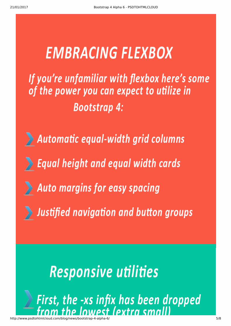
EMBRACING FLEXBOX
21/01/2017 Bootstrap 4 Alpha 6 - PSDTOHTMLCLOUD
http://www.psdtohtmlcloud.com/blog/news/bootstrap-4-alpha-6/ 2/8
Flexbox becomes the default layout option for Bootstrap 4. Sass variable $enable-flex has been
removed, Sass �les cleaned up, docs consolidated, and migration and browser support notes
updated. Beyond the �exbox changes, there are no additional changes to the compiled CSS at this
time.
Removed the $enable-�ex variable: Flexbox is now enabled by default and cannot be disabledvia Sass variable.
Removed the non-�exbox variants from grid system, cards, media objects, list groups, andnavigation components.
Consolidated grid docs to a single grid.md �le (no more flexbox-grid.md.)
Updated migration and browser support docs to clarify IE10+ support.
Removed �exbox.md docs from the Getting started section.
Because of these changes, here’s what’s been modi�ed in the compiled CSS:
Clear�x has been removed from rows as it’s no longer necessary with no float s being present.
Columns use max-width instead of width . While this was the case for the �exbox grid before
this change, it’s different from the default grid’s use of width .
GRID SYSTEM UPDATES
As part of �exbox, included support for vertical and horizontal alignment classes.
Responsive autosizing columns and container padding options are added.
Add any number of .col-* classes and they’ll automatically be equal in width.
Padding for grid containers can now be con�gured across breakpoints with the new $grid-
gutter-widths Sass map.
In addition, you can remove gutters from grid rows and their columns with the .no-gutters
modi�er.
RESPONSIVE UTILITIES AND THE GREAT INFIX
With Alpha 6, you end up with updated classes like .col-6 , .d-none , .float-right , .d-md-
flex , .justify-content-end, and .text-lg-left. These new classes make it easier for those
migrating from v3 with clearer mappings to legacy class names.
For the grid, there should be no breaking changes to your code. You can, however, takeadvantage of the �exbox auto layout and alignment options though!
For cards, this means you can now drop .card-deck-wrapper from your markup.
For media objects, this means you can be more �exible with the order of your markup
For list groups, this simpli�es the alignment of badges. No more required utilities just tovertically and horizontally align badges in list group items. (You might still need some for�ne-tuning, though).
Even more complex components like the carousel have been modi�ed to use �exbox insome places.

21/01/2017 Bootstrap 4 Alpha 6 - PSDTOHTMLCLOUD
http://www.psdtohtmlcloud.com/blog/news/bootstrap-4-alpha-6/ 3/8
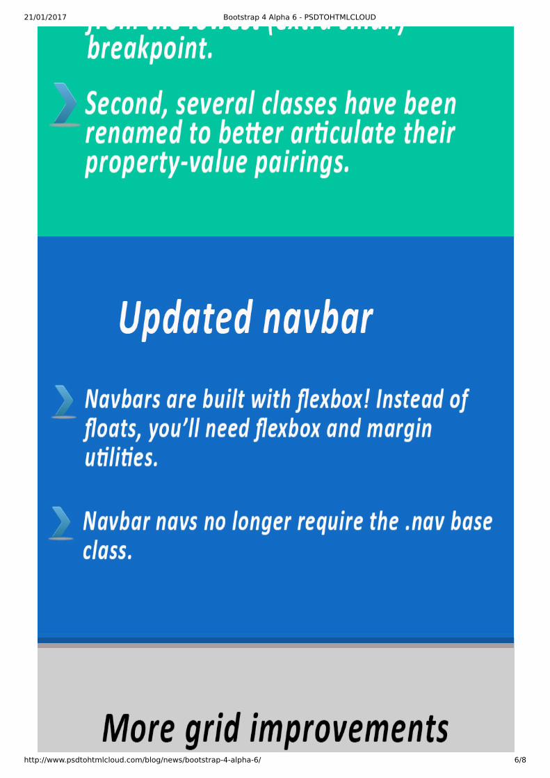
First, the -xs in�x has been dropped from the lowest (extra small) breakpoint. xs isn’t a
responsive breakpoint quite like sm , md , lg , and xl because it doesn’t start applying styles at
a min-width and up. It simply applies to everything as there’s no bounding @media query.
Second, several classes have been renamed to better articulate their property-value pairings.Instead of pull, now use �oat. Instead of creating new names for the various �exbox properties,start with the property name.
UPDATED NAVBAR
As mentioned in our last article BOOTSTRAP 4 ALPHA 5
(http://www.psdtohtmlcloud.com/blog/news/bootstrap-4-alpha-5/), the Alpha 5 navbar was a little
half baked. This time around, its completely baked. No, but seriously, the navbar has been rewritten
to provide better built-in responsive behavior and improved layout customisation thanks to the
move to �exbox. Here’s the rundown on what’s changed:
Navbars are built with �exbox! Instead of �oats, you’ll need �exbox (https://v4-alpha.getbootstrap.com/utilities/�exbox/) and margin utilities (https://v4-alpha.getbootstrap.com/utilities/spacing/).
Navbar navs no longer require the .nav base class. Now it’s just .navbar-nav and utilities for
alignment.
The .navbar-toggleable classes are now applied to the .navbar instead of the .collapse
within.
The responsive navbar toggle, .navbar-toggler, has also been updated. The icon is once again
a child element, .navbar-toggler-icon, for improved customisation.
Check out the navbar docs (https://v4-alpha.getbootstrap.com/components/navbar/) to learn more
and see it in action.
Do you want to migrate your website from Bootstrap 3 to Bootstrap 4, then you can Migrate to v4
(https://v4-alpha.getbootstrap.com/migration/) easily.
Looking for someone who can develop a website or
mobile app for you with the latest Bootstrap Alpha 6,
checkout our PSD to HTML
(http://www.psdtohtmlcloud.com/psd-to-html) service.
Feel free to contact us
(http://www.psdtohtmlcloud.com/contact-us), we will
develop your website for you so that you can focus on
things that you love doing most and enjoy being your own
boss.
UP NEXT, FIRST BETA

21/01/2017 Bootstrap 4 Alpha 6 - PSDTOHTMLCLOUD
http://www.psdtohtmlcloud.com/blog/news/bootstrap-4-alpha-6/ 4/8
UP NEXT, FIRST BETALike you, we’re very much ready for the �rst beta release. Bootstrap is focused on not adding
anything new, ideally making as few breaking changes as possible, and emphasizing documentation
quality and bug �xes.
21/01/2017 Bootstrap 4 Alpha 6 - PSDTOHTMLCLOUD
http://www.psdtohtmlcloud.com/blog/news/bootstrap-4-alpha-6/ 5/8
21/01/2017 Bootstrap 4 Alpha 6 - PSDTOHTMLCLOUD
http://www.psdtohtmlcloud.com/blog/news/bootstrap-4-alpha-6/ 6/8

21/01/2017 Bootstrap 4 Alpha 6 - PSDTOHTMLCLOUD
http://www.psdtohtmlcloud.com/blog/news/bootstrap-4-alpha-6/ 7/8

21/01/2017 Bootstrap 4 Alpha 6 - PSDTOHTMLCLOUD
http://www.psdtohtmlcloud.com/blog/news/bootstrap-4-alpha-6/ 8/8


![Matthijs Hogervorst arXiv:1703.08159v2 [hep-th] 13 Nov 2017 · 2 Warm-up: toy bootstrap in alpha space For pedagogical purposes, we will work out an example of an alpha space transform](https://img.pdfslide.net/doc/110x75/5f635ad350975339ca10c848/matthijs-hogervorst-arxiv170308159v2-hep-th-13-nov-2017-2-warm-up-toy-bootstrap.jpg)


![[BOOK] [Bootstrap] [Awesome] Bootstrap-Programming-Cookbook](https://img.pdfslide.net/doc/110x75/577ca6bf1a28abea748c023f/book-bootstrap-awesome-bootstrap-programming-cookbook.jpg)

