Embed Size (px)
Citation preview
Digipak LayoutThe layouts of the Front Cover, Back Cover, CD and the CD Insert
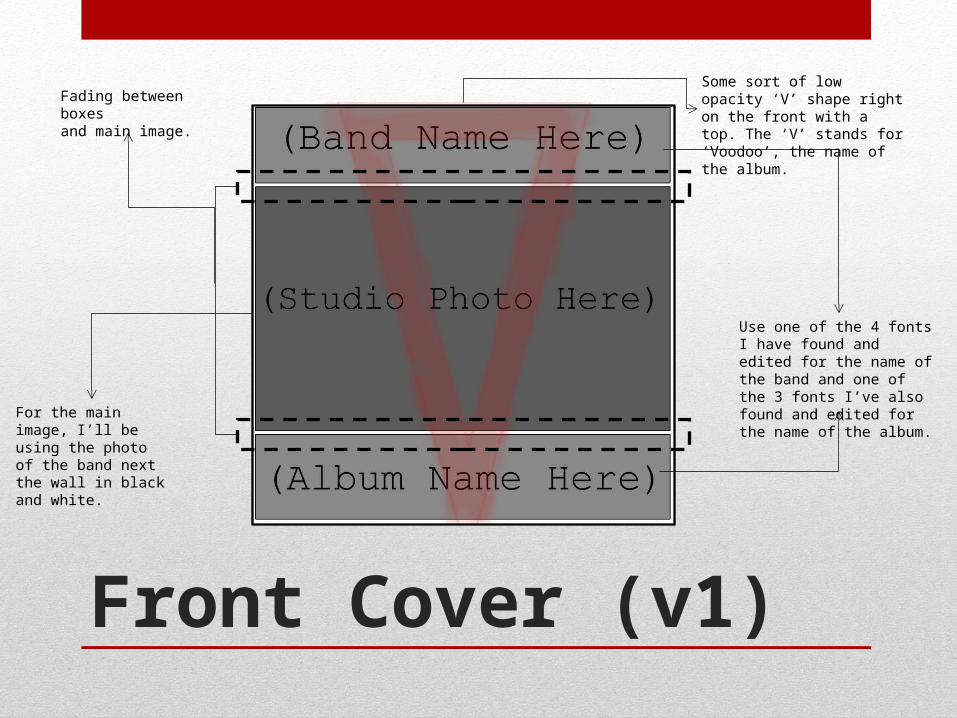
Front Cover (v1)
Fading between boxes and main image.
Some sort of low opacity ‘V’ shape right on the front with a top. The ‘V’ stands for ‘Voodoo’, the name of the album.
Use one of the 4 fonts I have found and edited for the name of the band and one of the 3 fonts I’ve also found and edited for the name of the album.
For the main image, I’ll be using the photo of the band next the wall in black and white.
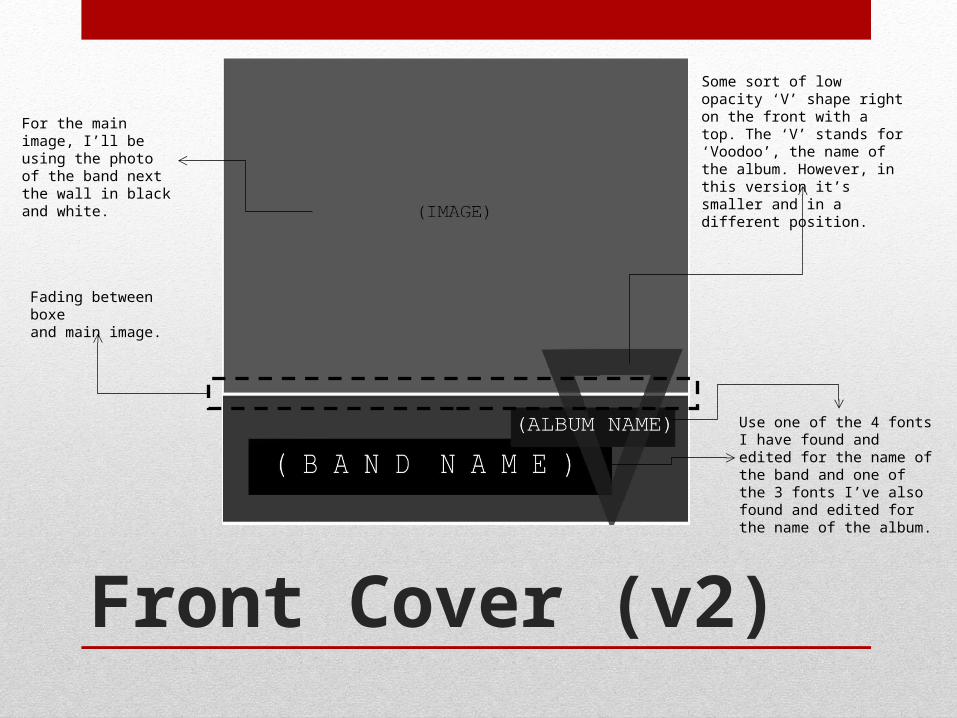
Front Cover (v2)
Fading between boxe and main image.
For the main image, I’ll be using the photo of the band next the wall in black and white.
Use one of the 4 fonts I have found and edited for the name of the band and one of the 3 fonts I’ve also found and edited for the name of the album.
Some sort of low opacity ‘V’ shape right on the front with a top. The ‘V’ stands for ‘Voodoo’, the name of the album. However, in this version it’s smaller and in a different position.
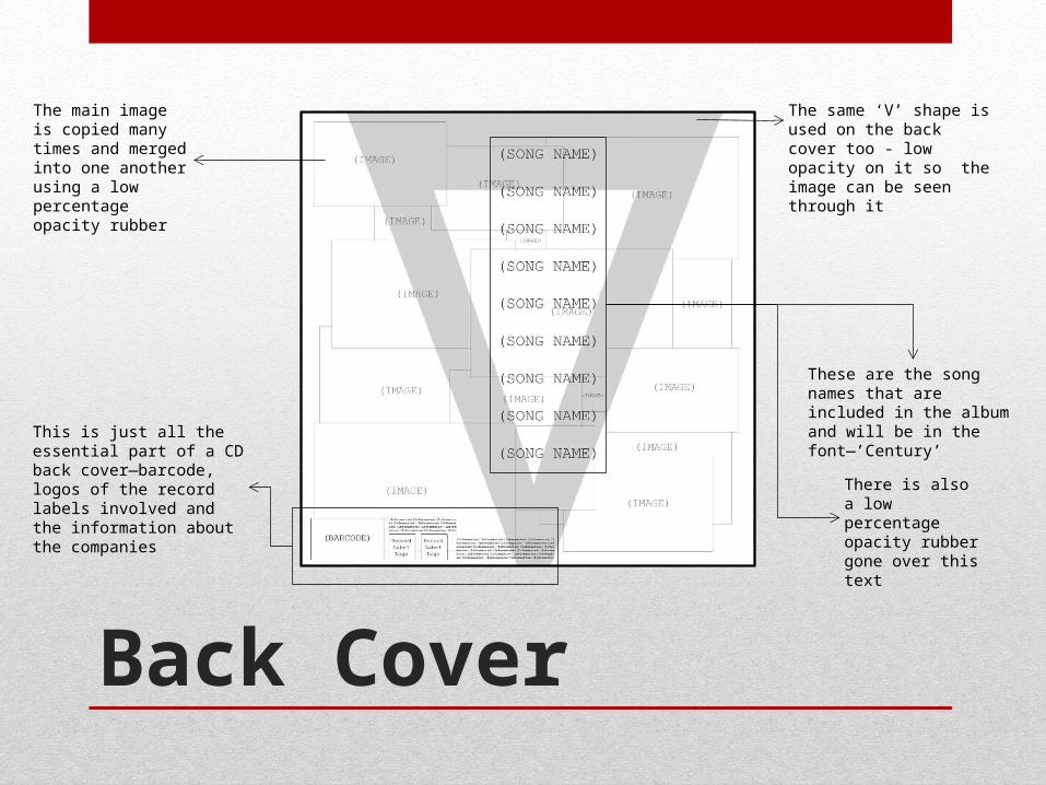
Back Cover
The main image is copied many times and merged into one another using a low percentage opacity rubber
The same ‘V’ shape is used on the back cover too - low opacity on it so the image can be seen through it
This is just all the essential part of a CD back cover—barcode, logos of the record labels involved and the information about the companies
These are the song names that are included in the album and will be in the font—’Century’
There is also a low percentage opacity rubber gone over this text
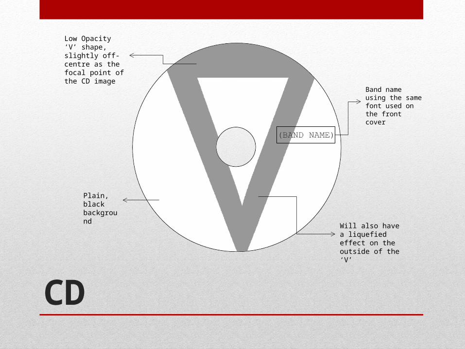
CD
Band name using the same font used on the front cover
Low Opacity ‘V’ shape, slightly off- centre as the focal point of the CD image
Plain, black background
Will also have a liquefied effect on the outside of the ‘V’
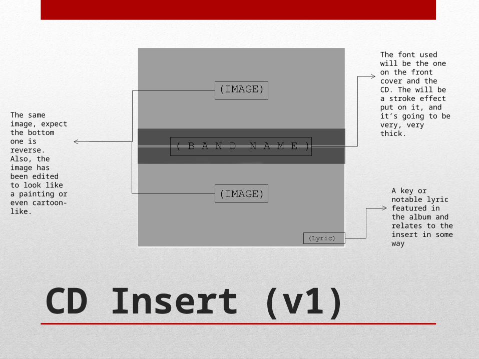
CD Insert (v1)
A key or notable lyric featured in the album and relates to the insert in some way
The same image, expect the bottom one is reverse. Also, the image has been edited to look like a painting or even cartoon-like.
The font used will be the one on the front cover and the CD. The will be a stroke effect put on it, and it’s going to be very, very thick.
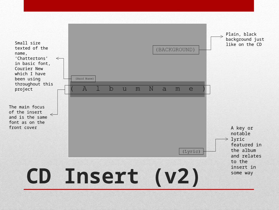
CD Insert (v2)
A key or notable lyric featured in the album and relates to the insert in some way
The main focus of the insert and is the same font as on the front cover
Small size texted of the name, ‘Chattertons’ in basic font, Courier New which I have been using throughout this project
Plain, black background just like on the CD