Embed Size (px)
Citation preview

Digipak ExamplesHere are examples of adverts and album
covers I looked at to gain influences of how to produce my own.

Starting PointI collected multiple
images and reduced them down to 4. I selected where I
wanted each photo to be placed within the
album cover template. After doing
so I resized each image to fit the
dimensions. This was more difficult for the top right image as
each face represents a separate image which I edited and
grouped before importing it.

CD
Here is the image used for the disc, we
replicated one we selected from the cover. The lines
indicate where the image can be placed and where text can
be placed.

Color Balance + Black & WhiteHere is how the
album cover looks when color changes are added. Adding a blue tint made the
bottom images cleaner and more
sharp, the same style applies to the album spine. We used black & white for the inside to link to the style of the music video we
created.

Text
Added simple stylish text to give the
details of the album. As well as this a
barcode was added for authenticity of the
product we were creating.

Keeping a themeReplicating the same
color scheme onto the disc ensures continuity to the
album, and makes for an overall cleaner, more professional
looking piece.
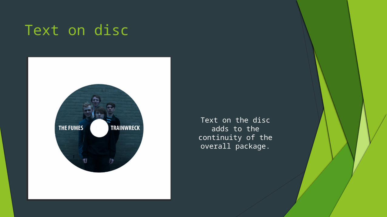
Text on disc
Text on the disc adds to the continuity of
the overall package.

Advertisement
This is photo selected for the
advertisement. We originally selected a wider shot within a grassland area, but
editing that shot became difficult so
we switched to something simpler.

Finished ProductHere is the finished advertisement, with the simpler picture it
appears more professional and suits
the conventions of modern music
adverts, which is good as that is goal
we had set for us. We simply added a single filter to the original image and imported
the company logo's/text to obtain
this final piece.