Embed Size (px)
Citation preview
EVALUATION Q1: IN WHAT WAYS DOES YOUR MEDIA PRODUCT USE, DEVELOP OR CHALLENGE FORMS AND CONVENTIONS OF REAL MEDIA PRODUCTS?
TRAILER:

In the trailer there are many locations used including the woods, an attic and the house. As seen in “The Grudge” a woman is searching through an empty house and eventually goes into the attic. The attic is used as a location in many horror films since it provides a dark, cramped and mysterious atmosphere. We used the attic since it helped provide a scene which made the audience feel uncomfortable. The kitchen is the first time Lily sees the ghost. We chose the kitchen since it makes the audience relate to Lily. A
horror movie that uses a kitchen is in the “Scream” opening therefore we conformed to another location convention.
Many horror films do include a house, but our house is in a well built area unlike a house which is remote (The Woman in Black). We decided to challenge this convention because we wanted to add a sense of reality to our movie. By using a normal house it shows a supernatural phenomenon could happen to anybody.
LOCATIONS:
MAKE UP & WARDROBE:
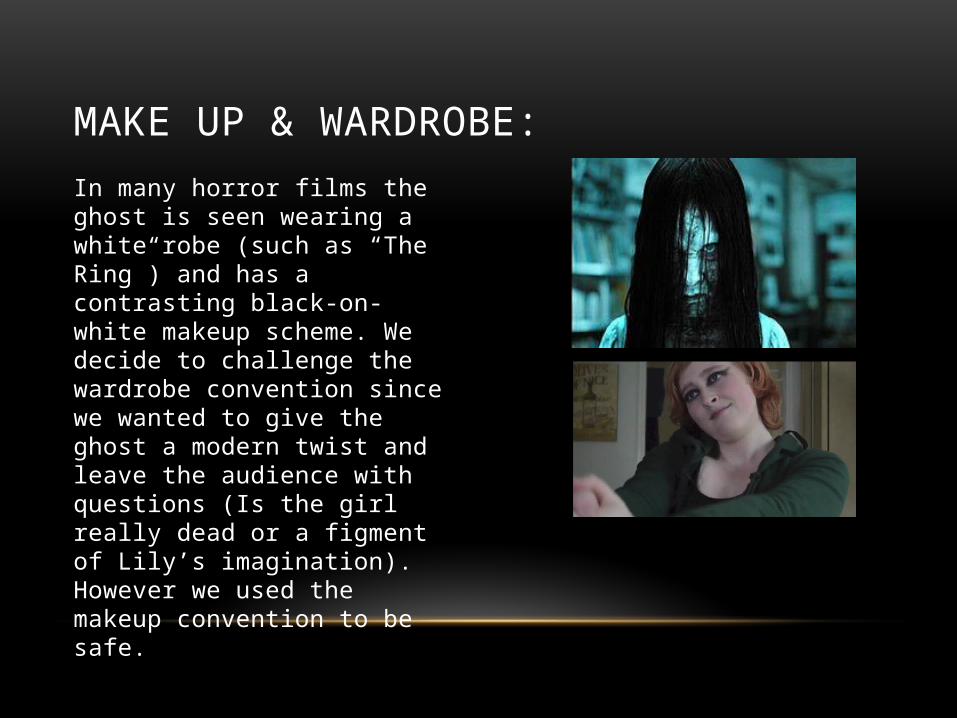
In many horror films the ghost is seen wearing a white robe (such as “The Ring”) and has a contrasting black-on-white makeup scheme. We decide to challenge the wardrobe convention since we wanted to give the ghost a modern twist and leave the audience with questions (Is the girl really dead or a figment of Lily’s imagination). However we used the makeup convention to be safe.

EDITING & CAMERA:
One convention I decided to develop is how long you get the antagonist for; in most supernatural horror film trailers the ghost is seen towards the end of the trailer or have glimpse cuts of them. In “Annabelle” there is a scene where a supernatural being leaps at the mother before the scene cuts. This only gives the audience a short amount of time to comprehend what happened; I developed this convention by having a shot reverse shot on the ghost and Lily. Since the ghost was not fully seen till the end of the scene, the shot reverse shot helped create tension as well the ghost being not fully visible. The first scene of the trailer is of an unknown person committing suicide. Unlike other horror trailers which start instantly on a positive note such as The Conjuring which starts with the family moving into the house. I chose this as the first scene so it will instantly grab the audience’s attention if they were watching the trailer on YouTube.

Background music:
Long suspenseful notes with contrasting short sharp notes help create shock in the audience. We conformed to this in the attic scene, since we had a elongated drone background music with electric static over it. Isolated instruments are often used just before the main character occurs which helps presents the idea of vulnerability, to the audience. We instantly see the main character at her birthday when a peaceful piano piece is being played over.
Dialogue:
The tone of a voice helps show what sort of character they are. In the Saw franchise, Jigsaw (antagonist) has a unique tone to his voice compared to the other characters, which shows he is intimidating. We applied tone to our main character. By having her speak softly when she is talking with her friends it shows she is kind, but when she is screaming in the field in shows her fear and confusion.
Sound effects:
We used numerous sound effects that conformed to the horror genre. When Lily is first haunted we used crows cawing; crows are used a lot in horror movie since they are related to death. The gunshot towards the end was the sound of a door slamming with a muffled audio effect placed over it. Loud noises are used to surprise the audience, which I used in our product.
SOUND:

POSTER:

We used the convention of a black, red and white colour scheme, this a common colour scheme seen in many horror posters since the colours represent darkness, blood and the innocence of the main character. There is no certain font style that supernatural posters have. It can either be bold and blocked (Woman In Black) or thin (Sinister). We decided to use the latter since we thought it suited the overall plot of Mirage – a sense of mystery.
FONT:
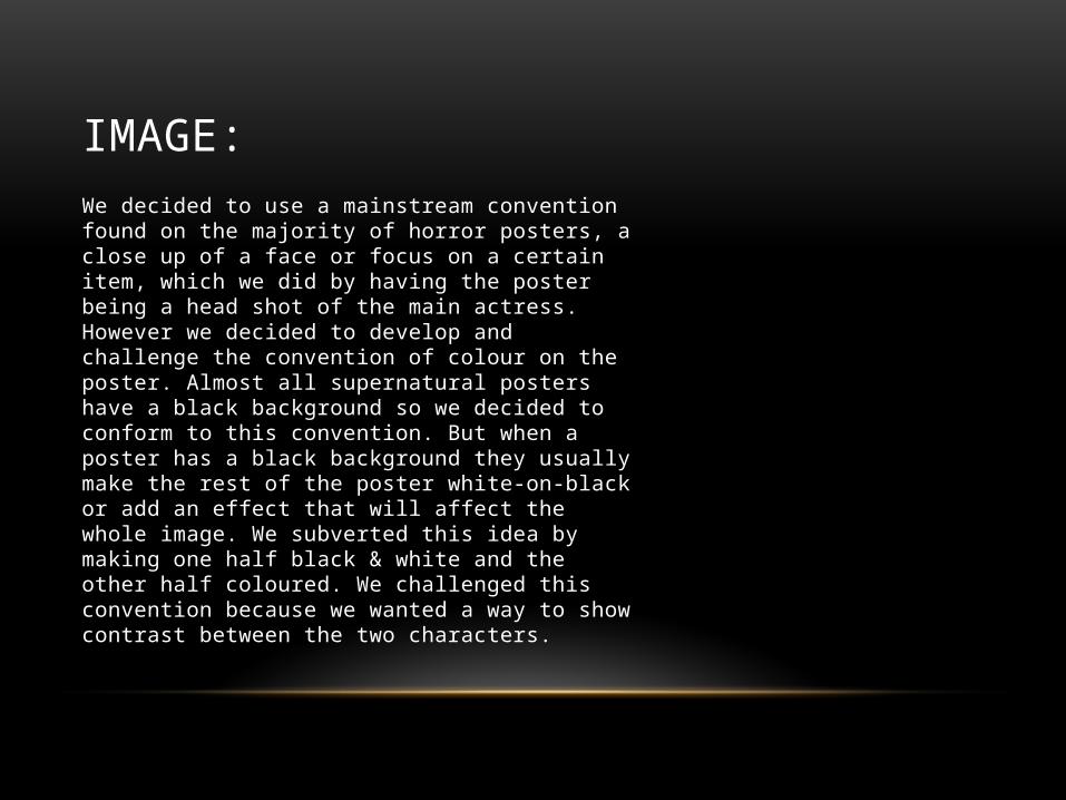
We decided to use a mainstream convention found on the majority of horror posters, a close up of a face or focus on a certain item, which we did by having the poster being a head shot of the main actress. However we decided to develop and challenge the convention of colour on the poster. Almost all supernatural posters have a black background so we decided to conform to this convention. But when a poster has a black background they usually make the rest of the poster white-on-black or add an effect that will affect the whole image. We subverted this idea by making one half black & white and the other half coloured. We challenged this convention because we wanted a way to show contrast between the two characters.
IMAGE:

COVER LINE:
Almost all cover lines in supernatural posters involve a hint to the plot and usually break the 4th wall by using 2nd person to talk directly to the audience (Carrie: You will know her name). We instead developed this convention and used 1st person but the way we did it made it sound like the main character was talking directly to the audience.
MAGAZINE COVER:

Magazine covers do not change the font style of their title to maintain their brand, but they change the colour of the font to synergize with the movie they are advertising. We kept this convention the same since it would have been unprofessional to change it.
We decided to put our movie title in the bottom third of the cover since it does not take the attention away from the magazine’s title. Therefore using the convention of the magazine title and movie title being in the top third and bottom third.
FONT:
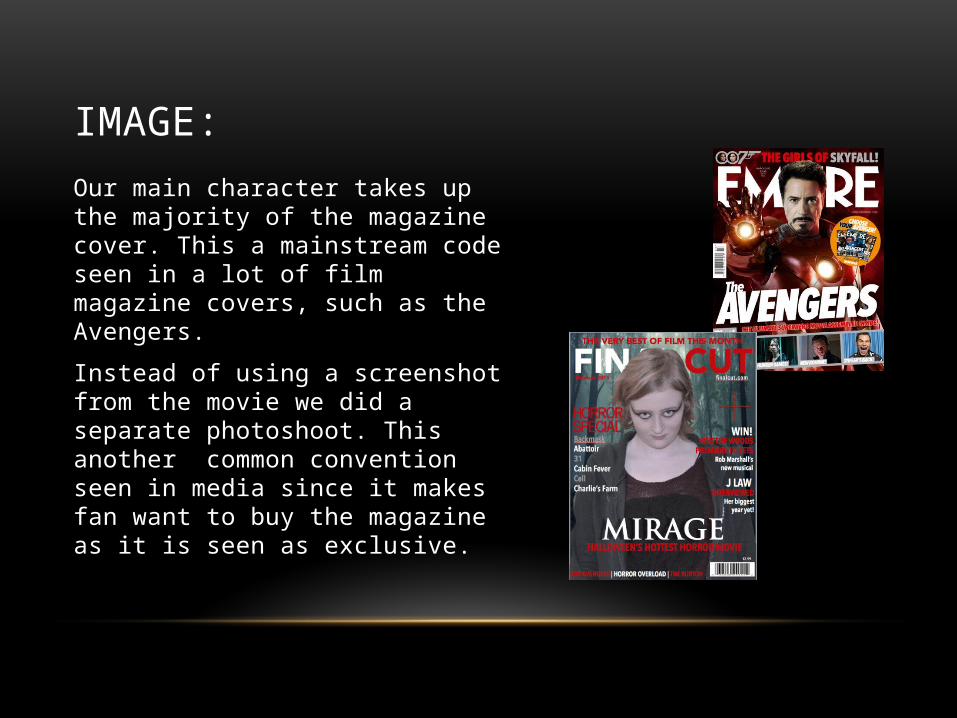
Our main character takes up the majority of the magazine cover. This a mainstream code seen in a lot of film magazine covers, such as the Avengers.
Instead of using a screenshot from the movie we did a separate photoshoot. This another common convention seen in media since it makes fan want to buy the magazine as it is seen as exclusive.
IMAGE:

By using cover lines we also conformed to another convention. Cover lines are used to attract an audience that wouldn’t much care about the image on the cover. We wrote about interviews and celebrities therefore using the conventions of real media products.
We also have included an issue number, date and barcode. Nearly every magazine has the issue codes on the front of cover or on the back, this does not help advertise the film but it’s a common code and conventions on a magazine therefore we had to use it.
COVER LINES:

CONCLUSION:• The narrative of our product did subvert some common conventions since we wanted
our trailer to seem unique. Our trailer challenged and used certain conventions of real media films.
• However, the magazine did conform to a lot of conventions since it is rare to find magazine covers on horror films so it made it hard for us to imagine what a horror magazine cover would look like. We decided to use the conventions as we wanted to be safe with our product.
• The poster did conform and subvert the conventions because we wanted to be unique and new yet obvious enough for the audience to realise the genre of the movie. Therefore we developed the conventions of the poster.