Embed Size (px)
Citation preview
Influences
Magazine cover – Q Magazine
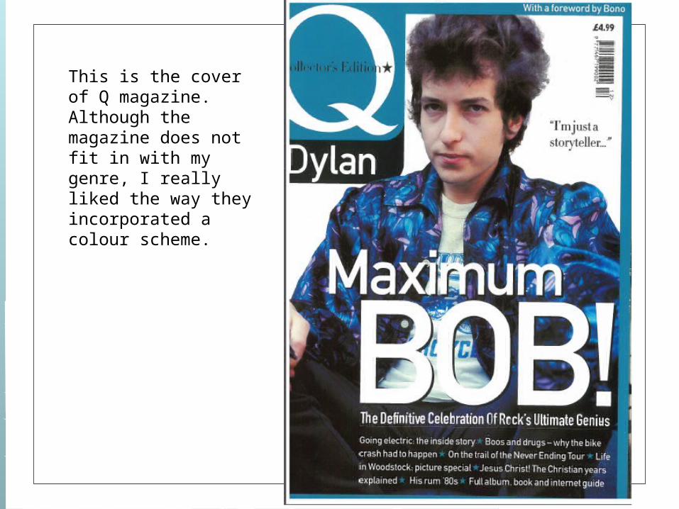
This is the cover of Q magazine. Although the magazine does not fit in with my genre, I really liked the way they incorporated a colour scheme.
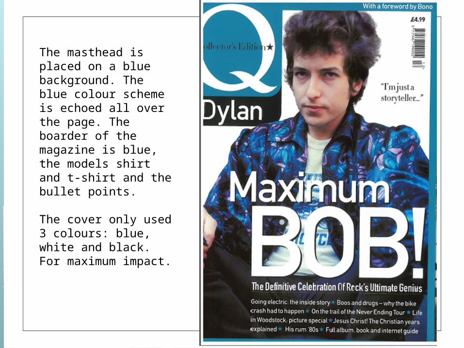
The masthead is placed on a blue background. The blue colour scheme is echoed all over the page. The boarder of the magazine is blue, the models shirt and t-shirt and the bullet points.
The cover only used 3 colours: blue, white and black. For maximum impact.
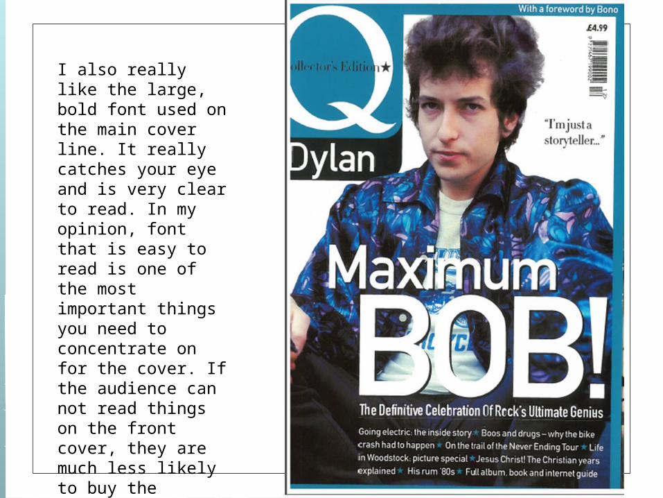
I also really like the large, bold font used on the main cover line. It really catches your eye and is very clear to read. In my opinion, font that is easy to read is one of the most important things you need to concentrate on for the cover. If the audience can not read things on the front cover, they are much less likely to buy the magazine.
For my magazine cover I am planning on incorporating a colour scheme for maximum impact. Although the Q magazine cover is not the colours, model or style I have used, It has defiantly shown me the benefits of using a colour scheme and how it catches the audiences eyes. It also influenced me into ensuring my font is easy to read and eye catching.
I now plan to use a colour scheme/ specific colour pallet for my cover.