Embed Size (px)
Citation preview
<web/F>
CSS architecture CSS is as important as JavaScript
<web/F> <web/F>
Why CSS architecture? It is not as trivial as you think
<web/F> <web/F>
CSS tragedy
The great tragedy of CSS is that it doesn’t stop your application
if CSS is broken.
And that is why CSS always takes a backseat to JavaScript.
<web/F> <web/F>
If CSS break
• Breaking of JavaScript may disable use of certain feature.
• But if CSS is broken, then your presentation layer break. This is big
compromise on User experience.
• Bad UX is definitely a game loser.
<web/F> <web/F>
Why do we need CSS architecture?
• Just one word - maintainability
• Enterprise application development is a world of
• RRC – Rapid requirement change
• Scale – Huge scale

<web/F> <web/F>
Idea of architecture
• Set of patterns
• Promoting good practices

<web/F> <web/F>
Tenets of good architecture
• DRY – Do not repeat Yourself
• Reusable
• Predictable
• Maintainable
<web/F> <web/F>
Problem with plain CSS
• Repetition cannot be easily avoid
• Reuse is hard
• Future friendly CSS is hard
<web/F> <web/F>
Days of writing plain CSS are almost over…
<web/F> <web/F>
CSS tool chain
• CSS pre-processors
• SASS, LESS, Stylus, etc.
• CSS post-processor
<web/F> <web/F>
SASS vs. LESS
• Which one should you chose?
<web/F> <web/F>
CSS frameworks
• Foundation
• Bootstrap
• Others

<web/F> <web/F>
Common CSS problems Techniques to write better CSS
<web/F> <web/F>
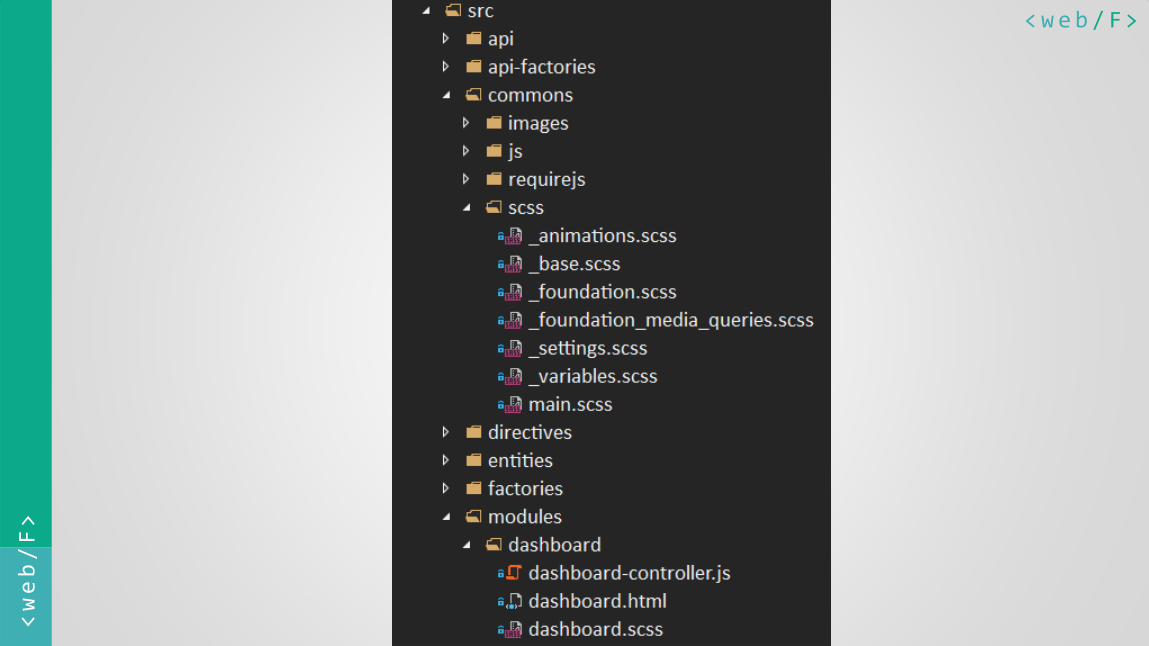
Problem 1
CSS code structure
How to map it properly with Angular folder structure
<web/F> <web/F>
<web/F> <web/F>
Problem 2
Variable naming
Choosing appropriate variable names
<web/F> <web/F>
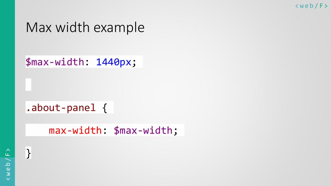
Max width example
$max-width: 1440px;
.about-panel {
max-width: $max-width;
}

<web/F> <web/F>
Max width example
$max-width-1200: 1200px;
$max-width-1440: 1440px;
$max-width-1920: 1920px;
.about-panel {
max-width: $max-width-1440;
}
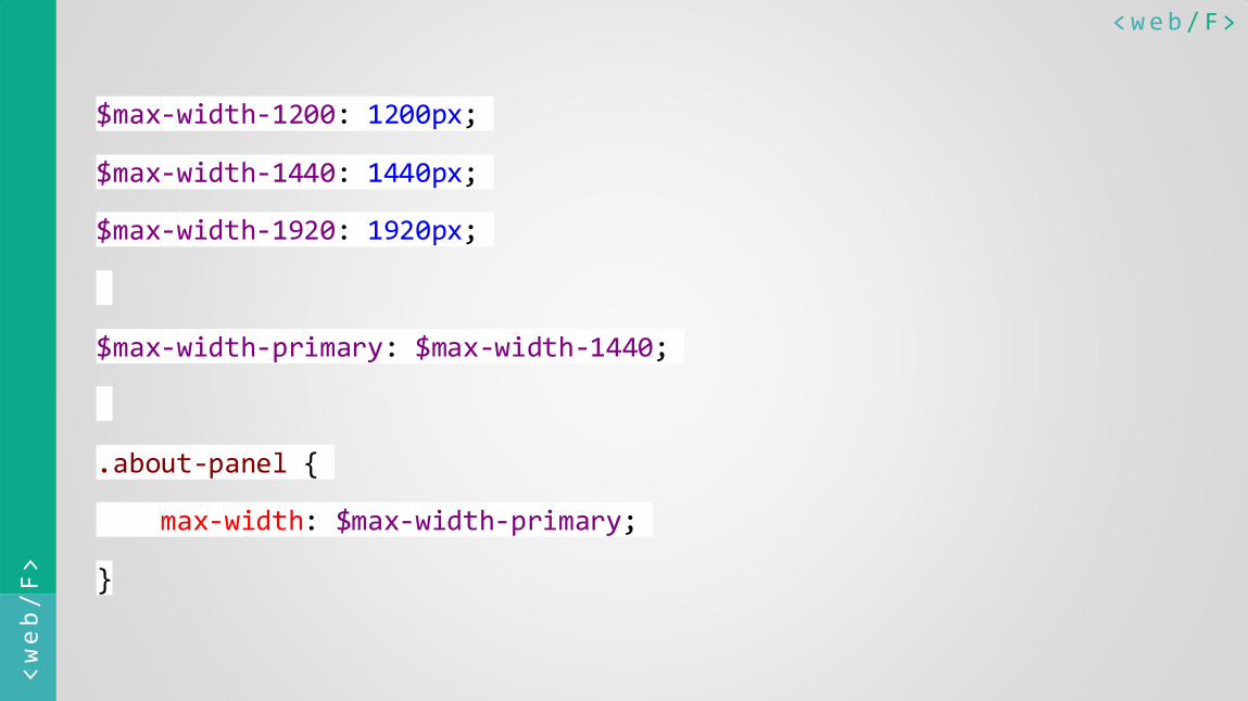
<web/F> <web/F>
$max-width-1200: 1200px;
$max-width-1440: 1440px;
$max-width-1920: 1920px;
$max-width-primary: $max-width-1440;
.about-panel {
max-width: $max-width-primary;
}
<web/F> <web/F>
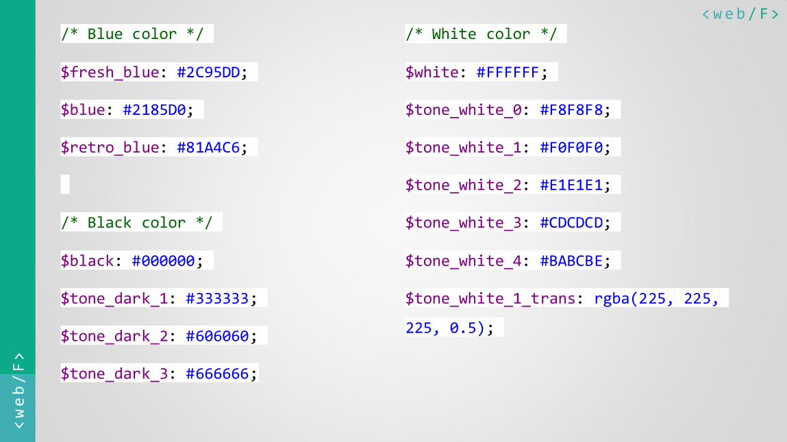
Problem 3
Color palette design
Standardizing most powerful elements of web
<web/F> <web/F>
/* Blue color */
$fresh_blue: #2C95DD;
$blue: #2185D0;
$retro_blue: #81A4C6;
/* Black color */
$black: #000000;
$tone_dark_1: #333333;
$tone_dark_2: #606060;
$tone_dark_3: #666666;
/* White color */
$white: #FFFFFF;
$tone_white_0: #F8F8F8;
$tone_white_1: #F0F0F0;
$tone_white_2: #E1E1E1;
$tone_white_3: #CDCDCD;
$tone_white_4: #BABCBE;
$tone_white_1_trans: rgba(225, 225,
225, 0.5);

<web/F> <web/F>
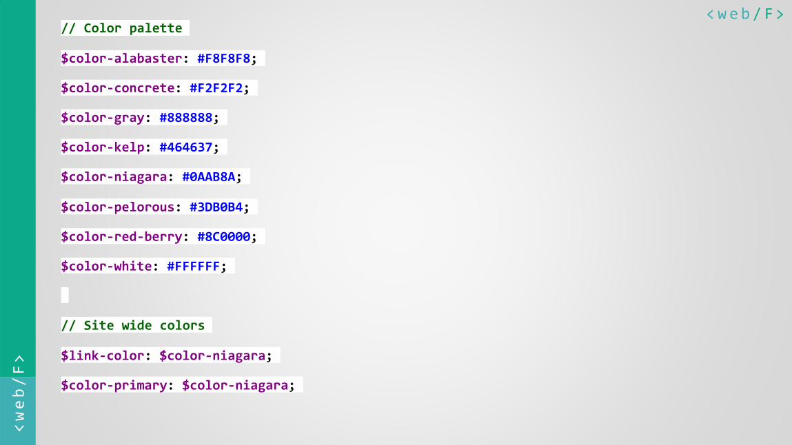
Name that color
http://chir.ag/projects/name-that-color/
http://www.color-blindness.com/color-name-hue/
<web/F> <web/F>
// Color palette
$color-alabaster: #F8F8F8;
$color-concrete: #F2F2F2;
$color-gray: #888888;
$color-kelp: #464637;
$color-niagara: #0AAB8A;
$color-pelorous: #3DB0B4;
$color-red-berry: #8C0000;
$color-white: #FFFFFF;
// Site wide colors
$link-color: $color-niagara;
$color-primary: $color-niagara;

<web/F> <web/F>
Problem 4
Responsive CSS layout
Writing better readable code
<web/F> <web/F>
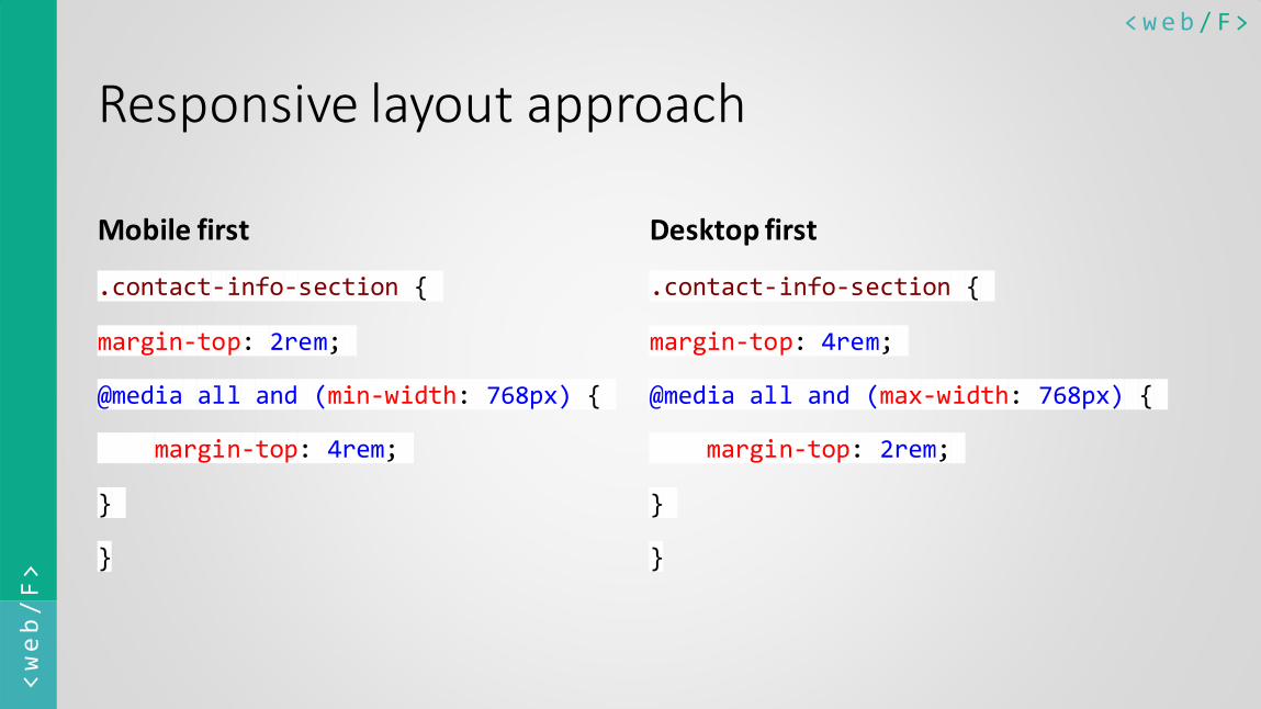
Responsive layout approach
Mobile first
.contact-info-section {
margin-top: 2rem;
@media all and (min-width: 768px) {
margin-top: 4rem;
}
}
Desktop first
.contact-info-section {
margin-top: 4rem;
@media all and (max-width: 768px) {
margin-top: 2rem;
}
}
<web/F> <web/F>
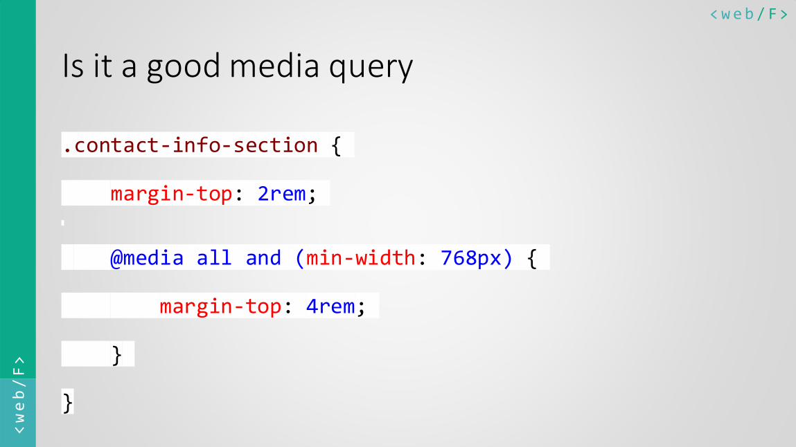
Is it a good media query
.contact-info-section {
margin-top: 2rem;
@media all and (min-width: 768px) {
margin-top: 4rem;
}
}
<web/F> <web/F>
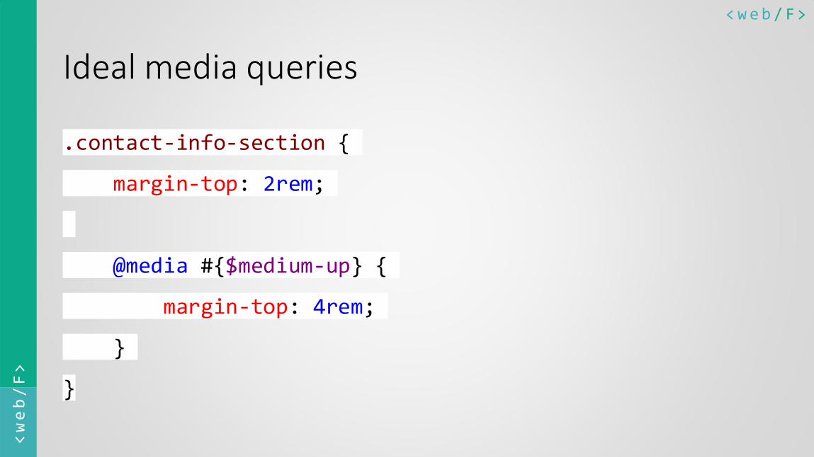
Ideal media queries
.contact-info-section {
margin-top: 2rem;
@media #{$medium-up} {
margin-top: 4rem;
}
}
<web/F> <web/F>
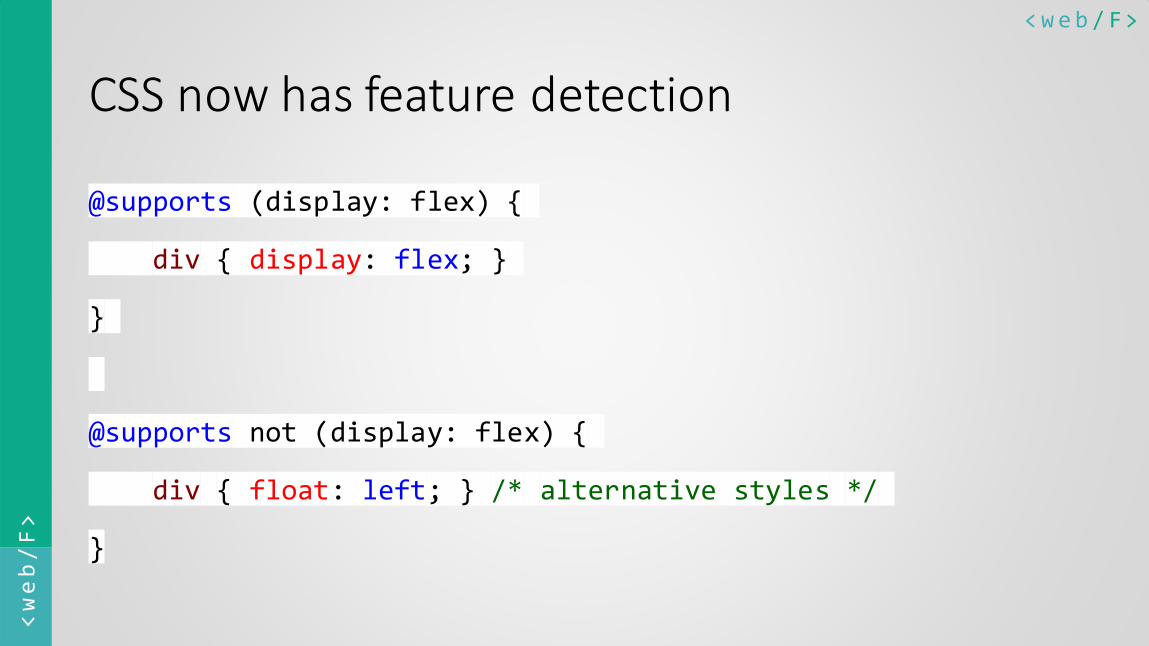
CSS now has feature detection
@supports (display: flex) {
div { display: flex; }
}
@supports not (display: flex) {
div { float: left; } /* alternative styles */
}
<web/F> <web/F>
Problem 5
Future friendly CSS
Developers should not worry

<web/F> <web/F>
How cross browser CSS is written
.about-section {
display: -webkit-box; /* OLD - iOS 6-, Safari 3.1-6 */
display: -moz-box; /* OLD - Firefox 19- (buggy but mostly works)
*/
display: -ms-flexbox; /* TWEENER - IE 10 */
display: -webkit-flex; /* NEW - Chrome */
display: flex;
}
<web/F> <web/F>
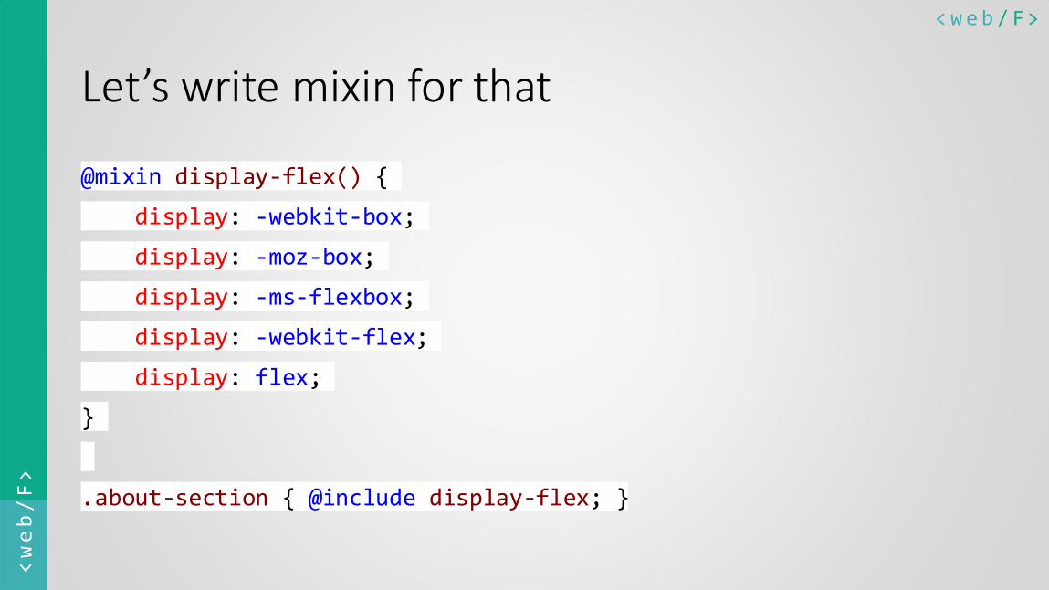
Let’s write mixin for that
@mixin display-flex() {
display: -webkit-box;
display: -moz-box;
display: -ms-flexbox;
display: -webkit-flex;
display: flex;
}
.about-section { @include display-flex; }
<web/F> <web/F>
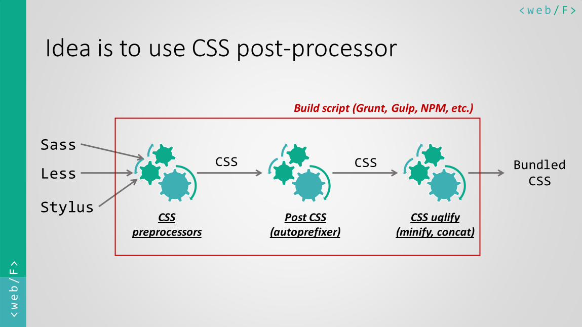
Idea is to use CSS post-processor
Sass
Stylus
CSS preprocessors
Less
Post CSS (autoprefixer)
CSS
CSS
CSS uglify (minify, concat)
Bundled CSS
Build script (Grunt, Gulp, NPM, etc.)
<web/F> <web/F>
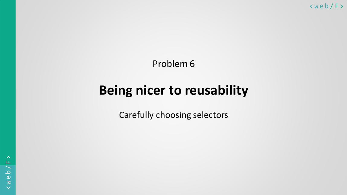
Problem 6
Being nicer to reusability
Carefully choosing selectors
<web/F> <web/F>
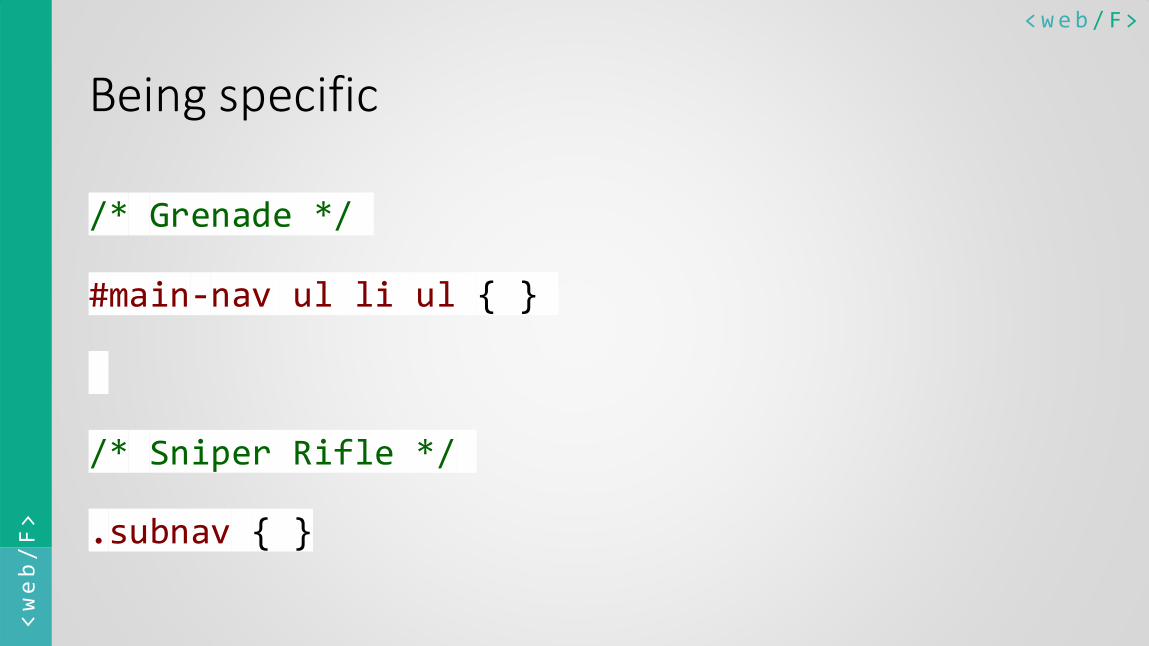
Being specific
/* Grenade */
#main-nav ul li ul { }
/* Sniper Rifle */
.subnav { }

<web/F> <web/F>
Better namespacing
/* High risk of style cross-contamination */
.widget { }
.widget .title { }
/* Low risk of style cross-contamination */
.widget { }
.widget-title { }
<web/F> <web/F>
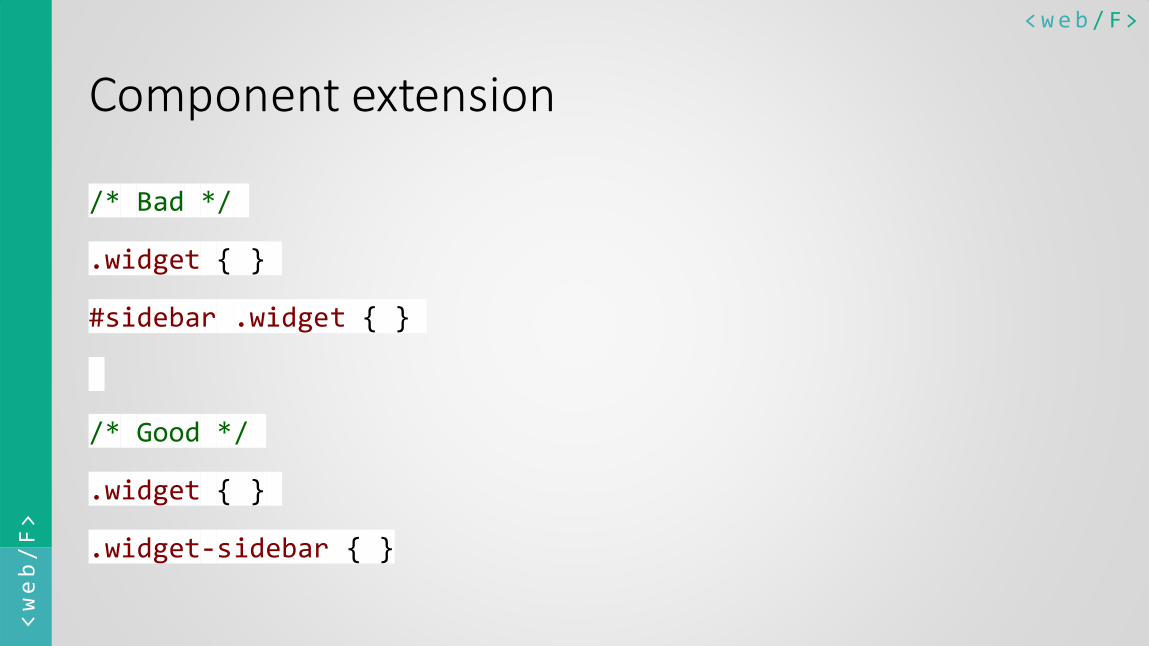
Component extension
/* Bad */
.widget { }
#sidebar .widget { }
/* Good */
.widget { }
.widget-sidebar { }
<web/F> <web/F>
CSS architecture Writing a CSS with same concern as JS is a key to better and efficient
design. Don’t ignore it.

<web/F> <web/F>
By
Harshal Patil
@mistyharsh


![10 Commandments for efficient CSS architecture [CSSConf.Asia '14]](https://img.pdfslide.net/doc/110x75/55a507c51a28ab0e7b8b46d3/10-commandments-for-efficient-css-architecture-cssconfasia-14.jpg)