Embed Size (px)
Citation preview

Mark Allan (MarkXA) – DNNGarden.com
onmouseover=“dead”
DNN in the new mobile world

Mark Allan (MarkXA) – DNNGarden.com
What we’ll be covering Why worry? Possible approaches Implementing solutions Testing DNN 6 Arguments Discussion

Mark Allan (MarkXA) – DNNGarden.com
What we’ll not be covering Details of mobile design• I’m a developer, not a designer• See skin contest mobile entries
jQuery Mobile and other frameworks• Nik just gave a talk on that!

Mark Allan (MarkXA) – DNNGarden.com
Why worry?

Mark Allan (MarkXA) – DNNGarden.com
Mobile browsing is growing
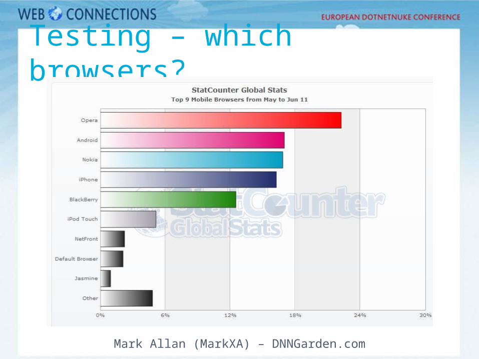
Mobile browser share now 7.7%, up from 1.7% 18 months ago
StatCounter reports 6.5% up from 1.2% worldwide

Mark Allan (MarkXA) – DNNGarden.com
And it’s not going to stop
Roughly 25% projected growth year-on-year

Mark Allan (MarkXA) – DNNGarden.com
What is “mobile” anyway? Phones? iOS/Android tablets?? Windows tablets??? Surface????

Mark Allan (MarkXA) – DNNGarden.com
Option 1: Do nothing

Mark Allan (MarkXA) – DNNGarden.com
The “do nothing” option Mobile browsers can show desktop
sites

Mark Allan (MarkXA) – DNNGarden.com
The “do nothing” option Pros:• Very easy!
Cons:• Touch devices have no mouseover, not
good for standard DNN flyout menus• Forces the user to zoom around the
page, not ideal UX• Usually heavy on bandwidth

Mark Allan (MarkXA) – DNNGarden.com
Demo
Tweaking a desktop site

Mark Allan (MarkXA) – DNNGarden.com
Option 2: CSS

Mark Allan (MarkXA) – DNNGarden.com
One skin for all devices Use stylesheet media types and
CSS3 media queries to apply different CSS to a single skin, e.g.
• <link rel="stylesheet" type="text/css" href="mobile.css" media="handheld" />
• @media (min-width:450px) { .leftcol { width: 30% }}

Mark Allan (MarkXA) – DNNGarden.com
One skin for all devices Pros:• Flexible solution• Doesn’t rely on browser sniffing
Cons:• Inconsistent browser support• Not easy to implement reduced
bandwidth• Content remains the same

Mark Allan (MarkXA) – DNNGarden.com
Demo
Using @media

Mark Allan (MarkXA) – DNNGarden.com
Option 3: Multiple skins

Mark Allan (MarkXA) – DNNGarden.com
Multiple skins Create multiple ASCX skin files for
e.g. desktop, mobile, tablet Master ASCX uses server-side user
agent detection to determine which one to load
MySkin.ascx
MySkin_Desktop.ascx
MySkin_Mobile.ascx
MySkin_Tablet.ascx

Mark Allan (MarkXA) – DNNGarden.com
Multiple skins Pros:• Can produce entirely different layouts if
necessary• Once set up, easy to maintain
Cons:• Relies on browser sniffing (e.g.
http://detectmobilebrowser.com or http://51degrees.codeplex.com)
• Technically a bit tricky• Content remains the same

Mark Allan (MarkXA) – DNNGarden.com
Demo
Skin switching

Mark Allan (MarkXA) – DNNGarden.com
Option 4: Multiple sites

Mark Allan (MarkXA) – DNNGarden.com
Multiple sites Create two sites, one for desktop and
one for mobile, e.g.• www.mysite.com• m.mysite.com
Portal 1www.mysite.comDesktop content
Portal 2m.mysite.com
Mobile content

Mark Allan (MarkXA) – DNNGarden.com
Multiple sites Pros:• Complete control• Content can be varied
Cons:• No sharing of content, users, etc
between portals
Mark Allan (MarkXA) – DNNGarden.com
Option 5: Micro-sites

Mark Allan (MarkXA) – DNNGarden.com
Create two sets of pages, one for desktop and one for mobile
Micro-sites
Single portal
Desktop pages Mobile pages
Mark Allan (MarkXA) – DNNGarden.com
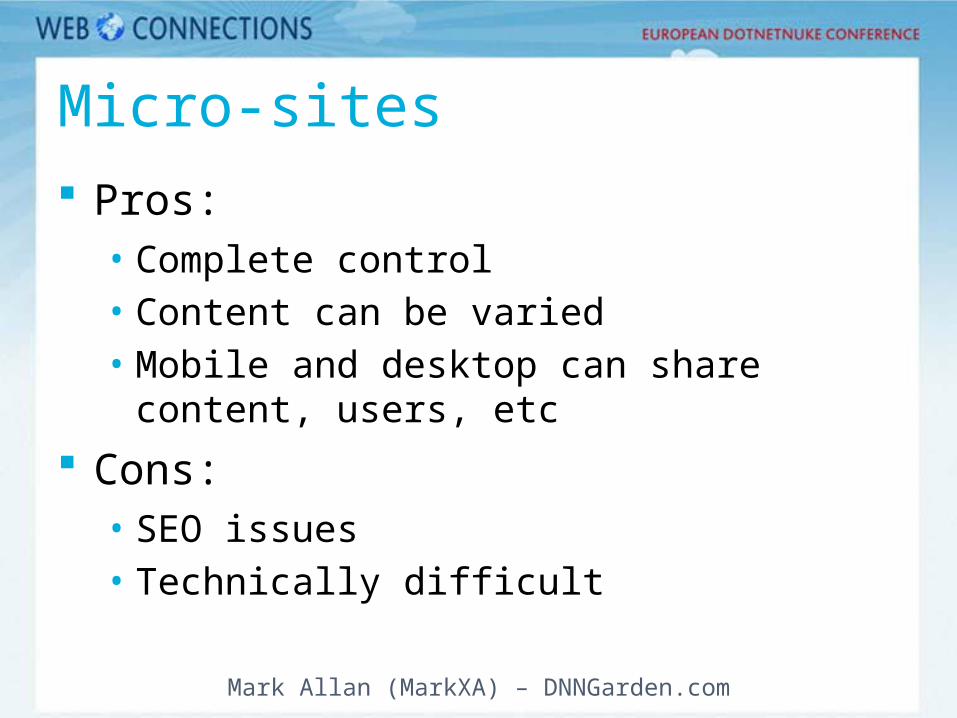
Micro-sites Pros:• Complete control• Content can be varied• Mobile and desktop can share content,
users, etc
Cons:• SEO issues• Technically difficult

Mark Allan (MarkXA) – DNNGarden.com
Demo
Micro-sites

Mark Allan (MarkXA) – DNNGarden.com
Option 6: Apps

Mark Allan (MarkXA) – DNNGarden.com
Work out what functionality your site offers
Wrap it up as a mobile app
The nuclear option

Mark Allan (MarkXA) – DNNGarden.com
The nuclear option Pros:• Cool• Raises engagement levels• Possibility of offline access
Cons:• Difficult• Expensive

Mark Allan (MarkXA) – DNNGarden.com
Testing mobile sites
Mark Allan (MarkXA) – DNNGarden.com
Testing – which browsers?

Mark Allan (MarkXA) – DNNGarden.com
Emulators http://www.opera.com/mobile/demo/ - Opera Mini
(online emulator) http://labs.opera.com/downloads/ - Opera Mobile http://developer.android.com/ http://www.forum.nokia.com/Library/Tools_and_down
loads/Other/Symbian_SDKs/ http://
developer.apple.com/devcenter/ios/index.action (requires Mac)
http://us.blackberry.com/developers/resources/simulators.jsp
http://create.msdn.com/ (Windows Phone)
Mark Allan (MarkXA) – DNNGarden.com
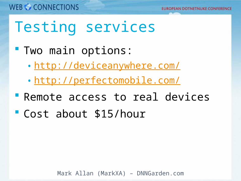
Testing services Two main options:• http://deviceanywhere.com/• http://perfectomobile.com/
Remote access to real devices Cost about $15/hour

Mark Allan (MarkXA) – DNNGarden.com
DotNetNuke 6

Mark Allan (MarkXA) – DNNGarden.com
DotNetNuke 6 No new features in 6.0 Preliminary plans for 6.1+• Micro-sites• Mobile detection and redirection
In the meantime• 40Fingers style helper• mobiNuke