Embed Size (px)
Citation preview
Photos for our front cover
Hannah Knight and Riah Andrews
Explanation and Inspiration
Before we started to create our front cover, we first looked at various images of other famous men, so as to draw inspiration from their costume, posture and setting for our own front covers. I have created a slideshow detailing this research, and this can be seen in a previous post. We decided first of all that we wanted to include a male on the cover of our magazine because on conducting a survey using SurveyMonkey of our target audience, we found that they had no preference of whether a male or female should be featured on the cover, and we decided as teenage girls ourselves that we would be more attracted to a magazine which had a good looking male on the cover.
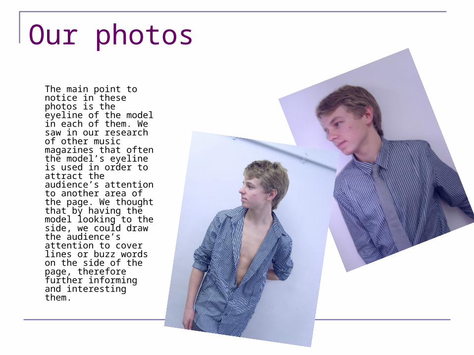
Our photos
The main point to notice in these photos is the eyeline of the model in each of them. We saw in our research of other music magazines that often the model’s eyeline is used in order to attract the audience’s attention to another area of the page. We thought that by having the model looking to the side, we could draw the audience’s attention to cover lines or buzz words on the side of the page, therefore further informing and interesting them.
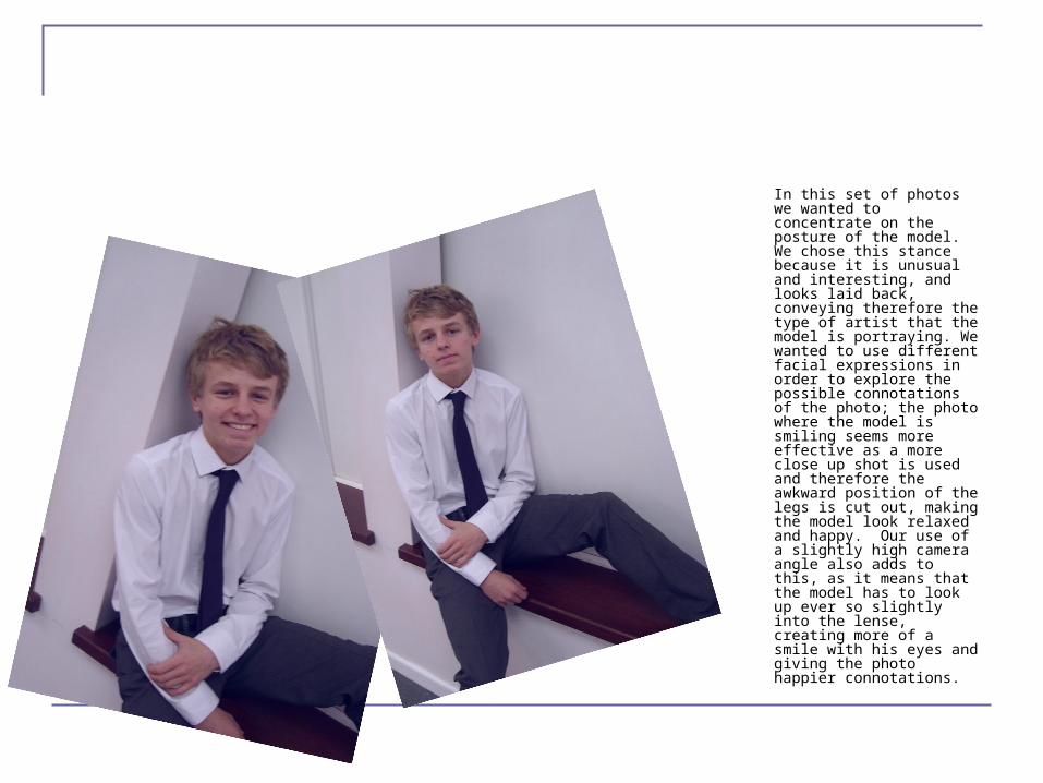
In this set of photos we wanted to concentrate on the posture of the model. We chose this stance because it is unusual and interesting, and looks laid back, conveying therefore the type of artist that the model is portraying. We wanted to use different facial expressions in order to explore the possible connotations of the photo; the photo where the model is smiling seems more effective as a more close up shot is used and therefore the awkward position of the legs is cut out, making the model look relaxed and happy. Our use of a slightly high camera angle also adds to this, as it means that the model has to look up ever so slightly into the lense, creating more of a smile with his eyes and giving the photo happier connotations.
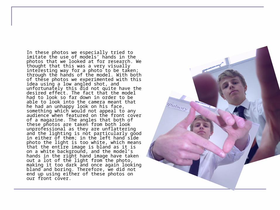
In these photos we especially tried to imitate the use of models’ hands in the photos that we looked at for research. We thought that this was a very visually interesting way for a photo to be taken; through the hands of the model. With both of these photos we experimented with this idea using a low angled shot, and unfortunately this did not quite have the desired effect. The fact that the model had to look so far down in order to be able to look into the camera meant that he had an unhappy look on his face, something which would not appeal to any audience when featured on the front cover of a magazine. The angles that both of these photos are taken from both look unprofessional as they are unflattering and the lighting is not particularly good in either of them; in the left hand side photo the light is too white, which means that the entire image is bland as it is on a white background, and the model’s hands in the right hand image have taken out a lot of the light from the photo, making it too dark and once again looking bland and boring. Therefore, we did not end up using either of these photos on our front cover.
The image we used
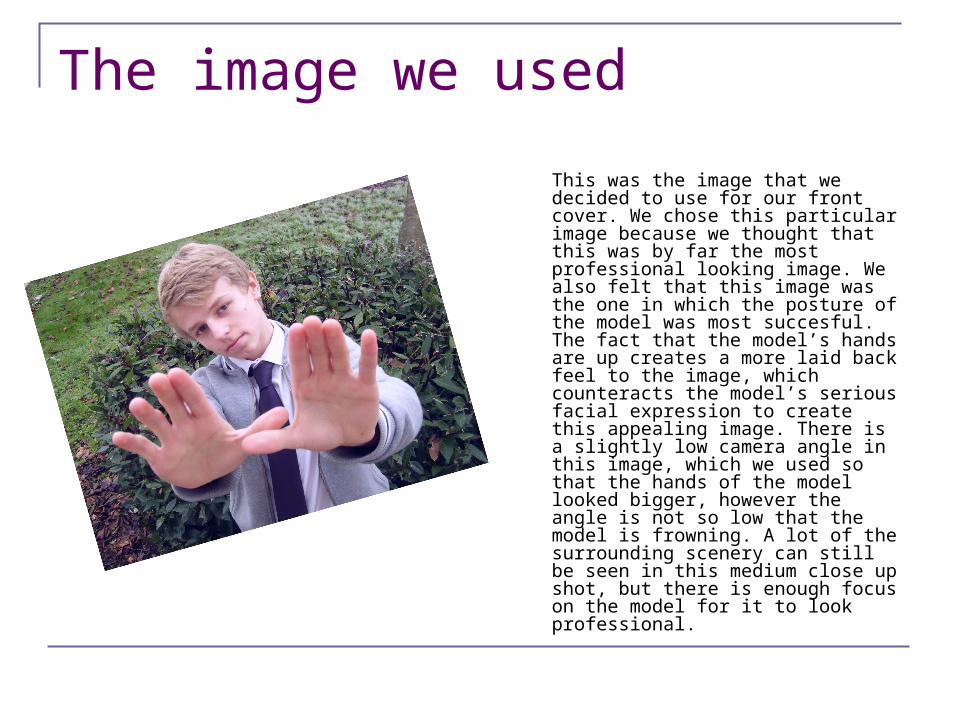
This was the image that we decided to use for our front cover. We chose this particular image because we thought that this was by far the most professional looking image. We also felt that this image was the one in which the posture of the model was most succesful. The fact that the model’s hands are up creates a more laid back feel to the image, which counteracts the model’s serious facial expression to create this appealing image. There is a slightly low camera angle in this image, which we used so that the hands of the model looked bigger, however the angle is not so low that the model is frowning. A lot of the surrounding scenery can still be seen in this medium close up shot, but there is enough focus on the model for it to look professional.
Mise en scene
CostumeAs explained in the presentation detailing the research of our images, we wanted to have the model in our photos wearing smart clothes. We chose to do this because we felt that this made the images look a lot more professional, as well as making the model look like a respectable and believable artist. The image that we used for our final front cover included a bomber jacket over the model’s shirt and tie, and we chose to do this so as to give the artist a more edgy and contemporary look, therefore depicting his more laid back approach to and style of music.
LightingWe agreed that it was important for the image on our front cover to be very light and airy. We wanted to do this because we both felt that the front cover image needs to be bright so as to stand out to the audience, as there is a limited amount of time in which a reader can decide which magazine to read. Therefore, we used only natural light in these images, as we wanted them to look as fresh as possible. The image that we used for our final front cover was actually taken outside, and therefore was the perfect light balance for our front cover.