Embed Size (px)
Citation preview

Evaluation Question 4
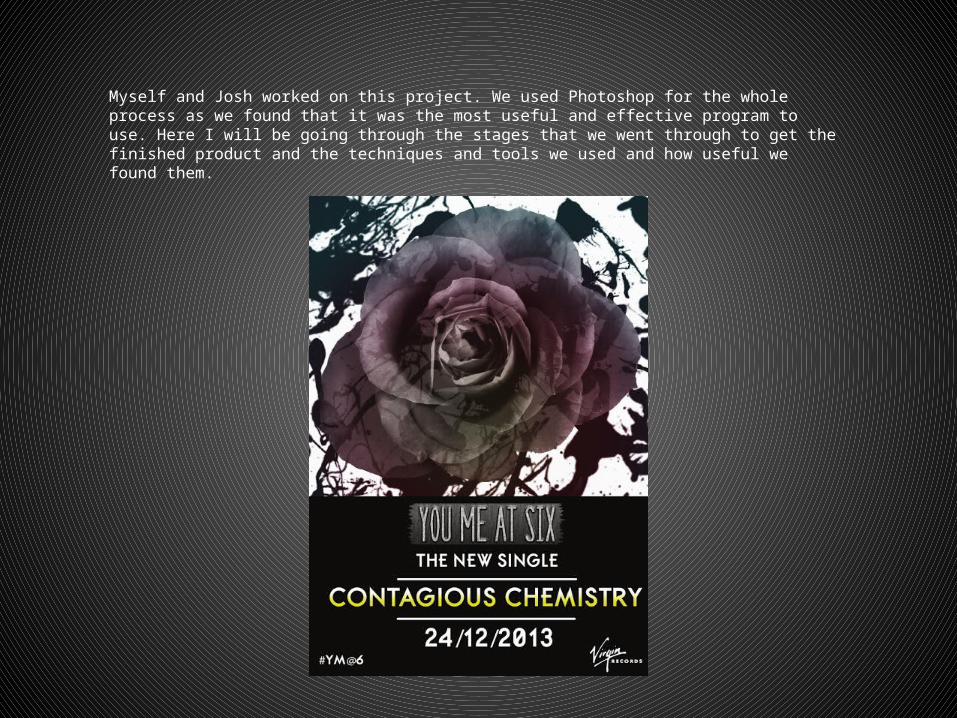
Myself and Josh worked on this project. We used Photoshop for the whole process as we found that it was the most useful and effective program to use. Here I will be going through the stages that we went through to get the finished product and the techniques and tools we used and how useful we found them.
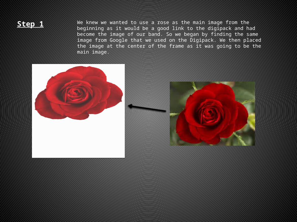
Step 1 We knew we wanted to use a rose as the main image from the beginning as it would be a good link to the digipack and had become the image of our band. So we began by finding the same image from Google that we used on the Digipack. We then placed the image at the center of the frame as it was going to be the main image.
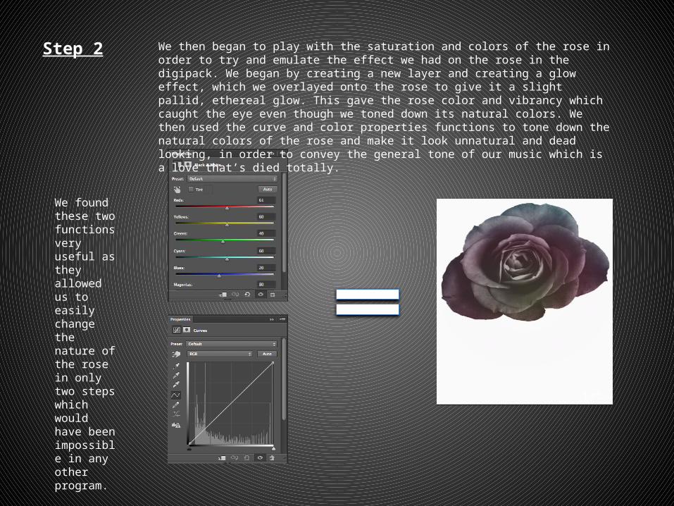
Step 2 We then began to play with the saturation and colors of the rose in order to try and emulate the effect we had on the rose in the digipack. We began by creating a new layer and creating a glow effect, which we overlayed onto the rose to give it a slight pallid, ethereal glow. This gave the rose color and vibrancy which caught the eye even though we toned down its natural colors. We then used the curve and color properties functions to tone down the natural colors of the rose and make it look unnatural and dead looking, in order to convey the general tone of our music which is a love that’s died totally.
We found these two functions very useful as they allowed us to easily change the nature of the rose in only two steps which would have been impossible in any other program.
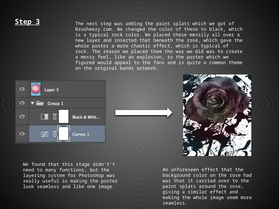
Step 3 The next step was adding the paint splats which we got of Brusheezy.com. We changed the color of these to black, which is a typical rock color. We placed these messily all over a new layer and inserted that beneath the rose, which gave the whole poster a more chaotic effect, which is typical of rock. The reason we placed them the way we did was to create a messy feel, like an explosion, to the poster which we figured would appeal to the fans and is quite a common theme on the original bands artwork.
We found that this stage didn't’t need to many functions, but the layering system for Photoshop was really useful in making the poster look seamless and like one image.
An unforeseen effect that the background color on the rose had was that it carried over to the paint splats around the rose, giving a similar effect and making the whole image seem more seamless.
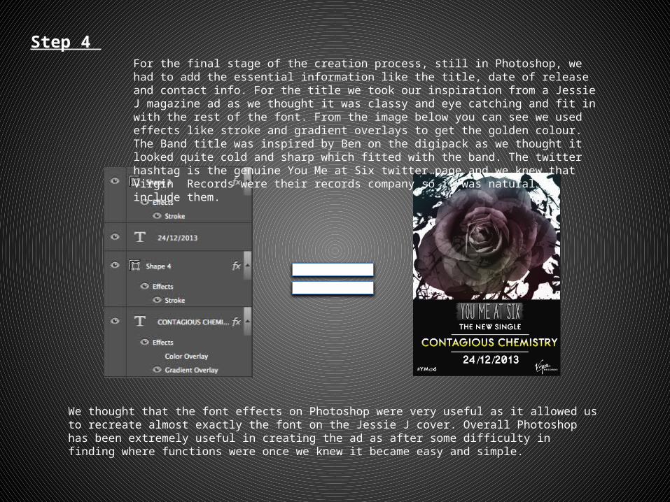
Step 4 For the final stage of the creation process, still in Photoshop, we had to add the essential information like the title, date of release and contact info. For the title we took our inspiration from a Jessie J magazine ad as we thought it was classy and eye catching and fit in with the rest of the font. From the image below you can see we used effects like stroke and gradient overlays to get the golden colour. The Band title was inspired by Ben on the digipack as we thought it looked quite cold and sharp which fitted with the band. The twitter hashtag is the genuine You Me at Six twitter page and we knew that Virgin Records were their records company so it was natural to include them.
We thought that the font effects on Photoshop were very useful as it allowed us to recreate almost exactly the font on the Jessie J cover. Overall Photoshop has been extremely useful in creating the ad as after some difficulty in finding where functions were once we knew it became easy and simple.