Embed Size (px)
Citation preview

11 Fool-proof Way’sto Ruin You’re
Presentation Slides
Please note: The typos on the title page and other errors are intentional. MarketingProfs writer Veronica Maria Jarski (who created this deck) sincerely implores you to not follow this as a prescription.
Instead, do the OPPOSITE.
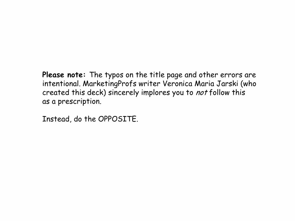
1. Change fonts frequently.
Using different fonts will trick the readers’ eyes and prevent people from
reading your slides easily.
They are totally going to have towork hard to read your words!
No free ride here, slackers.
2. Avoid using images.
Presentation attendees want to LEARN,
not look at stuff and… Hey, is your mind wandering?
Eyes back to this presentation, please.
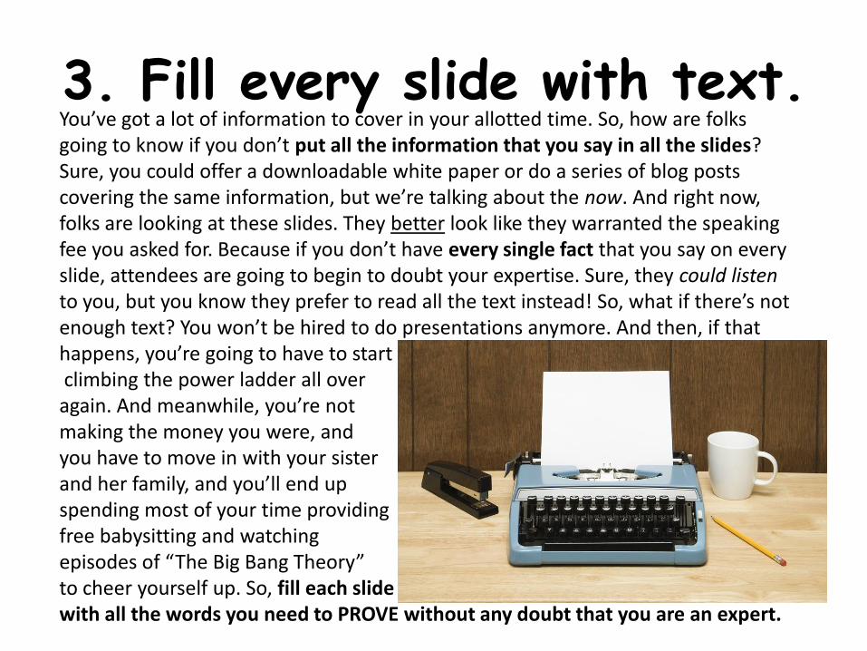
3. Fill every slide with text.You’ve got a lot of information to cover in your allotted time. So, how are folks going to know if you don’t put all the information that you say in all the slides? Sure, you could offer a downloadable white paper or do a series of blog posts covering the same information, but we’re talking about the now. And right now, folks are looking at these slides. They better look like they warranted the speaking fee you asked for. Because if you don’t have every single fact that you say on every slide, attendees are going to begin to doubt your expertise. Sure, they could listen to you, but you know they prefer to read all the text instead! So, what if there’s not enough text? You won’t be hired to do presentations anymore. And then, if that happens, you’re going to have to startclimbing the power ladder all over again. And meanwhile, you’re not making the money you were, and you have to move in with your sister and her family, and you’ll end up spending most of your time providingfree babysitting and watchingepisodes of “The Big Bang Theory” to cheer yourself up. So, fill each slidewith all the words you need to PROVE without any doubt that you are an expert.
4. Overdesign your pages.
You can do SO
many things in
Show off your by using as many of
the whizzbang features of PowerPoint as you
deem fit (read: all). COOL!
Series 10
5
Category 1
Series 1
Series 2
Series 3
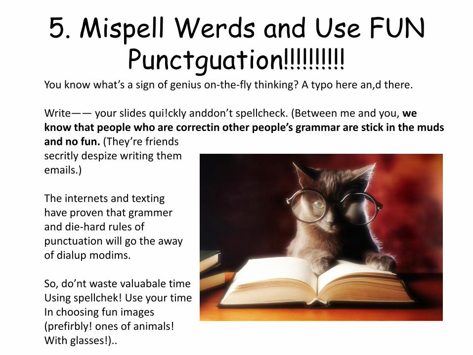
5. Mispell Werds and Use FUN Punctguation!!!!!!!!!!
You know what’s a sign of genius on-the-fly thinking? A typo here an,d there.
Write―― your slides qui!ckly anddon’t spellcheck. (Between me and you, we know that people who are correctin other people’s grammar are stick in the mudsand no fun. (They’re friends secritly despize writing thememails.)
The internets and texting have proven that grammerand die-hard rules of punctuation will go the awayof dialup modims.
So, do’nt waste valuabale time Using spellchek! Use your time In choosing fun images (prefirbly! ones of animals! With glasses!)..
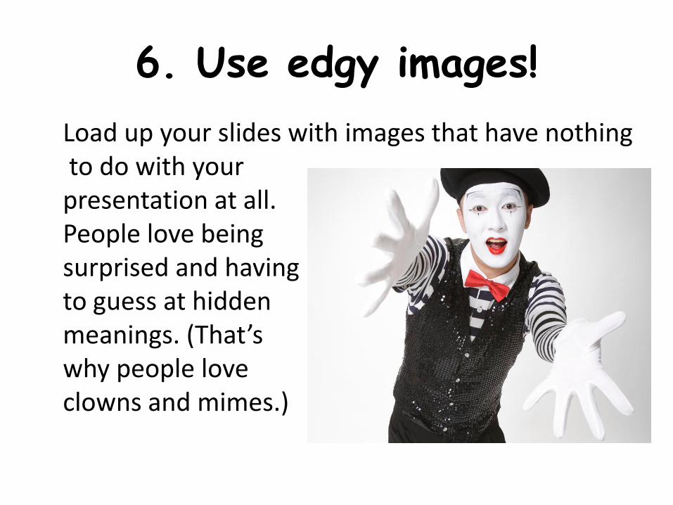
6. Use edgy images!
Load up your slides with images that have nothingto do with yourpresentation at all.People love being surprised and having to guess at hidden meanings. (That’swhy people loveclowns and mimes.)
7. Use lots of color.
Most companies prefer to use just a select groupof colors as their “palette.”
Studies have proven, though, that colors inspireemotions. So, use colors as frequently as possible to convey feelings like happiness, joy, excitement, fear, schadenfreude,etc.
The more colors, the better!
8. Switch up your font sizes.
Keep attendees’ attention by varying the sizes
of your fonts. (This compliments the #1 slides.)
You want people to peer in and also
LEAN AWAY from your slides.
That results in E-N-G-A-G-E-M-E-N-T.
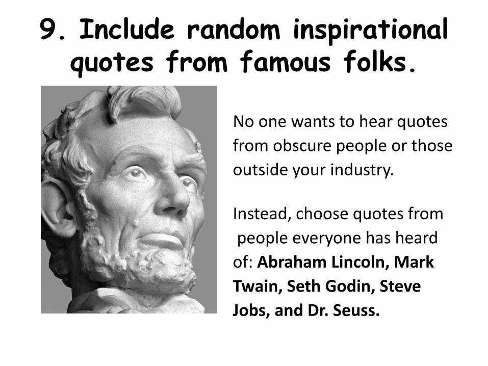
9. Include random inspirational quotes from famous folks.
No one wants to hear quotes
from obscure people or those
outside your industry.
Instead, choose quotes from
people everyone has heard
of: Abraham Lincoln, Mark
Twain, Seth Godin, Steve
Jobs, and Dr. Seuss.
10. Use Comic Sans.
Really.
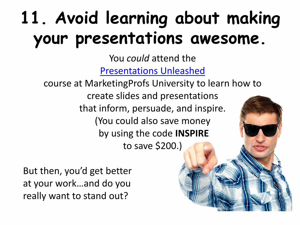
11. Avoid learning about making your presentations awesome.
You could attend the Presentations Unleashed
course at MarketingProfs University to learn how to create slides and presentations
that inform, persuade, and inspire. (You could also save moneyby using the code INSPIRE
to save $200.)
But then, you’d get better at your work…and do you really want to stand out?