Embed Size (px)
Citation preview

Question One:In what ways does your media product use
forms and conventions of real media products?
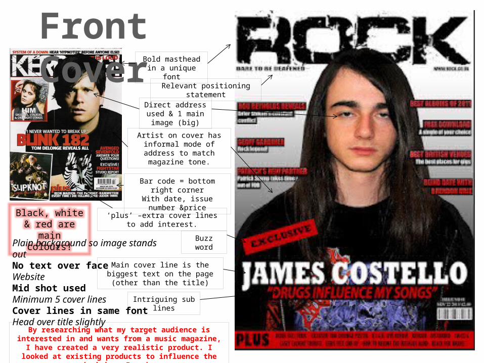
Front CoverBold masthead in a
unique font
Black, white & red are main colours!
Direct address used & 1 main image (big)
Bar code = bottom right cornerWith date, issue number &price
‘plus’ –extra cover lines to add interest.
Relevant positioning statement
Main cover line is the biggest text on the page (other than the title)
Buzz word
Artist on cover has informal mode of address to match
magazine tone.
Intriguing sub lines
By researching what my target audience is interested in and wants from a music magazine, I have created a very realistic product. I
looked at existing products to influence the decisions I made.
Plain background so image stands outNo text over faceWebsiteMid shot usedMinimum 5 cover linesCover lines in same fontHead over title slightly

Contents Page‘Contents’ at top,
issue details &website
Large main image
Big numbers
I have put coloured backgrounds on the text boxes for the sub titles, like this professional
contents page has.
Small subsiduary images , anchored by
numbers to show what page they relate
to.
I have included subscription
details
I have cover lines in capital letters and bold. I made the sub lines smaller and not in bold. This
makes the cover lines more eye-catching and the stories are smaller and ambiguous.
The images I have used
relate to the stories.
The cover lines match the
colour scheme.
I think that my contents page looks professional, because I’ve followed the codes
and conventions.

Double Page SpreadLarge, interesting title
Stand first beneath title
Direct address used to involve the audience
Drop quote to look more interesting
Drop capital at start
Colour scheme is consistent throughout
article &matches image.
Credits beneath stand first
Page number +website
Informal mode of address, Clothing appeals to target
audience’s social group Article written in short paragraphs Mid shot used for single artist.
3 columns of text, which is written in 11pt. Image on left page, article on right.
My title bleeds onto the left page to unite them. Musician matches magazine genre.