Embed Size (px)
Citation preview


Definitions
• A brand is the complete image that differentiates a product, service, or group from its competition and creates meaning and enthusiasm in the mind of the consumer.
• Branding encompasses the entire visual identity and messaging—name, logo, promotions—to create a meaningful story using print, digital, social, and motion graphic formats.
• An integrated branding program is the creation of a comprehensive, strategic, unified, and transmedia program for a brand.
• Brand strategy is the core tactical underpinning of branding, uniting all planning for every visual and verbal brand expression.
• A logo is a unique identifying symbol that represents and embodies everything a brand or company signifies.
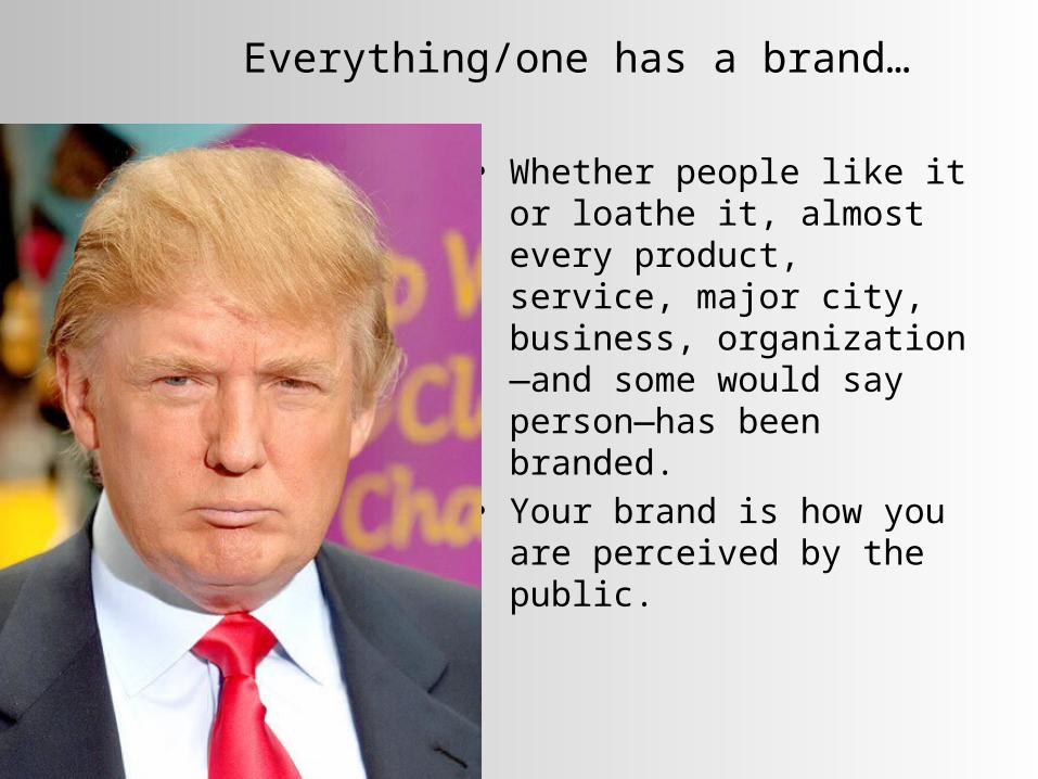
Everything/one has a brand…
• Whether people like it or loathe it, almost every product, service, major city, business, organization—and some would say person—has been branded.
• Your brand is how you are perceived by the public.

Differentiation Two main verbal differentiators are the brand name, a
proprietary name, and the tagline, a slogan or short distinctive phrase.
The main visual identifier is the logo. Every brand also has intangible assets—emotional benefits—
due to its heritage, visual identity, package design, environmental design, advertising, endorsements, and other associations.

Branding Process
• The design process for branding: Orientation Analysis Concepts Design Implementation

Strategy
• The tactical underpinning of branding. Defines the company’s personality and promise. Differentiates the brand from the competition. Codifies the brand essence. Provides a conceptual plan with guidelines to drive design
solutions.
öola: Identity© Pentagram, New York

The “Construct”
Every brand should possess a core value or construct, a quality or position a brand “owns” against the composition.• Establishes a brand in the audience’s mind as the primary possessor of
that quality.• Captures the public’s mind against the competition.• Claims ownership of a benefit or quality before anyone else does.
Several factors must be considered when formulating a brand construct: Differentiation Ownership Consistency Relevance

Brand Process: Naming
• A brand name is a signature.• Naming a brand involves crucial
considerations. What does the name mean? What spirit or personality should it
convey? How will people react to it? What does the name mean across
cultures?• Names can be explanatory, expressive,
invented, allegorical, symbolic, or acronyms.

Visual Identity Design
The visual identity differentiates and builds a sustainable presence and position in the marketplace while engendering trust in the brand.• It is the visual and verbal articulation of the brand and
includes all pertinent design formats…logo, letterhead, business card, website, social media, and more.
• A visual identity should be: Identifiable Memorable Distinctive Sustainable Flexible/extendible

The Visual Identity Design Brief
Preliminary steps leading to the design brief include:• market research• a brand audit (assessment)• competitive audit• setting or clarifying existing strategy• naming or renaming. After analysis, conceptual design begins, based on the brief.

Designing Visual Identity
• Conception The concept is based on a brand’s or group’s core
value and positioning in the marketplace.• Coherence
A program of brand strategies results in harmonious experiences for its audience
A brand experience defines how the consumer interacts with the brand at every touchpoint.

What is a Logo?
A logo is the keystone of any visual identity program.It is a unique identifying symbol.This single graphic design solution will be a part of every other brand design solution. It is the primary brand signifier.

LOGO
Stemming from the word logotype; related terms are symbol, mark, brand mark, identifier, or trademark.
With one glance, the average person should be able to recognize and assess a brand or group by looking at its logo.

Logo Categories
• A logo can be a wordmark, lettermark, symbol mark, combination mark, or emblem.
(Logotype)
(Lettermark)

Lettermarks
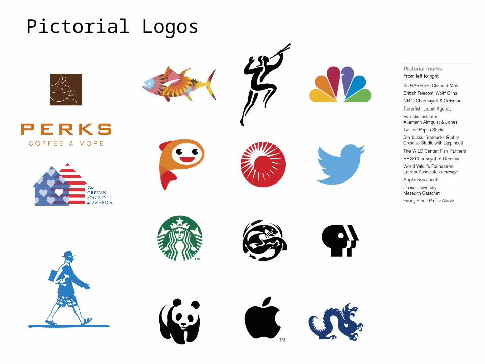
Pictorial Logos

Character Logos

Abstract Logos
(Abstract Symbol)
(Nonobjective Symbol)

Emblems
(Emblem)
(Emblem)

Designing a Logo
• Generating design concepts depends on compressing meaning into one small unit that will have to function, endure for years and be integral to every visual message.
VisionSpring: Logo (and Runners-Up)© UnderConsideration LLC, Austin, TX

Designing a Logo
Visual Brief A visual brief or collage board is one way of determining the construct; also called a visual positioning collage.
Using a visual brief collage board is a great starting point, in particular for logo design; it can encompass the general look, mood, personality, colors, imagery, and typefaces.
A visual brief collage replaces a written design brief or brand brief, which is used to determine strategy before concept generation.

Core Values and Attributes:
The defined principles that guide an entity’s conduct.
Moomah: Identity© Apartment One, Brooklyn

Brand Essence and Story: Entity’s fundamental characteristics or
narrative expressed concisely in a core concept.
Oregon College of Art and Craft: Branding Initiative© Ziba Marketing, Portland, OR

Symbolic Meaning
A logo can be based on a symbol or attribute symbolic meaning to an object or form.
Holocaust Remembrance Project/Before and After: Logo© Jeff Fisher, LogoMotives, Portland, OR

Archetypes• Archetypes are found in the
themes of myths (e.g., death and rebirth), characters in literature (e.g., hero and villain), and imagery in dreams (e.g., eyes and teeth).
• They are believed to be a product of unconscious biases and dispositions that have been “hardwired” in the brain over the course of human evolution.
• Identifying and aligning appropriate archetypes with a design can increase its probability of success.

Archetypes• Harley-Davidson aligns its
product design and branding with the outlaw archetype, emphasizing freedom and living outside the rules of society.
• Products have a certain look and feel (e.g., black and chrome motorcycles with a loud, distinctive sound) and marketing images often emphasize rugged looking people in black leather.

Archetypes• Nike (named after the
Greek goddess of victory), by contrast, aligns its brand with the Hero archetype, using heroic sports figures to promote its product. Michael Jordan, Tiger Woods, and Lance Armstrong are all shown wearing Nike products while typically striking a heroic pose.

Archetypes • Consider archetypal themes
and forms in all aspects of a design—from form and function to name and brand.
• Since archetypes influence perception on an unconscious and primarily affective level, they are especially useful when traditional modes of communication (e.g., language) cannot be used.

Logo Format: Compositional Unit
• A trademark—the representational part of a logo typically separate from typography--must be visually independent, able to stand on its own. It is incorporated into many other solutions, including
print, screen, and so on. Some formats include self-contained unit, breaking the
unit, and free-form.
Mermaid Inn: Logo (Self-contained)© Louise Fili, Ltd., New York
Byader: Logo (Free-form)© Brandcentral
Interaccess: Logo (Breaking the Unit)© Underline Studio

Visualization
The characteristics of all shapes, forms, typefaces, colors, images, and symbols of a logo contribute to its denotative and connotative meaning.• Here are some fundamental ways of depicting shapes or forms.
Elemental : line or flat tone used to reduce an image or subject to stark simplicity, similar to a pictograph.
Linear: line used as the main element to depict the ojbect. High contrast: depiction of forms based on extreme contrast
of light and shadow falling on a three-dimensional form. Volumetric: light and shadow, gradation, or modeling used
to suggest the illusion of three-dimensional form. Texture or pattern: line or marks used to suggest form, light,
texture, pattern, or tone using hatch, cross-hatch, cross contour, dots, smudges, etc.
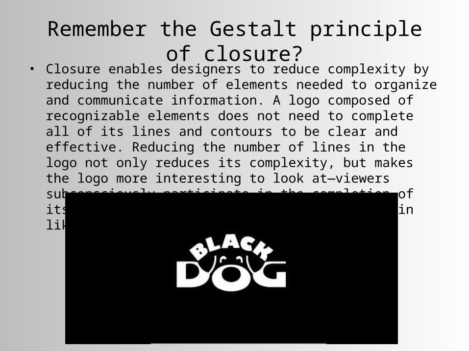
Remember the Gestalt principle of closure?• Closure enables designers to reduce complexity by reducing the number
of elements needed to organize and communicate information. A logo composed of recognizable elements does not need to complete all of its lines and contours to be clear and effective. Reducing the number of lines in the logo not only reduces its complexity, but makes the logo more interesting to look at—viewers subconsciously participate in the completion of its design—it resonates and lights up the brain like a puzzle.


Color
Many brands are synonymous with the color or color paletteof their visual identities.• Color contributes to distinction and
influences people’s brand perception. Cultural and psychological color associations influence these choices.
Companies may use color variations in logos for the same brand to represent different operating units or brand extensions.

Type Gestalt
A typeface for a logo should be chosen for its form, appropriateness, and expressive potential.• Keep in mind these considerations for logo and identity design:
Legibility Connotation: appropriateness, voice, and expression Uniqueness and distinction
Select a typeface family for range, flexibility, weight, etc. It should work in a range of formats and media Work well in black and white as well as color Pair with a typeface for correspondence on stationery to complement the logo,
not replicate it

The LetterheadA business tool used for formal or legal purposes.• printed on a sheet of fine paper or viewed as a digital page, is
a core visual identity component, part of a broader viual identity system. The design of the letterhead should be consistent with
other components of the visual identity
Columbus Band and Trust Co.: Stationery© Topos Graphics, Brooklyn

The Letterhead
• Every decision counts, from typography to positioning of the contact information.
• Functional considerations include size, legibility when faxed, how it folds, ability to take ink well, a secondary sheet (with less content), and template guidelines.
Composition• Very often, pertinent information resides at the head (or top)
of the page; others break with tradition and position type, graphics, or illustrations in any number of ways Some designers feel it is perfectly acceptable to have
slight to moderate variations in color, type, or arrangements among the letterhead, envelopes, and business cards.

The Business Card
A business card is, perhaps, the most intimate design format.• Often passed from hand to hand, it quickly and directly tells its reader who you are,
what you do, with whom you are affiliated, and how to contact you.
Identity Standards for Business Cards• Guidelines usually include:
Individual’s name, job title, organizational corporate unit or department name, address or office location, office phone and mobile numbers, E-mail address(es), and web address
Some designers prefer a two- sided card, utilizing the reverse side.

Review: Purpose of Branding
• In an overcrowded marketplace, relevant branding can ensure success for a quality product, service, group, cause, individual, or commodity.
• Branding builds equity.
(RED): Branding© Wolff Olins, New York
Designing Visual Identity
With visual identity projects, there must be preliminary steps including market research, a brand audit (assessment), competitive audit, setting or clarifying existing strategy, and naming or renaming. After analysis, conceptual design begins, based on the strategy set forth in the design brief.• Conception
The visual identity design concept is conceived based on the group’s core value, narrative, communication goals, and positioning in the marketplace.
• Coherence A program of strategic solutions results in harmony A brand defines the user experience as we interact with the
product at every touchpoint.
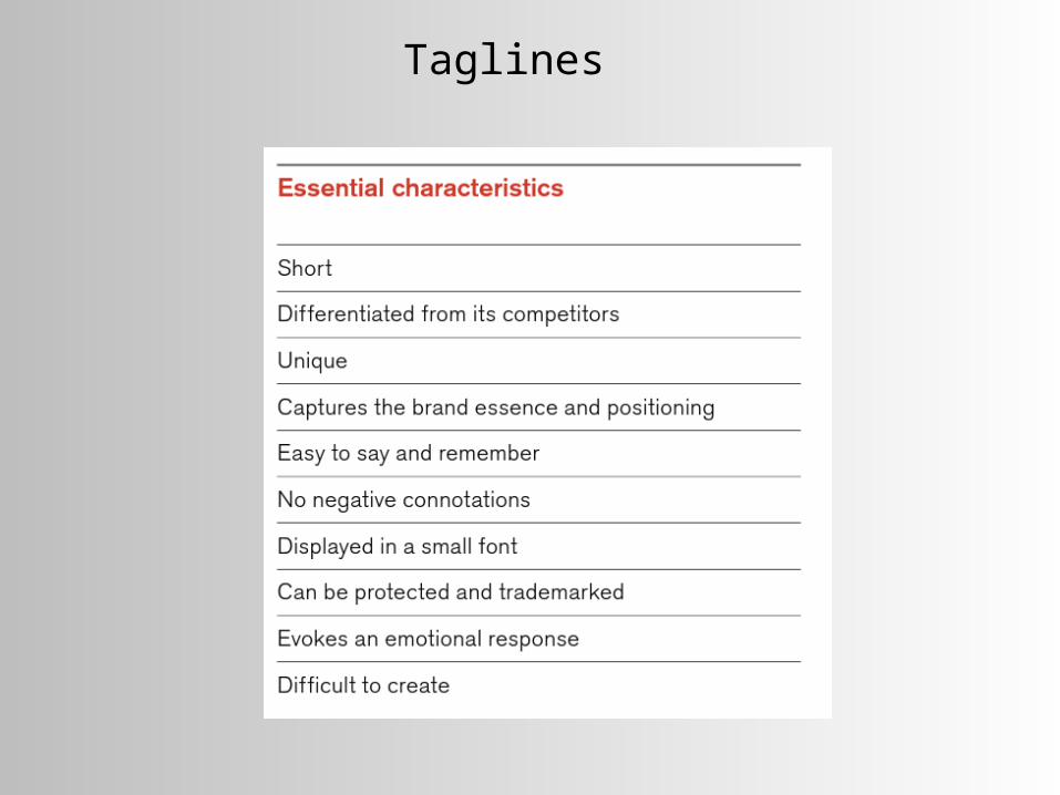
Taglines

Taglines

Taglines

Color
• Color contributes to distinction and influences people’s brand perception.
• Cultural and psychological associations influence these choices.

The Brand Type
A typeface for a brand should be chosen for form, appropriateness, and expressive potential.• Keep in mind:
Legibility Connotation: appropriateness, voice, and expression Uniqueness/distinction
Select a type family for range, flexibility, weight, etc. Should work in a range of formats and media Work well in black and white as well as color Pair with a typeface for correspondence on stationery to complement the logo, not replicate it

The LetterheadA business tool used for formal or legal purposes.• printed on a sheet of fine paper or viewed as a digital page, it is a core
visual identity component, part of a broader visual identity system. The design should be consistent with other components of the visual identity
Columbus Band and Trust Co.: Stationery© Topos Graphics, Brooklyn

The Letterhead
• Every decision counts, from typography to positioning of the contact information.
• Functional considerations include size, legibility when faxed, how it folds, ability to take ink well, a secondary sheet (with less content), and template guidelines.
Composition• Very often, pertinent information resides at the head (or top)
of the page; others break with tradition and position type, graphics, or illustrations in any number of ways Some designers feel it is perfectly acceptable to have
slight to moderate variations in color, type, or arrangements among the letterhead, envelopes, and business cards.

The Business Card
A business card is, perhaps, the most intimate design format.• Often passed from hand to hand, it quickly and directly tells its reader who you are,
what you do, with whom you are affiliated, and how to contact you.
Identity Standards for Business Cards• Guidelines usually include:
Individual’s name, job title, organizational corporate unit or department name, address or office location, office phone and mobile numbers, E-mail address(es), and web address
Some designers prefer a two- sided card, utilizing the reverse side.
Standard Size = 3.5 x 2 inches