Embed Size (px)
Citation preview
THE PSYCHOLOGY
www.ethinos.com
DECONSTRUCTING
BEHIND DESIGN
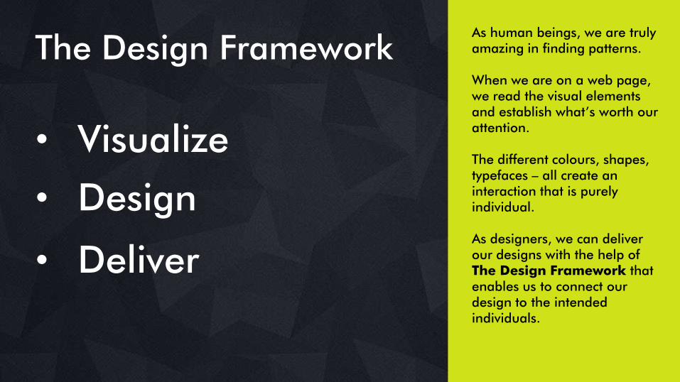
The Design Framework
• Visualize
• Deliver
• Design
As human beings, we are truly amazing in finding patterns.
When we are on a web page, we read the visual elements and establish what‘s worth our attention.
The different colours, shapes, typefaces – all create an interaction that is purely individual.
As designers, we can deliver our designs with the help of The Design Framework that enables us to connect our design to the intended individuals.
The Design Framework
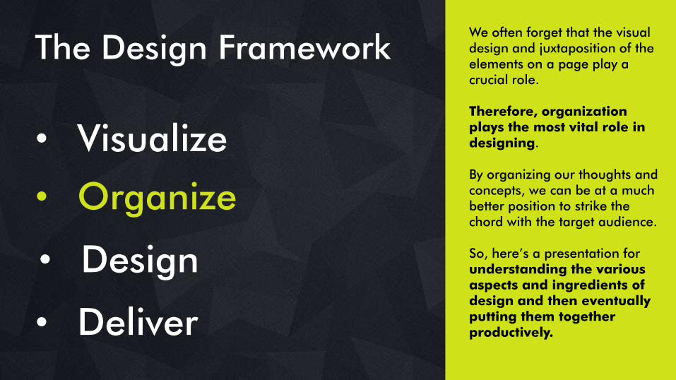
• Visualize
• Organize
The Design Framework
• Deliver
We often forget that the visual design and juxtaposition of the elements on a page play a crucial role.
Therefore, organization plays the most vital role in designing.
By organizing our thoughts and concepts, we can be at a much better position to strike the chord with the target audience.
So, here‘s a presentation for understanding the various aspects and ingredients of design and then eventually putting them together productively.
• Design
The Elements of Design Framework
DECONSTRUCTING THE PSYCHOLOGYBEHIND DESIGN
The Building Blocks of Design
SHAPES
www.ethinos.com
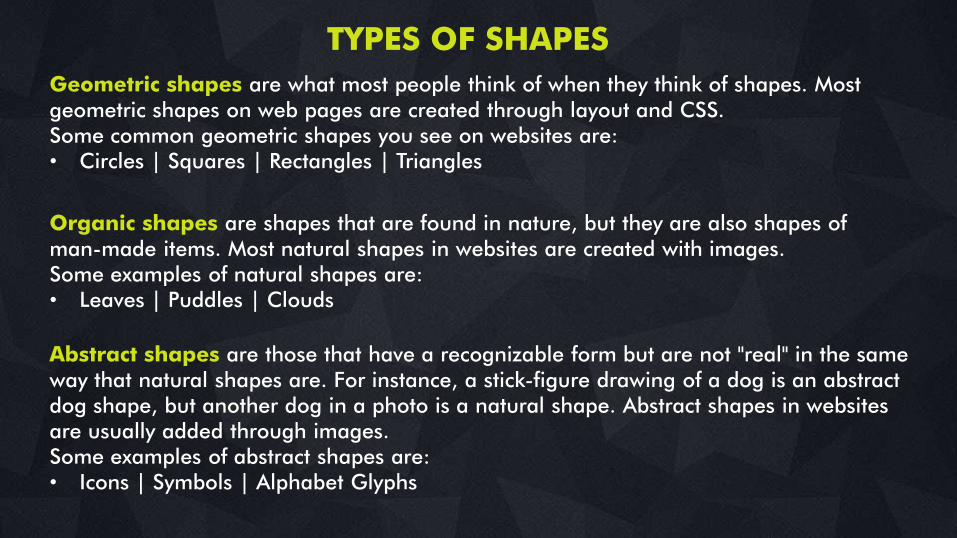
Abstract shapes are those that have a recognizable form but are not "real" in the same way that natural shapes are. For instance, a stick-figure drawing of a dog is an abstract dog shape, but another dog in a photo is a natural shape. Abstract shapes in websites are usually added through images. Some examples of abstract shapes are:• Icons | Symbols | Alphabet Glyphs
Organic shapes are shapes that are found in nature, but they are also shapes of man-made items. Most natural shapes in websites are created with images. Some examples of natural shapes are:• Leaves | Puddles | Clouds
Geometric shapes are what most people think of when they think of shapes. Most geometric shapes on web pages are created through layout and CSS. Some common geometric shapes you see on websites are:• Circles | Squares | Rectangles | Triangles
TYPES OF SHAPES
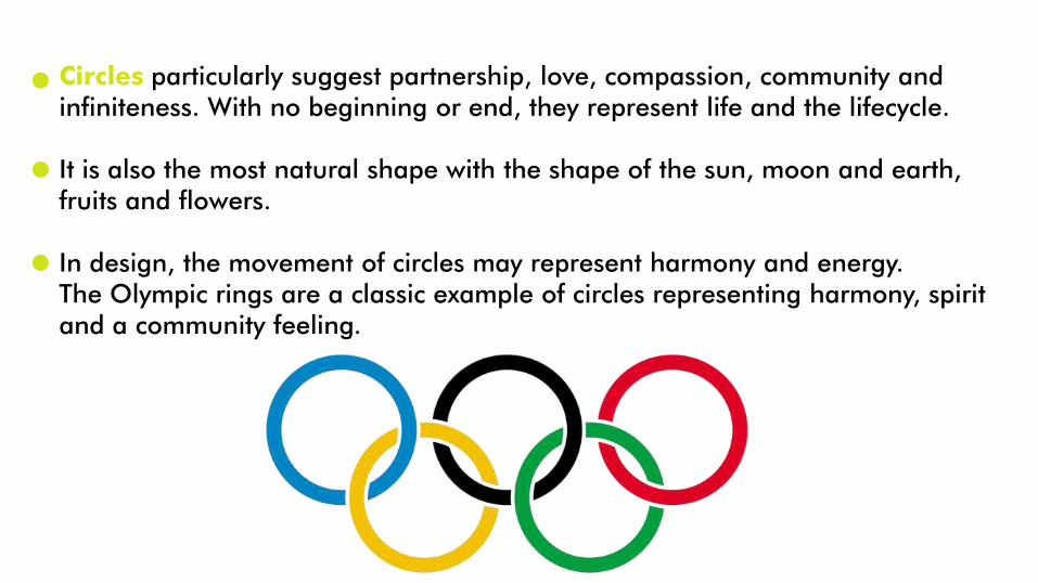
Circles particularly suggest partnership, love, compassion, community and infiniteness. With no beginning or end, they represent life and the lifecycle.
It is also the most natural shape with the shape of the sun, moon and earth, fruits and flowers.
In design, the movement of circles may represent harmony and energy. The Olympic rings are a classic example of circles representing harmony, spirit and a community feeling.
Importance of usage of circles in design
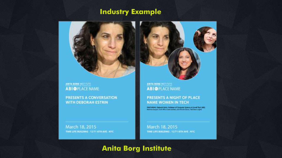
Industry Example
Anita Borg Institute
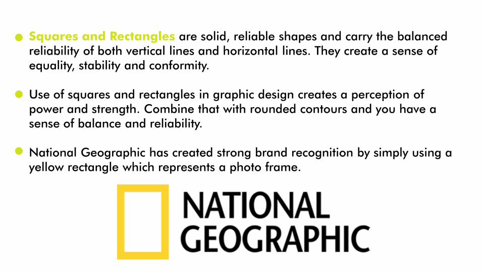
Squares and Rectangles are solid, reliable shapes and carry the balanced reliability of both vertical lines and horizontal lines. They create a sense of equality, stability and conformity.
Use of squares and rectangles in graphic design creates a perception of power and strength. Combine that with rounded contours and you have a sense of balance and reliability.
National Geographic has created strong brand recognition by simply using a yellow rectangle which represents a photo frame.
Importance of usage of Squares and circles in design
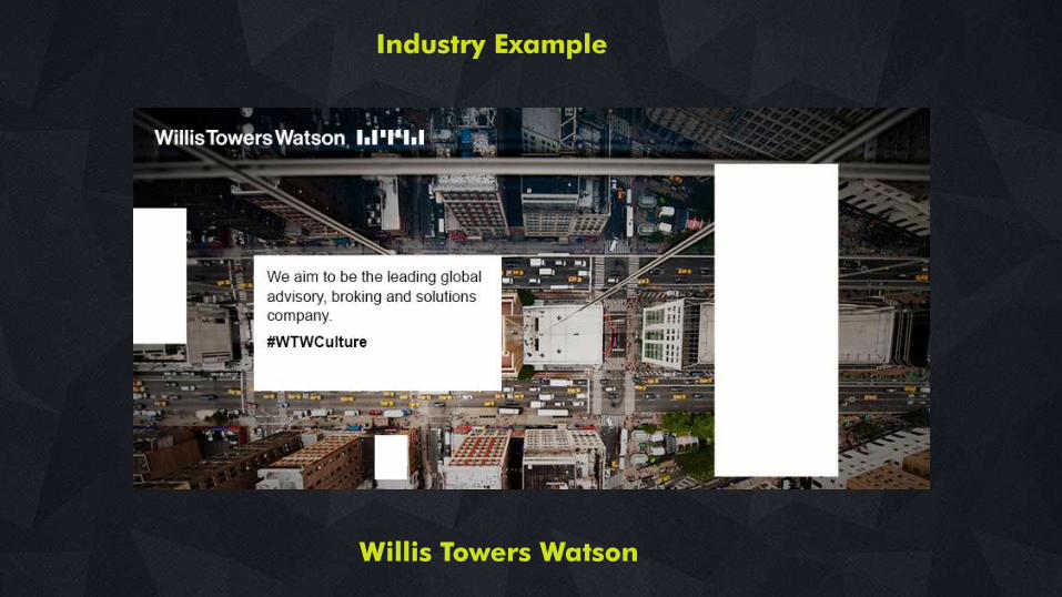
Industry Example
Willis Towers Watson
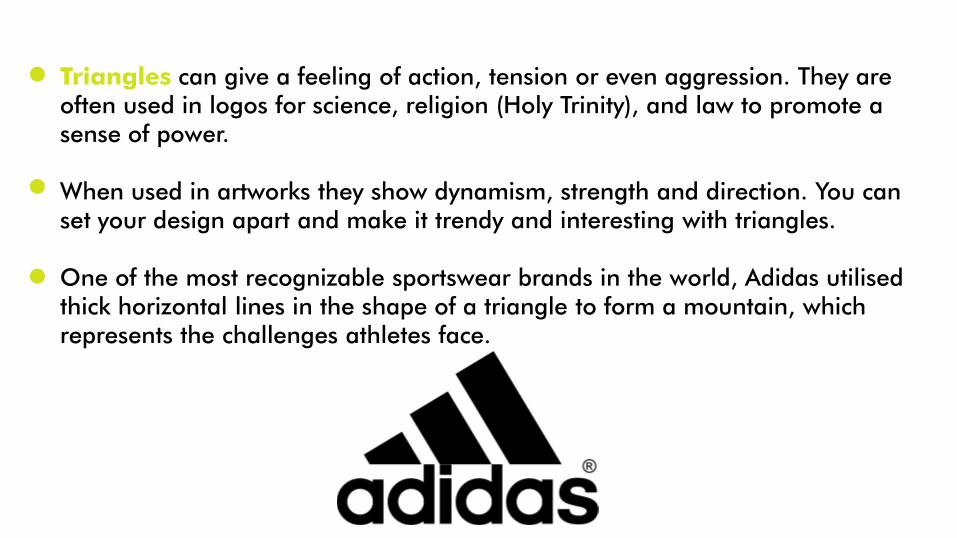
Triangles can give a feeling of action, tension or even aggression. They are often used in logos for science, religion (Holy Trinity), and law to promote a sense of power.
When used in artworks they show dynamism, strength and direction. You can set your design apart and make it trendy and interesting with triangles.
One of the most recognizable sportswear brands in the world, Adidas utilised thick horizontal lines in the shape of a triangle to form a mountain, which represents the challenges athletes face.
Importance of usage of triangles in design

Industry Example
WNS Global Services
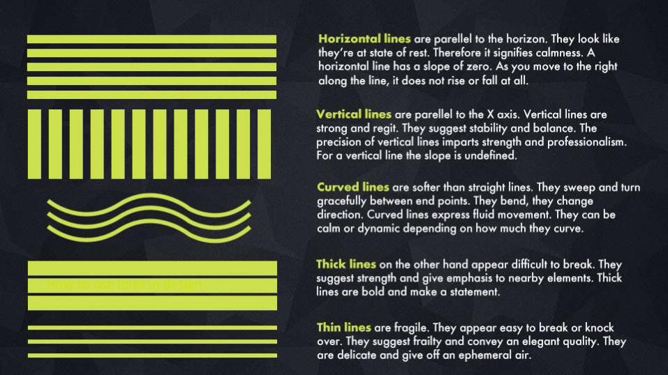
How to use lines in design
DECONSTRUCTING THE PSYCHOLOGYBEHIND DESIGNWHITE SPACE
Less is More
www.ethinos.comWhite space and design
White space is not wasted space.
In web design, some space not only makes our content more appealing, clean and elegant but also helps readability.
If used cleverly, it helps prioritise and break up the content as well as guides users easily from A to B with elements that are more recognizable and easier to find.
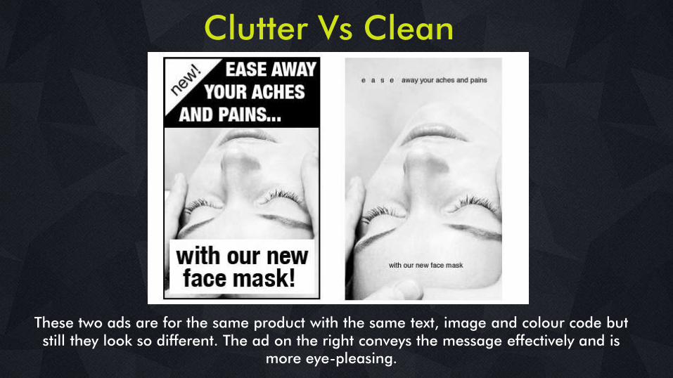
Clutter Vs Clean
These two ads are for the same product with the same text, image and colour code but still they look so different. The ad on the right conveys the message effectively and is
more eye-pleasing.
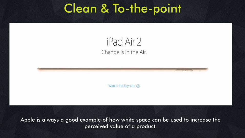
Clean & To-the-point
Apple is always a good example of how white space can be used to increase the perceived value of a product.
DECONSTRUCTING THE PSYCHOLOGYBEHIND DESIGNCOLOUR
Colour has a huge impact on the mood of the design
www.ethinos.com
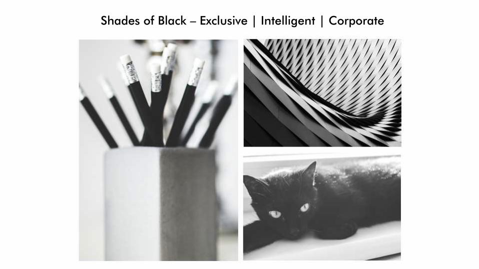
Shades of Black – Exclusive | Intelligent | Corporate
Significance of color in design
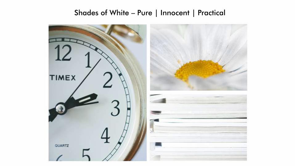
Shades of White – Pure | Innocent | Practical
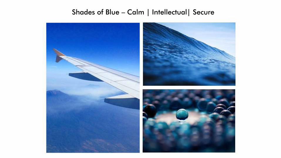
Shades of Blue – Calm | Intellectual| Secure
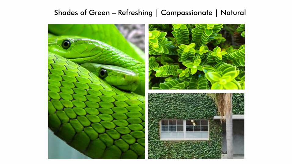
Shades of Green – Refreshing | Compassionate | Natural
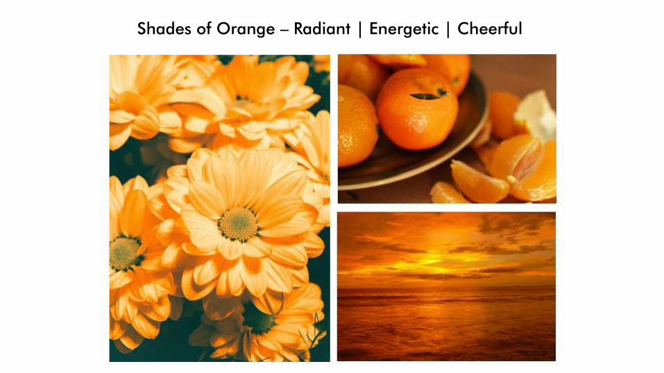
Shades of Orange – Radiant | Energetic | Cheerful
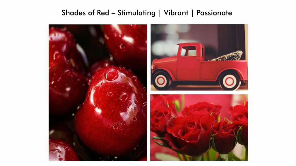
Shades of Red – Stimulating | Vibrant | Passionate
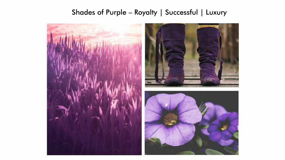
Shades of Purple – Royalty | Successful | Luxury
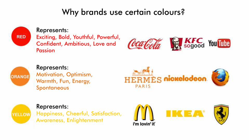
Why brands use certain colours?
Represents:Exciting, Bold, Youthful, Powerful,Confident, Ambitious, Love and Passion
Represents:Motivation, Optimism,Warmth, Fun, Energy, Spontaneous
Represents:Happiness, Cheerful, Satisfaction, Awareness, Enlightenment
Brands and colors
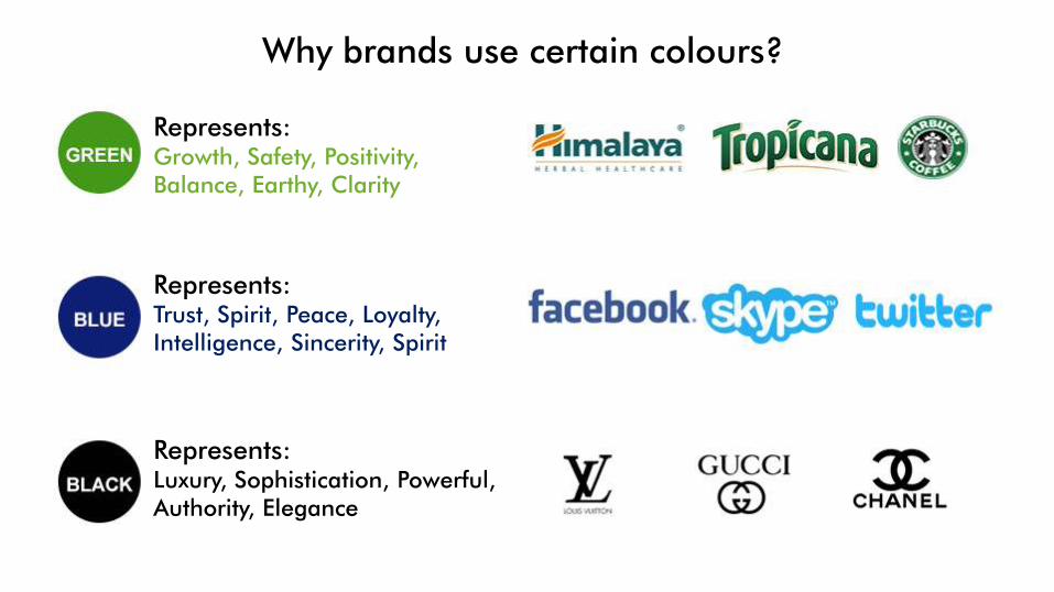
Why brands use certain colours?
Represents:Growth, Safety, Positivity,Balance, Earthy, Clarity
Represents:Trust, Spirit, Peace, Loyalty,Intelligence, Sincerity, Spirit
Represents:Luxury, Sophistication, Powerful, Authority, Elegance
DECONSTRUCTING THE PSYCHOLOGYBEHIND DESIGN
IMAGERYA picture is worth a thousand words
www.ethinos.comUse of Imagery and Design
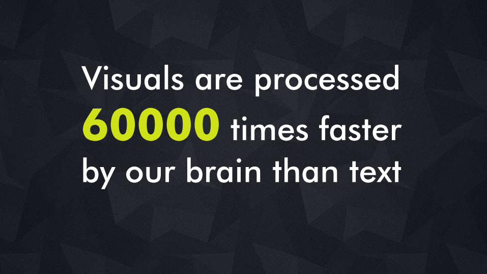
Visuals are processed
60000 times faster
by our brain than text
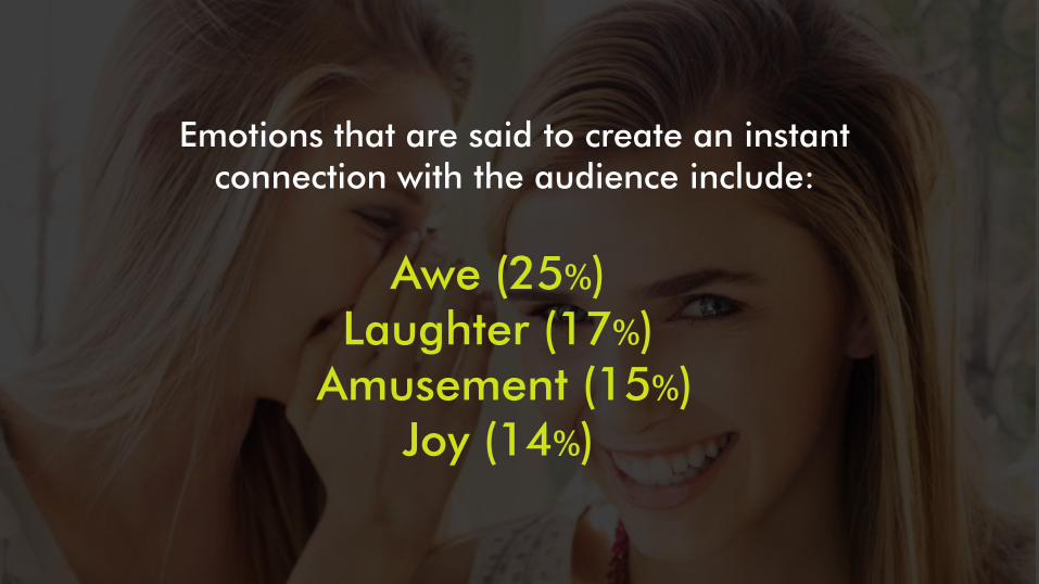
Awe (25%) Laughter (17%)
Amusement (15%)Joy (14%)
Emotions that are said to create an instant connection with the audience include:
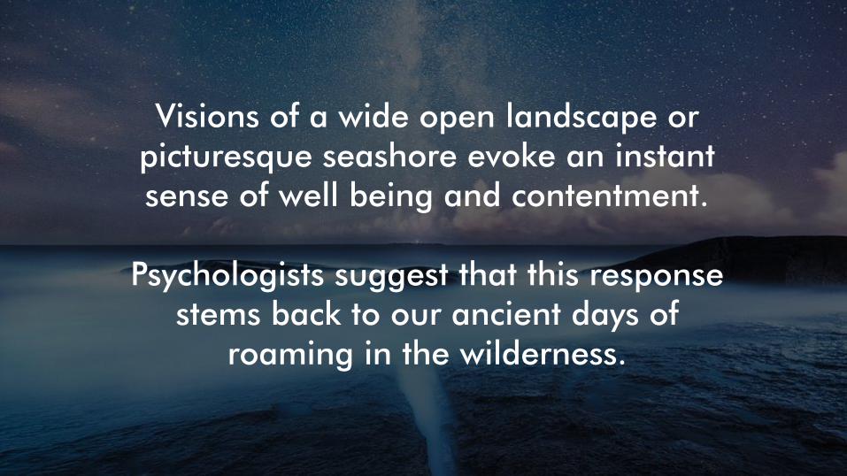
Visions of a wide open landscape or picturesque seashore evoke an instant sense of well being and contentment.
Psychologists suggest that this response stems back to our ancient days of
roaming in the wilderness.
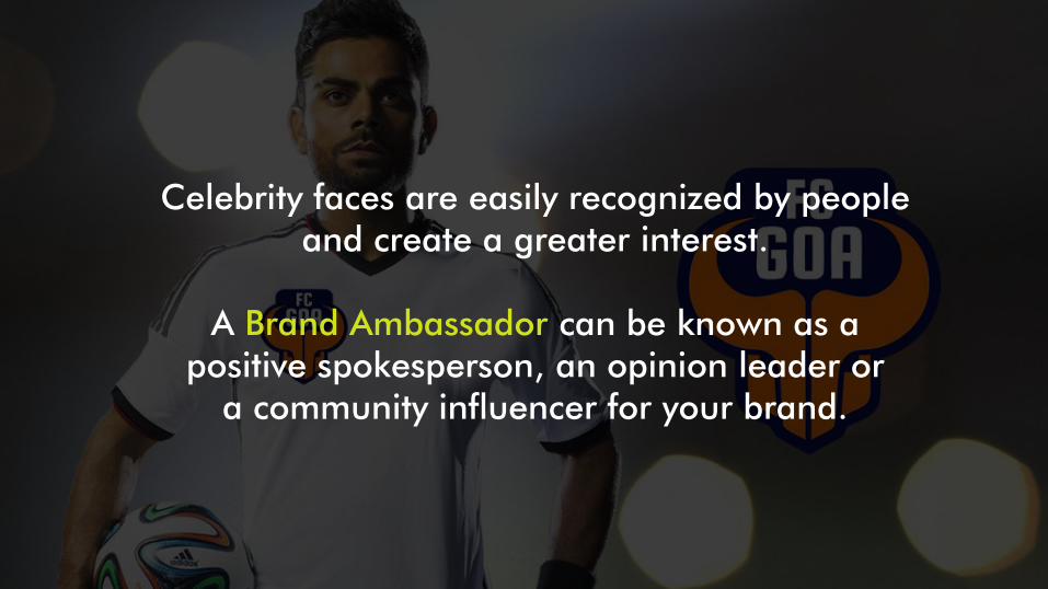
Celebrity faces are easily recognized by people and create a greater interest.
A Brand Ambassador can be known as a positive spokesperson, an opinion leader or
a community influencer for your brand.
DECONSTRUCTING THE PSYCHOLOGYBEHIND DESIGNFONTS
Know your type
www.ethinos.com
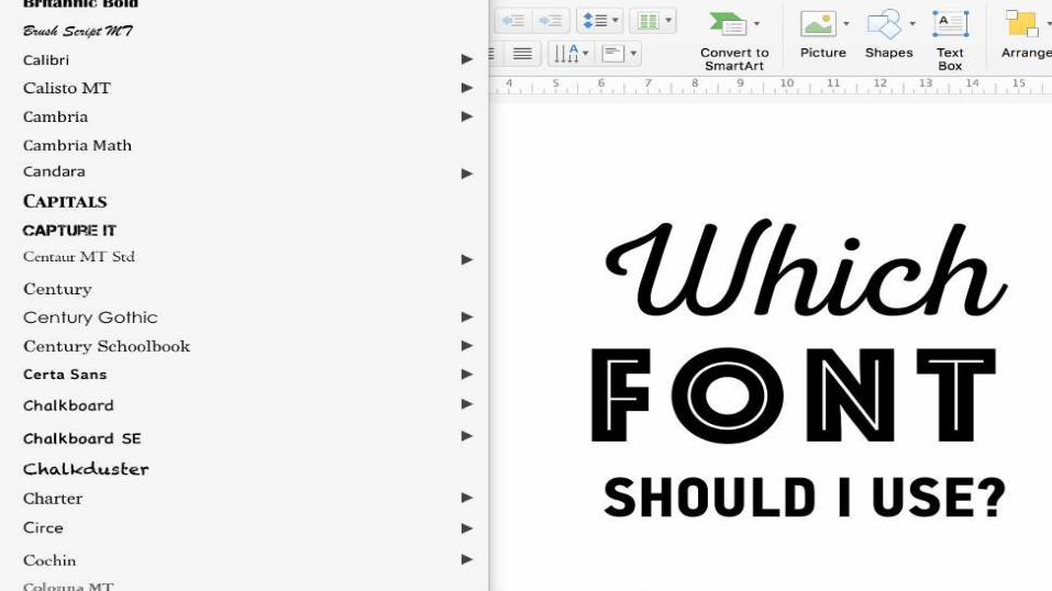
Your fonts can speak louder than your words.
When it comes to fonts, there seem to be endless choices — from normal, conventional-looking fonts to interesting curly fonts.
Selecting the right typeface requires a combination of understanding and intuition, and like any other skill, it also demands practice.
Design Typography tips
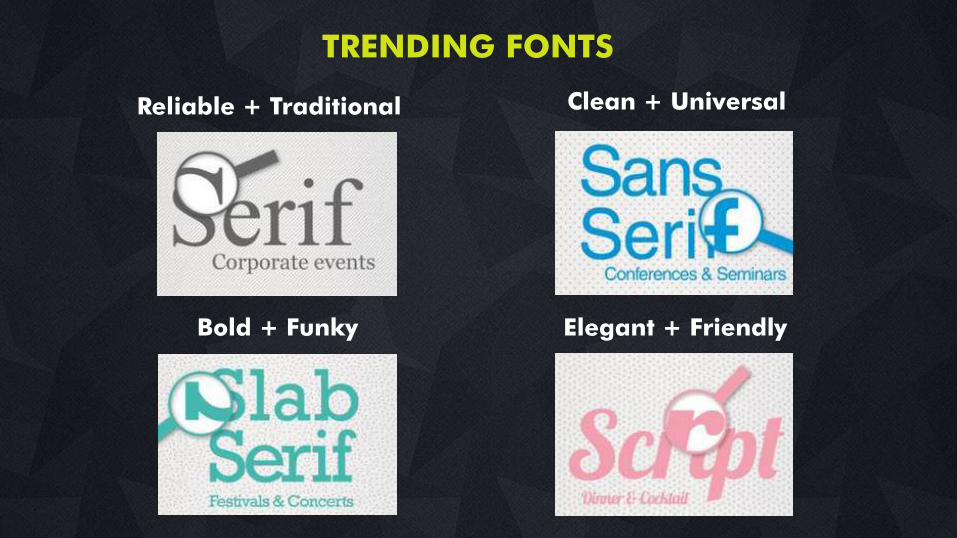
Reliable + Traditional Clean + Universal
Bold + Funky Elegant + Friendly
TRENDING FONTS
DECONSTRUCTING THE PSYCHOLOGYBEHIND DESIGN
PUTTING ITTOGETHER
www.ethinos.com
DECONSTRUCTING THE PSYCHOLOGYBEHIND DESIGN
THE WHOLE IS IDENTIFIED BEFORE THE PARTS
www.ethinos.com
DECONSTRUCTING THE PSYCHOLOGYBEHIND DESIGN
THE WHOLE IS IDENTIFIED BEFORE THE PARTS
- Gestalt Theory
www.ethinos.com
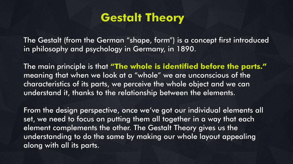
Gestalt Theory
The Gestalt (from the German ―shape, form‖) is a concept first introduced in philosophy and psychology in Germany, in 1890.
The main principle is that “The whole is identified before the parts.” meaning that when we look at a ―whole‖ we are unconscious of the characteristics of its parts, we perceive the whole object and we can understand it, thanks to the relationship between the elements.
From the design perspective, once we‘ve got our individual elements all set, we need to focus on putting them all together in a way that each element complements the other. The Gestalt Theory gives us the understanding to do the same by making our whole layout appealing along with all its parts.
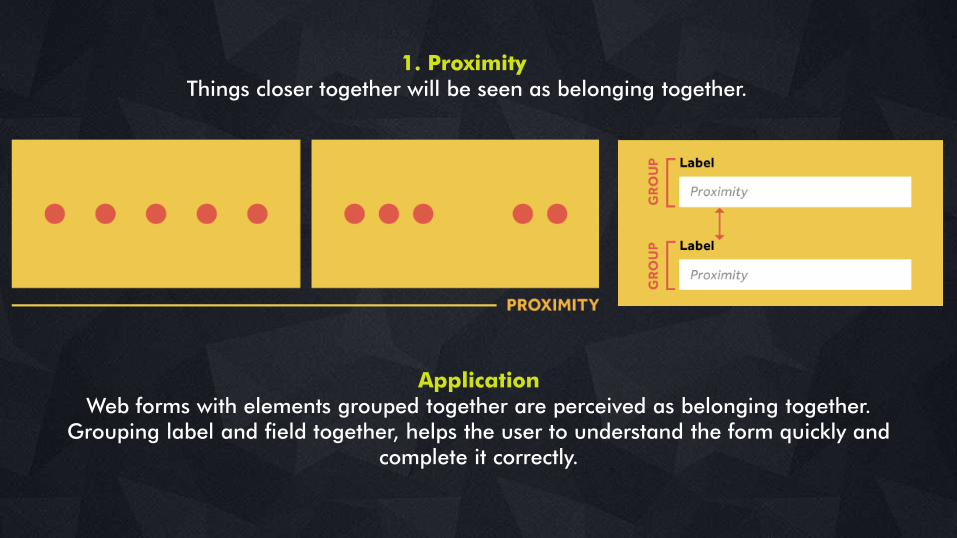
1. ProximityThings closer together will be seen as belonging together.
ApplicationWeb forms with elements grouped together are perceived as belonging together.
Grouping label and field together, helps the user to understand the form quickly and complete it correctly.
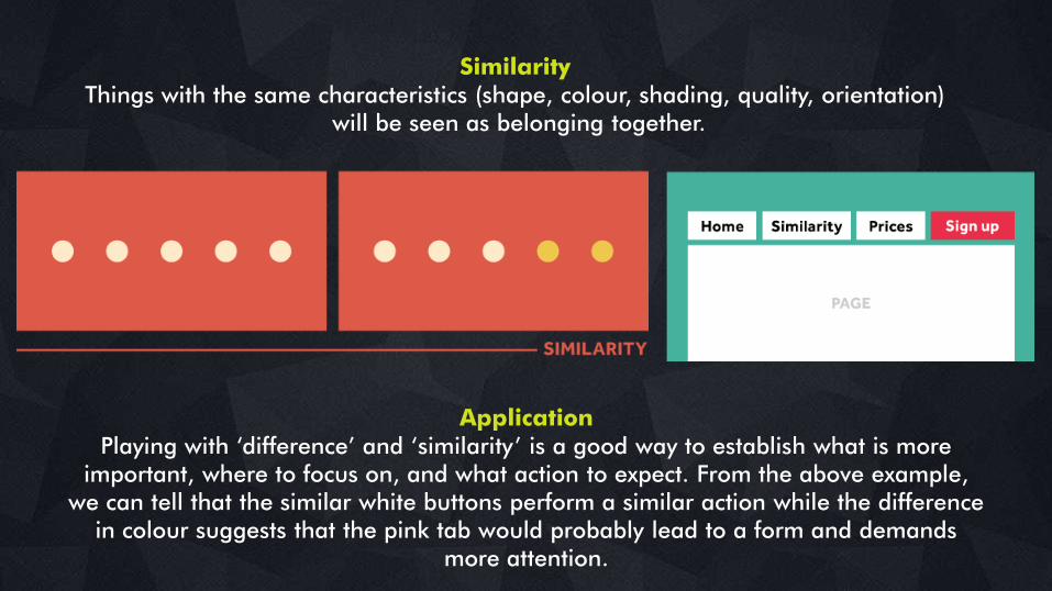
SimilarityThings with the same characteristics (shape, colour, shading, quality, orientation)
will be seen as belonging together.
ApplicationPlaying with ‗difference‘ and ‗similarity‘ is a good way to establish what is more
important, where to focus on, and what action to expect. From the above example, we can tell that the similar white buttons perform a similar action while the difference
in colour suggests that the pink tab would probably lead to a form and demands more attention.
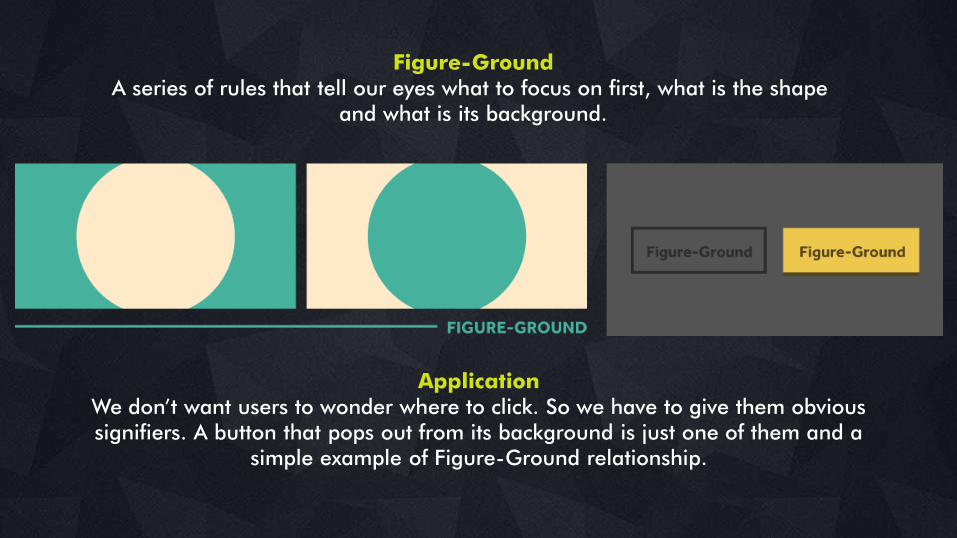
Figure-GroundA series of rules that tell our eyes what to focus on first, what is the shape
and what is its background.
ApplicationWe don‘t want users to wonder where to click. So we have to give them obvious signifiers. A button that pops out from its background is just one of them and a
simple example of Figure-Ground relationship.
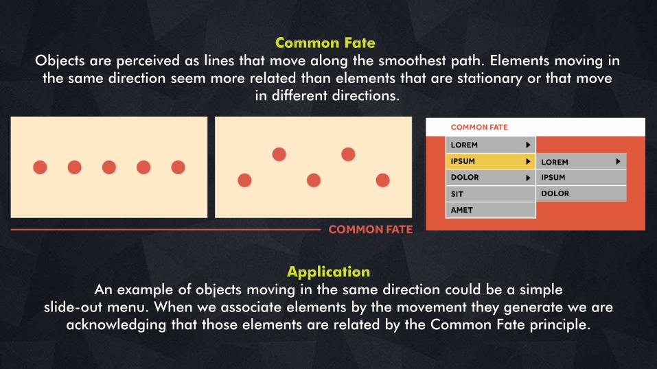
Common FateObjects are perceived as lines that move along the smoothest path. Elements moving inthe same direction seem more related than elements that are stationary or that move
in different directions.
ApplicationAn example of objects moving in the same direction could be a simple
slide-out menu. When we associate elements by the movement they generate we are acknowledging that those elements are related by the Common Fate principle.
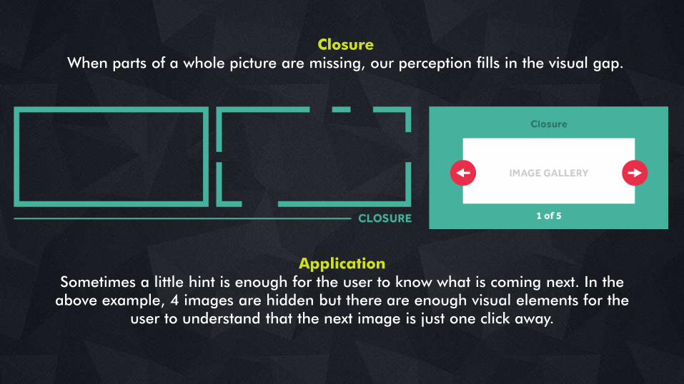
ClosureWhen parts of a whole picture are missing, our perception fills in the visual gap.
ApplicationSometimes a little hint is enough for the user to know what is coming next. In the
above example, 4 images are hidden but there are enough visual elements for the user to understand that the next image is just one click away.
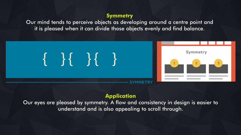
SymmetryOur mind tends to perceive objects as developing around a centre point and
it is pleased when it can divide those objects evenly and find balance.
ApplicationOur eyes are pleased by symmetry. A flow and consistency in design is easier to
understand and is also appealing to scroll through.
DECONSTRUCTING THE PSYCHOLOGYBEHIND DESIGN
CREATIVE WITHOUT STRATEGY IS CALLED
―ART‖
CREATIVE WITH STRATEGY IS CALLED
“ADVERTISING”
www.ethinos.com
SOURCES
1. www.manifesto.co.uk/design-principles-gestalt-white-space-perception/
2. www.webdesign.tutsplus.com/articles/the-gestalt-principle-design-theory-for-web-
designers--webdesign-1756
3. www.designshack.net/articles/layouts/the-sometimes-hidden-meaning-of-shapes/
4. www.slideshare.net/thecroaker/which-typeface-should-i-use
5. www.justcreative.com/2008/06/13/how-to-design-learn-the-basics/
CONNECT WITH US
www.ethinos.com
/EthinosDigital
/Ethinos