Embed Size (px)
Citation preview
Graphic Narrative Evaluation
Use this template to help you evaluate your project.
You should give specific details about your work.
You should provide both written and visual examples to explain your project.
You should find areas to praise in your work. Be specific about why you think they are good or why you are proud of them.
You should also find areas that could be improved. Look for areas that you could make better if you went back to them. Be specific about what you would improve.
Add additional slides as you need to. Don’t be restricted by what is here.
Any blank slides should be deleted before submission.
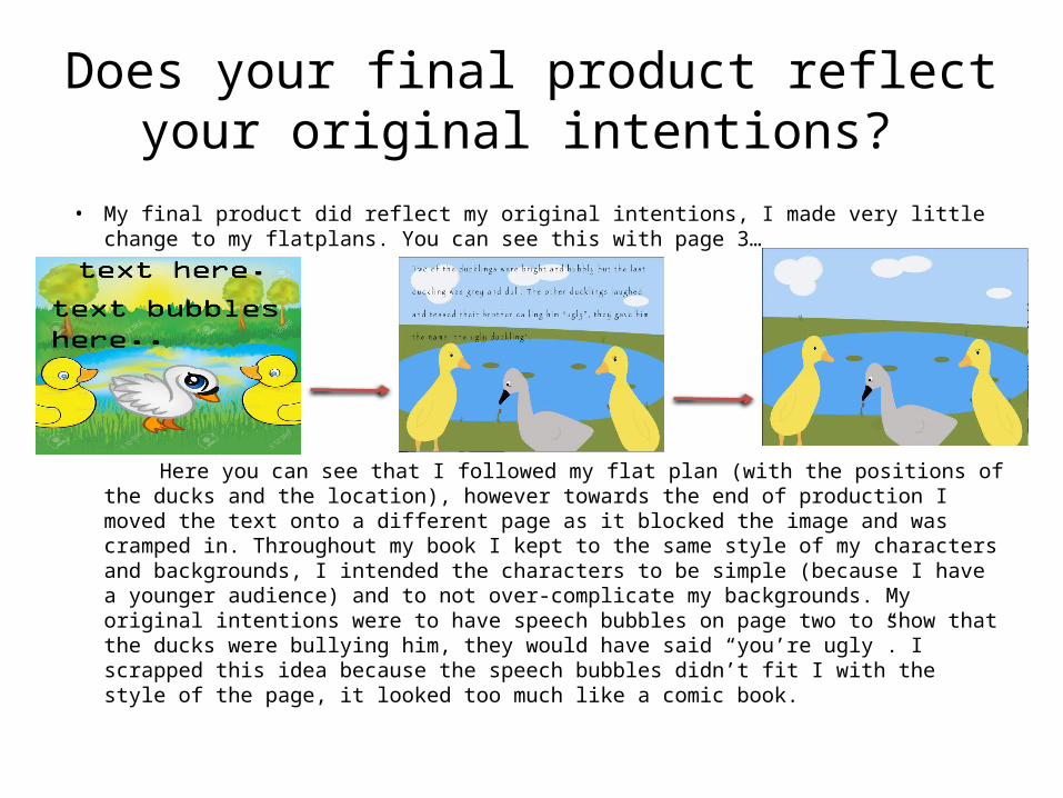
Does your final product reflect your original intentions?
• My final product did reflect my original intentions, I made very little change to my flatplans. You can see this with page 3…
Here you can see that I followed my flat plan (with the positions of the ducks and the location), however towards the end of production I moved the text onto a different page as it blocked the image and was cramped in. Throughout my book I kept to the same style of my characters and backgrounds, I intended the characters to be simple (because I have a younger audience) and to not over-complicate my backgrounds. My original intentions were to have speech bubbles on page two to show that the ducks were bullying him, they would have said “you’re ugly”. I scrapped this idea because the speech bubbles didn’t fit I with the style of the page, it looked too much like a comic book.
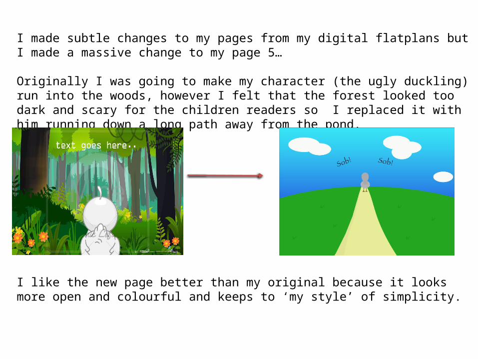
I made subtle changes to my pages from my digital flatplans but I made a massive change to my page 5…
Originally I was going to make my character (the ugly duckling) run into the woods, however I felt that the forest looked too dark and scary for the children readers so I replaced it with him running down a long path away from the pond.
I like the new page better than my original because it looks more open and colourful and keeps to ‘my style’ of simplicity.
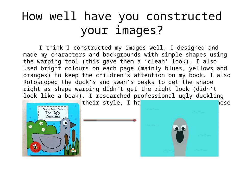
How well have you constructed your images?
I think I constructed my images well, I designed and made my characters and backgrounds with simple shapes using the warping tool (this gave them a ‘clean’ look). I also used bright colours on each page (mainly blues, yellows and oranges) to keep the children’s attention on my book. I also Rotoscoped the duck’s and swan’s beaks to get the shape right as shape warping didn’t get the right look (didn’t look like a beak). I researched professional ugly duckling books to look at their style, I have a similar look to these books…
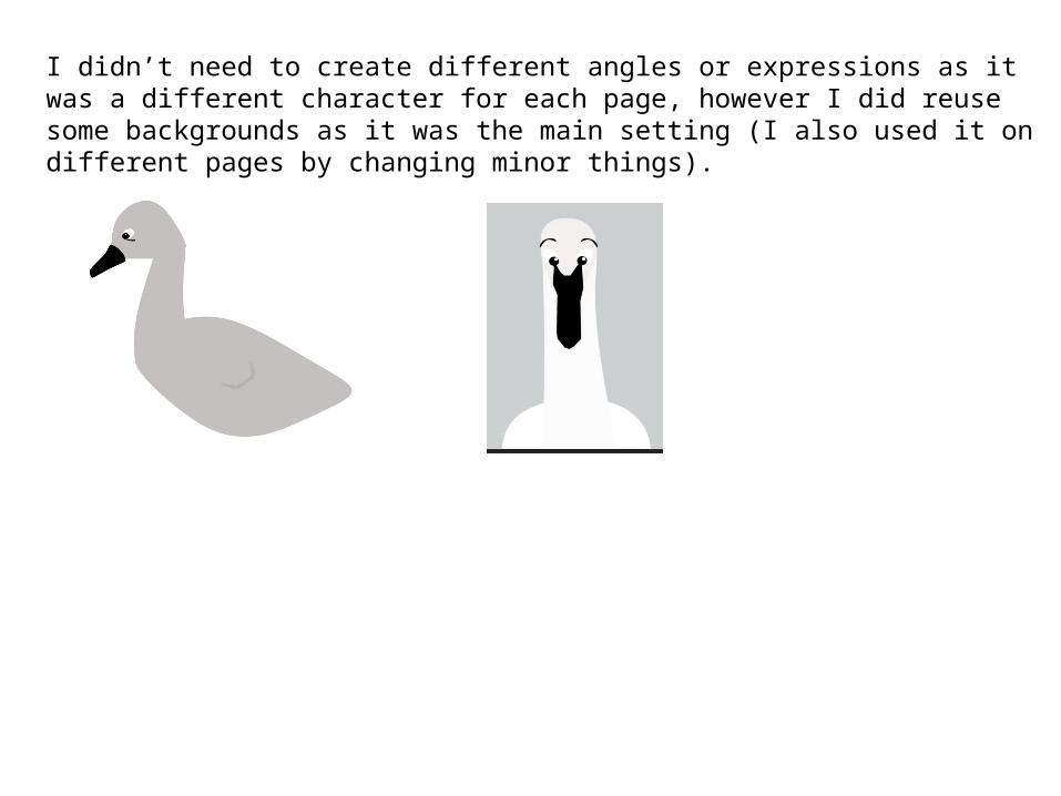
I didn’t need to create different angles or expressions as it was a different character for each page, however I did reuse some backgrounds as it was the main setting (I also used it on different pages by changing minor things).
How well have you used text to anchor your images
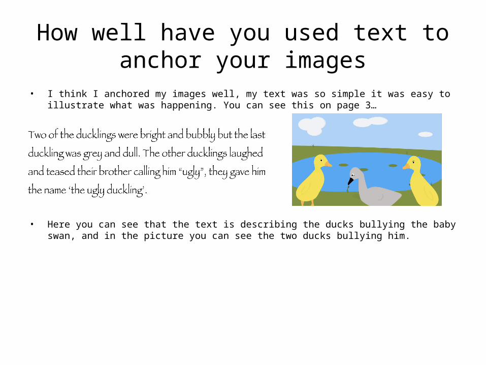
• I think I anchored my images well, my text was so simple it was easy to illustrate what was happening. You can see this on page 3…
• Here you can see that the text is describing the ducks bullying the baby swan, and in the picture you can see the two ducks bullying him.
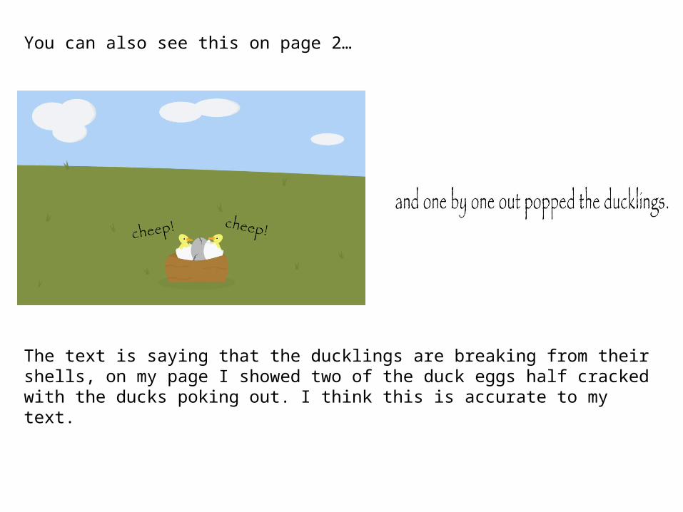
You can also see this on page 2…
The text is saying that the ducklings are breaking from their shells, on my page I showed two of the duck eggs half cracked with the ducks poking out. I think this is accurate to my text.
Is your product suitable for your audience?
In my proposal I said that my audience was 0-7 year olds, I think I hit this audience because my book is easy to follow as the writing is simplistic and pictures colourful.
My proposal also said that it was suitable for all genders, I think my book is suitable because there is no gender specific content like colours (blue and pink) and characters (female or male, prince or princess). Throughout the book I only have 4 characters which consists of two boys and two girls, this makes it equal. My proposal also stated that my audience would be English speakers, because of this I wrote the book in English. My proposal also said that the reader didn’t have to have any hobbies or interests that are related to the book or to be in any class, I did this by not including content that every child will enjoy and want to read more about. My book on a whole doesn’t fit into any categories (gender specific) this means I have a wider audience.
Here you can see that I used simple language, that is not too complicated for children.
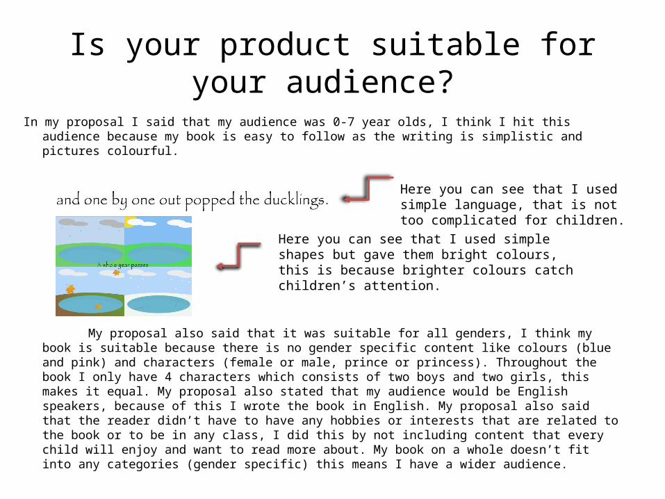
Here you can see that I used simple shapes but gave them bright colours, this is because brighter colours catch children’s attention.
What do you like/dislike about how your final product looks?
• Reference specific tools you used with images• I like the look of shape warping in my work because of its simplistic look and how it fits my
style, however I thought it was blocky in some places (close ups of the face and minor details). I like the look of my last page because I used a Gradient Overlay to make the sunset, I mixed oranges and yellows to get this look, I also did this for the water to make it look like the sun was setting into it.
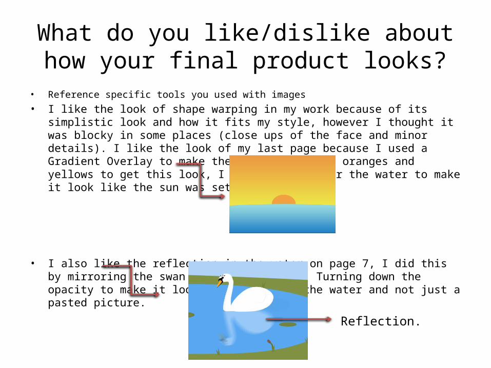
• I also like the reflection in the water on page 7, I did this by mirroring the swan and distorting it. Turning down the opacity to make it look like it was in the water and not just a pasted picture.
Reflection.
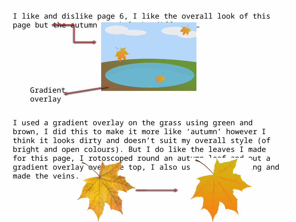
I like and dislike page 6, I like the overall look of this page but the autumn month looks different…
I used a gradient overlay on the grass using green and brown, I did this to make it more like ‘autumn’ however I think it looks dirty and doesn’t suit my overall style (of bright and open colours). But I do like the leaves I made for this page, I rotoscoped round an autumn leaf and put a gradient overlay over the top, I also used shape warping and made the veins.
Gradient overlay
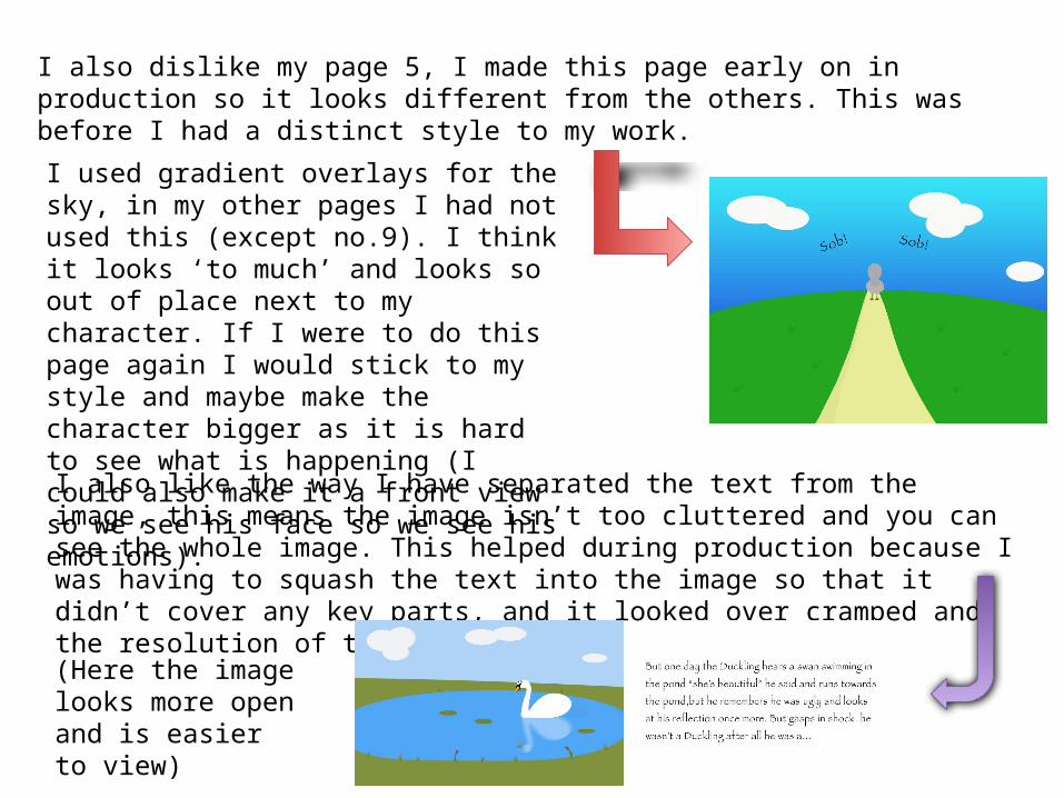
I also dislike my page 5, I made this page early on in production so it looks different from the others. This was before I had a distinct style to my work.
I used gradient overlays for the sky, in my other pages I had not used this (except no.9). I think it looks ‘to much’ and looks so out of place next to my character. If I were to do this page again I would stick to my style and maybe make the character bigger as it is hard to see what is happening (I could also make it a front view so we see his face so we see his emotions).
I also like the way I have separated the text from the image, this means the image isn’t too cluttered and you can see the whole image. This helped during production because I was having to squash the text into the image so that it didn’t cover any key parts, and it looked over cramped and the resolution of the text lowered.
(Here the image looks more open and is easier to view)
What do you like/dislike about the techniques you have used?
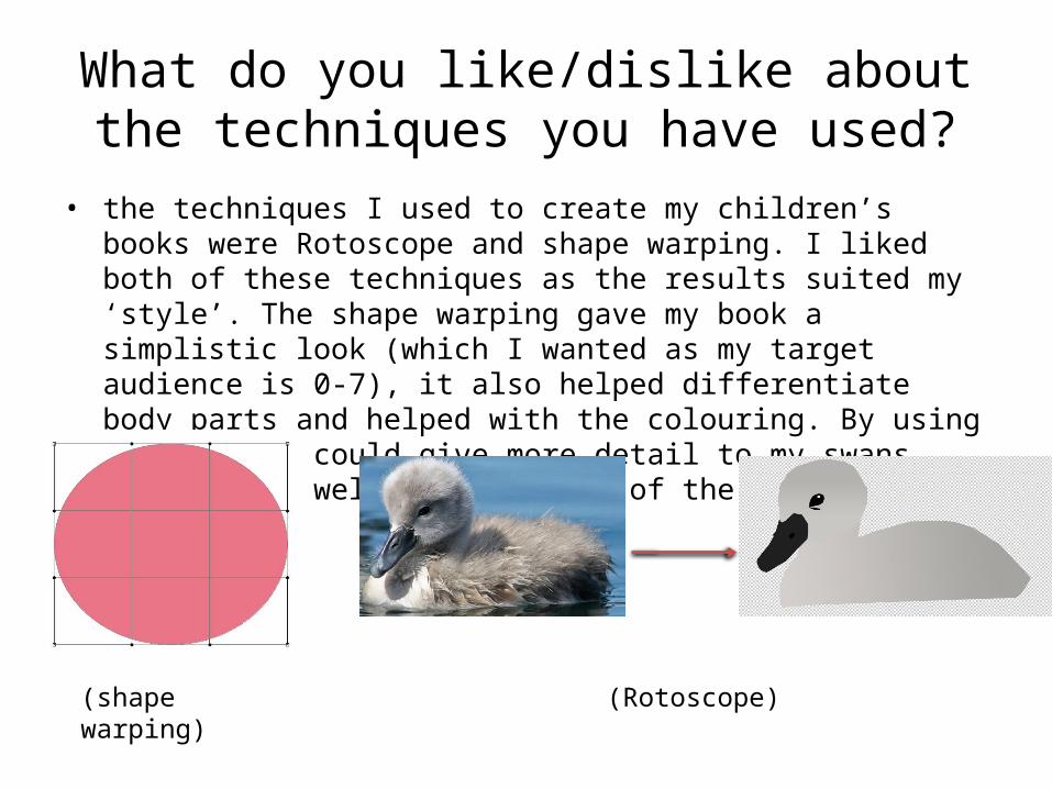
• the techniques I used to create my children’s books were Rotoscope and shape warping. I liked both of these techniques as the results suited my ‘style’. The shape warping gave my book a simplistic look (which I wanted as my target audience is 0-7), it also helped differentiate body parts and helped with the colouring. By using rotoscope I could give more detail to my swans, this worked well on the beaks of the swans.
(shape warping) (Rotoscope)
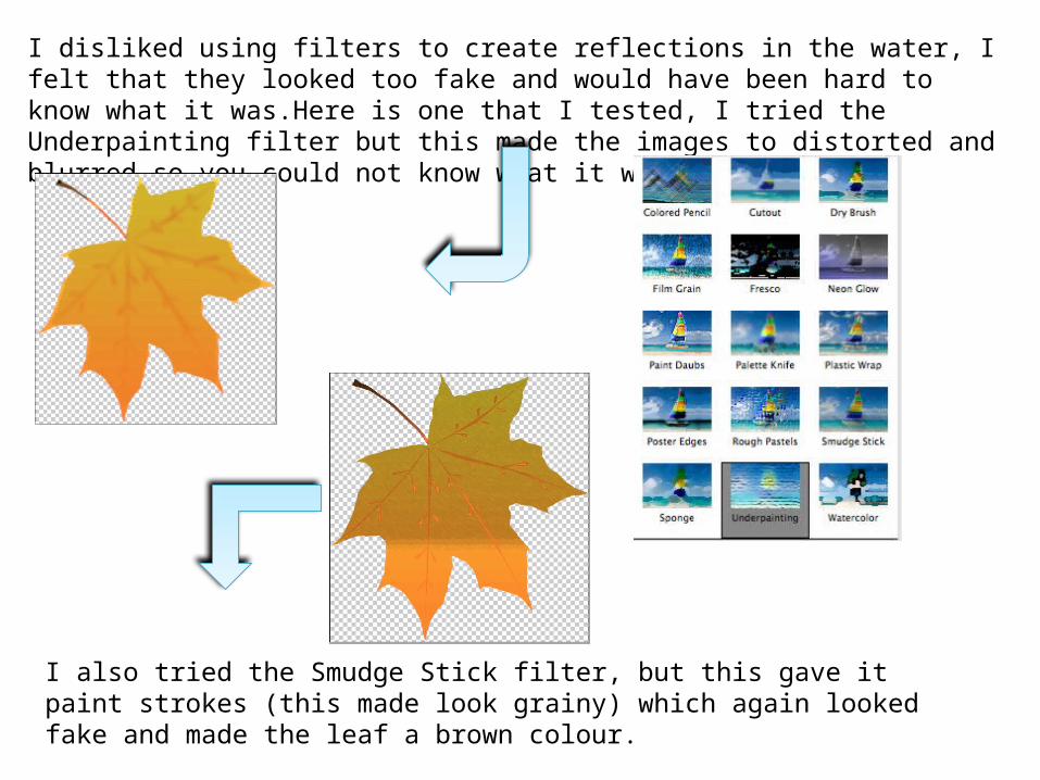
I disliked using filters to create reflections in the water, I felt that they looked too fake and would have been hard to know what it was.Here is one that I tested, I tried the Underpainting filter but this made the images to distorted and blurred so you could not know what it was.
I also tried the Smudge Stick filter, but this gave it paint strokes (this made look grainy) which again looked fake and made the leaf a brown colour.
Why did you include the content you used?
• Images, fonts, effects, colours
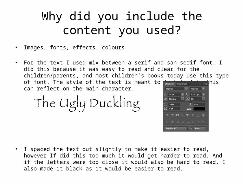
• For the text I used mix between a serif and san-serif font, I did this because it was easy to read and clear for the children/parents, and most children’s books today use this type of font. The style of the text is meant to look ‘ugly’, this can reflect on the main character.
• I spaced the text out slightly to make it easier to read, however If did this too much it would get harder to read. And if the letters were too close it would also be hard to read. I also made it black as it would be easier to read.
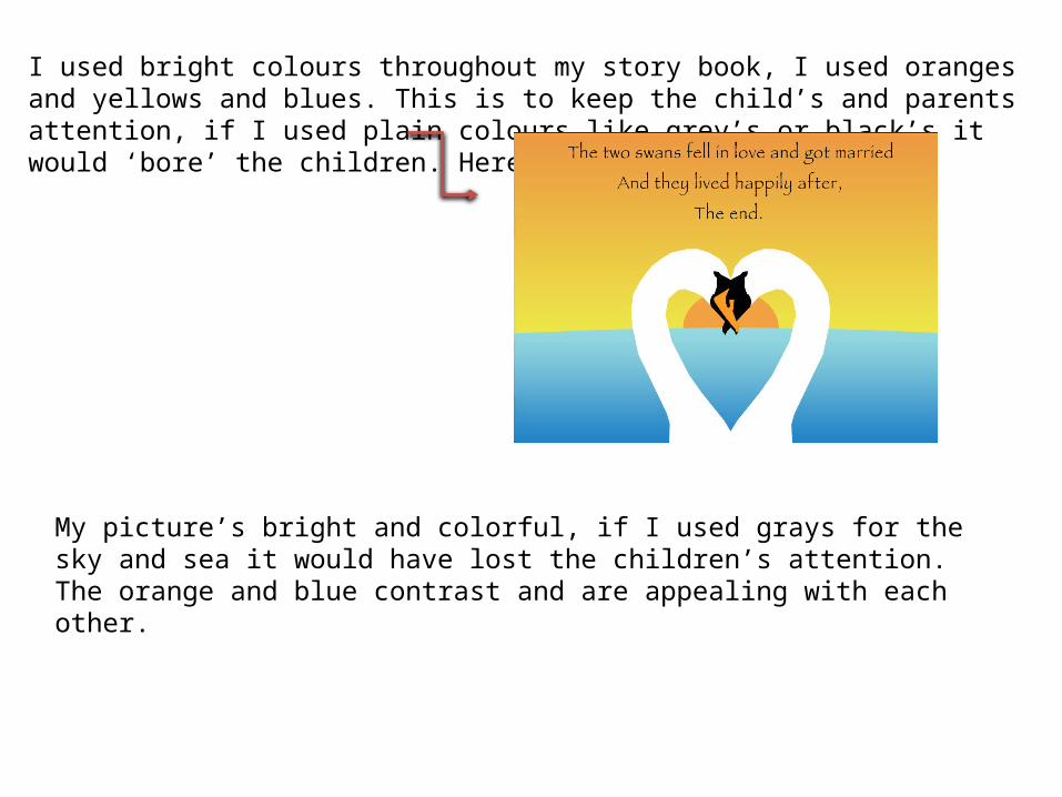
I used bright colours throughout my story book, I used oranges and yellows and blues. This is to keep the child’s and parents attention, if I used plain colours like grey’s or black’s it would ‘bore’ the children. Here is an example…
My picture’s bright and colorful, if I used grays for the sky and sea it would have lost the children’s attention. The orange and blue contrast and are appealing with each other.
What signs, symbols or codes have your used in your work?
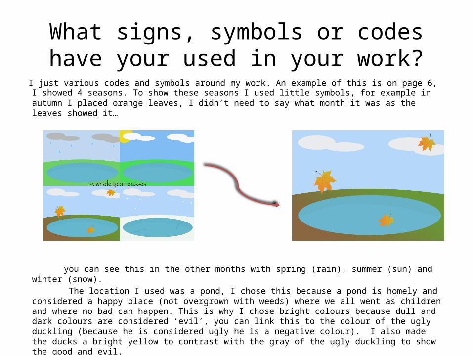
I just various codes and symbols around my work. An example of this is on page 6, I showed 4 seasons. To show these seasons I used little symbols, for example in autumn I placed orange leaves, I didn’t need to say what month it was as the leaves showed it…
you can see this in the other months with spring (rain), summer (sun) and winter (snow). The location I used was a pond, I chose this because a pond is homely and considered a happy
place (not overgrown with weeds) where we all went as children and where no bad can happen. This is why I chose bright colours because dull and dark colours are considered ‘evil’, you can link this to the colour of the ugly duckling (because he is considered ugly he is a negative colour). I also made the ducks a bright yellow to contrast with the gray of the ugly duckling to show the good and evil.
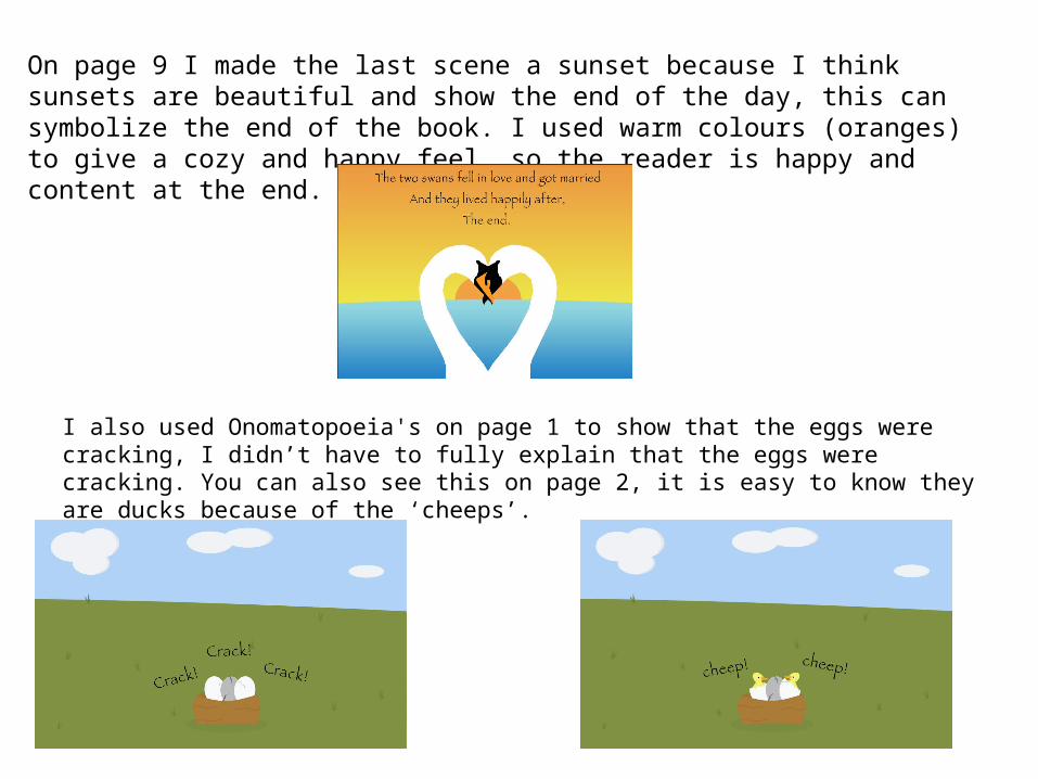
On page 9 I made the last scene a sunset because I think sunsets are beautiful and show the end of the day, this can symbolize the end of the book. I used warm colours (oranges) to give a cozy and happy feel, so the reader is happy and content at the end.
I also used Onomatopoeia's on page 1 to show that the eggs were cracking, I didn’t have to fully explain that the eggs were cracking. You can also see this on page 2, it is easy to know they are ducks because of the ‘cheeps’.
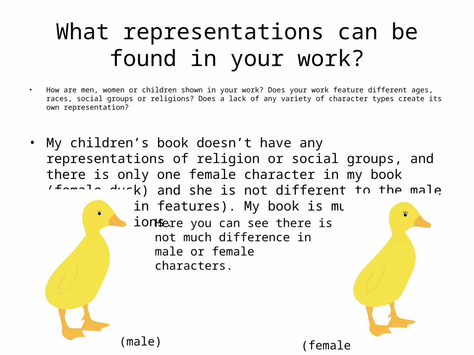
What representations can be found in your work?
• How are men, women or children shown in your work? Does your work feature different ages, races, social groups or religions? Does a lack of any variety of character types create its own representation?
• My children’s book doesn’t have any representations of religion or social groups, and there is only one female character in my book (female duck) and she is not different to the male duck (only in features). My book is mutual in representations.
(male) (female)
Here you can see there is not much difference in male or female characters.
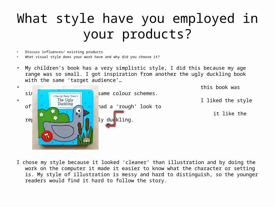
What style have you employed in your products?
• Discuss influences/ existing products• What visual style does your work have and why did you choose it?
• My children’s book has a very simplistic style, I did this because my age range was so small. I got inspiration from another the ugly duckling book with the same ‘target audience’…
• this book was simple also and had the same colour schemes.
• I liked the style of this book because it had a ‘rough’ look to
it like the representation of the ugly duckling.
I chose my style because it looked ‘cleaner’ than illustration and by doing the work on the computer it made it easier to know what the character or setting is. My style of illustration is messy and hard to distinguish, so the younger readers would find it hard to follow the story.
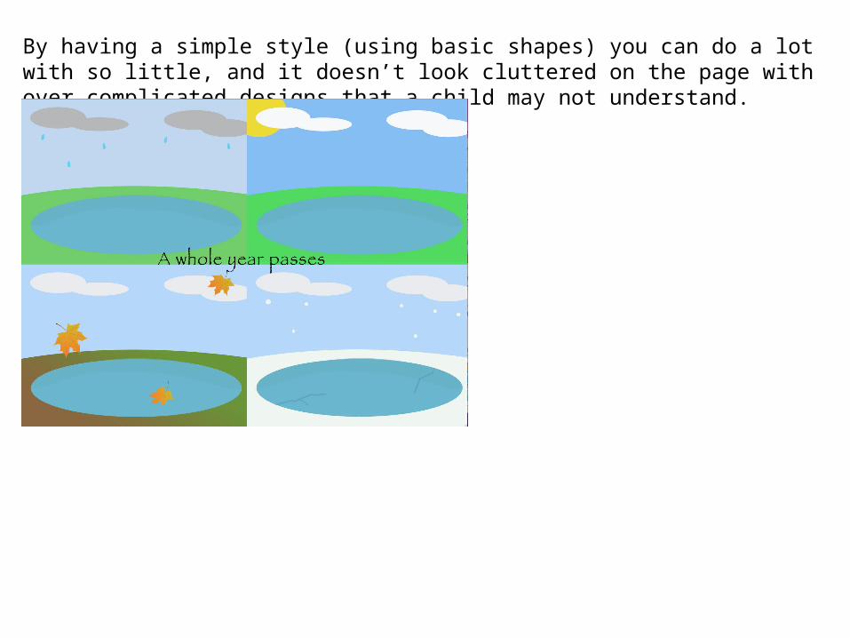
By having a simple style (using basic shapes) you can do a lot with so little, and it doesn’t look cluttered on the page with over complicated designs that a child may not understand.
What were the strengths and weaknesses of the pre-production and planning
• How did the planning and research help• How well did you manage your time• Reference specific examples
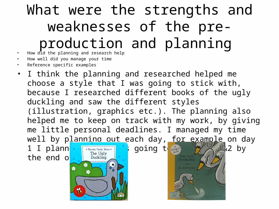
• I think the planning and researched helped me choose a style that I was going to stick with, because I researched different books of the ugly duckling and saw the different styles (illustration, graphics etc.). The planning also helped me to keep on track with my work, by giving me little personal deadlines. I managed my time well by planning out each day, for example on day 1 I planned that I was going to do pages 1&2 by the end of the day.
A weakness of planning was that I had to keep to the set schedule otherwise I’d have a day of no work towards the end. If I had finished pages 1&2 in the first half of he day I would start the next days which meant I didn’t have any work to do on the second day.
Historical and cultural context
• How does your work compare to what has come before? What other similar products have existed in the past? What current products exist?
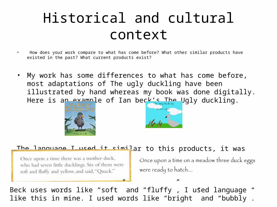
• My work has some differences to what has come before, most adaptations of The ugly duckling have been illustrated by hand whereas my book was done digitally. Here is an example of Ian beck’s The Ugly duckling.
The language I used it similar to this products, it was simple and easy to read…
Beck uses words like “soft” and “fluffy”, I used language like this in mine. I used words like “bright” and “bubbly”.
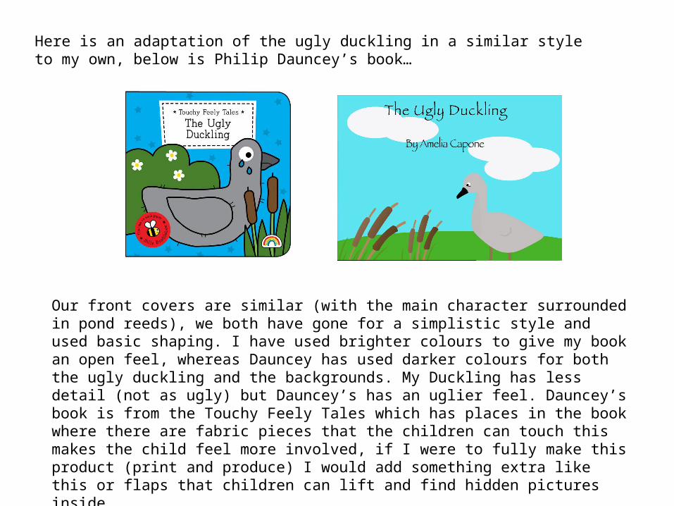
Here is an adaptation of the ugly duckling in a similar style to my own, below is Philip Dauncey’s book…
Our front covers are similar (with the main character surrounded in pond reeds), we both have gone for a simplistic style and used basic shaping. I have used brighter colours to give my book an open feel, whereas Dauncey has used darker colours for both the ugly duckling and the backgrounds. My Duckling has less detail (not as ugly) but Dauncey’s has an uglier feel. Dauncey’s book is from the Touchy Feely Tales which has places in the book where there are fabric pieces that the children can touch this makes the child feel more involved, if I were to fully make this product (print and produce) I would add something extra like this or flaps that children can lift and find hidden pictures inside.
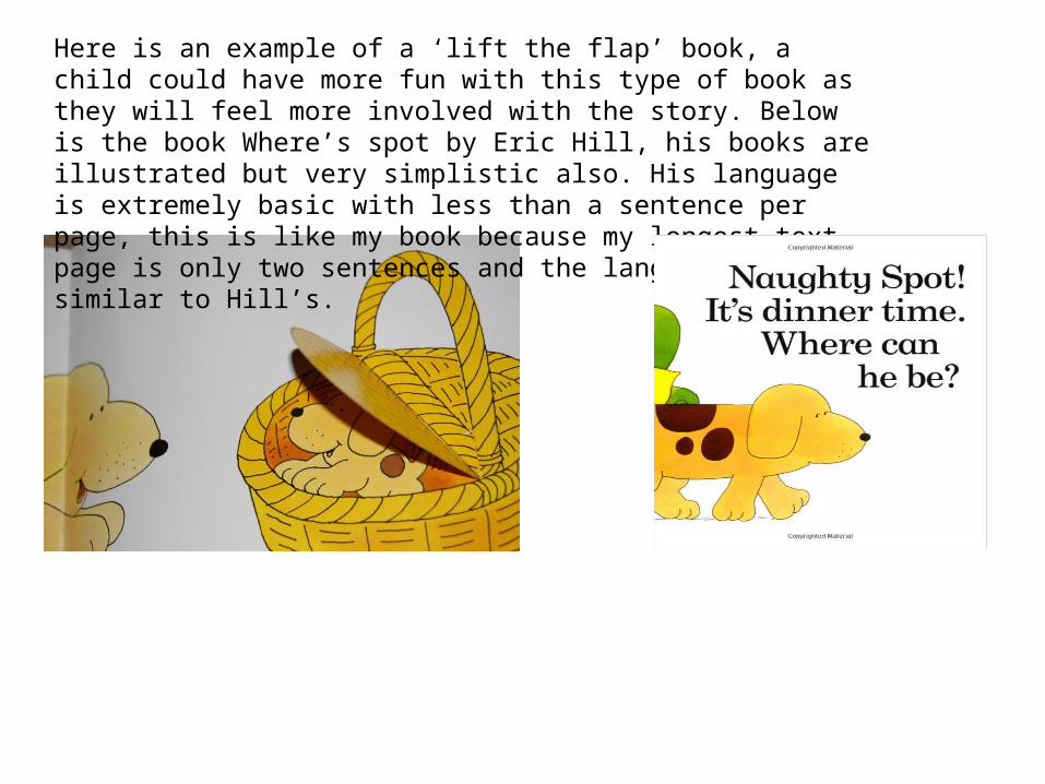
Here is an example of a ‘lift the flap’ book, a child could have more fun with this type of book as they will feel more involved with the story. Below is the book Where’s spot by Eric Hill, his books are illustrated but very simplistic also. His language is extremely basic with less than a sentence per page, this is like my book because my longest text page is only two sentences and the language is similar to Hill’s.
Peer Feedback
• Summarise peer feedback and discuss– Responses you agree with– Responses you disagree with