Embed Size (px)
Citation preview
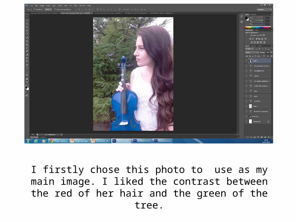
I firstly chose this photo to use as my main image. I liked the contrast between the red of her hair and the green of the tree.
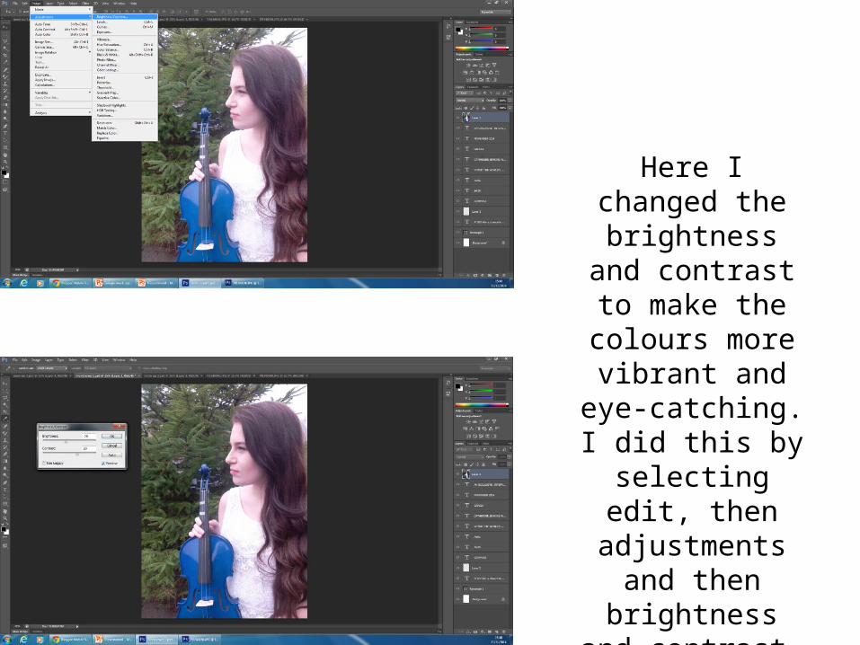
Here I changed the brightness and
contrast to make the colours more vibrant and eye-
catching. I did this by selecting edit, then adjustments
and then brightness and contrast.
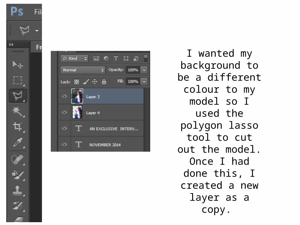
I wanted my background to be a
different colour to my model so I used the polygon lasso tool to cut out the model.
Once I had done this, I created a new layer
as a copy.
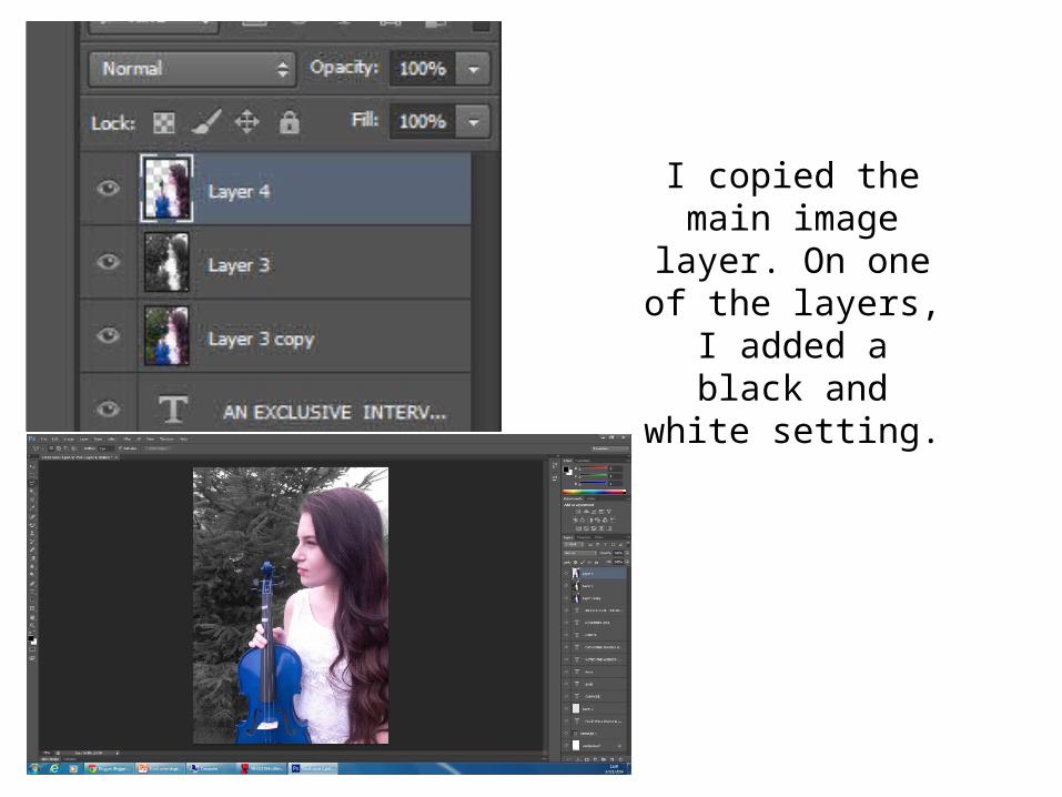
I copied the main image layer. On one
of the layers, I added a black and white
setting.
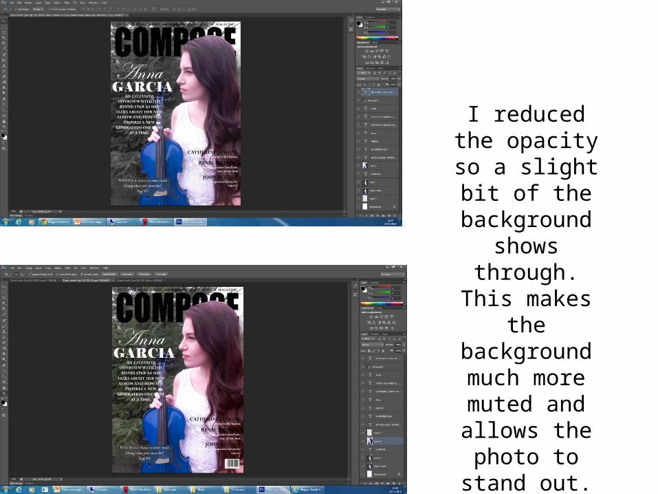
I reduced the opacity so a slight
bit of the background
shows through. This makes the
background much more muted and allows the photo
to stand out.
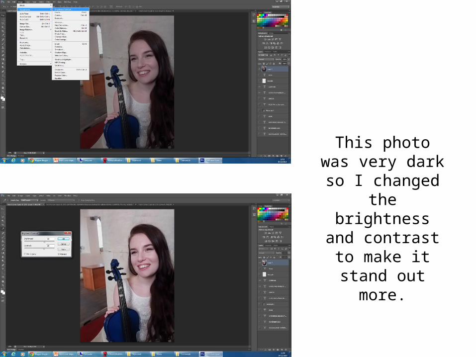
This photo was very dark so I changed
the brightness and contrast to make it
stand out more.
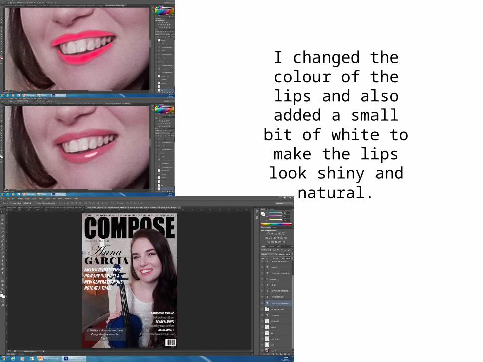
I changed the colour of the lips and also added a small bit of
white to make the lips look shiny and natural.
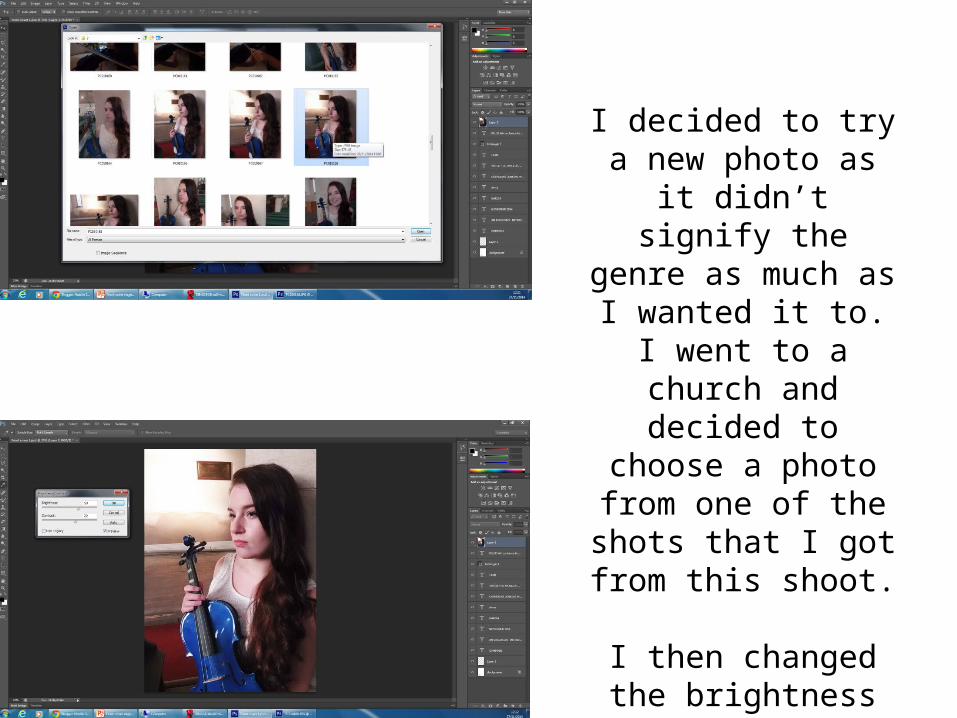
I decided to try a new photo as it didn’t signify the genre as much as I
wanted it to. I went to a church and decided to choose a photo from
one of the shots that I got from this shoot.
I then changed the brightness and contrast on the photo to make the colours stand out.
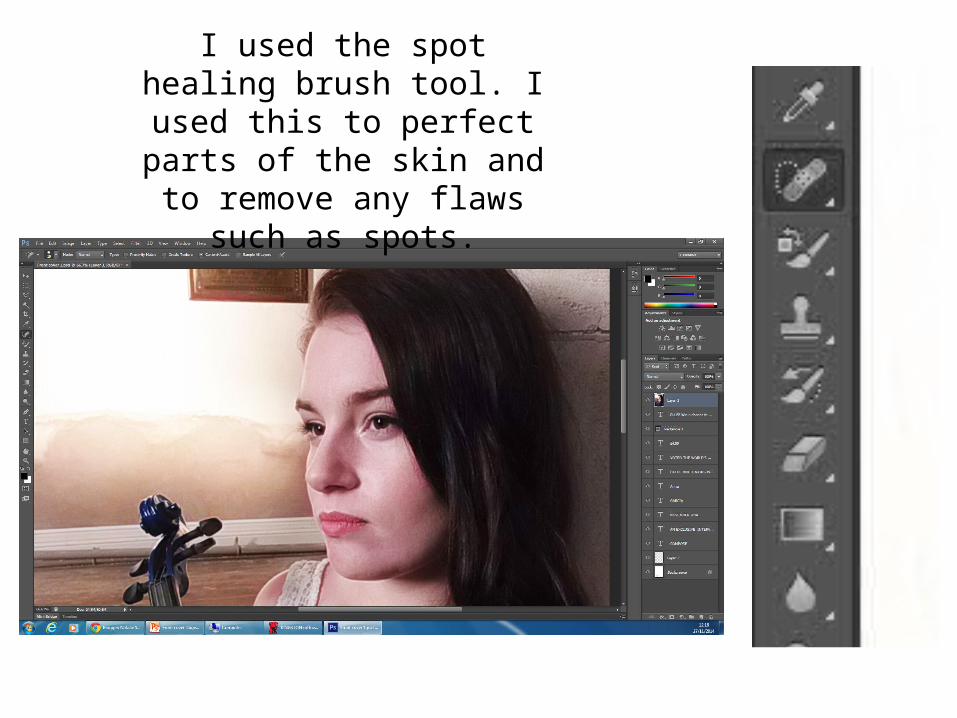
I used the spot healing brush tool. I used this to perfect
parts of the skin and to remove any flaws such as
spots.
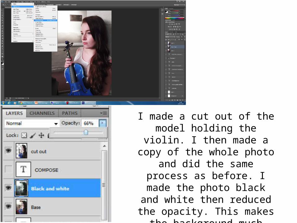
I made a cut out of the model holding the violin. I then made a copy of the whole photo and did
the same process as before. I made the photo black and white then reduced the opacity. This makes the background much more muted and makes the
image stand out.
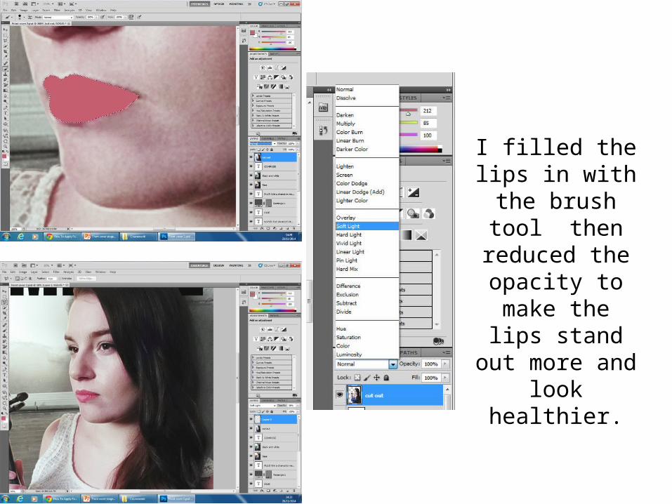
I filled the lips in with the brush
tool then reduced the opacity to make the lips
stand out more and look healthier.
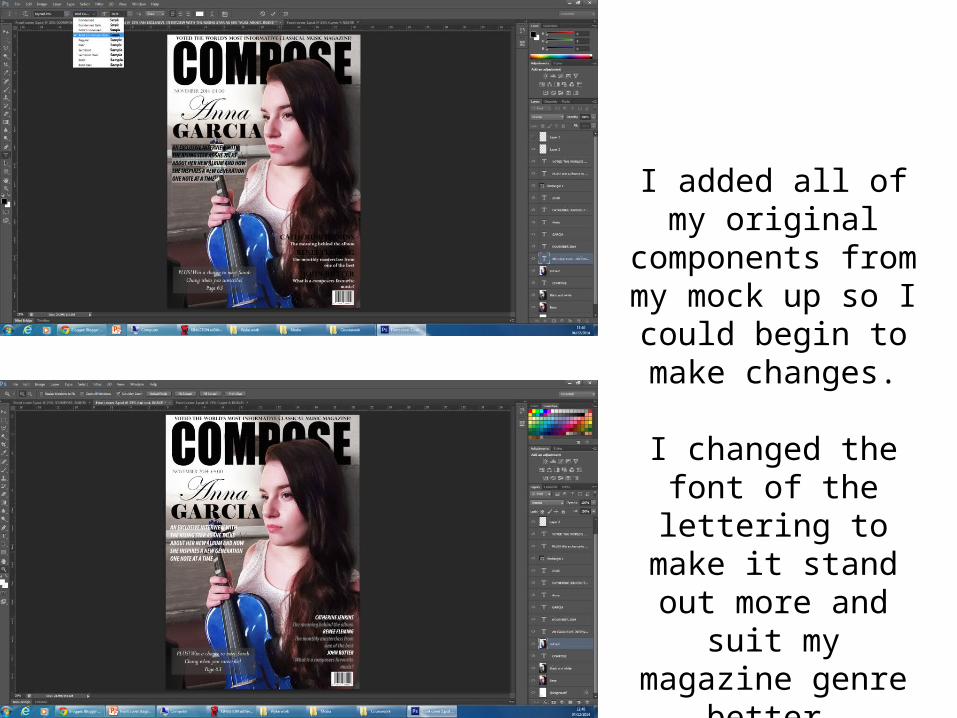
I added all of my original components from my mock up so I could begin to make
changes.
I changed the font of the lettering to make it
stand out more and suit my magazine
genre better.
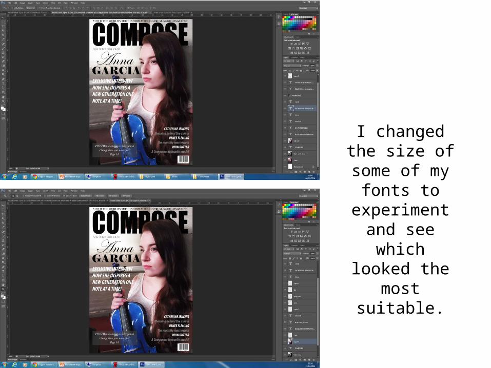
I changed the size of some of
my fonts to experiment and
see which looked the most
suitable.
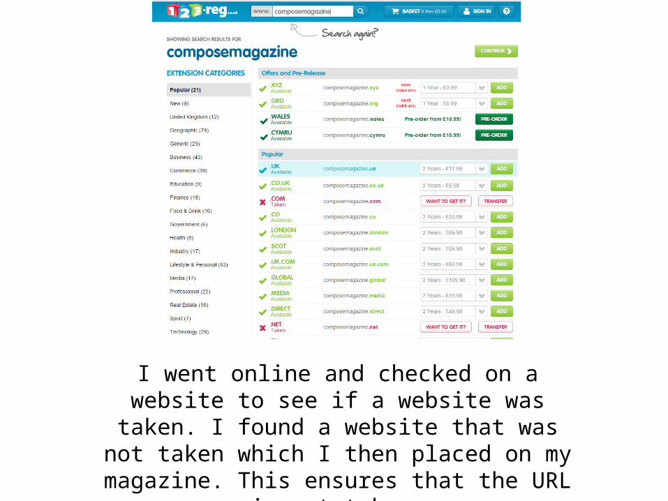
I went online and checked on a website to see if a website was taken. I found a website that was not taken which I then placed on my magazine. This
ensures that the URL is not taken.