Embed Size (px)
Citation preview

BUDDY WALLTEAM SIMPLE
(Christine Mcgahhey, Seoyeon Kim, Yurae Kim) !

CONTENTIntroduction
Concept Statement
Persona Design
Cultural Probe Design and Analysis
Context Mapping
Journey Map
Conclusion

INTRODUCTION
INITIAL IDEAS
1. Auto-stylist
2. Medical Bracelet
3. Find Lost Items!
4. Interactive Wall

CONCEPT STATEMENT
Nowadays, people rarely have time for themselves. They are bombarded with horrendous amount of work, and many people feel trapped by endless days filled with office, cars, and work. Sometimes people even feel alienated. For that kind of people, we have thought of interactive wall- buddy wall.
When people stand in front of the wall, the wall will recognize the user and let the user create his/her own pet/buddy. And when the user returns, stands in front of the wall later, then the pet will recognize the person and have interaction with the person. The person can name the pet, feed it, and interact with it.
We think this wall will have maximum effect when installed right in the middle of the crowded city. People exhausted from work, or life overall can forget whatever’s tiring them and relax using this wall. Also people will feel more affection towards it, because as they come and go during day, they can actually see the wall and know that their buddy is in there.

PERSONA
1. SociabilityTo know if people will like having a companion / and to know how people will use and accept the wall.
2. Tech-friendlinessTo determine people’s accessibility towards the interactive wall.

PERSONAS
ry
PERSONAS
• 2. Person who is not very social but is tech-friendly

PERSONAS
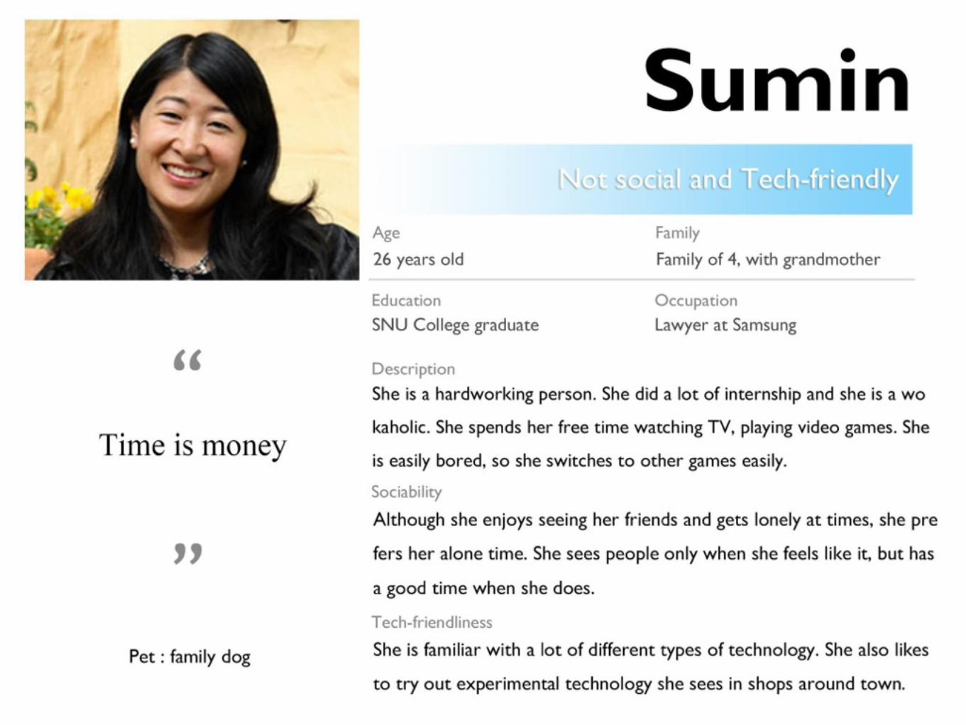
• 1. Person who is not social and not familiar with tech

PERSONAS
• 1. Person who is social and not familiar w/tech

MAIN PERSONA
#1 & #2
Because goal of our design is to help people relieve stresss, the age range of between 20s to 30s fits the best. They are both familiar with technology and we can draw two different kinds of reaction from them. For the technology aspect, almost non of them would have problem in adapting to the interface. As persona #1 has extrovert characteristic, he/she would easily approach the wall and enjoy it. The #2, who has introvert characteristic is also likely to appreciate the wall as they can interact comfortably with a “buddy” .

CULTURAL PROBE DESIGN 1. Maps
A simple set of maps that show where they go during the day, places that they want to go, and places that they do not want to go to
2. Color Sketch
At the end of the day the participants will fill in a circle with a color of their choice that they think best reflects their day
3. Video Memo
At the beginning and end of the day they make a short video. The morning video would be about how the slept or their plans for the day. The evening video would be about how their day was and how they are feeling.

CULTURAL PROBE PACKET

PARTICIPANTS
(1) Kiyong Shin (2) Claudia Andrade
Junha Kim
Jieun Kim Taylor Herman

RESULT: 1-(1)

RESULT: 1-(1)

RESULT: 1-(1)

RESULT: 1-(1)
• 1-(1): Ki yong shin
The colors used were white and types of reds. They traveled a lot during the time they did the package to meet as many friends as possible. They dislike and like very specific areas for personal reasons, and like different places in each environment (social, urban, natural, and home)

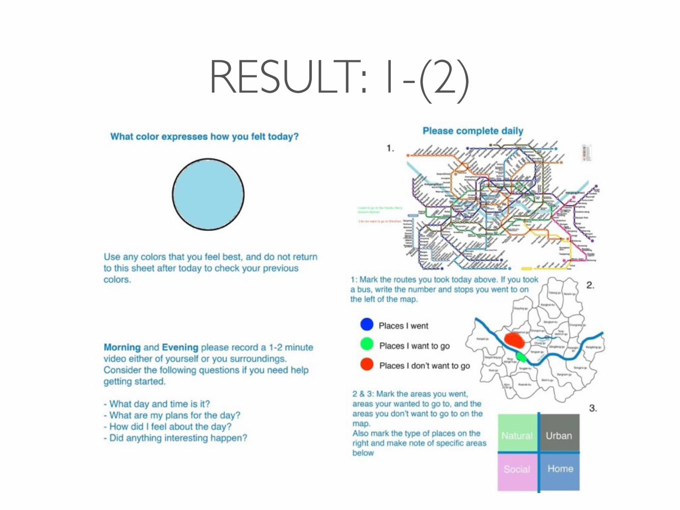
RESULT: 1-(2)

RESULT: 1-(2)

RESULT: 1-(2)

RESULT: 1-(2)
RESULT: 1-(2)

RESULT: 1-(2)
• 1-(2): Claudia Andrade
Colors usually reflected the weather of that day, just like her mood is.(*) She tends to stay in Songdo area, expect when going to Gangnam to work and to Hongdae on weekends. She prefers natural places to urban ones and wished to go to a park or outside.

RESULT: 2

RESULT: 2

RESULT: 2

RESULT: 2
• 2: Junha Kim
He used patterns in their color sketches to express his mood and used bright colors for some days, and darker ones for when he was sick. He traveled the most on Friday, and every day he said the place he disliked was Sinchon.

RESULT: 3

RESULT: 3

RESULT: 3

RESULT: 3
• 3: Ji Eun Kim
She used environment for the color sketches. She used pink pastel color when seeing cherry blossoms on her date with her boyfriend. She did not travel too much and disliked places that they associate with school and places that are very far from her home.

RESULT: 4

RESULT: 4

RESULT: 4

RESULT: 4

RESULT: 4

RESULT: 4
• 4: Taylor Herman
Colors were very bright and reflected the emotions that she felt that day. Brighter colors were for energetic days, red was for love, and less active days had more dull colors. She travels a lot around Seoul, and prefers to be in an outdoor environment playing sports or out with friends.

COLOR SCHEME

ANALYSIS 1• Everyone approached this exercise in different ways. For instance, when recording video memo, while
some people sat in front of the camera and talked about their day, some chose not to talk, but to show some scenery or to express their feelings in unique ways. Also as mentioned above, the way people associated their emotion with color also varied. From this, we found how unique and subjective each individual is. We realized that our product must be something that can approach each individual in different, personalized ways. Thus we thought of customization of our interactive wall.
• People travel great distances, contrary to what we originally thought. They don’t stay in one place, and when they move they generally feel better than just staying in same place. There are two possible reason for that: 1. when they move, they go to meet friends, to socialize, so they might feel better because of socializing 2. they move out of their daily routine when they move. So maybe pleasure from little change?
• Most of the people do not like the places they daily go to for work, school, etc. They like places that are far from their daily routes, and places that are less urban. (natural?) They seek change from boring work/school/etc.


INTERVIEW DESIGN1. How did you enjoy using the packet? How about making the videos?
2. What did you think as you did the activities?
3. Tell me more details about the maps you made. What types of places did you go to? What were the reasons for going to these places? Are these usual routes for you?
4. Why did you choose the colors that you did for each day?
5. What kind of things make you stressed during the week?
6. What types of things relax you? (Activities, animals, people, etc. Please explain in detail what and why.)

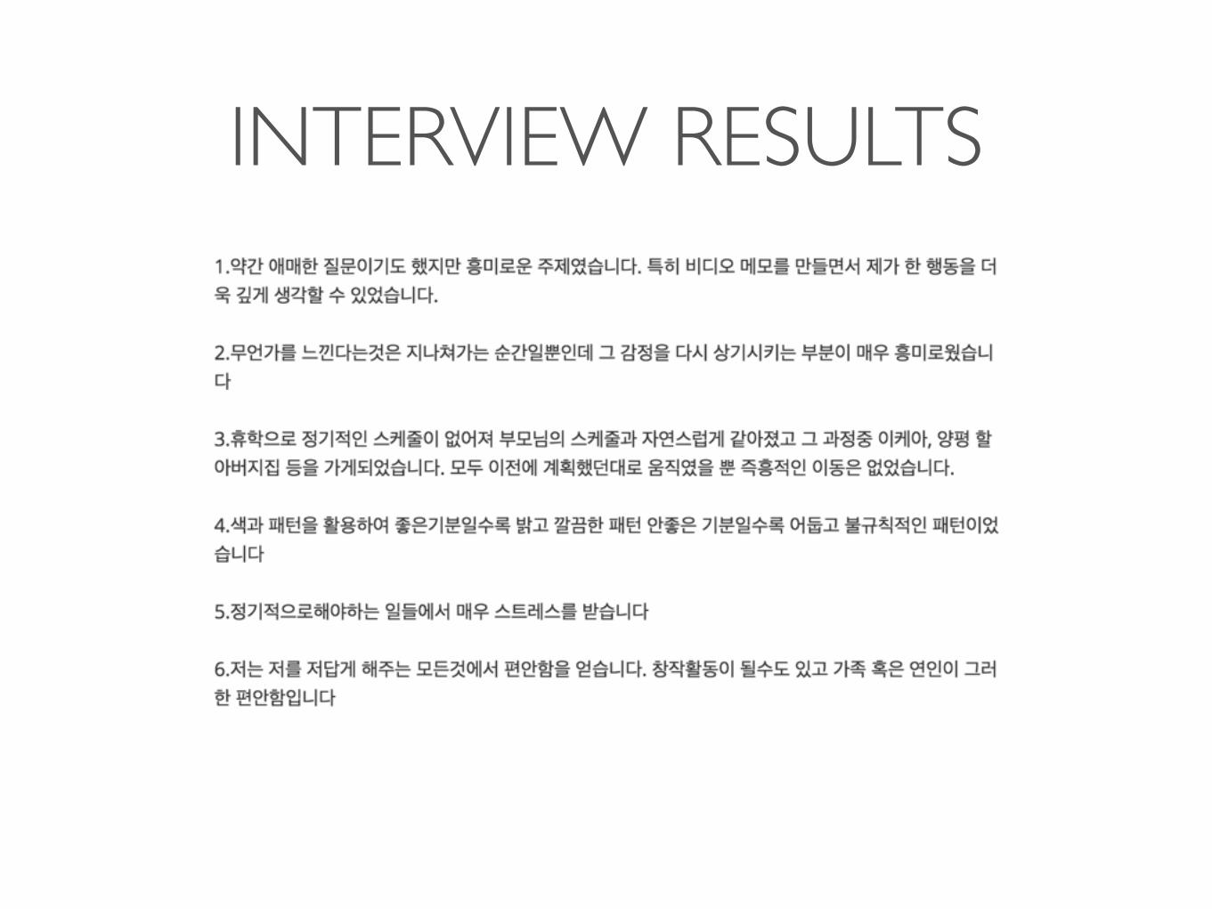
INTERVIEW RESULTS

INTERVIEW RESULTSKiyong Shin
• Doing the probe was very new and interesting to him.
• He was able to organize his life pattern while he was doing the probe.
• His area of activity is focused on Gangnam, Mapo, Nowon, Yongsan area. His home, and workplaces.
• Some of colors he chose fit into the general meanings of color but some are completely different from what we expected.
• He gets stress by the work that he has to do in the military.
• He relieves stress by meeting his friends, exercising, eating delicious food, and listening to hiphop music.

INTERVIEW RESULTS

INTERVIEW RESULTSJi Eun Kim
• She didn’t appreciated the package that much. She thought maybe this was for research process.
• She prefers places that are close to her home. During weekdays, she mostly goes to her university, where she doesn’t really like.
• She realized that even though she was living in Seoul for more than 10 years, she doesn’t know much about it.
• She used various colors to express her mood, and environment affects her a lot. (she used baby pink because cherry blossom was pretty)
• She gets stress from burden of work and relationship with other people.
• Exercising, date with her boyfriend, watching animation that she likes, and listening to priest reduce her stress.
INTERVIEW RESULTS

INTERVIEW RESULTS
Junha Kim
• At first questions felt vague, but were interesting
• Feelings are usually instantly there and gone. But by doing this activity, he could revisit those emotions and that was very interesting for him.
• He expressed his emotions using patterns
• He feels stress in daily routine works.
• He feels relaxed when doing familiar things.
• The places he goes affect his mood, in other words, environment.

INTERVIEW RESULTS

INTERVIEW RESULTSClaudia
• At first I felt awkward to do the package
• Work and homework makes her feel stressed
• Looking out a window helps reduce stress
• Watching videos of animals because it makes her laugh and happy
• Exercise reduces stress
• Orange is more relaxing like sunlight and blue is more boring
• Mostly the maps captured the regular routes that she takes

INTERVIEW RESULTS

INTERVIEW RESULTSTaylor
• Liked seeing her own positivity
• Tried to think about her feelings a lot
• Blue is relaxing, yellow is for energetic, orange is ambitious, and red is loved
• Not completing tasks that she wants to finish makes her stressed
• Sports, sleeping, and music help relieve stress
• When she needs energy she wants to be with people and when she needs to relax she likes to be in a quiet place alone

ANALYSIS 2• Mostly the maps captured the regular routes that people take and the amount that they usually travel
• Moods of introverts are heavily affected by external factors. For example, Ji Eun Kim, when describing why she chose certain colors, she said that environment hugely affected her decision. On the other hand, extroverts are not really affected by external factors. Previously we said that Claudia’s moods were affected by weather element. However, when cross-referenced with video memos, we found out that even when the weather was bad her attitude and general tone was light. Thus we concluded that extroverts (for example, Kiyong and Taylor) are not really affected by external factors. This leads to their choice of color-
• There are two groups considering Color sketch. One group uses simple colors or colors that are based on basic moods or weather. This group accept the general(popular) meaning of colors. The other group used various colors to express their mood. They have their unique, own meanings for the colors. When we look at the color sketches, we can see that the introverts are the ones who use colors uniquely in order to express their moods. Compared to introverts, extroverts resort to using general meaning of colors. We concluded that as introverts are more sensitive, they try more various ways to show their moods, while extroverts who are insensitive compared to introverts do not pay much attention in expressing their moods.

CONTEXT MAPPING

JOURNEY MAPPING

CONCLUSION• Concept: Interactive “Buddy” Wall that allows users to create a companion, interact with it,
visit it again in the future and relieve stress with their new buddy. The Buddies are more abstract and do not look like any one animal, but with feel familiar still and as if they exist. Each one can be unique and will recognize and follow their owner, creating a connection with them.
• Target Users: People in their late-twenties and early-thirties who are comfortable with technology and who lead busy lives.
• Location: In an urban area that they will pass by a lot to give it a more natural and calming feeling, and something to look forward to in the areas that they don’t necessarily like.
• Color scheme: Non-primary colors that are more natural and not too bright. It should feel realistic and not strain their eyes, with a soft glow that makes their buddy feel alive.

Thank you !