Embed Size (px)
DESCRIPTION
The purpose of this paper is to review the current status of the digital presence of Chartered Institutes (CI). In this Whitepaper, we will be looking at how successfully or how unsuccessfully CIs provide a good digital User Experience (UX) to their members and visitors.
Citation preview
User Experience of Chartered Institutes
– A review

Contents
Published by Zabisco Digital Limited
Introduction
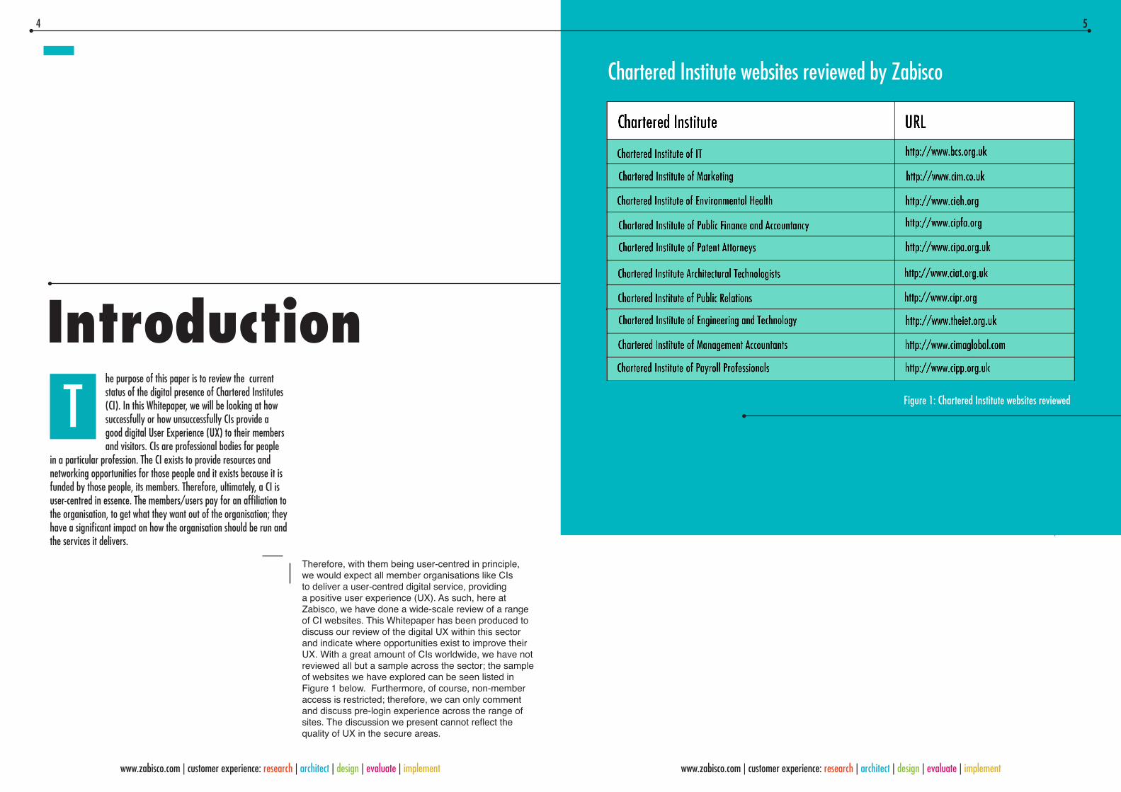
Chartered Institute websites reviewed by Zabisco
Zabisco UX consultancy & design
User Experience/UX
The start of the user journey – The homepage
User-driven focus vs organisation focus
User interface
Using a hero
Navigation
User engagement Accessibility
Mobile and responsive web design
Summary
Table of figures
4
5
6
7
9
12
18
18
19
22
23
27
30
By Natalie Moore - Customer Experience Researcher
Hammad Khan - Director of User Experience
32
2 3
www.zabisco.com | customer experience: research | architect | design | evaluate | implement www.zabisco.com | customer experience: research | architect | design | evaluate | implement
Introduction
Therefore, with them being user-centred in principle, we would expect all member organisations like CIs to deliver a user-centred digital service, providing a positive user experience (UX). As such, here at Zabisco, we have done a wide-scale review of a range of CI websites. This Whitepaper has been produced to discuss our review of the digital UX within this sector and indicate where opportunities exist to improve their UX. With a great amount of CIs worldwide, we have not reviewed all but a sample across the sector; the sample of websites we have explored can be seen listed in Figure 1 below. Furthermore, of course, non-member access is restricted; therefore, we can only comment and discuss pre-login experience across the range of sites. The discussion we present cannot reflect the quality of UX in the secure areas.
he purpose of this paper is to review the current status of the digital presence of Chartered Institutes (CI). In this Whitepaper, we will be looking at how successfully or how unsuccessfully CIs provide a good digital User Experience (UX) to their members and visitors. CIs are professional bodies for people
in a particular profession. The CI exists to provide resources and networking opportunities for those people and it exists because it is funded by those people, its members. Therefore, ultimately, a CI is user-centred in essence. The members/users pay for an affiliation to the organisation, to get what they want out of the organisation; they have a significant impact on how the organisation should be run and the services it delivers.
5
www.zabisco.com | customer experience: research | architect | design | evaluate | implement www.zabisco.com | customer experience: research | architect | design | evaluate | implement
T Figure 1: Chartered Institute websites reviewed
Chartered Institute websites reviewed by Zabisco
4 5
www.zabisco.com | customer experience: research | architect | design | evaluate | implement www.zabisco.com | customer experience: research | architect | design | evaluate | implement

In the following sections of this paper, we will discuss what UX is and why it should be a fundamental concern in digital design. In our review of the CI websites, we will evaluate the various factors that create the UX, discuss what makes good UX in relation to these aspects and highlight examples across the CIs sector that we have researched where we feel the UX is being addressed effectively and where it could be much improved.
At Zabisco, we specialise in understanding users, their needs and motivations. We shape their digital experience through designing the environment and tools which create that experience, with the end users always in mind. For us, users come first and remain the key consideration throughout.
Zabisco UX consultancy & design
User Experience/UX
Firstly, why should UX be considered at all? What does UX really mean in digital design? UX is a well-established profession and an integral part of digital design because it is identifiably important. The term is reasonably self-explanatory; we work on the experi-ence that a user has when using a digital service. Those two words can be considered individually though to give two key factors why this practise is important and what should be taken into account: who is the user and what is the experience?
So, who is the user? Professional bodies, such as CIs, provide services for a particular group of people as they exist around a certain profession. The organisa-tion’s purpose is to deliver resources and opportunities relevant to people who work in a particular field. This does not mean, h owever, that those people’s drivers, interests and motivations are necessarily the same. The CI may be providing services for a large population of people with one major element in common, but that does not mean that there is little diversity within that group.
When considering who the visitors to the website of a CI are, the diversity in who they are, why they are visiting the website and what they may want from it becomes apparent. Firstly, there are members and non-members; instantly there are two factions of people with a different reason for visiting the website. Within those two groups are different types of users: not only different job roles, gender and ages, but different levels of internet literacy, knowledge, loyalty or affiliation and attitudes. Each of these users may be engaging with the website with a different motivation and goal and, therefore, will have a different experience from the same site. Considering who your users are should be the first thing identified when designing a website and should remain at the forefront throughout.
76
www.zabisco.com | customer experience: research | architect | design | evaluate | implement
Then, consider the experience those users will have from the website. We’ve established there are different users, with different needs and wants, but what is the same is that all users will be seeking a satisfying experience. The experience is important;
it affects the user’s perception of the organisation, the level of engagement this incites with the organisation and potential leads created with the organisation beyond the website. As stated, organisations like CIs exist for their users and remain in existence by retaining and attracting new members and, thus, funding. Therefore, the UX of the website is an integral part to the success of the organisation.
The positivity of this experience is determined by how easy the user journey is and whether the user gets what they want from it. A user journey is the route a visitor to the website takes to find what they want: the pathway from A to B. This may be via C, D and E; it may be as short or long, simple or complicated as the design of the website helps to make it. In the following parts of this paper, we will discuss the elements of the CIs website designs that shape the user journey and the overall UX. There are many factors of digital design that combine to create the UX and each of these, and the interactions between them, should be considered. We have broken these aspects down into a 10-point review, listed below.
T
We discuss CI websites throughout this paper in terms of these points and their inter-relationships; some are considered in conjunction where they heavily interact. Firstly, however, we’re looking at the beginning of the user journey and first impressions before we review in a greater level of detail, although some of these points will of course be touched upon.
1. User-driven vs organisation-driven focus
2. Information architecture
3. User interface
4. Interactivity and engagement
5. Aesthetic appeal and media
6. Accessibility
7. Functionality and features
8. Content
9. Social integration and sharing
10. Mobile and responsive web design
The start of the user journey – The homepageActually, the start of the journey is not the homepage; the start of the journey is the user’s motivation and how they find their way to the website. This highlights our first point – the user, who they are and their motivations and goals, always comes first. Something to consider…
For the purposes of this paper, however, to address the website UX, the starting point for a user interacting with the organisation’s digital service is the homepage. This is the first interface they see, where they begin to find what they are looking for. From this first impression, the user will obtain a perception of the organisation and an instant perception of how easy this website may be to explore and identify what they are searching for. For instance, look at the examples below; it can be seen with these how the design affects the appeal of the site and sets expectations of how easy the site may be to use. Some comments follow giving examples why we selected these.
8 9
www.zabisco.com | customer experience: research | architect | design | evaluate | implement www.zabisco.com | customer experience: research | architect | design | evaluate | implement
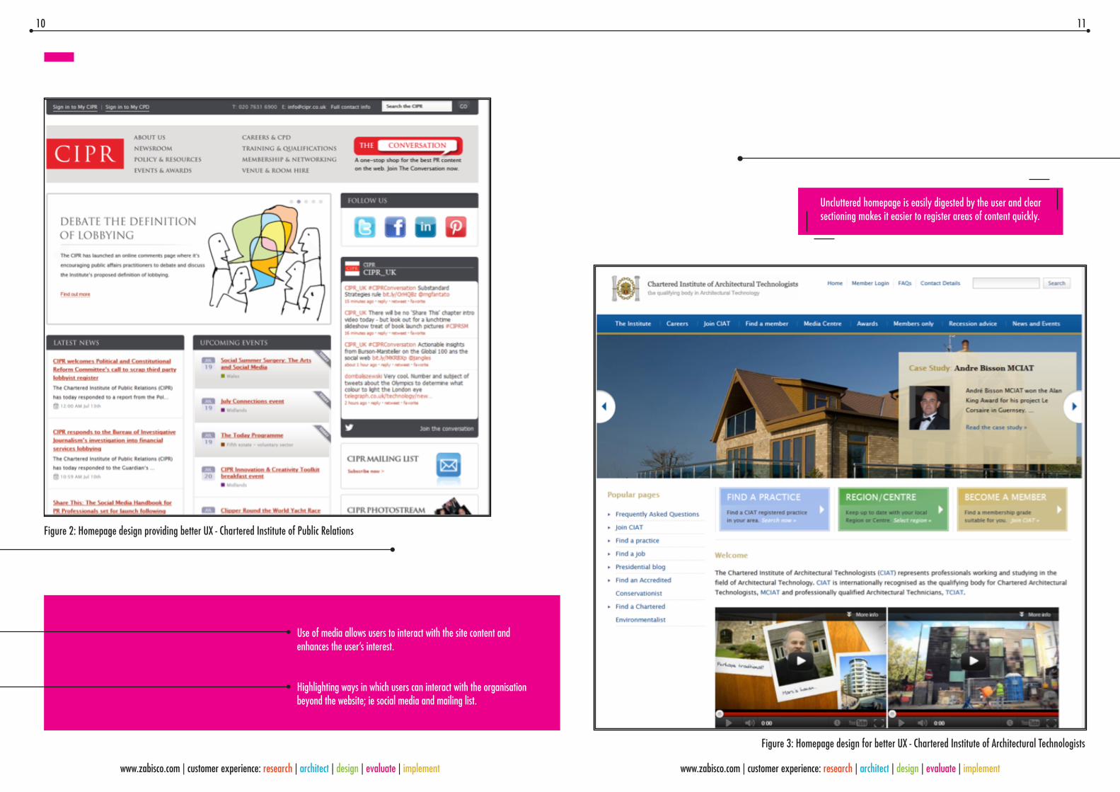
Figure 2: Homepage design providing better UX - Chartered Institute of Public Relations
Figure 3: Homepage design for better UX - Chartered Institute of Architectural Technologists
Uncluttered homepage is easily digested by the user and clear sectioning makes it easier to register areas of content quickly.
Use of media allows users to interact with the site content and enhances the user’s interest.
Highlighting ways in which users can interact with the organisation beyond the website; ie social media and mailing list.
10 11
www.zabisco.com | customer experience: research | architect | design | evaluate | implement www.zabisco.com | customer experience: research | architect | design | evaluate | implement

User-driven focus vs organisation focusAs we have said, the user comes first. The users’ wants, needs, motivations and goals will determine why and how they approach and go through a website. So, logically, provide users a journey based on who they are and what they need: streamline their journey and make it easier for them. As reiterated throughout this paper, considering whom your users are and their motivations and keeping this at the forefront throughout ensures a user-centred design.
A user journey initiates from the homepage, therefore the digital service should be user-centred from this point. Some CI websites we have seen incorporate this principle to some extent, to direct people to areas of the website related to that user, by having links on the homepage for employers or students, but this does not delve deep enough into who these users are or their motivations, which in turn would help shape the best user journeys for them.
Two CIs have recently undergone a website redesign: the Chartered Institute of IT and the Chartered Institute of Engineering and Technology. The Chartered Institute of Engineering and Technology was a UX design by Zabisco. In both cases, a user-centred design approach was employed to improve their online presence and the UX for members and visitors to their website. In both cases, the redesign resulted in a user-specific starting point to navigate from, clearly visible on the homepage. Both CIs use an interactive hero to display this information, making it noticeable and distinct, shown below in Figures 4 and 5. The value of using tools such as this is covered later in the paper.
Figure 4: User-driven navigation - Chartered Institute of IT
Figure 5: User-driven navigation - Chartered Institute of Engineering and Technology
12 13
www.zabisco.com | customer experience: research | architect | design | evaluate | implement www.zabisco.com | customer experience: research | architect | design | evaluate | implement

It is still possible to navigate to areas of the site from the homepage immediately, of course, by content or resources the Institute offer, and this is appropriate and important, but the option is available to filter information based on the user. Allowing members and visitors to engage with the website from the outset based on who they are creates an enhanced experience, of having a focused and relevant relationship with the Institute.
Many of the websites reviewed, however, do not take this approach. They are designed around what the organisation has to offer in terms of departments or services rather than whom they are offering it to. As stated above, content-driven navigation options are important, but this too can be user-centred to give a good UX. Of course, being user-centred does not mean everything must derive from a specific user perspective. Yes there are variations amongst user groups as outlined earlier in this paper, but there are some commonalities in terms of content they will be looking for. Therefore, some task or organisation-based content is user-centred, but which elements these are needs to be identified and the presentation of them must be considered to provide an optimal user journey. This is where many CI websites could be improved. For example, Figures 6, 7 and 8 demonstrate a poor UX in terms of content navigation and comments below each outline some reasons why this is the case.
Figure 6: Poor UX design - Chartered Institute of Environmental Health
• There is a lack of logical organisation to the main links in the centre of the homepage.
• It is not immediately obvious or intuitive what information all of the links will provide, particularly to a novice visitor • The benefit of using imagery has not been effectively included to enhance user understanding of the content.
14 15
www.zabisco.com | customer experience: research | architect | design | evaluate | implement www.zabisco.com | customer experience: research | architect | design | evaluate | implement

Figure 8: UX not addressed - Chartered Institute of Internal Auditors
The content is there, but it is not engaging in terms of user or content type, nothing stands out, making the user have to seek out any information and therefore not providing the easiest user journey from the start.
The scrolling feed on the right ‘What’s New’ is bland, not well-spaced and moves too quickly to read the longer pieces of text easily and comfortably.
In member organisations such as CIs, membership and disseminating information through news or offered services are most commonly placed at the forefront on homepages. However, the more contemporary websites with better UX present these aspects in a visually more appealing and immediate way, enabling users to easily access this information more instantly – thus providing a user-centred UX. Some examples of CIs who address these aspects are featured above in Figures 9 and 10.
Figure 7: Poor UX design - The Chartered Institute of Patent Attorneys
• Disorganised layout; for example, there is an Upcoming events section but they are scat tered all over the homepage and not clear.
• The use of so many different fonts and colours is distracting and makes the page look cluttered; there is no consistency to help guide the user.
Figure 9: Chartered Institute of Public Relations Figure 10: Chartered Institute of Public Relations
16 17
www.zabisco.com | customer experience: research | architect | design | evaluate | implement www.zabisco.com | customer experience: research | architect | design | evaluate | implement
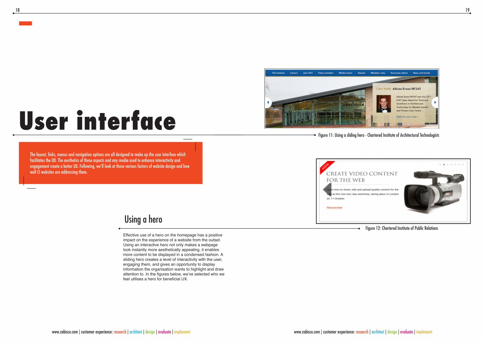
Using a heroEffective use of a hero on the homepage has a positive impact on the experience of a website from the outset. Using an interactive hero not only makes a webpage look instantly more aesthetically appealing, it enables more content to be displayed in a condensed fashion. A sliding hero creates a level of interactivity with the user, engaging them, and gives an opportunity to display information the organisation wants to highlight and draw attention to. In the figures below, we’ve selected who we feel utilises a hero for beneficial UX.
User interfaceThe layout, links, menus and navigation options are all designed to make up the user interface which facilitates the UX. The aesthetics of these aspects and any media used to enhance interactivity and engagement create a better UX. Following, we’ll look at these various factors of website design and how well CI websites are addressing them.
Figure 11: Using a sliding hero - Chartered Institute of Architectural Technologists
Figure 12: Chartered Institute of Public Relations
18 19
www.zabisco.com | customer experience: research | architect | design | evaluate | implement www.zabisco.com | customer experience: research | architect | design | evaluate | implement

Menus and links should be clear and direct the user on a streamlined journey. Cluttered pages should be avoided, so making use of interactive features such as drop down menus, heroes, sliding and collapsible panels allows for content to be displayed in a condensed and organised format. This approach is more digestible for the user. For example, as shown below in Figure 13, the use of drop down menus on the main navigation provides better UX in terms of displaying immediately to the user what content a section contains without having to leave the page they are currently on.
NavigationOf course, a critical part of the user journey and UX created is the navigation. Several factors impact whether the navigation provides a good UX or not: a combination of the Information Architecture, aesthetic design and interactivity involved. We’ve previously discussed initiating a user-centred navigation from the homepage but it is important to retain a user-centred perspective throughout in forming user journeys.
Figure 13: Use of a drop down menu - Chartered Institute of Personnel and Development
The drop down menu enables content to be condensed and reduce the amount of information required on the homepage.
It enables the user to find out what clicking a tab could lead them to without having to leave the page they are on, there-fore reducing page loading or the potential for beginning on an incorrect journey to find what they want.
Very few of the CI websites utilise other features outlined above such as sliding and collapsible panels. This interactivity engages users and makes them want to look at what is there. In Figures 14 and 15 are examples from our own website design for the Institute of Engineering and Technology to demonstrate the effectiveness of these interactive features.
Within the site, cues and feedback to the user are important to facilitate their journey. As can be seen in the figures 14 and 15, small visual cues can make significant changes to user understanding. In each of these images, the interactivity of these areas is indicated by the inclusion of the arrows. They intuitively signal to the user this means they can click on the content to move it in a direction. The arrows on the collapsible panel in Figure 14 change direction to feedback to the user which section is ‘open’ to reveal information.
Feedback and cues are important throughout navigation, to indicate to the user where they are on the site and what their options are and their actions mean. The use of colour is important; for example on the main navigation, changing the colour of a tab compared to the rest of the tabs highlights to the user what section they are on. This can be done texturally also, for example by changing the impression of the text when the mouse hovers over it indicates to the user it is a clickable link. Breadcrumbs are a useful tool to simply demonstrate to the user where they are on the site, where they were previously and allow them to go back to a section in one action.
Figure 15: Sliding menu panel - Institute of Engineering and Technology
Figure 14: Collapsible menu panel - Institute of Engineering and Technology
20 21
www.zabisco.com | customer experience: research | architect | design | evaluate | implement

User engagement
Visitors to the CI websites, members or non-members, need to be encouraged to explore the website for this resource to fulfil its purpose. A visitor firstly wants to achieve their goal and get what they want out of the website and a bonus is being attracted to view other areas of the site. In order to do both these things, the website needs to be inviting and enable the user to engage with the service it provides. Photos and images are incorporated in the majority of the websites we have reviewed, which does serve to enhance the appeal of a website. In some cases, appealing aesthetics are utilised well on the homepage but not carried through to sub-level pages.
The Chartered Institute of Environmental Health is an example showing how poor aesthetic design make a website much less inviting to read and explore; users are not attracted and drawn in to the content.
Figure 16: Collapsible menu panel to condense information - Institute of Engineering and Technology
Figure 17: Chartered Institute of Environmental Health
Figure 18: Chartered Institute of Environmental Health
22 23
www.zabisco.com | customer experience: research | architect | design | evaluate | implement
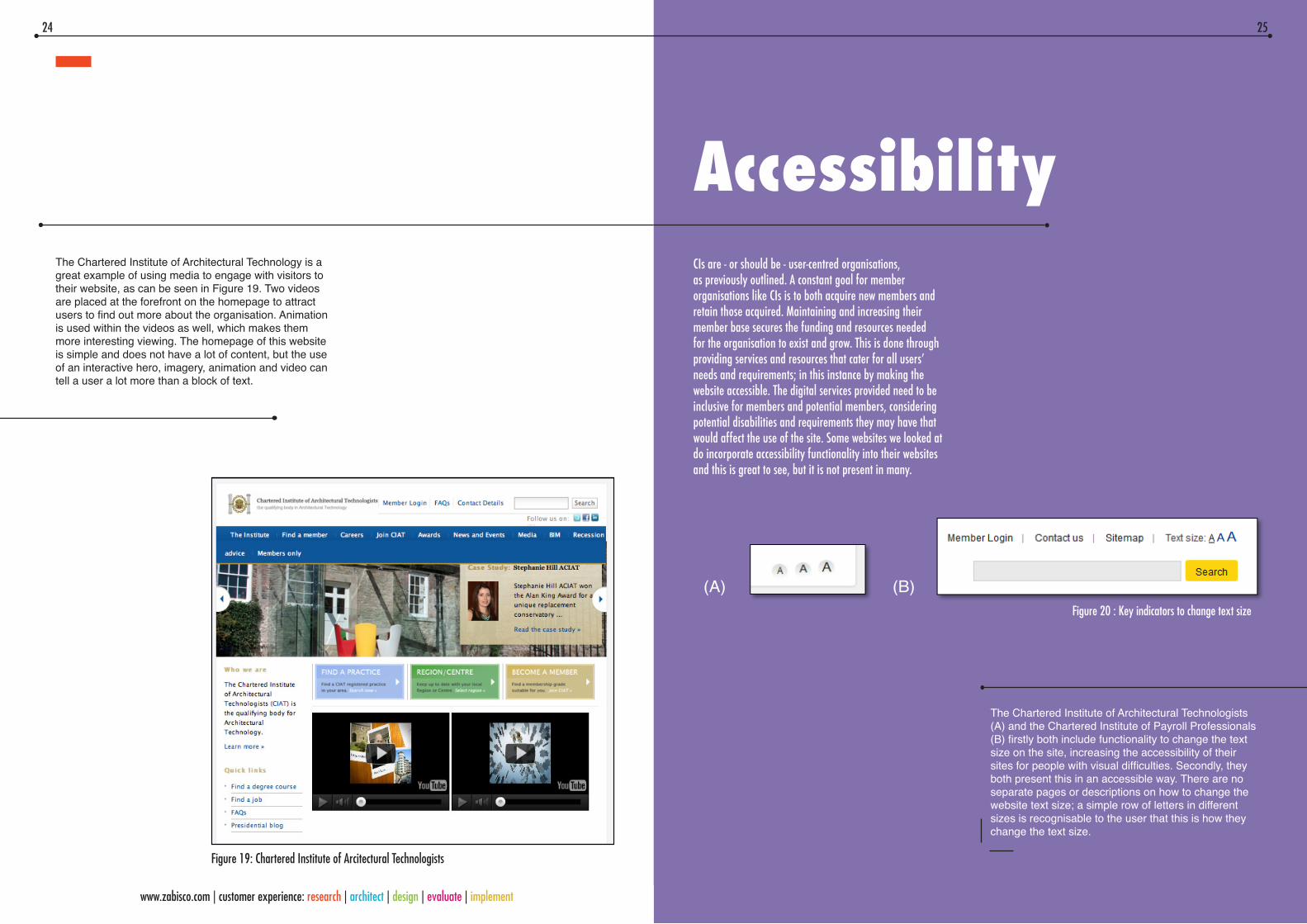
AccessibilityCIs are - or should be - user-centred organisations, as previously outlined. A constant goal for member organisations like CIs is to both acquire new members and retain those acquired. Maintaining and increasing their member base secures the funding and resources needed for the organisation to exist and grow. This is done through providing services and resources that cater for all users’ needs and requirements; in this instance by making the website accessible. The digital services provided need to be inclusive for members and potential members, considering potential disabilities and requirements they may have that would affect the use of the site. Some websites we looked at do incorporate accessibility functionality into their websites and this is great to see, but it is not present in many.
The Chartered Institute of Architectural Technology is a great example of using media to engage with visitors to their website, as can be seen in Figure 19. Two videos are placed at the forefront on the homepage to attract users to find out more about the organisation. Animation is used within the videos as well, which makes them more interesting viewing. The homepage of this website is simple and does not have a lot of content, but the use of an interactive hero, imagery, animation and video can tell a user a lot more than a block of text.
Figure 19: Chartered Institute of Arcitectural Technologists
The Chartered Institute of Architectural Technologists (A) and the Chartered Institute of Payroll Professionals (B) firstly both include functionality to change the text size on the site, increasing the accessibility of their sites for people with visual difficulties. Secondly, they both present this in an accessible way. There are no separate pages or descriptions on how to change the website text size; a simple row of letters in different sizes is recognisable to the user that this is how they change the text size.
Figure 20 : Key indicators to change text size
(A) (B)
24 25
www.zabisco.com | customer experience: research | architect | design | evaluate | implement
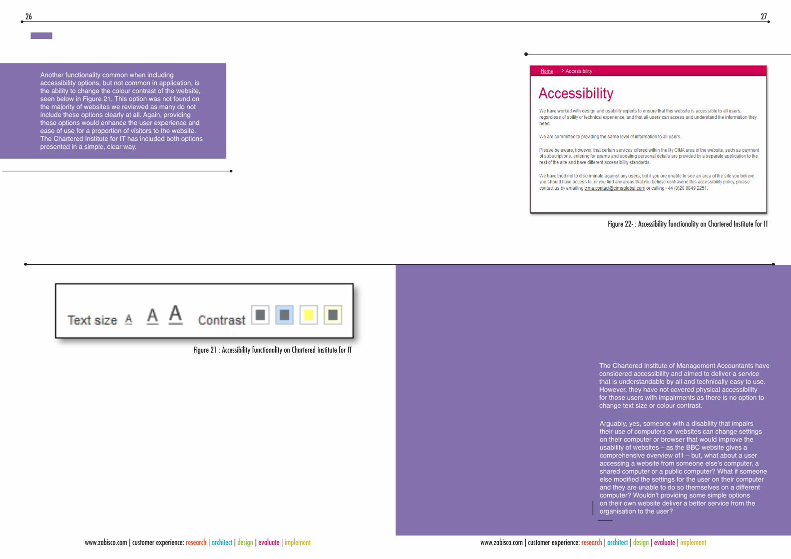
Another functionality common when including accessibility options, but not common in application, is the ability to change the colour contrast of the website, seen below in Figure 21. This option was not found on the majority of websites we reviewed as many do not include these options clearly at all. Again, providing these options would enhance the user experience and ease of use for a proportion of visitors to the website. The Chartered Institute for IT has included both options presented in a simple, clear way.
The Chartered Institute of Management Accountants have considered accessibility and aimed to deliver a service that is understandable by all and technically easy to use. However, they have not covered physical accessibility for those users with impairments as there is no option to change text size or colour contrast.
Figure 21 : Accessibility functionality on Chartered Institute for IT
Figure 22- : Accessibility functionality on Chartered Institute for IT
Arguably, yes, someone with a disability that impairs their use of computers or websites can change settings on their computer or browser that would improve the usability of websites – as the BBC website gives a comprehensive overview of1 – but, what about a user accessing a website from someone else’s computer, a shared computer or a public computer? What if someone else modified the settings for the user on their computer and they are unable to do so themselves on a different computer? Wouldn’t providing some simple options on their own website deliver a better service from the organisation to the user?
26 27
www.zabisco.com | customer experience: research | architect | design | evaluate | implement www.zabisco.com | customer experience: research | architect | design | evaluate | implement

Mobile and responsive web designThe digital world and how people access websites is changing. Sales in desktop PCs are declining and we are seeing an increased market in mobile devices such as smartphones and tablets. The graph below shows recent and predicted trends.
Figure 23 : Trend in smartphone sales
Apple’s iPhones and iPads are leading this market with others quickly following suit. At the beginning of this year, Microsoft published a report on their upgraded operating system Windows 8 and outlines how it will be an upgrade for better experience on mobile devices. The user experience to be had in comparison to Windows 7 on a PC will be very similar; the improvements are proposed to be significant for small portable devices like tablets and smartphones, suggesting that Microsoft recognise this as the changing face of the digital market.” “3” on page 33
At Zabisco we created an infographic on the UK smartphone market in 2011, demonstrating the trend towards smartphone usage. An excerpt from this is above in Figure 24.
Figure 24: Infographic on UK smartphone market 2011– Zabisco
This has significant implications for UX and web design, and the accessibility and usability of websites when put into today’s contexts. If many people already, and continuously increasing amounts of people, are accessing websites on mobiles, it should be a priority whether your website is suitable for browsing on a mobile.
There are fundamental differences between mobiles and desktops which mean that a desktop website design does not transfer well to mobile browsing. The screen is obviously smaller, so how easy content is to see and read becomes an issue. The users do not have a mouse to navigate and select buttons and content, they use their fingers; target sizes become an issue. It is not so easy and is frustrating for a user to type a lot of information using touchscreen; minimising the need for user input becomes important. In addition to these issues, internet connectivity on a mobile can be less stable. Page loading can be slower, therefore the content and navigation should be designed with this accounted for; minimise the need for input and page reloading.
Of those we’ve reviewed, even the RC websites that we determine provide better UX are not optimised for mobile and this is certainly a domain that anyone providing digital services should be moving towards. We recently published a blog on the key factors of great mobile web design; for more information on effective mobile web design, this can be viewed at http://www.zabisco.com/blog/the-keys-to-great-mobile-web-design/.
28 29
www.zabisco.com | customer experience: research | architect | design | evaluate | implement
SummaryTo sum up what we’ve been discussing in this paper, we’ve selected some examples from the websites we reviewed that we rate higher in terms of aspects of user experience and rank them here for their overall user experience. There are 8 Chartered Institutes appraised here; all go some lengths to address the user experience and succeed in elements, but on exploring the sites they begin to separate out…
Firstly, of course, the Chartered Institute of Engineering and Technology (IET) rates highly with us – we designed it. When designing a website we consider all the aspects of the user experience discussed in this paper as we recognise the value of doing so. IET comes up top because it gives a user-centred experience from the outset and this carries through the site and through the user journey. The IET website does not incorporate the accessibility functionality discussed in this paper, but unfortunately this aspect is rarely high on the clients’ priority list and is not fit into the agenda. The Chartered Institute for IT (BCS) also incorporates a user-driven journey through their site and navigation tools such as a hero and mega-nav; but the website is lacking in aesthetic appeal, visual cues to the user for multimedia, interactive tools to condense and break down information…we feel it could be improved.
The Chartered Institute of Public Relations (CIPR), the Chartered Institute of Payroll Professionals (CIPP), the Chartered Institute of Marketing (CIM) and the Chartered Institute of Architectural Technologists (CIAT) we rank somewhat alongside each other. They all do include some video media to enhance the content of the website and begin with providing an appealing homepage. However, first impressions are not everything, particularly when evaluating the holistic user experience. Unfortunately the rest of the content is not presented so interestingly or in fact user-friendly; it is not so easy for a user to find what they are looking for without reading through a long column or block of text. Aesthetic design would improve these websites – font style, colour, layout all do have an important impact on user experience.
The Chartered Institute of Public Finance & Accountancy (CIPFA) rates just above the ones we present following. CIPFA uses some good navigation tools from the homepage: a sliding hero and mega-nav drop-down or pop-up menus. It has a clear, simple, uncluttered layout which carries through to sub-levels. Unfortunately the experience becomes bland; there is a lack of intelligent use of imagery and interactivity to assist the user in their journey and make it more appealing.
The Chartered Institute of Management Accountants (CIMA) we would highlight next and are pleased to see them adopting a design to facilitate the user experience. There are interactive tools and helpful navigation tools, there is use of media and – most importantly – this carries through the site to sub-level pages making them easy to digest.
None of these websites have a user-driven approach in the same capacity as the IET website or BCS website. All of these websites are difficult to rank in a definitive order; different sites provide better or worse user experience in different aspects of the information architecture and design. To provide an optimal user experience all aspects need to be considered in a holistic approach to the design.
30 31
www.zabisco.com | customer experience: research | architect | design | evaluate | implement www.zabisco.com | customer experience: research | architect | design | evaluate | implement
Table of Figures
5 -
10 -
11-
13 -
13 -
15 -
16 -
17 -
17 -
19 -
19 -
20 -
21 -16 -
Figure 1: Chartered Institute websites reviewed
Figure 2: Homepage design providing better UX - Chartered Institute of Public Relations
Figure 3: Homepage design for better UX - Chartered Institute of Architectural Technologists
Figure 4: User-driven navigation - Chartered Institute of IT
Figure 5 : User-driven navigation - Chartered Institute of Engineering and Technology
Figure 6: Poor UX design - Chartered Institute of Environmental Health
Figure 7 - The Chartered Institute of Patent Attorneys
Figure 8: UX not addressed - Chartered Institute of Internal Auditors
Figure 9: Chartered Institute of Public Relations
Figure 10: Charterered Institute of Public Relations
Figure 11: Uaing a sliding hero - Chartered Institute Arcitec-tural Technologists
Figure 12: Chartered Institute of Public Relations
Figure 13: Use of drop down menu - Chartered Institute of Personnel and Development
Figure 14: Collapsible menu panel - Institute of Engineering and Technology
21 -
22 -
23 -
24 -
25 -
Figure 15: Sliding menu panel - Institute of Engineering and Technology
Figure 16: Collapsible menu panel to condense information - Institute of Engineering and Technology
26 -
23 -
Bibliography
2 http://money.cnn.com/2010/07/20/technology/desktop_PC_death/index.htm
1 http://www.bbc.co.uk/accessibility
3http://money.cnn.com/2010/07/20/technology/desktop_PC_death/index.htm
Figure 17: Chartered Institute of Environmental Health
Figure 18: Chartered Institute of Environmental Health
Figure 19: Chartered Institute of Arcitectural Technologists
Figure 20 : Key indicators to change text size
Figure 21 : Accessibility functionality on Chartered Institute for IT
Figure 22- : Accessibility functionality on Chartered Institute for IT
Figure 23 : Trend in smartphone sales
27 -
28 -
Figure 24: Infographic on UK smartphone market 2011 – Zabisco
28 -
32 33
www.zabisco.com | customer experience: research | architect | design | evaluate | implement www.zabisco.com | customer experience: research | architect | design | evaluate | implement
Published by Zabisco Digital Limited
www.zabisco.com | customer experience: research | architect | design | evaluate | implementwww.zabisco.com | customer experience: research | architect | design | evaluate | implement


![[UX Series] 1 - UX Introduction](https://img.pdfslide.net/doc/110x75/563db7f0550346aa9a8f53b0/ux-series-1-ux-introduction.jpg)