Embed Size (px)
Citation preview

Exploratory Multilevel Hot Spot Analysis:Australian Taxation Office Case Study
Denny1,2 Graham J. Williams3,1 Peter Christen1
1 Department of Computer Science,The Australian National University,
Canberra 0200, Australia,Email: [email protected], [email protected]
2 Faculty of Computer Science,University of Indonesia
3 The Australian Taxation Office,Email: [email protected]
Abstract
Population based real-life datasets often containsmaller clusters of unusual sub-populations. Whilethese clusters, called ‘hot spots’, are small and sparse,they are usually of special interest to an analyst.In this paper we introduce a visual drill-down Self-Organizing Map (SOM)-based approach to exploresuch hot spots characteristics in real-life datasets. It-erative clustering algorithms (such as k-means) andSOM are not designed to show these small and sparseclusters in detail. The feasibility of our approach isdemonstrated using a large real life dataset from theAustralian Taxation Office.
Keywords: self-organizing maps, cluster analysis,neural network, imbalanced data, drill-down, visual-ization.
1 Introduction
Cluster analysis is often used to help in understandingand dealing with the complexities of large datasets.For example, it may be easier to devise marketingstrategies based on groupings of customers sharingsimilar characteristics because the number of group-ings/clusters can be small enough to make the taskmanageable.
Self-Organizing Map (SOM) (Kohonen 1982) is apopular tool for cluster analysis for several reasons.First, SOM performs topological mapping from high-dimensional data into a two-dimensional map wheresimilar entities are placed nearby. Second, SOM per-forms vector quantization which produces a smallerrepresentative dataset that follows the distribution ofthe original dataset. Third, SOM offers various vi-sualizations which are relatively easy to interpret fornon-technical users when exploring a dataset. Appli-cations of SOM for cluster analysis can be found inmany domains, such as health (Markey et al. 2003,Viveros et al. 1996) or marketing (Dolnicar 1997).
In real life, cluster sizes are normally not equal andclusters do not have the same interestingness. Distri-bution of clusters is often very skewed as captured bythe Pareto distribution (Pareto 1972) also known asthe “80:20 rule”. Thus, the interesting clusters are
Copyright c©2007, Australian Computer Society, Inc. This pa-per appeared at the Sixth Australasian Data Mining Confer-ence (AusDM 2007), Gold Coast, Australia. Conferences in Re-search and Practice in Information Technology (CRPIT), Vol.70. Peter Christen, Paul Kennedy, Jiuyong Li, Inna Kolyshkinaand Graham Williams, Ed. Reproduction for academic, not-forprofit purposes permitted provided this text is included.
usually only a small fraction of a dataset. Further-more, the variance of items at the tail or margin ofthe normal distribution of a population is also largercompared to the center of the normal distribution. Inother words, in real life it is common to find largedense clusters for common sub-populations and smallsparse clusters for interesting sub-populations. In ataxation context this could be a group of tax enti-ties who have a tax debt, while in an insurance con-text this could be a group of high claiming clients.Williams (1999) proposed the hot spots methodologythat aims to identify important or interesting groupsin a very large dataset. The methodology uses a com-bination of clustering and rule induction. As a re-sult, business organizations can make improvementson their strategies, such as treatment strategies to im-prove tax compliance, by understanding these smalland interesting clusters that are called hot spots. Itcan be interesting to analyze these hot spots in rela-tion to the whole population.
However, iterative clustering algorithms (such ask-means) and SOM tend to merge these small sparseclusters, thus reducing the ability to analyze themin detail. The k-means algorithm tries to generate arelatively uniform distribution on the cluster sizes asshown by Xiong et al. (2006). As a result, k-means isunsuitable for highly skewed datasets.
When SOM is used for cluster analysis, it also hassimilar issues. Increasing the map size of a SOM onlygives a better resolution map (in terms of lower quan-tization error and finer cluster borders) but with sig-nificant additional computational cost. However, anincreased map size does not provide extra informationabout these small and sparse clusters. Small sparseclusters are represented as a few nodes in a SOM,which reduces the capability to characterize them.
Hierarchical clustering algorithms (Han & Kam-ber 2006), on the other hand, require high compu-tational resources, thus making them impractical forvery large datasets. Furthermore, different definitionsof between cluster distances (such as minimum, max-imum, or average distance) will often produce differ-ent clustering results. Moreover, the definition of thebetween cluster distance has to be determined before-hand.
Therefore, the approach presented in this paper isaimed to help analysts to identify and understand hotspots behaviour. The main contribution of our ap-proach is drill-down hot spot exploration using SOM-based visualizations that capable in handling imbal-anced data.
The rest of the paper is organized as follows. Sec-tion 2 briefly introduces SOMs and explain their limi-
73

0
1
2
0
1
2
Figure 1: Local lattice structure: hexagonal topol-ogy (left) and rectangular topology (right) and itsneighbourhood radius in the map space (adaptedfrom Vesanto et al. (2000)).
tation for analyzing hot spots. Section 3 reviews cur-rent SOM-based clustering techniques. Our approachis discussed in Section 4 and Section 5 discusses theresults of our experiments with a real life dataset fromthe taxation domain.
2 Self-Organizing Maps
A SOM is an artificial neural network that performsunsupervised competitive learning (Kohonen 1982).Importantly, SOMs allow the visualization and ex-ploration of a high-dimensional data space by non-linearly projecting it onto a lower-dimensional man-ifold, most commonly a 2-D plane (Kohonen 2001).Artificial neurons are arranged on a low-dimensionalgrid. Each neuron i has an n-dimensional prototypevector, mi, also known as a weight or codebook vec-tor, where n is the dimensionality of the input data.Each neuron is connected to neighbouring neurons,determining the topology of the map. In a hexago-nal grid, each neuron is connected to six neighbours,while in a rectangular grid each neuron is connectedto four neighbours, as shown in Figure 1. In the mapspace, neighbours are equidistant.
SOMs are trained by presenting data vectors to themap and adjusting the prototype vectors accordingly.These prototype vectors are initialized to differentvalues. There are two approaches to training a SOM:sequential training and batch training. In sequentialtraining, one data vector is presented to the map ata time and the prototype vectors are updated. Onthe other hand, in batch training, the whole datasetis presented to the map and all prototype vectors areupdated at once.
In sequential training, the training vectors can betaken from the dataset in random order, or cycli-cally. At each training step t, the Best Matching Unit(BMU) bi for training data vector xi, i.e. the proto-type vector mj closest to the training data vector xi,is selected from the map according to Equation 1:
∀j, ‖xi −mbi(t)‖ ≤ ‖xi −mj(t)‖, (1)
where only non-missing values are used in the distancecalculation. Then, the prototype vectors of node biand its neighbours are moved closer to xi:
mj(t + 1) = mj(t) + α(t)hbij(t)[xi −mj(t)], (2)
where α(t) is the learning rate (a tuning parame-ter) and hbij(t) is the neighbourhood function (oftenGaussian) centered on bi. This process of updatingthe prototype vectors is repeated until a predefinednumber of iteration or epochs is completed. Bothα(t) and the radius of hbij(t) are decreased after eachiteration. Since the time complexity of SOMs is linear
in the number of prototype vectors, number of datavectors, and number of iteration, SOMs are able tocope with large and high-dimensional datasets.
In the batch algorithm, the values of new proto-type vectors are the weighted averages of the trainingdata vectors that are mapped to mj and its neigh-bours, where the weight is the neighbourhood ker-nel value hbij centered on unit bi (Kohonen 2001).The new prototype vectors are calculated using Equa-tion 3.
mj(t + 1) =∑N
i=1 hbij(t)xi∑Ni=1 hbij(t)
, (3)
where N is the number of training data vectors. SOMis capable in handling missing values, as Equation 3only performs summation and counting of the non-missing values.
The batch algorithm is similar to k-means. Thedifference is that the batch algorithm uses weightsin calculating the new ‘centroids’ that are based onthe chosen neighbourhood kernel function, while k-means assigns the same weight (weight of one for datavectors assigned to a cluster, weight of zero for therest) when calculating the centroids.
The map is usually trained in two phases: roughtraining phase and fine tuning phase. The roughtraining phase usually has shorter training length andwider initial radius compared to fine tuning phase. Inthe rough phase, the learning rate α(t) and the radiusof hbij(t) decrease in a faster rate compared to the finetuning phase.
After a SOM is trained using a real life dataset, thecommon population is usually located in the centerof the map and the remainder at the border, becauseof the topologically ordering property and the neigh-bourhood kernel function used in the training. Inreal life datasets, the remainder of a population usu-ally has a few different characteristics compared tothe common population. For example, in a taxationcontext, entities who rely mainly on salary and wagesfor income are mapped onto the center of the mapsince they are the common population. Other enti-ties might have a few variations, such as having salaryand wages and interest income; or having salary andwages, interest, and dividend income.
Since we are interested in the hot spots or ‘un-common but interesting clusters’, these clusters areusually located at the border of the map. However,SOMs have a problem with an issue called the bordereffect (Kohonen 2001). The neighbourhood defini-tion is not symmetric at the borders of the map. Asshown in Figure 1, the number of neighbours per uniton the border and corner of the map is not equal tothe number of neighbours in the middle of the map.Therefore, the density estimation for the border unitsis different to the units in the middle of the map (Ko-honen 2001). As a result, the tails of the marginaldistributions of variables (normally located at borderunits) are less well represented than their centers. Aswe are interested in hot spots, and these hot spots areusually located at the borders of the map, there is aneed to address this problem.
Besides the single level SOM proposed originallyby Kohonen (1982), there are SOMs with hierarchicalstructure, such as Hierarchical SOM (Koikkalainen &Oja 1990) and Growing-Hierarchical SOM (Ditten-bach et al. 2000). In these approaches, only one nodecan be drilled down to the next level. The problemof drilling down only one node at a time is that theVoronoi border of the prototype vector in a sparsearea might not be a good cut of the entities in ahot spot area. Furthermore, the goal of Hierarchi-cal SOM is to achieve lower computational cost byusing a Tree-Structured SOM to find a BMU faster.
74

Figure 2: The distance matrix visualization of thewhole population dataset, where distance is the me-dian of distances a node to its neighbours.
In our approach, several nodes can be selected to bedrilled down interactively by feedback from the user.
3 SOM-based clustering
As mentioned earlier, SOMs perform vector quan-tization and projection to a 2-D map, and have atopology-retaining property. This makes SOMs suit-able for clustering data based on their spatial rela-tionships on the map using visualizations. ExistingSOM-based clustering methods can be categorizedinto visualization based clustering, direct clustering,and two-level clustering (hybrid) as discussed below.
A rough cluster structure can be observed usinga distance-matrix based visualization. The distance-matrix based visualization, such as u-matrix visual-ization (Iivarinen et al. 1994), shows distances be-tween neighbouring nodes using a colour scale rep-resentation on a map grid, as shown in Figure 21.As shown in the colour bar, white indicates a shortdistance between a node and its neighbouring nodes,while black indicates a long distance between the nodeand its neighbours. The distance matrix visualiza-tion methods can be used to show borders betweenclusters. Long distances that show highly dissimilarfeatures between neighbouring nodes divide clusters,i.e. the dense parts of the maps with similar features(white regions) (Iivarinen et al. 1994). In other words,the distances of the neighbouring units in the dataspace are represented using shades of colour in themap space.
By using this visualization, users can see the clus-ter structure of the dense part of the map, for examplethe center of the map (region marked ‘A’) in Figure 2.However, it is difficult to see the cluster structure ofthe sparse parts at the lower-right and the upper-leftcorners of the map (regions marked ‘B’ and ‘C’).
Another method to analyze a hierarchical clus-ter structure is by using a variant of the data hithistogram that shows how many data vectors aremapped to each node. This is called “Smoothed DataHistogram” (SDH) and proposed by Pampalk et al.(2002). In this visualization technique, each data vec-tor is mapped to its s closest units (BMU) with a lin-early decreasing membership degree. The first BMUhas a s/cs degree of membership, the second BMUhas a (s − 1)/cs, and so forth for the s closest units.The remainder units have zero degree of membership.Pampalk et al. (2002) define cs =
∑s−1i=0 (s− i) to en-
sure the total membership of each data item adds up1All the SOM figures were originally in colour. For printing
purposes, they were converted into gray scale and therefore somedetails are lost. In the original version, for example, low values arerepresented as shades of blue and high values are represented asshades of reds.
to 1. They argue that a hierarchical cluster structurein the data can be observed by changing the valueof s. The drawback of this visualization techniqueis sensitive to the parameter s. The authors did notgive any heuristics to choose a suitable value of s.They argued that the optimal value of the smoothingparameter depends on an application. Furthermore,large values of s will give more value to the units atthe center of the map due to the topological orderingproperty of a SOM.
This technique might be able to visualize clusterstructure of the dense parts of the map. However, thisapproach cannot show the hierarchical structure of asparse part (hot spot) of a map due to the limitationof SOM as described in Section 2.
In direct clustering, each map unit is treated as acluster, its members being the data vectors for whichit is the BMU. This approach has been applied toa breast cancer database (Markey et al. 2003), to ahealth insurance industry (Viveros et al. 1996) andfor market segmentation (Dolnicar 1997).
A disadvantage is that the map resolution mustmatch the desired number of clusters, which mustbe determined in advance. Furthermore, taking eachmap unit as a cluster centroid does not guarantee thatthe clustering result will minimize within-cluster dis-tances and maximize between-cluster distances sinceSOMs will produce more units for large clusters.Again, this technique cannot show the cluster struc-ture of the sparse part of a map due to the limitationof SOM.
In contrast to direct clustering, in two-level clus-tering, the units of a trained SOM are treatedas ‘proto-clusters’ serving as an abstraction of thedataset (Vesanto & Alhoniemi 2000). Their proto-type vectors are clustered using a traditional cluster-ing technique, such as k-means or agglomerative hi-erarchical clustering, to form the final clusters. Eachdata vector belongs to the same cluster as its BMU.
When a SOM is used in the first level of the pro-cedure, it leads to two advantages. Firstly, the orig-inal data vectors are characterized by a considerablysmaller-sized set of prototype vectors, allowing effi-cient use of clustering algorithms to divide the proto-types into groups, as shown by Vesanto & Alhoniemi(2000). As a result, this approach is suitable for largeor high-dimensional datasets, such as genome data,and for obtaining an initial understanding of possibleclusters. For example, after the optimal number ofclusters is decided, based on data exploration of theclustering of the maps, clustering with that numberof clusters can be performed directly on the data vec-tors instead of on the prototype vectors, if desired.Furthermore, it allows a visual presentation and in-terpretation of the clusters via the 2-D grid.
The two-level clustering method also has the samedrawback as the previously mentioned methods, as italso uses SOM as the abstraction layer. It is not pos-sible to see the cluster structure of the sparse part ofthe map, even when using an agglomerative hierar-chical clustering on top of the map.
In detecting changes in cluster structure usingSOM, Denny & Squire (2005) used two level clus-tering as described previously and multiple visualiza-tion linking to show how clusters change over time,such as emerging clusters, missing clusters, enlargingclusters, and shrinking clusters. Their method weretested using synthetic and real-life datasets using theWorld Development Indicator data published by theWorld Bank (World Bank 2003). The results verifythat the methods are capable of revealing changes incluster structure, corresponding to known changes ineconomic fortunes of countries.
75
4 Our Visual Drill-Down Approach
Our visual SOM drill-down approach is applied tothe task of exploring taxpayer compliance, in the con-text of a project with the Australian Taxation Office(ATO) and using a de-identified client dataset. In thissection, we discuss data pre-processing, map training,identifying hot spots, and drilling-down the hot spots.
4.1 Dataset
Due to data confidentiality, the complete data de-scription and results cannot be shown in this paper.However, we do provide aggregate indicative resultsthat demonstrate the effectiveness of our approach.
The motivation of the analysis is to understandthe logic and structures that drive tax payers’ com-pliance behaviour (behavioural archetypes). The ideais to construct ‘psychographic groups’ (Wells 1975) byusing data mining. Understanding the difference be-tween low and high risk tax payers will be valuablefor the ATO.
The archetype dataset consists of about 6.5 mil-lion entities with 89 numerical attributes which reflecttax payers behaviour. In general, these attributes canbe categorized into: income profile (amount and pro-portion of each income source), propensity to lodgecorrectly and on time (lodgement profile), propen-sity/capacity to pay (debt profile), market segments,demographics, Socio-Economic Indicators for Areas(SEIFA) (Trewin 2003), and involvement in tax avoid-ance schemes. These attributes were manually se-lected by the ATO’s analysts.
4.2 Data Preprocessing
In distance-based clustering methods, it is importantto perform normalization prior to clustering sinceattributes might have different scale/range (Han &Kamber 2006). Without normalization, attributeswith larger ranges will have more influence on thedistance measurement. Common normalization tech-nique are: z-score normalization, min-max normaliza-tion, and decimal scaling.
In the dataset, we found that some attributes havea large range to variance ratio. When all of the at-tributes in the dataset are normalized using z-score,the normalized values of these attributes will still havelarger ranges.
The range of the z-score normalized value(rangeA′) can be calculated as the range in the orig-inal dataset (rangeA) divided by the standard devia-tion of the original dataset (σA) as shown below. Thenormalized value v′ of attribute A can be calculatedby: v′ = v−A
σA.
rangeA′ = maxA′ −minA′
= maxA−AσA
− min−AσA
= maxA−minA
σA= rangeA
σA
where A is the mean, minA and maxA are the min-imum and maximum value of the original attributevalues, and minA′ and maxA′ are the minimum andmaximum of the normalized values. Therefore, whenan attribute has a large range to variance ratio, therange of the normalized value would be high, out-weighing other attributes in the distance calculation.Therefore, it is suggested to use a mixed normaliza-tion method, such as z-score and min-max normaliza-tion, or use weight coefficients in the distance calcu-lation.
As SOMs can only handle numerical attributes, allnon-numerical attributes have to be transformed intonumerical attributes. Categorical attributes, such as
market segmentation and lodgement channel, are con-verted into numerical attributes by encoding each cat-egorical value into a binary attribute. Furthermore,some numerical attributes that can have negative andpositive values are split into two new variables thatonly contain the positive values or only the negativevalues to make it easier to interpret the result.
4.3 Map Training
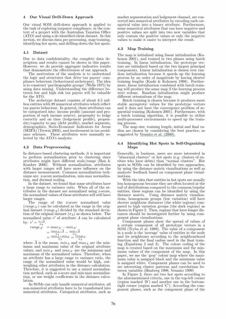
The map is initialized using linear initialization (Ko-honen 2001), and trained in two phases using batchtraining. In linear initialization, the prototype vec-tors are initialized based on the two largest principalcomponents. Linear initialization is chosen over ran-dom initialization because it speeds up the learningprocess by an order of magnitude by having shortertraining lengths (Kaski & Kohonen 1998). Further-more, linear initialization combined with batch train-ing will produce the same map if the learning processwere redone. Random initialization might producedifferent orientations of the map.
Batch training is chosen because it produces morestable asymptotic values for the prototype vectorsand it does not have the convergence problem of se-quential training (Kohonen 2001). Furthermore, witha batch training algorithm, it is possible to utilizemulti-processor environments to speed up the train-ing process.
The map size, training length, initial and final ra-dius are chosen by considering the best practice, assuggested by Vesanto et al. (2000).
4.4 Identifying Hot Spots in Self-OrganizingMaps
Generally, in business, users are more interested in“abnormal clusters” or hot spots (e.g. clusters of en-tities who have debts) than “normal clusters”. Hotspots in SOMs can be identified by two approaches,by using the distance matrix visualizations as well asanalysts’ feedback based on component plane visual-izations.
With the idea that entities in hot spots are usuallyless homogenous because they are often located at thetail of distributions compared to the common/regularentities, these regions can be identified by using thedistance matrix. Using distance matrix visualiza-tions, homogenous groups (low variation) will haveshorter neighbour distances (the white regions) com-pared to high variation groups (the dark regions) asshown in Figure 2. Then, regions that have longer dis-tances should be investigated further by using com-ponent plane visualizations.
Component planes show the spread of values ofa certain component of all prototype vectors in aSOM (Tryba et al. 1989). The value of a componentin a node is the ‘average’ value of entities in the nodeand its neighbours according to the neighbourhoodfunction and the final radius used in the final train-ing (Equations 2 and 3). The colour coding of themap is created based on the maximum and the min-imum values of the component of the map. In thispaper, we use the ‘gray’ colour map where the maxi-mum value is assigned black and the minimum valueis assigned white. Component planes can be used tosee interesting cluster patterns and correlations be-tween variables (Himberg 1998, Vesanto 1999)
In Figure 2, there are two hot spots according tothe aforementioned criteria, one in the top-left corner(region marked ‘B’) and another one in the bottom-right corner (region marked ‘C’). According the com-ponent planes, such as the component plane of the
76

Component plane: Cnt_IT_Debt_Cases
0
1
2
3
4
5
6
7
8
9
1 0
1 1
1 2
1 3
1 4
1 5
1 6
1 7
1 8
1 9
2 0
2 1
2 2
2 3
2 4
2 5
2 6
2 7
2 8
2 9
3 0
3 1
3 2
3 3
3 4
3 5
3 6
3 7
3 8
3 9
4 0
4 1
4 2
4 3
4 4
4 5
4 6
4 7
4 8
4 9
5 0
5 1
5 2
5 3
5 4
5 5
5 6
5 7
5 8
5 9
6 0
6 1
6 2
6 3
6 4
6 5
6 6
6 7
6 8
6 9
7 0
7 1
7 2
7 3
7 4
7 5
7 6
7 7
7 8
7 9
8 0
8 1
8 2
8 3
8 4
8 5
8 6
8 7
8 8
8 9
9 0
9 1
9 2
9 3
9 4
9 5
9 6
9 7
9 8
9 9
100
101
102
103
104
105
106
107
108
109
110
111
112
113
114
115
116
117
118
119
120
121
122
123
124
125
126
127
128
129
130
131
132
133
134
135
136
137
138
139
140
141
142
143
144
145
146
147
148
149
150
151
152
153
154
155
156
157
158
159
160
161
162
163
164
165
166
167
168
169
170
171
172
173
174
175
176
177
178
179
180
181
182
183
184
185
186
187
188
189
190
191
192
193
194
195
196
197
198
199
200
201
202
203
204
205
206
207
208
209
210
211
212
213
214
215
216
217
218
219
220
221
222
223
224
225
226
227
228
229
230
231
232
233
234
235
236
237
238
239
240
241
242
243
244
245
246
247
248
249
250
251
252
253
254
255
256
257
258
259
260
261
262
263
264
265
266
267
268
269
270
271
272
273
274
275
276
277
278
279
280
281
282
283
284
285
286
287
288
289
290
291
292
293
294
295
296
297
298
299
1.4912
1.2782
1.0651
0.8521
0.6391
0.4261
0.2130
0.0000
Figure 3: Component plane of ‘number of debt cases’of the whole population.
Component plane: Cnt_Cases_Paid
0
1
2
3
4
5
6
7
8
9
1 0
1 1
1 2
1 3
1 4
1 5
1 6
1 7
1 8
1 9
2 0
2 1
2 2
2 3
2 4
2 5
2 6
2 7
2 8
2 9
3 0
3 1
3 2
3 3
3 4
3 5
3 6
3 7
3 8
3 9
4 0
4 1
4 2
4 3
4 4
4 5
4 6
4 7
4 8
4 9
5 0
5 1
5 2
5 3
5 4
5 5
5 6
5 7
5 8
5 9
6 0
6 1
6 2
6 3
6 4
6 5
6 6
6 7
6 8
6 9
7 0
7 1
7 2
7 3
7 4
7 5
7 6
7 7
7 8
7 9
8 0
8 1
8 2
8 3
8 4
8 5
8 6
8 7
8 8
8 9
9 0
9 1
9 2
9 3
9 4
9 5
9 6
9 7
9 8
9 9
100
101
102
103
104
105
106
107
108
109
110
111
112
113
114
115
116
117
118
119
120
121
122
123
124
125
126
127
128
129
130
131
132
133
134
135
136
137
138
139
140
141
142
143
144
145
146
147
148
149
150
151
152
153
154
155
156
157
158
159
160
161
162
163
164
165
166
167
168
169
170
171
172
173
174
175
176
177
178
179
180
181
182
183
184
185
186
187
188
189
190
191
192
193
194
195
196
197
198
199
200
201
202
203
204
205
206
207
208
209
210
211
212
213
214
215
216
217
218
219
220
221
222
223
224
225
226
227
228
229
230
231
232
233
234
235
236
237
238
239
240
241
242
243
244
245
246
247
248
249
250
251
252
253
254
255
256
257
258
259
260
261
262
263
264
265
266
267
268
269
270
271
272
273
274
275
276
277
278
279
280
281
282
283
284
285
286
287
288
289
290
291
292
293
294
295
296
297
298
299
1.3032
1.1170
0.9308
0.7447
0.5585
0.3723
0.1862
0.0000
Figure 4: Component plane of ‘number of debt casespaid’ of the whole population.
number of debt cases as shown in Figure 3, and do-main expertise, the hot spot in the bottom-right cor-ner is more interesting than the one in the top-leftcorner. The bottom-right corner region consists ofentities who have debt, have high taxable income,are involved in tax avoidance schemes, and have highrisk scores. The top-left corner, on the other hand,consists of entities who received allowances and havemore amendments.
The entities in the bottom-right region have highlydissimilar characteristics. However, at this level, it isdifficult to differentiate the debt behaviour as shownin Figures 3 and 4. Therefore, it is a good idea to drilldown into this region as discussed in the next section.
In identifying hot spots, the domain knowledgeof analysts is invaluable because some attributes aremore interesting compared to others. In this case,for example: involvement in tax avoidance schemes,lodgement behaviours, number of debt cases, and tax-able income, are more interesting in identifying hotspots compared to market segmentation.
4.5 Drill Down and Visualizing Hot Spots
After analysts choose a part of the top level map (dis-tinguish this group as a hot spot) that is interestingto be explored, a sub-map of the region is trainedusing entities that are mapped to the chosen region.Some issues that need to be taken care of in train-ing the sub-map are: consistency of interpretation ofthe visualization of the sub-map, and maintaining thesub-map quality with respect to the sub-population.
In order to make interpretation of the visualizationof the sub-map consistent to the analysts, the orien-tation of the map should be preserved and the colourcoding should be consistent. The drawback of usinglinear initialization for the sub-map based on the en-tities in the sub-map is that the orientation of thesub-map might be different to the orientation of the
Component plane: Seifa1_05
0
1
2
3
4
5
6
7
8
9
1 0
1 1
1 2
1 3
1 4
1 5
1 6
1 7
1 8
1 9
2 0
2 1
2 2
2 3
2 4
2 5
2 6
2 7
2 8
2 9
3 0
3 1
3 2
3 3
3 4
3 5
3 6
3 7
3 8
3 9
4 0
4 1
4 2
4 3
4 4
4 5
4 6
4 7
4 8
4 9
5 0
5 1
5 2
5 3
5 4
5 5
5 6
5 7
5 8
5 9
6 0
6 1
6 2
6 3
6 4
6 5
6 6
6 7
6 8
6 9
7 0
7 1
7 2
7 3
7 4
7 5
7 6
7 7
7 8
7 9
8 0
8 1
8 2
8 3
8 4
8 5
8 6
8 7
8 8
8 9
9 0
9 1
9 2
9 3
9 4
9 5
9 6
9 7
9 8
9 9
100
101
102
103
104
105
106
107
108
109
110
111
112
113
114
115
116
117
118
119
120
121
122
123
124
125
126
127
128
129
130
131
132
133
134
135
136
137
138
139
140
141
142
143
144
145
146
147
148
149
150
151
152
153
154
155
156
157
158
159
160
161
162
163
164
165
166
167
168
169
170
171
172
173
174
175
176
177
178
179
180
181
182
183
184
185
186
187
188
189
190
191
192
193
194
195
196
197
198
199
200
201
202
203
204
205
206
207
208
209
210
211
212
213
214
215
216
217
218
219
220
221
222
223
224
225
226
227
228
229
230
231
232
233
234
235
236
237
238
239
240
241
242
243
244
245
246
247
248
249
250
251
252
253
254
255
256
257
258
259
260
261
262
263
264
265
266
267
268
269
270
271
272
273
274
275
276
277
278
279
280
281
282
283
284
285
286
287
288
289
290
291
292
293
294
295
296
297
298
299
1.173K
1.132K
1.091K
1.050K
1.009K
968.17
927.07
885.97
Figure 5: Component plane of SEIFA of the sub-mapof region marked ‘C’ in Figure 2.
top level map. For example, the debt entities were lo-cated at the bottom-right corner of the top level mapbut they might be located at the top-left corner as wedrill down. This might confuse the user. This couldhappen when the two largest principal componentsof the whole population and the sub-population aredifferent.
Therefore, it is suggested that the top level map isused as the initial map of the sub-map. The radius ofthe rough phase training should be wide enough, oth-erwise parts of the map might be empty (no entitiesmapped to particular nodes). Therefore, as a guide,the initial radius of the rough phase can be half ofthe longest side and the initial radius of the fine tunephase can be a quarter of the longest side.
The sub-map can be visualized using distance ma-trix visualization and component plane visualization.In order to show the distribution of values of the sub-map with respect to the whole population, it is sug-gested that when showing the component planes ofthe sub-map, the colour map used for the whole pop-ulation, as described in Section 4.4, is used to visu-alize the component planes of the sub-map. In otherwords, black colour in the sub-map visualizations isused for the maximum value of the component of thetop level map, not the maximum value of the com-ponent of the sub map. For example, Figure 5 showsthe distribution of Socio-Economic Indicator for Ar-eas of the bottom-right corner of the whole map. Asthe sub-map has better quality in terms of quanti-zation error (more homogenous/less variation of theentities mapped to a node), the component value inthe sub-map might exceed the maximum value of thewhole map. The colour for values more than the max-imum value of the whole map would be black as well.Therefore, when a cluster of black nodes appears inthe visualization, it is possible that the values are ac-tually exceeding the values of black in the colour bar.
The training of the sub-map will be considerablyfaster than training of the whole population as thenumber of data vectors mapped to the region are con-siderably smaller. Therefore, it is possible for usersto explore hot spots interactively.
5 Results and Discussion
To interpret multiple visualizations, analysts need tounderstand that these visualizations are linked by po-sition or by colour. Visualization of the same map islinked by position, which means that the position ofeach entity remains the same in each visualization.For example, Figures 2, 3, and 4 are linked by po-sition. Visualization of the whole map and the submap is linked by colour as described previously. Thecolour map of the top level map is used as the colourmap in the sub-map.
77

Component plane: Employees_Mkt05
0
1
2
3
4
5
6
7
8
9
1 0
1 1
1 2
1 3
1 4
1 5
1 6
1 7
1 8
1 9
2 0
2 1
2 2
2 3
2 4
2 5
2 6
2 7
2 8
2 9
3 0
3 1
3 2
3 3
3 4
3 5
3 6
3 7
3 8
3 9
4 0
4 1
4 2
4 3
4 4
4 5
4 6
4 7
4 8
4 9
5 0
5 1
5 2
5 3
5 4
5 5
5 6
5 7
5 8
5 9
6 0
6 1
6 2
6 3
6 4
6 5
6 6
6 7
6 8
6 9
7 0
7 1
7 2
7 3
7 4
7 5
7 6
7 7
7 8
7 9
8 0
8 1
8 2
8 3
8 4
8 5
8 6
8 7
8 8
8 9
9 0
9 1
9 2
9 3
9 4
9 5
9 6
9 7
9 8
9 9
100
101
102
103
104
105
106
107
108
109
110
111
112
113
114
115
116
117
118
119
120
121
122
123
124
125
126
127
128
129
130
131
132
133
134
135
136
137
138
139
140
141
142
143
144
145
146
147
148
149
150
151
152
153
154
155
156
157
158
159
160
161
162
163
164
165
166
167
168
169
170
171
172
173
174
175
176
177
178
179
180
181
182
183
184
185
186
187
188
189
190
191
192
193
194
195
196
197
198
199
200
201
202
203
204
205
206
207
208
209
210
211
212
213
214
215
216
217
218
219
220
221
222
223
224
225
226
227
228
229
230
231
232
233
234
235
236
237
238
239
240
241
242
243
244
245
246
247
248
249
250
251
252
253
254
255
256
257
258
259
260
261
262
263
264
265
266
267
268
269
270
271
272
273
274
275
276
277
278
279
280
281
282
283
284
285
286
287
288
289
290
291
292
293
294
295
296
297
298
299
0.9995
0.8714
0.7433
0.6152
0.4872
0.3591
0.2310
0.1029
Figure 6: Component plane of ‘employee market’ ofthe whole population. Value of 1.0 means that thenode consists of 100% employees.
Component plane: SW05_pc
0
1
2
3
4
5
6
7
8
9
1 0
1 1
1 2
1 3
1 4
1 5
1 6
1 7
1 8
1 9
2 0
2 1
2 2
2 3
2 4
2 5
2 6
2 7
2 8
2 9
3 0
3 1
3 2
3 3
3 4
3 5
3 6
3 7
3 8
3 9
4 0
4 1
4 2
4 3
4 4
4 5
4 6
4 7
4 8
4 9
5 0
5 1
5 2
5 3
5 4
5 5
5 6
5 7
5 8
5 9
6 0
6 1
6 2
6 3
6 4
6 5
6 6
6 7
6 8
6 9
7 0
7 1
7 2
7 3
7 4
7 5
7 6
7 7
7 8
7 9
8 0
8 1
8 2
8 3
8 4
8 5
8 6
8 7
8 8
8 9
9 0
9 1
9 2
9 3
9 4
9 5
9 6
9 7
9 8
9 9
100
101
102
103
104
105
106
107
108
109
110
111
112
113
114
115
116
117
118
119
120
121
122
123
124
125
126
127
128
129
130
131
132
133
134
135
136
137
138
139
140
141
142
143
144
145
146
147
148
149
150
151
152
153
154
155
156
157
158
159
160
161
162
163
164
165
166
167
168
169
170
171
172
173
174
175
176
177
178
179
180
181
182
183
184
185
186
187
188
189
190
191
192
193
194
195
196
197
198
199
200
201
202
203
204
205
206
207
208
209
210
211
212
213
214
215
216
217
218
219
220
221
222
223
224
225
226
227
228
229
230
231
232
233
234
235
236
237
238
239
240
241
242
243
244
245
246
247
248
249
250
251
252
253
254
255
256
257
258
259
260
261
262
263
264
265
266
267
268
269
270
271
272
273
274
275
276
277
278
279
280
281
282
283
284
285
286
287
288
289
290
291
292
293
294
295
296
297
298
299
120.29
97.329
74.359
51.389
28.419
5.4500
-17.51
-40.48
Figure 7: Component plane of percentage of salaryand wages to total income of the whole population.
In our experiments, the map size is 15x30, withhexagonal lattice structure. The initial radius of therough phase and the fine tune phase are 8 and 4 re-spectively. The training length for the rough phaseand the fine tuning phase are 6 and 10 epochs, respec-tively. The training processes took about 5 hours ona Debian GNU/Linux machine with two 64-bit AMDdual-core 3 GHz processors and 16 GB memory usingour Java SOM Toolbox2.
As discussed in Section 2, the common populationin a real life dataset are usually located in the centerof the map. The entities in the center of the mapof the whole population are relatively homogenous asshown in Figure 2. Based on the component plane vi-sualizations, this common population mainly consistsof employees (Figure 6) with salary and wages as themain source of income (Figure 7).
At this level, we can see that e-tax3 is an incometax return lodgement channel that is commonly usedby employees, as shown in Figure 8. This is as ex-pected since their tax returns generally tend to besimpler. The usage of the e-tax lodgement channelcan be further optimized since, as a group, only 40%of the entities mapped to the darkest nodes of themap were using this channel. The information can beuseful, for example, in deciding whether to promotee-tax directly to groups of other (similar) tax payerswho may benefit from using this lodgement channel.
At the whole population level, it is not possibleto differentiate debt behaviours because these enti-ties are mapped to a small number of units at thelower-right corner of the map, as shown in Figures 3and 4. Debt behaviour can be differentiated by ob-serving debt-related attributes of this sub-population,such as total payment arrangements made, total de-
2Contact the author if you are interested in using the JavaSOM-Toolbox.
3http://www.ato.gov.au/etax
Component plane: ChannelETAX
0
1
2
3
4
5
6
7
8
9
1 0
1 1
1 2
1 3
1 4
1 5
1 6
1 7
1 8
1 9
2 0
2 1
2 2
2 3
2 4
2 5
2 6
2 7
2 8
2 9
3 0
3 1
3 2
3 3
3 4
3 5
3 6
3 7
3 8
3 9
4 0
4 1
4 2
4 3
4 4
4 5
4 6
4 7
4 8
4 9
5 0
5 1
5 2
5 3
5 4
5 5
5 6
5 7
5 8
5 9
6 0
6 1
6 2
6 3
6 4
6 5
6 6
6 7
6 8
6 9
7 0
7 1
7 2
7 3
7 4
7 5
7 6
7 7
7 8
7 9
8 0
8 1
8 2
8 3
8 4
8 5
8 6
8 7
8 8
8 9
9 0
9 1
9 2
9 3
9 4
9 5
9 6
9 7
9 8
9 9
100
101
102
103
104
105
106
107
108
109
110
111
112
113
114
115
116
117
118
119
120
121
122
123
124
125
126
127
128
129
130
131
132
133
134
135
136
137
138
139
140
141
142
143
144
145
146
147
148
149
150
151
152
153
154
155
156
157
158
159
160
161
162
163
164
165
166
167
168
169
170
171
172
173
174
175
176
177
178
179
180
181
182
183
184
185
186
187
188
189
190
191
192
193
194
195
196
197
198
199
200
201
202
203
204
205
206
207
208
209
210
211
212
213
214
215
216
217
218
219
220
221
222
223
224
225
226
227
228
229
230
231
232
233
234
235
236
237
238
239
240
241
242
243
244
245
246
247
248
249
250
251
252
253
254
255
256
257
258
259
260
261
262
263
264
265
266
267
268
269
270
271
272
273
274
275
276
277
278
279
280
281
282
283
284
285
286
287
288
289
290
291
292
293
294
295
296
297
298
299
0.3974
0.3408
0.2842
0.2276
0.1709
0.1143
0.0577
0.0011
Figure 8: Component plane of ‘usage of e-tax lodge-ment channel’ of the whole population.
Distance matrix
0
1
2
3
4
5
6
7
8
9
1 0
1 1
1 2
1 3
1 4
1 5
1 6
1 7
1 8
1 9
2 0
2 1
2 2
2 3
2 4
2 5
2 6
2 7
2 8
2 9
3 0
3 1
3 2
3 3
3 4
3 5
3 6
3 7
3 8
3 9
4 0
4 1
4 2
4 3
4 4
4 5
4 6
4 7
4 8
4 9
5 0
5 1
5 2
5 3
5 4
5 5
5 6
5 7
5 8
5 9
6 0
6 1
6 2
6 3
6 4
6 5
6 6
6 7
6 8
6 9
7 0
7 1
7 2
7 3
7 4
7 5
7 6
7 7
7 8
7 9
8 0
8 1
8 2
8 3
8 4
8 5
8 6
8 7
8 8
8 9
9 0
9 1
9 2
9 3
9 4
9 5
9 6
9 7
9 8
9 9
100
101
102
103
104
105
106
107
108
109
110
111
112
113
114
115
116
117
118
119
120
121
122
123
124
125
126
127
128
129
130
131
132
133
134
135
136
137
138
139
140
141
142
143
144
145
146
147
148
149
150
151
152
153
154
155
156
157
158
159
160
161
162
163
164
165
166
167
168
169
170
171
172
173
174
175
176
177
178
179
180
181
182
183
184
185
186
187
188
189
190
191
192
193
194
195
196
197
198
199
200
201
202
203
204
205
206
207
208
209
210
211
212
213
214
215
216
217
218
219
220
221
222
223
224
225
226
227
228
229
230
231
232
233
234
235
236
237
238
239
240
241
242
243
244
245
246
247
248
249
250
251
252
253
254
255
256
257
258
259
260
261
262
263
264
265
266
267
268
269
270
271
272
273
274
275
276
277
278
279
280
281
282
283
284
285
286
287
288
289
290
291
292
293
294
295
296
297
298
299
14.761
12.765
10.768
8.7718
6.7751
4.7784
2.7817
0.7849
Figure 9: Distance matrix visualization of the sub-map of region marked ‘C’ in Figure 2.
fault payment arrangements, total finalized paymentarrangements, and age of debt.
In order to see the debt behaviour in detail, wedrill down the lower-right corner of the top level mapas explained in the previous section. At this level, wecan also use a distance matrix (Figure 9) visualizationto highlight the hot spot at this sub-map. In Figure 9,they are located at the bottom of the map.
In the sub-map, we are able to identify a groupwith characteristics of nearly all of the debt casespaid (Figures 10 and 11) but with a higher stage ofcompliance enforcement taken by the ATO. It is in-teresting to note that these entities also live in areaswith slightly above average Social-Economic Indica-tor for Areas (Figure 5) which could mean that theymight have the capacity to pay. This kind of analysisis not possible at the whole population level, as theseentities are squeezed into a few nodes over the wholemap which makes it difficult to differentiate.
It is also interesting to note that the hot spot ofthe sub-map consists of entities that are involved in
Component plane: Cnt_IT_Debt_Cases
0
1
2
3
4
5
6
7
8
9
1 0
1 1
1 2
1 3
1 4
1 5
1 6
1 7
1 8
1 9
2 0
2 1
2 2
2 3
2 4
2 5
2 6
2 7
2 8
2 9
3 0
3 1
3 2
3 3
3 4
3 5
3 6
3 7
3 8
3 9
4 0
4 1
4 2
4 3
4 4
4 5
4 6
4 7
4 8
4 9
5 0
5 1
5 2
5 3
5 4
5 5
5 6
5 7
5 8
5 9
6 0
6 1
6 2
6 3
6 4
6 5
6 6
6 7
6 8
6 9
7 0
7 1
7 2
7 3
7 4
7 5
7 6
7 7
7 8
7 9
8 0
8 1
8 2
8 3
8 4
8 5
8 6
8 7
8 8
8 9
9 0
9 1
9 2
9 3
9 4
9 5
9 6
9 7
9 8
9 9
100
101
102
103
104
105
106
107
108
109
110
111
112
113
114
115
116
117
118
119
120
121
122
123
124
125
126
127
128
129
130
131
132
133
134
135
136
137
138
139
140
141
142
143
144
145
146
147
148
149
150
151
152
153
154
155
156
157
158
159
160
161
162
163
164
165
166
167
168
169
170
171
172
173
174
175
176
177
178
179
180
181
182
183
184
185
186
187
188
189
190
191
192
193
194
195
196
197
198
199
200
201
202
203
204
205
206
207
208
209
210
211
212
213
214
215
216
217
218
219
220
221
222
223
224
225
226
227
228
229
230
231
232
233
234
235
236
237
238
239
240
241
242
243
244
245
246
247
248
249
250
251
252
253
254
255
256
257
258
259
260
261
262
263
264
265
266
267
268
269
270
271
272
273
274
275
276
277
278
279
280
281
282
283
284
285
286
287
288
289
290
291
292
293
294
295
296
297
298
299
1.4912
1.2782
1.0651
0.8521
0.6391
0.4261
0.2130
0.0000
Figure 10: Component plane of ‘number of debt cases’of the sub-map of region marked ‘C’ in Figure 2.
78

Component plane: Cnt_Cases_Paid
0
1
2
3
4
5
6
7
8
9
1 0
1 1
1 2
1 3
1 4
1 5
1 6
1 7
1 8
1 9
2 0
2 1
2 2
2 3
2 4
2 5
2 6
2 7
2 8
2 9
3 0
3 1
3 2
3 3
3 4
3 5
3 6
3 7
3 8
3 9
4 0
4 1
4 2
4 3
4 4
4 5
4 6
4 7
4 8
4 9
5 0
5 1
5 2
5 3
5 4
5 5
5 6
5 7
5 8
5 9
6 0
6 1
6 2
6 3
6 4
6 5
6 6
6 7
6 8
6 9
7 0
7 1
7 2
7 3
7 4
7 5
7 6
7 7
7 8
7 9
8 0
8 1
8 2
8 3
8 4
8 5
8 6
8 7
8 8
8 9
9 0
9 1
9 2
9 3
9 4
9 5
9 6
9 7
9 8
9 9
100
101
102
103
104
105
106
107
108
109
110
111
112
113
114
115
116
117
118
119
120
121
122
123
124
125
126
127
128
129
130
131
132
133
134
135
136
137
138
139
140
141
142
143
144
145
146
147
148
149
150
151
152
153
154
155
156
157
158
159
160
161
162
163
164
165
166
167
168
169
170
171
172
173
174
175
176
177
178
179
180
181
182
183
184
185
186
187
188
189
190
191
192
193
194
195
196
197
198
199
200
201
202
203
204
205
206
207
208
209
210
211
212
213
214
215
216
217
218
219
220
221
222
223
224
225
226
227
228
229
230
231
232
233
234
235
236
237
238
239
240
241
242
243
244
245
246
247
248
249
250
251
252
253
254
255
256
257
258
259
260
261
262
263
264
265
266
267
268
269
270
271
272
273
274
275
276
277
278
279
280
281
282
283
284
285
286
287
288
289
290
291
292
293
294
295
296
297
298
299
1.3032
1.1170
0.9308
0.7447
0.5585
0.3723
0.1862
0.0000
Figure 11: Component plane of ‘number of debt casespaid’ of the sub-map of region marked ‘C’ in Figure 2.
tax avoidance activities. Furthermore, this group hascharacteristics of longer debt age, higher stage of com-pliance enforcement taken by the ATO, and lower per-centage of cases paid.
6 Conclusion and Future Work
We have highlighted the use of SOMs in exploringhot spots in a large real world dataset from the tax-ation domain. Based on our experiments, our ap-proach is an effective tool for hot spots explorationsince it offers visualizations that are easy to under-stand for non-technical users. Moreover, SOMs areable to handle missing values, are computationallyfeasible for large datasets, and are able to exploitmulti-processor environments. Furthermore, in us-ing our approach, users do not have to determine thenumber of clusters nor the between-cluster distancedefinition beforehand.
With our approach, users are able to select regionsto drill down, whereas in agglomerative clustering al-gorithms, the between-cluster distance formula dic-tate how the population is split. Therefore, the userwould be able to select regions/clusters based on theirbusiness drivers/needs. This is particularly useful assome attributes have higher importance compared toothers.
This work is part of a larger research project wherewe are interested in observing the dynamics of hotspots over time such as to find entities who are mov-ing in or out of hot spots. Such knowledge would bevaluable as the analysts can derive strategies to en-courage or to deter people to move in or out of thehot spots; or to evaluate effectiveness of their imple-mented strategies.
Acknowledgement
This research has been supported by the AustralianTaxation Office and the authors express their grati-tude to Grant Brodie, Georgina Breen, Nicole Wade,and Warwick Graco for providing key data and do-main expertise.
References
Denny & Squire, D. M. (2005), Visualization of clus-ter changes by comparing Self-Organizing Maps, inT. B. Ho, D. Cheung & H. Liu, eds, ‘PAKDD’05’,Vol. 3518 of Lecture Notes in Computer Science,Springer, pp. 410–419.
Dittenbach, M., Merkl, D. & Rauber, A. (2000),Growing hierarchical Self-Organizing Map, in ‘Pro-ceedings of the International Joint Conference on
Neural Networks’, Vol. 6, Technische UniversitatWien, IEEE, Piscataway, NJ, pp. 15–19.
Dolnicar, S. (1997), The use of neural networks inmarketing: market segmentation with self organ-ising feature maps, in ‘Proceedings of WSOM’97,Workshop on Self-Organizing Maps, Espoo, Fin-land, June 4–6’, Helsinki University of Technology,Neural Networks Research Centre, Espoo, Finland,pp. 38–43.
Han, J. & Kamber, M. (2006), Data Mining: Con-cepts and Techniques (second edition), MorganKaufmann, San Francisco, CA.
Himberg, J. (1998), Enhancing the SOM-baseddata visualization by linking different data projec-tions, in ‘Proceedings of 1st International Sym-posium Intelligent Data Engineering and Learn-ing (IDEAL’98)—Perspectives on Financial Engi-neering and Data Mining’, Springer, Hong Kong,pp. 427–434.
Iivarinen, J., Kohonen, T., Kangas, J. & Kaski,S. (1994), Visualizing the clusters on the Self-Organizing Map, in C. Carlsson, T. Jarvi & T. Re-ponen, eds, ‘Proceedings of the Conference on Ar-tificial Intelligence Research in Finland’, Vol. 12,Finnish Artificial Intelligence Society, Helsinki,Finland, pp. 122–126.
Kaski, S. & Kohonen, T. (1998), Tips for process-ing and color-coding of Self-Organizing Maps, inG. Deboeck & T. Kohonen, eds, ‘Visual Explo-rations in Finance with Self-Organizing Maps’,Springer, London, pp. 195–202.
Kohonen, T. (1982), ‘Self-organized formation oftopologically correct feature maps’, Biological Cy-bernetics 43, 59–69.
Kohonen, T. (2001), Self-Organizing Maps (ThirdEdition), Vol. 30 of Springer Series in InformationSciences, Springer, Berlin, Heidelberg.
Koikkalainen, P. & Oja, E. (1990), Self-organizing hi-erarchical feature maps, in ‘Proceedings IJCNN-90, International Joint Conference on Neural Net-works, Washington, DC’, Vol. 2, IEEE Service Cen-ter, Piscataway, NJ, pp. 279–285.
Markey, M. K., Lo, J. Y., Tourassi, G. D. & FloydJr., C. E. (2003), ‘Self-organizing map for clusteranalysis of a breast cancer database.’, Artificial In-telligence in Medicine 27(2), 113–127.
Pampalk, E., Rauber, A. & Merkl, D. (2002), Us-ing smoothed data histograms for cluster visual-ization in self-organizing maps, in ‘Artificial Neu-ral Networks - ICANN 2002: International Confer-ence, Madrid, Spain, August 28-30, 2002. Proceed-ings’, Vol. 2415/2002, Springer Berlin / Heidelberg,pp. 871–876.
Pareto, V. (1972), Manual of Political Economy,Macmillan, London. Translated by Ann S. Schwier.Edited by Ann S.Schwier and Alfred N.Page.
Trewin, D. (2003), Socio-economic indexes for areas:Australia 2001, Technical Report 2039, AustralianBureau of Statistics.
Tryba, V., Metzen, S. & Goser, K. (1989), Designingbasic integrated circuits by self-organizing featuremaps, in ‘Neuro-Nımes ’89. International Work-shop on Neural Networks and their Applications’,ARC; SEE, EC2, Nanterre, France, pp. 225–235.
79

Vesanto, J. (1999), ‘SOM-based data visualizationmethods’, Intelligent Data Analysis 3(2), 111–126.
Vesanto, J. & Alhoniemi, E. (2000), ‘Clustering ofthe Self-Organizing Map’, IEEE Transactions onNeural Networks 11(3), 586–600.
Vesanto, J., Himberg, J., Alhoniemi, E. & Parhankan-gas, J. (2000), SOM toolbox for Matlab 5, Re-port A57, Helsinki University of Technology, NeuralNetworks Research Centre, Espoo, Finland.
Viveros, M. S., Nearhos, J. P. & Rothman, M. J.(1996), Applying data mining techniques to ahealth insurance information system, in T. M. Vi-jayaraman, A. P. Buchmann, C. Mohan & N. L.Sarda, eds, ‘Proceedings of 22th International Con-ference on Very Large Data Bases (VLDB’96),September 3-6, 1996, Mumbai (Bombay), India’,Morgan Kaufmann, pp. 286–294.
Wells, W. D. (1975), ‘Psychographics: A criticalreview’, Journal of Marketing Research (JMR)12(2), 196–213.
Williams, G. J. (1999), Evolutionary hot spots datamining - an architecture for exploring for interest-ing discoveries, in ‘PAKDD ’99: Proceedings of theThird Pacific-Asia Conference on Methodologies forKnowledge Discovery and Data Mining’, Springer-Verlag, London, UK, pp. 184–193.
World Bank (2003), World Development Indicators2003, The World Bank, Washington DC.
Xiong, H., Wu, J. & Chen, J. (2006), K-means cluster-ing versus validation measures: a data distributionperspective, in ‘KDD ’06: Proceedings of the 12thACM SIGKDD international conference on Knowl-edge discovery and data mining’, ACM Press, NewYork, NY, USA, pp. 779–784.
80


