Embed Size (px)
Citation preview

Gabor Filter Visualization
V. Shiv Naga Prasad∗
University of Maryland
Justin DomkeUniversity of Maryland
ABSTRACTWe present a system for the visualization of an importantsignal processing technique- a Gabor Filter bank’s responseto an image. To do this, one must overcome the problemthat no multi-dimensional space can be shown in a a single,static graph. We use an interactive widget to change thevisible range of the projected dimensions, and additionalgraphics which summarize the responses in the projecteddimensions. Thus, though we view this four-dimensionalspace through 2-dimensional projections, we allow the userto understand all dimensions, not just the plane of projec-tion. We found that the implemented system helped in get-ting a better understanding of Gabor filter responses. Wethink that use of a domain dependent interaction tool andadditional summarization graphics may be useful in a moregeneral Information Visualization setting.
General TermsGabor Filters, Information Visualization, High DimensionalData
KeywordsGabor Filters, Information Visualization, High DimensionalData
1. INTRODUCTIONSpatial frequencies and their orientations are important char-acteristics of textures in images. Figure 2 shows examplesof spatial textures with characteristic frequency and orien-tations. The frequency characteristics of images can be an-alyzed using spectral decomposition methods like Fourieranalysis. We will illustrate spectral analysis for the simplercase of 1D signals. Consider the sinusoid shown in Fig-ure 1(a). The magnitude of its Fourier spectrum is shownin Figure 1(b) - the peak corresponds to the frequency of
∗The authors wish to thank Ben Shneiderman and MustafaBilgic for review and discussion about the work.
the sinusoid. Figure 1(c) shows another sinusoid whose fre-quency is double that of the previous one; Figure 1(d) showsthe magnitude of its spectrum. Suppose we add these two si-nusoids then we will obtain a signal as shown in Figure 1(e).Doing a spectral analysis on this would show the composi-tion of the signal - the two peaks in Figure 1(f) correspond tothe component sinusoids. Fourier analysis has proven to beone of the most powerful tools in signal processing. However,a key problem with Fourier analysis is that spectral featuresfrom different parts of the image are mixed together. Manyimage analysis applications, e.g. object recognition, track-ing, etc., require spatially localized features. Gabor filtersare a popular tool for this task of extracting spatially local-ized spectral features [1, 2].
0 20 40 60 80 100 120 140 160 180 200−1
−0.8
−0.6
−0.4
−0.2
0
0.2
0.4
0.6
0.8
1
0 10 20 30 40 50 60 70 80 90 1000
10
20
30
40
50
60
70
80
(a) (b)
0 20 40 60 80 100 120 140 160 180 200−1
−0.8
−0.6
−0.4
−0.2
0
0.2
0.4
0.6
0.8
1
0 10 20 30 40 50 60 70 80 90 1000
10
20
30
40
50
60
70
80
90
100
(c) (d)
0 20 40 60 80 100 120 140 160 180 200−2
−1.5
−1
−0.5
0
0.5
1
1.5
2
0 10 20 30 40 50 60 70 80 90 1000
20
40
60
80
100
120
(e) (f)
Figure 1: (a) & (b) A sinusoid and its spectrum. (c)A sinusoid with twice the frequency, (d) its spec-trum. (e) Combination of the two sinusoids and (f)its spectrum.
A Gabor filter bank’s response to an image consists of 4dimensions - two of which directly correspond to the image

(a) (b)
Figure 2: Example of spatial frequencies in images:(a) Vertical stripes - the frequencies would have hor-izontal orientation, and (b) Curved stripes
plane. Visualizing a 4D space on a screen is difficult. Thefocus of our paper is to provide a good interactive interfacefor this. To give a better description of the problem, we firstintroduce Gabor Filters in more depth. Then we will discussour interface and its relation to current work in InformationVisualization.
1.1 Introduction to Gabor FiltersA Gabor filter is obtained by modulating a sinusoid with aGaussian. For the case of one dimensional (1D) signals, a1D sinusoid is modulated with a Gaussian. This filter willtherefore respond to some frequency, but only in a localizedpart of the signal. This is illustrated in Figure 3. For 2Dsignals such as images, consider the sinusoid shown in Fig-ure 4(a). By combining this with a Gaussian (Figure 4(b)),we obtain a Gabor filter - Figure 4(c). Let g(x, y, θ, φ) bethe function defining a Gabor filter centered at the originwith θ as the spatial frequency and φ as the orientation. Wecan view Gabor filters as:
g(x, y, θ, φ) = exp(−x2 + y2
σ2) exp(2πθi(x cos φ + y sin φ)))
(1)
It has been shown that σ, the standard deviation of theGaussian kernel depends upon the spatial frequency to mea-sured, i.e. θ. In our case, σ = 0.65θ. Figure 5 shows 3Dplots of some Gabor filters and the intensity plots of theiramplitudes in the image plane. See [3] for an interactive toolto explore 2D Gabor filters.
The response of a Gabor filter to an image is obtained bya 2D convolution operation. Let I(x, y) denote the imageand G(x, y, θ, φ) denote the response of a Gabor filter withfrequency θ and orientation φ to an image at point (x, y) onthe image plane. G(.) is obtained as
G(x, y, θ, φ) =
� �I(p, q)g(x − p, y − q, θ, φ) dp dq (2)
Consider the image of a zebra shown in Figure 6(a). If we ap-ply a Gabor filter oriented horizontally on this image then itwill give high responses wherever there are horizontal stripespresent on the zebra. Figure 6(b) shows the amplitude ofthe response of such a horizontally oriented Gabor filter forthe image.
1.2 Previous WorkThe GRID principles [4] provide a general strategy for deal-ing with multi-dimensional data. We have used these prin-ciples here to guide our interface design. These principleswould dictate that we begin to visualize our 4-dimensionalspace by looking at the 2-dimensional projections, and this
0 20 40 60 80 100 120 140 160 180 200−1
−0.8
−0.6
−0.4
−0.2
0
0.2
0.4
0.6
0.8
1
(a)
0 20 40 60 80 100 120 140 160 180 2000
0.1
0.2
0.3
0.4
0.5
0.6
0.7
0.8
0.9
1
(b)
0 20 40 60 80 100 120 140 160 180 200−1
−0.8
−0.6
−0.4
−0.2
0
0.2
0.4
0.6
0.8
1
(c)
Figure 3: Gabor filter composition for 1D signals:(a) sinusoid, (b) a Gaussian kernel, (c) the corre-sponding Gabor filter.
has proven useful to us. The next dictate is to rank whichprojections are worth considering. Here, we do not need todo this dynamically, since we are always projecting the same4 dimensions. We can therefore predict in advance which 2-dimensional projections are informative. As we will discussin detail later, these projections are the (x, y) plane, and the(θ, φ) plane. We found that if the user is given these projec-tions, the other possible projections add little. Gross et.al.present an approach for generating static visualization ofGabor filter responses using projections [5]. However, sim-ply showing these 2-dimensional projections statically doesnot give a satisfactory impression of the 4-dimensional data,since many 4-dimensional spaces correspond to the sameprojections. We therefore included two techniques in ourvisualization to give a richer impression of the data. First,we designed a simple interface which allows the user to in-teract with the projections: the user can restrict what parts
of the projected dimensions are visible. Second, we includeadditional visualizations to give information about where inthe projected dimensions the data came from.
2. OUR APPROACH2.1 One Dimensional VisualizationWe have devised a simple way to view the responses of Ga-bor filters in one dimension. These filter responses can benicely summarized in a static one-dimensional graph. Thisis interesting in its own right, and also provides an introduc-tion to our approach for two dimensional filters.
Take the response of a one-dimensional Gabor filter bankto to be G(x, θ), where x is ’position’ and θ is frequency.By creating an array indexed by x and θ and encoding the

010
2030
4050
60
0
10
20
30
40
50
60
70
−1
−0.5
0
0.5
1
(a)
010
2030
4050
60
0
10
20
30
40
50
60
0
0.5
1
(b)
010
2030
4050
60
0
10
20
30
40
50
60
−1
−0.5
0
0.5
1
(c)
Figure 4: Gabor filter composition: (a) 2D sinusoidoriented at 30◦ with the x-axis, (b) a Gaussian ker-nel, (c) the corresponding Gabor filter. Notice howthe sinusoid becomes spatially localized.
strength of the response as color, we can visualize the entirefilter bank response in a single figure. For examples on syn-thetic signals, see Figures 7 and 8. For an example from areal signal, see see Figure 9. Observe that for real signals, itis very difficult to predict how a filter bank will respond toa given signal. This is the major motivation for this work.
2.2 Other PossibilitiesA straight forward extension of the 1D visualization ap-proach would be to simply show a matrix of intensity plotson the screen. Each intensity plot would show the amplitudeof Gabor filters for a particular orientation and frequency.The frequency could vary along the row in the matrix andorientation could vary along the columns. The problem withthis approach is the lack of ability of the user to interact withthe filter bank parameters. Typically users like to be able tochoose ranges of orientations and frequencies of the Gaborfilter bank and to observe the responses over the whole im-age. Natural images rarely respond to specific frequencies ororientation but rather exhibit a spread over these parame-ters. Ability to dynamically choose the range of parametershelps in better understanding of the response characteris-tics. Another issue is the pragmatics of screen real estate.Typical images of interest in computer vision research areof size 300 × 200. Assuming that the video screen resolu-tion is 1024× 768 and we can occupy the whole screen withthe intensity plots, we can show only 3 orientations and 3scales. Even downsizing the image by half will only increasethese to 7 and 7 respectively. Downsizing further might pose
Figure 5: Example of Gabor filters with differentfrequencies and orientations. First column showstheir 3D plots and the second one, the intensity plotsof their amplitude along the image plane.
problems in visualization.
Medical imaging also involves visualizing images with mul-tiple modalities simultaneously [6, 7, 8]. However, here theemphasis is on capturing the 3D human body structure. Theusual approach is to stack the different image planes on topof one other and allowing the user to slice the across theseplanes. Notice that in our case we are dealing with 4 di-mensions where only two have any explicit spatial meaning.The other dimension would be created artificially by stack-ing the image planes. Choosing a range of parameters wouldinvolve rotating the stack of image planes around and choos-ing a volume. It has been cited in visualization literaturethat 3D rotations during visualizations are often disorient-ing as it is difficult to keep track of a frame of reference overthe course of interaction. In our work, we have tried to getthe best possible interaction while confining ourselves to 2Dvisualization.
Another option would be to reuse our approach of visual-izing Gabor filter responses to 1D signals. The user couldbe given an interface to enable him/her to slice an imageinto a strip. Then we could apply Gabor filters of differentfrequencies along this strip and stack them as shown in Fig-ure 7. However, it would be difficult to simultaneously viewresponses for multiple orientations. Moreover, images havean inherently 2D structure - applying filters along 1D stripswill ignore this.
Parallel coordinates are a popular approach for visualizing

(a)
(b)
Figure 6: (a) An image, (b) The response for Ga-bor filter oriented horizontally - white indicateshigh amplitude of response, black indicates low re-sponse. Notice how regions of vertical stripes arehighlighted.
multi-dimensional data [9, 10]. Each dimension is plottedalong an axis and all axes are placed parallel to one another.Each data point in the high dimensional space is representedby correspondingly joining the axes with line segments. Inour case, two of the dimensions are coordinates on the im-age plane and hence plotting them on parallel coordinatesmight not be a good idea. (Figure 10) Star Coordinatesis another popular visualization tool for multi-dimensionaldata [11]. However, it might not useful in our case as two ofthe dimensions have explicit spatial meaning.
2.3 Our ApproachNow, for a two dimensional Gabor filter bank, the situationis much more difficult. Take the response for such a bankto be G(x, y, θ, φ), where (x, y) is the position of the filterrelative to the input signal, θ is the frequency of the filter,and φ is the orientation of the filter. It is clear that no staticpresentation will allow us to view the response of the entirefilter bank. Here we adopt the philosophy that, in orderto give a users an understanding of the response of this 4dimensional filter bank, interaction is necessary.
We feel that 2 dimensional projections are again the best
Figure 7: 1 dimensional Filter response for a syn-thetic signal
Figure 8: 1 dimensional Filter response for a syn-thetic signal
way to view this data. Thus, our approach is essentially inline with the GRID principles, but applied in an unusualway. The obvious thing here, would be to observe that with4 dimensions, there are 6 possible projections- why not sim-ply show them and be done with it? There are two reasons.
The first and minor reason is that most of these 6 projec-tions are not meaningful. For example, a projection ontothe (y, φ) plane is difficult to intepret. There are really onlytwo projections with natural interpretations: onto the (x, y)plane, and onto the (θ, φ) plane.
The second and more important reason, is that we have too
much data for full projections. If we simply project the datadownwards onto the (x, y) plane, we will be able to see themaximum filter response for each image point, but we willhave no idea what part of the filter gave this response. Wecombat this problem in two ways. First, we allow users toproject onto this plane, but we also allow them to restrict

Figure 9: 1 dimensional Filter response for a realsignal
what portions of the other dimensions are projected. Sec-ondly, we use additional plots to show where in the extradimensions the maximum value came from.
Our interface has five plots:
1. Original image.
2. G plot: the (x, y) projection of the Gabor filter re-sponses.
3. θ plot: this shows frequency of maximal Gabor filterresponse for different points on the image plane.
4. φ plot: this shows the orientation of maximal Gaborfilter response for different points on the image plane.
5. (θ, φ) projection of the Gabor filter responses.
In addition, we have two interaction widgets:
1. (θ, π) interaction widget: this is shown on the (θ, φ)projection plane and is used to restrict the range ofparameters of the Gabor filter bank. The user se-lects a range in the frequency and orientation dimen-sions of the filter bank: (θmin, φmin) → (θmax, φmax).The program then finds, for every pair (x, y), the θ
and φ such that G(x, y, θ, φ) is maximum, subject toθmin ≤ θ ≤ θmax, φmin ≤ φ ≤ φmax. The three fig-ures, namely (x, y) projection, θ plot and φ plot showG, θ and φ for each point on the image.
2. (x, y) interaction widget: this is shown on the originalimage’s (x, y) plane. It is used to select a rectangulararea on the image plane: (xmin, ymin) → (xmax, ymax)Then, for each pair (θ, φ), the program finds the max-imum G(x, y, θ, φ) such that xmin ≤ x ≤ xmax, andymin ≤ y ≤ ymax. The (θ, φ) projection summarizesthe G(x, y, θ, φ) for each pair (θ, φ).
1 1.5 2 2.5 3 3.5 4 4.5 50
0.1
0.2
0.3
0.4
0.5
0.6
0.7
0.8
0.9
1
Figure 10: Parallel coordinate plot for a small10x10 image. The dimensions, from left to rightare: x, y, θ, φ, G(x, y, θ, φ (Since we need to show notjust the 4 dimensions, but the strength of eachpoint therein, in some sense we are visualizing a5-dimensional space.) Notice that even for this tinyimage, Parallel Coordinates are very difficult to un-derstand.
Though the technique was created specifically for the prob-lem of Gabor Filter visualization, we feel that our fundamen-tal idea may be of interest to the general Information Visu-alization community, if stated more generally. When doinga projection of high dimensional data to a two-dimensionalspace, is it necessary to give up all information about theprojected dimensions? We argue that it is not necessary andprovide two techniques. First, the user can interactively re-strict what portions of the larger high-dimensional space areprojected. Secondly, additional plots can be used to showthe values of each projected dimensions. These techniquesmight prove useful if applied to more general informationvisualization tools, such as HCE.
3. INTERFACE3.1 Original ImageThis is simply a plot of the image that the Gabor filter bankis responding to. This is important to show, because usersneed to compare positions on this image to positions on theother plots. The zebra image is shown in Figure 6(a).
3.2 (x, y) Interaction WidgetThe user moves a box on the image to select (xmin, ymin) →(xmax, ymax). This is shown in Figure 11. Notice that in thisexample, the user has selected a portion of the Zebra withstripes slightly off the horizontal. The program then findsthe Gabor filter parameters responding to the image signalwithin this area. These are shown in the (θ, φ) projection.
3.3 (θ, φ) ProjectionThe (θ, φ) projection is special because the orientation, φ,is cyclic in the range [0, π]. In order to show this clearly,we plot the projection in the form of a disc. Here, the fre-quency, i.e. θ, varies along the radius, while φ varies alongthe angular direction. The plot widget is shown in Figure 12.
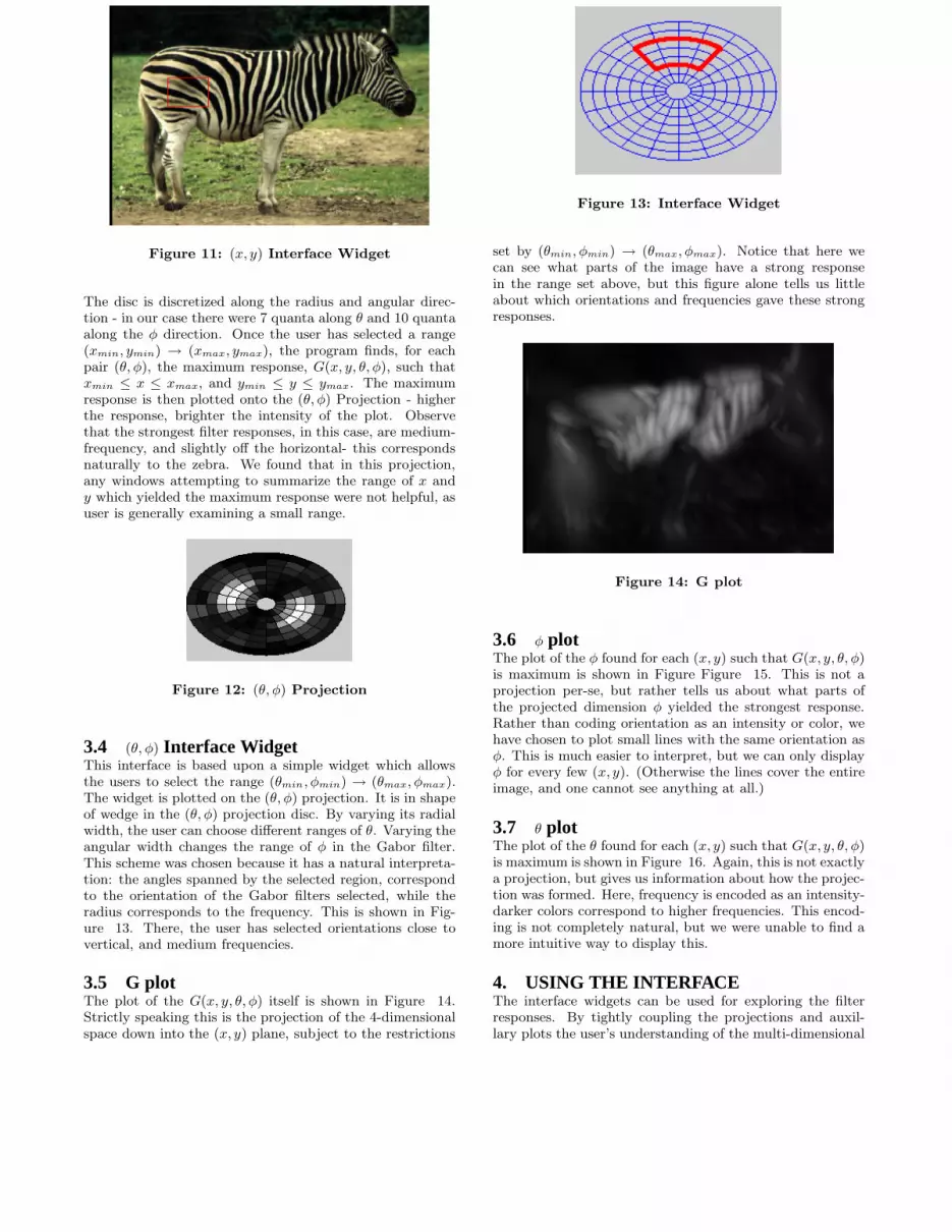
Figure 11: (x, y) Interface Widget
The disc is discretized along the radius and angular direc-tion - in our case there were 7 quanta along θ and 10 quantaalong the φ direction. Once the user has selected a range(xmin, ymin) → (xmax, ymax), the program finds, for eachpair (θ, φ), the maximum response, G(x, y, θ, φ), such thatxmin ≤ x ≤ xmax, and ymin ≤ y ≤ ymax. The maximumresponse is then plotted onto the (θ, φ) Projection - higherthe response, brighter the intensity of the plot. Observethat the strongest filter responses, in this case, are medium-frequency, and slightly off the horizontal- this correspondsnaturally to the zebra. We found that in this projection,any windows attempting to summarize the range of x andy which yielded the maximum response were not helpful, asuser is generally examining a small range.
Figure 12: (θ, φ) Projection
3.4 (θ, φ) Interface WidgetThis interface is based upon a simple widget which allowsthe users to select the range (θmin, φmin) → (θmax, φmax).The widget is plotted on the (θ, φ) projection. It is in shapeof wedge in the (θ, φ) projection disc. By varying its radialwidth, the user can choose different ranges of θ. Varying theangular width changes the range of φ in the Gabor filter.This scheme was chosen because it has a natural interpreta-tion: the angles spanned by the selected region, correspondto the orientation of the Gabor filters selected, while theradius corresponds to the frequency. This is shown in Fig-ure 13. There, the user has selected orientations close tovertical, and medium frequencies.
3.5 G plotThe plot of the G(x, y, θ, φ) itself is shown in Figure 14.Strictly speaking this is the projection of the 4-dimensionalspace down into the (x, y) plane, subject to the restrictions
Figure 13: Interface Widget
set by (θmin, φmin) → (θmax, φmax). Notice that here wecan see what parts of the image have a strong responsein the range set above, but this figure alone tells us littleabout which orientations and frequencies gave these strongresponses.
Figure 14: G plot
3.6 φ plotThe plot of the φ found for each (x, y) such that G(x, y, θ, φ)is maximum is shown in Figure Figure 15. This is not aprojection per-se, but rather tells us about what parts ofthe projected dimension φ yielded the strongest response.Rather than coding orientation as an intensity or color, wehave chosen to plot small lines with the same orientation asφ. This is much easier to interpret, but we can only displayφ for every few (x, y). (Otherwise the lines cover the entireimage, and one cannot see anything at all.)
3.7 θ plotThe plot of the θ found for each (x, y) such that G(x, y, θ, φ)is maximum is shown in Figure 16. Again, this is not exactlya projection, but gives us information about how the projec-tion was formed. Here, frequency is encoded as an intensity-darker colors correspond to higher frequencies. This encod-ing is not completely natural, but we were unable to find amore intuitive way to display this.
4. USING THE INTERFACEThe interface widgets can be used for exploring the filterresponses. By tightly coupling the projections and auxil-lary plots the user’s understanding of the multi-dimensional

Figure 15: φ plot
Figure 16: θ plot
space is enhanced. The user can use the (x, y) interface wid-get to find out the filter responses in regions of interest inthe image. He or she can then use the (θ, φ) interface wid-get to find other regions in the image which produce similarresponses from the Gabor filter bank.
5. CONCLUSIONWe have presented a system for the visualization of a difficultmulti-dimensional space- the space of a Gabor Filter bank’sresponse to an image. The chief difficulty in doing this isthat no single, static picture can show all information abouta multi-dimensional space such as this. We applied two tech-niques to give additional information about the projections-an interactive widget to change the visible range of the pro-jected dimensions, and additional graphics which summarizethe responses in the projected dimensions. Thus, thoughwe view this four-dimensional space through 2-dimensionalprojections, we allow the user to understand all dimensions,not just the plane of projection. These techniques may beuseful in a more general Information Visualization setting-when projecting to a lower-dimensional space, it is possibleto retain information about all dimensions.
6. REFERENCES[1] D. J. Gabor, “Theory of communication,” IEE,
vol. 93, no. 26, pp. 429–457, 1946.
[2] A. C. Bovik, M. Clark, and W. S. Geisler,“Multichannel texture analysis using localized spatial
filters,” IEEE Trans. Pattern Anal. Mach. Intell.,vol. 12, no. 1, pp. 57–73, 1990.
[3] “An interactive tool for visualizing Gabor filters.”[Online]. Available:http://www.cs.rug.nl/ imaging/simplecell.html
[4] S. Jinwook and B. Shneiderman, “A rank-by-featureframework for interactive exploration ofmultidimensional data,” Univ. of Maryland - CollegePark, Tech. Rep. HCIL-2004-31, 2004. [Online].Available: ftp://ftp.cs.umd.edu/pub/hcil/Reports-Abstracts-Bibliography/2004-31html/2004-31.pdf
[5] M. H. Gross and R. Koch, “Visualization ofmultidimensional shape and texture features in laserrange data using complex-valued Gabor wavelets,”IEEE Trans. Visualization and Computer Graphics,vol. 1, no. 1, 1995.
[6] C. Rueden, K. W. Eliceiri, and J. G. White, “VisBio:A computational tool for visualization ofmultidimensional biological image data,” Traffic,vol. 5, pp. 411–417, 2004.
[7] “Analyze: A software from mayo clinic for visualizingmedical data.” [Online]. Available:http://www.mayo.edu/bir/HTMLs/robb FNTF 94.htm
[8] “3DViewNix: A software from the Univ. of Penn. forvisualizing multimodal medical images.” [Online].Available:http://mipgsun.mipg.upenn.edu/ Vnews/info/features.html
[9] A. Inselberg and B. Dimsdale, “Parallel Coordinates:A tool for visualizing multidimensional geometry,” inIEEE Symposium on Information Visualization, 1990,pp. 361–375.
[10] D. A. Keim, “Information visualization and visualdata mining,” IEEE Trans. Visualization and
Computer Graphics, vol. 8, no. 1, pp. 1–8, 2002.
[11] E. Kandogan, “Visualizing multi-dimensional clusters,trends, and outliers using star coordinates,” in KDD
’01: Proceedings of the seventh ACM SIGKDD
international conference on Knowledge discovery and
data mining, 2001, pp. 107–116.

Figure 17: Layout of the interface: top left corner - original image, bottom left corner - (x, y) projection of G
plot, top right corner - θ plot, bottom right corner - φ plot, and center - (θ, φ) projection of G plot. The (x, y)and (θ, φ) interface widgets are shown in red on the top left and center plots respectively.
Figure 18: The user has selected the entire (x, y) range, and Gabor filters with nearly vertical orientations φ,with medium or high frequency θ. Notice that in the bottom left plot, parts of the zerba with vertical edgeshave a high response.

Figure 19: A different image. The user has selected the cadaver’s face area. The horizontal lines in the arearesult in higher responses for Gabor filters with horizontal orientation, as show in the (θ, φ) plot in the center.Because the user has selected high frequencies with any orientation, the edges in the image are highlighted.
Figure 20: The user has again selected all orientations φ, but now with medium to high frequencies θ