Embed Size (px)
Citation preview
1
Abstract —Based on a simulated Non Volatile Memory fab,
we employ data-mining to Identify and quantify the apparent
causes of work in process bubbles along the process. The
chosen bubble formalization methods proved able to detect the
phenomenon and enabled its occurrence frequency to be
forecasted. In the chosen environment, bubbles seem to be
highly correlated with the utilization patterns of the process
segment considered.
Index Terms—Production management, semiconductors,
work-in-process, congestion.
I. INTRODUCTION
his paper addresses the issue of fab line robustness
regarding acute Work-In-Process (WIP) congestion
over a short process segment. This phenomenon, termed
“bubbles” in the fab jargon, is known to be one of the main
sources of variability in the process flow and to drain a
substantial portion of the operation workforce focus and
energy. Its impact has so far not been measured and even
the meaning of the term “bubble” differs slightly from place
to place. Most practitioners agree that a “WIP bubble,” or
“bubble” for short, is an acute WIP congestion at a certain
segment of the line, but such a definition does not provide a
quantification scale that would allow tackling the issue in a
somewhat rational way (see Cunningham et al. [2],
McGlynn et al. [13], Potti et al. [8] or Bilgin et al. [16]).
Only very recently has the bubble phenomenon been
studied in its own right (See Hirade et. al, [14]). In an
earlier article (Hassoun et. al, [10]), we formally defined the
concept of WIP bubble, formulated the means of bubble
identification, and measured the impact of bubbles on the
line.
In the present work we aimed to identify the
characteristics of the line that most influence the occurrence
of bubbles. In order to reach a certain level of generality as
well as to have control over plant running conditions, we
preferred to generate data via simulation and not to base our
analysis on actual data from a fab. Our industrial partners
had a special interest in flash or Non Volatile Memory
(NVM) factories, and so the “SEMATECH dataset one”
model, which represents such a fab, was chosen. We
generated a large number of variations of this model, thus
creating different characteristics for each of the processing
steps under each scenario. The frequency of the appearance
of bubbles was measured in the different pre-defined
process segments, and we correlated this frequency with the
segment characteristics. Data mining tools have recently
proven their ability to extract important information from
large amounts of data typically generated by today’s high-
tech manufacturing environment (see Gardner et al. [9] or
Kusiak [11]). We employed some of these data mining
techniques to establish a prediction model for bubble
frequency.
In the following sections, we restate our formalization of
the bubble concept, provide the technical details of our
experimentation framework, and present the results both in
terms of the forecasting capabilities of the models and of
the most important prediction variables for the appearance
of bubbles. A similar analysis in a real plant would allow
for accurate predictions of the tendency of certain segments
in the line to undergo bubbles and may be helpful in
improving existing fabs and in designing production lines
that are less prone to develop WIP bubbles.
Hunting Down the Bubble Makers in Fabs
M. Hassoun, G. Rabinowitz
T
2
II. BUBBLE DEFINITION AND PRINCIPLES OF IDENTIFICATION
For reader convenience, we briefly review the means of
formal bubble identification as provided in Hassoun et al.
[10]. We have based our bubble identification mechanism
on two basic principles: First, the capacity of a segment to
recover from a bubble (also called its “burst capacity”, see
Arazy et. al, [17]) determines a certain WIP threshold that
delimitates between normal operation and WIP congestion.
Second, the capacity of any segment that includes a
bottleneck is limited by the capacity of the bottleneck. The
cumulative WIP level in such a segment is an indication of
the segment’s capacity. We thus divided the process into
segments, each of which included one bottleneck, and
monitored their cumulative WIP. Then, we built an
Exponentially Weighted Moving Average (EWMA) control
chart for the daily WIP level and defined any extrusion
from the upper limit of the chart as a “Local Bubble Event”
(LBE), meaning that the congestion is measured only in a
defined segment. A bubble, in its traditional meaning, is
thus the appearance of several LBEs in consecutive
operation segments along the process.
For the sake of clarity, we recall that the smoothed
central line value is given by:
1ˆ)1(ˆ ttt WWW (1)
The smoothened standard deviation is given by:
1ˆ)1(ˆ ttt SSS (2)
Therefore, the Upper Control Limit for the WIP in the
segment is given by:
ttt SZWUCL ˆˆ (3)
where tW is the average WIP level at period t (we used
weeks), and is the exponential factor, St is the standard
deviation in the WIP values at t, and is the smoothing
factor. Z is the chart range.
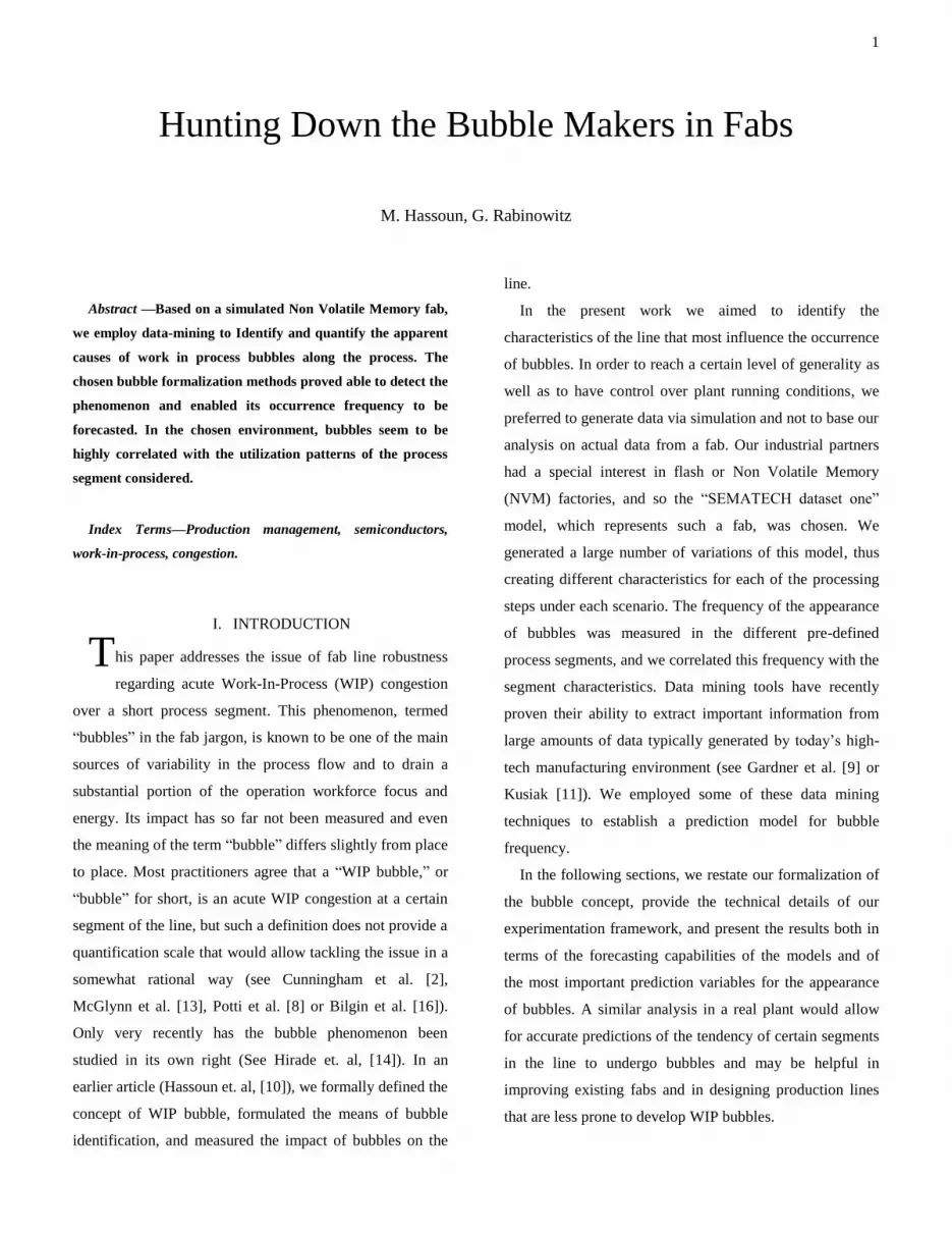
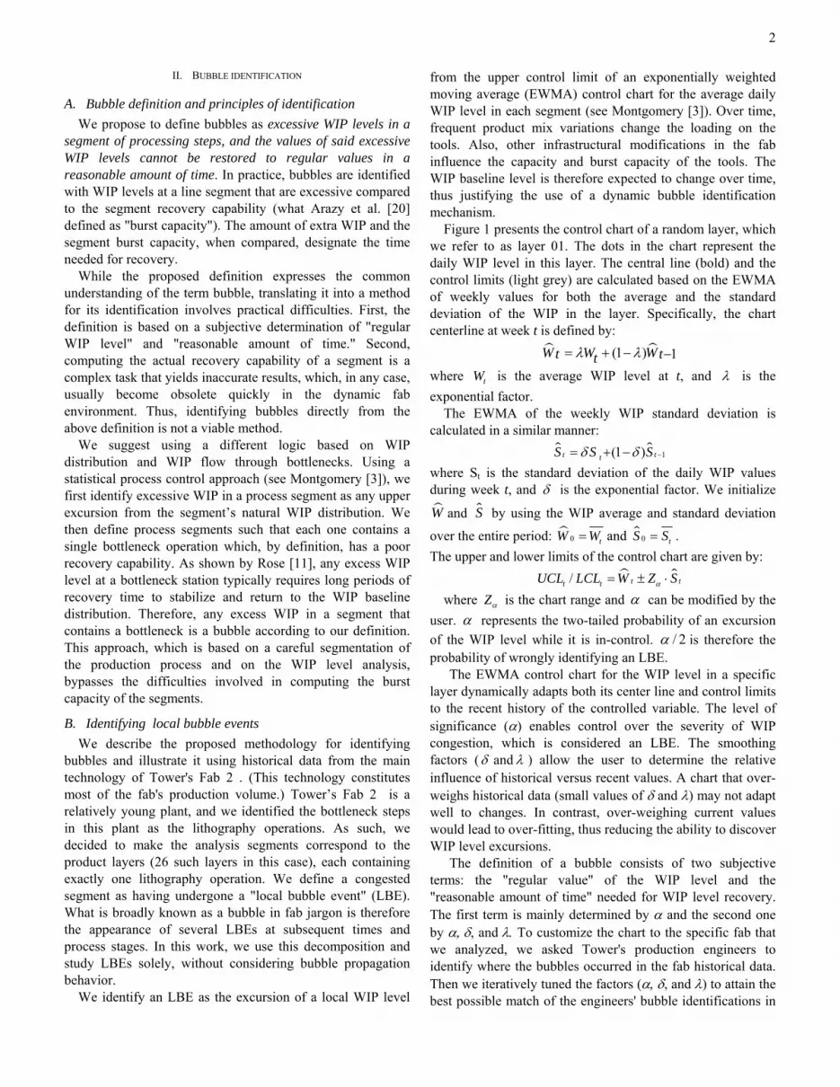
An example of the control chart for one of the segments
is shown in Figure 1. Days with average WIPs exceeding
the chart upper bounds (areas circled in the figure) are
considered LBEs.
0
5
10
15
20
25
30
35
0 100 200 300 400 500 600 700 800
LotsLBEs
Days
Figure 1 EWMA control chart for WIP in a segment
Although the above definition (proposed in Hassoun et
al. 9]) is clear and rational, its implementation is far from
trivial, and for the current work, we needed to alter it
slightly for several reasons. In most fabs, identifying the
bottlenecks and consequently defining the line segments is
a complex task. First, the assumptions necessary for the
computation, a priori, of the workload on the stations
implies inaccuracies. The planned machine rate and
availability of the tools are only estimations, and their
realization over a defined period can differ from their
predicted values. Second, the steep changes in the
semiconductor markets are reflected at the fab level by
frequent changes in the product mix. Each product mix
stresses the fab capacity differently and both workload and
bottlenecks are subsequently redistributed. To cope with
these issues, we changed the LBE definition slightly by
allowing for more than one bottleneck in each segment.
Line segmentation can then follow management needs and
rationale. Any segmentation is legitimate as long as each
segment includes enough heavily loaded operations, thus
insuring that under a broad range of scenarios, it includes at
least one tool that behaved, a posteriori, as a bottleneck.
This revision of the former definition of the LBE is minor
as the WIP distribution remains representative of the
segment capabilities.
III. EXPERIMENTATION FRAMEWORK
The purpose of the experiments was to generate a large
number of different situations in the fab and to explore
3
these situations through data mining. In this section, we
describe the simulated fab that we used, the bubble
identification mechanism, and the structure of the output
data obtained from the experiment.
A. Sematech Dataset 1 NVM fab characteristics
The simulated fab “SEMATECH dataset one” is one of 6
standard models aimed at mimicking real fab behavior that
have been broadly used as research benchmarks (see
Palmeri et al. [18], Hunter et al. [6], Iwata et al. [19], or Dai
et al. [4]). Plant structure and operation are described in
great detail, and numerous characteristics of the true fab
level of complexity are expressed. The models are available
at: ftp://ftp.eas.asu.edu/pub/centers/masmlab/.
The NVM fab model is characterized by two high-
volume products produced on 68 toolsets (i.e., group of
identical tools). The total number of tools in the plant is
211. Product 1 and product 2 require 210 and 245
processing steps, respectively, to be completed. The
operations are characterized by, among other properties,
processing batch definitions (e.g., wafer, lot, lot batch), post
process cooling times, and sequence dependant setups for
two implant tools.
Rework and in-line scrap are also modeled, at both the
wafer and the lot levels (some lots are fully
reworked/scrapped, others are partially reworked/scrapped).
The release rate of the 48 wafer lots is constant—about one
lot every 3 hours for Product 1 and one lot every 6 hours for
Product 2—leading to a total of 4,000 wafers per week. For
loading and unloading lots on machines, assisting during
either part or all the process, and transporting lots from
machine to machine, 83 human operators of 28 types are
required. Based on these characteristics, this model proved
to be unstable, and the CT and WIP continued to grow with
time. We therefore adjusted the model in two ways: We set
the release rate at 90% of the SEMATECH definition
(3,600 wafers per week) and increased the head count of
operator number 7 (which appeared to be fully utilized,
even under the new, lower release rate) from 1 to 2. Under
these new conditions, the model showed converging,
steady-state behavior while still operating close to full
utilization (any increase in the release rate would
destabilize it).
B. Bubble analysis in the Sematech NVM fab
We applied the LBE analysis scheme to the NVM fab
first by dividing the process route into segments
corresponding to re-entrance loops, and each segment
ended with the litho operation “Develop”. This resulted in
fifteen and seventeen segments for products 1 and 2,
respectively. The average number of operations in a
segment was approximately fifteen for each product. The
first segment of each product differed slightly: it had about
half the number of operations exhibited by the other
segments and it included no bottleneck. (The way a tool is
identified as a bottleneck is presented later on.)
We then tuned the EWMA chart coefficients to
effectively discriminate extreme congestion from regular
variability in WIP. The exponential factors for both the
control chart central line and its smoothened standard
deviation was set at 0.2. The control range Z was set at a
value of 2. One of the charts was already presented in
Figure 1.
Finally, we chose a target variable suitable to the planned
analysis. Hassoun et al. [10] have evaluated the impact of
bubbles from the viewpoint of lots by counting the number
of LBEs each lot suffered. Here, however, we evaluated
bubble occurrence at the segment. We decided to measure
the number of days the segment suffered an LBE, denoting
this metric as the Local Bubble Event Count (LBEC).
Another possibility would have been to count the number of
LBEs appearing in the measured period, but since this
metric would not reflect the duration of the bubbles, we
abandoned this option.
C. The data structure
The experiment generates a single observation for each
segment under each scenario. The structure of the
observation data is described here. Each segment’s
characteristics were constructed from its operation
variables. Some of the operation variables describe the

4
operation in itself; others are related to the toolset on which
the operation is processed. The operation variables
comprise parameters that are set prior to the simulation run
(e.g., distance from last bottleneck, next operation of the
same product on the station, etc.) and performance
measures that result from the simulation run. Most
performance measures are variables related to the toolset
that runs the operation (Availability, utilization, mean and
standard deviation of the number of down times, etc.). One
remarkable exception is the standard deviation of lot Inter-
Arrival Time to the operation. Note that the average of the
Inter-Arrival Time to the operation is an atrophied
performance measure that differs from the release rate only
due to small amounts of rework and lots scrap. We
therefore did not use it as a descriptor but merely as a
normalization value for the Process Time.
One of the most important variables is what is called the
“Load” on a station. It represents the expected portion of
the station capacity needed to actually process the required
product mix and is calculated following formulae used in
the industry. We used this metric to define any station
having a load above 90% as a bottleneck.
We processed the operation vectors for constructing the
segment’s characteristic vector. The variables describing
the segment are presented in Table 1 below. Some of the
variables are obvious metrics and describe the segment
directly (availability, number of BNs, etc.). Others quantify
the interactions between two subsequent operations. The
segment characteristic vector consists of 30 variables,
including the LBEC in the analyzed period. Each
simulation run yields 32 (15 and 17 of products 1 and 2,
respectively) observations of 30 fields.
Table 1 Segment descriptors
Descriptor Variables Remarks
Length Segment length Number of steps in
segment
Position Measured in steps distance of the first
operation of the
segment from the start
of the line
Load and BN
operations
Number of BN's, minimum
number of tools in a BN station,
min distance between
consecutive BN's, max load in
layer
BN defined as tools
loaded above 90%
Special regime
operations
Number of setup operations and
batch operations in the layer.
Maximum batch size in the
layers batch operations.
Availability average, standard deviation,
minimum, max gap between
two consecutive operations
stdv is measured among
the averages of the layer
operations availability
Utilization Weighted average, stdv of avg,
overall stdv, minimum,
maximum, max gap between
consecutive operations.
Number of tool
breakages
Weighted average, stdv of avg,
overall stdv, maximum, max gap
between consecutive operations.
Inter-Arrival Time stdv
Raw Process
time / IAT ratio
minimum, maximum Raw ratio. May yield
values higher than 1
Normalized
Process time /
IAT ratio
minimum, maximum normalized by the
number of tools and
batch size. Values are
in the 0-1 range
D. Design of Experiment
After setting the simulation framework and its data
processing infrastructure, we had to decide on the most
suitable experiment for achieving our goal. We needed to
generate a large number of scenarios that were
characterized by fairly high stress levels on fab capacity
and that were sufficiently different from one another. On
the other hand, we took the decision, a priori, to discard any
data coming from a simulation run that would not stabilize.
We wanted to maintain the highest possible level of control
and reduce the chances of creating an exploding WIP
situation. With these two contradictory ideas in mind, we
decided to create two hundred experiments by randomly
altering the basic settings supplied by SEMATECH (after
our changes as described earlier) on two levels. First, we
changed the product mix for each experiment. The original
figures were 2400 wafers per week and 1200 wafers per
week for products 1 and 2, respectively. For each
experiment, the release rate of product 1 was randomly
chosen from a uniform distribution between 2000 and 2600.
The product 2 release rate was then set accordingly to give
5
a total, combined release rate for both products of 3600
wafers per week. In parallel, because we wanted to act on
each station individually, we altered the stations’
availability definitions in two ways: for half the scenarios,
we multiplied both the MTBF (Mean Time Between
Failures) and the MTTR (Mean Time To Repair) of each
station by the same random factor taken from a uniform
distribution in a range of [0.5; 2]. In these scenarios, the
resulting availabilities were not changed and we acted only
on the variance of the availability. In the remaining
scenarios, the machines’ availability was changed. The
MTBF was set at the original value and the MTTR was
multiplied by a factor chosen randomly from a uniform
distribution. The factor distribution ranges were [0.7; 1.05]
for bottleneck and [0.8; 1.2] for non-bottleneck stations.
At this stage, we conducted a single simulation run for
each of the 200 scenarios and examined their stabilizations.
We found that 39 of them diverged, and therefore, we
discarded their data. Then, in each of the stable scenarios,
we discarded segments with no bottlenecks (7% of
instances). The remaining usable data comprised a list of
4765 observation vectors.
IV. DATA MINING AND RESULTS
Using data mining methods to explore the database and
find emergent bubble phenomena, we addressed two main
questions about the occurrence of LBEs:
1. Can the chosen segment descriptors predict LBEC?
2. Which segment descriptors are more influential in terms
of the LBEC?
A. Understanding the data
Below we present a few characteristics of the data, which
are, in our view, essential to understand the following
sections.
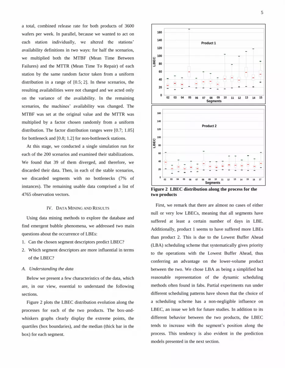
Figure 2 plots the LBEC distribution evolution along the
processes for each of the two products. The box-and-
whiskers graphs clearly display the extreme points, the
quartiles (box boundaries), and the median (thick bar in the
box) for each segment.
0
20
40
60
80
100
120
140
160
Segments
LB
EC
02 03 04 1514131211100908070605
Product 1
0
20
40
60
80
100
120
140
160
Segments
LB
EC
02 03 04 1514131211100908070605 1716
Product 2
Figure 2 LBEC distribution along the process for the
two products
First, we remark that there are almost no cases of either
null or very low LBECs, meaning that all segments have
suffered at least a certain number of days in LBE.
Additionally, product 1 seems to have suffered more LBEs
than product 2. This is due to the Lowest Buffer Ahead
(LBA) scheduling scheme that systematically gives priority
to the operations with the Lowest Buffer Ahead, thus
conferring an advantage on the lower-volume product
between the two. We chose LBA as being a simplified but
reasonable representation of the dynamic scheduling
methods often found in fabs. Partial experiments run under
different scheduling patterns have shown that the choice of
a scheduling scheme has a non-negligible influence on
LBEC, an issue we left for future studies. In addition to its
different behavior between the two products, the LBEC
tends to increase with the segment’s position along the
process. This tendency is also evident in the prediction
models presented in the next section.
6
To address the dimensionality of the data, we performed
a Principal Component Analysis. This procedure identified
five components in the output data. Hence, we expected the
number of variables in use for prediction to be many fewer
than the original 29 variables.
B. Data-mining methodology
As already stated, the purpose of this research was
twofold: First, to study and improve our ability to predict
bubbles (or their quantitative definition, LBEC), based on
the chosen set of variables. Second, and perhaps more
important, to draw some insightful conclusions concerning
the main prediction attributes. Numerous statistical methods
may be considered, but as is discussed below, certain data
mining methods, e.g. decision trees (See Han et al. [5]), are
more applicable to our problem.
We denote an “observation tuple” as the vector of the
observed LBEC and its corresponding attributes, which will
be used as independent explanatory variables. Although the
LBEC is an integer, we preferred predicting it via a
classification model that classifies the tuples into groups
(ranges of LBEC values) rather than predicting their
individual LBEC values. Although this technique causes us
to lose both the numeric order of the LBEC values and the
internal LBEC variability within each class, classification
models were chosen over prediction models for two
reasons. First, in contrast to the various regression methods,
they do not require any assumption regarding model
structure. Second, they allow us to control the LBEC ranges
and thus to obtain more meaningful results.
The more commonly used classification models are
Decision Trees, Neural Networks, Bayesian Classifiers, and
Rule based classifiers (see Han et al. [5]). The decision tree
classifiers have the advantage of being easy to generate and
parameterize, and they enable a clear reading of their
internal logic. We therefore adopted them as our models of
choice. To generate decision tree classifiers, we used one of
the two major algorithms in the industry, namely the C5
procedure (see Quinlan [7]). Decision trees in general and
the C5 procedure in particular have demonstrated their
robustness and subsequent abilities in analyzing the large
and complex data sets usually generated in the
manufacturing environment (see Ozturk et al. [1] or Yeh et
al. [15]). It is important to emphasize that, while we
preferred the described method, alternative techniques
could have been used.
In this section, we analyze some different procedures for
building prediction models and then evaluate the models’
performances. We identify the best procedure (the one
yielding the best models), and address the level of
performance it achieved. In the next section, we apply the
best procedure, build the prediction model, and study its
characteristics.
In our quest for the best procedure, models were
systematically built and trained on a training subset of the
dataset (70% of all the tuples), and the quality of their
predictions was then evaluated on a test subset (the
remaining 30% of the instances). We evaluated each model-
generating procedure on ten random partitions of the data
into training and test sets to limit the risk of a biased
separation between the sets. Although we employed a
classification model, our performance measure was based
on the square of the prediction errors and is described
herein.
For all means related to computing variance, the
predicted LBEC of each instance is the average LBEC for
the predicted category of that tuple. The prediction error for
one instance, error(i), was defined as the gap between the
actual LBEC score of the tuple and the predicted LBEC.
Thus, the proportion of variance explained by the model
can be derived as follows:
2
1
( ) 1
1 ( )
n
i
error i n
Explained VarianceVariance test set
(4)
where n is the number of observations in the test set, i is
observation index in the test set, and Variance(test set) is
the variance of LBEC in the test set.
Since we chose to use classification models for the
LBEC, first we had to partition the data into meaningful
classes with respect to this metric. The LBEC is a new

7
measure, for which no user defined levels are available.
Thus, we were free to define the LBEC partition levels
according to our requirements. This partition must not only
make sense, it must also allow for efficient classification
models to be built. Therefore, after a short phase of
parameterization of the C5 algorithm (mostly based on the
industry rules of thumb), we conducted a trial and error
process intended to find a partition of LBEC levels that
would lead to high prediction performance.
Initially, we tried to part the data into equally populated
groups (Binning) according to LBEC values. This method
is the simplest, but it yielded relatively poor predictions,
with only about 30% (or lower) of the variance explained
by the model, no matter the number of bins that were
chosen. Next we used a centroid-based clustering
technique, the K-means method (See MacQueen [3]).
Basically, this method creates a user-defined number of
clusters such that the distance between each tuple and the
centroid of its corresponding cluster (computed on certain
attributes, in our case only LBEC) is minimized. We tested
this method with different numbers of clusters. For the
cases of 2, 3, and 4 clusters, Table 2 presents the average,
minimum, and maximum of the explained variance ratio
from ten trials. We also tried models that are based on more
than four clusters, but one of the clusters was invariably too
small to be detected (terminal tree nodes were restricted to
at least 1.5% of the training population).
Table 2 Proportion of variance explained by models
2 clusters 3 clusters 4 clusters
Average 42% 54% 56%
Maximum 48% 59% 60%
Minimum 36% 49% 51%
In our case, the results in Table 2 show that the option of
four clusters yields the highest performance in terms of
explained variance. Incidentally, considering the
complexity of the environment studied and the elusive
nature of the phenomenon we wish to predict, we found the
level of performance of the prediction models to be
satisfactory. We thus adopted the following steps as our
chosen procedure to create a prediction model for LBEC:
1. Discretize the LBEC into four clusters using the
K-means algorithm.
2. Build a prediction tree using the C5 algorithm, with
the clusters as targets.
C. Model, rules, and descriptors for LBEC
After choosing an efficient workflow, we had to
determine which segment descriptors were “bubble
makers.” We applied the workflow to the entire set of data
to get the best possible model and analyzed model structure
through its classification rules. In the first phase of the
chosen workflow, the K-means algorithm generated four
clusters, which are presented relative to the LBEC
distribution (Figure 3).
-0.0005
0
0.0005
0.001
0.0015
0.002
0.0025
0.003
0 10 20 30 40 50 60 70 80 90 100
LBEC
Fre
qu
en
cy
Cluster 1 Cluster 3 Cluster 4Cluster 2
Figure 3 Clusters and LBEC distribution for total
population
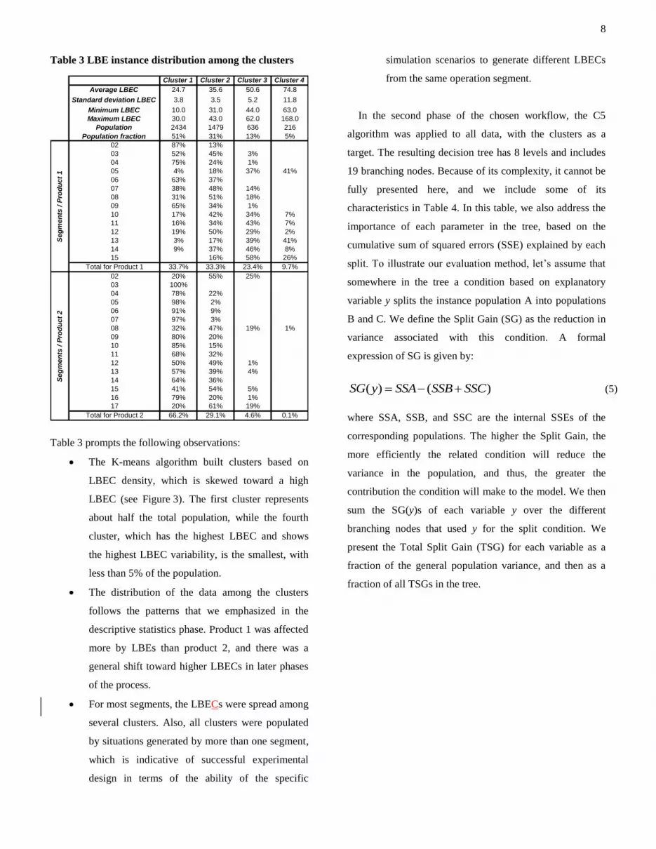
The top part of Table 3 presents the LBEC statistics for
each cluster, and the lower part lists the distribution of
instances among the clusters for each segment along the
line. For example, based on the number of LBEC it
generated, segment number 03 of product 1 was classified
in cluster 1 in 52% of the experiments, in cluster 2 in 46%
of the instances, and in cluster 3 in 3% of the instances.
8
Table 3 LBE instance distribution among the clusters
Cluster 1 Cluster 2 Cluster 3 Cluster 4
Average LBEC 24.7 35.6 50.6 74.8
Standard deviation LBEC 3.8 3.5 5.2 11.8
Minimum LBEC 10.0 31.0 44.0 63.0
Maximum LBEC 30.0 43.0 62.0 168.0
Population 2434 1479 636 216
Population fraction 51% 31% 13% 5%
02 87% 13%
03 52% 45% 3%
04 75% 24% 1%
05 4% 18% 37% 41%
06 63% 37%
07 38% 48% 14%
08 31% 51% 18%
09 65% 34% 1%
10 17% 42% 34% 7%
11 16% 34% 43% 7%
12 19% 50% 29% 2%
13 3% 17% 39% 41%
14 9% 37% 46% 8%
15 16% 58% 26%
Total for Product 1 33.7% 33.3% 23.4% 9.7%
02 20% 55% 25%
03 100%
04 78% 22%
05 98% 2%
06 91% 9%
07 97% 3%
08 32% 47% 19% 1%
09 80% 20%
10 85% 15%
11 68% 32%
12 50% 49% 1%
13 57% 39% 4%
14 64% 36%
15 41% 54% 5%
16 79% 20% 1%
17 20% 61% 19%
Total for Product 2 66.2% 29.1% 4.6% 0.1%
Seg
men
ts / P
rod
uct
1S
eg
men
ts / P
rod
uct
2
Table 3 prompts the following observations:
The K-means algorithm built clusters based on
LBEC density, which is skewed toward a high
LBEC (see Figure 3). The first cluster represents
about half the total population, while the fourth
cluster, which has the highest LBEC and shows
the highest LBEC variability, is the smallest, with
less than 5% of the population.
The distribution of the data among the clusters
follows the patterns that we emphasized in the
descriptive statistics phase. Product 1 was affected
more by LBEs than product 2, and there was a
general shift toward higher LBECs in later phases
of the process.
For most segments, the LBECs were spread among
several clusters. Also, all clusters were populated
by situations generated by more than one segment,
which is indicative of successful experimental
design in terms of the ability of the specific
simulation scenarios to generate different LBECs
from the same operation segment.
In the second phase of the chosen workflow, the C5
algorithm was applied to all data, with the clusters as a
target. The resulting decision tree has 8 levels and includes
19 branching nodes. Because of its complexity, it cannot be
fully presented here, and we include some of its
characteristics in Table 4. In this table, we also address the
importance of each parameter in the tree, based on the
cumulative sum of squared errors (SSE) explained by each
split. To illustrate our evaluation method, let’s assume that
somewhere in the tree a condition based on explanatory
variable y splits the instance population A into populations
B and C. We define the Split Gain (SG) as the reduction in
variance associated with this condition. A formal
expression of SG is given by:
)()( SSCSSBSSAySG (5)
where SSA, SSB, and SSC are the internal SSEs of the
corresponding populations. The higher the Split Gain, the
more efficiently the related condition will reduce the
variance in the population, and thus, the greater the
contribution the condition will make to the model. We then
sum the SG(y)s of each variable y over the different
branching nodes that used y for the split condition. We
present the Total Split Gain (TSG) for each variable as a
fraction of the general population variance, and then as a
fraction of all TSGs in the tree.
9
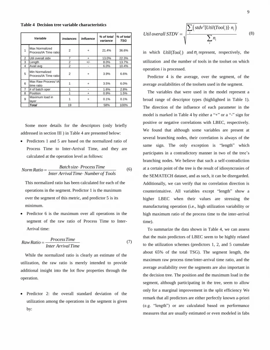
Table 4 Decision tree variable characteristics
instances Influence% of total
variance
% of total
TSG
1Max Normalized
Process/IA Time ratio2 + 21.4% 36.6%
2 Util overall stdv 7 + 13.0% 22.3%
3 Length 2 +/- 8.0% 13.7%
4 Avail avg 2 - 6.0% 10.4%
5Min Normalized
Process/IA Time ratio2 + 3.9% 6.6%
6Max Raw Process/ IA
time ratio1 + 3.5% 6.0%
7 # of batch oper 1 - 1.6% 2.8%
8 Position 1 + 0.9% 1.5%
9Maximum load in
layer1 + 0.1% 0.1%
Total 19 58% 100%
Variable
Some more details for the descriptors (only briefly
addressed in section III ) in Table 4 are presented below:
Predictors 1 and 5 are based on the normalized ratio of
Process Time to Inter-Arrival Time, and they are
calculated at the operation level as follows:
Batch size ProcessTimeNorm Ratio
Inter ArrivalTime Number of Tools
(6)
This normalized ratio has been calculated for each of the
operations in the segment. Predictor 1 is the maximum
over the segment of this metric, and predictor 5 is its
minimum.
Predictor 6 is the maximum over all operations in the
segment of the raw ratio of Process Time to Inter-
Arrival time:
ProcessTimeRaw Ratio
Inter ArrivalTime (7)
While the normalized ratio is clearly an estimate of the
utilization, the raw ratio is merely intended to provide
additional insight into the lot flow properties through the
operation.
Predictor 2: the overall standard deviation of the
utilization among the operations in the segment is given
by:
2[ ( )]i i
i
i
i
stdv Util Tool n
Util overall STDVn
(8)
in which ( )iUtil Tool and in represent, respectively, the
utilization and the number of tools in the toolset on which
operation i is processed.
Predictor 4 is the average, over the segment, of the
average availabilities of the toolsets used in the segment.
The variables that were used in the model represent a
broad range of descriptor types (highlighted in Table 1).
The direction of the influence of each parameter in the
model is marked in Table 4 by either a “+” or a “-” sign for
positive or negative correlations with LBEC, respectively.
We found that although some variables are present at
several branching nodes, their correlation is always of the
same sign. The only exception is “length” which
participates in a contradictory manner in two of the tree’s
branching nodes. We believe that such a self-contradiction
at a certain point of the tree is the result of idiosyncrasies of
the SEMATECH dataset, and as such, it can be disregarded.
Additionally, we can verify that no correlation direction is
counterintuitive. All variables except “length” show a
higher LBEC when their values are stressing the
manufacturing operation (i.e., high utilization variability or
high maximum ratio of the process time to the inter-arrival
time).
To summarize the data shown in Table 4, we can assess
that the main predictors of LBEC seem to be highly related
to the utilization schemes (predictors 1, 2, and 5 cumulate
about 65% of the total TSG). The segment length, the
maximum raw process time/inter-arrival time ratio, and the
average availability over the segments are also important in
the decision tree. The position and the maximum load in the
segment, although participating in the tree, seem to allow
only for a marginal improvement in the split efficiency We
remark that all predictors are either perfectly known a-priori
(e.g. “length”) or are calculated based on performance
measures that are usually estimated or even modeled in fabs
10
as a matter of ongoing manufacturing monitoring (e.g.
Availability or Utilization. see Rose [12] for an example).
On another level of interest, we recall that our Principal
Components Analysis led to five components. We correlate
this fact with the Cumulative TSG of the model, which
approaches 90% of total TSG for the five most important
variables. These results indicate that five reasonably
independent variables from the proposed set should be
enough to predict the segment LBEC.
V. CONCLUSIONS
The present research is an effort to study and provide
information that may help reduce the WIP bubble
phenomenon. A strong linkage between Cycle Time and
bubbles was shown in our previous paper (Hassoun et al.
[10]). Here, we present a methodology for identifying the
characteristics with the most influence on the occurrence of
bubbles and for designing a prediction model to detect the
tendency of a process route segment to undergo bubbles. In
so doing, we expect to allow both the practitioner and the
researcher to tackle the issue of cycle time control by better
managing WIP flow variability.
While applying our methods to a benchmark simulated
NVM fab, we showed that the long-term tendency of a
carefully defined operation segment to undergo WIP bubble
events is predictable. By showing that a fair level of
correlation exists between the process segment
characteristics and the LBEC, we assessed the pertinence of
the LBE analysis scheme as formerly defined in Hassoun et
al. [10]. We also showed that the most influential
characteristics in terms of bubble occurrence in the chosen
NVM fab model relate to the utilization profile of the
segment (See table 4 for a list of these predictors). All of
these predictors are computed based on fundamental
parameters and performance measures that are either fully
known a priori or that can be estimated by models.
To the practitioner, the methodology presented offers some
important insights into several real-life scenarios: When
tailored to a specific fab, the prediction model will be able
to forecast the impact on bubble occurrence of different
“what-if” scenarios. By highlighting the rules and
conditions that influence Bubbles, this problem can be
rationally tackled by influencing specific variables of the
line. Moreover, we believe that extended use of this
methodology on a broad range of fabs will elicit a few
general rules or highly influential variables. This kind of
insight will enable planned fabs to be evaluated for their
potential to generate WIP bubbles even before they are
built. As a byproduct of our analysis, we propose that
practitioners begin calculating and gathering new metrics
(including, of course, LBEC) with potential significance in
WIP flow variability and in other fields of line evaluation.
ACKNOWLEDGEMENTS
We gratefully acknowledge the partial support we received
from the Intel Corporation to conduct this study.
11
REFERENCES
[1] A. Ozturk, S. Kayahgil, N. E. Ozdemirel. “Manufacturing lead
time estimation using data mining”. European Journal of
Operational research. Vol 173, pp 683-700, 2006
[2] C. Cunningham, R. Babikian, “A80-a new perspective on
predictable factory performance”. IEEE/SEMI Advanced
Semiconductor Manufacturing Conference and Workshop, pp
71-76, Sep 1998.
[3] J. B. MacQueen. “Some methods for classification and analysis
of multivariate observation” Proceedings of the 5th Berkeley
Symposium on mathematical statistics and probability, pp 281-
297, 1967.
[4] J. G. Dai and Steven Neuroth, “DPPS scheduling policies in
semiconductor wafer fabs,” In G. T. Mackulak, J.W. Fowler
and A. Schomig, editors, Proceedings of the International
Conference on Modeling and Analysis of Semiconductor
Manufacturing, (194-199), Tempe, Arizona, 2002
[5] J. Han, M. Kamber. Data Mining, concepts and techniques.
Second edition. San Francisco: Morgan Kaufman Publishers,
2006, Chapter 6.
[6] J. Hunter, D. Delp, D. Collins and J. Si (2002). “Understanding
a Semiconductor Process Using a Full-Scale Model”. IEEE
Transactions on Semiconductor manufacturing, Vol. 15, No. 2.
[7] J. R. Quinlan. C4.5: Programs for machine learning. Morgan
Kauffman Publishers,1993.
[8] K. Potti, A. Gupta, “ASAP applications of simulation modeling
in a wafers fab”, Proceedings of the 2002 Winter Simulation
Conference. Pp 1846-1848, 2002.
[9] M. Gardner, J Bieker. “Data mining solves tough
semiconductor manufacturing problems”. Proceedings of the
sixth ACM SIGKDD international conference on Knowledge
discovery and data mining, pp 376-383, 2000.
[10] M. Hassoun, G. Rabinowitz, S. Lachs, “Identification and Cost
Estimation of WIP Bubbles in a Fab”. IEEE Transactions on
Semiconductors Manufacturing, Vol. 21, No. 2, May 2008.
[11] M. Kusiak. “Rough set theory: a data mining tool for
semiconductor manufacturing”. IEEE transactions on
electronics packaging manufacturing. Vol 24, No.1, 2001.
[12] O. Rose. “modeling tool failures in semiconductor fab
simulation”. Proceedings of the 2004 winter simulation
conference. pp 1910-1994, 2004.
[13] P. McGlynn, M. O’Dea, “How to get predictable throughput
times in a multiple product environment”, IEEE International
Symposium on Semiconductor Manufacturing,pp 27-30, 1997.
[14] R. Hirade, R Raymond, H. Okano, “Sensitivity analysis on
causal events of WIP bubbles by a log-driven simulator,
Proceedings of the 2007Winter Simulation Conference, pp
1747-1754, 2007
[15] RL. Yeh, C. Liu, BC Shia, YT Cheng, YF Huwang. “Imputing
manufacturing material in data mining”. Journal of intelligent
manufacturing. Vol 19, No. 1, pp 109-118, 2007.
[16] S. Bilgin, M. Nishimura, “ Implementation of a WIP modeling
system at LSI logic”, IEEE International Symposium on
Semiconductor Manufacturing, pp 293- 296, Oct 2003.
[17] U. Arazy, Y De-Russo, “A framework for fab agility and 25
ways to be agile”, Proceedings of the ninth international
symposium on semiconductor manufacturing (ISSM), pp 213-
216, 2000
[18] V. Palmeri, and D. W. Collins . An Analysis of the “K-Step
Ahead” Minimum Inventory Variability Policy® Using
SEMATECH Semiconductor Manufacturing Data in a
Discrete-Event Simulation Model. Proceedings of IEEE 6th
International Conference on Emerging Technologies and
Factory Automation , Los Angeles, 1997.
[19] Y. Iwata, , K.Taji and H.Tamura . “Multi-objective capacity
planning for agile semiconductor manufacturing”. Production
Planning and Control. Vol. 14 No. 3, pp. 244-254, 2003
Michael Hassoun is a PhD student in the Industrial
Engineering and Management Department at Ben
Gurion University of the Negev, Israel. He earned
his MSc from the same department and his BSc in
Mechanical Engineering from the Technion, Israel
He worked during the years 2000-2001 at Intel fab8
as a functional area industrial engineer. His PhD
research interest is in the bubble phenomenon in fabs.
Gad Rabinowitz is an Associate Professor in the
Industrial Engineering and Management
Department at Ben Gurion University of the
Negev, Israel. His research interests focus on the
theory and practice of operation and scheduling of
production and logistics systems and the modeling
of quality engineering and management issues. He
received his BSc and MSc from Ben Gurion
University, and his PhD in Operations Research from Case Western
Reserve University.

1
Identification and Cost Estimation of WIP Bubbles in a Fab
M. Hassoun, G. Rabinowitz and S. Lachs
Abstract —We quantify the impact of work in process (WIP)
bubbles on a semiconductor fab. As a preliminary step we formalize the concept of WIP bubbles by decomposing them into local events of relatively acute and temporary WIP congestion. The local bubble is empirically identified and its impact on local waiting time distribution is assessed. We then estimate its marginal impact on the overall line waiting time and cost. Finally, a novel visualization tool for the bubble's progression is proposed.
Index Terms—Production management, semiconductors, work-in-process, congestion.
I. INTRODUCTION hew
operational difficulties associated with inflated ork-in-process (WIP) along the complex, highly re-
entrant process used in the semiconductor industry represent one of the major roadblocks to the smooth operation of fabs. The cycle time of lots going through a congested fab is tightly correlated with WIP levels by Little's law [6]. Thus, a reduction in cycle time is frequently obtained through an improvement in WIP management. For example, Leachman et al. [14] proposed an integrative WIP management tool based on the allocation of overall waiting time to bottleneck operations exclusively. By doing so, they prioritized these operations in terms of WIP buffers and reduced the odds of bottleneck starvation. Sadjadi et al. [4] reported the successful implementation of a cycle time reduction plan based mainly on an improved WIP management policy.
Most semiconductor manufacturers agree that one of the most harmful events in WIP management is what is known as a WIP bubble or "bubble" for short (see Cunningham et al. [2], McGlynn et al. [12], Potti et al. [8] or Bilgin et al. [15]). However, bubbles remain to be studied as phenomena in their own right. The term bubble still lacks a clear definition, Shen et al. [22] and Dabbas et al. [13] use it to describe any unbalance in the WIP flow, while others (i.e. Rippenhagen et al. [1] or Bilgin et al. [15]) refer to it as a temporary acute inflation of WIP levels over a limited segment of the line, requiring unusual means for mitigation.
After a bubble has emerged at a certain stage of the production process, typically at a bottleneck station,
substantial efforts are needed to reduce the WIP. The bubbles are particularly harmful to the WIP flow and cycle time of the fab processing lines because of the re-entrant nature of the semiconductor production process (see Kumar and Kumar [16]). In such plants, the WIP progresses along a series of processing loops while using the same tools repeatedly. Each loop includes a photolithography step that is typically the fab's bottleneck. The effort spent to move a bubble through a bottleneck is therefore quite often an endless and ineffective task that inevitably congests the next bottleneck in the process (see McGlynn et. al [12]). Once formed, and despite all efforts to eliminate it or at least mitigate its negative effects, the bubble often advances along the process like a shockwave all the way to the end of the line (see Potti et al. [8]).
Manuscript received June, 2007.
While it is known that bubbles are related to some of the main causes for delays and cycle time variability, the impact of bubbles on the line and the mechanisms of bubble formation, propagation, and disappearance/elimination have not been systematically studied. Different studies refer to the causes of bubbles in a somewhat informal context, as if those causes are common knowledge. Some practitioners implicate human decisions. Bilgin et. al [15] cite the "big WIP move mentality" as one of the causes of bubbles. Robinson et. al [7] speak of the will to maximize utilization of large batch tools, thus increasing variability. Also cited are preemptive causes like unscheduled down time (see Dabbas et. al [13] or Cardarelli et. al [5]) or technological constraints (Grewal et al [10] use the example of dedication on large batch tools).
The impact of bubbles is also treated as common knowledge. Many agree that the main performance measures affected by bubbles are cycle time and cycle time variability, and consequently the service level to customers (See Cunningham et al [2] for an example). Nonetheless, scientific evidence of the causality that binds bubbles to cycle time is lacking, and the intensity of the correlation between bubbles and cycle time has not been assessed.
This paper is the first phase of a broader work aimed at studying the bubble phenomenon in a fab. We propose a methodology to quantify the impact of bubbles on cycle time (section III) and on cost (section IV). As a preliminary stage, section II develops the tools needed for bubble identification.
The proposed method is demonstrated using eight months of daily WIP data from Fab 2 of Tower Semiconductors Ltd, Migdal-Haemek, Israel.
T
2
II. BUBBLE IDENTIFICATION
A. Bubble definition and principles of identification We propose to define bubbles as excessive WIP levels in a
segment of processing steps, and the values of said excessive WIP levels cannot be restored to regular values in a reasonable amount of time. In practice, bubbles are identified with WIP levels at a line segment that are excessive compared to the segment recovery capability (what Arazy et al. [20] defined as "burst capacity"). The amount of extra WIP and the segment burst capacity, when compared, designate the time needed for recovery.
While the proposed definition expresses the common understanding of the term bubble, translating it into a method for its identification involves practical difficulties. First, the definition is based on a subjective determination of "regular WIP level" and "reasonable amount of time." Second, computing the actual recovery capability of a segment is a complex task that yields inaccurate results, which, in any case, usually become obsolete quickly in the dynamic fab environment. Thus, identifying bubbles directly from the above definition is not a viable method.
We suggest using a different logic based on WIP distribution and WIP flow through bottlenecks. Using a statistical process control approach (see Montgomery [3]), we first identify excessive WIP in a process segment as any upper excursion from the segment’s natural WIP distribution. We then define process segments such that each one contains a single bottleneck operation which, by definition, has a poor recovery capability. As shown by Rose [11], any excess WIP level at a bottleneck station typically requires long periods of recovery time to stabilize and return to the WIP baseline distribution. Therefore, any excess WIP in a segment that contains a bottleneck is a bubble according to our definition. This approach, which is based on a careful segmentation of the production process and on the WIP level analysis, bypasses the difficulties involved in computing the burst capacity of the segments.
B. Identifying local bubble events We describe the proposed methodology for identifying
bubbles and illustrate it using historical data from the main technology of Tower's Fab 2 . (This technology constitutes most of the fab's production volume.) Tower’s Fab 2 is a relatively young plant, and we identified the bottleneck steps in this plant as the lithography operations. As such, we decided to make the analysis segments correspond to the product layers (26 such layers in this case), each containing exactly one lithography operation. We define a congested segment as having undergone a "local bubble event" (LBE). What is broadly known as a bubble in fab jargon is therefore the appearance of several LBEs at subsequent times and process stages. In this work, we use this decomposition and study LBEs solely, without considering bubble propagation behavior.
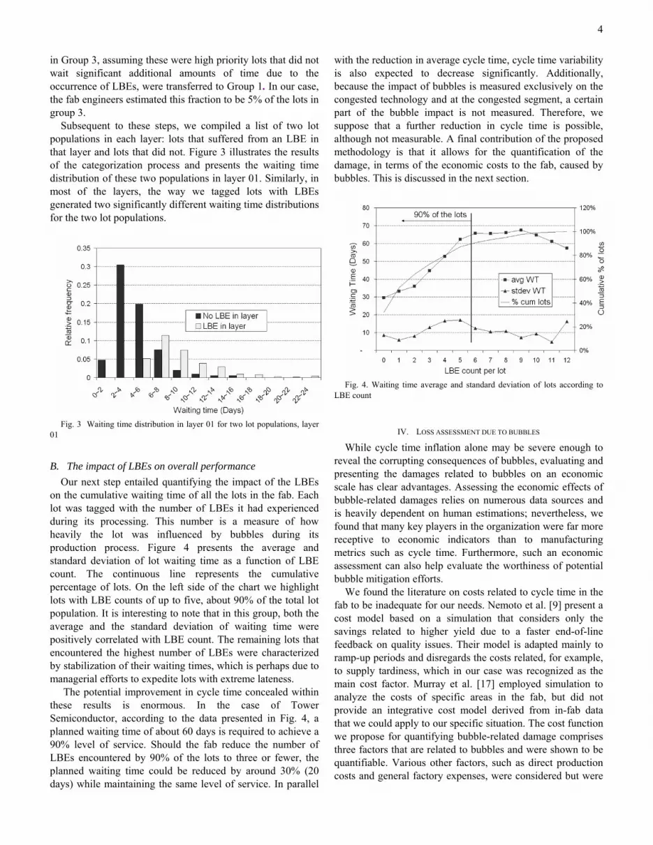
We identify an LBE as the excursion of a local WIP level
from the upper control limit of an exponentially weighted moving average (EWMA) control chart for the average daily WIP level in each segment (see Montgomery [3]). Over time, frequent product mix variations change the loading on the tools. Also, other infrastructural modifications in the fab influence the capacity and burst capacity of the tools. The WIP baseline level is therefore expected to change over time, thus justifying the use of a dynamic bubble identification mechanism.
Figure 1 presents the control chart of a random layer, which we refer to as layer 01. The dots in the chart represent the daily WIP level in this layer. The central line (bold) and the control limits (light grey) are calculated based on the EWMA of weekly values for both the average and the standard deviation of the WIP in the layer. Specifically, the chart centerline at week t is defined by:
(1 ) 1W W Wt ttλ λ= + − −
where is the average WIP level at t, and tW λ is the exponential factor.
The EWMA of the weekly WIP standard deviation is calculated in a similar manner:
1(1 )t ttS S Sδ δ −= + − where St is the standard deviation of the daily WIP values during week t, and δ is the exponential factor. We initialize
W and S by using the WIP average and standard deviation
over the entire period: 0 tW W= and 0 tS S= . The upper and lower limits of the control chart are given by:
/ t tt tUCL LCL W Z Sα= ± ⋅ where Zα is the chart range and α can be modified by the
user. α represents the two-tailed probability of an excursion of the WIP level while it is in-control. is therefore the probability of wrongly identifying an LBE.
/ 2α
The EWMA control chart for the WIP level in a specific layer dynamically adapts both its center line and control limits to the recent history of the controlled variable. The level of significance (α) enables control over the severity of WIP congestion, which is considered an LBE. The smoothing factors ( δ and λ ) allow the user to determine the relative influence of historical versus recent values. A chart that over-weighs historical data (small values of δ and λ) may not adapt well to changes. In contrast, over-weighing current values would lead to over-fitting, thus reducing the ability to discover WIP level excursions.
The definition of a bubble consists of two subjective terms: the "regular value" of the WIP level and the "reasonable amount of time" needed for WIP level recovery. The first term is mainly determined by α and the second one by α, δ, and λ. To customize the chart to the specific fab that we analyzed, we asked Tower's production engineers to identify where the bubbles occurred in the fab historical data. Then we iteratively tuned the factors (α, δ, and λ) to attain the best possible match of the engineers' bubble identifications in
3
all the layers. The following values for the chart factors scored a 90% match: α = 5%, δ = 0.1 and λ = 0.1.
Fig. 1 Control Chart for average daily WIP in a specific layer Fig. 1 presents the proposed control chart of layer 01 after
the factor tuning process. We can see that this layer experienced three local bubble events during the period displayed: one during August 2004 and two slightly shorter ones during October and December of the same year. Excursions below the lower control limit are not a problem by themselves. Nonetheless, they reflect another facet of the in-line variability and may be a symptom of a blocked or congested feeder segment.
III. BUBBLE IMPACT ON CYCLE TIME
The proposed definition of an LBE is now used for quantifying the impact of bubbles on cycle time. The processing time in fabs is typically smaller in value and much lower in variability than the waiting time (see Hopp and Spearman [21]). Because we assume that bubbles have an impact solely on waiting time, we only consider that parameter. After identifying all the LBEs in each segment over time, we matched each lot with the number of LBEs it sustained during its entire production period and with its overall waiting time. For a sample of lots, we correlated the waiting time with the number of LBEs.
A. Tagging lots with local bubble events (LBEs) To count the number of LBEs encountered by a lot during
its process, each layer was analyzed separately, lots were tagged as having undergone an LBE or not, and finally the results were totaled. In each segment, a lot was marked as having been affected by an LBE if during its transit in the segment an LBE occurred that significantly increased the lot waiting time. In our effort to identify lots that were affected by the bubble, waiting time was considered to filter out high priority lots that pass through the bubble without being affected by it
Lot classification was conducted as follows: Based on the above method, we determined the starting and
ending dates of each LBE in each layer. The lots in the
samples taken from each layer were split into three groups: • Group 1: Lots that went through the layer
while it was not congested with an LBE. • Group 2: Lots that reached the layer while it
was not congested but left after the formation of an LBE.
• Group 3: Lots that reached a layer while it was congested with an LBE.
Figure 2 presents the relative frequency distributions for the waiting times of lots in the three lot groups of layer 01.
Fig. 2 Waiting time frequency by lot group, layer 01 While this classification method enables the clear and
simple differentiation of lots, to achieve a reliable analysis it requires further tuning. It is indeed quite simple to categorize a lot that was present in the layer while an LBE occurred as having suffered from a bubble. Were a “first-come, first-serve” rule a viable scheduling method in fabs, tagging lots based solely on their having undergone an LBE would be an appropriate method. In practice, due to the use of scheduling schemes based on lot prioritization, some lots run through a congested layer quickly while increasing the waiting times of other lots already waiting in the layer. To reduce the noise introduced by these high priority lots, we reconsidered the waiting times of the lots classified into Groups 2 and 3. In a first refinement step, the lots of Group 2 were reallocated either to Group 1 or Group 3 based on their average waiting times. A ratio T was determined based on the relative values of the average waiting times of the three groups:
2 1
3 1
WT WTTWT WT
−=
−
where iWT is the average waiting time of lots in the original Group i. We then reallocate the fraction T of lots from Group 2 with the longest waiting times to Group 3. The remainder of the Group 2 lots was reallocated to Group 1. It should be noted that the lower T is, the closer the waiting time distribution curves of Groups 1 and 2 and, consequently, the higher the number of lots from Group 2 that are redirected to Group 1.
In a final refinement step, a small fraction of the fastest lots
4
in Group 3, assuming these were high priority lots that did not wait significant additional amounts of time due to the occurrence of LBEs, were transferred to Group 1. In our case, the fab engineers estimated this fraction to be 5% of the lots in group 3.
Subsequent to these steps, we compiled a list of two lot populations in each layer: lots that suffered from an LBE in that layer and lots that did not. Figure 3 illustrates the results of the categorization process and presents the waiting time distribution of these two populations in layer 01. Similarly, in most of the layers, the way we tagged lots with LBEs generated two significantly different waiting time distributions for the two lot populations.
Fig. 3 Waiting time distribution in layer 01 for two lot populations, layer
01
B. The impact of LBEs on overall performance Our next step entailed quantifying the impact of the LBEs
on the cumulative waiting time of all the lots in the fab. Each lot was tagged with the number of LBEs it had experienced during its processing. This number is a measure of how heavily the lot was influenced by bubbles during its production process. Figure 4 presents the average and standard deviation of lot waiting time as a function of LBE count. The continuous line represents the cumulative percentage of lots. On the left side of the chart we highlight lots with LBE counts of up to five, about 90% of the total lot population. It is interesting to note that in this group, both the average and the standard deviation of waiting time were positively correlated with LBE count. The remaining lots that encountered the highest number of LBEs were characterized by stabilization of their waiting times, which is perhaps due to managerial efforts to expedite lots with extreme lateness.
The potential improvement in cycle time concealed within these results is enormous. In the case of Tower Semiconductor, according to the data presented in Fig. 4, a planned waiting time of about 60 days is required to achieve a 90% level of service. Should the fab reduce the number of LBEs encountered by 90% of the lots to three or fewer, the planned waiting time could be reduced by around 30% (20 days) while maintaining the same level of service. In parallel
with the reduction in average cycle time, cycle time variability is also expected to decrease significantly. Additionally, because the impact of bubbles is measured exclusively on the congested technology and at the congested segment, a certain part of the bubble impact is not measured. Therefore, we suppose that a further reduction in cycle time is possible, although not measurable. A final contribution of the proposed methodology is that it allows for the quantification of the damage, in terms of the economic costs to the fab, caused by bubbles. This is discussed in the next section.
Fig. 4. Waiting time average and standard deviation of lots according to
LBE count
IV. LOSS ASSESSMENT DUE TO BUBBLES
While cycle time inflation alone may be severe enough to reveal the corrupting consequences of bubbles, evaluating and presenting the damages related to bubbles on an economic scale has clear advantages. Assessing the economic effects of bubble-related damages relies on numerous data sources and is heavily dependent on human estimations; nevertheless, we found that many key players in the organization were far more receptive to economic indicators than to manufacturing metrics such as cycle time. Furthermore, such an economic assessment can also help evaluate the worthiness of potential bubble mitigation efforts.
We found the literature on costs related to cycle time in the fab to be inadequate for our needs. Nemoto et al. [9] present a cost model based on a simulation that considers only the savings related to higher yield due to a faster end-of-line feedback on quality issues. Their model is adapted mainly to ramp-up periods and disregards the costs related, for example, to supply tardiness, which in our case was recognized as the main cost factor. Murray et al. [17] employed simulation to analyze the costs of specific areas in the fab, but did not provide an integrative cost model derived from in-fab data that we could apply to our specific situation. The cost function we propose for quantifying bubble-related damage comprises three factors that are related to bubbles and were shown to be quantifiable. Various other factors, such as direct production costs and general factory expenses, were considered but were
5
not included in the bubble-related cost computation as they are not significantly influenced by either bubbles or cycle time.
The three cost factors are: 1. Manpower: The measurable manpower costs related
to bubbles are twofold. First, we considered the extra time spent in morning meetings when a bubble has developed in the fab. Second, we evaluated the additional manpower required for emergency repairs and maintenance (engineers and technicians are known to be called in for late-night maintenance on congested machines).
2. Yield: As mentioned by Cunningham et al. [18], the functional relationship between cycle time and die yield is still largely unknown, and the correlation between both parameters has not been verified. Nonetheless, our quality evaluation found a significant reduction in die yield as a function of the total waiting time in the line. Therefore, we included this factor in the cost function associated with bubbles. Figure 5 presents, from the case under study (Tower Semiconductors), the measured end-of-line die yield as a function of cycle time.
Fig. 5 Die yield vs. waiting time
3. Due date to customers: Tardiness in supplying customers is the most important cost factor considered and also the most difficult to assess. We applied an increasing slope, stepwise linear loss function for supply tardiness built by the company IE team.
We also considered the wafer scrap rate at the layer as a
potential cost-related factor as technicians working in a congested area may be more prone to commit errors and to scrap wafers. This factor, however, was not statistically confirmed, due mainly to the limited number of scraps in each layer.
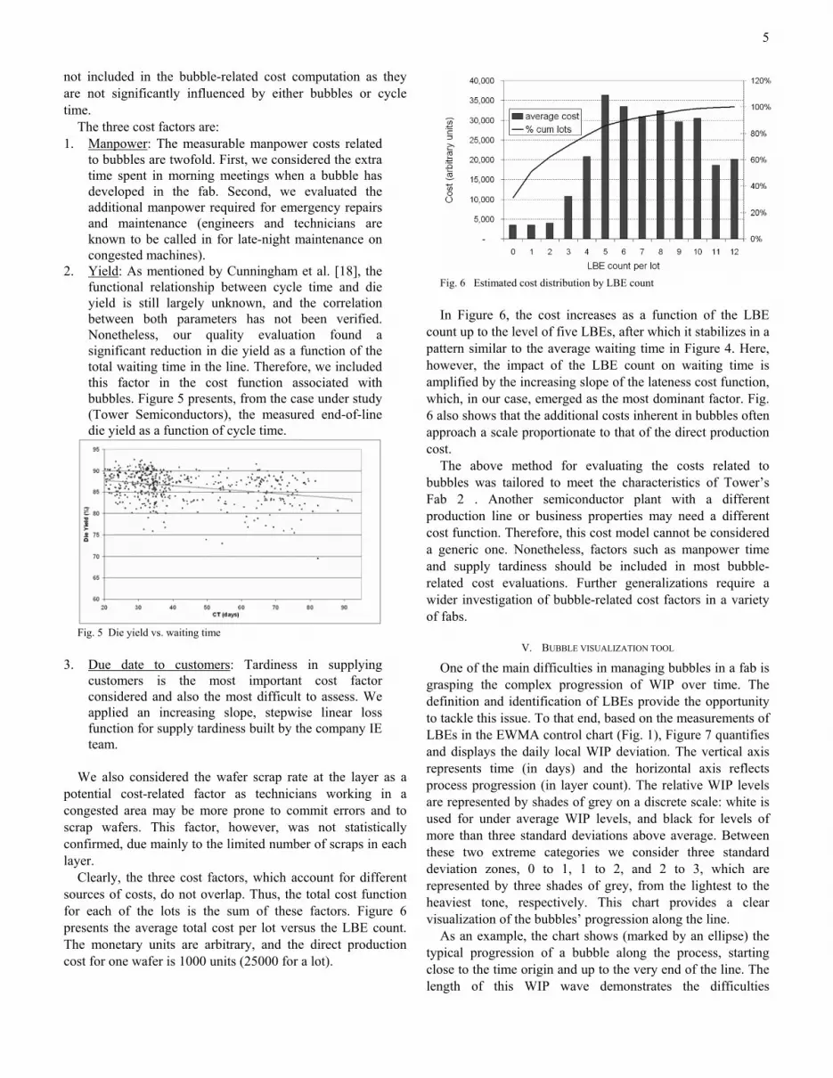
Clearly, the three cost factors, which account for different sources of costs, do not overlap. Thus, the total cost function for each of the lots is the sum of these factors. Figure 6 presents the average total cost per lot versus the LBE count. The monetary units are arbitrary, and the direct production cost for one wafer is 1000 units (25000 for a lot).
Fig. 6 Estimated cost distribution by LBE count In Figure 6, the cost increases as a function of the LBE
count up to the level of five LBEs, after which it stabilizes in a pattern similar to the average waiting time in Figure 4. Here, however, the impact of the LBE count on waiting time is amplified by the increasing slope of the lateness cost function, which, in our case, emerged as the most dominant factor. Fig. 6 also shows that the additional costs inherent in bubbles often approach a scale proportionate to that of the direct production cost.
The above method for evaluating the costs related to bubbles was tailored to meet the characteristics of Tower’s Fab 2 . Another semiconductor plant with a different production line or business properties may need a different cost function. Therefore, this cost model cannot be considered a generic one. Nonetheless, factors such as manpower time and supply tardiness should be included in most bubble-related cost evaluations. Further generalizations require a wider investigation of bubble-related cost factors in a variety of fabs.
V. BUBBLE VISUALIZATION TOOL
One of the main difficulties in managing bubbles in a fab is grasping the complex progression of WIP over time. The definition and identification of LBEs provide the opportunity to tackle this issue. To that end, based on the measurements of LBEs in the EWMA control chart (Fig. 1), Figure 7 quantifies and displays the daily local WIP deviation. The vertical axis represents time (in days) and the horizontal axis reflects process progression (in layer count). The relative WIP levels are represented by shades of grey on a discrete scale: white is used for under average WIP levels, and black for levels of more than three standard deviations above average. Between these two extreme categories we consider three standard deviation zones, 0 to 1, 1 to 2, and 2 to 3, which are represented by three shades of grey, from the lightest to the heaviest tone, respectively. This chart provides a clear visualization of the bubbles’ progression along the line.
As an example, the chart shows (marked by an ellipse) the typical progression of a bubble along the process, starting close to the time origin and up to the very end of the line. The length of this WIP wave demonstrates the difficulties
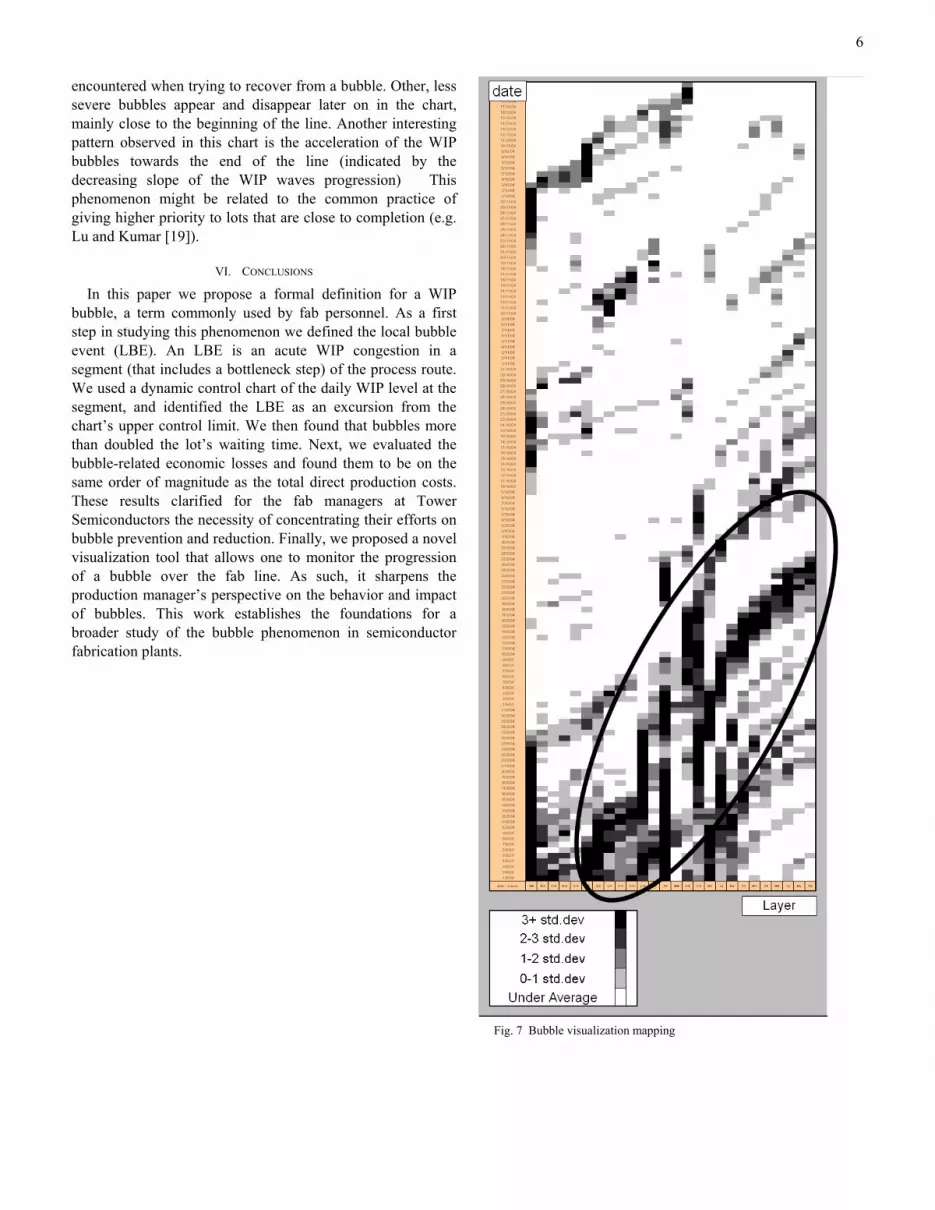
6
encountered when trying to recover from a bubble. Other, less severe bubbles appear and disappear later on in the chart, mainly close to the beginning of the line. Another interesting pattern observed in this chart is the acceleration of the WIP bubbles towards the end of the line (indicated by the decreasing slope of the WIP waves progression) This phenomenon might be related to the common practice of giving higher priority to lots that are close to completion (e.g. Lu and Kumar [19]).
VI. CONCLUSIONS
In this paper we propose a formal definition for a WIP bubble, a term commonly used by fab personnel. As a first step in studying this phenomenon we defined the local bubble event (LBE). An LBE is an acute WIP congestion in a segment (that includes a bottleneck step) of the process route. We used a dynamic control chart of the daily WIP level at the segment, and identified the LBE as an excursion from the chart’s upper control limit. We then found that bubbles more than doubled the lot’s waiting time. Next, we evaluated the bubble-related economic losses and found them to be on the same order of magnitude as the total direct production costs. These results clarified for the fab managers at Tower Semiconductors the necessity of concentrating their efforts on bubble prevention and reduction. Finally, we proposed a novel visualization tool that allows one to monitor the progression of a bubble over the fab line. As such, it sharpens the production manager’s perspective on the behavior and impact of bubbles. This work establishes the foundations for a broader study of the bubble phenomenon in semiconductor fabrication plants.
Fig. 7 Bubble visualization mapping

7
REFERENCES [1] C. Rippenhagen, S. Krishnaswamy, "Implementing the theory of
constraints philosophy in highly re-entrant systems", Proceedings of the 1998 Winter Simulation Conference, 1998
[2] C. Cunningham, R. Babikian,"A80-a new perspective on predictable factory performance". IEEE/SEMI Advanced Semiconductor Manufacturing Conference and Workshop, pp 71-76, Sep 1998.
[3] D. C., Montgomery, Introduction to Statistical Quality Control (fifth ed.), 2001 Wiley
[4] F.Sadjadi and T.Baker, “Comprehensive Cycle Time Reduction Program At AMD’s Fab25,” 2001 IEEE International Symposium on Semiconductor manufacturing (ISSM '01). 2001
[5] G. Cardarelli, P. M Pelagagge., A.Granito, , " Performance analysis of automated interbay material handling and storage systems for large wafer fab". Proceedings of the Electronics Manufacturing Technology Symposium Symposium. Sixteenth IEEE/CPMT International pp 235-241 vol.1. 1994
[6] J. D. C Little, "A Proof of the Queueing Formula L = λ W" Operations Research, 9, pp 383-387, 1961
[7] J. Robinson, F. Chance, "Wafer fab cycle time management using MES data" Proceedings of the MASM 2000 Conference, Tempe, AZ, May 10-12, 2000.
[8] K. Potti, A. Gupta, "ASAP applications of simulation modeling in a wafers fab", Proceedings of the 2002 Winter Simulation Conference
[9] K.Nemoto, E.Akcali and R. M. Uzsoy, “Quantifying the Benefits of Cycle Time Reduction in Semiconductor Wafer Fabrication,” IEEE Transactions on electronics packaging manufacturing, vol. 23, No. 1. Jan 2000.
[10] N. S. Grewal A, C. Bruska, T. M. Wulf, J. Robinson, "Validating Simulation model cycle time at Seagate technology", Proceedings of the Winter Simulation Conference. 1999
[11] O. Rose, "WIP evolution of a semiconductor factory after a bottleneck workcenter breakdown", Proceedings of the 30th conference on Winter simulation, pp 997-1004, 1998.
[12] P. McGlynn, M. O'Dea, "How to get predictable throughput times in a multiple product environment", IEEE International Symposium on Semiconductor Manufacturing, 1997.
[13] R. M. Dabbas John W. Fowler, " A New Scheduling Approach Using Combined Dispatching Criteria in Wafer Fabs", IEEE Transactions on Semiconductors Manufacturing, Vol. 16, No. 3, August 2003.
[14] R.C.Leachman, J. Kang and V. Lin. “SLIM: Short Cycle Time and Low Inventory in Manufactoring at Samsung Electronics,” Interfaces, INFORMS, vol. 32, pp 61-77, 2002
[15] S. Bilgin, M. Nishimura, ” Implementation of a WIP modeling system at LSI logic", IEEE International Symposium on Semiconductor Manufacturing, pp 293- 296, Oct 2003.
[16] S. Kumar, and P.R. Kumar, “Queueing Network Models in the Design and Analysis of Semiconductor Wafer Fabs,” IEEE Transactions on Robotics and Automation, vol. 17, Iss. 5. May 2001
[17] S. Murray, G. T. Mackulak, J. W. Fowler, T. Colvin, “A simulation-based cost modeling methodology for evaluation of interbay material handling in a semiconductor wafer fab,” Proceedings of the 32nd conference on Winter simulation, pp. 1510 – 1517, 2000.
[18] S. P.Cunningham and J. G Shanthikumar, “Empirical Results on the Relationship Between Die Yield and Cycle Time in Semiconductor Wafer Fabrication,” IEEE Transactions on semiconductor manufacturing, vol. 9, No. 2. May 1996.
[19] S.H. Lu and P.R.Kumar (1991). "Distributed scheduling based on due dates and buffer priorities". IEEE Transactions on Automatic Control, vol. 36, no 12, pp1406-1416, Dec 1991
[20] U. Arazy, Y De-Russo, "A framework for fab agility and 25 ways to be agile", Proceedings of the ninth international symposium on semiconductor manufacturing (ISSM), pp 213-216, 2000
[21] W. J. Hopp, M. L. Spearman. Factory Physics. New York: McGraw/Hill, 2001, pp. 287-335.
[22] Y. Shen, R. C. Leachman, "Stochastic Wafer Fabrication Scheduling", IEEE Transactions on Semiconductors Manufacturing, Vol. 16, No. 1, February 2003.
Michael Hassoun is a PhD student in the Industrial Engineering and Management Department at Ben Gurion University of the Negev, Israel. He earned his MSc from the same department and his BSc in Mechanical Engineering from the Technion, Israel He worked during the years 2000-2001 at Intel fab 8 as a functional area industrial engineer. His PhD research interest is focused on the bubble phenomenon in fabs.
Gad Rabinowitz is an Associate Professor in the Industrial Engineering and Management Department at Ben Gurion University of the Negev, Israel. His research interests focus on the theory and practice of operation and scheduling of production and logistics systems; and modeling of quality engineering and management issues. He received his B.Sc. and M.Sc. from Ben Gurion University, and his Ph.D. in Operations Research from Case Western Reserve University.
Shlomi Lachs graduated from the Industrial Engineering and Management Department at Ben Gurion University of the Negev, Israel. The present work represents his final BSc project.