Embed Size (px)
Citation preview

1
Narrating regions: New Storytelling technique helps increasing people’s analysis and
information sharing
Monica Brezzi, OECD Paris, France, [email protected]
Mikael Jern, National Center for Visual Analytics, Linkoping University, Sweden,
Abstract
Sound information at sub-national level and benchmarking of regions across national borders
has increased in importance in the policy agenda of many countries due to higher integration
driven by institutional processes and economic globalisation. Geovisual analytics techniques
help illustrating complex data such as regional, spatiotemporal and multidimensional
statistics. Interactive time-linked visual representations enable the users to simultaneously
analyse relations among different variables. “OECD eXplorer”, developed by NCVA in
collaboration with OECD, is today a worldwide recognized web-enabled tool for visualizing
and better understanding the socio-economic structure of OECD regions and their
performance over time. Geovisual Analytics in the OECD explorer has so far focused more
on tools to analyse regional economic performance than on methods that efficiently publish
gained knowledge. Publication is indeed part of the analytical process and it could become a
catalyst for discussion generating new value in a social setting. In this context, we introduce a
novel storytelling that supports the editorial authoring process with the goal to advance
technology critical to the sharing of information and publishing. With the introduction of this
new technique, we are moving away from a clear distinction between authors and readers:
The analyst can discuss with interested readers the visual discoveries which have been
captured into snapshots together with descriptive text and hyperlinks. The author gets
feedback from colleagues, adapts the story and publishes it using a “Vislet” that is embedded
in blogs or wikis. This advanced storytelling technology applied to OECD eXplorer can
therefore become a complete on-line publication to highlight recent trends and relevant
disparities among OECD regions.

2
1. Introduction
We live in a data-rich world where people have become familiar with notions like GDP and
sustainable development; statistics that compare countries’ economic performance often hit
the news headlines. At the same time, there is evidence of a growing gap between the image
conveyed by official macro-economic statistics such as GDP, and the perceptions of people
about their conditions and the dimensions important to describe the places where they live and
the quality of their own lives. The geographical level to which statistics are referred is,
therefore, increasingly important as country averages cannot sufficiently inform on how
resources are differently distributed and mobilized for a sustainable growth. Even though
international comparisons of economies and societies tend to be undertaken at the country
level, economic performance and social indicators can vary within countries every bit as
much as they do between countries (OECD 2009a). Comparing a region’s competitiveness in
the global arena requires sound statistics and data, but such information is often limited and
complex to be visualized. How can the existing information be made available in a way to
enable decision-makers and citizens to fully explore and make use of it? How can different
sources of information be pooled together and transformed into knowledge for decision-
making?
In this context, in November 2008 we introduced a dynamic web-enabled demonstrator
“OECD eXplorer” (http://stats.oecd.org/OECDregionalstatistics/ ), a customized tool for
interactively analyzing, communicating and sharing gained insights. It includes a snapshot
mechanism that captures, re-uses and shares findings. The key feature of OECD eXplorer is
its deployment to Internet users for dynamic web.
The development of eXplorer reflects a challenging applied research task to stimulate, at
global level, an exchange of best practices through collaborative Geovisual Analytics
reasoning (Thomas and Cook 2005). Tools are introduced to help gathering and sharing
national and local initiatives aimed at measuring economic, social and environmental
developments and to engage policy makers, statisticians and the public in collaborative
activities. The global dimension of such a task responds to build a repository of progress
indicators, where experts and public users can use Geovisual Analytics tools to compare
situations for countries, regions or local communities.
While the benefits of Geovisual Analytics tools are many, it remains a challenge to adapt
these tools to the Internet and reach a broader user community. Important features include

3
dynamic web-enabled visualization and animation that enables statisticians and regional
experts to explore geospatial demographics data from multiple perspectives (Brodbeck and
Girardin 2003; Roberts 2004; Jern et al. 2005), discover interesting relationships, share their
discoveries with colleagues (Wohlfart and Hauser 2007; Jern et al. 2008) and finally
communicate selected relevant knowledge to the public. These discoveries often emerge
through the diverse backgrounds and experiences of expert domains and are precious in a
creative analytics reasoning process.
Thanks to further developments and additional functions added in the past two years, OECD
eXplorer has become the most advanced web-tool to analyse regional economic performance
with a high degree of flexibility for the user. Different National Statistics Offices and
Organizations have started using eXplorer for their own databases.
This paper reflects the most recent developments in eXplorer on methods to publish gained
knowledge and share the rich information gathered and analysed on eXplorer in ways easily
accessible by a broad audience.
Even though the original Explorer already contained a function to capture views together with
explanatory text (Jern 2009), the new publish statistics tool (“vislets”) presented in this paper
enable the analyst to embed dynamic visualization in web pages and blogs. In this way, while
eXplorer remains the analytical and authoring tool, the publishing application can be
separated thus reaching a wider audience also of non-experts users.
The paper is organized as follow: first we describe briefly what explorer is today referring to
some of its main features and reflecting on the different users who have contributed to shape
some of the current features. In paragraph 3 we describe the “Vislets” and publishing method
giving some examples of current and future uses. Paragraph 4 concludes.
2. What is Explorer today?
OECD countries have experienced a growing interest in regional development in recent years
(OECD 2009a). The performance of regional economies and the effectiveness of regional
policy help determine a nation’s growth and shape the measure of well-being across countries.
For the past years the OECD has been studying regional disparities and regional economic
growth in its member countries in order to evaluate innovative strategies for development and
spread successful policies.
This interest has generated new demand for sound statistical information at the sub-national
level on factors that are important to enhance economic growth and living conditions. The

4
OECD Regional database (OECD 2009b) is a unique source of statistical information at sub-
national level for all the OECD Countries. It contains yearly time-series for around 40
indicators on demography, economic and labour market performance, education, healthcare,
environmental outputs and knowledge-based economy. Within each country regions are
classified on the basis of two territorial levels: the higher level consists of 335 large regions in
the OECD countries, while the lower level comprises 1,681 small regions. OECD has since
long felt the need to make regional data much more easily available on the web in an
interactive and user-participative way. In particular, to make a more extensive use of dynamic
web-enabled maps which can, more effectively than a graph, convey the four dimensions
included in the regional database: statistical indicator, time, regional and country value
(Figure 1).
In addition, timely information on the progress of a local community requires crossing
different sources of information and new ways to generate and share information for decision-
making.
Finally, many analysts and citizens want to create content and express themselves through
“user-created knowledge” and a more pro-active, collaborative role in content creation,
distribution and shared use. Active users and user-centred innovation are increasingly
important and could have a beneficial social impact.
Figure 1: Towards a dynamic visualization of OECD reports
In this context, the National Centre for Visual Analytics (NCVA) has developed a dynamic
web-enabled tool OECD eXplorer, for interactively analyzing, visualizing and
communicating statistical data. The first version of eXplorer was released in November 2008

5
on the OECD web-site (http://stats.oecd.org/OECDregionalstatistics/ ) to be used with the
OECD regional database.
Several extended versions have been successively released to enhance the possibility of
exploring trends over time and for different geographical boundaries, to use different map
layers for better locating places, to provide functions for analysing data and benchmarking
regions, to present stories about the statistics and to combine metadata and maps status.
Today eXplorer is a worldwide recognized web tool for visualizing and better understanding
the socio-economic structure of OECD regions and their performance over time. More and
more institutions are adopting Explorer to analyse local economic performance and living
conditions by a recognized need to take into account multiple dimensions of well-being. To
better suit different potential users, NCVA has recently worked to create a generic platform
(called “open eXplorer”) that can be distributed to institutional partners and easily customized
according to their needs.
The system implementation of Explorer has been developed by NCVA using its own GAV
Flash framework adapted for the Web 2.0 using Adobe’s Flash basic graphics and Flex for
user interfaces (Jern and others 2009). Many capture and reuse approaches are limited to be
used within the same application environment that may require the installation of specific
software and or a software license. In this context, we introduce a web compliant toolkit that,
through different layered components, facilitates a snapshot mechanism to capture, re-use and
share information previously uploaded. We demonstrate that such an implementation can
provide a more open and collaborative GeoAnalytics framework for public use (OECD
2009b).
A description of previous work on geo-visualization, recent developments for internet
deployment and their impact on increased knowledge based on statistics, can be found in Jern,
Brezzi and Thygesen (2009).
GAV Flash includes a collection of common geo-visualization and information visualization
components, data analysis algorithms, tools that connect the components to each other and
data providers that can load data from various sources. Interactive features that support a
spatial analytical reasoning process are introduced such as tooltips, brushing, highlight, visual
inquiry and conditioned statistics filter mechanisms that help detecting outliers.
As GAV Flash is built upon Adobe Flex, a developer has access to all Flex user interface
functionalities. By combining buttons, panels and sliders with visual representations,
applications can be easily customized. The open architecture allows new tools to be

6
incorporated with the already existing components, e.g. statistical analysis tools or visual
representations.
All GAV Flash components rest on different basis such as visualizations, managers or data
providers and interact with each other, without knowing the exact nature of the others. A
visual component needs a data provider to function, but the source of data can be different,
from a simple Excel sheet to an extensive database. The data run through the data provider in
order to create a common formatting that all the other components can understand. By
separating the data structure from the visual representations, applications are created that
work regardless of input, so that data can be supplied from the outside and linked into the
system with minimal programming skills. All visual components use the same data storage
class, Data Cube. This class is also used in the analysis to calculate different properties of a
distribution, such as percentiles, mean and histograms (Figure 2).
Figure 2: GAV Flash component architecture
2.1 Main features of eXplorer
Dynamically linked views
Spatial-temporal and multivariate data are effectively analysed through the use of multiple-
linked and coordinated views (Roberts 2004; Jern et al. 2005). In order to detect complex
patterns it is convenient to view data through a number of different visual representations
simultaneously, each of which is best suited to highlight different features. In eXplorer the
different views are coordinated using the GAV data linking method based on the data cube

7
model and colouring scheme. Any filtering or highlighting made in one of the linked
functional components is transmitted to all the others.
Figure 3 displays an example of a linked coordination between the three main eXplorer views.
The same colour map representing the variable “elderly dependency rate” in Italian regions is
applied to all views and the regions Napoli and Trieste are highlighted in all views.
Figure 3: Dynamically linked views in eXplorer
EXplorer’s user interface is divided into three main dynamic linked views: a color map, a
scatter plot and the parallel axes chart (PAC). These views are separated by interactive
splitters, allowing the user to scale the sizes of individual views. The Scatter Plot share views
with the Data Grid and Table Lens, while the PAC shares with a Time Graph (only for time
animation). In the sequel only the main features are described, a detailed guide on what
explorer enables to do is available on line.
Color maps
In the map-view regions are shaded according to the scale of values of the chosen indicators.
Basic pan and zoom functions are available through the mouse. The colour scale values can
be adjusted dynamically by moving the handlers or alternatively users can switch to a uniform
or a percentile distribution.
In addition, eXplorer supports a Google Map layer that integrates various types of Google
Maps (Street, Satellite, Hybrid, Terrain) with the eXplorer shaded regional map and country
border layer. The Google Map layer with city names for example can make the identification
of a geographic location easier. These layers can be combined and controlled to be displayed,
hidden or transparent depending on the needs of the user.

8
Figure 4: Explorer map layers with control panel
Scatter plot and time animation
In the right panel of OECD eXplorer, regions are displayed as bubbles at the intersection
values for two chosen indicators on the X-axis and Y-axis of a scatterplot. The plot also
shows two extra dimensions through the use of colour which corresponds to that on the map
and through the size of each bubble, so the number of indicators simultaneously analysed is
increased to four.
GAV Flash employs a data model optimized for handling spatio-temporal and multivariate
indicator data sets in a GeoAnalytics context (Franzén and Jern 2006). This conceptual data
model can be seen as a data cube with three dimensions: space, time and indicators. The
spatial dimension is represented by the OECD regions, the indicators are the socio-economic
indicators (GDP growth, elderly dependency rate, etc) and time is represented by the yearly
values of the indicators. The general method for finding a value in the cube is by its position
(space; time and indicator). Of course different definitions of space, time and indicators can
be applied in eXplorer.
Space-time-indicator awareness means that the data cube can be analysed and visualized
across all three dimensions simultaneously. OECD eXplorer performs this task by integrating
and time-linking three visual representation views: colour map, PAC and scatter plot. The
bubble plot is demonstrated to be an effective Flash-based time animation method (Rosling
2006), but integrated and linked with a map and a multivariate indicator frequency histogram
embedded in a PAC, makes it even more useful. The GAV open architecture, which can
handle large datasets and integrated snapshot mechanisms, is another important extension to
this emerging animation technique.

9
Figure 5: Time Animation in eXplorer applied to OECD TL3 regions
Parallel axes chart (PAC) in Adobe Flash
The strength of the PAC has already been demonstrated in many scientific environments
(Inselberg 1985; Andrienko et al. 2006); it represents a proven geovisualization technique that
enables visual representation of spatial multivariate data and hence a key explorative
mechanism in a Geovisual Analytics application. The technique supports a large number of
tasks for analyses of relationships between indicators. In the case of OECD eXplorer, each
region is represented by a string passing through the parallel axes. Each axis represents a
single indicator in the data cube. A string forms a visual representation of the characteristics
of one region. Differences between selected regions can be found by visually comparing the
profiles representing them. Dynamic range sliders are attached to each axis and the user can
dynamically select or combine filter methods thus altering constraints on indicator values
shown in the other views (Figure 6).

10
Figure 6: Parallel Coordinate Plot for analysing and comparing regional data
This PAC has been extended with special features that are important to statistical exploration,
such as histograms and filter operations based on percentile statistics (Jern and Johansson 2007).
Histograms attached to each axis are used to visualize the distribution of indicator data,
splitting the axes into a user defined number of equally high rectangular areas (bins). The
width of a rectangle indicates the frequency of regions intersecting that bin, the more regions
within an area the wider the rectangle
Statistical filter methods based both on ranges chosen by the user and on percentile
calculations are embedded in the PAC attached to an indicator. Figure 7 shows only regions
which fulfil two conditions controlled by dynamic sliders along the indicators axes: a) Labour
productivity must be higher than the OECD mean value (green line) and b) unemployment
rate must be lower than the OECD mean value. Two regions Oslo and Liguria which comply
with these conditions are highlighted.
Figure 7: Parallel Coordinates Plot to filter data
2.2 Different users with diversified needs
Explorer has become the common platform used by different organizations to visualize and
analyze statistical data, thus increasing the integration and exchange of information. Target
groups for such a knowledge-generating are quite diverse. A primary target group is policy-
makers in charge of regional development policy, who can make use of this tool in their

11
decision process. As well as statisticians and analysts involved in policy analysis and
evaluations. Citizens and the media would also be able to get informed and at the same time
participate in increasing the knowledge on how life is lived – and can be improved – from
region to region.
Because of the different expertise and needs of the target-groups, the tool should be flexible
and adaptable to different audiences. NCVA demonstrated ability and will to adapt the tool to
the needs expressed by the OECD, and later to the proposals expressed by pilot key users
during a two months trial, thus adjusting eXplorer in an ideal way to user needs. Also the
recent developments have followed the same user-centric perspective used in the first releases
of OECD eXplorer (Andrienko et al. 2003). Potential users have been involved in expressing
their specific needs and evaluating the technical solutions adopted by NCVA. Many useful
suggestions for improving the functionality were made and have been incorporated in
successive iterations.
The current version of OECD eXplorer has two identical tools to analyze, respectively,
statistics on large regions and small regions. This choice was made to avoid complexity and
long downloading time of large geometry files. OECD regions are analysed through four
separate application scenarios grouping countries in continents and according to the territorial
level chosen. The latest addition, OECD Factbook eXplorer, provides all the country statistics
contained in the flagship publication OECD Factbook 2009. Additional modules of eXplorer
are currently under development to better suit the visualization of different statistics produced
by the OECD.
Over the past two years, many organizations have started using eXplorer to visualize their
own data requiring a certain degree of customization of the tool. This is the case for example
of Statistics Sweden, Statistics Denmark, the Italian Ministry of Economic Development and
the European Commission. In some cases different geographical boundaries were required in
order to visualize data at lower geographical level (e.g. municipalities). In other cases users
were interested in developing tools to help the analysis of data and visualize relations.
Reviews from eXplorer partners who have evaluated the platform and available tools,
highlight the following eXplorer characteristics as most effective:
eXplorer is freely available and it requires only regional boundaries and statistical
data; the procedure to import external statistical data into eXplorer is very easy.
It easily captures the complexity of multi-dimensional regional data through the
dynamic time-link views.

12
The structure of eXplorer encourages collaboration between statistics analysts and
users of statistics; It may also help to support more educational use of official
statistics.
It encompasses data visualization and of possibility to capture, save and open
discoveries (snapshots) with attached analytics reasoning metadata e.g. Storytelling;
eXplorer is a very comprehensive tool for advanced users; the publishing approach
(through Vislets) is regarded as very attractive to a general public, since it does not
require IT expertise. This publishing technique may become a strategic tool for news
media to publish statistics news on the web.
The current situation shows that the many users make different use of all the options and
views provided by eXplorer, also because of different expertise. While some use eXplorer to
analyse relations among regions and variables, others need to be guided in the visualization of
such relations. Especially having in mind the latter group of users, we have strengthened
methods to efficiently publish gained knowledge. Publication is indeed part of the analytical
process and it could become a catalyst for discussion generating new value in a social setting.
In this context, we introduce a novel storytelling, described in the next paragraph, which
supports the editorial authoring process with the goal to advance technology critical to the
sharing of information and publishing.
3. Using “vislets” to publish dynamic visualization statistics
Complex and collaborative geovisual analytics tasks require the external representation and
visual organization of information. These methods can help users compare, organize,
comprehend and reflect on what they know, quickly access specific information when needed,
remember relevant thoughts and ideas, as well as exchange knowledge and develop a shared
understanding with other people.
The latest version of eXplorer introduces tools for an integrated statistics analysis,
collaboration and publication process facilitating storytelling aimed at producing statistical
news content in support of an automatic authoring process. The author should simply press a
button to publish gained knowledge from a visual interactive discovery process. We present
our latest research that focuses on the most ancient of social rituals “storytelling” - telling a
story about a region’s development over time and shape the measure of economic growth and
well-being. Discoveries that more engagingly draw us into reflections about the knowledge on
13
how life is lived - and can be improved – from region to region and in addition let the reader
dynamically participate in this process and help advancing research critical to the
dissemination of official statistics by means of web-enabled tools. A platform for
dissemination of embedded dynamic statistics data visualization with the analytics sense-
making metadata (story) joined together and publishable in any web pages such as blogs,
wikis etc. Publishing official statistics through assisted content creation with emphasis on
visualization and metadata represents a key advantage of our storytelling and has the potential
to change the terms and structures for learning.
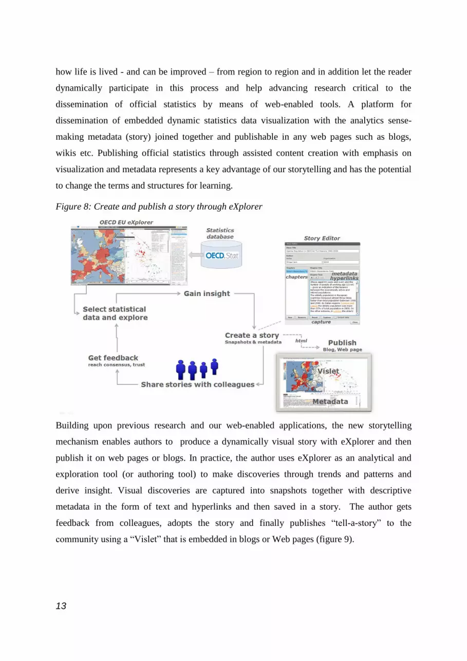
Figure 8: Create and publish a story through eXplorer
Building upon previous research and our web-enabled applications, the new storytelling
mechanism enables authors to produce a dynamically visual story with eXplorer and then
publish it on web pages or blogs. In practice, the author uses eXplorer as an analytical and
exploration tool (or authoring tool) to make discoveries through trends and patterns and
derive insight. Visual discoveries are captured into snapshots together with descriptive
metadata in the form of text and hyperlinks and then saved in a story. The author gets
feedback from colleagues, adopts the story and finally publishes “tell-a-story” to the
community using a “Vislet” that is embedded in blogs or Web pages (figure 9).

14
Figure 9: How to produce a vislet with eXplorer
The conceptual approach is based around three complementary characteristics: eXplorer,
storytelling and Vislet.
eXplorer works as the data provider and manager. It produces dynamic visual representations
including maps, scatter plot, table lens, parallel axes chart, time graph, data grid, coordinated
views, map layers. It provides some analytic tools such as dynamic query, filter, regional
categorization and profiles. Finally, it creates HTML code for Vislet.
Storytelling: When exploring and making sense of, for example, comprehensive statistics
data, we need a coherent cognitive workspace to hang our discoveries on for organizing and
navigating our thoughts. The GAV Flash toolkit includes such means by capturing saving and
packaging the results of an exploration gain insight process in a series of “snapshots” that
could help the analyst to highlight views of particular interest and subsequently guide other
analysts to follow important discoveries. The snapshot tool creates a single or a continuous
series (story) of visualization captures during the exploration process. In a typical scenario the
analyst has selected relevant attributes, time step (temporal data), data items-of-interest, color
class values, filter conditions for selected attributes and finally highlights the “discovery”
from a certain angle (viewing properties).
Figure 10. The snapshot system scans through all active views to gather and apply states.

15
Storytelling, in our context, is about telling a story on the subject of explored data and related
analytics reasoning about how gained knowledge was achieved. Storytelling within this
participative web context, could more engagingly draw the user into exciting reflections and
sometimes change a perspective altogether. The story is placed in the hands of those who
need it, e.g. analysts, teachers, managers or any decision makers. Dynamic visual storytelling
is a way of telling stories through interactive web-enabled visualization. Our proposed
storytelling technology, (Figure 11), could advance research critical to collaboration and
dissemination of digital media and enable a leap in understanding by the audience so as to
grasp how researchers or teachers may influence our students.
Figure 11. The GAV Flash storytelling mechanism
A Vislet is a standalone Flash application (widget) assembled from functional GAV Flash
components and Adobe Flex GUI tools. The Vislet, represented by, for example, a single map
view or a composite time-linked map and scatter plot view (figure 12), facilitates the
transition of selected statistics data into heterogeneous and communicative sense-making
news entities with integrated metadata and dynamic embedded animated visualizations that
could engage the user.
A Vislet can be assigned from a selection of the visual representation e.g. map, scatter plot,
parallel coordinates, table lens, time graph or data grid. Interactive features are exposed to all
visualizations including tooltips, brushing, highlight, filter that can discover outliers and
dynamic multiple-linked views. Several advanced color legend tasks are supported e.g. show

16
outliers based on 5th
and 95th
percentiles in certain colors or dynamic sliders that control class
values etc.
A server maintains the Vislet flash (swf) files together with a story repository, data source and
shape maps. The GAV Flash application runs locally in Flash Player on the client machine
and generates HTML code representing a story that is manually (copy/paste) embedded into a
web page. This resulting Vislet is then opened in the reader’s Web browser and requested
data, GIS, visualization widgets, eXplorer code and stories (metadata with snapshots) are
accessed from the eXplorer server.
Figure 12 Example of a Vislet embedded in a web page (blog)
With the introduction of this new technique, we are moving away from a clear distinction
between authors and readers: The analyst can discuss with interested readers the visual
discoveries which have been captured into snapshots together with descriptive text and
hyperlinks. Only the selected indicators and visual representations are published together with
their metadata, thus facilitating the comprehension of statistical information by non expert
readers.
We believe that this advanced storytelling technology can be very useful for media as some
examples of using explorer to tell a story have already showed. At the same time, the Vislet
technique applied to OECD eXplorer can help developing agile on-line publications, which
draw the attention on recent trends and inequalities among OECD regions.

17
4. Conclusions
Traditional practices for geovisual analytics methods applied to official statistics need tools
for more user participation and increased expectations in terms of user experience. This paper
presents an integrated statistics exploration, collaboration and publication process that will
address editorial storytelling aimed at producing statistical news content in support of an
automatic authoring process. The author can simply press a button to publish gained
knowledge that efficiently and clearly visualize statistical data. A storytelling technology is
introduced with the goal to advance research critical to official statistical collaboration and
publishing and to deliver this research into a web-enabled toolkit for the generation,
management and publication of embedded dynamic visualization with the analytics sense-
making metadata joined together and publishable in any HTML web pages such as blogs,
wikis etc. Publishing official statistics through assisted content creation with emphasis on
dynamic web-enabled visualization and snapshots could in many ways change the terms and
structures for learning. At the same time, it will encourage the practical use of more advanced,
collaborative geovisual analytics science technologies because of its easy accessibility to
import any regional statistical data from national statistics to statistics from a neighbourhood.
It could also enable the readers to take a more active role in the discovery process of
exploring regional indicators, for example, to identify those regional areas that outperform
other regions of their country or mean values. The tool will increase the interest in and
knowledge of regional structures and development patterns among specialist as well as non-
specialist users.
5. References
Andrienko V, Andrienko N, Voss H (2003) GIS for Everyone: the Common GIS project and
beyond, Peterson M. (ed.), Maps and the Internet, Elsevier Science, pp. 131-146
Andrienko G, Andrienko N, Fischer R, Mues V, Schuck A (2006). The parallel coordinate
plot in action: design and use for geographic visualization. International Journal of
Geographical Information Science, 20(10).
Brodbeck D, Girardin L (2003) Design study: using multiple coordinated views to analyze
geo-referenced high-dimensional datasets. In Proceedings of the Coordinated and Multiple
Views in Exploratory Visualization, IEEE Computer Society, pp. 104–111
Franzén J, Jern M (2006) GeoAnalytics – Exploring spatio-temporal and multivariate data,

18
Reviewed proceedings IV, London, published by IEEE Computer Society.
Inselberg A (1985) The plane with parallel coordinates, The Visual Computer 1(2), pp 69-92.
Jern M, Brezzi M, Thygesen L, (2009) A web-enabled Geovisual Analytics tool applied to
OECD Regional Data, Reviewed Proceedings in Eurographics
Jern M (2009) Collaborative Web-Enabled GeoAnalytics Applied to OECD Regional Data,
Proceedings of the 6th International Conference, Cooperative Design, Visualization, and
Engineering, Luxembourg, September 20-23, 2009.
Jern M, Rogstadius J, Åström T, Ynnerman A (2008) Visual Analytics presentation tools
applied in HTML Documents, Reviewed proceedings, IV08, London, published by IEEE
Computer Society.
Jern M, Johansson S (2007) GeoAnalytics Visual Inquiry and Filtering Tools in Parallel
Coordinates Plot, Seattle, ACM GIS.
OECD (2009a) Regions at a glance: 2009 edition.
OECD (2009b) OECD Regional database http://stats.oecd.org/WBOS
Roberts J (2004) Exploratory visualization with multiple linked views. In Exploring
Geovisualization A. MacEachren M Kraak J, Dykes J eds, Amsterdam.
Rosling L (2006) Gapminder http://www.gapminder.org/world/
Thomas J, Cook K (2005) Illuminating the Path: The Research and Development Agenda for
Visual Analytics.


![[Digital Storytelling Toolkit] - idigstories](https://img.pdfslide.net/doc/110x75/631f847185e2495e151068a0/digital-storytelling-toolkit-idigstories.jpg)