Embed Size (px)
Citation preview

Principles of MicroeconomicsPrinciples of Microeconomics

Principles of MicroeconomicsPrinciples of Microeconomics
DR. EMMA HUTCHINSON, UNIVERSITY OF VICTORIA
Maxwell Nicholson, Ben Lukenchuk, Timothy TaylorMaxwell Nicholson, Ben Lukenchuk, Timothy Taylor

Principles of Microeconomics by University of Victoria is licensed under a Creative Commons Attribution 4.0 International License, exceptwhere otherwise noted.
Unless otherwise noted, Principles of Microeconomics is (c) 2016 by OpenStax and is licensed under a Creative Commons AttributionLicense 4.0 except for the following changes and additions, which are (c) 2017 by the University of Victoria, and are licensed under aCreative Commons-Attribution 4.0 International license.You are free to use or modify (adapt) any of this material providing the terms of the Creative Commons licenses are adhered to.The following changes have been made to this book:
• Development of 8 course-specific topics in length
• Over 200 multiple choice questions integrated into the textbook
• Added Examples throughout the book
• 8 Case studies that include around 10 questions each with worked solutions. These cases focus on a specific
news story, such as Brexit, De Beers, SulpherDioxide cap and trade programs and more. (These can be used
separately from the book easily)
• Over 200 figures that can be edited through pages’ software
Under this license, any user of this textbook or the textbook contents herein must provide proper attribution as follows:The OpenStax College name, OpenStax College logo, OpenStax College book covers, OpenStax CNX name, and OpenStax CNX logoare not subject to the creative commons license and may not be reproduced without the prior and express written consent of RiceUniversity. For questions regarding this license, please contact [email protected].
• If you use this textbook as a bibliographic reference, then you should cite it as follows:
OpenStax Economics, Principles of Economics. OpenStax CNX. May 18, 2016 http://cnx.org/contents/
• If you redistribute this textbook in a print format, then you must include on every physical page the
following attribution:
“Download for free at http://cnx.org/contents/[email protected].”
• If you redistribute part of this textbook, then you must retain in every digital format page view (including
but not limited to EPUB, PDF, and HTML) and on every physical printed page the following attribution:
“Download for free at http://cnx.org/contents/[email protected].”

Contents
Topic 1: Introductory Concepts and Models
Introduction to Microeconomics 21.1 What Is Economics, and Why Is It Important? 51.2 Opportunity Costs & Sunk Costs 111.3 Marginal Analysis 22Case Study - Beer or Cancer? 26Solutions: Case Study - Beer or Cancer? 29Topic 1 Multiple Choice Questions 33Topic 1 Solutions 38Topic 1 References 39
Topic 2: Specialization and Trade
Introduction to Specialization & Trade 412.2 Production Possibility Frontier 442.3 Trade 53Case Study - Brexit 65Solutions: Case Study - Brexit 71Topic 2 Multiple Choice Questions 78Topic 2 Solutions 86Topic 2 References 87
Topic 3: Supply, Demand, and Equilibrium
Introduction to Supply and Demand 893.1 The Competitive Market Model 923.2 Building Demand and Consumer Surplus 953.3 Other Determinants of Demand 1083.4 Building Supply and Producer Surplus 1243.5 Other Determinants of Supply 137
3.6 Equilibrium and Market Surplus 146Solutions: Case Study - The Housing Market 172Topic 3 Solutions 177Topic 3 References 181
Topic 4 Part 1: Elasticity
4.1 Calculating Elasticity 1834.2 Elasticity and Revenue 1944.3 Relative Elasticity 202
Topic 4 Part 2: Applications of Supply and Demand
4.4 Introduction to Government Policy 2124.6 Quantity Controls 2154.7 Taxes and Subsidies 2194.8 Elasticity and PolicyMaxwell Nicholson
235
4.9 Tariffs 243Case Study - Automation in Fast Food 253Solutions: Case Study - Automation in Fast Food 259Topic 4 Multiple Choice Questions 267Topic 4 Solutions 288Topic 4 References 292
Topic 5: Externalities
Introduction to Environmental Protection and Negative Externalities 2955.1 Externalities 2975.2 Indirectly Correcting Externalities 3095.3 Directly Targeting Pollution 315Case Study - Sulpher Dioxide 328Solutions: Case Study - Sulpher Dioxide 332Topic 5 Solutions 340Topic 5 References 342
Topic 6: Consumer Theory
Introduction to Consumer Choices 3446.1 The Budget Line 3476.2 The Indifference Curve 3576.3 Understanding Consumer Theory 3666.4 Building Demand 381

Case Study - The Liberal Gas Tax 383Solutions: Case Study - The Liberal Gas Tax 387Topic 6 Solutions 396Topic 6 References 398
Topic 7: Producer Theory
Introduction to Cost and Industry Structure 4007.1 Building Producer Theory 4037.2 Understanding Producer Theory 4157.3 Producer Theory in the Long Run 4267.4 The Structure of Costs in the Long Run 436Solution: Case Study - Oil Markets 444Topic 7 Solutions 450Topic 7 References 452
Topic 8: Imperfect Competition
Introduction to Imperfect Competition 4548.1 Monopoly 4578.2 Fixing Monopoly 4698.3 Why Monopolies Persist 4748.4 Monopolistic Competition 480Case Study - Diamond's Demise 493Solutions: Diamond's Demise 499Topic 8 Solutions 506Topic 8 References 507
Appendix A: The Use of Mathematics in Principles of Economics 508
Appendix B: Indifference Curves 532

Topic 1: Introductory Concepts and Models
1

Introduction to Microeconomics
Topic Objectives
Topic 1: Introductory Concepts & ModelsIn this Topic, you will learn about:
• What Is Economics, and Why Is It Important?
• Microeconomics and Macroeconomics
• How Economists Use Theories and Models to Understand Economic Issues
• Scarcity and Trade-offs
• Opportunity and Sunk Costs
• Marginal Analysis
2

Figure 1. Do You Use Facebook? Economics is greatly impacted by how well information travels through society. Today, social media giantslike Twitter, Facebook, and Instagram are major forces on the information super highway. (Credit: Johan Larsson/Flickr)
Decisions … Decisions in the Social Media AgeDecisions … Decisions in the Social Media Age
To post or not to post? Every day we are faced with a myriad of decisions, from what to have for breakfast,to which route to take to class, to the more complex—“Should I double major and add possibly anothersemester of study to my education?” Our response to these choices depends on the information we haveavailable at any given moment, information economists call “imperfect” because we rarely have all thedata we need to make perfect decisions. Despite the lack of perfect information, we still make hundreds ofdecisions a day.
And now, we have another avenue to gather information—social media. Outlets like Facebook and Twitterare altering the process by which we make choices, how we spend our time, which movies we see, whichproducts we buy, and more. How many of you chose a university without checking out its Facebook pageor Twitter stream first for information and feedback?
As you will see in this course, what happens in economics is affected by how well and how fast informationis disseminated through a society, such as how quickly information travels through Facebook. “Economistslove nothing better than when deep and liquid markets operate under conditions of perfect information,”says Jessica Irvine, National Economics Editor for News Corp Australia.
3 • PRINCIPLES OF MICROECONOMICS

This leads us to the topic of this chapter, an introduction to the world of making decisions, processinginformation, and understanding behavior in markets —the world of economics.
What is economics and why should you spend your time learning it? After all, there are other disciplines you
could be studying, and other ways you could be spending your time. As the topic feature just mentioned, making
choices is at the heart of what economists study, and your decision to take this course is as much as economic
decision as anything else.
It is important to distinguish microeconomics from macroeconomics. Whereas macro studies how the aggregate
economy behaves, with reference to inflation, price levels, rate of growth, national income, unemployment and
more, micro focuses on individual decisions.
Economics is probably not what you think. It is not primarily about money or finance. It is not primarily about
business. It is not mathematics. What is it then? It is both a subject area and a way of viewing the world.
INTRODUCTION TO MICROECONOMICS • 4

1.1 What Is Economics, and Why Is It Important?
Learning Objectives
By the end of this section, you will be able to:
• Discuss the importance of studying economics
• Explain the relationship between production and division of labor
• Evaluate the significance of scarcity
At its core, Economics is the study of how humans make decisions in the face of scarcity. These can be individual
decisions, family decisions, business decisions or societal decisions. If you look around carefully, you will see
that scarcity is a fact of life. Scarcity means that human wants for goods, services and resources exceed what is
available. Resources, such as labor, tools, land, and raw materials are necessary to produce the goods and services
we want but they exist in limited supply. Of course, the ultimate scarce resource is time – everyone, rich or poor,
has just 24 hours in the day to try to acquire the goods they want. At any point in time, there is only a finite amount
of resources available.
Think about it this way: In 2016, the labor force in Canada contained 19.4 million workers, according to Statistics
Canada. The total area of the Canada is 9.99 million square kilometres. These are large numbers for such crucial
resources, however, they are limited. Because these resources are limited, so are the numbers of goods and
services we produce with them. Combine this with the fact that human wants seem to be virtually infinite, and
you can see why scarcity is a problem.
5

Figure 1. Scarcity of Resources. Homeless people are a stark reminder that scarcityof resources is real. (Credit: “daveynin”/Flickr Creative Commons)
If you still do not believe that scarcity is a problem, consider the following: Does everyone need food to eat? Does
everyone need a decent place to live? Does everyone have access to healthcare? In every country in the world,
there are people who are hungry, homeless, and in need of healthcare, just to focus on a few critical goods and
services. Why is this the case? It is because of scarcity. Let’s delve into the concept of scarcity a little deeper,
because it is crucial to understanding economics.
The Problem of ScarcityThe Problem of Scarcity
Think about all the things you consume: food, shelter, clothing, transportation, healthcare, and entertainment. How
do you acquire those items? You do not produce them yourself. You buy them. How do you afford the things you
buy? You work for a wage. Or if you do not, someone else does on your behalf. Yet most of us never have enough
to buy all the things we want. This is because of scarcity. So how do we solve the problem of scarcity?
Every society, at every level, must make choices about how to use its resources. Families must decide whether
to spend their money on a new car or a vacation. Towns must choose whether to put more of the budget into
police and fire protection or into the school system. Nations must decide whether to devote more funds to national
defence or to protecting the environment. In most cases, there just isn’t enough money in the budget to do
everything. So why do we not each just produce all of the things we consume? The simple answer is most of us
do not know how, but that is not the main reason. Think back to pioneer days, when individuals knew how to do
many more practical tasks than we do today, from building their homes, to growing crops, to hunting for food, or
repairing their equipment. Most of us do not know how to do all—or any—of those things. It is not because we
could not learn. Rather, we do not have to. The reason why is something called the division and specialization of
labor, a production innovation first put forth by Adam Smith in his book, The Wealth of Nations (See Figure 2).
1.1 WHAT IS ECONOMICS, AND WHY IS IT IMPORTANT? • 6

Figure 2. Adam Smith. Adam Smithintroduced the idea of dividing labor intodiscrete tasks. (Credit: WikimediaCommons)
The Division of and Specialization of LaborThe Division of and Specialization of Labor
The formal study of economics began when Adam Smith (1723–1790) published his famous book The Wealth of
Nations in 1776. Many authors had written on economics in the centuries before Smith, but he was the first to
address the subject in a comprehensive way. In the first chapter, Smith introduces the division of labor, which
means that the way a good or service is produced is divided into a number of tasks that are performed by different
workers, instead of all the tasks being done by the same person.
To illustrate the division of labor, Smith counted how many tasks went into making a pin: drawing out a piece
of wire, cutting it to the right length, straightening it, putting a head on one end and a point on the other, and
packaging pins for sale, to name just a few. Smith counted 18 distinct tasks that were often done by different
people—all for a pin!
Modern businesses divide tasks as well. Even a relatively simple business like a restaurant divides up the task of
serving meals into a range of jobs like top chef, sous chefs, kitchen help, servers to wait on the tables, a greeter at
the door, janitors to clean up, and a business manager to handle paychecks and bills—not to mention the economic
connections a restaurant has with suppliers of food, furniture, kitchen equipment, and the building where it is
located. A complex business like a large manufacturing factory, such as the shoe factory shown in Figure 3 can
have hundreds of job classifications.
7 • PRINCIPLES OF MICROECONOMICS

Figure 3. Division of Labor. Workers on an assembly line are an example of thedivisions of labor. (Credit: Nina Hale/Flickr Creative Commons)
Why the Division of Labor Increases ProductionWhy the Division of Labor Increases Production
When the tasks involved with producing a good or service are divided and subdivided, workers and businesses can
produce a greater quantity of output. In his observations of pin factories, Smith observed that one worker alone
might make 20 pins in a day, but that a small business of 10 workers (some of whom would need to do two or
three of the 18 tasks involved with pin-making), could make 48,000 pins in a day. How can a group of workers,
each specializing in certain tasks, produce so much more than the same number of workers who try to produce the
entire good or service by themselves? Smith offered three reasons.
First, specialization in a particular small job allows workers to focus on the parts of the production process
where they have an advantage. (In later topics, we will develop this idea by discussing comparative advantage.)
People have different skills, talents, and interests, so they will be better at some jobs than at others. The particular
advantages may be based on educational choices, which are in turn shaped by interests and talents. Only those
with medical degrees qualify to become doctors, for instance. For some goods, specialization will be affected
by geography—it is easier to be a wheat farmer in Saskatchewan than in British Columbia, but easier to run a
tourist hotel in BC than in Saskatchewan. If you live in or near a big city, it is easier to attract enough customers
to operate a successful dry cleaning business or movie theater than if you live in a sparsely populated rural area.
Whatever the reason, if people specialize in the production of what they do best, they will be more productive
than if they produce a combination of things, some of which they are good at and some of which they are not.
Second, workers who specialize in certain tasks often learn to produce more quickly and with higher quality. This
pattern holds true for many workers, including assembly line laborers who build cars, stylists who cut hair, and
doctors who perform heart surgery. In fact, specialized workers often know their jobs well enough to suggest
innovative ways to do their work faster and better.
Third, specialization allows businesses to take advantage of economies of scale, which means that for many
goods, as the level of production increases, the average cost of producing each individual unit declines. For
example, if a factory produces only 100 cars per year, each car will be quite expensive to make on average.
1.1 WHAT IS ECONOMICS, AND WHY IS IT IMPORTANT? • 8
However, if a factory produces 50,000 cars each year, then it can set up an assembly line with huge machines
and workers performing specialized tasks, and the average cost of production per car will be lower. The ultimate
result of workers who can focus on their preferences and talents, learn to do their specialized jobs better, and work
in larger organizations is that society as a whole can produce and consume far more than if each person tried to
produce all of their own goods and services. The division and specialization of labor has been a force against the
problem of scarcity.
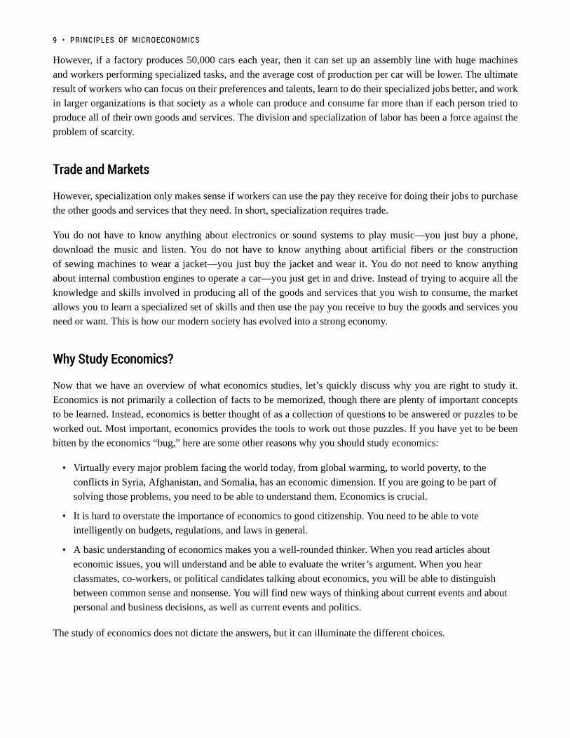
Trade and MarketsTrade and Markets
However, specialization only makes sense if workers can use the pay they receive for doing their jobs to purchase
the other goods and services that they need. In short, specialization requires trade.
You do not have to know anything about electronics or sound systems to play music—you just buy a phone,
download the music and listen. You do not have to know anything about artificial fibers or the construction
of sewing machines to wear a jacket—you just buy the jacket and wear it. You do not need to know anything
about internal combustion engines to operate a car—you just get in and drive. Instead of trying to acquire all the
knowledge and skills involved in producing all of the goods and services that you wish to consume, the market
allows you to learn a specialized set of skills and then use the pay you receive to buy the goods and services you
need or want. This is how our modern society has evolved into a strong economy.
Why Study Economics?Why Study Economics?
Now that we have an overview of what economics studies, let’s quickly discuss why you are right to study it.
Economics is not primarily a collection of facts to be memorized, though there are plenty of important concepts
to be learned. Instead, economics is better thought of as a collection of questions to be answered or puzzles to be
worked out. Most important, economics provides the tools to work out those puzzles. If you have yet to be been
bitten by the economics “bug,” here are some other reasons why you should study economics:
• Virtually every major problem facing the world today, from global warming, to world poverty, to the
conflicts in Syria, Afghanistan, and Somalia, has an economic dimension. If you are going to be part of
solving those problems, you need to be able to understand them. Economics is crucial.
• It is hard to overstate the importance of economics to good citizenship. You need to be able to vote
intelligently on budgets, regulations, and laws in general.
• A basic understanding of economics makes you a well-rounded thinker. When you read articles about
economic issues, you will understand and be able to evaluate the writer’s argument. When you hear
classmates, co-workers, or political candidates talking about economics, you will be able to distinguish
between common sense and nonsense. You will find new ways of thinking about current events and about
personal and business decisions, as well as current events and politics.
The study of economics does not dictate the answers, but it can illuminate the different choices.
9 • PRINCIPLES OF MICROECONOMICS

SummarySummary
Economics seeks to understand and address the problem of scarcity, which is when human wants for goods and
services exceed the available supply. A modern economy displays a division of labor, in which people earn income
by specializing in what they produce and then use that income to purchase the products they need or want. The
division of labor allows individuals and firms to specialize and to produce more for several reasons: a) It allows
the agents to focus on areas of advantage due to natural factors and skill levels; b) It encourages the agents to learn
and invent; c) It allows agents to take advantage of economies of scale. Division and specialization of labor only
work when individuals can purchase what they do not produce in markets. Learning about economics helps you
understand the major problems facing the world today, prepares you to be a good citizen, and helps you become a
well-rounded thinker.
GlossaryGlossary
Division of Laborthe way in which the work required to produce a good or service is divided into tasks performed bydifferent workersEconomicsthe study of how humans make choices under conditions of scarcityEconomies of Scalewhen the average cost of producing each individual unit declines as total output increasesScarcitywhen human wants for goods and services exceed the available supplySpecializationwhen workers or firms focus on particular tasks for which they are well-suited within the overallproduction process
1.1 WHAT IS ECONOMICS, AND WHY IS IT IMPORTANT? • 10

1.2 Opportunity Costs & Sunk Costs
Learning Objectives
By the end of this section, you will be able to:
• Understand the three step process for making binary decisions
• Calculate the opportunity cost of an action
• Understand how sunk costs influence our decision making
Economics looks at how rational individuals make decisions. An important part of being a rational decision maker
is considering opportunity costs. In our introductory section we identified the concept of scarcity. Normally we are
quite good at considering scarcity when it comes to resources and money. What we are less good at considering is
scarcity of time.
Consider the following image that shows the number of weeks an average human lives. Sometimes it kind of feels
like our lives are made up of a countless number of weeks. But there they are—fully countable—staring you in
the face. This isn’t meant to scare you, but rather to emphasize that a rational consumer doesn’t ignore time, but
incorporates it into the analysis of any decision they make.
11

So how do you ‘spend’ your time? In economics, we want to place a value on each different opportunity we have
so we can compare them.
What if your friends were to ask you if you want to go out to the club? How much do you value it? As economists,
we want to measure the happiness you will get from this experience by finding your maximum willingness to
pay. Let’s say that for a 5 hour night at the club, the MOST you are willing to pay is $100. Seem high? If you
have gone clubbing, this is likely close to what you paid for it.
1.2 OPPORTUNITY COSTS & SUNK COSTS • 12

Suppose the costs of going clubbing are $50 ($15 cover, $20 for drinks and $15 for a ride home). With that
analysis it seems like you should go, but so far we have only considered the explicit costs of the experience. An
explicit cost represents a clear direct payment of cash (whether actual cash or from debit, credit, etc). But what
about our time? We must consider time as another cost of the action.
How do we measure time? Simple – what else could we be doing with that time? Assume you also work as a
server at the campus pub, where you get paid $15 an hour (including tips). This makes it easy to put a dollar
amount on your time. For 5 hours of clubbing, you are forgoing the opportunity to earn $75 ($15 * 5). This is
your implicit cost for clubbing, or the cost that has been incurred but does not result in a direct payment.
It is important to note that the implicit costs are the benefit of the next best option. There are an infinite number
of things we could be doing with our time, from watching a movie to studying economics, but for implicit costs
we only consider the next best. If we took them all into account our costs would be infinite.
Consider the two options side by side.
Table 1.2a
This shows us something interesting. Even though we are willing to pay $100 to go out clubbing, our ‘happiness’
from working is greater. A rational consumer would chose to work. The $75 we could be earning from working
is equal to our implicit costs of going out since, rather than going clubbing, we could be making money for the
5 hours. To truly consider costs we must always consider our opportunity costs which include the implicit and
explicit costs of an action.
13 • PRINCIPLES OF MICROECONOMICS

Table 1.2b
In this example if you were to go clubbing opportunity costs are:
Explicit Costs (cover, drinks and ride home) : $50
Implicit Costs (forgone income from 5 hours) : $75
Opportunity Costs : $125
Should you go clubbing? You are only willing to pay $100, and your opportunity costs are $125 so no!
Does this mean you should never go out? Not at all. You just may be surprised that your willingness to pay may
be well over $100.
How to measure ‘Happiness’
In our previous analysis we refer to the concept of “Total Happiness.” The problem is, happiness is not aneasy value to measure. Daniel Bernoulli, an economist, first introduced the concept of utility as a meansof measuring happiness. Classical economists will often assume that utilities can be measured as a hardnumber. In reality, it is must harder to measure the happiness a consumer receives from a good. Often,we will use the measurement of how much a consumer is willing to pay, but even this information canbe difficult to assess. For the remainder of Topic 1, we will refer to happiness as something that can bemeasured, recognizing that this is rarely as easy as it will appear here.
ScarcityScarcity
This consideration of opportunity cost is rooted in an understanding that all resources are scarce. The first image
paints a compelling picture of the scarcity of time, and our financial resources are also scarce. Being a rational
1.2 OPPORTUNITY COSTS & SUNK COSTS • 14

decision maker means considering the scarcity of all resources associated with an action. As decision makers, we
have to make trade-offs on what we do with finite resources.
This leads us to a fairly simple conclusion. We should do something if the benefits outweigh the costs. The key
insight is that the costs we are referring to are opportunity costs, which consider the next best alternative use of
our resources.
Making DecisionsMaking Decisions
We have now looked at how to analyze two options, but how do we make the decision? We can lay the process
out in three steps:
1. Find your willingness to pay (or wage you would earn) from the option you are considering and the next
best alternative
2. Subtract the explicit costs from each option to find your happiness
3. Choose the option with that makes you happier
If we want to change this into the process for a binary decision (yes or no):
1. Add up all the benefits of an action
2. Subtract all costs explicit and implicit
3. If benefits > costs, this is the right choice
It is important to note that not all decisions are binary.
Sunk CostsSunk Costs
Just as it is important to understand the costs that should be considered in decision making, it is important to
understand what costs should not. Consider the two options you may have when you wake up – do you work out
or sleep in? Have you ever convinced yourself to get out of bed by reminding yourself that you paid $60 for your
monthly gym membership? Well, you fell victim to a common logical fallacy.
A sunk cost is a cost that no matter what is unrecoverable. As such it should have no impact on future decision
making. This may sound strange, but consider the your two options using the analysis learned above for making
decisions.
15 • PRINCIPLES OF MICROECONOMICS

Following our steps we find the maximum willingness to pay for each option, subtract the explicit costs, and
compare the happiness from each. It does not matter that we spend $60 on a gym membership because no matter
what we do we can’t get that money back. With this willingness to pay reflected in the table, the better option is
to Sleep-In, with an opportunity cost of $20.
Notice that the $60 is not included as an explicit costs because it is not an additional cost we have to incur as a
result of working out. Since we have already paid the $60, it is no longer something we consider.
1.2 OPPORTUNITY COSTS & SUNK COSTS • 16

Why Buy a Gym Membership?Why Buy a Gym Membership?
(Credit: “Scott Webb”/Unsplash Creative Commons)
Why would one ever buy a gym membership? Well in this case, it might be a bad idea. The ‘willingnessto pay’ represents how badly someone might want to go to the gym. If you knew that every morning youwould wake up and value sleeping more than working out, then a gym pass might not be for you.
If that was the case you would need to find a way to increase your willingness to go to the gym, forexample, if you committed to a work out plan with a friend, the social cost of sleeping in may be high,incentivizing you to get out of bed.
The important lesson here is to be mindful of your future motivation when you are incurring a sunk cost.
Sunk Costs & BusinessSunk Costs & Business
Sunk costs aren’t exclusive to gym memberships, in fact, the sunk cost fallacy is common in big business and
government. Ever heard the expression “we’ve invested too much in this project to back out now?” Even if you
have not, it sounds fairly logical – unfortunately it is not.
Consider a mining company that has invested $5 million in the infrastructure of a mine. After new information,
they learn of another, richer mine site that they can mine for $4 million, with projected revenues of $8 million.
17 • PRINCIPLES OF MICROECONOMICS

The current mine site will cost $1 million to extract the remaining resources ($4 million projected revenue). What
should the company do?
At shown the total profits from the new site are higher, so despite the fact they have invested $5 million in the old
site, they should abandon it and mine the new. The conclusion:
Sunk costs are irrelevant for decision making.
Want to know how you can avoid the sunk cost fallacy in your decision making? Read more here.
GlossaryGlossary
Explicit Coststhe direct cost of an action, usually involves a cash transaction or a physical transfer of resources.Implicit Costs
the indirect cost of an action, includes the cost of forgoing the next best optionOpportunity Cost
all costs associated with an action, both explicit and implicitSunk Costscosts that have been paid that cannot be recoveredTrade-Offsa sacrifice of resources (time, money etc.) to achieve a certain benefitWillingness to Paythe maximum amount of resources a consumer is willing to lose to achieve a certain benefit
1.2 OPPORTUNITY COSTS & SUNK COSTS • 18

Exercises 1.2
1. Which of the following statements about opportunity cost is TRUE?
I. Opportunity cost is equal to implicit costs plus explicit costs.II. Opportunity cost only measures direct monetary costs.III. Opportunity cost accounts for alternative uses of resources such as time and money.
a) I, II and III.b) Ic) III only.d) I and III only.
2. Which of the following statements about opportunity costs is TRUE?
I. The opportunity cost of a given action is equal to the value foregone of all feasible alternative actions.II. Opportunity costs only measure direct out of pocket expenditures.III. To calculate accurately the opportunity cost of an action we need to first identify the next bestalternative to that action.
a) III only.b) I and III only.c) II only.d) None of the statements is true.
3. Suppose that you deciding between seeing a move and going to a concert on a particular Saturdayevening. You are willing to pay $20 to see the movie and the movie ticket costs $5. You are willing to pay$80 for the concert and the concert ticket costs $50. The opportunity cost of going to the movie is:
a) $5.b) $30.c) $35.d) $65.
4. Suppose that you are willing to pay $20 to see a movie on Saturday night. A ticket costs $10, and thenext-best alternative use of your time would be to go to dinner with a friend. The cost of the dinner is $20and you value the experience of having dinner with your friend at $60. The opportunity cost of seeing themovie is equal to:
a) $50.b) $30.c) $20.d) $10.
5. Suppose that you are willing to pay $50 to see a movie on Saturday night. A ticket costs $15, and thenext-best alternative use of your time would be to go to a concert which costs $80 and you value at $100.The opportunity cost of seeing the movie is equal to:
a) $15.
19 • PRINCIPLES OF MICROECONOMICS

b) $20.c) $35.d) $70.
6. Suppose you play a round of golf costing $75. The golf takes four hours to play. If you were not playinggolf you could be working and earning $40 per hour. The opportunity cost of your golf game is:
a) $75.b) $235.c) $155.d) $160.
7. Suppose you have bought and paid for a ticket to see Lady Gaga in concert. You were willing to pay upto $200 for this ticket, but it only cost you $110. On the day of the concert, a friend offers you a free ticketto the opera instead. Assuming that it is impossible to resell the Lady Gaga ticket, what is the minimumvalue you would have to place on a night at the opera, in order for you to choose the opera over LadyGaga?
a) $200.b) $110.c) $90.d) $0.
8. Suppose that you are willing to pay $350 to see Leonard Cohen play at the Save-On-Foods Arena.Tickets cost $100, and the next-best alternative use of your time would be to work in paid employmentearning $50 over the evening. The opportunity cost of seeing Leonard Cohen is equal to:
a) $50.b) $100.c) $150.d) $200.
9. I am considering loaning my brother $10,000 for one year. He has agreed to pay 10% interest on theloan. If I don’t loan my brother the $10,000, it will stay in my bank account for the year, where it will earn2% interest. What is the opportunity cost to me of the loan to my brother?
a) $200.b) $800.c) $1,000.d) $1,200.
10. In January, in an attempt to commit to getting fit, I signed a year-long, binding contract at a local gym,agreeing to pay $40 per month in membership fees. I also spent $300 on extremely stylish gym clothes.This morning, I was trying to decide whether or not to actually go to the gym. Which of the following wasrelevant to this decision?
a) The $40 that I paid the gym this month.b) The $300 I spent on gym clothes.
1.2 OPPORTUNITY COSTS & SUNK COSTS • 20
c) The fact that I also had to write a 103 midterm exam today.d) All of the above were relevant.
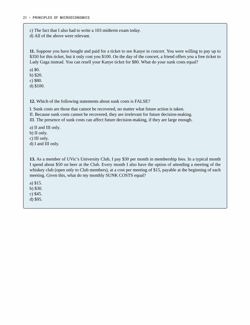
11. Suppose you have bought and paid for a ticket to see Kanye in concert. You were willing to pay up to$350 for this ticket, but it only cost you $100. On the day of the concert, a friend offers you a free ticket toLady Gaga instead. You can resell your Kanye ticket for $80. What do your sunk costs equal?
a) $0.b) $20.c) $80.d) $100.
12. Which of the following statements about sunk costs is FALSE?
I. Sunk costs are those that cannot be recovered, no matter what future action is taken.II. Because sunk costs cannot be recovered, they are irrelevant for future decision-making.III. The presence of sunk costs can affect future decision-making, if they are large enough.
a) II and III only.b) II only.c) III only.d) I and III only.
13. As a member of UVic’s University Club, I pay $30 per month in membership fees. In a typical monthI spend about $50 on beer at the Club. Every month I also have the option of attending a meeting of thewhiskey club (open only to Club members), at a cost per meeting of $15, payable at the beginning of eachmeeting. Given this, what do my monthly SUNK COSTS equal?
a) $15.b) $30.c) $45.d) $95.
21 • PRINCIPLES OF MICROECONOMICS

1.3 Marginal Analysis
Learning Objectives
By the end of this section, you will be able to:
• Use marginal analysis to determine the right quantity of an action
• Calculate marginal net benefit of an additional unit of activity
“Economics is the painful elaboration of the obvious” – Anonymous.
That quote might seem quite relevant when the biggest conclusion of our last section was that you should do
something if the benefits outweigh the costs. While sometimes economics can seem obvious, it is important to
first understand how a rational consumer should behave before seeing how we fail to meet that standard.
MarginalMarginal AnalysisAnalysis
In the last section we showed how to make a binary decision, but not all decisions fit that category. Many are
‘how much’ decisions. For example, if you have decided to go clubbing, how many drinks do you buy? This is
a decision where we use marginal analysis. Marginal analysis is the process of breaking down a decision into
a series of ‘yes or no’ decisions. More formally, it is an examination of the additional benefits of an activity
compared to the additional costs incurred by that same activity.
To make a decision using marginal analysis, we need to know the willingness to pay for each level of the activity.
As mentioned, this is also known as the marginal benefit from an action.
To decide how many drinks to buy, you have to make a series of yes or no decisions on whether to buy an
additional drink. In Table 1.3a the marginal benefit is diminishing. This means that you are willing to pay more
for the 1st drink than the next. Your friends are all drinking, so you are likely willing to pay quite a lot for your
1st drink. By the 4th, you may feel as though you do not need another.
22

So how many drinks will you buy if the cost is $7? To make this decision, we must use marginal analysis for each
level. This means comparing our marginal benefit with marginal cost of an additional unit of activity. In this case
marginal cost is just equal to $7.
For the 1st Drink: MB = $20 > MC = $ 7, you should buy the drink.
For the 2nd Drink: MB = $12 > MC = $ 7, you should buy the drink.
For the 3rd Drink: MB = $6 < MC = $ 7, you should not buy the drink.
With this simple process we can easily see that you will buy 2 drinks, unless there is a price change.
Net BenefitNet Benefit
What is our net benefit from the actions, or how much ‘happiness’ have we gained? To calculate, all we have to
do is add up our benefits and subtract our costs.
Total Benefit = $20 + $12 = $32
Total Cost = $7 + $7 = $14
Net Benefit = $32 – $14 = $18
It is important to recognize that our act of marginal analysis has maximized this benefit. Consider what would
happen if we purchased 3 drinks.
Total Benefit = $20 + $12 + $6 = $38
Total Cost = $7 + $7 + $7 = $21
Net Benefit = $38 – $21 = $17
Note that although total benefit is more than it was previously, net benefit is lower. Looking closer we can see that
net benefit fell because our total costs rose ($14 –> $21) by more than our total benefits ($32 –> $38). As a quick
rule:
23 • PRINCIPLES OF MICROECONOMICS

When total benefits rise more than total costs, then the action is logical.
When total costs rise more than total benefits, then the action is illogical.
This is why we look at the marginal net benefit of a decision, rather that the total. It is as though all the previous
actions are ‘sunk’. We can calculate the marginal net benefit of a decision by subtracting marginal cost from
marginal benefit. Marginal net benefit of the first drink is $13 ($20 – $7), the 2nd is $5 ($12 – $7), and the third
is -$1 ($6 – $7). As long as the marginal net benefit is positive, we should increase our activity!
SummarySummary
Marginal analysis is an essential concept for everything we learn in economics, because it lies at the core of why
we make decisions. We have just scratched the surface of it now, but will go more in depth in Topic 3. For now,
we will turn our attention to a slightly different topic – trade.
GlossaryGlossary
Marginal Analysis The examination of the additional benefits of an activity compared to the additionalcosts incurred by that same activity
Marginal Benefit
The additional satisfaction one gains from an additional unit of an activityMarginal Cost
The additional costs from an additional unit of an activityMarginal Net BenefitThe difference between the marginal benefits and marginal costs of an action
Exercises 1.3
1. According to marginal analysis, optimal decision-making involves:
a) Taking actions whenever the marginal benefit is positive.b) Taking actions only if the marginal cost is zero.c) Taking actions whenever the marginal benefit exceeds the marginal cost.d) All of the above.
2. Jane’s marginal benefit per day from drinking coke is given in the table below. This shows that she
1.3 MARGINAL ANALYSIS • 24

values the first coke she drinks at $1.20, the second at $1.15, and so on.If the price of coke is $1.00, the optimal number of cokes that Jane should drink is:
a) 1.b) 2.c) 3.d) 4.
25 • PRINCIPLES OF MICROECONOMICS

Case Study - Beer or Cancer?
Note that the Economics 103 Case Studies are meant to supplement the course material by giving youexperience applying Economic concepts to real world examples. While they are beyond the level you willbe tested on, they are useful for students who want a stronger grasp of the concepts and their applications.
Credit: University of Victoria
Interesting things have been happening in the chemistry labs of UVic. Professor Fraser Hof and Philips Brewery
chemist Euan Thomson have been collaborating to revolutionize the craft brewing process.
The project was inspired by a very different invention from Hof’s lab—the only one of its kind. “We created a
26

tool for profiling the proteins in cancer cells,” said Hof. “And I realized that it could also be used to profile the
proteins in brewer’s yeast.”
Read more about the beer chemistry collaboration.
In Topic 1 we talked about the opportunity costs of an action. Let’s explore how opportunity costs might impact
decisions on what to research.
Assume that the government provides $50,000/year for the department to conduct cancer research, and the costs
of operating the research lab is $30,000. Philips offers $70,000/year to do beer research, but researching beer
would increase costs by $5,000.
1. What is the opportunity cost of conducting cancer research? Break this into implicit and explicit costs.
2. What option will the department choose? What are the opportunity costs of this choice?
3. What is the total economic profits from this choice?
4. If the cancer lab was offered $30,000 to shut down what would be the opportunity cost?
5. What is the minimum amount the government would have to provide for the department to conduct
cancer research?
6. Why must the government pay the lab more money for the same work as before? What does this show
us about how opportunities effect compensation?
Academic pursuits often have high private opportunity costs – its why professors are so well paid. If they’re paid
too little, the brightest PhDs will turn to industry instead of academia and universities will suffer. In order to attract
experts from industry, the university needs to have the resources to compensate them.
27 • PRINCIPLES OF MICROECONOMICS
Read more about professor compensation.
Consider an Economics prof who could be making $80,000 in the private sector, and a Business prof that could
be making $100,000. Assume the individuals value the added prestige and benefits from being a prof at $20,000.
7. All else equal, how much will you have to pay each professor to entice them to teach?
In this case study we have shown how microeconomic concepts of opportunity costs can be used to understand
current events and practical examples. Do you have an example you think would make a good case study? Contact
[email protected] to propose your story.
CASE STUDY - BEER OR CANCER? • 28

Solutions: Case Study - Beer or Cancer?
1. What is the opportunity cost of conducting cancer research? Break this into implicit and explicit costs.
We are given the information that the government provides $50,000/year for the department to conduct cancer
research, and the costs of operating the research lab is $30,000. Philips offers $70,000/year to do beer research,
but researching beer would increase costs by $5,000.
The best way to find our cost breakdown is to put this information into a table, where we can make a side by
side comparison of the two options. In the cancer research column, we have a total revenue of $50,000 from
government funding, minus explicit operating costs of $30,000. This leaves us with accounting profits of $20,000.
Likewise, in the beer research column, we have total revenue of $70,000 from Philips, minus $30,000 + $5,000,
or $35,000 in explicit operating costs. This leaves us with accounting profits of $35,000.
Since we are looking at the opportunity costs of cancer research, we don’t have to worry yet about which option
the department will choose. Since we know opportunity cost is explicit + implicit costs, all we need is the
implicit cost of the next best option. In this case, when we conduct cancer research we forgo $35,000 of profits.
This means:
29

Explicit Costs (lab operating costs): $30,000
Implicit Costs (forgone profits from Philips): $35,000
Opportunity Costs (Implicit + Explicit): $65,000
2. What option will the department choose? What are the opportunity costs of this choice?
Since we have already calculated the accounting profits and know that Cancer research gives $20,000 of profits,
whereas beer provides $35,000, we know that the department will choose beer research.
Finding opportunity costs is the same process as before, except now our explicit costs are the operating costs of
the beer lab, and our implicit costs are the forgone profits from cancer research.
Explicit Costs (lab operating costs): $35,000
Implicit Costs (forgone profits from Cancer research): $20,000
Opportunity Costs (Implicit + Explicit): $55,000
3. What is the total economic profits from this choice?
Economic profits are the difference between total revenue and all the costs of an action, implicit and explicit. With
a total revenue of $70,000 from Philips, our economic profits are equal to $70,000 minus our previously calculated
opportunity costs. Since $70,000 – $55,000 = $15,000, our economic profits from beer research are $15,000.
4. If the cancer lab was offered $30,000 to shut down what would be the opportunity cost?
If the department was offered $30,000 to shut down, this just creates another option. Remember that opportunity
cost includes the implicit costs of the next best alternative. This means we must determine whether is is better for
the lab to shut down, or to work with Philips.
SOLUTIONS: CASE STUDY - BEER OR CANCER? • 30
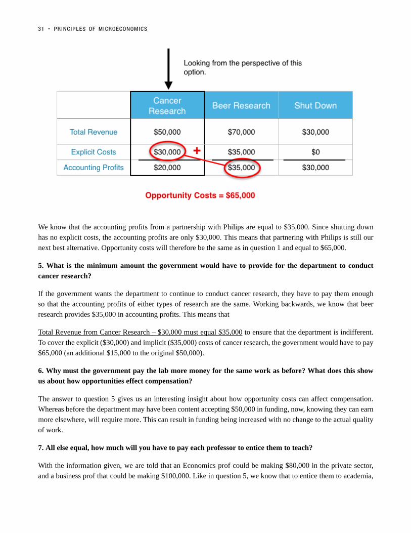
We know that the accounting profits from a partnership with Philips are equal to $35,000. Since shutting down
has no explicit costs, the accounting profits are only $30,000. This means that partnering with Philips is still our
next best alternative. Opportunity costs will therefore be the same as in question 1 and equal to $65,000.
5. What is the minimum amount the government would have to provide for the department to conduct
cancer research?
If the government wants the department to continue to conduct cancer research, they have to pay them enough
so that the accounting profits of either types of research are the same. Working backwards, we know that beer
research provides $35,000 in accounting profits. This means that
Total Revenue from Cancer Research – $30,000 must equal $35,000 to ensure that the department is indifferent.
To cover the explicit ($30,000) and implicit ($35,000) costs of cancer research, the government would have to pay
$65,000 (an additional $15,000 to the original $50,000).
6. Why must the government pay the lab more money for the same work as before? What does this show
us about how opportunities effect compensation?
The answer to question 5 gives us an interesting insight about how opportunity costs can affect compensation.
Whereas before the department may have been content accepting $50,000 in funding, now, knowing they can earn
more elsewhere, will require more. This can result in funding being increased with no change to the actual quality
of work.
7. All else equal, how much will you have to pay each professor to entice them to teach?
With the information given, we are told that an Economics prof could be making $80,000 in the private sector,
and a business prof that could be making $100,000. Like in question 5, we know that to entice them to academia,
31 • PRINCIPLES OF MICROECONOMICS

the accounting profits must be equal. We also know that academia comes with an added prestige factor of
$20,000. Putting the economist in our table:
Notice that explicit costs are denoted by ‘x’ to represent that, while we don’t know how much they are, they are
assumed to be the same. This cost would represent the cost of living associated with either job.
We know that for the economist to be indifferent, accounting profits must be equal. This means that
$20,000 + C – x = $80,000 – x
Solving for C we find C = $60,000. This means that the economist would need to be paid $60,000 to join
academia.
Doing the same process for the business prof, we would find they would have to be paid $80,000 to join academia.
This can help explain why profs from different departments can have very different compensation. Ultimately, it
depends on the job prospects they would have outside of the academic sphere.
SOLUTIONS: CASE STUDY - BEER OR CANCER? • 32

Topic 1 Multiple Choice Questions
All the following questions are from previous exams for Economics 103. They are duplicates of thequestions found in the Topic sub-sections.
Exercises 1.2Exercises 1.2
1. Which of the following statements about opportunity cost is TRUE?
I. Opportunity cost is equal to implicit costs plus explicit costs.
II. Opportunity cost only measures direct monetary costs.
III. Opportunity cost accounts for alternative uses of resources such as time and money.
a) I, II and III.
b) I
c) III only.
d) I and III only.
2. Which of the following statements about opportunity costs is TRUE?
I. The opportunity cost of a given action is equal to the value foregone of all feasible alternative actions.
II. Opportunity costs only measure direct out of pocket expenditures.
III. To calculate accurately the opportunity cost of an action we need to first identify the next best alternative to
that action.
a) III only.
b) I and III only.
c) II only.
d) None of the statements is true.
3. Suppose that you deciding between seeing a move and going to a concert on a particular Saturday evening. You
33

are willing to pay $20 to see the movie and the movie ticket costs $5. You are willing to pay $80 for the concert
and the concert ticket costs $50. The opportunity cost of going to the movie is:
a) $5.
b) $30.
c) $35.
d) $65.
4. Suppose that you are willing to pay $20 to see a movie on Saturday night. A ticket costs $10, and the next-best
alternative use of your time would be to go to dinner with a friend. The cost of the dinner is $20 and you value the
experience of having dinner with your friend at $60. The opportunity cost of seeing the movie is equal to:
a) $50.
b) $30.
c) $20.
d) $10.
5. Suppose that you are willing to pay $50 to see a movie on Saturday night. A ticket costs $15, and the next-best
alternative use of your time would be to go to a concert which costs $80 and you value at $100. The opportunity
cost of seeing the movie is equal to:
a) $15.
b) $20.
c) $35.
d) $70.
6. Suppose you play a round of golf costing $75. The golf takes four hours to play. If you were not playing golf
you could be working and earning $40 per hour. The opportunity cost of your golf game is:
a) $75.
b) $235.
c) $155.
d) $160.
7. Suppose you have bought and paid for a ticket to see Lady Gaga in concert. You were willing to pay up to $200
for this ticket, but it only cost you $110. On the day of the concert, a friend offers you a free ticket to the opera
instead. Assuming that it is impossible to resell the Lady Gaga ticket, what is the minimum value you would have
to place on a night at the opera, in order for you to choose the opera over Lady Gaga?
TOPIC 1 MULTIPLE CHOICE QUESTIONS • 34

a) $200.
b) $110.
c) $90.
d) $0.
8. Suppose that you are willing to pay $350 to see Leonard Cohen play at the Save-On-Foods Arena. Tickets cost
$100, and the next-best alternative use of your time would be to work in paid employment earning $50 over the
evening. The opportunity cost of seeing Leonard Cohen is equal to:
a) $50.
b) $100.
c) $150.
d) $200.
9. I am considering loaning my brother $10,000 for one year. He has agreed to pay 10% interest on the loan. If
I don’t loan my brother the $10,000, it will stay in my bank account for the year, where it will earn 2% interest.
What is the opportunity cost to me of the loan to my brother?
a) $200.
b) $800.
c) $1,000.
d) $1,200.
10. In January, in an attempt to commit to getting fit, I signed a year-long, binding contract at a local gym, agreeing
to pay $40 per month in membership fees. I also spent $300 on extremely stylish gym clothes. This morning, I was
trying to decide whether or not to actually go to the gym. Which of the following was relevant to this decision?
a) The $40 that I paid the gym this month.
b) The $300 I spent on gym clothes.
c) The fact that I also had to write a 103 midterm exam today.
d) All of the above were relevant.
11. Suppose you have bought and paid for a ticket to see Kanye in concert. You were willing to pay up to $350
for this ticket, but it only cost you $100. On the day of the concert, a friend offers you a free ticket to Lady Gaga
instead. You can resell your Kanye ticket for $80. What do your sunk costs equal?
a) $0.
b) $20.
35 • PRINCIPLES OF MICROECONOMICS
c) $80.
d) $100.
12. Which of the following statements about sunk costs is FALSE?
I. Sunk costs are those that cannot be recovered, no matter what future action is taken.
II. Because sunk costs cannot be recovered, they are irrelevant for future decision-making.
III. The presence of sunk costs can affect future decision-making, if they are large enough.
a) II and III only.
b) II only.
c) III only.
d) I and III only.
13. As a member of UVic’s University Club, I pay $30 per month in membership fees. In a typical month I spend
about $50 on beer at the Club. Every month I also have the option of attending a meeting of the whiskey club
(open only to Club members), at a cost per meeting of $15, payable at the beginning of each meeting. Given this,
what do my monthly SUNK COSTS equal?
a) $15.
b) $30.
c) $45.
d) $95.
Exercises 1.3Exercises 1.3
1. According to marginal analysis, optimal decision-making involves:
a) Taking actions whenever the marginal benefit is positive.
b) Taking actions only if the marginal cost is zero.
c) Taking actions whenever the marginal benefit exceeds the marginal cost.
d) All of the above.
2. Jane’s marginal benefit per day from drinking coke is given in the table below. This shows that she values the
first coke she drinks at $1.20, the second at $1.15, and so on.
If the price of coke is $1.00, the optimal number of cokes that Jane should drink is:
TOPIC 1 MULTIPLE CHOICE QUESTIONS • 36

a) 1.
b) 2.
c) 3.
d) 4.
37 • PRINCIPLES OF MICROECONOMICS

Topic 1 Solutions
Solutions to Exercises 1.2
1. D
2. A
3. C
4. A
5. C
6. B
7. A
8. C
9. A
10. C
11. B
12. C
13. B
Solutions to Exercises 1.3
1. C
2. B
38

Topic 1 References
Dehaas, Josh. Macleans. “Professors pay ranked highest to lowest.” May 4, 2012. http://www.macleans.ca/
education/uniandcollege/professor-pay-ranked-from-highest-to-lowest/
Jeevanandam, Vimala. The Ring. “Buzz builds over beer chemistry collaboration.” November 3,
2016. https://www.uvic.ca/ring/news/research/2016+brewery-yeast-hof+ring
Investopedia. “Utility.” http://www.investopedia.com/terms/u/utility.asp
Smith, Adam. The Wealth of Nations. March 9, 1776.
Statistics Canada. “Labour Force Characteristics.” 2016. http://www.statcan.gc.ca/tables-tableaux/sum-som/l01/
cst01/econ10-eng.htm
Urban, Tim. Wait But Why. “Your Life in Weeks.” May 7, 2014. http://waitbutwhy.com/2014/05/life-weeks.html
39

Topic 2: Specialization and Trade
40

Introduction to Specialization & Trade
Topic Objectives
Topic 2: Specialization & Trade
In this topic, you will learn about:
• Economic Efficiency
• Opportunity Cost and how it influences decisions
• The Production Possibility Frontier
• Absolute and Comparative advantages
The topic will help you develop the following skills:
• Develop a sense of the normative approach used in economics
• Practice simple model building
• Understanding the benefits from trade
41

Figure 1. Apple or Samsung iPhone? Though the iPhone is widely recognized as an Apple product, 26% of the phone’s parts aresupplied by rival phone-maker, Samsung. In international trade, there are often “conflicts” like this as each party specializes on what it doesbest. (Credit: modification of work by Yutaka Tsutano Creative Commons)
Just Whose iPhone Is It?Just Whose iPhone Is It?
The iPhone is a global product. Apple neither manufactures iPhone components nor assemblesthem. Actually, Foxconn Corporation, a Taiwanese company, assembles iPhones at its factoryin Shenzhen, China. In addition, Samsung supplies about 26% of the parts that make up theiPhone. In short, oddly enough, Samsung is both Apple’s biggest supplier and main competitor.Why do these two firms work together to produce the iPhone? To understand the economic logicbehind trade, one must accept that the exchange of goods and services is done in a mutuallybeneficial manner. Samsung is one of the world’s largest electronics parts suppliers. Samsungcan make high profits focusing on making the phone’s parts, while Apple concentrates on itsstrength—designing elegant, easy-to-use products. If each group focuses on what it does best,both parties benefit from trade.
INTRODUCTION TO SPECIALIZATION & TRADE • 42

Click to Learn MoreClick to Learn More
We live in a global marketplace. The food in your kitchen might include fresh fruit from Chile, cheese from
France, and bottled water from Scotland. Your wireless phone may have been manufactured in Taiwan or Korea.
Your clothes are possibly designed in Italy and manufactured in China. As a worker, if your job involves farming,
machinery, airplanes, cars, or scientific instruments, the odds are high that a hearty proportion of your company’s
sales—and hence the money that pays your salary—comes from export sales. We are all linked by international
trade, which has grown dramatically in the last few decades and plays an increasingly important role in the global
economy.
Recall that Macroeconomics is the study of how the aggregate economy behaves. Though trade can often be
a Marco issue (examining exchange rates, interest rates, trade agreements etc.), it is fundamentally rooted
in Microeconomics. Resource allocation is the decisions individuals, businesses, and governments make with
scarce resources. In the example above, both Taiwan and China decide what amounts of phones and microchips
they would each like to produce. Though this interplay between micro- and macroeconomics is complicated, there
are fundamentally three resources allocation questions at the core of microeconomics:
1. What goods and services should a society produce, given its scarce resources?
2. How should the production of these goods and services take place?
3. Who should consume these goods and services?
These questions are all normative, meaning they are subjective and value-based as opposed to positive, fact-
based questions. We need normative criteria to evaluate these questions – an idea that will be developed later in
this chapter.
In this topic, we will focus on answering the second question “how should the production of these goods and
services take place,” as we evaluate how countries can gain from trade and allocate resources most efficiently.
43 • PRINCIPLES OF MICROECONOMICS

The fires in Fort McMurray were a natural disaster that could not havebeen anticipated. The devastation severely impacted the economy ofAlberta, not to mention the lives of many of its habitats. Althoughthere are many unpredictable aspects to our world, economicsdevelops a simplified framework to make analysis despite theseunknowns. (Credit: DarrenRD/ WikimediaCommons/ CC-BY-SA-4.0)
2.2 Production Possibility Frontier
Learning Objectives
By the end of this section, you will be able to:
• Understand how economic models work to simplify complex problems
• Define opportunity cost and apply it to daily situations
• Understand how to graph and analyze a PPF
• Explain how preferences influence our production decisions
Think of all the different variables that can impact
trade. A country’s interest rate influences the flow of
financial capital; its exchange rate encourages or
discourages the purchase of goods and services. The
weather can impact the production of goods, and
politics can create tension between countries. Many of
these examples are macro issues that will impact our
micro analysis. How can we navigate such complex
economic issues to make normative judgments? The
answer is economic models.
An economic model is a simplified framework that is
designed to illustrate complex processes. Oftentimes
in introductory Microeconomics, these models seem
oversimplified because they hold certain variables
constant. While one should remain aware of this, these
models are still useful. Holding some information
constant can help us understand a concept without
being overwhelmed by a vast number of
influencing factors. Economic models are the building blocks of most modern economic theory. By understanding
these models, we can develop a mindset to understand the economic world.
44

If you were stranded on an island with only pineapples and crabs, howmuch of each would you produce? Would this change depending onhow difficult each one was to harvest? (Credit: Pablo Garcia Saldaña/Unsplash)
Model of ProductionModel of Production
An economic model is only useful when we
understand its underlying assumptions. For this
model, imagine the following scenario:
You are stranded on a tropical island alone. On this
island, there are only two foods: pineapples and crabs.
In other words, you face a trade-off: any time you
spend harvesting pineapples is time that cannot be
spent looking for crabs. You are forced to make a
decision on how to allocate the scarce resource of
time.
While this is an extreme example, it is reflective of a
common problem in production. Since there are only a
certain number of hours in the day, time is a scarce
resource. This scarcity limits the amount of total
production.
Figure 2.2a displays a table showing several different
combinations of goods that can be harvested in a given
week. The table is very logical – if you spend all your
time catching crabs, you will have no pineapples.
Notice that you can produce either all crabs, all
pineapples, or a mix of the two.
Assume you choose to only catch crabs. How many would have to be given up in order to obtain ten pineapples?
In this example, only one. This is an important concept; even though our scarce resource is time, we can measure
the cost of a good, in this case, pineapples, in terms of the foregone good, in this cases crabs.
This concept is called the Marginal Opportunity Cost of an action. In this case, since you have to give up
one crab to produce 10 pineapples, the marginal opportunity cost for one pineapple is 1/10 of a crab.
45 • PRINCIPLES OF MICROECONOMICS

Figure 2.2a
Notice how the marginal cost changes as you
harvest more pineapples. To produce the next ten
pineapples, it costs two crabs, and the next ten costs
four. This continues until there are no more crabs to
give up. While marginal opportunity cost is not always
increasing, it is intuitive to think that the more
pineapples you pick, the harder they will be to find,
and therefore the more time you will have to give up to
harvest 10 more.
ApplicationsApplications
Opportunity Cost At UniversityOpportunity Cost At University
The concept of “Opportunity Cost” is not just applicable when you are stranded on an island; in fact, weface opportunity costs every day. Consider the opportunity cost of reading this textbook. Perhaps for thehour you spend reading, you could have made $11 working at a restaurant, scrolled through Facebook, orspent time with friends. By continuing to read, you are forfeiting the opportunity of doing one of thosethings. One common fallacy when evaluating opportunity costs is considering all the different ways youcould be spending your time. Remember, since you can only be in once place at a time, only the next bestoption is relevant in your decision making. In our simplified example, we limited our discussion to onlytwo options so this fallacy did not interfere.
Production Possibility FrontierProduction Possibility Frontier
While much useful analysis can be conducted with a chart, it is often useful to represent our models graphically.
A Production Possibility Frontier (PPF) is the graphical representation of Figure 2.2a. It represents
the maximum combination of goods that can be produced given available resources and technology. Each point
represents one of the combinations from Figure 2.2a. In our example, while we would love to produce 50
2.2 PRODUCTION POSSIBILITY FRONTIER • 46
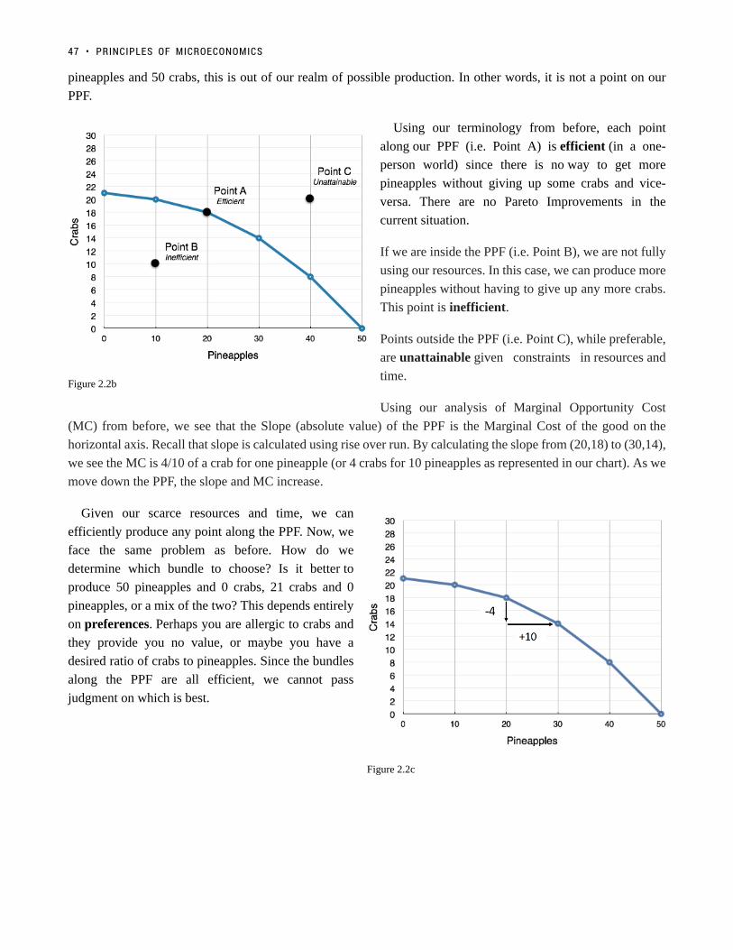
Figure 2.2b
Figure 2.2c
pineapples and 50 crabs, this is out of our realm of possible production. In other words, it is not a point on our
PPF.
Using our terminology from before, each point
along our PPF (i.e. Point A) is efficient (in a one-
person world) since there is no way to get more
pineapples without giving up some crabs and vice-
versa. There are no Pareto Improvements in the
current situation.
If we are inside the PPF (i.e. Point B), we are not fully
using our resources. In this case, we can produce more
pineapples without having to give up any more crabs.
This point is inefficient.
Points outside the PPF (i.e. Point C), while preferable,
are unattainable given constraints in resources and
time.
Using our analysis of Marginal Opportunity Cost
(MC) from before, we see that the Slope (absolute value) of the PPF is the Marginal Cost of the good on the
horizontal axis. Recall that slope is calculated using rise over run. By calculating the slope from (20,18) to (30,14),
we see the MC is 4/10 of a crab for one pineapple (or 4 crabs for 10 pineapples as represented in our chart). As we
move down the PPF, the slope and MC increase.
Given our scarce resources and time, we can
efficiently produce any point along the PPF. Now, we
face the same problem as before. How do we
determine which bundle to choose? Is it better to
produce 50 pineapples and 0 crabs, 21 crabs and 0
pineapples, or a mix of the two? This depends entirely
on preferences. Perhaps you are allergic to crabs and
they provide you no value, or maybe you have a
desired ratio of crabs to pineapples. Since the bundles
along the PPF are all efficient, we cannot pass
judgment on which is best.
47 • PRINCIPLES OF MICROECONOMICS

Applications
The Island Example – BrexitThe Island Example – Brexit
Former British Prime Minister David Cameron defending the ‘stay’ side of the Brexit debate. (Credit: World EconomicForum/ Flickr/ CC-BY-SA-2.0)
While our discussion so far has referred to a deserted island scenario, the same concepts are easily relatableto a country’s production. On a much larger scale, countries face trade-offs in production. The islandsituation can be likened to a country with a policy of autarky – a state of economic independence or self-sufficiency. The United Kingdom’s decision to leave the European Union (commonly known as Brexit)metaphorically makes it more of an island. The country will have to face more trade-offs with the goodsit can produce. As we will see in the next section, trade can reduce these trade-offs and allow countries toreach points outside their PPF.
2.2 PRODUCTION POSSIBILITY FRONTIER • 48

Click to Learn MoreClick to Learn More
Shifting a PPFShifting a PPF
As we will see in Topic 2.3, trade allows countries, individuals, or firms to reach points outside their PPF. In
addition to trade, there are some other factors that shift a countries PPF, allowing an change in attainable output.
These factors include:
• A Shift in Technology – If you were to invent a computer system that showed the location of crabs and
pineapples on the island, you would be able to produce more of both goods, shifting the PPF outward.
• More Education or Training – If you were to become more skilled at harvesting pineapples or crabs, your
attainable output would increase, shifting the PPF outward.
• Natural Disaster – If disaster strikes, and pineapples or crabs become less plentiful, your attainable output
would decrease, shifting the PPF inward.
These are not the only factors that could shift the PPF, but they are the most common. What is important to
recognize is that a PPF represents what is attainable, and that is subject to change.
GlossaryGlossary
AutarkyA state of economic independence or self-sufficiency.Economic ModelA simplified framework that is designed to illustrate complex processes.Marginal Opportunity CostA solution that is ethically or legally just and fair, but may not be wholly satisfactory to any or all theinvolved parties.PreferencesThe ordering of alternatives based on their relative utility, a process which results in an optimal choice.Production Possibilities Frontier (PPF)A diagram that shows the productively efficient combinations of two products that an economy canproduce given the resources it has available.
49 • PRINCIPLES OF MICROECONOMICS

Exercises 2.2
1. Consider the PPF diagram below.
Given the PPF illustrated, what is the opportunity cost of moving from B to A?
a) 5 coconuts.b) 10 fish.c) 5/10 fishd) 10/5 coconuts.
The following TWO questions refer the diagram below, which illustrates the PPF for a producer of twogoods, x and y.
2. Which of the following statements is TRUE?
I. The marginal cost of producing x is higher at high levels of x than it is at low levels of x.II. The marginal cost of producing y is higher at high levels of y than it is at low levels of y.III. The marginal cost of producing both x and y is constant in the level of production.
a) I only.b) II only.
2.2 PRODUCTION POSSIBILITY FRONTIER • 50

c) III only.d) I and II only.
3. If this economy is operating at point A, which of the following statements is TRUE?
I. The opportunity cost of producing more x is zero.II. The opportunity cost of producing more y is zero.III. Point A is inefficient.
a) III only.b) I and II only.c) I and III only.d) I, II, and III.
The following TWO questions refer to the PPF diagram below.
4. What is the MARGINAL cost of producing good y?
a) 1/4 of a unit of x.b) 1/4 of a unit of y.c) 4 units of x.d) 4 units of y.
5. What is the cost of producing FOUR units of good y?
a) 16 units of x.b) 4 units of x.c) 1/4 of a unit of x.d) 40 units of x.
6. Consider a PPF drawn with x on the horizontal axis and y on the vertical axis. Which of the followingconcepts can be used to explain why this production possibility frontier could be flat at relatively lowslevels of x and steep at relatively high levels of x?
a) Increasing marginal costs.b) Scarcity
51 • PRINCIPLES OF MICROECONOMICS

c) Sunk costs.d) Trade
7. Which of the following concepts can be used to explain why production possibility frontiers slopedownwards.
a) Scarcityb) Sunk costs.c) Traded) Increasing marginal costs.
2.2 PRODUCTION POSSIBILITY FRONTIER • 52

In 1817, David Ricardo, a businessman,economist, and member of the BritishParliament, wrote a treatise called On thePrinciples of Political Economy andTaxation. In this treatise, Ricardo arguedthat specialization and free trade benefitall trading partners, even those that maybe relatively inefficient. To see what hemeant, we must be able to distinguishbetween absolute and comparativeadvantage. (Credit: Wikimedia/ PublicDomain)
2.3 Trade
Learning Objectives
By the end of this section, you will be able to:
• Explain the gains of trade created when a country specializes
• Define absolute advantage, comparative advantage
• Understand how to find comparative and absolute advantage from looking at a PPF
The American statesman Benjamin Franklin (1706–1790) once wrote:
“No nation was ever ruined by trade.” Many economists would express their
attitudes toward international trade in an even more positive manner.
The evidence that international trade confers overall benefits on economies
is very strong. Trade has accompanied economic growth in Canada and
around the world. Many economies that have shown the most rapid growth in
the last few decades—for example, Japan, South Korea, China, and
India—have done so by dramatically orienting their economies toward
international trade. To understand the benefits of trade, or why we trade in
the first place, we need to understand the concepts of comparative and
absolute advantage.
Production Possibilities with TradeProduction Possibilities with Trade
In the previous section, we stated that points outside the PPF were not
possible given our constraints. With trade, these constraints can change.
Continuing the example from Chapter 2.2, suppose another person, Jamie,
becomes stranded on the island with you. You could choose to avoid him and
live your own separate lives, or you could work together to improve each
other’s well-being. It turns out Jamie has different skills than you – he is
better at producing both crabs and pineapples. (See Figure 2.3a)
53

Figure 2.3b
Figure 2.3a
In this case, where one person or group is better at
producing both goods, we say they have an Absolute
Advantage in the production of the good. In this
example, Jamie has the absolute advantage in the
production of both goods. This means Jamie’s entire
PPF lies outside of yours. (See Figure 2.3b)
Why would Jamie want to trade with you if he is better
at producing both goods? We mentioned before that
preferences determine where you would produce. For
this example, assume that you want to produce and
consume the following:
Without TradeWithout Trade
You: 20 pineapples and 18 crabs
Jamie: 50 pineapples and 10 crabs.
Between the two of you, you are producing 70 pineapples and 28 crabs. Is this efficient? Recall that a situation is
efficient if there are no available Pareto Improvements. If we can get more pineapples and crabs without having
to give anything up, then the situation is inefficient.
By simply changing both yours and Jamie’s production points, we see that this is inefficient. If you were to
produce 30 pineapples and 14 crabs while Jamie was to produce 40 pineapples and 18 crabs, the aggregate
production would be 70 pineapples and 32 crabs – four more crabs than before! It is now clear that the previous
situation was inefficient. You can trade 10 of your pineapples for 6 crabs, which leaves the following allotment of
resources:
2.3 TRADE • 54

With TradeWith Trade
You: 20 pineapples and 20 crabs
Jamie: 50 pineapples and 12 crabs
Each of you walks away with two more crabs than before. This is what we mean when we talk about gains from
trade. Both you and Jamie are now able to produce at a point outside your PPF’s. To understand where these extra
crabs come from, we must first explore the concept of comparative advantage.
Figure 2.3c
55 • PRINCIPLES OF MICROECONOMICS

(Credit: Chad Teer/ Wikimedia/CC-BY-2.0)
Application
It’s All About OilIt’s All About Oil
A country has an absolute advantage in producing if it uses fewer resourcesto produce. Absolute advantage can be the result of a country’s naturalendowment. For example, extracting oil in Saudi Arabia and other MiddleEastern countries is essentially just a matter of drilling a hole. Producing oilin countries like the United States can require considerable exploration andcostly technologies for drilling and extraction. This case of absoluteadvantage has been a key contributing factor towards much of the chaos inthe Middle East. The United States and other countries will go to greatextents to defend their oil interests, and will sometimes meddle in othercountry’s affairs in devastating ways.
ComparativeComparative AdvantageAdvantage
Let’s look further into these gains from trade.
When you increase your production of pineapples from 20 to 30, you have to give up 4 crabs. This means your
marginal cost is 0.4 crabs for 1 pineapple.
When Jamie decreased his production of pineapples from 50 to 40, he gained 8 crabs. This means his marginal
cost was 0.8 crabs for 1 pineapple.
The gains from trade arise from this difference in marginal cost. Since it is more expensive for Jamie to produce
pineapples (MC of 0.8 versus your MC of 0.4) he should produce fewer pineapples and more crabs. The economic
agent with the lower marginal cost of producing a good has the comparative advantage in producing that good.
In this case, you have the comparative advantage in producing pineapples, and Jamie has the comparative
advantage in producing crabs. This specialization in production results in gains from trade, as each person or
country can focus on what it can produce at the lowest cost.
Note that even though Jamie had the absolute advantage in both goods, his marginal cost of producing crabs was
still higher, since marginal cost is based on a trade-off between the two goods. We can liken this example to a
trade between Canada and a developing country. Canada may be better at producing both computers and textiles
(the absolute advantage) but the advantages we have in producing computers are far greater. Any hour we have to
give up to produce textiles comes at a much higher cost to us than it would to a developing country, giving us the
comparative advantage at producing computers, and the developing country the advantage at producing textiles.
The island example is no different. Even though Jamie is better at producing pineapples, what Jamie is really an
expert at is producing crabs, so having to give up time spent catching crabs comes at a high cost.
In this example, marginal costs are changing. This means that depending on where individuals produce, they may
have a different comparative advantage. Recall that marginal cost is the slope of the PPF, so as each individual
2.3 TRADE • 56

produces more pineapples, the pineapples become more expensive to produce. This is known as the law of
diminishing returns which states that as additional increments of resources are added to producing a good or
service, the marginal benefit from those additional increments will decline. This example has introduced a lot of
different concepts – moving forward, our examples will be simpler, and linear.
Linear PPF’sLinear PPF’s
Most of the examples will deal with linear PPF’s. This makes problems considerably easier, since in the case
of a linear PPF (in which the marginal cost will be constant), one individual will always have the comparative
advantage in one good. This means that comparative advantage is the same at any point on the PPF, and can be
easily calculated.
We have changed Jamie and your skill set to be linear in Figure 2.3d.
Now we can use our tools of efficiency and trade to determine if certain points are efficient. In Figure 2.3d various
points have been shown to reflect possible points of production for you (blue) and Jamie (green). Remember,
57 • PRINCIPLES OF MICROECONOMICS
we have no information about preferences. The first step is to find who has the comparative advantage for which
good. For a linear PPF, this just means finding the slope.
JamieJamie
Jamie’s PPF has the slope of 40/50 or 0.8 Crabs for 1 Pineapple.
This means his opportunity costs are:
0.8 Crabs for 1 Pineapple.
1.25 Pineapples for 1 Crab (the inverse of the slope)
YouYou
Your PPF has the slope of 25/50 or 0.5 Crabs for 1 Pineapple.
This means your opportunity costs are:
0.5 Crabs for 1 Pineapple.
2 Pineapples for 1 Crab
Who Has the ComparativeWho Has the Comparative AdvantageAdvantage
Comparing the opportunity costs, it costs Jamie 0.8 Crabs to produce 1 Pineapple, whereas is costs you only 0.5
Crabs. This means:
You have the comparative advantage in producing Pineapples.
Remember that the 0.8 and 0.5 crabs represent the cost of pineapples in terms of crabs. It is similar to saying “It
costs Jamie $0.80 to buy a Pineapple, it costs you $0.50, who should buy it?” In a PPF, cost is denoted in terms of
the other good, not dollars.
Furthermore, it costs Jamie only 1.25 Pineapples to produce 1 Crab, whereas is costs you 2 Pineapples This
means:
Jamie has the comparative advantage in producing Crabs.
This is true for every point on our PPF. Now we will examine each of the points using this information.
Jamie Produces @ Point E, You Produce @ Point BJamie Produces @ Point E, You Produce @ Point B
In this combination, Jamie produces only Pineapples and you produce only Crabs. This situation is clearly
inefficient since each player is producing a good the other can produce for less. By changing production and
trading goods, both parties stand to benefit.
2.3 TRADE • 58

Jamie Produces @ Point C, You Produce @ Point DJamie Produces @ Point C, You Produce @ Point D
Recognizing that the last combination was inefficient, Jamie begins producing more Crabs and you begin
producing more Pineapples. Although this seems to adhere to the comparative advantage, each of you are still
producing goods that the other can produce for less. Jamie is still producing 20 Pineapples, and you are still
producing 10 Crabs. As we saw before, if you both specialize in what you are comparably good at, then there will
be even more gains from trade. This means that the situation is inefficient.
Jamie Produces @ Point A, You Produce @ Point EJamie Produces @ Point A, You Produce @ Point E
Realizing the previous points were inefficient, Jamie produces only Pineapples and you produce only Crabs. In
this situation both players are producing only the good they have the comparative advantage in. This situation is
certainly efficient, as there are no production changes that can be made that result in more than 40 Crabs, and 50
Pineapples.
Jamie Produces @ Point A, You Produce @ Point DJamie Produces @ Point A, You Produce @ Point D
What if we want 50 Crabs? Is there no way to produce this efficiently? There is. Point A/Point E is not the only
efficient point possible. This is because of preferences. If in total, you and Jamie prefer only 40 Crabs, then Point
A/ Point E would be the efficient point where you would produce, but if you and Jamie desire 50 Crabs, that would
not be the preferred combination. If you desire 50 Crabs, then the person who has the comparative advantage in
Crabs (in this case Jamie) should produce all 50 Crabs, or produce as many Crabs as possible. In this case, Jamie
can only produce 40, which leaves the remaining 10 to be produced by you. Although Jamie could produce these
10 Crabs more efficiently, he is constrained by his production ability. This means that Point A/Point D is also an
efficient combination of goods, since there is no way to acquire 50 Crabs which results in more than 30 Pineapples
being produced.
Jamie Produces @ Point A, You Produce @ Point BJamie Produces @ Point A, You Produce @ Point B
It should logically follow that this combination is also efficient. Even though you have the comparative advantage
at producing Pineapples, if the Pineapples are poisonous and no one wants any, both you and Jamie will produce
only Crabs! There is no other way to produce 65 Crabs where you will have any Pineapples left.
To simplify the analysis above you can use the following rule for linear PPF’s
If at least one player is maximizing their comparative advantage, then the situation is efficient
This simple rule occurs since any combination where both players produce a mix of goods is a combination where
players stand to gain from more specialization and trade. These gains only end when at least one player has
exhausted the gains from specialization, and is producing only the good they are comparatively better at.
SummarySummary
In summary, the PPF is a model we can use to represent the production of one or more parties. Trade allows parties
59 • PRINCIPLES OF MICROECONOMICS

to consume at points outside their PPF when they maximize comparative advantage. The party with the lower
opportunity cost will have the comparative advantage in the production of a good. Even though a party might
have the absolute advantage in the production of both goods, since comparative advantage is based on opportunity
costs, other parties can still retain comparative advantage. Parties can achieve gains from trade by specializing in
the good they are comparably good at, to the extent that consumers want that good.
ConclusionConclusion
In Topic 2, we have explored the production possibility model in depth, looking at a simplified version of trade and
deepening our understanding of opportunity costs. Now, we can take our knowledge of basic economic modelling
and our comprehension of costs and examine one of the most important of microeconomics: supply and demand.
GlossaryGlossary
Absolute Advantagewhen one country can use fewer resources to produce a good compared to another country; when acountry is more productive compared to another countryComparative Advantagewhen a country can produce a good at a lower cost in terms of other goods; or, when a country has alower opportunity cost of productionGains from Tradea country that can consume more than it can produce as a result of specialization and tradeLaw of Diminishing Returnsas additional increments of resources are added to producing a good or service, the marginal benefit fromthose additional increments will declineSpecializationa method of production where one party focuses on the production of a limited group of products orservices
Exercises 2.3
1. The following question refers to the table below, which shows the maximum number of goods X and Ythat producers A and B can produce in one day.
Which of the following statements in TRUE?
a) Producer A has the comparative advantage in producing X.
2.3 TRADE • 60

b) Producer A has the comparative advantage in producing Y.c) Producer B has the absolute advantage in producing X and Y.d) No producer has the comparative advantage in producing either X or Y.
2. Consider the PPF diagram drawn below, for two countries that are free to trade with one another.
Which of the following production combinations is/are INEFFICIENT?
I. Country 1 produces at point C and country 2 produces at point D.II. Country 1 produces at point E and country 2 produces point at B.III. Country 1 produces at point E and country 2 produces at point A.
a) II only.b) I only.c) I and II only.d) I, II and III.
3. The diagram below illustrates the PPFs for two countries that produce wine and cheese. With no trade,country 1 produces at point A on its PPF and country 2 produces at point B.
Assume that the two countries now begin to trade with one another. Which of the following will NOToccur (relative to the case with no trade).
a) Country 1 will produce less cheese.b) Country 2 will export wine.c) Country 1 will import cheese.d) Country 2 will produce more cheese.
61 • PRINCIPLES OF MICROECONOMICS

4. Which of the following statements about production and trade is FALSE?
I. If a country has an absolute advantage in producing a good, then it also has the comparative advantagein the production of that good.II. Rich countries will generally have the comparative advantage in the production of all goods.III. If a country has the absolute advantage in the production of a good, then this country will be madebetter off by specializing in the production of that good.a) I only.b) I and II only.c) I, II and III.d) III only.
The following THREE questions refer to the diagram below, which illustrates the PPFs for two countrieswho are free to trade.
5. What is the marginal opportunity cost (MC) of producing good x in each country?
a) 2 units of good y in country 1 and 4 units of good y in country 2.b) 1/2 a unit of good y in country 1 and 1/4 of a unit of good y in country 2.c) 2 units of good y in country 1 and 1/4 of a unit of good y in country 2.d) 1/2 a unit of good y in country 1 and 4 units of good y in country 2.
6. What is the marginal opportunity cost (MC) of producing good y in each country?
a) 2 units of good x in country 1 and 4 units of good x in country 2.b) 1/2 a unit of good x in country 1 and 1/4 of a unit of good x in country 2.c) 2 units of good x in country 1 and 1/4 of a unit of good x in country 2.d) 1/2 a unit of good x in country 1 and 4 units of good x in country 2.
7. Suppose that aggregate production of x across the two countries is equal to 100 (that is, country one’sproduction of x plus country two’s production of x equals 100 units). If these 100 units of x are beingproduced efficiently, then aggregate production of y will equal:
a) 200 units of y.b) 400 units of y.
2.3 TRADE • 62

c) 600 units of y.d) 800 units of y.
8. The diagram below illustrates the identical PPFs of two countries.
Initially, there is no trade allowed between the two countries, and each country produces at point A. If tradeis opened up, which of the following will occur?
I. Country 1 will export coal to country 2.II. Country 2 will produce more clothing.III. Country 1 will produce less coal.
a) I and II only.b) III only.c) II and III only.d) None of the above.
9. The table below shows the maximum amounts of coffee and salmon that Brazil and British Colombiacan produce if they just produce one good.
Assuming constant marginal costs:
a) Brazil has a comparative advantage in coffee productionb) In Brazil, the marginal cost of salmon production is 2 units of coffee.c) In BC, the marginal cost of coffee production is 1½ units of salmon.d) All of the above are correct.
10. The diagram below illustrates the PPFs for two countries that produce two goods. The two countriesare free to trade with one another.
63 • PRINCIPLES OF MICROECONOMICS

Which of the following production combinations are efficient?
a) Country 1 is at point C; country 2 is at point D.b) Country 1 is at point A; country 2 is at point B.c) Country 1 is at point C; country 2 is at point A.d) All of the above are efficient.
2.3 TRADE • 64

Case Study - Brexit
Note that the Economics 103 Case Studies are meant to supplement the course material by giving youexperience applying Economic concepts to real world examples. While they are beyond the level you willbe tested on, they are useful for students who want a stronger grasp of the concepts and their applications.
UKIP Leader Nigel Farage MEP was a strong proponent of the ‘leave side’ in Britain’s referendum to stay or leave the EU. (Credit: GageSkidmore/ Flickr/ CC BY-SA 2.0)
Some have said that June 23rd, 2016 will go down as Britain’s independence day, but many others have been less
positive about Britain’s decision to leave the European Union. Financial markets, facing new found uncertainty,
plunged. The pound fell hard against the dollar to a 30-year low of $1.32. This decision has caused ripples in
65

the world economy, noticeably in Europe where Britain provided strong consumption for European goods. The
Brexit vote caused uncertainty in many of the world’s markets. If Britain, long a champion of free trade, can vote
to revoke a regional trade deal, how much faith can businesses worldwide put in other international economic
agreements?
Read more about Brexit’s impact on the world economy.
In Topic 2 we talked about competitive advantage and the gains from trade. To illustrates some of the affects
of Brexit consider Rolls Royce, designer, distributer, and manufacturer of power systems for aviation and former
owner of car brands like Bentley. Rolls Royce sold Bentley (now owned by Volkswagon) in 1971, let’s assume
they want to re-enter the market with ‘Rolls Royce’ branded vehicles.
Assume Rolls Royce can produce two things, aircraft parts, which they sell to firms like Airbus, Boieng etc. Or
car parts, which they can uses to manufacture cars.
CASE STUDY - BREXIT • 66

In 1971, Rolls Royce sold rights to Bentely following financial problems stemming from the costs of developing the RB211 jetengine. (Credit: Rachel Patterson/ Flickr/ CC BY-NC-ND 2.0)
1. Rolls Royce can produce either 50 car parts, 100 aircraft parts, or a combination or both. Represent cars
parts on the y-axis and aircraft parts on the x-axis. Draw Rolls Royce PPF on the diagram below. Assume
the PPF is linear.
67 • PRINCIPLES OF MICROECONOMICS
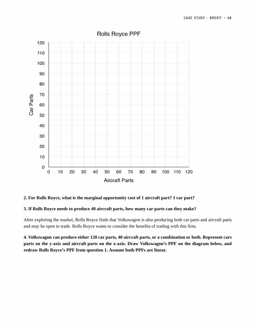
2. For Rolls Royce, what is the marginal opportunity cost of 1 aircraft part? 1 car part?
3. If Rolls Royce needs to produce 40 aircraft parts, how many car parts can they make?
After exploring the market, Rolls Royce finds that Volkswagon is also producing both car parts and aircraft parts
and may be open to trade. Rolls Royce wants to consider the benefits of trading with this firm.
4. Volkswagon can produce either 120 car parts, 40 aircraft parts, or a combination or both. Represent cars
parts on the y-axis and aircraft parts on the x-axis. Draw Volkswagon’s PPF on the diagram below, and
redraw Rolls Royce’s PPF from question 1. Assume both PPFs are linear.
CASE STUDY - BREXIT • 68

5. For Volkswagon, what is the marginal opportunity cost of 1 aircraft part? 1 car part?
6. Who has the absolute advantage in the production of aircraft parts? Car parts?
7. Who has the comparative advantage in the production of aircraft parts? Car parts? Why?
8. Assume each firm needs 20 aircraft parts and cannot trade. How many car parts is each able to produce
after making 20 aircraft parts? What is the total amount of car parts produced?
9. If the market is opened up to trade, represent the efficient production of 40 aircraft parts on the PPF.
What is the total number of car parts produced now?
Vehicles and aircraft are two of Britain’s largest exports, together making up 17.7% of the total. Although final
assembly of many cars occurs in Britain, the supply chains often span the globe. Bumpers for some Bentley
Bentaygas, for example, are made in Europe but then sent to Crewe for inspection before going to Germany for
specialist painting. After that, they return to the UK for final assembly. Brexit would mean imposing tariffs (taxes
on imports) on much of this supply chain, making it more expensive for Rolls Royce if they wanted to trade with
69 • PRINCIPLES OF MICROECONOMICS

Volkswagon. We will talk more about tariffs and how they are affect the market in Topic 4, assume for now that
Brexit completely restricts trade.
Read more about Brexit’s effect on the UK car industry.
10. Explain why Brexit makes both companies worse off with reference to question 8 and 9.
In this case study we have shown how microeconomic concepts of production possibilities can be used to
understand current events in the news. Do you have a story you think would make a good case study? Contact
[email protected] to propose your story.
CASE STUDY - BREXIT • 70

Solutions: Case Study - Brexit
1. Rolls Royce can produce either 50 car parts, 100 aircraft parts, or a combination or both. Represent cars
parts on the y-axis and aircraft parts on the x-axis. Draw Rolls Royce PPF on the diagram below. Assume
the PPF is linear.
The best way to draw a PPF is to find how many of each good the firm can produce if they produce that good
only. In this case we are told Rolls Royce can either produce 50 car parts, 100 aircraft parts, or a mix. This means
we know the point (0, 50) and (100, 0) are on our PPF. Simply label these points and connect them to find Rolls
Royce’s PPF.
71

2. For Rolls Royce, what is the marginal opportunity cost of 1 aircraft part? 1 car part?
Remember that the marginal opportunity cost of the good on the x-axis, in this case aircraft parts, is simply the
slope of the PPF. Taking the slope we find that we must trade 50 car parts for every 100 aircraft parts, this means
that the marginal opportunity cost of one aircraft part is 0.5 car parts.
The marginal opportunity cost of the good on the y-axis, in this case car parts, is equal to the inverse of the slope.
This means we must trade 100 aircraft parts for every 50 car parts. The marginal opportunity cost of one car part
is 2 aircraft parts.
3. If Rolls Royce needs to produce 40 aircraft parts, how many car parts can they make?
Since there is no opportunities for trade, this is a relatively simple problem. All you have to do is draw a line up
from 40 aircraft parts, and see how many car parts Rolls Royce can make with the remaining resources.
SOLUTIONS: CASE STUDY - BREXIT • 72

Looking at the diagram you can see that when Rolls Royce produces 40 aircraft parts, they can produce 30 car
parts.
Rolls Royce can produce a maximum of 100 aircraft parts, and for every 10 they give up they can make 5 car
parts. If they are only producing 40 aircraft parts they have given up 60. The trade off in the production of 60
aircraft parts allows them to produce 30 car parts.
4. Volkswagon can produce either 120 car parts, 40 aircraft parts, or a combination or both. Represent cars
parts on the y-axis and aircraft parts on the x-axis. Draw Volkswagon’s PPF on the diagram below, and
redraw Rolls Royce’s PPF from question 1. Assume both PPFs are linear.
Again, the best way to draw a PPF is to find how many of each good the firm can produce if they produce
that good only. Based on the information we are given, we know the points (0, 120) and (40, 0) are on
Volkswagon’s PPF. Simply label these points and connect them to find Volkswagon’s PPF.
73 • PRINCIPLES OF MICROECONOMICS
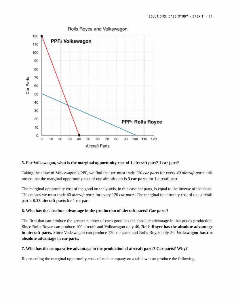
5. For Volkswagon, what is the marginal opportunity cost of 1 aircraft part? 1 car part?
Taking the slope of Volkswagon’s PPF, we find that we must trade 120 car parts for every 40 aircraft parts, this
means that the marginal opportunity cost of one aircraft part is 3 car parts for 1 aircraft part.
The marginal opportunity cost of the good on the y-axis, in this case car parts, is equal to the inverse of the slope.
This means we must trade 40 aircraft parts for every 120 car parts. The marginal opportunity cost of one aircraft
part is 0.33 aircraft parts for 1 car part.
6. Who has the absolute advantage in the production of aircraft parts? Car parts?
The firm that can produce the greater number of each good has the absolute advantage in that goods production.
Since Rolls Royce can produce 100 aircraft and Volkswagon only 40, Rolls Royce has the absolute advantage
in aircraft parts. Since Volkswagon can produce 120 car parts and Rolls Royce only 50, Volkswagon has the
absolute advantage in car parts.
7. Who has the comparative advantage in the production of aircraft parts? Car parts? Why?
Representing the marginal opportunity costs of each company on a table we can produce the following:
SOLUTIONS: CASE STUDY - BREXIT • 74

Recall that the firm with the lower opportunity cost has the comparative in the production of the good. In this
case Rolls Royce only has to give up 0.5 car parts for 1 aircraft part, whereas Volkswagon has to give up
3! This means Rolls Royce has the comparative advantage in aircraft parts. Volkswagon only has to give
up 0.33 aircraft parts for 1 car part, whereas Roll Royce has to give up 2. This means Volkswagon has the
comparative advantage in car parts.
This means that when possible, Rolls Royce should specialize in the production of aircraft parts, since they have
lower opportunity cost of producing them.
*Note that in this example each firm has both the competitive and absolute advantage in their good, but this need
not be the case. One firm could have the absolute advantage at both goods, but there would still be mutually
beneficial trades available.
8. Assume each firm needs 20 aircraft parts and cannot trade. How many car parts is each able to produce?
What is the total amount of car parts?
75 • PRINCIPLES OF MICROECONOMICS

If the firms cannot trade with eachother then this exercise is identical to Question 3, just with two firms. All we
have to do is draw a line up from 20 aircraft parts, and see how many car parts each can produce.
As shown in the diagram above, Rolls Royce can produce 40 car parts, and Volkswagon can produce 60 car parts
for a total of 100.
9. If the market is opened up to trade, represent the efficient production of 40 aircraft parts on the PPF.
What is the total number of car parts produced?
If the market is open to trade and we need 40 aircraft parts, they won’t be produced as they were in Question
8. When we are told how much of a specific good we want, the firm with the comparative advantage in that good
will produce as much of that good as they can (up to the total). In this case Rolls Royce has the comparative
advantage in aircraft parts so they will produce all 40. Notice that when Rolls Royce produces 40 aircraft parts,
they are still producing 30 car parts – that is fine. We can not say that Rolls Royce should produce more than 40
because if we only want 40 aircraft parts, there is no reason to produce more (no one will buy them, there is no
use for them, etc.). The remaining resources should be used to produce car parts.
If Rolls Royce is producing 40 aircraft parts, they are also producing 30 car parts. Since we do not need anymore
aircraft parts, Volkswagon can focus on what they are comparatively better at and produce 120 car parts. This is
SOLUTIONS: CASE STUDY - BREXIT • 76

the most efficient way for the firms to produce 40 aircraft parts and results in a total of 150 car parts (120 car parts
from Volkswagon + 30 car parts from Roll Royce).
Note that this follows the rule in Topic 2.3 where we stated that if at least one player is maximizing their
comparative advantage, then the situation is efficient (in this case Volkswagon is maximizing).
10. Explain why Brexit makes both companies worse off with reference to question 8 and 9.
Comparing the total number of parts with and without trade we see that the total number of goods are:
Without Trade: 40 Aircraft Parts, 100 Car Parts
With Trade: 40 Aircraft Parts, 150 Car Parts
Trade results in a Pareto improvement as the total number of car parts increases. This means that Brexit results in
both companies having less car parts, which means less revenue.
Policy restricting trade has made it so neither company can focus on what they are comparatively good at. If Rolls
Royce wants to produce cars, they have to produce the car parts themselves at higher costs. This is why we say
there are ‘gains from trade’ as whether you were the British company or the German company, both parties stand
to benefit.
77 • PRINCIPLES OF MICROECONOMICS

Topic 2 Multiple Choice Questions
All the following questions are from previous exams for Economics 103. They are duplicates of thequestions found in the Topic sub-sections.
Exercises 2.2Exercises 2.2
1. Consider the PPF diagram below.
Given the PPF illustrated, what is the opportunity cost of moving from B to A?
a) 5 coconuts.
b) 10 fish.
c) 5/10 fish
d) 10/5 coconuts.
The following TWO questions refer the diagram below, which illustrates the PPF for a producer of two goods, x
and y.
78

2. Which of the following statements is TRUE?
I. The marginal cost of producing x is higher at high levels of x than it is at low levels of x.
II. The marginal cost of producing y is higher at high levels of y than it is at low levels of y.
III. The marginal cost of producing both x and y is constant in the level of production.
a) I only.
b) II only.
c) III only.
d) I and II only.
3. If this economy is operating at point A, which of the following statements is TRUE?
I. The opportunity cost of producing more x is zero.
II. The opportunity cost of producing more y is zero.
III. Point A is inefficient.
a) III only.
b) I and II only.
c) I and III only.
d) I, II, and III.
The following TWO questions refer to the PPF diagram below.
79 • PRINCIPLES OF MICROECONOMICS

4. What is the MARGINAL cost of producing good y?
a) 1/4 of a unit of x.
b) 1/4 of a unit of y.
c) 4 units of x.
d) 4 units of y.
5. What is the cost of producing FOUR units of good y?
a) 16 units of x.
b) 4 units of x.
c) 1/4 of a unit of x.
d) 40 units of x.
6. Consider a PPF drawn with x on the horizontal axis and y on the vertical axis. Which of the following concepts
can be used to explain why this production possibility frontier could be flat at relatively lows levels of x and steep
at relatively high levels of x?
a) Increasing marginal costs.
b) Scarcity
c) Sunk costs.
d) Trade
7. Which of the following concepts can be used to explain why production possibility frontiers slope downwards.
a) Scarcity
b) Sunk costs.
c) Trade
d) Increasing marginal costs.
TOPIC 2 MULTIPLE CHOICE QUESTIONS • 80

Exercises 2.3Exercises 2.3
1. The following question refers to the table below, which shows the maximum number of goods X and Y that
producers A and B can produce in one day.
Which of the following statements in TRUE?
a) Producer A has the comparative advantage in producing X.
b) Producer A has the comparative advantage in producing Y.
c) Producer B has the absolute advantage in producing X and Y.
d) No producer has the comparative advantage in producing either X or Y.
2. Consider the PPF diagram drawn below, for two countries that are free to trade with one another.
Which of the following production combinations is/are INEFFICIENT?
I. Country 1 produces at point C and country 2 produces at point D.
II. Country 1 produces at point E and country 2 produces point at B.
III. Country 1 produces at point E and country 2 produces at point A.
a) II only.
b) I only.
c) I and II only.
d) I, II and III.
3. The diagram below illustrates the PPFs for two countries that produce wine and cheese. With no trade, country
1 produces at point A on its PPF and country 2 produces at point B.
81 • PRINCIPLES OF MICROECONOMICS

Assume that the two countries now begin to trade with one another. Which of the following will NOT occur
(relative to the case with no trade).
a) Country 1 will produce less cheese.
b) Country 2 will export wine.
c) Country 1 will import cheese.
d) Country 2 will produce more cheese.
4. Which of the following statements about production and trade is FALSE?
I. If a country has an absolute advantage in producing a good, then it also has the comparative advantage in the
production of that good.
II. Rich countries will generally have the comparative advantage in the production of all goods.
III. If a country has the absolute advantage in the production of a good, then this country will be made better off
by specializing in the production of that good.a) I only.
b) I and II only.
c) I, II and III.
d) III only.
The following THREE questions refer to the diagram below, which illustrates the PPFs for two countries who are
free to trade.
TOPIC 2 MULTIPLE CHOICE QUESTIONS • 82

5. What is the marginal opportunity cost (MC) of producing good x in each country?
a) 2 units of good y in country 1 and 4 units of good y in country 2.
b) 1/2 a unit of good y in country 1 and 1/4 of a unit of good y in country 2.
c) 2 units of good y in country 1 and 1/4 of a unit of good y in country 2.
d) 1/2 a unit of good y in country 1 and 4 units of good y in country 2.
6. What is the marginal opportunity cost (MC) of producing good y in each country?
a) 2 units of good x in country 1 and 4 units of good x in country 2.
b) 1/2 a unit of good x in country 1 and 1/4 of a unit of good x in country 2.
c) 2 units of good x in country 1 and 1/4 of a unit of good x in country 2.
d) 1/2 a unit of good x in country 1 and 4 units of good x in country 2.
7. Suppose that aggregate production of x across the two countries is equal to 100 (that is, country one’s
production of x plus country two’s production of x equals 100 units). If these 100 units of x are being produced
efficiently, then aggregate production of y will equal:
a) 200 units of y.
b) 400 units of y.
c) 600 units of y.
d) 800 units of y.
8. The diagram below illustrates the identical PPFs of two countries.
83 • PRINCIPLES OF MICROECONOMICS

Initially, there is no trade allowed between the two countries, and each country produces at point A. If trade is
opened up, which of the following will occur?
I. Country 1 will export coal to country 2.
II. Country 2 will produce more clothing.
III. Country 1 will produce less coal.
a) I and II only.
b) III only.
c) II and III only.
d) None of the above.
9. The table below shows the maximum amounts of coffee and salmon that Brazil and British Colombia can
produce if they just produce one good.
Assuming constant marginal costs:
a) Brazil has a comparative advantage in coffee production
b) In Brazil, the marginal cost of salmon production is 2 units of coffee.
c) In BC, the marginal cost of coffee production is 1½ units of salmon.
d) All of the above are correct.
10. The diagram below illustrates the PPFs for two countries that produce two goods. The two countries are free
to trade with one another.
TOPIC 2 MULTIPLE CHOICE QUESTIONS • 84

Which of the following production combinations are efficient?
a) Country 1 is at point C; country 2 is at point D.
b) Country 1 is at point A; country 2 is at point B.
c) Country 1 is at point C; country 2 is at point A.
d) All of the above are efficient.
85 • PRINCIPLES OF MICROECONOMICS

Topic 2 Solutions
Solutions to Exercises 2.2
1. B
2. D
3. D
4. C
5. A
6. A
7. A
Solutions to Exercises 2.3
1. D
2. B
3. B
4. C
5. A
6. B
7. C
8. D
9. D
10. C
86

Topic 2 References
Campbell, Peter. Financial Times. “UK car industry fears effects of Brexit tariffs on supply chain.” October 16,
2016. https://www.ft.com/content/c397f174-9205-11e6-a72e-b428cb934b78
The Economist. “Slicing an Apple.” August 10, 2011. http://www.economist.com/blogs/dailychart/2011/08/
apple-and-samsungs-symbiotic-relationship
The Economist. “Unfavourable Trade Winds.” May 26, 2016. http://www.economist.com/news/britain/
21695544-it-would-be-hard-britain-negotiate-good-trade-deals-post-brexit-unfavourable-trade-winds
Encyclopaedia Britannica. “David Ricardo.” March 1, 2016. https://www.britannica.com/biography/Vilfredo-
Pareto
Encyclopaedia Britannica. “Vilfredo Pareto.” January 23, 2014. https://www.britannica.com/biography/Vilfredo-
Pareto
Krugman, Paul R. Pop Internationalism. The MIT Press, Cambridge. 1996.
Krugman, Paul R. “What Do Undergrads Need to Know about Trade?” American Economic Review 83, no. 2.
1993. 23-26.
Ricardo, David. “On the Principles of Political Economy and Taxation.” Library of Economics and
Liberty.http://www.econlib.org/library/Ricardo/ricP.html.
Rolls-Royce. “Rolls-Royce history timeline.” https://www.rolls-royce.com/about/our-story/rolls-royce-history-
timeline.aspx
Workman, Daniel. World’s Top Exports. “United Kingdom’s Top 10 Exports.” April 20, 2017.
http://www.worldstopexports.com/united-kingdoms-top-exports/
87

Topic 3: Supply, Demand, and Equilibrium
88

Introduction to Supply and Demand
Topic Objectives
Topic 3: Supply, Demand & Equilibrium
In this topic, you will learn about:
• Assumptions of the competitive market model: all agents are price takers, homogeneous products.
• Demand & supply: determinants of demand & supply, demand & supply curves, consumer andproducer surplus, divisibility, the “laws” of demand and supply, movements along versus shifts ofdemand and supply curves.
• Normal & inferior goods, complements & substitutes, individual demand and supply v marketdemand and supply
• Equilibrium prices and quantities, price as a mechanism for equilibration.
In Chapter Two we looked at comparative advantage, and how a country could gain from trade by specializing in
the production of goods for which they had the lower opportunity cost. Contrasting this with reality we will notice
a number of things. Firstly, transactions are conducted and denominated in dollars, not other goods, and typically
there will be more than one buyer and one seller interacting in the market. This is a typical competitive market,
which is a market form we will explore in depth in this topic.
89

Figure 1. Farmer’s Market. Organic vegetables and fruits that are grown and sold within a specific geographical region should, in theory,cost less than conventional produce because the transportation costs are less. That is not, however, usually the case. (Credit: modification ofwork by Natalie Maynor/Flickr Creative Commons)
Why Can We Not Get Enough of Organic?Why Can We Not Get Enough of Organic?
Organic food is increasingly popular, not just in the United States, but worldwide. At one time, consumershad to go to specialty stores or farmer’s markets to find organic produce. Now it is available in mostgrocery stores. In short, organic is part of the mainstream.
Ever wonder why organic food costs more than conventional food? Why, say, does an organic Fuji applecost $1.99 a pound, while its conventional counterpart costs $1.49 a pound? The same price relationshipis true for just about every organic product on the market. If many organic foods are locally grown, wouldthey not take less time to get to market and therefore be cheaper? What are the forces that keep those pricesfrom coming down? Turns out those forces have a lot to do with demand and supply.
An auction bidder pays thousands of dollars for a dress Whitney Houston wore. A collector spends a small fortune
for a few drawings by John Lennon. People usually react to purchases like these in two ways: their jaw drops
because they think these are high prices to pay for such goods or they think these are rare, desirable items and the
amount paid seems right.
INTRODUCTION TO SUPPLY AND DEMAND • 90

Gasoline prices are effected by demand and supply shocksboth locally and globally. (Credit: Philippa McKinlay/Flickr/ CC BY-NC-ND 2.0)
When economists talk about prices, they are less interested
in making judgments than in gaining a practical understanding
of what determines prices and why prices change. Consider a
price most of us contend with weekly: that of a litre of gas.
Some of you may remember the sharp fall in gas prices in
2015, which worsened when sanctions were lifted from Iran in
January of 2016 . What caused the price of a barrel to fall from
almost $110 to just $15? To explain these price movements,
economists focus on the determinants of what gasoline buyers
are willing to pay and what gasoline sellers are willing to
accept.
As it turns out, the price of gasoline in June of any given year
is nearly always higher than the price in January of that same
year; over recent decades, gasoline prices in midsummer have
averaged about 10 cents per gallon more than their midwinter
low. The likely reason is that people drive more in the summer,
and are also willing to pay more for gas – but that does not
explain how steeply gas prices fell. Other factors were at work during those six months, such as increased
competition between Saudi Arabia and Iran, an oversupply in production from years of heavy investment, and
other shocks to the supply and demand of oil.
This chapter introduces the economic model of demand and supply—one of the most powerful models in all of
economics. The discussion here begins by examining how demand and supply determine the price and the quantity
sold in markets for goods and services, and how changes in demand and supply lead to changes in prices and
quantities.
Click to Learn More About Demand and Supply Shocks to the Price of Oil
91 • PRINCIPLES OF MICROECONOMICS
3.1 The Competitive Market Model
Learning Objectives
By the end of this section, you will be able to:
• Explain the limitations of the Competitive Market Model
• Understand Product Homogeneity, Buyer Power, & Supplier Power
An Economic Model of Demand and SupplyAn Economic Model of Demand and Supply
Recall that an economic model is a simplified framework that is designed to illustrate complex processes. The
first model we looked at in Topic 2 was the Production Possibility Frontier, which outlined efficient production
under autarky and under trade. We mentioned that although these models can seem oversimplified, holding certain
variables constant to analyze the most important ones is an effective way to build a basis of understanding. For
demand and supply, we must remain conscious of the model’s simplifications to understand its limitations and
strengths. The next model we will explore is the competitive market model.
92

Shrek used to pitch Vidalia onions (Credit:truthinadvertising.org)
Assumptions of the Competitive Market ModelAssumptions of the Competitive Market Model
1. Product Homogeneity1. Product Homogeneity
Under product homogeneity, all goods offered for sale are identical in the
eyes of the economic agent. Say, for example, you go to the farmer’s
market and consider buying onions. Suppose there are two different farms
selling identical onions. In this case, the product is “homogeneous,” as you,
the consumer, have no preference over which onion to buy and will simply
go with whichever is cheaper. Instances of perfect homogeneity are actually
quite rare, as firms strive to differentiate themselves from their competitors.
Farms may position themselves as more organic, or more local. One onion
firm even used Shrek to differentiate its onions, playing off the line “ogres
are like onions, we have many layers.”
2. No Buyer Power2. No Buyer Power
Under the assumption of buyer power, no single consumer has the power to
influence the price at which they purchase a good. For example, your
choice whether or not to buy a Coke is not going to cause Coca Cola to
change its prices, since Coca Cola has many other consumers who would
will purchase. If you are buying a car, you likely have some degree of buyer
power, since your purchase results in substantial revenue for the car lot. In a perfectly competitive market,
consumers have no buyer power.
3. No Supplier Power3. No Supplier Power
Under this assumption, no single producer has the power to influence the price at which they sell a good.
Consider a small manufacturer attempting to negotiate prices with multinational retail corporation Walmart. The
manufacturer will likely have to take the price or go somewhere else. Compare that to Apple supplying an Apple
Specialist store, in this case Apple has a lot of power and can likely dictate prices to the retailer. In a perfectly
competitive market, producers have no supplier power.
Are These Realistic Assumptions?Are These Realistic Assumptions?
Some of these assumptions are not too far from reality. In fact, the economic climate in which firms operate ranges
from instances like these of perfect competition to monopolies, in which one firm sets its own prices. By first
understanding the model on one end of the extreme, we can begin to understand the spectrum.
In 3.2, we will look at potential buyers on the demand side.
In 3.3, we will look at potential sellers on the supply side.
Then, looking at how they interact, we will determine where the market equilibrium lies in 3.4.
93 • PRINCIPLES OF MICROECONOMICS

Let’s first focus on what economists mean by demand.
SummarySummary
The model to examine supply and demand is called the competitive market model. In the competitive market, we
assume products are homogeneous, and there is no supplier or buyer power.
3.1 THE COMPETITIVE MARKET MODEL • 94

3.2 Building Demand and Consumer Surplus
Learning Objectives
By the end of this section, you will be able to:
• Explain quantity demanded, and the law of demand
• Identify a demand curve
• Calculate consumer surplus given a Marginal Benefit curve and price
The Law of DemandThe Law of Demand
Economists use the term demand to refer to the amount of some good or service consumers are willing and able
to purchase at each price. Demand is based on needs and wants, and while consumers can differentiate between
a need and a want, from an economist’s perspective, they are the same thing. Demand is also based on ability
to pay. If you cannot pay for it, you have no effective demand. This concept of a consumer’s willingness to
pay (WTP) serves as a starting point for the demand curve. A consumer’s Willingness to Pay is equal to that
consumer’s Marginal Benefit (MB). This is useful information if we want to use Marginal Analysis.
As we learned in Topic 1, Marginal Analysis or “thinking on the margin” is how consumers decide whether or not
to buy an additional unit. It is the process of considering the additional benefits and costs of an activity to make a
decision. Therefore, when we say a consumer is willing to pay x dollars for another good, we are stating that the
consumer believes they will receive x amount of benefit. As long as the consumer’s marginal benefit is greater
than their marginal cost, they will purchase the good. Therefore, the maximum amount a consumer is willing to
pay is equal to their marginal benefit.
What a buyer pays for a unit of a good or service is called price. The total number of units purchased at that price
is called the quantity demanded. A rise in price of a good or service will almost always decrease the quantity
demanded of that good or service. Conversely, a fall in price will increase the quantity demanded. Economists call
this inverse relationship between price and quantity demanded the law of demand. The law of demand assumes
that all other variables that affect demand (to be explained in Topic 4) are held constant.
95

Filling up your gas tank costs money. How does the price of gas affect the amount youdrive? (Credit: Christopher/ Flickr/ CC BY-NC 2.0)
Let’s look at these concepts in more detail with an example. Assume that your car holds 50L of gas and that at
the average price of gas you would generally use about a tank of gas each month. This amount allows you to
comfortably drive to school and back, run errands, and use the car on weekends for trips. As discussed above, this
usage will change as price changes.
Demand Schedules and CurvesDemand Schedules and Curves
As a student on a tight budget, the price of gas will have a large influence on the amount you drive. When the
price of gasoline goes up, you will look for ways to reduce your driving by combining errands, commuting by
carpool or transit, biking and walking more, and driving less on weekends and holidays. So, what would happen
if the price of gas was $3.5/litre? Though you would likely be outraged that prices had risen so high, would you
stop driving altogether? Perhaps, but perhaps not. Assuming there are some cases where your marginal benefit for
driving is so high that you are willing to pay this high premium, we can estimate that you might use about one
tank over the semester. This is about one quarter of the driving you are used to. This shows that for the first 50L
of gas you consume, you are willing to pay a high price, in this case $3.5/L.
3.2 BUILDING DEMAND AND CONSUMER SURPLUS • 96

Figure 3.2a
If, from the high price of $3.5, the price falls to $2.4, you will drive more. At this price you may use 100L of
gas, or about two tanks, over the course of a semester. Using this we can make a demand schedule, as shown in
Figure 3.2a, for a typical student. This illustrates the law of demand. For the first tank of gas you were willing to
pay a high price of $3.5/L, but for the second tank you were only willing to pay $2.4/L. As price falls, the quantity
you demand increases.
This analysis can be continued for the third, fourth, and fifth tanks of gas. To create a more visual representation,
we can plot the quantities of gas a student is willing to buy at varying prices on a graph as shown in Figure
3.2b. Once again, we see that as the price falls, quantity demanded increases.
97 • PRINCIPLES OF MICROECONOMICS

Figure 3.2b
If we join the points together as in Figure 3.2c, we produce a demand curve – a graphical representation of our
demand schedule. This is the same as a Marginal Benefit Curve, as it shows the consumers marginal benefit at a
given quantity.
3.2 BUILDING DEMAND AND CONSUMER SURPLUS • 98

Figure 3.2c
TheThe Ceteris ParibusCeteris Paribus AssumptionAssumption
In section 3.1, we mentioned that we hold certain variables constant to analyze the ones that are most important.
In the case of the demand curve (and the supply curve, as we will soon see), we are examining a relationship
between two, and only two, variables: quantity on the horizontal axis and price on the vertical axis. The
assumption behind a demand or supply curve is that no economic factors other than the product’s price are
changing. Economists call this assumption ceteris paribus, a Latin phrase meaning “other things being equal.”
Any given demand or supply curve is based on the ceteris paribus assumption that all else is held equal. If all
else is not held equal, then the laws of supply and demand will not necessarily hold.
With the information about our demand curve and with the ceteris paribus assumption, we can determine what
quantity our student will consume at a given price. So, what if our price is $0.9? This is fairly close to what you
would expect to pay for gas in the current market. Alas, by examining the demand curve in Figure 3.2d, we see
what we had discussed earlier. The student will travel about 200 km per semester, using about a tank of gas each
month. We determine this by looking at where price is equal to the student’s marginal benefit, or where the price
line intersects the demand curve.
99 • PRINCIPLES OF MICROECONOMICS
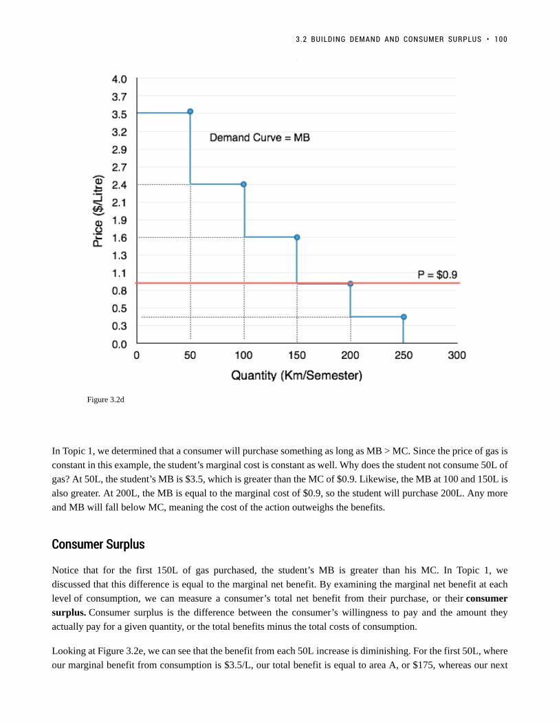
Figure 3.2d
In Topic 1, we determined that a consumer will purchase something as long as MB > MC. Since the price of gas is
constant in this example, the student’s marginal cost is constant as well. Why does the student not consume 50L of
gas? At 50L, the student’s MB is $3.5, which is greater than the MC of $0.9. Likewise, the MB at 100 and 150L is
also greater. At 200L, the MB is equal to the marginal cost of $0.9, so the student will purchase 200L. Any more
and MB will fall below MC, meaning the cost of the action outweighs the benefits.
Consumer SurplusConsumer Surplus
Notice that for the first 150L of gas purchased, the student’s MB is greater than his MC. In Topic 1, we
discussed that this difference is equal to the marginal net benefit. By examining the marginal net benefit at each
level of consumption, we can measure a consumer’s total net benefit from their purchase, or their consumer
surplus. Consumer surplus is the difference between the consumer’s willingness to pay and the amount they
actually pay for a given quantity, or the total benefits minus the total costs of consumption.
Looking at Figure 3.2e, we can see that the benefit from each 50L increase is diminishing. For the first 50L, where
our marginal benefit from consumption is $3.5/L, our total benefit is equal to area A, or $175, whereas our next
3.2 BUILDING DEMAND AND CONSUMER SURPLUS • 100

50L only give us a additional benefit of area B, or $120. Regardless, these 50L still increase our total benefit from
$175 to $295. Our total cost from the first 50L is $0.9/L or $45
Notice that for the first 150L of gas purchased, the student’s MB is greater than his MC. In Topic 1, we discussed
that this difference is equal to the student’s marginal net benefit. By examining the marginal net benefit at each
level of consumption, we can measure a consumer’s total net benefit from their purchase, or their consumer
surplus. Consumer surplus is the difference between the consumer’s willingness to pay and the amount they
actually pay for a given quantity, or the total benefits minus the total costs of consumption.
We can break down how this corresponds to consumer surplus with marginal analysis. For the first 50 units of
production, with total benefit of $175 and total cost of $45, our consumer surplus is equal to $130. We continue
this analysis in Figure 3.6f. As long as our MB is greater than our MC, consumer surplus will continue to increase.
Figure 3.6f
Take special note of total benefits and total costs at the consumption level of 250. Recall that we determined the
optimal level of production was when MB = MC. With our price of $0.9, this occurred when quantity demanded
was equal to 200L. Students often get confused when looking at the table above and point out that at 250L, total
101 • PRINCIPLES OF MICROECONOMICS

benefits are greater than total costs, and reason that the consumer should continue to consume beyond 200L, but
remember, it is not the total benefits and costs that matter in marginal analysis. For example, if you were willing
to pay $1 for a Coke but it costs $3, it doesn’t matter how many Cokes you purchased previously, or the benefit
or costs of those former Cokes. All that matters are the costs and benefits for the next unit of consumption. This
is the heart of marginal analysis.
Bringing the marginal analysis together, we can look holistically at consumer surplus. Recall that consumer
surplus is just the difference between the consumers willingness to pay (the blue line) and the cost to the consumer
(the red line). By calculating this area (shown shaded in green in Figure 3.2g) we can easily find consumer surplus
without having to look separately at Total Benefits and Total Costs.
Figure 3.2g
Consumer Surplus with Changing PricesConsumer Surplus with Changing Prices
We have now examined the consumer surplus when price is $0.9/L, but what if our price changes? Suppose that
price suddenly rises to $2.4/L. By the law of demand, we have established that this increase in price will cause
a decrease in quantity demanded, but it is also important to explore how consumer surplus changes. Consumer
surplus can be used to analyze changes in consumer well-being as market conditions change, making it a useful
tool to analyze how society is impacted.
3.2 BUILDING DEMAND AND CONSUMER SURPLUS • 102

Figure 3.2h
In Figure 3.2h, we see that consumer surplus decreases from $240 to $55. This fall is caused by two factors. First,
the student is buying less gas. As discussed before, when price is $2.4/L, the student will combine errands, etc. to
decrease the amount they drive. Second, the gas they continue to buy (100L) is now more expensive than before.
We can summarize these two changes easily. When prices increase, consumer surplus decreases because:
1. The quantity that the consumer consumes decreases.
2. The price of the goods the consumer continues to buy increases.
Completing the Demand CurveCompleting the Demand Curve
The last component of the demand curve to discuss is the divisibility of goods. In our example above, how would
quantity demanded change if price increased from $0.9/L to $1.0/L? In our example, it falls from 200L demanded
to 150L demanded! What about a price increase from $0.9/L to $1.6/L? Again our quantity demanded falls from
200L to 150L. Does this mean the price increase from $1.0/L to $1.6/L means nothing? This problem is due to the
fact that we only examined five possible points on our curve. In reality, the demand curve has an infinite number
of relationships between price and quantity
If we were to plot the quantity demanded for every possible price of gasoline, we find a smoothed-out curve like
the one shown in Figure 3.2i. When we do this, we fin the quantity demanded for $1.0/L of gas is different than
the quantity demanded for $0.99/L of gas. In reality, the average consumer may not change his or her consumption
103 • PRINCIPLES OF MICROECONOMICS

of gas in response to such a minor price change, and may have a demand curve that looks more like the staircases
presented earlier, but when you bring together the millions of Canadian gas purchasers with varying willingness
to pay, different reactions to prices changes, etc. the divisibility of goods becomes more plausible.
Figure 3.2i
SummarySummary
In this section, we examined the market from the eyes of the consumer and introduced consumer surplus to explain
how a consumer reacts to price changes. In section 3.4, we will examine the market from the eyes of the producer
and introduce the concept of producer surplus. With a strong understanding of consumer and producer surplus,
we can examine the impact that changes in the market have on society. Before we get there, we must examine the
other determinants of demand that can impact our demand curve.
GlossaryGlossary
Ceteris Paribusall else equalConsumer Surplusthe difference between a consumer’s willingness to pay, and the price they actually payDemand Curvea graphic representation of the relationship between price and quantity demanded of a certain good or
3.2 BUILDING DEMAND AND CONSUMER SURPLUS • 104

service, with quantity on the horizontal axis and the price on the vertical axisDemand Schedulea table that shows a range of prices for a certain good or service and the quantity demanded at eachpriceDemandthe relationship between price and the quantity demanded of a certain good or serviceLaw of Demandthe common relationship that a higher price leads to a lower quantity demanded of a certain good orservice and a lower price leads to a higher quantity demanded, while all other variables are heldconstantMarginal Benefit (MB)the additional satisfaction or utility that a person receives from consuming an additional unit of a good orservice, equal to WTPMarginal Analysisan examination of the additional benefits of an activity compared to the additional costs incurred by thatsame activity, used as a decision-making toolPricewhat a buyer pays for a unit of the specific good or serviceQuantity Demandedthe total number of units of a good or service consumers are willing to purchase at a given priceWillingness to Pay (WTP)the largest sum of money an individual is willing to give up to receive a product or service
Exercises 3.2
1. A buyer has purchased three units of good X. The marginal benefit of the fourth unit of X exceeds themarginal cost of the fourth unit of good X. Which of the following reasons explains why the buyer shouldpurchase the fourth unit?
I.The marginal net benefit of the fourth unit is positive.II. Buying the fourth unit will increase total benefits by more than total costs.III. Buying the fourth unit will increase total benefits and decrease total costs.
a) I onlyb) I and II onlyc) II onlyd) I, II, III
2. According to marginal analysis, optimal decision-making involves:
a) Taking actions whenever the marginal benefit is positive.b) Taking actions only if the marginal cost is zero.c) Taking actions whenever the marginal benefit exceeds the marginal cost.d) All of the above.
105 • PRINCIPLES OF MICROECONOMICS

The following TWO questions refer to an individual’s demand curve diagram, illustrated below.
3. If the price of this good is $1 per unit, what will be the quantity demanded?
a) 5.b) 10.c) 15.d) 20.
4. What are the TOTAL benefits to this individual if she consumes 10 units of the good?
a) $5.b) $10.c) $20.d) $30.
5. The demand curve for a good is derived from the:
a) Marginal cost of the good.b) Marginal benefit of the good.c) Marginal benefits of the good minus marginal costs of the good.d) Production Possibilities Frontier
6. Which of the following statements about demand curves is TRUE?
I. The “Law of Demand” holds if a consumer’s marginal benefit is lower at higher quantities consumedthan it is at lower quantities consumed.II. If the consumer’s marginal benefit is the same no matter what quantity is consumed, then her demandcurve will be vertical.III. All else equal, the marginal benefit of consuming a normal good will be higher for richer consumersthan for poorer consumers.
a) III only.b) I and II only.c) I and III only.d) I only.
3.2 BUILDING DEMAND AND CONSUMER SURPLUS • 106

The following FOUR questions refer to the diagram below, which illustrates a consumer’s demand curvefor a good.
7. If the price of this good is $30, what quantity will be demanded?
a) 5 units.b) 10 units.c) 15 units.d) 20 units.
8. If the price of this good is $20, what quantity will be demanded?
a) 5 units.b) 10 units.c) 15 units.d) 20 units.
9. If the price of this good is $20, what will consumer surplus equal?
a) $100.b) $200.c) $300d) $400.
10. If the price of this good falls from $30 to $20, but the consumer is prohibited from buying more than 5units of the good, by how much will consumer surplus increase?
a) $100.b) $75.c) $50d) $25.
107 • PRINCIPLES OF MICROECONOMICS

3.3 Other Determinants of Demand
Learning Objectives
By the end of this section, you will be able to:
• Understand the difference between demand and quantity demanded
• Know the four main determinants of demand
• Explain demand shifts from both horizontal and vertical perspectives
• Create an aggregate demand curve given individual curves
(Credit: Olenka Kotyk/Unsplash)
A Better Bus SystemA Better Bus System
In section 3.2, we explored how the price of gasoline affected quantity demanded, but what about other factors
that affect our choices? In May 2016, New York’s Metropolitan Transit Authority introduced high-tech buses
equipped with Wi-Fi and USB ports to charge phones and other devices. These improvements encourage people to
108

substitute away from cars, decreasing the demand for gasoline regardless of price. As we will see in this section,
there are many determinants of demand. The four we will explore in detail are:
1. Income
2. Prices of Related Goods
3. Tastes and Preferences
4. Expectations
As you will see, changes in these factors affect the interaction of price and quantity on every point of our demand
curve, resulting in a shift of the entire curve. First, let’s clear up some terminology.
Is demand the same as quantity demanded?
In economic terminology, demand is not the same as quantity demanded. When economists talk aboutdemand, they mean the relationship between a range of prices and the quantities demanded at those prices,as illustrated by a demand curve or demand schedule. When economists talk about quantity demanded,they mean only a certain point on the demand curve, or one quantity on the demand schedule. In otherwords, a change in quantity demanded is very different than a change in demand.
A change in demand refers to a shift in the demand curve that affects the whole diagram and theinteractions between price and quantity.
A change in quantity demanded refers to a movement along the demand curve, exploring differentpoints along the same curve.
We examined changes in quantity demanded in Topic 3.2. In this section, we discuss changes in demand.
1.1. IncomeIncome
The first determinant of demand we will explore is income. If you were to land a job with a top salary tomorrow,
how would that affect your demand for different items? Perhaps you would exchange your old Honda Accord for
a Porsche, or go on a shopping spree at a high-end clothing store. Though having more money means you can
buy more goods, there are some goods that you may actually buy less of. In introductory microeconomics, we
classify goods into two types: inferior goods and normal goods. For inferior goods, as your income rises your
demand falls. For normal goods, as income rises your demand rises
Consider Kraft Dinner and steak. On a student budget, Kraft Dinner or similar low-cost items can be a dietary
necessity, but as your income increases, you will likely eat less of these low-quality foods. This makes Kraft
Dinner an inferior good. On the other hand, as your income increases, you will likely consume more steak and
other fine dining foods, making them normal goods. Note that what we consider to be inferior or normal is
relative. A millionaire food connoisseur may regard a food you view as a delicacy as an inferior good that they
would only eat if they couldn’t afford such a luxurious lifestyle. Regardless, income is still an important factor
in our decision making and it is useful to make generalizations about how the market responds when incomes
change.
109 • PRINCIPLES OF MICROECONOMICS

(Credit: Above: Mike Mozart/ Flickr/ CC BY 2.0, Below: Benjamin Horn/ Flickr/ CC BY 2.0)
So what effect does income have on the demand curve? Assume we have an increase in income for our consumers
of gasoline. With more money you may be less conscious about the amount of gas you use – perhaps you will
finally buy an expensive parking pass and drive more. Assuming that gasoline is a normal good, this is going to
result in an increase in demand. In Figures 3.3a and 3.3b, we depict two different ways to view this shift.
Vertical Shift – Figure 3.3aVertical Shift – Figure 3.3a
The first way to look at a demand shift is to examine how a consumer’s willingness to pay (WTP) changes. With
your original income, you were willing to pay $0.9/L to use 100L of gas per semester (note this is simplified from
the example in 3.2 to be linear). When income triples, it is estimated we are willing to pay $3.3/L. Recall that
demand is determined by preferences and ability to pay, so for a normal good WTP will increase as income rises.
Notice that this increase is uniform at any point along the demand curve. Whereas you were WTP only $1.7/L for
50 units, you are now WTP $4.1/L. All across the demand curve, our willingness to pay has increased by$2.4/L.
3.3 OTHER DETERMINANTS OF DEMAND • 110

Figure 3.3a
HorizontalHorizontal Shift – Figure 3.3bShift – Figure 3.3b
The second way to view a demand shift is to look at how a consumer’s quantity demanded changes at each point
along the curve. At a price of $0.9/L, the student initially has a quantity demanded of 100L. After income increase
this has risen to 250L. This way of viewing the demand shift is why we call the change a shift in ‘demand’ instead
of quantity demanded as the quantity demanded at every point along the curve has changed.
Where the individual actually chooses to consume depends on the supply curve. In 3.2, we examined a demand
curve with a constant price. As we will see when we examine the supply curve, shifts often affect both the final
price and quantity in the market.
111 • PRINCIPLES OF MICROECONOMICS

Figure 3.3b
The following table summarizes the different effects income changes can have on our demand curve. Note that
the best way to learn these concepts is to think of examples and practice shifting the demand curve. You can refer
to the table to ensure you are on the right track!
Figure 3.3c
3.3 OTHER DETERMINANTS OF DEMAND • 112

2.2. Price of Related GoodsPrice of Related Goods
So far, we have only looked at one good in isolation. In reality, there are many goods in the marketplace
that interact with each other in unique ways. Some goods seem to pair nicely, whereas others compete. These
interactions have specific classifications in economics. With reference to the good we are analyzing in our demand
curve:
Complement goods are goods that a consumer likes to consume with a given good. For example, peanut butter
and jelly. Demand for complements is positively correlated with the other goods price. If jelly increases in price,
we will purchase less peanut butter.
Substitute goods are goods that a consumer could consume instead of a given good. For example, peanut butter
and almond butter. Demand for substitutes is negatively correlated with the other goods price. If almond butter
increases in price, we will purchase more peanut butter.
Like income, the impact of market price fluctuations on our demand curve depends on whether the two goods are
substitutes or complements. The following table summarizes how our demand for a given good can be impacted
by price fluctuations of other goods.
Figure 3.3d
113 • PRINCIPLES OF MICROECONOMICS

(Credit: dbgg1979/ Flickr/ CC BY 2.0)
Taking Advantage of Complements
Businesses are well-versed in the knowledge ofcomplements and substitutes, and often useconsumer behavior to their advantage. Considercommon displays of complementary products, suchas a display of marshmallows, chocolate, andgraham crackers, each a component of the summer-beloved S’more. A business may put grahamcrackers are on sale, but not the chocolate. If thegraham crackers were displayed alone on sale, thequantity demanded of the good would rise,according to the law of demand. By displaying thegoods together, this business is remindingconsumers that graham crackers are a complementto chocolate. This will make consumers also morelikely to purchase chocolate, even though price hasnot changed.
3.3. Tastes and PreferencesTastes and Preferences
Our tastes and preferences change over time. In our gasoline example, assume you start dating someone who
drives an electric car and constantly reminds you of the impact your gasoline consumption has on the
environment. You will likely begin to follow some of their habits and purchase less gasoline. Marketing
departments constantly try to influence your preferences, and sometimes even create them. That’s because the
more you prefer a product, the more you will demand it!
4.4. ExpectationsExpectations
The last determinant of demand we will explore is perhaps the most nuanced. It is that the expectation of the
future price of a good can affect how much consumers will demand it today. For example, if you are a frequent
shopper at Hudson’s Bay, you will be aware of the company’s regular sales. With sales so frequent, you may be
reluctant to purchase any non-discounted item. Since the actual date of the sale is unknown, this is a motivator
to wait, decreasing demand today. To really emphasize this point, consider Steam, a digital distribution platform
developed by Valve Corporation that sells PC video games online and provides a platform for users to interact.
Steam has performed well, with its sales constituting 50%–70% of the US$4 billion market for downloaded PC
games. If you are a Steam user, you understand the role of expectations play when purchasing games. Since Steam
holds regular holiday-themed sales where they blow out a large portion of their catalog with discounts as high
as 80% off there is always the expectation that you can buy the game for a lower price later. This is an even
stronger motivator as consumers know exactly when to look for the sales. This will decrease demand for the game
when there are no promotions.
If you expect the good to become more expensive, your present demand will increase.
3.3 OTHER DETERMINANTS OF DEMAND • 114

If you expect the good to become less expensive your present demand will decrease.
How soon you expect prices to change will affect the power of expectations. We all know the new iPhone is going
to be cheaper six months down the road than when it first comes out, but there are certain benefits to having the
product when it first hits the shelves. Firms work hard to create a perceived obsolescence in order to sell goods
when they are new. For example, if you fear clothes may go out of style, you are influenced to purchase them
immediately rather than wait for sales.
Market DemandMarket Demand
So far, while we have hinted at the market as a whole, the majority of our analysis has looked at one consumer
and their demand curve. In reality, we know the market is made up of many consumers, each with individual
preferences and willingness to pay. To illustrate market demand (also known as aggregate demand), we can start
with two demand curves. In Figure 3.3e below, two individual demand curves for gasoline are illustrated in green
and blue. These demand curves could be different for a number of reasons, consumer B could have higher income,
could enjoy driving more, or any other determinant of demand that would make his willingness to pay higher.
Notice first that the slopes of the demand curves are the same, and while this need not be the case, it makes
analysis simple.
To find the aggregate demand line, you simply pick two prices on the individual demand curves and add up
the quantity demanded from each consumer. For example, at the price of $1.3/litre, consumer A has quantity
demanded of 100 litres/semester, whereas consumer B has quantity demanded of 200 litres/ semester. In
aggregate consumer A + consumer B have quantity demanded of 300 litres/semester – this gives us point C on the
graph of aggregate demand. Likewise at the price of $3.7/litre, consumer A has quantity demanded of 50 litres/
semester, whereas consumer B has quantity demanded of 150 litres/semester resulting in 200 litres of aggregate
demand (50+150).
Figure 3.3e
115 • PRINCIPLES OF MICROECONOMICS

Now you have two points on the market demand curve, with this, you can connect the two points to give the whole
curve.
Note that market demand behaves in the same way as individual demand: it is shifted by external forces like
income, prices of related goods, preferences, and expectations. When examining demand from now on, we will,
for the most part, be analyzing market demand to determine equilibrium.
SummarySummary
We now know that a demand curve is constructed by considering a consumers willingness to pay and different
quantities, and the aggregate demand curve is the sum of all consumers demand curves. While price changes
influence our quantity demanded, shocks such as changes in income, price changes of related goods, changes in
tastes, and expectations can shift our demand, resulting in a different willingness to pay at every level. Now that
we understand demand, we can turn to supply and its determinants.
3.3 OTHER DETERMINANTS OF DEMAND • 116

GlossaryGlossary
Complementsgoods that are often used together so that consumption of one good tends to enhance consumption of theotherInferior Gooda good in which the quantity demanded falls as income rises, and in which quantity demanded rises andincome fallsMarket DemandThe aggregate of the demands of all potential customers (market participants) for a specific product overa specific period in a specific market.Normal Gooda good in which the quantity demanded rises as income rises, and in which quantity demanded falls asincome fallsShift in Demandwhen a change in some economic factor (other than price) causes a different quantity to be demanded atevery priceSubstitutea good that can replace another to some extent, so that greater consumption of one good can mean less ofthe other
Exercises 3.3
1. Which of the following statements about demand curves is TRUE?
a) If price falls and quantity demanded increases, this is represented by a movement along a given demandcurve.b) If price falls and quantity demanded increases, this is represented by a shift of the demand curve.c) If price falls and quantity demanded increases, this can be represented by either a movement along agiven demand curve, or a shift of the demand curve.d) None of the above are true.
2. Which of the following is NOT a determinant of the demand for good X?
a) The income of consumers who buy good X.b) The cost of labor used to produce good X.c) The price of good Y, a complement to X.d) The number of buyers of good X.
3. Which of the following will result in a DECREASE in demand (i.e., a leftward shift of the demandcurve)?
117 • PRINCIPLES OF MICROECONOMICS

a) An increase in income, if the good is normal.b) A decrease in the price of a complement to the good.c) An increase in the price of a substitute for the good.d) None of the above.
4. Suppose that my daily marginal benefit from drinking coffee increases by $2 per cup. Which of thefollowing represents the effect of this on my coffee demand curve?
5. Which of the following is NOT a determinant of the demand for good X?
a) The cost of labor used to produce good X.b) The price of good X.c) The income of consumers who buy good X.d) The price of good Y, which is a substitute for good X.
6. Which of the following IS a determinant of the demand for good X?
a) The income of consumers who buy good X.b) The cost of labor used to produce good X.c) The supply of good X.d) The number of sellers of good X.
7. A decrease in quantity demanded is, graphically, represented by:
3.3 OTHER DETERMINANTS OF DEMAND • 118

a) A leftward shift in the demand curve.b) A rightward shift in the demand curve.c) A movement up and to the left along a demand curve.d) A movement down and to the right along a demand curve.
8. Suppose goods X and Y are substitutes. Which of the following is TRUE?
a) An increase in the price of X will result in a decrease in the equilibrium price of Y.b) An decrease in the price of X will result in an increase in the equilibrium quantity of Y.c) An increase in the price of X will result in an increase in the equilibrium quantity of Y.d) More than one of the above is true.
9. If cookies are a normal good and incomes increase, we would expect:
a) An increase in equilibrium price and a decrease in equilibrium quantity.b) A decrease in equilibrium price and an increase in equilibrium quantity.c) A decrease in equilibrium price and equilibrium quantity.d) An increase in equilibrium price and equilibrium quantity.
10. A decrease in demand is, graphically, represented by:
a) A leftward shift in the demand curve.b) A rightward shift in the demand curve.c) A movement up and to the left along a demand curve.d) A movement down and to the right along a demand curve.
11. The diagram below illustrates 3 possible demand curves for coconuts.
Suppose that coconuts and pineapples are substitutes. If the price of pineapples increases, which of thefollowing movements will represent the effect of this in the market for coconuts?
a) A to C.b) A to B.
119 • PRINCIPLES OF MICROECONOMICS

c) B to A.d) B to E.
The following TWO questions refer to the diagram below.
12. If the price of this good is $20, what will be the quantity demanded?
a) 10.b) 20.c) 30.d) 40.
13. If the price of this good is $60, what will consumer surplus equal?
a) $50.b) $100.c) $150.d) $200.
14. The following question refers to the diagram below, which illustrates an individual’s demand curve fora good.
3.3 OTHER DETERMINANTS OF DEMAND • 120

If the price of this good falls from P1 to P2, then consumer surplus will _____ by areas _____.
a) increase; B+D.b) decrease; B+D.c) increase; A+B+D.d) decrease; A.
15. Consider the diagram below.
At the equilibrium in this market, which area represents CONSUMER surplus?
a) There is no consumer surplus.b) Area w.c) Area x + y.d) Area w + y.
16. Which of the following CANNOT result in a shift of the demand curve for a good?
a) A change in consumers’ incomes.b) A change in the price of the good.
121 • PRINCIPLES OF MICROECONOMICS

c) A change in the price of a complement to the good.d) All of the above will shift the demand curve.
17. Suppose the price of good X increases. If X and Y are substitutes, then, in the market for good Y, wewould expect:
a) An increase in both the equilibrium price and quantity.b) A decrease in the equilibrium price and an increase in the equilibrium quantity.c) An increase in the equilibrium price and a decrease in the equilibrium quantity.d) A decrease in both the equilibrium price and quantity.
18. If coffee and milk are complements, then which of the following will occur if the price of coffeeincreases?
a) The quantity of coffee demanded will increase.b) The quantity of coffee supplied will decrease.c) The demand for milk will increase.d) The demand for milk will decrease.
19. Consumer surplus is equal to:
a) Revenue received for a good minus that good’s cost of production.b) The amount of money a consumer is willing to pay for a good.c) The opportunity cost of a good.d) None of the above.
20. The diagram below illustrates 3 possible demand curves for coconuts.
Suppose that (i) coconuts are an inferior good and (ii) consumer incomes decrease. Which of the followingmovements could represent the effect of this in the market for coconuts?
a) A to C.b) B to A.
3.3 OTHER DETERMINANTS OF DEMAND • 122

c) C to A.d) B to E.
123 • PRINCIPLES OF MICROECONOMICS

3.4 Building Supply and Producer Surplus
Learning Objectives
By the end of this section, you will be able to:
• Explain quantity supplied, and the law of supply
• Understand how implicit and explicit costs are used to build a supply curve
• Calculate producer surplus given a marginal cost curve and price
• Explain the divisibility of goods
124

(Credit: Alaythia Cakes)
Now that we have examined demand and its determinants, let’s look at supply. For the most part, the
analysis is similar. Let’s start with an example.
The Cupcake BusinessThe Cupcake Business
When the store “Cupcakes” came to Vancouver in 2002, the cupcake industry was very different than it
is today. The start-up was the only one in town and had the ability to set the price as it saw fit. Over 10
years later, the industry has changed. It is now common to see multiple cupcake shops in each city. New
York even has a cupcake ATM where customers can buy cupcakes after the store closes. To understand
the supply side of the market, let’s look at a cupcake business that operated in a far more competitive
market model than the ones mentioned above – Alaythia Cakes. Alaythia Cakes, a small-town business
that primarily sold its products at a weekly farmer’s market, was looking to bring its products to the
provincial stage with distribution in grocery stores. Compared to the overall market, Alaythia Cakes
was a small player, and when negotiating with brands like Save on Foods, Thrifty Foods, and Costco,
it found that it had little to no power in negotiating price, since the grocery chains had access to many
other cupcakes suppliers (no supplier power).
125 • PRINCIPLES OF MICROECONOMICS

Figure 3.4a
Opportunity Cost in the Real WorldOpportunity Cost in the Real World
In Topic 2, we looked at the production possibilities of a person on an island, denominating costs in
the marginal opportunity cost of an action. Let’s take that island example and apply it to a firm. While
Alaythia Cakes was looking to expand, its production possibilities are limited by the owner and the
capacity of the staff. The business can choose to produce and sell cookies, cupcakes, or a mix of both.
Assume that:
For the first 5 cupcakes, the MC = 0.8 cookies
(4 cookies/5 cupcakes)
For the second 5 cupcakes, the MC = 1.6
cookies (8 cookies/5 cupcakes)
For the third 5 cupcakes, the MC = 2.4
cookies (12 cookies/5 cupcakes)
With this information, we can derive the supply
curve, but first we need to denominate the
marginal cost in the correct medium of exchange
– dollars. Let’s assume the current market price
for cookies is $0.50 per cookie. Then, for the first 5 cupcakes, implicit costs are $0.50 x 0.8 = $0.4. All
we are doing is changing the way we describe cost from ‘cookie terms’ to ‘dollar terms.’ Is this all our
costs? Recall in Topic 1 that the opportunity costs of an action include all implicit and explicit costs. In
this case, an explicit cost would include the actual cost of flour, eggs, etc. Let’s assume that the explicit
costs of a cupcake are $0.5. This means:
MC of 1st 5 cupcakes = $0.5 (explicit) + $0.4 (implicit) = $0.9
MC of 2nd 5 cupcakes = $0.5 (explicit) + $0.8* (implicit) = $1.3
MC of 3rd 5 cupcakes = $0.5 (explicit) + $1.2* (implicit) = $1.7
*the implicit costs were calculated by multiplying the implicit costs denominated in cookies by $0.5.
The Supply CurveThe Supply Curve
To create the supply curve, we need to graphically represent our information. Using price on the y-axis,
and quantity on the x-axis, we can plot the marginal cost points to produce Figure 3.4b.
3.4 BUILDING SUPPLY AND PRODUCER SURPLUS • 126

Figure 3.4b
As with demand, we simply join the points in stair-step fashion to create our curve as shown in Figure
3.4c. We can now use our supply curve to examine how our quantity supplied interacts with price, and
how this will affect producer surplus.
127 • PRINCIPLES OF MICROECONOMICS

Figure 3.4c
Now, let’s use these tools to determine quantity supplied. Suppose after meeting with the managers of
Save-On-Foods, Thrifty Foods, etc. the manager of Alaythia Cakes has determined the best price they
can get for the cupcakes is $2.3. By looking at where price intersects the supply curve, we can determine
what quantity of cupcakes Alaythia Cakes will supply. Looking at Figure 3.4d, the MC of units 15 to 20
is $2.1, which is less than the price, but the MC of units 20 to 25 is $2.5, which is greater than price.
Therefore, Alaythia Cakes will produce 20 cupcakes when the market price is $2.3.
3.4 BUILDING SUPPLY AND PRODUCER SURPLUS • 128

Figure 3.4d
Producer SurplusProducer Surplus
Just like consumer surplus, it is important to examine a producer’s net benefit from a certain action.
Whereas consumer surplus is the difference between what the consumer is willing to pay and the price
they pay, producer surplus is the difference between what the producer is paid (revenue), and the
variable cost of production. Our variable costs are represented by our implicit and explicit costs.
How does producer surplus differ from profit?How does producer surplus differ from profit?
As we will explore later in the course, there is a key distinction between economic profit and the classicprofit calculated in accounting. Economic profit is a firm’s total revenue minus its total costs, includingvariable, fixed and opportunity costs. Accounting profit, on the other hand, does not include opportunitycosts. (In our example, this means implicit costs would be ignored, and we would only look at the $0.5constant cost per unit).
The main difference between producer surplus and economic profit is fixed costs, the costs of productionthat don’t vary when the quantity is changed (i.e. rent, equipment purchase). Economic profit subtractsfixed costs, whereas producer surplus does not. We will explore fixed costs in depth soon.
129 • PRINCIPLES OF MICROECONOMICS

To break down producer surplus, let’s look at the total revenue and total variable costs of producing 20
cupcakes.
Figure 3.4e
Total RevenueTotal Revenue
If the market price of a cupcake is $2.3 and we are producing 20 cupcakes, what is our total revenue?
The problem is simple. If you are making $2.3 for every cupcake, and you sell 20, your total revenue
will be $46. On the graph, this always corresponds to a rectangle bounded by the price and the quantity
supplied (the blue shaded region).
Total Variable CostTotal Variable Cost
To find total variable cost we need to add the MC at each level, calculating the area under the supply
curve (the red shaded region). The calculation of cost for Figure 3.4e is:
Marginal cost of the 1st 5 cupcakes = $0.9 x 5 cupcakes = $4.5
Marginal cost of the 2nd 5 cupcakes = $1.3 x 5 cupcakes = $6.5
Marginal cost of the 3rd 5 cupcakes = $1.7 x 5 cupcakes = $8.5
Marginal cost of the 4th 5 cupcakes = $2.1 x 5 cupcakes = $10.5
Total variable costs ($4.5 + $6.5 + $8.5 + $10.5) = $30
3.4 BUILDING SUPPLY AND PRODUCER SURPLUS • 130

Producer SurplusProducer Surplus
Bringing all this information together we can calculate producer surplus. Since Total Revenue – Total Variable
Costs = Producer Surplus (PS), our PS is equal to $46 – $30 = $16. This corresponds to the area between the
price producers receive, and their costs, shown in green in Figure 3.4f.
Figure 3.4f
Producer Surplus with Changing PricesProducer Surplus with Changing Prices
Determining producer surplus with changing prices closely mirrors that of consumer surplus during
changing prices, but in order to get comfortable with the terminology, we will analyze the
effects separately.
Suppose the manager of Alaythia Cakes had been happily selling cupcakes to the grocery stores at $2.3, but one
morning, all the grocery stores told him that the best price they could give him was now $1.4/cupcake. According
to the law of supply, we know this decrease in price will cause a decrease in quantity supplied, but how does our
producer surplus change? Calculating the change in the green area in Figure 3.4g, we see that producer surplus
falls from $16 to $3. This change is due to two factors. Firstly, at the lower price, the business can no longer
sustain production of 20 units as MC > P, so it decreases the quantity supplied to 10 units. This causes the firm
to lose the $4 of producer surplus it was receiving from selling units 10-20. Second, the firm is now receiving a
lower price for the units it continues to produce, a total of $0.9 fewer dollars on 10 units, resulting in the other $9
decrease in producer surplus.
131 • PRINCIPLES OF MICROECONOMICS

Figure 3.4g
In short, when there is a fall in price, producer surplus decreases for two reasons:
1. The quantity produced decreases
2. The price the producer receives for the remaining goods decreases
Completing the Supply CurveCompleting the Supply Curve
The last step we have in the derivation of supply is recognizing that there is divisibility of goods. In the
stair-step example, we are implicitly assuming that we can only trade cupcakes and cookies in 5 cupcake
increments. Of course, this is not actually the case. The more divisibility we introduce, the more our
supply curve smooths out until it is a straight line.
3.4 BUILDING SUPPLY AND PRODUCER SURPLUS • 132

Figure 3.4h
In our analysis of the interaction between supply and demand (equilibrium), we will continue to
use smoothed out supply and demand curves. Not only are these curves based on more realistic
assumptions, they also lead to greater versatility for mathematical analysis.
SummarySummary
In this section, we examined the market from the eyes of the producer and introduced producer surplus to explain
how a firm reacts to price changes. We showed that a change in producer surplus is due to a change in quantity
and a change in price, and learned that most supply curves are smoothed out by the divisibility of goods. Before
we look at the equilibrium, let us finish the supply picture by looking at some other determinants of supply.
GlossaryGlossary
Excess Supplyat the existing price, quantity supplied exceeds the quantity demanded; also called a surplusLaw of Supplythe common relationship that a higher price leads to a greater quantity supplied and a lower price leadsto a lower quantity supplied, while all other variables are held constant
133 • PRINCIPLES OF MICROECONOMICS

Marginal Costthe additional cost that a firm incurs for producing an additional unit of a good or service.Producer Surplusthe difference between a producers costs, and the price they are paidQuantity Suppliedthe total number of units of a good or service producers are willing to sell at a given priceSupply Curvea line that shows the relationship between price and quantity supplied on a graph, with quantity suppliedon the horizontal axis and price on the vertical axisSupply Schedulea table that shows a range of prices for a good or service and the quantity supplied at each priceSupplythe relationship between price and the quantity supplied of a certain good or service
Exercises 3.4
1. An individual producer’s supply curve for a good is derived from:
a) The preferences of consumers of that good.b) The income of consumers of that good.c) The marginal cost of producing that good.d) All of the above.
The following TWO questions refer to the supply curve diagram below.
2. If price is $8 per unit, quantity supplied will equal:
a) 10.b) 20.c) 30.d) 40.
3.4 BUILDING SUPPLY AND PRODUCER SURPLUS • 134

3. If quantity supplied increases from 10 to 20 units, the producer’s total costs will increase by:
a) $20.b) $30.c) $40.d) $80.
4. Which of the following statements about supply curves is TRUE?
a) The “law of supply” states that as price rises, quantity supplied also rises.b) If the marginal cost of producing a good is higher at high levels of output than at low levels of output,then the supply curve for that good is upward sloping.c) Both a) and b) are true.d) Neither a) nor b) are true.
5. When deciding how much of a particular good to produce, a producer should:
a) Keep producing more units until the total benefits equal the total costs.b) Always produce an additional unit if price is greater than marginal cost.c) Never produce an additional unit if its marginal cost is higher than the marginal cost of previouslyproduced units.d) Always produce at additional unit if price is greater than zero.
The following TWO questions refer to the diagram below, which illustrates a supply curve.
6. In order for quantity supplied to equal 6 units, the price per unit must be:
a) $1.b) $2.c) $3.d) $4.
7. If the price of this good is $4 per unit, then what does producer surplus equal?
a) $32.b) $24.
135 • PRINCIPLES OF MICROECONOMICS

c) $16.d) $12.
8. The diagram below illustrates a supply curve.
If the price of this good is $2 per unit, then what will be the quantity supplied?
a) 0.b) 1.c) 2.d) 3.
9. Sarah is selling her used truck. The minimum amount she needs to be paid for the truck is $5,000. Sheadvertises the truck on usedvictoria.com for $8,000, and eventually sells the truck for $6,000. Her producersurplus is equal to _____.
a) $1,000.b) $2,000.c) $3,000.d) $6,000.
3.4 BUILDING SUPPLY AND PRODUCER SURPLUS • 136

3.5 Other Determinants of Supply
Learning Objectives
By the end of this section, you will be able to:
• Understand the difference between supply and quantity supplied
• Know the four main determinants of supply
• Explain supply shifts from both horizontal and vertical perspectives
• Know the difference between explicit and opportunity costs
137

(Credit: EZ Frost)
It’s as Easy as CakeIt’s as Easy as Cake
In section 3.4 we looked at the impact of price on the supply curve, but there are many other factors that affect
a company’s decision to produce. For example, new innovations are always coming out to make cake decorating
and baking easier, whether it is machines like the one shown above, or faster and better mixers. These inventions
save time and energy at different levels of production. External forces like these impact our supply curve. The
four supply shocks we will examine in detail include:
1. Input Prices
2. Technology
3. Expectations
4. Number of Producers
Whereas changes in price change quantity supplied, these factors shift supply. This is distinctly different from
changes in quantity supplied as these shocks affect the price-quantity interaction at every point on our curve.
Is supply the same as quantity supplied?Is supply the same as quantity supplied?
As with demand and quantity demanded, supply is not the same as quantity supplied. Wheneconomists talk about supply, they mean the relationship between a range of prices and the
3.5 OTHER DETERMINANTS OF SUPPLY • 138
distinct quantities supplied, as illustrated by a supply curve. When economists talk aboutquantity supplied, they mean only a certain point on the supply curve. Like demand, this meansa change in quantity supplied is very different than a change in supply.
A change in supply refers to a shift in the supply curve, affecting the whole diagram andevery interaction between price and quantity
A change in quantity supplied refers to a movement along the supply curve, exploringdifferent points on the same curve.
We examined changes in quantity supplied in Topic 3.4. In this section, we discuss changes insupply.
Input PricesInput Prices
Perhaps the most obvious shock to the supply curve is the cost of inputs. Also known as ‘Factors of
Production’, these are the combination of labor, materials, and machinery used to produce goods and
services. Our cupcake supply curve was based on the assumption of specific implicit and explicit costs
which are prone to change. Any changes to these costs will affect our marginal costs at every point.
Changes in ExplicitChanges in Explicit CostsCosts
Changes in explicit costs are the easiest to conceptualize. We determined that the explicit cost of our
cupcake supplies was around $0.50 each. What if icing sugar, an input to cupcakes, becomes more
expensive? This will raise our marginal costs at all points of production, causing an upward shift in our
supply curve.
Changes in Opportunity CostsChanges in Opportunity Costs
Opportunity cost is more of an abstract concept to think about in terms of input prices. Essentially, if
cookies become more profitable to produce, our supply model considers the higher opportunity cost as
an increase in our cost of making cupcakes. Suppose the market price for cookies increases from the
original $0.50 to $1.00. Now, our MC will be as follows:
MC of 1st 5 cupcakes = $0.5 (explicit) + $0.8 (implicit) = $1.3 (increased from $0.9)
MC of 2nd 5 cupcakes = $0.5 (explicit) + $1.6 (implicit) = $2.1 (increased from $1.3)
MC of 3rd 5 cupcakes = $0.5 (explicit) + $2.4 (implicit) = $2.9 (increased from $1.7)
Notice this increase in marginal cost occurs at all levels, meaning the change will shift the entire
supply, changing the quantity supplied at every point.
*For an interesting exercise, think about how a price change to an input for both cookies and cupcakeswould affect production. On one hand, explicit costs would be higher, but opportunity costs would belower as cookies would be less profitable. Note from now on, we will generally talk about input costs as
139 • PRINCIPLES OF MICROECONOMICS

increasing or decreasing (rather than looking at explicit and implicit costs) to simplify our analysis.
How does the supply curve actually change? In our discussion of demand, we explained that you could
view a demand shift as vertical, as consumers’ willingness to pay changes at every quantity demanded;
or as horizontal, as the amount consumers buy changes at every price level. There is a similar process
for supply.
Vertical Shift – Figure 3.5aVertical Shift – Figure 3.5a
The first way to view a shift in supply is as a vertical shift. Recall that supply represents the producer’s
MC at each point of production. Assuming that in the original supply curve our MC of producing 15
units is $1.60, if costs increase by a dollar, we will see the marginal cost increase to $2.60. Since input
prices increase by a dollar regardless of our production level, the entire curve will shift up by $1.00.
Figure 3.5a
Horizontal Shift – Figure 3.5bHorizontal Shift – Figure 3.5b
The next way to view a supply shift is slightly less intuitive. In Figure 3.5b, when the price of cupcakes
is $1.80, our quantity supplied is equal to five cupcakes. Consider how this will change with a $1.00
decrease in input prices. Originally, we produced 5 cupcakes because our price was equal to marginal
costs at that level When our costs fall, our price is still $1.80, but our costs are $0.90. Since P>MC, it
3.5 OTHER DETERMINANTS OF SUPPLY • 140

is efficient to produce more than 5 units. Using marginal analysis, we find it is efficient to produce 17
units at this price.
Whereas before, it was only viable to produce 5 units at the price of $1.80, we can now produce up to 17
units efficiently. This causes the supply curve to shift right.
Figure 3.5b
Most shocks will cause a uniform shift as can be explained vertically or horizontally. Technology, expectations,
and the number of producers will all shift the supply curve in the same way as depicted.
TechnologyTechnology
As mentioned at the beginning of the section, changes in technology will also shift the supply curve. Why is
that the case? Technology changes have a direct impact on the cost of production. If suddenly a new innovation
allows you to cut your work time in half, you will cut down your costs of labor. If technology allows you to
conserve wasted resources, then your input prices will decrease, These changes will increase supply, shifting the
141 • PRINCIPLES OF MICROECONOMICS

curve to the right. Technological Decay is a less common case where technological progress is reversed. What
if the city banned the use of a certain cupcake icing machine because the noise was bothering other residents?
This would cause you to go back to the less efficient practice of icing by hand, thereby increasing your costs. In
summary:
• Improvements in technology will lower costs of production and increase supply
• Decay in technology will increase costs of production and decrease supply
ExpectationsExpectations
Like demand, expectations of the supply price affect production decisions. Production decisions are a lot
like playing the stock market; if we are producing cupcakes and cookies to sell to the store tomorrow, we have to
produce based on the current, incomplete knowledge we have about those prices. Normally, you will be confident
that these prices will stay relatively stable, but if you have reason to believe the prices of cupcakes will drastically
rise in the morning, you may devote more of your attention to producing them. Expectations are usually based on
some form of evidence or signal and can cause supply shifts quite suddenly. In summary:
• If the firm expects prices to rise, supply will increase
• If the firm expects prices to fall, supply will decrease
Number of ProducersNumber of Producers
The final determinant of supply is the number of producers. So far, we have examined just one firm. Recall
in section 3.3 we showed that the competitive market is characterized by many potential buyers, and added
up individual demand curves to produce aggregate demand. Likewise, the market is made up of many other
producers. By adding all the suppliers together, we get aggregate supply. This can affect total supply. If for
example, four new firms enter the cupcake market, whereas Alaythia Cakes was producing just 5 cupcakes, now
the firms each produce 5 cupcakes for a total of 25 (assuming that the individual supply curves are the same,
which need not be the case). In summary:
• When more firms enter the market, supply will increase
• When firms leave the market, supply will decrease
SummarySummary
The four supply shocks have been summarized in the table below. Once again, the best way to learn
these shifts is not to memorize them, but to practice shifts on the diagram to view their effects.
3.5 OTHER DETERMINANTS OF SUPPLY • 142

Figure 3.5c
GlossaryGlossary
Aggregate Supplytotal of all goods and services (including exports and imports) supplied at every price level, within anational economy during a given period. Also called total outputExplicit Costsdirect costs of production such as rent, salaries, wages, or other input costs. Easily recognizable forclassification and recordingFactors of Productionthe combination of labor, materials, and machinery that is used to produce goods and services; alsocalled inputsImplicit Coststhe opportunity costs of an action, associated with an actions trade-offsShift in Supplywhen a change in some economic factor (other than price) causes a different quantity to be supplied atevery price
Exercises 3.5
1. Which of the following will NOT shift the market supply curve of good X?
a) A change in the cost of inputs used to produce good X.b) A change in the technology used to produce X.c) A change number of sellers of good X.d) A change in the price of good X.
2. Which of the following is NOT a determinant of the supply of good X?
a) The cost of inputs used to produce good X.b) The technology used to produce X.
143 • PRINCIPLES OF MICROECONOMICS

c) The number of sellers of good X.d) All of the above are determinants of the supply of good X.
The following TWO questions refer to the diagram below.
3. At what price will quantity supplied equal 3 units?
a) $1.b) $2.c) $3.d) $4.
4. At what price will producer surplus equal $2?
a) $1.b) $2.c) $3.d) $4.
5. A decrease in supply is, graphically, represented by:
a) A leftward shift in the supply curve.b) A rightward shift in the supply curve.c) A movement up and to the right along a supply curve.d) A movement down and to the left along a supply curve.
6. Which of the following is NOT a determinant of the supply of good X?
a) The cost of labor used to produce good X.b) The price of good X.c) The income of consumers who buy good X.d) The number of sellers of good X.
3.5 OTHER DETERMINANTS OF SUPPLY • 144

7. Which of the following is NOT a determinant of the supply of good X?
a) The cost of labor used to produce good X.b) Consumer preferences.c) Technology.d) All of the above are determinants of the supply of good X.
8. Martin is selling his viola. The minimum amount he needs to be paid for the viola is $15,500. He finda buyer for who is willing to pay $22,400, but this buyer insists that Martin pays for delivery of the viola.The cost of delivery is $700. Martin’s producer surplus from selling his viola is equal to _____.
a) $14,800.b) $7,600.c) $6,900.d) $6,200.
9. Which of the following statements about inferior goods is/are FALSE?
I. Inferior goods are those that we will never buy, no matter how cheap they are.II. Inferior goods are those that we buy more of, if we become poorer.III. Inferior goods are those that we buy more of, if we become richer.
a) I onlyb) III only.c) I and III only.d) I, II, and III.
145 • PRINCIPLES OF MICROECONOMICS

3.6 Equilibrium and Market Surplus
Learning Objectives
By the end of this section, you will be able to:
• Explain equilibrium, equilibrium price, and equilibrium quantity
• Understand how supply and demand bring markets back to equilibrium
• Analyze the effect of supply and demand shocks to market price and quantity
• Calculate market surplus given supply and demand curves
146

(Credit: Richard Hsu/ Flickr/ CC BY-ND 2.0)
Who Sets the Price?Who Sets the Price?
Have you ever been to a busy street corner and seen a row of fast food vendors lined up beside each other?Oftentimes, the vendors have little to no branding, so the stands are relatively homogeneous. How do youdecide where to buy? Assuming the quality looks about the same, you might go for the cheapest option.
What about the vendors? Knowing that consumers will purchase the cheapest option, they will avoidsetting their price above their competitors, and may lower prices to sell more. As long as the price is abovethier costs there is still an opportunity to undercut the competition. This will cause a race to the bottomuntil the price is at the equilibrium level.
Who sets the price? With many different firms and consumers, no individual has the power to influenceprice. But collectively, their actions determine it. This brings us to the core conclusion of this chapter:market price is determined by the interactions between supply and demand.
147 • PRINCIPLES OF MICROECONOMICS

EquilibriumEquilibrium
Equilibrium is formally defined as a state of rest or balance due to the equal action of opposing forces. In
economics, these forces are supply and demand. As we will see, when supply and demand are not in balance,
economic forces will work until the balance is restored.
Figure 3.6a shows the competitive market for hot dogs, with aggregate demand in blue and aggregate supply in
yellow. As price rises, quantity demand for hot dog falls, and quantity supplied rises. There are two important
points on this diagram. First is equilibrium quantity (QE). QE is where the quantity supplied is equal to the
quantity demanded. It is important to recognize this value and the mechanism that leads us there. There is only
one price that corresponds with equilibrium quantity, and that is equilibrium price (PE). The question remains,
how do we arrive at equilibrium? Let’s first consider what occurs when the price is too high.
Figure 3.6a
3.6 EQUILIBRIUM AND MARKET SURPLUS • 148

When Price isWhen Price is Higher than EquilibriumHigher than Equilibrium
What if the price is above our equilibrium value? How will the equal and opposite forces bring it back to
equilibrium? There are a number of reasons why the price may be too high. One common example that we will
explore in greater depth in Topic 4 is the price floor. Regardless of the cause, we see in Figure 3.6b that a price
above equilibrium will result in quantity supplied being greater than quantity demanded. This excess supply is
also known as a surplus. There are too many sellers who are enticed by the high price, and not enough buyers.
Consider a hot dog vendor, Paul, in this situation. Though Paul would be happy to receive the high price of $5
from the customers who buy the good, he will find that he will be unable to sell all the hot dogs he cooks, since
500 hotdogs are being made, and only 100 sold. This will result in wasted product, and a surplus of 400 hotdogs
in the market. If vendors were forced to stay in this market, the quantity supplied would fall to 100, as vendors
would quickly reduce production to what customers are willing to purchase.
Figure 3.6b
In order to sell all his hot dogs, Paul could start offering the hot dogs for a cheaper price until he is able to sell
everything he produces. In this case, every vendor has the incentive to drop their price, since (all else equal)
consumers will purchase the product with the lowest price. As price falls, two things occur:
149 • PRINCIPLES OF MICROECONOMICS

• There is a decrease in quantity supplied (a movement along the supply curve)
• There is an increase in quantity demanded (a movement along the demand curve)
Notice that both supply and demand are forces that bring the market back to equilibrium. When price is at
equilibrium of $3, no vendor has the incentive to decrease their price, since this would result in them selling
hotdogs at a loss.
When Price isWhen Price is Lower than EquilibriumLower than Equilibrium
What if price is lower than equilibrium? This is depicted in Figure 3.6c with a market price of $1.0. When price is
too low, the quantity demanded is greater than quantity supplied. This excess demand is known as a shortage. In
this situation, the low price causes an excess of buyers. When we have a shortage, the consumers who are able to
buy the good are happy, but due to the low price, not enough will be produced and not every consumer will get
thier hands on a hotdog.
Figure 3.6c
3.6 EQUILIBRIUM AND MARKET SURPLUS • 150
At $1.0, 500 hot dogs are demanded, but only 100 are being produced. This means there are many consumers
who are willing to pay more than the $1 for a hotdog, but are unable to find one. So, how do the 100 hot dogs get
allocated? Perhaps it will be on a first come first serve basis, but frustrated consumers will likely start to offer a
higher price to the hot dog stands and outbid other consumers. This will drive price back to the equilibrium level.
As a price rises, two things occur:
• There is an increase in quantity supplied (a movement along the supply curve)
• There is a decrease in quantity demanded (a movement along the demand curve)
Again, both supply and demand are forces that bring the market back to equilibrium.
External Market Shocks & EquilibriumExternal Market Shocks & Equilibrium
In Topic 3.3 and 3.5, we explored the determinants of demand and supply, and examined the impact of different
external shocks on the demand and supply curve. How will these shocks affect equilibrium? Suppose the price of
a hamburger, a substitute for hot dogs, rises. We learned in Topic 3.3 that when the price of a substitute increases,
our demand for hot dogs will increase. In Figure 3.4d below, we see the initial effects of the demand shift. (recall
that a demand shift changes the relationship between quantity demanded and quantity supplied at every point!)
151 • PRINCIPLES OF MICROECONOMICS
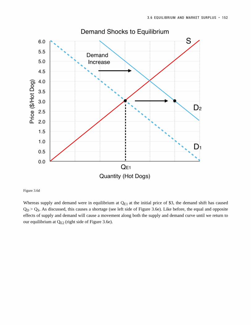
Figure 3.6d
Whereas supply and demand were in equilibrium at QE1 at the initial price of $3, the demand shift has caused
QD > QS. As discussed, this causes a shortage (see left side of Figure 3.6e). Like before, the equal and opposite
effects of supply and demand will cause a movement along both the supply and demand curve until we return to
our equilibrium at QE2 (right side of Figure 3.6e).
3.6 EQUILIBRIUM AND MARKET SURPLUS • 152

Figure 3.6e
Notice the effects of the demand shift on our overall equilibrium. Both equilibrium price and quantity are
now higher. Understanding these final effects is extremely important to understanding the supply and demand
model.
What if two curves shift?What if two curves shift?
We have viewed the separate effects of demand and supply shifts, but what happens if both shift at once? Assume
that in addition to an increase in the price of hamburgers, there is a decrease in the number of hot dog stands
in the market, causing a decrease in supply. How do these two shocks change our equilibrium? The effects are
depicted in Figure 3.6f.
153 • PRINCIPLES OF MICROECONOMICS

Figure 3.6f
Our two effects, an increase in demand and a decrease in supply, each have thier own effects. The increase in
demand causes both the price and quantity to increase, whereas the decrease in supply causes the price to increase
and quantity to decrease. What does this mean for our equilibrium? Summarizing these effects:
Price: Demand causes increase, Supply causes increase.
Quantity: Demand causes increase, Supply causes decrease.
If both the supply and demand shifts are causing the price to rise, our prices will clearly rise; however, the change
in quantity is not so simple. If one shift causes quantity to rise and another causes it to fall, what is the overall
effect? In Figure 3.6f, there appears to be no change in quantity, but this is because the two shifts are depicted
as equal and opposite. In reality, unless we know the magnitude of the curve shifts, we cannot say much about
the change in quantity. In other words, the resulting quantity change is inconclusive. Figure 3.6g summarizes
the results from different combinations of curve shifts.
3.6 EQUILIBRIUM AND MARKET SURPLUS • 154

Figure 3.6g
Remember, the best way to understand these impacts is through practice not memorization.
Market SurplusMarket Surplus
In this topic, we have outlined the importance of using consumer surplus and producer surplus to measure
net benefits for consumers and producers. Recall consumer surplus is the difference between what consumers
are willing to pay and what they actually pay, whereas producer surplus is the difference between what the
producer is paid and the marginal costs of production. Oftentimes, we want to look holistically at the market
and calculate market/private surplus, a measure of the net benefits accruing to all participants in the market.
This includes our consumer surplus, producer surplus, and, as we will explore in Topic 4, government revenue/
expenditure.
For our hot dog market, using our market surplus definition of consumer surplus + producer surplus +
government, we can see in Figure 3.6g that the market surplus is equal to the green and yellow areas.
155 • PRINCIPLES OF MICROECONOMICS

Figure 3.6h
To calculate market surplus, simply find the area of the shaded regions.
The area of a triangle is (base x height)/2.
Consumer surplus (green)= (300 x 3)/2 = $450
Producer surplus (yellow) = (300 x 3)/2 = $450
Market Surplus = $450 + $450 = $900
While adding up the surplus of every party is simple with just consumers and producers, it gets more complicated
as more players enter the market. In Figure 3.6i, a different process is outlined. Since the demand curve is the
marginal benefit curve, it represents the marginal benefits at each quantity level. (We know that this is distributed
between consumers and producers) Therefore, the area under our marginal benefit curve represents our total
3.6 EQUILIBRIUM AND MARKET SURPLUS • 156

market benefits. Likewise, the supply curve is the marginal cost curve and represents the marginal costs at each
quantity level. The area under the marginal cost curve represents our total market costs.
Figure 3.6i
With our total benefits (blue) and our total costs (red), we can easily determine our total market surplus is the
green area in Figure 3.6j below. To calculate:
Total Benefits: $1350
Total benefits correspond to the blue area in Figure 3.6i. This area is made up of a rectangle with dimensions 300
x $3 and a triangle with base 300 and height of $3. The area is (300 x $3) + (300 x $3)/2.
Total Costs: $400
Total costs correspond to the red area in Figure 3.6i. This area is made up of a triangle with a base of 300 and
height of $3. The area is (300 x $3)/2.
Total Market Surplus: $900
Total market surplus can be calculated as total benefits – total costs. Alternatively, we can calculate the area
between our marginal benefit and marginal cost, constrained by quantity. This is the equivalent of finding the
difference between the marginal benefits and the marginal costs at each level of production. In Figure 3.6j, this is
the green area, with base of $6 and height of 300.
157 • PRINCIPLES OF MICROECONOMICS

Figure 3.6j
Market Surplus and EfficiencyMarket Surplus and Efficiency
Market surplus is certainly a useful way to measure the net benefits to players in the market, but it can also
be used to measure efficiency. By comparing market surplus in different situations, we can confirm whether an
equilibrium is efficient. (Recall efficiency is a situation where we cannot make one person better off without
making another worse off.) With this in mind, we can infer that an equilibrium is efficient if it maximizes market
surplus.
In Figure 3.6k, we have a market that is producing 200 hot dogs – 100 less than our equilibrium. Is this efficient?
Well, if we calculate the green shaded region below, we find that it is $800, which is $100 less than before. By
simply increasing production back to our original level, we make both consumers and producers better off without
making anyone worse off. The difference in green regions from Figure 3.6j and Figure 3.6k is called Deadweight
Loss, because it is cost to society made by an inefficiency. As a whole, the market could be made better off by
increasing quantity.
3.6 EQUILIBRIUM AND MARKET SURPLUS • 158

Figure 3.6k
SummarySummary
In this section we completed the construction of our competitive market model, bringing together supply and
demand. The equal and opposite forces of supply and demand lead the market to a single equilibrium price and
quantity, which is generally self sustaining. Looking at shocks introduced in earlier sections, we saw that external
events can change our equilibrium, and combinations of shocks can sometimes lead to ambiguous effects. Using
consumer and producer surplus, we developed a criteria for efficiency – market surplus – that can be used to
calculate deadweight loss.. Market surplus and deadweight loss will be a key focus of Topic 4, where we look at
the impact of government intervention in the market.
159 • PRINCIPLES OF MICROECONOMICS

GlossaryGlossary
Deadweight LossA cost to society created by a market inefficiency, occurs when quantity is different from equilibriumquantityEquilibrium Pricethe price where quantity demanded is equal to quantity suppliedEquilibrium Quantitythe quantity at which quantity demanded and quantity supplied are equal for a certain price levelEquilibriumthe situation where quantity demanded is equal to the quantity supplied; the combination of price andquantity where there is no economic pressure from surpluses or shortages that would cause price orquantity to changeExcess Demandat the existing price, the quantity demanded exceeds the quantity supplied; also called a shortageExcess Supplyat the existing price, quantity supplied exceeds the quantity demanded; also called a surplusMarket Surplusthe total welfare to society, includes producer surplus, consumer surplus, and government expenditureShortageat the existing price, the quantity demanded exceeds the quantity supplied; also called excess demandSurplusat the existing price, quantity supplied exceeds the quantity demanded; also called excess supply
Exercises 3.6
1. Suppose that – at a given level of some economic activity – marginal benefit is greater than marginalcost. The economic agent in question (the decision-maker) can increase net benefits by increasing the levelof the activity, for which of the following reasons?
a) Total costs will fall by more than total benefits.b) Total benefits will rise by more than total costs.c) Neither a) nor b).d) Either a) or b).
2. Which of the following statements is TRUE?
a) Consumer surplus is the difference between the minimum amount a consumer is willing to pay, and whathe or she actually pays.b) Producer surplus is the difference between the amount of money a seller is paid, and the maximumamount that he or she needs to be paid.c) Market surplus is equal to the sum of consumer surplus and producer surplus.d) All of the above are true.
3.6 EQUILIBRIUM AND MARKET SURPLUS • 160

The following TWO questions refer to the supply and demand curve diagram below.
3. The equilibrium price in this market is equal to:
a) $6 per unit.b) $5 per unit.c) $4 per unit.d) $3 per unit.
4. At a price of $8, there is:
a) Excess demand (a shortage) of 25 units.b) Excess demand (a shortage) of 15 units.c) Excess supply (a surplus) of 15 units.d) Excess supply (a surplus) of 25 units.
5. Which of the following statements about consumer surplus and producer surplus is TRUE?
a) Consumer surplus is equal to the area under the demand curve.b) Producer surplus is equal to the area under the supply curve.c) Both producer and consumer surplus are equal to price multiplied by quantity.d) None of the above statements is true.
6. Consider the supply and demand curve diagram below.
161 • PRINCIPLES OF MICROECONOMICS
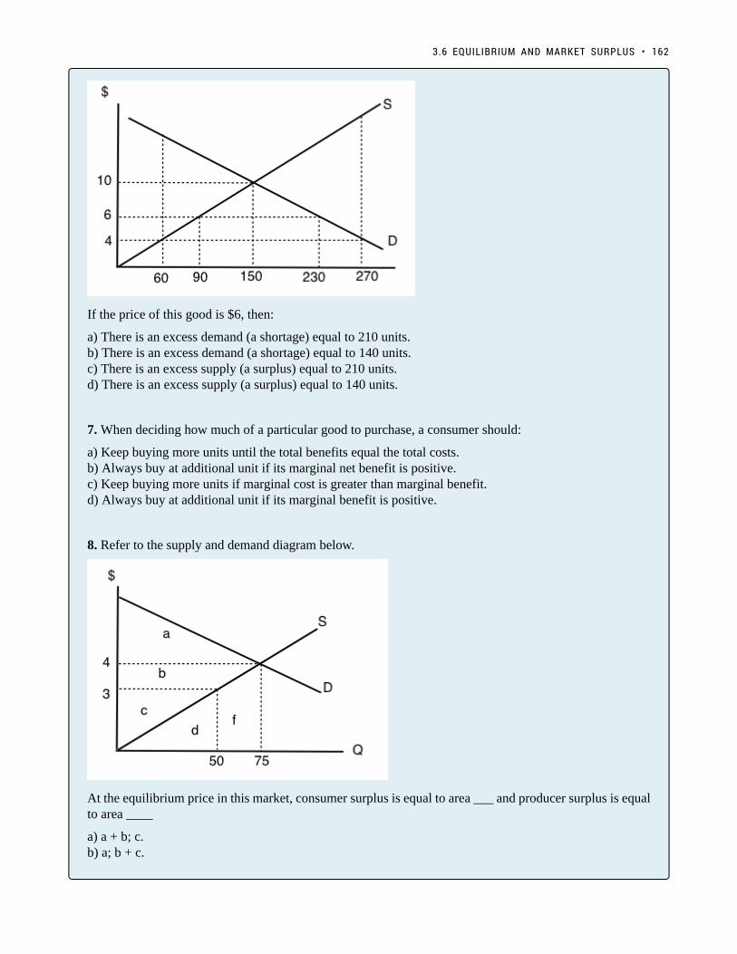
If the price of this good is $6, then:
a) There is an excess demand (a shortage) equal to 210 units.b) There is an excess demand (a shortage) equal to 140 units.c) There is an excess supply (a surplus) equal to 210 units.d) There is an excess supply (a surplus) equal to 140 units.
7. When deciding how much of a particular good to purchase, a consumer should:
a) Keep buying more units until the total benefits equal the total costs.b) Always buy at additional unit if its marginal net benefit is positive.c) Keep buying more units if marginal cost is greater than marginal benefit.d) Always buy at additional unit if its marginal benefit is positive.
8. Refer to the supply and demand diagram below.
At the equilibrium price in this market, consumer surplus is equal to area ___ and producer surplus is equalto area ____
a) a + b; c.b) a; b + c.
3.6 EQUILIBRIUM AND MARKET SURPLUS • 162

c) a + b; b + c.d) a + b + c; d + f.
9. Which of the following statements about consumer and producer surplus is TRUE?
a) Consumer surplus is equal to the maximum amount a consumer is willing to pay for a good, minus whatthe consumer has to pay for the good.b) Producer surplus is equal to the amount received from selling a good, minus the minimum amount theseller needed to receive, in order to be willing to sell the good.c) Both a) and b) are true.d) Neither a) nor b) are true.
The following TWO questions refer to the supply and demand diagram below.
10. Which of the following COULD explain the shift in supply from S1 to S2.
a) An increase in the cost of producing the good.b) A decrease in the number of sellers in the market.c) Both a) and b).d) Neither a) nor b).
11. If supply is S2, which area represents MARKET surplus?
a) ab) a + b.c) a + b + e.d) We need to know price in order to determine market surplus.
12. Consider the supply and demand diagram drawn below.
163 • PRINCIPLES OF MICROECONOMICS

Suppose that demand is initially D1, but, following a change in consumer preferences, demand shifts toD2. Note that the two demand curves are parallel. Which of the following statements is TRUE?
a) Demand increases by 30 units.b) Quantity demanded increases by 30 units.c) Equilibrium quantity increases by 30 units.d) More than one of the above statements is true.
13. Suppose the equilibrium price of good X is $10 and the equilibrium quantity is 60 units. If the price ofgood X is $4:
a) The quantity demanded will be less than 60 units.b) The quantity supplied will be more than 60 units.c) There will be an excess demand for good X.d) There will be an excess supply of good X.
14. All else equal, a decrease in the marginal cost of producing a good will result in:
a) A lower equilibrium quantity and a higher equilibrium price.b) A lower equilibrium quantity and a lower equilibrium price.c) A higher equilibrium quantity and a higher equilibrium price.d) A higher equilibrium quantity and a lower equilibrium price.
The following TWO questions refer to the diagram below.
3.6 EQUILIBRIUM AND MARKET SURPLUS • 164
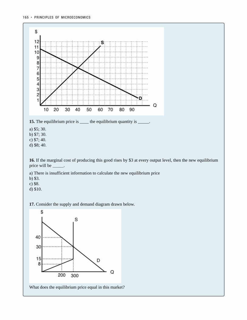
15. The equilibrium price is ____ the equilibrium quantity is _____.
a) $5; 30.b) $7; 30.c) $7; 40.d) $8; 40.
16. If the marginal cost of producing this good rises by $3 at every output level, then the new equilibriumprice will be _____.
a) There is insufficient information to calculate the new equilibrium priceb) $3.c) $8.d) $10.
17. Consider the supply and demand diagram drawn below.
What does the equilibrium price equal in this market?
165 • PRINCIPLES OF MICROECONOMICS

a) $8.b) $15.c) $30.d) $45.
18. Refer to the diagram below.
At a price of $10 per unit:
a) There is excess demand (a shortage) equal to 45 units.b) There is excess supply (a surplus) equal to 45 units.c) There is excess demand (a shortage) equal to 20 units.d) There is excess supply (a surplus) equal to 20 units.
19. Consider the market for oranges. Suppose that both of the following occur simultaneously: (i) the priceof apples (a substitute for oranges) decreases; and (ii) world-wide droughts reduce the harvest of orangesby 30%. Then, in the market for oranges we would expect:
a) The equilibrium price of oranges could either increase or decrease, but equilibrium quantity willdefinitely decrease.b) The equilibrium quantity of oranges could either increase or decrease, but equilibrium price willdefinitely decrease.c) The equilibrium price of oranges could either increase or decrease, but equilibrium quantity willdefinitely increase.d) The equilibrium quantity of oranges could either increase or decrease, but equilibrium price willdefinitely increase.
20. Suppose that, following a decrease in the supply of good X, we observe that the price of good Ydecreases. If no other curves have shifted, which of the following can we infer?
a) Good X is an inferior good.b) Goods X and Y are complements.c) Goods X and Y are substitutes.d) None of the above.
3.6 EQUILIBRIUM AND MARKET SURPLUS • 166

21. In recent years there have been a couple of high profile cases of contamination of baby formulaproduced in China. As a result, many Chinese parents buy baby formula that is produced outside China.Which of the following accurately describes the likely effect of this on baby formula prices?
a) An increase in the price of baby formula produced in China and a decrease in the price of baby formulaproduced outside China.b) A decrease in the price of baby formula produced in China and an increase in the price of baby formulaproduced outside China.c) A decrease in the price of both baby formula produced in China and baby formula produced outsideChina.d) An increase in the price of both baby formula produced in China and baby formula produced outsideChina.
22. Refer to the supply and demand diagram below.
If supply is S1, which area represents MARKET surplus?
a) ab) a + b.c) a + b + e.d) We need to know price in order to determine market surplus.
23. Suppose that in the market for good X (a normal good), the following occur simultaneously: (i)consumer incomes increase and (ii) the price of oil (an input to the production of X) increases. Which ofthe following statements is TRUE?
a) The equilibrium price of X could either increase or decrease, but equilibrium quantity will definitelydecrease.b) The equilibrium quantity of X could either increase or decrease, but equilibrium price will definitelydecrease.c) The equilibrium price of X could either increase or decrease, but equilibrium quantity will definitelyincrease.
167 • PRINCIPLES OF MICROECONOMICS

d) The equilibrium quantity of X could either increase or decrease, but equilibrium price will definitelyincrease.
24. Consider the supply and demand diagram below.
If supply decreases from S1 to S2, which area represents the change in PRODUCER surplus?
a) b + c – f.b) a + b + c.c) b – f – e.d) c + f + g + e.
25. A recent news story reported that OPEC is expected to decrease the supply of oil next summer. Summeris traditionally a time of increased demand for oil because of the many families driving and flying tovacation sites. What would be the combined effect of these two activities on the summer market forgasoline?
a) An increase in the equilibrium price and the quantity.b) An increase in the equilibrium price and an unpredictable change in the equilibrium quantity.c) An unpredictable change in both the equilibrium price and the quantity.d) An unpredictable change in the equilibrium price and a decrease in the equilibrium quantity.
26. Consider the supply and demand curves drawn below.
3.6 EQUILIBRIUM AND MARKET SURPLUS • 168

Given the equilibrium quantity, which area represents MARKET SURPLUS?
a) X + Y + Z.b) X + Y.c) X.d) There is no market surplus.
27. Which of the following CANNOT result in an increase in price in a competitive market for a normalgood?
a) An increase in income.b) A decrease in the price of a complement to this good.c) An increase in the price of a substitute for this good.d) A decrease in the wages paid to workers who produce this good.
28. Consider the supply and demand curves illustrated below.
Which of the following statements is true?
a) At a price of P3, there is excess demand equal to the distance DE.b) At a price of P3, there is excess demand equal to the distance BE.
169 • PRINCIPLES OF MICROECONOMICS

c) At a price of P3, there is excess supply equal to the distance BE.d) At a price of P3, there is excess supply equal to the distance DE.
29. Which of the following CANNOT result in a decrease in the equilibrium quantity sold of an inferiorgood?
a) An increase in the price of a substitute for the good.b) An increase in consumer incomes.c) An increase in wages paid to workers who produce the good.d) An increase in the price of a complement for the good.
30. Which of the following statements is FALSE?
a) At the competitive equilibrium, market surplus is maximized.b) At the competitive equilibrium, the marginal benefit to consumers equals the marginal cost to producers.c) At the competitive equilibrium, social surplus is maximized if there are no externalities.d) At the competitive equilibrium, it is possible to make at least one person better off without makinganyone worse off.
31. A recent Health Canada report argued that there is a strong link between the consumption of steak andheart disease. At the same time, Canadian consumers’ incomes rose. If steak is a normal good, what arethe combined effects in the market for steak?
a) An increase in the equilibrium price and the quantity.b) An increase in the equilibrium price and an unpredictable change in the equilibrium quantity.c) An unpredictable change in both the equilibrium price and the quantity.d) An unpredictable change in the equilibrium price and a decrease in the equilibrium quantity.
The next THREE questions refer to the diagram below.
32. Given the equilibrium quantity of 300 units, which areas represent MARKET SURPLUS?
a) a+b+c+d.b) a+b+c.
3.6 EQUILIBRIUM AND MARKET SURPLUS • 170

c) a+c.d) a+b.
33. Given the equilibrium quantity of 300 units, which areas represent PRODUCER SURPLUS?
a) c+d.b) a+b.c) a+c.d) b+d.
34. Given the equilibrium quantity of 300 units, which areas represent CONSUMER SURPLUS?
a) c+d.b) a+b.c) a+c.d) b+d.
171 • PRINCIPLES OF MICROECONOMICS

Solutions: Case Study - The Housing Market
1. Label Figure CS3 a. with the Equilibrium price and quantity, and label supply and demand curves as
either renters or landlords.
Since Landlords supply the housing units, they represent the supply side of the market, labeled S1.
Since Renters demand the housing units, they represent the demand side of the market, labeled S2.
172
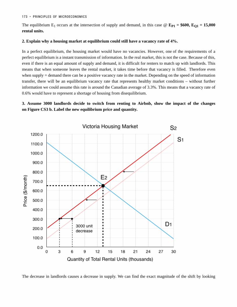
The equilibrium E1 occurs at the intersection of supply and demand, in this case @ EP1 = $600, EQ1 = 15,000
rental units.
2. Explain why a housing market at equilibrium could still have a vacancy rate of 4%.
In a perfect equilibrium, the housing market would have no vacancies. However, one of the requirements of a
perfect equilibrium is a instant transmission of information. In the real market, this is not the case. Because of this,
even if there is an equal amount of supply and demand, it is difficult for renters to match up with landlords. This
means that when someone leaves the rental market, it takes time before that vacancy is filled. Therefore even
when supply = demand there can be a positive vacancy rate in the market. Depending on the speed of information
transfer, there will be an equilibrium vacancy rate that represents healthy market conditions – without further
information we could assume this rate is around the Canadian average of 3.3%. This means that a vacancy rate of
0.6% would have to represent a shortage of housing from disequilibrium.
3. Assume 3000 landlords decide to switch from renting to Airbnb, show the impact of the changes
on Figure CS3 b. Label the new equilibrium price and quantity.
The decrease in landlords causes a decrease in supply. We can find the exact magnitude of the shift by looking
173 • PRINCIPLES OF MICROECONOMICS

at how much quantity supplied decreases for each price level. In this case, we are told to assume that quantity
supplied decreases by 3000 rental units at every price. This causes a shift from S1 to S2.
The new equilibrium E2 results from the intersection between S2 and D1, in this case @ EP2 = $650, EQ2 = 13,000
rental units.
4. Assume 9000 new renters enter the market instead of mortgaging homes, show the impact of the changes
on Figure CS3 b. Explain the impact of both the shock from Airbnb and the shock from less housing buyers
on equilibrium price and quantity. Do the shocks work together or oppose one another?
The increase in renters in the market causes an increase in demand. Again, the magnitude of the shift is given to
us. We are told that quantity demanded increases by 9000 rental units at every price. this causes demand to shift
from D1 to D2.
The new equilibrium E3 results from the intersection between S2 and D2, in this case @ EP3 = $800, EQ3 = 18,000
rental units.
We can see that compared to EP1 = $600, EQ1 = 15,000 rental units, E3 has seen a increase in price and quantity.
Breaking down the two effects:
SOLUTIONS: CASE STUDY - THE HOUSING MARKET • 174

The decrease in supply caused price to rise and quantity to fall.
The increase in demand caused price to rise and quantity to rise.
We can see that the effects on price worked together, but the effects on quantity opposed. The end result of an
increase in quantity is because the demand shock was greater than the supply shock. In this topic we explained
that unless you know which effect is greater, the result of opposing shocks are inconclusive. In this case we can
say with certainty that quantity has increased because we know the exact size of the shocks.
5. Assume price remains at the original equilibrium , calculate the magnitude of the shortage or surplus of
housing that results. Explain the impact this shortage will have the behaviour of landlords.
If price remains at the original equilibrium E1 of $600, Quantity Demanded @ D2 is 24,000 and Quantity Supplied
@ S2 is 12,000. This means that there will be a 12,000 unit shortage in rental housing (24,000 – 12,000). As
mentioned in the case study, this will cause pressure for prices to increase. Since landlords cannot raise prices for
existing tenants, they will be incentivized to find ways to evict tenants. For the spots that are up for rent, bidding
wars will ensue.
6. Assume the government wants to bring price back to it’s original level, if it costs $50,000 to increase the
number of rental units by one, how much will this cost the government?
175 • PRINCIPLES OF MICROECONOMICS

In order to shift supply from S2 to a supply curve that intersects with D2 at an equilibrium price of $600, the
government has to find a way to increase the supply of rental housing by 12,000 units. If it costs $50,000/unit,
this would cost the government $600 million.
7. Read the Executive Summary of the Alliance of BC Students White Paper on Student Housing. What
is the ABCS proposing that could help decrease price in the market? How would this affect supply and/or
demand?
The ABCS white paper draws attention to the fact that universities are currently restricted from accruing debt
to build more student housing. They recommend that the government remove this restriction, explaining that the
increase in housing for students will take them out of the competitive market above. Depending on how you view
the market this could be explained as an increase in supply or a decrease of demand. If you consider student
housing as a separate market, this effect would decrease demand as it takes student out of the market. If you
consider it as the same market, it would increase supply as it increases the amount of housing available.
SOLUTIONS: CASE STUDY - THE HOUSING MARKET • 176

Topic 3 Solutions
Solutions to Exercises 3.2
1. B
2. C
3. C
4. B
5. B
6. C
7. A
8. B
9. A
10. C
Solutions to Exercises 3.3
1. A
2. B
3. D
4. D
5. A
6. A
7. C
8. C
9. D
177

10. A
11. A
12. C
13. B
14. A
15. D
16. B
17. A
18. D
19. D
20. A
Solutions to Exercises 3.4
1. C
2. D
3. B
4. C
5. B
6. C
7. C
8. B
9. A
Solutions to Exercises 3.5
1. D
2. D
3. D
4. C
5. A
TOPIC 3 SOLUTIONS • 178

6. C
7. B
8. D
9. C
Solutions to Exercises 3.6
1. B
2. C
3. A
4. D
5. D
6. B
7. B
8. B
9. C
10. D
11. C
12. A
13. C
14. D
15. C
16. C
17. C
18. B
19. A
20. B
21. B
22. A
23. D
24. C
25. B
26. C
179 • PRINCIPLES OF MICROECONOMICS

27. D
28. A
29. A
30. D
31. C
32. A
33. D
34. C
TOPIC 3 SOLUTIONS • 180

Topic 3 References
Alliance of BC Students. Where’s The Housing White Paper. 2016. https://abcstudentsdotca.files.wordpress.com/
2016/10/absc-housingwhitepaper.pdf
Bula, Frances. The Globe and Mail. “AirBnb Not to Blame for Vancouver’s Difficult Rental Market, Company
Says.” September 28, 2016. http://www.theglobeandmail.com/news/british-columbia/most-airbnb-hosts-make-
less-profit-than-those-who-rent-long-term-report/article32095594/
Bula, Frances and Sully Dhillon. The Globe and Mail. “British Columbia Reveals $500-million Affordable-
Housing Plan.” November 22, 2016. http://www.theglobeandmail.com/news/british-columbia/bc-
says-2900-affordable-housing-units-to-be-built-within-two-years/article32983738/
CBC Radio West. “Grand Forks Teen Baker Runs Successful Company.” November 8, 2012. http://www.cbc.ca/
radiowest/2012/11/08/grand-forks-teen-baker-runs-successful-company/index.html
Chang, Lulu. Digital Trends. “High-tech MTA buses with Wi-Fi are now rolling around New York City.” May 19,
2016. https://www.digitaltrends.com/cars/mta-high-tech-bus/
Chiang, Oliver. Forbes. “The Master of Online Mayhem.” February 9th, 2011. https://www.forbes.com/forbes/
2011/0228/technology-gabe-newell-videogames-valve-online-mayhem.html
Dyck, Darryl. The Globe and Mail. “Cities Take Aim at AirBnb.” July 11,
2016. http://www.theglobeandmail.com/news/british-columbia/concerns-about-airbnb-impact-on-rentersspread/
article30845642/
Jordan, Miriam and Lauren A. E. Schuker. The Wall Street Journal. “The Onion’s Best Friend Is an Ogre.” June
28, 2010. https://www.wsj.com/articles/SB10001424052748704123604575323433042544568
Lawrence, April. CHEK News. “Bidding Wars Taking Place in ‘Vicious’ Greater Victoria Rental Market.” August
15, 2016. http://www.cheknews.ca/bidding-wars-greater-victoria-rental-market-207772/
Shea, Courtney. The Globe and Mail. “Sweet News for Canadian Cupcake Lovers.” April 23, 2013.
http://www.theglobeandmail.com/life/food-and-wine/food-trends/sweet-news-for-canadian-cupcake-lovers/
article11510344/
Sprinkles Cupcake ATM. YouTube. March 16, 2012. https://www.youtube.com/watch?v=mgzxHNq8Bek
181

Topic 4 Part 1: Elasticity
182

4.1 Calculating Elasticity
Learning Objectives
By the end of this section, you will be able to:
• Calculate the price elasticity of demand
• Calculate the price elasticity of supply
• Calculate the income elasticity of demand and the cross-price elasticity of demand
• Apply concepts of price elasticity to real-world situations
183

(Credit: Melo McC/ Flickr/ CC BY-NC-ND 2.0)
That Will Be How Much?That Will Be How Much?
Imagine going to your favorite coffee shop and having the waiter inform you the pricing has changed.Instead of $3 for a cup of coffee with cream and sweetener, you will now be charged $2 for a black coffee,$1 for creamer, and $1 for your choice of sweetener. If you want to pay your usual $3 for a cup of coffee,you must choose between creamer and sweetener. If you want both, you now face an extra charge of $1.Sound absurd? Well, that is the situation Netflix customers found themselves in 2011 – a 60% price hiketo retain the same service.
In early 2011, Netflix consumers paid about $10 a month for a package consisting of streaming video andDVD rentals. In July 2011, the company announced a packaging change. Customers wishing to retain bothstreaming video and DVD rental would be charged $15.98 per month – a price increase of about 60%. In2014, Netflix also raised its streaming video subscription price from $7.99 to $8.99 per month for new U.S.customers. The company also changed its policy of 4K streaming content from $9.00 to $12.00 per monththat year.
How did customers of the 18-year-old firm react? Did they abandon Netflix? How much will this pricechange affect the demand for Netflix’s products? The answers to those questions will be explored in thischapter with a concept economists call elasticity.
4.1 CALCULATING ELASTICITY • 184

Click to read the rest of the Netflix story
Anyone who has studied economics knows the law of demand: a higher price will lead to a lower quantity
demanded. What you may not know is how much lower the quantity demanded will be. Similarly, the law of
supply shows that a higher price will lead to a higher quantity supplied. The question is: How much higher? This
topic will explain how to answer these questions and why they are critically important in the real world.
To find answers to these questions, we need to understand the concept of elasticity. Elasticity is an economics
concept that measures the responsiveness of one variable to changes in another variable. Suppose you drop two
items from a second-floor balcony. The first item is a tennis ball, and the second item is a brick. Which will
bounce higher? Obviously, the tennis ball. We would say that the tennis ball has greater elasticity.
But how is this degree of responsiveness seen in our models? Both the demand and supply curve show the
relationship between price and quantity, and elasticity can improve our understanding of this relationship.
The own price elasticity of demand is the percentage change in the quantity demanded of a good or service
divided by the percentage change in the price. This shows the responsiveness of the quantity demanded to a
change in price.
The own price elasticity of supply is the percentage change in quantity supplied divided by the percentage
change in price. This shows the responsiveness of quantity supplied to a change in price.
Our formula for elasticity, , can be used for most elasticity problems, we just use different prices and
quantities for different situations.
Why percentages are counter-intuitiveWhy percentages are counter-intuitive
Recall that the simplified formula for percentage change is , also written as .
Suppose there is an increase in quantity demanded from 4 coffees to 6 coffees. Calculating percentagechange ( ) there has been a 50% increase in quantity demanded. Using the same numbers, consider whathappens when quantity demanded decreases from 6 coffees to 4 coffees, ( ) this change results in a 33%decrease in quantity demanded.
185 • PRINCIPLES OF MICROECONOMICS

Right away, this should raise a red flag about calculating the elasticity between at two points, if percentagechange is dependant on the direction (A to B or B to A) then how can we ensure a consistent elasticityvalue?
Figure 4.1a
Let’s calculate elasticity from both perspectives:
Moving from A to B:
%ΔPrice: The coffee price falls from $4.50 to $3.00, meaning the percentage change is = -33%.Price has fallen by 33%.
%ΔQuantity: The quantity of coffee sold increases from 4 to 6, meaning the percentage change is =50%. Quantity has risen by 50%
Elasticity: = 1.5*
Moving from B to A:
%ΔPrice: The coffee price rises from $3.00 to $4.50, meaning the percentage change is = 50%.Price has risen by 50%.
%ΔQuantity:The quantity of coffee sold falls from 6 to 4, meaning the percentage change is = -33%. Quantity hasfallen by 33%
4.1 CALCULATING ELASTICITY • 186

Elasticity: = 0.67
These two calculations give us different numbers. This type of analysis would make elasticity subject todirection which adds unnecessary complication. To avoid this, we will instead rely on averages.
*Note that elasticity is an absolute value, meaning it is not affected by positive of negative values.
Mid-point MethodMid-point Method
To calculate elasticity, instead of using simple percentage changes in quantity and price, economists use the
average percent change. This is called the mid-point method for elasticity, and is represented in the following
equations:
The advantage of the mid-point method is that one obtains the same elasticity between two price points whether
there is a price increase or decrease. This is because the denominator is an average rather than the old value.
Using the mid-point method to calculate the elasticity between Point A and Point B:
This method gives us a sort of average elasticity of demand over two points on our curve. Notice that our elasticity
of 1 falls in-between the elasticities of 0.67 and 1.52 that we calculated in the previous example.
Point-Slope FormulaPoint-Slope Formula
In Figure 4.1a we were given two points and looked at elasticity as movements along a curve. As we will see in
Topic 4.3, it is often useful to view elasticity at a single point. To calculate this, we have to derive a new equation.
Since we know that a percentage change in price can be rewritten as
187 • PRINCIPLES OF MICROECONOMICS

and a percentage change in quantity to
we can rearrange the original equation as
which is the same as saying
This gives us our point-slope formula. How do we use it to calculate the elasticity at Point A? The P/Q portion of
our equation corresponds to the values at the point, which are $4.5 and 4. The ΔQ/ ΔP corresponds to the inverse
slope of the curve. Recall slope is calculated as rise/run.
In Figure 4.1, the slope is = 0.75, which means the inverse is 1/0.75 = 1.33. Plugging this information into
our equation, we get:
= 1.5
This analysis gives us elasticity as a single point. Notice that this gives us the same number as calculating
elasticity from Point A to B. This is not a coincidence. When we are calculating from Point A to Point B, we are
actually just calculating the elasticity at Point A, since we are using the values on Point A as the denominator for
our percentage change. Likewise from Point B to Point A, we are calculating the elasticity at Point B. When we
use the mid-point method, we are just taking an average of the two points. This solidifies the fact that there is a
different elasticity at every point on our line, a concept that will be important when we discuss revenue.
Not Really So DifferentNot Really So Different
Even though mid-point and Point-Slope appear to be fairly different formulas, mid-point can be rewritten to show
how similar the two really are.
=
Remember that when a fraction is divided by a fraction, you can rearrange it to a fraction multiplied by the inverse
of the denominator fraction.
=
Notice that compared to point-slope: , the only difference is that point-slope is the inverse of the slope
multiplied by a single point, whereas mid-point is the inverse of the slope multiplied by multiple points. This
reinforces the conclusion that mid-point represents an average.
4.1 CALCULATING ELASTICITY • 188

Other ElasticitiesOther Elasticities
Remember, elasticity is the responsiveness of one variable to changes in another variable. This means it can
be applied to more that just the price-quantity relationship of our market model. In Topic 3 we discussed how
goods can be inferior/normal or substitutes/complements. We will examine this even further when we introduce
consumer theory, but for now we can develop our understanding by applying what we know about elasticities.
Own-priceOwn-price elasticity of supplyelasticity of supply (e(ePPSS))
Our analysis of elasticity has been centred around demand, but the same principles apply to the supply curve.
Whereas elasticity of demand measures responsiveness of quantity demanded to a price change, own-price
elasticity of supply measures the responsiveness of quantity supplied. The more elastic a firm, the more it can
increase production when prices are rising, and decrease its production when prices are falling. Our equation is as
follows:
Own-price elasticity of supply can be calculated using mid-point and point-slope formula in the same way as for
ePD.
Cross-price elasticity of demand (eCross-price elasticity of demand (eXPXPDD))
Whereas the own-price elasticity of demand measures the responsiveness of quantity to a goods own price, cross-
price elasticity of demand shows us how quantity demand responds to changes in the price of related goods.
Whereas before we could ignore positives and negatives with elasticities, with cross-price, this matters. Our
equation is as follows:
Consider our discussion of complements and substitutes in Topic 3.3. We defined complements as goods that
individuals prefer to consume with another good, and substitutes as goods individuals prefer to consume instead
of another good. If the price of a complement rises our demand will fall, if the price of a substitute rises our
demand will rise. For cross-price elasticity this means:
A complement will have a negative cross-price elasticity, since if the % change in price is positive, the % change
in quantity will be negative and vice-versa.
A substitute will have a positive cross-price elasticity, since if the % change in price is positive, the % change
in quantity will be positive and vice-versa.
This adds another dimension to our discussion of complements/substitutes. Now we can comment on the strength
of the relationship between two goods. For example, a cross-price elasticity of -4 suggests an individual strongly
prefers to consume two goods together, compared to a cross-price elasticity of -0.5. This could represent the cross-
price elasticity of a consumer for a hot dog, with respect to ketchup and relish. The consumer might strongly
prefer to consume hot dogs with ketchup, and loosely prefers relish.
189 • PRINCIPLES OF MICROECONOMICS

Income elasticity of demand (eIncome elasticity of demand (eNNDD))
In Topic 3 we also explained how goods can be normal or inferior depending on how a consumer responds
to a change in income. This responsiveness can also be measured with elasticity by the income elasticity of
demand. Our equation is as follows:
As with cross-price elasticity, whether our elasticity is positive or negative provides valuable information about
how the consumer views the good:
A normal good will have a positive income elasticity, since if the % change in income is positive, the % change
in quantity will be positive and vice-versa.
A inferior good will have a negative income elasticity, since if the % change in income is positive, the % change
in quantity will be negative and vice-versa.
The value of our elasticity will indicate how responsive a good is to a change in income. A good with an income
elasticity of 0.05, while technically a normal good (since demand increases after an increase in income) is not
nearly as responsive as one with an income elasticity of demand of 5.
SummarySummary
Elasticity is a measure of responsiveness, calculated by the percentage change in one variable divided by the
percentage change in another.
Both mid-point and point-slope formulas are important for calculating elasticity in different situations. Mid-point
gives an average of elasticities between two points, whereas point-slope gives the elasticity at a certain point.
These can be calculated with the following formulas:
Base Formula Mid-Point Formula Point-Slope Formula
Since elasticity measures responsiveness, it can also be used to measure the own-price elasticity of supply, the
cross-price elasticity of demand, and the income elasticity of demand. These can be calculated with the following
formulas:
Own-Price Elasticity of Supply Cross-Price Elasticity of Demand Income Elasticity of Demand
4.1 CALCULATING ELASTICITY • 190

GlossaryGlossary
Cross-price elasticity of demandthe percentage change in the quantity demanded of good A as a result of a percentage change in price ofgood BElasticityan economics concept that measures responsiveness of one variable to changes in another variableIncome elasticity of demandthe percentage change in quantity demanded of a good or service as a result of a percentage change inincomeOwn-price elasticity of demandpercentage change in the quantity demanded of a good or service divided the percentage change in priceMid-point MethodInvolves multiplying the inverse of the slope by the values of a single point.Own-price elasticity of supplypercentage change in the quantity supplied divided by the percentage change in pricePoint Slope MethodA method of calculating elasticity between two points. Involves calculating the percentage change ofprice and quantity with respect to an average of the two points.
Exercises 4.1
1. Use the demand curve diagram below to answer the following question.
What is the own-price elasticity of demand as price increases from $2 per unit to $4 per unit? Use the mid-point formula in your calculation.
a) 1/3.b) 6/10.
191 • PRINCIPLES OF MICROECONOMICS

c) 2/3.d) None of the above.
2. Suppose that a 2% increase in price results in a 6% decrease in quantity demanded. Own-price elasticityof demand is equal to:
a) 1/3.b) 6.c) 2d) 3.
3. If own-price elasticity of demand equals 0.3 in absolute value, then what percentage change in price willresult in a 6% decrease in quantity demanded?
a) 3%b) 6%c) 20%.d) 50%.
4. Suppose you are told that the own-price elasticity of supply equal 0.5. Which of the following is thecorrect interpretation of this number?
a) A 1% increase in price will result in a 50% increase in quantity supplied.b) A 1% increase in price will result in a 5% increase in quantity supplied.c) A 1% increase in price will result in a 2% increase in quantity supplied.d) A 1% increase in price will result in a 0.5% increase in quantity supplied.
5. Suppose that a 10 increase in price results in a 50 percent decrease in quantity demanded. What does(the absolute value of) own price elasticity of demand equal?
a) 0.5.b) 0.2.c) 5.d) 10.
6. If goods X and Y are SUBSTITUTES, then which of the following could be the value of the cross priceelasticity of demand for good Y?
a) -1.b) -2.c) Neither a) nor b).d) Both a) and b).
7. If pizza is a normal good, then which of the following could be the value of income elasticity of demand?
a) 0.2.b) 0.8.
4.1 CALCULATING ELASTICITY • 192

c) 1.4d) All of the above.
8. If goods X and Y are COMPLEMENTS, the which of the following could be the value of cross priceelasticity of demand?
a) 0.b) 1.c) -1.d) All of the above could be the value of cross price elasticity of demand.
193 • PRINCIPLES OF MICROECONOMICS

4.2 Elasticity and Revenue
Learning Objectives
By the end of this section, you will be able to:
• Analyze graphs in order to classify elasticity as constant unitary, infinite, or zero
• Describe the price effect and the quantity effect
• Analyze how price elasticities impact revenue and expenditure
In Topic 4.1, we introduced the concept of elasticity and how to calculate it, but we didn’t explain why it is
useful. Recall that elasticity measures responsiveness of one variable to changes in another variable. If you owned
a coffee shop and wanted to increase your prices, this ‘responsiveness’ is something you need to consider. When
you increase prices, you know quantity will fall, but by how much?
Elasticities can be divided into three broad categories: elastic, inelastic, and unitary. An elastic demand is one
in which the elasticity is greater than one, indicating a high responsiveness to changes in price. Elasticities that
are less than one indicate low responsiveness to price changes and correspond to inelastic demand. Unitary
elasticities indicate proportional responsiveness of either demand or supply, as summarized in the following table:
If . . . Then . . . And It Is Called . . .
Elastic
Unit Elastic
Inelastic
Elastic, Inelastic, and Unitary: Three Cases of Elasticity
If we were to calculate elasticity at every point on a demand curve, we could divide it into these elastic, unit
elastic, and inelastic areas, as shown in Figure 4.2a. This means the impact of a price change will depend on
where we are producing. Feel free to calculate the elasticity in any of the regions, you will find that it indeed fits
the description.
194

Figure 4.2a
To demonstrate, we have calculated the elasticities at a point in each of the zones:
Point A = = Elastic
Point B = = Inelastic
Point C = = Unit Elastic
In reality, the only point we need to find to determine which areas are elastic and inelastic is our point where
elasticity is 1, or Point C. This isn’t as hard as it may seem. Since our formula is equal to the inverse of our slope
multiplied by a point on the graph, it will only equal 1 when our point is equal to the slope of our graph. For a
linear graph, this only occurs at the middle point, which is (4.5, 3.325) in this case.
195 • PRINCIPLES OF MICROECONOMICS
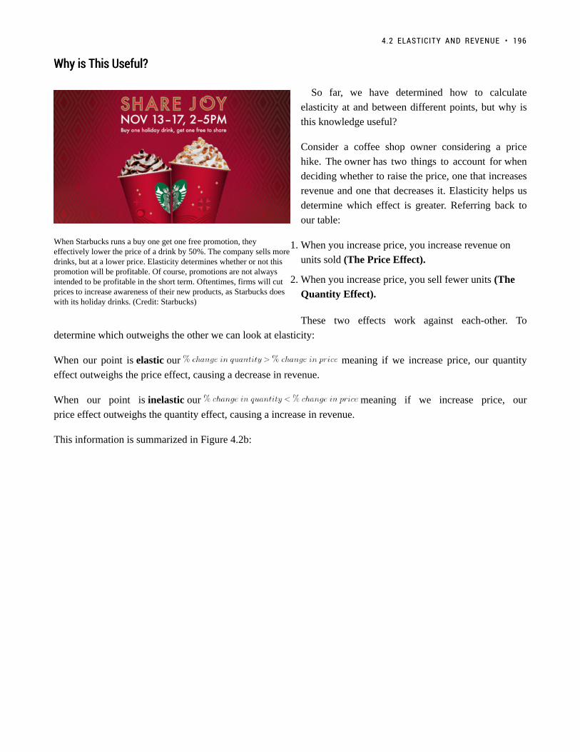
When Starbucks runs a buy one get one free promotion, theyeffectively lower the price of a drink by 50%. The company sells moredrinks, but at a lower price. Elasticity determines whether or not thispromotion will be profitable. Of course, promotions are not alwaysintended to be profitable in the short term. Oftentimes, firms will cutprices to increase awareness of their new products, as Starbucks doeswith its holiday drinks. (Credit: Starbucks)
Why is This Useful?Why is This Useful?
So far, we have determined how to calculate
elasticity at and between different points, but why is
this knowledge useful?
Consider a coffee shop owner considering a price
hike. The owner has two things to account for when
deciding whether to raise the price, one that increases
revenue and one that decreases it. Elasticity helps us
determine which effect is greater. Referring back to
our table:
1. When you increase price, you increase revenue on
units sold (The Price Effect).
2. When you increase price, you sell fewer units (The
Quantity Effect).
These two effects work against each-other. To
determine which outweighs the other we can look at elasticity:
When our point is elastic our meaning if we increase price, our quantity
effect outweighs the price effect, causing a decrease in revenue.
When our point is inelastic our meaning if we increase price, our
price effect outweighs the quantity effect, causing a increase in revenue.
This information is summarized in Figure 4.2b:
4.2 ELASTICITY AND REVENUE • 196

Figure 4.2b
The first thing to note is that revenue is maximized at
the point where elasticity is unit elastic. Why? If you
are the coffee shop owner, you will notice that there
are untapped opportunities when demand is elastic or
inelastic.
If elastic: The quantity effect outweighs the price
effect, meaning if we decrease prices, the revenue
gained from the more units sold will outweigh the
revenue lost from the decrease in price.
If inelastic: The price effect outweighs the
quantity effect, meaning if we increase prices, the
revenue gained from the higher price will outweigh
the revenue lost from less units sold.
The effects of price increase and decrease at different
points are summarized in Figure 4.2c.
Figure 4.2c
197 • PRINCIPLES OF MICROECONOMICS

What about ExpenditureWhat about Expenditure
You will notice that expenditure is mentioned whenever revenue is. This is because a dollar earned by the coffee
shop corresponds to a dollar spent by the consumer. Therefore, if the firm’s revenue is rising, then the consumer’s
expenditure is rising as well. You must understand how to answer questions from both sides.
SummarySummary
Elasticity is used to measure the responsiveness of one variable to another. This responsiveness can be labelled as
elastic (e > 1), unit elastic (e = 1), and inelastic (e < 1). We can apply this to the demand curve, with unit elastic
corresponding to the middle of the demand curve (x-intercept/2 , y-intercept/2). Everything to the left is elastic
and everything to the right is inelastic. This information can be used to maximize revenue or expenditure, with the
understanding that when elastic, the quantity effect outweighs the price effect, and when inelastic, the price effect
outweighs the quantity effect.
GlossaryGlossary
Elasticwhen the elasticity is greater than one, indicating that a 1 percent increase in price will result in amore than 1 percent increase in quantity; this indicates a high responsiveness to price.Inelasticwhen the elasticity is less than one, indicating that a 1 percent increase in price paid to the firm willresult in a less than 1 percent increase in quantity; this indicates a low responsiveness to price.Unitary elasticwhen the calculated elasticity is equal to one indicating that a change in the price of the good or serviceresults in a proportional change in the quantity demanded or supplied
Exercises 4.2
Use the demand curve diagram below to answer the following TWO questions.
4.2 ELASTICITY AND REVENUE • 198

1. What is the own-price elasticity of demand as price decreases from $8 per unit to $6 per unit? Use themid-point formula in your calculation.
a) Infinity.b) 7.0c) 2.0.d) 1.75
2. At what point is demand unit-elastic?
a) P = $6, Q = 12.b) P = $4, Q = 8.c) P = $2, Q = 12.d) None of the above.
3. Which of the following statements about the relationship between the price elasticity of demand andrevenue is TRUE?
a) If demand is price inelastic, then increasing price will decrease revenue.b) If demand is price elastic, then decreasing price will increase revenue.c) If demand is perfectly inelastic, then revenue is the same at any price.d) Elasticity is constant along a linear demand curve and so too is revenue.
4. Suppose BC Ferries is considering an increase in ferry fares. If doing so results in an increase in revenuesraised, which of the following could be the value of the own-price elasticity of demand for ferry rides?
a) 0.5.b) 1.0.c) 1.5.d) All of the above.
5. Use the demand diagram below to answer this question. Note that P × Q equals $900 at every point onthis demand curve.
199 • PRINCIPLES OF MICROECONOMICS

Which of the following statements correctly describes own-price elasticity of demand, for this particulardemand curve?
I. Demand is unit elastic at a price of $30, and elastic at all prices greater than $30.II. Demand is unit elastic at a price of $30, and inelastic at all prices less than $30.III. Demand is unit elastic for all prices.
a) I and II only.b) I only.c) I, II and III.d) III only.
6. Suppose that, if the price of a good falls from $10 to $8, total expenditure on the good decreases. Whichof the following could be the (absolute) value for the own-price elasticity of demand, in the price rangeconsidered?
a) 1.6.b) 2.3.c) Both a) and b).d) Neither a) or b).
7. Consider the demand curve drawn below.
4.2 ELASTICITY AND REVENUE • 200
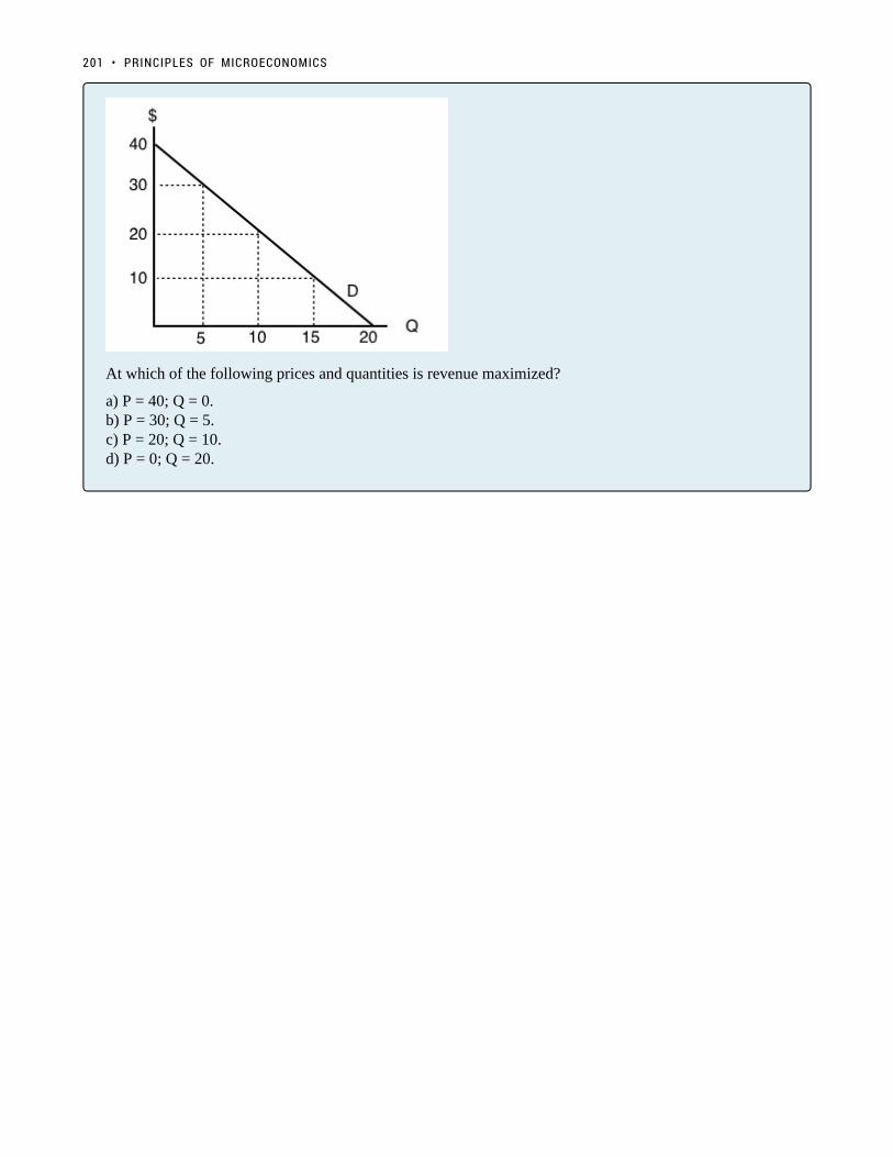
At which of the following prices and quantities is revenue maximized?
a) P = 40; Q = 0.b) P = 30; Q = 5.c) P = 20; Q = 10.d) P = 0; Q = 20.
201 • PRINCIPLES OF MICROECONOMICS

4.3 Relative Elasticity
Learning Objectives
By the end of this section, you will be able to:
• Differentiate between perfectly elastic and inelastic
• Understand the difference between elasticity on a single curve and relative elasticity
• Explain what variables influence elasticity of supply and demand
202

(Credit: University of Victoria Students’ Society)
Textbook or Burger?Textbook or Burger?
In Topics 4.1 and 4.2, we looked at elasticity on a single demand curve and examined how responsiveconsumer are to price changes at various levels of production. But what about responsiveness across firms?Across industries? We know that in certain industries, such as the textbook industry, consumers are lessresponsive to change than others. How is the quantity demanded for textbooks affected by an increase inprice? If the textbook for a course rose from $100 to $150, what would you do? Most students will buy thebook anyway, since it is a required course material. Publishers are increasingly using different strategiesto ensure the market stays inelastic or unresponsive to price change, such as bundling the textbook withmandatory course access codes. Compare this situation with the price of a burger. If the price of a burgerrises from $8 to $12, you may purchase lunch from a different restaurant or start packing lunch fromhome. The market for textbooks and burgers are very different. In this section, we will explore the relativeelasticity of different markets.
Perfectly Elastic and Perfectly InelasticPerfectly Elastic and Perfectly Inelastic
To begin the conversation about relative elasticity, it helps to first look at the extremes.
Perfectly ElasticPerfectly Elastic
Imagine a product where if the price increased, even slightly, you wouldn’t buy any it anymore. Sound familiar?
203 • PRINCIPLES OF MICROECONOMICS
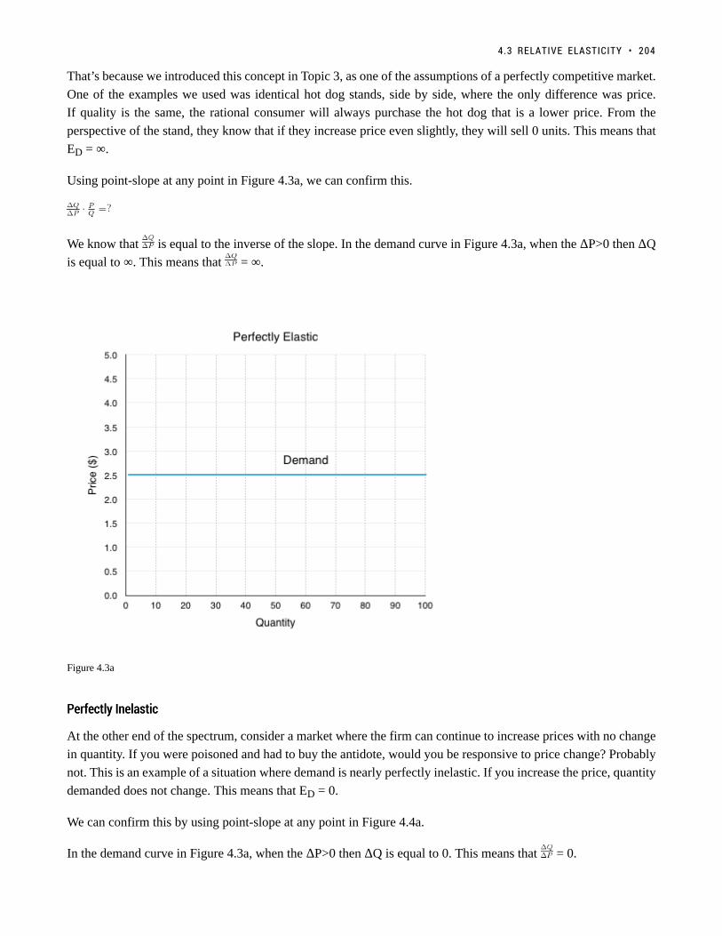
That’s because we introduced this concept in Topic 3, as one of the assumptions of a perfectly competitive market.
One of the examples we used was identical hot dog stands, side by side, where the only difference was price.
If quality is the same, the rational consumer will always purchase the hot dog that is a lower price. From the
perspective of the stand, they know that if they increase price even slightly, they will sell 0 units. This means that
ED = ∞.
Using point-slope at any point in Figure 4.3a, we can confirm this.
We know that is equal to the inverse of the slope. In the demand curve in Figure 4.3a, when the ΔP>0 then ΔQ
is equal to ∞. This means that = ∞.
Figure 4.3a
PerfectlyPerfectly InelasticInelastic
At the other end of the spectrum, consider a market where the firm can continue to increase prices with no change
in quantity. If you were poisoned and had to buy the antidote, would you be responsive to price change? Probably
not. This is an example of a situation where demand is nearly perfectly inelastic. If you increase the price, quantity
demanded does not change. This means that ED = 0.
We can confirm this by using point-slope at any point in Figure 4.4a.
In the demand curve in Figure 4.3a, when the ΔP>0 then ΔQ is equal to 0. This means that = 0.
4.3 RELATIVE ELASTICITY • 204

Figure 4.3b
Relative ElasticityRelative Elasticity
The concepts of perfectly elastic and perfectly inelastic lead us into a discussion of relative elasticity. In 4.1 and
4.2, we examined a single demand curve, and looked at the numerical value of elasticity along that demand curve.
However, elasticity can also be useful when comparing demand curves. Even though each demand curve has an
inelastic, elastic, and unit elastic section, the comparison of the curves can show which markets are relatively
more responsive to price changes. This is an important concept to understand for when we look at the impacts of
a policy change.
205 • PRINCIPLES OF MICROECONOMICS

Figure 4.3c
Figure 4.3c illustrates two curves. One is relatively more inelastic and the other is relatively more elastic. The
best way to determine which is more elastic or inelastic is to compare each curve to the extremes. The curve
more resemblant of perfect elasticity is relatively more elastic, the curve more resemblant or perfect inelasticity
is relatively more inelastic. Note this is different than saying one is elastic and the other inelastic! To emphasize
this point, read the section “Bears and Elasticity.”
4.3 RELATIVE ELASTICITY • 206

Bears and ElasticityBears and Elasticity
(Credit: Wapster/ Flickr/ CC BY 2.0)
A bear jumps out of a bush and starts chasing two hikers. They both start running for their lives, but thenone of them stops to put on his running shoes.
His friend says, “What are you doing? You can’t outrun a bear!”
His friend replies, “I don’t have to outrun the bear; I only have to outrun you!”
If both friends are trying to get away from the bear and you learn that one of them is fast, does thisinformation tell you who gets eaten? No! It only matters which one is faster, or fast relative to the other.Relative elasticity is the same. In fact, we cannot pass judgement if one is elastic or inelastic unless we arereferencing to another.
The concept of relative elasticity is not based on the calculations in 4.1 and 4.2, as each demand curve has an
inelastic, elastic and unit elastic region. Demand curves take the shape of anything between perfectly elastic and
perfectly inelastic, and you can only judge relative elasticity in reference to other curves.
What About SupplyWhat About Supply
The same concepts and principles can be applied to supply. There is fairly significant variation across different
industries, with some relatively more elastic than others.
207 • PRINCIPLES OF MICROECONOMICS
Factors That InfluenceFactors That Influence Relative ElasticityRelative Elasticity
So what causes this difference in relative elasticity? For the most part, external factors which influence
responsiveness.
DemandDemand
1. Availability of substitutes
The availability of substitutes is a strong factor in determining the elasticity of a good. If there are many close
substitutes, then it is fairly easy for consumers to find a suitable alternative to a good if prices rise.
1. Necessity of a good
In addition, the extent to which a good is a necessity or a luxury greatly influences its elasticity. Essentials, such
as soap, flour, sugar, etc. are generally purchased in the same quantity regardless of price. On the other hand,
consumers are very price conscious when it comes to luxury goods (such as comforts, jewelry, etc.).
1. Income
The necessity of a good depends quite heavily on the customer’s income. Someone with low income might be
more price conscious (elastic) when purchasing a new sofa compared to someone with higher income. Generally
the larger percentage of your income a good takes up, the more sensitive you will be to price changes.
SupplySupply
What causes supply to be more or less elastic?
1. Availability of resources
If a company’s production is dependent on scarce resources, the company is less responsive to changes in price.
Even if prices are high and the firm wants to increase production, it wont be able to without the proper inputs.
1. Technological innovation
Innovation tends to lead to more efficient production. If a firm benefits from top notch production technology, it
will be more able to respond to an increase in price with an increase in production.
1. Barriers to entry
If there are few barriers to entry in an industry, an increase in price can cause a large increase in production as
new firms quickly enter the market.
4.3 RELATIVE ELASTICITY • 208

Time: The Ever-Constraining FactorTime: The Ever-Constraining Factor
Both the elasticity of supply and demand are impacted by time. For the consumer, how much time they have to
make a consumption decision. For the producer, how much time it has to produce the good and build inventory.
Regardless of whether we are talking about supply or demand, an increase in time always increases the elasticity
of a good by increasing the ability to act and make informed decisions.
SummarySummary
Whereas hard labels such as elastic, unit elastic, and inelastic can be used to describe specific sections of supply
and demand curves (based on a calculated value), when comparing two curves everything is relative. Using the
knowledge of perfect elasticity and perfect inelasticity, we can compare two curves on the basis of elasticity
to determine how responsive the general consumer group, industry, etc. is to price changes. A flatter curve is
relatively more elastic than a steeper curve. Availability of substitutes, a goods necessity, and a consumers income
all affect the relative elasticity of demand. The availability of resources, technological innovation, and the barriers
to entry all affect the relative elasticity of supply. Time affects elasticity of either curve.
Now that we have the tools of supply, demand and elasticity, we will use them to understand how government
policy affects the market.
GlossaryGlossary
Perfectly Elasticthe extremely elastic situation of demand or supply where quantity changes by an infinite amount inresponse to any change in price; horizontal in appearancePerfectly Inelasticthe highly inelastic case of demand or supply in which a percentage change in price, no matter howlarge, results in zero change in the quantity; vertical in appearance
Exercises 4.3
1. Which of the following does NOT affect the magnitude of own-price elasticity of demand?
a) The length of the time horizon over which we are looking at the change in consumer behaviour.b) The availability (or lack thereof) of close substitutes for the good in question.c) The amount by which quantity supplied will change as price changes.d) All of the above affect the own-price elasticity of demand.
2. If a demand curve is VERTICAL, then own-price elasticity of demand for this good is equal to:
a) Infinity.b) Zero.
209 • PRINCIPLES OF MICROECONOMICS

c) One.d) None of the above.
3. If – given consumer preferences – a certain good has many close substitutes available, then:
a) The demand for that good will be relatively inelastic, compared to goods for which there are few closesubstitutes.b) The supply of that good will be relatively inelastic, compared to goods for which there are few closesubstitutes.c) The demand for that good will be relatively elastic, compared to goods for which there are few closesubstitutes.d) The supply of that good will be relatively elastic, compared to goods for which there are few closesubstitutes.
4. If – given consumer preferences – a certain good has few close substitutes available, then:
a) The demand for that good will be relatively inelastic, compared to goods for which there are many closesubstitutes.b) The supply of that good will be relatively inelastic, compared to goods for which there are many closesubstitutes.c) The demand for that good will be relatively elastic, compared to goods for which there are many closesubstitutes.d) The supply of that good will be relatively elastic, compared to goods for which there are many closesubstitutes.
4.3 RELATIVE ELASTICITY • 210

Topic 4 Part 2: Applications of Supply andDemand
211
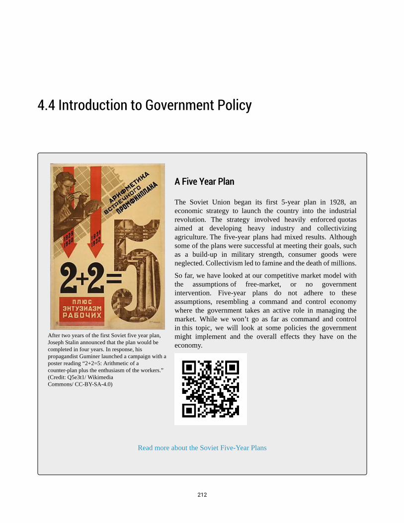
After two years of the first Soviet five year plan,Joseph Stalin announced that the plan would becompleted in four years. In response, hispropagandist Guminer launched a campaign with aposter reading “2+2=5: Arithmetic of acounter-plan plus the enthusiasm of the workers.”(Credit: Q5e3t1/ WikimediaCommons/ CC-BY-SA-4.0)
4.4 Introduction to Government Policy
A Five Year PlanA Five Year Plan
The Soviet Union began its first 5-year plan in 1928, aneconomic strategy to launch the country into the industrialrevolution. The strategy involved heavily enforced quotasaimed at developing heavy industry and collectivizingagriculture. The five-year plans had mixed results. Althoughsome of the plans were successful at meeting their goals, suchas a build-up in military strength, consumer goods wereneglected. Collectivism led to famine and the death of millions.
So far, we have looked at our competitive market model withthe assumptions of free-market, or no governmentintervention. Five-year plans do not adhere to theseassumptions, resembling a command and control economywhere the government takes an active role in managing themarket. While we won’t go as far as command and controlin this topic, we will look at some policies the governmentmight implement and the overall effects they have on theeconomy.
Read more about the Soviet Five-Year Plans
212

WhyWhy the Government Intervenesthe Government Intervenes
So far, we have assumed that the only players in the market are the government, consumers, and firms. This
means that market surplus (consumer surplus + producer surplus + government revenue/expenditure) is our sole
measure of efficiency.
We have already learned that competitive markets maximize market surplus. This means that any government
intervention that changes our equilibrium will inevitably decreases market surplus, resulting in deadweight
loss and an inefficient outcome.
If intervention leads to an inefficient outcome, why would the government intervene? Several reasons are outlined
below
1. Government Revenue
The government may decide to implement a policy to generate revenue. When we explore taxes, we will see that
policies that generate revenue in inelastic markets are especially appealing.
2. Politics
Not all policy is good for society. Special interest groups will sometimes get what they ask for, even if their
demands create inefficiencies. Sometimes politicians care more about what will get them votes, than what is good
for society.
3. Equity
The government does not always prioritize efficiency. Policies like price ceilings are often intended to help
consumers in low-income brackets. Equity is a topic that is explored in more depth in upper level economics.
Efficient outcomes can result in a small group accumulating all the wealth. Often this is not viewed as the best
outcome.
4. Externalities
In Topic 5, we will see that not all costs are incorporated in our models. For our gasoline market, why did we
not consider pollution? There are many externalities and external costs that are not accounted for by firms and
consumers. Once these are incorporated into our model, there are clear arguments to be made for government
intervention.
Policy ImplementsPolicy Implements
There are many different policies that governments can use to alter the market. Some are much more complicated
than others, but many fall into four broad classes we will explore in detail:
1.
a. Price Controls
213 • PRINCIPLES OF MICROECONOMICS

b. Quantity Controls
c. Taxes and Subsidies
d. Tariffs
4.4 INTRODUCTION TO GOVERNMENT POLICY • 214

4.6 Quantity Controls
Learning Objectives
By the end of this section, you will be able to:
• Explain the effects of a quantity control
• Understand why quotas cause a deadweight loss
We looked at an example of the government regulating prices, and concluded that the change in quantity is what
causes the deadweight loss. What if the government regulates quantity directly? It should be fairly obvious that
this will cause a deadweight loss, but the distribution of surplus will be different.
215

Figure 4.6a
In Figure 4.7a, we show the market for oil. The equilibrium quantity is 3.5 million barrels of oil. A policy to
reduce quantity is called a quota, a government imposed restriction on the number of goods bought and sold. If
the government sets a quota of 2 million barrels, both consumers and producers have to reduce consumption and
production to that level. The main difference in this policy is that price does not change. The quota only sets a
restriction on quantity, so the price remains at the equilibrium level of $2.9/gallon.
4.6 QUANTITY CONTROLS • 216

Figure 4.6b
Market SurplusMarket Surplus
BeforeBefore
The market surplus before has not been depicted, as the process should be routine. Ensure you understand how to
find the following values:
Consumer Surplus = $3.675 million
Producer Surplus = $5.075 million
Market Surplus = $8.75 million
AfterAfter
The market surplus after the policy, as shown in Figure ____.
Consumer Surplus (Blue Area) = $3.0 million
217 • PRINCIPLES OF MICROECONOMICS

Producer Surplus (Red Area)= $4.1 million
Market Surplus = $7.1 million
Comparing market surplus before and market surplus after, we should note an important difference – both
consumer and producer surplus have decreased because the quota caused a reduction in quantity. Since price has
not changed, there is no transfer in surplus from one party to another.
Notice that the producer bears the greater burden of the quota. This is due to relative elasticity. We will discuss
how relative elasticity affects the distribution of deadweight loss in Topic 4.9.
SummarySummary
A quota is the simplest of the government policies we will look at. It is a straightforward way for the government
to restrict production. We will see later that while this policy decreases market surplus, it can be useful for other
reasons.
What about a upper limit quota?
GlossaryGlossary
QuotaA government imposed restriction on the number of goods bought and sold
Exercises 4.6
1. Which of the following CANNOT reduce the equilibrium quantity sold in a market?
a) A price ceiling.b) A price floor.c) A quota.d) All of the above can decrease equilibrium quantity sold.
4.6 QUANTITY CONTROLS • 218

4.7 Taxes and Subsidies
Learning Objectives
By the end of this section, you will be able to:
• Distinguish between legal and economic tax incidence
• Know how to represent taxes by shifting the curve and the wedge method
• Understand the quantity and price affect from a tax
• Describe why both taxes and subsidies cause deadweight loss
Taxes are not the most popular policy, but they are often necessary. We will look at two methods to understand
how taxes affect the market: by shifting the curve and using the wedge method. First, we must examine the
difference between legal tax incidence and economic tax incidence.
Legal versus Economic Tax IncidenceLegal versus Economic Tax Incidence
When the government sets a tax, it must decide whether to levy the tax on the producers or the consumers. This
is called legal tax incidence. The most well-known taxes are ones levied on the consumer, such as Government
Sales Tax (GST) and Provincial Sales Tax (PST). The government also sets taxes on producers, such as the gas
tax, which cuts into their profits. The legal incidence of the tax is actually irrelevant when determining who
is impacted by the tax. When the government levies a gas tax, the producers will pass some of these costs on
as an increased price. Likewise, a tax on consumers will ultimately decrease quantity demanded and reduce
producer surplus. This is because the economic tax incidence, or who actually pays in the new equilibrium for
the incidence of the tax, is based on how the market responds to the price change – not on legal incidence.
Tax – Shifting the CurveTax – Shifting the Curve
In Topic 3, we determined that the supply curve was derived from a firm’s Marginal Cost and that shifts in the
supply curve were caused by any changes in the market that caused an increase in MC at every quantity level.
219

This is no different for a tax. From the producer’s perspective, any tax levied on them is just an increase in the
marginal costs per unit. To illustrate the effect of a tax, let’s look at the oil market again.
If the government levies a $3 gas tax on producers (a legal tax incidence on producers), the supply curve will
shift up by $3. As shown in Figure 4.8a below, a new equilibrium is created at P=$5 and Q=2 million barrels.
Note that producers do not receive $5, they now only receive $2, as $3 has to be sent to the government. From
the consumer’s perspective, this $1 increase in price is no different than a price increase for any other reason, and
responds by decreasing the quantity demanded for the higher priced good.
Figure 4.7a
What if the legal incidence of the tax is levied on the consumers? Since the demand curve represents the
consumers’ willingness to pay, the demand curve will shift down as a result of the tax. If consumers are only
willing to pay $4/gallon for 4 million gallons of oil but know they will face a $3/gallon tax at the till, they will
only purchase 4 million gallons if the ticket price is $1. This creates a new equilibrium where consumers pay a $2
ticket price, knowing they will have to pay a $3 tax for a total of $5. The producers will receive the $2 paid before
taxes.
4.7 TAXES AND SUBSIDIES • 220

Figure 4.7b
Note that whether the tax is levied on the consumer or producer, the final result is the same, proving the legal
incidence of the tax is irrelevant.
Tax –Tax – The Wedge MethodThe Wedge Method
Another method to view taxes is through the wedge method. This method recognizes that who pays the tax is
ultimately irrelevant. Instead, the wedge method illustrates that a tax drives a wedge between the price consumers
pay and the revenue producers receive, equal to the size of the tax levied.
As illustrated below, to find the new equilibrium, one simply needs to find a $3 wedge between the curves. The
first wedge tested is only $0.7, followed by $1.5, until the $3.0 tax is found.
221 • PRINCIPLES OF MICROECONOMICS

Figure 4.7c
Market SurplusMarket Surplus
Like with price and quantity controls, one must compare the market surplus before and after a price change to
fully understand the effects of a tax policy on surplus.
4.7 TAXES AND SUBSIDIES • 222
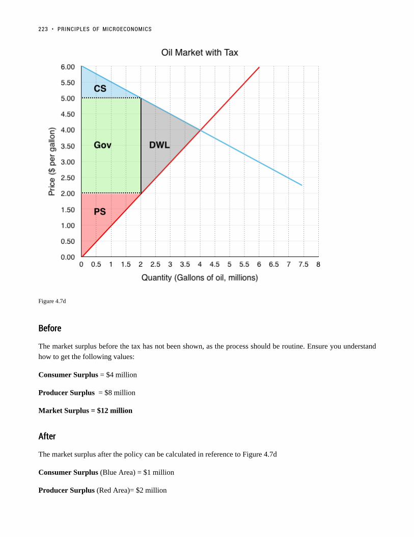
Figure 4.7d
BeforeBefore
The market surplus before the tax has not been shown, as the process should be routine. Ensure you understand
how to get the following values:
Consumer Surplus = $4 million
Producer Surplus = $8 million
Market Surplus = $12 million
AfterAfter
The market surplus after the policy can be calculated in reference to Figure 4.7d
Consumer Surplus (Blue Area) = $1 million
Producer Surplus (Red Area)= $2 million
223 • PRINCIPLES OF MICROECONOMICS

Government Revenue (Green Area) = $6 million
Market Surplus = $9 million
Why is Government Included in Market SurplusWhy is Government Included in Market Surplus
In our previous examples dealing with market surplus, we did not include any discussion of governmentrevenue, since the government was not engaging in our market. Remember that market surplus is ourmetric for efficiency. If government was not included in this metric, it would not be very useful. In this casea million-dollar loss to government would be considered efficient if it resulted in a $1 gain to a consumer.To ensure that our metric for efficiency is still useful we must consider government when calculatingmarket surplus.
As with the quota – both consumer and producer surplus decreased because of a reduced quantity. The difference
is, since the price is changing, there is redistribution. This time, the redistribution is from consumers and
producers to the government. Remember, only a change in quantity causes a deadweight loss. Price changes
simply shift surplus around between consumers, producers, and the government.
Transfer and Deadweight LossTransfer and Deadweight Loss
Let’s look closely at the tax’s impact on quantity and price to see how these components affect the market.
4.7 TAXES AND SUBSIDIES • 224

Figure 4.7e
Transfer – The Impact of PriceTransfer – The Impact of Price
Due to the tax’s effect on price, areas A and C are transferred from consumer and producer surplus to government
revenue.
Consumers to Government – Area A
Consumers originally paid $4/gallon for gas. Now, they are paying $5/gallon. The $1 increase in price is the
portion of the tax that consumers have to bear. Despite the fact that the tax is levied on producers, the consumers
have to bear a share of the price change. The size of this share depends on relative elasticity – a concept we will
explore in the next section. This is because a decrease in price to producers means quantity supplied is falling,
and in order to maintain equilibrium, quantity demanded must fall by an equal amount. This price change means
225 • PRINCIPLES OF MICROECONOMICS

the government collects $1 x 2 million gallons or $2 million in tax revenue from the consumers. This is a straight
transfer from consumers to government and has no effect on market surplus.
Producers to Government – Area CProducers to Government – Area C
Originally, producers received revenue of $4/gallon for gas. Now, they receive $2/gallon. This $2 decrease is the
portion of the tax that producers have to bear. This means that the government collects $2 x 2 million gallons or
$4 million in tax revenue from the producers. This is a transfer from producers to the government.
As calculated, the government receives a total of $6 million in tax revenue, which is taken from consumers and
producers. This has no impact on net market surplus.
Deadweight Loss – The Impact of Quantity
If we just considered a transfer of surplus, there would be no deadweight loss. In this case, though, we know
that price changes come with a change in quantity. A higher price for consumers will cause a decrease in the
quantity demanded, and a lower price for producers will cause a decrease in quantity supplied. This reduction
from equilibrium quantity is what causes a deadweight loss in the market since there are consumers and producers
who are no longer able to buy and supply the good.
ConsumerConsumer Surplus Decrease – Area BSurplus Decrease – Area B
Due to the increase in price, many consumers will switch away from oil to alternative options. This decrease in
quantity demand of 1.5 million gallons of oil causes a deadweight loss of $1 million.
Producer Surplus Decrease – Area D
Producers, who now receive only $2.00/gallon for their production, will also decrease quantity supplied by 1.5
million gallons of oil. It is no coincidence that the size of the decrease is the same. When you create the wedge
between consumers and producers, you are finding the quantity where the full amount of the tax is incurred but the
market is still at equilibrium. Remember that quantity demanded must equal quantity supplied or the market will
not be stable. This mirrored decrease in quantity ensures this is still the case. Notice, however, that the impact of
this quantity drop causes a larger decrease in producer surplus than consumer surplus totalling $2 million. Again,
this is due to elasticity, or the relative responsiveness to the price chance, which will be explored in more detail
shortly.
Together, these decreases cause a $3 million deadweight loss (the difference between the market surplus before
and market surplus after).
SubsidySubsidy
While a tax drives a wedge that increases the price consumers have to pay and decreases the price producers
receive, a subsidy does the opposite. A subsidy is a benefit given by the government to groups or individuals,
usually in the form of a cash payment or a tax reduction. A subsidy is often given to remove some type of burden,
and it is often considered to be in the overall interest of the public. In economic terms, a subsidy drives a wedge,
4.7 TAXES AND SUBSIDIES • 226
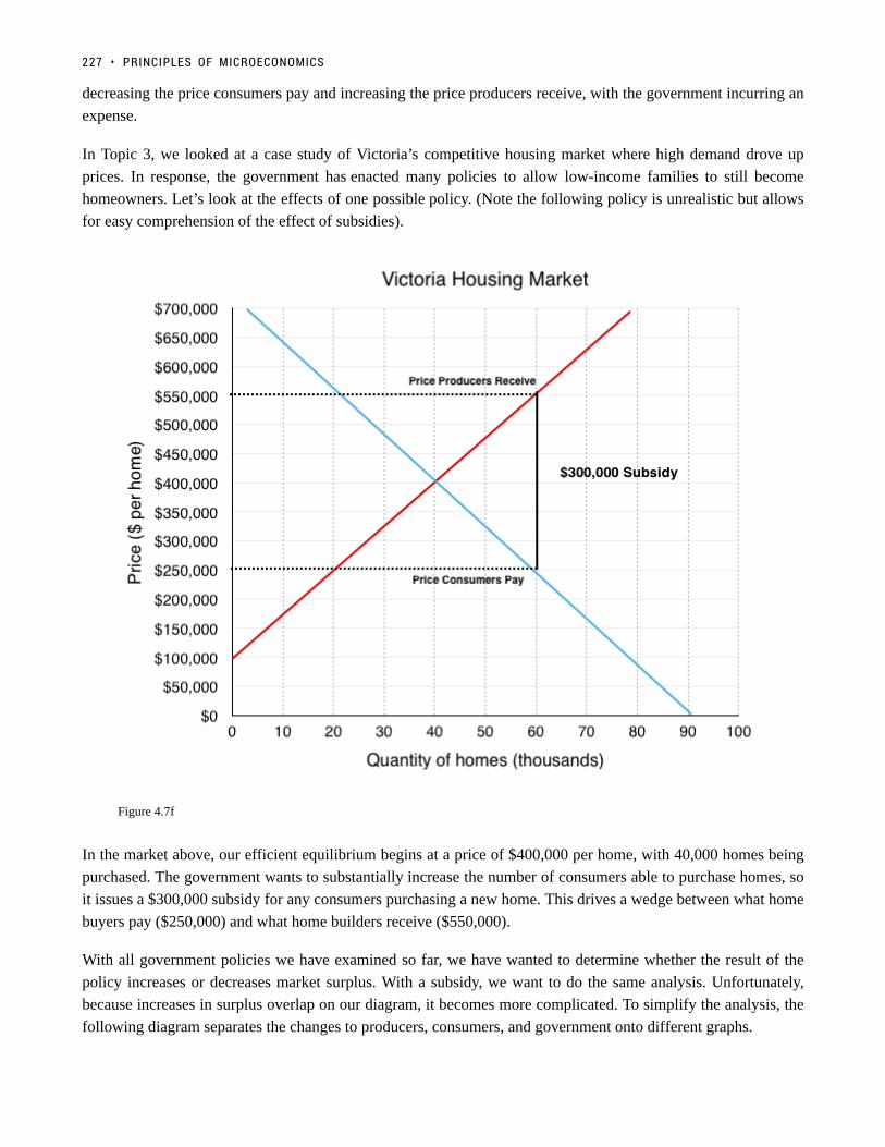
decreasing the price consumers pay and increasing the price producers receive, with the government incurring an
expense.
In Topic 3, we looked at a case study of Victoria’s competitive housing market where high demand drove up
prices. In response, the government has enacted many policies to allow low-income families to still become
homeowners. Let’s look at the effects of one possible policy. (Note the following policy is unrealistic but allows
for easy comprehension of the effect of subsidies).
Figure 4.7f
In the market above, our efficient equilibrium begins at a price of $400,000 per home, with 40,000 homes being
purchased. The government wants to substantially increase the number of consumers able to purchase homes, so
it issues a $300,000 subsidy for any consumers purchasing a new home. This drives a wedge between what home
buyers pay ($250,000) and what home builders receive ($550,000).
With all government policies we have examined so far, we have wanted to determine whether the result of the
policy increases or decreases market surplus. With a subsidy, we want to do the same analysis. Unfortunately,
because increases in surplus overlap on our diagram, it becomes more complicated. To simplify the analysis, the
following diagram separates the changes to producers, consumers, and government onto different graphs.
227 • PRINCIPLES OF MICROECONOMICS

Figure 4.7g
ProducersProducers
The producers now receive $550,000 instead of $400,000, increasing quantity supplied to 60,000 homes.
This increases producer surplus by areas A and B.
ConsumersConsumers
The consumers now pay $250,000 instead of $400,000, increasing quantity demanded to 60,000 homes.
This increases consumer surplus by areas C and D.
GovernmentGovernment
The government now has to pay $300,000 per home to subsidize the 60,000 consumers buying new homes (this
4.7 TAXES AND SUBSIDIES • 228

policy would cost the government $18 billion!!) Graphically, this is equal to a decrease in government to areas A,
B, C, D and E.
ResultResult
Our total gains from the policy (to producers and consumers) are areas A, B, C and D, whereas total losses (the
cost to the government) are areas A, B, C, D, and E. To summarize:
Areas A, B, C and D are transferred from the government to consumers and producers.
Area E is a deadweight loss from the policy.
There are two things to notice about this example. First, the policy was successful at increasing quantity from
40,000 homes to 60,000 homes. Second, it resulted in a deadweight loss because equilibrium quantity was too
high. Remember, anytime quantity is changed from the equilibrium quantity, in the absence of externalities,
there is a deadweight loss. This is true for when quantity is decreased and when it is increased.
http://www.investopedia.com/terms/s/subsidy.asp
SummarySummary
Taxes and subsidies are more complicated than a price or quantity control as they involve a third economic player:
the government. As we saw, who the tax or subsidy is levied on is irrelevant when looking at how the market ends
up. Note that the last three sections have painted a fairly grim picture about policy instruments. This is because our
model currently does not include the external costs economic players impose to the macro-environment (pollution,
disease, etc.) or attribute any meaning to equity. These concepts will be explored in more detail in later topics.
In our examples above, we see that the legal incidence of the tax does not matter, but what does? To determine
which party bears more of the burden, we must apply the concept of relative elasticity to our analysis.
GlossaryGlossary
Economic Tax Incidencethe distribution of tax based on who bears the burden in the new equilibrium, based on elasticityLegal Tax Incidencethe legal distribution of who pays the taxSubsidya benefit given by the government to groups or individuals, usually in the form of a cash payment or a taxreduction It is often to remove some type of burden, and it is often considered to be in the overall interestof the public
229 • PRINCIPLES OF MICROECONOMICS

Exercises 4.7
Refer to the supply and demand curves illustrated below for the following THREE questions. Consider theintroduction of a $20 per unit tax in this market.
1. Which areas represent the loss to consumer AND producer surplus as a result of this tax?
a) k + f.b) j + g.c) k + j.d) k + f + j + g.
2. Which areas represent the gain in government revenue as a result of this tax?
a) k + f.b) j + g.c) k + j.d) k + f + j + g.
3. Which areas represent the deadweight loss associated with this tax?
a) f + g.b) k – g.c) j – f.d) k + f + j + g.
4. Assume that the marginal cost of producing socks is constant for all sock producers, and is equal to $5per pair. If government introduces a constant per-unit tax on socks, then which of the following statementsis FALSE, given the after-tax equilibrium in the sock market? (Assume a downward-sloping demand curvefor socks.)
a) Consumers are worse off as a result of the tax.b) Spending on socks may either increase or decrease as a result of the tax.c) Producers are worse off as a result of the tax.d) This tax will result in a deadweight loss.
4.7 TAXES AND SUBSIDIES • 230

5. Refer to the supply and demand diagram below.
If an subsidy of $3 per unit is introduced in this market, the price that consumers pay will equal ____ andthe price that producers receive net of the subsidy will equal _____.
a) $2; $5.b) $3; $6.c) $4; $7.d) $5; $8.
6. If a subsidy is introduced in a market, then which of the following statement is TRUE? Assume noexternalities
a) Consumer and producer surplus increase but social surplus decreases.b) Consumer and producer surplus decrease but social surplus increases.c) Consumer surplus, producer surplus, and social surplus all increase.d) Consumer surplus, producer surplus, and social surplus all decrease
Use the diagram below to answer the following TWO questions.
7. If a $6 per unit tax is introduced in this market, then the price that consumers pay will equal ____ andthe price that producers receive net of the tax will equal _____.
231 • PRINCIPLES OF MICROECONOMICS

a) $10; $4.b) $9; $3.c) $8; $2.d) $7; $1.
8. If a $6 per unit tax is introduced in this market, then the new equilibrium quantity will be:
a) 20 units.b) 40 units.c) 60 units.d) None of the above.
9. Which of the following statements about the deadweight loss of taxation is TRUE? (Assume noexternalities.)
a) If there is a deadweight loss, then the revenue raised by the tax is greater than the losses to consumerand producers.b) If there is no deadweight loss, then revenue raised by the government is exactly equal to the losses toconsumers and producers.c) Both a) and b).d) Neither a) nor b).
10. Which of the following correctly describes the equilibrium effects of a per-unit tax, in a market withNO externalities?
a) Consumer and producer surplus increase but social surplus decreases.b) Consumer and producer surplus decrease but social surplus increases.c) Consumer surplus, producer surplus, and social surplus all increase.d) Consumer surplus, producer surplus, and social surplus all decrease.
11. Which of the following correctly describes the equilibrium effects of a per unit subsidy?
a) Consumer price rises, producer price falls, and quantity increases.b) Consumer price falls, producer price falls, and quantity increases.c) Consumer price rises, producer price rises, and quantity increases.d) Consumer price falls, producer price rises, and quantity increases.
12. Refer to the supply and demand diagram below.
4.7 TAXES AND SUBSIDIES • 232

If an output (excise) tax of $5 per unit is introduced in this market, the price that consumers pay will equal____ and the price that producers receive net of the tax will equal _____.
a) $5; $10.b) $6; $11.c) $7; $12.d) $8; $3.
13. Consider the supply and demand diagram below.
If a $2 per unit subsidy is introduced, what will be the equilibrium quantity?
a) 40 units.b) 45 units.c) 50 units.d) 55 units.
Consider the supply and demand diagram below. Assume that: (i) there are no externalities; and (ii) in theabsence of government regulation the market supply curve is the one labeled S1.
233 • PRINCIPLES OF MICROECONOMICS

14. If a $5 per unit tax is introduced in this market, which area represents the deadweight loss?
a) a.b) a + b.c) b + c.d) a + b + c.
4.7 TAXES AND SUBSIDIES • 234

4.8 Elasticity and Policy
MAXWELL NICHOLSON
Learning Objectives
By the end of this section, you will be able to:
• Describe how elasticity impacts deadweight loss
• Predict who will bear a greater burden from a policy based on relative elasticity
• Understand the difference between elasticity and relative elasticity
235

(Credit: David Masters/ Flickr/ CC BY 2.0)
Buttery ElasticityButtery Elasticity
For many years the U.S dairy market was inelastic, but times have changed, and dairy demand is notas inelastic as it once was, says Sara Dorland, managing partner with Seattle-based Ceres Dairy RiskManagement. Higher prices can have a direct effect on the consumption of dairy products.
“Historically a good amount of our product went to the U.S. government, which kept prices stable,especially for skim products,” says Dorland, who holds an MBA in business and finance. “Therefore, onceevery few years, butter or cheese would have a run-up and fall back down. As a result, milk and dairyproduct prices played within a rather tight range, a factor that contributed to our belief that demand wasrather inelastic. Today, that is not the case as the government is no longer one of our best customers.”
This means that the quantity demanded in the dairy market is becoming more responsive to changes inprice in the U.S. Compare this to the Canadian market and you will see a very different story. Due toa supply management system that is operated by farmer-run provincial marketing boards, the Canadiandairy market remains very inelastic as high tariffs and quota requirements restrict market entry. This limitsthe number of producers in the market and reduces consumer choice, causing a very inelastic demand curvelike we saw with the textbook industry.
Relative elasticity is important when looking at how markets respond to a price change. Two of the policieswe looked at, taxes and price controls, caused deadweight loss and redistribution among market players.
4.8 ELASTICITY AND POLICY • 236

As we will illustrate in this chapter, the relative elasticity of a market will determine which party bears agreater burden of tax policy.
Read the rest of the story here.
https://www.vice.com/en_ca/article/blame-canadas-dairy-cartel-for-our-expensive-milk-and-cheese-867
http://www.theglobeandmail.com/news/politics/canadas-dairy-industry-is-a-rich-closed-club/article25124114/
http://www.agweb.com/article/why-dairy-demand-has-become-more-elastic-naa-catherine-merlo/
In Topic 4.3, we discussed some of the many factors that cause supply and demand to be relatively more or less
elastic. Now, we will explore the impact that this has on relative policy burden and deadweight loss.
Elasticity and Deadweight LossElasticity and Deadweight Loss
Let’s continue to look at the dairy market. How would a $2.25 per unit tax on the American and Canadian
dairy market impact different market players? In our analysis, let’s make the assumption that the Canadian and
American markets both start with an equilibrium price of $4/jug and equilibrium quantity of 8 million. This is
obviously not realistic, but it allows us to analyze the effects of elasticity holding other factors constant. The only
difference in this scenario is the elasticity of the demand curve. Demand in the American market is relatively more
elastic than the Canadian market. The tax has been shown on both diagrams and the deadweight loss depicted
237 • PRINCIPLES OF MICROECONOMICS

Figure 4.8a
At first glance, it is difficult to determine which deadweight loss is greater. Since deadweight loss is the result of
a quantity change, we can ignore the redistributive effects of the tax and look exclusively at the lost surplus to
consumers and producers who are no longer buying/selling the good.
Deadweight loss to American – Relatively more ElasticDeadweight loss to American – Relatively more Elastic
The $2.25 tax causes a wedge between what consumers pay (now $4.25) and what producers receive (now $2.00).
This wedge causes a decrease in equilibrium quantity from 8 million milk jugs to just 4 million. Calculations for
deadweight loss are shown below:
= = $4.5 million
Deadweight loss to CanadianDeadweight loss to Canadian – Relatively more Inelastic– Relatively more Inelastic
For Canadians, the $2.25 tax causes a different wedge between what consumers pay and what producers receive.
Consumers now pay $4.75 and producers receive $2.50 This wedge causes a different decrease in equilibrium
quantity from 8 million milk jugs to 5 million. Notice that this decrease in quantity is less than the American
market. Calculations for deadweight loss are shown below:
= = $3.375 million
It should be no surprise that, as else constant, the deadweight loss is greater for the market that experiences the
larger decrease in equilibrium quantity. Notice that although the triangles are different shapes, the base of each
triangle is the same, and equal to the $2.25 tax. The only difference is the height, which is equal to the decrease in
quantity from equilibrium. This leads us to our first principle of relative elasticity:
4.8 ELASTICITY AND POLICY • 238

For a more elastic market a price change causes a greater decrease in quantity therefore a policy in amore elastic market will cause a greater deadweight loss.
Policy Burdens and ElasticityPolicy Burdens and Elasticity
We have determined that the more elastic a market is, all else equal, the market will have a greater deadweight
loss. How does relative elasticity affect the share of the burden producers and consumers bear?
Figure 4.8b
Visually, it seems quite clear that in the American market, where demand is more elastic, consumers bear a smaller
burden. Let’s test this mathematically.
American MarketAmerican Market
Deadweight Loss to Consumers:
= $0.5 million
Deadweight Loss to Producers:
= $4 million
Total Deadweight Loss:
$4.5 million
This means that consumers bear 11.11% of the tax burden and producers bear 88.89%.
239 • PRINCIPLES OF MICROECONOMICS

CanadianCanadian MarketMarket
Deadweight Loss to Consumers:
= $1.125 million
Deadweight Loss to Producers:
= $2.25 million
Total Deadweight Loss:
$3.375 million
This means that consumers bear 33.33% of the tax burden and producers bear 66.67%.
As we speculated, consumers bear a smaller burden in the US market, and in both cases a smaller burden than the
producers. This leads us to our second principle of relative elasticity.
As supply (demand) grows relatively more inelastic, producers (consumers) bear a greater burden ofthe tax.
As supply (demand) grows relatively more elastic, producers (consumers) bear a smaller burden ofthe tax.
Recall in Topic 4.7, we examined the difference between legal and economic tax incidence and determined that
who the tax was levied on is irrelevant for who bears the burden. Now, we have the tools to determine who will
bear the greater burden. Just as we can examine a demand curve being more or less elastic, we can examine
the relative elasticity of demand compared to supply. In both instances of this hypothetical this dairy market,
producers bear over 50% of the tax, meaning in box cases, supply is relatively more elastic than demand.
Exercises 4.8
1. Suppose a tax is levied in a market in which demand is downward sloping and supply is perfectly elastic.Which of the following statements is/are TRUE? (Assume no externalities.)
I. Producer surplus decreases.II. The deadweight loss is zero.III. Consumers bear all the burden of the tax.
a) II only.b) I and II only.c) I, II, and III.d) III only.
2. Which of the following statements about tax incidence and relative elasticities is TRUE?
4.8 ELASTICITY AND POLICY • 240

If demand is relatively inelastic and supply is relatively elastic, then consumers bear more of the burden ofa tax.If supply is perfectly inelastic, then producers bear none of the burden of a tax, no matter what the valueof own-price elasticity of demand.If the relative elasticities of demand and supply are the same, the tax burden is shared equally acrossconsumers and producers.
a) II only.b) I and III only.c) I, II, and III.d) III only.
3. The diagram below illustrates the supply curve for a good, and two possible demand curves for thatgood.
If a price floor (set above the initial equilibrium price) is introduced in this market then:
a) The deadweight loss will be smaller, if demand is D1 than if demand is D2.b) The decrease in quantity will be smaller, if demand is D1 than if demand is D2.c) Neither a) nor b) are true.d) Both a) and b) are true.
4. In which of the following cases will the deadweight loss from taxation be zero?
a) If demand is perfectly elastic.b) If demand is unit elastic.c) If demand is perfectly inelastic.d) Either a) or c) will result in zero deadweight loss from taxation.
5. Which of the following statements about the economic incidence of taxation is TRUE?
I. If demand is elastic, producers will bear a greater burden of the tax than consumers.II. If supply is perfectly inelastic, producers will bear all the burden of the tax.III. If the supply curve is perfectly elastic, consumers will bear none of the burden of the tax.
a) II only.b) I and II only.c) II and III only.d) I, II and III.
6. Which of the following correctly describes the equilibrium effects of a per-unit tax, in a market with NOexternalities?
241 • PRINCIPLES OF MICROECONOMICS

a) Consumer and producer surplus increase but social surplus decreases.b) Consumer and producer surplus decrease but social surplus increases.c) Consumer surplus, producer surplus, and social surplus all increase.d) Consumer surplus, producer surplus, and social surplus all decrease
7. Suppose that the price of a good increases. The increase in produce surplus will be:
a) Larger if demand is relatively elastic than if demand is relatively inelastic.b) Smaller if demand is relatively elastic than if demand is relatively inelastic.c) Smaller if supply is relatively elastic than if supply is relatively inelastic.d) Larger if supply is relatively elastic than if supply is relatively inelastic.
Save
4.8 ELASTICITY AND POLICY • 242

4.9 Tariffs
Learning Objectives
By the end of this section, you will be able to:
• Describe how the market changes when it is open to the world market
• Explain the impact of tariffs to domestic consumers, producers, and government
• Understand and show why a tariff causes a deadweight loss
(Credit: jaymethunt/ Pixabay/ CC0 Public Domain)
243

The Wooden Wall to ExportsThe Wooden Wall to Exports
Canadian lumber is one of the most well-known Canadian exports next to maple syrup and bacon. Thismeans relations with Canada’s biggest trading partner, the United States, can substantially help or harmthe industry. An expired deal in 2015, with a one-year grace period, means that renegotiations will impactlumber sales for years to come. The problem – the U.S. may increase its tariff (a common trade policy)from 15% to up to 25%, in response to what they say are unfair subsidies from the Canadian government.
How would this increase affect consumers? How would it affect American and Canadian producers? Wewill explore the incidence of trade policy, specifically tariffs, in this section.
Read more about the Canada-US lumber deals.
In Topic 2, we briefly looked at the Production Possibility Frontier, a trade model that looks at the production
of two goods. As we know, trade is far more complicated than that. With our supply and demand model and the
policy tools we have explored, we can analyze a piece of this complex topic by looking at the impact of trade
policy on each domestic.
Trade policy is often motivated by the desire to protect the domestic industry and workers since imports
are typically cheaper than domestic counterparts. Imports create unwanted competition for the firms and give
domestic jobs to other countries. The preventative policy can take a number of forms, from direct price controls
to quotas or taxes on imported goods. In this section, we will focus on one of the more common forms of trade
policy: tariffs.
TariffsTariffs
A tariff is defined as a tax on imported goods. The easiest way to show how it works is with an example. Below,
we have continued the example from the beginning of this section: the US lumber market. In the domestic market,
the domestic equilibrium price and quantity are $1,000/board feet, and 40 million board feet, respectively. This
is denoted as PD = $1,000 and QD = 40 million. In this case, the world price, or PW is substantially lower than
the domestic price. While this is not always the case, there is no incentive to import if PW is greater than PD (This
model assumes that imports are identical to domestic products in every respect except for price).
With access to imports with prices as low as $400, American consumers will purchase significantly more lumber.
4.9 TARIFFS • 244

Their quantity demanded will increase to 70 million units (40 million more than the domestic equilibrium). These
consumers are significantly better off with the new access to cheap lumber.
Domestic producers, on the other hand, lose a large degree of surplus from the imports. Whereas before they
supplied 40 million board feet of lumber at $1000, now they can only supply 10 million board feet. This is because
many domestic firms are no longer able to compete with the foreign production and will either leave the market
or decrease production.
With domestic production of 10 million and total production of 70 million, 60 million board feet of lumber are
imported from Canada.
Figure 4.9a
With such a significant portion of lumber production being imported, the government may choose to introduce a
protectionist policy to restrict foreign competition, due to severe pressure from domestic producers. One important
clarification about our model at this point is that the only surplus America cares about is domestic. Any producer
surplus to Canadian firms is irrelevant in American decision making.
Suppose the government enacts a $400 tariff on imports to restrict competition. A tariff is a tax imposed on
245 • PRINCIPLES OF MICROECONOMICS

important goods or services. This creates an equilibrium price equal to $800 (world price + the $400 tariff). While
this price is still below the domestic equilibrium, more domestic firms are now able to compete. In the new
equilibrium, total quantity is 50 million board feet, 30 million of which are domestic. This means that imports
have dropped from 60 million to 20 million board feet.
Figure 4.9b
In this situation, domestic producers are better off, as they are now able to sell 20 million more units. Consumers,
on the other hand, are worse off, as they face a higher price. The government is better off with revenue collected
by the tariff. In Figure 4.10c, we have broken down the effects of the tariff on each of the market players.
4.9 TARIFFS • 246
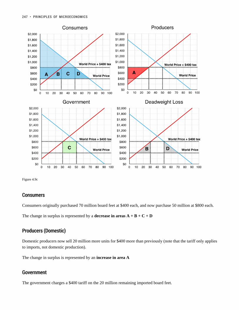
Figure 4.9c
ConsumersConsumers
Consumers originally purchased 70 million board feet at $400 each, and now purchase 50 million at $800 each.
The change in surplus is represented by a decrease in areas A + B + C + D
Producers (Domestic)Producers (Domestic)
Domestic producers now sell 20 million more units for $400 more than previously (note that the tariff only applies
to imports, not domestic production).
The change in surplus is represented by an increase in area A
GovernmentGovernment
The government charges a $400 tariff on the 20 million remaining imported board feet.
247 • PRINCIPLES OF MICROECONOMICS

The change in surplus is represented by an increase in area C
Net ResultNet Result
The government and producers gained areas A and C as a result of the tariff, but consumers lost areas A, B, C,
and D. Overall, the policy created a deadweight loss equal to area B and D.
ConclusionConclusion
In chapter 4, we looked at a number of policies that resulted in gains for some market players, but overall
deadweight loss for society. We explored price and quantity controls, taxes and subsidies, and trade policy. In all
cases except for subsidies, the policies reduced equilibrium quantity to a point where MB > MC. This means that
although the net marginal benefits from an additional unit were greater than the net marginal costs, the policy was
restricting the market from returning to equilibrium
Why would the government implement policies that decrease market surplus? One possible reason we addressed
is politics. In our example of trade policy, the domestic producers of lumber pressured the government to increase
protection against foreign competition. This protectionist stance is quite common. Though trade is beneficial for
society overall, many workers can lose jobs in the short run to foreign competition. In addition, when the people
who stand to gain from a policy are concentrated and vocal, the majority is often ignored.
One of the most common reasons for policy, which we will discuss in detail in Topic 5, is that the market does not
take into account all the costs it imposes on society. This does not mean the model is flawed, we just need to add
another layer: externalities.
GlossaryGlossary
Domestic EquilibriumThe equilibrium acheived by a market if it is not open to tradeTariffa tax imposed on imported goods or servicesWorld Pricethe equilibrium price of the world market
Exercises 4.9
Use the diagram below, illustrates the domestic supply curve (SD) and demand curve for a good, to answerthe following THREE questions. Assume that the world price is equal to $20 per unit, and initially thereare no trade restrictions in place.
4.9 TARIFFS • 248

1. If a tariff of $10 per unit is introduced in the market, then, at the new equilibrium:
a) Consumers will pay a price of $20, quantity sold will be 60 units, of which 40 are imported.b) Consumers will pay a price of $30, quantity sold will be 40 units, of which 30 are produced domestically.c) Consumers will pay a price of $20, quantity sold will be 60 units, of which none are produceddomestically.d) Consumers will pay a price of $30, quantity sold will be 40 units, of which none are imported.
2. If a tariff of $10 per unit is introduced in the market, then the government will raise ____ in tariffrevenue.
a) $400.b) $300.c) $200.d) $100.
3. If a tariff of $10 per unit is introduced in the market, then the deadweight loss will equal:
a) $50.b) $100.c) $150.d) None of the above.
The following two questions refer to the diagram below, which illustrates the domestic supply curve (SD)and demand curve for a good. Assume that the world price is equal to $5 per unit, and that initially thereare no trade restrictions.
249 • PRINCIPLES OF MICROECONOMICS

4. If a tariff of $10 per unit of imports is introduced, which area represents the deadweight loss?
a) a + f.b) c + e.c) a + b + c + e + f + g.d) a + b + d + h + g + f.
5. If a tariff of $10 per unit of imports is introduced, which area represents the tariff revenue raised?
a) d.b) d + h.c) h.d) b + h + g.
Use the diagram below – which illustrates the domestic supply and demand curves for a good – to answerthe following TWO questions. Assume that the world price is equal to $2.
4.9 TARIFFS • 250

6. If there are no trade restrictions in place, what will be the equilibrium quantity of IMPORTS?
a) 40.b) 50.c) 60.d) None of the above.
7. If a tariff of $2 is introduced, then:
a) Imports will decrease and social surplus will increase.b) Imports will decrease and consumer surplus will increasec) Imports will decrease and domestic producer surplus will increase.d) All of the above will occur.
8. The diagram below illustrates the domestic supply curve (SD) and demand curve for a good. Assumethat the world price is equal to $5 per unit.
If imports of this good are banned altogether, which area represents the deadweight loss?
a) a + b.b) e.c) c+d.d) a + b + c + d + e.
9. The diagram below illustrates the domestic supply curve (SD) and demand curve for a good. Assumethat the world price is equal to $10 per unit, and initially there are no trade restrictions.
251 • PRINCIPLES OF MICROECONOMICS

If a tariff of $10 per unit is introduced, by how much to imports decrease?
a) 10 units.b) 20 units.c) 30 units.d) 40 units.
4.9 TARIFFS • 252

Case Study - Automation in Fast Food
Note that the Economics 103 Case Studies are meant to supplement the course material by giving youexperience applying Economic concepts to real world examples. While they are beyond the level you willbe tested on, they are useful for students who want a stronger grasp of the concepts and their applications.
(Credit: Todd Brown/ Pinterest)
Fast food saw an increasing shift to automation in 2016, with Mcdonalds widely adopting “Create your Taste”
electronic kiosks where customers could place their order. Many customers are finding that automation adds
consistency, gives greater opportunities for customization, and reduces human error. Publications including
Forbes, Business Insider, and more report that the fight for higher minimum wages has expedited this shift.
Corporate leaders such as former President and CEO of McDonalds USA argue the success of “The Fight for 15”
in states such as California has resulted in the closure of many small businesses, unable to pay the rising costs of
labour and lacking the resources to switch to machines.
253

Read former McDonald CEO comment on “The Fight for 15.”
Read more about small businesses impacted by rising minimum wage.
In Topic 3 we explored the impact of government intervention in the market, and showed how policies that change
quantity from equilibrium cause deadweight losses. To explore this further, let’s consider the labour market for
fast food and the possible impact of a minimum wage.
1. A supply and demand curve for the fast food labour market is presented below, label the equilibrium
price and quantity.
2. What is consumer and producer surplus? Market surplus?
CASE STUDY - AUTOMATION IN FAST FOOD • 254

3. Assume the government passes policy introducing a $15 minimum wage. Label the new quantity
demanded, and quantity supplied. Is there a shortage or a surplus of labour?
4. What are the two effects of the minimum wage on workers? What is the net change in surplus?
5. What is the deadweight loss from this policy?
Remember that positive economics and efficiency is independent of equity. The argument is not that redistributing
wealth is unnecessary, but that perhaps a minimum wage policy is not the best mechanism to do it. Even
so there is debate about whether minimum wage does cause the inefficiency as suggested above. A series of
rigorous studies by the Institute for Research on Labor and Employment at the University of California, Berkeley,
comparing neighbouring counties in the U.S. located on different sides of a state border with different minimum
wage levels between 1990 and 2006 found no adverse employment effects from higher minimum wages. One key
argument is that an increase in minimum wage boosts spending in the economy, which may create jobs.
255 • PRINCIPLES OF MICROECONOMICS

Read more arguments defending minimum wage policy.
(Credit: INeverCry/ Flickr/ CC-BY-SA-2.0)
How can we represent this in our model? Well in the diagram above, we made assumptions about the elasticity
of the market, where an increase in the price of labour caused a relatively large drop in the quantity of labour
demanded. What if firms were less responsive to such price changes?
6. A new supply and demand curve for the fast food labour market is presented below with a more inelastic
supply curve, label the new equilibrium price and quantity.
CASE STUDY - AUTOMATION IN FAST FOOD • 256

7. Assume the government again passes policy introducing a $15 minimum wage. Label the new quantity
demanded, quantity supplied. Is there a shortage or a surplus of labour? By how much?
8. What is the deadweight loss from this policy? How does this compare to before?
How does automation impact the elasticity of the firms demand curve? Consider McDonald’s USA CEO Ed
Rensi’s statement:
“I was at the National Restaurant Show yesterday and if you look at the robotic devices that are coming into the
restaurant industry — it’s cheaper to buy a $35,000 robotic arm than it is to hire an employee who’s inefficient
making $15 an hour bagging French fries — it’s nonsense and it’s very destructive and it’s inflationary and it’s
going to cause a job loss across this country like you’re not going to believe.”
257 • PRINCIPLES OF MICROECONOMICS

Former CEO for the U.S. operations of McDonald’s Corporation, Ed Rensi, speaks with Fox Business News on the impact of the $15minimum wage.
Rensi is adamant that economics happens at the margin; he is not suggesting that a increase in minimum wage will
cause everyone to switch to automation, but that it incentives more and more to consider it as a viable alternative.
9. Comment on how automation effects the elasticity of demand for labour. Would easy access to
automation make demand relatively more or less elastic?
In this case study we have shown how microeconomic concepts of policy and elasticity can be used to understand
current events in the news. Do you have a story you think would make a good case study? Contact
[email protected] to propose your story.
CASE STUDY - AUTOMATION IN FAST FOOD • 258

Solutions: Case Study - Automation in Fast Food
1. A supply and demand curve for the fast food labour market is presented below, label the equilibrium
price and quantity.
Since Firms demand the labour, they represent the demand side of the market.
Since Job Searchers supply the labour, they represent the supply side of the market.
The equilibrium occurs at the intersection of supply and demand, in this case @ EP = $10/hr, EQ = 4.8
million workers employed.
2. What is consumer and producer surplus? Market surplus?
259

Consumer Surplus
It is important to understand that firms are the consumers in this situation since they demand and ‘consume’
labour. Recall consumer surplus is the difference between willingness to pay and the wage they pay paid. This is
equal to the area labelled CS represented by the blue triangle in the figure above.
= $24 million
Producer Surplus
In this contexts the producers are the job searchers/workers since they ‘produce’ labour for the firms to buy.
Producer surplus is the difference between the marginal cost of labour (commuting, opportunity cost, etc) and the
wage.
= $24 million
Market Surplus
Market surplus is just consumer surplus + producer surplus.
$24 million + $24 million = $48 million
3. Assume the government passes policy introducing a $15 minimum wage. Label the new quantity
demanded, and quantity supplied. Is there a shortage or a surplus of labour?
SOLUTIONS: CASE STUDY - AUTOMATION IN FAST FOOD • 260

A minimum wage is the same as a price floor, a government policy that restricts price from falling below the
mandated level. In this case price is wage. At a wage of $15/hour quantity of labour demanded = 2.4 million,
whereas quantity of labour supplied = 7.2 million. The resulting unemployment represents a surplus of workers
in the market.
4. What are the two effects of the minimum wage on workers? What is the net change in surplus?
261 • PRINCIPLES OF MICROECONOMICS

When you have a price change from equilibrium two things happen – a transfer and a deadweight loss. In this
example the two mean very different things for consumers.
The transfer
There are clear benefits for the minimum wage if you keep your job. For the 2.4 million workers in this situation
who go from receiving a wage of $10/hour to $15/hour, their surplus increases. This increase is represented by the
highlighted red region labelled +PS.
($15-$10)*(2.4) = +$12 million
The deadweight loss
The workers who lose their jobs from the policy are less happy. In this case 2.4 million workers are now unable to
find work. Note that these are the workers who faced the highest marginal cost of labour, the decrease in surplus
is represented by the grey region labelled -PS.
= -$6 million.
The net change in surplus for workers is +$6 million ($12 million – $6 million)
5. What is the deadweight loss from this policy?
Even though workers gain from the policy, we cannot forget about the firms!
SOLUTIONS: CASE STUDY - AUTOMATION IN FAST FOOD • 262

Although the breakdown of the firms is not represented, we know that the ‘transfer’ from question 4 was coming
out of the pockets of firms. For deadweight loss, this is irrelevant since is is just a redistribution of surplus.
What we are interested in are the firms who are no longer employing workers, going out of business because
workers are too expensive. This is represented by the darker of the two grey regions.
= $6 million
Adding the two DWL areas together, we find the minimum wage resulted in inefficiencies of $12 million ($6
million + $6 million)
6. A new supply and demand curve for the fast food labour market is presented below with a more inelastic
supply curve, label the new equilibrium price and quantity.
263 • PRINCIPLES OF MICROECONOMICS

The new equilibrium occurs where the supply curve intersects the new demand curve, in this case @ EP = $10/
hr, EQ = 2.4 million workers employed.
Note that the equilibrium is the same, but the slope has changed, meaning the demand curve crosses through
different points at every other quantity.
7. Assume the government again passes policy introducing a $15 minimum wage. Label the new quantity
demanded, quantity supplied. Is there a shortage or a surplus of labour? By how much?
SOLUTIONS: CASE STUDY - AUTOMATION IN FAST FOOD • 264

At a wage of $15/hour quantity of labour demanded = 3.6 million, whereas quantity of labour supplied = 7.2
million. The resulting unemployment represents a surplus of workers in the market.
Note that quantity of labour demanded has not fallen by as much as firms are less responsive to the change in
wage.
8. What is the deadweight loss from this policy? How does this compare to before?
265 • PRINCIPLES OF MICROECONOMICS

Again we see a deadweight loss as workers lose jobs and firms go out of business. This is equal to the area in grey,
labelled DWL.
= $4.8 million.
By changing our assumptions of elasticity we see our deadweight loss has fallen from $12 million to $4.8 million.
This demonstrates the importance of the assumptions we make, and ensuring that you reveal your assumptions
when conducted economic analysis.
9. Comment on how automation effects the elasticity of demand for labour. Would easy access to
automation make demand relatively more or less elastic?
All the rhetoric around the increasing accessibility of automation points to the fact that firms demand curves are
becoming relatively more elastic. Whereas before there may have been little choice but to have someone at the till,
now they can be fairly easily replaced by a machine. This is imporant to recognize when considering the impacts
of minimum wage policy, as changing technology can change the assumptions on which we base our models.
SOLUTIONS: CASE STUDY - AUTOMATION IN FAST FOOD • 266

Topic 4 Multiple Choice Questions
All the following questions are from previous exams for Economics 103. They are duplicates of thequestions found in the Topic sub-sections.
Exercises 4.1Exercises 4.1
1. Use the demand curve diagram below to answer the following question.
What is the own-price elasticity of demand as price increases from $2 per unit to $4 per unit? Use the mid-point
formula in your calculation.
a) 1/3.
b) 6/10.
c) 2/3.
d) None of the above.
2. Suppose that a 2% increase in price results in a 6% decrease in quantity demanded. Own-price elasticity of
demand is equal to:
a) 1/3.
267

b) 6.
c) 2
d) 3.
3. If own-price elasticity of demand equals 0.3 in absolute value, then what percentage change in price will result
in a 6% decrease in quantity demanded?
a) 3%
b) 6%
c) 20%.
d) 50%.
4. Suppose you are told that the own-price elasticity of supply equal 0.5. Which of the following is the correct
interpretation of this number?
a) A 1% increase in price will result in a 50% increase in quantity supplied.
b) A 1% increase in price will result in a 5% increase in quantity supplied.
c) A 1% increase in price will result in a 2% increase in quantity supplied.
d) A 1% increase in price will result in a 0.5% increase in quantity supplied.
5. Suppose that a 10 increase in price results in a 50 percent decrease in quantity demanded. What does (the
absolute value of) own price elasticity of demand equal?
a) 0.5.
b) 0.2.
c) 5.
d) 10.
6. If goods X and Y are SUBSTITUTES, then which of the following could be the value of the cross price
elasticity of demand for good Y?
a) -1.
b) -2.
c) Neither a) nor b).
d) Both a) and b).
7. If pizza is a normal good, then which of the following could be the value of income elasticity of demand?
TOPIC 4 MULTIPLE CHOICE QUESTIONS • 268

a) 0.2.
b) 0.8.
c) 1.4
d) All of the above.
8. If goods X and Y are COMPLEMENTS, the which of the following could be the value of cross price elasticity
of demand?
a) 0.
b) 1.
c) -1.
d) All of the above could be the value of cross price elasticity of demand.
Exercises 4.2Exercises 4.2
Use the demand curve diagram below to answer the following TWO questions.
1. What is the own-price elasticity of demand as price decreases from $8 per unit to $6 per unit? Use the mid-point
formula in your calculation.
a) Infinity.
b) 7.0
c) 2.0.
d) 1.75
2. At what point is demand unit-elastic?
a) P = $6, Q = 12.
b) P = $4, Q = 8.
269 • PRINCIPLES OF MICROECONOMICS

c) P = $2, Q = 12.
d) None of the above.
3. Which of the following statements about the relationship between the price elasticity of demand and revenue is
TRUE?
a) If demand is price inelastic, then increasing price will decrease revenue.
b) If demand is price elastic, then decreasing price will increase revenue.
c) If demand is perfectly inelastic, then revenue is the same at any price.
d) Elasticity is constant along a linear demand curve and so too is revenue.
4. Suppose BC Ferries is considering an increase in ferry fares. If doing so results in an increase in revenues
raised, which of the following could be the value of the own-price elasticity of demand for ferry rides?
a) 0.5.
b) 1.0.
c) 1.5.
d) All of the above.
5. Use the demand diagram below to answer this question. Note that P × Q equals $900 at every point on this
demand curve.
TOPIC 4 MULTIPLE CHOICE QUESTIONS • 270

Which of the following statements correctly describes own-price elasticity of demand, for this particular demand
curve?
I. Demand is unit elastic at a price of $30, and elastic at all prices greater than $30.
II. Demand is unit elastic at a price of $30, and inelastic at all prices less than $30.
III. Demand is unit elastic for all prices.
a) I and II only.
b) I only.
c) I, II and III.
d) III only.
6. Suppose that, if the price of a good falls from $10 to $8, total expenditure on the good decreases. Which of the
following could be the (absolute) value for the own-price elasticity of demand, in the price range considered?
a) 1.6.
b) 2.3.
c) Both a) and b).
d) Neither a) or b).
7. Consider the demand curve drawn below.
271 • PRINCIPLES OF MICROECONOMICS

At which of the following prices and quantities is revenue maximized?
a) P = 40; Q = 0.
b) P = 30; Q = 5.
c) P = 20; Q = 10.
d) P = 0; Q = 20.
Exercises 4.3Exercises 4.3
1. Which of the following does NOT affect the magnitude of own-price elasticity of demand?
a) The length of the time horizon over which we are looking at the change in consumer behaviour.
b) The availability (or lack thereof) of close substitutes for the good in question.
c) The amount by which quantity supplied will change as price changes.
d) All of the above affect the own-price elasticity of demand.
2. If a demand curve is VERTICAL, then own-price elasticity of demand for this good is equal to:
a) Infinity.
b) Zero.
c) One.
d) None of the above.
3. If – given consumer preferences – a certain good has many close substitutes available, then:
a) The demand for that good will be relatively inelastic, compared to goods for which there are few close
substitutes.
b) The supply of that good will be relatively inelastic, compared to goods for which there are few close substitutes.
c) The demand for that good will be relatively elastic, compared to goods for which there are few close substitutes.
d) The supply of that good will be relatively elastic, compared to goods for which there are few close substitutes.
TOPIC 4 MULTIPLE CHOICE QUESTIONS • 272

4. If – given consumer preferences – a certain good has few close substitutes available, then:
a) The demand for that good will be relatively inelastic, compared to goods for which there are many close
substitutes.
b) The supply of that good will be relatively inelastic, compared to goods for which there are many close
substitutes.
c) The demand for that good will be relatively elastic, compared to goods for which there are many close
substitutes.
d) The supply of that good will be relatively elastic, compared to goods for which there are many close substitutes.
Exercises 4.5Exercises 4.5
The following TWO questions refer to the supply and demand curves illustrated below.
1. A price ceiling of P3 causes:
a) A deadweight loss triangle whose corners are ABC.
b) A deadweight loss triangle whose corners are ACD.
c) A deadweight loss triangle whose corners are BEC.
d) A deadweight loss triangle whose corners are CDE.
2. A price floor of P1 causes:
a) Excess demand equal to the distance AB.
b) Excess supply equal to the distance AB.
c) Excess supply equal to the distance DE.
d) Excess demand equal to the distance DE.
273 • PRINCIPLES OF MICROECONOMICS

3. Which of the following statements about price ceilings is TRUE? (Assume the price ceiling is set below the
unregulated equilibrium price.)
a) Price ceilings make sellers worse off.
b) Price ceilings make buyers better off.
c) Both a) and b) are true.
d) Neither a) nor b is true).
4. Which of the following statements about minimum wages is true?
a) Minimum wage laws may make some workers better off and others worse off.
b) Minimum wage laws make employers worse off.
c) Both a) and b) are true.
d) None of the above are true.
5. Consider diagram below, which illustrates the market for low-skilled labour.
Suppose that the equilibrium quantity is reduced from Q1 to Q2 units, through the introduction of a price floor.
Which of the following correctly describes the resulting decrease in MARKET surplus?
a) Market surplus will decrease by a – c.
b) Market surplus will decrease by by e + c.
c) Market surplus will decrease by a + b + e + c.
d) Market surplus will decrease by b – e.
6. Consider diagram below, which illustrates the market for low-skilled labour.
TOPIC 4 MULTIPLE CHOICE QUESTIONS • 274

If the government introduces a minimum wage law set at $9 per hour, then, in the new equilibrium, which of the
following statements is TRUE?
I. There will be 11,000 workers willing to work who cannot find work, given the wage.
II. The number of workers employed will decrease by 11,000.
III. The number of workers that employers are prepared to hire will decrease by 5,000.
a) I only.
b) I and II only.
c) I, II, and III.
d) I and III only.
7. Suppose that the BC government wishes to reduce the quantity of beer sold in the Province by 20%. It has
calculated that this goal can be achieved EITHER through a price floor set at $2 per six-pack of beer OR a price
ceiling of $20 per six-pack of beer. Assume that the current price of beer is $10 per six-pack. Which of the
following statements about these policies is TRUE?
a) The deadweight loss from the price floor will be greater than the deadweight loss from the price ceiling.
b) The deadweight loss from the price ceiling will be greater than the deadweight loss from the price floor.
c) There is insufficient information to determine which policy will have the large deadweight loss.
d) None of the above statements is true.
8. Consider the supply and demand diagram below. Assume no externalities.
275 • PRINCIPLES OF MICROECONOMICS

If a price floor of $20 is introduced, then which area will represent the deadweight loss?
a) e.
b) e + d.
c) e + b + d.
d) The deadweight loss will be zero.
9. If a price ceiling (set below the initial equilibrium price) is introduced in a market, then:
a) Producer surplus definitely decreases.
b) Consumer surplus definitely increases.
c) Neither a) nor b) are true.
d) Both a) and b) are true.
10. In Canada, the prices of most medical services are regulated by the Provinces (that is, they are subject to price
ceilings). This type of regulation is likely to result in which of the following (relative to an unregulated market)?
a) An increase in the quantity of medical services provided.
b) Consumption of medical services such that the marginal benefit is less than the marginal cost.
c) Lower incomes for providers of medical services.
d) Higher tax revenues for Provincial governments.
Exercises 4.6Exercises 4.6
1. Which of the following CANNOT reduce the equilibrium quantity sold in a market?
a) A price ceiling.
b) A price floor.
TOPIC 4 MULTIPLE CHOICE QUESTIONS • 276

c) A quota.
d) All of the above can decrease equilibrium quantity sold.
Exercises 4.7Exercises 4.7
Refer to the supply and demand curves illustrated below for the following THREE questions. Consider the
introduction of a $20 per unit tax in this market.
1. Which areas represent the loss to consumer AND producer surplus as a result of this tax?
a) k + f.
b) j + g.
c) k + j.
d) k + f + j + g.
2. Which areas represent the gain in government revenue as a result of this tax?
a) k + f.
b) j + g.
c) k + j.
d) k + f + j + g.
3. Which areas represent the deadweight loss associated with this tax?
a) f + g.
b) k – g.
c) j – f.
d) k + f + j + g.
4. Assume that the marginal cost of producing socks is constant for all sock producers, and is equal to $5 per
277 • PRINCIPLES OF MICROECONOMICS

pair. If government introduces a constant per-unit tax on socks, then which of the following statements is FALSE,
given the after-tax equilibrium in the sock market? (Assume a downward-sloping demand curve for socks.)
a) Consumers are worse off as a result of the tax.
b) Spending on socks may either increase or decrease as a result of the tax.
c) Producers are worse off as a result of the tax.
d) This tax will result in a deadweight loss.
5. Refer to the supply and demand diagram below.
If an subsidy of $3 per unit is introduced in this market, the price that consumers pay will equal ____ and the price
that producers receive net of the subsidy will equal _____.
a) $2; $5.
b) $3; $6.
c) $4; $7.
d) $5; $8.
6. If a subsidy is introduced in a market, then which of the following statement is TRUE? Assume no externalities
a) Consumer and producer surplus increase but social surplus decreases.
b) Consumer and producer surplus decrease but social surplus increases.
c) Consumer surplus, producer surplus, and social surplus all increase.
d) Consumer surplus, producer surplus, and social surplus all decrease
Use the diagram below to answer the following TWO questions.
TOPIC 4 MULTIPLE CHOICE QUESTIONS • 278

7. If a $6 per unit tax is introduced in this market, then the price that consumers pay will equal ____ and the price
that producers receive net of the tax will equal _____.
a) $10; $4.
b) $9; $3.
c) $8; $2.
d) $7; $1.
8. If a $6 per unit tax is introduced in this market, then the new equilibrium quantity will be:
a) 20 units.
b) 40 units.
c) 60 units.
d) None of the above.
9. Which of the following statements about the deadweight loss of taxation is TRUE? (Assume no externalities.)
a) If there is a deadweight loss, then the revenue raised by the tax is greater than the losses to consumer and
producers.
b) If there is no deadweight loss, then revenue raised by the government is exactly equal to the losses to consumers
and producers.
c) Both a) and b).
d) Neither a) nor b).
10. Which of the following correctly describes the equilibrium effects of a per-unit tax, in a market with NO
externalities?
279 • PRINCIPLES OF MICROECONOMICS

a) Consumer and producer surplus increase but social surplus decreases.
b) Consumer and producer surplus decrease but social surplus increases.
c) Consumer surplus, producer surplus, and social surplus all increase.
d) Consumer surplus, producer surplus, and social surplus all decrease.
11. Which of the following correctly describes the equilibrium effects of a per unit subsidy?
a) Consumer price rises, producer price falls, and quantity increases.
b) Consumer price falls, producer price falls, and quantity increases.
c) Consumer price rises, producer price rises, and quantity increases.
d) Consumer price falls, producer price rises, and quantity increases.
12. Refer to the supply and demand diagram below.
If an output (excise) tax of $5 per unit is introduced in this market, the price that consumers pay will equal ____
and the price that producers receive net of the tax will equal _____.
a) $5; $10.
b) $6; $11.
c) $7; $12.
d) $8; $3.
13. Consider the supply and demand diagram below.
TOPIC 4 MULTIPLE CHOICE QUESTIONS • 280
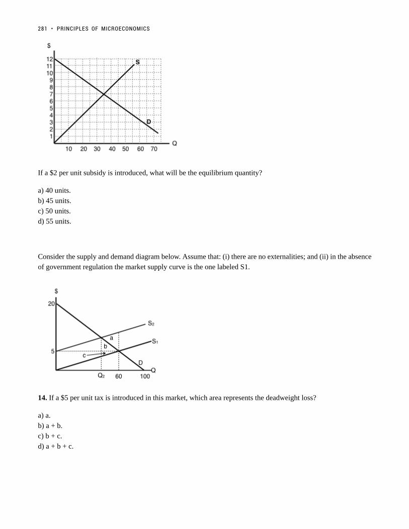
If a $2 per unit subsidy is introduced, what will be the equilibrium quantity?
a) 40 units.
b) 45 units.
c) 50 units.
d) 55 units.
Consider the supply and demand diagram below. Assume that: (i) there are no externalities; and (ii) in the absence
of government regulation the market supply curve is the one labeled S1.
14. If a $5 per unit tax is introduced in this market, which area represents the deadweight loss?
a) a.
b) a + b.
c) b + c.
d) a + b + c.
281 • PRINCIPLES OF MICROECONOMICS

Exercises 4.8Exercises 4.8
1. Suppose a tax is levied in a market in which demand is downward sloping and supply is perfectly elastic. Which
of the following statements is/are TRUE? (Assume no externalities.)
I. Producer surplus decreases.
II. The deadweight loss is zero.
III. Consumers bear all the burden of the tax.
a) II only.
b) I and II only.
c) I, II, and III.
d) III only.
2. Which of the following statements about tax incidence and relative elasticities is TRUE?
If demand is relatively inelastic and supply is relatively elastic, then consumers bear more of the burden of a tax.
If supply is perfectly inelastic, then producers bear none of the burden of a tax, no matter what the value of own-
price elasticity of demand.
If the relative elasticities of demand and supply are the same, the tax burden is shared equally across consumers
and producers.
a) II only.
b) I and III only.
c) I, II, and III.
d) III only.
3. The diagram below illustrates the supply curve for a good, and two possible demand curves for that good.
If a price floor (set above the initial equilibrium price) is introduced in this market then:
a) The deadweight loss will be smaller, if demand is D1 than if demand is D2.
b) The decrease in quantity will be smaller, if demand is D1 than if demand is D2.
c) Neither a) nor b) are true.
d) Both a) and b) are true.
TOPIC 4 MULTIPLE CHOICE QUESTIONS • 282

4. In which of the following cases will the deadweight loss from taxation be zero?
a) If demand is perfectly elastic.
b) If demand is unit elastic.
c) If demand is perfectly inelastic.
d) Either a) or c) will result in zero deadweight loss from taxation.
5. Which of the following statements about the economic incidence of taxation is TRUE?
I. If demand is elastic, producers will bear a greater burden of the tax than consumers.
II. If supply is perfectly inelastic, producers will bear all the burden of the tax.
III. If the supply curve is perfectly elastic, consumers will bear none of the burden of the tax.
a) II only.
b) I and II only.
c) II and III only.
d) I, II and III.
6. Which of the following correctly describes the equilibrium effects of a per-unit tax, in a market with NO
externalities?
a) Consumer and producer surplus increase but social surplus decreases.
b) Consumer and producer surplus decrease but social surplus increases.
c) Consumer surplus, producer surplus, and social surplus all increase.
d) Consumer surplus, producer surplus, and social surplus all decrease
7. Suppose that the price of a good increases. The increase in produce surplus will be:
a) Larger if demand is relatively elastic than if demand is relatively inelastic.
b) Smaller if demand is relatively elastic than if demand is relatively inelastic.
c) Smaller if supply is relatively elastic than if supply is relatively inelastic.
d) Larger if supply is relatively elastic than if supply is relatively inelastic.
Exercises 4.9Exercises 4.9
Use the diagram below, illustrates the domestic supply curve (SD) and demand curve for a good, to answer the
following THREE questions. Assume that the world price is equal to $20 per unit, and initially there are no trade
restrictions in place.
283 • PRINCIPLES OF MICROECONOMICS

1. If a tariff of $10 per unit is introduced in the market, then, at the new equilibrium:
a) Consumers will pay a price of $20, quantity sold will be 60 units, of which 40 are imported.
b) Consumers will pay a price of $30, quantity sold will be 40 units, of which 30 are produced domestically.
c) Consumers will pay a price of $20, quantity sold will be 60 units, of which none are produced domestically.
d) Consumers will pay a price of $30, quantity sold will be 40 units, of which none are imported.
2. If a tariff of $10 per unit is introduced in the market, then the government will raise ____ in tariff revenue.
a) $400.
b) $300.
c) $200.
d) $100.
3. If a tariff of $10 per unit is introduced in the market, then the deadweight loss will equal:
a) $50.
b) $100.
c) $150.
d) None of the above.
The following two questions refer to the diagram below, which illustrates the domestic supply curve (SD) and
demand curve for a good. Assume that the world price is equal to $5 per unit, and that initially there are no trade
restrictions.
TOPIC 4 MULTIPLE CHOICE QUESTIONS • 284

4. If a tariff of $10 per unit of imports is introduced, which area represents the deadweight loss?
a) a + f.
b) c + e.
c) a + b + c + e + f + g.
d) a + b + d + h + g + f.
5. If a tariff of $10 per unit of imports is introduced, which area represents the tariff revenue raised?
a) d.
b) d + h.
c) h.
d) b + h + g.
Use the diagram below – which illustrates the domestic supply and demand curves for a good – to answer the
following TWO questions. Assume that the world price is equal to $2.
285 • PRINCIPLES OF MICROECONOMICS

6. If there are no trade restrictions in place, what will be the equilibrium quantity of IMPORTS?
a) 40.
b) 50.
c) 60.
d) None of the above.
7. If a tariff of $2 is introduced, then:
a) Imports will decrease and social surplus will increase.
b) Imports will decrease and consumer surplus will increase
c) Imports will decrease and domestic producer surplus will increase.
d) All of the above will occur.
8. The diagram below illustrates the domestic supply curve (SD) and demand curve for a good. Assume that the
world price is equal to $5 per unit.
TOPIC 4 MULTIPLE CHOICE QUESTIONS • 286

If imports of this good are banned altogether, which area represents the deadweight loss?
a) a + b.
b) e.
c) c+d.
d) a + b + c + d + e.
9. The diagram below illustrates the domestic supply curve (SD) and demand curve for a good. Assume that the
world price is equal to $10 per unit, and initially there are no trade restrictions.
If a tariff of $10 per unit is introduced, by how much to imports decrease?
a) 10 units.
b) 20 units.
c) 30 units.
d) 40 units.
287 • PRINCIPLES OF MICROECONOMICS

Topic 4 Solutions
Solutions to Exercises 4.1
1. B
2. D
3. C
4. D
5. C
6. C
7. D
8. C
Solutions to Exercises 4.2
1. B
2. B
3. B
4. A
5. D
6. D
7. C
288

Solutions to Exercises 4.3
1. C
2. B
3. C
4. A
Solutions to Exercises 4.5
1. B
2. B
3. A
4. C
5. B
6. D
7. D
8. C
9. A
10. C
Solutions to Exercises 4.6
1. D
Solutions to Exercises 4.7
1. D
2. C
3. A
289 • PRINCIPLES OF MICROECONOMICS

4. C
5. C
6. A
7. B
8. A
9. B
10. D
11. D
12. D
13. A
14. C
Solutions to Exercises 4.8
1. D
2. B
3. D
4. C
5. A
6. D
7. D
Solutions to Exercises 4.9
1. B
2. D
3. C
4. C
5. B
6. B
7. C
TOPIC 4 SOLUTIONS • 290

8. C
9. C
291 • PRINCIPLES OF MICROECONOMICS

Topic 4 References
Britten, Liam. The Globe and Mail. “Vancouver Wants Province to Tax Airbnb Rentals Like Hotels.” June 27,
2016. http://www.cbc.ca/news/canada/british-columbia/airbnb-tax-vancouver-1.3655343
The Economist. “Undoing the Mess.” October 10, 2011. http://www.economist.com/blogs/schumpeter/2011/10/
netflix
Limitone, Julia. FoxBusiness. “Fmr. McDonald’s USA CEO: $35K Robots Cheaper Than Hiring at $15 Per
Hour.” May 24, 2016. http://www.foxbusiness.com/features/2016/05/24/fmr-mcdonalds-usa-ceo-35k-robots-
cheaper-than-hiring-at-15-per-hour.html
Investopedia. “What factors influence a change in demand elasticity?” April 3, 2015.
http://www.investopedia.com/ask/answers/040315/what-factors-influence-change-demand-
elasticity.asp?ad=dirN&qo=investopediaSiteSearch&qsrc=0&o=40186
Investopedia. “What factors influence a change in supply elasticity?” April 3, 2015. http://www.investopedia.com/
ask/answers/040315/what-factors-influence-change-supply-elasticity.asp
Lobo, Rita. World Finance. “In Defence of… Minimum Wage.” February 22,
2013. http://www.worldfinance.com/contributors/in-defence-of-minimum-wage
Malmo, Christopher. Vice. “Blame Canada’s Dairy Cartel for Our Expensive Milk and Cheese.” September 4,
2014. https://www.vice.com/en_ca/article/blame-canadas-dairy-cartel-for-our-expensive-milk-and-cheese-867
McKenna, Barrie. The Globe and Mail. “Canada’s Dairy Industry is a Rich, Closed Club. June 25,
2015. http://www.theglobeandmail.com/news/politics/canadas-dairy-industry-is-a-rich-closed-club/
article25124114/
Merlo, Catherine. AGWeb. “Why Dairy Demand Has Become More Elastic.” March 5,
2015. https://www.agweb.com/article/why-dairy-demand-has-become-more-elastic-naa-catherine-merlo/
Montgomery, Marc. Radio Canada International. “Canada-US Lumber Deal, Back Again, Still Bad for Canada.”
September 19, 2016. http://www.rcinet.ca/en/2016/09/19/canada-us-lumber-deal-back-again-still-bad-for-canada/
Rensi, Ed. Forbes. Thanks To ‘Fight For $15’ Minimum Wage, McDonald’s Unveils Job-Replacing Self-Service
292

Kiosks Nationwide.” November 29, 2016. https://www.forbes.com/sites/realspin/2016/11/29/thanks-to-fight-
for-15-minimum-wage-mcdonalds-unveils-job-replacing-self-service-kiosks-nationwide/#104cea084fbc
293 • PRINCIPLES OF MICROECONOMICS

Topic 5: Externalities
294

Introduction to Environmental Protection and NegativeExternalities
Figure 1. Environmental Debate. Across the country, countless people have protested, even risking arrest, against the Keystone XL Pipeline.(Credit: modification of image by “NoKXL”/Flickr Creative Commons)
Keystone XLKeystone XL
You might have heard about Keystone XL in the news. It is a pipeline system designed to bring oilfrom Canada to the refineries near the Gulf of Mexico, as well as to boost crude oil production in theUnited States. While a private company, TransCanada, will own the pipeline, U.S. government approvalis required because of its size and location. The pipeline is being built in four phases, with the first twocurrently in operation, bringing oil from Alberta, Canada, east across Canada, south through the UnitedStates into Nebraska and Oklahoma, and northeast again to Illinois. The third and fourth phases of theproject, known as Keystone XL, would create a pipeline southeast from Alberta straight to Nebraska, andthen from Oklahoma to the Gulf of Mexico.
Sounds like a great idea, right? A pipeline that would move much needed crude oil to the Gulf refinerieswould increase oil production for manufacturing needs, reduce price pressure at the gas pump, and increase
295
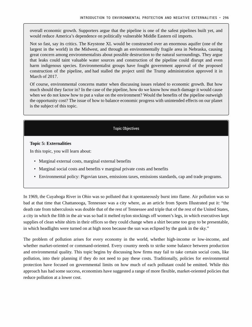
overall economic growth. Supporters argue that the pipeline is one of the safest pipelines built yet, andwould reduce America’s dependence on politically vulnerable Middle Eastern oil imports.
Not so fast, say its critics. The Keystone XL would be constructed over an enormous aquifer (one of thelargest in the world) in the Midwest, and through an environmentally fragile area in Nebraska, causinggreat concern among environmentalists about possible destruction to the natural surroundings. They arguethat leaks could taint valuable water sources and construction of the pipeline could disrupt and evenharm indigenous species. Environmentalist groups have fought government approval of the proposedconstruction of the pipeline, and had stalled the project until the Trump administration approved it inMarch of 2017.
Of course, environmental concerns matter when discussing issues related to economic growth. But howmuch should they factor in? In the case of the pipeline, how do we know how much damage it would causewhen we do not know how to put a value on the environment? Would the benefits of the pipeline outweighthe opportunity cost? The issue of how to balance economic progress with unintended effects on our planetis the subject of this topic.
Topic Objectives
Topic 5: Externalities
In this topic, you will learn about:
• Marginal external costs, marginal external benefits
• Marginal social costs and benefits v marginal private costs and benefits
• Environmental policy: Pigovian taxes, emissions taxes, emissions standards, cap and trade programs.
In 1969, the Cuyahoga River in Ohio was so polluted that it spontaneously burst into flame. Air pollution was so
bad at that time that Chattanooga, Tennessee was a city where, as an article from Sports Illustrated put it: “the
death rate from tuberculosis was double that of the rest of Tennessee and triple that of the rest of the United States,
a city in which the filth in the air was so bad it melted nylon stockings off women’s legs, in which executives kept
supplies of clean white shirts in their offices so they could change when a shirt became too gray to be presentable,
in which headlights were turned on at high noon because the sun was eclipsed by the gunk in the sky.”
The problem of pollution arises for every economy in the world, whether high-income or low-income, and
whether market-oriented or command-oriented. Every country needs to strike some balance between production
and environmental quality. This topic begins by discussing how firms may fail to take certain social costs, like
pollution, into their planning if they do not need to pay these costs. Traditionally, policies for environmental
protection have focused on governmental limits on how much of each pollutant could be emitted. While this
approach has had some success, economists have suggested a range of more flexible, market-oriented policies that
reduce pollution at a lower cost.
INTRODUCTION TO ENVIRONMENTAL PROTECTION AND NEGATIVE EXTERNALITIES • 296

5.1 Externalities
Learning Objectives
By the end of this section, you will be able to:
• Explain and give examples of positive and negative externalities.
• Identify equilibrium price and quantity.
In Topics 3 and 4 we introduced the concept of a market. In particular, we closely examined perfectly competitive
markets. We observed how producers and consumers of a good interacted to reach equilibrium. We
also demonstrated that any policy that was introduced (i.e. quota, price control, tax, etc.) moved the market away
from the surplus maximizing equilibrium and created a deadweight loss.
Our assumption throughout this analysis, however, was that there was no third party impacted by the interaction
of producers and consumers. We can now add the concept of Externalities to our supply and demand model to
account for the impact of market interactions on external agents. We will find that the equilibrium that is optimal
for consumers and producers of the good may be sub-optimal for society. We will learn that the all-regulation-
is-bad-regulation conclusion from earlier is not always the case – in many situations, we can improve societal
outcomes with policy. Before we get to this conclusion, let’s first unpack this concept of externalities.
ExternalitiesExternalities
To this point, we have modelled private markets. Private markets only consider consumers, producers and the
government – the impacts on external parties is irrelevant. The perfectly competitive market we
modelled offered an efficient way to put buyers and sellers together and determine what goods are produced,
how they are produced, and who gets them. The principle that voluntary exchange benefits both buyers and
sellers is a fundamental building block of the economic way of thinking. But what happens when a voluntary
exchange affects a third party who is neither the buyer nor the seller?As an example, consider a club
promoter who wants to build a night club right next to your apartment building. You and your neighbours will be
able to hear the music in your apartments late into the night. In this case, the club’s owners and attendees may
both be quite satisfied with their voluntary exchange, but you have no voice in their market transaction. The
297

effect of a market exchange on a third party who is outside or “external” to the exchange is called an externality.
Because externalities that occur in market transactions affect other parties beyond those involved, they are
sometimes called spillovers.Externalities can be negative or positive. The club example from above is that of
a negative externality. The club imposed a cost on you, an external agent to the market interaction. A positive
externality occurs when the market interaction of others presents a benefit to non-market participants.
Enriching Our ModelEnriching Our Model
As discussed earlier, we have previously modelled private markets. Thus, the terminology we used in that
analysis applies to private markets. The terms consumer surplus, producer surplus, market surplus, and the
market equilibrium (note that this will be referred to interchangeably in this chapter as the unregulated market
equilibrium) derive their meaning from an analysis of private markets and need to be adapted in a discussion
where external costs or external benefits are present.
For the purpose of this analysis, the following terminology will be used:
• Our topic three demand curve is equivalent to the marginal private benefit curve.
• Our topic three supply curve is equivalent to the marginal private cost curve.
We now want to develop a model that accounts for positive and negative externalities. To do so, we must
consider the external costs and benefits. External costs and benefits occur when producing or consuming a good or
service imposes a cost/benefit upon a third party. When we account for external costs and benefits, the following
definitions apply:
• When we add external benefits to private benefits, we create a marginal social benefit curve. In the
presence of a positive externality (with a constant marginal external benefit), this curve lies above the
demand curve at all quantities.
• When we add external costs to private costs, we create a marginal social cost curve. In the presence of a
negative externality (with a constant marginal external cost), this curve lies above the supply curve at
all quantities.
When we were considering private markets, our objective was to maximize market surplus or total private benefits
minus total private costs. Our new objective considering all impacted agents in society is to maximize social
surplus or total social benefits minus total social costs.
Recall that in this course, our diagrams reflect “marginal” quantities. Notice that some of the definitionsrequire you to use “total” quantities. Remember that to derive a “total” from a “marginal,” take the areaunderneath the marginal up to a quantity of interest. This quantity is often the equilibrium.
A Negative ExternalityA Negative Externality
Much of the work we will do is with negative externalities. As we will see in the next section, pollution is
5.1 EXTERNALITIES • 298

modelled as a negative externality. Economists illustrate the social costs of production with a demand and supply
diagram. For example, consider Figure 5.1a, which shows a negative externality. Notice that there are external
costs but no external benefits. Graphically, this means that the marginal social cost (MSC) curve lies above the
marginal private cost (MPC) curve by an amount equal to the marginal external cost (MEC) and the marginal
private benefit (MPB) and marginal social benefit (MSB) are equivalent.
Let’s undergo an analysis of this diagram to understand how we need to shift our thinking from Topic 3 and 4 to
Topic 5.
Figure 5.1a
Let’s first pretend we know nothing about externalities and ignore MSC. Market equilibrium in this diagram
occurs at the intersection of supply and demand, or the intersection of MPC and MSB (which is equivalent
to MPB). This occurs at Q1. Now we know that total private benefits at the market equilibrium are equal to
a+b+c+e+f and we know that total private cost at the market equilibrium equals c+f.
The market surplus at Q1 is equal to (total private benefits – total private costs), in this case, a+b+e. [(a+b+c+e+f)
– (c+f)].
Now, let’s introduce some of the concepts we’ve learned in this section to our analysis. To get a true picture
of surplus, we need to account for the external cost of production. Recall that social surplus is the difference
between total social benefits and total social cost. Social surplus is sometimes referred to as aggregate net benefits.
Since there is no positive externality, social benefit and private benefit are equal. Thus, as before, it is equal to
a+b+c+e+f.
Total social cost at the market equilibrium is equal to b+c+d+e+f, and includes all the areas under our MSC curve
up to our quantity. Notice that this is larger than total private cost by b+e+d. This should make sense as we are
analyzing a negative externality where, by definition, the private cost to producers is smaller than the social cost
of their actions. The difference is these two values is equal to the external costs.
The social surplus at Q1 is equal to total social benefits – total social costs. In this case, a-d. [(a+b+c+e+f) –
(b+c+d+e+f)].
299 • PRINCIPLES OF MICROECONOMICS

In Topic 3 and 4, we saw that the market equilibrium quantity maximized market surplus and that any move away
from this quantity caused a deadweight loss. Let’s see if this conclusion holds when we introduce externalities.
Recall that deadweight loss (DWL) is defined at maximized surplus – actual surplus. In Layman’s terms,it is where we want to be in a perfect world minus where we are now. In some sense, it is a quantificationof inefficiency.
Consider our diagram of a negative externality again. Let’s pick an arbitrary value that is less than Q1 (our optimal
market equilibrium). Consider Q2.
Figure 5.1b
If we were to calculate market surplus, we would find that market surplus is lower at Q2 than at Q1 by triangle e.
The market surplus at Q2 is equal to area a+b. [(a+b+c) – (c)].
What about social surplus? Total social benefit at Q2 is equal to a+b+c. Total social cost at Q2 is equal to b+c.
The social surplus at Q2 is equal to area a [(a+b+c) – (b+c)].
This result is interesting. By moving to a quantity lower than our optimal market equilibrium, we raised social
surplus. Compared to Q1 we have increased our social surplus by area d. This means that d was a deadweight
loss from being at the optimal market level of production. That is to say, the optimal market level of production
was inefficient for society. By leaving the market unregulated and letting the interaction of producers and
consumers set quantity and price, society as a whole is worse off than if quantity had been restricted by policy for
example. This means that there is an opportunity for government intervention to make society better off.
Why is this the case? Well, at Q1, we see that our MSC is greater than our MSB. Using marginal analysis, we
know that when MC > MB, we need to reduce our quantity to maximize surplus.
5.1 EXTERNALITIES • 300

How do you know which quantity maximizes surplus?
• When looking for the market equilibrium (sometimes called the unregulatedmarket equilibrium), we want to select the quantity where demand = supply or where marginalprivate benefit = marginal private cost. Diagrammatically, this will happen where MPB intersectsMPC. The quantity where this occurs will always maximize market surplus.
• When looking for the social surplus maximizing equilibrium, we want to select the quantitywhere marginal social benefit = marginal social cost. Diagrammatically, this will happen whereMSB intersects MSC. The quantity where this occurs will always maximize social surplus.
Pareto Improvements and Potential Pareto ImprovementPareto Improvements and Potential Pareto Improvement
At this point, there may be some confusion around our analysis. The market (or private agents) were worse off
in the move from Q1 to Q2, but society was made better off. How is this possible? What criteria are we using to
judge if our action to restrict quantity is appropriate? Recall our definition of efficiency from earlier topics. We
defined Pareto-efficiency as an outcome where no one can be made better off without making someone worse
off. As it turns out, we need two additional definitions to fully understand the movement from an inefficient to an
efficient allocation.
The first term we need to become familiar with is a Pareto Improvement. A Pareto Improvement is a change
such that someone is made better off without making anybody worse off. Consider the following example. You
only like peanut butter and jelly sandwiches, but your mom has packed you a PB & J and a Nutella sandwich. Your
friend has no sandwiches in their lunch bag but loves sandwiches. Since you do not value Nutella sandwiches, if
you give your friend your Nutella sandwich, you would make them better off without making yourself worse off
(remember, you don’t place any value on Nutella sandwiches). This scenario describes a Pareto Improvement.
The second term we need to introduce is a Potential Pareto Improvement. The definition of a Potential Pareto
Improvement has three parts:
1. As opposed to a Pareto Improvement, a Potential Pareto Improvement may have people who gain and
people who lose.
2. The individuals who gain from the change gain by enough that in theory some of their gains could be taken
to compensate those who lose such that we again have a scenario where people are made better off without
making anybody worse off.
3. The compensation just needs to be possible. It does not have to occur for a change to be a Potential Pareto
Improvement.
Note that all Pareto Improvements are necessarily Potential Pareto Improvements but not all Potential Pareto
Improvements are necessarily Pareto Improvements.
It should also be noted that if social surplus increased, at the very least Potential Pareto Improvement occurred.
301 • PRINCIPLES OF MICROECONOMICS
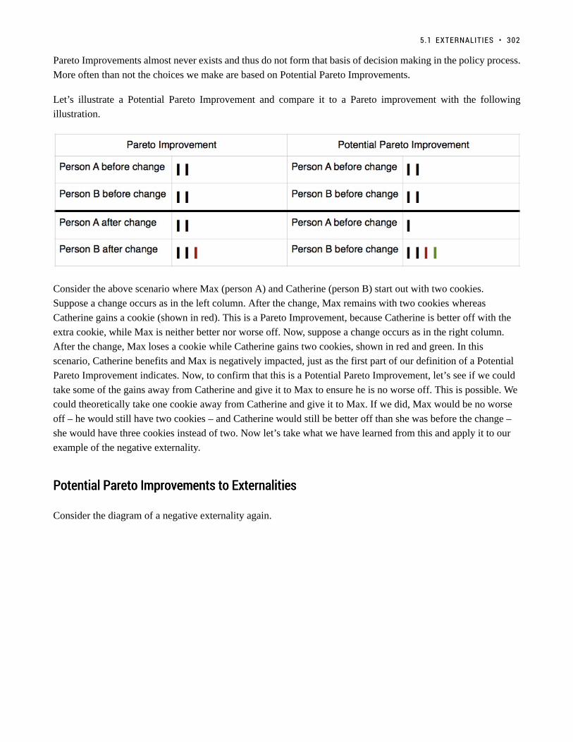
Pareto Improvements almost never exists and thus do not form that basis of decision making in the policy process.
More often than not the choices we make are based on Potential Pareto Improvements.
Let’s illustrate a Potential Pareto Improvement and compare it to a Pareto improvement with the following
illustration.
Consider the above scenario where Max (person A) and Catherine (person B) start out with two cookies.
Suppose a change occurs as in the left column. After the change, Max remains with two cookies whereas
Catherine gains a cookie (shown in red). This is a Pareto Improvement, because Catherine is better off with the
extra cookie, while Max is neither better nor worse off. Now, suppose a change occurs as in the right column.
After the change, Max loses a cookie while Catherine gains two cookies, shown in red and green. In this
scenario, Catherine benefits and Max is negatively impacted, just as the first part of our definition of a Potential
Pareto Improvement indicates. Now, to confirm that this is a Potential Pareto Improvement, let’s see if we could
take some of the gains away from Catherine and give it to Max to ensure he is no worse off. This is possible. We
could theoretically take one cookie away from Catherine and give it to Max. If we did, Max would be no worse
off – he would still have two cookies – and Catherine would still be better off than she was before the change –
she would have three cookies instead of two. Now let’s take what we have learned from this and apply it to our
example of the negative externality.
Potential Pareto Improvements to ExternalitiesPotential Pareto Improvements to Externalities
Consider the diagram of a negative externality again.
5.1 EXTERNALITIES • 302

Figure 5.1c
Let’s hone in on the change in both market and social surplus by changing from quantity Q1 to Q2.
Private Agents
Let’s first consider private market participants. In the move from Q1 to Q2, private agents reduce their costs by f
(they are producing less so costs should be less; f is the area underneath the marginal private cost curve between
Q2 and Q1) but also decrease their benefit by e+f (the area under the marginal private benefit curve between the
two quantities of interest). On balance, they are worse off by e. when they move from Q1 to Q2.
External Agents
In the move from Q1 to Q2, the external cost imposed declines by d+e, meaning they are better off by
d+e. Remember when looking for external costs, we are looking under the MSC curve but above the MPC curve.
To determine whether this is a Potential Pareto Improvement, we need to find out whether the gains from the
winners exceed the losses to others. In our example, the gain by external agents is indeed larger than the loss to
private agents (d+e > e). Therefore, in theory, we could take e from the external agents and give it to the private
agents and make them equally as well off as they were at the market equilibrium. External agents would still be
better off by d. Thus, a Potential Pareto Improvement has been realized.
This resolves the tension we brought up at the beginning of this section and explains how we can increase social
surplus by changing the quantity from the market equilibrium.
Positive ExternalitiesPositive Externalities
As we mentioned previously, a positive externality occurs when the market interaction of others presents a benefit
to non-market participants. The analysis of positive externalities is almost identical to negative externalities. The
difference is that instead of the market equilibrium quantity being too much, the market will generate too little of
Q. Let’s look at an example. Consider the following diagram of a market where a positive externality is present.
303 • PRINCIPLES OF MICROECONOMICS

Figure 5.1d
Notice first that MPC curve is the same as MSC curve because there are no external costs. Second, the MSB curve
lies above the MPB curve at all quantities because each unit of private consumption generates a spill-over benefit
to non-market participants. The area in between MSB and MPB is the external benefit. Remember that MPB +
MEB = MSB.
Let’s briefly explore this diagram as we did for negative externalities. The market equilibrium occurs where MPB
= MPC. That occurs at Q1.
The market surplus at Q1 is equal to total private benefits – total private costs, in this case b. [(b+c) – (c)].
The social surplus at Q1 is equal to total social benefits – total social costs, in this case a+b. [(a+b+c) – (c)].
As before, suppose we increased the quantity in this market to Q2.
The market surplus at Q2 is equal to b-f. [(b+c+g) – (c+f+g)].
The social surplus at Q2 is equal to a+b+d. [(a+b+c+d+f+g) – (c+f+g)].
Note that social surplus has increased despite the fact that market participants are worse off. Thus, a Potential
Pareto Improvement must have occurred. We can see this is the case by noticing that d+f is the amount that non-
market participants gained by the increase in production and that f is the loss to market participants from excess
production. In theory, we could take f from the external agents and give it to the market participants so they would
be indifferent to the situation before and after the change. Thus, we know that d is the deadweight loss in the
presence of a positive externality, due to under production.
Okay, but what’s an example of a Positive and a Negative Externality?
As an example of a Negative Externality: Suppose a banana farmer uses pesticides on their crop andsome of this pesticide runs off into a nearby stream that is the primary water supply of a downstreamcommunity. The farmer and the banana consumers do not account for the negative impact the operationshave on the stream. In other words, there is a spillover cost inherent to this market interaction.
5.1 EXTERNALITIES • 304

As an example of a Positive Externality: suppose a bee keeper’s hives are located near another farmer’sorchard. The bees fly to the orchard and pollinate the crop resulting in a spillover benefit for the orchardfarmer.
Key Concepts and SummaryKey Concepts and Summary
Economic production can cause environmental damage. This trade-off arises for all countries, whether they be
high-income or low-income, and whether their economies are market-oriented or command-oriented.
An externality occurs when an exchange between a buyer and seller has an impact on a third party who is not part
of the exchange.
An externality can have a negative or positive impact on the third party. If those parties imposing a negative
externality on others had to take the broader social cost of their behaviour into account, they would have an
incentive to reduce the production of whatever is causing the negative externality.
In the case of a positive externality, the third party is obtaining benefits from the exchange between a buyer and a
seller, but they are not paying for these benefits. If this is the case, markets tend to under-produce output because
suppliers do not consider the additional benefits to others. If the parties that are creating benefits for others can
somehow be compensated for these external benefits, they would have an incentive to increase production.
GlossaryGlossary
External Benefitsadditional benefits reaped by third parties outside the production process when a unit of output isproducedExternal Costadditional costs incurred by third parties outside the production process when a unit of output isproducedExternalitya market exchange that affects a third party who is outside or “external” to the exchange; sometimescalled a “spillover”Market FailureWhen the market on its own does not allocate resources efficiently in a way that balances social costs andbenefits; externalities are one example of a market failureNegative Externalitya situation where a third party, outside the transaction, suffers from a market transaction by othersPositive Externalitya situation where a third party, outside the transaction, benefits from a market transaction by othersPrivate Marketa market that only considers consumers, producers and the government, doesn’t include external agentsSocial Costscosts that include both the private costs incurred by firms and also additional costs incurred by third
305 • PRINCIPLES OF MICROECONOMICS

parties outside the production process, like costs of pollutionSpilloversee externality
Exercises 5.1
1. Which of the following statements about negative externalities is/are TRUE?
I. At the social-surplus maximizing level of output, external costs equal zero.II. At the unregulated competitive equilibrium, marginal social cost is greater than marginal social benefit.III. At any output level, social costs are greater than private (market) costs.
a) I, II, and III.b) II only.c) III only.d) II and III.
2. Which of the following statements about external costs is TRUE?
a) Economics uses the term “external cost” to describe a spillover effect from market activity that is toosmall to matter to society.b) Economics ignores the environmental impact of market activities by calling such impact an “externalcost.”c) Economics does not provide guidance for environmental policy since its treats any environmental costas an “external cost”.d) None of the above statements are true.
3. If a competitive market is characterized by a negative externality, then which of the following statementsis true?
a) Social surplus is greater than market surplus.b) Social surplus is less than market surplus.c) Social surplus is equal to market surplus.d) Social surplus may be greater than or less than market surplus, depending on the size of the externality.
The following TWO questions refer to the diagram below, which illustrates the market for a good whoseproduction results in a negative externality.
5.1 EXTERNALITIES • 306

4. If there is no regulation in place to correct the externality, which area represents MARKET surplus?
a) a.b) a – d.c) a + b.d) a + b + e.
5. If there is no regulation in place to correct the externality, which area represents SOCIAL surplus?
a) a.b) a – d.c) a + b.d) a + b + e.
6. Suppose that each kilowatt-hour (kwh) of electricity produced using natural gas results in 0.2kgs ofcarbon dioxide emissions. If each ton of carbon dioxide emissions results in environmental costs of $360,then the marginal external cost per kwh of electricity produced is equal to (0.2kg is equal to about0.000220462 tons):
a) 10 cents.b) 8 cents.c) 4 cents.d) 2 cents.
The following THREE question refer to the diagram below, which illustrates the marginal private cost,marginal social cost, and marginal social benefits for a goods whose production results in a negativeexternality.
307 • PRINCIPLES OF MICROECONOMICS

7. Which are represents the deadweight loss due to the externality?
a) j.b) h.c) h+j.d) There is no deadweight loss.
8. Which are represents external costs at the unregulated competitive equilibrium?
a) g + h + j + m + k.b) g + h + j.c) g + m.d) g.
9. Which are represents social surplus at the unregulated competitive equilibrium?
a) f – j.b) f.c) f + g + h.d) f + g + h – j.
Save
Save
5.1 EXTERNALITIES • 308

5.2 Indirectly Correcting Externalities
Learning Objectives
By the end of this section, you will be able to:
• Explain how policy can improve societal outcomes when markets do not function perfectly.
• Compare and demonstrate how different environmental policies work to reduce pollution.
A Source of Market FailureA Source of Market Failure
Recall from our analysis in Topic 5.1 that reducing the quantity in the market from the optimal market level of
production to the socially optimal level of production raised social surplus. In Topic 4, we saw a variety of policies
that changed the quantity from the market equilibrium and resulted in a deadweight loss. Why the difference?
In Topic 3 and 4, our supply and demand models relied on the assumption that the market was perfectly
competitive and that there were no externalities. With these assumptions, the market would naturally optimize
both the market and social surplus because there would be no external costs.
Recognizing that externalities do exist, our market no longer naturally optimizes, since external costs do not
impact market participants and thus are not taken into account for their decision.
309

Figure 5.2a
Recall this diagram of a negative externality. We found that social surplus at the optimal market quantity (or
competitive equilibrium) was a-d. We then found that at the socially optimal level of production, the social surplus
was a. We concluded that d was the deadweight loss from being at the competitive equilibrium and not addressing
the externality. Since the market did not naturally maximize societal welfare, the unaddressed externality results
in a market failure. Since our market equilibrium quantity differs from our social equilibrium quantity, we have a
deadweight loss. When left unaddressed, externalities cause competitive markets to fail.
Correcting or ‘Internalizing’ an ExternalityCorrecting or ‘Internalizing’ an Externality
Now we know that an externality is a form of market failure that arises because market participants do not account
for factors external to the market. This makes the market quantity is too low or too high relative to the socially
optimal level of production. Fortunately, in Topic 3 and 4, we learned a variety of policies that influence the
number of goods exchanged in a market. We can use these to set quantity where MSB =MSC. If we create policy
correctly, we can bring the market back to the social surplus maximizing level of output.
We can either set the appropriate quantity directly through a quota, price floor, or price ceiling. More commonly,
governments address the externality through a tax or subsidy. In this case, the government introduces a tax that
will make market participants act as if they care about participants outside the market. In economic jargon, this is
called internalizing the externality. A tax that addresses a negative externality by taxing the good instead of the
actual external cost is called a Pigouvian Tax. We work through an example below.
Consider the following diagram of a perfectly competitive market with a negative externality present.
5.2 INDIRECTLY CORRECTING EXTERNALITIES • 310

Figure 5.2b
We know that without regulation, the market will naturally tend to QE (where MPC=MPB) and that this will
result in a deadweight loss of area k. Ideally, we want the quantity exchanged to equal Q*, which is the social
surplus optimizing level of production since this level of output is where MSB = MSC. How can we force the
market here? One way is to introduce a tax equal to the marginal external cost at the efficient quantity Q*. This
makes the producer face a cost curve of MPC + tax, and since the tax is equal to external costs, this will just
cause firms to act as though they recognize the externality.That is easy in this case as we have a constant MEC
and we can set the amount of our tax equal to it. Using our knowledge from Topic 4 and the analysis of our
previous diagram, we can convince ourselves that this policy brings us to Q*.
ZeroZero Externality isn’t the AnswerExternality isn’t the Answer
Notice in the diagram above that at the socially optimal level of production, external costs do not equal zero.
At QE, external costs are m+c+h+k+g+n. When we introduce a tax that takes us to Q*, external costs are equal
to m+c+h. A common misconception is that introducing a tax in this market eliminates external costs. This is
incorrect. In some sense, we are aiming for an “optimal” level of external cost. To get a sense for this, consider
the manufacturing industry. We could get external costs (like the adverse effects of carbon dioxide emissions) to
equal zero if we stopped production entirely, but then we would have a world with little energy.
Secondly, consider a world where the externality is not constant like in the previous example. Perhaps it is
increasing in the level of production like the diagram below.
311 • PRINCIPLES OF MICROECONOMICS

Figure 5.2c
At this point, you should be able to convince yourself that the equilibrium quantity is 100 and the socially efficient
level of output is 80. The intuition behind the policy response is the same as before, but we have to be careful
about the amount of the tax as the marginal external cost is changing. We want to set the level of the tax equal to
the marginal external cost at the socially efficient level of output. This value is 8-3 or $5. We know that setting a
tax equal to $5 will bring us to 80 units, where social welfare is maximized.
Third, notice that we have been indirectly targeting pollution with the policies we have discussed. We have taxed
the good to reduce pollution. There is no incentive to innovate our production processes and make them “greener”
because no matter how green your good is, you will still have to pay the tax. In the next section, we look at policies
that address this and directly target pollution.
GlossaryGlossary
Pigouvian Taxa tax levied on any market activity that generates negative externalities (costs not internalized in themarket price)
Exercises 5.2
The following TWO questions refer to the diagram below, which illustrates the marginal private cost,
5.2 INDIRECTLY CORRECTING EXTERNALITIES • 312

marginal social cost, and marginal social benefits for a goods whose production results in a negativeexternality.
1. If the government introduces a per unit tax equal to the marginal external cost, what area represents thechange in social surplus?
a) j; a decrease.b) j; an increase.c) h; a decrease.d) h; an increase.
2. Which area represents external costs at the social-surplus-maximizing quantity of output?
a) External costs are zero.b) g + h + j.c) g + h.d) g.
The following TWO questions refer to the diagram below, which illustrates the supply and demand curvesfor a perfectly competitive market. Assume that each unit of output results in a marginal external cost of$5.
313 • PRINCIPLES OF MICROECONOMICS

3. In the absence of government intervention, what will the deadweight loss equal?
a) $0.b) $30.c) $60.d) There is insufficient information to determine the size of the deadweight loss.
4. If a tax of $5 per unit is introduced in the market illustrated above, then the price that consumers paywill be ____ and the price that producer receive (net of the tax) will be____.
a) $9; $4.b) $8; $5.c) $7; $6.d) $6; $1.
5.2 INDIRECTLY CORRECTING EXTERNALITIES • 314

5.3 Directly Targeting Pollution
Learning Objectives
By the end of this section, you will be able to:
• Show how the government can directly target pollution.
• Consider the pros and cons of pollution standards, cap and trade, and pollution tax policies.
• Explain how firms respond to each policy.
In the previous section, we looked at externalities and policies to correct the market failures they cause. In this
section, we look at mechanisms to directly target pollution.
Model Background:Model Background:
Why do firms pollute? The economist’s answer is because there is a benefit to pollution – production implies
pollution and production allows the firm to generate revenue. In an unregulated world, firms can maximize their
profits by using the cheapest production method available. It is not an unreasonable assumption to say that
the cheapest method is likely the “dirtiest” method. When producing, firms are weighing the MB of pollution
(revenue) against the MC. In an unregulated world, the MC of pollution is zero, so firms will emit the maximum
level of pollution that their production method allows for. The problem is that when a firm only looks at its own
cost and benefits, the societal cost of pollution is ignored. Thus, we have a role for government intervention in
addressing this market failure. In analyzing the decisions of firms directly around emission or pollution, we use
the abatement model.
315

Figure 5.3a
The graph above illustrates the marginal benefit of pollution (MPB), or equivalently, the marginal cost of
abatement (MCA) for a firm. Abatement, a term describing the reduction of pollution, is almost always costly.
On the vertical axis, we have cost and/or benefit in dollar terms. On the horizontal axis, we have pollution. Recall
that in the absence of regulation, the firm will emit at PMAX. Assume this firm decides to reduce its emissions to
P1. In this case, it would need to pay large amounts of money for abatement, since there would be a hefty cost
associated with cleaning up its production. The area under the MCA curve between PMAX and P1, shown above
as the red triangle, represents this cost.
It is important to note something about marginal cost of abatement. As shown in the diagram above, it is likely
to be low at relatively high levels of P and high at relatively low levels of P. Consider a coal-fired power plant
to understand why this is true. When the firm is making no efforts to reduce pollution, there are relatively cheap
things it can do to reduce its pollution, like installing a smokestack scrubber. This concept is commonly referred
to as “low-hanging fruit.” When this firm is polluting only a small amount, it is much costlier to reduce pollution
by an additional unit. An extreme example is that the coal-fired power plant would need to convert to a wind farm.
In theory, we could map the marginal social cost of pollution onto the above graph, find the intersection and force
the firm to reduce its emissions to this optimal level. However, there is a heavy information burden for this to
happen. In order for this to occur, we would need to know social cost information and the cost of abatement for the
firm. This is at best impractical and at worst impossible. In reality, we estimate the appropriate pollution reduction
and create a policy to get us there.
There are three that we will consider: pollution standards, a pollution tax, and a cap-and-trade system.
5.3 DIRECTLY TARGETING POLLUTION • 316

In creating any policy, we want to consider three criteria:
First, we want to ensure low-cost opportunities for abatement are chosen over high-cost opportunities whenever
possible. This will result in pollution reduction at the least cost.
Second, ideally, we want a system with a low informational burden. As we have discussed, assigning a cost
to environmental impact is very difficult. If we can design a system that does not depend on these imprecise
estimates, we can still get to a beneficial outcome.
Lastly, we want to think about distribution: Who is paying the cost for this policy and who is benefiting?
Pollution StandardsPollution Standards
The most rudimentary policy available is called a pollution (or emission) standard. This policy directly limits
the amount of pollution a firm is allowed to emit. In effect, the policymaker tells the firms that they all must
restrict their emission to, for example, 350 units. The upside of this policy is that it ensures the government will
reach its pollution reduction target. The bad news is that the reduction is unlikely to occur at least cost. Consider
the Figure 5.3b, which shows two firms and their associated MCA below.
Figure 5.3b
317 • PRINCIPLES OF MICROECONOMICS

We can see that Firm 1 (with MCA1) has higher abatement costs over at all levels of P compared to Firm 2 (with
MCA2).
Suppose the government wants to reduce pollution from PMAX = 1600 (800 from each firm) by 900 units. It
decides to divide the abatement burden evenly between the two firms (450 each) so a pollution standard is set at
350 units. This means that each firm may only emit 350 units. This is shown on the diagram above.
From this policy, the government gets the desired reduction of emission by 900 units but not at least cost. Observe
in the diagram that at a pollution level of 350 units, Firm 1 has a MCA of around $22 and Firm 2 has a MCA
equal to around $11. This means that Firm 1 is willing to pay up to $22 for one more unit of pollution, and Firm
2 is willing to accept at least $11. If there was a way for Firm 1 to pay Firm 2 for some of its pollution allowance,
then both parties could gain. This is not possible under the pollution standards regime.
Cap and TradeCap and Trade
A scheme where Firm 1 can buy pollution allowances from Firm 2 exists, and is called Cap and Trade. Under
cap and trade, the government sets a certain pollution level and then provides permits that firms can purchase, sell,
and trade. In effect, the government is creating a market for pollution and limiting the available pollution to the
number of permits it provides. This allows the market to allocate emissions reduction efficiently.
Suppose the government wants the same 900-unit reduction in emissions and to reduce emissions to 700 units. Its
first step is to create 700 permits. The second and more difficult decision is to decide how many permits each firm
will get initially. Let’s assume each firm is given half the permits.
Figure 5.3c
5.3 DIRECTLY TARGETING POLLUTION • 318

Figure 5.3c is the same diagram we had in our pollution standard scenario. As we noted, the MCA’s are not equal,
and there is an incentive for Firm 1 to pay Firm 2 for some of its pollution allowance. Specifically, Firm 1 is
willing to pay its MCA for an additional unit of pollution ($22), and Firm 2 is only willing to accept (WTA) more
than its MCA ($11). Clearly, there are beneficial exchanges available.
What happens when a trade occurs? We can see that as pollution level changes, the MCA for each firm will change
as well.
Figure 5.3d
When Firm 1 increases its pollution by 100 units and Firm 2 decreases its pollution by 100 units, the parameters
for a beneficial exchange have changed. Now, Firm 1 is only willing to pay up to $17 to pollute, and Firm 2 must
be paid at least $14.
We can see that transactions will continue to occur until the WTP = WTA, or the MCA for each firm is the same.
This occurs at $15.
319 • PRINCIPLES OF MICROECONOMICS

Figure 5.3e
5.3 DIRECTLY TARGETING POLLUTION • 320

What prices will permits trade at?What prices will permits trade at?
If there are a range of prices in which beneficial transactions can occur, for example in Figure 5.3c at anyprice between $11 and $22, what price will the permits trade at? Remember that in a perfectly competitivemarket, the price is set by the market. This means that the price of permits will equal the MCA at theequilibrium. Why? Our buying firms will be willing to pay somewhere between $22 and $15, and ourselling firms need to be paid somewhere between $11 and $15. If you are a firm looking to sell your permitand you try to sell for more than $15, the buying firm will look elsewhere, knowing that other firms willsell for $15. If you are a buying firm and you offer less than $15, the selling firm will go elsewhere,knowing it can receive at least $15. Therefore, the equilibrium price of permits is $15.
The conclusion? We can easily find the permit price by finding the point where the marginal costs ofabatement are the same, and the total amount of emissions is equal to the number of permits. By identifyingthis point, we will also be able to tell who is the buyer and seller of permits in each situation.
How Cap and Trade Minimizes CostsHow Cap and Trade Minimizes Costs
We can look at how each firm assesses the benefits and costs of selling and buying permits and conclude that the
exchange is mutually beneficially and results in a Pareto improvement. Having an open market for trading permits
ensures that if one firm is more efficient at reducing emissions, it will sell permits to a firm that is less efficient.
This ensures that pollution reduction is done in the most efficient way possible.
321 • PRINCIPLES OF MICROECONOMICS

Consider Figure 5.3, which shows the benefits and costs of pollution for Firm 1 compared to the benefits and costs
of abatement for Firm 2.
Figure 5.3f
Clearly, issuing permits results in efficient emission reductions. In this policy, the government has to set a quantity,
and allows the market to set the price of pollution.
Pollution TaxPollution Tax
There is one more method the government can use to directly curb pollution. Whereas with cap and trade, the
government has to set the quantity of emissions, a pollution tax allows it to set the price.
Setting the price can be more difficult. If the government wants to reduce emissions to 700 units, it will have to set
a tax rate that incentivizes firms to do so. With the diagrams above, this might not seem so difficult, but normally
the government will not know the MCA of the firms.
5.3 DIRECTLY TARGETING POLLUTION • 322

All that considered, if the government has the information, a pollution tax can have much the same effect as cap
and trade. If the government sets the pollution tax at $15, consider how Firm 1 behaves:
Figure 5.3g
Without the tax, the firms both maximize their pollution. Once the $15 tax is set, the firms each compare the costs
of abatement with the cost of paying the tax. In Figure 5.3d, we can see that it costs Firm 1 more to pay the tax
than it does for them to reduce pollution from 800 units to 500 units.
This does not mean it will reduce pollution entirely. Consider Firm 1’s decision when it is emitting 500 units of
pollution:
Figure 5.3h
In this case, we see the cost of abatement is higher than the cost of the tax. This means that the firm will pay the
tax. Notice that this causes Firm 1 to reduce emissions to the same level as under cap and trade. Doing the same
analysis for Firm 2 would lead us to the same conclusion. This means that a pollution tax also causes firms to
reduce emissions in the most efficient way possible.
323 • PRINCIPLES OF MICROECONOMICS

Key Concepts and SummaryKey Concepts and Summary
Examples of market-oriented environmental policies include taxes, cap and trade, and pollution reduction. These
policies ensure those who impose negative externalities face the social cost. Consider the following table which
summarizes the 3 policies:
Is it Efficient? Who Gains? What decisions does government make?
Pollution Standards No No one The government has to set the rate ofpollution.(quantity decision)
Cap and Trade Yes The more efficient firm can earnrevenue.
The government has to decide how many permitsto allocate.(quantity decision)
Pollution Tax Yes The government earns taxrevenue.
The government has to decide on the taxrate.(price decision)
GlossaryGlossary
Abatementreduction or lessening, in this case the reduction of pollutionCap and Tradea government program designed to cap the total level of emissions from firms by creating a market forpollution permitsPollution Allowancea permit that allows a firm to emit a certain amount of pollution; firms with more permits than pollutioncan sell the remaining permits to other firmsPollution Standardlegal requirements that set limits on the permissible amount of pollutants, restrict the quantity of pollutionthat a firm emitsPollution Taxa tax imposed on the quantity of pollution that a firm emits
Exercises 5.3
Use the diagram below to answer the following THREE questions, which illustrates the marginal costs ofabatement for two polluting firms.
5.3 DIRECTLY TARGETING POLLUTION • 324

1. If the marginal private cost of pollution is zero for each firm then, in the absence of regulation, pollutionlevels will be:
a) P1 = 100, P2 = 100.b) P1 = 50, P2 = 100.c) P1 = 50, P2 = 50.d) P1 = 100, P2 = 50.
2. If a pollution tax of $6 per unit is introduced, pollution levels will be:
a) P1 = 60, P2 = 10.b) P1 = 70, P2 = 20.c) P1 = 80, P2 = 30.d) P1 = 90, P2 = 40.
3. Suppose a cap and trade program is introduced to reduce aggregate emissions. If each firm receivesHALF the permits in the initial allocation, then which firm will sell permits and which firm will buy?
a) Firm 1 will sell permits and firm 2 will buy permits.b) Firm 1 will buy permits and firm 2 will sell permits.c) We need to know the number of permits in total, in order to figure out who will sell and who will buy.d) We need to know the equilibrium price of permits, in order to figure out who will sell and who will buy.
The following THREE questions refer to the diagram below, which illustrates the marginal abatement costcurve for two firms. Assume these are the only two emitters of pollution.
325 • PRINCIPLES OF MICROECONOMICS

4. If a pollution tax of $10 per unit is introduced, then how much will each firm emit in the taxedequilibrium?
a) Firm 1 will emit 60 units, firm 2 will emit 120 units.b) Firm 1 will emit 80 units, firm 2 will emit 160 units.c) Firm 1 will emit 20 units, firm 2 will emit 40 units.d) Each firm will emit no pollution.
5. If a cap and trade program is introduced in which aggregate emissions are restricted to 120 units, whatis the competitive equilibrium price for permits?
a) $10.b) $15.c) $20.d) We cannot determines the equilibrium price without knowing the initial distribution of permits.
6. Suppose a cap and trade program is introduced, in which firm 1 receives 100 permits and firm 2 receives120 permits, in the initial allocation. Which of the following statements is true?
a) Given the initial allocation of permits, neither firm will want to buy permits.b) Given the initial allocation of permits, neither firm will want to sell permits.c) In equilibrium, firm 1 will buy permits and firm 2 will sell permits.d) In equilibrium, firm 1 will sell permits and firm 2 will buy permits.
7. Which if the following statements about environmental policy is true?
I. A cap and trade policy allows the government to directly control the quantity of pollution, but the priceof pollution is determined by private agents.II. A carbon tax allows the government to directly control the price of pollution, but the quantity ofpollution is determined by private agents.III. Both carbon taxes and cap and trade programs will result in least-cost abatement.
5.3 DIRECTLY TARGETING POLLUTION • 326

a) I only.b) II only.c) I and II only.d) I, II, and III.
The following two questions refer to the diagram below, which illustrates the marginal abatement costcurve for two polluting firms. Note that in the absence of regulation, each firm will emit 80 units of thepollutant in question, so that aggregate emissions are 160 units.
8. If a pollution tax of $8 per unit is introduced, then what is the percentage decrease in aggregateemissions?
a) 25%.b) 50%.c) 75%.d) 100%.
9. If a cap and trade program is introduced in which aggregate emissions are restricted to 100 units, whatbe the equilibrium price of permits?
a) $2.b) $4.c) $6.d) $8.
327 • PRINCIPLES OF MICROECONOMICS

Case Study - Sulpher Dioxide
(Credit: United Nations Photo/ Flickr/ CC BY-NC-ND 2.0)
The world’s first large scale application of cap and trade to control pollution was approved by the Bush
administration in November 1990. Since then, it has been hailed by many as a landmark event in environmental
regulation. Introduced under the Clean Air Act Amendments of 1990, the policy was launched to combat the
growing threat of acid rain. It has been estimated that using this policy rather than command and control
regulations saved the economy $1 billion a year. A new report from Harvard Environmental Economics Program
concludes that the program was a great success by almost all measures. The legislation capped emissions at 8.95
million tons annually, allowing power plants to slash SO2 in the most efficient way.
At the beginning of the program, the government allocated allowances, denominated in tons of SO2 emissions,
328

to power plants covered by the law, according to formulas contained in the legislation. If annual emissions at a
regulated facility exceeded the allowances allocated to that facility, the facility owner could either buy allowances
or reduce emissions, whether by installing pollution controls, changing the mix of fuels used to operate the facility,
or by scaling back operations. If emissions at a regulated facility were reduced below its allowance allocation, the
facility owner could sell the extra allowances or bank them for future use. These opportunities created incentives
to find ways to reduce emissions at the lowest cost.
Read a full report about the full effects of this cap and trade program.
Let’s examine this program, and compare it to a program in the EU that was less successful. Assume there are
only two firms in the market and Firm 1 and Firm 2 face abatement curves as shown below:
1. How much will the firms pollute before policy intervention?
329 • PRINCIPLES OF MICROECONOMICS

2. If the government implemented a cap and trade system, distributing a total of 12 million permits, with 6
million to each firm, who would sell and who would buy permits?
3. How much would the seller be willing to accept, and how much will the buyer be willing to pay?
4. What is the equilibrium price of permits, and the equilibrium quantity of Sulpher Dioxide
production? After the exchange of permits on the open market, how much does each firm emit?
5. What are the total benefits and total costs to each firm from trading permits? Show that the trade was a
Pareto Improvement.
Instead of cap and trade, a common policy is for the government to set a carbon tax. As a reminder, a carbon tax
imposes a tax on each unit of emissions and gives firms an incentive to reduce pollution whenever doing so would
cost less than paying the tax. As such, the quantity of pollution reduced depends on the chosen level of the tax.
6. What is the correct tax level to receive the same result as in question 2?
7. How much revenue will the government raise from the tax?
8. What assumptions does the government have to make under cap and trade? What about under the
carbon tax?
The SO2 allowance-trading program was highly effective. SO2 emissions from electric power plants decreased
36 percent (from 15.9 million to 10.2 million tons) between 1990 and 2004. The program’s long-term goal of
reducing annual nationwide emissions to 8.95 million tons was achieved in 2007.
Not all cap and trade programs have been effective. The EU Emissions Trading System for example has been
largely unsuccessful. The cap was set at 16 billion tonnes, or roughly half the European Union’s total carbon
emissions. Unfortunately the government overestimated the demand for carbon, and to make things worse a
recession reduced industrial demand.
Read more about the failure of the EU Emissions Trading Scheme.
Assume Firm 1 and Firm 2 face abatement curves as shown below:
CASE STUDY - SULPHER DIOXIDE • 330

9. If the government implemented a cap and trade system, distributing a total of 16 million permits, how
much will emissions be reduced by as a result of this policy?
Once the cap and trade program was implemented, it was hard to adjust it. The EU later attempted to take 900m
tonnes of carbon allowances off the market and reintroduce them when it was hoped demand would be stronger,
but the attempt failed to pass through European parliament.
Another way to correct the program would be for the government to buy the permits off the firms themselves.
10. If the government wanted to reduce emissions by 50% by purchasing permits, what is the minimum
amount they would have to pay?
As you can see, while it may seen a cap and trade program would be easy to readjust if quantity assumptions are
wrong, in reality implementing a policy and communicating it to the firms can be quite difficult.
In this case study we have shown how microeconomic concepts of abatement and carbon-tax can be used to
understand past policy strategies. Do you have a example you think would make a good case study? Contact
[email protected] to propose your story.
331 • PRINCIPLES OF MICROECONOMICS

Solutions: Case Study - Sulpher Dioxide
1. How much will the firms pollute before policy intervention?
Without policy intervention, there is no benefit for a firm to decrease its pollution. Even though reducing the first
few units costs relatively little, the firm maximizes profits by polluting its full amount of pollution, where the
costs of abatement are 0. This results in Firm 1 polluting 10 million tons of Sulpher Dioxide, and Firm 2 polluting
20 million tons, for a total of 30 million tons.
2. If the government implemented a cap and trade system, distributing a total of 12 million permits, with 6
million to each firm, who would sell and who would buy permits?
Since we know that each firm is given 6 million permits, we need to compare the marginal cost of abatement for
332

each firm at that level. Drawing a line up from 6 million we see that for Firm 1, their marginal cost of abatement
is $350, whereas Firm 2 faces a cost of $200. Since Firm 1 values pollution more that Firm 2, there are mutually
beneficial exchanges where Firm 1 buys permits from Firm 2.
3. How much would the seller be willing to accept, and how much will the buyer be willing to pay?
At 6 million permits, we can see that Firm 1 is willing to pay up to their marginal cost of abatement, or $350,
and Firm 2 is willing to accept at least enough to cover their lost benefit from polluting, or $200. Notice that after
Firm 1 buys a permit from Firm 2, this relationship changes – Firm 1 will be willing to pay slightly less, and Firm
2 will need to be paid slightly more.
4. What is the equilibrium price of permits, and the equilibrium quantity of Sulpher Dioxide
production? After the exchange of permits on the open market, how much does each firm emit?
To find the equilibrium price and quantity, we need to find a price level for permits such that the marginal cost of
abatement for both firms is equal. By looking at our previous graph, and following what happens each time Firm
1 buys a permit from Firm 2, we see that Firm 1’s marginal cost falls and Firm 2’s marginal cost rises until they
are equal.
333 • PRINCIPLES OF MICROECONOMICS

The transactions continue until Firm 1 has 8 million permits and Firm 2 has 4 million units. At this point the
marginal costs of abatement are equal so no mutually beneficial transactions exist. Equilibrium quantity is 12
million, as regulated by the government, and the market price for permits is $300.
5. What are the total benefits and total costs to each firm from trading permits? Show that the trade was a
Pareto Improvement
For Firm 1, buying more permits gives them the benefit of polluting more, which is equal to the reduction of the
costs of abatement as shown in the green area. The cost is the amount they have to pay Firm 2, which is equal to
the market price of the permit ($300) multiplied by the number they purchase as shown in the red area.
Note that while Firm 1 is technically willing to pay more than $300, in the perfectly competitive market for
permits we usually deal with, if Firm 2 tries to charge any more than $300, Firm 1 will purchase permits from
another firm.
SOLUTIONS: CASE STUDY - SULPHER DIOXIDE • 334

Calculating costs and benefits:
Benefits (green area):
[$300 x (8-6)] + [($350-$300) x (8-6)]/2
=$650 million
Costs (red area):
[$300 x (8-6)]
=$600 million
Surplus:
$650 million – $600 million
=$50 million
For Firm 2, selling permits means they will have to pollute less. This cost of abatement is equal to the red area
below, and is the down side for selling permits. This cost is outweighed by the benefit of selling permits at the
market price of $300. The revenue Firm 2 receives is depicted in the green area.
335 • PRINCIPLES OF MICROECONOMICS

Calculating costs and benefits:
Benefits (green area):
[$300 x (6-4)] + [($350-$300) x (6-4)]/2
=$600 million
Costs (red area):
[$200 x (6-4)] + [($300-$200) x (6-4)]/2
=$500 million
Surplus:
$600 million – $500 million
=$100 million
We can see that since both firms benefited from the trade, that this is indeed a Pareto improvement from when
they were each emitting 6 million tons of Sulpher Dioxide. The total surplus gain is equal to $150 million ($50
million + $100 million).
6. What is the correct tax level to receive the same result as in question 2?
The tax level to give us the same result as before is equal to the market price of permits. This price incentives
the same action from Firms 1 and 2, but rather than making trades with each other, they are making decisions on
whether or not to abate on the margin with consideration of the tax. They will abate as long as there marginal cost
of abatement is lower than the tax rate.
SOLUTIONS: CASE STUDY - SULPHER DIOXIDE • 336

7. How much revenue will the government raise from the tax?
The government earns $300/ton of Sulpher Dioxide emitted. Since total emissions are 12 million tons, the
government will make $3.6 billion. ($300 x 12 million)
8. What assumptions does the government have to make under cap and trade? What about under the
carbon tax?
Under cap and trade the government has to make assumptions and decide on the quantity to cap emissions,
whereas under a carbon tax, the government has to make assumptions and decide on the price to tax emissions.
If the government wants to reduce emissions by 50%, with a carbon tax it would have to know the marginal cost
of abatement for each of the firms. With cap and trade, they just need to know how much firms are emitting. Of
course, as mentioned in the following explanation of the EU policy, sometimes emissions will change as a result
of changing demand, which can make it difficult to set the right quantity under cap and trade.
9. If the government implemented a cap and trade system, distributing a total of 16 billion permits, how
much will emissions be reduced by as a result of this policy?
In this case, since we don’t know the initial distribution of the permits, we can skip right to the result of the cap
and trade. Knowing that firms will trade permits until the marginal cost of abatement is equal, we need to find
a horizontal line where the total amount of pollution sums to 16 billion tons of Carbon. As shown in the graph
below, this occurs at a price of $0/permit. This means that the government actually gave out enough permits for
the firms to continue to pollute at the levels they had before the cap and trade program, rendering the policy
ineffective.
337 • PRINCIPLES OF MICROECONOMICS

10. If the government wanted to reduce emissions by 50% by purchasing permits, what is the minimum
amount they would have to pay?
After trades, we know that Firm 1 will end up with 12 billion permits, and Firm 2 will end up with 4
billion permits. If the government wants to reduce emissions by 50% they will have to purchase 8 billion permits
to make the new pollution levels 8 billion. We can quickly identify that the equilibrium price for 8 billion permits
is $15, so one way the government could reduce pollution is offer $15 to the firms.
Notice however that the government could get away with paying less. As long as they pay the firms for the
marginal cost of abating to 8 billion tons of Carbon, the firms will be indifferent to abating or not.
SOLUTIONS: CASE STUDY - SULPHER DIOXIDE • 338

Calculating the total abatement costs:
Firm 1 – Abating from 12 billion to 6 billion (Area A):
$15 x (12 – 6) = $90 billion
Firm 2 – Abating from 4 billion to 2 billion (Area B):
$15 x (4 – 2) = $30 billion
Total Costs to the Government
$90 billion + $30 billion = $120 billion
As shown, trying to purchase permits out of the market can become quite expensive.
339 • PRINCIPLES OF MICROECONOMICS

Topic 5 Solutions
Solutions to Exercises 5.1
1. D
2. D
3. B
4. D
5. B
6. B
7. A
8. B
9. A
Solutions to Exercises 5.2
1. B
2. D
3. B
4. D
Solutions to Exercises 5.3
1. D
2. B
340

3. B
4. A
5. C
6. D
7. D
8. C
9. B
341 • PRINCIPLES OF MICROECONOMICS

Topic 5 References
BBC News. “Keystone XL Pipeline: Why is it So Disputed.” January 24, 2017. http://www.bbc.com/news/world-
us-canada-30103078
Chan, Gabriel, Robert Stavins, Robert Stowe, and Richard Sweeny. Harvard Environmental Economics
Program. The S02 Allowance Trading System and the Clean Air Act Amendments of 1990. January
2012. https://www.hks.harvard.edu/m-rcbg/heep/papers/SO2-Brief_digital_final.pdf
The Economist. “ETS, RIP.” April 20, 2013. http://www.economist.com/news/finance-and-economics/
21576388-failure-reform-europes-carbon-market-will-reverberate-round-world-ets
Johnson, Willian Oscar. Sports Illustrated. “Back on Track.” April 30, 1990. https://www.si.com/vault/1990/04/
30/121923/back-on-track-earth-day-success-story-the-chattanooga-choo-choo-no-longer-spews-foul-air
342

Topic 6: Consumer Theory
343

Introduction to Consumer Choices
Figure 1. Investment Choices. Higher education is generally viewed as a good investment, if one can afford it, regardless of the state of theeconomy. (Credit: modification of work by Jason Bache/Flickr Creative Commons)
“Eeny, Meeny, Miney, Moe”—Making Choices“Eeny, Meeny, Miney, Moe”—Making Choices
The Great Recession of 2008–2009 touched families around the globe. In too many countries, workersfound themselves out of a job. In developed countries, unemployment compensation provided a safety net,but families still saw a marked decrease in disposable income and had to make tough spending decisions.Of course, non-essential, discretionary spending was the first to go.
Even so, there was one particular category that saw a universal increase in spending world-wide during thattime—an 18% uptick in the United States, specifically. You might guess that consumers began eating more
344

meals at home, increasing spending at the grocery store. But the Bureau of Labor Statistics’ ConsumerExpenditure Survey, which tracks U.S. food spending over time, showed “real total food spending by U.S.households declined five percent between 2006 and 2009.” So, it was not groceries. Just what productwould people around the world demand more of during tough economic times, and more importantly, why?(Find out at chapter’s end.)
That question leads us to this chapter’s topic—analyzing how consumers make choices. For mostconsumers, using “eeny, meeny, miney, moe” is not how they make decisions; their decision-makingprocesses have been educated far beyond a children’s rhyme.
Topic Objectives
Topic 6: Consumer Theory
In this topic, you will learn about:
• Budget Lines and the price ratio
• Indifference and the marginal rate of substitution
• Optimal consumer choice; changes in choice; substitution and income effects of price changes.
Microeconomics seeks to understand the behavior of individual economic agents, such as individuals and
businesses. Economists believe that individuals’ decisions, such as which goods and services to buy, can be
analyzed as choices made within certain budget constraints. Generally, consumers are trying to get the most for
their limited budget. In economic terms, they are trying to maximize total utility, or satisfaction, given their budget
constraint.
Everyone has their own personal tastes and preferences. The French say: à chacun son goût, or “Each to his
own taste.” An old Latin saying goes, De gustibus non est disputandum or “There’s no disputing about taste.”
If people’s decisions are based on their own tastes and personal preferences, however, then how can economists
hope to analyze the choices consumers make?
An economic explanation for why people make different choices begins with accepting the proverbial wisdom that
tastes are a matter of personal preference. But economists also believe that the choices people make are influenced
by their incomes, by the prices of goods and services they consume, and by factors like where they live. This
chapter introduces the economic theory of how consumers make choices about what to buy.
The analysis in this chapter will dive deeper into the demand side of our supply and demand model, which will
help us develop a deeper understanding of all the impacts of a price change beyond a simple difference in quantity
demanded.
Our DemandOur Demand Model So FarModel So Far
So far, we have learned the basics of demand. Our demand curve represents the marginal benefit to consumers.
345 • PRINCIPLES OF MICROECONOMICS

When our quantity increases, our marginal benefits fall. Why is that? We talked briefly about consumers
preferring a bundle of goods, and referred back to our production possibility frontier where consumers had to
make trade-offs relative to other goods. Essentially, marginal benefit reflects:
-how much we like a good in absolute sense, and
-how much we like a good relative to other goods.
This brings us to the two components of the demand model that we will explore in this chapter:
1. What goods can we afford?
This question will be answered with an analysis of the consumer’s budget line, which shows all the combinations
of goods consumers can purchase using their full budget.
2. What goods do we like?
This question will be answered with an analysis of the consumer’s indifference curve, which shows all the bundles
of goods that give the consumer the same amount of happiness, or utility.
By determining where these two curves are tangent to each other, we can determine where a consumer will
consume at each price level.
Before we can use these tools, we need to understand all the components, we will start by exploring what goods
consumers can afford, given their budget lines.
INTRODUCTION TO CONSUMER CHOICES • 346

6.1 The Budget Line
Learning Objectives
By the end of this section, you will be able to:
• Understand budget lines
• Explain price ratios
• Recreate budget lines after prices and income changes
The Budget LineThe Budget Line
To understand how households make decisions, economists look at what consumers can afford. To do this, we
must chart the consumer’s budget constraint. In a budget constraint, the quantity of one good is measured on the
horizontal axis and the quantity of the other good is measured on the vertical axis. The budget constraint shows
the various combinations of the two goods that the consumer can afford. Consider the situation of José, as shown
in Figure 6.1a. José likes to collect T-shirts and movies.
In Figure 6.1a, the number of T-shirts José will buy is on the horizontal axis, while the number of movies he will
buy José is on the vertical axis. If José had unlimited income or if goods were free, then he could consume without
limit. But José, like all of us, faces a budget constraint. José has a total of $56 to spend. T-shirts cost $14 and
movies cost $7.
Plotting the budget constraint is a fairly simple process. Each point on the budget line has to exhaust all $56 of
José’s budget. The easiest way to find these points is to plot the intercepts and connect the dots. Each intercept
represents a case where José spends all of his budget on either T-shirts or movies.
If José spends all his money on movies, which cost $7, José can buy $56/$7, or 8 of them. This means the y-
intercept is the point (0,8). Here, José buys 0 T-shirts and 8 movies.
If José spends all his money on T-shirts, which cost $14, José can buy only 4 of them ($56/$14). This means the
x-intercept is the point (4,0). Here, José buys 4 T-shirts and 0 movies.
347

By connecting these two extremes, you can find every combination that José can afford along his budget line. For
example, at point R, José buys 2 T-shirts and 4 movies. This costs him:
T-Shirts @ $14 x 2 = $28
Movies @ $7 x 4 = $28
Total = $24 + $28 = $56
This point indeed exhausts José’s budget.
Figure 6.1a
6.1 THE BUDGET LINE • 348

Budget ConstraintsBudget Constraints
We now know that José must purchase at some point along the budget line, depending on his
preferences. Note that any point within the budget line is feasible. José can spend less than $56, but this
is not optimal as he can still buy more goods. Since T-shirts and movies are the only two goods, there
is no ability in this model for José to save. This means that not spending his full budget is essentially
wasted income. On the other hand, any point beyond the budget line is not feasible. If José only has $56,
he cannot spend more than that. Notice that areas in the green zone are not necessarily more optimal
than points along the budget line. The optimal point depends on José’s preferences, which we will
explore when we discuss José’s indifference curve.
Figure 6.1b
349 • PRINCIPLES OF MICROECONOMICS

SlopeSlope
Though we can easily just connect the X and Y intercepts to find the budget line representing all possible
combinations that expend José’s entire budget, it is important to discuss what the slope of this line represents.
Remember, the slope is the rate of change. In economics, the slope of the graph is often quite important. In this
situation, the slope is QY/QX. If we want to represent slope in terms of prices it is equal to Px/PY. This can seem
unintuitive at first, as we are used to seeing slope as Y/X., but the reason this is not true for prices is because the y-
axis represents quantity, not price. As we saw above, as price doubles, the quantity the consumer could previously
purchase is halved.
If José is making $56:
When the price of movies is $7, he can buy 8 of them
When the price of movies is $14, he can buy 4 of them
Since price and quantity have this inverse relationship, we can use either Px/PY or QY/QX to find the slope. Since
price is often the information given, it is important to remember that the slope can be calculated either way.
What Does SlopeWhat Does Slope Mean?Mean?
The meaning of the budget line’s slope or price ratio is the same as the slope of a PPF. (The difference between
these two curves is that the PPF shows all the different combinations given time a time/production constraint,
whereas a budget line shows different combinations given budget constraint. Otherwise, the two graphs are
basically the same). This means the slope of the curve is the relative price of the good on the x-axis in terms of
the good on the y-axis. The price ratio of 2 means that José must give up 2 movies for every T-shirt. Likewise,
the inverse slope of 1/2 means that José must give up 1/2 a T-shirt per movie.
When Income ChangesWhen Income Changes
Because budget and prices are prone to change, José’s budget line can shift and pivot. For example,
if José’s budget drops from $56 to $42, the budget line will shift inward, as he is unable to purchase the
same number of goods as before.
To plot the new budget line, find the new intercepts:
Budget: $42
Price of movies: $7
Price of T-shirts: $14
Maximum number of movies (y-intercept): $42/$7 = 6
Maximum number of T-shirts (x-intercept): $42/$14 = 3
6.1 THE BUDGET LINE • 350

Figure 6.1c
As a result of the shift, José’s budget line has shifted inward, leaving less consumption opportunities available.
When PriceWhen Price ChangesChanges
In addition to income changes, sometimes the prices of movies and T-shirts rises and falls. Suppose,
from our original budget of $56, movies double in price from $7 to $14. Again, to plot the new graph,
simply find the new intercepts:
Budget: $56
Price of movies: $14
Price of T-shirts: $14
351 • PRINCIPLES OF MICROECONOMICS

Maximum number of movies (y-intercept): $56/$14 = 4
Maximum number of T-shirts (x-intercept): $56/$14 = 4
Figure 6.1d
As a result of the pivot, José has fewer consumption opportunities available and the slope of the line
changes. This has two effects:
The Size Effect: There are fewer opportunities for consumption (as a result of the price change, the
purchasing power of José’s dollar has fallen).
The Slope Effect: The relative price of movies is now higher, while the relative price of T-shirts is now
lower.
6.1 THE BUDGET LINE • 352

When Price and Income ChangeWhen Price and Income Change
The last type of change is when both price and income change. Suppose the price of movies increases
from $7 to $12 and José’s budget increases to $63. To plot the new budget line, follow the same steps as
before:
Budget: $63
Price of movies: $12
Price of T-shirts: $14
Maximum number of movies (y-intercept): $63/$12 = 5.25
Maximum number of T-shirts (x-intercept): $63/$14 = 4.50
353 • PRINCIPLES OF MICROECONOMICS

Figure 6.1e
These changes have interesting effects. José now has access to some new consumption opportunities,
but many others are now unavailable. While the slope effect has clearly made the relative price of T-
shirts lower, the size effect is uncertain. These effects are implicit in the income and substitution effects
we will explore shortly.
ConclusionConclusion
Though we understand the different ways by which consumers can exhaust their income, we have
not yet discussed how to determine which bundles of goods different consumers prefer. To finish our
analysis, let’s take a look at Indifference Curves.
6.1 THE BUDGET LINE • 354

GlossaryGlossary
Budget Constraintall possible combinations of goods and services that can be attained given current prices and limitedincomeBudget Linea graphical representation of a consumers budget constraintPrice Ratiothe slope of the budget line, represents the price of x in terms of good ySize Effectthe impact of a price change on the purchasing power of the consumerSlope Effectthe impact of a price change on the relative prices of good x and y
Exercises 6.1
1. In the diagram below, a consumer maximizes utility by choosing point A, given BL1.
Suppose that both good x is normal and good y is inferior, and the budget line shifts to BL2. Which of thefollowing could be the new optimal consumption choice?
a) B.b) C.c) D.d) Either B or C or D.
2. Which of the following diagrams could represent the change in a consumer’s budget line if (i) the priceof good y increases AND (ii) the consumer’s income decreases.
355 • PRINCIPLES OF MICROECONOMICS

6.1 THE BUDGET LINE • 356

6.2 The Indifference Curve
Learning Objectives
By the end of this section, you will be able to:
• Understand the indifference curve
• Explain the marginal rate of substitution
• Represent perfect substitutes, perfect complements, and convex preferences on an indifference curve
Understanding PreferencesUnderstanding Preferences
Rational consumers will spend all of their income, meaning they will produce somewhere along their budget line.
The point they produce ultimately depends on preferences. Consider again the situation of José, who can buy T-
shirts or Movies.
357

Figure 6.1a – Redisplayed
If José likes T-shirts but hates movies, he will spend all of his money on T-shirts and nothing on movies. In other
words, he will select bundle P.
If José likes movies but hates T-shirts, he will spend all of his money on movies and none on T-shirts. In other
words, he will select bundle T.
Usually, consumers prefer a mix of both goods. Where they consume depends on the strength of their preferences,
measured by a concept known as utility. Utility, an economic term that was introduced by Daniel Bernoulli, refers
to the total satisfaction received from consuming a good or service. Utility measures our happiness derived from
consumption. Using the concept of utility, we can graph our preferences.
Graphing PreferencesGraphing Preferences
In Topic 6.1, we looked at how to represent a consumer’s choices graphically with a budget line, with each
point showing a different way for the consumer to spend all of their budget. Now, we want to represent their
preferences on the same diagram.
An indifference curve maps the consumption bundles that the consumer views as equal. The consumer is equally
as happy to consume at any point along the indifference curve.
6.2 THE INDIFFERENCE CURVE • 358

Consider Figure 3.2a, where several possible consumption points are laid out. With the knowledge we have, what
can we say about José’s consumption choices? Assuming José is at point A, would he prefer another bundle more?
Point C – At point C José consumes more movies and T-shirts. Since more goods make José happier, he is better
off at point C.
Point B – At point B, José consumes more movies, but fewer T-shirts. Because we do not know José’s
preferences, we cannot say whether José is better or worse off.
Point D – At point D, José consumes more T-shirts, but fewer movies. Because we do not know José’s
preferences, we cannot say whether José is better or worse off.
Figure 6.2a
Perfect SubstitutesPerfect Substitutes
Let’s start with a simple example of José’s preferences and assume he views T-shirts and movies as nearly perfect
359 • PRINCIPLES OF MICROECONOMICS

substitutes. If the two goods were perfect substitutes, José would be indifferent between Movies and T-shirts. Let’s
assume instead that José likes T-shirts twice as much as movies – José is equally as happy with 4 T-shirts as he is
with 8 movies.
At point A, to keep utility constant, if José is to lose 1 T-shirt, he has to gain 2 movies to stay on the same
indifference curve.
What information does this give us regarding José preferences between A, B, C and D?
Point C – Again, since José has more movies and T-shirts at point C, his utility has increased, and he is on a
higher indifference curve.
Point B – At point B, José has one less T-shirt, but 2 more movies. As outlined, this means his utility is
unchanged, and he is on the same indifference curve.
Point D – At point D, José has 1 more T-shirt, but 3 fewer movies. Since José only views T-shirts as two times
more valuable than movies, his utility has decreased, and he is on a lower indifference curve.
6.2 THE INDIFFERENCE CURVE • 360

Figure 6.2b
It is important to recognize that there is an infinite amount of indifference curves. We can graph an IC for point
D, and an IC for point C.
Since very point on an indifference curve represents equal utility, we can be confident that every point on IC2 is
superior to every point on IC1, and every point on IC1 is superior to every point on IC0.
361 • PRINCIPLES OF MICROECONOMICS

Figure 6.2c
To maximize his utility, José will choose to consume on the highest possible indifference curve that he can afford.
What Does SlopeWhat Does Slope Mean?Mean?
The slope of the indifference curve is the marginal rate of substitution (MRS). The MRS is the amount of a
good that a consumer is willing to give up for a unit of another good, without any change in utility. In the example
above, our MRS is equal to -2. This means that the maximum amount of movies José is willing to give up to get
one T-shirt is 2. If he were to give up any more, he would be on a lower indifference curve. Likewise, if he were
to give up any less, he would be on a higher indifference curve.
Since indifference curves are downward sloping, they have a negative slope. Because we know the definition of
MRS, keeping the negative sign is unnecessary. We can just use the absolute value of the slope to simplify the
analysis.
Convex PreferencesConvex Preferences
Thinking about José’s preferences, it may seem odd to simply state that he values T-shirts twice as much as
6.2 THE INDIFFERENCE CURVE • 362

movies. What if José has no T-shirts and 8 movies? In this case, perhaps he would be willing to give up more
movies to obtain a T-shirt. This intuition that consumers prefer variety leads us to an indifference curve that
is strictly convex. At low levels of x, we prefer it more than at high levels of x and vice versa for good y.
Figure 6.2d
Figure 6.2d shows an example of José’s convex preferences. Notice how the MRS changes depending on the
consumption. When José has few T-shirts, he is willing to give up more movies in exchange for one more shirt.
Conversely, when José has many T-shirts, he is not willing to give up as many movies to obtain one more T-shirt.
Graphically, when José has 1 T-shirt and 4 movies, he is willing to give up to 3 movies in exchange for 1 T-Shirt.
(MRS = 3)
When José has 4 T-Shirts and 1 Movie he is only willing to give up 1/2 a movie in exchange for 1 T-Shirt. (MRS
= 1/2)
In this example, José has diminishing MRS. In other words, the more of one good he consumes, the smaller the
MRS becomes for that good.
363 • PRINCIPLES OF MICROECONOMICS

ConclusionConclusion
We said earlier that José wants to be on the highest indifference curve possible, given his budget. By putting our
budget line and indifference curve on the same diagram and maximizing José’s utility given his constraints, we
can find exactly where he will consume.
GlossaryGlossary
Diminishing Marginal Rate of SubstitutionThe more of a good one consumes, the less desirable it becomes. Represented by MRS falling as xincreases on an indifference curve.Indifference Curvea graph representing all consumption opportunities that a consumer holds as equal valueMarginal Rate of Substitutionthe rate at which a consumer is willing to give up one good for another without a change in utility; theslope of the indifference curveStrictly Convex Preferencesa good becomes less desirable as you acquire more of it, preference for a variety of goodsUtilityeconomic term referring to the total satisfaction received from consuming a good or service
Exercises 6.2
1. If a consumer (who buys two goods) has strictly convex preferences, then:
a) Her indifference curves are relatively steep at low levels of x and relatively flat at high levels of x.b) Her preference is to have some of each of the two goods, rather than all of one and none of the other.c) Her marginal rate of substitution diminishes.d) All of the above are true.
2. The diagram below illustrates the indifference curve of a consumer of goods x and y.
Assuming the current consumption bundle is the point labelled A, which of the following statements isTRUE?
6.2 THE INDIFFERENCE CURVE • 364

a) This consumer is just willing to give up 2 units of y for an additional x.b) This consumer is just willing to give up 1 unit of y for an additional 2 units of x.c) This consumer is just willing to give up 1/2 a unit of x for an additional y.d) Both a) and c) are true.
3. A consumer has $20 per week to spend on coffee and muffins. The price of a cup of coffee and the priceof a muffin both equal $1 each. If the consumer always likes to consume one muffin for every cup of coffeehe drinks, what consumption bundle will maximize his utility?
a) 20 muffins and no coffee.b) 20 coffees and no muffins.c) 10 coffees and 10 muffins.d) All of the above consumption bundles maximize his utility – he is indifferent among all those optionslisted.
365 • PRINCIPLES OF MICROECONOMICS
6.3 Understanding Consumer Theory
Learning Objectives
By the end of this section, you will be able to:
• Understand how the budget line and indifference curve influence a consumers decisions
• Differentiate between the income effect and substitution effect
• Determine whether goods are substitutes/complements and normal/inferior
If we think about the indifference curves in a slightly different way, we see that MRS describes marginal benefit.
Since MRS represents the maximum amount of y we are willing to give up in exchange for one unit of x, it also
represents how much value our consumer places on x in terms of y.
This means the indifference curve tells us the marginal benefit of good x in terms of good y, and the budget line
tells us the marginal cost of good x in terms of good y. As discussed in Topic 1, using marginal analysis, our
consumer will continue to purchase more of a good until the marginal benefit is equal to the marginal cost. This
means
if MRS > Px/Py, the consumer will consume more x and less y.
If MRS < Px/Py, the consumer will consume less x and more y.
If MRS = Px/Py, the consumer will not change their consumption.
Recall that MRS is the slope of the indifference curve, and Px/Py is the slope of the budget line. This means that
if the slope of the indifference curve is steeper than that of the budget line, the consumer will consume more x and
less y.
Figure 6.3a shows José’s budget line and possible indifference curves. As Point A, MRS is greater than Px/Py,
so José should consume more x and less y to maximize his utility.
366

Figure 6.3a
Moving along the budget line (shown in black), we see this action indeed allows José to consume on a higher
indifference curve. At point B, MRS = Px/Py, so this is the utility maximizing point, given José’s constraints.
Notice that since Point A and Point B are on the same budget line, José could increase utility without a change in
expenditures.
In summary, the consumer will consume at the point where the indifference curve and the budget line are tangent,
meaning the slopes are equal.
When Prices ChangesWhen Prices Changes
We now have all the pieces to develop our model for consumer theory. In Topic 3, we examined the law of
demand, which showed that as the price increased our quantity demanded of the good decreased. Now, let’s look
at how our consumption choices react to a change in price based on our indifference curve and budget line.
367 • PRINCIPLES OF MICROECONOMICS

Figure 6.3b
Consider a market with 100 consumers like José, each with budgets of $56 and preferences as illustrated in Figure
6.3b.
The graph shows the final effect of a price increase on T-shirts. Suppose T-shirts have increased from $14 to $28.
The easiest way to graph a price change is to assume José spends all of his money on T-shirts to see how the
intercept will change. Following the price increase, he can only purchase 2 T-shirts. ($56 budget / $28/T-shirt)
Because we are imagining a market with 100 consumers like José, all in all, 200 T-shirts will be bought. The price
increase causes the budget line to pivot inwards and changes the price ratio from Px/Py = 2 to Px/Py = 4.
Since we know the price of movies has not changed, we know that José can still purchase 8 movies and can show
the new graph with our knowledge of these points.
In our example, this causes consumers to change consumption from 200 T-Shirts and 400 Movies (Point A) to
around 70 T-Shirts and 500 Movies (Point C). Why is this the case? Can we tell from this graph whether the two
goods are compliments or substitutes? Normal or inferior?
To answer these questions, we can decompose the consumer’s response into two parts:
1. The substitution effect (SE): isolates the effect of the change in relative prices, by holding well-being
constant.
6.3 UNDERSTANDING CONSUMER THEORY • 368

-Draw a BL with the same slope as the new one, but draw it touching the original IC at the point of tangency.
-The movement from the old optimal consumption point to this new tangency point is the SE.
2. The income effect (IE): isolates the effect of the change in purchasing power (well-being), holding prices
constant.
-Draw the final BL associated with the price change.
-The movement from the consumption point on the BL drawn in the SE to the optimal point on the final BL is the
IE.
Substitution EffectSubstitution Effect
Breaking up the effects of a price change involves back-tracking from our final effect. To find the
substitution effect, we must do a thought experiment and ask “where would the consumer’s optimal bundle be if
they were given back enough money to consume along their original indifference curve?”
At point C in Figure 6.3b, our current budget of $56 brought us to a lower IC. To analyze the SE, we must hold
well-being constant and return to our original IC. To do so, we must increase each consumers budget by $23, so
we can go back to IC1 at Point B. This is an important step because it shows us how the consumer would respond
to the differences in relative prices, holding purchasing power constant. Note the $23 amount is the exact income
increase it would take to bring us back tangent with the original indifference curve.
We stated that the substitution effect is purely due to changes in relative prices. To examine its effect, we
must compare the two points along our original IC: our first consumption bundle, Point A, and our new
consumption bundle, Point B, which represents how our consumer behaves if they feel no poorer. This means the
substitution effect is the change from Point A to Point B.
369 • PRINCIPLES OF MICROECONOMICS

Figure 6.3c
Substitution always has the same effect. People will substitute away from the good which has increased in price
because it is relatively more expensive. Since the price ratio is Px/Py, when the price of x increases, Px/Py will be
greater. Whereas before Px/Py = MRS, now Px/Py is > MRS. This means the consumer will buy less x and more
y until MRS = Px/Py again.
Income EffectIncome Effect
To find our SE we had to hypothetically give the consumer some income to bring them back to their original IC.
Though this exercise is simply to show the effect of a price change while holding purchasing power constant, in
reality, this sometimes actually happens! Take, for example, a government tax rebate. This is often done to ensure
that government increasing prices doesn’t cause consumers to be any worse off than before.
Price increases reduce a consumer’s purchasing power, making them unable to be as happy as they were before.
At Point C, although our budget is unchanged at $56, we are not able to stay on IC1 without a large increase in
income (back to Point B). The income effect is represented as the movement from Point B, where we are able
to consume at the same level of utility as before, to Point C, where the decrease in purchasing power is also
represented. This isolates the change to a consumer’s purchasing power, holding relative prices constant.
6.3 UNDERSTANDING CONSUMER THEORY • 370

Figure 6.3d
In Figure 6.3d, we see that the individual consumes more T-shirts and movies following an increase in income.
In Topic 3, we said that if QD increases when income increases, the good is normal, and if QD decreases when
income decreases, it is inferior. This means that both T-shirts and movies are normal goods. This is not always the
case. If QD of either good fell after the income increase, it would be inferior.
The Final EffectThe Final Effect
To determine the final effect, we need to bring together the income effect and the substitution effect. The SE
brought us from Point A to Point B, and the IE from Point B to Point C. We generalize the sum of these effects
using X and Y.
371 • PRINCIPLES OF MICROECONOMICS

Figure 6.3e
Substitution Effect: x decreases, y increases
Income Effect: x decreases, y decreases
With this information, we know the consumer will consume less x, but we are uncertain whether they will
consume more or less y. By looking at the movement from Point A to Point C on the graph, we can see the final
effect shows the consumer wanting more y and less x.
This provides us with some useful information. Recall in Topic 3, we determined that if two goods are substitutes,
when the price of one increases, the demand for the other will increase; whereas if they are complements, when
the price of one increases, demand for the other will decrease. In this case, movies and T-shirts are substitutes.
What We Have LearnedWhat We Have Learned
Let’s summarize the information we have learned from a simple consumer theory analysis of a price increase.
After a price increase in T-shirts from $14 to $28:
• Consumers buy more Movies and Less T-Shirts
• Both Movies and T-Shirts are normal goods (income effect)
• Movies and T-Shirts are substitutes (final effect)
We want to be able to determine these three things for every consumer problem you are given.
6.3 UNDERSTANDING CONSUMER THEORY • 372
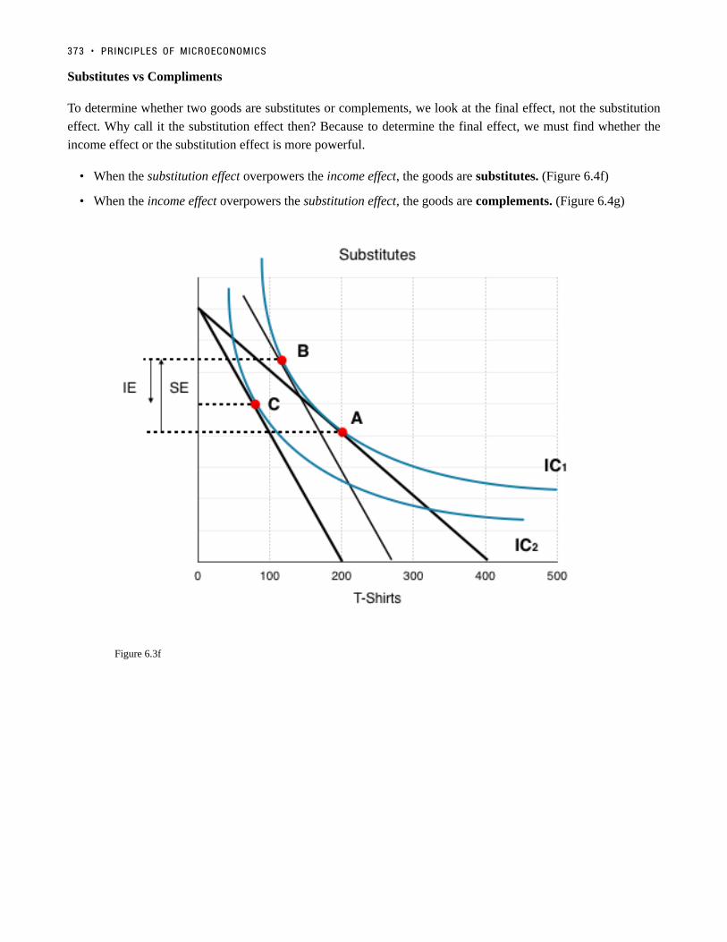
Substitutes vs Compliments
To determine whether two goods are substitutes or complements, we look at the final effect, not the substitution
effect. Why call it the substitution effect then? Because to determine the final effect, we must find whether the
income effect or the substitution effect is more powerful.
• When the substitution effect overpowers the income effect, the goods are substitutes. (Figure 6.4f)
• When the income effect overpowers the substitution effect, the goods are complements. (Figure 6.4g)
Figure 6.3f
373 • PRINCIPLES OF MICROECONOMICS

Figure 6.3g
Normal vs InferiorNormal vs Inferior
You should already have a good understanding of how to tell whether a good is normal or inferior based on the
income effect. In the example above, we determined that both goods were normal since when we removed the
hypothetical income boost, both QD for x and QD for y fell.
Let’s look at a case where prices are decreasing. In Figure 6.4h, the IC and BL are shown for a market where the
price of x has fallen, pivoting the budget line from BL1 to BL2. In this case, we must take away the hypothetical
income to isolate the SE, bringing us from Point A to Point B. The income effect is simply what happens when
we reverse our thought experiment, and either remove the hypothetical income, or in this case, give it back.
6.3 UNDERSTANDING CONSUMER THEORY • 374

Figure 6.3h
Figure 6.4h presents 3 regions. Whether the goods are inferior or normal will determine where the new IC and
Point C end up.
Region 1: QD for X decreases, QD for Y increases
Good X is inferior, Good Y is normal
Region 2: QD for X increases, QD for Y increases
Good X is normal, Good Y is normal
Region 3: QD for X increases, QD for Y decreases
Good X is normal, Good Y is inferior
What if Both Goods Are Inferior?What if Both Goods Are Inferior?
Both goods cannot be considered inferior in this model, because the model only represents twogoods. Whether a good is inferior or normal is relative to other goods. Kraft Dinner is inferior becausewhen I can afford to, I would rather buy Steak. Consider a case where two inferior goods are the only twogoods in the market. With your budget, you can either purchase Kraft Dinner or Tomato Soup. Althoughboth could be considered inferior in the regular market, in our market of two goods, when income increases
375 • PRINCIPLES OF MICROECONOMICS

you will either buy more of both, or more of one – never less of both. Remember that economic modelsare simplifications of reality, because the more variables you include, the more complicated they become.
ConclusionConclusion
Consumer theory helps us see how individual consumers behave in a large market. With the model, we can
determine whether goods are substitutes or complements, normal or inferior, and use the final effects to see how
consumers respond to price changes. In Topic 3, we showed how movements along the demand curve result from
changes in prices. In the next section, we will show how this model can be used to derive demand curves.
GlossaryGlossary
Income EffectThe effect of a price change on a consumers purchasing powers, impact depends on whether good isnormal or inferiorSubstitution Effectthe effect of a price change on the relative price of goods, consumers generally substitute away fromgoods when prices riseTangentthe slope are equal
Exercises 6.3
1. In the diagram below, a consumer maximizes utility by choosing point A, given BL1.
Suppose that both goods x and y are normal and the budget line shifts to BL2. Which of the followingcould be the new optimal consumption choice?
a) B.
6.3 UNDERSTANDING CONSUMER THEORY • 376
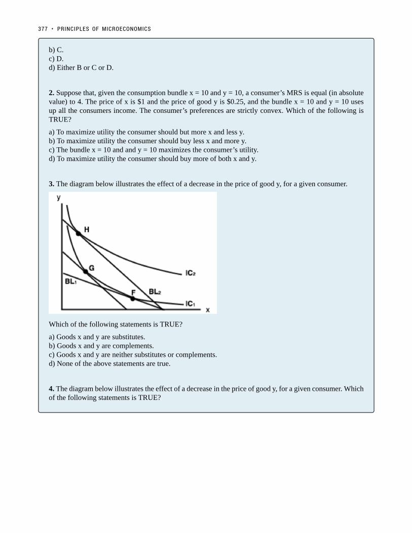
b) C.c) D.d) Either B or C or D.
2. Suppose that, given the consumption bundle x = 10 and y = 10, a consumer’s MRS is equal (in absolutevalue) to 4. The price of x is $1 and the price of good y is $0.25, and the bundle x = 10 and y = 10 usesup all the consumers income. The consumer’s preferences are strictly convex. Which of the following isTRUE?
a) To maximize utility the consumer should but more x and less y.b) To maximize utility the consumer should buy less x and more y.c) The bundle x = 10 and and y = 10 maximizes the consumer’s utility.d) To maximize utility the consumer should buy more of both x and y.
3. The diagram below illustrates the effect of a decrease in the price of good y, for a given consumer.
Which of the following statements is TRUE?
a) Goods x and y are substitutes.b) Goods x and y are complements.c) Goods x and y are neither substitutes or complements.d) None of the above statements are true.
4. The diagram below illustrates the effect of a decrease in the price of good y, for a given consumer. Whichof the following statements is TRUE?
377 • PRINCIPLES OF MICROECONOMICS

a) Goods x and y are substitutes.b) Goods x and y are complements.c) Goods x and y are neither substitutes or complements.d) None of the above statements are true.
5. Refer to the indifference curve/budget line diagram below.
Suppose that a consumer initially faces budget line BL1, and thus, by choosing consumption point c, is ableto achieve the utility level associated with IC1. If px decreases, then the substitution effect is the movementfrom ______ and the income effect is the movement from ______.
a) a to b; b to c.b) b to a; a to d.c) c to d; d to a.d) d to c; c to b.
6. Refer to the indifference curve/budget line diagram below.
6.3 UNDERSTANDING CONSUMER THEORY • 378

This consumer has $300 in income and initially faces prices of px = $1 and py = $3. Given this, shemaximized her utility at point a.
If the price of good x rises to $3, how much additional income would the consumer need, in order to beable to attain her original level of utility given the new prices?
a) There is insufficient information to determine the additional income needed.b) $450.c) $300.d) $150.
7. Refer to the indifference curve/budget line diagram below.
Suppose that a consumer initially faces budget line BL1, and thus is able to achieve the utility level
379 • PRINCIPLES OF MICROECONOMICS

associated with IC1. If py increases, then the substitution effect is the movement from ______ and theincome effect is the movement from ______.
a) e to d; d to c.b) e to c; e to d.c ) e to c; c to d.d) e to f; f to d.
8. Suppose that, given the consumption bundle x = 10 and y = 10, a consumer’s MRS is equal (in absolutevalue) to 0.4. The price of x is $0.50 and the price of good y is $0.75, and the bundle x = 10 and y = 10uses up all the consumers income. The consumer’s preferences are strictly convex. Which of the followingis TRUE?
a) To maximize utility the consumer should buy more x and less y.b) To maximize utility the consumer should buy less x and more y.c) The bundle x = 10 and and y = 10 maximizes the consumer’s utility.d) There is insufficient information to determine what the consumer should do to maximize utility.
6.3 UNDERSTANDING CONSUMER THEORY • 380

6.4 Building Demand
Learning Objectives
By the end of this section, you will be able to:
• Understand how the demand curve and consumer theory are linked
The Foundations of Demand CurvesThe Foundations of Demand Curves
Changes in the price of a good cause the budget constraint to shift, and new indifference curves to form. In
this way, the logical foundations of demand curves—which show a connection between prices and quantity
demanded—are based on the underlying idea of individuals seeking utility. Figure 6.4a shows a budget constraint
with a choice between housing and “everything else.” (Putting “everything else” on the vertical axis can be a
useful approach in some cases, especially when the focus of the analysis is on one particular good.) The preferred
choice on the original budget constraint that provides the highest possible utility is labelled M0. The other three
budget constraints represent successively higher prices for housing of P1, P2, and P3. As the budget constraint
continues to rotate inwards, the utility-maximizing choices are labelled M1, M2, and M3, and the quantity
demanded of housing falls from Q0 to Q1 to Q2 to Q3. Note that indifference curves have not been represented to
keep the graph easy to follow. M0, M1, M2, and M3 represent the points where IC0, IC1, IC2, and IC3 are tangent
to the changing budget lines.
381

Figure 6.4a
So, as the price of housing rises, the budget constraint shifts to the left, and the quantity consumed of housing
falls, ceteris paribus (meaning, with all other things being the same). This relationship – the price of housing
rising while the quantity of housing demanded falls – is graphed on the demand curve. Indeed, the vertical dashed
lines stretching between the top and bottom show that the quantity of housing demanded at each point is the same
in both (a) and (b). The shape of a demand curve is ultimately determined by the underlying choices made to
maximize utility subject to a budget constraint. While economists may not be able to measure utility, they can
certainly measure price and quantity demanded.
ConclusionConclusion
In chapter 6, we explored the inner workings of the demand curve and showed how consumers strive to maximize
their utility given their budget constraints. This analysis shows us how to determine whether a good is normal or
inferior, and whether two goods are substitutes or compliments. Next, we will examine the back-end of the supply
curve with an in-depth analysis of producer theory.
6.4 BUILDING DEMAND • 382
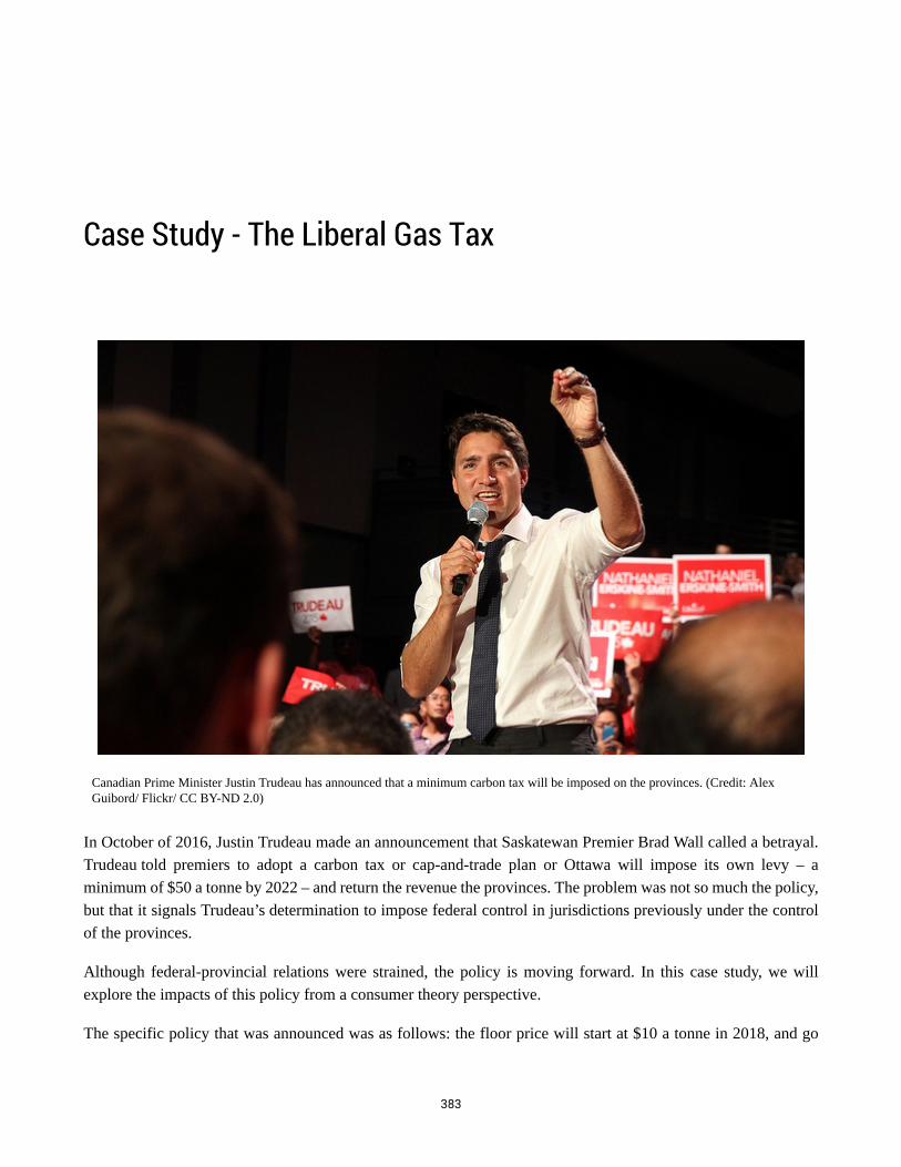
Case Study - The Liberal Gas Tax
Canadian Prime Minister Justin Trudeau has announced that a minimum carbon tax will be imposed on the provinces. (Credit: AlexGuibord/ Flickr/ CC BY-ND 2.0)
In October of 2016, Justin Trudeau made an announcement that Saskatewan Premier Brad Wall called a betrayal.
Trudeau told premiers to adopt a carbon tax or cap-and-trade plan or Ottawa will impose its own levy – a
minimum of $50 a tonne by 2022 – and return the revenue the provinces. The problem was not so much the policy,
but that it signals Trudeau’s determination to impose federal control in jurisdictions previously under the control
of the provinces.
Although federal-provincial relations were strained, the policy is moving forward. In this case study, we will
explore the impacts of this policy from a consumer theory perspective.
The specific policy that was announced was as follows: the floor price will start at $10 a tonne in 2018, and go
383

up by $10 a year for the next four years. Provinces with a pre-existing policy must make up the difference. It is
estimated that a $50 carbon tax would drive up pump prices by 11 cents a litre.
Read more about the Liberal Carbon Tax plan
Assume a households budget is $180, that the price of gas is $0.90 and that the price of all other goods is $1.38.
1. Draw the household’s budget line on the diagram below. If they were to buy only one good or the other,
how many total L of gas could they buy? How many of all other goods?
CASE STUDY - THE LIBERAL GAS TAX • 384
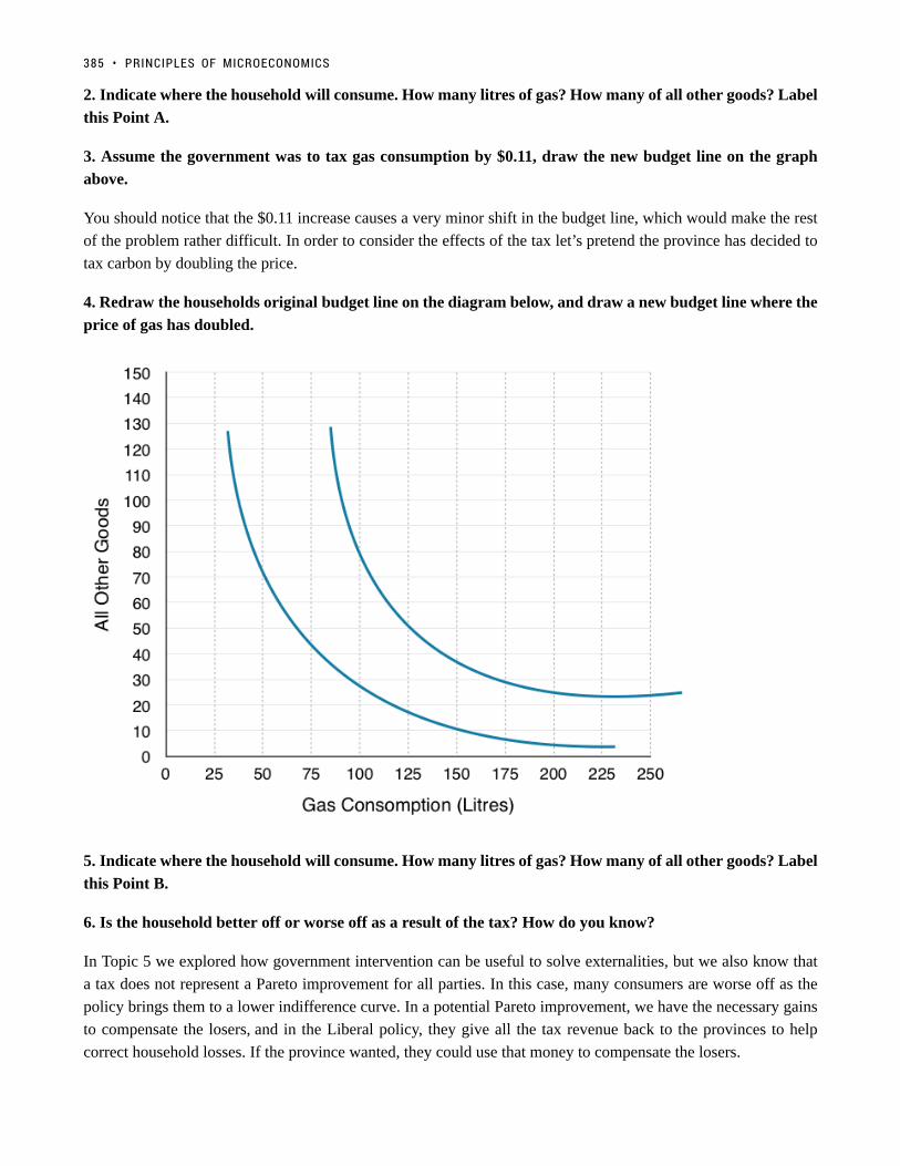
2. Indicate where the household will consume. How many litres of gas? How many of all other goods? Label
this Point A.
3. Assume the government was to tax gas consumption by $0.11, draw the new budget line on the graph
above.
You should notice that the $0.11 increase causes a very minor shift in the budget line, which would make the rest
of the problem rather difficult. In order to consider the effects of the tax let’s pretend the province has decided to
tax carbon by doubling the price.
4. Redraw the households original budget line on the diagram below, and draw a new budget line where the
price of gas has doubled.
5. Indicate where the household will consume. How many litres of gas? How many of all other goods? Label
this Point B.
6. Is the household better off or worse off as a result of the tax? How do you know?
In Topic 5 we explored how government intervention can be useful to solve externalities, but we also know that
a tax does not represent a Pareto improvement for all parties. In this case, many consumers are worse off as the
policy brings them to a lower indifference curve. In a potential Pareto improvement, we have the necessary gains
to compensate the losers, and in the Liberal policy, they give all the tax revenue back to the provinces to help
correct household losses. If the province wanted, they could use that money to compensate the losers.
385 • PRINCIPLES OF MICROECONOMICS

Not everyone gains from a gas tax. Although it may be a potential parato improvement, the government must consider the losers from thepolicy. (Credit: qian/ Flickr/ CC BY-NC-SA 2.0)
7. How much money does the government collect from each household from the gas tax?
8. If the government compensates each household until they are indifferent to the gas tax, where will the
households consume? Label this Point C. Does this still reduce pollution?
9. How much money would the government have to give to each household to make them indifferent about
the tax?
10. Indicate the Income Effect, the Substitution Effect and the Final Effect of the tax (without
compensation) with reference to the 3 points (A, B & C)
11. How could this policy represent a potential Pareto improvement if the revenue the government receives
is not enough to compensate the households?
Notice that this analysis does not pass judgement on whether the government is doing too much or not enough
for the environment. As an economist, you can evaluate policy to determine whether they are the best method to
achieving a certain objective, without making comment on the objective.
In this case study we have shown how microeconomic concepts of environmental policy and consumer theory can
be used to understand current events in the news. Do you have a story you think would make a good case study?
Contact [email protected] to propose your story.
CASE STUDY - THE LIBERAL GAS TAX • 386

Solutions: Case Study - The Liberal Gas Tax
1. Draw the household’s budget line on the diagram below. If they were to buy only one good or the other,
how many total L of gas could they buy? How many of all other goods?
In order to draw the budget line the best method is to find how many of each good the household could buy if they
purchased only one good. In this case the household has a budget of $180, the price of gas is $0.90 and the price
of all other goods is $1.38.
Purchase only gas: $180/$0.90 = 200. This is our X-intercept.
Purchase only other goods: $180/$1.38 = 130. This is our Y-intercept.
Plotting the intercept and connecting the dots:
387

2. Indicate where the household will consume. How many litres of gas? How many of all other goods? Label
this Point A.
The place where the household will consume is where the IC is tangent to the budget line, or where MRS = Px/
Py. At this point the benefits of an extra litre of gas are equal to the costs, so the household cannot gain from any
change in consumption.
On the graph below, we see households consume at Point A, consuming 125L of gas and 50 Other Goods.
SOLUTIONS: CASE STUDY - THE LIBERAL GAS TAX • 388

3. Assume the government was to tax gas consumption by $0.11, draw the new budget line on the graph
above.
Again to draw the budget line the best method is to find how many of each good the household could buy if they
purchased only one good. In this case the only thing that has changed is our price of gas has increased from $0.90
to $1.01.
Purchase only gas: $180/$1.01 = 178. This is our X-intercept.
Purchase only other goods: $180/$1.38 = 130. This is our Y-intercept.
Plotting the intercept and connecting the dots:
389 • PRINCIPLES OF MICROECONOMICS
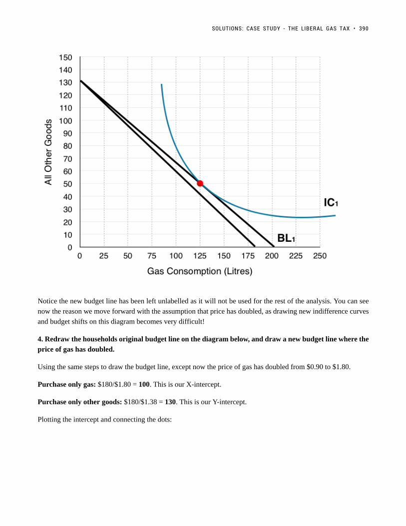
Notice the new budget line has been left unlabelled as it will not be used for the rest of the analysis. You can see
now the reason we move forward with the assumption that price has doubled, as drawing new indifference curves
and budget shifts on this diagram becomes very difficult!
4. Redraw the households original budget line on the diagram below, and draw a new budget line where the
price of gas has doubled.
Using the same steps to draw the budget line, except now the price of gas has doubled from $0.90 to $1.80.
Purchase only gas: $180/$1.80 = 100. This is our X-intercept.
Purchase only other goods: $180/$1.38 = 130. This is our Y-intercept.
Plotting the intercept and connecting the dots:
SOLUTIONS: CASE STUDY - THE LIBERAL GAS TAX • 390

5. Indicate where the household will consume. How many litres of gas? How many of all other goods? Label
this Point B.
On the graph below, households consume where BL2 is tangent to IC2 at Point B, consuming 50L of gas and 70
Other Goods.
391 • PRINCIPLES OF MICROECONOMICS

6. Is the household better off or worse off as a result of the tax? How do you know?
We can see that the household is worse off as a result of the tax since they are consuming on a lower indifference
curve. Remember the household views every point along an indifference curve as equal, so operating at a point on
a lower indifference curve means you are worse off.
7. How much money does the government collect from each household from the gas tax?
The government collects $0.90 for every L of gas that is consumed, in question 5 we identified that households
consume 50L after the tax. This means that the government collects $0.90*50 = $45 from each household.
8. If the government compensates each household until they are indifferent to the gas tax, where will the
households consume? Label this Point C.
In order to find this information we have to shift the new budget line (BL2) until it is tangent to the original
indifference curve. In question 6 we emphasized that if households are on a lower indifference curve they are
worse off, and that the consumer is indifferent between points on its indifference curve. In the figure below we
can see BL2 gradually shift out as the government gives more and more to the household. This continues until the
budget line + compensation is tangent to the original indifference curve at Point C.
SOLUTIONS: CASE STUDY - THE LIBERAL GAS TAX • 392
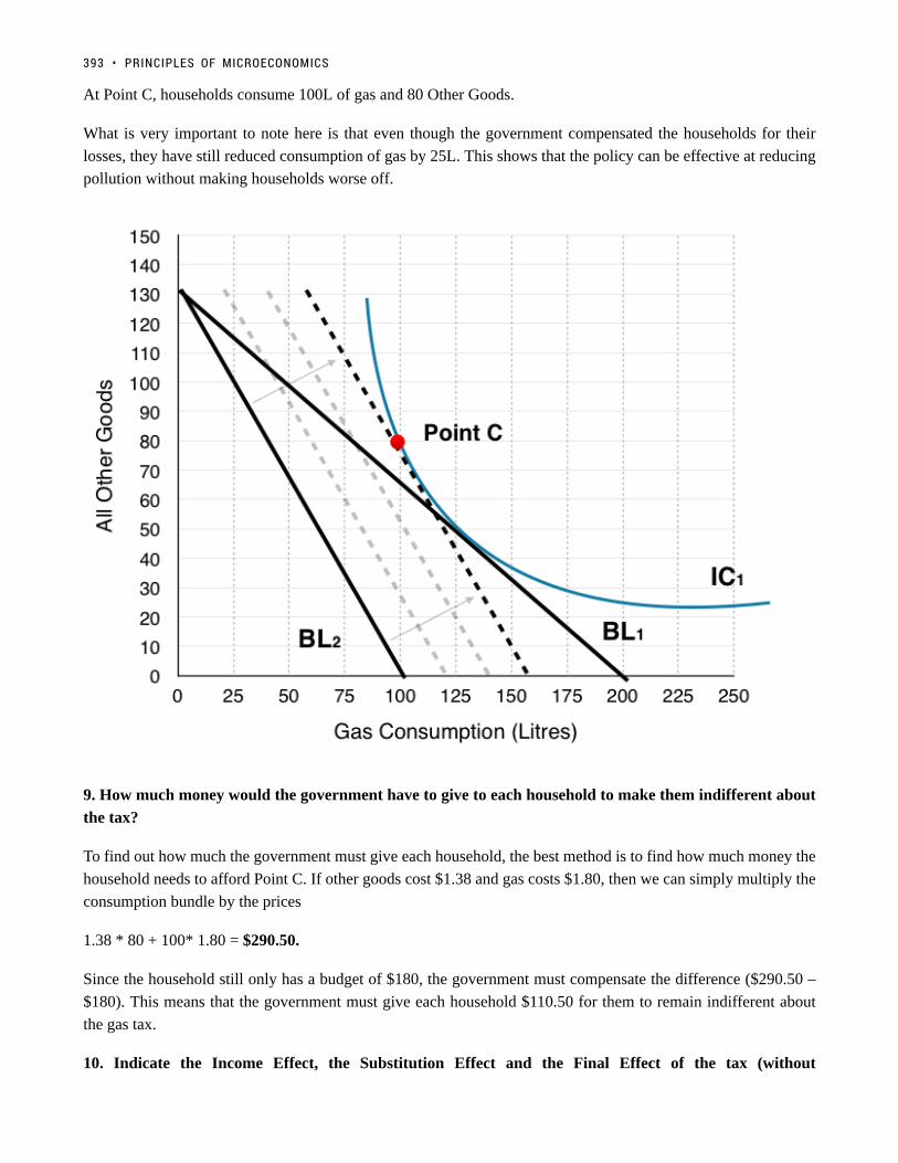
At Point C, households consume 100L of gas and 80 Other Goods.
What is very important to note here is that even though the government compensated the households for their
losses, they have still reduced consumption of gas by 25L. This shows that the policy can be effective at reducing
pollution without making households worse off.
9. How much money would the government have to give to each household to make them indifferent about
the tax?
To find out how much the government must give each household, the best method is to find how much money the
household needs to afford Point C. If other goods cost $1.38 and gas costs $1.80, then we can simply multiply the
consumption bundle by the prices
1.38 * 80 + 100* 1.80 = $290.50.
Since the household still only has a budget of $180, the government must compensate the difference ($290.50 –
$180). This means that the government must give each household $110.50 for them to remain indifferent about
the gas tax.
10. Indicate the Income Effect, the Substitution Effect and the Final Effect of the tax (without
393 • PRINCIPLES OF MICROECONOMICS

compensation) with reference to the 3 points (A, B & C). What is the final effect of the entire policy (with
compensation)?
In Topic 6 we have mentioned numerous times that to isolate the income effect and substitution effect we have to
give back the ‘hypothetical’ income to see how a household would behave if they had no reduction in purchasing
power. In this exercise (question 9) we calculated how much this income would have to be, so that the government
could remove the effects. This means that the final effect of the tax + compensation (Point A to Point C) is just
the substitution effect and that the government’s compensation is the income effect. In summary:
Just Tax
Substitution Effect: Point A to Point C
Income Effect: Point C to Point B
Final Effect: Point A to Point B
Tax + Compensation
Substitution Effect: Point A to Point C
Income Effect: N/A
Final Effect: Point A to Point C
SOLUTIONS: CASE STUDY - THE LIBERAL GAS TAX • 394
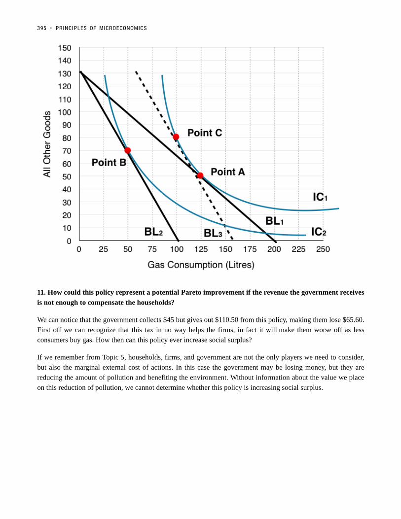
11. How could this policy represent a potential Pareto improvement if the revenue the government receives
is not enough to compensate the households?
We can notice that the government collects $45 but gives out $110.50 from this policy, making them lose $65.60.
First off we can recognize that this tax in no way helps the firms, in fact it will make them worse off as less
consumers buy gas. How then can this policy ever increase social surplus?
If we remember from Topic 5, households, firms, and government are not the only players we need to consider,
but also the marginal external cost of actions. In this case the government may be losing money, but they are
reducing the amount of pollution and benefiting the environment. Without information about the value we place
on this reduction of pollution, we cannot determine whether this policy is increasing social surplus.
395 • PRINCIPLES OF MICROECONOMICS

Topic 6 Solutions
Solutions to Exercises 6.1
1. C
2. B
Solutions to Exercises 6.2
1. D
2. D
3. C
Solutions to Exercises 6.3
1. B
2. C
3. A
4. A
5. C
6. D
7. C
8. B
396

397 • PRINCIPLES OF MICROECONOMICS

Topic 6 References
McCarthy, Shawn and Daniel LeBlanc. The Globe and Mail. “Liberal Government’s Carbon Tax Plan Provokes
Anger from Provinces.” October 3, 2016. http://www.theglobeandmail.com/news/politics/liberals-to-set-carbon-
price-at-10-a-tonne-in-2018-rising-to-50-by-2022/article32206937/
UNESCO Institute for Statistics. “Statistics in Brief / Profiles” Accessed August 2013. http://stats.uis.unesco.org/
unesco/TableViewer/document.aspx?ReportId=121 &IF_Language=en&BR_Country=5580.
U.S. Bureau of Labor Statistics. 2015. “Consumer Expenditures in 2013.” Accessed March 11, 2015.
http://www.bls.gov/cex/csxann13.pdf.
398

Topic 7: Producer Theory
399
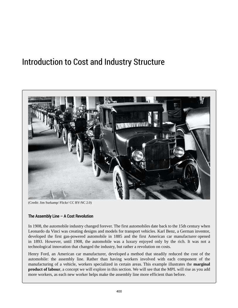
Introduction to Cost and Industry Structure
(Credit: Jim Surkamp/ Flickr/ CC BY-NC 2.0)
The Assembly Line – A Cost RevolutionThe Assembly Line – A Cost Revolution
In 1908, the automobile industry changed forever. The first automobiles date back to the 15th century whenLeonardo da Vinci was creating designs and models for transport vehicles. Karl Benz, a German inventor,developed the first gas-powered automobile in 1885 and the first American car manufacturer openedin 1893. However, until 1908, the automobile was a luxury enjoyed only by the rich. It was not atechnological innovation that changed the industry, but rather a revolution on costs.
Henry Ford, an American car manufacturer, developed a method that steadily reduced the cost of theautomobile: the assembly line. Rather than having workers involved with each component of themanufacturing of a vehicle, workers specialized in certain areas. This example illustrates the marginalproduct of labour, a concept we will explore in this section. We will see that the MPL will rise as you addmore workers, as each new worker helps make the assembly line more efficient than before.
400

The Model T, known popularly as the “Tin Lizzie” has become an American folkloric symbol, as it wasa turning point in allowing the majority of Americans to afford the automobile. By 1927, over 15 millionModel-T’s had been produced.
This innovation in production shows that the economics of the firm has an important bearing on the overallmarket and allows us to understand how costs affect supply.
Read more about the Model-TRead more about the Model-T
Topic Objectives
Topic 7: Producer Theory
In this Topic, you will learn about:
• Fixed versus variable factors
• The structure of costs in the short run
• The structure of costs in the long run
• Marginal and average productivity of labour
• Marginal costs, average variable costs, average total costs, and average fixed costs
• Producer surplus versus profits
• Short and long run competitive equilibria
In Topic 6, we explored the underlying behaviours of the demand curve, and how consumers make consumption
decisions based on preferences and budget constraints. Now, we will examine the underlying behaviours of
individual firms in our supply curve.
First, let’s review some of the assumptions we have made about supply curves in perfectly competitive markets:
• Producers will increase production if MB (or price) is greater than the MC
• Producers will reduce production if MB (price) is less than MC
• Producers maximize profits where MB = MC
401 • PRINCIPLES OF MICROECONOMICS

• The supply curve represents the aggregate MC of all firms
So far, we have shown the supply, or marginal cost curve, as linear and upward sloping. In this topic, we will give
greater consideration to the workings of a firm, and how firms respond to demand/supply shocks.
INTRODUCTION TO COST AND INDUSTRY STRUCTURE • 402

7.1 Building Producer Theory
Learning Objectives
By the end of this section, you will be able to:
• Understand the relationship between marginal product of labour and marginal cost
• Derive average cost from marginal costs
• Represent a firm’s short run costs on a producer theory diagram
Different firms face different kinds of costs. A list of the costs involved in producing cars will look very different
from the costs involved in producing fast-food meals. However, the cost structure of all firms can be broken down
into some common types.
To start, we want to look at the costs of a single firm in the short run. These costs come from the different inputs
required to produce a good, whether that is machines, labour, ingredients, rent, etc. By short run, we mean that
there is at least one input that cannot be changed. This input (or inputs) is classified as a fixed cost since in the
short term there is nothing we can do to avoid this cost except quit producing altogether.
When a firm looks at its total costs of production in the short run, a useful starting point is to divide total costs
into two categories: fixed costs (ones that cannot change) and variable costs (ones that can change).
To guide our understanding of fixed and variable costs, consider Henry Ford once more. When Ford was opening
his first factory, he had to consider different categories of costs.
Fixed Costs
Ford’s fixed costs are his expenditures that do not change regardless of his level of production. Whether
he produced a lot or a little, his fixed costs are the same.
The first step for Ford to open his factory is finding the factory space. Ford must find someone who is willing to
sell or rent him space. His first offer comes from Tom, who will only rent to Ford if Ford signs a 1-year lease for
$20,000. Ford, with little negotiating power, agrees and signs the lease.
403

Once Ford signs the lease, the rent for the year costs him $20,000 regardless of how much he produces. This lease
has now become a sunk cost since there is nothing Ford can do to get his money back. Fixed costs can take many
other forms: for example, the cost of machinery or equipment to produce the product, research and development
costs, even an expense like advertising to popularize a brand name. The level of fixed costs varies according to
the specific line of business. For instance, manufacturing computer chips requires an expensive factory, but a local
moving and hauling business can get by with almost no fixed costs at all if it rents trucks by the day when needed.
Since Fords cost is fixed for a whole year, this is the length of his ‘short-run.’ During that period, since the lease
expense is sunk, it should not affect his decision making.
Variable CostsVariable Costs
Ford’s variable costs are incurred in the act of producing—the more he produces, the greater the variable cost.
After signing the lease for the factory and purchasing machines, Ford now has to buy the raw materials and find
workers to produce his cars. The more Ford wants to produce, the more workers and raw materials he will have
to buy. For this reason, his variable costs are increasing as his production increases.
Marginal Product of LabourMarginal Product of Labour
For now, let’s diverge from the Ford example and consider an industry that is more labour intensive:
barbershops. In the service industry, one of the most important variable costs is labour. How do we measure the
cost of labour? It is not as simple as the hourly wage.
Consider a barbershop called “The Clip Joint.” For The Clip Joint, the variable costs include hiring barbers.
Assume this cost is $80 per barber each day. The quantity of haircuts the barbershop can produce will increase as
it hires additional barbers. Consider Table 1, which depicts the number of haircuts each new barber can produce.
Notice that the first barber can only do 15 haircuts a day, whereas the next can cut 22.
Number of Barbers Number of Haircuts/New Barber
1 15
2 22
3 25
4 23
5 19
6 13
This represents the Marginal Product of Labour, or the change in output that results from employing an extra
unit of labour. The table can be depicted on a graph, with MPL on the y-axis and the # of Barbers on the x-axis.
On the graph, we notice that at a certain level of barbers, our marginal gains from an extra barber begin to fall.
7.1 BUILDING PRODUCER THEORY • 404

Figure 7.1a
To understand the reason behind this pattern, consider that a one-man barber shop is a very busy operation.
The single barber needs to do everything: say hello to people, answer the phone, cut hair, clean up, and run the
cash register. A second barber reduces the level of disruption from jumping back and forth between these tasks,
and allows a greater division of labor and specialization. The result can be greater increasing marginal returns.
However, as other barbers are added, the advantage of each additional barber is less, since the specialization of
labor can only go so far. The addition of a sixth or seventh or eighth barber just to greet people at the door will
have less impact than the second one did. This is the pattern of diminishing marginal returns. As a result, the total
costs of production will begin to rise more rapidly as output increases. At some point, you may even see negative
returns as the additional barbers begin bumping elbows and getting in each other’s way. In this case, the addition
of still more barbers would cause the output to decrease.
This pattern of diminishing marginal returns is common in production. As another example, consider the
problem of irrigating a crop on a farmer’s field. The plot of land is the fixed factor of production, while the water
that can be added to the land is the key variable cost. As the farmer adds water to the land, output increases. But
adding more and more water brings smaller and smaller increases in output until at some point the water floods
the field and reduces output. Diminishing marginal returns occur because we are ultimately constrained by some
fixed factor.
MarginalMarginal CostsCosts
How do we represent the MPL as a variable cost? Remember that the cost of hiring a barber is equal to $80/day.
405 • PRINCIPLES OF MICROECONOMICS
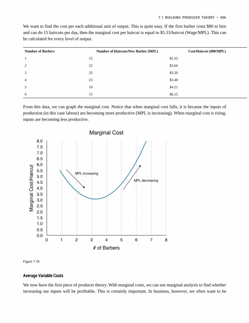
We want to find the cost per each additional unit of output. This is quite easy. If the first barber costs $80 to hire
and can do 15 haircuts per day, then the marginal cost per haircut is equal to $5.33/haircut (Wage/MPL). This can
be calculated for every level of output.
Number of Barbers Number of Haircuts/New Barber (MPL) Cost/Haircut ($80/MPL)
1 15 $5.33
2 22 $3.64
3 25 $3.20
4 23 $3.48
5 19 $4.21
6 13 $6.15
From this data, we can graph the marginal cost. Notice that when marginal cost falls, it is because the inputs of
production (in this case labour) are becoming more productive (MPL is increasing). When marginal cost is rising,
inputs are becoming less productive.
Figure 7.1b
Average Variable CostsAverage Variable Costs
We now have the first piece of producer theory. With marginal costs, we can use marginal analysis to find whether
increasing our inputs will be profitable. This is certainly important. In business, however, we often want to be
7.1 BUILDING PRODUCER THEORY • 406

able to answer “how much does a single haircut cost to produce”. Right now, our answer is “it depends” since our
costs vary based on the number of barbers. Sometimes, we want to ignore this variation and calculate the average
variable cost. Average variable cost is calculated by taking the total costs from every barber up to that point and
dividing it by the total number of haircuts those barbers cut collectively.
# of Haircuts Marginal Cost/Haircut Total Costs Average Cost/Haircut (Total Costs/# ofHaircuts)
1 $5.33 $5.33 $5.33
2 $3.64 $8.97 $4.49
3 $3.20 $12.17 $4.06
4 $3.48 $15.65 $3.91
5 $4.21 $19.69 $3.97
6 $6.15 $26.01 $4.34
Our average variable cost can be represented on the same graph as our marginal cost curve, helping us build our
producer theory diagram even further.
Figure 7.1c
Notice that the marginal cost line intersects the average cost line exactly at the bottom of the average cost curve—
407 • PRINCIPLES OF MICROECONOMICS

this occurs at a cost of $4.0. The reason why the intersection occurs at this point is built into the economic meaning
of marginal and average costs. If the marginal cost of production is below the average cost of producing previous
units, as it is for the points to the left of where MC crosses AVC, then producing one additional unit will reduce
average costs overall—and the AVC curve will be downward-sloping in this zone. Conversely, if the marginal
cost of production for producing an additional unit is above the average cost of producing units, as it is for points
to the right of where MC crosses AVC, then producing a marginal unit will increase average costs overall—and
the AVC curve must be upward-sloping in this zone. The point of transition, between where MC is pulling AVC
down and where it is pulling it up, must occur at the minimum point of the AVC curve.
When MC begins to increase, notice that AVC does not immediately increase. As long as marginal cost is below
average cost, it causes AVC to decrease. When MC intercepts AVC and begins to rise, it causes AVC to increases.
As we will see, AVCMIN is very important in the short run. See the application “Average Can Fall While Marginal
Increases: Grades” to solidify this interaction.
Average Can Fall While Marginal Increases: GradesAverage Can Fall While Marginal Increases: Grades
(Credit: bitjungle/ Flickr/ CC BY-SA 2.0)
This concept can seem confusing at first, but it in fact quite intuitive. Consider how you calculate yourgrades. If you are normally an A student and have an 80% average in Microeconomics, you will likely be
7.1 BUILDING PRODUCER THEORY • 408

disappointed if you received a 50% on a Midterm. Say, on the next midterm, you receive 65% – this isbetter than the 50% from last time but is still bringing you down from the A average you had hoped for.This is similar to the case of MC and AVC. MC is like the midterm grades – even when it is increasing, ifit is still below your average, it will continue to bring it down, and when it is greater than average, it willbring it up.
Average Product of LabourAverage Product of Labour
Backtracking slightly, the same analysis can be done for the Average Product of Labour, which can also be used
to derive the AVC curve. Consider the graph below which represents the interaction between MPL and APL.
Figure 7.1d
Notice that the maximum point on the APL happens at the same point (4.5 barbers) as the minimum point on AVC
in Figure 7.1c. This is because when on average barbers are most productive, costs/haircut are lowest. Comparing
the APL/MPL graph to the AVC/MC graph we see that the curves are inversely related.
Average Total CostsAverage Total Costs
We now have MC and AVC represented in our producer theory model. How do we represent fixed costs? Let’s
assume the Clip Joint has fixed costs equal to $150 per day. average total cost is an average of our total variable
cost and total fixed costs. As such, it can be found by (total VC + FC)/Q. Expanding this equation, we see it is
409 • PRINCIPLES OF MICROECONOMICS

equivalent to VC/Q+FC/Q which is AVC + AFC. Since we already have our AVC, all we have to do is add the
FC/Q at each level of production.
Notice that we have changed the units on the x-axis of our producer theory graph from # of Barbers to # of
Haircuts. Although in this example MC would be a constant $5.33 from 0 haircuts to 15 haircuts and constant
$3.64 from 15 haircuts to 37 haircuts, in a larger market, this curve would be smoothed out. The following has
been smoothed out to represent a different MC for each haircut.
Figure 7.1e
So what is our ATC when we are producing 50 haircuts? Our AVC is $4.00. Our AFC at this point will be quite
high at $150/50 = $3. This means our ATC is $4.00 + $3.00 = $7.00. Consider how AFC changes as we increase
Q:
Q = 10 –> AFC = $150/10 = $15
Q = 20 –> AFC = $150/20 = $7.5
Q = 30 –> AFC = $150/30 = $5
Q = 150 –> AFC = $150/150 = $1
Since the only effect of an increase of inputs is spreading FC out amongst more units, AFC is always falling as Q
increases.
7.1 BUILDING PRODUCER THEORY • 410

Since AVC = ATC – (FC/Q), at low levels of Q, FC/Q is high. This means AVC is < ATC by a significant amount.
At high levels of Q, FC/Q is low. This means AVC is < ATC by a small amount.
As Q increases, FC/Q approaches 0 and AVC and AFC converge, as seen on Figure 7.1e
Why are total cost and average cost not on the same graph?Why are total cost and average cost not on the same graph?
Total cost, fixed cost, and variable cost each reflect different aspects of the cost of production over the entire
quantity of output being produced. These costs are measured in dollars. In contrast, marginal cost, average cost,
and average variable cost are costs per unit. In the previous example, they are measured as cost per haircut. Thus,
it would not make sense to put all of these numbers on the same graph, since they are measured in different units
($ versus $ per unit of output).
It would be as if the vertical axis measured two different things. In addition, as a practical matter, if they were
on the same graph, the lines for marginal cost, average cost, and average variable cost would appear almost flat
against the horizontal axis, compared to the values for total cost, fixed cost, and variable cost. Using the figures
from the previous example, the total cost of producing 40 haircuts is $296, but the average cost is $296/40, or
$7.4. If you graphed both total and average cost on the same axes, the average cost would hardly show.
A Variety of Cost PatternsA Variety of Cost Patterns
The pattern of costs varies among industries and even among firms in the same industry. Some businesses have
high fixed costs, but low marginal costs. Consider, for example, an Internet company that provides medical advice
to customers. Such a company might be paid by consumers directly, or perhaps hospitals or healthcare practices
might subscribe on behalf of their patients. Setting up the website, collecting the information, writing the content,
and buying or leasing the computer space to handle the web traffic are all fixed costs that must be undertaken
before the site can work. However, when the website is up and running, it can provide a high quantity of service
with relatively low variable costs, like the cost of monitoring the system and updating the information. In this
case, the total cost curve might start at a high level, because of the high fixed costs, but then might appear close
to flat, up to a large quantity of output, reflecting the low variable costs of operation.
For other firms, fixed costs may be relatively low. For example, consider small businesses that rake leaves in the
fall or shovel snow off sidewalks and driveways in the winter. For fixed costs, such firms may need little more
than a car to transport workers to customer’s homes and some rakes and shovels. Still other firms may find that
diminishing marginal returns set in quite sharply. If a manufacturing plant tried to run 24 hours per day, seven days
a week, little time remains for routine maintenance of the equipment, and marginal costs can increase dramatically
as the firm struggles to repair and replace overworked equipment.
Every firm can gain insight into its task of earning profits by dividing its total costs into fixed and variable
costs, and then using these calculations as a basis for average total cost, average variable cost, and marginal cost.
However, making a final decision about the profit-maximizing quantity to produce and the price to charge will
require combining these perspectives on cost with an analysis of sales and revenue, which in turn requires looking
at the market structure in which the firm finds itself. Before we turn to the analysis of market structure in other
topics, we will analyze how a perfectly competitive firm makes decisions in the short- and long-run
411 • PRINCIPLES OF MICROECONOMICS

Key Concepts and SummaryKey Concepts and Summary
In the short-run, a firm’s total costs can be divided into fixed costs, which a firm must incur before producing
any output, and variable costs, which the firm incurs in the act of producing. Fixed costs are sunk costs; that is,
because they are in the past and cannot be altered, they should play no role in economic decisions about future
production or pricing until out short run’s time horizon is up. Variable costs typically show diminishing marginal
returns, so that the marginal cost of producing higher levels of output rises.
Marginal cost is calculated by taking the change in total cost (or the change in variable cost, which will be the
same thing) and dividing it by the change in output for each level. Marginal costs are typically rising. A firm can
compare marginal cost to the additional revenue it gains from selling another unit to find out whether its marginal
unit is adding to its profit.
Average total cost is calculated by taking total cost and dividing by total output at each different level of output.
Average costs are typically U-shaped on a graph.
Average variable cost is calculated by taking variable cost and dividing it by the total output at each level of
output. Average variable costs are also typically U-shaped.
GlossaryGlossary
Average Product of Labourthe average amount of output each worker can produce; Total product/Total outputAverage Total Costtotal cost divided by the quantity of outputAverage Variable Costsariable cost divided by the quantity of outputDiminishing Marginal Returnsthe decrease in the marginal output of a production as input is is incrementally increasedFixed Costexpenditure that must be made before production starts and that does not change regardless of the level ofproductionMarginal Product of Labourthe amount of output an additional worker can produceShort Runa period of time in which at least one cost factor is fixedTotal Costthe sum of fixed and variable costs of productionVariable Costscost of production that increases with the quantity produced
7.1 BUILDING PRODUCER THEORY • 412

Exercises 7.1
The following FOUR questions refer to the table below, which shows the relationship between labour andoutput for a firm.
1. The marginal product of the fourth unit of labour hired is:
a) 10.b) 3.c) 4.d) 0.
2. If each unit of labour must be paid a wage of $10, then what do (total) variable costs equal, at an outputlevel of 25 units?
a) $250.b) $50.c) $20.d) $2.
3. If three workers are employed, then the average product of labour is:
a) 12.b) 11.c) 36.d) 40.
4. If each unit of labour must be paid a wage of $12, then what is the marginal cost of the 43rd unit ofoutput?
a) $12.b) $36.c) $3.d) $4.
5. Suppose that the marginal produce of labour is always decreasing in number of workers employed.Which of the following statements about the marginal cost of producing output is true?
Which of the following statements is true?
413 • PRINCIPLES OF MICROECONOMICS

a) Marginal cost is constant in output.b) Marginal cost is decreasing in output.c) Marginal cost is increasing in output.d) Marginal cost is decreasing in output at low level of output, and increasing in output at high levels ofoutput.
6. If the marginal cost of producing output is constant and equal to $5 per unit, and fixed costs are equal to$600, then average total cost given an output level of 100 is:
a) $5.b) $6.c) $11.d) $20.
7.1 BUILDING PRODUCER THEORY • 414

7.2 Understanding Producer Theory
Learning Objectives
By the end of this section, you will be able to:
• Calculate fixed costs, producer theory, and profits.
• Identify when firms will exit in the short-run.
• Be able to identify break-even and shut-down points.
Now that we have built our model for Producer Theory, we want to use it as a tool to understand how individual
firms behave when faced with different prices. First, let’s see the different variables we can calculate from our
graph.
Fixed CostFixed Cost
In Topic 7.1, we showed that ATC = AVC + AFC. This means that AFC = ATC – AVC. Since FC = (AFC x
Q), on our graph, we can find what total fixed costs are by simply multiplying the difference in AVC and
ATC by the quantity at that level [(ATC-AVC) x (Q)].
415

Figure 7.2a
At Q = 50, our ATC = $7 and AVC = $4. Calculating fixed cost, we see it equals $150 [(7-4) x (50)], as stated
in Topic 7.1. Remember that we derived ATC using fixed costs. Now, without knowing fixed cost, we can work
backwards from our diagram to calculate total fixed cost at any Q.
Calculating FC at any other point, we will find that it is always equal to $150. At Q = 150, ATC = $7.5 and AVC
= $6.5. [(7.5-6.5) x (150)] = $150. Remember that fixed cost is always equal to $150 regardless of quantity, but
AFC is always decreasing, as this $150 gets spread out across more goods.
7.2 UNDERSTANDING PRODUCER THEORY • 416
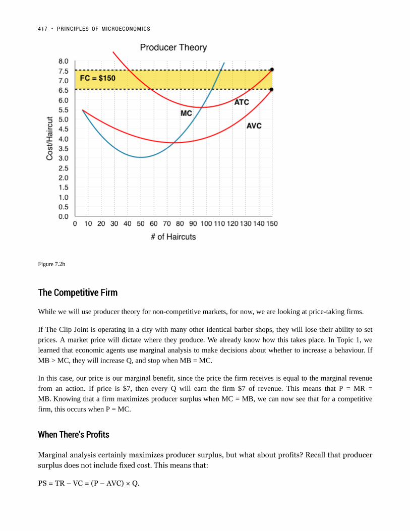
Figure 7.2b
The Competitive FirmThe Competitive Firm
While we will use producer theory for non-competitive markets, for now, we are looking at price-taking firms.
If The Clip Joint is operating in a city with many other identical barber shops, they will lose their ability to set
prices. A market price will dictate where they produce. We already know how this takes place. In Topic 1, we
learned that economic agents use marginal analysis to make decisions about whether to increase a behaviour. If
MB > MC, they will increase Q, and stop when MB = MC.
In this case, our price is our marginal benefit, since the price the firm receives is equal to the marginal revenue
from an action. If price is $7, then every Q will earn the firm $7 of revenue. This means that P = MR =
MB. Knowing that a firm maximizes producer surplus when MC = MB, we can now see that for a competitive
firm, this occurs when P = MC.
When There’s ProfitsWhen There’s Profits
Marginal analysis certainly maximizes producer surplus, but what about profits? Recall that producer
surplus does not include fixed cost. This means that:
PS = TR – VC = (P – AVC) × Q.
417 • PRINCIPLES OF MICROECONOMICS
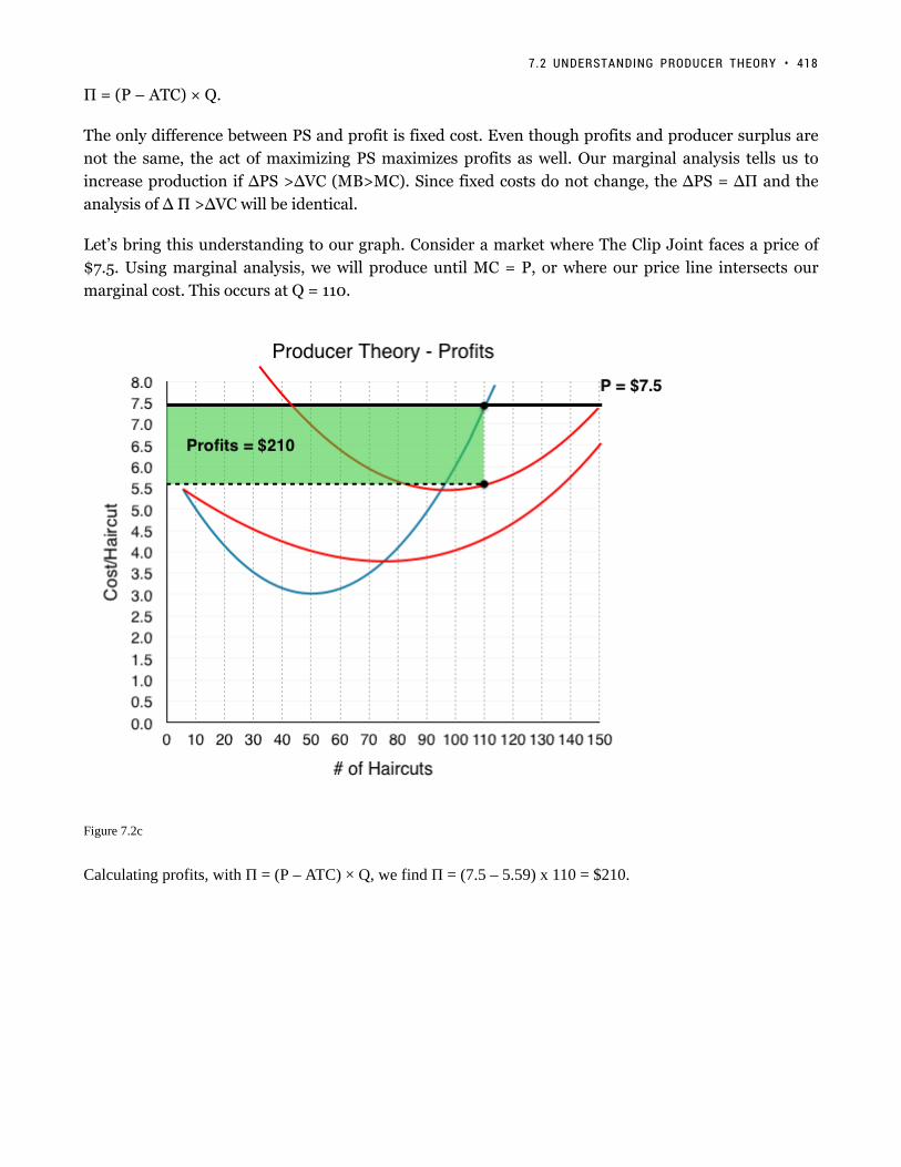
Π = (P – ATC) × Q.
The only difference between PS and profit is fixed cost. Even though profits and producer surplus are
not the same, the act of maximizing PS maximizes profits as well. Our marginal analysis tells us to
increase production if ∆PS >∆VC (MB>MC). Since fixed costs do not change, the ∆PS = ∆Π and the
analysis of ∆ Π >∆VC will be identical.
Let’s bring this understanding to our graph. Consider a market where The Clip Joint faces a price of
$7.5. Using marginal analysis, we will produce until MC = P, or where our price line intersects our
marginal cost. This occurs at Q = 110.
Figure 7.2c
Calculating profits, with Π = (P – ATC) × Q, we find Π = (7.5 – 5.59) x 110 = $210.
7.2 UNDERSTANDING PRODUCER THEORY • 418
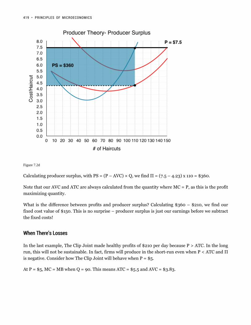
Figure 7.2d
Calculating producer surplus, with PS = (P – AVC) × Q, we find Π = (7.5 – 4.23) x 110 = $360.
Note that our AVC and ATC are always calculated from the quantity where MC = P, as this is the profit
maximizing quantity.
What is the difference between profits and producer surplus? Calculating $360 – $210, we find our
fixed cost value of $150. This is no surprise – producer surplus is just our earnings before we subtract
the fixed costs!
When There’s LossesWhen There’s Losses
In the last example, The Clip Joint made healthy profits of $210 per day because P > ATC. In the long
run, this will not be sustainable. In fact, firms will produce in the short-run even when P < ATC and Π
is negative. Consider how The Clip Joint will behave when P = $5.
At P = $5, MC = MB when Q = 90. This means ATC = $5.5 and AVC = $3.83.
419 • PRINCIPLES OF MICROECONOMICS

Figure 7.2e
Calculating profits, with Π = (P – ATC) × Q, we find Π = (5.0 – 5.5) x 90 = -$45.
Why doesn’t the firm just shut down if it is losing money? Because it could be losing more money. Remember
that no matter how much The Clip Joint produces, it still has to pay $150 in fixed costs. In this case, The Clip
Joint will take a loss of $45 over a loss of $150.
We can come to the same conclusion by looking at producer surplus.
7.2 UNDERSTANDING PRODUCER THEORY • 420

Figure 7.3f
If PS > 0, then the firm has enough money to pay for all of its variable costs, plus some money left over to pay
for its fixed costs. In this case, after paying VC, The Clip Joint has $105 left over to pay off a portion of its fixed
costs.
This should clear up the relationship between FC, PS, and Profits. Producer Surplus is the amount we have before
paying our fixed costs.
Smart-thinking company presidents do not continue to accept loses in the long run – that would be bad business.
When the lease comes up for renewal, The Clip Joint will shut down knowing that it loses $45 from each day of
business. Is there any case where it would shut down immediately in the short run? Yes. In this example, our PS >
0 since P > AVC; this means that even though we are losing money, we are able to pay off some of our FC. What if
P < AVC? In this case, our firm would not even be able to pay for its workers, let alone rent and other fixed costs.
The more the firm produced, the more money it would lose. In this case, our firm will shut down immediately.
For this reason, we call the point where P = AVCMIN the Shut-Down Point. If the price falls any lower, the firm
will shut down immediately.
421 • PRINCIPLES OF MICROECONOMICS

Figure 7.2g
Another important point is the Break-Even Point where P = ATC. If the price falls below this, we reach a
situation like the example above, where the firm makes negative profits but continues to operate in the short-run.
We have now analyzed how an individual firm behaves in the short-run in depth – but what about the long run?
What happens when shocks to the economy cause price to change? We will answer these questions in Topic 7.3.
GlossaryGlossary
Break-Even PointA point where a firm is making no profitsShut-Down PointA point where a firm is only able to cover their variable costs of production
Exercises 7.2
1. Suppose you are given the following information about a competitive firm:
At the current quantity produced, P = $10; AVC = $4; AVC is at is minimum.
7.2 UNDERSTANDING PRODUCER THEORY • 422

Given this:
a) The firm should continue to produce its current level of output; this is profit maximizing.b) In order to maximize profits, the firm should increase output.c) In order to maximize profits, the firm should decrease output.d) We do not have enough information to determine what the firm should do to maximize profits.
2. If a firm’s profit equals $600 and its producer surplus equals $1,000, then its fixed costs:
a) Equal $400b) Equal $600.c) Equal $1,600.d) Cannot be determined without further information.
The following TWO questions refer to the diagram below. Assume perfect competition.
3. The firm’s shut-down price is ____.
a) $2.b) $4.c) $7.d) $10.
4. (Remember to refer to the diagram on the previous page.) The firm’s break-even price is ____.
a) $2.b) $4.
423 • PRINCIPLES OF MICROECONOMICS

c) $7.d) $10.
The following THREE questions refer to the diagram below, which illustrates a competitive firm’s costcurves.
5. What do this firm’s fixed costs equal?
a) There is insufficient information to calculate the firm’s fixed costs.b) $50.c) $30.d) $20.
6. (Remember to refer to the diagram on the previous page.) If this firm can sell its output for $10 per unit,then its maximum profit is equal to:
a) $150.b) $75.c) $60.d) $45.
7. (Remember to refer to the diagram on the previous page.) If this firm can sell its output for $10 per unit,then its maximum producer surplus is equal to:
a) $150.b) $75.c) $60.d) $45.
The following THREE questions refer to the diagram below. Assume perfect competition.
7.2 UNDERSTANDING PRODUCER THEORY • 424

8. Given a price of $18, the profit-maximizing level of output for this firm is:
a) 5.b) 25.c) 30.d) 40.
9. (Remember to refer to the diagram on the previous page.) Given a price of $18, the firm’s maximumprofit is equal to:
a) $360.b) $240.c) $180.d) $0.
10. (Remember to refer to the diagram on the previous page.) What do this firm’s fixed costs equal?
a) $0b) $40.c) $180.d) There is insufficient information to calculate fixed costs.
425 • PRINCIPLES OF MICROECONOMICS
7.3 Producer Theory in the Long Run
Learning Objectives
By the end of this section, you will be able to:
• Understand why positive and negative profits entice entry and exit.
• Differentiate between accounting and economic profits.
• Explain what happens in the long-run after shocks to supply and demand.
So far we have looked at The Clip Joint in the short-run, while eluding to some of the actions The Clip Joint may
take in the LR including:
• If the price is below The Clip Joint’s break-even price, it will continue to operate in the short-run but exit in
the long run.
• If the price is below The Clip Joint’s shut-down price, it will shut down in the short-run.
In our example in Topic 7.2, when price was $7.50, we showed The Clip Joint making positive profits in the
short run. To begin our discussion of long-run, we must first remember that The Clip Joint is a price-taker who is
receiving price cues from the competitive market. This means that the price that The Clip Joint faces is equal to
the equilibrium price in the aggregate market. In Figure 7.3a, the competitive market is shown with an equilibrium
price of $7.5, and an equilibrium quantity of 5,500 haircuts. Assuming every firm is identical to The Clip Joint,
we can determine how many firms are in the market by the equation Q/q, dividing the 5,500 haircuts produced in
the market, by the 110 haircuts each firm produces at the market price. This shows us that in this market, there are
5,500/110 = 50 firms.
426

Figure 7.3a
In this situation, cutting hair is an attractive industry. Each firm is able to pay all variable costs (which include
opportunity costs) and fixed costs and make $210 in profit after economic expenses! In the long run, this is
unsustainable – other businesses will see the profitable market and decide to join the industry. This activity will
cause supply to increase.
Figure 7.3b
In Figure 7.3b, our supply has increased from S1 to S2, causing price to fall from $7.5 to $6.5 and creating a new
equilibrium quantity of 6,600. Consider what this has done for The Clip Joint’s profits. Now, with the market
427 • PRINCIPLES OF MICROECONOMICS

change, The Clip Joint is making only $52.50 in profits – a significant decrease from before. Notice that the
amount of firms has increased from 50 to 6,600/105 = 63 firms.
Although the number of firms has increased and the equilibrium price has fallen, there is still incentive in the
market for firms to enter. Since profits are positive, supply will continue to increase.
Figure 7.3c
Supply continues to increase until Price = $5.8, which is the break-even price for the market. At this point, The
Clip Joint is making no profits and there is no incentive for other firms to enter.
In this analysis, we have shown that when a firm is making positive profits in the short-run, in the long run, this
will cause more firms to enter, decreasing price until it is at the break-even point once more. If price is below
break-even, the reverse will occur as firms leave the market to seek opportunities elsewhere. The important take
away is:
While firms can make positive or negative profits in the short-run, in the long run, firms will always break-even.
No Economic Profits?No Economic Profits?
How can it be that in the long-run equilibrium firms make no profits? Are we suggesting that no firmscan make any money in the long-run? These questions stem from the difference between AccountingProfits and Economic Profits.
Accounting profits are what most of us think of when we hear “profits.” This is the bottom line of theincome statement equal to our firm’s revenues minus expenses. Economic profit on the other hand includes
7.3 PRODUCER THEORY IN THE LONG RUN • 428

opportunity costs. This means that our accounting profits could be giving us 6% returns, and our economicprofits could be zero if we could be making that same 6% elsewhere.
In conclusion, firms can certainly make accounting profits in the long-run, but their economic profits willalways return to 0.
Comparative StaticsComparative Statics
You now know all the basic tools for producer theory, with the understanding of how a single firm behaves in
a market, and how a market responds when profits are not 0. Let’s conclude by applying these concepts to the
comparative statics exercises we learned in Topic 3.
In the market for haircuts, consider what would happen if a new peer-reviewed study was released saying that
people with hair shorter than 6 inches are 60% more likely to catch the common cold in a given year. Considering
what we learned in Topic 3, we know that this would decrease the demand for haircuts, as many consumers would
prefer long hair over getting sick.
Figure 7.3d
As shown in Figure 7.3d, this causes a decrease in demand, which causes price to fall from $5.80 to $4.00 and
quantity to drop from 7,500 to 6,000 haircuts moving from E1 to E2. At this price, The Clip Joint will reduce
services from 100 to 80 haircuts per day. In addition, with ATC as high as $6.20, The Clip Joint is losing $168 per
day. Since The Clip Joint is able to cover its variable costs, it will remain in the market in the short-term, but once
it’s lease runs out, The Clip Joint will close down.
Consider the number of firms in the industry. In our previous example, we saw that changes in supply caused the
429 • PRINCIPLES OF MICROECONOMICS

number of firms to fluctuate. Before the demand shock, we had 75 Firms (7,500/100) and after, we still have 75
(6,000/80). Since each firm has reduced its production, all are able to stay in the market in the short-term.
Figure 7.3e
In the long run, The Clip Joint, along with many other barbershops, leave the market. This causes supply to
decrease, reducing the aggregate demand and raising the price. This creates a new equilibrium at E3, with EQ of
4,000 and EP of $5.80.
Notice the EP has returned to the level it started at – this is no coincidence.
The competitive market always returns zero profits for its individual firms in the long-run, with entry and exit
correcting any short-term deviations.
Since profits were negative, exit caused price to increases again until they were 0. When profits are positive, entry
causes price to fall until they are 0. Just as we saw market corrections for shortages and surpluses, the competitive
market will always return to an equilibrium where no firm is making positive economic profits.
GlossaryGlossary
Accounting Profitstotal revenues minus explicit costs, including depreciationEconomic Profitstotal revenues minus total costs (explicit plus implicit costs)Entrywhen firms enter a market enticed by positive profits, causes prices to fall
7.3 PRODUCER THEORY IN THE LONG RUN • 430

Exitwhen firms leave a market due to losses, causes prices to rise
Exercises 7.3
1. Suppose that a perfectly competitive firm is currently producing 10 units of output. You also have thefollowing additional information:
P = $6; MC; = $6; AVC = $3; ATC = $8.
Given this:
a) This firm should continue to produce 10 units in the short run, but should exit the industry in the longrun, unless price rises.b) This firm should shut down in the short run, and exit the industry in the long run, unless price rises.c) This firm should increase its price in order to maximize profits.d) This firm should increase its output in order to maximize profits.
2. Suppose that a perfectly competitive industry is initially in long run equilibrium.
The government then introduces a $1,000 annual fee that each firm in the industry must pay, no matter howmuch output it produces. Which of the following statements is TRUE?
a) Price will increase in the short run, but return to its initial level in the long run.b) Price will not change in the short run, but will increase in the long run.c) Price will increase in both the short and the long run, but the increase will be greater in the short runthan in the long run.d) Price will increase in both the short and the long run, but the increase will be greater in the long run thanin the short run.
3. Suppose you are given the following information about a competitive firm:
P = $10; ATC = $4; MC = $10; q = 20.
Given this:
a) The firm should continue to produce 20 units of output; this is profit maximizing.b) In order to maximize profits, the firm should produce more than 20 units of output.c) In order to maximize profits, the firm should produce fewer than 20 units of output.d) The firm should shut down in the short run and exit in the long run.
4. Which of the following statements about competitive firms is FALSE?
a) A competitive firm maximizes profit by producing the level of output at which price equal marginalcost.b) A competitive firm maximizes profit by producing the level of output at which marginal revenue equalsmarginal cost.c) For a competitive firm, marginal revenue is less than price.d) For a competitive firm, economic profits equal zero in the long run.
431 • PRINCIPLES OF MICROECONOMICS
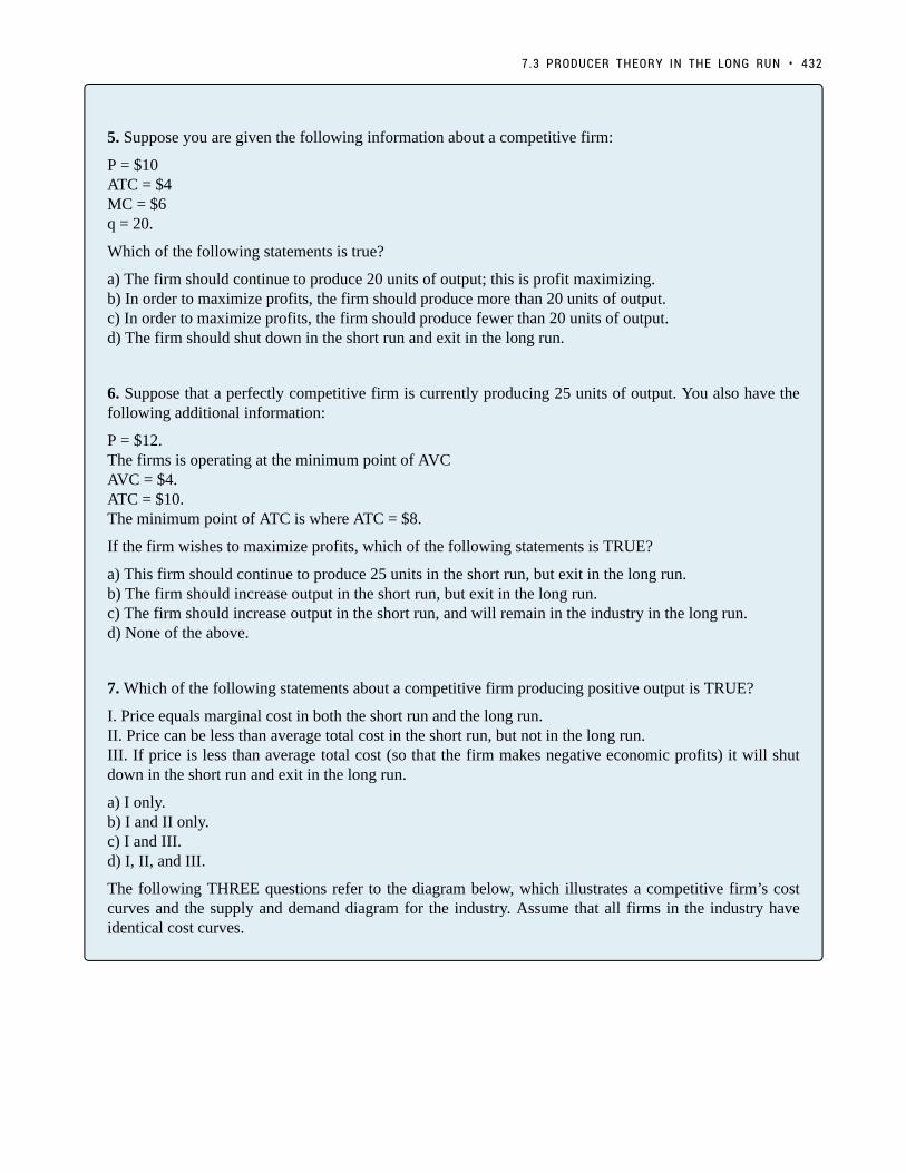
5. Suppose you are given the following information about a competitive firm:
P = $10ATC = $4MC = $6q = 20.
Which of the following statements is true?
a) The firm should continue to produce 20 units of output; this is profit maximizing.b) In order to maximize profits, the firm should produce more than 20 units of output.c) In order to maximize profits, the firm should produce fewer than 20 units of output.d) The firm should shut down in the short run and exit in the long run.
6. Suppose that a perfectly competitive firm is currently producing 25 units of output. You also have thefollowing additional information:
P = $12.The firms is operating at the minimum point of AVCAVC = $4.ATC = $10.The minimum point of ATC is where ATC = $8.
If the firm wishes to maximize profits, which of the following statements is TRUE?
a) This firm should continue to produce 25 units in the short run, but exit in the long run.b) The firm should increase output in the short run, but exit in the long run.c) The firm should increase output in the short run, and will remain in the industry in the long run.d) None of the above.
7. Which of the following statements about a competitive firm producing positive output is TRUE?
I. Price equals marginal cost in both the short run and the long run.II. Price can be less than average total cost in the short run, but not in the long run.III. If price is less than average total cost (so that the firm makes negative economic profits) it will shutdown in the short run and exit in the long run.
a) I only.b) I and II only.c) I and III.d) I, II, and III.
The following THREE questions refer to the diagram below, which illustrates a competitive firm’s costcurves and the supply and demand diagram for the industry. Assume that all firms in the industry haveidentical cost curves.
7.3 PRODUCER THEORY IN THE LONG RUN • 432

8. If demand is given by D1, then each firm in the industry will produce _____ units of output.
a) 0.b) 10.c) 13.d) 15.
9. If demand is given by D1, then how many firms operate in this industry?
a) There is insufficient information to determine the number of firms in the industry.b) 10.c) 20.d) 30.
10. If demand shifts from D1 to D2, then, in the short run:
a) Firms will make positive economic profits.b) New firms will enter the market.c) The price will remain unchanged at $25.d) Some firms will stop producing, since price is below average variable cost.
11. Suppose that the wages competitive firms must pay to their workers increase. Which of the followingstatements is TRUE?
a) The firms’ marginal costs will rise.b) The market supply curve will shift left and price will rise.c) In the long run firms will be making zero economic profits.d) All of the above are true.
The following TWO question refers to the diagram below, which illustrates a competitive firm’s costcurves, and the supply and demand diagram for the industry. Assume that all firms in the industry haveidentical cost curves.
433 • PRINCIPLES OF MICROECONOMICS
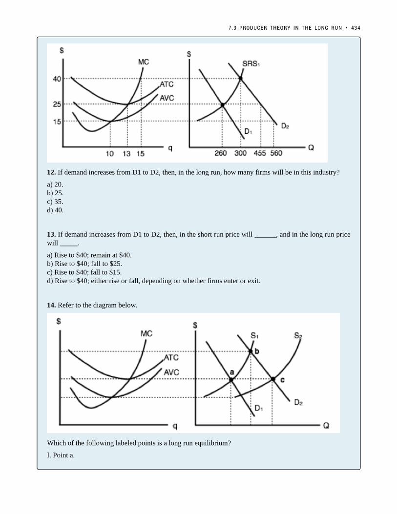
12. If demand increases from D1 to D2, then, in the long run, how many firms will be in this industry?
a) 20.b) 25.c) 35.d) 40.
13. If demand increases from D1 to D2, then, in the short run price will ______, and in the long run pricewill _____.
a) Rise to $40; remain at $40.b) Rise to $40; fall to $25.c) Rise to $40; fall to $15.d) Rise to $40; either rise or fall, depending on whether firms enter or exit.
14. Refer to the diagram below.
Which of the following labeled points is a long run equilibrium?
I. Point a.
7.3 PRODUCER THEORY IN THE LONG RUN • 434

II. Point b.III. Point c.
a) I only.b) I and II only.c) I and III only.d) I, II, and III.
435 • PRINCIPLES OF MICROECONOMICS

7.4 The Structure of Costs in the Long Run
Learning Objectives
By the end of this section, you will be able to:
• Calculate total cost
• Identify economies of scale, diseconomies of scale, and constant returns to scale
• Interpret graphs of long-run average cost curves and short-run average cost curves
• Analyze cost and production in the long run and short run
The long run is the period of time when all costs are variable. The long run depends on the specifics of the firm in
question—it is not a precise period of time. If you have a one-year lease on your factory, then the long run is any
period longer than a year, since after a year you are no longer bound by the lease. No costs are fixed in the long
run. A firm can build new factories and purchase new machinery, or it can close existing facilities. In planning for
the long run, the firm will compare alternative production technologies (or processes).
In this context, technology refers to all alternative methods of combining inputs to produce outputs. It does not
refer to a specific new invention like the tablet computer. The firm will search for the production technology that
allows it to produce the desired level of output at the lowest cost. After all, lower costs lead to higher profits—at
least if total revenues remain unchanged. Moreover, each firm must fear that if it does not seek out the lowest-cost
methods of production, then it may lose sales to competitor firms that find a way to produce and sell for less.
Choice of Production TechnologyChoice of Production Technology
Many tasks can be performed with a range of combinations of labor and physical capital. For example, a firm can
have human beings answering phones and taking messages, or it can invest in an automated voicemail system. A
firm can hire file clerks and secretaries to manage a system of paper folders and file cabinets, or it can invest in a
computerized record-keeping system that will require fewer employees. A firm can hire workers to push supplies
around a factory on rolling carts, it can invest in motorized vehicles, or it can invest in robots that carry materials
without a driver. Firms often face a choice between buying a many small machines, which need a worker to run
436

each one, or buying one larger and more expensive machine, which requires only one or two workers to operate
it. In short, physical capital and labor can often substitute for each other.
Consider the example of a private firm that is hired by local governments to clean up public parks. Three different
combinations of labor and physical capital for cleaning up a single average-sized park appear in Table 6. The
first production technology is heavy on workers and light on machines, while the next two technologies substitute
machines for workers. Since all three of these production methods produce the same thing—one cleaned-up
park—a profit-seeking firm will choose the production technology that is least expensive, given the prices of labor
and machines.
Production technology 1 10 workers 2 machines
Production technology 2 7 workers 4 machines
Production technology 3 3 workers 7 machines
Table 6. Three Ways to Clean a Park
Production technology 1 uses the most labor and least machinery, while production technology 3 uses the least
labor and the most machinery. Table 7 outlines three examples of how the total cost will change with each
production technology as the cost of labor changes. As the cost of labor rises from example A to B to C, the firm
will choose to substitute away from labor and use more machinery.
Example A: Workers cost $40, machines cost $80
Labor Cost Machine Cost Total Cost
Cost of technology 1 10 × $40 = $400 2 × $80 = $160 $560
Cost of technology 2 7 × $40 = $280 4 × $80 = $320 $600
Cost of technology 3 3 × $40 = $120 7 × $80 = $560 $680
Example B: Workers cost $55, machines cost $80
Labor Cost Machine Cost Total Cost
Cost of technology 1 10 × $55 = $550 2 × $80 = $160 $710
Cost of technology 2 7 × $55 = $385 4 × $80 = $320 $705
Cost of technology 3 3 × $55 = $165 7 × $80 = $560 $725
Example C: Workers cost $90, machines cost $80
Labor Cost Machine Cost Total Cost
Cost of technology 1 10 × $90 = $900 2 × $80 = $160 $1,060
Cost of technology 2 7 × $90 = $630 4 × $80 = $320 $950
Cost of technology 3 3 × $90 = $270 7 × $80 = $560 $830
Table 7. Total Cost with Rising Labor Costs
Example A shows the firm’s cost calculation when wages are $40 and machines costs are $80. In this case,
technology 1 is the low-cost production technology. In example B, wages rise to $55, while the cost of machines
does not change, in which case technology 2 is the low-cost production technology. If wages keep rising up to
437 • PRINCIPLES OF MICROECONOMICS

$90, while the cost of machines remains unchanged, then technology 3 clearly becomes the low-cost form of
production, as shown in example C.
This example shows that as an input becomes more expensive (in this case, the labor input), firms will attempt to
conserve on using that input and will instead shift to other inputs that are relatively less expensive. This pattern
helps to explain why the demand curve for labor (or any input) slopes down; that is, as labor becomes relatively
more expensive, profit-seeking firms will seek to substitute the use of other inputs. When a multinational
employer like Coca-Cola or McDonald’s sets up a bottling plant or a restaurant in a high-wage economy like
the United States, Canada, Japan, or Western Europe, it is likely to use production technologies that conserve on
the number of workers and focuses more on machines. However, that same employer is likely to use production
technologies with more workers and less machinery when producing in a lower-wage country like Mexico, China,
or South Africa.
Economies of ScaleEconomies of Scale
Once a firm has determined the least costly production technology, it can consider the optimal scale of production,
or quantity of output to produce. Many industries experience economies of scale. Economies of scale refers to the
situation where, as the quantity of output goes up, the cost per unit goes down. This is the idea behind “warehouse
stores” like Costco or Walmart. In everyday language: a larger factory can produce at a lower average cost than a
smaller factory.
Figure 1 illustrates the idea of economies of scale, showing the average cost of producing an alarm clock falling
as the quantity of output rises. For a small-sized factory like S, with an output level of 1,000, the average cost of
production is $12 per alarm clock. For a medium-sized factory like M, with an output level of 2,000, the average
cost of production falls to $8 per alarm clock. For a large factory like L, with an output of 5,000, the average cost
of production declines still further to $4 per alarm clock.
Figure 7.4a: Economies of Scale. A small factory like S produces 1,000 alarm clocks at an average cost of $12 per clock. Amedium factory like M produces 2,000 alarm clocks at a cost of $8 per clock. A large factory like L produces 5,000 alarmclocks at a cost of $4 per clock. Economies of scale exist because the larger scale of production leads to lower average costs.
7.4 THE STRUCTURE OF COSTS IN THE LONG RUN • 438

The average cost curve in Figure 1 may appear similar to the average cost curves presented earlier in this chapter,
although it is downward-sloping rather than U-shaped. But there is one major difference. The economies of scale
curve is a long-run average cost curve, because it allows all factors of production to change. The short-run average
cost curves presented earlier in this chapter assumed the existence of fixed costs, and only variable costs were
allowed to change.
One prominent example of economies of scale occurs in the chemical industry. Chemical plants have a lot of
pipes. The cost of the materials for producing a pipe is related to the circumference of the pipe and its length.
However, the volume of chemicals that can flow through a pipe is determined by the cross-section area of the
pipe. The calculations in Table 8 show that a pipe which uses twice as much material to make (as shown by the
circumference of the pipe doubling) can actually carry four times the volume of chemicals because the cross-
section area of the pipe rises by a factor of four (as shown in the Area column).
Circumference (2πr2πr) Area (πr2πr2)
4-inch pipe 12.5 inches 12.5 square inches
8-inch pipe 25.1 inches 50.2 square inches
16-inch pipe 50.2 inches 201.1 square inches
Table 8. Comparing Pipes: Economies of Scale in the Chemical Industry
A doubling of the cost of producing the pipe allows the chemical firm to process four times as much material.
This pattern is a major reason for economies of scale in chemical production, which uses a large quantity of pipes.
Of course, economies of scale in a chemical plant are more complex than this simple calculation suggests. But the
chemical engineers who design these plants have long used what they call the “six-tenths rule,” a rule of thumb
which holds that increasing the quantity produced in a chemical plant by a certain percentage will increase total
cost by only six-tenths as much.
Shapes of Long-Run Average Cost CurvesShapes of Long-Run Average Cost Curves
While in the short run firms are limited to operating on a single average cost curve (corresponding to the level
of fixed costs they have chosen), in the long run when all costs are variable, they can choose to operate on any
average cost curve. Thus, the long-run average cost (LRAC) curve is actually based on a group of short-run
average cost (SRAC) curves, each of which represents one specific level of fixed costs. More precisely, the long-
run average cost curve will be the least expensive average cost curve for any level of output. Figure 2 shows how
the long-run average cost curve is built from a group of short-run average cost curves. Five short-run-average
cost curves appear on the diagram. Each SRAC curve represents a different level of fixed costs. For example, you
can imagine SRAC1 as a small factory, SRAC2 as a medium factory, SRAC3 as a large factory, and SRAC4 and
SRAC5 as very large and ultra-large. Although this diagram shows only five SRAC curves, presumably there are
an infinite number of other SRAC curves between the ones that are shown. This family of short-run average cost
curves can be thought of as representing different choices for a firm that is planning its level of investment in
fixed cost physical capital—knowing that different choices about capital investment in the present will cause it to
end up with different short-run average cost curves in the future.
439 • PRINCIPLES OF MICROECONOMICS

Figure 7.4b From Short-Run Average Cost Curves to Long-Run Average Cost Curves. The five different short-run averagecost (SRAC) curves each represents a different level of fixed costs, from the low level of fixed costs at SRAC1 to the highlevel of fixed costs at SRAC5. Other SRAC curves, not shown in the diagram, lie between the ones that are shown here. Thelong-run average cost (LRAC) curve shows the lowest cost for producing each quantity of output when fixed costs can vary,and so it is formed by the bottom edge of the family of SRAC curves. If a firm wished to produce quantity Q3, it wouldchoose the fixed costs associated with SRAC3.
The long-run average cost curve shows the cost of producing each quantity in the long run, when the firm can
choose its level of fixed costs and thus choose which short-run average costs it desires. If the firm plans to produce
in the long run at an output of Q3, it should make the set of investments that will lead it to locate on SRAC3, which
allows producing q3 at the lowest cost. A firm that intends to produce Q3 would be foolish to choose the level of
fixed costs at SRAC2 or SRAC4. At SRAC2 the level of fixed costs is too low for producing Q3 at lowest possible
cost, and producing q3 would require adding a very high level of variable costs and make the average cost very
high. At SRAC4, the level of fixed costs is too high for producing q3 at lowest possible cost, and again average
costs would be very high as a result.
The shape of the long-run cost curve, as drawn in Figure 7.4b, is fairly common for many industries. The left-
hand portion of the long-run average cost curve, where it is downward- sloping from output levels Q1 to Q2 to Q3,
illustrates the case of economies of scale. In this portion of the long-run average cost curve, larger scale leads to
lower average costs. This pattern was illustrated earlier in Figure 7.4a.
In the middle portion of the long-run average cost curve, the flat portion of the curve around Q3, economies of
scale have been exhausted. In this situation, allowing all inputs to expand does not much change the average
cost of production, and it is called constant returns to scale. In this range of the LRAC curve, the average cost
of production does not change much as scale rises or falls. The following Clear it Up feature explains where
diminishing marginal returns fit into this analysis.
7.4 THE STRUCTURE OF COSTS IN THE LONG RUN • 440

How do economies of scale compare to diminishing marginal returns?How do economies of scale compare to diminishing marginal returns?
The concept of economies of scale, where average costs decline as production expands, might seem toconflict with the idea of diminishing marginal returns, where marginal costs rise as production expands.But diminishing marginal returns refers only to the short-run average cost curve, where one variable input(like labor) is increasing, but other inputs (like capital) are fixed. Economies of scale refers to the long-runaverage cost curve where all inputs are being allowed to increase together. Thus, it is quite possible andcommon to have an industry that has both diminishing marginal returns when only one input is allowed tochange, and at the same time has increasing or constant economies of scale when all inputs change togetherto produce a larger-scale operation.
Finally, the right-hand portion of the long-run average cost curve, running from output level Q4 to Q5, shows
a situation where, as the level of output and the scale rises, average costs rise as well. This situation is called
diseconomies of scale. A firm or a factory can grow so large that it becomes very difficult to manage, resulting in
unnecessarily high costs as many layers of management try to communicate with workers and with each other, and
as failures to communicate lead to disruptions in the flow of work and materials. Not many overly large factories
exist in the real world, because with their very high production costs, they are unable to compete for long against
plants with lower average costs of production. However, in some planned economies, like the economy of the old
Soviet Union, plants that were so large as to be grossly inefficient were able to continue operating for a long time
because government economic planners protected them from competition and ensured that they would not make
losses.
Diseconomies of scale can also be present across an entire firm, not just a large factory. The leviathan effect
can hit firms that become too large to run efficiently, across the entirety of the enterprise. Firms that shrink their
operations are often responding to finding itself in the diseconomies region, thus moving back to a lower average
cost at a lower output level.
Visit this website to read an article about the complexity of the belief that banks can be “too-big-to-fail.”
Shifting Patterns of Long-Run Average CostShifting Patterns of Long-Run Average Cost
New developments in production technology can shift the long-run average cost curve in ways that can alter the
size distribution of firms in an industry.
441 • PRINCIPLES OF MICROECONOMICS

For much of the twentieth century, the most common change has been to see alterations in technology, like the
assembly line or the large department store, where large-scale producers seemed to gain an advantage over smaller
ones. In the long-run average cost curve, the downward-sloping economies of scale portion of the curve stretched
over a larger quantity of output.
However, new production technologies do not inevitably lead to a greater average size for firms. For example, in
recent years some new technologies for generating electricity on a smaller scale have appeared. The traditional
coal-burning electricity plants needed to produce 300 to 600 megawatts of power to exploit economies of scale
fully. However, high-efficiency turbines to produce electricity from burning natural gas can produce electricity at
a competitive price while producing a smaller quantity of 100 megawatts or less. These new technologies create
the possibility for smaller companies or plants to generate electricity as efficiently as large ones. Another example
of a technology-driven shift to smaller plants may be taking place in the tire industry. A traditional mid-size tire
plant produces about six million tires per year. However, in 2000, the Italian company Pirelli introduced a new
tire factory that uses many robots. The Pirelli tire plant produced only about one million tires per year, but did so
at a lower average cost than a traditional mid-sized tire plant.
Controversy has simmered in recent years over whether the new information and communications technologies
will lead to a larger or smaller size for firms. On one side, the new technology may make it easier for small firms
to reach out beyond their local geographic area and find customers across a state, or the nation, or even across
international boundaries. This factor might seem to predict a future with a larger number of small competitors.
On the other side, perhaps the new information and communications technology will create “winner-take-all”
markets where one large company will tend to command a large share of total sales, as Microsoft has done in the
production of software for personal computers or Amazon has done in online bookselling. Moreover, improved
information and communication technologies might make it easier to manage many different plants and operations
across the country or around the world, and thus encourage larger firms. This ongoing battle between the forces
of smallness and largeness will be of great interest to economists, businesspeople, and policymakers.
Key Concepts and SummaryKey Concepts and Summary
A production technology refers to a specific combination of labor, physical capital, and technology that makes up
a particular method of production.
In the long run, firms can choose their production technology, and so all costs become variable costs. In making
this choice, firms will try to substitute relatively inexpensive inputs for relatively expensive inputs where possible,
so as to produce at the lowest possible long-run average cost.
Economies of scale refers to a situation where as the level of output increases, the average cost decreases. Constant
returns to scale refers to a situation where average cost does not change as output increases. Diseconomies of scale
refers to a situation where as output increases, average costs increase also.
The long-run average cost curve shows the lowest possible average cost of production, allowing all the inputs
to production to vary so that the firm is choosing its production technology. A downward-sloping LRAC shows
economies of scale; a flat LRAC shows constant returns to scale; an upward-sloping LRAC shows diseconomies
of scale. If the long-run average cost curve has only one quantity produced that results in the lowest possible
average cost, then all of the firms competing in an industry should be the same size. However, if the LRAC has a
7.4 THE STRUCTURE OF COSTS IN THE LONG RUN • 442
flat segment at the bottom, so that a range of different quantities can be produced at the lowest average cost, the
firms competing in the industry will display a range of sizes. The market demand in conjunction with the long-run
average cost curve determines how many firms will exist in a given industry.
If the quantity demanded in the market of a certain product is much greater than the quantity found at the bottom
of the long-run average cost curve, where the cost of production is lowest, the market will have many firms
competing. If the quantity demanded in the market is less than the quantity at the bottom of the LRAC, there will
likely be only one firm.
GlossaryGlossary
Constant Returns to Scaleexpanding all inputs proportionately does not change the average cost of productionDiseconomies of Scalethe long-run average cost of producing each individual unit increases as total output increasesLong-Run Average Cost (LRAC) Curveshows the lowest possible average cost of production, allowing all the inputs to production to vary so thatthe firm is choosing its production technologyProduction Technologiesalternative methods of combining inputs to produce outputShort-Run Average Cost (SRAC) Curvethe average total cost curve in the short term; shows the total of the average fixed costs and the averagevariable costs
443 • PRINCIPLES OF MICROECONOMICS

Solution: Case Study - Oil Markets
1. Consider the following producer theory model for a single firm producing oil, and the
aggregate supply and demand. What is the firm’s equilibrium price and quantity?
To find price, we look at the aggregate market, where supply = demand. In this case, we find the
intersection, labeled E1, occurs at a quantity of 50 million barrels/day and a price of $50/barrel.
Remember that in order to maximize profits, the firm will produce until MB = MC. Since the market
is perfectly competitive, MB = MC when P = MC. This means we must find where our price of $50
intersects our marginal cost curve. Looking at our producer theory diagram, we see that P = MC when
the individual firm is producing 20 million barrels/day.
This means our equilibrium price is $50 and our equilibrium quantity is 20 million barrels/day.
2. What is the firm’s profit at this level?
444

To find firms profits, calculate the area between Price and ATC shown in green. Since price is equal to
the marginal revenue for the firm, this green area is the difference between TR (P*Q) and TC (ATC*Q).
Since MR is $50 and ATC is $41, our firm is making $9 in profit for each barrel of oil. This means that profits are
equal to $9 x 20 million barrels, or $180 million.
3. What will occur in the long-run for this market? Show this on the new graph below.
The profits that this firm is making are unsustainable in the long-run, $180 million is attractive to firms in similar
industries and will cause entry.
This will cause our supply curve to shift to S2, where price is equal to our firm’s ATC. As long as P > ATC, our
firm is making a profit and entry continues to occur. At the price of $40, our firm is making 0 profits and the
market is in long-run equilibrium.
445 • PRINCIPLES OF MICROECONOMICS

While price fell for a variety of other reasons, the high price certainly incentivized the firms to expand operations,
and as we saw in the article, this increase in the production indeed increases supply.
4. Assume the market is at long-run equilibrium. Use the producer theory model from
above to show the impact of Iran’s entry, assume this brings the market to a price of $27.
What is the new equilibrium price and quantity for the firm?
Iran’s entry will again cause an increase in our supply curve, this time to S3 where our equilibrium (E3) occurs
with a price of $27, as specified.
SOLUTION: CASE STUDY - OIL MARKETS • 446

Again, since the market is perfectly competitive, MB = MC when P = MC. Looking where $27 intersects our MC
curve, we find that firms will maximize profits by producing 16 million barrels of oil/day.
5. What are the firms profits at this price?
In this case, since P < ATC, the firm is making negative profits. In the diagram below, this is indicated by the red
area. Since price is equal to the marginal revenue for the firm, this red area is the difference between TR (P*Q)
and TC (ATC*Q).
Our total revenue is equal to $27/barrel x 16 million barrels, or $432 million. Total cost is equal to $40/barrel x
16 million barrels, or $640 million. The difference between total revenue and total cost is equal to -$208 million.
447 • PRINCIPLES OF MICROECONOMICS

6. What does this excerpt suggest about how firms will behave in the short run?
This excerpt hints that the price of $27, while causing losses, is still well above the shut-down price of $15
that would cause firms to shut-down. Since oil production requires considerable capital investment into digging
wells, it makes sense that even when in aggregate you are losing money, you will continue to pump oil if you are
covering your day-to-day operational costs.
This suggests that the firm will continue to operate in the short-term.
7. Based on the information given about this market, what do you think the time horizon will be for this
industries ‘long run’? What will happen in the long run?
Based on the information about the market, you can make a good assumption that the time horizons for an oil
firms fixed factor could be well over a few years. Oil wells are projects that take considerable time and resources
to develop, and once built are basically used until they run dry. This means that a firm could continue to pump oil
from wells for years after knowing that they will not fully recover their fixed costs.
In our model, this means that our supply curve will be slow to adjust to periods of high or low profits. Eventually,
the curve will shift back to S2 and profits will return to 0.
8. Comment on the effects of OPEC’s actions on the market.
Normally when prices fall, firms adjust production in the short-run. Comparing the responses in question 3 and 4
you can see that the firm has decreased production from 18 million barrels/day to 16 million barrels to react to the
price decrease, an OPEC pact to keep production high would stop that from happening.
SOLUTION: CASE STUDY - OIL MARKETS • 448

Looking from the firms perspective, we can calculate their new losses and find ($40 – $27)(18) = -$234 million.
The pact causes the firm to lose more money because they are operation where MC > MR. While this results in
losses, the overproduction can have the effect of keeping out new entrants. In this case, it more likely led to further
problems for the industry.
449 • PRINCIPLES OF MICROECONOMICS

Topic 7 Solutions
Solutions to Exercises 7.1
1. C
2. C
3. A
4. D
5. C
6. C
Solutions to Exercises 7.2
1. B
2. A
3. B
4. C
5. C
6. D
7. B
8. C
9. C
10. B
450

Solutions to Exercises 7.3
1. A
2. B
3. A
4. C
5. B
6. C
7. B
8. C
9. C
10. A
11. D
12. C
13. B
14. C
451 • PRINCIPLES OF MICROECONOMICS
Topic 7 References
The Economist. “Why the Oil Price is Falling.” December 8, 2014. http://www.economist.com/blogs/economist-
explains/2014/12/economist-explains-4
The Economist. “The Oil Conundrum.” January 23, 2016. http://www.economist.com/news/briefing/
21688919-plunging-prices-have-neither-halted-oil-production-nor-stimulated-surge-global-growth
History.com. “Model T.” 2010. http://www.history.com/topics/model-t
Yergin, Daniel. The Prize: The Epic Quest for Oil, Money & Power. 1st ed. New York: Free Press, 2014. Print.
452

Topic 8: Imperfect Competition
453

Introduction to Imperfect Competition
In the mid-nineteenth century, the United States, specifically the Southern States, nearly had a monopoly in the cotton supplied to GreatBritain. These states attempted to leverage this economic power into political power – trying to sway Great Britain to recognize theConfederate States of America. (Credit: AgriLife Today/ Flickr/ CC BY-NC-ND 2.0)
Monopolizing on HistoryMonopolizing on History
Many of the case studies in this text have focused on current events, but lets step into the past to observehow monopoly, or near monopolies, have helped shape history. In the spring of 1773, the East IndiaCompany, a firm that, in its time, was designated “too big to fail,” was experiencing ongoing financial
454
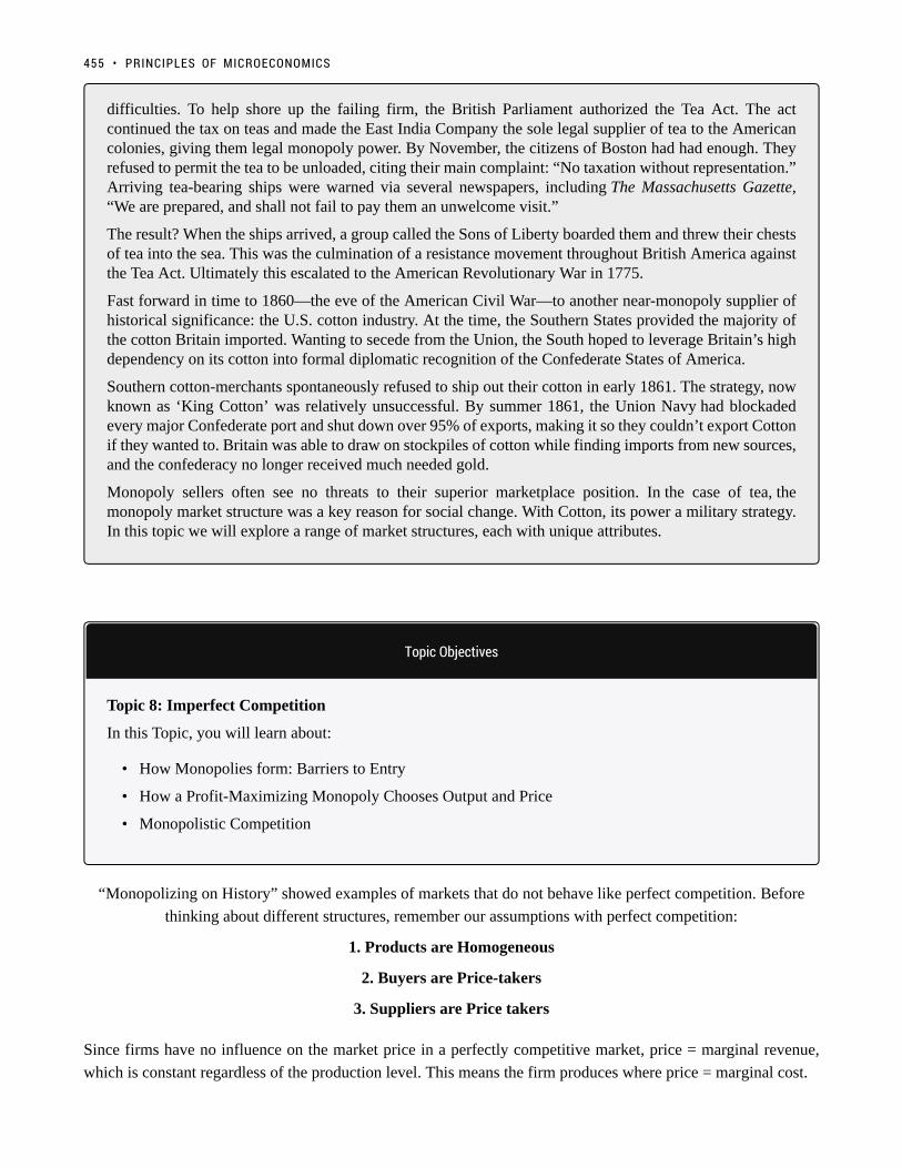
difficulties. To help shore up the failing firm, the British Parliament authorized the Tea Act. The actcontinued the tax on teas and made the East India Company the sole legal supplier of tea to the Americancolonies, giving them legal monopoly power. By November, the citizens of Boston had had enough. Theyrefused to permit the tea to be unloaded, citing their main complaint: “No taxation without representation.”Arriving tea-bearing ships were warned via several newspapers, including The Massachusetts Gazette,“We are prepared, and shall not fail to pay them an unwelcome visit.”
The result? When the ships arrived, a group called the Sons of Liberty boarded them and threw their chestsof tea into the sea. This was the culmination of a resistance movement throughout British America againstthe Tea Act. Ultimately this escalated to the American Revolutionary War in 1775.
Fast forward in time to 1860—the eve of the American Civil War—to another near-monopoly supplier ofhistorical significance: the U.S. cotton industry. At the time, the Southern States provided the majority ofthe cotton Britain imported. Wanting to secede from the Union, the South hoped to leverage Britain’s highdependency on its cotton into formal diplomatic recognition of the Confederate States of America.
Southern cotton-merchants spontaneously refused to ship out their cotton in early 1861. The strategy, nowknown as ‘King Cotton’ was relatively unsuccessful. By summer 1861, the Union Navy had blockadedevery major Confederate port and shut down over 95% of exports, making it so they couldn’t export Cottonif they wanted to. Britain was able to draw on stockpiles of cotton while finding imports from new sources,and the confederacy no longer received much needed gold.
Monopoly sellers often see no threats to their superior marketplace position. In the case of tea, themonopoly market structure was a key reason for social change. With Cotton, its power a military strategy.In this topic we will explore a range of market structures, each with unique attributes.
Topic Objectives
Topic 8: Imperfect Competition
In this Topic, you will learn about:
• How Monopolies form: Barriers to Entry
• How a Profit-Maximizing Monopoly Chooses Output and Price
• Monopolistic Competition
“Monopolizing on History” showed examples of markets that do not behave like perfect competition. Before
thinking about different structures, remember our assumptions with perfect competition:
1. Products are Homogeneous
2. Buyers are Price-takers
3. Suppliers are Price takers
Since firms have no influence on the market price in a perfectly competitive market, price = marginal revenue,
which is constant regardless of the production level. This means the firm produces where price = marginal cost.
455 • PRINCIPLES OF MICROECONOMICS

In a competitive market, firms are unable to increase their prices above equilibrium without losing at least some
customers. In reality, we know that this is often not the case. Clothing brands, for example, can sell items for much
higher than what they cost to make, whereas other firms that are selling similar products at a lower price struggle
to get by. This is in part due to the number of firms in a market and in a firm’s ability to distinguish its products
from its competitors.
In reality, there is a spectrum of different market structures called the Spectrum of Competition.
Firms face different competitive situations. At one extreme—perfect competition—many firms are all trying to
sell identical products. At the other extreme—monopoly—only one firm is selling the product, and this firm faces
no competition. Monopolistic competition and oligopoly fall between the two extremes. Monopolistic competition
is a situation with many firms selling similar, but not identical, products. Oligopoly is a situation with few firms
that sell identical or similar products.
We analyzed perfect competition in depth in Topic 7. Now, let’s view the other extreme and examine a firm’s
behaviour without competition.
INTRODUCTION TO IMPERFECT COMPETITION • 456

8.1 Monopoly
Learning Objectives
By the end of this section, you will be able to:
• Understand the Marginal Revenue curve and its significance for a monopolist
• Describe how a monopoly chooses price and quantity
• Calculate the profits of a monopolist and explain why profits do not cause entry
• Explain why monopolies cause deadweight loss
Whereas perfect competition is a market where firms have no market power and they simply respond to the market
price, a monopolistic market is one with no competition at all, and firms have complete market power. In the case
of monopoly, one firm produces all of the output in a market. Since a monopoly faces no significant competition,
it can charge any price it wishes. While a monopoly, by definition, refers to a single firm, in practice, the term is
often used to describe a market in which one firm has a very high market share.
Even though there are very few true monopolies in existence, we deal with some every day, often
without realizing it: your electric and garbage collection companies for example. Some new drugs are
produced by only one pharmaceutical firm—and no close substitutes for that drug may exist.
While a monopoly must be concerned about whether consumers will purchase its products or spend
their money on something altogether different, the monopolist need not worry about the actions of
other firms. As a result, a monopoly is not a price taker like a perfectly competitive firm. Rather, it
exercises power to choose its market price.
Competitive Market RecapCompetitive Market Recap
Below is Figure 7.3a to remind us how the competitive firm operates.
457

Figure 7.3a Reproduced
Notice in the competitive market, demand is downward sloping, but how does demand behave for the individual
firm?
Figure 8.1a
In Figure 8.1a the competitive market for an individual firm is re-created. Since the firm cannot deviate from the
market price dictated by aggregate supply and demand, they face an elastic demand curve. If they raise the price,
they will sell no units; if they drop the price, they will sell an infinite amount of units. Why don’t they drop price
and sell more units? Remember that the firm produces where P = MR = MC, so if they sell beyond this point,
8.1 MONOPOLY • 458

they are losing money. This brings the market to equilibrium at the break-even point, where ATC is minimized
and profit = 0.
Single Price MonopolySingle Price Monopoly
So we know a competitive market faces an elastic demand, what about a single-priced monopoly? This is distinct
from other monopolies in that the firm must charge the same price to all consumers. In this case, the aggregate
demand is the firm’s demand! To explore monopoly, consider the sunglasses market.
What do Oakley, Ray-Ban and Persol have in common? They are all owned by the same brand. That’s
right, Luxottica, an Italian based eyewear company, produces about 70% of all name brand eyewear.
This is fairly close to a monopoly, as with that high of a market share, Luxottica dominates the market
price. Notice that Luxottica is not a single price monopoly, as it practices a form of price discrimination
by having multiple brands aimed at different consumers. Let’s consider what would happen if Luxottica
only sold one kind of sunglasses at the same price to all consumers, and if they owned 100% of the
market.
Whereas the competitive firm was a small player in the aggregate market, the monopolist dictates both the
final price and the quantity. If Luxottica decides to lower price, it must do so for ALL buyers. Consider what
implications this has on revenue.
Figure 8.1b
In Figure 8.1b the global demand for sunglasses is shown. According to the law of demand, as price falls,
quantity demanded increases. This means that Luxottica can increase revenue by lowering price, as they sell more
sunglasses. This is not that happens from a price decrease however, as the firm decreases price it loses some of
the revenue on the goods it was previously selling.
459 • PRINCIPLES OF MICROECONOMICS

At point A, Luxottica is selling 20 million sunglasses at $160 per pair. When it reduces the price to $120,
two things happen:
1. Luxottica loses $40 on each of the 20 million sunglasses it was selling before. 20 million consumers were
willing to pay the full $160 for a pair, and now only have to pay $120. This results in a loss of $800
million for Luxottica. (shown as the red shaded region.
2. Luxottica gains $120 on each of the 20 million new sunglasses it now sells. 20 million consumers were not
willing to pay $160 for a pair, but are willing to pay $120. This results ina gain of $2.4 billion for Luxottica
(shown as the green shaded region).
These changes collectively represent a net gain of $1.6 billion for Luxottica.
Figure 8.1c
For a monopoly, a price decrease doesn’t always result in more revenue. When price is decreased, we have a loss
in revenue from existing sales, and an increase in revenue from new sales. The more sales we are making, the
greater the loss. Consider what happens when Luxottica drops prices when it is selling 60 million sunglasses.
At point A, Luxottica is selling 60 million sunglasses at $80 per pair. When it reduces the price to $40:
1. Luxottica loses $40 on each of the 60 million sunglasses it was selling before. This results in a loss of $2.4
billion for Luxottica.
2. Luxottica gains $40 on each of the 20 million new sunglasses it now sells. This results ina gain of $80
billion for Luxottica.
These changes collectively represent a net loss of $1.6 billion for Luxottica.
8.1 MONOPOLY • 460

Representing RevenueRepresenting Revenue
As we can see, finding where price = MC would no longer be a good metric for where we should produce,
since we also want to take into account the affect price changes have on revenue. While the above
analysis seems rather random, we can systematically represent the changes in revenue from a decrease
in price – in fact, we already have! In Topic 4, we explored how the elasticity at different points along a
demand curve affected the changes in revenue.
Figure 8.1d
Remember, the equation to calculate elasticity is (% change in quantity/% change in price). Looking at the two
changes in revenue from the examples above, we can see that the decrease in revenue came from the price change,
and the increase came from the quantity change. This means that when % change in quantity > % change in price,
461 • PRINCIPLES OF MICROECONOMICS

our revenue increases from a price drop! Put simply, when our ED>1, we should continue to decrease price,
maximizing our revenue. If ED<1, we have gone too far and can increase revenue by increasing price!
So, does this mean Luxottica will produce 50 million pairs of sunglasses, charge $100 per unit and call it
a day? Not necessarily. While that would maximize revenue, remember that it doesn’t matter if revenue
is rising if costs are rising by more. To find where we produce, we must find the point where marginal
revenue = marginal cost.
Marginal RevenueMarginal Revenue
The amount that our revenue changes from an increase in quantity is called Marginal Revenue and can be
represented alongside our demand curve. When ED >1, MR >0 since an increase in quantity will increase revenue.
Conversely, When ED <1, MR <0 since an increase in quantity will decrease revenue.
Figure 8.1e
Since ED = 1 at the midpoint of a linear demand function, MR will always intercept the x-axis at QMAX/2, in this
case at x=50. The key to this analysis is that whereas for the competitive firm P = MR, for a monopoly, P > MR.
8.1 MONOPOLY • 462

Monopoly BehaviourMonopoly Behaviour
So what price will Luxottica charge? Adding its marginal cost to the graph, we can see that MC= MR at
30 million Sunglasses. At any quantity below this, MR > MC meaning Luxottica can increase profits by
increasing production.
MR and MC intersect where P = $80, will this be the market price? At 30 million sunglasses sold,
consumers are willing to pay $140 per pair. Luxottica knows this and will charge as high as it can. This
means the market price will be $140.
Figure 8.1f
This behaviour is standard for a monopolist. Operate at the quantity where MC = MR, and charge a price equal to
the consumers willingness to pay.
Market SurplusMarket Surplus
In earlier topics, a key metric we analyzed was market/social surplus, which showed how government intervention
can cause deadweight loss or correct the loss from externalities, etc. In this case, we want to see if a monopoly is
as efficient as perfect competition. Recall our rule that differences in prices from equilibrium cause transfers and
differences in quantity from equilibrium cause deadweight loss. Make a prediction as to how the monopoly
market will affect efficiency.
463 • PRINCIPLES OF MICROECONOMICS

Competitive MarketCompetitive Market
As a point of comparison, consider how this market would behave under perfect competition. Our equilibrium
would be where MB (demand) = MC (supply). PE = $116, QE = 42 million.
Figure 8.1g
Calculating market surplus:
Consumer Surplus = $1.764 billionConsumer Surplus = $1.764 billion
Blue shaded region.
[($200-$116)*(42)]/2 = 1.764 billion
ProducerProducer Surplus = $2.436Surplus = $2.436 billionbillion
Yellow shaded region.
[($116)*(42)]/2 = 2.436 billion
8.1 MONOPOLY • 464

MarketMarket Surplus = $4.2Surplus = $4.2 billionbillion
MonopolyMonopoly MarketMarket
In comparison, the monopoly market has PE = $140 and QE = 30 million.
Figure 8.1h
Calculating market surplus:
Consumer Surplus = $900Consumer Surplus = $900 millionmillion
Blue shaded region.
[($200-$140)*(30)]/2 = 900 million
Notice consumer surplus decreased for two reasons. First, 12 million consumers are no longer willing
to pay for the sunglasses (this quantity change will be part of the deadweight loss). Second, the 30
million consumers who still buy sunglasses now have to pay $60 more (the transfer from consumers to
producers).
ProducerProducer Surplus = $3.0 billionSurplus = $3.0 billion
Yellow shaded region.
465 • PRINCIPLES OF MICROECONOMICS

[($140-$80)*(30)] + [($80)*(30)]/2] = 3 billion
There are two changes to producer surplus with opposite effects. First, since 12 million consumers are
no longer willing to buy the goods, Luxottica sells 12 million fewer sunglasses (this loss in surplus is the
other piece of the deadweight loss). However, the $60 increase in price on the 30 million units it still
sells more than compensates for the loss.
MarketMarket Surplus = $3.9 billionSurplus = $3.9 billion
Deadweight Loss from MonopolyDeadweight Loss from Monopoly
Remember that it is inefficient when there are potential Pareto improvements. In other words, if an
action can be taken where the gains outweigh the losses, and by compensating the losers everyone
could be made better off, then there is a deadweight loss. When we move from a monopoly market to a
competitive one, market surplus increases by $1.2 billion. This means that the monopoly causes a $1.2
billion deadweight loss.
Figure 8.1i
Remember that deadweight loss is only a result in deviations from the equilibrium quantity. Between 30 million
sunglasses and 42 million sunglasses, consumers are willing to pay more than the firm’s marginal cost, so MB
8.1 MONOPOLY • 466

>MC. Since the monopolist is unwilling lower its price to increase output (and lose revenue from its pre-existing
sales), the deadweight loss persists.
The red shaded region in Figure 8.1i is a measure of the loss to society from having monopoly rather than
competition.
GlossaryGlossary
Marginal RevenueThe increase in revenue resulting from a marginal increase in quantityMonopolya situation in which one firm produces all of the output in a marketSingle-priced Monopolya monopolist that can only charge one price
Exercises 8.1
1. Which of the following statements about a single-price monopoly is FALSE?
a) The monopolist will never charge a price on the inelastic portion of the demand curve.b) Marginal revenue equals marginal cost at the profit-maximizing level of output.c) Price equals marginal cost at the profit-maximizing level of output.d) Marginal revenue is less than price, since the monopolist must lower its price to all consumers to sell anadditional unit of output.
2. Suppose that at a monopolist’s current output choice, marginal cost equals price. Which of the followingstatements is TRUE?
a) The monopolist is currently maximizing profits.b) The monopolist should produce more output to maximize profits.c) The monopolist should produce less output to maximize profits.d) We do not have enough information to know whether or not the monopolist is maximizing profits.
3. Refer to the diagram below, which illustrates the demand, marginal revenue, and marginal cost curvesfor a single-price monopolist.
467 • PRINCIPLES OF MICROECONOMICS

The profit-maximizing price and quantity for this monopolist are:
a) P = $4, Q = 60.b) P = $6, Q = 60.c) P = $4, Q = 30.d) P = $6, Q = 30.
8.1 MONOPOLY • 468
8.2 Fixing Monopoly
Learning Objectives
By the end of this section, you will be able to:
• Explain how Price Discrimination can correct market failure
• Suggest government policies to remove the deadweight loss associated with monopoly
In Topic 4, we learned about the different government policies that can change quantity (in those cases resulting
in a deadweight loss) and showed how these can be helpful to correct failures due to externalities. Now, we will
apply those concepts to see how we can correct monopolies.
Price DiscriminationPrice Discrimination
Before looking at how policy can be used to correct a monopoly, let’s first consider a simpler solution. In the
last section, we introduced a single price monopoly, saying that the monopolist must charge the same price to all
consumers. In reality, monopolists tend to practice price discrimination meaning they charge a different price to
different consumers, with the aim of charging the maximum of each consumer’s willingness to pay.
This is seen in practice in many different ways. The most common is price discrimination based on demographics.
Discounts for seniors or children who are willing to pay less for the good allow the monopolist to still capture
revenue from these consumers. Companies may also create slightly different offerings or brands to appeal to
different crowds. Luxottica, for example, sells higher priced Ray-Bans to cater to a more fashion-conscious crowd,
and Oakley caters to consumers who care more about functionality. Let’s look at how the different price points
affect market surplus.
469

Figure 8.2a
In this situation, Luxottica sells sunglasses at two different prices: Ray-Bans at $160 and Oakleys at $120. Notice
the effect this has on producer surplus. Whereas at $140 Luxottica sold 30 million units, at the two prices it can
sell 40 million, and the average price of the sunglasses is still $140 million. This benefits some consumers who
can purchase sunglasses at the lower cost but hurts some who now have to pay a higher price. The deadweight
loss has shrunk considerably.
Can we ever remove the deadweight loss entirely? For the producer, this would be preferred as the more it
can differentiate prices, the more surplus it receives. Consider a case where the producer can charge the exact
willingness to pay of each consumer, a perfect price discrimination.
8.2 FIXING MONOPOLY • 470
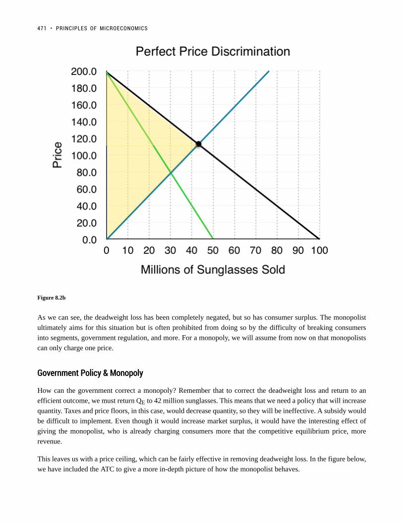
Figure 8.2b
As we can see, the deadweight loss has been completely negated, but so has consumer surplus. The monopolist
ultimately aims for this situation but is often prohibited from doing so by the difficulty of breaking consumers
into segments, government regulation, and more. For a monopoly, we will assume from now on that monopolists
can only charge one price.
Government Policy & MonopolyGovernment Policy & Monopoly
How can the government correct a monopoly? Remember that to correct the deadweight loss and return to an
efficient outcome, we must return QE to 42 million sunglasses. This means that we need a policy that will increase
quantity. Taxes and price floors, in this case, would decrease quantity, so they will be ineffective. A subsidy would
be difficult to implement. Even though it would increase market surplus, it would have the interesting effect of
giving the monopolist, who is already charging consumers more that the competitive equilibrium price, more
revenue.
This leaves us with a price ceiling, which can be fairly effective in removing deadweight loss. In the figure below,
we have included the ATC to give a more in-depth picture of how the monopolist behaves.
471 • PRINCIPLES OF MICROECONOMICS

Figure 8.2c
A binding price floor at $116 would indeed remove the DWL and bring the market almost back to a competitive
equilibrium, but with one key difference. In this equilibrium, ATC is not minimized. Why does this matter if there
is no DWL? If the market became open to competition, firms entering the market would cause each demand to
shift inwards and would cause aggregate MC to fall as firms were able to take advantage of a lower ATC. This
would bring the price down and make consumers better off. The result is that even with market correction, the
market equilibrium is still too small.
GlossaryGlossary
Perfect Price Discriminationthe action of selling the same product at a different price to each consumer, equal to their maximumwillingness to payPrice Discriminationthe action of selling the same product at different price to maximize profits
8.2 FIXING MONOPOLY • 472

Exercises 8.2
The following TWO questions refer to the diagram below, which illustrates the demand, marginal revenue,and marginal cost curves for a profit-maximizing single-price monopolist.
1. Which area represents the deadweight loss due to the monopoly?
a) g + h.b) f + g.c) f + c.d) f + g + c+ h.
2. Which area represents the monopolist’s producer surplus?
a) a + b + f.b) a + b + f + c.c) a + b + f + c + j.d) a + b + j.
473 • PRINCIPLES OF MICROECONOMICS

8.3 Why Monopolies Persist
Learning Objectives
By the end of this section, you will be able to:
• Distinguish between a natural monopoly and a legal monopoly.
• Explain how economies of scale and the control of natural resources led to the necessary formationof legal monopolies
• Analyze the importance of trademarks and patents in promoting innovation
Because of the lack of competition, monopolies tend to earn significant economic profits. These profits should
attract vigorous competition as described in Perfect Competition, and yet, because of one particular characteristic
of monopolies, they do not. Barriers to entry are the legal, technological, or market forces that discourage or
prevent potential competitors from entering a market. Barriers to entry can range from the simple and easily
surmountable, such as the cost of renting retail space, to the extremely restrictive. For example, there are a finite
number of radio frequencies available for broadcasting. Once the rights to all of them have been purchased, no
new competitors can enter the market.
In some cases, barriers to entry may lead to monopoly. In other cases, they may limit competition to a few firms.
Barriers may block entry even if the firm or firms currently in the market are earning profits. Thus, in markets
with significant barriers to entry, it is not true that abnormally high profits will attract new firms, and that this
entry of new firms will eventually cause the price to decline so that surviving firms earn only a normal level of
profit in the long run.
There are two types of monopoly, based on the types of barriers to entry they exploit. One is a natural monopoly,
where the barriers to entry are something other than legal prohibition. The other is a legal monopoly, where laws
prohibit (or severely limit) competition.
Natural MonopolyNatural Monopoly
Economies of scale can combine with the size of the market to limit competition. Figure 8.3a presents a long-
474
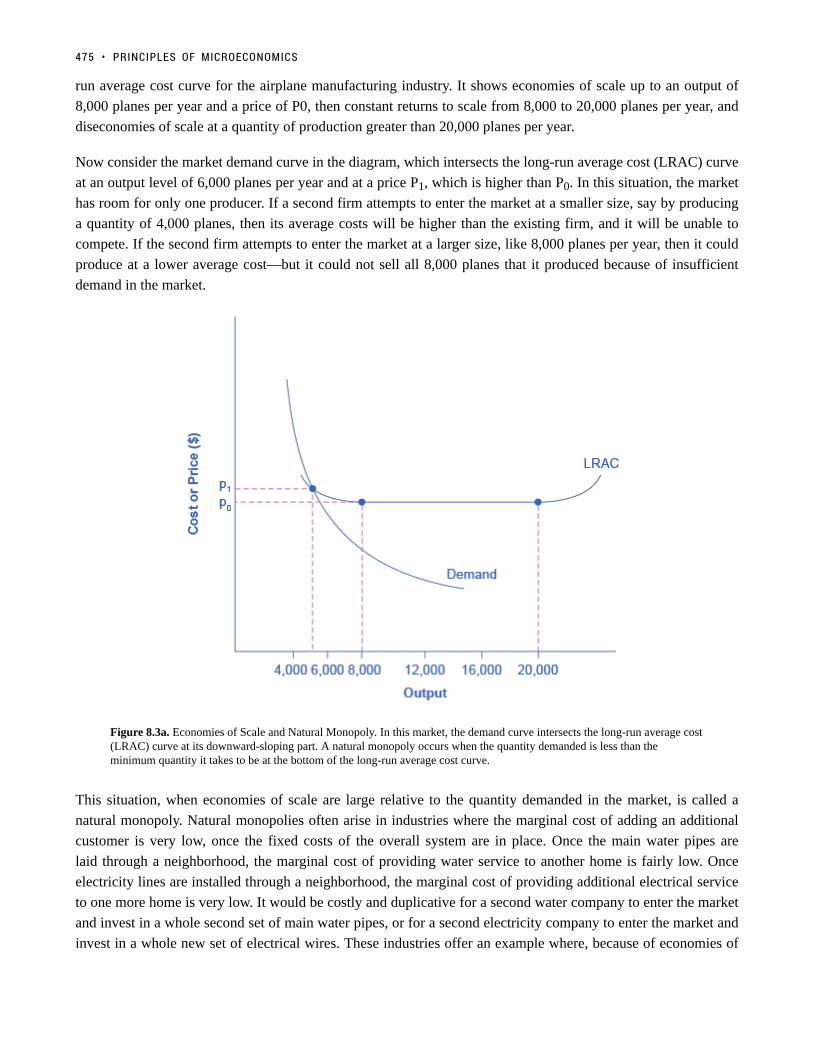
run average cost curve for the airplane manufacturing industry. It shows economies of scale up to an output of
8,000 planes per year and a price of P0, then constant returns to scale from 8,000 to 20,000 planes per year, and
diseconomies of scale at a quantity of production greater than 20,000 planes per year.
Now consider the market demand curve in the diagram, which intersects the long-run average cost (LRAC) curve
at an output level of 6,000 planes per year and at a price P1, which is higher than P0. In this situation, the market
has room for only one producer. If a second firm attempts to enter the market at a smaller size, say by producing
a quantity of 4,000 planes, then its average costs will be higher than the existing firm, and it will be unable to
compete. If the second firm attempts to enter the market at a larger size, like 8,000 planes per year, then it could
produce at a lower average cost—but it could not sell all 8,000 planes that it produced because of insufficient
demand in the market.
Figure 8.3a. Economies of Scale and Natural Monopoly. In this market, the demand curve intersects the long-run average cost(LRAC) curve at its downward-sloping part. A natural monopoly occurs when the quantity demanded is less than theminimum quantity it takes to be at the bottom of the long-run average cost curve.
This situation, when economies of scale are large relative to the quantity demanded in the market, is called a
natural monopoly. Natural monopolies often arise in industries where the marginal cost of adding an additional
customer is very low, once the fixed costs of the overall system are in place. Once the main water pipes are
laid through a neighborhood, the marginal cost of providing water service to another home is fairly low. Once
electricity lines are installed through a neighborhood, the marginal cost of providing additional electrical service
to one more home is very low. It would be costly and duplicative for a second water company to enter the market
and invest in a whole second set of main water pipes, or for a second electricity company to enter the market and
invest in a whole new set of electrical wires. These industries offer an example where, because of economies of
475 • PRINCIPLES OF MICROECONOMICS

scale, one producer can serve the entire market more efficiently than a number of smaller producers that would
need to make duplicate physical capital investments.
A natural monopoly can also arise in smaller local markets for products that are difficult to transport. For example,
cement production exhibits economies of scale, and the quantity of cement demanded in a local area may not be
much larger than what a single plant can produce. Moreover, the costs of transporting cement over land are high,
and so a cement plant in an area without access to water transportation may be a natural monopoly.
Control of a Physical ResourceControl of a Physical Resource
Another type of natural monopoly occurs when a company has control of a scarce physical resource.
In the U.S., one historical example of this pattern occurred when the Aluminum Company of America
(ALCOA) controlled most of the supply of bauxite, a key mineral used in making aluminum. Back in the
1930s, when ALCOA controlled most of the bauxite, other firms were simply unable to produce enough
aluminum to compete.
As another example, the majority of global diamond production is controlled by DeBeers, a
multinational company that has mining and production operations in South Africa, Botswana, Namibia,
and Canada. It also has exploration activities on four continents, while directing a worldwide
distribution network of rough cut diamonds. Though in recent years they have experienced growing
competition, their impact on the rough diamond market is still considerable.
Legal MonopolyLegal Monopoly
For some products, the government erects barriers to entry by prohibiting or limiting competition.
Under U.S. law, no organization but the U.S. Postal Service is legally allowed to deliver first-class
mail. Many states or cities have laws or regulations that allow households a choice of only one electric
company, one water company, and one company to pick up their garbage. Most legal monopolies are
considered utilities – products necessary for everyday life – that are socially beneficial to have. As
a consequence, the government allows producers to become regulated monopolies to ensure that an
appropriate amount of these products is provided to consumers. Additionally, legal monopolies are
often subject to economies of scale, so it makes sense to allow only one provider.
Promoting InnovationPromoting Innovation
Innovation takes time and resources to achieve. Suppose a company invests in research and development and
finds the cure for the common cold. In this world of near- ubiquitous information, other companies could take the
formula, produce the drug, and because they did not incur the costs of research and development (R&D), undercut
the price of the company that discovered the drug. Given this possibility, many firms would choose not to invest
in R&D, and as a result, the world would have less innovation.
To prevent this from happening, the patent act was created in Canada as a part of the British North America Act
8.3 WHY MONOPOLIES PERSIST • 476

in 1869. A patent gives the inventor the exclusive legal right to make, use, or sell the invention for a limited time
in Canada. The idea is to provide limited monopoly power so that innovative firms can recoup their investment in
R&D, but then to allow other firms to produce the product more cheaply once the patent expires.
A trademark is an identifying symbol or name for a particular good, like Chevrolet cars, or the Nike “swoosh”
that appears on shoes and athletic gear. A firm can renew a trademark over and over again, as long as it remains
in active use.
A copyright, according to the Canadian Intellectual Property Office, “is the exclusive legal right to produce,
reproduce, publish or perform an original literary, artistic, dramatic or musical work. ” No one can reproduce,
display, or perform a copyrighted work without permission from the author. Copyright protection generally lasts
for the life of the author plus 70 years.
Roughly speaking, the patent law covers inventions and copyright protects books, songs, and art. But in certain
areas, like the invention of new software, it has been unclear whether patent or copyright protection should apply.
There is also a body of law known as trade secrets. Even if a company does not have a patent on an invention,
competing firms are not allowed to steal its secrets. One famous trade secret is the formula for Coca-Cola, which
is not protected under copyright or patent law, but is simply kept secret by the company.
Taken together, this combination of patents, trademarks, copyrights, and trade secret law is called intellectual
property, because it implies ownership over an idea, concept, or image, not a physical piece of property like a
house or a car. Countries around the world have enacted laws to protect intellectual property, although the time
periods and exact provisions of such laws vary across countries.
Visit this website for examples of some pretty bizarre patents.
Intimidating Potential CompetitionIntimidating Potential Competition
Businesses have developed a number of schemes for creating barriers to entry by deterring potential competitors
from entering the market. One method is known as predatory pricing, in which a firm uses the threat of price
cuts to discourage competition. Predatory pricing is a violation of antitrust law, but it is difficult to prove.
Consider a large airline that provides most of the flights between two particular cities. A new, small start-up airline
decides to offer service between these two cities. The large airline immediately slashes prices on this route so that
477 • PRINCIPLES OF MICROECONOMICS

the new entrant cannot make any money. After the new entrant has gone out of business, the incumbent firm can
raise prices again.
After this pattern is repeated once or twice, potential new entrants may decide that it is not wise to try to
compete. Small airlines often accuse larger airlines of predatory pricing: in the early 2000s, for example, ValuJet
accused Delta of predatory pricing, Frontier accused United, and Reno Air accused Northwest. In 2015, the Justice
Department ruled against American Express and Mastercard for imposing restrictions on retailers who encouraged
customers to use lower swipe fees on credit transactions.
In some cases, large advertising budgets can also act as a way of discouraging the competition. If the only way
to launch a successful new national cola drink is to spend more than the promotional budgets of Coca-Cola and
PepsiCo., not too many companies will try. A firmly established brand name can be difficult to dislodge.
Summing Up Barriers to EntrySumming Up Barriers to Entry
Table 8.3a lists the barriers to entry that have been discussed here. This list is not exhaustive since firms
have proved to be highly creative in inventing business practices that discourage competition. When
barriers to entry exist, perfect competition is no longer a reasonable description of how an industry
works. When barriers to entry are high enough, a monopoly can result.
Barrier to Entry Government Role? Example
Natural monopoly Government often responds with regulation (orownership) Water and electric companies
Control of a physical resource No DeBeers for diamonds
Legal monopoly Yes Post office, past regulation of airlines andtrucking
Patent, trademark, andcopyright Yes, through protection of intellectual property New drugs or software
Intimidating potentialcompetitors Somewhat Predatory pricing; well-known brand names
Table 8.3a Barriers to Entry
Key Concepts and SummaryKey Concepts and Summary
Barriers to entry prevent or discourage competitors from entering the market. These barriers include: economies
of scale that lead to natural monopoly, control of a physical resource, legal restrictions on competition, patent,
trademark and copyright protection, and practices to intimidate the competition like predatory pricing. Intellectual
property refers to the legally guaranteed ownership of an idea, rather than a physical item. The laws that protect
intellectual property include patents, copyrights, trademarks, and trade secrets. A natural monopoly arises when
economies of scale persist over a large enough range of output that if one firm supplies the entire market, no other
firm can enter without facing a cost disadvantage.
8.3 WHY MONOPOLIES PERSIST • 478
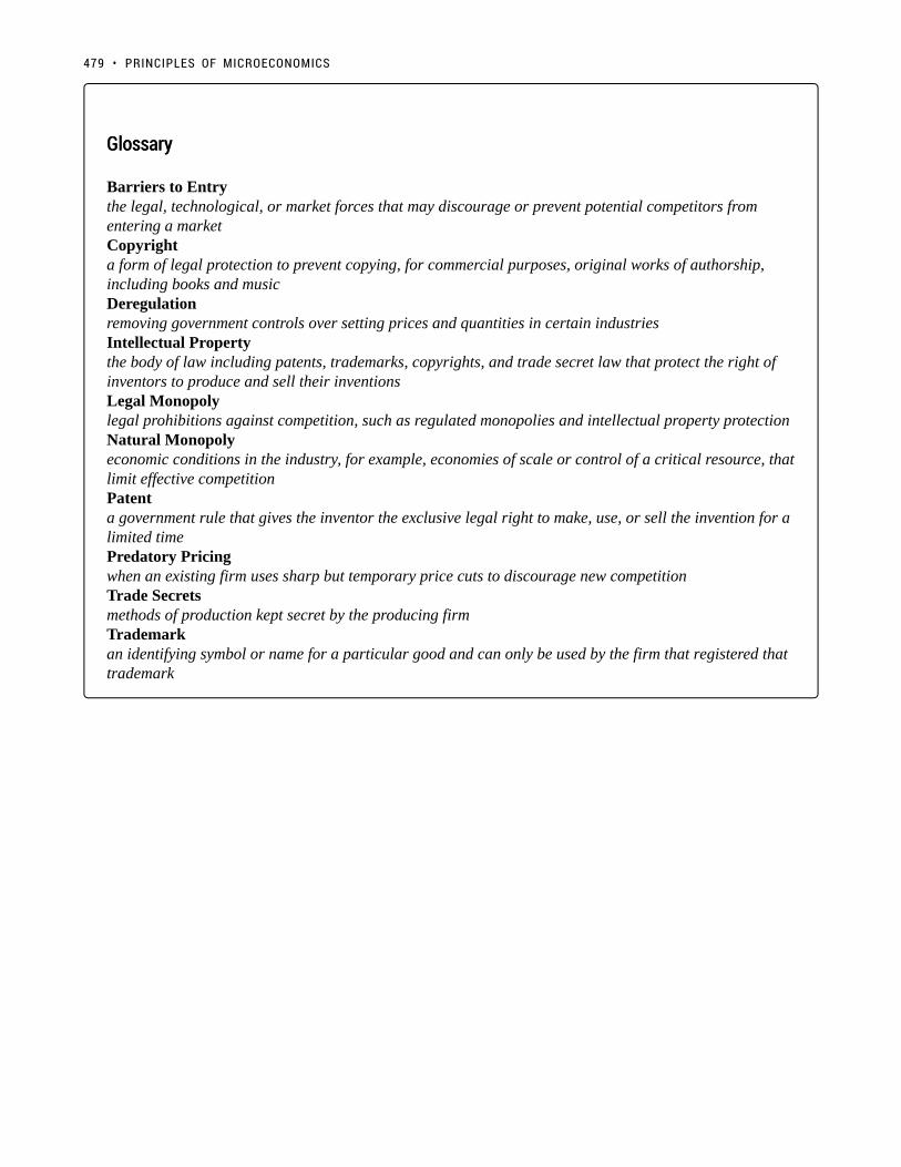
GlossaryGlossary
Barriers to Entrythe legal, technological, or market forces that may discourage or prevent potential competitors fromentering a marketCopyrighta form of legal protection to prevent copying, for commercial purposes, original works of authorship,including books and musicDeregulationremoving government controls over setting prices and quantities in certain industriesIntellectual Propertythe body of law including patents, trademarks, copyrights, and trade secret law that protect the right ofinventors to produce and sell their inventionsLegal Monopolylegal prohibitions against competition, such as regulated monopolies and intellectual property protectionNatural Monopolyeconomic conditions in the industry, for example, economies of scale or control of a critical resource, thatlimit effective competitionPatenta government rule that gives the inventor the exclusive legal right to make, use, or sell the invention for alimited timePredatory Pricingwhen an existing firm uses sharp but temporary price cuts to discourage new competitionTrade Secretsmethods of production kept secret by the producing firmTrademarkan identifying symbol or name for a particular good and can only be used by the firm that registered thattrademark
479 • PRINCIPLES OF MICROECONOMICS

8.4 Monopolistic Competition
Learning Objectives
By the end of this section, you will be able to:
• Explain the significance of differentiated products
• Describe how a monopolistic competitor chooses price and quantity
• Discuss entry, exit, and efficiency as they pertain to monopolistic competition
• Analyze how advertising can impact monopolistic competition
We have now explored the two sides of the spectrum. In perfect competition, we assume identical
products, and in a monopoly, we assume only one product is available.
Monopolistic competition lies in-between. It involves many firms competing against each other, but selling
products that are distinctive in some way. Examples include stores that sell different styles of clothing, restaurants
or grocery stores that sell different kinds of food and even products like golf balls or beer that may be at least
somewhat similar but differ in public perception because of advertising and brand names. Firms producing such
products must also compete with other styles, flavours and brand names. The term “monopolistic competition”
captures this mixture of mini-monopoly and tough competition.
Who invented the theory of imperfect competition?Who invented the theory of imperfect competition?
The theory of imperfect competition was developed by two economists independently but simultaneouslyin 1933. The first was Edward Chamberlin of Harvard University who published The Economics ofMonopolistic Competition. The second was Joan Robinson of Cambridge University who published TheEconomics of Imperfect Competition. Robinson subsequently became interested in macroeconomics whereshe became a prominent Keynesian, and later a post-Keynesian economist.
480

Differentiated ProductsDifferentiated Products
A firm can try to make its products different from those of its competitors in several ways: physical aspects of
the product, selling location, intangible aspects of the product, and perceptions of the product. Products that are
distinctive in one of these four ways are called differentiated products.
Physical aspects of a product include all the phrases you hear in advertisements: such as an unbreakable bottle,
nonstick surface, freezer-to-microwave, non-shrink, extra spicy, newly redesigned for your comfort. The location
of a firm can also create a difference between producers. For example, a gas station located at a busy intersection
can probably sell more gas than one located on a small side-road. A supplier to an automobile manufacturer may
find that it is advantageous to locate near the car factory.
Intangible aspects can differentiate a product, too. Some intangible aspects may be promises like a guarantee of
satisfaction or money back, a reputation for high-quality services like free delivery, or a loan to purchase the
product. Finally, product perception may occur in the minds of the buyers. For example, many people could not
tell the difference in taste between common varieties of beer or cigarettes if they were blindfolded, but because of
past habits and advertising, they have strong preferences for certain brands. Advertising can play a role in shaping
these intangible preferences.
The concept of differentiated products is closely related to the degree of variety that is available. If everyone in
the economy wore only blue jeans, ate only white bread, and drank only tap water, then the markets for clothing,
food, and drink would be much closer to perfectly competitive. The variety of styles, flavors, locations, and
characteristics creates product differentiation and monopolistic competition.
Perceived Demand for a Monopolistic CompetitorPerceived Demand for a Monopolistic Competitor
A monopolistically competitive firm faces a demand for its goods that is between monopoly and perfect
competition. Figure 8.4a offers a reminder that the demand curve as faced by a perfectly competitive firm is
perfectly elastic or flat, because the perfectly competitive firm can sell any quantity it wishes at the prevailing
market price. In contrast, the demand curve, as faced by a monopolist, is the market demand curve, since a
monopolist is the only firm in the market, and hence is downward sloping.
481 • PRINCIPLES OF MICROECONOMICS

Figure 8.4a. Perceived Demand for Firms in Different Competitive Settings. The demand curve faced by a perfectly competitive firm isperfectly elastic, meaning it can sell all the output it wishes at the prevailing market price. The demand curve faced by a monopoly is themarket demand. It can sell more output only by decreasing the price it charges. The demand curve faced by a monopolistically competitivefirm falls in between.
The demand curve as faced by a monopolistic competitor is not flat, but rather downward-sloping, meaning that
the monopolistic competitor, like the monopoly, can raise its price without losing all of its customers or lower its
price and gain more customers. Since there are substitutes, the demand curve for a monopolistically competitive
firm is relatively more elastic than that of a monopoly, where there are no close substitutes. If a monopolist raises
its price, some consumers will choose not to purchase its product—but they will then need to buy a completely
different product. However, when a monopolistic competitor raises its price, consumers can choose to buy a
similar product from another firm. If a monopolistic competitor raises its price, it will not lose as many customers
as would a perfectly competitive firm, but it will lose more customers than a monopoly would.
At a glance, the demand curves faced by a monopoly and monopolistic competitor look similar—that is, they both
slope down. Still, the underlying economic meaning of these demand curves is different because a monopolist
faces the market demand curve and a monopolistic competitor does not.
8.4 MONOPOLISTIC COMPETITION • 482

Cellular CompetitionCellular Competition
(Credit: Intel Free Press/ Flickr/ CC BY-SA 2.0)
Recall that monopolistic competition refers to an industry that has more than a few firms that each offera distinguished product. The Canadian cellular industry is one such market. With a history dating back asfar as Alexander Graham Bell’s invention of the telephone in 1876, the Canadian cellular industry now hasa number of large firms including Rogers, Telus, and Bell. What about Fido, Koodo, and Virgin Mobile?They are owned by Rogers, Telus, and Bell, respectively. While this market has some similarities to anOligopoly (which we will not explore in this course), it is often classified as a monopolistic competition.
Consider what you would do if your monthly cell phone bill increased by $2. Would you switch to anothercompany? Likely not. This means that the cellular market is certainly not perfectly competitive as cellphone companies have some ability to change prices. Therefore, the demand faced by each of the cellularcompanies will be more elastic than market demand, but not perfectly elastic. Let’s explore how thesemonopolistic competitive firms set prices.
How a Monopolistic Competitor Chooses Price and QuantityHow a Monopolistic Competitor Chooses Price and Quantity
To explore monopolistic competition, let’s consider Rogers, one of the Cellular companies in the market. Rogers
faces a downward sloping demand curve and has ATC and MC curves similar to the ones we have seen before.
483 • PRINCIPLES OF MICROECONOMICS

Figure 8.4b.
The monopolistically competitive firm decides on its profit-maximizing quantity and price similar to the way
that a monopolist does. Since they face a downward sloping demand curve, the same considerations about how
elasticity affects revenue are relevant, and the firm will maximize profits where MR = MC when P > MR.
Step 1. Rogers determines its profit-maximizing level of output. This will occur where MR = MC. Two situations
are possible:
• If the firm is producing at a quantity of output where marginal revenue exceeds marginal cost, then the firm
should keep expanding production, because each marginal unit is adding to profit by bringing in more
revenue than cost. In this way, the firm will produce up to the quantity where MR = MC.
• If the firm is producing at a quantity where marginal costs exceed marginal revenue, then each marginal
unit is costing more than the revenue it brings in, and the firm will increase its profits by reducing the
quantity of output until MR = MC.
In this example, MR and MC intersect when Rogers has 3.6 million subscribers.
Step 2. Rogers decides what price to charge. When the firm has determined its profit-maximizing quantity of
output, it will behave like a monopoly and charge the maximum it can at the quantity. On the graph, this process
8.4 MONOPOLISTIC COMPETITION • 484

can be shown as a vertical line reaching up through the profit-maximizing quantity until it hits the firm’s perceived
demand curve. For Rogers, this occurs at a price of $70/month.
Although the process by which a monopolistic competitor makes decisions about quantity and price is similar to
the way in which a monopolist makes such decisions, two differences are worth remembering. First, although
both a monopolist and a monopolistic competitor face downward-sloping demand curves, the monopolist’s
demand curve is the market demand curve, while the perceived demand curve for a monopolistic competitor is
based on the extent of its product differentiation and how many competitors it faces. Second, a monopolist is
surrounded by barriers to entry and need not fear entry, but a monopolistic competitor who earns profits must
expect the entry of firms with similar, but differentiated, products.
Monopolistic Competitors and EntryMonopolistic Competitors and Entry
Consider the profits of Rogers at equilibrium quantity of 3.6 million subscribers:
Figure 8.4c.
At a price of $70/month, ATC is only $60 and Rogers’ profit is $36 million. ($10 profit/subscriber) Notice that
this market creates a deadweight loss equal to the red area since the equilibrium quantity is less than what would
occur in competitive equilibrium (5 million subscriptions).
485 • PRINCIPLES OF MICROECONOMICS

Remember that in monopolistic competition, there are few barriers to entry. Since Rogers is earning positive
economic profits, other firms will be tempted to enter the market.
The entry of other firms into the same general market shifts the demand curve faced by a monopolistically
competitive firm. As more firms enter the market, the quantity demanded at a given price for any particular firm
will decline, and the firm’s perceived demand curve will shift to the left. As a firm’s perceived demand curve
shifts to the left, its marginal revenue curve will also shift to the left. The shift in marginal revenue will change
the profit-maximizing quantity that the firm chooses to produce since marginal revenue will then equal marginal
cost at a lower quantity.
Figure 8.4d.
When will this shifting stop? When profits are 0. As long as P > ATC firms will continue to enter the market, and
demand will continue to shift inward. As shown in Figure 8.4d, this occurs when P = ATC and MR = MC. This
specific point happens when Demand is tangent to ATC because (Emma why is this?).
What about the social surplus? Although profits are now 0, a deadweight loss persists. This is because, unlike
perfect competition, P > MR, which also means that P > MC. Since consumers’ willingness to pay is greater
that the marginal cost of the firm, market failure continues. Remember that a key reason for this is the firms’
inability to charge more that one price. Notice also that ATC is not at a minimum. This is the price the market
pays for variety since the aggregate market does not ensure the most efficient production when there is slight
differentiation in products.
8.4 MONOPOLISTIC COMPETITION • 486

The Benefits of Variety and Product DifferentiationThe Benefits of Variety and Product Differentiation
Even though monopolistic competition does not provide efficiency, it does have benefits of its own. Product
differentiation is based on variety and innovation. Many people would prefer to live in an economy with many
kinds of clothes, foods, and car styles; not in a world of perfect competition where everyone will always wear
blue jeans and white shirts, eat only spaghetti with plain red sauce, and drive an identical model of car. Many
people would prefer to live in an economy where firms are struggling to figure out ways of attracting customers
by methods like friendlier service, free delivery, guarantees of quality, variations on existing products, and a better
shopping experience.
Economists have struggled, with only partial success, to address the question of whether a market-oriented
economy produces the optimal amount of variety. Critics of market-oriented economies argue that society does
not really need dozens of different athletic shoes or breakfast cereals or automobiles. They argue that much
of the cost of creating such a high degree of product differentiation, and then of advertising and marketing
this differentiation, is socially wasteful—that is, most people would be just as happy with a smaller range
of differentiated products produced and sold at a lower price. Defenders of a market-oriented economy respond
that if people do not want to buy differentiated products or highly advertised brand names, no one is forcing
them to do so. Moreover, they argue that consumers benefit substantially when firms seek short-term profits by
providing differentiated products. This controversy may never be fully resolved, in part because deciding on the
optimal amount of variety is very difficult, and in part because the two sides often place different values on what
variety means for consumers.
487 • PRINCIPLES OF MICROECONOMICS

How does advertising impact monopolistic competition?How does advertising impact monopolistic competition?
(Credit: Marmoulak/ Wikimedia Commons/ CC BY 2.0)
The Canadian economy spent about $12.22 billion on advertising in 2016, according to statista.com.
Advertising is all about explaining to people, or making people believe, that the products of one firm aredifferentiated from the products of another firm. In the framework of monopolistic competition, there aretwo ways to conceive how advertising works: either advertising causes a firm’s perceived demand curveto become more inelastic (that is, it causes the perceived demand curve to become steeper), or advertisingcauses demand for the firm’s product to increase (that is, it causes the firm’s perceived demand curve toshift to the right). In either case, a successful advertising campaign may allow a firm to sell either a greaterquantity or to charge a higher price, or both, and thus increase its profits.
However, economists and business owners have also long suspected that much of the advertising mayonly offset other advertising. Economist A. C. Pigou wrote the following back in 1920 in his book, TheEconomics of Welfare:
It may happen that expenditures on advertisement made by competing monopolists [that is, what wenow call monopolistic competitors] will simply neutralise one another, and leave the industrial positionexactly as it would have been if neither had expended anything. For, clearly, if each of two rivals makesequal efforts to attract the favour of the public away from the other, the total result is the same as itwould have been if neither had made any effort at all.
8.4 MONOPOLISTIC COMPETITION • 488

SummarySummary
Monopolistic competition refers to a market where many firms sell differentiated products.
Differentiated products can arise from characteristics of the good or service, location from which the
product is sold, intangible aspects of the product, and perceptions of the product.
If the firms in a monopolistically competitive industry are earning economic profits, the industry will
attract entry until profits are driven down to zero in the long run. If the firms in a monopolistically
competitive industry are suffering economic losses, then the industry will see an exit of firms until
economic profits are driven up to zero in the long run.
A monopolistically competitive firm is not efficient because it does not produce at the minimum of its
average cost curve or produce where P = MC. Thus, a monopolistically competitive firm will tend to
produce a lower quantity at a higher cost and charge a higher price than a perfectly competitive firm.
Monopolistically competitive industries do offer benefits to consumers in the form of greater variety
and incentives for improved products and services. There is some controversy over whether a market-
oriented economy generates too much variety.
The following table summarizes the three types of market structure we have examined. The fourth,
oligopoly, is not in the scope of this course.
Market typeMarket type DescriptionDescription MR v PMR v P P v MCP v MC LR ΠLR Π
Perf. Comp. Many sellers, identical goods, freeentry in LR MR = P P = MC Π = 0
Monopoly Single seller, barriers to entry MR < P P > MC Π > 0
Monopolistic Comp. Many sellers, differentiated products,free entry in LR MR < P P > MC Π = 0
GlossaryGlossary
Differentiated Productsa product that is perceived by consumers as distinctive in some wayMonopolistic Competitionmany firms competing to sell similar but differentiated products
489 • PRINCIPLES OF MICROECONOMICS

Exercises 8.4
The following TWO questions refer to the diagram below, which illustrates the demand, marginal revenue,and relevant cost curves for a monopolistically competitive firm.
1. How many units of output should this firm produce, in order to maximize profits?
a) 10.b) 25.c) 30.d) 60.
2. In the long run, what price will this firm charge for its output?
a) $10.b) A price less than $10 and greater than $6.c) $6.d) A price less than $6 and greater than $4.
The following TWO questions refer to the diagram below.
8.4 MONOPOLISTIC COMPETITION • 490

3. Which of the four diagrams illustrates a long run equilibrium for a monopolistically competitive firm?
a) Figure 1.b) Figure 2.c) Figure 4.d) Figures 2 and 4.
4. Which of the four diagrams illustrates a monopolistically competitive firm able to make positiveeconomic profits in the short run?
a) Figure 1.b) Figure 2.c) Figures 1 and 2.d) None of the above.
5. Which of the following statements about the comparison between monopolistic competition in the longrun and monopoly in the long run is FALSE?
a) Marginal revenue is less than price for both monopoly and monopolistic competition.b) Price is greater than marginal cost for both monopoly and monopolistic competition.c) Price is greater than average total cost for both monopoly and monopolistic competition.
491 • PRINCIPLES OF MICROECONOMICS

d) Neither monopoly or monopolistic competition produce at the minimum point of the average total costcurve.
6. Which of the following statements about the comparison between perfect competition and monopolisticcompetition is TRUE?
I. Both perfectly competitive and monopolistically competitive firms produce where marginal revenueequals marginal cost.II. Both perfectly competitive and monopolistically competitive firms produce where price equals marginalcost.III. Both perfectly competitive and monopolistically industries are characterized by free entry and zeroprofits in the long run.
a) I only.b) I and III only.c) I and II only.d) I, II and III.
8.4 MONOPOLISTIC COMPETITION • 492

Case Study - Diamond's Demise
(Credit: bettercopy.org)
How much would you spend on a diamond engagement ring? If you answered around the national average of
$4,000 then you too have fallen victim to one of the most incredible marketing campaigns of all time. A diamond
is intrinsically worthless, and against popular belief, they really aren’t that rare. Their resale value is next to
nothing.
So why are we willing to spend so much on a ring? Well, we can trace that back to the 19th century. Before 1866,
diamonds had been rare, but when massive discoveries were found in South Africa, the rock was on the verge
of losing its value. Thats when Cecil Rhodes stepped in and founded De Beers Corporation – consolidating the
mines and restricting supply, maintaining the fiction that diamonds were scarce and had inherent value.
493
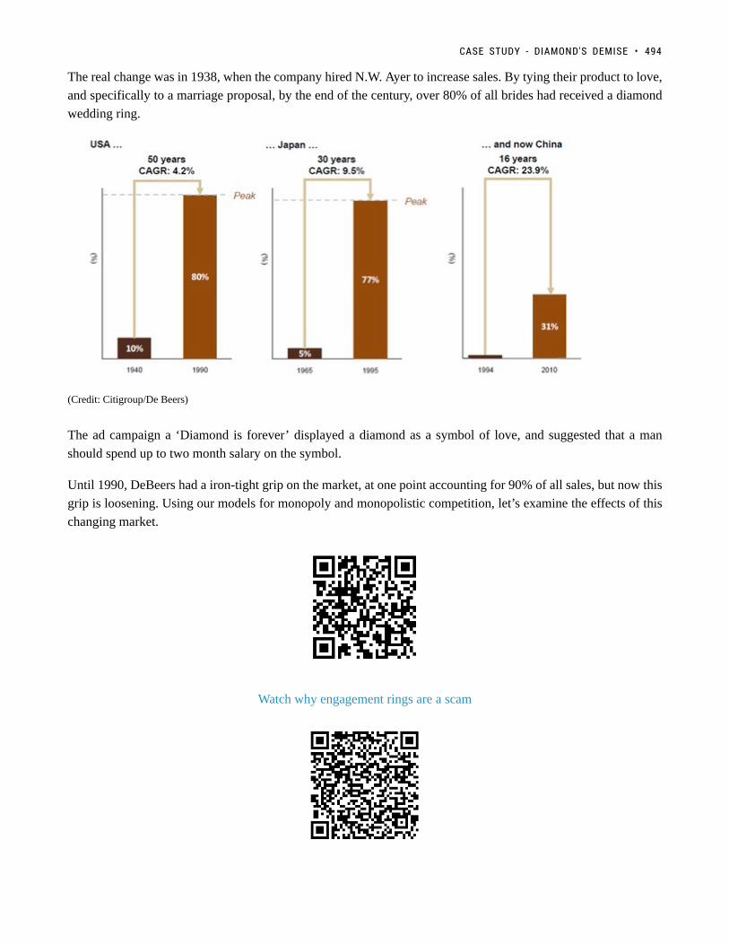
The real change was in 1938, when the company hired N.W. Ayer to increase sales. By tying their product to love,
and specifically to a marriage proposal, by the end of the century, over 80% of all brides had received a diamond
wedding ring.
(Credit: Citigroup/De Beers)
The ad campaign a ‘Diamond is forever’ displayed a diamond as a symbol of love, and suggested that a man
should spend up to two month salary on the symbol.
Until 1990, DeBeers had a iron-tight grip on the market, at one point accounting for 90% of all sales, but now this
grip is loosening. Using our models for monopoly and monopolistic competition, let’s examine the effects of this
changing market.
Watch why engagement rings are a scam
CASE STUDY - DIAMOND'S DEMISE • 494

Learn more about DeBeers ad Campaign
Below is a representation of the demand curve for diamonds. Assume DeBeers is operating as a monopoly.
1. As a monopolist, what is the total effect of a price change from $2,400 to $1,600 on revenue? Break this
change into an increase and a decrease.
If you were to do exercise 1 in for every marginal change in price, you would find the marginal revenue curve. The
marginal revenue diagram has been provided for the next exercises, along with the marginal costs for DeBeers.
2. As a monopolist, what quantity does DeBeers produce? What price do they charge?
3. What is Consumer Surplus, Producer Surplus, and Market Surplus?
4. What is the deadweight loss under monopoly?
495 • PRINCIPLES OF MICROECONOMICS

An ATC curve has been provided for DeBeers. These costs include marketing, mining exploration, and more.
5. What are DeBeers profits? Why are they able to sustain these in the long-run?
CASE STUDY - DIAMOND'S DEMISE • 496

From the 1990’s to now, the market has changed considerably, with DeBeer having to adapt to new challenges.
The first is the introduction of direct competitors. Russia’s state-owned diamond company ALROSA now
produces more diamonds than DeBeers itself. Some new firms even bought mines from DeBeers when the
company was trying to support their balance sheet.
Another change is the introduction of substitutes, with synthetic diamonds becoming more appealing to price-
conscious young shoppers. Advances on the production of these products are fairly recent, notably, in 2015 New
Diamond Technology displayed the potential of synthetics by creating a ten-carat polished diamond.
This means the market is changing from monopoly to monopolistic competition. We know that entry of other
firms will cause the monopolists demand curve to shift.
497 • PRINCIPLES OF MICROECONOMICS

Read more about how the diamond market is changing
6. Show the effect of the changes on our demand curve. If the new marginal revenue intersects marginal
cost at (45, 1,900) draw the new demand curve and new marginal revenue curve.
7. As a monopolistic competitor, what quantity does DeBeers produce? What price do they charge?
8. What are DeBeers profits now?
9. What is the deadweight loss under monopolistic competition?
10. Are these market changes good or bad for consumers?
In this case study we have shown how microeconomic concepts of monopoly and monopolistic competition can
be used to understand current events in the news. Do you have a story you think would make a good case study?
Contact [email protected] to propose your own case.
CASE STUDY - DIAMOND'S DEMISE • 498

Solutions: Diamond's Demise
1. As a monopolist, what is the total effect of a price change from $2,400 to $1,600 on revenue? Break this
change into an increase and a decrease.
Based on our demand curve, when DeBeers decreases its prices two things happen – DeBeers loses money on the
499

80 million Carats of diamonds they were originally selling, but they also gain from 40 million new Carats they are
able to sell. Calculating the areas of the increase and the decreases, we find that they are both equal to $64,000.
2. As a monopolist, what quantity does DeBeers produce? What price do they charge?
–
A monopolist charges the highest price possible where MR = MC. Here, that occurs at a quantity of 65 million
Carats and a price of $2,700.
3. What is Consumer Surplus, Producer Surplus, and Market Surplus?
We can do both number 3 and 4 together on the graph below. Calculating the areas:
Monopoly (graph on right)
Producer Surplus (yellow area):
(2,700 – 1,300)(65) +
=$133.25 billion
Consumer Surplus (blue area):
SOLUTIONS: DIAMOND'S DEMISE • 500

=$42.25 billion
Market Surplus (blue + yellow):
$133.25 billion +$42.25 billion
=$175.5 billion
4. What is the deadweight loss under monopoly?
Remember that social surplus is maximized where MC = MB, or where our MC intersects the demand curve. This
occurs at a quantity of 100 million carats and a price of $2,000
Social Surplus Maximizing (graph on left)
Producer Surplus (yellow area):
=$100 billion
Consumer Surplus (blue area):
=$100 billion
Market Surplus (blue + yellow):
$100 billion + $100 billion
=$200 billion
The difference between the market surplus under monopoly, and the market surplus when the market is maximizing
social surplus is equal to the deadweight loss. Note that social surplus could also be maximized under perfect
price discrimination.
DWL = $200 billion- $175.5 billion = $24.5 billion
501 • PRINCIPLES OF MICROECONOMICS

5. What are DeBeers profits? Why are they able to sustain these in the long-run?
To calculate DeBeers profits we must find the ATC @ our given quantity. Since we know that P-ATC = profit per
unit, we can calculate the rectangular area between these two points to find profit. At quantity of 65 million Carats
of diamonds, our ATC = $1,700.
($2,700 – $1,700)(65)
=$65 billion
SOLUTIONS: DIAMOND'S DEMISE • 502

6. Show the effect of the changes on our demand curve in the long run. If the new marginal revenue
intersects marginal cost at (45, 1,900) draw the new demand curve and new marginal revenue curve.
As shown in the figure below as more firms enter the market, our demand curve no longer represents the demand
curve for the entire market. Some of DeBeer’s consumers will go elsewhere, and the demand curve that DeBeer’s
faces will shift inwards. As long as there are positive profits (P > ATC) then this process will continue to occur.
As we can see at point (45, $1900) our demand curve (D2) is tangent to the ATC curve and MR = MC. These are
the conditions for a monopolistic competitor.
7. As a monopolistic competitor, what quantity does DeBeers produce? What price do they charge?
Similar to a monopoly, a monopolistic competitor charges the highest price possible where MR = MC. Here, that
occurs at a quantity of 45 million Carats and a price of $1,900.
503 • PRINCIPLES OF MICROECONOMICS

8. What are DeBeers profits now?
Remember that under monopolistic competition, profits are 0 in the long-run. Since the diamond market has
reached a state of long-run equilibrium, De Beers profits will be 0. In the diagram above we can see that P=ATC,
meaning that there are no profits.
9. What is the deadweight loss under monopolistic competition?
Remember that social surplus is maximized where MC = MB, or where our MC intersects the demand curve. This
occurs at a quantity of 75 million carats and a price of $1,400.
We could once again calculate the consumer, and producer surplus, or we could also note on the diagram that the
decrease in surplus is equal to the red shaded area.
Calculating the red area:
($2,000 – $1,000) ( 70 – 45 ) /2
=$17,500
SOLUTIONS: DIAMOND'S DEMISE • 504

10. Are these market changes good or bad for consumers?
We actually can’t find directly the changes in consumer surplus by the information we are given, since we cannot
compare the deadweight loss from questions 4 and question 9. This is because both of these look at the individual
firm, and for monopolistic competition, we know there are other firms in the market. We can notice that our price
has decreased, and that our drop quantity demanded will be offset by supply from other firms. We also know that
consumers generally prefer variety, and by opening up market more options are available.
505 • PRINCIPLES OF MICROECONOMICS

Topic 8 Solutions
Solutions to Exercises 8.1
1. C
2. C
3. D
Solutions to Exercises 8.2
1. A
2. C
Solutions to Exercises 8.4
1. B
2. B
3. C
4. C
5. C
6. B
506

Topic 8 References
Aboukhadijeh, Feross. “Chapter 20: Girding for War – The North and the South, 1861-1865.” StudyNotes, Inc.
Accessed July 7, 2013. http://www.apstudynotes.org/us-history/outlines/chapter-20-girding-for-war-the-north-
and-the-south-1861-1865/.
Adam Ruins Everything. CollegeHumour. “Why Engagement Rings Are a Scam.” February 13,
2014. http://www.collegehumor.com/video/6952792/why-engagement-rings-are-a-scam
British Parliament. “(28 August 1833). Slavery Abolition Act 1833; Section LXIV.” Accessed July 2013.
http://www.pdavis.nl/Legis_07.htm.
Dattel, E. (nd). “Cotton and the Civil War.” Mississippi Historical Society. Accessed July 2013.
http://mshistorynow.mdah.state.ms.us/articles/291/cotton-and-the-civil-war.
The Economist. “The Future of Forever: A Report from DeBeers New Diamond Mine.” February 25,
2017. http://www.economist.com/news/international/21717369-production-worlds-most-valuable-gem-may-be-
about-peak-report-de-beerss
Friedman, Uri. The Atlantic. “How an Ad Campaign Invented the Diamond Engagement Ring.” February 13,
2015. https://www.theatlantic.com/international/archive/2015/02/how-an-ad-campaign-invented-the-diamond-
engagement-ring/385376/
Massachusetts Historical Society. “The Coming of the American Revolution 1764-1776: The Boston Tea Party.”
Retrieved from http://www.masshist.org/revolution/teaparty.php.
Massachusetts Historical Society. “Whereas our Nation.” The Massachusetts Gazette, p. 2. Accessed July 2013
http://www.masshist.org/revolution/image-
viewer.php?old=1&item_id=457&img_step=1&nmask=1&mode=large.
Touryalai, Halah. Forbes. “Ray-Ban, Oakley, Chanel Or Prada Sunglasses? They’re All Made By This Obscure
$9B Company.” July 2, 2013. https://www.forbes.com/sites/halahtouryalai/2013/07/02/ray-ban-oakley-chanel-or-
prada-sunglasses-theyre-all-made-by-this-obscure-9b-company/#237511b364d6
507
Appendix A: The Use of Mathematics in Principles ofEconomics
(This appendix should be consulted after first reading Welcome to Economics!) Economics is not math. There is
no important concept in this course that cannot be explained without mathematics. That said, math is a tool that
can be used to illustrate economic concepts. Remember the saying a picture is worth a thousand words? Instead
of a picture, think of a graph. It is the same thing. Economists use models as the primary tool to derive insights
about economic issues and problems. Math is one way of working with (or manipulating) economic models.
There are other ways of representing models, such as text or narrative. But why would you use your fist to bang
a nail, if you had a hammer? Math has certain advantages over text. It disciplines your thinking by making you
specify exactly what you mean. You can get away with fuzzy thinking in your head, but you cannot when you
reduce a model to algebraic equations. At the same time, math also has disadvantages. Mathematical models are
necessarily based on simplifying assumptions, so they are not likely to be perfectly realistic. Mathematical models
also lack the nuances which can be found in narrative models. The point is that math is one tool, but it is not the
only tool or even always the best tool economists can use. So what math will you need for this book? The answer
is: little more than high school algebra and graphs. You will need to know:
• What a function is
• How to interpret the equation of a line (i.e., slope and intercept)
• How to manipulate a line (i.e., changing the slope or the intercept)
• How to compute and interpret a growth rate (i.e., percentage change)
• How to read and manipulate a graph
In this text, we will use the easiest math possible, and we will introduce it in this appendix. So if you find some
math in the book that you cannot follow, come back to this appendix to review. Like most things, math has
diminishing returns. A little math ability goes a long way; the more advanced math you bring in, the less additional
knowledge that will get you. That said, if you are going to major in economics, you should consider learning a
little calculus. It will be worth your while in terms of helping you learn advanced economics more quickly.
508

Algebraic ModelsAlgebraic Models
Often economic models (or parts of models) are expressed in terms of mathematical functions. What is a function?
A function describes a relationship. Sometimes the relationship is a definition. For example (using words), your
professor is Adam Smith. This could be expressed as Professor = Adam Smith. Or Friends = Bob + Shawn +
Margaret.
Often in economics, functions describe cause and effect. The variable on the left-hand side is what is being
explained (“the effect”). On the right-hand side is what is doing the explaining (“the causes”). For example,
suppose your GPA was determined as follows:
This equation states that your GPA depends on three things: your combined SAT score, your class attendance,
and the number of hours you spend studying. It also says that study time is twice as important (0.50) as either
combined_SAT score (0.25) or class_attendance (0.25). If this relationship is true, how could you raise your GPA?
By not skipping class and studying more. Note that you cannot do anything about your SAT score, since if you
are in college, you have (presumably) already taken the SATs.
Of course, economic models express relationships using economic variables, like Budget =
money_spent_on_econ_books + money_spent_on_music, assuming that the only things you buy are economics
books and music.
Most of the relationships we use in this course are expressed as linear equations of the form:
Expressing Equations Graphically
Graphs are useful for two purposes. The first is to express equations visually, and the second is to display statistics
or data. This section will discuss expressing equations visually.
To a mathematician or an economist, a variable is the name given to a quantity that may assume a range of values.
In the equation of a line presented above, x and y are the variables, with x on the horizontal axis and y on the
vertical axis, and b and m representing factors that determine the shape of the line. To see how this equation
works, consider a numerical example:
In this equation for a specific line, the b term has been set equal to 9 and the m term has been set equal to 3. Table
1 shows the values of x and y for this given equation. Figure 1 shows this equation, and these values, in a graph.
To construct the table, just plug in a series of different values for x, and then calculate what value of y results. In
the figure, these points are plotted and a line is drawn through them.
509 • PRINCIPLES OF MICROECONOMICS

x y
0 9
1 12
2 15
3 18
4 21
5 24
6 27
Table 1. Values for the Slope Intercept Equation
APPENDIX A: THE USE OF MATHEMATICS IN PRINCIPLES OF ECONOMICS • 510

Figure 1. Slope and the Algebra of Straight Lines. This line graph has x on thehorizontal axis and y on the vertical axis. The y-intercept—that is, the point wherethe line intersects the y-axis—is 9. The slope of the line is 3; that is, there is a rise of3 on the vertical axis for every increase of 1 on the horizontal axis. The slope is thesame all along a straight line.
This example illustrates how the b and m terms in an equation for a straight line determine the shape of the line.
The b term is called the y-intercept. The reason for this name is that, if x = 0, then the b term will reveal where
the line intercepts, or crosses, the y-axis. In this example, the line hits the vertical axis at 9. The m term in the
equation for the line is the slope. Remember that slope is defined as rise over run; more specifically, the slope of
a line from one point to another is the change in the vertical axis divided by the change in the horizontal axis. In
this example, each time the x term increases by one (the run), the y term rises by three. Thus, the slope of this line
is three. Specifying a y-intercept and a slope—that is, specifying b and m in the equation for a line—will identify
a specific line. Although it is rare for real-world data points to arrange themselves as an exact straight line, it often
turns out that a straight line can offer a reasonable approximation of actual data.
Interpreting the Slope
The concept of slope is very useful in economics, because it measures the relationship between two variables.
A positive slope means that two variables are positively related; that is, when x increases, so does y, or when x
decreases, y decreases also. Graphically, a positive slope means that as a line on the line graph moves from left
to right, the line rises. The length-weight relationship, shown in Figure 3 later in this Appendix, has a positive
slope. We will learn in other chapters that price and quantity supplied have a positive relationship; that is, firms
will supply more when the price is higher.
A negative slope means that two variables are negatively related; that is, when x increases, y decreases, or when
x decreases, y increases. Graphically, a negative slope means that, as the line on the line graph moves from
left to right, the line falls. The altitude-air density relationship, shown in Figure 4 later in this appendix, has a
negative slope. We will learn that price and quantity demanded have a negative relationship; that is, consumers
will purchase less when the price is higher.
511 • PRINCIPLES OF MICROECONOMICS

A slope of zero means that there is no relationship between x and y. Graphically, the line is flat; that is, zero rise
over the run. Figure 5 of the unemployment rate, shown later in this appendix, illustrates a common pattern of
many line graphs: some segments where the slope is positive, other segments where the slope is negative, and still
other segments where the slope is close to zero.
The slope of a straight line between two points can be calculated in numerical terms. To calculate slope, begin by
designating one point as the “starting point” and the other point as the “end point” and then calculating the rise
over run between these two points. As an example, consider the slope of the air density graph between the points
representing an altitude of 4,000 meters and an altitude of 6,000 meters:
Rise: Change in variable on vertical axis (end point minus original point)
Run: Change in variable on horizontal axis (end point minus original point)
Thus, the slope of a straight line between these two points would be that from the altitude of 4,000 meters up to
6,000 meters, the density of the air decreases by approximately 0.1 kilograms/cubic meter for each of the next
1,000 meters
Suppose the slope of a line were to increase. Graphically, that means it would get steeper. Suppose the slope of
a line were to decrease. Then it would get flatter. These conditions are true whether or not the slope was positive
or negative to begin with. A higher positive slope means a steeper upward tilt to the line, while a smaller positive
slope means a flatter upward tilt to the line. A negative slope that is larger in absolute value (that is, more negative)
means a steeper downward tilt to the line. A slope of zero is a horizontal flat line. A vertical line has an infinite
slope.
Suppose a line has a larger intercept. Graphically, that means it would shift out (or up) from the old origin, parallel
to the old line. If a line has a smaller intercept, it would shift in (or down), parallel to the old line.
Solving Models with Algebra
Economists often use models to answer a specific question, like: What will the unemployment rate be if the
economy grows at 3% per year? Answering specific questions requires solving the “system” of equations that
represent the model.
Suppose the demand for personal pizzas is given by the following equation:
where Qd is the amount of personal pizzas consumers want to buy (i.e., quantity demanded), and P is the price of
pizzas. Suppose the supply of personal pizzas is:
APPENDIX A: THE USE OF MATHEMATICS IN PRINCIPLES OF ECONOMICS • 512

where Qs is the amount of pizza producers will supply (i.e., quantity supplied).
Finally, suppose that the personal pizza market operates where supply equals demand, or
We now have a system of three equations and three unknowns (Qd, Qs, and P), which we can solve with algebra:
Since Qd = Qs, we can set the demand and supply equation equal to each other:
Subtracting 2 from both sides and adding 2P to both sides yields:
In other words, the price of each personal pizza will be $2. How much will consumers buy?
Taking the price of $2, and plugging it into the demand equation, we get:
So if the price is $2 each, consumers will purchase 12. How much will producers supply? Taking the price of $2,
and plugging it into the supply equation, we get:
So if the price is $2 each, producers will supply 12 personal pizzas. This means we did our math correctly, since
Qd = Qs.
Solving Models with Graphs
If algebra is not your forte, you can get the same answer by using graphs. Take the equations for Qd and Qs and
graph them on the same set of axes as shown in Figure 2. Since P is on the vertical axis, it is easiest if you solve
each equation for P. The demand curve is then P = 8 – 0.5Qd and the demand curve is P = –0.4 + 0.2Qs. Note
that the vertical intercepts are 8 and –0.4, and the slopes are –0.5 for demand and 0.2 for supply. If you draw the
graphs carefully, you will see that where they cross (Qs = Qd), the price is $2 and the quantity is 12, just like the
algebra predicted.
513 • PRINCIPLES OF MICROECONOMICS

Figure 2. Supply and Demand Graph. The equations for Qd and Qs are displayedgraphically by the sloped lines.
We will use graphs more frequently in this book than algebra, but now you know the math behind the graphs.
Growth RatesGrowth Rates
Growth rates are frequently encountered in real world economics. A growth rate is simply the percentage change
in some quantity. It could be your income. It could be a business’s sales. It could be a nation’s GDP. The formula
for computing a growth rate is straightforward:
Suppose your job pays $10 per hour. Your boss, however, is so impressed with your work that he gives you a $2
per hour raise. The percentage change (or growth rate) in your pay is $2/$10 = 0.20 or 20%.
To compute the growth rate for data over an extended period of time, for example, the average annual growth in
GDP over a decade or more, the denominator is commonly defined a little differently. In the previous example, we
defined the quantity as the initial quantity—or the quantity when we started. This is fine for a one-time calculation,
but when we compute the growth over and over, it makes more sense to define the quantity as the average quantity
over the period in question, which is defined as the quantity halfway between the initial quantity and the next
quantity. This is harder to explain in words than to show with an example. Suppose a nation’s GDP was $1 trillion
in 2005 and $1.03 trillion in 2006. The growth rate between 2005 and 2006 would be the change in GDP ($1.03
trillion – $1.00 trillion) divided by the average GDP between 2005 and 2006 ($1.03 trillion + $1.00 trillion)/2. In
other words:
Note that if we used the first method, the calculation would be ($1.03 trillion – $1.00 trillion) / $1.00 trillion
APPENDIX A: THE USE OF MATHEMATICS IN PRINCIPLES OF ECONOMICS • 514

= 3% growth, which is approximately the same as the second, more complicated method. If you need a rough
approximation, use the first method. If you need accuracy, use the second method.
A few things to remember: A positive growth rate means the quantity is growing. A smaller growth rate means
the quantity is growing more slowly. A larger growth rate means the quantity is growing more quickly. A negative
growth rate means the quantity is decreasing.
The same change over times yields a smaller growth rate. If you got a $2 raise each year, in the first year the
growth rate would be $2/$10 = 20%, as shown above. But in the second year, the growth rate would be $2/$12 =
0.167 or 16.7% growth. In the third year, the same $2 raise would correspond to a $2/$14 = 14.2%. The moral of
the story is this: To keep the growth rate the same, the change must increase each period.
Displaying Data Graphically and Interpreting the GraphDisplaying Data Graphically and Interpreting the Graph
Graphs are also used to display data or evidence. Graphs are a method of presenting numerical patterns. They
condense detailed numerical information into a visual form in which relationships and numerical patterns can
be seen more easily. For example, which countries have larger or smaller populations? A careful reader could
examine a long list of numbers representing the populations of many countries, but with over 200 nations in the
world, searching through such a list would take concentration and time. Putting these same numbers on a graph
can quickly reveal population patterns. Economists use graphs both for a compact and readable presentation of
groups of numbers and for building an intuitive grasp of relationships and connections.
Three types of graphs are used in this book: line graphs, pie graphs, and bar graphs. Each is discussed below. We
also provide warnings about how graphs can be manipulated to alter viewers’ perceptions of the relationships in
the data.
Line Graphs
The graphs we have discussed so far are called line graphs, because they show a relationship between two
variables: one measured on the horizontal axis and the other measured on the vertical axis.
Sometimes it is useful to show more than one set of data on the same axes. The data in Table 2 is displayed in
Figure 3 which shows the relationship between two variables: length and median weight for American baby boys
and girls during the first three years of life. (The median means that half of all babies weigh more than this and
half weigh less.) The line graph measures length in inches on the horizontal axis and weight in pounds on the
vertical axis. For example, point A on the figure shows that a boy who is 28 inches long will have a median weight
of about 19 pounds. One line on the graph shows the length-weight relationship for boys and the other line shows
the relationship for girls. This kind of graph is widely used by healthcare providers to check whether a child’s
physical development is roughly on track.
515 • PRINCIPLES OF MICROECONOMICS

Figure 3. The Length-Weight Relationship for American Boys and Girls. The linegraph shows the relationship between height and weight for boys and girls from birthto 3 years. Point A, for example, shows that a boy of 28 inches in height (measuredon the horizontal axis) is typically 19 pounds in weight (measured on the verticalaxis). These data apply only to children in the first three years of life.
Boys from Birth to 36 Months Girls from Birth to 36 Months
Length (inches) Weight (pounds) Length (inches) Weight (pounds)
20.0 8.0 20.0 7.9
22.0 10.5 22.0 10.5
24.0 13.5 24.0 13.2
26.0 16.4 26.0 16.0
28.0 19.0 28.0 18.8
30.0 21.8 30.0 21.2
32.0 24.3 32.0 24.0
34.0 27.0 34.0 26.2
36.0 29.3 36.0 28.9
38.0 32.0 38.0 31.3
Table 2. Length to Weight Relationship for American Boys and Girls
Not all relationships in economics are linear. Sometimes they are curves. Figure 4 presents another example of a
line graph, representing the data from Table 3. In this case, the line graph shows how thin the air becomes when
you climb a mountain. The horizontal axis of the figure shows altitude, measured in meters above sea level. The
APPENDIX A: THE USE OF MATHEMATICS IN PRINCIPLES OF ECONOMICS • 516

vertical axis measures the density of the air at each altitude. Air density is measured by the weight of the air in
a cubic meter of space (that is, a box measuring one meter in height, width, and depth). As the graph shows,
air pressure is heaviest at ground level and becomes lighter as you climb. Figure 4 shows that a cubic meter of
air at an altitude of 500 meters weighs approximately one kilogram (about 2.2 pounds). However, as the altitude
increases, air density decreases. A cubic meter of air at the top of Mount Everest, at about 8,828 meters, would
weigh only 0.023 kilograms. The thin air at high altitudes explains why many mountain climbers need to use
oxygen tanks as they reach the top of a mountain.
517 • PRINCIPLES OF MICROECONOMICS

Figure 4. Altitude-Air Density Relationship. This line graph shows the relationship between altitude, measured in metersabove sea level, and air density, measured in kilograms of air per cubic meter. As altitude rises, air density declines. The pointat the top of Mount Everest has an altitude of approximately 8,828 meters above sea level (the horizontal axis) and air densityof 0.023 kilograms per cubic meter (the vertical axis).
APPENDIX A: THE USE OF MATHEMATICS IN PRINCIPLES OF ECONOMICS • 518

Altitude (meters) Air Density (kg/cubic meters)
0 1.200
500 1.093
1,000 0.831
1,500 0.678
2,000 0.569
2,500 0.484
3,000 0.415
3,500 0.357
4,000 0.307
4,500 0.231
5,000 0.182
5,500 0.142
6,000 0.100
6,500 0.085
7,000 0.066
7,500 0.051
8,000 0.041
8,500 0.025
9,000 0.022
9,500 0.019
10,000 0.014
Table 3. Altitude to Air Density Relationship
The length-weight relationship and the altitude-air density relationships in these two figures represent averages.
If you were to collect actual data on air pressure at different altitudes, the same altitude in different geographic
locations will have slightly different air density, depending on factors like how far you are from the equator, local
weather conditions, and the humidity in the air. Similarly, in measuring the height and weight of children for the
previous line graph, children of a particular height would have a range of different weights, some above average
and some below. In the real world, this sort of variation in data is common. The task of a researcher is to organize
that data in a way that helps to understand typical patterns. The study of statistics, especially when combined with
computer statistics and spreadsheet programs, is a great help in organizing this kind of data, plotting line graphs,
and looking for typical underlying relationships. For most economics and social science majors, a statistics course
will be required at some point.
One common line graph is called a time series, in which the horizontal axis shows time and the vertical axis
displays another variable. Thus, a time series graph shows how a variable changes over time. Figure 5 shows the
unemployment rate in the United States since 1975, where unemployment is defined as the percentage of adults
who want jobs and are looking for a job, but cannot find one. The points for the unemployment rate in each year
are plotted on the graph, and a line then connects the points, showing how the unemployment rate has moved up
and down since 1975. The line graph makes it easy to see, for example, that the highest unemployment rate during
519 • PRINCIPLES OF MICROECONOMICS

this time period was slightly less than 10% in the early 1980s and 2010, while the unemployment rate declined
from the early 1990s to the end of the 1990s, before rising and then falling back in the early 2000s, and then rising
sharply during the recession from 2008–2009.
APPENDIX A: THE USE OF MATHEMATICS IN PRINCIPLES OF ECONOMICS • 520

Figure 5. U.S. Unemployment Rate, 1975–2014. This graph provides a quickvisual summary of unemployment data. With a graph like this, it is easy to spotthe times of high unemployment and of low unemployment.
Pie Graphs
A pie graph (sometimes called a pie chart) is used to show how an overall total is divided into parts. A circle
represents a group as a whole. The slices of this circular “pie” show the relative sizes of subgroups.
Figure 6 shows how the U.S. population was divided among children, working age adults, and the elderly in 1970,
2000, and what is projected for 2030. The information is first conveyed with numbers in Table 4, and then in three
pie charts. The first column of Table 4 shows the total U.S. population for each of the three years. Columns 2–4
categorize the total in terms of age groups—from birth to 18 years, from 19 to 64 years, and 65 years and above.
In columns 2–4, the first number shows the actual number of people in each age category, while the number in
parentheses shows the percentage of the total population comprised by that age group.
Year Total Population 19 and Under 20–64 years Over 65
1970 205.0 million 77.2 (37.6%) 107.7 (52.5%) 20.1 (9.8%)
2000 275.4 million 78.4 (28.5%) 162.2 (58.9%) 34.8 (12.6%)
2030 351.1 million 92.6 (26.4%) 188.2 (53.6%) 70.3 (20.0%)
Table 4. U.S. Age Distribution, 1970, 2000, and 2030 (projected)
521 • PRINCIPLES OF MICROECONOMICS

Figure 6. Pie Graphs of the U.S. Age Distribution (numbers in millions). The three pie graphs illustrate the division of total population intothree age groups for the three different years.
In a pie graph, each slice of the pie represents a share of the total, or a percentage. For example, 50% would be half
of the pie and 20% would be one-fifth of the pie. The three pie graphs in Figure 6 show that the share of the U.S.
population 65 and over is growing. The pie graphs allow you to get a feel for the relative size of the different age
groups from 1970 to 2000 to 2030, without requiring you to slog through the specific numbers and percentages in
the table. Some common examples of how pie graphs are used include dividing the population into groups by age,
income level, ethnicity, religion, occupation; dividing different firms into categories by size, industry, number of
employees; and dividing up government spending or taxes into its main categories.
Bar Graphs
A bar graph uses the height of different bars to compare quantities. Table 5 lists the 12 most populous countries
in the world. Figure 7 provides this same data in a bar graph. The height of the bars corresponds to the population
of each country. Although you may know that China and India are the most populous countries in the world,
seeing how the bars on the graph tower over the other countries helps illustrate the magnitude of the difference
between the sizes of national populations.
APPENDIX A: THE USE OF MATHEMATICS IN PRINCIPLES OF ECONOMICS • 522

Figure 7. Leading Countries of the World by Population, 2015 (in millions). The graph shows the 12 countries of the world withthe largest populations. The height of the bars in the bar graph shows the size of the population for each country.
Country Population
China 1,369
India 1,270
United States 321
Indonesia 255
Brazil 204
Pakistan 190
Nigeria 184
Bangladesh 158
Russia 146
Japan 127
Mexico 121
Philippines 101
Table 5. Leading 12 Countries of the World by Population
Bar graphs can be subdivided in a way that reveals information similar to that we can get from pie charts. Figure 8
offers three bar graphs based on the information from Figure 6 about the U.S. age distribution in 1970, 2000, and
2030. Figure 8 (a) shows three bars for each year, representing the total number of persons in each age bracket
for each year. Figure 8 (b) shows just one bar for each year, but the different age groups are now shaded inside
the bar. In Figure 8 (c), still based on the same data, the vertical axis measures percentages rather than the number
of persons. In this case, all three bar graphs are the same height, representing 100% of the population, with each
bar divided according to the percentage of population in each age group. It is sometimes easier for a reader to run
his or her eyes across several bar graphs, comparing the shaded areas, rather than trying to compare several pie
graphs.
523 • PRINCIPLES OF MICROECONOMICS

Figure 8. U.S. Population with Bar Graphs. Population data can be represented in different ways. (a) Shows three bars for each year,representing the total number of persons in each age bracket for each year. (b) Shows just one bar for each year, but the different age groupsare now shaded inside the bar. (c) Sets the vertical axis as a measure of percentages rather than the number of persons. All three bar graphsare the same height and each bar is divided according to the percentage of population in each age group.
Figure 7 and Figure 8 show how the bars can represent countries or years, and how the vertical axis can
represent a numerical or a percentage value. Bar graphs can also compare size, quantity, rates, distances, and other
quantitative categories.
Comparing Line Graphs with Pie Charts and Bar Graphs
Now that you are familiar with pie graphs, bar graphs, and line graphs, how do you know which graph to use for
your data? Pie graphs are often better than line graphs at showing how an overall group is divided. However, if a
pie graph has too many slices, it can become difficult to interpret.
Bar graphs are especially useful when comparing quantities. For example, if you are studying the populations of
APPENDIX A: THE USE OF MATHEMATICS IN PRINCIPLES OF ECONOMICS • 524

different countries, as in Figure 7, bar graphs can show the relationships between the population sizes of multiple
countries. Not only can it show these relationships, but it can also show breakdowns of different groups within the
population.
A line graph is often the most effective format for illustrating a relationship between two variables that are both
changing. For example, time series graphs can show patterns as time changes, like the unemployment rate over
time. Line graphs are widely used in economics to present continuous data about prices, wages, quantities bought
and sold, the size of the economy.
How Graphs Can Be Misleading
Graphs not only reveal patterns; they can also alter how patterns are perceived. To see some of the ways this can be
done, consider the line graphs of Figure 9, Figure 10, and Figure 11. These graphs all illustrate the unemployment
rate—but from different perspectives.
525 • PRINCIPLES OF MICROECONOMICS

Figure 9.
APPENDIX A: THE USE OF MATHEMATICS IN PRINCIPLES OF ECONOMICS • 526

527 • PRINCIPLES OF MICROECONOMICS

Figure 10. Presenting Unemployment Rates in Different Ways, All of Them Accurate. Simply changing the width and heightof the area in which data is displayed can alter the perception of the data.
APPENDIX A: THE USE OF MATHEMATICS IN PRINCIPLES OF ECONOMICS • 528

Figure 11. Presenting Unemployment Rates in Different Ways, All of Them Accurate. Simply changing the width and heightof the area in which data is displayed can alter the perception of the data.
Suppose you wanted a graph which gives the impression that the rise in unemployment in 2009 was not all that
large, or all that extraordinary by historical standards. You might choose to present your data as in Figure 9 (a).
Figure 9 (a) includes much of the same data presented earlier in Figure 5, but stretches the horizontal axis out
longer relative to the vertical axis. By spreading the graph wide and flat, the visual appearance is that the rise
in unemployment is not so large, and is similar to some past rises in unemployment. Now imagine you wanted
to emphasize how unemployment spiked substantially higher in 2009. In this case, using the same data, you can
stretch the vertical axis out relative to the horizontal axis, as in Figure 9 (b), which makes all rises and falls in
unemployment appear larger.
529 • PRINCIPLES OF MICROECONOMICS
A similar effect can be accomplished without changing the length of the axes, but by changing the scale on the
vertical axis. In Figure 10 (c), the scale on the vertical axis runs from 0% to 30%, while in Figure 10 (d), the
vertical axis runs from 3% to 10%. Compared to Figure 5, where the vertical scale runs from 0% to 12%, Figure
10 (c) makes the fluctuation in unemployment look smaller, while Figure 10 (d) makes it look larger.
Another way to alter the perception of the graph is to reduce the amount of variation by changing the number
of points plotted on the graph. Figure 10 (e) shows the unemployment rate according to five-year averages. By
averaging out some of the year- to-year changes, the line appears smoother and with fewer highs and lows. In
reality, the unemployment rate is reported monthly, and Figure 11 (f) shows the monthly figures since 1960, which
fluctuate more than the five-year average. Figure 11 (f) is also a vivid illustration of how graphs can compress lots
of data. The graph includes monthly data since 1960, which over almost 50 years, works out to nearly 600 data
points. Reading that list of 600 data points in numerical form would be hypnotic. You can, however, get a good
intuitive sense of these 600 data points very quickly from the graph.
A final trick in manipulating the perception of graphical information is that, by choosing the starting and ending
points carefully, you can influence the perception of whether the variable is rising or falling. The original data
show a general pattern with unemployment low in the 1960s, but spiking up in the mid-1970s, early 1980s, early
1990s, early 2000s, and late 2000s. Figure 11 (g), however, shows a graph that goes back only to 1975, which
gives an impression that unemployment was more-or-less gradually falling over time until the 2009 recession
pushed it back up to its “original” level—which is a plausible interpretation if one starts at the high point around
1975.
These kinds of tricks—or shall we just call them “presentation choices”— are not limited to line graphs. In a pie
chart with many small slices and one large slice, someone must decided what categories should be used to produce
these slices in the first place, thus making some slices appear bigger than others. If you are making a bar graph,
you can make the vertical axis either taller or shorter, which will tend to make variations in the height of the bars
appear more or less.
Being able to read graphs is an essential skill, both in economics and in life. A graph is just one perspective or
point of view, shaped by choices such as those discussed in this section. Do not always believe the first quick
impression from a graph. View with caution.
Key Concepts and SummaryKey Concepts and Summary
Math is a tool for understanding economics and economic relationships can be expressed mathematically using
algebra or graphs. The algebraic equation for a line is y = b + mx, where x is the variable on the horizontal axis
and y is the variable on the vertical axis, the b term is the y-intercept and the m term is the slope. The slope of a
line is the same at any point on the line and it indicates the relationship (positive, negative, or zero) between two
economic variables.
Economic models can be solved algebraically or graphically. Graphs allow you to illustrate data visually. They
can illustrate patterns, comparisons, trends, and apportionment by condensing the numerical data and providing
an intuitive sense of relationships in the data. A line graph shows the relationship between two variables: one is
shown on the horizontal axis and one on the vertical axis. A pie graph shows how something is allotted, such as
a sum of money or a group of people. The size of each slice of the pie is drawn to represent the corresponding
APPENDIX A: THE USE OF MATHEMATICS IN PRINCIPLES OF ECONOMICS • 530

percentage of the whole. A bar graph uses the height of bars to show a relationship, where each bar represents a
certain entity, like a country or a group of people. The bars on a bar graph can also be divided into segments to
show subgroups.
Any graph is a single visual perspective on a subject. The impression it leaves will be based on many choices,
such as what data or time frame is included, how data or groups are divided up, the relative size of vertical and
horizontal axes, whether the scale used on a vertical starts at zero. Thus, any graph should be regarded somewhat
skeptically, remembering that the underlying relationship can be open to different interpretations.
Review Questions
1. Name three kinds of graphs and briefly state when is most appropriate to use each type of graph.
2. What is slope on a line graph?
3. What do the slices of a pie chart represent?
4. Why is a bar chart the best way to illustrate comparisons?
5. How does the appearance of positive slope differ from negative slope and from zero slope?
531 • PRINCIPLES OF MICROECONOMICS

Appendix B: Indifference Curves
Economists use a vocabulary of maximizing utility to describe people’s preferences. In Consumer Choices, the
level of utility that a person receives is described in numerical terms. This appendix presents an alternative
approach to describing personal preferences, called indifference curves, which avoids any need for using numbers
to measure utility. By setting aside the assumption of putting a numerical valuation on utility—an assumption that
many students and economists find uncomfortably unrealistic—the indifference curve framework helps to clarify
the logic of the underlying model.
What Is an Indifference Curve?What Is an Indifference Curve?
People cannot really put a numerical value on their level of satisfaction. However, they can, and do, identify
what choices would give them more, or less, or the same amount of satisfaction. An indifference curve shows
combinations of goods that provide an equal level of utility or satisfaction. For example, Figure 1 presents three
indifference curves that represent Lilly’s preferences for the tradeoffs that she faces in her two main relaxation
activities: eating doughnuts and reading paperback books. Each indifference curve (Ul, Um, and Uh) represents
one level of utility. First we will explore the meaning of one particular indifference curve and then we will look at
the indifference curves as a group.
532

Figure 1. Lilly’s Indifference Curves. Lilly would receive equal utility from all points on a givenindifference curve. Any points on the highest indifference curve Uh, like F, provide greater utilitythan any points like A, B, C, and D on the middle indifference curve Um. Similarly, any points on themiddle indifference curve Um provide greater utility than any points on the lowest indifference curveUl.
The Shape of an Indifference Curve
The indifference curve Um has four points labeled on it: A, B, C, and D. Since an indifference curve represents a
set of choices that have the same level of utility, Lilly must receive an equal amount of utility, judged according
to her personal preferences, from two books and 120 doughnuts (point A), from three books and 84 doughnuts
(point B) from 11 books and 40 doughnuts (point C) or from 12 books and 35 doughnuts (point D). She would
also receive the same utility from any of the unlabeled intermediate points along this indifference curve.
Indifference curves have a roughly similar shape in two ways: 1) they are downward sloping from left to right; 2)
they are convex with respect to the origin. In other words, they are steeper on the left and flatter on the right. The
downward slope of the indifference curve means that Lilly must trade off less of one good to get more of the other,
while holding utility constant. For example, points A and B sit on the same indifference curve Um, which means
that they provide Lilly with the same level of utility. Thus, the marginal utility that Lilly would gain from, say,
increasing her consumption of books from two to three must be equal to the marginal utility that she would lose
if her consumption of doughnuts was cut from 120 to 84—so that her overall utility remains unchanged between
533 • PRINCIPLES OF MICROECONOMICS

points A and B. Indeed, the slope along an indifference curve is referred to as the marginal rate of substitution,
which is the rate at which a person is willing to trade one good for another so that utility will remain the same.
Indifference curves like Um are steeper on the left and flatter on the right. The reason behind this shape involves
diminishing marginal utility—the notion that as a person consumes more of a good, the marginal utility from
each additional unit becomes lower. Compare two different choices between points that all provide Lilly an equal
amount of utility along the indifference curve Um: the choice between A and B, and between C and D. In both
choices, Lilly consumes one more book, but between A and B her consumption of doughnuts falls by 36 (from
120 to 84) and between C and D it falls by only five (from 40 to 35). The reason for this difference is that points A
and C are different starting points, and thus have different implications for marginal utility. At point A, Lilly has
few books and many doughnuts. Thus, her marginal utility from an extra book will be relatively high while the
marginal utility of additional doughnuts is relatively low—so on the margin, it will take a relatively large number
of doughnuts to offset the utility from the marginal book. At point C, however, Lilly has many books and few
doughnuts. From this starting point, her marginal utility gained from extra books will be relatively low, while the
marginal utility lost from additional doughnuts would be relatively high—so on the margin, it will take a relatively
smaller number of doughnuts to offset the change of one marginal book. In short, the slope of the indifference
curve changes because the marginal rate of substitution—that is, the quantity of one good that would be traded for
the other good to keep utility constant—also changes, as a result of diminishing marginal utility of both goods.
The Field of Indifference Curves
Each indifference curve represents the choices that provide a single level of utility. Every level of utility will
have its own indifference curve. Thus, Lilly’s preferences will include an infinite number of indifference curves
lying nestled together on the diagram—even though only three of the indifference curves, representing three levels
of utility, appear on Figure 1. In other words, an infinite number of indifference curves are not drawn on this
diagram—but you should remember that they exist.
Higher indifference curves represent a greater level of utility than lower ones. In Figure 1, indifference curve Ul
can be thought of as a “low” level of utility, while Um is a “medium” level of utility and Uh is a “high” level of
utility. All of the choices on indifference curve Uh are preferred to all of the choices on indifference curve Um,
which in turn are preferred to all of the choices on Ul.
To understand why higher indifference curves are preferred to lower ones, compare point B on indifference
curve Um to point F on indifference curve Uh. Point F has greater consumption of both books (five to three)
and doughnuts (100 to 84), so point F is clearly preferable to point B. Given the definition of an indifference
curve—that all the points on the curve have the same level of utility—if point F on indifference curve Uh is
preferred to point B on indifference curve Um, then it must be true that all points on indifference curve Uh have
a higher level of utility than all points on Um. More generally, for any point on a lower indifference curve, like
Ul, you can identify a point on a higher indifference curve like Um or Uh that has a higher consumption of both
goods. Since one point on the higher indifference curve is preferred to one point on the lower curve, and since
all the points on a given indifference curve have the same level of utility, it must be true that all points on higher
indifference curves have greater utility than all points on lower indifference curves.
These arguments about the shapes of indifference curves and about higher or lower levels of utility do not
require any numerical estimates of utility, either by the individual or by anyone else. They are only based on the
APPENDIX B: INDIFFERENCE CURVES • 534

assumptions that when people have less of one good they need more of another good to make up for it, if they are
keeping the same level of utility, and that as people have more of a good, the marginal utility they receive from
additional units of that good will diminish. Given these gentle assumptions, a field of indifference curves can be
mapped out to describe the preferences of any individual.
The Individuality of Indifference Curves
Each person determines their own preferences and utility. Thus, while indifference curves have the same general
shape—they slope down, and the slope is steeper on the left and flatter on the right—the specific shape of
indifference curves can be different for every person. Figure 1, for example, applies only to Lilly’s preferences.
Indifference curves for other people would probably travel through different points.
Utility-Maximizing with Indifference CurvesUtility-Maximizing with Indifference Curves
People seek the highest level of utility, which means that they wish to be on the highest possible indifference
curve. However, people are limited by their budget constraints, which show what tradeoffs are actually possible.
Maximizing Utility at the Highest Indifference Curve
Return to the situation of Lilly’s choice between paperback books and doughnuts. Say that books cost $6,
doughnuts are 50 cents each, and that Lilly has $60 to spend. This information provides the basis for the budget
line shown in Figure 2. Along with the budget line are shown the three indifference curves from Figure 1. What
is Lilly’s utility-maximizing choice? Several possibilities are identified in the diagram.
535 • PRINCIPLES OF MICROECONOMICS

Figure 2. Indifference Curves and a Budget Constraint. Lilly’s preferences areshown by the indifference curves. Lilly’s budget constraint, given the prices of booksand doughnuts and her income, is shown by the straight line. Lilly’s optimal choicewill be point B, where the budget line is tangent to the indifference curve Um. Lillywould have more utility at a point like F on the higher indifference curve Uh, but thebudget line does not touch the higher indifference curve Uh at any point, so shecannot afford this choice. A choice like G is affordable to Lilly, but it lies onindifference curve Ul and thus provides less utility than choice B, which is onindifference curve Um.
The choice of F with five books and 100 doughnuts is highly desirable, since it is on the highest indifference curve
Uh of those shown in the diagram. However, it is not affordable given Lilly’s budget constraint. The choice of H
with three books and 70 doughnuts on indifference curve Ul is a wasteful choice, since it is inside Lilly’s budget
set, and as a utility-maximizer, Lilly will always prefer a choice on the budget constraint itself. Choices B and G
are both on the opportunity set. However, choice G of six books and 48 doughnuts is on lower indifference curve
Ul than choice B of three books and 84 doughnuts, which is on the indifference curve Um. If Lilly were to start
at choice G, and then thought about whether the marginal utility she was deriving from doughnuts and books,
she would decide that some additional doughnuts and fewer books would make her happier—which would cause
her to move toward her preferred choice B. Given the combination of Lilly’s personal preferences, as identified
by her indifference curves, and Lilly’s opportunity set, which is determined by prices and income, B will be her
utility-maximizing choice.
The highest achievable indifference curve touches the opportunity set at a single point of tangency. Since an
infinite number of indifference curves exist, even if only a few of them are drawn on any given diagram,
there will always exist one indifference curve that touches the budget line at a single point of tangency. All
higher indifference curves, like Uh, will be completely above the budget line and, although the choices on that
APPENDIX B: INDIFFERENCE CURVES • 536

indifference curve would provide higher utility, they are not affordable given the budget set. All lower indifference
curves, like Ul, will cross the budget line in two separate places. When one indifference curve crosses the budget
line in two places, however, there will be another, higher, attainable indifference curve sitting above it that touches
the budget line at only one point of tangency.
Changes in IncomeChanges in Income
A rise in income causes the budget constraint to shift to the right. In graphical terms, the new budget constraint
will now be tangent to a higher indifference curve, representing a higher level of utility. A reduction in income
will cause the budget constraint to shift to the left, which will cause it to be tangent to a lower indifference curve,
representing a reduced level of utility. If income rises by, for example, 50%, exactly how much will a person alter
consumption of books and doughnuts? Will consumption of both goods rise by 50%? Or will the quantity of one
good rise substantially, while the quantity of the other good rises only a little, or even declines?
Since personal preferences and the shape of indifference curves are different for each individual, the response to
changes in income will be different, too. For example, consider the preferences of Manuel and Natasha in Figure 3
(a) and Figure 3 (b). They each start with an identical income of $40, which they spend on yogurts that cost $1 and
rental movies that cost $4. Thus, they face identical budget constraints. However, based on Manuel’s preferences,
as revealed by his indifference curves, his utility-maximizing choice on the original budget set occurs where his
opportunity set is tangent to the highest possible indifference curve at W, with three movies and 28 yogurts, while
Natasha’s utility-maximizing choice on the original budget set at Y will be seven movies and 12 yogurts.
537 • PRINCIPLES OF MICROECONOMICS
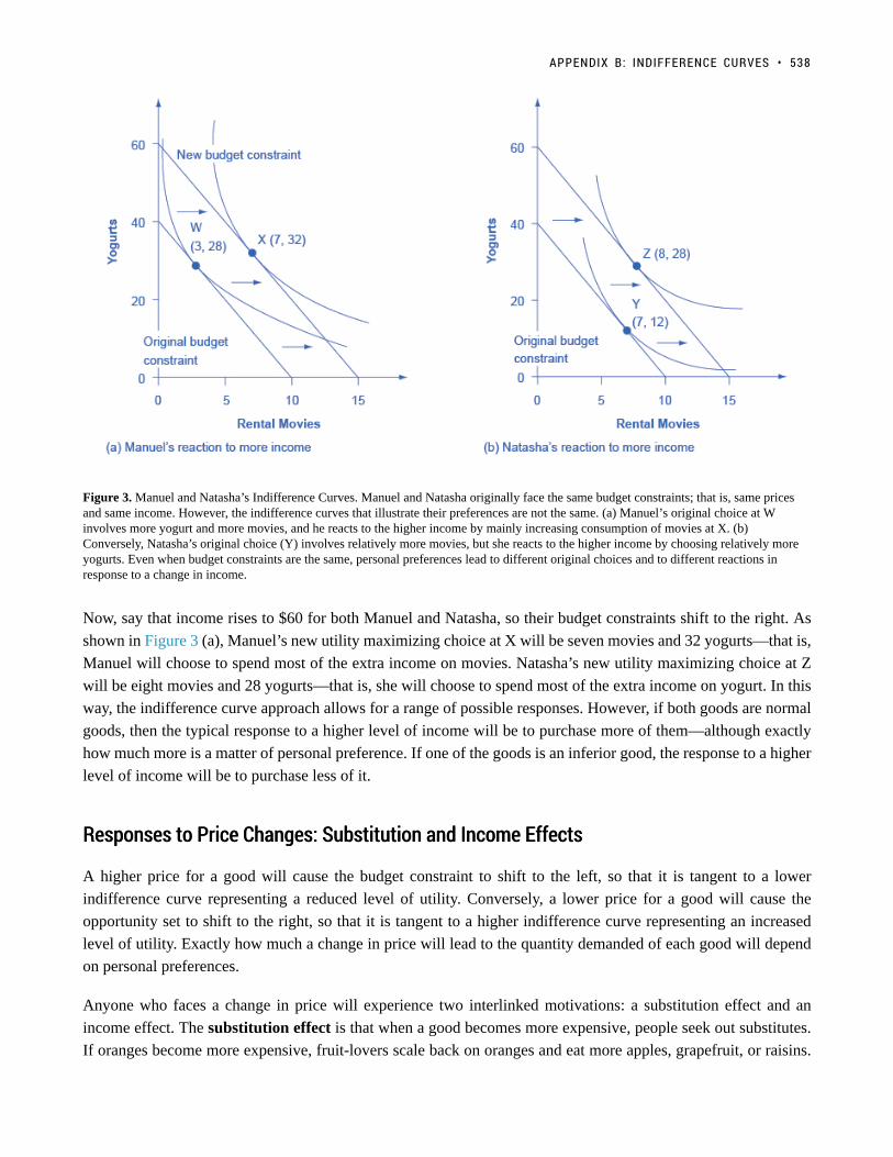
Figure 3. Manuel and Natasha’s Indifference Curves. Manuel and Natasha originally face the same budget constraints; that is, same pricesand same income. However, the indifference curves that illustrate their preferences are not the same. (a) Manuel’s original choice at Winvolves more yogurt and more movies, and he reacts to the higher income by mainly increasing consumption of movies at X. (b)Conversely, Natasha’s original choice (Y) involves relatively more movies, but she reacts to the higher income by choosing relatively moreyogurts. Even when budget constraints are the same, personal preferences lead to different original choices and to different reactions inresponse to a change in income.
Now, say that income rises to $60 for both Manuel and Natasha, so their budget constraints shift to the right. As
shown in Figure 3 (a), Manuel’s new utility maximizing choice at X will be seven movies and 32 yogurts—that is,
Manuel will choose to spend most of the extra income on movies. Natasha’s new utility maximizing choice at Z
will be eight movies and 28 yogurts—that is, she will choose to spend most of the extra income on yogurt. In this
way, the indifference curve approach allows for a range of possible responses. However, if both goods are normal
goods, then the typical response to a higher level of income will be to purchase more of them—although exactly
how much more is a matter of personal preference. If one of the goods is an inferior good, the response to a higher
level of income will be to purchase less of it.
Responses to Price Changes: Substitution and Income EffectsResponses to Price Changes: Substitution and Income Effects
A higher price for a good will cause the budget constraint to shift to the left, so that it is tangent to a lower
indifference curve representing a reduced level of utility. Conversely, a lower price for a good will cause the
opportunity set to shift to the right, so that it is tangent to a higher indifference curve representing an increased
level of utility. Exactly how much a change in price will lead to the quantity demanded of each good will depend
on personal preferences.
Anyone who faces a change in price will experience two interlinked motivations: a substitution effect and an
income effect. The substitution effect is that when a good becomes more expensive, people seek out substitutes.
If oranges become more expensive, fruit-lovers scale back on oranges and eat more apples, grapefruit, or raisins.
APPENDIX B: INDIFFERENCE CURVES • 538

Conversely, when a good becomes cheaper, people substitute toward consuming more. If oranges get cheaper,
people fire up their juicing machines and ease off on other fruits and foods. The income effect refers to how a
change in the price of a good alters the effective buying power of one’s income. If the price of a good that you have
been buying falls, then in effect your buying power has risen—you are able to purchase more goods. Conversely,
if the price of a good that you have been buying rises, then the buying power of a given amount of income is
diminished. (One common source of confusion is that the “income effect” does not refer to a change in actual
income. Instead, it refers to the situation in which the price of a good changes, and thus the quantities of goods
that can be purchased with a fixed amount of income change. It might be more accurate to call the “income effect”
a “buying power effect,” but the “income effect” terminology has been used for decades, and it is not going to
change during this economics course.) Whenever a price changes, consumers feel the pull of both substitution and
income effects at the same time.
Using indifference curves, you can illustrate the substitution and income effects on a graph. In Figure 4, Ogden
faces a choice between two goods: haircuts or personal pizzas. Haircuts cost $20, personal pizzas cost $6, and he
has $120 to spend.
539 • PRINCIPLES OF MICROECONOMICS
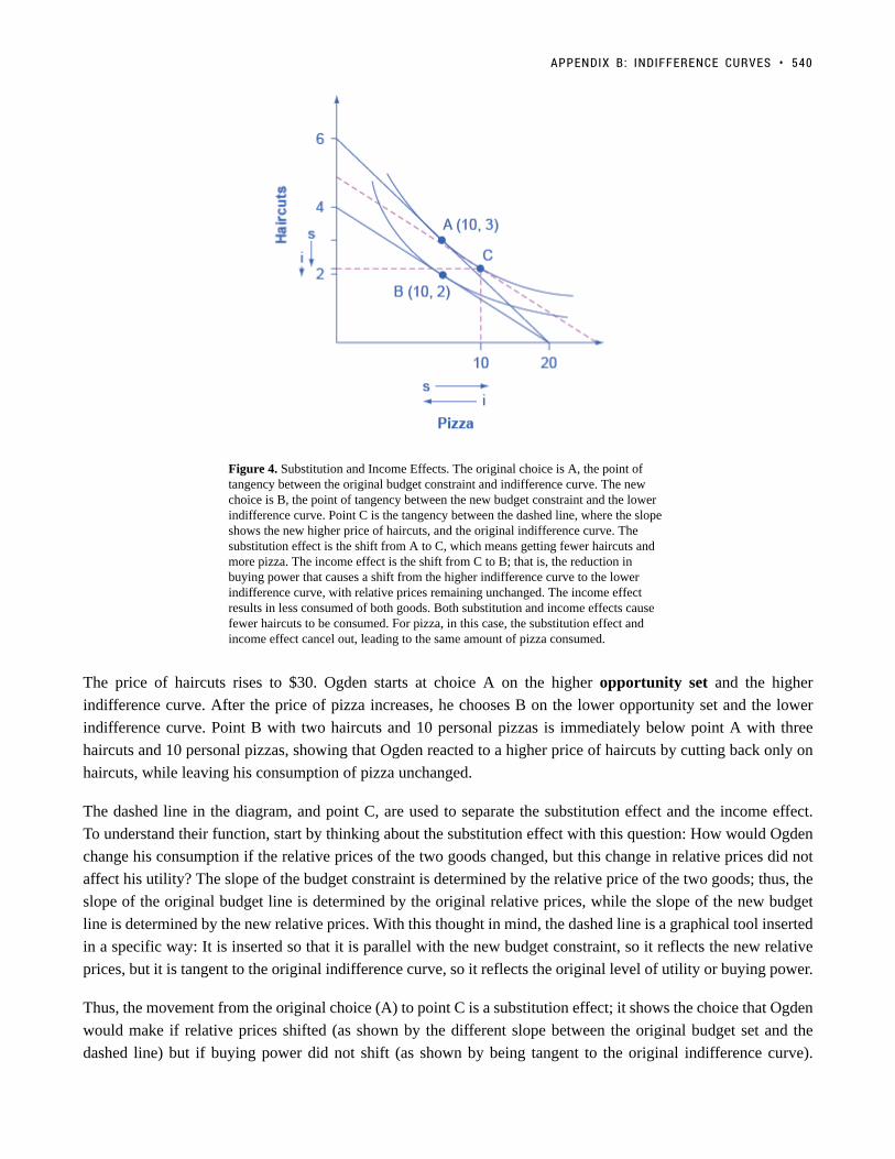
Figure 4. Substitution and Income Effects. The original choice is A, the point oftangency between the original budget constraint and indifference curve. The newchoice is B, the point of tangency between the new budget constraint and the lowerindifference curve. Point C is the tangency between the dashed line, where the slopeshows the new higher price of haircuts, and the original indifference curve. Thesubstitution effect is the shift from A to C, which means getting fewer haircuts andmore pizza. The income effect is the shift from C to B; that is, the reduction inbuying power that causes a shift from the higher indifference curve to the lowerindifference curve, with relative prices remaining unchanged. The income effectresults in less consumed of both goods. Both substitution and income effects causefewer haircuts to be consumed. For pizza, in this case, the substitution effect andincome effect cancel out, leading to the same amount of pizza consumed.
The price of haircuts rises to $30. Ogden starts at choice A on the higher opportunity set and the higher
indifference curve. After the price of pizza increases, he chooses B on the lower opportunity set and the lower
indifference curve. Point B with two haircuts and 10 personal pizzas is immediately below point A with three
haircuts and 10 personal pizzas, showing that Ogden reacted to a higher price of haircuts by cutting back only on
haircuts, while leaving his consumption of pizza unchanged.
The dashed line in the diagram, and point C, are used to separate the substitution effect and the income effect.
To understand their function, start by thinking about the substitution effect with this question: How would Ogden
change his consumption if the relative prices of the two goods changed, but this change in relative prices did not
affect his utility? The slope of the budget constraint is determined by the relative price of the two goods; thus, the
slope of the original budget line is determined by the original relative prices, while the slope of the new budget
line is determined by the new relative prices. With this thought in mind, the dashed line is a graphical tool inserted
in a specific way: It is inserted so that it is parallel with the new budget constraint, so it reflects the new relative
prices, but it is tangent to the original indifference curve, so it reflects the original level of utility or buying power.
Thus, the movement from the original choice (A) to point C is a substitution effect; it shows the choice that Ogden
would make if relative prices shifted (as shown by the different slope between the original budget set and the
dashed line) but if buying power did not shift (as shown by being tangent to the original indifference curve).
APPENDIX B: INDIFFERENCE CURVES • 540
The substitution effect will encourage people to shift away from the good which has become relatively more
expensive—in Ogden’s case, the haircuts on the vertical axis—and toward the good which has become relatively
less expensive—in this case, the pizza on the vertical axis. The two arrows labeled with “s” for “substitution
effect,” one on each axis, show the direction of this movement.
The income effect is the movement from point C to B, which shows how Ogden reacts to a reduction in his buying
power from the higher indifference curve to the lower indifference curve, but holding constant the relative prices
(because the dashed line has the same slope as the new budget constraint). In this case, where the price of one good
increases, buying power is reduced, so the income effect means that consumption of both goods should fall (if
they are both normal goods, which it is reasonable to assume unless there is reason to believe otherwise). The two
arrows labeled with “i” for “income effect,” one on each axis, show the direction of this income effect movement.
Now, put the substitution and income effects together. When the price of pizza increased, Ogden consumed less of
it, for two reasons shown in the exhibit: the substitution effect of the higher price led him to consume less and the
income effect of the higher price also led him to consume less. However, when the price of pizza increased, Ogden
consumed the same quantity of haircuts. The substitution effect of a higher price for pizza meant that haircuts
became relatively less expensive (compared to pizza), and this factor, taken alone, would have encouraged Ogden
to consume more haircuts. However, the income effect of a higher price for pizza meant that he wished to consume
less of both goods, and this factor, taken alone, would have encouraged Ogden to consume fewer haircuts. As
shown in Figure 4, in this particular example the substitution effect and income effect on Ogden’s consumption of
haircuts are offsetting—so he ends up consuming the same quantity of haircuts after the price increase for pizza
as before.
The size of these income and substitution effects will differ from person to person, depending on individual
preferences. For example, if Ogden’s substitution effect away from pizza and toward haircuts is especially strong,
and outweighs the income effect, then a higher price for pizza might lead to increased consumption of haircuts.
This case would be drawn on the graph so that the point of tangency between the new budget constraint and the
relevant indifference curve occurred below point B and to the right. Conversely, if the substitution effect away
from pizza and toward haircuts is not as strong, and the income effect on is relatively stronger, then Ogden will be
more likely to react to the higher price of pizza by consuming less of both goods. In this case, his optimal choice
after the price change will be above and to the left of choice B on the new budget constraint.
Although the substitution and income effects are often discussed as a sequence of events, it should be remembered
that they are twin components of a single cause—a change in price. Although you can analyze them separately,
the two effects are always proceeding hand in hand, happening at the same time.
Indifference Curves with Labor-Leisure and Intertemporal ChoicesIndifference Curves with Labor-Leisure and Intertemporal Choices
The concept of an indifference curve applies to tradeoffs in any household choice, including the labor-leisure
choice or the intertemporal choice between present and future consumption. In the labor-leisure choice, each
indifference curve shows the combinations of leisure and income that provide a certain level of utility. In an
intertemporal choice, each indifference curve shows the combinations of present and future consumption that
provide a certain level of utility. The general shapes of the indifference curves—downward sloping, steeper on the
left and flatter on the right—also remain the same.
541 • PRINCIPLES OF MICROECONOMICS
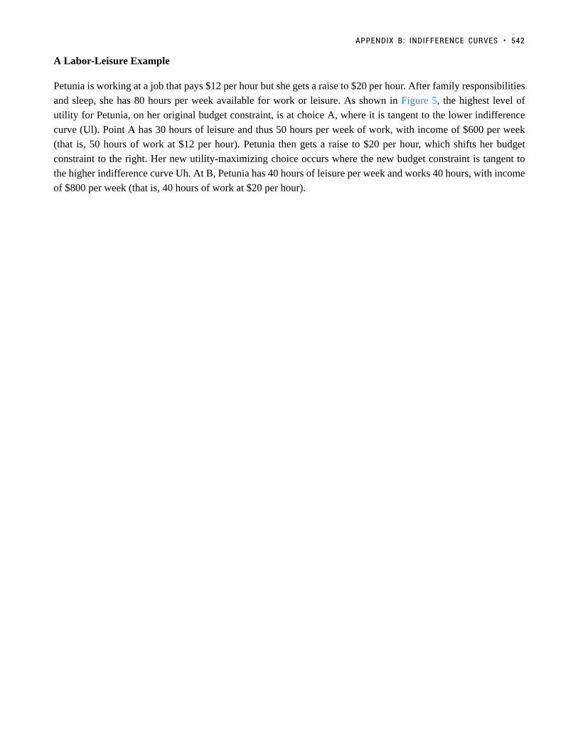
A Labor-Leisure Example
Petunia is working at a job that pays $12 per hour but she gets a raise to $20 per hour. After family responsibilities
and sleep, she has 80 hours per week available for work or leisure. As shown in Figure 5, the highest level of
utility for Petunia, on her original budget constraint, is at choice A, where it is tangent to the lower indifference
curve (Ul). Point A has 30 hours of leisure and thus 50 hours per week of work, with income of $600 per week
(that is, 50 hours of work at $12 per hour). Petunia then gets a raise to $20 per hour, which shifts her budget
constraint to the right. Her new utility-maximizing choice occurs where the new budget constraint is tangent to
the higher indifference curve Uh. At B, Petunia has 40 hours of leisure per week and works 40 hours, with income
of $800 per week (that is, 40 hours of work at $20 per hour).
APPENDIX B: INDIFFERENCE CURVES • 542
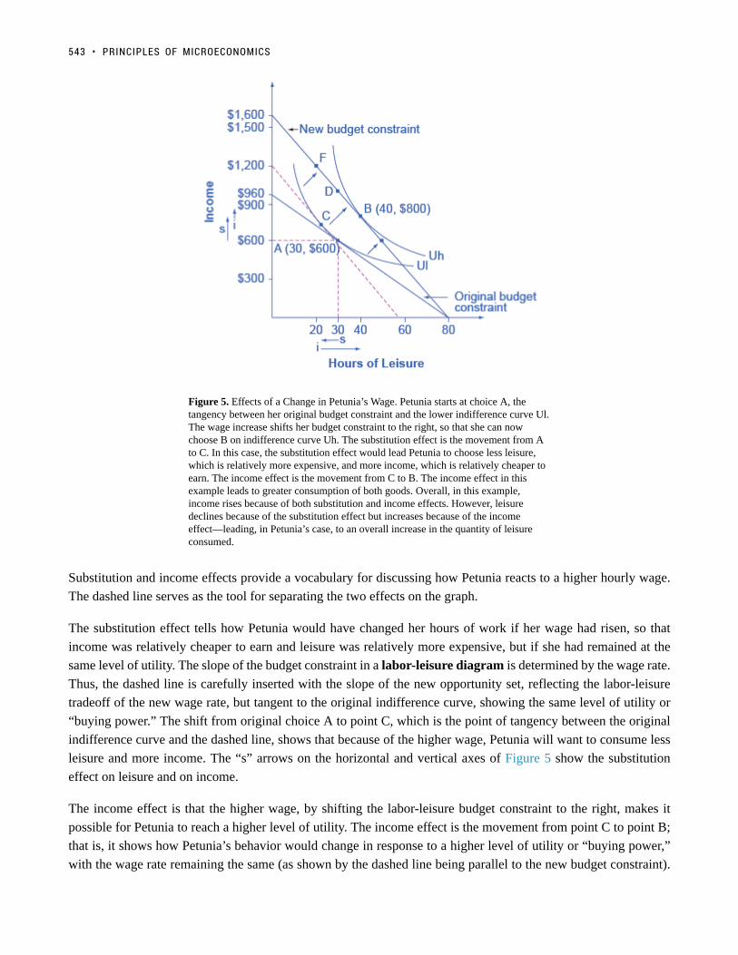
Figure 5. Effects of a Change in Petunia’s Wage. Petunia starts at choice A, thetangency between her original budget constraint and the lower indifference curve Ul.The wage increase shifts her budget constraint to the right, so that she can nowchoose B on indifference curve Uh. The substitution effect is the movement from Ato C. In this case, the substitution effect would lead Petunia to choose less leisure,which is relatively more expensive, and more income, which is relatively cheaper toearn. The income effect is the movement from C to B. The income effect in thisexample leads to greater consumption of both goods. Overall, in this example,income rises because of both substitution and income effects. However, leisuredeclines because of the substitution effect but increases because of the incomeeffect—leading, in Petunia’s case, to an overall increase in the quantity of leisureconsumed.
Substitution and income effects provide a vocabulary for discussing how Petunia reacts to a higher hourly wage.
The dashed line serves as the tool for separating the two effects on the graph.
The substitution effect tells how Petunia would have changed her hours of work if her wage had risen, so that
income was relatively cheaper to earn and leisure was relatively more expensive, but if she had remained at the
same level of utility. The slope of the budget constraint in a labor-leisure diagram is determined by the wage rate.
Thus, the dashed line is carefully inserted with the slope of the new opportunity set, reflecting the labor-leisure
tradeoff of the new wage rate, but tangent to the original indifference curve, showing the same level of utility or
“buying power.” The shift from original choice A to point C, which is the point of tangency between the original
indifference curve and the dashed line, shows that because of the higher wage, Petunia will want to consume less
leisure and more income. The “s” arrows on the horizontal and vertical axes of Figure 5 show the substitution
effect on leisure and on income.
The income effect is that the higher wage, by shifting the labor-leisure budget constraint to the right, makes it
possible for Petunia to reach a higher level of utility. The income effect is the movement from point C to point B;
that is, it shows how Petunia’s behavior would change in response to a higher level of utility or “buying power,”
with the wage rate remaining the same (as shown by the dashed line being parallel to the new budget constraint).
543 • PRINCIPLES OF MICROECONOMICS

The income effect, encouraging Petunia to consume both more leisure and more income, is drawn with arrows on
the horizontal and vertical axis of Figure 5.
Putting these effects together, Petunia responds to the higher wage by moving from choice A to choice B. This
movement involves choosing more income, both because the substitution effect of higher wages has made income
relatively cheaper or easier to earn, and because the income effect of higher wages has made it possible to
have more income and more leisure. Her movement from A to B also involves choosing more leisure because,
according to Petunia’s preferences, the income effect that encourages choosing more leisure is stronger than the
substitution effect that encourages choosing less leisure.
Figure 5 represents only Petunia’s preferences. Other people might make other choices. For example, a person
whose substitution and income effects on leisure exactly counterbalanced each other might react to a higher wage
with a choice like D, exactly above the original choice A, which means taking all of the benefit of the higher
wages in the form of income while working the same number of hours. Yet another person, whose substitution
effect on leisure outweighed the income effect, might react to a higher wage by making a choice like F, where
the response to higher wages is to work more hours and earn much more income. To represent these different
preferences, you could easily draw the indifference curve Uh to be tangent to the new budget constraint at D or F,
rather than at B.
An Intertemporal Choice Example
Quentin has saved up $10,000. He is thinking about spending some or all of it on a vacation in the present,
and then will save the rest for another big vacation five years from now. Over those five years, he expects to
earn a total 80% rate of return. Figure 6 shows Quentin’s budget constraint and his indifference curves between
present consumption and future consumption. The highest level of utility that Quentin can achieve at his original
intertemporal budget constraint occurs at point A, where he is consuming $6,000, saving $4,000 for the future, and
expecting with the accumulated interest to have $7,200 for future consumption (that is, $4,000 in current financial
savings plus the 80% rate of return).
However, Quentin has just realized that his expected rate of return was unrealistically high. A more realistic
expectation is that over five years he can earn a total return of 30%. In effect, his intertemporal budget constraint
has pivoted to the left, so that his original utility-maximizing choice is no longer available. Will Quentin react
to the lower rate of return by saving more, or less, or the same amount? Again, the language of substitution and
income effects provides a framework for thinking about the motivations behind various choices. The dashed line,
which is a graphical tool to separate the substitution and income effect, is carefully inserted with the same slope
as the new opportunity set, so that it reflects the changed rate of return, but it is tangent to the original indifference
curve, so that it shows no change in utility or “buying power.”
The substitution effect tells how Quentin would have altered his consumption because the lower rate of return
makes future consumption relatively more expensive and present consumption relatively cheaper. The movement
from the original choice A to point C shows how Quentin substitutes toward more present consumption and less
future consumption in response to the lower interest rate, with no change in utility. The substitution arrows on the
horizontal and vertical axes of Figure 6 show the direction of the substitution effect motivation. The substitution
effect suggests that, because of the lower interest rate, Quentin should consume more in the present and less in the
future.
APPENDIX B: INDIFFERENCE CURVES • 544

Quentin also has an income effect motivation. The lower rate of return shifts the budget constraint to the left,
which means that Quentin’s utility or “buying power” is reduced. The income effect (assuming normal goods)
encourages less of both present and future consumption. The impact of the income effect on reducing present and
future consumption in this example is shown with “i” arrows on the horizontal and vertical axis of Figure 6.
545 • PRINCIPLES OF MICROECONOMICS

Figure 6. Indifference Curve and an Intertemporal Budget Constraint. The originalchoice is A, at the tangency between the original budget constraint and the originalindifference curve Uh. The dashed line is drawn parallel to the new budget set, sothat its slope reflects the lower rate of return, but is tangent to the originalindifference curve. The movement from A to C is the substitution effect: in this case,future consumption has become relatively more expensive, and present consumptionhas become relatively cheaper. The income effect is the shift from C to B; that is, thereduction in utility or “buying power” that causes a move to a lower indifferencecurve Ul, but with the relative price the same. It means less present and less futureconsumption. In the move from A to B, the substitution effect on presentconsumption is greater than the income effect, so the overall result is more presentconsumption. Notice that the lower indifference curve could have been drawntangent to the lower budget constraint point D or point F, depending on personalpreferences.
Taking both effects together, the substitution effect is encouraging Quentin toward more present and less future
consumption, because present consumption is relatively cheaper, while the income effect is encouraging him to
less present and less future consumption, because the lower interest rate is pushing him to a lower level of utility.
For Quentin’s personal preferences, the substitution effect is stronger so that, overall, he reacts to the lower rate of
return with more present consumption and less savings at choice B. However, other people might have different
preferences. They might react to a lower rate of return by choosing the same level of present consumption and
savings at choice D, or by choosing less present consumption and more savings at a point like F. For these
other sets of preferences, the income effect of a lower rate of return on present consumption would be relatively
stronger, while the substitution effect would be relatively weaker.
Sketching Substitution and Income EffectsSketching Substitution and Income Effects
Indifference curves provide an analytical tool for looking at all the choices that provide a single level of utility.
APPENDIX B: INDIFFERENCE CURVES • 546

They eliminate any need for placing numerical values on utility and help to illuminate the process of making
utility-maximizing decisions. They also provide the basis for a more detailed investigation of the complementary
motivations that arise in response to a change in a price, wage or rate of return—namely, the substitution and
income effects.
If you are finding it a little tricky to sketch diagrams that show substitution and income effects so that the points
of tangency all come out correctly, it may be useful to follow this procedure.
Step 1. Begin with a budget constraint showing the choice between two goods, which this example will call
“candy” and “movies.” Choose a point A which will be the optimal choice, where the indifference curve will be
tangent—but it is often easier not to draw in the indifference curve just yet. See Figure 7.
Figure 7.
Step 2. Now the price of movies changes: let’s say that it rises. That shifts the budget set inward. You know that
the higher price will push the decision-maker down to a lower level of utility, represented by a lower indifference
curve. But at this stage, draw only the new budget set. See Figure 8.
547 • PRINCIPLES OF MICROECONOMICS

Figure 8.
Step 3. The key tool in distinguishing between substitution and income effects is to insert a dashed line, parallel
to the new budget line. This line is a graphical tool that allows you to distinguish between the two changes:
(1) the effect on consumption of the two goods of the shift in prices—with the level of utility remaining
unchanged—which is the substitution effect; and (2) the effect on consumption of the two goods of shifting from
one indifference curve to the other—with relative prices staying unchanged—which is the income effect. The
dashed line is inserted in this step. The trick is to have the dashed line travel close to the original choice A, but
not directly through point A. See Figure 9.
APPENDIX B: INDIFFERENCE CURVES • 548

Figure 9.
Step 4. Now, draw the original indifference curve, so that it is tangent to both point A on the original budget line
and to a point C on the dashed line. Many students find it easiest to first select the tangency point C where the
original indifference curve touches the dashed line, and then to draw the original indifference curve through A and
C. The substitution effect is illustrated by the movement along the original indifference curve as prices change
but the level of utility holds constant, from A to C. As expected, the substitution effect leads to less consumed
of the good that is relatively more expensive, as shown by the “s” (substitution) arrow on the vertical axis, and
more consumed of the good that is relatively less expensive, as shown by the “s” arrow on the horizontal axis. See
Figure 10.
549 • PRINCIPLES OF MICROECONOMICS

Figure 10.
Step 5. With the substitution effect in place, now choose utility-maximizing point B on the new opportunity set.
When you choose point B, think about whether you wish the substitution or the income effect to have a larger
impact on the good (in this case, candy) on the horizontal axis. If you choose point B to be directly in a vertical
line with point A (as is illustrated here), then the income effect will be exactly offsetting the substitution effect on
the horizontal axis. If you insert point B so that it lies a little to right of the original point A, then the substitution
effect will exceed the income effect. If you insert point B so that it lies a little to the left of point A, then the
income effect will exceed the substitution effect. The income effect is the movement from C to B, showing how
choices shifted as a result of the decline in buying power and the movement between two levels of utility, with
relative prices remaining the same. With normal goods, the negative income effect means less consumed of each
good, as shown by the direction of the “i” (income effect) arrows on the vertical and horizontal axes. See Figure
11.
APPENDIX B: INDIFFERENCE CURVES • 550

Figure 11.
In sketching substitution and income effect diagrams, you may wish to practice some of the following variations:
(1) Price falls instead of a rising; (2) The price change affects the good on either the vertical or the horizontal axis;
(3) Sketch these diagrams so that the substitution effect exceeds the income effect; the income effect exceeds the
substitution effect; and the two effects are equal.
One final note: The helpful dashed line can be drawn tangent to the new indifference curve, and parallel to the
original budget line, rather than tangent to the original indifference curve and parallel to the new budget line.
Some students find this approach more intuitively clear. The answers you get about the direction and relative sizes
of the substitution and income effects, however, should be the same.
Key Concepts and SummaryKey Concepts and Summary
An indifference curve is drawn on a budget constraint diagram that shows the tradeoffs between two goods. All
points along a single indifference curve provide the same level of utility. Higher indifference curves represent
higher levels of utility. Indifference curves slope downward because, if utility is to remain the same at all points
along the curve, a reduction in the quantity of the good on the vertical axis must be counterbalanced by an increase
in the quantity of the good on the horizontal axis (or vice versa). Indifference curves are steeper on the far left and
flatter on the far right, because of diminishing marginal utility.
The utility-maximizing choice along a budget constraint will be the point of tangency where the budget constraint
touches an indifference curve at a single point. A change in the price of any good has two effects: a substitution
effect and an income effect. The substitution effect motivation encourages a utility-maximizer to buy less of what
is relatively more expensive and more of what is relatively cheaper. The income effect motivation encourages a
551 • PRINCIPLES OF MICROECONOMICS

utility-maximizer to buy more of both goods if utility rises or less of both goods if utility falls (if they are both
normal goods).
In a labor-leisure choice, every wage change has a substitution and an income effect. The substitution effect of
a wage increase is to choose more income, since it is cheaper to earn, and less leisure, since its opportunity cost
has increased. The income effect of a wage increase is to choose more of leisure and income, since they are both
normal goods. The substitution and income effects of a wage decrease would reverse these directions.
In an intertemporal consumption choice, every interest rate change has a substitution and an income effect. The
substitution effect of an interest rate increase is to choose more future consumption, since it is now cheaper
to earn future consumption and less present consumption (more savings), since the opportunity cost of present
consumption in terms of what is being given up in the future has increased. The income effect of an interest
rate increase is to choose more of both present and future consumption, since they are both normal goods. The
substitution and income effects of an interest rate decrease would reverse these directions.
Review Questions
1. What point is preferred along an indifference curve?
2. Why do indifference curves slope down?
3. Why are indifference curves steep on the left and flatter on the right?
4. How many indifference curves does a person have?
5. How can you tell which indifference curves represent higher or lower levels of utility?
6. What is a substitution effect?
7. What is an income effect?
8. Does the “income effect” involve a change in income? Explain.
9. Does a change in price have both an income effect and a substitution effect? Does a change inincome have both an income effect and a substitution effect?
10. Would you expect, in some cases, to see only an income effect or only a substitution effect?Explain.
11. Which is larger, the income effect or the substitution effect?
APPENDIX B: INDIFFERENCE CURVES • 552


