Embed Size (px)
Citation preview
1
Representations of children in food advertisements in Cyprus: A sociosemiotic perspective
Evripides Zantides
Assistant Professor Graphic Communication
Cyprus University of Technology, Department of Multimedia and Graphic arts, Cyprus
[email protected], +35725002223
Evripides Zantides is Assistant Professor in the Department of Multimedia and Graphic Arts of Cyprus
University of Technology in Cyprus. He has presented papers in a number of international
conferences on Semiotics, Graphic Design education, Typography and Visual Communication and
has participated, with distinguished work, in refereed Art and Design Biennales and other international
exhibitions. Actively involved in conference and exhibition committees, he is the delegate for Cyprus to
ATypI, the International Typographic Association as well as for IASS-AIS, the International Association
for Semiotic Studies. He is also member of the International Association for Visual Semiotics (AISV)
and elected in the executive committee of the Hellenic Semiotic Society (HSS). His research interests
are based on Semiotics and Identity in the process of audio/visualizing verbal language using image,
text/typography and sound. He is also the founder and director of the Semiotics and Visual
Communication Lab in Cyprus University of Technology (www.svclab.com).
Evangelos Kourdis
Assistant Professor Translation Semiotics
Aristotle University of Thessaloniki, Department of French Language and Literature, Greece
[email protected], +302310997514
Evangelos Kourdis is an Assistant Professor in Translation Semiotics at the Department of French
Language & Literature, Faculty of Philosophy, Aristotle University of Thessaloniki. He received a PhD
in Theories and Sciences of Language and Communication from the Faculty of Philosophy, Aristotle
University of Thessaloniki. Evangelos is the national representative for Greece to the International
Association for Semiotic Studies, and vice president of the Hellenic Semiotics Society, member of the
Hellenic Society for Translation Studies and delegate in Greece of the Société d’Etudes des Pratiques
et Théories en traduction (SEPTET, France). Evangelos is an international collaborator at the
Semiotics and Visual Communication Laboratory of Cyprus University of Technology, and has
published articles in referee journals such as Signs, Lexia, TRANS, Discourse and Interaction,
Translation Studies in the New Millennium, Signes, Discours et Sociétés.
2
Abstract
This paper presents a sociosemiotic approach applied through visual content analysis in advertising.
In particular, we examine the representation of children in Cypriot print advertisements as main
subjects in the construction of advertising messages for food. The selected target group is mainly
parents or adults who have children. The present study focuses on the iconic dimension of verbal and
non-verbal signs of twenty-six advertisements. Our study shows that advertisements for children’s
food in Cyprus localize global cultural values such as family, safety and food quality for children
through codified iconic (plastic visual) signs that connote characteristics of “Cypriotness”.
Keywords: advertising, children’s food, content analysis, iconic signs, cultural values.
0. Research objectives
This study constitutes a semiotic analysis of food advertising for children in Cyprus based on a
selected corpus of 26 samples from four weekly magazines (TV Mania, Down Town, OK, Tiletheatis).
We selected iconic sign systems and processed them using the SPSS 191 program for statistical
analysis in social sciences. These magazines were distributed free of charge every weekend with local
Cypriot newspapers over a period of two years (2009-2010) and were chosen because they have the
highest circulation in Cyprus and are therefore read by the majority of the population2 (TV Mania has
57% readability on Saturdays and Down Town 45% on Sundays). The objective of the study is to
explore how second order significations are assigned through codified iconic (plastic visual) signs in
the construction of food advertisements that make use of children to target adults. This is achieved by
examining the iconic dimension of verbal and non verbal signs of the selected corpus, such as the
colour of human features and its dominance in the overall composition, facial expressions and gaze,
the location of children in advertisements and the representations of family life, the location of logos
and typography.
1. Semiotics and nutritional practices
Food has been the focus of many studies, and as a subject it has been explored from a variety of
cultural and semiotic perspectives. According to Parasecoli, it is just one of the semiospheres that
constitute culture, interacting with, and at the same time defined by language, technology (including
1 The present study constitutes a quantitative approach. Crosstabulations with significance will be
explored in future research.
2 Giorgos Agapiou, ‘‘What Cypriots are reading,’’ Filelefteros tis Kiriakis, October 11, 2009, p.21,
http://www.philenews.com/AssetService/Image.ashx?t=2&pg=13758&, accessed February 2013.
3
agriculture), politics and economics, and many other domains of everyday life.3 Theorists have
highlighted the cultural aspect of food, its symbolic character4, subject to discourse and interpretation.
Furthermore, food is considered as exclusive a human behaviour as language, since, according to
Levi-Strauss, “if there is no society without language, neither is there any which does not cook in some
manner at least some of its food”.5 Levi-Strauss adopted a structural approach to food, devoting three
volumes to his study, in which he stressed the significance of transforming a natural object such as
raw food, into a cultural one, namely cooked food.6
Focusing more on a semiotic approach in his Mythologies, Barthes studied milk and wine, burgers and
chips, and referred to alimentary signs that are connected to national symbolisms, with connotations
such as Frenchness (francité). 7
Researchers such as Douglas later approached food as a social code,
stating that “if food is treated as a code, the messages it encodes will be found in the pattern of social
relations being expressed”.8 Parasecoli remarks that “a semiotic analysis of food can help us achieve
a more nuanced and holistic interpretation of semiosis as a process that involves not only the mind but
also the whole embodied experience, well beyond sensory perceptions”.9 Food is indeed a deeply
cultural code, a complex cultural form of communication, and it would be very interesting to see how
this cultural code can be promoted through print advertisements.
2. Advertising and children’s food
Kitchen observes that in the process of marketing and advertising children’s food ‘‘the concept of
children’s food is historically recent. In many cultures childhood was considered merely a prelude to
adulthood rather than a meaningful phase of human development in itself’’.10
Advertising food to
children is not only a sensitive issue because of its target audience, but also an interesting subject
where we can explore the semiotic perspective of the advertising language used. For instance, as
3 Fabio Parasecoli, “Savoring Semiotics: food in intercultural communication,” Social Semiotics 21,
no.5 (2011): 653.
4 Vyacheslav V. Ivanov, ‘‘Semiotics of the 20th century,’’ Sign Systems Studies 36, no.1 (2008):
213-214.
5 Claude Levi-Strauss, “Le triangle culinaire,’’ L’Arc 26 (1965): 22.
6 Levi-Strauss, Claude. Mythologiques 1. Le cru et le cuit. Paris: Plon, 1964.
Levi-Strauss, Claude. Mythologiques 2. Du miel aux cendres. Paris: Plon, 1966.
Levi-Strauss, Claude. Mythologiques 3. L'Origine des manières de table. Paris: Plon, 1968.
7 Roland Barthes, Mythologies (Paris: Seuil, 1957), pp. 71, 74.
8 Mary Douglas, “Deciphering a Meal,” Myth, Symbol, and Culture, Daedalus 101 no.1 (1972): 61.
9 Parasecoli, “Savoring Semiotics,” p. 661.
10 Philip J. Kitchen, Marketing Communications: Principles and Practice (London: Thomson Learning,
2006), p. 147.
4
Elliot stresses, this is possible through concrete modes such as creating a funny atmosphere in the
advertisements.11
The assignment of meaning to selling goods is common practice in advertising, and companies need
to be careful about what food products they sell to children, and how they do it. Valentine remarks that
“anyone who markets to kids or researches the youth market will be aware that children live in a
culture of their own, created by, and for this age group. […] It has therefore become a research holy
grail to find ways to understand this world and track how the changing cultural context influences
young people’s responses to brands”.12
We also need to consider that young people and kids are not
yet exposed to visual culture as much as adults are, and as Valentine observes, “[it] is, in effect, the
constructed images of the self within their [the children’s] own culture that determines how kids “see”
themselves and how they will want to be seen by others. They look, as it were, into a cultural mirror to
find who they are”.13
She also adds that “several things flow that are key to the semiotics of youth
marketing.”
In another study regarding the reading of food advertisements, Tresidder observes that
“[u]nderstanding the production and consumption of the images contained within food marketing
requires the exploration of the complex layers of discourses and influences that socially and culturally
embed the language of food and gastronomy within contemporary society,” 14
and that this language is
utilized by both the individual and the industry “to exchange the meanings and significance within both
commercial and cultural settings”. This might be the reason, Beasly and Danesi remark, “[t]he feature
that characterizes the business of modern advertising is that it has joined forces with marketing
science in the business of getting products and services from producers to consumers in the most
effective way possible […] The work of the advertiser and marketer is, fundamentally, the work of the
semiotician”.15
But how can Semiotics serve this work?
3. From Roland Barthes to Groupe μ
The increasing number of semiotic studies that examine the way meaning is constructed in
advertisements demonstrates how Semiotics could give some answers to the previous question. The
11
Charlene Elliot, “Marketing Fun Foods: A profile and Analysis of Supermarket Food Messages
Targeted at Children,” Canadian Public Policy-Analyse de Politiques Vol. XXXIV, No. 2 (2008): 270.
12 Virginia Valentine, “Using Semiotics to build powerful brands for children,” Young Consumers:
Insight and Ideas for Responsible Marketers 4, no. 2 (2003): 9.
13 Ibid., p. 10
14 Richard Tresidder, “Reading food marketing: the semiotics of Marks & Spencer!?,” International
Journal of Sociology and Social Policy 30, no. 9 (2010): 483
15 Ron Beasly and Marcel Danesi, Persuasive Signs: The Semiotics of Advertising (Berlin, New York:
Mouton de Gruyter, 2002), p. 131.
5
first complete semiotic analysis of an advertisement is considered to be found in Barthes’s essay La
rhétorique de l’image (1964) where he classified the advertisement’s signs or messages into two main
types: verbal and iconic signs/messages. He then categorised iconic signs into non-codified iconic and
codified iconic signs. For Guidère, Barthes’s division of signs turns advertising language into an
advertising giant, a cluster of disparate signs.16
Indeed, the signs are disparate but they have a
common purpose: to promote connotative meanings through their synergy.
Barthes did not develop further his classification of iconic signs however this synergy not only of
disparate signs (verbal and iconic) but also of signs that share common characteristics (codified iconic
and non-codified iconic) were marked by the Belgian Semioticians known as Groupe μ. Thus, almost
thirty years later, Groupe μ (1992), in their famous work Traité du signe visuel (1992), elaborated on
Barthes’ classification, categorising iconic signs into iconic visual signs (Barthe’s non-codified iconic
signs) and plastic visual signs (Barthe’s codified iconic signs) such as colour, form and texture.
Groupe μ defines the relationship between iconic visual and plastic visual signs in the following way:
"the plastic, being phenomenologically the signifying of the iconic signs, enables the identification of
the iconic. In turn, the iconic, once identified, enables one to attribute content to the plastic elements
which don’t belong to the iconic type."17
According to Groupe μ, signifiers of an iconic entity coincide
as a rule with signifiers of a plastic entity, and vice versa. Furthermore there is a relation between the
two types of visual signs. For Groupe μ, there is an iconoplastic relationship between iconic visual
signs and plastic visual signs, and this relation
"is evidence that the plastic element is autonomous from the iconic representation. In fact
plastic and iconic elements complement each other. Because it is the phenomenological
signifier of the iconic sign, the plastic element allows viewers to identify the iconic, while
the iconic element thus identified makes it possible to discover content in the plastic
elements that do not belong to iconic types."18
In our study, we adopt Barthes’s classification by emphasising the iconoplastic relationship between
iconic visual signs and plastic visual signs, as proposed by Groupe μ. More precisely, we examine the
plastic visual dimension of verbal signs, logos, colours, gazes, facial expressions, location of children
in advertisements and family representations, and typography. The study of these plastic visual signs
is based on our research objective i.e. to investigate whether they are carriers of specific cultural
16
Mathieu Guidère, Publicité et traduction (Paris: L’Harmattan, 2000), p. 39.
17 Groupe M., Traité du signe visuel. Pour une rhétorique de l'image (Paris: Éditions Le Seuil, 1992),
p. 361.
18 Groupe M., ‘‘A rhetoric of visual statements’’, in Advances in visual semiotics: the semiotic web
1992-93 by Thomas-A. Sebeok and Jean Umiker-Sebeok (Berlin and New York: Mouton de Gruyter,
1995), p. 597.
6
connotations and values in food advertisements that use children, in order to facilitate the promotion of
a product in the Cypriot market.
4. The plastic visual signs of the advertisements
As Kitchen highlights, non-verbal messages (like music or pictures of happy pretty children ) are often
employed by advertisers to signify values, in children’s advertisements for food, which will appeal to
the parents (especially the mother) who buys and prepares the child’s food.19
On this basis,
Channon20
stresses that this type of advertising had to communicate successfully at two levels: young
mothers with children under 12, who are looking for new ideas to feed children and to children under
12 who are attracted by the novelty and play appeal of the product. We are interested in seeing how
the non-verbal signs function in the promotion of a product in Cypriot advertisements for children’s
food, to whom they appeal, and if these signs are culturally selected by advertisers to assure the
advertisement’s success.
4.1. The plastic visual dimension of verbal signs and logos
The extension of analysis from the verbal to the non-verbal messages is of central interest to semiotic
advertising research. In this study we will not be focusing on the linguistic content of the verbal
message, but on its visual aspect. Many scholars have stressed the visual dimension of the language
system from Welby who in her discussion of translative-interpretative processes stated that ‘‘[...] we
are forgetting that while language itself is a symbolic system its method is mainly pictorial,’’21
to
Barthes who stated ‘‘I have a disease: I see language.’’22
According to Petrilli, all these scholars
evidenced an aspect of verbal signs that is irreducible to indexicality or to conventionality.23
Especially
in advertising, language is imbued with visual significance. More specifically, not only the typography
of verbal signs (as we will see later), but also the location of the verbal sign is yet another important
19
Philip J. Kitchen, Marketing Communications: Principles and Practice (London: Thomson Learning,
2006), p. 147.
20 Charles Channon, Twenty advertising case histories, second series (London: Cassell, 1989), p. 295.
21 Victoria Welby, What is Meaning? Studies in the Development of Significance (Amsterdam: John
Benjamins, 1983 [1903]), p. 38.
22 Roland Barthes. Roland Barthes by Roland Barthes (Berkley & Los Angeles: University of California
Press, 1977), p. 161.
23 Susan Petrilli and Augusto Ponzio, ‘‘Iconicity, Otherness and Translation’’, Chinese Semiotic
Studies 7, no1 (2012): 20.
7
aspect that should be taken into account when analysing the iconic signs of the advertisements under
scrutiny, since “every text is itself an image, an observable surface.”24
As regards the linguistic aspect of the verbal signs of the studied advertisements, they are mainly in
Greek (69%) belonging to Cypriot advertisements, and the rest in English (31%) targeting non-Greek
reader groups as well. In respect of the location of the verbal signs in our corpus, in more than half
(54%) the verbal sign is located in the lower part of the advertisement, in 31% in the middle and in the
remaining 15% in the top part. Since the verbal sign is mainly positioned in the lower part of the
studied advertisements, it performs what Barthes defines as anchorage function,25
.that is to clarify
what the iconic messages in the advertisements stand for. At the same time, it is interesting to remark
that, as described by Kress and van Leeuwen,“what has been placed on the top is presented as the
Ideal, and what has been placed at the bottom is put forward as the Real.”26
The majority of the verbal
signs placed at the bottom of our advertisements give practical and detailed information, showing and
explaining ‘what is the real’ aim/purpose of ‘ideal’ iconic messages placed at the top .
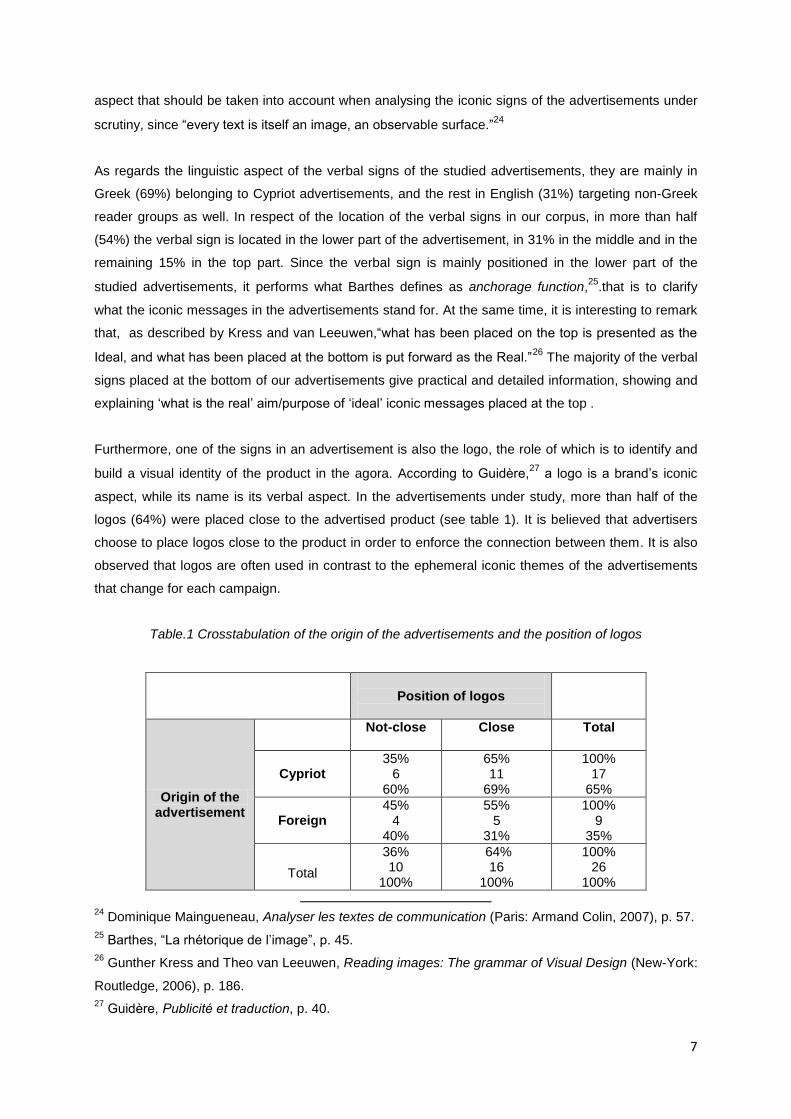
Furthermore, one of the signs in an advertisement is also the logo, the role of which is to identify and
build a visual identity of the product in the agora. According to Guidère,27
a logo is a brand’s iconic
aspect, while its name is its verbal aspect. In the advertisements under study, more than half of the
logos (64%) were placed close to the advertised product (see table 1). It is believed that advertisers
choose to place logos close to the product in order to enforce the connection between them. It is also
observed that logos are often used in contrast to the ephemeral iconic themes of the advertisements
that change for each campaign.
Table.1 Crosstabulation of the origin of the advertisements and the position of logos
Position of logos
Origin of the advertisement
Not-close
Close Total
Cypriot 35%
6 60%
65% 11
69%
100% 17
65%
Foreign 45%
4 40%
55% 5
31%
100% 9
35%
Total
36% 10
100%
64% 16
100%
100% 26
100%
24
Dominique Maingueneau, Analyser les textes de communication (Paris: Armand Colin, 2007), p. 57.
25 Barthes, “La rhétorique de l’image”, p. 45.
26 Gunther Kress and Theo van Leeuwen, Reading images: The grammar of Visual Design (New-York:
Routledge, 2006), p. 186.
27 Guidère, Publicité et traduction, p. 40.
8
4.2. Colour as a plastic visual sign
Another intensely cultural aspect is the plastic visual sign of colour. Hornung supports in a very simple
way how colour is used in food advertisements for children to make the product look appealing and to
reinforce values such as multiculturalism and egalitarianism.28
Perceptions of food are also associated
with colours, i.e. the flavour of cakes and ice creams are often anticipated from their colour29
. As van
Leeuwen remarks,
[…] a quality of an object (e.g. colour) is then recognized as coming from a
particular context (a particular culture, a particular historical period, a particular activity,
particular group, etc.), and conveys ideas and values that are commonly associated with
that context in popular culture and hence familiar to anyone who is at all exposed to mass
media.’’30
For this reason, the qualitative features of the children (such as eye and hair colour) appearing in
advertisements are selected on this basis. In the food advertisements which appear in Cypriot
advertisements, the children’s eye colour is unclear in 31% of the cases, 38% seem to have brown
eyes and 31% blue. Things become much clearer when it comes to the hair colour of the children in
the advertisements. Here, 54% have brown hair, 31% have blond hair, 8% black hair and another 7%
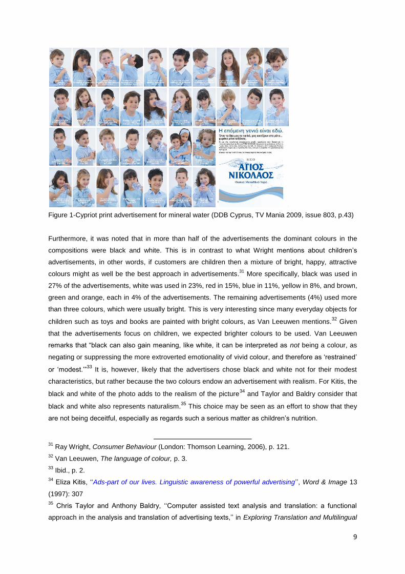
red hair. Dark colours seem to dominate in the advertisements studied as shown in the example Fig.
1, where this conclusion is reflected.
28
David, Hornung, Colour: A Workshop for Artists and Designers (London: Laurence King Publishing,
2005), p. 133.
29 Dawn Burton, Cross-Cultural Marketing: Theory, practice and relevance. London, New York:
Routledge, 2009.
30 Theo Van Leeuwen, The language of colour. An Introduction (London, New York: Routledge, 2011),
p. 86.
9
Figure 1-Cypriot print advertisement for mineral water (DDB Cyprus, TV Mania 2009, issue 803, p.43)
Furthermore, it was noted that in more than half of the advertisements the dominant colours in the
compositions were black and white. This is in contrast to what Wright mentions about children’s
advertisements, in other words, if customers are children then a mixture of bright, happy, attractive
colours might as well be the best approach in advertisements.31
More specifically, black was used in
27% of the advertisements, white was used in 23%, red in 15%, blue in 11%, yellow in 8%, and brown,
green and orange, each in 4% of the advertisements. The remaining advertisements (4%) used more
than three colours, which were usually bright. This is very interesting since many everyday objects for
children such as toys and books are painted with bright colours, as Van Leeuwen mentions.32
Given
that the advertisements focus on children, we expected brighter colours to be used. Van Leeuwen
remarks that “black can also gain meaning, like white, it can be interpreted as not being a colour, as
negating or suppressing the more extroverted emotionality of vivid colour, and therefore as ‘restrained’
or ‘modest.’”33
It is, however, likely that the advertisers chose black and white not for their modest
characteristics, but rather because the two colours endow an advertisement with realism. For Kitis, the
black and white of the photo adds to the realism of the picture34
and Taylor and Baldry consider that
black and white also represents naturalism.35
This choice may be seen as an effort to show that they
are not being deceitful, especially as regards such a serious matter as children’s nutrition.
31
Ray Wright, Consumer Behaviour (London: Thomson Learning, 2006), p. 121.
32 Van Leeuwen, The language of colour, p. 3.
33 Ibid., p. 2.
34 Eliza Kitis, ‘‘Ads-part of our lives. Linguistic awareness of powerful advertising’’, Word & Image 13
(1997): 307
35 Chris Taylor and Anthony Baldry, ‘‘Computer assisted text analysis and translation: a functional
approach in the analysis and translation of advertising texts,’’ in Exploring Translation and Multilingual
10
4.3. Facial expression and gaze as plastic visual signs
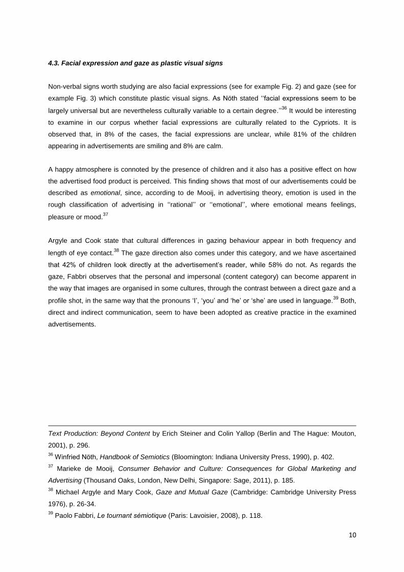
Non-verbal signs worth studying are also facial expressions (see for example Fig. 2) and gaze (see for
example Fig. 3) which constitute plastic visual signs. As Nöth stated ‘‘facial expressions seem to be
largely universal but are nevertheless culturally variable to a certain degree.’’36
It would be interesting
to examine in our corpus whether facial expressions are culturally related to the Cypriots. It is
observed that, in 8% of the cases, the facial expressions are unclear, while 81% of the children
appearing in advertisements are smiling and 8% are calm.
A happy atmosphere is connoted by the presence of children and it also has a positive effect on how
the advertised food product is perceived. This finding shows that most of our advertisements could be
described as emotional, since, according to de Mooij, in advertising theory, emotion is used in the
rough classification of advertising in ‘‘rational’’ or ‘‘emotional’’, where emotional means feelings,
pleasure or mood.37
Argyle and Cook state that cultural differences in gazing behaviour appear in both frequency and
length of eye contact.38
The gaze direction also comes under this category, and we have ascertained
that 42% of children look directly at the advertisement’s reader, while 58% do not. As regards the
gaze, Fabbri observes that the personal and impersonal (content category) can become apparent in
the way that images are organised in some cultures, through the contrast between a direct gaze and a
profile shot, in the same way that the pronouns ‘I’, ‘you’ and ‘he’ or ‘she’ are used in language.39
Both,
direct and indirect communication, seem to have been adopted as creative practice in the examined
advertisements.
Text Production: Beyond Content by Erich Steiner and Colin Yallop (Berlin and The Hague: Mouton,
2001), p. 296.
36 Winfried Nöth, Handbook of Semiotics (Bloomington: Indiana University Press, 1990), p. 402.
37 Marieke de Mooij, Consumer Behavior and Culture: Consequences for Global Marketing and
Advertising (Thousand Oaks, London, New Delhi, Singapore: Sage, 2011), p. 185.
38 Michael Argyle and Mary Cook, Gaze and Mutual Gaze (Cambridge: Cambridge University Press
1976), p. 26-34.
39 Paolo Fabbri, Le tournant sémiotique (Paris: Lavoisier, 2008), p. 118.
11
Figure 2-Cypriot print advertisement for fruit drink (Wellspring Trading Ltd, TV Mania 2009, issue 814,
p.37)
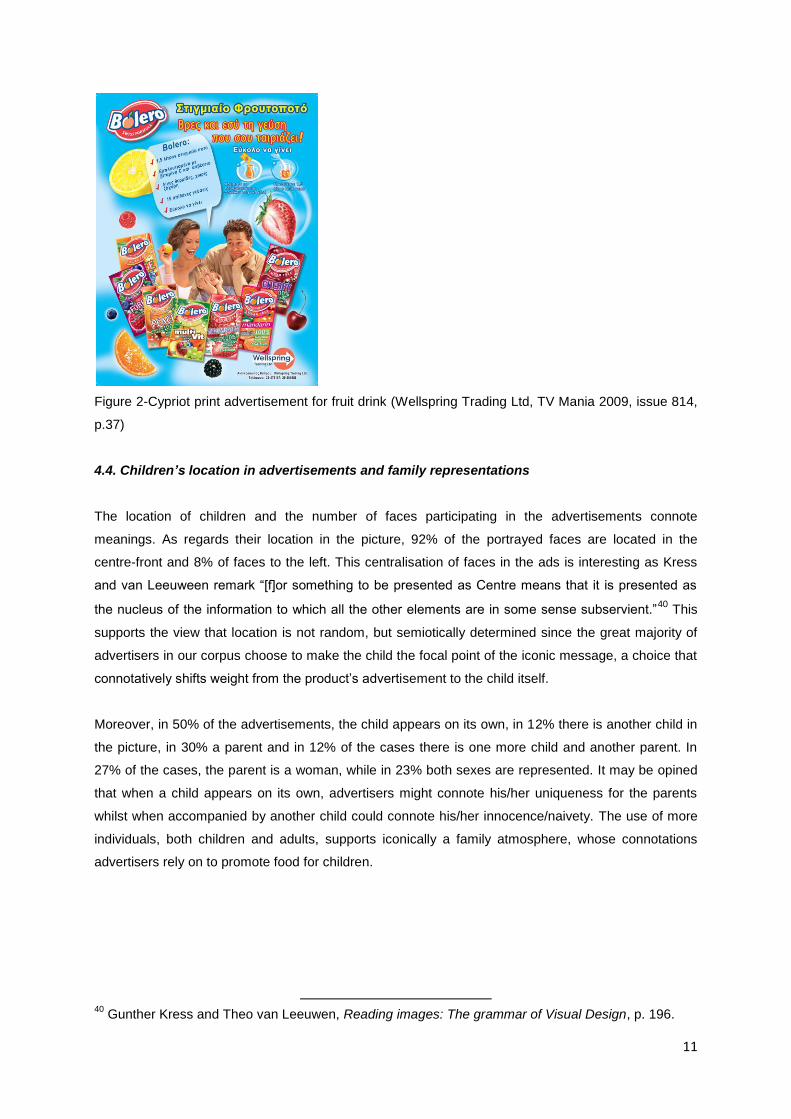
4.4. Children’s location in advertisements and family representations
The location of children and the number of faces participating in the advertisements connote
meanings. As regards their location in the picture, 92% of the portrayed faces are located in the
centre-front and 8% of faces to the left. This centralisation of faces in the ads is interesting as Kress
and van Leeuween remark “[f]or something to be presented as Centre means that it is presented as
the nucleus of the information to which all the other elements are in some sense subservient.”40
This
supports the view that location is not random, but semiotically determined since the great majority of
advertisers in our corpus choose to make the child the focal point of the iconic message, a choice that
connotatively shifts weight from the product’s advertisement to the child itself.
Moreover, in 50% of the advertisements, the child appears on its own, in 12% there is another child in
the picture, in 30% a parent and in 12% of the cases there is one more child and another parent. In
27% of the cases, the parent is a woman, while in 23% both sexes are represented. It may be opined
that when a child appears on its own, advertisers might connote his/her uniqueness for the parents
whilst when accompanied by another child could connote his/her innocence/naivety. The use of more
individuals, both children and adults, supports iconically a family atmosphere, whose connotations
advertisers rely on to promote food for children.
40
Gunther Kress and Theo van Leeuwen, Reading images: The grammar of Visual Design, p. 196.
12
Figure 3-Cypriot print advertisement for ice-cream (Regis Milk Industries Ltd, Down Town 2009, issue
142, p.81)
4.5. Typography and graphics as plastic signs
It is worth mentioning that in Barthes’s classification, the verbal message is premised in relation to the
iconic messages, since "writing and speech are always complete terms of informational structure"41
and because it confronts the polysemic character of the image. Besides its information structure,
writing is actuated by typography. According to Goddard, ‘‘[…] the verbal language can suggest
particular qualities as a result of how it appears: in other words, writing is a form of image-making, too.
It could be said to have its own paralanguage, as a result of ‘clothing’ the copywriter has chosen for
it.’’42
The aforementioned position is adopted in this paper as well as the importance of typography and
graphic design in the context of advertising, since both construct and visualize a mental idea, a
concept, which needs to successfully reach its audience. There are unlimited combinations of graphic
elements and any variation in the content or placement of an image or images, and in the type and
space of an advertisement would lead to a different visual outcome which, in turn, would result in a
different interpretation. Usually, the major constituents of a typical advertisement are: headline,
caption/subheading, illustration/photograph/image, body copy, logo/symbol/name-style, slogan and
name/address/website.
41
Barthes, “La rhétorique de l’image”, p. 43-44.
42 Angela Goddard, The Language of Advertising (London & New York: Routledge, 1998), p. 16.
13
According to Bertin, graphic parameters contribute to the semiotic structuring and transference of
meaning in design applications such as shape, scale, value (tone), texture, color, orientation and
location.43
Through these parameters an advertisement uses specific typefaces and styles for
headlines, sub-headings or body copy and we believe that these choices are essential when striving to
achieve a certain tone of voice and attract a particular target audience as in our case children and
their parents.
Many researchers have examined the semiotic attributes of typography. However, studies looking
specifically at typographic characteristics in the context of food advertisements for children in Cyprus
are limited. Our focus is on display typography since its major role is to attract the viewer’s attention.
In the current study a series of typographic variables was set in respect of a visual content analysis, as
described above. McCarthy and Mothersbaugh observe that typography is a function of typeface
characteristics, spacing and layout and that these dimensions have semantic associations.44
Because
of the unlimited combinations of these dimensions, we have defined our typographic aspects based on
specific typographic characteristics described by van Leeuwen such as serif and sans serif, script,
decorative, irregular, italics/slope, curvature, texture and connectivity.45
We have also included in our
coding procedure the typographic characteristics of upper and lower case to see the use of display
type set in capital letters or not for this type of advertisement. It is common knowledge in typography
that most of the time lower-case letters are more easily legible that upper-case letters.
This practice is noted in our results, as 85% of our adverts use lower-case characters to attract
attention, 11% upper-case and 4% both. This finding, that verbal messages targeting children are
written in lower-case letters, makes sense in respect of the writing that kids learn to do and read at
elementary school first-level classes and with which they are consequently better acquainted.
Italic writing is often used to differentiate information within running text, signify handwriting or to
assign importance to that which is written. Almost all of our adverts (92%) use roman characters,
which are upright, rather than italicized or oblique, compared to 8% that use italic characters.
According to Jackson “the attitude in vertical writing is natural and free whilst in sloping writing it is
twisted and awkward,”46
and this supports our previous finding as well as facilitating and supporting
legibility in the major part of our corpus.
43
Jacques Bertin, Semiology of Graphics (California: Esri Press, 2011[1967]), p. 42.
44 McCarthy S., M. and L., D. Mothersbaugh. “Effects on Typographic Factors in Advertising-Based
Persuasion: A General Model and Initial Empirical Tests.” Psychology & Marketing 19, no. 7-8 (2002):
663-691.
45 Van Leeuwen, Theo. “Towards a semiotics of typography.” Information Design Journal and
Document Design 14, no. 2 (2006): 239-255.
46 John Jackson, Upright Versus Sloping Writing: Being an Inquiry Into the Respective Merits of
Sloping and Upright Or Vertical Writing (London : S. Low, Marston, Searle & Rivington), p.6
14
In terms of typeface attributes dealing with serifs, script, decorative or irregular characteristics, we
observed that most of our advertisements (73%) use sans serif letterforms, 12% use serif fonts and
15% use script writing. Interestingly, we found no advertisements using decorative or irregular
typefaces, and this, in our opinion, has to do with legibility. Thus, the avoidance of complicated or
confusing letterforms is expected in children’s advertisements.
This is also supported by our findings on the use of textures in letterforms: 96% are plain, flat and two-
dimensional, 4% are three-dimensional and none of our advertisements use patterns within the
typefaces. Sans serif roman fonts are usually a safe approach for this kind of advertisement. The use
of script writing (15%) is probably based on the fact that it is associated with handwriting, and this
makes the messages look more ‘children-based’. These forms of typefaces, may be opined, add
innocence and purity to the verbal messages used for targeting the buyers, who—in the selected
corpus—are mainly parents or adults who have children.
In terms of curvature, we found 77% of our adverts to be using predominantly rounded letterforms and
23% angular. As van Leeuwen remarks, “[r]oundedness can come to signify “smooth”, “soft”, “natural”,
“organic”, “maternal”, and so on, whereas angularity “abrasive”, “harsh”, “technical”, “masculine”, and
so on.” 47
As a result, we believe that this finding enhances the messages with a friendly iconicity, thus
making them more attractive and familiar to parents or adults who have children to read.
Looking at the letterforms’ connectivity, it is observed that 92% of the advertisements have connected
and 8% disconnected letterforms. Like in script writing, and as van Leeuwen48
remarks, connectivity is
associated with handwriting and has it own metaphoric potential, and that external connection might
suggest ‘wholeness’, or ‘integration’ depending on how it is used and in what context. In general, the
selection, size, placement and design of typefaces often add second level significations in the writing
of verbal language.
5. Food advertisements and cultural values
The semiotic study has revealed valuable information about the cultural context of these Cypriot print
advertisements. In fact, as Fontanille states, “the relation between semiotic and cultural is not only an
inclusion […] the cultural could generally be the operator of transformations of the semiotic.”49
In other
words the cultural produces semiotic interpretations and in this context it would be very interesting to
see whether this aspect derives from our corpus.
47
Ibid., p. 149.
48 Ibid.
49 Jacques Fontanille, “Introduction,” in L’explosion et la culture by Juri Lotman, translated by I.
Merkoulova (Limoges: Pulim, 2004), p. 11.
15
The age groups of children in the selected sample have their own semiotic dimensions. We can see
that in 8% of the advertisements, children are up to one year of age, in another 8% the children are
between two and four years of age. In 42% of the advertisements children are between four and eight
years of age and the same percentage (42%) exists in the group of children between eight and twelve
years of age. We can therefore infer that advertisers are using the age group of four to twelve years of
age (84%) in which other foods can be easily promoted as they might not be subject to the nutritional
restrictions imposed by specialists for children up to four years of age. Of course, this does not mean
that parents will be more lax about the food their children in this age group eat, but, as Shimp
remarks, children between the ages of 6 to 11 ‘‘[…] influence their parents’ choices of clothing and
toys and even the brand choices of products such as toothpaste and food products.’’50
The values promoted in the advertisements under study constitute, in the Barthesian sense, social
myths: these values are quality of life (23%), with which certain foods are closely linked; the realisation
of children’s dreams (14%); health (11%), since some foods are promoted as helping children’s
natural growth, whereas other foods are less beneficial; care (2%), which parents appear to show to
their children when they select the appropriate food for them; the trust (2%) they place in certain foods
and the preference given to less processed and more natural foods (2%). In our opinion, the value of
‘quality of life’ embraces all the aforementioned values, as the main care of parents is to assure that a
high quality of life and a sense of security is offered to their children.
Finally, the selection of internal or external settings in the advertisements is also of semiotic interest.
In particular, 62% of the time concerns the internal home-environment whereas only 38% concerns
external spaces. We see that the iconic code of the home is stronger than the iconic code of nature,
because a home implies protection and security, particularly where children are concerned.
Additionally, we believe that 38% of the advertisements using exterior locations reflect the
Mediterranean (Cypriot) way of life where warm temperatures allow family activities outside the home
environment.
6. General remarks
Bignell mentions that ‘‘advertisements make use of signs and social myths which are already in
circulation, and ask us to recognize and often to enjoy them.’’51
50
Terence A. Shimp, Advertising, Promotion, and Other Aspects of Integrated Marketing
Communications (Mason: Cengage Learning, 2010), p.111.
51 Jonathan Bignell, Media Semiotics. An Introduction (Manchester and New York: Manchester
University Press, 2002), p. 31.
16
The inclusion of other people in the advertising compositions, whether they are children or women or a
combination thereof, and the preference shown for home environments purposely emphasizes the
value of family. It is worth mentioning that family is considered to be a core value in Cyprus.
Where the typography of advertisements is concerned, we have noted that letterforms can be used
connotatively not only because of their historical and contextual background, but also because of their
design, placement and layout on paper or screen. Typefaces reflect trends, styles and attitudes. They
can be related to various forms of ideologies and second level significations. Typographic and layout
combinations between verbal and non-verbal components in advertisements are unlimited and even
the smallest alteration can play a significant role in visual interpretation.
In general, the letterforms that are used have high levels of legibility, are viewer-friendly and have
similar colours and aesthetics that are not only near to what children are exposed to in their everyday
life in many of their books, but also connote qualities like innocence, naivety and sensitivity to the
parents. Lower case, roman, sans serif, no-textured, rounded and connected typefaces are mainly
used for written language. We think that further research can be similarly carried out by incorporating
additional typographic characteristics and design parameters, as well as using a bigger corpus from
other areas, such as children’s packaging, comics, toys and other related products.
7. Conclusion
According to Levitt ‘‘companies must learn to operate as if the world were one large market-ignoring
superficial regional and national differences.’’52
However, Cannon remarks that ‘‘[…] because of the
rapid impact needed from advertising, the fact that we find national associations being used, would
seem to indicate a belief on the part of advertisers that such associations do serve a purpose.’’53
We
are in agreement with Cannon’s position since our study has shown that food advertisements which
present young children as major participants do in fact target parents or adults who have children
under their care. Within this context, advertisers adopt the practice of localization in relation with
plastic signs, and in particular with figurative features of children and their parents, however, the
cultural values promoted are global and involve values such as family, security, safety and food
quality.
52
Levitt, Theodore. “The Globalization of Markets.” Harvard Business Review 61, no. 3 (1983): 92.
53 Jackie Cannon, ‘‘Supra-Nationality and Sub-Nationality in Spanish Advertising,’’ in Advertsing and
Identity in Europe. The I of the Beholder by Jackie Cannon, Patricia Odber de Baubeta and Robin
Warner (Bristol, Portland: Intelect, 2003), p. 18.
17
References
Agapiou, Giorgos. ‘‘What Cypriots are reading,’’ Filelefteros tis Kiriakis, October 11, 2009,
http://www.philenews.com/AssetService/Image.ashx?t=2&pg=13758&, accessed February 2013.
Argyle, Michael and Mary Cook. Gaze and Mutual Gaze. Cambridge: Cambridge University Press
1976.
Barthes, Roland. Mythologies. Paris: Seuil, 1957.
Barthes, Roland. ‘‘La rhétorique de l’image.” Communication 4 (1964): 40-51.
Barthes, Roland. Roland Barthes by Roland Barthes. Berkley & Los Angeles: University of California
Press, 1977.
Beasly, Ron and Marcel Danesi. Persuasive Signs: The Semiotics of Advertising. Berlin, New York:
Mouton de Gruyter, 2002.
Bertin, Jacques. Semiology of Graphics. California: Esri Press, 2011[1967].
Bignel,l Jonathan. Media Semiotics. An Introduction. Manchester, New York: Manchester, University
Press, 2002.
Burton, Dawn. Cross-Cultural Marketing: Theory, practice and relevance. London, New York:
Routledge, 2009.
Cannon, Jackie. ‘‘Supra-Nationality and Sub-Nationality in Spanish Advertising,’’ in Advertsing and
Identity in Europe. The I of the Beholder by Jackie Cannon, Patricia Odber de Baubeta and Robin
Warner, Bristol, Portland: Intelect, 2003.
Channon, Charles. Twenty advertising case histories, second series. London: Cassell, 1989
Charaudeau, Patrick. Langage et discours: éléments de sémiolinguistique. Paris: Hachette, 1983.
Danesi, Marcel. Messages, Signs and Meanings. A Basic Textbook in Semiotics and Communication.
Studies in Linguistic and Cultural Anthropology, Vol.1. Toronto: Canadian Scholars’ Press,
2004.
Douglas, Mary. “Deciphering a Meal.” Myth, Symbol, and Culture, Daedalus 101, no.1 (1972): 61-81.
Eco, Umberto. Theory of Semiotics. Trans. E. Kallifatidi. Athens: Gnosi, 1994.
Elliot, Charlene. “Marketing Fun Foods: A profile and Analysis of Supermarket Food Messages
Targeted at Children.” Canadian Public Policy-Analyse de Politiques Vol. XXXIV, No.2 (2008):
260-273.
Fabbri, Paolo. Le tournant sémiotique. Paris: Lavoisier, 2008.
Fontanille, Jacques. “Introduction.” In L’explosion et la culture by Juri Lotman, translated by I.
Merkoulova. Limoges: Pulim, 2004.
Goddard, Angela. The Language of Advertising. London and New York: Routledge, 1998.
Guidère, Mathieu. Publicité et traduction. Paris: L’Harmattan, 2000.
Groupe μ. Traité du signe visuel. Pour une rhétorique de l'image. Paris: Éditions Le Seuil, 1992.
Groupe μ., ‘‘A rhetoric of visual statements’’, in Advances in visual semiotics: the semiotic web 1992-
93 by Thomas-A. Sebeok and Jean Umiker-Sebeok. Berlin and New York: Mouton de Gruyter,
1995.
18
Jackson, John. Upright Versus Sloping Writing: Being an Inquiry Into the Respective Merits of Sloping
and Upright Or Vertical Writing. London : S. Low, Marston, Searle & Rivington, 2012.
Hornung, David. Colour: A Workshop for Artists and Designers. London: Laurence King, 2005.
Ivanov, Vyacheslav V. ‘‘Semiotics of the 20th century,’’ Sign Systems Studies 36, no.1 (2008):
213-214.
Kelly-Holmes, Helen. Advertising as Multilingual Communication. London, New York: Palgrave
Macmillan, 2005.
Kitchen, Philip. Marketing Communications: Principles and Practice. London: Thomson Learning,
2006.
Kitis, Eliza. ‘‘Ads-part of our lives. Linguistic awareness of powerful advertising’’, Word & Image 13
(1997): 304-313.
Kress, Gunther and Theo van Leeuwen. Reading images: The grammar of Visual Design. New-York:
Routledge, 2006.
Levi-Strauss, Claude. Mythologiques 1.Le cru et le cuit. Paris: Plon, 1964.
Levi-Strauss, Claude. “Le triangle culinaire.” L’Arc 26 (1965): 19-29.
Levi-Strauss, Claude. Mythologiques 2. Du miel aux cendres. Paris: Plon, 1966.
Levi-Strauss, Claude. Mythologiques 3. L'Origine des manières de table. Paris: Plon, 1968.
Levitt, Theodore. “The Globalization of Markets.” Harvard Business Review 61, no. 3 (1983): 92-101.
Maingueneau, Dominique. Analyser les textes de communication. Paris: Armand Colin, 2007.
McCarthy, Michael and David Mothersbaugh. “Effects on Typographic Factors in Advertising-
Based Persuasion: A General Model and Initial Empirical Tests.” Psychology & Marketing 19,
no. 7-8 (2002): 663-691.
Mooij, Marieke de. Consumer Behavior and Culture: Consequences for Global Marketing and
Advertising. Thousand Oaks, London, New Delhi, Singapore: Sage, 2011.
Nöth, Winfried. Handbook of Semiotics. Bloomington: Indiana University Press, 1990.
Parasecoli, Fabio (2011). “Savoring Semiotics: food in intercultural communication.” Social Semiotics
21 (5): 645-663.
Petrilli, Susan and Augusto Ponzio. ‘‘Iconicity, Otherness and Translation’’, Chinese Semiotic Studies
7, no1 (2012): 11-26.
Shimp, Terence. Advertising, Promotion, and Other Aspects of Integrated Marketing Communications.
Mason: Cengage Learning, 2010.
Smith, Raoul N. “A Functional View of the Linguistics of Advertising.” In Linguistics and the
Professions, edited by R. J. di Petro. New Jersey: Ablex Publishing, 1982.
Taylor, Chris and Anthony Baldry, ‘‘Computer assisted text analysis and translation: a functional
approach in the analysis and translation of advertising texts,’’ in Exploring Translation and
Multilingual Text Production: Beyond Content by Erich Steiner and Colin Yallop, Berlin and The
Hague: Mouton, 2001.
Tresidder, Richard. “Reading food marketing: the semiotics of Marks & Spencer!?.” International
Journal of Sociology and Social Policy 30, no. 9 (2010): 472-485.

19
Valentine, Virginia. “Using Semiotics to build powerful brands for children.” Young Consumers: Insight
and Ideas for Responsible Marketers 4, no. 2 (2003): 9-16.
Van Leeuwen, Theo. The language of colour. An Introduction. London, New York: Routledge, 2011.
Van Leeuwen, Theo. “Towards a semiotics of typography.” Information Design Journal and Document
Design 14, no. 2 (2006): 239-255.
Welby, Victoria What is Meaning? Studies in the Development of Significance, Amsterdam: John
Benjamins, 1983 [1903]), p. 38.
Wright, Ray. Consumer behavior. London: Thomson Learning, 2006