Embed Size (px)
Citation preview
The Highs and Lows of Modernism:
A Cultural Deconstruction
Emma West
Thesis submitted for the degree of Doctor of Philosophy (Critical and Cultural Theory)
School of English, Communication and Philosophy
Cardiff University
January 2017
1
Summary
Over the past two decades, scholars have shown that the modernist ‘Great Divide’ between
high and low culture is culturally-constructed, reductive and oversimplified. Yet, despite
these critical disavowals, the field of modernist studies is still informed by the Divide’s
binary systems of evaluation and classification. ‘High’ and ‘low’ texts are studied in isolation
and modernism is privileged over popular culture.
This thesis argues that we must address the Great Divide’s structure if we are to
move beyond it. The Divide is underpinned by three structural myths: that of essence (texts
are inherently high or low), mutual exclusivity (texts are either high or low) and precedence
(high texts come before low ones).
Over the course of four chapters, this study seeks to define, challenge and reconfigure
the Great Divide, exploring new approaches which allow us to study texts from across the
cultural spectrum together. After an initial chapter which maps out the Great Divide in
early-twentieth-century Britain, the following three chapters interrogate the structural
myths in turn. Chapter 2 disputes the myth of essence, arguing that both ‘little’ and ‘popular’
magazines are shaped by external factors; Chapter 3 considers travel posters, showing that
they exhibit apparently mutually-exclusive aesthetic and publicity functions at once; and
Chapter 4 examines the extent to which innovations in mass-market fashion predated their
modernist counterparts.
Informed by theory but rooted in print culture, this thesis combines cultural history
and deconstruction to displace the Great Divide as a system of classification and reinstate it
as an object of study. Only by viewing high, low and middlebrow texts together can we
trace the effects that socio-economic conditions, prevailing aesthetic norms and audience
demands had on a text’s production, circulation and reception.
2
Declaration This work has not been submitted in substance for any other degree or award at this or any other university or place of learning, nor is being submitted concurrently in candidature for any degree or other award. Signed Emma West Date 16/01/2017 STATEMENT 1 This thesis is being submitted in partial fulfillment of the requirements for the degree of PhD in Critical and Cultural Theory. Signed Emma West Date 16/01/2017 STATEMENT 2 This thesis is the result of my own independent work/investigation, except where otherwise stated. Other sources are acknowledged by explicit references. The views expressed are my own. Signed Emma West Date 16/01/2017 STATEMENT 3 I hereby give consent for my thesis, if accepted, to be available online in the University’s Open Access repository and for inter-library loan, and for the title and summary to be made available to outside organisations. Signed Emma West Date 16/01/2017 STATEMENT 4: PREVIOUSLY APPROVED BAR ON ACCESS I hereby give consent for my thesis, if accepted, to be available online in the University’s Open Access repository and for inter-library loans after expiry of a bar on access previously approved by the Academic Standards & Quality Committee. Signed Emma West Date 16/01/2017
3
Contents
Summary 1 Declaration 2 Contents 3 List of Illustrations 4 Acknowledgements 7 Introduction
The ‘Battle of the Brows’: High, Low and Middlebrow in Modern(ist) Britain 9
Chapter 1
‘a deep and jagged fissure’: Mapping the Great Divide 38
Chapter 2
‘you, the public’: Norms, Readers and Modern(ist) Magazines 85
Chapter 3
‘Cubists and Tubists’: Art versus Commerce in Interwar Travel Posters 151
Chapter 4
‘an art which is wholly of today’: Modernism, Fashion and Cultural Translation 209
Conclusion
or, How I Learned to Stop Worrying and Love the Great Divide 251
Works Cited 267
4
List of Illustrations Figure 1.1: D’Ecaville, ‘If you ate acorns’, in Edgar Wallace, ‘Amongst the
Highbrows’, Britannia and Eve, 1.6, November 1928 45
Figure 1.2: Robert Scholes, ‘high and low’, in Paradoxy of Modernism 54
Figure 1.3: Umberto Eco, ‘Revised Semantic Model’, in A Theory of Semiotics 55
Figure 1.4: Umberto Eco, ‘elementary tree’, in A Theory of Semiotics 57
Figure 1.5: Elementary Tree, Binary Semantic Model 57
Figure 1.6: Excerpt from the ‘People’ strand, Binary Semantic Model 59
Figure 1.7: Binary Semantic Model, 1890-1955 67
Figure 1.8: Culture, Binary Semantic Model, 1890-1955 68
Figure 1.9: People, Binary Semantic Model, 1890-1955 69
Figure 1.10: Texts, Binary Semantic Model, 1890-1955 70
Figure 2.1: Excerpt from the ‘texts’ strand, Binary Semantic Model 97
Figure 2.2: Timeline for Selected Periodicals, 1890-1950 (after Brooker and Thacker, ‘General Introduction’, p. 22)
105
Figure 2.3: Advertisement for London Correspondence College, London Magazine, September 1920
107
Figure 2.4: Advertisement for John Hassall School, London Magazine, September 1920
107
Figure 2.5: Advertisement for Associated Fashion Artists, London Magazine, October 1921
108
Figure 2.6: Cover, Royal Magazine, January 1921 126
Figure 2.7: Cover, Tyro, 2, 1922 126
Figure 2.8: Cover, Lloyd’s Magazine, November 1920 127
Figure 2.9: Cover, Pearson’s, January 1920 127
5
Figure 2.10: Cover, Royal Magazine, November 1906 129
Figure 2.11: Cover, Royal Magazine, May 1911 129
Figure 2.12: Cover, London Magazine, September 1916 129
Figure 2.13: Cover, London Magazine, May 1918 129
Figure 2.14: Cover, Windsor Magazine, October 1915 129
Figure 2.15: Cover, Windsor Magazine, August 1917 129
Figure 2.16: Cover, Lloyd’s Magazine, January 1921 130
Figure 2.17: ‘“Tyronic Dialogues—X. and F.”’, Tyro, 2, 1922 133
Figure 2.18: ‘Lipschitz’, Tyro, 2, 1922 134
Figure 2.19: ‘Wadsworth’, Tyro, 2, 1922 134
Figure 2.20: ‘Gossamer for Goddesses’, Royal Magazine, January 1921 136
Figure 2.21: Detail from ‘Gossamer for Goddesses’, Royal Magazine, January 1921
137
Figure 2.22: ‘ESSAY ON THE OBJECTIVE OF PLASTIC ART IN OUR TIME’, Tyro, 2, 1922
139
Table 1: Comparison of periodical codes in the Royal and the Tyro 147
Figure 3.1: E. McKnight Kauffer, Soaring to Success! Daily Herald – the Early Bird, 1919
160
Figure 3.2: Excerpt from E. McKnight Kauffer, ‘The Poster and Symbolism’, Penrose Annual, 16, 1924
161
Figure 3.3: T. D. Kerr, Electrification!, Progress Poster No. 1, Southern, 1925 185
Figure 3.4: T. D. Kerr, Steam!, Progress Poster No. 2, Southern, 1925 185
Figure 3.5: T. D. Kerr, The Viaduct, Progress Poster No. 3, Southern, 1925 185
Figure 3.6: Artist unknown, Margate, Southern, 1925 186
Figure 3.7: Artist unknown, Where the South Downs Slope to the Sea, Southern, 1925
186
Figure 3.8: Algernon Talmage, Aberdeen, LMS, 1924 190
Figure 3.9: Cayley Robinson, British Industries: Cotton, LMS, 1924 191
Figure 3.10: Norman Wilkinson, Galloway, LMS, 1927 197
6
Figure 3.11: Tom Purvis, The Trossachs, LNER, 1926 198
Figure 3.12: Horace Taylor, Gleneagles Hotel, LMS, c1928 198
Figure 3.13: Norman Wilkinson, The ‘Coronation Scot’ Ascending Shap Fell, Cumbria, 1937
201
Figure 3.14: Norman Wilkinson, HMY ‘Britannia’ Racing the Yacht ‘Westward’ in the Solent, 1935, undated
201
Figure 4.1: Anna Van Campen Stewart, ‘Fashions’, Good Housekeeping, March 1923
227
Figure 4.2: Pattern No. 40,572, ‘Summer in the Office!’, Modern Weekly, July 2 1927
232
Figure 4.3: Anna evening dress, ‘Clothes—and the Woman’, Theatre World, October 1927
232
Figure 4.4: ‘Tess about Town’, Modern Weekly, 2 July 1927 234
Figure 4.5: ‘Pockets are Trimmed’, Home Notes, 18 February 1928 236
Figure 4.6: ‘Pride in your Pocket’, Modern Weekly, 2 July 1927 236
Figure 4.7: Madge Garland, ‘Fashions feminine and Otherwise’, Britannia and Eve, November 1929
242
Figure 4.8: Blanche B. Elliott, ‘Living in One’s Own Times’, Bystander, 22 April 1931
243
7
Acknowledgements My first and greatest thanks must go to a man who has become not only a trusted and
irreplaceable mentor but also a true friend: my supervisor, Laurent Milesi. Over the last
eight years, Laurent has been an unfailing source of support and guidance on all matters
academic and otherwise: I cannot express how much I have valued his guidance during the
conception, researching and writing of this thesis, as well as during the mammoth task of
organising our 2013 Alternative Modernisms conference. His patience, kindness and
generosity has been unparalleled throughout; thank you for everything, Laurent.
I could not have undertaken this PhD without the support of an Arts and Humanities
Research Council (AHRC) Doctoral Award; thank you to the AHRC and to Chris Weedon
and Ian Buchanan for giving me feedback on, and acting as references for, that initial
application. Thank you to the School of English, Communication and Philosophy for awards
for library research and conference attendance, and the British Federation of Women
Graduates, who awarded me the Elen Wynn Vanstone Scholarship in 2013; this fund
enabled me to undertake the long stretches of primary and archival research that formed
the basis for Chapters 2 and 4. In 2012, I was lucky enough to spend 3 months at the
Library of Congress, Washington DC, as part of the AHRC’s International Placement
Scheme. Particular thanks to Mary Lou Reker, who made my stay at the Kluge Center an
absolute pleasure, and Jan Grenci and the team in the Prints and Photographs Division, who
spent 12 weeks traipsing between the study room and storeroom in search of every British
poster in their collection.
I am grateful for the help and feedback of many colleagues in the School of English,
Communication and Philosophy, but I would especially like to thank my second supervisor,
Josh Robinson, for his timely and useful feedback and advice, and Katie Gramich for her
honest and insightful comments as part of my review panel. In Autumn 2016, I spent 5
weeks at the MDRN research centre at KU Leuven, Belgium; I would like to thank Dirk De
Geest, Jan Baetens, Sascha Bru, Bart Vervaeck and David Martens, to name but a few, for
their warm welcome and helpful suggestions. Many thanks to Ortwin de Graef and Dirk De
8
Geest for arranging my visit and acting as my hosts; special thanks must also go to Bram
Lambrecht and Kristof Van Gansen for being generous and inspiring office-mates.
It is often said that it takes a village to raise a child; in my case, it has taken nigh-on a
village to complete my PhD. It is no exaggeration to say that this thesis would have been
impossible without the support of my family, friends and colleagues. When I began my
doctorate in 2011, I had suffered from the chronic condition of M.E./CFS for 14 years. I
could manage my condition, but this meant limiting my working hours to 3 hours a day. In
2013, however, after being hospitalised three times, I was diagnosed with the autoimmune
condition ulcerative colitis. During that year, I rarely worked for more than an hour a day.
Gradually, with inestimable support from Laurent, my husband James, my parents Nick and
Deborah, and too many other friends and family members to mention, I became able to
increase my activity and to match, or even exceed, my initial 3-hour-a-day starting point.
Thank you Mum, Dad and James for keeping me afloat – both emotionally and financially –
during these turbulent but extraordinarily rewarding five years. Thanks especially to my
father, Nick West, who spent weeks proof-reading the thesis.
The fact that I could even finish this project is due in no small part to the tireless
assistance of Rhian Rattray, Postgraduate Manager, for her help with organising an
interruption of study, transitioning to part time and arranging an extension. Thank you,
Rhian, for enabling me to continue to do what I love.
9
Introduction
The ‘Battle of the Brows’:
High, Low and Middlebrow in Modern(ist) Britain
since the Battle of the Brows troubles, I am told, the evening air, the finest minds of our age have lately been engaged in debating, not without that passion which befits a noble cause, what a highbrow is and what a lowbrow, which is better and which is worse…
- Virginia Woolf, 19321
On 25 March 1941, amongst reports of British prisoners of war and bombs on South-East
towns, The Times published a provocative leading article about interwar culture entitled
‘Eclipse of the Highbrow’. Written in response to the recent publication of a ‘sane and lively
little book of reflections’ by Lord Elton,2 it argued that the highbrow art so prevalent since
the Great War was ‘completely at variance with those stoic virtues which the whole nation
is now called upon to practise.’3 Disregarding ‘“unspectacular virtues,” such as endurance,
unselfishness, and discipline’, the interwar highbrow
preferred a hasty brilliance, which degenerated rapidly into a clever triviality, upon which, in turn, the more conscientious performers […] laboured to graft a pedantic and deliberate obscurity and perversity. Arts were brought down to the level of esoteric parlour games. To be a poet needed much the same qualities as to be a maker of acrostics, and an admired stanza was scarcely distinguishable from an ingenious clue in a crossword puzzle. In prose [sic] there were experimenters in almost meaningless sound. In painting theory succeeded theory with bewildering rapidity, each more literary and less painter-like than the last […]. Meanwhile the public grew first bewildered and then bored.4
1 Virginia Woolf, ‘Middlebrow’, in The Death of the Moth and Other Essays (London: Hogarth Press, 1942), pp. 113-9 (p. 113). 2 The book in question was Lord Godfrey Elton’s Notebook in Wartime (London: Collins, 1941). In her 4 April 1941 review of the book for the Spectator, the novelist and journalist Rose Macaulay wrote that the book was full of ‘questionable statements’, such as the ‘written or implied’ assertion that while it was ‘arrogant to despise common men’ it was ‘not arrogant to despise intellectuals.’ See Macaulay, ‘Down With Highbrows’, Spectator, 4 April 1941, p. 14. 3 ‘Eclipse of the Highbrow’, The Times, 25 March 1941, p. 5. 4 ‘Eclipse of the Highbrow’, p. 5.
10
This extraordinary wartime article demonstrates the enduring animosity engendered by
what Virginia Woolf in 1932 termed the ‘Battle of the Brows’: a period of conflict over
cultural categorisation and stratification unmatched by any public debate before or since. In
the pages of the press, in BBC talks, in pamphlets, essays and books, the highbrow elite and
the low or middlebrow masses fought to, in Woolf’s words, define ‘what a highbrow is and
what a lowbrow, which is better and which is worse’.5 Although this Battle reached its peak
in the early 1930s, this wartime epilogue neatly summarises the hallmarks of this vitriolic
debate: ‘highbrow’ literature and art was difficult to the point of perversity and so
experimental it became ‘meaningless’, its supporters were the enemies of common people
and ordinary values, and the public disliked highbrow art just as much as the highbrow hated
them. It constructed a divide between the intellectual elite and the ‘Plain Reader’,6 one
characterised not by indifference but by outright hostility: the arts, it argued, ‘despised the
common man, and he retaliated.’7
Far from being a retrospective account of a historic divide, however, the ‘Eclipse of the
Highbrow’ served only to reignite the Battle of the Brows. For the next fortnight, the Times’
letters’ pages were dominated by responses to this robust critique of highbrow
intellectualism. The first to respond were the highbrows: on the 27th and 28th of March
Kenneth Clark, Director of the National Portrait Gallery (and later of Civilisation fame), the
poet Stephen Spender and the publisher Geoffrey Faber all wrote in defence of vanguard art
and literature;8 in his riposte, Faber pointed out that ‘from 1925 up to present moment
there has been a continuous increase in the publication and sale of contemporary verse—at
least of the contemporary verse which you seem specially to dislike.’9 Yet these highbrow
protestations were quickly drowned out as eminent writers, journalists and academics
including Professor Ernest Barker, Hartley Kemball-Cook and George Sampson wrote to
5 Woolf, ‘Middlebrow’, p. 113. 6 The notion of the ‘Plain Reader’ or ‘common reader’ was a trope used in much modernist criticism during this period. This shorthand was used to connote the type of mythical individual with the kind of simple taste, basic education and unsophisticated desires which the elite imagined was characteristic of the masses. It was not usually used in a pejorative manner, but in attempting to speak for the ‘Plain Reader’, or to pretend that they knew what she or he wanted, the elites managed to be highly patronising. See Laura Riding and Robert Graves, A Survey of Modernist Poetry (London: William Heinemann, 1927), Q. D. Leavis, Fiction and the Reading Public (1932; repr. London: Chatto & Windus, 1965) and Virginia Woolf, The Common Reader (Harmondsworth: Penguin, 1938). 7 ‘Eclipse of the Highbrow’, p. 5. 8 Kenneth Clark, ‘Eclipse of the Highbrow’, The Times, 27 March 1941, p. 5, Stephen Spender, ‘Eclipse of the Highbrow’, The Times, 27 March 1941, p. 5 and Geoffrey Faber, ‘Eclipse of the Highbrow’, The Times, 28 March 1941, p. 5. 9 Faber, ‘Eclipse of the Highbrow’, p. 5.
11
praise the article’s measured stance.10 In response to Spender, Clark and Faber, the
journalist J. A. Spender wrote to ‘put in a word for the ‘middle-brows,’ who are the real
victims of the controversy’ […]. Owing to the almost complete capture of criticism by the
‘advanced’ belligerents we of this class find ourselves flattened out and voiceless.’11 On the
same day, the author and translator Herbert B. Grimsditch wrote to say that ‘[u]nlike Sir
Kenneth Clark and Mr. Stephen Spender, I rejoiced in your leading article, which was wise
and timely.’12 To illustrate his point, he quoted a passage from Gertrude Stein’s Useful
Knowledge, writing that if ‘Mr. Spender or any other highbrow claims to be able to read
more than a paragraph or two, or to extract any meaning from this affair, he is a better man
than I am.’13 Nearly a fortnight later, the historian G. M. Young had the last word with an
excoriating attack on ‘what Mr. Robert Nichols would call shambrow, and I have called sniff-
brow, criticism’, in which he compared highbrow critics to a ‘crowd of gnats’ without ‘any
sense of responsibility to the public, or the middlebrow, or the average man at all.’14 ‘What
brows’, he asked, ‘were ever higher than those which tried to palm Ezra Pound off on us as
a scholar?’15
The fact that this leader could prompt such a flurry of correspondence seems
remarkable when one considers that it was published during the Blitz and merely days after
London’s worst bombing for some months.16 Yet the urgency of this debate demonstrates
the wide-ranging significance of the ‘brows’: far from just denoting differing tastes and
opinions on art, literature and culture, these categories of high- and low-brow represented,
according to the American cultural critic Gilbert Seldes in 1924, ‘two separate ways of
apprehending the world’.17 In this thesis, I explore these two different ways of ‘apprehending
the world’, examining what happened when the intellectual elite collided with ordinary
readers and writers. I seek to interrogate the categories of high and low culture, asking how
10 Ernest Barker, ‘Eclipse of the Highbrow’, The Times, 31 March 1941, p. 5, Hartley Kemball Cook, ‘Eclipse of the Highbrow’, The Times, 3 April 1941, p. 5 and George Sampson, ‘Eclipse of the Highbrow’, 1 April 1941, p. 5. 11 J. A. Spender, ‘Eclipse of the Highbrow’, The Times, 29 March 1941, p. 5. 12 Herbert B. Grimsditch, ‘Eclipse of the Highbrow’, The Times, 29 March 1941, p. 5. 13 Grimsditch, ‘Eclipse of the Highbrow’, p. 5. 14 G. M. Young, ‘Eclipse of the Highbrow’, The Times, 9 April 1941, p. 5. 15 Young, ‘Eclipse of the Highbrow’, p. 5. 16 March 1941 saw a marked increase in bombing; see reports in The Times such as ‘Heavy Raid on London’, The Times, 10 March 1941, p. 4; ‘Six-Hour Raid on Portsmouth’, The Times, 12 March 1941, p. 4; ‘Heavy Raid on Bristol’, The Times, 18 March 1941, p. 4; ‘Heavy Attack on London’, The Times, 20 March 1941, p. 4. The latter article described the recent spate of bombings as ‘the height of one of the heaviest air raids London has had for some time.’ 17 Gilbert Seldes, The Seven Lively Arts (New York; London: Harper & Bros., 1924), p. 350.
12
and why they were defined. How was this binary opposition between high and low culture
shaped by socio-economic factors and issues of class, gender, race, sexuality and ethnicity?
What was at stake in demarcating and policing these cultural categories, and what is their
legacy today?
I take as my object of focus the most sustained and vehement period of cultural
conflict in British history: the interwar Battle of the Brows. It is difficult to pinpoint the first
emergence of the ‘brows’; ‘highbrow’ and ‘lowbrow’ emerged in America around the turn of
the century – the Oxford English Dictionary dates the first usage of ‘highbrow’ to 1884 and
‘lowbrow’ to 1901 – but the term was not in popular usage in Britain until the late 1910s
and early 1920s.18 The first usage of the term ‘middlebrow’ is even more contested. The
Oxford English Dictionary dates its first usage to 1924 in the Freeman’s Journal; in their
introduction to Transitions in Middlebrow Writing, Kate Macdonald and Christoph Singer trace
its use back one year earlier, to 1923.19 In his influential 1998 study, Lawrence Rainey
identifies the first use of the ‘middlebrow’ to 1906, although he does not reveal his source.20
Even if there was an early isolated usage, the term was not widely used until the mid- to
late-1920s.
Whatever the date of their original inception, from 1920 onwards references to the
‘brows’ in newspapers, magazines and essays increased exponentially until the mid-1930s,
with a brief resurgence during the 1940s. Although the concepts behind the terms were not
new – as a leading article in The Times observed in 1923, lowbrow was just a new term for
‘philistine’ and highbrow a new variant of ‘prig’ – the ‘brows’ caught both the elite and the
public’s imagination.21 No self-respecting intellectual could survive the Battle of the Brows
without offering their own idiosyncratic and often doom-laden two pennyworth of wisdom.
18 ‘highbrow, adj. and n.’, OED Online, September 2014, Oxford University Press. Available at http://www.oed.com/view/Entry/86863 [accessed 18 October 2016]; ‘lowbrow, n. and adj. (and adv.)’, OED Online, September 2013, Oxford University Press. Available at http://www.oed.com/view/Entry/110661 [accessed 18 October 2016]. In The Long Week-End, Robert Graves and Alan Hodge write that ‘“low-brow” and “high-brow” were American terms first popularized in England by H. G. Wells’, most notably in his 1909 book Ann Veronica. [Graves and Hodge, The Long Week-End: A Social History of Great Britain 1918-1939, 2nd edn. (London: Faber and Faber, 1950), p. 50.] Yet in my newspaper research, the earliest reference I found to the ‘highbrow’ was in The Times on 1 December 1916 in a review of the American ‘A Revue for the Highbrow’, and even then the term was not widely used in the British press until 1920 onwards. See ‘An American Matinee’, The Times, 1 December 1916, p. 11. 19 See ‘middlebrow, n. and adj.’, OED Online, March 2002, Oxford University Press. Available at http://www.oed.com/view/Entry/252048 [accessed 18 October 2016]; and Kate Macdonald and Christoph Singer, ‘Introduction: Transitions and Cultural Formations’, in Transitions in Middlebrow Writing, ed. by Kate Macdonald and Christoph Singer (Houndmills, Basingstoke: Palgrave Macmillan 2015), pp. 1-13 (p. 5). 20 Lawrence Rainey, Institutions of Modernism: Literary Elites and Public Culture (New Haven, CT: Yale University Press, 1998), p. 3. 21 ‘High-Brows and Low-Brows’, The Times, 27 August 1923, p. 11.
13
Self-confessed highbrows from Aldous Huxley to Desmond MacCarthy waded in with
satirical essays (‘Forehead Villainous Low’ and ‘Highbrows’, both 1931) seeking to define
these new categories;22 in Cambridge, intellectuals like Q. D. and F. R. Leavis and L. C.
Knights took a more sombre approach, equating the rise of the mass reading or viewing
public with a catastrophic ‘levelling-down’ of standards and values.23 Writers and critics such
as I. A. Richards, R. H Wilenski and George Orwell all proposed objective systems of
evaluating cultural texts,24 only for Leonard Woolf to mock this classificatory impulse in his
1927 book Hunting the Highbrow, a pseudo-scientific guide to identifying each of the six
different species of highbrow, from ‘Altifrons aestheticus var. severus, the man who only likes
what is best in literature, art, and music’ to ‘Pseudaltifrons intellectualis, the man who only
likes what nobody else can understand.’25 In 1932, J. B. Priestley took to the airwaves to
mount a robust defence of the ‘broadbrow’ – a term which, unfortunately, never caught on
– and in doing so inspired Virginia’s Woolf’s posthumously-published riposte, ‘Middlebrow’,
which contained the now iconic line: ‘If any human being, man, woman, dog, cat or half-
crushed worm dares call me “middlebrow” I will take my pen and stab him, dead.’26
Faced with such a stellar cast list, one can be forgiven for thinking that the Battle of
the Brows was just confined to the upper echelons of British literary culture. Yet these
definitional conundrums seemed to intrigue the general public as much as their Bloomsbury
22 Aldous Huxley, ‘Forehead Villainous Low’, in Music at Night & Other Essays (London: Chatto & Windus, 1931), pp. 201-210; Desmond MacCarthy, ‘Highbrows’, in Experience (London: Putnam, 1935), pp. 307-311. 23 See, for instance, Q. D. Leavis, Fiction and the Reading Public; F. R. Leavis, Mass Civilisation and Minority Culture (Cambridge: The Minority Press, 1930), p. 5; L. C. Knights and Donald Culver, ‘Scrutiny: A Manifesto’, Scrutiny: A Quarterly Review, 1.1, May 1932, pp. 2-7 (p. 2). I. A. Richards, another Cambridge resident, also talks at length about a ‘collapse of values’ and declining standards in Principles of Literary Criticism, 2nd edn. (1926; repr. Routledge & Kegan Paul Ltd., 1949), pp. 36-7, as does T. S. Eliot in his polemic Notes Towards the Definition of Culture, 2nd edn. (London: Faber and Faber, 1962), pp. 100-8. 24 In Principles of Literary Criticism, first published in 1926, Richards attempted to formulate an objective definition of value: ‘Anything is valuable which will satisfy an appetency without involving the frustration of some equal or more important appetency’ (p. 48). But, as he acknowledges, ‘we have still to say what “important” stands for in this formulation’ (p. 48). R. H. Wilenski tried again in 1935 with his theory of theory of ‘intrinsic value’ and ‘acquired value’, but his definition of the ‘intrinsic value of original art’ as ‘simply the comprehension of the artist’s purpose and the extent of its fulfilment’ still relied upon subjective value judgements. See R. H. Wilenski, The Modern Movement in Art (London: Faber and Faber, 1935), pp. 41, 175. Finally, George Orwell proposed a ‘system, perhaps quite a rigid one, of grading novels into classes A, B, C and so forth’, but was unable to explain how such a system would work in practice. See George Orwell, ‘In Defence of the Novel’, in The Collected Essays, Journalism and Letters of George Orwell: Volume 1. An Age Like This, 1920-1940, ed. by Sonia Orwell and Ian Angus (1936; repr. London: Secker & Warburg, 1968), pp. 249-256 (p. 254). 25 Leonard Woolf, Hunting the Highbrow (London: Hogarth Press, 1927), pp. 10-11. 26 Woolf, ‘Middlebrow’, p. 119. J. B. Priestley’s talk, ‘To a High-Brow’ aired on the BBC on 17 October 1932, followed a week later by Harold Nicholson’s ‘To a Low-Brow’ on 24 October. For more on this battle of the airwaves, and indeed the whole Battle of the Brows, see Melba Cuddy-Keane, Virginia Woolf, the Intellectual, and the Public Sphere (Cambridge: Cambridge University Press, 2003), pp. 16-33. Some years earlier, Priestley outlined his conception of what he termed the ‘broadbrow’ in his essay ‘High, Low, Broad’, in Open House: A Book of Essays (London: William Heinemann, 1929), pp. 162-167.
14
counterparts. For a few short years, issues of cultural classification and stratification
captivated the nation, extending out beyond modernist coteries and into the homes of
middle-class families via the booming British press.27 Barely a month went by without a
column or leading article exploring the vagaries of the high or lowbrow position. There
were reports of ‘Highbrow Problems’, a ‘“Highbrow” Attitude to Gramophone’, ‘“Highbrow
Women Readers’ and, most intriguing, ‘Highbrow Porters’.28 The majority of the articles
sought to define, then ridicule the highbrow, but there were also denunciations of the
lowbrow ‘groper in the mud of life’,29 such as a Times leading article from August 1923,
which dismissed the ‘low-brow’ as a ‘primitive creature, with all the prejudices of the
savage.’30 Some columnists tried to put an end to the Battle of the Brows, as in the
charmingly titled ‘Highbrow and Ignoramus: A Plea for Common Sense’,31 but the suggestion
that readers should ‘do whatever they could to break down the domination over the race of
the words “high-brow” and “low-brow”’ appeared to fall on deaf ears.32 It was widely
acknowledged that ‘there was always a little uncertainty about what exactly is meant by the
term “highbrow”’,33 but that did not mean that the terms were not useful. All that was
required was a better system of definition;34 to that end, the Manchester Guardian and the
Observer ran a series of competitions in 1930, 1934 and 1936 to find the ‘perfect definition
27 John Baxendale discusses ‘populist-highbrow hunting’ in the British press in his essay ‘Priestley and the Highbrows’, in Middlebrow Literary Cultures: The Battle of the Brows, 1920-1960, ed. by Erica Brown and Mary Grover (London: Palgrave Macmillan, 2012), pp. 69-81 (pp. 71-3). 28 See ‘Miscellany: Highbrow Problems’, Manchester Guardian, 5 March 1927, p. 11; ‘“Highbrow” Attitude to Gramophone’, Manchester Guardian, 10 July 1925, p. 14; ‘“Highbrow” Women Readers”, Scotsman, 11 September 1929, p. 7; ‘Highbrow Porters’, Manchester Guardian, 7 August 1928, p. 5. The Manchester Guardian was not the only newspaper to be concerned with the ‘brows’; in his essay ‘Cultural Hierarchies and the Interwar British Press’, Adrian Bingham explores how ‘popular titles aimed at the suburban lower middle classes, such as the Mail, the Express, the Mirror and the Weekly Dispatch’ ‘circulated and moulded ideas about social and cultural hierarchies.’ See Bingham, ‘Cultural Hierarchies’, in Middlebrow Literary Cultures, pp. 55-68 (p. 56). 29 This wonderful phrase, ‘groper in the mud of life’, was used in an advertisement for the Sunday Express, published in The Times on 24 October 1925. It proclaimed that ‘[w]hat was wanted was a newspaper which fulfilled neither the desire of the extreme high-brow, nor of the groper in the mud of life, but of ordinary men and women of culture in any walk of life, who require sound news and good views put before them in an attractive manner.’ ‘Sunday Express’, The Times, 24 October 1925, p. 19. 30 ‘High-Brows and Low-Brows’, p. 11. For more mainstream attacks on the lowbrow, see ‘“A Mean and Ignorant People”: Mr. Ervine Says We Deserve Our Literature’, Manchester Guardian, 18 January 1927, p. 6 and Evelyn Sharp, ‘The Low-Brow Reader: Another Problem of Adolescence’, Manchester Guardian, 9 November 1927, p. 6. 31 ‘“Highbrow” and Ignoramus: A Plea for Common Sense’, The Times, 13 October 1923, p. 10. 32 ‘Forming of Public Opinion: Professor Pear on Ethics and Advertising’, Manchester Guardian, 30 April 1930, p. 15. 33 ‘Miscellany: Highbrow Problems’, p. 11. 34 We could think here of I. A. Richards’s assertion that to ‘bridge the gulf, to bring the level of popular appreciation nearer to the consensus of the best qualified opinion, and to defend this opinion against damaging attacks […], a much clearer account than has yet been produced, of why this opinion is right, is essential.’ See Richards, Principles of Literary Criticism, p. 36.
15
of the Highbrow – that ancient human genus with the modern name’.35 The competitions
yielded a dazzling range of entries, from the witty (‘People who use their eyebrows more
than their eyes’36) and the bizarre (‘A gravedigger attending a cremation lecture’37) to the
absurdly memorable (‘a person who looks at a sausage and thinks of Picasso’38).
Reading these amusing jibes and one-liners, it is easy to view the Battle of the Brows
as a quaint cultural relic. One can imagine the cast of Downton Abbey sitting around good-
naturedly rehearsing these debates over cultural stratification. Yet this Battle was anything
but good-natured: the laughter concealed a deep set of anxieties, resentments, and
prejudices held by both sides of what Andreas Huyssen has called the ‘Great Divide’
between high and low culture.39 Although characterised by the light, jovial tone that was
ubiquitous in interwar journalism and criticism, the Battle of the Brows was the product of
anxiety over an increasingly all-encompassing, lowest-common-denominator mass culture;
the rise of a working- and lower-middle-class mass readership; technological innovations like
the gramophone, cinema and wireless which promoted passivity and reduced time spent
engaged in more wholesome pursuits; and political emancipation and democratisation which
attempted to extend high culture out to the masses, including women.40 The Battle was
born, in part, out of a genuine fear that these technological, social, political and economic
revolutions threatened to dilute or even destroy (high) culture.41 Yet it was also motivated
by the increasing unreliability of existing systems of social classification. Prior to the
Industrial Revolution, lack of education or lack of money could not be simulated or
bypassed; the rise of these newly-literate and wealthy middle-classes, however, meant that
those without good breeding could infiltrate the cultural elite. In order to circumnavigate
this problem, social stratification began to be replaced by cultural stratification; as we will
see in Chapter 1, class was more and more determined by, or aligned with, taste.42 In her
35 ‘Saturday Competition: The Highbrow Defined’, Manchester Guardian, 14 March 1934, p. 18. 36 ‘Report on Competition No. 216: Definition of a Highbrow’, Observer, 25 May 1930, p. 24 37 ‘Saturday Competition’, p. 18. 38 ‘Report on No. 535: The Highbrow’, Observer, 5 July 1936, p. 24. 39 Andreas Huyssen, After the Great Divide: Modernism, Mass Culture, Postmodernism (Bloomington: Indiana University Press, 1986), p. viii. 40 I return to the connection between gender and the Great Divide in Chapters 1 and 2 below. 41 In the modernist period, high culture was increasingly taken to mean culture as such; see Raymond Williams, Culture and Society 1780-1950 (London: Chatto & Windus, 1958), p. xvi; Steven Connor, Theory and Cultural Value (Oxford: Blackwell, 1992), p. 234; and Clement Greenberg, ‘The Plight of Our Culture’, in Clement Greenberg, The Collected Essays and Criticism: Volume 3 Affirmations and Refusals 1950-1956, ed. by John O'Brian (1953; repr. Chicago and London: The University of Chicago Press, 1993), pp. 122-152 (p. 138). 42 See Pierre Bourdieu, Distinction: A Social Critique of the Judgement of Taste, trans. by Richard Nice (New York and London: Routledge, 1984), pp.1-2. I return to the issue of class in Chapter 1.
16
account of the Battle of the Brows, Melba Cuddy-Keane argues that the ‘brows’ retained
‘much of the baggage of the older constructions of “elites” and “masses.”’ Although the
terms high and lowbrow ostensibly demarcated different ‘taste publics’, it ‘was widely
assumed that intellectual culture was upper class and popular culture, low class’.43
In a society in which taste was becoming the only reliable method of distinguishing
between the elite and the masses – or, rather, the only way for the elite to defend
themselves from the masses – the ‘brows’ offered a way of creating order out of chaos, of
clearly distinguishing between ‘them’ and ‘us’.44 Unlike previous manifestations of the
high/low divide, such as Matthew Arnold’s ‘Barbarians’, ‘Philistines’ and ‘Populace’,45 the
highbrow/middlebrow/lowbrow distinction had a neat symmetry: it offered a clear and
simple distinction which could be easily attached to anyone or any text that one suspected
of being ‘other’. As an Observer columnist remarked in 1930, the ‘high-brow is always fair
game: he is always the other fellow.’46 Animosity between ‘taste publics’ was not new,
especially when those publics were aligned with social class, but the ‘brows’ acted as a
convenient shorthand with which to express several economic, social and political
grievances at once.
High and low in modernist studies
From the vantage point of 2017, we can view the Battle of the Brows for what it was: the
death throes of an antiquated intellectual elite trying to fight off the encroaching forces of
democracy, equality and collectivism. As such, scholars over the last two decades have
sought to discredit this ‘untenable opposition between “art” and “commerce”’.47 This
Divide, described by Patrick Brantlinger as ‘dubious at best’,48 has been ‘placed under
43 Cuddy-Keane, Virginia Woolf, pp. 17, 18. The term ‘taste publics’ belongs to Herbert J. Gans; see his Popular Culture and High Culture (New York: Basic Books, 1999), p. 7. 44 For more on the ‘them’ and ‘us’ distinction, see the discussion of Wyndham Lewis’s editorial stance in Chapter 2. 45 Matthew Arnold, ‘Culture and Anarchy: An Essay in Political and Social Criticism’, in Culture and Anarchy and other writings, ed. by Stefan Collini (1867-69; repr. Cambridge: Cambridge University Press, 1993), pp. 53-211 (pp. 106-8). 46 ‘New Novels: This World and the Next’, Observer, 23 February 1930, p. 8. 47 Andrzej Gasiorek, ‘Class Positions’, in The Oxford Handbook of Modernisms, ed. by Peter Brooker, Andrzej Gasiorek, Deborah Longworth and Andrew Thacker (Oxford: Oxford University Press, 2010), pp. 178-198 (p. 180). 48 Patrick Brantlinger, Bread and Circuses: Theories of Mass Culture and Social Decay (Ithaca: Cornell University Press, 1983), p. 39.
17
erasure: that is to say, acknowledged as an institutionalised cultural phenomenon’.49 We see
this process of erasure at work in recent studies such as Lise Jaillant’s Modernism, the
Middlebrow and the Literary Canon (2014), in which she demonstrates that the categories of
high, middle and lowbrow are the product of critical discourse, not material differences
between texts.50 Far from describing cultural texts, or the relationship between texts
designated as high or lowbrow, the Great Divide records a biased, oversimplified and
restrictive system of cultural evaluation and classification. The categories of high, middle and
lowbrow are, according to Lawrence Levine, little more than ‘crude labels’ characterised by
‘continual defensiveness’;51 David M. Earle describes the Divide as ‘illusory’, a ‘posture for
self-marketing’.52
I could go on. In both modernist studies and cultural history more broadly, it has
become a critical commonplace to view the Great Divide as rhetorically-constructed at best
and downright false at worst. In Inventing High and Low: Literature, Mass Culture, and Uneven
Modernity in Spain, Stephanie Sieburth discusses the desirability of discussing ‘literary and
artistic texts without falling into the high/low division’,53 as if the Divide is a trap which has
been set for us by decades of elitist commentators and modernist snobs. Sieburth is right to
be wary; in this thesis, I argue that this divide – or at least the mutually-exclusive values and
assumptions which underpin this divide – still shapes modernist studies today, both in terms
of the texts that we study and how we study them.
I first encountered the Great Divide in 2008 when researching my undergraduate
dissertation on modernism and fashion. This dissertation asked a simple question: can
fashion ever be modernist? The answer was more complex than I had anticipated. In trying
to settle the issue, I discovered a gulf between the rhetorical divide which constructed high
and low texts as mutually exclusive, and the reality of cultural objects, such as those in the
fashion world, which mixed elements from both categories. Even in 2008, this gulf between
rhetoric and reality was commonly accepted. In 2006, Mary Hammond described the
49 Peter Brooker and Andrew Thacker, ‘General Introduction’, in The Oxford Critical and Cultural History of Modernist Magazines: Volume 1, Britain and Ireland, 1880-1955, ed. by Peter Brooker and Andrew Thacker (Oxford: Oxford University Press, 2009), pp. 1-26 (p. 10). 50 Lise Jaillant, Modernism, Middlebrow and the Literary Canon (London: Pickering & Chatto, 2014), p. 1. 51 Lawrence W. Levine, Highbrow/Lowbrow: The Emergence of Cultural Hierarchy in America (Cambridge, MA: Harvard University Press, 1990), p. 3. 52 David M. Earle, Re-Covering Modernism: Pulps, Paperbacks and the Prejudice of Form (Farnham, Surrey: Ashgate, 2009), p. 6. 53 Stephanie A. Sieburth, Inventing High and Low: Literature, Mass Culture, and Uneven Modernity in Spain (Durham, NC: Duke University Press, 1994), p. 11.
18
‘art/market opposition’ – one of the key components of the modernist high/low divide – as
‘less a divide than a negotiating table.’54 For Kirk Varnedoe and Adam Gopnik, the
‘relationship between high and low has been one of dance and dialogue rather than
opposition and contamination’;55 in Institutions of Modernism, Lawrence Rainey explored case
studies which ‘point to an institutional field of cultural production being rapidly and radically
transformed into one more variegated and complex than the rigid dichotomy between
“high” and “low” allows.’56 Despite these disavowals, however, the Great Divide still framed
how we saw cultural texts. In 1987, Huyssen observed that the ‘belief in the Great Divide,
with its aesthetic, moral and political implications is still dominant in the academy today’;57 in
2008, I saw little evidence that things had changed. At that time, for instance, fashion was
rarely discussed in the same breath as modernism: as representatives of low and high
culture, the two were still seen as mutually exclusive.58
This thesis was thus prompted by a single question: why, despite decades of
scholarship discrediting it, does the Great Divide still shape modernist studies? In examining
the existing critical field, I became convinced that the Great Divide persisted because critics
had not addressed its fundamental structure. As noted above, dozens of studies had engaged
with the Great Divide, not only directly but also in the associated fields of marketplace59 and
54 Mary Hammond, Reading, Publishing and the Formation of Literary Taste in England 1880-1914 (London: Ashgate, 2006), pp. 5-6. 55 Kirk Varnedoe and Adam Gopnik, ‘Introduction’, in Modern Art and Popular Culture: Readings in High and Low, ed. by Kirk Varnedoe and Adam Gopnik (New York: Harry N. Abrams, 1990), pp. 10-17 (p. 12). 56 Lawrence Rainey, Institutions of Modernism: Literary Elites and Public Culture (New Haven, CT: Yale University Press, 1998), p. 3. 57 Huyssen, After the Great Divide, p. viii. 58 There were a handful of studies which considered the relationship between modernism and fashion – Nancy J. Troy’s Couture Culture: A Study in Modern Art and Fashion (Cambridge, MA: MIT Press, 2004), Mary E. Davis’s Classic Chic: Music, Fashion, and Modernism (Berkeley: University of California Press, 2006) and Radu Stern’s anthology Against Fashion: Clothing as Art, 1850-1930 (Cambridge, MA: MIT Press, 2004) in particular – but they had failed to infiltrate the world of modernist studies, at least in the UK. At the inaugural British Association for Modernist Studies Conference in Glasgow in 2010, mine was the only paper across three days to consider fashion. In the years since this project was first conceived, fashion has received much more critical attention in modernist studies, with landmark publications such as Ilya Parkins’s Poiret, Dior and Schiaparelli: Fashion, Femininity and Modernity (London: Berg, 2012), Caroline Evans’s The Mechanical Smile: Modernism and the First Fashion Shows in France and America, 1900-1929 (New Haven, CT: Yale University Press, 2013), Jessica Burnstein’s Cold Modernism: Literature, Fashion, Art (University Park: Pennsylvania University Press, 2012) and Sophie Oliver’s essay ‘Fashion in Jean Rhys/Jean Rhys in Fashion’, Modernist Cultures, 11.3 (November 2016), 312-330. As a medium, though, it is still often read in terms of its relationship to art as opposed to being evaluated according to its own medium-specific qualities. For more on the art/fashion dichotomy, see Adam Geczy and Vicki Karaminas’s excellent edited collection Fashion and Art (London: Bloomsbury, 2012), as well as my recent essay ‘Surrealist? Modernist? Artist? – The Vicissitudes of Elsa Schiaparelli’, in Intersections: Women artists/surrealism/modernism, ed. by Patricia Allmer (Manchester: Manchester University Press, 2016), pp. 275-95. 59 See, for example, Rod Rosenquist, Modernism, the Market and the Institution of the New (Cambridge: Cambridge University Press, 2009), Alissa G. Karl, Modernism and the Marketplace: Literary Culture and Consumer Capitalism in Rhys, Woolf, Stein, and Nella Larsen, Literary Criticism and Cultural Theory (New York: Routledge,
19
celebrity studies.60 There are a plethora of case studies exploring crossovers between high
and low culture: one could spend weeks reading about the use of selling and marketing tools
to promote modernist artists and writers and their high cultural works,61 or about the
avant-garde and modernist appropriation of, and appreciation for, popular culture.62 We
could think of the appropriation of pornography in James Joyce, Aubrey Beardsley and D. H.
Lawrence,63 the use of newsprint in Dos Passos’s Manhattan Transfer (1925) and Cubist
collages, jazz in avant-garde Polish poetry or Piet Mondrian’s Broadway Boogie Woogie (1942-
43),64 or the circus in Djuna Barnes’s Nightwood (1936) and Christopher Wood’s designs for
the one-act ballet, Luna Park (1930).65 Such examples serve to complicate the binary
high/low divide, showing a two-way transfer of ideas between so-called ‘high’ and ‘low’
cultures. They act as a reminder that the avant-gardes actively sought to expand and
redefine the borders of literature and art in the first half of the twentieth century, both in
terms of ‘appropriate’ subject matter and form.
I am wary, however, of simply adding to this expanding list of examples of crossovers
between high and low. By focusing on such crossovers, critics can unwittingly create the
impression that these examples are of interest precisely because they run counter to the
norm (that is, high and low culture were separate and opposed). Thus, scholarship which
seeks to complicate the Great Divide can sometimes result in entrenching it further. In this
2009) and John Xiros Cooper, Modernism and the Culture of Market Society (Cambridge: Cambridge University Press, 2009). 60 Indicative texts include Aaron Jaffe, Modernism and the Culture of Celebrity (Cambridge: Cambridge University Press, 2005), Faye Hammill, Women, Celebrity, and Literary Culture between the Wars (Austin: University of Texas Press, 2007) and Jonathan Goldman, Modernism is the Literature of Celebrity (Austin: University of Texas Press, 2011). 61 See, for instance, Robert Jensen, Marketing Modernism in Fin-de-Siècle Europe (Princeton, NJ: Princeton University Press, 1994); Jennifer Wicke, ‘Mrs. Dalloway Goes to Market: Woolf, Keynes, and Modern Markets’, Novel: A Forum on Fiction, 28.1 (Autumn 1994), 5-23; Jaillant, Modernism, Middlebrow and the Literary Canon; and Suzanne W. Churchill and Adam McKible, ‘Modernism in Magazines’, in The Oxford Handbook of Modernisms, ed. by Peter Brooker, Andrzej Gasiorek, Deborah Longworth and Andrew Thacker (Oxford and New York: Oxford University Press, 2010), pp. 335-352 (p. 337). 62 I am thinking here of volumes such as David Chinitz’s T. S. Eliot and the Cultural Divide (Chicago: University of Chicago Press, 2003), Richard Martin’s Cubism and Fashion (New York: Metropolitan Museum of Art, 1998) and Juan Antonio Suárez’s Pop Modernism: Noise and the Reinvention of the Everyday (Urbana: University of Illinois Press, 2007). See also selected essays in Modern Art and Popular Culture: Readings in High and Low, ed. by Kirk Varnedoe and Adam Gopnik, and Regarding the Popular: Modernism, the Avant-Garde and High and Low Culture, ed. by Sascha Bru, Laurence Nuijs, Benedikt Hjartarson, Peter Nicholls, Tania Ørum and Hubert Berg (Berlin: De Gruyter, 2011). 63 See Alison Pease, Modernism, Mass Culture, and the Aesthetics of Obscenity (Cambridge and New York: Cambridge University Press, 2000). 64 For jazz in Polish poetry, see Beata Śniecikowska, ‘What Did They Need Jazz For? Jazz Music in Polish Interwar Poetry’, in Regarding the Popular, ed. by Bru et al., pp. 142-59. 65 On the circus in Nightwood, see Laura Winkiel, ‘Circuses and Spectacles: Public Culture in Nightwood’, Journal of Modern Literature, 21.1 (Summer 1997), 7-28. Christopher Wood’s wonderful designs for Luna Park are in private ownership, held in the James L. Gordon Collection.
20
thesis, I want to shift the focus. Until we develop approaches which allow us to show that all
texts displayed ‘high’ and ‘low’ characteristics, or that challenge the categories of high and
low, however, we will simply be adding texts to, not revising the structure of, the canon.
Take, for instance, Vogue magazine and Edward McKnight Kauffer posters. These ostensibly
popular, commercial, ephemeral texts have been canonised: their artistic, literary and
cultural value has been lauded in critical essays and exhibitions.66 On the surface, this
canonisation of ‘low’ cultural texts may appear democratic, or be taken as evidence that the
Great Divide’s cultural hegemony is waning. But the values and assumptions which inform
the Divide remain the same: these popular texts have been canonised largely because of
their high cultural connections – in the case of McKnight Kauffer and of Vogue, their
connections with the Bloomsbury set.67 By emphasising the influence of modernist ideas and
aesthetics, scholars have implied that Vogue and McKnight Kauffer posters are interesting
insofar as they depart from the norms espoused by other fashion magazines or advertising
posters. In other words, they are important because they display an engagement with the
intrinsically valuable sphere of modernist experimentation: their avant-garde credentials
elevate them from ‘mere’ commercial work to something more worthy of serious attention.
Thus, although the Divide appears outwardly more inclusive, these selective canonisations
allow the binary oppositions which underpin the Divide to remain unchallenged. There is
still a split between art and commerce and serious and light art; Vogue and McKnight Kauffer
might be valorised but most fashion magazines and posters are still classified, evaluated and
studied differently to more ‘literary’ or ‘artistic’ mediums, forms and genres.68
Things are beginning to change: in literary studies, recent and forthcoming publications
such as the Edinburgh Companion to Women’s Print Media in Interwar Britain, scheduled for
66 Edward McKnight Kauffer was the subject of an exhibition, ‘The Poster King’ at the Esoterick Collection of Modern Italian Art in London in 2011. Vogue magazine has been the subject of many exhibitions, most recently ‘Vogue 100: A Century of Style’ at the National Portrait Gallery in 2016. I discuss the critical literature on McKnight Kauffer and Vogue in more detail below. 67 Two recent essays about McKnight Kauffer have emphasised his connections with the Bloomsbury set: Alexandra Harris’s ‘The Poster King’, in The Poster King: E. McKnight Kauffer (London: Esoterick Foundation, 2011), pp. 6-26, and Elizabeth Willson Gordon’s, ‘On or About December 1928 the Hogarth Press Changed: E. McKnight Kauffer, Art, Markets and the Hogarth Press 1928-39’ in Leonard and Virginia Woolf, The Hogarth Press and the Networks of Modernism (Edinburgh: Edinburgh University Press, 2010), pp. 179-205. Several recent essays have also emphasised the relationship between Vogue, its editor Dorothy Todd and Bloomsbury modernism; see, for instance, Anne Pender, ‘“Modernist Madonnas”: Dorothy Todd, Madge Garland and Virginia Woolf’, Women’s History Review 16.4 (2007), 519-33 and Aurelea Mahood, ‘Fashioning Readers: The avant garde and British Vogue, 1920-9’, Women: A Cultural Review, 13.1 (2002), 37-47. 68 The reasons for these differences in approach are linked to a complex web of
21
publication in Summer 2017,69 as well as the pioneering work of Faye Hammill, Alice Wood
and Fiona Hackney,70 have bought much-needed attention to ‘women’s’, fashion and mass-
market magazines. In art history, the advances made by, and the increasing overlaps with,
the field of design history mean that posters and magazines are no longer viewed as being
outside the remit of the art historian. More work, however, remains to be done: historians
and enthusiasts such as Beverley Cole and Richard Durack, Ruth Artmonsky and Paul
Rennie have done essential work in collecting, reproducing and examining a wide range of
posters from different companies and encompassing all possible styles,71 yet vast swathes of
posters remain unexamined. There are manifold possible reasons for this lack of critical
attention: firstly, scholars may turn to travel posters as part of wider projects on individual
artists or designers, therefore focusing on individual contributions rather than the field as a
whole. Secondly, it is difficult to research many professional artists and designers as no
papers or records remain; consequently, the field is skewed towards ‘celebrity’ artists and
designers, or those who worked across other media. Finally, the sheer volume of available
material means that it is near impossible for every artist, designer or poster to receive equal
critical attention. Digitisation is still a relatively new phenomenon; like with periodical
studies, technological advances may provide the impetus for a surge in critical interest in
railway posters. Nevertheless, and not discounting these caveats, the current critical focus
on more explicitly ‘artistic’ or ‘experimental’ posters still creates the impression that more
traditional or, for want of a better word, ‘middlebrow’ posters,72 belong more to the
province of the collector or enthusiast than the academic.73
69 Catherine Clay, Maria DiCenzo, Barbara Green and Fiona Hackney (eds.), Edinburgh Companion to Women’s Print Media in Interwar Britain (Edinburgh: Edinburgh University Press, 2017). 70 See, for instance, Faye Hammill and Michelle Smith, Magazines, Travel and Middlebrow Culture: Canadian Periodicals in English and French 1925-1960 (Edmonton: University of Alberta Press, 2015) and Faye Hammill and Mark Hussey, Modernism’s Print Cultures (London: Bloomsbury, 2016); Alice Wood, ‘Modernism, Exclusivity, and the Sophisticated Public of Harper’s Bazaar (UK)’, Modernist Cultures, 11.3 (Autumn 2016), 370-88 and Wood, ‘Modernism and the Middlebrow in British Women's Magazines, 1916-1930’, in Middlebrow and Gender, 1890-1945, ed. by Christoph Ehland and Cornelia Wachter (Leiden: Brill Rodopi, 2016), pp. 39-59; and Fiona Hackney, ‘Making Modern Women, Stitch by Stitch: Dressmaking and Women’s Magazines in Britain 1919-39’, in The Culture of Sewing: Gender, Consumption and Home Dressmaking, ed. by Barbara Burman (Oxford: Berg, 1999), pp. 73-95 and Hackney, ‘“Women are News”: British Women’s Magazines 1919-1939’, in Transatlantic Print Culture, 1880-1940: Emerging Media, Emerging Modernisms, ed. by Ann Ardis and Patrick Collier (Basingstoke: Palgrave Macmillan, 2008), pp. 114-133. 71 I return to the work of Cole and Durack, Artmonsky and Rennie in Chapter 3. 72 The issue of whether we can use the ‘term’ middlebrow to apply to works of art and design will be discussed by researchers at the ‘Art History and the Middlebrow?’ symposium at the Paul Mellon Centre for British Art (March 2017), organised by Dr Hana Leaper. 73 We could think here of Art for All: British Posters for Transport, ed. by Teri Edelstein (New Haven, CT: Yale University Press, 2010) or London Transport Posters: A Century of Art and Design (Aldershot: Lund Humphries, 2008), ed. by David Bownes and Oliver Green; no equivalent edited volume exists for the often more traditional posters produced for the ‘Big Four’ railway companies. There is also an additional issue at stake
22
Although perhaps motivated by the reasons outlined above, the emphasis on
experimental works or those by ‘celebrity’ artists or designers can result in an expanded,
not a reshaped, artistic canon. Such ‘popular’ works (posters, magazines) have in part been
admitted to the canon because they are perceived to display high cultural characteristics
such as originality and experimentation. In some fields, and in some cases, these critical
advances have been characterised more by movements of addition, not reconfiguration. In
this thesis, I propose methodologies which allow us to break out of this cycle of selective
addition or canonisation and challenge the Great Divide itself. I argue that the Divide is
predicated on three structural myths: mutual exclusivity (texts are either high or low),
essence (texts are inherently high or low) and precedence (high texts come before low
ones). Unless we challenge these myths directly – and, in doing so, suggest ways of viewing
texts which overcome this binary thinking – we will continue to be hamstrung by the
Divide’s ‘aesthetic, moral and political implications’.74 Although the Great Divide and its
associated value judgements – that high cultural texts possess more economic and literary
or artistic value than low ones, or that high cultural works are the autonomous, unmediated
work of the genius artist or writer – have been discredited, these three structural myths
work to ensure that the Great Divide persists, however unconsciously or subliminally. The
myth of essence explains, for instance, why we are disproportionately interested in the
work of high modernists in the field of applied art or design, such as Pablo Picasso’s or
Henri Matisse’s set and costume designs for the Ballets Russes.75 The attention paid to these
marginal experiments far outweighs that given to even the most experienced, expert and
experimental set or costume designers for both the Ballet Russes and other companies,
despite the often greater reach and influence of these professionals in their own spheres.76
Many modernist scholars – myself included – would struggle to name more than a handful of
here, relating to the economics of publishing: books with dozens of colour images are expensive to produce, whether from copyright and permissions charges, or the costs of publishing; consequently, such books are aimed at the largest possible market. In practice, this means less analysis and fewer critical essays to make more space for images of the posters themselves. 74 Huyssen, After the Great Divide, p. viii. 75 The Ballets Russes dominates literature on interwar ballet; British companies such as Ballet Rambert or Sadler’s Wells have been marginalised in comparison. Even within literature on the Ballets Russes, however, the contribution of celebrity artists like Matisse, Picasso, and, to a lesser extent, Natalia Goncharova, receive attention out of proportion to the number of ballets these artists worked on. See, for instance, Jane Pritchard (ed.), Diaghilev and the Golden Age of the Ballets Russes (London: V&A Publishing, 2010); in the book’s ‘Preface’, Mark Jones focuses almost exclusively on Diaghilev’s relationship with Picasso (Mark Jones, ‘Foreword’, in Diaghilev and the Golden Age of the Ballets Russes, p. 9). 76 In terms of British theatre and ballet, we could think of the work of Peter Godfrey, William Chappell or Theodore Komisarjevsky, whose work has received little scholarly attention.
23
set or costume designers, whereas our list of artists from the same period would surely
exceed the fingers on both hands. This emphasis on these artists’ extra-artistic dalliances
creates the impression that texts produced by ‘great’ artists or writers have inherent artistic
value, regardless of the context in which they are produced or the functions which they
attempt to perform. This critical attention may be due, in part, to the celebrity status of
these artists,77 but under the terms of the Great Divide, (fine) art as a medium becomes a
celebrity too: its status and influence towers over all other visual forms. Consequently,
similar set or costume designs produced under the same conditions by professionals are
placed at a dual disadvantage: they do not have the celebrity status of Matisse or Picasso and
they do not work in the hallowed realm of art.78
This critical emphasis on high cultural experimenters, as opposed to ‘low’
professionals, is a product of the Divide’s third structural myth of precedence: the belief
that high texts ‘come before’ low ones. Under this model, high culture – or at least the high
cultural artist or writer – is the sole progenitor of original ideas. Matisse’s and Picasso’s
designs are creative because they come from the minds of genius artists; when professionals
engaged with experimental ideas, however, their work was often viewed as derivative or
even parasitical.79 We can see this in the split between modernist and Art Deco design: the
latter’s commercial connections and emphasis on pleasure and entertainment means that it
has been – and, to some extent, still is – perceived as lacking artistic or ideological value.
Bevis Hillier and Stephen Escritt have written at length on the divide between modernism
and the retroactively-applied category of Art Deco in their book Art Deco Style (1997); Art
Deco, they write, ‘was often described as “modernistic” by self-professed Modernists,
77 For more on modernism and celebrity, see Hammill, Women, Celebrity, and Literary Culture, Jaffe, Modernism and the Culture of Celebrity and Goldman, Modernism is the Literature of Celebrity. 78 For more on the links between modernism and professionalism, see Thomas Strychacz, Modernism, Mass Culture, and Professionalism (Cambridge: Cambridge University Press, 1993). 79 In her biography of Roger Fry, Virginia Woolf wrote that ‘business men’ were ‘quick to see how [Omega] designs could be copied and made agreeable to the public taste. Emasculated versions of the original Omega ideas appeared in the furniture shops and were more acceptable to the ordinary person than the original.’ No matter that these ‘emasculated versions’ were more practical – Woolf herself acknowledged that there were failures among the Omega designs (‘Cracks appeared. Legs came off. Varnish ran.’) – mass-market copies would always be less valuable (in both an ideological and an economic sense) than their authentic Omega counterparts. Yet whether the Omega designs ‘worked’ was somewhat beside the point: Omega designs were, and have continued to be, more valuable than mass-market versions because of their rarity: an essential component in ascertaining a work’s market value. This brief example demonstrates how our ‘commonsense’ or everyday conceptions of value continue to be shaped, at least implicitly, by systems of market value. For more on this complex relationship between economic and artistic value see Joseph Leo Koerner and Lisbert Rausing, ‘Value’, in Critical Terms for Art History, ed. by Robert S. Nelson and Richard Shiff, 2nd edn. (Chicago: Chicago University Press, 2003), pp. 419-34. See Virginia Woolf, Roger Fry: A Biography (New York: Harcourt, Brace and Company, 1940), p. 196.
24
generally in terms of disgust. To them Art Deco was a bastardization of true Modernism and
was unashamedly commercially driven.’ There is a ‘rich anecdotal seam of Modernist hatred
for the perceived dilution and popularization of modernity which Art Deco was seen to
represent.’80 In other words, the modernist critique of Art Deco can be linked to the
difference between styles and movements: styles such as Art Deco were characterised by a
similar visual appearance, whereas movements such as Functionalism or Surrealism were
united more by their shared belief in theoretical principles (socio-political, technical,
aesthetic) than a single ‘look’. For the modernists, Art Deco was all style and no substance:
by replicating a single style via easily-identifiable motifs, shapes and colours, Art Deco was
deemed to be devoid of, or at least at a distance from, the ideological beliefs underpinning
the movements that gave birth to these simplified, geometric and abstract aesthetics in the
first place.
I examine these modernist accusations against mass-market ‘modernistic’ design in
more detail in Chapter 4; for now, however, Hillier and Escritt’s summary sets up this
mutually-exclusive distinction between modernist and mass-market design, in which the
former is responsible for generating original ideas and the latter cynically and greedily
‘dilutes’ them in the interest of sales. While few scholars would accept this reductive binary
today, the myth that only high cultural producers could be responsible for creative, original
ideas still structures our field. As with the divide between literary and fashion magazines,
modernist design as the realm of originality is deemed a suitable subject for scholarly study;
derivative Art Deco, in contrast, is relegated to the realm of glossy coffee-table books and
guides for antique collectors.81 While the idea that only high cultural texts could possess
artistic or literary value has been challenged by those working in the fields of
intermodernism and the middlebrow,82 a lingering impression remains that these categories
80 Bevis Hillier and Stephen Escritt, Art Deco Style (London: Phaidon Press, 1997), pp. 22-3. 81 I complicate this distinction between original and derivative in Chapter 4. The fact remains, however, that Art Deco is still primarily examined outside of the academy. Indicative ‘coffee table’ books on Art Deco include Yvonne Brunhammer, Art Deco Style, trans. by David Beeson (London: Academy Editions, 1983), Dan Klein, Nancy A. McClelland and Malcolm Haslam, In the Deco Style (London: Thames and Hudson, 1987) and Thibaud Hérem, London Deco (London: Nobrow Press, 2013). More ‘scholarly’ tomes on modernist design include James Peto and Donna Loveday (eds.), Modern Britain: 1929-1939 (London: Design Museum, 1999), Jonathan M. Woodham, Twentieth Century Design (Oxford: Oxford University Press, 1997) and Paul Greenhalgh (ed.), Modernism in Design (London: Reaktion Books, 1990). 82 See Kristin Bluemel (ed.), Intermodernism: Literary Culture in Mid-Twentieth-Century Britain (Edinburgh: Edinburgh University Press, 2009). Literature on the middlebrow is too numerous to mention; I discuss this burgeoning field in more detail below and in Chapter 1, but those new to middlebrow studies may want to consult the AHRC-funded Middlebrow Network’s bibliography for indicative titles. See ‘Bibliography’, Middlebrow Network. Available at http://www.middlebrow-network.com/Bibliography.aspx [accessed 11 January
25
constitute an addendum to real, authentic, original high modernism. The fact that
intermodernist and middlebrow texts tend to be studied in isolation, with their own
conferences, books and edited collections, further exacerbates this sense of marginality.
Such scholarship deepens our understanding of modern culture and helps balance out the
scholarly emphasis on modernism, but this critical isolationism allows these new fields to be
side-lined as an addition to, not a restructuring of, the literary canon.
A ‘double gesture’: Towards a cultural deconstruction
These brief examples show that, far from being a distant historical relic, the Great Divide
continues to dictate which texts are studied, canonised, taught and exhibited today. It
determines which texts have literary, artistic and cultural value, and which do not; in doing
so, it controls not just which texts are studied but how we study them. It affects our
disciplinary boundaries and the structure of our entire critical field: it marginalises some
mediums and forms (advertising, fashion, the middlebrow) whilst privileging others (‘literary’
novels, poetry, painting). Most of all, it stops us from viewing texts from across the cultural
spectrum together, at once: as Lawrence Levine puts it, the Great Divide has created a
‘world in which things could not be truly compared because they were so rarely laid out
horizontally, next to one another, but were always positioned above or below each other
on an infinite vertical scale’.83 In other words, how can one compare the strategies
employed by high and low texts if one can find no common criteria by which to assess their
specific similarities and differences? One cannot just use the criteria encoded by the Great
Divide, namely literary or artistic value. To do so immediately puts non-literary or non-
artistic texts at a disadvantage; one would not criticise a railway timetable for failing to
display the dexterous literary experimentation of Virginia Woolf’s The Waves: each text was
designed to fulfil different functions. Yet, as we saw above in relation to McKnight Kauffer
posters and Vogue magazine, popular mediums are seldom evaluated according to their own
properties but more often according to high cultural criteria: this explains why so few ‘low’
texts ascend through the ranks of cultural hierarchy and become canonised.
2017]. I return to the subject of intermodernism later in this Introduction, and to the middlebrow in Chapter 1. 83 Levine, Highbrow/Lowbrow, p. 3.
26
This thesis seeks to overturn and then reconfigure the Great Divide, suggesting new
ways of organising cultural texts which exceed this binary thinking. It is this ‘double gesture’
of dismantling and rebuilding which marks this thesis as a work of cultural deconstruction:84
one cannot suggest new approaches without having shown how and why the old model is
flawed. Indeed, it is through a context-specific examination of the Divide’s flaws that I identify
alternative ways of approaching the source material. Over the course of four chapters, I use
semiotic and formalist theory to denaturalise the Great Divide, showing that its myths do
not apply to cultural texts. I begin by mapping out the Great Divide, as defined in modern
Britain.85 I adapt Umberto Eco’s ‘Revised Semantic Model’ to construct a map which
demonstrates that the categories of ‘high’ and ‘low’ were context-specific, transitory,
relative and relational. I show that these categories were open to change and re-evaluation,
but they were also informed by a series of fundamental oppositions between
presence/absence, inside/outside and true/false which underpin many ancient binary
oppositions like male/female, day/night, white/black. Far from being commonsense, objective
or natural, I argue that the Great Divide was – at least in modern Britain – informed by class
and gender anxiety and prejudice.
Having identified exactly what the terms of the high/low divide were, I then set about
challenging its three structural myths: essence (texts are inherently high or low), mutual
exclusivity (texts are either high or low) and precedence (high texts come before low
texts). Each of the remaining chapters considers a myth in turn: Chapter 2 examines the
myth of essence in relation to magazines, arguing that whether they were high or low (in the
language of magazines, ‘little’ or ‘popular’) depended on how they related to two external
84 The phrase ‘double gesture’ is Jacques Derrida’s; in ‘Signature Event Context’ he writes that, when it comes to binary oppositions, ‘[d]econstruction cannot limit itself or proceed immediately to a neutralization: it must, [proceed] by means of a double gesture, a double science, a double writing’. See Jacques Derrida, ‘Signature Event Context’, in Margins of Philosophy, trans. by Alan Bass (Brighton: Harvester Press, 1982), pp. 307-330 (p. 329). 85 The mapping does not relate exclusively to modern Britain; as part of my research, I read many books and essays from commentators in Europe and the United States, including Gilbert Seldes’s The Seven Lively Arts (New York; London: Harper, 1924) and Russell Lynes’s 1949 essay ‘Highbrow, Middlebrow, Lowbrow’, reproduced in The Tastemakers (New York: Grosset and Dunlap, 1954), pp. 310-333, as well as Karl Mannheim’s Man and Society in an Age of Reconstruction: Studies in Modern Social Structure, trans. by Edward Shils (London: Routledge and Kegan Paul, 1940), Walter Benjamin’s ‘The Work of Art in the Age of Mechnical Reproduction’, in One-Way Street and Other Writings, trans. by J. A. Underwood (London: Penguin, 2009), pp. 228-259, and Theodor Adorno and Max Horkheimer’s ‘The Culture Industry: Enlightenment as Mass Deception’, in Dialectic of Enlightenment: Philosophical Fragments, ed. by Gunzelin Schmid Noerr, trans. by Edmund Jephcott (Stanford: Stanford University Press, 2002), pp. 94–136. These essays provide a context for the discussions taking place in Britain, and show the extent to which ‘British’ thought was shaped by thinkers from other nations. I return to the links between Britain, Europe and America below.
27
factors: what Jan Mukařovský calls the ‘aesthetic norm’ and Yuri Lotman the ‘ideal reader’.86
By comparing and contrasting Wyndham Lewis’s modernist magazine the Tyro and Francis
Baily’s mainstream the Royal, I argue that attention paid to prevailing aesthetic norms and
the demands of readers influenced the form and content of both publications. In Chapter 3,
I dispute the myth of mutual exclusivity by examining a range of railway posters, produced
by professional designers such as Horace Taylor, Tom Purvis and Norman Wilkinson. I turn
once again to Mukařovský, this time to his notion of function,87 arguing that these posters
displayed both aesthetic and publicity functions at once. Far from being antithetical, these
functions aided and furthered each other: in the case of T. D. Kerr’s ‘Progress’ posters for
Southern Railway, aesthetics helped to further the posters’ publicity function. Finally,
Chapter 4 draws on Yuri Lotman’s concept of ‘cultural translation’ to challenge the myth
that new ideas always appeared first in high cultural texts;88 instead, I read both mass-market
fashion and modernist art as equivalent and parallel engagements with the ‘spirit of the age’.
Indeed, for many fashion designers and journalists (M. Jacques Worth, Blanche Elliott, Madge
Garland), fashion was able to respond more quickly to the ‘modern mode of life’ than high
cultural forms.
Far from being just destructive tools, then, the theoretical approaches developed
(aesthetic norm, ideal reader, function and cultural translation) enable us to view different
types of cultural text together, allowing for a more holistic perception of modern(ist)
culture. They constitute common criteria or measures by which all texts can be judged and
compared: in Levine’s terms, they help us to reconfigure the high/low divide as a horizontal,
not a vertical divide. This interdisciplinary, ‘multibrow’ approach is essential if we are to
develop a fuller understanding of how texts were conceived, marketed and circulated; what
and who they were inspired by; and how ideas moved throughout and across cultural
spheres. I am arguing for the importance and critical value of ‘low’ cultural texts, certainly,
but especially when viewed in dialogue with other texts from across the cultural spectrum. I
do not want to measure low cultural texts according to high cultural criteria, or to suggest
that modernism is the peak of cultural achievement by which other texts should be judged: I
share Kristin Bluemel’s frustration with the New Modernist Studies, where ‘whatever is not
86 See Jan Mukařovský, Aesthetic Function, Norm and Value as Social Facts, trans. by Mark E. Suino (Ann Arbor: University of Michigan Press, 1970), pp. 24-6, and Yuri M. Lotman, Universe of the Mind: A Semiotic Theory of Culture, trans. by Ann Shukman, intr. by Umberto Eco (London: Tauris, 1990), p. 64. 87 See Mukařovský, Aesthetic Function, pp. 2-4. 88 See Yuri M. Lotman, Universe of the Mind: A Semiotic Theory of Culture, trans. by Ann Shukman, intr. by Umberto Eco (London: Tauris, 1990), pp. 36-7.
28
modernism will function as modernism’s other, an other that is measured against and known
in terms of the same’.89 Throughout this thesis, I argue that we must evaluate each text
according to its context-specific aims and functions. But I take a different approach to
Bluemel; where she writes that intermodernism ‘is not especially concerned with the critical
vocabulary of high modernism or with tracing the relations between intermodern and
modernist texts’,90 I believe that a ‘multibrow’ approach, one which focuses not only on the
dialogue between texts from across the cultural spectrum but also on the critical language
used by those in various cultural groups, is the only way to understand modern culture as a
whole. Such an approach also goes some way to combating the increasing ghettoization of
our field into specialised but isolated niches.
Throughout this thesis, my emphasis is on cultural dynamics and dialogue, not only
between a range of texts but also disciplines, fields and theories. These diverse engagements
are united by one common guiding principle: I seek to move the attention away from the
‘inside’ of individual texts and more onto how socio-economic conditions, the presence of
competitors and collaborators, and audience expectations shaped the form and content of
cultural texts. By focusing on measures which can be applied equally to all cultural texts, I
endeavour to side-step the vertically-stratified Great Divide and view texts on a horizontal
plane. That does not mean, however, that I seek to efface all differences between texts, or
to suggest that popular texts are ‘the same’ as modernist ones. Although I support the
recent widening and pluralisation of the modernist canon, especially through
interdisciplinary or ‘multibrow’ conferences organised by the Modernist Studies Association
(MSA) and British Association for Modernist Studies (BAMS), or even my own Alternative
Modernisms (2013), a lingering question remains: is it useful to endlessly expand the field of
modernism to include practices which were constructed either explicitly or implicitly in
opposition to it? This expansion risks emptying out the meaning of ‘modernism’ as a specific,
if broad, set of concerns and strategies, neatly summarised by Pericles Lewis as a ‘break
away from traditional verse forms, narrative techniques, and generic conventions in order to
seek new methods of representation appropriate to life in an urban, industrial, mass-
oriented age.’91 To describe many of the texts examined in this thesis as modernist is to do
89 Kristin Bluemel, ‘Introduction: What is Intermodernism?’, in Intermodernism: Literary Culture in Mid-Twentieth-Century Britain, ed. by Kristin Bluemel (Edinburgh: Edinburgh University Press, 2009), pp. 1-20 (p. 5). 90 Bluemel, Intermodernism, p. 2. 91 Pericles Lewis, The Cambridge Introduction to Modernism (Cambridge: Cambridge University Press, 2007), p. xvii.
29
a disservice to both popular or middlebrow texts and their modernist counterparts. The
standard illustrated magazines I discuss in Chapter 2 are not modernist, nor did they aspire
to be. I am myself guilty of trying to bring non-modernist or even anti-modernist texts
within the modernist banner in the name of democracy or inclusion, but I am increasingly
convinced that, far from devaluing popular texts, emphasising a distinction between
modernist and non-modernist works simply provides the opportunity to evaluate both on
their own terms.
I am wary, however, of being too schematic about such a distinction: as we will see in
the chapters which follow, there were often thematic and formal similarities (as well as
marked differences) between modernist and non-modernist texts. To acknowledge those
similarities, I have favoured the term modern(ist) at points throughout the thesis. This term
works to denote both texts which can be described as ‘modern’ and those which can be
described as ‘modernist’; as such, it serves as a useful reminder that my focus throughout is
not solely on modernist texts. Although modernism is privileged in the title of this thesis, it
might be more accurate (if less elegant) to call it ‘The Highs and Lows of Modern(ism)’, or
even ‘The Highs and Lows of the Modern’. In my textual selections, made within the fields of
graphic design, fashion and popular magazines, I am often concerned less with modernism
and more with the ‘modern’, used both as temporal marker and a set of thematic
preoccupations and visual styles. Of course, the category of the ‘modern’ is itself transitory
and open to change – something which denotes ‘now’ will always be difficult to pin down –
but in this thesis, I consider texts that were concerned with, or self-consciously constructed
as, expressing the ‘modern’ in 1920s Britain. In Chapter 4, I delve into this notion of the
modern in more detail by considering an associated concept, that of the Zeitgeist or ‘spirit of
the age’; for now, it is enough to say that when I refer to the ‘modern’ I mean variously and
broadly those texts which appear preoccupied with early-twentieth-century social, political,
economic and technological change (the wireless, cinema, urbanisation, fast travel, female
emancipation), the ‘spirit of the age’ (simplicity, whimsy, gaiety) and/or their use of novel
visual styles (bright colours, abstract shapes, flattened perspective, a feeling of dynamism). In
other words, I am referring broadly to the socio-economic conditions, mood and aesthetics
of what we might term the ‘Golden’ or ‘Roaring Twenties’. Although perhaps more
associated with America in the literature of F. Scott Fitzgerald and Anita Loos,92 this period
92 The quintessential ‘Roaring Twenties’ novel is F. Scott Fitzgerald’s The Great Gatsby (1926); we could also think of Anita Loos’s Gentleman Prefer Blondes from the previous year. For an excellent introduction to the literature and culture of this period, see Marion Meade, Bobbed Hair and Bathtub Gin: Writers Running Wild in the
30
was marked in Britain with the emergence of the flapper and the ‘Bright Young Things’, as
expressed most memorably in Evelyn Waugh’s Decline and Fall (1928) and Vile Bodies
(1930).93
Rather than getting too tied up in knots about the overdetermined terms modern,
modernity and modernism, then, it is perhaps best to denote my field of focus as the culture
– both high, low and middlebrow – in a specific time and place. In this study, that specific
time and place is interwar Britain. My reasons for choosing for Britain are simple: as I
outline in the following section, there is, as yet, no single monograph on the Great Divide in
Britain. This omission appears even more startling given the fact that, as I explore in
Chapter 1, the Divide appears to have been both more entrenched and vigorously
contested than anywhere else in the world. Consequently, I chose to focus almost
exclusively on Britain, attempting to recover and interrogate site-specific debates
surrounding cultural stratification. That is not to say, however, that I conceive of Britain as
cut off from the rest of the world: as Daniel Gorman argued in 2012, the 1920s was
characterised by the ‘emergence of an international society’.94 The establishment and growth
of international groups such as the League of Nations following the First World War (as
Melba Cuddy-Keane points out, the first world war),95 the increase in international travel and
enhanced dissemination of international news via the wireless and print media all
contributed to a society which was more porous and open to outside influence than ever
before. There was a two-way exchange of expatriates, with Britons visiting, living and
working in urban centres such as Paris and Berlin,96 and Europeans coming to Britain,
Twenties (New York: Doubleday, 2004). Sarah Churchwell’s Careless People: Murder, Mayhem and the Invention of ‘The Great Gatsby’ (London: Virago, 2013) places Fitzgerald’s novel in its socio-economic context, and Judith Mackrell’s Flappers: Six Women of a Dangerous Generation (London: Pan Books, 2014) considers the flapper as a transatlantic phenomenon. 93 For an authoritative account of this period in British history see D. J. Taylor, Bright Young People: The Rise and Fall of a Generation 1918-1940 (London: Vintage, 2008). 94 Daniel Gorman, The Emergence of International Society in the 1920s (Cambridge: Cambridge University Press, 2012), p. 17. 95 Melba Cuddy-Keane, ‘Modernism, Geopolitics, Globalization’, Modernism/modernity, 10.3 (September 2003), 539-558 (p. 540). Cuddy-Keane’s article gives an excellent overview of the development of a ‘global consciousness’ in the wake of the First World War. 96 There are too many British travellers and expatriates to mention: it is almost easier to list those writers and artists that were not influenced by time abroad in some capacity. But we could think of Mina Loy, Ford Maddox Ford and Nancy Cunard living in Paris, or Christopher Isherwood, Stephen Spender and W. H. Auden in Berlin in the late 1920s and early 30s. Mina Loy is an intriguing example: as Gillian Hanscombe and Viriginia L. Smyers put it, ‘Loy moved from Victorian England to impressionist Paris, to futurist Florence, to bohemian Greenwich Village and back to expatriate Paris during her long career.’ [Gillian Hanscombe and Virginia L. Smyers, Writing for Their Lives: The Modernist Women, 1910-1940 (Boston: Northeastern University Press, 1987), p. 112.] These urban centres were by no means the only destinations for intrepid modernist travellers: we could think of Wyndham Lewis in Morocco, Edward Burra’s trips to the French port towns of Cassis, Marseilles and Toulon,
31
whether Belgians in Wales during WWI or German émigrés coming to London in the
1930s.97 Groups such as the Design & Industries Association went on tours to Europe
throughout the 1920s and ‘30s, visiting Holland (1928) and Sweden, Norway and Germany
(1931) to see examples of modern design and architecture first-hand; in the 1930s,
international art movements such as Surrealism led to the exchange of both bodies and
ideas across geographical borders.98 Exhibitions of international art occurred throughout the
early twentieth century, starting with Roger Fry’s ‘Manet and the Post-Impressionists’ (1910)
and the ‘Second Post-Impressionist Exhibition’ (1913), both at the Grafton Galleries, and
running all the way through to the International Surrealist Exhibition at the New Burlington
Galleries (1936) and the UK-wide tour of Picasso’s Guernica (1938-39). Books, periodicals
and annuals featured work by international artists and writers; in the field of graphic design,
publications like the Penrose Annual and Modern Publicity, alongside books such as E. McKnight
Kauffer’s The Art of the Poster (1924) and W. G. Raffé’s Poster Design (1929) introduced
designers and students to developments in poster design from continental Europe and the
United States.99 In addition, tours from international companies such as Serge Diaghilev’s
Ballets Russes influenced a whole generation of theatre-goers, designers, choreographers
and dancers, arguably leading to the establishment of British companies Ballet Rambert and
or Leonora Carrington and Malcolm Lowry in Mexico. For more on modernist writers abroad, see David G. Farley, Modernist Travel Writing: Intellectuals Abroad (Columbia, MO: University of Missouri Press, 2010). 97 Much has been written on Belgian refugees in Wales. See, for instance, Moira Vincentelli, ‘The Davies family and Belgian refugee artists & musicians in Wales’, National Library of Wales Journal, 22.2 (Winter 1981), 226-233; Eric Rowan and Carolyn Stewart, ‘Belgian Artists Exiled in Wales’, in An Elusive Tradition: Art and Society in Wales, 1870-1950 (Cardiff: University of Wales Press, 2002), pp. 91-124; and Art in Exile: Flanders, Wales and the First World War, ed. by Oliver Fairclough, Robert Hoozee and Caterina Verdickt (Ghent: Museum of Fine Arts; Heino/Wijhe: Hannema-de Stuers Foundation; Cardiff: National Museums & Galleries of Wales, 2002). Many German artists, architects and designers came to Britain in the early 30s, some seeking work and others fleeing Nazism: we could think of the designer Hans Schleger, architect Erich Mendelsohn, and the painter and sculptor Hans Feibusch, to name just a few. For more on German émigrés in Britain, see Daniel Snowman, ‘The Hitler émigrés: the cultural impact on Britain of refugees from Nazism’, Historical Research, 77.197 (August 2004), 437–458; Rachel Dickson and Sarah Macdougall, Forced Journeys: Artists in Exile in Britain c.1933-45 (London: Ben Uri Gallery, 2009); and Jonathan Black, ‘For the People's Good: Hans Schleger (1898–1976), Poster Design and British National Identity, 1935–60’, Visual Culture in Britain, 13.2 (2012), 169-90. 98 Surrealism was a truly international art movement; as Michel Remy notes in the introduction to his landmark study Surrealism in Britain, ‘the cross-cultural spirit of surrealism [led to the] launch of various magazines and formal groups in Yugoslavia (1924), Belgium (1926), Romania (1928), Czechoslovakia and Denmark (1929), the Canary Islands (1932) and Egypt (1934), along with the migration of artists to Paris from Germany, Switzerland, Cuba, Chile and Spain specifically to join the movement between 1925 and 1935.’ [Michel Remy, Surrealism in Britain (Aldershot: Ashgate, 1999), p. 16. For more on British surrealism’s international connections, see Anthony Penrose, The Home of the Surrealists: Lee Miller, Roland Penrose and their Circle at Farley Farm (London: Frances Lincoln, 2001). 99 See Edward McKnight Kauffer (ed.), The Art of the Poster: Its Origin, Evolution & Purpose (London: Cecil Palmer, 1924) and W. G. Raffé, Poster Design (London: Chapman and Hall, 1929). I return to the Penrose Annual and Modern Publicity in Chapter 3.
32
the Vic-Wells Ballet.100 When I speak of Britain in this thesis, then, it is with an awareness of
the increasing internationalism of the 1920s; focusing on Britain, however, allows me to
explore how these international ideas were translated into the British context. As I explore
in Chapter 1, there are some specificities of the British context, namely the class system,
which coloured debates around cultural stratification.
My temporal focus is inspired by the work of the Space Between Society, which
considers all forms of cultural expression from 1914 to 1945, and the 20s30s Network,
which, again, considers a range of disciplines within those two tumultuous decades. As
noted above, my focus centres primarily on interwar Britain, although I do make excursions
outside this period in my first chapter, which maps the high/low divide across a broad
period from around 1890 to 1955. For my three subsequent ‘case study’ chapters, however,
each focuses on a roughly three or four-year period from the early, middle and late 1920s.
The 1920s might seem like a strange choice, given that the ‘Battle of the Brows’, as
described above, was at its most virulent in the early 1930s. Yet the 1920s attracted my
attention for two reasons: firstly, I was fascinated by the formative years of the ‘brows’
conflict. During this decade, these new terms were still ontologically indeterminate enough
to prompt an extended period of discussion and deliberation: competing definitions were
circulated and debated before something approaching a consensus appeared. By the time the
highbrows waded in, and the terms became the subject of newspaper competitions from
1930 onwards, attitudes had become entrenched. The 1920s are much more inconsistent,
contested and volatile – and all the most interesting for it.
Secondly, aside from giving birth to the Battle of the Brows debate, the 1920s was a
crucial period for my three case study mediums: magazines, graphic design and fashion. Each
medium underwent a period of transition and faced a series of definitional and existential
crises. In Chapter 2, I examine how magazine editors rushed to respond to a changed
readership in the years immediately following the First World War; in Chapter 3, I explore
100 Claire Warden explores the influence of Ballets Russes tours and dancers on British theatre and ballet in her book Migrating Modernist Performance: British Theatrical Travels Through Russia (London: Palgrave Macmillan, 2016), pp. 32-42. Rebecca Beasley, Matthew Taunton and David Ayers (to name a few) are also currently exploring British-Russian connections; see, for instance, Rebecca Beasley, ‘Russia and the Invention of the Modernist Intelligentsia’, in Geographies of Modernism: Literatures, Cultures, Spaces, ed. by Peter Brooker and Andrew Thacker (London: Routledge, 2005), pp. 19-30; Matthew Taunton, ‘Russia and the British Intellectuals: The Significance of the Stalin-Wells Talk’ in Russia in Britain: From Melodrama to Modernism, ed. by Rebecca Beasley and Philip Ross Bullock (Oxford: Oxford University Press, 2013), pp. 209-224; and David Ayers, ‘The New Europe and the New World: Eliot, Masaryk, and the Geopolitics of National Culture’, Modernist Cultures, 11.1 (2016), 8-25. Beasley and Taunton are co-founders of the Anglo-Russian Research Network; for more information, see https://anglorussiannetwork.wordpress.com [accessed 30 May 2017].
33
the emergence of ‘commercial art’ in the mid 1920s, and how this new field affected
definitions of these hitherto mutually-exclusive categories; finally, in Chapter 4, I investigate
the debates taking place in the world of fashion in the late 1920s about how best to respond
to shifts in the wider Zeitgeist. These crises can each be viewed as part of a larger debate
taking place about the role and nature of cultural hierarchy in modern Britain; they reflect
wider uncertainties about the relationship between elite and mass culture and producers
and audiences. In order to trace these debates, I turn to the pages of print media, especially
newspapers, magazines and specialist trade publications. These print sources, most of which
have been hitherto critically overlooked, are valuable for several reasons: they demonstrate
just how widespread these debates were, they give voice to those we do not usually hear in
accounts of the period, they help to counteract the critical dominance of the little magazine
or modernist manifesto, and they help us get a better sense of how modern(ist) ideas
circulated in the public sphere.
A cultural history of the Great Divide
These chapters thus endeavour not only to disprove the modernist myths but also to
examine their effects. Somewhat appropriately for a work which rejects binary thinking, this
project falls in-between a work of cultural deconstruction and of cultural history: it is
marked not only by its ‘double gesture’ of destructing and rebuilding but also by a wider
gesture of challenging and recording the Great Divide. I seek to define the Great Divide and
explore its inner workings just as much as I aim to overthrow it. The Divide restricts our
thinking and stops us from viewing texts from across the cultural spectrum together, but it
would be foolish to imagine that we can ‘get rid’ of it completely. If, as Peter Stallybrass and
Allon White argue, the high/low divide is one the hierarchies which gives a ‘fundamental
basis to mechanisms of ordering and sense-making in European cultures’, then removing it
would be nigh on impossible.101 However, even if one could find a way to eradicate the
Divide, such an eradication would not be desirable. The aim of this thesis is not to efface
differences between texts that have been classified as high, middle or lowbrow; to do so
would be to remove the context from cultural texts and to mask the role of power, money
and politics in defining and assigning cultural value. It is necessary to preserve and maintain
101 Peter Stallybrass and Allon White, The Politics and Poetics of Transgression (Ithaca: Cornell University Press, 1986), p. 3.
34
these evaluative differences: they give an insight into how socio-economic material factors
affect the production and reception of cultural texts. Thus, instead of jettisoning the Divide,
I aim to displace it, removing it as an organising principle and reinstating it as an object of
study. I attempt to trace its effects, asking how the value judgements which it encodes
determined every moment of a text’s lifespan. In addition to just examining or recording the
Divide, however, this thesis is informed by the desire to construct more productive
approaches which allow us to view high, middle and lowbrow texts together. In that sense,
we could describe the project as enacting a twice double gesture, one informed by the
double processes of both cultural history and deconstruction.
It is this mix of history and deconstruction, in addition to its geographical and
interdisciplinary focus, which marks out my thesis from previous studies of the high/low
divide. Much excellent work has already been done investigating the Great Divide in a
literary and/or American context; I have already mentioned Lawrence Levine’s
Highbrow/Lowbrow (1990) and Lise Jaillant’s Modernism, Middlebrow and the Literary Canon
(2014), but we could also think of Peter Swirski’s From Lowbrow to Nobrow (2005) and Joan
Shelley Rubin’s The Making of Middlebrow Culture (1992).102 Regarding the Popular (2010),
edited by Sascha Bru et al., expanded this focus with a collection of essays exploring
crossovers between high and low culture across Britain and Europe.103 This collection is also
notable for the extent to which it considers disciplines outside of the literary sphere: aside
from Kirk Varnedoe and Adam Gopnik’s 1990 collection Modern Art and Popular Culture:
Readings in High and Low and Victoria Grieve’s The Federal Art Project and the Creation of
Middlebrow Culture (2009),104 most studies concerning the ‘brows’ have been undertaken by
literary scholars.
Surprisingly, there are barely any works which focus exclusively on the British Battle of
the Brows. There are several excellent recent edited collections which examine the Great
Divide in a transatlantic or pan-European context, including Erica Brown and Mary Grover’s
Middlebrow Literary Cultures: The Battle of the Brows, 1920-1960 (2012), Ann Ardis and Patrick
Collier’s Transatlantic Print Culture, 1880-1940: Emerging Media, Emerging Modernisms (2008),
and Kate Macdonald and Christoph Singer’s Transitions in Middlebrow Writing (2015), but
102 See Peter Swirski, From Lowbrow to Nobrow (Montréal: McGill-Queen's University Press, 2005) and Joan Shelley Rubin, The Making of Middlebrow Culture (Chapel Hill: University of North Carolina Press, 1992). 103 See Sascha Bru, Laurence Nuijs, Benedikt Hjartarson, Peter Nicholls, Tania Ørum and Hubert Berg (eds.), Regarding the Popular: Modernism, the Avant-Garde and High and Low Culture (Berlin: De Gruyter, 2011). 104 Victoria Grieve, The Federal Art Project and the Creation of Middlebrow Culture (Urbana: University of Illinois Press, 2009).
35
there is as yet no single monograph on cultural hierarchy in Britain.105 Single essays within
and introductions to these volumes provide genealogies of the Battle of the Brows, as does
Kate Macdonald’s introduction to The Masculine Middlebrow (2011) and Melba Cuddy-
Keane’s first chapter in her book Virginia Woolf, the Intellectual, and the Public Sphere (2003),
but while these accounts challenge the terms upon which cultural hierarchy is founded, they
cannot be described as works of cultural deconstruction: they do not suggest theoretical
models for reconfiguring the Great Divide.106
To my knowledge, only three works in this field display a broadly deconstructive
impulse: Kristin Bluemel’s aforementioned collection Intermodernism: Literary Culture in Mid-
Twentieth-Century Britain (2009), Stephanie Sieburth’s Inventing High and Low: Literature, Mass
Culture, and Uneven Modernity in Spain (1994) and Robert Scholes’s Paradoxy of Modernism
(2006). Each has influenced my thinking and shaped the approaches taken throughout the
thesis, but I depart from each in crucial ways. I have already shown how, by favouring a
‘multibrow’ approach, my methodology differs from Bluemel’s, but it is worth noting
another crucial point at which our approaches diverge. In residing ‘between’ modernism and
its other(s), intermodernism acts as a ‘cultural and critical bridge or borderland whose
inhabitants are always looking two ways’, thus freeing critical discourse from ‘“the
association of high or low (or middlebrow) culture”’.107 Intermodernist texts can be both
modernist and other at the same time: as such, the category acts as a critique of the
modernist myth of essence and fixed ontology. Yet, in attempting to demarcate this new
field of intermodernism, Bluemel inadvertently creates a coherent, defined category with the
kind of essential qualities which she sets out to critique. Of course, it is almost impossible to
put forward a new category without at least sketching out what texts that category might
include, but I echo Faye Hammill’s preference for viewing cultural categories less as fixed
sets of characteristics and more a ‘mode of circulation, reception, and consumption of
105 Several monographs consider issues relating to the Battle of the Brows, such as John Carey’s, The Intellectuals and the Masses: Pride and Prejudice among the Literary Intelligentsia, 1880-1939 (London: Faber and Faber, 1992), D. L. LeMahieu’s A Culture for Democracy: Mass Communication and the Cultivated Mind in Britain Between the Wars (Oxford: Clarendon Press, 1988) and Nicola Humble’s The Feminine Middlebrow Novel, 1920s to 1950s: Class, Domesticity, and Bohemianism (Oxford: Oxford University Press, 2001), but none focus on the topic exclusively. 106 See, for instance, Macdonald and Singer, ‘Introduction’, pp. 1-13; Cuddy-Keane, Virginia Woolf, pp. 13-58; Baxendale, ‘Priestley and the Highbrows’, pp. 71-6; Kate Macdonald, ‘Introduction: Identifying the Middlebrow, the Masculine and Mr Miniver’ in The Masculine Middlebrow, 1880-1950: What Mr Miniver Read, ed. by Kate Macdonald (London: Palgrave Macmillan, 2011), pp. 1-23; and Erica Brown and Mary Grover, ‘Introduction’, in Middlebrow Literary Cultures: The Battle of the Brows, 1920-1960, ed. by Erica Brown and Mary Grover (London: Palgrave Macmillan, 2012), pp. 1-21. 107 Bluemel, Intermodernism, pp. 1, 3.
36
cultural products’.108 This shift in emphasis from the inside (the text) to the outside (its
circulation, reception, consumption) roots texts in their wider social and economic context
and opens up opportunities for comparison with other texts circulating at the time.
In Inventing High and Low, Stephanie Sieburth considers a range of ‘high’ and ‘low’ texts
from Spanish literature, considering the similarities in textual strategies employed by each. I
agree with Sieburth when she writes that the ‘high/low opposition buttresses our self-
definition as Westerners; until we understand the ways in which our identity has depended
on it, we cannot be successful in the attempt to move beyond it.’109 But while I share both
her aims and her emphasis on the effects of gender and class, I nonetheless wanted to more
explicitly deconstruct the Great Divide than Sieburth does in her succession of close
readings. I wanted, in other words, to get closer to Robert Scholes’s Paradoxy of Modernism.
Scholes’s exploration of how the terms high and low were utilised in modernist criticism
provided a foundation for this current study, as did his use of paradoxical descriptors such
as ‘durable fluff’, ‘iridescent mediocrity’ and ‘formulaic creativity’ to ‘provide an antidote to
the toxic critical discourse of Modernism.’110 These paradoxical categories explode the myth
of mutual exclusivity which I seek to deconstruct in Chapter 3, but I felt that the study could
have been pushed further if it was to truly deliver a knock-out blow to the Great Divide.
This thesis can thus be read as an extension of Scholes’s work in three key areas:
firstly, it considers a range of mediums and disciplines, moving beyond the purely literary
into the world of art, fashion and design; secondly, it employs a range of theoretical
strategies which systematically challenge the Great Divide’s structural myths; and thirdly, it
emphasises the role of context and audiences in shaping this binary distinction. In addition
to the role of key modernist writers and thinkers considered by Scholes (Theodor Adorno,
Clement Greenberg and Virginia Woolf), I seek to trace the pervasive effects of the Divide
in print, material and popular culture. I explore not just how the modernist elite defined the
high/low divide, but also how journalists, popular writers and ‘common readers’ defined the
categories of high- and low-brow. In what follows, I use theory to shift the focus from the
inside of the text to its external circumstances, particularly onto its dialogue with other
texts. As such, I see my work as part of not just the literature on the Great Divide but also
108 Faye Hammill and Michelle Smith, Magazines, Travel and Middlebrow Culture: Canadian Periodicals in English and French 1925-1960 (Edmonton: University of Alberta Press, 2015), p. 10. 109 Stephanie Sieburth, Inventing High and Low: Literature, Mass Culture, and Uneven Modernity in Spain (Durham, NC: Duke University Press, 1994), p. 25. 110 Robert Scholes, Paradoxy of Modernism (New Haven, CT: Yale University Press, 2006), p. 219.
37
what we might call the wider critical decentering at work in modernist studies; this
approach seeks to emphasise the importance of context and of the influence of socio-
economic factors, especially audiences, on a text’s form and content. If, as I argue in
Chapter 1, the Great Divide is context-specific, transitory and relative, I believe that we
need to examine this context first and foremost if we are to understand how the Divide
influenced the production, reception and evaluation of cultural objects in modern Britain.
38
Chapter 1
‘a deep and jagged fissure’: Mapping the Great Divide
Of course, it is very difficult to define what one means by ‘highbrow’.
- Observer, 19321
Writing in the Observer in January 1936, the BBC’s first Director of Talks, Hilda Matheson,
described the difficulties of catering to high, middle and lowbrow wireless audiences. There
had been a plan, she wrote, for three different stations on different frequencies but it ‘came
to nothing’. The ‘fundamental difficulty’ of different programmes for different brows was
that
there are no clearly marked frontiers to tastes and interests which will fit neatly into any classification.
My correspondent, for example, who dubs himself middle-brow with a leaning to high-brow, complains
against the inclusion of detective fiction among books reviewed by wireless. Yet detective fiction is
admittedly the favourite recreation of countless high and middle-brows.2
Matheson did finally get her way: by September 1946 there were three distinct stations
which catered separately to all tastes (the middlebrow Home Service, the lowbrow Light
Programme and the highbrow Third Programme). It was not a simple process, however; as
Matheson observes, it was difficult to ascertain which types of output qualified as high,
middle and lowbrow. Even within the same groups, there was disagreement over what they
wanted to hear: while some highbrows wanted to hear ‘religious talks’ and ‘lectures by
1 ‘Why Not “High-Brow” Variety?’, Observer, 14 August 1932, p. 3. 2 Hilda Matheson, ‘Broadcasting: High-Brows and Low-Brows. Can We Cater for Both?’, Observer, 19 January 1936, p. 11.
39
Professor Tovey’,3 others expressed a desire for ‘Spanish songs and madrigals and symphony
concerts’.4
Despite differences in their requests for content, however, listeners did agree on one
point: there needed to be separate stations. As early as 1925, the BBC responded to
complaints over output by assuring audiences that ‘a balance between “high-brows,”
“medium-brows,” and “low-brows” was achieved on a mathematical basis’:
In a week of eight programmes, for instance, they might have “two high-brow nights, three medium-brow
nights, and three low-brow nights;” it would vary from time to time. They carefully checked the sorts of
programmes to maintain variety, and whatever might be said it could not truly be said that they did not
work on a definite system.5
However mathematical it may have been, the BBC’s ‘definite system’ did little to curb
listener dissatisfaction. By 1937 it had become ‘the fashion to hurl bricks at the B.B.C. for its
programmes, which were too high-brow, or too low-brow, or biased this way or that’.6
Once again, the problem was the difficulty of ascertaining which programmes belonged to
which brow. A ‘definite system’ was all very well, but if programmers – or indeed listeners –
could not agree over definitions of high, middle and lowbrow, then audiences were unlikely
to be satisfied.
The problem of defining these new categories of high, middle and lowbrow was not
just confined to broadcasting; the question of what – or who – could be classed as high,
middle or lowbrow gripped the British public during the 1920s, ‘30s and ‘40s. These new
terms – high, middle and lowbrow emerged around the turn of the century and were in
popular usage by the mid-1920s – sparked what Woolf christened the ‘Battle of the Brows’:
nearly three decades of bitter cultural debate characterised by vitriol and bile on both sides
of the divide. In this chapter, I examine how seemingly innocuous questions of cultural
classification masked deep-seated social, economic and cultural anxieties experienced by
both the elite and the masses. Drawing on an array of primary materials, from magazines to
3 ‘Report on No. 470: BBC Grumbles’, Observer, 7 April 1935, p. 30. 4 Francesca M. Wilson, ‘Listening to the Wireless: A Station for Highbrows’, Manchester Guardian, 24 February 1937, p. 8. The reference to ‘Spanish songs’ may seem idiosyncratic to us today, but this phrase most likely refers to Spanish Republican ballads, then enjoying a vogue among cultivated, leftist circles. A volume of such songs was collected by the Republican poet Rafael Albert, Romancero general de la Guerra España (1936) and reviewed in the UK; see, for instance, Helen Simpson, ‘Songs of New Spain’, Spectator, 26 November 1937, p. 11. 5 'How B.B.C. Makes its Programmes: “High-Brows” & “Low-Brows”’, Manchester Guardian, 28 August 1925, p. 11. 6 ‘Easter Conferences’, Observer, 28 March 1937, p. 4.
40
newspapers to essays, I examine the contradictory and consensual usages of the ‘brows’ in
early-twentieth-century Britain. As early BBC employees such as Matheson quickly
discovered, it was almost impossible to reach an objective definition of high and lowbrow;
this ontological indeterminacy continues to structure our discussions of high and low
culture in modernist studies today. Too often, we assume that everyone knows what we are
talking about when we refer to ‘high’ or ‘low’ culture; this assumption enables the Great
Divide to remain unchallenged, protected by its chameleonic ability to adapt to whatever
the writer or reader thinks it means. The terms ‘high culture’ and ‘low culture’ hide a
multitude of sins: they operate according to vague assumptions and rough equivalences as
opposed to fixed and definite denotations.
This chapter thus has a simple, if nigh on impossible, purpose: to map the high/low
divide. In a wonderful 1928 Britannia and Eve article, the popular novelist Edgar Wallace
described the ‘highbrow movement’ as ‘like a violently agitated blancmange’; after Wallace,
one could describe attempts to pin down these labels as like nailing jelly to a wall.7 Shifting,
subjective, time- and context-specific, these categories elude easy classification. To try and
define them is to artificially impose order onto chaos: even more grievously, attempts to fix
the terms risk simplifying the very categories I wish to complicate. Yet efforts to interrogate
the Great Divide must begin by laying out what the Divide meant in practice. How were the
categories of high and low used by both intellectuals and the general public in modern
Britain? What characteristics were observed in (or given to) people, texts and cultures
within these classificatory borders? For all their slipperiness, the terms did and still do
function as cultural categories: they would not have persisted without some degree of
semiotic consensus. We need a system of definition which can accommodate both sameness
and difference, identifying points of departure as well as instances of harmony. To this end, I
develop a modified form of Umberto Eco’s Revised Semantic Model, a map which illustrates
the diverse and often conflicting connotations produced by the binary opposition high/low in
the modern period, from healthy/sick to original/imitation. This map comprises the
foundation for the rest of the thesis: it lays out the assumptions that I seek to challenge in
the following three chapters.
7 Edgar Wallace, ‘Amongst the Highbrows’, Britannia and Eve, 1.6, November 1928, pp. 528-9 (p. 529).
41
Fuzzy concepts: defining high and low
In my Introduction, I observed that the neat visual metaphor of eyebrows raised or lowered
helped popularise the tripartite distinction of high, middle and lowbrow in 1920s Britain.
Despite its memorable formulation, however, there was a fundamental problem with the
brows metaphor: no matter how many competitions were run or articles published,
commentators were unable to reach a ‘perfect definition’ of the high, middle or lowbrow.
There were three barriers to constructing an objective definition: firstly, definitions were
felt to be natural or ‘commonsense’; there was, therefore, little need to fully define them.
Secondly, definitions were subjective, predicated more on personal (dis)taste than any
‘objective’ system of classification.8 Thirdly, and on a related note, definitions were context-
specific. Their use of humour, for instance, ensured that definitions not only applied to a
specific set of people or texts, but also would only be understood by those who shared the
same sense of humour.
All three of these definitional problems appear within a single article written by the
Observer’s anonymous World of Letters’ columnist, who wrote on October 17 1920 that
if I cannot furnish a concise and exact definition of a high-brow any more than I can of an elephant or of
a crowd, I know all three when I see them, and can make a number of definite assertions about each.
High-brows are gregarious, and usually live in coteries. Their sense of their own intellectual superiority
is often developed to a higher degree than their sense of humour. They belong to the family of Intellectual
Snobs, whose daughters include the Blue-Stockings, and among whose older children are numbered the
Pedants and the Prigs. Mrs. Hannah More and Maria Edgeworth’s father are good representatives of the
eighteenth-century highbrow. […] But Molière’s précieuses ridicules and femmes savantes are the classic
high-brows of all time…9
Firstly, the article perpetuates and parodies the pervasive assumption that what constitutes
a high (or low) brow was shared by everyone. The article suggests that the way we identify
and classify people or cultural texts cannot be articulated: it is something innate and so
commonsense that classifications seem inconvertible. As Pierre Bourdieu puts it, taste ‘feels
itself to be natural’;10 thus, our unconscious acts of classification do not feel like the product
of personal taste at all. Defining high and low becomes superfluous: why define something
which we can all already identify with ease?
8 I discuss the issue of subjective definitions, of the middlebrow in particular, in Emma West, ‘“betwixt and between”: Towards a (N)ontology of the Mediocre’, in Word and Text: A Journal of Literary Studies and Linguistics 3.1 (2013), 12-24 (pp. 20-1). 9 ‘The World of Letters: “High-Brows” in Books’, Observer, 17 October 1920, p. 4. 10 Pierre Bourdieu, Distinction: A Social Critique of the Judgement of Taste, trans. by Richard Nice (New York: Routledge, 1984), p. 56.
42
Secondly, the article’s conception of the highbrow is both subjective and selective. Like
Wilson’s idiosyncratic characterisation of ‘Spanish songs’ as highbrow, the anonymous
columnist combines both generalised (‘gregarious, and usually live in coteries’) and highly
specific (‘Mrs. Hannah More and Maria Edgeworth’s father’) reference points. Neither
strategy is particularly satisfying: as we will see below, such a combination tended to
produce definitions which revealed more about the definer than the defined. The
characterisation of the highbrow as gregarious, for instance, was particularly unusual: one of
the hallmarks of the interwar highbrow was the movement’s dry asceticism.
Finally, the anonymous columnist utilises humour to construct a definition of the
highbrow which would appeal only to members of a similar social circle, or at least those
with a similar educational background. Deciphering such a definition would have required a
high level of cultural capital: one needed a good working knowledge of Molière and
eighteenth-century literature to piece it together. Such elevated references seem rather
ironic to us today, when a knowledge of Molière’s précieuses ridicules and femmes savantes
would be associated most readily with the highbrow.11 Yet it is the use of humour which
allows the columnist to firmly distinguish herself from the highbrow. Written with tongue
firmly in cheek, her witty opening reference to an ‘elephant’ distances herself from both the
highbrows – later identified as those whose ‘sense of their own intellectual superiority is
often developed to a greater degree than their sense of humour’ – and from those who
seek to ‘hunt’ them; the whole article can be read as a parody of the wild abandon with
which commentators rushed to give their definitions of the high- and low-brow.
All three of these ‘definitional problems’ – the assumption that what constituted the
‘brows’ was commonsense, the reliance upon subjective and selective definitions, and the
appeals to a shared and excluding sense of humour – reappear with unfailing frequency
throughout the ‘Battle of the Brows’ period. Perhaps most striking are the attempts at
comedy: above all else, it was humour which helped to distinguish between ‘them’ and ‘us’.12
A Times columnist observed as early as 1920 that the term ‘High-Brow has this great
advantage, that there is more sound of laughter in it [than Prig]; before the word is staled by
use it presents a ludicrous image, and it is some way to victory to start with the laugh on
11 Such a classification would, however, only apply to contemporary Britain; in France, for instance, the inclusion of such texts on the school curriculum would make them much more common knowledge. This geographical difference once again highlights the importance of context in definitions of the ‘highbrow’ and ‘lowbrow’. 12 Ann Ardis has written about the New Age’s satirical treatment of modernist groups, especially the Futurists, in Modernism and Cultural Conflict, 1880-1922 (Cambridge: Cambridge University Press, 2002), pp. 147-50.
43
your side, even if the laugh is your own.’13 And the laughter was, almost without exception,
exclusively one’s own: as one of the judges in the Manchester Guardian’s 1934 competition
to define the highbrow observed, a ‘good number of the definitions [submitted] appear to
have been pointed by personal experience’.14 The 1934 competition alone contained the
following three definitions, all of which focus on idiosyncratic linguistic usages: ‘someone
who says, “Yes, definitely so” instead of “Rather”’; ‘a person who says “snapdragon” when
all the rest of the company are saying “antirrhinum”’; and ‘one who brays through his nose
(in a ridiculous and disgusting manner) about a certain “Don Keehotay,” whom for three
hundred years all decent Englishmen have known as Don Quixote.’15 For these entrants, it
was language, not taste, which distinguished between high and low; such definitions pre-
empt the 1950s debate about ‘U’ and ‘non-U’ terms as a key distinguishing factor between
the upper and working classes.16 Unlike the U/non-U debate, which aimed to provide a
comprehensive list of the terms used by the upper class, however, these 1930s competition
entries were much more selective: indeed, they were so selective that they did not mean
anything to anyone except the definer. A twenty-first-century reader would interpret the
first and second instances the other way round: only a highbrow would say ‘Rather’ instead
of ‘Yes, definitely so’ or ‘antirrhinum’ instead of ‘snapdragon’. Even at the time, the judge
noted that a ‘few generations ago, when the Anglo-Saxon “snapdragon” was the term of
generality, the charge may have been the other way round.’17 The final instance in which a
self-conscious intellectual adopts an affected foreign pronunciation is perhaps more
enduring, but very few ‘decent Englishman’ would still pronounce Don Quixote with a hard
‘q’ and ‘x’. We can grasp the impulses behind such depictions, but their attempt at humour,
reliance upon personal experience and invocation of examples open to changes in
interpretation, means that they utterly fail as definitions, not only to us today but also at the
time.
Far from being an objective process, the act of definition thus often says more about
the definer than it does about the defined. As I have argued elsewhere on the (non)category
of the mediocre, definitions of the ‘brows’ are often simply lists of things the definer does
13 ‘High-Brows and Low-Brows’, The Times, 27 August 1923, p. 11. 14 ‘Saturday Competition: The Highbrow Defined’, Manchester Guardian, 14 March 1934, p. 18. 15 ‘Saturday Competition: The Highbrow Defined’, p. 18. 16 In 1956, Alan S. C. Ross wrote that it was ‘solely through language that the upper class is clearly marked off from the others.’ See Ross, ‘U and Non-U’, in Noblesse Oblige: An enquiry into the identifiable characteristics of the English aristocracy, ed. by Nancy Mitford (1956; repr. New York: Atheneum, 1986), pp. 55-89 (p. 55). 17 ‘Saturday Competition: The Highbrow Defined’, p. 18.
44
not like.18 In the wonderfully titled ‘“Highbrow” and Ignoramus: A Plea for Common Sense’,
a Times columnist observed that the highbrow was little more than ‘a bundle of theories and
preconceptions, possibly prejudices’.19 Prejudice is the right term; definitions from this
period are rife with contempt for people and pastimes not to one’s own taste. We could
think here of Huxley’s conception of the ‘ideal Englishman and Englishwoman […] so
anxious to be considered low-brows’. They are
those two delightful young married people, who are the permanent hero and heroine of all the friendly
jokes in Punch. They have about a thousand a year and perhaps two children, who are perpetually making
the sweetest, the most killingly Barrie-esque remarks. They are, of course, the greatest dears and awfully
good sports; and as for their sense of humour – it’s really priceless. When they find a couple of woodlice
in their garden, they instantly christen them Agatha and Archibald – than which, as every one [sic] will
agree, nothing could well be funnier. Indeed, their sense of humour is so constantly in evidence, that one
would be almost tempted to believe that they take nothing seriously. But one would be wrong. These
charming jesters have hall-marked hearts and all the right, all the genuinely upper-middle-class instincts
about everything and everybody, including the highbrows, for whom they have a healthily Public-School
contempt – mingled, however, with a secret and uncomfortable fear.20
Once again, language and humour, or humour through language, are the key battlegrounds.
Like the competition entries above, it focuses on a specific use of language – here, the
christening of woodlice ‘Agatha and Archibald’ – and uses this as incontrovertible evidence
of the lowbrow’s deplorable character. No matter that such an example is highly
idiosyncratic: its idiosyncrasy is precisely the point. Huxley uses the woodlice as a
shorthand: their very idiosyncrasy ensures that only a select few will be admitted to his
exclusive club of lowbrow-baiters. Even more so than taste, humour becomes the
distinguishing factor between the high and lowbrow during this period.
Ironically, Huxley’s account of the lowbrow sense of humour is extraordinarily similar
to Wallace’s depiction of the highbrow, published a couple of years earlier:
The men, who are inevitably hatless, wear plus fours all day long, probably all night long. The ladies wear
straight green dresses and sandals. They are usually very plain, even without any clothes or sandals. They
have hilarious Sunday parties, when other ladies with straight green dresses and other gentlemen in plus
fours cycle down to pass an intellectual Sabbath with kindred souls. They read perfectly divine books of
poetry which, to an illiterate like myself, are not poetry at all and not sense at all. The men paint. Some
of them started at art schools, but most of them picked it up.21
18 West, ‘“Betwixt and Between”’, pp. 20-21. 19 ‘“Highbrow” and Ignoramus: A Plea for Common Sense’, The Times, 13 October 1923, p. 10. 20 Aldous Huxley, ‘Forehead Villainous Low’, in Music at Night & Other Essays (London: Chatto & Windus, 1931), pp. 201-10 (pp. 202-3). 21 Wallace, ‘Amongst the Highbrows’, pp. 528-9.
45
The key phrase here is ‘hilarious Sunday parties’: for Wallace, as for Huxley, it is the fact
that these people find themselves amusing that rankles most. Although Huxley’s ‘ideal
Englishman and Englishwoman’ are supposed to be lowbrows and Wallace’s hatless men and
sandaled women highbrows, there is very little to separate the two groups. In each account,
those depicted are affected, pretentious and false; more heinously, they have political views,
tastes, habits and a sense of humour of which the definer does not approve. The fact that
two definitions ostensibly describing opposing groups could share so many similarities
reveals the extent to which categories of high and low were little more than ciphers for a
definer’s bugbears. For Wallace, his dislike of the highbrow is encapsulated by their taste for
nuts: they ‘so loathe the flesh-pots of Smithfield
that they serve up their messes of soya beans and
grapenuts in the shape of mutton chops.’22 They
have a leader, he writes, who ‘told me that if you
ate acorns and wore no shoes or stocking and
never had your hair cut, you’d live to be ninety at
least.’23 Such stereotyping was a godsend for
caricaturists (Figure 1.1), but did little to aid the
search for an objective definition. Nuts do,
admittedly, have connotations of frugality and
asceticism, but, in the words of the 1936 Observer
competition judge, such a definition can hardly be
called ‘water-tight’.24
All of the above definitions, whether by anonymous entrants or famous authors, rely
on assumption and inference; they assume that we are familiar with the specific references
cited and from them can extrapolate what high (or low) culture ‘mean’. Defining high and
low is thus an intricate process of layering, a merging of the highly specific (Don Keehotay,
woodlice, nuts) with the generalised (conservatism, pretension, humourlessness). That does
not mean, however, that individual portraits can be combined to reach a firm definition of
the high or lowbrow. The idiosyncratic nature of these definitions rendered it difficult to
reach any kind of consensus over what the terms meant, not just across groups but often
22 Wallace, ‘Amongst the Highbrows’, p. 528. 23 Wallace, ‘Amongst the Highbrows’, p. 529. 24 ‘Report on No. 535: The Highbrow’, Observer, 5 July 1936, p. 24.
Figure 1.1: D’Ecaville, ‘If you ate acorns’, in Edgar Wallace, ‘Amongst the Highbrows’, Britannia and Eve, 1.6, November 1928
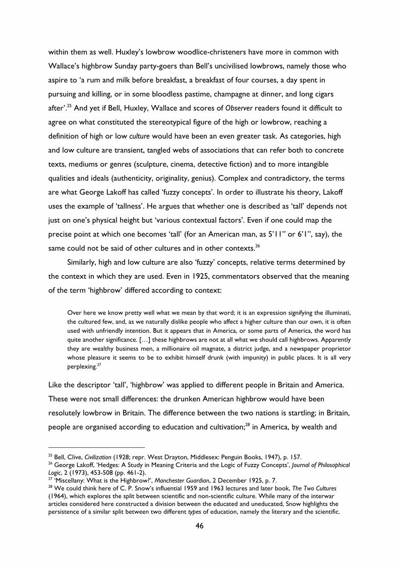
46
within them as well. Huxley’s lowbrow woodlice-christeners have more in common with
Wallace’s highbrow Sunday party-goers than Bell’s uncivilised lowbrows, namely those who
aspire to ‘a rum and milk before breakfast, a breakfast of four courses, a day spent in
pursuing and killing, or in some bloodless pastime, champagne at dinner, and long cigars
after’.25 And yet if Bell, Huxley, Wallace and scores of Observer readers found it difficult to
agree on what constituted the stereotypical figure of the high or lowbrow, reaching a
definition of high or low culture would have been an even greater task. As categories, high
and low culture are transient, tangled webs of associations that can refer both to concrete
texts, mediums or genres (sculpture, cinema, detective fiction) and to more intangible
qualities and ideals (authenticity, originality, genius). Complex and contradictory, the terms
are what George Lakoff has called ‘fuzzy concepts’. In order to illustrate his theory, Lakoff
uses the example of ‘tallness’. He argues that whether one is described as ‘tall’ depends not
just on one’s physical height but ‘various contextual factors’. Even if one could map the
precise point at which one becomes ‘tall’ (for an American man, as 5’11” or 6’1”, say), the
same could not be said of other cultures and in other contexts.26
Similarly, high and low culture are also ‘fuzzy’ concepts, relative terms determined by
the context in which they are used. Even in 1925, commentators observed that the meaning
of the term ‘highbrow’ differed according to context:
Over here we know pretty well what we mean by that word; it is an expression signifying the illuminati,
the cultured few, and, as we naturally dislike people who affect a higher culture than our own, it is often
used with unfriendly intention. But it appears that in America, or some parts of America, the word has
quite another significance. […] these highbrows are not at all what we should call highbrows. Apparently
they are wealthy business men, a millionaire oil magnate, a district judge, and a newspaper proprietor
whose pleasure it seems to be to exhibit himself drunk (with impunity) in public places. It is all very
perplexing.27
Like the descriptor ‘tall’, ‘highbrow’ was applied to different people in Britain and America.
These were not small differences: the drunken American highbrow would have been
resolutely lowbrow in Britain. The difference between the two nations is startling; in Britain,
people are organised according to education and cultivation;28 in America, by wealth and
25 Bell, Clive, Civilization (1928; repr. West Drayton, Middlesex: Penguin Books, 1947), p. 157. 26 George Lakoff, ‘Hedges: A Study in Meaning Criteria and the Logic of Fuzzy Concepts’, Journal of Philosophical Logic, 2 (1973), 453-508 (pp. 461-2). 27 ‘Miscellany: What is the Highbrow?’, Manchester Guardian, 2 December 1925, p. 7. 28 We could think here of C. P. Snow’s influential 1959 and 1963 lectures and later book, The Two Cultures (1964), which explores the split between scientific and non-scientific culture. While many of the interwar articles considered here constructed a division between the educated and uneducated, Snow highlights the persistence of a similar split between two different types of education, namely the literary and the scientific.
47
status. Such a difference is perhaps not surprising, but these criteria do reveal a lot about
prevailing value systems in each nation. In Britain, class emerges as the biggest dividing factor
(it is class, after all, that ensures one’s upbringing, level of education and approach to the
arts);29 in America, it is money, not class or even behaviour, that has the power to
distinguish. These differing conceptions of class did not just affect the meaning of the terms
high or lowbrow; they led to divergent systems of cultural classification and stratification. In
her book Modernism, Middlebrow and the Literary Canon, Lise Jaillant argues that ‘the different
class systems between the two countries largely explain why the “Battle of the Brows” was
fought on the English soil, leaving the United States untouched’, at least until New Criticism
sought to distinguish between high and low culture.30
This alien (to us) use of the term ‘highbrow’ was not characteristic of all Americans;
Gilbert Seldes’s The Seven Lively Arts, published a year earlier than the Times article, uses the
term in a manner with which we are familiar: as characterised by intellectualism and a ‘high
seriousness’.31 But the fact that divergent definitions could occur, even within one nation,
shows the importance of contextualising definitions. Any attempt to define high and low
culture (and/or high and lowbrow) must take context into account, and yet this act of
definition is complicated by the fact that the terms mean so many diverse things at once.
Jostein Gripsrud argues that high culture ‘has several meanings. It refers both to a set of
institutions, to certain types of media and texts, and to discourses on these and other social
phenomena’.32 Others have also written on the difficulty of teasing out the meaning of (high
or low) culture: Raymond Williams’s Culture and Society and Keywords, in particular, are a
touchstone for the present study. In the former, he observes that the meaning of the term
See C. P. Snow, The Two Cultures, with an introduction by Stefan Collini (Cambridge: Cambridge University Press, 1998). 29 Bourdieu explores the connections between class, education and taste in Distinction, pp. 1-2. See also John Guillory, Cultural Capital: The Problem of Literary Canon Formation (Chicago: University of Chicago Press, 1993), pp. vii-ix. 30 Lise Jaillant, Modernism, Middlebrow and the Literary Canon (London: Pickering & Chatto, 2014), pp. 96-7, p. 5. For more on the development of the high/low divide in America, see also Lawrence W. Levine, Highbrow/Lowbrow: The Emergence of Cultural Hierarchy in America (Cambridge, MA: Harvard University Press, 1990). 31 Gilbert Seldes, The Seven Lively Arts (New York: Harper, 1924), p. 348. While Seldes uses the term highbrow, it was certainly not a term he liked. In his essay ‘Before a Picture by Picasso’, he described high- and low-brow as ‘two of the most disagreeable words in the language’ (p. 349); instead, he favoured the tripartite distinction between the ‘lively’, ‘bogus’ and ‘great’/‘major’ arts (pp. 310-2). His characterisation of this distinction, articulated in ‘Picasso’ and ‘The Great God Bogus’, pre-empt Woolf’s essay ‘Middlebrow’ written a decade later; in essence, he argues that both ‘lively’ (low) and ‘great’ (high) are ‘opposed in spirit to the middle or bogus arts’ (p. 349). See Seldes, ‘The Great God Bogus’, in Seven Lively Arts, pp. 309-20 and ‘Before a Picture by Picasso’, in Seven Lively Arts, pp. 345-57. 32 Jostein Gripsrud, ‘“High Culture” Revisited’, in Cultural Theory and Popular Culture: A Reader, ed. by John Storey, 2nd edn. (New York: Prentice Hall, 1997), pp. 532-45 (p. 535).
48
‘culture’ underwent four distinct changes in less than two hundred years. Initially used in the
nineteenth century to relate to the state of an individual’s mind, it gradually broadened to
encompass intellectual activity across society, later becoming synonymous with not just a
‘general body of the arts’ but a ‘whole way of life’.33 These ontological developments were
both syn- and dia-chronic; as Terry Eagleton observes, culture can mean both a body of the
arts and a way of life. It signifies a society’s ‘structure of feeling’ (its manners, tastes, values)
as well as the institutions that uphold these values, those elements which ‘define it as this
society and not as some other’.34
Although this present study is concerned with ‘high culture’ and ‘low culture’ the same
issues of complexity arise: they too refer not just to tangible ‘things’ but to intangible values;
they are subject to change; and they are determined largely by context. In some ways,
however, the process of defining high- and low-culture is more difficult than defining
‘culture’ in isolation: the terms are relative, constructed solely in opposition.35 They are
what John Lyons calls a ‘gradable opposition’:36 ‘terms which are comparatively graded on
the same implicit dimension’.37 Their meanings are entwined: a shift in what constitutes high
affects what can be classed as low, and vice versa. Yet the distinction is not quite that
simple: although the categories reside at opposite ends of a scale, they do not constitute an
absolute or ‘digital’ opposition (as with ‘dead’ and ‘alive’, for instance).38 High and low are
instead an ‘analogue opposition’, a ‘more or less’ antonymy instead of a strict ‘either/or’
opposition. In other words, while ‘x is high’ implies that ‘x is not low’, ‘x is not low’ is not
necessarily the same as ‘x is high’. There is some slippage between high and low, especially
when the category of the middlebrow is taken into consideration, which means that each
term does not simply constitute the inverse of the other.39
These slippages notwithstanding, the Great Divide acquires much of its meaning
through its analogue opposition, meaning reinforced by its use of spatial metaphor. Unlike
oppositions such as good and bad or male and female, in which one term is implicitly ranked
33 Raymond Williams, Culture and Society 1780-1950 (London: Chatto & Windus, 1958), p. xvi. 34 Terry Eagleton, Literary Theory: An Introduction (Oxford: Blackwell, 1983), pp. 3-4. 35 That is not to say, however, that ‘culture’ is not constructed in opposition to other terms, but rather that high and low are more explicitly oppositional. As we will see below, ‘culture’ is often synonymous with high culture, which comes to mean culture as such. Culture is therefore implicitly constructed in opposition to anything which is not culture (in other words, low culture). Moreover, on a social level, culture is constituted by difference: British culture is not American culture, and vice versa. 36 John Lyons, Semantics: Volume 1 (Cambridge: Cambridge University Press, 1977), p. 271. 37 Daniel Chandler, Semiotics: The Basics, 2nd edn. (Oxford: Routledge, 2007), p. 104. 38 Chandler, Semiotics, p. 104. 39 I examine this difficult issue of the middlebrow and how it fits into the high/low divide further below.
49
above the other, high and low come with a built-in hierarchy. High always comes before or
rather above low, both in terms of its metaphorical spatial positioning and the order in
which the words are placed. Like many binaries, the terms are what Yakov Malkiel has called
‘irreversible binomials’, pairings in which the order of words cannot be replaced.40 While we
might speak of high and low, we never speak of low and high. This ordering may seem
arbitrary, but it is one of the main ways in which terms acquire meaning. In always coming
first, ‘high’ appears primary, precedent and privileged, as opposed to ‘low’, which is
secondary, derivative and inferior.41 As Malkiel writes, ‘the stronger partner […] asserts its
superiority synchronically by rushing to occupy the first place’.42 As with all binaries, the
high-low opposition is a hierarchical relationship in which the first term is positive and the
second negative.
Here we have a triple system of meaning-generation: meaning is constructed through
opposition, spatial metaphor and word order. In each method, the meaning of the terms
high and low (culture) is not constructed in isolation but in tandem. The two concepts are
inseparable; even as they attempt to distinguish themselves, they still rely on and necessitate
the other. Any attempt to define high and low must consider both concepts at the same
time. Not only that, but the terms must also be considered in relation to other associated
binaries within the semiotic system: high and low, for instance, are aligned with or
encompass other vertical oppositions such as male and female, mind and body, white and
black. The meaning of the terms high and low is determined by external factors on a micro
and macro level, either by the term’s opposite, or, when taken together, by their relation to
other signs within the larger semiotic system. As such, the terms are subject to change
‘solely because a neighbouring term has been modified’.43 The meaning of high and low is
profoundly uncertain and unstable; hence, any attempt to define the terms amounts to what
Derrida calls a ‘necessary but impossible task’:44 necessary because one must define the
Divide’s terms before calling it into question; impossible because to do so presupposes that
high and low have inherent characteristics. Defining the high/low divide is essential, but it is
also crucial to avoid fixing terms that have no essence. In defining high and low one ends up
40 Yakov Malkiel, ‘Studies in Irreversible Binomials’, in Essays on Linguistic Themes (Oxford: Basil Blackwell, 1968), pp. 311-55. 41 I explore the characterisation of high as original and low as derivative in Chapter 4. 42 Malkiel, ‘Studies’, p. 344. 43 Ferdinand de Saussure, Course in General Linguistics, trans. by Wade Baskin, ed. by Charles Bally and Albert Sechehaye in collaboration with Albert Reidlinger, 2nd edn. (London: Fontana/Collins, 1981), p. 120. 44 Jacques Derrida, ‘Des Tours de Babel’, in Psyche: Inventions of the Other, Volume I, trans. by Joseph F. Graham (Stanford, CA: Stanford University Press, 2007), pp. 191-225 (p. 197).
50
defining the a priori indefinable, and, if one is not careful, performing precisely the kind of
essentialist gesture that I am trying to critique. If I want to argue that high and low are
determined solely by context, then attempting to define the terms seems deeply
contradictory.
This tension between defining and essentialising is further complicated by the fact that
the categories ‘high’ or ‘low’ are regularly subdivided into different, often contradictory sub-
categories: within high, there is traditional, modernist and avant-garde culture; within low,
there is popular, mass and folk culture.45 The distinctions between these categories,
especially modernism and the avant-garde and popular and mass culture, have been the
subject of many dozens of books and essays over the past fifty years. Sean Latham and Gayle
Rogers date disagreements over the term ‘avant-garde’ (and, particularly, its relationship to
modernism) to the emergence of two influential treatises, both bearing the same name,
which were published in the late 60s and early 70s: Renato Poggioli’s Theory of the Avant-
garde and Peter Bürger’s Theory of the Avant-garde.46 I do not want to replicate Latham and
Roger’s excellent overview of a highly-contested term, but suffice to say that these
contentious and conflicting accounts have left a lasting legacy of debate and dispute over the
split between modernism and the avant-garde. Critics such as Robert Jensen and Ann Ardis
have sought to collapse differences between modernism and the avant-garde: Ardis by
coining the ostensibly paradoxical phrase ‘modernist avant-garde’,47 and Jensen by showing
the extent to which both movements sought the ‘signs of authenticity through the denial of
commercialism’.48 Even those who attempt to identify a distinction between modernism and
the avant-garde – Thomas Crow, for instance – tend to use the terms interchangeably.49 As
45 See, for instance, James Naremore and Patrick Brantlinger, ‘Introduction: Six Artistic Cultures’ in James Naremore and Patrick Brantlinger (eds), Modernity and Mass Culture (Bloomington: Indiana University Press, 1991), pp. 1-23 (pp. 8-13). 46 See Sean Latham and Gayle Rogers, Modernism: Evolution of an Idea (London: Bloomsbury Academic, 2015), pp. 127-30. 47 Ardis writes that the purpose of coining the phrase ‘modernist avant-garde has been to call into question commonly held views of the avant-garde’s radicalness and to expose instead its deep investments, before as well as after the war, in securing majority approval for its minority cultural values.’ See Ardis, Modernism and Cultural Conflict, p. 175. 48 Robert Jensen, Marketing Modernism in Fin-de-Siècle Europe (Princeton, NJ: Princeton University Press, 1994), p. 10. 49 Thomas Crow begins his book, Modern Art in the Common Culture, by identifying the artistic avant-garde as a movement which has ‘discovered, renewed, or re-invented itself by identifying with marginal, “non-artistic” forms of expressivity and display’ (p. 3). Here he seems to build on Bürger’s characterisation of the avant-garde as anti-art(ists), and yet he does not make a Bürgerian distinction between modernism and the avant-garde. Indeed, on page 33 he use ‘modernist’ and ‘advanced’ in two consecutive sentences as synonyms. See Thomas Crow, Modern Art in the Common Culture (New Haven, CT: Yale University Press, 1996). For me, Crow’s use of these terms speaks of the complex legacy of Bürger’s book: the canonisation of Bürger’s conception of the historical avant-garde mirrors the institutionalisation of the avant-garde which he discusses.
51
Huyssen observed in 1987, ‘“modernism” and “avantgarde” [have become] synonymous
terms in the critical discourse’.50 Part of this problem is down to language: the Icelandic
critic Astradur Eysteinsson ‘notes the slipperiness across languages, especially between
“modernism” and “avant-garde”.51 Part of it is also due to the overlap between the two
categories, a sense of imbrication complicated by the appearance of single figures in both
camps, either at different or separate times. Latham and Rogers cite T. S. Eliot as a case
study par excellence: here was a man who ‘inherited the mantle of the avant-garde and
became modernism’s emblem’.52
That is not to say, however, that one cannot distinguish between modernism and the
avant-garde; Tyrus Miller’s recent ‘Introduction’ to the 2016 Cambridge Companion to
Wyndham Lewis proves that it is possible to devise a working definition of the avant-garde.53
For my purposes, however, I have chosen to focus on the (marginally) less critically-loaded
term ‘high culture’. The categories of modernism and the avant-garde necessitate definition:
they designate firmer positions and relate to specific texts, movements or individuals in a
manner in which the fuzzy concept of ‘high’ falls short. There is, in other words, more of a
risk of essentialising the terms ‘modernism’ and ‘the avant-garde’ than the explicitly
metaphorical and oppositional category of ‘high culture’. As useful as they may be in other
studies, particularly for distinguishing between different political and aesthetic modes of
praxis, to attempt to reach a ‘water-tight’ distinction between modernism and the avant-
garde is to suggest that terms relate to an ontological reality present in the texts
themselves, as opposed to being shifting and imprecise terms which are retroactively applied
to texts and practices.
I have chosen to avoid the contested distinction between mass and popular culture for
many of the same reasons: namely, the categories are at once both vague and
overdetermined. There is no clear dividing line between the two: a ‘low’ cultural text such
In both cases, the hard edges are shaved off, leaving behind a term used increasingly to designate a subset of modernism, as opposed to a number of distinct movements. 50 Andreas Huyssen, ‘Introduction’, in Andreas Huyssen, After the Great Divide: Modernism, Mass Culture, Postmodernism (Bloomington: Indiana University Press, 1986), pp. vii-xii (p. viii). 51 Latham and Rogers, Modernism, p. 142. 52 Latham and Rogers, Modernism, p. 98. 53 Miller emphasises the ‘military provenance’ of the term avant-garde, describing how it connotes ‘small, mobile contingents of artists and writers foraying out in advance of the masses, probing the mainstream culture’s lines for gaps and vulnerable points, and conducting sudden ambushes and raids before vanishing as quickly as they appeared.’ Tyrus Miller, ‘Introduction: Janus-Faced Lewis, Avant-Gardist and Satirist’, in The Cambridge Companion to Wyndham Lewis, ed. by Tyrus Miller (New York: Cambridge University Press, 2016), pp. 1-18 (pp. 2-3).
52
as a potboiler novel could equally be classified as a product of mass culture or an example of
popular culture. There is a sense in which mass culture is produced and popular culture is
consumed; Andreas Huyssen, for instance, argues that modernists such as Theodor Adorno
depicted mass culture as something which was ‘administered and imposed from above’.54
Such a definition was not ‘water-tight’, however; as Edward Shils pointed out in 1961, mass
culture ‘refers simultaneously to the substantive and qualitative properties of the culture, to
the social status of its consumers, and to the media by which it is transmitted.’55 This ‘three-
fold reference’ results in a complex and contradictory term, one in which mediums and
genres are conflated with measures of value, and the quantitative is merged with the
qualitative. This conflation between quantity and quality is shared, of course, with ‘popular
culture’: far from being an objective marker denoting the things which large numbers of
people read, watch or consume, popular culture connotes the ephemeral, inconsequential
and insubstantial. Yet this conflation masks the fact, according to Stuart Hall, that the only
thing ‘essential to the definition of popular culture is the relations which define “popular
culture” in a continuing tension (relationship, influence and antagonism) to the dominant
culture.’56 What constitutes popular culture is thus less about individual texts and more
about cultural dynamics.57
Consequently, due to the complex, contradictory and loaded nature of terms such as
‘popular culture’, this study chooses instead to refer to the wider categories of ‘high’ and
‘low’ culture. That is not to say that the above terms have been elided or jettisoned
completely: these inner divisions are still present in the semiotic map and across the rest of
the thesis, but the emphasis is placed upon the macro division between high and low(brow).
The Great Divide has the advantage of including not only the categories ‘modernist’, ‘avant-
garde’, ‘traditional’, ‘popular’, ‘mass’ and ‘folk’ culture, but also the interstitial or
intermediate space of the middlebrow (more of which below). On a practical level, it is also
much easier to map a single division than a tripartite system of oppositions. Such a map
54 Andreas Huyssen, ‘Mass Culture as Woman’, in Andreas Huyssen, After the Great Divide: Modernism, Mass Culture, Postmodernism (Bloomington: Indiana University Press, 1986), pp. 44-62 (p. 48). 55 Edward Shils, ‘Mass Society and Its Culture’, in Literary Taste, Culture and Mass Communication, Vol. 1: Culture and Mass Culture, ed. by Peter Davison, Rolf Meyersohn, Edward Shils (1961; repr. Cambridge: Chadwyck-Healey, 1978), pp. 203-29 (p. 206). 56 Stuart Hall, ‘Notes on Deconstructing “the Popular”’, in Cultural Theory and Popular Culture: A Reader, ed. by John Storey, 2nd edn. (London: Prentice Hall, 1997), pp. 442-53 (p. 449), my emphasis. 57 We could think here, for instance, of the complex relationship between the avant-garde and popular culture in the early twentieth century, as discussed in my Introduction, in which forms associated with the working classes such as the circus and music hall, along with genres encompassing wider social classes, including the cinema, jazz and sport, were both appreciated, and appropriated, by the avant-garde.
53
would be unwieldy at best, illegible at worst. In attempting to map the Great Divide, we
need a system that can consider all of these diverse discursive fields without getting too
mired in details. It needs to acknowledge the fact that high and low are fuzzy concepts:
subjective, relative, shifting and context-specific. Most of all, it needs to take into account
the Great Divide’s nature as a binary opposition.
Mapping high and low
Mapping the Great Divide is not a simple task. For all of the reasons outlined above, few
attempts have been made to ‘map’ high and low culture. In practical terms, it is difficult to
decide how to present the material. As we have seen, definitions of high and low were
variously context-specific, biased, idiosyncratic, open to change, contradictory and relative.
Any attempt to collate, rationalise and present such definitions in a clear and ordered
manner appears as foolhardy as trying to stop Wallace’s ‘violently agitated blancmange’ from
wobbling. Just as they cannot be encapsulated by any single definition, the terms ‘high’ and
‘low’ culture cannot be contained by a single metaphor. They are at once chameleonic and
liquid: they seep out from the cracks of any box in which they are placed. Any ‘normal’ map
– one which is measured, objective, comprehensive and accurate – is incompatible with the
Great Divide’s frustratingly fuzzy character. Consequently, a model is required which can do
five different things:
1. Map high and low together at once
2. Show how meaning changes according to context
3. Show a vast number of connotations without becoming illegible
4. Accommodate contradictions
5. Define without essentialising.
In this section, I will explore how we can produce a map which achieves these five goals,
building on two existing models. I outline the benefits and limitations of each model as well
as the pitfalls of the very act of mapping.
Existing models
In Paradoxy of Modernism (2006), Robert Scholes characterised the high and low divide using
the following chart:
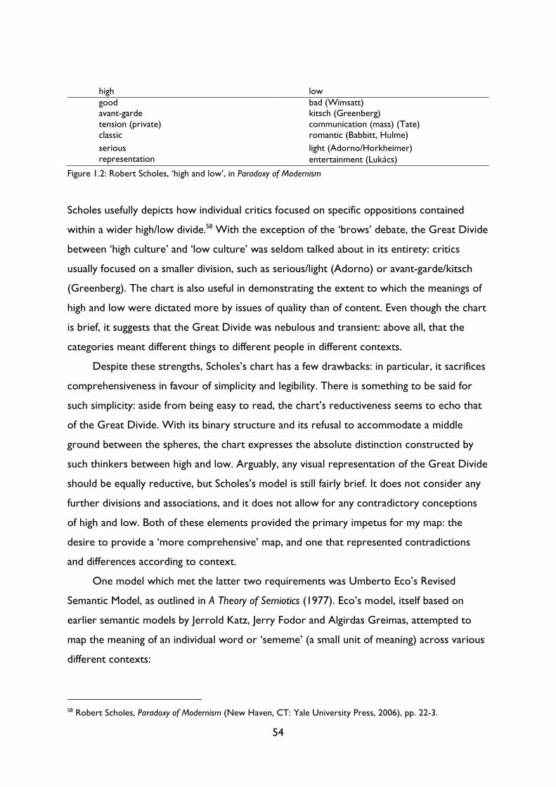
54
high low good bad (Wimsatt) avant-garde kitsch (Greenberg) tension (private) communication (mass) (Tate) classic romantic (Babbitt, Hulme)
serious light (Adorno/Horkheimer) representation entertainment (Lukács)
Figure 1.2: Robert Scholes, ‘high and low’, in Paradoxy of Modernism
Scholes usefully depicts how individual critics focused on specific oppositions contained
within a wider high/low divide.58 With the exception of the ‘brows’ debate, the Great Divide
between ‘high culture’ and ‘low culture’ was seldom talked about in its entirety: critics
usually focused on a smaller division, such as serious/light (Adorno) or avant-garde/kitsch
(Greenberg). The chart is also useful in demonstrating the extent to which the meanings of
high and low were dictated more by issues of quality than of content. Even though the chart
is brief, it suggests that the Great Divide was nebulous and transient: above all, that the
categories meant different things to different people in different contexts.
Despite these strengths, Scholes’s chart has a few drawbacks: in particular, it sacrifices
comprehensiveness in favour of simplicity and legibility. There is something to be said for
such simplicity: aside from being easy to read, the chart’s reductiveness seems to echo that
of the Great Divide. With its binary structure and its refusal to accommodate a middle
ground between the spheres, the chart expresses the absolute distinction constructed by
such thinkers between high and low. Arguably, any visual representation of the Great Divide
should be equally reductive, but Scholes’s model is still fairly brief. It does not consider any
further divisions and associations, and it does not allow for any contradictory conceptions
of high and low. Both of these elements provided the primary impetus for my map: the
desire to provide a ‘more comprehensive’ map, and one that represented contradictions
and differences according to context.
One model which met the latter two requirements was Umberto Eco’s Revised
Semantic Model, as outlined in A Theory of Semiotics (1977). Eco’s model, itself based on
earlier semantic models by Jerrold Katz, Jerry Fodor and Algirdas Greimas, attempted to
map the meaning of an individual word or ‘sememe’ (a small unit of meaning) across various
different contexts:
58 Robert Scholes, Paradoxy of Modernism (New Haven, CT: Yale University Press, 2006), pp. 22-3.
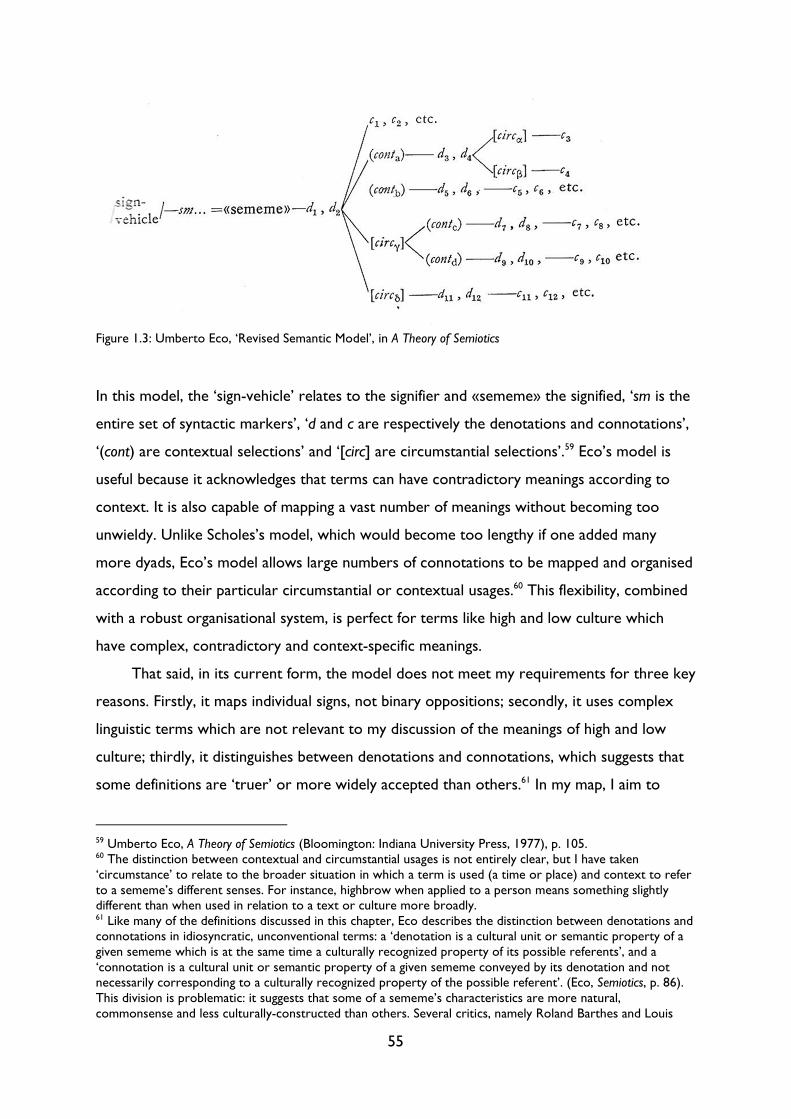
55
In this model, the ‘sign-vehicle’ relates to the signifier and «sememe» the signified, ‘sm is the
entire set of syntactic markers’, ‘d and c are respectively the denotations and connotations’,
‘(cont) are contextual selections’ and ‘[circ] are circumstantial selections’.59 Eco’s model is
useful because it acknowledges that terms can have contradictory meanings according to
context. It is also capable of mapping a vast number of meanings without becoming too
unwieldy. Unlike Scholes’s model, which would become too lengthy if one added many
more dyads, Eco’s model allows large numbers of connotations to be mapped and organised
according to their particular circumstantial or contextual usages.60 This flexibility, combined
with a robust organisational system, is perfect for terms like high and low culture which
have complex, contradictory and context-specific meanings.
That said, in its current form, the model does not meet my requirements for three key
reasons. Firstly, it maps individual signs, not binary oppositions; secondly, it uses complex
linguistic terms which are not relevant to my discussion of the meanings of high and low
culture; thirdly, it distinguishes between denotations and connotations, which suggests that
some definitions are ‘truer’ or more widely accepted than others.61 In my map, I aim to
59 Umberto Eco, A Theory of Semiotics (Bloomington: Indiana University Press, 1977), p. 105. 60 The distinction between contextual and circumstantial usages is not entirely clear, but I have taken ‘circumstance’ to relate to the broader situation in which a term is used (a time or place) and context to refer to a sememe’s different senses. For instance, highbrow when applied to a person means something slightly different than when used in relation to a text or culture more broadly. 61 Like many of the definitions discussed in this chapter, Eco describes the distinction between denotations and connotations in idiosyncratic, unconventional terms: a ‘denotation is a cultural unit or semantic property of a given sememe which is at the same time a culturally recognized property of its possible referents’, and a ‘connotation is a cultural unit or semantic property of a given sememe conveyed by its denotation and not necessarily corresponding to a culturally recognized property of the possible referent’. (Eco, Semiotics, p. 86). This division is problematic: it suggests that some of a sememe’s characteristics are more natural, commonsense and less culturally-constructed than others. Several critics, namely Roland Barthes and Louis
Figure 1.3: Umberto Eco, ‘Revised Semantic Model’, in A Theory of Semiotics
56
overcome all three of these limitations. I map high and low together at once as one unit of
signification; I jettison any linguistic and semiotic elements, leaving only those which chart
how the meaning of the Great Divide changed according to context; and I map only
connotations. On the final point, while it was tempting to distinguish between niche and
widely-held views (connotations/denotations) – one only need think of the Observer and
Guardian competition entries to see the challenges of mapping such a wide and eccentric
range of definitions – in practice it was near impossible to identify which views were more
common than others. The variations present in the competition entries alone suggests that
no single definition of high or low culture obtained complete consensus during the modern
period. Every account displayed idiosyncratic individual variations shaped by the individual’s
personal tastes and experiences. That said, from each of these individual variations it was
possible to extrapolate wider characteristics. The highbrow who brays ‘Don Keehotay’
constructs an image of someone who is affected, self-conscious and pretentious, whereas
those who stick to ‘Don Quixote’ are honest and unpretentious.62
By extrapolating key qualities from individual definitions, I was thus able to distil even
the most subjective definitions into broader characteristics, whether pretentious/honest or
new/traditional. This act of extrapolation had the advantage of making my map more
readable and accessible, as well as overcoming the need to distinguish between niche and
widely-held connotations. All of the dyads mapped are connotations – they are all subjective
and shifting to varying degrees – but they constitute accumulated and distilled units of
meaning which would have meant something to most people in modern Britain.
Althusser, have taken issue with this division, arguing that no real distinction can be made between denotation and connotation, but, rather, that all denotations are just connotations that have been ‘naturalised’. See Roland Barthes, S/Z, trans. by Richard Miller (New York: Hill and Wang; The Noonday Press, 1974) and Kaja Silverman, The Subject of Semiotics (New York: Oxford University Press, 1983). 62 I return to the honest/pretentious divide in more detail below.
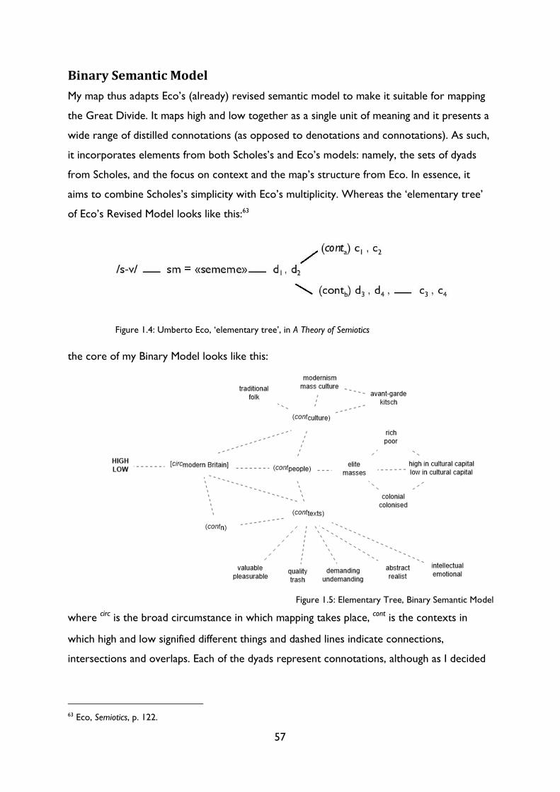
57
Binary Semantic Model
My map thus adapts Eco’s (already) revised semantic model to make it suitable for mapping
the Great Divide. It maps high and low together as a single unit of meaning and it presents a
wide range of distilled connotations (as opposed to denotations and connotations). As such,
it incorporates elements from both Scholes’s and Eco’s models: namely, the sets of dyads
from Scholes, and the focus on context and the map’s structure from Eco. In essence, it
aims to combine Scholes’s simplicity with Eco’s multiplicity. Whereas the ‘elementary tree’
of Eco’s Revised Model looks like this:63
the core of my Binary Model looks like this:
where circ is the broad circumstance in which mapping takes place, cont is the contexts in
which high and low signified different things and dashed lines indicate connections,
intersections and overlaps. Each of the dyads represent connotations, although as I decided
63 Eco, Semiotics, p. 122.
Figure 1.4: Umberto Eco, ‘elementary tree’, in A Theory of Semiotics
Figure 1.5: Elementary Tree, Binary Semantic Model
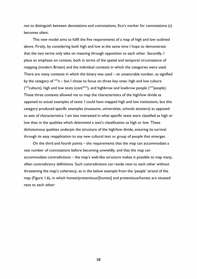
58
not to distinguish between denotations and connotations, Eco’s marker for connotations (c)
becomes silent.
This new model aims to fulfil the five requirements of a map of high and low outlined
above. Firstly, by considering both high and low at the same time I hope to demonstrate
that the two terms only take on meaning through opposition to each other. Secondly, I
place an emphasis on context, both in terms of the spatial and temporal circumstance of
mapping (modern Britain) and the individual contexts in which the categories were used.
There are many contexts in which the binary was used – an unsaturable number, as signified
by the category of contn – but I chose to focus on three key ones: high and low culture
(contculture), high and low texts (conttexts), and highbrow and lowbrow people (contpeople).
These three contexts allowed me to map the characteristics of the high/low divide as
opposed to actual examples of texts: I could have mapped high and low institutions, but this
category produced specific examples (museums, universities, schools etcetera) as opposed
to sets of characteristics. I am less interested in what specific texts were classified as high or
low than in the qualities which determined a text’s classification as high or low. These
dichotomous qualities underpin the structure of the high/low divide, ensuring its survival
through its easy reapplication to any new cultural text or group of people that emerges.
On the third and fourth points – the requirements that the map can accommodate a
vast number of connotations before becoming unwieldly, and that the map can
accommodate contradictions – the map’s web-like structure makes it possible to map many,
often contradictory definitions. Such contradictions can reside next to each other without
threatening the map’s coherency, as in the below example from the ‘people’ strand of the
map (Figure 1.6), in which honest/pretentious/[honest] and pretentious/honest are situated
next to each other:
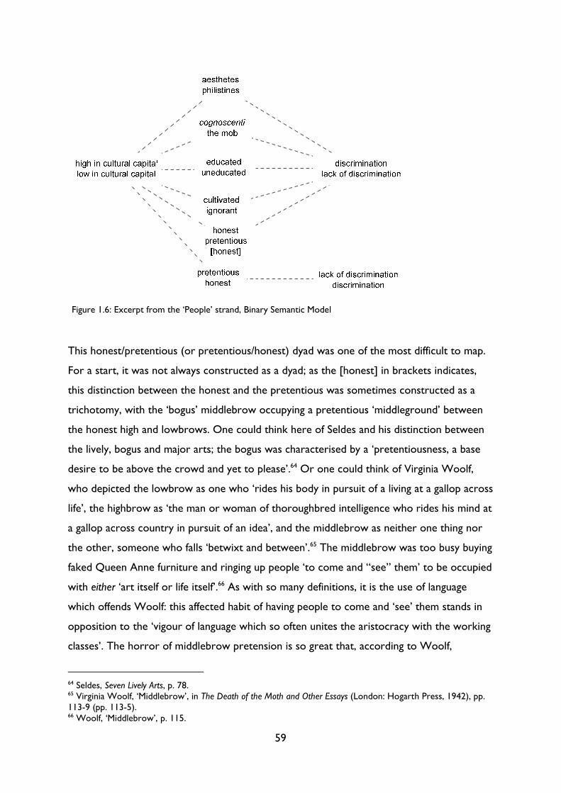
59
This honest/pretentious (or pretentious/honest) dyad was one of the most difficult to map.
For a start, it was not always constructed as a dyad; as the [honest] in brackets indicates,
this distinction between the honest and the pretentious was sometimes constructed as a
trichotomy, with the ‘bogus’ middlebrow occupying a pretentious ‘middleground’ between
the honest high and lowbrows. One could think here of Seldes and his distinction between
the lively, bogus and major arts; the bogus was characterised by a ‘pretentiousness, a base
desire to be above the crowd and yet to please’.64 Or one could think of Virginia Woolf,
who depicted the lowbrow as one who ‘rides his body in pursuit of a living at a gallop across
life’, the highbrow as ‘the man or woman of thoroughbred intelligence who rides his mind at
a gallop across country in pursuit of an idea’, and the middlebrow as neither one thing nor
the other, someone who falls ‘betwixt and between’.65 The middlebrow was too busy buying
faked Queen Anne furniture and ringing up people ‘to come and “see” them’ to be occupied
with either ‘art itself or life itself’.66 As with so many definitions, it is the use of language
which offends Woolf: this affected habit of having people to come and ‘see’ them stands in
opposition to the ‘vigour of language which so often unites the aristocracy with the working
classes’. The horror of middlebrow pretension is so great that, according to Woolf,
64 Seldes, Seven Lively Arts, p. 78. 65 Virginia Woolf, ‘Middlebrow’, in The Death of the Moth and Other Essays (London: Hogarth Press, 1942), pp. 113-9 (pp. 113-5). 66 Woolf, ‘Middlebrow’, p. 115.
Figure 1.6: Excerpt from the ‘People’ strand, Binary Semantic Model
60
highbrow ‘duchesses’ and ‘charwomen’ ‘would rather sit in the coal cellar, together, than in
the drawing-room with middlebrows and pour out tea’.67
In stark opposition to this honest/pretentious/honest trichotomy stands the
pretentious/honest dyad, in which lowbrows and middlebrows united together against the
pretentious highbrow. The ‘middlebrow’ critic Frank Swinnerton wrote in 1938 that
Bloomsbury ‘feels strongly its intellectual superiority to the rest of British mankind. It is full
of what Desmond MacCarthy (to whom Bloomsbury is a shrine, and even its parents
sacrosanct) calls “alert, original men and women” and what I call ill-mannered and
pretentious dilettanti.’68 Swinnerton’s damning – and highly personal – indictment of
Bloomsbury echoes that of much popular reporting from the time, in which highbrow
became a synonym for the pretentious.69 In this formulation, it was variously the low or
middlebrow that was honest and discerning. For Priestley, the ‘broadbrow’ was the only one
who possessed a true ‘sense of values’, ‘appreciation of the human scene’ and ‘critical
faculty’.70 Unsurprisingly, Priestley’s view was contested by those on the other side of the
divide, such as Bell, who asserted that only the civilized highbrow possessed ‘a taste for
truth and beauty, tolerance, intellectual honesty, fastidiousness, a sense of humour [and]
good manners’.71 Ever the perceptive satirist, Leonard Woolf parodied this clamour to
depict one’s own group as the most honest in the opening pages of Hunting the Highbrow, in
which he described being continuously ‘told that we are all much better fellows – more
honest, and clean, and happy, and wise, and English – for being lowbrows.’72 Whether a high,
middle or lowbrow was honest or pretentious thus depended entirely on whether the
individual doing the defining belonged to the group in question. Such a statement is self-
evident, yet it highlights the lack of a fixed referent for each category. The marker
‘pretentious’, for instance, could refer to both the highbrow and the middlebrow; it was
thus essential that the semiotic map could both accommodate and emphasise such
divergences.
67 Woolf, ‘Middlebrow’, p. 115. Woolf’s emphasis on language as the key distinguishing factor between different classes echoes that of the competition entrants discussed above, and also pre-empts the distinction between ‘U’ and ‘non-U’ which rose to prominence in the early 1950s. 68 Frank Swinnerton, The Georgian Literary Scene 1910-1935 (1938; repr. London: J. M. Dent, 1951), pp. 251-2. 69 See, for instance, an Observer article from 14 August 1932, ‘Why Not “High-Brow” Variety?’, which explored the potential dangers of putting an a ‘high-brow’ variety show. One the dangers, it expounded, was that any such revue ‘would tend to become pretentious or merely dull’. (‘Why Not “High-Brow”’, p. 3.) 70 J. B. Priestley, ‘High, Low, Broad’, in Open House: A Book of Essays (London: William Heinemann, 1929), pp. 162-7 (p. 166). 71 Bell, Civilization, p. 104. 72 Leonard Woolf, Hunting the Highbrow (London: Hogarth Press, 1927), p. 5.
61
The final demand – that the semiotic map defines high and low without essentialising
them – was perhaps the most difficult to achieve. I share the same concerns as Ann Ardis
when she writes that ‘I worry about the connotations of stasis and fixity in the notion of
mapping.’73 I too worry that my map will be read as a straightforward transcription of the
inherent qualities contained within the categories of high and low. I have nonetheless tried
to indicate this lack of essence where I can, namely by using dashed lines to indicate
overlaps, by including contradictions, and by focusing on connotations not denotations.
These strategies suggest that the meaning of high and low was not clear, simple or fixed.
Moreover, the indication that these meanings only apply to a specific context and
circumstance exposes the Great Divide’s lack of essential meaning.
Limitations
For all its innovations, my new model still has two major limitations: it exhibits bias and it
excludes the category of the middlebrow.
If the term highbrow constitutes little more than ‘a bundle of theories and
preconceptions, possibly prejudices’,74 it is hardly surprising that my semiotic map is biased.
One would be hard-pressed to find an ‘objective’ and ‘impartial’ definition of the high or
lowbrow; inevitably, this impartiality is writ large in my map. Yet the map’s bias runs deeper
than that: it reflects my choice of texts and their subsequent collation and presentation. I
noted above the process by which I ‘distilled’ an idiosyncratic array of definitions into
broader dichotomous categories, such as mind and body or pretentious and honest. While
such an act of distillation was necessary – a map comprised of hundreds of variants upon
‘Don Keehotay/Don Quixote’ would have been useless – the terminology used in the map
thus often differs from the precise language used by individuals writing in the early twentieth
century. In other words, I am both systematising and schematising: inevitably, these dual acts
of condensing and interpreting tend to sacrifice accuracy and authenticity at the expense of
legibility and coherency.
In addition, the map is skewed towards a ‘highbrow’ perspective as those tend to be
the writings that survive, or the ones that are better known and more readily available. The
intellectual elite had the most vested interest in defining (and policing) the Great Divide, and
73 Ann Ardis, ‘Making Middlebrow Culture, Making Middlebrow Literary Texts Matter: The Crisis, Easter 1912’, Modernist Cultures, 6.1 (2011), 18-40 (p. 22). 74 ‘“Highbrow” and Ignoramus’, p. 10.
62
the time in which to theorise it, as well as the resources, the captive audience, and the
mechanisms of dissemination through publishing and promotion. Advocates of low or
middlebrow culture also presented definitions in books, pamphlets and the press, but
despite their larger number, their contribution to the debate is overshadowed by their
highbrow counterparts. As we have seen, many of the most incisive observations about the
Great Divide came from those writing in newspapers, whether as journalists, editors or
entrants, and yet such texts have not been canonised. The problems are twofold: on the
one hand, academia has historically failed to see the literary and historical value of
mainstream material culture. Blinded by the value judgements encoded in the Great Divide
(art versus entertainment, deep versus shallow, eternal versus ephemeral, elite versus
masses), academics have consistently devalued popular texts in comparison to their
modernist or vanguard counterparts, despite, or rather because of, the former’s greater
circulation. On the other hand, and on a practical level, newspapers and periodicals are
difficult to work with: they are often either overwhelming voluminous or extremely rare,
incomplete or lacking advertising. Sean Latham and Robert Scholes describe this lack of
surviving advertising in magazines such as Scribner’s as the ‘hole in the archive’.75 For them,
this ‘hole’ is the ‘consequence of a distinctly modern bias against the commercial aspects of
aesthetic production’;76 the fact that ‘literary’ material has been preserved where explicitly
commercial content has been removed reveals the pervasiveness of the high/low or
art/market divide not just in our systems of canonisation but also in the concurrent
processes of archiving and preservation. Thankfully, both access to and interest in
newspapers and magazines in their own right is now increasing, but despite this burgeoning
field of study our understanding of the Battle of the Brows is still dominated by the thoughts
of a small, canonised cast of intellectuals.77 Consequently, although the map draws on a
variety of ‘high’ and ‘low’ sources, most of the dyads mapped are still derived from
highbrow tastemakers. While incisive, newspaper columns were typically brief and keyed in
to current events; intellectuals had the time and space in which to provide a measured
75 Sean Latham and Robert Scholes, ‘The Rise of Periodical Studies’, PMLA, 121.2 (March 2006), 517-31 (p. 520). 76 Latham and Scholes, ‘Rise of Periodical Studies’, p. 521. 77 There are recent exceptions: Melissa Sullivan and Sophie Blanch’s 2011 special issue of Modernist Cultures, alongside the two volumes edited by Erica Brown and Mary Grover and Kate Macdonald and Christoph Singer, have attempted to broaden our understanding of the ‘Battle of Brows’ by focusing on popular newspapers, magazines and non-canonical novels. See Kate Macdonald and Christoph Singer, ‘Introduction: Transitions and Cultural Formations’, Transitions in Middlebrow Writing (Basingstoke: Palgrave Macmillan 2015), Erica Brown and Mary Grover (eds.), Middlebrow Literary Cultures: The Battle of the Brows, 1920-1960 (London: Palgrave Macmillan, 2012), and Melissa Sullivan and Sophie Blanch (eds.), Modernist Cultures, 6.1 (May 2011).
63
overview or sustained examination of the cultural field. Thus, popular accounts often proved
less useful than their elite counterparts in constructing my map of high and low.
This phrase, ‘proved less useful’, is in itself significant. The act of mapping, with its
attendant value judgements over what is important or useful, is itself a highly personal
process. As Jostein Gripsrud observes, as a paid research student I belong to a ‘high-culture
discourse on culture’; this context and my background undoubtedly affect my
conceptualisation of the Great Divide, even if they do, ironically, make me more inclined to
valorise low culture and critique high culture. As someone with ‘years and years devoted to
the accumulation of high cultural capital’, I have the ‘class privilege’ of ‘double-access’ to both
high and low culture, whereas the ‘majority only has access to the low one’.78 I am – quite
literally – Gripsrud’s symbolic ‘PhD at the rock concert’, and my map reflects that.79 Thus,
my mapping is not neutral or objective, as Steven Connor demonstrates in Theory and
Cultural Value:
the current interest in the question of discourse and the relationships of power which it embodies and
enacts […] has centred on the business of codifying, classifying and regularizing the workings of power
and the concentrations and distributions of value which it brings about, contenting itself therefore with
activities of mapping which mimic the “neutral” processes of mapping in which power and value are
dissimulated in the modern world, rather than with evaluating (or considering the question of how one
might or should evaluate) those considerations of value themselves.80
In other words, if one’s work is concerned with cultural value, then that concern cannot
exclude the value judgements made in one’s own work. It is easy to forget that one makes
value judgements when one is busy critiquing the value judgements of others. Compelled by
a kind of messianic desire to produce a ‘better’, more ‘objective’, more ‘comprehensive’
map, one can neglect to view one’s own impulses with a critical eye.
As Connor points out, the desire to produce a ‘better’ map is especially paradoxical
when that map seeks to argue that all values are relative in the first place. When discussing
Barbara Hernstein Smith’s Contingencies of Value, he notes that she displays an ‘absolute
commitment to the contingency of all absolutes’. This paradox is problematic, but for
Connor the book’s ‘deficiency lies not in any failure to expunge paradox or self-
contradiction, but in its failure to recognize its own paradoxical structure (indeed, the
78 Gripsrud, ‘“High Culture” Revisited’, pp. 536-7. 79 Gripsrud, ‘“High Culture” Revisited’, p. 537. 80 Steven Connor, Theory and Cultural Value (Oxford: Blackwell, 1992), p. 12.
64
paradoxical nature of all value systems) and to seek to articulate and explore it.’81 Quite
how such an exploration would operate is unclear; we cannot move outside our own
conscious and unconscious systems of evaluation. Yet the inability to imagine such a
situation is precisely the point: our work is the product of our own value judgements,
desires, background, schooling, experiences, etcetera. The danger lies not in our flawed,
subjective approaches, but in our failure to acknowledge our approaches as flawed and
subjective. In failing to question why we have these desires or why we value these
approaches above others, we are failing to mine a crucial expanse of data. My selection of
Eco’s model, for instance, speaks of my privileging of order, structure and detail over
anything more freeform or generalised; my choice of Derridean deconstruction reflects, in
part, my political desire to valorise the repressed. My approach may appear ‘better’ to me,
but only because it embodies my own personal canon of critical attributes: a personal canon
that is informed by high culture far more than I would care to admit. Even when attempting
to critique high culture, I am nonetheless a product of, and (partial) adherent to, its value
judgements. A critical awareness of our own use of value judgements, then, helps us to see
how the high/low divide and its associated systems of evaluation permeate all of our critical
and social interactions.
The map’s second limitation is perhaps more practical than the first. As much as I
wanted to depict the middlebrow in my semiotic map, there were several practical barriers
which made trichotomous mapping unfeasible. Firstly, not all characteristics were conceived
in a three-way opposition. I have included tripartite connotations where I found them –
predominately in the ‘people’ section of the map – but the majority of connotations were
the product of a more direct dichotomy, often with the lower or maligned term
incorporating characteristics designated as middlebrow as well as lowbrow. We could think,
for instance, of the binary oppositions between elite/masses or disinterested/interested. It
might have been possible to insert or extrapolate intermediate, middlebrow qualities
between the two extremes of high and low, had it not been for the second major barrier to
mapping the middlebrow: with the exception of Charles Peirce’s work, almost nothing has
been written about trichotomous structures. It is hard, therefore, to find a model which
describes the interrelationship between high, middle and low.82 The relationship between
81 Connor, Theory and Cultural Value, p. 31. 82 Peirce discusses semiotic trichotomies at length in Charles S. Peirce, ‘Logic as Semiotic: The Theory of Signs’, in Semiotics: An Introductory Anthology, ed. by Robert E. Innis (London: Hutchinson, 1986), pp. 1-23. Due to the difficulties of ascertaining the place of the middlebrow, as outlined below, I have opted for a binary
65
the three categories is still an oppositional one, but it is hard to identify the exact ‘place’ or
position of the middlebrow. The prefix ‘middle’ seems to suggest that it is positioned part
way between high and low on a vertical scale, but it is unclear whether this area is simply a
mix of high and low or constitutes separate characteristics altogether. Edward Sapir has
argued that there is a ‘problem of interpretation’ when it comes to gradable oppositions
such as good and bad or high and low: the ‘area between a and b’ can be ‘understood as a
“both and” area, a “neither nor” area, or logically as a tie between a and b, which thereupon
lose their distinctiveness’.83
Ascertaining the position of the middlebrow, then, is not only contentious but also
problematic: to do so risks reducing a complex series of cultural practices and modes of
reception to a single, static, mid-way point between high and low.84 There is even more of a
risk of essentialising with the middlebrow than with high and low culture: although all three
are non-essential, provisional categories, the ‘place’ of high and low in the cultural hierarchy
is never in question. Whatever their individual definitions, each category always occupies
opposite ends of the cultural spectrum. The middlebrow, on the other hand, has a much
more complex relationship with other formations in the cultural sphere. To simply map it as
‘in-between’ the categories of high and low suggests that its texts form part of a continuum
between high and low, as opposed to a cultural form which operates on entirely different
terms altogether. As we will see below, I am interested in the extent to which the
middlebrow does not fit, in the ways in which writers and critics resisted the binary divides
between art and entertainment and value and pleasure imposed by the mechanisms of the
Great Divide. Mapping the middlebrow would thus artificially reduce it to a set of
characteristics; as Nicola Humble remarked in a 2011 interview with Elke d’Hoker, the
middlebrow ‘is not a fixed designation, there is no such thing as “middlebrow literature”.’85 I
observed in the Introduction that the conception of the middlebrow which I find the most
model. It is worth noting, however, that the semiotic system upon which I draw, namely Umberto Eco’s, has itself been influenced by the American semiotician. 83 Edward Sapir, ‘Grading: A Study in Semantics’, in Selected Writings of Edward Sapir in Language, Culture and Personality, ed. by David G. Mandelbaum (Berkeley: University of California Press, 1968), pp. 122-149 (p. 131). 84 Determining the space or position of the middlebrow is a highly contentious subject in middlebrow studies. Two excellent collections of essays which consider this question (among others) are Kate Macdonald (ed.), The Masculine Middlebrow, 1880-1950: What Mr Miniver Read (London: Palgrave Macmillan, 2011) and Erica Brown and Mary Grover (eds.), Middlebrow Literary Cultures: The Battle of the Brows, 1920-1960 (London: Palgrave Macmillan, 2012). See also John Guillory, ‘The Ordeal of Middlebrow Culture’, Transition, 67 (1995), 82-92 (p. 87) and Nicola Humble, The Feminine Middlebrow Novel, 1920s to 1950s: Class, Domesticity, and Bohemianism (Oxford: Oxford University Press, 2001) pp. 11-12. I discuss the middlebrow in more detail below. 85 Nicola Humble, quoted in Elke D’hoker, ‘Theorizing the Middlebrow. An interview with Nicola Humble’, Interferences litteraires/Literaire interferenties, 7 (November 2011), 259-265 (p. 260).
66
useful is Faye Hammill’s, which describes the middlebrow less as an ontological category and
more as ‘mode of circulation, reception, and consumption of cultural products’.86 Whether
we see the middlebrow as a ‘mode of circulation, reception, and consumption’ or, as
Humble suggests, a category which relates to the ‘culture and practices of reading’,87
however, the result is still the same: the middlebrow’s spatial and ontological slipperiness
makes it not only hard but also misleading to include the middlebrow in semiotic mapping.
Attempting to prescribe the precise place of the middlebrow runs the risk of causing, in
Humble’s words, ‘notions of the middlebrow to harden in debate, for it to be seen as a fixed
category with a securely-bounded canon’.88
These limitations notwithstanding, here is my map of the Great Divide, followed, for
ease of legibility, by larger versions of the map’s three main strands.
86 Faye Hammill and Michelle Smith, Magazines, Travel and Middlebrow Culture: Canadian Periodicals in English and French 1925-1960 (Edmonton: University of Alberta Press, 2015), p. 10. 87 Nicola Humble, ‘Sitting Forward or Sitting Back: Highbrow v. Middlebrow Reading’, Modernist Cultures, 6.1 (2011), 41-59 (p. 42). 88 Humble, ‘Sitting’, p. 42. This exclusion of the middlebrow from the semiotic map does not mean, however, that I have omitted the middlebrow from this thesis altogether: all my subsequent chapters investigate ‘middlebrow’ texts and debates, such as the collision of art and commerce in travel posters in Chapter 3, or the discussion of the ‘middlebrow’ magazine the Royal in Chapter 2 and the ‘middlebrow’ magazines Britannia and Eve and the Bystander in Chapter 4.

67
Figure 1.7: Binary Semantic Model, 1890-1955
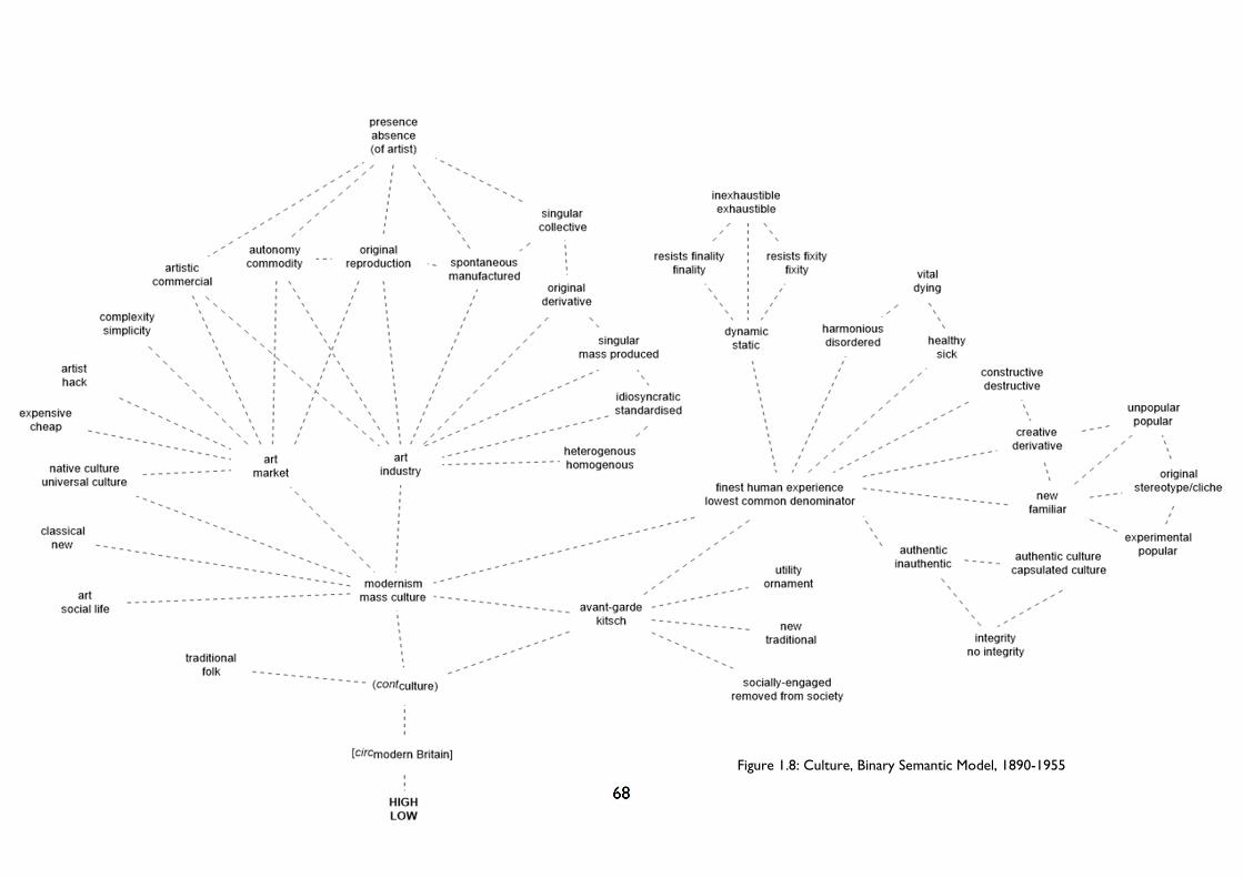
68
Figure 1.8: Culture, Binary Semantic Model, 1890-1955
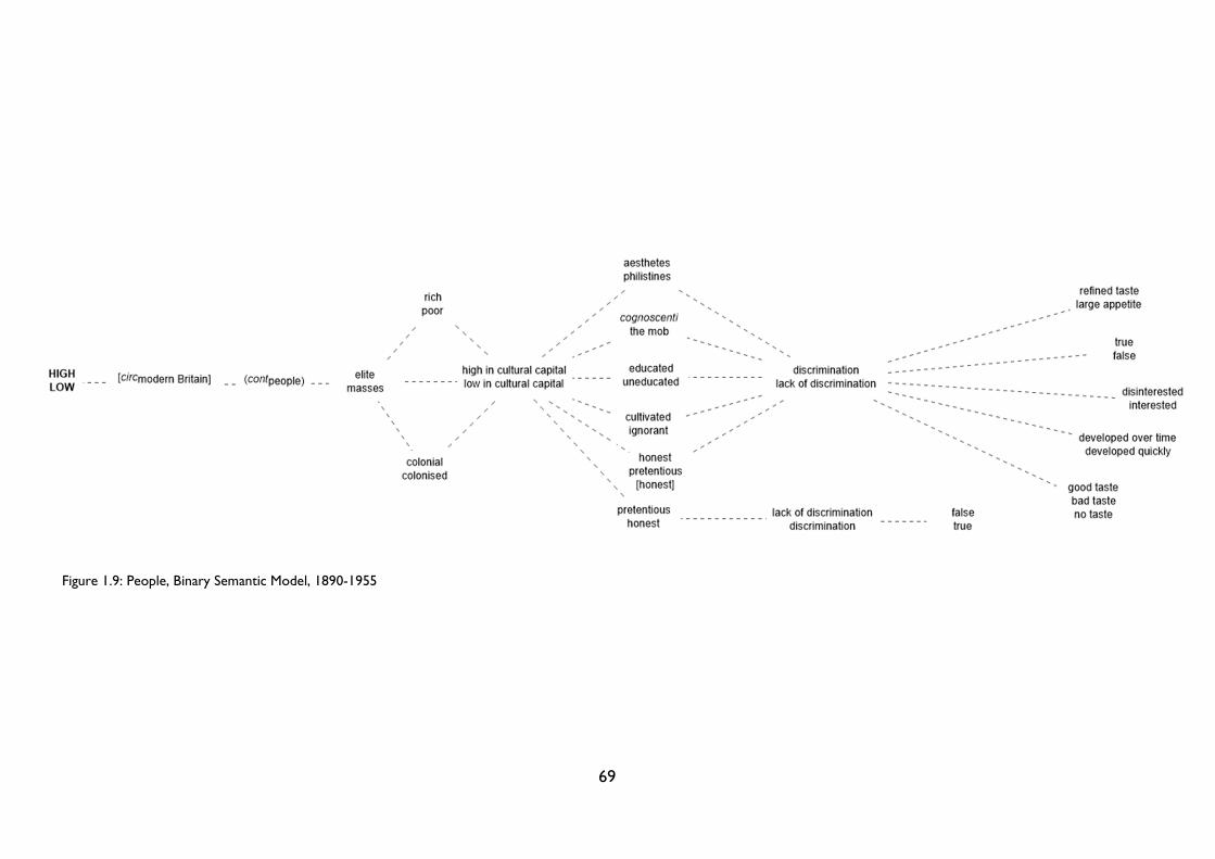
69
Figure 1.9: People, Binary Semantic Model, 1890-1955
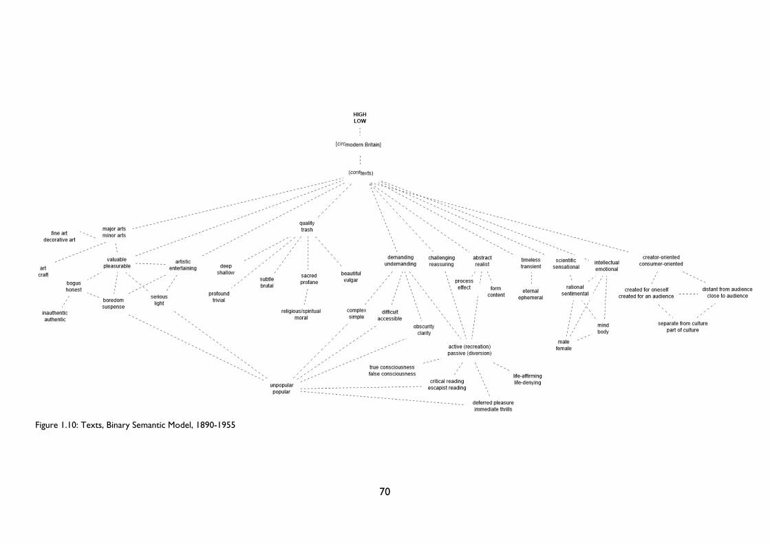
70
Figure 1.10: Texts, Binary Semantic Model, 1890-1955
71
The Binary Semantic Model: semiotics and spectrality
These dichotomous sets of characteristics are not exhaustive, but taken together they
demonstrate the Great Divide’s richness and complexity. Covering approximately the years
1890-1955, this map constitutes a web of interwoven significations, many of which are
deeply oppositional. For a start, the map’s long timeframe means that it denotes several
different phases in the high/low debate: we have the 1890s emphasis on the art/commerce
divide, as encapsulated in George Gissing’s New Grub Street (1891); the interwar ‘Battle of
the Brows’, which focused more on people than on texts; and the turn in the 1940s and
early ‘50s to wider questions of control, representation and democracy. Despite the shifting
tenor of these cultural debates, the map nevertheless indicates the Divide’s broad
connotations across this 65-year period. Such an act of mapping can never be too precise;
indeed, many of the dichotomies give rise to other dichotomies, more so than could have
been indicated here. To depict all the links between the different sets of associations would
turn the map into an indecipherable black mass of crossed and overlaid lines. It is safe to
assume that almost all of the connotations are connected to each other in some way, not
only within their artificially separated contexts but outside them as well. The
demanding/undemanding or timeless/transient distinctions could be applied equally to types
of culture and cultural texts; the same applies to the vital/dying or unpopular/popular
binaries which appear on the ‘culture’ side of the map. There are as many – if not more –
undrawn lines as there are drawn ones: these undrawn lines and unmapped distinctions
somehow haunt the map, reflecting the excessive unknowability of mapping, the folly of even
embarking upon this necessary but impossible task.
Indeed, these undrawn lines are not the only hidden connections that haunt the
semiotic map. Class, gender and the middlebrow also loom large, ostensibly absent but
present in so many of the mapped dichotomies. The ‘people’ strand of the map, for instance,
is rife with class distinctions. The educated/uneducated divide might as well read upper
class/lower class; it is class, after all, which is the primary influence on our level of education
and resulting attitude towards the arts. The same could be said of aesthetes/philistines, but
here the class issue becomes more complex. Often the philistines (at least in the eyes of the
modernist elite) were members of the aristocracy: traditional, backward-looking, closed-
minded individuals with more of an interest in ‘smoking room stories’ and ‘hunting or
72
shooting’ than great art.89 For this reason, I deliberately avoided mapping a distinction
between upper/middle/lower class: whether one was classed as high, middle or lowbrow did
not correspond directly to one’s class. As Stuart Hall reminds us, ‘there is no one-to-one
relationship between a class and a particular cultural form or practice. The terms “class”
and “popular” are deeply related, but they are not absolutely interchangeable.’90
Instead, after Bourdieu, I have focused on the distinction between individuals with high
and low cultural capital.91 As noted above, Bourdieu has written extensively on the links
between class, education and taste; I hope that by using his terms I can gesture towards
class without trying to fix it in a way that is not only reductive but also inaccurate. To
suggest that modern cultural stratification corresponded entirely to class distinctions is to
oversimplify the complex intersections between taste and class. Bourdieu notes that ‘zones
of taste […] roughly correspond to educational levels and social classes’,92 but in the early
twentieth century critics and columnists placed the emphasis more on an individual’s taste,
habits and mannerisms as opposed to their membership of a certain class. The class
dimension was implied, certainly, but this class prejudice was displaced into the ostensibly
safer arena of ‘taste prejudice’. Against a backdrop of a growing middle class with increased
accessibility to culture, taste was the last bastion of the marginalised intellectual elite. Taste
was the one thing which could not be bought: it was an inherent set of values, the product
of one’s upbringing and education. As such, one of the key distinctions between high and
low is encapsulated in the dyad developed over time/developed quickly. This distinction first
came to prominence in the 1890s: following education reforms, the introduction of public
libraries and the emergence of mass publishing, there were concerns that individuals could
now acquire ‘culture in a hurry’. ‘Till [mass] culture came in’, the editor of The Times wrote
in 1892,
if any one [sic] wanted what may be styled a high-class article in criticism, he had to submit to the slow
and expensive processes of a classical education. […] We may say that culture has taken the place of
reading, of education, of scholarship, so that critics, for instance, may now be produced from commercial
raw material with an immense saving on the preliminary outlay.93
89 Bell, Civilization, p. 129. 90 Hall, ‘Deconstructing the “Popular”’, p. 452. 91 Bourdieu describes individuals using the terms ‘high cultural capital’ and ‘low cultural capital’ in Distinction, pp. 123-4. 92 Bourdieu, Distinction, p. 1. 93 ‘Culture in a Hurry’, The Times, 13 December 1892, p. 6.
73
It is no coincidence that the time put into acquiring culture is likened to monetary
expenditure: in this formulation, time really is money. Any time spent ‘por[ing] over
miserable books’ is a waste of time (and money) when one can get an ‘excellent substitute’
for culture from ‘the newspapers and societies at second hand’.94 This monetary dimension
feeds into the art/market divide seen elsewhere on the semiotic map and stokes the
assumption that anything commercial is culturally and artistically worthless.95
This link between money, class and taste continued into the early and even mid-
twentieth century. In 1955, Evelyn Waugh wrote to Nancy Mitford that he
could make [her] flesh creep by telling you about the new wave of philistinism with which we are
threatened by these sour young people who are coming off the assembly lines in their hundreds every
year and finding employment as critics, even as poets and novelists.96
The image of hoards of critics without taste, class or discernment being expelled from
factory assembly lines encapsulates the snobbery at the heart of the elite’s fear about a
decline in standards. The above passage is particularly striking when placed in context: the
philistines Waugh describes are what he calls ‘Mr. Butler’s protégés’, the ‘deserving poor’
given university degrees following the Butler Education Act (1944).97 One cannot take
Waugh’s remarks too seriously – his letter is a parody of the responses Nancy Mitford
received in reply to an essay on the British class system – and yet this class-masquerading-
as-taste prejudice was rife throughout the modern period.98 In ‘The Plight of Our Culture’
(1953), Greenberg criticised the industrialisation of culture, a process in which ‘types of
94 ‘Culture in a Hurry’, p. 6. 95 I explore the art/commerce divide in detail in Chapter 3 below. 96 Evelyn Waugh, ‘Open Letter to the Honourable Mrs. Peter Rodd (Nancy Mitford) On a Very Serious Subject’, in Noblesse Oblige: An enquiry into the identifiable characteristics of the English aristocracy, ed. by Nancy Mitford (1956; repr. New York: Atheneum, 1986), pp. 93-119 (p. 107). 97 Waugh, ‘Open Letter’, p. 97. 98 I return to Waugh’s ‘Open Letter’ below. Waugh’s letter was just one of several essays included in Nancy Mitford’s Noblesse Oblige, which opened with her already infamous essay on ‘U’ and ‘non-U’, first published in Encounter in September 1955. Waugh’s letter first appeared in Encounter in December 1955. See Nancy Mitford, ‘The English Aristocracy’, in Noblesse Oblige: An enquiry into the identifiable characteristics of the English aristocracy, ed. by Nancy Mitford (1956; repr. New York: Atheneum, 1986), pp. 21-52. It is also worth noting that this critique of the new critics ‘coming off the assembly lines’ was rooted not only in class but also gender prejudice. Patrick Collier writes that early-twentieth-century fears about the ‘fall in British journalism’ were ‘consequent with the arrival of women as a force in journalism.’ See Collier, ‘Journalism Meets Modernism’, in Gender in Modernism: New Geographies, Complex Intersections, ed. by Bonnie Kime Scott (Urbana: University of Illinois Press, 2007), pp. 186-96 (p. 188).
74
knowledge are stripped, digested, synopsized, “surveyed,” or abridged’.99 This ‘capsulated
culture’ was opposed to real, authentic (high) culture:
Being, among other things, the expression of unconscious taste and habit, of assumptions that never get
stated, of a way of life and an ingrained sense of proportion, it has as a rule to begin being acquired during
childhood, from the immediate and everyday just as much as from books and works of art.100
In contrast, the ‘new middle classes’, with their capsulated, bastardised simulacra of culture,
are unable to acquire an appreciation for true culture in the same way. For them, culture is
not innate; it ‘comes to them from the outside, in adolescence at most, and […] therefore
tends to remain somewhat external and artificial’.101 In an era of increasing social mobility, it
was thus taste, not wealth, that revealed an individual’s class origins. Faced with the rise of
the middle classes, Humble writes, the ‘snobbery’ of the upper middle classes became ‘both
more intense and more rarefied, as it sought to construct codes of belonging that the
usurpers could not crack.’102 Taste played a crucial role in these ‘codes of belonging’, both as
an apparently inherent marker of class and as a set of values around which groups could
rally. It helped to unite those within a group and, more importantly, to exclude anyone who
did not share their sense of what was good and bad or right and wrong. In other words,
taste kept people in their place; it differentiated them at a time when other modes of
classification were becoming less reliable.
Greenberg’s essay is also helpful for considering the role of the middlebrow in my
semiotic map. For him, capsulated culture is a synonym for ‘middlebrow’, for the type of
person who wants to be cultured but does not have the upbringing, intelligence, or time to
acquire it properly. All of these accusations against people trying to acquire culture in a
hurry are essentially aimed at middlebrows: the lowbrows, in a state of blissful ignorance,
are not interested in any form of high culture, however abridged. The lowbrows constituted
what the journalist Whelpdale in George Gissing’s New Grub Street (1891) termed the
‘quarter-educated’,
that is to say, the great new generation that is being turned out by the Board schools, the young men and
women who can just read, but are incapable of sustained attention. People of this kind want something
to occupy them in trains and on ‘buses and trams. As a rule they care for newspapers except the Sunday
99 Clement Greenberg, ‘The Plight of Our Culture’, in Clement Greenberg, The Collected Essays and Criticism: Volume 3 Affirmations and Refusals 1950-1956, ed. by John O'Brian (1953; repr. Chicago: University of Chicago Press, 1993), pp. 122-52 (p. 136). 100 Greenberg, ‘Plight of Our Culture’, p. 135. 101 Greenberg, ‘Plight of Our Culture’, p. 135. 102 Humble, Feminine Middlebrow, p. 82.
75
ones; what they want is the lightest and frothiest of chit-chatty information—bits of stories, bits of
description, bits of scandal, bits of jokes, bits of statistics, bits of foolery. Am I not right? Everything must
be very short, two inches at the utmost; their attention can’t sustain itself beyond two inches. Even chat
is too solid for them: they want chit-chat.103
Whelpdale’s vision for his ‘Chit-Chat’ magazine was a thinly-veiled reference to George
Newnes’s Tit-bits magazine, a popular stalwart on the newsstands since 1881. This was
literature not for the ‘trained critic’ but rather the ‘Tired Business Man’, that ubiquitous
figure exhausted from a day’s work and travel and wanting nothing more than to be ‘amused
and refreshed’ by what he saw or read.104 He travelled home on the train with Tit-Bits or
visited the music hall after work, where he could ‘heal his tiredness by having forty winks’.105
Such readers and viewers were not interested in aping the highbrow: they sought out,
according to Q. D. Leavis, ‘substitute or kill-time interests like listening to radio and
gramophone, looking through newspapers and magazines, watching films and commercial
football.’106
Yet, while their lack of taste was lamentable, the lowbrow posed less of a threat to the
intellectual elite than the middlebrow. Lowbrows knew their place: they were ‘primitive
creature[s]’ with ‘bloodthirsty passions’,107 more likely to be seen at the dog track or the
cinema than ‘por[ing] over miserable books’.108 Voracious middlebrow readers, on the other
hand, committed two unforgivable crimes: firstly, they had ideas above their station: as
Humble argues, the ‘rise in power of the middle class’ meant that ‘some of its members
rose above their own class altogether’;109 secondly, and on a related note, they were often
difficult for others to place. Brown and Grover argue that ‘[a]nxieties about the middlebrow
are linked with the uncertain class position of any kind of writer’;110 it is this indeterminacy
which so troubled Woolf in her essay on the ‘Middlebrow’. The middlebrow caused offence
103 George Gissing, New Grub Street (1891; repr. Oxford: Oxford University Press, 2008), p. 460. Winifred Holtby also acknowledged the rise of this ‘immense new public’ emerging, ‘partially literate, from our national system of elementary schools’, in a 1931 Radio Times article; see Holtby, ‘Modern Newspaper: Edited to Entertain’, ed. by Patrick Collier, in Gender in Modernism: New Geographies, Complex Intersections, ed. by Bonnie Kime Scott (Urbana: University of Illinois Press, 2007), pp. 209-15. 104 For more on the ‘Tired Business Man’, see G. M. Young, ‘The New Cortegiano’, in Daylight and Champaign (London: Hart-Davis, 1948), pp. 131-149 (p. 142), and ‘Manchester Theatres and Music Halls’, Manchester Guardian, 25 October 1927, p. 14. 105 ‘Manchester Theatres’, p. 14. 106 Leavis, Fiction and the Reading Public, p. 209. 107 ‘High-Brows’, p. 11. 108 ‘Culture in a Hurry’, p. 6. 109 Humble, Feminine Middlebrow, p. 61. 110 Erica Brown and Mary Grover, ‘Introduction’, in Middlebrow Literary Cultures: The Battle of the Brows, 1920-1960, ed. by Erica Brown and Mary Grover (London: Palgrave Macmillan, 2012), pp. 1-21 (p. 16).
76
not through their essence but rather through the lack of it: they were ‘neither one thing nor
the other’.111 The whole middlebrow field has been described by Macdonald and Singer as a
‘miasmic force’, a hazy, provisional terrain with ‘room for all tastes and cultures, since
policing and exclusion was not part of the middlebrow project, if there can said to have
been one.’112 Here we get to the crux of the highbrow fear and rejection of the middlebrow:
as Kate Macdonald and Christoph Singer note, ‘[m]iddlebrow culture offers an alternative
formation for the understanding and appreciation of literature, art and music, without
didacticism, and with confidence in its appeal to consumers.’113 The intellectual elite were
afraid of middlebrow culture because it offered an entirely different model of culture, one
which did not require the highbrows to act as cultural arbiters. The middlebrows no longer
needed to aspire or defer to the elite: with critics and writers to represent them and cater
for their tastes, they could construct a self-sufficient culture free from sneering derision and
dismissal.114 They were carving out a ‘third way’, one which baulked equally at the
highbrow’s dry intellectualism and the lowbrow’s brutish sensationalism, in search of a
happy medium somewhere in-between.
We can see why (middlebrow) critics posed such a threat to both the editor of The
Times in 1892 and Greenberg in 1953: the middlebrow presented a direct challenge to the
Great Divide’s cultural hegemony. It suggested that culture did not have to be exclusive and
excluding; as such, the middlebrow could not be included in modern theorisations of
culture. There was a danger, after all, that the middlebrow could be mistaken for culture as
such; as Greenberg wrote,
it is middlebrow, not lowbrow, culture that does most nowadays to cut the social ground from under
high culture. The middlebrow aspect is taken more and more for culture as such, for representative
culture, even by educated people who still regard culture as a matter of personal parts instead of as a
means of asserting status. Active high culture is left increasingly to specialists, and the middlebrow
becomes the highest form to which the amateur, or dilettante, can aspire.115
111 Woolf, ‘Middlebrow’, p. 115. 112 Kate Macdonald and Christoph Singer, ‘Introduction: Transitions and Cultural Formations’, Transitions in Middlebrow Writing (Basingstoke: Palgrave Macmillan 2015), pp. 1-13 (pp. 5, 6). 113 Macdonald and Singer, ‘Introduction’, p. 6. 114 This middlebrow culture was much more inclusive and democratic than the modernist elite could ever be: as we will see in Chapter 2, middlebrow writers, editors and publishers took a real interest in their readers, entering into a reciprocal dialogue with their public. Modernist writers and editors, on the other hand, had a tendency to tell their readers what they wanted, even when they attempted to reach out to the ‘common man’. 115 Greenberg, ‘The Plight of Our Culture’, p. 140.
77
Consequently, although culture was often conceived explicitly as a triad, the qualities behind
the different categories were organised into neat binary distinctions. A mutually-exclusive
division between high and low was required to teach the ‘amateur’ that culture meant high
culture. Only highbrow texts were ‘true’ manifestations of culture; anything else was just
‘false’. As with class, then, the absence of ‘middlebrow’ qualities from (or, rather, their
spectral presence on) the semiotic map tells us more than a simple presence could ever
have done.
In contrast to class and the middlebrow, the male/female binary appears explicitly in
the Binary Semantic Model, present in the ‘texts’ strand as part of wider distinctions
between intellect/emotion and mind/body. Aside from this singular citation, however, the
majority of connotations represented in the semiotic map are aligned with or determined by
gender assumptions. In her seminal book, Forever England: Femininity, Literature and
Conservatism Between the Wars, Alison Light describes the ‘many different ways [in which]
aesthetic judgements are intertwined with those about gender.’116 We could think of the
qualitative distinctions between deep/shallow or the disciplinary divisions between art/craft:
in both cases, the former is associated with men and the latter with women. Huyssen has
famously argued that mass culture has, since the 19th century, been associated with women.
This connection between low culture and femininity extends not just to the types of texts
that women read (‘serialized feuilleton novels, popular and family magazines, the stuff of
lending libraries, fictional bestsellers and the like’)117 or even to the connotations assigned to
such texts (profound/trivial, rational/sentimental, eternal/ephemeral)118 but to the very
notion of the masses. Through reference to a range of 19th and early 20th century examples,
Huyssen shows how ‘the proletarian and petit-bourgeois masses were persistently
described in terms of a feminine threat.’119 This association between a mass of bodies and
116 Alison Light, Forever England: Femininity, Literature and Conservatism Between the Wars (Abingdon: Routledge, 1991), p. 7. 117 Huyssen, ‘Mass Culture as Woman’, p. 49. 118 Sentimental was a key term: as Suzanne Clark writes, women as diverse as Kay Boyle, Edna St Vincent Millay and Louise Bogan were repressed and side-lined by this inaccurate label. ‘To this day’, she argues, ‘calling a work “sentimental” means that no critical analysis is required. The censorship of the “sensational” by modernist critics foreclosed the respectful consideration of women writers.’ See Suzanne Clark, ‘Sentimental Modernism’, in Gender in Modernism: New Geographies, Complex Intersections, ed. by Bonnie Kime Scott (Urbana: University of Illinois Press, 2007), pp. 125-36 (p. 129). Sentimentality was not the exclusive domain of women, however; in Rose Macaulay’s fictional satire of the newspaper world, Potterism (1920), ‘sentimental’ is regularly used as a term of abuse by the self-confessed intellectual and rational (read: snobbish) writers at the Weekly Fact. For them, one of the mainstream Potter Press’s biggest crimes is its ‘cheap and popular appeal to sentiment’: its publications are characterised by ‘second-rate sentimentalism and cheap short-cuts and mediocrity’. See Rose Macaulay, Potterism (New York: Boni & Liveright, 1920), p. 50. 119 Huyssen, ‘Mass Culture as Woman’, pp. 52-3.
78
women is perhaps due to the persistent aligning of women with the body, as opposed to
men with the mind. Women were – and are – more associated with the emotional, personal
or local (their bodies, the domestic sphere) rather than intellectual public or political spaces:
a view expressed succinctly by John Ruskin in his 1865 lecture ‘Of Queens’ Gardens’. For
Ruskin, man ‘is eminently the doer, the creator, the discoverer, the defender. His intellect is
for speculation, for war, and for conquest’.120 He embarks upon ‘rough work in the open
world, must encounter all peril and trial’; woman, on the other hand, is ‘guard[ed] from all
this; within his house, as ruled by her’.121 Wherever a ‘true wife comes, his home is always
round her’; the home is thus the ‘true place and power’ of woman.122
This conflation of the feminine and the domestic here brings the middlebrow back into
focus: according to Erica Brown, the middlebrow is a ‘pejorative label’ which displays
‘prejudices towards feminine and domestic themes’.123 Both Nicola Humble and Nicola
Beauman have written at length about the connections between gender, the domestic and
the middlebrow;124 in A Very Great Profession, Beauman writes that the ‘traditions of fiction in
a culture which is class-bound and male-dominated’ have dismissed the domestic as an
‘unfruitful topic for fiction, presumably because it is even-tempered, everyday and therefore
dull.’125 The female, domestic, middlebrow novel sits on all of the wrong sides of the Great
Divide: it is ephemeral, insignificant, realist, mundane, as opposed to ground-breaking,
experimental, political, eternal works by and for men. For the ‘woman’s novel’ to be viewed
as an object worthy of value it had to efface the gender of its author: in practical terms,
Beauman argues, this meant that authors such as Virginia Woolf ‘left the everyday out of her
novels and confined it instead to her diaries and letters’.126 Female novelists could produce
works of literary value, but only if they adopted the characteristics of the highbrow, male,
modernist novel. Although women like Woolf were occasionally canonised alongside their
male counterparts, such exceptional guest memberships to the highbrow intellectual elite do
120 John Ruskin, ‘Of Queens’ Gardens’, in Sesame and Lilies. Three Lectures by John Ruskin (Toronto: Gage, 1890), pp. 83-113 (p. 101). 121 Ruskin, ‘Of Queens’ Gardens’, p. 101. 122 Ruskin, ‘Of Queens’ Gardens’, pp. 102, 103. 123 Brown, Comedy and the Feminine Middlebrow, pp. 7-8. 124 See Humble, Feminine Middlebrow, pp. 108-48 and Nicola Beauman, A Very Great Profession: The Woman’s Novel 1914-39 (London: Persephone Books, 2008), pp. 134-71. 125 Beauman, Very Great Profession, pp. 140, 134. 126 Beauman, Very Great Profession, p. 141.
79
not disprove the rule that it was woman’s writing and female-oriented culture (magazines,
fashion, craft) which were associated more readily with the ‘low’ half of the Great Divide.127
Like class, then, gender prejudices haunt the semiotic map, lurking beneath its array of
apparently ungendered distinctions.128 Yet the connotations that were mapped also reveal a
lot about how high and low were conceived in the modern period. Although
characterisations were subjective, some oppositions transgressed taste boundaries. The
elite/masses couplet, for instance, was used by both high and lowbrow audiences, even if
they could not agree on the precise characteristics of each. As we saw above, depictions of
both groups differed depending on who was doing the definitions. Evelyn Waugh summed
up the subjective nature of cultural categorisation perfectly in his ‘Open Letter to the
Honourable Mrs. Peter Rodd (Nancy Mitford) on a Very Serious Subject’. The ‘basic
principle of English social life’, he wrote,
is that everyone (everyone, that is to say, who comes to the front door) thinks he is a gentleman. There is
a second principle of almost equal importance: everyone draws the line of demarcation immediately below his
own heels. The professions rule out the trades; the Services, the professions; the Household Brigade, the
line regiments; squires, squireens; landed families who had London houses rule out those who spent all
the year at home; and so on, in an infinite number of degrees and in secret, the line is, or was, drawn. It
is essentially a process of ruling out. If you examine the accumulated code of precepts which define ‘the
gentleman’ you will find that almost all are negative.129
In his inimitable style, Waugh makes a number of incisive points. Firstly, he notes that most
definitions of subjective and shifting categories like the ‘gentleman’ are made using the via
negativa, that is, by what they are not than what they actually are.130 Secondly, he identifies
the impulse to distinguish between oneself and those with whom one shared the most
similarities. An outsider might not be able to tell the difference between a squire and a
127 The same can also be said of sexuality, race, ethnicity and even nationality – in each case, the normal, unmarked term is associated with the dominant position in British culture: namely, the straight British white man. In her ‘Introduction’ to The Gender of Modernism, Bonnie Kime Scott discusses the intersections of social categories with the ‘gender complex’ in modernist studies. See Bonnie Kime Scott, ‘Introduction: A Retro-prospective on Gender in Modernism’, in Gender in Modernism: New Geographies, Complex Intersections, ed. by Bonnie Kime Scott (Urbana: University of Illinois Press, 2007), pp. 1-22 (pp. 11-12). It also worth noting, after Rita Felski, that the notion of the feminine was not fixed in the modern period: just like the fuzzy concepts high and low, its ‘meanings blur and change, sometimes dramatically, sometimes almost imperceptibly, as one moves across different regimes of discourse and traditions of representation.’ After Ludmilla Jordanova, Felski views culture as containing ‘many sedimented layers of meaning’, a ‘composite whose boundaries are unstable and constantly shifting’. This description could be used to describe the categories of high and low just as accurately as they do the categories of male and female. See Rita Felski, The Gender of Modernity (Cambridge, MA: Harvard University Press, 1995), p. 30. 128 I return to the gendered assumptions which underpinned the Great Divide below. 129 Waugh, ‘Open Letter’, p. 107. 130 I have written about the modern use of the via negativa in definitions of the brows in my article, ‘“betwixt and between”, p. 21.
80
‘squireen’; consequently, one had to draw ‘the line of demarcation immediately below
[one’s] own heels’. As with the highbrow/middlebrow distinction, it was only those nipping
at one’s heels that posed any immediate threat. Thirdly, although he is discussing social
divisions, Waugh’s observation that the definer always possesses positive attributes and
everyone else negative ones applies equally to distinctions between ‘taste publics’.131 To
quote an Observer article from 1930, the high or lowbrow is ‘always fair game; he is always
the other fellow.’132 Just as the individual asked is always a gentleman, in the Battle of the
Brows the individual speaking was always reasonable, honest and discerning; everyone else
was ludicrous, pretentious and undiscerning. Nonetheless, the elite/masses distinction
seemed to stick, even if the language used to describe each group differed greatly. There is a
big difference in the masses depicted pejoratively as ‘the herd’ (Q. D. Leavis) or ‘the mob’
(Murry and Mansfield) and the masses depicted more quantitatively as ‘the Many’ (Huxley)
or ‘the majority’ (Eliot).133 Although such quantitative descriptions were by no means free of
signification (and negative connotations) – as we will see in Chapter 4, the division between
the singular and the multiple is a key dimension of high and low – the mass as ‘majority’
seems less loaded than the animalistic metaphor of ‘the herd’, or the violent connotations of
‘the mob’.134 Despite these qualitative differences, however, the elite/masses couplet held
across the cultural spectrum. Disagreements over content or interpretation were to some
extent irrelevant: there was a cultural consensus that culture could be divided into an
intellectual elite and the rest of the public, even if the position of the dividing line was open
to interpretation.
The semiotic map also reveals the extent to which many of the dyads featured can be
broken down into a handful of distinctions which underpin Western culture. The onion
metaphor is hackneyed, but in this case it seems appropriate: each layer of signification can
be peeled off to reveal a deeper level of meaning underneath. Take the art/commerce
distinction, for instance: this overarching distinction can be separated into a number of
associated dichotomies, from singular/collective and autonomy/commodity to
original/derivative and spontaneous/manufactured. Remove this layer and you will find the
131 For more on what Herbert J. Gans terms ‘taste publics’, see Gans, Popular Culture and High Culture (New York: Basic Books, 1999), p. 7. 132 ‘New Novels: This World and the Next’, Observer, 23 February 1930, p. 8. 133 See Q. D. Leavis, Fiction and the Reading Public, pp. 194-5; John Middleton Murry and Katherine Mansfield, ‘The Meaning of Rhythm’, Rhythm, 1.5 (1911), pp. 18-20 (p. 20); Huxley, ‘Forehead Villainous Low’, p. 205; T. S. Eliot, Notes Towards the Definition of Culture, p. 35. 134 I discuss these dehumanising characterisations of the masses in West, ‘“betwixt and between”’, p. 17.
81
familiar Derridean dyad of presence/absence lurking within: in this case, the presence or
absence of the artist.135 The characteristics contained within the art/commerce divide can
effectively be distilled into this single, fundamental binary opposition. It is not the only one:
to absence/presence we could add active/passive (serious/light, intellectual/emotional,
challenging/reassuring, rational/sentimental) or true/false (authentic/inauthentic,
creative/derivative, beautiful/vulgar, cultivated/ignorant). From combinations of these three
alone, we could construct more or less the entire semiotic map.
Ultimately, it is these fundamental, structural dichotomies of Western culture that
underpin the high/low divide. These pervasive systems of evaluation determine not only the
high/low opposition but also privilege speech over writing, day over night, man over woman.
As established above, gender prejudice haunts the semiotic map, influencing both the Great
Divide’s content (its specific characteristics) and its later applications (which texts are
classified as high, low and middlebrow). This gender prejudice is not just a symptom of
wider female repression: this prejudice is encoded directly into the Great Divide. In other
words, this divide is not just a passive record of misogyny but rather one of the systems by
which misogyny continues to be perpetuated and validated. In her essay ‘Sorties: Out and
Out: Attacks/Ways Out/Forays’, the incomparable Hélène Cixous lists a series of binary
oppositions, beginning with ‘Activity/passivity’, ‘Sun/Moon’, ‘Culture/Nature’, ‘Day/Night’ and
culminating in ‘High/Low’.136 All such divisions are gendered, she argues, but it is ‘the
opposition between activity and passivity’ which structures the entire history of philosophy
and of male privilege.137 Woman is ‘always associated with passivity’; either she is ‘passive or
she does not exist’.138 As Tim Armstrong, reading Wyndham Lewis, puts it, ‘man produces,
woman reproduces’.139 The ‘masculine body is more readily conceptualized in terms of work
and action’; the female body is more passive, limited to the realm of aesthetic reform (that
is, of ‘reshaping’ the body through physical exercise whilst ensuring that it retains its
‘natural’ appearance).140 When one speaks of the Great Divide, then, one is speaking of this
135 This presence/absence dichotomy underpins Derrida’s deconstruction of the hierarchical divide between speech/writing in Of Grammatology, trans. by Gayatri Chakravorty Spivak (Baltimore: John Hopkins University Press, 1997). 136 Hélène Cixous, ‘Sorties: Out and Out: Attacks/Ways Out/Forays’, in Hélène Cixous and Catherine Clement, The Newly Born Woman, trans. by Betsy Wing (Manchester: Manchester University Press, 1987), pp. 63-132 (p. 63). 137 Cixous, ‘Sorties’, p. 64. 138 Cixous, ‘Sorties’, p. 64. 139 Tim Armstrong, Modernism, Technology and the Body: A Cultural Study (Cambridge: Cambridge University Press, 1998), p. 109. 140 Armstrong, Modernism, Technology, pp. 109-10.
82
‘absolute constant’,141 this gendered division between activity and passivity which underpins
most, if not all, of the dyads represented in the semiotic map. Taken together with true/false
and presence/absence, these dichotomies constitute the three key structural myths which
underpin the Great Divide: the myth that texts are inherently high or low
(presence/absence), the myth that texts are either high or low (true/false), and the myth
that high texts come before low texts (active/passive).142
The couplets mapped in the Binary Semantic Model acquire meaning not only vertically
(art/commerce – spontaneous/manufactured – presence/absence) but also horizontally, in
combination with other dyads. The meaning of high and low is thus both relative and
relational. By itself, neither side of the quantitative distinction between singular/numerous
has a strongly ameliorative or pejorative dimension (except, of course, the privilege
conferred upon ‘singular’ for coming first in the opposition). When aligned with more
qualitative binaries such as authentic/inauthentic or original/derivative, however, the ‘neutral’
quantitative binary begins to take on meaning.
What emerges through mapping, then, is that texts/people/cultures are classified
according to their positioning along several different axes: quantity and quality, as well as
time and space. It is this process of layering, the loading of signification, which creates
meaning from a set of apparently objective measurements. Combined with qualitative
judgements, markers of quantity, time and space take on value. Such a process would be
difficult to map: although arranged on four axes, each axis does not retain a fixed value.
Take the time axis for instance: where ‘less’ time might sometimes be considered ‘better’ (in
the case of new/old, avant-garde/rear-guard, original/copy), at others ‘more’ time is
preferable (in the case of lasting/ephemeral, deferred/immediate pleasure, developed over
time/acquired quickly). Once again, it is only when these temporal, spatial or quantitative
markers come together with qualitative ones in a specific context that they acquire meaning.
Many of these connections are so old that they appear incontrovertible: it is difficult to even
think of a situation in which ‘numerous’ works of art could be more valuable than a ‘singular’
141 Cixous, ‘Sorties’, p. 64. 142 One could argue for other ‘key’ dichotomies: Connor, for instance, gives an excellent account of the value/pleasure dichotomy; Scholes, on the other hand, chooses to foreground divides such as serious/trivial and creative/formulaic. See Connor, 'Value of Pleasure, Pleasure of Value', in Theory and Cultural Value, pp. 34-56 and Scholes, A Paradoxy of Modernism. In the present study, however, I am more interested in the fundamental oppositions and assumptions which underpin such pairings; value/pleasure, serious/trivial and creative/formulaic, for instance, could all be distilled down to the single division between active/passive as explored by Cixous in ‘Sorties’. For this reason, I have chosen instead to focus on these ‘structural’ oppositions and the associated myths to which they have given rise.
83
one. For the numerous works to have any value, they would each need to be singular and
original; if they were duplicates or reproductions, their artistic and monetary value would be
negligible. Even mediums dictated by the presence of multiples – fine prints, for instance –
place more value on a series with fewer iterations. Just because these connections and
connotations appear commonsense, however, does not mean that these links are ‘natural’.
They are constantly renewed and reinforced by the commissioning and canonisation
practices of institutions such as academia, galleries, museums, schools and the state, as well
as influential figures like critics, dealers, writers and patrons. It is not the case that
characteristics depicted in the map are inherently good or bad; they become good or bad
when individuals or institutions in specific contexts evaluate them as such.
In this chapter, I have shown that the meaning of high and low was relative, subjective,
and shifting. The act of mapping inevitably makes meaning appear more monolithic than it
was, and yet this process of mapping revealed a surprising level of congruency between
definitions, even when coming from different audiences. While characteristics may have
been evaluated differently, the actual qualities applied to high and low texts, people or
cultures were generally more similar than they were different. These qualities may have
been ambiguous and relational (see, for instance, deep/shallow or vital/dying) but there was
a broader consensus over definitions than I expected. Even though characteristics were
generalised, rhetorical and bore little resemblance to actual texts or people, it was possible
to construct a working definition of ‘high’ and ‘low’ culture.
It is not enough, therefore, to simply say that high and low have no meaning. They
might not have inherent meaning, but the surprisingly broad consensus suggests that the
categories meant – and mean – similar things to most people. They meant enough, that is,
for most people to identify texts, people or cultures as high or low, even if they could not
‘furnish a precise definition’ of either category. Conversely, though, it is also not enough to
say that high and low did have meaning, at least, not in the sense of possessing fixed,
essential qualities. As a gradable opposition, each term is structured and defined by the
other; as fuzzy concepts, meaning is not only relative but contextual: change the time, place
or audience and the meaning of high and low (and the middlebrow) will shift. It is only
through a complex process of context-specific association and valorisation that these terms
became imbued with meaning by those in power.
The process of mapping, then, is one of simultaneously determining and denaturalising
meaning. Perversely for a descriptive map, it raises more questions than it provides answers.
84
It aims to move the emphasis from simply showing how high and low were defined to asking
why and by whom. In doing so, it begins to expose the social, economic and political factors
that led to the emergence and persistence of the modern Great Divide. In my next chapter,
I delve into specifics, asking how the Divide worked in practice. Using Mukařovský’s theory
of the ‘aesthetic norm’, I explore how texts were constructed in relation to the Great
Divide. Focusing on a comparison of the little magazine the Tyro and the middlebrow
monthly the Royal, I consider not just how magazines were classified according to the
criteria outlined above, but rather how texts were produced with high, middle or lowbrow
readers in mind. In doing so, I aim to challenge the Great Divide’s first structural myth: that
texts were inherently high or low.
85
Chapter 2
‘you, the public’:
Norms, Readers and Modern(ist) Magazines
Since the War love in fiction has borne some resemblance to love in
real life. Authors allow their characters to think instead of blither, to
act more or less logically, to behave somewhat as genuine human
beings do. They do this by kind permission of you, the public, who
always have the last word, and are your own censor.
- Francis Evans Baily, 19211
In his editor’s letter for July 1921, F. E. Baily of the popular illustrated fiction magazine the Royal
argued that it was the public who had the ultimate say over an author’s fictional creations. It
was readers, he argued, who ‘cast forth luv from their books and magazines, replacing it with
love.’2 It is difficult, of course, to say precisely where such a trend emanated: did the desire for
‘love’ not ‘luv’ emanate in the reader or in the writer (or, indeed, in the editor)? For Baily, the
former was true: as an editor, he aimed to emulate and accommodate shifts in public opinion. In
his autobiography, Twenty-Nine Hard Years’ Labour, Baily describes how, after the War,
he had now somehow or another to psycho-analyse the post-war public and find out what they wanted to
read. The last thing they wished to read about was the war, and as a kind of unnatural gaiety pervaded
everything, partly because people were trying to forget the anxieties of the war and partly because
demobilized young officers were getting rid of their gratuities in the West End as fast as possible, reading
matter became very gay.3
1 F. E. Baily, ‘Mr. Editor—His Page’, Royal Magazine, July 1921, p. 179 (p. 179). 2 Baily, ‘Mr. Editor’, July 1921, p. 179. 3 Francis Evans Baily, Twenty-Nine Years’ Hard Labour (London: Hutchinson, 1934), p. 155.
86
Baily draws a direct correlation between social, political and economic change on the one hand
and literary developments on the other. Few modernists would dispute this connection
between modern life and literary change: we need only think of Virginia Woolf’s famous
proclamation that ‘on or about December 1910 human character changed.’4 For Woolf, ‘when
human relations change there is at the same time a change in religion, conduct, politics, and
literature.’5 Yet, where Baily cites social change as the catalyst for literary change, Woolf
observes that the ‘first signs of [change] are recorded in the books of Samuel Butler, in The
Way of All Flesh in particular; the plays of Bernard Shaw continue to record it.’6 Woolf goes on
to describe the changes visible in ‘life’, but these are secondary, both temporally and
qualitatively, to literary change.
We have here two models of literary production. In Baily’s model, writers reflect changes
in the reading public; in Woolf’s, writers enact changes in the reading public. These two
different models encapsulate many of the fundamental assumptions behind the Great Divide:
high literature is active, creative, artistic, demanding; popular fiction is passive, derivative,
commercial, undemanding. Where Woolf’s model is inward-looking, the product of internal
inspiration, Baily’s is outward-facing, designed to serve an audience. It is the time-honoured split
between Literature as Art versus literature as a trade, a division which has persisted since at
least the 1830s. In her 1932 survey of Fiction and the Reading Public, Q. D. Leavis quotes from
the autobiography of Sir Egerton Bridges (1830), in which he writes that it is a
vile evil that literature has become so much a trade all over Europe. Nothing has gone so far as to nurture a
corrupt taste, and to give the unintellectual power over the intellectual. Merit is now universally estimated by
the multitude of readers that an author can attract.7
From at least 1830, then, literary critics and commentators have devalued texts designed to
serve and please a public, and privileged texts which appeared to serve no-one except the
author himself. These evaluative criteria do not correspond to literary form or content but
rather to the method of literary production. According to critics such as Bridges or Q. D.
4 Virginia Woolf, Mr. Bennett and Mrs. Brown (London: Hogarth Press, 1924), p. 4. 5 Woolf, Mr. Bennett, p. 5. 6 Woolf, Mr. Bennett, p. 5. 7 Sir Egerton Bridges, quoted in Q. D. Leavis, Fiction and the Reading Public (1932; repr. London: Chatto & Windus, 1965), p. 188.
87
Leavis, to produce a text solely in relation to an audience is to sell one’s literary soul: such a
text is incapable of possessing inherent literary value. It is a mere shell, something devoid of
depth or the presence of authorial intention or ideology. It is impossible for such a text to be
original, as it seeks only to please. Such a ‘novel-reading public’, argues Arnold Bennett,
is excessively difficult to please, and rarely capable of enthusiasm. […] The backbone [of the novel-reading
public] dislikes the raising of any question which it deems to have been decided: a peculiarity which at once
puts it in opposition to all fine work, and to nearly all passable second-rate work. It also dislikes bring
confronted with anything that it considers ‘unpleasant,’ that is to say, interesting. It has a genuine horror of
the truth neat.8
Consequently, any writer seeking to please the ‘backbone of the novel-reading public’
must therefore jettison those elements which would displease its audience: anything challenging,
interesting or truthful. In the words of Richard Aldington, Imagist poet and prolific reviewer,
[the] world is not anxious to be prodded or excited or seduced into spiritual activity; it wants to be
comfortably bored into somnolence after its meals; it wants to be delicately and sentimentally tickled—more
or less delicately, more or less sentimentally according to climate—with tales of love in varying degrees of
chastity. […]
These things have nothing to do with literature. They merely exist to satisfy a demand.9
Here Aldington builds on Bennett’s image of the conservative ‘backbone’ of the public,
suggesting that such readers prefer to be ‘comfortably bored’ – at most ‘delicately and
sentimentally tickled’ – by literature. To this picture of the passive, somnolent reader he adds
the familiar economic language of supply and demand explored in Chapter 1, quoting the phrase
‘“Literature as a trade”’ in inverted commas.10 This quotation signals the extent to which this
criticism of the literary marketplace has become a commonplace; by 1916, the notion that
literature was being ruined by commercial forces was an accepted fact.11 In particular, Aldington
places the blame for such a bastardisation on romantic literature; his reference to ‘tales of love
8 Arnold Bennett, ‘Middle-Class’, in Books and Persons: Being Comments on a Past Epoch, 1908-1911 (London: Chatto & Windus, 1917), pp. 88-100 (p. 97). 9 Richard Aldington, ‘Reviewing’, Egoist, 1.3, January 1916, p. 5. 10 Aldington, ‘Reviewing’, p. 5. 11 We could think, for instance, of Ezra Pound’s famous lines from ‘Hugh Selwyn Mauberley’ (1919): ‘We see τò
καλóν / Decreed in the market place.’ Here Pound makes that familiar modernist accusation: what is deemed
beautiful (τò καλóν) is decided not by cultural authorities but rather by the impassionate checks and balances of the market place; sales become the only measure of success in this commercial world. See Ezra Pound, ‘Hugh Selwyn Mauberley’, in Modernism: An Anthology, ed. by Lawrence Rainey (Malden, MA: Blackwell Publishing, 2005), pp. 48-61 (p. 50).
88
in varying degrees of chastity’ draws parallels between ‘feminine’ genres or publications and the
excesses of the commercial marketplace.12
Taken together, Aldington’s and Bennett’s acerbic characterisations of the reading public
read like a catalogue of qualities encoded as ‘low’ in Chapter 1’s semiotic map: they are
feminine, passive, uncritical and undemanding. Such audiences are mainly described using the via
negativa, that is, by their lack of essential qualities or desires: they do not want excitement,
originality, challenge or even truth. It thus follows that any text produced to please the public
cannot possess inherent literary value: such a text is too debased to warrant serious
consideration. In this chapter, I seek to complicate this simple divide between the eternally
valuable text produced in isolation and the ephemeral, worthless text produced for an
audience. In doing so, I aim to challenge the first of the Great Divide’s structural myths: that
texts are inherently high or low. I do this in two related ways: both by showing that all texts
were produced in relation to an audience, and by demonstrating that the form and content of
all texts were informed by ‘external’ as well as ‘internal’ factors. I argue that there is no such
thing as an ‘inherent’ or ‘essential’ characteristic: no text is produced in a vacuum, immune
from interference. To do so, I compare and contrast two magazines from either end of the
cultural spectrum: the elite, highbrow Tyro (1921-22), edited by Wyndham Lewis, and the
aforementioned popular fiction magazine the Royal (1898-1930), edited from January 1912 to
June 1927 by F. E. Baily. Through a combination of literary close reading and a close
examination of what Peter Brooker and Andrew Thacker have called a magazine’s ‘periodical
codes’ (including price, advertising, design, size and use of illustrations),13 I show how magazines
were constructed in relation to both an ‘ideal reader’ and prevailing aesthetic and literary
‘norms’.14 This chapter thus moves the emphasis away from a text’s mythical ‘inside’ to its
outside, examining how ‘external’ factors such as norms and audiences determined a text’s
production, circulation and reception.
12 I examine this gendering of the Great Divide in Chapter 1. For more on the equation of a decline in literary standards with the rise of female readers and writers, see Patrick Collier, ‘Journalism Meets Modernism’, in Gender in Modernism: New Geographies, Complex Intersections, ed. by Bonnie Kime Scott (Urbana: University of Illinois Press, 2007), pp. 186-96 (pp. 188-9). 13 See Peter Brooker and Andrew Thacker, ‘General Introduction’, in The Oxford Critical and Cultural History of Modernist Magazines: Volume 1, Britain and Ireland, 1880-1955, ed. by Peter Brooker and Andrew Thacker (Oxford: Oxford University Press, 2009), pp. 1-26 (p. 6). I revisit the notion of ‘periodical codes’ in more detail below. 14 The notion of the ‘ideal reader’ is Yuri Lotman’s; the ‘aesthetic norm’ is Jan Mukařovský’s. I explore both concepts in detail below.
89
‘What the Public Wants’
In the opening line of her 1925 article, ‘What the Public Wants’, the journalist and novelist Rose
Macaulay observed that
This is a topic upon which we, the public, talk a great deal, and rightly. What we want. The desires of humanity
and the questions thereof. What can be more interesting, more vitally interesting to us all? The question
seems to cover a rather wide field of philosophical and metaphysical inquiry…15
In this section, I agree with Macaulay, although perhaps not in the sense which she intended.
For me, this burning late-nineteenth- and early-twentieth-century issue of ‘what the public
wants’ is of interest less for the precise demands of the reading public and more for whether,
and how, writers and editors sought to diagnose and satiate the public’s literary appetite. Did
writers attempt to replicate the public’s tastes or did they just express their own? Patrick
Collier has explored this notion of ‘what the public wants’ in depth, especially in relation to
Rose Macaulay’s work, in his book Modernism on Fleet Street,16 so I will not replicate that
discussion here. It is useful, however, to sketch out the broad terms of the debate: this key
question of the reading public’s taste illuminates the wider split between the two methods of
literary production (inward- versus outward-facing) which this chapter seeks to complicate.
The first model is that put forward by Francis Baily of the Royal, namely the idea that texts
are written to meet public demand. In this model, a writer’s (or editor’s) sole concern should
be to identify and then give the public what it wants. The instructive figure here is the press
baron Lord Northcliffe, loosely fictionalised by Arnold Bennett in his 1909 play What the Public
Wants. In it, the Northcliffe cipher Sir Charles Worgan explains his philosophy to his estranged
brother, the ‘dilettante’ Francis:
Sir C. I’ve only got one principle. Give the public what it wants. Don’t give the public what you think it
ought to want, or what you think would be good for it; but what it actually does want. I argue like
this. Supposing you went into a tobacconist’s and asked for a packet of cigarettes, and the
tobacconist told you that cigarettes were bad for you, and that he could only sell you a pipe and
tobacco—what should you say? [He rises, excited.] […] You see my point, eh? You see my point?
15 Rose Macaulay, ‘What the Public Wants’, ed. by Patrick Collier, in Gender in Modernism: New Geographies, Complex Intersections, ed. by Bonnie Kime Scott (London: Methuen, 1925; repr. Urbana: University of Illinois Press, 2007), pp. 205-8 (p. 205). 16 See, for instance, Patrick Collier’s chapter ‘“What the Public Wants”: Rose Macaulay and Her Publics’, in Patrick Collier, Modernism on Fleet Street (Aldershot: Ashgate, 2006), pp. 137-68.
90
I’ve got no moral axes to grind. I’m just a business man [more excitedly]. […] I make no pretence to
be anything but a business man. And my speciality is, what the public wants—in printed matter.
Francis. But how did you find out what it wants? I suppose it wasn’t vouchsafed to you in a dream.
Sir C. [hesitating]. I—I don’t exactly know. … I began by thinking about what I should want myself. The
Lad’s Own Budget was the first. I knew well enough what I wanted when I was a boy of twelve, for
instance; and as most boys are alike—you see! … I put on the market a paper that I actually did
want when I was twelve.17
This short exchange contains all the hallmarks of the press baron’s attitude towards both
journalism and his public.18 Sir Charles’s repeated insistence that he is a ‘business man’ and the
extended tobacconist metaphor reveal the extent to which he views writing as a trade. The
latter also exposes his lack of moral code or sense of responsibility: his is a no-nonsense, free
market approach, not an Arnold-inflected paternalism. He is accused, he says, of trying to
‘pander to the passions of the public’, but he prefers to ‘call it supplying a legitimate demand.’19
Time and time again, his description of the newspaper business slides into the financial:
questioned by Francis on its hyperbolic contents, he defends not the paper’s contents, but how
much money it makes: ‘We’ve got to give all the news there is going about, and we’ve got to
sell the paper. And by God we do sell it! […] We please the largest public. We pay the highest
prices. We make the largest profits.’20 Selling copies and pleasing the public are assumed to be
one and the same thing: by Sir Charles’s logic, the paper could not sell in such vast quantities if
the public did not like it. Thus, he has to print what the public wants; as Q. D. Leavis put it, the
entire periodical-fiction trade has been organized on a scientific basis. To achieve as large a circulation as
possible (in order to secure the advertiser) the editor sets out to satisfy the common measure of taste, and
he cannot (or thinks he cannot) afford to publish any story which fails to conform to type.21
In this model, editors and writers are held hostage by the dual menace of the advertiser and the
public. Commercial pressures outweigh literary ones and sales become the sole criteria by
which the editor or publisher judges success.
17 Arnold Bennett, What the Public Wants: A Play in Four Acts (1909; repr. New York: George H. Doran, 1911), pp. 22-3. 18 In his book Visions of the Press in Britain, 1850-1950, Mark Hampton quotes E. T. Raymond, who wrote in 1919 that Northcliffe ‘“knows exactly what the public wants, or rather what the public would want if it knew how to make its wants known.” […] For Raymond, Northcliffe’s skills appeared less as influencing the masses than as reflecting their desires’. See Mark Hampton, Visions of the Press in Britain, 1850-1950 (Urbana: University of Illinois Press, 2004), p. 149. 19 Bennett, What the Public Wants, p. 42. 20 Bennett, What the Public Wants, p. 41. 21 Q. D. Leavis, Fiction and the Reading Public, p. 27.
91
Behind this critique of the mass media lies the suggestions that while the popular press
pandered to the needs of its readers, ‘little’ or vanguard magazines were immune to such
considerations. I will complicate this simple narrative later in relation to the Royal and the Tyro
magazine; for now, it is enough to note the popularity of this image of the mass-market editor
who cared for nothing but advertising, sales and circulation figures. Rose Macaulay and Rebecca
West wrote articles expressing their frustration with editorial policy, in particular noting with
distaste the preference for the ‘frivolous and monotonous’ over serious news, the implication
being that the public were not interested in politics or policy or international affairs.22 West
vehemently believed that ‘the policy of cramming the paper with personal gossip’ was ‘giving the
public what they do not want’.23 Much like Woolf, who invokes her servant to show that the
horror of the middlebrow exceeded class affiliation,24 West refers to an unnamed servant who
‘was naturally bored to death’ by her usual Sunday newspaper’s ‘watery chatter’.25 The servant
appears here as a witness in West’s defence: West can hardly be accused of snobbery if even
the lower classes at whom such papers are aimed fail to be satisfied by them.
In her article ‘What the Public Wants’, Macaulay fails to relate her servant’s opinion; she
does, however, describe a run-in with an editor who accused her of ‘mistak[ing] his object and
the desire of the public, which was to have articles dealing with the lighter side of life.’26 Like
West, Macaulay refused to believe that
there is any public which wants anything of the kind. But there is a public which swallows, apparently, anything
it gets, and never says what it does want, because it doesn’t know. So editors have no resource except to
pander to their own morbid taste, hoping that it may also be the taste of others.27
Here Macaulay lights upon a key trope: rather than giving the public what they want, the editor
simply presents them with his ‘own morbid taste’. We can recall Sir Charles Worgan above,
who explains that the Lad’s Own Budget was so successful because he could remember what he
22 See Rose Macaulay, ‘The Press and the Public’, pp. 201-4 and Rebecca West, ‘The Future of the Press IV: The Journalist and the Public’, pp. 196-201, both selected and edited by Patrick Collier in Gender in Modernism: New Geographies, Complex Intersections, ed. by Bonnie Kime Scott (Urbana: University of Illinois Press, 2007). The phrase ‘frivolous and monotonous’ is West’s; see West, ‘Future of the Press’, p. 196. 23 West, ‘Future of the Press’, p. 197. 24 Virginia Woolf, ‘Middlebrow’, in The Death of the Moth and Other Essays (London: Hogarth Press, 1942), pp. 113-9 (pp. 113-5). I discuss Woolf’s invocation of her servant in Chapter 1 above. 25 West, ‘Future of the Press’, p. 198. 26 Macaulay, ‘What the Public Wants’, p. 207. 27 Macaulay, ‘What the Public Wants’, p. 207.
92
wanted when he was a boy of twelve. Leaving aside the insinuation that a press baron’s taste
and intelligence was a good match for a twelve-year-old boy, this accusation – that an editor
was forcing his own taste onto the public – reappeared throughout the period. In his article
‘Reviewing’, Aldington argued that it was ‘necessary for the publisher—and the periodical
editor—to persuade their public that an imitation, a dilution of a good book is better than a
good book’.28 Instead of attempting to discover what the public wanted, the mass-market editor
simply forced the public to appreciate, or at least ‘swallow’, any content he could find.
In that sense, the image of the editor who panders to public taste is as much a fiction as
the entirely inward-facing genius writer working in isolation in their garret. The popular editor
is informed by his own personal taste just as much as the ‘serious’ writer is informed by tastes
and demands other than their own. As we will see below, those writing for or editing even the
smallest of ‘little’ magazines had to consider factors beyond the purely literary. Reality
notwithstanding, however, this mythic idea of the writer toiling away in isolation remained
popular throughout the modern period. This image of the garret constituted the second,
opposing model of literary production: one in which the writer works in complete seclusion,
motivated solely by literary considerations.29 This model is encapsulated perfectly by Woolf in
her 1939 pamphlet Reviewing; in it, Woolf uses the vivid extended metaphor of a shop window
to describe the current state of literary production. There are, she writes, ‘certain shop
windows which always attract a crowd. The attraction is not in the finished article but in the
worn-out garments that are having patches inserted in them. The crowd is watching the women
at work.’30 Just like clothes menders, she writes,
our poets, playwrights, and novelists sit in the shop window, doing their work under the curious gaze of
reviewers. But the reviewers are not content, like the crowd in the street, to gaze in silence; they comment
28 Aldington, ‘Reviewing’, p. 5. 29 The nineteenth-century trope of the garret extended throughout the modern period: we could think here of George Gissing’s New Grub Street (1891), and the plight of the idealistic Edwin Reardon, who half starves himself over four years spent in a ‘certain garret’ on Tottenham Court Road, trying to become a ‘literary man’; or George Orwell’s Keep the Aspidistra Flying (1936), in which our anti-hero Gordon Comstock’s ‘vision of himself’ was as a ‘poet starving in a garret—but starving, somehow, not uncomfortably’. See Gissing, New Grub Street (1891; repr. Oxford: Oxford University Press, 2008), p. 57, and Orwell, Keep the Aspidistra Flying, ed. by Peter Davison, The Complete Works of George Orwell, Vol. 4 (London: Secker & Warburg, 1997), p. 53. I discuss both books in more detail in Chapter 3 below. 30 Virginia Woolf, Reviewing (London: Hogarth Press, 1939), p. 5.
93
upon aloud upon the size of the holes, upon the skill of the workers, and advise the public which of the goods
in the shop windows is the best worth buying.31
One could argue that a review comes out after a work is finished, and therefore the novelist or
playwright is not beset with interference throughout the entire creative process, but Woolf
suggests that reviews are much more pervasive and invasive than that. Having one’s work
commented upon in public and, especially, assessed according to the demands of the public,
disrupts the whole writing process. Her solution, she argues, is to organise consultations, much
as in medicine, in which the writer meets in private for a one-to-one session with a reviewer,
whereupon they can meet as equals. This abolition of the reviewer – this ‘smashing of the shop
window’ – would allow the writer to
withdraw into the darkness of the workshop; he would no longer carry on his difficult and delicate task like
a trouser mender in Oxford Street, with a horde of reviewers pressing their nose to the glass and commenting
to a curious crowd upon each stitch. Hence his self-consciousness would diminish and his reputation would
shrivel. No longer puffed this way and that, now elated, now depressed, he could attend to his work.32
Although clearly intended to be satirical – one cannot think that Woolf seriously proposed the
notion of ‘consultations’ as opposed to printed reviews – this extraordinary article reveals the
anxiety experienced by writers such as Woolf about the power of reviews (and thus
consciousness of the public taste) to contaminate autonomous literary production. The image
of the ‘workshop’ is, in effect, just a mid-twentieth-century update of the late-nineteenth-
century trope of the ‘garret’. Whether locked away in his garret or ‘withdrawn into the
darkness of the workshop’, in this model of literary production, knowledge of what the public
wants could only harm and distract the serious writer, tampering with their mood and making
them ‘self-conscious’.
Woolf’s vision of the writer working in isolation in the ‘workshop’ is undermined,
however, by her earlier essay ‘The Patron and the Crocus’, first published in the Nation and
Athenaeum on 12 April 1924.33 Here we see Woolf at her most pragmatic: she acknowledges,
quite candidly, that ‘every writer has some public or other at the end of his pen’.34 A ‘book is
31 Virginia Woolf, Reviewing, p. 5. 32 Woolf, Reviewing, pp. 22-3. 33 This article underwent several revisions; it was first reproduced in Woolf’s The Common Reader (London: Hogarth Press, 1925); I concentrate on the Penguin Books edition from 1938. 34 Virginia Woolf, ‘The Patron and the Crocus’, in The Common Reader (Harmondsworth: Penguin, 1938), pp. 205-9. Unless otherwise indicated, further references are to this edition and are included parenthetically in the text.
94
always written for somebody to read’; as she states in an earlier draft, ‘writing is not the
scribbling of sheets on a desert islands [sic] for the gulls to carry away’.35 Far from being cooped
up in her ‘workshop’, Woolf describes the creative process as a dialogue, if not directly with
the public, then at least with a public-minded patron. Using the image of a ‘crocus’ to represent
a writer’s work, she argues that the writer
has, before he sets pen to paper, to choose from a crowd of competitors the particular patron who suits him
best. It is futile to say, ‘Dismiss them all; think only of your crocus,’ because writing is a method of
communication; and the crocus is an imperfect crocus until it has been shared. The first man or the last may
write for himself alone, but he is an exception and an unenviable one at that, and the gulls are welcome to his
works if the gulls can read them. (p. 206)
The process of choosing a patron has to happen, crucially, before setting pen to paper: in this
more pragmatic model, ‘the patron is not merely the paymaster, but also in a very subtle and
insidious way the instigator and inspirer of what is written’ (p. 205). It is worth noting that the
patrons listed are not rich benefactors but rather different audiences and ‘their various
mouthpieces’: the ‘daily Press, the weekly Press, the monthly Press; the English public and the
American public; the bestseller public and the worst-seller public; the highbrow public and the
red-blood public’ (p. 205). Unlike in Reviewing, Woolf expresses little dissatisfaction on the
incursion of the public into the creative process; in fact, she argues, writers like Samuel Butler,
George Meredith, and Henry James, who disdain the public, have ‘tortured’ crocuses, ‘beautiful
and bright, but with something wry-necked about them, malformed, shrivelled on the one side,
overblown on the other. A touch of the sun would have done them a world of good.’ (p. 206)
In other words, the writer who feels himself ‘superior’ to his public is incapable of producing
good work.
Woolf’s ‘The Patron and the Crocus’ thus complicates the usual modernist model of
literary production by acknowledging the importance of a public or patron. Yet the effects of a
writer working only to please a public, earn money, or for fame and prestige were as equally
damaging as the writer who works in superior isolation from the masses. For all Woolf
acknowledged the ‘golden glow’ of the ‘genial, affable, warm-heated […] newspaper crocus’,
35 Smith College Libraries hold a holograph and transcript of Woolf’s draft of ‘The Patron and the Crocus’; both holograph and transcript are available via their online exhibition, Woolf in the World: A Pen and a Press of Her Own. See Virginia Woolf, ‘“The Patron and the Crocus”: holograph, 26 February-15 March 1924. With transcript.’, Woolf in the World: A Pen and a Press of Her Own, Smith College Libraries. Available at http://www.smith.edu/libraries/libs/rarebook/exhibitions/penandpress/case7a.htm [accessed 1 December 2016].
95
such flowers ‘fade’ when ‘the night comes’ (p. 207). Articles in newspapers might serve a
purpose, namely to ‘start a million brains running at nine o'clock in the morning’ or to ‘give two
million eyes something bright and brisk and amusing to look at’ (p. 207), but they do not have
inherent, that is literary, value. Upon closer inspection, such plants ‘are only very distantly
related to the original little yellow or purple flower which pokes up through the grass in
Kensington Gardens early in March every year’ (p. 207): to wit, any text produced solely in
relation to the public produces little more than a pale and passing imitation of real Literature.
For the crocus to continue to flourish, the patron and public must be subordinate to the
writer, or at least to the literary work. The role of the patron (by which Woolf appears to
mean both a work’s commissioner and its reader) is to ‘help us to preserve our flowers from
decay.’ (p. 207) To extend the botanical metaphor, the patron is a gardener in a field of wild
crocuses: their job is not to cultivate or germinate new flowers but rather to ‘shed and envelop
the crocus in an atmosphere which makes it appear a plant of the very highest importance’ (p.
208). The gardener can help ensure the correct conditions for growth and survival, but it
cannot ensure that the crocus – especially wild variants – will grow. Perversely, then, Woolf’s
image of the ideal patron is one who confers almost complete autonomy over the creative
process, someone who is ‘ready to efface himself or efface himself as his writers require’ (p. 208).
There is no doubt in ‘The Patron and the Crocus’ where the balance of power lies: it rests
almost exclusively in the mind and pen of the independent genius writer. Such writers do not
write exclusively for themselves, but their choice of audience, and their decision of what and
how to write for that audience, is entirely the writer’s own.
Consequently, and despite its more nuanced approach, Woolf’s model of literary
production does not deviate from the modernist or indeed Romantic assumption that the work
of art is the unmediated product of a single mind. This model of cultural production was
constructed in strict binary opposition to the first explored above, namely the notion that
popular texts were produced solely in relation to a public. Both models were laid out by the art
critic R. H. Wilenski in his 1935 book The Modern Movement, in which he explains the essential
differences between the original and the popular work of art. Wilenski’s ‘theory of comparative
values’ is worth quoting at length because it touches upon the two key themes explored in this
chapter: the split between inward- and outward-facing models of production and the notion
that texts were inherently high or low:
96
The basis of the theory of comparative values which I have submitted consists of certain convictions of my
own. My first conviction is that, in the case of an original work of art, no reaction on the part of the spectator
can constitute a criterion of the work’s value, because a work of this character is the secret communication
by the artist to himself of an enlargement of his own experience; [sic] so that the artist alone can be the
perfect judge of the extent to which his work is or is not the perfect fulfilment of his purpose. […] My fourth
conviction is that an essential difference between the value of original works of art and the value of popular
works of various kinds is that in the case of popular works the spectator’s appreciation can be the true
criterion of value when those works have been produced in order to excite that appreciation; whereas in the
case of original works of art, as I have said, the spectator’s appreciation cannot constitute a true criterion of
the work’s intrinsic value because the question of the work’s effect on spectators other than the artist has
not preoccupied the artist at any stage of his procedure.36
There is a lot to unpack in Wilenski’s theory. First, it is worth noting that his theory of
comparative values is a purely individual one, based on ‘certain convictions of my own’.
Throughout the book, Wilenski elevates the role of the individual in cultural production,
beginning with himself. He is content to ‘run counter to the attitude of contemporary aesthetic
critics’ because he is ‘supported by a firm belief’ in his own ideas (p. 51). In Wilenski’s model,
the artist is king: he defines the ‘originality of a work of art’ as consisting of ‘the attitude,
motives and procedure of the man who made it’ (p. 73). Whether a work is deemed to be
artistic or not depends not on its form or character, but rather whether the ‘work is or is not
the perfect fulfilment of [the artist’s] purpose.’ Such a statement appears almost tautological: if
the artist sets out to create a work of art, then presumably anything he creates, and is pleased
with, will constitute a work of art. The crux of the matter, however, rests on the nature of the
artist’s intentions: there is a gulf which separates the work which is the ‘secret communication
by the artist to himself of an enlargement of his own experience’, and the work which is created
because the artist ‘believe[s] other people are likely to be pleased with it or pay them money
for it’ (p. 72). ‘All original artists, I am certain’, Wilenski writes, ‘have always worked without
reference to their work’s effect on spectators other than themselves’ (pp. 51-2). The sole
criterion, then, for a work which possesses ‘intrinsic’ value, and one which does not, is whether
the work was created for the artist or for the public. Wilenski thus takes the modernist
conflation between methods of production and measures of value and makes it explicit: for him,
only works produced by the artist unconcerned by ‘the work’s effect on spectators […] at any
36 R. H. Wilenski, The Modern Movement in Art (London: Faber and Faber, 1935), pp. 50-1. All further references are to this edition and are included parenthetically in the text.
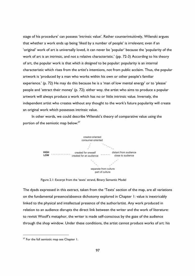
97
stage of his procedure’ can possess ‘intrinsic value’. Rather counterintuitively, Wilenski argues
that whether a work ends up being ‘liked by a number of people’ is irrelevant; even if an
‘original’ work of art is universally loved, it can never be ‘popular’ because the ‘popularity of the
work of art is an intrinsic, and not a relative characteristic.’ (pp. 72-3) According to his theory
of art, the popular work is that which is designed to be popular: popularity is an internal
characteristic which rises from the artist’s intentions, not from public acclaim. Thus, the popular
artwork is ‘produced by a man who works within his own or other people’s familiar
experience.’ (p. 72) He may do this because he is a ‘man of low mental energy’ or to ‘please’
people and ‘attract their money’ (p. 72); either way, the artist who aims to produce a popular
artwork will always produce a work which has no or little intrinsic value. Inversely, the
independent artist who creates without any thought to the work’s future popularity will create
an original work which possesses intrinsic value.
In other words, we could describe Wilenski’s theory of comparative value using the
portion of the semiotic map below:37
The dyads expressed in this extract, taken from the ‘Texts’ section of the map, are all variations
on the fundamental presence/absence dichotomy explored in Chapter 1: value is inextricably
linked to the physical and intellectual presence of the author/artist. Any work produced in
relation to an audience disrupts the direct link between the writer and the work of literature:
to revisit Woolf’s metaphor, the writer is made self-conscious by the gaze of the audience
through the shop window. Under these conditions, the artist cannot produce works of art: his
37 For the full semiotic map see Chapter 1.
Figure 2.1: Excerpt from the ‘texts’ strand, Binary Semantic Model
98
pure intentions are corrupted by the vagaries of public demand. The audience thus represents
difference: any work which attempts to be close to or to please its audience is, by its very
nature, artistically compromised and without value. Consequently, while Wilenski’s theory of
comparative value may be idiosyncratic and difficult to apply in practice, its underlying principles
were based on the fundamental assumptions which underpin the high/low divide. The myth that
texts were inherently high or low – that they possessed or lacked inherent value – is predicated
upon the assumption that high cultural texts were never created with an (mass) audience in
mind, or at least never to satisfy an audience; such an argument begins to falter, however, when
applied to magazines.
Magazines, the ‘ideal reader’, and the ‘aesthetic norm’
Woolf’s unpublished assertion that ‘writing is not the scribbling of sheets on a desert islands
[sic] for the gulls to carry away’38 is especially pertinent when considered in relation to
magazines. While all texts were, at least implicitly, constructed with an audience in mind, the
weekly or monthly nature of magazine publishing meant that both editors and writers needed a
clear idea of the magazine’s target audience. It was, and is, a ruthless business, in which editorial
missteps were swiftly and decisively punished by a decline in sales or a bulging bag of
complaints. Editors, and to some extent their publishers, were responsible not only for deciding
upon the list of contributors, the balance of fiction and non-fiction and the editorial tone, but
also the use of photographs and illustrations, the cover design, page layout, advertising, fonts,
price, and stockists, all of which combined to determine a magazine’s readership. I do not want
to create the impression of exceptionality, or to suggest that magazines were somehow
different to or more ‘outward-facing’ than other forms of literary or cultural production. I
want, in fact, to suggest the opposite: magazines are the rule, not the exception to it. Yet
magazines are the perfect texts with which to demonstrate that all texts were outward-facing,
whether elite or mainstream, original or popular, high- or low-brow. Each magazine represents
the collision of the ‘inside’ and the ‘outside’: unlike with a novel, where there is a (perhaps
erroneous) sense that the ‘work of art’ was created independently and then marketed to an
38 Woolf, ‘“The Patron and the Crocus”: holograph’, p. 1.
99
audience, with a magazine it is impossible to view production and promotion as separate
processes. ‘External’ and ‘internal’ characteristics are inscribed in the same document: one can
see how much the magazine cost, how it was designed, which companies advertised in its pages.
A magazine debunks the myth of the autonomous creative act: even insular and ideological
‘little’ magazines were created with an audience – albeit an elite one – in mind. The price,
design, size and content of a magazine were not coincidental: they were all part of the editor
and publisher’s efforts to create a coherent brand which appealed to their target audience.
Magazines, then, are the ideal artefacts through which to explore how artists and writers
responded, both directly and indirectly, to the public. As Martin Conboy observes in The Press
and Popular Culture, the ‘dialogue between readers and popular newspapers can be literal, as in
the letters pages, or part of the textualization of the readership in the layout, language and
advertising of the newspaper’.39 Although Conboy is referring to newspapers, both the notion
of ‘dialogue’ and the ‘textualization of the readership’ are critical concepts for periodical
studies: in both the Tyro and the Royal explored below, Lewis and Baily entered into a dialogue
with their readers through editorials and more generally through the magazine’s modes of
presentation and circulation. In this chapter, I use Yuri Lotman’s notion of the ‘ideal reader’,
akin to Conboy’s ‘textualization of the readership’, as a way of tracing the type of reader
inscribed in the textual, visual and design elements of a magazine. As we will see below,
Lotman’s theory exposes how a magazine’s language has the power not only to attract but also
to exclude readers; the latter act of exclusion is crucial when it comes to the editorial policy of
‘little’ magazines like the Tyro.
Such analysis centres on what Ann Ardis has termed the ‘internal dialogics of a magazine:
the relationships among and between specific components of any given issue of the magazine,
and the creation of meaning through these juxtapositions.’40 In addition to this focus on each
magazine’s internal dialogics, I also explore their ‘external dialogics: their discursive exchanges
39 Martin Conboy, The Press and Popular Culture (London: Sage, 2002), p. 96. I am grateful to Mark Hampton for his essay, ‘Representing the Public Sphere: The New Journalism and its Historians’, which introduced me to both this quotation and Conboy’s book. See Mark Hampton, ‘Representing the Public Sphere: The New Journalism and its Historians’, in Transatlantic Print Culture, 1880-1940: Emerging Media, Emerging Modernisms, ed. by Ann Ardis and Patrick Collier (Basingstoke: Palgrave Macmillan, 2008), pp. 15-29 (p. 19). 40 Ann Ardis, ‘Staging the Public Sphere: Magazine Dialogism and the Prosthetics of Authorship at the Turn of the Twentieth Century’, in Transatlantic Print Culture, 1880-1940: Emerging Media, Emerging Modernisms, ed. by Ann Ardis and Patrick Collier (Basingstoke: Palgrave Macmillan, 2008), pp. 30-47 (p. 38).
100
with other print media; the mappings of geographical (and temporal) space that they perform as
they claim the territories that they report on, distribute copies to, take advertisements from.’41
While the focus throughout the chapter remains on production (as opposed to circulation or
reception), I use Jan Mukařovský’s theory of the ‘aesthetic norm’ to assess how the form and
content of each magazine was produced as part of a dialogue with its competitors. Broadly
defined, the ‘aesthetic norm’ refers to the prevailing conception of what constituted a work of
art in a given place at a given time.42 Such a definition appears self-evident, but the value of
Mukařovský’s theory, at least in this context, is its emphasis on literary or artistic production as
a dialogic, not a self-contained, process. I will explore the notion of the aesthetic norm in more
detail below; for now, though, it is worth outlining three crucial features of Mukařovský’s
theory:
1. All artistic or literary texts are produced in response to an aesthetic or literary norm.
This response can be a straightforward replication of, or a more complex and critical
engagement with, the norm. Somewhat counterintuitively, Mukařovský’s definition of a
work of art is that which ‘destroys’ existing aesthetic norms: the entire ‘history of art’,
he writes, is ‘the history of revolts against reigning norms’.43 While we might question
the binary distinction Mukařovský draws between the genuine work of art which
‘revolts’ against prevailing norms, and the ‘standardized and repetitious’ ‘creation’ which
‘totally observe[s] an accepted norm’,44 his underlying point still stands: the work of art
or literature is produced in reference to, or rather in dialogue with, an aesthetic or
literary norm.
2. The aesthetic norm is socially constructed: it exists only ‘as a fact of the so-called
collective awareness’. As Mark E. Suino puts it in his ‘Afterword’ to Mukařovský’s
Aesthetic Function, Norm and Value as Social Facts, when we speak of the ‘aesthetic norm’
we ‘are not speaking of an autonomous force, but rather of a social point of view’.45 The
41 Ardis, ‘Staging the Public Sphere’, p. 38. 42 Jan Mukařovský, Aesthetic Function, Norm and Value as Social Facts, trans. by Mark E. Suino (Ann Arbor: University of Michigan Press, 1970), pp. 24-6. 43 Mukařovský, Aesthetic Function, p. 33. 44 Mukařovský, Aesthetic Function, p. 37. 45 Mark E. Suino, ‘Afterword’, in Jan Mukařovský, Aesthetic Function, Norm and Value as Social Facts, trans. by Mark E. Suino (Ann Arbor: University of Michigan Press, 1970), pp. 97-102 (p. 99).
101
‘perceiving public comes to anticipate certain structural or organizational qualities from
art, and thus exerts a normative influence on art.’46 In other words, the process of
normalisation is a social one, dictated by audiences.
3. The norm is open to change and ‘violation’: far from being a fixed set of aesthetic
criteria, it is a ‘process which is constantly being renewed’.47 It ‘changes by virtue of the
fact that it is constantly being re-applied, and it must adjust itself to new circumstances
which arise as a result of these new applications.’48
Taken together, these three features combine to create a theory of cultural production as a
dynamic, dialogic process of negotiation, adaptation and rejection between artists, norms, texts
and audiences. It suggests that an ‘outward-facing’ mode of cultural production is the province
of all texts, whether elite or popular, modernist or mainstream. If, like Suino, we view the
aesthetic norm as a marker of a reader’s expectations, then the artist or writer hoping to
produce a work of art or literature which appealed to a certain audience had – at least
subconsciously – to identify and respond to the aesthetic norm. Depending on the audience
being courted, such a response might take the form of destructing or replicating the norm;
either way, it would require a knowledge of and an engagement with both one’s ‘ideal reader’
and one’s competitors. An awareness of the latter would, in effect, lead to the former: one
could quickly identify the prevailing aesthetic norm by studying the dominant styles of
illustration, typography and layout on display at the bookstall, then pitch one’s own publication
to either fill a gap or provide more of the same.
Thus, although I wanted to focus on a couple of case study publications, I began by
conducting a synchronic study of British magazines in the immediate post-WWI period, from
1919 to 1922. By considering a range of magazines, I could identify not only prevailing aesthetic
norms but also how each publication responded to such norms and each other. I took a broad
approach, focusing on contributors, types of fiction and non-fiction, cover design, internal
layout, typography, use of illustrations and photographs, and the content, design and number of
advertisements. My methodology was inspired by Andrew Thacker and Peter Brooker’s
46 Suino, ‘Afterword’, p. 99. 47 Mukařovský, Aesthetic Function, p. 95. 48 Mukařovský, Aesthetic Function, p. 31.
102
introduction to the first volume of the Oxford Critical and Cultural History of Modernist Magazines
in two respects: firstly, my focus on ‘periodical codes’ (more of which below), and, secondly,
my choice of dates. In their ‘General Introduction’, Brooker and Thacker observe that 1919
was a particularly prolific year for publishing, with the simultaneous appearance of
the [London] Mercury, Arts and Letters, Form, Chapbook, Coterie, The Owl, and Athenaeum. This alerts us to a set
of synchronic relations or possibilities, a sense of the range of magazines an individual writer or illustrator
could contribute to at any one time. It also indicates clusters of magazines running concurrently with an
awareness of each other, in an overlapping or complementary relation, but frequently in a relation of rivalry
and competition, even if this was sometimes cooked up to boost sales.49
Brooker and Thacker’s focus on ‘synchronic relations’ is vital if we are to understand how
magazines engaged with one another. Their list of ‘little’ magazines, however, only tells part of
the story. As Patrick Collier observes in Modernism on Fleet Street, there were ‘more than
50,000 periodicals being published in Great Britain in 1922’.50 To focus only on modernist
publications presents rather a skewed perspective of British print culture; as Ann Ardis, after
Michael North, argues, ‘we risk preserving modernism “in intellectual amber,” retrospectively
accomplishing “by critical consensus” modernism’s “insulation from the cultural world into
which it was introduced,” unless we acknowledge its original simultaneity with other aesthetic
practices’.51 In this chapter, I argue that little magazines did not just appear alongside more
popular periodicals: the former were consciously produced in opposition to the latter. By only
viewing modernist magazines in isolation, we fail to identify the range of aesthetic norms
circulating within the public sphere, or to analyse how modernist magazines sought to reject
and challenge such norms. Little magazines did not exist in a vacuum: it is necessary, therefore,
to situate such texts in relation to the mass-market magazines against which the little magazines
were consciously situating themselves.
Yet this act of ‘situating’ little magazines is not the only reason for considering popular
periodicals alongside modernist ones: this comparative approach allows us to consider the ways
in which all publications attempted to attract their ‘ideal reader’. In that sense, such analysis
allows us to close the gap between modernist and popular magazines, or, at least, to challenge
the notion that little magazines were produced without an audience in mind. I am wary,
49 Brooker and Thacker, ‘General Introduction’, p. 22. 50 Collier, Modernism on Fleet Street, p. 202. 51 Ann Ardis, ‘The Dialogics of Modernism(s) in the New Age’, Modernism/modernity, 14.3 (2007), 407-34 (p. 409).
103
however, of reifying the little magazine and using it as the high watermark of periodical
achievement: popular magazines should be read and evaluated in their own right, not as context
for, or a piquant contrast to, modernist magazines. Although I focus on the years 1919 to 1922,
seen as modernism’s annus mirabilis, I do not want just to contextualise this moment of
modernist creativity. The immediate post-war period is of interest for its two, apparently
contradictory trends: firstly, the explosion in both popular and elite publishing; secondly, the
existential crisis in publishing. As Arthur Gideon, the intellectual anti-hero of Rose Macaulay’s
tragi-comic press satire Potterism, observes, 1919
was a queer, inconclusive, lazy, muddled, reckless, unsatisfactory, rather ludicrous time. It seemed as if the
world was suffering from vertigo. I have seen men who have been badly hit spinning round and round madly,
like dancing dervishes. That was, I think, what we were all doing for some time after the war—spinning round
and round, silly and dazed, without purpose or power.52
The end of the war and the ensuing peace seemed to result in an air of gaiety bordering on
delirium, a delight in new freedoms tinged with indecision. Editors and publishers had to
respond quickly to the new post-war mood, but, as Francis Baily recalls, the ‘subject matter,
style, and so on which had served them [male writers] very well before the war were
comparatively useless after it.’53 Writers and editors were ‘all equally at sea as to what the
public wanted in the way of writing and illustrations.’ (p. 157) War stories quickly gave way to
what Baily called ‘the “leg” period’ – the first appearance of ‘girls’ legs’ in fiction, articles,
photographs and illustrations – but he realised this ‘mania for legs and all that they implied
could not go on for ever’ (pp. 155-7). Consequently, Baily ‘began building up [his] magazine
from the purely frivolous state in which [he] found it into something with more than a merely
superficial interest.’ (p. 158) Such a process was ‘very difficult at first’, however, ‘because every
other magazine was doing the same, new magazines were being produced, and the competition
for contributors worth buying became very keen.’ (p. 158)
Baily’s reminiscences and Macaulay’s fictional assertions paint a picture of a publishing
world in flux. Perhaps for the first time in their career, writers and editors ‘had more or less to
start all over again’ (p. 157). They had to reach out to and ‘psycho-analyse’ both new and old
52 Rose Macaulay, Potterism (New York: Boni & Liveright, 1920), p. 46. 53 Baily, Twenty-Nine Hard Years’ Labour, p. 157. All further references are to this edition and are included parenthetically in the text.
104
readers, either men returning home from the war physically or emotionally scarred, or women
whose lives had been fundamentally changed by the conflict. There was a huge increase in
working women during the First World War: 1,345,000 more women were employed in July
1918 than in July 1914, with the biggest increases in industry (792,000) and commerce
(492,000) and the only decrease in domestic service (-400,000).54 After the War, many women
were replaced by returning men, but there was still a rise in female employment from pre-war
levels: women represented 30.75% of the total workforce in manufacturing in July 1914; in July
1920, the total was 32.24%.55 The rise was steeper in other areas: in banking and finance, the
percentage rose from 5.12% in July 1914 to 26.42% in July 1920; in commerce, it rose from
28.82% in July 1914 to 41.68% in July 1920.56 As Sallie Heller Hogg points out, this rise may in
part be explained by local shortages of men, but the war nevertheless led to innovations in the
types of work women were permitted to do (doctors, surgeons, police officers, insurance
agents) that were not revoked in peace time.57 Even for those who did not take up employment
during the war, or who left employment after it, the lack of young men to marry and domestic
servants to hire would have affected both women’s opportunities and domestic arrangements.
The task of appealing to these readers’ new concerns and preoccupations ‘came down in the
last event to the editor’ (p. 157); as such, editors required a greater knowledge of both their
public and their competitors than ever before. Consequently, popular magazines like the Royal
are the perfect volumes which with to consider how magazines responded to aesthetic norms
in the interwar period. To Brooker and Thacker’s list, I thus added the Royal, alongside three
other influential popular periodicals: the London Magazine, Lloyd’s, and the Strand (Figure 2.2).
54 Sallie Heller Hogg, ‘Employment of Women in Great Britain, 1891-1921’ (unpublished doctoral thesis, University of Oxford, 1967), p. 170. 55 Heller Hogg, ‘Employment of Women’, pp. 215, 220. 56 Heller Hogg, ‘Employment of Women’, p. 220. 57 Heller Hogg, ‘Employment of Women’, p. 220-21.
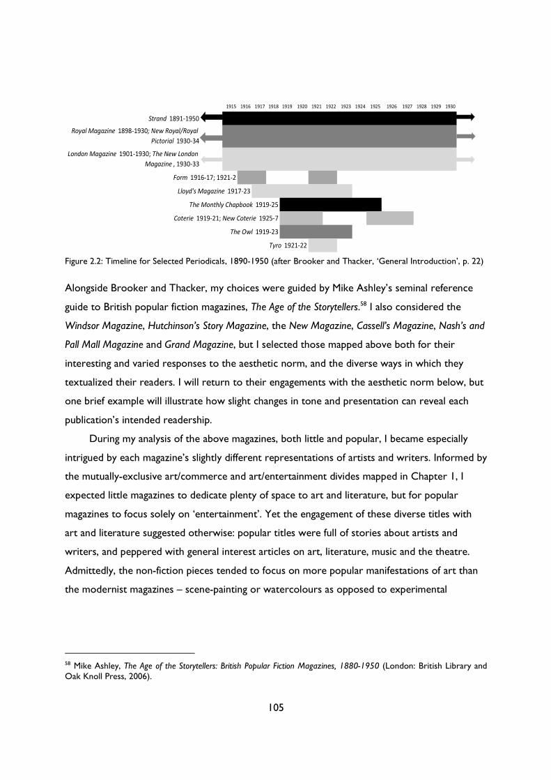
105
Alongside Brooker and Thacker, my choices were guided by Mike Ashley’s seminal reference
guide to British popular fiction magazines, The Age of the Storytellers.58 I also considered the
Windsor Magazine, Hutchinson’s Story Magazine, the New Magazine, Cassell’s Magazine, Nash’s and
Pall Mall Magazine and Grand Magazine, but I selected those mapped above both for their
interesting and varied responses to the aesthetic norm, and the diverse ways in which they
textualized their readers. I will return to their engagements with the aesthetic norm below, but
one brief example will illustrate how slight changes in tone and presentation can reveal each
publication’s intended readership.
During my analysis of the above magazines, both little and popular, I became especially
intrigued by each magazine’s slightly different representations of artists and writers. Informed by
the mutually-exclusive art/commerce and art/entertainment divides mapped in Chapter 1, I
expected little magazines to dedicate plenty of space to art and literature, but for popular
magazines to focus solely on ‘entertainment’. Yet the engagement of these diverse titles with
art and literature suggested otherwise: popular titles were full of stories about artists and
writers, and peppered with general interest articles on art, literature, music and the theatre.
Admittedly, the non-fiction pieces tended to focus on more popular manifestations of art than
the modernist magazines – scene-painting or watercolours as opposed to experimental
58 Mike Ashley, The Age of the Storytellers: British Popular Fiction Magazines, 1880-1950 (London: British Library and Oak Knoll Press, 2006).
1915 1916 1917 1918 1919 1920 1921 1922 1923 1924 1925 1926 1927 1928 1929 1930
Strand 1891-1950
Royal Magazine 1898-1930; New Royal/Royal
Pictorial 1930-34
London Magazine 1901-1930; The New London
Magazine , 1930-33
Form 1916-17; 1921-2
Lloyd's Magazine 1917-23
The Monthly Chapbook 1919-25
Coterie 1919-21; New Coterie 1925-7
The Owl 1919-23
Tyro 1921-22
Figure 2.2: Timeline for Selected Periodicals, 1890-1950 (after Brooker and Thacker, ‘General Introduction’, p. 22)
106
woodcuts or sculpture – but these articles do complicate the simple art/commerce divide.59
The fiction pieces which featured artists or writers as (anti)heroes are particularly of interest:
the representation of such figures reveals each magazine’s target audience and their attitudes
towards the art world. In other words, these stories formed a crucial part of each magazine’s
implicit ‘textualization of their readership’. The London Magazine, for instance, adopted a
reverential attitude towards artists and writers as romantic heroes; the Strand, on the other
hand, saw artists as figures of fun, such as in the memorable ‘Brown of Boomoonoomana’
where an impoverished young writer steals a shoulder of mutton and is chased around London
by the police.60
These fictional divergences reveal the different audiences each magazine attempted to
attract. During the early 1920s the Strand was a resolutely ‘middlebrow’ affair in the
Wodehousian vein, full of madcap farces and gentle parodies of the moneyed or the cultured.
As such, it appealed to more of a cross-gender, middle-class audience than magazines such as
the London, which was aimed at female, lower-middle-class readers. The London’s fiction
constructs an image of its ‘ideal reader’ as more aspirational than the middle-class female
readers courted by Lloyd’s or the Grand: in its art stories, the artist or writer or theatre
director is portrayed as noble and courageous; in each instance, their courage is rewarded
when a rich patron or resourceful woman comes to the rescue.61 The stories end happily when
– and only when – the creative genius can also make money; a utopian dream reflected in, or
perhaps dictated by, the proliferation of advertisements for correspondence courses to teach
readers how to write or draw for the magazines. In the September 1920 issue the magazine ran
two lead stories whose heroes were artists or writers;62 in the same issue, they ran two
prominent advertisements for drawing and writing courses (Figures 2.3 and 2.4).
59 See, for example, Winston Churchill, ‘Painting as a Pastime’, Strand, December 1921, pp. 535-544 or Reginald Pound, ‘Fifty Years of Scene Painting: An Interview with Mr. Joseph Harker’, Strand, February 1921, pp. 173-178. I discuss the modernist art/commerce divide in detail in Chapter 3 below. 60 Morley Roberts, ‘Brown of Boomoonoomana’, Strand, March 1921, pp. 207-219. 61 See, for instance, A. M. Burrage, ‘Derelicts’, London Magazine, July 1921, pp. 437-443 or Lloyd Williams, ‘The Woman Who Lost Her Wedding Ring’, London Magazine, September 1920, pp. 3-17. 62 See Williams, ‘The Woman Who Lost Her Wedding Ring’ and Robert W. Sneddon, ‘Bonds of Bohemia’, London Magazine, September 1920, pp. 81-87.
107
Such advertisements promised ‘Special training’ to become either a ‘Successful Writer’ or a
‘successful Artist’.63 Such success was no longer limited to an elite few; even those with the
slightest amount of ‘literary talent’ could earn ‘Plenty of money […] by writing articles and
short stories for the papers’.64 Success here, as in the magazine’s fiction, was firmly aligned with
money: students were encouraged to study art not for art’s sake, but rather to supplement
their income, as in this advertisement for Associated Fashion Artists from October 1921
63 Advertisement for London Correspondence College, London Magazine, September 1920, p. xxv; Advertisement for John Hassall School, London Magazine, September 1920, p. xxiii. 64 Advertisement for London Correspondence College, p. xxv.
Figure 2.3: Advertisement for London Correspondence College, London Magazine, September 1920
Figure 2.4: Advertisement for John Hassall School, London
Magazine, September 1920
108
(Figure 2.5). Fashion drawing, the advert proclaims, ‘does not
require years of hard study such as other branches of art before
you realise any compensation’. Instead, students would be
‘assist[ed]’ to sell this ‘lucrative art work […] as soon as they are
proficient’.65 For the London’s aspiring lower- to-middle-class
readers, the speed and ease with which they could supplement
their income must have been an attractive proposition, one
consistently made more desirable through the magazine’s fictional
offerings.66
From this initial analysis of the London’s internal and
external dialogics, we can see how the magazine’s fiction was
influenced by its advertisements (and, presumably, vice versa),
and how both were shaped by audience expectations and the
tone of competing publications. To examine this complex constellation of writers, editors,
advertisers and readers in more detail, the rest of the chapter is devoted to a close comparison
of two exemplary magazines: the Tyro and the Royal. These magazines appear to reside at
opposite ends of the print culture spectrum: where the Tyro was the typical short-lived,
experimental ‘little’ magazine, with a tiny circulation and a small circle of contributors, the
‘standard illustrated popular magazine’ the Royal was in comparison a behemoth, reaching over
150,000 readers and with a publication history dating back to 1891.67 The differences between
each magazine extend from the type, length and tone of their fictional and non-fiction pieces to
their price, binding, frequency and conditions of publication: in both their form and content,
these texts appear to encapsulate the differences in form and content between magazines
traditionally categorised as ‘little’ and ‘popular’. These categories roughly map onto the notions
65 Advertisement for Associated Fashion Artists, London Magazine, October 1921, p. xxxi. 66 In Figure 1, it is interesting to note that the advertisement for London Correspondence College sits next to one for wedding rings – surely a piece of inspired promotion in light of the later story about a struggling creative and his wife who ‘lost her wedding ring’. 67 The term ‘standard illustrated popular magazine’ is Mike Ashley’s: see Age of the Storytellers, p. 18 for more on the distinction he draws between standard, slick, digest, pocket-book and tabloid publications. He describes the ‘standard’ as the ‘size and format adopted by the regular magazines from The Strand [sic] onwards. Most of these were printed on high quality coated paper (though many had to reduce to newsprint during the First World War). They usually have substantial advertising sections fore and aft. […] The standard size was 240 x 165 mm though some may be slightly smaller.’ (Ashley, Age of the Storytellers, p. 18)
Figure 2.5: Advertisement for Associated Fashion Artists, London Magazine, October 1921
109
of ‘high’ and ‘low’ culture outlined in Chapter 1, although it is worth noting that the ‘popular’
here denotes a vast and varied field of cultural production, ranging from pulp to illustrated
fiction to slick magazines. Such a field thus includes texts that align more closely with our
conception of the middle- as well as the low-brow, although categorising a magazine as either is
fraught with difficulty. As we saw in Chapter 1, the categories of high, middle and lowbrow are
always relative, transient and contingent: this reliance upon context makes it difficult to ‘apply’
them to cultural objects. With magazines, however, one encounters several additional layers of
difficulty: magazines are a diverse collection of different types of texts with different functions,
some of which one might class as ‘high’ and some as ‘low’. The magazines also differ from issue
to issue or volume to volume, depending on their editor, publisher, contributors, financial
situation and broader conditions of social, economic and political change. In his book, Re-
Covering Modernism, David M. Earle notes that the American magazine the Smart Set has
variously been categorised as ‘both an avant-garde magazine and a pulp magazine’.68 For Earle,
these wild differences in classification reveal the purely rhetorical nature of the ‘border
between elite modernism and popular modernism’. This distinction between elite/popular
loses some of its power when we consider the thousands of magazine titles and styles below the miniscule
upper cultural strata of little magazines and smart magazines: the slicks like Saturday Evening Post and McCall’s,
the trade magazines, the specialty magazines, and, at the lowest end of the spectrum, the all fiction and pulp
magazines. Under scrutiny, the differentiation breaks down; it is itself a product of the modernist practices of
exclusion on the part of the publishers, academy, and the artists themselves.69
While I agree with Earle’s contention completely, it is nonetheless useful to retain this split
between the ‘elite’ or ‘little’ and the ‘popular’, at least to be able to interrogate it further and
reveal the value judgements contained within. As we will see below, the key distinction
between ‘little’ and ‘popular’ magazines had less to do with content and more to do with their
attitude towards audiences; in other words, the binary between the inward-facing and outward-
facing models of literary production.
By analysing how each magazine engaged with aesthetic norms and entered into a dialogue
with its ideal reader, I aim to complicate the simple binary between creator-oriented and
68 David M. Earle, Re-Covering Modernism: Pulps, Paperbacks and the Prejudice of Form (Farnham, Surrey: Ashgate, 2009), p. 20. On a similar note, Dean Baldwin remarks that in the magazine world the ‘line between highbrow and middlebrow is extremely difficult to draw and in the end must be arbitrary.’ See Dean Baldwin, Art and Commerce in the British Short Story: 1880-1950 (London: Pickering & Chatto, 2013), p. 68. 69 Earle, Re-Covering Modernism, p. 64.
110
consumer-oriented modes of production, challenging the link between perceived creative purity
and literary or artistic value. I begin by exploring the ‘internal dialogics’ of each magazine by
both performing close readings of articles and considering the magazine’s contents more
broadly; in the following section, I move on to the ‘external dialogics’ of each magazine,
comparing and contrasting each magazine’s cover design and internal layout. In each case, I
argue that differences in the form and content of each magazine were caused less by ‘essential’
qualities, either within those producing the magazine or in its methods of production, and more
by the need to attract and maintain different audiences.
The ‘little’ and the ‘popular’
As in the London Magazine, an examination of ‘art stories’ in the Royal and the Tyro reveals how
each magazine used fiction to orient itself towards a particular type of reader. In this section, I
compare two quintessential ‘art stories’ from each publication: Wyndham Lewis’s ‘“Tyronic
Dialogues.—X. and F.”’ from the second (and last) issue of the Tyro (1922); the second,
‘Gossamer for Goddesses’ by Robert Magill, featured in the Royal (January 1921). The following
extracts are from the beginning of each story: the first Lewis’s ‘Tyronic Dialogues’, is followed
by Magill’s ‘Gossamer for Goddesses’.
[Two forms in dark tweed coats are seen gesticulating against a large blank canvas on which the sun’s breakfast
light is flowing. As the dialogues advance the canvas is noticed to be gradually darkening and to be becoming a
picture.]
X.—Remember, my dear F., that you are for every man a little picture of himself: a badly drawn and
irritating picture of himself. Therefore, never show that you notice. Above all, never be so
uncircumspect as to praise it. For the man so treated will say: “F., I was told, has said something nice
about my work. The dirty dog! I suppose he means people to think that my work is so contemptible
that he can afford to praise it. Or is his game to suggest that I am a follower of his? Or does he intend
to sell that drawing of mine that he gave me £5 for, and is he stimulating the market? Or does he just
wish to strut down the street with a nice feeling of being generous and grand? In any case, he wishes
to belittle me either by giving himself a cheap extra two inches, or by chipping an inch or two of me by
making me appear inoffensive. Any way, the dirty dog, I’ll pay him, I will!”
F.—But what are you to say if a man shows you a painting that you consider good?
X.—My dear F.—Fool! And that so rarely happens!
F.—But should it happen, what is to be done?
111
X.—To remain on good terms with your fellow artists you must explode with derisive invective: sneer a
little or whatever is expected of you. That will be reported to them and they will feel that all is well:
that you appreciate them.70
As an artist, Edgar Pritchard hated “7’s” and “4’s.” They were crude, mechanical things, and he much
preferred the lordly rotundity of an “8” or the subtle curves of a “6.” Wherefore he employed an agent to
sell his sketches. It was always a matter of wonder to him how Richard Webb, the aforesaid agent, could
calculate in his head how much fifteen per cent. of eleven guineas came to. He had tried to do it himself,
with a lot of pens and paper, but as he would use curly figures in preference to straight ones, he always got
it wrong. He received a cheque from Webb every Friday, spent it by the next Friday, and then went to get
another.
The cheque was seldom for more than a ten-pound note or so, although Edgar’s sketches sold fairly
well as covers for magazines. One week there were not so many figures on the cheque as usual.
Said Webb: “The editor of Simpson’s would only spring a fiver for that last cover you did. I did my best
for you, but, as he said, there’s getting to be a good deal of sameness about your work. You want to find
something fresh.”
Edgar was disagreeably surprised.
“I don’t quite follow,” said he. “The subjects vary enough, don’t they?”
“Oh, the ideas are all right,” said the agent. “The trouble is that all the sketches seem to be of the
same girl. You ought to change your model occasionally.”
“I don’t use a model,” said Edgar. “I do all of those faces out of my own head.”
“Do you? Well, I’ll give you some advice. Find the girl who’s put them there, and either murder her, or
marry her, so as to get her off your mind. Otherwise you’ll be copying wall-papers at eighteenpence an
hour before twelve months are out.”71
Even in the course of these short extracts there are a plethora of differences. Although each
excerpt satirises the modern artist, there are undeniable formal, stylistic and ideological
differences between the two. In his first sentence, Magill tells us our hero’s full name, his
occupation, and gives us an insight into his character. From his quirky approach to numbers, we
begin to construct an image of Edgar as a hapless, even absurd comic figure, but Magill’s jaunty
tone and pseudo-poetic turns of phrase (‘lordly rotundity’) creates the impression that,
although inept, Edgar is a decent and likeable fellow. Edgar may be a figure of fun, but he is a
sympathetic one. In contrast, Lewis eschews conventional methods of description in favour of
stage directions. Unlike Magill, who uses his first sentence for characterisation, Lewis uses his
first sentence to set up the piece’s dramatic context and subject: namely, the art world. We are
not told that his characters are artists, but the fact that they are standing ‘gesticulating’ in front
70 Wyndham Lewis, ‘“Tyronic Dialogues.—X. and F.”’, Tyro, 2, 1922, pp. 46-49 (p. 46). All further references are to this edition and will be included parenthetically in the text below. 71 Robert Magill, ‘Gossamer for Goddesses’, Royal Magazine, January 1921, pp. 239-244 (p. 239). All further references are to this edition and will be included parenthetically in the text below.
112
of a ‘large blank canvas’ tells us that they are members of an artistic circle. Aside from their
attire (‘dark tweed coats’), we know little about Lewis’s characters. They are not named except
for their initials (X. and F.) and their description as ‘Two forms’ creates an impression of
dehumanisation, of types as opposed to actual individuals. When the characters do speak, their
tone and the content of their discussion is cerebral and ideological, not emotional: we learn
more about their milieu than about X. and F. themselves. The characters use slang and there is
a colloquial tone, but one devoid of any warmth. Their utterances are deeply cynical: these are
highly educated men but they are cold, superficial and sarcastic.
These initial differences in characterisation reflect wider disparities in form and genre. For
his part, Magill adopts a traditional short-story format: a plot with a beginning, middle and an
end, recognisable characters, and a mix of description and dialogue. Unlike Lewis’s more
intellectual, ideological dialogue, in ‘Gossamer’ the dialogue is used primarily to move the plot
along. The above exchange between Edgar and his agent sets up the scenario for the entire
story: Edgar needs to find the girl populating his pictures and ‘either murder her, or marry her’.
From the piece’s tone, it is safe to assume that Edgar will choose the latter, and so from just
this short extract it is possible to identify the story’s plot, genre and its probable ending. Lewis,
on the other hand, rejects plot, characterisation and context in favour of a dialogue. Writing in
the Encyclopaedia Britannica in 1911, Edmund Gosse observed that the dialogue ‘has always been
a favourite with those writers who have something to censure or to impart, but who love to
stand outside the pulpit’.72 Lewis, infamous provocateur and ‘bombardeer’, can hardly be
accused of reticence, but the use of the dialogue form allows him to satirise members of the
artistic community (in particular, the Bloomsbury set) without needing to resort to the kind of
explicit criticism or invective that populated the pages of Blast. Written as a dialogue, the
conversation appears to be a record, albeit an exaggerated one, of the types of exchanges that
occur between the vacuous individuals that inhabit the contemporary artistic milieu. Each tyro
appears to speak for himself, and, in doing so, unwittingly reveals the depths of his own
stupidity. It is a humorous piece, but very dark, and it would have required an enormous
amount of cultural capital for one to find it amusing.
72 Edmund Gosse, ‘Dialogue’ in The Encyclopaedia Britannica: A Dictionary of Arts, Sciences, Literature and General Information, 11th edn., 29 vols (Cambridge: Cambridge University Press, 1911), VIII, pp. 156-157 (p. 156).
113
This need for cultural capital is one of the key differences between ‘Gossamer’ and
‘“Tyronic Dialogues”’. Before being able to understand – or to laugh at – ‘“Tyronic Dialogues”’
the reader would have needed knowledge of what Lewis termed a ‘tyro’, of contemporary
artists and their circle, and, ideally, of Lewis’s clashes with them. The piece does not stand
alone: one needs to have read the first issue of Tyro, to have visited his exhibition ‘Tyros and
Portraits’, or to have read his interview in the Daily Express, in which he explains that a tyro is
‘raw and undeveloped; his vitality is immense, but purposeless, and hence sometimes
malignant’,73 in order to have a chance of understanding what, or whom, Lewis is satirising.
Frankly, readers may have had difficulties even then; his description in Tyro 1 of tyros as
‘immense novices’ who ‘brandish their appetites in their faces, lay bare their teeth in a
valedictory, inviting, or merely substantial laugh’ does little to aid comprehension.74 Only by
taking the rhetorical writings, the dialogue and his pictures such as Mr Wyndham Lewis as a ‘Tyro’
(1920-21) and A Reading of Ovid (Tyros) (1920-21) can one begin to build up a picture of this
hazy, repugnant figure of the tyro as part halfwit and part schemer.75
In contrast, readers of ‘Gossamer’ required little or no knowledge of the art world.
Magill’s short story has a simple structure and clearly elucidated characters which veer towards
stereotype. As an artist, Edgar is predictably incompetent when it comes to business matters,
but Magill does subvert the reader’s expectations by describing him as ‘not a little bit like the
usual impression of an artist, with long hair, and an atmosphere of having breakfasted on rose-
clouds instead of eggs and bacon’ (p. 239). Instead, Edgar was ‘short and dapper, neatly dressed,
liked pickles, and was a keen motorcyclist’ (p. 239). This amusing description is characteristic of
73 Wyndham Lewis, quoted in Paul O’Keefe, Some Sort of Genius: A Life of Wyndham Lewis (London: Pimlico, 2001), p. 229. 74 Wyndham Lewis, ‘A Note on Tyros.’, Tyro, 1, 1921, p. 2 (p. 2). 75 Lewis may have also expected his audience to be familiar with the figure Tyro from Greek mythology, although his conception of the tyro differed sharply from the figure described, for instance, in Homer’s Odyssey, in which Tyro is a princess ravaged by Poseidon and has two sons by him (Book XI, 235-59). See Homer, The Odyssey, Greek text with an English translation by A. T. Murray (Cambridge, MA: Harvard University Press, 1919). Available at http://thecantosproject.ed.ac.uk/index.php/c2-in-a-draft-of-16/ii-sources/118-tyro-odyssey-xi [accessed 18 May 2017]. Ezra Pound also refers to the Tyro myth in Three Cantos and Canto II and IV; see Roxana Preda, The Online Companion to The Cantos of Ezra Pound, II: n.4, The Cantos Project. Available at http://thecantosproject.ed.ac.uk/index.php/c2-in-a-draft-of-16/ii-poem [accessed 18 May 2017]. For more on the relationship between Lewis and Greek mythology, especially in relation to the notion of the tyro, see Kitty Hudson, ‘Wyndham Lewis’s A Reading of Ovid (Tyros): The Classical and the Modern’, Journal of Wyndham Lewis Studies, 4 (2013), 18-40 (pp. 21-24).
114
Magill’s light touch throughout: he seems aware of the stereotypes with which he engages, and
works to gently subvert them. For the reader, while a prior knowledge of the artist’s reputation
as high-minded but wholly impractical may have increased the humour, such knowledge was not
necessary. Magill describes the usual image of the artist so that readers can appreciate why
Edgar is different. He plays with the stereotypical myth of the artist as a romantic genius and
portrays him as a Wodehousian well-intentioned fool, one who vows to keep to a strict
sketching schedule to make enough money to marry his level-headed sweetheart, only to get
distracted by sharpening pencils or going out to ‘see how Burnham Beeches looked in the
sunshine’ (p. 240).
In both pieces, the artist is the source of the humour, but, unlike in Lewis’s diatribe,
Magill’s subject is not the art world. Edgar is an artist not because Magill wants to make a
comment on contemporary art or artists, but rather because an artist makes for a sympathetic
romantic hero. Art is the backdrop in front of which the romance unfolds: it provides the
starting point from which Magill can produce a couple of unexpected twists. A wealthy client
notices Edgar’s talent for sketching beautiful imaginary dresses and so employs him to work in
his fashion house, only to discover that, when explicitly tasked with designing dresses, Edgar
fails to produce anything original. At his wits’ end, his patron retypes a short story from the
Daily Gazette and asks Edgar to illustrate it, upon which point he ‘began to produce some really
new designs in women’s clothing’ (p. 243), makes a fortune and gets his girl.
This portrayal of Edgar as an original but unwitting genius perhaps does little to subvert
any myths about artists, but the amusing twists and affectionate tone make it a charming
romantic comedy – one that just happens to be about art. Conversely, ‘“Tyronic Dialogues”’
has to be about art. Purposefully devoid of plot and characterisation as a comment upon post-
war dehumanisation, the dialogue’s primary aim is to ridicule the art world. As the dialogue
progresses, it widens its scope to take in society as a whole: Lewis’s reviled Bloomsbury
adversaries come to embody the disease pervading modern culture. Modern life is a ‘nightmare,
staged in a menagerie’, haunted by grotesquely grinning figures who want nothing more than to
‘batter subterraneously at you, and at each other’ (p. 47). It is a world of subconscious violence,
where hypocrisy, retaliation and ‘putrid gossip’ prevail (p. 49). Unable, or unwilling, to face the
horrors of war, artists are little more than automatons: empty, nameless figures blindly
following the same routines and spouting the same stories, too afraid to turn within, ‘for in
115
themselves imagination or effort awaits them’ (p. 49). It is a troubling, unsettling piece, one
without a simple message or target for its satire. Lewis evidently despises X. and his cynical
pronouncements, but the piece seems to end with a hint of self-identification. X, like his fellow
artists, may be a machine, but at least he is alive, seemingly aware of the absurdity of modern
life and yet powerless to do anything about it, ‘beholden’ as he is ‘to machines that are asleep’
(p. 49). This last line seems to speak of Lewis’s own frustration with the prevailing English
aesthetic conservatism; indeed, Scott W. Klein observes that ‘“Tyronic Dialogues”’ provides an
early example of Lewis’s ‘developing conception of the solitary self and the oppositional artist’,
one that is explored more fully in his later work.76
However confused, Lewis’s satire, ‘“Tyronic Dialogues”’ is clearly trying to make an
ideological point about the contemporary art world in a way that Magill simply was not. This is
not to criticise ‘Gossamer’ – it is a fresh and enjoyable romantic comedy – but the two sought
to perform different functions for contrasting audiences: while ‘Gossamer’ sets out to entertain,
‘“Tyronic Dialogues”’ displays a heady mix of ideological, satirical and political functions. The
presence of dark humour suggests that Lewis’s piece was intended to entertain, but this
function is subordinated to its ability to attack, criticise and expose the hypocrisy at the heart
of the art world. Neither story could have appeared in the other magazine, not because either
story was not ‘good’ enough but rather because each one engaged with (or challenged)
different aesthetic, or in this case, literary norms in order to attract a specific audience. Where
‘“Tyronic Dialogues”’ sets out to challenge Edwardian literary norms, ‘Gossamer’ replicates
them: the latter has a simple plot with a few pleasing twists, a happy, neat resolution, likeable
characters, lively, colloquial dialogue, and some humorous turns of phrase (‘his one signet-ring
was neat, yet not gaudy, like the National Anthem’ [p. 244]). In her 1931 article on the ‘Modern
Newspaper’ in the Radio Times, Winifred Holtby wrote that ‘[b]rief and bright is the modern
motto’ of the newspaper ‘edited to entertain’:77 the same could also be said of Baily’s Royal. It is
cheerful, simple and undemanding, accessible and (potentially) enjoyable for all.
76 Scott W. Klein, ‘The Tyro: An Introduction’, The Modernist Journals Project. Available at http://modjourn.org/render.php?id=mjp.2005.00.103&view=mjp_object [accessed 14 April 2015]. 77 Winifred Holtby, ‘Modern Newspaper: Edited to Entertain’, ed. by Patrick Collier, in Gender in Modernism: New Geographies, Complex Intersections, ed. by Bonnie Kime Scott (Urbana: University of Illinois Press, 2007), pp. 209-15 (p. 210).
116
In particular, ‘Gossamer’ spoke to the growing young, lower-to-middle-class female
market that fiction magazines such as the Royal aimed to capture.78 Although it began life in
1898 with ‘violent’ articles and stories which attracted a ‘predominantly male readership’,
successive changes in editorship meant that by 1906 its audience was predominantly female.79
Under F. E. Baily’s editorship, the magazine moved away from violence and towards humour
and romance: above all, the Royal attempted to delight and amuse its readers with a mix of light-
hearted and sentimental fiction; whimsical illustrations, jokes and cartoons; and lively
photographic features about stars of the stage and screen.80 Such whimsy should not be
mistaken for triviality, however: as stories such as ‘Gossamer’ show, the magazine was primarily
concerned with the trials and triumphs of the soon-to-be emancipated New Woman. Edgar
might be the main character, but the story’s real heroine is Pauline, the no-nonsense business-
woman whose common and financial sense far outstrips Edgar’s. She will not be passively
wooed: she makes Edgar work for her hand and when they finally come together it is as equal
partners in both business and in life.
‘Gossamer’ can thus be read as a quintessential Royal piece of the early 1920s. With its
light touch, gentle subversion of expectations and strong, independent female characters, it
combines existing literary norms with a modern preoccupation with women’s emancipation,
political and otherwise. Mike Ashley observes that under Baily the Royal ‘found its niche as the
voice of the woman’s movement’:81 in that sense, we can read the Royal as a more popular
version of Dora Marsden’s feminist, modernist periodicals the Freewoman/New Freewoman or
the newly-launched Time and Tide, first published in 1920.82 As Catherine Clay has shown, Time
and Tide was marketed as a ‘high class women’s weekly’, as indicated by its advertisements for
‘cultural products’ as opposed to the foodstuffs, clothes and toiletries we see in the Royal
78 ‘Slick’ women’s magazines had yet to become ubiquitous in the early 1920s (the British edition of Good Housekeeping, the paradigmatic women’s monthly, did not appear until 1922), and so ‘standard illustrated popular magazines’ such as the Royal or its progenitor Pearson’s were still popular choices among young British women in 1921. 79 See Mike Ashley’s excellent introduction to The Royal Magazine in Age of the Storytellers, pp. 181-187. 80 Ashley, Age of the Storytellers, p. 184. 81 Ashley, Age of the Storytellers, p. 184. 82 Mark S. Morrisson discusses the Freewoman/New Freewoman/Egoist in The Public Face of Modernism: Little Magazines, Audiences, and Reception 1905-1920 (Madison: University of Wisconsin Press, 2001), pp. 84-116; Catherine Clay examines Time and Tide’s cultural positioning in reference to its advertising in her article ‘“WHAT WE MIGHT EXPECT – If the Highbrow Weeklies Advertized like the Patent Foods”: Time and Tide, Advertising, and the “Battle of the Brows”’, Modernist Cultures, 6.1 (2011), 60-95.
117
(Table 1).83 Articles on the ‘woman question’ published in the Royal tended to focus more on
the private than the public sphere, emphasising the domestic above more explicitly socio-
political topics. Yet these domestic articles were not the instructional pieces one might expect
in a ‘women’s magazine’: they tackled big, often controversial articles such as divorce, parenting
and the role of the modern woman. In November 1920, Michael Annesley wrote a deliberately
provocative article in praise of ‘Bohemia’ as opposed to ‘Suburbia’, arguing that the latter
turned a wife into a ‘tear-drenched, complaining creature who works herself to a shadow doing
unnecessary housework’; elsewhere, A. Maude Royden, a ‘well-known woman preacher and
lecturer’, wrote on the perils of an unhappy marriage and advocated divorce.84 In the same issue
as ‘Gossamer’, the first in a series of articles by Elinor Glyn entitled ‘How I Would Bring Up a
Girl’ implored young girls and their parents to value critical thinking, common sense and good
taste as much as external beauty. In phrasing which pre-empts Woolf’s A Room of One’s Own,
Glyn writes that the mark of the modern, accomplished young woman was her ‘brilliantly
polished’ mind, a mind that has been ‘trained so that she can decide for herself the best’.85
Throughout the 1920s, then, the Royal’s fictional heroines and the subjects of the non-
fiction articles are sensible, independent women capable of making their own decisions. True,
much of the fiction was romantic, but the heroines were not vulnerable, passive damsels waiting
to be rescued. Variations upon the plot of ‘Gossamer’ – romantic but inept artists being saved
by level-headed business-women – reappeared dozens of times during this period: we could
think of Jean Fraser’s ‘One Little Hour’ (March 1921), in which an artist refuses to compromise
on his artistic ideals and thus loses the love of his life, or Christine Castle’s ‘White Hyacinths’
(February 1921), in which the exotically-named Desirée Foster convinces her idealistic writer
beau Dicky to write stories that sell.86 The latter instance is particularly intriguing as it stages
the two models of cultural production explored at the beginning of this chapter. In it, Dicky
represents the modernist model of cultural production: the stereotypical tortured artist
working in ‘the grip of an overpowering ecstasy of creation’ (p. 291) without concession to
83 Clay, ‘“WHAT WE MIGHT EXPECT”’, p. 62. Table 1 appears at the end of this chapter, pp. 147-50. 84 See Michael Annesley, ‘Wives’, Royal Magazine, November 1920, pp. 47-9 (p. 49), and A. Maude Royden, ‘What Marriage Really Means’, Royal Magazine, January 1922, pp. 206-8. 85 Elinor Glyn, ‘How I Would Bring Up a Girl’, Royal Magazine, January 1921, pp. 212-17 (p. 217). 86 Jean Fraser, ‘One Little Hour’, Royal Magazine, March 1921, pp. 428-30, and Christine Castle, ‘White Hyacinths’, Royal Magazine, February 1921, pp. 290-97. All further references to the latter are to this edition and are included parenthetically in the text.
118
what the public wants. He believes that ‘Art was Art, and Truth was Truth, and no pitiful
caterer to a Fool Public could alter that.’ Desirée, on the other hand, represents the more
pragmatic approach advocated by Baily and dramatized by Bennett: upon reading Dicky’s latest
masterpiece, she observes that no editor would publish it with such an unhappy ending.87
‘“You’ve got to write what they want”’, she argues (p. 291). Dicky, however, remains
unconvinced: after some Keats-inspired posturing and flinging his hands out in a ‘hopeless
gesture’, he resolves to keep the story the same:
‘It stands,’ said Dicky. ‘By George, it stands! And the men with money can take it or leave it. It’s good work,
though I say it as I shouldn’t, and I’ll butcher it for nobody’s Roman holiday. Where in Hades did I put the
tobacco?’
All of which was the right spirit—when you can afford it. (p. 292)
This wonderful authorial aside encapsulates both Castle’s and the Royal’s view of naïve, slightly
ridiculous artists and writers without financial sense: such idealism is admirable, certainly, but
only those with money can indulge in such whims. In Chapter 1, I discussed Andreas Huyssen’s
assertion that women were repeatedly aligned with mass culture and the commercial sphere in
the late-nineteenth and early-twentieth century. For Huyssen, such an alignment was a
pejorative characterisation; in the Royal, however, money-minded women are lauded. They are
not ‘mercenary’; they are just realistic. There must be a way, Desirée says, of producing stories
with happy endings which are not ‘pink-and-white poppy-cock […]. There must be lots of
happiness in the world that isn’t stupid.’ (p. 295)
Desirée’s pragmatic, nuanced approach to literary production thus mirrors that expressed
by Baily in his editorials. This chapter opened with Baily’s assertion that the post-war change in
romantic fiction from ‘luv’ to ‘love’ occurred by ‘by kind permission of you, the public, who
always have the last word, and are your own censor’.88 This emphasis on the audience is crucial:
for Baily, it was the audience, not the contributors, which shaped the magazine. He was an
astute and experienced editor, and quickly identified that in the post-war period the ‘bulk of
magazine readers’ shifted from men to women.89 Aside from producing stories which adhered
87 Desirée’s assertion that editors would not publish stories with unhappy endings is echoed by Baldwin in Art and Commerce in the British Short Story. In it, he explores the constraints placed upon writers by editors and publishers with a preference for a ‘cheerful tone, sympathetic characters, moral propriety and conventional plot’ (p. 93); see Baldwin, Art and Commerce, pp. 90-3. 88 Baily, ‘Mr. Editor’, July 1921, p. 179. 89 Baily, Twenty-Nine Hard Years’ Labour, p. 156.
119
to (or gently challenged) aesthetic norms and provoked delight, pleasure, or amusement, he
used his editor’s letters to create a feeling of warmth and familiarity between himself and his
relatively new readership. Written in an informal, chatty tone, the letters establish a dialogue
with his public, making them feel like valued investors as opposed to passive readers. Never
patronising or preachy, the letters often demystified the process of producing and editing a
magazine, such as in the entry for February 1922 which gave the reader a surprisingly technical
insight into how the magazine’s illustrations were commissioned, engraved and printed.90 Such
an ‘outward-facing’ approach clearly worked: while precise circulation figures are not known,
the Royal sold between 150,000 and 250,000 copies each month.91 Indeed, the magazine was so
successful that its publisher C. Arthur Pearson felt the magazine could cope with a significant
price rise from 9d to 1/- in January 1921.92 In-keeping with the house style, Baily introduced and
attempted to justify the hike in his editor’s letter for December 1920, writing that the ‘rise in
price coincides with the new Galsworthy serial, which is a very definite consolation for the
expenditure of an extra 3d. Moreover, if you glance over the list of contributors to this
Number you will realise we really do give you the best there is obtainable.’93
In his editorials, Baily addresses the audience directly, treating them like intelligent,
reasonable and discerning patrons. In her study George Newnes and the New Journalism in Britain,
Kate Jackson remarks that ‘all of Newnes’s magazines represented the attempt to maintain an
interactive relationship with readers and to manufacture a community of interest through
editorials, correspondence columns, competitions and other features’:94 although published by
Pearson, not Newnes, the Royal displays this same commitment to an ‘interactive relationship’
between the magazine’s producers and its readers. Aside from editorials and competitions, the
Royal also accepted unsolicited manuscripts: a small note underneath the contents in each issue
states that aspiring ‘[a]uthors are advised to study “How to Write for the Papers” by Albert E.
Bull, obtainable from any bookseller for 2/6 or post free from The Publisher, 18 Henrietta
90 F. E. Baily, ‘Mr. Editor—His Page’, Royal Magazine, February 1922, p. 277 (p. 277). 91 Ashley, Age of the Storytellers, p. 182. For more on publishing and sales figures, see Table 1, pp. 147-50. 92 This was a large price rise compared to that of previous years. Ashley notes that the price rose by a penny in 1917 and 1918; this was a rise of threepence. See Ashley, Age of the Storytellers, p. 187. 93 F. E. Baily, ‘Mr. Editor—His Page’, Royal Magazine, December 1920, p. 79 (p. 79). 94 Kate Jackson, George Newnes and the New Journalism in Britain, 1880-1910: Culture and Profit (Aldershot: Ashgate, 2001), p. 272.
120
Street, London, W. C. 2, for 2/10.’95 This fascinating ‘how-to guide’, conveniently also published
by Pearson, teaches young writers how to write every possible type of short story, from the
‘love element in fiction’ to ‘boys’ stories’, as well as tips for writing both general and specialised
newspaper journalism.96 If we are feeling uncharitable, we could read the Royal’s apparently
democratic approach towards submissions as a rather cynical means of duping unsuspecting
young writers into buying their in-house, how-to guide. Yet in his editorials and autobiography,
Baily repeatedly states that the principal difficulty of running a magazine was to ‘find enough
good short stories’:97 as a result, he appeared to genuinely welcome submissions and
suggestions from his readers.98
In contrast, Lewis’s editorial in Tyro 2 is more concerned with reporting his own thoughts
than in pandering, or even listening, to an audience. The piece has an imperious and hectoring
tone, as if readers should feel privileged that Lewis has deigned to share such a masterpiece
with them. Instead of illuminating the process of production, Lewis refuses to give even the
most basic information (price, release date, availability) about future issues of the Tyro. It would
be ‘impossible’, he writes,
to quote a figure for a year’s subscription. The present subscribers will receive the present number, which
must be regarded as two numbers, and the succeeding number, of whatever dimension, whatever sold at,
when it appears. This has seemed to us a fair arrangement, seeing the new and enlarged form that the paper
has taken.99
While such a lack of specifics is understandable for a little magazine like the Tyro, it is Lewis’s
attitude towards his reader which marks the difference between him and an editor like Baily.
Where Baily speaks of ‘you’, the audience, Lewis speaks of ‘us’, the producers. Although he
writes that he ‘wishes to get in touch with anyone in the country with whom he is not
acquainted, by letters or personally, who shares these interests’,100 the fact that he is able to
offer to enter into personal correspondence with readers suggests that the magazine was never
95 See, for instance, ‘Contents: April 1921’, Royal Magazine, April 1921, p. xv. 96 Albert E. Bull, How to Write for the Papers: A Guide to the Young Author, 2nd edn. (London: C. Arthur Pearson, Ltd., 1918). 97 Baily, Twenty-Nine Hard Years’ Labour, p. 22. 98 In his editorial for April 1921, Baily writes that he is ‘only too anxious to help the promising beginner with advice, encouragement, even money.’ See F. E. Baily, ‘Mr. Editor—His Page’, Royal Magazine, April 1921, p. 439. 99 Wyndham Lewis, ‘Editorial’, Tyro, 2, 1922, p. 3 (p. 3). 100 Lewis, ‘Editorial’, p. 3.
121
aimed at a large circulation. In fact, this passage suggests that Lewis expected to be already
acquainted with the majority of the magazine’s readers; as Ezra Pound observed in a letter to
Lewis, ‘“Cant see that TYRO is of interest outside Bloomsbury”’.101 Pound’s fears were realised;
in his article on the Tyro Klein describes how Lewis ‘took 60 copies to Paris on a trip with Eliot,
and sent an inscribed copy to James Joyce’, but his attempts to ‘promote and disseminate the
journal more widely’ had ‘little practical effect’.102 Once again, accurate circulation figures are
unavailable, but it seems unlikely that the magazine sold 150 – let alone 150,000 – copies.103
That is not to say, however, that Lewis was not interested in finding an audience for the
Tyro. In early 1921, Lewis asked his friend Agnes Bedford to ‘sell some copies to any folks who
would not in an ordinary way hear about it’.104 Both this plea for help and the doomed trip to
Paris demonstrate that Lewis was interested in soliciting a readership, albeit a highly educated,
elite one. In Universe of the Mind, Yuri Lotman argues that one can reconstruct an image of a
text’s ‘ideal reader’ by identifying the memories (or shared knowledge) that it inscribes. This
notion of ‘memory’ anticipates Bourdieu’s conception of cultural capital; for Lotman, a ‘text can
be defined by the type of memory it needs for it to be understood’.105 Some texts, especially
those ‘addressed to someone known personally’, hold more shared memories than others;
others, addressed to a wider audience, will have more commonly held memories.106 In Lewis’s
case, the fact that he is predominately aiming at an audience with whom he is already familiar
101 Ezra Pound, quoted in Klein, ‘The Tyro’. 102 Klein, ‘The Tyro’. 103 Despite its small circulation, the Tyro had a bigger influence than its sales figures suggest. In his essay ‘Lewis and the European Avant-Gardes’, Sascha Bru notes that Lewis ‘was most likely unaware of the fact that the first issue of the Polish Futurist magazine Nowa Sztuka (New Art) in 1921 printed a review of the Tyro that presented Vorticism, along with Expressionism, as an alternative to cubism and futurism. In May 1922, the Tyro was further discussed in Semafor u Maibutnie (Semaphore into the Future), a Ukrainian journal published in Kyiv by the panfuturist Mykhail’ Semenko. Paul Edwards has observed that the Tyro, which Lewis had launched as a final attempt to present the English avant-garde as a united front, made little impact in England. On the continent, by contrast, its project was not only noted but applauded.’ Bru’s essay reminds us that despite their poor sales, magazines like the Tyro were subject to different modes of circulation, often being passed from hand to hand. This rarity may have increased the value (ideological and aesthetic as well as financial) of such magazines: sales were by no means the only marker of success for ‘little’ magazines. See Sascha Bru, ‘Lewis and the European Avant-Gardes’, in The Cambridge Companion to Wyndham Lewis, ed. by Tyrus Miller (New York: Cambridge University Press, 2016), pp. 19-31 (p. 21). 104 Wyndham Lewis, ‘Letter to Agnes Bedford, 14th April 1921’, in The Letters of Wyndham Lewis, ed. by W. K. Rose (London: Methuen & Co., 1963), p. 124. 105 Yuri M. Lotman, Universe of the Mind: A Semiotic Theory of Culture, trans. by Ann Shukman, intr. Umberto Eco (London: Tauris, 1990), p. 64. 106 Lotman, Universe of the Mind, p. 63.
122
means that he can inscribe his text with more specific shared memories (that is, a higher or
more rarefied form of cultural capital).
It is erroneous, then, to argue that the modernists were ambivalent about appealing to
the – or, more accurately, a – public. We saw above that the modernist myth of literary
production, in which the writer toils away in his garret, was just that: a myth. Yet even the very
vocabulary we use to categorise magazines (little/popular) denotes these two antithetical models
of literary production: in their influential study The Little Magazine: A History and a Bibliography
(1946), Hoffman, Allen and Ulrich characterised the little magazine as a
magazine designed to print artistic work which for reasons of commercial expediency is not acceptable to
the money-minded periodicals or presses. […] Little magazines are willing to lose money, to court ridicule,
to ignore public taste, willing to do almost anything—steal, beg, or undress in public—rather than sacrifice
their right to print good material.107
Independent, defiant, ‘non-commercial by intent’, these noble magazines fought single-handedly
against the dual distractions of popularity and profit to further the aims of literature. It is
interesting to note that Hoffman et al. make little reference to a magazine’s content and more
to its attitude towards audience; for them, what the word ‘little’ ‘designated above everything
else was a limited group of intelligent readers: to be a reader one had to understand the aims of
the particular schools of literature that the magazines represented, had to be interested in
learning about dadaism, vorticism, expressionism, and surrealism’.108 Ironically, these magazines
which were supposed to be uninterested in courting the public came to be defined by their
ability to attract a certain type of readership.
Indeed, despite their aloof tone and appearance, little magazines like the Tyro were often
more concerned than popular ones with appealing to their specific public. They had to engage
with and challenge prevailing aesthetic norms in a way which would, perversely, appeal to their
target demographic of vanguards and mavericks. As Lotman observes, a ‘text will be valued not
only for the extent to which it is comprehensible to the addressee, but also for the extent to
which it is incomprehensible to other people’.109 In using what Lotman calls a ‘private language’,110
107 Frederick J. Hoffman, Charles Allen, Carolyn F. Ulrich, The Little Magazine: A History and a Bibliography (Princeton, New Jersey: Princeton University Press, 1946), p. 2. 108 Hoffman et al., The Little Magazine, p. 3. 109 Lotman, Universe of the Mind, p. 64, my emphasis. 110 Lotman, Universe of the Mind, p. 64.
123
Lewis inscribes his ideal reader into the text, both explicitly by appealing to those ‘interested in
the painting and general movement this paper supports’,111 and implicitly in the language, tone,
vocabulary, and cultural and artistic references used. This ideal(ised) reader would share both
Lewis’s knowledge of the contemporary art world and his combative stance against stifling
English aesthetic conservatism. The fact that much of the magazine would be incomprehensible
to ‘ordinary’ readers made it all the more attractive: for Lewis and his comrades, this man on
the street represented all that was wrong with modern Britain. Suspicious, close-minded,
‘corrupted and degraded into semi-imbecility’, such individuals were lumped together and
dismissed as the ‘them’ to Lewis and his colleagues’ ‘us’.112 In Tyro 2’s opening article, ‘A
Preamble for the Usual Public’, this divide between the avant- and the rear-guard is literally
couched in terms of ‘them’ and ‘us’. ‘After having been annoyed by some form of art remote
from their daily city or bridge experience,’ Lewis wrote, ‘they fall back with relief and defiance
upon [realism].’113
The experiences and reactions of the general public are antithetical to those of Lewis et
al., and yet, strangely, the form of address changes halfway through the piece, moving from the
third to the second person:
You may want everything but bridge, dancing, whiskey and the Novel Magazine to end to-morrow; and you
may even be fool enough to pay a man to write that for you in your daily paper. But you will not have to
reflect very much to see that as life has never been confined to those things, but always outspeeded the jazz,
overflowed the whiskey, and transcended intellectually the Novel Magazine, that there is a good chance of its
always doing so.114
Instead of writing about the public, Lewis shifts to writing for the public (as, in fact, the piece’s
title initially suggests). Admittedly, the tone is still adversarial and his politics remain the same,
but he uses the second-person address to engage directly with the public, to convince them of
the importance and value of ‘plastic’ art.115 He adopts a more colloquial style, with rhetorical
111 Lewis, ‘Editorial’, p. 3. 112 See Lewis’s vitriolic depiction of ‘the Public’ in his essay ‘The Democratic State and Its Monopoly of Indirectness’, in The Art of Being Ruled, ed. by Reed Way Dasenbrock (Santa Rosa: Black Sparrow Press, 1989), pp. 72-75 (p. 74). 113 Wyndham Lewis, ‘A Preamble for the Usual Public’, Tyro, 2, 1922, pp. 3-9 (p. 5), my emphasis. 114 Lewis, ‘Preamble’, p. 6. 115 Lewis declines to define what exactly he means by ‘plastic’ art, but in broad terms he refers to art which is malleable: that which can respond to the conditions of modernity. In ‘Preamble’, he asks whether it would ‘not be better to develop a plastic art in harmony with the innovations (that is the living existence, merely) of science and political thought, which is, in our time, real enough?’ (p. 7).
124
questions and more familiar cultural and artistic touchstones. In a paragraph in which he
imagines a dialogue between himself and a fictional ‘common reader’, there are no fewer than
ten consecutive rhetorical questions (‘“But must you do these abstract things?”’).116 Such a
paragraph would not appear out of place in a magazine like the Royal, which relished opinion
pieces by ‘controversial’ writers such as Gilbert M. Frankau. Introducing Frankau’s 1921 series
of articles, Baily proclaims that they ‘mock the follies of the age with a satire rare since the days
of Dean Swift. You may not agree with them but you cannot ignore them’.117 As in ‘Preamble’,
Frankau’s ‘persuasive pen’ attempts to ‘woo’ the reader into changing their mind on a range of
topics, from art to class, to gender equality.118
While both antagonistic, the difference between Frankau articles such as ‘The Bulwark of
Class’ and Lewis’s ‘Preamble’ is that Frankau, under the guidance of Baily, was clear about his
audience. Lewis, on the other hand, seems to have had a more muddled editorial policy. One
recalls his Vorticist manifesto in Blast 1, in which Lewis proclaims that ‘Blast will be popular,
essentially. It will not appeal to any particular class but to the fundamental and popular instincts
in every class and description of people, TO THE INDIVIDUAL.’119 It is one thing to design a
magazine for ‘individuals’, but if the ‘Man in the Street and the Gentleman are equally ignored’ it
becomes difficult to reach any individuals at all.120 Tyro was not as bombastic as Blast, but its
oppositional stance put it at risk of alienating its potential audience. In his biography of Lewis,
Paul O’Keefe relates how Woolf, Bell and Fry read the Tyro in shops without buying it.121 More
than that, though, Tyro was at risk of preaching to the converted. The ‘Preamble for the Usual
Public’ seems to want to convert the ‘Man in the Street’ to ‘plastic’ art, but it is not clear
whether the article is addressed to, or written about, this public. Who is the ‘Usual Public’?
Were they Lewis’s usual public (readers of Tyro 1) or were they a more generalised public? If
Lewis was writing for his own usual public, then surely they did not need to be converted to
the modernist cause. It seems unlikely that an individual would pick up a copy of Tyro by chance.
Its size, typography, style of illustration and cover design all denoted an experimental, unusual
116 Lewis, ‘Preamble’, p. 7. 117 F. E. Baily, in Gilbert Frankau, 'Woman---the Sphinx', Royal Magazine, May 1921, pp. 35-38 (p. 35). 118 F. E. Baily, in Gilbert Frankau, 'The Bulwark of Class', Royal Magazine, June 1921, pp. 110-113 (p. 110). 119 Wyndham Lewis, ‘Long Live the Vortex!’, Blast, 1, 1914, pp. 7-8 (p. 7). 120 Lewis, ‘Long Live the Vortex’, p. 7. 121 O’Keefe, Some Sort of Genius, p. 231.
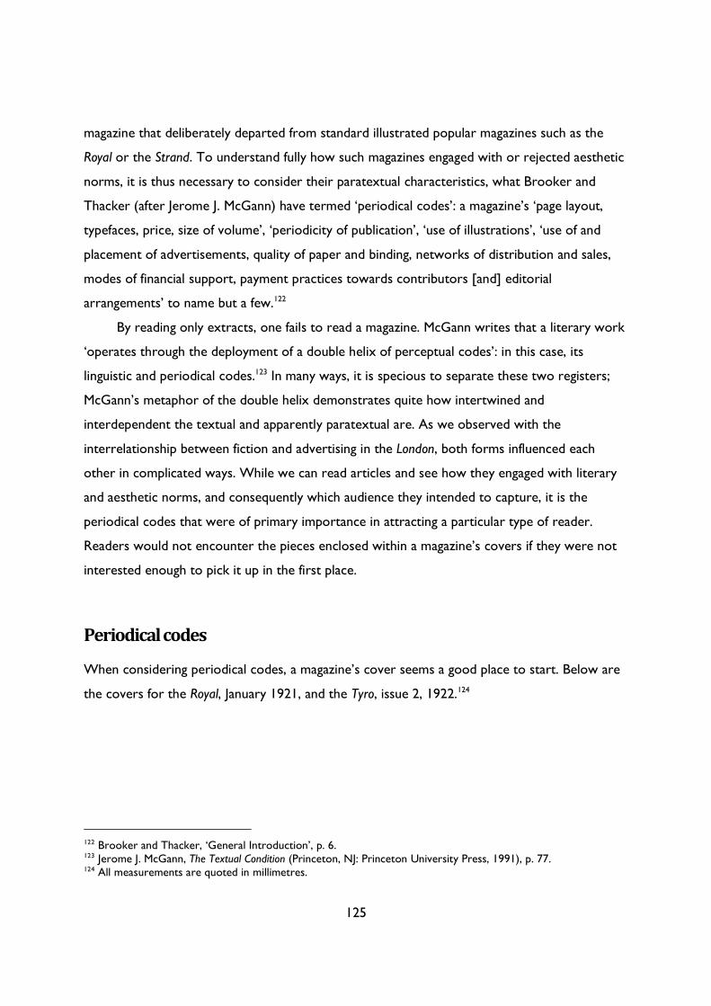
125
magazine that deliberately departed from standard illustrated popular magazines such as the
Royal or the Strand. To understand fully how such magazines engaged with or rejected aesthetic
norms, it is thus necessary to consider their paratextual characteristics, what Brooker and
Thacker (after Jerome J. McGann) have termed ‘periodical codes’: a magazine’s ‘page layout,
typefaces, price, size of volume’, ‘periodicity of publication’, ‘use of illustrations’, ‘use of and
placement of advertisements, quality of paper and binding, networks of distribution and sales,
modes of financial support, payment practices towards contributors [and] editorial
arrangements’ to name but a few.122
By reading only extracts, one fails to read a magazine. McGann writes that a literary work
‘operates through the deployment of a double helix of perceptual codes’: in this case, its
linguistic and periodical codes.123 In many ways, it is specious to separate these two registers;
McGann’s metaphor of the double helix demonstrates quite how intertwined and
interdependent the textual and apparently paratextual are. As we observed with the
interrelationship between fiction and advertising in the London, both forms influenced each
other in complicated ways. While we can read articles and see how they engaged with literary
and aesthetic norms, and consequently which audience they intended to capture, it is the
periodical codes that were of primary importance in attracting a particular type of reader.
Readers would not encounter the pieces enclosed within a magazine’s covers if they were not
interested enough to pick it up in the first place.
Periodical codes
When considering periodical codes, a magazine’s cover seems a good place to start. Below are
the covers for the Royal, January 1921, and the Tyro, issue 2, 1922.124
122 Brooker and Thacker, ‘General Introduction’, p. 6. 123 Jerome J. McGann, The Textual Condition (Princeton, NJ: Princeton University Press, 1991), p. 77. 124 All measurements are quoted in millimetres.
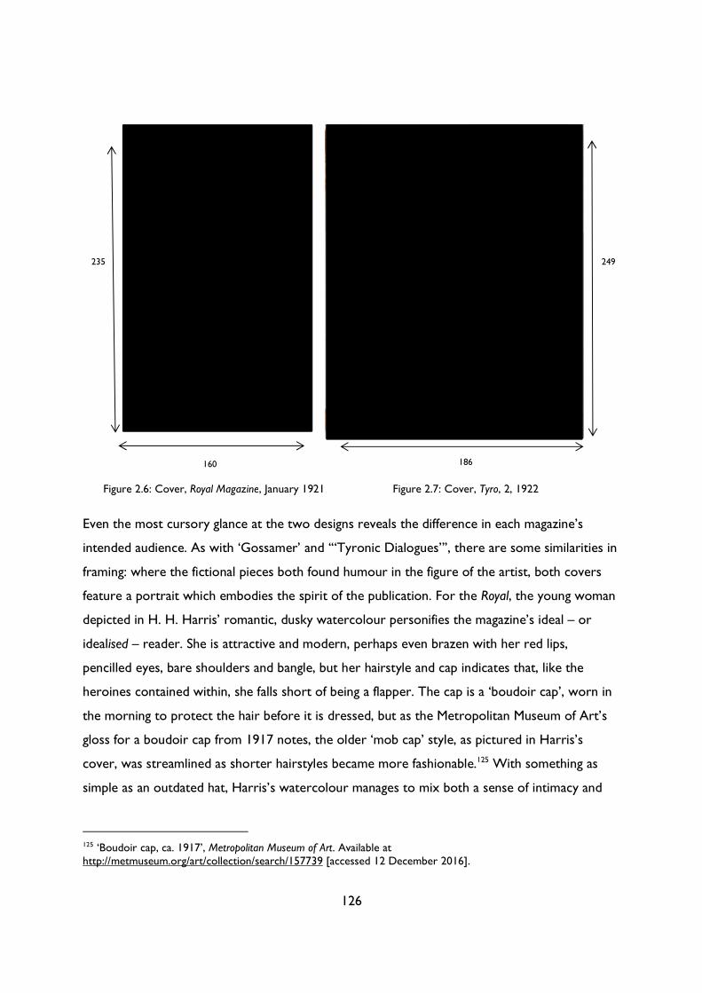
126
Even the most cursory glance at the two designs reveals the difference in each magazine’s
intended audience. As with ‘Gossamer’ and ‘“Tyronic Dialogues”’, there are some similarities in
framing: where the fictional pieces both found humour in the figure of the artist, both covers
feature a portrait which embodies the spirit of the publication. For the Royal, the young woman
depicted in H. H. Harris’ romantic, dusky watercolour personifies the magazine’s ideal – or
idealised – reader. She is attractive and modern, perhaps even brazen with her red lips,
pencilled eyes, bare shoulders and bangle, but her hairstyle and cap indicates that, like the
heroines contained within, she falls short of being a flapper. The cap is a ‘boudoir cap’, worn in
the morning to protect the hair before it is dressed, but as the Metropolitan Museum of Art’s
gloss for a boudoir cap from 1917 notes, the older ‘mob cap’ style, as pictured in Harris’s
cover, was streamlined as shorter hairstyles became more fashionable.125 With something as
simple as an outdated hat, Harris’s watercolour manages to mix both a sense of intimacy and
125 ‘Boudoir cap, ca. 1917’, Metropolitan Museum of Art. Available at http://metmuseum.org/art/collection/search/157739 [accessed 12 December 2016].
235
160 186
249
Figure 2.6: Cover, Royal Magazine, January 1921 Figure 2.7: Cover, Tyro, 2, 1922
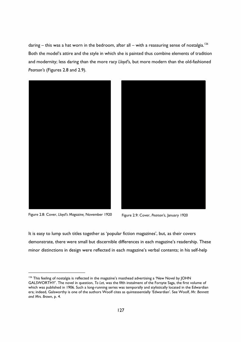
127
daring – this was a hat worn in the bedroom, after all – with a reassuring sense of nostalgia.126
Both the model’s attire and the style in which she is painted thus combine elements of tradition
and modernity; less daring than the more racy Lloyd’s, but more modern than the old-fashioned
Pearson’s (Figures 2.8 and 2.9).
It is easy to lump such titles together as ‘popular fiction magazines’, but, as their covers
demonstrate, there were small but discernible differences in each magazine’s readership. These
minor distinctions in design were reflected in each magazine’s verbal contents; in his self-help
126 This feeling of nostalgia is reflected in the magazine’s masthead advertising a ‘New Novel by JOHN GALSWORTHY’. The novel in question, To Let, was the fifth instalment of the Forsyte Saga, the first volume of which was published in 1906. Such a long-running series was temporally and stylistically located in the Edwardian era; indeed, Galsworthy is one of the authors Woolf cites as quintessentially ‘Edwardian’. See Woolf, Mr. Bennett and Mrs. Brown, p. 4.
Figure 2.8: Cover, Lloyd’s Magazine, November 1920 Figure 2.9: Cover, Pearson’s, January 1920
128
guide, How to Write for the Papers, Albert E. Bull observed that, while a ‘casual paper reader’
might ‘sum up’ the ‘popular penny weekly journals […] as being similar’,
Each editor has his own ideals and knows his own public. The differences may be very slight—invisible to the
novice—but the practised writer can see them and in writing his article would probably shape it a little
differently in each case.
There are men in London who, if they heard a column article read aloud, could almost tell you where it
came from. Some could make a very good guess by hearing the title and the sub and cross-headings.127
The same can be said of each magazine’s cover. Take the title of the publication away and it is
still possible to identity which periodical is which simply by considering the minor differences in
colour, artistic style, typography, advertisements and the types of figures pictured. Each nuance
would have resulted in a slightly different visual impression which would have appealed to
different types of publics.
Looking at these popular magazine covers, we can see that while each magazine broadly
replicated the aesthetic norm of the portrait of a woman on the cover, each publication
adapted the norm in small ways to attract a different readership. This aesthetic norm was
established in about 1911 by the Royal (Figure 2.11); in the Edwardian period, these magazines
featured an array of different covers, from this rather macabre vision of a ghostly sailor (Figure
2.10) to the Windsor’s rather understated landscape (Figure 2.14). Following the influence of the
Royal, however, and especially in the final years of the war, other popular fiction magazines
began to shift to portrait covers, almost exclusively of women (Figures 2.13, 2.15). Such a
change was reflected in – or perhaps precipitated by – a change in each magazine’s readership;
as noted above, Baily identified a change in the Royal’s readership from predominately male
before the war to predominately female after the conflict ended.
127 Bull, How to Write for the Papers, p. 13.
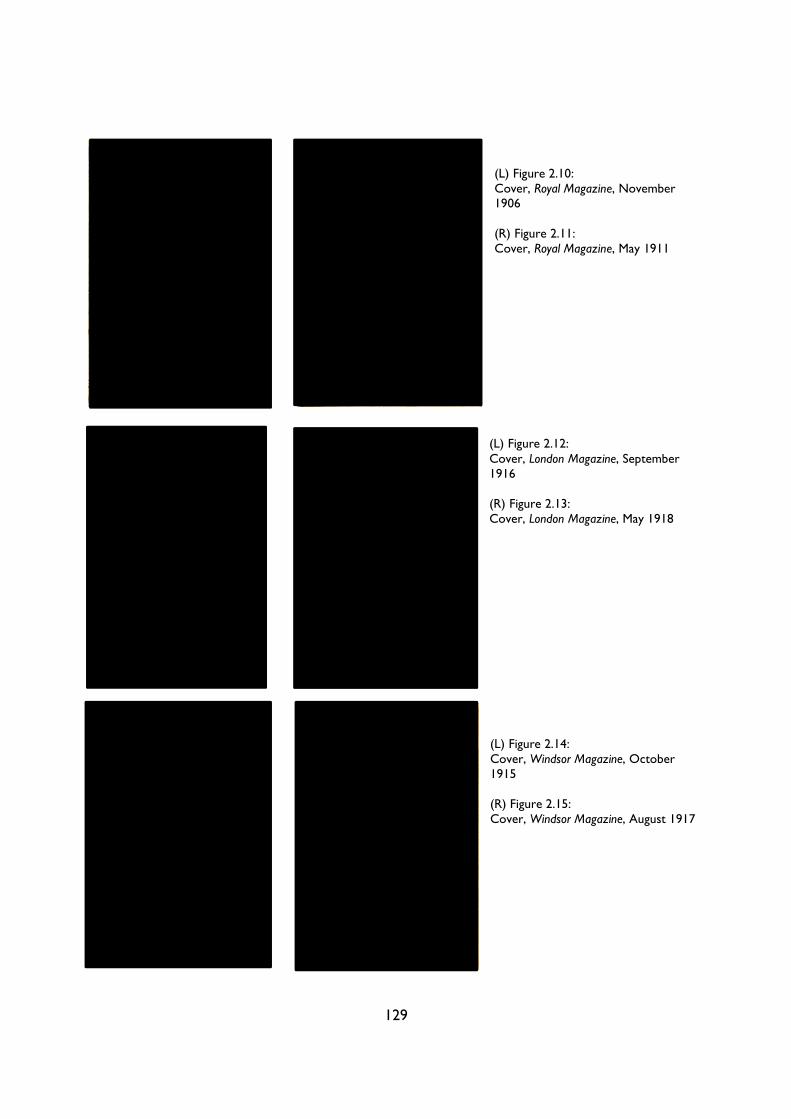
129
(L) Figure 2.10: Cover, Royal Magazine, November 1906 (R) Figure 2.11: Cover, Royal Magazine, May 1911
(L) Figure 2.12: Cover, London Magazine, September 1916 (R) Figure 2.13: Cover, London Magazine, May 1918
(L) Figure 2.14: Cover, Windsor Magazine, October 1915 (R) Figure 2.15: Cover, Windsor Magazine, August 1917
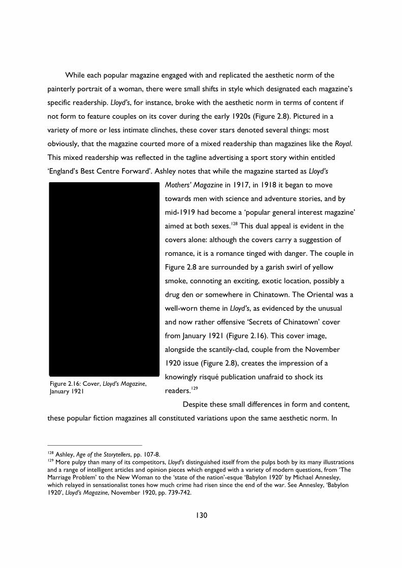
130
While each popular magazine engaged with and replicated the aesthetic norm of the
painterly portrait of a woman, there were small shifts in style which designated each magazine’s
specific readership. Lloyd’s, for instance, broke with the aesthetic norm in terms of content if
not form to feature couples on its cover during the early 1920s (Figure 2.8). Pictured in a
variety of more or less intimate clinches, these cover stars denoted several things: most
obviously, that the magazine courted more of a mixed readership than magazines like the Royal.
This mixed readership was reflected in the tagline advertising a sport story within entitled
‘England’s Best Centre Forward’. Ashley notes that while the magazine started as Lloyd’s
Mothers’ Magazine in 1917, in 1918 it began to move
towards men with science and adventure stories, and by
mid-1919 had become a ‘popular general interest magazine’
aimed at both sexes.128 This dual appeal is evident in the
covers alone: although the covers carry a suggestion of
romance, it is a romance tinged with danger. The couple in
Figure 2.8 are surrounded by a garish swirl of yellow
smoke, connoting an exciting, exotic location, possibly a
drug den or somewhere in Chinatown. The Oriental was a
well-worn theme in Lloyd’s, as evidenced by the unusual
and now rather offensive ‘Secrets of Chinatown’ cover
from January 1921 (Figure 2.16). This cover image,
alongside the scantily-clad, couple from the November
1920 issue (Figure 2.8), creates the impression of a
knowingly risqué publication unafraid to shock its
readers.129
Despite these small differences in form and content,
these popular fiction magazines all constituted variations upon the same aesthetic norm. In
128 Ashley, Age of the Storytellers, pp. 107-8. 129 More pulpy than many of its competitors, Lloyd’s distinguished itself from the pulps both by its many illustrations and a range of intelligent articles and opinion pieces which engaged with a variety of modern questions, from ‘The Marriage Problem’ to the New Woman to the ‘state of the nation’-esque ‘Babylon 1920’ by Michael Annesley, which relayed in sensationalist tones how much crime had risen since the end of the war. See Annesley, ‘Babylon 1920’, Lloyd’s Magazine, November 1920, pp. 739-742.
Figure 2.16: Cover, Lloyd’s Magazine, January 1921
131
every possible way, Lewis places the Tyro in direct opposition to the norms espoused by these
mass-market magazines. The cover renounces colour in favour of monochrome130 and eschews
big names or advertising: even the heading which identified WYNDHAM LEWIS as the
magazine’s editor on the cover of Tyro 1 was gone by the second edition. Instead, Lewis relies
upon a brief description of the magazine’s contents, ‘A REVIEW OF THE ART OF PAINTING
SCULPTURE AND DESIGN’, the implication being that those who were truly interested in
such topics did not need to be swayed by cheap references to celebrity (as in the Royal’s John
Galsworthy masthead). As we have seen in relation to its verbal contents, the Tyro was not
interested in casual readers but in dedicated ones:131 the cover reinforces this impression, not
only through its lack of advertising but also in its striking image of a sadistically grinning tyro.
Abstracted almost to the point of initial incomprehension, this partial pen-and-ink portrait apes
and subverts the norm of wholesome portraits on the front of fiction magazines. Lewis’s ‘cover
star’ fixes its despicable gaze on the potential reader, daring them, with a sneer, to open the
covers and face what lies inside. Nothing could be further from Harris’s benign, demure pastels:
where the coquettish gaze of the Royal’s cover star issues an invitation to the reader, Lewis’s
stark, monochrome drawing presents a hideous, snarling challenge. From June 1917, The Little
Review famously ran with the subheading ‘MAKING NO COMPROMISE WITH THE PUBLIC
TASTE’; in its design alone, Lewis’s cover for Tyro 2 seems to invoke that earlier promise.132
Aside from its visual choices, the very size of the Tyro seems to engage in a combative
dialogue with standard illustrated magazines like the Royal. Lewis chooses dimensions which are
similar enough to invite comparison to standard illustrated magazines, but large enough to
denote an air of superiority (see Table 1). Tyro 2 marked a departure from Tyro 1 in the latter
respect: where the former was strangely long and thin and printed on almost translucent stock,
Tyro 2 was much more substantial, printed on a thicker, less glossy stock akin to that of other
130 Lewis’s decision to print in monochrome rather than colour may have been financially, as opposed to aesthetically, motivated; Lewis struggled to source sufficient funding for the Tyro. Writing to his publisher Harriet Shaw Weaver in July 1921, he expressed his hope to bring out ‘another and more interesting number of the Tyro, with some more adequate financial backing’. The letter concludes with Lewis asking for ‘a cheque for £7. 8. 0 out of the small Tyro fund’ to pay off a firm of engravers threatening him with legal action. See ‘Letter to Harriet Shaw Weaver, 26th July 1921’, in The Letters of Wyndham Lewis, pp. 126-7. 131 Indeed, it is worth bearing in mind that most little magazines relied upon subscribers as opposed to selling copies on newsstands or in bookshops; consequently, the cover of a magazine like the Tyro did not need to be as immediately attractive as a publication like the Royal, which relief on ‘shelf appeal’. 132 See Margaret Anderson (ed.), The Little Review, 4.2, 1917, Modernist Journals Project. Available at http://modjourn.org/render.php?id=1297798381125002&view=mjp_object [accessed 8 July 2015].
132
art periodicals. Rejecting the standard two columns used in Tyro 1, and elsewhere in magazines
such as the Royal, Lewis adopts a single-column layout with large margins and the same,
relatively heavy serif font used for both headings and text (Figure 2.17). Unlike in Blast or even
Tyro 1, there is less of an emphasis on experimental visuals and more on the quality of the text
itself. Gone are the large, attention-grabbing headings from Tyro 1; Tyro 2 assumes a more
traditional, even conservative typographic appearance more in line with established little
magazines such as Coterie or the Monthly Chapbook. The heavy stock and wide margins sanctify
the text, presenting its contents as rarefied and important. It reads more like a book or
exhibition catalogue than a magazine, especially with its large section of glossy reproductions at
the back (Figures 2.18 and 2.19). Printed one per double page spread, these reproductions of
avant-garde and modernist paintings, woodcuts and sculptures are treated with the same
reverence as the linguistic contents. McGann writes that ‘We do not need to have read a single
word of many newspaper texts in order to have already “read” part of what they are saying’;133
the same can be said of magazines like Tyro 2. Unlike in the Royal (Figure 2.20), these images are
not included to add visual interest or to make large chunks of text appear less intimidating.
They are works of Art; as such, they need to be displayed, examined and appreciated in
isolation. They are featured without introduction or explanation, presuming once again a
certain knowledge and understanding on the part of the reader; indeed, some of the artists are
identified only by their surnames (Dismorr, Wadsworth or Lipschitz), suggesting a prior
familiarity, if not acquaintance, with the artists pictured. Perhaps surprisingly, the pieces
themselves are not identified; instead, the images appear emblematic, works which embody not
only the individual artist’s output but also that of a wider movement—the majority of the
artists pictured, after all, were Lewis’s erstwhile collaborators from Blast or the short-lived
Group X.134 That said, Tyro is much less a group effort than Lewis’s previous projects: it is
notable, for instance, that he reprints more of his own paintings (or his essays) than any of his
contemporaries (Table 1). Yet these works still express the ideals delineated in the magazine’s
133 McGann, Textual Condition, p. 115. 134 Jessica Dismorr, Frederick Etchells and Edward Wadsworth were featured in Blast; the three were joined by Frank Dobson for the Group X exhibition in 1920. The only artists represented in Tyro 2 that were not former Lewis colleagues were Jacques Lipschitz and Cedric Morris. The latter contributed not a plate but a pen-and-ink drawing; it is possible that Lewis already knew him through their work for the Arts League of Service.
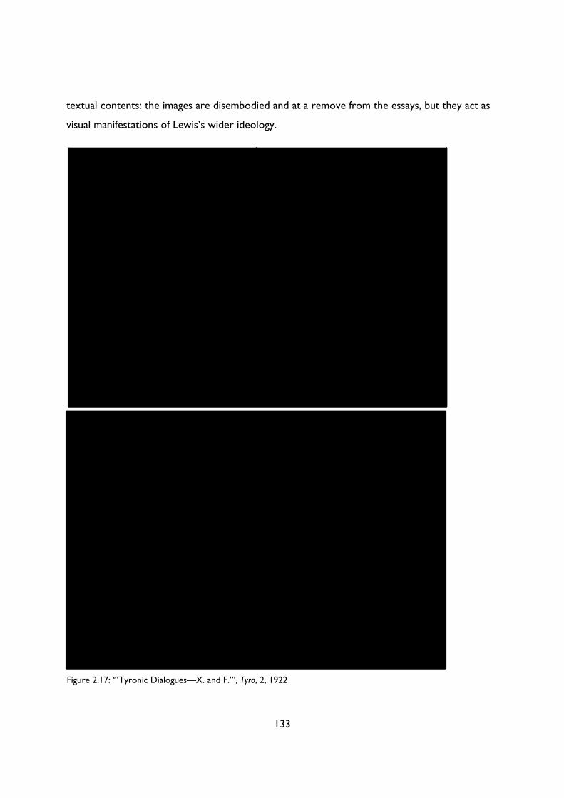
133
textual contents: the images are disembodied and at a remove from the essays, but they act as
visual manifestations of Lewis’s wider ideology.
Figure 2.17: ‘“Tyronic Dialogues—X. and F.”’, Tyro, 2, 1922
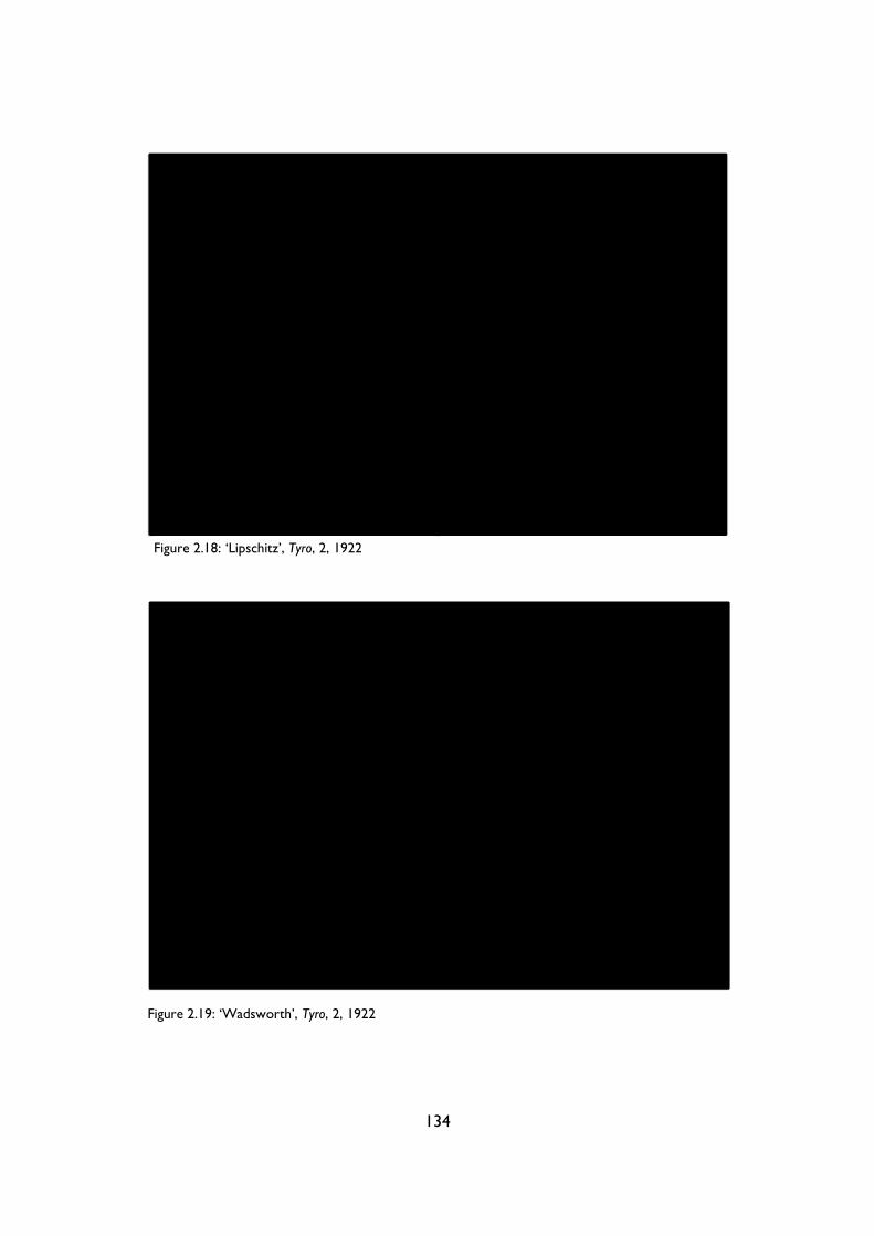
134
Figure 2.18: ‘Lipschitz’, Tyro, 2, 1922
Figure 2.19: ‘Wadsworth’, Tyro, 2, 1922
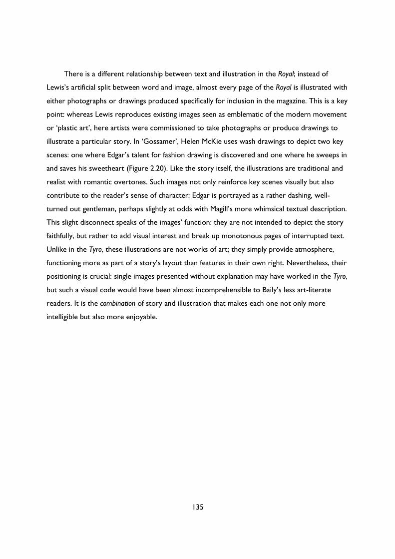
135
There is a different relationship between text and illustration in the Royal; instead of
Lewis’s artificial split between word and image, almost every page of the Royal is illustrated with
either photographs or drawings produced specifically for inclusion in the magazine. This is a key
point: whereas Lewis reproduces existing images seen as emblematic of the modern movement
or ‘plastic art’, here artists were commissioned to take photographs or produce drawings to
illustrate a particular story. In ‘Gossamer’, Helen McKie uses wash drawings to depict two key
scenes: one where Edgar’s talent for fashion drawing is discovered and one where he sweeps in
and saves his sweetheart (Figure 2.20). Like the story itself, the illustrations are traditional and
realist with romantic overtones. Such images not only reinforce key scenes visually but also
contribute to the reader’s sense of character: Edgar is portrayed as a rather dashing, well-
turned out gentleman, perhaps slightly at odds with Magill’s more whimsical textual description.
This slight disconnect speaks of the images’ function: they are not intended to depict the story
faithfully, but rather to add visual interest and break up monotonous pages of interrupted text.
Unlike in the Tyro, these illustrations are not works of art; they simply provide atmosphere,
functioning more as part of a story’s layout than features in their own right. Nevertheless, their
positioning is crucial: single images presented without explanation may have worked in the Tyro,
but such a visual code would have been almost incomprehensible to Baily’s less art-literate
readers. It is the combination of story and illustration that makes each one not only more
intelligible but also more enjoyable.

136
Figure 2.20: ‘Gossamer for Goddesses’, Royal Magazine, January 1921
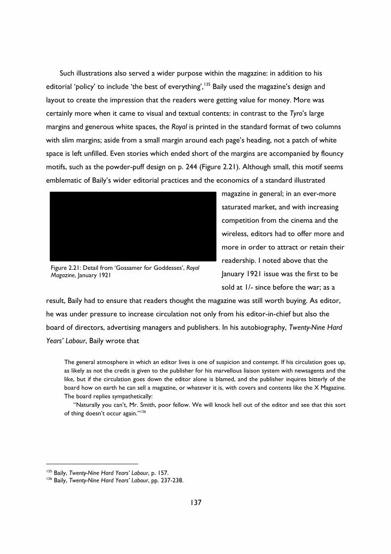
137
Such illustrations also served a wider purpose within the magazine: in addition to his
editorial ‘policy’ to include ‘the best of everything’,135 Baily used the magazine’s design and
layout to create the impression that the readers were getting value for money. More was
certainly more when it came to visual and textual contents: in contrast to the Tyro’s large
margins and generous white spaces, the Royal is printed in the standard format of two columns
with slim margins; aside from a small margin around each page’s heading, not a patch of white
space is left unfilled. Even stories which ended short of the margins are accompanied by flouncy
motifs, such as the powder-puff design on p. 244 (Figure 2.21). Although small, this motif seems
emblematic of Baily’s wider editorial practices and the economics of a standard illustrated
magazine in general; in an ever-more
saturated market, and with increasing
competition from the cinema and the
wireless, editors had to offer more and
more in order to attract or retain their
readership. I noted above that the
January 1921 issue was the first to be
sold at 1/- since before the war; as a
result, Baily had to ensure that readers thought the magazine was still worth buying. As editor,
he was under pressure to increase circulation not only from his editor-in-chief but also the
board of directors, advertising managers and publishers. In his autobiography, Twenty-Nine Hard
Years’ Labour, Baily wrote that
The general atmosphere in which an editor lives is one of suspicion and contempt. If his circulation goes up,
as likely as not the credit is given to the publisher for his marvellous liaison system with newsagents and the
like, but if the circulation goes down the editor alone is blamed, and the publisher inquires bitterly of the
board how on earth he can sell a magazine, or whatever it is, with covers and contents like the X Magazine.
The board replies sympathetically:
“Naturally you can’t, Mr. Smith, poor fellow. We will knock hell out of the editor and see that this sort
of thing doesn’t occur again.”136
135 Baily, Twenty-Nine Hard Years’ Labour, p. 157. 136 Baily, Twenty-Nine Hard Years’ Labour, pp. 237-238.
Figure 2.21: Detail from ‘Gossamer for Goddesses’, Royal Magazine, January 1921
138
The financial pressures placed on Baily constitute perhaps the biggest difference in the two
magazines.137 Albeit tinged with personal bitterness, Baily’s account of editor as scapegoat
stands in stark contrast to Lewis’s experience. As the founder and self-appointed editor of a
small coterie magazine, Lewis would have had far greater editorial freedom: unlike the Royal,
the Tyro did not need to make money. As outlined in Table 1, the Tyro received financial
support from both Sydney Schiff and Harriet Shaw Weaver at The Egoist Press; undoubtedly
both Lewis and Weaver would have been pleased if the Tyro had made a profit, but Lewis’s
career did not depend on sales figures. Nonetheless, Lewis was still under financial pressure,
albeit a different kind to Baily. How often the magazine appeared, and in what format, would
have undoubtedly been influenced by access to capital for paper, ink and associated printing
costs. Moreover, a lack of funds with which to pay contributors would have affected the types
of material that Lewis could include: it restricted it to either his own contributions, or those of
willing friends and contacts. The magazine’s financial arrangements may therefore account for
the prevalence of pieces by Lewis in the Tyro; even though issue 2 features other contributions,
it revolves around Lewis’s ‘Essay on the Objective of Plastic Art in Our Time’.138 Yet the way in
which the essay is displayed suggests that there was more behind this foregrounding of his own
work than just financial necessity; the essay is preceded by a full-page heading and short
explanatory note, once again setting up the text as a vital contribution to contemporary art
criticism and theory (Figure 2.22).
137 These economic pressures constitute one of the ‘Six Constraints of the Production of Literary Works’, outlined by Richard A. Pearson and added to by Dean Baldwin in Art and Commerce in the British Short Story. To Pearson’s original list of six constraints (technology, law, industry structure, organizational structure, careers and markets), Baldwin adds two further constraints: aesthetics and advertising (pp. 3-4). For a discussion of each of these constraints see Baldwin, Art and Commerce, pp. 4-13. 138 Lewis, ‘Essay on the Objective of Plastic Art in Our Time’. See Table 1, pp. 147-50, for a more detailed examination of Tyro 2’s contents.
139
This foregrounding of his own essay, along with the volume of Lewis’s own contributions
and the idiosyncratic conception of the ‘tyro’, suggests that the Tyro was, above all, a
mouthpiece for Lewis: a mouthpiece made possible by both the financial support of his patrons
and the magazine’s elite intended audience. With his small educated audience, Lewis had the
freedom to publish long theoretical pieces such as ‘Plastic Art in Our Time’, and essays in
French such as Waldemar George’s ‘Lettre de Paris’.139 Specific pieces aside, though, it is clear
that the Tyro’s economic circumstances of production dictate the magazine’s entire tone, from
the type of advertisements to the emphasis placed on individual contributors. If he had edited
139 Waldemar George, ‘Lettre de Paris’, Tyro, 2, 1922, pp. 50-52. See also the French-language advertisements in Tyro 2 for L’Esprit Nouveau and L’Amour de L’Art (p. C). For more on Tyro’s advertisements, see Table 1, pp. 147-50. It is not surprising that the magazine featured essays and articles in French – the target audience of intellectuals and vanguardists would have almost all been multilingual. Nevertheless, such contributions would have been unthinkable in a mass-market magazine like the Royal.
Figure 2.22: ‘ESSAY ON THE OBJECTIVE OF PLASTIC ART IN OUR TIME’, Tyro, 2, 1922
140
the Royal, Lewis could not have pursued the kind of intellectual and self-aggrandising agenda that
he does in the Tyro. Baily was himself a prolific novelist and short-story writer, with stories
published in many well-regarded American magazines, but his fiction almost never appeared in
the Royal. The magazine’s needs came above not just his own but that of any of the Royal’s
contributors, however lofty. The Royal aimed for a wide appeal; as such, it could not be a one-
man enterprise. Baily had to work to create a brand which would inspire a loyal readership,
especially in the post-war period when tastes were changing.
Baily’s efforts to create a coherent brand identity for the Royal can be observed in all of
his editorial and design decisions, right down to his choice of page headings. Necessarily
marginal, these headings encapsulate the identity of each magazine. In the Royal, Baily opts for
the name of the magazine on the left and the name of the story on the right, as opposed to the
Strand, which printed the name of the feature / name of the author, or the Grand and Nash’s and
Pall Mall Magazine which both printed the title of the magazine / name of author. These slight
variations reveal the different emphases of each magazine. Since its inception, the Strand aimed
to attract the biggest names; consequently, their system of privileging the author’s name and the
feature which they were writing constitutes just one part of a wider emphasis on individual
celebrity contributors. By replacing the name of the author with the name of the magazine,
Baily makes clear his vision for the Royal: a uniform entity concerned less with printing big-name
authors (Galsworthy was an exception) and more with maintaining a consistently cheerful tone
and style throughout. Of the magazines studied, the Royal was one of only two to feature an
editor’s letter, and the only one to place that editor’s letter at the front. In Pearson’s, published
by the same company as the Royal, the editor’s letter was placed at the back of the magazine,
suggesting that the magazine’s contents took precedence over the editor’s views. In the Royal,
the editor’s letter not only opened the magazine but, as we have seen, was a big part of Baily’s
attempts to create a dialogue with both new and established readers. The letter, together with
the cover design and the use of page headings, suggests a coherent and curated magazine;
perhaps not a one-man enterprise like the Tyro but nonetheless one as idiosyncratic as the
parameters of popular publishing permitted.
These parameters cannot be overlooked; as Baily writes in his autobiography, he simply
could not take the kind of editorial risks that Lewis did. ‘Editors,’ he wrote,
141
have to be very conservative, and change their editorial policy by slow degrees. It is not much use for an
editor to try and lead the public, because the public doesn’t want to be led. It wants to be given the same old
thing to which it has become accustomed over a period of years, dressed up in a slightly different form. […]
If a publishing business is to pay its way its papers must be essentially what the English are fond of calling
sound, and it is practically impossible to be sound and brilliant at the same time. Therefore the free-lance
should not curse his editors because they smile sadly and reject brilliant and unusual suggestions, style of
writing, story plots, and so on. It is more than the editors’ lives are worth to use such contributions, and they
too have their wives and families to think of.
If the picture I have painted of the editorial outlook seems dull, the ambitious free-lance yearning to
become another James Joyce or Aubrey Beardsley should remember that the editor has to think of his board,
and the board must think of their shareholders and employees; that the board have a great responsibility to
discharge in making the business pay and providing a dividend on the capital, and paying wages and salaries,
and that they cannot afford to take wild chances. (pp. 238-9)
Put this way, it is impossible to see how a mainstream magazine could be classified as anything
but low- or middlebrow. It is not a coincidence that all popular magazines are classified in this
way: they are defined entirely by the economic circumstances of their production. Reading
Baily’s autobiography, it becomes clear that his aims and beliefs were not that dissimilar to
Lewis’s: both men used all available resources to create the ‘best’ publication that they could.
Baily did not set out to create an ‘inferior’ product; in fact, he set out to do the opposite. But
the pressures of producing a monthly magazine which had to make money, not only to satisfy
his board of directors but also to maintain advertisers, meant that a certain type of product
would be created.140 Lewis could wait until he had sufficient material to bring out a magazine;
Baily did not have that luxury. Perhaps understandably, the quality of features and stories was
more variable than in an infrequent and short-lived little magazine. I doubt that Lewis could
have found sufficient quantities of excellent material to fill hundreds of issues of the Tyro. As
much as Baily wanted to include ‘brilliant’ material, the necessity of keeping readers meant that
he had to stick to the merely ‘solid’ instead.
In other words, popular magazine editors such as Baily had to adhere to existing aesthetic
and literary norms, not only to capture a certain type of reader but as a response to pressures
placed upon them by publishers, advertisers and shareholders. To challenge one’s public was to
lose one’s public, and to face being dismissed. Consequently, Baily and his colleagues had to
140 I have not discussed advertising in these two magazines, but suffice it to say that having full-page advertisements from household names such as Nestle, Boots and Beecham’s would have conferred different pressures than the types of small elite booksellers and publishers that advertised in the Tyro. These adverts do not just reveal the magazine’s ideal reader; they also give us an insight into the economic pressures placed upon editors and publishers to maintain a healthy circulation. For more on the advertisements in each magazine, see Table 1, pp. 147-50.
142
foster more of a spirit of pragmatism than idealism: instead of ‘making it new’, they had to make
the best of what they already had.
Magazines are not inherently high or low
I began this chapter with an overview of two competing models of literary production: an
inward-facing model, in which the writer works in isolation in his garret, and an outward-facing
model, in which the commercially-motivated writer gives the public what they want. As we have
seen, such mutually-exclusive, overly simplified models are both myths: on the one hand, all
texts, especially magazines, are created with an audience in mind; on the other, even the most
reader-savvy editor is swayed by their own personal taste as much as by the (often imagined)
demands of their readers. Yet these two models do broadly correlate with the different
economic circumstances of production experienced by editors like Wyndham Lewis and Francis
Baily. With his small circulation and elite readership, Lewis had free reign over artistic and
literary content, even if his decisions meant that his magazines typically folded after two issues.
In contrast, Baily had to ensure that circulation figures were maintained, otherwise he was out
of a job.
While these two models of literary production are not entirely myths, neither are they
adequate descriptions of how magazines were produced in modern Britain. Lewis could afford
to be more ‘inward-facing’ than Baily, but that is not to say that Lewis produced the Tyro in a
garret. He was interested in soliciting an audience, whether through his forms of direct address,
his efforts to sell the magazine by hand, or the use of a ‘private language’ to inscribe an ideal
reader throughout. As Adrian Hunter puts it, the notion that writers and artists could stand
‘outside the market and contemporary culture was one of the central delusions to which the
modernists clung. It is more accurate to see modernism as occurring within its own specialist
segment of a fragmented literary marketplace, than operating independently of it.’141 In this
chapter, I have analysed the Tyro’s internal and external dialogics in order to show how the
magazine operated within its ‘specialist segment’ of the marketplace, engaging in a dialogue with
both its specialist readers and other publications. This dialogue was not just with other
141 Adrian Hunter, Cambridge Introduction to the Short Story in English, p. 83, quoted in Baldwin, Art and Commerce in the British Short Story, p. 160, my emphasis.
143
modernist magazines in this rarefied sphere: on the contrary, the Tyro was defined and shaped
by its rejection of established aesthetic norms on display in standard illustrated popular
magazines like the Royal.
Similarly, to describe Baily as a purely mercenary, outward-facing editor is to do him an
injustice. Although Baily was interested in and aware of his reader’s tastes, he was not afraid to
challenge or stretch their expectations. He introduced challenging subjects in his editor’s
letters, such as tax and the declining value of sterling (March 1921), or the crisis in the dye
industry (February 1921), and commissioned provocative leading articles, such as the
aforementioned Gilbert Frankau and Elinor Glyn series. Baily was aware that such articles may
cause offence, but he wrote in February that he would ‘not apologise for the appearance of
Christine Jope-Slade's article, “Why Do You Hate Me?” (p. 326) in these pages. Really, the next
man or the next woman is a very good fellow if we would only believe it. The trouble is we cast
so little bread upon the waters nowadays.’142 Here, as elsewhere, Baily casts himself as less of
an editor than a social campaigner: much like Lewis, he uses the Royal as a mouthpiece for those
issues which interest and incense him. In his autobiography, he writes that he aimed not just to
replicate existing norms and styles but rather to raise the Royal ‘from the purely frivolous state
in which [he] found it into something with more than a merely superficial interest.’ (p. 158) As
such, Baily is a far cry from the figure of the press baron depicted in Bennett’s What the Public
Wants, who would give out ‘liqueur brandy’ with his newspaper if it helped improve his sales
figures;143 Baily toes a complex and fascinating line between pleasing his readers and promoting
his own social and literary agenda.
Both the Tyro and the Royal thus challenge the neat models of literary production which
separate ‘little’ from ‘popular’ magazines. Upon close inspection, such a divide appears spurious:
we cannot describe such publications as simply non-commercial or commercial, inward-facing
or outward-facing. What consequences, then, does such a finding have for the modernist myth
which this chapter seeks to challenge, namely the assertion that texts are inherently high or
low? The answer is a complex one. In their ‘Introduction’ to Volume 1 of the Oxford Critical and
Cultural History of Magazines, Brooker and Thacker discuss Jerome McGann’s distinction
‘between the linguistic codes (the semiotics and semantics of the actual words) and the
142 F. E. Baily, ‘Mr. Editor—His Page’, Royal Magazine, February 1921, p. 261. 143 Bennett, What the Public Wants, p. 35.
144
bibliographic codes of a text (such matters as “typefaces, bindings, book prices, page
format”).’144 When I began this research, I expected to find no differences in what McGann
called the ‘linguistic codes’ between ‘little’ and ‘popular’ magazines. Differences in classification
resulted, I believed, from ‘external’, ‘bibliographic’ (or, using Brooker and Thacker’s
terminology, ‘periodical’) codes: a magazine’s design, price and frequency all gave the impression
that it was one kind of magazine and not another. Having conducted a synchronic study of
magazines from across the cultural spectrum, however, I soon realised that there were
differences in each type of magazine’s ‘linguistic’ and ‘periodical’ codes. These differences were
not a product of classification – they were not applied after the magazine was finished – but
rather they emerged before, during the production phase. Magazines were produced under
specific economic conditions to appeal to a certain audience. Every element of the magazine –
the text, headings, design, layout, publisher, price, frequency, advertisements, and so on – was
designed to attract a particular stratum of the British populace. They systematically reproduced
or challenged existing aesthetic norms, depending on whether they were aiming for a
mainstream or an elite audience. These aesthetic decisions were not the (sole) product of
individual beliefs and desires; even in the case of ‘little’ magazines, the intended audience
dictated the magazine’s contents.
Consequently, while we cannot say that there no differences between magazines, we can
say that these differences were caused less by ‘internal’ qualities on behalf of the writer and
more by the audience each magazine sought to attract. In his definition of art outlined above,
Wilenski argues that any work of art constructed to satisfy an audience cannot have ‘intrinsic’
value: he is convinced that all ‘original artists […] have always worked without reference to
their work’s effect on spectators other than themselves’ (pp. 51-2). Whether a work is artistic
or popular depends not on its ‘effect on spectators’ but rather on its means of production and
the artist’s intentions: the original work of art is determined by ‘the attitude, motives and
procedure of the man who made it’ (p. 73). In Wilenski’s model, there is a direct and
incontrovertible link between value and the ‘presence’ of the artist (or his intentions); my
analysis of the Royal and the Tyro, however, pries apart this link between methods of production
and literary value. Neither the Royal nor the Tyro are intrinsically high or low in Wilenski’s
144 Brooker and Thacker, ‘General Introduction’, p. 6.
145
sense: their qualitative differences are not due to either the failure or the absence of the artist.
The Royal did not aim to be the Tyro: it sought to fulfil different functions and thus attract a
different audience.
Instead of arguing that texts are not inherently high or low, then, perhaps it is more
accurate to say instead that magazines were constructed as ‘high’ or ‘low’ texts, or, even better,
that magazines were constructed with ‘high-’, ‘middle-’ or ‘low-brow’ readers in mind. Perhaps
the best formulation, however, and the approach that I have tried to take throughout this
chapter, is to remove references to the ‘brows’ altogether: in my research, I have seen little
evidence that magazines specifically tailored their content to audiences within ‘brow’ categories.
Within the world of popular magazines, for instance, there were so many available publications
and so many small variations in each magazine’s readership that they could not be contained by
the broad and contradictory categories of ‘high-’, ‘middle-’ and ‘low-brow’. Ardis and Collier,
after Henry James, write that the late-nineteenth and early-twentieth century ‘expanded and
segmented print marketplace provided an opportunity to find and target one’s own proper
audience in the “chess board” of emerging market segments’.145 James’s notion of a ‘chess
board’, with its multiple horizontal possibilities, is a much more apt visual metaphor than the
vertically stratified ‘brows’.
That said, in arguing that magazines – or, more broadly, all cultural texts – are not
inherently, intrinsically or essentially ‘high’ or ‘low’, I do not mean to dispute their
categorisation or eradicate difference; rather, I mean to foreground and denaturalise this
categorisation, exposing it as less a marker of quality and more a record of the circumstances
of production. By focusing solely on production, I hope to have shown how whether a magazine
was classified as ‘little’ or ‘popular’ (or ‘high’ or ‘low’) depends not only on how and by whom it
is read but also on how it was produced for those readers. Certain types of material conditions
and audiences lead to certain types of texts. Consequently, in the more complex, nuanced
model of cultural production outlined in this chapter, there is no distinction between a text’s
‘inside’ or ‘outside’: the ‘external’ circumstances of a text’s production (competitors, publishers,
editors, audiences) affect its ‘internal’ characteristics (content, style, presentation, modes of
address). In paying attention to how each magazine engages with aesthetic norms in order to
145 Ann Ardis and Patrick Collier, ‘Introduction’, in Transatlantic Print Culture, 1880-1940: Emerging Media, Emerging Modernisms, ed. by Ann Ardis and Patrick Collier (Basingstoke: Palgrave Macmillan, 2008), pp. 1-12 (p. 2).

146
inscribe its ideal reader, I have demonstrated how each magazine’s ‘outside’ has become its
‘inside’. By collapsing this spurious distinction between inside and outside, we can better analyse
how audiences shaped a magazine’s production, as well as its reception and circulation. It also
enables us to view a range of magazines together, at once: the focus on a text’s audience and
the functions which it sets out to fulfil allows ‘little’ and ‘popular’ magazines to be assessed and
examined using the same criteria. As we will see in what follows, the key concept which
emerges is that of ‘function’: in the following chapter, I build on Mukařovský’s concept of the
‘aesthetic norm’ by introducing his notion of ‘aesthetic function’, considering how a functionalist
approach can debunk the second modernist myth that texts were either high or low.
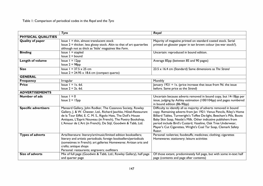
Table 1: Comparison of periodical codes in the Royal and the Tyro
147
Tyro Royal PHYSICAL QUALITIES Quality of paper Issue 1 = thin, almost translucent stock
Issue 2 = thicker, less glossy stock. Akin to that of art quarterlies although not as thick as ‘little’ magazines like Form.
Majority of magazine printed on standard coated stock. Serial printed on glossier paper in tan brown colour (ex-war stock?).
Binding Issue 1 = stapled Issue 2 = bound
Uncertain: reproduced in bound edition.
Length of volume Issue 1 = 12pp Issue 2 = 98pp
Average 85pp (between 85 and 90 pages)
Size Issue 1 = 37.5 x 25 cm Issue 2 = 24.95 x 18.6 cm (compact quarto)
23.5 x 16.4 cm (Standard) Same dimensions as The Strand
GENERAL Frequency Irregular Monthly Price Issue 1 = 1s. 6d.
Issue 2 = 2s. 6d. January 1921 = 1s. (price increase that issue from 9d. the issue before. Same price as the Strand)
ADVERTISEMENTS Number of ads Issue 1 = 0
Issue 2 = 15pp Uncertain because adverts removed in bound copy, but 14-18pp per issue, judging by Ashley estimation (100/104pp) and pages numbered in bound edition (86-90pp)
Specific advertisers Mansard Gallery, John Rodker, The Casanova Society, Rowley Gallery, J. & W. Chester, Ltd., Richard Jaschke, Hôtel-Restaurant de la Tour Eiffel, E. C. M. S., Rigolo Hats, The Doll’s House Antiques, L’Esprit Nouveau (in French), The Poetry Bookshop, L’Amour de L’Art (in French), De Stijl, Goodwin & Tabb, Ltd.
Difficulty to identify all as majority of adverts removed in bound copy. Remaining adverts from Jan 1921: Venus Pencils, Riley’s Home Billiard Tables, Turnwright’s Toffee De-light, Beecham’s Pills, Boots Baby Skin Soap, Nestle’s Milk. Other indicative publishers from period include Bird’s Custard, Vaseline, Oak Tree Underwear, Player's Cut Cigarettes, Wright's Coal Tar Soap, Clemark Safety Razor.
Types of adverts Arts/literature: literary/art/music/limited edition booksellers; literary and artistic periodicals; foreign booksellers/periodicals (sometimes in French); art galleries Homewares: Artisan arts and crafts; antique shops Personal: restaurants; engravers; outfitters
Personal: toiletries; foodstuffs; medicines; clothing; cigarettes Homewares: stationery; leisure activities
Size of adverts Mix of full page (Goodwin & Tabb, Ltd.; Rowley Gallery), half page and quarter page
Of those extant, predominately full page, but with some in-text half page (contents and page after contents)
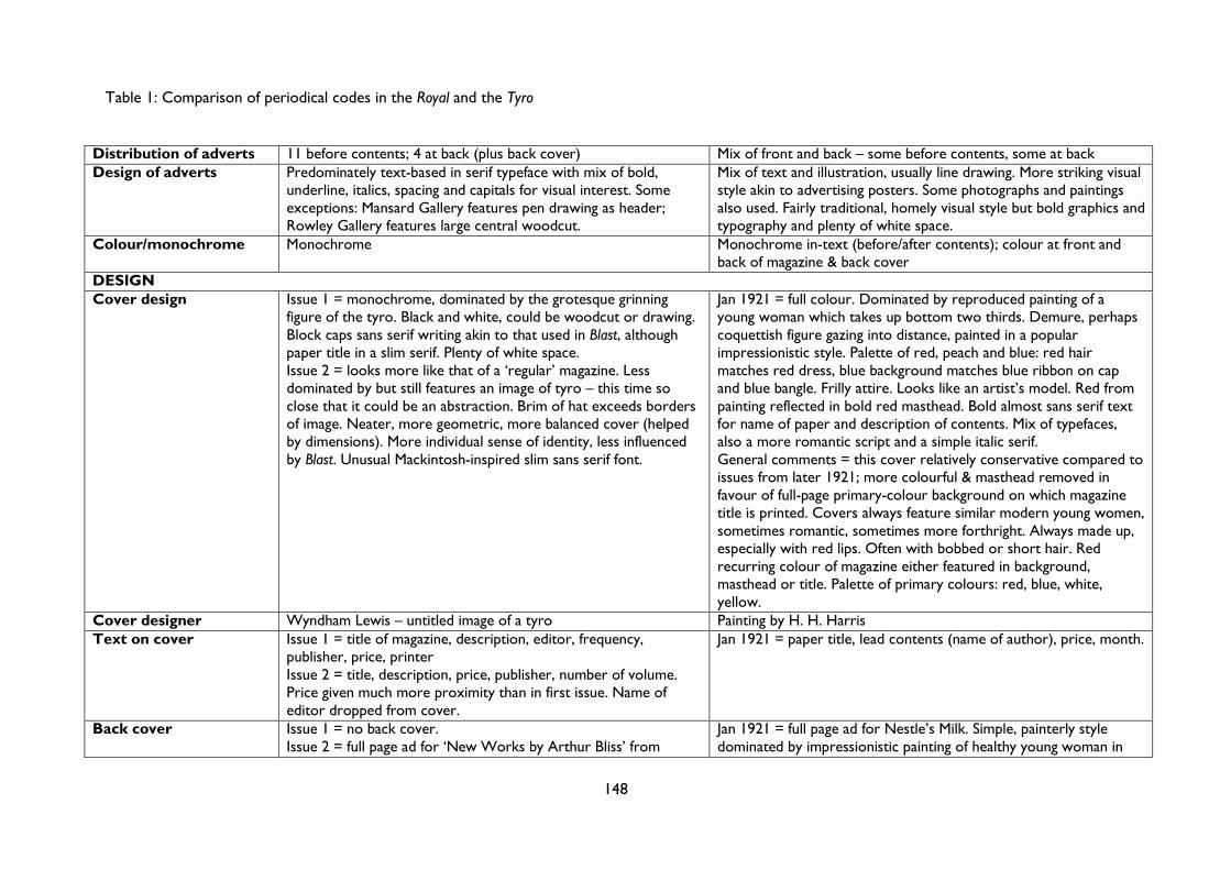
Table 1: Comparison of periodical codes in the Royal and the Tyro
148
Distribution of adverts 11 before contents; 4 at back (plus back cover) Mix of front and back – some before contents, some at back Design of adverts Predominately text-based in serif typeface with mix of bold,
underline, italics, spacing and capitals for visual interest. Some exceptions: Mansard Gallery features pen drawing as header; Rowley Gallery features large central woodcut.
Mix of text and illustration, usually line drawing. More striking visual style akin to advertising posters. Some photographs and paintings also used. Fairly traditional, homely visual style but bold graphics and typography and plenty of white space.
Colour/monochrome Monochrome Monochrome in-text (before/after contents); colour at front and back of magazine & back cover
DESIGN Cover design Issue 1 = monochrome, dominated by the grotesque grinning
figure of the tyro. Black and white, could be woodcut or drawing. Block caps sans serif writing akin to that used in Blast, although paper title in a slim serif. Plenty of white space. Issue 2 = looks more like that of a ‘regular’ magazine. Less dominated by but still features an image of tyro – this time so close that it could be an abstraction. Brim of hat exceeds borders of image. Neater, more geometric, more balanced cover (helped by dimensions). More individual sense of identity, less influenced by Blast. Unusual Mackintosh-inspired slim sans serif font.
Jan 1921 = full colour. Dominated by reproduced painting of a young woman which takes up bottom two thirds. Demure, perhaps coquettish figure gazing into distance, painted in a popular impressionistic style. Palette of red, peach and blue: red hair matches red dress, blue background matches blue ribbon on cap and blue bangle. Frilly attire. Looks like an artist’s model. Red from painting reflected in bold red masthead. Bold almost sans serif text for name of paper and description of contents. Mix of typefaces, also a more romantic script and a simple italic serif. General comments = this cover relatively conservative compared to issues from later 1921; more colourful & masthead removed in favour of full-page primary-colour background on which magazine title is printed. Covers always feature similar modern young women, sometimes romantic, sometimes more forthright. Always made up, especially with red lips. Often with bobbed or short hair. Red recurring colour of magazine either featured in background, masthead or title. Palette of primary colours: red, blue, white, yellow.
Cover designer Wyndham Lewis – untitled image of a tyro Painting by H. H. Harris Text on cover Issue 1 = title of magazine, description, editor, frequency,
publisher, price, printer Issue 2 = title, description, price, publisher, number of volume. Price given much more proximity than in first issue. Name of editor dropped from cover.
Jan 1921 = paper title, lead contents (name of author), price, month.
Back cover Issue 1 = no back cover. Issue 2 = full page ad for ‘New Works by Arthur Bliss’ from
Jan 1921 = full page ad for Nestle’s Milk. Simple, painterly style dominated by impressionistic painting of healthy young woman in
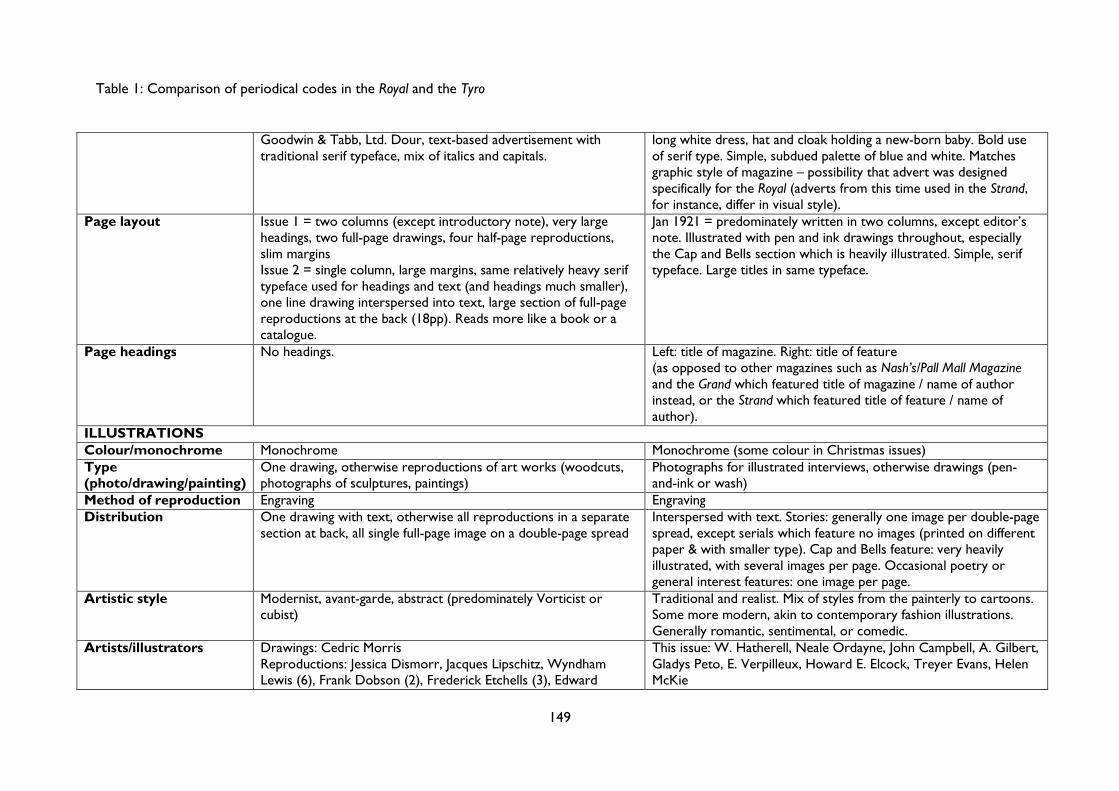
Table 1: Comparison of periodical codes in the Royal and the Tyro
149
Goodwin & Tabb, Ltd. Dour, text-based advertisement with traditional serif typeface, mix of italics and capitals.
long white dress, hat and cloak holding a new-born baby. Bold use of serif type. Simple, subdued palette of blue and white. Matches graphic style of magazine – possibility that advert was designed specifically for the Royal (adverts from this time used in the Strand, for instance, differ in visual style).
Page layout Issue 1 = two columns (except introductory note), very large headings, two full-page drawings, four half-page reproductions, slim margins Issue 2 = single column, large margins, same relatively heavy serif typeface used for headings and text (and headings much smaller), one line drawing interspersed into text, large section of full-page reproductions at the back (18pp). Reads more like a book or a catalogue.
Jan 1921 = predominately written in two columns, except editor’s note. Illustrated with pen and ink drawings throughout, especially the Cap and Bells section which is heavily illustrated. Simple, serif typeface. Large titles in same typeface.
Page headings No headings. Left: title of magazine. Right: title of feature (as opposed to other magazines such as Nash’s/Pall Mall Magazine and the Grand which featured title of magazine / name of author instead, or the Strand which featured title of feature / name of author).
ILLUSTRATIONS Colour/monochrome Monochrome Monochrome (some colour in Christmas issues) Type (photo/drawing/painting)
One drawing, otherwise reproductions of art works (woodcuts, photographs of sculptures, paintings)
Photographs for illustrated interviews, otherwise drawings (pen-and-ink or wash)
Method of reproduction Engraving Engraving Distribution One drawing with text, otherwise all reproductions in a separate
section at back, all single full-page image on a double-page spread Interspersed with text. Stories: generally one image per double-page spread, except serials which feature no images (printed on different paper & with smaller type). Cap and Bells feature: very heavily illustrated, with several images per page. Occasional poetry or general interest features: one image per page.
Artistic style Modernist, avant-garde, abstract (predominately Vorticist or cubist)
Traditional and realist. Mix of styles from the painterly to cartoons. Some more modern, akin to contemporary fashion illustrations. Generally romantic, sentimental, or comedic.
Artists/illustrators Drawings: Cedric Morris Reproductions: Jessica Dismorr, Jacques Lipschitz, Wyndham Lewis (6), Frank Dobson (2), Frederick Etchells (3), Edward
This issue: W. Hatherell, Neale Ordayne, John Campbell, A. Gilbert, Gladys Peto, E. Verpilleux, Howard E. Elcock, Treyer Evans, Helen McKie
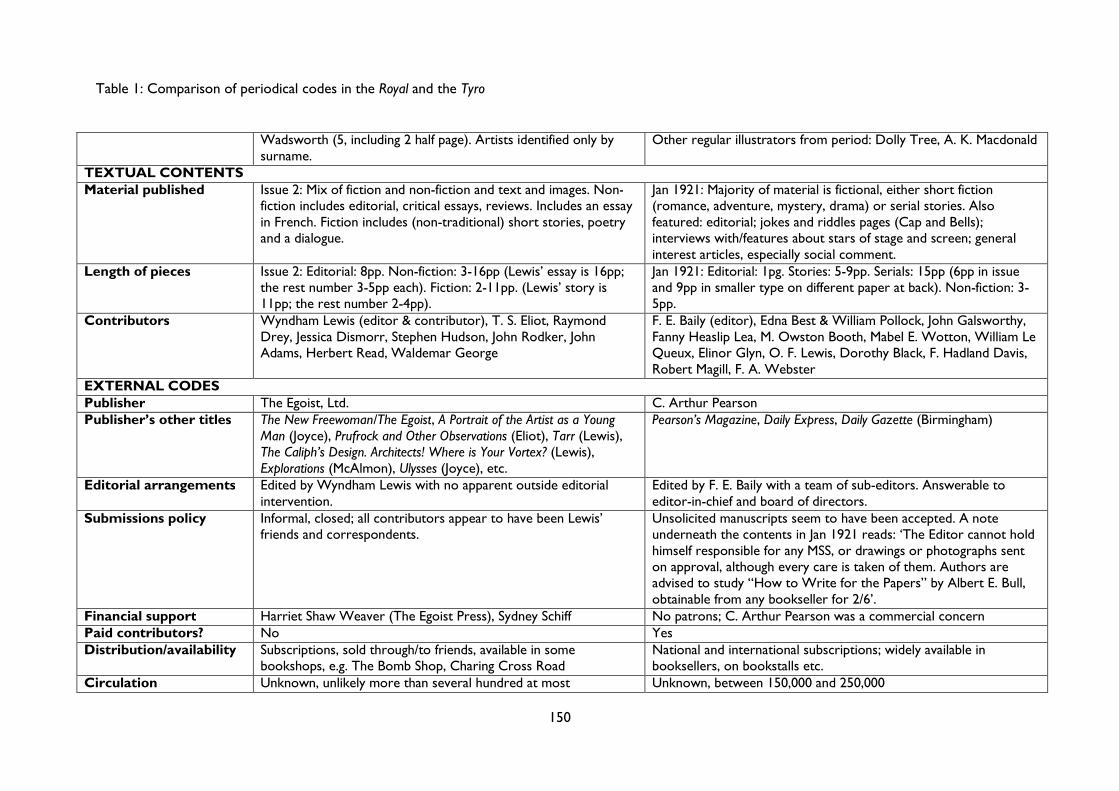
Table 1: Comparison of periodical codes in the Royal and the Tyro
150
Wadsworth (5, including 2 half page). Artists identified only by surname.
Other regular illustrators from period: Dolly Tree, A. K. Macdonald
TEXTUAL CONTENTS Material published Issue 2: Mix of fiction and non-fiction and text and images. Non-
fiction includes editorial, critical essays, reviews. Includes an essay in French. Fiction includes (non-traditional) short stories, poetry and a dialogue.
Jan 1921: Majority of material is fictional, either short fiction (romance, adventure, mystery, drama) or serial stories. Also featured: editorial; jokes and riddles pages (Cap and Bells); interviews with/features about stars of stage and screen; general interest articles, especially social comment.
Length of pieces Issue 2: Editorial: 8pp. Non-fiction: 3-16pp (Lewis’ essay is 16pp; the rest number 3-5pp each). Fiction: 2-11pp. (Lewis’ story is 11pp; the rest number 2-4pp).
Jan 1921: Editorial: 1pg. Stories: 5-9pp. Serials: 15pp (6pp in issue and 9pp in smaller type on different paper at back). Non-fiction: 3-5pp.
Contributors Wyndham Lewis (editor & contributor), T. S. Eliot, Raymond Drey, Jessica Dismorr, Stephen Hudson, John Rodker, John Adams, Herbert Read, Waldemar George
F. E. Baily (editor), Edna Best & William Pollock, John Galsworthy, Fanny Heaslip Lea, M. Owston Booth, Mabel E. Wotton, William Le Queux, Elinor Glyn, O. F. Lewis, Dorothy Black, F. Hadland Davis, Robert Magill, F. A. Webster
EXTERNAL CODES Publisher The Egoist, Ltd. C. Arthur Pearson Publisher’s other titles The New Freewoman/The Egoist, A Portrait of the Artist as a Young
Man (Joyce), Prufrock and Other Observations (Eliot), Tarr (Lewis), The Caliph’s Design. Architects! Where is Your Vortex? (Lewis), Explorations (McAlmon), Ulysses (Joyce), etc.
Pearson’s Magazine, Daily Express, Daily Gazette (Birmingham)
Editorial arrangements Edited by Wyndham Lewis with no apparent outside editorial intervention.
Edited by F. E. Baily with a team of sub-editors. Answerable to editor-in-chief and board of directors.
Submissions policy Informal, closed; all contributors appear to have been Lewis’ friends and correspondents.
Unsolicited manuscripts seem to have been accepted. A note underneath the contents in Jan 1921 reads: ‘The Editor cannot hold himself responsible for any MSS, or drawings or photographs sent on approval, although every care is taken of them. Authors are advised to study “How to Write for the Papers” by Albert E. Bull, obtainable from any bookseller for 2/6’.
Financial support Harriet Shaw Weaver (The Egoist Press), Sydney Schiff No patrons; C. Arthur Pearson was a commercial concern Paid contributors? No Yes Distribution/availability Subscriptions, sold through/to friends, available in some
bookshops, e.g. The Bomb Shop, Charing Cross Road National and international subscriptions; widely available in booksellers, on bookstalls etc.
Circulation Unknown, unlikely more than several hundred at most Unknown, between 150,000 and 250,000
151
Chapter 3
‘Cubists and Tubists’:
Art versus Commerce in Interwar Travel Posters
In many ways it is pleasant that Art should be applied to commercial uses, yet
it is absurd to suppose that any true artist will ever spell Art with a capital “C”.
- Arthur Lawrence, 19241
In Britain, the years between 1890 and 1945 constitute the peak of the rhetorical divide
between art and commerce. Essays, novels, opinion pieces, talks on the radio and spats in
the newspapers all debated one central question: are art and commerce mutually exclusive?
In Chapter 2, we saw how the notion of ‘Literature as a trade’ had become commonplace
by 1916; this notion was popularised, largely, by George Gissing’s seminal New Grub Street
(1891), in which the conflict between his two protagonists comes to represent a wider
cultural struggle. In a key passage, Jasper Milvain, self-proclaimed ‘literary man of 1882’,
identifies what is wrong with his friend Edwin Reardon:
He won't make concessions, or rather, he can't make them; he can't supply the market. I—well, you may
say that at present I do nothing; but that's a great mistake, I am learning my business. Literature nowadays
is a trade. Putting aside men of genius, who may succeed by mere cosmic force, your successful man of
letters is your skilful tradesman. He thinks first and foremost of the markets; when one kind of goods
begins to go off slackly, he is ready with something new and appetising. [...] Now, look you: if I had been
in Reardon's place, I'd have made four hundred at least out of "The Optimist"; I should have gone shrewdly
to work with magazines and newspapers and foreign publishers, and—all sorts of people. Reardon can't
do that kind of thing, he's behind his age…2
Milvain’s unabashed celebration of the commercialisation of literature acts almost as a
checklist of some of the key fault-lines of the Great Divide: innate talent versus a trade
1 Arthur Lawrence, ‘Artists Who Help the Advertiser No.14 Aubrey Hammond’, Commercial Art, 3.5, September 1924, pp. 107-109 (p. 107). 2 George Gissing, New Grub Street (1891; repr. Oxford: Oxford University Press, 2008), pp. 8-9.
152
learnt, autonomous art versus audience-oriented fodder, timeless art versus empty novelty.
In the new Grub Street, the writer is a ‘tradesman’, a ‘salesman’, a ‘business-man’; there is
no longer any room for men like Reardon, the ‘old type of unpractical artist’.
If Reardon was ‘behind his age’ in 1882, then he certainly would have been by the
1920s and 1930s. By then, this divide between ‘artists’ and ‘hacks’ had morphed into the
language of ‘highbrow’ and ‘lowbrow’, and the cultural battleground had moved from the
realm of commercial publishing to that of mass advertising, as depicted in George Orwell’s
caustic 1936 novel, Keep the Aspidistra Flying.3 Orwell was a great admirer of Gissing: in an
essay on his predecessor, Orwell wrote that Gissing’s ‘central theme can be stated in three
words – “not enough money”’.4 These three words also provide a neat summary of Keep the
Aspidistra Flying; through the ‘obnoxious and detestable’ figure of his hero, Gordon
Comstock,5 Orwell depicts the disastrous effects that (lack of) money can wage on artistic
production. Gordon, ‘aged twenty-nine and rather moth-eaten already’ (p. 1), has given up a
‘good job’ at the New Albion Publicity Company to dedicate himself to his writing, but is
unable to do so without a decent income:
It was the lack of money, simply the lack of money that robbed him of the power to “write”. He clung to
that as an article of faith. Money, money, all is money! Could you write even a penny novelette without
money to put heart in you? Invention, energy, wit, style, charm – they’ve all got to be paid for in hard
cash. (p. 8)
Working in a bookshop because it is somehow more noble, more ‘literary’, Gordon’s
attempts to write are – as he sees it – constantly thwarted by money. We first meet
Gordon alone, bored and depressed by the empty bookshop, when the ‘nasty raw wind’
inspires the first two lines of a poem:
Sharply the menacing wind sweeps over
The bending poplars, newly bare.
Good. ‘Bare’ is a sod to rhyme; however, there’s always ‘air’, which every poet since Chaucer has
been struggling to find rhymes for. But the impulse died away in Gordon’s mind. He turned the money
over in his pocket. Twopence halfpenny and a Joey — twopence halfpenny. His mind was sticky with
boredom. He couldn’t cope with rhymes and adjectives. You can’t, with only twopence halfpenny in your
pocket.
3 George Orwell, Keep the Aspidistra Flying, ed. by Peter Davison, The Complete Works of George Orwell, Vol. 4 (London: Secker & Warburg, 1997). All further references are to this edition and are included parenthetically in the text. 4 George Orwell, ‘Not Enough Money: A Sketch of George Gissing’, in Two Wasted Years, 1943, ed. by Peter Davison, The Complete Works of George Orwell, Vol. 15 (London: Secker & Warburg, 1998), pp. 45-7 (46). 5 Stephen Jay Greenblatt, Three Modern Satirists: Waugh, Orwell, and Huxley (New Haven: Yale University Press, 1965), p. 53.
153
His eyes refocused themselves upon the posters opposite. He had his private reasons for hating them.
Mechanically he re-read their slogans. ‘Kangaroo Burgundy — the wine for Britons.’ ‘Q.T. Sauce Keeps
Hubby Smiling.’ ‘Hike all day on a Slab of Vitamalt!’ ‘Are you a Highbrow? Dandruff is the reason.’ ‘Kiddies
clamour for their Breakfast Crisps.’ ‘Pyorrhea? Not me!’ ‘Roland Butta enjoys his meal with Bovex.’ (p.
5)
This extraordinary scene dramatizes the perennial threat which money poses to the artist
or writer. Briefly inspired, Gordon attempts to write only for his attention to be wrested
away by money: first by the ‘twopence halfpenny’ in his pocket, and second by the posters
opposite. His impulse is snuffed out by a dual pecuniary evil: on the one hand, it is
impossible to write without money. He can’t ‘cope with rhymes and adjectives’ with only
‘twopence halfpenny’. Yet, on the other hand, the lure of money is just as distracting: we
later learn that Gordon was a successful advertising man before quitting to pursue a literary
life. The advertising posters act as a reminder, as pervasive as Big Brother, that Gordon
cannot escape money.
Throughout the novel, these ad-posters consistently quash Gordon’s creativity,
replacing his own embryonic lines of poetry with their inane, meaningless slogans (‘Kiddies
clamour for their Breakfast Crisps’). With their crass attempts at alliteration, such slogans
aim to resemble poetry; at times, advertisements are explicitly constructed as poems.6
Towards the end, when Gordon must choose between abandoning his unborn child or his
long poem London Pleasures, a ‘two years’ foetus which would never be born’ (p. 268), he is
bombarded by a ‘monstrous’ poster, ‘ten feet high at least’, emblazoned with one of a ‘series
of four-line poems – Bovex Ballads, they were called’ (p. 257). This ‘soppy, lifeless drivel’
forces itself into Gordon’s consciousness, ‘jingl[ing]’ in his head like the Pied Piper, luring
him away from the life that ‘he had chosen’ to the prospect of ‘writing Bovex Ballads
himself’ (p. 258). To be this complicit with money is to eliminate the artistic impulse
entirely: Gordon cannot be both an ad-man and a poet. ‘Either surrender or don’t
surrender’, he tells himself; there is no middle-ground when it comes to money (p. 268). In
6 Mark S. Morrisson explores the Imagist poets’ engagement with advertising in The Public Face of Modernism: Little Magazines, Audiences, and Reception 1905-1920 (Madison: University of Wisconsin Press, 2001), pp. 95-101. See in particular pp. 99-100 for his discussion of the extraordinary ‘The Magic Carpet’ by Allen Upward: ‘poem, commodity advertisement, self-promotion, or all three?’ (p. 100). For more on the relationship between literature and advertising, see the current research project LITTéPUB, which explores both ‘advertising constructed according to literary models’ and ‘marketing or promotional material for literature, books and authors’ in France since 1830. See ‘Projet LITTéPUB Literary advertising and advertising literature from 1830 to nowadays’, L'Agence nationale de la recherche. Available at http://www.agence-nationale-recherche.fr/en/anr-funded-project/?tx_lwmsuivibilan_pi2%5BCODE%5D=ANR-14-CE31-0006 [accessed 20 December 2016].
154
an inverse of the Faustian pact, Gordon has to sacrifice the ‘soiled and tattered’ manuscript
of London Pleasures to the money-god before he can ‘buckle to work, sell his soul and hold
down his job’. London Pleasures ‘plop[s]’ unceremoniously down the drain (p. 269), only to
be replaced by posters for the appropriately excremental ‘The Queen of Sheba Toilet
Requisites Co.’ (p. 271).
While pushed to extremes for comic effect, the irreconcilable antagonism between
poetry and posters depicted in Keep the Aspidistra Flying captures many of the concerns
voiced by early-twentieth-century commentators about the perils of mass advertising and
commercialised mass culture. As we observed in Chapter 1, this mutual exclusivity between
art and commerce is one of three key myths that structure the Great Divide. In this
chapter, I will turn once again to interwar British books, journals and periodicals to examine
the precise nature of this opposition, mapping but also questioning the extent to which this
binary thinking prevailed. This interwar period was, after all, marked by an increasing
number of collaborations between artists and commercial firms: modernist artists as diverse
as John and Paul Nash, Graham Sutherland, Ben Nicholson and Vanessa Bell designed Shell
posters; Nicholson also joined Edward Bawden, John Piper and Rex Whistler in producing
publicity for Imperial Airways.7 Such collaborations often extended beyond printed
materials: the Cunard Line, for instance, commissioned artists including the erstwhile
vorticist Edward Wadsworth and the commercial and theatrical artists Doris and Anna
Zinkeisen to produce murals for RMS Queen Mary, launched in 1936.8 As traditional models
of patronage waned, artists began to accept corporate or semi-public commissions, such as
those for London Transport, the General Post Office (GPO) and the Empire Marketing
Board; these artist commissions began to blur the lines between ‘art’ and ‘commerce’.9
7 For more on Shell publicity from this period, see John Hewitt, ‘The “Nature” and “Art” of Shell Advertising in the Early 1930s’, Journal of Design History, 5.2 (1992), 121-139, and Malcolm V. Speakman, ‘Shell’s England: Corporate Patronage and English Art in the Shell Posters of the 1930s’ (unpublished doctoral thesis, University of Manchester, 2014); for Imperial Airways see Scott Anthony and Oliver Green, British Aviation Posters: Art, Design and Flight (Farnham: Lund Humphries, 2012). Other firms which collaborated with artists during this period included the Coal, Gas & Coke Company, Allan Walton Textiles, and, in the United States, Cheney Silks. For more on the latter’s collaboration with Georgia O’Keefe, see Regina Lee Blaszczyk, ‘The Colors of Modernism: Georgia O’Keefe, Cheney Brothers, and the Relationship Between Art and Industry in the 1920s’, in Seeing High and Low: Representing Social Conflict in American Visual Culture, ed. by Patricia Johnston (Berkeley: University of California Press, 2006), pp. 228-46. 8 Britta C. Dwyer discusses the Zinkeisen sisters’ murals for RMS Queen Mary in her essay ‘Negotiating “new” venues in art: Doris and Anna Zinkeisen in modernizing London’, in Women’s Contributions to Visual Culture, 1918-1939, ed. by Karen E. Brown (Aldershot: Ashgate, 2008), pp. 117-38 (pp. 131-4). 9 These shifts in traditional models of artistic patronage were explored in a series of articles in the Listener magazine in 1935. Over the course of a month, the art critic Roger Hinks, Osbert Sitwell, Edward Marsh and Jack Beddington, Head of Publicity at Shell-Mex, wrote discussing different facets of contemporary art patronage. The Hinks, Marsh and Beddington essays were reproduced in R. S. Lambert (ed.), Art in England
155
Nowhere were these lines more blurred than in the new world of graphic design and mass
advertising: the world, in short, of Orwell’s New Albion Publicity Company.10 In the early
1920s there was an explosion of interest in the ‘use’ of art in publicity, a usage which
threatened to destabilise but also preserve existing conceptions of art.
This chapter is split into two parts. Firstly, I will examine the discussions and debates
about the relationship between art and commerce which raged in the books, newspapers
and periodicals of the mid-twenties. I lay out both the ‘modernist’ and the ‘commercial’
positions, exploring the contradictions within each. Surprisingly, neither the modernist elite
nor designers could agree on a single stance. Not all modernists believed that art and
commerce were mutually exclusive; not all designers believed that advertising could – or
should – unite both commerce and art. Having established how art and commerce – and
‘commercial art’ – were rhetorically defined I then consider the extent to which these
rhetorical divisions were present in actual cultural texts. In particular, I examine the mass
advertising poster, emblem for Gordon Comstock of everything antithetical to true or
‘pure’ art. As a key site of conflict between the aesthetic and the commercial, the second
part will focus on a selection of posters from three of the four British interwar railway
companies: London, Midland and Scottish Railway (LMS), London and North Eastern Railway
(LNER) and Southern.11 As we will see, these posters combined art and publicity in
innovative ways, but such combinations were not unproblematic. While commentators and
commissioners wanted posters to appear more artistic, it did not necessarily mean that they
wanted works of art. Thus, while the railway posters explored below demonstrate that art
and commerce were not mutually exclusive, it is also not enough to say that they were
entirely equivalent. In order to navigate these complex distinctions, and to suggest ways of
viewing advertising posters that do not fall into binary thinking, I will place the emphasis on
Jan Mukařovský’s notion of ‘function’, exploring the extent to which apparently opposing
tendencies like aesthetic and publicity functions could both be present in a single text.
(Harmondsworth: Penguin, 1938), pp. 73-87; Osbert Sitwell’s essay, ‘Patronage in Art Today—II’ was published in the Listener, 11 September 1935, pp. 419-21. 10 Orwell was not the only interwar author to write about the advertising world. In her novel Murder Must Advertise (1933), Dorothy L. Sayers used her experience working at S. H. Benson Ltd. as a backdrop to a Lord Peter Wimsey mystery. During her time at S. H. Benson, Sayers was responsible for many well-known slogans, including the short poem ‘If he can say as you can / Guinness is good for you / How grand to be a Toucan / Just think what Toucan do’. Published in 1935 on a poster designed by John Gilroy, one wonders whether Orwell’s ‘Bovex Ballads’ were in part inspired by Sayers’s poem. 11 The final interwar railway company was the Great Western Railway (GWR).
156
Modernist positions: autonomy, art & advertising
Gordon Comstock was not alone in feeling that money impeded the production of true art.
The year after Keep the Aspidistra Flying was published, J. L. Martin, Ben Nicholson and Naum
Gabo claimed in their introduction to Circle: International Survey of Constructivist Art that it
was ‘indeed fair to say that popular taste […] and the dependence upon private enterprise,
completely handicap the development of new ideas in art’.12 The ‘completely’ is key here:
commerce (or ‘private enterprise’) is entirely antithetical to artistic values. Eric Gill, writing
in 1934, argued that the commercial factor had overtaken all considerations in the making of
things. ‘For paintings and sculptures and music, for poems, detective stories and
psychological novels’, he argued, ‘you need the individual mind controlling the individual
hand and responding to the individual eye or ear.’ The modern, machine-driven world of
‘commercial fulfilment’ was divorcing art from the individual, replacing emotional expression
with mere ‘salesmanship’.13
Gill’s tirade against the machine could hardly be described as novel, appearing as it did
in the mid-nineteen-thirties,14 but his essay came at a time of renewed concern over the
effects of commercialism on art. In this section, I will consider some of the typical modernist
critiques of the marketplace, building upon my initial exploration of the art/commerce divide
in Chapter 2 above. I aim to reveal the contradictions inherent in this staunchly anti-
12 J. L. Martin, Ben Nicholson and N. Gabo, ‘Editorial’, in Circle: International Survey of Constructivist Art, ed. by J. L. Martin, Ben Nicholson and N. Gabo (London: Faber and Faber, 1937), pp. v-vi (p. v). 13 Eric Gill, ‘Art and a Changing Civilisation’, in Art and Changing Civilization: Literary Taste, Culture and Mass Communication, Volume IV, ed. by Peter Davison, Rolf Meyersohn, Edward Shils (1934; repr. Cambridge: Chadwyck-Healey, 1978), pp. 135-281 (pp. 247, 239-40). 14 We can trace such critiques of the machine back to the Romantic period and the start of the Industrial Revolution, but perhaps the biggest influence on Gill’s thought was John Ruskin. In his chapter ‘The Nature of Gothic’ in The Stones of Venice (1851-53), reprinted by William Morris’s Kelmscott Press in 1892, Ruskin describes how the machine ‘unhumanize[s]’ workers, making ‘their fingers measure degrees like cog-wheels, and their arms strike curves like compasses’ [John Ruskin, The Nature of Gothic: A Chapter of the Stones of Venice (Hammersmith: Kelmscott Press, 1892), p. 17]. Crucially, like Gill after him, Ruskin connects this critique of the dehumanising machine to a broader critique of industrial capitalism, arguing that it is ‘not that men are ill fed, but that they have no pleasure in the work by which they make their bread, & therefore look to wealth as the only means of pleasure.’ (p. 20) When it comes to Gill’s critique of the machine, it is worth noting that his views are influenced not only by Ruskin (and Morris) but also by Catholic crafts guilds such as Maurice Denis’s Ateliers d’Art Sacré (1919) and his own Guild of St Joseph and St Dominic, founded in 1920. He made an explicit connection between religion and the machine in his 1940 pamphlet Christianity and the Machine Age, in which he argued that the machine ‘deprives human labour of the quality of service and makes it simply a means to gaining money.’ [Eric Gill, ‘Christianity and the Machine Age’, in Philosophy and Technology: Readings in the philosophical problems of technology, ed. by Carl Mitcham and Robert Mackey (1940; repr. New York: The Free Press, 1983), pp. 214-236 (p. 235).] Yet, for Gill, the machine itself was not the problem: he notes the potential for its use in ‘alleviating the sufferings of the poor’ (p. 235), and he himself worked to produce typefaces such as Gill Sans (in which this thesis is written) which was produced on a mass scale by the LNER. Rather, Gill objects to what the machine has come to stand for: it is an emblem of commercial capitalist culture, in which ‘holiness’ and ‘good will’ are subordinated to the practice of making money (p. 235).
157
commercial position, showing how the modernist praise for designers like Edward McKnight
Kauffer demonstrates at least a structural possibility that texts could be at once both artistic
and commercial. While such praise can be dismissed as an exception, I consider Roger Fry’s
1925 essay Art and Commerce in some depth, investigating Fry’s conflicting portrayal of the
dynamic and challenging new field of poster design as both danger and possibility.
As early as 1924, this ‘highbrow’ position was conflated with anti-commercialism in the
popular press. Ruminating on the subject of American theatre, The Times’s dramatic critic
wrote that it appeared to him ‘that the high brows in America are just a trifle higher than
elsewhere. […] I suppose it is because the “commercial” spirit is to be found at its
maximum in America that the anti-commercial or high-brow spirit is at its maximum there
too.’15 For the dramatic critic, the anti-commercial and the high-brow spirit are one and the
same thing: an accusation borne out if we consider the writings of the arch-highbrow Q. D.
Leavis, who argued in 1932 that it was ‘because of new commercial conditions [that] the
beginnings of a split between popular and cultivated fiction’ became ‘apparent’ in the mid-
nineteenth century,16 or I. A. Richards, who claimed that ‘commercialism’ was precipitating a
‘collapse in values’ and the ‘decreasing in merit’ of art forms.17
These modernist objections to the marketplace were widespread and have been well-
recorded. In The Public Face of Modernism, Mark S. Morrisson neatly summaries this ‘familiar
set of concerns’:
culture controlled by corporations; public debate constricted by advertisers’ prejudices; profit and ‘the
bottom line’ sacrificing the original, the creative, to the tried and true, to the ‘lowest common
denominator’; copy that requires little thought and panders to readers’ taste for the sensational, uncritical,
and merely entertaining.18
Although these primarily literary concerns also applied to art and design, in the latter fields
commercialism’s primary threat was its perceived challenge to artistic autonomy. In Keep the
Aspidistra Flying, Circle and Gill’s Art and a Changing Civilisation above, commerce inhibits the
production of pure, spontaneous, expressive art. Commerce presented a threefold
challenge: it impeded independent creation and execution, it imposed an extra-artistic
purpose or function (i.e. to sell or to have a use-value), and it imposed a (mass) audience.
To the modernists, the commercial world represented a loss of control, freedom and
15 Our Dramatic Critic, ‘New Isms.’, The Times, 6 February 1924, p. 8, my emphasis. 16 Q. D. Leavis, Fiction and the Reading Public (1932; repr. London: Chatto & Windus, 1965), p. 158. 17 I. A. Richards, Principles of Literary Criticism, 2nd edn. (1926; repr. Routledge & Kegan Paul, 1949), p. 36. 18 Morrisson, The Public Face of Modernism, p. 5.
158
integrity. In other words, commercialism constituted the infection of the internal artistic
impulse by external pressures. In a key passage in The Culture Industry, Adorno expressed
the relationship between art and commerce as a parasitic one: the culture industry ‘lives
parasitically from the extra-artistic technique of the material production of goods, without
regard for the obligation to the internal artistic whole implied by its functionality, but also
without concern for the laws of form demanded by aesthetic autonomy’.19 In this short
passage, Adorno touches on many of the points considered throughout this thesis: the
identification of art as autonomous, the hierarchical divide between internal (art) and
external (commerce), and the depiction of commercial pressures as ‘purely’ commercial.
The latter assertion – that mass-market works are purely commercial – suggests that
cultural objects which make money are devoid of artistic function or moral or aesthetic
responsibility.
This notion of autonomy, then, was not just central to the modernist conception of
the artist: it constituted the essence of art and the artist. Thomas Crow has argued that
‘Modernism as a word carries connotations of an autonomous, inward, self-referential and
self-critical artistic practice’: note here that autonomy comes first in his list of
characteristics.20 Andrew Goldstone quotes a telling statement from Eliot published in the
Criterion in 1923, in which he writes that ‘I have assumed as axiomatic that a creation, a
work of art, is autonomous.’21 Elsewhere, Andreas Huyssen, Mary Hammond and D. L.
LeMahieu have all identified the centrality of autonomy to the modernist project, exploring
variously the conception of autonomy in Adorno and Greenberg (Huyssen), fin-de-siècle
British authors (Hammond) and Bell, Fry and Moore (LeMahieu).22 For Huyssen, the
‘autonomy of art has’, from its inception, ‘been related dialectically to the commodity
form’.23 Huyssen dates this split between the work of art and mass commercial culture to
19 Theodor Adorno, 'Culture Industry Reconsidered', in The Culture Industry, ed. and intr. by J. M. Bernstein (London and New York: Routledge, 1991), pp. 98-106 (p. 101). I return to the notion of mass culture as a parasite in Chapter 4 below. 20 Thomas Crow, 'Modernism and Mass Culture in the Visual Arts', in Modernism and Modernity: The Vancouver Conference Papers, ed. by Benjamin H. D. Buchloh, Serge Guilbaut and David Solkin (Halifax: The Press of the Nova Scotia College of Art and Design, 1983), pp. 215-264 (p. 216). 21 T. S. Eliot, quoted in Andrew Goldstone, Fictions of Autonomy: Modernism from Wilde to de Man (New York; London: Oxford University Press, 2013), p. 1. 22 See Andreas Huyssen, After the Great Divide: Modernism, Mass Culture, Postmodernism (Bloomington: Indiana University Press, 1986), pp. 16-43; D. L. LeMahieu, A Culture for Democracy: Mass Communication and the Cultivated Mind in Britain Between the Wars (Oxford: Clarendon Press, 1988), pp. 121-131; and Mary Hammond, Reading, Publishing and the Formation of Literary Taste in England 1880-1914 (London: Ashgate, 2006), pp. 117-118, 180. 23 Huyssen, After the Great Divide, p. 17.
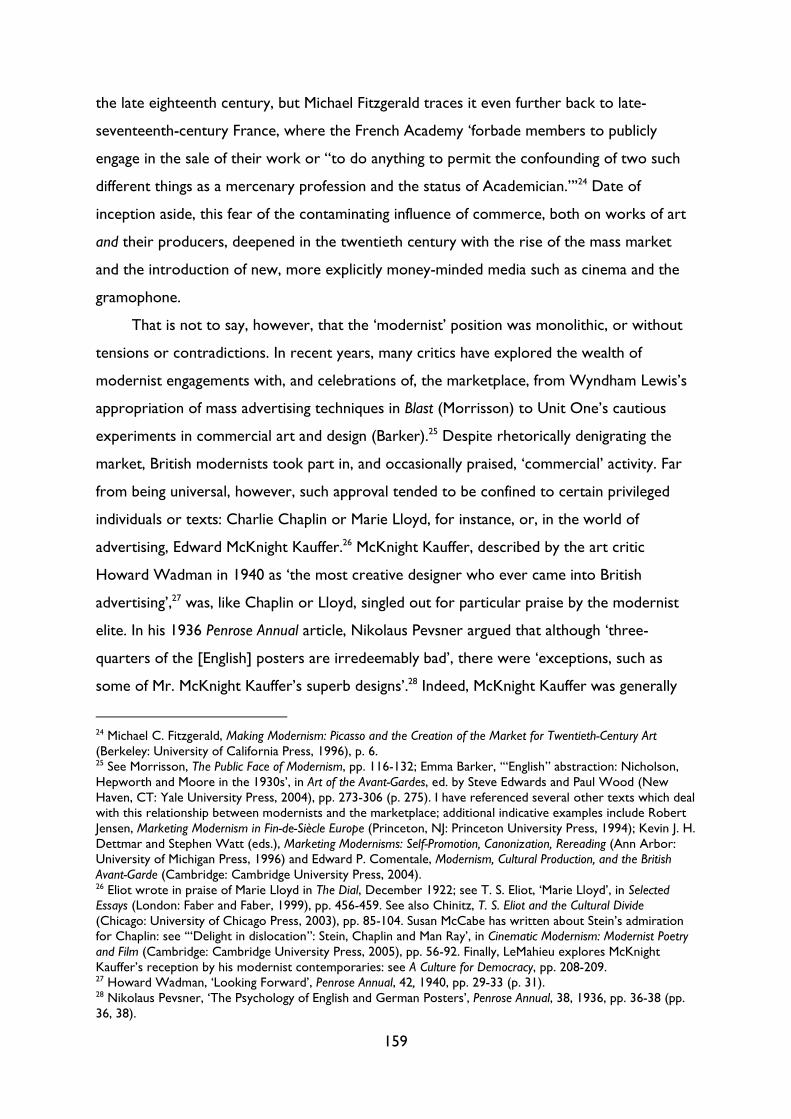
159
the late eighteenth century, but Michael Fitzgerald traces it even further back to late-
seventeenth-century France, where the French Academy ‘forbade members to publicly
engage in the sale of their work or “to do anything to permit the confounding of two such
different things as a mercenary profession and the status of Academician.”’24 Date of
inception aside, this fear of the contaminating influence of commerce, both on works of art
and their producers, deepened in the twentieth century with the rise of the mass market
and the introduction of new, more explicitly money-minded media such as cinema and the
gramophone.
That is not to say, however, that the ‘modernist’ position was monolithic, or without
tensions or contradictions. In recent years, many critics have explored the wealth of
modernist engagements with, and celebrations of, the marketplace, from Wyndham Lewis’s
appropriation of mass advertising techniques in Blast (Morrisson) to Unit One’s cautious
experiments in commercial art and design (Barker).25 Despite rhetorically denigrating the
market, British modernists took part in, and occasionally praised, ‘commercial’ activity. Far
from being universal, however, such approval tended to be confined to certain privileged
individuals or texts: Charlie Chaplin or Marie Lloyd, for instance, or, in the world of
advertising, Edward McKnight Kauffer.26 McKnight Kauffer, described by the art critic
Howard Wadman in 1940 as ‘the most creative designer who ever came into British
advertising’,27 was, like Chaplin or Lloyd, singled out for particular praise by the modernist
elite. In his 1936 Penrose Annual article, Nikolaus Pevsner argued that although ‘three-
quarters of the [English] posters are irredeemably bad’, there were ‘exceptions, such as
some of Mr. McKnight Kauffer’s superb designs’.28 Indeed, McKnight Kauffer was generally
24 Michael C. Fitzgerald, Making Modernism: Picasso and the Creation of the Market for Twentieth-Century Art (Berkeley: University of California Press, 1996), p. 6. 25 See Morrisson, The Public Face of Modernism, pp. 116-132; Emma Barker, ‘“English” abstraction: Nicholson, Hepworth and Moore in the 1930s’, in Art of the Avant-Gardes, ed. by Steve Edwards and Paul Wood (New Haven, CT: Yale University Press, 2004), pp. 273-306 (p. 275). I have referenced several other texts which deal with this relationship between modernists and the marketplace; additional indicative examples include Robert Jensen, Marketing Modernism in Fin-de-Siècle Europe (Princeton, NJ: Princeton University Press, 1994); Kevin J. H. Dettmar and Stephen Watt (eds.), Marketing Modernisms: Self-Promotion, Canonization, Rereading (Ann Arbor: University of Michigan Press, 1996) and Edward P. Comentale, Modernism, Cultural Production, and the British Avant-Garde (Cambridge: Cambridge University Press, 2004). 26 Eliot wrote in praise of Marie Lloyd in The Dial, December 1922; see T. S. Eliot, ‘Marie Lloyd’, in Selected Essays (London: Faber and Faber, 1999), pp. 456-459. See also Chinitz, T. S. Eliot and the Cultural Divide (Chicago: University of Chicago Press, 2003), pp. 85-104. Susan McCabe has written about Stein’s admiration for Chaplin: see ‘“Delight in dislocation”: Stein, Chaplin and Man Ray’, in Cinematic Modernism: Modernist Poetry and Film (Cambridge: Cambridge University Press, 2005), pp. 56-92. Finally, LeMahieu explores McKnight Kauffer’s reception by his modernist contemporaries: see A Culture for Democracy, pp. 208-209. 27 Howard Wadman, ‘Looking Forward’, Penrose Annual, 42, 1940, pp. 29-33 (p. 31). 28 Nikolaus Pevsner, ‘The Psychology of English and German Posters’, Penrose Annual, 38, 1936, pp. 36-38 (pp. 36, 38).
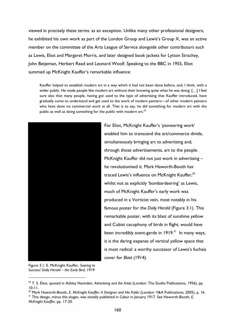
160
viewed in precisely these terms: as an exception. Unlike many other professional designers,
he exhibited his own work as part of the London Group and Lewis’s Group X, was an active
member on the committee of the Arts League of Service alongside other contributors such
as Lewis, Eliot and Margaret Morris, and later designed book jackets for Lytton Strachey,
John Betjeman, Herbert Read and Leonard Woolf. Speaking to the BBC in 1955, Eliot
summed up McKnight Kauffer’s remarkable influence:
Kauffer helped to establish modern art in a way which it had not been done before, and, I think, with a
wider public. He made people like modern art without their knowing quite what he was doing. […] I feel
sure also that many people, having got used to the type of advertising that Kauffer introduced, have
gradually come to understand and get used to the work of modern painters—of other modern painters
who have done no commercial work at all. That is to say, he did something for modern art with the
public as well as doing something for the public with modern art.29
For Eliot, McKnight Kauffer’s ‘pioneering work’
enabled him to transcend the art/commerce divide,
simultaneously bringing art to advertising and,
through those advertisements, art to the people.
McKnight Kauffer did not just work in advertising –
he revolutionised it. Mark Haworth-Booth has
traced Lewis’s influence on McKnight Kauffer;30
whilst not as explicitly ‘bombardeering’ as Lewis,
much of McKnight Kauffer’s early work was
produced in a Vorticist vein, most notably in his
famous poster for the Daily Herald (Figure 3.1). This
remarkable poster, with its blast of sunshine yellow
and Cubist cacophony of birds in flight, would have
been incredibly avant-garde in 1919.31 In many ways,
it is the daring expanse of vertical yellow space that
is most radical: a worthy successor of Lewis’s fuchsia
cover for Blast (1914).
29 T. S. Eliot, quoted in Ashley Havinden, Advertising and the Artist (London: The Studio Publications, 1956), pp. 10-11. 30 Mark Haworth-Booth, E. McKnight Kauffer: A Designer and His Public (London: V&A Publications, 2005), p. 16. 31 This design, minus the slogan, was initially published in Colour in January 1917. See Haworth-Booth, E. McKnight Kauffer, pp. 17-20.
Figure 3.1: E. McKnight Kauffer, Soaring to Success! Daily Herald – the Early Bird, 1919
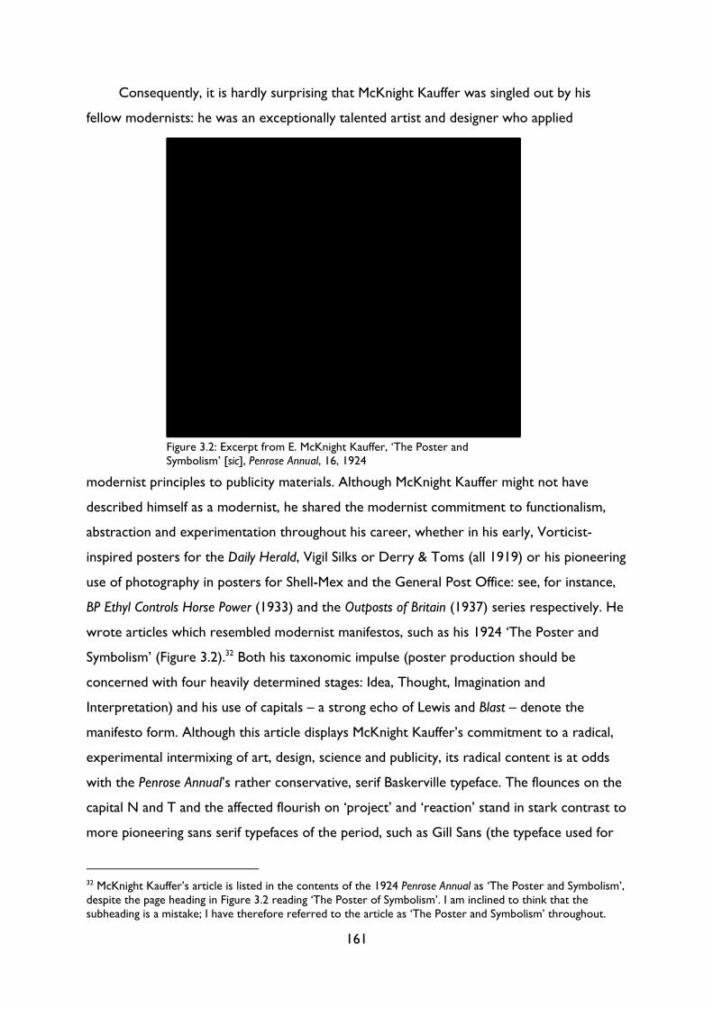
161
Consequently, it is hardly surprising that McKnight Kauffer was singled out by his
fellow modernists: he was an exceptionally talented artist and designer who applied
modernist principles to publicity materials. Although McKnight Kauffer might not have
described himself as a modernist, he shared the modernist commitment to functionalism,
abstraction and experimentation throughout his career, whether in his early, Vorticist-
inspired posters for the Daily Herald, Vigil Silks or Derry & Toms (all 1919) or his pioneering
use of photography in posters for Shell-Mex and the General Post Office: see, for instance,
BP Ethyl Controls Horse Power (1933) and the Outposts of Britain (1937) series respectively. He
wrote articles which resembled modernist manifestos, such as his 1924 ‘The Poster and
Symbolism’ (Figure 3.2).32 Both his taxonomic impulse (poster production should be
concerned with four heavily determined stages: Idea, Thought, Imagination and
Interpretation) and his use of capitals – a strong echo of Lewis and Blast – denote the
manifesto form. Although this article displays McKnight Kauffer’s commitment to a radical,
experimental intermixing of art, design, science and publicity, its radical content is at odds
with the Penrose Annual’s rather conservative, serif Baskerville typeface. The flounces on the
capital N and T and the affected flourish on ‘project’ and ‘reaction’ stand in stark contrast to
more pioneering sans serif typefaces of the period, such as Gill Sans (the typeface used for
32 McKnight Kauffer’s article is listed in the contents of the 1924 Penrose Annual as ‘The Poster and Symbolism’, despite the page heading in Figure 3.2 reading ‘The Poster of Symbolism’. I am inclined to think that the subheading is a mistake; I have therefore referred to the article as ‘The Poster and Symbolism’ throughout.
Figure 3.2: Excerpt from E. McKnight Kauffer, ‘The Poster and Symbolism’ [sic], Penrose Annual, 16, 1924
162
this thesis) or Johnston Sans, used for the London Underground from 1916.33 The typeface
in Figure 3.2 may have been an anomaly – Steve Hare notes that it was a ‘policy to try out
each of Monotype’s new types in Penrose’34 – but the strange pairing of McKnight Kauffer’s
radical, forward-looking ideas with the antiquated Baskerville typeface indicates that
McKnight Kauffer was ahead of many of his colleagues in the new field of ‘commercial art’.
His practice was informed by an intellectual and ‘scientific’ rigour and an awareness of all the
latest developments in modern art and design;35 his compendium book, The Art of the Poster:
Its Origin, Evolution & Purpose (1924), showcased an extensive selection of historical and
vanguard British, American and continental posters.36 The result of extensive research at the
British Library, The Art of the Poster would have introduced many British readers and
students to new developments in poster design.
McKnight Kauffer helped to bring modernist ideas to both British graphic designers
and ‘man on the street’, but he did not do so single-handed. In my Introduction, I argued
that ‘exceptional’ popular texts and producers have been canonised: McKnight Kauffer is a
case in point. McKnight Kauffer was extraordinarily talented, and produced some of the
most experimental and enduring works of modern British publicity, but he was not alone.
One need only consider some of the organisations for whom he worked (London
Underground, Steinhal & Co, Vigil Silks, Shell-Mex, Empire Marketing Board), alongside
scores of other designers, to witness the explosion of creativity and experimentation that
characterised the interwar visual arts. Under the direction of Frank Pick, the London
Underground, for instance, was a pioneering patron of British modernism, employing scores
of artists, designers, typographers and architects to overhaul London’s transport system, its
stations, its signage and its attendant publicity into a utopian, modernist Gesamtkunstwerk.37
33 In the digital age, several different versions of Gill Sans exist. This thesis uses ‘Gill Sans MT’, which is a digitised version of Monotype’s Gill Sans. 34 Steve Hare, ‘By Printers for Printers’, Eye, 15.60 (Summer 2006), 52-59. 35 For more on McKnight Kauffer’s ‘scientific’ approach, see Adolphe Armand Braun, ‘Artists Who Help the Advertiser - No. 7 - E. McKnight Kauffer’, Commercial Art, 2.14, December 1923, pp. 324-326. 36 Edward McKnight Kauffer (ed.), The Art of the Poster: Its Origin, Evolution & Purpose (London: Cecil Palmer, 1924). 37 An early DIA pamphlet, A New Body with New Aims (1915), made this German influence explicit: it featured an essay by the critic A. Clutton Brock on ‘The Industrial Art of Germany’, in which he argued that the ‘astonishing improvement’ in German industrial art ‘had been caused mainly by cooperation between the designer, the manufacturer, and the distributor. […] The artist ceased to be a tiresome crank to the manufacturer, or the manufacturer a dull Philistine to the artist.’ [A. Clutton Brock, ‘The Industrial Art of Germany’, in A New Body with New Aims (London: Design & Industries Association, 1915), pp. 13-19 (p. 20).] Following the outbreak of war, the Board of Trade organised an exhibition of ‘enemy goods’ by German and Austrian industrial artists at Goldsmith’s Hall, London, in May 1915, in an attempt to show British manufacturers the kind of trade they could pick up now that war had ceased imports from Germany; this exhibition, and the wartime context, prompted the formation of the DIA. For more on the DIA’s beginnings
163
The use of the German term is significant: Pick, as a founding member and later president of
the Design and Industries Association (DIA), was heavily influenced by the work of the
Deutscher Werkbund, founded in 1907, which aimed to foster links between artists and
manufacturers to design objects for mass production. As Head of Publicity at London
Transport, Pick was in the perfect position to be able to enact the DIA’s aims of integrating
art into everyday life on an unprecedented scale, revolutionising every aspect of the
transport system, right down to the textiles used in the train carriages and the tiles that
adorned the station walls. For Pick, art was not a ‘supplementary process or extraneous
addition’; it was a ‘spirit informing all material’, ‘all workmanship’ and ‘all design’ that ‘ought
to be present in all organisation’.38
As a pioneering modernist patron, Pick has received lots of critical attention,39 but, like
McKnight Kauffer, he was not the only individual to believe that ‘art and commerce must
ally themselves’.40 We could think of Jack Beddington at Shell-Mex, William Teasdale at the
LNER, Alastair Morton at Edinburgh Weavers, Alec Walker at Vigil Silk, or Stephen Tallents
and John Grierson at the Empire Marketing Board and later the GPO.41 Combined, these
and aims, see founder member H. H. Peach’s article, ‘Museums and the Design and Industries Association’, American Magazine of Art, March 1916, pp. 197-200. 38 Frank Pick, ‘Art in Commerce and in Life’ (8 March 1916), London, V&A Archive of Art and Design, AAD/1997/7/96, pp. 15-16. 39 There is a wealth of material available about Frank Pick and the Underground; indicative examples include Christian Barman, The Man Who Built London Transport: A Biography of Frank Pick (Newton Abbot: David & Charles, 1979), Michael T. Saler, The Avant-Garde in Interwar England: Medieval Modernism and the London Underground (New York: Oxford University Press, 1999); David Bownes and Oliver Green (eds.), London Transport Posters: A Century of Art and Design (Aldershot: Lund Humphries, 2008) and Oliver Green and Jeremy Rewse-Davies, Designed for London: 150 Years of Transport Design (London: Laurence King, 1995). 40 Pick, ‘Art in Commerce’, p. 24. 41 Jack Beddington was a leading modernist patron, commissioning leading artists and designers such as McKnight Kauffer, Graham Sutherland, Paul Nash, Vanessa Bell, and Clifford and Rosemary Ellis to produce posters displayed on the side of vehicles; see Ruth Artmonsky, Jack Beddington: The Footnote Man (London: Artmonsky Arts, 2006). Beddington also sat on the short-lived Poster Advisory Committee at the GPO from 1933 to 1936 alongside Clive Bell, Stephen Tallents and Kenneth Clark. William Teasdale was appointed as the LNER’s first Advertising Manager in 1923; he was responsible for securing the work of five leading poster designers (Tom Purvis, Fred Taylor, Austin Cooper, Frank Mason and Frank Newbould) for exclusive use at the LNER. For more on Teasdale, see Beverley Cole, It’s Quicker by Rail: LNER Publicity and Posters, 1923 to 1947 (London: Capital Transport, 2006), p. 3; Beverley Cole and Richard Durack, Railway Posters, 1923-1947 (London: Laurence King, 1992), pp. 15-17; and John Hewitt, ‘East Coast Joys: Tom Purvis and the LNER’, Journal of Design History, 8.4 (1995), 291-311. Alastair Morton, Art Director at Edinburgh Weavers, commissioned daring modernist designs by artists and designers including Ben Nicholson, Barbara Hepworth and Marion Dorn; see Lesley Jackson, Alastair Morton and Edinburgh Weavers: Visionary Textiles and Modern Art (London: V&A, 2012). As both an artist and fabric manufacturer, Alec Walker could produce not only his own designs, as inspired by a 1923 meeting with Raoul Dufy, but also commission artists such as Sutherland and Nash to produce designs for printing onto silk and linen. For more on Walker, see Lesley Jackson, Twentieth-Century Pattern Design (London: Mitchell Beazley, 2011), pp. 72-73 and Alan Powers, Modern Block Printed Textiles (London: Walker Books, 1992). Sir Stephen Tallents was a civil servant who believed in the power of good design to raise the level of public taste. At both the Empire Marketing Board and the GPO, as well as the Ministry of Information during the Second World War, Tallents commissioned leading advocates of modernist
164
patrons commissioned hundreds of artists and designers, many of whom would be identified
as ‘modernist’ today, to produce posters, publicity materials, films, textiles and other
products. In other words, although articles and talks continued to expound on the divide
between art and commerce, such a divide was, even in the early 1920s, more a function of
rhetoric than of lived experience. The boundaries between art and commerce were
becoming blurred, often indistinguishably, in this new field of ‘commercial art’: consequently,
those whose conception of art was predicated on its opposition to commerce had to
fundamentally rethink their approach. In 1925, Roger Fry appeared to do just that: in a talk
and later pamphlet entitled Art and Commerce, he examined the dangers and opportunities of
this dynamic new field. It is a strange essay, full of contradictions, but these contradictions
reveal the difficulties experienced by those attempting to demarcate the nascent discipline
of ‘commercial art’.
Fry begins by setting up a rigid divide between art and craft – or, in his words, ‘art’ and
‘opifact’ or ‘artist’ and ‘opificer’. Where an ‘opifact’ is ‘any object made by man not for
direct use but for the gratification of those special feelings and desires’, a work of art is any
opifact ‘in which we can trace a quite particular quality, the quality of expressing a particular
emotion which we call the esthetic [sic] emotion’.42 It is this ‘esthetic emotion’ which
separates the mere opifact from the work of art: instead of producing pleasure or
conferring prestige, artworks are ‘generally unwelcome disturbers of the established
harmony, spoilers of the feast’ (pp. 53-4).43 Art is living, radical; the opifact is mummified. As
the essay progresses, however, Fry begins to acknowledge an ontological indeterminacy
between the two categories. ‘There is, of course’, he writes, ‘every degree of shading
between the pure opificer who is entirely immune from esthetic feeling and the pure artist
who has no possibility of compromise with commerce and the existing order’ (p. 55). Here,
art and design, including McKnight Kauffer, Sutherland, Nash, Bell, Clive Gardiner and Macdonald Gill. See Scott Anthony, Public Relations and the Making of Modern Britain: Stephen Tallents and the birth of a progressive media profession (Manchester: Manchester University Press, 2012), Stephen Constantine, Buy & Build: the advertising posters of the Empire Marketing Board (London: H.M.S.O., 1986) and Paul Rennie, GPO Posters (Woodbridge: Antique Collectors' Club, 2011). Like Tallents, Grierson worked at the EMB, setting up a film unit, and did the same at the GPO in the 1930s. The GPO’s Crown Film Unit produced some of the most experimental documentary and propaganda films of the period, bringing together artists, designers, filmmakers, composers and writers, such as Benjamin Britten and W. H. Auden on Night Mail (1936). See The Projection of Britain: A History of the GPO Film Unit, ed. by Scott Anthony and James G. Marshall (Basingstoke: Palgrave Macmillan, 2011). 42 Roger Fry, ‘Art and Commerce’, reprinted in Journal of Cultural Economics, 22 (1998), 49-59 (p. 50). All further references are to this edition and are included parenthetically in the text. 43 Fry’s definition here recalls Mukařovský’s definition of art as that which ‘destroys’ existing aesthetic norms, discussed in Chapter 2 above. See Jan Mukařovský, Aesthetic Function, Norm and Value as Social Facts, trans. by Mark E. Suino (Ann Arbor: University of Michigan Press, 1970), p. 33.
165
Fry recognises that his categorisation of artists and opificers is ‘very schematic’, but he
remains insistent that there is a difference between the two. In a statement which recalls the
Observer’s ‘World of Letters’ column explored in Chapter 1, in which the columnist
observed that while she could not ‘furnish a precise and exact definition of a high-brow’, she
could nonetheless ‘make a number of definite assertions’ about him,44 Fry contends that ‘the
fact that we cannot ever draw a definite line between [artists and opificers] is no more
argument against recognising the opposing types than it is to say that we cannot draw the
line between blue and green.’ (p. 55) In other words, like the World of Books columnist, the
difference between artist and opificer is, for Fry, entirely self-evident. Formal definitions or
borders are not required when one can just infer the essential difference between the two.
So far, so modernist: Fry’s insistence on a hazy, indeterminable but incontrovertible
difference between art and commerce is representative of prevailing aesthetic and cultural
theory – or, indeed, of social and cultural categorisation in general. What is surprising is
Fry’s view of advertising. He makes the usual observations, that advertising trades in the
business of ‘hypnotic suggestion’ or that it forces people to ‘buy more soap than they need’,
but he also argues that ‘advertisement has, in recent times, taken on a new complexion. It is
tinged with a new poetry, a new romance.’ (pp. 57-8) This publicity may, as he argues, be a
ploy to ‘induce’ the public ‘to pay far more for things than they cost to produce’, but it has
an unexpected side effect: the ‘possibility of commerce doing something to redress the
balance in favour of art’ (p. 58). As posters are relatively cheap to produce, companies are
more likely to ‘take risks’ with them, resulting, perhaps, in a ‘work of art [which] might pass
muster both with the employer and the public’.45 Moreover, as this new medium has yet to
become ‘ossified and fixed in its habits’, the ‘art of poster design holds out opportunities of
a kind that are all too rare in modern life’ (p. 59): namely, the creation of genuinely new
forms of art.
Fry’s account is interesting for several reasons: firstly, it captures the spirit of optimism
which imbued much of the writing about ‘commercial art’ from this period, especially in
journals such as Commercial Art, the Studio, Penrose Annual and Posters and Publicity (later
44 ‘The World of Letters: “High-Brows” in Books’, Observer, 17 October 1920, p. 4. 45 The same can be said of all genres of ephemera, including book covers, pamphlets, programmes and advertising, as well as the printed matter, displays and even buildings produced for major exhibitions such as the World Fairs, Empire Exhibitions and Festival of Britain. Their temporary nature meant that more risks could be taken and more experimental designs produced.
166
Modern Publicity).46 Secondly, it displays an intriguing search for new terms to describe this
new profession, one that continued as late as the 1950s. Finally, its twists and turns and
contradictions represent the wider debates taking place about the essence of, and role for,
‘commercial art’ in interwar Britain. As Fry noted, ‘there is as yet no fixed and traditional
notion of the kind of thing a poster ought to be’ (p. 59); consequently, the poster
represented both a possibility and a threat. Posters could bring art to the public and
improve public taste, but they also threatened fine art’s cultural hegemony. In Chapter 1, we
examined the modernist fears of the middlebrow, in particular Clement Greenberg’s anxiety
that the middlebrow would be mistaken for ‘culture as such’;47 similarly, the artistic poster
threatened the very essence of art as autonomous, independent and ‘non-commercial by
intent’. While the modernists could admire McKnight Kauffer’s pioneering experiments in
poster-design, their attitudes towards advertising as a whole were ambivalent at best. Even
Fry, who concocted a complex new aesthetic theory which would allow posters to rise
from the status as mere ‘opifact’ and ascend to the heights of the ‘work of art’, sought to
downplay the poster’s commercial functions. The reason for optimism, he suggests, is due
to the poster’s rejection of the purely commercial in favour of efforts to ‘educate’ the public
and ‘show them the way to higher and better things’ (p. 58). In other words, such posters
are valuable not because they combine the artistic and the commercial but rather because
they prioritise the artistic over the commercial, allowing the artist to retain their autonomy.
Upon closer inspection, Fry’s idealistic, optimistic defence of the poster is perhaps more
emblematic of the modernist position than it first appears.
46 I have mentioned only British examples here, but there were many influential European magazines which considered commercial art; Jeremy Aynsley notes that by the late 1920s there were an estimated 22 graphic design journals in Berlin and 16 in Leipzig. See Jeremy Aynsley, Graphic Design in Germany: 1890-1945 (London: Thames and Hudson, 2000), p. 120. The most famous and influential German graphic design journal from this period was Gebrauchsgraphik (1924-44); for a history of the journal, see Aynsley, Graphic Design, pp. 120-137. In France, the most influential journal was Arts et métiers graphiques (1927-39); see Kristof Van Gansen, ‘Literature and Advertising in Arts et métiers graphiques’, Interférences littéraires/Literaire interferenties, 18, Circulations publicitaires de la littérature, ed. by Myriam Boucharenc, Laurence Guellec & David Martens (May 2016), 123-145. Patrick Rössler has also written on German magazines which considered – and helped to construct – the ‘neue typographie’ in his chapter ‘Frankfurt: Leipzig, and Dessau: “neue typographie”—The New Face of a New World: das neue Frankfurt (1926-33) and die neue linie (1929-43)’, in The Oxford Critical and Cultural History of Modernist Magazines: Volume III, Europe 1880-1940, ed. by Peter Brooker, Sascha Bru, Andrew Thacker and Christian Weikop (Oxford: Oxford University Press, 2013), pp. 969-91. 47 Clement Greenberg, ‘The Plight of Our Culture’, in Clement Greenberg, The Collected Essays and Criticism: Volume 3 Affirmations and Refusals 1950-1956, ed. by John O'Brian (1953; repr. Chicago: University of Chicago Press, 1993), pp. 122-52 (p. 140).
167
Commercial positions: integration versus separation
One might expect to see disagreements among modernists over the relationship between
commerce and art, but one would expect fewer disputes in the emerging field of
‘commercial art’; the name alone suggests a happy alliance between hitherto opposing
factions. Yet there were disagreements: even among those working in this new field, there
was little consensus over what terms should be used, what approach should be taken and to
what extent art and commerce should even be combined. ‘No phase of creative art’, wrote
Hector Bolitho, ‘has caused more disturbance in the nest than poster painting’.48 On the one
hand, there were those who believed that art and commerce could and should be fully
integrated. An early advocate of ‘commercial art’ was the art critic Alfred Yockney, who
wrote in the Studio’s 1914/15 issue that the ‘ideal poster is that in which artistic merit is
allied to commercial utility’.49 The choice of the political or even militaristic verb ‘allied’ is
significant: a conflict was developing between those who, like Yockney, wanted to further
the integration of art and commerce, and others, like the critic G. W. Duncan, who believed
that art had no place in design. ‘Posters’, Duncan argued, ‘are designed to sell a service, a
commodity, or an idea, not gratify the whims of an artist or an advertising manager. By all
means try and educate the public taste, but do not use commercial posters simply as an
indirect form of publicity for artists and art galleries.’50 For Duncan, a poster’s practical,
commercial function as a selling aid trumped any pretence it might have to ‘art’.
Finally, there were commercial artists or designers themselves, many of whom
believed, like the modernists, that commercial pressures were impeding the production of
artistic posters. This position was the inverse of Duncan’s: where the latter believed that art
compromised a poster’s commercial function, designers such as Tom Purvis believed that
commerce extinguished any pretension a poster had to be a work of art. In a wonderfully
caustic passage, Purvis explained what happened as soon as one company ‘employs with
success something which approaches art in his public appeal. Then the yell is for ART in
large quantities, but of course cheap or cheaper if possible, and the spark of possible decent
evolution slowly dies away again into contemplative vulgarity.’51 The contrast between the
48 Hector Bolitho, ‘Commercial Art at Wembley’, Commercial Art, 3.2, June 1924, pp. 47-48 (p. 47). 49 Alfred Yockney, ‘Some Recent London Posters’, Studio, 63, 1914/15, pp. 281-292 (p. 292). 50 G. W. Duncan, ‘The Development of the “Underground” Poster’, Penrose Annual, 37, 1935, pp. 21-23 (p. 23). 51 Tom Purvis, ‘Introduction’, in F. A. Mercer and W. Gaunt, Poster Progress (London: The Studio, 1939), pp. 7-12 (p. 7).
168
light spark of possibility and the dark ‘pit of commonplace vulgarity’52 encapsulates this
typically modernist position, in which art is pure and clean and commerce is dirty and crass.
This type of language can be traced to the fundamental split between mind/body observed in
the semiotic map in Chapter 1; in a passage which recalls Woolf’s metaphor of the work of
art as a crocus explored in Chapter 2, Purvis extends the metaphor of art as a delicate
flame and commerce as the dark ‘Gods of Destruction’: the ‘poor little spark of progress’,
derided by ignorance and ignored by laziness, twisting and turning and quivering, endeavours to keep its
little head up and its light unextinguished. When it looks most like dying is the time it makes another
desperate effort and flutters into a wee fitful illumination of the darkness and the Gods of Destruction
smile sardonically, knowing that while they own the power and the concrete rewards for ‘good works
well done,’ very little chance remains for their little rival to gain strength enough to compete with them
on anything like level terms. Poor little Poster design and Poster progress flame! Even when times are
propitious and constructive effort is the order of the day, what chance has it got? Here and there men
and women of understanding minds build a little screen to protect it from the blasts assailing it, and tend
it carefully to the extent of their abilities, but eventually have to give up the effort or, in the struggle for
economic existence, compromise with the greater power of darkness.
Still the little spark keeps alight in the heart of the artist.53
In this extraordinary passage, laced with a lyrical cynicism quite unprecedented in a book
about poster design, Purvis combines the tone of Orwell’s Keep the Aspidistra Flying with the
sentiment of Woolf’s ‘The Patron and the Crocus’. Like Keep the Aspidistra Flying’s Gordon
Comstock, the poor poster designer is pitted in a David-and-Goliathesque battle against the
‘Gods of Destruction’ (what Orwell termed the ‘money-god’), desperately trying to
preserve and protect the artistic spark in the face of ignorance, laziness and money. The
designer must face the same choice as Gordon: compromise or starve. And yet, despite
dark market forces, the ‘little spark keeps alight in the heart of the artist’: here, Purvis
subscribes to the first model of cultural production explored in Chapter 2: the artist as the
site of originality. As in Woolf’s ‘The Patron and the Crocus’, a community of ‘men and
women of understanding minds’ (in Woolf’s language, ‘patrons’), work to ‘protect’ and
‘tend’ the spark of progress created, in isolation, by the genius designer. In short, Purvis’s
passage encapsulates all of the modernist fears of a dominant and immoral mass-market: the
fear that it would entail a loss of artistic autonomy, that audiences and sales figures would
be the only measure of success, and that aesthetics would be compromised in favour of
lowest-common-denominator tastes.
52 Purvis, ‘Introduction’, p. 7. 53 Purvis, ‘Introduction’, pp. 8-9.
169
In this section, I trace these three, often contradictory positions – a belief in the
integration of art and commerce, the damaging power of art in commercial advertising, and
the destructive potential of commerce on (poster) art – examining how the debate over
‘commercial art’ had wide-reaching implications for the very definition of art itself. Perhaps
unsurprisingly, this three-way debate was described in 1925 by Sydney R. Jones as ‘a battle’:
much like, in fact, the ‘Battle of the Brows’ gripping more literary circles. Jones was an
advocate for the use of art in publicity, but he conceded that ‘although past actions have
yielded much, complete victory is not yet in sight’.54 Like Purvis, Jones argued that the
‘frequent failure of the business man to comprehend and appreciate the value of good design
in advertising is too often a bar to progress’.55 Yet not all those in favour of the growing
‘union between art and publicity’ dismissed the business community.56 On the contrary,
perhaps the most influential journal of the period, Commercial Art, was explicitly founded to
negotiate an accord between the warring factions of art and business. Resembling, once
again, a modernist manifesto, the first editorial outlines the magazine’s ‘PHILOSOPHY’,
arguing that it is their ‘contention that [Art’s] use in Commerce is constant, immense and
indispensable’.57 The article proceeds, in heightened figurative language, to proclaim that
Commercial Art has fetters which it wants to shake off, the worker thinks, the trader has an idea, the
artist creates, the fetters loosen and fall, and tomorrow Art and Commerce will join hands to personify
the triumph of youth and progress.58
The heroic imagery of Art and Commerce shaking off their fetters to ‘join hands’ leaves the
potential reader in no doubt of the magazine’s position: in essence, Commercial Art was a
sophisticated piece of propaganda, aimed not just at practitioners but also at the ‘Business
Man’. Indicative articles from the first issue include ‘Taste as a Commercial Asset’ by W. R.
Titterton and ‘Making the Artist Get Your Idea’ by Eric Warne. Unlike other similar
journals, Commercial Art was not targeted primarily at artists or connoisseurs:59 Warne’s use
of the second-person ‘Your’, as implicitly contrasted with the third-person ‘Artist’, signals
54 Sydney R. Jones, Art and Publicity: Fine Printing and Design, ed. by Geoffrey Holme (London: The Studio, 1925), p. 18. 55 Jones, Art and Publicity (1925), p. 18. 56 Sydney R. Jones, Posters & Publicity: Fine Printing and Design, ed. by Geoffrey Holme (London: The Studio, 1926), p. 1. 57 The Editor, ‘Our Philosophy, Policy & Programme’, Commercial Art, 1.1, October 1922, p. 1 (p. 1). The use of capital letters in ‘PHILOSOPHY’ resembles the use of capitals in modernist magazines and manifestoes such as Wyndham Lewis’s Blast or on the front page of Tyro 2. 58 The Editor, ‘Our Philosophy’, p. 1. 59 We could think of the Studio and its sister publication Modern Publicity, or the Penrose Annual, all of which were more explicitly aimed at those within the art world.
170
his ‘ideal reader’ through his title alone. Such articles gave practical help and advice to
business men wishing to commission or employ artists to design advertising, as well as
emphasising the economic value of advertising more generally. This editorial focus did
broaden as the journal aged, especially when it was renamed as Commercial Art and Industry
in 1932, but as its initial title suggests, it remained a publication in favour of the ‘effective
alliance of Art with Advertising’.60
That is not to say, however, that Commercial Art did not represent the views of those
who believed otherwise. Although its editorials were firmly in favour of the integration of
art and commerce, its pages also included missives from those in the second camp who
believed that art could harm a poster’s selling function. In one such article, the magazine
recounted an ‘instructive, if somewhat unorthodox, talk on modern advertising’ by a ‘Mr.
Joseph Thorp, advertising consultant to the Imperial Tobacco Co.’. Thorp argued that
‘A desperate amount of nonsense is being talked about art in advertising. It is sometimes derided owing
to continual misuse of the term. I am sick of the word, and really think it would be an excellent thing if it
were prevented by Act of Parliament from being used for another ten years.’
‘A lot of cant has been talked about the hoardings being the poor man's picture gallery. There is
precious little art on the hoardings. Is there one poster in twenty-five that can reasonably be called the
work of an artist of any school? A man is not an artist because he can draw a joint of beef enlarged forty
diameters.’61
Although rather facetious, Thorp’s frustration with the perceived ‘misuse’ of the term ‘art’
to apply to advertising was shared by the Studio’s columnist ‘The Lay Figure’.62 The February
1925 edition, entitled ‘On a Misused Word’, gently satirised the position espoused by
figures such as Thorp. Presented as a dialogue between the ‘Plain Man’, the ‘Young
Highbrow’ and the ‘Critic’, the column reads like a more popular (and less astringent)
version of Lewis’s ‘“Tyronic Dialogues”’ discussed in Chapter 2. In this iteration, the Plain
Man is at a loss to understand
‘why you fellows should always be complaining that no one takes an interest in art […]. It seems to me
that there is no subject that is more talked about or that gets more attention from the general public.’
‘If you had said that there is no subject about which more silly nonsense is talked I should, for once,
have been prepared to agree with you,’ remarked the Young Highbrow contemptuously. ‘Unintelligent
comment does not imply serious attention.’
60 Hopton Hadley, ‘Art that Helps Advertising and Selling’, Commercial Art, 1.1, October 1922, p. 7 (p. 7). 61 ‘“Cant and Nonsense About Art in Advertising”’, Commercial Art, 4.7, May 1925, p. 129 (p. 129). 62 The column was perhaps written by the art critic Alfred Lys Baldry; Kimberley Morse Jones identifies him as the author of the column in the 1890s but it is unclear if he was still writing for the Studio in 1925. See Kimberly Morse-Jones, Elizabeth Robins Pennell, Nineteenth-Century Pioneer of Modern Art Criticism (Farnham, Surrey: Ashgate, 2015), p. 86 n9.
171
[…] ‘Don’t be quite so superior,’ said that the Critic, breaking in before the Plain Man could reply.
‘You must admit that a fair proportion of the things which business men advertise and offer for sale have
some claim to be considered as sound artistic productions and fit to appeal to people of taste. But there
is a vast amount of stuff turned out under the name of art that has no right to the label it bears. That it
should find a market implies a lack of discrimination on the part of the public and a misunderstanding of
right aesthetic principles.’
“But it does not imply a want of interest in art,” argued the Plain Man. “That is my point.”63
Taken together, these two articles yield a number of insights about the art/commerce
debate in the 1920s. Firstly, 1924/25 was the zenith of the conflict: both articles allude to
the debate’s prevalence in contemporary culture, to such an extent that Thorp calls for an
‘Act of Parliament’ to prevent it ‘being used for another ten years’. Everyone, it seemed, was
talking – and arguing – about this new relationship between commerce and art. The debate
was emerging from the pages of specialist books and magazines and entering into everyday
life. There were public talks and debates, such as the one Thorp himself was delivering, or, a
couple of months earlier, a discussion at the Women’s Advertising Club of London entitled
‘Should Artists Advertise?’64 At the Wembley Exhibition in 1924 there were ‘no fewer than
ten speakers on poster art’ alone, along with many more on other areas of commercial
art.65 Elsewhere, newly-formed associations such as the Design in Industries Association
(1915), British Institute of Industrial Art (1920) and the Arts League of Service (1919) were
becoming increasingly active; the latter group, for instance, organised the above talk by Fry,
delivered to accompany an exhibition of posters in Oxford. Aside from such talks, the
‘commercial art’ debate was fuelled and perhaps inspired by several associated exhibitions,
from the LNER’s annual poster exhibition to touring exhibitions such as the one held in
Harrogate in 1925.66
Secondly, both articles demonstrate the extent to which the art/commerce debate
was a conflict about language: more specifically, about definitions. At the close of the
column, the Critic (coincidentally the most intelligent and measured of the three characters
considering the columnist’s profession) argues that
‘All things that are well made and with a proper sense of their fitness for their purpose have in them a
measure of artistic intention,’ returned the Critic; ‘so where is the distinction between ordinary things
and art things? No, I object to the suggestion that art is something unpractical and eccentric; if people
63 The Lay Figure, ‘The Lay Figure: On a Misused Word’, Studio, 89, February 1925, p. 120 (p. 120). 64 ‘Should Artists Advertise?’, Commercial Art, 4.6, April 1925, pp. 100-103. 65 The Editor, ‘The Convention and a Welcome to the Delegates’, Commercial Art, 3.4, August 1924, pp. 79 (p. 79). 66 For more on the Harrogate exhibition, see R. B., ‘The Business Man's Art’, Commercial Art, 4.9, July 1925, pp. 168-171. The LNER poster exhibition was held every year in their offices in Kings Cross Station from 1923. See the brief reference in ‘Bits from Everywhere’, Commercial Art, 5.6, June 1926, pp. 119-120 (p. 119).
172
thought a little more about it they would resent these ridiculous and artificial definitions and they would
laugh at the advertiser’s label.’67
The key phrase here is ‘ridiculous and artificial definitions’: namely the conception of art as
‘something unpractical and eccentric’. Here, the columnist gently parodies the established
DIA doctrine, decreed in talks, pamphlets and magazines since its establishment in 1915,
that art was an essential part of everyday life. His objection at the ‘artificial’ distinction
between ‘art things’ and ‘ordinary things’ recalls comments submitted by Sir Kenneth
Anderson, Chairman of the Orient Line, to the DIA’s first meeting on 19 May 1915 at the
Great Eastern Hotel, in which he wrote that
there had been so much ‘high falutin’ talk about art as a sort of sealed mystery, unrelated to our everyday needs, that it was popularly regarded as having ‘uselessness’ and ‘superfluity’ for its distinctive characteristics—a sort of top-dressing to be applied or omitted at will instead of a quality inherent in sound design.68
The notion that art was merely a luxury, something extraneous and external to everyday
products, was one of the ideas which the DIA explicitly sought to dispel: it was the first
principle of the ‘DIA creed’; according to a 1916 pamphlet, ‘Design is not added decoration;
it is plan, which includes decoration.’69 Pick also made similar comments in two separate
1916 talks, one in Leicester and one to the Art Worker’s Guild, in which he argued that art
‘thinks of itself as something that exists as an entity, when it is really nothing more than a
process, a mode of expression.’70 What the Critic, Thorp, Anderson, Pick and the DIA all
have in common is thus their objection to the ‘misuse’ of the term art; as Pick put it,
‘[b]ecause a piece of sculpture or painting has acquired a separate and valued being by
reason of its art, art has claimed to be sculpture and paintings and such like.’71 In one sense,
the DIA and its advocates were calling for an expanded conception of art, one which
encompassed everyday objects, yet they were also calling for a contracted version of it, one
which excluded those objects which cynically aspired to the term ‘art’ by virtue of
externally-applied decoration.
67 The Lay Figure, ‘On a Misused Word’, 120. 68 Sir Kenneth Anderson, quoted in Design and Industries Association, [Minutes of the inaugural meeting], (London: Design and Industries Association, 1915), n. p. 69 Design & Industries Association, The Beginnings of a Journal of the Design & Industries Association (London: Dangerfield Printing Co., 1916), p. 7. 70 Frank Pick, ‘To the Master and Brethren of the Art Worker’s Guild’ (c1916), London, V&A Archive of Art and Design, AAD/1997/7/96, p. 1. 71 Pick, ‘To the Master’, p. 1.
173
These already complex debates and discussions were further complicated by the
introduction of the term ‘commercial art’ in the early 1920s. T. G. Casson, writing in the
December 1925 edition of The Artists Monthly, sought to question what exactly was meant
by the term ‘Commercial Art’:
There are certain things that it is difficult to name but for the sake of convenience we must call something.
Yet the names given in such cases often acquire a significance apart from that originally intended. Such to
some extent is the term ‘Commercial Art.’ Because it is convenient it is commonly used, but what in fact
do we really mean when we use it? Can we satisfactorily define it? Those in habit of employing it, probably
vaguely refer to ‘drawings or painting made or used for the promotion of Commerce.’ Perhaps they
would describe any sketches or designs made for advertisements as ‘Commercial Art,’ and the man or
woman who makes them as a ‘Commercial Artist.’ These terms, however, mean very little, and such a
definition as that suggested is obviously unsatisfactory.72
Casson’s comments recall the articles about the difficulty of defining the term ‘highbrow’
explored in Chapter 1. The interwar period was racked by an ontological indeterminacy, an
indeterminacy which expressed itself in the search for terms to describe new types of
professions, people and products. As Fry observed in the above lecture, the field of poster
design, or commercial art more broadly, was so new that it had yet to take on any specific
characteristics. Casson himself worked for Shaftesbury Studio, a company which dealt with
‘the business of art publishers, designers, illustrators and advertising agents’,73 and yet even
he struggled to define the term ‘Commercial Art’: does it refer to a particular type of
drawing or painting, or does it refer to any painting or drawing made for an advertisement?
To wit, is Commercial Art defined by its essence or the function to which it is put?
This question – whether commercial art was defined by essence or function –
depended largely on one’s definition of Art with a capital A. As we have seen, for many
modernists such as Fry, there was an essential difference between Art and Commerce. To
speak of ‘Commercial Art’ or a ‘commercial artist’ – the term favoured by magazines like
the Studio – was, for the modernists, a contradiction in terms. The opening editorial of
Commercial Art acknowledges this fact, writing that there were ‘some fastidious people who
will not suffer the term “Commercial Art” being used in their presence. They contend that
the two words antagonise one another and cannot be joined without some sort of sacrilege
being committed.’74 This astute editorial captures the modernist attitude perfectly, even if,
72 T. G. Casson, ‘Commercial Art’, The Artists Monthly, 1.3, December 1925, pp. 101-102 (p. 101). 73 ‘New Companies’, British and Colonial Printer and Stationer, 86.3, 15 January 1920, p. 62 http://www.archive.org/stream/britishcolonial031920londuoft/britishcolonial031920londuoft_djvu.txt [accessed 10 December 2015]. 74 The Editor, ‘Our Philosophy’, p. 1.
174
as the editor points out, ‘a number of highbrows concede that [Art] has an occasional use in
Commerce’.75 Perversely, though, as we will see below, the difference in opinion between
the ‘highbrows’ who abhorred the term ‘commercial art’, and the editors of Commercial Art
who believed in the unity it signalled between art and commerce, has more to do with
language than the aesthetics of advertisements. While we can summarise the ‘commercial
art’ debate as differences in opinion about the extent to which art and commerce should be
united or divided, it would be more accurate to describe the debate as a conflict around
terminology. The editors of Commercial Art seemed to conflate the rejection of the term
‘commercial art’ with the rejection of art (or rather the aesthetic) in commercial work, but
this was not the case. Practitioners like McKnight Kauffer, Purvis and Tom Eckersley
avoided the term ‘commercial art’ in favour of ‘poster design’ not because they rejected the
notion that posters could be ‘artistic’ – or arresting, bold or challenging – but rather
because they wanted to acknowledge functional differences between paintings and posters.
In what follows, I trace how practitioners and critics such as McKnight Kauffer and his
collaborator the art critic R. A. Stephens used function as a way of drawing a non-
hierarchical distinction between ‘pure painting’ and ‘poster design’. This emphasis on
function allowed them to view the two disciplines as ‘separate but equal’, arranged in a
horizontal, not a vertical, relationship. Consequently, and in reference to Jan Mukařovský’s
theory of ‘aesthetic function’, I suggest that focusing on function can help us to circumvent
the binary thinking of the high/low divide, allowing us to acknowledge the presence of both
aesthetic and economic functions in a single text.
(Advertising) art and the aesthetic function
In a 1924 essay on the evolution of the modern poster, R. A. Stephens drew a functional
distinction between ‘poster designing’ and ‘pure painting’. A painting, he argued,
can no more substitute a poster than a poster can substitute a painting. They use similar mediums and
means, but the difference of their ultimate function is so great that the colour, as well as design, must be
used differently, and consequently its conception itself is different. This makes poster-designing an entirely
separate branch of art which possesses its own laws and purposes.76
75 The Editor, ‘Our Philosophy’, p. 1. 76 R. A. Stephens, ‘I. Origin and Evolution’, in The Art of the Poster: Its Origin, Evolution & Purpose, ed. by Edward McKnight Kauffer (London: Cecil Palmer, 1924), pp. 1-30 (p. 5).
175
For Stephens, a painting cannot replace a poster, and vice versa, not because the latter is
less valuable or interesting than the other, but because each form aims to fulfil different
functions. Similarly, McKnight Kauffer saw the difference between painting and designing as
functional, not essential or qualitative:
Undeniably, the art of the Poster is quite different from the art of painting pictures, and until this
distinction is made apparent there is likely to be a continued compromise between the two arts. […]
The Artist, as Poster Designer, must bear in mind that the aim of the Poster should be to present a
summary of the set of facts to be advertised and to group and interpret them in such a manner that they
will be quickly grasped by the spectator and remain impressed upon his memory.77
Here, McKnight Kauffer places an emphasis on function:78 a poster, unlike a painting, must
communicate a specific ‘set of facts’ to the ‘spectator’. Whereas many of those writing in
Commercial Art sought to downplay differences between art and poster design, or at least to
emphasise their inherent compatibility, McKnight Kauffer and Stephens both emphasised
differences between art and poster design – not because they saw poster design as
‘inartistic’ or worthless, but rather because they viewed it as a valuable discipline in its own
right. McKnight Kauffer’s book can be read as a plea for recognition: a plea for posters to be
judged not according to solely aesthetic criteria but rather by new criteria which
acknowledged the very different functions which posters had to perform. McKnight Kauffer
and Stephens’s philosophy can thus be encapsulated in the phrase ‘separate but equal’.
Poster painting is distinct from pure painting, but the relationship between the two is not
the vertical one described by the high/low divide. Poster design is not inferior to painting; it
is rather ‘an entirely separate branch of art which possesses its own laws and purposes’. The
relationship between painting and designing is thus horizontal, not vertical. Each branch has
its own language and characteristics, dictated largely by the functions which each work is
expected to perform.
77 Edward McKnight Kauffer, ‘Introduction’, in The Art of the Poster, pp. ix-xi (p. ix). 78 It is important to distinguish here between the terms function, functional and Functionalism, especially with a capital F. Following Louis Sullivan’s coining of the phrase ‘form ever follows function’ in 1896, the phrase, albeit minus the qualifier, became a rallying cry for many modernists, especially architects such as Walter Gropius and Le Corbusier. McKnight Kauffer’s insistence on the importance of function may therefore align him more with the avant-garde than many of his designer colleagues. Yet the notion of functionalism was also important to those in the field of graphic design: a glance at the pages of Penrose Annual in the 1930s shows the number of articles dedicated to, or at least discussing, the subject. See, for instance, Frederick A. Horn, ‘After Functionalism — Surréalism? [sic]’, Penrose Annual, 38, 1936, pp. 48-51; Herbert Read, ‘A Choice of Extremes’, Penrose Annual, 39, 1937, pp. 21-24; and Howard Wadman, ‘Mechanism or humanism? Current design in publicity printing’, Penrose Annual, 38, 1936, pp. 40-43. I return to the importance of function and functionalism in more detail in Chapter 4.
176
Accordingly, this horizontal relationship has none of the qualitative connotations
associated with a vertical divide. Yet a divide remained nonetheless: a divide that is
problematic when one is attempting to show that art and commerce were not mutually
exclusive. If we view ‘pure painting’ and ‘poster designing’ as representatives of art and
commerce more broadly, an opposition remained: the relationship between painting and
design (or art and commerce, or high and low) was characterised more by difference than
by shared values. This relationship was not strictly mutually exclusive – McKnight Kauffer
suggests that an Artist could also be a Poster Designer – but, according to the designer
Horace Taylor, it was ‘extremely unlikely’ that ‘an artist who has been working for years at
one aspect of painting will produce a successful [poster] design’. Taylor believed that the
‘most important qualities in designing posters’, namely a ‘sense of decoration, originality in
design and a bold use of colour’, could well be absent from a ‘successful portrait or even
landscape painter’.79 For Taylor, the differences between pure painting and poster design
were so marked that the two disciplines were, in effect, mutually exclusive: practitioners
could only work – or excel – in one field or the other. Writing a decade later, Frederick A.
Horn made the memorable observation that the ‘commercial typographer should be a
business man who stoops to art to gain his effects, rather than an artist who stoops to
business to gain his bread’.80 For him, the division between art and commerce (or the artist
and the typographer) was an essential, ontological one: the use of the verb ‘stoops’ suggests
not only a sense of lowering oneself but also the action of reaching for something outside of
oneself. In this formulation, business is something entirely separate and distinct from art.
This division was not only pronounced but highly desirable: according to him, artists doing
typography ‘result[ed] in the many beautiful but dumb settings that are seen every day’.81
Exactly what constituted a ‘dumb setting’ is uncertain, but Horn’s position is unequivocal:
the artist had no place in the field of design.
Behind both Horn’s and Taylor’s rejection of artists in the field of design lies the
assumption that artists are concerned only with the aesthetic. Horn, in particular, assumes
that the artist has no common or business sense; while they might create ‘beautiful’ settings,
they are unable to think beyond the aesthetic to more practical considerations. Horn’s
assumption is the inverse of the modernist position: here, unusually, art is the one being
79 Horace Taylor, ‘The Poster Revival. I: Mr. E. McKnight Kauffer’, Studio, 79, 1920, pp. 140-147 (p. 143). 80 Horn, ‘After Functionalism’, p. 51. 81 Horn, ‘After Functionalism’, p. 51.
177
devalued, but the design critique of the art world is no different to the modernist critique of
advertising: the other camp is always without sense, either artistic sensibility or business
acumen. In Chapter 1, we observed how the Great Divide was characterised by a ‘them’
and ‘us’ mentality; this divide between artists and designers has the same tenor. There were
exceptions to this binary thinking – McKnight Kauffer’s and Stephens’s functional
approaches, for instance – but the majority of writing from this period tends to assume that
practitioners privileged either the aesthetic function or the publicity function. There are no
overlaps between the two; we could think of Keep the Aspidistra Flying’s Gordon Comstock,
for instance, who is forced to drop his epic poem London Pleasures into the drain when he
takes up a job at the New Albion advertising agency, or New Grub Street’s Edwin Reardon,
who sacrifices everything – financial security, his marriage, his child – to pursue his literary
ambitions. In Chapter 2, we saw how Hoffman, Allen and Ulrich defined ‘little’ magazines as
being ‘noncommercial by intent’: a ‘little magazine is a magazine designed to print artistic
work which for reasons of commercial expediency is not acceptable to the money-minded
periodicals or presses.’82 Hoffman, Allen and Ulrich’s overgeneralised equation of ‘little’
magazines with the ‘noncommercial’ has, and continues to be, repudiated (not least in the
present study), but it is nonetheless a useful reminder of the rhetorical nature of the binary
divide between the artistic and the commercial which persisted from 1890 to at least the
1950s. For many modernists living through the Battle of the Brows, an ‘artistic’ work which
could also make money was ontologically impossible, if only in their rhetorical writings on
literature and art. In the art world, Eric Gill drew a similarly absolute distinction between
the artistic and the commercial, arguing that machine caused ‘the immediate destruction of
the essence of the thing called art.’83 This destruction occurred because the origins of the
machine ‘were neither humanitarian or artistic, but purely commercial.’84 As explored
above, Gill’s concern was, like Ruskin, less for the machine itself and more for its effect upon
the maker: the machine was dangerous because it dehumanised workers, turning them and
their bodies into mere cogs. Nevertheless, Gill draws an explicit distinction between
commercialism and the demise of all other functions, whether ‘humanitarian or artistic’: in
Christianity and the Machine Age, he argues that ‘the spirit which has animated merchants and
industrialists and financiers from the beginning of the Machine Age, whether in big business
82 Frederick J. Hoffman, Charles Allen, Carolyn F. Ulrich, The Little Magazine: A History and a Bibliography (Princeton, New Jersey: Princeton University Press, 1946), p. 2. 83 Gill, ‘Art and a Changing Civilization’, p. 219. 84 Gill, ‘Art and a Changing Civilization’, p. 222.
178
or small, is not the provision of social amenity or the relief of suffering, but the
aggrandizement of themselves.’85 Gill’s account, like Hoffman, Allen and Ulrich’s may be
oversimplified, but that is precisely the point: their tirades against the commercial system
are blunt instruments, created to make a point, not to reflect the complexities of the actual
interplay between aesthetic (or humanitarian) and commercial functions in fields such as
advertising and graphic design. In these examples, not only art and commerce but artistic
and commercial functions are assumed to be antithetical and mutually exclusive.
Yet saying that a cultural object is not a work of art is not the same as saying that it is
not artistic. I completely agree with The Lay Figure and Thorp above, who express their
frustration at the ‘misuse’ of the term ‘art’: posters are not works of Art with a capital A.
Posters and paintings are designed to do different things and should not be judged according
to the same criteria. But just because a poster – or indeed any text – aims to make money
does not also mean that it cannot also possess aesthetic value, or attempt to fulfil an
aesthetic function. There is a logical link between the aesthetic and art – as Mukařovský puts
it, art is the ‘province of phenomena which are per se aesthetic’86 – but the aesthetic is not
only found in the work of art. To describe a painting’s only function as aesthetic, or a
poster’s only function as pecuniary,87 is an oversimplification. When outlining his theory of
‘aesthetic function’, Mukařovský insisted that ‘there are many gradations of the aesthetic
function and it is rarely possible to determine the complete absence of even the weakest
aesthetic residue’ (p. 4). ‘There are no objects or actions’, he wrote, ‘which, by virtue of
their essence or organization would, regardless of time, place or the person evaluating
them, possess an aesthetic function and others which, again by their very nature, would be
necessarily immune to the aesthetic function’ (p. 2). The division of art and commerce
cannot, then, be reduced to a simple distinction between the presence and the absence of
the aesthetic function. According to his model, both apparently contradictory impulses
could be present in any single text. Indeed, Mukařovský struggles to find any art form which
does not display at least two competing functions. In architecture there is ‘competition
85 Gill, ‘Christianity and the Machine Age’, p. 235. 86 Jan Mukařovský, Aesthetic Function, Norm and Value as Social Facts, trans. by Mark E. Suino (Ann Arbor: University of Michigan Press, 1970), p. 8. All further references are to this edition and are included parenthetically in the text. 87 I have used the term ‘pecuniary’ here in an attempt to emphasise the distinction between commerce as a category and the pecuniary or selling function. The linguistic and ontological difference between art and the aesthetic is perhaps easier to determine than commerce and the commercial; hence, for want of a better term, I have here opted for ‘pecuniary’ to denote anything relating to sales or the generation of money. Below, I follow Mukařovský in using ‘publicity’, but here ‘publicity’ appears a little too specific and not quite money-oriented enough.
179
between aesthetic and practical functions’; in literature, the ‘competition is between the
aesthetic and communicative functions’ (p. 9). Drama ‘oscillates between art and
propaganda’ and photography ‘alternates between self-orientation and communication’ (p.
10, 13). Even in painting and music one can ‘find cases in which the aesthetic function is only
an accompanying function and not a dominant one’; specifically, he cites Constructivist
architecture and Surrealism as contemporary movements which subordinate the aesthetic
to the scientific or sociological (pp. 10-11, 19).
Such categorisations are highly idiosyncratic: they reveal more about Mukařovský’s
particular temporal and geographic context – Czechoslovakia in the late 1930s – than they
do about the ‘nature’ of these particular types of art. But his primary point, that the ‘reign of
the aesthetic function is not absolute in any type of art’ (p. 10), still stands. There will always
be more than one function present in a work; moreover, these functions are themselves
subject to constant change. The ‘aesthetic function manifests itself only under certain
conditions, i.e. a certain social context’ (p. 3). Here we begin to see the relationship
between the aesthetic norm as outlined in Chapter 2 and the aesthetic function: whether a
work performs an aesthetic function depends largely on how it interacts with the prevailing
aesthetic norm. Consequently, whether or not a work displays a (dominant) aesthetic
function depends largely on the context in which it is viewed. As Mukařovský writes, the
‘aesthetic is, in itself, neither a real property of an object nor is it explicitly connected to
some of its properties’ (p. 18). Even a work designed to perform an aesthetic function may
not be viewed as a work of art if conceptions of art change; conversely, works with a
subordinate aesthetic function may later be viewed as works of art as tastes change or their
other functions diminish. This, incidentally, is the case for travel posters: as their
communicative and publicity functions have waned, their aesthetic function has blossomed,
to the extent that they are regularly displayed in museums and galleries and hung in private
homes.88
Accordingly, when ‘separating the aesthetic from the extra-aesthetic’, Mukařovský
warns, we ‘must always bear in mind that we are not dealing with precisely defined and
88 That is not to say, however, that posters have only recently begun to be displayed in the museum or at home. This practice was widespread even in the early 1920s. In his rebuff to S. T. James’s article ‘The Art of the Railway Poster’ discussed below, Norman Wilkinson wrote that his poster for the ‘L. & N.W. Railway’ sold in excess of 3,000 copies. [Norman Wilkinson, ‘The Art of the Railway Poster: A Reply’, Commercial Art, 4.1, November 1924, pp. 1-2 (pp. 1-2). In her essay on transport posters, Teri Edelstein describes how the Underground, LMS and LNER all had shops in which they sold their posters. See Teri Edelstein, ‘The Art of Posters: Strategies and Debates’, in Art for All: British Posters for Transport, ed. by Teri Edelstein (New Haven, CT: Yale University Press, 2010), pp. 17-42 (p. 22).
180
mutually exclusive areas. Both are in a constant, mutual contact which can be described as a
dialectical antinomy’ (p. 5). This statement seems to perfectly describe the relationship
between art and commerce. Firstly, it acknowledges, as noted above, that the aesthetic and
extra-aesthetic are not fixed categories but are rather fluid and open to influence and
change. Secondly, and most importantly, the two categories are not mutually exclusive but
rather in a state of ‘mutual contact’. That is not to say that the relationship is without
conflict: art and commerce exist in a ‘dialectical antinomy’ in which both categories compete
for supremacy. For Mukařovský, there is a division between art and commerce, but this
division is determined less by the absence or presence of the aesthetic function and more
by the ‘relative importance of the aesthetic function compared to other functions’ (p. 5). In
art,
the aesthetic function is the dominant function, while outside of art, even if it is present, it occupies a
secondary position. […] The predominance of some extra-aesthetic function is a rather frequent
phenomenon in the history of art; but the dominance of the aesthetic function is always felt as
fundamental, “unmarked,” while dominance by another function is considered “marked,” i.e. as a violation
of the normal condition (p. 7).
Mukařovský’s use of the terms unmarked/marked recalls our discussion of high and low as
unmarked and marked irreversible binomials in Chapter 1. Here, the terms apply not only
to high and low (or art and commerce) as cultural categories but also to the functions
within them. There is an incontrovertible, logical link between the aesthetic function and art:
it is defined by the presence of the aesthetic function, to the extent that its absence (or
subordination) appears exceptional. The opposite is the case for commerce: any text which
displays a dominant aesthetic function would become marked, an exception to the norm.
How, then, does Mukařovský’s conception of aesthetic function aid our understanding
of the relationship between art and commerce? True, he states that the relationship
between the aesthetic and extra-aesthetic is not mutually exclusive, but the relationship is
still hierarchical and oppositional. There is a discernible divide between art and non-art,
even if this divide is transitory and malleable. From the outside, there does not seem to be a
big difference between defining art as the presence of aesthetic function or as the dominance
of aesthetic function. Yet while the difference is not big, it is crucial. The acknowledgment
that different or even opposing functions can be present within a single text, even if one of
these functions is more dominant than the other, explodes the structural myth that texts
produced for the mass commercial market could not be artistic (or rather, more accurately,
that such texts did not possess an aesthetic function). In this formulation, art does not
181
possess sole custody of the aesthetic. Art must necessarily possess some aesthetic function,
but that does not preclude the existence of the aesthetic in apparently extra-aesthetic texts.
It is this awareness of both sameness and difference between two halves of a
dichotomy that is particularly useful when studying ‘borderline’ texts such as mass-market
travel posters.89 The aim is not to efface difference or to elevate posters and classify them as
works of art. Rather, the aim is to do the opposite: to reaffirm their status as posters, and
to consider what it is that makes them different. What functions do travel posters possess,
and how do these functions relate to each other? In short, what is the functional dynamic of
the poster? And how do these dynamics change according to time and context?
The art of the (railway) poster
The ‘essential task of travel advertising’, wrote Howard Wadman in the 1938 Penrose Annual,
was to
make [the public] come to your town. […] Like so many advertising problems, this one calls not for a
brilliant “idea,” nor for an exhibition of contemporary art, but for just enough imagination to seize the
essential atmosphere of the place in question, and enough craftsmanship to put it on paper.90
In other words, a little imagination went a long way. Too much experimentation, too much
‘contemporary art’, and the essential aim of the travel poster would be lost. Posters did not
require an artist but rather a Purvisian ‘master craftsman’,91 someone who understood that
a poster’s primary function was to sell. Such a view, Wadman argued, ‘cuts against both the
high-brow and the low-brow attitudes’; indeed, he took pains to criticise the pernicious
‘Councillor Buzzfuzz’ of the English seaside resort and the ‘highly self-conscious tricks of the
intellectuals’ equally.92 In his view, the ‘worn-out devices’ of Buzzfuzz et al. were ‘useless’,
89 Mukařovský describes ‘painted, graphic and plastic advertising’ as occupying ‘the borderline between art and total extra-aesthetics’ (Aesthetic Function, pp. 10-11). 90 Howard Wadman, ‘The Advertising of Travel’, Penrose Annual, 40, 1938, pp. 50-53 (p. 52). 91 ‘Master craftsman’ was Purvis’s preferred term. In his ‘Introduction’ to Poster Progress he wrote ‘I loathe the word “artist.” Personally I am as proud of being called a master craftsman as I imagine Michelangelo must have been, but I hope that I have not his arrogance with his critics’ (Purvis, ‘Introduction’, p. 10). Purvis’s preference may stem from his training at Camberwell, which emphasised training in trades and crafts such as architecture, wood carving and embroidery, as much as, if not more so, than the fine arts. For more on the modern use of the term craftsman, especially by Pick, see Saler’s The Avant-Garde in Interwar England, pp. 70-72, 154-55. 92 The character Councillor Buzzfuzz appears to have been Wadman’s creation, but both his ludicrous name and his coarse manner within the article (‘“Give ‘em a pretty girl in a bathing-dress,” says Councillor Buzzfuzz; “that’s what they like to look at.” Knowing chuckles all round the table.’) suggests a figure not unlike Arnold Bennett’s press mogul Sir Charles Worgan, encountered in Chapter 2: Buzzfuzz is a no-nonsense, purely
182
but no more so than some of the advanced designs used by the London Underground, many
of which were
nothing more than superb decorations of the Underground Railway, about as persuasive and relevant to
their subject as Beethoven’s Ninth Symphony would be.
Posters that are merely embellishments of station walls, or opportunities for young painters to exhibit
themselves, may have great social significance and enormous cultural value, but they have no integrity as
posters.
Function has its own values, and the integrity of a travel poster is in direct ratio to its effectiveness
in making you want to go to a specific place. Travel advertising is not exempt from the first principles of
all advertising. It does not exist for its own sake, but to turn the wheels of a great industry. It must sell,
and it is about time some of our art students got wind of the fact.93
Although written a decade later than many of the texts discussed above, Wadman’s article is
worth quoting at length because it touches upon many of the key points of contention about
travel posters: namely, this conflict between a poster’s aesthetic and commercial functions.
For Wadman, posters are often too aesthetic and not commercial or ‘persuasive’ enough. All
of their noble qualities aside, a poster cannot be judged according to aesthetic criteria. They
are not meant as ‘embellishments’ or ‘exhibits’ but as propaganda designed to sell.
Accordingly, if posters do not attract visitors to a town, ‘they have no integrity as posters’.94
Wadman’s view was shared by many involved in the industry. Writing in McKnight
Kauffer’s Art of the Poster in 1924, Phillips Russell argued that while a poster could be
appreciated by a historian or a collector ‘as an object of beauty’ and by an ‘artist as a
conception or means of expression’, for the ‘business man, who is a producer of
commodities, it possesses only one interest: Does it sell his goods?’95 Other critics and
practitioners agreed that posters had to sell, but believed that the use of artistic tropes and
techniques increased, not prevented, sales. In the July 1924 issue of Commercial Art, W.
Gaunt claimed that a ‘faithful and literal rendering of some place, commodity, or whatever it
is, does not hold the attention. […] But an arrangement of geometrical figures, of loops and
lines, stimulates the imagination.’96 If the goal of a poster was to ‘shock’ and to attract
money-minded figure with reactionary taste in both politics and aesthetics. See Wadman, ‘Advertising of Travel’, p. 52. 93 Wadman, ‘Advertising of Travel’, p. 52. 94 Wadman’s critique is echoed in D. C. H. Watts’s article, ‘Evaluating British railway poster advertising: The London & North Eastern Railway between the wars’, The Journal of Transport History, 25.2 (2004), 23-56. In it, Watts assesses whether interwar LNER posters actually ‘promote[d] travel by LNER’, concluding that their failure to actually depict the train services being promoted led to a decrease in their effectiveness as advertisements (pp. 45-48). 95 Phillips Russell, ‘II. Purpose: The Poster as a Selling Device’, in The Art of the Poster: Its Origin, Evolution & Purpose, ed. by Edward McKnight Kauffer (London: Cecil Palmer, 1924), pp. 33-45 (p. 33). 96 W. Gaunt, ‘The Scope of Artistic Advertisement’, Commercial Art, 3.3, July 1924, pp. 70-71 (p. 71).
183
attention, then ‘advanced’ art was clearly an important selling aid. Moreover, any advertiser
who ignored the aesthetic was, warned A. Ryan, risking ‘los[ing] an incalculable but
tremendous advantage’. ‘Ordinary folk’, he wrote,
are simple, inarticulate, and not keenly interested in the arts. But they have a strong latent approval of
decency and dignity in their surroundings, and pressure of steadily increasing force is being brought to
bear on them to make this natural bias more pronounced. In short, the tide is turning against ugliness in
advertising. Twenty years hence an unsightly poster will not be a commercial proposition, and those
advertisers who realize this at once will save themselves most damaging loss of prestige.97
The fear of ‘loss of prestige’ was a very real one for companies competing in the increasingly
crowded interwar mass-market.98 This notion of ‘prestige’ was of particular concern to the
newly-established ‘big four’ railway companies. Formed on 1 January 1923 following the
Railways Act of 1921, GWR, LNER, LMS and Southern were an amalgamation of many
hundreds of different local services, grouped together into loose regions.99 As such, each
company needed to establish a precise brand identity, to both distinguish itself in the minds
of its customers and differentiate itself from its new competitors. The amalgamation process
had led to intense rivalry between the newly-formed companies, especially the LMS and
LNER, who both ran London to Scotland lines, and who engaged in a heated and well-
publicised ‘Race to the North’ in 1928. Aside from issues of brand identity, the precise
location and quality of the lines taken over meant that each company had a particular set of
needs which had to be addressed through advertising. I will return to the LMS and LNER in
more detail below; for now, I will explore the various needs of the newly-formed companies
through a closer examination of the other two companies, examining a case study series of
posters by T. D. Kerr for Southern.
Paul Rennie notes that as the Southern and Great Western Railways ‘operated, more-
or-less, as a monopoly’, they saw ‘little virtue in using valuable display space to advertise
[their] own efforts’.100 Despite the restructuring, the GWR had ‘retained its original name
since 1835’; consequently, they ‘felt no great need to reassert its identity as the other
companies did’.101 Instead of posters, they focused largely on press advertisements and
97 A. Ryan, ‘The Economics of Unsightly Advertising’, Penrose Annual, 33, 1931, pp. 79-82 (p. 81). 98 This general idea of ‘prestige’ or even ‘prestige posters’ as a category was much discussed in the interwar period. See, for instance, W. D. H. McCullough, ‘In defence of prestige’, Penrose Annual, 38, p. 1936, p. 39 (p. 39). 99 For more information on this amalgamation, see Cole and Durack, Railway Posters, pp. 6-17; Lorna Frost, Railway Posters (Oxford: Shire Publications, 2012), pp. 23-39; and Paul Rennie, Modern British Posters: Art, Design, Communication (London: Black Dog Publishing Limited, 2010), p. 47. 100 Rennie, Modern British Posters, p. 47. 101 Frost, Railway Posters, p. 28.
184
holiday brochures and guides: formats more suited to communicating specific information
about services as opposed to brand awareness.102 Southern, on the other hand, used posters
as part of a ‘“systematic scheme of connected and co-related publicity”’ to counter
increased criticism of their suburban services.103 Alongside press advertisements,
information booklets and even an ‘Information Section’ at Waterloo Station, Southern
issued a landmark series of four ‘Progress’ posters by T. D. Kerr (Figures 3.3-3.5).104
102 Cole and Durack, Railway Posters, p. 9; Frost, Railway Posters, pp. 28-29. 103 The Railway Gazette, quoted in Cole and Durack, Railway Posters, p. 10. 104 See Cole and Durack, Railway Posters, pp. 10-11. Only 3 of the 4 ‘Progress’ posters survive in the National Railway Museum’s collection; the final poster, ‘Rolling Stock’, is not represented.
185
Figure 3.3: T. D. Kerr, Electrification!,
Progress Poster No. 1, Southern, 1925
Figure 3.4: T. D. Kerr, Steam!, Progress Poster No. 2, Southern, 1925
Figure 3.5: T. D. Kerr, The Viaduct, Progress Poster No. 3, Southern, 1925

186
Quite how modern these posters were can only be appreciated when compared to other
Southern posters produced in the same year, such as Figures 3.6 and 3.7 below:
Figure 3.6: Artist unknown, Margate, Southern, 1925
Figure 3.7: Artist unknown, Where the South Downs Slope to the Sea,
Southern, 1925
187
Figures 3.6 and 3.7 are fairly representative of the pre-war style of poster advertising still
lingering into the mid-twenties. As John Hewitt observes, before and during the war,
posters primarily consisted of existing paintings purchased and then reproduced as
posters.105 While the above two images may have been commissioned directly by Southern,
the structure of the image remains unchanged from the pre-war era: an oil painting
surrounded by a monotone border reminiscent of a picture frame, containing small blocks
of serif type and the company logo. The images resemble paintings more than posters, with
the majority of the space dedicated to a faithful, realistic depiction of the advertised
location.
In contrast, Kerr’s ‘Progress’ posters are unequivocally conceived and designed as
posters. The text is an integral part of the poster; text and image work together directly to
create a coherent message, one that works both at a distance and close-up. The text
describes at some length the precise improvements that are being made to Southern
services, including details of expenditure, but it is not necessary for the viewer to read the
text to grasp the message being portrayed. The simple, clean lines of the graphics; the
striking primary palette and the bold, sans serif typeface all contribute to a startling sense of
modernity and ‘progress’. There is a visual coherence within each image, but more
importantly within the series as a whole, a sense further emphasised by the decision to use
a ‘double royal’ as opposed to the usual ‘quad royal’ poster size.106 The smaller, vertical
dimensions of these images would have allowed them to be displayed together more easily.
It is also worth noting that the majority of London Underground posters used the double
royal format as these were more suited to tube stations; in following the lead of Frank Pick
and the London Underground, Southern could tacitly align themselves with the most
‘advanced’ of all the transport companies. Underground posters, even as early as 1925, were
already instantly recognisable both for their design structure and their uniform use of
Johnston Sans. By adopting a similar, if rather thicker, ‘humanist’ sans serif type for their
revised logo,107 Southern tapped into the Underground’s reputation for modernity,
105 John Hewitt, ‘Posters of Distinction: Art, Advertising and the London, Midland, and Scottish Railways’, Design Issues, 16.1 (Spring 2000), 16-35 (p. 18). 106 Paul Rennie writes that ‘poster sizes were made consistent from the 1880s onwards’ in multiples of ‘Crown’ (15 x 20”) and ‘Royal’ (25 x 20”) proportions. The vertical double royal therefore measured 40 x 25” and the horizontal quad royal 40 x 50”. See Rennie, Modern British Posters, n. p. The quad royal was the most common size used for railway advertising, although London Transport regularly used vertical double royal sizes. 107 It is difficult to identify the precise typeface used for Southern’s publicity during this period. It is reminiscent of the two primary ‘humanist’ sans serif fonts from the period, Johnston Sans and Gill Sans, although the latter was not introduced until 1927. According to Gavin Ambrose and Paul Harris, humanist sans serif typefaces are
188
suggesting that their railway services were as organised and progressive as their publicity.
For a service suffering from accusations of overcrowding, such posters were a
masterstroke: the generous use of white space and the uncluttered graphics and fonts
create a calm sense of spaciousness.
According to Beverley Cole and Richard Durack, such ‘Progress’ posters ‘served a
dual purpose’: they ‘informed the general public’ about the progress of improvements and
the date by which they would be finished, and they ‘satisfied the shareholders that their
money was being usefully spent’.108 In other words, in the ‘Progress’ posters, the aesthetic
function is somewhat subordinated to what Mukařovský might term ‘publicity’ and
‘communicative’ functions. Publicity, much like Art, is a vague term, one that carries
connotations of commercialism, but is not directly confined to increasing sales. It can apply
broadly to the general promotion of a company, goods or services (namely, brand
awareness) or more precisely to the promotion of specific innovations. Evidently, there is an
overlap between so-called ‘publicity’ and ‘communicative’ functions, but publicity usually
carries a more emotive element, such as the creation of prestige or the generation of
goodwill towards a company. In the context of railway posters, a text in which the
communicative function dominates would be one of the handbills produced and displayed to
advertise a particular change in services.109 The ‘Progress’ posters, however, appear to be
doing something more complex by using a combination of the communicative, publicity and
aesthetic functions to achieve a number of specific purposes: to quash complaints, to
increase customer confidence, to appease shareholders and to depict Southern as modern
and progressive. Although the posters were designed for an ostensibly commercial concern,
their primary aim or function was not to sell – at least not directly. The posters would have
primarily been displayed in Southern stations, so the audience would have been comprised
of existing customers. Instead of attracting more customers, the aim of the posters was to
mollify existing, disgruntled ones (and, presumably, to justify any increase in fares resulting
those ‘based on Roman inscription capitals’; as such, they have ‘more stroke weight contrast’ than fonts like Futura, also 1927. Humanist sans serif typefaces also have ‘splayed “M”, “N”, “V” and “W” characters’. See Gavin Ambrose and Paul Harris, The Visual Dictionary of Typography (Lausanne: AVA, 2010), p. 133. When designing Gill Sans, Eric Gill was influenced by Johnston’s earlier typeface for London Underground; it is therefore likely that whoever designed the Southern typeface also based it on Johnston Sans, adding enough weight to distinguish it from the Underground typeface. 108 Cole and Durack, Railway Posters, p. 65. 109 Even here aesthetic and publicity functions are present: the LNER, for instance, changed all of its handbills and posters to Gill Sans from 1927 onwards. By introducing this universal typeface, the company was able to create a sense of brand identity and beauty even in purely typographic posters. See Cecil Dandridge, ‘An Account of the LNER Type Standardisation’, Monotype Recorder, Winter 1933, pp. 7-11.
189
from the works). In ‘Art and Commerce’, Fry says of advertising in general, and railway
posters in particular, that
Advertisement is used not so much to induce us to buy as to make us willing to pay far more for things
than they cost to produce. Thus the railway companies give us progressively worse and worse
accommodation but, by advertisement, they produce in the public a non-critical state of romantic
enthusiasm for the line. (p. 58)
Kerr’s series of posters appear to do just that: to produce this ‘non-critical state of
romantic enthusiasm for the line’. In order to create this enthusiasm, as we have seen, Kerr
uses a mix of the aesthetic, communicative and publicity functions to create texts which
promote Southern on several different levels. To create such a feeling of enthusiasm or to
assuage even the company’s most vocal critics required artistry and an appeal to the
emotions, not just a straightforward reporting of facts.
What is evident from the ‘Progress’ posters is that there is a great deal of overlap
between different functions present in a single text. Mukařovský’s reminder that the
aesthetic and the extra-aesthetic are not ‘precisely defined and mutually exclusive areas’
seems particularly relevant here. But his statement that a line can be drawn between those
texts in which the aesthetic is dominant (art) and those in which it is subordinated (not art)
is also useful: in Kerr’s posters, the aesthetic is utilised less for its own sake (to make
beautiful posters) and more to aid more the publicity function (to create the impression of a
modern, sophisticated company). As with the magazines studied in Chapter 2, it is the
demands made by context and projected audience which determine the precise form – or,
in this case, the particular weighting given to the aesthetic – that a text takes. In the context
of customer dissatisfaction, the priority for Southern executives was, as the Railway Gazette
put it in 1927, to create ‘“propaganda designed to develop the kinship of interests between
public and railway”.’110 For the LNER and LMS, on the other hand, the direct competition
between their very similar services led to the privileging of the aesthetic as the primary
means of distinction.
110 Railway Gazette (7 January 1927), quoted in Cole and Durack, Railway Posters, p. 10.
190
Posters as art: the ‘poor man’s Picture Gallery’111
Hewitt has described the relationship between the LMS and the LNER in the mid-twenties
as a competition waged ‘at the level of image, not price’.112 In his article, ‘Posters of
Distinction’, he describes the LMS’s extraordinary 1924 campaign to commission over a
dozen Royal Academicians (RAs) to produce railway posters: a campaign specifically
designed to use art to bring prestige to the new company. (Figures 3.8, 3.9 and 3.10).
Hewitt presents a fascinating analysis of the interplay between art and commerce in these
posters, exploring how the ‘signifiers that assert [a poster’s] artistic status are emphasized’,
and ‘those elements that draw attention to the poster’s commercial status are played
down’.113 In other words, the RA posters subordinated the pecuniary to the aesthetic
function; we can see this process of subordination at work in Figures 3.8 and 3.9.
111 Yockney, ‘Some Recent London Posters’, p. 292. 112 Hewitt, ‘Posters of Distinction’, p. 27. 113 Hewitt, ‘Posters of Distinction’, p. 28.
Figure 3.8: Algernon Talmage, Aberdeen, LMS, 1924
191
Figure 3.8, Algernon Talmage’s Aberdeen, is the most ‘painterly’ of all the RA posters,
resembling more a Post-Impressionist painting than a poster. A comparison of the Aberdeen
canvas held at the National Railway Museum with Talmage’s other landscapes, such as
Hampshire Countryside and Ringwood Glade, reveals the extent to which Talmage depicted
Aberdeen in his usual style: all three images share the same visible brush strokes, prominent
shadows and a similar subject matter.114 Admittedly, Aberdeen is much brighter than his
other paintings, most of which were realised in murky shades of mustard, olive green and
brown; this brighter palette suggests that Talmage had some awareness of the painting’s
function as a poster when completing it.115 Nevertheless, its Post-Impressionist technique
and style leave the viewer in no doubt that the poster was conceived primarily as a painting.
It is an unusually sunny depiction of the Granite City, certainly, but there is nothing in
114 See Algernon Talmage, Ringwood Glade [Oil on canvas]. Bushey Museum and Art Gallery. (undated) Available at http://artuk.org/discover/artworks/ringwood-glade-16243 [accessed 20 December 2016], and Algernon Talmage, Hampshire Countryside [Oil on canvas]. Bushey Museum and Art Gallery. (undated) Available at http://artuk.org/discover/artworks/hampshire-countryside-16232 [accessed 20 December 2016]. 115 This suggestion – that Talmage used a brighter palette for Aberdeen as it was going to be used as a poster – is borne out by his other design for LMS, The Lake District for Holidays: Honister Crag, which is even brighter still. See Algernon Talmage, The Lake District for Holidays: Honister Crag [Oil on canvas]. National Railway Museum, York. (undated) Available at http://www.nrm.org.uk/ourcollection/posters/CollectionItem?objid=1986-8837 [accessed 20 December 2016].
Figure 3.9: Cayley Robinson, British Industries: Cotton, LMS, 1924
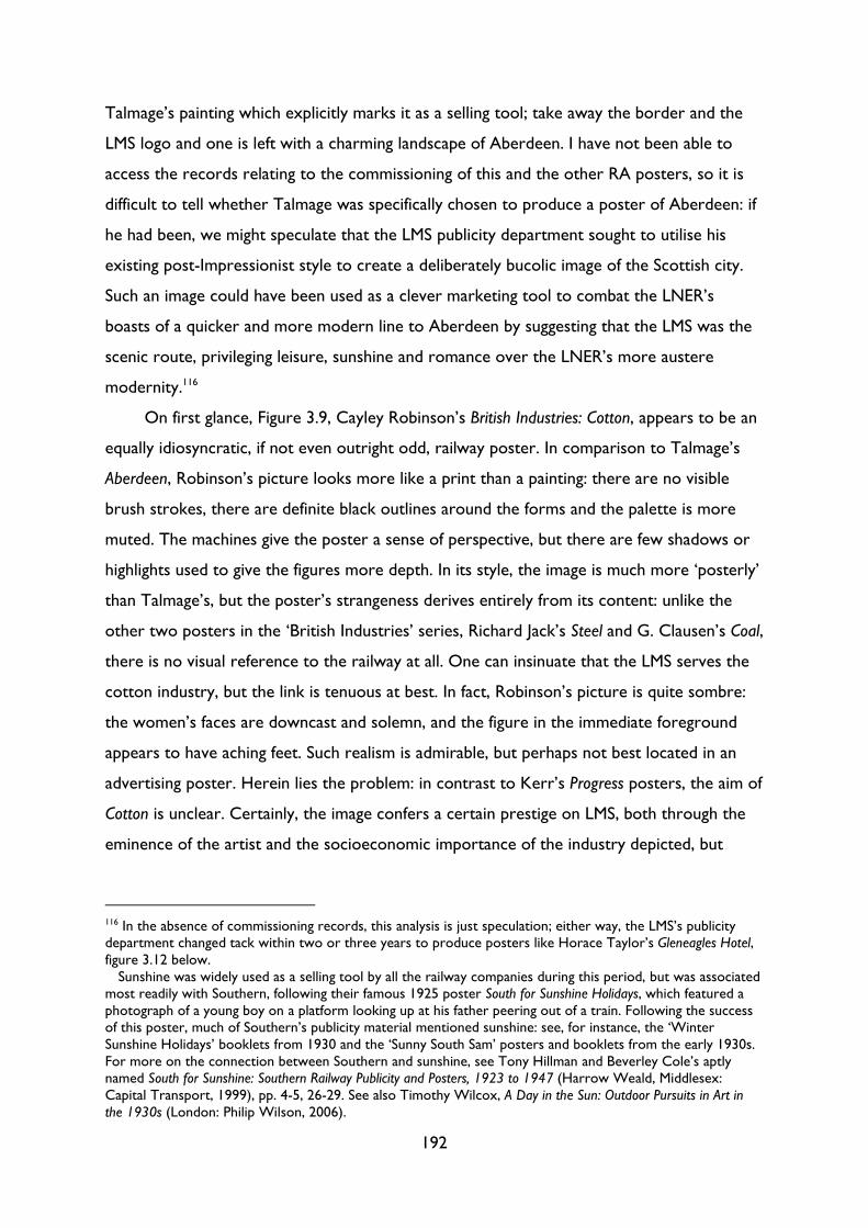
192
Talmage’s painting which explicitly marks it as a selling tool; take away the border and the
LMS logo and one is left with a charming landscape of Aberdeen. I have not been able to
access the records relating to the commissioning of this and the other RA posters, so it is
difficult to tell whether Talmage was specifically chosen to produce a poster of Aberdeen: if
he had been, we might speculate that the LMS publicity department sought to utilise his
existing post-Impressionist style to create a deliberately bucolic image of the Scottish city.
Such an image could have been used as a clever marketing tool to combat the LNER’s
boasts of a quicker and more modern line to Aberdeen by suggesting that the LMS was the
scenic route, privileging leisure, sunshine and romance over the LNER’s more austere
modernity.116
On first glance, Figure 3.9, Cayley Robinson’s British Industries: Cotton, appears to be an
equally idiosyncratic, if not even outright odd, railway poster. In comparison to Talmage’s
Aberdeen, Robinson’s picture looks more like a print than a painting: there are no visible
brush strokes, there are definite black outlines around the forms and the palette is more
muted. The machines give the poster a sense of perspective, but there are few shadows or
highlights used to give the figures more depth. In its style, the image is much more ‘posterly’
than Talmage’s, but the poster’s strangeness derives entirely from its content: unlike the
other two posters in the ‘British Industries’ series, Richard Jack’s Steel and G. Clausen’s Coal,
there is no visual reference to the railway at all. One can insinuate that the LMS serves the
cotton industry, but the link is tenuous at best. In fact, Robinson’s picture is quite sombre:
the women’s faces are downcast and solemn, and the figure in the immediate foreground
appears to have aching feet. Such realism is admirable, but perhaps not best located in an
advertising poster. Herein lies the problem: in contrast to Kerr’s Progress posters, the aim of
Cotton is unclear. Certainly, the image confers a certain prestige on LMS, both through the
eminence of the artist and the socioeconomic importance of the industry depicted, but
116 In the absence of commissioning records, this analysis is just speculation; either way, the LMS’s publicity department changed tack within two or three years to produce posters like Horace Taylor’s Gleneagles Hotel, figure 3.12 below.
Sunshine was widely used as a selling tool by all the railway companies during this period, but was associated most readily with Southern, following their famous 1925 poster South for Sunshine Holidays, which featured a photograph of a young boy on a platform looking up at his father peering out of a train. Following the success of this poster, much of Southern’s publicity material mentioned sunshine: see, for instance, the ‘Winter Sunshine Holidays’ booklets from 1930 and the ‘Sunny South Sam’ posters and booklets from the early 1930s. For more on the connection between Southern and sunshine, see Tony Hillman and Beverley Cole’s aptly named South for Sunshine: Southern Railway Publicity and Posters, 1923 to 1947 (Harrow Weald, Middlesex: Capital Transport, 1999), pp. 4-5, 26-29. See also Timothy Wilcox, A Day in the Sun: Outdoor Pursuits in Art in the 1930s (London: Philip Wilson, 2006).
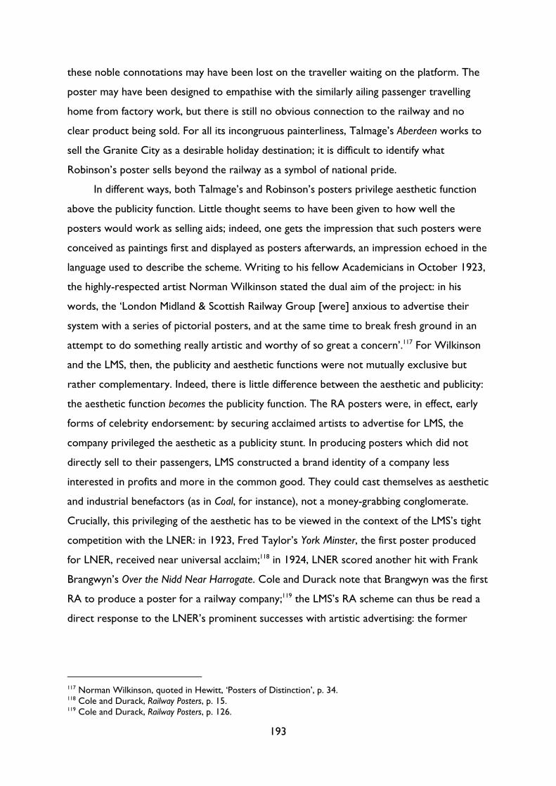
193
these noble connotations may have been lost on the traveller waiting on the platform. The
poster may have been designed to empathise with the similarly ailing passenger travelling
home from factory work, but there is still no obvious connection to the railway and no
clear product being sold. For all its incongruous painterliness, Talmage’s Aberdeen works to
sell the Granite City as a desirable holiday destination; it is difficult to identify what
Robinson’s poster sells beyond the railway as a symbol of national pride.
In different ways, both Talmage’s and Robinson’s posters privilege aesthetic function
above the publicity function. Little thought seems to have been given to how well the
posters would work as selling aids; indeed, one gets the impression that such posters were
conceived as paintings first and displayed as posters afterwards, an impression echoed in the
language used to describe the scheme. Writing to his fellow Academicians in October 1923,
the highly-respected artist Norman Wilkinson stated the dual aim of the project: in his
words, the ‘London Midland & Scottish Railway Group [were] anxious to advertise their
system with a series of pictorial posters, and at the same time to break fresh ground in an
attempt to do something really artistic and worthy of so great a concern’.117 For Wilkinson
and the LMS, then, the publicity and aesthetic functions were not mutually exclusive but
rather complementary. Indeed, there is little difference between the aesthetic and publicity:
the aesthetic function becomes the publicity function. The RA posters were, in effect, early
forms of celebrity endorsement: by securing acclaimed artists to advertise for LMS, the
company privileged the aesthetic as a publicity stunt. In producing posters which did not
directly sell to their passengers, LMS constructed a brand identity of a company less
interested in profits and more in the common good. They could cast themselves as aesthetic
and industrial benefactors (as in Coal, for instance), not a money-grabbing conglomerate.
Crucially, this privileging of the aesthetic has to be viewed in the context of the LMS’s tight
competition with the LNER: in 1923, Fred Taylor’s York Minster, the first poster produced
for LNER, received near universal acclaim;118 in 1924, LNER scored another hit with Frank
Brangwyn’s Over the Nidd Near Harrogate. Cole and Durack note that Brangwyn was the first
RA to produce a poster for a railway company;119 the LMS’s RA scheme can thus be read a
direct response to the LNER’s prominent successes with artistic advertising: the former
117 Norman Wilkinson, quoted in Hewitt, ‘Posters of Distinction’, p. 34. 118 Cole and Durack, Railway Posters, p. 15. 119 Cole and Durack, Railway Posters, p. 126.
194
took the latter’s successful formula and extended it, investing money in high-profile artistic
commissions to build the LMS’s company prestige.
It should not be assumed that artists were employed simply to bring each company
prestige, however; as Wilkinson’s letter demonstrates, by ‘obtaining the best possible work’,
the RA posters presented not only an opportunity to raise the LMS’s reputation but also ‘a
chance of educating public taste’.120 Such remarks tap into a wider trend of what Michael
Saler has called ‘medieval modernism’, an interwar belief in the improving potential of
design, inspired by the ‘medieval definition of art as simply a well-constructed artifact [sic]
that was fit for purpose.’121 Medieval modernists believed in the unification of both art and
commerce and art and life; advocates included Frank Pick of the London Underground, the
art critic Herbert Read and the artist and patron William Rothenstein, as well as
organisations like the Design & Industries Association, the Council for Art and Industry and
members of the progressive London County Council. These figures and groups were unified
by a shared belief in the power of design to improve public taste; indeed, Wilkinson’s
remarks almost directly foreshadow the views expressed by Stephen Tallents and Kenneth
Clark a decade later, who believed that the primary aim of GPO posters was to ‘rais[e] the
level of public taste’,122 or Cecil Dandridge, the LNER’s advertising manager, who wrote in
the 1937 Penrose Annual that the commissioning of ‘many artists of eminence’ had ‘harnessed
together’ the ‘mutual interests of the railway companies, art, and printing […] to serve a
great public need, and, at the same time, to advance public taste’.123
It was the presence of this apparently non-commercial, rather utopian didactic
function that caused the most debate in the trade press. The decision to commission works
by Royal Academicians (RAs) was welcomed in typically overblown terms by Commercial Art,
who heralded the decision as the ‘dawning of that day when Art and Commerce, hand in
hand, shall establish the reign of beauty and prosperity in our midst’.124 For the editor, the
importance of the scheme was ‘in fact not measured in terms of Commerce or of Art’; it
was something more fundamental.125 By commissioning artists to paint posters, the LMS had
120 Hewitt, ‘Posters of Distinction’, p. 34. 121 Saler, The Avant-Garde in Interwar England, p. 9. 122 I am currently preparing an article on General Post Office posters from the 1930s, and the work of the Poster Advisory Group under Sir Stephen Tallents. The quoted reference to ‘raising the level of public taste’ comes from an unpublished letter from Kenneth Clark to Colonel Crutchley, a civil servant responsible for post office publicity. See Kenneth Clark, ‘Letter, Mr. Clark to Col. Crutchley’ (1 December 1937), London, British Postal Museum and Archive, POST 33/5253. 123 C. G. Dandridge, ‘Evolution in Printing of Railway Propaganda’, Penrose Annual, 35, 1937, pp. 50-55 (p. 50). 124 The Editor, ‘Signs of the Times’, Commercial Art, 2.16, February 1924, pp. 369 (p. 369). 125 Editor, ‘Signs’, p. 369.
195
emancipated art from ‘behind the walls of the picture gallery’ and established a ‘great out-
door Gallery’ on the street.126 In other words, the LMS’s RA posters scheme privileged the
aesthetic function over the publicity function, creating more of an act of philanthropy than
an advertising campaign.
It was precisely this emphasis on the aesthetic, seen by the editor of Commercial Art as
the scheme’s biggest success, which some critics saw as its primary failing. Shortly after the
commissioned posters were circulated, S. T. James argued that while the posters were
‘artistically’ a ‘great success’, ‘commercially, their appeal is more than a little doubtful’.127
‘Most of them are magnificent in conception and design’, he wrote, ‘but they advertise the
great talent of the painter rather than the merits of the railroad’.128 One can certainly see
James’s point when we consider Talmage’s Aberdeen and Robinson’s Cotton above; the latter
poster, in particular, seems to have little to do with the LMS railway. James’s comments
recall Keep the Aspidistra Flying, only inverted: whereas advertising stopped Gordon from
creating art, here art impedes the production of effective advertising. The ‘man on the
street’ viewing one of the RA posters ‘is lifted from the realms of commerce to the realm of
high art, and the railway company who spent so much money on the poster is almost
entirely forgotten.’129 Once again, art and commerce are mutually exclusive; high art is as
much as a distraction for the consumer as the Bovex posters were to Gordon. Indeed,
there were concerns whether such artistic posters would have any effect on the ‘man
hurrying by and not out sight-seeing’130 ‘I quite appreciate’, wrote the ‘poster artist’ Francis
Warren,
that such display of the best possible art will tend to raise the standard of graphic work generally in
advertising, and the directors are to be thanked for such enterprise. But who could have done more for
art on the hoarding than some of the men who have specialised in the design of advertisement?131
In other words, why employ fine artists to produce posters when one can draw on the
talents of specialist poster designers such as Fred Taylor or McKnight Kauffer? These
professionals – men we would today term ‘graphic designers’ – could unite both aesthetic
appeal and a clear, eye-catching message.
126 See Editor, ‘Signs’, p. 369, and Wilkinson, quoted in Hewitt, ‘Posters of Distinction’, p. 34. 127 S. T. James, ‘The Art of the Railway Poster’, Commercial Art 3.6, October 1924, pp. 127-128 (p. 127). 128 James, ‘Art of the Railway Poster’, p. 127. 129 James, ‘Art of the Railway Poster’, p. 127. 130 ‘Correspondence: Can R.A's design Posters?’, Commercial Art, 2.16, February 1924, p. 372 (p. 372). 131 ‘Correspondence’, p. 372.
196
For designers like Austin Cooper and Tom Purvis, the aesthetic might arise as a by-
product of other functions, but a beautiful picture did not necessarily make a good poster.
When outlining what makes a good poster, Purvis makes no mention of art or the aesthetic:
for him, the four essential qualities which ‘comprise the creed of the poster designer’ were
1. Fitness to its purpose.
2. The quality of pleasant shock.
3. Completeness as a unit.
4. Simplicity in thought and clarity of statement.132
Unlike Wilkinson’s lofty aspirations to art in his RA posters, Purvis took a more pragmatic
approach to the ‘craft’ of poster design; indeed, he wrote that he ‘loathe[d] the word
“artist.” Personally I am as proud of being called a master craftsman as I imagine
Michelangelo must have been’.133 Cooper was similarly pragmatic: he wrote in 1938 that the
dual functions of the poster were ‘first to arrest the attention, then, having caught the eye
of the beholder, to deliver a message swiftly and succinctly, in such a manner that the
beholder may be convinced and, if possible, may remember the message or act in the way
required.’134 Again, Cooper avoids any mention of the aesthetic: if the aesthetic function can
be used to attract the viewer’s eye then so much the better, but the aesthetic cannot be the
only or even the prominent function in a poster designed to sell goods or an idea.
When it comes to posters, then, what constitutes the aesthetic becomes blurred. In
travel posters, the aesthetic function either becomes the publicity function (as in the RA
posters), or is a by-product of the publicity function. In both cases, when done well, one
cannot separate the aesthetic and publicity functions in a poster. As the 1920s progressed,
the boundaries became increasingly blurred between aesthetic and publicity functions in
posters, eventually resulting in a new visual language which seamlessly united the two. This
shift – from the purely aesthetic to an inseparable mix of aesthetic and publicity functions –
can best be illustrated by a trio of posters from the mid-1920s, all advertising destinations in
132 Purvis, ‘Introduction’, p. 11. The functionalist creed of ‘fitness for purpose’ was by no means Purvis’s own invention: it was derived from the DIA, who were in turn inspired by the Deutscher Werkbund, who were themselves inspired by Morris and the Arts & Crafts movement. It is not clear whether Purvis was a DIA member, but he certainly participated in DIA events, giving a talk at the Bristol DIA on 9 December 1935. Nonetheless, Purvis’s four essential qualities show the extent to which he translated the DIA’s ideas into the field of poster design, privileging qualities inherent to the medium of poster design, such as the ‘quality of pleasant shock’. The four qualities show Purvis entering into a dialogue with vanguard ideas in art and design: in the language adopted in Chapter 4 below, we could say that Purvis performs a ‘cultural translation’ of DIA principles. 133 Purvis, ‘Introduction’, p. 10. 134 Austin Cooper, Making a Poster, ‘How to Do It Series’ (London: The Studio, 1938), p. 16.
197
Scotland: Norman Wilkinson’s Galloway (1927; Figure 3.10), Tom Purvis’s The Trossachs
(1926; Figure 3.11), and Horace Taylor’s Gleneagles Hotel (c1928; Figure 3.12):135
135 The National Railway Museum dates the first two images as 1927 and 1926 respectively; the Library of Congress, which owns the only known copy of Gleneagles Hotel, dates Taylor’s poster as ‘1920s’. I have dated it here as c1928 for two reasons: firstly, if we look at Taylor’s 1920s poster designs, they became more avant-garde as the decade unfolded. Taylor worked for the London Underground between 1924 and 1926 and his last poster, To Summer Sales by Underground (1926), displayed a more geometric, cubist approach than his famous Art Deco Brightest London posters (1924). Secondly, as we will see below, the poster’s radical aesthetics can perhaps be explained by the specific context of the 1928 ‘Race to the North’ between the LMS and the LNER. While the precise date is uncertain, we can at least say that the poster had to have been made before Taylor died in 1934.
Figure 3.10: Norman Wilkinson, Galloway, LMS, 1927
198
Figure 3.11: Tom Purvis, The Trossachs, LNER, 1926
Figure 3.12: Horace Taylor, Gleneagles Hotel, LMS, c1928
199
In these three images, we can see how, in the space of two or three years, poster design
developed from the reproduction of paintings (Galloway) to the development of what
Stephens called an ‘entirely separate branch of art which possesses its own laws and
purposes’ (Gleneagles).136 The differences in aesthetic style should not just be read as a
simple progression from the naïve reproduction of paintings to a fully-fledged expression of
‘graphic design’ principles, however: as these three roughly contemporary posters show,
realist and abstract approaches were used in parallel throughout the interwar period. In
these posters, we can see both extremes of the continuum between what Austin Cooper
called the ‘realistic’ and the ‘abstract’ schools of poster design in the 1920s and ‘30s.137 The
fact that the realist Galloway and the avant-garde Gleneagles were produced at the same time
for the same company reveals how different contexts, purposes and audiences affected each
image’s visual style. To return to the language of the previous chapter, we could describe
Wilkinson’s realist painting as replicating the aesthetic norm; Purvis and Taylor worked to
challenge this norm in their more abstract compositions. Yet, as in our discussion of the
aesthetic norm in Chapter 2, any exploration of the aesthetic norm must take into
consideration context and audiences. It would be a mistake to read the latter two posters
as a ‘pure’ expression of the designer’s vanguard ideas; instead, each designer identified this
particular aesthetic style as best suiting his message and attracting his target audience. As
Cooper wrote in Making a Poster, ‘Subject and Purpose must always dictate choice of
treatment; it would be a waste of money and effort to address industrial workers in terms
more suited for Mayfair debutantes and vice versa.’138 We can thus read these posters as a
record of both the different types of audiences which posters sought to attract, and the
functions which they had to fulfil.
Although it was released in 1927, the visual style of Wilkinson’s Galloway (Figure 3.10)
does not differ from the posters produced for the aforementioned 1925 RA scheme,
orchestrated by Wilkinson himself. Having analysed Talmage’s Aberdeen and Robinson’s
Cotton above, I do not want to spend much time reading Wilkinson’s poster. That said, I
would like to make a few comments about Galloway’s frame, as it is this frame which
136 Stephens, ‘Origin and Evolution’, p. 5. 137 Cooper, Making a Poster, p. 17. Aside from Cooper, other commentators identified two different approaches to poster design. In the mid-nineteen-twenties these were known colloquially as the ‘McKnight Kauffer school and the Fred Taylor school’. See ‘Art Advocates at the Convention’, Commercial Art, 3.5, September 1924, pp. 103-105 (p. 105). 138 Cooper, Making a Poster, p. 16.
200
distinguishes the image both as a poster and from Purvis’s and Taylor’s posters. In her 1982
essay ‘Sincerely Yours’, Rosalind Krauss writes that
Authorship assumes that paintings have an absolute firstness in the hierarchy of the arts and that their
frames, which are adjuncts after all, must follow after, being made to fit. But it is perfectly possible to
imagine a case where the frame comes first and the painted panel, like so much decorative filler, comes
afterward, tailored to the measure of the more opulent, resplendent frame.139
Krauss’s assertion particularly applies to genres like mural painting: such works are
effectively, if not actually, designed to fit within the confines of a particular space and in a
particular setting. If we begin to expand our idea of the frame from beyond the purely
literal, however, we can see how images like Wilkinson’s Galloway were produced – at least
metaphorically – to fit within their given frame. The painting may have been conceived as a
painting, but it was a painting which would be reproduced at train stations as a poster: as
such, Wilkinson was at least in part dictated by the demands of function and audience, as
well as the technical demands of reproduction. For instance, although Galloway is more
painterly than Taylor’s Gleneagles Hotel, the former still exhibits a more flattened visual style
than Wilkinson’s paintings from the same period: there are no brush strokes and the hills
and rocks are represented by large blocks of colour. One can distinguish between the
works Wilkinson created for the railway and paintings produced solely as paintings: if we
consider two Wilkinson paintings from the 1930s, The ‘Coronation Scot’ Ascending Shap Fell,
Cumbria (Figure 3.13) and HMY ‘Britannia’ Racing the Yacht ‘Westward’ in the Solent, 1935
(Figure 3.14), one does not need to consult the caption to identify which painting was
produced for a railway company:
139 Rosalind E. Krauss, ‘Sincerely Yours’, in The Originality of the Avant-Garde and Other Modernist Myths (Cambridge, MA: The MIT Press, 1985), pp. 171-94 (p. 191). ‘Sincerely Yours’ was written as a response to the criticism Krauss received upon the publication of her seminal essay ‘The Originality of the Avant-Garde’.
201
Figure 3.13: Norman Wilkinson, The ‘Coronation Scot’ Ascending Shap Fell, Cumbria, 1937
Figure 3.14: Norman Wilkinson, HMY ‘Britannia’ Racing the Yacht ‘Westward’ in the Solent, 1935, undated
202
Aside from the fact that one features a train, the small differences in visual style – the
former’s larger blocks of colour, brighter palette and the focus on shapes as opposed to
details – all indicate that The Coronation Scot was designed for reproduction and use in a
railway poster, instead of hanging on a gallery or on a private wall. Even before the frame
was added, The Coronation Scot and Galloway have been dictated by the frame.
In that sense, Galloway’s frame extends out beyond the confines of the picture to
include the commissioning process as a whole; as Wilkinson noted in 1924, the LMS wanted
to commission works which would ‘do something really artistic and worthy of so great a
concern’.140 Galloway was inevitably shaped by this dual purpose; just because it appears
more like a painting than Purvis’s and Cooper’s posters, it does not mean that Galloway was
the product of an immaculate artistic inception. The LMS may have sought to downplay
posters’ publicity function – Hewitt describes how such posters were ‘cropped to exclude
the copy’ in press advertisements or poster annuals, ‘effectively effac[ing]’ the ‘status of
these posters as advertising’141 – but these ‘pictorial’ posters were nonetheless shaped by
the functions which they had to fulfil and the audiences at whom they were aimed. In that
sense, Galloway can be read as the perfect embodiment of Krauss’s ‘notion of the painting as
a function of the frame (and not the reverse)’: from its moment of inception, Galloway was
influenced by the frame which would eventually enclose it on the railway hoarding.142
Krauss’s assertion, that the painting is a function of the frame, can also be applied to
Purvis’s The Trosschs (Figure 3.11), produced a year later than Galloway for the LNER. This
later poster is an example of ‘reminder advertising’, namely a poster that reminds customers
of an existing service (‘By East Coast Route’).143 This slight difference in functional emphasis
is partly due to the different companies involved; Hewitt describes LNER posters as ‘more
commercial’, more ‘explicitly associated with the direct sell’, than their competitors at
LMS.144 True, Purvis does not depict the train service itself, or any day trippers enjoying the
scenery, but, as Stephen Williams has argued, such an unpopulated image carried a
connotation of exclusivity in the interwar period.145 The same could be said of Wilkinson’s
140 Norman Wilkinson, quoted in Hewitt, ‘Posters of Distinction’, p. 34. 141 Hewitt, ‘Posters of Distinction’, p. 27. 142 Posters like Galloway thus serve to further debunk the modernist model of cultural production as isolated and autonomous, free from market and audience demands, explored in Chapter 2 above. 143 See Cole and Durack, Railway Posters, p. 15. 144 Hewitt, ‘Posters of Distinction’, p. 20. 145 Stephen Williams, ‘The Art of the Railway Poster: Travel, Tourism and the Visual Representation of Place in Britain, 1920-1945’, in Travel, Tourism and Art, ed. by Tijana Rakić and Jo-Anne Lester (Farnham, Surrey: Ashgate, 2013), pp. 47-66 (p. 56).
203
unpopulated Galloway, but where Wilkinson faithfully depicts a landscape, Purvis depicts
what it feels like to be there. The difference between the two – and the reason that Purvis’s
works as a more direct form of advertising – is their use of what the art critic Howard
Wadman called ‘atmosphere’. For Wadman, the ‘rather subtle distinction […] between the
mere picture and the successful poster’ could be reduced to the ‘difference between
phenomena and experience’.146 A successful poster needed both the ‘evocation of
atmosphere and experience’: both are achieved in Purvis’s ‘Trossachs’. The luminous lime-
yellow of the lake and the highlights on the mountain create a palpable sense of time and
space: it is sunset, the shadows are lengthening, birds flying home, trees morphing into
silhouettes. This intangible but felt quality of ‘atmosphere’ thus recalls Roland Barthes’s
notion of the ‘punctum’, that indefinable detail or moment which grabs and arrests one’s
attention in a photograph (as opposed to the ‘studium’, which evokes a more superficial and
passing interest).147 It is the presence of this punctum, the ‘atmosphere’ which grabs, that
allows Purvis to create a poster which privileges non-aesthetic functions – it exists, above
all, to remind users of a specific service – but still performs an aesthetic function.
The final poster in our three-way comparison, Horace Taylor’s Gleneagles, features a
much less prominent, or rather less artistic-looking, frame; it is less a frame than a border.
The difference between a frame and border is slight but essential: where a border signifies a
‘side, edge, brink, or margin; a limit, or boundary’, a frame denotes a ‘structure that
supports or encloses something.’148 In essence, the frame is ‘external’ and secondary, applied
afterwards; the border is ‘inside’, part of the image itself. Although Krauss disputes the
notion that the frame comes second, on a purely chronological level the frame in Galloway
and The Trossachs was added afterwards; David Preston notes that the ‘copy in [Purvis’s]
designs seems to have been handled as a separate, secondary concern, often being lettered
by another hand, which was not uncommon.’ He describes how, as was presumably the case
in Trossachs, a ‘single, muted colour – usually picked out from the illustration itself – might
be used for lettering’.149 The fact that a frame was going to be added undoubtedly affected
146 Wadman, ‘The advertising of travel’, pp. 52-53. 147 Roland Barthes, Camera Lucida: Reflections on Photography, trans. by Richard Howard (London: Cape, 1982), pp. 25-60. 148 See ‘border, n.’, OED Online, December 2016, Oxford University Press. Available at http://www.oed.com/view/Entry/21617 [accessed 31 December 2016] and ‘frame, n. and adj.2’, OED Online, December 2016, Oxford University Press. Available at http://www.oed.com/view/Entry/74151 [accessed December 31 2016]. 149 David Preston, ‘Tom Purvis: At Work’, in Ruth Artmonsky and David Preston, Tom Purvis: Art for the Sake of Money (London: Artmonsky Arts, 2014), pp. 38-119 (p. 61).
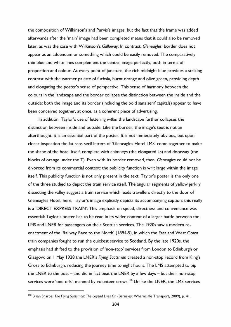
204
the composition of Wilkinson’s and Purvis’s images, but the fact that the frame was added
afterwards after the ‘main’ image had been completed means that it could also be removed
later, as was the case with Wilkinson’s Galloway. In contrast, Gleneagles’ border does not
appear as an addendum or something which could be easily removed. The comparatively
thin blue and white lines complement the central image perfectly, both in terms of
proportion and colour. At every point of juncture, the rich midnight blue provides a striking
contrast with the warmer palette of fuchsia, burnt orange and olive green, providing depth
and elongating the poster’s sense of perspective. This sense of harmony between the
colours in the landscape and the border collapse the distinction between the inside and the
outside: both the image and its border (including the bold sans serif capitals) appear to have
been conceived together, at once, as a coherent piece of advertising.
In addition, Taylor’s use of lettering within the landscape further collapses the
distinction between inside and outside. Like the border, the image’s text is not an
afterthought: it is an essential part of the poster. It is not immediately obvious, but upon
closer inspection the fat sans serif letters of ‘Gleneagles Hotel LMS’ come together to make
the shape of the hotel itself, complete with chimneys (the elongated Ls) and doorway (the
blocks of orange under the T). Even with its border removed, then, Gleneagles could not be
divorced from its commercial context: the publicity function is writ large within the image
itself. This publicity function is not only present in the text: Taylor’s poster is the only one
of the three studied to depict the train service itself. The angular segments of yellow jerkily
dissecting the valley suggest a train service which leads travellers directly to the door of
Gleneagles Hotel; here, Taylor’s image explicitly depicts its accompanying caption: this really
is a ‘DIRECT EXPRESS TRAIN’. This emphasis on speed, directness and convenience was
essential: Taylor’s poster has to be read in its wider context of a larger battle between the
LMS and LNER for passengers on their Scottish services. The 1920s saw a modern re-
enactment of the ‘Railway Race to the North’ (1894-5), in which the East and West Coast
train companies fought to run the quickest service to Scotland. By the late 1920s, the
emphasis had shifted to the provision of ‘non-stop’ services from London to Edinburgh or
Glasgow; on 1 May 1928 the LNER’s Flying Scotsman created a non-stop record from King’s
Cross to Edinburgh, reducing the journey time to eight hours. The LMS attempted to pip
the LNER to the post – and did in fact beat the LNER by a few days – but their non-stop
services were ‘one-offs’, manned by volunteer crews.150 Unlike the LNER, the LMS services
150 Brian Sharpe, The Flying Scotsman: The Legend Lives On (Barnsley: Wharncliffe Transport, 2009), p. 41.
205
were more of a publicity stunt than a going concern; at a disadvantage because of its ‘hilly
and curvy West Coast line’, and in the face of larger investment by the LNER in ‘prestige
carriages’ and ‘express-speeds’,151 Taylor’s Gleneagles can be read part of the LMS’s fight
back. The LMS might not have been able to provide faster or more comfortable services,
but they could create the impression of a faster and more comfortable service.
It is this context of rivalry which explains the poster’s startlingly radical visual style.
The poster marked a departure for both Taylor, whose other posters for London
Underground were in a bright but accessible Art Deco style, and the LMS, who were more
aesthetically conservative than the LNER. The LMS did employ a new advertising manager,
Sir Charles Higham, in 1927;152 Taylor’s poster could thus be seen as part of Higham’s turn
away from fine art and towards what we term today graphic design. But even this change in
management does not account for Gleneagles; Taylor’s poster was more radical than other
LMS posters not only from the late 1920s (see Galloway from 1927) but also from the 1930s
and ‘40s. One would be hard-pushed to find a more radical poster, either for the LMS or
any of the other British railway companies. What, then, caused this sudden change in
direction? The answer, as usual, is linked to function and audiences. In terms of function, as
we have seen, the LMS needed to connote a fast, direct and luxurious service: the use of a
daring, experimental style helped to further that impression. The avant-garde aesthetics –
the flattened perspective, abstract use of geometric shapes and vibrant, Fauvist colours – all
connote a company which is up to date with the latest artistic and design trends, the
implication being, of course, that this modernity extended to the train service itself. In
Chapter 2, I explored Lotman’s notions of the ‘ideal reader’, arguing that Wyndham Lewis
inscribed his ‘ideal reader’ in Tyro by his use of what Lotman calls a ‘private language’, that
which is not only ‘comprehensible to the addressee’ but also ‘incomprehensible to other
people’.153 We can see this same process of inscription at work in Taylor’s poster: instead of
inscribing an ideal reader, Taylor uses the challenging visual language of modernism to
inscribe an ideal viewer or even an ideal passenger. The poster is explicitly aimed at those
audiences either familiar with, or at least intrigued by, vanguard aesthetics: in short, an
upper-class, educated, discerning and Bohemian, or, at least, fashionable audience, whose
151 Bill Horsfall, London, Midland & Scottish: Britain’s Greatest Railway (Bloomington, IN: AuthorHouse, 2014), p. 3. 152 Hewitt, ‘Posters of Distinction’, pp. 31-2. 153 Lotman, Universe of the Mind, p. 64, my emphasis.
206
bank balance is as high as their cultural capital.154 By using a ‘difficult’, abstract aesthetic, the
poster achieves two linked purposes: firstly, despite the LMS’ slower and more antiquated
service, the poster confers an impression of radical modernity upon the company; secondly,
it addresses – and hopes to appeal to – an elite audience.
Taylor’s Gleneagles is thus one of the first posters to represent an inseparable mix of
aesthetic and publicity functions, in which both contribute to and aid the other. The two
functions are interwoven both in the image’s inception and the final image itself: in terms of
inception, the context in which the poster was commissioned and the audience it sought to
attract required a daring aesthetic approach; in terms of the final image, the integrated use
of the border and lettering helped to achieve both the poster’s aesthetic and its publicity
function. Text and image, aesthetics and publicity unite in a remarkably effective piece of
commercial art, one which prefigures the development of a new graphic language which
reached full articulation during the Second World War. In many ways, Gleneagles alone
succeeds in debunking the idea that art and commerce were (or are) mutually exclusive.
One can simply not separate the artistic from the commercial in a poster like Gleneagles: on
the one hand, the aesthetic is used to further the publicity function by attracting a certain
audience and conferring prestige; on the other hand, the restraints and demands of the
commercial context helped to further the aesthetic function, producing an image far more
radical than any other railway poster seen before or since. It is spurious to try and separate
the two: such a daring image could not have been created if it had not been for the purely
commercial ‘Race to the North’. Gleneagles thus represents not just the much wished-for
‘alliance’ between commerce and art but, in the words of the art critic Alfred Yockney, a
true ‘bond of union’.155
As such, posters can appear as exceptions to an otherwise strictly binary divide. They
are the visual equivalent of the literary middlebrow: neither here nor there, not quite
artistic nor solely commercial. One could argue that although posters transgressed this
divide, works of fine art remain structurally opposed to mass-market fodder. In one sense,
this is true: as we saw above, the categories of Art and Commerce were often explicitly
154 Williams, Watts and Hewitt all discuss the issue of class in their essays on railway posters (Williams, ‘Art of the Railway Poster’, p. 50; Hewitt, ‘Posters of Distinction’, pp. 29-31; Watts, ‘Evaluating British Railway Poster Advertising’, pp. 29-40). Watts, in particular, notes that the ‘target audience’ for posters such as Figures 3.10 and 3.11 above would have been aimed at ‘middle-class holiday-makers’; working-class visitors tended to choose their resort according to personal recommendations, proximity or previous experience (pp. 29-30). In emphasising the speed and convenience of the Perth service (not to mention the emphasis on the expensive and exclusive Gleneagles Hotel), the Gleneagles poster inscribes an upper-middle if not upper-class passenger. 155 Yockney, ‘Some Recent London Posters’, p. 292.
207
defined in opposition to each other. By acknowledging the presence of competing functions
within each category, however, we begin to prise open this division, challenging notions of
both essence and hierarchy. We can challenge the notion of ‘pure art’ as a single category
exclusively concerned with the aesthetic; similarly, we can dispute the idea that commerce
is monolithically pecuniary. On a textual level, this challenge allows us to consider the
precise interplay between opposing functions within texts, helping us to interrogate how
different social and economic contexts of production affect the form and content of cultural
objects. In the posters above, we observed how the different needs of each railway, as well
as specific differences in intended audience and aims of each campaign, led to small shifts in
the balance of functions within each text. This focus on function could fruitfully be expanded
to any combination of texts across the cultural spectrum; by opening up the discussion away
from essence to wider considerations of production and reception, the notion of function
allows, in particular, for the discussion of ‘artistic’ and ‘commercial’ texts together by theme.
Crucially, this emphasis on function does not eradicate difference. It challenges the
mutually exclusive relationship between Art and Commerce but only insofar as to
defamiliarize it. We are aware that, on a textual level, the aesthetic and commercial were
deeply intertwined and imbricated: one may have been privileged above the other, but the
two functions were always mutually present. At the level of discourse, however, it is vital to
maintain the rhetorical division between Art and Commerce in historical texts, viewing it as
an object of study, not an organising principle. The art/commerce divide may fail to describe
cultural texts, but it does describe the systems of value used to classify cultural texts: the
privileging of independence, autonomy and singularity of artistic vision that we witnessed in
Chapters 1 and 2 are all at work again here. Paying attention to the historical art/commerce
divide, especially in primary texts like magazines, thus helps to uncover these fundamental
assumptions about literary or artistic value, but it can also yield unexpected findings. What
surprised me in this chapter was the multitude of positions taken both by those inside and
outside this contested and contradictory field of commercial art: neither modernist artists,
critics and commentators, nor designers and advertisers, presented a monolithic stance on
how – or whether – art and commerce should be combined. Most intriguing were the views
of practitioners like Horace Taylor, who argued against the inclusion of art in poster design,
but simultaneously created some of the most aesthetically pleasing and daring works of the
early twentieth century. Taylor’s rejection of ‘art’ makes us challenge our own views and
definitions of art, reminding us not to conflate the aesthetic function with art as a discipline.

208
Most of all, his writings and posters compel us to develop ways of reading posters which do
not use purely artistic criteria. As we have seen, whether a poster fulfils its publicity
function is just as – if not more – important than whether it fulfils the aesthetic function; as
such, posters deserve to be celebrated and studied as their own ‘entirely separate branch of
art’, assessed and classified according to their own, non-artistic criteria.
209
Chapter 4
‘an art which is wholly of to-day’:
Modernism, fashion and cultural translation
Fashion, it isn't rash to say, is simply a mirror reflecting every
minute the changing symphony of the finesse we call ‘modernism.’
- M. Jacques Worth, 19291
In the opening lines of Blast, Wyndham Lewis proudly proclaims that ‘We do not want to
make people wear Futurist Patches, or fuss men to take pink and sky-blue trousers. We are
not their wives or tailors.’2 The references to Futurism and ‘pink and sky-blue trousers’ is
undoubtedly a swipe at Giacomo Balla’s recently published ‘Futurist Men’s Clothing: A
Manifesto’ (20 May 1914), in which he advocated the use of ‘MUSCULAR colours’, ‘dynamic
shapes’ and the addition of ‘modifiers’, pieces of fabric which could be attached to a garment
to provoke different physical or emotional states from ‘Loving’ to ‘Arrogant’ or
‘Persuasive’.3 Lewis’s jibe is unsurprising given the well-documented spat between Lewis and
his erstwhile artistic comrades, and yet this reference to dress represents a wider thread of
disdain for fashion which runs throughout the magazine; in Blast’s ‘Manifesto’, Lewis argues
that ‘To believe that it is necessary for or conducive to art, to “Improve” life, for instance—
make architecture, dress, ornament, in “better taste,” is absurd.’4 Though part of a wider
1 M. Jacques Worth, ‘The Mode of To-Day’, Britannia and Eve, 1.2 (June 1929), pp. 72-3 (p. 72). 2 Wyndham Lewis, ‘Long Live the Vortex!’, Blast, 1, 1914, pp. 7-8 (p. 7). 3 Giacomo Balla, ‘Futurist Men’s Clothing: A Manifesto’, trans. by Lawrence Rainey in Futurism: An Anthology, ed. by Lawrence Rainey, Christine Poggi, Laura Wittman (New Haven, CT: Yale University Press, 2009), pp. 194-195. For more on Futurist fashion see my article ‘“hap-hap-hap-hap-happy clothes”: Avant-Garde Experiments in/with Material(s)’, in The Aesthetics of Matter: Modernism, the Avant-garde and Material Exchange, ed. by Sarah Posman, Anne Reverseau, David Ayers, Sascha Bru, Benedikt Hjartarson (Berlin: De Gruyter, 2013), pp. 67-81 (pp. 67-72), and Emily Braun, ‘Futurist Fashion: Three Manifestos’, Art Journal, 54.1 (Spring 1995), 34-41. 4 Wyndham Lewis, ‘Manifesto’, Blast, 1 (1914), pp. 30-43 (p. 33).
210
statement on the purpose of art and its involvement in ‘life’, dress is once again
characterised as something outside of – or indeed beneath – the realm of art.
Lewis was, as usual, being deliberately provocative; as such, it would be dangerous to
read his comments as representing a philosophy on fashion. Nor would it be accurate to say
that his views represented modernist or avant-garde attitudes towards fashion more
broadly: most of the European ‘isms’ experimented with fashion design, including the
aforementioned Futurism, Constructivism and, through the pioneering work of Sonia
Delaunay, Simultaneism.5 I have written about avant-garde experiments in dress elsewhere;6
in this chapter, I aim to excavate a different strand of modernist thought, one which focused
less on fashion as a medium and more what its mass-market manifestations represented. As
Radu Stern puts it in Against Fashion, the experimental dress created by Delaunay, Balla,
Varvara Stepanova, Nadezhda Lamanova et al. were ‘diverse in terms of style, but they all
proceed from a common will to reject “official” fashion, refusing its mercantile logic and
striving to replace it by a utopian “antifashion.”’7 This notion of antifashion is crucial: I do
not wish to argue that modernists opposed dress as a medium, or that they thought
garments were beneath their notice; the contrary is demonstrably true. Yet the fashion
industry, as a product, if not the zenith of, mass-produced, homogenous, lowest-common-
denominator commodity culture, was a common enemy for many of the modernist critics
and thinkers explored below.8 A case in point is that of the modernist designer and Bauhaus
5 For more on Constructivist fashion see Costume Revolution: Textiles, clothing and costume of the Soviet Union in the Twenties, ed. by Lidya Zaletova, Fabio Ciofi degli Atti, Franco Panzini et al. (London: Trefoil, 1989) and West, ‘“hap-hap-hap-hap-happy clothes”’, pp. 72-81. On Sonia Delaunay, see Sonia Delaunay, trans. Abigail Grater (London: Tate, 2014), published to accompany the 2014/15 exhibition Sonia Delaunay at Musee d’Art Moderne de la Ville de Paris and Tate Modern. For more on a range of avant-garde experiments in dress, see Against Fashion: Clothing as Art, 1850-1930, ed. by Radu Stern (Cambridge, MA; London: MIT Press, 2004). 6 See West, ‘“hap-hap-hap-hap-happy clothes”’, for a discussion of Futurist and Constructivist fashion, and Emma West, ‘Surrealist? Modernist? Artist? – The Vicissitudes of Elsa Schiaparelli’, in Intersections: Women artists/surrealism/modernism, ed. by Patricia Allmer (Manchester: Manchester University Press, 2016), pp. 275-95, for a discussion of Elsa Schiaparelli’s dress designs in relation to both functionalism and surrealism. 7 Radu Stern, ‘Against Fashion: The Avant-Garde and Clothing’, in Against Fashion: Clothing as Art, 1850-1930, ed. by Radu Stern (Cambridge, MA; London: MIT Press, 2004), pp. 2-77 (p. 3). 8 Of course this type of critique was not the only modernist response to the fashion industry. In Tigersprung, Ulrich Lehmann describes how Walter Benjamin and Charles Baudelaire among others recognised the intellectual, cultural and social value of fashion; in Paris, France, Gertrude Stein described fashion as a kind of cultural and artistic barometer for the health of a nation: ‘It is funny about art and literature, fashions being part of it. Two years ago everybody was saying that France was down and out, was sinking to be a second-rate power, etcetera etcetera. And I said but I do not think so because not for years not since the war have hats been as various and lovely and as french as they are now.’ See Ulrich Lehmann, Tigersprung: Fashion in Modernity (Cambridge, MA: MIT Press, 2000), and Gertrude Stein, Paris, France (1940; repr. London: Peter Owen, 2011), p. 12. Critics are also beginning to recognise the importance of fashion in modern(ist) literature; see R. S. Koppen, Virginia Woolf, Fashion and Literary Modernity (Edinburgh: Edinburgh University Press, 2009), Jessica
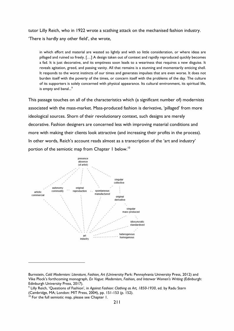
211
tutor Lilly Reich, who in 1922 wrote a scathing attack on the mechanised fashion industry.
‘There is hardly any other field’, she wrote,
in which effort and material are wasted so lightly and with so little consideration, or where ideas are
pillaged and ruined so freely. […] A design taken out of context and rapidly reproduced quickly becomes
a fad. It is just decorative, and its emptiness soon leads to a weariness that requires a new disguise. It
reveals agitation, greed, and passing vanity. All that remains is a stunning and momentarily enticing shell.
It responds to the worst instincts of our times and generates impulses that are even worse. It does not
burden itself with the poverty of the times, or concern itself with the problems of the day. The culture
of its supporters is solely concerned with physical appearance. Its cultural environment, its spiritual life,
is empty and banal...9
This passage touches on all of the characteristics which (a significant number of) modernists
associated with the mass-market. Mass-produced fashion is derivative, ‘pillaged’ from more
ideological sources. Shorn of their revolutionary context, such designs are merely
decorative. Fashion designers are concerned less with improving material conditions and
more with making their clients look attractive (and increasing their profits in the process).
In other words, Reich’s account reads almost as a transcription of the ‘art and industry’
portion of the semiotic map from Chapter 1 below.10
Burnstein, Cold Modernism: Literature, Fashion, Art (University Park: Pennsylvania University Press, 2012) and Vike Plock’s forthcoming monograph, En Vogue: Modernism, Fashion, and Interwar Women's Writing (Edinburgh: Edinburgh University Press, 2017). 9 Lilly Reich, ‘Questions of Fashion’, in Against Fashion: Clothing as Art, 1850-1930, ed. by Radu Stern (Cambridge, MA; London: MIT Press, 2004), pp. 151-153 (p. 152). 10 For the full semiotic map, please see Chapter 1.
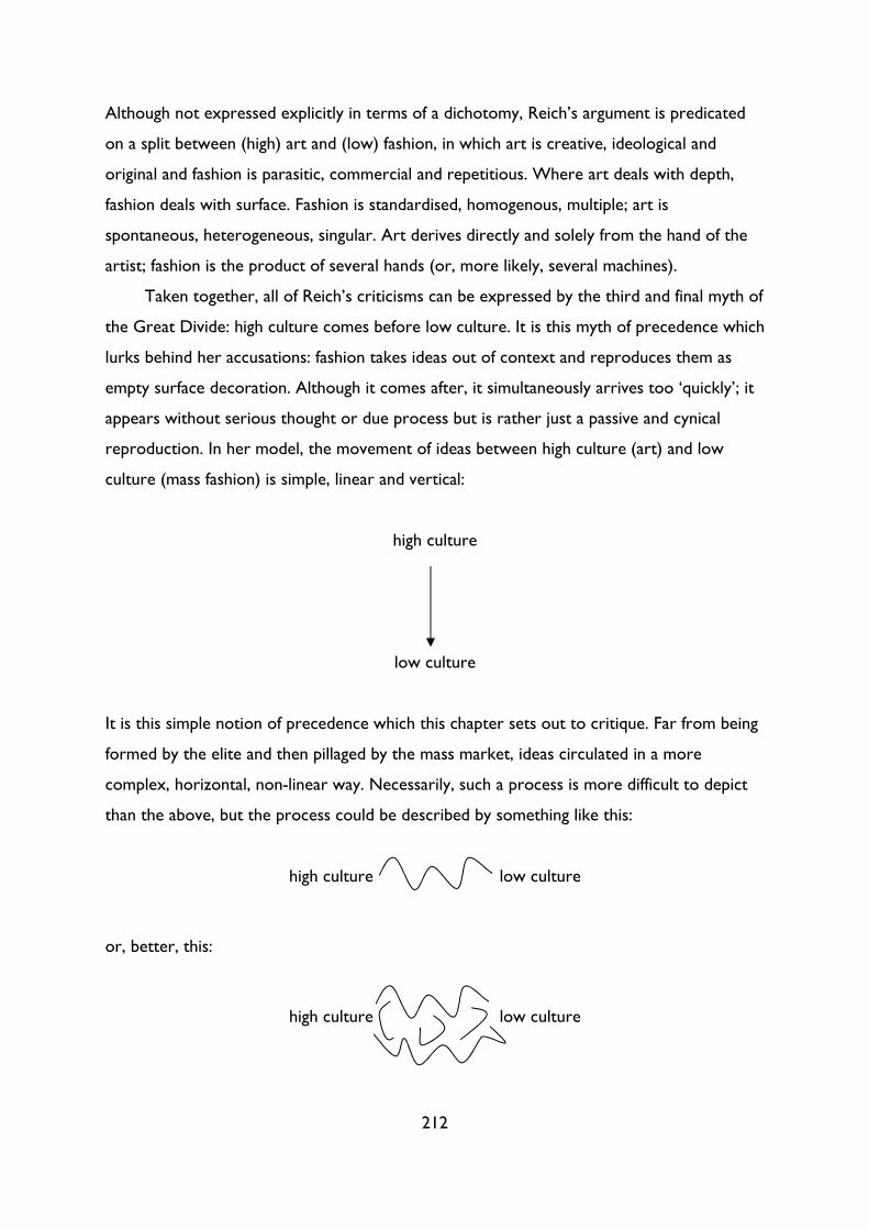
212
Although not expressed explicitly in terms of a dichotomy, Reich’s argument is predicated
on a split between (high) art and (low) fashion, in which art is creative, ideological and
original and fashion is parasitic, commercial and repetitious. Where art deals with depth,
fashion deals with surface. Fashion is standardised, homogenous, multiple; art is
spontaneous, heterogeneous, singular. Art derives directly and solely from the hand of the
artist; fashion is the product of several hands (or, more likely, several machines).
Taken together, all of Reich’s criticisms can be expressed by the third and final myth of
the Great Divide: high culture comes before low culture. It is this myth of precedence which
lurks behind her accusations: fashion takes ideas out of context and reproduces them as
empty surface decoration. Although it comes after, it simultaneously arrives too ‘quickly’; it
appears without serious thought or due process but is rather just a passive and cynical
reproduction. In her model, the movement of ideas between high culture (art) and low
culture (mass fashion) is simple, linear and vertical:
high culture
low culture
It is this simple notion of precedence which this chapter sets out to critique. Far from being
formed by the elite and then pillaged by the mass market, ideas circulated in a more
complex, horizontal, non-linear way. Necessarily, such a process is more difficult to depict
than the above, but the process could be described by something like this:
high culture low culture
or, better, this:
high culture low culture
213
We could describe this latter model as a kind of Brownian motion, a term used in particle
physics to describe the ‘irregular oscillatory movement observed in microscopic particles’.11
The random, spontaneous movement represented in such a diagram illustrates the extent to
which ideas circulated chaotically across and within culture, not necessarily as part of a
simple movement from high to low, whether vertical or horizontal. Of course, the
movement of ideas was not entirely random; ideas were circulated via social networks and
disseminating institutions such as periodicals, reviews, exhibitions, catalogues, wireless
broadcasts, the cinema and bookshops among others. Nonetheless, the haphazard Brownian
model gets closer to depicting the movement of ideas than the linear model, in which ideas
can be directly traced as they move from one individual or medium to another.
This chapter attempts to move away from a simple, linear model and towards a more
complex, Brownian conception of cultural dynamics. It will argue that both high and low
culture expressed what was termed the ‘Spirit of the Age’: a nebulous, shifting concept
without a fixed or singular point of origin. In the 1920s, this spirit was encapsulated in the
drive towards functionalism and simplicity – a spirit expressed concurrently across all types
of different media, from painting to interior design to architecture to sculpture. Even
women’s fashion, a medium historically associated – especially in its haute couture form –
with display, decoration and luxury, sought to reject ‘meaningless’ ornament during the
1920s.12 In fact, fashion’s widespread adoption of standardisation and purity of line can be
said to precede that of many high cultural forms. Its proximity to the body and its symbiotic
relationship with modernity meant that, more than any other art, it had to respond as
quickly as possible to the changing conditions of modern life, whether practical, aesthetic or
ideological.
11 ‘Brownian, adj.’, OED Online, June 2016, Oxford University Press. Available at http://www.oed.com/view/Entry/23857 [accessed 16 September 2016]. 12 Adam Geczy and Vicki Karaminas explore the characterisation of fashion as frivolous in their introduction to their edited collection Fashion and Art; they write that ‘fashion, as part of the modernist project, was construted to be art’s Other: fashion was deemed frivolous, regulated to the domain of the feminine and the body, as opposed to art, which was deemed masculine and placed in the sphere of the mind and the psyche.’ See Adam Geczy and Vicki Karaminas, ‘Fashion and Art: Critical Crossovers’, in Fashion and Art, ed. by Adam Geczy and Vicki Karaminas (London: Bloomsbury, 2012), pp. 1-12 (p. 3).
214
The modernist model: Fashion as parasite
The modernist conception of cultural production can be encapsulated in two separate but
closely linked ideas: firstly, that the modernist elite is the primary source of originality;
secondly, that ‘low’ cultural forms are secondary and thus derivative. Unusually for a binary
opposition, both sides of the primary/secondary or original/derivative dyad have been
characterised at length.13 On the ‘positive’ side of the dyad – the claim that the modernist
individual is the site of originality – one only need turn to any of the many modernist
manifestoes to trace the link between the individual creative genius and (his) radical new
ideas. Lewis’s Blast appeals not just ‘TO THE INDIVIDUAL’; it was presenting ‘an art of
individuals’14 in which each essay or artwork was the sole product of an idiosyncratic
creative mind. In Unit One, Herbert Read expanded upon this ethic of the individual, stating
that the ‘modern artist is essentially an individualist: his general desire is not to conform to
any pattern, to follow any lead, to take any instructions—but to be as original as possible, to
be himself and to express himself in his art.’15 For Read, the modernist artwork was an
autonomous expression of self, one which could only come into being if the artist remained
unencumbered by external pressures.16 In the context of a collective manifesto, this
emphasis on the role of the individual appears somewhat strange, yet Read sought to
remind readers that Unit One was a ‘practical’, not ‘technical’ collaboration. While they
13 In semiotic theory, the privileged or positive side of a binary opposition (in this case, high culture) is described as the ‘unmarked’, normal term; its opposite (low culture) is described as ‘marked’ or abnormal. [See, for instance, Roman Jakobson, ‘Zero Sign’, in Russian and Slavic Grammar: Studies 1931-1981, ed. by Linda R. Waugh and Morris Halle (Berlin: Mouton, 1984), pp. 151-160.] This notion recalls Richard Dyer’s notion of the white person as the ‘subject without properties’, at once both ‘everything and nothing’, a norm without identifiable characteristics. [Richard Dyer, White: Essays on Race and Culture (London: Routledge, 2013), p. 39.] Whiteness is less a property in and of itself than an absence of blackness. Similarly, ‘high culture’, as the normal, unmarked, neutral term, often simply signifies the absence of lowness (that is, of the degraded, the inferior, the substandard). As the norm, ‘high culture’ is often defined less through positive attributes than through negation: it is easier to identify what high culture is not than what it is. The original/derivative dyad is thus interesting precisely because both sides of the dichotomy have been defined at length.
Aside from the originalderivative dyad, we could also think of the famous binary opposition between original and reproduction, as explored in Walter Benjamin’s seminal 1936 essay ‘The Work of Art in the Age of Mechnical Reproduction’, in One-Way Street and Other Writings, trans. by J. A. Underwood (London: Penguin, 2009), pp. 228-259. In this chapter, I want to move away from the original/reproduction dyad; this distinction relates to the status of the cultural text, that is, whether it is an original or a reproduction as a noun. These labels are more or less incontrovertible. In order to challenge the systems of evaluation which privilege high over low and art over fashion, then, I have focused instead on the qualities identified in, or ascribed to, cultural texts: in this case, on original/derivative as adjectives. 14 Lewis, ‘Long Live the Vortex!’, pp. 7, 8. 15 Herbert Read, ‘Introduction’, in Unit 1: The Modern Movement in English Architecture, Painting and Sculpture, ed. by Herbert Read (London: Cassell, 1934), pp. 9-16 (pp. 11-12). 16 For more on the modernist conception of autonomy, see Chapters 2 and 3 above.
215
might share ‘a central office’ or ‘an information bureau where the enquirer can find out
about the nature of the works done by members of the group, their whereabouts and
prices’, the members ‘have not agreed that any one method of painting or carving or
building is the right method; they have not even agreed that their art should express a
common sentiment or even a conscious direction.’17 In that sense, Unit One was ‘an art of
individuals’ more thoroughly than Lewis’s Vorticism with its shared aesthetics and
collaborative blasting and blessing of their contemporaries.
This cult of the individual was not limited to artistic manifestoes; Rosalind Krauss has
argued that modernism and the avant-garde can be defined by this notion of the self as site of
incontestable originality. In her seminal essay, ‘The Originality of the Avant-Garde’, she
writes that ‘the avant-garde artist above all claims originality as his right—his birthright, so
to speak. With his own self as the origin of his work, that production will have the same
uniqueness as he; the condition of his own singularity will guarantee the originality of what
he makes.’18 Such an individualist conception of originality has implications not only for
artistic practice – viewing art, like Read, purely as an ‘expression of one’s self’ – but also for
culture more broadly. If the modernist elite is seen as the sole progenitors of original ideas,
then the rest of culture inevitably appears as derivative, lesser. This logic can be seen at
work in the writings of many modernist critics, from Clive Bell to F. R. Leavis to T. S. Eliot.
According to Bell, it was only the cultivated elite who could act as disseminators of civility,
and educate the ‘busy multitude’.19 For him, this elite had to be compromised of those who
were ‘free from material cares’: ‘to live a highly civilized life’, he wrote, a man
must have food, warmth, shelter, elbow-room, leisure, and liberty. [...] Civilization requires the existence
of a leisured class, and a leisured class requires the existence of slaves – of people, I mean, who give some
part of their surplus time and energy to the support of others.20
Bell’s reference to ‘slaves’ indicates that his comments are made in jest, and yet he returns
to his belief in the ‘leisured class’ a few pages later, arguing that if the ‘community’ wants
17 Read, ‘Introduction’, p. 12. 18 Rosalind E. Krauss, ‘The Originality of the Avant-Garde’, in The Originality of the Avant-Garde and Other Modernist Myths (Cambridge, MA: MIT Press, 1985), pp. 151-170 (p. 160). 19 Clive Bell, Civilization (1928; repr. West Drayton: Penguin Books, 1947), p. 130. 20 Bell, Civilization, p. 127.
216
‘civilization’ it ‘must support a leisured class as it support schools and universities, museums
and picture galleries.’21 Financial and intellectual autonomy are linked: only those
who have never been obliged to please a master or conciliate a colleague alone retain the power of
thinking and feeling with absolute honesty on all subjects. Only they know how to be perfectly
disinterested and detached; how to pursue an idea without constantly looking to right and left for its
practical implications; how to be remorseless in logic and in passion uncompromising.22
It is only with full autonomy that the thinker or artist as sacred source of originality can
produce the best work. Once produced, this work – indeed, this entire way of life – will
form an ‘operative nucleus which converts a passive culture into a civilizing force’.23
In other words, producing cultural texts or upholding cultural values is the sole remit
of the cultivated elite. For Leavis, culture ‘always had been in minority keeping’. It was only
ever a ‘very small minority’ who were ‘capable of unprompted, first hand judgement’;24
consequently, those capable of such judgement had to, in Eliot’s words,
be formed into suitable groups, endowed with appropriate powers, and perhaps with various emoluments
and honours. Those groups, formed of individuals apt for powers of government and administration, will
direct the public life of the nation; the individuals composing them will be spoken of as “leaders.” There
will be groups concerned with art, and groups concerned with science, and groups concerned with
philosophy as well as consisting of men of action: and these groups are what we call élites.25
Like Leavis and Bell, Eliot was slightly hazy on the precise role of these newly-christened
‘élites’. They agreed that the elite would preserve culture, but they disagreed over the
manner in which or even the extent to which this culture would reach the masses. Eliot
himself seemed divided on this point: towards the beginning of Notes Towards the Definition
21 Bell, Civilization, pp. 129-30. Bell’s suggestion appears to gesture towards some kind of state patronage, an issue discussed in Unit 1: The Modern Movement in English Architecture, Painting and Sculpture, ed. by Herbert Read (London: Cassell, 1934). In preparation for the book, Read sent out a questionnaire to leading artists, sculptors and designers, one section of which was on ‘Policy’, including ‘19. Do you think that the State and the City could do more to support contemporary works of art?’ (Read, ‘Introduction’, p. 15) Not all artists engaged with this question, but John Armstrong, John Bigge and Tristram Hillier’s responses are particularly worth reading in this regard; see pp. 37-47, 48-56 and 68-76 respectively. The issue of state patronage was also explored in a 1935 series of articles, ‘Patronage in Art Today’, published in the Listener: see Roger Hinks, ‘Patronage in Art Today—1’, Listener, 4 September 1935, pp. 385-7; Osbert Sitwell, ‘Patronage in Art Today—II’, Listener, 11 September 1935, pp. 419-22; Edward Marsh, ‘Patronage in Art Today—III’, Listener, 18 September 1935, pp. 487-90; and the aforementioned Jack Beddington, ‘Patronage in Art Today—IV’, Listener, 25 September 1935, pp. 527-8. Three out of four of these essays (excluding Sitwell’s) were later reproduced in Art in England, ed. by R. S. Lambert (Harmondsworth: Penguin, 1938), pp. 73-86. 22 Bell, Civilization, p. 129. 23 Bell, Civilization, p. 155. 24 F. R. Leavis, Mass Civilisation and Minority Culture (Cambridge: The Minority Press, 1930), pp. 3-4. 25 T. S. Eliot, Notes Towards the Definition of Culture, 2nd edn. (London: Faber and Faber, 1962), p. 36.
217
of Culture, he argued that the ‘higher level of culture must be thought of both as valuable in
itself, and as enriching of the lower levels: thus the movement of culture would proceed in a
kind of cycle, each class nourishing the others’;26 later on, however, he warns that ‘to make
everyone share in the appreciation of the fruits of the more conscious part of culture is to
adulterate and cheapen what you give’.27 A ‘mass culture’, he writes, ‘will always be a
substitute culture; and sooner or later the deception will become apparent to the more
intelligent of those upon whom this culture has been palmed off.’28
Despite these internal inconsistencies, we can discern a number of key modernist
principles from Eliot et al’s ‘definition of culture’: namely, that elite culture is culture as such;
mass culture is secondary and inferior to elite culture; the masses are incapable of creating
or preserving culture. On the final point Eliot was influenced by the German sociologist Karl
Mannheim, who opened his exploration of societal structure by stating that ‘a sociological
investigation of culture in liberal society must begin with the life of those who create
culture, i.e. the intelligentsia’.29 The notion that those outside the intelligentsia could be
responsible for creating culture appears inconceivable to Mannheim. Only ‘small groups of
connoisseurs’ are ‘responsible for cultural initiative and tradition. If these small groups are
destroyed or thwarted in their selection, the social conditions for the emergence and
persistence of culture disappear.’30 Or, to put it another way, ideas, values, standards and
traditions are generated or safeguarded by the elite who pass them down to the masses.
In the context of this dominant conception of elite culture as culture as such, it is
hardly surprising that mass-cultural texts are viewed as derivative. If ideas originate solely in
elite culture, then mass cultural texts are a priori derivative; there is no structural possibility
that they can be otherwise. As we saw in Chapter 3, the Great Divide is repeatedly
structured by mutual exclusivity: if high culture is the province of originality, then low
culture cannot produce originality as well. This conception of low culture as derivative is
not limited to the use of the via negativa, however; as we observed in Reich’s account above,
fashion, in particular, was characterised as derivative in its own right. One could cite many
26 Eliot, Notes, p. 37. 27 Eliot, Notes, pp. 106-7. 28 Eliot, Notes, p. 107. 29 Karl Mannheim, Man and Society in an Age of Reconstruction: Studies in Modern Social Structure, trans. by Edward Shils (London: Routledge and Kegan Paul Ltd., 1940), p. 81. For Eliot’s references to Mannheim, see Eliot, Notes, pp. 37-41. 30 Mannheim, Man and Society, pp. 83-5.
218
examples, but it is interesting to note the specific language used to describe fashion as
derivative. Far from being just ‘secondary’, it is described as a ‘thief’, a ‘parasite’ or an
‘infection’.31 In all instances, fashion takes ideas from original, creative high culture and
‘debase[s]’ them for commercial gain. Alongside Reich, we could turn to Raymond
Plummer’s account of how cubism ‘was rapidly debased by British manufacturers anxious to
jump on a fashionable bandwagon’,32 to T. H. Robsjohn-Gibbings’s tirade Mona Lisa’s
Mustache, in which he describes how fashion designers observed the commercial potential of
surrealism and ‘couldn’t wait to get in on the whole racket’,33 or to Noel Carrington’s
contempt for what he called ‘a kind of everyman’s cubism’, a ‘great cult’ which ‘ran its
feverish course without restraint in a body which for lack of a living tradition had lost its
immunity.’34
This characterisation of mass-market forms as parasitic inevitably recalls both the
language and character of the speech/writing dichotomy in Derrida’s Of Grammatology.
Derrida describes how, in Saussurean theory,
the order of writing is the order of exteriority, of the “occasional,” of the “accessory,” of the “auxiliary,”
of the “parasitic”. The argument of Jakobson and Halle appeals to the factual genesis and invokes the
secondariness of writing in the colloquial sense: “Only after having mastered speech does one graduate
to reading and writing.” […] Even if “after” were here a facile representation, if one knew perfectly well
what one thought and stated while assuring that one learns to write after having learned to speak, would
that suffice to conclude that what thus comes “after” is parasitic? And what is a parasite? And what if
writing were precisely that which makes us reconsider our logic of the parasite?35
Here, Derrida makes two crucial moves which can guide our own deconstruction of the
art/fashion dichotomy. Firstly, he questions the logic by which writing can be said to come
‘after’ speech; secondly, he questions the conflation of temporality and value contained in
the word ‘parasite’: namely, the assumption that what ‘comes “after” is parasitic’. In other
31 The couturier Elizabeth Hawes variously described fashion as a ‘thief’ (p. 23) or a ‘parasite’ (p. 6) in her memoir Fashion is Spinach: How to Beat the Fashion Racket (1938; repr. New York: Dover Publications, 2015), In it, Hawes draws a distinction between ‘style’ which is functional and eternal and (mass-market) fashion which ‘swipes ideas from style’ (p. 10). Noel Carrington describes the mass-market appropriation of Cubism as an ‘infection’ in his memoir and account of the Design and Industries Association, Industrial Design in Britain (London: George Allen & Unwin, 1976), p. 86. 32 Raymond Plummer, Nothing need be ugly: The first 70 years of the Design & Industries Association (London: Design & Industries Association, 1985), p. 21. 33 T. H. Robsjohn-Gibbings, Mona Lisa’s Mustache: A Dissection of Modern Art (New York: Alfred A. Knopf, 1948), p. 224. 34 Carrington, Industrial Design, p. 86. 35 Jacques Derrida, Of Grammatology, trans. by Gayatri Chakravorty Spivak (Baltimore: John Hopkins University Press, 1997), p. 55.
219
words, why is that which is second always depicted as not just following but actively
exploiting the first?
The Oxford English Dictionary definitions for ‘first’ and ‘second’ reveal the extent to
which the temporal and the qualitative are imbricated in the notion of the first. The first is
that which is ‘before all others; earliest in time or serial order, foremost in position, rank, or
importance.’36 Here, the definition shifts immediately from the temporal (‘earliest in time’)
to the qualitative (‘foremost in […] importance’).37 In its other senses, it is consistently
associated with positive qualities, such as ‘winning or leading’.38 The second, on the other
hand, is largely free of qualitative connotations. It is, quite simply, that which ‘[c]om[es] next
after the first’.39 Crucially, the second is only ever seen in relation to the first; in all of its
senses, the second is either ‘next’ or ‘additional’: there can be no second without the first.
One could technically say the same of the reverse – there can be no first without the
second – but the first possesses an originary quality which negates the presence of any
other. As an adverb, the first describes that which comes ‘[b]efore any other or anything
else, in time, serial order, rank, etc.; before anything else is done or takes place.’40 The first
can appear in isolation; in fact, the first in the sense of ‘original’ or ‘fundamental’ (not just in
the sense of coming first in a race), must appear in isolation. It is singular, pure and
autonomous, whether the product of genius or perspicacity or perseverance. It is
pioneering; it sets the parameters which the second follows.
Far from being an objective measure of time, then, even the dyad first/second contains
an inherent qualitative dimension. The first is principal, paramount, foremost: it is
foundational, of key importance. The second, on the other hand, is additional,
supplementary, auxiliary: it can add to or adapt the first but it can never replace it
completely. In short, only that which comes first can be truly new; the second is always
responding, at least in part, to its predecessor. It is not a great leap, then, to move from the
second as supplementary, imitative and dependent to the second as parasite, with all its
(even stronger) pejorative connotations. The parasite, J. Hillis Miller writes,
36 ‘first, adj., adv., and n.2’, OED Online, June 2016, Oxford University Press. Available at http://www.oed.com/view/Entry/70609 [accessed 6 July 2016]. 37 ‘first’, OED Online. 38 ‘first’, OED Online. 39 ‘second, adj. and n.2’, OED Online, June 2016, Oxford University Press. Available at http://www.oed.com/view/Entry/174500 [accessed 6 July 2016]. 40 ‘first’, OED Online.
220
suggests the image of “the obvious or univocal reading” as the mighty, masculine oak or ash, rooted in
the solid ground, endangered by the insidious twining around it of ivy, English or maybe poison, somehow
feminine, secondary, defective, or dependent, a clinging vine, able to live in no other way but by drawing
the life sap of its host, cutting off its light and air.41
Several of the characteristics Miller identifies are present in accounts of the relationship
between high art and low fashion: art as oak tree is solid, serious, masculine; fashion as
(poison) ivy is feminine, dependent, clinging. And yet, as Miller notes, there is an
etymological uncertainty over which comes first: parasite or host. He notes that the prefix
‘para’ is derived from the ‘Indo-European root per, which is the “base of prepositions and
pre-verbs with the basic meaning of ‘forward’, and a ‘wide range of extended senses such as
“in front of,” “before,” “early,” “first,” “chief”.’’42 Consequently, the parasite as a term is
‘equivocal rather than univocal’: it signifies ‘at once proximity and distance, similarity and
difference, interiority and exteriority, something at once inside a domestic economy and
outside it, something simultaneously this side of the boundary line, threshold, or margin, and
at the same time beyond it’.43 Far from being a simple marker of secondariness, the
‘parasitic’ essentially identifies a text which does not fit into a linear conception of space or
time. Even if one could separate one from the other (there is, after all, ‘no parasite without
its host’), is it thus possible to determine which ‘comes first’?
In his essay, Miller uses etymology to challenge the ‘clear’ and ‘obvious’ reading which
states that the parasite must come after the host; in the remainder of this chapter I hope to
use textual analysis and cultural history to explore the complex ‘parasitic’ relationship
between high (art) and low (fashion). In reference to fashion magazines, I will demonstrate
two things: firstly, that low culture did not always come after high culture, and secondly,
even when low culture did appear after high culture, it was not simply ‘defective or
dependent’. One can challenge the myth that high cultural texts (always) come before low
ones in several different ways; in relation to the fashion industry, these arguments can be
organised into three different strands:
1. High cultural texts are not always original; they do not have a single, simple point of
origin.
2. Low cultural texts are not always parasitic:
41 J. Hillis Miller, ‘The Critic as Host’, Critical Inquiry, 3.3 (Spring 1977), 439-447 (p. 440). 42 Miller, ‘Critic as Host’, p. 441. 43 Miller, ‘Critic as Host’, p. 441.
221
a. imitations can be authentic.
b. adaptations can be creative.
3. High and low culture both respond to the ‘Spirit of the Age’: instead of moving in a
linear fashion from high to low, ideas circulated organically as part of the Zeitgeist.
1. High cultural texts are not always original
In ‘The Originality of the Avant-Garde’, Krauss systematically debunks the Romantic and
later modernist myth of the single, genius artist labouring in isolation to produce
spontaneous, autonomous works. She takes as her case in point a new, posthumous cast of
Rodin’s The Gates of Hell, a work which, at the time of his death, was ‘very much unfinished’.
‘In what sense,’ she asks, ‘is the new cast an original?’44 In other words, how many (other)
hands can be involved before the work ceases to be ‘a Rodin’? Rodin ‘never went’ to the
foundries which produced his sculptures, he ‘never supervised or regulated either the
finishing or the patination, and in the end never checked the pieces before they were crated
to be shipped to the client or dealer who had bought them.’45 In this context, to what
extent can any of Rodin’s sculptures be seen as the province of one man, of the outpouring
of one singular, spontaneous expression? While the initial design may bear Rodin’s signature,
what about the finished iteration(s)? As Krauss, after Benjamin, reminds us, ‘authenticity
empties out as a notion as one approaches those mediums which are inherently multiple’.46
The same can be said of fashion: as a medium, it is characterised by reproduction and
multiplication. Even within the field of fashion, however, there is a split between haute
couture and the low mass market. As in fine art, there is an expectation that the couture
garment is singular and original, regardless of the extent to which its form has been
influenced by the other arts.47 Yet, like Rodin’s tenuous relationship to the finished casts, the
authorship of couture garments is far from simple. In her 1938 memoir, Fashion is Spinach,
the American couturier Elizabeth Hawes described how it was often the fitter or ‘première’,
44 Krauss, ‘Originality’, p. 151. 45 Krauss, ‘Originality’, p. 153. 46 Krauss, ‘Originality’, p. 152. 47 Miller observes that ‘each “single element,” far from being unequivocally what it is, subdivides within itself to recapitulate the relation of parasite and host of which, on the larger scale, it appears or be one or the other pole.’ (p. 444) When viewed in opposition to art, fashion as a whole is the parasite; when couture is considered in relation to mass-market fashion, however, couture is the host and the readymade is the parasite.
222
not the head of the fashion house, who was ‘the actual designer’. Patou, the revered French
designer,
used to select his fabrics and tell the heads of his workrooms what line he wanted in the clothes for the
season. The fitters would then retire and make muslins. Patou looked over the muslins, changed them,
gave exact material and color, supervised fittings, and you had a Patou collection. […] Patou stood, I
think, in the place of a stylist, but a functioning one, to his premières.48
In the house of Patou, the named designer was a priori subordinate to the fitters. The
primacy of the première – even the name denotes authority and precedence – overturns
the popular conception of the art work (in this case, the couture garment) as the
expression of a single creative genius. Admittedly, designers such as Patou were responsible
for generating the ‘ideas’, but, as Hawes recounted, the extent to which these ideas were
actually realised varied widely:
the order established by all the French couturiers is to give the idea, by word, sketch or pattern to a
première. The première then makes a complete pattern for the mannequin who is subsequently to show
the finished dress. The designer sees the muslin, approves or changes. The garment is then cut in the final
material.
When a designer first decides what she is going to make, the fun, as you can see, only begins. The
pattern may turn out according to the original idea, the dress cut in the material may or may not.49
As is evident from Hawes’s description, the ‘original idea’ is just one of many factors which
determines a garment’s final form. There is, for a start, a huge gulf between the idea
communicated ‘by word, sketch or pattern’. These different methods of communication
gave the première varying degrees of creative control: at one extreme, we have the dress
designed almost entirely by the première following verbal instructions; at the other, we have
a pattern designed by the couturier which is constructed (and adapted) by the première and
their helpers. Yet even a pattern might need to be altered considerably in order to work in
three dimensions and with the material chosen. Sometimes, Hawes recalled, the ‘newly cut
dresses’ ‘looked swell’, at ‘other times they looked awful’.50 Often, the idea did not contain
enough information to construct a functional garment: Hawes suspected that her employer,
the couturier Madam Grout, ‘never put any backs in her dresses. She thought up the outline
48 Hawes, Fashion is Spinach, p. 98. 49 Hawes, Fashion is Spinach, pp. 100-101. 50 Hawes, Fashion is Spinach, p. 101.
223
and the front and forgot to discuss the back with the première. So usually the material just
went around and covered up the nakedness underneath it.’51
At every stage of the designing process, then, the dress gets further from the original
conception, to the point at which it is questionable whether the first idea dictated the final
dress at all. There is a constant process of translation at work here – verbal ideas translated
into sketches, sketches into patterns, two-dimensional ideas into three, ideas adapted to fit
the form of the body, ideas adjusted to complement material. And this is all before the act
of replication – of actually making a dress or dresses to sell – takes place. The number of
hands involved in designing and making even a haute couture garment is dizzying, and
perhaps not so far from the realm of mass-market fashion as may be assumed. Both Krauss’s
and Hawes’s accounts show us that the notion of the singular point of origin – the single
idea or the single hand – is a myth, whether it is applied to fine art or haute couture. In both
cases, there is a degree of multiplicity in high culture which mirrors the multiple copies
more explicitly and visibly present in the department store.
2a. Low cultural texts are not always parasitic: imitations can be
authentic
Before considering the extent to which low cultural texts can be considered parasitic, it is
first necessary to distinguish between the two different types of low culture present in this
chapter. On a macro level – in comparison to fine art – the whole of fashion (couture and
mass-market) can and has been viewed as low culture. Within the field of fashion itself,
however, only mass-market fashion is considered inferior to the more elite world of
couture. I will return to the first, macro opposition in Point 3 below; in this section, I will
examine the labelling of mass-market garments as parasitic.
Any such examination must first begin with a caveat: the mass market did copy haute
couture designs; in fact, evidence suggests that copying took place on an industrial scale. In
her article on 1920s fashion, Amy de la Haye states that ‘[d]esigns started almost exclusively
in the luxurious couture salons of Paris and filtered down to the cheapest levels of
51 Hawes, Fashion is Spinach, p. 101.
224
production in Europe and America.’52 De la Haye’s assertion is corroborated by Hawes’s
Fashion is Spinach, in which she describes at length her time spent working for one of the
many copy houses in Paris during the 1920s. These houses were illegal and often raided, but
the process was so ubiquitous that there was ‘an old tradition in Paris that the day a
designer isn’t copied, he is dead’.53 The houses would send out copyists to watch the fashion
shows and take illicit notes or memorise details and sketch them afterwards. They would
intercept dresses – for a fee – at warehouses and ports before being shipped overseas. In
her autobiography, Shocking Life, the Italian couturier Elsa Schiaparelli described how an
American manufacturer bought one of her knitted caps and ‘made millions’ out of copying it.
Schiaparelli claimed not to mind – much like Hawes, she recognised that the ‘moment
people stop copying you, it means that you are no longer any good and that you have
ceased to be news’ – but she did get
so tired of seeing it reproduced that she wished she had never thought of it. From all the shop windows,
including the five- and ten-cent stores, at the corner of every street, from every bus, in town and in the
country, the naughty hat obsessed her, until one day it winked at her from the bald head of a baby in a
pram. That day she gave the order to her salesgirls to destroy every single one in stock, to refuse to sell
it, and never to mention one again.54
Schiaparelli’s account can hardly be taken as objective – Schiap, as she referred to herself in
the third person, was a masterful self-publicist – but it serves to corroborate both Hawes’s
and de la Haye’s accounts of the copying culture rife in 1920s fashion.55
Evidently, it is futile to contest the fact that, in the fashion world, ideas moved
unilaterally from couture to the mass market. In this sense, mass-market fashion came ‘after’
couture, but does that automatically mean that it has less value? Or, to misquote Derrida,
even if mass-market fashion came after couture, ‘would that suffice to conclude that what
thus comes “after” is parasitic’? What is at stake here is not objective measures of time but
subjective measures of value. One of Reich’s key objections to mass-market fashion was that
52 Amy de la Haye, ‘The Dissemination of Design from Haute Couture to Fashionable Ready-to-wear during the 1920s with Specific Reference to the Hodson Dress Shop in Willenhall’, Textile History, 24.1 (1993), 39-48 (p. 39). 53 Hawes, Fashion is Spinach, p. 46. 54 Elsa Schiaparelli, Shocking Life: The Autobiography of Elsa Schiaparelli (1954; repr. London, V&A Publications, 2007), pp. 49-50. 55 Schiaparelli’s account is typically hyperbolic, but the fashion journalist and later Vogue editor Alison Settle noted in an unpublished talk that during 1932 ‘we wore Schiaparelli's little knitted cap on every head’. See Alison Settle, 'Talk by AS on “Fashion over the past 10 years.”’ (1937), Brighton, University of Brighton Design Archives, L.30.4, p. 4.
225
it ‘pillaged and ruined’ ideas. The word ‘ruined’ suggests that designs were somehow altered
and cheapened during mass-production, and yet the evidence shows that the opposite is the
case. In Hawes’s account, she describes how her copy house endeavoured to make its
copies as accurate and authentic as possible. The house would go to great expense to
purchase some of the most desirable models, dubbed the ‘Fords’, in order to ensure
complete accuracy. Of her house, Hawes wrote, ‘It was a very good copy house. Our boast
was that we never made a copy of any dress which we hadn’t had the original actually in our
hands.’56 Once again, the reference to ‘hands’ is significant. Authenticity was, like in art or
couture, intimately connected to physical proximity: specifically, to the touch of hands.
Ironically, for a copy house, the copyists had a commitment to absolute authenticity, insofar
as authenticity was possible in a replica. Were mass-market copyists ‘ruining’ ideas, then, if
they reproduced couture garments exactly? How many steps removed from the ‘original’
idea can a garment be before it is no longer original? As we observed above, the couturier’s
ideas or hands were almost never solely responsible for the creation of a dress; is not the
faithfully-reproduced garment, then, just one more step in an already long line of steps away
from a mythical source? The difference between the copy and the ‘original’ is more one of
degrees than of kind. Reich accuses mass-market fashion of being just a ‘shell’ or a ‘fad’, but
if the garments looked the same, and offered the same freedom and feeling of modernity to
the wearer, then surely the ideas and ideals of the designer remained intact (or, as intact as
they had ever been)? There was something insalubrious in the underhand way that these
designs were stolen, but it is questionable whether this made a difference to the end wearer
able to experience modern clothes without spending vast sums of money.
Indeed, the notion of the copy is far less problematic in the world of fashion than it is
in art history. In art, authenticity is constructed in strict opposition to imitation. A copied
painting could never be described as ‘authentic’, even if it was made in the presence of the
original. Although painters are primarily trained through practical imitation, these works are
viewed as means to an end, not valuable in their own right; a painting which perfectly
imitates another would be labelled as a forgery, not a work of art. Fashion, in contrast,
operates under a different set of evaluative criteria: here, authenticity is not antithetical to
imitation; authenticity can only be derived from imitation. These different evaluative criteria
56 Hawes, Fashion is Spinach, p. 38.
226
are partly due to the fact that fashion has to fulfil a different number of functions to art: art
may at any time perform aesthetic, ideological, commercial, pedagogical, or prestige
functions, but precedence is always given to the aesthetic; clothes, on the other hand, may
perform a combination of practical (keeping the body warm), social (identity formation),
communicative (group membership) and aesthetic (appearing attractive) functions, without
one function consistently dominating the others. As such, the qualities which are judged to
be ‘good’ or desirable in fashion are very different from those valued in fine art. In 1904,
Georg Simmel described fashion as a ‘form of imitation’; when it comes to dress, imitation is
prized for its ability to signal group affiliation or even to permit entry to a higher social
class.57 Simmel observes that imitation not only ‘gives the individual the satisfaction of not
standing alone in his actions’ but also frees the individual ‘from the worry of choosing’.58 He
does not suggest that women imitated everything – indeed, Simmel notes that this imitative
impulse is offset by a parallel desire to differentiate oneself – but his account demonstrates
the inherent appeal of imitating fashionable dress. Imitation was able to fulfil many of
fashion’s desired functions in a way that ‘pure’ originality would have been unable to do. The
Bystander’s outspoken fashion columnist, ‘Candida’, observed in 1927 that ‘originality is not
exactly popular at this time of day. […] Wherever I dance and dine, whatever I dance and
dine in, I see its counterpart on everyone else. I’d be seriously disturbed if I didn’t.’59
Although written in the arch tone adopted by many magazine writers during this period,
Candida’s comments concealed an important point: homogenised fashion created a sense of
community and belonging which unusual dress could not (with the exception, of course, of
those circles in which to dress outlandishly was to signal group affiliation, as in Futurist or
Surrealist coteries).
For the majority, however, imitation as a strategy of assimilation involved copying
styles direct from Paris. De la Haye recounts how mainstream manufacturers and retailers
‘proudly advertised that their models were copies of Parisian designs.’60 Proximity is
important again, this time not to the artist/designer but to Paris itself. In an unpublished and
indeed rejected 1928 talk for the BBC, the English couturier Isobel railed against the
primacy of French fashion, warning that ‘[so] long as the average English woman bows the
57 Georg Simmel, ‘Fashion’, American Journal of Sociology, 62.6 (1904; repr. May 1957), 541-558 (p. 541). 58 Simmel, ‘Fashion’, p. 542-43. 59 Candida, ‘Femina: Fashions in Souls’, Bystander, 14 December 1927, p. i. 60 de la Haye, ‘Dissemination of Design’, p. 40.
227
knee to the legendary excellence of Paris, so long as she clamoures [sic] for “French
Models”, the sky will be dark and overcast for the English dress designer with ambition and
ideas.’61 Similar accusations had been made four years earlier by Candida, who argued that
the ‘very atmosphere of Paris is paralysing to British effort. And when such effort does
achieve anything original it always hides under a French name—to inspire confidence, it
says.’62 Much as ballet dancers adopted French or Russian stage names, fashion designers
took on French names in an effort to create an impression of natural style and first-hand
knowledge.63
Similarly, every fashion magazine – and even many general-interest magazines – had a
fashion column direct from
Paris in order to appear
authoritative. Good
Housekeeping made much of
its Paris office, printing its
address directly underneath
the author’s by-line (Figure
4.1).64 Here the ‘Good
Housekeeping’ Paris office
address is followed by an urgent, all-caps reassurance that the article contains ‘LAST-
MINUTE NEWS FROM PARIS’. Evidently, both spatial and temporal proximity were
valuable commodities in an increasingly-crowded marketplace. In addition to ‘women’s
magazines’, periodicals as diverse as Theatre World, a specialist monthly, and the Outlook, a
‘complete weekly review of current events, politics and the arts’, carried fashion columns
61 Isobel (Mrs Nathan), ‘Dress Designing as a Career for Women’ (1928), London, V&A Archive of Art and Design, AAD/1991/12/7/1, pp. 1-2. In the Archive of Art and Design, Isobel’s talk is accompanied by a rejection letter from the BBC, explaining that ‘Although your manuscript does not mention specifically the name of your firm, yet it is in the main an advertisement for that firm, and therefore is not suitable in its present form for broadcasting.’ See ‘Letter from BBC to Mrs Nathan’ (31 May 1928), London, V&A Archive of Art and Design, AAD/1991/12/7/1. 62 Candida, ‘Femina: The Tenth Art’, Bystander, 20 August 1924, p. 465. 63 This phenomenon of British designers taking on French names or titles can be seen, ironically, in an article entitled ‘Does Paris Lead? British Designers’ Challenge to France’, Bystander, 4 September 1929, pp. 518-19. Despite proclaiming that British designers can rival France, this challenge can only take place, it seems, with assumed French names and titles like ‘Maguerite’, ‘Madame Idare’ and the more Anglophone ‘Madame Hayward’. 64 It is worth noting that Rue de la Paix was a particularly exclusive address; this exclusivity may in part account for its textual foregrounding.
Figure 4.1: Anna Van Campen Stewart, ‘Fashions’, Good Housekeeping, March 1923
228
direct from Paris.65 Intriguingly, both magazines adapted their fashion columns in 1927 to
emphasise their Parisian connections: in February, the Theatre World column, ‘Clothes—and
the Woman’ was no longer attributed to ‘Tamara’ but rather written ‘By Our Paris
Correspondent’; in July, the Outlook followed suit, replacing Mademoiselle Chanel’s short-
lived weekly column with the rather more prosaic ‘Fashions in Paris’.66 Although Chanel
could undoubtedly speak with some authority on the latest trends, it appears that a column
with news direct from Paris outweighed even the star power of a column by Mademoiselle
Chanel. Admittedly, it could be the case that Chanel’s column was only ever intended to be
temporary; she opened her first piece by stating that ‘I am a little shy of undertaking a series
of articles on the mode, for it is not my habit to write, and I can make a frock better than I
can explain it.’67 In an article on fin-de-siècle magazines, however, Christopher Breward
suggests that ‘magazines aimed at a wealthier readership pitched their contents at the level
of reportage, responding to the very achievable desires of their intended audience.’68 We
can see this preference for reportage at work in the Outlook: it replaced Chanel’s
impressionistic and idiosyncratic hand-illustrated column with ‘on the ground’ reporting –
illustrated by photographs – demonstrating the current styles actually being worn by wealthy
Parisian women.
This editorial privileging of news direct from Paris suggests that consumers were
interested in authenticity and originality, but only if it originated in Paris. Perversely, an
‘original’, couture English garment would have been less attractive (if attainable) to many
women than a copy of the latest dress being worn in Paris. This spatial reification – the
‘French legend’ as Hawes puts it – serves to disrupt high cultural modes of evaluation. There
was such a thing as ‘good’ copy, and, perversely, this often ranked higher than ‘real’ English
counterparts. Such a system of evaluation seems alien to the art historian, and yet this
confusion is inevitable when using inappropriately artistic criteria to judge non-artistic
65 See the advertisement for the Outlook, ‘A SENSIBLE NEW YEAR GIFT for either sex—’, Outlook, 1 January 1927, p. 15. 66 See Our Paris Correspondent, ‘Clothes—and the Woman’, Theatre World (February 1927), p. 38 and ‘Fashions in Paris’, Outlook, 2 July 1927, pp. 13-14. 67 Mademoiselle Chanel, ‘Woman’s World’, Outlook, 7 May 1927, pp. 503-4 (p. 503). It is difficult to tell the circumstances of the column’s commission and production as the column or indeed the magazine as a whole has yet to receive any critical attention. 68 Christopher Breward , ‘Patterns of Respectability: Publishing, Home Sewing and the Dynamics of Class and Gender 1870-1914’, in The Culture of Sewing: Gender, Consumption and Home Dressmaking, ed. by Barbara Burman (Oxford; New York: Berg, 1999), pp. 21-31 (p. 25).
229
mediums. In other words, function must be taken into account when evaluating whether a
cultural object has value. In one sense, mass-market fashion was parasitic – it stole ideas and
duplicated them in order to sell them at a lower price – and yet, far from devaluing the end
garments for its audience, it actually made them more desirable. Put simply, such garments
were better able to fulfil their intended functions. The widespread practice of copying in the
fashion industry thus begins to unseat the ‘obvious or univocal reading’ which dictates that
any text which comes after is automatically less valuable than its predecessor.
2b. Low cultural texts are not always parasitic: adaptation can be
creative
Although authentic imitations were prized, not all garments were copied precisely. Hawes, a
vocal critic of ready-to-wear fashion, summed-up the state of American mass production as
‘bad in quality and cheated on cut. It was Vionnet’s best model with a bow added to it for
the purpose of attracting the American eye. It was junked up and tricked out and tawdry.’69
This fantastic phrase, ‘junked up and tricked out and tawdry’, sounds like something Reich
might have said if she had been American; it expresses the same concern over slipping
standards and unnecessary embellishment which the German designer had bemoaned
twenty years before. In the American market, beautiful, simple, artistic dresses were ‘ruined’
by the addition of bows or frills to make them appear better value for money or more fun.
And yet it is disingenuous to disregard anything ‘fun’ as lacking in value.70 In a 1933 edition of
Nash’s Pall Mall Magazine, the travel writer Rosita Forbes argued that modern women no
longer ‘dress to cut out each other in beauty or charm or originality. We dress for fun. We
dress to amuse ourselves.’71 Forbes’s assertion reminds us that fashion, more than painting,
had to fulfil a diverse and shifting range of functions. As we will see below, simplicity and
minimalism were popular but so, according to Forbes, was anything which was ‘intriguing
and a trifle ridiculous’.72 In the fashion world, austere simplicity and ‘meaningless ornament’
69 Hawes, Fashion is Spinach, p. 125. 70 Robert Scholes has written about the modernist dismissal of comedy as trivial in his chapter ‘Durable Fluff: The Importance of Not Being Earnest’ in Paradoxy of Modernism (New Haven, CT: Yale University Press, 2006), pp. 143-161. 71 Rosita Forbes and Beverley Nichols, ‘What's Wrong with Women's Dress?’, Nash's Pall Mall Magazine, November 1933, pp. 14-17, 90-91 (p. 91). 72 Forbes, ‘What’s Wrong with Women’s Dress?’, p. 91.
230
were not as diametrically opposed as they were in other fields of art and design. Noel
Carrington recollected that when he first attended Design and Industries Association
debates he ‘used to hear the phrase “meaningless ornament” used as a regular anathema. It
had become a moral issue, like Sabbath observance in my youth.’73 As he pointed out,
however, this notion of ‘meaningless ornament’ was much more difficult to apply to fields
such as dress; indeed,
firms whose business was closely linked with fashion in decoration or dress tended to look askance at
the new Association, and not a few artists regarded it with suspicion. I sympathised with a lady who rose
at the end of a debate to demand of a speaker what he meant by “meaningless”. Had her flowered dress
a meaning other than that she liked it herself and hoped others did too?74
Once again, we see the limits of applying evaluative criteria to mediums other than those for
which they were designed.75 In fashion, there was no ideological split between decoration
(bad) and minimalism (good); a woman’s wardrobe would almost certainly contain garments
at either end of the spectrum which would be worn on different occasions. Day and
sportswear, for instance, needed to be streamlined to allow freedom of movement; evening
or formal wear, however, privileged distinction and prestige above more practical
considerations. ‘Vionnet’s best model’ with a bow on it, then, may have appeared ‘tawdry’
to Hawes, but it does not mean that it was inherently ‘meaningless’. A dress with a bow may
have better fulfilled the intended wearer’s desire for fun and distinction than a simpler dress
which could be replicated by her friends and acquaintances.
At the heart of this critique of the mass-market replica is the assumption that the
‘original’ couture dress is the ‘real’ or ‘best’ one; that styles designed for a wealthy, upper-
class woman living a leisured and privileged life would be equally suitable for a working-class
one. According to this model, to adapt a dress is to ruin it; yet a ‘translated’ copy, in which
some design elements are lost but others are gained, could in fact be far more appropriate
and functional in the broadest sense of the term. In short, the process of adaptation can be
73 Carrington, Industrial Design, p. 67. 74 Carrington, Industrial Design, p. 68. 75 As the 1920s progressed, the DIA appeared to take a more pragmatic stance, acknowledging that ‘Ornament was permissible if “appropriate”’ (Carrington, Industrial Design, p. 68), but the act of judging which types of ornament were ‘appropriate’ was highly subjective. The DIA had a supply of lantern slides which they would rent out to regional branches in order to illustrate examples of good design, yet these slides, some of which survive in the V&A Archive of Art and Design, appear to show vast variations in what constituted ‘appropriate’ levels of ornamentation. See Design & Industries Association, ‘Glass Slides’ (n. d.), London, V&A Archive of Art and Design, AAD 3/20-1978 – AAD 3/24-1978.
231
creative, not destructive. For Yuri Lotman, these imperfect adaptations, what he calls
‘illegitimate translations’, are more creative than a simple transference of ideas from one
sphere to another:
For the results are not precise translations, but approximate equivalences determined by the cultural-
psychological and semiotic content common to both systems. This kind of “illegitimate”, imprecise, but
approximate translation is one of the most important features of any creative thinking. For these
“illegitimate” associations provoke new semantic connections and give rise to texts that are in principle
new ones.76
Far from being a bastardisation of original couture ideas, the mass-produced or homemade
garment can in fact be original in its own right. In Lotman’s model, the elite are not the sole
progenitors of originality or creativity; by translating ideas across semiotic boundaries – in
this case from the elite world of couture to mass readymade fashion – mass-market
designers can be credited with designing something completely new. One such example is a
day dress designed specifically for the office girl, as featured in Modern Weekly magazine on
July 2 1927 (Figure 4.2). This dress takes couture’s fascination with the simple, streamlined
and geometric and combines them in an eminently practical ensemble. Made from voile, as
opposed to crepe marocain or otherwise expensive and delicate materials, the dress ‘will
wash, and wash, and wash!’ 77 Moreover, its mix of the decorative (ornamental buttons,
abstract print) and the practical (the addition of a ‘bolero coatee’) makes the dress ‘perfectly
suitable for office wear’ and ‘perfect for evening wear’.78 In taking the practical
considerations of the ‘office girl’ into account, a new type of garment is devised which can
be worn as both day- and evening-wear. This mass-market innovation preceded similar
developments in the world of couture; as leisured women had more time to change for
dinner, evening dresses could be luxurious, ornamental and utterly impractical. While
dropped-waist, shift dresses such as this 1927 ‘Anna creation’ (Figure 4.3) looked modern
and allowed (some) freedom of movement, they could never be worn in the day. For all
their modern trappings, then, such garments represented the modern Zeitgeist less than
Pattern No. 40,572 from Modern Weekly. The single-function evening dress still subscribed
to outmoded and restrictive notions of having to change several times a day; the multi-use
76 Yuri M. Lotman, Universe of the Mind: A Semiotic Theory of Culture, trans. by Ann Shukman, intr. by Umberto Eco (London: Tauris, 1990), pp. 36-7. 77 ‘Summer in the Office!’, Modern Weekly, July 2 1927, pp. 556-58 (p. 556). 78 ‘Summer in the Office!’, p. 557.
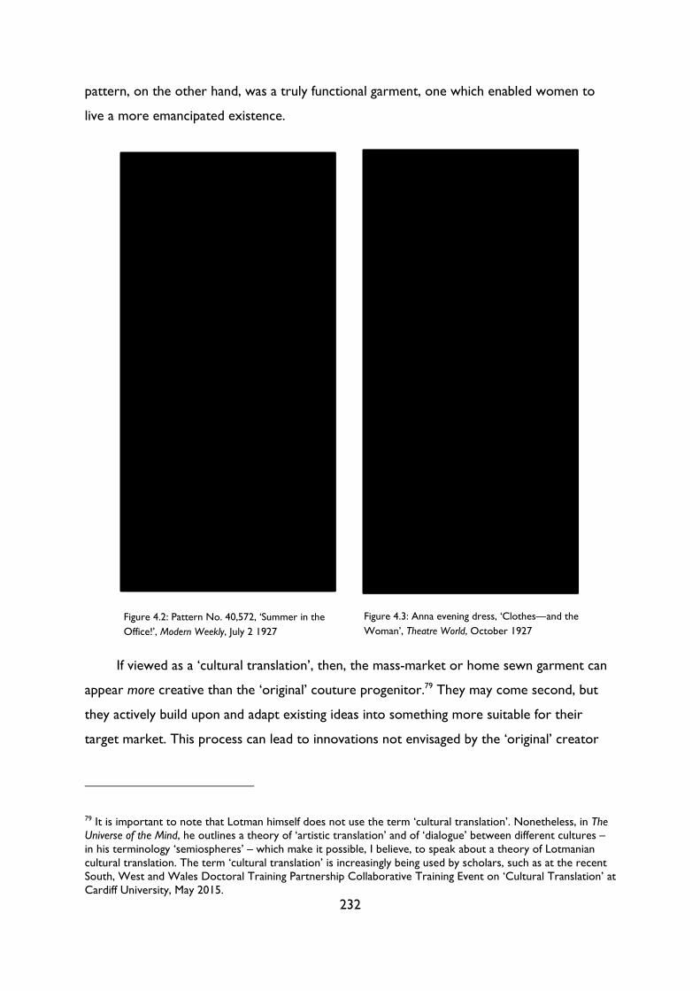
232
pattern, on the other hand, was a truly functional garment, one which enabled women to
live a more emancipated existence.
If viewed as a ‘cultural translation’, then, the mass-market or home sewn garment can
appear more creative than the ‘original’ couture progenitor.79 They may come second, but
they actively build upon and adapt existing ideas into something more suitable for their
target market. This process can lead to innovations not envisaged by the ‘original’ creator
79 It is important to note that Lotman himself does not use the term ‘cultural translation’. Nonetheless, in The Universe of the Mind, he outlines a theory of ‘artistic translation’ and of ‘dialogue’ between different cultures – in his terminology ‘semiospheres’ – which make it possible, I believe, to speak about a theory of Lotmanian cultural translation. The term ‘cultural translation’ is increasingly being used by scholars, such as at the recent South, West and Wales Doctoral Training Partnership Collaborative Training Event on ‘Cultural Translation’ at Cardiff University, May 2015.
Figure 4.2: Pattern No. 40,572, ‘Summer in the
Office!’, Modern Weekly, July 2 1927 Figure 4.3: Anna evening dress, ‘Clothes—and the
Woman’, Theatre World, October 1927
233
which may, in turn, influence their own cultural production. Away from readymade clothing,
home dressmaking also provided an opportunity for working- and middle-class women to
adapt garments to their individual needs. Barbara Burman and Fiona Hackney have written
about the creativity inherent in home dressmaking; in the interwar period, Hackney writes,
‘women’s knowledge of the magazine genre and dressmaking skills enabled them to decode,
resist, adapt, or recreate mass produced ideals’.80 Magazines such as Woman’s Weekly and
Home Chat carried free dressmaking patterns, many of which could be made up in several
different ways.81 Consequently, while patterns were becoming increasingly simplified and
standardised, the home dressmaker had more opportunities for adapting these patterns
according to her own taste and budget. Such creativity was often compelled by necessity;
Burman describes dressmaking during the Edwardian period as a mix of ‘thrift and
creativity’,82 a practice which varied widely according to the class and economic resources of
the individual home dressmaker. While middle-class women ‘had both the time to make
clothes to express their own creativity and access to the leisure occasions on which to wear
them’,83 working- or lower-middle-class women were forced to make adaptations less as a
statement of creative self-expression and more as an effort to both ‘keep up appearances’
and make ends meet.
80 Fiona Hackney, ‘Making Modern Women, Stitch by Stitch: Dressmaking and Women’s Magazines in Britain 1919-39’, in The Culture of Sewing, pp. 73-95 (p. 89). 81 Hackney, ‘Making Modern Women’, p. 78. 82 Barbara Burman, ‘Made at Home by Clever Fingers: Home Dressmaking in Edwardian England’, in The Culture of Sewing, pp. 33-53 (p. 41). 83 Burman, ‘Made at Home’, p. 39.

234
Figure 4.4: ‘Tess about Town’, Modern Weekly, 2 July 1927
235
By the mid-1920s, magazines such as Home Notes and Modern Weekly were promoting
thrift and creativity as both necessary and chic to their young, lower-middle-class readers.
Modern Weekly’s ‘Tess about Town’ column featured the exploits of a young flapper
negotiating both modern fashion and a fashionable modern life. Drawn in a simplified pen-
and-ink style, the illustrations for 2 July 1927 show Tess as she invents one simple but
effortlessly stylish ensemble after another, all created from short-lengths bought in the sales
(Figure 4.4). Unlike many other contemporary columns, ‘Tess about Town’ was not selling
or promoting mail-order patterns; rather, it aims to entertain and inspire its readers. Tess is
portrayed as an identifiable but aspirational figure, someone able to take ‘notions’ from
‘every fashion paper’ and improvise her own versions of current styles.84 The column echoes
both Mass Observation surveys from the 1940s and Hackney’s findings from oral history
interviews, in which readers of interwar fashion ‘books’ described using magazines for ‘ideas’
but resisted following fashions to the letter.85 The 1920s were characterised by what Worth
described as a ‘mania for standardisation’,86 and yet women were keen to find ways of
mixing similarity with individual touches. As Chanel wrote in her first column for Outlook, ‘if
fashion is a matter of uniform and obliges all women to present the same general
appearance, it is still useful to indicate to each in accordance with her type the slight
variations which are permissible to preserve her sense of individuality.’87 Such variations,
‘slight’ or otherwise, could be achieved by adapting patterns or existing clothes.
Women adapted not only paper patterns but also existing ready-to-wear garments, as
is evident in the craze for adding pockets onto garments during 1927 and 1928. Home Notes
featured a ‘how-to’ article in February 1928 promoting several different ‘transfers’ which
helped readers create and attach pockets to dresses (Figure 4.5); a few months earlier
Modern Weekly ran the more impressionistic ‘Pride in Your Pocket’, which featured
inspirational ideas for applying pockets to a range of garments (Figure 4.6).
84 ‘Tess about Town’, Modern Weekly, July 1927, p. 546. 85 Hackney, ‘Making Modern Women’, p. 86. 86 M. Jacques Worth, ‘The Psychology of Fashion’, Britannia and Eve, 1.1, May 1929, pp. 65-66 (p. 66). 87 Chanel, ‘Woman’s World’, p. 503.
236
These kinds of home alterations would have filled both Reich and Hawes with horror –
perfectly good, simple dresses are ‘ruined’ with the ‘tawdry’ addition of pockets – and yet
these pockets cannot be just dismissed as ‘meaningless decoration’. Such pockets were, as
the editorial in Modern Weekly claimed, ‘tremendously useful’:
You always carry a handkerchief, but where are you going to put it? It’s no good carrying it screwed up
in your hot hand in a tight ball, or pushed through the hand or your wrist watch, or your bracelet, or in
that very masculine way, up your sleeve! So please remember the pocket! You’ll get to rely on it, and
realise how practical and useful it is.88
This issue of the pocket illustrates a wider contradiction inherent in the high fashion or high
cultural attitude towards functionalism. High culture preached an ethic of simplicity and
form follows function, but simplicity risked becoming an aesthetic decision as opposed to a
response to the needs of the wearer. While mass-market or homemade dresses might be
criticised for ‘ruining’ the ‘pure’ cut and lines of simple functionalism, little thought was given
to whether such austere garments were the most practical choices for all women in all
88 ‘Pride in your Pocket’, Modern Weekly, 2 July 1927, p. 573.
Figure 4.5: ‘Pockets are Trimmed’, Home Notes, 18 February 1928
Figure 4.6: ‘Pride in your Pocket’, Modern Weekly, 2 July 1927
237
scenarios. In other words, minimalism was often conflated with functionalism. Herbert Read
described the dangers of such a conflation in a 1937 article in the Penrose Annual:
The highest virtue of a utilitarian object is obviously its efficiency; and efficiency can be reduced to terms
of economy, simplicity and clarity. […] But the real danger in this attitude is of a psychological nature.
Simplicity is, after all, an aesthetic prejudice. It appeals to some sensibilities, but not necessarily to all; and
it may not reach the depths of the sensibilities addicted to it—its application may be essentially superficial.
I am not suggesting that complicatedness itself is a virtue, but any disinterested survey of the history of
art shows that there is no single type of aesthetic form. Form is as various as feeling.89
By reducing the notion of utilitarianism to simplicity, the designer is at risk of enforcing an
inappropriate – and therefore nonutilitarian – style upon cultural objects. Reich disparages
those garments which ‘ruined and pillaged’ ideas, but it may be that these adaptations were
made in order to make the clothes more functional.
Such adaptions were not wholly voluntary; according to Lotman, acts of translation are
required when ideas cross cultural borders. In Universe of the Mind, he describes different
disciplines as different ‘semiospheres’: large, diverse signifying spaces united by their own
‘languages’, that is, their own systems of norms, customs and meanings. 90 These
semiospheres ‘cannot come into contact with foreign semiotic texts or non-texts. In order
for these types to be realized in the semiosphere, it is necessary for them to be translated
into one of the languages of semiospheric internal space’.91 This observation seems self-
evident: a two-dimensional painting, a piece of music or even a ballet costume cannot be
simply transposed into the realm of mass-market fashion and made into a functional
garment.92 Just as with linguistic translation, some forms and concepts do not have a precise
equivalent in other languages; consequently, these ‘illegitimate’ translations take the
approximate idea and reformulate it in a manner intelligible to those in the receiving
semiosphere. Or, to put it another way, ideas are received and adapted in such a way to
make them appropriate for the medium, its audience(s), and the purposes for which the
object is designed.
89 Herbert Read, ‘A Choice of Extremes’, Penrose Annual, 39, 1937, pp. 21-24 (pp. 21-22). 90 For an exploration of Lotman’s notion of the semiosphere and its languages, see Lotman, Universe of the Mind, pp. 36-7 and Edna Andrews, Conversations with Lotman: Cultural Semiotics in Language, Literature, and Cognition (Toronto: University of Toronto Press, 2003), pp. 43, 46. 91 Lotman, quoted in Andrews, Conversations with Lotman, pp. 62-3. 92 We might also describe this process as one of ‘remediation’; for more on remediation and the transfer of ideas between different mediums, see Jay David Bolter and Richard Grusin, Remediation: Understanding New Media (Cambridge, MA: MIT Press, 1999).
238
In written translations, these acts of adaptation and assimilation are often infinitely
preferable to a strictly literal translation; the same applies to cultural translation. A literal or
‘faithful’ translation from art or architecture or design to fashion (or vice versa) would
involve a surface translation of outward aesthetics (pattern, decoration) as opposed to the
adaptation of structural principles (form, shape, movement). Thus, a garment without the
conspicuous signs of modernity or modernism may actually display more of the
characteristics associated with high culture than an outwardly ‘modernist’ one. We could
think here of a severely cut, simple shift dress without pockets or embellishments. Although
it may appear to manifest modernist ideals of ‘economy, simplicity and clarity’, its simplicity
may be at the expense of its utility. As Read infers, just because one aesthetic style connotes
particular qualities or fulfils certain functions in one medium, it does not mean that the style
would still possess those abilities if transferred to another discipline. While the addition of a
pocket to keep a handkerchief may appear trivial, it in fact demonstrates the extent to
which mass-market or homemade cultural translations of couture can exhibit the ideals of
functionalism more than their minimal predecessors.
3. High and low culture both respond to the ‘Spirit of the Age’
In the previous section, we explored how home dressmakers engaged in a creative process
of cultural translation, adapting ideas from a range of sources into garments that suited their
individual needs. In this model, the issue of which garment or idea came first is irrelevant: it
is the process of adaptation which leads an inexhaustible series of new manifestations. At a
macro level, the same can be said about the relationship between fashion and art. The
concept of cultural translation helps us to complicate the established narrative of fashion
appropriating modernist aesthetics and transforming it into a ‘kind of everyman’s cubism’.
Instead, an alternative model begins to appear, one in which ideas are generated in a less
linear or straightforward manner. There is no single, static point of origin; ideas emerge
spontaneously and develop over the course of innumerable translations between different
cultural spheres. High and low cultural texts both responded to and adapted ideas circulating
within culture as part of what the critic and curator James Laver described in 1934 as ‘that
239
intangible something that I can only call the Spirit of the Age’.93 Journalists and designers did
not view fashion as secondary or inferior to art; for them, fashion was the perfect
expression of the ‘modern mode of life’ or the ‘character of the day’.94 In a series of three
fascinating articles on the philosophy of modern fashion for Britannia and Eve in 1929, the
couturier Worth claimed that ‘Dress has always borne the stamp of its time, just like a
trade-mark. […] The age in which we live is essentially a practical one, and its clothes
assume the same outlook.’95 According to Rosita Forbes, it was sportswear which
‘expresses so well the mood of the moment’;96 for the Austrian cultural commentator Adolf
Loos it was the men’s suit which ‘has truly been made in the spirit of our times’.97
In each case, fashion responded to social and economic changes above aesthetic
considerations. Far from aping modernist aesthetics, many fashion designers and
commentators sought to distinguish themselves from art in rhetoric as well as practice. In
Loos’s opinion, any object which bore the presence of the artist or the architect was bound
to be inferior: ‘All the pieces that were, to my mind, out of touch with the spirit of the age,
were created by craftsmen who had come under the thumb of artists and architects, while
those pieces in the spirit of the age were created by craftsmen for whom architects did not
provide any designs.’98 With her typical mix of polemics and mischief, the Bystander’s fashion
critic ‘Candida’ described art as ‘a deadly microbe, which will end this civilisation of ours as
in its day it has destroyed so many others.’99 Both Loos’s and Candida’s comments must be
treated with some suspicion – Loos was a infamous agent provocateur, and Candida’s
columns were written with tongue firmly in cheek – but their comments nonetheless recall
those of Howard Wadman and Joseph Thorp cited in Chapter 3, who felt that the problem
with modern posters was that they were too artistic, not that they were not artistic
93 James Laver, ‘Clothes—And Design’, in Design in Modern Life, ed. by John Gloag (London: George Allen & Unwin Limited), pp. 49-58 (p. 55). 94 Worth, ‘The Mode of To-Day’, p. 73. 95 Worth, ‘The Psychology of Fashion’, p. 65. 96 Forbes, ‘What’s Wrong with Women’s Dress?’, p. 91. 97 Adolf Loos, ‘Hands Off!’ (1917), in Ornament and Crime: Selected Essays, ed. by Adolf Opel, trans. by Michael Mitchell (Riverside, CA: Ariadne Press, 1998), pp. 179-83 (p. 179). 98 Loos, ‘Hands Off!’, p. 180. 99 Candida, ‘Femina: Too Clever’, Bystander; 19 March 1924, p. 706. This intriguing reversal, in which art, not fashion, is seen as a parasite, was prefigured by Loos, who described in 1908 how he ‘drove’ members of the Deutsche Werkbund out of the tailors’ and the shoemakers’ workshops, and also saved other crafts not yet infested with “artists,” from an unwanted invasion’. See Adolf Loos, ‘Cultural Degeneration’ (1908), in Ornament and Crime: Selected Essays, ed. by Adolf Opel, trans. by Michael Mitchell (Riverside, CA: Ariadne Press, 1998), pp. 163-166 (p. 164).
240
enough.100 For Candida, aspirations to art would ruin dresses. Artists ‘give us the low, the
mean and the hideous in the name of art’; luckily, ‘dressmakers haven't got there yet. They
lavish the art part on the atmosphere [the fashion show], and leave us still looking quite
creditable, for which I'm devoutly thankful.’101 To mix art and fashion would be deadly, not
just because artistic dress resembled ‘“Mere bags”’, but also because the fields were too
dissimilar. In 1922, she attacked a new French law which declared that ‘henceforth frocks
shall be considered works of art, [and] be copyright in consequence’.102 ‘How do we ever
keep out of prison,’ she asked, ‘in a world bristling with laws which we know nothing
about?’ In the past ‘you could crib other people's clothes ideas with impunity, for they, being
neither art nor business, fell between two stools and were fair game.’ The new legislation,
on the other hand, would leave women going
about in fear and trembling, and no one will dare to have any ideas for fear of finding that they're not as
original as one had hoped. To be strictly honest in one's ideas about sleeves and skirts and cloaks, think
of the complexity of it! Why, we've cribbed them from each other ever since our first hair-pins.103
In other words, ideas in fashion do not have one single point of origin; they are constantly
‘cribbed’ and adapted, not just from within the industry but from other mediums and
modern life itself. Fashion was not art; to treat it as such was to restrict and hamper its own
idiosyncratic creative process.
Of course, fashion was influenced by art, but only as a part of a wider Zeitgeist. Just like
painting, modern fashion was primarily a response to the changing conditions wrought by
modernity. In 1926, Candida wrote that
According to one famous person [Lucien Lelong], life is going the pace at such a terrific rate that it can't
be lived in what he calls “static” clothes. The dress of the present, and of course of the future (doesn't
every genius work for posterity, if not for all time?), is the “kinetic” frock, designed exclusively by him.
What exactly is kineticness? This is what he says about it: “The spirit of the age is manifested by its pace
of living. I do not merely design clothes, I am moving towards an ideal.”104
100 See ‘“Cant and Nonsense About Art in Advertising”’, Commercial Art, 4.7, May 1925, p. 129 (p. 129) and Howard Wadman, ‘The Advertising of Travel’, Penrose Annual, 40, 1938, pp. 50-53 (p. 52). 101 Candida, ‘Too Clever’, p. 706. 102 Candida, ‘Femina: Copyright Frocks’, Bystander, 18 January 1922, p. vii. For more on the issue of originality, copyright and fashion, see Nancy J. Troy, Couture Culture: A Study in Modern Art and Fashion (Cambridge, MA: MIT Press, 2004), pp. 266-326. 103 Candida, ‘Copyright Frocks’, p. vii. 104 Candida, ‘Femina: Kinetic and Otherwise’, Bystander, 31 March 1926, p. 788.
241
Here Lelong draws a direct correlation between modernity and fashion, not (modernist) art.
That is not to say that art did not influence fashion – in a 1937 talk Alison Settle noted that
‘The Italian Art Exhibition brought turbans to Paris, long velvet cloaks, ruffs, pageboy hats
and the beginning of pageboy hairdressing’105 – but that fashion, much like other mediums,
translated an array of contemporary concerns and historical styles into ‘an art wholly of to-
day’. The same could be said of almost any tranche of modernism; indeed, Lelong’s
bombastic statement that he is ‘moving towards an ideal’ echoes the rhetoric expounded by
the Futurists and Vorticists in the first wave of the avant-garde. Fashion, like modernist art,
design, architecture and music, endeavoured to produce forms which suited the modern
‘pace of living’. In order to do so, practitioners from each discipline were inspired by and
‘borrowed’ ideas, forms and aesthetics from other mediums. In my Introduction, I discuss
the appreciation for, and appropriation of, popular culture by the historical avant-garde;
texts and genres from newspapers and advertising to jazz records and music hall songs
transformed both the form and content of avant-garde and modernist art and literature. The
plethora of crossovers between so-called ‘high’ and ‘low’ culture demonstrate that no
discipline was a closed, hermetically sealed system; original ideas were generated not in a
vacuum but through cross-cultural encounters – as Edna Andrews puts it, ‘[m]eanings are
created as information is translated across boundaries, and in no other way.’106 We can view
modern fashion, then, not as a secondary adaptation or imitation of Futurist or Vorticist
ideas but as a parallel creative response to the conditions of modern life.
This notion of parallels between the arts was expressed in fashion magazines
throughout the 1920s. The journalist and later editor of Vogue Madge Garland wrote an
extraordinary piece in Britannia and Eve in 1929, ‘Fashions feminine and Otherwise’, which
drew parallels between modern fashion, modernity and modernism (Figure 4.7).
105 Settle, ‘Talk by AS’, p. 6. 106 Andrews, Conversations with Lotman, p. 46.
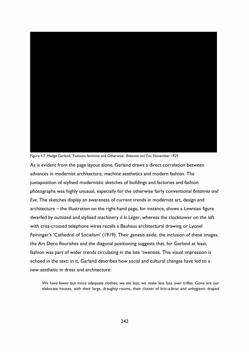
242
As is evident from the page layout alone, Garland draws a direct correlation between
advances in modernist architecture, machine aesthetics and modern fashion. The
juxtaposition of stylised modernistic sketches of buildings and factories and fashion
photographs was highly unusual, especially for the otherwise fairly conventional Britannia and
Eve. The sketches display an awareness of current trends in modernist art, design and
architecture – the illustration on the right-hand page, for instance, shows a Lewisian figure
dwarfed by outsized and stylised machinery à la Léger, whereas the clocktower on the left
with criss-crossed telephone wires recalls a Bauhaus architectural drawing or Lyonel
Feininger’s ‘Cathedral of Socialism’ (1919). Their genesis aside, the inclusion of these images,
the Art Deco flourishes and the diagonal positioning suggests that, for Garland at least,
fashion was part of wider trends circulating in the late ‘twenties. This visual impression is
echoed in the text: in it, Garland describes how social and cultural changes have led to a
new aesthetic in dress and architecture:
We have fewer but more adequate clothes; we eat less; we make less fuss over trifles. Gone are our
elaborate houses, with their large, draughty rooms, their clutter of bric-a-brac and unhygienic draped
Figure 4.7: Madge Garland, ‘Fashions feminine and Otherwise’, Britannia and Eve, November 1929
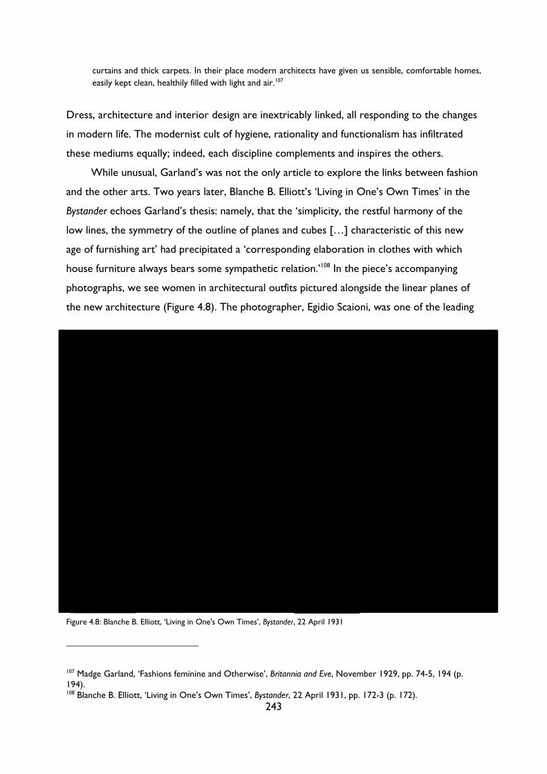
243
curtains and thick carpets. In their place modern architects have given us sensible, comfortable homes,
easily kept clean, healthily filled with light and air.107
Dress, architecture and interior design are inextricably linked, all responding to the changes
in modern life. The modernist cult of hygiene, rationality and functionalism has infiltrated
these mediums equally; indeed, each discipline complements and inspires the others.
While unusual, Garland’s was not the only article to explore the links between fashion
and the other arts. Two years later, Blanche B. Elliott’s ‘Living in One’s Own Times’ in the
Bystander echoes Garland’s thesis: namely, that the ‘simplicity, the restful harmony of the
low lines, the symmetry of the outline of planes and cubes […] characteristic of this new
age of furnishing art’ had precipitated a ‘corresponding elaboration in clothes with which
house furniture always bears some sympathetic relation.’108 In the piece’s accompanying
photographs, we see women in architectural outfits pictured alongside the linear planes of
the new architecture (Figure 4.8). The photographer, Egidio Scaioni, was one of the leading
107 Madge Garland, ‘Fashions feminine and Otherwise’, Britannia and Eve, November 1929, pp. 74-5, 194 (p. 194). 108 Blanche B. Elliott, ‘Living in One’s Own Times’, Bystander, 22 April 1931, pp. 172-3 (p. 172).
Figure 4.8: Blanche B. Elliott, ‘Living in One's Own Times’, Bystander, 22 April 1931
244
proponents of modernist fashion photography in Paris during the 1920s and ‘30s; his
distinctive stark, angular backdrops and striking lighting can also be seen in Theatre World’s
fashion column during 1927 (Figure 4.3).109 While the text explores the intersections
between interiors and dress, the double-page spread explores the relationship between
(modernist) interior design, fashion and photography, one in which each medium enriches
and influences the others. Indeed, despite her stated hostility towards the intermixing of art
and fashion, Candida argued in 1922 that if one wanted to know about the latest trends in
art, one should turn not to painting but to dress:
BUT what about that family likeness between the arts which it was my intention to talk about? To trace
it, don't begin at the top of the tree. Don't give reasons why the Russian ballet is very like a portrait by
Augustus John, and why both are intimately related to Stravinski's [sic] latest effort, and to the fundamental
idea, if any, of If Winter Comes. But look instead at your latest dress ‘creation’ home from Lanvin, or
Molyneux, or Madeleine et Madeleine, and take it to pieces, figuratively, of course, and you'll know all
about the successes of the Johns, the Diaghileffs, and Stravinskis of this world.110
Far from just absorbing or imitating artistic trends, clothes are an expression of a truly
contemporary spirit. While Candida, like Loos, did not approve of the infiltration of artists
into fashion, she did acknowledge the increasing ‘family likeness between the arts’ and thus
the parallel appearance of modernist ideas across painting, fashion, ballet, music and theatre.
Of these modernist ideas, the ones which gained the most traction in the ‘applied arts’
were those of simplicity and functionalism. ‘Dresses’, Candida wrote,
are very ‘psychological’ just now. The nicest are invented by gentlemen and ladies who were within an
ace of becoming famous writers, painters, fiddlers, etc., etc. Their creations will give you at first an
impression of guileless, almost amateurish, simplicity. All the good, old traditions are ignored. There is no
cut or fit: everything bags which should be plain, and all is plain that should bag; and, worst of all, in unusual
places odds and ends survive that should have been severely suppressed. The thing seems flung together
by someone who did not know his craft, let alone any art.111
We have here two different but related modernist impulses: firstly, the drive towards the
abstract and the difficult; secondly, the rejection of traditional modes of beauty or accepted
forms. Difficulty is attained through apparent simplicity; taken to the extreme, a simple dress
109 Scaioni appears to have been largely forgotten; for more on his work see Sylvie Lécallier, ‘“Monte Carlo by Maggy Rouff, ensemble for the Côte d’Azur” by Egidio Scaioni’, Palais Galliera. Available at http://www.palaisgalliera.paris.fr/en/work/monte-carlo-maggy-rouff-ensemble-cote-dazur-egidio-scaioni [accessed 15 August 2016]. 110 Candida, ‘Femina: On Having Opinions’, Bystander, 28 June 1922, p. 848 (p. 848). 111 Candida, ‘On Having Opinions’, p. 848.
245
is little more than a ‘bag’. Such a garment is the challenging ‘highbrow’ antithesis to a more
familiar, flattering dress with tapering and trimmings. Candida had little patience with such
experiments; her critique of the modernist designer as ‘someone who did not know his
craft, let alone any art’ recalls comments made following the 1910 Post-Impressionist
Exhibition, at which critics such as William Blunt bemoaned the lack of ‘skill or taste good
or bad or art or cleverness – nothing but the gross indecency which scrawls indecencies on
the walls of a privy.’112 The fact that modern(ist) fashion could also attract similar criticisms
– accusations that it was little more than a ‘jest in crepe de Chine’ with ‘so much art in it
that you can’t see the wood for the trees’ – shows the extent to which the same radical,
often controversial impulses were present across the arts. During the 1920s and early ‘30s,
fashion journalism often resembled modernist manifestos, such as Blanche Elliott’s claim that
the ‘elimination of the superfluous is as necessary to the art of good dressing as to any
other form of art’,113 or Jacques Worth’s assertion that
THE couturier, therefore, must watch out that every dress be appropriate, for purposeless beauty has
no meaning to-day. And, up to a certain point, this is as it should be. More than ever must we have
harmony, a ‘rightness,’ between the line, the material, and the ornamentation of a gown, as well as a
fitness for the specific occasion.114
Fitness, harmony, appropriate: all key words which can be found in any treatise on
modernism in design or architecture. Professor C. H. Reilly, head of the influential Liverpool
School of Architecture, wrote in the Manchester Guardian in 1932 about this ‘New Spirit in
Architecture’, namely, the feeling that there
was too little simplicity in our buildings. There was therefore a desire to study mass-forms rather than
facade decoration to obtain the necessary unity. Gordon Craig and Adolphe Appia led the way on the
stage. Detail there, too, gave way to mass-form. In sculpture it was the same, and even in the two-
dimensional art of painting a new value was attached to the expression of volume.115
Although Reilly does not mention fashion directly, we can see the impulses present in
architecture, painting and design in dress as well: that is, the focus on underlying structure
as opposed to – and often at the expense of – surface decoration.
112 William Blunt, quoted in Peter Stansky, On or About December 1910: Early Bloomsbury and its Intimate World (Cambridge, Mass.; London: Harvard University Press, 1996), pp. 204-5. 113 Blanche B. Elliott, ‘Chic—Is Simplicity’, Bystander, 3 December 1930, pp. 496-7 (p. 496). 114 Worth, ‘The Psychology of Fashion’, p. 65. 115 Professor C. H. Reilly, 'The New Spirit in Architecture. A Break with the Past.', Manchester Guardian, 29 June 1932.
246
This turn towards ‘mass-form’ over individual details resulted in a new simplicity and
rationalism which pervaded all of the arts. Garland, Elliott, Candida and Worth all viewed
fashion (for better or worse) as just one part of a wider Zeitgeist or even Gesamtkunstwerk in
which each medium spontaneously and in parallel designed cultural objects fit for modern
life. Worth observed that the ‘phrase “extreme simplicity” applied to dress is really nothing
more than one way of calling attention to the parallel which exists between style and the
simplification of the modern mode of life.’116 It is significant that it was these fashion
journalists and designers, not elite commentators, who were first to identify this
concurrence between the arts. It was discussed at length in the fashion magazines of the
1920s and early 30s, whereas the notion gained currency in artistic circles until several years
later. When Paul Nash wrote to the editor of The Times in June 1933, he explained that his
new group, Unit One ‘may be said to stand for the expression of a truly contemporary
spirit, for that thing which is recognized as peculiarly of to-day in painting, sculpture, and
architecture.’117 Similarly, in 1937, the editors of Circle emphasised ‘those works which
appear to have one common idea and one common spirit’.118 These ideas, they argued,
have grown spontaneously in most countries of the world. The fact that they have, in the course of the
last twenty years, become more crystallized, precise, and more and more allied to the various domains
of social life, indicates their organic growth in the mind of society and must prove that these creative
activities cannot be considered as the temporary mood of an artistic sect, but are, on the contrary, an
essential part of the cultural development of our time.119
For Nicholson, Martin and Gabo, the fact that ‘constructive’ ideas could be witnessed in all
‘domains of social life’ was something to be celebrated, not denigrated. It demonstrated that
modernist ideas could not be dismissed as an eccentric elite fad; on the contrary, the
increasing popularity of modernism revealed the extent to which ‘A NEW cultural unity is
slowly emerging out of the fundamental changes which are taking place in our present-day
civilization.’120 By drawing spontaneously upon similar ideas, all forms of cultural expression
were able to construct forms appropriate for modern life.
116 Worth, ‘The Mode of To-Day’, p. 72. 117 Paul Nash, ‘Unit One: A New Group of Artists’, The Times, 12 June 1933, p. 10. 118 J. L. Martin, Ben Nicholson and N. Gabo, ‘Editorial’, in Circle: International Survey of Constructivist Art, ed. by J. L. Martin, Ben Nicholson and N. Gabo (London: Faber and Faber, 1937), pp. v-vi (p. vi). 119 Martin, Nicholson and Gabo, ‘Editorial’, p. v. 120 Martin, Nicholson and Gabo, ‘Editorial’, p. v.
247
Of all cultural forms, fashion was perhaps best placed to respond to the changing
conditions of modernity. Its practitioners were among the first to identify a common spirit
across the arts precisely because fashion revolved around this ability to recognise and
anticipate cultural trends. ‘My whole success as a dress designer’, Hawes argued, ‘depends
on my feeling this very minute what my clients are going to want tomorrow and providing it
for them.’121 In Tigersprung, Ulrich Lehmann writes that fashion designers are able to
create the perfect expression of the contemporary spirit […] because of the absolute proximity of their
works to the human body and its emotive responses. Clothes are closer to the spirit than intellectual
contemplation or analysis is; and in the hand of a truly progressive designer, they can operate on an
equally fundamental level. Therefore, they provide a veritable embodiment of a cultural concept, whose
brief existence is itself a sign of fashion’s growing dominance—it appears first reflected in a new dress or
suit of a particular season, before it is disseminated in the media.122
In being intimately connected with the body, clothes are among the first to express the new
spirit. Clothes had to change to allow the new types of movement demanded by modern
city life, travel or sport. As women’s lives underwent a series of revolutions, their clothes
had to adjust to reflect, anticipate and facilitate these changes.123 ‘However questionable the
value of political freedom’, Garland wrote in 1929, ‘there was no doubt as to the real
freedom from the tyranny of corsets, flounces and hairpins!’124
Fashion designers had to constantly respond to the Zeitgeist or, in Hawes’s memorable
words, ‘be left to starve’.125 According to Hawes, this contemporaneity was the difference
between fashion and painting:
Your couturier’s art is so very fleeting, so entirely a thing of the minute, that it must be sold hot off the
platter or it is worthless. I cannot design a very beautiful dress this year which someone will suddenly
discover ten years later and pay me a very large sum of money to possess and hang on the wall.126
Unlike painting, dress (rarely) acquired meaning or value; it had most currency upon
inception precisely because of its symbiotic relationship with contemporary culture. ‘[Of] all
the fine arts’, Worth wrote, ‘Fashion is evolving the fastest. Any group of up-to-date women
121 Hawes, Fashion is Spinach, p. 108. 122 Lehmann, Tigersprung, p. xix. 123 I have written elsewhere about this relationship between fashion, modernity and female emancipation. See Emma West, ‘A Modern(ist) Mode: Fashion, 1910 and the Limits of Modernism’, Word and Text: A Journal of Literary Studies and Linguistics, 1.2 (2011), 65-78. 124 Garland, ‘Fashions feminine and otherwise’, p. 74. 125 Hawes, Fashion is Spinach, p. 108. 126 Hawes, Fashion is Spinach, pp. 107-8.
248
exemplify, better than any other factor of modern life, an art which is wholly of to-day.
Fashion, it isn't rash to say, is simply a mirror reflecting every minute the changing symphony
of the finesse we call “modernism.”’127 Worth here uses modernism in the broadest sense –
we might more accurately use the term ‘modernity’ – but his reference to modernism is
fitting. With their simple, abstract, geometric, functional clothes, a group of fashionable
women in the late 1920s would have expressed the Zeitgeist more instantly than almost any
other form of modernist art or culture. Nonetheless, Worth’s metaphor of the mirror
implies that fashion passively replicates modern life or modernist aesthetics. Perhaps more
fitting is James Laver’s simile, in which he describes fashion as ‘like a weathercock which
shows the way the wind is blowing before more solemn and serious arts are aware that the
wind has changed.’128 In this formulation, fashion is invested with more agency: it is
pioneering, vanguard even, seizing upon trends which the more serious arts have yet to
acknowledge.
Consequently, fashion was often more modern, more prescient, than the artistic
modernism it was purported to have ‘pillaged and ruined’. Worth argued that the ‘serious
arts’ were slower to respond because they were ‘more unique, more personal’; fashion, on
the other hand, possessed a peculiar ‘adaptability to the tempo of the times. No other art is
so flexible, so impersonal, so possessing such a wide appeal.’129 Whether down to this
‘impersonality’, the desire for consumers to appear contemporary, or the structural
necessity to produce new collections twice a year, fashion succeeded in capturing the ‘spirit
of the age’ more quickly than the fine arts. To suggest that fashion passively stole from high
modernism is to misrepresent or misunderstand how ideas were generated and circulated in
the modern period. It is impossible to conceive of the movement of ideas as a one-way
transfer from high to low; ideas appeared spontaneously, mysteriously even, and travelled
across cultural borders indiscriminately. Such borders were not fixed, rigid or unbreachable:
as Andrews argues,
[b]ecause the semiotic boundary is like a membrane or filter, always penetrable, clearly bilingual
translation is possible from both directions (internal to external and vice versa). The interplay across
these boundaries is inexhaustible. […] This kind of contact between different semiospheres is constantly
occurring, and these semiotic "currents" flow horizontally and vertically from within and without.130
127 Worth, ‘The Mode of To-Day’, p. 72. 128 Laver, ‘Clothes—And Design’, p. 58. 129 Worth, ‘The Mode of To-Day’, p. 72. 130 Andrews, Conversations with Lotman, p. 46.
249
By viewing borders not as fortifications but rather as ‘translation filters’ – a place where
ideas are assessed and adapted according to the norms within the receiving culture – we can
begin to understand how similar inputs (new technology, political emancipation, the First
World War) resulted in a varied range of aesthetic and cultural responses, from fashion to
painting to architecture to music to design.
In this chapter, we have seen how notions of simplicity and functionalism appeared in
different mediums concurrently, all inspired by the ‘simplification of the modern mode of
life’. This Zeitgeist was a collective reaction to the excesses of Art Nouveau, an embrace of
the machine aesthetic and a love affair with pour le sport and bicycling.131 It was characterised
by Malevich’s Black Square (1916), Le Corbusier’s Pavillon de l’Esprit Nouveau (1924) and
Chanel’s ‘little black dress’ (1926) among many others. There is no single point of inception,
no ‘Eureka’ moment; all of these modern(ist) texts can be read as cultural translations of
each other, whether directly or indirectly. This, I think, is the value of Lotman’s theories
when interrogating this relationship between high and low culture. It helps to move away
from a linear, one-way conception of cultural transfer and towards a more haphazard,
dynamic notion of cultural translation, one in which there is no input or output, no pure or
singular origin, no concept of parasite or host. The question of which text came ‘first’
becomes irrelevant: even if one text appears chronologically before another, that does not
mean that the second text is derivative. Instead of copying the first text, the second may
have been inspired by the same social and cultural trends – the Zeitgeist – that inspired the
first. The chain or rather web of influences and translations is infinite and often untraceable.
As a result, no one text can be designated as the ‘first’, with all of the positive qualities
(originality, creativity, purity) which that category connotes. When using a concept of
cultural translation, there is in fact no value attached to being first: for Lotman, it is the
translations between cultures which is the most creative and generative aspect of cultural
production.132 The notion of cultural translation thus contributes to what we might call a
wider critical decentring occurring within modernist studies. Until recently, the moment of
inspiration or the act of creation has been viewed by literary and art historians as the point
131 For instance, Caroline Evans has written about the influence of mechanisation and the Ford’s Model T production-line on early fashion shows in her book The Mechanical Smile: Modernism and the First Fashion Shows in France and America, 1900-1929 (New Haven: Yale University Press, 2013). 132 For more on cultural translation as creative and generative, see, Lotman, Universe of the Mind, pp. 36-7, 140.

250
of value and importance. The recent attention on mediating and disseminating institutions
such as magazines, publishers, book sellers and art dealers, however, has shifted this focus
from the act of creation to its circulation and reception. As a concept, cultural translation
offers a theoretical framework or rationale for shifting our attention from single, fixed
points of origin to multiple exchanges at and around cultural borders. As such, it encourages
us to look beyond a text’s creator and towards audiences, norms and functions as
determining factors in a text’s eventual form, whether modern, modernist or anything in-
between.
251
Conclusion
or, How I Learned to Stop Worrying and Love the Great Divide
The talk about high-brow and low-brow, too, is beside
the mark: we are all both, but over different things.
- A. H. Fox Strangways, 19301
In the early 1930s, a series of cultural commentators and critics took to the columns and
letters’ pages of the national press to express their dissatisfaction with the ubiquitous
distinction between the ‘high-brow’ and the ‘low-brow’. The music critic A. H. Fox
Strangways dismissed the distinction; for him, everyone displayed both high- and low-brow
characteristics or tastes depending on the context.2 Hamilton Fyfe, journalist and erstwhile
editor of the Daily Mirror, appeared to agree: in a June 1932 letter to the editor of the
Bookman, he wrote that
it seems to me that you are suffering from a delusion, this delusion being that there are certain people
who may be described as highbrows, and others who are the opposite of them and may therefore be
termed lowbrows. No such people exist. The legend of them was started in American comic papers.
Being too poor in invention to coin slang of its own, the English nation adopts American slang, and with
it blends an innocent belief that there is some reality behind its humorous images.3
What started out as a joke had, by 1932, become a veritable sport: Fyfe noted that the
‘pastime of trying to spot the highbrow in buses may have ousted for the moment the
crossword puzzle.’4 Yet, for Fyfe, the highbrow/lowbrow debate was a case of the
Emperor’s New Clothes: the distinction might have been amusing, but it was not borne out
in reality. Professor T. H. Pear, broadcaster and Professor of Psychology at Manchester
1 A. H. Fox Strangways, ‘Music and Musicians: The B.B.C. and its Critics’, Observer, 12 October 1930, p. 14. 2 Strangways, ‘Music and Musicians’, p. 14. 3 Hamilton Fyfe, ‘Highbrow Delusion’, Bookman, 82, June 1932, p. 178. 4 Fyfe, ‘Highbrow Delusion’, p. 178.
252
University, went one step further, asking ‘his hearers’ at a 1930 talk to ‘do whatever they
could to break down the domination over the race of the words “high-brow” and “low-
brow,” which stood for a most vulgar and unreal distinction.’5
For me, this phrase – a ‘most vulgar and unreal distinction’ – encapsulates my entire
feeling about the Great Divide. When I first conceived of this project, over eight years ago, I
began as a devout Pearite: I viewed the Great Divide with not just suspicion but outright
hostility. The categories of high and low were, in Fyfe’s words, a delusion: they did not apply
to the range and diversity of cultural texts produced in modern Britain. Having grown up in
a house decorated with interwar travel posters, and with a lifelong interest in fashion, I
failed to see how such cultural objects could be described by the reductive and binary
categories of high- and low-brow or high and low culture. After having begun researching
the high/low divide for my undergraduate thesis on modernism and fashion, I realised that I
was not the only one to share this contempt for, and frustration with, these categories.
There were scores of essays, books and newspaper articles all discrediting what Huyssen
called the ‘Great Divide’, and yet the distinction persisted, not just in modernist studies but
in contemporary culture more widely.6 Take, for instance, Mark Lawson’s July 2013
interview with the composer Murray Gold on BBC Radio 4’s arts programme Front Row. In
discussing a BBC Proms concert featuring Gold’s ‘incidental’ music from the popular
science-fiction television series Doctor Who, Lawson commented:
ML: I took offence on your behalf. In the proms official guide I turned to the biographies of composers
and after Philip Glass and before Sophia Gubaidulina there’s no Murray Gold.
MG: Oh well that might be last the vestiges of the high versus low culture war (laughs).
ML: (Laughs) Well, that’s why I asked. I did wonder about this, that it’s as if what you’ve done is off to
one side, somehow.
MG: Yeah. Well, that’s not my battle to fight, I wouldn’t have thought. […] I suppose I have a very slight
leaning towards the elite in the high versus low culture war. And in the proms as a whole there
aren’t that many opportunities for really tough, gritty modernist composers to have a go at having
their music being played in front of a big audience, a massive audience. As your humble
representative of the low culture here, I defer to them and if they left me out of the programme
(laughs) I don’t mind too much.7
Not only does this interview capture the same debates that preoccupied the modernists
(serious art versus light entertainment, autonomous art versus commercial fodder), but it
5 ‘Forming of Public Opinion: Professor Pear on Ethics and Advertising’, Manchester Guardian, April 30 1930, p. 15. 6 I discuss the extent to which the Great Divide still shapes influence on modernist studies in the Introduction. 7 ‘Murray Gold on Doctor Who’, Front Row, 9 July 2013, BBC Radio 4, my transcription. Available at http://www.bbc.co.uk/programmes/b036kbm9 [accessed 21 December 2016].
253
also expresses these concerns using the same language. By casting the high/low debate as a
‘war’, a ‘battle to fight’, Gold’s language recalls that of Virginia Woolf in her infamous 1932
essay ‘Middlebrow’. Although delivered with sardonic humour, in describing the ‘Battle of
the Brows troubles’, Woolf uses violent verbs such as ‘stab’ and ‘exterminate’ to express
her hatred for the middlebrow, that ‘bloodless and pernicious pest’.8
He might not go as far as Woolf, but Gold’s use of similarly militaristic language is
striking. While his comments are accompanied by laughter, they nonetheless point to a
deep-rooted tension between supporters of ‘high’ and ‘low’ culture in contemporary Britain,
despite our ostensibly more inclusive approach to all forms of cultural expression. Eighty
years ago, ‘incidental’ music from a television (or wireless) series would not have been
showcased at the Proms. Just because Gold’s compositions were included, however, does
not mean that they are valued in the same way as other compositions from more critically-
acclaimed classical composers. Indeed, Gold’s omission from the list of composer
biographies demonstrates that while his music was deemed ‘good’ (or perhaps, rather
‘popular’ or ‘profitable’) enough for inclusion, it does not change the fact that his work is, as
Lawson put it, ‘off to one side’. Gold’s work, after all, stands for everything the high
modernists rallied against: instead of aiming to educate, improve or challenge, his music is
pure entertainment: it is emotional, enjoyable and recognisable. It represents not the
autonomous, ideological outpouring of the genius artist, but music written on a laptop
‘directly for an audience’ with the aim of ‘resonat[ing] with as many people as possible as
quickly as possible’.9
This simple act of omission, masked by a public act of inclusion, encapsulates the
twenty-first century high/low divide. The medium and the context in which he works
exclude Gold from being viewed as a ‘proper’ composer. Even when played in a concert
hall, the fact that Gold’s music is and was for television stops it from being taken seriously,
as demonstrated in the concert’s press reviews. Despite being written by different critics,
the reviews in the Guardian and the Telegraph both described themselves as ‘churlish’ for
even critiquing a work of pure entertainment.10 Geoff Brown also adopted a similarly
dismissive attitude in his review for The Times, asserting that the concert was ‘never about
8 Virginia Woolf, ‘Middlebrow’, in The Death of the Moth and Other Essays (London: The Hogarth Press, 1942), pp. 113-119 (p. 113, 119, 118). 9 Front Row, 9 July 2013. 10 See John Lewis, ‘Prom 2: Doctor Who Prom – review’, Guardian, 14 July 2013. Available at http://www.theguardian.com/music/2013/jul/14/doctor-who-prom-review [accessed 17 January 2014] and Ben Lawrence, ‘Doctor Who Prom, Royal Albert Hall, review’, Daily Telegraph, 15 July 2013, p. 23.
254
the notes’ but rather about the ‘gallimaufry of monsters, recent clips and new footage’ that
‘transfixed the crowd’.11 It is this kind of snobbery encapsulated in the derogatory term
‘gallimaufry’ that reveals the persistence of a mutually-exclusive division between worthless,
‘lowbrow’ entertainment on one hand and valuable, ‘highbrow’ art on the other.
The omission of Murray Gold from the Proms programme is just one instance of the
contemporary high/low divide; we could also think of the 2011 Booker Prize row, in which
the judges were accused of ‘dumbing down’,12 or debates around blockbuster art exhibitions
in which ‘success is now judged on visitor numbers and box office sales’.13 In the first
instance, the critique of the Booker Prize judges was founded on the belief that books could
not be both ‘readable’ and have literary value, a belief so deeply ingrained by some in the
literary world that a rival ‘Folio Prize’ was set up whose ‘sole criterion for judgment will be
excellence.’14 In the second instance, the critique of blockbuster exhibitions is based on the
dual belief that a) ‘[c]rowds cannot appreciate art’, and b) only a small number of educated
and refined ‘individuals’ have ‘a real, rare feeling for art’.15 None of these debates are new: in
fact, the underlying principles of a mutually-exclusive divide between art and entertainment
and the elite and the masses, or the assumption that only ‘difficult’ works can have literary
or artistic value, are centuries old. The Great Divide may have peaked in the interwar
period, but it continues to shape the way we read, view, evaluate, teach, study and canonise
cultural objects a century later. The three structural myths identified in this thesis – the
myths of essence (texts are inherently high or low), mutual exclusivity (texts are either high
or low) and precedence (high texts come before low texts) – are, despite decades of
scholarship to the contrary, as pervasive now as they have ever been.
Confronted by these contemporary manifestations of the Great Divide, my mission
was clear: eradicate this ‘vulgar and unreal distinction’. Until we address the structure of the
11 Geoff Brown, ‘Prom 2’, The Times, 15 July 2013, section T2, p. 10. 12 Indicative articles include Jeanette Winterson, ‘Forget easyBook. Readability is no test for true literature’, Guardian, 18 October 2011, section ‘Comment’, p. 32; Catherine Bennett, ‘The Man Booker judges seem to find reading a bit hard’, Observer, 11 September 2011, section ‘Comment’, p. 37; Allan Massie, ‘Is the Booker Prize really being dumbed down?’, Telegraph, 15 October 2011. Available at http://www.telegraph.co.uk/culture/books/booker-prize/8829213/Is-the-Booker-Prize-really-being-dumbed-down.html [accessed 20 January 2014]. 13 Emine Saner, ‘Blockbuster art: good or bad?’, Guardian, 25 January 2013. Available at https://www.theguardian.com/commentisfree/2013/jan/25/blockbuster-art-good-or-bad [accessed 28 December 2016]. 14 ‘The Prize’, The Folio Prize. Available at http://www.thefolioprize.com/the-prize/ [accessed 20 January 2014]. 15 Jonathan Jones, ‘Down with Kickstarter! Where art is concerned, the crowd is an idiot’, Guardian, 15 July 2015. Available at https://www.theguardian.com/artanddesign/jonathanjonesblog/2015/jul/15/down-with-kickstarter-crowdfunding-where-art-is-concerned-crowd-is-an-idiot [accessed 15 July 2015].
255
high/low divide, we are doomed to keep having the same debates over cultural value in
relation to different cultural objects. The late 19th century outcry about the dangers of
‘ephemeral fiction’ might have been replaced by denunciations of self-published Kindle
fiction,16 but the criticisms of both are dictated by equivalent issues of class, gender, money
and power. Although we might appear more inclusive, the underlying assumptions remain
the same. Consequently, I set out to emancipate British culture from the tyranny of this
binary thinking, in which any cultural text produced for an audience, for entertainment, or
for money could possess little artistic or literary value. Armed with little more than a
passing knowledge of Soviet semiotics and Derridean deconstruction, I would overturn the
high/low divide once and for all, suggesting new ways of seeing texts which exceeded this
restrictive and ‘unreal distinction’.
A laudable aim, perhaps, but one that was hard to achieve. I spent the first year of my
doctorate diligently collecting examples of texts which transgressed the boundaries of high
and low, from publishing, literature and magazines to graphic design, art, architecture and
fashion. The more examples I collected, the more convinced I became of my argument;
until, that was, I began to close-read my selected case studies. Surprisingly – and it was a
surprise to me – my texts did not neatly fit into the argument I had constructed beforehand.
In fact, in the case of magazines, the texts completely contradicted my argument. Where I
expected to see magazines with no ‘internal’ or ‘linguistic’ differences, I saw magazines with
vast variations in language, tone, plot, characterisation, genre and presentation. Given these
material differences, it became harder to maintain my combative stance towards the Great
Divide. One could not simply disprove or debunk the Great Divide if it reflected material
variations in cultural texts. I encountered similar problems with my other chapters: in
Chapter 1, I found more of a critical consensus over the terms high and lowbrow than I had
been expecting; as a result, I could not argue that the high/low divide had no meaning. In
Chapter 3, while the travel posters considered neatly blended aesthetic and publicity
functions, I was intrigued to discover that both those within and without the new field of
‘commercial art’ wanted, in general, to preserve a distinction between art and commerce.
Finally, in Chapter 4, the complexities of the relationship between art and fashion meant,
16 In Reading, Publishing and the Formation of Literary Taste in England 1880-1914 (London: Ashgate, 2006), Mary Hammond describes how a taste for ‘ephemeral fiction’ was, in the late nineteenth century, ‘frequently likened to an addiction to drink.’ (p. 33) The prodigious reading of ephemeral fiction – in contrast to more weighty, male-authored classics or works of philosophy, history, biography and science – was thought to ‘encourage theft’ and ‘soften the mind and make it impervious to other things.’ (p. 33)
256
once again, that a simple rebuttal of the structural myth of precedence could not suffice.
Although the myth was an oversimplification, high cultural texts often did come before low
cultural ones.
Given these findings, it was no longer possible to rebuff a Divide which was at least
partially true. I had expected to find a divide which imposed artificial differences between
texts at the evaluation stage; what I found was a system of ‘deep values’ and ingrained
assumptions which affected a text at every moment of its production, circulation and
reception. Accordingly, as one colleague put it, deconstruction began to seem ‘over the top,
somehow’. It was not only impractical or difficult to ‘get rid of’ the Great Divide, but also
undesirable. Far from being something which I worked through on my way to a mythical
non-binary approach, I realised that the Divide was my object of focus. When I first
conceived of the project, it had three separate stages: Stage 1 (Chapter 1), defining the
Great Divide, Stage 2 (Chapters 2-4), disproving the three structural myths, and finally,
Stage 3 (Chapter 5), proposing a new thematic approach which would overcome the
Divide’s binary thinking. Taken together, the thesis would deliver a knock-out blow to the
Great Divide, making it impossible for it to continue its stranglehold on modernist studies
or contemporary culture.
As I researched and began writing the thesis, however, I began to realise two things:
first, that the three stages were not as neat and distinct as I imagined. In a sense, each
chapter was performing all three stages, at once: in the first chapter, for instance, by
showing that the high/low divide was context-specific, contradictory, relative and relational,
I began to enact Stages 2 and 3 as well as Stage 1. In addition to defining the Divide, this
chapter disproved the myth of essence and suggested a way of viewing texts (semiotic
mapping) which drew attention to the artificiality of such distinctions. The same could be
said of the other chapters: although each engaged specifically with one structural myth –
essence, mutual exclusivity, precedence – each chapter also sought to define a different field
or set of debates, as well as developing approaches which shifted the emphasis away from a
text’s classification and onto how it engaged with audiences, norms and functions.
This apprehension – that all three stages were present in each chapter – led to my
second realisation: far from being steps along the way which would help me to reach a final
destination, each chapter was its own destination. I had viewed Chapters 1-4 as necessary
evils, required only insofar as they helped me reach the mythical critical enlightenment of
Chapter 5, but, as the project progressed, I no longer needed Chapter 5. I realised that,
257
instead of jettisoning the Divide, my aim was to keep it and draw more attention to it. The
Divide might not be ‘true’ or ‘describe’ cultural texts, but it is precisely this gap between the
rhetoric about, and the reality of, cultural texts which makes the Divide so interesting. Why
are some characteristics valued above others? Why are some mediums associated with
particular qualities and audiences? Who decides which texts are categorised as high or low?
And what is there at stake in such categorisations? If one removes or effaces this gap
between the rhetorical and material, then one also removes the record of how class,
gender, sexuality, race and money affected the production and evaluation of cultural texts.
Similarly, if one was to classify texts ‘more accurately’, then one would lose an awareness of
both how deep values and assumptions affected evaluation, and how texts explicitly
positioned themselves in relation to norms and audiences, and aimed to fulfil certain
functions.
The thesis thus shifted from being a ‘pure’ cultural deconstruction to something in-
between a cultural deconstruction and a cultural history, or rather a deconstruction enacted
through cultural history. By focusing on primary materials and on a range of contemporary
debates, I was able to expose the Great Divide’s inner workings, showing how the
apparently common-sense, immutable categories of high and low were socially constructed,
based on an unchanging set of deep values and fundamental binary oppositions such as
presence/absence, true/false and active/passive. Across my four chapters, I demonstrated
how the categories of high, low and middlebrow were shaped by class and gender prejudice,
in which the texts produced by men and the elite (most often, elite men) were valued above
those produced by – or for – women and the masses. There is more work to do in tracing
the role that race and sexuality played in the interwar British high/low divide; although both
inevitably contributed to how texts were classified (straight and/or white as high and gay
and/or black as low), in the case studies examined, class and gender had more of an
influence.17 That is not to say, however, that the high/low divide maps neatly onto class or
gender divides – as we saw in Chapter 1, this is rarely the case – but it is fair to say that the
Great Divide was shaped by, and helped perpetuate, a complex matrix of socio-economic
prejudices and anxieties.
17 Race appears to have played more of a role in the American context; Ann Ardis explores the influence of race in shaping American periodical cultures in her essay ‘Making Middlebrow Culture, Making Middlebrow Literary Texts Matter: The Crisis, Easter 1912’, Modernist Cultures, 6.1 (2011), 18-40. In her book Lesbian Modernism: Censorship, Sexuality and Genre Fiction, Elizabeth English explores how attitudes towards female sexuality influenced the form and content of both modernist and mainstream works of fiction. See Elizabeth English, Lesbian Modernism: Censorship, Sexuality and Genre Fiction (Edinburgh: Edinburgh University Press, 2015).
258
Throughout this thesis, I have attempted to trace how these prejudices and anxieties
manifested themselves in specific times and places. In Chapter 1, the Manchester Guardian
and Observer’s competitions to define the highbrow were just one example of the interwar
‘classificatory impulse’, in which both the modernist elite and the ‘man on the street’ sought
to try and assimilate social, political and economic changes wrought by modernity and the
First World War. Against the backdrop of first-wave feminism and the increasing
irrelevance of class distinctions, the categories of the ‘brows’ provided an opportunity to
organise and thus ‘defuse’ both people and texts in an uncertain and changing world. In
Chapter 2, the emergence of a new model of cultural production, in which texts were
produced in reference to ‘what the public wants’, threatened the Romantic and then
modernist myth that literary texts were the autonomous outpouring of a single creative
genius. The new mass media – popular magazines and newspapers – offered an alternative
model not just of production but of consumption: instead of being dictated to or dismissed
by the academic or literary elite, the ‘common reader’ was actively courted with fiction and
non-fiction designed specifically to appeal to them. Faced with this lucrative new model of
cultural production, the literary elite fought back by denigrating and dismissing this mass
readership, casting themselves as the only possible producers and guardians of ‘authentic’
culture. In Chapter 3, the contested field of ‘commercial art’ presented a challenge to the
art establishment, mixing art and publicity in a manner which threatened the neat definitions
of both; modernists thus responded to this existential crisis by renewing and policing the
mutually-exclusive distinction between art and commerce in talks, essays and in fiction.
Throughout this period, texts and mediums which mixed high and low were especially
dangerous: by eluding categorisation, such texts challenged the hegemonic modernist
position that texts were either good or bad, valuable or worthless.18 Finally, in Chapter 4,
we saw how mass-market cultural translations were rejected as derivative and imitative
because, like in Chapter 1, they suggested that ideas could emanate somewhere else than in
the mind of the genius artist. This chapter thus explores two key trends that emerged in the
late 1920s: firstly, the inability of older systems of cultural evaluation to adapt to increasingly
complex systems of mass production, ones in which objects could not be traced back to a
single point of origin; secondly, a shift in cultural authority from the elite to the masses and
18 Virginia Woolf spoke for many of her modernist compatriots when she wrote of the middlebrow man or woman as someone ‘who ambles and saunters now on this side of the hedge, now on that, in pursuit of no single object, neither art itself nor life itself, but both mixed indistinguishably, and rather nastily, with money, fame, power, or prestige.’ See Woolf, ‘Middlebrow’, p. 115.
259
from high art to popular culture. The debate about which medium best expressed the ‘spirit
of the age’ can be read as both a symptom of rapid technological and industrial advances and
a fight for cultural supremacy and prestige.
In each case, economic or social change (new mass readership, rise of mass publishing,
post-war shift to women readers, emergence of mass advertising, appearance of graphic
design as a medium and a profession, explosion of the ready-to-wear fashion industry,
etcetera) threatened the established artistic or literary order. New audiences, and the
cultural objects produced for them, challenged the cultural elite’s hegemony: the heated
discussions which took place in the columns, letters’ pages, leaders and editorials of ‘little’
and ‘popular’ publications can be read less as a debate over taste and more as a battle for
control. I began my introduction with an overview of the ‘Eclipse of the Highbrow’ debate,
in which Kenneth Clark asserted that ‘we must not be led into thinking that the average
man […] is, or can ever become, the ultimate authority of artistic merit’;19 all of the conflicts
and disagreements outlined in this thesis all centred around this one belief: that culture had
to be in minority keeping. The case studies outlined above thus serve to reinforce Huyssen’s
belief that modernism ‘constituted itself through a conscious strategy of exclusion, an
anxiety of contamination by its other: an increasingly consuming and engulfing mass
culture.’20 More specifically, the modernist project (or at least its dominant British
manifestation) can be read as the product of anxiety over new audiences: whether in
literature, art or design, the British modernist elite believed that mass readers, viewers or
buyers would mistake low or middlebrow culture for culture as such, cheapening authentic
culture and lowering standards. For modernist writers and commentators from T. S. Eliot to
F. R. Leavis, cultural democratisation was synonymous with a collective ‘race to the bottom’,
in which artistic and literary value was passed over in favour of sales or laughs. Whether
driven by an anxious self-interest or a more beneficent cultural paternalism, the modernist
elite fought to maintain cultural control in two ways: firstly, by dominating the field of
cultural commentary in essays, pamphlets, radio talks and books, and secondly, by making
their cultural texts so difficult that they were the only ones who could decipher and
‘explain’ them to an ordinary audience.21
19 Kenneth Clark, ‘Eclipse of the Highbrow’, The Times, 27 March 1941, p. 5. 20 Andreas Huyssen, ‘Introduction’, in After the Great Divide: Modernism, Mass Culture, Postmodernism (Bloomington: Indiana University Press, 1986), pp. vii-xii (p. vii). 21 This accusation – that highbrows cultivated a ‘deliberate obscurity or perversity’ – was rife during the 1930s and 40s, culminating in the ‘Eclipse of the Highbrow’ debate in 1941. See ‘Eclipse of the Highbrow’, The Times, 25 March 1941, p. 5. For more on the relationship between modernism and difficulty, and, in particular, on the
260
The debates encountered in Chapters 1-4 thus represent what happened when this
elitist modernist paternalism collided with increasingly vocal and assured mass audiences and
producers. Fought out in the pages of the new mass media, these conflicts represent the
struggle for each side to be able to define and thus evaluate culture on their own terms. As
we saw in the Introduction, figures like the journalist J. A. Spender waded in on the ‘Eclipse
of the Highbrow’ debate to demand ‘some consideration for the tastes and opinions of the
moderately well-educated, and not wholly ignorant middle class […]. Owing to the almost
complete capture of criticism by the “advanced” belligerents we of this class find ourselves
flattened out and voiceless.’22 The ‘Battle of the Brows’ was, in effect, the product of the
attempts of the ‘moderately well-educated, and not wholly ignorant middle class’ to find
their voice and express pride in their own ‘tastes and opinions’. The category of the
‘highbrow’, for instance, was a way for the ‘average man’ to fight the elite’s cultural
hegemony through laughter; at the same time, we saw how categories such as J. B.
Priestley’s ‘broadbrow’ were devised to create a sense of belonging and pride in one’s own
likes and dislikes.23 The category of the ‘broadbrow’ unfortunately never caught on, but the
‘lowbrow’ became a badge of honour in its own right, proudly displayed by commentators
from the popular novelist Edgar Wallace to the theatre critic James Agate, who wrote ‘A
Plea for the Philistine’ in the Sphere in May 1925.24 According to Agate,
‘Philistine!’ is the epithet hurled by the cognoscenti at the man of average education and taste who does
not see eye-to-eye with the specialist in matters of art. ‘Philistine!’ would be the highbrow thing to say of
a decent salesman in a home-trade warehouse who failed to appreciate the finesse of a cartoon by Mr.
Beerbohm, or the last fine shade in a poem by Miss Sitwell. It is nothing to the Highbrow that the salesman
may perceive infinities of subtlety in Mr. Tom Webster’s account of his last adventure at ‘Ally Pally’ or
Stamford Bridge. It is nothing that he is moved by Ella Wheeler Wilcox’s [verses]25 to make life a little
easier for Mother when he gets home, and give up that evening at the club and take her to the cinema
instead. No, your salesman is not a Philistine. Your Highbrow cannot conceive the existence of people
who are supremely indifferent to what caustic thing Max may say and draw about Lord Robert Cecil, or
who care less than nothing that to Miss Sitwell the leaves of the silver birch are like hot-water-bottles
glistening under the gas-jet in the scullery.26
modernists’ paradoxical attempts to attribute value to ‘surface difficulty’, see Leonard Diepeveen, The Difficulties of Modernism (New York: Routledge, 2003), p. 198. 22 J. A. Spender, ‘Eclipse of the Highbrow’, The Times, 29 March 1941, p. 5. 23 See J. B. Priestley, ‘High, Low, Broad’, in Open House: A Book of Essays (London: William Heinemann, 1929), pp. 162-7. Priestley’s essay is discussed in more detail in Chapter 1. 24 See Edgar Wallace, ‘Amongst the Highbrows’, Britannia and Eve, 1.6, November 1928, pp. 528-9 and James Agate, ‘A Plea for the Philistine’, Sphere, 9 May 1925, p. 172. For a full discussion of Wallace’s essay, see Chapter 1. 25 Ella Wheeler Wilcox (1850 – 1919) was a popular American author and poet. 26 Agate, ‘Plea’, p. 172.
261
Agate’s insightful characterisation of the highbrow attitude towards the lowbrow Philistine
reveals the true nature of this division: far from being unable to appreciate the fruits of high
culture, whether Miss Sitwell’s reflections upon the ‘leaves of the silver birch’ or Mr.
Beerbohm’s caricature of Lord Robert Cecil, the lowbrow is just not interested. This lack of
interest is inconceivable for the highbrow, who cannot understand how a ‘decent salesman’
might find aesthetic value in a football report, or be ‘moved by’ sentimental verses. The
highbrow position is predicated upon the notion of a ‘correct’ response to cultural texts,
one born of the right kind of education and upbringing: only those with a true ‘Sense of
Values’ can discern that one should find aesthetic or literary value in Beerbohm and Sitwell,
not in Webster or Wilcox.27
In other words, the highbrows policed a single, inflexible and often unspoken system of
evaluation which privileged certain mediums, forms and genres above others. Tirzah
Garwood, the wife of the painter and engraver Eric Ravilious and artist in her own right,
expressed frustration at this illogical ‘scale of values’ in her autobiography, writing that at
the Royal College of Art in the 1930s there was a
gulf between the [Design School] and the Painting School which was considered superior; painting,
especially oils, being a higher and more aesthetically valuable form of art than commercial design. Eric had
an inferiority complex because he was a designer and it took years to get rid of this feeling. It was an
attitude I very much resented as I could not see that there was very much reason except tradition behind
the scale of values attached to different forms of painting. Why should watercolour, which is a far more
difficult medium than oil, be less valuable; it is I suppose more perishable but I wonder if that is the only
reason? Why should etching have a far higher price than engraving?28
Watercolour is arguably less valuable because it is, in Garwood’s words, ‘more perishable’:
it cannot be displayed long term without losing colour, and display potential affects a work’s
financial valuation. Yet there is, nonetheless, an indeterminate and indefinable sense in which
watercolour is less important than oils. This sense may be due entirely to the restrictions
placed on displaying watercolours, but, like Garwood, I am left wondering if these
restrictions are the only reason for its lower position in the artistic hierarchy of mediums.
Alongside the hierarchy that Garwood identifies (painting over designing, oil over
watercolour, etching over engraving), we could add several others discussed in this thesis:
paintings over posters, literature over advertising and art over fashion. In each of these
27 Clive Bell wrote at length about what he called a ‘Sense of Values’ in his book Civilization without ever specifying what exactly those ‘values’ were. See Bell, Civilization (1928; repr. West Drayton: Penguin Books, 1947), pp. 45-75. 28 Tirzah Garwood, Long Live Great Bardfield: The Autobiography of Tirzah Garwood, ed. and with a preface by Anne Ullmann (London: Persephone Books, 2016), p. 167.
262
examples, a complex matrix of assumptions and ‘deep values’ ensured that mediums
associated with money or mass audiences (whether as viewers or, in the case of
watercolours, as hobbyist practitioners)29 were devalued at the expense of less ostensibly
commercial and thus more ‘artistic’ mediums like oils and etchings.30 In 1930, an unnamed
Observer columnist observed that the use of the words ‘highbrow’ and ‘lowbrow’
‘perpetuate the habit of woolly thought which confuses types of entertainment with
standards of quality’;31 we can see evidence of this ‘woolly thought’ throughout this thesis.
Whole mediums were (and indeed are, as the case of Murray Gold shows) aligned with
‘standards of quality’. Magazine fiction, graphic design and fashion were associated with ‘low’
or even a lack of artistic or literary value; in each case, works belonging to each medium
were devalued because they apparently failed to meet artistic or literary criteria – a fact
which is unsurprising given the fact that none of the texts aspired to be Literature or Art. If
we assess all texts according to high cultural criteria, it is hardly surprising that some texts
come to be devalued: they cannot satisfy functions which they were never designed to fulfil.
The blanket use of artistic or literary criteria without any consideration of a text’s intended
functions does ‘popular’ texts a disservice: to ask whether a travel poster is a work of art is
the wrong question; it is like asking whether Marcel Duchamp’s Fountain (1917) helped to
increase sales of urinals.32 The travel poster and the work of art aim to fulfil different
functions: the former mostly publicity and the latter mainly aesthetic. Both functions are
always mutually present, but at any time one function is dominant; to seize upon a work’s
subordinate function and use that as the criterion by which to assess a work misses the
point.
29 That is not to say that hobbyists do not (also) paint in oils: my anecdotal observations as an amateur artist myself, however, lead me to think that, at least in 2017, watercolour is more readily associated with amateurs. Watercolours are cheaper and there are more adult education classes available, at least at local venues such as Bristol Folk House, which runs four times as many watercolour classes as oil ones. See Bristol Folk House, Summer Term Programme 2017. Available at https://www.bristolfolkhouse.co.uk/uploads/term-info/1489436517-Final_BFH%20Summer%20term%202017.pdf [accessed 23 May 2017]. 30 We could argue, as I have done above, that watercolours are lower down in the hierarchy because they cannot be displayed for too long without being damaged, and that these display restrictions affect a work’s valuation. Yet there is something ironic in the idea that if a medium is associated too much with making the artist or designer money, then it has less artistic value, but if it attracts a high price after it is created, then it has higher artistic value. In both cases, money affects not just a work’s financial value but its artistic or intellectual value too. Why is a work more ‘important’ if it costs a lot of money? This apparently commonsense link between financial value and intellectual/artistic value deserves teasing out further. 31 ‘Broadcasting: The Programme and the Listener’, Observer, 6 April 1930, p. 26. 32 Grayson Perry satirises this distinction between urinal as highbrow work of art and lowbrow object in his work ‘High brow, Middle brow, Low brow’. In-between the two resides the middle brow, with a vase as symbol both of their aspiring taste and their dual dislike of pretentious art and vulgar bodily impulses. See Grayson Perry, ‘High brow, Middle brow, Low brow’, in Playing to the Gallery (2014), p. 57.
263
Instead, I have traced how audiences, editors, commentators and producers attempted
to carve out their own, alternative systems of evaluation. Each chapter examines how
practitioners, readers and viewers sought to define their own culture and cultural objects as
they saw fit, whether in fiction, the new world of graphic design, or in fashion. In Chapter 2,
we saw how Francis Baily at the Royal pioneered a publication which could unite both
literary and entertainment value, listening to and attracting a mass readership whilst also
giving them ‘the best there is obtainable’.33 In Chapter 3, we saw how Edward McKnight
Kauffer and R. A. Stephens advocated a ‘separate but equal’ policy, in which poster design
was a distinct and discrete ‘separate branch of art which possess its own laws and
purposes.’34 Finally, in Chapter 4, the fashion designer M. Jacques Worth and the journalists
Madge Garland and Blanche Elliott argued for the cultural value of fashion as a unique
barometer of modernity, able to respond more quickly to the ‘modern mode of life’ than
high cultural forms.35 Unlike traditional ‘scales of value’, these alternative systems were not
based on mutual exclusivity, nor did they subscribe to the notion that the aesthetic was the
sole province of art: for McKnight Kauffer and Stephens, the aesthetic could be found in
many different places, often in combination with ostensibly contradictory functions, such as
the didactic, moral and informative. In the fields of popular publishing, graphic design and
fashion, a work could have both literary and entertainment value, have aesthetic and
publicity functions, and be authentic and derivative. Textual characteristics were evaluated
completely differently under these subject-specific criteria: in the art world, any text
described as an imitation or derivative would lack value; in mass-market fashion, however,
‘authentic’ imitations of couture were highly desirable.
Inspired by the work of McKnight Kauffer, Stephens et al., this thesis constitutes not
just a record of these alternative systems of evaluation, but also a plea to continue this
pioneering work. In short, I advocate a form of what we might call, after Samuel Taylor
Coleridge, sympathetic criticism:36 a system which assesses each medium and cultural object
33 F. E. Baily, ‘Mr. Editor—His Page’, Royal Magazine (December 1920), p. 79 (p. 79). 34 R. A. Stephens, ‘I. Origin and Evolution’, in The Art of the Poster: Its Origin, Evolution & Purpose, ed. by Edward McKnight Kauffer (London: Cecil Palmer, 1924), pp. 1-30 (p. 5). 35 M. Jacques Worth, ‘The Mode of To-day’, Britannia and Eve, 1.2 (June 1929), pp. 72-3 (p. 72). 36 In his 1814 volume, Essays on the Principle of Genial Criticism, Samuel Taylor Coleridge outlined what he called ‘genial criticism’; since then, critics have struggled to identify exactly what the term means. [See Raimonda Modiano, ‘Coleridge as Literary Critic: Biographia Literaria and Essays on the Principles of Genial Criticism’, in The Oxford Handbook of Samuel Taylor Coleridge, ed. by Frederick Burwick (Oxford: Oxford University Press, 2009), pp. 218, 224.] According to David Duff, however, ‘Coleridge defines the role of “the genial Judgement” as being “to distinguish accurately the character & characteristics of each poem, praising them according to their force and vivacity in their own kind”’. [David Duff, Romanticism and the Uses of Genre (Oxford: Oxford University
264
according to the functions it is designed to fulfil. It rejects the blanket use of high cultural
criteria and the assumption that high culture is culture as such. Under this system, travel
posters would not be assessed according to artistic criteria: they would, instead, be judged
by whether they helped to increase sales or passenger numbers, mollify disgruntled
customers, or increase the prestige of the company advertised, all depending on the context
in which each poster was commissioned, the field into which such posters appeared, and the
audiences which they sought to attract. Such a system thus relies on an awareness of
prevailing aesthetic norms, as well as intended audiences; as we saw in the discussion of
Horace Taylor’s Gleneagles Hotel (c1928) in Chapter 3, Taylor’s extraordinary use of avant-
garde aesthetics helped to further the poster’s publicity function because of the poster’s
elite target audience and its use as part of the LMS’ wider ‘Race for the North’ with the
LNER. Taylor’s vanguard composition may have led to an unsuccessful poster if designed for
use in another context or for another audience: sympathetic criticism, therefore, must
always pay specific attention to the contextual interplay of function, norms and audiences at
work in a text’s production, circulation and reception.
By focusing on the role of function, norms and audiences, sympathetic criticism makes
it possible to recognise the value of ‘low’ cultural texts by assessing them on their own
merits. This tripartite focus has another added benefit: it allows texts from across the
cultural spectrum to be viewed together, at once. These three factors are common to all
texts, whatever their classification: analysing and organising texts according to these criteria
helps us to move the emphasis from a text’s ‘inside’ to its ‘outside’, considering how socio-
economic factors affected the form and content of cultural objects. In this approach,
material textual differences are not assigned value or organised hierarchically; rather,
material differences are viewed as the result of variations in a text’s intended audience, the
process of commissioning, and its relationship with aesthetic norms. As I hope to have
shown in Chapter 2, by using common measures such as the ideal reader and the aesthetic
norm, one can examine how the desire to attract specific audiences led to vast variations in
the tone, style, content and presentation of ‘little’ magazines like the Tyro and ‘popular’
Press, 2009), p. 84.] Coleridge’s emphasis on praising a cultural text according to its own generic merits clearly chimes with my own project. Yet, in other senses, Coleridge’s genial criticism departs from my conception of sympathetic criticism: Coleridge maintains a strict hierarchy between genres and appears to distinguish between different types of poem only in order to identify which forms are inherently superior to others. [See Duff, Romanticism, pp. 84-5.] I thus prefer the term ‘sympathetic criticism’ as denoting a non-hierarchical method of analysing cultural texts according both to a text’s specific functions, and the generic expectations of the medium to which it belongs.
265
magazines like the Royal. By comparing and contrasting these two publications, I gained an
awareness of how the Tyro directly responded to an aesthetic norm which the Royal helped
to establish: this awareness would not have been possible if I had viewed ‘little’ and ‘popular’
magazines in isolation. Furthermore, viewing the two texts together highlighted the
significant differences in each editor’s mode of address to his ideal reader, a mode which
may have been overlooked if reading each magazine separately. Magazines were not
produced in a vacuum: it is essential that our scholarship endeavours to place them in their
literary, aesthetic, social, political and economic context, not just that of the wider
conditions of modern life but also their dialogic relationship with their high and low
competitors.37 Indeed, as my other case studies in graphic design and fashion show, these
mediums must be viewed as part of a dialogue with other high and low forms, both within
and without these fields. The world of fashion explicitly saw itself as one side of a dialogue
with art, architecture, theatre, ballet, interior design and modernity more broadly. Here, I
hope that the notion of Lotmanian ‘cultural translation’ developed in Chapter 4 may be of
some use to scholars wishing to analyse the relationship between ‘high’ and ‘low’ mediums
like art and fashion without viewing art as the high watermark of cultural achievement, or
subjecting fashion to its evaluative criteria.
These, then, are the two innovations which I hope that my version of sympathetic
criticism will make: firstly, that scholars will assess cultural objects according to their
context-specific aims; secondly, that scholars will endeavour to view texts from across the
cultural spectrum together. In order to achieve both, it is necessary to simultaneously
sidestep the Great Divide, rejecting it as a means of organising and evaluating texts, and
reinstate it as an object of study, tracing how its value judgements affected how cultural
objects were made, read, viewed and reviewed. This ‘dual gesture’ of sidestepping and
reinstating has, in a sense, come to characterise the form of cultural deconstruction
developed in this thesis; although ostensibly less radical than my initial aim of debunking and
reconfiguring the high/low divide, this final amalgam of cultural deconstruction and cultural
history shows a more nuanced awareness of the Great Divide’s value as an object of study.
This awareness has been grounded in, and is the product of, extensive archival and magazine
research: I have, in short, allowed my approach to be guided by the texts themselves, as
opposed to ‘applying’ predetermined theories onto them.
37 I continue to be inspired by Ann Ardis’s work on magazine ‘dialogics’; for more on Ardis’s approach, see Chapter 2.
266
In their ‘General Introduction’ to the first volume of the Oxford Critical and Cultural
History of Modernist Magazines, Brooker and Thacker neatly summarise the pitfalls, but also
the opportunities, of ‘deconstructing’ the distinction between high and low:
The poststructuralist concept of ‘difference’ has been […] evoked to dispel the hierarchies of high and
low and their associated values of elite or minority or mass or popular. The result of this cultural
deconstruction, however, can seem to have merely replaced a former hierarchy with a flat plateau of
newly expandable, rhizomatically branching modernisms. A pluralist recognition of new modernisms, that
is to say, once it has questioned the selective attribution of cultural value bestowed upon an established
orthodoxy, is prone to substitute a paradoxically undifferentiated plane of difference for distinctions of
value. A more historicized and materialist deconstruction will seek to disclose how modernisms are
marked by the accents of gender, sexuality, ethnicity, and religion, and, as indicated above, will investigate
the relations between artistic forms, techniques, and strategies, and prevailing social and economic
conditions.38
In this thesis, I hope to have developed strategies which allow us to move towards the
latter, not the former, model: a ‘historicized and materialist deconstruction’ as opposed to a
‘flat plateau of rhizomatically branching modernisms.’ While it is tempting, for all the reasons
outlined above, to want to destroy the high/low divide and replace it with an
‘undifferentiated plane of difference’, such a gesture results in a loss of meaning. To get rid
of the Great Divide is to jettison an awareness of social and economic conditions: in the
language used here, of audiences, norms and functions. Instead of discarding it, I have thus
aimed to emphasise the Great Divide’s primacy, arguing for its pervasive influence at every
moment of a text’s production, circulation and reception. In the above chapters, I have
explored approaches which enable us to view texts together on a horizontal plane, but only
because these approaches allow us to directly compare how the values and assumptions
which constitute the Great Divide affected the form and content of cultural texts. It is my
hope that the theories used here – semiotic mapping, cultural translation, the aesthetic
norm, function and the ideal reader – will be of use not only to scholars in modernist
studies attempting a ‘historicized and materialist deconstruction’ but also to those working
on different types of texts and in other time periods. Contemporary culture would be a
good place to start; as the case of Murray Gold shows, the Great Divide is alive and well in
twenty-first century Britain.
38 Peter Brooker and Andrew Thacker, ‘General Introduction’, in The Oxford Critical and Cultural History of Modernist Magazines: Volume 1, Britain and Ireland, 1880-1955, ed. by Peter Brooker and Andrew Thacker (Oxford: Oxford University Press, 2009), pp. 1-26 (p. 10).
267
Works Cited This bibliography has been split into several sections to aid the reader. It begins with a general section,
which includes published books and essays; it is followed by separate sections for newspapers and
magazines, internet sources, and unpublished material. While many bibliographies include references
only to the names of newspapers and magazines consulted, I have listed all the articles used. These
works constitute the bulk of my primary sources; as such, I wanted to treat them as I would more
‘scholarly’ texts. For ease of reading, however, I have placed the texts derived from newspapers and
magazines into their own section.
Adorno, Theodor, ‘Culture Industry Reconsidered’, in The Culture Industry, ed. and intr. by J. M. Bernstein (London: Routledge, 1991), pp. 98-106
--- and Max Horkheimer, ‘The Culture Industry: Enlightenment as Mass Deception’, in Dialectic of Enlightenment: Philosophical Fragments, ed. by Gunzelin Schmid Noerr, trans. by Edmund Jephcott (Stanford: Stanford University Press, 2002), pp. 94–136
Ambrose, Gavin and Paul Harris, The Visual Dictionary of Typography (Lausanne: AVA, 2010)
Andrews, Edna, Conversations with Lotman: Cultural Semiotics in Language, Literature, and
Cognition (Toronto: University of Toronto Press, 2003)
Anthony, Scott, Public Relations and the Making of Modern Britain: Stephen Tallents and the birth
of a progressive media profession (Manchester: Manchester University Press, 2012)
--- and Oliver Green, British Aviation Posters: Art, Design and Flight (Farnham: Lund Humphries, 2012)
--- and James G. Marshall (eds.), The Projection of Britain: A History of the GPO Film Unit, ed. by (Basingstoke: Palgrave Macmillan, 2011)
Ardis, Ann, ‘The Dialogics of Modernism(s) in the New Age’, Modernism/modernity, 14.3 (2007), 407-34
--- ‘Making Middlebrow Culture, Making Middlebrow Literary Texts Matter: The Crisis, Easter 1912’, Modernist Cultures, 6.1 (2011), 18-40
268
--- Modernism and Cultural Conflict, 1880-1922 (Cambridge: Cambridge University Press, 2002)
--- ‘Staging the Public Sphere: Magazine Dialogism and the Prosthetics of Authorship at the Turn of the Twentieth Century’, in Transatlantic Print Culture, 1880-1940: Emerging Media,
Emerging Modernisms, ed. by Ann Ardis and Patrick Collier (Basingstoke: Palgrave Macmillan, 2008), pp. 30-47
--- and Patrick Collier, ‘Introduction’, in Transatlantic Print Culture, 1880-1940: Emerging
Media, Emerging Modernisms, ed. by Ann Ardis and Patrick Collier (Basingstoke: Palgrave Macmillan, 2008), pp. 1-12
Armstrong, Tim, Modernism, Technology and the Body: A Cultural Study (Cambridge: Cambridge University Press, 1998)
Arnold, Matthew, ‘Culture and Anarchy: An Essay in Political and Social Criticism’, in Culture
and Anarchy and other writings, ed. by Stefan Collini (1867-69; repr. Cambridge: Cambridge University Press, 1993), pp. 53-211
Artmonsky, Ruth, Jack Beddington: The Footnote Man (London: Artmonsky Arts, 2006)
Ashley, Mike, The Age of the Storytellers: British Popular Fiction Magazines, 1880-1950 (London: British Library and Oak Knoll Press, 2006)
Ayers, David, ‘The New Europe and the New World: Eliot, Masaryk, and the Geopolitics of National Culture’, Modernist Cultures, 11.1 (2016), 8-25
Aynsley, Jeremy, Graphic Design in Germany: 1890-1945 (London: Thames and Hudson, 2000)
Baily, Francis Evans, Twenty-Nine Hard Years’ Labour (London: Hutchinson, 1934)
Baldwin, Dean, Art and Commerce in the British Short Story: 1880-1950 (London: Pickering & Chatto, 2013)
Balla, Giacomo, ‘Futurist Men’s Clothing: A Manifesto’, trans. by Lawrence Rainey in Futurism: An Anthology, ed. by Lawrence Rainey, Christine Poggi, Laura Wittman (New Haven, CT: Yale University Press, 2009), pp. 194-195
Barker, Emma, ‘“English” abstraction: Nicholson, Hepworth and Moore in the 1930s’, in Art
of the Avant-Gardes, ed. by Steve Edwards and Paul Wood (New Haven, CT: Yale University Press, 2004), pp. 273-306
Christian Barman, The Man Who Built London Transport: A Biography of Frank Pick (Newton Abbot: David & Charles, 1979)
Barthes, Roland, Camera Lucida: Reflections on Photography, trans. by Richard Howard (London: Cape, 1982)
269
--- S/Z, trans. by Richard Miller (New York: Hill and Wang; The Noonday Press, 1974)
Baxendale, John, ‘Priestley and the Highbrows’, in Middlebrow Literary Cultures: The Battle of
the Brows, 1920-1960, ed. by Erica Brown and Mary Grover (London: Palgrave Macmillan, 2012), pp. 69-81
Beasley, Rebecca, ‘Russia and the Invention of the Modernist Intelligentsia’, in Geographies of
Modernism: Literatures, Cultures, Spaces, ed. by Peter Brooker and Andrew Thacker (London: Routledge, 2005), pp. 19-30
Beauman, Nicola, A Very Great Profession: The Woman’s Novel 1914-39 (London: Persephone Books, 2008)
Bell, Clive, Civilization (1928; repr. West Drayton: Penguin, 1947)
Benjamin, Walter, ‘The Work of Art in the Age of Mechnical Reproduction’, in One-Way
Street and Other Writings, trans. by J. A. Underwood (London: Penguin, 2009), pp. 228-259
Bennett, Arnold, ‘Middle-Class’, in Books and Persons: Being Comments on a Past Epoch, 1908-
1911 (London: Chatto & Windus, 1917), pp. 88-100
--- What the Public Wants: A Play in Four Acts (1909; repr. New York: George H. Doran, 1911)
Bigge, John, ‘John Bigge’, in Unit 1: The Modern Movement in English Architecture, Painting and
Sculpture, ed. by Herbert Read (London: Cassell, 1934), pp. 48-56
Bingham, Adrian, ‘Cultural Hierarchies and the Interwar British Press’, in Middlebrow Literary
Cultures: The Battle of the Brows, 1920-1960, ed. by Erica Brown and Mary Grover (London: Palgrave Macmillan, 2012), pp. 55-68
Black, Jonathan, ‘For the People's Good: Hans Schleger (1898–1976), Poster Design and British National Identity, 1935–60’, Visual Culture in Britain, 13.2 (2012), 169-90
Blaszczyk, Regina Lee, ‘The Colors of Modernism: Georgia O’Keefe, Cheney Brothers, and the Relationship Between Art and Industry in the 1920s’, in Seeing High and Low:
Representing Social Conflict in American Visual Culture, ed. by Patricia Johnston (Berkeley: University of California Press, 2006), pp. 228-46
Bluemel, Kristin, ‘Introduction: What is Intermodernism?’, in Intermodernism: Literary Culture
in Mid-Twentieth-Century Britain, ed. by Kristin Bluemel (Edinburgh: Edinburgh University Press, 2009), pp. 1-20
Bolter, Jay David and Richard Grusin, Remediation: Understanding New Media (Cambridge, MA: MIT Press, 1999)
270
Bourdieu, Pierre, Distinction: A Social Critique of the Judgement of Taste, trans. by Richard Nice (New York: Routledge, 1984)
Bownes, David and Oliver Green (eds.), London Transport Posters: A Century of Art and Design (Aldershot: Lund Humphries, 2008)
Brantlinger, Patrick, Bread and Circuses: Theories of Mass Culture and Social Decay (Ithaca: Cornell University Press, 1983)
Braun, Emily, ‘Futurist Fashion: Three Manifestos’, Art Journal, 54.1 (Spring 1995), 34-41
Breward, Christopher, ‘Patterns of Respectability: Publishing, Home Sewing and the Dynamics of Class and Gender 1870-1914’, in The Culture of Sewing: Gender, Consumption
and Home Dressmaking, ed. by Barbara Burman (Oxford: Berg, 1999), pp. 21-31
Brooker, Peter and Andrew Thacker, ‘General Introduction’, in The Oxford Critical and
Cultural History of Modernist Magazines: Volume 1, Britain and Ireland, 1880-1955, ed. by Peter Brooker and Andrew Thacker (Oxford: Oxford University Press, 2009), pp. 1-26
Brown, Erica, Comedy and the Feminine Middlebrow Novel: Elizabeth von Arnim and Elizabeth
Taylor (Abingdon: Routledge, 2016)
--- and Mary Grover, ‘Introduction’, in Middlebrow Literary Cultures: The Battle of the Brows,
1920-1960, ed. by Erica Brown and Mary Grover (London: Palgrave Macmillan, 2012), pp. 1-21
Bru, Sascha, ‘Lewis and the European Avant-Gardes’, in The Cambridge Companion to
Wyndham Lewis, ed. by Tyrus Miller (New York: Cambridge University Press, 2016), pp. 19-31
Bru, Sascha, Laurence Nuijs, Benedikt Hjartarson, Peter Nicholls, Tania Ørum and Hubert Berg (eds.), Regarding the Popular: Modernism, the Avant-Garde and High and Low Culture
(Berlin: De Gruyter, 2011)
Brunhammer, Yvonne, Art Deco Style, trans. by David Beeson (London: Academy Editions, 1983)
Bull, Albert E., How to Write for the Papers: A Guide to the Young Author, 2nd edn. (London: Arthur Pearson, 1918)
Bürger, Peter, Theory of the Avant-Garde, trans. by Michael Shaw (Minneapolis: University of Minnesota Press, 1984)
Burman, Barbara, ‘Introduction’, in The Culture of Sewing: Gender, Consumption and Home
Dressmaking, ed. by Barbara Burman (Oxford: Berg, 1999), pp. 1-18
271
--- ‘Made at Home by Clever Fingers: Home Dressmaking in Edwardian England’, in The
Culture of Sewing: Gender, Consumption and Home Dressmaking, ed. by Barbara Burman (Oxford: Berg, 1999), pp. 33-53
Burnstein, Jessica, Cold Modernism: Literature, Fashion, Art (University Park: Pennsylvania University Press, 2012)
Carey, John, The Intellectuals and the Masses: Pride and Prejudice among the Literary
Intelligentsia, 1880-1939 (London: Faber and Faber, 1992)
Carrington, Noel, Industrial Design in Britain (London: George Allen & Unwin, 1976)
Chandler, Daniel, Semiotics: The Basics, 2nd edn. (Oxford: Routledge, 2007)
Churchill, Suzanne W. and Adam McKible, ‘Modernism in Magazines’, in The Oxford
Handbook of Modernisms, ed. by Peter Brooker, Andrzej Gasiorek, Deborah Longworth and Andrew Thacker (Oxford and New York: Oxford University Press, 2010), pp. 335-352
Churchwell, Sarah Careless People: Murder, Mayhem and the Invention of ‘The Great Gatsby’ (London: Virago, 2013)
Chinitz, David, T. S. Eliot and the Cultural Divide (Chicago: University of Chicago Press, 2003)
Cixous, Hélène, ‘Sorties: Out and Out: Attacks/Ways Out/Forays’, in Hélène Cixous and Catherine Clement, The Newly Born Woman, trans. by Betsy Wing (Manchester: Manchester University Press, 1987), pp. 63-132
Clark, Suzanne, ‘Sentimental Modernism’, in Gender in Modernism: New Geographies, Complex
Intersections, ed. by Bonnie Kime Scott (Urbana: University of Illinois Press, 2007), pp. 125-36
Clay, Catherine, ‘“WHAT WE MIGHT EXPECT – If the Highbrow Weeklies Advertized like the Patent Foods”: Time and Tide, Advertising, and the “Battle of the Brows”’, Modernist
Cultures, 6.1 (2011), 60-95
Clutton Brock, A. ‘The Industrial Art of Germany’, in A New Body with New Aims (London: Design & Industries Association, 1915), pp. 13-19
Cole, Beverley, It’s Quicker by Rail: LNER Publicity and Posters, 1923 to 1947 (London: Capital Transport, 2006)
--- and Richard Durack, Railway Posters, 1923-1947 (London: Laurence King, 1992)
--- and Tony Hillman, South for Sunshine: Southern Railway Publicity and Posters, 1923 to 1947
(Harrow Weald, Middlesex: Capital Transport, 1999)
272
Collier, Patrick, ‘Journalism Meets Modernism’, in Gender in Modernism: New Geographies,
Complex Intersections, ed. by Bonnie Kime Scott (Urbana: University of Illinois Press, 2007), pp. 186-96
--- Modernism on Fleet Street (Aldershot: Ashgate, 2006)
Comentale, Edward P., Modernism, Cultural Production, and the British Avant-Garde (Cambridge: Cambridge University Press, 2004)
Conboy, Martin, The Press and Popular Culture (London: Sage, 2002)
Connor, Steven, Theory and Cultural Value (Oxford: Blackwell, 1992)
Constantine, Stephen, Buy & Build: the advertising posters of the Empire Marketing Board
(London: H.M.S.O., 1986)
Cooper, Austin, Making a Poster, ‘How to Do It Series’ (London: The Studio, 1938)
--- Modernism and the Culture of Market Society (Cambridge: Cambridge University Press, 2009)
Cooper, John Xiros, ‘Modernism in the Age of Mass Culture and Consumption’, in The
Oxford Handbook of Modernisms, ed. by Peter Brooker, Andrzej Gasiorek, Deborah Longworth and Andrew Thacker (Oxford: Oxford University Press, 2010), pp. 300-314
Crow, Thomas, ‘Modernism and Mass Culture in the Visual Arts’, in Modernism and
Modernity: The Vancouver Conference Papers, ed. by Benjamin H. D. Buchloh, Serge Guilbaut and David Solkin (Halifax: Nova Scotia College of Art and Design, 1983), pp. 215-264
Cuddy-Keane, Melba, ‘Modernism, Geopolitics, Globalization’, Modernism/modernity, 10.3 (September 2003), 539-558
--- Virginia Woolf, the Intellectual, and the Public Sphere (Cambridge: Cambridge University Press, 2003)
D’hoker, Elke, ‘Theorizing the Middlebrow. An interview with Nicola Humble’, Interfe rences
litte raires/Literaire interferenties, 7 (November 2011), 259-265
Davis, Mary E., Classic Chic: Music, Fashion, and Modernism (Berkeley: University of California Press, 2006)
Derrida, Jacques, ‘Des Tours de Babel’, in Psyche: Inventions of the Other, Volume I, trans. by Joseph F. Graham (Stanford, CA: Stanford University Press, 2007), pp. 191-225
--- Of Grammatology, trans. by Gayatri Chakravorty Spivak (Baltimore: John Hopkins University Press, 1997)
273
--- ‘Signature Event Context’, in Margins of Philosophy, trans. by Alan Bass (Brighton: Harvester Press, 1982), pp. 307-330
Design & Industries Association, The Beginnings of a Journal of the Design & Industries
Association (London: Dangerfield Printing Co., 1916)
--- [Minutes of the inaugural meeting], (London: Design and Industries Association, 1915)
Dettmar, Kevin J. H. and Stephen Watt (eds.), Marketing Modernisms: Self-Promotion,
Canonization, Rereading (Ann Arbor: University of Michigan Press, 1996)
Dickson, Rachel and Sarah Macdougall, Forced Journeys: Artists in Exile in Britain c.1933-45 (London: Ben Uri Gallery, 2009)
Diepeveen, Leonard, The Difficulties of Modernism (New York: Routledge, 2003)
Duff, David, Romanticism and the Uses of Genre (Oxford: Oxford University Press, 2009)
Dwyer, Britta C., ‘Negotiating “new” venues in art: Doris and Anna Zinkeisen in modernizing London’, in Women’s Contributions to Visual Culture, 1918-1939, ed. by Karen E. Brown (Aldershot: Ashgate, 2008), pp. 117-38
Dyer, Richard, White: Essays on Race and Culture (London: Routledge, 2013)
Eagleton, Terry, Literary Theory: An Introduction (Oxford: Blackwell, 1983)
Earle, David M., Re-Covering Modernism: Pulps, Paperbacks and the Prejudice of Form (Farnham, Surrey: Ashgate, 2009)
Eckersley, Tom, Poster Design (London: The Studio Publications, 1954)
Eco, Umberto, A Theory of Semiotics (Bloomington: Indiana University Press, 1977)
Edelstein, Teri, ‘The Art of Posters: Strategies and Debates’, in Art for All: British Posters for
Transport, ed. by Teri Edelstein (New Haven, CT: Yale University Press, 2010), pp. 17-42
Eliot, T. S., ‘Marie Lloyd’, in Selected Essays (London: Faber and Faber, 1999), pp. 456-459
--- Notes Towards the Definition of Culture, 2nd edn. (London: Faber and Faber, 1962)
Elton, Lord Godfrey, Notebook in Wartime (London: Collins, 1941).
English, Elizabeth, Lesbian Modernism: Censorship, Sexuality and Genre Fiction (Edinburgh: Edinburgh University Press, 2015)
Evans, Caroline, The Mechanical Smile: Modernism and the First Fashion Shows in France and
America, 1900-1929 (New Haven, CT: Yale University Press, 2013)
274
Fairclough, Oliver, Robert Hoozee and Caterina Verdickt (eds.), Art in Exile: Flanders, Wales
and the First World War, ed. by (Ghent: Museum of Fine Arts; Heino/Wijhe: Hannema-de Stuers Foundation; Cardiff: National Museums & Galleries of Wales, 2002)
Farley, David G., Modernist Travel Writing: Intellectuals Abroad (Columbia, MO: University of Missouri Press, 2010)
Felski, Rita, The Gender of Modernity (Cambridge, MA: Harvard University Press, 1995)
Fitzgerald, F. Scott, The Great Gatsby (1926; repr. London: Penguin, 2007)
Fitzgerald, Michael C., Making Modernism: Picasso and the Creation of the Market for Twentieth-
Century Art (Berkeley: University of California Press, 1996)
Frost, Lorna, Railway Posters (Oxford: Shire Publications, 2012)
Gans, Herbert J., Popular Culture and High Culture (New York: Basic Books, 1999)
Garwood, Tirzah, Long Live Great Bardfield: The Autobiography of Tirzah Garwood, ed. and with a preface by Anne Ullmann (London: Persephone Books, 2016)
Gasiorek, Andrzej, ‘Class Positions’, in The Oxford Handbook of Modernisms, ed. by Peter Brooker, Andrzej Gasiorek, Deborah Longworth and Andrew Thacker (Oxford: Oxford University Press, 2010), pp. 178-198
Geczy, Adam and Vicki Karaminas, ‘Fashion and Art: Critical Crossovers’, in Fashion and Art, ed. by Adam Geczy and Vicki Karaminas (London: Bloomsbury, 2012), pp. 1-12
Gill, Eric, ‘Art and a Changing Civilisation’, in Art and Changing Civilization: Literary Taste,
Culture and Mass Communication, Volume IV, ed. by Peter Davison, Rolf Meyersohn, Edward Shils (1934; repr. Cambridge: Chadwyck-Healey, 1978), pp. 135-281
--- ‘Christianity and the Machine Age’, in Philosophy and Technology: Readings in the
philosophical problems of technology, ed. by Carl Mitcham and Robert Mackey (1940; repr. New York: The Free Press, 1983), pp. 214-236
Gissing, George, New Grub Street (1891; repr. Oxford: Oxford University Press, 2008)
Goldman, Jonathan, Modernism is the Literature of Celebrity (Austin: University of Texas Press, 2011)
Gorman, Daniel, The Emergence of International Society in the 1920s (Cambridge: Cambridge University Press, 2012)
Gosse, Edmund, ‘Dialogue’ in The Encyclopaedia Britannica: A Dictionary of Arts, Sciences,
Literature and General Information, 11th edn., 29 vols (Cambridge: Cambridge University Press, 1911), VIII, pp. 156-157
275
Graves, Robert and Alan Hodge, The Long Week-End: A Social History of Great Britain 1918-
1939, 2nd edn. (London: Faber and Faber, 1950)
Green, Oliver and Jeremy Rewse-Davies, Designed for London: 150 Years of Transport Design (London: Laurence King, 1995)
Greenberg, Clement, ‘Avant-Garde and Kitsch’, in Pollock and After: The Critical Debate, ed. by Francis Fascina (1939; repr. London: Harper & Row, 1985), pp. 48-59
--- ‘The Plight of Our Culture’, in Clement Greenberg, The Collected Essays and Criticism:
Volume 3 Affirmations and Refusals 1950-1956, ed. by John O'Brian (1953; repr. Chicago and London: The University of Chicago Press, 1993), pp. 122-152
Greenblatt, Stephen Jay, Three Modern Satirists: Waugh, Orwell, and Huxley (New Haven, CT: Yale University Press, 1965)
Greenhalgh, Paul (ed.), Modernism in Design (London: Reaktion Books, 1990)
Grieve, Victoria, The Federal Art Project and the Creation of Middlebrow Culture (Urbana: University of Illinois Press, 2009)
Gripsrud, Jostein, ‘“High Culture” Revisited’, in Cultural Theory and Popular Culture: A Reader, ed. by John Storey, 2nd edn. (New York: Prentice Hall, 1997), pp. 532-545
Guillory, John, Cultural Capital: The Problem of Literary Canon Formation (Chicago: University of Chicago Press, 1993)
--- ‘The Ordeal of Middlebrow Culture’, Transition, 67 (1995), 82-92
Hackney, Fiona, ‘Making Modern Women, Stitch by Stitch: Dressmaking and Women’s Magazines in Britain 1919-39’, in The Culture of Sewing: Gender, Consumption and Home
Dressmaking, ed. by Barbara Burman (Oxford: Berg, 1999), pp. 73-95
--- ‘“Women are News”: British Women’s Magazines 1919-1939’, in Transatlantic Print
Culture, 1880-1940: Emerging Media, Emerging Modernisms, ed. by Ann Ardis and Patrick Collier (Basingstoke: Palgrave Macmillan, 2008), pp. 114-133
Hall, Stuart, ‘Notes on Deconstructing “the Popular”’, in Cultural Theory and Popular Culture:
A Reader, ed. by John Storey, 2nd edn. (London: Prentice Hall, 1997), pp. 442-453
Hammill, Faye, Women, Celebrity, and Literary Culture between the Wars (Austin: University of Texas Press, 2007)
--- and Mark Hussey, Modernism’s Print Cultures (London: Bloomsbury, 2016)
--- and Michelle Smith, Magazines, Travel and Middlebrow Culture: Canadian Periodicals in English
and French 1925-1960 (Edmonton: University of Alberta Press, 2015)
276
Hammond, Mary, Reading, Publishing and the Formation of Literary Taste in England 1880-1914
(London: Ashgate, 2006)
Hampton, Mark, ‘Representing the Public Sphere: The New Journalism and its Historians’, in Transatlantic Print Culture, 1880-1940: Emerging Media, Emerging Modernisms, ed. by Ann Ardis and Patrick Collier (Basingstoke: Palgrave Macmillan, 2008), pp. 15-29
--- Visions of the Press in Britain, 1850-1950 (Urbana: University of Illinois Press, 2004)
Hanscombe, Gillian and Virginia L. Smyers, Writing for Their Lives: The Modernist Women,
1910-1940 (Boston: Northeastern University Press, 1987)
Hare, Steve, ‘By Printers for Printers’, Eye, 15.60 (Summer 2006), 52-59
Harris. Alexandra, ‘The Poster King’, in The Poster King: E. McKnight Kauffer (London: Esoterick Foundation, 2011), pp. 6-26
Havinden, Ashley, Advertising and the Artist (London: The Studio Publications, 1956)
Hawes, Elizabeth, Fashion is Spinach: How to Beat the Fashion Racket (1938; repr. New York: Dover Publications, 2015)
Haworth-Booth, Mark, E. McKnight Kauffer: A Designer and His Public (London: V&A Publications, 2005)
Haye, Amy de la, ‘The Dissemination of Design from Haute Couture to Fashionable Ready-to-wear during the 1920s with Specific Reference to the Hodson Dress Shop in Willenhall’, Textile History, 24.1 (1993), 39-48
Hazlitt, William, ‘Lectures on the English Poets’, 2nd edn. in The Collected Works of William
Hazlitt, Volume 5, ed. by A. R. Waller and Arnold Glover (1819; repr. London: J. M. Dent, 1902), pp. 1-168
--- ‘On the Fine Arts’, in Criticisms on Art: and Sketches of the Picture Galleries of England, ed. by W. Hazlitt (1842; repr. London: John Templeman, 1843), pp. 155-239
Hérem, Thibaud, London Deco (London: Nobrow Press, 2013)
Hewitt, John, ‘East Coast Joys: Tom Purvis and the LNER’, Journal of Design History, 8.4 (1995), 291-311
--- ‘The “Nature” and “Art” of Shell Advertising in the Early 1930s’, Journal of Design History, 5.2 (1992), 121-139
--- ‘Posters of Distinction: Art, Advertising and the London, Midland, and Scottish Railways’, Design Issues, 16.1 (Spring 2000), 16-35
277
Hillier, Bevis and Stephen Escritt, Art Deco Style (London: Phaidon Press, 1997)
Hoffman, Frederick J., Charles Allen, Carolyn F. Ulrich, The Little Magazine: A History and a
Bibliography (Princeton, NJ: Princeton University Press, 1946)
Holtby, Winifred, ‘Modern Newspaper: Edited to Entertain’, ed. by Patrick Collier, in Gender
in Modernism: New Geographies, Complex Intersections, ed. by Bonnie Kime Scott (Urbana: University of Illinois Press, 2007), pp. 209-15
Horsfall, Bill, London, Midland & Scottish: Britain’s Greatest Railway (Bloomington, IN: AuthorHouse, 2014)
Hudson, Kitty, ‘Wyndham Lewis’s A Reading of Ovid (Tyros): The Classical and the Modern’, Journal of Wyndham Lewis Studies, 4 (2013), 18-40
Hughes, Jeff, ‘Insects or neutrons? Science news values in interwar Britain’, in Journalism,
Science and Society: Science Communication between News and Public Relations, ed. by Martin W. Bauer and Massimiano Bucchi (Abingdon: Routledge, 2007), pp. 11-20
Humble, Nicola, The Feminine Middlebrow Novel, 1920s to 1950s: Class, Domesticity, and
Bohemianism (Oxford: Oxford University Press, 2001)
--- ‘Sitting Forward or Sitting Back: Highbrow v. Middlebrow Reading’, Modernist Cultures, 6.1 (2011), 41-59
Huxley, Aldous, ‘Forehead Villainous Low’, in Music at Night & Other Essays (London: Chatto & Windus, 1931), pp. 201-210
Huyssen, Andreas, After the Great Divide: Modernism, Mass Culture, Postmodernism (Bloomington: Indiana University Press, 1986)
Jackson, Kate, George Newnes and the New Journalism in Britain, 1880-1910: Culture and Profit (Aldershot: Ashgate, 2001)
Jackson, Lesley, Alastair Morton and Edinburgh Weavers: Visionary Textiles and Modern Art (London: V&A, 2012)
--- Twentieth-Century Pattern Design (London: Mitchell Beazley, 2011)
Jaffe, Aaron, Modernism and the Culture of Celebrity (Cambridge: Cambridge University Press, 2005)
Jaillant, Lise, Modernism, Middlebrow and the Literary Canon (London: Pickering & Chatto, 2014)
Jakobson, Roman, ‘Zero Sign’, in Russian and Slavic Grammar: Studies 1931-1981, ed. by Linda R. Waugh and Morris Halle (Berlin: Mouton, 1984), pp. 151-160
278
Jameson, Fredric, Postmodernism, Or the Cultural Logic of Late Capitalism (Durham, NC: Duke University Press, 1991)
Jensen, Robert, Marketing Modernism in Fin-de-Siècle Europe (Princeton, NJ: Princeton University Press, 1994)
Jones, Sydney R., Art and Publicity: Fine Printing and Design, ed. by Geoffrey Holme (London: The Studio, 1925)
--- Posters & Publicity: Fine Printing and Design, ed. by Geoffrey Holme (London: The Studio, 1926)
Karl, Alissa G., Modernism and the Marketplace: Literary Culture and Consumer Capitalism in
Rhys, Woolf, Stein, and Nella Larsen, Literary Criticism and Cultural Theory (New York: Routledge, 2009)
Klein, Dan, Nancy A. McClelland and Malcolm Haslam, In the Deco Style (London: Thames and Hudson, 1987)
Koerner, Joseph Leo and Lisbert Rausing, ‘Value’, in Critical Terms for Art History, ed. by Robert S. Nelson and Richard Shiff, 2nd edn. (Chicago: Chicago University Press, 2003), pp. 419-34
Koppen, R. S., Virginia Woolf, Fashion and Literary Modernity (Edinburgh: Edinburgh University Press, 2009)
Krauss, Rosalind E., The Originality of the Avant-Garde and Other Modernist Myths (Cambridge, MA: MIT Press, 1985)
Lakoff, George, ‘Hedges: A Study in Meaning Criteria and the Logic of Fuzzy Concepts’, Journal of Philosophical Logic, 2 (1973), 453-508
Lambert, R. S. (ed.), Art in England (Harmondsworth: Penguin, 1938)
Latham, Sean and Robert Scholes, ‘The Rise of Periodical Studies’, PMLA, 121.2 (March 2006), 517-31
Leavis, F. R., Mass Civilisation and Minority Culture (Cambridge: The Minority Press, 1930)
Leavis, Q. D., Fiction and the Reading Public (1932; repr. London: Chatto & Windus, 1965)
Lehmann, Ulrich, Tigersprung: Fashion in Modernity (Cambridge, MA: MIT Press, 2000)
LeMahieu, D. L., A Culture for Democracy: Mass Communication and the Cultivated Mind in
Britain Between the Wars (Oxford: Clarendon Press, 1988)
279
Levine, Lawrence W., Highbrow/Lowbrow: The Emergence of Cultural Hierarchy in America (Cambridge, MA: Harvard University Press, 1990)
Lewis, Pericles, The Cambridge Introduction to Modernism (Cambridge: Cambridge University Press, 2007)
Lewis, Wyndham, ‘The Democratic State and Its Monopoly of Indirectness’, in Wyndham Lewis, The Art of Being Ruled, ed. by Reed Way Dasenbrock (Santa Rosa: Black Sparrow Press, 1989), pp. 72-75
Light, Alison, Forever England: Femininity, Literature and Conservatism Between the Wars (Abingdon: Routledge, 1991)
Loos, Adolf, ‘Cultural Degeneration’ (1908), in Ornament and Crime: Selected Essays, ed. by Adolf Opel, trans. by Michael Mitchell (Riverside, CA: Ariadne Press, 1998), pp. 163-166
--- ‘Hands Off!’ (1917), in Ornament and Crime: Selected Essays, ed. by Adolf Opel, trans. by Michael Mitchell (Riverside, CA: Ariadne Press, 1998), pp. 179-83
Loos, Anita, Gentlemen Prefer Blondes and But Gentlemen Marry Brunettes (New York: Penguin, 1998)
Lotman, Yuri M., Universe of the Mind: A Semiotic Theory of Culture, trans. by Ann Shukman, intr. by Umberto Eco (London: Tauris, 1990)
Löwenthal, Leo, Literature, Popular Culture, and Society (Englewood Cliffs, NJ: Prentice-Hall, 1961)
Lukács, Georg, ‘Healthy or Sick Art?’, in Writer and Critic and Other Essays, trans. by Arthur Kahn (London: Merlin, 1978), pp. 103-109
Lynes, Russell, ‘Highbrow, Middlebrow, Lowbrow’, in The Tastemakers (1949; repr. New York: Grosset and Dunlap, 1954), pp. 310-333
Lyons, John, Semantics: Volume 1 (Cambridge: Cambridge University Press, 1977)
Lyotard, Jean-François, The Postmodern Condition: A Report on Knowledge, trans. by Geoff Bennington and Brian Massumi (Minneapolis: University of Minnesota Press, 1984)
Macaulay, Rose, ‘The Press and the Public’, ed. by Patrick Collier, in Gender in Modernism:
New Geographies, Complex Intersections, ed. by Bonnie Kime Scott (New York: Bonnie and Liveright, 1926; repr. Urbana: University of Illinois Press, 2007), pp. 201-4
--- ‘What the Public Wants’, ed. by Patrick Collier, in Gender in Modernism: New Geographies,
Complex Intersections, ed. by Bonnie Kime Scott (London: Methuen, 1925; repr. Urbana: University of Illinois Press, 2007), pp. 205-8.
280
--- Potterism (New York: Boni & Liveright, 1920)
MacCarthy, Desmond, ‘Highbrows’, in Experience (London: Putnam, 1935), pp. 307-311
Macdonald, Dwight, ‘A Theory of Mass Culture’, in Mass Culture: The popular arts in America, ed. by Bernard Rosenburg and David Manning White (New York: Macmillan, 1957), pp. 59-73
Macdonald, Kate, ‘Introduction: Identifying the Middlebrow, the Masculine and Mr Miniver’ in The Masculine Middlebrow, 1880-1950: What Mr Miniver Read, ed. by Kate Macdonald (London: Palgrave Macmillan, 2011), pp. 1-23
--- and Christoph Singer, ‘Introduction: Transitions and Cultural Formations’, Transitions in
Middlebrow Writing (Basingstoke: Palgrave Macmillan 2015), pp. 1-13
Mackrell, Judith, Flappers: Six Women of a Dangerous Generation (London: Pan Books, 2014)
Mahood, Aurelea, ‘Fashioning Readers: The avant garde and British Vogue, 1920-9’, Women:
A Cultural Review, 13.1 (2002), 37-47
Malkiel, Yakov, ‘Studies in Irreversible Binomials’, in Essays on Linguistic Themes (Oxford: Basil Blackwell, 1968), pp. 311-355
Mannheim, Karl, Man and Society in an Age of Reconstruction: Studies in Modern Social Structure, trans. by Edward Shils (London: Routledge and Kegan Paul, 1940)
Martin, J. L., Ben Nicholson and N. Gabo, ‘Editorial’, in Circle: International Survey of
Constructivist Art, ed. by J. L. Martin, Ben Nicholson and N. Gabo (London: Faber and Faber, 1937), pp. v-vi
Martin, Richard, Cubism and Fashion (New York: Metropolitan Museum of Art, 1998)
McCabe, Susan, ‘“Delight in dislocation”: Stein, Chaplin and Man Ray’, in Cinematic
Modernism: Modernist Poetry and Film (Cambridge: Cambridge University Press, 2005), pp. 56-92
McGann, Jerome J., The Textual Condition (Princeton, NJ: Princeton University Press, 1991)
McKnight Kauffer, Edward (ed.), The Art of the Poster: Its Origin, Evolution & Purpose (London: Cecil Palmer, 1924)
Meade, Marion, Bobbed Hair and Bathtub Gin: Writers Running Wild in the Twenties (New York: Doubleday, 2004)
Miller, J. Hillis, ‘The Critic as Host’, Critical Inquiry, 3.3 (Spring 1977), 439-447
281
Miller, Tyrus, ‘Introduction: Janus-Faced Lewis, Avant-Gardist and Satirist’, in The Cambridge
Companion to Wyndham Lewis, ed. by Tyrus Miller (New York: Cambridge University Press, 2016), pp. 1-18
Mitford, Nancy, ‘The English Aristocracy’, in Noblesse Oblige: An enquiry into the identifiable
characteristics of the English aristocracy, ed. by Nancy Mitford (1956; repr. New York: Atheneum, 1986), pp. 21-52
Modiano, Raimonda, ‘Coleridge as Literary Critic: Biographia Literaria and Essays on the
Principles of Genial Criticism’, in The Oxford Handbook of Samuel Taylor Coleridge, ed. by Frederick Burwick (Oxford: Oxford University Press, 2009)
Moore, Henry, ‘Henry Moore’, in Unit 1: The Modern Movement in English Architecture, Painting
and Sculpture, ed. by Herbert Read (London: Cassell, 1934), pp. 28-35
Morrisson, Mark S., The Public Face of Modernism: Little Magazines, Audiences, and Reception 1905-1920 (Madison: University of Wisconsin Press, 2001)
Morse-Jones, Kimberly, Elizabeth Robins Pennell, Nineteenth-Century Pioneer of Modern Art
Criticism (Farnham, Surrey: Ashgate, 2015)
Mukařovský, Jan, Aesthetic Function, Norm and Value as Social Facts, trans. by Mark E. Suino (Ann Arbor: University of Michigan Press, 1970)
Naremore, James and Patrick Brantlinger, ‘Introduction: Six Artistic Cultures’ in James Naremore and Patrick Brantlinger (eds), Modernity and Mass Culture (Bloomington: Indiana University Press, 1991), pp. 1-23
Nietzsche, Fredrich, ‘The Antichrist’, in The Portable Nietzsche, trans. by Walter Kaufmann (1888; repr. New York: Penguin, 1976), pp. 565-656
O’Keefe, Paul, Some Sort of Genius: A Life of Wyndham Lewis (London: Pimlico, 2001)
Oliver, Sophie, ‘Fashion in Jean Rhys/Jean Rhys in Fashion’, Modernist Cultures, 11.3 (November 2016), 312-330
Orwell, George, ‘In Defence of the Novel’, in The Collected Essays, Journalism and Letters of
George Orwell: Volume 1. An Age Like This, 1920-1940, ed. by Sonia Orwell and Ian Angus (1936; repr. London: Secker & Warburg, 1968), pp. 249-256
--- ‘Not Enough Money: A Sketch of George Gissing’, in Two Wasted Years, 1943, ed. by Peter Davison, The Complete Works of George Orwell, Vol. 15 (London: Secker & Warburg, 1998), pp. 45-7
--- Keep the Aspidistra Flying, ed. by Peter Davison, The Complete Works of George Orwell, Vol. 4 (London: Secker & Warburg, 1997)
282
Parkins, Ilya, Poiret, Dior and Schiaparelli: Fashion, Femininity and Modernity (London: Berg, 2012)
Pease, Alison, Modernism, Mass Culture, and the Aesthetics of Obscenity (Cambridge and New York: Cambridge University Press, 2000)
Peirce, Charles S., ‘Logic as Semiotic: The Theory of Signs’, in Semiotics: An Introductory
Anthology, ed. by Robert E. Innis (London: Hutchinson and Co., 1986), pp. 1-23
Pender, Anne, ‘“Modernist Madonnas”: Dorothy Todd, Madge Garland and Virginia Woolf’, Women’s History Review 16.4 (2007), 519-33
Penrose, Anthony, The Home of the Surrealists: Lee Miller, Roland Penrose and their Circle at
Farley Farm (London: Frances Lincoln, 2001)
Perry, Grayson, Playing to the Gallery (Particular Books: London, 2014)
Peto, James and Donna Loveday (eds.), Modern Britain: 1929-1939 (London: Design Museum, 1999)
Pick, Frank, ‘The Meaning and Purpose in Design’, in Design in Modern Life, ed. by John Gloag (London: George Allen & Unwin, 1934), pp. 125-34
Plummer, Raymond, Nothing need be ugly: The first 70 years of the Design & Industries
Association (London: Design & Industries Association, 1985)
Poggioli, Renato, 'The Artist in the Modern World', in The Sociology of Art and Literature, ed. by Milton C. Albrecht, James H. Barnett, Mason Griff (New York: Praeger Publishers, 1970), pp. 669-86
Pound, Ezra, ‘Hugh Selwyn Mauberley’ in Modernism: An Anthology, ed. by Lawrence Rainey (Malden, MA: Blackwell Publishing, 2005), pp. 48-61
Powers, Alan, Modern Block Printed Textiles (London: Walker Books, 1992)
--- Modern: The Modern Movement in Britain (London: Merrell, 2007)
Preston, David, ‘Tom Purvis: At Work’, in Ruth Artmonsky and David Preston, Tom Purvis:
Art for the Sake of Money (London: Artmonsky Arts, 2014), pp. 38-119
Priestley, J. B., ‘High, Low, Broad’, in Open House: A Book of Essays (London: William Heinemann, 1929), pp. 162-7
Pritchard, Jane (ed.), Diaghilev and the Golden Age of the Ballets Russes (London: V&A Publishing, 2010)
283
Purvis, Tom, ‘Introduction’, in F. A. Mercer and W. Gaunt, Poster Progress (London: The Studio, 1939), pp. 7-12
Raffé, W. G., Poster Design (London: Chapman and Hall, 1929)
Rainey, Lawrence, Institutions of Modernism: Literary Elites and Public Culture (New Haven, CT: Yale University Press, 1998)
Rancière, Jacques, The Politics of Aesthetics: The Distribution of the Sensible, trans. by Gabriel Rockhill (London: Continuum, 2004)
Read, Herbert, ‘Introduction’, in Unit 1: The Modern Movement in English Architecture, Painting
and Sculpture, ed. by Herbert Read (London: Cassell, 1934), pp. 9-16
--- Art and Industry: The Principles of Industrial Design, 2nd edn. (London: Faber and Faber, 1947), pp. 18-22.
Reich, Lilly, ‘Questions of Fashion’, in Against Fashion: Clothing as Art, 1850-1930, ed. by Radu Stern (Cambridge, MA: MIT Press, 2004), pp. 151-153
Remy, Michel, Surrealism in Britain (Aldershot: Ashgate, 1999)
Rennie, Paul, GPO Posters (Woodbridge: Antique Collectors' Club, 2011)
--- Modern British Posters: Art, Design, Communication (London: Black Dog Publishing Limited, 2010)
Richards, I. A., Principles of Literary Criticism, 2nd edn. (1926; repr. Routledge & Kegan Paul, 1949)
Riding, Laura and Robert Graves, A Survey of Modernist Poetry (London: William Heinemann, 1927)
Robsjohn-Gibbings, T. H., Mona Lisa’s Mustache: A Dissection of Modern Art (New York: Alfred A. Knopf, 1948)
Rose, W. K. (ed.), The Letters of Wyndham Lewis (London: Methuen, 1963)
Rosenquist, Rod, Modernism, the Market and the Institution of the New (Cambridge: Cambridge University Press, 2009)
Ross, Alan S. C., ‘U and Non-U: An Essay in Sociological Linguistics’, in Noblesse Oblige: An
enquiry into the identifiable characteristics of the English aristocracy, ed. by Nancy Mitford (1956; repr. New York: Atheneum, 1986), pp. 55-89
Rössler, Patrick, ‘Frankfurt: Leipzig, and Dessau: “neue typographie”—The New Face of a New World: das neue Frankfurt (1926-33) and die neue linie (1929-43)’, in The Oxford
284
Critical and Cultural History of Modernist Magazines: Volume III, Europe 1880-1940, ed. by Peter Brooker, Sascha Bru, Andrew Thacker and Christian Weikop (Oxford: Oxford University Press, 2013), pp. 969-91
Rowan, Eric and Carolyn Stewart, ‘Belgian Artists Exiled in Wales’, in An Elusive Tradition: Art
and Society in Wales, 1870-1950 (Cardiff: University of Wales Press, 2002), pp. 91-124
Rubin, Joan Shelley, The Making of Middlebrow Culture (Chapel Hill: University of North Carolina Press, 1992)
Ruskin, John, The Nature of Gothic: A Chapter of the Stones of Venice (Hammersmith: Kelmscott Press, 1892)
--- ‘Of Queens’ Gardens’, in Sesame and Lilies. Three Lectures by John Ruskin (Toronto: Gage, 1890), pp. 83-113
Russell, Phillips, ‘II. Purpose: The Poster as a Selling Device’, in The Art of the Poster: Its Origin,
Evolution & Purpose, ed. by Edward McKnight Kauffer (London: Cecil Palmer, 1924), pp. 33-45
Saler, Michael T., The Avant-Garde in Interwar England: Medieval Modernism and the London
Underground (New York: Oxford University Press, 1999)
Sapir, Edward, ‘Grading: A Study in Semantics’, in Selected Writings of Edward Sapir in
Language, Culture and Personality, ed. by David G. Mandelbaum (Berkeley; Los Angeles: University of California Press, 1968), pp. 122-49
Saussure, Ferdinand de, Course in General Linguistics, trans. by Wade Baskin, ed. by Charles Bally and Albert Sechehaye in collaboration with Albert Reidlinger, 2nd edn. (London: Fontana/Collins, 1981)
Sayers, Dorothy L., Murder Must Advertise (London: Victor Gollancz, 1933; repr. London: New English Library, 2003)
Schiaparelli, Elsa, Shocking Life: The Autobiography of Elsa Schiaparelli (1954; repr. London, V&A Publications, 2007)
Scholes, Robert, Paradoxy of Modernism (New Haven, CT: Yale University Press, 2006)
Scott, Bonnie Kime, ‘Introduction: A Retro-prospective on Gender in Modernism’, in Gender
in Modernism: New Geographies, Complex Intersections, ed. by Bonnie Kime Scott (Urbana: University of Illinois Press, 2007), pp. 1-22
Seldes, Gilbert, The Seven Lively Arts (New York; London: Harper, 1924)
Sharpe, Brian, The Flying Scotsman: The Legend Lives On (Barnsley: Wharncliffe Transport, 2009)
285
Shils, Edward, ‘Mass Society and Its Culture’, in Literary Taste, Culture and Mass
Communication, Vol. 1: Culture and Mass Culture, ed. by Peter Davison, Rolf Meyersohn, Edward Shils (1961; repr. Cambridge: Chadwyck-Healey, 1978), pp. 203-229
Sieburth, Stephanie A., Inventing High and Low: Literature, Mass Culture, and Uneven Modernity
in Spain (Durham, NC: Duke University Press, 1994)
Silverman, Kaja, The Subject of Semiotics (New York: Oxford University Press, 1983)
Simmel, Georg, ‘Fashion’, American Journal of Sociology, 62.6 (1904; repr. May 1957), 541-558
Śniecikowska, Beata, ‘What Did They Need Jazz For? Jazz Music in Polish Interwar Poetry’, Regarding the Popular: Modernism, the Avant-Garde and High and Low Culture, ed. by Sascha Bru, Laurence Nuijs, Benedikt Hjartarson, Peter Nicholls, Tania Ørum and Hubert Berg (Berlin: De Gruyter, 2011), pp. 142-59
Snow, C. P., The Two Cultures, with an introduction by Stefan Collini (Cambridge: Cambridge University Press, 1998)
Snowman, Daniel, ‘The Hitler émigrés: the cultural impact on Britain of refugees from Nazism’, Historical Research, 77.197 (August 2004), 437–458
Stallybrass, Peter and Allon White, The Politics and Poetics of Transgression (Ithaca: Cornell University Press, 1986)
Stansky, Peter, On or About December 1910: Early Bloomsbury and its Intimate World (Cambridge, MA: Harvard University Press, 1996)
Stein, Gertrude, Paris, France (1940; repr. London: Peter Owen, 2011)
Stephens, R. A., ‘I. Origin and Evolution’, in The Art of the Poster: Its Origin, Evolution &
Purpose, ed. by Edward McKnight Kauffer (London: Cecil Palmer, 1924), pp. 1-30
Stern, Radu (ed.), Against Fashion: Clothing as Art, 1850-1930 (Cambridge, MA: MIT Press, 2004)
Storey, John, From Popular Culture to Everyday Life (New York: Routledge, 2014)
Strychacz, Thomas, Modernism, Mass Culture, and Professionalism (Cambridge: Cambridge University Press, 1993)
Suárez, Juan Antonio, Pop Modernism: Noise and the Reinvention of the Everyday (Urbana: University of Illinois Press, 2007)
Suino, Mark E., ‘Afterword’, in Jan Mukařovský, Aesthetic Function, Norm and Value as Social
Facts, trans. by Mark E. Suino (Ann Arbor: University of Michigan Press, 1970), pp. 97-102
286
Swingewood, Alan, The Myth of Mass Culture (London: Macmillan, 1977)
Swirski, Peter, From Lowbrow to Nobrow (Montréal: McGill-Queen's University Press, 2005)
Taunton, Matthew, ‘Russia and the British Intellectuals: The Significance of the Stalin-Wells Talk’ in Russia in Britain: From Melodrama to Modernism, ed. by Rebecca Beasley and Philip Ross Bullock (Oxford: Oxford University Press, 2013), pp. 209-224
Taylor, D. J., Bright Young People: The Rise and Fall of a Generation 1918-1940 (London: Vintage, 2008)
Troy, Nancy J., Couture Culture: A Study in Modern Art and Fashion (Cambridge, MA: MIT Press, 2004)
Van Gansen, Kristof, ‘Literature and Advertising in Arts et métiers graphiques’, Interférences
littéraires/Literaire interferenties, 18, Circulations publicitaires de la littérature, ed. by Myriam Boucharenc, Laurence Guellec & David Martens (May 2016), 123-145
Varnedoe, Kirk and Adam Gopnik, ‘Introduction’, in Modern Art and Popular Culture: Readings
in High and Low, ed. by Kirk Varnedoe and Adam Gopnik (New York: Harry N. Abrams, 1990), pp. 10-17
Vincentelli, Moira, ‘The Davies family and Belgian refugee artists & musicians in Wales’, National Library of Wales Journal, 22.2 (Winter 1981), 226-233
Warden, Claire, Migrating Modernist Performance: British Theatrical Travels Through Russia
(London: Palgrave Macmillan, 2016)
Watts, D. C. H., ‘Evaluating British railway poster advertising: The London & North Eastern Railway between the wars’, The Journal of Transport History, 25.2 (2004), 23-56
Waugh, Evelyn, Decline and Fall (1928; repr. London: Penguin, 2003)
--- ‘Open Letter to the Honourable Mrs. Peter Rodd (Nancy Mitford) On a Very Serious Subject’, in Noblesse Oblige: An enquiry into the identifiable characteristics of the English
aristocracy, ed. by Nancy Mitford (1956; repr. New York: Atheneum, 1986), pp. 93-119
--- Vile Bodies (Harmondsworth: Penguin, 1986)
West, Emma, ‘“betwixt and between”: Towards a (N)ontology of the Mediocre’, in Word
and Text: A Journal of Literary Studies and Linguistics 3.1 (2013), 12-24
--- ‘“hap-hap-hap-hap-happy clothes”: Avant-Garde Experiments in/with Material(s)’, in The
Aesthetics of Matter: Modernism, the Avant-garde and Material Exchange, ed. by Sarah Posman, Anne Reverseau, David Ayers, Sascha Bru, Benedikt Hjartarson (Berlin: De Gruyter, 2013), pp. 67-81
287
--- A Modern(ist) Mode: Fashion, 1910 and the Limits of Modernism’, Word and Text: A
Journal of Literary Studies and Linguistics, 1.2 (2011), 65-78
--- ‘Surrealist? Modernist? Artist? – The Vicissitudes of Elsa Schiaparelli’, in Intersections:
Women artists/surrealism/modernism, ed. by Patricia Allmer (Manchester: Manchester University Press, 2016), pp. 275-95
West, Rebecca, ‘The Future of the Press IV: The Journalist and the Public’, ed. by Patrick Collier, in Gender in Modernism: New Geographies, Complex Intersections, ed. by Bonnie Kime Scott (London: Methuen, 1925; repr. Urbana: University of Illinois Press, 2007), pp. 196-201
Wexler, Joyce Piell, Who Paid for Modernism? Art, Money, and the Fiction of Conrad, Joyce, and
Lawrence (Fayetteville: University of Arkansas Press, 1997)
Wicke, Jennifer, ‘Mrs. Dalloway Goes to Market: Woolf, Keynes, and Modern Markets’, Novel: A Forum on Fiction, 28.1 (Autumn 1994), 5-23
Wilcox, Timothy, A Day in the Sun: Outdoor Pursuits in Art in the 1930s (London: Philip Wilson, 2006)
Wilenski, R. H., The Modern Movement in Art (London: Faber and Faber, 1935)
Williams, Raymond, Culture and Society 1780-1950 (London: Chatto & Windus, 1958)
--- Keywords: A Vocabulary of Culture and Society (London: Fontana, 1983)
Williams, Stephen, ‘The Art of the Railway Poster: Travel, Tourism and the Visual Representation of Place in Britain, 1920-1945’, in Travel, Tourism and Art, ed. by Tijana Rakić and Jo-Anne Lester (Farnham, Surrey: Ashgate, 2013), pp. 47-66
Willson, Elizabeth Gordon, ‘On or About December 1928 the Hogarth Press Changed: E. McKnight Kauffer, Art, Markets and the Hogarth Press 1928-39’ in Leonard and Virginia
Woolf, The Hogarth Press and the Networks of Modernism (Edinburgh: Edinburgh University Press, 2010), pp. 179-205
Winkiel, Laura, ‘Circuses and Spectacles: Public Culture in Nightwood’, Journal of Modern
Literature, 21.1 (Summer 1997), 7-28
Wood, Alice, ‘Modernism and the Middlebrow in British Women's Magazines, 1916-1930’, in Middlebrow and Gender, 1890-1945, ed. by Christoph Ehland and Cornelia Wachter (Leiden: Brill Rodopi, 2016), pp. 39-59
--- ‘Modernism, Exclusivity, and the Sophisticated Public of Harper’s Bazaar (UK)’, Modernist
Cultures, 11.3 (Autumn 2016), 370-88
Woodham, Jonathan M., Twentieth Century Design (Oxford: Oxford University Press, 1997)
288
Woolf, Leonard, Hunting the Highbrow (London: Hogarth Press, 1927)
Woolf, Virginia, ‘Middlebrow’, in The Death of the Moth and Other Essays (London: Hogarth Press, 1942), pp. 113-9
--- Mr. Bennett and Mrs. Brown (London: Hogarth Press, 1924)
--- ‘The Patron and the Crocus’, in The Common Reader (Harmondsworth: Penguin, 1938), pp. 205-9
--- Reviewing (London: Hogarth Press, 1939)
--- Roger Fry: A Biography (New York: Harcourt, Brace and Company, 1940)
Young, G. M., ‘The New Cortegiano’, in Daylight and Champaign (London: Hart-Davis, 1948), pp. 131-49
Newspapers and Magazines
‘An American Matinee’, The Times, 1 December 1916, p. 11
‘Art Advocates at the Convention’, Commercial Art, 3.5, September 1924, pp. 103-105
‘Bits from Everywhere’, Commercial Art, 5.6, June 1926, pp. 119-120
‘Broadcasting: The Programme and the Listener’, Observer, 6 April 1930, p. 26
‘“Cant and Nonsense About Art in Advertising”’, Commercial Art, 4.7, May 1925, p. 129
‘Contents: April 1921’, Royal Magazine, April 1921, p. xv
‘Correspondence: Can R.A's design Posters?’, Commercial Art, 2.16, February 1924, pp. 372
‘Culture in a Hurry’, The Times, 13 December 1892, p. 6
‘Does Paris Lead? British Designers’ Challenge to France’, Bystander, 4 September 1929, pp. 518-19
‘Easter Conferences’, Observer, 28 March 1937, p. 4
‘Eclipse of the Highbrow’, The Times, 25 March 1941, p. 5
‘Fashions in Paris’, Outlook, 2 July 1927, pp. 13-14
‘Forming of Public Opinion: Professor Pear on Ethics and Advertising’, Manchester Guardian, 30 April 1930, p. 15
289
‘Heavy Attack on London’, The Times, 20 March 1941, p. 4
‘Heavy Raid on Bristol’, The Times, 18 March 1941, p. 4
‘Heavy Raid on London’, The Times, 10 March 1941, p. 4
‘“Highbrow” and Ignoramus: A Plea for Common Sense’, The Times, 13 October 1923, p. 10
‘“Highbrow” Attitude to Gramophone’, Manchester Guardian, 10 July 1925, p. 14
‘High-Brows and Low-Brows’, The Times, 27 August 1923, pg. 11
‘Highbrow Porters’, Manchester Guardian, 7 August 1928, p. 5
‘“Highbrow” Women Readers”, Scotsman, 11 September 1929, p. 7
‘How B.B.C. Makes its Programmes: “High-Brows” & “Low-Brows”’, Manchester Guardian, 28 August 1925, p. 11
‘Literary Museums’, The Times, 16 July 1931, p. 13
‘Manchester Theatres and Music Halls’, Manchester Guardian, 25 October 1927, p. 14
‘“A Mean and Ignorant People”: Mr. Ervine Says We Deserve Our Literature’, Manchester
Guardian, 18 January 1927, p. 6
‘Miscellany: Highbrow Problems’, Manchester Guardian, 5 March 1927, p. 11
‘Miscellany: What is the Highbrow?’, Manchester Guardian, 2 December 1925, p. 7
‘New Novels: This World and the Next’, Observer, 23 February 1930, p. 8
‘Pride in your Pocket’, Modern Weekly, 2 July 1927, p. 573
‘Report on Competition No. 216: Definition of a Highbrow’, Observer, 25 May 1930, p. 24
‘Report on No. 470: BBC Grumbles’, Observer, 7 April 1935, p. 30
‘Report on No. 535: The Highbrow’, Observer, 5 July 1936, p. 24
‘Saturday Competition: The Highbrow Defined’, Manchester Guardian, 14 March 1934, p. 18
‘A SENSIBLE NEW YEAR GIFT for either sex—’, Outlook, 1 January 1927, p. 15
‘Should Artists Advertise?’, Commercial Art, 4.6, April 1925, pp. 100-103
‘Six-Hour Raid on Portsmouth’, The Times, 12 March 1941, p. 4
‘A “Studio” International Prize Competition’, Studio, 89, April 1925, p. 189
290
‘“The Studio” International Prize Competition: “Art and Commerce.” Winning Essays’, Studio, 91, February 1926, pp. 124-152
‘Summer in the Office!’, Modern Weekly, July 2 1927, pp. 556-58
‘Sunday Express’, The Times, 24 October 1925, p. 19
‘Tess about Town’, Modern Weekly, 2 July 1927, p. 546
‘The Third Programme’, Manchester Guardian, 18 October 1945, p. 4
‘The World of Letters: “High-Brows” in Books’, Observer, 17 October 1920, p. 4
‘Why Not “High-Brow” Variety?’, Observer, 14 August 1932, p. 3
Agate, James, ‘A Plea for the Philistine’, Sphere, 9 May 1925, p. 172
Aldington, Richard, ‘Reviewing’, Egoist, 1.3, January 1916, p. 5
Annesley, Michael, ‘Babylon 1920’, Lloyd’s Magazine, November 1920, pp. 739-742
--- ‘Wives’, Royal Magazine, November 1920, pp. 47-9
B., R., ‘The Business Man's Art’, Commercial Art, 4.9, July 1925, pp. 168-171
Baily, F. E., ‘Mr. Editor—His Page’, Royal Magazine, December 1920, p. 79
--- ‘Mr. Editor—His Page’, Royal Magazine, February 1921, p. 261
--- ‘Mr. Editor—His Page’, Royal Magazine, April 1921, p. 439
--- ‘Mr. Editor—His Page’, Royal Magazine, July 1921, p. 179
--- ‘Mr. Editor—His Page’, Royal Magazine, February 1922, p. 277
Barker, Ernest, ‘Eclipse of the Highbrow’, The Times, 31 March 1941, p. 5
Beddington, Jack, ‘Patronage in Art Today—IV’, Listener, 25 September 1935, pp. 527-8
Bennett, Catherine, ‘The Man Booker judges seem to find reading a bit hard’, Observer, 11 September 2011, section ‘Comment’, p. 37
Bolitho, Hector, ‘Commercial Art at Wembley’, Commercial Art, 3.2, June 1924, pp. 47-48
Braun, Adolphe Armand, ‘Artists Who Help the Advertiser - No. 7 - E. McKnight Kauffer’, Commercial Art, 2.14, December 1923, pp. 324-326
Brown, Geoff, ‘Prom 2’, The Times, 15 July 2013, section T2, p. 10
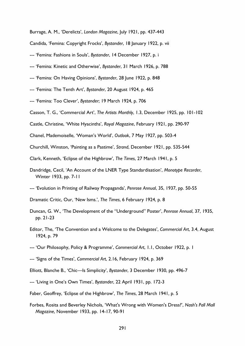
291
Burrage, A. M., ‘Derelicts’, London Magazine, July 1921, pp. 437-443
Candida, ‘Femina: Copyright Frocks’, Bystander, 18 January 1922, p. vii
--- ‘Femina: Fashions in Souls’, Bystander, 14 December 1927, p. i
--- ‘Femina: Kinetic and Otherwise’, Bystander, 31 March 1926, p. 788
--- ‘Femina: On Having Opinions’, Bystander, 28 June 1922, p. 848
--- ‘Femina: The Tenth Art’, Bystander, 20 August 1924, p. 465
--- ‘Femina: Too Clever’, Bystander; 19 March 1924, p. 706
Casson, T. G., ‘Commercial Art’, The Artists Monthly, 1.3, December 1925, pp. 101-102
Castle, Christine, ‘White Hyacinths’, Royal Magazine, February 1921, pp. 290-97
Chanel, Mademoiselle, ‘Woman’s World’, Outlook, 7 May 1927, pp. 503-4
Churchill, Winston, ‘Painting as a Pastime’, Strand, December 1921, pp. 535-544
Clark, Kenneth, ‘Eclipse of the Highbrow’, The Times, 27 March 1941, p. 5
Dandridge, Cecil, ‘An Account of the LNER Type Standardisation’, Monotype Recorder, Winter 1933, pp. 7-11
--- ‘Evolution in Printing of Railway Propaganda’, Penrose Annual, 35, 1937, pp. 50-55
Dramatic Critic, Our, ‘New Isms.’, The Times, 6 February 1924, p. 8
Duncan, G. W., ‘The Development of the “Underground” Poster’, Penrose Annual, 37, 1935, pp. 21-23
Editor, The, ‘The Convention and a Welcome to the Delegates’, Commercial Art, 3.4, August 1924, p. 79
--- ‘Our Philosophy, Policy & Programme’, Commercial Art, 1.1, October 1922, p. 1
--- ‘Signs of the Times’, Commercial Art, 2.16, February 1924, p. 369
Elliott, Blanche B., ‘Chic—Is Simplicity’, Bystander, 3 December 1930, pp. 496-7
--- ‘Living in One’s Own Times’, Bystander, 22 April 1931, pp. 172-3
Faber, Geoffrey, ‘Eclipse of the Highbrow’, The Times, 28 March 1941, p. 5
Forbes, Rosita and Beverley Nichols, ‘What's Wrong with Women's Dress?’, Nash's Pall Mall
Magazine, November 1933, pp. 14-17, 90-91
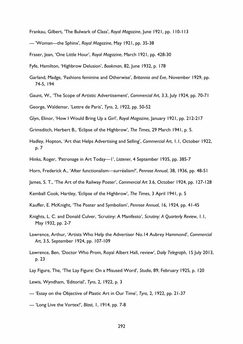
292
Frankau, Gilbert, 'The Bulwark of Class', Royal Magazine, June 1921, pp. 110-113
--- 'Woman---the Sphinx', Royal Magazine, May 1921, pp. 35-38
Fraser, Jean, ‘One Little Hour’, Royal Magazine, March 1921, pp. 428-30
Fyfe, Hamilton, ‘Highbrow Delusion’, Bookman, 82, June 1932, p. 178
Garland, Madge, ‘Fashions feminine and Otherwise’, Britannia and Eve, November 1929, pp. 74-5, 194
Gaunt, W., ‘The Scope of Artistic Advertisement’, Commercial Art, 3.3, July 1924, pp. 70-71
George, Waldemar, ‘Lettre de Paris’, Tyro, 2, 1922, pp. 50-52
Glyn, Elinor, ‘How I Would Bring Up a Girl’, Royal Magazine, January 1921, pp. 212-217
Grimsditch, Herbert B., ‘Eclipse of the Highbrow’, The Times, 29 March 1941, p. 5.
Hadley, Hopton, ‘Art that Helps Advertising and Selling’, Commercial Art, 1.1, October 1922, p. 7
Hinks, Roger, ‘Patronage in Art Today—1’, Listener, 4 September 1935, pp. 385-7
Horn, Frederick A., ‘After functionalism—surréalism?’, Penrose Annual, 38, 1936, pp. 48-51
James, S. T., ‘The Art of the Railway Poster’, Commercial Art 3.6, October 1924, pp. 127-128
Kemball Cook, Hartley, ‘Eclipse of the Highbrow’, The Times, 3 April 1941, p. 5
Kauffer, E. McKnight, ‘The Poster and Symbolism’, Penrose Annual, 16, 1924, pp. 41-45
Knights, L. C. and Donald Culver, ‘Scrutiny: A Manifesto’, Scrutiny: A Quarterly Review, 1.1, May 1932, pp. 2-7
Lawrence, Arthur, ‘Artists Who Help the Advertiser No.14 Aubrey Hammond’, Commercial
Art, 3.5, September 1924, pp. 107-109
Lawrence, Ben, ‘Doctor Who Prom, Royal Albert Hall, review’, Daily Telegraph, 15 July 2013, p. 23
Lay Figure, The, ‘The Lay Figure: On a Misused Word’, Studio, 89, February 1925, p. 120
Lewis, Wyndham, ‘Editorial’, Tyro, 2, 1922, p. 3
--- ‘Essay on the Objective of Plastic Art in Our Time’, Tyro, 2, 1922, pp. 21-37
--- ‘Long Live the Vortex!’, Blast, 1, 1914, pp. 7-8
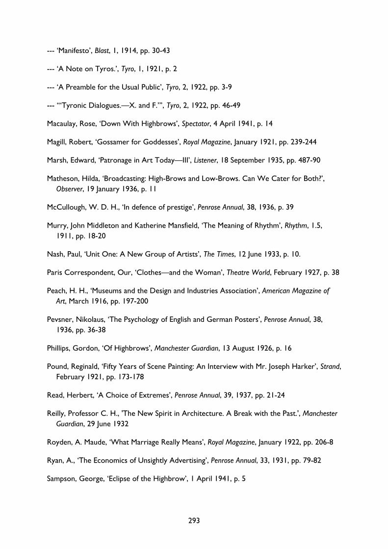
293
--- ‘Manifesto’, Blast, 1, 1914, pp. 30-43
--- ‘A Note on Tyros.’, Tyro, 1, 1921, p. 2
--- ‘A Preamble for the Usual Public’, Tyro, 2, 1922, pp. 3-9
--- ‘“Tyronic Dialogues.—X. and F.”’, Tyro, 2, 1922, pp. 46-49
Macaulay, Rose, ‘Down With Highbrows’, Spectator, 4 April 1941, p. 14
Magill, Robert, ‘Gossamer for Goddesses’, Royal Magazine, January 1921, pp. 239-244
Marsh, Edward, ‘Patronage in Art Today—III’, Listener, 18 September 1935, pp. 487-90
Matheson, Hilda, ‘Broadcasting: High-Brows and Low-Brows. Can We Cater for Both?’, Observer, 19 January 1936, p. 11
McCullough, W. D. H., ‘In defence of prestige’, Penrose Annual, 38, 1936, p. 39
Murry, John Middleton and Katherine Mansfield, ‘The Meaning of Rhythm’, Rhythm, 1.5, 1911, pp. 18-20
Nash, Paul, ‘Unit One: A New Group of Artists’, The Times, 12 June 1933, p. 10.
Paris Correspondent, Our, ‘Clothes—and the Woman’, Theatre World, February 1927, p. 38
Peach, H. H., ‘Museums and the Design and Industries Association’, American Magazine of
Art, March 1916, pp. 197-200
Pevsner, Nikolaus, ‘The Psychology of English and German Posters’, Penrose Annual, 38, 1936, pp. 36-38
Phillips, Gordon, ‘Of Highbrows’, Manchester Guardian, 13 August 1926, p. 16
Pound, Reginald, ‘Fifty Years of Scene Painting: An Interview with Mr. Joseph Harker’, Strand, February 1921, pp. 173-178
Read, Herbert, ‘A Choice of Extremes’, Penrose Annual, 39, 1937, pp. 21-24
Reilly, Professor C. H., 'The New Spirit in Architecture. A Break with the Past.', Manchester
Guardian, 29 June 1932
Royden, A. Maude, ‘What Marriage Really Means’, Royal Magazine, January 1922, pp. 206-8
Ryan, A., ‘The Economics of Unsightly Advertising’, Penrose Annual, 33, 1931, pp. 79-82
Sampson, George, ‘Eclipse of the Highbrow’, 1 April 1941, p. 5
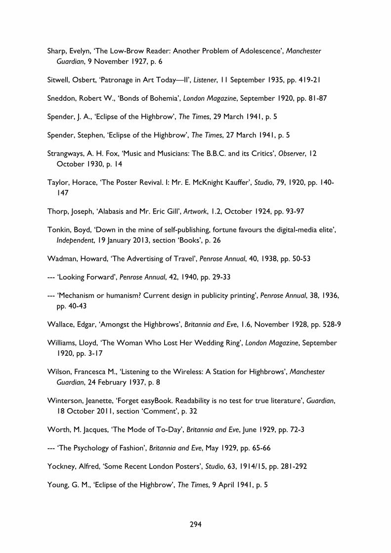
294
Sharp, Evelyn, ‘The Low-Brow Reader: Another Problem of Adolescence’, Manchester
Guardian, 9 November 1927, p. 6
Sitwell, Osbert, ‘Patronage in Art Today—II’, Listener, 11 September 1935, pp. 419-21
Sneddon, Robert W., ‘Bonds of Bohemia’, London Magazine, September 1920, pp. 81-87
Spender, J. A., ‘Eclipse of the Highbrow’, The Times, 29 March 1941, p. 5
Spender, Stephen, ‘Eclipse of the Highbrow’, The Times, 27 March 1941, p. 5
Strangways, A. H. Fox, ‘Music and Musicians: The B.B.C. and its Critics’, Observer, 12 October 1930, p. 14
Taylor, Horace, ‘The Poster Revival. I: Mr. E. McKnight Kauffer’, Studio, 79, 1920, pp. 140-147
Thorp, Joseph, ‘Alabasis and Mr. Eric Gill’, Artwork, 1.2, October 1924, pp. 93-97
Tonkin, Boyd, ‘Down in the mine of self-publishing, fortune favours the digital-media elite’, Independent, 19 January 2013, section ‘Books’, p. 26
Wadman, Howard, ‘The Advertising of Travel’, Penrose Annual, 40, 1938, pp. 50-53
--- ‘Looking Forward’, Penrose Annual, 42, 1940, pp. 29-33
--- ‘Mechanism or humanism? Current design in publicity printing’, Penrose Annual, 38, 1936, pp. 40-43
Wallace, Edgar, ‘Amongst the Highbrows’, Britannia and Eve, 1.6, November 1928, pp. 528-9
Williams, Lloyd, ‘The Woman Who Lost Her Wedding Ring’, London Magazine, September 1920, pp. 3-17
Wilson, Francesca M., ‘Listening to the Wireless: A Station for Highbrows’, Manchester
Guardian, 24 February 1937, p. 8
Winterson, Jeanette, ‘Forget easyBook. Readability is no test for true literature’, Guardian, 18 October 2011, section ‘Comment’, p. 32
Worth, M. Jacques, ‘The Mode of To-Day’, Britannia and Eve, June 1929, pp. 72-3
--- ‘The Psychology of Fashion’, Britannia and Eve, May 1929, pp. 65-66
Yockney, Alfred, ‘Some Recent London Posters’, Studio, 63, 1914/15, pp. 281-292
Young, G. M., ‘Eclipse of the Highbrow’, The Times, 9 April 1941, p. 5
295
Internet Sources
‘-ic, suffix’, OED Online, June 2016, Oxford University Press. Available at http://www.oed.com/view/Entry/90756 [accessed 7 July 2016]
‘art, n.1’, OED Online, September 2015, Oxford University Press. Available at http://www.oed.com/view/Entry/11125 [accessed 4 December 2015]
‘Bibliography’, Middlebrow Network. Available at http://www.middlebrow-network.com/Bibliography.aspx [accessed 11 January 2017]
‘border, n.’, OED Online, December 2016, Oxford University Press. Available at http://www.oed.com/view/Entry/21617 [accessed 31 December 2016]
‘Boudoir cap, ca. 1917’, Metropolitan Museum of Art. Available at http://metmuseum.org/art/collection/search/157739 [accessed 12 December 2016]
‘Brownian, adj.’, OED Online, June 2016, Oxford University Press. Available at http://www.oed.com/view/Entry/23857 [accessed 16 September 2016]
‘essential, adj. and n.’, OED Online, June 2015, Oxford University Press. Available at http://www.oed.com/view/Entry/64503 [accessed 17 July 2015]
‘first, adj., adv., and n.2’, OED Online, June 2016, Oxford University Press. Available at http://www.oed.com/view/Entry/70609 [accessed 6 July 2016]
‘frame, n. and adj.2’, OED Online, December 2016, Oxford University Press. Available at http://www.oed.com/view/Entry/74151 [accessed December 31 2016]
‘high, adj. and n.2’, OED Online, March 2014, Oxford University Press. Available at http://www.oed.com/view/Entry/86850 [accessed 4 June 2014]
‘highbrow, adj. and n.’, OED Online, September 2014, Oxford University Press. Available at http://www.oed.com/view/Entry/86863 [accessed 18 October 2016]
‘Home’, Anglo-Russian Research Network. Available at https://anglorussiannetwork.wordpress.com [accessed 30 May 2017]
‘low, adj. and n.2’, OED Online, March 2014, Oxford University Press. Available at http://www.oed.com/view/Entry/110646 [accessed 3 June 2014]
‘lowbrow, n. and adj. (and adv.)’, OED Online, September 2013, Oxford University Press. Available at http://www.oed.com/view/Entry/110661 [accessed 18 October 2016]
‘middlebrow, n. and adj.’, OED Online, March 2002, Oxford University Press. Available at http://www.oed.com/view/Entry/252048 [accessed 18 October 2016]
296
‘Murray Gold on Doctor Who’, Front Row, 9 July 2013, BBC Radio 4. Available at http://www.bbc.co.uk/programmes/b036kbm9 [accessed 21 December 2016].
‘New Companies’, British and Colonial Printer and Stationer, 86.3, 15 January 1920, p. 62 http://www.archive.org/stream/britishcolonial031920londuoft/britishcolonial031920londuoft_djvu.txt [accessed 10 December 2015]
‘original, adj. and n.’, OED Online, June 2015, Oxford University Press. Available at http://www.oed.com/view/Entry/132564 [accessed 22 July 2015]
‘Projet LITTéPUB Literary advertising and advertising literature from 1830 to nowadays’, L'Agence nationale de la recherche. Available at http://www.agence-nationale-recherche.fr/en/anr-funded-project/?tx_lwmsuivibilan_pi2%5BCODE%5D=ANR-14-CE31-0006 [accessed 20 December 2016]
‘second, adj. and n.2’, OED Online, June 2016, Oxford University Press. Available at http://www.oed.com/view/Entry/174500 [accessed 6 July 2016]
‘The Prize’, The Folio Prize. Available at http://www.thefolioprize.com/the-prize/ [accessed 20 January 2014]
‘Winter 2012/13’, Met Office. Available at http://www.metoffice.gov.uk/climate/uk/summaries/2013/winter [accessed 2 February 2015]
Anderson, Margaret (ed.), The Little Review, 4.2 (1917), Modernist Journals Project. Available at http://modjourn.org/render.php?id=1297798381125002&view=mjp_object [accessed 8 July 2015]
Bevan, Kate, ‘Instagram is debasing real photography’, Guardian, 19 July 2012. Available at http://www.theguardian.com/technology/2012/jul/19/instagram-debasing-real-photography [accessed 20 January 2014]
Bristol Folk House, Summer Term Programme 2017. Available at https://www.bristolfolkhouse.co.uk/uploads/term-info/1489436517-Final_BFH%20Summer%20term%202017.pdf [accessed 23 May 2017]
Flood, Alison, ‘Self-published authors react with anger to 'laziness' charge’, Guardian, 29 August 2012. Available at http://www.theguardian.com/books/2012/aug/29/self-published-laziness-charge-sue-grafton [accessed 20 January 2014]
Homer, The Odyssey, Greek text with an English translation by A. T. Murray (Cambridge, MA: Harvard University Press, 1919). Available at http://thecantosproject.ed.ac.uk/index.php/c2-in-a-draft-of-16/ii-sources/118-tyro-odyssey-xi [accessed 18 May 2017]
297
Jones, Jonathan, ‘Down with Kickstarter! Where art is concerned, the crowd is an idiot’, Guardian, 15 July 2015. Available at https://www.theguardian.com/artanddesign/jonathanjonesblog/2015/jul/15/down-with-kickstarter-crowdfunding-where-art-is-concerned-crowd-is-an-idiot [accessed 15 July 2015]
Kim, Soo, ‘London’s best Underground poster revealed’, Telegraph, 15 January 2014. Available at http://www.telegraph.co.uk/travel/travelnews/10573449/Londons-best-Underground-poster-revealed.html [accessed 19 December 2015]
Klein, Scott W., ‘The Tyro: An Introduction’, The Modernist Journals Project. Available at http://modjourn.org/render.php?id=mjp.2005.00.103&view=mjp_object [accessed 14 April 2015]
Kozlowski, Michael, ‘Self-Published Authors Are Destroying Literature’, Good eReader, 17 June 2013. Available at http://goodereader.com/blog/commentary/self-published-authors-are-destroying-literature [accessed 20 January 2014]
Lécallier, Sylvie, ‘“Monte Carlo by Maggy Rouff, ensemble for the Côte d’Azur” by Egidio Scaioni’, Palais Galliera. Available at http://www.palaisgalliera.paris.fr/en/work/monte-carlo-maggy-rouff-ensemble-cote-dazur-egidio-scaioni [accessed 15 August 2016]
Lewis, John, ‘Prom 2: Doctor Who Prom – review’, Guardian, 14 July 2013. Available at http://www.theguardian.com/music/2013/jul/14/doctor-who-prom-review [accessed 17 January 2014]
Massie, Allan, ‘Is the Booker Prize really being dumbed down?’, Telegraph, 15 October 2011. Available at http://www.telegraph.co.uk/culture/books/booker-prize/8829213/Is-the-Booker-Prize-really-being-dumbed-down.html [accessed 20 January 2014]
Preda, Roxana, The Online Companion to The Cantos of Ezra Pound, II: n.4, The Cantos Project. Available at http://thecantosproject.ed.ac.uk/index.php/c2-in-a-draft-of-16/ii-poem [accessed 18 May 2017]
Saner, Emine, ‘Blockbuster art: good or bad?’, Guardian, 25 January 2013. Available at https://www.theguardian.com/commentisfree/2013/jan/25/blockbuster-art-good-or-bad [accessed 28 December 2016]
Virginia Woolf, ‘“The Patron and the Crocus”: holograph, 26 February-15 March 1924. With transcript.’, Woolf in the World: A Pen and a Press of Her Own, Smith College Libraries. Available at http://www.smith.edu/libraries/libs/rarebook/exhibitions/penandpress/case7a.htm [accessed 1 December 2016]
298
Unpublished Sources
‘Letter from BBC to Mrs Nathan’ (31 May 1928), London, V&A Archive of Art and Design, AAD/1991/12/7/1
Clark, Kenneth, ‘Letter, Mr. Clark to Col. Crutchley’ (1 December 1937), London, British Postal Museum and Archive, POST 33/5253
Design & Industries Association, ‘Glass Slides’ (n.d.), London, V&A Archive of Art and Design, AAD 3/20-1978 – AAD 3/24-1978
Heller Hogg, Sallie, ‘Employment of Women in Great Britain, 1891-1921’ (unpublished doctoral thesis, University of Oxford, 1967)
Isobel (Mrs Nathan), ‘Dress Designing as a Career for Women’ (1928), London, V&A Archive of Art and Design, AAD/1991/12/7/1
Pick, Frank, ‘Art in Commerce and in Life’ (8 March 1916), London, V&A Archive of Art and Design, AAD/1997/7/96
--- ‘To the Master and Brethren of the Art Worker’s Guild’ (c1916), London, V&A Archive of Art and Design, AAD/1997/7/96
Settle, Alison, 'Talk by AS on “Fashion over the past 10 years.”’ (1937), Brighton, University of Brighton Design Archives, L.30.4
Speakman, Malcolm V., ‘Shell’s England: Corporate Patronage and English Art in the Shell Posters of the 1930s’ (unpublished doctoral thesis, University of Manchester, 2014)


