Embed Size (px)
Citation preview

Visualization as Assemblage:
How Modesty, Ethics, and Attachment Inform a Critical Design Practice
Patricio Dávila
A dissertation submitted to
the Faculty of Graduate Studies in partial fulfillment of the requirements
for the degree of Doctor of Philosophy
Graduate Program in Communication and Culture York University Toronto, Ontario
July 2016
© Patricio Dávila, 2016

ii
Abstract
Visualization is a form of design practice that deploys representational processes of enormous
rhetorical and analytical power. What is often left out of the picture is the network of processes
which it assembles and the non-visual effects it produces. This study asks how visualization can
operate as a critical design practice that attends to the representational and performative
processes it arranges. In order to contextualize this form of arrangement in design, the study
undertakes a review of Bruno Latour’s interpretation of design as a form of modest restyling and
arrangement. It also addresses this question through the use of a productive alignment between
Latour’s development of actor-network theory and Deleuze and Guattari’s assemblage theory
which allows to both describe how things and processes mobilize knowledge and how human
subjectivity emerges from human-nonhuman entanglements, respectively. The assemblage
framework is applied to three case studies that offer distinct instances of critical visualization
practices with each emphasizing a specific aspect. Liquid Traces (2014–present), from Forensic
Architecture (a research project based at Goldsmiths, University of London), is a project that
condemns NATO forces for criminal negligence that led to the deaths of 63 refugees fleeing
Libya by boat in 2011, and also reveals the ways a surface may assemble components and
highlight its own form of construction. Anti-Eviction Mapping Project (2013–present), from the
San Francisco Tenants Union, advocates for housing justice by mobilizing maps, events, and
site-specific installations, and illustrates how visualization is a process that exists beyond any
one artifact. In The Air, Tonight (2013–present), from the Public Visualization Studio, is my own
“research-creation” project highlights the connection between housing and climate through an
annual visualization event, and shows how design can operate through iteration, reworking, and
connection to allied processes. What emerges from this study is an ethics of visualization that
refocuses criticality on the potential of design to act “modestly” (Latour), to reveal its own
construction, and to maintain the quality of attachments made.

iii
Dedication
I dedicate this thesis to my partner Patricia Pastén, without whom it would have been impossible
to embark on this whole journey. I also dedicate this to my daughter Aurea Elfride Dávila Pastén
who always reminded me of the value of this endeavour.

iv
Acknowledgments
It is difficult to enumerate all the interactions, messages, and presences that contribute to the
work involved in a project like this. I am grateful to the many people including family, friends,
and colleagues who have indulged my obsession, and given me the space and resources to
complete this work. In particular, many thanks go to my advisor Janine Marchessault who
recommended that I undertake a Ph.D. in the first place and who has guided the development of
my work throughout. My deep appreciation to committee member Jan Hadlaw who generously
offered her knowledge and expertise, and helped me further my own understanding of critical
engagements in design. My sincere thanks to committee member Caitlin Fisher who, since my
Master’s work, has continued to provide inspiration from her own work and guidance for mine. I
also feel a deep gratitude to David McIntosh, a teacher in my undergraduate career, and now a
close friend and colleague who encouraged my pursuit of this degree and continued to
emotionally and intellectually support its development.
Dave Colangelo and I collaborated on numerous projects throughout my time in the
Communication and Culture program. These projects and our conversations illuminated many of
the ideas in this dissertation in practice. I would like to also acknowledge the role that my
students have played in generously responding to the incremental implementation of concepts
developed over the last five years. It is their enthusiasm for this scholarship and practice that
drives me to contribute to the field.

v
Table of Contents
Abstract ........................................................................................................................................... ii
Dedication ...................................................................................................................................... iii
Acknowledgments .......................................................................................................................... iv
Table of Contents ............................................................................................................................ v
List of Figures ............................................................................................................................... vii
Chapter One: Introduction .............................................................................................................. 1 Introduction ............................................................................................................................... 1 Research Question .................................................................................................................... 4 Framework ................................................................................................................................ 5 Outline ....................................................................................................................................... 8 Existing Literature .................................................................................................................... 9
Design ................................................................................................................................. 9 Information visualization and cartography ....................................................................... 10
Methodology ........................................................................................................................... 13 Outcomes ................................................................................................................................ 16 Conclusion .............................................................................................................................. 18
Chapter Two: Design in Medias Res ............................................................................................ 19 Introduction ............................................................................................................................. 19 Design, Criticality, and Modesty ............................................................................................ 23 Criticality in Design ................................................................................................................ 30 Modesty through Situatedness ................................................................................................ 36 Matters of Concern from Artificiality ..................................................................................... 43 Wicked Matters of Concern .................................................................................................... 48 Visualization as Designing for Matters of Concern ................................................................ 53 Conclusion .............................................................................................................................. 58
Chapter Three: Subjectivation in the Visualization-Assemblage ................................................. 60 Introduction ............................................................................................................................. 60 Assemblages and Networks .................................................................................................... 62 Networks and Visualization .................................................................................................... 68 Purified Objects and Immediacy ............................................................................................. 75 Subjectivation and Visualization ............................................................................................ 84 Conclusion .............................................................................................................................. 95

vi
Chapter Four: Two Cases .............................................................................................................. 98 Introduction ............................................................................................................................. 98 Liquid Traces ........................................................................................................................ 100
Dashboard and Platforms of Calculation ........................................................................ 103 Assembling the Allied Inscriptions ................................................................................. 106 Cascades .......................................................................................................................... 114 Navigation Over Correspondence ................................................................................... 115 Translation ...................................................................................................................... 118 Artistic Visualization ...................................................................................................... 119 Production of Subjectivity in the Assemblage ................................................................ 120
Anti-Eviction Mapping Project ............................................................................................. 129 Expressing a Matter of Concern ..................................................................................... 130 From Interessement to Assemblage ................................................................................ 136 Veridical and Expressive Visualization .......................................................................... 141 Production of Subjectivity and Spatial Understanding ................................................... 145 Conclusion ...................................................................................................................... 146
Chapter Five: Critical Visualization Practice ............................................................................. 148 Introduction ........................................................................................................................... 148 Visualizing Weather and Homelessness ............................................................................... 151 Beyond Communication and Representation ........................................................................ 156 Critical Visualization Practice as Expressive Cartography .................................................. 160 The Network and Assemblage of In the Air, Tonight .......................................................... 165 Participation and Interessement ............................................................................................ 179 Conclusion ............................................................................................................................ 189
Chapter Six: Conclusion ............................................................................................................. 190
Bibliography ............................................................................................................................... 200
Appendices .................................................................................................................................. 221 Appendix A ........................................................................................................................... 221 Appendix B ........................................................................................................................... 222

vii
List of Figures
Figure 1. Visualization dashboard video (screen capture). ..................................................... 101Figure 2. Lorenzo Pezzani at press conference June 18, 2013. .............................................. 107Figure 3. Visualization dashboard showing list of data sources
(screen capture, detail, top right corner). ................................................................. 109Figure 4. Visualization dashboard showing news video clips
(screen capture, detail, bottom right corner). .......................................................... 110Figure 5. Visualization dashboard showing animated trajectory of vessel
(screen capture, detail, bottom). .............................................................................. 114Figure 6. Guardian UK interactive map (screen capture) by Allen (2012)
reproducing Liquid Traces data and visualization. ................................................. 128Figure 7. Interactive map (screen capture). ............................................................................ 131Figure 8. Reproduction of AEMP Ellis Act Evictions map as a video (screen capture). ........ 132Figure 9. Interactive map (screen capture). ............................................................................ 137Figure 10. Volunteer painting mural. ........................................................................................ 143Figure 11. ITAT installation at Ryerson Image Centre
by P. Davila and D. Colangelo (2016). ................................................................... 153Figure 12. Map of Cathy Crowe’s Social Justice Walk (screen capture),
part of ITAT by P. Davila and D. Colangelo (2016). .............................................. 170Figure 13. Mobile interface (screen capture),
part of ITAT by P. Davila and D. Colangelo (2016). .............................................. 171Figure 14. Map of ITAT location (at Ryerson Image Centre) in relation
to shelters and services. ........................................................................................... 173Figure 15. Shelter app (screen capture), part of ITAT
by P. Davila and D. Colangelo (2016). ................................................................... 173Figure 16. Map and geo-located photos from STAR photovoice workshop (screen capture),
part of ITAT by P. Davila and D. Colangelo (2016). .............................................. 175Figure 17. Fly-through visualization (screen capture) of the movements of youth
experiencing homelessness, part of ITAT by P. Davila and D. Colangelo (2016). 177Figure 18. Overview visualization (screen capture) of the movements of youth
experiencing homelessness, part of ITAT by P. Davila and D. Colangelo (2016). 177Figure 19. Original movement visualizations from Buccieri (2013). ....................................... 179

1
Chapter One: Introduction
Introduction
The goal of this project is to develop a theory of representation in contemporary design
practice that acknowledges the processes of data collection, communication, and project-making
as well as the objects which are part of the design process. Representation takes place on many
fronts and includes processes on political, cultural, historical, technical, aesthetic, and
philosophical registers. Design activity is implicated in all these fields because it brings into
being a multitude of artifacts that are attempts to respond to specific issues that comprise an
artificial world. By attempting to develop this notion of representation the present work also
aims to contribute to the field of digital humanities through the study of design theories,
visualization, and critical theories. Digital humanities, although a relatively new subfield, has
often been described as an interdisciplinary practice that combines design, digital theory, critical
theory, and visual techniques with humanities and social science research. Digital humanities
also aligns with one of the premises of this dissertation—namely, that artificiality, as the
entanglement of human and nonhuman, is a precondition for moving beyond nature/culture or
science/humanities splits.
One consideration in understanding representation in design activity is the movement
between a critical (or negative) and a postcritical philosophy of media and technology. Critical
theory is generally characterized as finding media and technology to negatively limit human
consciousness and reduce the possibilities of emancipation. Postcritical theory, on the other
hand, typically highlights social practice and hegemonic/counter-hegemonic practices that make
2
use of media and technology. A critique of representation has been a core activity in the critical
approach whereby the forms that are produced in a capitalist context are unpacked in order to
understand the real meaning and dynamics behind the façade.1 The other consideration seeks to
place human agency amongst the agencies of other actants with a resulting network of agents
that communicate power through numerous mediators (including objects, environments, animals,
technology, etc.). This postcritical approach puts less emphasis on the veracity of representation
and more on its process, deployment, negotiation, and re-interpretation. This refocusing, for
instance, has been developed in geography, and science and technology studies.
This study will focus on visualization and design practice as a site of inquiry. Visualization
has taken many forms in design: sketching in the very beginnings of ideation; documentation of
practices, sites, and people in the research of a given phenomenon; diagrams that describe or
outline a network of actants; and data representation that aids analysis and communicates
specific narratives. Within design practice, visualization is therefore an immensely important and
central activity that as a site of inquiry will allow for a consideration of the ways that processes,
people, and things are represented. Specifically, this study will look at visualization practices that
exemplify a move from a critical to postcritical approach in design practice. This investigation
will involve looking at design outcomes and design practices, that are at times difficult to
separate and treat in isolation, but nonetheless provisionally offer moments to think about how
representation is at once a process and an object that creates possible worlds.
1 While this polemic has been mainly limited to architectural theory and practice (Somol & Whiting, 2002; Baird, 2004) it has
some correlates to developments in geography and communication design. These tensions have centred on critical/postcritical issues as well as on other related dichotomies such as representational vs. post- or nonrepresentational.

3
A major impetus for this work was my need to develop a framework that helps designers
redirect their practice to better address the major crises facing contemporary society, namely
environmental degradation and growing social and economic disparity. It is designers, visual
designers in particular, that can provide ways of rendering complex phenomena visible, readable,
and possibly intelligible. This was the call made by Bruno Latour in his address to the Design
History Society in 2008. Latour frames design as a practice of repair rather than revolution, and
one that may help us better represent complex assemblages (i.e. social, political, environmental,
technological) in order to make better decisions regarding these issues—visualization is one such
practice.
Yet, given the legacy of denigrating visuality in western civilization (Jay, 1994) and the
relatively recent incorporation of the design field into academia, visualization and design have
not received sustained critical inquiry. The exceptions to this come mainly from science and
technology studies (Daston & Galison, 1992; Dumit & Burri, 2008; Haraway, 1997; Jones, 1998;
Latour, 1986; Lynch & Woolgar, 1990) and geography (Crampton, 2001; Pickles, 2004) with
some coming from contemporary visualization (Manovich, 2002; Sack, 2007) and design
(Drucker, 2014; Hall, 2011). This general lack of attention and the abundant need to embark on
this kind of investigation is noted by Drucker (2014). The lack of more critical work on
visualization is also exacerbated by the enduring imprint of the two cultures (Snow, 1993)
problem in which the natural sciences and the humanities have shared an equal suspicion and
disdain for the claims made by the other. Where visualization has found the majority of its
funding, researchers, publications, and application is in the fields of computer science, statistics,
human-computer-interaction, and cognitive science. It has therefore played into the siloing of

4
disciplines and specialization. As noted above, this trend shows some evidence of becoming less
dominant due to the increased attention given to the digital humanities, in which a large variety
of research agendas find part of their expression through interactive, generative, and often visual
tools and projects that synthesize and/or represent different forms of data. Furthermore, design is
one of the disciplines/practices particularly suited to working between content and expression as
well as between material and symbolic interactions, and therefore finding passages of influence
between these relationships. For example, working materially for a designer is a basic empirical
process of discovering the properties and interactions of any given medium. Working
conceptually for a designer is a basic thinking process of relating concepts. Both can be seen as
creative processes in which something is devised.
Research Question
The guiding question for this study is: how can visualization operate as a critical design
practice that attends to the representational and performative processes it arranges? Addressing
this question entails looking at several other supporting questions. For instance, how do
visualizations work as assemblages that arrange people and things? As a result of this human-
nonhuman entanglement a question of how subjectivity is produced within these assemblages
also emerges. Following this line of inquiry will lead to an understanding of design’s role in
arranging these assemblages as well as an understanding of an ethics of visualization.
5
Framework
The object of this study is interdisciplinary in nature and as such relies on related bodies of
literature and research. The framework used in this study emerges from key overlapping
concepts in actor-network theory (ANT) (Latour, 2005b; Law, 2009) and assemblage theory
(DeLanda, 2006; Deleuze & Guattari, 2004). The utility of combining aspects of these two
frameworks relies on how one is useful for describing specific objects that mediate and the other
is useful for describing the production of subjectivity. Their overlapping and complimentary
nature has been noted by Müller (2015), for instance, and similar roots and readings of
precedents appear in Latour and Stengers. It is also important to note how both frameworks are
deeply indebted to a French continental form of philosophy and specifically a post-structuralist
ethos in which a deep respect of empirical sciences is coupled with a deeper reading in the arts
and humanities. Perhaps the most important aspect of their joint use is the way both put an
emphasis on systems of association that are contingent, mutating, emergent, and which express
different forms of power relations. What also makes this combination useful for the work in this
dissertation is that the question of representation and performativity has often been raised, albeit
in different ways, in the work done by Latour and Deleuze & Guattari, who are the central
figures in these frameworks.
Actor-network theory is partially a result from a turn in science and technology studies that
saw social constructionism counter the dominant positivist account of scientific knowledge.
Assemblage theory is partially an outcome of the disillusionment of the post-1968 leftist
movement, the use of psychoanalysis in Marxist thought, and the start of an ecological analysis

6
of posthuman subjectivity. Both frameworks are also heavily influenced by the increasing role of
ecological and cybernetic thinking. In this sense, these theories attempt to describe phenomena
through the lens of flat ontologies (Bryant, 2011; DeLanda, 2005) that place agency within the
realms of both human and nonhuman actants. This is part of their emphasis on the relational
nature of power and the role played by nonhumans in the stabilization or disruption of, among
other things, social configurations. These related frameworks are particularly well-suited to the
study of design activity due to their deliberate privileging of the agency of designed objects and
their attendant intentional and non-intentional effects on the social sphere as well as the role of
nonhuman components on human subjectivity.
ANT, as Latour has often remarked, is not a theory so much as a methodological approach
(Latour, 1999b, 2005b). It sets out an outline of methods that aim to create very modest yet
accurate and comprehensive accounts of particular phenomena. For the purposes of this present
study, ANT will not be used as a guide to carry out research but rather as a perspective with
tenets regarding the description of agency and relational networks of actants. The ANT concepts
of immutable mobiles (Latour, 1990) and translation (Callon, 1986) are useful tools to
understand the relations of power specific to visual design, visualization, and visual
communication. Where immutable mobiles are objects which circulate as stable representations
of given phenomena or space and extend power over what is represented, translation is a process
by which problems are articulated, allies enlisted, roles are defined, and actors are mobilized.
Immutable mobiles and translation are therefore key concepts for understanding representation.
The use of these frameworks also leads to a consideration of expression (Deleuze &
Guattari, 2004; Lazzarato, 2003; Massumi, 2002a; Whitehead, 1968) as a fundamental concept
7
with which to understand representation in design. The notion of expression emphasizes the
processes by which a representation is made but also the propositional or generative character of
representational practice; as Lazzarato states, “images, signs and statements do not represent
something, but rather create possible worlds” (Lazzarato, 2003, para. 2). This is also key to
understanding design as an expressive practice that strategically deploys visual/textual/aural
objects of communication as well as tools, environments, and systems that are handled,
inhabited, and embodied. This, in turn, is a generative force.
More recently, the work done under the heading of speculative realism or object-oriented
ontology takes up some of the philosophical underpinnings of actor-network theory along with
Deleuze’s assemblage, Whitehead’s pragmatism, and Heidegger’s phenomenology. The
emphasis is placed on the status, definition, and interaction of objects—in stark contrast to
thinking of phenomena through notions of meaning and difference. Object-oriented ontology
expands theories of signs, discourses, and representations to include the nonhuman, objects,
technology, and the natural environment (among other things) as active agents impacting humans
and others (Bryant, 2011). It finds allies in the work of Delanda (2005), Haraway (1991),
Suchman (2007), Barad (2007), Bennett (2010), and Latour (1993b), all of which share a logic of
flat ontologies in which objects are regarded as having a reality and agency equal to that of
humans, although not necessarily equal in strength.

8
Outline
This study is organized into five sections which proceed from a discussion of the role of
design to how visualization operates and on to specific instances of visualization practice.
Throughout it situates the work at the intersection of three related bodies of literature and
practice: information visualization, design theory and practice, and the overlap between actor-
network theory and assemblage theory. The second chapter analyzes the role and definition of
design through Bruno Latour’s keynote to the Design History Society. This sets the groundwork
for further exploration of the relationship between design and visualization through an actor-
network/assemblage theory framework. The third chapter describes the way visualization design
presents information, accrues power and produces subjectivity through specific concepts
developed in actor-network theory (e.g. immutable mobiles, cascade of inscriptions) and
assemblage theory (e.g. enunciation, subjectivation). The fourth chapter analyzes two contrasting
cases of visualization design that exemplify concepts developed in Chapters One and Two. The
visualizations will be discussed as both actants that entail other actants and processes, as well as
assemblages in the production of subjectivity. The fifth chapter, through an analysis of a
research-creation project, will apply the network-assemblage concepts in order to articulate a
critical visualization practice. It will highlight productive aspects of the work and identify
components that need further development. It will also expand upon the notion of visualization
as an assemblage and what that means in terms of participation, affect, event, and performance.
9
Existing Literature
Design
This study will also connect with research in design that investigates the social role of
designers, the projective role of design activity, and the ubiquitous use of the diagram as both
operative concept and formal outcome. The social significance of design has been a perennial
issue from at least the 1970s, with its emergence marked by Victor Papanek’s (1972) Design for
the Real World. This text and subsequent work by design scholars attempt to redirect design
activity towards social justice and environmental responsibility (Dilnot, 1982; Manzini &
Cullars, 1992; Margolin, 2002; Margolin & Margolin, 2002). Concern for the social dimension
of design also extends to thinking of design and democracy (Bonsiepe, 2006; DiSalvo, 2012).
Participation and accurate representation of the needs and desires of a given constituency are
necessary parts of the design process in order for it to be responsive, relevant, and ethical
(Akrich, 1992; Binder et al., 2011; Sanoff, 2008). This understanding has been fleshed out in
contexts where labour and government imperatives were more emphasized, for instance in the
case of Scandinavian participatory design in ICT systems (Floyd, Mehl, Reisin, Schmidt, &
Wolf, 1989) and more recently in contexts where corporations or NGOs engage in co-creation
(Sanders & Stappers, 2008) and human-centred design (IDEO, 2011). Also, the relational (i.e.
social) nature of design activity and its outputs has more recently emerged within design
scholarship (Blauvelt, 2008) with reference to trends in art practice, e.g. relational aesthetics
(Bishop, 2004; Bourriaud, 2002).

10
Design practice, especially in architecture, has also seen a rise in the use of diagram as
both part of the design process and the final outcome (Allen, 1999; Vidler, 2000). Several
architects/theorists have taken on the work of visualization and its persuasive representation of
space (Corner, 1999). Others have noted the projective qualities of diagrams used by designers
and architects that float above indexical aspects of images (Allen, 1998). In this discourse,
diagrams exemplify the shift in emphasis to a postcritical notion of design where the task of
unpacking the relationship between the real and the representation is diminished in favour of a
non-narrative and postrepresentational practice (Somol, 1998). Criticality in design has emerged
as a distinct discourse that incorporates judgement as an essential part of design activity (Dilnot,
2008), an approach to acknowledging the disciplinary framework and limited set of premises of
this activity (Agre, 1997), and as a practice that invites dialogue and reflexivity regarding design
agendas (Dunne, 2005; Dunne & Raby, 2001). More recently, design and critical art practice
have been framed as a set of techniques and perspectives that can be mustered to participate in an
agonistic form of democracy (Mouffe, 2010) which raises awareness, creates community, resists
oppression, or projects alternatives to important political issues (DiSalvo, 2012).
Information visualization and cartography
Critical cartography developed as a challenge to a once-dominant conception of
cartography as an instrument of clear, accurate, objective communication embodying a technical
authority which relegated other non-scientific maps to the realm of propaganda (Pickles, 2004).
This present study, building on the insights made by critical cartography, places maps within

11
processes of map-making and map-using (Pickles, 2004) and conceives of maps as socially
constructed and therefore functions of knowledge-power (Foucault, 1995) that produce as much
as exclude subjects (Crampton, 2001; Harley, 1988, 1989; Pickles, 2004; Wood, 1992). Mapping
has also been used to represent and intervene in the experience of the city (Cosgrove, 2006).
Maps, for example by the Situationist movement, were also political tools for unmaking and
playfully resisting the dominant forces of urban design and spectacle (Sadler, 1998; Vidler,
2006).
Cartography is at once a predecessor and an allied discipline to information visualization.
The mapping of physical space has often overlapped with the representation of data on physical
or abstract space. This is also evidenced by the fact that the work of Jacques Bertin (2011), a
cartographer, has played a central role in the development of visual strategies for visualization.
Bertin’s work on the visual processing of information has been followed up more recently by
research on heuristics and historical examples (Tufte, 1990, 1997, 2001, 2006). A history of the
representation of visual thinking and visual representation of data has also been undertaken
(Friendly, 2008). Within computer science, human-computer interaction, and psychology, a
whole field has emerged that deals with the computational, interactive, and cognitive operations
involved in the representation of large amounts of data and their use in decision-making. In this
space, information visualization is often looked at as a problem space in which the main goal is
to increase understanding while decreasing cognitive load. Information visualization is defined
as the amplification of cognition through processes of pattern recognition and computation
(Card, 1999).

12
What is often missing from discourse on visualization is critique (Hall, 2011). While
critical work in cartography has made significant contributions, critical work in information
visualization is still at its nascent stage. Exceptions include work that has looked at visualization
as an extension of critical studies and aesthetics in new media and information art, for instance:
visualization as a means of simplifying our access to the world (Manovich, 2002, 2010); the
aesthetic dimension of visualization (Viegas & Wattenberg, 2007) as a practice that goes beyond
analytics; or visualization as an art form that utilizes the aesthetics of administration (Sack,
2007). Other contributions come from science and technology studies. Visualization (i.e. the
related fields of cartography, scientific visualization, data visualization, information graphics,
information visualization, and visual analytics) has also been investigated through the lenses of
actor-network theory, a key framework in science and technology studies resulting in an
emphasis on work and mediation (Daston, 2014; Lynch, 1994). The relational operations of
visualizations—in other words, the association, refinement, and movement of visualization
objects—meant that visualization could be analyzed as an articulated form of representation
through immutable mobiles (Latour, 1990).
The use of visualization, especially modes of cartography, has also been reframed from
having a mimetic function to having a navigational one (Latour, November, & Camacho-Hübner,
2010). This introduces a shift in thinking that relies less on the importance of whether a
representation corresponds accurately to a space or phenomenon and more on the calculations
and negotiations made to navigate a given issue or terrain. Latour (2008a) brings this same logic
to the realm of design and the practice of representing complex phenomena—and, as such, he
catalyzed an important moment in which the worlds of design, visualization, and science and

13
technologies studies converge. In his 2008 address to the Design History Society, Latour
reframes design as an activity that repairs and not necessarily revolutionizes, as a human activity
that creates worlds of attachment and association, and as a necessary tool to represent these
complex connections such that we make better future decisions. This represents a key body of
work that helps frame the features of visualization but then opens the field to think through the
practice of visualization as an assembly of human and nonhuman actants.
Methodology
As previously indicated, this study is conducted through an overview of the main
contemporary currents in design theory and visualization theory as well as the analysis of a case
study on current practices of expressive cartography and another case study of a research-
creation project which attempts to work with the theoretical framework discussed above. Case
studies are used to explore projects as instances of a larger scope of practices that can be thought
of as critical visualization practice. The aim is to use case study methodology to generate an
analytic generalization (Yin, 2009) that both supports the claim that critical visualization
practice has some recent precedents and also represents a novel framework for thinking through
design and visualization practices. These case studies are also examined through the theoretical
framework elaborated in Chapters Two and Three that creates a bridge between actor-network
and assemblage theory approaches to visualization.
The first set of case studies looks at two visualization projects: Liquid Traces and Anti-
Eviction Mapping Project. Produced by Forensic Architecture (FA), Liquid Traces is a
14
visualization in video documentary form that accompanies a report on the failure of navy ships
from various NATO countries to rescue 72 refugees (from the Libyan conflict) aboard a boat
drifting in the Mediterranean Sea. FA, situated at Goldsmiths University and directed by Eyal
Weisman, produces work that assembles heterogeneous data and creates new analytical tools to
present counter-evidence in legal cases and media reports involving occupation, violence, and
human rights abuses. The Anti-Eviction Mapping Project is an activist initiative that documents
and visualizes the gentrification/displacement that occurs in the San Francisco Bay Area. This
initiative is supported by the San Francisco Tenants Union and is used as a way of educating
citizens, advocating for tenant rights, and supporting community members. For this case study,
videos, online interactive maps, reports, interviews (i.e. text and audio), and photography have
been used to analyze these two projects. The work itself lives largely online and it is through this
platform that it is circulated and access is provided.
Using the theoretical framework outlined in this study, the second case study examines a
visualization project that I am involved with. It is an ongoing project that predates the research
done in this dissertation and continues to build through iterations. Up to now it has involved
three facets: the orchestration of an outdoor architectural display as a public visualization tool;
the collection and mapping of data related to homelessness; and events supporting both the
production and dissemination of the visualizations. Processes in programming, visual design,
interaction design, videography, data analysis, workshops, media relations, and social network
management have all been important parts of the project. Although I was not directly involved in
every aspect, I did initiate the project with Dave Colangelo and proceeded to develop the project
through its successive iterations. This form of involvement, I believe, gives me a good overview

15
of the project, some knowledge regarding the specific processes undertaken, as well as some
distance in order to assess its relative merits and shortcomings.
This case study also incorporates research-creation as a method through which to produce
knowledge. Methodologically, research-creation represents a recently acknowledged form of
scholarly work that attempts to broaden the scope of what is deemed knowledge by introducing
new ways of intervening, producing, and disseminating. Research-creation has been described as
an umbrella term that can involve different forms of combining creative practice with scholarly
inquiry: research-for-creation, research-from-creation, creative presentations of research, and
creation-as-research (Chapman & Sawchuk, 2012, p. 15). These forms are not meant to be
exclusive categories but rather styles that emphasize one set of processes and goals over others.
For the purposes of the current research, the research-from-creation style best suits the process
undertaken. This style, as described by Chapman and Sawchuk (2012), uses the creative
project—including the research to produce the work (e.g. finding suitable technologies,
sketching, designing) and the performance of the work (e.g. event, maintenance)—as a source to
propel the research. It should also be noted that this method highlights some fundamental issues
within research. For instance, Chapman and Sawchuk (2012) suggest that this method is itself an
intervention into the “‘regimes of truth’ of university-based research” (p. 6). When used in the
creation of a dissertation, research-creation challenges dominant notions of scholarly knowledge,
namely the presentation of quantifiable results and deliverables that meet established academic
standards. Creative projects can often be multi-faceted, non-linear, and experimental, and can
work through representational, performative, and affective dimensions—all valuable ways of
knowing and experiencing but which often elude formal logics or measurement.

16
Outcomes
The focus of this work is design as a form of visualization. While the notion of
visualization will be expanded, so will the notion of design. It is in this respect that this work will
contribute to the field of design studies. As outlined above, the existing literature outlines a
concentration of work around design as a social practice, and visualization and mapping as tools
for mobilizing knowledge and establishing relations of power. The current work is an effort to
fill a gap at the intersection of both these concerns. The expected contribution will take the form
of adding a theoretical tool for understanding the role of participation and visual representation
in design. This will include the notion of design and visualization as productions that involve
both the development of processes as well as the creation of artifacts. This will also include a
design-specific account of the relationship between representational practices and flat ontologies.
Rather than look at the relationship between representation and space through a practice
stemming solely from geography or sociology, this study will locate it within design practice.
Design activity is uniquely situated to employ aspects from both of these other fields in the
creation of artifacts that represent and produce particular spatialized material and communicative
assemblies. For this reason, this study will contribute primarily to the field of communication
and design studies through an articulation of three different—but very related—kinds of mapping
practices: counter-mapping, participatory mapping, and expressive cartography. These types are
not meant to create exclusive categories but rather sites of emphasis. For instance, counter-
mapping may involve mapping data that is either underrepresented or often misrepresented.

17
These maps may make extensive use of existing data that are made available through
governments, university research organizations, NGOs, or private sector organizations.
Participatory mapping, on the other hand, may also endeavour to make visible forms of data that
are rarely represented, but rather than employ official data it relies on the subjective experience
of people involved in an issue or places being represented.
What I term expressive cartography is a practice that incorporates both publicly available
data and participatory practices, but also attempts to mobilize the process either through events,
feedback loops, and actions that aim to compose a new reality. This approach necessarily
highlights the heterogeneous network of actors that need to be represented and, borrowing from
Lazzarato (2003), make the creation of these worlds possible. Generally, these categories trace a
trajectory from a critique of representation to a projective activity of making possible worlds.
This trajectory has also been noted as a general shift from a focus on competence to one on
performance, that is, from one that captures through mimesis, representation, and reproduction to
one that expresses through enunciation, interaction, and flow (Kwinter, 1993). The contribution
of this dissertation—critical visualization practice as expressive cartography—therefore
highlights the map or visualization as both a process and an event. Beyond an object that is
produced and circulates it is an object whose production assembles various actors (e.g. activists,
designers, researchers, web technologies, visual elements, users, community members, sensors,
cameras, open data, etc.) and through this production creates a particular public. This conception
of expressive cartography also builds on a shift in the epistemological and ontological status of
maps. This shift is characterized by an emphasis on the navigational rather than indexical (Latour
et al., 2010) properties of visualizations (i.e. maps). It is therefore the focus on the actual

18
negotiation with specific markers and a shifting set of circumstances and positions (e.g.
navigating a ship around hazards in a body of water) that allows us to rely less on whether a
representation is true or not and more on the interrelationship between any number of indicators
of position, orientation, speed, etc. This alternate schema of user-visualization can be applied to a
wider set of contexts (e.g. design processes, urban planning, aesthetic visualizations) and provide
a tool for rethinking how people use these kinds of representations to make decisions.
Conclusion
The following work, as outlined above, presents a framework for analyzing a form of
design practice. Visualization has been studied through the lenses of science and technology
studies, computer science, cognitive science, psychology, and geography. What this study will
offer is a combination of insights from these fields in the service of articulating the social
potential of visualization. This study will demonstrate how the social is expanded to include
nonhuman actants and how this reiterates key developments in design theory. From this base a
case will be made to include a larger repertoire of concepts to understand the production of
subjectivity and its role in visualization. Finally, we will see how these notions are applied
through a series of case studies ranging from visualization videos to mapping projects to
architectural media and events.

19
Chapter Two: Design in Medias Res
Introduction
What I am pressing for is a means for drawing things together—gods, non humans and
mortals included. Why should this prove to be an impossible task? Why can the powerful
visual vocabulary that has been devised in the past by generations of artists, engineers,
designers, philosophers, artisans and activists for matters of fact, not be devised (I hesitate
to say restyled) for matters of concern? (Latour, 2008a, p. 13)
Sociologist Bruno Latour’s keynote address to the Design History Society2 is a short but
profound exhortation on the role of design in human society. The stakes are high—at a moment
of global social, environmental, and economic crisis largely a result of misrecognising the effects
of human industry. Design, both an engine of the industrial era and a basic human activity, can
provide one way of surviving this crisis—namely, through its capacity to make things visible.
But it is not a simple matter of improving the quality and accuracy of visual representations that
is needed here. Rather, what is required is a reconsideration of what is meant by the verb “to
design.” Latour proposes two necessary strategies: firstly, reposition design along principles of
association and attachment, and secondly, place a specific responsibility for explicitation on the
design community at large.
2 Latour addressed designers and design scholars on the occasion of the DHS’s Networks of Design 2008 Annual Conference
in Falmouth, Cornwall, UK.

20
What effectively results from this endeavour is a specifically Latourian formulation of
design as a postcritical practice that describes (i.e. visualizes) our entanglement (i.e.
attachments) in networks of human and nonhuman actants. To design while acknowledging our
entanglement is to design in medias res. This, in turn, prompts us to redefine what it is to design,
given that there is no tabula rasa and that designing itself is always already defined through
entanglements before one even begins to design. Within this context, visualization practice is
valuable in two ways: first, it is a process by which to describe the nature of entanglements;
second, it is itself a work of entanglement. Latour’s exposition of design as way of understanding
the way things are connected thus embeds visualization into design practice precisely because of
its ability to draw things together.
Latour’s reframing of design will serve as a catalyst to build a framework with which to
understand and foster critical visualization practice. In order to do this, we must look at and
extend three key concepts that support Latour’s position: the links between design, modesty, and
criticality; matters of concern as a product of artificiality; and the process of design as
visualization. This will also involve using Latour’s keynote as a starting point to connect the
tenets of his methodological and philosophical work to design. Latour’s keynote can be
understood as an official acknowledgement of the major importance of actor-network theory
(ANT) and more generally, of Latourian thought to design.3 This is evidenced in the list of
presenters in the proceedings of the conference—several have gone on to incorporate forms of
3 This talk is situated a few years after Latour’s two important exhibitions at Zentrum für Kunst und Medientechnologie (a
world-renowned new media museum in Karlsruhe, Germany): Iconoclash and Making Things Public. These were very ambitious exhibitions with a vast array of artist-designer-researcher projects that deal with the transition from a critique of representation to an advocacy of explicitation. It is important to note this sequence of events because the exhibitions themselves act as manifestations of Latour’s basic thesis in the keynote.

21
material semiotics (i.e. ANT) to the ethnographies of design discipline (Yaneva, 2009),
implementation of ANT in design pedagogy (Ward & Wilkie, 2009), and ANT perspective
towards design practice (Nickelsen & Binder, 2008). The following chapter will endeavour to
provide a close reading of the keynote’s text and analyze the connections between Latour’s
concepts of design, criticality, attachment and explicitation, and contemporary design work that
flesh out this particular Latourian philosophy. This will serve to launch into a discussion, in the
following chapters, on how visualization projects bring networks and assemblages into being.
Why is it important to look at Latour’s specific influence in the area of design? Latourian
thought has pervaded many disciplines including anthropology, science and technology studies,
organizational studies, and philosophy—to name only a few. Reasons for this ubiquity can be
found in Latour’s sustained use of the actant-network concept to advocate for a sociological
practice that attends to the micro relationship between humans and nonhumans. This
theory/method is well-suited for an era that spans over two decades and which has seen the fall
of the Berlin wall and dissolution of the Soviet Union, an unprecedented rise in the connectivity
between people and things via telecommunication and data networks, and an increasing
awareness of global environmental crisis. The notion of connectedness, the importance of
nonhumans shaping human fates, and the collapse of a major ideological dichotomy are major
threads throughout Latourian thought. In the field of design there has been a surge of interest in
systems thinking, human-technology interaction, anthropology, and ethnographic
methodologies—all of which are echoed in Latour’s basic framework of relational thinking,
technologies of mediation, and an ethnomethodological approach. Ultimately, the most
interesting aspect of the Latourian contribution to design is the problematic his work raises in the

22
crisis of representation, nonhuman participation, and postcritical practice. One of the ways this is
played out is in information visualization and critical design practice where description and
critique are the two dominant operative modes, respectively.
The title of Latour’s talk, A Cautious Prometheus? A Few Steps Toward a Philosophy of
Design (with Special Attention to Peter Sloterdijk) is informative in two ways: first, it revises the
aim of design through the trope of Promethean hubris; second, it points to a new philosophy of
design that incorporates Sloterdijk’s notions of explicitation and envelopes. It also posits a
relationship between modesty and construction that requires us to attend to the socio-technical
relationships needed to support life.
Latour evokes the notion of things as a central concept for what design can and should do.
Things are assemblages of other things. Latour echoes Heidegger’s use of thing (Heidegger,
1971) where it references a gathering. Things are a very important designation for Latour
because of this double meaning of artifact and gathering. In this ontology, objects are closed and
settled while things are active and contested. Ding (Old English), the root word of thing, also
refers to a parliament or assembly of heterogeneous elements. Latour has made it his project to
promote a political dimension of artifacts that acknowledges the nature of their assemblage as
well as the sphere created by controversial things (Latour, 2005a, p. 12). Things are therefore not
simply matters of fact that are settled, stable definitions that emerge from natural occurrences,
but rather things are matters of concern where multiple parties (i.e. humans and nonhumans) are
actively engaged in the process of their composition.
What we normally think of as matters of fact are inherently political for they are composed
of the struggles and negotiations of allies, inclusion, representation, and power. They are better

23
understood as matters of concern which require representation such that they allow inspection.
Reiterating a call he makes in the introduction to the Making Things Public exhibition and
catalogue/book (Latour, 2005a, p. 13), Latour’s keynote articulates a need for an aesthetics of
matters of concern that goes beyond the transparent and discrete depictions of matters of fact
(Latour, 2005a, p. 13). In this keynote he explores design’s central role in the process of
representing matters of concern. Ultimately, Latour is proposing that the aim of design should be
to assemble or draw things together in such a way that it aids human cognition, which would
presumably lead to better decision-making. In order to understand Latour’s argument we must
contextualize his concepts within the wider landscape of design theory. To this end, the rest of
this chapter will trace the connections and disjunctions between contemporary thinking in
design, Latour’s innovation and incorporation of the notion of design, and the role of design as
representation.
Design, Criticality, and Modesty
For Latour, designing involves a basic humility in the face of complexity. This means that
revolution is not desirable, that starting from a blank slate is not possible, and that separation is
an illusion. It is because of these ostensible qualities that Latour holds design in high esteem. In
his definition of the term, design mirrors Latour’s own set of methodological principles which
have been formalized within the actor-network theory (ANT) approach in sociology. If we
compare specific aspects of his ANT-approach to concepts in design theory we will be better
prepared to understand his contribution to the field.

24
To begin with, Latour’s notion of design, as he explains in his keynote, is transplanted
from his French experience with the term. In English, restyling better approximates the French
etymology of design. Limiting the essence of design to surface effects would rankle many
designers since there has been a long legacy of thinking of design as form that follows function,
and therefore thinking of it as a discipline that attends to the work performed and the proper
representation of content. Presumably, mere styling or restyling would be the focus of fashion
and branding—hardly the disciplines we would expect to help humanity come to terms with its
finitude. But for Latour, “style” is used as a way to understand the manner in which things are
composed—fashioning. Design, in this sense, is central to Latour’s constructivist or
compositionist framework which prioritizes the gathering of objects in a heterogeneous network
as a site of inquiry. How something is composed, among the endless other ways it could be
composed, is the focus of design as style.
Design, for Latour, always arrives at a situation or process that is already under way.
Similarly, the ANT sociologist arrives at a site to create an account which builds on previous
accounts and adds further detail to the understanding of how a particular issue is composed. This
is not far from other understandings of design. For instance, it echoes the notion of vormgever, a
Dutch term often used to mean design and which suggests designing as form-giving. The
assumption is that there are already material components that should be arranged in order to give
the thing a recognizable form. We can find a compatible ethos in the compositionist aesthetics of
creating form through bricolage, collage, and assemblage. These are art practices that privilege
the juxtaposition of elements to create compositions of heterogeneous networks. The aggregate

25
form holds the pieces together, but upon closer inspection a complex interplay between the
various and often found elements is revealed.
Restyling and refashioning can be contrasted to another dominant definition of design—
namely, planning action.4 Planning is a basic human activity, as is the underlying logical
requirement that we plan action in order to change a given situation. Herbert Simon’s often cited
notion that: “everyone designs who devises courses of action aimed at changing existing
situations into preferred ones”5 (Simon, 1996, p. 67) has been paraphrased and reinterpreted
almost infinitely in attempts to come to grips with what designing is as a discipline (see Schön,
1983). Design, as the planning of action, has resulted in artifacts and environments that are
intended to meet well-defined goals. Victor Margolin (2002, p. 107) notes that this notion of
design as conception and planning of the artificial is deeply informed by a positivist framework
that positions nature as the ground on which a science of the artificial (i.e. design) is applied. At
first glance, the planning of action version of design seems to be largely different from Latour’s
notion of restyling. But this is true only in the degree of emphasis.
While the planning paradigm of design is indebted to a strong rationalist and positivist
approach it nevertheless focuses on the description and ordering of connections, translations, and
processes involved in a project. For instance, Simon (1996) outlined a model of design and
proposed that an essential element of design was the establishment of a hierarchy through the
4 Etymological treatments of the word design often resort to the Latin roots that denote marking out. This root accounts for
the dominant notion of design that points to making a mark and to planning—both to an aesthetic (i.e. graphic) dimension as well as a cognitive (i.e. strategic) one.
5 Design researcher Nigel Cross (2011) suggests that although everyone is a designer (in that they may create a plan of action to change things from how they are to a preferred state), professional designers have particular skills that allow them to be very sensitive to their environment (including objects, texts, etc. that relate to the project) and therefore allow them to synthesize and translate this kind of data into formal design proposals.

26
ordering of subsystems within systems and sub-functions within functions. It is only through this
rational and stable structuring of elements and actions that an analysis of efficiency can be
performed. This understanding is also supported by Victor Papanek (1972), who posits that
“design is the conscious effort to impose meaningful order” (p. 6). Whether this is the ordering
of shapes and lines on a sheet of paper or the gathering of materials to create a tool, the designer
engages in a quasi-rational process of selecting a goal and a means of achieving that goal.
If design has been pictured as a rational process through which objects or processes are
carefully planned, it has also been pictured as an intuitive process that involves the cultivation of
spontaneous flashes of insight and creativity (Frayling, 1993). This intuitive process which leads
to creative leaps has more recently been referred to as abductive thinking6 in design (Martin,
2009). Architectural theorist Robert Somol also highlights the virtue of abductive thinking,
although he doesn’t call it that. Somol refers, instead, to a eureka moment when a designer
suddenly registers the ecological, community, etc. in the field (Somol, 1998). Somol notes that
“Eureka results from a repetition between quotidian and disciplinary experience” (Ulmer quoted
in Somol, 1998)—between the experience of the banal and the intent of design. But perhaps the
more instructive version of this notion of design process is aesthetic cognition. This conception
is highlighted by Susan Buck-Morss in the work of Theodor Adorno and Walter Benjamin, and
more recently used by Clive Dilnot (1982) to help define the role of design in regard to the
invention and implementation of technology. Aesthetic cognition in this context means being
able to handle the social, technological, logical, and affective aspects of a particular design
6 This follows pragmatist philosopher Charles Peirce’s notion of abductive reasoning, which he posits as a third kind of
reasoning beyond inductive or deductive reasoning.

27
problem—and this relies on the sensibilities of an artist or designer. Dilnot (1982) suggests that
“Design, by contrast [to engineering, presumably], is a multi-dimensional activity characterized
precisely by its ability to synthesize heterogeneous criteria from a number of different orders
(technical, economic, humanistic, etc.)” (p. 144). The planning process in design is therefore
parallel to an aesthetic process that creates connections.
It is this kind of design cognition that maps onto the compositionist ethos championed by
Latour. Aesthetic cognition is useful to see how a designer or artist can fathom the multitude of
connections amongst a variety of heterogeneous actors. More than abductive thinking or the
eureka moment, aesthetic cognition signals a particular aspect of how design as a cognitive
process can serve as an important capacity to assemble disparate elements, considerations, and
issues in order to solve a problem. But this is not simply an ineffable or magical event—it is also
part of how design, more recently, has begun to define itself as a field. From a pedagogical
perspective, for instance, Bruce Archer (1979) positions design as a viable third area of
education that makes a triad with science and humanities (p. 19). As a kind of antidote to the
problem of two cultures (i.e. science and humanities) identified by C.P. Snow (1993), Archer
suggests that design focuses on the making and doing of human activity and thus fleshes out the
area left behind by the focus on measurement in the sciences and the focus on interpretation in
the humanities. He states that,
where Science is the collected body of theoretical knowledge based upon observation,
measurement, hypothesis and test, and the Humanities is the collected body of
interpretative knowledge based upon contemplation, criticism, evaluation and discourse,

28
the third area is the collected body of practical knowledge based upon sensibility,
invention, validation and implementation. (Archer, 1979, p. 20)
Design in this sense is an activity that combines an aesthetic and creative process with an
evaluative and performative one.
The humanist perspective has been a fundamental aspect of design. Despite Latour’s
dedication to having us accept a flat ontology that puts human and nonhuman agency on equal
footing, he does not discount human interpretation as being a dominant force. Latour recognizes
this problematic dichotomy and has even made efforts to combat it.7 In fact in his keynote,
Latour identifies the symbolic, interpretive, and aesthetic dimension of design as a great
advantage of the concept. Creating meaning and interfaces between humans and their
environment is a central concern. For instance, Gui Bonsiepe suggests that design can augment
our perception of the world. For Bonsiepe (1997), design is the domain of transforming the
present-at-hand to the ready-to-hand (p. 2). Using Heidegger’s terms, Bonsiepe states that
design is or should be in the business of increasing cognition—in turning things that are simply
known (i.e. present-at-hand) to things that are acted through (i.e. ready-to-hand). For Bonsiepe,
design is concerned with creating an interface for humans in order to work with other people and
artifacts.8
7 Latour’s massive open online course (MOOC) on Scientific Humanities at Sciences Po attempts to bridge this divide by
directly applying an ANT-inspired humanities analysis to issues in science and technology (see http://www.bruno-latour.fr/node/532).
8 Bonsiepe is particularly qualified to suggest that design can aid in revealing our connectedness. He was the interface designer of the Cibersyn economy management system developed by cybernetician Stafford Beer for the Allende socialist government in Chile in the early 1970s.

29
The human interpretation of design objects has also been a major concern in design
research. This is not surprising given the central role of designing objects for human use and
consumption. Interpretation, as a human activity that relates a human subject to a given object, is
predicated on generating meaning. It is with this premise that design has been analyzed through
rhetorical (Buchanan, 1985) and semantic (Krippendorff, 2006) frameworks. Richard Buchanan
(1985), for instance, privileges the capacity of design to manage meaning when he envelops the
ultimate aims of product and communication design under the notion of design as rhetoric (p. 8).
By applying rhetoric as a framework Buchanan is able to describe designed objects as
communicative and as forms of persuasion. Designed objects declare themselves to the user as
things to be considered useful for a particular task (Buchanan, 1985, p. 20)—the crafting of this
declaration and its reception by a user is the realm of design. In its capacity to help humans
interpret the world and organize human activity, design ultimately leads to the arrangement of
natural, social, and technological systems. Buchanan suggests that the increasing predominance
of these systems and our reliance on them to organize activity and sustain life has begun to blur
the distinction between human and nonhuman. It is similar to Latour’s contention that, in this
sense, design both works to perform (i.e. maintain) and represent (i.e. describe) these
heterogeneous assemblages insofar as they are considered part of humanity’s entanglement in an
artificial world.
30
Criticality in Design
A crucial dimension of the symbolic and material worlds that Latour attempts to negotiate
in terms of the cultural and natural, or the representational and performative, is the question of
criticality. The critical project, for Latour, has lost much of its utility—especially in the face of
our collective ecological crisis. For this reason Latour resorts to design as mode of refashioning.
Yet, an etymological inquiry reveals a very different process closer to critique. According to its
Latin root, to design is to mark out—to make a mark and thereby separate what is inside from
what is outside. This root meaning has been extrapolated to explain what a designer ultimately
does—that is, to separate out what is from what should be (Dilnot, 2008). Through a
consideration of the critical in design we will see that in fact there are commonalities that support
Latour’s position but also extend it.
Inherent in this process is a critical judgement that results in the establishment of a need.
This judgement occurs through the ordering of priorities of what should be and the separating of
what is included in the scope of the project. What is therefore represents the problem state and
what should be represents the solution state. This is a dominant notion of design that privileges
problem-solving, and perhaps more importantly problem-framing, as a central goal. Problem-
framing has a normative dimension in that it requires an establishment of priorities and an
assessment of needs, and implies a dissatisfaction with the status quo. It also implies a
progressive movement forward from the what is to the what should be.

31
Within design, the critical stance has been expressed in at least two different ways. One is
more closely aligned with the tenets of Critical Theory.9 Emancipation through a critique of mass
media is seen as a primary strategy. Examples in visual design include the work of Jan Van
Toorn and Jonathan Barnbrook. These designers work to unveil the mechanisms of cultural
hegemony by which ideology is maintained. It tends to presuppose a duped citizen or consumer
that is in need of a critical distance between images and reality. The other position treats critique
as a fundamental aspect of design process. According to Clive Dilnot, the critical move is an
inseparable part of designing in that it constitutes the act of deciding between what is and what
should be. Discerning what is lacking in a given state of affairs is to already decide what could
be; this therefore becomes the basis for informing the direction of the design activity. Dilnot
(2008) states that “perception, not realization, opens the game [of design activity]; that which is
in the gift of the designer is, therefore, in the first instance, a critical apperception” (p. 179). This
involves both reconciling what is perceived with what is already known and acknowledging the
designer as intervenor in that situation.
The incorporation of critical thought concerning rationality and humanistic goals into
design pedagogy marks a pivotal moment in the development of the design field. A key example
of this can be found in the Ulm School of Design (an unofficial successor to the Bauhaus): the
school made it a founding principle to consider design a moral act. First among the criteria for
any endeavour was the assessment of how the project would benefit humanity. The only reliable
9 Critical Theory, from the Frankfurt School tradition, has been described as a practical endeavour that aims “to liberate
human beings from the circumstances that enslave them” (Horkheimer, 1982, p. 244). It is predicated on a notion that the world is in ruins, that everywhere humans are in chains, that there are universal concepts of human dignity and welfare, and that change can be effected through a rational and rigorous critique of these conditions.
32
way seen of achieving this goal was the rather strict application of an objective, rational design
methodology. Human need was analyzed and incorporated into the entire process of concept
generation, form-making, and production. Inevitably, the rationalist doctrine that pervaded all of
the Ulm school’s design pedagogy placed minimalism higher on the moral scale as it was said to
embody a sense of authenticity. Surface was considered only insofar as it facilitated the
communication of the essence of the material or the functional use of the object. Both “truth to
materials” and “form follows function” are maxims in art and especially design which signal this
commitment to authenticity and an eschewing of illusion or effects. Reducing clutter and
producing strong forms that communicated simply, held a promise to transcend language and
culture.
Universalist design strategies attempted to create a visual language that transcended any
specificity to location. The minimalist aesthetic evident in most of this kind of work employs a
visual language that operates according to principles of Gestalt theory in order to achieve an
immediacy of perception. It was believed by Ulm practitioners that a design process that made
efficient use of the connection between object, visual stimuli, and cognition could orchestrate a
common and raw aesthetic experience that was universally accessible regardless of ethnic, social,
or geographical differences. This can be seen as a response to the aftermath of World War II.
The shadow of mass devastation across Europe put a new agenda in the minds of these
designers—fix the world (i.e. create order in the world) through a rational application of design.
But this impulse lost out in the mid-twentieth century with the advent of designed obsolescence,
conspicuous consumption, and Moore’s law of computational power, which is characterized by
rapacious production and disposal of designed objects. In the period that has followed the world

33
wars, design has been the purveyor of perceived difference (e.g. between products and brands)
and the creator of new needs in the service of a growth economy that requires constant renewal.
Gianni Vattimo (quoted in Hill, 2007) suggests that “in a consumer society continual renewal (of
clothes, tools, buildings) is already required physiologically for the system simply to survive.
What is new is not in the least ‘revolutionary’ or subversive: it is what allows things to stay the
same” (Design Humility section, para. 3). Needs in this context become effects of the system and
thus help reproduce the system. However, the ecological imperative that has come to pervade
much discussion of technological development and consumption in the form of sustainable
practices has forced many designers and theorists to expand the scope of the system to include
the needs of biological life to survive on Earth. This reassessment of needs as well as where and
what design is oriented towards represents a breakdown in the conventional logic of design that
mirrors a trend in critical thought.
The critical project has had one of its most ardent critics in Latour. At the core of his
argument is the assertion that critical theorists (and critical sociologists) have resorted to
generalized concepts that lack the precision that would make the critiques hold (Latour, 2004b).
He also argues that critique has emphasized iconoclasm over a careful understanding of how
representations enable and make durable specific arrangements of people and things (Latour,
2004b). Critique for Latour has become an industry for the right as much as for the left; for
example, the World Trade Centre is said to have collapsed under the weight of capitalism’s
nihilism (according to Baudrillard) and the “controversy” of climate change is perpetuated by
U.S. Republican lobby groups. Critique has become too quick and too thoughtless to carry the
same import as before. Latour argues that contemporary forms of social critique lack the

34
empiricism that would ground their claims and instead rely on preconfigured explanations that
too quickly resort to notions such as power, society, or discourse which tend to undermine the
complexity of phenomena but are nonetheless used to sway opinion one way or another.
A fundamental problem in critical theory, according to Latour (2004b), is that the beliefs of
the ethnographic informant (i.e. the everyday person, the subject, the participant, or the user) are
at once taken into account and summarily discounted as myth and reframed as expressions of
larger dynamics such power, race, gender, etc.—all part of critical sociologist’s toolkit for
explaining cultures and society. A similar critique in the social sciences and humanities is
registered by Nigel Thrift (1996) when he states that “a hardly problematised sphere of
representation is allowed to take precedence over lived experience and materiality, usually as a
series of images or texts which a theorist contemplatively deconstructs, thus implicitly degrading
practices” (p. 4). This problematic centres around the contradictory nature of how the subject and
object are treated. In one scenario the object is an empty vessel that simply reflects the subject’s
desires (e.g. social constructivism). In the other scenario the subject is overdetermined by the
objects (e.g. naive positivism)10. Instead Latour argues for raising the informant’s account to the
same level of importance as the sociologist.
A trend that parallels Latour’s critique has also emerged within design—namely, user-
centred design. In contrast to the design of functional systems where an operator must conform
to the requirements of the machine, a human-centred approach attempts to align the interfaces of
10 A similar observation has been made by Jacques Rancière (2009), who traces the notion of a populace dominated by false
imagery to a mid-nineteenth century development that included the lamentation for illiterate individuals being bombarded by too much media. Too much imagery and too much text were being launched at simple folks that had not had the benefit of a formal education that would enable them to decode and discern the good from the bad.

35
machines to the preexisting capacities, dispositions, habits, and perspectives of human users.
This is all in the service of creating designed artifacts that make sense to the stakeholders. The
bringing in of context (including humans) has been a feature of design research, methodology,
and practice for over 50 years. The way that context has been incorporated has differed: from
demographics, market analysis, interviews, focus groups, and user-testing; to more recently,
ethnography and participatory methods. Including the viewpoints of users and consumers, as
experts in their own experience and context, has been a standard method for creating meaningful
messages, products, environments, and services. This aligns directly with Latour’s adherence to
ethnomethodological principles in which the literacies, capacities, and expertise of people to
navigate their material-social worlds is respected and deferred to when analyzing practices in
culture.
Latour’s prioritizing of the participant’s point of view is also consistent with his focus on
the details that compose a network of relations. Therefore, a stress on the relational structure of
networks of actors is at the core of what he offers as an alternative to critical theory. Latour takes
up a strategy related to collage—assemblage—as a way out of the bankruptcy he detects in the
critical enterprise. By describing networks of actors as assemblages (borrowing from Gilles
Deleuze and Félix Guattari), Latour underscores the importance of associations between
nonhumans and humans. This borrows from assemblage as an art strategy—an understanding
that avoids teleologies and rather responds to the contingent relations between elements in the
creation of a whole. Rather than bring down false representations and negate their claim to truth,
assemblages highlight the careful piecing together of heterogenous components and reveal
instead their connectedness.

36
Modesty through Situatedness
A focus on the perspective of the participant leads to an emphasis on the nature of any
actant’s situatedness. Rather than seek a transcendent logic, Latour—along with Deleuze and
Guattari for instance—seeks an emergent logic. Where a transcendent logic requires a critical
distance to ensure objective value, an emergent logic requires proximity. Situatedness,
emergence, and proximity share a common thread that in Latour’s logic amounts to an attention
to details. It is for this reason that Latour favours the design paradigm. In his lexicon, design is
about craft, quality expressed in the attention a designer gives to the small contingent elements of
a composition. We are reminded of this reprioritizing by Katherine Hayles (1995) when she asks,
“what happens if we begin from the premise not that we know reality because we are separate
from it (traditional objectivity), but that we can know the world because we are connected with
it?” (p. 48), For Latour, the need to apprehend, represent, and intervene—in other words
design—with all its contingencies, processes, and complexity, also necessitates a disdain for
criticality. When designing in assemblages and networks, the virtues of detachment and distance
may be replaced by attachment and proximity.
It should be noted though that this conception of design, and by extension the designer, has
not been the dominant one over the past several decades. Instead, the role of the designer has
more often been framed as problem-solver, outsider, expert, consultant, observer, etc. which
positions the designer outside of the thing being investigated and designed for. Not being
implicated in the current situation creates a distance that ostensibly allows a designer to gain a

37
certain level of objectivity. They are brought in to help define the shape of the problem,
recommend plans of action, and often implement a part of those actions. This problem-solution
paradigm of design has been critiqued for assuming that the designer could objectively gather all
relevant information to frame/define a problem and then combine/evaluate elements in order to
produce an executable solution that would fully satisfy the real problem (Buchanan, 1992, p. 15).
Instead, Buchanan offers the notion of placements as an integral part of the design process.
Buchanan (1992) explains, “What is regarded as the designer’s style, then, is sometimes more
than just a personal preference for certain types of visual forms, materials, or techniques; it is a
characteristic way of seeing possibilities through conceptual placements” (p. 13). Buchanan
alerts us to the situatedness of the designer within a particular set of skills or dispositions (e.g.
visual, material, performative, systemic). Rather than limit the designer in achieving an objective
distance from the problem, this disposition allows the designer to view particular aspects of the
problem that afford places of intervention (Buchanan, 1992, p. 10). Acknowledging the
designer’s style (i.e. placement) is consistent with the notion of flattening the hierarchy between
actants—whether they are humans, designers, users, or nonhumans. It acknowledges the
particular way that components, including skills, knowledges, capacities, etc., are assembled—a
Latourian form of re-styling that extends the productive processes of the designer.
Situatedness also lends itself to a particular cognitive process for designers. Looking at the
designer’s subject position in design activity, Dilnot (1982) uses the notion of design cognition
to address how the designer synthesizes a heterogeneous set of concerns, processes, and
techniques. Dilnot ties the concept of design cognition to the aesthetic cognition that was
defended by Adorno and Benjamin. Aesthetic cognition—following Susan Buck-Morss—is

38
more adequate than rationalism because “in it subject and object, idea and nature, reason and
sensual experience were interrelated without either getting the upper hand—in short, it
[aesthetics] provided a structural model for ‘dialectical,’ ‘materialist’ cognition” (Dilnot, 1982,
p. 145). Yet within this situated synthesis of varied concerns in design process, Dilnot also
observes that an inseparable phase is the analysis that determines a thing to be or not be
desirable—that is, a critical move. This resonates with Simon’s (1988) original definition which
placed design as part of the analysis needed to make plans that change existing situations into
preferred ones. But Dilnot (1982) posits that a renewed sense of criticality is needed in design—
one that perceives “truth” and translates this into a synthetic composition acknowledging its
status as a configuration (p. 179). Criticality in design requires that we—designers especially—
evaluate “the sufficient or insufficient character of the artificial” (Dilnot, 2008, p. 184). This
echoes Latour’s (2008a) suggestion that we look at the construction of assemblages in terms of
good or bad quality. For Dilnot, this is a moral question because we are now in an era in which
all doing involves transitive action, that is to say, that all action has repercussions in the world
and therefore, all action, and especially design action, is a moral act (Dilnot, 2008, p. 184). For
Latour, as with Dilnot, the problems of truth–falsity should give way to a greater emphasis on the
good–bad quality of configuration (Dilnot) or network/assemblage (Latour). For this reason
design is an appropriate lens through which to look at socio-technical arrangements. As Latour
states, the “advantage of the concept of design is that it necessarily involves an ethical dimension
which is tied into the obvious question of good versus bad design” (2008a, p. 5). Since a central
concern of design is the capacitating, framing, and delegating of action, it follows that Latour
39
focuses on performance rather than representation. Therefore, for Latour criticality must give
way to a pragmatics of design process.
Latour’s framework embodies many of the tendencies often categorized under the terms
pragmatism,11 postcriticality,12 or non-representational theory (NRT). While these terms are not
interchangeable they do overlap in the way they privilege experience and complexity over
representation. NRT is particularly instructive for contextualizing Latour’s thought on design
(and visualization) because of the emergence of this theory in the field of geography—a field
dedicated to the representation of human interaction with space, one form of which is
cartography and visualization. It draws from and expands upon Latour’s framework by
advancing a deep skepticism towards the valuation of representations over lived practice.
Everyday practice, affect, and performance—aspects that historically have either escaped
representation or been deemed inconsequential—are emphasized as sites of great importance for
how people make sense of their lives, interact, and structure their world. For Nigel Thrift (1996),
NRT’s originator and principal theorist, a consideration of context is also a key element in
understanding how humans act and make sense of the world. But rather than treat context as
background, Thrift suggests that it be brought to the foreground and treated as an active mediator
11 This can be seen as part of a larger pragmatist turn, identified by Alvesson and Skolberg, that also coincides with a renewed
interest in American pragmatist thought (e.g. Peirce, Dewey, Whitehead, James). This resurgence has been championed by Latour as an alternative thread of philosophy that avoids the nature/culture split by pursuing a form of radical empiricism. It is also a source for Latour’s suspicion of the iconoclastic impulse for it obviates the reliance on reality–appearance distinction in favour of understanding interrelated action, process, and performativity.
12 This term has been most popular in discussing architectural theory and practice—especially in contradistinction with critical practice. Critical is concerned with self-referentiality, dialectics, and the conditions of representation, and postcritical seeks to contribute to a production and projection of collective activity (Somol & Whiting, 2002, p. 74). Michael Speaks (2005), a proponent of the postcritical turn, suggests that critical practitioners were in search of truth that lay outside of commercial reality. It has also been noted that many practitioners that work through a projective or postcritical mode very often eschew continental philosophy and critical theory in favour of pragmatics (Baird, 2004; Speaks, 2005).

40
in human activity. Similarly, these NRT concepts have been taken up as a kind of Latourian
pragmatism in design. For instance, Albena Yaneva (2012) echoes Latour’s embrace of
pragmatist thought and applies it to the field of design and architecture. For Yaneva, the
pragmatist approach embraces complexity and avoids reductivism. She emphasizes, like Latour,
the need for a renewed sense of realism that attends to how technological and material agencies
frame human activity.
Latour’s logic of situatedness is fundamental to his call for modesty in how we describe
(i.e. sociology) and intervene in (i.e. design) the world. To acknowledge the complexity and non-
linearity of ecological systems and the multitude of actions that create knowledge is to assume a
humility towards both one’s capacity to effect change and one’s ability to represent the totality of
interactions. But adopting the position of the modest designer needs to be considered carefully in
order to not reproduce some of the same problematics it is intended to address. While modesty
may be a way of countering the hubris of a capitalist, industrial society it cannot translate into
either a withdrawal from the action or a willingness to become invisible in the process of an
intervention. This would perpetuate a particular form of modesty that, according to Donna
Haraway, is fundamental to a rationalist and objectivist production of knowledge. Haraway
(1997) offers a feminist critique of this form of modesty that is necessary if we are to embody
this attribute as designers. Modesty, in one very particular sense, has been the modernist and
masculinist mode that removes the body—and women, historically—from the act of witnessing
scientific discoveries. In this way, modesty has operated as a safeguard against situatedness and
other knowledges in order to reduce scientific experiments to their most essential elements and
increase impartiality. But Haraway insists that modesty can be rewritten or mutated to not repeat

41
this pattern of domination by insisting on the validity of one’s location, exclusion, partiality, and
experience. The modest witness “is about telling the truth, giving reliable testimony,
guaranteeing important things, providing good enough grounding—while eschewing the
addictive narcotic of transcendental foundations—to enable compelling belief and collective
action” (Haraway, 1997, p. 22). The value of situatedness lies in how it reorients the validity of
particular knowledges that have historically been marginalized. By extension, the value of
modesty in design lies in highlighting the specificity of one’s actions and their entanglement with
other actants.
Latour suggests that the spread of the term design coincides with the fact that there is more
to do than ever before. By this he means that our ecological crises have prompted us to look at
ways of remaking our collective life (Latour, 2008a, p. 7). The paradox lies in the fact that the
design problem has become greater than ever before in human history and yet the approach
advocated by Latour is that of a modest designer. The cautious-Promethean position—which
advances an iterative, reparative (and descriptive) mandate for design in a world characterized by
the interplay of networks or assemblages—thus leads to a reworking of criticality. The modest
designer doesn’t appeal to transcendent, non-located knowledge in a gambit to revolutionize the
world. The modest designer exhibits not a modernist attitude that heroically leaps forward but a
cautiously radical attitude that emphasizes “modesty, care, precautions, skills, crafts, meanings,
attention to details, careful conservations, redesign, artificiality, and ever shifting transitory
fashions” (Latour, 2008a, p. 7). It is with these designerly traits—criticality and modesty—that
we can begin to attend to the ways that particular matters are represented and configure the
world.

42
The postcritical is thoroughly non-Promethean. It does not seek revolution or rupture.
Instead it seeks to repair, re-style, iterate, modify. This approach is not without its critiques and
contradictions. For instance, Alvesson and Skoldberg (2009) note that it was Lyotard who
provides the initial impetus for a pragmatic turn which accepts the inevitability of capitalism and
advocates working within these existing constraints in what he terms a temporary contract (p.
192). Rather than provide critiques of meta-concepts such as capitalism, pragmatist and
postcritical designers strive to embed themselves in the context, willingly participate in the
market economy, and produce change from within. A similar critique has been launched at
Latour and ANT in general. Law (2009) notes that ANT has been criticized for privileging a
masculinist, functionalist, and entrepreneurial perspective of human and nonhuman assemblages
which neglects the politics of access and accounts of participants who are not deemed valuable
enough to be documented. Although these characterizations may in some cases be accurate, Law
(2009) maintains that ANT is diasporic in that it (or at least main concepts within it) has been
taken up in a multitude of other fields that add and/or replace concepts that address these
shortcomings. It is in this spirit that part of this critique will be addressed by incorporating an
assemblage approach to ANT concepts. Specifically, the work of Deleuze and Guattari will be
used to describe both the production of subjectivity within assemblages (i.e. networks) and the
way networks as assemblages offer more flexible ways of analyzing how attachments and
associations proliferate.

43
Matters of Concern from Artificiality
Design, for Latour, offers a form of criticality and action that is up to the task of
confronting social and ecological crises. For this reason, Latour (2004b) states that
the critical mind, if it is to renew itself and be relevant again, is to be found in the
cultivation of a stubbornly realist attitude—to speak like William James—but a realism
dealing with what I will call matters of concern, not matters of fact. (p. 231)
In Latour’s lexicon, matters of concern are the assemblages made of complex ecological systems
and discursive networks and realism13 is a function of how connected something is within a
network of actants and how traceable those social and material connections are. We can
extrapolate from this that the quality of a design is therefore determined by how it connects and
how well those connections are made. In his keynote, Latour extends this logic to encompass
what design can and should do, and so recommends that we focus our attention on the artificial.
He states that “artificiality is our destiny” (Latour, 2008a), because it is the site where humans
continuously re-configure themselves and their environments in order to survive.
The artificial, as the outcome of human activity, is therefore synonymous with dominant
notions of design. Simon (1988), in an effort to define the artificial and ways of studying it,
argued that the science of the artificial is the science of design since it is the study of how
humans make decisions (i.e. make plans) about how to live within their environment (see also
Margolin, 2002). Ultimately, the notion of the artificial problematizes Simon’s premise of design
13 Realism is an important concept to understand with Latour’s lexicon. It is rooted in a radical empiricist tradition that
emerged from pragmatist thought (e.g. James, Whitehead, Dewey, Peirce).

44
as the planning of action. This rationalist approach to design is predicated on a closed system
where causality can be relatively easy to apprehend. Glen Hill (2007) suggests that there is in
fact a paradox in the concept of design that hinges on the notion of causality. Hill explains that
our ability to understand causality leads us to think that we can intervene in order to bring about
a more beneficial outcome. The growing realization that causality is impossible to predict
beyond extremely local dynamics threatens to remove the fundamental procedure by which
design can say or do anything. Hill also notes that within design there has historically been a
certain hubris insofar as the abilities of the discipline to make things better are concerned. Much
like Latour’s call for modesty, Hill advocates for a humility that promotes a good amount of
hesitation at the prospect of designing something new. This modesty in the face of the artificial is
predicated on acknowledging our inability to completely understand, predict, and control
interactions between human and nonhuman worlds—where the human world is social, cultural,
and artificial, and the nonhuman world “natural.”
Victor Margolin (2002), for instance, notes that Simon put nature and the artificial in terms
analogous to nature and culture (p. 108). Culture therefore is the realm of human action
expressed through design—not just control of technology, as Dilnot put it, but also the control of
the natural environment. According to Margolin though, culture and nature (as the ground for the
real and therefore meaning) have in fact been blurred through the postmodern notions of the
dissolution of metanarratives and the rise of simulacra. The lack of an overarching and guiding
story of progress or logic—by God or otherwise—plus the endless simulation and representation
that has ultimately separated us from any kind of reality, has led to a conflation of culture and
nature (Margolin, 2002, pp. 109–112). Echoing the critiques of Adorno and Horkheimer (2006),

45
Margolin observes that instrumental reason and technology (e.g. biotechnology) have a tendency
to treat everything as an object with exchange-value (i.e. reification) and therefore reduce actual
value. This leads to a lack of understanding of what can be lost in the process of creating the
artificial and in many cases supplanting the natural (Margolin, 2002). He points to the dangers of
replacing the natural with the artificial due to the inherent relations of production and power in
the technological. The concentration of power in the artificial is therefore something that should
concern designers (Margolin, 2002).
This mirrors Latour’s whole premise about the potential for design to have a deep impact
on how we navigate our ecological crises. Based on his analysis of networks and actants and on
how relations of power are amassed and deployed, Latour champions design as a way of creating
and of representing these assemblages. Likewise, Margolin doesn’t seek to return to a pre-
technological state but rather to redirect design practice such that we do not further submerge
ourselves in simulacra. Margolin still wishes to maintain a separation of culture and nature—
between that which is artificial and made by human design and that which is independent of
design. For Margolin (2002), establishing that boundary is a necessary step in the survival of
human society, as is moving away from attempting to completely replicate or supplant the
natural with the artificial (p. 118). Yet this formulation is problematic because of the practical
impossibility of drawing a boundary around what is and what is not designed or affected by
design (i.e. human activity).
Part of this difficulty with the nature/artificial or nature/culture split is addressed through
more recent work which describes how nonhumans mediate our relationship to the world.
Latour—among others such as Sloterdijk (2005), Bennett (2010), Verbeek (2005), Fry (2009),

46
and Willis (2006)—reminds us of the agency of both humans and nonhumans (which include the
objects created by humans in the framing of human action). The belief in a strict definition of
nature versus culture has been problematized by, among others, Latour (1993b) and critiqued as
one of the defining aspects of modernity—or non-modernity. Latour (1993b) suggests that this
split has both allowed science and technology to produce ever more creations with little notice of
the ramifications (i.e. environmental/ecological or social). Phenomena such as climate change
are an acute example of this, for the pursuit of technological innovation has rendered a complex
dynamic in which humans, culture, technology, science, and environmental actants are deeply
interconnected.
Perhaps the most fundamentally artificial entity is the thing. Things are designed and as
such emerge from an interaction of natural–cultural processes. As discussed above, it is also
important to note that the term thing, for Latour, is a basic concept borrowed from Heidegger
through the German etymology of ding, meaning a gathering and which highlights the process of
becoming a thing (Latour, 2005a), and it is opposed to the notion of the object as a stabilized,
unrelational entity. Following this framing of the term, things are therefore relational, processual,
and constructed. Latour urges us to look at phenomena we tend to consider natural (i.e. matters
of fact or objects) in artificial terms (i.e. matters of concern or things) so that we may see that
design has played a central role in their creation and maintenance, and, more importantly, that we
can critically judge it as being ill- or well-designed rather than true or false. Therefore an object
like global warming becomes a construction much like a building or a chair or a thing that must
be looked at in terms of the actants that it gathers as support—data, witnesses, images,
spokespersons, governments, corporations, materials, workers, policy, capital, processes, etc.

47
At the root of the notion of artificiality is the requirement to dissolve the nature/culture
split—a split that we have professed to have made in modernity (Latour, 1993b) but have really
never achieved. This positions design, as a practice of the artificial, as a central discipline that
sees beyond the nature/culture split and both deploys and represents nonhuman-human
assemblages. This is an important aspect that highlights the connectedness of the social (i.e.
human, cultural) sphere with the technological sphere. Humans control technology and
technology mediates human interaction (e.g. mobile phone applications and social media). To
this we add the use of the natural sphere as resource and context (e.g. coltan mining and conflict
minerals). This entanglement results in the artificial—a condition in which no aspect of a
human’s everyday experience is untouched by social/technological intervention. Dilnot (2008),
for instance, argues that design has now entered a new phase in which the artificial has risen to
be the horizon and medium of our existence. This is beyond the notion of the artificial that was
advocated by Simon (1988) in which it was a more discrete field that acted as the interface where
humans could intervene between two environments governed by natural laws (the inner
environment of the artifact and the outer environment) in order to produce a preferred situation
(p. 68). Instead, artificiality represents an entanglement of different ecologies; matters of
concern, in turn, represent the ways humans designate the reality of particular assemblages. This
is something that Guattari (2008) had also observed, although his terminology focused more on
three specific ecologies: mental, social, and environmental. These layers represent the individual,
the collective, and the nonhuman as well as the inherent transversality between the layers. In the
next chapter, through Latour’s articulation and through Deleuze and Guattari’s use, artificiality

48
will be discussed and will be shown to offer an opening to understand how cognition is
supported and how subjectivity is produced.
Wicked Matters of Concern
If the artificial, as the space that emerges from the interaction of humans and nonhumans,
is always already there for designers, it has not often been acknowledged. A prime example of
this is the predominance of language which posits that design is concerned with defining
problems and creating solutions. This amounts to a blind spot of designing that has allowed
designers to ignore how their activity is framed and results in a design as problem-solving model.
This linear model puts the problem “out there” and the designer “in here”—a privileged
objective and critical position from which to view the problem and then solve it. Although the
dominance of this model has perhaps lessened over the decades, it is still prevalent (Dorst, 2006)
and espoused unreservedly by many designers (e.g. visual communication designers). The
American Institute of Graphic Arts (AIGA), for instance, published a booklet that advocates for
the role of design in the economy by outlining the design process as a linear development from
problem definition to solution execution (2007). This dominant model in design is not addressed
by Latour in his keynote. Instead, Latour frames the goals of design within the dichotomy of
leap/rupture and iteration/repair. Despite this omission in his account of design we can apply
some of the precepts of his methodology to problematize the problem-solution orthodoxy in
design. This is a methodology that is implied in his keynote but which Latour has expanded
considerably across other texts (Latour, 2005b).

49
Latour prefers the notion of design that operates as an additive process. His use of
(re)styling as the central activity in design emphasizes the careful arrangement, configuration,
and presentation of existing objects. This is consistent with his view that sociological
methodology must pay close attention to the precise nature of the relations among actants as well
as acknowledge that the research itself is a further description and deployment of existing
accounts and actants in the network under investigation—the result is an ongoing process of
piling on of carefully crafted descriptions. There is an emphasis on the belief that sociology—or
design—is process without end in which components are added, removed, rearranged. By
contrast, the problem-solution design model is predicated on a linear finite process that
presupposes the existence of a clearly defined problem for which there exists an optimum
solution. These are determinate problems (Buchanan, 1992, p. 15) that are cut off from their
connections to other inputs. Latour’s methodology privileges the connectors (the mediators of a
network) and suggests that the cut-off mark is admittedly arbitrary (driven by limits of resources,
time, attention) and does not represent a meaningful border to separate the significant from the
insignificant (Latour, 2005b).
The conventional notion of problem definition is the description of all the elements of the
problem and the requirements for a successful solution (Buchanan, 1992, p. 15). Objectivity, and
therefore the possibility that the designer can define a real and stable problem, denies the
possibility that the problem may be in flux, relative, or that its existence as a problem may be
purely a construction of the problem-definer (e.g. the client or designer) who, in turn, has
predefined the elements of the solution. This kind of objectivity is non-relational and relies on a
process of purification or decontextualization which Latour (1993b) has identified as a basic

50
characteristic of modernist thinking—it presumes a perspective that is value-free and
unencumbered by any material (i.e. nonhuman) effects. Although Latour has not cited Buchanan
in any of his work, there is a strong alignment between their two approaches. They are linked by
a shared thinking about the artificial and complexity in human-technological-environmental
systems that is deeply skeptical of simplistic notions of technological progress and a
nature/culture split. These concerns are represented in the twin notions of wicked problems and
matters of concern.
The limitations of the problem-solution model have been identified before. It has been
demonstrated that while this model may well be appealing for “tame” problems, it is most
inadequate in the face of “wicked” ones (Rittel & Webber, 1973). Wicked problems are the
white flag of surrender rather than the Promethean charge of revolutionary change identified by
Latour. They represent an acceptance of the complexity, locality, contingency, and endless
variation of any given problem situation. While tame problems are characterized by their strict
causality, well-defined problem space, and established goals, wicked problems contain the
opposite. As outlined by Rittel and Webber (1973), some of the key characteristics of wicked
problems include: no definitive formulation of wicked problems; wicked problems don’t stop;
solutions are not true or false but good or bad; solutions cannot be definitively tested; wicked
problems are symptoms of other problems; explanations of a wicked problem can be numerous;
explanations of a wicked problem determine the solution; solutions are one-shot operations and
can’t be repeated exactly (pp. 161-166). This distinction between tame problems and wicked
problems aligns very closely with the distinction Latour makes between matters of fact and
matters of concern, respectively. This distinction lies in acknowledging the discursive, material,

51
performative, and technical aspects of all forms of knowledge, and the controversial nature of
any object of knowledge given how these aspects frame and are framed by human and nonhuman
activity.
The notion of matters of concern is highly consistent with Latour’s early philosophy
outlined in “Irreductions”, the second half of his book The Pasteurization of France (Latour,
1993a). Harman (2009) posits that the central features of Latour’s thinking entail the ontology of
actants, the principle of irreduction, the process of translation and the nature of alliances. These
concepts build on each other and all aim to describe how all things are composed through
networks of other things that are found in a constant process of strengthening and weakening
connections. The principle of irreduction, it is important to note, holds that no thing can be
reduced to simpler components which fully explain the existence of that thing. Instead, all things
are on the same ontological footing (Harman, 2009, p. 14) or pertain to a flat ontology (DeLanda,
2005). All things have agency and act as intermediators between other actants and therefore
affect other actants. This leads to the understanding that things are in fact networks composed of
human and nonhuman actants that are highly contingent, always transforming, and constantly
negotiated. This, in turn, leaves matters of fact to be the exception and matters of concern the
norm. And yet, the idea of matters of fact persists. As Latour states,
If it is true as I have claimed that we have never been modern, and if it is true, as a
consequence, that ‘matters of fact’ have now clearly become ‘matters of concern,’ then
there is logic to the following observation: the typically modernist divide between
materiality on the one hand and design on the other is slowly being dissolved away. The
more objects are turned into things—that is, the more matters of facts are turned into

52
matters of concern—the more they are rendered into objects of design through and
through. (Latour, 2008a, p. 2)
Objects are no longer objects but rather projects that assemble heterogeneous actants and may
only appear to be stabilized matters of fact.
Matters of fact, Latour (2004a) explains, have four key characteristics: they have clear
boundaries where causality and truth are well understood; the means and labour by which an
object is created becomes invisible; unexpected consequences of objects are relegated to a
different sphere (e.g. social, political); and unexpected consequences of objects don’t impact the
original definition of the object (pp. 22–23). Much like tame problems, matters of fact are
characterized by how ostensibly stable, definable, containable, and representable they are. On the
other hand, wicked problems are akin to matters of concern in that they are full of conflicting
values and points of view on a given situation. Nonetheless, they represent a shared site of
concern. According to designer Peter Jones (2014), “Wicked problems include most persistent
social and environmental issues, such as the continuous global problems that have evolved over
time. ‘Problems,’ as we naively designate them, are essentially social agreements to name a
salient concern shared within a culture” (p. 95). Wicked problems are artificial through and
through. They frustrate any hope of a clear, logical, linear, causal relationship between one
condition and another. As Jones (2014) reminds us, wicked problems have a social dimension
that acts to designate a particular concern among a variety of people. It is in this way that wicked
problems are similar to matters of concern.14
14 Matters of concern takes part of its meaning from the notion of public that emerges in a public of the affected elaborated by
John Dewey. Dewey (1954) states that, “the public consists of all those who are affected by the indirect consequences of transactions to such an extent that it is deemed necessary to have those consequences systematically cared for” (p. 16).

53
Confronted with wicked problems or with matters of concern, design can be useful in
devising necessarily limited and modest solutions or in describing incomplete and modest
representations. Latour, in his keynote, implores designers to use the talents they often apply to
representing matters of fact instead for representing matters of concern. Matters of fact are a
product of blackboxing complex processes and stabilizing controversial issues in such a way that
they are easily deployable and appear natural or commonplace. Design as a mode of representing
(or visualizing) matters of concern would resist compressing and obscuring and would instead
reveal the connectedness and reality of their construction.
Visualization as Designing for Matters of Concern
Presumably, Latour chose to focus on the field of design because it encompasses the
creative activity of art, the productive activity of engineering and marketing, and the scholarly
activity of academia. And as such it is well placed as a field that straddles the complex
relationships between politics, industry, art, and philosophy to be the ground on which to
investigate how we relate to our environment in terms of how we conceive it, intervene in it, and
how it shapes us. Thinking about artificiality and criticality as key aspects of design helps us
understand the way that design is social through the artifacts it produces, the way the artificial
dominates our lived experience by illuminating and revealing, as well as how designers represent
phenomena and negotiate difference and contingency.
Although this notion was formulated in an effort to establish a pragmatist political theory, its logic echoes that described in both matters of concern and wicked problems specifically in how a public emerges around the unexpected consequences inherent in wicked problems and which constitute a matter of concern.

54
A productive slippage occurs in Latour’s keynote between design as a way of making
things and design as a way of representing things. Despite his efforts to describe design as style
of action informed by modesty and iteration, he ends his lecture with an urgent appeal to
designers to visualize. He urges designers and design scholars at the conference to (visually)
represent matters of concern, rather than simply design more artifacts. This is not a contradiction
for Latour since for him the act of describing is also an act of intervention into the very networks
being represented. Latour promotes the idea that the most promising role for design is that of
description. He implores the designers and historians to build better visual languages for
describing matters of concern such that we can facilitate better decision-making and planning,
which are also both aspects of the general activity of designing.
Describing, representing, and visualizing have the capacity to open well-established norms
or hot controversies to view by a public. This is the function of design that Latour prefers. Rather
than only solve problems, design can expose problems to scrutiny by a wider diversity of
stakeholders. Solutions can be ways of fixing things—in which fixing means alleviating a
tension, removing an obstacle, or stabilizing a rogue element; this closely resembles the process
of turning a matter of concern into a matter of fact. This is problematic precisely because matters
of concern disappear from view once they are solved—solutions and matters of fact tend to
blackbox. Latour (1999c) describes blackboxing as
an expression from the sociology of science that refers to the way scientific and technical
work is made invisible by its own success. When a machine runs efficiently, when a
matter of fact is settled, one need focus only on its input and outputs and not on its internal

55
complexity. Thus, paradoxically, the more science and technology succeed, the more
opaque and obscure they become. (p. 304)
Design, in this regard, should be employed to reveal rather than disguise.
Therefore, one of the main roles for design is to address wicked problems by representing
them as controversies or matters of concern. Latour argues that it is up to designers and artists to
visualize and develop an aesthetics of matters of concern. Latour (2008b) points back to Otto
Neurath’s work on Isotype and the visualization of economics as an example of making facts
visible for workers but stresses that what is needed now is a similar attempt that goes beyond
logical positivism and Bauhaus modernism and which does not replicate the (visual) styles of
matters of fact (p. 49). Latour (2008b) asks:
How can a whole industry of visualization be wallowing in hype when we cannot even
solve this simplest of all riddles: show me the people necessary to activate what you have
drawn on a CAD design software. Soft indeed! Where are the artists, the designers, the
programmers, who could finally extract us from the 17th century and bring us eventually
to the 21st century? (p. 48)
To begin answering this question, Latour (2008b) provisionally outlines four basic specifications
for the style of matters of concern: they must matter, be liked, be populated, and be durable (p.
47). In other words, for matters of concern to be adequately represented, designers must ensure
that they: show how assemblages are constructed and connected to our experience; elaborate and
invite further discussion; include the vast variety of participants in the assemblage; should be
available to be inspected again and again. It should be noted that the potential of design to help
in the representation of this complexity has been articulated by many of its main theorists and

56
practitioners. For instance, Archer (1979) reminds us that the essential language of design is
modelling as a mode of representing (e.g. diagram, gesture, algorithm) a thing. Dilnot (1982)
emphasizes the social and representational dimension of design that operates through cognition
and communication. Although Archer and Dilnot align with Latour’s position, Latour offers an
analysis that shows how representations help maintain networks that are often reduced to social
phenomena.
While these specifications are meant to redirect the representation of matters of concern,
they are not meant as a guide to a pure mode of representation. Representation is not without its
perils. Immutable mobiles—the term Latour uses to describe objects which can travel, hold their
form, and be combined with other objects of representation—are so powerful they may replace
the thing being described. As Latour (2008b) notes,
once the operations of the mind are brought in, it is only a small step to confuse
immutable mobiles as a solution for communications, with immutable mobiles as being
what the world itself is made of. Matters of fact shift from being a descriptive mode, a
style of reasoning, to what is furnishing the world itself. (p. 44)
Visualization must therefore acknowledge and even foster a sense of its own incompleteness and
contingency. Latour warns that “if you stick to them, images are dangerous, blasphemous,
idolatrous, but they are safe, innocent, indispensable if you learn how to jump from one image to
the next” (2005a, p. 19). He expands this idea of jumping “from one image to the next” as a
navigational model of representation—much like how navigators do with hazards in the ocean.
There is a constant movement between the marker, the documented position of the hazard, the
map and the moving position of the vessel (and the navigator) (Latour, 2005a). This is a reversal

57
of the mimetic model of representation where there is an expectation of a one-to-one
correspondence between map and territory. Rather than have one visualization attempt to capture
the fullness of a given phenomenon, Latour argues that one acknowledge the different tactics
used and different representations referenced to determine one’s relation to the territory. The
navigational mode also reinforces a central argument regarding the act of design and wicked
problems—that is a situated practice. To design representations or visualizations of complex
assemblages or matters of concern necessarily requires a positionality that is manifested in the
account itself. No god-trick of objective visuality need be applied in order to ensure complete
representation. Instead, the designer should employ a plurality of “incomplete” accounts and a
navigational process that builds a triangulated perspective on the terrain in question.
Why does Latour, in the end, make a plea for visualization and not other kinds of designing
such as physical assembly and repair? Latour has devoted much effort to describing how
scientific knowledge is created and maintained. One of the key processes he has documented is
the inscription (Latour, 1986). The production and circulation of inscriptions (i.e. textual, visual
records of information) amounts to a material, social, and cognitive means of extending the use
of specific information across disciplines, establishing links between distant actors, and
maintaining alliances between heterogeneous collectivities. The inscription is the basis of the
scientific revolution, the industrial revolution, and continued technological innovation. It is
therefore to this powerful technique that Latour urges us to direct our attention.
Another reason for Latour’s plea for visualization is to be found in the notion of
explicitation—a term he borrows from Peter Sloterdijk. Explicitation is the way in which our
dependency on our environment is revealed. Latour (2008a) thinks of explicitation in terms of

58
design for it makes explicit the networks of associations between humans and nonhumans:
“What I find so important in the notion of explicitation, of folding envelopes into envelopes, is
that it is a powerful way of retrieving science and technology by completely modifying what is
meant by a sustainable artificial life” (p. 9). Explicitating the artificial environments, networks,
and spheres (i.e. envelopes) that we create in order to sustain ourselves, reasserts the nature of
our vulnerability, embeddedness, and entanglement in these assemblages. Visualization is
therefore a means of explicitation.
Conclusion
Latour has written elsewhere about the way that images, representations, cartography, and
visualizations have helped build the edifices of matters of fact (1986, 1990, 2005b, 2008b). He
takes these observations and applies them to the role of design and in doing so he resuscitates a
quality of design that can help counter the hubris of the modernist mindset that is typified by,
among other things, stabilized facts, a human and nonhuman split, definable problems, or elegant
solutions. What is novel in his keynote is his direct appeal to design to understand its own
capacity as a modest, additive, and configurational practice that can bring about a new aesthetics
of matters of concern in the form of explicitation. This comprises a Latourian theory of design
and it is logically consistent with the notion that we are entangled in a multiplicity of
networks/assemblages. By merging core tenets of actant-network thinking with the practice of
design, Latour has laid out the groundwork for elaborating more specifically on how
visualization can act as a network or assemblage. What flows from a Latourian theory of design

59
is a process of visualization that draws things together, enlists participants, and looks after the
way in which things are attached. In the following chapters I will discuss ways of supplementing
these aspects by looking at the subjective and affective dimensions in networks through a deeper
engagement with assemblages of enunciation. This will also lead to looking at criticality in
design and applying it to the construction of networks and assemblages in order to understand
the process by which decisions of quality (i.e. good or bad connections) are made.

60
Chapter Three: Subjectivation in the Visualization-Assemblage
Introduction
Visualization is a media practice which organizes everyday knowledges (e.g.
entertainment, journalism, social media) as well as specialized fields of knowledge (e.g. science,
economics, war). Visualization is an instance of the continuous mediation through which we live,
navigate, and operate in our environment. It is part of the interface with which we perceive,
think, and act. It is therefore necessary to find a framework that allows us to understand this one
aspect of how we come to know about our environment and ourselves. Visualization, especially,
has a particular grasp of the ostensibly objective reality that forms our surrounds, both local and
remote, and, as such, can be a prosthesis to apprehend phenomena that go beyond our sensory
apparatus (e.g. city-wide social patterns or movement and presence on the sea).
Visualization is also a process by which things are drawn together. In other words, people
and objects are translated into a network that represents them. It is therefore important to see
visualization as both a way of representing our attachments and a form of attachment itself. This
entails bridging the way that visualizations affect the users with the way that visualizations
assemble their constituent components. It requires making contiguous visualization’s points of
reception with its points of production. In order to do this, I will look at the ways that
visualizations operate within networks and as assemblages. This will be done by discussing: the
processes of bringing things and people together through Latour’s concepts of immutable
mobiles and inscriptions; the dominant tropes that frame visualization, such as objectivity,
minimalism, transparency, and coherency; the cognitive processes that visualization augments;
61
the expressive and subjectivizing capacities of visualization; and the way visualization involves
both representation and participation.
Before discussing these specific aspects of visualization we should address the question of
why assemblages and networks have become the dominant framework through which to look at
this practice. We can begin by noticing a common thread between the network and assemblage
approaches, namely the problematization of basic dichotomies such as culture/nature,
subject/object, and human/nonhuman. What propels this problematization is a particular interest
in how an ecological crisis has emerged and how it can be survived. For Latour (1993b) this
requires a critique of the modernist assumption of the split between culture and nature which has
resulted in “monsters” (i.e. socio-technical networks) that bridge that divide and are therefore
extremely difficult to manage or perceive. For Guattari (2008) (and Deleuze to a lesser extent)
this involves an understanding of subjectivity as a nexus of mental, social, and environmental
ecologies (p. 28).
To extend my use of Latour’s framework, and what I’ve extracted as a Latourian design
theory in the previous chapter, I will explore how we can think of networks and assemblages in
the production of subjectivity—specifically, visualization’s role in subjectification.
Subjectification, or subjectivation, should be understood as the production of subjectivity
through the entanglement in an assemblage. For this I am relying on Deleuze and Guattari’s
work and Maurizio Lazzarato’s extension of their work on the production of subjectivity,
assemblages of enunciation, and their theory of expression.

62
Assemblages and Networks
If we were to look for a common motif across artificiality and design, wicked design
problems, and matters of concern, the image of the network or assemblage would emerge. Both
denote an arrangement of associated (or attached) yet different nodes or objects. Design’s role in
matters of concern and in artificiality is to manifest the associations between human and
nonhuman actors. These associations form networks of power that link social and technical
processes with human, animal, environmental actors. Latour’s keynote, discussed in the previous
chapter, helps us understand the links between his actor-network theory (ANT) framework and
the way that design assembles elements into powerful, recognizable forms. These forms can be,
among other things, visualizations that are in themselves products of networks and actants within
other networks. They can also be assemblages or components of an assemblage that produce
affect.
While the terms assemblage and network are often used interchangeably, it is useful to note
both how they are similar as well as how they are different—specifically, as I use them to refer
to concepts advanced by Deleuze and Guattari, and Latour respectively. I use them in a
complementary fashion in order to rely on the methodological components of an actor-network
approach and extend the consideration of subjectivity through assemblage theory. This aligns
with how other scholars have begun to think of this joined use of the approaches. For instance,
Müller states, “one way to think of ANT is as an empirical sister-in-arms of the more
philosophical assemblage thinking” (2015, p. 30). Where the former is interested in tracing the

63
shape of the network that binds us and others together, the latter is interested in mapping
possibilities of connections.
The logic of network and assemblage which prioritizes how things relate is a central
preoccupation in actor-network theory. As noted above, network thinking (i.e. ANT) is less
theory and more methodology or approach to studying how humans and technological systems
operate. The approach itself encompasses methods from sociology, anthropology, and
ethnography. John Law (2009), a central figure in ANT, states that
As a form, one of several, of material semiotics, it is better understood as a toolkit for
telling interesting stories about, and interfering in, those relations. More profoundly, it is a
sensibility to the messy practices of relationality and materiality of the world. (p. 1)
Assemblage thinking echoes the same premise and extends it to consider how subjectivity
emerges:
Assemblages may involve individuals, but also functions, machines, diverse semiotic
systems. It is only by taking desiring machines all the way back to the molecular order—
that is, to a point prior to the group and the individual [...]—that we will succeed in
misarticulating mass-produced institutional structures, and in giving marginal positions
of desire the possibility of freeing themselves from neurotic impasses. (Guattari, 1996, p.
154)
Thinking through assemblages allows for a way of going beyond individuals and locating the
ways a variety of actants and processes can produce subjectivity.
The terms network and assemblage are used almost interchangeably by some flat ontology
theorists (Bennett, 2010; Bryant, 2011) as well as by Latour (2005b), although for him the term

64
assemblage denotes more a collection of different objects. An essential feature of assemblages is
the disregard for the difference between humans and nonhumans with regards to affect and
agency. Similarly, Deleuze explains that for “the idea of assemblage, the nature-culture
distinction no longer matters. […] But an assemblage is first and foremost what keeps very
heterogeneous elements together: e.g. a sound, a gesture, a position, etc., both natural and
artificial elements” (Deleuze, 2007, p. 179). Within an ontology of networks, this problematizes
the social as a separable and meaningful concept since a society or collectivity would require the
inclusion of nonhumans. For this reason, Latour urges us to not rely on social explanations (i.e.
exclusively human agency) for understanding the organization of human life. He explains that
the material and the technology with which humans live are an inseparable aspect of human
action that must be accounted for in any description of society.
Assemblage also recalls the aesthetic dimension that was hinted at in Latour’s use of
styling and re-styling as arrangement or configuration of disparate components. The related
terms assemblage, bricolage, and collage have long been strategies for modern art-making
precisely because of the ways in which the final outcome does not resolve to either the parts or
the whole but maintains that tension in order to highlight its own process of coming together.
Different, often very incongruous, elements are brought together into a piece that maintains its
integrity yet constantly signals its heterogeneity and the act of composition. The strategy
normally involves the artist responding in a step-by-step manner to each addition made to the
composition and often rejects any overall predetermined plan in organizing the work. Closely
related to assemblage, the notion of bricolage also rejects the idea of a teleology governing the
process of its composition. It is a privileging of the minor decisions made on the ground rather

65
than the creation and use of a plan. As Shelley Turkle and Seymour Papert (1992) explain with
regards to designing computer programs, “Bricoleurs construct theories by arranging and
rearranging, by negotiating and renegotiating with a set of well-known materials” (Bricolage
section, para. 1). Furthermore, “Bricoleurs use a mastery of associations and interactions”
(Turkle & Papert, 1992, Bricolage section, para. 4). In assembling, the plan becomes only a
predisposition to follow the associations between disparate materials and not a predetermined
image to which components must submit. This strategy is mirrored in Latour’s (2005b) comment
that “The task of defining and ordering the social should be left to the actors themselves, not
taken up by the analyst” (p. 23). In a similar vein, Law (2009) suggests that material semiotics is
best understood as a “provisional assembly of productive, heterogeneous and [...] quite limited
forms of ordering located in no larger overall order” (p. 5). The product and process of
networking thinking (as methodology) is therefore to describe a relational heterogeneous
network that follows the links created by the actors and not an a priori framework.
Assemblages, as well as networks, are also not static structures. Law (2004), quoting
Verran and Turnbull, notes that an assemblage
is like an episteme with technologies added but that connotes the ad hoc contingency of a
collage in its capacity to embrace a wide variety of incompatible components. It also has
the virtue of connoting active and evolving practices rather than a passive and static
structure. (p. 41)
Assemblages are the opposite of fixed ensembles. They are processual. Assemblages are
constantly changing, adding, and shedding components. Bennett (2010), for instance, describes
the assemblage as an emergent and “open-ended collective” (p. 24). In contrast, the tendency of a

66
structural approach is to totalize the set of relations. While structures signal transcendent
properties of how elements are related, assemblages and networks are provisional arrangements
always on the edge of collapse. We can also see this in Guattari’s notion of the machine, which
represents the processual logic that can work in assemblages. It is categorically different from
structure: “the machine will be conceived in opposition to structure, the latter being associated
with a feeling of eternity and the former with an awareness of finitude, precariousness,
destruction and death” (Guattari, 1995, p. 58). Both networks and assemblages differ from
structures in that they emphasize the constant work required to maintain the arrangement.
The process of composing assemblages or networks can work to establish and maintain
matters of concern. While Latour’s network approach points to processes of mobilizing,
translating, and enlisting actants into the network, Deleuze and Guattari’s assemblage approach
points to how assemblages create affects that impact a variety of bodies. Bennett (2010) notes
that assemblages themselves also have agency and can exhibit a kind of life of their own or act as
affective bodies. It is therefore not just the actants within a network or assemblage that have
agency but the gathering itself that can affect others. As they are vital gatherings, assemblages
are not static blocks of smaller components but instead ad hoc confederacies that persist despite
the ebbs and flows of processes that work either for or against their existence. In a similar vein,
Latour (2005b) suggests (like Thatcher but for different reasons, he reminds us) that there is no
society but only collectivities, networks, associations, and assemblages in which decisions in
matters of concern are won by whoever mobilizes the more powerful assemblage (p. 5). We can
compare this to how Deleuze (2007) state that it is

67
in assemblages [that] you find states of things, bodies, various combinations of bodies,
hodgepodges; but you also find utterances, modes of expression, and whole regimes of
signs. The relations between the two are pretty complex. For example, a society is defined
not by productive forces and ideology, but by “hodgepodges” and “verdicts.” (p. 176)
In other words, hodgepodges are the mixtures of actants in a network or assemblage, and verdicts
are the matters of concern that are advocated. These compositions have agency, and, as Latour
notes, they themselves become actants in other networks.
This leads to an important distinction between how the network and the assemblage
describe the constitution of the actants or components in the arrangement. Within the network,
all actants are effects of associations and are therefore only valid if they can be accounted for and
traced.15 It is the connections that are most important in the network. Law (2009) states that a
network “assumes that nothing has reality or form outside the enactment of those relations” (p.
1). Within the assemblage, associations play a fundamental role in the existence of the
arrangement, but components are not reduced to effects; instead they retain intrinsic qualities
outside of any association (Müller, 2015, p. 31). As I will discuss later in this chapter, Deleuze
and Guattari developed the notion of forms of content and forms of expression as one way of
understanding this persistence and mutability.
The dominant characteristics of network thinking and assemblage thinking furnish a set of
concepts that allow us to look at how visualization is a compositional process and has agency
within other compositions. Each emphasizes a priority that is relevant to the current discussion.
15 This is a critique of the ANT notion of networks that has also been made from an object-oriented ontology perspective
where the object or actant is not reducible to its connections to other objects (Harman, 2009).

68
In the case of Latour’s network theory, the human-nonhuman associations and processes of
maintaining those connections is of paramount importance. In the case of Deleuze and Guattari’s
assemblage theory, it is the human-nonhuman entanglements that produce subjectivity.
Throughout the remainder of this chapter, I will discuss how these two approaches can be
combined to investigate how visualizations are produced and circulate, how they act as
interfaces, and how participants are incorporated.
Networks and Visualization
Visualization has an incredible power to represent, enable, and persuade. Part of
visualization’s power is derived from how it operates as an object and a process. It is an object in
the sense that it can have a physical existence that can be described and sensed by multiple
people and that can be compared to other such objects. But it is also a process—much in the
same way that John Pickles (2004) insists that maps are in fact mapping. It is a process insofar as
there are flows of data that become visually represented that are, in turn, recontextualized,
redrawn, recombined, and circulated through a variety of media. Latour’s (2005b) network
concepts help us understand this ontology of the visualization as an object and process. We can
follow up this analysis with Latour’s own meditation on diagrams, maps, and charts which, he
notes, can form cascades of inscriptions that promote, reduce, and clarify scientific statements or
which can also act as immutable mobiles that allow accounts to travel long distances and thus
extend our sensory/perceptual reach. Of equal importance, Latour holds that in order for this kind

69
of work to be done by visualizations, they need to operate within processes of knowledge
representation and political processes that enlist allies and denounce opponents.
Power is accrued through the network of visualizations. Objects such as immutable
mobiles and inscriptions encapsulate human action and extend it beyond human capacity.
Visualizations are tools for observing people, things, and events in space but are also design
tools for planning, coordinating, and controlling them in space. Governments, research labs,
think tanks, and corporations use these techniques in the fulfillment of their respective agendas
and consequently as bodies producing knowledges that project an authoritative view of the
world. Visualization power stems from its use by authorities in society as well as from the very
process by which it reduces complexity and ambiguity into something graspable and presents in
visible form something previously invisible. This has been the case since at least the golden age
of cartography (Alpers, 1987).
For instance, we can look at Latour’s analysis of maps to understand how they require a
context of other maps in order to become authoritative. Latour (2010) suggests that maps, as well
as scientific visualizations, function as part of a cascade of inscriptions. The cascade is the
increasing sophistication of image production that summarizes other images (or data sets) and
reduces data to salient points to present a clearer and more powerful argument. The inscription
draws its power through its connection to other inscriptions—for if any inscription, or
visualization, were to be taken out of its context and disconnected from its body of precedents, it
would become a purely aesthetic object, losing its ability to communicate meaningful
information and thus losing its scientific value. The drawing together of allied data into the
visualization increases the power of the inscription. This is reinforced due to the fact that the cost

70
of re-producing the image from scratch becomes a deterrent and hence the value of the
inscription is raised. Data, whether it is in the form of other inscriptions or in the very costly
collection of empirical data from the source, is brought together in one central site or inscription
(Latour, 1986). This has the effect that
the cost of dissenting increases with each new collection, each new labelling, each new
redrawing. This is especially true if the phenomena we are asked to believe are invisible to
the naked eye; quasars, chromosomes, brain peptides, leptons, gross national products,
classes, coast lines are never seen but through the “clothed” eye of inscription devices.
(Latour, 1986, p. 17)
The “clothed eye” is in fact an increasingly complex apparatus that is not easily replicated. It is
also constituted by an individual’s or organization’s ability to access the required technology,
materials, processes, and specialized knowledge.
The piling up of inscriptions is a layering and processing of information that is also
dependent on the compatibility of data—the ability to compare data on common terms.
Scientists’ ability to map and visualize a variety of data over and over again is predicated on this
standardization of data. In other words, if things are made to work on the same code they are
infinitely comparable, recombinable, searchable, etc. Latour (2010) states that metrology—the
science of standardizing measurement—is fundamental to the creation of visualizations. This
agreement to treat a variety of quantities in compatible ways allows for people, agencies,
governing bodies, academic bodies, or corporate bodies to act, as Latour terms it, as centres of
calculation, exerting power via the knowledge they produce through the combination and

71
layering of mass amounts of data and, consequently, large amounts of connections to people,
places, processes, and things.
Overlaying and mapping are two of the most powerful ways of creating connections
between different sets of data. Overlaying involves taking one set of points and imposing it on
another set.16 It effectively takes one thing out of one context and places it into another. The
proportion (or relation) between the numbers stays the same but the scales change—essentially a
unit conversion. Mapping is also, of course, the overlaying of numbers, text, contours, dots, or
areas onto an image that has an indexical relationship to physical space. In terms of visualization
Manovich (2002) states that:
By representing all data using the same numerical code, computers make it easy to map
one representation into another: grayscale image into 3D surface, a sound wave into an
image (think of visualizers in music players such as iTunes), and so on. Visualization then
can be thought of as a particular subset of mapping in which a data set is mapped into an
image. (n.p.)
The space onto which data is mapped is always a rationalized space. It is necessarily a Cartesian
space measurable in discrete units along an x, y, or z axis that allows for the computation of data
points. Similar to the mapping of numbers, this kind of mapping gains enormous power in the
compression and standardization of diverse sets of data.
16 In computer programming this is a common function that is used very frequently to make one set of numbers understandable
as another set. For instance, the set {0, 1, 2, 3} based on a range of 0 to 10 can be mapped onto a range of 0 to 1 {0.0, 0.1, 0.2, 0.3} or onto a range of 128 to 516 {128.0, 166.8, 205.6, 244.4}.

72
Visualizations garner power through the use of several strategies that rely on
communicating indexicality, clarity, rigour, proof, connections, coherence and logic. Some of
these aspects are recalled through simply referring to the data visualization genre. Others are
evoked through the very process of visualization that simplifies, smoothes, erases and
emphasizes data to create a seemingly complete picture. Visualizations depend on networks of
actants and processes that create coherence which adds to its power to represent objective
knowledge. David Harvey, for instance, notes that maps promote an orderly view of reality. He
states that cartography engages in
locating, identifying and bounding phenomena and thereby situating events, processes and
things within a coherent spatial frame. It imposes spatial order on phenomena. In its
contemporary manifestation, it depends heavily on a Cartesian logic in which res extensa
are presumed to be quite separate from the realms of mind and thought and capable of full
depiction within some set of coordinates (a grid or graticule). (Harvey quoted in Pickles,
2004, p. 81)
In other words, the assumption is that objective knowledge of the external world can be
quantified and spatially ordered because it is observable. The observable—the organic and
disordered patterns of seeing—are in turn systematized and stabilized through visualization
techniques such as the grid. The graticule (i.e. grid) used in mapping provides a systematic way
of consistently presenting objects in a stable and calculable space. The aim of this technique is to
present an inspectable vision of space. It is a technique that is “concerned with how we know the
world and how what constitutes ‘public knowledge’ can be represented in ways that all can
73
understand” (Pickles, 2004, p. 86). Again, placing multiple data sets within a rational, ordered
space aids in the presumption of objective knowledge.
While the power of a visualization lies in the way it is connected to other inscriptions and
the way it incorporates standardized data, it also depends on the removal of any evidence of its
construction. Paradoxically, where the data comes from and the process by which it was arranged
needs to be obscured. Pickles, for instance, explains how a map makes a “representational claim
[that] was always predicated on making the many specific decisions, compromises, adjustments,
generalizations, and slippages that characterize all knowledge production disappear. That is, it
erases the work the map actually does” (Pickles, 2006, p. 349). It is therefore through erasure or
a process of purification that the idea of truth is communicated. The sketches, mistakes and
possibilities for alternative configurations would otherwise undermine a visualization’s tendency
to appear as a given and its ability to show one authoritative narrative. The rough pencil marks
on the paper have been rubbed out and the dust brushed off to make the final diagram
presentable and absolute. Purification in this sense, attempts to separate the natural dimension
from the cultural dimension—the real from the interpretive. This is kind of separation Latour
describes as the epitome of modern knowledge production that removes any hint of the
implication of politics and ideology in the construction of our view of the natural world (and vice
versa) (Latour, 1993b).
Within the field of cartography we also see this tendency. Pickles, for instance, suggests
that the search for a practice that focused on science, accuracy and truth intensified in response
to the increased use of propaganda maps during the First World War (Pickles, 2004, p. 41). This
meant that the persuasive and manipulative characteristics of maps were demoted to a set of

74
political artifacts that must be avoided. Ironically, it is the move towards a more scientific form
of representation that attempts to eschew political and cultural overtones or specificities that
ultimately makes the visualization form more persuasive.
As a result, the visualization’s status as an assemblage or network becomes more difficult
to discern. The process of erasing traces of its production naturalizes its claims. The ways that it
marshals other inscriptions and incorporates other traces make the data appear more cohesive
and produce a more believable picture. As Pickles (2004) notes, “the map was a construction that
always drew upon disparate information sources, patched together mappings from a variety of
sources, built upon cartographic techniques and taken-for-granted practices, and thus contained
within it traces of these legacies” (p. 88). Similarly, Henri Lefebvre (1991) notes that the
persuasiveness of representations of space relies on how they tend to make everything coherent
(p. 313). This is especially problematic given that the process of making a visualization
necessarily creates incoherencies. Ingrid Kallick-Wakker (1994), for instance, describes the
process of visualization as comprising three steps—identification, quantification, and
categorization—that are instrumental in the organization of empirical data but that inevitably
create gaps and incompleteness (p. 310). This data set is, in turn, restored to a sense of coherence
through visualization. All these traces of production are smoothed out to create a seamless whole
onto a rational, Euclidean grid. Moreover, cartographers have historically interpolated between
the data points to fill in the void, therefore maintaining the appearance of a one-to-one
relationship between data and the phenomenon. By smoothing the erratic data the cartographer
(and visualizer) fashions a more beautiful shape of the information and therefore helps present a
more persuasive and definitive picture of reality. All these processes and techniques work

75
towards making the artifact a powerful representation of reality. The more sophisticated and
automated these techniques become, the more these processes themselves are blackboxed and
elude critical inspection.
Purified Objects and Immediacy
Blackboxing removes the network of associations and the processes from scrutiny. The
conditions that produce the blackbox are standardized procedures, conventions, and masses of
inscriptions allied so that they support the fundamental claims being made. In visualization,
blackboxing has often had an aesthetic dimension that supports its naturalization. Minimalism,
transparency, and coherence all contribute to a sensation of seeing something objectively
rendered. The promise of objectivity in research and communication was particularly attractive
in the early 1900s (Daston & Galison, 1992). This aspiration can be seen, for example, in the use
of visual form to communicate objectively—an approach greatly enhanced by the work of
various members of the Vienna Circle during this period. In particular, Rudolf Carnap’s work on
intersubjective and neutral languages to describe mathematical, logical, or scientific concepts,
and Otto Neurath’s work on communicating sociological and economic information in
universally accessible ways, advanced the notion that an objective form of representation could
be developed and used to improve human understanding.17
17 A key premise here is the association of objectivity with intersubjectivity—where a set of shared subjective perceptions of a
given phenomenon constitute sufficient grounds for validating the existence of a thing. Daston and Galison note that Carnap was instrumental in putting forward this kind of intersubjective approach to communicating thought. It relied on eliminating particulars and revealing only the relational and structural character of a concept. This ensured that multiple theorists and researchers could access the concept (Daston & Galison, 1992, 291). This suggests that a highly formalized visual representation can serve to share knowledge amongst individuals.

76
Although visual design has taken many forms and followed many styles over the past
century, within the domain of visualization design has inherited a very strong ethos of
minimalism that supports a pervasive ambition to represent data objectively. We see the
application of a modernist and minimalist aesthetic to goals of scientific rigour and universality
in the collaborative work of Otto Neurath and Gerd Arntz—specifically, the Vienna Method of
Picture Statistics (later renamed ISOTYPE for International System of Typographic Picture
Education) (Cat, 2014) that aimed to communicate sociological and economic information to as
wide an audience as possible. The visual language of this visual education work was a perfect
marriage of the logical positivism of the Vienna Circle and Gestalt-like aesthetics. The aesthetic
visual language mirrored the pursuit of general laws that were ostensibly independent of history,
culture, and politics—a growing concern of Neurath and the Vienna Circle in the interwar years
in Europe.
Neurath’s graphics work through icons that refer to people, machines, territories. But
visualization styles often attempt to present indexical links to the phenomenal itself, thus
promoting an assumption that there is a direct link between the representation and data. As
Pickles (2004) notes, cartographers have assumed that mapping was a mirror of nature (p. 36).
This term is strikingly similar to William Henry Fox Talbot’s (1844) notion of the pencil of
nature that frames photography as a photogenic drawing that lets nature and light do the work of
recording its existence, therefore rendering its fidelity only a matter of technical perfection.
Likewise, objectivity, notes Pickles, was derived through the proximity of the mapper (and map)
to the reality of nature. In data visualization, this assumption of indexicality is ingrained and
naturalized even more so. There is a virtually unquestioned direct relationship between a pixel, a

77
variable, a data source, and tool of measurement. Richard Wright (2008), in his entry on “data
visualization” in Software Studies: A Lexicon, notes that information visualization has inherited
the notion of expressiveness from Edward Tufte (p. 79). Expressiveness relies on the ostensibly
self-evident nature of data and our need to let the data speak for itself. This, in turn, emphasizes
the objective claim that can be made through referring and presenting things in themselves—this
is analogous to stating that nature has spoken. Again, this echoes Latour’s 2008b own
recognition of the value of Neurath’s project but with the caveat that rather than repeat the style
of a naive positivism it must reveal matters of concern in a way that acknowledges its own
constructedness, invites discussion, reveals its constituent parts, and is available to repeated
inspection (p. 49).
Purifying cartography (and visualization more generally) from any traces of mediation
disconnects it from its social context of production and reasserts the illusion of being objective
and rational—a critique levelled by Latour (1993b) towards modern knowledge production in
science and sociology. It assumes that visualizing can transcend the messy political, social, and
cultural turbulence of any particular historical period. In doing so, a map or visualization
becomes what Haraway terms a fetish, which is an object that acts as a substitute for the real
thing. Haraway (1997) states that “the maps are fetishes insofar as they enable a specific kind of
mistake that turns process into non-tropic, real, literal things inside containers” (p. 136). In other
words, maps give the illusion of presenting the thing-in-itself and eliminating any marks that
alert the viewer to the practices behind its production. Making a map look non-tropic, non-
fetishistic, and ensuring that it looks clear and rational and a product of a scientific non-culture is
the god trick. Haraway (1997) suggests that this ostensibly non-tropic ideal form of map serves

78
up a space enclosing various entities and “readying them for further exploration, specification,
sale, contract, protection, management, or whatever” (p. 136). Therefore the map is rendered just
a tool and can be critiqued only for how it gets employed but not for the inherent biases that it
reproduces.
Making the tool appear more neutral involves a series of choices and processes which
attempts to correct any misreadings while attesting to the tool’s accuracy. As Wood (2010)
explains,
It’s not just pragmatism or objectivity that dresses the topographic map with reliability
diagrams and magnetic error diagrams and multiple referencing grids, or the thematic map
with the trappings of f-scaled symbols and psychometrically divided grays. It’s the urge to
claim the map as a scientific instrument and accrue to it all the mute credibility and faith
that this demands. (p. 106)
Our reception of a sketchy map, for instance, would contrast that of a pristine, technically drawn
map regardless of the claims being made. As cartographer J.K. Wright (1942) warns,
The trim, precise and clean-cut appearance that a well drawn map presents lends it an air
of scientific authenticity that may or may not be deserved. A map may be like a person
who talks clearly and convincingly on a subject of which his knowledge is imperfect.
(quoted in Board, 2011, p. 45)
The visual tropes of objectivity are thus upheld in the name of efficiency and immediacy.
In order to make itself disappear and presumably allow the content to be read efficiently,
the aesthetic dimension of information visualization has generally tended towards this minimalist
style that reduces all forms to their essential parts—the visuals are reduced to forms that follow

79
function.18 Minimalism, an aesthetic movement associated with early modernist artistic European
movements including Russian Constructivism, De Stijl, and the Bauhaus, began with a general
concern for the reduction of form to geometric and/or abstract shapes. The aims of this
movement were to explore the relationship between the fundamental properties of human visual
apparatus and aesthetics, to communicate across linguistic or cultural differences, and to achieve
a sensory response from a viewer with a minimal form. The aims of minimalism overlap
significantly with the research of the Gestalt school of psychology (i.e. Max Wertheimer,
Wolfgang Köhler, Kurt Koffka) during the same period. For instance, one of the main
contributions by the Gestalt school is its early work focused on visual perception and the
articulation of principles of visual perception known as the Law of Pragnanz which states that
every stimulus is perceived in its simplest form.
The minimalist impulse is still dominant today; driven by a desire to communicate
efficiently, it is also aided by the representation of communication as a linear exchange of signals
between two nodes that can be hindered by noise in the channel. For instance, the prominent
information visualization writer Edward Tufte (2001) has promoted the concept of a data-ink-
ratio to highlight the principle of less is more where the minimal amount of visual stimuli (in the
form of ink) should produce the maximum amount of meaning. Pickles suggests these
mathematical models of communication that emphasize a linear process where a message is
transmitted between a sender and receiver (such as those developed by Shannon and Weaver
[1964]) have heavily influenced the way cartography has been taught and studied. In fact, Board
18 This phrase articulates a design philosophy, associated with architect Louis Sullivan and rooted in the Bauhaus tradition,
that emphasized a beauty born out of authenticity, utility, and economy.

80
(2011) outlines how during the mid-20th century there was a concerted effort to research
cartography as a form of communication and as such attempt to model the use of maps as a
communication process. Board’s map-communication-model describes the information flow
from a map maker to a map user. The implication of this model is that the flow can be quantified,
“noise” reduced, and correspondence evaluated.
Reducing noise, standardizing interpretation or decoding, and easing communication are
still dominant goals in information visualization and this has led to a focus on the cognitive
supports in visualization and the pursuit of an immediacy of pattern recognition. The apparent
preference for an objectivist, mechanical, and minimalist aesthetic is also born out of a desire to
reduce cognitive load. The avenue to reducing work in deciphering representations is
understanding the way human brains perceive and process visual stimuli along with providing all
available resources for completing a specific cognitive task. Card (1999) identifies this as a “cost
structure of information” (p. 14). The goal is immediacy—literally meaning no mediation or at
least reducing the costs of mediation.
Simplification, reduction, and non-contradiction work hand-in-hand with the aims of the
field of information visualization to augment cognition. It is through this simplification that
patterns can be detected and the shape of the data can be discerned using the human visual
system’s built-in pattern-finding mechanisms. The processes of visualization—the “knowledge
crystallization” process; the data aggregating, filtering, and parsing process; and the visual
encoding process—all involve a steady narrowing of possible interpretations of the data in order
to flesh out salient features that produce patterns (Card, 1999, p. 10). Reduction is precisely the
process that turns raw data into data tables which are turned into visualizations (Card, 1999, p.

81
11). This is, in other words, the distilling of data material to essences which ostensibly produce a
truer picture of the reality that is inside the raw data. This mirrors a conception of cognitive
processing:
There appears to be a general Principle of Selective Omission of Information at work in all
biological information processing systems. The sensory organs simplify and organize their
inputs, supplying the higher processing centres with aggregated forms of information
which, to a considerable extent, predetermine the patterned structures that the higher
centres can detect. The higher centres in their turn reduce the quantity of information
which will be processed at later stages by further organization of the partly processed
information into more abstract and universal forms. (Resnikof quoted in Card, 1999, p. 11)
And as Card (1999) states, “information visualization simply abets this process of producing
patterns that can be detected and abstracted” (p. 11). Visualization thus attempts to remove noise
or contradiction from the raw data such that salient features become more prominent. This is
concomitant with the endeavour of scientific knowledge which “encompasses nature by
representing nature; it represents nature as visualizable or as presentable in a non-contradictory
complete form, as if it could be mapped into a space of finite dimensions” (Figlio, 1996, p. 74).
Augmenting cognition, with visualization, involves creating sensory experiences that map onto
human cognitive capacities in such a way as to minimize effort—this in turn makes a more
powerful impression that rings truer.
To reduce costs—both cognitive and financial—perception and cognition of visualizations
have been understood as sensory and arbitrary (Ware, 2013). Colin Ware, researcher in
information visualization and perception psychology, suggests that these two main ways in

82
which representations function are part of every visualization. The sensory and arbitrary
distinction falls roughly along the lines of physiological and cultural-linguistic differences in
understanding visual representations, respectively. On the one hand, sensory representations
have the following properties: sensory immediacy, understandability without training, resistance
to alternate denotation, and cross-cultural validity (Ware, 2013, p. 12). On the other hand, the
properties of arbitrary representations are that they are: hard to learn, easy to forget, embedded in
culture and applications, and formally powerful (Ware, 2013, p. 15). The work involved in
arbitrary representations is based on learning conventions and their associated meanings as well
as maintaining this knowledge. This is arduous by comparison to sensory representations which
are read retinally. In other words, this process depends on a sensory immediacy by which Ware
(2013) means the work that pre-attentive perception performs in the human visual system.
Sensory representations work best in the user task of pattern recognition. For instance, if a set of
variables in a data set are of similar value then our pre-attentive perception activates to recognize
a grouping of proximate points on a chart visualization. What is important to understand is the
fact that this process occurs before the user understands exactly what these points represent (a
secondary phase that involves more elaborate processing). The user simply recognizes group.
The recognition occurs without conscious thought. It is therefore understandable that immediate
or instant recognition of a pattern is highly convincing since it relies on a physiological process
before it relies on a cognitive process. This is reminiscent of the ability of sensory images,
specifically photography and film, to affect us (i.e. pre-attentively) in profound ways—a
phenomenon that was also registered by Walter Benjamin. Benjamin (1968) describes the effects
of architecture and film acting upon us by way of distraction and tactile appropriation. It is

83
through habit formation (not active contemplation) that a building (or artifact) affects “the
masses.” The masses may come to a specific kind of understanding of this artifact but, as he
states, “the public is an examiner, but an absent-minded one” (Benjamin, 1968, p. 241). This is a
two-fold opportunity: for a greater distribution of the sensory experiences to the masses and for a
more powerful mechanism for shaping public consciousness.
The tactile appropriation that Benjamin uses to understand the capacity of moving images
is almost a kind of embodied apprehension. This type of apprehension depends on an unwitting
acceptance of basic features. If we use Ware’s (2013) notion of sensory representation we can
see the real persuasive power of these features (p. 12). These are a set of properties which outline
the universalizing and naturalizing tendencies of visualizations (which are, as mentioned above,
understandability without training, resistance to alternate denotation, sensory immediacy, and
cross-cultural validity). In particular, Ware suggests that sensory representations are resistant to
alternate denotation. This makes criticality of visualization that much more difficult. As Ware
(2013) states, “the problem [in data visualization] is that once data is represented as a visual
object, it attains a kind of literal concrete quality that makes the viewer think it is accurate” (p.
28). The concreteness, physicality, and immediacy conform to a tactile appropriation—as if the
real thing was before our very eyes.
These are the processes in the network that contribute to the creation of visualizations. But
these visualizations don’t simply exist in a network, they do work themselves. Part of this work
is subjectivization; another part is the process of engendering tropes of coherence, objectivity,
and transparency, and therefore a picture of reality. Such visualizations work on a pre-attentive,

84
tactile, sensory level which operates within assemblages that involve both physical and semiotic
components.
Subjectivation and Visualization
The “literal concrete quality” that Ware describes can play a role in our subjectivation. It is
here that assemblage thinking can help us understand the articulation between human and
nonhuman in the production of subjectivity. Assemblages of enunciation are networks that work
through semiotic components. Lazzarato (2014), paraphrasing Guattari, explains that expression
as a collective semiotic machine is in fact “a collective assemblage of enunciation encompassing
diverse and heterogeneous substances of human and nonhuman expression” (p. 65). This concept
did not start with Guattari for we can see the genealogy of the concept of enunciation at least as
far back as Foucault (2002), who outlines the role of enunciation as an operative function within
a field of discourse (p. 99).
Latour (2005b) acknowledges that Foucault’s later work that deals with subjectification
offers a promise for understanding subjectivity beyond the notion of interiority or psychology:
“make every single entity populating the former inside come from the outside not as a negative
constraint ‘limiting subjectivity,’ but as a positive offer of subjectivation” (p. 212). Latour notes
this understanding of subjectivation (or subjectification) as a process that springs from the
equipment we use—equipment being Foucault’s notion of a medium through which we construct
subjectivity. With respect to the processes involved in visualizations, Latour again advances a
constructionist approach that puts the work in a network and not in a mysterious interiority. As
85
he states, “cognitive abilities do not reside in ‘you’ but are distributed throughout the formatted
setting, which is not only made of localizers but also of many competence-building propositions,
of many small intellectual technologies” (Latour, 2005b, p. 211). For Latour, a recourse to
subjectivity also brings in tow the notion of objectivity and thus resurrects the modernist
dichotomy of nature and culture.
What Deleuze and Guattari (and Lazzarato) offer is a Latour-compatible conception of
subjectivity. It is a subjectivity that highlights the role of being entangled in an assemblage. It is
less concerned with interiority and more concerned with the cognitive, aesthetic, and affective
realm that works similarly to Latour’s (2005b) plug-ins that build our competences to navigate,
use, discern, participate, etc., but that also act in proto-enunciative ways that we are not
completely aware of (p. 204). While Latour dismisses the role of the cognitive or the affective in
favour of the more traceable processes of objects, Deleuze and Guattari’s (assemblages of)
subjectivation involves a non-linear dimension that cannot be captured.
Assemblages of enunciation, insofar as they are arrangements of experiences, messages,
codes, environments, objects, humans, etc., are involved in the formation of subjectivity.
Lazzarato (2014), for instance, emphasizes that this is a machine that works to produce
subjectivity, and states that “intelligence, affects, sensations, cognition, memory, and physical
force are now components whose synthesis no longer lies in the person but in the assemblage or
process (corporations, media, public services, education, etc.)” (p. 27). A visualization is one
such assemblage that is expressive and effects viewers or users in subtle yet powerful ways. This
can be used to add to Latour’s concepts of immutable mobiles or cascades of inscriptions. Rather

86
than rely on the material semiotics in Latour’s network thinking, Lazzarato, through the work of
Deleuze and Guattari, alerts us to role of a-signifying semiotics.
Diagrams, according to Lazzarato, work through an a-signifying semiotics. They do not
work as images that are symbolic and representational. Instead,
diagrams, curves, and data “speak,” “express” themselves, and “communicate,” for, by
making visible, comparable, and manipulable the most diverse flows of information
(machinic translatability), they forcefully contribute to decision-making and price-setting.
Diagrams provide the thresholds of proto-subjectivity from which human subjectivity
determines its choices. With each threshold it crosses to make a decision, to express an
evaluation, and to indicate a price, subjectivity has no choice but to rely on machines, a-
signifying writing systems, and information codified and produced by mathematical
instruments. (Lazzarato, 2014, p. 97)
Here Lazzarato is specifically interested in understanding the mechanisms and processes
involved in the sustaining of capitalism. Where critiques of representation, for him, have failed
to adequately elucidate the power of capitalism, Lazzarato looks to the underside of
representation to explain its ability to endure. But rather than replace a critique of representation,
Lazzarato, similar to Latour, looks to supplement it with an analysis of the effects of nonhuman
agency. Lazzarato (2014) points out that
“Objects,” machines, protocols, diagrams, graphs, and software lose their “objectivity”
and become capable of constituting vectors of “proto-subjectivation” or focal points of
“proto-enunciation.” That machines, objects (and signs), do so means that they suggest,

87
enable, solicit, prompt, encourage, and prohibit certain actions, thoughts, and affects or
promote others. (p. 30)
Lazzarato includes the way objects, processes of visualization, and software play an important
role in sustaining capitalism through subjectivization.
Stock market traders and their entanglement within (visualization) assemblages are useful
figures in seeing how subjectivity can be produced. Lazzarato (2014) describes the interface that
surrounds a trader (i.e. graphs, diagrams, numbers) as the “indispensable components of
enunciation, of ‘nonhuman’ sites of partial subjectivation” (p. 97). According to Lazzarato, these
signs no longer simply represent a remote reality but become the things themselves that are
transformed and which transform reality. They are operational on the world, through the user and
on the user. The trader therefore forms part of an assemblage where “mathematical systems, data
banks, interconnected computer networks, telephone networks, and so on, are part of the
financier’s subjectivity” (Lazzarato, 2014, p. 99). This echoes how Guattari (2008) put diagrams
into a techno-scientific semiotic category amongst other mechanisms or instruments that support
capitalism (p. 48).
We can find resonance between Lazzarato’s development of proto-subjectivation and
visual design—one that specifically speaks to fundamental cognitive and perceptual principles
built into the practice of visualization. There is a useful resonance between proto-subjectivities
and the notion of pre-attentive cognition which forms a fundamental pillar in the design of
visualizations. Pre-attentive cognition draws heavily on the work of Gestalt psychology and the
research done in perception and cognitive science. Akin to pre-attentive perception (discussed
above), it is a kind of retinal processing that works at a stage that precedes actual cognitive

88
processes that infer meaning, access memory, etc. (Ware, 2013). Although proto-subjectivity
refers to a variety of experiences of an affective dimension, it is useful to note that this does
include the visual sensory apparatus. With this in mind we can approximate the ways that pre-
attentive cognition may work as a kind of affect. As noted earlier, visualization holds a particular
grasp on our cognitive processes by the way our sensory apparatus reacts to visual stimuli. To
recap, this retinal processing performs a basic operation which contributes to deeper cognitive
work where meaning is derived. But these visual components do offer a basic semantic structure
(as described in Gestalt principles of psychology) that conveys notions such as grouping,
continuance, common fate, similarity, connection, etc. It is this immediacy in processing
information that lends to the “literal concrete quality” that Ware attributes to visualizations. The
difference between the sensory and arbitrary components of visualization noted by Ware can be
mapped to the a-signifying and signifying components of assemblages of enunciation.
This connection between cognition, subjectivity, objects, networks, and assemblages finds
allies in the work of other scholars working in literary theory, computation, and design. There is
an emerging body of scholarship that attempts to link the affective dimension, the cognitive
dimension, and the design of visuals and environments. For instance, Johanna Drucker (2014)
also notes that visualizations and the graphic codes deployed in visual design create interfaces
that mediate human subjectivity. But rather than hold on to the affirmative, instrumentalist, and
mechanistic notion of user-experience that is often the focus of the human-computer interaction
(HCI), Drucker insists that we adopt a critical theory of interface born out of media theory and
graphic design. N. Katherine Hayles (2014), on the other hand, acknowledges the importance of
considering something similar to the proto-linguistic but in terms of cognitive nonconscious in

89
order to supplement the analysis offered by critique and interpretation. Hayles notes that one of
the processes at work within the cognitive nonconscious is the constitution of the protoself, a
concept developed by Antonio Damasio. It is in this pre-conscious phase of experience that
humans begin to form consciousness. Not unlike Guattari’s (and Lazzarato’s) proto-
subjectivation process, the cognitive nonconscious as well as the protoself are specific sites
where capitalism is reproduced. In a similar vein, Parisi and Goodman (2011) posit a compatible
analysis to the cognitive nonconscious and the protoself with what they term mnemonic control
as a component in affective capitalism. Their account is focused on the embodied memory that is
formed, triggered, and oriented towards the future through an immersion in branded spaces.
These theoretical frameworks, along with the present study, are parallel attempts to
describe the mechanisms by which signs, in the form of media images, visualizations, interfaces,
places, and devices, suffuse consciousness and nonconsciousness above and beyond linguistic or
representational components. With this analysis in hand, it is easier to notice the ways that
visualization functions as a process of entanglement within systems that may empower or
disempower by increasing or decreasing our ability to understand and act.
Visualizations also have the power to frame our relationship to the world precisely because
of our experience of the world. Information visualization borrows authority through the
reciprocal exchange between what Lefebvre (1991) terms representations of space and
representational spaces. As an example, Lefebvre describes how the labyrinth is at once a spatial
concept and a spatial experience. What we now know as a labyrinth has historically oscillated
between being a spatial strategy for trapping enemies, a model for building palaces, a
representation of the womb, a metaphor for life’s journey, or a space for amusement. In other

90
words, the labyrinth (both historically and currently) informs the spaces we build and experience
as well as informs the metaphors we use to explain aspects of life (Lefebvre, 1991, p. 233).
Lefebvre’s description of the emergence of perspective drawing makes an even more
concrete link between the visualization of space and how physical space is experienced. He
observes that “These artists ‘discovered’ perspective and developed the theory of it because a
space in perspective lay before them, because such a space had already been produced”
(Lefebvre, 1991, p. 79). This is a reciprocal movement that produces representations of space
through social practices (e.g. the use of cypress trees to delineate property along borders) but
also reinforces and re-articulates representational spaces which in turn show up in
representations of space.
The reciprocal socio-cultural relationship observed by Lefebvre is supported by more
recent research in cognitive science. Barbara Tversky (2011) suggests that our mental
representations and how we perceive our visual representations are shaped by the way we
operate in the physical world, what she terms spractions or spatial-action representations. These
are not elaborate meanings that are conveyed but rather building blocks of meaning, e.g. group,
type, proximity, etc. They also operate “silently and directly” (Tversky, 2011, p. 528). It is
through our physiologically-based familiarity with embodied knowledge and its invisibility that
visualizations (especially diagrams) gain their effectiveness. When Tversky (2011) subsequently
states that “the designed world is a diagram” she makes clear that the exchange between lived
physical (i.e. representational) space and virtual (i.e. representations of) space is reciprocal (p.
528).

91
Visualizations, in particular maps, have had a long history of being able to reproduce the
territory along a preferred concept of that territory. They do this in two ways: first, by preparing
the ground. As Denis Wood (2003) notes, “Cartographers [and the academic field of map making
and theorizing] played a significant role in making the world safe for colonizers, mining
conglomerates, and the military” (p. 7). Second, maps present an ideal version of a territory that
spatially arranges power according to class and to which residents adhere. Angel Rama (1996),
for instance, notes that colonial cities in New Spain typically used concentrically arranged urban
space that put the seat of power (e.g. vice-royalty) at the centre, surrounded by the lettered
bureaucratic class, and then descending classes towards the periphery; these arrangements were
literally drawn up (i.e. mapped) in the centre of the Spanish Empire then communicated and
implemented in the colony.
The centre as a visual signifier of power is well understood (Arnheim, 1988). Thomas
Saarinen (1987) provided empirical evidence to support this point in his study of 3,863
geography students from 49 countries on various continents who were asked to freehand draw
the shape of continents/countries. Saarinen observed that an overwhelming proportion of
students drew their world map with Europe in the centre. Students who did not fit this trend were
largely from mainland China. Saarinen speculates that students from locations that appear on the
edges of a Eurocentric map prefer Sinocentric maps. The striking exception to this tendency was
from students in Hong Kong who preferred to draw Eurocentric maps—presumably a result of
conditioning in a colonial educational context. These conventions become second nature and
efforts to unlearn them become arduous. For example, as Tversky (2011) notes, “Even though
arbitrary, the conventional north-up orientation of maps has both cognitive and practical

92
consequences; north-up maps are easier for many judgments” (p. 507). In other words, these
images and others are ingrained and become tools for navigating and judging our immediate
reality.
Size is another visual signifier of power and its representation in maps became a very well-
known controversy that pitted scientific cartographers against social humanitarian cartographers,
objectivity versus ideology, and first world versus third world (Crampton, 1994; Monmonier,
1995). This controversy was so heated and so important that Crampton (1994) called it
“cartography’s defining moment” due to the fact that it marked a point when the issues of power
and knowledge came into direct contact with issues of technical precision and scientific realism.
The controversy began with a technical problem of map projection—how to represent the
surface of a sphere (i.e. Earth) on a flat surface (i.e. a map). This technical problem found
solutions in various projections (e.g. Mercator, Robinson, dymaxion) that inherently included
compromises that distorted or omitted aspects of the spherical surface. Arno Peters (quoted in
Crampton, 1994), a German historian, observed that the ubiquitous Mercator map used in
education around the world increased the size of landmasses in the northern hemisphere (i.e.
European countries) which in turn reduced the relative size of the southern hemisphere (i.e.
African, South Asian, and South American countries); he thus claimed that it was a map that
“overvalue[d] the white man and distort[ed] the picture of the world to the advantage of the
colonial masters of the time” (n.p.). Peters promoted his own map projection (called the Gall-
Peters projection) that corrected this representation. While the map projection promoted by Arno
Peters had specific technical problems, its main objective lay outside of (scientific) cartography
and instead in the larger societal context that included concerns of power (Crampton, 1994). This

93
is reflected in the fact that the map has been distributed widely by UNESCO and several other
NGOs with mandates to address poverty in the developing world. The Gall-Peters map is
therefore offered as a corrective to a Eurocentric conception of space that too easily aligns with
and abets other asymmetrical power relations embedded in cultural imperialism, language, and
trade. These educational maps are an example of how representations (e.g. geographical,
sociological, scientific, political) can be part of networks that mobilize knowledge and inform.
But they do this not only at the level of information that can be accepted or rejected but at the
level of assemblages that produce subjectivity.
Assemblages contain physical components as well as expressive components. The
productive process of an assemblage can be seen, for example, in Guattari’s description of his
experience of watching television. A “production of polyphonic subjectivity” emerges when he
is attracted to the luminous glow of the screen, when he is absorbed by the narrative of the
program, and when his daydreams float by (Guattari, 1995, p. 16). Partial subjectivity, for
Guattari (1995), involves the pre-personal, polyphonic, collective, and machinic (p. 21). Deleuze
and Guattari (2004) describe assemblages in the following terms:
On a first, horizontal, axis, an assemblage comprises two segments, one of content, the
other of expression. On the one hand it is a machinic assemblage of bodies, of actions and
passions, an intermingling of bodies reacting to one another; on the other hand, it is a
collective assemblage of enunciation, of acts and statements, of incorporeal
transformations attributed to bodies. Then on a vertical axis, the assemblage has both
territorial sides, or reterritorialized sides, which stabilize it, and cutting edges of
deterritorialization, which carry it away. (p. 97)

94
The machinic assemblage is comprised of forms of content that interact with assemblages of
enunciation that are comprised of forms of expression. The machinic assemblage works in
conjunction with the assemblage of enunciation—these two notions roughly correspond to the
physical object world and the world of language, respectively (Young, 2013). We are thus
situated within assemblages where the material components that physically aid our bodies to
move and sustain themselves (i.e. machinic) and the semiotic/performative components that aid
our understanding of our environment (i.e. enunciative) both interact. The relationship between
content and expression lies in the idea that both can have a form. The form of content and form
of expression are independent yet related entities. For example, where content can be a person,
expression can be a particular designation of that person. A person in a court can be designated
as guilty and as a felon. The person (i.e. content) is also a felon (i.e. expression). The advantage
of this model is that the same content can undergo different incorporeal transformations and thus
have different expressions in different assemblages—in a court assemblage, that person is a
felon, in a family assemblage, that person can be a sibling.
Expressions are more than linguistic or symbolic components—they are performed. The
illocutionary power of stating someone’s guilt or innocence demonstrates how expressions, as
spoken and signifying terms, can have an impact. But leaving it in the linguistic and symbolic
field would limit the usefulness of this model. It is precisely in looking at the non-linguistic and
nonhuman ways that expression functions that makes this concept useful. Guattari (and Deleuze
to lesser extent) develops the notion of a-signifying semiotics in order to account for the non-
linguistic, and more affective and aesthetic forms of expression in an assemblage. For Guattari,
a-signifying components work as proto-subjective components that operate prior to a notion of

95
the individual. They constitute the array of nonhuman forces that come to bear on the production
of subjectivity. Similarly, Bryant (2014), who advances a model of incorporeal machines based
on Deleuze and Guattari’s model, notes that these are assemblages that work to form human
subjectivity through training, habits, norms, environments, etc.
Conclusion
Visualization practice involves both representing our attachments and producing
attachments. This is most evident in the way a visualization can show, for instance, the
gentrification of a neighbourhood through the placement of markers on a map, as well as the way
the same visualization enlists participants to share their data to make the map and how the map
itself is taken up, repurposed, and circulated online. Through the visualization process a-
signifying components are at play in the perception of the visual representation as well as in the
gathering of data, participation at events, visiting of locations, and sharing of content.
The equipment Latour (2005b) refers to as part of subjectivation is also the “material and
intellectual technologies” that are used to observe, record, study, and evaluate (p. 197). This
equipment is also a form of attachment, or, in other words, our attachments are equipment that
we use (and that use us) to live, perceive, etc. As discussed in the previous chapter, Latour
highlights the importance of thinking through attachment (referencing Sloterdijk’s development
of the concept). This is reiterated when he states that emancipation “does not mean ‘freed from
bonds’ but well-attached” (Latour, 2005b, p. 218). Within the terms of design, this is tantamount
to the artificial—the ecological composition of human and nonhuman actants. Visualization, as a

96
design practice, produces various assemblages through which we perceive our world. In similar
terms, Stengers (2008) reminds us that artificiality is the equipment in the assemblage that helps
us approach something beyond us (e.g. nature, other) (p. 52). This is an assemblage that works
through artifacts, processes, and affect: “To tell about a force, or to feel it, to be affected by it,
always means that an assemblage has been produced, or fabricated—a matter of art, or
artificiality, never a testimony of wild authenticity” (Stengers, 2008, p. 43). Design, especially in
the form of visualization, is therefore involved in creating the style of our attachment, the kind of
equipment we use, and the conditions of our artificiality. Design governs how we are attached
and visualization provides a specific form of equipment with which we inspect our attachments.
We must critically assess the way we are attached. As Latour (2008a) suggests, the
designer must assume a modest role that aims to repair and restyle our forms of artificiality and
attachment. This implies that criticality is concerned with statements of quality and not
necessarily negation. He suggests that “the question to be addressed is not whether we should be
free or bound but whether we are well or poorly bound” (Latour, 1999a, p. 22). Similarly,
Stengers (2008) advocates for an engagement with discrimination (instead of critique) in which
the quality of associations are attended to.19 This is of great importance given the way that
assemblages of enunciation are sites of partial subjectivation. They work on a proto-subjective
level in which pre-attentive cognitive processes take place. Criticality, in this respect, takes place
19 A critical understanding of attachment in digital creative practice is not new and is echoed by Sean Cubitt’s (2007) outline
of the precepts of digital art. From the perspective of form of practice, Cubitt describes a set of conditions that should be met by any artistic practice that involves new media. These conditions share an overriding concern for connectivity, process, mediation, and participation. Cubitt shifts the meaning of interaction, as in the feedback loop between computer and operator, to something more akin to attachment—precisely because labour is required for a digital art to become activated. He advocates for a form of digital indexicality where the artwork itself signals its position within a larger socio-technical network or assemblage (Cubitt, 2007, p. 307).

97
through discriminating the quality of the equipment that furnish our subjectivation. What is also
important to note is that this equipment and this assemblage is deployed beyond the artifact of
the visualization. It can take the form of performances, sites, derivations of a visualization into
other forms, news reports, etc. To flesh this out in the following chapters I’ve looked at the work
of the Forensic Architecture, Anti-Eviction Mapping Project, and my own research-creation
project—all of which engage participants in manifold ways, all derived from visualization.
98
Chapter Four: Two Cases
Introduction
On March 27, 2011 a boat carrying 72 African refugees ran out of fuel. It was on a journey
between Tripoli, Libya and the Italian island of Lampedusa. During the next 14 days nearly all
the passengers died while NATO ships and fishing boats observed the drifting vessel.
Over the past decade thousands of families have been evicted from dwellings in downtown
San Francisco to make room for investment properties that serve tech-company employees.
These families—predominantly poor, immigrant, and racialized—continue to be displaced in
order to fuel the officially endorsed creative economy.
These two incidents are examples of a wider ongoing phenomenon in which sectors of
society are both made invisible and discarded because of a paradoxical combination of their
status as a perceived threat to economic or societal stability as well as their vulnerability and
alterity. Part of what allows for this dynamic to continue is the relative invisibility of the
processes that either exacerbate risks, displace families, or obfuscate accountability.
Liquid Traces is a visualization documentary that makes the case for NATO accountability
in the death of the African refugees. The Anti-Eviction Mapping Project is a collection of
visualizations and events that advocate for housing rights for tenants in San Francisco’s Bay
Area. I’ve selected two projects that aim to visualize these two issues, respectively. They were
chosen because they employ different modes of visualization that highlight the importance of
paying attention to the networks and assemblages involved in collection, creation, presentation,
and dissemination. These aspects are especially important when considering projects that seek to

99
advocate for social justice and produce counter-hegemonic messaging. These are projects where
respect for participants, accurate representation, and continued engagement are embedded in
their mandate. For this reason, I will be analyzing these projects through the framework of
network and assemblage as applied to visualization that I developed in the previous chapter. This
chapter will endeavour to apply Latour’s design theory to the problem of visualizations “in the
wild,” that is, visualizations that are considered beyond the confines of mere artifact and that
interact and mutate in a wide ecology of objects as well as specifically attempt to elucidate
matters of concern. I propose that Latourian terms offer a way of thinking through the practices
of visualization but that a more supple framework is needed in order to account for the ways that
visualizations affect users and how they are performed, distributed, and remade. In order to
accomplish this, I will use this extended framework (described in earlier chapters) that looks to
the notion of expression and assemblages of enunciation to better analyze the ways that a
visualization circulates and mutates, and how a visualization affects and attaches human
participants.
Latour’s notion of design as a practice that deals with artificiality and matters of concern
through explicitation, with an ethos of modesty and attachment, gives us a framework with
which to consider how visualization, as an instance of power and participation, is deployed in a
variety of practices. Latour’s framework works well in describing how a visualization is
constructed and how it fits into a network. Liquid Traces is a very suitable project to explore this.
However, there are some inherent limitations with Latour’s framework with regards to how
subjectivity is considered. This dimension is important to consider because it highlights an
untraceable process (hence Latour’s dismissal), but it is nevertheless a speculative or theorizable

100
process that is often underrepresented. This will be explored with aspects of the Liquid Traces
project but will be expanded more fully with the Anti-Eviction Mapping Project. For this
Deleuze and Guattari’s (and Lazzarato’s) notions of affect, expression, and assemblages of
enunciation will be applied in an effort to supplement Latour’s framework. The bridging of these
approaches is undertaken in order to create a conceptual model that can be applied broadly to any
number of visualizations, or, more precisely, any number of visualization practices that are
committed to a critical engagement with their own processes.
Liquid Traces
Liquid Traces is a project created by Charles Heller and Lorenzo Pezzani, both doctoral
candidates at Goldsmiths University in London, under the auspices of Forensic Architecture.
Headed by Eyal Weizman, Forensic Architecture is a research group based at Goldsmiths that
aims to use the abilities of designers and artists in collaboration with journalists, scientists,
sociologists, and activists to unearth evidence that is embedded in open data, citizen journalism,
social media, etc. and assemble it in coherent ways that can be used as proof in courts of law and
in popular media.
The Liquid Traces project combines the elements of documentary and visualization
(including cartography and dashboard) into a video that compellingly presents the case of the so-
called “left-to-die boat.” The project also comprises a report, Forensic Oceanography: Report on
the ‘Left-To-Die Boat’ written by Heller, Pezzani, and collaborators at Situ Studio.20 The
20 Video and documentation can be accessed at: http://www.forensic-architecture.org/case/left-die-boat/.

101
documentary/visualization includes images and video from the research, analysis, and process
work involved in creating the visualizations. It brings together many elements that corroborate in
the telling of the story, including segments from interviews, documents, maps, diagrams, and
timelines (see Figure 1).
Figure 1. Visualization dashboard video (screen capture). From “Liquid Traces” by Heller and
Pezzani (2014).
What make this project an important case study for understanding how critical
visualization practice should be seen as a network/assemblage is how it brings things together,
how it affects participants, and how it travels. A matter of concern is revealed through this
network and the style of its construction is made apparent, including the enlisting, affecting, and
attachment of human participants. Liquid Traces is a visualization project that presents an

102
interface that simulates a tool for visually inspecting data. This involves processes of assembling
people, technologies, sources, and other evidence that provides and affects the user/viewer with
complex and rich layers of information and imagery. This also involves the process of creating
an aesthetic experience that weaves these elements together such that it is both authoritative and
compelling. Ultimately, what is at stake is a matter of concern regarding the visibility of refugee
lives within a dominant culture and political structure that often upholds systemic racism and
prefers to ignore the consequences of a colonial history and a continued interventionist mandate
in former colonies. The project specifically details the human cost of European immigration
policy as applied in the Mediterranean Sea, the site of continued migration from poor or war-torn
African countries to rich European countries. Pezzani and Heller note that 1,200 other deaths of
people crossing the Mediterranean Sea from Libya to Europe were documented during the same
year of the “left-to-die boat” incident. In addition, 14,000 deaths have been documented at the
border of the EU in the past 20 years, and an even greater number is estimated for undocumented
deaths. It is within this context that the “left-to-die boat” incident occurred in which over 60
refugees, including men, women, and children, from Libya died in their attempt to reach the
European territory of Lampedusa. The crux of this injustice lies in the non-assistance by vessels,
including NATO military vessels, that came into contact with the boat. The Liquid Traces project
therefore is aimed at supporting legal cases filed by NGOs in Italy, France, Canada, Spain,
Belgium, and the UK against the states whose military operated in the area during that time.

103
Dashboard and Platforms of Calculation
Latour’s (1986) description of the processes and effects of assembling heterogeneous
sources (i.e. inscriptions) in such a way that one is better able to compare, contrast, recombine,
and synthesize (p. 11) offers a useful lens to look at projects that draw together a multitude of
sources in order to present a compelling narrative. In addition, Latour’s further work on how
inscriptions can be thought through a navigational mode rather than a representational mode
offers a powerful tool for considering the ways in which such projects may be used or read to
form a fuller picture of a given issue or phenomenon. Forensic Architecture’s Liquid Traces
project exemplifies both of these aspects through its creation of a visualization interface and a
surface on which multiple sources are collected and sequenced.
The Liquid Traces project demonstrates the increasing difficultly of distinguishing between
different genres of visualization. While there are specializations such as data visualization,
scientific visualization, medical visualization, architectural visualization, geographic
visualization, information visualization, info graphics, and visual analytics (amongst others), it is
often the case that a visualization will involve a number of these genres in one project. In an
effort to triangulate around a particular point of interest, different data sources and thus different
visualization genres may be deployed in order to more fully represent the issue. For example, a
visualization showing sales volume (both historical and projected) for a consumer goods
company may involve conventional charts showing volume of sales over a given period of time
but it may also show a geographic distribution of sales. These visualizations, in turn, may be
incorporated into a dashboard that attempts to give the user an overview of the general health of

104
the company, or it may be incorporated into a slide presentation which offers a narrative of the
company’s performance to a roomful of investors.
The dashboard is a recent convention developed in visualization which itself mimics the
instrument panel in an airplane cockpit, boat, or vehicle. The instruments are positioned so that
the pilot, skipper, or driver may at-a-glance pick up on critical indicators and compare different
metrics, all in the process of making decisions and taking action. Through inclement weather and
treacherous terrain or where visibility is limited and not trustworthy, the dashboard provides a
rationalized layout of precise measurements of various aspects needed to navigate safely. The
aesthetic is thus one of control over a chaotic external world. The dashboard renders this messy
exterior as a regulated, measured, and rationalized view from the safety of a protected interior.
The Liquid Traces visualization mimics a dashboard in both its simulation of the liveliness
of a real world and the interactivity afforded by this kind of interface. Yet this visualization is a
video, not an interactive tool, and as such it follows a linear path in order to tell a concise,
compelling, and angering story about the negligence of NATO countries towards North African
refugees attempting to reach Southern Europe. Through the course of the video, the viewer
witnesses the events taking place while the dashboard remembers, predicts, categorizes, and
contextualizes these events for the benefit of the viewer. Dashboards, in the form employed by
the video, are an assemblage of a variety of sources that work similarly to the way inscriptions
and immutable mobiles do, as described by Latour. He develops the concept of the immutable
mobile to explain the way scientific knowledge has been built up and how it has attained more
power than traditional knowledges—a process which began with the advent of maps and
achieved full momentum with the printing press. If inscriptions, as they move from one context
105
to another, retain their basic form and content and are not easily modified, they become powerful
links to past observations, recordings, and interpretations, and help build a view of the world.
Their mobility and reproducibility are essential to the spreading of knowledge. They are
recombinable with other inscriptions, for instance as overlays. They depend on a form of optical
consistency that allows them to be compared to other inscriptions. They also greatly assist the
written text in establishing points of reference and a cohesion between narrative and visual
evidence (Latour, 1986, p. 18).
These last two properties of immutable mobiles are perhaps the most powerful. Their two-
dimensionality allows them to become part of geometry and therefore they can be calculated and
merged with other inscriptions. They also merge with texts to form an object in which “the text
and spectacle of the world end up having the same character” (Latour, 1986, p. 20). Pezzani and
Heller employ both these properties to maximum effect in their video. Firstly, throughout the
video they add a voice narration which acts as the text that often accompanies inscriptions. This
presents a self-evident display of data wherein the voice describes and the images on the screen
corroborate. Secondly, the authors divide up the screen space into quadrants dedicated to
particular types of data. This juxtaposes various elements without occluding other important
elements already on the main screen space. This space is a map with a graticule (i.e. grid)
representing latitude and longitude, which allows an extensive array of data to be combined,
superimposed, and thus compared. What results is a surface that orchestrates inscriptions and
augments cognition, and, in this sense, gains the authority that maps have traditionally accrued.
As Latour (2010) notes, “maps have always been platforms of calculation interface” (p. 582).

106
Assembling the Allied Inscriptions
The narration is the textual layer that requires the visualization for its proof. Much like
reading a text, the video’s forward movement locks the viewer into following the explicit logic
of the narration as it builds on argument after argument that will lead to an impactful conclusion.
Each piece of evidence is displayed on screen and described through the narrative. Michael
Lynch (1988) (borrowing from Morrison) notes that this is an effect in scientific illustrations as
well: “the illustration is an autonomous surface that is nonetheless contained within a text, and
which can be used in various ways by the text’s discourse to invite a reader to ‘see what is being
said’” (p. 203). This works similarly to how the narration in Liquid Traces is essential to
understanding the claims being made. The narration utters an assertion, as if anticipating the
action in the video, and the visualization confirms what is claimed. This is one of the underlying
powers of visualization when deployed in multiple media—the claims being made are presented
as self-evident.
This interplay between text and image in visualizations has been used as a prop for
displays of expertise. Visualizations, Latour (1986) suggests, are essential for supporting claims
made by scientists. Latour notes that “When these resources were lacking, the self same
scientists stuttered, hesitated, and talked nonsense, and displayed every kind of political or
cultural bias” (p. 4). The aura of objectivity, expertise, and authority is produced with the aid of
these and other visual presentation materials. This can occur through other components and
processes in the assemblage. For instance, Pezzani’s act of gesturing during the press conference
with International Federation for Human Rights can be compared to how the narration in Liquid

107
Traces directs the viewer’s attention to the salient and convincing details of the visualization.
Pezzani gestures to the maps and visualizations produced for the case of the left-to-die boat (see
Figure 2) to present the evidence that supports his claims. Despite becoming an expert on the
case through the process of researching the incident and consequently earning a Ph.D. based on
the project, Pezzani uses the visualization to make explicit the terms, relations, and significance
of what he is stating for the reporters and videographers.
Figure 2. Lorenzo Pezzani at press conference June 18, 2013. From Pezzani, Heller and Situ
Research (2014).
Charles Goodwin (2001) expands on this performative dimension of images and interaction
to indicate that when speech and gesture is involved it is often used to direct attention (p. 164).

108
Goodwin shows that images are used with speech and gesture to direct a listener’s attention and
to supplement the image itself. This constitutes a complex performance between objects and
humans wherein all actants are interlinked. The image itself is not simply a representation of a
real thing but instead a useful representation for the speaker to bolster parts of his testimony.
Pezzani’s presentation of the map at the FIDH press conference with Abu Kurke, a survivor from
the refugee boat, exemplifies the interactive dimension between image, speech, and gesture.
The use of text is also used to confirm the animations taking place on the map. For
instance, we can see how the top-right side of the dashboard contains a list of datasources that
foreshadow their inclusion in the case being narrated (see Figure 3). The list of labels includes:
left-to-die boat trajectory, migration routes, commercial vessel positions (AIS Data), main
fishing areas, FRONTEX operation areas, search and rescue zones, airstrikes, NATO
surveillance area, military ships, distance of known military ships, satellite imagery, signals
circulation, GPS location, and signals coverage. The labels light up when the respective
datasource is being visualized and overlaid on the map. It acts as both a table of contents and pile
of evidence to assure the viewer that the case being made is supported by numerous but allied
inscriptions (i.e. data).

109
Figure 3. Visualization dashboard showing list of data sources (screen capture, detail, top right
corner). From “Liquid Traces” by Heller and Pezzani (2014).
The bottom-right side of the dashboard (see Figure 4) is used occasionally to show small
clips of news videos that corroborate the narrator’s account of events leading up to the case in
question. News reports as well as amateur video of protests in Benghazi, Libya coinciding with
the 2011 uprisings in multiple Arab countries, often referred to as Arab Spring, are played in this
section. These are followed by thumbnail views of maps from the U.S. Department of Defence
showing NATO attacks on Libya that were ostensibly to support resistance to Ghadafi and to

110
prevent the loss of human lives. Most importantly, the middle section is reserved for the
annotated map. It shows the NATO surveillance area that was established during the airstrike
campaign against Ghadafi’s regime. This area overlaps with the trajectory of the refugee boat
and points to the coalition forces’ non-assistance of the vessel in distress.
Figure 4. Visualization dashboard showing news video clips (screen capture, detail, bottom right
corner). From “Liquid Traces” by Heller and Pezzani (2014).
To build the case, the video does not attempt to rely on one definitive view. Instead, the
dashboard assembles its allies in the attempt to reconstruct the event from multiple points of
view. We are alerted to this additive process by the overlaying of photographic and radar satellite

111
imagery on top of the diagrammatic overlays of vessel positions and the refugee boat trajectory
on the map. Satellite imagery is a form of evidence that is at once indexical yet opaque. It offers
a snapshot of light patterns or in some cases echoes received by radar. Although sensors on some
of the satellites (e.g. RADARSAT-1) can resolve up to eight metres, determining the identity of
the vessels detected in the image is a process of establishing probabilities—these are listed on the
bottom-right with their respective levels of confidence (e.g. 95%, 90%, 85%).
This additive technique is common in scientific research and other fields; it attempts to
establish evidence and support theories with visual displays. Latour (1986) explains that the
images are constantly being made less confusing by being flattened out, visualized, and
diagrammed (p. 15). To elaborate this point, Latour relies heavily on Michael Lynch’s (1988)
work on the processes of recording and representation in scientific work. Lynch’s work is very
important in our attempt to understand how it is that images (such as satellite images) which are
inherently vague go through a process to become clearer and more convincing—a dominant
feature of mapping and visualization. Lynch (1988) states that
Although the diagram can be seen as a schematic version of the photograph, the
photograph is not to be taken as a schematic representation of the diagram. The pair thus
shows a sequential ordering; the photograph being an “original” and the diagram a
rendering of it. (p. 208)
The original and the diagram are often displayed side-by-side in the scientific work Lynch has
studied. In this split-screen arrangement, they allow the viewer to see in the image, that is, to see
the structure that is clearly evident in the diagram. In the case of Heller and Pezzani’s video we

112
see the image and the diagram overlapped to ensure that the viewer sees proof of the
phenomenon as well as the process of the construction of the proof.
Lynch argues that this form of comparison makes the images more flexible and amenable
to being incorporated into more inscriptions. He states that
Reasoning and vision are intimately associated from the beginning of the rendering
process to its end. It is only by comparing one stage of that process to another that we can
distinguish relative degrees of eidetic vs. empirical form. As we trace through the
sequence of renderings, we see that the object progressively assumes a generalized,
hypothetically guided, didactically useful, and mathematically analyzable form. It
becomes progressively less recalcitrant to the textual devices of describing, displaying,
comparing, causally accounting, mapping, and measuring. (Lynch, 1988, p. 216)
Interestingly, we are not dissuaded from believing in the analysis when we are shown the
original work—quite the contrary, we are reassured that there is clear chain of transformations. A
process that again aids the narration (i.e. text) of the video gains rhetorical force.
Lynch makes an important observation. Scientific representations, and I would argue
visualizations more generally, do not only simplify the phenomena and reduce information to a
manageable amount but they also add visual features which “clarify, complete, extend, and
identify” latent aspects of the phenomena (Lynch, 1988, p. 229). It should be noted that these
transformational processes are strikingly similar to Pickles’s observations on the mapping
process which erases the traces and ambiguities in a map while clarifying and highlighting
specific types of features. We can also see in the processes of cleaning, parsing, filtering, and

113
mining in data visualization that there exists a parallel logic to that observed by Lynch and
Latour.21
In the frame of the dashboard created by Heller and Pezzani, these processes further
coalesce to create a more compelling case against the NATO forces. The diagram in Liquid
Traces, for instance, works as an aid to perceive the qualities of the photograph. It is annotated, it
highlights features and it diminishes the noise in the visual channel. It also makes features more
alike and therefore brings out a pattern that can be more easily noticed. For instance, the
trajectory of the boat (see Figure 5) is represented as an animation that shows movement from
one point to another. Of course this is an interpolation between known coordinates derived from
static satellite images and triangulated with other data gathered. But what is presented is a
smoothed out and unbroken movement—a passage of time with markers showing significant
events during the entire ordeal. What is also accomplished by this representation is the addition
of a layer of information that does not exist in any one image (as each image is a frozen moment
in time that records fuzzy and ambiguous pixels that may or may not indicate the existence of a
vessel at sea).
21 These are the kinds of transformations that mediators perform in a network; according to Latour (2005b), there is never pure
transportation between one actant and another, there is always transformation.

114
Figure 5. Visualization dashboard showing animated trajectory of vessel (screen capture, detail,
bottom). From “Liquid Traces” by Heller and Pezzani (2014).
Cascades
What emerges from this arrangement of data sources and visualizations is a cascade of
inscriptions (as described in Chapter Three). The dashboard assembles the images as a series in
which any one image, if taken in isolation, becomes mute and only attests to a location or
probability of object size. But in concert with other independent reports, ship-spotter websites,
official military documents, and eyewitness accounts, these inscriptions are interlinked into a
persuasive statement of fact. On the dashboard in Liquid Traces, we see excerpts from the
Spanish newspaper El Pais that show the itinerary of the Spanish frigate Méndez Núñez. This
inscription (itself derived and supported by other processes of recording and accounting), when
coupled with the map and the satellite imagery, indicates a high probability that the Méndez

115
Núñez was one of the ships spotted in the area. Higher confidence in the identity of specific
military ships is achieved as more sources are piled on top.
The importance of inscriptions being part of a cascade is that they vouch for the validity
and strength of that particular inscription. As Latour (citing Daston & Galison [2007], 2010)
suggests, “any given image is always preceded or followed by long series of graphs, tables,
equations, legends, and paragraphs, and it is the series in its entirety that can be said to ‘have a
referent’ or to prove something incontrovertibly” (p. 588). In other words, the inscription is
allied with other inscriptions that support its claim. It is another signpost which the navigator-
reader consults on the way to apprehending an issue. If an inscription is isolated from this
cascade and regarded on its own, it loses its value, according to Latour. This is especially the
case for scientific inscriptions (e.g. visualizations, journal articles) which in isolation would lose
their scientific value (Latour et al., 2010).
Navigation Over Correspondence
It may be tempting to consider the Liquid Traces dashboard as an object that points to one
statement of fact: the presence and criminal negligence of NATO forces in the area which led to
the loss of many lives on the refugee boat. To be sure, this is the aim of Heller and Pezzani in
making this video, generating the report, and participating in the legal cases against the NATO
governments involved in the incident. Yet, the dashboard-as-visualization-as-video, through one
of its principal characteristics—time—takes on a processual and navigational character.

116
The Liquid Traces dashboard mimics the calculation interface that Latour describes as a
tool for creating a processual relationship between a variety of representations and data sources.
A conventional notion of maps (or visualizations) would hold that they are representations of a
territory and their quality is evaluated by how accurately they reproduce salient details of the
territory. This is the mimetic role assigned to visualizations that Latour finds lacking (Latour et
al., 2010). Digital maps for navigation are dashboards that assemble heterogeneous data sets.
They are a navigational platform that integrates databanks, interfaces for data handling, and
creates different outputs for different users. Thinking of maps as dashboards through which a
navigator continually calculates distances, presence of risks, positioning, bearing, etc. clarifies
the ways in which visualization is a process that entails “anticipation, participation, reflexivity
and feedback” (Latour et al., 2010, p. 581).
Key to understanding the need for the navigational form of mapping and visualization is
the knowledge that “truth,” as a faithful correspondence between representation (map) and
reality (territory), is not tenable. But, as Latour argues, correspondence among inscriptions—
such as those assembled on a dashboard—can afford a processual relationship of navigating
space that involves comparison, juxtaposition, calculation, and correction. He states that the
navigational works precisely because it is not mimetic. It doesn’t resemble the territory; rather
the various sets of data bear some relation to the map being used to navigate—and thus a back
and forth process of finding correspondences ensues (Latour et al., 2010, p. 586). Despite the
non-interactive nature of the Liquid Traces video we can see how correspondence is thus built
between different sources that point to the high probability of NATO vessels (and commercial
vessels) being in the vicinity of the refugee boat. As viewers, and as navigators, we develop an

117
understanding that the organizations mandated with helping civilians intentionally neglected the
boat and effectively left the refugees to die on the sea.
With navigation, Latour invites us to think of the ways in which we use and perform
visualization rather than focus on space that is represented. A convention in geography and
cartography is the privileging of the base map as real foundation for all successive (thematic)
layers piled on top. This, ostensibly, assures a level of accuracy and confidence that the
subsequent layers are meaningful because they operate in real space. Through Latour’s
conception we can say that the space being represented instead emerges through its visualization.
The space seen in Liquid Traces, for instance, is not at base the Mediterranean Sea with all the
rest on top of it but rather a composition (or perhaps a composing) through which a multitude of
processes bring sources into contact with each other. This, in turn, allows the navigator-user-
viewer to observe successive signposts which help find a bearing, a trajectory, or the presence of
an object.
The visualization and report created by the authors is largely done through the use of
existing material. This signals the fact that the author’s report and, more significantly, the
dashboard video act more as a re-analysis and rethreading of existing secondary data. The
authors acknowledge the importance of news reports and publicly available documents about the
incident with specific reference to the “Lives Lost in the Mediterranean Sea: Who is
Responsible?” inquiry led by a Dutch Senator.

118
Translation
What does such a visualization—as an actor-network—do? Part of the answer to this
question lies in the notion of interessement. As described in the previous chapter, interessement
is effectively a translation of an actor (e.g. interests, voice) into a form within the network that
allows the network itself to become an actor—a macro-actor. Latour and Callon have used this
concept to describe how organizations and institutions assemble and translate other actors in
order to act as a macro-actor. But this concept can also help us understand how visualizations
enlist other actors.
As discussed thus far in the case of Liquid Traces, the visualization does not just assemble
nonhuman actants (e.g. letters, reports, imagery) into a stabilized network, it assembles the
interests of human actants (e.g. refugees). What is translated in this process is the voice of an
actant (e.g. the survivors’ and the other refugees’ experience) into a component of a network
that, in turn, becomes another actant that contains these translated actants. By being video-
recorded through the interview, Dan Heile Gebre is thus enlisted into the case—not only as a
plaintiff or survivor but as stakeholder. Gebre is not just a subjective observer but an expert
witness who now represents the reality of having been on that boat during that journey. The
Liquid Traces visualization (and report) now derives more authority from its translated actants.
Their incorporation suggests an implicit endorsement and thus the visualization acts and speaks
for several actants. In the discussion on the Anti-Eviction Mapping Project we will see how this
process of interessement works at a larger scale.

119
Artistic Visualization
Liquid Traces is not simply a visualization and report issued to compel the international
community to condemn and prosecute these NATO forces. This project also operates as a
creative project that incorporates elements of design and art. While concepts used thus far to
analyze the work (such as immutable mobiles, cascades of inscriptions, navigational practice,
and interessement) are very useful concepts to help understand the way Liquid Traces works,
they have less to say about how the visualization works as part of a critical visualization practice
that involves a creative process, as well as about how the visualization is also an aesthetic object
and experience.
It is also instructive to note how Latour makes a clear distinction between certain forms of
artistic visualizations and scientific visualizations. He states that
What is so characteristic of the “art of describing,” to use Alpers’s (1983) term, is that
scientific and artistic visualizations, whatever their many crossovers and overlaps, have
one radical difference: scientific inscriptions draw together long series of dissimilar
navigational tools, whereas painting defines, by definition, only two endpoints, the
prototype and the copy. (Latour et al., 2010, p. 589)
Of course, when Latour talks of artistic visualization, he is specifically talking about Dutch
painting and maps as described by Svetlana Alpers. Artistic maps, such as those described by
Alpers, attempted to mimetically represent the world and, Latour suggests, contributed to an
enduring mimetic understanding of visualization where accurate description was valued above

120
all. Contemporary artistic and design practices have problematized this relationship.22 But it does
leave unanswered the role of contemporary art and design practices that create aesthetic works
that also attempt to have a veridical value.23
In the case of Liquid Traces we can see that it operates beyond this dichotomy. This
visualization is at once an analytical tool for bringing together the relevant evidence to prove the
guilt of NATO vessels in the area of the incident as well as an artistic work that employs
aesthetic and rhetorical strategies for creating a compelling narrative. Liquid Traces also
functions as a work of art and design that aims to express both the conditions of its production as
well as the magnitude of the crime. It is in this instance that assemblage thinking can help us
understand the structures and processes at work within a critical visualization project that builds
on what can be described through an actor-network analysis.
Production of Subjectivity in the Assemblage
The cascade’s role in cementing value can also be applied to the kind of veridical value in
Liquid Traces which the creators took great pains to build. The cascade concept describes its role
in a network that produces the visualization, the practice that upholds it, and the claims it is
making. This model intentionally dismisses the subjective dimension involved in the cascade. As
has been discussed, the subjective is deemphasized in ANT-thinking due to the lack of suitable
22 See the work of Julie Mehretu, Guillermo Kuitca, and Marcelo Serrano for examples of artists using maps that float between
mimetic, affective, and compositional strategies.
23 Latour has curated at least two exhibitions (Iconoclash and Making Things Public at the ZKM in Karlsruhe, Germany) that present a variety of works that bridge art, design, and scientific representation.

121
traces that can be collected and accounted for. We can add another dimension to the notion that
value in the inscription is maintained through its being lodged in a cascade or network—namely,
subjectivation within an assemblage of enunciation. If scientific value contributes to the
authority of a specific claim made by an inscription, it would stand to reason that subjectivation
contributes to the relative strength of the assemblage.
As Lazzarato (2014) has indicated, subjectivation involves the assemblage of humans and
nonhumans along with the process of enunciation: “The production of subjectivity is indeed a
‘collective’ process, yet the collective both goes beyond the individual, in an extra-personal
dimension (machinic, economic, social, technological systems), and precedes the person
(preverbal intensities within a system of affects and intensities)” (p. 57). This draws from a
notion of affect which Deleuze and Guattari (2004) define as the ability to act on a body. Their
concept and use of affect is not simply feeling as such, but rather puts the emphasis on acting
upon or affecting. Affect is coupled with the notion of percept. Deleuze and Guattari carefully
separate affect and percept from what affections or perceptions may entail. They are instead
basic elements that make up a “bloc of sensations” (Deleuze & Guattari, 1994, p. 164). These are
pre-linguistic, pre-conceptual, non-signifying processes that produce experience.
One of the ways to produce sensations is to employ aesthetic techniques. The aesthetic
techniques employed in Liquid Traces attempt to invite the viewer to feel and experience
particular aspects of the narrative. Pezzani and Heller incorporate sounds, voice, video, text,
diagrams, and animation to produce this experience. Before we are presented with visual
information in this visualization-video, we hear sounds that submerge us into the experience of
the territory. The soundtrack that accompanies the narration and visual information is composed

122
of deep ocean underwater sounds remixed to elicit a sense of the volume of the vast sea and the
powerful movements of its currents.24 The sound corresponds to the graphic vectors of currents
that begin to fade in on the dashboard.
With only the silhouettes of the coastlines visible, the dark and menacing map is vaguely
reminiscent of what it may look like to navigate these waters at night. The narrator begins:
“Modulations of the sea’s ever-moving surface immediately fold back into its immense liquid
mass” and asks, “What traces might deaths at and through the sea leave? How to recreate
violations when the murder weapon is the sea itself?” (Pezzani & Heller, 2014, 00:19). As the
narrator continues, the dark map becomes a dashboard that divides the visual space into specific
areas for dates and timelines, inventory of datasources, thumbnail views of data, and the map
itself with annotations. The stage is set for a making a case through the use of rhetoric, allusion,
as well as evidence.
At a later point in the video, the dashboard (and map) again becomes dark as the narrator
describes how an army helicopter that had spotted the boat begins to leave the area. When night
comes for the refugees and visibility at sea is reduced, night comes for the viewer and features of
the map are more difficult to discern. The viewer is brought into a relationship with the map that
is not simply that of objective viewer or neutral adjudicator of evidence but as a kind of
participant that, while not positioned in the boat with the refugees, relies on a subjective
involvement in the events being described. The viewer doesn’t just know that it is more
dangerous at night, the viewer also feels it.
24 The sounds are sourced from the Listen to the Deep Ocean Environment project at the Laboratory of Applied Bioacoustics at
the Technical University of Catalonia, Spain (BarcelonaTech, UPC).

123
Just before the main map displays the trajectory of the refugee boat, a portion of the
interview video with survivor Dan Heile Gebre is shown in the corner of the dashboard. At
several points later in the visualization video, the interview will reappear to support the claim
made by the diagram on the map. He offers eyewitness testimony of the ordeal suffered on the
boat and of the presence—but non-assistance—of military vessels. Despite the authors’ intention
to focus in the interview on the precision of the recollection in order to buttress the
reconstruction of the case, the inclusion of the testimony does add a subjective dimension that
allows the viewer to approach the experience of the tragedy. Beyond corroboration, Gebre’s
voice and account of the event bridges the distance inherent in the Apollonian view of the boat’s
trajectory. We are thus confronted with the body of one refugee and thus metonymically with the
other bodies of the refugees who occupy the minuscule group of pixels on the digital map. We
are brought into a form of contact with the reality experienced by Gebre.
While we (the viewers) are affected, perhaps changed, through this contact with the
survivor, the survivor is transformed by virtue of being enlisted in the visualization and report.
Through this presentation of the interview and the presentation of the roles of the actors within
the incident, Liquid Traces creates a series of incorporeal transformations that reconfigures the
identity of these actors and their relationships. Through this process of enrolment in the case
against the NATO countries, Gebre has been transformed from refugee to survivor to witness. He
is designated as a material witness in the case and therefore occupies a much different position
than undocumented refugee—he takes on a new authority.
Beyond the affective register, the assemblage which emerges through the project also
makes incorporeal transformations. As discussed in the previous chapter, incorporeal

124
transformations reframe humans and nonhumans within an assemblage that can affect their
conditions. In the case of Liquid Traces, we see how the process of visualization may carry out
similar transformations through the ways that it assembles its objects. For instance, the
visualization itself attempts to transform the water on which the incident occurred into an object.
The water is incorporeally transformed when the Mediterranean Sea becomes a murder weapon.
Vectors of sea currents show the fluid dynamics that can create eddies and flows that can either
misdirect a vessel or project it quickly towards its destination. The narrator reminds us that the
project’s goal is to “reconstruct a violation when the murder weapon is the water itself…what are
the conditions that transform the sea into a deadly liquid” (Heller & Pezzani, 2014, 00:37). Apart
from the use of metaphor, the visualization carries out an illocutionary act of designating the sea
a weapon that is wielded by the NATO forces in the area.
If we recall the common example that illustrates the notion of incorporeal transformations
in an assemblage—the judge’s pronouncement of guilt on a defendant transforms the person
from suspect to convict—the similarities to the current project are productive. The Liquid Traces
project acts prefiguratively by stating the verdict as strongly as possible outside an actual court.
Through a transformation, the murder weapon is produced. Through a similar transformation, the
military vessels, ostensibly with missions to ensure security and safety, are transformed into
vessels that effectively murder refugees.
Considering visualization as a network or assemblage requires us to include the process of
data collection as a key component. This process makes a difference in the visual representations
made. At the sites of data collection, the participants in the process are also transformed. For
instance, as we extended the assemblage to the process of the interview with survivor Dan Heile

125
Gebre we saw that he was transformed from survivor to expert witness. He is also translated in
order to satisfy the requirements of the project to legitimize all accounts of the incident. This
process conforms to the notion of interessement discussed earlier—the processes (in a
visualization) that bring actants together. It is the translation of actors into a configuration that
supports the stabilization of the network. Yet what the interview reveals is the subjective
dimension of being enlisted into the network through interessement.
Gebre is surrounded by equipment that can increase his cognitive and communicative
competence. Since the report authors needed their interview with Gebre to proceed in a manner
that would best support the building of their case, they used accessible tools such as pen and
paper to explain terms and specific questions to facilitate the recollection of precise elements of
the narrative (e.g. time of day, speed of boat, fuel consumption, colour or shape of vessels
encountered). In addition to sketches, throughout the interview, maps and images were used.
Maps, for instance, were used as memory aids and as presentation aids for explaining the
chronology of events, the trajectory of the boat, and the locations of potential rescue vessels.
Images of boats or aircraft, similar to the ones likely to have been in the area during that time,
were used to add or confirm specific details. None of these images were treated as photographic
evidence of the tragedy but rather as elements that when assembled would leave very little doubt
as to who was responsible for leaving the refugees to die. They worked as devices that, due to
their own limits, could not and did not represent exact and fully rendered aspects of the event.
They instead allowed for the interviewer and interviewee to approximate the relative points of
the whole story.

126
At the beginning of the interview, Pezzani (the interviewer) thanks Gebre for agreeing to,
once more, discuss his experience of the ordeal. He makes special note of how he can only
imagine how painful the act of the retelling his experience must be and thus thanks him again.
This is further acknowledged by the presence of Father Mussie Zerai during the interview. Zerai
is a member of the clergy at the Vatican who the refugees had called via satellite phone after
their first day at sea. He is present in order to both vouch for the legitimacy of Pezzani and Heller
as well as offer some measure of safety for Gebre who is still in a vulnerable position and who
could be further victimized through this process.
The research apparatus (i.e. researcher, participant, table, chairs, room, recording
equipment, a table, pen and paper) is necessary for the extractive process of the interview, but
the interviewer’s acknowledgment of Gebre’s trauma, the informal setting, and the familiar face
of Father Mussie are equally necessary for the affective dimension of the interview—the purpose
of which is for Gebre to recount the terrible details of the journey on the boat over the 16-day
period. By remembering and retelling the events in sequence he undoubtedly relives the trauma.
This interview process is not simply the enlisting of an actor’s presence and expertise in the
function of strengthening the hold on a particular issue. It is also the production of subjectivity at
different clusters in the assemblage. The interview during data collection is one such cluster.
Other clusters can include the presentation of evidence at press conferences, the discussion of
materials at workshops, the viewing of the video at festival screenings, or even the viewing of
the video online. The assemblage in the case of Liquid Traces comprises the viewing, the
sharing, the collection of evidence, the performance, the judgment, the survivors, the documents,
and the imagery.

127
The report, materials, and visualization video have been demonstrated, screened, presented,
workshopped, recombined, and repurposed through a variety of events, platforms, and
organizations. To begin with, the Liquid Traces video, currently hosted on the Vimeo video-
streaming Internet service, has been played approximately 4,500 times in two years.25 These
viewings come from visitors to the Vimeo site from a link shared via e-mail or social networking
website, or from visitors viewing the video embedded in a third-party site. The video has been
screened internationally: notably, at SabirFest (September 2014), in Messina, Italy—
geographically very close to Lampedusa (the refugees’ original destination) and Libya. Also in
September 2014, Liquid Traces was screened at CineCycle in Toronto, Canada with the support
of the Department of Geography, University of Toronto. Pezzani attended this screening and
contextualized the issues facing refugees in Europe. As part of an effort to continue
dissemination, outreach, and discussions at the Forensic Architecture research group at
Goldsmiths University, Pezzani and Heller participated in a multi-day workshop on Forensic
Oceanography. This workshop focused on political context, refugee experience, methods of data
collection, analysis, and presentation. Not unlike the press conference described earlier, these
screenings and workshops are also performances that create aesthetic experiences for presenters,
audiences, and participants alike. The visualizations and reports (i.e. inscriptions) are part of
stagecraft in employing percepts, producing affect, and augmenting cognition. Interestingly, the
work in Liquid Traces has also been recreated by news agencies. For instance, The Guardian
created an interactive map for its online edition (Allen, 2012). This visualization (see Figure 6)
25 This metric, as of January 15, 2016, is available on the video’s hosted page at: https://vimeo.com/89790770.

128
took the trajectory developed by Pezzani and Heller and highlighted the sequence of events as
compiled in the Liquid Traces visualization. The Guardian also included Pezzani’s interview
with survivor Dan Heile Gebre in an article detailing the different vessels and NATO forces that
had come in contact with the refugee boat (Shenker & Willsher, 2012). These examples of how
the Liquid Traces project has been reproduced underline the importance of why we need to think
of visualizations as both processual and as assemblages or networks. These instances are
effectively part of the visualization project. They are an intended outcome of the visualization
and ultimately refer back and support the claims made. It is through this lens that we can better
analyze how they work, how they make claims, who and what they enlist in their production, and
what affects they may produce.
Figure 6. Guardian UK interactive map (screen capture) by Allen (2012) reproducing Liquid
Traces data and visualization.

129
Anti-Eviction Mapping Project
The Anti-Eviction Mapping Project (AEMP), produced by the San Francisco Tenants
Union, offers another example of how these networks and assemblages may be represented and
experienced. The AEMP doesn’t employ a dashboard to accomplish this goal. Instead, an even
more widely distributed set of events, performances, interfaces, and representations make up the
assemblage. The AEMP website serves as a hub for providing access to the maps it has produced,
oral stories it has compiled, and tools it has developed as well as the latest news regarding
projects, solidarity efforts, and local news on policy, court decisions, etc.26 AEMP has produced
over 30 maps which are available to visitors on its site. The project also provides a list of
“Gentrification Players” so that users can better identify the key individuals and organizations
that are responsible for the rise of aggressive hypergentrification. The site also serves as a means
for data gathering—it has several tools for users to contribute their own stories to the project’s
documentation archive. It also provides tools for users to employ in their fight against evictions.
From this site we are able to access several projects by the AEMP, including Ellis Act Evictions,
the Narratives of Displacement Oral History Map, the Clarion Alley Mural Project, and the No-
Fault Evictions and Tech Bus Stops. I will focus on these interrelated AEMP projects to show
how networks and assemblages are formed and how they can be deployed in acts of resistance.
26 The project can be accessed at http://www.antievictionmap.com/.

130
Expressing a Matter of Concern
AEMP is an attempt to make visible a matter of concern. It can be seen as a network of
actors and an assemblage that expresses, as well as a machine of subjectivation that employs
signifying and a-signifying semiotics. It does this by visually representing the pattern of
displacement of tenants, and re-presenting the voices and desires of the displaced tenants and
activists.
If we recall, Latour’s notion of a matter of concern attempts to encapsulate the dynamics
between different assemblages that work towards establishing the ontological status of a given
issue. The matter of concern, in this case, is essentially the gentrification of San Francisco, which
involves the displacement of tenants—many of whom are lower-income, people of colour, and
recent immigrants. While the municipality represents the revitalization and real estate investment
in the area as a positive development for the city’s wellbeing, the AEMP represents the
externalized human costs of this development.
Central to understanding the mechanism by which tenants are displaced is understanding
the use of the Ellis Act, a municipal by-law that exists in many cities in California; it was
originally designed to allow property owners to evict tenants in the event that they themselves
needed to move in. The Act also allows owners of multi-unit buildings to evict tenants in order to
do renovations that convert the building to a single-family dwelling. This provision, according to
many, including the San Francisco Tenants Union, activists, lawyers, and the AEMP, has been
systematically abused by property owners and developers to evict low-rent tenants in order to
bring in high-paying tenants. This has resulted in a 75% increase in evictions in two years.

131
AEMP refers to these Ellis Act evictions as no-fault evictions. They are the key variable that is
plotted in many of AEMP’s interactive maps. The data is procured from the San Francisco Rent
Board which publishes annual eviction reports in aggregate form but also offers access to
specific eviction cases.
The Ellis Act interactive maps, which are also often shown as animated timelines, show the
rise and spread of evictions by property owners ostensibly moving into the building (see Figure
7). The user can click on the play button in order to start the timeline animation, which shows a
chronological sequence of evictions from 1997 to 2014, totalling 3,775 families evicted. Each
eviction is represented by an exploding marker which alludes to the devastation a bombing run
might have had on a city in World War II. The visualization has a rhetorical force that is easy to
detect—with each impact shown on the map the number of families affected increases. When
more families are evicted at once, the explosion is proportionately greater.
Figure 7. Interactive map (screen capture). From “Ellis Act Evictions” by Anti-Eviction
Mapping Project (n.d.-a).

132
In addition to the website and their social media presence (e.g. AEMP’s Facebook page has
almost 4,000 followers and approximately 1,500 Twitter followers as of August 15, 2015) the
AEMP has also used the local, national, and international news media to its advantage by being
covered in over 200 separate news stories in just over 14 months. One of these stories is by AJ+
(i.e. Al Jazeera’s millenial-oriented social-media news platform) and takes the form of a 32-
second YouTube video that repackages an AEMP (no fault eviction timeline) map visualization
by animating it along with titles, captions, and a soundtrack (AJ+, 2014) (see Figure 8). This
treatment of the original Ellis Act Eviction Map further augments the rhetorical force of the
visualization by dramatizing the human dimension of the issue and adding a sense of urgency
with a sombre yet rhythmically driving soundtrack. The clip ends with an AJ+ announcer telling
the viewer that if they want more information and want to join the conversation they can
download the AJ+ mobile app.
Figure 8. Reproduction of AEMP Ellis Act Evictions map as a video (screen capture). From
“Mapping San Francisco’s No-Fault Evictions Since 1997” by AJ+ (2014).

133
This adaptation of the original eviction map illustrates how visualizations are circulated
and repackaged in an era of data journalism (European Journalism Centre & Open Knowledge
Foundation, 2012). The recent surge in the creation of data stories by major news organizations
(e.g. New York Times, The Guardian, Washington Post, ProPublica) has inevitably been both a
source of inspiration for the AEMP and factor in the popularity of its visualizations. Data-driven
visualizations and compelling illustrations of dramatic changes over time are presently highly-
valued content for these media organizations—AEMP has both. This is also evidenced in the
case of the Liquid Traces visualization which was re-drawn or re-edited in articles for The
Guardian.
The AEMP currently has two versions of this map—one detailing the occurrences in San
Francisco and the other in Santa Monica. Using the same design—visual style, format, mapping
cloud-service, and code—AEMP, in collaboration with the Pico Neighborhood Association and
Rent Control Board of Santa Monica, has created a map that shows the same issue that is
plaguing San Francisco occurring in other parts of California.
In both the evictions maps (e.g. San Francisco and Santa Monica) and in the AJ+ news clip
we can observe a fairly consistent visual style which has added impact each time it has been
used. But the visual surface of the map speaks only to one dimension of the power of the
visualization to travel across different registers. The other dimension is the data itself, which has
been recombined with other data sets to bring out a related insight through the representation of
patterns that draw initial and potentially alarming correlations. For instance, Erin McElroy and
Andrew Szeto, in their presentation at Allied Media Conference 2015 in Detroit, note that the
areas with high evictions are correlated with the areas where there has been an increase in Tech

134
Shuttle Bus stops (i.e. pick-up points for the privately operated luxury buses for employees who
commute to several of the big tech company employers in the surrounding area).
To illustrate this correlation AEMP created the No-Fault Evictions and Tech Bus Stops map
(Anti-Eviction Mapping Project, 2013). AEMP used Stamen Design’s (2012) The City from the
Valley project as a basis to create a map with two important layers: markers showing Tech Bus
Stops and areas with high numbers of evictions.27 This combination demonstrates an apparent
correlation between the location of bus stops and the higher rate of evictions. On the website
they offer an analysis which states that “69% of No-Fault Evictions each year occurred within
four blocks of known shuttle stops” (Anti-Eviction Mapping Project, n.d.). This would suggest
that the evictions are an effect of the high desirability of well-heeled tech employees to property
owners who exploit no-fault evictions designed to evacuate buildings for renovation, and then
offer the improved units at higher prices.
This use of the maps suggests that it is important to consider the power of how
visualizations can travel from one context to another and how they can be reassembled and
reconfigured with other data. Although Latour’s notion of immutable mobiles is extremely useful
in understanding the cognitive, representational, and administrative capacities of visualizations,
it is less useful when considering the work of AEMP, even if we select just one map and trace its
trajectory. This is because the San Francisco map and data are re-used in a number of ways (e.g.
Youtube videos, murals, other maps, oral history maps). The map is therefore multi-sensory,
27 According to Stamen Design, at the time of making their map the location of the tech bus stops was not public knowledge.
Therefore, in order to create a database of locations and types of bus stops (e.g. which company ran which bus) Stamen first looked at informal listings on sites like Foursquare but soon realized that they needed to enlist cyclists to make and record field observations that could then be digitized and compiled—a process which used Stamen’s own Field Papers technology.

135
multi-dimensional, multi-platform, or multi-media. Its mutability is precisely the feature that
allows AEMP to flesh out an issue and reach a diverse range of users and viewers. The same
issue of Ellis Act evictions is documented in San Francisco and in Santa Monica. By using the
same design and inserting the data and information specific to the municipality, AEMP increases
the strength of the argument against these displacements.
This is also somewhat different from Latour’s concept of the cascade of inscriptions which
entails a series of related or allied diagrams, maps, reports, etc. that strengthen the veridical value
of the visualization. Similar to how the cascade involves a process of building a fact, the
maps/data of the AEMP also attempt to stabilize their concern into a fact. But the difference lies
in how it is not a procession of inscriptions of which any specific visualization can be part of but
rather a multiplicity of visualizations. It is, instead, expressive. It entails a variety of non-linear
outcomes of a mapping process. At times, it resembles a previous map, as in the case of the AJ+
video, because of the data used. At other times, it resembles the style of a previous map but the
data is different and the location is different, as in the case of the Santa Monica map. At still
other times, the map is expressed in completely other forms including media and kinds of
embodiment.
The power of this expressivity is evidenced in how the AEMP uses its suite of maps to
present the different strengths of quantitative and qualitative data. For instance, AEMP uses data
analysis and visualization along with the human voice to retell the experience of community and
dispossession. We see the same data now assembled with recordings and images of residents and

136
survivors.28 While the technical process is a relatively straightforward layering of data (eviction
data with geo-located audio files) the result represents an expressive transformation of form: the
evicted tenants are represented in the eviction maps, and some of these same tenants are
represented through their stories. Using Deleuze and Guattari’s notion of expression we can see
that while the content (i.e. the tenants) remains the same, the forms of expression proliferate
(dots on a map and voices in your ear).
From Interessement to Assemblage
Like the Ellis Act Eviction Maps, the Narratives of Displacement Oral History Map plots
the number of no-fault evictions through the use of circle area markers, on a standard Mercator-
style projection of the city area and quickly shows the magnitude and expanse of displacements
in the San Francisco Bay Area (SFBA) over the past several years when they have soared
alongside real estate speculation and the increasing influx of tech startups and big tech company
(e.g. Google, Salesforce) employees to the surrounding area (see Figure 9). Unlike the eviction
maps discussed above, this map shows all the evictions over the past two decades at once. This
way, at a glance, we can evaluate the concentrations of evictions and determine that they tend to
gather in the Mission District and other neighbourhoods further to the north and west. This
recalls a classic pattern of gentrification whereby lower income neighbourhoods—historically
28 AEMP’s project thus combines mapping with ethnography—the Apollonian gaze (Cosgrove, 2003) with the survivor’s
testimony. Rather than privilege the all-seeing view-from-above, these other projects humanize the map by revealing the territory.

137
with lower property value and which have been inhabited by new immigrants, artists, and
workers—are rapaciously and systematically purchased for investment and new construction.
Figure 9. Interactive map (screen capture). From “Narratives of Displacement and Resistance”
by Anti-Eviction Mapping Project (2015b).
Although the work done by the AEMP is useful and necessary, Erin McElroy, one of the
project leads, notes that “dots on a map don’t tell the whole story” (McElroy, Wojczuk, &
Tirado, 2015). The visualizations themselves as representations of a distribution of values show
an overview of a phenomenon that necessarily reduces the individual events to data points where
differences between data points are eliminated except for time and location. The subjective
dimension of each event is missing. The oral history map is an attempt to further our
understanding of the impact of displacement by addressing this tendency of maps and

138
visualizations to flatten differences and erase messy data (Pickles, 2006, p. 349). In this map, two
kinds of markers are used to represent the quantitative data and the qualitative data: firstly, red
circle markers, whose size corresponds with the number of evictions, are used to represent
buildings; secondly, blue circle markers are used to represent the profiles and stories of specific
tenants. Users can hover over the red markers to see eviction information (i.e. building address,
eviction type, number of units) or hover over the blue markers to see the tentant-interviewee
profile. Clicking on the blue circle brings up a larger description panel with several media that
can be played.
The stories gathered for the oral history map come mainly from three different processes.
Some of the interviews come from volunteers reaching out to people affected by displacement
and interviewing them for the sole purpose of the map. Others are gathered from a related event
entitled Campfire: Eviction Ghost Stories and Other Housing Horrors, held the year before in
San Francisco. Additionally, visitors to the site are offered the opportunity to add their own story
through an online survey tool. Although organized through different initiatives, these activities
offer similar opportunities for survivors of displacement to add their own testimony to the
official record and history of the phenomenon.
From an actor-network perspective, the collection of oral storytelling from people who
have suffered and/or survived eviction constitutes a form of interessement. The voice, identity,
and testimony is thus translated into a network that enrols actants and mobilizes these
connections in a well-structured issue—an attempt to significantly shift the frame of a matter of
concern, for instance. As described in the previous chapter, Latour and Callon’s concept of
translation (Callon, 1986; Latour & Callon, 1981) also includes several other processes that

139
outline a specific form of power arrangement between, for instance, a researcher and a
collectivity of human and nonhuman actants. Obligatory points of passage can place the
researcher in a powerful position that manages the collective voice. Problematization frames an
issue such that the researcher becomes indispensable. Enrolment brings the human actants into
the network. Mobilization transports the issues in the network (via visual representations, etc.) to
media, venues, and other networks that may serve the purposes of the researcher.
We can see how the AEMP has problematized the issue of unlawful evictions, set itself
(and its parent organization, the San Francisco Tenants Union) as a nucleus of activity, enrolled
storytellers, and mobilized the issue through their maps, etc. In this way, the AEMP loosely
conforms to the model of interessement. But the model specified by Latour and Callon puts too
much emphasis on the management role that translates a collectivity of actants into a larger
actant. Gatekeeping and the stabilization of the network through the transfer of power from the
collectivity to the manager may describe how particular forms of visualization or networks that
use visualization may function, but for the purposes of understanding a critical visualization
practice it is this very power dynamic that is questioned.29
Although there is a form of translation in the project that enrols storytellers into the project
and mobilizes their experiences, the phases described by Latour and Callon do not fit a critical
visualization practice such as the AEMP. For instance, Erin McElroy, one of the members of the
project, states that their aim is to work in a mutual-aid model that attempts to not just work for a
community but share resources amongst community members (McElroy et al., 2015). But if we
29 Star’s (1990) concept of boundary objects works similarly as a way of understanding the process of interessement, but
attempts to model it in non-hierarchical terms.

140
apply the notion of assemblage to this multi-dimensional project we can see several features that
help us understand how it operates beyond a frame of translation.
As part of an assemblage of enunciation these events help make incorporeal
transformations, for there is an attendant form of empowerment wherein the storytellers are
transformed from victims of displacement to survivors and sources of knowledge. This
transformation from victim to survivor and knowledge bearer is reiterated through the oral
history map itself. People are also designated as tenants and furthermore designated as humans
with intrinsic value. They are incorporeally transformed from simply renters to community
members. We saw a similar process in the Liquid Traces project where refugees became
survivors who became expert witnesses in the case against the NATO forces.
This process operates through other sites as well. For instance, the AEMP project as a
whole produces an incorporeal transformation of the city itself. Its enunciations designate San
Francisco as a city under attack from investors, and where community members resist
displacement. This counters or complicates any number of other notions of the city as a liberal
stronghold of tolerance or a prosperous “smart city” buoyed by the successes of Silicon Valley.
It is useful to also consider how assemblages, especially those that comprise social
movements, use expressive components. Manuel Delanda (2006), using the work of Charles
Tilly, notes that the expressive capacities of assemblages are often in the service of establishing
membership and solidarity, problematizing categorizations imposed by government, and
communicating the magnitude of the movement (p. 59). In Latourian terms, these expressive
capacities are also particularly powerful in the advocating of matters of concern.

141
This is accomplished through the connection that is made to the issue, the project, and the
larger community. This connection is sometimes framed as an act of solidarity or healing. For
instance, on their Facebook event page the organizers state:
We are using an old form of oral storytelling to share eviction experiences with each other.
We hope the storytellers will feel accompanied by those gathered, and that there will be a
little magic in the circle to help the storytellers heal some of the loss. (Camarena, 2014)
The data and stories, while representing a physical space, exist as digital or virtual spaces
that are accessible from around the world through a computer and an Internet connection. Story
collection can also work this way: there is a call-out and link on the oral history map that urges
users to add their own story relating to displacement in the city. This design has particular
capacities that allow the stories to travel fast and far—something that has been used by the
AEMP to great effect. As an expressive component of an assemblage this facilitates not only the
connection to other assemblages, but also the growth and continuing stability of the assemblage.
Veridical and Expressive Visualization
Territorialization of the assemblage’s expressive capabilities can also contribute to the
solidity and identity of the assemblage (DeLanda, 2006, p. 59). In the present case, this can mean
solidifying of the identity of the residents as survivors while locating this precisely at the heart of
the neighbourhood heaviest-hit by gentrification. A tangible form and specifically-located
instance of the map would have a set of characteristics, complimentary to the ones online, that
would allow for preserving memory and honouring the stories of survivors. These are priorities

142
which, we can imagine, propelled the Clarion Alley Mural Project in San Francisco’s Mission
District to ask the AEMP to create a mural about the work being done on displacement in the
area (see Figure 10). This led to a physical mural which records the history of successful
resistance and the struggles made by different tenants who fight eviction in the area—many of
whom have successfully fought eviction attempts (Menchini, 2015). The mural was a
collaborative effort by a group of volunteer artists and community members organized by the
AEMP; it comprises a 20-foot painted mural on Clarion Alley which joins Valencia and Mission
streets (Anti-Eviction Mapping Project, 2015). The Ellis Act Evictions map (which is on its way
to becoming iconic through its repeated use across platforms and projects and due the
recognizable form of the San Francisco Bay Area shoreline) is painted on the mural along with
the portraits of several interviewees from the oral history map. The overview of the phenomenon
is combined with the faces of the people which in turn represent personal stories. The personal
stories are accessible through a local phone number posted on the mural. This is therefore also a
locative media project wherein people who visit the mural can listen to the testimony and stand
at the epicentre of the displacement crisis. Its location is also very important symbolically,
according to Claudia Tirado, one of the storytellers, for it is very close to the local police station
and the alley on which it is painted joins two major Bay Area streets: Valencia and Mission
(McElroy et al., 2015). In addition, the Clarion Alley Mural Project has become an open-air
public gallery as it is a site of a vast amount of murals that run the whole length of the alley on
both sides. The site itself is a reminder of the ongoing grassroots creativity of the local residents
and their connection to political resistance throughout the decades.

143
Figure 10. Volunteer painting mural. From “Clarion Alley Mural Project” by Anti-Eviction
Mapping Project (2015a).
At the inauguration of the mural, McElroy reminded the attendees that the mapping
project, although it started as a simple visualization, has grown to add layers of the story. The
mural specifically also adds intersections within the current housing crisis in the SFBA, such as
racial profiling by police, reduction in affordable housing, and violence against homeless people,
which are important to understand as different dimensions of a complex problem (Menchini,
2015). As one approaches the corner where the alley meets the main street, one can see the
mural.30 Perhaps the most distinguishing marks are the circles with portraits of the storytellers;
next is the familiar map (very similar to the evictions map) in the bottom centre. It is
immediately readable as a story (or set of stories) about a place. Claudia Tirado, one of the
30 My experience of the mural has been solely through the use of recorded video, maps, and Google Street Views.

144
storyteller–interviewees, notes that the mural is particularly successful because it is logical and
visually comprehensible. Murals, according to Tirado, can be very “artsy” but this mural “zeros
in on the problem”; it is also “data-driven” but retains the emotion of “who is being displaced”
(McElroy et al., 2015). This is an important and illustrative remark. As a teacher, as a parent, as a
resident, and as a participant, Tirado finds the mural to function beyond artistic representation
and rather as a visualization that has an indexical link to the events occurring in the area. The
combination with portraits and oral testimony further adds to the evidence being presented but
retains the emotional impact through the use of voice and human faces. It also reminds us of the
promise of artistic visualization, and critical visualization practice more generally, that combines
the veridical with the expressive in such a way that concerns are stabilized and cases strongly
made, but the connections to the assemblage of human actants are acknowledged.
The active work in maintaining the assemblage and ultimately the community of workers,
tenants, and advocates is also exemplified in production of a zine. The stories from the map are
transcribed and included in We Are Here: Oral Histories of San Francisco, produced by the
AEMP. In zine form, the stories are circulated through more informal means that often involve
face-to-face conversations and meetings at specific places (e.g. the mural or the SF Tenants
Union office) and events (e.g. the mural inauguration). Rather than a limitation, this form of
circulation helps define a community through a process of self-selection where access is granted
to those within the community or who commit to participating in an event.

145
Production of Subjectivity and Spatial Understanding
The oral storytelling performances (where stories were recorded and later included in the
map) and the creation, unveiling, and everyday experiencing of the mural project, are events that
play a role in the production of subjectivity. These are formalized spaces and times of reception
of both stories and visualizations. They are intensified forms of what occurs at other times and
places of reception—online, at the mural, on the phone, etc. As such they make more legible the
ways in which an assemblage of enunciation is part of the production of subjectivity. These are
processes that frame and reproduce the relationship between individual and community, and
resident and neighbourhood or city. The assemblage is comprised of a heterogeneous collectivity
of humans, events, spaces, devices, words, images, facts, stories, etc. The organizing principle in
this particular assemblage is the mapping in the Anti-Eviction Mapping Project.
From mapping evictions to showing patterns in transportation to interviewing survivors to
creating oral history maps to hosting storytelling events to producing community-led murals, the
diverse activities of the AEMP have shown that mapping is a term that means more than placing
markers on a two-dimensional representation of a territory. I suggest that the AEMP works closer
to a model of critical visualization practice. AEMP is a form of practice in that it instantiates an
assemblage of enunciation aimed at resistance to and survival of gentrification and displacement.
It is akin to Eades and Zheng’s (2014) notion of a counter-mapping assemblage that attempts to
bring together a heterogeneous network of people, objects, events, and places into a collectivity
that tells a different story about a specific area.
146
Eades and Zheng (2014) note that “mapping is thus the process of producing and
reproducing ‘a spatial understanding’ of a part of the world” (p. 81). In this general definition it
is necessary to also include the use of graphic artifacts, systems, processes, and performances—
especially in how they are used to connect with others. Eades and Zheng (2014) point to
DeLanda’s formulation that relations of exteriority are essential to how assemblages co-exist and
interact with other assemblages (p. 90); specifically, they use this formulation to understand how
a variety of platforms including publications and online mapping services are used by the
Wemindji First Nation to relate their perspective to settler society and other Indigenous
communities.
Similarly, the AEMP works as an assemblage of people, messages, devices, places, events,
images, words, and voices to resist displacement. It centres its activities around the notion of the
map—partially because it began as a simple representation of the crisis. More importantly, the
AEMP has continued mapping the stories, experiences, and facts of displacement on a history of
San Francisco. In doing so, it has built an assemblage of enunciation that attempts to resist
through the act of creating a different possible world. This is a world built through components
that not only represent another world but enact it. And through its enactment, an alternative
production of subjectivity is instantiated.
Conclusion
I consider both Forensic Architecture’s Liquid Traces and the Anti-Eviction Mapping
Project to be examples of critical visualization practice. While AEMP works to solidify a

147
community and represent the issues it faces to allies, corporations, and government, Forensic
Architecture visualizes evidence such that humans and objects get to speak within forums where
cases of human rights are decided.
The challenge here has been to understand an artifact or object like the Liquid Traces
visualization less as a representation and more as a network or assemblage. On the one hand,
networks help us analyze the ways that evidence is ordered into a stabilized arrangement. On the
other hand, assemblages help us understand it as a creative practice that produces subjectivity.
The AEMP project illustrates how visualizations can work as processes, in an assemblage, that
can take on different forms of expression that strengthen and proliferate the connections with
other assemblages.
This overview of the two projects demonstrates the suitability of using Latour’s framework
as a starting point to understand a larger picture of visualization practice but it also reveals the
limits of that framework. Assemblage theory and specifically enunciation/expression was
explored in order to extend the ways that a network-cum-assemblage can be used to look at
critical visualization practice. In the next chapter, my own research-creation project will be
discussed with use of this framework. People, technologies, networks, and physical sites are
coordinated in this critical visualization project so that the nature of the relationships amongst
participants is acknowledged, the form in which humans are represented is scrutinized, and the
aesthetic and affective potential of the visualization is explored. The review of this project will
also include a critique of the results and will point to alternatives that may improve the overall
project.

148
Chapter Five: Critical Visualization Practice
Introduction
“Everyday, one of my street family is dying because of this cold weather,” Tabitha Turk,
who has lived on the streets of Toronto for 15 years, said at the vigil. “Nobody [cares]
about us out here. They treat us like we’re invisible.” (Otis, 2015)
The case study that forms the subject of this chapter is a project entitled In the Air, Tonight
(ITAT) (2013–). I co-created ITAT with Dave Colangelo along with a growing number of
collaborators. It combines media architecture, environmental sensing, social networks,
visualization, workshops, and news media to make links between urban space, climate change,
and homelessness. Its dominant visualization medium was a low-resolution array of light panels
that clad Ryerson University’s Image Centre building in Toronto, Canada every month of
February from 2013 until present. It displayed a blue wave with occasional red or white bursts to
represent local wind speed and social network traffic on the topic “#homelessness.” This case
study involves the application of a framework to the practice of visualization as well as an
abstraction of real issues of poverty, justice, life, and death, through an aesthetic project that
aims to increase visibility and understanding. The stakes in this project are high and yet the
effects are diffuse and difficult to quantify.
Through an analysis of my own participation in this research-creation project this chapter
makes the case that there is a clear line of logic through Latour’s definition of design to
visualization to actor-networks to assemblages to critical visualization practice. The value of this

149
endeavour lies not only in analyzing artistic or activist visualization projects such as Liquid
Traces, Anti-Eviction Mapping Project, and the present project but also in looking at how
visualizations more generally are themselves both networks and assemblages that contribute to
the production of subjectivity. I believe this is an important task and valuable contribution to
how we understand the process of visualization, but there is work to be done in order to shift the
discourse to include an expanded notion of design and visualization practice. This is evidenced
by my recent experience in attempting to present this notion within a scholarly forum through a
case study of the research-creation project that will be discussed in this chapter.
An analysis of this project was also submitted to the IEEE Visap 2014 conference in
Paris.31 This conference is one of the most prestigious and long running international academic
and industrial events in visualization, although the specific track to which I submitted the project,
Vis Arts Program, was only in its second year. It was submitted for consideration in two
categories: exhibitions and paper presentations. It was rejected in the former and conditionally
accepted in the latter. The comments offered by the peer reviewers are illuminating with respect
to the expectations within the visualization research community, how visualization process is
delimited, and to a lesser extent how art practice, aesthetics, and visualization are currently being
practiced and studied. For instance, one reviewer stated that the project
as a visual communication, speaking to the homelessness in the area, the elements are
conceptually disjointed and rely upon verbal explanation to order [sic] to access the
purpose of the work. Visual art is a means of visual communication. Visualization is a
31 IEEE (Institute of Electrical and Electronics Engineers) is one of the world’s largest technical professional associations; see
https://www.ieee.org/.

150
means of visual communication. When it relies so heavily on verbal explanation one has
to ask why it is presented in this format. (IEEE, personal communication, August 7,
2014)
Other reviewers commented that the visualization was of minimal quality and simplistic due to
both the simplicity of the variables used and presumably the low resolution of the display (on the
building). These comments reiterate a persistent and dominant outlook in visualization practice,
i.e. that even when framed as art, visualizations are purpose-built to communicate complex data
in more simplified form to facilitate a cognitive task and promote a specific action. A strong
commitment to communication and representationalism seems to be at the root of this evaluation.
It relies on a paradigm of communication (e.g. Shannon and Weaver) that prioritizes
correspondence, efficiency, clarity, and speed. The project’s success hinges on the visualization
(image) object efficiently representing something, rather than on the network or assemblage that
emerges. This is a position that emphasizes the visualization-as-artifact instead of visualization-
as-process, visualization-as-event, or visualization-as-assemblage. The following discussion
works to problematize this supposition.
The IEEE reviewers failed to see the relevance of the non-visual parts of the visualization.
To be sure, a central challenge is delimiting the space that constitutes the visualization—in other
words distinguishing what is part of the visualization from what is not. The elements typically
considered to be part of the visualization are the visual representation, the visual style, the
graphic conventions, the software, and the interactive features. We can extend this to include the
cognitive load, the perception science, the usability, and the task performance. In the former list,
the surface characteristics of the visualization are considered, and in the latter, the human

151
performance is evaluated. Consideration of these elements delimits a space that is very much
focused on the artifact and its immediate effects. This is a comfortable problem domain in which
data can be collected, taxonomies can be built, and standards can be applied in the pursuit of
efficiency and efficacy. The other more difficult elements that are involved in the visualization
process are who and what is assembled, and in what way. This requires attention to the way data
is gathered, how connections between one visualization and another are made, and how
participants/actants are enlisted.
My experience of receiving this feedback became an impetus for including this project as a
case with which to think through critical visualization practice. Building off the analysis offered
in the previous chapter, here I will further make the case that if visualizations are to be
considered more than discreet artifacts we must employ the concepts of network and assemblage
to create more robust and useful accounts of how they operate.
Visualizing Weather and Homelessness
At base, the visual design of the In the Air, Tonight (ITAT) visualization can be thought of
as a kind of weather beacon32 placed on the LED façade of the Ryerson Image Centre. A simple
sweeping blue animation represented wind speed (sweep speed equals wind speed). The
direction of the sweep (sweeping left or right) represented the direction of the wind. The wind
32 This was also inspired by the Canada Life Building weather beacon; built in the 1950s, it announces weather changes
through a series of simple lighting changes (e.g. lights on the support tower illuminate in an upward direction for temperature rising, downward for temperature falling, and a light on the top of the beacon flashes red for rain and white for snow) (Desson, 2014).

152
direction was derived from a compass on our weather station33 from which we got data in
degrees (i.e. 0 degrees equals north and 180 degrees equals south). If the wind crossed 180
degrees we changed the direction of the animation. We chose this number since the main face of
the Image Arts building, which faces the pond/ice rink (a central feature of Ryerson University’s
downtown Toronto campus) and therefore attracts the majority of pedestrian traffic, runs north to
south and would reflect the direction of the wind appropriately. This constant animation was
intermittently disrupted by a pulse of colour that represented either a tweet containing the
hashtag #homelessness or the moment when someone donated to the project.
The visualization was extremely simple in order to take advantage of the particular
characteristics of the physical space and LED façade. Given the low resolution of the façade,
more complex layers of information would simply have become confusing and difficult to
correlate to a particular datum. This apparent limitation worked to our advantage as it allowed us
to simultaneously relate and distinguish the two sides of the natural with the social, namely wind
speed and temperature with social communication and homelessness, via the colours blue (for
wind) and red (for #homelessness) or white (for donation).
The choice of colours also helped reinforce the legibility and presence of the project. For
instance, the blue gradient acted as a symbol of the project by connecting the building with a
mobile website and desktop website as well as all the other visual elements (e.g. collateral
material) involved. Blue became a visual extension of the building to create an external/dispersed
network of screens for the installation—beyond the physical building and onto mobile/desktop
33 We purchased a consumer-grade weather station for this project and installed it on the roof of the Ryerson Image Arts
building in order to get local sensor data.

153
devices. The other colours were reserved for intermittent use. The red pulse acted as a warning or
signal of concern while the white pulse acted as a brief reprieve or illumination.
The visualization of wind speed, direction, and Twitter activity took place on the building
as well as on the mobile devices of viewers on-site and web users off-site. This meant that
visitors experienced the scale of the building’s animation: the immensity of the red or white
signal combined with smaller, scattered experiences of signals on smaller screens in the
immediate vicinity. The changing colours in the large-scale LED light installation reflected off
the environment (e.g. windows, ice, snow, concrete), creating an immersive experience that was
at once aesthetic, specular, and embodied (see Figure 11).
Figure 11. ITAT installation at Ryerson Image Centre by P. Davila and D. Colangelo (2016).

154
The building acted as a central beacon both physically in the city and visually in a set of
interfaces offered to participants—the blue, red, and white animation tied together the visuals as
displayed on the building and the mobile/desktop website. Its centrality was also reinforced by
the fact that the site of the Ryerson Image Centre is also geographically at the centre of the
highest concentration of facilities and services for people experiencing homelessness in Toronto.
The beacon was also expanded through the interaction that existed both onsite, where users
directly responded to the physical experience of affecting the animations on the building, and
also in a dispersed manner, where users could browse, tweet, and retweet across the city, and
especially in drop-in centres.34
Apart from creating cohesion between the different media that the project existed on, the
visual language was kept intentionally minimal in order to emphasize certain aspects of the
project. For instance, the design of the web application (i.e. website) was focused on representing
the flow of tweets that contained the hashtag and visually emphasized the activity and energy
surrounding the topic—visualizing the global concern represented through Twitter conversations.
Also, the design of the web application also encouraged users to compose their own messages
about homelessness as well as retweet any especially salient tweets that already existed in the
stream. Finally, the information bar on the top of the web application also is a visual
representation (iconic and textual) that further connects situational information and the
experience(s) of homelessness at the site of the Ryerson Image Centre, delivering live weather
34 We made efforts to reach out to the local community by distributing information about the project to drop-in centres and
homeless shelters around the city. Each of these centres has Internet-enabled computers, and by the end of the project we had seen some participation from clients and staff at these centres.

155
data and allowing participants to connect that with the hardship and risk of actual cold weather
conditions at that very moment.
While those who experience homelessness35 come from all walks of life, and may be
young, old, male, female, LGBTQ, and/or may experience health issues both mental and
physical, what all people experiencing homelessness suffer from is overexposure to the elements.
This is one of the underlying dangers that threatens a life that has been stripped bare of its most
basic supporting element: shelter. It is because of this underlying and crucial fact that we decided
to stage ITAT in the middle of the winter—a time in Toronto, and in many places around the
world, when shelter becomes even more important for those who find themselves without it.36
Coincidentally, the winter of the first year of the ITAT project was also one of the coldest
winters Toronto had experienced in over 30 years. In the period between November 2013 and
April 2014 there were 36 days that warranted Extreme Cold Weather Alerts (City of Toronto,
2016). This was a significant jump from previous years when the average number of alerts had
been 13.6 per winter.37 In winter 2014–2015 (the second year of the ITAT project) the number of
days of extreme cold rose to 39 which further increased the risk for people living on the street—
several people died in the cold on this particular year.
35 Homelessness can be broken down into a series of general categories which outline issues that are particular to certain
vulnerable populations including youth, women, Indigenous peoples, the elderly, and people with addictions or mental health issues. Often, someone experiencing homelessness will fit within more than one category.
36 Another dangerous time of year is the height of summer when people with complex health issues suffer more and risk death when temperatures rise.
37 Although climate scientists observe that there is very likely a trend towards fewer cold days and more warm days (IPCC, 2007) there is also climate research that suggests that more extreme cold weather could result from a reduction in sea ice (Petoukhov & Semenov, 2010) and Arctic warming (Francis & Vavrus, 2012).

156
The ITAT visualization, specifically the interface of the LED façade and the web
application interface, reflects this focus on the threat from the elements. But this part of the
visualization project constitutes one rather simple artifact that creates a direct representation of
the data that drives it, i.e. wind data, tweet data, and donation data. On another level, the ITAT
visualization assemblage operates as multiple components (e.g. maps, workshops, walks) that go
beyond direct representations of data.
Beyond Communication and Representation
To include the wider entanglements of visualization beyond the artifact also requires that
we expand upon what is understood as the role of visualization beyond its communicative
properties to encompass the performative aspects, non-linear capacities, and heterogeneous
networks at play. I suggest that ITAT constitutes a particular form of art, design, and
visualization practice that attempts to step beyond a concern of representationalism,
communication, formal aesthetics, problem-solving, or augmenting cognitive processes—all
dominant notions within the visual design of information and visualization. I also posit that this
project serves as a modest example of a critical visualization practice, that is, a form of
visualization that acknowledges and fosters a critical understanding of the complex processes of
translation, representation, and participation involved in any form of visualization.
As evidenced throughout this text, I have relied on a collection of scholarship based on
(and including) Deleuze and Guattari’s concepts associated with assemblages to expand upon
Latour’s material semiotic approach to visualization. Latour’s notes on design, although much

157
less developed than his actor-network concepts, do provide a very useful context in which to
consider his work on visualization—especially for the critical designer.
In the previous chapter, I discussed how two different visualization projects worked as
critical visualization projects precisely because they both, to varying degrees, attended to the
connections that formed their respective assemblages. In this chapter, I will continue that basis of
analysis for my research-creation project, but it is important to also consider one of the contexts
in which this visualization project is situated—namely, visualization as communicational
practice.
The comments cited from the peer-review of my conference paper show an indebtedness
(albeit unacknowledged) to Shannon and Weaver’s (1964) communication model and more
precisely Board’s (2011) map-communication-model. This is symptomatic of a larger dominant
paradigm in HCI and information visualization that is committed to increasing efficiency,
augmenting cognition, and establishing core principles of visualization.38 If we are to question
information visualization as a form of communication we must interrogate the notion of
information within communication. In this respect, Terranova’s (2004) analysis of
communication as a process within networks helps us quite a bit. Information is not a content of
communication, according to Terranova. Instead, information is the process by which
possibilities are controlled and resistance is performed. It does not follow a logic of
representation where establishing difference and identity are the foremost concern.
38 This is not to suggest that there are no alternative discourses within these fields. Areas such as affective computing, critical
design, speculative design, and social computing have launched ambitious projects to focus on critical theory, marginalized knowledges and communities which may often entail a critique of communication and representation.

158
Terranova uses the foundations of information theory to understand communication and
representation in a networked society. Drawing from concepts in thermodynamics and statistical
mechanics, information theory holds that the relationship between states is nonlinear and our
understanding of these states is determined through probability. Terranova notes that
This has a double consequence for our understanding of the cultural politics of
information: on the one hand, it implies a shift away from representation to modulation
which emphasizes the power of the mutating and divergent; on the other hand, it locates
informational dynamics outside the perspectival and three-dimensional space of modernity
and within an immersive, multidimensional and transformative topology. (Terranova,
2004, p. 28)
We can apply this notion and see how communication rendered in a network has more to do with
transformation and mediation than correspondence. Both Latour’s networks and Deleuze and
Guattari’s assemblages share this concept. Accurate accounts of a network’s construction,
according to Latour (2005b), depend on acknowledging how mediators transform meaning and
not just transport it (p. 40). Assemblages of enunciation can produce different forms of
expression that are connected but do not necessarily resemble their forms of content. In this
respect communication and expression may seem to be opposed to each other. Where
communication may purport to establish a basic channel for transmitting meaning, expression is
more concerned with the proliferation of meanings and forms.
Terranova outlines a logic of communication in a networked era that precisely lies outside
of a notion of correspondence and linearity and instead centres around a notion of potentiality or
possibility. She suggests that “What lies beyond the possible and the real is thus the openness of

159
the virtual, of the invention and the fluctuation, of what cannot be planned or even thought in
advance, of what has no real permanence but only reverberations” (Terranova, 2004, p. 27).39
Applied to the design of visualization, we can say that the pragmatics and the performance of the
assemblage necessitate different forms because of the variability of contexts, media, and
materiality—despite any intentionality on the part of the designer.
The rethinking of communication entails a rethinking of representation. If an adherence to
correspondence is tempered with an acknowledgement of mutation, mediation, or
transformation, then the possibility of faithful representation is also problematized. Mediators are
key members in actant networks because they do not transport meaning from one actant to
another but rather translate meaning. Furthermore, as discussed in the previous chapter with
respect to the Liquid Traces visualization project, Latour’s navigational approach to the role of
visualizations involves negotiation and emphasizes the agency of the navigator rather than the
correspondence of the map to territory—this approach thus weakens the mimetic importance of a
visualization.
As discussed in previous chapters, Pickles has identified the crisis of representation in
mapping to be rooted in a scepticism towards the grounds of objectivism, a rise in subjectivity in
mapping, and an analysis of the ideological underpinnings of maps. His critique is launched at
the communicational model of scientific cartography and is contrasted with the power-
knowledge model of critical cartography. While Pickles, to address this crisis, recommends we
start by thinking of mapping as a social creation that employs representational strategies, Latour
39 This would complicate the conventional aim of design which lies in the planning of action to create a desired outcome.

160
asks us to consider it as a strongly formed network of agencies—a form of social assemblage that
attaches human actants and technical actants to each other. Contra the correspondence model of
visualization, it is through a network or assemblage model of visualization that the navigational,
non-representational, and performative processes make it valuable, useful, or productive.
Critical Visualization Practice as Expressive Cartography
The reframing of communication and representation beyond the notion of correspondence
also leads us to reframe information within visualization. A critical engagement with
visualization practice opens the door to evaluating what is in fact produced by this mode of
visual practice. I suggest that one way of thinking about critical visualization practice is to
consider it as a form of expressive cartography.
As discussed earlier, expression allows us to think of the nonlinearity of outcomes of a
process. We can go back to the etymological components of the term “expression” to remind us
of the process of pressing out or the movement from one form to another form or series of forms.
This is the important component of expression that allows for the non-linear and non-causal
relationship between forms and ultimately the proliferation or emergence of multiple forms.
Expression, and especially enunciation, signal the importance of the performative, contingent,
and material dimensions.
Rather than referring exclusively to geospatial information visualization, I use the term
cartography to refer to two other key aspects of information visualization practice. First,
cartography refers to the way that data is mapped onto the terms or context of other data in most,

161
if not all, instances of visualization (Cox, 2006; Manovich, 2002). Second, cartography
references the fact that visualizations, in particular the kind that can be termed artistic or
aesthetic (Fishwick, 2006; Gaviria, 2008; Sack, 2007; Viegas & Wattenberg, 2007), function as
maps that arrange information, images, etc., which produce a multitude of subjective readings
and connections beyond the original intentions of the designer or artist.
This line of conceptualizing an expressive cartography is indebted, in part, to the
rhizomatic structure proposed by Deleuze and Guattari. The image of the rhizome suggests the
logic of connectivity in an assemblage; as Deleuze and Guattari (2004) state, “a rhizome
ceaselessly establishes connections between semiotic chains, organizations of power, and
circumstances relative to the arts, sciences and social struggles” (p. 7). Rhizomatic structures
spread horizontally and are distinguished from what Deleuze and Guattari call arborescent
hierarchical structures, which are vertical. These two divergent concepts can be understood
through the notion of mapping versus tracing. On the one hand, rhizomatic maps introduce
assemblies, connections, networks, and recombinations, while, on the other hand, traces slavishly
reproduce a given event or object in order to provide an indexical relation to an original moment.
Mutation and creation are emphasized in the former while provenance and authority are
privileged in the latter.
In a certain way the term expressive cartography is redundant because both parts of the
term indicate a similar logic. First, expression is non-linear articulation that acknowledges the
multiplicity of forms that may manifest. Second, cartography is a kind of creative mapping that
assembles connections between concepts to create new planes. Both are in contradistinction to
the idea of tracing where a form is reproduced without change, and therefore both emphasize the

162
possibility for creative change. Despite this apparent redundancy there is value in thinking of
them as complementary terms because of the emphasis on enunciation on the part of the former
term and on assemblage on the part of the latter.
The expressive aspect of visualization also highlights the contextualized action that takes
place—the enunciation in the assemblage. Therefore, an important aspect that should be noted in
this conceptualization is the emphasis on information visualization as a practice. This subtle yet
significant shift is an acknowledgement of the performative dimension of visualization. The use
of the term performance, in this context, is meant to highlight the labour involved in creating
visualizations, the constructed nature of visualizations, and the use of visualizations. This is an
analysis that has already been made with regards to maps. Pickles (2004), for instance, states that
“Maps are made because of the needs of particular social situations; they are made to fulfil a
particular function. As a result there cannot be a general theory of mapping and cartography,
only a pragmatics of map-making and map-using” (p. 66). So rather than focus on the veridical
characteristics of a visualization, the focus is put on the imbrication of social and technical
processes. Visualizations, in other words, are always in a state of becoming. This emphasis is
necessary to understand visualization projects such as Liquid Traces, Anti-Eviction Mapping
Project, and especially a project like ITAT.
While making and using maps, as Pickles suggests, are important aspects of the action that
takes place in an assemblage, we should expand this analysis to also look at how visualizations
are part of actant networks and are constructed, supported, reiterated, and expressed through the
constitutive processes of those networks. Again, expression helps us understand the multiplicity
involved in visualization. The expressiveness of a visualization is a product of it being a part of

163
an assemblage. It arranges material in ways that can be expressed through a multitude of allied
forms.
Thinking of information visualization practice with regards to the specific medium of
architectural façades emphasizes the focus on expressivity, and networks of production and
reception in a visualization project. Part of this is due to the physical scale of the visual medium
that, on the one hand, requires specialized technology, negotiation with property managers, and
permits, and on the other hand uses physical public space and interactive mobile interfaces.
Using a building façade to express meaning with moving image and light is a genre of art
practiced by numerous artists and designers that works with these ideas of scale, visibility, public
space, and interaction.
This project was influenced by the work of several artists that have used large projections
and displays to offer critiques and/or create relational spaces. These include Rafael Lozano-
Hemmer, Jenny Holzer, Alfredo Jaar, and Krzysztof Wodiczko. In particular, Jaar’s project for
Montreal’s Mois De La Photo, Lights in the City (1999) informed the ITAT project. Lights in the
City asked clients of downtown homeless shelters in the city to press buttons which, in turn,
triggered red lights in the Cupola of the Marché Bonsecours (Jaar, 2000). Jaar’s project is laden
with an overriding symbolic layer relating to crisis or disaster—the colour red with its near
universal (yet not exclusive) association with risk or danger and the cupola with its history of
fires that have destroyed the building. Jaar merges participation, symbolism, and visualization in
order to communicate a strong feeling and message about the everyday crisis of homelessness.
Jaar’s project serves as a useful contrast to the In the Air, Tonight project. Lights in the City
can be understood as creating a correspondence between the people using a homeless shelter and

164
public announcement of the issue. This works primarily on the premise of representation. The
presence of people experiencing homelessness is augmented in the minds of viewers but there is
nevertheless a direct correspondence between a button pressed and a signal emitted. The
veridical value of the red signal is based on its indexical connection to the person who enters the
shelter. Proof of the crisis is demonstrated and thus concludes the project.
On the other hand, ITAT can be understood as creating an event that takes place over a
duration in which several people/objects are assembled. Here we return to the notion of
expression, which helps us understand how the relationship between what is visualized and how
it comes into being is a complex creative relationship that is in constant interaction with its
context. As Brian Massumi states,
It is important not to think of the creativity of expression as if it brought something into
being from nothing. There is no tabula rasa of expression. It always takes place in a
cluttered world. Its field of emergence is strewn with the after-effects of events past,
already-formed subjects and objects and the two-pronged systems of capture (of content
and expression, bodies and words) regulating their interaction: nets aplenty. (Massumi,
2002b, p. xxix)
Expression is therefore as much an entanglement as it is a manifestation. Massumi (with
Deleuze and Guattari) suggests that we remove the causal and communicative function of
expression in order to understand the formation of social arrangements, law, culture, architecture,
technology, etc. When applied to an artifact/process such as aesthetic visualization we can
consider that where a communication goal would seek to create a correspondence between a
sender and a receiver, an expressive goal would understand the creative movement between one

165
thing and the next thing—never settling too long in one form or another. The expressive is
nothing if not emergent—the form of which is most surely to shift over time.
As described above, the ITAT project, beyond the representation of environmental
variables and social network traffic, found expression through a variety of visualizations (e.g. on
the façade, in videos and animated gifs, and on maps) as well as a variety of media including
architecture, mobile phones, desktop computers, homeless shelters, Twitter, social justice walks,
local news media (including the weather report), and art and design online media. This diffusion
and creation of a discursive field surrounding this public visualization project was the originally
stated goal and therefore warrants an expanded notion of visualization to fully account for the
conception, execution, and circulation involved in this project. When one includes these various
aspects in the understanding of visualization one may be forced to consider visualization as a
process but also as an event. Massumi (2002b) reminds us that “expression is an event” (p. xvii)
in order to emphasize the process, the movement, and above all the constant change and
mutation that is involved.
The Network and Assemblage of In the Air, Tonight
A designer or design team needs to attend to a whole host of components that in
themselves constitute the process that leads to the visualization of data, especially when it is
presented in an digital and interactive form. These components involve protocols, systems,
software, interoperability, communication, data, hardware devices, as well as graphic
conventions and usability. This amounts to a network or assemblage that is composed of human

166
and nonhuman actants. But the critical visualization designer needs to attend to more than the
usability and technical requirements of a visualization, they need to attend to the ethical
dimension of how well or how badly humans and nonhumans are arranged.
The In the Air, Tonight project represents such a network and assemblage. ITAT arranges
nonhumans including the wind, the temperature, the sensors, the light emitting diodes (LED), the
building, the application programming interfaces (API), the Twitter platform, and several
programming languages (e.g. Java/Processing, Javascript, PHP), as well as humans including the
people experiencing homelessness, the workshop participants, the activists, the politicians, the
Twitter users, the designers, and the researchers into an assemblage that simultaneously
stabilizes the meanings and locations of homelessness, and creates multiple expressions that
connect to other assemblages.
A list of all the components in the assemblage or project reads somewhat like a laundry list
of disconnected projects but it is through the careful repetition of specific elements, the timely
coordination of events, and strategic sharing of allied visualizations that this project emerges as
an assemblage. Not unlike the Anti-Eviction Mapping Project, the conceit of ITAT is to visualize
a specific issue in an effort to resist, support, or at the very least create a better understanding. To
this conceit a multitude of allied projects are attached. But this also frustrates a definitive
description of the project. The obvious choice for ITAT is to settle on the visualization displayed
on the Ryerson Image Centre façade even if this may misrepresent the connectedness and
complexity of the project.
At base the project consists of: a building-sized visualization and web interface that
visualizes weather data and Twitter activity around #homelessness; a photovoice workshop held

167
at St. Michael’s Hospital; a series of online visualization videos describing spatial aspects of
homelessness; news articles in the Huffington Post; a PR campaign to garner media attention and
news stories; an interactive documentary installation. The project also connected with an
ongoing Social Justice Walk conducted in the area that coincided with the duration of the
installation. What this list implies is the variety of expressions that a given issue may produce
and the dynamic of how these assemblages operates. Yet it all centres around the notion of
visualizing an issue.
As an initial step to connect ITAT with other assemblages, we identified some key
stakeholders early on in our research and discovered that information dissemination and sharing
by this group of experts and practitioners was occurring online in the form of an ongoing Twitter
conversation organized under the hashtag #homelessness. Leading up to the initial launch of
ITAT’s month-long run, we reached out to this community, informed them of our project, and
asked them to help us amplify this issue and their ongoing efforts by continuing to spread
information about the project. Reaching out to this community had two major effects: it
increased the frequency of the hashtag in online discourse, creating a small but important change
in the online media diet of some Twitter users, and it encouraged connections to be made
between these experts and practitioners, helping them to deepen connections between countries
and sites across the mostly English-speaking world (i.e. U.K., Australia, U.S.A., Canada).40
The effort to connect with a community of key stakeholders led to connecting with
initiatives already taking place in the local community. Although an independent project, Cathy
40 This was a limitation of using an English hashtag but subsequent iterations include equivalents in other languages.

168
Crowe’s Social Justice Walks are a good place to start in order to look the ways that ITAT works
as a network-assemblage and through expressive elements. By its very nature as an independent
project it illustrates the ways that assemblages attach to other assemblages through relations of
exteriority. All year round, housing advocate and street nurse Cathy Crowe41 leads walks
throughout the downtown Toronto area in order to sensitize people to the realities and
complexities of homelessness. The four week duration of the ITAT project also overlapped with
Crowe’s ongoing series of tours. During the month of February 2014, Crowe’s walks often began
in front of the installation at Ryerson University, where issues raised by the project were
incorporated into the discussion. Crowe described and discussed aspects of ITAT with the
attendees, who were also encouraged to participate in the project by tweeting about the issues
raised through the proceeding walk. While the walks conducted by Crowe are independent of the
ITAT project and pre-date the creation of the project, they form part of an assemblage that
arranges and connects issues of justice, visibility, news media, and engagement.
These walks work like allied inscriptions where the ITAT project is a preceding inscription
in the network. The walks reproduce and transform part of the visualization into other media
forms. They also strengthen the value of the visualization created by the ITAT building
installation. But again, the inscription metaphor is an odd fit with the way that the walk expresses
content in the project. In order to extend the analysis we must look at how it emerges through the
assemblage.
41 Crowe is Distinguished Visiting Practitioner, Department of Politics and Public Administration at Ryerson University. She
also leads the Jack Layton Leadership School: Social Justice, Activism and Community.

169
If we recall the mapping-assemblage suggested by Eades and Zheng (described in the
previous chapter) we will see a similarity in how spatial issues are recreated, reinterpreted, and
performed through walking and visualization. A spatial understanding is produced through
walking-as-mapping. While the visualization on the building and the project maps shared on
Twitter deterritorialize the assemblage through information networks, the visualization is
territorialized through the walk. These are the two extremes of one of the axes of the assemblage
described by DeLanda (2006, p. 11). Terms are either deterritorialized through dissemination and
distribution or they are territorialized and concretized through their performance by specific
people in a defined physical space and context. For example, on one walk, Crowe led the group
from the ITAT installation at Ryerson University to a social housing complex, and then on to a
shelter threatened with closure, a wintertime warming centre, a community health centre, and
finally to a shelter on the periphery of a social housing redevelopment (see Figure 12). Nearly
three hours in duration, the 2.5 km walk made a point of showing the distances—which were
made more arduous by the -20 C weather—between services that a person experiencing
homelessness needs to access.42 The group performed a map on the territory containing the
shelters, the services, the ITAT installation, and a large number of people experiencing
homelessness.
42 A map of the walk can be accessed at: https://www.google.com/maps/d/viewer?mid=z0TQlQTTYo60.k6a19bJnzLKA.

170
Figure 12. Map of Cathy Crowe’s Social Justice Walk (screen capture), part of ITAT by P.
Davila and D. Colangelo (2016).
The ITAT assemblage connects with Cathy Crowe’s walks which represent another
assemblage emerging from her academic position at Ryerson University, her involvement in
street health, and her ongoing participation with social services in the city. Despite the
performances differing, the Social Justice Walk is attached to the ITAT assemblage through a
process of sharing material and expressive components. The exteriority of relations described by
DeLanda (2006) as well as Eades and Zheng (2014) is a key feature of assemblages that allows
them to proliferate, join, or mutate. The association with Crowe’s walk is similar to that which
ITAT has with other assemblages, for instance the #homelessness hashtag itself that exists as an
organizing principle for all tweets regarding the topic. Similar to Crowe’s walks, both the
hashtag and Twitter itself pre-date ITAT and work independently from the project, yet they get

171
attached through the proliferation of expressions and functions that occur through the ITAT
project.
The ITAT web app interface, which mimics the visualization on the building in real time, is
also entirely devoted to tweeting and thus connecting to another assemblage. The interface
enables users to read and write tweets even if they don’t have a Twitter account. The Twitter
feed on the interface is curated to only show tweets tagged with #homelessness. It is a minimal
interface with very few other elements (see Figure 13). Furthermore, we use the hashtag to show
all posts, articles, and visualizations that get created or shared by the project. Again, the ITAT
assemblage attaches itself to another assemblage through its ability to differently express similar
material components (i.e. data, people, weather).
Figure 13. Mobile interface (screen capture), part of ITAT by P. Davila and D. Colangelo (2016).

172
It should be underscored that the ITAT installation is located in downtown Toronto, where,
as mentioned above, the Ryerson Image Centre’s geographic position puts it in the middle of a
cluster of several homeless shelters and drop-in centres for people who are poor, homeless, and
chronically under-housed43 (see Figure 14).44 This spatial arrangement of these services is also
expressed through the Shelter mobile-ready web app we developed as part of ITAT. Designed to
help people quickly find drop-in centres, Shelter augments the existing online offerings of the
Toronto Drop-in Network (TDIN) by adding a mobile-ready interface and providing route
recommendations which guide the user to drop-ins from their current location (see Figure 15).
The Shelter web app prototype was soft-launched this year in order to gauge interest and solicit
feedback from users and people working on homelessness. We are exploring a more developed
visualization/wayfinding web app with the general manager of the TDIN and with city
councillors who’ve demonstrated a commitment to making services more accessible to the city’s
most vulnerable populations.
43 It is also two blocks away from the Church of the Holy Trinity where the Toronto Homeless Memorial is held every month.
People gather on the steps of the church, and the names of people who died while homeless are read out loud and attendees are invited to share stories about them.
44 A map of the area and locations can be accessed at: https://www.google.com/maps/d/viewer?mid=z0TQlQTTYo60.khsWV4lEOrFg.

173
Figure 14. Map of ITAT location (at Ryerson Image Centre) in relation to shelters and services.
Figure 15. Shelter app (screen capture), part of ITAT by P. Davila and D. Colangelo (2016).

174
Admittedly, the visualization of weather and Twitter activity on the Ryerson Image Centre
building is very simple but this is both by design and out of necessity. At once, it relies on the
spectacle of the lit building and the colours it casts on the surrounding area as well as adapts to
the constraints of the architecture of the building and technology of the lighting system. In this
way the building installation acts as a hub through which these projects, objects, and processes
are linked.
For instance, this year (2016) we added a workshop component to the ITAT project. Tim
McLeod and Alexis Mavrogiannis, collaborators in the ITAT project, led a series of workshops at
the Supporting Transitions and Recovery (STAR) Learning Centre at St. Michael’s hospital in
downtown Toronto. Participants, who included people transitioning from living on the street to
living in permanent housing, were invited to photograph parts of the city and parts of their
everyday experience that they thought would be important to document and share with others.
Equipped with disposable cameras, participants documented places and objects in the city that
had particular significance for them—for example a site where a friend had died, a symbol of
hope, or a symbol of political inertia. Comments were written on selected images that elaborated
on participants’ choices of subject. A collection of these images and comments were edited
together and geo-located on an online map that was made available through ITAT using the
#homelessness hashtag (see Figure 16).45
45 A map of the images can be accessed at: http://publicvisualizationstudio.co/photovoice/.

175
Figure 16. Map and geo-located photos from STAR photovoice workshop (screen capture), part
of ITAT by P. Davila and D. Colangelo (2016).
A comparison of the different visualizations will reveal that they all show the same thing—
namely, downtown Toronto, social services, and homelessness. Although their visual style is not
intentionally similar we can see that they are referring to the same places and the same issue.
While the Anti-Eviction Mapping Project made use of the same styles for different
visualizations, the ITAT project focused on one space using a variety of visual styles.
Two visualizations were developed for the most recent iteration of the project (see Figures
17 and 18).46 These were based on the work of health sociologist Kristy Buccieri (2013) who
researched the movements of several young people experiencing homelessness in the Toronto
46 The visualizations can be accessed at: https://www.youtube.com/watch?v=imRmTMwmsPU and
https://www.youtube.com/watch?v=H_Vb82yY_ZA.

176
area. These were designed as very short narratives that would describe one or two aspects of
experiencing homelessness—namely, the daily routine and travel required to get to services. Two
styles of presentation were used: a fly-through visualization through different locations in a 3D
rendered city and a static overview showing different journeys. Each style fostered a different
experience of the space and the data. The fly-through visualization, used for the daily routine
visualization, attempted to give a more micro perspective on the spatial aspects of experiencing
homeless and accessing services. Flying from location to location from a point of view of
approximately 100 ft. above the ground allowed the viewer to see the shape of streets, the green
spaces, and possibly familiar buildings that would ground the experience. The static overview,
used for the required travel visualization, retained the visual qualities of the satellite imagery
from which it was created, and allowed for a more macro view of the city. The view’s lack of
movement promoted the idea that this was a stable (and transcendent) Apollonian gaze.
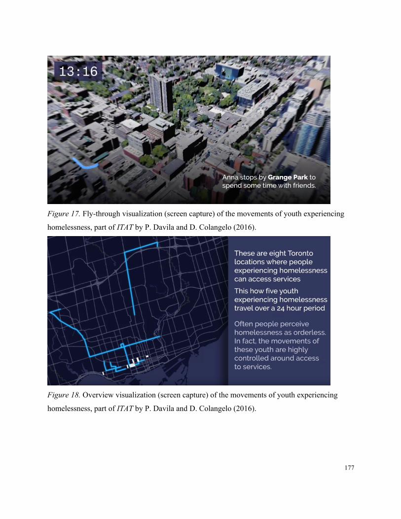
177
Figure 17. Fly-through visualization (screen capture) of the movements of youth experiencing
homelessness, part of ITAT by P. Davila and D. Colangelo (2016).
Figure 18. Overview visualization (screen capture) of the movements of youth experiencing
homelessness, part of ITAT by P. Davila and D. Colangelo (2016).

178
The visualizations are designed to be viewed, posted, and embedded in a Twitter or
Facebook feed where users often have videos play automatically as they scroll through. This
tactic is similar to that employed by news organizations (e.g. Propublica, AJ+, Mic, Salon) that
make extensive use of social networks. For instance, Propublica uses a specific file format
(animated .gif files) to communicate short intense bursts of information relating to a news story.
Because of the limitations of time and the constraints of file format these are often visualizations
designed specifically to attract the user’s attention and deliver a very succinct message. These
animations often link to longer news stories that go into much greater depth. Part of the tactic is
to create a compelling visual story using data that can be easily distributed (e.g. re-tweeted or
shared on Facebook) and thus increase the potential readership of the article or of the news
agency more generally.
Although these visualizations do not represent weather and social network activity, they
are imbricated into the visualization project in order to attach themselves to the assemblage and
show another dimension of the issue. The original visualizations created by Buccieri for her
research report (see Figure 19) were re-designed, animated, and annotated. In this way, they
added to the cascade of inscriptions surrounding the research on spatial agency and
homelessness. They build on the work done by the sociologist by inserting it into another
assemblage. While in a cascade of inscriptions (e.g. visualizations), for Latour, an individual
inscription increases its scientific value through its association with previous and allied
inscriptions, in the case of these visualizations they increase the expressive dimension. Not
unlike the maps produced around the Anti-Eviction Mapping Project, these visualizations
proliferate through their treatment and styling by designers working on the project. In order to

179
increase the audience, these visualizations express the specialized data from the original report in
forms that address a non-expert viewer.
Figure 19. Original movement visualizations from Buccieri (2013).
Participation and Interessement
If a visualization is to be understood through the lens of network and assemblage then how
members act within this arrangement is an important consideration. Being part of a network and
working to maintain a network are both forms of participation. Again, this produces a challenge
for analyzing visualizations. The processes and forms of participation have been generally
limited to quantifiable aspects that involve software, tasks, and visual cognition. This is not
surprising because, as discussed in previous chapters, one of the explicit goals of information
visualization is the reduction of complexity in the aims of augmenting human cognition and
pattern recognition (Bederson & Shneiderman, 2003)—which precisely delimited an area of
research and innovation.

180
The ITAT project may represent a reversal of this putative role of visualization where
instead the complexity is posited on the interpretive and participatory side rather than on the
interactive and representational side of understanding data. This is potentially another factor that
led to the conflicting reviews of the project by the IEEE peer reviewers. Using a very low
resolution matrix (i.e. the building LED façade) and a very simple mapping of data to visual
elements, this project combines and visualizes three streams of data (i.e. wind speed, wind
direction, and Twitter activity). These are rather simple data sets but it is their juxtaposition and
their arrangement with other participatory aspects that invites more complex interpretations and
implications. This kind of project—where there is a shared medium (e.g. building facade, Twitter
feed) and where visitors and viewers can alter the artwork through specific actions—highlights
the way participation and sociality largely produce the aesthetic experience.
But we should be cautious not to conflate the ability to affect a visualization through the
use of an interface (i.e. interaction) with the notion of participation. While interaction, within the
context of visualization, normally refers to the process of human-computer interaction (HCI),
participation must be understood as a process that: first, does not directly require mediation
through a computer; second, acknowledges that feedback is not a matter measured in
milliseconds but can be a much more complex and delayed process; third, does not necessarily
aim to augment specific cognitive processes; and fourth, in many cases, entails a political
commitment that aims to produce more equitable relationships amongst participants or between
participants and the outcome of a project.
For the purposes of the present study the focus is primarily on the participatory aspects of
the project. Although interaction is an important consideration of the work of visualizations, a

181
look at participation allows us to note how a network and assemblage is produced. This becomes
even clearer when we consider that an emphasis on interaction would become increasingly
difficult if we were to log all the various ways that interfaces may manifest and specific issues of
interaction and cognition emerge within a networked notion of visualization.47 The emphasis on
participation as the work that constitutes the network is also supported by Latour’s (1986) stress
on looking at the role of how objects (i.e. inscriptions) are assembled or how things are drawn
together (p. 6) rather than the role of cognition in visualization when trying to understand the
ways that knowledge is created and transported.
Immutable mobiles allow information to travel back and get assembled with other
inscriptions. Cascades of inscription form a series of claims that strengthen through their
imbrication. Navigational practice characterizes the way that users consult calculation surfaces
that collect and present a variety of data. These are forms of transporting and working with
information but they also involve a form of enlisting actants into a network which, in turn,
becomes an actant within another network. We saw how this occurred in the two case studies
discussed in the previous chapter where the network process of interessement was used as a
concept to understand how participants were represented in a visualization project.
To further our use of this concept we can also look to how the boundary object as a form of
interessement operates in a project like ITAT. A boundary object (e.g. image, document, device,
system) makes possible the coming together of various stakeholders around a common issue
47 It should be noted that there are fields which do focus on this kind of research with networks such as Computer Supported
Collaborative Work (CSCW). But a vast majority of work in visualization tends to focus on specific problems illustrated by specific types of visualizations, interactions, etc.

182
(Star & Griesemer, 1989). Each stakeholder agrees to the more general components of this
representation but finds specific components within the representation which suit his/her
particular agenda. The strength of this concept comes from the fact that it describes specific
instances in socio-technical systems which act as translators between various stakeholder groups
without the need to create consensus. People can share, use, and contribute to some kind of
representation of a given issue and agree to its main features but find more precise features that
relate to their personal goals. In other words, a visualization can be a common ground without
requiring everyone to agree to exactly what it means or represents.
Star and Greisemer outline a variety of types of boundary objects that match some of the
aspects of the ITAT assemblage: repositories, ideal types, coincident boundaries, and
standardized forms. Repositories allow participants to withdraw things from a collection (e.g.
objects, data) and repurpose them for their own uses. Ideal types allow participants to share a
common visual representation that is abstract enough that it does not contradict individual
understandings of an issue. Coincident boundaries allow participants to view different contents
of a similarly delimited space. Standardized forms allow participants to use a common interface
to communicate despite being from different social worlds. Therefore, if applied to the ITAT
assemblage, boundary objects can be in the form of visualizations (i.e. coincident boundaries or
ideal types), social media platforms (i.e. standardized forms), or archives (i.e. repositories) which
allow people who inhabit different social worlds to interact with a common space (Star &
Griesemer, 1989, p. 411).
For the purposes of this discussion it is useful to think of the activists, designers, users,
passersby, media, viewers, etc. as party to the boundary object. Rather than rely on a polysemous
183
or subjective reading approach to understanding how this visualization project functions, the
boundary object can help model the way that a network of actants may participate in the life of a
project. It is not necessary for all users, viewers, designers, activists, researchers, etc. to see the
exact same thing in the visualization. In fact, the power of a visualization may rest in its ability to
be vague enough that people may invest in a particular representation of data to the extent that
they can agree on the general contours of the issue being represented. In the case of ITAT, we can
think of the association of weather and homelessness through the (aesthetic) boundary object.
Interessement through the form of the boundary object can address the way that visual
engagement can proceed. But once again, as we saw in the case of the Liquid Traces project and
the Anti-Eviction Mapping Project, the notion of interessement, as a network process, should be
considered in parallel with the assemblage in order for it to be more useful for artistic
visualization projects.
As discussed previously with these visualization projects, applying Latour and Callon’s
concept of interessement (Callon, 1986; Latour & Callon, 1981) to critical visualization practice
limits its utility to focusing more on how power relations are centralized to create authority
through the translating of participants into an actant-network. Through obligatory points of
passage, power is centralized in the manager or researcher. Through problematizing an issue, the
manager or researcher becomes indispensable. Enrolment and mobilization bring participants
into the network and transport issues to a wider network, a process that can stifle dissent from
participants. However, the model of the boundary object addresses part of this limitation by
modifying the concept to emphasize an ecological analysis of how concerns around a given issue
are mediated and represented (Star & Griesemer, 1989, p. 389). That is to say, it does not hold

184
any point of view as primary, essential, and more valid than any other. In this way, it points to
how objects themselves can be collaborative devices that perform interessement and translation
in a network, but it does not necessarily work to centralize the management of power.
Understanding visualization through an ecological (i.e. boundary object) framing of
interessement is necessary to a critical visualization practice and therefore for understanding the
way the network is constituted, and the way its members participate and each makes use of the
resources of the network. This modification is important because it opens up the way translation
is a more distributed process, which can also help in creating assemblages that do not shift
authority to a central figure (e.g. artist, designer, manager, researcher).
It is also instructive to compare participation in a visualization project, as an artistic
project, with how participation is framed within relational aesthetics projects in order to address
potential critiques of this kind of practice. Relational aesthetics is an umbrella term used to
describe a variety of art practices (e.g. the work of Joseph Beuys, Liam Gillick, and Rirkrit
Tiravanija) that aim at creating spaces in which social interaction is fostered. The artwork
generally requires participation and people doing things (e.g. making and eating pad thai) in a
given space in the hopes that a sense of conviviality and dialogue would emerge (Bourriaud,
2002, p. 30). Yet, relational aesthetics projects can suffer from the same reductionist and
centralizing effects identified in interessement, where an artist enlists community participants in
order to complete the work—a work that will, through documentation, reviews, etc, continue to
circulate in an art economy well beyond the social world of the participants. This comparison
also helps us consider some of the critiques of this genre of art practice (as well as other forms of
site-specific and community-based art practice) and use this to critique the role of interessement,

185
beyond the notion of the boundary object, in a project like ITAT. The political ambitions of
relational aesthetics have been vigorously critiqued to be, at best, ineffective, navel-gazing, elitist
exercises masquerading as socially-engaged art, or at worst, parasitic practices that import
authenticity by using local communities (Bishop, 2004). Similarly, site-specific artwork (which
sometimes coincides with relational work, especially when the site is construed as a community)
has also been critiqued for exacerbating power inequality, remarginalizing constituents, and
depoliticizing issues (Kwon, 2002).
This remarginalization through reproducing power inequality can go hand-in-hand with the
importation of authenticity. This is analogous to the inherent critique within interessement
advanced by Callon and Latour. Networks of actants can be stabilized to form a larger actant that
incorporates the voices, bodies, and performances of human and nonhuman actants—this is a
form of power. In the ITAT project, we brought in the lived experiences, the visual stories, the
supportive tweets and shares, and the data in order to create an actant that would (temporarily)
represent homelessness. We therefore also ran the risk of re-creating a power dynamic that could
further marginalize the people we were attempting to represent.
Attempts at producing a better assemblage have been made throughout the course of the
three installations (i.e. 2014, 2015, 2016) but two initiatives are particularly instructive. First, in
2015, we were inspired by the Tweets2Rue48 project in France that provided phones and accounts
to several people experiencing homelessness, to assist them in telling their stories. This is part of
a larger trend in social media to tell stories (e.g. documentaries, histories, first-person accounts)
48 See http://tweets2rue.blogspot.ca/.

186
through a long series of short posts that can last from a few days to much longer. The aim of the
project was to humanize street-involved people and dispel misconceptions of homelessness.
Through ITAT we attempted to begin a similar project that would allow people to tweet their own
experiences in Toronto. With the help of coordinators at one of the Out of the Cold shelters in
downtown Toronto we were put into contact with a client who was interested in participating as a
correspondent. He was identified as a good candidate because he was in transition to permanent
housing and expressed interest in the project itself.
The concept was designed to have the correspondent tweet his reflections and report on the
current conditions at the shelter he was using. In addition to enriching the Twitter discussion
about #homelessness, these specific tweets would produce different colour animations on the
building and therefore add to the variables being juxtaposed on the visualization. We proceeded
to secure an honorarium, purchase a phone (that he would keep after the project was concluded)
as well as a usage plan for one month, and set up a Twitter account through which he could
publish his posts.
Although the project started out well it ultimately failed. The participant’s phone was
stolen a few days after he took possession of it—a reality in the shelter experience that we failed
to adequately prepare for. In addition, we lost touch with the participant and were unable to
follow up for debriefing and for feedback on how to improve the project. This failure signals a
lack of adequate attention to how certain parts of the ITAT assemblage were constructed. Even if
this process did not directly remarginalize the participant, the value of the initiative for him was
negligible at best. Had this project been successful there may have been a better experience for

187
the participant where he would have been able to address a wider audience with his reflections
and reporting.
This initiative was rethought for the following year’s iteration. Instead of enlisting one or
two people and asking them to report through tweets, we used a framework that was already in
place and which already had some trust in the community. As described above, Tim McLeod and
Alexis Mavragiannis, both graduate students focusing on public heath, led a series of workshops
at St. Michael’s Hospital Supporting Transitions and Recovery (STAR) Learning Centre in
Toronto. Using photovoice49 methods, the workshops allowed participants to build confidence in
personal storytelling through photography.
The photos created by workshop participants detailed both the daily lived experience of
homelessness and personal reflections on political factors contributing to the ongoing crisis.
Images were selected and annotated with captions that helped readers interpret their content.
These images were also geolocated and positioned on a map of the downtown area in order to
again show the spatial dimension of experiencing homelessness. This map, in turn, was
distributed through tweets from the ITAT Twitter account including the #homelessness hashtag.
Although this was a much more successful iteration of our attempt to include the voices of
people experiencing homelessness, there were still issues with regards to maintaining the links
between the members of the assemblage. While the workshop participants were able to view
their photos, select ones they liked, and annotate them, they had little or no opportunity to see
them assembled, disseminated online, or visualized on a map. Part of this problem stems from
49 Photovoice is an auto-ethnographic research method that positions the participant’s agency at the centre of the process. It is
popular in research projects that study experiences and conditions of marginalized communities.
188
the inherent difficulty in continuity in a limited amount of time with someone who does not have
housing, but it also stems from a lack of fully accommodating how participants can continue
benefiting from their involvement in the project—in other words, how participation as
interessement is maintained in ways that do not exacerbate existing power dynamics.
The feedback on the ITAT project from reviewers for the IEEE Vis Art symposium
generally identified a failure to communicate efficiently. But I believe the failure lies somewhere
else. It does not concern the communicative properties of the visualization but rather the nature
of how the assemblage was composed and maintained. The failure was in the lack of a deeper
engagement with the people who experience homelessness. Although it was through researchers,
advocates, and support workers that we have gained knowledge or moved forward with the
project, engaging with people personally affected by homelessness has been a much more
difficult process. Power, privilege, and lack of personal connections have contributed to this
particular failure. The assemblage that was instantiated through this project did not sufficiently
attend to the connections made between the participants. This is a factor that may contribute to
the difficulty in maintaining connections to the community when an event such as ITAT is held
once a year and its main participants do not form part of the community during the rest of the
year. The value of this kind of visualization project increases by the degree with which it
maintains the assemblage. A sparse and anemic network renders the visual components of the
visualization spurious at best or willfully misleading at worst. If this project is to be held to the
criteria of a critical visualization practice then it should do much better at addressing this issue.

189
Conclusion
The difficulty in thinking about visualization as a process is that it can involve aspects that
are common to any number of other non-visual processes (e.g. organizational management,
community services, editorial roles). It is at this point when we expand the scope of what is
considered in the analysis that the question emerges, are we still dealing with visualization or are
we dealing with an expanded media practice? Critical visualization practice is an expanded
media practice because it takes as a central apparatus the visualization of data but does not
subscribe to the notion that a simple artifact is created. Instead, it allows visualization as a
process to move beyond strict definitions and allows sources to participate in ways that are not
limited to a logic of extraction. The ITAT project was a public aesthetic visualization installation
that knew itself to be also an expanded media and critical visualization project. The various
aspects of the project were designed in order to foster activities and interactions that could take
place. It was a specific kind of installation using a specific understanding of what is meant by
visualization. Nevertheless, there are elements in this installation that hold true for most if not all
instances of visualization, namely assembly, representation, and interpretation. As an
assemblage, visualization is constructed by enlisting technologies and humans, then circulated
through expressions of these components which are received, interpreted, and further reiterated
through other assemblages. As critical visualization practitioners, designers and artists should
emphasize the ethical relationship—which often gets scant attention—between these elements.

190
Chapter Six: Conclusion
Prometheus is a figure that represents a daringness to catapult the state of things far
forward. He also represents a dynamic where the instruments of great change are bestowed upon
everyday people by heroes and geniuses. Design has often been framed within this trope. For
instance, Nelson and Stolterman (2012), in an attempt to create an ontology of design, suggest
that humans did not discover fire but that they did design it. In this aphorism, humans,
particularly adventurous and clever humans, take on the role of Prometheus. It speaks, at once, of
the ingenuity of human designers to shape even the most elemental components of life, as well as
the ubiquity of design process and its fundamental role in supporting human life. In a similar
vein, acclaimed modernist designer Paul Rand (2008) stated that “Everything is design!
Everything!” (p. 25). Design being everywhere means that its product is embedded in everyday
practice and that designers affect everything. These statements betray a certain hubris in the
ability of design to affect all corners of life. They easily fit into a kind of practice that leads the
charge forward to design the world—to press idealized diagrams onto a receptive medium.
This is in contrast to Latour’s (2008a) employment of the term where instead, he presents
the “cautious Prometheus,” a modest driver of change, in an attempt to temper this hubris that
historically has had its most powerful expression in industrial science and technology.50 Modesty
points to the logic that must be used to address the massive scale of environmental, social,
50 Ezio Manzini (1992) echoes this ethos when he suggests that we should embrace the “Prometheus of the everyday” by
which he means there are quotidian design challenges all around that our attention should be directed to forming better connections in a variety of local ecologies (p. 5).
191
economic, and technological issues we currently face that have resulted from unbridled industrial
and market forces. This is key to working through a mode of restyling and reconfiguration rather
than grand reversals or giant leaps forward. For Latour, this also entails a rethinking of the
critical stance—moving from an approach that seeks to denounce and unveil a truth to an
approach that seeks to describe and evaluate the quality of constructions (i.e. socio-technical).
Visualization plays a very important role in this postcritical approach. It is a genre of media
practice that assembles data in order to describe and make visible phenomena that escape
immediate apprehension. Visualization, communication design, information design, and
interaction design are concentrations of technologies and techniques that work at the intersection
of human knowledge, perception, action, networked media, and computation. They are a set of
disciplines that represent a basis through which to investigate the schism between
representationalism and postrepresentationalism, between a linguistic paradigm and a
performative paradigm, and between a critical and postcritical approach.
This situation led to the development of a guiding research question that looked at critical
visualization practice. In order to understand how visualization can operate as a critical design
practice that simultaneously attends to the representational and performative processes it
arranges, this study articulated a theoretical framework that could describe relevant
characteristics of that practice and looked at three case studies that engaged in that practice. This
entailed also looking at how visualizations work as assemblages that arrange people and things.
The way(s) that subjectivity is produced within these human-nonhuman assemblages also
emerged as an important consideration.

192
The process of addressing this question has led to a novel investigation and articulation of
visualization design practice through actor-network and assemblage theory. Visualization design
was considered as an expanded practice that entails the configuration of networks and not just
the immediate visual medium or the analysis of data. This was aided by the linking of
methodological analysis in ANT and theoretical concepts in assemblage theory to create a more
flexible framework. This framework helped both create accounts of how visualizations function
and formulate speculations of how they produced subjectivity. This work thus broadens the
scope of what is considered visualization. Without disavowing the study of visualization that
pursues a semiotics of symbols, a heuristics of interaction, and a metric of perception and
cognition, this study has shown how knowledge is reproduced through visual means, but also
how this production depends on the maintenance of specific relations.
In a visualization project like Liquid Traces it becomes clear that visualization practice
involves a process of assembling and relating diverse data components onto a plane that allows
for inspection. This process assembles human as well as nonhuman actants in order to be
flattened out, compiled, and compared. Satellite imagery, news reports, simulations, and
interviewees were composed into a dashboard that afforded the viewer an instrument through
which to navigate a narrative of refugee deaths. This project exemplified how inscriptions travel
and form cascades which accrue authority and persuasiveness, and yet show their
constructedness. The equipment in the assemblage was made evident through the interface of the
dashboard. Video clips, inventories, and maps were composed on the screen. The cascades of
inscriptions were made visible. The viewer also saw the equipment show its seams and
provenance of representations through the layering of raw images over and under refined

193
diagrams. The visualization also involved other relations by being attached to other assemblages
where equipment was configured for data collection. Interviews with a survivor were conducted
to corroborate other sources already collected. Memory was supported through writing, photos,
and the presence of a clergyman. These assemblages of collection attached to visualization
assemblages also transformed survivors into expert witnesses. Their representation in the
visualization and associated reports and videos, which aided the legal case against the NATO
governments, recast these few illegal migrants as authoritative voices. This example points to
how this kind of project has effects that far outstrip the immediate visual-perceptual effects of
the display.
Similarly, Anti-Eviction Mapping Project shows how in a visualization assemblage the
configuration extends far beyond one surface. The mapping project uses the conceit of a map that
makes the displacement of tenants in downtown San Francisco visible but it also creates a
cartography of artefacts, events, experiences, and places that produces a subjectivity that resists
displacement. Although the case study focused only on a handful of maps created by the project
it is evident that these maps proliferate as immutable mobiles and, more importantly, as mutable
mobiles that are restyled and recast. In some instances, data remained the same and maps were
animated and captioned, in others the visual style was reused for different data but for the same
issue. The assemblage extended and attached to other assemblages of organizations, networks,
and locations. Again, like Liquid Traces, AEMP assembled human actants through its data
collection process (e.g. oral storytelling events, online forms). Participation also defined the way
this project created relations between the storytellers, tenants, advocates, and designers. Places

194
were marked with maps and portraits of participants/community members and online maps
placed their voices amongst other markers that described a quantitative measure of displacement.
One of the results of In the Air, Tonight was a multiplying of the ways a visualization
assemblage could exist and move. Another cartography of elements was produced by walking
the territory, plotting the waypoints, making a site-specific intervention, adding donations,
conducting a workshop, and appearing in news media. Assemblages attach to other assemblages
through an exteriority of relations. Linkages are made between assemblages because of shared
content and mutability of expressive forms—a walk is a map, a map is visualization showing
services, a mobile app showing shelter services is also an interface to make donations, donations
trigger building-scale visualizations, building visualizations appear on news stories. This project,
along with the previous two case studies, also represents the modesty emphasized in constructing
multiple versions, iterations, and connections to other assemblages. They also underline the need
to maintain the connections made as a matter of ethics in a critical visualization practice. What
becomes apparent through these projects is that representing (our) entanglement is also a form of
entanglement.
These projects are all involved in establishing, perhaps designing, a matter of concern—the
guilt of NATO forces, the violence of displacement, or the crisis of homelessness. Matters of
concern do not exist without participation, interessement, and the construction of assemblages.
Design, especially in the form of visualization, is therefore involved in creating the style of our
attachment, the kind of equipment we use, and the conditions of our artificiality. The
environments, the tools, and the processes that comprise our spheres also shape our ways of
perceiving our spaces and ourselves. Visualization, as a practice that acts as a prosthetic and

195
augmentation of our abilities to perceive the world, is a powerful actor in this sphere. Yet our
attachments are of a cognitive as well as a participatory character. This is derived from Latour’s
recasting of design as a way of understanding how things are connected, which embeds
visualization into design practice precisely because of its ability to “draw things together.”
The decision to incorporate Deleuze and Guattari’s work was driven by an observation of
the similarities between networks and assemblages in how each described their respective objects
of thought. This was observed while still acknowledging the differences, namely that networks,
in the form articulated in actor-network theory, are part of a methodological discourse, and
assemblages, in the form articulated by Deleuze and Guattari, are part of a philosophical
exploration. Assemblage theory, like ANT, acknowledges a form of agency in nonhuman actants
which is essential for an ecological understanding of phenomena. This also leads to an
understanding of subjectivity as a production that involves human and nonhuman affects—a
notion which Latour echoes with the concept of equipment. It was Lazzarato’s work on
asignifying semiotics, through Deleuze and Guattari, that was particularly helpful in making
links to how visualization could involve proto-subjective processes. While Latour’s methodology
emphasizes the traceable processes, Deleuze and Guattari’s theory emphasizes the mappable
connections and thus makes it possible to elaborate a theory of subjectivity that can incorporate
notions of proto-enunciation or possibly pre-attentive cognition into the analysis.
The development of this articulated framework and the analysis of these case studies has
also served as a catalyst to begin new projects in exhibition, curation, research, and practice. As a
guest curator at Onsite, the new professional gallery at OCAD University, I will be creating an
exhibition on critical visualization practice scheduled for winter 2018. The program will include

196
projects that illustrate the wide spectrum of practices that work through an ethics of visualization
and attachment. This often takes place within advocacy and activist work that takes guidance
from the community it is representing and is accountable to. Works by Forensic Architecture,
Anti-Eviction Mapping Project, Laura Kurgan, Bureau d’Études, Iconoclasistas, Tactical
Technology Collective, Beehive Collective, and Torkwase Dyson (among others) are being
considered for inclusion in the program. These designers and artists, each in their respective
ways, create visualization projects that are intimately tied to the people and places represented.
The exhibition of this particular mode of practice will be augmented with a symposium to allow
scholars and practitioners to share current work in this domain. Community workshops will also
be held in order to multiply the ways that people can access this rich history of practice as well
as learn techniques that can be used in local community projects.
Recently appointed as the director of the Zero Lab at OCAD University, I will be
promoting the mandate of the lab which focuses on sustainable futures, community resilience,
and environmental justice through a set of practices (e.g. interaction, interface, and visualization)
that aim to make these issues visible, legible, and actionable. Visualization and especially the
expanded practice described in this study will directly impact how the work of the lab is guided.
For instance, practices in mapping, interface design, community engagement, design ethics, and
participatory methods will be central to how projects are structured.
Based on the success of In the Air, Tonight and other similar projects over the past five
years, I have formed Public Visualization Studio with Dave Colangelo and other collaborators.
This initiative is an effort to consolidate the work under the genres of public installation,
interaction, visualization, and visual storytelling. We have recently produced works at Toronto’s

197
Nuit Blanche and Mississauga’s Celebration Square that immerse viewers in public spaces with
interactive visualizations simulating global ecologies and essayistic videos linking global
networks of consumption as labour. These projects are representative of future explorations in
merging data, narrative, and experiences in public venues.
This dissertation has also opened up a landscape of thought that Latour, Stengers, and
Deleuze and Guattari have drawn from work by Whitehead, James, Dewey, and Peirce where
diverse but often related notions of radical empiricism, experience, and semiotics are explored.
Further research in these histories looks promising for understanding alternative trajectories of
thought that have influenced many contemporary scholars in science and technology studies.
This may be especially productive as a basis to think through subjectivity and experience when
working further through Latour’s development of a Gaia theory and Guattari’s notion of the
Three Ecologies. Much work on the anthropocene, as a human-caused geological phase, has
begun to emerge. Work on making the anthropocene sensible or visible will therefore become a
growing area of research in design and media studies.
These current and future projects, and the projects described in the case studies present a
special challenge for the visualization researcher-practitioner. They illustrate a challenge to
manage an apparent paradox in critical visualization practice: the power of visualization is in its
capacity to compellingly represent a possible reality and to simultaneously blackbox a set of
relations that discourages inquiry into its components and processes. For the visualization, the
greater the capacity to visually bring to life a possible reality, the lesser the opportunity to
discern the quality of its construction or the conditions of its production. This is an echo of a
well-articulated critique in several fields (e.g. anthropology, ethnography, history) where

198
descriptions, representations, and claims have required authors to foreground or bracket their
subjective position, the mode of authorship, and the limits of selected techniques in order to
reassert an objective grasp on the matter being studied. In visualization, this has sometimes taken
the form of transparency, showing the code or the raw data used to develop a particular
representation. Through artistic visualization, some artists have made a virtue of the subjective
choices and human hand in the creation of a visualization by not removing traces of production
and including non-sequiturs or errors in the final work. Still other practitioners have attempted to
reassert a form of correspondence between the visual representation and the community being
represented through collaborative projects of crowd-sourced data or endlessly editable maps.
This apparent paradox (blackboxing and revealing assemblages) presents critical
visualization practice with an opportunity to reframe criticality along lines explored in this
dissertation. It requires a slip in the meaning and use of the term critical; in this vein, Stengers
(2008) suggests that, rather than critique, discernment is needed, in her case, to build good
accounts of socio-technical systems. Stengers advocates that attention be paid to caring and
fostering connections rather than denouncing and critiquing. Multiplicity and contingency are
valued over the purification of facts. A similar notion is expressed by Guattari (1995) when he
asks, “Who speaks the truth? This is no longer the question: but how, and under what conditions
can the best bring about the pragmatics of incorporeal events that will recompose a world and
reinstall processual complexity?” (p. 86). In visualization practice, where an account is written or
visualized, an assemblage also comes into existence through its connections. Visualization as a
design practice creates the style of our attachment, arranges the kind of equipment we use, and
shapes the conditions of our artificiality. Where criticality may have emphasized distance and

199
objectivity in order to support claims of truth, when designing (in) assemblages and networks,
these virtues may be replaced by attachment and proximity. What has emerged from this study is
an ethics of visualization that refocuses criticality on the potential of design to act modestly, to
reveal its own construction, and to maintain the quality of attachments made.

200
Bibliography
Agre, P. E. (1997). Toward a Critical Technical Practice: Lessons Learned in Trying to Reform
AI. In G. Bowker, L. Gasser, L. Star, & B. Turner (Eds.), Social Science, Technical
Systems, and Cooperative Work: Bridging the Great Divide (pp. 131–158). Mahwah, NJ:
Lawrence Erlbaum Associates, Inc.
AIGA. (2007). AIGA Design Process. AIGA. Retrieved from http://www.aiga.org/why-design-
booklet/
AJ+. (2014). Mapping San Francisco’s No-Fault Evictions Since 1997. Retrieved from
https://www.youtube.com/watch?v=D3UPom9R04U
Akrich, M. (1992). The De-scription of technical objects. In W. E. Bijker & J. Law (Eds.),
Shaping Technology/Building Society: Studies in Sociotechnical Change (pp. 205–224).
Cambridge, MA: MIT Press.
Allen, P. (2012, March 29). Migrant boat tragedy – interactive. The Guardian. Retrieved from
http://www.theguardian.com/world/interactive/2012/mar/29/migrant-boat-tragedy-
refugees-europe
Allen, S. (1998). Diagrams matter. ANY 23 – Diagram Work: Data Mechanics for a Topological
Age, 16–19.
Allen, S. (1999). Points + Lines: Diagrams and Projects for the City. New York, NY: Princeton
Architectural Press.

201
Alpers, S. (1987). The mapping impulse in Dutch art. In D. Woodward (Ed.), Art and
Cartography: Six Historical Essays (pp. 51–96). Chicago, IL: University of Chicago
Press.
Alvesson, M., & Sköldberg, K. (2009). Reflexive Methodology: New Vistas for Qualitative
research. London, England: SAGE.
Anti-Eviction Mapping Project. (2013). No-Fault Evictions and Tech Bus Stops (San Francisco,
2011-2013). San Francisco, CA. Retrieved from
http://www.antievictionmappingproject.net/techbusevictions.html
Anti-Eviction Mapping Project. (2015a). Mural in Clarion Alley. Retrieved August 3, 2015, from
http://www.antievictionmap.com/mural-in-clarion-alley
Anti-Eviction Mapping Project. (2015b). Narratives of Displacement and Resistance. Retrieved
May 11, 2016, from http://www.antievictionmappingproject.net/narratives.html
Anti-Eviction Mapping Project. (n.d.-a). Ellis Act Evictions. Retrieved May 11, 2016, from
http://www.antievictionmappingproject.net/ellis.html
Anti-Eviction Mapping Project. (n.d.-b). Tech Bus Stops and No-Fault Evictions. Retrieved
August 2, 2015, from http://www.antievictionmappingproject.net/techbusevictions.html
Archer, B. (1979). Design as discipline. Design Studies, 1(1), 17–20.
Arnheim, R. (1988). The Power of the Center: A Study of Composition in the Visual Arts (New
version). Berkeley, CA: University of California Press.
Baird, G. (2004). “Criticality” and its discontents. Harvard Design Magazine, (Number 21).

202
Barad, K. M. (2007). Meeting the Universe Halfway: Quantum Physics and the Entanglement of
Matter and Meaning. Durham, NC: Duke University Press.
Bederson, B., & Shneiderman, B. (2003). The Craft of Information Visualization: Readings and
Reflections. San Francisco, CA: Morgan Kaufmann.
Benjamin, W. (1968). Illuminations. (H. Arendt, Ed.). New York, NY: Schocken Books.
Bennett, J. (2010). Vibrant Matter: A Political Ecology of Things. Durham, NC: Duke University
Press.
Bertin, J. (2011). Semiology of Graphics: Diagrams, Networks, Maps. Redlands, CA: ESRI
Press.
Binder, T., De Michelis, G., Ehn, P., Jacucci, G., Linde, P., & Wagner, I. (2011). Design Things.
Cambridge, MA: MIT Press.
Bishop, C. (2004). Antagonism and relational aesthetics. October, 110, 51–79.
Blauvelt, A. (2008). Towards relational design. Design Observer. Retrieved from
http://observatory.designobserver.com/feature/towards-relational-design/7557/
Board, C. (2011). Cartographic communication. In M. Dodge, R. Kitchin, & C. R. Perkins
(Eds.), The Map Reader: Theories of Mapping Practice and Cartographic Representation
(pp. 37–47). Chichester, England: Wiley-Blackwell.
Bonsiepe, G. (1997). Discursivity – visuality. Presented at the Design, The Blindspot of Theory,
Jan van Eyck Academy, Maastrich, Netherlands.
Bonsiepe, G. (2006). Design and democracy. Design Issues, 22(2), 27–34.
Bourriaud, N. (2002). Relational Aesthetics. Dijon, France: Les Presses du réel.

203
Bryant, L. R. (2011). The Democracy of Objects. Ann Arbor, MI: Open Humanities Press.
Bryant, L. R. (2014). Onto-Cartography: An Ontology of Machines and Media. Edinburgh,
Scotland: Edinburgh University Press.
Buccieri, K. (2013). Waldo 101: Mapping the intersections of space, place, and gender in the
lives of ten homeless youth. In S. Gaetz (Ed.), Youth Homelessness in Canada:
Implications for Policy and Practice (pp. 425–443). Toronto, Canada: Canadian
Homelessness Research Network.
Buchanan, R. (1985). Declaration by design: rhetoric, argument, and demonstration in design
practice. Design Issues, 2(1), 4–22.
Buchanan, R. (1992). Wicked problems in design thinking. Design Issues, 8(2), 5–21.
Callon, M. (1986). Some elements of a sociology of translation: domestication of the scallops
and the fishermen of St. Brieuc Bay. In J. Law (Ed.), Power, Action and Belief: A New
Sociology of Knowledge? (pp. 196–223). London, England: Routledge.
Camarena, A. (2014, January 17). Campfire: Eviction Ghost Stories and Other Housing Horrors.
Retrieved September 29, 2015, from
https://www.facebook.com/events/730582570300323/
Card, S. K. (1999). Information Visualization. In S. K. Card, J. D. Mackinlay, & B. Shneiderman
(Eds.), Readings in Information Visualization: Using Vision to Think (pp. 1–34). San
Francisco, CA: Morgan Kaufmann Publishers.
Card, S. K., Mackinlay, J. D., & Shneiderman, B. (1999). Readings in Information Visualization:
Using Vision to Think. San Francisco, CA: Morgan Kaufmann Publishers.

204
Cat, J. (2014). Otto Neurath. In E. N. Zalta (Ed.), The Stanford Encyclopedia of Philosophy
(Winter 2014). Retrieved from
http://plato.stanford.edu/archives/win2014/entries/neurath/
Chapman, O., & Sawchuk, K. (2012). Research-creation: intervention, analysis and “family
resemblances.” Canadian Journal of Communication, 37, 5–26.
City of Toronto. (2016). Statistics on Extreme Cold Weather Alerts in Toronto. Retrieved May
11, 2016, from
http://www1.toronto.ca/wps/portal/contentonly?vgnextoid=0b1ed4b4920c0410VgnVCM
10000071d60f89RCRD
Corner, J. (1999). The agency of mapping: speculation, critique and invention. In D. E. Cosgrove
(Ed.), Mappings (pp. 213–252). London: Reaktion.
Cosgrove, D. (2006). Cartocity. In J. Abrams & P. Hall (Eds.), Else/where: Mapping New
Cartographies of Networks and Territories (pp. 148–165). Minneapolis, MN: University
of Minnesota Design Institute.
Cosgrove, D. E. (2003). Apollo’s Eye: A Cartographic Genealogy of the Earth in the Western
Imagination. Baltimore, MD: Johns Hopkins University Press.
Cox, D. (2006). Metaphoric mappings: the art of visualization. In P. A. Fishwick (Ed.), Aesthetic
Computing (pp. 89–114). Cambridge, MA: MIT Press.
Crampton, J. (1994). Cartography’s defining moment: the Peters projection controversy, 1974-
1990. Cartographica, 31(4), 16–32.

205
Crampton, J. W. (2001). Maps as social constructions: power, communication and visualization.
Progress in Human Geography, 25(2), 235–252.
Cross, N. (2011). Design Thinking: Understanding How Designers Think and Work. Oxford,
England: Berg.
Cubitt, S. (2007). Precepts for digital artwork. In J. Marchessault & S. Lord (Eds.), Fluid
Screens, Expanded Cinema (pp. 304–320). Toronto, Canada: University of Toronto
Press.
Daston, L. (2014). Beyond representation. In C. Coopmans (Ed.), Representation in Scientific
Practice Revisited (pp. 319–322). Cambridge, MA: MIT Press.
Daston, L., & Galison, P. (1992). The image of objectivity. Representations, (40), 81–128.
DeLanda, M. (2005). Intensive science and virtual philosophy. London, England: Bloomsbury.
DeLanda, M. (2006). A New Philosophy of Society: Assemblage Theory and Social Complexity.
London, England: Bloomsbury.
Deleuze, G., & Guattari, F. (1994). What is Philosophy? (H. Tomlinson & G. Burchell, Trans.).
New York, NY: Columbia University Press.
Deleuze, G., & Guattari, F. (2004). A Thousand Plateaus: Capitalism and Schizophrenia. (B.
Massumi, Trans.). London, England: Continuum.
Deleuze, G. (2007). Two Regimes of Madness: Texts and Interviews, 1975-1995. (D. Lapoujade,
Ed.). New York, NY: Semiotext(E).
Desson, C. (2014, December 10). How a coloured box on a Toronto tower can tell you the
weather. The Toronto Star. Retrieved from

206
http://www.thestar.com/news/starweather/2014/12/how_the_canada_life_building_predic
ts_the_weather.html
Dewey, J. (1954). The Public and Its Problems. Chicago, IL: Swallow Press.
Dilnot, C. (1982). Design as a socially significant activity: an introduction. Design Studies, 3(3),
139–146.
Dilnot, C. (2008). The critical in design (part one). Journal of Writing in Creative Practice, 1(2),
177–189.
DiSalvo, C. (2012). Adversarial Design. Cambridge, MA.: MIT Press.
Dorst, K. (2006). Design problems and design paradoxes. Design Issues, 22(3), 4–17.
Drucker, J. (2014). Graphesis: Visual Forms of Knowledge Production. Cambridge, MA:
Harvard University Press.
Dumit, J., & Burri, R. V. (2008). Social studies of scientific imaging and visualization. In E. J.
Hackett, O. Amsterdamska, M. Lynch, & J. Wajcman (Eds.), The Handbook of Science
and Technology Studies (3rd ed., pp. 297–317). Cambridge, MA: MIT Press.
Dunne, A. (2005). Hertzian Tales: Electronic Products, Aesthetic Experience, and Critical
Design. Cambridge, MA: MIT Press.
Dunne, A., & Raby, F. (2001). Design Noir: The Secret Life of Electronic Objects. Basel,
Switzerland: Birkhauser.
Eades, G., & Zheng, Y. (2014). Counter-mapping as assemblage. In B. Doolin, E. Lamprou, N.
Mitev, & L. McLeod (Eds.), Information Systems and Global Assemblages:

207
(Re)Configuring Actors, Artefacts, Organizations (Vol. 446, pp. 79–94). Berlin,
Germany: Springer.
European Journalism Centre, & Open Knowledge Foundation. (2012). The Data Journalism
Handbook. (J. Gray, L. Bounegru, & L. Chambers, Eds.). Sebastopol, CA: O’Reilly
Media.
Figlio, K. (1996). Knowing, loving and hating nature: a psychoanalytic view. In G. Robertson, L.
Tickner, J. Bird, B. Curtis, M. Mash, & T. Putnam (Eds.), FutureNatural: Nature,
Science, Culture (pp. 73–86). London, England: Routledge.
Fishwick, P. A. (2006). Aesthetic Computing. Cambridge, MA: MIT Press.
Floyd, C., Mehl, W.-M., Reisin, F.-M., Schmidt, G., & Wolf, G. (1989). Out of Scandinavia:
alternative approaches to software design and system development. Human Computer
Interaction, 4(4), 253–350.
Foucault, M. (2002). Archaeology of Knowledge. London, England: Routledge.
Fox Talbot, H. (1844). The Pencil of Nature. London, England: Longman, Brown, Green and
Longmans.
Francis, J. A., & Vavrus, S. J. (2012). Evidence linking Arctic amplification to extreme weather
in mid-latitudes. Geophysical Research Letters, 39(6), 1–6.
Frayling, C. (1993). Research in art and design. Royal College of Art Research Papers, 1(1), 1–5.
Friendly, M. (2008). A brief history of data visualization. In Handbook of Data Visualization
(pp. 15–56). Berlin, Germany: Springer.

208
Fry, T. (2009). Design Futuring: Sustainability, Ethics, and New Practice. Oxford, England:
Berg.
Gaviria, A. R. (2008). When is information visualization art? Determining the critical criteria.
Leonardo, 41(5), 479–482.
Goodwin, C. (2001). Practices of seeing, visual analysis: an ethnomethodological approach. In T.
Van Leeuwen & C. Jewitt (Eds.), Handbook of Visual Analysis (pp. 157–182). London,
England: SAGE.
Guattari, F. (1995). Chaosmosis: An Ethico-Aesthetic Paradigm. Bloomington, IL: Indiana
University Press.
Guattari, F. (2008). The Three Ecologies. London, England: Continuum.
Guattari, F., & Genosko, G. (1996). The Guattari Reader. Oxford, England: Blackwell
Publishers.
Hall, P. (2011). Bubbles, lines, and string: how information visualization shapes society. In A.
Blauvelt, E. Lupton, & R. Giampietro (Eds.), Graphic Design: Now in Production (pp.
170–185). Minneapolis, MN: Walker Art Center.
Haraway, D. J. (1991). Simians, Cyborgs, and Women: The Reinvention of Nature. New York,
NY: Routledge.
Haraway, D. J. (1997). Modest₋Witness@Second₋Millennium.FemaleMan₋Meets₋OncoMouse:
feminism and technoscience. New York: Routledge.

209
Harley, J. B. (1988). Maps, knowledge and power. In D. E. Cosgrove & S. Daniels (Eds.), The
Iconography of Landscape: Essays on the Symbolic Representation, Design, and Use of
Past Environments. Cambridge, England: Cambridge University Press.
Harley, J. B. (1989). Deconstructing the map. Cartographica, 26(2), 1–20.
Harman, G. (2009). Prince of Networks: Bruno Latour and Metaphysics. Melbourne, Australia:
re.press.
Hayles, N. K. (1995). Making the cut: the interplay of narrative and system, or what systems
theory can’t see. CultCrit, 30, 71–100.
Hayles, N. K. (2014). Cognition everywhere: the rise of the cognitive nonconscious and the costs
of consciousness. New Literary History, 45(2), 199–220.
Heidegger, M. (1971). The thing. In A. Hofstadter (Trans.), Poetry, Language, Thought. (pp.
163–186). New York, NY: Harper & Row.
Heller, C., & Pezzani, L. (2014). Liquid Traces – The Left-to-Die Boat Case. Retrieved from
https://vimeo.com/89790770
Hill, G. (2007). Design without Causality: Heidegger’s Impossible Challenge for Ecologically
Sustainable Architecture. Presented at the 4th International Conference of the
Association of Architecture Schools of Australasia, Techniques and Technologies:
Transfer and Transformation, University of Technology Sydney.
Horkheimer, M. (1982). Critical Theory: Selected Essays. New York, NY: Continuum.

210
Horkheimer, M., & Adorno, T. W. (2006). The culture industry: enlightenment as mass
deception. In M. G. Durham & D. M. Kellner (Eds.), Media and Cultural Studies:
Keyworks (pp. 41–72). Malden, MA: Blackwell.
IDEO. (2011). Human Centered Design Toolkit: An Innovation Guide for Social Enterprises and
NGOs Worldwide. Palo Alto, CA: IDEO.
IPCC (Intergovernmental Panel on Climate Change). (2007). Observations: surface and
atmospheric climate change. In IPCC Fourth Assessment Report: Climate Change 2007.
Geneva, Switzerland: World Meteorological Organization. Retrieved from
https://www.ipcc.ch/publications_and_data/ar4/wg1/en/ch3s3-8-2.html
Jaar, A. (2000). Notes on Lights in the City. Retrieved from
http://www.alfredojaar.net/index1.html
Jay, M. (1994). Downcast Eyes: The Denigration of Vision in Twentieth-Century French
Thought. Berkeley, CA: University of California press.
Jones, C. (1998). Picturing Science, Producing Art. New York: Routledge.
Jones, P. (2014). Systemic design principles for complex social systems. In G. S. Metcalf (Ed.),
Social Systems and Design (pp. 91–128). Tokyo, Japan: Springer.
Kallick-Wakker, I. (1994). Science icons: the visualization of scientific truths. Leonardo, 27(4),
309–315.
Krippendorff, K. (2006). The Semantic Turn: A New Foundation for Design. Boca Raton, FL:
Taylor & Francis.

211
Kwinter, S. (1993). Soft systems. In B. Boigon (Ed.), Culture Lab (pp. 207–228). New York,
NY: Princeton Architectural Press.
Kwon, M. (2002). One Place After Another: Site-specific Art and Locational Identity.
Cambridge, MA: MIT Press.
Latour, B. (1986). Visualisation and cognition: drawing things together. In H. Kuklick (Ed.),
Knowledge and Society Studies in the Sociology of Culture Past and Present (pp. 1–40).
Greenwich, CT: Jai Press.
Latour, B. (1990). Drawing things together. In M. Lynch & S. Woolgar (Eds.), Representation in
Scientific Practice (pp. 19–68). Cambridge, MA: MIT Press.
Latour, B. (1993a). The Pasteurization of France. Cambridge, MA: Harvard University Press.
Latour, B. (1993b). We Have Never Been Modern. Cambridge, MA: Harvard University Press.
Latour, B. (1999a). Factures/fractures: from the concept of network to the concept of attachment.
Res, 36, 20–31.
Latour, B. (1999b). On recalling ANT. In J. Law & J. Hassard (Eds.), Actor Network Theory and
After (pp. 15–25). Oxford, England: Blackwell.
Latour, B. (1999c). Pandora’s Hope: Essays on the Reality of Science Studies. Cambridge, MA:
Harvard University Press.
Latour, B. (2004a). Politics of Nature: How to Bring the Sciences into Democracy. Cambridge,
MA: Harvard University Press.
Latour, B. (2004b). Why has critique run out of steam? From matters of fact to matters of
concern. Critical Inquiry, 30, 225–248.

212
Latour, B. (2005a). From realpolitik to dingpolitik – an introduction to Making Things Public. In
B. Latour & P. Weibel (Eds.), Making Things Public: Atmosperes of Democracy (pp. 4–
31). Cambridge, MA: MIT Press.
Latour, B. (2005b). Reassembling the Social: An Introduction to Actor-Network-Theory. Oxford,
England: Oxford University Press.
Latour, B. (2008a). A cautious Prometheus? A few steps toward a philosophy of design (with
special attention to Peter Sloterdijk). Presented at the Networks of Design, Design
History Society, Falmouth, Cornwall, UK. Retrieved from http://www.bruno-
latour.fr/sites/default/files/112-DESIGN-CORNWALL-GB.pdf
Latour, B. (2008b). What is the Style of Matters of Concern? Two Lectures in Empirical
Philosophy. Assen, Netherlands: Koninklijke Van Gorcum.
Latour, B., & Callon, M. (1981). Unscrewing the big Leviathan: how actors macro-structure
reality and how sociologists help them to do so. In K. Knorr-Cetina & A. V. Cicourel
(Eds.), Advances in Social Theory and Methodology: Towards an Integration of Micro-
and Macro-Sociologies (pp. 277–303). Boston, MA: Routledge & Kegan Paul.
Latour, B., November, V., & Camacho-Hübner, E. (2010). Entering a risky territory: space in the
age of digital navigation. Environment and Planning D: Society and Space, 28, 581–599.
Law, J. (2004). After Method: Mess in Social Science Research. London, England: Routledge.
Law, J. (2009). Actor network theory and material semiotics. In B. S. Turner (Ed.), The New
Blackwell Companion to Social Theory (pp. 141–158). Oxford, England: Wiley-
Blackwell.

213
Lazzarato, M. (2003). Struggle, Event, Media. Retrieved from
http://www.republicart.net/disc/representations/lazzarato01_en.htm
Lazzarato, M. (2014). Signs and Machines: Capitalism and the Production of Subjectivity. (J. D.
Jordan, Trans.). Los Angeles, CA: Semiotext(e).
Lefebvre, H. (1991). The Production of Space. Oxford, England: Blackwell.
Lynch, M. (1988). The externalized retina: selection and mathematization in the visual
documentation of objects in the life sciences. Human Studies, 11, 201–234.
Lynch, M. (1994). Representation is overrated: some critical remarks about the use of the
concept of representation in science studies. Configurations, 2(1), 137–149.
Lynch, M., & Woolgar, S. (Eds.). (1990). Representation in Scientific Practice. Cambridge, MA:
MIT Press.
Manovich, L. (2002). Data Visualisation as New Abstraction and Anti-Sublime. Retrieved from
http://manovich.net/DOCS/data_art_2.doc
Manovich, L. (2010). What is Visualization? Retrieved from http://manovich.net/blog/wp-
content/uploads/2010/10/manovich_visualization_2010.doc
Manzini, E., & Cullars, J. (1992). Prometheus of the everyday: the ecology of the artificial and
the designer’s responsibility. Design Issues, 9(1), 5–20.
Margolin, V. (2002). The Politics of the Artificial: Essays on Design and Design Studies.
Chicago, IL: University of Chicago Press.
Margolin, V., & Margolin, S. (2002). A “social model” of design: issues of practice and research.
Design Issues, 18(4), 24–30.

214
Martin, R. (2009). What is Design Thinking Anyway? Retrieved June 21, 2015, from
http://designobserver.com/feature/what-is-design-thinking-anyway/11097/
Massumi, B. (2002a). A Shock to Thought: Expressions after Deleuze and Guattari. London,
England: Routledge.
Massumi, B. (2002b). Parables for the Virtual: Movement, Affect, Sensation. Durham, NC: Duke
University Press.
McElroy, E., Wojczuk, C., & Tirado, C. (2015, May 19). Anti-Eviction Mapping Mural Project
interview on Setting the Standards [Interview]. Retrieved from
https://www.indybay.org/newsitems/2015/05/19/18772469.php
Menchini, P. (2015). Mural on Clarion Alley: Narratives of Displacement & Resistance 16 May
2015 [Video File]. Retrieved from https://vimeo.com/128097975
Monmonier, M. S. (1995). Drawing the Line: Tales of Maps and Cartocontroversy. New York,
NY: H. Holt.
Mouffe, C. (2010). Agonism and public space. In Metahaven & M. Vishmidt (Eds.), Metahaven:
Uncorporate Identity (pp. 239–250). Baden, Switzerland: Lars Müller and Jan van Eyck
Academie.
Müller, M. (2015). Assemblages and actor-networks: rethinking socio-material power, politics
and space. Geography Compass, 9(1), 27–41.
Nickelsen, N. C., & Binder, T. (2008). Design and heterogeneous engineering: toward an actor
network perspective on design. Artifact, 2(3-4), 164–175.

215
Otis, D. (2015, January 6). Second homeless man dead as bitter cold envelops city | Toronto Star.
The Toronto Star. Retrieved from
http://www.thestar.com/news/gta/2015/01/06/second_homeless_man_dead_as_bitter_col
d_envelops_city.html
Papanek, V. J. (1972). Design for the Real World: Human Ecology and Social Change. New
York, NY: Pantheon Books.
Parisi, L., & Goodman, S. (2011). Mnemonic control. In P. T. Clough & C. Willse (Eds.),
Beyond Biopolitics: Essays on the Governance of Life and Death (pp. 163–176). Durham,
NC: Duke University Press.
Petoukhov, V., & Semenov, V. A. (2010). A link between reduced Barents-Kara sea ice and cold
winter extremes over northern continents. Journal of Geophysical Research:
Atmospheres, 115(D21), 1–11.
Pezzani, L., Heller, C., & Situ Research. (2014). Case: “Left-to-Die Boat.” In Forensis: the
Architecture of Public Truth (pp. 637–655). Berlin, Germany: Sternberg Press.
Pickles, J. (2004). A History of Spaces: Cartographic Reason, Mapping, and the Geo-Coded
World. London, England: Routledge.
Pickles, J. (2006). On the social lives of maps and the politics of diagrams: a story of power,
seduction, and disappearance. Area, 38(3), 347–350.
Rama, A. (1996). The Lettered City. Durham, NC: Duke University Press.
Rancière, J. (2009). The Emancipated Spectator. London, England: Verso.

216
Rand, P., & Kroeger, M. (2008). Paul Rand: Conversations with Students. New York, NY:
Princeton Architectural Press.
Rittel, H., & Webber, M. (1973). Dilemmas in a general theory of planning. Policy Sciences, 4,
155–169.
Saarinen, T. (1987). Centrering of Mental Maps of the World. Tucson, AZ: University of
Arizona.
Sack, W. (2007). Aesthetics of information visualization. In C. Paul, V. Vesna, & M. Lovejoy
(Eds.), Context Providers. Minneapolis, MN: University of Minnesota Press.
Sadler, S. (1998). The Situationist City. Cambridge MA: MIT Press.
Sanders, E. B.-N., & Stappers, P. J. (2008). Co-creation and the new landscapes of design.
CoDesign, 4(1), 5–18.
Sanoff, H. (2008). Multiple views of participatory design. International Journal of Architectural
Research, 2(1), 57–69.
Schön, D. A. (1983). The Reflective Practitioner: How Professionals Think in Action. New York,
NY: Basic Books.
Shannon, C. E., & Weaver, W. (1964). The Mathematical Theory of Communication. Urbana, IL:
University of Illinois Press.
Shenker, J., & Willsher, K. (2012, April 11). Migrant boat tragedy: UK crew may have seen
doomed vessel. The Guardian. Retrieved from
http://www.theguardian.com/world/2012/apr/11/nato-migrants-left-to-die
Simon, H. A. (1988). The science of design: creating the artificial. Design Issues, 4(1/2), 67–82.

217
Simon, H. A. (1996). The Sciences of the Artificial (3rd ed.). Cambridge, MA: MIT Press.
Sloterdijk, P. (2005). Foreword to the theory of spheres. In M. Ohanian & J.-C. Royoux (Eds.),
Cosmograms (pp. 223–240). New York, NY: Lukas & Sternberg.
Snow, C. P. (1993). The Two Cultures. London, England: Cambridge University Press.
Somol, R. E. (1998). The diagrams of matter. ANY 23, Diagram Work: Data Mechanics for a
Topological Age, 23, 23–26.
Somol, R. E., & Whiting, S. (2002). Notes around the Doppler effect and other moods of
modernism. Perspecta, 33, 72–77.
Speaks, M. (2005). After theory. Architectural Record, 193(6).
Stamen Design. (2012). The City from the Valley. Retrieved August 5, 2015, from
http://stamen.com/zero1/
Star, S., & Griesemer, J. (1989). Institutional ecology, “translations” and boundary objects:
amateurs and professionals in Berkeley’s Museum of Vertebrate Zoology, 1907-39.
Social Studies of Science, 19(3), 420, 387.
Star, S. L. (1990). The structure of ill-structured solutions: boundary objects and heterogeneous
distributed problem solving. In L. Gasser & M. N. Huhns (Eds.), Distributed Artificial
Intelligence: vol. 2 (pp. 37–54). San Francisco, CA: Morgan Kaufmann Publishers Inc.
Stengers, I. (2008). Experimenting with refrains: subjectivity and the challenge of escaping
modern dualism. Subjectivity, 22(1), 38–59.
Nelson, H. G., & Stolterman, E. (2012). The Design Way: Intentional Change in an
Unpredictable World. Cambridge, MA: MIT Press.
218
Suchman, L. A. (2007). Human-Machine Reconfigurations Plans and Situated Actions.
Cambridge, MA: Cambridge University Press.
Terranova, T. (2004). Network Culture: Politics for the Information Age. London, England:
Pluto Press.
Thrift, N. J. (1996). Spatial Formations. London, England: SAGE.
Tufte, E. R. (1990). Envisioning Information. Cheshire, CT: Graphics Press.
Tufte, E. R. (1997). Visual Explanations: Images and Quantities, Evidence and Narrative.
Cheshire, CT: Graphics Press.
Tufte, E. R. (2001). The Visual Display of Quantitative Information. Cheshire, CT: Graphics
Press.
Tufte, E. R. (2006). Beautiful Evidence. Cheshire, CT: Graphics Press.
Turkle, S., & Papert, S. (1992). Epistemological pluralism and the revaluation of the concrete.
Journal of Mathematical Behavior, 11(1), 3–33.
Tversky, B. (2011). Visualizing thought: topics in cognitive science. Topics in Cognitive
Science, 3(3), 499–535.
Verbeek, P.-P. (2005). What Things Do: Philosophical Reflections on Technology, Agency, and
Design. University Park, PA: Pennsylvania State University Press.
Vidler, A. (2000). Diagrams of diagrams: architectural abstraction and modern representation.
Representations, (72), 1–20.
Vidler, A. (2006). Terres inconnues: cartographies of a landscape to be invented. October,
115(1), 13–30.

219
Viegas, F. B., & Wattenberg, M. (2007). Artistic data visualization: beyond visual analytics. In
Proceedings of the 2nd International Conference on Online Communities and Social
Computing. Berlin, Germany: Springer-Verlag.
Ward, M., & Wilkie, A. (2009). Made in criticalland: designing matters of concern. In J. Glynne,
F. Hackney, & V. Minton (Eds.), Networks of Design: Proceedings of the 2008 Annual
International Conference of the Design History Society (UK), University College
Falmouth, 3-6 September. (pp. 118–123). Boca Raton, FL: Universal-Publishers.
Ware, C. (2013). Information Visualization: Perception for Design (3rd ed.). Waltham, MA:
Morgan Kaufmann.
Whitehead, A. N. (1968). Modes of Thought. New York, NY: Free Press.
Willis, A.-M. (2006). Ontological designing. Design Philosophy Papers, 2. Retrieved from
http://www.desphilosophy.com/dpp/home.html
Wood, D. (1992). How maps work. Cartographica, 29(3), 66–74.
Wood, D. (2003). Cartography is dead (thank God!). Cartographic Perspectives, 45, 4–7.
Wood, D. (2010). Rethinking the Power of Maps. New York, NY: Guilford Press.
Wright, R. (2008). Data visualization. In M. Fuller (Ed.), Software Studies: A Lexicon (pp. 78–
87). Cambridge, MA: MIT Press.
Yaneva, A. (2009). Made by the Office for Metropolitan Architecture: An Ethnography of
Design. Rotterdam, Netherlands: 010 Publishers.
Yaneva, A. (2012). Mapping Controversies in Architecture. Burlington, VT: Ashgate Publishing
Company.

220
Yin, R. K. (2009). Case Study Research: Design and Methods (4th ed.). Los Angeles, CA:
SAGE.
Young, E. B. (2013). The Deleuze and Guattari Dictionary. New York, NY: Bloomsbury.

221
Appendices
Appendix A
Letter Regarding Originality of Dissertation Patricio Davila May 1, 2016 This letter describes the nature of my collaborations in the production of a research-creation project included in my dissertation, “Visualization as Assemblage: How Modesty, Ethics and Attachment Inform a Critical Design Practice,” presented to York University and Ryerson University in partial fulfillment of the requirements for the degree of Doctor of Philosophy in the Program of Communication and Culture. In The Air, Tonight (2014-) is an ongoing collaboration between myself and Dave Colangelo. Initial conceptualization and negotiations with the administration of the Ryerson Image Arts Building LED façade were made by Dave Colangelo, Jon Friis, and Takin Aghdashloo in 2011. After Friis and Aghdashloo left the project, I joined and we jointly refined the concept for the project, raised funds, and put together a team to complete the project. Colangelo was involved in initial programming, building animation design, and computer modeling. I hired and directed Robert Tu in completing the programming for the back-end of the installation (PHP, Javascript and Processing/Java) while Maggie Chan was hired to complete the building animations and produce documentation of the month-long installation. The team shared various production duties including refining the concept, installing a remote weather station on the roof of the building, installing a webcam, producing promotional materials, moderating the Twitter feed, and public relations planning and execution. In-kind consultation and support was provided by street nurse Cathy Crowe, public relations analysts Claire LaRocca and Alen Sadeh, professor and media artist David Bouchard, and the staff at the Ryerson Image Arts Building. For the second iteration of the project, David Schnitmann provided additional technical support. For the third iteration of the project, we partnered with Alexis Mavrogiannis and Tim McLeod who developed a workshop at the STAR education program. Sincerely,
Patricio Davila

222
Appendix B
Re: Letter Regarding Originality of Dissertation


