Embed Size (px)
Citation preview
About This PDF This PDF file is a compilation of all of the Lesson Plan, Teacher Resource, and Student Resource Word documents that make up this NAF course. Please note that there are some course files that are not included here (such as Excel files). This “desk reference” enables you to easily browse these main course materials, as well as search for key terms. For teaching purposes, however, we recommend that you use the actual Word files. Unlike PDF files they are easy to edit, customize, and print selectively. Like all NAF curriculum materials, this PDF is for use only by NAF member academies. Please do not distribute it beyond your academy.
Copyright © 2011–2016 NAF. All rights reserved.
NAF Graphic Design
Lesson 1 Course Introduction
Special Note to Teachers Graphic Design was written originally as a course for students in the Academy of Information Technology. Because this course covers topics that are relevant and applicable to any career, it is now available for all NAF students, regardless of academy theme. Here are some important notes for teachers in the Academies of Finance, Hospitality & Tourism, and Health Sciences who are teaching Graphic Design for the first time:
You may need to modify more technical aspects of the course or make other adjustments to suit your students.
We’ve incorporated some industry examples for finance, hospitality and tourism, and health sciences, but please include additional examples appropriate for your students, as you would do with any NAF course.
This course may include activities that are duplicates of ones your students have already completed in another NAF course. Simply skip these activities or substitute others.
Lesson Overview This introductory lesson exposes students to some of the key terms and areas of knowledge that they will be studying throughout this course. They also learn about the skills that will help them be successful working in graphic design.
Students probe their personal conceptions about graphic design by judging the accuracy of a variety of statements. They acquire a sense of the course objectives by looking at examples of graphic design portfolios that students from previous years created as culminating projects. Students also set up two course tools: a general taxonomy of key terms in graphic design, and a notebook that they will use throughout the course.
Advance Preparation
In the first class period, students view a culminating project example. You can print out the example materials or have students view them on the computer; if you decide to print them, you’ll need to print them in color so that students can see the color palette.
Determine how you would like students to set up notebooks for this course. We recommend you have them keep their notes and course materials in a computer-based folder, a three-ring binder, or a spiral-bound notebook.
The culminating project for this course requires advance planning in order to recruit real clients for whom students can create an identity design. It is recommended that you begin recruiting clients at the beginning of the course. Use Teacher Resource 1.1, Preview: Requirements for the Culminating Project, as a guide.
Use the Semester Planning Table for planning purposes throughout the course. This document is included in the Course Planning Tools section of the course. All course materials can be downloaded from the NAF Online Curriculum Library.
NAF Graphic Design Lesson 1 Course Introduction
Copyright © 2011–2016 NAF. All rights reserved. - 2 -
This course requires a specific set of computer-related equipment and other supplies. These are listed in Required Equipment and Supplies, which is included in the Course Planning Tools section of the course. Review this list and make sure that you will have the necessary equipment and supplies for each lesson.
Review the Summary of Annual Course Updates (also included in the Course Planning Tools section), which describes significant changes to the course since the previous year.
Note that guidance for NAFTrack Certification procedures is not included within the lesson plans for this course. Be sure to review the course’s NAFTrack Certification Course Guide, available in the NAFTrack Certification section of the course materials.
This lesson is expected to take 2 class periods.*
Lesson Framework
Learning Objectives Each student will:
Infer the skills and knowledge about graphic design needed to be successful in an authentic project
Identify general graphic design terms with which to build a taxonomy
Academic Standards None
Assessment None
Prerequisites None
* There are a number of introductory activities you may want to add before the first set of course activities, depending upon your
own needs and preferences. Such activities will extend the length of this lesson and may include conducting a favorite icebreaker,
setting course and grading expectations, teaching classroom procedures, and having students learn each other’s names.
NAF Graphic Design Lesson 1 Course Introduction
Copyright © 2011–2016 NAF. All rights reserved. - 3 -
Instructional Materials
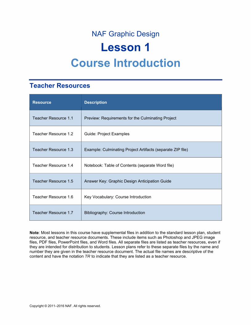
Teacher Resources Teacher Resource 1.1, Preview: Requirements for the Culminating Project
Teacher Resource 1.2, Guide: Project Examples
Teacher Resource 1.3, Example: Culminating Project Artifacts (separate ZIP file)
Teacher Resource 1.4, Notebook: Table of Contents (separate Word file)
Teacher Resource 1.5, Answer Key: Graphic Design Anticipation Guide
Teacher Resource 1.6, Key Vocabulary: Course Introduction
Teacher Resource 1.7, Bibliography: Course Introduction
Student Resources Student Resource 1.1, Anticipation Guide: Graphic Design
Student Resource 1.2, Taxonomy: Graphic Design Terms
Equipment and Supplies One notebook per student for taking notes and holding assignments and handouts (options
include three-ring binder, spiral-bound notebook, computer-based folder)
Portfolios of culminating projects from previous years
Blackboard, whiteboard, or flip chart
Chart paper
Lesson Steps
Step Min. Activity
CLASS PERIOD 1
1 40 Presentation: Example of the Graphic Design Culminating Project
This activity introduces students to the Graphic Design course by giving them a chance to explore a sample of the culminating project they will be creating during the course. It also focuses on the following college and career skill:
NAF Graphic Design Lesson 1 Course Introduction
Copyright © 2011–2016 NAF. All rights reserved. - 4 -
Step Min. Activity
Developing awareness of one’s own abilities and performance
Start the class by giving the students some overall background on the culminating project. Explain that the students will work in groups, and each group will be assigned a client. Groups will begin the project by examining their client’s core values, philosophy, principles, and target market. Then they will define an identity design that reflects who the client is. The identity design includes a logo that tells the client’s story, as well as color palettes, typeface choices, and an image style. After completing these foundational steps, students will create a portfolio of materials for their client, including business cards, letterhead, and at least one other type of printed collateral that adheres to the client’s identity design. See Teacher Resource 1.2, Guide: Project Examples, for more information on the project and the specific examples the students will view.
Explain to students that they will present their portfolio to their client, and also present it to an invited audience at a student portfolio review held at the end of the course.
Divide the class into groups and distribute Teacher Resource 1.3, Example: Culminating Project Artifacts (separate ZIP file). You can either print the materials for students to look at or ask students to open the file and look at the materials on their computer.
Ask the students to go through the items once to get an overall sense of the project materials. Then write the following question on the board:
What do you think you need to know about graphic design, and what skills would you need to have, in order to complete a project like this?
Ask students to write down their answers to this question as they review the examples again. Ask volunteers to share what they wrote and then list their ideas on the board. Another option is to make two lists: one for kinds of knowledge and one for skills needed. Work with the class to whittle down the list(s) to the 10 or so most important skills and/or areas of knowledge that the students believe would be needed for this course. Have them explain their reasons for including each skill or knowledge area.
Write the 10 or so items on chart paper and post the chart on the class wall. Return to this list during the course to give students an opportunity to evaluate their initial expectations. You can also have the class check off skills and areas of knowledge as they encounter them throughout the course.
Ask students to share any final observations about the examples they just viewed. Here are some possible questions you might ask:
Does the work fit your idea of what a graphic design professional would do? If so, how?
What strengths and knowledge do you have that would help in work like this?
What challenges would you have to overcome to do work like this?
In the last unit of this course, you will focus more closely on the skills and areas of knowledge that are important for graphic design professionals.
2 10 Anticipation Guide: Graphic Design
In this activity, students build on prior knowledge as they begin to engage with some of the topics covered in this course.
Have students read the directions for Student Resource 1.1, Anticipation Guide:
NAF Graphic Design Lesson 1 Course Introduction
Copyright © 2011–2016 NAF. All rights reserved. - 5 -
Step Min. Activity
Graphic Design. Answer their questions about the directions. Explain that it is not important to figure out what an expert would think is the “right” answer, but rather to share what they think. Model what you mean by doing the first statement aloud with students.
Next, have students complete the first two sections—“My guess” and “My reason”—for each statement of the resource. At the end of class, collect this resource and let students know you’ll be reviewing it together in the next class period. Note: If there isn’t enough class time to complete these, you may have students do so for homework. Just be clear that students should not use any reference materials to find the “right” answers for these statements—it’s really about what each student thinks on his or her own.
Review the students’ responses before the next class period to get a sense of their prior knowledge for this course.
CLASS PERIOD 2
3 15 Review: Graphic Design Anticipation Guide
Students practice sharing their opinions and listening to their classmates’ perspectives as they review the anticipation guide they completed in the previous class period.
Pair students with a neighbor. Return Student Resource 1.1, Anticipation Guide: Graphic Design, to students and tell them to compare their responses and discuss their reasoning. Then, with the whole class, ask a couple of students to share their reasoning for each statement. Note the areas where students are in agreement and disagreement. Use Teacher Resource 1.2, Answer Key: Graphic Design Anticipation Guide, to tell students how most graphic designers would respond to these statements, but point out that some are open to interpretation. Also note that they will be learning a lot more about each of these topics throughout the course. Tell students to write down what they learned during this discussion in the “I learned” section of the resource.
This anticipation guide will be inserted into each student’s course notebook, which students will prepare in the next activity.
4 15 Preparation: Course Notebook
If appropriate for the type of notebook you want your students to keep, prior to class print enough copies of Teacher Resource 1.4, Notebook: Table of Contents (separate Word file), so that all students have a couple of pages to place in the beginning of their notebooks.
To begin this activity, advise students that they will be required to keep a notebook with their work for this course. Make sure students understand that their notebook is a place where they will save important work. Tell students they will need to bring their notebook to every class and will use it to keep many kinds of work in, including:
Notes
Guides and other resources
Sketches and drafts
Reflections
NAF Graphic Design Lesson 1 Course Introduction
Copyright © 2011–2016 NAF. All rights reserved. - 6 -
Step Min. Activity
Project plans
Explain to students how to organize their notebooks in a way that works for your class. Whatever notebook structure you choose, make sure it provides students with the following:
An orderly way of keeping notes, reflections, project work, and so forth for each lesson so that they can reference their work when necessary.
A place to insert pages such as reference sheets, note-taking tools, sketches, and other materials that they complete during each lesson.
A means of setting up a table of contents so that they can find a page when they need it. One option is to give each student a couple of copies of Teacher Resource 1.4, Notebook: Table of Contents (separate Word file), and ask them to insert the pages at the beginning of their notebook.
When students are clear on how to set up their notebook and have created a table of contents, ask them to insert their anticipation guide as the first entry in their notebook. Tell students that they need to keep all of the handouts they receive in this course, and to keep track of them via the table of contents, because they will refer back to many of them and use them for other assignments.
If students have Internet access, an additional place to save personal portfolio components would be with a cloud-based application like Google Drive.
Another important tool that students will keep in their notebooks is a taxonomy. They will complete the taxonomy in the next activity.
5 20 Taxonomy: General Course Terms
As they develop a taxonomy during the first unit of this course, students discover more of what they already know about graphic design and create a place to store new terms. (See The NAF Learning Handbook for more information on this strategy.)
Ask for a show of hands to see which students remember how to create a taxonomy from developing one in a previous academy course. Next, ask for a volunteer to explain how taxonomies work for new students and for students who have forgotten. Supplement the student’s explanation as necessary to make the process of developing a taxonomy clear.
Next, ask students to look at Student Resource 1.2, Taxonomy: Graphic Design Terms.
Direct the class to begin independently by thinking of terms that relate to graphic design. An example is the term typography. Students will write typography next to the letter T. Allow students to work for about five minutes, adding as many terms as they can think of that relate directly to graphic design. They may write more than one term for each letter; however, they should not worry about finding a term for every letter.
Next organize students in pairs. Ask them to collaborate by sharing terms in order to build their taxonomies. For example, if one student has written typography and the other has not, the second student would add typography to his or her taxonomy.
After five minutes, ask students to leave their taxonomies on their desks and walk around the room to view each other’s taxonomies. Ask students to collect terms from their peers to bring back to their own taxonomies.
NAF Graphic Design Lesson 1 Course Introduction
Copyright © 2011–2016 NAF. All rights reserved. - 7 -
Step Min. Activity
Give students a couple of minutes to add the terms they collected to their taxonomies, and then complete the activity with a short discussion. Call on as many pairs as time allows, asking them to share some of the terms that were easy to come up with and some of the terms from peers that were new to them.
Tell students to insert the taxonomy into their notebook after the anticipation guide, and to follow any instructions you provided for numbering pages and adding entries to the table of contents. Inform them that from now on, they will be in charge of remembering to add resources to their notebook and to keep the table of contents up to date.
This taxonomy can be used as time allows and as appropriate until the end of Unit 1. Have students continue to add relevant vocabulary terms they encounter. This taxonomy should become a solid list of basic terminology that will serve as a resource for future assignments. Adding to the taxonomy will not be explicitly suggested in the lesson plans, so please incorporate this activity at your discretion.
Extensions
Enrichment Have students interview a former NAF Graphic Design student who is now in college. Provide them with names and contact information for these former students. Tell students to ask the former student questions about what he or she is learning, how being part of a NAF academy has helped, and what skills he or she thinks current students should focus on this year in graphic design. Instruct students to write up a summary of the interview and share it with their classmates.
Technology Integration Set up your class to reduce paper and encourage student collaboration by using online tools for document sharing and classroom management. Students can access resources and upload their work to a web-based service, making it easier for you to track their progress.
Share and collaborate on documents and presentations using Google Docs or Google Slides.
Track assignments, share resources, and interact with students about their work using an online management learning service like Collaborize Classroom (www.collaborizeclassroom.com).
Take classroom discussions online, connect with other teachers, and keep students on top of their assignments with a tool like eChalk (www.echalk.com) or Edmodo (www.edmodo.com).
Upload, collect, and manage student resources, including photo and video, with services like Haiku Learning (www.haikulearning.com) and LiveBinders (www.livebinders.com).
Many of these tools are cross-platform, so students can stay connected using any type of device (desktop, laptop, tablet, or smartphone). While most paperless solutions are free, some require a small paid subscription. Check with your school or district for low-cost educator price plans.
Copyright © 2011–2016 NAF. All rights reserved.
NAF Graphic Design
Lesson 1 Course Introduction
Teacher Resources
Resource Description
Teacher Resource 1.1 Preview: Requirements for the Culminating Project
Teacher Resource 1.2 Guide: Project Examples
Teacher Resource 1.3 Example: Culminating Project Artifacts (separate ZIP file)
Teacher Resource 1.4 Notebook: Table of Contents (separate Word file)
Teacher Resource 1.5 Answer Key: Graphic Design Anticipation Guide
Teacher Resource 1.6 Key Vocabulary: Course Introduction
Teacher Resource 1.7 Bibliography: Course Introduction
Note: Most lessons in this course have supplemental files in addition to the standard lesson plan, student resource, and teacher resource documents. These include items such as Photoshop and JPEG image files, PDF files, PowerPoint files, and Word files. All separate files are listed as teacher resources, even if they are intended for distribution to students. Lesson plans refer to these separate files by the name and number they are given in the teacher resource document. The actual file names are descriptive of the content and have the notation TR to indicate that they are listed as a teacher resource.
NAF Graphic Design Lesson 1 Course Introduction
Copyright © 2011–2016 NAF. All rights reserved.
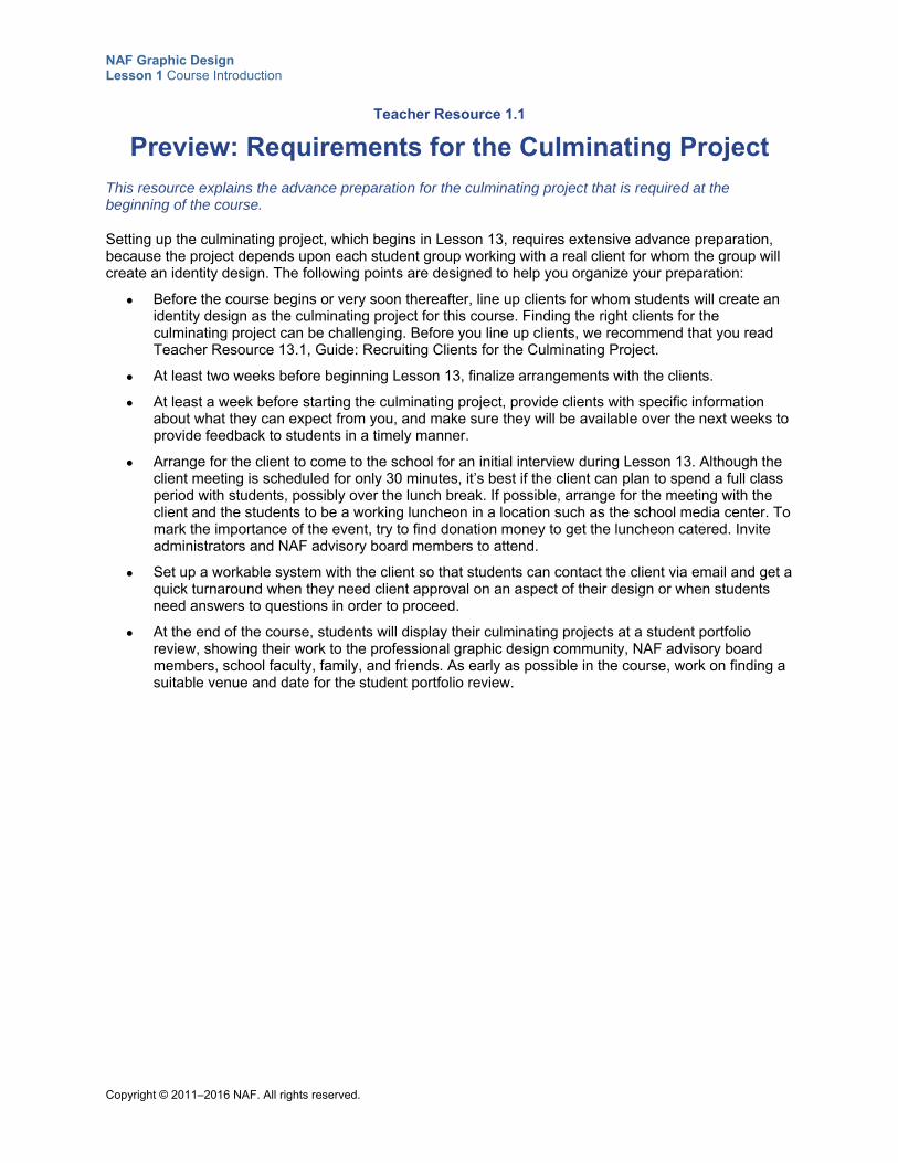
Teacher Resource 1.1
Preview: Requirements for the Culminating Project
This resource explains the advance preparation for the culminating project that is required at the beginning of the course.
Setting up the culminating project, which begins in Lesson 13, requires extensive advance preparation, because the project depends upon each student group working with a real client for whom the group will create an identity design. The following points are designed to help you organize your preparation:
Before the course begins or very soon thereafter, line up clients for whom students will create an identity design as the culminating project for this course. Finding the right clients for the culminating project can be challenging. Before you line up clients, we recommend that you read Teacher Resource 13.1, Guide: Recruiting Clients for the Culminating Project.
At least two weeks before beginning Lesson 13, finalize arrangements with the clients.
At least a week before starting the culminating project, provide clients with specific information about what they can expect from you, and make sure they will be available over the next weeks to provide feedback to students in a timely manner.
Arrange for the client to come to the school for an initial interview during Lesson 13. Although the client meeting is scheduled for only 30 minutes, it’s best if the client can plan to spend a full class period with students, possibly over the lunch break. If possible, arrange for the meeting with the client and the students to be a working luncheon in a location such as the school media center. To mark the importance of the event, try to find donation money to get the luncheon catered. Invite administrators and NAF advisory board members to attend.
Set up a workable system with the client so that students can contact the client via email and get a quick turnaround when they need client approval on an aspect of their design or when students need answers to questions in order to proceed.
At the end of the course, students will display their culminating projects at a student portfolio review, showing their work to the professional graphic design community, NAF advisory board members, school faculty, family, and friends. As early as possible in the course, work on finding a suitable venue and date for the student portfolio review.
NAF Graphic Design Lesson 1 Course Introduction
Copyright © 2011–2016 NAF. All rights reserved.
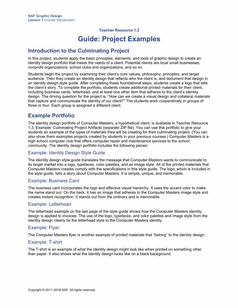
Teacher Resource 1.2
Guide: Project Examples
Introduction to the Culminating Project In this project, students apply the basic principles, elements, and tools of graphic design to create an identity design portfolio that meets the needs of a client. Potential clients are local small businesses, nonprofit organizations, school clubs and organizations, and so on.
Students begin the project by examining their client’s core values, philosophy, principles, and target audience. Then they create an identity design that reflects who the client is, and document that design in an identity design style guide. After completing these foundational steps, students create a logo that tells the client’s story. To complete the portfolio, students create additional printed materials for their client, including business cards, letterhead, and at least one other item that adheres to the client’s identity design. The driving question for the project is, “How can we create a visual design and collateral materials that capture and communicate the identity of our client?” The students work cooperatively in groups of three or four. Each group is assigned a different client.
Example Portfolio The identity design portfolio of Computer Masters, a hypothetical client, is available in Teacher Resource 1.3, Example: Culminating Project Artifacts (separate ZIP file). You can use this portfolio to give your students an example of the types of materials they will be creating for their culminating project. (You can also show them examples projects created by students in your previous courses.) Computer Masters is a high school computer club that offers computer repair and maintenance services to the school community. The identity design portfolio includes the following pieces:
Example: Identity Design Style Guide
The identity design style guide translates the message that Computer Masters wants to communicate to its target market into a logo, typefaces, color palettes, and an image style. All of the printed materials that Computer Masters creates comply with the specifications in this style guide. The logo, which is included in the style guide, tells a story about Computer Masters. It is simple, unique, and memorable.
Example: Business Card
The business card incorporates the logo and effective visual hierarchy. It uses the accent color to make the name stand out. On the back, it has an image that adheres to the Computer Masters image style and creates instant recognition. It stands out from the ordinary and is memorable.
Example: Letterhead
The letterhead example on the last page of the style guide shows how the Computer Masters identity design is applied to invoices. The use of the logo, typefaces, and color palettes and image style from the identity design clearly tie the letterhead style to the Computer Masters identity.
Example: Flyer
The Computer Masters flyer is another example of printed materials that “belong” to the identity design.
Example: T-shirt
The T-shirt is an example of what the identity design might look like when printed on something other than paper. It also shows what the identity design looks like on a black background.
NAF Graphic Design Lesson 1 Course Introduction
Copyright © 2011–2016 NAF. All rights reserved.
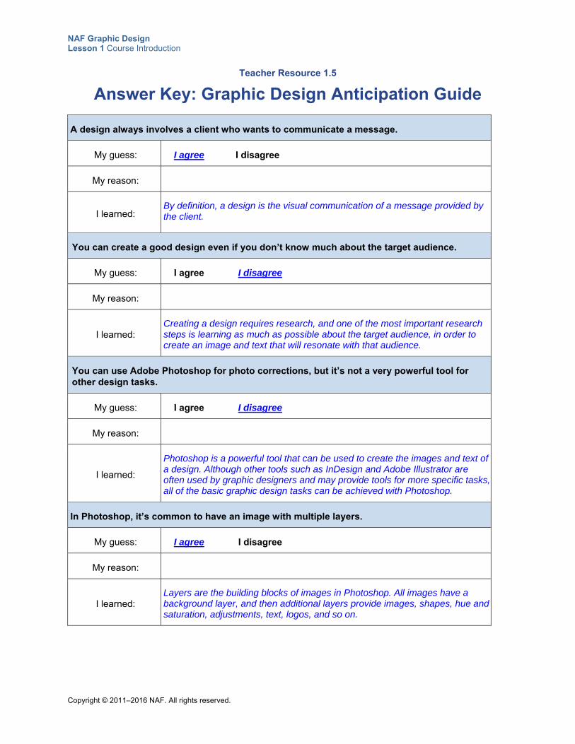
Teacher Resource 1.5
Answer Key: Graphic Design Anticipation Guide
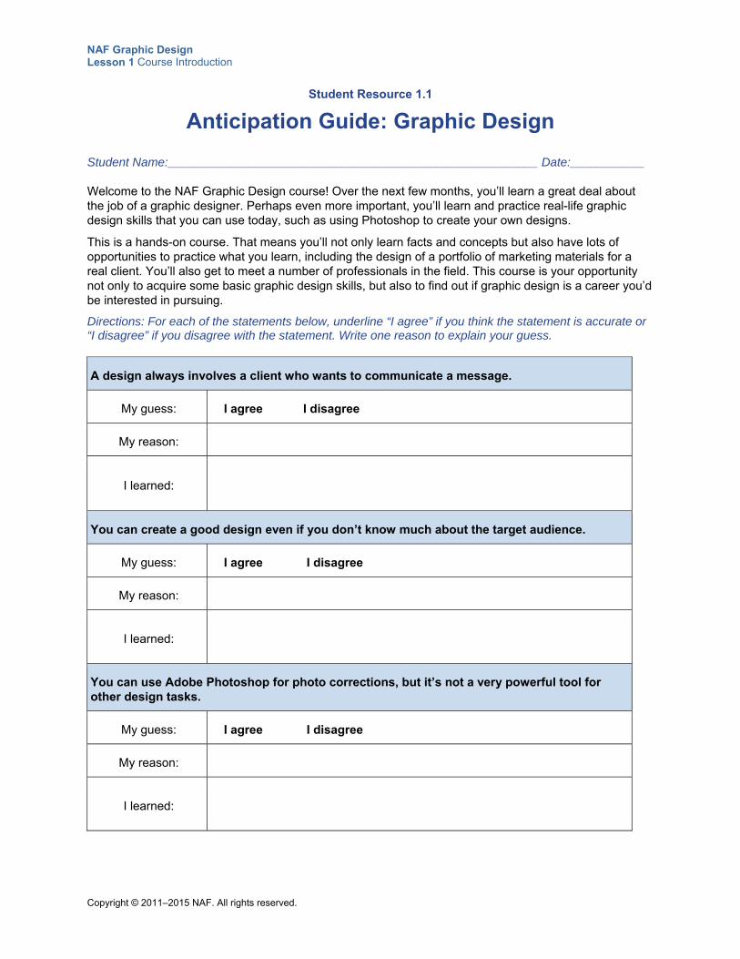
A design always involves a client who wants to communicate a message.
My guess: I agree I disagree
My reason:
I learned: By definition, a design is the visual communication of a message provided by the client.
You can create a good design even if you don’t know much about the target audience.
My guess: I agree I disagree
My reason:
I learned: Creating a design requires research, and one of the most important research steps is learning as much as possible about the target audience, in order to create an image and text that will resonate with that audience.
You can use Adobe Photoshop for photo corrections, but it’s not a very powerful tool for other design tasks.
My guess: I agree I disagree
My reason:
I learned:
Photoshop is a powerful tool that can be used to create the images and text of a design. Although other tools such as InDesign and Adobe Illustrator are often used by graphic designers and may provide tools for more specific tasks, all of the basic graphic design tasks can be achieved with Photoshop.
In Photoshop, it’s common to have an image with multiple layers.
My guess: I agree I disagree
My reason:
I learned: Layers are the building blocks of images in Photoshop. All images have a background layer, and then additional layers provide images, shapes, hue and saturation, adjustments, text, logos, and so on.
NAF Graphic Design Lesson 1 Course Introduction
Copyright © 2011–2016 NAF. All rights reserved.
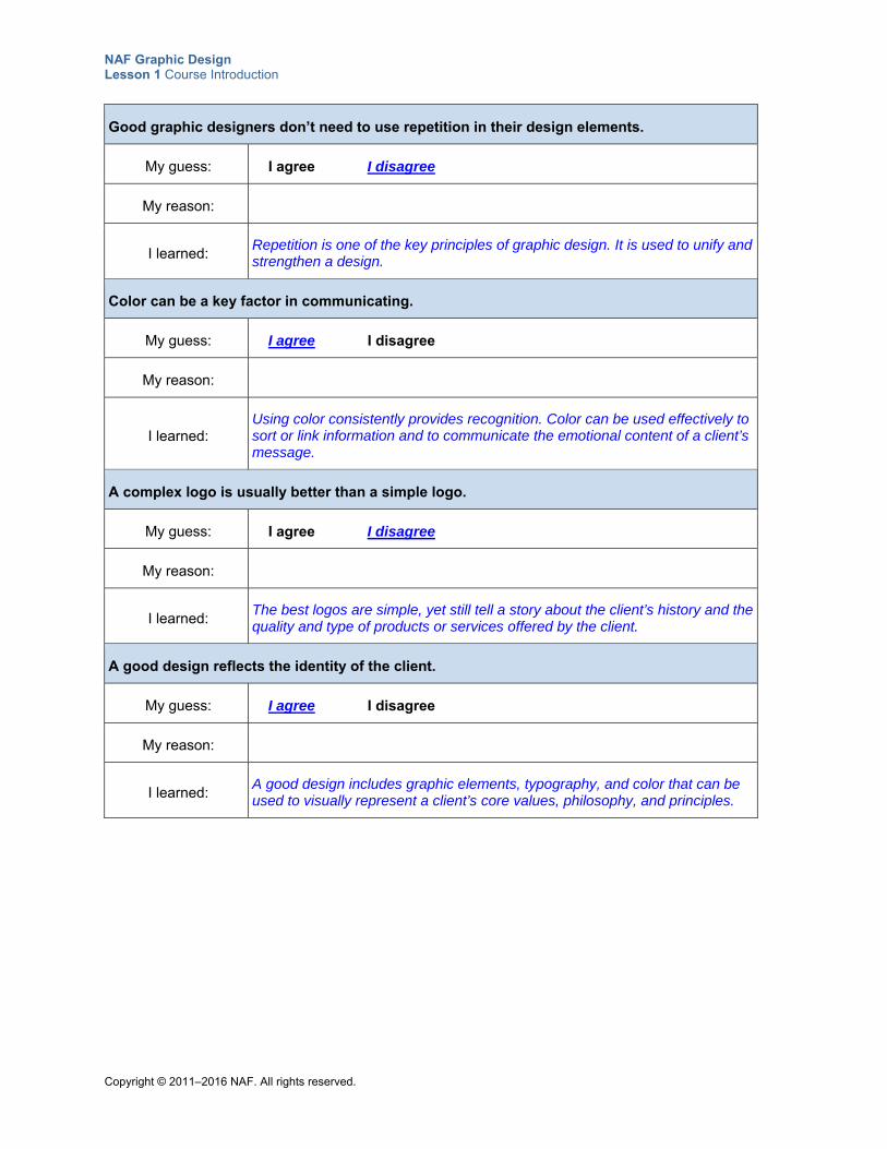
Good graphic designers don’t need to use repetition in their design elements.
My guess: I agree I disagree
My reason:
I learned: Repetition is one of the key principles of graphic design. It is used to unify and strengthen a design.
Color can be a key factor in communicating.
My guess: I agree I disagree
My reason:
I learned: Using color consistently provides recognition. Color can be used effectively to sort or link information and to communicate the emotional content of a client’s message.
A complex logo is usually better than a simple logo.
My guess: I agree I disagree
My reason:
I learned: The best logos are simple, yet still tell a story about the client’s history and the quality and type of products or services offered by the client.
A good design reflects the identity of the client.
My guess: I agree I disagree
My reason:
I learned: A good design includes graphic elements, typography, and color that can be used to visually represent a client’s core values, philosophy, and principles.
NAF Graphic Design Lesson 1 Course Introduction
Copyright © 2011–2016 NAF. All rights reserved.
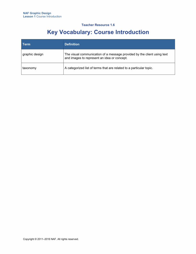
Teacher Resource 1.6
Key Vocabulary: Course Introduction
Term Definition
graphic design The visual communication of a message provided by the client using text and images to represent an idea or concept.
taxonomy A categorized list of terms that are related to a particular topic.
NAF Graphic Design Lesson 1 Course Introduction
Copyright © 2011–2016 NAF. All rights reserved.
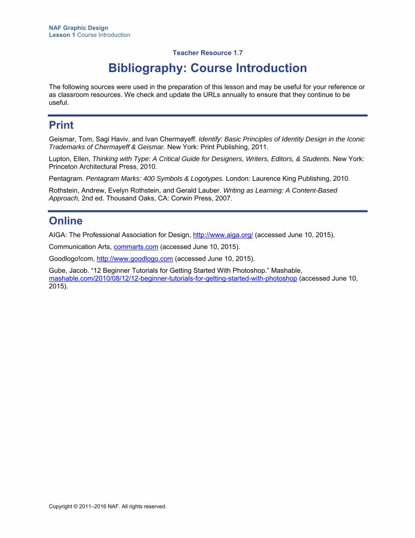
Teacher Resource 1.7
Bibliography: Course Introduction
The following sources were used in the preparation of this lesson and may be useful for your reference or as classroom resources. We check and update the URLs annually to ensure that they continue to be useful.
Print Geismar, Tom, Sagi Haviv, and Ivan Chermayeff. Identify: Basic Principles of Identity Design in the Iconic Trademarks of Chermayeff & Geismar. New York: Print Publishing, 2011.
Lupton, Ellen, Thinking with Type: A Critical Guide for Designers, Writers, Editors, & Students. New York: Princeton Architectural Press, 2010.
Pentagram. Pentagram Marks: 400 Symbols & Logotypes. London: Laurence King Publishing, 2010.
Rothstein, Andrew, Evelyn Rothstein, and Gerald Lauber. Writing as Learning: A Content-Based Approach, 2nd ed. Thousand Oaks, CA: Corwin Press, 2007.
Online AIGA: The Professional Association for Design, http://www.aiga.org/ (accessed June 10, 2015).
Communication Arts, commarts.com (accessed June 10, 2015).
Goodlogo!com, http://www.goodlogo.com (accessed June 10, 2015).
Gube, Jacob. “12 Beginner Tutorials for Getting Started With Photoshop.” Mashable, mashable.com/2010/08/12/12-beginner-tutorials-for-getting-started-with-photoshop (accessed June 10, 2015).
Copyright © 2011–2015 NAF. All rights reserved.
NAF Graphic Design
Lesson 1 Course Introduction
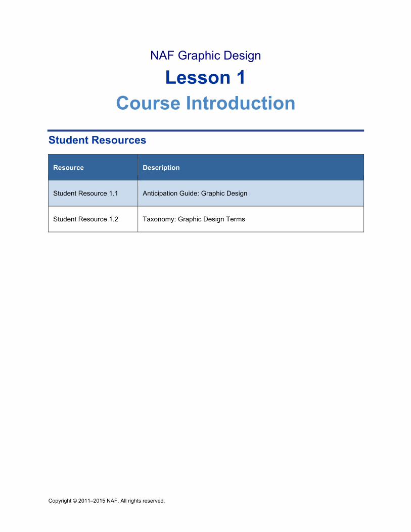
Student Resources
Resource Description
Student Resource 1.1 Anticipation Guide: Graphic Design
Student Resource 1.2 Taxonomy: Graphic Design Terms
NAF Graphic Design Lesson 1 Course Introduction
Copyright © 2011–2015 NAF. All rights reserved.
Student Resource 1.1
Anticipation Guide: Graphic Design
Student Name:_______________________________________________________ Date:___________
Welcome to the NAF Graphic Design course! Over the next few months, you’ll learn a great deal about the job of a graphic designer. Perhaps even more important, you’ll learn and practice real-life graphic design skills that you can use today, such as using Photoshop to create your own designs.
This is a hands-on course. That means you’ll not only learn facts and concepts but also have lots of opportunities to practice what you learn, including the design of a portfolio of marketing materials for a real client. You’ll also get to meet a number of professionals in the field. This course is your opportunity not only to acquire some basic graphic design skills, but also to find out if graphic design is a career you’d be interested in pursuing.
Directions: For each of the statements below, underline “I agree” if you think the statement is accurate or “I disagree” if you disagree with the statement. Write one reason to explain your guess.
A design always involves a client who wants to communicate a message.
My guess: I agree I disagree
My reason:
I learned:
You can create a good design even if you don’t know much about the target audience.
My guess: I agree I disagree
My reason:
I learned:
You can use Adobe Photoshop for photo corrections, but it’s not a very powerful tool for other design tasks.
My guess: I agree I disagree
My reason:
I learned:
NAF Graphic Design Lesson 1 Course Introduction
Copyright © 2011–2015 NAF. All rights reserved.
In Photoshop, it’s common to have an image with multiple layers.
My guess: I agree I disagree
My reason:
I learned:
Good graphic designers don’t need to use repetition in their design elements.
My guess: I agree I disagree
My reason:
I learned:
Color can be a key factor in communicating.
My guess: I agree I disagree
My reason:
I learned:
A complex logo is usually better than a simple logo.
My guess: I agree I disagree
My reason:
I learned:
A good design reflects the identity of the client.
My guess: I agree I disagree
My reason:
I learned:
NAF Graphic Design Lesson 1 Course Introduction
Copyright © 2011–2015 NAF. All rights reserved.
Student Resource 1.2
Taxonomy: Graphic Design Terms
Student Name: Date:
Think of terms related to graphic design. Write them on this list in alphabetical order.
A
B
C
D
E
F
G
H
I
J
K
L
M
N
O
P
Q
R
S
T
U
V
W
X
Y
Z
Copyright © 2011–2015 NAF. All rights reserved.
NAF Graphic Design
Lesson 2 What Is Graphic Design?
In this lesson, students learn what makes an image a graphic design, and they explore key elements of visual communication. They work with concepts such as target audience, levels of meaning, and what makes a design memorable. Students also look at the skills that graphic designers need to develop, and begin to assess the work they need to do to acquire these skills.
This lesson is expected to take 4 class periods.
Lesson Framework
Learning Objectives Each student will:
Describe the components used in visual communication*
Explain how signs and symbols communicate meaning
Compare and contrast different levels of visual perception
List the skill set used by professional graphic designers
*This is one of the 16 key learning objectives assessed by the NAFTrack Certification end-of-course exam for this course.
Academic Standards The relevant Common Core State Standards are too extensive to list here but are an important basis for this lesson. For details, please refer to the separate document “Correlations to the Common Core Standards” (available in the Course Planning Tools section of the course materials).
Analyze how the application of visual arts elements and principles of design communicate and express ideas (Common Career Technical Core 2012, AR-VIS 2)
Analyze the interdependence of the technical and artistic elements of various careers within the Arts, A/V Technology & Communications Career Cluster™ (Common Career Technical Core 2012, AR 1)
NAF Graphic Design Lesson 2 What Is Graphic Design?
Copyright © 2011–2015 NAF. All rights reserved. - 2 -
Identify the purpose, audience, and audience needs for preparing an image (Adobe Certified Associate, Objectives for Visual Communication using Photoshop CS6, Setting Project Requirements 1.1)
Assessment
Assessment Product Means of Assessment
A written explanation of how a design communicates meaning (Student Resource 2.5)
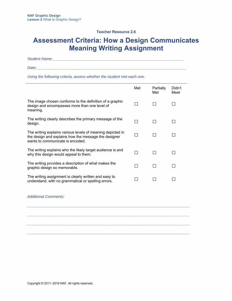
Assessment Criteria: How a Design Communicates Meaning Writing Assignment (Teacher Resource 2.6)
Prerequisites None
Instructional Materials
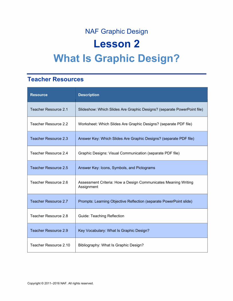
Teacher Resources Teacher Resource 2.1, Slideshow: Which Slides Are Graphic Designs? (separate PowerPoint file)
Teacher Resource 2.2, Worksheet: Which Slides Are Graphic Designs? (separate PDF file)
Teacher Resource 2.3, Answer Key: Which Slides Are Graphic Designs? (separate PDF file)
Teacher Resource 2.4, Graphic Designs: Visual Communication (separate PDF file)
Teacher Resource 2.5, Answer Key: Icons, Symbols, and Pictograms
Teacher Resource 2.6, Assessment Criteria: How a Design Communicates Meaning Writing Assignment
Teacher Resource 2.7, Prompts: Learning Objective Reflection (separate PowerPoint slide)
Teacher Resource 2.8, Guide: Teaching Reflection
Teacher Resource 2.9, Key Vocabulary: What Is Graphic Design?
Teacher Resource 2.10, Bibliography: What Is Graphic Design?
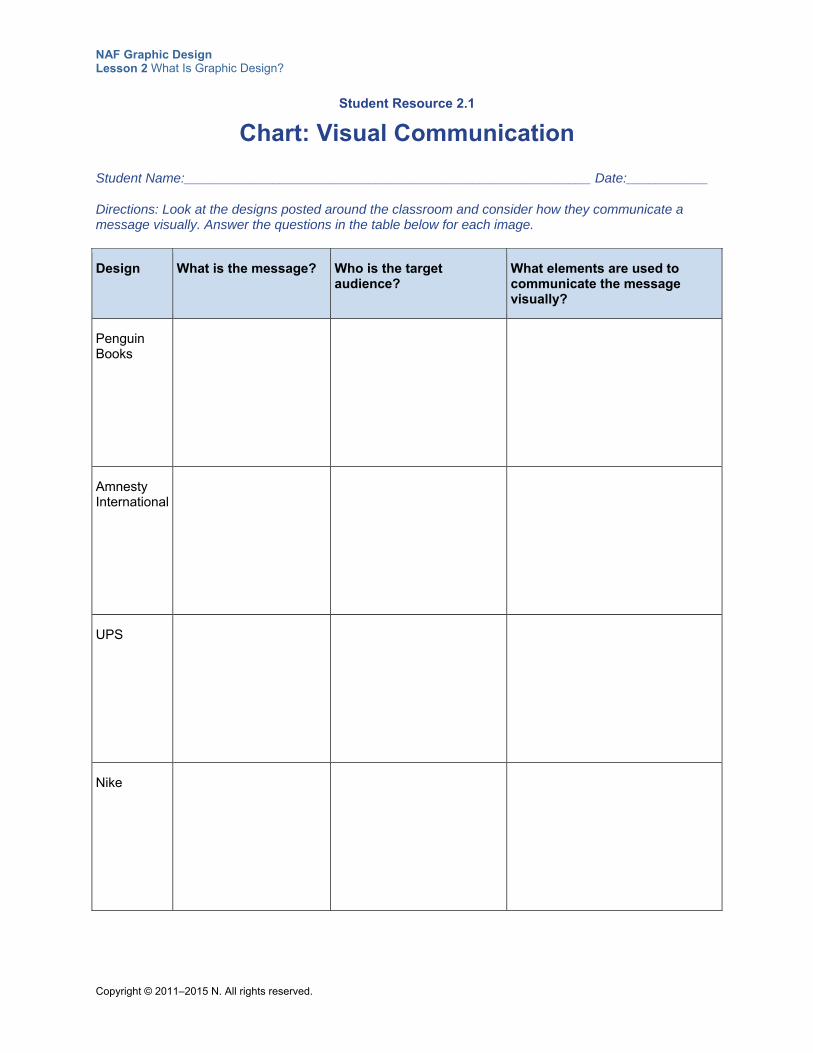
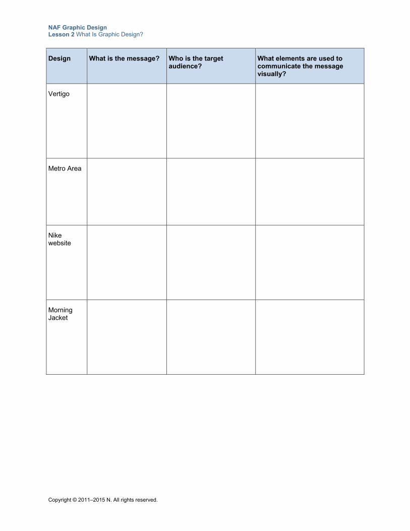
Student Resources Student Resource 2.1, Chart: Visual Communication
Student Resource 2.2, Group, Label: Icons, Symbols, and Pictograms
Student Resource 2.3, Reading: Levels of Meaning in Graphic Design
Student Resource 2.4, Analysis: Levels of Meaning in Graphic Design
Student Resource 2.5, Writing Assignment: How a Design Communicates Meaning
Student Resource 2.6, Skills Analysis: Skills of Graphic Designers
Equipment and Supplies LCD projector and computer for PowerPoint slideshow
NAF Graphic Design Lesson 2 What Is Graphic Design?
Copyright © 2011–2015 NAF. All rights reserved. - 3 -
Blackboard, whiteboard, or flip chart
Magazines and other materials students can use to cut out graphic designs (or ask students to find designs to print off the web)
Plain paper, colored pencils, markers, and so on, for freehand design
Lesson Steps
Step Min. Activity
CLASS PERIOD 1
1
25 Slideshow: What Makes a Graphic Design?
In this activity, students develop an initial idea of what makes an effective design.
Before class begins, write the following definition of graphic design on the board:
A graphic design is a visual communication of a client’s message, using text and images to represent a product, an idea, or a concept.
Read the definition as a class, and then break the definition down into the “key clues” for identifying a graphic design, and write these on the board:
Visually communicates a message
Involves a client who wants to communicate a message
Combines text and images to convey an idea or a concept
Next, give each student a copy of Teacher Resource 2.2, Worksheet: Which Slides Are Graphic Designs? (separate PDF file), and explain that they will be viewing a set of slides. (The first column of the worksheet has thumbnails of the slides they will view.)
Using a computer and an LCD projector, present the slideshow in Teacher Resource 2.1, Slideshow: Which Slides Are Graphic Designs? (separate PowerPoint file). As students view the slides, instruct them to underline Yes on their worksheet if the slide shows a graphic design and No if it does not. Ask them to write the relevant clues in the “Key Clues” column. As an example, go over the first two slides, which are completed on the worksheet. Give students time to write their answers before going on to the next slide.
After the slideshow is over, ask students to share their answers with a partner and make any corrections they want to based on input from their partner. Then view the set of slides again as a class, and ask students to give a thumbs up for slides that they think are graphic designs. Discuss why each slide is or is not a graphic design, and answer any questions. For guidance on some of the more ambiguous images and for additional information about the images, use Teacher Resource 2.3, Answer Key:
NAF Graphic Design Lesson 2 What Is Graphic Design?
Copyright © 2011–2015 NAF. All rights reserved. - 4 -
Step Min. Activity
Which Slides Are Graphic Designs? (separate PDF file).
To conclude this activity, ask students to add any new information they have learned to the list of key clues on the board. Make sure the final list includes the following elements:
Identifies, informs, instructs, interprets, or persuades
Responds to the needs of a client
Is geared for a target audience
Combines written language and imagery into messages
Tell students to place this worksheet in their notebook and make an entry in the table of contents. They will need to refer to this definition of graphic design throughout the course. Explain that in the next activity, they will have a chance to see if they can use this definition to distinguish graphic designs from other types of art and design.
2 25 Analysis: Solving a Visual Problem
This activity introduces students to the basics of visual communication. It focuses on the following college and career skill:
Thinking critically and systemically to solve difficult problems
Print out the graphic designs in Teacher Resource 2.4, Graphic Designs: Visual Communication (separate PDF file), one per page. Post them at eight stations around the room.
Place students in groups of three and refer them to Student Resource 2.1, Chart: Visual Communication. Instruct students to visit each station with their group and answer the questions on their chart as to how each image communicates visually. After each group completes its analysis, ask the students to compare their answers with another group.
Finally, have students share as a class to check accuracy and completeness, and add any new items to the previous activity’s list of key visual communication elements.
CLASS PERIOD 2
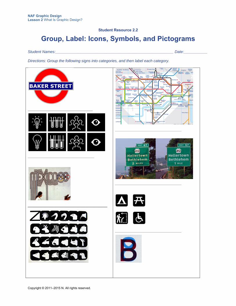
3 10 Group, Label: Icons, Symbols, Pictograms
In this activity, students explore how different types of signs (including icons, symbols, and pictograms) communicate meaning, and they learn to differentiate between the different types of signs.
To begin, place students in groups of three or four and ask them to study the images on Student Resource 2.2, Group, Label: Icons, Symbols, and Pictograms. Ask them to group the like items together into whatever categories they can think of. To help students, write the following questions on the board:
Is the image a realistic representation of the object or thing it represents?
Is the use of a common shared language required to decipher the image?
Is a common cultural experience required to decipher the image?
NAF Graphic Design Lesson 2 What Is Graphic Design?
Copyright © 2011–2015 NAF. All rights reserved. - 5 -
Step Min. Activity
Next, ask students to share the categories they used, and discuss what makes the items different.
Finally, introduce the following terms and help students match up their categories with these standard categories for signs that communicate meaning:
Icon
Symbol
Pictogram
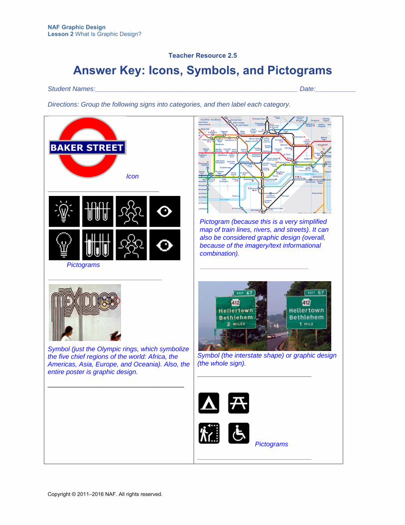
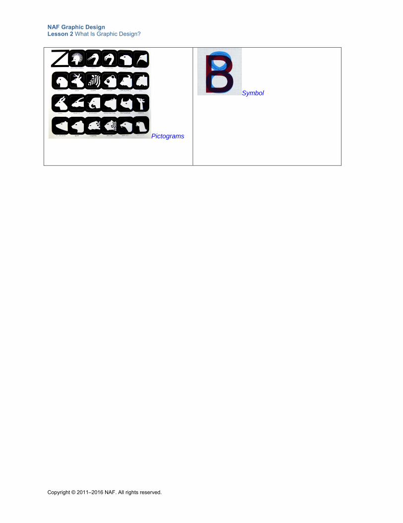
Use Teacher Resource 2.5, Answer Key: Icons, Symbols, and Pictograms, to go over which image on Student Resource 2.2 goes in which of these categories. Answer any questions, and explain that in the next activity, they will have a chance to create their own signs.
4 30 Freehand Design: Creating Signs That Communicate Meaning
In this activity, students put into practice what they have learned about communicating meaning using signs.
Explain to students that the school administration has requested a set of 10 signs to communicate information to students, teachers, and visitors. Write the following list on the board or choose other items that are appropriate for your school. (You may want to create posters or flyers that can actually be used by your school.)
No skateboarding on the steps
No littering
This way to the cafeteria
Teachers only allowed in here
Emergency vehicles only
Visitor parking
Quiet zone
No hats in class
Caution: speed bumps
Professional dress day tomorrow
Ask each student to choose any one of these items and create a sign that communicates it. It’s best to distribute the designs so that each item has one or two students drawing it. Take a minute to discuss the target audience and cultural context if they are making these signs for their school. Clarify that students need to find a new way to communicate an old idea if they choose an item that is commonly found on signs. Have students draw by hand on a sheet of paper that they can post on the wall.
If students have Internet access, consider asking them to make their signs using an online graphic design tool like Canva (www.canva.com).
When students have completed their drawings, ask them to share their sign with a partner to make sure the partner can understand what it is communicating, and to make modifications or redraw it as necessary. Have students hang their completed signs in the front of the classroom.
NAF Graphic Design Lesson 2 What Is Graphic Design?
Copyright © 2011–2015 NAF. All rights reserved. - 6 -
Step Min. Activity
Finally, have students work together to identify what each sign is communicating and to label the sign as an icon, a symbol, or a pictogram. Answer any questions students have and congratulate them on creating their first designs in this class.
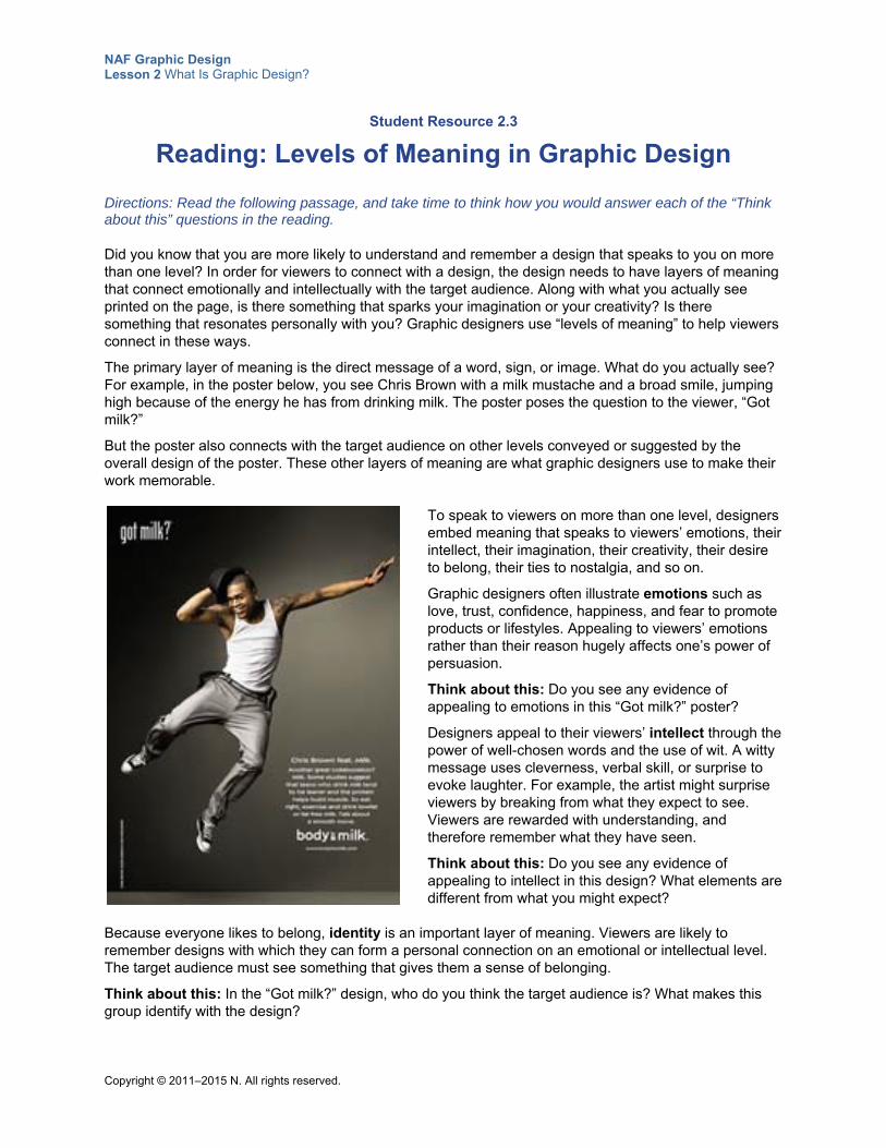
5 10 Homework: Reading on Levels of Meaning in Graphic Design
In this reading, students learn about the levels of meaning communicated in a design. This activity focuses on the following college and career skill:
Working effectively with a diversity of individuals and perspectives
To introduce this homework reading, refer students to Student Resource 2.3, Reading: Levels of Meaning in Graphic Design. Ask students to look at the “Got milk?” graphic design in the reading and answer the following question:
How do you think readers respond to this image? Emotionally, intellectually, spiritually?
After several students answer, explain that they are addressing the topic of levels of meaning, which they will explore in the homework reading. Instruct students to read the passage for homework and to answer the questions in the reading as they read. Also refer students to Student Resource 2.4, Analysis: Levels of Meaning in Graphic Design, and instruct them to complete this resource as part of their homework, using the information they learn in the reading to form their answers.
Point out to students that understanding levels of meaning is an important first step to succeeding at graphic design.
CLASS PERIOD 3
6 10 Homework Review: Reading on Levels of Meaning in Graphic Design
This activity is an opportunity to check student learning about the levels of meaning communicated in a graphic design.
To begin, review the questions in the reading about the “Got milk?” design as a class, to make sure students understand the concept of levels of meaning:
What levels of meaning did you find in this poster?
What is there about the poster that makes you remember it?
What in the design appeals to emotions?
What in the design appeals to the intellect?
What in the design appeals to imagination or creativity?
Who is the target audience that would identify with this design?
Next, ask students to share their answers to Student Resource 2.4, Analysis: Levels of Meaning in Graphic Design, with a partner to check for accuracy and completeness. Remind them that they might not totally agree on the answers, but they should be able to defend their reasoning for answering as they did.
Next, have pairs share their answers with the class, and point out any additional
NAF Graphic Design Lesson 2 What Is Graphic Design?
Copyright © 2011–2015 NAF. All rights reserved. - 7 -
Step Min. Activity
aspects of levels of meaning in the designs that students might have missed. Answer any questions, and instruct students to put this worksheet in their notebook for future reference on levels of meaning.
Remind students to practice discerning the levels of meaning in the graphic designs that they encounter every day.
7 40 Written Analysis: Visual Communication through Graphic Design
In this activity, students bring together all they have learned about graphic design and use this information to analyze a design of their choosing.
Explain to students that in this activity, they will be choosing a design that they like and writing an analysis of how the design visually communicates meaning.
Refer students to Student Resource 2.5, Writing Assignment: How a Design Communicates Meaning. Begin by looking at the example at the end of the resource. Ask students to read through the example piece with a partner and underline the following:
What the author says about the primary level of meaning
What the author says about other levels of meaning embedded in the design
What the author says about the target audience
What the author says that makes the message memorable
The conclusion
Ask pairs to share their responses with the class, and answer any questions students have about how to describe a design in this way. You may want to note that this image reflects the time and cultural context of its creation (the clothing and computer equipment look out-of-date), and ask students how they think this might impact the effectiveness of the ad.
Next, review the assessment criteria with students, and answer any questions students have about how their work will be assessed.
Finally, have students find a design they would like to write about. Either instruct students to look on the web for a design they can print out, or provide students with magazines or other image sources from which they can cut out a design and paste it into their assignment. Remind students to choose a design that is appropriate for schoolwork. You may want to point them to Wikimedia or another site that your school uses to find royalty-free images.
If students have not completed their piece by the end of the class period, instruct them to finish a solid draft for homework. Explain that they will do a peer review of each other’s work in the next class period before submitting the work for assessment.
CLASS PERIOD 4
8 20 Peer Review and Revision: Visual Communication Writing Assignment
In this activity, students review each other’s work and then make corrections based on
NAF Graphic Design Lesson 2 What Is Graphic Design?
Copyright © 2011–2015 NAF. All rights reserved. - 8 -
Step Min. Activity
input from their peers.
To begin this activity, ask students if they had any specific difficulties with their writing assignment and answer any general questions students have. Then ask students to exchange their writing assignment with a partner. Instruct them to check each other’s work for accuracy and completeness and to offer any other suggestions they may have for improvement. Remind students to use the assessment criteria as a means of assessing their partner’s work.
After 5 or 10 minutes, instruct partners to share their suggestions with each other. Students should then create a final draft of their writing assignment, incorporating the partner’s suggestions. Circulate as students are working and answer any questions that have not been resolved.
Have students produce a final draft in class (time permitting) or for homework and then submit their writing assignment for assessment. Assess student work using Teacher Resource 2.6, Assessment Criteria: How a Design Communicates Meaning Writing Assignment.
9 15 Group Analysis: Skills of Graphic Designers
In this activity, students look at the variety of skills required by graphic designers and think about their own skills and what they need to learn.
Introduce this activity by explaining that being a professional graphic designer requires many more skills than just knowing how to draw. Explain to students that in this course, they will learn the basic principles and elements of graphic design, but they will also explore the wide variety of skills that graphic designers need in order to succeed. Refer students to Student Resource 2.6, Skills Analysis: Skills of Graphic Designers. Ask students to work in groups of three or four to fill in the second column of the worksheet and to come up with the best explanation for why each skill is important, drawing on what they have learned in this lesson or on what they already know. Then ask students to respond to the two prompts at the bottom of the worksheet individually:
My strongest skill:
The skills I will most need to work on:
After groups have a chance to work through the table, ask groups to share their answers, and point out any aspects they didn’t address. Finally, ask students to share what they think their strongest skills are and which skills they need to work on. Encourage students to take advantage of every opportunity to develop these skills during the course.
10
15 Reflection: Key Learning Objective
Students reflect on whether they met a specific learning objective for this lesson.
Prior to class, prepare to project Teacher Resource 2.7, Prompts: Learning Objective Reflection (separate PowerPoint slide), during this activity.
Note: If your students lack experience with reflecting on their learning or reflecting on whether they met a learning objective for a lesson, refer to Teacher Resource 2.8, Guide: Teaching Reflection. Allocate more time for this reflection activity in order to
NAF Graphic Design Lesson 2 What Is Graphic Design?
Copyright © 2011–2015 NAF. All rights reserved. - 9 -
Step Min. Activity
integrate more direct instruction and practice.
Write the following learning objective on the board:
Describe the components used in visual communication
Project Teacher Resource 2.7, Prompts: Learning Objective Reflection. Tell students to choose one of the prompts and think about it in connection with the learning objective on the board. They should then write their reflection in their notebook.
Give students a few minutes to write down their thoughts. Ask for a show of hands to see who chose the first prompt. Place these students in pairs or triads to compare their reflections. Do the same for each of the other prompts. Their task is to choose the reflection that is most complete, on topic, and thoughtful.
Ask a member of each group to share the reflection that the group feels best fits these criteria. Generate a brief class discussion to help students develop their metacognitive skills. Complete this activity by reminding students that this type of practice will help them when they have to complete professional self-evaluations in their internships or jobs. If your students are participating in NAFTrack Certification, it also prepares them for the reflection component of the culminating project.
Extensions
Enrichment Instruct students to find library or Internet resources about Charles Sanders Peirce, who
developed the field of semiotics (the study of signs and symbols), and to write a report detailing Peirce’s pioneering work on how signs and symbols influence language and communication.
Technology Integration Consider showing and discussing the following video during the lesson:
“Olympic Pictograms Through the Ages.” New York Times video, 4:02. February 4, 2010. http://www.nytimes.com/interactive/2010/02/24/sports/olympics/pictograms-interactive.html?_r=0 (accessed June 17, 2015).
Cross-Curricular Integration English Language Arts: Ask students to compare and contrast the defining elements of visual
communication with those of written communication and verbal communication and create a Venn diagram to show their findings. How are the messages encoded differently? What elements of communication are always the same?
Math: Ask students to compare and contrast the use of signs and symbols in math and in graphic arts. Have them examine the purpose of signs and symbols in each discipline, the variety of signs and symbols used in each, and the precision with which signs and symbols are used. Ask students to write a short report detailing their conclusions.
Copyright © 2011–2016 NAF. All rights reserved.
NAF Graphic Design
Lesson 2 What Is Graphic Design?
Teacher Resources
Resource Description
Teacher Resource 2.1 Slideshow: Which Slides Are Graphic Designs? (separate PowerPoint file)
Teacher Resource 2.2 Worksheet: Which Slides Are Graphic Designs? (separate PDF file)
Teacher Resource 2.3 Answer Key: Which Slides Are Graphic Designs? (separate PDF file)
Teacher Resource 2.4 Graphic Designs: Visual Communication (separate PDF file)
Teacher Resource 2.5 Answer Key: Icons, Symbols, and Pictograms
Teacher Resource 2.6 Assessment Criteria: How a Design Communicates Meaning Writing Assignment
Teacher Resource 2.7 Prompts: Learning Objective Reflection (separate PowerPoint slide)
Teacher Resource 2.8 Guide: Teaching Reflection
Teacher Resource 2.9 Key Vocabulary: What Is Graphic Design?
Teacher Resource 2.10 Bibliography: What Is Graphic Design?
NAF Graphic Design Lesson 2 What Is Graphic Design?
Copyright © 2011–2016 NAF. All rights reserved.
Teacher Resource 2.5
Answer Key: Icons, Symbols, and Pictograms
Student Names:_______________________________________________________ Date:___________
Directions: Group the following signs into categories, and then label each category.
Icon
__________________________________________
Pictograms
___________________________________________
Symbol (just the Olympic rings, which symbolize the five chief regions of the world: Africa, the Americas, Asia, Europe, and Oceania). Also, the entire poster is graphic design.
_____________________________________
Pictogram (because this is a very simplified map of train lines, rivers, and streets). It can also be considered graphic design (overall, because of the imagery/text informational combination).
_________________________________________
Symbol (the interstate shape) or graphic design (the whole sign).
___________________________________________
Pictograms
___________________________________________
NAF Graphic Design Lesson 2 What Is Graphic Design?
Copyright © 2011–2016 NAF. All rights reserved.
Pictograms
Symbol
NAF Graphic Design Lesson 2 What Is Graphic Design?
Copyright © 2011–2016 NAF. All rights reserved.
Teacher Resource 2.6
Assessment Criteria: How a Design Communicates Meaning Writing Assignment
Student Name:______________________________________________________________
Date:_______________________________________________________________________
Using the following criteria, assess whether the student met each one.
Met Partially Met
Didn’t Meet
The image chosen conforms to the definition of a graphic design and encompasses more than one level of meaning.
□ □ □
The writing clearly describes the primary message of the design.
□ □ □
The writing explains various levels of meaning depicted in the design and explains how the message the designer wants to communicate is encoded.
□ □ □
The writing explains who the likely target audience is and why this design would appeal to them.
□ □ □
The writing provides a description of what makes the graphic design so memorable.
□ □ □
The writing assignment is clearly written and easy to understand, with no grammatical or spelling errors.
□ □ □
Additional Comments:
_____________________________________________________________________________
_____________________________________________________________________________
_____________________________________________________________________________
_____________________________________________________________________________
NAF Graphic Design Lesson 2 What Is Graphic Design?
Copyright © 2011–2016 NAF. All rights reserved.
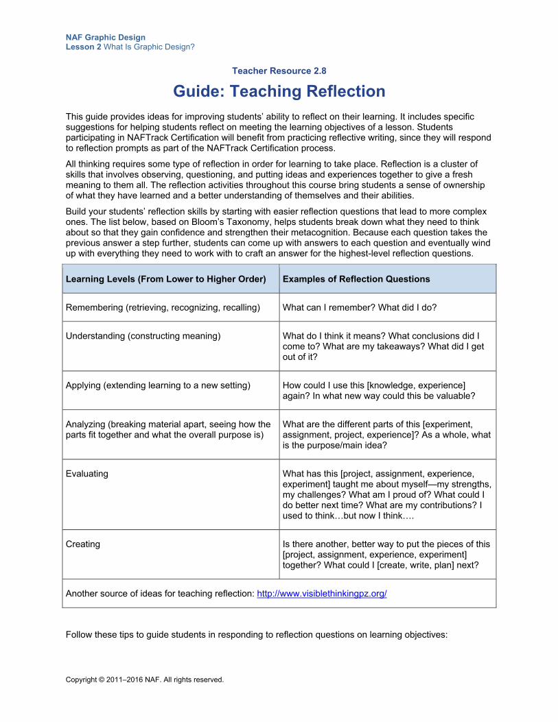
Teacher Resource 2.8
Guide: Teaching Reflection
This guide provides ideas for improving students’ ability to reflect on their learning. It includes specific suggestions for helping students reflect on meeting the learning objectives of a lesson. Students participating in NAFTrack Certification will benefit from practicing reflective writing, since they will respond to reflection prompts as part of the NAFTrack Certification process.
All thinking requires some type of reflection in order for learning to take place. Reflection is a cluster of skills that involves observing, questioning, and putting ideas and experiences together to give a fresh meaning to them all. The reflection activities throughout this course bring students a sense of ownership of what they have learned and a better understanding of themselves and their abilities.
Build your students’ reflection skills by starting with easier reflection questions that lead to more complex ones. The list below, based on Bloom’s Taxonomy, helps students break down what they need to think about so that they gain confidence and strengthen their metacognition. Because each question takes the previous answer a step further, students can come up with answers to each question and eventually wind up with everything they need to work with to craft an answer for the highest-level reflection questions.
Learning Levels (From Lower to Higher Order) Examples of Reflection Questions
Remembering (retrieving, recognizing, recalling) What can I remember? What did I do?
Understanding (constructing meaning) What do I think it means? What conclusions did I come to? What are my takeaways? What did I get out of it?
Applying (extending learning to a new setting) How could I use this [knowledge, experience] again? In what new way could this be valuable?
Analyzing (breaking material apart, seeing how the parts fit together and what the overall purpose is)
What are the different parts of this [experiment, assignment, project, experience]? As a whole, what is the purpose/main idea?
Evaluating What has this [project, assignment, experience, experiment] taught me about myself—my strengths, my challenges? What am I proud of? What could I do better next time? What are my contributions? I used to think…but now I think….
Creating Is there another, better way to put the pieces of this [project, assignment, experience, experiment] together? What could I [create, write, plan] next?
Another source of ideas for teaching reflection: http://www.visiblethinkingpz.org/
Follow these tips to guide students in responding to reflection questions on learning objectives:
NAF Graphic Design Lesson 2 What Is Graphic Design?
Copyright © 2011–2016 NAF. All rights reserved.
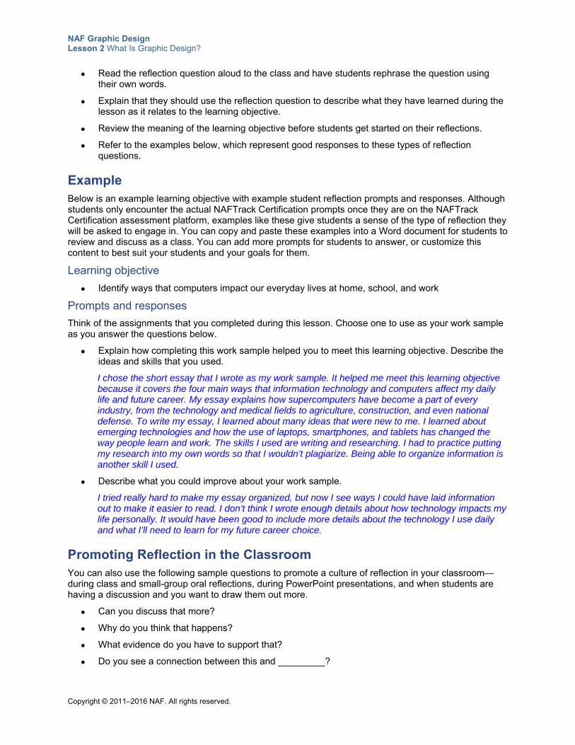
Read the reflection question aloud to the class and have students rephrase the question using their own words.
Explain that they should use the reflection question to describe what they have learned during the lesson as it relates to the learning objective.
Review the meaning of the learning objective before students get started on their reflections.
Refer to the examples below, which represent good responses to these types of reflection questions.
Example Below is an example learning objective with example student reflection prompts and responses. Although students only encounter the actual NAFTrack Certification prompts once they are on the NAFTrack Certification assessment platform, examples like these give students a sense of the type of reflection they will be asked to engage in. You can copy and paste these examples into a Word document for students to review and discuss as a class. You can add more prompts for students to answer, or customize this content to best suit your students and your goals for them.
Learning objective
Identify ways that computers impact our everyday lives at home, school, and work
Prompts and responses
Think of the assignments that you completed during this lesson. Choose one to use as your work sample as you answer the questions below.
Explain how completing this work sample helped you to meet this learning objective. Describe the ideas and skills that you used.
I chose the short essay that I wrote as my work sample. It helped me meet this learning objective because it covers the four main ways that information technology and computers affect my daily life and future career. My essay explains how supercomputers have become a part of every industry, from the technology and medical fields to agriculture, construction, and even national defense. To write my essay, I learned about many ideas that were new to me. I learned about emerging technologies and how the use of laptops, smartphones, and tablets has changed the way people learn and work. The skills I used are writing and researching. I had to practice putting my research into my own words so that I wouldn’t plagiarize. Being able to organize information is another skill I used.
Describe what you could improve about your work sample.
I tried really hard to make my essay organized, but now I see ways I could have laid information out to make it easier to read. I don’t think I wrote enough details about how technology impacts my life personally. It would have been good to include more details about the technology I use daily and what I’ll need to learn for my future career choice.
Promoting Reflection in the Classroom You can also use the following sample questions to promote a culture of reflection in your classroom—during class and small-group oral reflections, during PowerPoint presentations, and when students are having a discussion and you want to draw them out more.
Can you discuss that more?
Why do you think that happens?
What evidence do you have to support that?
Do you see a connection between this and _________?
NAF Graphic Design Lesson 2 What Is Graphic Design?
Copyright © 2011–2016 NAF. All rights reserved.
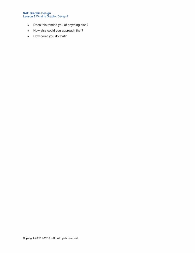
Does this remind you of anything else?
How else could you approach that?
How could you do that?
NAF Graphic Design Lesson 2 What Is Graphic Design?
Copyright © 2011–2016 NAF. All rights reserved.
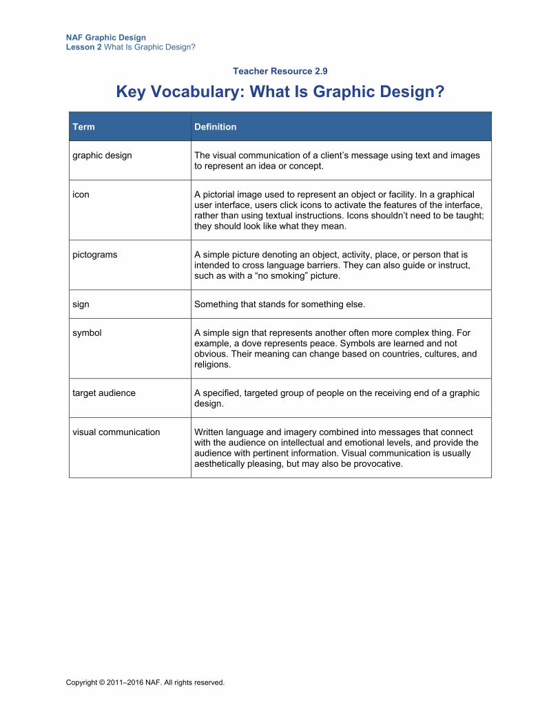
Teacher Resource 2.9
Key Vocabulary: What Is Graphic Design?
Term Definition
graphic design The visual communication of a client’s message using text and images to represent an idea or concept.
icon A pictorial image used to represent an object or facility. In a graphical user interface, users click icons to activate the features of the interface, rather than using textual instructions. Icons shouldn’t need to be taught; they should look like what they mean.
pictograms A simple picture denoting an object, activity, place, or person that is intended to cross language barriers. They can also guide or instruct, such as with a “no smoking” picture.
sign Something that stands for something else.
symbol A simple sign that represents another often more complex thing. For example, a dove represents peace. Symbols are learned and not obvious. Their meaning can change based on countries, cultures, and religions.
target audience A specified, targeted group of people on the receiving end of a graphic design.
visual communication Written language and imagery combined into messages that connect with the audience on intellectual and emotional levels, and provide the audience with pertinent information. Visual communication is usually aesthetically pleasing, but may also be provocative.
NAF Graphic Design Lesson 2 What Is Graphic Design?
Copyright © 2011–2016 NAF. All rights reserved.
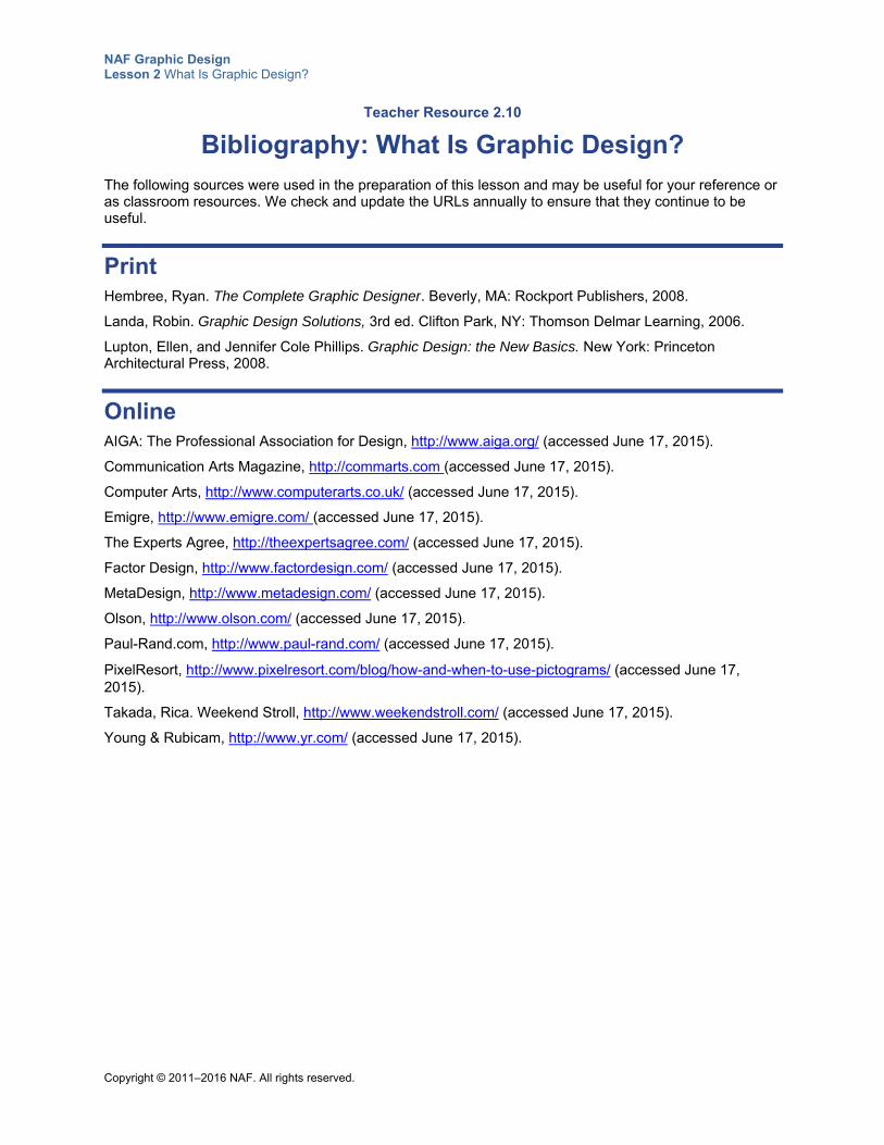
Teacher Resource 2.10
Bibliography: What Is Graphic Design?
The following sources were used in the preparation of this lesson and may be useful for your reference or as classroom resources. We check and update the URLs annually to ensure that they continue to be useful.
Print Hembree, Ryan. The Complete Graphic Designer. Beverly, MA: Rockport Publishers, 2008.
Landa, Robin. Graphic Design Solutions, 3rd ed. Clifton Park, NY: Thomson Delmar Learning, 2006.
Lupton, Ellen, and Jennifer Cole Phillips. Graphic Design: the New Basics. New York: Princeton Architectural Press, 2008.
Online AIGA: The Professional Association for Design, http://www.aiga.org/ (accessed June 17, 2015).
Communication Arts Magazine, http://commarts.com (accessed June 17, 2015).
Computer Arts, http://www.computerarts.co.uk/ (accessed June 17, 2015).
Emigre, http://www.emigre.com/ (accessed June 17, 2015).
The Experts Agree, http://theexpertsagree.com/ (accessed June 17, 2015).
Factor Design, http://www.factordesign.com/ (accessed June 17, 2015).
MetaDesign, http://www.metadesign.com/ (accessed June 17, 2015).
Olson, http://www.olson.com/ (accessed June 17, 2015).
Paul-Rand.com, http://www.paul-rand.com/ (accessed June 17, 2015).
PixelResort, http://www.pixelresort.com/blog/how-and-when-to-use-pictograms/ (accessed June 17, 2015).
Takada, Rica. Weekend Stroll, http://www.weekendstroll.com/ (accessed June 17, 2015).
Young & Rubicam, http://www.yr.com/ (accessed June 17, 2015).
Copyright © 2011–2015 NAF. All rights reserved.
NAF Graphic Design
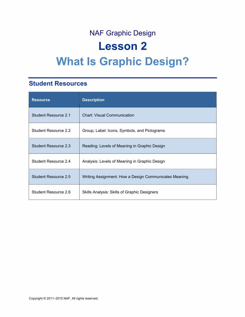
Lesson 2 What Is Graphic Design?
Student Resources
Resource Description
Student Resource 2.1 Chart: Visual Communication
Student Resource 2.2 Group, Label: Icons, Symbols, and Pictograms
Student Resource 2.3 Reading: Levels of Meaning in Graphic Design
Student Resource 2.4 Analysis: Levels of Meaning in Graphic Design
Student Resource 2.5 Writing Assignment: How a Design Communicates Meaning
Student Resource 2.6 Skills Analysis: Skills of Graphic Designers
NAF Graphic Design Lesson 2 What Is Graphic Design?
Copyright © 2011–2015 N. All rights reserved.
Student Resource 2.1
Chart: Visual Communication
Student Name:_______________________________________________________ Date:___________
Directions: Look at the designs posted around the classroom and consider how they communicate a message visually. Answer the questions in the table below for each image.
Design What is the message? Who is the target audience?
What elements are used to communicate the message visually?
Penguin Books
Amnesty International
UPS
Nike
NAF Graphic Design Lesson 2 What Is Graphic Design?
Copyright © 2011–2015 N. All rights reserved.
Design What is the message? Who is the target audience?
What elements are used to communicate the message visually?
Vertigo
Metro Area
Nike website
Morning Jacket
NAF Graphic Design Lesson 2 What Is Graphic Design?
Copyright © 2011–2015 N. All rights reserved.
Student Resource 2.2
Group, Label: Icons, Symbols, and Pictograms
Student Names:_______________________________________________________ Date:___________
Directions: Group the following signs into categories, and then label each category.
__________________________________________
___________________________________________
_____________________________________
___________________________________________
___________________________________________
___________________________________________
NAF Graphic Design Lesson 2 What Is Graphic Design?
Copyright © 2011–2015 N. All rights reserved.
Student Resource 2.3
Reading: Levels of Meaning in Graphic Design
Directions: Read the following passage, and take time to think how you would answer each of the “Think about this” questions in the reading.
Did you know that you are more likely to understand and remember a design that speaks to you on more than one level? In order for viewers to connect with a design, the design needs to have layers of meaning that connect emotionally and intellectually with the target audience. Along with what you actually see printed on the page, is there something that sparks your imagination or your creativity? Is there something that resonates personally with you? Graphic designers use “levels of meaning” to help viewers connect in these ways.
The primary layer of meaning is the direct message of a word, sign, or image. What do you actually see? For example, in the poster below, you see Chris Brown with a milk mustache and a broad smile, jumping high because of the energy he has from drinking milk. The poster poses the question to the viewer, “Got milk?”
But the poster also connects with the target audience on other levels conveyed or suggested by the overall design of the poster. These other layers of meaning are what graphic designers use to make their work memorable.
To speak to viewers on more than one level, designers embed meaning that speaks to viewers’ emotions, their intellect, their imagination, their creativity, their desire to belong, their ties to nostalgia, and so on.
Graphic designers often illustrate emotions such as love, trust, confidence, happiness, and fear to promote products or lifestyles. Appealing to viewers’ emotions rather than their reason hugely affects one’s power of persuasion.
Think about this: Do you see any evidence of appealing to emotions in this “Got milk?” poster?
Designers appeal to their viewers’ intellect through the power of well-chosen words and the use of wit. A witty message uses cleverness, verbal skill, or surprise to evoke laughter. For example, the artist might surprise viewers by breaking from what they expect to see. Viewers are rewarded with understanding, and therefore remember what they have seen.
Think about this: Do you see any evidence of appealing to intellect in this design? What elements are different from what you might expect?
Because everyone likes to belong, identity is an important layer of meaning. Viewers are likely to remember designs with which they can form a personal connection on an emotional or intellectual level. The target audience must see something that gives them a sense of belonging.
Think about this: In the “Got milk?” design, who do you think the target audience is? What makes this group identify with the design?
NAF Graphic Design Lesson 2 What Is Graphic Design?
Copyright © 2011–2015 N. All rights reserved.
Speaking to the viewer’s imagination and creativity are also methods of embedding meaning in a design. Designers invite viewers to use their creativity and imagine themselves in a situation that would bring them personal pleasure, adventure, success, or some other positive outcome.
Think about this: In the “Got milk?” design, do you think the designer is appealing to the viewer’s imagination and creativity?
Nostalgic imagery often elicits comfort and dependability in visual images. A reference to history or tradition tends to resonate with the viewer as being true and desirable.
Remember that not all designs have all of these levels of meaning. But all good designs have more than one level of meaning. This reading is just an introduction to this very important topic. As you learn more about graphic design in this course and in future studies, you will continue to learn how graphic designers use a wide variety of tools and techniques to embed meaning in their designs.
In our society, we are bombarded with thousands of visual messages every day. From the cereal box you see first thing in the morning to the TV advertisement just before bedtime, designers are vying for your consideration through their designs. If you pay attention, you will start to notice the levels of meaning that are presented to you. Learning to work with levels of meaning is important preparation for succeeding in graphic design.
NAF Graphic Design Lesson 2 What Is Graphic Design?
Copyright © 2011–2015 N. All rights reserved.
Student Resource 2.4
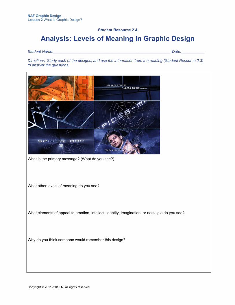
Analysis: Levels of Meaning in Graphic Design
Student Name:_______________________________________________________ Date:___________
Directions: Study each of the designs, and use the information from the reading (Student Resource 2.3) to answer the questions.
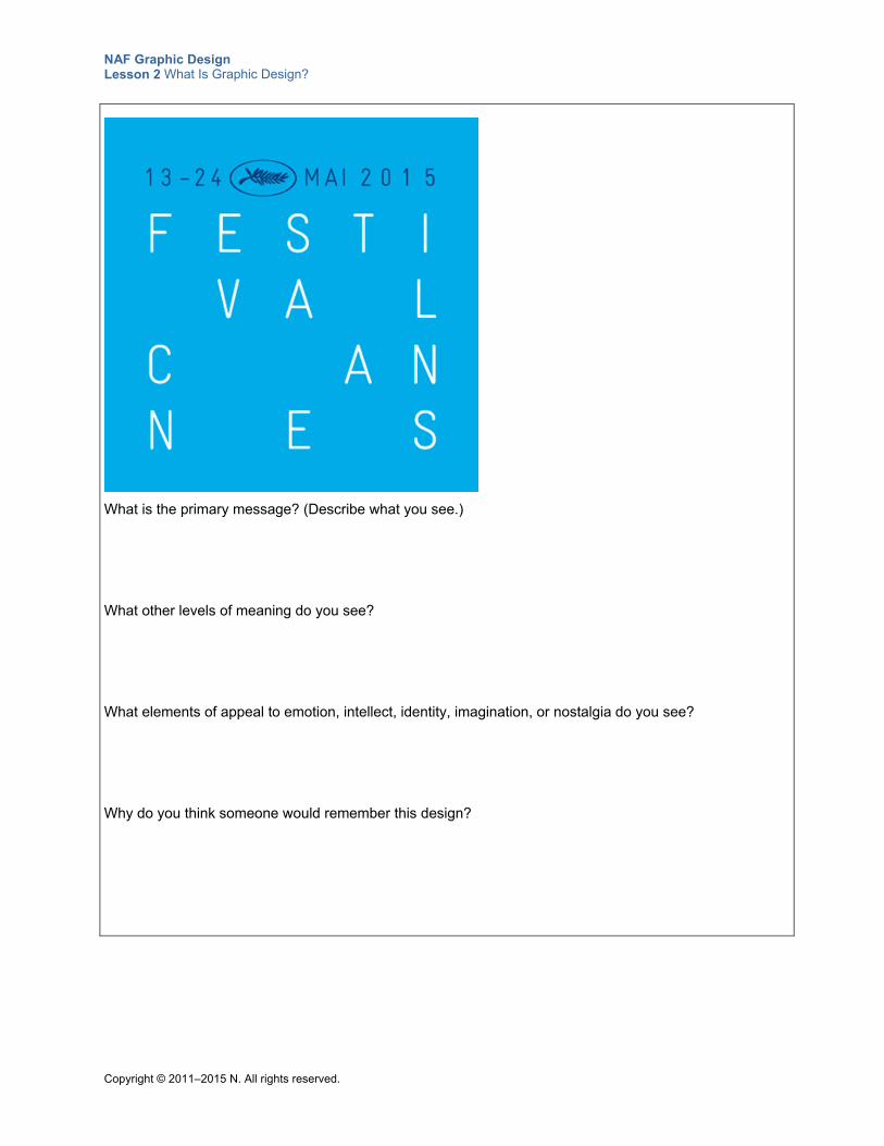
What is the primary message? (What do you see?)
What other levels of meaning do you see?
What elements of appeal to emotion, intellect, identity, imagination, or nostalgia do you see?
Why do you think someone would remember this design?
NAF Graphic Design Lesson 2 What Is Graphic Design?
Copyright © 2011–2015 N. All rights reserved.
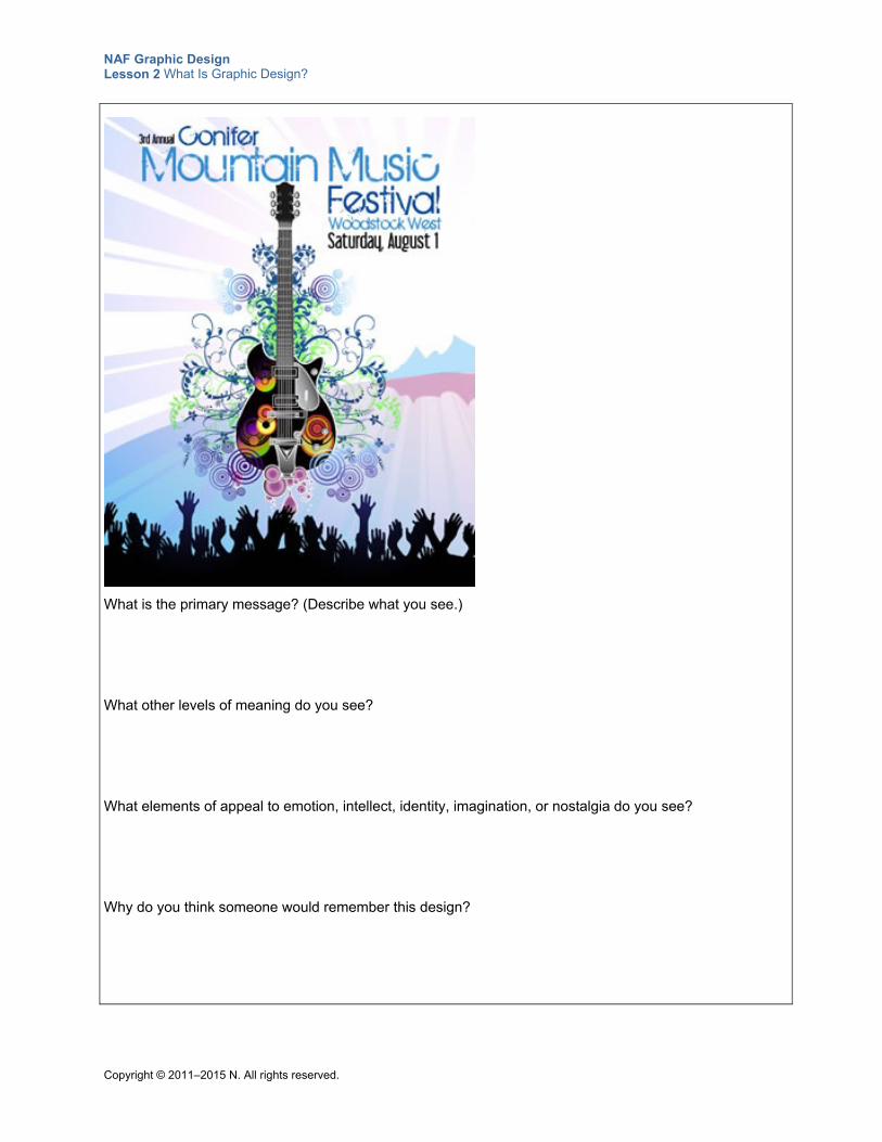
What is the primary message? (Describe what you see.)
What other levels of meaning do you see?
What elements of appeal to emotion, intellect, identity, imagination, or nostalgia do you see?
Why do you think someone would remember this design?
NAF Graphic Design Lesson 2 What Is Graphic Design?
Copyright © 2011–2015 N. All rights reserved.
Student Resource 2.5
Writing Assignment: How a Design Communicates Meaning
Directions: For this assignment, you have the opportunity to choose a design you like and explain how it communicates meaning. Follow your teacher’s instructions to complete the steps below.
Step 1: To begin, analyze the design and writing sample at the end of this resource, according to your teacher’s instructions, and carefully review the assessment criteria for this assignment.
Step 2: Select your design. Make sure that it meets the definition of a graphic design and encompasses more than one level of meaning.
Step 3: After you select the design you want to write about, note your answers to the following questions to help you plan your writing.
What is the primary message of your graphic design? Describe what you see.
What is the overall message the designer communicates, and what levels of meaning does he or she use to communicate visually? Who is the target audience, and what makes this design appealing to them?
What makes the message in the design you’ve chosen memorable?
What conclusions can you draw about how this design communicates meaning?
Step 4: Write your analysis on a separate sheet of paper or use a word processing program such as Microsoft Word. Remember to leave room for your image at the top of the page.
Make sure your assignment meets or exceeds the following assessment criteria:
The image chosen conforms to the definition of a graphic design and encompasses more than one level of meaning.
The writing clearly describes the primary message of the design.
The writing explains various levels of meaning depicted in the design and explains how the message the designer wants to communicate is encoded.
The writing explains who the likely target audience is and why this design would appeal to them.
The writing provides a description of what makes the graphic design so memorable.
The writing assignment is clearly written and easy to understand, with no grammatical or spelling errors.
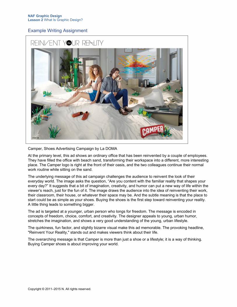
NAF Graphic Design Lesson 2 What Is Graphic Design?
Copyright © 2011–2015 N. All rights reserved.
Example Writing Assignment
Camper, Shoes Advertising Campaign by La DOMA
At the primary level, this ad shows an ordinary office that has been reinvented by a couple of employees. They have filled the office with beach sand, transforming their workspace into a different, more interesting place. The Camper logo is right at the front of their oasis, and the two colleagues continue their normal work routine while sitting on the sand.
The underlying message of this ad campaign challenges the audience to reinvent the look of their everyday world. The image asks the question, “Are you content with the familiar reality that shapes your every day?” It suggests that a bit of imagination, creativity, and humor can put a new way of life within the viewer’s reach, just for the fun of it. The image draws the audience into the idea of reinventing their work, their classroom, their house, or whatever their space may be. And the subtle meaning is that the place to start could be as simple as your shoes. Buying the shoes is the first step toward reinventing your reality. A little thing leads to something bigger.
The ad is targeted at a younger, urban person who longs for freedom. The message is encoded in concepts of freedom, choice, comfort, and creativity. The designer appeals to young, urban humor, stretches the imagination, and shows a very good understanding of the young, urban lifestyle.
The quirkiness, fun factor, and slightly bizarre visual make this ad memorable. The provoking headline, "Reinvent Your Reality," stands out and makes viewers think about their life.
The overarching message is that Camper is more than just a shoe or a lifestyle; it is a way of thinking. Buying Camper shoes is about improving your world.
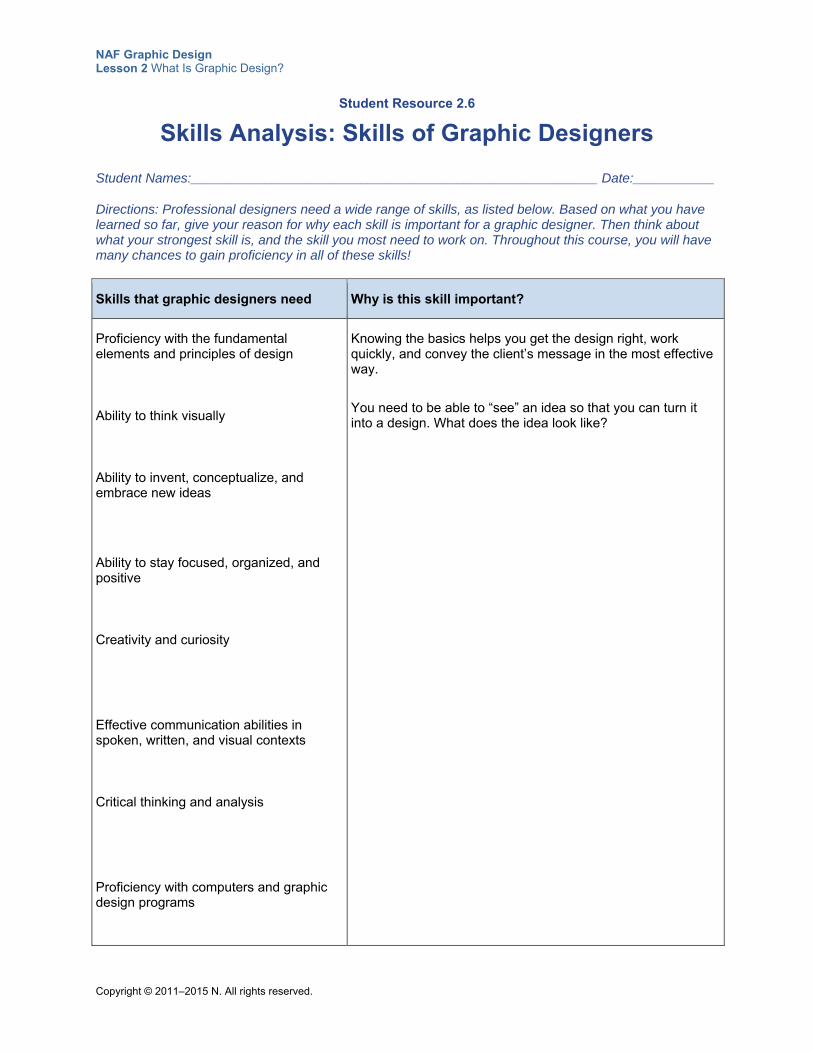
NAF Graphic Design Lesson 2 What Is Graphic Design?
Copyright © 2011–2015 N. All rights reserved.
Student Resource 2.6
Skills Analysis: Skills of Graphic Designers
Student Names:_______________________________________________________ Date:___________
Directions: Professional designers need a wide range of skills, as listed below. Based on what you have learned so far, give your reason for why each skill is important for a graphic designer. Then think about what your strongest skill is, and the skill you most need to work on. Throughout this course, you will have many chances to gain proficiency in all of these skills!
Skills that graphic designers need Why is this skill important?
Proficiency with the fundamental elements and principles of design
Ability to think visually
Ability to invent, conceptualize, and embrace new ideas
Ability to stay focused, organized, and positive
Creativity and curiosity
Effective communication abilities in spoken, written, and visual contexts
Critical thinking and analysis
Proficiency with computers and graphic design programs
Knowing the basics helps you get the design right, work quickly, and convey the client’s message in the most effective way.
You need to be able to “see” an idea so that you can turn it into a design. What does the idea look like?
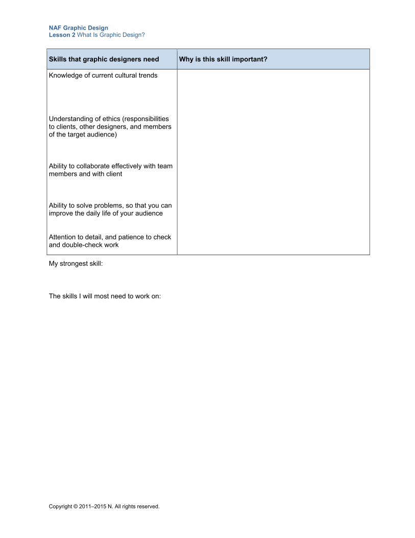
NAF Graphic Design Lesson 2 What Is Graphic Design?
Copyright © 2011–2015 N. All rights reserved.
Skills that graphic designers need Why is this skill important?
Knowledge of current cultural trends
Understanding of ethics (responsibilities to clients, other designers, and members of the target audience)
Ability to collaborate effectively with team members and with client
Ability to solve problems, so that you can improve the daily life of your audience
Attention to detail, and patience to check and double-check work
My strongest skill:
The skills I will most need to work on:
Copyright © 2011–2015 NAF. All rights reserved.
NAF Graphic Design
Lesson 3 The Graphic Design Process
In this lesson, students are introduced to the steps in the graphic design process, and they work through the first three steps: defining the problem, gathering information through research, and writing a creative brief. Students also learn about the different players involved in the design process.
This lesson is expected to take 3 class periods.
Lesson Framework
Learning Objectives Each student will:
Explain how to conduct research to solve a visual problem
Develop a creative brief that outlines the strategy for a graphic design
Identify the steps in the graphic design process*
Identify the goals, roles, and deliverables of a professional doing graphic design work
*This is one of the 16 key learning objectives assessed by the NAFTrack Certification end-of-course exam for this course.
Academic Standards The relevant Common Core State Standards are too extensive to list here but are an important basis for this lesson. For details, please refer to the separate document “Correlations to the Common Core Standards” (available in the Course Planning Tools section of the course materials).
Analyze how the application of visual arts elements and principles of design communicate and express ideas (Common Career Technical Core 2012, AR-VIS 2)
Identify the purpose, audience, and audience needs for preparing an image (Adobe Certified Associate, Objectives for Visual Communication using Photoshop CS6, Setting Project Requirements 1.1)
Communicate with others (such as peers and clients) about design plans (Adobe Certified Associate, Objectives for Visual Communication using Photoshop CS6, Setting Project Requirements 1.4)
NAF Graphic Design Lesson 3 The Graphic Design Process
Copyright © 2011–2015 NAF. All rights reserved. - 2 -
Apply existing knowledge to generate new ideas, products, or processes (ISTE NETS for Students 2007, 1a)
Contribute to project teams to produce original works or solve problems (ISTE NETS for Students 2007, 2d)
Locate, organize, analyze, evaluate, synthesize, and ethically use information from a variety of sources and media (ISTE NETS for Students 2007, 3b)
Assessment
Assessment Product Means of Assessment
A creative brief detailing the parameters of a graphic design (Student Resource 3.5)
Assessment Criteria: Creative Brief (Teacher Resource 3.2)
Prerequisites Basic understanding of graphic design as visual communication
Knowledge of the skill set of graphic designers
Basic understanding of the importance of defining the target audience
Instructional Materials
Teacher Resources Teacher Resource 3.1, Presentation and Notes: Steps in the Graphic Design Process (includes
separate PowerPoint file)
Teacher Resource 3.2, Assessment Criteria: Creative Brief
Teacher Resource 3.3, Key Vocabulary: The Graphic Design Process
Teacher Resource 3.4, Bibliography: The Graphic Design Process
Student Resources Student Resource 3.1, Example: Creative Brief
Student Resource 3.2, Note Taking: Steps in the Graphic Design Process
Student Resource 3.3, Reading: Steps in the Graphic Design Process
Student Resource 3.4, Research Notes: Event Poster
Student Resource 3.5, Assignment Sheet: Creative Brief
Equipment and Supplies LCD projector and computer for PowerPoint presentation
Blackboard, whiteboard, or flip chart
Computers with Internet access (see Required Equipment and Supplies, in the Course Planning Tools section of the course, for full details about this course’s technology requirements)
NAF Graphic Design Lesson 3 The Graphic Design Process
Copyright © 2011–2015 NAF. All rights reserved. - 3 -
Sticky notes
Lesson Steps
Step Min. Activity
CLASS PERIOD 1
1 20 Think, Pair, Share: Defining the Problem
In this activity, students study a creative brief for a book cover and discover how this genre of writing is used as part of the graphic design process.
Note: The example creative brief is about a book cover for the 50th anniversary edition of To Kill a Mockingbird. To create an opportunity for cross-curricular integration, you may want to rework this example so that it features a book that your students are reading in their English Language Arts class.
Explain to students that in this lesson, they will be learning about the graphic design process, in particular going through all of the preparatory work necessary to come up with a good concept for a design.
Refer students to Student Resource 3.1, Example: Creative Brief. Ask them to read through the brief and answer the following questions in their notebook:
What is the most important message or idea the book cover should communicate?
How would you describe this style of writing (be imaginative; is this a certain genre)?
Why is it helpful to have a creative brief?
Next, ask students to share their answers with a partner, and then share as a class. Write their ideas on the board, and then work together as a class to come up with a solid answer for each question.
Explain to students that identifying the problem to be solved is the first step in the design process, and they will get more practice identifying graphic design problems in this lesson. Developing a good concept for a graphic design requires a clear understanding of the problem to be solved.
Tell students that during this lesson, they will be writing a creative brief similar to the example they just looked at.
Make sure students understand that the creative brief is an agreement between the client and the graphic designer about the graphic design project. They should also note that a good creative brief is helpful because it identifies the message to be communicated. The graphic designer can then limit the scope to ideas and concepts
NAF Graphic Design Lesson 3 The Graphic Design Process
Copyright © 2011–2015 NAF. All rights reserved. - 4 -
Step Min. Activity
that align with the message stated in the creative brief.
2
15 Presentation: Steps in the Graphic Design Process
This activity gives students an overview of the entire design process. It also develops students’ listening and note-taking skills.
To prepare, make notes to guide class discussion using Teacher Resource 3.1, Presentation Notes: Steps in the Graphic Design Process. Have Teacher Resource 3.1, Presentation: Steps in the Graphic Design Process (separate PowerPoint file), ready to show as a full-screen slideshow using an LCD projector.
Point out to students that they have worked through the first step of the design process:
Identifying and defining the problem to be solved
Then explain that in this presentation, they will learn about the remaining steps a graphic designer goes through in the design process. Refer students to Student Resource 3.2, Note Taking: Steps in the Graphic Design Process, and instruct them to use this resource to take notes during the presentation. Ask them to think specifically about what the key goals, roles, and deliverables are for the designer during each step of the design process.
Present the slideshow. Use the notes you prepared and the questions on the slides to encourage class discussion.
This presentation is duplicated as Student Resource 3.3, Reading: Steps in the Graphic Design Process. If an LCD projector is unavailable, students can read the presentation, answer the discussion questions in their notebook, and discuss their answers as a class. This student resource is also useful for review.
After the presentation, divide the class into pairs or groups of three and have them compare their notes for completeness and accuracy. Invite each pair or triad to share their thoughts and questions.
Finally, work through the goals, roles, and deliverables of a graphic designer as a class.
3 15 Scenario Analysis: Defining the Graphic Design Problem
In this activity, students get some hands-on experience identifying the problem to be solved. This is the first step in creating a graphic design. This activity focuses on the following college and career skills:
Working effectively with a diversity of individuals and perspectives
Thinking critically and systemically to solve difficult problems
Explain to students that in this activity, they will be working in pairs and going through the first step of planning a poster for an upcoming event at a concert hall in your area. Explain that each pair of students can choose one of their favorite artists to be the performer at the event.
When students are paired up, refer them to Student Resource 3.4, Research Notes: Event Poster. Have them begin by filling in the venue and the name of their performer at the top of the worksheet.
Next, remind students that the first step in the design process is to uncover the problem
NAF Graphic Design Lesson 3 The Graphic Design Process
Copyright © 2011–2015 NAF. All rights reserved. - 5 -
Step Min. Activity
that they, as graphic designers, have been hired to solve. Tell them that the first page of the resource provides information about the poster the client is requesting. Instruct pairs to examine the information and use it to find answers to questions 1, 2, and 3 on the second page of the resource. These questions are meant to help students form a definition of the problem to be solved.
After pairs have answered the first three questions, have them share their answers to the following question with the class:
What is the single most persuasive idea that the poster should communicate?
Look at the first two questions together as necessary, to help students come to a clear statement of the problem to be solved. Advise students that they will be researching the remaining questions in the next class period, in order to form a solution that meets the client’s needs.
CLASS PERIOD 2
4
25 Research: Solving a Visual Problem
In this activity, students learn how to research a client in order to create a solution to a visual problem. This activity focuses on the following college and career skills:
Demonstrating adaptability and flexibility
Thinking critically and systemically to solve difficult problems
Explain to students that after defining the problem that needs to be solved, they need to research their client, the target audience, and the competition in order to form a solution that meets the client’s needs. Ask students to share with a partner two or three things they think it would be important to know about the client. Have pairs share what they thought of with the class, and create a list on the board. The list should include such items as:
Information about the client’s goals
The look of the client’s website, logo, and so forth
The look of other graphic design materials that the client already has
Characteristics of the target audience
The most important visual elements related to the client
Instruct students to continue working with their partner from the previous activity and to answer the remaining questions on Student Resource 3.4, Research Notes: Event Poster. Instruct them to use a search engine to find the website of their performer to begin their research. Also, tell them to use a search engine to research the competition (that is, other performers who are popular with their target audience). Encourage students to also look at magazines available in the classroom, and to use any other sources available to them that will help them round out their research. Ask them to note the important information they find in answer to the research notes questions. Pairs should divide up the work to move more quickly through the websites and other sources they have to research.
Point out that they will be using their notes to write a creative brief that they will present to their client. Circulate while students are working and answer any questions.
NAF Graphic Design Lesson 3 The Graphic Design Process
Copyright © 2011–2015 NAF. All rights reserved. - 6 -
Step Min. Activity
5
25 Planning: Creative Brief
In this activity, students use the information they have just gathered to begin a formal creative brief document for a client.
To begin, ask students what they remember about a creative brief from the PowerPoint presentation, and write the important points they mention on the board. Remind students that the creative brief is their strategy document for creating a design. It is their agreement with the client about what they will design.
Explain to students that they will be working with their partner from the previous activities to write a rough outline of a creative brief for their performer. Refer students to Student Resource 3.5, Assignment Sheet: Creative Brief, and ask them to look at the different sections they will be including in their creative brief. Answer any questions they have about the content sections.
Next, ask students to refer back to the example creative brief in Student Resource 3.1, Example: Creative Brief. Have students work in pairs to assess the example brief using the assessment criteria, and ask pairs to share with the class what they think could be improved. Answer any questions students have before they begin working.
Instruct pairs to use the remainder of this class period to write an outline of their creative brief under the headings on their assignment sheet. They will have time to write a polished draft at the beginning of the next class period. If necessary, they should finish their outline (and any additional research they need to do) for homework.
Remind students that writing a creative brief is an important professional skill that they will use every time they create a professional graphic design.
CLASS PERIOD 3
6
30 Writing Assignment: Creative Brief
In this activity, students transform their outline into a creative brief. This activity focuses on the following college and career skill:
Demonstrating the ability to write effectively
To begin this activity, ask students to share any insights they gained from working on their outlines, or any questions they have about their creative briefs.
Next, instruct students to create a polished version of their creative brief using a word processing program such as Microsoft Word. Explain that one person can work on the details of the wording while the other person types. Remind students to refer to the assessment criteria as necessary to make sure they are on track. Also remind them that a creative brief should not be longer than a page.
When they have finished their work, have students either print their creative brief and place it on their desk or save their work and leave it for viewing on their computer screen.
7 10 Gallery Walk: Creative Briefs
NAF Graphic Design Lesson 3 The Graphic Design Process
Copyright © 2011–2015 NAF. All rights reserved. - 7 -
Step Min. Activity
In this activity, students examine each other’s creative briefs.
Explain to students that they can learn a lot by looking at the work of others. Give students about five minutes to look at two or three of the creative briefs and to post sticky notes on each, noting what they like about it, any important information that is missing, and any questions they have. Encourage students to use the assessment criteria to guide them in determining which elements might be missing or still need improvement.
Next, take a few minutes for students to share comments on what they liked about the different creative briefs. Ask students to consider whether they think each creative brief could be used as the basis for formulating an effective design.
Give students a few minutes to talk with their partner about any changes they need to make for a final version of their creative brief, taking into consideration the new information they received as a result of the gallery walk. Instruct them to work out a plan with their partner to create a final draft of their creative brief for homework. Tell students to submit their final draft for assessment at the beginning of the next class period. Use Teacher Resource 3.2, Assessment Criteria: Creative Brief, to assess their work.
8 10 Think, Pair, Share: Challenges of the Design Process
To conclude this lesson, instruct students to look back at Student Resource 3.3, Reading: Steps in the Graphic Design Process. Congratulate them on successfully working through the first three steps of the design process. To help them put the three steps in the context of the entire process, ask students to write about the following in their notebooks:
What are the most important points about the graphic design process that you need to keep in mind going forward?
Which activity in the design process do you think will be most challenging? Why?
Ask students to share their answers with a partner, and then ask pairs to share their answers with the class. Encourage students to “think big” about what they can achieve in their first course as graphic designers.
Extensions
Enrichment Have students bring closure to the vocabulary taxonomy they started in Lesson 1. Instruct
students to spend five minutes adding any new terms that they have not yet included. Next, have students do a gallery walk to collect more terms from their classmates. Conduct a brief class review and discussion on the additions they made. Conclude by reminding students that they now have a resource for future assignments that will help them to remember and use new terminology.
Instruct students to research a business or an organization that they think would be an interesting client and then create a file of information that would be useful if they were creating graphic designs for this client. The file should include information about the entity’s website, target audience, and logo and the types of printed materials it produces.
NAF Graphic Design Lesson 3 The Graphic Design Process
Copyright © 2011–2015 NAF. All rights reserved. - 8 -
Technology Integration Tell students to visit the following websites and take notes on new techniques they learn that could
help them write better creative briefs:
o http://www.adcracker.com/brief/sample-creative-brief.htm
o http://www.slideshare.net/truedigital/how-to-write-a-creative-brief-by-true-digital
o http://www.commarts.com/columns/creative-briefs-shifting
Ask students to share the most important information they learn with the class. They can provide a written summary or deliver an oral report.
Cross-Curricular Integration English Language Arts: When students are assigned to write personal short stories or other
creative writing genres, ask them to use the skills they have learned in this lesson to create book covers for their works.
Social Studies/History: As you study the history of different countries and peoples, ask students to analyze the demographics of a group of people as if this group were a target audience. (This could be a particular group of people in a particular country, at a particular time period.) Suggest that students think about questions such as the following, and ask them to write a summary of their findings.
o How old are they?
o Are they male or female?
o How much money do they make?
o What do they read?
o What TV shows do they watch?
o What do they think? Feel?
o What are their likes? Dislikes?
o What are their dreams? Their biggest fears?
o What kind of house do they live in?
o What kind of car do they drive?
o What sort of job do they have?
o Where do they shop?
English Language Arts: Ask students to make believe that they have traveled back to the time of Dickens, Shakespeare, or another author they are reading. Instruct them to write a creative brief for a book cover for the first edition of the author’s book. One of the “mandatories” for the book cover is that it represent characters from the book or their enterprises.
History: Ask students to examine how posters from past historical events, such as elections and wars, were used to persuade and influence people. Instruct students to write a report about their findings and include a copy of at least one poster to illustrate what they found.
Science: The purpose of a graphic design can be to educate. Instruct students to research and report on how scientists use graphic designs to educate their audience about important concepts like DNA, nuclear fission, and so on.
Physical Education: Instruct students to research materials used to market and promote professional and college sports. Ask them to analyze these materials and report on the most common graphic styles used for this kind of publicity. Tell students to include at least one example of promotional materials that supports their analysis.
Copyright © 2011–2015 NAF. All rights reserved.
NAF Graphic Design
Lesson 3 The Graphic Design Process
Teacher Resources
Resource Description
Teacher Resource 3.1 Presentation and Notes: Steps in the Graphic Design Process (includes separate PowerPoint file)
Teacher Resource 3.2 Assessment Criteria: Creative Brief
Teacher Resource 3.3 Key Vocabulary: The Graphic Design Process
Teacher Resource 3.4 Bibliography: The Graphic Design Process
NAF Graphic Design Lesson 3 The Graphic Design Process
Copyright © 2011–2015 NAF. All rights reserved.
Teacher Resource 3.1
Presentation Notes: Steps in the Graphic Design Process
Before you show this presentation, use the text accompanying each slide to develop presentation notes. Writing the notes yourself enables you to approach the subject matter in a way that is comfortable to you and engaging for your students. Make this presentation as interactive as possible by stopping frequently to ask questions and encourage class discussion.
A thoughtful, well-structured design process is essential to solving visual communication problems. Although there are different ways to work through the design process, the fundamental steps outlined in this presentation provide the basis for successful design.
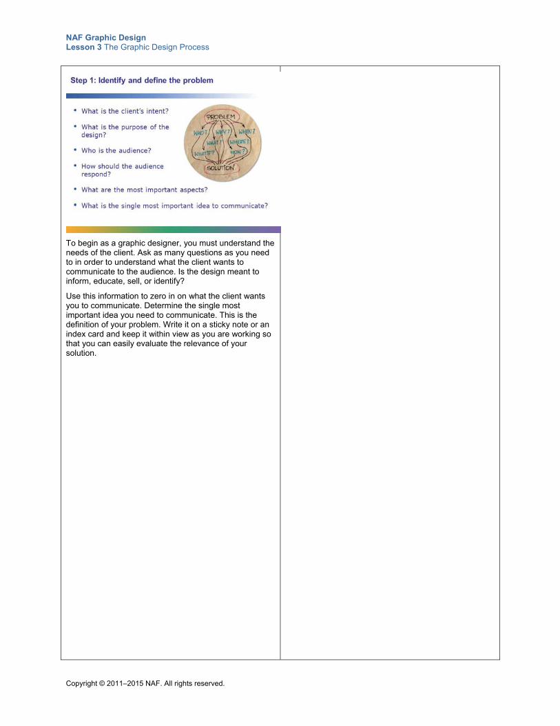
NAF Graphic Design Lesson 3 The Graphic Design Process
Copyright © 2011–2015 NAF. All rights reserved.
To begin as a graphic designer, you must understand the needs of the client. Ask as many questions as you need to in order to understand what the client wants to communicate to the audience. Is the design meant to inform, educate, sell, or identify?
Use this information to zero in on what the client wants you to communicate. Determine the single most important idea you need to communicate. This is the definition of your problem. Write it on a sticky note or an index card and keep it within view as you are working so that you can easily evaluate the relevance of your solution.
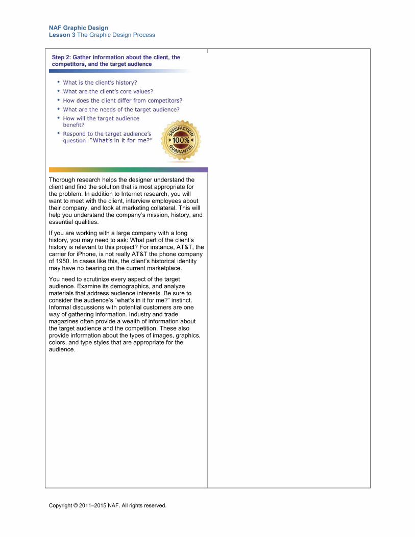
NAF Graphic Design Lesson 3 The Graphic Design Process
Copyright © 2011–2015 NAF. All rights reserved.
Thorough research helps the designer understand the client and find the solution that is most appropriate for the problem. In addition to Internet research, you will want to meet with the client, interview employees about their company, and look at marketing collateral. This will help you understand the company’s mission, history, and essential qualities.
If you are working with a large company with a long history, you may need to ask: What part of the client’s history is relevant to this project? For instance, AT&T, the carrier for iPhone, is not really AT&T the phone company of 1950. In cases like this, the client’s historical identity may have no bearing on the current marketplace.
You need to scrutinize every aspect of the target audience. Examine its demographics, and analyze materials that address audience interests. Be sure to consider the audience’s “what’s in it for me?” instinct. Informal discussions with potential customers are one way of gathering information. Industry and trade magazines often provide a wealth of information about the target audience and the competition. These also provide information about the types of images, graphics, colors, and type styles that are appropriate for the audience.
NAF Graphic Design Lesson 3 The Graphic Design Process
Copyright © 2011–2015 NAF. All rights reserved.
A creative brief is a strategic plan that both the client and the designer agree upon. The creative brief serves as a springboard for the work that follows. Research done in the previous step plays into forming this strategy. Elements such as budget, deadlines, and deliverables are also important parts of the creative brief.
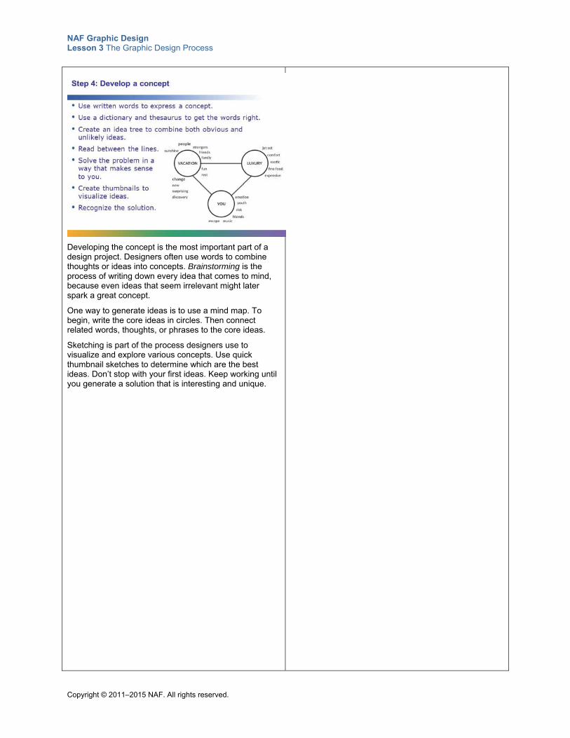
NAF Graphic Design Lesson 3 The Graphic Design Process
Copyright © 2011–2015 NAF. All rights reserved.
Developing the concept is the most important part of a design project. Designers often use words to combine thoughts or ideas into concepts. Brainstorming is the process of writing down every idea that comes to mind, because even ideas that seem irrelevant might later spark a great concept.
One way to generate ideas is to use a mind map. To begin, write the core ideas in circles. Then connect related words, thoughts, or phrases to the core ideas.
Sketching is part of the process designers use to visualize and explore various concepts. Use quick thumbnail sketches to determine which are the best ideas. Don’t stop with your first ideas. Keep working until you generate a solution that is interesting and unique.
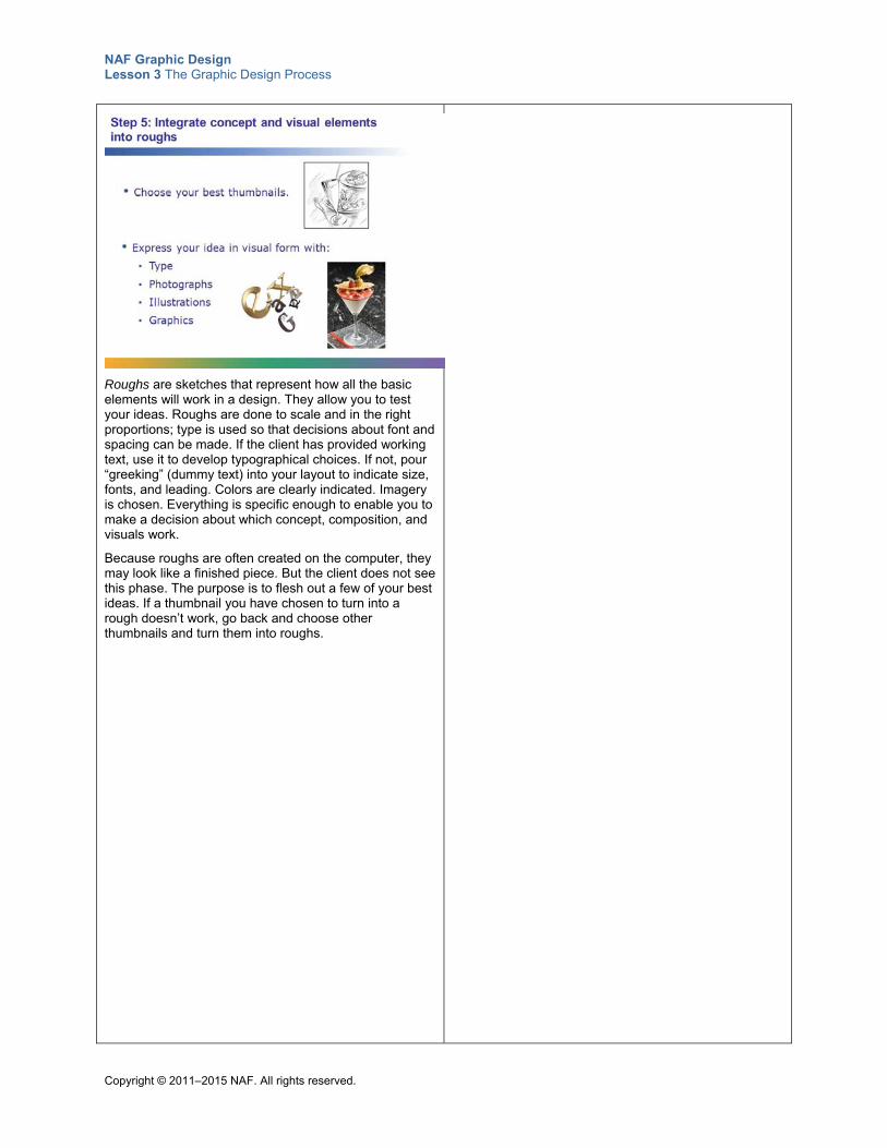
NAF Graphic Design Lesson 3 The Graphic Design Process
Copyright © 2011–2015 NAF. All rights reserved.
Roughs are sketches that represent how all the basic elements will work in a design. They allow you to test your ideas. Roughs are done to scale and in the right proportions; type is used so that decisions about font and spacing can be made. If the client has provided working text, use it to develop typographical choices. If not, pour “greeking” (dummy text) into your layout to indicate size, fonts, and leading. Colors are clearly indicated. Imagery is chosen. Everything is specific enough to enable you to make a decision about which concept, composition, and visuals work.
Because roughs are often created on the computer, they may look like a finished piece. But the client does not see this phase. The purpose is to flesh out a few of your best ideas. If a thumbnail you have chosen to turn into a rough doesn’t work, go back and choose other thumbnails and turn them into roughs.
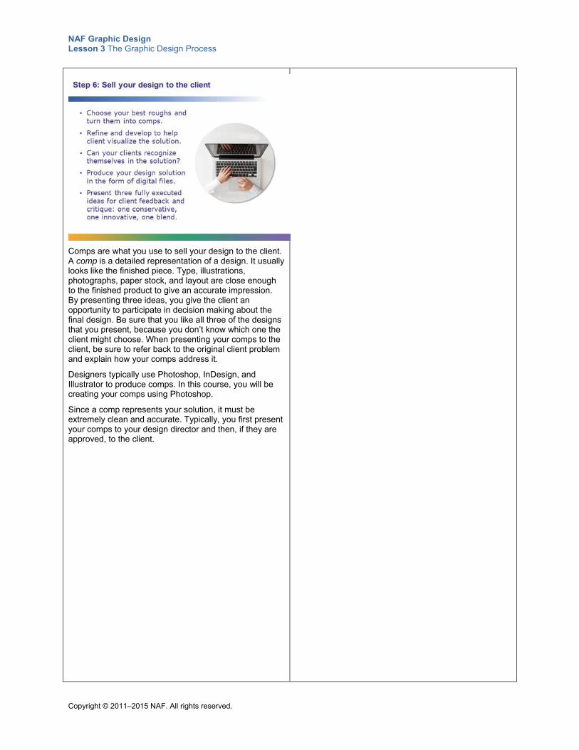
NAF Graphic Design Lesson 3 The Graphic Design Process
Copyright © 2011–2015 NAF. All rights reserved.
Comps are what you use to sell your design to the client. A comp is a detailed representation of a design. It usually looks like the finished piece. Type, illustrations, photographs, paper stock, and layout are close enough to the finished product to give an accurate impression. By presenting three ideas, you give the client an opportunity to participate in decision making about the final design. Be sure that you like all three of the designs that you present, because you don’t know which one the client might choose. When presenting your comps to the client, be sure to refer back to the original client problem and explain how your comps address it.
Designers typically use Photoshop, InDesign, and Illustrator to produce comps. In this course, you will be creating your comps using Photoshop.
Since a comp represents your solution, it must be extremely clean and accurate. Typically, you first present your comps to your design director and then, if they are approved, to the client.
NAF Graphic Design Lesson 3 The Graphic Design Process
Copyright © 2011–2015 NAF. All rights reserved.
Executing the final design requires careful work to ensure that all of the design elements work together and communicate the intended message. If the client has asked you to change one item, make sure you look at how that change impacts the rest of the design. You will likely need to go back and forth with your client once or twice, with the client proofreading and approving the finals.
Well before making your final client presentations, be sure that your final design can be reproduced without going over budget.
The final design you give to the printer or web designer will be in a page layout program such as InDesign, or converted into Adobe Acrobat PDF format. Make sure you have your design in the final page layout format when you ask for final approval from the client.
NAF Graphic Design Lesson 3 The Graphic Design Process
Copyright © 2011–2015 NAF. All rights reserved.
Providing the right materials to the printer or web designer and communicating clearly is essential to the success of any design production. For example, when you submit the job to a printer, make sure you have all of the pieces. This includes layout, image files, and font files for all fonts used in the design. If the job includes multiple pages or folding, also submit a folding dummy (a full- or reduced-size, folded and trimmed version that clearly indicates the page flow of the final printed piece).
It is your responsibility to see your project through to the end, which may include approval of the job as it comes off the printing press or in a digital mock-up. This step, called a press check, requires particular attention to detail.
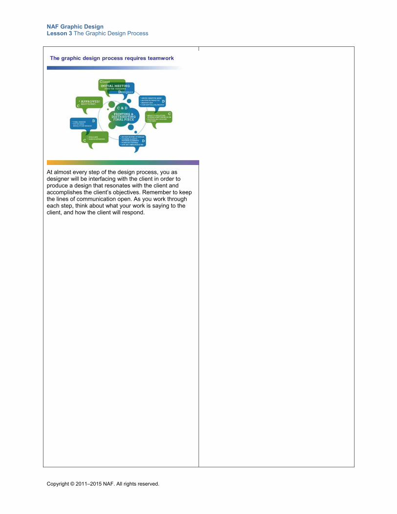
NAF Graphic Design Lesson 3 The Graphic Design Process
Copyright © 2011–2015 NAF. All rights reserved.
At almost every step of the design process, you as designer will be interfacing with the client in order to produce a design that resonates with the client and accomplishes the client’s objectives. Remember to keep the lines of communication open. As you work through each step, think about what your work is saying to the client, and how the client will respond.
NAF Graphic Design Lesson 3 The Graphic Design Process
Copyright © 2011–2015 NAF. All rights reserved.
Teacher Resource 3.2
Assessment Criteria: Creative Brief
Student Names:______________________________________________________________
Date:_______________________________________________________________________
Using the following criteria, assess whether students met each one.
Met Partially Met
Didn’t Meet
The creative brief contains a clear description of the client and the client’s needs and objectives.
□ □ □
The information about the target audience is adequate for determining the style of the message (the creative approach).
□ □ □
The creative brief clearly states the single most important message to convey to the target audience.
□ □ □
The creative brief itemizes all deliverables and spells out all deadlines.
□ □ □
The creative brief is neat and well written, with no spelling or grammatical errors.
□ □ □
Additional Comments:
_____________________________________________________________________________
_____________________________________________________________________________
_____________________________________________________________________________
_____________________________________________________________________________
NAF Graphic Design Lesson 3 The Graphic Design Process
Copyright © 2011–2015 NAF. All rights reserved.
Teacher Resource 3.3
Key Vocabulary: The Graphic Design Process
Term Definition
Adobe Illustrator A vector program often used by designers to create logos, work with or manipulate type, and draw.
Adobe InDesign A page layout program used by designers to combine text and images.
Adobe Photoshop A pixel-based program typically used to create or edit images.
comps Also known as comprehensives, these are the step after roughs in the design process. Comps show the exact placement of page elements (text, illustrations, etc.) in a form comparable to that of the final printing. Details such as backgrounds, color schemes, and images are more thoroughly worked out. Oftentimes designers show a client several different styles in comps and let the client decide.
creative brief A written plan delineating the strategy, expectations, audience, and scope of a design project.
mandatories Elements that the client requires the designer to include in a design. This could be a logo, specific colors, or a specific URL.
roughs Page designs or layouts that depict a somewhat accurate representation of the final size and position of all page elements. Roughs include accurate type and color information.
target audience The primary group of people that a graphic design is trying to reach. This group can be defined in terms of demographics.
thumbnails Small-scale, hand-drawn rough sketches of a design concept. These are usually generated during the concept development phase of design and are used internally (they are not shown to the client). Thumbnails are used to help determine which concepts warrant further development.
NAF Graphic Design Lesson 3 The Graphic Design Process
Copyright © 2011–2015 NAF. All rights reserved.
Teacher Resource 3.4
Bibliography: The Graphic Design Process
The following sources were used in the preparation of this lesson and may be useful for your reference or as classroom resources. We check and update the URLs annually to ensure that they continue to be useful.
Print Hembree, Ryan. The Complete Graphic Designer. Beverly, MA: Rockport Publishers, 2008.
Landa, Robin. Graphic Design Solutions, 3rd ed. Clifton Park, NY: Thomson Delmar Learning, 2006.
Online AIGA: The Professional Association for Design, http://www.aiga.org/ (accessed June 18, 2015).
“Sample Creative Brief.” AdCracker, http://www.adcracker.com/brief/Sample_Creative_Brief.htm (accessed June 18, 2015).
True Digital. “How to Write a Creative Brief.” Slideshare, http://www.slideshare.net/truedigital/how-to-write-a-creative-brief-by-true-digital (accessed June 18, 2015).
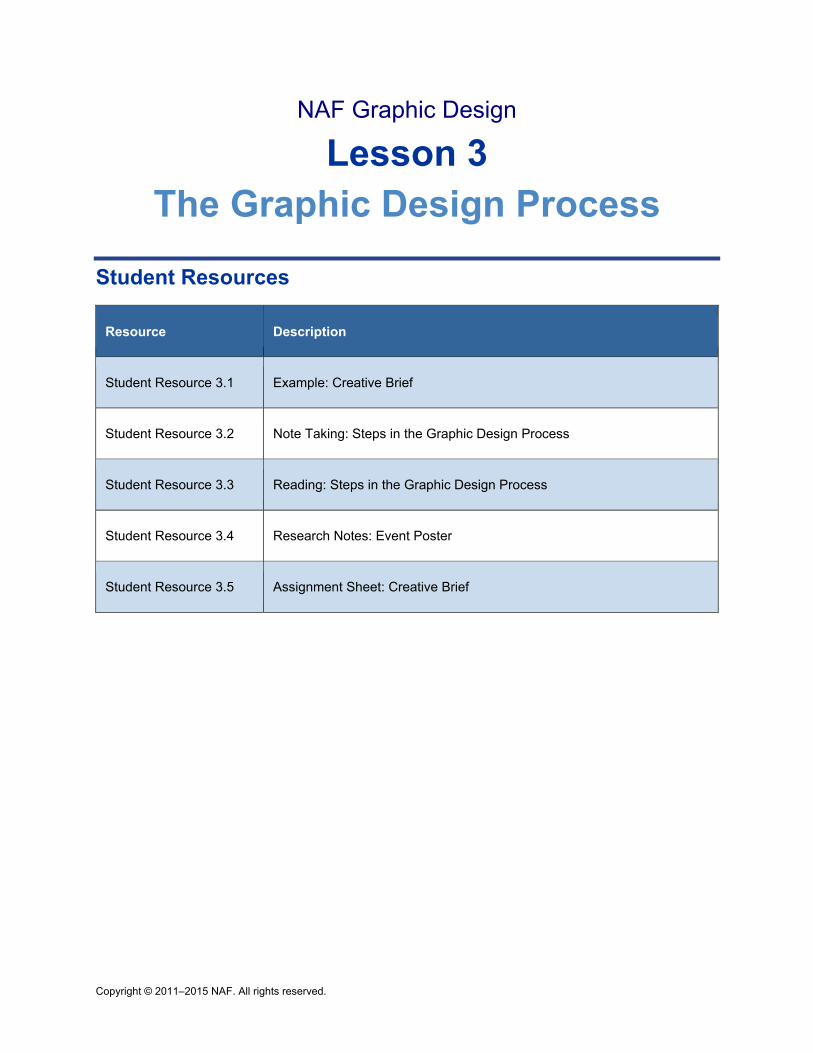
Copyright © 2011–2015 NAF. All rights reserved.
NAF Graphic Design
Lesson 3 The Graphic Design Process
Student Resources
Resource Description
Student Resource 3.1 Example: Creative Brief
Student Resource 3.2 Note Taking: Steps in the Graphic Design Process
Student Resource 3.3 Reading: Steps in the Graphic Design Process
Student Resource 3.4 Research Notes: Event Poster
Student Resource 3.5 Assignment Sheet: Creative Brief
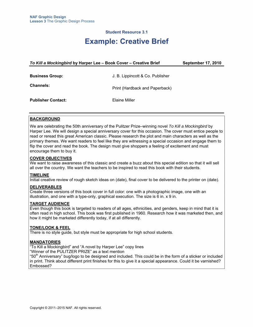
NAF Graphic Design Lesson 3 The Graphic Design Process
Copyright © 2011–2015 NAF. All rights reserved.
Student Resource 3.1
Example: Creative Brief
To Kill a Mockingbird by Harper Lee – Book Cover – Creative Brief September 17, 2010
Business Group: J. B. Lippincott & Co. Publisher Channels:
Print (Hardback and Paperback)
Publisher Contact:
Elaine Miller
BACKGROUND
We are celebrating the 50th anniversary of the Pulitzer Prize–winning novel To Kill a Mockingbird by Harper Lee. We will design a special anniversary cover for this occasion. The cover must entice people to read or reread this great American classic. Please research the plot and main characters as well as the primary themes. We want readers to feel like they are witnessing a special occasion and engage them to flip the cover and read the book. The design must give shoppers a feeling of excitement and must encourage them to buy it.
COVER OBJECTIVES We want to raise awareness of this classic and create a buzz about this special edition so that it will sell all over the country. We want the teachers to be inspired to read this book with their students.
TIMELINE Initial creative review of rough sketch ideas on (date), final cover to be delivered to the printer on (date).
DELIVERABLES Create three versions of this book cover in full color: one with a photographic image, one with an illustration, and one with a type-only, graphical execution. The size is 6 in. x 9 in.
TARGET AUDIENCE Even though this book is targeted to readers of all ages, ethnicities, and genders, keep in mind that it is often read in high school. This book was first published in 1960. Research how it was marketed then, and how it might be marketed differently today, if at all differently.
TONE/LOOK & FEEL There is no style guide, but style must be appropriate for high school students.
MANDATORIES “To Kill a Mockingbird” and “A novel by Harper Lee” copy lines “Winner of the PULITZER PRIZE” as a text mention “50th Anniversary” bug/logo to be designed and included. This could be in the form of a sticker or included in print. Think about different print finishes for this to give it a special appearance. Could it be varnished? Embossed?
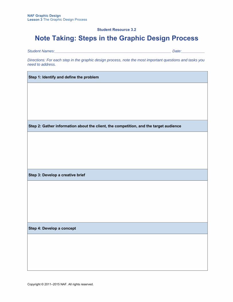
NAF Graphic Design Lesson 3 The Graphic Design Process
Copyright © 2011–2015 NAF. All rights reserved.
Student Resource 3.2
Note Taking: Steps in the Graphic Design Process
Student Names:_______________________________________________________ Date:___________
Directions: For each step in the graphic design process, note the most important questions and tasks you need to address.
Step 1: Identify and define the problem
Step 2: Gather information about the client, the competition, and the target audience
Step 3: Develop a creative brief
Step 4: Develop a concept
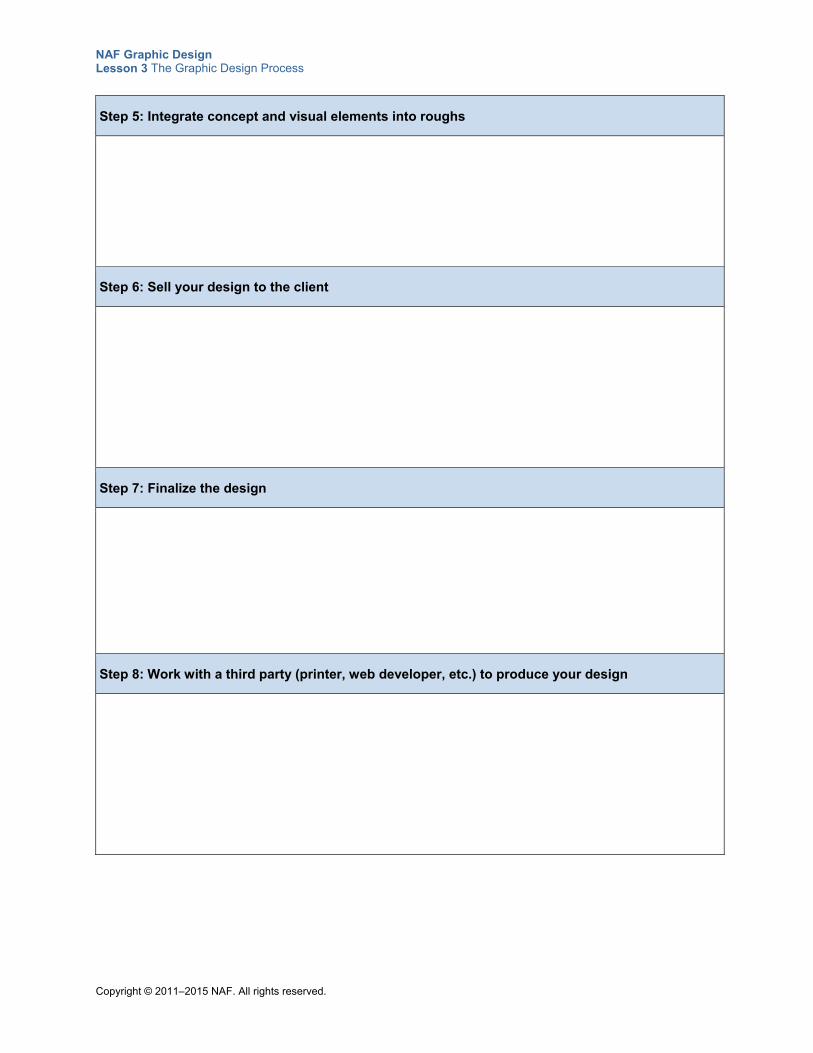
NAF Graphic Design Lesson 3 The Graphic Design Process
Copyright © 2011–2015 NAF. All rights reserved.
Step 5: Integrate concept and visual elements into roughs
Step 6: Sell your design to the client
Step 7: Finalize the design
Step 8: Work with a third party (printer, web developer, etc.) to produce your design
NAF Graphic Design Lesson 3 The Graphic Design Process
Copyright © 2011–2015 NAF. All rights reserved.
Student Resource 3.3
Reading: Steps in the Graphic Design Process
A thoughtful, well-structured design process is essential to solving visual communication problems. Although there are different ways to work through the design process, the fundamental steps outlined in this presentation provide the basis for successful design.
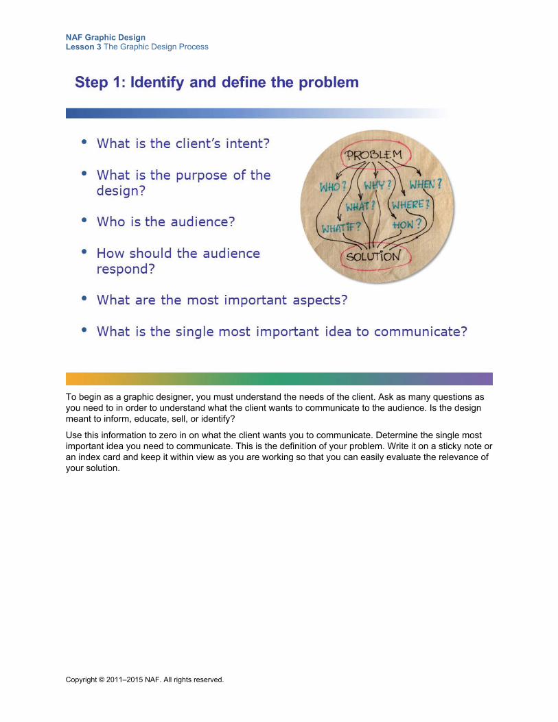
NAF Graphic Design Lesson 3 The Graphic Design Process
Copyright © 2011–2015 NAF. All rights reserved.
To begin as a graphic designer, you must understand the needs of the client. Ask as many questions as you need to in order to understand what the client wants to communicate to the audience. Is the design meant to inform, educate, sell, or identify?
Use this information to zero in on what the client wants you to communicate. Determine the single most important idea you need to communicate. This is the definition of your problem. Write it on a sticky note or an index card and keep it within view as you are working so that you can easily evaluate the relevance of your solution.
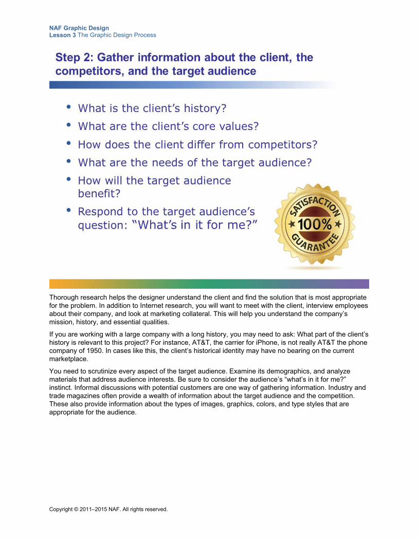
NAF Graphic Design Lesson 3 The Graphic Design Process
Copyright © 2011–2015 NAF. All rights reserved.
Thorough research helps the designer understand the client and find the solution that is most appropriate for the problem. In addition to Internet research, you will want to meet with the client, interview employees about their company, and look at marketing collateral. This will help you understand the company’s mission, history, and essential qualities.
If you are working with a large company with a long history, you may need to ask: What part of the client’s history is relevant to this project? For instance, AT&T, the carrier for iPhone, is not really AT&T the phone company of 1950. In cases like this, the client’s historical identity may have no bearing on the current marketplace.
You need to scrutinize every aspect of the target audience. Examine its demographics, and analyze materials that address audience interests. Be sure to consider the audience’s “what’s in it for me?” instinct. Informal discussions with potential customers are one way of gathering information. Industry and trade magazines often provide a wealth of information about the target audience and the competition. These also provide information about the types of images, graphics, colors, and type styles that are appropriate for the audience.
NAF Graphic Design Lesson 3 The Graphic Design Process
Copyright © 2011–2015 NAF. All rights reserved.
A creative brief is a strategic plan that both the client and the designer agree upon. The creative brief serves as a springboard for the work that follows. Research done in the previous step plays into forming this strategy. Elements such as budget, deadlines, and deliverables are also important parts of the creative brief.
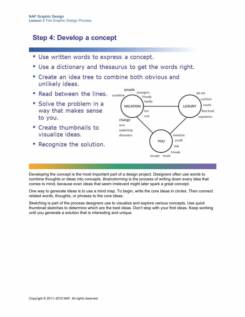
NAF Graphic Design Lesson 3 The Graphic Design Process
Copyright © 2011–2015 NAF. All rights reserved.
Developing the concept is the most important part of a design project. Designers often use words to combine thoughts or ideas into concepts. Brainstorming is the process of writing down every idea that comes to mind, because even ideas that seem irrelevant might later spark a great concept.
One way to generate ideas is to use a mind map. To begin, write the core ideas in circles. Then connect related words, thoughts, or phrases to the core ideas.
Sketching is part of the process designers use to visualize and explore various concepts. Use quick thumbnail sketches to determine which are the best ideas. Don’t stop with your first ideas. Keep working until you generate a solution that is interesting and unique.
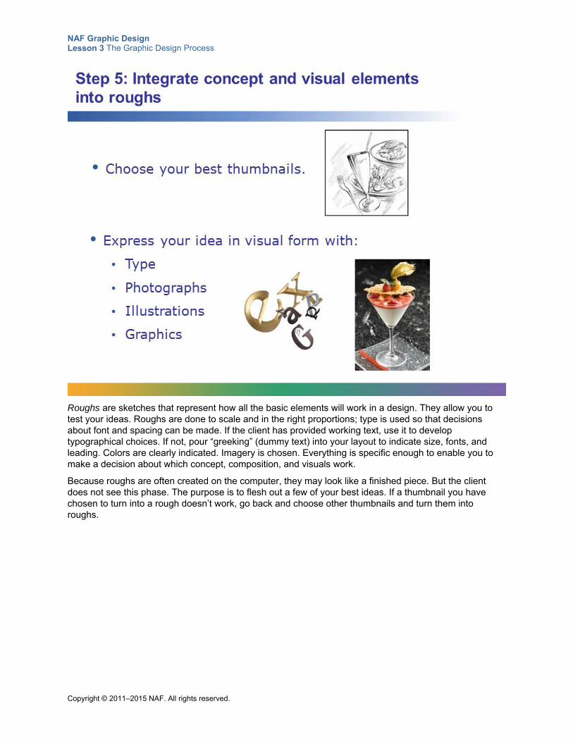
NAF Graphic Design Lesson 3 The Graphic Design Process
Copyright © 2011–2015 NAF. All rights reserved.
Roughs are sketches that represent how all the basic elements will work in a design. They allow you to test your ideas. Roughs are done to scale and in the right proportions; type is used so that decisions about font and spacing can be made. If the client has provided working text, use it to develop typographical choices. If not, pour “greeking” (dummy text) into your layout to indicate size, fonts, and leading. Colors are clearly indicated. Imagery is chosen. Everything is specific enough to enable you to make a decision about which concept, composition, and visuals work.
Because roughs are often created on the computer, they may look like a finished piece. But the client does not see this phase. The purpose is to flesh out a few of your best ideas. If a thumbnail you have chosen to turn into a rough doesn’t work, go back and choose other thumbnails and turn them into roughs.
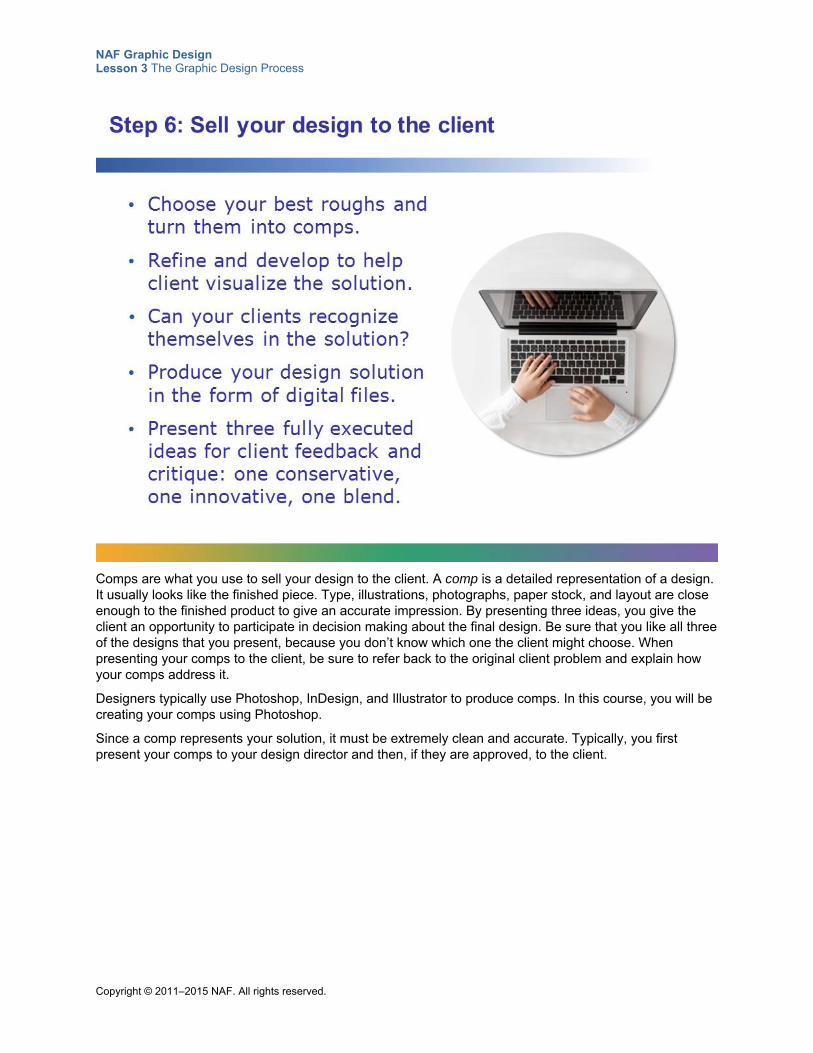
NAF Graphic Design Lesson 3 The Graphic Design Process
Copyright © 2011–2015 NAF. All rights reserved.
Comps are what you use to sell your design to the client. A comp is a detailed representation of a design. It usually looks like the finished piece. Type, illustrations, photographs, paper stock, and layout are close enough to the finished product to give an accurate impression. By presenting three ideas, you give the client an opportunity to participate in decision making about the final design. Be sure that you like all three of the designs that you present, because you don’t know which one the client might choose. When presenting your comps to the client, be sure to refer back to the original client problem and explain how your comps address it.
Designers typically use Photoshop, InDesign, and Illustrator to produce comps. In this course, you will be creating your comps using Photoshop.
Since a comp represents your solution, it must be extremely clean and accurate. Typically, you first present your comps to your design director and then, if they are approved, to the client.
NAF Graphic Design Lesson 3 The Graphic Design Process
Copyright © 2011–2015 NAF. All rights reserved.
Executing the final design requires careful work to ensure that all of the design elements work together and communicate the intended message. If the client has asked you to change one item, make sure you look at how that change impacts the rest of the design. You will likely need to go back and forth with your client once or twice, with the client proofreading and approving the finals.
Well before making your final client presentations, be sure that your final design can be reproduced without going over budget.
The final design you give to the printer or web designer will be in a page layout program such as InDesign, or converted into Adobe Acrobat PDF format. Make sure you have your design in the final page layout format when you ask for final approval from the client.
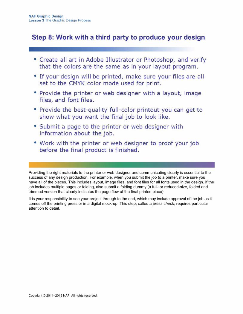
NAF Graphic Design Lesson 3 The Graphic Design Process
Copyright © 2011–2015 NAF. All rights reserved.
Providing the right materials to the printer or web designer and communicating clearly is essential to the success of any design production. For example, when you submit the job to a printer, make sure you have all of the pieces. This includes layout, image files, and font files for all fonts used in the design. If the job includes multiple pages or folding, also submit a folding dummy (a full- or reduced-size, folded and trimmed version that clearly indicates the page flow of the final printed piece).
It is your responsibility to see your project through to the end, which may include approval of the job as it comes off the printing press or in a digital mock-up. This step, called a press check, requires particular attention to detail.
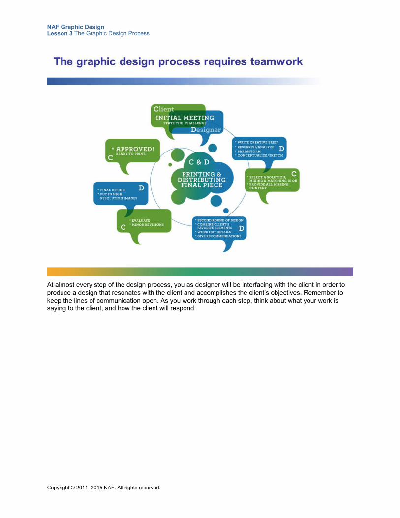
NAF Graphic Design Lesson 3 The Graphic Design Process
Copyright © 2011–2015 NAF. All rights reserved.
At almost every step of the design process, you as designer will be interfacing with the client in order to produce a design that resonates with the client and accomplishes the client’s objectives. Remember to keep the lines of communication open. As you work through each step, think about what your work is saying to the client, and how the client will respond.
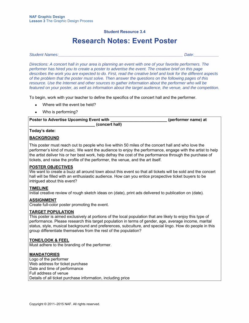
NAF Graphic Design Lesson 3 The Graphic Design Process
Copyright © 2011–2015 NAF. All rights reserved.
Student Resource 3.4
Research Notes: Event Poster
Student Names:_______________________________________________________ Date:___________
Directions: A concert hall in your area is planning an event with one of your favorite performers. The performer has hired you to create a poster to advertise the event. The creative brief on this page describes the work you are expected to do. First, read the creative brief and look for the different aspects of the problem that the poster must solve. Then answer the questions on the following pages of this resource. Use the Internet and other sources to gather information about the performer who will be featured on your poster, as well as information about the target audience, the venue, and the competition.
To begin, work with your teacher to define the specifics of the concert hall and the performer.
Where will the event be held?
Who is performing?
Poster to Advertise Upcoming Event with _________________________ (performer name) at _____________________________ (concert hall)
Today’s date:
BACKGROUND
This poster must reach out to people who live within 50 miles of the concert hall and who love the performer’s kind of music. We want the audience to enjoy the performance, engage with the artist to help the artist deliver his or her best work, help defray the cost of the performance through the purchase of tickets, and raise the profile of the performer, the venue, and the art itself.
POSTER OBJECTIVES We want to create a buzz all around town about this event so that all tickets will be sold and the concert hall will be filled with an enthusiastic audience. How can you entice prospective ticket buyers to be intrigued about this event?
TIMELINE Initial creative review of rough sketch ideas on (date), print ads delivered to publication on (date).
ASSIGNMENT Create full-color poster promoting the event.
TARGET POPULATION This poster is aimed exclusively at portions of the local population that are likely to enjoy this type of performance. Please research this target population in terms of gender, age, average income, marital status, style, musical background and preferences, subculture, and special lingo. How do people in this group differentiate themselves from the rest of the population?
TONE/LOOK & FEEL Must adhere to the branding of the performer.
MANDATORIES Logo of the performer Web address for ticket purchase Date and time of performance Full address of venue Details of all ticket purchase information, including price
NAF Graphic Design Lesson 3 The Graphic Design Process
Copyright © 2011–2015 NAF. All rights reserved.
1. Why is the client (the performer) advertising? What is the client’s intent? (For example, does the client want to inform, educate, entertain, sell, or direct?)
2. What is the message the client wants to communicate? What is the essence of the event? What is important for the public to understand about this play or concert or dance presentation?
3. What is the single most persuasive idea that the poster should communicate?
4. When you listen to the performer’s music or watch the artist perform, what images does it conjure in your mind? What words describe the performer’s style?
5. What is the performer most well-known for? What events has the performer staged over the past year? What do people say about the performer?
6. Describe the look and feel of the performer’s CD or DVD covers and prior concert posters. (Think about colors, style, language, images, and so on.)
NAF Graphic Design Lesson 3 The Graphic Design Process
Copyright © 2011–2015 NAF. All rights reserved.
7. What are the demographics of the performer’s typical audience (for example, gender; age; marital status; taste in music; social and financial status; education; clothing style; type of car driven; type of house; places the performer hangs out; specific likes or dislikes; religious, political, social, or ethical views; etc.)? What makes these people tick? What would the client like these people to think? What would the client like them to feel?
8. What is the tone and style of delivery most likely to be accepted by the target audience? How can you respond to the target audience’s question, “What’s in it for me?”
9. What are the distinguishing characteristics of the location where the event will be held?
10. What are the barriers that would discourage the target audience from buying tickets?
11. Who is the performer’s biggest competitor? How does the performer distinguish him- or herself from the competition?
NAF Graphic Design Lesson 3 The Graphic Design Process
Copyright © 2011–2015 NAF. All rights reserved.
Student Resource 3.5
Assignment Sheet: Creative Brief
Student Names:_______________________________________________________ Date:___________
Directions: Use the information in your research notes to write a creative brief for your poster project. First, do an outline, noting the information you want to include in your creative brief under each section heading below. When you are satisfied with your notes, create a polished version of the creative brief using a word processing program such as Microsoft Word. Remember, this is a brief: it should fit on one page! Before you begin working, review the assessment criteria and study the example creative brief in Student Resource 3.1, Example: Creative Brief.
Overview: (What is the basic information about this project? Who is the client and what are the client’s needs?)
Message: (What is the value of this performance to the target audience? Outline how this performer compares to the competition. What is the single most important idea to communicate?)
Timeline: (When are the comps due? When is the finished work due? For this project, you can use hypothetical dates that you think would be realistic for this type of project.)
Deliverables: (What will be delivered to the client?)
NAF Graphic Design Lesson 3 The Graphic Design Process
Copyright © 2011–2015 NAF. All rights reserved.
Target Audience: (What are the most important points to consider about the audience the poster is directed to? Where will this audience view the poster? What should be included and what should be avoided when addressing this audience?)
Style / Look and Feel: (What style appeals to the target audience? Funny, loud, casual, calming, racy? What should be communicated visually? What images would be most effective? What language would be most effective?)
Mandatories: (What are the client’s mandatory requirements in terms of content, style, etc.?)
Additional Information: (You might want to include information about the competition, for example.)
Make sure your creative brief meets or exceeds the following assessment criteria:
The creative brief contains a clear description of the client and the client’s needs and objectives.
The information about the target audience is adequate for determining the style of the message (the creative approach).
The creative brief clearly states the single most important message to convey to the target audience.
The creative brief itemizes all deliverables and spells out all deadlines.
The creative brief is neat and well written, with no spelling or grammatical errors.
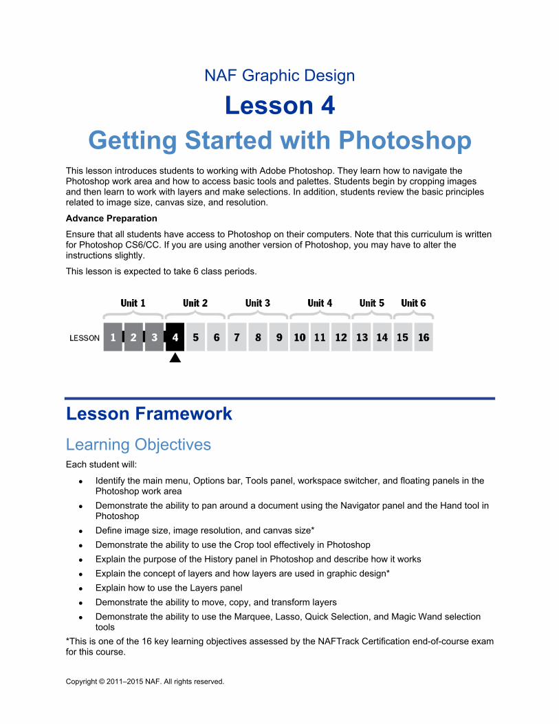
Copyright © 2011–2015 NAF. All rights reserved.
NAF Graphic Design
Lesson 4 Getting Started with Photoshop
This lesson introduces students to working with Adobe Photoshop. They learn how to navigate the Photoshop work area and how to access basic tools and palettes. Students begin by cropping images and then learn to work with layers and make selections. In addition, students review the basic principles related to image size, canvas size, and resolution.
Advance Preparation
Ensure that all students have access to Photoshop on their computers. Note that this curriculum is written for Photoshop CS6/CC. If you are using another version of Photoshop, you may have to alter the instructions slightly.
This lesson is expected to take 6 class periods.
Lesson Framework
Learning Objectives Each student will:
Identify the main menu, Options bar, Tools panel, workspace switcher, and floating panels in the Photoshop work area
Demonstrate the ability to pan around a document using the Navigator panel and the Hand tool in Photoshop
Define image size, image resolution, and canvas size*
Demonstrate the ability to use the Crop tool effectively in Photoshop
Explain the purpose of the History panel in Photoshop and describe how it works
Explain the concept of layers and how layers are used in graphic design*
Explain how to use the Layers panel
Demonstrate the ability to move, copy, and transform layers
Demonstrate the ability to use the Marquee, Lasso, Quick Selection, and Magic Wand selection tools
*This is one of the 16 key learning objectives assessed by the NAFTrack Certification end-of-course exam for this course.
NAF Graphic Design Lesson 4 Getting Started with Photoshop
Copyright © 2011–2015 NAF. All rights reserved. - 2 -
Academic Standards The relevant Common Core State Standards are too extensive to list here but are an important basis for this lesson. For details, please refer to the separate document “Correlations to the Common Core Standards” (available in the Course Planning Tools section of the course materials).
Analyze and create two and three-dimensional visual art forms using various media (Common Career Technical Core 2012, AR-VIS 3)
Demonstrate knowledge of image resolution, image size, and image file format for web, video, and print (Adobe Certified Associate, Objectives for Visual Communication using Photoshop CS6, Setting Project Requirements 2.1)
Demonstrate knowledge of design principles, elements, and image composition (Adobe Certified Associate, Objectives for Visual Communication using Photoshop CS6, Setting Project Requirements 2.2)
Identify elements of the Photoshop CS6 user interface and demonstrate knowledge of their functions (Adobe Certified Associate, Objectives for Visual Communication using Photoshop CS6, Setting Project Requirements 3.1)
Demonstrate knowledge of layers and masks (Adobe Certified Associate, Objectives for Visual Communication using Photoshop CS6, Setting Project Requirements 3.2)
Demonstrate knowledge of working with selections and measurement (Adobe Certified Associate, Objectives for Visual Communication using Photoshop CS6, Setting Project Requirements 4.1)
Create original works as a means of personal or group expression (ISTE NETS for Students 2007, 1b)
Transfer current knowledge to learning of new technologies (ISTE NETS for Students 2007, 6d)
Assessment
Assessment Product Means of Assessment
Creation of a multilayer image and an accompanying annotation (Student Resource 4.6)
Assessment Criteria: Original Multilayer Image (Teacher Resource 4.6)
Prerequisites Basic knowledge of image size and resolution
Understanding of graphic design as visual communication
Understanding of how text and images work together in a graphic design
Instructional Materials
Teacher Resources Teacher Resource 4.1, Images: CroppingImages folder, ElephantLounge.psd, House.tif,
SelectionsImages folder (separate ZIP file)
Teacher Resource 4.2, Puzzle Pieces: The Photoshop Work Area
NAF Graphic Design Lesson 4 Getting Started with Photoshop
Copyright © 2011–2015 NAF. All rights reserved. - 3 -
Teacher Resource 4.3, Reference: Photoshop Work Area (separate PPT file)
Teacher Resource 4.4, Lecture Notes: Image Size and Resolution
Teacher Resource 4.5, Commentary: A Graphic Designer Annotates Layers
Teacher Resource 4.6, Assessment Criteria: Original Multilayer Image
Teacher Resource 4.7, Key Vocabulary: Getting Started with Photoshop
Teacher Resource 4.8, Bibliography: Getting Started with Photoshop
Student Resources Student Resource 4.1, K-W-L Chart: Image Size, Canvas Size, and Resolution
Student Resource 4.2, Reading: Tips on Composition Balance
Student Resource 4.3, Practice and Notes: Creating and Manipulating Layers
Student Resource 4.4, Image Series: Editing Using Selections
Student Resource 4.5, Practice Exercises: Using Selection Tools
Student Resource 4.6, Assignment Sheet: Creating an Original Multilayer Image
Student Resource 4.7, Planning Sheet: Multilayer Image
Equipment and Supplies LCD projector and computer
Access to Photoshop for all students
Familiar image that the class can edit in Photoshop (such as a photo of a school activity)
Blackboard, whiteboard, or flip chart
Chart paper and adhesive tape
Sticky notes
Lesson Steps
Step Min. Activity
CLASS PERIOD 1
1 15 Assembling a Puzzle: The Photoshop Work Area
The purpose of this activity is to familiarize students with the Photoshop work area. This activity also focuses on the following college and career skills:
NAF Graphic Design Lesson 4 Getting Started with Photoshop
Copyright © 2011–2015 NAF. All rights reserved. - 4 -
Step Min. Activity
Demonstrating teamwork and collaboration
Thinking critically and systemically to solve difficult problems
Before students come to class, draw the outline of a computer screen on a piece of chart paper, leaving enough room around the edges for students to label the different parts of the Photoshop work area. Also print a copy of the nine puzzle piece pages of Teacher Resource 4.2, Puzzle Pieces: The Photoshop Work Area.
Explain to students that the first step to becoming proficient in Photoshop is to become familiar with the work area. Arrange students in nine groups and give each group one sheet from Teacher Resource 4.2. Also ask each group to open an image in Photoshop. (For example, you might give students a photo of the class to open in Photoshop, or some other image that is familiar to them.)
Explain that the puzzle piece they have on their sheet is a part of the Photoshop work area. Point out that their sheet gives them the name of their item, explains where to locate it in the Photoshop window, and gives them one or two tasks to perform with their item. Instruct groups to:
Locate their item on their Photoshop screen and follow the instructions given on the sheet. They should prepare to share what they discover with the rest of the class.
Cut out their puzzle piece and tape it in the correct place on the chart paper, so that the chart paper looks like a Photoshop window when all of the pieces are attached.
Label their puzzle piece on the chart paper.
When all groups have added their puzzle piece to the chart paper and labeled it, ask each group of students to report what they know about their puzzle piece. As the groups report, point out any interaction between the various puzzle pieces. Answer any questions about how the Photoshop work area is organized.
Keep the chart paper posted in the classroom so that you can refer to it when working with Photoshop. Give each student a copy of Teacher Resource 4.3, Reference: Photoshop Work Area (separate PDF file). Have students check to see if this reference looks the same as the image they’ve created on chart paper, and talk through any discrepancies. Instruct students to place this reference sheet in their notebook for use when working with Photoshop.
Remind students that having a good handle on the Photoshop work area will help them work more quickly and effectively. Point out that they will get lots of practice using various parts of the work area during this lesson.
2 15 K-W-L Chart: Image Size, Canvas Size, and Resolution
The purpose of this activity is to review the relationships between image size, canvas size, and resolution. Students will use this knowledge when they crop images later in this lesson.
Explain to students that the concepts of image size, canvas size, and resolution are extremely important for graphic designers. Tell them they need to master these concepts in order to work effectively in Photoshop. Refer students to Student Resource 4.1, K-W-L Chart: Image Size, Canvas Size, and Resolution. Instruct students to write down what they already know about each term in the first column and to write anything else they would like to know in the second column. (For details on the K-W-L learning
NAF Graphic Design Lesson 4 Getting Started with Photoshop
Copyright © 2011–2015 NAF. All rights reserved. - 5 -
Step Min. Activity
strategy, see The NAF Learning Handbook.).
After students have completed the first two columns of their chart, ask them to share what they wrote with a partner.
Next, use the lecture notes in Teacher Resource 4.4, Lecture Notes: Image Size and Resolution, to fill in any gaps in students’ knowledge of these topics. Instruct students to take notes in the “What I Learned” column of their K-W-L chart during the lecture.
Tell students that in the next activities, they will be cropping pictures and will need to consider the image size and the resolution of the image.
3
20 Modeling and Guided Practice: Cropping a Picture
In this activity, students practice cropping a picture with the Crop tool, paying attention to resolution and image size. They also get practice using the Navigator and History panels as they work. This activity focuses on the following college and career skills:
Demonstrating the ability to listen effectively
Effectively using technology relevant to a profession
Using a computer with an LCD projector, open an image that has several different items that students might want to crop. You could choose a picture from a sports event at your school, for example, or choose one of the photos in the CroppingImages folder in Teacher Resource 4.1, Images. Have students open the same image you open and follow along on their own computers.
To begin, demonstrate how to use the Navigator panel to move around in the image, increase the zoom, and so on. When students catch on, demonstrate how to use the Hand tool to move the image. After students have a minute to practice this, ask them to share reasons why the Navigator panel and the Hand tool will be useful to them.
Next, open the Crop tool and look at the image size and resolution settings in the Options bar. Ask students for suggestions about what you might want to specify for image size and resolution, based on your discussion of image size and resolution in the previous activity. When students are clear on how image size and resolution work in the Options bar, instruct them to choose the section they want to crop, specify the image size and resolution, and perform the crop.
After students have cropped the picture, introduce the History panel. Demonstrate what happens when you select a previous version of the image in the History panel. Ask students to share reasons why the History panel might be useful.
Finally, instruct students to save their cropped image as a JPEG file (with file extension “.jpg”). Explain that JPEG is a standard format that is recognized by most graphic editing programs. When you save a JPEG file, Photoshop asks you to choose a compression amount. Explain that Photoshop uses lossy compression, which eliminates some color detail but can shrink a JPEG file to about 5% of original size.
If time permits, allow students to do a gallery walk and look at the cropped images displayed on their peers’ computer screens. Answer any questions students have about image size and resolution.
Tell students that in the next class period, they will be cropping a picture of their choice. Encourage them to choose a picture they would like to work with and to bring it to the
NAF Graphic Design Lesson 4 Getting Started with Photoshop
Copyright © 2011–2015 NAF. All rights reserved. - 6 -
Step Min. Activity
next class period.
CLASS PERIOD 2
4 10 Reading: Tips on Composition Balance
This reading gives students some tips about composition that they can apply when they crop pictures in the next activity.
To begin, refer students to Student Resource 4.2, Reading: Tips on Composition Balance.
As a pre-reading activity, ask students what catches their eye when they look at each of the four pictures in the reading. Explain that composition balance is a way of leading the viewer into an image and making the viewer connect with the image.
Instruct students to read the passage and underline the tips they think they could use to crop an image effectively and demonstrate composition balance.
When students have completed the reading, have them share what they have underlined with a partner, and then share as a class.
Tell students that in the next activity, they will need to put what they have learned about composition into practice when they crop an image.
5
15 Independent Practice: Creating a Cropped Image
In this activity, students get practice using all they have learned about cropping images.
Instruct students to open a photo of their choice in Photoshop and use what they have learned so far in this lesson to crop their image effectively. (Students who don’t have their own image can use one of the images in the CroppingImages folder in Teacher Resource 4.1, Images.)
Remind students to pay attention to image size, resolution, and composition. Tell them to save their cropped image as a JPEG file.
When students have completed their cropping, write the following questions on the board and ask students to write answers to these questions in their notebook:
What resolution did you choose for your image and why?
What dimensions did you choose for your image and why?
How does your new image show composition balance?
Finally, ask students to take a look at each other’s cropped images and use sticky notes to comment on their effectiveness. Write the following terms on the board and encourage students to use these terms in their comments:
Focal point
Sense of depth
Balance of light and dark
Broken symmetry
NAF Graphic Design Lesson 4 Getting Started with Photoshop
Copyright © 2011–2015 NAF. All rights reserved. - 7 -
Step Min. Activity
Splash of color
Geometric forms
You may want to gauge student understanding by assessing the cropped images and notebook questions on a credit/no credit basis.
Remind students that cropping images effectively is an important skill that they will need to perfect as they work in graphic design.
6 5 K-W-L Chart: New Information about Image Size and Resolution
In this activity, students note the new information they have learned about image size and resolution, as related to cropping pictures in Photoshop.
Instruct students to revisit their K-W-L chart about image size and resolution (Student Resource 4.1) and to add any new information they learned from the reading and from their experience while cropping images in Photoshop. After they have a few minutes to write, ask students to share their updated What I Learned column with a partner, and then have them share as a class. Answer any remaining questions students have about image size and resolution.
7
20 Guided Practice and Analysis: Dissecting a Composite Image into Layers
In this activity, students discover the different ways that layers can be used to create a composite image.
To begin this activity, ask students to work in pairs, and have them open the image ElephantLounge.psd in Photoshop. (This image is included in Teacher Resource 4.1, Images.) Only the background layer should be visible when students open the image. Explain that this image was created by a graphic designer who wanted to create a CD cover for a fictional electronic/digital band named Elephant Lounge Orchestra. She used several layers to create her cover.
Explain that the background layer is like the canvas or paper that the rest of the image is built on. Using your computer and an LCD projector, show students the Layers panel and demonstrate how to activate the next layer up by clicking the visibility icon (eye icon) in the left column. Explain that as you activate each layer in order, each new layer sits on top of the layers that are already activated. The layers with a checkered background in the Layers panel are transparent.
Then, instruct students to activate the other layers one at a time from the bottom up by clicking in the eye icon column, and to discuss with their partner the new items that they see in each layer. Once they have gone through all the layers, ask them to deactivate all of the layers except the background. Tell them they will now have a chance to look at the construction of this image from the graphic designer’s point of view.
Using Teacher Resource 4.5, Commentary: A Graphic Designer Annotates Layers, read aloud the commentary of the graphic designer as students activate each layer. Point out the importance of clearly naming each layer when you create a design. And make sure students understand that each layer serves a specific purpose in building the design.
Finally, ask students to work with their partner and write an answer to the following question in their notebook. Tell them they should be prepared to share their answer
NAF Graphic Design Lesson 4 Getting Started with Photoshop
Copyright © 2011–2015 NAF. All rights reserved. - 8 -
Step Min. Activity
with the class:
How does the use of layers add to graphic design?
Ask pairs to share their answers with the class, and make a list on the board with information about the purpose of layers.
Make sure you cover the following:
Each layer contains discrete elements of the design; the layers are then combined to create the finished product.
Layers make it easy to modify a design because separate elements can be accessed and edited.
Point out to students that layers are one of the most important tools used by professional graphic designers, and tell them they will be using layers in almost all of the work they do in this course.
CLASS PERIOD 3
8
25 Modeling & Guided Practice: Creating, Duplicating, Deleting, and Moving Layers
In this activity, students learn how to manipulate layers. This activity also focuses on the following college and career skills:
Effectively using technology relevant to a profession
Demonstrating the ability to listen effectively
Explain to students that in this activity, they will learn how to use various Photoshop tools, along with the Layers panel, to modify an image by creating new layers and manipulating the existing layers. Refer students to Student Resource 4.3, Practice and Notes: Creating and Manipulating Layers, and ask them to take notes on this resource as you work through the layers exercise. Note that you will be taking the image on the left of the resource page and adding layers to create the image on the right.
Using your computer connected to an LCD projector, open the file House.tif. (This file is in Teacher Resource 4.1, Images.) Have students open this image on their computers also and complete each step along with you. Follow the steps below to demonstrate basic ways of creating, organizing, and manipulating layers.
1. Begin by looking at each of the existing layers so that students are clear about what is contained in each layer. Rename the layers to give them meaningful names. (Explain to students that you double-click the name to rename the layer.)
2. Before continuing, have students save their files using Save > Save As, so that they don’t accidentally save all of their changes over the original.
3. Group layers 2–5, and name the group House1.
4. Use the Free Transform tool (Edit > Free Transform) to reduce the size of the house. Be sure to press the Shift key as you click and drag the bottom right corner of House1; this will retain the proportions of the image as you reduce it. Double-click within the selection to complete the transformation, or press the Enter key.
5. Select the House1 group and, to duplicate the group, drag it down to the duplicate-
NAF Graphic Design Lesson 4 Getting Started with Photoshop
Copyright © 2011–2015 NAF. All rights reserved. - 9 -
Step Min. Activity
layer icon at the bottom of the Layers panel.
6. Name the new group House2.
7. Use the Move tool to move the second house next to the first house.
8. Select the fourth layer (the windows) from House2 and drag it to the Trash icon at the bottom of the Layers panel to remove the windows from House2, and then use the Free Transform tool (Edit > Free Transform) to make the door bigger.
9. Select House1 and add a new layer called Chimney. Set the color to red, and use the Rectangle tool to draw a chimney. Use the Free Transform tool to place the chimney on the roof correctly and resize it if necessary, and then rotate it a bit to illustrate how free transform rotate works.
10. Add another layer and call it Smoke. Change the color to white, and use the Brush tool to create some smoke coming out of the chimney. Encourage students to test out different brushes in the brush Options bar drop-down list.
11. Create a Hue/Saturation layer and increase the lightness to make it look like a foggy day.
12. Add a final layer and call it Name. Select the Text tool and instruct students to write their name in this layer. Tell them to use the font and size that they want and to place their name somewhere in the image. Point out that the T is used in the Layers panel to denote this as a text layer.
When you have completed these steps, give students a chance to look at each other’s images. Point out that their images should look very similar to yours. For any images that aren’t correct, instruct students to help each other figure out where they went astray and make corrections. Remind them to use the History panel if they need to go back to a previous step. Answer any questions they may have about creating, organizing, and manipulating images. You may want to gauge student understanding by assessing the notes they wrote in Student Resource 4.3 on a credit/no credit basis.
Point out to students that they will be learning more and more about working with layers throughout this course, but knowing the basics covered in this activity will help them to work effectively in Photoshop.
9
25 Guided Practice: Using Selections
This activity introduces students to the concept of using selections to edit images.
To introduce this activity, refer students to Student Resource 4.4, Image Series: Editing Using Selections. Explain that in each of the four series of images, something has been selected from the first image and inserted into the second image to create a new image with two layers.
Write the following questions on the board, and ask students to work with a partner to answer these questions for each of the four series of images:
What has been selected from the first image in the series?
What is the shape of the selection?
Which of the four selections looks like it would be the easiest to make? Why? Which one looks like it would be the hardest to make? Why?
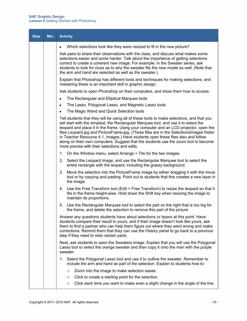
NAF Graphic Design Lesson 4 Getting Started with Photoshop
Copyright © 2011–2015 NAF. All rights reserved. - 10 -
Step Min. Activity
Which selections look like they were resized to fit in the new picture?
Ask pairs to share their observations with the class, and discuss what makes some selections easier and some harder. Talk about the importance of getting selections correct to create a coherent new image. For example, in the Sweater series, ask students to look for clues as to why the sweater fits the new model so well. (Note that the arm and hand are selected as well as the sweater.)
Explain that Photoshop has different tools and techniques for making selections, and mastering these is an important skill in graphic design.
Ask students to open Photoshop on their computers, and show them how to access:
The Rectangular and Elliptical Marquee tools
The Lasso, Polygonal Lasso, and Magnetic Lasso tools
The Magic Wand and Quick Selection tools
Tell students that they will be using all of these tools to make selections, and that you will start with the simplest, the Rectangular Marquee tool, and use it to select the leopard and place it in the frame. Using your computer and an LCD projector, open the files Leopard.jpg and PictureFrame.jpg. (These files are in the SelectionsImages folder in Teacher Resource 4.1, Images.) Have students open these files also and follow along on their own computers. Suggest that the students use the zoom tool to become more precise with their selections and edits.
1. On the Window menu, select Arrange > Tile for the two images.
2. Select the Leopard image, and use the Rectangular Marquee tool to select the entire rectangle with the leopard, including the grassy background.
3. Move the selection into the PictureFrame image by either dragging it with the move tool or by copying and pasting. Point out to students that this creates a new layer in the image.
4. Use the Free Transform tool (Edit > Free Transform) to resize the leopard so that it fits in the frame height-wise. Hold down the Shift key when resizing the image to maintain its proportions.
5. Use the Rectangular Marquee tool to select the part on the right that is too big for the frame, and delete the selection to remove this part of the picture.
Answer any questions students have about selections or layers at this point. Have students compare their result to yours, and if their image doesn’t look like yours, ask them to find a partner who can help them figure out where they went wrong and make corrections. Remind them that they can use the History panel to go back to a previous step if they need to redo certain parts.
Next, ask students to open the Sweaters image. Explain that you will use the Polygonal Lasso tool to select the orange sweater and then copy it onto the man with the purple sweater.
1. Select the Polygonal Lasso tool and use it to outline the sweater. Remember to include the arm and hand as part of the selection. Explain to students how to:
o Zoom into the image to make selection easier.
o Click to create a starting point for the selection.
o Click each time you want to make even a slight change in the angle of the line
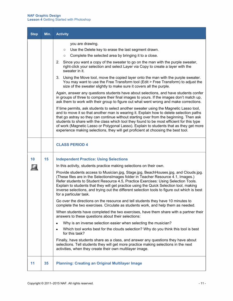
NAF Graphic Design Lesson 4 Getting Started with Photoshop
Copyright © 2011–2015 NAF. All rights reserved. - 11 -
Step Min. Activity
you are drawing.
o Use the Delete key to erase the last segment drawn.
o Complete the selected area by bringing it to a close.
2. Since you want a copy of the sweater to go on the man with the purple sweater, right-click your selection and select Layer via Copy to create a layer with the sweater in it.
3. Using the Move tool, move the copied layer onto the man with the purple sweater. You may want to use the Free Transform tool (Edit > Free Transform) to adjust the size of the sweater slightly to make sure it covers all the purple.
Again, answer any questions students have about selections, and have students confer in groups of three to compare their final images to yours. If the images don’t match up, ask them to work with their group to figure out what went wrong and make corrections.
If time permits, ask students to select another sweater using the Magnetic Lasso tool, and to move it so that another man is wearing it. Explain how to delete selection paths that go astray so they can continue without starting over from the beginning. Then ask students to share with the class which tool they found to be most efficient for this type of work (Magnetic Lasso or Polygonal Lasso). Explain to students that as they get more experience making selections, they will get proficient at choosing the best tool.
CLASS PERIOD 4
10
15 Independent Practice: Using Selections
In this activity, students practice making selections on their own.
Provide students access to Musician.jpg, Stage.jpg, BeachHouses.jpg, and Clouds.jpg. (These files are in the SelectionsImages folder in Teacher Resource 4.1, Images.) Refer students to Student Resource 4.5, Practice Exercises: Using Selection Tools. Explain to students that they will get practice using the Quick Selection tool, making inverse selections, and trying out the different selection tools to figure out which is best for a particular task.
Go over the directions on the resource and tell students they have 10 minutes to complete the two exercises. Circulate as students work, and help them as needed.
When students have completed the two exercises, have them share with a partner their answers to these questions about their selections:
Why is an inverse selection easier when selecting the musician?
Which tool works best for the clouds selection? Why do you think this tool is best for this task?
Finally, have students share as a class, and answer any questions they have about selections. Tell students they will get more practice making selections in the next activities, when they create their own multilayer image.
11 35 Planning: Creating an Original Multilayer Image
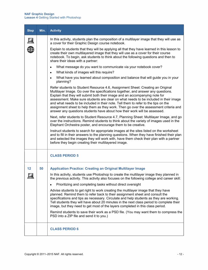
NAF Graphic Design Lesson 4 Getting Started with Photoshop
Copyright © 2011–2015 NAF. All rights reserved. - 12 -
Step Min. Activity
In this activity, students plan the composition of a multilayer image that they will use as a cover for their Graphic Design course notebook.
Explain to students that they will be applying all that they have learned in this lesson to create their own multilayered image that they will use as a cover for their course notebook. To begin, ask students to think about the following questions and then to share their ideas with a partner:
What message do you want to communicate via your notebook cover?
What kinds of images will this require?
What have you learned about composition and balance that will guide you in your planning?
Refer students to Student Resource 4.6, Assignment Sheet: Creating an Original Multilayer Image. Go over the specifications together, and answer any questions. Explain that they will submit both their image and an accompanying note for assessment. Make sure students are clear on what needs to be included in their image and what needs to be included in their note. Tell them to refer to the tips on the assignment sheet to help them as they work. Then go over the assessment criteria and answer any questions students have about how their work will be assessed.
Next, refer students to Student Resource 4.7, Planning Sheet: Multilayer Image, and go over the instructions. Remind students to think about the variety of images used in the Elephant Orchestra poster, and encourage them to be creative.
Instruct students to search for appropriate images at the sites listed on the worksheet and to fill in their answers to the planning questions. When they have finished their plan and selected the images they will work with, have them check their plan with a partner before they begin creating their multilayered image.
CLASS PERIOD 5
12
50 Application Practice: Creating an Original Multilayer Image
In this activity, students use Photoshop to create the multilayer image they planned in the previous activity. This activity also focuses on the following college and career skill:
Prioritizing and completing tasks without direct oversight
Advise students to get right to work creating the multilayer image that they have planned. Remind them to refer back to their assignment sheet and consult the specifications and tips as necessary. Circulate and help students as they are working. Tell students they will have about 20 minutes in the next class period to complete their image, but they need to get most of the layers completed in this class period.
Remind students to save their work as a PSD file. (You may want them to compress the PSD into a ZIP file and send it to you.)
CLASS PERIOD 6
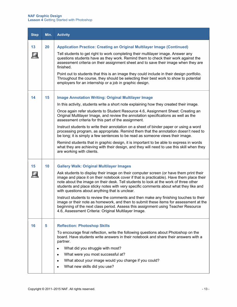
NAF Graphic Design Lesson 4 Getting Started with Photoshop
Copyright © 2011–2015 NAF. All rights reserved. - 13 -
Step Min. Activity
13
20 Application Practice: Creating an Original Multilayer Image (Continued)
Tell students to get right to work completing their multilayer image. Answer any questions students have as they work. Remind them to check their work against the assessment criteria on their assignment sheet and to save their image when they are finished.
Point out to students that this is an image they could include in their design portfolio. Throughout the course, they should be selecting their best work to show to potential employers for an internship or a job in graphic design.
14 15 Image Annotation Writing: Original Multilayer Image
In this activity, students write a short note explaining how they created their image.
Once again refer students to Student Resource 4.6, Assignment Sheet: Creating an Original Multilayer Image, and review the annotation specifications as well as the assessment criteria for this part of the assignment.
Instruct students to write their annotation on a sheet of binder paper or using a word processing program, as appropriate. Remind them that the annotation doesn’t need to be long; it is simply a few sentences to be read as someone views their image.
Remind students that in graphic design, it is important to be able to express in words what they are achieving with their design, and they will need to use this skill when they are working with clients.
15
10 Gallery Walk: Original Multilayer Images
Ask students to display their image on their computer screen (or have them print their image and place it on their notebook cover if that is practicable). Have them place their note about the image on their desk. Tell students to look at the work of three other students and place sticky notes with very specific comments about what they like and with questions about anything that is unclear.
Instruct students to review the comments and then make any finishing touches to their image or their note as homework, and then to submit these items for assessment at the beginning of the next class period. Assess this assignment using Teacher Resource 4.6, Assessment Criteria: Original Multilayer Image.
16 5 Reflection: Photoshop Skills
To encourage final reflection, write the following questions about Photoshop on the board. Have students write answers in their notebook and share their answers with a partner.
What did you struggle with most?
What were you most successful at?
What about your image would you change if you could?
What new skills did you use?
NAF Graphic Design Lesson 4 Getting Started with Photoshop
Copyright © 2011–2015 NAF. All rights reserved. - 14 -
Extensions
Enrichment Have students create a Venn diagram to compare and contrast the Photoshop work area to the
work area in another application such as Microsoft PowerPoint.
Instruct students to find an image that they like and experiment with changing the image resolution and image size to see how this affects the sharpness of the image. Ask them to write a paragraph to summarize their findings.
Ask students to practice using selection tools, the Crop tool, transformations, and layers to create a set of images related to a particular theme, and to begin a portfolio with their favorites. Remind students of the importance of practicing these skills in order to perfect them.
Technology Integration Have students research the difference between saving files for print versus saving them for use on
the web. Make sure they consider size, file types, and platform. Students can begin their research using the following websites for reference:
o http://www.creativeprogression.com/save-for-web/
o http://www.vsellis.com/understanding-dpi-resolution-and-print-vs-web-images/
Ask students to look at Photoshop shortcut keys and practice using them. Encourage them to use the following image maps to help them memorize the shortcuts:
o http://cdn.designbeep.com/wp-content/uploads/2011/02/63.jpg
o http://phlearn.com/wp-content/uploads/2011/03/keyboard-shortcuts.jpg
o http://www.shortcutstickers.com/images/large/photoshop-shortcut-stickers_c1_LRG.jpg
Cross-Curricular Integration Math: Refer students to the website All about Digital Photos (http://www.rideau-
info.com/photos/math.html) and ask them to work out the math problems related to calculating ppi, dpi, and image size.
History: Have students create an annotated timeline that shows important milestones in the history of Photoshop and the history of Adobe. Have them focus on how the rise of Photoshop and the rise of digital photography in general have had an impact on photography.
Any other class: Ask students to create a Photoshop image to use as an illustration in a project or writing assignment.
Science: Ask students to create a layered image that illustrates the different layers of something in nature, such as a leaf.
Copyright © 2011–2015 NAF. All rights reserved.
NAF Graphic Design
Lesson 4 Getting Started with Photoshop
Teacher Resources
Resource Description
Teacher Resource 4.1 Images: CroppingImages folder, ElephantLounge.psd, House.tif, SelectionsImages folder (separate ZIP file)
Teacher Resource 4.2 Puzzle Pieces: The Photoshop Work Area
Teacher Resource 4.3 Reference: Photoshop Work Area (separate PPT file)
Teacher Resource 4.4 Lecture Notes: Image Size and Resolution
Teacher Resource 4.5 Commentary: A Graphic Designer Annotates Layers
Teacher Resource 4.6 Assessment Criteria: Original Multilayer Image
Teacher Resource 4.7 Key Vocabulary: Getting Started with Photoshop
Teacher Resource 4.8 Bibliography: Getting Started with Photoshop
NAF Graphic Design Lesson 4 Getting Started with Photoshop
Copyright © 2011–2015 NAF. All rights reserved.
Teacher Resource 4.2
Puzzle Pieces: The Photoshop Work Area
Directions: Print the following pages in this resource and give one page to each group. Make sure all pages are distributed. (If necessary, give more than one page to each group.) Each group will cut out its piece of the puzzle and then tape it in the correct place on a piece of chart paper that has an outline of a computer screen.
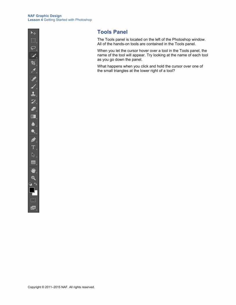
NAF Graphic Design Lesson 4 Getting Started with Photoshop
Copyright © 2011–2015 NAF. All rights reserved.
Tools Panel The Tools panel is located on the left of the Photoshop window. All of the hands-on tools are contained in the Tools panel.
When you let the cursor hover over a tool in the Tools panel, the name of the tool will appear. Try looking at the name of each tool as you go down the panel.
What happens when you click and hold the cursor over one of the small triangles at the lower right of a tool?
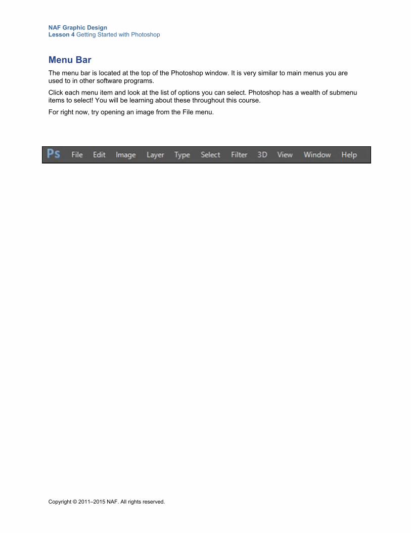
NAF Graphic Design Lesson 4 Getting Started with Photoshop
Copyright © 2011–2015 NAF. All rights reserved.
Menu Bar The menu bar is located at the top of the Photoshop window. It is very similar to main menus you are used to in other software programs.
Click each menu item and look at the list of options you can select. Photoshop has a wealth of submenu items to select! You will be learning about these throughout this course.
For right now, try opening an image from the File menu.
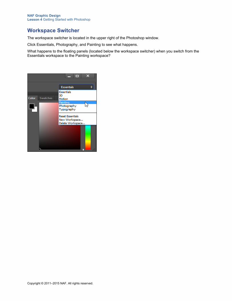
NAF Graphic Design Lesson 4 Getting Started with Photoshop
Copyright © 2011–2015 NAF. All rights reserved.
Workspace Switcher The workspace switcher is located in the upper right of the Photoshop window.
Click Essentials, Photography, and Painting to see what happens.
What happens to the floating panels (located below the workspace switcher) when you switch from the Essentials workspace to the Painting workspace?
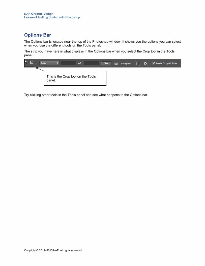
NAF Graphic Design Lesson 4 Getting Started with Photoshop
Copyright © 2011–2015 NAF. All rights reserved.
Options Bar The Options bar is located near the top of the Photoshop window. It shows you the options you can select when you use the different tools on the Tools panel.
The strip you have here is what displays in the Options bar when you select the Crop tool in the Tools panel.
Try clicking other tools in the Tools panel and see what happens to the Options bar.
This is the Crop tool on the Tools panel.
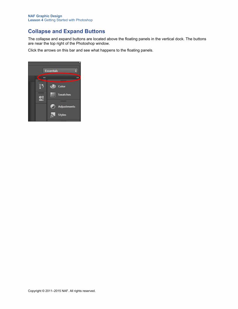
NAF Graphic Design Lesson 4 Getting Started with Photoshop
Copyright © 2011–2015 NAF. All rights reserved.
Collapse and Expand Buttons The collapse and expand buttons are located above the floating panels in the vertical dock. The buttons are near the top right of the Photoshop window.
Click the arrows on this bar and see what happens to the floating panels.
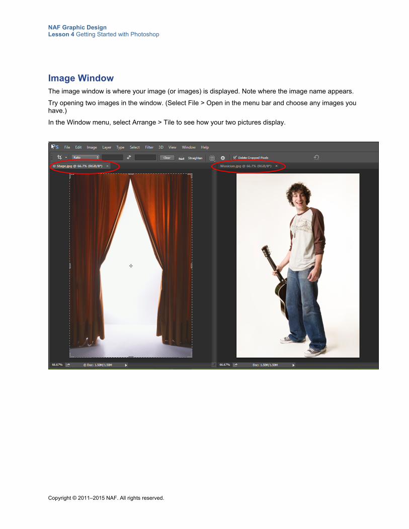
NAF Graphic Design Lesson 4 Getting Started with Photoshop
Copyright © 2011–2015 NAF. All rights reserved.
Image Window The image window is where your image (or images) is displayed. Note where the image name appears.
Try opening two images in the window. (Select File > Open in the menu bar and choose any images you have.)
In the Window menu, select Arrange > Tile to see how your two pictures display.
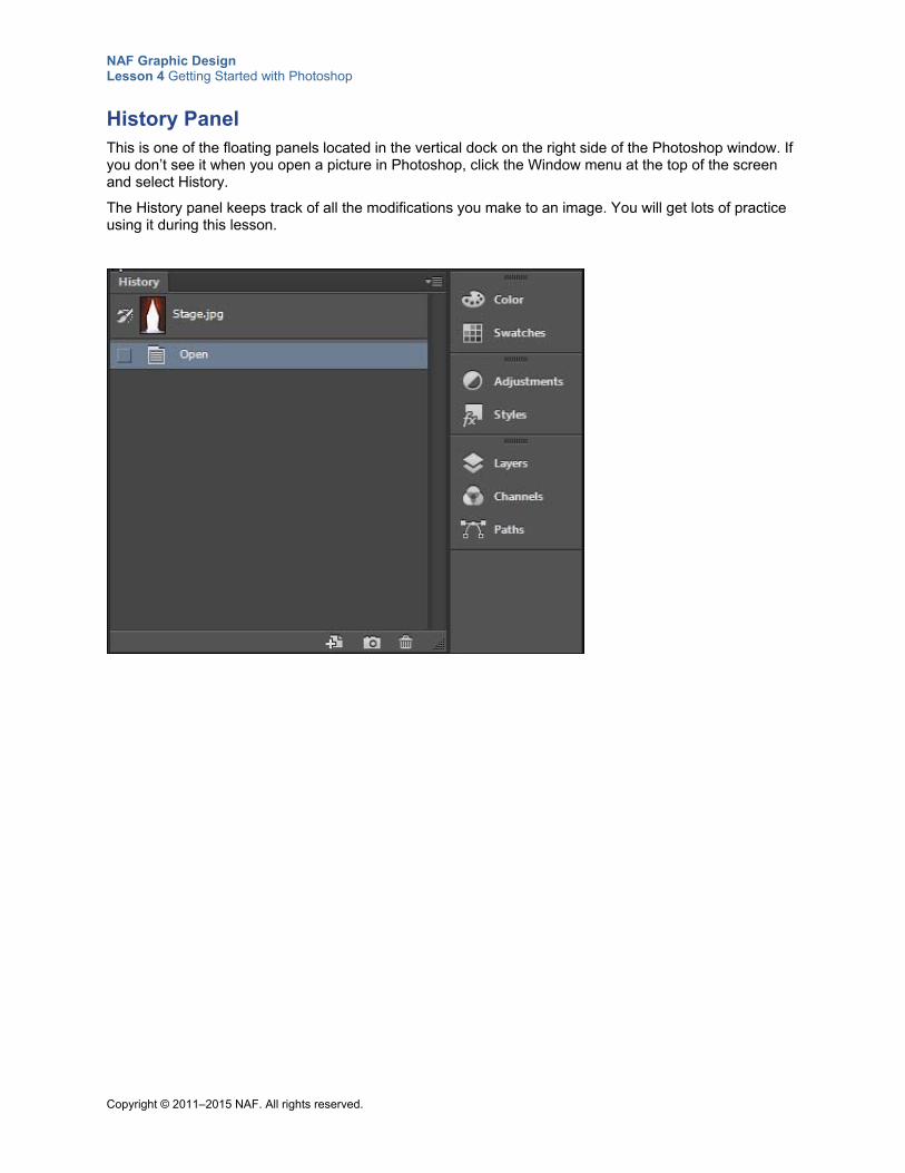
NAF Graphic Design Lesson 4 Getting Started with Photoshop
Copyright © 2011–2015 NAF. All rights reserved.
History Panel This is one of the floating panels located in the vertical dock on the right side of the Photoshop window. If you don’t see it when you open a picture in Photoshop, click the Window menu at the top of the screen and select History.
The History panel keeps track of all the modifications you make to an image. You will get lots of practice using it during this lesson.
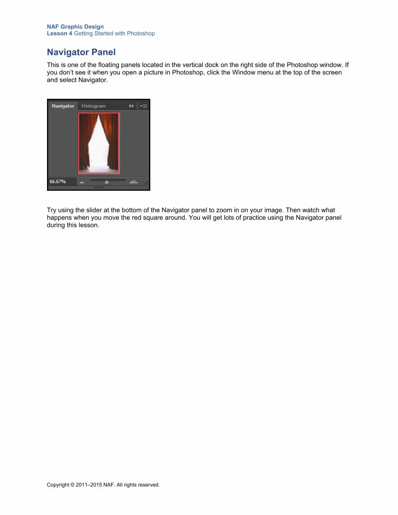
NAF Graphic Design Lesson 4 Getting Started with Photoshop
Copyright © 2011–2015 NAF. All rights reserved.
Navigator Panel This is one of the floating panels located in the vertical dock on the right side of the Photoshop window. If you don’t see it when you open a picture in Photoshop, click the Window menu at the top of the screen and select Navigator.
Try using the slider at the bottom of the Navigator panel to zoom in on your image. Then watch what happens when you move the red square around. You will get lots of practice using the Navigator panel during this lesson.
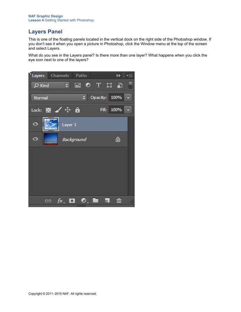
NAF Graphic Design Lesson 4 Getting Started with Photoshop
Copyright © 2011–2015 NAF. All rights reserved.
Layers Panel This is one of the floating panels located in the vertical dock on the right side of the Photoshop window. If you don’t see it when you open a picture in Photoshop, click the Window menu at the top of the screen and select Layers.
What do you see in the Layers panel? Is there more than one layer? What happens when you click the eye icon next to one of the layers?
NAF Graphic Design Lesson 4 Getting Started with Photoshop
Copyright © 2011–2015 NAF. All rights reserved.
Teacher Resource 4.4
Lecture Notes: Image Size and Resolution
Use these notes to explain the important points about image size, resolution, and canvas size to students.
Resolution or Pixels per Inch (ppi) This refers to the number of pixels on a linear inch of an image when the image is viewed on a monitor. The more pixels per inch, the higher the resolution. An image with a higher resolution will look smoother and sharper.
The higher the image resolution, the larger your file size. The larger your file size, the longer it will take your computer to process or save an image.
Dots per Inch (dpi) This refers to the number of dots on a linear inch of a printed image. The more dots per square inch, the higher the resolution and the sharper the image. Dots per inch is used only for printed images.
Make Sure the Resolution Is Correct for Your Project For web (onscreen) graphics, the standard is 72 ppi.
For print design, resolution needs to be 300 ppi when the image will be used at the same size (or smaller) in the final layout in a program like InDesign.
Images that are black and white only (no shades of gray) need to be saved as TIFFs in bitmap color mode at 1,200 ppi resolution so that they look sharp. This format is mostly used for solid black and white line art such as simple text logos. Images in bitmap color mode are made up of either black or white pixels. There are no colors and there are no gray tones.
In desktop publishing, TIFF is the standard format for importing images into documents. There is no compression.
Image Size To get a sharp image, set the image size no smaller than the proportion that your final picture needs to have. For example, if you want an image that is 8.5 by 11 inches, make sure your image size is 8.5 by 11 inches or larger. You might want to have the image size larger than the exact size because of the probability that it could be changed or repurposed. Most designers keep a source file of the largest possible size for future use. Help students to understand the importance of setting an image size when they create an image, rather than just opening a picture and using the dimensions of the picture as the image size.
The amount of image data remains constant when you change the image size or the resolution. When you keep the same width and height and specify a higher resolution, this artificially increases the resolution; you will never get more data than what you started with. You can, however, get a smaller size file by either reducing the dimensions, reducing the resolution, or both. This can be helpful if your image file size is very large (and larger than what you need for your final output) because the larger the file, the slower your computer may become.
Canvas Size This refers to the full editable area of an image. Increasing the canvas size adds space around the existing image. Typically, you change the canvas size to extend an image by adding something to it. For example, if you have a person on the very edge of an image, you can extend the canvas to give more
NAF Graphic Design Lesson 4 Getting Started with Photoshop
Copyright © 2011–2015 NAF. All rights reserved.
space to the right of the person. This creates a blank space of canvas, and you have to fill in that space. In the rare case where you want to downsize the canvas, part of the existing image is cropped.
Starting with Images that Have High Resolution If you scan an image, make sure you scan it at a high enough resolution. A high-quality image to
start with will help you end up with a good print. If your hard-copy original is sufficiently sharp, try scanning it at 400 or 600 dpi. That way you’ll be able to crop the image and retain its clarity in subsequent contexts.
If you use a digital camera, choose a high resolution setting.
Images that are lifted off a web page are typically low resolution and will print blurry or pixilated.
NAF Graphic Design Lesson 4 Getting Started with Photoshop
Copyright © 2011–2015 NAF. All rights reserved.
Teacher Resource 4.5
Commentary: A Graphic Designer Annotates Layers
This commentary is the graphic designer’s explanation of the layers in the image ElephantLounge.psd (included in Teacher Resource 4.1). Read the commentary about each layer to students as they activate the layer.
Background layer: This image starts with a background layer that is urban and hip and a metaphor for the digital age, with buildings made out of 1s and 0s.
Color Fill 1: The bright cyan blue color fill layered over the background makes it pop more and be more saturated. The opacity of this fill layer is 60%, so it shows only partially.
Gradient: The elephant is in its own layer, so it is isolated. The elephant is trumpeting out the music, reflecting the name of the band.
Gradient Fill 1: This bright green gradient fill layer turns the elephant into a more abstract animal.
Brightness Contrast 1: This brightness layer makes the dark elephant stand out from the buildings more. It also increases the contrast a bit.
Parasol: This layer adds a parasol for the elephant. The parasol was too distracting in its full bright color, so it is a “luminosity” layer, and the opacity is slightly reduced.
Elephant Lounge Orchestra: This layer adds the name. Drawing a swirly path and typing on it makes it look like the name is coming out of the elephant’s trunk. The name is typed in an interesting, playful font that works with the eclectic music band. Note: This layer uses the RequiemOrnamentsHTF font. If the computers in your classroom don’t have this font, Photoshop will substitute another font.
Vol. 1: Because this is the first CD this band is releasing, this layer has a big “Vol. 1” to play up the idea that there will be more in this series. The drop shadow and beveling make this stand out. The layer is multiplied in so that the background shows through. Note the scale between the “Vol.” and the number 1.
Logo: This logo was drawn in Illustrator and copied into the bottom right corner.
Red Stroke Ellipse: This ellipse layer serves to contain the logo in a shape.
NAF Graphic Design Lesson 4 Getting Started with Photoshop
Copyright © 2011–2015 NAF. All rights reserved.
Teacher Resource 4.6
Assessment Criteria: Original Multilayer Image
Student Name:______________________________________________________________
Date:_______________________________________________________________________
Using the following criteria, assess whether the student met each one.
Met Partially Met
Didn’t Meet
Selections are accurate and show evidence of careful work to get them just right.
□ □ □
Layers are in the correct order to achieve the desired result.
□ □ □
All layers have names that are meaningful, indicating their content.
□ □ □
Layers that go together are grouped appropriately. □ □ □
An adjustment layer is used effectively to enhance the image.
□ □ □
The image complies with all of the specifications. □ □ □
The image shows composition balance, with all of the items working together.
□ □ □
The image annotation gives the reader a clear idea about how the image was created and explains why the work was done in a certain way.
□ □ □
The annotation is neat, with correct spelling and grammar. □ □ □
Additional Comments:
_____________________________________________________________________________
_____________________________________________________________________________
_____________________________________________________________________________
_____________________________________________________________________________
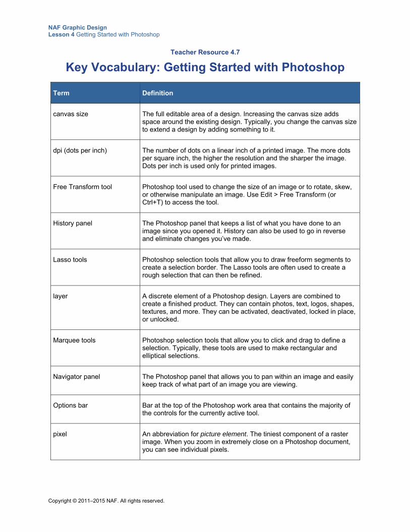
NAF Graphic Design Lesson 4 Getting Started with Photoshop
Copyright © 2011–2015 NAF. All rights reserved.
Teacher Resource 4.7
Key Vocabulary: Getting Started with Photoshop
Term Definition
canvas size The full editable area of a design. Increasing the canvas size adds space around the existing design. Typically, you change the canvas size to extend a design by adding something to it.
dpi (dots per inch) The number of dots on a linear inch of a printed image. The more dots per square inch, the higher the resolution and the sharper the image. Dots per inch is used only for printed images.
Free Transform tool Photoshop tool used to change the size of an image or to rotate, skew, or otherwise manipulate an image. Use Edit > Free Transform (or Ctrl+T) to access the tool.
History panel The Photoshop panel that keeps a list of what you have done to an image since you opened it. History can also be used to go in reverse and eliminate changes you’ve made.
Lasso tools Photoshop selection tools that allow you to draw freeform segments to create a selection border. The Lasso tools are often used to create a rough selection that can then be refined.
layer A discrete element of a Photoshop design. Layers are combined to create a finished product. They can contain photos, text, logos, shapes, textures, and more. They can be activated, deactivated, locked in place, or unlocked.
Marquee tools Photoshop selection tools that allow you to click and drag to define a selection. Typically, these tools are used to make rectangular and elliptical selections.
Navigator panel The Photoshop panel that allows you to pan within an image and easily keep track of what part of an image you are viewing.
Options bar Bar at the top of the Photoshop work area that contains the majority of the controls for the currently active tool.
pixel An abbreviation for picture element. The tiniest component of a raster image. When you zoom in extremely close on a Photoshop document, you can see individual pixels.
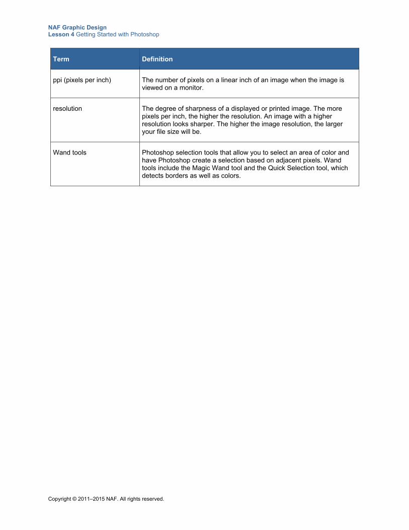
NAF Graphic Design Lesson 4 Getting Started with Photoshop
Copyright © 2011–2015 NAF. All rights reserved.
Term Definition
ppi (pixels per inch) The number of pixels on a linear inch of an image when the image is viewed on a monitor.
resolution The degree of sharpness of a displayed or printed image. The more pixels per inch, the higher the resolution. An image with a higher resolution looks sharper. The higher the image resolution, the larger your file size will be.
Wand tools Photoshop selection tools that allow you to select an area of color and have Photoshop create a selection based on adjacent pixels. Wand tools include the Magic Wand tool and the Quick Selection tool, which detects borders as well as colors.
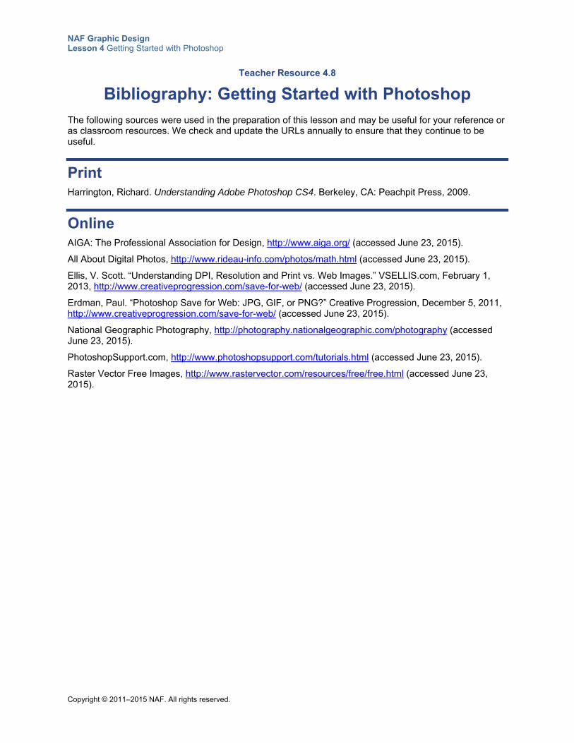
NAF Graphic Design Lesson 4 Getting Started with Photoshop
Copyright © 2011–2015 NAF. All rights reserved.
Teacher Resource 4.8
Bibliography: Getting Started with Photoshop
The following sources were used in the preparation of this lesson and may be useful for your reference or as classroom resources. We check and update the URLs annually to ensure that they continue to be useful.
Print Harrington, Richard. Understanding Adobe Photoshop CS4. Berkeley, CA: Peachpit Press, 2009.
Online AIGA: The Professional Association for Design, http://www.aiga.org/ (accessed June 23, 2015).
All About Digital Photos, http://www.rideau-info.com/photos/math.html (accessed June 23, 2015).
Ellis, V. Scott. “Understanding DPI, Resolution and Print vs. Web Images.” VSELLIS.com, February 1, 2013, http://www.creativeprogression.com/save-for-web/ (accessed June 23, 2015).
Erdman, Paul. “Photoshop Save for Web: JPG, GIF, or PNG?” Creative Progression, December 5, 2011, http://www.creativeprogression.com/save-for-web/ (accessed June 23, 2015).
National Geographic Photography, http://photography.nationalgeographic.com/photography (accessed June 23, 2015).
PhotoshopSupport.com, http://www.photoshopsupport.com/tutorials.html (accessed June 23, 2015).
Raster Vector Free Images, http://www.rastervector.com/resources/free/free.html (accessed June 23, 2015).
Copyright © 2011–2015 NAF. All rights reserved.
NAF Graphic Design
Lesson 4 Getting Started with Photoshop
Student Resources
Resource Description
Student Resource 4.1 K-W-L Chart: Image Size, Canvas Size, and Resolution
Student Resource 4.2 Reading: Tips on Composition Balance
Student Resource 4.3 Practice and Notes: Creating and Manipulating Layers
Student Resource 4.4 Image Series: Editing Using Selections
Student Resource 4.5 Practice Exercises: Using Selection Tools
Student Resource 4.6 Assignment Sheet: Creating an Original Multilayer Image
Student Resource 4.7 Planning Sheet: Multilayer Image
NAF Graphic Design Lesson 4 Getting Started with Photoshop
Copyright © 2011–2015 NAF. All rights reserved.
Student Resource 4.1
K-W-L Chart: Image Size, Canvas Size, and Resolution
Student Name:_______________________________________________________ Date:___________
Directions: For each topic, write what you know about the topic in the first column, and write what you would like to know in the second column. As you learn new things about image size, canvas size, and resolution in this lesson, write what you learn in the third column.
What I Know What I Want to Know What I Learned
Image size
Canvas size
Resolution
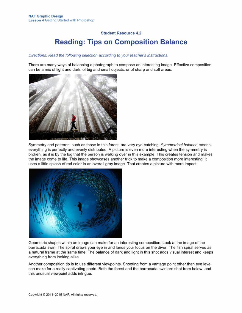
NAF Graphic Design Lesson 4 Getting Started with Photoshop
Copyright © 2011–2015 NAF. All rights reserved.
Student Resource 4.2
Reading: Tips on Composition Balance
Directions: Read the following selection according to your teacher’s instructions.
There are many ways of balancing a photograph to compose an interesting image. Effective composition can be a mix of light and dark, of big and small objects, or of sharp and soft areas.
Symmetry and patterns, such as those in this forest, are very eye-catching. Symmetrical balance means everything is perfectly and evenly distributed. A picture is even more interesting when the symmetry is broken, as it is by the log that the person is walking over in this example. This creates tension and makes the image come to life. This image showcases another trick to make a composition more interesting: it uses a little splash of red color in an overall gray image. That creates a picture with more impact.
Geometric shapes within an image can make for an interesting composition. Look at the image of the barracuda swirl. The spiral draws your eye in and lands your focus on the diver. The fish spiral serves as a natural frame at the same time. The balance of dark and light in this shot adds visual interest and keeps everything from looking alike.
Another composition tip is to use different viewpoints. Shooting from a vantage point other than eye level can make for a really captivating photo. Both the forest and the barracuda swirl are shot from below, and this unusual viewpoint adds intrigue.
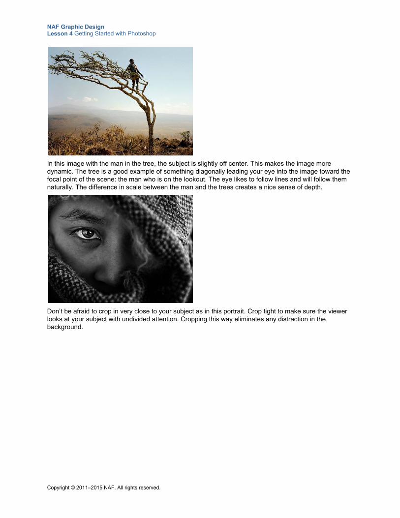
NAF Graphic Design Lesson 4 Getting Started with Photoshop
Copyright © 2011–2015 NAF. All rights reserved.
In this image with the man in the tree, the subject is slightly off center. This makes the image more dynamic. The tree is a good example of something diagonally leading your eye into the image toward the focal point of the scene: the man who is on the lookout. The eye likes to follow lines and will follow them naturally. The difference in scale between the man and the trees creates a nice sense of depth.
Don’t be afraid to crop in very close to your subject as in this portrait. Crop tight to make sure the viewer looks at your subject with undivided attention. Cropping this way eliminates any distraction in the background.
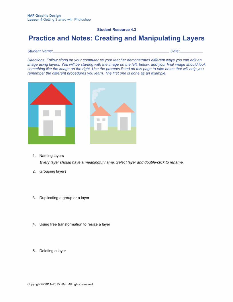
NAF Graphic Design Lesson 4 Getting Started with Photoshop
Copyright © 2011–2015 NAF. All rights reserved.
Student Resource 4.3
Practice and Notes: Creating and Manipulating Layers
Student Name:_______________________________________________________ Date:___________
Directions: Follow along on your computer as your teacher demonstrates different ways you can edit an image using layers. You will be starting with the image on the left, below, and your final image should look something like the image on the right. Use the prompts listed on this page to take notes that will help you remember the different procedures you learn. The first one is done as an example.
1. Naming layers
Every layer should have a meaningful name. Select layer and double-click to rename.
2. Grouping layers
3. Duplicating a group or a layer
4. Using free transformation to resize a layer
5. Deleting a layer
NAF Graphic Design Lesson 4 Getting Started with Photoshop
Copyright © 2011–2015 NAF. All rights reserved.
6. Creating a new layer
7. Specifying a color
8. Using the Rectangle tool
9. Using free transformation to rotate
10. Using the Brush tool
11. Creating a Hue/Saturation layer
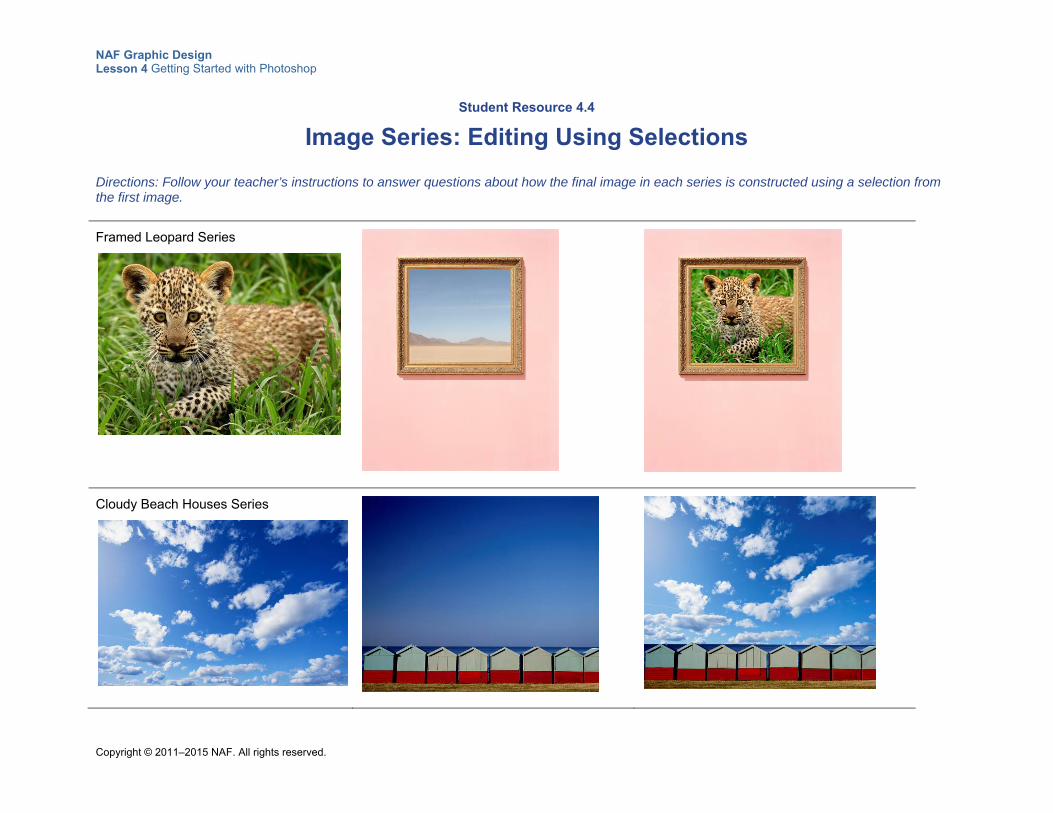
NAF Graphic Design Lesson 4 Getting Started with Photoshop
Copyright © 2011–2015 NAF. All rights reserved.
Student Resource 4.4
Image Series: Editing Using Selections
Directions: Follow your teacher’s instructions to answer questions about how the final image in each series is constructed using a selection from the first image.
Framed Leopard Series
Cloudy Beach Houses Series
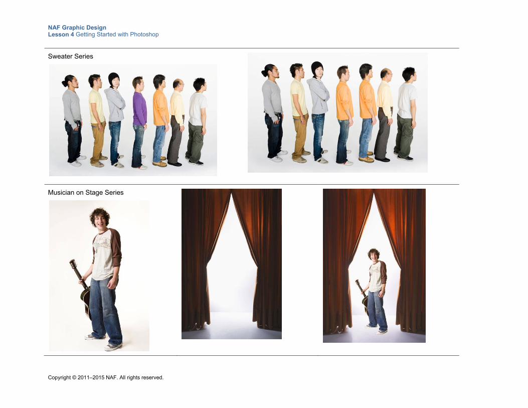
NAF Graphic Design Lesson 4 Getting Started with Photoshop
Copyright © 2011–2015 NAF. All rights reserved.
Sweater Series
Musician on Stage Series
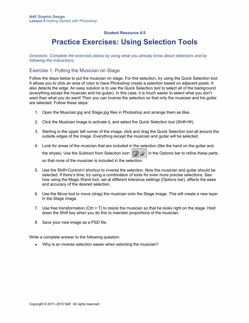
NAF Graphic Design Lesson 4 Getting Started with Photoshop
Copyright © 2011–2015 NAF. All rights reserved.
Student Resource 4.5
Practice Exercises: Using Selection Tools
Directions: Complete the exercises below by using what you already know about selections and by following the instructions.
Exercise 1: Putting the Musician on Stage
Follow the steps below to put the musician on stage. For this selection, try using the Quick Selection tool. It allows you to click an area of color to have Photoshop create a selection based on adjacent pixels. It also detects the edge. An easy solution is to use the Quick Selection tool to select all of the background (everything except the musician and his guitar). In this case, it is much easier to select what you don’t want than what you do want! Then you can inverse the selection so that only the musician and his guitar are selected. Follow these steps:
1. Open the Musician.jpg and Stage.jpg files in Photoshop and arrange them as tiles.
2. Click the Musician image to activate it, and select the Quick Selection tool (Shift+W).
3. Starting in the upper left corner of the image, click and drag the Quick Selection tool all around the outside edges of the image. Everything except the musician and guitar will be selected.
4. Look for areas of the musician that are included in the selection (like the hand on the guitar and
the shoes). Use the Subtract from Selection icon in the Options bar to refine these parts,
so that none of the musician is included in the selection.
5. Use the Shift+Control+I shortcut to inverse the selection. Now the musician and guitar should be selected. If there’s time, try using a combination of tools for even more precise selections. See how using the Magic Wand tool, set at different tolerance settings (Options bar), affects the ease and accuracy of the desired selection.
6. Use the Move tool to move (drag) the musician onto the Stage image. This will create a new layer in the Stage image.
7. Use free transformation (Ctrl + T) to resize the musician so that he looks right on the stage. Hold down the Shift key when you do this to maintain proportions of the musician.
8. Save your new image as a PSD file.
Write a complete answer to the following question:
Why is an inverse selection easier when selecting the musician?
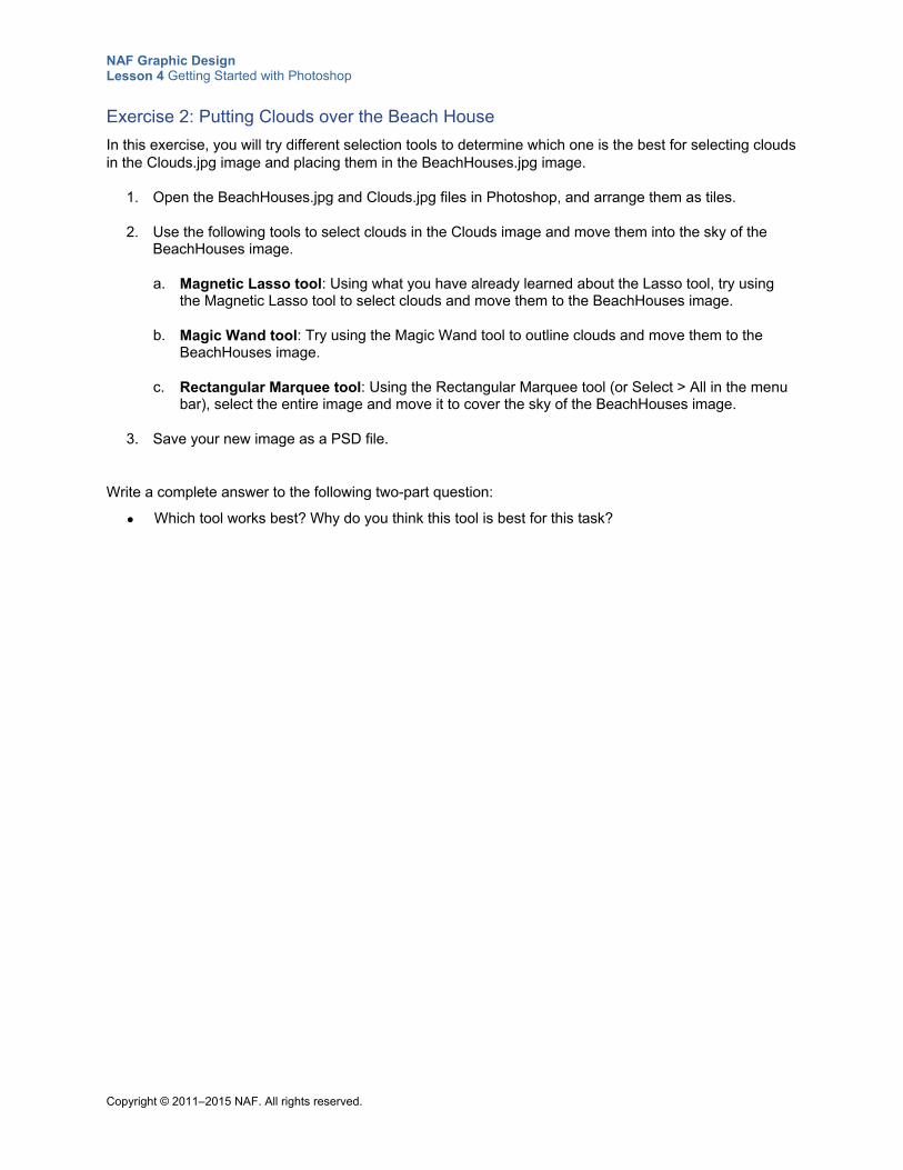
NAF Graphic Design Lesson 4 Getting Started with Photoshop
Copyright © 2011–2015 NAF. All rights reserved.
Exercise 2: Putting Clouds over the Beach House
In this exercise, you will try different selection tools to determine which one is the best for selecting clouds in the Clouds.jpg image and placing them in the BeachHouses.jpg image.
1. Open the BeachHouses.jpg and Clouds.jpg files in Photoshop, and arrange them as tiles.
2. Use the following tools to select clouds in the Clouds image and move them into the sky of the BeachHouses image.
a. Magnetic Lasso tool: Using what you have already learned about the Lasso tool, try using the Magnetic Lasso tool to select clouds and move them to the BeachHouses image.
b. Magic Wand tool: Try using the Magic Wand tool to outline clouds and move them to the BeachHouses image.
c. Rectangular Marquee tool: Using the Rectangular Marquee tool (or Select > All in the menu bar), select the entire image and move it to cover the sky of the BeachHouses image.
3. Save your new image as a PSD file.
Write a complete answer to the following two-part question:
Which tool works best? Why do you think this tool is best for this task?
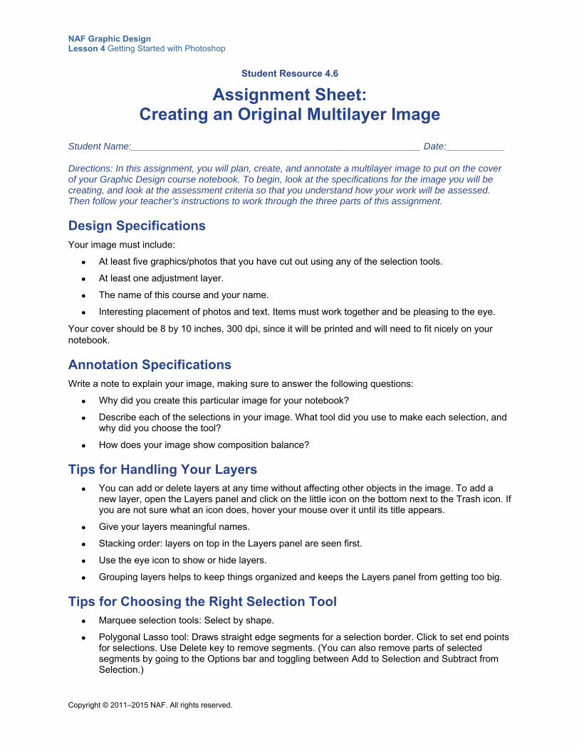
NAF Graphic Design Lesson 4 Getting Started with Photoshop
Copyright © 2011–2015 NAF. All rights reserved.
Student Resource 4.6
Assignment Sheet: Creating an Original Multilayer Image
Student Name:_______________________________________________________ Date:___________
Directions: In this assignment, you will plan, create, and annotate a multilayer image to put on the cover of your Graphic Design course notebook. To begin, look at the specifications for the image you will be creating, and look at the assessment criteria so that you understand how your work will be assessed. Then follow your teacher’s instructions to work through the three parts of this assignment.
Design Specifications Your image must include:
At least five graphics/photos that you have cut out using any of the selection tools.
At least one adjustment layer.
The name of this course and your name.
Interesting placement of photos and text. Items must work together and be pleasing to the eye.
Your cover should be 8 by 10 inches, 300 dpi, since it will be printed and will need to fit nicely on your notebook.
Annotation Specifications Write a note to explain your image, making sure to answer the following questions:
Why did you create this particular image for your notebook?
Describe each of the selections in your image. What tool did you use to make each selection, and why did you choose the tool?
How does your image show composition balance?
Tips for Handling Your Layers You can add or delete layers at any time without affecting other objects in the image. To add a
new layer, open the Layers panel and click on the little icon on the bottom next to the Trash icon. If you are not sure what an icon does, hover your mouse over it until its title appears.
Give your layers meaningful names.
Stacking order: layers on top in the Layers panel are seen first.
Use the eye icon to show or hide layers.
Grouping layers helps to keep things organized and keeps the Layers panel from getting too big.
Tips for Choosing the Right Selection Tool Marquee selection tools: Select by shape.
Polygonal Lasso tool: Draws straight edge segments for a selection border. Click to set end points for selections. Use Delete key to remove segments. (You can also remove parts of selected segments by going to the Options bar and toggling between Add to Selection and Subtract from Selection.)
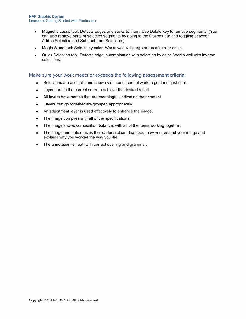
NAF Graphic Design Lesson 4 Getting Started with Photoshop
Copyright © 2011–2015 NAF. All rights reserved.
Magnetic Lasso tool: Detects edges and sticks to them. Use Delete key to remove segments. (You can also remove parts of selected segments by going to the Options bar and toggling between Add to Selection and Subtract from Selection.)
Magic Wand tool: Selects by color. Works well with large areas of similar color.
Quick Selection tool: Detects edge in combination with selection by color. Works well with inverse selections.
Make sure your work meets or exceeds the following assessment criteria:
Selections are accurate and show evidence of careful work to get them just right.
Layers are in the correct order to achieve the desired result.
All layers have names that are meaningful, indicating their content.
Layers that go together are grouped appropriately.
An adjustment layer is used effectively to enhance the image.
The image complies with all of the specifications.
The image shows composition balance, with all of the items working together.
The image annotation gives the reader a clear idea about how you created your image and explains why you worked the way you did.
The annotation is neat, with correct spelling and grammar.
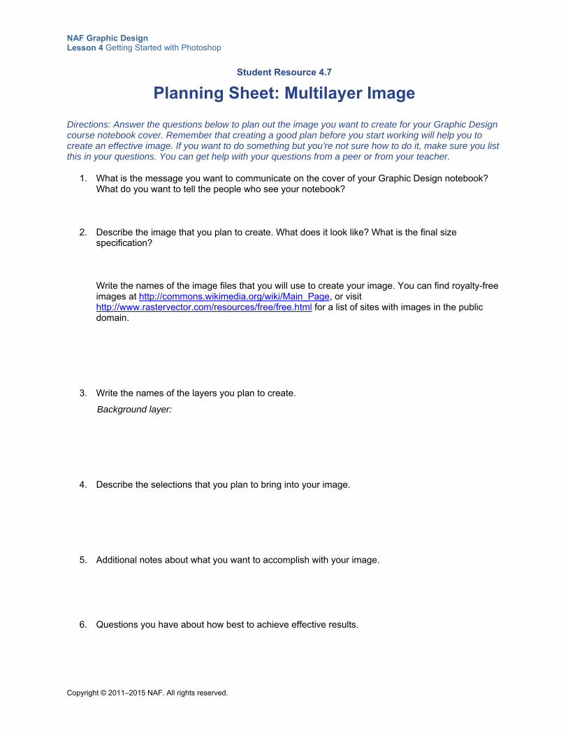
NAF Graphic Design Lesson 4 Getting Started with Photoshop
Copyright © 2011–2015 NAF. All rights reserved.
Student Resource 4.7
Planning Sheet: Multilayer Image
Directions: Answer the questions below to plan out the image you want to create for your Graphic Design course notebook cover. Remember that creating a good plan before you start working will help you to create an effective image. If you want to do something but you’re not sure how to do it, make sure you list this in your questions. You can get help with your questions from a peer or from your teacher.
1. What is the message you want to communicate on the cover of your Graphic Design notebook? What do you want to tell the people who see your notebook?
2. Describe the image that you plan to create. What does it look like? What is the final size specification? Write the names of the image files that you will use to create your image. You can find royalty-free images at http://commons.wikimedia.org/wiki/Main_Page, or visit http://www.rastervector.com/resources/free/free.html for a list of sites with images in the public domain.
3. Write the names of the layers you plan to create.
Background layer:
4. Describe the selections that you plan to bring into your image.
5. Additional notes about what you want to accomplish with your image.
6. Questions you have about how best to achieve effective results.
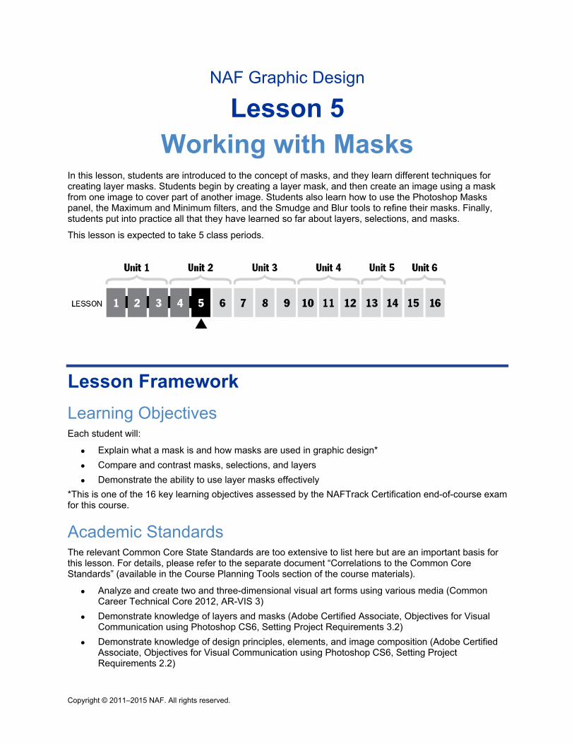
Copyright © 2011–2015 NAF. All rights reserved.
NAF Graphic Design
Lesson 5 Working with Masks
In this lesson, students are introduced to the concept of masks, and they learn different techniques for creating layer masks. Students begin by creating a layer mask, and then create an image using a mask from one image to cover part of another image. Students also learn how to use the Photoshop Masks panel, the Maximum and Minimum filters, and the Smudge and Blur tools to refine their masks. Finally, students put into practice all that they have learned so far about layers, selections, and masks.
This lesson is expected to take 5 class periods.
Lesson Framework
Learning Objectives Each student will:
Explain what a mask is and how masks are used in graphic design*
Compare and contrast masks, selections, and layers
Demonstrate the ability to use layer masks effectively
*This is one of the 16 key learning objectives assessed by the NAFTrack Certification end-of-course exam for this course.
Academic Standards The relevant Common Core State Standards are too extensive to list here but are an important basis for this lesson. For details, please refer to the separate document “Correlations to the Common Core Standards” (available in the Course Planning Tools section of the course materials).
Analyze and create two and three-dimensional visual art forms using various media (Common Career Technical Core 2012, AR-VIS 3)
Demonstrate knowledge of layers and masks (Adobe Certified Associate, Objectives for Visual Communication using Photoshop CS6, Setting Project Requirements 3.2)
Demonstrate knowledge of design principles, elements, and image composition (Adobe Certified Associate, Objectives for Visual Communication using Photoshop CS6, Setting Project Requirements 2.2)
NAF Graphic Design Lesson 5 Working with Masks
Copyright © 2011–2015 NAF. All rights reserved. - 2 -
Transform images (Adobe Certified Associate, Objectives for Visual Communication using Photoshop CS6, Setting Project Requirements 4.3)
Demonstrate knowledge of image resolution, image size, and image file format for web, video, and print (Adobe Certified Associate, Objectives for Visual Communication using Photoshop CS6, Setting Project Requirements 2.1)
Apply existing knowledge to generate new ideas, products, or processes (ISTE NETS for Students 2007, 1a)
Create original works as a means of personal or group expression (ISTE NETS for Students 2007, 1b)
Assessment
Assessment Product Means of Assessment
An original image that uses selections, layers, and masks, accompanied by a descriptive annotation of the image (Student Resource 5.5)
Assessment Criteria: Utopia Image Using Selections, Layers, and Masks (Teacher Resource 5.3)
Prerequisites Basic knowledge of image size and resolution
Understanding of graphic design as visual communication
Ability to create accurate selections using all Photoshop selection tools
Ability to edit and manipulate layers in a Photoshop image
Understanding of composition balance in an image
Instructional Materials
Teacher Resources Teacher Resource 5.1, Template: Face Masks (separate PDF file)
Teacher Resource 5.2, Images: Girl.jpg, Women.jpg, SnowTent.jpg, Bunny.tif, Student.tif, Soccer_Player.tif, TwoGirls.jpg (separate ZIP file)
Teacher Resource 5.3, Assessment Criteria: Utopia Image Using Selections, Layers, and Masks
Teacher Resource 5.4, Key Vocabulary: Working with Masks
Teacher Resource 5.5, Bibliography: Working with Masks
Student Resources Student Resource 5.1, Exploration: What Are Masks and Why Use Them?
Student Resource 5.2, Tutorial: Using a Mask to Combine Images
Student Resource 5.3, Interactive Reading: Three Ways to Refine or Adjust a Mask
Student Resource 5.4, Defining Format: Layers, Selections, and Layer Masks
NAF Graphic Design Lesson 5 Working with Masks
Copyright © 2011–2015 NAF. All rights reserved. - 3 -
Student Resource 5.5, Assignment Sheet: Using Selections, Layers, and Masks to Create an Image of Your Utopia
Student Resource 5.6, Planning Sheet: Using Selections, Layers, and Masks to Create an Image of Your Utopia
Equipment and Supplies LCD projector and computer
Scissors and tape for cutting out masks
Colored cellophane for each student
Access to Photoshop for all students
Blackboard, whiteboard, or flip chart
Sticky notes
Lesson Steps
Step Min. Activity
CLASS PERIOD 1
1 15 Object Lessons: What Are Masks and Why Use Them?
This activity familiarizes students with the purpose of masks and helps them grasp the concept of how masks work in the construction of a Photoshop image.
Make enough copies of the four face masks in Teacher Resource 5.1, Template: Face Masks (separate PDF file), to give each group of four a copy of all four masks. (Another option is to print the masks, cut them out, and laminate them, so that you can use them in future classes.)
Ask students to work in groups of four, and refer them to Student Resource 5.1, Exploration: What Are Masks and Why Use Them? Give each group a copy of the masks, along with scissors, tape, and a small piece of colored cellophane. Explain to students that they will be using face masks to gather some ideas about how masks work and the purpose of masks.
Go over the worksheet instructions with students and tell them they have 10 minutes to cut out their masks, try them out, and answer the questions as a group. (Since time is short, make sure they don’t try to cut out every detail of the masks.)
After 10 minutes, have groups report on the answers to the worksheet questions. Make sure their answers include the following information:
NAF Graphic Design Lesson 5 Working with Masks
Copyright © 2011–2015 NAF. All rights reserved. - 4 -
Step Min. Activity
A mask changes how someone or something looks by hiding some parts and letting others show.
A mask is not destructive. Everything behind a mask is not visible, but it is still there. If the part behind a “mask” is missing, it is not a mask.
A non-opaque mask changes how something looks by adding a covering that lets the hidden part show through, allowing you to see both images at the same time.
To conclude the discussion, explain to students that in Photoshop, layer masks are used for the same basic purpose as face masks: they hide some areas of an image and let others show through, changing either a small part or the whole character of an image. Write the following term on the board:
nondestructive editing
Explain that in Photoshop, masking is a nondestructive editing technique because the edits never touch or change the original image. It’s very similar to the way that putting a mask in front of your face doesn’t change your face. A Photoshop layer mask always has the original image behind the mask, even though you can’t see it because it is hidden by the mask.
Tell students that in this lesson, they will combine the use of masks with what they already know about selections and layers to create images that adhere to the principles of nondestructive editing.
2
15 Modeling and Guided Practice: Basics of Creating Layer Masks
This activity introduces students to the tools and techniques used for creating layer masks in Photoshop. The activity focuses on the following college and career skills:
Developing awareness of one’s own abilities and performance
Effectively using technology relevant to a profession
Explain to students that layer masks allow you to hide (or mask) part of a layer using painting and selection tools. Just as they used a face mask to hide part of their face in the previous activity, so they will use a layer mask to hide (or mask) part of a layer in this activity.
Using your computer connected to an LCD projector, open the file Girl.jpg. (This file is in Teacher Resource 5.2, Images.) Follow the steps below to demonstrate the basic steps in working with a mask. Have students open this image on their computers also and complete each step along with you.
1. To create a floating layer, double-click the name Background in the background layer in the Layers panel. Name the floating layer Girl. Explain to students that a floating layer is a layer that can move around freely. It is different from a background layer because it is transparent, whereas the background layer is never transparent.
2. Use the Quick Selection tool to select the gray background around the girl. Have students try different settings in the Options bar to see how they affect the ease and accuracy of the selection.
3. Use Select > Inverse (Shift+Ctrl+I) to inverse the selection so that the girl is selected. Don’t worry if the selection isn’t perfectly accurate. You will touch it up
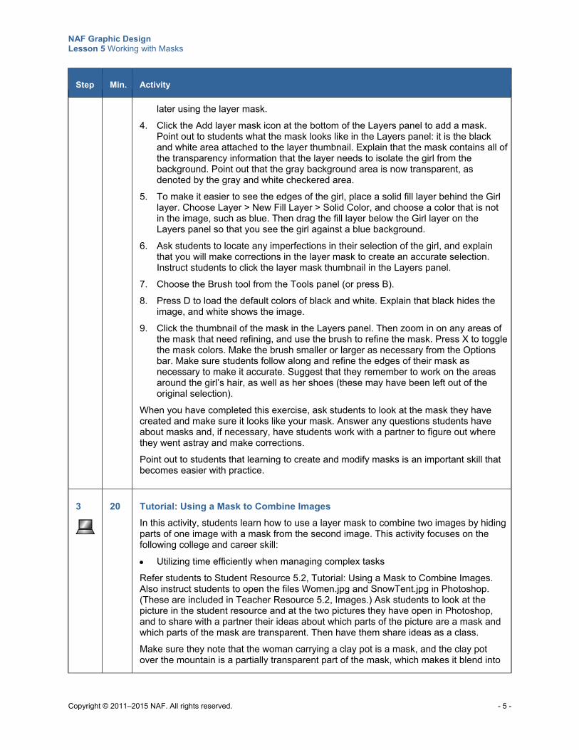
NAF Graphic Design Lesson 5 Working with Masks
Copyright © 2011–2015 NAF. All rights reserved. - 5 -
Step Min. Activity
later using the layer mask.
4. Click the Add layer mask icon at the bottom of the Layers panel to add a mask. Point out to students what the mask looks like in the Layers panel: it is the black and white area attached to the layer thumbnail. Explain that the mask contains all of the transparency information that the layer needs to isolate the girl from the background. Point out that the gray background area is now transparent, as denoted by the gray and white checkered area.
5. To make it easier to see the edges of the girl, place a solid fill layer behind the Girl layer. Choose Layer > New Fill Layer > Solid Color, and choose a color that is not in the image, such as blue. Then drag the fill layer below the Girl layer on the Layers panel so that you see the girl against a blue background.
6. Ask students to locate any imperfections in their selection of the girl, and explain that you will make corrections in the layer mask to create an accurate selection. Instruct students to click the layer mask thumbnail in the Layers panel.
7. Choose the Brush tool from the Tools panel (or press B).
8. Press D to load the default colors of black and white. Explain that black hides the image, and white shows the image.
9. Click the thumbnail of the mask in the Layers panel. Then zoom in on any areas of the mask that need refining, and use the brush to refine the mask. Press X to toggle the mask colors. Make the brush smaller or larger as necessary from the Options bar. Make sure students follow along and refine the edges of their mask as necessary to make it accurate. Suggest that they remember to work on the areas around the girl’s hair, as well as her shoes (these may have been left out of the original selection).
When you have completed this exercise, ask students to look at the mask they have created and make sure it looks like your mask. Answer any questions students have about masks and, if necessary, have students work with a partner to figure out where they went astray and make corrections.
Point out to students that learning to create and modify masks is an important skill that becomes easier with practice.
3
20 Tutorial: Using a Mask to Combine Images
In this activity, students learn how to use a layer mask to combine two images by hiding parts of one image with a mask from the second image. This activity focuses on the following college and career skill:
Utilizing time efficiently when managing complex tasks
Refer students to Student Resource 5.2, Tutorial: Using a Mask to Combine Images. Also instruct students to open the files Women.jpg and SnowTent.jpg in Photoshop. (These are included in Teacher Resource 5.2, Images.) Ask students to look at the picture in the student resource and at the two pictures they have open in Photoshop, and to share with a partner their ideas about which parts of the picture are a mask and which parts of the mask are transparent. Then have them share ideas as a class.
Make sure they note that the woman carrying a clay pot is a mask, and the clay pot over the mountain is a partially transparent part of the mask, which makes it blend into
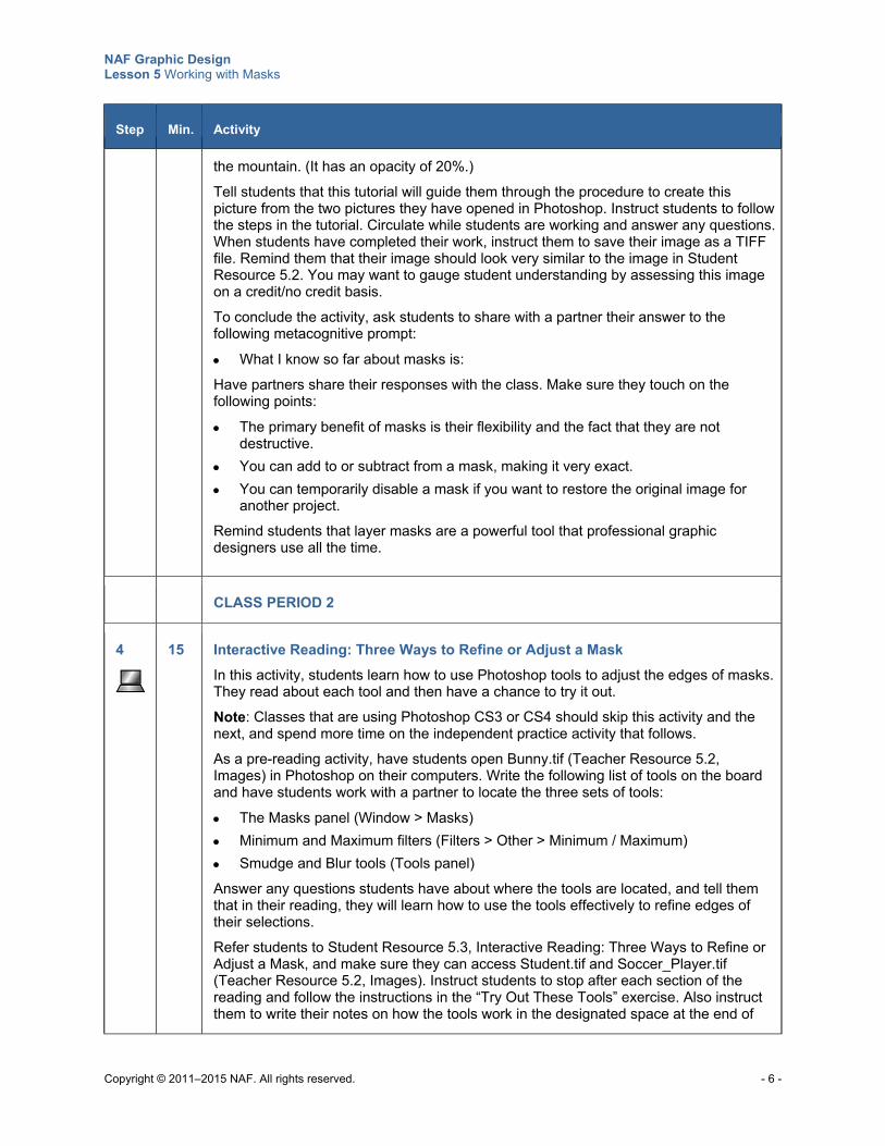
NAF Graphic Design Lesson 5 Working with Masks
Copyright © 2011–2015 NAF. All rights reserved. - 6 -
Step Min. Activity
the mountain. (It has an opacity of 20%.)
Tell students that this tutorial will guide them through the procedure to create this picture from the two pictures they have opened in Photoshop. Instruct students to follow the steps in the tutorial. Circulate while students are working and answer any questions. When students have completed their work, instruct them to save their image as a TIFF file. Remind them that their image should look very similar to the image in Student Resource 5.2. You may want to gauge student understanding by assessing this image on a credit/no credit basis.
To conclude the activity, ask students to share with a partner their answer to the following metacognitive prompt:
What I know so far about masks is:
Have partners share their responses with the class. Make sure they touch on the following points:
The primary benefit of masks is their flexibility and the fact that they are not destructive.
You can add to or subtract from a mask, making it very exact.
You can temporarily disable a mask if you want to restore the original image for another project.
Remind students that layer masks are a powerful tool that professional graphic designers use all the time.
CLASS PERIOD 2
4
15 Interactive Reading: Three Ways to Refine or Adjust a Mask
In this activity, students learn how to use Photoshop tools to adjust the edges of masks. They read about each tool and then have a chance to try it out.
Note: Classes that are using Photoshop CS3 or CS4 should skip this activity and the next, and spend more time on the independent practice activity that follows.
As a pre-reading activity, have students open Bunny.tif (Teacher Resource 5.2, Images) in Photoshop on their computers. Write the following list of tools on the board and have students work with a partner to locate the three sets of tools:
The Masks panel (Window > Masks)
Minimum and Maximum filters (Filters > Other > Minimum / Maximum)
Smudge and Blur tools (Tools panel)
Answer any questions students have about where the tools are located, and tell them that in their reading, they will learn how to use the tools effectively to refine edges of their selections.
Refer students to Student Resource 5.3, Interactive Reading: Three Ways to Refine or Adjust a Mask, and make sure they can access Student.tif and Soccer_Player.tif (Teacher Resource 5.2, Images). Instruct students to stop after each section of the reading and follow the instructions in the “Try Out These Tools” exercise. Also instruct them to write their notes on how the tools work in the designated space at the end of
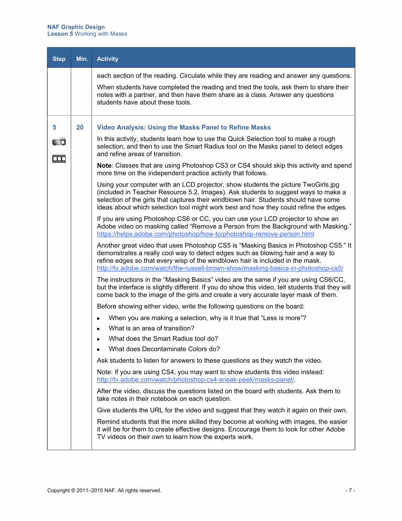
NAF Graphic Design Lesson 5 Working with Masks
Copyright © 2011–2015 NAF. All rights reserved. - 7 -
Step Min. Activity
each section of the reading. Circulate while they are reading and answer any questions.
When students have completed the reading and tried the tools, ask them to share their notes with a partner, and then have them share as a class. Answer any questions students have about these tools.
5
20 Video Analysis: Using the Masks Panel to Refine Masks
In this activity, students learn how to use the Quick Selection tool to make a rough selection, and then to use the Smart Radius tool on the Masks panel to detect edges and refine areas of transition.
Note: Classes that are using Photoshop CS3 or CS4 should skip this activity and spend more time on the independent practice activity that follows.
Using your computer with an LCD projector, show students the picture TwoGirls.jpg (included in Teacher Resource 5.2, Images). Ask students to suggest ways to make a selection of the girls that captures their windblown hair. Students should have some ideas about which selection tool might work best and how they could refine the edges.
If you are using Photoshop CS6 or CC, you can use your LCD projector to show an Adobe video on masking called “Remove a Person from the Background with Masking.” https://helpx.adobe.com/photoshop/how-to/photoshop-remove-person.html
Another great video that uses Photoshop CS5 is “Masking Basics in Photoshop CS5.” It demonstrates a really cool way to detect edges such as blowing hair and a way to refine edges so that every wisp of the windblown hair is included in the mask. http://tv.adobe.com/watch/the-russell-brown-show/masking-basics-in-photoshop-cs5/
The instructions in the “Masking Basics” video are the same if you are using CS6/CC, but the interface is slightly different. If you do show this video, tell students that they will come back to the image of the girls and create a very accurate layer mask of them.
Before showing either video, write the following questions on the board:
When you are making a selection, why is it true that “Less is more”?
What is an area of transition?
What does the Smart Radius tool do?
What does Decontaminate Colors do?
Ask students to listen for answers to these questions as they watch the video.
Note: If you are using CS4, you may want to show students this video instead: http://tv.adobe.com/watch/photoshop-cs4-sneak-peek/masks-panel/.
After the video, discuss the questions listed on the board with students. Ask them to take notes in their notebook on each question.
Give students the URL for the video and suggest that they watch it again on their own.
Remind students that the more skilled they become at working with images, the easier it will be for them to create effective designs. Encourage them to look for other Adobe TV videos on their own to learn how the experts work.
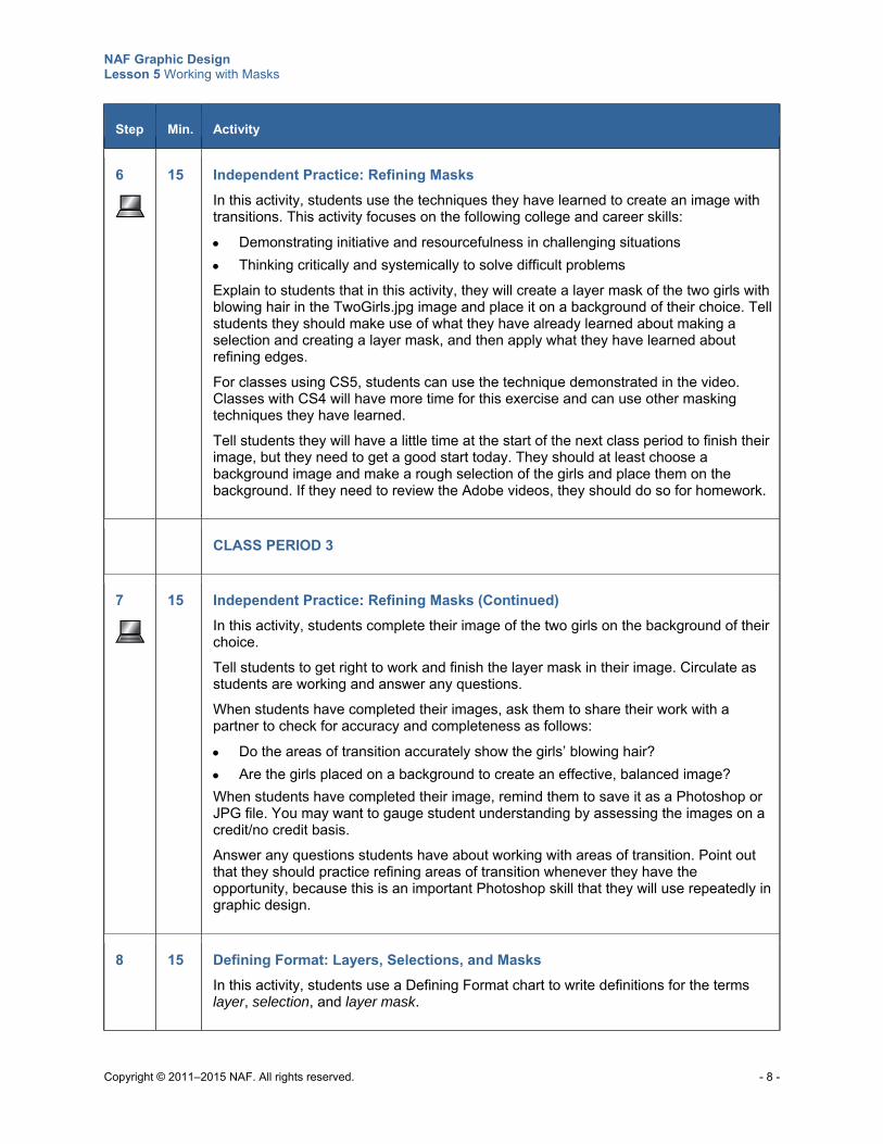
NAF Graphic Design Lesson 5 Working with Masks
Copyright © 2011–2015 NAF. All rights reserved. - 8 -
Step Min. Activity
6
15 Independent Practice: Refining Masks
In this activity, students use the techniques they have learned to create an image with transitions. This activity focuses on the following college and career skills:
Demonstrating initiative and resourcefulness in challenging situations
Thinking critically and systemically to solve difficult problems
Explain to students that in this activity, they will create a layer mask of the two girls with blowing hair in the TwoGirls.jpg image and place it on a background of their choice. Tell students they should make use of what they have already learned about making a selection and creating a layer mask, and then apply what they have learned about refining edges.
For classes using CS5, students can use the technique demonstrated in the video. Classes with CS4 will have more time for this exercise and can use other masking techniques they have learned.
Tell students they will have a little time at the start of the next class period to finish their image, but they need to get a good start today. They should at least choose a background image and make a rough selection of the girls and place them on the background. If they need to review the Adobe videos, they should do so for homework.
CLASS PERIOD 3
7
15 Independent Practice: Refining Masks (Continued)
In this activity, students complete their image of the two girls on the background of their choice.
Tell students to get right to work and finish the layer mask in their image. Circulate as students are working and answer any questions.
When students have completed their images, ask them to share their work with a partner to check for accuracy and completeness as follows:
Do the areas of transition accurately show the girls’ blowing hair?
Are the girls placed on a background to create an effective, balanced image?
When students have completed their image, remind them to save it as a Photoshop or JPG file. You may want to gauge student understanding by assessing the images on a credit/no credit basis.
Answer any questions students have about working with areas of transition. Point out that they should practice refining areas of transition whenever they have the opportunity, because this is an important Photoshop skill that they will use repeatedly in graphic design.
8 15 Defining Format: Layers, Selections, and Masks
In this activity, students use a Defining Format chart to write definitions for the terms layer, selection, and layer mask.
NAF Graphic Design Lesson 5 Working with Masks
Copyright © 2011–2015 NAF. All rights reserved. - 9 -
Step Min. Activity
Refer students to Student Resource 5.4, Defining Format: Layers, Selections, and Layer Masks. Explain that in addition to knowing how to use these tools, they need to be able to explain in words what each tool is and to differentiate between them.
Look at the examples given for layer as a class, and answer any questions about how to construct Defining Format definitions. Then group students in pairs and ask them to write down categories and characteristics for each term. (Even though they are working in pairs, each student should fill out a chart so that the student will have it in his or her notebook for reference.) When students have completed their charts, have pairs share in groups of four and add any new information they learn from their peers.
Finally, have students share as a class, and create a Defining Format chart on the board or on chart paper. Use the best categories and characteristics for each term.
Instruct students to save their chart in their notebook for future reference. Remind them that these are terms that they can use in an interview for a job or an internship.
9
20 Assessment Activity: Creating an Original Image Using Selections, Layers, and Masks
In this activity, students use what they have learned in Lessons 4 and 5 to create an image of what they imagine a utopian world would look like. Their image must use selections, layers, and layer masks.
Refer students to Student Resource 5.5, Assignment Sheet: Using Selections, Layers, and Masks to Create an Image of Your Utopia. Explain that this is an important piece of work for their graphic design portfolio, and they should create an image that would be suitable to show to a potential employer. You may want to have students share different ideas about what an idealized world might look like.
Review the specifications for the image and the accompanying annotation. Also review the assessment criteria and answer questions about how the work will be assessed.
Next, refer students to Student Resource 5.6, Planning Sheet: Using Selections, Layers, and Masks to Create an Image of Your Utopia, and go over the instructions. Tell students to search for appropriate images at the sites listed on the planning sheet and to fill in their answers to the planning questions. When they have finished their plan and selected the images they will work with, have them check their plan with a partner before they begin creating their image.
Tell students they will have time in the next class period to complete their image and write their annotation, but they need to find all of their images and plan out their project before the beginning of the next class period. They should complete these steps for homework if necessary. If needed, help students find a way to have access to Photoshop outside of class time.
Remind students to save their work as a PSD file.
CLASS PERIOD 4
10 50 Assessment Activity: Creating an Original Image Using Selections, Layers, and Masks (Continued)
NAF Graphic Design Lesson 5 Working with Masks
Copyright © 2011–2015 NAF. All rights reserved. - 10 -
Step Min. Activity
In this activity, students continue using what they have learned in Lessons 4 and 5 to create an image of what they imagine a utopian world would look like.
Tell students to get right to work completing the image of their utopia. Answer any questions students have as they work. Remind them to check their work against the assessment criteria on their assignment sheet.
Advise students that they will be annotating their images and reviewing each other’s images in the next class period. They should have a solid draft of their image completed at the beginning of the next class period.
CLASS PERIOD 5
11 10 Image Annotation Writing: Original Image Using Layers, Selections, and Masks
In this activity, students write a short note explaining how they created their image.
Once again refer students to Student Resource 5.5, Assignment Sheet: Using Selections, Layers, and Masks to Create an Image of Your Utopia, and review the annotation specifications and the assessment criteria for this part of the assignment.
Instruct students to write their annotation on a sheet of binder paper or with a word processing program, as appropriate. Remind them that the annotation doesn’t need to be long; it is simply a few sentences to be read as someone views their image.
Remind students that in graphic design, it is important to be able to express in words what they are achieving with a design, and they will need to use this skill when they are working with clients.
12
15 Peer Review: Utopia Images Using Selections, Layers, and Masks
In this activity, students share their work in groups of four and comment on each other’s work.
Instruct students to read their annotation and show their image to the other members of their group. Tell students to say what they like about each image and to comment on anything that still needs work or is unclear.
Ask each group to choose one effective image to share with the class. Then have each group share one image and comment on why they chose it.
Finally, answer any last questions about using selections, layers, and masks effectively.
13
20 Final Revisions: Utopia Images Using Selections, Layers, and Masks
In this activity, students make any necessary changes to their work before submitting it for assessment.
Ask students to think about whether they believe their image is good enough to include in a portfolio to show a prospective employer. Is there any aspect of the image or annotation that they can improve, based on the peer review? If they think they need to improve certain aspects, such as refining edges of a layer mask, encourage them to get
NAF Graphic Design Lesson 5 Working with Masks
Copyright © 2011–2015 NAF. All rights reserved. - 11 -
Step Min. Activity
help from a peer to make improvements.
At the end of this activity, ask students to submit their work for assessment. Assess their work using Teacher Resource 5.3, Assessment Criteria: Utopia Image Using Selections, Layers, and Masks.
Congratulate students on the work they have done so far, and remind them that selections, layers, and masks are the building blocks for the images they will be creating as graphic designers.
14 5 Reflection: Layer Masks
In this activity, students reflect on the utility of layer masks when creating an image.
Write the following prompt on the board and ask students to complete the statement in their notebook with at least three reasons:
The beauty of using layer masks when creating an image is that…
When they have completed their statement, ask them to share it with a partner, and then share as a class.
To conclude the activity, answer any final questions students have about layer masks. Point out that they will be able to apply many of the skills they have learned about refining layer masks when they work on photo corrections in the next lesson.
Extensions
Enrichment Instruct students to create an image with more than one layer mask, and have them use a
different technique to refine the edges of each layer mask.
Instruct students to create a CD cover using an image with at least one layer mask. Remind them to think about the size of a CD cover and to size their image accordingly.
Technology Integration Ask students to practice their photography skills on their own to create images they can edit in
Photoshop. For tips and help with photography, direct them to Adobe’s Creative Cloud Essentials Tutorial: https://helpx.adobe.com/creative-cloud/tutorials-photography-jumpstart.html
Cross-Curricular Integration English Language Arts: Give students a list of “masking” terms such as auditory masking, back masking, masking tape, mask computing, masking agents, sound masking, and spectral mask, and instruct them to make a chart that shows what each term means in one column, and what part of the meaning is common to all masking terms in another column. Ask students to add other masking terms to their chart.
Copyright © 2011–2015 NAF. All rights reserved.
NAF Graphic Design
Lesson 5 Working with Masks
Teacher Resources
Resource Description
Teacher Resource 5.1 Template: Face Masks (separate PDF file)
Teacher Resource 5.2 Images: Girl.jpg, Women.jpg, SnowTent.jpg, Bunny.tif, Student.tif, Soccer_Player.tif, TwoGirls.jpg (separate ZIP file)
Teacher Resource 5.3 Assessment Criteria: Utopia Image Using Selections, Layers, and Masks
Teacher Resource 5.4 Key Vocabulary: Working with Masks
Teacher Resource 5.5 Bibliography: Working with Masks
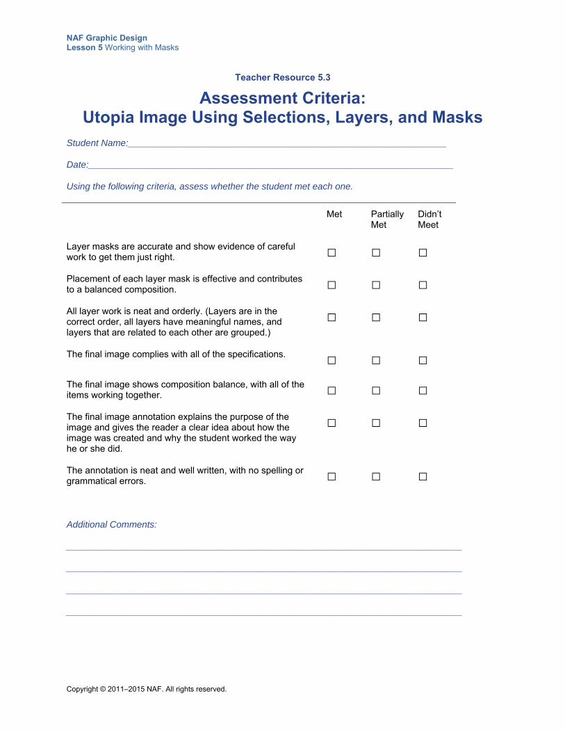
NAF Graphic Design Lesson 5 Working with Masks
Copyright © 2011–2015 NAF. All rights reserved.
Teacher Resource 5.3
Assessment Criteria: Utopia Image Using Selections, Layers, and Masks
Student Name:______________________________________________________________
Date:_______________________________________________________________________
Using the following criteria, assess whether the student met each one.
Met Partially Met
Didn’t Meet
Layer masks are accurate and show evidence of careful work to get them just right.
□ □ □
Placement of each layer mask is effective and contributes to a balanced composition.
□ □ □
All layer work is neat and orderly. (Layers are in the correct order, all layers have meaningful names, and layers that are related to each other are grouped.)
□ □ □
The final image complies with all of the specifications. □ □ □
The final image shows composition balance, with all of the items working together.
□ □ □
The final image annotation explains the purpose of the image and gives the reader a clear idea about how the image was created and why the student worked the way he or she did.
□ □ □
The annotation is neat and well written, with no spelling or grammatical errors.
□ □ □
Additional Comments:
_____________________________________________________________________________
_____________________________________________________________________________
_____________________________________________________________________________
_____________________________________________________________________________
NAF Graphic Design Lesson 5 Working with Masks
Copyright © 2011–2015 NAF. All rights reserved.
Teacher Resource 5.4
Key Vocabulary: Working with Masks
Term Definition
area of transition When using the Refine Edge tool, the area that includes some background that’s being removed and some foreground. The greater the radius, the larger the area of transition.
Blur tool Tool that can be used to soften the uneven edges of a selection or mask.
Density slider Tool on Masks panel used to adjust the opacity of a mask. At 100% density, the mask is completely opaque and blocks out any underlying area of the layer. As you lower the density, more of the area under the mask becomes visible.
Feather slider Tool on Masks panel used to apply feathering to the mask edges. Feathering blurs the edges of the mask to create a softer transition between the masked and unmasked areas. Feathering is applied from the edges of the mask outward, within the range of pixels you set with the slider.
layer mask An editable selection in Photoshop that reveals or hides an entire layer or certain portions of a layer. The mask is applied to an individual layer and is visible in the Layers panel as a thumbnail, which is linked to the layer’s own thumbnail. When a layer mask is applied, it tells Photoshop how much of that layer will be visible. Layer masks play an important role in nondestructive editing.
Maximum filter Filter used on a layer mask to spread out the white areas and choke in the black areas. It replaces the current pixel’s brightness value with the highest brightness value of the surrounding pixels.
Minimum filter Filter used on a layer mask to spread out the black areas and reduce the white areas. It replaces the current pixel’s brightness value with the lowest brightness value of the surrounding pixels.
nondestructive editing A workflow that focuses on leaving the source content of a project unmodified by creating dynamic (nonpermanent) edits that can be adjusted later. The layer system and layer masks are key elements of this type of editing.
opacity The transparency of an image. When using a layer mask, you can use shades of gray to define the opacity of part or all of the layer mask.
NAF Graphic Design Lesson 5 Working with Masks
Copyright © 2011–2015 NAF. All rights reserved.
Term Definition
Refine Radius Tool on the Refine Edge window that allows you to paint across uneven edges, such as wisps of hair. It includes them in the selection while keeping hidden everything around the hair (or around whatever Photoshop considers the “nonforeground” areas).
Smart Radius Tool on the Refine Edge window used to automatically smooth out a transition. This is very useful for selecting hair and uneven edges.
Smudge tool Photoshop tool that blends the pixels where you paint, simulating the action of dragging a finger through wet paint.
NAF Graphic Design Lesson 5 Working with Masks
Copyright © 2011–2015 NAF. All rights reserved.
Teacher Resource 5.5
Bibliography: Working with Masks
The following sources were used in the preparation of this lesson and may be useful for your reference or as classroom resources. We check and update the URLs annually to ensure that they continue to be useful.
Print Harrington, Richard. Understanding Adobe Photoshop CS4. Berkeley, CA: Peachpit Press, 2009.
Online AIGA: The Professional Association for Design, http://www.aiga.org/ (accessed June 24, 2015).
Dreamstime Stock Photo, http://www.dreamstime.com (accessed June 24, 2015).
National Geographic Photography, http://photography.nationalgeographic.com/photography (accessed June 24, 2015).
Orwig, Chris. “Remove a Person from the Background with Masking.” Adobe TV / Lynda.com video, 6:06. December 10, 2013. https://helpx.adobe.com/photoshop/how-to/photoshop-remove-person.html (accessed June 24, 2015).
PhotoshopSupport.com, http://www.photoshopsupport.com/tutorials.html (accessed June 24, 2015).
Raster Vector Free Images, http://www.rastervector.com/resources/free/free.html (accessed June 24, 2015).
The Russell Brown Show, “Masking Basics in Adobe Photoshop CS5.” Adobe TV video, 12:44. May 19, 2010. http://tv.adobe.com/watch/the-russell-brown-show/masking-basics-in-photoshop-cs5/ (accessed June 24, 2015).
Wikimedia Commons, http://commons.wikimedia.org/wiki/Main_Page (accessed June 24, 2015).
Copyright © 2011–2015 NAF. All rights reserved.
NAF Graphic Design
Lesson 5 Working with Masks
Student Resources
Resource Description
Student Resource 5.1 Exploration: What Are Masks and Why Use Them?
Student Resource 5.2 Tutorial: Using a Mask to Combine Images
Student Resource 5.3 Interactive Reading: Three Ways to Refine or Adjust a Mask
Student Resource 5.4 Defining Format: Layers, Selections, and Layer Masks
Student Resource 5.5 Assignment Sheet: Using Selections, Layers, and Masks to Create an Image of Your Utopia
Student Resource 5.6 Planning Sheet: Using Selections, Layers, and Masks to Create an Image of Your Utopia
NAF Graphic Design Lesson 5 Working with Masks
Copyright © 2011–2015 NAF. All rights reserved.
Student Resource 5.1
Exploration: What Are Masks and Why Use Them?
Student Names:_______________________________________________________ Date:___________
Directions: Using the templates your teacher gives you, cut out the four masks. Make sure you cut out the eye holes. Choose one of the masks, and tape colored cellophane over the eye holes just on that mask. Then hold the masks up to the faces of different members of your group, one at a time, and reflect on what you see to inform your answers to the questions below.
1. What is the purpose of a mask?
2. How does a mask change the appearance of a face or an image?
3. What happens if the position of the mask changes?
4. How does opacity affect what you see through a mask?
5. Does a mask have to have something behind it in order to be a mask? Why or why not?
6. Do masks always have clean edges? How does a clean edge affect what you see?
7. When you cover something with a mask, how does it affect what’s behind the mask? Are masks destructive?
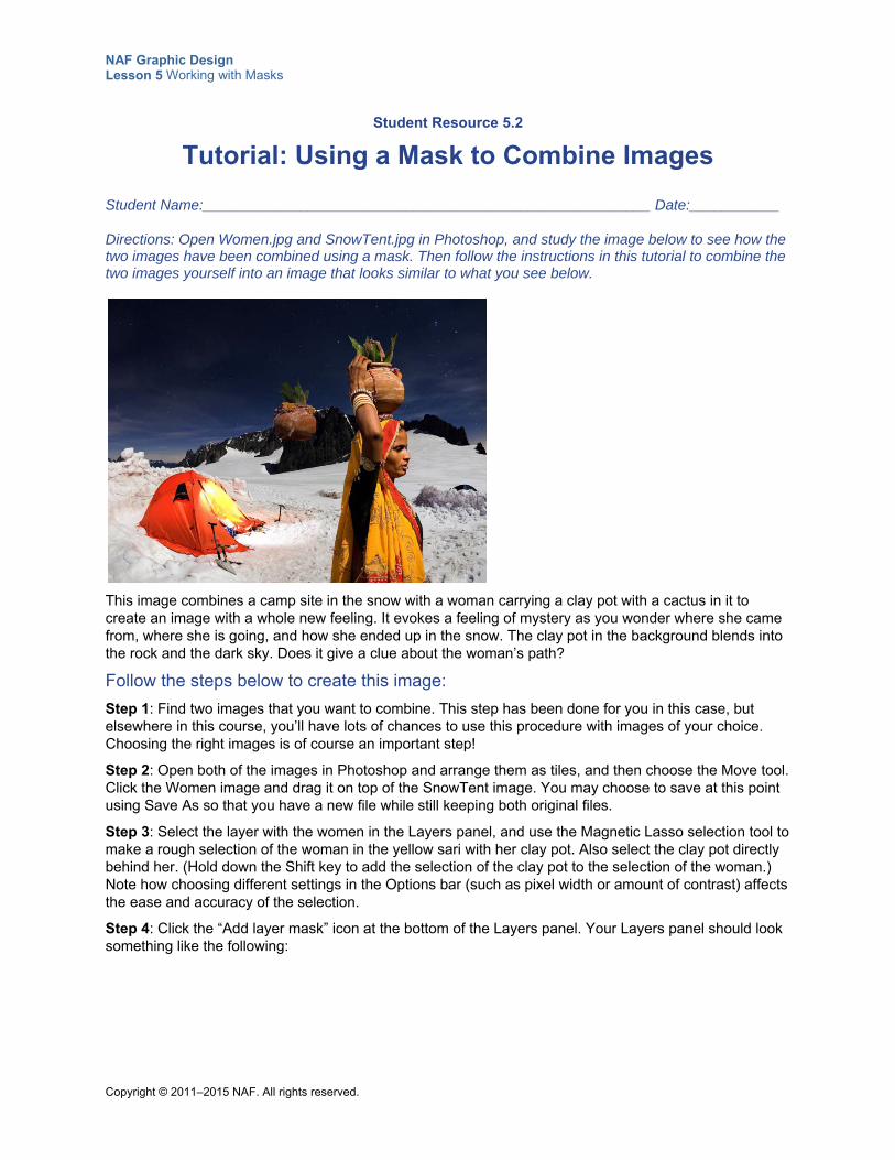
NAF Graphic Design Lesson 5 Working with Masks
Copyright © 2011–2015 NAF. All rights reserved.
Student Resource 5.2
Tutorial: Using a Mask to Combine Images
Student Name:_______________________________________________________ Date:___________
Directions: Open Women.jpg and SnowTent.jpg in Photoshop, and study the image below to see how the two images have been combined using a mask. Then follow the instructions in this tutorial to combine the two images yourself into an image that looks similar to what you see below.
This image combines a camp site in the snow with a woman carrying a clay pot with a cactus in it to create an image with a whole new feeling. It evokes a feeling of mystery as you wonder where she came from, where she is going, and how she ended up in the snow. The clay pot in the background blends into the rock and the dark sky. Does it give a clue about the woman’s path?
Follow the steps below to create this image:
Step 1: Find two images that you want to combine. This step has been done for you in this case, but elsewhere in this course, you’ll have lots of chances to use this procedure with images of your choice. Choosing the right images is of course an important step!
Step 2: Open both of the images in Photoshop and arrange them as tiles, and then choose the Move tool. Click the Women image and drag it on top of the SnowTent image. You may choose to save at this point using Save As so that you have a new file while still keeping both original files.
Step 3: Select the layer with the women in the Layers panel, and use the Magnetic Lasso selection tool to make a rough selection of the woman in the yellow sari with her clay pot. Also select the clay pot directly behind her. (Hold down the Shift key to add the selection of the clay pot to the selection of the woman.) Note how choosing different settings in the Options bar (such as pixel width or amount of contrast) affects the ease and accuracy of the selection.
Step 4: Click the “Add layer mask” icon at the bottom of the Layers panel. Your Layers panel should look something like the following:
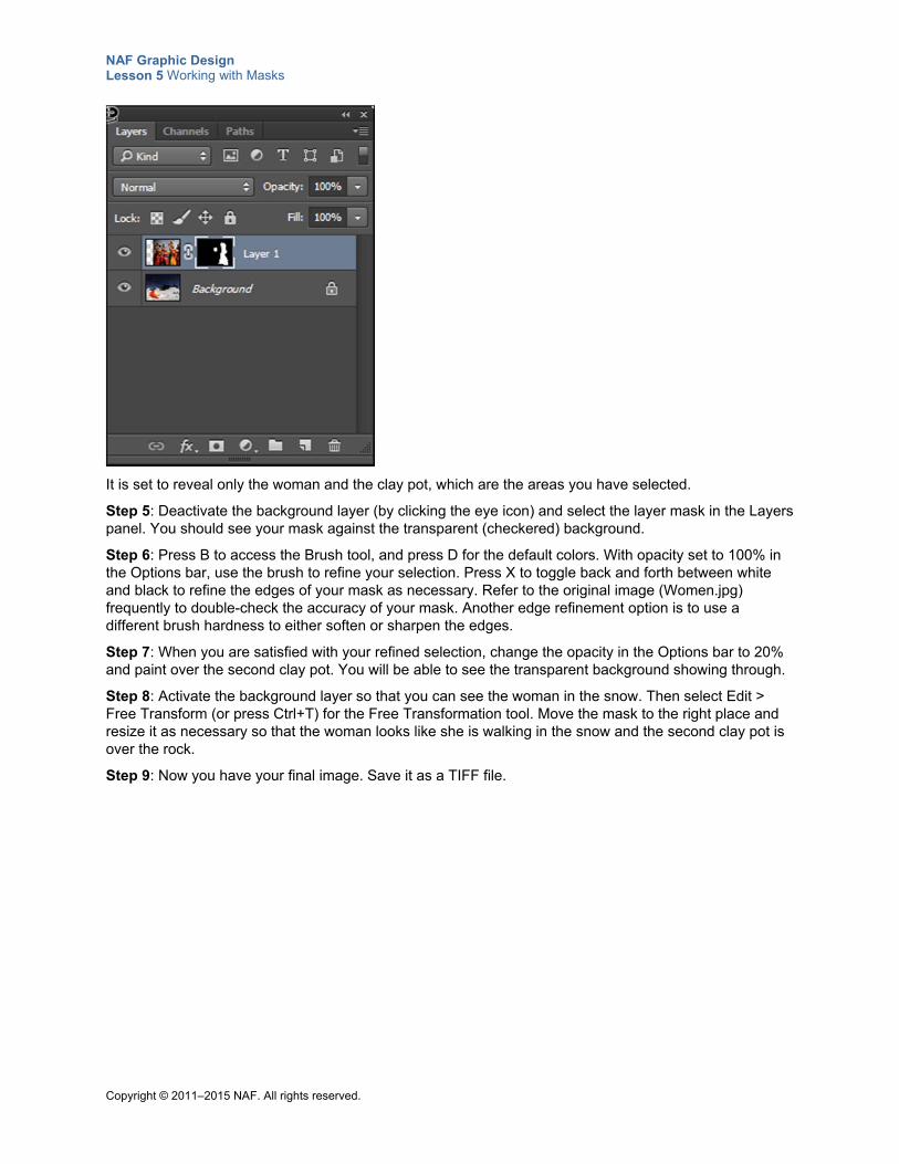
NAF Graphic Design Lesson 5 Working with Masks
Copyright © 2011–2015 NAF. All rights reserved.
It is set to reveal only the woman and the clay pot, which are the areas you have selected.
Step 5: Deactivate the background layer (by clicking the eye icon) and select the layer mask in the Layers panel. You should see your mask against the transparent (checkered) background.
Step 6: Press B to access the Brush tool, and press D for the default colors. With opacity set to 100% in the Options bar, use the brush to refine your selection. Press X to toggle back and forth between white and black to refine the edges of your mask as necessary. Refer to the original image (Women.jpg) frequently to double-check the accuracy of your mask. Another edge refinement option is to use a different brush hardness to either soften or sharpen the edges.
Step 7: When you are satisfied with your refined selection, change the opacity in the Options bar to 20% and paint over the second clay pot. You will be able to see the transparent background showing through.
Step 8: Activate the background layer so that you can see the woman in the snow. Then select Edit > Free Transform (or press Ctrl+T) for the Free Transformation tool. Move the mask to the right place and resize it as necessary so that the woman looks like she is walking in the snow and the second clay pot is over the rock.
Step 9: Now you have your final image. Save it as a TIFF file.
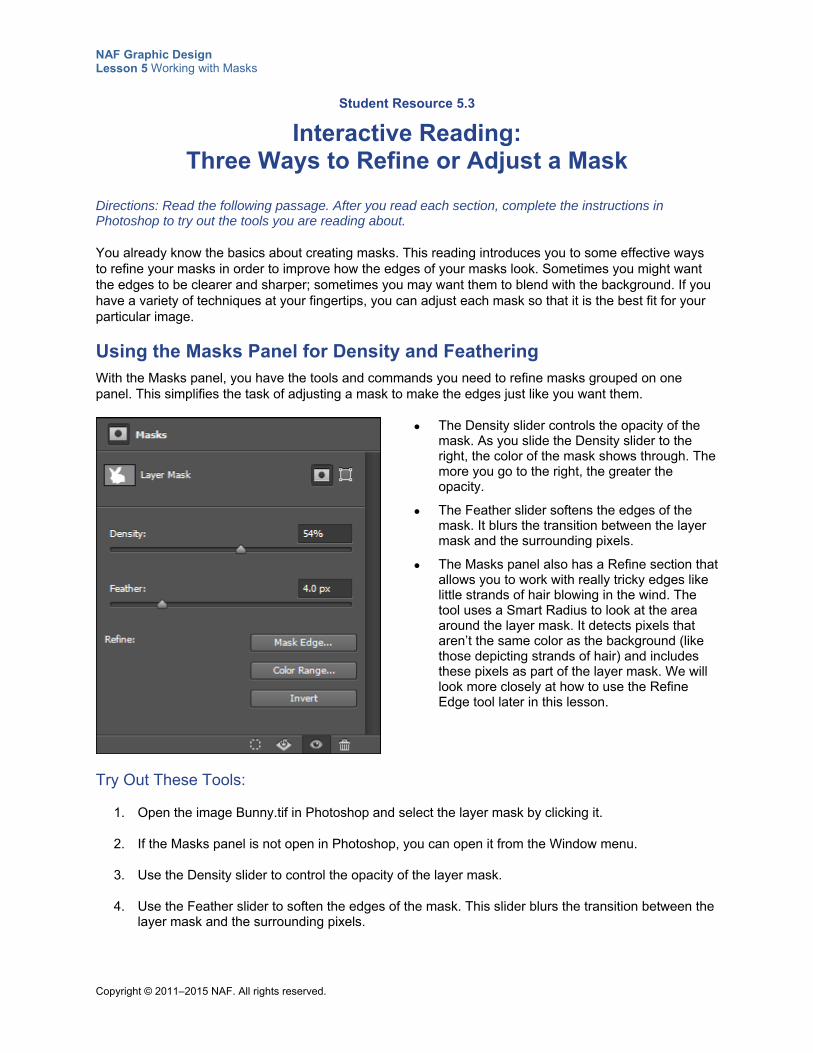
NAF Graphic Design Lesson 5 Working with Masks
Copyright © 2011–2015 NAF. All rights reserved.
Student Resource 5.3
Interactive Reading: Three Ways to Refine or Adjust a Mask
Directions: Read the following passage. After you read each section, complete the instructions in Photoshop to try out the tools you are reading about.
You already know the basics about creating masks. This reading introduces you to some effective ways to refine your masks in order to improve how the edges of your masks look. Sometimes you might want the edges to be clearer and sharper; sometimes you may want them to blend with the background. If you have a variety of techniques at your fingertips, you can adjust each mask so that it is the best fit for your particular image.
Using the Masks Panel for Density and Feathering With the Masks panel, you have the tools and commands you need to refine masks grouped on one panel. This simplifies the task of adjusting a mask to make the edges just like you want them.
The Density slider controls the opacity of the mask. As you slide the Density slider to the right, the color of the mask shows through. The more you go to the right, the greater the opacity.
The Feather slider softens the edges of the mask. It blurs the transition between the layer mask and the surrounding pixels.
The Masks panel also has a Refine section that allows you to work with really tricky edges like little strands of hair blowing in the wind. The tool uses a Smart Radius to look at the area around the layer mask. It detects pixels that aren’t the same color as the background (like those depicting strands of hair) and includes these pixels as part of the layer mask. We will look more closely at how to use the Refine Edge tool later in this lesson.
Try Out These Tools:
1. Open the image Bunny.tif in Photoshop and select the layer mask by clicking it.
2. If the Masks panel is not open in Photoshop, you can open it from the Window menu.
3. Use the Density slider to control the opacity of the layer mask.
4. Use the Feather slider to soften the edges of the mask. This slider blurs the transition between the layer mask and the surrounding pixels.
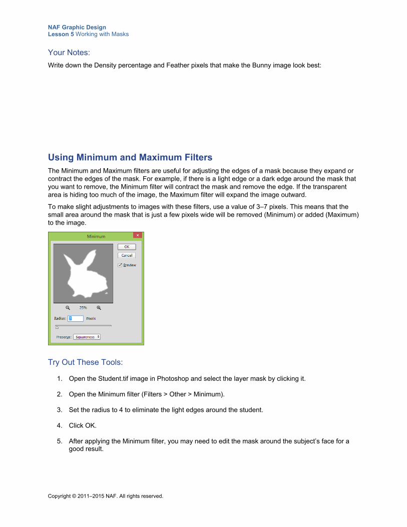
NAF Graphic Design Lesson 5 Working with Masks
Copyright © 2011–2015 NAF. All rights reserved.
Your Notes:
Write down the Density percentage and Feather pixels that make the Bunny image look best:
Using Minimum and Maximum Filters The Minimum and Maximum filters are useful for adjusting the edges of a mask because they expand or contract the edges of the mask. For example, if there is a light edge or a dark edge around the mask that you want to remove, the Minimum filter will contract the mask and remove the edge. If the transparent area is hiding too much of the image, the Maximum filter will expand the image outward.
To make slight adjustments to images with these filters, use a value of 3–7 pixels. This means that the small area around the mask that is just a few pixels wide will be removed (Minimum) or added (Maximum) to the image.
Try Out These Tools:
1. Open the Student.tif image in Photoshop and select the layer mask by clicking it.
2. Open the Minimum filter (Filters > Other > Minimum).
3. Set the radius to 4 to eliminate the light edges around the student.
4. Click OK.
5. After applying the Minimum filter, you may need to edit the mask around the subject’s face for a good result.
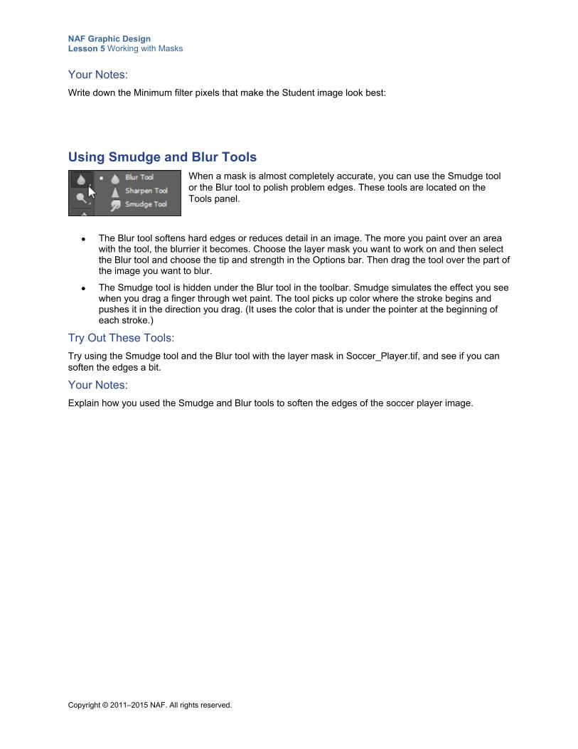
NAF Graphic Design Lesson 5 Working with Masks
Copyright © 2011–2015 NAF. All rights reserved.
Your Notes:
Write down the Minimum filter pixels that make the Student image look best:
Using Smudge and Blur Tools When a mask is almost completely accurate, you can use the Smudge tool or the Blur tool to polish problem edges. These tools are located on the Tools panel.
The Blur tool softens hard edges or reduces detail in an image. The more you paint over an area with the tool, the blurrier it becomes. Choose the layer mask you want to work on and then select the Blur tool and choose the tip and strength in the Options bar. Then drag the tool over the part of the image you want to blur.
The Smudge tool is hidden under the Blur tool in the toolbar. Smudge simulates the effect you see when you drag a finger through wet paint. The tool picks up color where the stroke begins and pushes it in the direction you drag. (It uses the color that is under the pointer at the beginning of each stroke.)
Try Out These Tools:
Try using the Smudge tool and the Blur tool with the layer mask in Soccer_Player.tif, and see if you can soften the edges a bit.
Your Notes:
Explain how you used the Smudge and Blur tools to soften the edges of the soccer player image.
NAF Graphic Design Lesson 5 Working with Masks
Copyright © 2011–2015 NAF. All rights reserved.
Student Resource 5.4
Defining Format: Layers, Selections, and Layer Masks
Directions: In the chart below, first enter a category for each term. In the next column, list characteristics of the term as you would see in a dictionary definition. A category and one characteristic of the term layer are given as an example.
Term Category Characteristics
A layer is a discrete element of a Photoshop design that: 1. can be activated or deactivated
2.
3.
4.
A selection is a
that:
1.
2.
3.
4.
A layer mask is a nondestructive editing technique in Photoshop that:
1.
2.
3.
4.
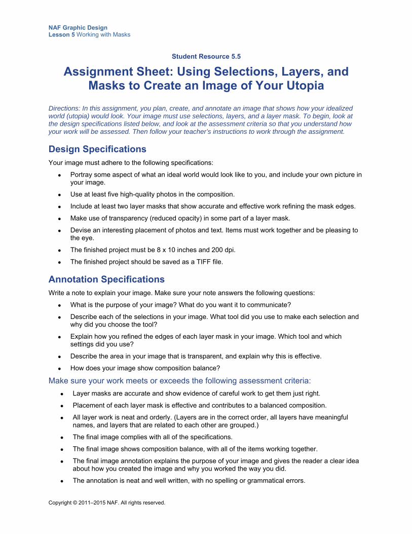
NAF Graphic Design Lesson 5 Working with Masks
Copyright © 2011–2015 NAF. All rights reserved.
Student Resource 5.5
Assignment Sheet: Using Selections, Layers, and Masks to Create an Image of Your Utopia
Directions: In this assignment, you plan, create, and annotate an image that shows how your idealized world (utopia) would look. Your image must use selections, layers, and a layer mask. To begin, look at the design specifications listed below, and look at the assessment criteria so that you understand how your work will be assessed. Then follow your teacher’s instructions to work through the assignment.
Design Specifications Your image must adhere to the following specifications:
Portray some aspect of what an ideal world would look like to you, and include your own picture in your image.
Use at least five high-quality photos in the composition.
Include at least two layer masks that show accurate and effective work refining the mask edges.
Make use of transparency (reduced opacity) in some part of a layer mask.
Devise an interesting placement of photos and text. Items must work together and be pleasing to the eye.
The finished project must be 8 x 10 inches and 200 dpi.
The finished project should be saved as a TIFF file.
Annotation Specifications Write a note to explain your image. Make sure your note answers the following questions:
What is the purpose of your image? What do you want it to communicate?
Describe each of the selections in your image. What tool did you use to make each selection and why did you choose the tool?
Explain how you refined the edges of each layer mask in your image. Which tool and which settings did you use?
Describe the area in your image that is transparent, and explain why this is effective.
How does your image show composition balance?
Make sure your work meets or exceeds the following assessment criteria:
Layer masks are accurate and show evidence of careful work to get them just right.
Placement of each layer mask is effective and contributes to a balanced composition.
All layer work is neat and orderly. (Layers are in the correct order, all layers have meaningful names, and layers that are related to each other are grouped.)
The final image complies with all of the specifications.
The final image shows composition balance, with all of the items working together.
The final image annotation explains the purpose of your image and gives the reader a clear idea about how you created the image and why you worked the way you did.
The annotation is neat and well written, with no spelling or grammatical errors.
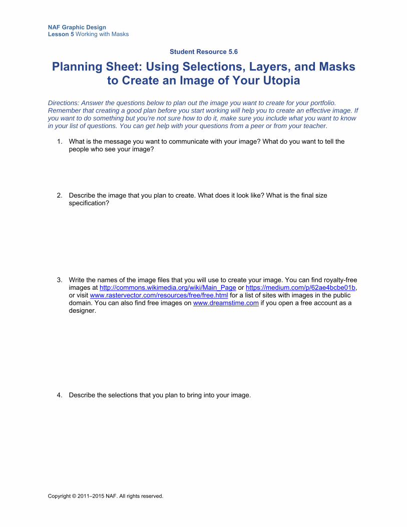
NAF Graphic Design Lesson 5 Working with Masks
Copyright © 2011–2015 NAF. All rights reserved.
Student Resource 5.6
Planning Sheet: Using Selections, Layers, and Masks to Create an Image of Your Utopia
Directions: Answer the questions below to plan out the image you want to create for your portfolio. Remember that creating a good plan before you start working will help you to create an effective image. If you want to do something but you’re not sure how to do it, make sure you include what you want to know in your list of questions. You can get help with your questions from a peer or from your teacher.
1. What is the message you want to communicate with your image? What do you want to tell the people who see your image?
2. Describe the image that you plan to create. What does it look like? What is the final size specification?
3. Write the names of the image files that you will use to create your image. You can find royalty-free images at http://commons.wikimedia.org/wiki/Main_Page or https://medium.com/p/62ae4bcbe01b, or visit www.rastervector.com/resources/free/free.html for a list of sites with images in the public domain. You can also find free images on www.dreamstime.com if you open a free account as a designer.
4. Describe the selections that you plan to bring into your image.
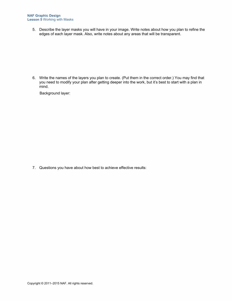
NAF Graphic Design Lesson 5 Working with Masks
Copyright © 2011–2015 NAF. All rights reserved.
5. Describe the layer masks you will have in your image. Write notes about how you plan to refine the edges of each layer mask. Also, write notes about any areas that will be transparent.
6. Write the names of the layers you plan to create. (Put them in the correct order.) You may find that you need to modify your plan after getting deeper into the work, but it’s best to start with a plan in mind.
Background layer:
7. Questions you have about how best to achieve effective results:
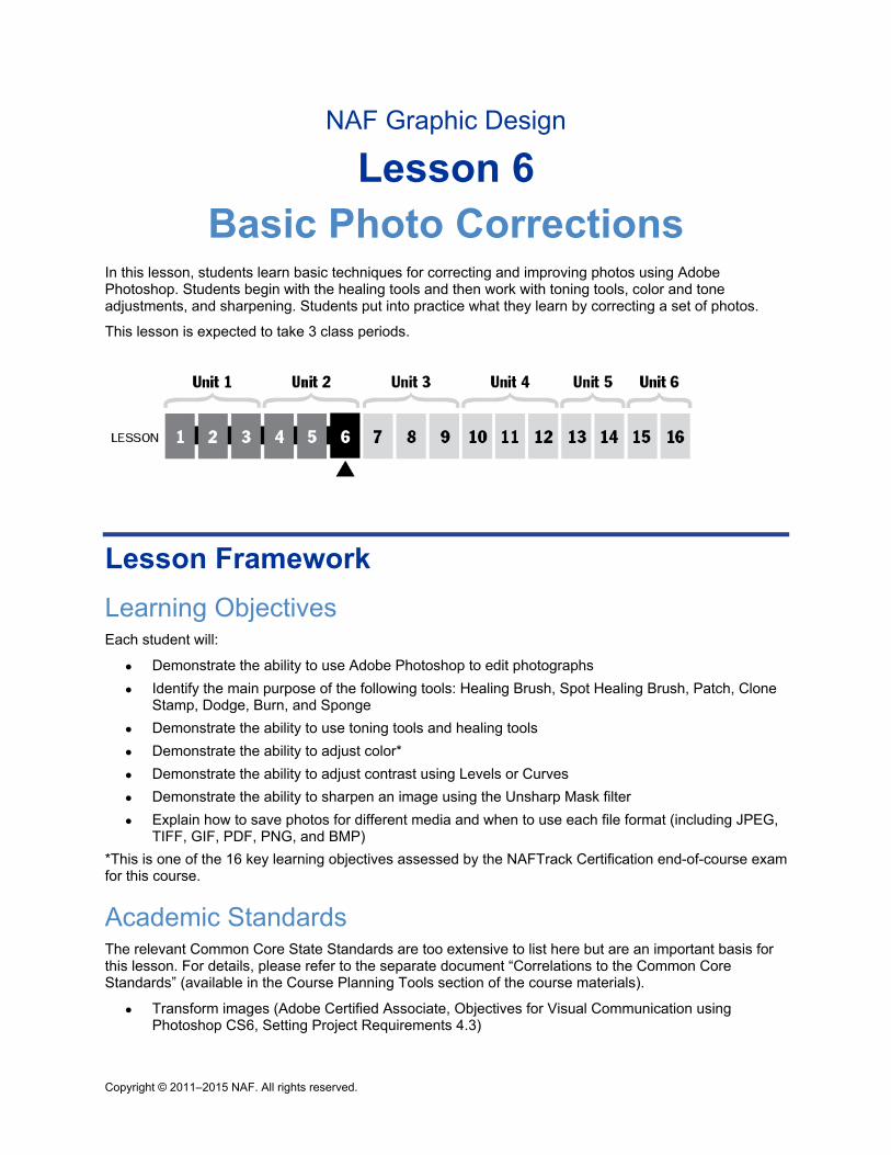
Copyright © 2011–2015 NAF. All rights reserved.
NAF Graphic Design
Lesson 6 Basic Photo Corrections
In this lesson, students learn basic techniques for correcting and improving photos using Adobe Photoshop. Students begin with the healing tools and then work with toning tools, color and tone adjustments, and sharpening. Students put into practice what they learn by correcting a set of photos.
This lesson is expected to take 3 class periods.
Lesson Framework
Learning Objectives Each student will:
Demonstrate the ability to use Adobe Photoshop to edit photographs
Identify the main purpose of the following tools: Healing Brush, Spot Healing Brush, Patch, Clone Stamp, Dodge, Burn, and Sponge
Demonstrate the ability to use toning tools and healing tools
Demonstrate the ability to adjust color*
Demonstrate the ability to adjust contrast using Levels or Curves
Demonstrate the ability to sharpen an image using the Unsharp Mask filter
Explain how to save photos for different media and when to use each file format (including JPEG, TIFF, GIF, PDF, PNG, and BMP)
*This is one of the 16 key learning objectives assessed by the NAFTrack Certification end-of-course exam for this course.
Academic Standards The relevant Common Core State Standards are too extensive to list here but are an important basis for this lesson. For details, please refer to the separate document “Correlations to the Common Core Standards” (available in the Course Planning Tools section of the course materials).
Transform images (Adobe Certified Associate, Objectives for Visual Communication using Photoshop CS6, Setting Project Requirements 4.3)
NAF Graphic Design Lesson 6 Basic Photo Corrections
Copyright © 2011–2015 NAF. All rights reserved. - 2 -
Adjust or correct the tonal range, color, or distortions of an image (Adobe Certified Associate, Objectives for Visual Communication using Photoshop CS6, Setting Project Requirements 4.4)
Demonstrate knowledge of retouching and blending images (Adobe Certified Associate, Objectives for Visual Communication using Photoshop CS6, Setting Project Requirements 4.5)
Demonstrate knowledge of color correction using Photoshop CS6 (Adobe Certified Associate, Objectives for Visual Communication using Photoshop CS6, Setting Project Requirements 2.4)
Demonstrate knowledge of image resolution, image size, and image file format for web, video, and print (Adobe Certified Associate, Objectives for Visual Communication using Photoshop CS6, Setting Project Requirements 2.1)
Plan and manage activities to develop a solution or complete a project (ISTE NETS for Students 2007, 4b)
Select and use applications effectively and productively (ISTE NETS for Students 2007, 6b)
Assessment
Assessment Product Means of Assessment
Two images that have been corrected using Photoshop tools and commands (Student Resource 6.5)
Assessment Criteria: Photo Corrections (Teacher Resource 6.3)
Prerequisites Basic knowledge of image size and resolution
Understanding of graphic design as visual communication
Ability to create accurate selections using all Photoshop selection tools
Ability to edit and manipulate layers in a Photoshop image
Ability to manipulate layer masks in Photoshop
Understanding of composition balance in an image
Instructional Materials
Teacher Resources Teacher Resource 6.1, Images: Which_Photo_Correction folder, ThreeGenerations.jpg, Dodge-
burn-sponge.jpg, Photo_Corrections folder (separate ZIP file)
Teacher Resource 6.2, Answer Key: Photo Correction Chart
Teacher Resource 6.3, Assessment Criteria: Photo Corrections
Teacher Resource 6.4, Key Vocabulary: Basic Photo Corrections
Teacher Resource 6.5, Bibliography: Basic Photo Corrections
Student Resources Student Resource 6.1, Reference Sheet: Photo Correction Tools
Student Resource 6.2, Photo Correction Chart: Which Tool?
NAF Graphic Design Lesson 6 Basic Photo Corrections
Copyright © 2011–2015 NAF. All rights reserved. - 3 -
Student Resource 6.3, Interactive Reading: Improving Color and Sharpness in Photos
Student Resource 6.4, Reference Sheet: File Formats
Student Resource 6.5, Assignment Sheet: Photo Planning and Corrections
Equipment and Supplies Access to Photoshop for all students
LCD projector and computer for videos
Blackboard, whiteboard, or flip chart
Lesson Steps
Step Min. Activity
CLASS PERIOD 1
1
15 Observation and Analysis: Which Photo Correction Tool?
The purpose of this activity is to introduce students to the photo correction tools used in Photoshop.
Explain to students that in this lesson, they will learn the basics of correcting and retouching photos using Photoshop, and refer them to Student Resource 6.1, Reference Sheet: Photo Correction Tools.
Give students access to the photos in the folder Which_Photo_Correction. (This folder is included in Teacher Resource 6.1, Images.) Explain that the folder contains four sets of “before and after” photos; some corrections have been made to the second photo in each set. Instruct students to look closely at each photo to see which corrections have been done and to try to guess which of the tools on the reference sheet was used for each correction. Tell them to write their answers on Student Resource 6.2, Photo Correction Chart: Which Tool? Explain that they should leave the “Tools actually used” boxes blank, and fill them in later when they learn which tool was used.
When students have completed the exercise, come together as a class to look at the photos using an LCD projector. Use Teacher Resource 6.2, Answer Key: Photo Correction Chart, to guide the discussion. Tell the students which tools were actually used to retouch each photo, but point out that different tools can be used to achieve similar results, and sometimes it takes more than one tool to get the most accurate results. Have students write the names of the tools that were used for each photo in the “Tools actually used” boxes. Explain that as they begin working with the tools, they will discover which are best in each type of situation.
NAF Graphic Design Lesson 6 Basic Photo Corrections
Copyright © 2011–2015 NAF. All rights reserved. - 4 -
Step Min. Activity
In conclusion, point out to students that it is best to retouch photos that are close to their desired state. The experts say that with practice, 90% of problems can be fixed in less than 15 minutes. Remind students that learning how to spot problems and then choose an appropriate correction technique is an essential part of mastering Photoshop.
2
15 Video Modeling: Healing Brush, Spot Healing Brush, and Patch Tools
In this activity, students learn various techniques for using the healing tools. Using your computer with an LCD projector, show students the picture ThreeGenerations.jpg. (This picture is included in Teacher Resource 6.1, Images.) Ask students to suggest photo corrections that could be made with the healing tools. They will probably suggest things such as removing blemishes on the faces, removing highlights from the hair, and removing the stocking in the background. Tell students that they will have a chance to improve this photo later in the lesson, and the video they are going to watch will help them develop some techniques for retouching such images. Before showing the video, write the following questions on the board: What does the Spot Healing brush do?
How does the Content Aware move tool work?
Instruct students to listen for answers to these questions as they watch the video. Show the video “Fix Flaws and Repair Photos” (https://helpx.adobe.com/photoshop/how-to/fix-flaws-retouch-photos.html) using your computer and an LCD projector.
After the video, discuss the questions listed on the board with students, and ask them to note new information they learn on their reference sheet (Student Resource 6.1, Reference Sheet: Photo Correction Tools).
Give students the URL for the video and suggest that they watch it again on their own.
Remind students that the more skilled they become at correcting photos, the easier it will be for them to create effective graphic designs. Encourage them to look for other Adobe Photoshop tutorial videos on their own, to learn how the experts work.
3
20 Modeling and Independent Practice: Using the Options Bar
In this activity, students get practice using the Options bar to adjust brush settings.
Instruct students to open the file ThreeGenerations.jpg in Photoshop, and also open this file on your computer connected to an LCD projector. Since students looked at this photo in the previous activity, they should have some ideas about what to improve. Ask students to contribute to a list of suggested corrections, and write their suggestions on the board. The list will likely include corrections such as the following:
Remove moles and blemishes on the younger woman’s face
Remove highlights in the young woman’s hair
Clean up the older woman’s face
Remove the distracting stocking in the background
NAF Graphic Design Lesson 6 Basic Photo Corrections
Copyright © 2011–2015 NAF. All rights reserved. - 5 -
Step Min. Activity
Clone the older woman’s left eye over her right eye
Explain to students that to make these corrections accurately, they need to pay attention to the settings on the Options bar. As an example, select the Healing Brush tool to remove the moles and blemishes on the younger woman’s face, and have students follow along on their own computers as you model the procedure. Depending on the size of the spot you are fixing, change the size of the brush to values between 5 and 15 pixels. Try fixing the smallest spots with a 2-pixel brush. Also experiment with different values for the hardness of the brush tip, and point out how this makes a difference in the result. When the class is satisfied with the corrections you have made to the young woman’s face, ask students to make notes about what they have learned in the “Important Options” column of their reference sheet (Student Resource 6.1, Reference Sheet: Photo Correction Tools), and then ask one or two students to read the notes they wrote to the class. Next, ask students to work on their own to clean up the older woman’s face, using the techniques they have learned. Remind students that they need to practice in order to find out for themselves what happens when they change the size or hardness of a brush tip. Point out that they will encounter brush tip options with many Photoshop tools, and they all work the same way. So, the time they spend learning to use brushes effectively and accurately will help them with many Photoshop tasks. If time permits, instruct students to:
Remove the highlights from the young woman’s hair using the Healing Brush tool.
Remove the distracting stocking from the background using a combination of the Healing Brush and the Patch tool, or using the Spot Healing Brush. Encourage them to try out different size, hardness, and spacing settings.
Clone the older woman’s left eye over her right eye by using the Healing Brush tool and then playing around with the Clone Source window (for more advanced students). Hint: You have to go -100%W and then rotate it +50 degrees. Since it is not a frontal portrait, it doesn’t work as nicely as with the photo of the older man shown in the video, but trying to make it look natural is a good challenge.
To conclude this activity, answer any questions students have about the Options bar, and remind them that whenever they choose a tool in Photoshop, they should pay attention to the settings in the Options bar and use them to achieve the effects that they are looking for.
CLASS PERIOD 2
4
20 Interactive Reading: Correcting Color and Sharpness in Photos
This reading introduces students to tools they can use to improve the color and sharpness of an image. It focuses on the following college and career skill:
Thinking critically and systemically to solve difficult problems
As a pre-reading activity, ask students to open a photo of their choice in Photoshop and then to open the Histogram panel (Window > Histogram) and the Adjustments panel (Window > Adjustments).
NAF Graphic Design Lesson 6 Basic Photo Corrections
Copyright © 2011–2015 NAF. All rights reserved. - 6 -
Step Min. Activity
Note: In Photoshop versions prior to CS5, these tools are also found in the Image menu (Image > Adjustments).
First, ask students to run their cursor over the various icons in the Adjustments panel. Ask them to share with a partner what they think the purpose of the Adjustments panel is, and then share as a class. Students are likely to note that this panel can be used to change the color and tone of an image.
Next, ask students to click the Levels icon in the Adjustments panel, and then to move the gray triangle in the middle of the Levels slider. Ask them to note:
What happens to the photo they have open?
What happens to the histogram?
Tell students that in the reading, they will learn how to use these tools effectively to correct and improve their photos.
Refer students to Student Resource 6.3, Interactive Reading: Improving Color and Sharpness in Photos. Instruct them to read each selection and then follow the instructions to try out the tools and take notes on their findings.
When students have completed the reading and tried the various tools, ask them to share their notes with a partner. To finish, ask them to share their answers with the class and check for completeness and accuracy. Answer any questions students have about adjusting color and tone.
Remind students that they will need to practice using the color correction tools to get good at color correction, and encourage them to work on improving color in their photos on their own.
5
10 Video Modeling: Dodge, Burn, Sponge
In this activity, students learn how to use the toning tools.
Tell students that they will be watching a video that teaches them how to use the Dodge, Burn, and Sponge toning tools. To begin, ask students to open Photoshop and locate these tools in the Tools panel.
Before showing the video, write the following questions on the board:
What is the purpose of the Dodge tool?
What is the purpose of the Burn tool?
How does the Sponge tool work?
Instruct students to listen for answers to these questions as they watch the video.
Using your LCD projector, show the video “How to Correct Color and Tone” (https://helpx.adobe.com/photoshop/how-to/color-tone-adjustments.html).
After the video, discuss the questions listed on the board with students, and ask them to note new information they learn on their reference sheet (Student Resource 6.1, Reference Sheet: Photo Correction Tools).
Give students the URL for the video and suggest that they watch it again on their own.
Tell students they will have a chance to practice using the tools they learned about during the remainder of this lesson.
NAF Graphic Design Lesson 6 Basic Photo Corrections
Copyright © 2011–2015 NAF. All rights reserved. - 7 -
Step Min. Activity
6
10 Independent Practice: Dodge, Burn, Sponge
In this activity, students practice correcting a photo with the toning tools.
Instruct students to work in pairs, and give them access to the photo Dodge-burn-sponge.jpg. (This file is included in Teacher Resource 6.1, Images.) Tell pairs to open the image in Photoshop and work to improve the image using the toning tools they learned about in the video. You might suggest that they use the Dodge tool to lighten the faces, the Burn tool to darken the baseball cap or the washed-out shirt, and the Sponge tool to desaturate the red sock. You could also ask students who need more of a challenge to make the striped sweater all gray tones. Remind students to use the Options bar to play with different exposures, brush sizes and hardnesses, and range (midtones, highlights, or shadows).
You may want to review nondestructive editing techniques, and remind students to save the original image by using layers to make all of their edits.
Circulate while students are working and answer any questions students have about how to use the tools with this picture.
When pairs have finished their work, ask them to compare their retouched image with another pair’s image and try to find areas where they could improve their work. Finally, ask for one or two volunteers to share their work with the class, and answer any remaining questions about how to use the toning tools.
Tell students they will get more practice with these tools in the next class period.
7
10 Matching: File Formats
In this activity, students review what they know about file formats for images.
Point out to students that it is helpful to gather all of the information they have collected about image file formats in one place. Refer them to Student Resource 6.4, Reference Sheet: File Formats, and explain that to complete the reference sheet, they need to read each description and fill in the name of the file format that is described. Remind students that the best format for a graphic depends on how you intend to use it, and they should know when each of the file formats listed on this reference sheet is the best one to use.
Instruct students to work in groups of four to match the file types to all of the descriptions, but have each student complete a reference sheet to place into his or her notebook. Tell students that if they aren’t sure about some of the formats, they can use a search engine to look for information on the web.
When students have completed the exercise, go over the answers as a class to check for accuracy, and then instruct students to save this reference sheet in their notebook. Conclude with a discussion of the best file formats to use when saving the photos they’ve worked on so far.
Point out to students that being able to determine the proper file format to use for an image is a required skill for a graphic designer because you must set up files correctly for printing, online use, optimal image resolution, and output.
NAF Graphic Design Lesson 6 Basic Photo Corrections
Copyright © 2011–2015 NAF. All rights reserved. - 8 -
Step Min. Activity
CLASS PERIOD 3
8
45 Assessment: Photo Planning and Corrections
In this activity, students demonstrate their ability to use the photo correction skills they have learned. This activity also focuses on the following college and career skills:
Prioritizing and completing tasks without direct oversight
Effectively using technology relevant to a profession
Demonstrating creativity and innovation
Refer students to Student Resource 6.5, Assignment Sheet: Photo Planning and Corrections. Explain that in this activity, they will be choosing two photos and improving them before submitting them for assessment. Go over the requirements, and make sure students understand that they need to make all four types of corrections between their two photos. Give students access to the Photo Corrections folder (included in Teacher Resource 6.1, Images). Tell students to first fill out the planning chart before they begin their corrections in Photoshop. Go over the assessment criteria as a class to make sure students understand how their work will be assessed, and answer any questions.
Circulate while students are working and answer questions. When they have completed their corrections, ask students to share their work with a partner and evaluate whether each other’s work meets the assessment criteria. Instruct them to make any necessary changes before submitting their before and after images and their planning chart for assessment.
Use Teacher Resource 6.3, Assessment Criteria: Photo Corrections, to assess student work. Instruct students to add their before and after images to their portfolio of graphic design work.
9 5 Think, Pair, Share: Photo Correction Skills
Write the following prompt on the board. Ask students to think about their response and to write it down in their notebooks:
If I have an interview for a job in a photography studio or a printing shop, the three things I want to be sure to tell them about my skills in photo correction are:
Have students share their responses with a partner, and then ask pairs to share their responses with the class.
To conclude the lesson, reinforce the idea that photo correction skills are an important asset for many jobs related to graphic design.
NAF Graphic Design Lesson 6 Basic Photo Corrections
Copyright © 2011–2015 NAF. All rights reserved. - 9 -
Extensions
Enrichment Have students gather images of their family to create a family photo album with anywhere from 2
to 20 images. These images can be digital photos, scans of paper photos, or a combination of both. Tell students to retouch all of the photos as necessary. When they have perfected all of their images, they should print them on photo paper, if possible, so that they can share the album with their family.
Technology Integration Have students enhance one of their photos using cinematic color grading, which creates a movie-
like effect. Consider asking students to watch the following video. For YouTube videos: if your school does not allow access to YouTube, you may wish to download the video to your computer in advance using KeepVid (see www.keepvid.com) or a similar program.
o “Cinematic Color Grading.” Photoshop Training Channel, YouTube, 25:17. https://www.youtube.com/watch?v=GFuenozbiE0
If you are using Photoshop CS4, instruct students to watch the video about making color adjustments at http://tv.adobe.com/watch/learn-photoshop-cs4/making-adjustments/. Then have them adjust the colors in a photo of their choice, using the information they have learned in the video about creating adjustment layers from the Adjustments panel.
Cross-Curricular Integration English Language Arts or Photography: Ask students to research the etymology of the terms burn
and dodge as they relate to photography and report back to the class.
History: Instruct students to write a short biography of a person who played an important role in the history of photography before the time of digital photography. Possible subjects:
o George Eastman
o Henri Cartier-Bresson
o Joseph Nicéphore
o Louis Daguerre
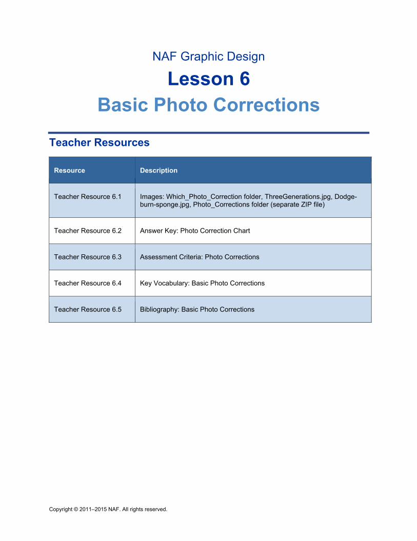
Copyright © 2011–2015 NAF. All rights reserved.
NAF Graphic Design
Lesson 6 Basic Photo Corrections
Teacher Resources
Resource Description
Teacher Resource 6.1 Images: Which_Photo_Correction folder, ThreeGenerations.jpg, Dodge-burn-sponge.jpg, Photo_Corrections folder (separate ZIP file)
Teacher Resource 6.2 Answer Key: Photo Correction Chart
Teacher Resource 6.3 Assessment Criteria: Photo Corrections
Teacher Resource 6.4 Key Vocabulary: Basic Photo Corrections
Teacher Resource 6.5 Bibliography: Basic Photo Corrections
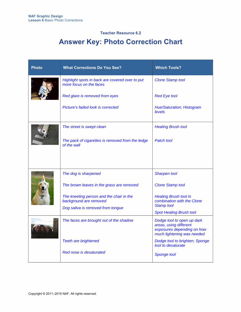
NAF Graphic Design Lesson 6 Basic Photo Corrections
Copyright © 2011–2015 NAF. All rights reserved.
Teacher Resource 6.2
Answer Key: Photo Correction Chart
Photo What Corrections Do You See? Which Tools?
Highlight spots in back are covered over to put more focus on the faces
Red glare is removed from eyes
Picture’s faded look is corrected
Clone Stamp tool
Red Eye tool
Hue/Saturation; Histogram levels
The street is swept clean
The pack of cigarettes is removed from the ledge of the wall
Healing Brush tool
Patch tool
The dog is sharpened
The brown leaves in the grass are removed
The kneeling person and the chair in the background are removed
Dog saliva is removed from tongue
Sharpen tool
Clone Stamp tool
Healing Brush tool in combination with the Clone Stamp tool
Spot Healing Brush tool
The faces are brought out of the shadow
Teeth are brightened
Red nose is desaturated
Dodge tool to open up dark areas, using different exposures depending on how much lightening was needed
Dodge tool to brighten; Sponge tool to desaturate Sponge tool
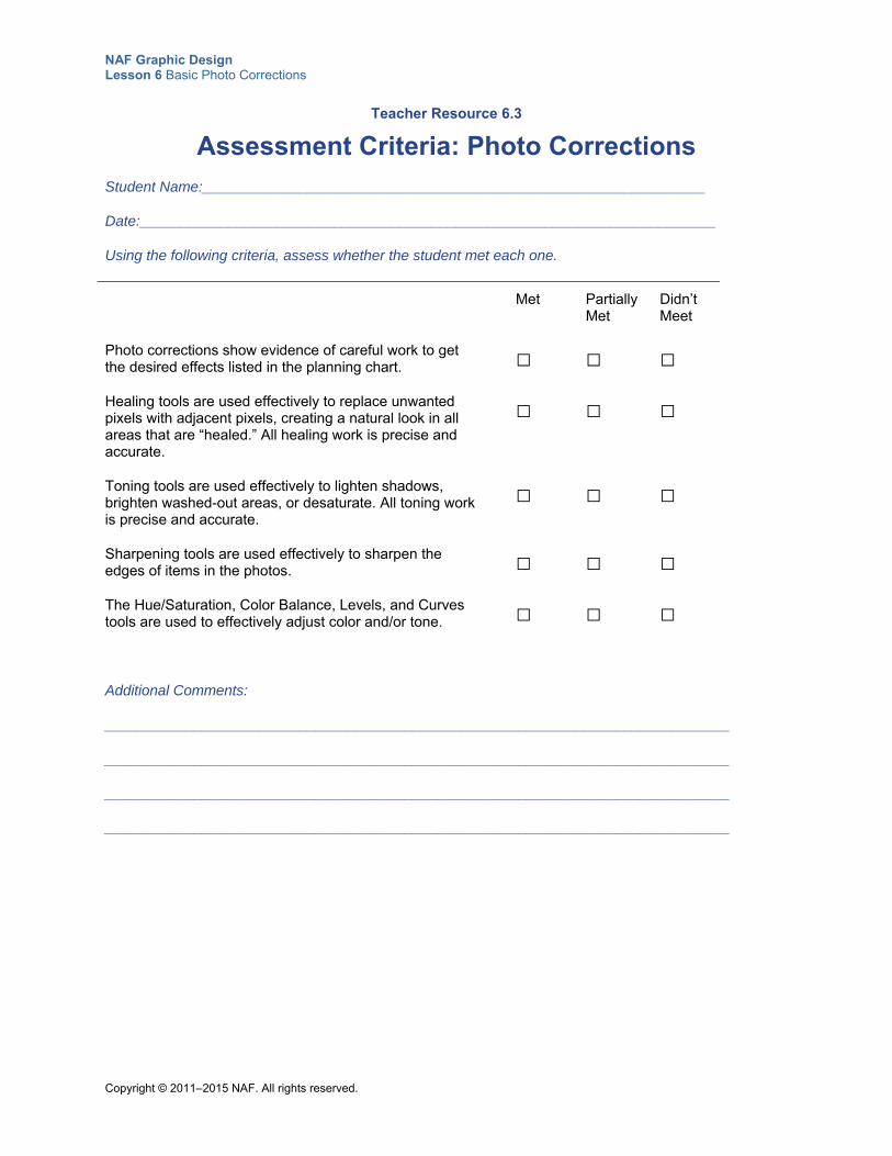
NAF Graphic Design Lesson 6 Basic Photo Corrections
Copyright © 2011–2015 NAF. All rights reserved.
Teacher Resource 6.3
Assessment Criteria: Photo Corrections
Student Name:______________________________________________________________
Date:_______________________________________________________________________
Using the following criteria, assess whether the student met each one.
Met Partially Met
Didn’t Meet
Photo corrections show evidence of careful work to get the desired effects listed in the planning chart.
□ □ □
Healing tools are used effectively to replace unwanted pixels with adjacent pixels, creating a natural look in all areas that are “healed.” All healing work is precise and accurate.
□ □ □
Toning tools are used effectively to lighten shadows, brighten washed-out areas, or desaturate. All toning work is precise and accurate.
□ □ □
Sharpening tools are used effectively to sharpen the edges of items in the photos.
□ □ □
The Hue/Saturation, Color Balance, Levels, and Curves tools are used to effectively adjust color and/or tone.
□ □ □
Additional Comments:
_____________________________________________________________________________
_____________________________________________________________________________
_____________________________________________________________________________
_____________________________________________________________________________
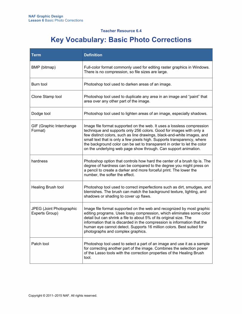
NAF Graphic Design Lesson 6 Basic Photo Corrections
Copyright © 2011–2015 NAF. All rights reserved.
Teacher Resource 6.4
Key Vocabulary: Basic Photo Corrections
Term Definition
BMP (bitmap) Full-color format commonly used for editing raster graphics in Windows. There is no compression, so file sizes are large.
Burn tool Photoshop tool used to darken areas of an image.
Clone Stamp tool Photoshop tool used to duplicate any area in an image and “paint” that area over any other part of the image.
Dodge tool Photoshop tool used to lighten areas of an image, especially shadows.
GIF (Graphic Interchange Format)
Image file format supported on the web. It uses a lossless compression technique and supports only 256 colors. Good for images with only a few distinct colors, such as line drawings, black-and-white images, and small text that is only a few pixels high. Supports transparency, where the background color can be set to transparent in order to let the color on the underlying web page show through. Can support animation.
hardness Photoshop option that controls how hard the center of a brush tip is. The degree of hardness can be compared to the degree you might press on a pencil to create a darker and more forceful print. The lower the number, the softer the effect.
Healing Brush tool Photoshop tool used to correct imperfections such as dirt, smudges, and blemishes. The brush can match the background texture, lighting, and shadows or shading to cover up flaws.
JPEG (Joint Photographic Experts Group)
Image file format supported on the web and recognized by most graphic editing programs. Uses lossy compression, which eliminates some color detail but can shrink a file to about 5% of its original size. The information that is discarded in the compression is information that the human eye cannot detect. Supports 16 million colors. Best suited for photographs and complex graphics.
Patch tool Photoshop tool used to select a part of an image and use it as a sample for correcting another part of the image. Combines the selection power of the Lasso tools with the correction properties of the Healing Brush tool.
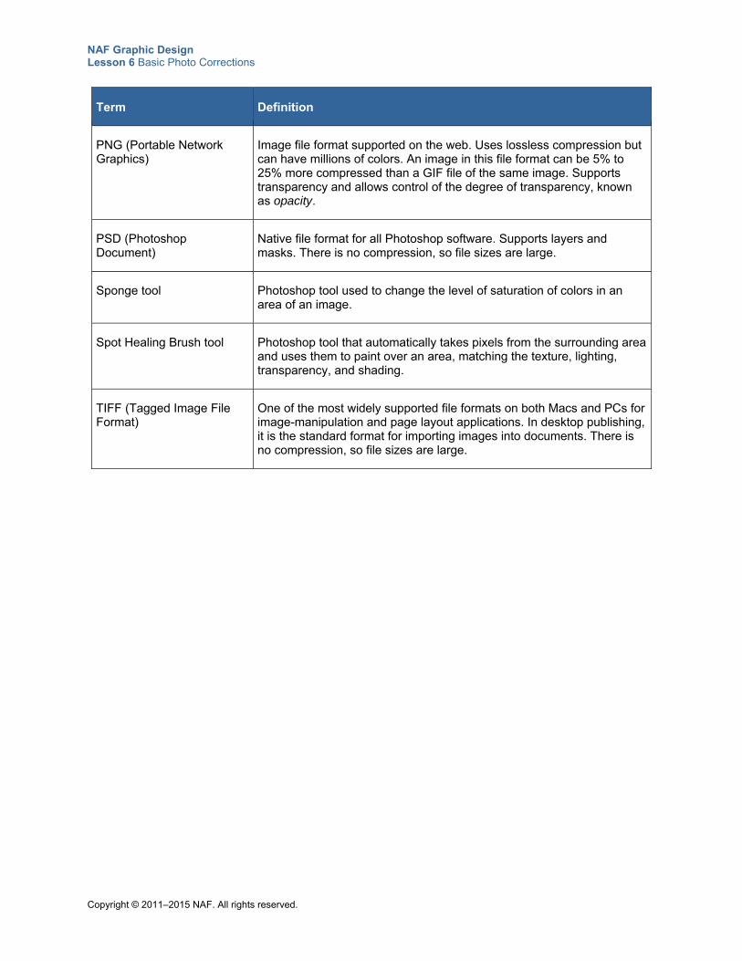
NAF Graphic Design Lesson 6 Basic Photo Corrections
Copyright © 2011–2015 NAF. All rights reserved.
Term Definition
PNG (Portable Network Graphics)
Image file format supported on the web. Uses lossless compression but can have millions of colors. An image in this file format can be 5% to 25% more compressed than a GIF file of the same image. Supports transparency and allows control of the degree of transparency, known as opacity.
PSD (Photoshop Document)
Native file format for all Photoshop software. Supports layers and masks. There is no compression, so file sizes are large.
Sponge tool Photoshop tool used to change the level of saturation of colors in an area of an image.
Spot Healing Brush tool Photoshop tool that automatically takes pixels from the surrounding area and uses them to paint over an area, matching the texture, lighting, transparency, and shading.
TIFF (Tagged Image File Format)
One of the most widely supported file formats on both Macs and PCs for image-manipulation and page layout applications. In desktop publishing, it is the standard format for importing images into documents. There is no compression, so file sizes are large.
NAF Graphic Design Lesson 6 Basic Photo Corrections
Copyright © 2011–2015 NAF. All rights reserved.
Teacher Resource 6.5
Bibliography: Basic Photo Corrections
The following sources were used in the preparation of this lesson and may be useful for your reference or as classroom resources. We check and update the URLs annually to ensure that they continue to be useful.
Print Harrington, Richard. Understanding Adobe Photoshop CS4. Berkeley, CA: Peachpit Press, 2009.
Online AIGA: The Professional Association for Design, http://www.aiga.org/ (accessed June 24, 2015).
“Cinematic Color Grading.” Photoshop Training Channel, YouTube, 25:17. https://www.youtube.com/watch?v=GFuenozbiE0 (accessed June 25, 2015).
Photoshop Help. http://help.adobe.com/en_US/photoshop/cs/using/photoshop_cs5_help.pdf (accessed June 24, 2015).
Photoshop Support.com, http://www.photoshopsupport.com/tutorials.html (accessed May 23, 2014).
Pizzi, Matthew. “Fix Flaws and Repair Photos.” Adobe TV video, 4:22. June 18, 2014. https://helpx.adobe.com/photoshop/how-to/fix-flaws-retouch-photos.html (accessed June 24, 2015).
Pizzi, Matthew. “How to Correct Color and Tone.” Adobe TV video, 4:11. June 18, 2014. https://helpx.adobe.com/photoshop/how-to/color-tone-adjustments.html (accessed June 25, 2015).
Raster Vector Free Images, http://www.rastervector.com/resources/free/free.html (accessed May 23, 2014).
Snider, Lesa. “The Basics of Retouching People, Part 2.” PhotoLesa.com, June 7, 2006. http://photolesa.com/tutorials/basics-retouching-people-part-2 (accessed June 24, 2015).
Wikimedia Commons, http://commons.wikimedia.org/wiki/Main_Page (accessed May 23, 2014).
Copyright © 2011–2015 NAF. All rights reserved.
NAF Graphic Design
Lesson 6 Basic Photo Corrections
Student Resources
Resource Description
Student Resource 6.1 Reference Sheet: Photo Correction Tools
Student Resource 6.2 Photo Correction Chart: Which Tool?
Student Resource 6.3 Interactive Reading: Improving Color and Sharpness in Photos
Student Resource 6.4 Reference Sheet: File Formats
Student Resource 6.5 Assignment Sheet: Photo Planning and Corrections
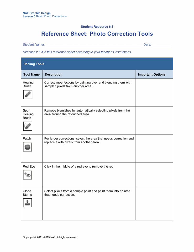
NAF Graphic Design Lesson 6 Basic Photo Corrections
Copyright © 2011–2015 NAF. All rights reserved.
Student Resource 6.1
Reference Sheet: Photo Correction Tools
Student Names:_______________________________________________________ Date:___________
Directions: Fill in this reference sheet according to your teacher’s instructions.
Healing Tools
Tool Name Description Important Options
Healing Brush
Correct imperfections by painting over and blending them with sampled pixels from another area.
Spot Healing Brush
Remove blemishes by automatically selecting pixels from the area around the retouched area.
Patch
For larger corrections, select the area that needs correction and replace it with pixels from another area.
Red Eye
Click in the middle of a red eye to remove the red.
Clone Stamp
Select pixels from a sample point and paint them into an area that needs correction.
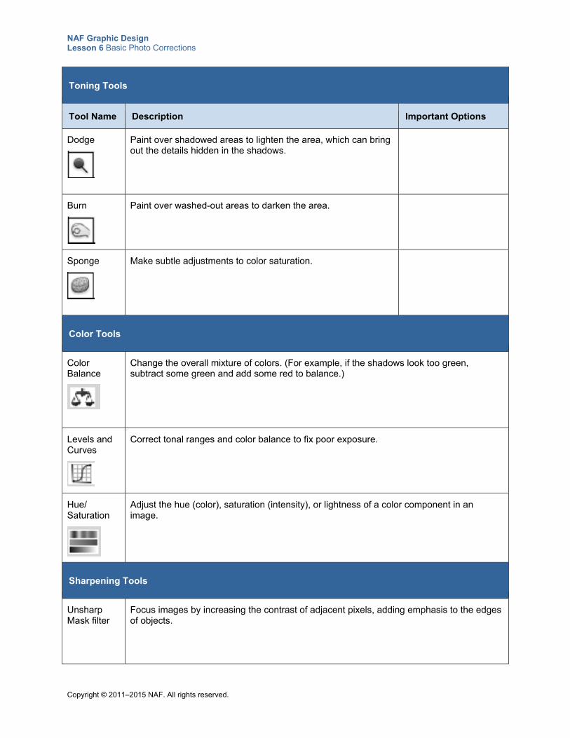
NAF Graphic Design Lesson 6 Basic Photo Corrections
Copyright © 2011–2015 NAF. All rights reserved.
Toning Tools
Tool Name Description Important Options
Dodge
Paint over shadowed areas to lighten the area, which can bring out the details hidden in the shadows.
Burn
Paint over washed-out areas to darken the area.
Sponge
Make subtle adjustments to color saturation.
Color Tools
Color Balance
Change the overall mixture of colors. (For example, if the shadows look too green, subtract some green and add some red to balance.)
Levels and Curves
Correct tonal ranges and color balance to fix poor exposure.
Hue/ Saturation
Adjust the hue (color), saturation (intensity), or lightness of a color component in an image.
Sharpening Tools
Unsharp Mask filter
Focus images by increasing the contrast of adjacent pixels, adding emphasis to the edges of objects.
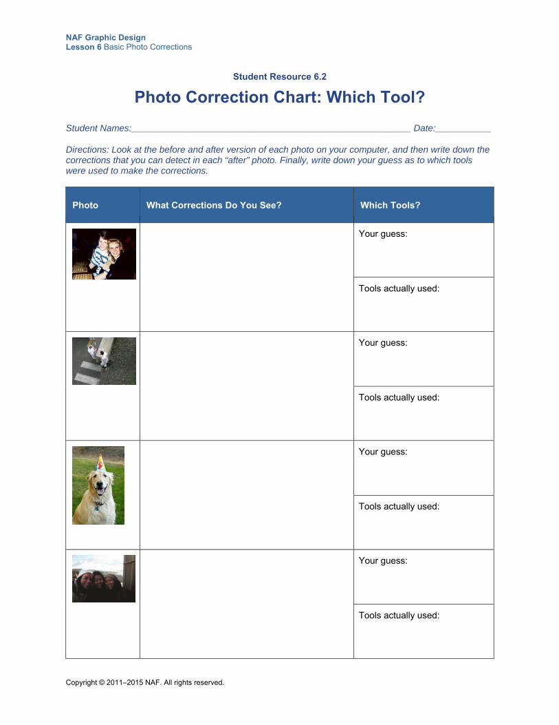
NAF Graphic Design Lesson 6 Basic Photo Corrections
Copyright © 2011–2015 NAF. All rights reserved.
Student Resource 6.2
Photo Correction Chart: Which Tool?
Student Names:_______________________________________________________ Date:___________
Directions: Look at the before and after version of each photo on your computer, and then write down the corrections that you can detect in each “after” photo. Finally, write down your guess as to which tools were used to make the corrections.
Photo What Corrections Do You See? Which Tools?
Your guess:
Tools actually used:
Your guess:
Tools actually used:
Your guess:
Tools actually used:
Your guess:
Tools actually used:
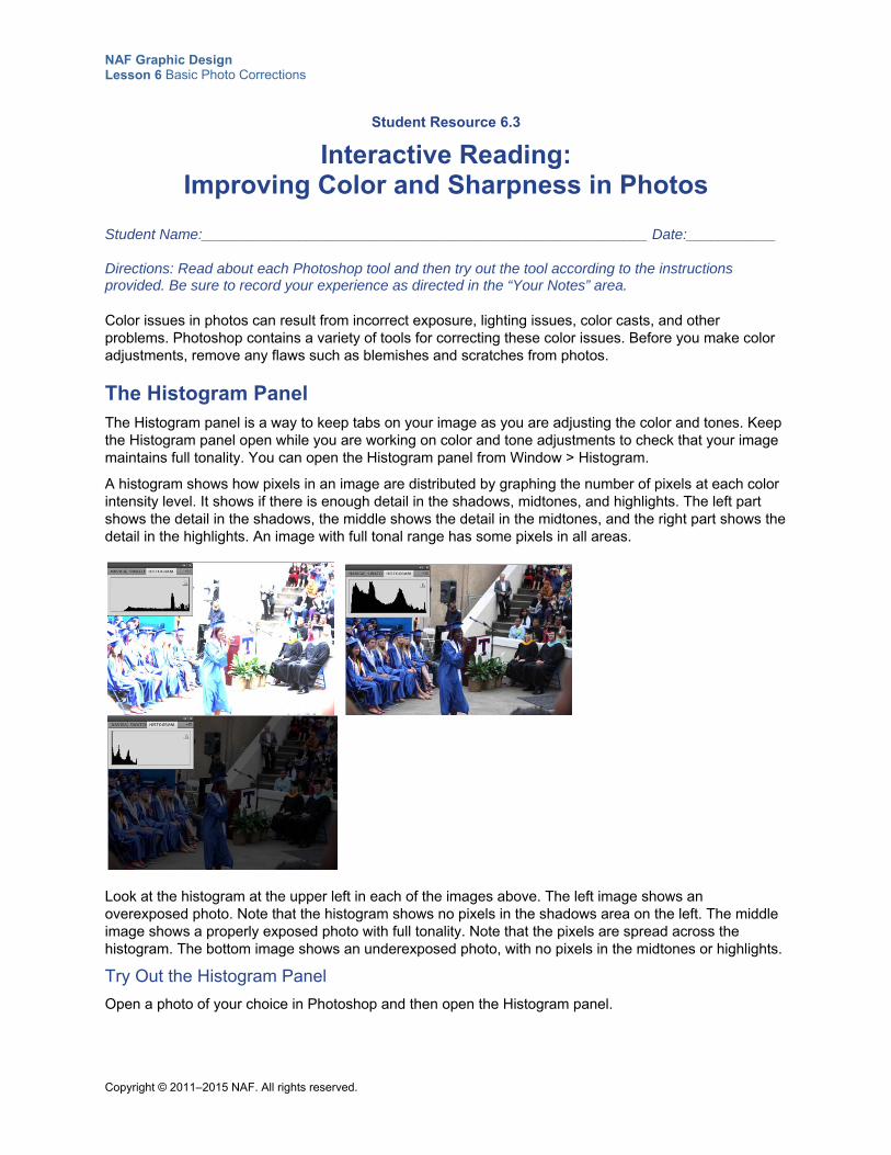
NAF Graphic Design Lesson 6 Basic Photo Corrections
Copyright © 2011–2015 NAF. All rights reserved.
Student Resource 6.3
Interactive Reading: Improving Color and Sharpness in Photos
Student Name:_______________________________________________________ Date:___________
Directions: Read about each Photoshop tool and then try out the tool according to the instructions provided. Be sure to record your experience as directed in the “Your Notes” area.
Color issues in photos can result from incorrect exposure, lighting issues, color casts, and other problems. Photoshop contains a variety of tools for correcting these color issues. Before you make color adjustments, remove any flaws such as blemishes and scratches from photos.
The Histogram Panel The Histogram panel is a way to keep tabs on your image as you are adjusting the color and tones. Keep the Histogram panel open while you are working on color and tone adjustments to check that your image maintains full tonality. You can open the Histogram panel from Window > Histogram.
A histogram shows how pixels in an image are distributed by graphing the number of pixels at each color intensity level. It shows if there is enough detail in the shadows, midtones, and highlights. The left part shows the detail in the shadows, the middle shows the detail in the midtones, and the right part shows the detail in the highlights. An image with full tonal range has some pixels in all areas.
Look at the histogram at the upper left in each of the images above. The left image shows an overexposed photo. Note that the histogram shows no pixels in the shadows area on the left. The middle image shows a properly exposed photo with full tonality. Note that the pixels are spread across the histogram. The bottom image shows an underexposed photo, with no pixels in the midtones or highlights.
Try Out the Histogram Panel
Open a photo of your choice in Photoshop and then open the Histogram panel.
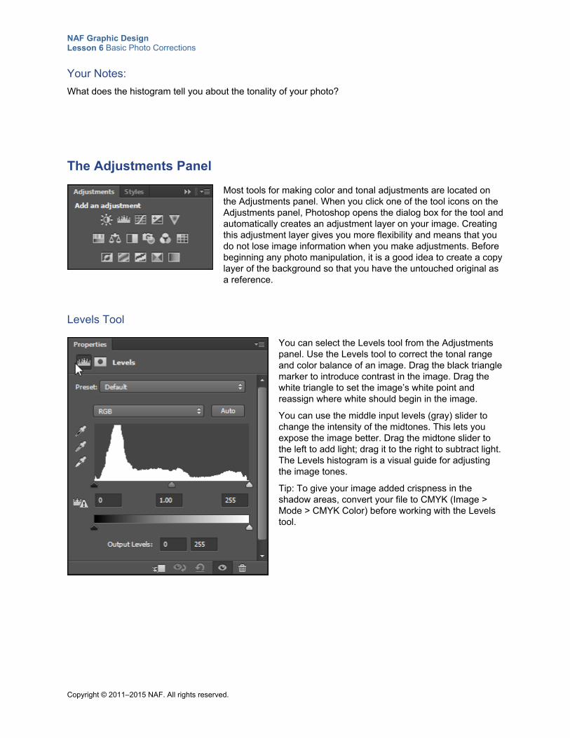
NAF Graphic Design Lesson 6 Basic Photo Corrections
Copyright © 2011–2015 NAF. All rights reserved.
Your Notes:
What does the histogram tell you about the tonality of your photo?
The Adjustments Panel
Most tools for making color and tonal adjustments are located on the Adjustments panel. When you click one of the tool icons on the Adjustments panel, Photoshop opens the dialog box for the tool and automatically creates an adjustment layer on your image. Creating this adjustment layer gives you more flexibility and means that you do not lose image information when you make adjustments. Before beginning any photo manipulation, it is a good idea to create a copy layer of the background so that you have the untouched original as a reference.
Levels Tool
You can select the Levels tool from the Adjustments panel. Use the Levels tool to correct the tonal range and color balance of an image. Drag the black triangle marker to introduce contrast in the image. Drag the white triangle to set the image’s white point and reassign where white should begin in the image.
You can use the middle input levels (gray) slider to change the intensity of the midtones. This lets you expose the image better. Drag the midtone slider to the left to add light; drag it to the right to subtract light. The Levels histogram is a visual guide for adjusting the image tones.
Tip: To give your image added crispness in the shadow areas, convert your file to CMYK (Image > Mode > CMYK Color) before working with the Levels tool.
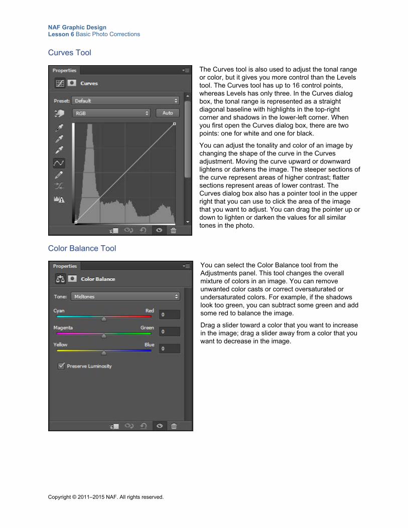
NAF Graphic Design Lesson 6 Basic Photo Corrections
Copyright © 2011–2015 NAF. All rights reserved.
Curves Tool
The Curves tool is also used to adjust the tonal range or color, but it gives you more control than the Levels tool. The Curves tool has up to 16 control points, whereas Levels has only three. In the Curves dialog box, the tonal range is represented as a straight diagonal baseline with highlights in the top-right corner and shadows in the lower-left corner. When you first open the Curves dialog box, there are two points: one for white and one for black.
You can adjust the tonality and color of an image by changing the shape of the curve in the Curves adjustment. Moving the curve upward or downward lightens or darkens the image. The steeper sections of the curve represent areas of higher contrast; flatter sections represent areas of lower contrast. The Curves dialog box also has a pointer tool in the upper right that you can use to click the area of the image that you want to adjust. You can drag the pointer up or down to lighten or darken the values for all similar tones in the photo.
Color Balance Tool
You can select the Color Balance tool from the Adjustments panel. This tool changes the overall mixture of colors in an image. You can remove unwanted color casts or correct oversaturated or undersaturated colors. For example, if the shadows look too green, you can subtract some green and add some red to balance the image.
Drag a slider toward a color that you want to increase in the image; drag a slider away from a color that you want to decrease in the image.
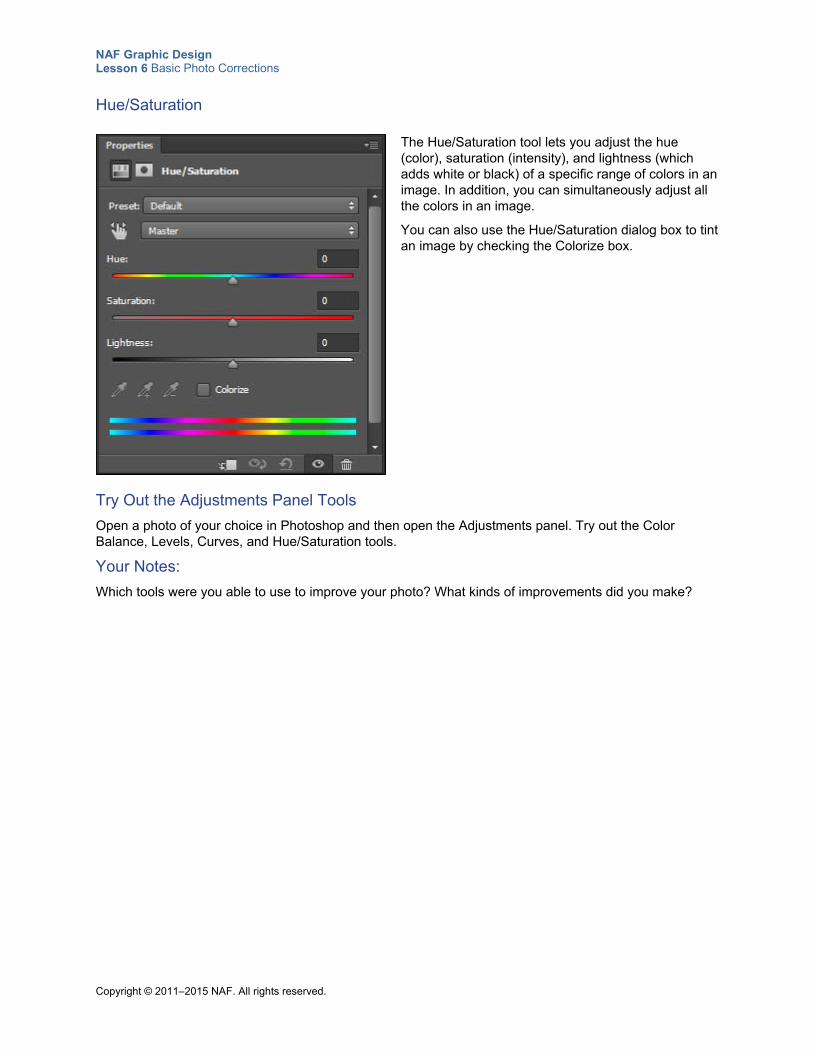
NAF Graphic Design Lesson 6 Basic Photo Corrections
Copyright © 2011–2015 NAF. All rights reserved.
Hue/Saturation
The Hue/Saturation tool lets you adjust the hue (color), saturation (intensity), and lightness (which adds white or black) of a specific range of colors in an image. In addition, you can simultaneously adjust all the colors in an image.
You can also use the Hue/Saturation dialog box to tint an image by checking the Colorize box.
Try Out the Adjustments Panel Tools
Open a photo of your choice in Photoshop and then open the Adjustments panel. Try out the Color Balance, Levels, Curves, and Hue/Saturation tools.
Your Notes:
Which tools were you able to use to improve your photo? What kinds of improvements did you make?
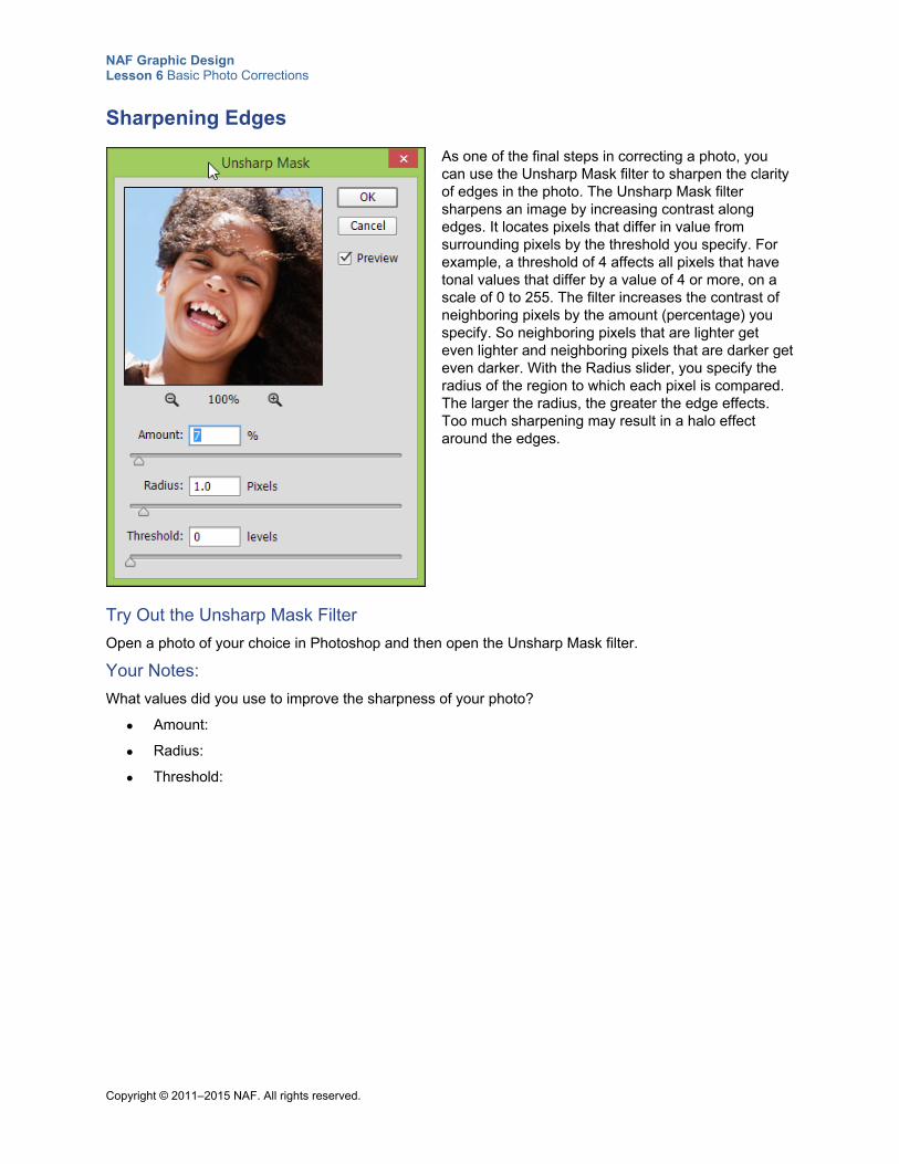
NAF Graphic Design Lesson 6 Basic Photo Corrections
Copyright © 2011–2015 NAF. All rights reserved.
Sharpening Edges
As one of the final steps in correcting a photo, you can use the Unsharp Mask filter to sharpen the clarity of edges in the photo. The Unsharp Mask filter sharpens an image by increasing contrast along edges. It locates pixels that differ in value from surrounding pixels by the threshold you specify. For example, a threshold of 4 affects all pixels that have tonal values that differ by a value of 4 or more, on a scale of 0 to 255. The filter increases the contrast of neighboring pixels by the amount (percentage) you specify. So neighboring pixels that are lighter get even lighter and neighboring pixels that are darker get even darker. With the Radius slider, you specify the radius of the region to which each pixel is compared. The larger the radius, the greater the edge effects. Too much sharpening may result in a halo effect around the edges.
Try Out the Unsharp Mask Filter
Open a photo of your choice in Photoshop and then open the Unsharp Mask filter.
Your Notes:
What values did you use to improve the sharpness of your photo?
Amount:
Radius:
Threshold:
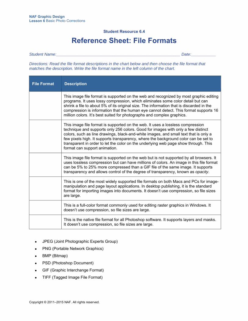
NAF Graphic Design Lesson 6 Basic Photo Corrections
Copyright © 2011–2015 NAF. All rights reserved.
Student Resource 6.4
Reference Sheet: File Formats
Student Name:_______________________________________________________ Date:___________
Directions: Read the file format descriptions in the chart below and then choose the file format that matches the description. Write the file format name in the left column of the chart.
File Format Description
This image file format is supported on the web and recognized by most graphic editing programs. It uses lossy compression, which eliminates some color detail but can shrink a file to about 5% of its original size. The information that is discarded in the compression is information that the human eye cannot detect. This format supports 16 million colors. It’s best suited for photographs and complex graphics.
This image file format is supported on the web. It uses a lossless compression technique and supports only 256 colors. Good for images with only a few distinct colors, such as line drawings, black-and-white images, and small text that is only a few pixels high. It supports transparency, where the background color can be set to transparent in order to let the color on the underlying web page show through. This format can support animation.
This image file format is supported on the web but is not supported by all browsers. It uses lossless compression but can have millions of colors. An image in this file format can be 5% to 25% more compressed than a GIF file of the same image. It supports transparency and allows control of the degree of transparency, known as opacity.
This is one of the most widely supported file formats on both Macs and PCs for image-manipulation and page layout applications. In desktop publishing, it is the standard format for importing images into documents. It doesn’t use compression, so file sizes are large.
This is a full-color format commonly used for editing raster graphics in Windows. It doesn’t use compression, so file sizes are large.
This is the native file format for all Photoshop software. It supports layers and masks. It doesn’t use compression, so file sizes are large.
JPEG (Joint Photographic Experts Group)
PNG (Portable Network Graphics)
BMP (Bitmap)
PSD (Photoshop Document)
GIF (Graphic Interchange Format)
TIFF (Tagged Image File Format)
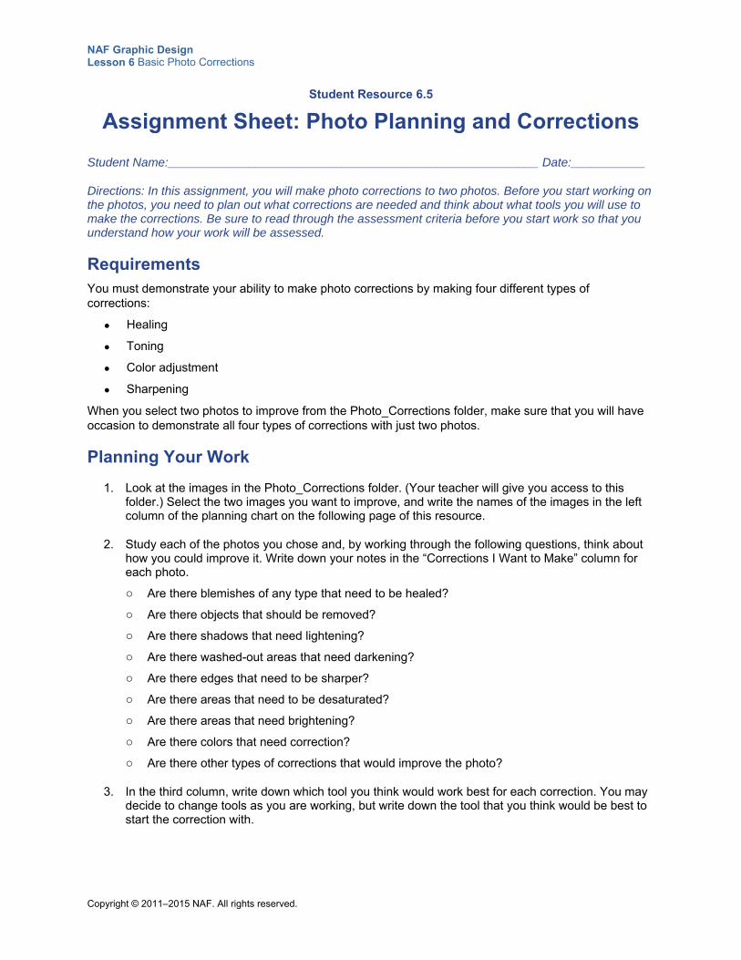
NAF Graphic Design Lesson 6 Basic Photo Corrections
Copyright © 2011–2015 NAF. All rights reserved.
Student Resource 6.5
Assignment Sheet: Photo Planning and Corrections
Student Name:_______________________________________________________ Date:___________
Directions: In this assignment, you will make photo corrections to two photos. Before you start working on the photos, you need to plan out what corrections are needed and think about what tools you will use to make the corrections. Be sure to read through the assessment criteria before you start work so that you understand how your work will be assessed.
Requirements You must demonstrate your ability to make photo corrections by making four different types of corrections:
Healing
Toning
Color adjustment
Sharpening
When you select two photos to improve from the Photo_Corrections folder, make sure that you will have occasion to demonstrate all four types of corrections with just two photos.
Planning Your Work
1. Look at the images in the Photo_Corrections folder. (Your teacher will give you access to this folder.) Select the two images you want to improve, and write the names of the images in the left column of the planning chart on the following page of this resource.
2. Study each of the photos you chose and, by working through the following questions, think about how you could improve it. Write down your notes in the “Corrections I Want to Make” column for each photo.
o Are there blemishes of any type that need to be healed?
o Are there objects that should be removed?
o Are there shadows that need lightening?
o Are there washed-out areas that need darkening?
o Are there edges that need to be sharper?
o Are there areas that need to be desaturated?
o Are there areas that need brightening?
o Are there colors that need correction?
o Are there other types of corrections that would improve the photo?
3. In the third column, write down which tool you think would work best for each correction. You may decide to change tools as you are working, but write down the tool that you think would be best to start the correction with.
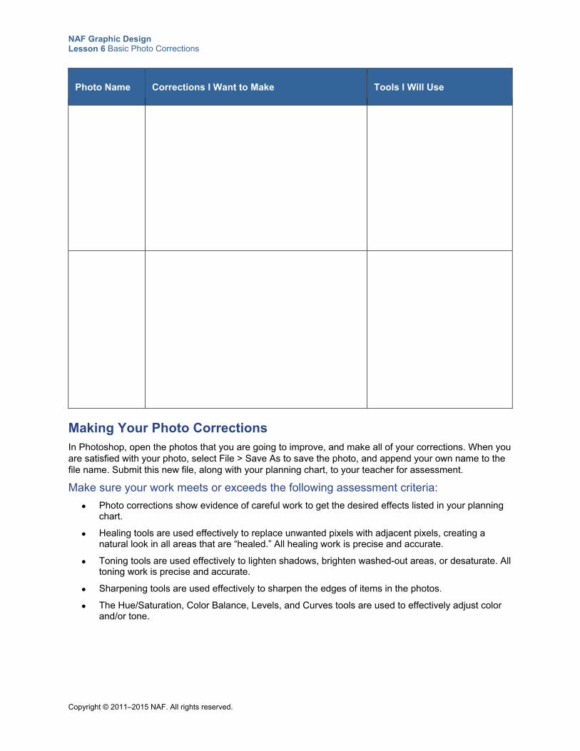
NAF Graphic Design Lesson 6 Basic Photo Corrections
Copyright © 2011–2015 NAF. All rights reserved.
Photo Name Corrections I Want to Make Tools I Will Use
Making Your Photo Corrections In Photoshop, open the photos that you are going to improve, and make all of your corrections. When you are satisfied with your photo, select File > Save As to save the photo, and append your own name to the file name. Submit this new file, along with your planning chart, to your teacher for assessment.
Make sure your work meets or exceeds the following assessment criteria:
Photo corrections show evidence of careful work to get the desired effects listed in your planning chart.
Healing tools are used effectively to replace unwanted pixels with adjacent pixels, creating a natural look in all areas that are “healed.” All healing work is precise and accurate.
Toning tools are used effectively to lighten shadows, brighten washed-out areas, or desaturate. All toning work is precise and accurate.
Sharpening tools are used effectively to sharpen the edges of items in the photos.
The Hue/Saturation, Color Balance, Levels, and Curves tools are used to effectively adjust color and/or tone.
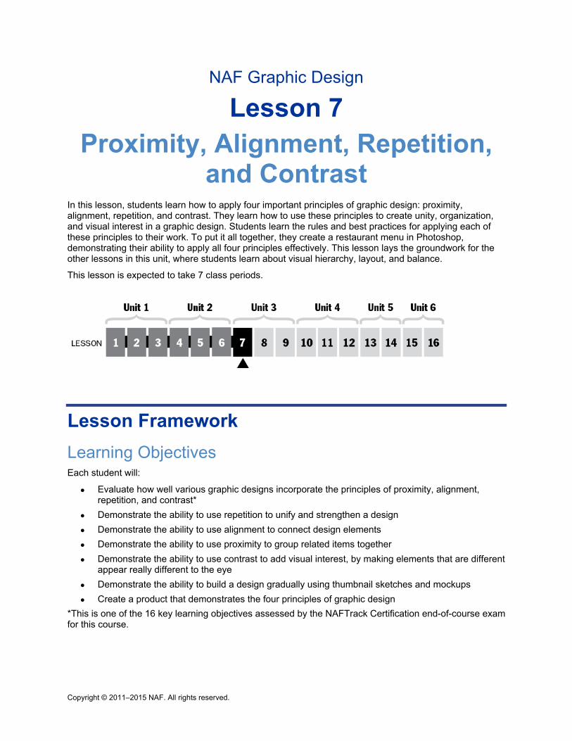
Copyright © 2011–2015 NAF. All rights reserved.
NAF Graphic Design
Lesson 7 Proximity, Alignment, Repetition,
and Contrast In this lesson, students learn how to apply four important principles of graphic design: proximity, alignment, repetition, and contrast. They learn how to use these principles to create unity, organization, and visual interest in a graphic design. Students learn the rules and best practices for applying each of these principles to their work. To put it all together, they create a restaurant menu in Photoshop, demonstrating their ability to apply all four principles effectively. This lesson lays the groundwork for the other lessons in this unit, where students learn about visual hierarchy, layout, and balance.
This lesson is expected to take 7 class periods.
Lesson Framework
Learning Objectives Each student will:
Evaluate how well various graphic designs incorporate the principles of proximity, alignment, repetition, and contrast*
Demonstrate the ability to use repetition to unify and strengthen a design
Demonstrate the ability to use alignment to connect design elements
Demonstrate the ability to use proximity to group related items together
Demonstrate the ability to use contrast to add visual interest, by making elements that are different appear really different to the eye
Demonstrate the ability to build a design gradually using thumbnail sketches and mockups
Create a product that demonstrates the four principles of graphic design
*This is one of the 16 key learning objectives assessed by the NAFTrack Certification end-of-course exam for this course.
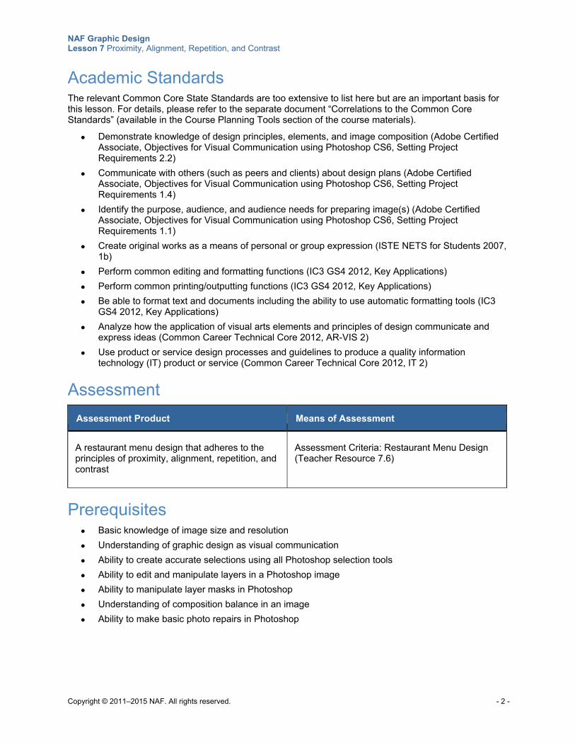
NAF Graphic Design Lesson 7 Proximity, Alignment, Repetition, and Contrast
Copyright © 2011–2015 NAF. All rights reserved. - 2 -
Academic Standards The relevant Common Core State Standards are too extensive to list here but are an important basis for this lesson. For details, please refer to the separate document “Correlations to the Common Core Standards” (available in the Course Planning Tools section of the course materials).
Demonstrate knowledge of design principles, elements, and image composition (Adobe Certified Associate, Objectives for Visual Communication using Photoshop CS6, Setting Project Requirements 2.2)
Communicate with others (such as peers and clients) about design plans (Adobe Certified Associate, Objectives for Visual Communication using Photoshop CS6, Setting Project Requirements 1.4)
Identify the purpose, audience, and audience needs for preparing image(s) (Adobe Certified Associate, Objectives for Visual Communication using Photoshop CS6, Setting Project Requirements 1.1)
Create original works as a means of personal or group expression (ISTE NETS for Students 2007, 1b)
Perform common editing and formatting functions (IC3 GS4 2012, Key Applications)
Perform common printing/outputting functions (IC3 GS4 2012, Key Applications)
Be able to format text and documents including the ability to use automatic formatting tools (IC3 GS4 2012, Key Applications)
Analyze how the application of visual arts elements and principles of design communicate and express ideas (Common Career Technical Core 2012, AR-VIS 2)
Use product or service design processes and guidelines to produce a quality information technology (IT) product or service (Common Career Technical Core 2012, IT 2)
Assessment
Assessment Product Means of Assessment
A restaurant menu design that adheres to the principles of proximity, alignment, repetition, and contrast
Assessment Criteria: Restaurant Menu Design (Teacher Resource 7.6)
Prerequisites Basic knowledge of image size and resolution
Understanding of graphic design as visual communication
Ability to create accurate selections using all Photoshop selection tools
Ability to edit and manipulate layers in a Photoshop image
Ability to manipulate layer masks in Photoshop
Understanding of composition balance in an image
Ability to make basic photo repairs in Photoshop
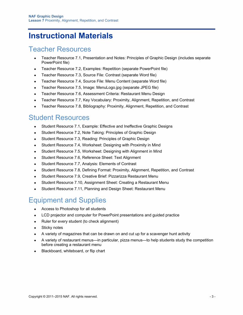
NAF Graphic Design Lesson 7 Proximity, Alignment, Repetition, and Contrast
Copyright © 2011–2015 NAF. All rights reserved. - 3 -
Instructional Materials
Teacher Resources Teacher Resource 7.1, Presentation and Notes: Principles of Graphic Design (includes separate
PowerPoint file)
Teacher Resource 7.2, Examples: Repetition (separate PowerPoint file)
Teacher Resource 7.3, Source File: Contrast (separate Word file)
Teacher Resource 7.4, Source File: Menu Content (separate Word file)
Teacher Resource 7.5, Image: MenuLogo.jpg (separate JPEG file)
Teacher Resource 7.6, Assessment Criteria: Restaurant Menu Design
Teacher Resource 7.7, Key Vocabulary: Proximity, Alignment, Repetition, and Contrast
Teacher Resource 7.8, Bibliography: Proximity, Alignment, Repetition, and Contrast
Student Resources Student Resource 7.1, Example: Effective and Ineffective Graphic Designs
Student Resource 7.2, Note Taking: Principles of Graphic Design
Student Resource 7.3, Reading: Principles of Graphic Design
Student Resource 7.4, Worksheet: Designing with Proximity in Mind
Student Resource 7.5, Worksheet: Designing with Alignment in Mind
Student Resource 7.6, Reference Sheet: Text Alignment
Student Resource 7.7, Analysis: Elements of Contrast
Student Resource 7.8, Defining Format: Proximity, Alignment, Repetition, and Contrast
Student Resource 7.9, Creative Brief: Pizzarizza Restaurant Menu
Student Resource 7.10, Assignment Sheet: Creating a Restaurant Menu
Student Resource 7.11, Planning and Design Sheet: Restaurant Menu
Equipment and Supplies Access to Photoshop for all students
LCD projector and computer for PowerPoint presentations and guided practice
Ruler for every student (to check alignment)
Sticky notes
A variety of magazines that can be drawn on and cut up for a scavenger hunt activity
A variety of restaurant menus—in particular, pizza menus—to help students study the competition before creating a restaurant menu
Blackboard, whiteboard, or flip chart
NAF Graphic Design Lesson 7 Proximity, Alignment, Repetition, and Contrast
Copyright © 2011–2015 NAF. All rights reserved. - 4 -
Lesson Steps
Step Min. Activity
CLASS PERIOD 1
1 10 List, Group: Graphic Design Principles
In this activity, students discover what they already know about the principles of graphic design.
Ask students to work in pairs, and refer them to Student Resource 7.1, Example: Effective and Ineffective Graphic Designs. Ask them to compare the two designs in the resource and to make a list of everything that makes one design better than the other.
When pairs have completed their work, ask them to call out the words and phrases they wrote to describe the better design, and list them on the board.
Next, write the following headings on the board so that you can make a list under each heading:
Proximity
Alignment
Repetition
Contrast
Ask students to suggest which items listed on the board should go under each heading. If there are items like “better organized,” “cohesive,” or “unity,” ask students to drill down to figure out what it is that makes one of these terms apply. It’s likely that students can tie such items to one of the headings on the board. It’s okay if some of the items listed don’t fit under any of the headings. Point out that you will be looking at visual hierarchy and balance in the other lessons in this unit. But mastering the principles of proximity, alignment, repetition, and contrast is a good starting point for creating effective designs.
2
20 Presentation: Principles of Graphic Design
This activity gives students an overview of the graphic design principles covered in this unit.
To prepare, make notes to guide class discussion using Teacher Resource 7.1, Presentation Notes: Principles of Graphic Design. Have Teacher Resource 7.1, Presentation: Principles of Graphic Design (separate PowerPoint file), ready to show as
NAF Graphic Design Lesson 7 Proximity, Alignment, Repetition, and Contrast
Copyright © 2011–2015 NAF. All rights reserved. - 5 -
Step Min. Activity
a full-screen slideshow using an LCD projector.
Explain to students that this presentation provides examples to help them learn how to apply the principles of graphic design. Refer students to Student Resource 7.2, Note Taking: Principles of Graphic Design, and ask them to take notes on the most important point they want to remember about each of the principles of graphic design. Answer any questions students have about the worksheet.
Present the slideshow. Use the notes you prepared and the questions on the slides to encourage class discussion.
This presentation is duplicated as Student Resource 7.3, Reading: Principles of Graphic Design. If an LCD projector is unavailable, students can read the presentation, answer the discussion questions in their notebook, and discuss their answers as a class. This student resource is also useful for review.
After the presentation, divide the class into pairs or groups of three and have them compare their notes for completeness and accuracy. Invite each pair or triad to share their thoughts and questions.
Remind students that mastering the principles of graphic design is extremely important for succeeding as a designer. These principles should become second nature to them.
3 20 Worksheet: Designing with Proximity in Mind
In this activity, students get practice identifying proximity and creating proximity in a design.
Tell students that the first principle of design they will be working on is proximity. Ask students to work in groups of three, and refer them to Student Resource 7.4, Worksheet: Designing with Proximity in Mind. Give groups about five minutes to look at the two examples and answer the questions below them. Then compare answers as a class, and talk through any discrepancies in the answers from different groups.
Next, ask students to continue working in their groups to sketch out a version of each design that respects the rules of proximity. Circulate while students are working and answer any questions.
Finally, instruct each student to create a final version of one of the designs for homework. Encourage them to base their final version on the sketches they have drawn with their group. Tell them their design can be hand drawn or computer generated.
Remind students that doing careful work that adheres to the principles of design is an important skill for graphic designers.
CLASS PERIOD 2
4 5 Homework Review: Proximity Designs
In this activity, students review each other’s work to examine how the principle of proximity is applied. The activity focuses on the following college and career skill:
Working effectively with a diversity of individuals and perspectives
Ask students to meet in groups of four and share the designs they created for
NAF Graphic Design Lesson 7 Proximity, Alignment, Repetition, and Contrast
Copyright © 2011–2015 NAF. All rights reserved. - 6 -
Step Min. Activity
homework with their group. Instruct groups to look at each design and discuss whether it complies with the principle of proximity. Tell students that if they see something that doesn’t comply, they should work as a group to find a solution.
To conclude the review, ask each group to share with the class a design from their group that clearly demonstrates proximity.
You may want to gauge student understanding by assessing this assignment on a credit/no-credit basis.
Remind students that as they go on to work on the other principles of graphic design in this lesson, they need to continue to adhere to the rules of proximity in all of their work.
5
20 Analysis: Designing with Alignment in Mind
In this activity, students get practice recognizing effective use of alignment in graphic designs.
To begin this activity, ask students to share what they remember about alignment from the PowerPoint presentation they viewed in the previous class period. Emphasize the fact that alignment is an important tool that unifies and organizes the information on a page.
Refer students to Student Resource 7.5, Worksheet: Designing with Alignment in Mind. Instruct them to read through the rules for alignment listed at the top of the worksheet and then to look at the three examples and make notes below each of anything that doesn’t adhere to the rules.
Next, using an LCD projector, project the first design on a whiteboard (if possible). Ask one student to come to the board and draw in the lines that show how images in the design are visually connected because they are on the same line. Ask other students to come to the board and help out, as necessary, until all of the lines aligning items in the design are drawn. Answer any questions students have about this. (If you can’t project the design on a whiteboard, you can have students draw lines on a paper copy of the design.)
Once students understand how invisible lines connect items, refer them back to their worksheets. Have them use a ruler to draw lines connecting aligned items in the designs. Circulate while students are working, and answer any questions. When they are finished, ask students to share their work with a partner to check for accuracy and completeness.
Finally, ask students to redesign the final image so that it complies with the rules of alignment. Have them sketch out their redesigned piece on a separate sheet of paper. Instruct them to use their ruler to draw lines on the sketch showing how the elements in the design are connected by alignment.
Ask students to share their sketches in groups of four, and answer any questions they have about alignment.
6 25 Scavenger Hunt: Effective Text Alignment
In this activity, students learn best practices for text alignment.
Refer students to Student Resource 7.6, Reference Sheet: Text Alignment. Go over the
NAF Graphic Design Lesson 7 Proximity, Alignment, Repetition, and Contrast
Copyright © 2011–2015 NAF. All rights reserved. - 7 -
Step Min. Activity
examples of the different types of text alignment as a class, and ask students to give examples of when they would be likely to use the different types of text alignment.
Next, ask students to work in groups of four. Give them as many examples of books, magazines, newsletters, ads, newspapers, and such as you have available, and ask them to find effective examples of each type of text alignment. Have them either cut out or photocopy their examples to create a small collection of effective alignments and paste them on a piece of chart paper, labeling each type of alignment. Explain that they should cut out or photocopy the whole page, to show how the alignment is used in relation to other items in the layout. Ask each group to post their chart paper on the wall when they are finished.
To conclude this activity, ask students to look at each other’s work and collect ideas about how they might use these different kinds of alignment effectively in their work.
CLASS PERIOD 3
7
10 Analysis: Repeating Elements
In this activity, students learn to recognize repetition in a graphic design.
Explain to students that in this activity, they will be learning how to enhance their designs by using repetition.
Using an LCD projector, project slide 1 of Teacher Resource 7.2, Examples: Repetition (separate PowerPoint file). Ask students to work in pairs, and give them one minute to make a list in their notebooks of all the repeating elements they can find in the design. Point out that some of the repeating elements might not be exactly the same; tell them to look for elements that show unity with variety. After they have a minute to study the first slide, show the second slide, and again have them list all of the repeating elements they see. When they are finished, ask pairs to share the repeating elements they found with the class.
Next, write the following questions on the board:
How does the repetition in these designs tie together otherwise separate parts?
In what way does repetition add visual interest to these designs?
Tell students that answering these questions will help them to analyze why repetition is important in graphic design. Ask students to think about their answers and then share their ideas with their partner. Finally, have pairs share with the class.
Encourage students to look for repetition whenever they see a design. Awareness of how graphic designers use repetition will help them incorporate this technique in their own work.
8 15 Write, Pair, Share: Using Contrast
In this activity, students learn how elements of contrast draw a viewer in to a design.
Refer students to Student Resource 7.7, Analysis: Elements of Contrast. Instruct them to look at the three graphic designs and answer the questions below each design.
NAF Graphic Design Lesson 7 Proximity, Alignment, Repetition, and Contrast
Copyright © 2011–2015 NAF. All rights reserved. - 8 -
Step Min. Activity
When they have finished writing their answers, ask students to share what they wrote with a partner, and then have pairs share their responses with the class to check for completeness and accuracy. Based on student responses, make a list on the board of effective ways to show contrast. Remind students that if they are going to make an element different to show contrast, they should make it really different.
Tell students they will have a chance to create a design that uses contrast in the next activity.
9
25 Independent Practice: Contrast
In this activity, students demonstrate what they have learned about contrast.
Give students access to Teacher Resource 7.3, Source File: Contrast (separate Word file). Ask students to open the file, and explain that what they see is a list of Photoshop selection tools and a list of Photoshop retouching tools. Explain that their assignment is to use this text as the basis for a graphic design that uses contrast to present the tools in a unified and organized way.
Tell students they will be creating their design in Photoshop. Ask them to open Photoshop and copy the text document into a Photoshop text layer. Using your computer and an LCD projector, model how to do this, and have students follow along on their own computers.
1. Open a new document in Photoshop that is US letter size.
2. Select the text tool to create a text layer.
3. Select all of the text in the Word document and copy it into the text layer of the Photoshop document.
Remind students to use the Options bar to select different options for the text. Encourage them to also include graphics and background in the design. Remind them to use contrast to unify and organize their design and to draw the reader in.
Tell students they will have a few minutes at the beginning of the next class period to make any finishing touches to their design, and they should save their file in PSD format.
CLASS PERIOD 4
10
20 Independent Practice: Contrast (Continued)
In this activity, students complete their contrast designs in Photoshop.
Tell students to get right to work finishing their contrast designs. Circulate while students are working and answer any questions. If some students have finished their work, ask them to serve as consultants for students who are still working.
When students have finished their designs, ask them to print a copy. Have students meet in groups of four and look at each other’s designs. Ask them to make a list of the different techniques group members used to show contrast. Then ask each group to read their list and show the class the design that they think best illustrates effective use
NAF Graphic Design Lesson 7 Proximity, Alignment, Repetition, and Contrast
Copyright © 2011–2015 NAF. All rights reserved. - 9 -
Step Min. Activity
of contrast.
Encourage students to look for elements of contrast whenever they look at advertisements, posters, book covers, and other designs. Learning to spot contrast in the work of others will help them get a feel for how to use it effectively.
11 15 Defining Format: Proximity, Alignment, Repetition, Contrast
In this activity, students use a Defining Format chart to write definitions for the terms proximity, alignment, contrast, and repetition as they apply to graphic design.
Refer students to Student Resource 7.8, Defining Format: Proximity, Alignment, Repetition, and Contrast. Explain that in addition to knowing how to apply these principles, students need to be able to verbalize the characteristics of each principle and differentiate between them.
Look at examples given for proximity as a class, and answer any questions students have about how to construct Defining Format definitions. Then group students in pairs and ask them to write down categories and characteristics for each term. (Even though they are working in pairs, each student should fill out a chart so that he or she will have it for reference.) When students have completed their charts, have pairs share in groups of four and add any new information they learn from their peers.
Finally, have students share as a class. Create a Defining Format chart on the board or on chart paper using the best categories and characteristics for each term.
Instruct students to save their Defining Format chart in their notebook for future reference. Remind them that these are terms they will encounter over and over again in graphic design.
12 15 Design Planning: Restaurant Menu
In this activity, students begin work on designing a restaurant menu that demonstrates effective use of the principles of graphic design. This activity focuses on the following college and career skill:
Demonstrating teamwork and collaboration
Explain to students that they will be creating a menu for a pizzeria, basing their work on a creative brief furnished by the restaurant owner. Point out that they will be expected to apply everything they have learned about graphic design principles to their menu.
Place students in groups of three and refer them to Student Resource 7.9, Creative Brief: Pizzarizza Restaurant Menu. Ask them to go over the creative brief in their group and write down any questions they would like to ask the restaurant owner.
Explain that you, the teacher, are standing in for the restaurant owner for this assignment, and instruct students to ask you the questions they have written down. Answer the questions students have, and make additions or adjustments to the creative brief in response to inquiries if necessary. Make sure everyone is clear on the final creative brief before continuing.
Next, refer students to Student Resource 7.10, Assignment Sheet: Creating a Restaurant Menu. Go over the workflow as a class, and make sure that students understand the steps involved in creating their menu. Ask students to read the
NAF Graphic Design Lesson 7 Proximity, Alignment, Repetition, and Contrast
Copyright © 2011–2015 NAF. All rights reserved. - 10 -
Step Min. Activity
assessment criteria in their groups, and then answer any questions they have about how their work will be assessed. Emphasize the importance of adhering to the principles of graphic design in their work.
Finally, refer students to Student Resource 7.11, Planning and Design Sheet: Restaurant Menu. Ask them to complete the research part of their planning and design for homework by looking at as many menus, and specifically pizza menus, as possible. Explain that they’ll want to get an idea of what competitors are doing. Remind them that they don’t want to just copy the competition; they want to set themselves apart from the competition. Their menu needs to be unique. Point out that since their menu will be in print, they really need to look at other print menus, not just menus on the web. If possible, give each group one or two menus that you’ve brought into the classroom to ensure that students have samples to look at. Also, asks students to think about ways they could research what style of menu would be attractive to young professionals. They might suggest, for example, searching various topics related to young professionals on the web, or interviewing young professionals they know. What visual styles and trends in other, non-restaurant contexts might appeal to them? Tell groups to divide up the research work among their members and to come to the next class period ready to share with their group what they have learned.
Remind students that to come up with a professional-looking design, they will have to put significant work into the planning stages.
CLASS PERIOD 5
13 30 Generating a Solution: Thumbnail Sketches of a Menu
In this activity, students create thumbnail sketches of menu ideas.
Instruct students to get right to work in their groups to complete the planning and design of their menus. Ask them to share their research information with each other, and ask them to draw some conclusions from their research about elements that they definitely want to include in (or exclude from) their menu.
Next, give students access to Teacher Resource 7.4, Source File: Menu Content (separate Word file), and Teacher Resource 7.5, Image: MenuLogo.jpg (separate JPEG file). Tell students to take a few minutes to familiarize themselves with these materials, and then to start thinking about ideas for their menu.
Instruct students to read the “Thumbnail Sketches” section of Student Resource 7.11, Planning and Design Sheet: Restaurant Menu, and then to work with their group to create as many thumbnails as they can in 15 minutes. Tell students that each member must come up with at least five thumbnails.
When time is up, have students go over the thumbnails in their group and choose the ones they want to develop. Explain that they should be able to eliminate many of the thumbnails fairly quickly and only work with those that have a great idea that pops out. They may want to combine ideas from a few of the best to come up with one design that they want to develop into roughs.
14 20 Performance Assessment: Creating Roughs for a Menu Design
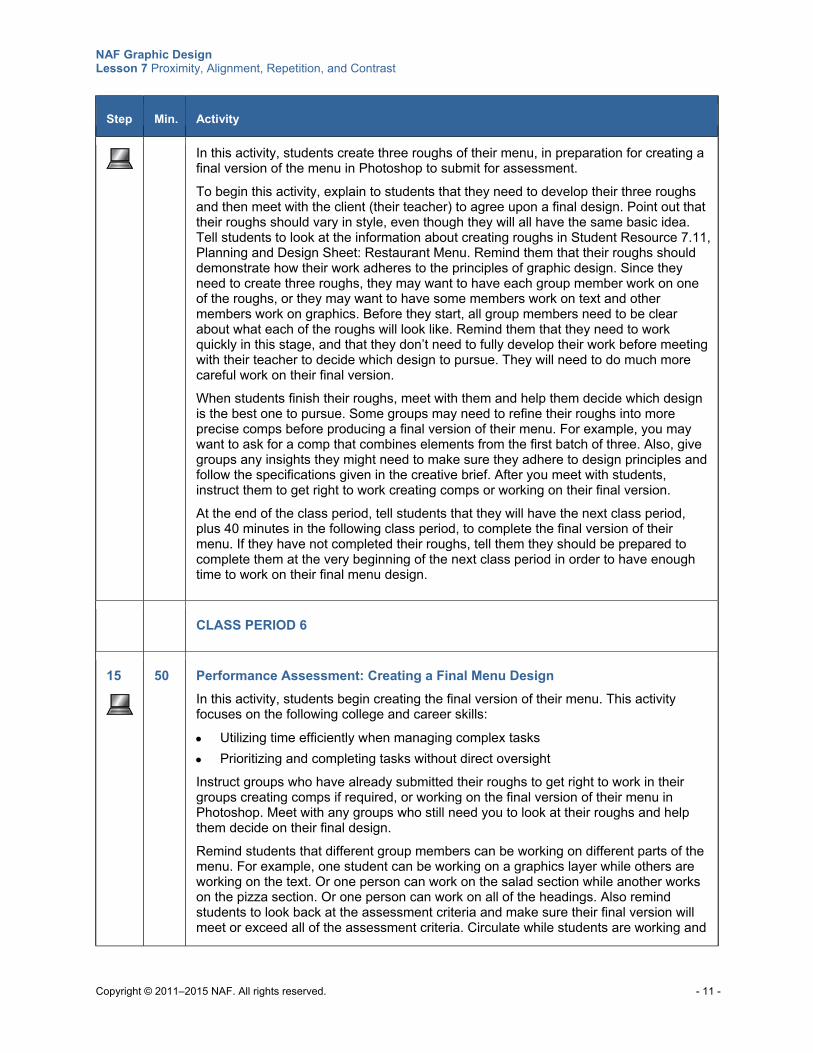
NAF Graphic Design Lesson 7 Proximity, Alignment, Repetition, and Contrast
Copyright © 2011–2015 NAF. All rights reserved. - 11 -
Step Min. Activity
In this activity, students create three roughs of their menu, in preparation for creating a final version of the menu in Photoshop to submit for assessment.
To begin this activity, explain to students that they need to develop their three roughs and then meet with the client (their teacher) to agree upon a final design. Point out that their roughs should vary in style, even though they will all have the same basic idea. Tell students to look at the information about creating roughs in Student Resource 7.11, Planning and Design Sheet: Restaurant Menu. Remind them that their roughs should demonstrate how their work adheres to the principles of graphic design. Since they need to create three roughs, they may want to have each group member work on one of the roughs, or they may want to have some members work on text and other members work on graphics. Before they start, all group members need to be clear about what each of the roughs will look like. Remind them that they need to work quickly in this stage, and that they don’t need to fully develop their work before meeting with their teacher to decide which design to pursue. They will need to do much more careful work on their final version.
When students finish their roughs, meet with them and help them decide which design is the best one to pursue. Some groups may need to refine their roughs into more precise comps before producing a final version of their menu. For example, you may want to ask for a comp that combines elements from the first batch of three. Also, give groups any insights they might need to make sure they adhere to design principles and follow the specifications given in the creative brief. After you meet with students, instruct them to get right to work creating comps or working on their final version.
At the end of the class period, tell students that they will have the next class period, plus 40 minutes in the following class period, to complete the final version of their menu. If they have not completed their roughs, tell them they should be prepared to complete them at the very beginning of the next class period in order to have enough time to work on their final menu design.
CLASS PERIOD 6
15
50 Performance Assessment: Creating a Final Menu Design
In this activity, students begin creating the final version of their menu. This activity focuses on the following college and career skills:
Utilizing time efficiently when managing complex tasks
Prioritizing and completing tasks without direct oversight
Instruct groups who have already submitted their roughs to get right to work in their groups creating comps if required, or working on the final version of their menu in Photoshop. Meet with any groups who still need you to look at their roughs and help them decide on their final design.
Remind students that different group members can be working on different parts of the menu. For example, one student can be working on a graphics layer while others are working on the text. Or one person can work on the salad section while another works on the pizza section. Or one person can work on all of the headings. Also remind students to look back at the assessment criteria and make sure their final version will meet or exceed all of the assessment criteria. Circulate while students are working and
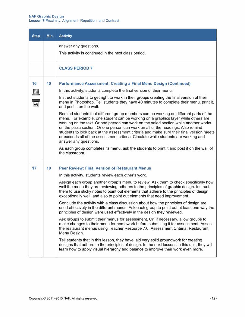
NAF Graphic Design Lesson 7 Proximity, Alignment, Repetition, and Contrast
Copyright © 2011–2015 NAF. All rights reserved. - 12 -
Step Min. Activity
answer any questions.
This activity is continued in the next class period.
CLASS PERIOD 7
16
40 Performance Assessment: Creating a Final Menu Design (Continued)
In this activity, students complete the final version of their menu. Instruct students to get right to work in their groups creating the final version of their menu in Photoshop. Tell students they have 40 minutes to complete their menu, print it, and post it on the wall.
Remind students that different group members can be working on different parts of the menu. For example, one student can be working on a graphics layer while others are working on the text. Or one person can work on the salad section while another works on the pizza section. Or one person can work on all of the headings. Also remind students to look back at the assessment criteria and make sure their final version meets or exceeds all of the assessment criteria. Circulate while students are working and answer any questions.
As each group completes its menu, ask the students to print it and post it on the wall of the classroom.
17 10 Peer Review: Final Version of Restaurant Menus
In this activity, students review each other’s work.
Assign each group another group’s menu to review. Ask them to check specifically how well the menu they are reviewing adheres to the principles of graphic design. Instruct them to use sticky notes to point out elements that adhere to the principles of design exceptionally well, and also to point out elements that need improvement.
Conclude the activity with a class discussion about how the principles of design are used effectively in the different menus. Ask each group to point out at least one way the principles of design were used effectively in the design they reviewed.
Ask groups to submit their menus for assessment. Or, if necessary, allow groups to make changes to their menu for homework before submitting it for assessment. Assess the restaurant menus using Teacher Resource 7.6, Assessment Criteria: Restaurant Menu Design.
Tell students that in this lesson, they have laid very solid groundwork for creating designs that adhere to the principles of design. In the next lessons in this unit, they will learn how to apply visual hierarchy and balance to improve their work even more.
NAF Graphic Design Lesson 7 Proximity, Alignment, Repetition, and Contrast
Copyright © 2011–2015 NAF. All rights reserved. - 13 -
Extensions
Enrichment Instruct students to apply the principles of graphic design that they have studied so far to their
resume. Ask students to look at a paper copy of their resume with a partner and to find at least two ways they can improve the look of the resume by applying what they have learned about proximity, alignment, and repetition. Point out to students that it is extremely important to apply principles of graphic design to professional documents like resumes, even though the content is mostly text.
Next, instruct students to open their resume on their computer and make the improvements they decided on with their partner. Explain that in most cases, it is best to keep a resume in Word format because doing so enables you to revise it at any time, without needing access to Photoshop or other graphic design programs. You might also want to point out that when submitting an electronic copy of a resume to a potential employer, it is best to save the Word file as a PDF file. A PDF file is the best way to ensure that formatting doesn’t go awry when the document is opened on a different computer.
Ask students to review each other’s resumes and answer the following questions:
o How does the resume adhere to the rules of proximity? Do you see any improvements that could be made?
o In what ways does the alignment make the resume seem organized and unified? What could be improved in this area?
o How is repetition used effectively? Can you think of a way that the repetition could be strengthened?
Instruct students to create a “Principles of Design” samples portfolio with good examples of proximity, alignment, contrast, and repetition. Encourage students to always be on the lookout for good examples in magazines, flyers, brochures, and other collateral. They can use the material in this portfolio as a reference point or as a source of inspiration when creating their own designs.
Technology Integration Ask students to convert their resume into a Photoshop document. Then ask them to share with the
class any ways they were able to make their resume look more professional because of the design capabilities in Photoshop.
If your students have access to the Internet or you have the technology to use apps in your classroom, instruct students to research and collect photo media inspiration using Pinterest or the Pinterest app.
Cross-Curricular Integration English Language Arts: Repetition and contrast are important techniques used in writing as well as
in graphic design. Ask students to choose either repetition or contrast and create a Venn diagram to compare and contrast how the technique is used effectively in writing and how it is used effectively in graphic design.
Science: Ask students to research and report on some aspect of how the brain processes visual stimuli. What scientific evidence is there that our brain likes when things line up nicely, that it is stimulated by contrast, and that it responds to repetition? Ask students to research experiments that provide data on this subject and to report back to the class.
Copyright © 2011–2015 NAF. All rights reserved.
NAF Graphic Design
Lesson 7 Proximity, Alignment, Repetition,
and Contrast
Teacher Resources
Resource Description
Teacher Resource 7.1 Presentation and Notes: Principles of Graphic Design (includes separate PowerPoint file)
Teacher Resource 7.2 Examples: Repetition (separate PowerPoint file)
Teacher Resource 7.3 Source File: Contrast (separate Word file)
Teacher Resource 7.4 Source File: Menu Content (separate Word file)
Teacher Resource 7.5 Image: MenuLogo.jpg (separate JPEG file)
Teacher Resource 7.6 Assessment Criteria: Restaurant Menu Design
Teacher Resource 7.7 Key Vocabulary: Proximity, Alignment, Repetition, and Contrast
Teacher Resource 7.8 Bibliography: Proximity, Alignment, Repetition, and Contrast
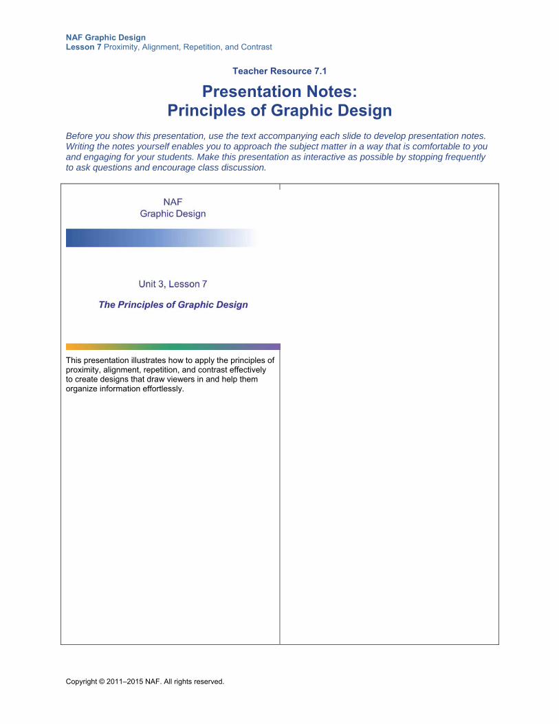
NAF Graphic Design Lesson 7 Proximity, Alignment, Repetition, and Contrast
Copyright © 2011–2015 NAF. All rights reserved.
Teacher Resource 7.1
Presentation Notes: Principles of Graphic Design
Before you show this presentation, use the text accompanying each slide to develop presentation notes. Writing the notes yourself enables you to approach the subject matter in a way that is comfortable to you and engaging for your students. Make this presentation as interactive as possible by stopping frequently to ask questions and encourage class discussion.
This presentation illustrates how to apply the principles of proximity, alignment, repetition, and contrast effectively to create designs that draw viewers in and help them organize information effortlessly.
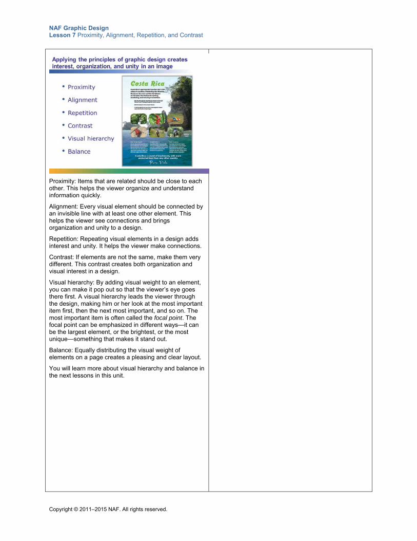
NAF Graphic Design Lesson 7 Proximity, Alignment, Repetition, and Contrast
Copyright © 2011–2015 NAF. All rights reserved.
Proximity: Items that are related should be close to each other. This helps the viewer organize and understand information quickly.
Alignment: Every visual element should be connected by an invisible line with at least one other element. This helps the viewer see connections and brings organization and unity to a design.
Repetition: Repeating visual elements in a design adds interest and unity. It helps the viewer make connections.
Contrast: If elements are not the same, make them very different. This contrast creates both organization and visual interest in a design.
Visual hierarchy: By adding visual weight to an element, you can make it pop out so that the viewer’s eye goes there first. A visual hierarchy leads the viewer through the design, making him or her look at the most important item first, then the next most important, and so on. The most important item is often called the focal point. The focal point can be emphasized in different ways—it can be the largest element, or the brightest, or the most unique—something that makes it stand out.
Balance: Equally distributing the visual weight of elements on a page creates a pleasing and clear layout.
You will learn more about visual hierarchy and balance in the next lessons in this unit.
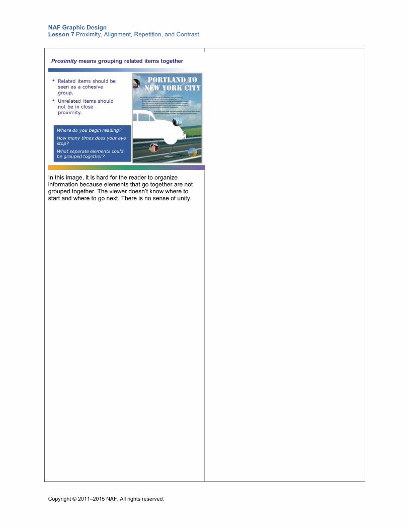
NAF Graphic Design Lesson 7 Proximity, Alignment, Repetition, and Contrast
Copyright © 2011–2015 NAF. All rights reserved.
In this image, it is hard for the reader to organize information because elements that go together are not grouped together. The viewer doesn’t know where to start and where to go next. There is no sense of unity.
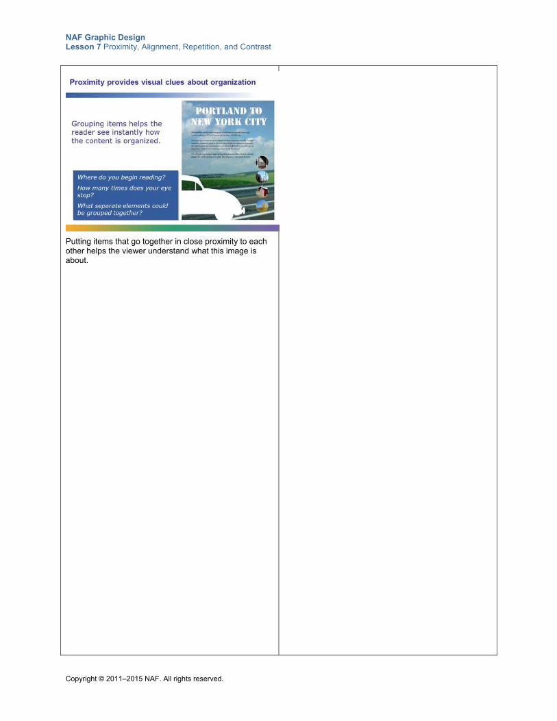
NAF Graphic Design Lesson 7 Proximity, Alignment, Repetition, and Contrast
Copyright © 2011–2015 NAF. All rights reserved.
Putting items that go together in close proximity to each other helps the viewer understand what this image is about.
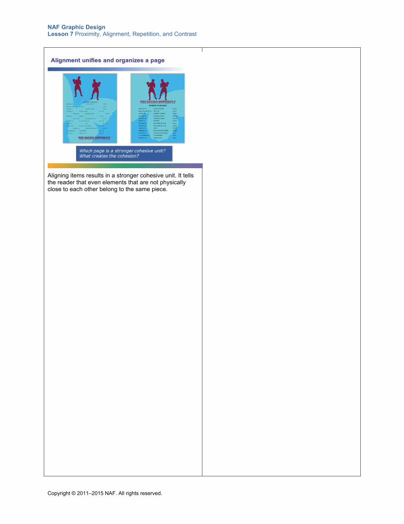
NAF Graphic Design Lesson 7 Proximity, Alignment, Repetition, and Contrast
Copyright © 2011–2015 NAF. All rights reserved.
Aligning items results in a stronger cohesive unit. It tells the reader that even elements that are not physically close to each other belong to the same piece.
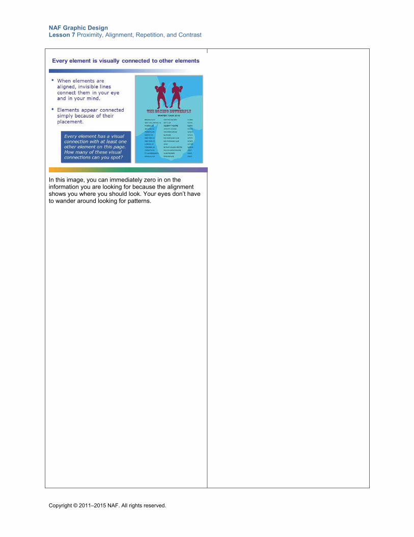
NAF Graphic Design Lesson 7 Proximity, Alignment, Repetition, and Contrast
Copyright © 2011–2015 NAF. All rights reserved.
In this image, you can immediately zero in on the information you are looking for because the alignment shows you where you should look. Your eyes don’t have to wander around looking for patterns.
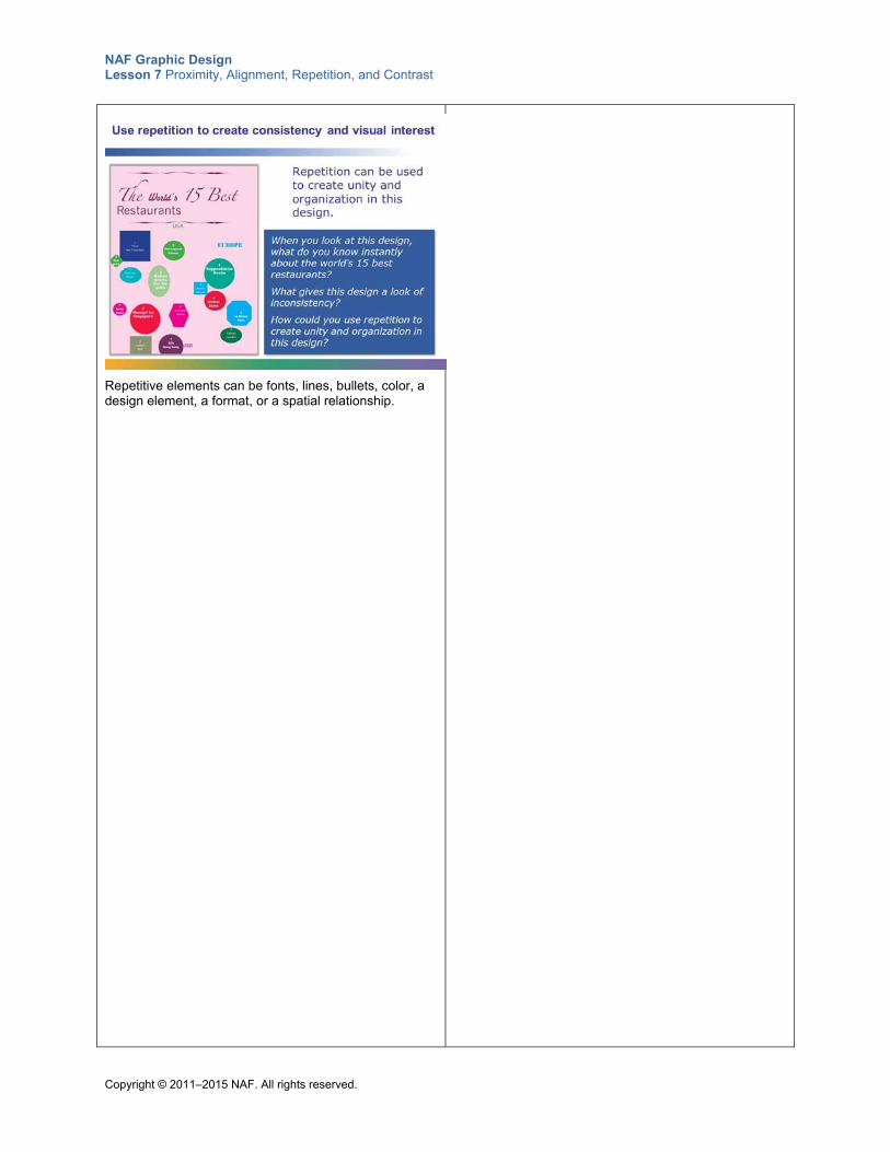
NAF Graphic Design Lesson 7 Proximity, Alignment, Repetition, and Contrast
Copyright © 2011–2015 NAF. All rights reserved.
Repetitive elements can be fonts, lines, bullets, color, a design element, a format, or a spatial relationship.
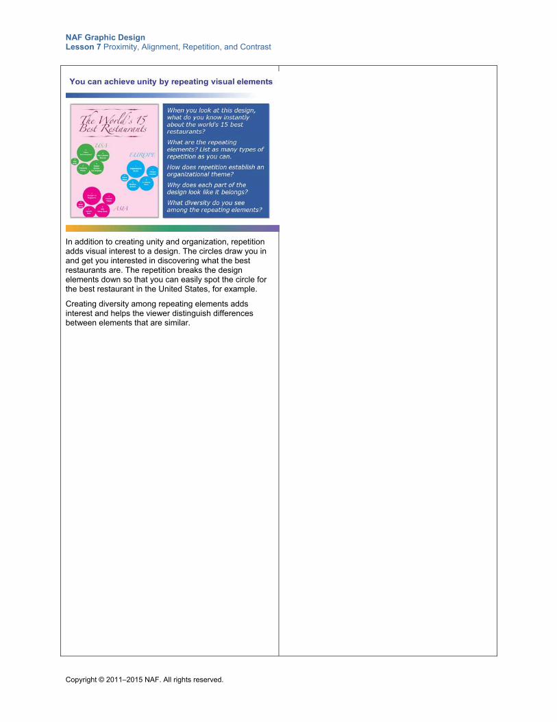
NAF Graphic Design Lesson 7 Proximity, Alignment, Repetition, and Contrast
Copyright © 2011–2015 NAF. All rights reserved.
In addition to creating unity and organization, repetition adds visual interest to a design. The circles draw you in and get you interested in discovering what the best restaurants are. The repetition breaks the design elements down so that you can easily spot the circle for the best restaurant in the United States, for example.
Creating diversity among repeating elements adds interest and helps the viewer distinguish differences between elements that are similar.
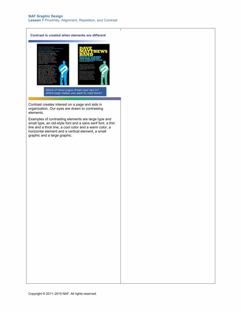
NAF Graphic Design Lesson 7 Proximity, Alignment, Repetition, and Contrast
Copyright © 2011–2015 NAF. All rights reserved.
Contrast creates interest on a page and aids in organization. Our eyes are drawn to contrasting elements.
Examples of contrasting elements are large type and small type, an old-style font and a sans serif font, a thin line and a thick line, a cool color and a warm color, a horizontal element and a vertical element, a small graphic and a large graphic.
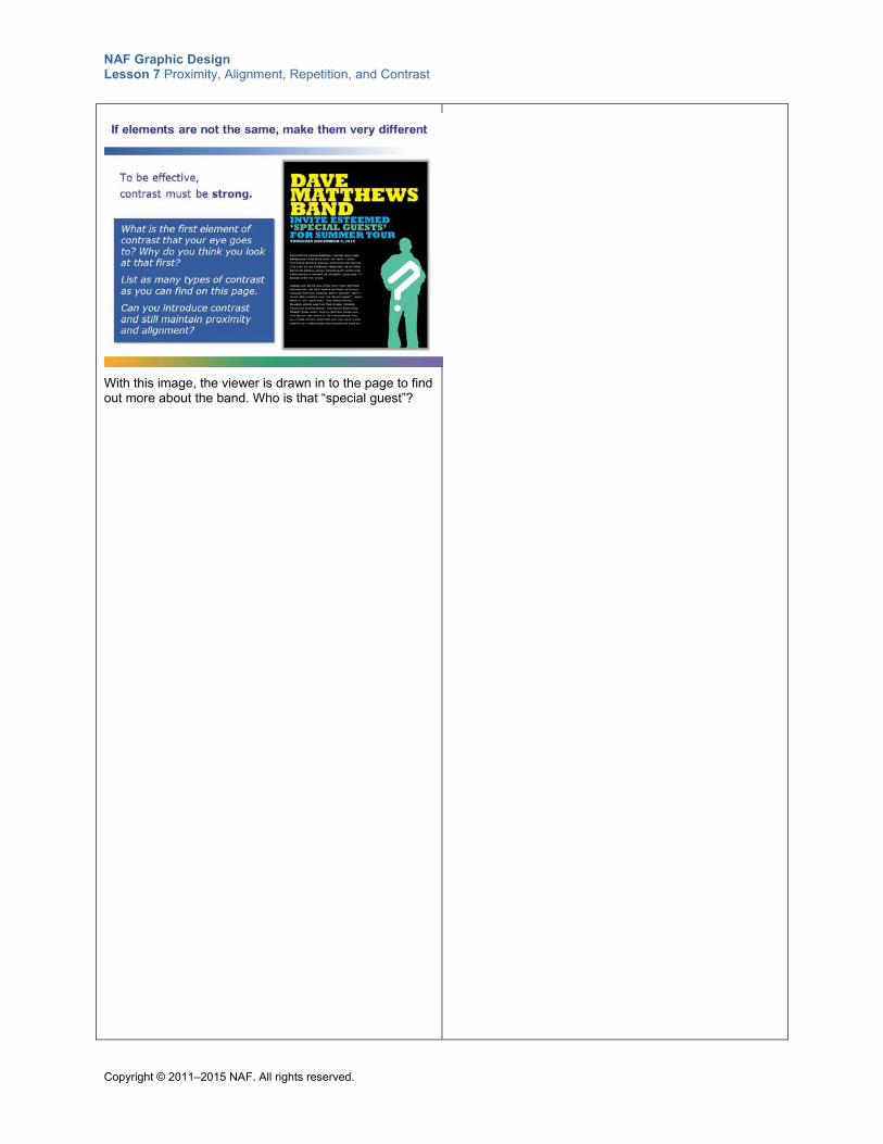
NAF Graphic Design Lesson 7 Proximity, Alignment, Repetition, and Contrast
Copyright © 2011–2015 NAF. All rights reserved.
With this image, the viewer is drawn in to the page to find out more about the band. Who is that “special guest”?
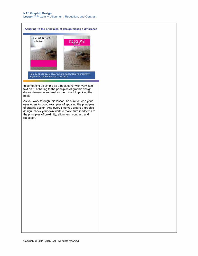
NAF Graphic Design Lesson 7 Proximity, Alignment, Repetition, and Contrast
Copyright © 2011–2015 NAF. All rights reserved.
In something as simple as a book cover with very little text on it, adhering to the principles of graphic design draws viewers in and makes them want to pick up the book.
As you work through this lesson, be sure to keep your eyes open for good examples of applying the principles of graphic design. And every time you create a graphic design, check your own work to make sure it adheres to the principles of proximity, alignment, contrast, and repetition.
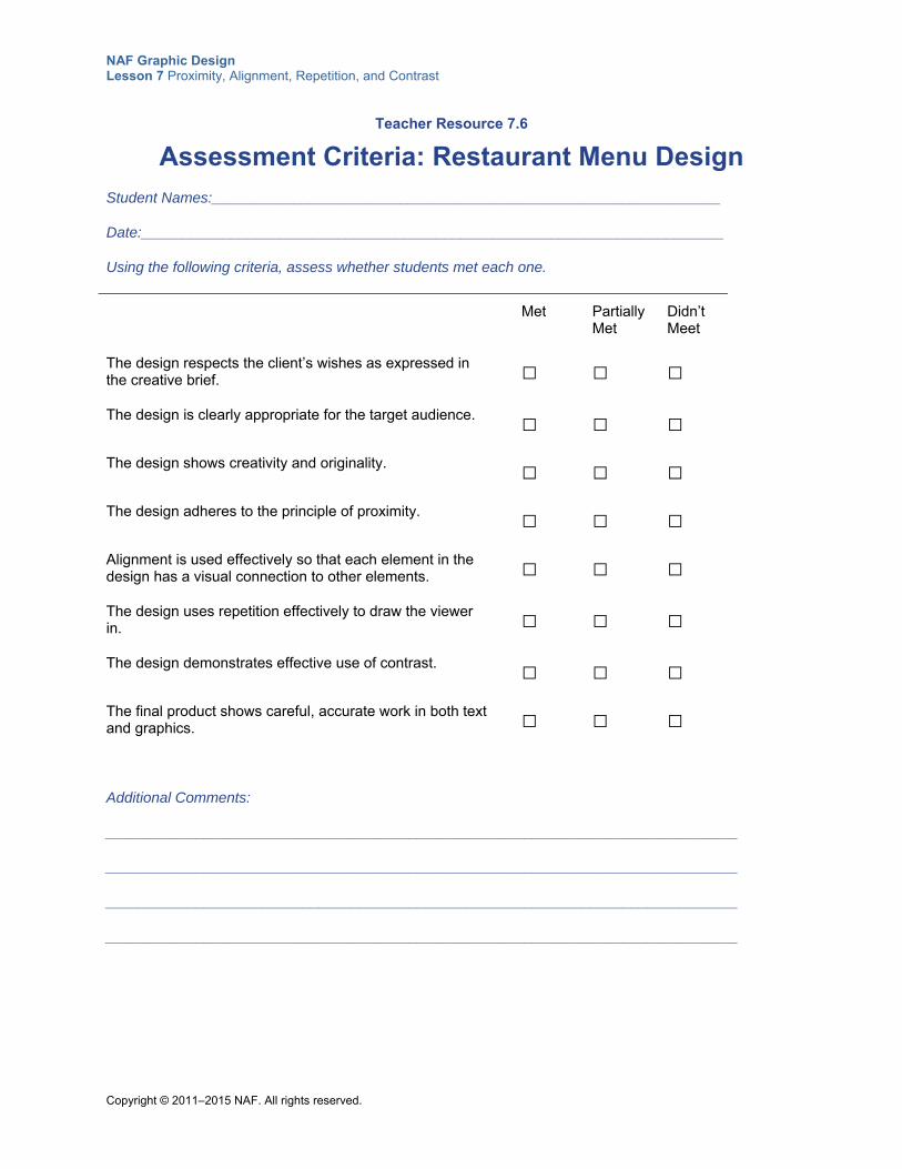
NAF Graphic Design Lesson 7 Proximity, Alignment, Repetition, and Contrast
Copyright © 2011–2015 NAF. All rights reserved.
Teacher Resource 7.6
Assessment Criteria: Restaurant Menu Design
Student Names:______________________________________________________________
Date:_______________________________________________________________________
Using the following criteria, assess whether students met each one.
Met Partially Met
Didn’t Meet
The design respects the client’s wishes as expressed in the creative brief.
□ □ □
The design is clearly appropriate for the target audience. □ □ □ The design shows creativity and originality. □ □ □
The design adheres to the principle of proximity. □ □ □
Alignment is used effectively so that each element in the design has a visual connection to other elements.
□ □ □
The design uses repetition effectively to draw the viewer in.
□ □ □
The design demonstrates effective use of contrast. □ □ □
The final product shows careful, accurate work in both text and graphics.
□ □ □
Additional Comments:
_____________________________________________________________________________
_____________________________________________________________________________
_____________________________________________________________________________
_____________________________________________________________________________
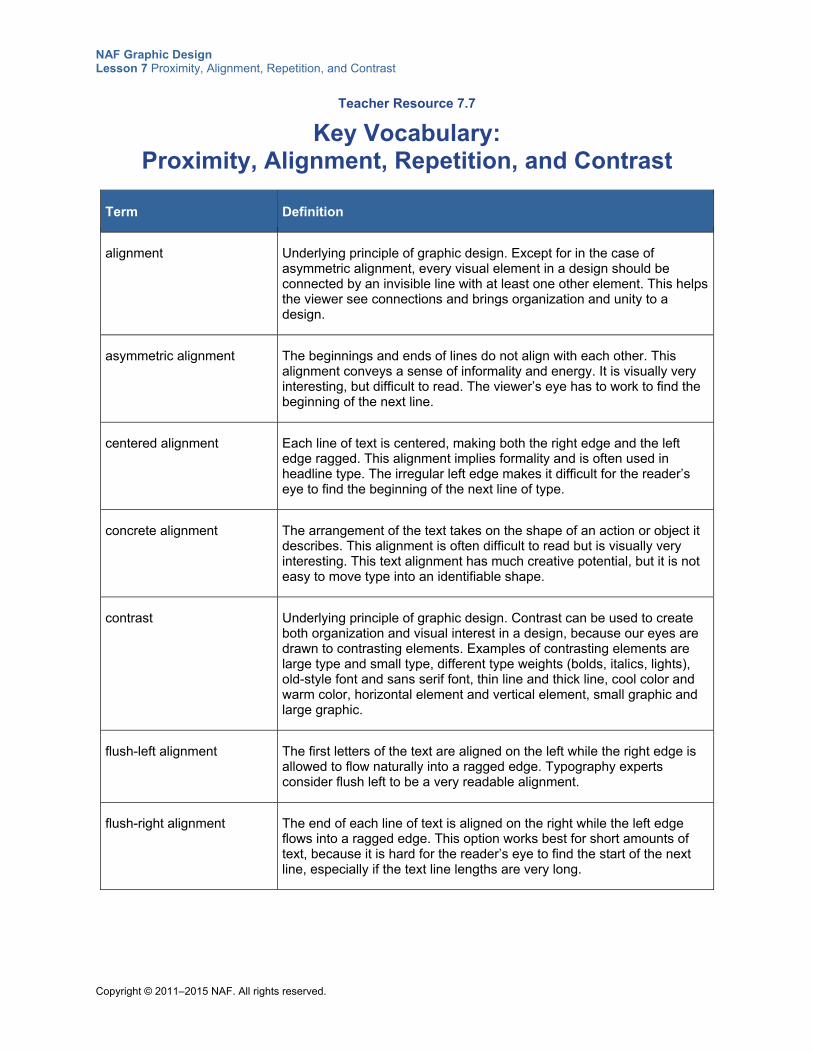
NAF Graphic Design Lesson 7 Proximity, Alignment, Repetition, and Contrast
Copyright © 2011–2015 NAF. All rights reserved.
Teacher Resource 7.7
Key Vocabulary: Proximity, Alignment, Repetition, and Contrast
Term Definition
alignment Underlying principle of graphic design. Except for in the case of asymmetric alignment, every visual element in a design should be connected by an invisible line with at least one other element. This helps the viewer see connections and brings organization and unity to a design.
asymmetric alignment The beginnings and ends of lines do not align with each other. This alignment conveys a sense of informality and energy. It is visually very interesting, but difficult to read. The viewer’s eye has to work to find the beginning of the next line.
centered alignment Each line of text is centered, making both the right edge and the left edge ragged. This alignment implies formality and is often used in headline type. The irregular left edge makes it difficult for the reader’s eye to find the beginning of the next line of type.
concrete alignment The arrangement of the text takes on the shape of an action or object it describes. This alignment is often difficult to read but is visually very interesting. This text alignment has much creative potential, but it is not easy to move type into an identifiable shape.
contrast Underlying principle of graphic design. Contrast can be used to create both organization and visual interest in a design, because our eyes are drawn to contrasting elements. Examples of contrasting elements are large type and small type, different type weights (bolds, italics, lights), old-style font and sans serif font, thin line and thick line, cool color and warm color, horizontal element and vertical element, small graphic and large graphic.
flush-left alignment The first letters of the text are aligned on the left while the right edge is allowed to flow naturally into a ragged edge. Typography experts consider flush left to be a very readable alignment.
flush-right alignment The end of each line of text is aligned on the right while the left edge flows into a ragged edge. This option works best for short amounts of text, because it is hard for the reader’s eye to find the start of the next line, especially if the text line lengths are very long.
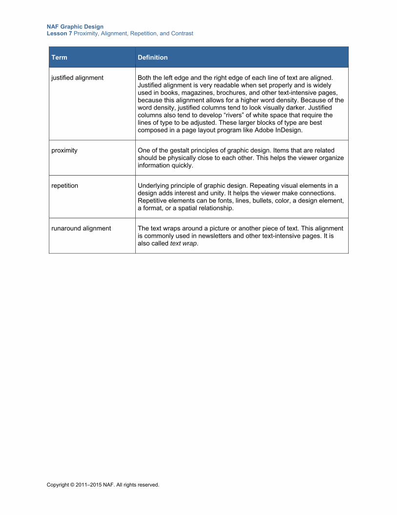
NAF Graphic Design Lesson 7 Proximity, Alignment, Repetition, and Contrast
Copyright © 2011–2015 NAF. All rights reserved.
Term Definition
justified alignment Both the left edge and the right edge of each line of text are aligned. Justified alignment is very readable when set properly and is widely used in books, magazines, brochures, and other text-intensive pages, because this alignment allows for a higher word density. Because of the word density, justified columns tend to look visually darker. Justified columns also tend to develop “rivers” of white space that require the lines of type to be adjusted. These larger blocks of type are best composed in a page layout program like Adobe InDesign.
proximity One of the gestalt principles of graphic design. Items that are related should be physically close to each other. This helps the viewer organize information quickly.
repetition Underlying principle of graphic design. Repeating visual elements in a design adds interest and unity. It helps the viewer make connections. Repetitive elements can be fonts, lines, bullets, color, a design element, a format, or a spatial relationship.
runaround alignment The text wraps around a picture or another piece of text. This alignment is commonly used in newsletters and other text-intensive pages. It is also called text wrap.
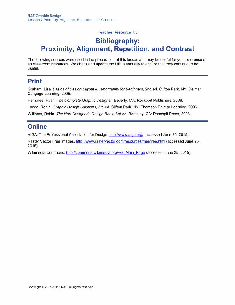
NAF Graphic Design Lesson 7 Proximity, Alignment, Repetition, and Contrast
Copyright © 2011–2015 NAF. All rights reserved.
Teacher Resource 7.8
Bibliography: Proximity, Alignment, Repetition, and Contrast
The following sources were used in the preparation of this lesson and may be useful for your reference or as classroom resources. We check and update the URLs annually to ensure that they continue to be useful.
Print Graham, Lisa. Basics of Design Layout & Typography for Beginners, 2nd ed. Clifton Park, NY: Delmar Cengage Learning, 2005.
Hembree, Ryan. The Complete Graphic Designer. Beverly, MA: Rockport Publishers, 2008.
Landa, Robin. Graphic Design Solutions, 3rd ed. Clifton Park, NY: Thomson Delmar Learning, 2006.
Williams, Robin. The Non-Designer’s Design Book, 3rd ed. Berkeley, CA: Peachpit Press, 2008.
Online AIGA: The Professional Association for Design, http://www.aiga.org/ (accessed June 25, 2015).
Raster Vector Free Images, http://www.rastervector.com/resources/free/free.html (accessed June 25, 2015).
Wikimedia Commons, http://commons.wikimedia.org/wiki/Main_Page (accessed June 25, 2015).
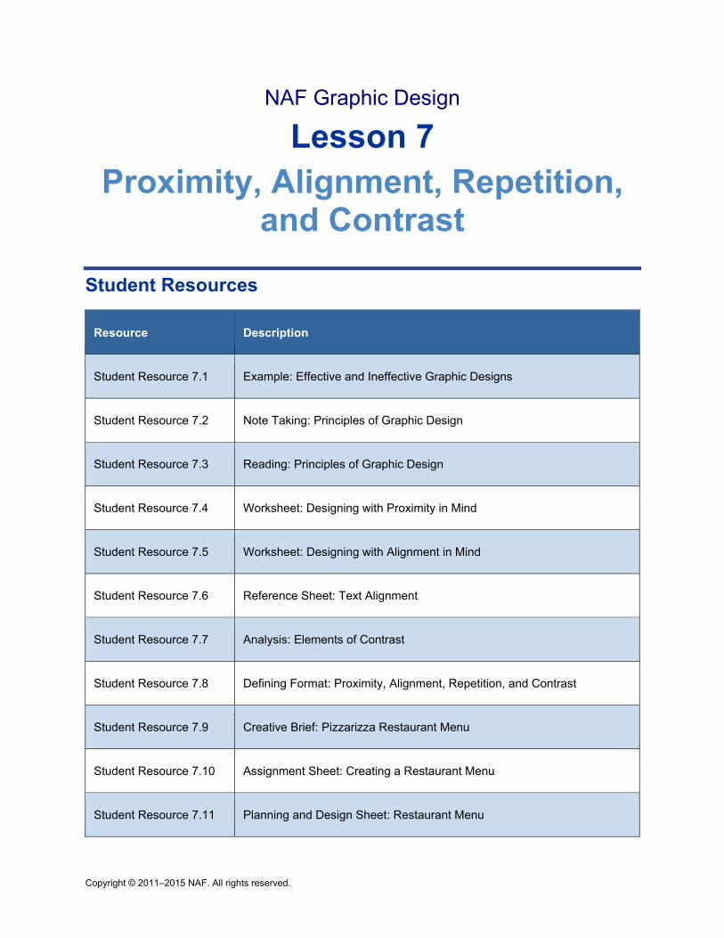
Copyright © 2011–2015 NAF. All rights reserved.
NAF Graphic Design
Lesson 7 Proximity, Alignment, Repetition,
and Contrast
Student Resources
Resource Description
Student Resource 7.1 Example: Effective and Ineffective Graphic Designs
Student Resource 7.2 Note Taking: Principles of Graphic Design
Student Resource 7.3 Reading: Principles of Graphic Design
Student Resource 7.4 Worksheet: Designing with Proximity in Mind
Student Resource 7.5 Worksheet: Designing with Alignment in Mind
Student Resource 7.6 Reference Sheet: Text Alignment
Student Resource 7.7 Analysis: Elements of Contrast
Student Resource 7.8 Defining Format: Proximity, Alignment, Repetition, and Contrast
Student Resource 7.9 Creative Brief: Pizzarizza Restaurant Menu
Student Resource 7.10 Assignment Sheet: Creating a Restaurant Menu
Student Resource 7.11 Planning and Design Sheet: Restaurant Menu
NAF Graphic Design Lesson 7 Proximity, Alignment, Repetition, and Contrast
Copyright © 2011–2015 NAF. All rights reserved.
Student Resource 7.1
Example: Effective and Ineffective Graphic Designs
Student Names:_______________________________________________________ Date:___________
Directions: Look at the two designs on the following page. Decide which one you think is the better design and make a list on this page of everything you notice that makes that design better than the other.
Which design do you like better: Costa Rica Design 1 or Costa Rica Design 2?
List everything you notice that makes one design more effective than the other:
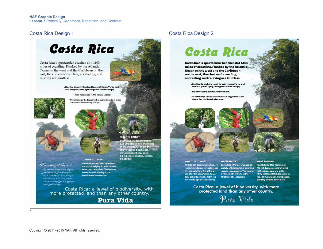
NAF Graphic Design Lesson 7 Proximity, Alignment, Repetition, and Contrast
Copyright © 2011–2015 NAF. All rights reserved.
Costa Rica Design 1
*
Costa Rica Design 2
NAF Graphic Design Lesson 7 Proximity, Alignment, Repetition, and Contrast
Copyright © 2011–2015 NAF. All rights reserved.
Student Resource 7.2
Note Taking: Principles of Graphic Design
Student Name:_______________________________________________________ Date:___________
Directions: As you watch the presentation about the principles of graphic design, write the most important point you want to remember about each principle on this worksheet.
Proximity
Alignment
Repetition
Contrast
Additional notes
NAF Graphic Design Lesson 7 Proximity, Alignment, Repetition, and Contrast
Copyright © 2011–2015 NAF. All rights reserved.
Student Resource 7.3
Reading: Principles of Graphic Design
This presentation illustrates how to apply the principles of proximity, alignment, repetition, and contrast effectively to create designs that draw viewers in and help them organize information effortlessly.
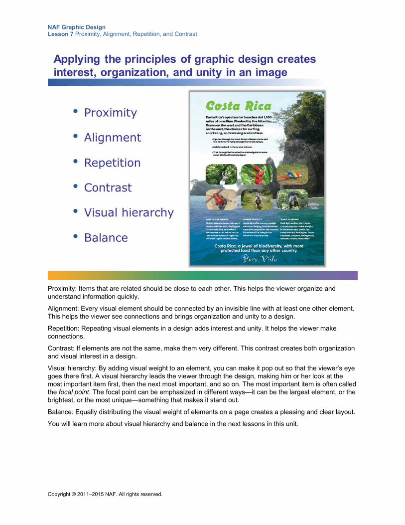
NAF Graphic Design Lesson 7 Proximity, Alignment, Repetition, and Contrast
Copyright © 2011–2015 NAF. All rights reserved.
Proximity: Items that are related should be close to each other. This helps the viewer organize and understand information quickly.
Alignment: Every visual element should be connected by an invisible line with at least one other element. This helps the viewer see connections and brings organization and unity to a design.
Repetition: Repeating visual elements in a design adds interest and unity. It helps the viewer make connections.
Contrast: If elements are not the same, make them very different. This contrast creates both organization and visual interest in a design.
Visual hierarchy: By adding visual weight to an element, you can make it pop out so that the viewer’s eye goes there first. A visual hierarchy leads the viewer through the design, making him or her look at the most important item first, then the next most important, and so on. The most important item is often called the focal point. The focal point can be emphasized in different ways—it can be the largest element, or the brightest, or the most unique—something that makes it stand out.
Balance: Equally distributing the visual weight of elements on a page creates a pleasing and clear layout.
You will learn more about visual hierarchy and balance in the next lessons in this unit.
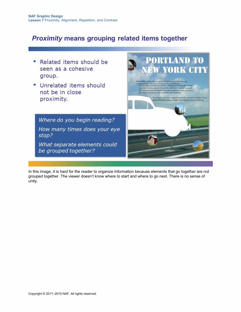
NAF Graphic Design Lesson 7 Proximity, Alignment, Repetition, and Contrast
Copyright © 2011–2015 NAF. All rights reserved.
In this image, it is hard for the reader to organize information because elements that go together are not grouped together. The viewer doesn’t know where to start and where to go next. There is no sense of unity.
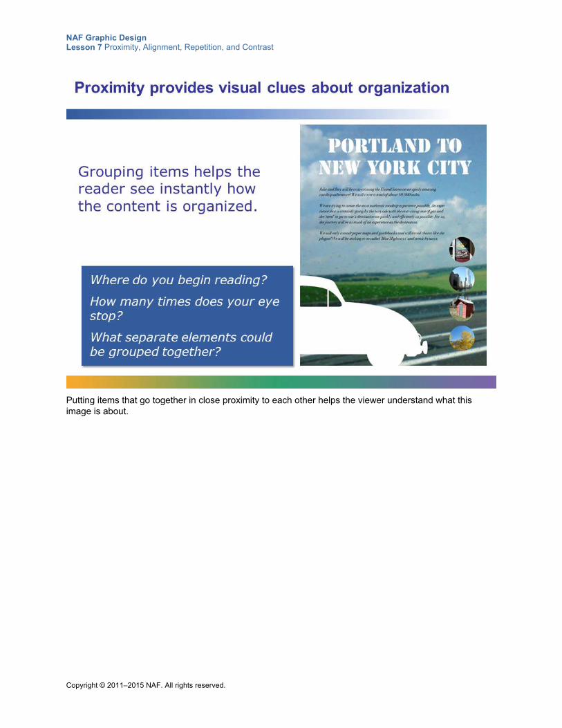
NAF Graphic Design Lesson 7 Proximity, Alignment, Repetition, and Contrast
Copyright © 2011–2015 NAF. All rights reserved.
Putting items that go together in close proximity to each other helps the viewer understand what this image is about.
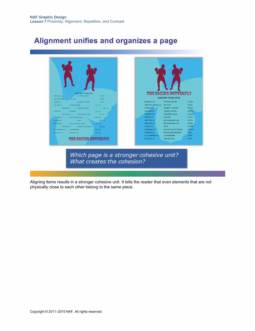
NAF Graphic Design Lesson 7 Proximity, Alignment, Repetition, and Contrast
Copyright © 2011–2015 NAF. All rights reserved.
Aligning items results in a stronger cohesive unit. It tells the reader that even elements that are not physically close to each other belong to the same piece.
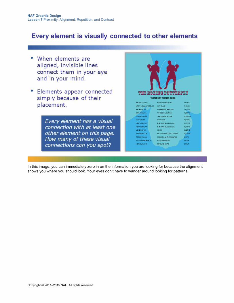
NAF Graphic Design Lesson 7 Proximity, Alignment, Repetition, and Contrast
Copyright © 2011–2015 NAF. All rights reserved.
In this image, you can immediately zero in on the information you are looking for because the alignment shows you where you should look. Your eyes don’t have to wander around looking for patterns.
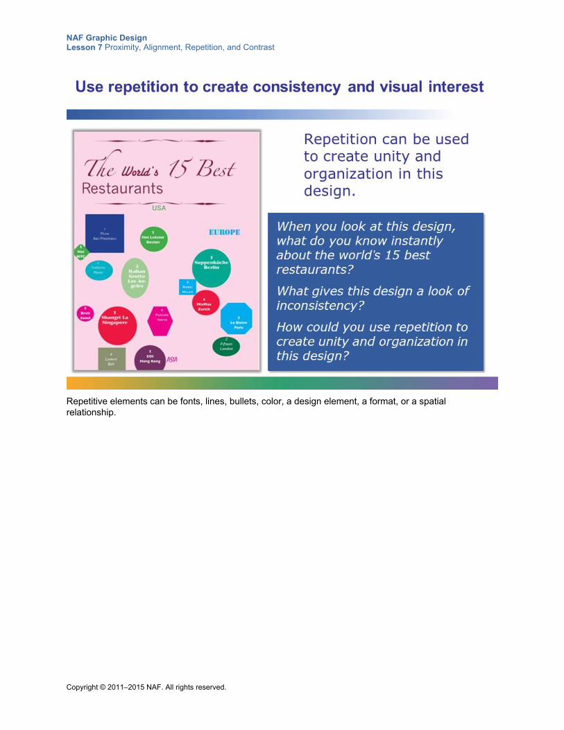
NAF Graphic Design Lesson 7 Proximity, Alignment, Repetition, and Contrast
Copyright © 2011–2015 NAF. All rights reserved.
Repetitive elements can be fonts, lines, bullets, color, a design element, a format, or a spatial relationship.
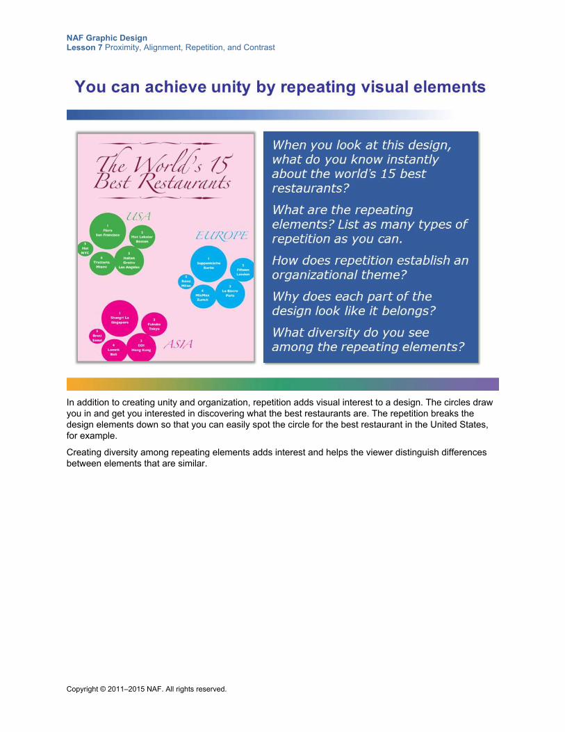
NAF Graphic Design Lesson 7 Proximity, Alignment, Repetition, and Contrast
Copyright © 2011–2015 NAF. All rights reserved.
In addition to creating unity and organization, repetition adds visual interest to a design. The circles draw you in and get you interested in discovering what the best restaurants are. The repetition breaks the design elements down so that you can easily spot the circle for the best restaurant in the United States, for example.
Creating diversity among repeating elements adds interest and helps the viewer distinguish differences between elements that are similar.
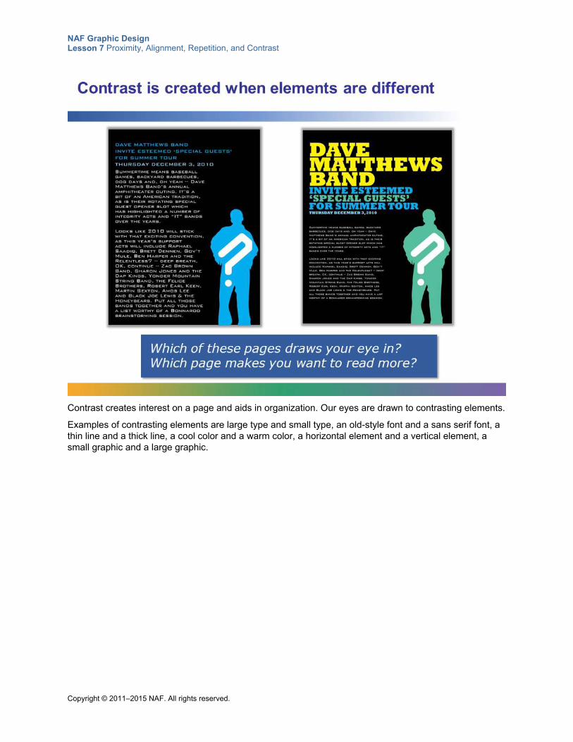
NAF Graphic Design Lesson 7 Proximity, Alignment, Repetition, and Contrast
Copyright © 2011–2015 NAF. All rights reserved.
Contrast creates interest on a page and aids in organization. Our eyes are drawn to contrasting elements.
Examples of contrasting elements are large type and small type, an old-style font and a sans serif font, a thin line and a thick line, a cool color and a warm color, a horizontal element and a vertical element, a small graphic and a large graphic.
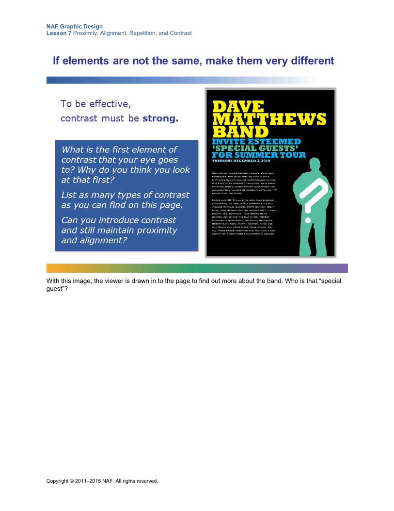
NAF Graphic Design Lesson 7 Proximity, Alignment, Repetition, and Contrast
Copyright © 2011–2015 NAF. All rights reserved.
With this image, the viewer is drawn in to the page to find out more about the band. Who is that “special guest”?
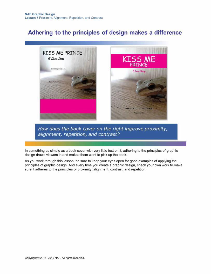
NAF Graphic Design Lesson 7 Proximity, Alignment, Repetition, and Contrast
Copyright © 2011–2015 NAF. All rights reserved.
In something as simple as a book cover with very little text on it, adhering to the principles of graphic design draws viewers in and makes them want to pick up the book.
As you work through this lesson, be sure to keep your eyes open for good examples of applying the principles of graphic design. And every time you create a graphic design, check your own work to make sure it adheres to the principles of proximity, alignment, contrast, and repetition.
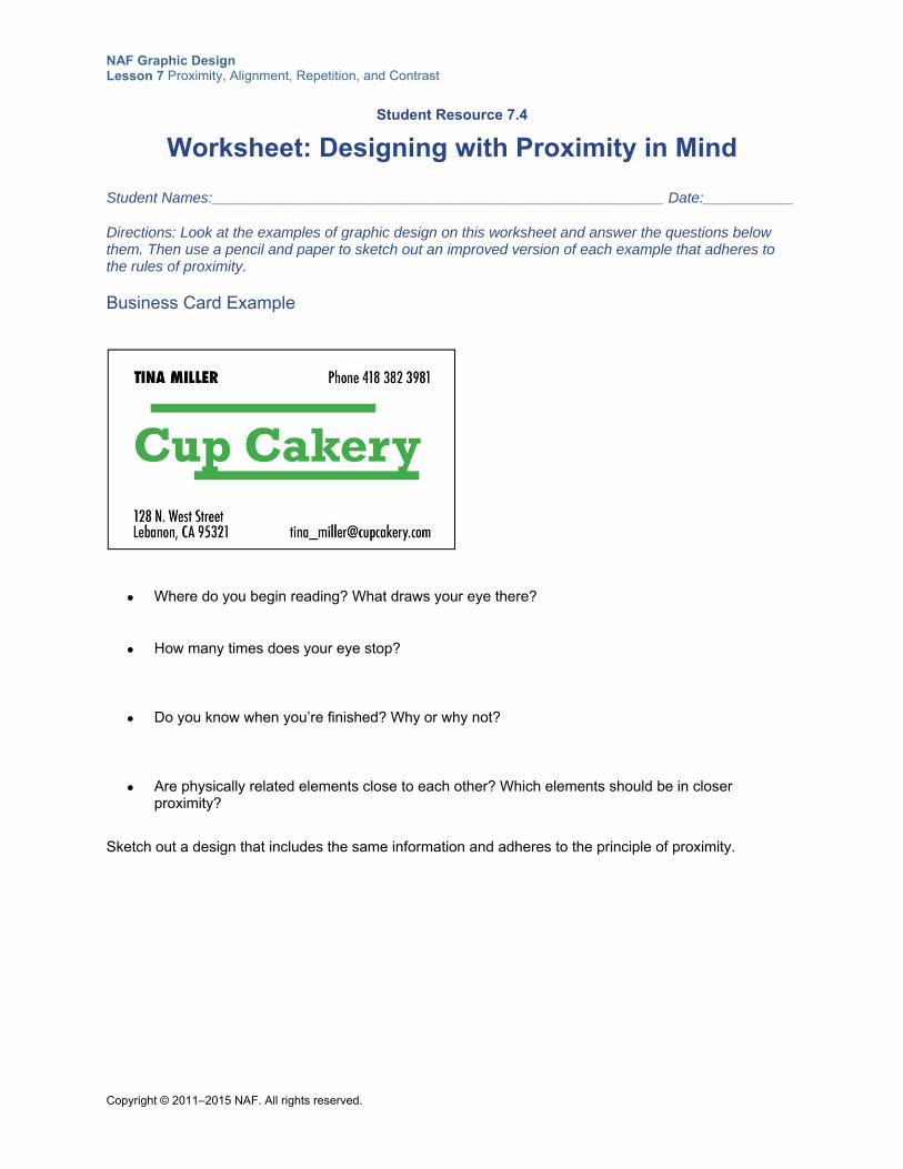
NAF Graphic Design Lesson 7 Proximity, Alignment, Repetition, and Contrast
Copyright © 2011–2015 NAF. All rights reserved.
Student Resource 7.4
Worksheet: Designing with Proximity in Mind
Student Names:_______________________________________________________ Date:___________
Directions: Look at the examples of graphic design on this worksheet and answer the questions below them. Then use a pencil and paper to sketch out an improved version of each example that adheres to the rules of proximity.
Business Card Example
Where do you begin reading? What draws your eye there?
How many times does your eye stop?
Do you know when you’re finished? Why or why not?
Are physically related elements close to each other? Which elements should be in closer proximity?
Sketch out a design that includes the same information and adheres to the principle of proximity.
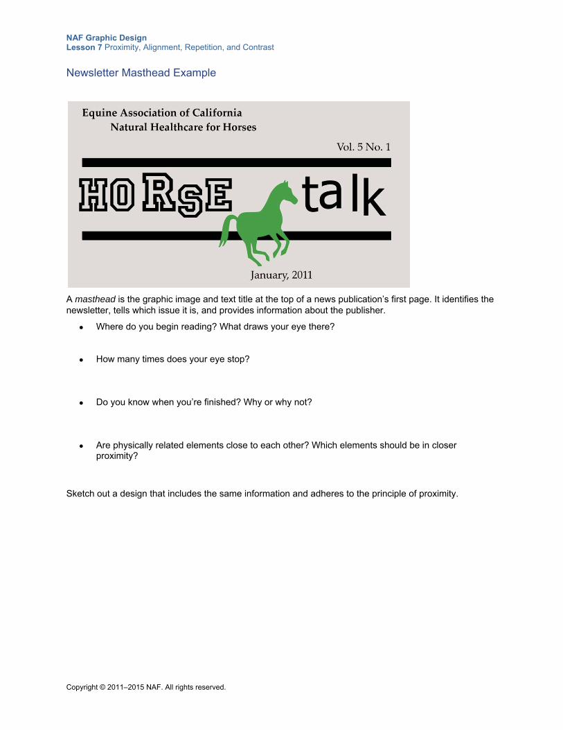
NAF Graphic Design Lesson 7 Proximity, Alignment, Repetition, and Contrast
Copyright © 2011–2015 NAF. All rights reserved.
Newsletter Masthead Example
A masthead is the graphic image and text title at the top of a news publication’s first page. It identifies the newsletter, tells which issue it is, and provides information about the publisher.
Where do you begin reading? What draws your eye there?
How many times does your eye stop?
Do you know when you’re finished? Why or why not?
Are physically related elements close to each other? Which elements should be in closer proximity?
Sketch out a design that includes the same information and adheres to the principle of proximity.
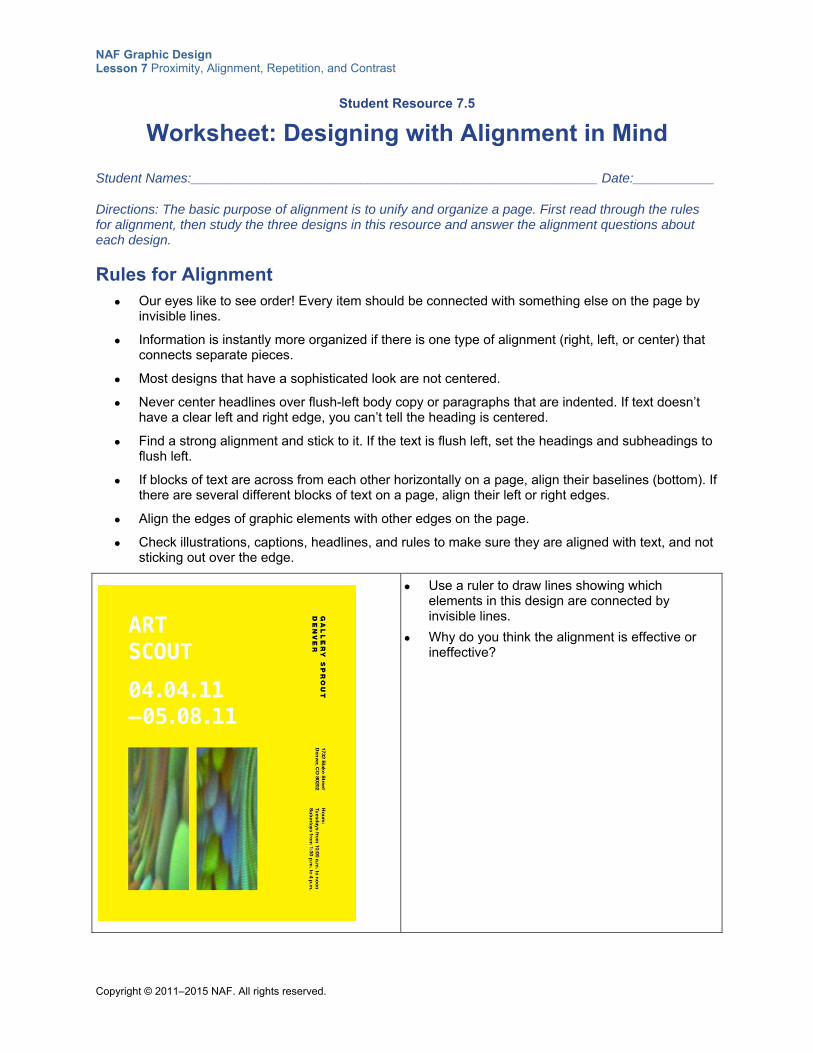
NAF Graphic Design Lesson 7 Proximity, Alignment, Repetition, and Contrast
Copyright © 2011–2015 NAF. All rights reserved.
Student Resource 7.5
Worksheet: Designing with Alignment in Mind
Student Names:_______________________________________________________ Date:___________
Directions: The basic purpose of alignment is to unify and organize a page. First read through the rules for alignment, then study the three designs in this resource and answer the alignment questions about each design.
Rules for Alignment Our eyes like to see order! Every item should be connected with something else on the page by
invisible lines.
Information is instantly more organized if there is one type of alignment (right, left, or center) that connects separate pieces.
Most designs that have a sophisticated look are not centered.
Never center headlines over flush-left body copy or paragraphs that are indented. If text doesn’t have a clear left and right edge, you can’t tell the heading is centered.
Find a strong alignment and stick to it. If the text is flush left, set the headings and subheadings to flush left.
If blocks of text are across from each other horizontally on a page, align their baselines (bottom). If there are several different blocks of text on a page, align their left or right edges.
Align the edges of graphic elements with other edges on the page.
Check illustrations, captions, headlines, and rules to make sure they are aligned with text, and not sticking out over the edge.
Use a ruler to draw lines showing which elements in this design are connected by invisible lines.
Why do you think the alignment is effective or ineffective?
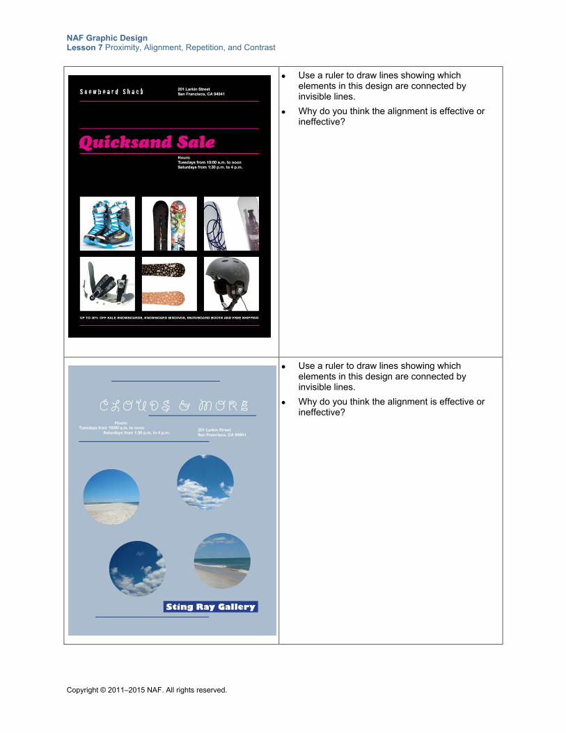
NAF Graphic Design Lesson 7 Proximity, Alignment, Repetition, and Contrast
Copyright © 2011–2015 NAF. All rights reserved.
Use a ruler to draw lines showing which elements in this design are connected by invisible lines.
Why do you think the alignment is effective or ineffective?
Use a ruler to draw lines showing which elements in this design are connected by invisible lines.
Why do you think the alignment is effective or ineffective?
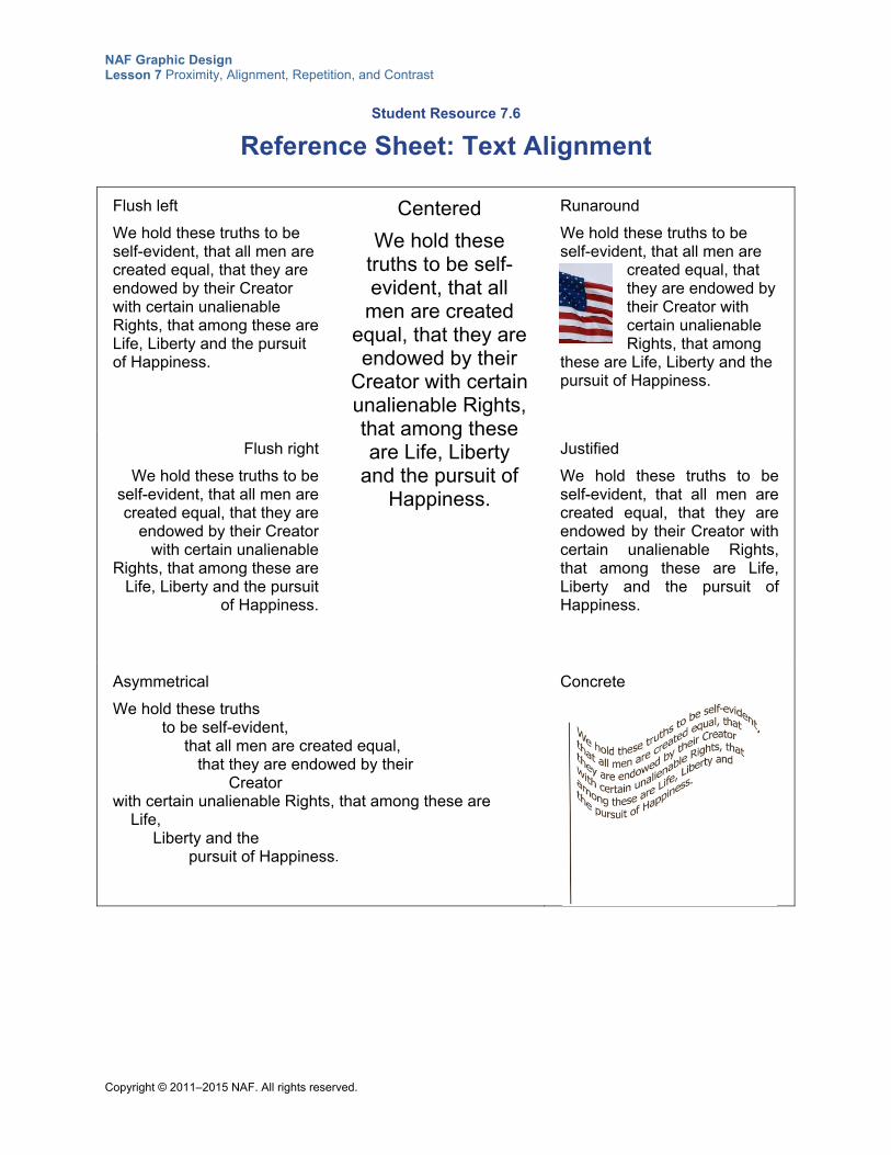
NAF Graphic Design Lesson 7 Proximity, Alignment, Repetition, and Contrast
Copyright © 2011–2015 NAF. All rights reserved.
Student Resource 7.6
Reference Sheet: Text Alignment
Flush left
We hold these truths to be self-evident, that all men are created equal, that they are endowed by their Creator with certain unalienable Rights, that among these are Life, Liberty and the pursuit of Happiness.
Centered
We hold these truths to be self-evident, that all
men are created equal, that they are endowed by their
Creator with certain unalienable Rights, that among these are Life, Liberty
and the pursuit of Happiness.
Runaround
We hold these truths to be self-evident, that all men are
created equal, that they are endowed by their Creator with certain unalienable Rights, that among
these are Life, Liberty and the pursuit of Happiness.
Flush right
We hold these truths to be self-evident, that all men are created equal, that they are
endowed by their Creator with certain unalienable
Rights, that among these are Life, Liberty and the pursuit
of Happiness.
Justified
We hold these truths to be self-evident, that all men are created equal, that they are endowed by their Creator with certain unalienable Rights, that among these are Life, Liberty and the pursuit of Happiness.
Asymmetrical
We hold these truths to be self-evident, that all men are created equal, that they are endowed by their Creator with certain unalienable Rights, that among these are Life, Liberty and the pursuit of Happiness.
Concrete
NAF Graphic Design Lesson 7 Proximity, Alignment, Repetition, and Contrast
Copyright © 2011–2015 NAF. All rights reserved.
Flush left: The first letters of the text are aligned on the left while the right edge is allowed to flow naturally into a ragged edge. Typography experts consider flush left to be a very readable alignment.
Flush right: The end of each line of text is aligned on the right while the left edge flows into a ragged edge. This option works best for short amounts of text because it is hard for the reader’s eye to find the start of the next line, especially if the text line lengths are very long.
Centered: Each line of text is centered, making both the right edge and the left edge ragged. This alignment implies formality and is often used in headline type. The irregular left edge makes it difficult for the reader’s eye to find the beginning of the next line of type, so avoid using centered alignment for more than just a few short phrases.
Justified: Both the left edge and the right edge of each line are aligned. Justified alignment is very readable when set properly and is widely used in books, magazines, brochures, and other text-intensive pages, because this alignment allows for a higher word density. Because of the word density, justified columns tend to look visually darker. Justified columns also tend to develop “rivers” of white space that require adjustment to the lines of type. For best results composing larger blocks of body type, designers use a page layout program like Adobe InDesign.
Runaround: The text wraps around a picture or another piece of text. This alignment is commonly used in newsletters and other text-intensive pages. It is also called text wrap.
Asymmetrical: This alignment conveys a sense of informality and energy. It is visually very interesting, but it is difficult to read because the beginnings and ends of lines do not align with each other. The viewer’s eye has to work to find the beginning of the next line. This alignment is best used for short lines of type and in more experimental, nontraditional layouts.
Concrete: In this alignment, the arrangement of the text takes on the shape of an action or object it describes. This alignment is often difficult to read but is visually very interesting. This text alignment has much creative potential, but it is not easy to move type into an identifiable shape!
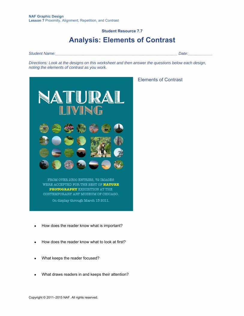
NAF Graphic Design Lesson 7 Proximity, Alignment, Repetition, and Contrast
Copyright © 2011–2015 NAF. All rights reserved.
Student Resource 7.7
Analysis: Elements of Contrast
Student Name:_______________________________________________________ Date:___________
Directions: Look at the designs on this worksheet and then answer the questions below each design, noting the elements of contrast as you work.
Elements of Contrast
How does the reader know what is important?
How does the reader know what to look at first?
What keeps the reader focused?
What draws readers in and keeps their attention?
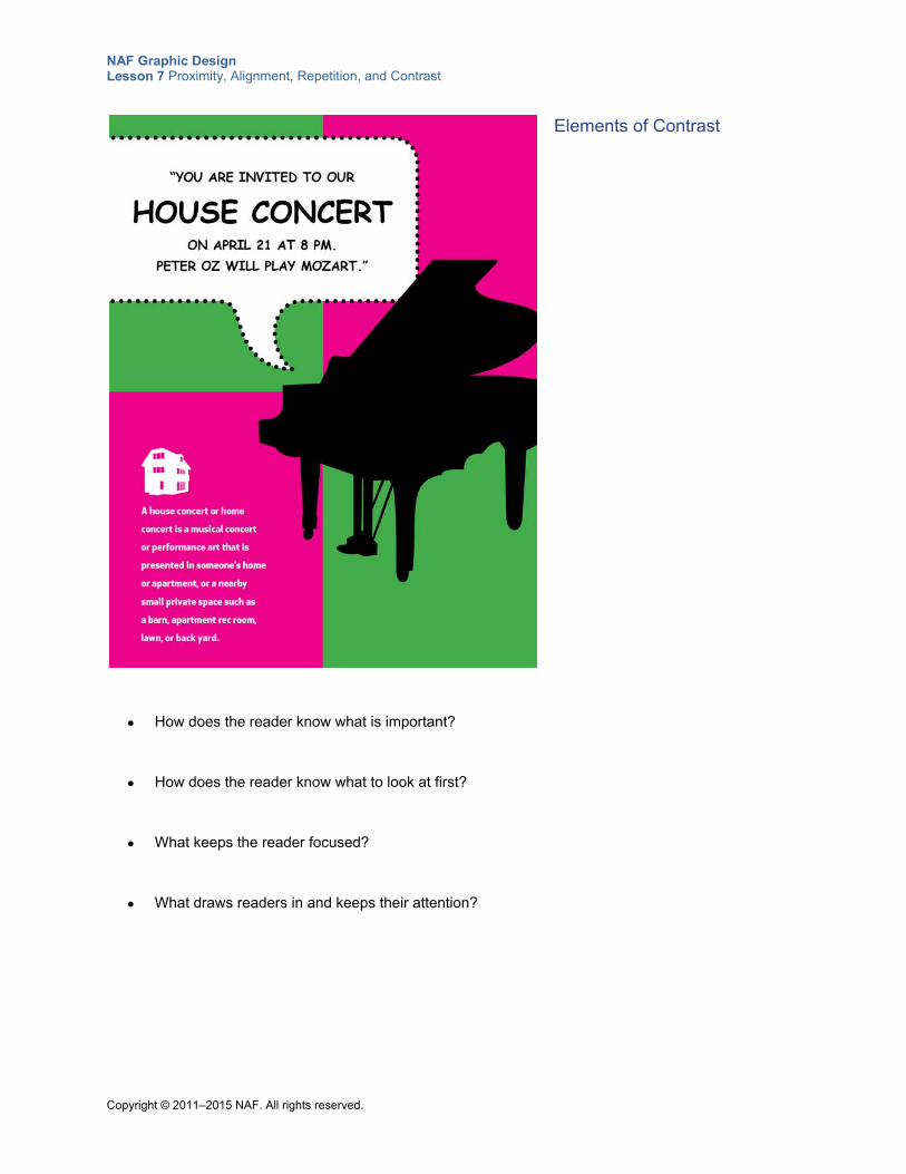
NAF Graphic Design Lesson 7 Proximity, Alignment, Repetition, and Contrast
Copyright © 2011–2015 NAF. All rights reserved.
Elements of Contrast
How does the reader know what is important?
How does the reader know what to look at first?
What keeps the reader focused?
What draws readers in and keeps their attention?
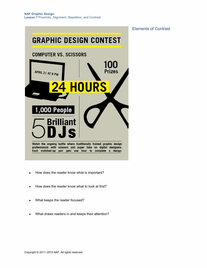
NAF Graphic Design Lesson 7 Proximity, Alignment, Repetition, and Contrast
Copyright © 2011–2015 NAF. All rights reserved.
Elements of Contrast
How does the reader know what is important?
How does the reader know what to look at first?
What keeps the reader focused?
What draws readers in and keeps their attention?
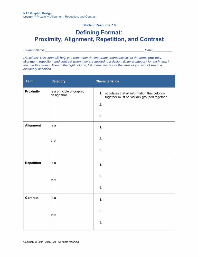
NAF Graphic Design Lesson 7 Proximity, Alignment, Repetition, and Contrast
Copyright © 2011–2015 NAF. All rights reserved.
Student Resource 7.8
Defining Format: Proximity, Alignment, Repetition, and Contrast
Student Name:_______________________________________________________ Date:___________
Directions: This chart will help you remember the important characteristics of the terms proximity, alignment, repetition, and contrast when they are applied to a design. Enter a category for each term in the middle column. Then in the right column, list characteristics of the term as you would see in a dictionary definition.
Term Category Characteristics
Proximity is a principle of graphic design that 1. stipulates that all information that belongs
together must be visually grouped together.
2.
3.
Alignment is a
that
1.
2.
3.
Repetition is a
that
1.
2.
3.
Contrast is a
that
1.
2.
3.
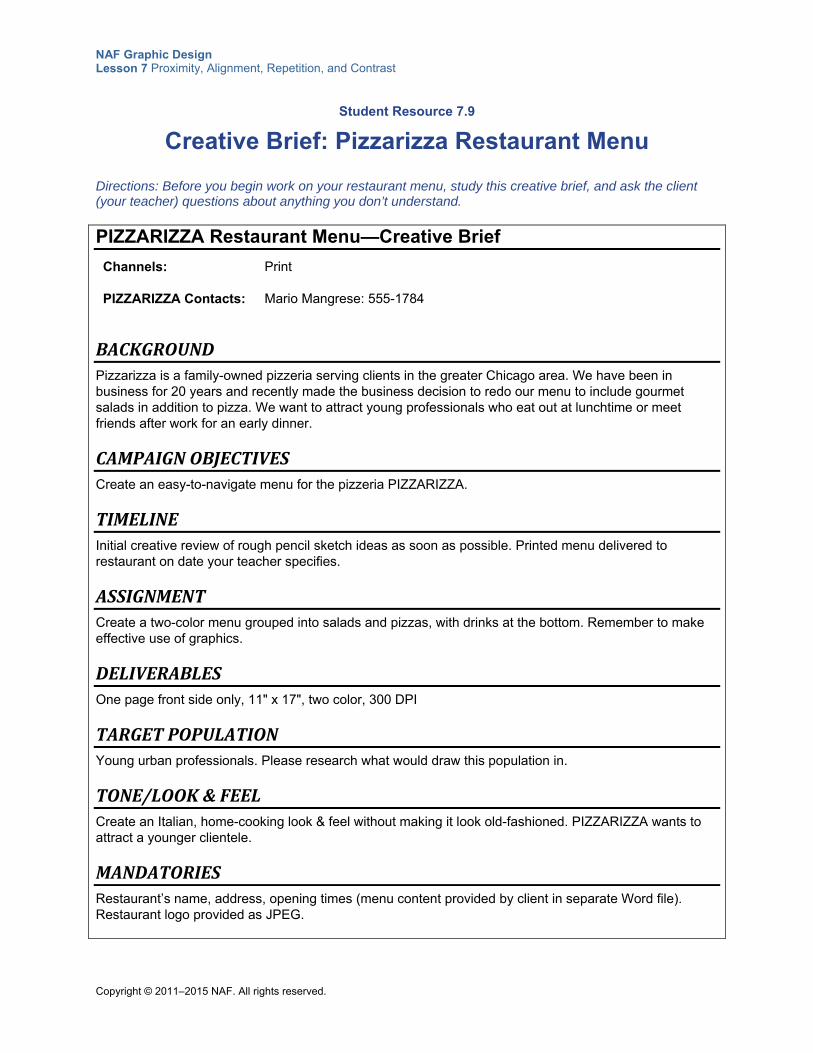
NAF Graphic Design Lesson 7 Proximity, Alignment, Repetition, and Contrast
Copyright © 2011–2015 NAF. All rights reserved.
Student Resource 7.9
Creative Brief: Pizzarizza Restaurant Menu
Directions: Before you begin work on your restaurant menu, study this creative brief, and ask the client (your teacher) questions about anything you don’t understand.
PIZZARIZZA Restaurant Menu—Creative Brief
Channels: Print
PIZZARIZZA Contacts: Mario Mangrese: 555-1784
BACKGROUNDPizzarizza is a family-owned pizzeria serving clients in the greater Chicago area. We have been in business for 20 years and recently made the business decision to redo our menu to include gourmet salads in addition to pizza. We want to attract young professionals who eat out at lunchtime or meet friends after work for an early dinner.
CAMPAIGNOBJECTIVESCreate an easy-to-navigate menu for the pizzeria PIZZARIZZA.
TIMELINEInitial creative review of rough pencil sketch ideas as soon as possible. Printed menu delivered to restaurant on date your teacher specifies.
ASSIGNMENTCreate a two-color menu grouped into salads and pizzas, with drinks at the bottom. Remember to make effective use of graphics.
DELIVERABLESOne page front side only, 11" x 17", two color, 300 DPI
TARGETPOPULATIONYoung urban professionals. Please research what would draw this population in.
TONE/LOOK&FEELCreate an Italian, home-cooking look & feel without making it look old-fashioned. PIZZARIZZA wants to attract a younger clientele.
MANDATORIESRestaurant’s name, address, opening times (menu content provided by client in separate Word file). Restaurant logo provided as JPEG.
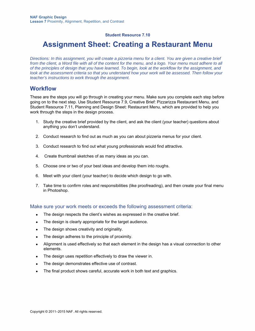
NAF Graphic Design Lesson 7 Proximity, Alignment, Repetition, and Contrast
Copyright © 2011–2015 NAF. All rights reserved.
Student Resource 7.10
Assignment Sheet: Creating a Restaurant Menu
Directions: In this assignment, you will create a pizzeria menu for a client. You are given a creative brief from the client, a Word file with all of the content for the menu, and a logo. Your menu must adhere to all of the principles of design that you have learned. To begin, look at the workflow for the assignment, and look at the assessment criteria so that you understand how your work will be assessed. Then follow your teacher’s instructions to work through the assignment.
Workflow These are the steps you will go through in creating your menu. Make sure you complete each step before going on to the next step. Use Student Resource 7.9, Creative Brief: Pizzarizza Restaurant Menu, and Student Resource 7.11, Planning and Design Sheet: Restaurant Menu, which are provided to help you work through the steps in the design process.
1. Study the creative brief provided by the client, and ask the client (your teacher) questions about anything you don’t understand.
2. Conduct research to find out as much as you can about pizzeria menus for your client.
3. Conduct research to find out what young professionals would find attractive.
4. Create thumbnail sketches of as many ideas as you can.
5. Choose one or two of your best ideas and develop them into roughs.
6. Meet with your client (your teacher) to decide which design to go with.
7. Take time to confirm roles and responsibilities (like proofreading), and then create your final menu in Photoshop.
Make sure your work meets or exceeds the following assessment criteria:
The design respects the client’s wishes as expressed in the creative brief.
The design is clearly appropriate for the target audience.
The design shows creativity and originality.
The design adheres to the principle of proximity.
Alignment is used effectively so that each element in the design has a visual connection to other elements.
The design uses repetition effectively to draw the viewer in.
The design demonstrates effective use of contrast.
The final product shows careful, accurate work in both text and graphics.
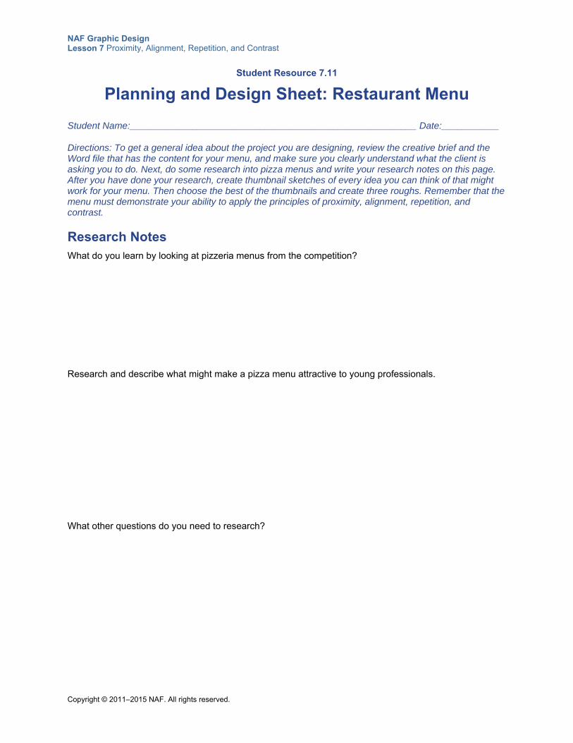
NAF Graphic Design Lesson 7 Proximity, Alignment, Repetition, and Contrast
Copyright © 2011–2015 NAF. All rights reserved.
Student Resource 7.11
Planning and Design Sheet: Restaurant Menu
Student Name:_______________________________________________________ Date:___________
Directions: To get a general idea about the project you are designing, review the creative brief and the Word file that has the content for your menu, and make sure you clearly understand what the client is asking you to do. Next, do some research into pizza menus and write your research notes on this page. After you have done your research, create thumbnail sketches of every idea you can think of that might work for your menu. Then choose the best of the thumbnails and create three roughs. Remember that the menu must demonstrate your ability to apply the principles of proximity, alignment, repetition, and contrast.
Research Notes What do you learn by looking at pizzeria menus from the competition?
Research and describe what might make a pizza menu attractive to young professionals.
What other questions do you need to research?
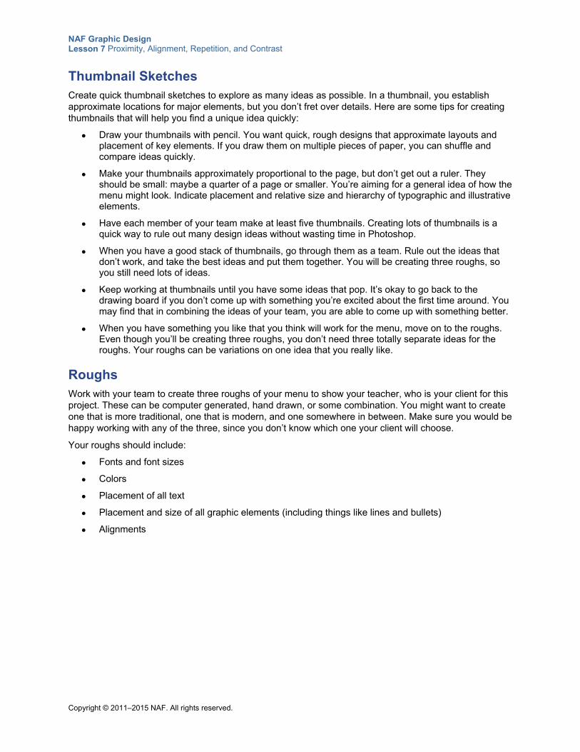
NAF Graphic Design Lesson 7 Proximity, Alignment, Repetition, and Contrast
Copyright © 2011–2015 NAF. All rights reserved.
Thumbnail Sketches Create quick thumbnail sketches to explore as many ideas as possible. In a thumbnail, you establish approximate locations for major elements, but you don’t fret over details. Here are some tips for creating thumbnails that will help you find a unique idea quickly:
Draw your thumbnails with pencil. You want quick, rough designs that approximate layouts and placement of key elements. If you draw them on multiple pieces of paper, you can shuffle and compare ideas quickly.
Make your thumbnails approximately proportional to the page, but don’t get out a ruler. They should be small: maybe a quarter of a page or smaller. You’re aiming for a general idea of how the menu might look. Indicate placement and relative size and hierarchy of typographic and illustrative elements.
Have each member of your team make at least five thumbnails. Creating lots of thumbnails is a quick way to rule out many design ideas without wasting time in Photoshop.
When you have a good stack of thumbnails, go through them as a team. Rule out the ideas that don’t work, and take the best ideas and put them together. You will be creating three roughs, so you still need lots of ideas.
Keep working at thumbnails until you have some ideas that pop. It’s okay to go back to the drawing board if you don’t come up with something you’re excited about the first time around. You may find that in combining the ideas of your team, you are able to come up with something better.
When you have something you like that you think will work for the menu, move on to the roughs. Even though you’ll be creating three roughs, you don’t need three totally separate ideas for the roughs. Your roughs can be variations on one idea that you really like.
Roughs Work with your team to create three roughs of your menu to show your teacher, who is your client for this project. These can be computer generated, hand drawn, or some combination. You might want to create one that is more traditional, one that is modern, and one somewhere in between. Make sure you would be happy working with any of the three, since you don’t know which one your client will choose.
Your roughs should include:
Fonts and font sizes
Colors
Placement of all text
Placement and size of all graphic elements (including things like lines and bullets)
Alignments
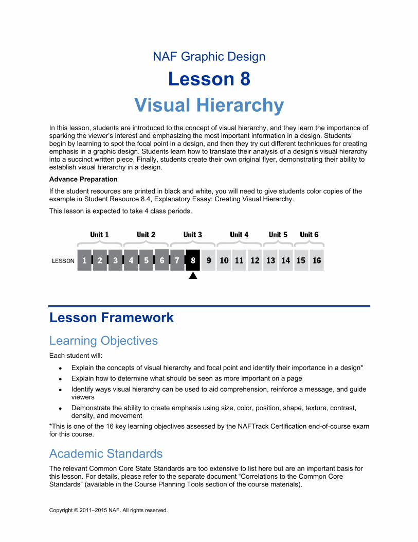
Copyright © 2011–2015 NAF. All rights reserved.
NAF Graphic Design
Lesson 8 Visual Hierarchy
In this lesson, students are introduced to the concept of visual hierarchy, and they learn the importance of sparking the viewer’s interest and emphasizing the most important information in a design. Students begin by learning to spot the focal point in a design, and then they try out different techniques for creating emphasis in a graphic design. Students learn how to translate their analysis of a design’s visual hierarchy into a succinct written piece. Finally, students create their own original flyer, demonstrating their ability to establish visual hierarchy in a design.
Advance Preparation
If the student resources are printed in black and white, you will need to give students color copies of the example in Student Resource 8.4, Explanatory Essay: Creating Visual Hierarchy.
This lesson is expected to take 4 class periods.
Lesson Framework
Learning Objectives Each student will:
Explain the concepts of visual hierarchy and focal point and identify their importance in a design*
Explain how to determine what should be seen as more important on a page
Identify ways visual hierarchy can be used to aid comprehension, reinforce a message, and guide viewers
Demonstrate the ability to create emphasis using size, color, position, shape, texture, contrast, density, and movement
*This is one of the 16 key learning objectives assessed by the NAFTrack Certification end-of-course exam for this course.
Academic Standards The relevant Common Core State Standards are too extensive to list here but are an important basis for this lesson. For details, please refer to the separate document “Correlations to the Common Core Standards” (available in the Course Planning Tools section of the course materials).
NAF Graphic Design Lesson 8 Visual Hierarchy
Copyright © 2011–2015 NAF. All rights reserved. - 2 -
Analyze how the application of visual arts elements and principles of design communicate and express ideas (Common Career Technical Core 2012, AR-VIS 2)
Analyze and create two and three-dimensional visual art forms using various media (Common Career Technical Core 2012, AR-VIS 3)
Demonstrate knowledge of design principles, elements, and image composition (Adobe Certified Associate, Objectives for Visual Communication using Photoshop CS6, Setting Project Requirements 2.2)
Communicate with others (such as peers and clients) about design plans (Adobe Certified Associate, Objectives for Visual Communication using Photoshop CS6 Setting Project Requirements 1.4)
Apply existing knowledge to generate new ideas, products, or processes (ISTE NETS for Students 2007, 1a)
Create original works as a means of personal or group expression (ISTE NETS for Students 2007, 1b)
Analyze how the application of visual arts elements and principles of design communicate and express ideas (Common Career Technical Core 2012, AR-VIS 2)
Use product or service design processes and guidelines to produce a quality information technology (IT) product or service (Common Career Technical Core 2012, IT 2)
Perform common printing/outputting functions (IC3 GS4 2012, Key Applications)
Assessment
Assessment Products Means of Assessment
An explanatory essay that analyzes the visual hierarchy of an image (Student Resource 8.4)
Assessment Criteria: Explanatory Essay (Teacher Resource 8.3)
A flyer that demonstrates effective visual hierarchy (Student Resource 8.5)
Assessment Criteria: School Event Flyer (Teacher Resource 8.4)
Prerequisites Basic knowledge of image size and resolution
Understanding of graphic design as visual communication
Ability to create accurate selections using all Photoshop selection tools
Ability to edit and manipulate layers in a Photoshop image
Understanding of composition balance in an image
Ability to make basic photo repairs in Photoshop
A working knowledge of the use of proximity, alignment, repetition, and contrast in graphic design
NAF Graphic Design Lesson 8 Visual Hierarchy
Copyright © 2011–2015 NAF. All rights reserved. - 3 -
Instructional Materials
Teacher Resources Teacher Resource 8.1, Slides: What Is the Visual Hierarchy? (separate PowerPoint file)
Teacher Resource 8.2, Images: Yogurt.psd, DesignerAd.psd (separate ZIP file)
Teacher Resource 8.3, Assessment Criteria: Explanatory Essay
Teacher Resource 8.4, Assessment Criteria: School Event Flyer
Teacher Resource 8.5, Key Vocabulary: Visual Hierarchy
Teacher Resource 8.6, Bibliography: Visual Hierarchy
Student Resources Student Resource 8.1, Worksheet: Visual Hierarchy
Student Resource 8.2, Planning Sheet and Reference: Creating Visual Hierarchy
Student Resource 8.3, Resource List: Emphasis Techniques
Student Resource 8.4, Explanatory Essay: Creating Visual Hierarchy
Student Resource 8.5, Assignment Sheet: School Event Flyer
Equipment and Supplies LCD projector and computer
Access to Photoshop for all students
Blackboard, whiteboard, or flip chart
Colored pencils
Sticky notes
Lesson Steps
Step Min. Activity
CLASS PERIOD 1
1 15 Deduction: Visual Hierarchy
NAF Graphic Design Lesson 8 Visual Hierarchy
Copyright © 2011–2015 NAF. All rights reserved. - 4 -
Step Min. Activity
This activity introduces students to the concept of visual hierarchy.
Explain to students that visual hierarchy is a technique of emphasizing different elements on a page in order to guide the viewer through the page. Tell students that in this activity, they will get a chance to see for themselves how visual hierarchy works.
Refer students to Student Resource 8.1, Worksheet: Visual Hierarchy. Tell them that you will be showing them a series of four designs, and for each design, they need to fill in the answer to these questions:
Where do you look first?
Where do you look second?
Where do you look third?
Using an LCD projector, project the images in Teacher Resource 8.1, Slides: What Is the Visual Hierarchy? (separate PowerPoint file). Give students a minute to look at each slide and write down on the worksheet their answers to the above questions.
Next, have students compare answers with a partner. Ask them to choose one of the images with their partner and try to come up with an explanation for why their eyes were drawn to locations on the graphics in the order that they were. Note that the most dominant element is not always at the top of the page. Beginning designers often tend to make the headline the focal point when there are many other options.
Ask pairs to share their explanations for why their eyes were drawn to different elements in the design, and make a list on the board of the factors that contribute to emphasis in a graphic design (e.g., placement, movement, size, color, shape, direction, texture, high contrast, etc.).
Point out to students that establishing a visual hierarchy sets a priority order for all of the information in the design. Viewers depend on the designer to direct their attention. Tell students that in this lesson, they will learn how to establish visual hierarchy in their own designs.
2
30 Analysis: What Is Most Important in a Design?
In this activity, students learn to determine which elements are the most important in a design and then use visual hierarchy techniques to make those important elements stand out.
Point out to students that the first step in establishing visual hierarchy is figuring out (1) which elements in a design are the most important for conveying the message they want to communicate and (2) which elements will spark the reader’s interest. Give students access to the PSD file Yogurt.psd (included in Teacher Resource 8.2, Images) and ask them to open it in Photoshop. Explain that all of the layers in this file are meant to be part of the packaging for a yogurt container. The yogurt is 2% all-natural cow’s milk pineapple yogurt. They may need to turn some layers off to see what is there:
An outline of the yogurt cup on the background layer, to be filled in with color
A logo
A pineapple
A cow silhouette
Three text layers
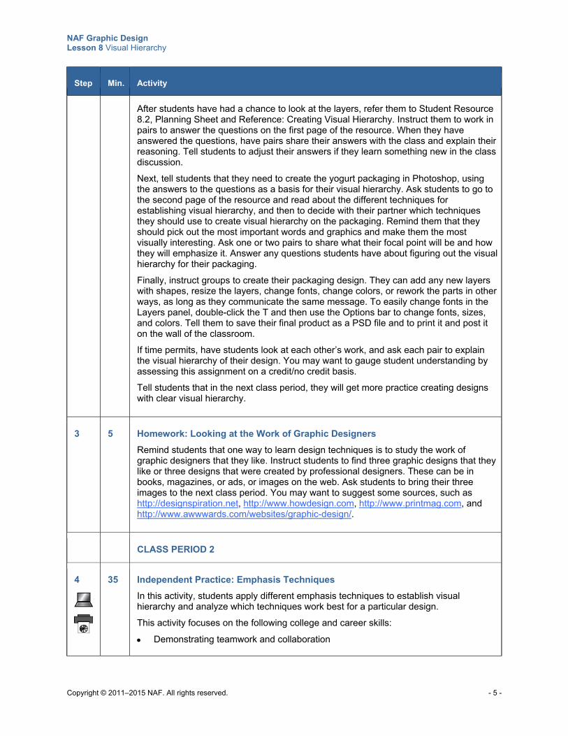
NAF Graphic Design Lesson 8 Visual Hierarchy
Copyright © 2011–2015 NAF. All rights reserved. - 5 -
Step Min. Activity
After students have had a chance to look at the layers, refer them to Student Resource 8.2, Planning Sheet and Reference: Creating Visual Hierarchy. Instruct them to work in pairs to answer the questions on the first page of the resource. When they have answered the questions, have pairs share their answers with the class and explain their reasoning. Tell students to adjust their answers if they learn something new in the class discussion.
Next, tell students that they need to create the yogurt packaging in Photoshop, using the answers to the questions as a basis for their visual hierarchy. Ask students to go to the second page of the resource and read about the different techniques for establishing visual hierarchy, and then to decide with their partner which techniques they should use to create visual hierarchy on the packaging. Remind them that they should pick out the most important words and graphics and make them the most visually interesting. Ask one or two pairs to share what their focal point will be and how they will emphasize it. Answer any questions students have about figuring out the visual hierarchy for their packaging.
Finally, instruct groups to create their packaging design. They can add any new layers with shapes, resize the layers, change fonts, change colors, or rework the parts in other ways, as long as they communicate the same message. To easily change fonts in the Layers panel, double-click the T and then use the Options bar to change fonts, sizes, and colors. Tell them to save their final product as a PSD file and to print it and post it on the wall of the classroom.
If time permits, have students look at each other’s work, and ask each pair to explain the visual hierarchy of their design. You may want to gauge student understanding by assessing this assignment on a credit/no credit basis. Tell students that in the next class period, they will get more practice creating designs with clear visual hierarchy.
3 5 Homework: Looking at the Work of Graphic Designers
Remind students that one way to learn design techniques is to study the work of graphic designers that they like. Instruct students to find three graphic designs that they like or three designs that were created by professional designers. These can be in books, magazines, or ads, or images on the web. Ask students to bring their three images to the next class period. You may want to suggest some sources, such as http://designspiration.net, http://www.howdesign.com, http://www.printmag.com, and http://www.awwwards.com/websites/graphic-design/.
CLASS PERIOD 2
4
35 Independent Practice: Emphasis Techniques
In this activity, students apply different emphasis techniques to establish visual hierarchy and analyze which techniques work best for a particular design.
This activity focuses on the following college and career skills:
Demonstrating teamwork and collaboration
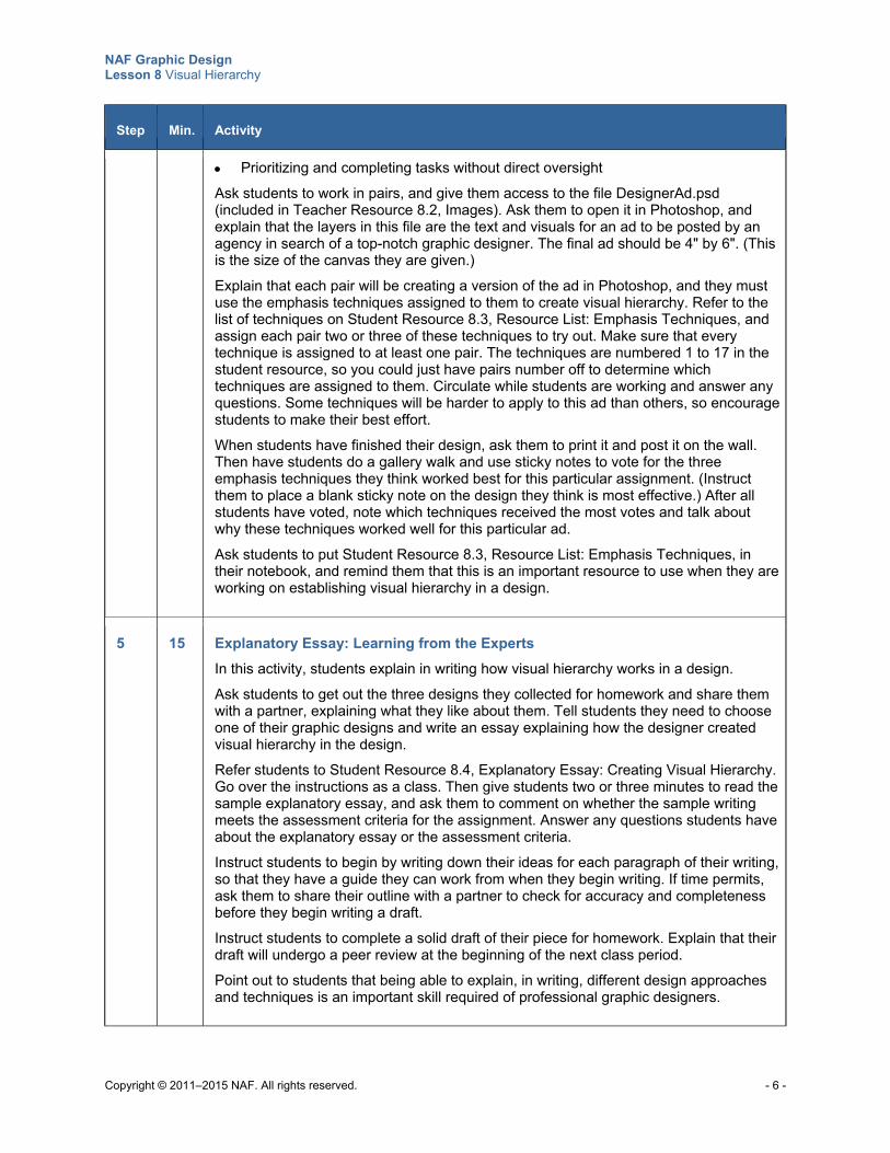
NAF Graphic Design Lesson 8 Visual Hierarchy
Copyright © 2011–2015 NAF. All rights reserved. - 6 -
Step Min. Activity
Prioritizing and completing tasks without direct oversight
Ask students to work in pairs, and give them access to the file DesignerAd.psd (included in Teacher Resource 8.2, Images). Ask them to open it in Photoshop, and explain that the layers in this file are the text and visuals for an ad to be posted by an agency in search of a top-notch graphic designer. The final ad should be 4" by 6". (This is the size of the canvas they are given.)
Explain that each pair will be creating a version of the ad in Photoshop, and they must use the emphasis techniques assigned to them to create visual hierarchy. Refer to the list of techniques on Student Resource 8.3, Resource List: Emphasis Techniques, and assign each pair two or three of these techniques to try out. Make sure that every technique is assigned to at least one pair. The techniques are numbered 1 to 17 in the student resource, so you could just have pairs number off to determine which techniques are assigned to them. Circulate while students are working and answer any questions. Some techniques will be harder to apply to this ad than others, so encourage students to make their best effort.
When students have finished their design, ask them to print it and post it on the wall. Then have students do a gallery walk and use sticky notes to vote for the three emphasis techniques they think worked best for this particular assignment. (Instruct them to place a blank sticky note on the design they think is most effective.) After all students have voted, note which techniques received the most votes and talk about why these techniques worked well for this particular ad.
Ask students to put Student Resource 8.3, Resource List: Emphasis Techniques, in their notebook, and remind them that this is an important resource to use when they are working on establishing visual hierarchy in a design.
5 15 Explanatory Essay: Learning from the Experts
In this activity, students explain in writing how visual hierarchy works in a design.
Ask students to get out the three designs they collected for homework and share them with a partner, explaining what they like about them. Tell students they need to choose one of their graphic designs and write an essay explaining how the designer created visual hierarchy in the design.
Refer students to Student Resource 8.4, Explanatory Essay: Creating Visual Hierarchy. Go over the instructions as a class. Then give students two or three minutes to read the sample explanatory essay, and ask them to comment on whether the sample writing meets the assessment criteria for the assignment. Answer any questions students have about the explanatory essay or the assessment criteria.
Instruct students to begin by writing down their ideas for each paragraph of their writing, so that they have a guide they can work from when they begin writing. If time permits, ask them to share their outline with a partner to check for accuracy and completeness before they begin writing a draft. Instruct students to complete a solid draft of their piece for homework. Explain that their draft will undergo a peer review at the beginning of the next class period. Point out to students that being able to explain, in writing, different design approaches and techniques is an important skill required of professional graphic designers.
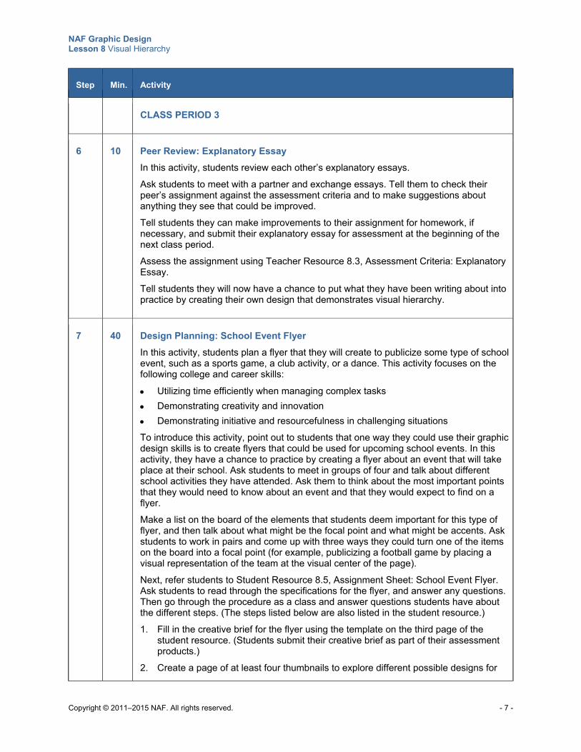
NAF Graphic Design Lesson 8 Visual Hierarchy
Copyright © 2011–2015 NAF. All rights reserved. - 7 -
Step Min. Activity
CLASS PERIOD 3
6 10 Peer Review: Explanatory Essay
In this activity, students review each other’s explanatory essays.
Ask students to meet with a partner and exchange essays. Tell them to check their peer’s assignment against the assessment criteria and to make suggestions about anything they see that could be improved.
Tell students they can make improvements to their assignment for homework, if necessary, and submit their explanatory essay for assessment at the beginning of the next class period.
Assess the assignment using Teacher Resource 8.3, Assessment Criteria: Explanatory Essay. Tell students they will now have a chance to put what they have been writing about into practice by creating their own design that demonstrates visual hierarchy.
7 40 Design Planning: School Event Flyer
In this activity, students plan a flyer that they will create to publicize some type of school event, such as a sports game, a club activity, or a dance. This activity focuses on the following college and career skills:
Utilizing time efficiently when managing complex tasks
Demonstrating creativity and innovation
Demonstrating initiative and resourcefulness in challenging situations
To introduce this activity, point out to students that one way they could use their graphic design skills is to create flyers that could be used for upcoming school events. In this activity, they have a chance to practice by creating a flyer about an event that will take place at their school. Ask students to meet in groups of four and talk about different school activities they have attended. Ask them to think about the most important points that they would need to know about an event and that they would expect to find on a flyer.
Make a list on the board of the elements that students deem important for this type of flyer, and then talk about what might be the focal point and what might be accents. Ask students to work in pairs and come up with three ways they could turn one of the items on the board into a focal point (for example, publicizing a football game by placing a visual representation of the team at the visual center of the page).
Next, refer students to Student Resource 8.5, Assignment Sheet: School Event Flyer. Ask students to read through the specifications for the flyer, and answer any questions. Then go through the procedure as a class and answer questions students have about the different steps. (The steps listed below are also listed in the student resource.)
1. Fill in the creative brief for the flyer using the template on the third page of the student resource. (Students submit their creative brief as part of their assessment products.)
2. Create a page of at least four thumbnails to explore different possible designs for
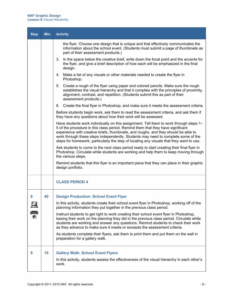
NAF Graphic Design Lesson 8 Visual Hierarchy
Copyright © 2011–2015 NAF. All rights reserved. - 8 -
Step Min. Activity
the flyer. Choose one design that is unique and that effectively communicates the information about the school event. (Students must submit a page of thumbnails as part of their assessment products.)
3. In the space below the creative brief, write down the focal point and the accents for the flyer, and give a brief description of how each will be emphasized in the final design.
4. Make a list of any visuals or other materials needed to create the flyer in Photoshop.
5. Create a rough of the flyer using paper and colored pencils. Make sure the rough establishes the visual hierarchy and that it complies with the principles of proximity, alignment, contrast, and repetition. (Students submit this as part of their assessment products.)
6. Create the final flyer in Photoshop, and make sure it meets the assessment criteria.
Before students begin work, ask them to read the assessment criteria, and ask them if they have any questions about how their work will be assessed.
Have students work individually on this assignment. Tell them to work through steps 1–5 of the procedure in this class period. Remind them that they have significant experience with creative briefs, thumbnails, and roughs, and they should be able to work through these steps independently. Students may need to complete some of the steps for homework, particularly the step of locating any visuals that they want to use.
Ask students to come to the next class period ready to start creating their final flyer in Photoshop. Circulate while students are working and help them to keep moving through the various steps.
Remind students that this flyer is an important piece that they can place in their graphic design portfolio.
CLASS PERIOD 4
8
40 Design Production: School Event Flyer
In this activity, students create their school event flyer in Photoshop, working off of the planning information they put together in the previous class period.
Instruct students to get right to work creating their school event flyer in Photoshop, basing their work on the planning they did in the previous class period. Circulate while students are working and answer any questions. Remind students to check their work as they advance to make sure it meets or exceeds the assessment criteria.
As students complete their flyers, ask them to print them and put them on the wall in preparation for a gallery walk.
9 10 Gallery Walk: School Event Flyers
In this activity, students assess the effectiveness of the visual hierarchy in each other’s work.
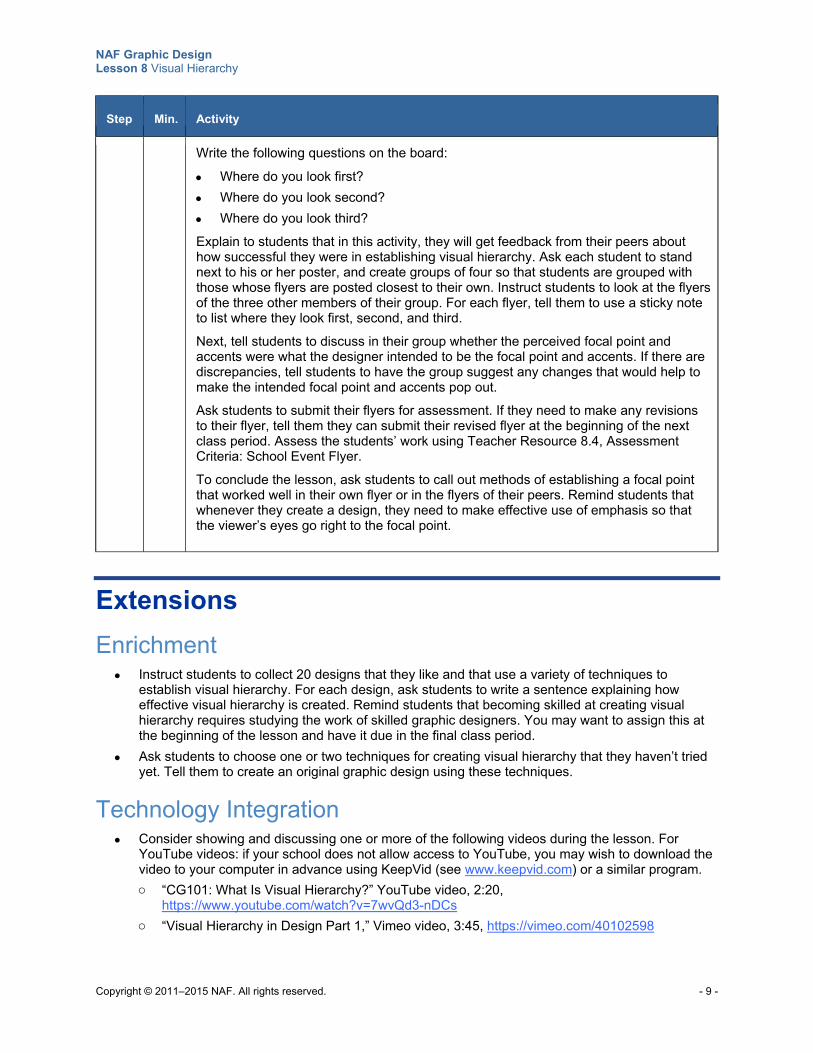
NAF Graphic Design Lesson 8 Visual Hierarchy
Copyright © 2011–2015 NAF. All rights reserved. - 9 -
Step Min. Activity
Write the following questions on the board:
Where do you look first?
Where do you look second?
Where do you look third?
Explain to students that in this activity, they will get feedback from their peers about how successful they were in establishing visual hierarchy. Ask each student to stand next to his or her poster, and create groups of four so that students are grouped with those whose flyers are posted closest to their own. Instruct students to look at the flyers of the three other members of their group. For each flyer, tell them to use a sticky note to list where they look first, second, and third.
Next, tell students to discuss in their group whether the perceived focal point and accents were what the designer intended to be the focal point and accents. If there are discrepancies, tell students to have the group suggest any changes that would help to make the intended focal point and accents pop out.
Ask students to submit their flyers for assessment. If they need to make any revisions to their flyer, tell them they can submit their revised flyer at the beginning of the next class period. Assess the students’ work using Teacher Resource 8.4, Assessment Criteria: School Event Flyer.
To conclude the lesson, ask students to call out methods of establishing a focal point that worked well in their own flyer or in the flyers of their peers. Remind students that whenever they create a design, they need to make effective use of emphasis so that the viewer’s eyes go right to the focal point.
Extensions
Enrichment Instruct students to collect 20 designs that they like and that use a variety of techniques to
establish visual hierarchy. For each design, ask students to write a sentence explaining how effective visual hierarchy is created. Remind students that becoming skilled at creating visual hierarchy requires studying the work of skilled graphic designers. You may want to assign this at the beginning of the lesson and have it due in the final class period.
Ask students to choose one or two techniques for creating visual hierarchy that they haven’t tried yet. Tell them to create an original graphic design using these techniques.
Technology Integration Consider showing and discussing one or more of the following videos during the lesson. For
YouTube videos: if your school does not allow access to YouTube, you may wish to download the video to your computer in advance using KeepVid (see www.keepvid.com) or a similar program.
o “CG101: What Is Visual Hierarchy?” YouTube video, 2:20, https://www.youtube.com/watch?v=7wvQd3-nDCs
o “Visual Hierarchy in Design Part 1,” Vimeo video, 3:45, https://vimeo.com/40102598
NAF Graphic Design Lesson 8 Visual Hierarchy
Copyright © 2011–2015 NAF. All rights reserved. - 10 -
Cross-Curricular Integration English Language Arts: Explain to students that just as a graphic designer creates visual hierarchy
to lead the viewer through a design, so a good fiction writer starts with an interesting lead that sends the reader breathlessly into the next paragraph. A great lead serves as a focal point and draws the reader in, much as a visual focal point draws a viewer in to a design. And the writer leads the reader through the story, with everything pointing in the direction of the climax or the call to action. Instruct students to write a feature story about an upcoming event, using the following strategy:
o Research the event.
o Read over your data to find your focal point or key thought that can lure your reader into the story.
o Organize the information so that everything accentuates the climax, or the most important message.
o Write an outline of the story, and purposefully think about how you want to lead your reader through each part.
o Follow your outline, and write the story.
When students have completed their stories, have them exchange them with each other and answer these questions:
o What is the focal point of this story?
o How did the writer lead me to the climax?
Science: In science, a focal point is defined as the point where rays of light converge. Have students research how a focal point is used in laser surgery or some other scientific field. Then ask students to create a design that illustrates the use of a focal point in science. Their design should of course have a visual focal point.
Copyright © 2011–2015 NAF. All rights reserved.
NAF Graphic Design
Lesson 8 Visual Hierarchy
Teacher Resources
Resource Description
Teacher Resource 8.1 Slides: What Is the Visual Hierarchy? (separate PowerPoint file)
Teacher Resource 8.2 Images: Yogurt.psd, DesignerAd.psd (separate ZIP file)
Teacher Resource 8.3 Assessment Criteria: Explanatory Essay
Teacher Resource 8.4 Assessment Criteria: School Event Flyer
Teacher Resource 8.5 Key Vocabulary: Visual Hierarchy
Teacher Resource 8.6 Bibliography: Visual Hierarchy
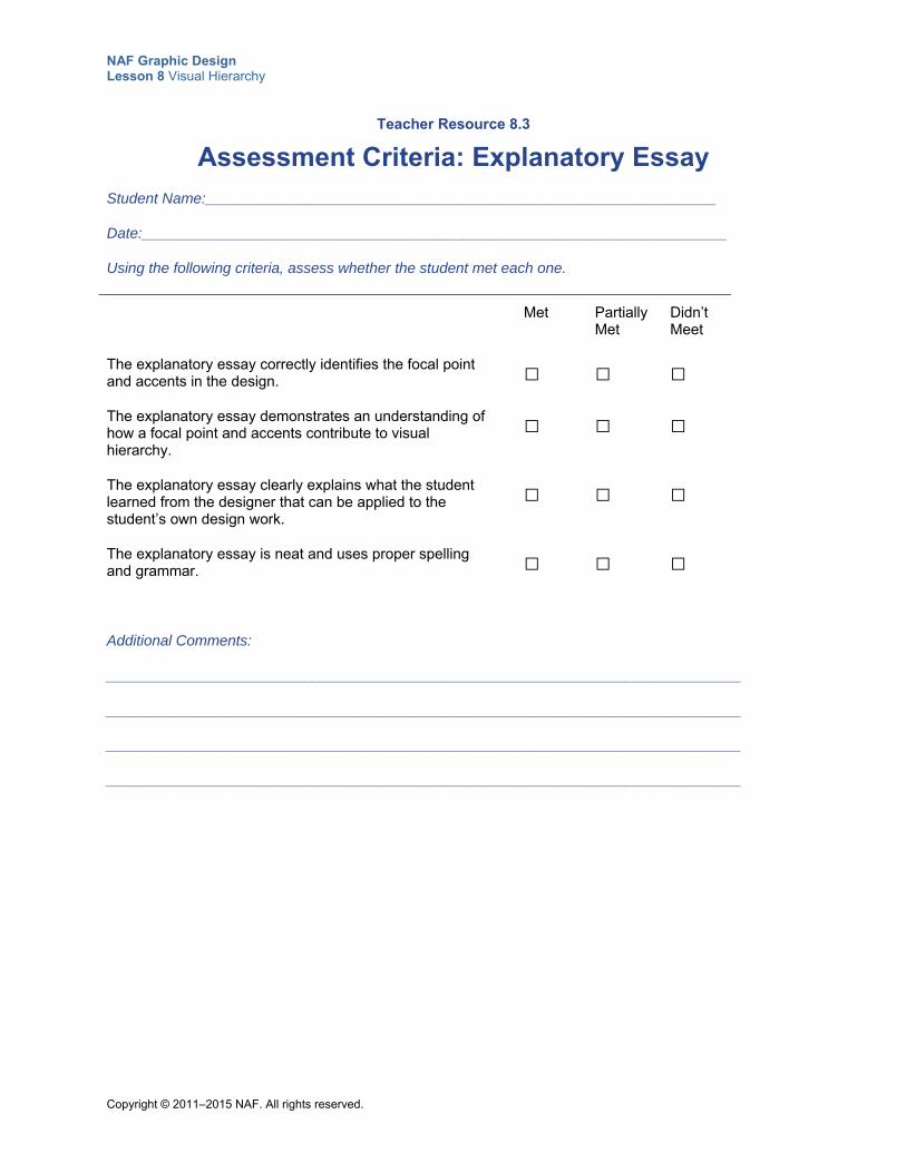
NAF Graphic Design Lesson 8 Visual Hierarchy
Copyright © 2011–2015 NAF. All rights reserved.
Teacher Resource 8.3
Assessment Criteria: Explanatory Essay
Student Name:______________________________________________________________
Date:_______________________________________________________________________
Using the following criteria, assess whether the student met each one.
Met Partially Met
Didn’t Meet
The explanatory essay correctly identifies the focal point and accents in the design.
□ □ □
The explanatory essay demonstrates an understanding of how a focal point and accents contribute to visual hierarchy.
□ □ □
The explanatory essay clearly explains what the student learned from the designer that can be applied to the student’s own design work.
□ □ □
The explanatory essay is neat and uses proper spelling and grammar.
□ □ □
Additional Comments:
_____________________________________________________________________________
_____________________________________________________________________________
_____________________________________________________________________________
_____________________________________________________________________________
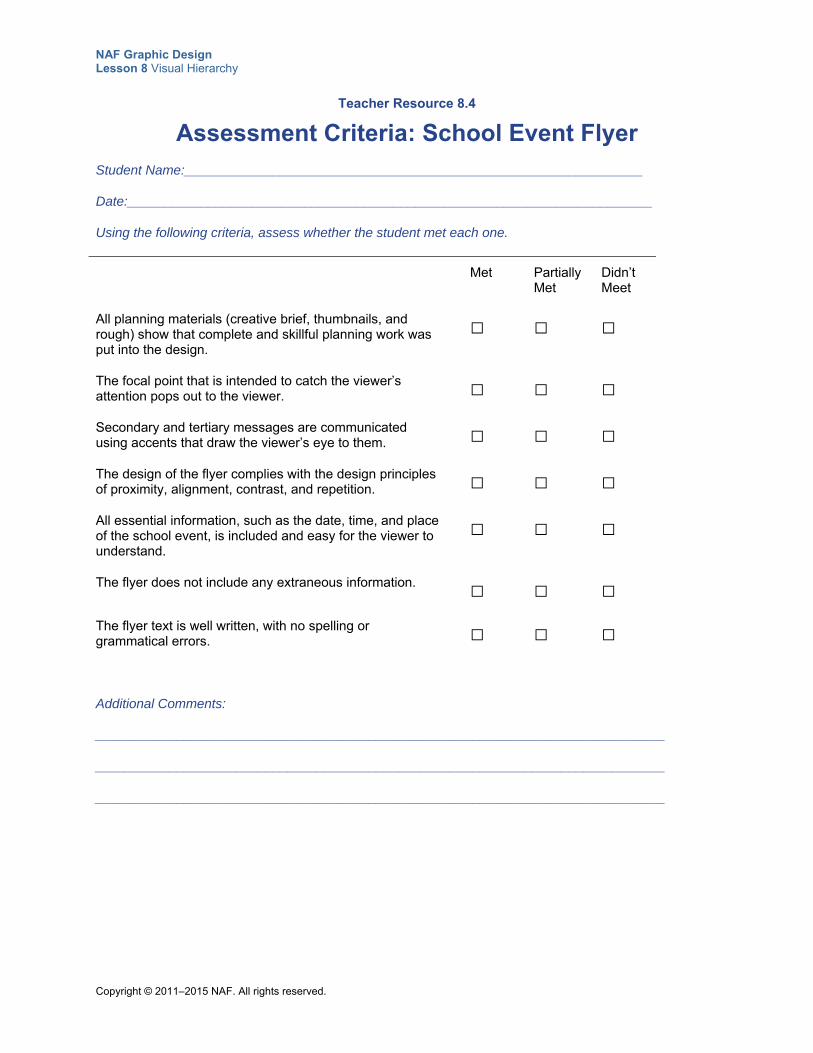
NAF Graphic Design Lesson 8 Visual Hierarchy
Copyright © 2011–2015 NAF. All rights reserved.
Teacher Resource 8.4
Assessment Criteria: School Event Flyer
Student Name:______________________________________________________________
Date:_______________________________________________________________________
Using the following criteria, assess whether the student met each one.
Met Partially Met
Didn’t Meet
All planning materials (creative brief, thumbnails, and rough) show that complete and skillful planning work was put into the design.
□ □ □
The focal point that is intended to catch the viewer’s attention pops out to the viewer.
□ □ □
Secondary and tertiary messages are communicated using accents that draw the viewer’s eye to them.
□ □ □
The design of the flyer complies with the design principles of proximity, alignment, contrast, and repetition.
□ □ □
All essential information, such as the date, time, and place of the school event, is included and easy for the viewer to understand.
□ □ □
The flyer does not include any extraneous information. □ □ □
The flyer text is well written, with no spelling or grammatical errors.
□ □ □
Additional Comments:
_____________________________________________________________________________
_____________________________________________________________________________
_____________________________________________________________________________
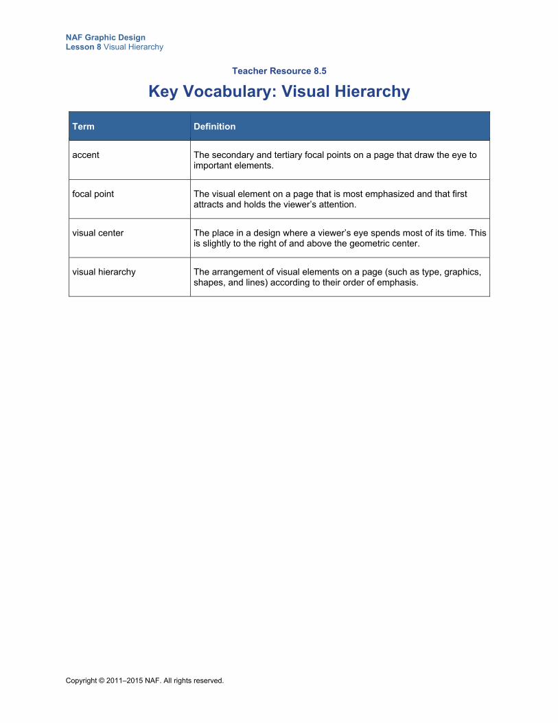
NAF Graphic Design Lesson 8 Visual Hierarchy
Copyright © 2011–2015 NAF. All rights reserved.
Teacher Resource 8.5
Key Vocabulary: Visual Hierarchy
Term Definition
accent The secondary and tertiary focal points on a page that draw the eye to important elements.
focal point The visual element on a page that is most emphasized and that first attracts and holds the viewer’s attention.
visual center The place in a design where a viewer’s eye spends most of its time. This is slightly to the right of and above the geometric center.
visual hierarchy The arrangement of visual elements on a page (such as type, graphics, shapes, and lines) according to their order of emphasis.
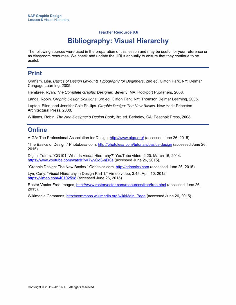
NAF Graphic Design Lesson 8 Visual Hierarchy
Copyright © 2011–2015 NAF. All rights reserved.
Teacher Resource 8.6
Bibliography: Visual Hierarchy
The following sources were used in the preparation of this lesson and may be useful for your reference or as classroom resources. We check and update the URLs annually to ensure that they continue to be useful.
Print Graham, Lisa. Basics of Design Layout & Typography for Beginners, 2nd ed. Clifton Park, NY: Delmar Cengage Learning, 2005.
Hembree, Ryan. The Complete Graphic Designer. Beverly, MA: Rockport Publishers, 2008.
Landa, Robin. Graphic Design Solutions, 3rd ed. Clifton Park, NY: Thomson Delmar Learning, 2006.
Lupton, Ellen, and Jennifer Cole Phillips. Graphic Design: The New Basics. New York: Princeton Architectural Press, 2008.
Williams, Robin. The Non-Designer’s Design Book, 3rd ed. Berkeley, CA: Peachpit Press, 2008.
Online AIGA: The Professional Association for Design, http://www.aiga.org/ (accessed June 26, 2015).
“The Basics of Design.” PhotoLesa.com, http://photolesa.com/tutorials/basics-design (accessed June 26, 2015).
Digital-Tutors. “CG101: What Is Visual Hierarchy?” YouTube video, 2:20. March 16, 2014. https://www.youtube.com/watch?v=7wvQd3-nDCs (accessed June 26, 2015).
“Graphic Design: The New Basics.” Gdbasics.com, http://gdbasics.com (accessed June 26, 2015).
Lyn, Carly. “Visual Hierarchy in Design Part 1,” Vimeo video, 3:45. April 10, 2012. https://vimeo.com/40102598 (accessed June 26, 2015).
Raster Vector Free Images, http://www.rastervector.com/resources/free/free.html (accessed June 26, 2015).
Wikimedia Commons, http://commons.wikimedia.org/wiki/Main_Page (accessed June 26, 2015).
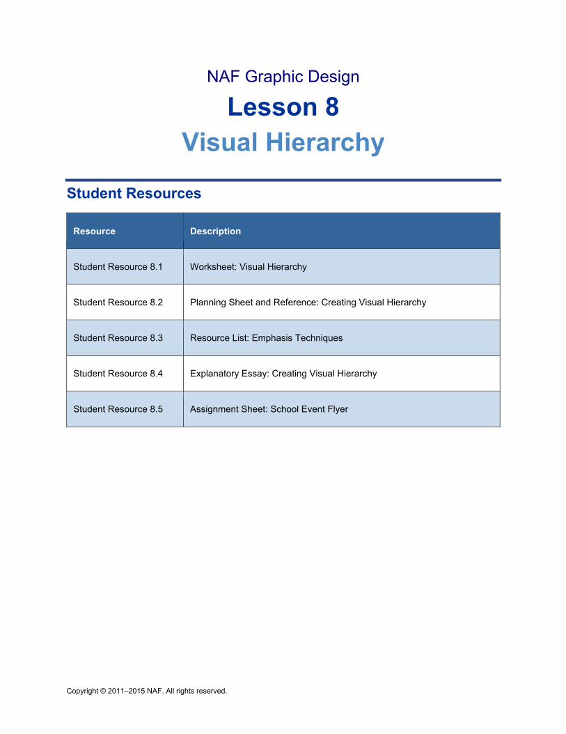
Copyright © 2011–2015 NAF. All rights reserved.
NAF Graphic Design
Lesson 8 Visual Hierarchy
Student Resources
Resource Description
Student Resource 8.1 Worksheet: Visual Hierarchy
Student Resource 8.2 Planning Sheet and Reference: Creating Visual Hierarchy
Student Resource 8.3 Resource List: Emphasis Techniques
Student Resource 8.4 Explanatory Essay: Creating Visual Hierarchy
Student Resource 8.5 Assignment Sheet: School Event Flyer
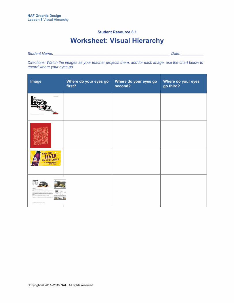
NAF Graphic Design Lesson 8 Visual Hierarchy
Copyright © 2011–2015 NAF. All rights reserved.
Student Resource 8.1
Worksheet: Visual Hierarchy
Student Name:_______________________________________________________ Date:___________
Directions: Watch the images as your teacher projects them, and for each image, use the chart below to record where your eyes go.
Image Where do your eyes go first?
Where do your eyes go second?
Where do your eyes go third?
NAF Graphic Design Lesson 8 Visual Hierarchy
Copyright © 2011–2015 NAF. All rights reserved.
Student Resource 8.2
Planning Sheet and Reference: Creating Visual Hierarchy
Student Name:_______________________________________________________ Date:___________
Directions: First, answer the questions below about the image you are creating in Photoshop. These questions will help you identify the most important elements in the design. Then read the information about different techniques for establishing visual hierarchy in a design, and experiment with some of the techniques to create a design that demonstrates visual hierarchy. Remember that viewers depend on the designer to direct their attention.
What visual element will you use to spark interest and attract the viewer’s attention?
What is the primary message you need to communicate?
What are the secondary messages?
Is there a piece of information that, if it isn’t emphasized or is unclear, could undermine the usefulness of your message? (Example: date, time, or place.) If so, what is that piece of information?
Is there any information you can afford to delete? If so, what?
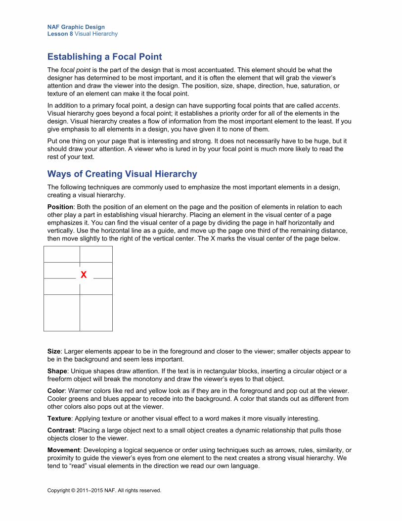
NAF Graphic Design Lesson 8 Visual Hierarchy
Copyright © 2011–2015 NAF. All rights reserved.
Establishing a Focal Point The focal point is the part of the design that is most accentuated. This element should be what the designer has determined to be most important, and it is often the element that will grab the viewer’s attention and draw the viewer into the design. The position, size, shape, direction, hue, saturation, or texture of an element can make it the focal point.
In addition to a primary focal point, a design can have supporting focal points that are called accents. Visual hierarchy goes beyond a focal point; it establishes a priority order for all of the elements in the design. Visual hierarchy creates a flow of information from the most important element to the least. If you give emphasis to all elements in a design, you have given it to none of them.
Put one thing on your page that is interesting and strong. It does not necessarily have to be huge, but it should draw your attention. A viewer who is lured in by your focal point is much more likely to read the rest of your text.
Ways of Creating Visual Hierarchy The following techniques are commonly used to emphasize the most important elements in a design, creating a visual hierarchy.
Position: Both the position of an element on the page and the position of elements in relation to each other play a part in establishing visual hierarchy. Placing an element in the visual center of a page emphasizes it. You can find the visual center of a page by dividing the page in half horizontally and vertically. Use the horizontal line as a guide, and move up the page one third of the remaining distance, then move slightly to the right of the vertical center. The X marks the visual center of the page below.
Size: Larger elements appear to be in the foreground and closer to the viewer; smaller objects appear to be in the background and seem less important.
Shape: Unique shapes draw attention. If the text is in rectangular blocks, inserting a circular object or a freeform object will break the monotony and draw the viewer’s eyes to that object.
Color: Warmer colors like red and yellow look as if they are in the foreground and pop out at the viewer. Cooler greens and blues appear to recede into the background. A color that stands out as different from other colors also pops out at the viewer.
Texture: Applying texture or another visual effect to a word makes it more visually interesting.
Contrast: Placing a large object next to a small object creates a dynamic relationship that pulls those objects closer to the viewer.
Movement: Developing a logical sequence or order using techniques such as arrows, rules, similarity, or proximity to guide the viewer’s eyes from one element to the next creates a strong visual hierarchy. We tend to “read” visual elements in the direction we read our own language.
X
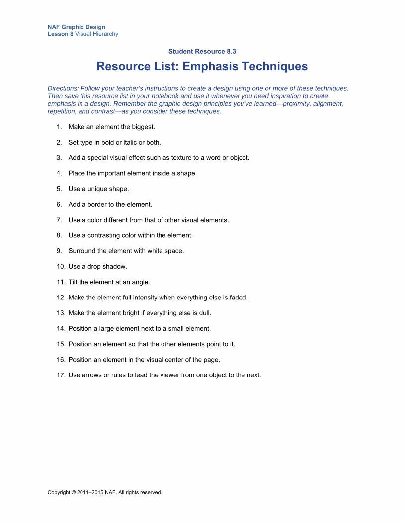
NAF Graphic Design Lesson 8 Visual Hierarchy
Copyright © 2011–2015 NAF. All rights reserved.
Student Resource 8.3
Resource List: Emphasis Techniques
Directions: Follow your teacher’s instructions to create a design using one or more of these techniques. Then save this resource list in your notebook and use it whenever you need inspiration to create emphasis in a design. Remember the graphic design principles you’ve learned—proximity, alignment, repetition, and contrast—as you consider these techniques.
1. Make an element the biggest.
2. Set type in bold or italic or both.
3. Add a special visual effect such as texture to a word or object.
4. Place the important element inside a shape.
5. Use a unique shape.
6. Add a border to the element.
7. Use a color different from that of other visual elements.
8. Use a contrasting color within the element.
9. Surround the element with white space.
10. Use a drop shadow.
11. Tilt the element at an angle.
12. Make the element full intensity when everything else is faded.
13. Make the element bright if everything else is dull.
14. Position a large element next to a small element.
15. Position an element so that the other elements point to it.
16. Position an element in the visual center of the page.
17. Use arrows or rules to lead the viewer from one object to the next.
NAF Graphic Design Lesson 8 Visual Hierarchy
Copyright © 2011–2015 NAF. All rights reserved.
Student Resource 8.4
Explanatory Essay: Creating Visual Hierarchy
Student Name:_______________________________________________________ Date:___________
Directions: Choose a design that you like, and write an essay explaining how the designer creates visual hierarchy in the design. Your essay should address the list of questions below. Write down notes about how you want to respond to each of the questions, and then use those notes as your guide when you write your essay. Before you start working, read the example explanatory essay on the next page of this resource, and see what tips you can find about how to structure your writing. And be sure to read the assessment criteria so that you understand how your writing will be assessed.
Your essay should be three or four paragraphs long. Write your notes below each question, and use your notes as a guide when you write your essay.
1. In your introductory paragraph, introduce the purpose and main message of the essay. (This is a standard component of an explanatory essay.) Think about why you chose this design.
2. What is the focal point of the design, and how does the designer emphasize it? Why is this technique effective?
3. What are the accents in the design, and how does the designer emphasize them? Why are the techniques effective?
4. In your closing paragraph, give a summary of the information in your essay. (This is a standard component of an explanatory essay.) As part of your summary, explain how the designer’s method for establishing visual hierarchy in this design inspires you as you think of a design you might like to create.
Make sure your explanatory essay meets or exceeds the following assessment criteria:
The explanatory essay correctly identifies the focal point and accents in the design.
The explanatory essay demonstrates an understanding of how a focal point and accents contribute to visual hierarchy.
The explanatory essay clearly explains what you learned from the designer that you can apply to your own design work.
The explanatory essay is neat and uses proper spelling and grammar.
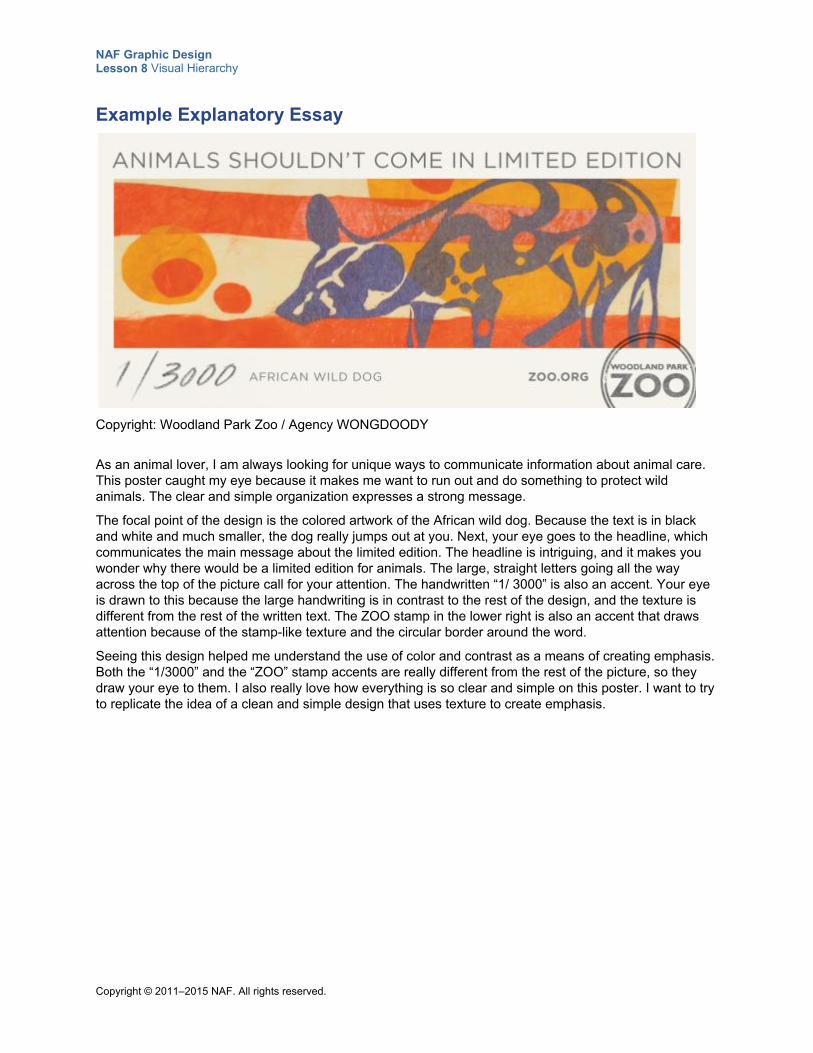
NAF Graphic Design Lesson 8 Visual Hierarchy
Copyright © 2011–2015 NAF. All rights reserved.
Example Explanatory Essay
Copyright: Woodland Park Zoo / Agency WONGDOODY
As an animal lover, I am always looking for unique ways to communicate information about animal care. This poster caught my eye because it makes me want to run out and do something to protect wild animals. The clear and simple organization expresses a strong message.
The focal point of the design is the colored artwork of the African wild dog. Because the text is in black and white and much smaller, the dog really jumps out at you. Next, your eye goes to the headline, which communicates the main message about the limited edition. The headline is intriguing, and it makes you wonder why there would be a limited edition for animals. The large, straight letters going all the way across the top of the picture call for your attention. The handwritten “1/ 3000” is also an accent. Your eye is drawn to this because the large handwriting is in contrast to the rest of the design, and the texture is different from the rest of the written text. The ZOO stamp in the lower right is also an accent that draws attention because of the stamp-like texture and the circular border around the word.
Seeing this design helped me understand the use of color and contrast as a means of creating emphasis. Both the “1/3000” and the “ZOO” stamp accents are really different from the rest of the picture, so they draw your eye to them. I also really love how everything is so clear and simple on this poster. I want to try to replicate the idea of a clean and simple design that uses texture to create emphasis.
NAF Graphic Design Lesson 8 Visual Hierarchy
Copyright © 2011–2015 NAF. All rights reserved.
Student Resource 8.5
Assignment Sheet: School Event Flyer
Directions: In this assignment, you will plan and create a flyer that demonstrates your ability to establish a visual hierarchy. You get to decide all of the details of the school event and write your own creative brief. To begin, read the specifications below. Then follow the procedure to create your flyer. Make sure you read and understand the assessment criteria before you begin work.
Specifications The flyer can be for any type of school event you would like: a sports game, a dance, a club
activity, a student body election, or something else. You may want to create a flyer that could be used to publicize an actual upcoming event. The flyer needs to publicize the event and communicate information to the target audience.
The flyer should motivate the target population to make every effort to attend the event.
Make sure the flyer describes what the event is and includes all essential information attendees will need to make plans and attend the event.
The flyer needs to adhere to all of the principles of graphic design that you have learned so far.
Procedure Follow these steps to create your flyer:
1. Fill in the creative brief for your flyer using the template included with this resource. You will submit your creative brief for assessment.
2. Create a page of at least four thumbnails to explore different possible designs for your flyer. Choose one design that is unique and that communicates the information about the school event effectively. You will submit your page of thumbnails for assessment.
3. In the space below your creative brief, write down the focal point and the accents for your flyer, and give a brief description of how each will be emphasized in the final design.
4. Make a list of any visuals or other materials you need to collect to create your flyer in Photoshop.
5. Create a rough of your design using paper and colored pencils. Make sure the rough establishes the visual hierarchy that you want, and that it complies with the principles of proximity, alignment, contrast, and repetition. You will submit this for assessment.
6. Create your final flyer in Photoshop, and make sure it meets the assessment criteria.
NAF Graphic Design Lesson 8 Visual Hierarchy
Copyright © 2011–2015 NAF. All rights reserved.
Make sure your work meets or exceeds the following assessment criteria:
All planning materials (creative brief, thumbnails, and rough) show that complete and skillful planning work was put into your design.
The focal point that you use to catch the viewer’s attention pops out to the viewer.
Secondary and tertiary messages are communicated using accents that draw the viewer’s eye to them.
The design of the flyer complies with the design principles of proximity, alignment, contrast, and repetition.
All essential information, such as the date, time, and place of the school event, is included and easy for the viewer to understand.
The flyer does not include any extraneous information.
The flyer text is well written, with no spelling or grammatical errors.
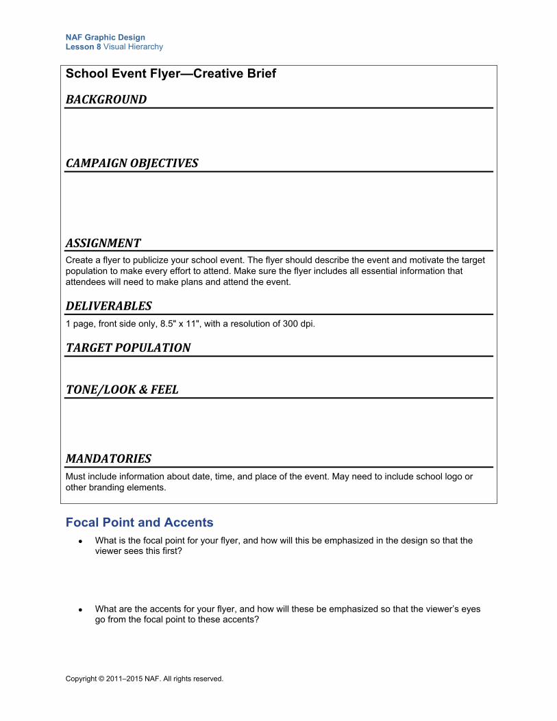
NAF Graphic Design Lesson 8 Visual Hierarchy
Copyright © 2011–2015 NAF. All rights reserved.
School Event Flyer—Creative Brief
BACKGROUND
CAMPAIGNOBJECTIVES
ASSIGNMENTCreate a flyer to publicize your school event. The flyer should describe the event and motivate the target population to make every effort to attend. Make sure the flyer includes all essential information that attendees will need to make plans and attend the event.
DELIVERABLES1 page, front side only, 8.5" x 11", with a resolution of 300 dpi.
TARGETPOPULATION
TONE/LOOK&FEEL
MANDATORIESMust include information about date, time, and place of the event. May need to include school logo or other branding elements.
Focal Point and Accents What is the focal point for your flyer, and how will this be emphasized in the design so that the
viewer sees this first?
What are the accents for your flyer, and how will these be emphasized so that the viewer’s eyes go from the focal point to these accents?
Copyright © 2011–2015 NAF. All rights reserved.
NAF Graphic Design
Lesson 9 Layout and Balance
In this lesson, students learn how to work with a grid to create a layout that is balanced and that adheres to all of the principles of graphic design. Students begin by learning about how grids are structured, and then look at the various elements that can be included in a page layout. Next, they use what they have learned to create their own layouts. Students also learn about how visual weight affects balance, and they learn the difference between symmetrical and asymmetrical balance.
Advance Preparation
This lesson requires you to have a large supply of magazines in your classroom so that students can analyze different layouts and then mark up magazine articles. You may want to hold a magazine drive sometime before this lesson, or perhaps contact medical offices and ask them to donate their old magazines. You could also make it a homework assignment for everyone to bring in one or two magazines. Or, lots of magazines allow you to view articles for free on the web. You could do a search for magazines in PDF format and print enough for the class.
In Class Period 1, students create a layout called “Summer Break.” You may want to advise them ahead of time to bring in any digital photos they would like to include in their layout. If you don’t think your students will have their own digital photos, you will need to have 10–15 digital photos of typical summer break activities for them to use.
If student resources are printed in black and white, you will need to give students a color copy of the images in Student Resource 9.3, Analysis: Achieving Balance. The image in Teacher Resource 9.3, Quiz: Principles of Design, should also be printed in color.
This lesson is expected to take 3 class periods.
Lesson Framework
Learning Objectives Each student will:
Describe how to use a grid structure to achieve consistency
Explain what constitutes a balanced design
Demonstrate the ability to achieve balance through symmetrical or asymmetrical layout*
Demonstrate the ability to create grids in Photoshop
NAF Graphic Design Lesson 9 Layout and Balance
Copyright © 2011–2015 NAF. All rights reserved. - 2 -
Explain the importance and appropriate use of white space and margins
Create attractive layouts that demonstrate balance
*This is one of the 16 key learning objectives assessed by the NAFTrack Certification end-of-course exam for this course.
Academic Standards The relevant Common Core State Standards are too extensive to list here but are an important basis for this lesson. For details, please refer to the separate document “Correlations to the Common Core Standards” (available in the Course Planning Tools section of the course materials).
Analyze how the application of visual arts elements and principles of design communicate and express ideas (Common Career Technical Core 2012, AR-VIS 2)
Demonstrate knowledge of working with selections and measurement (Adobe Certified Associate, Objectives for Visual Communication using Photoshop CS6, Setting Project Requirements 4.1)
Use Photoshop CS5 guides and rulers (Adobe Certified Associate, Objectives for Visual Communication using Photoshop CS6, Setting Project Requirements 4.1)
Demonstrate knowledge of design principles, elements, and image composition (Adobe Certified Associate, Objectives for Visual Communication using Photoshop CS6, Setting Project Requirements 2.2)
Communicate with others (such as peers and clients) about design plans (Adobe Certified Associate, Objectives for Visual Communication using Photoshop CS6, Setting Project Requirements 1.4)
Apply existing knowledge to generate new ideas, products, or processes (ISTE NETS for Students 2007, 1a)
Create original works as a means of personal or group expression (ISTE NETS for Students 2007, 1b)
Plan and manage activities to develop a solution or complete a project (ISTE NETS for Students 2007, 4b)
Assessment
Assessment Product Means of Assessment
Quiz on the principles of graphic design (Teacher Resource 9.3)
Answer Key: Principles of Design Quiz (Teacher Resource 9.4)
Prerequisites Basic knowledge of image size and resolution
Understanding of graphic design as visual communication
Ability to create accurate selections using all Photoshop selection tools
Ability to edit and manipulate layers in a Photoshop image
Understanding of composition balance in an image
Ability to make basic photo repairs in Photoshop
A working knowledge of the use of proximity, alignment, repetition, and contrast in graphic design
A working knowledge of how to establish a visual hierarchy
NAF Graphic Design Lesson 9 Layout and Balance
Copyright © 2011–2015 NAF. All rights reserved. - 3 -
Ability to create emphasis using size, color, position, shape, texture, contrast, density, and movement
Instructional Materials
Teacher Resources Teacher Resource 9.1, Images: SchoolPaper.psd, AndyWarhol.psd (separate ZIP file)
Teacher Resource 9.2, Slides: Examples of Balance (separate PowerPoint file)
Teacher Resource 9.3, Quiz: Principles of Design
Teacher Resource 9.4, Answer Key: Principles of Design Quiz
Teacher Resource 9.5, Key Vocabulary: Layout and Balance
Teacher Resource 9.6, Bibliography: Layout and Balance
Student Resources Student Resource 9.1, Grid: Page Layout
Student Resource 9.2, Reference Sheet: Page Layout Elements
Student Resource 9.3, Analysis: Achieving Balance
Student Resource 9.4, Tutorial: Creating a Grid
Equipment and Supplies Access to Photoshop for all students
LCD projector and computer
Rulers for marking alignment
At least one magazine for every pair of students, including if possible a broad selection of music, entertainment, and sports magazines
Small sticky notes
Photos of summer break activities (students can supply their own photos)
Blackboard, whiteboard, or flip chart
NAF Graphic Design Lesson 9 Layout and Balance
Copyright © 2011–2015 NAF. All rights reserved. - 4 -
Lesson Steps
Step Min. Activity
CLASS PERIOD 1
1 20 Layout Analysis: Grids
This activity introduces students to the concept of using a grid for layout.
As students enter the classroom, ask them to pair up. Have each pair choose from your classroom collection of magazines.
To begin this activity, write the term layout on the board. Ask students to share with a partner what they think a layout is in graphic design, and then have partners share their ideas with the class. Make sure students understand:
Layout refers to the organization and arrangement of type and visuals on a printed or digital page.
Explain to students that graphic designers typically use a grid to structure the alignment of a layout, particularly on pages with lots of text. Behind every page, there is an invisible grid. Tell students that in this lesson, they will learn how to structure their own design work using a grid. Refer students to Student Resource 9.1, Grid: Page Layout. Look at the various labels on the grid, including the columns, rows, gutters, margins, and modules and the horizon line. Explain any terms that aren’t clear. In particular:
A horizon line designates where you want your major copy to start. You might have a heading above the horizon line, and maybe a horizontal rule underneath it, but images are not placed above the horizon line. In some cases, the top margin is the horizon line.
Each box formed by the columns and rows is called a module. Modules can be combined to form larger areas for placement of text or graphics.
Next, ask pairs to select a page in their magazine and use a ruler and pencil to draw in the grid and identify the different components. Ask students to label the horizon line, gutters, margins, rows, columns, and modules. Remind them to look for modules in the grid that might be combined to make a larger block of text or graphics.
When students are finished, ask pairs to exchange their work with another pair to check for accuracy, and answer any questions. To conclude the activity, ask students to suggest reasons why grids are important to graphic design work, and write their responses on the board. Make sure the list of reasons includes the following:
Creating alignment
Creating organization on the page
Creating unity on the page
Leading the viewer through the page
Tell students they will get lots of practice designing with grids in this lesson.
2 10 Identification: Layout Elements
NAF Graphic Design Lesson 9 Layout and Balance
Copyright © 2011–2015 NAF. All rights reserved. - 5 -
Step Min. Activity
In this activity, students learn to identify a wide variety of page layout elements.
Refer students to Student Resource 9.2, Reference Sheet: Page Layout Elements. Explain that this two-page spread demonstrates how to use a large variety of page layout elements, which are labeled on the resource. Tell them they should become conversant with these various elements so that they can use them where appropriate when they create their own layouts. Answer any questions students have about the meaning of the terms. The meanings should be quite evident from the drawing. Some of these terms are included in Teacher Resource 9.5, Key Vocabulary: Layout and Balance, which you can use as a reference if necessary.
List the following terms on the board:
tinted box
headline
pull quote
caption
folio
column gutter
jumpline
drop cap
sidebar
Ask students to continue working in pairs, and give them about five minutes to look through the pages of magazines and other printed materials and find examples of as many of these page layout elements as they can, using sticky notes to mark what they find so that they can share it with the class.
Next, ask pairs to share with the class one or two of the items that they found that are used effectively to improve the organization, unity, or interest of the page. On the board, put a check mark next to each term when a group shares an example of it. After a few pairs have shared, ask other pairs to share examples of elements that don’t have a check mark next to them yet. Try to get examples of all of the page layout elements.
Point out to students that making use of this large variety of page layout elements available to them will help to add organization, unity, and interest to their work. Instruct students to put Student Resource 9.2 in their notebook so that they can refer to it when they need to develop an effective page layout.
3
20 Independent Practice: Creating a Layout with a Grid
In this activity, students practice creating a layout using a grid.
Give students access to the file SchoolPaper.psd and ask them to open it in Photoshop. (This file is included in Teacher Resource 9.1, Images.) Explain to students that this file contains several layers that they need to place in the layout grid to create the front page of a high school newspaper. (Make sure they see the grid, which is one of the layers.)
Tell students that they can adjust the size, fonts, and other aspects of the different elements.
They can replace “School Newspaper Name” with the name of their own school
NAF Graphic Design Lesson 9 Layout and Balance
Copyright © 2011–2015 NAF. All rights reserved. - 6 -
Step Min. Activity
paper.
They can create visual interest by adding their own photos of summer break activities. (Or they can use the photos provided in the file.)
Suggest that they may want to create jumplines and continue some of the articles on other pages, decreasing the amount of text on the front page.
Point out that the titles and text of the three articles are placeholder text. Explain that graphic designers often use placeholder text, also known as “lorem ipsum” or “Greeked” text, when they want to check what a layout will look like before they insert the actual text. Sometimes designers find placeholder text less distracting, allowing them to concentrate on the layout rather than the content of a page. The text that students see here is based on a piece of classic Latin literature. Tell students they can leave this placeholder text in their layout, or they can replace it with real text for an article about their summer break.
Remind students that they can spread text and graphics across the modules of the grid as necessary to create an effective layout. They can also crop any graphics if necessary. Circulate while students are working and answer any questions they have.
When students are finished, ask them to print their page and post it on the wall. You may want to gauge student understanding by assessing this assignment on a credit/no credit basis.
Take a minute to point out the variety of layouts they created using the same elements. Ask students which layouts they find particularly effective, and if time permits, analyze what makes them effective.
Point out to students that one element that makes some of the layouts more effective than others is balance. They will learn how to create balance in the next class period.
CLASS PERIOD 2
4
20 Observation and Analysis: Balance
In this activity, students learn to recognize balance in a design.
To begin this activity, ask students to share their ideas about what makes a design “balanced,” and write their ideas on the board. When you have a few ideas written down, introduce the term visual weight, and explain that the visual weight of an object is determined by characteristics such as:
Boldness
Brightness
Size
Color
Texture
White space
Graphics vs. text
Explain that a balanced design is one in which the visual weight of all elements is equally dispersed throughout the layout.
NAF Graphic Design Lesson 9 Layout and Balance
Copyright © 2011–2015 NAF. All rights reserved. - 7 -
Step Min. Activity
Using an LCD projector and your computer, open the file Teacher Resource 9.2, Slides: Examples of Balance (separate PowerPoint file). As you show each image, ask students to answer the questions below the image. This will introduce them to all of the aspects they need to consider when analyzing the balance of a design. Possible answers to each question are provided in the Notes section for each slide.
After you go through the slides, place students in groups of four and refer them to Student Resource 9.3, Analysis: Achieving Balance. Instruct students to answer the questions on the worksheet, which refer to the spread on the second page of the worksheet.
To conclude this activity, ask each group to share its analysis with the rest of the class. If you are pressed for time, groups could just share their answer to the final question, “What suggestions would you make to improve the balance of this image?”
5
30 Independent Practice: Achieving Balance
In this activity, students create a design that demonstrates balance. The activity also focuses on the following college and career skills:
Prioritizing and completing tasks without direct oversight
Demonstrating creativity and innovation
Explain to students that in this activity, they will have a chance to create balance in their own work. Give students access to the file AndyWarhol.psd and ask them to open it in Photoshop. (This file is included in Teacher Resource 9.1, Images.) Explain that the file includes several text and graphic layers that can be included on the page. They need to use these elements to create a design that is balanced. (They are not required to use all of the layers.)
To begin, ask students to think about the visual weight of the various layers. Which layers are visually heavy, and which layers are visually light? Remind them that they need to take this into account in order to achieve a balanced layout. Tell students that they can change the size, shape, color, and so on of objects as needed in order to achieve balance, and they can create symmetrical or asymmetrical balance. Point out to students that the background layer gives them a grid structure to work with when placing objects on the page.
Note: If time permits, you may want to ask students to create two different layouts: one symmetrical and one asymmetrical.
While students are completing their designs, write the following questions on the board:
How is visual weight distributed on the page?
Does the design demonstrate balance? If yes, what elements contribute to the balance? If no, how could better balance be achieved?
When students have completed their designs, ask them to share the designs in groups of four and to evaluate each design by responding to the questions on the board.
Ask students to make any necessary changes to their work based on what they have learned from their peers. You may want to gauge student understanding by assessing assignment on a credit/no credit basis.
At the end of this activity, tell students that balance is the last principle of graphic design they will be learning about in this course. In the next class period, they will take
NAF Graphic Design Lesson 9 Layout and Balance
Copyright © 2011–2015 NAF. All rights reserved. - 8 -
Step Min. Activity
a quiz covering all of the principles of graphic design they have learned about in this unit. Encourage them to go over their notes and worksheets on proximity, alignment, contrast, repetition, visual hierarchy, layout, and balance in preparation for the quiz.
CLASS PERIOD 3
6 10 Review: Principles of Design
In this activity, students review their notes in preparation for a quiz on the principles of graphic design.
Ask students to get out their notes, reference sheets, readings, and worksheets about the principles of graphic design. Instruct them to pair up and ask each other questions based on the material in their notes and other resources.
To get the students started, ask the whole class a few sample questions, such as the following:
Explain the principle of proximity in one sentence.
Why is it best to make items that contrast really contrast?
What is the difference between symmetrical balance and asymmetrical balance?
Tell students these are the types of questions they should ask each other. Write the following terms on the board and tell students they should make sure they are equipped to answer questions about all of these principles:
Contrast
Repetition
Alignment
Proximity
Unity
Visual hierarchy
Balance
Layout
At the end of the review time, instruct students to put their notes away in preparation for the quiz.
7 15 Quiz: Principles of Design
Note: When you prepare copies of this quiz for your students, make sure the second page of the quiz (the image) is in color.
Give students Teacher Resource 9.3, Quiz: Principles of Design. Tell them they have 10 minutes to answer the questions on the quiz.
After students have handed in their quizzes, go over the answers as a class and address any questions students have. Assess the quiz using Teacher Resource 9.4, Answer Key: Principles of Design Quiz.
NAF Graphic Design Lesson 9 Layout and Balance
Copyright © 2011–2015 NAF. All rights reserved. - 9 -
Step Min. Activity
Point out to students that during the remainder of this course, they will be expected to apply all of the principles of graphic design to their work. If there are any principles that they feel unsure about after this quiz, they should consult you or one of their peers to get help mastering all of the principles.
8
15 Guided Practice and Modeling: Creating a Grid in Photoshop
In this activity, students learn how to create a layout grid in Photoshop using guides. This activity focuses on the following college and career skills:
Effectively using technology relevant to a profession
Demonstrating the ability to listen effectively
Explain to students that although Photoshop doesn’t make it particularly easy to create a layout grid, with a bit of calculation, it is possible to create a very precise grid. Page layout programs such as InDesign do the math for you, but in Photoshop you have to manually calculate where you will put each grid line.
Tell students that in this activity, you will walk them through the procedure for creating a grid.
Refer students to Student Resource 9.4, Tutorial: Creating a Grid. Explain that you will be creating a grid on a US letter-size page, with two columns and three rows below the horizon line. Look together at the specifications for the margins, columns, rows, and gutters listed in the student resource. Then ask students to open a new US letter-size page in Photoshop on their computers.
Using an LCD projector and your computer, open Photoshop and go through the procedure on the reference sheet to create the grid. Ask students to follow along and create the same grid on their own computers. Be sure to begin by displaying a grid with inches divided into quarter inches; use Photoshop > Preferences > Guides, Grids, and Slices. This will make it easier for students to do the math. (For example, if you want 0.75-inch margins, you count in three squares from each edge and place your guideline. If the middle of the 8.5-inch page is at 4.25 inches, you go to 4.25 on the ruler and place the left edge of the vertical gutter one square to the left, and the right edge of the gutter one square to the right.)
After this initial step, instruct students to do the grid math on their own. Tell them to keep dragging guides from the horizontal and vertical rulers to place all of the lines on the page. Make sure students understand how to drag the guidelines vertically and horizontally from the margin just as you do.
When students have completed their grids, ask them to share their grid with a partner to check for accuracy and completeness. If any students do not have correct grids, have them get help from a peer or, if necessary, from you, so that everyone has a grid that looks just like the one that is projected.
To conclude this activity, ask students to think about what kind of design they could create with this particular grid, and then ask them to share their ideas with the class. Point out to students that when working in Photoshop, a grid is always a helpful tool for creating a design that is balanced.
9 10 Think, Pair Share: Principles of Graphic Design
NAF Graphic Design Lesson 9 Layout and Balance
Copyright © 2011–2015 NAF. All rights reserved. - 10 -
Step Min. Activity
In this activity, students think about how they can use their knowledge of the principles of graphic design in a professional setting.
Write the following question on the board and ask students to take a minute to think about their answer:
If you go for a job or internship interview and a potential employer asks you what you know about the principles of graphic design, how will you answer?
Next, ask students to role-play the interview question and practice their answer with a partner. First one person plays the role of the potential employer and the other is the interviewee, and then they change roles.
Finally, ask pairs to share their best answers with the class, and tell students to take notes in their notebook of responses they could use in an interview.
To conclude the lesson, point out to students that they have now covered all of the principles of graphic design. In order to become skilled graphic designers, they will need to continue putting the principles they have learned into practice.
Extensions
Enrichment Have students research how the ratio of thirds and the golden section ratio are used in graphic
design. Ask them to write a short report and share it with the class. You might also want to ask students to create a layout using one of these ratios.
Technology Integration If students have access to InDesign or another page layout program, have them create a two-
page spread for a newsletter using that program. You may want to have students use a 30-day-trial version of InDesign. As part of the assignment, have them create a grid in InDesign and note how working in that program is different from working in Photoshop.
Cross-Curricular Integration History: Ask students to research the history of layout in magazines. How were magazine layouts
created before computers? Tell students to find some magazines from the period of history they are studying (either on the web or at the library) and note differences they see in how page layout looks today and how it looked in that period in history. Ask them to write a report on their findings.
Math: Have students use ratios to calculate the width and height of columns, rows, gutters, and margins for different grid structures that can be used on various page sizes (for example, US letter portrait and landscape, legal, executive, poster, etc.). Ask them to make a chart with the information. They can use this chart for reference when they need to create a grid.
Math: Have students research how the golden section (also known as the golden mean, golden ratio, and divine proportion) is used in math and in graphic design. It is a ratio or proportion defined by the number pi. Ask students to suggest a way they could use this ratio in a graphic design and a way they could use it in math.
Copyright © 2011–2015 NAF. All rights reserved.
NAF Graphic Design
Lesson 9 Layout and Balance
Teacher Resources
Resource Description
Teacher Resource 9.1 Images: SchoolPaper.psd, AndyWarhol.psd (separate ZIP file)
Teacher Resource 9.2 Slides: Examples of Balance (separate PowerPoint file)
Teacher Resource 9.3 Quiz: Principles of Design
Teacher Resource 9.4 Answer Key: Principles of Design Quiz
Teacher Resource 9.5 Key Vocabulary: Layout and Balance
Teacher Resource 9.6 Bibliography: Layout and Balance
NAF Graphic Design Lesson 9 Layout and Balance
Copyright © 2011–2015 NAF. All rights reserved.
Teacher Resource 9.3
Quiz: Principles of Design
Directions: Study the graphic design on the following page and then answer the questions about it.
1. Give an example of effective use of repetition in this design.
2. Give an example of two design elements that are not close together but that you know are related because of the way they are aligned.
3. Describe what makes this graphic design balanced.
4. Explain the visual hierarchy of this design.
5. What factors contribute to the unity you find in this design?
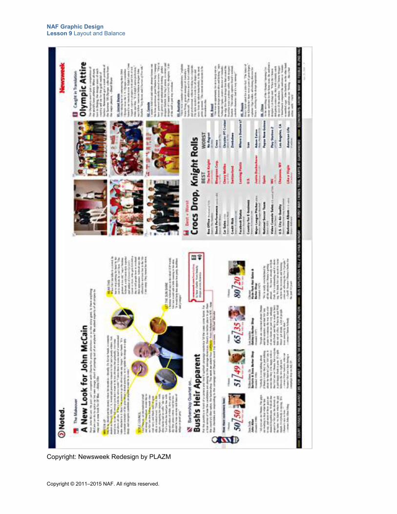
NAF Graphic Design Lesson 9 Layout and Balance
Copyright © 2011–2015 NAF. All rights reserved.
Copyright: Newsweek Redesign by PLAZM
NAF Graphic Design Lesson 9 Layout and Balance
Copyright © 2011–2015 NAF. All rights reserved.
Teacher Resource 9.4
Answer Key: Principles of Design Quiz
1. Give an example of effective use of repetition in this design.
o The use of the same sized “attire” images on the left
o The yellow callouts on McCain
o The repeated graphic device at the bottom left: 50/50, 51/49, and so on
2. Give an example of two design elements that are not close together but that you know are related because of the way they are aligned.
o The yellow callouts are spread to the left and right, but you know they are related because of the consistent treatment.
o The listings underneath the “Olympic Attire” heading on the right: You know that they all belong to the same article because of how they are aligned with the article. They are all evenly spaced and treated in the same way.
3. Describe what makes this graphic design balanced.
o The big graphic on the left with active yellow callouts draws your eye in. On the right side, you have the photos in a grid that draw your attention, so you have a balanced design from left to right.
o The geometrical layout makes it balanced.
o The consistent type treatments in headlines, and so forth, make it balanced.
o The color neutrality contributes to balance. There is no flood of color and therefore no distraction.
4. Explain the visual hierarchy of this design.
o Attire imagery (The eye is known to go to the upper-right area of a design, so these images are well placed.)
o McCain story, starting top left
o Captions of Olympic attire images
o This layout exemplifies the idea that hierarchy can be subtle (no hugely obvious hero image or dramatically primary focus) and remain dynamic and effective, especially in service of principles of balance. The bottom-left graphic and the circular details in the McCain graphic provide interest and engage the reader.
5. What factors contribute to the unity you find in this design?
o The headlines use the same fonts in the same color and the same size.
o Icons are used in front of kickers.
o All of the callouts use the same colors (red and yellow).
o The entire article sticks to a grid.
o There are not too many different text sizes overall.
o There is balance in white space.
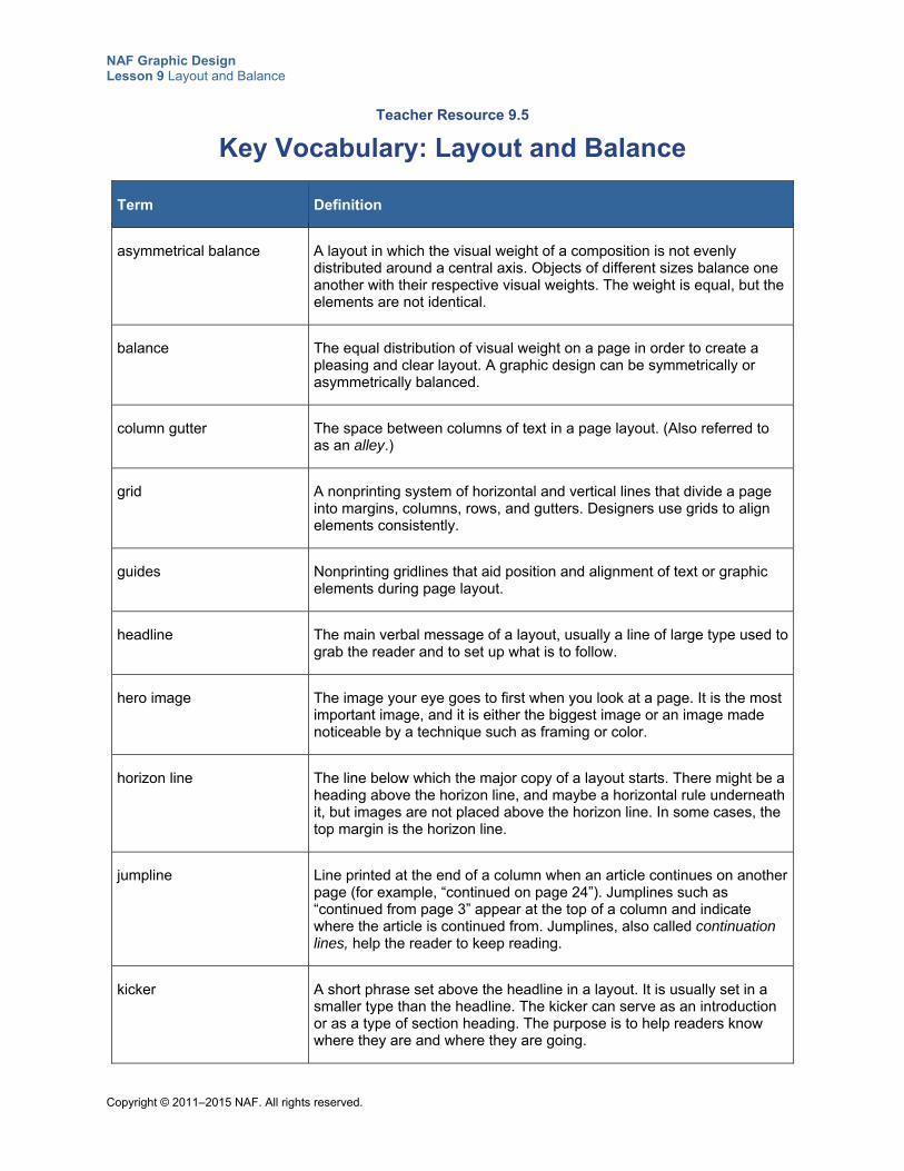
NAF Graphic Design Lesson 9 Layout and Balance
Copyright © 2011–2015 NAF. All rights reserved.
Teacher Resource 9.5
Key Vocabulary: Layout and Balance
Term Definition
asymmetrical balance A layout in which the visual weight of a composition is not evenly distributed around a central axis. Objects of different sizes balance one another with their respective visual weights. The weight is equal, but the elements are not identical.
balance The equal distribution of visual weight on a page in order to create a pleasing and clear layout. A graphic design can be symmetrically or asymmetrically balanced.
column gutter The space between columns of text in a page layout. (Also referred to as an alley.)
grid A nonprinting system of horizontal and vertical lines that divide a page into margins, columns, rows, and gutters. Designers use grids to align elements consistently.
guides Nonprinting gridlines that aid position and alignment of text or graphic elements during page layout.
headline The main verbal message of a layout, usually a line of large type used to grab the reader and to set up what is to follow.
hero image The image your eye goes to first when you look at a page. It is the most important image, and it is either the biggest image or an image made noticeable by a technique such as framing or color.
horizon line The line below which the major copy of a layout starts. There might be a heading above the horizon line, and maybe a horizontal rule underneath it, but images are not placed above the horizon line. In some cases, the top margin is the horizon line.
jumpline Line printed at the end of a column when an article continues on another page (for example, “continued on page 24”). Jumplines such as “continued from page 3” appear at the top of a column and indicate where the article is continued from. Jumplines, also called continuation lines, help the reader to keep reading.
kicker A short phrase set above the headline in a layout. It is usually set in a smaller type than the headline. The kicker can serve as an introduction or as a type of section heading. The purpose is to help readers know where they are and where they are going.
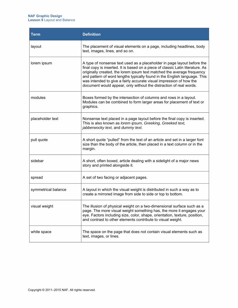
NAF Graphic Design Lesson 9 Layout and Balance
Copyright © 2011–2015 NAF. All rights reserved.
Term Definition
layout The placement of visual elements on a page, including headlines, body text, images, lines, and so on.
lorem ipsum A type of nonsense text used as a placeholder in page layout before the final copy is inserted. It is based on a piece of classic Latin literature. As originally created, the lorem ipsum text matched the average frequency and pattern of word lengths typically found in the English language. This was intended to give a fairly accurate visual impression of how the document would appear, only without the distraction of real words.
modules Boxes formed by the intersection of columns and rows in a layout. Modules can be combined to form larger areas for placement of text or graphics.
placeholder text Nonsense text placed in a page layout before the final copy is inserted. This is also known as lorem ipsum, Greeking, Greeked text, jabberwocky text, and dummy text.
pull quote A short quote “pulled” from the text of an article and set in a larger font size than the body of the article, then placed in a text column or in the margin.
sidebar A short, often boxed, article dealing with a sidelight of a major news story and printed alongside it.
spread A set of two facing or adjacent pages.
symmetrical balance A layout in which the visual weight is distributed in such a way as to create a mirrored image from side to side or top to bottom.
visual weight The illusion of physical weight on a two-dimensional surface such as a page. The more visual weight something has, the more it engages your eye. Factors including size, color, shape, orientation, texture, position, and contrast to other elements contribute to visual weight.
white space The space on the page that does not contain visual elements such as text, images, or lines.
NAF Graphic Design Lesson 9 Layout and Balance
Copyright © 2011–2015 NAF. All rights reserved.
Teacher Resource 9.6
Bibliography: Layout and Balance
The following sources were used in the preparation of this lesson and may be useful for your reference or as classroom resources. We check and update the URLs annually to ensure that they continue to be useful.
Print Beaird, Jason. The Principles of Beautiful Web Design, 2nd ed. Collingwood, VIC Australia: SitePoint, 2010.
Graham, Lisa. Basics of Design Layout & Typography for Beginners, 2nd ed. Clifton Park, NY: Delmar Cengage Learning, 2005.
Hembree, Ryan. The Complete Graphic Designer. Beverly, MA: Rockport Publishers, 2008.
Landa, Robin. Graphic Design Solutions, 3rd ed. Clifton Park, NY: Thomson Delmar Learning, 2006.
Williams, Robin. The Non-Designer’s Design Book, 3rd ed. Berkeley, CA: Peachpit Press, 2008.
Online AIGA: The Professional Association for Design, http://www.aiga.org/ (accessed June 28, 2015).
Boulton, Mark. “Five Steps to Designing Grid Systems.” July 4, 2005. http://www.markboulton.co.uk/journal/five-simple-steps-to-designing-grid-systems-part-1 (accessed June 28, 2015).
Raster Vector Free Images, http://www.rastervector.com/resources/free/free.html (accessed June 28, 2015).
Wikimedia Commons, http://commons.wikimedia.org/wiki/Main_Page (accessed June 28, 2015).
Copyright © 2011–2015 NAF. All rights reserved.
NAF Graphic Design
Lesson 9 Layout and Balance
Student Resources
Resource Description
Student Resource 9.1 Grid: Page Layout
Student Resource 9.2 Reference Sheet: Page Layout Elements
Student Resource 9.3 Analysis: Achieving Balance
Student Resource 9.4 Tutorial: Creating a Grid
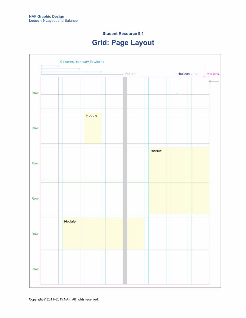
NAF Graphic Design Lesson 9 Layout and Balance
Copyright © 2011–2015 NAF. All rights reserved.
Student Resource 9.1
Grid: Page Layout
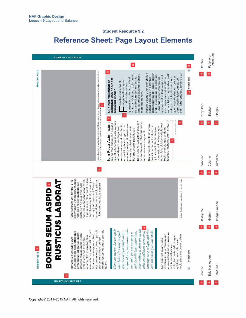
NAF Graphic Design Lesson 9 Layout and Balance
Copyright © 2011–2015 NAF. All rights reserved.
Student Resource 9.2
Reference Sheet: Page Layout Elements
NAF Graphic Design Lesson 9 Layout and Balance
Copyright © 2011–2015 NAF. All rights reserved.
Student Resource 9.3
Analysis: Achieving Balance
Student Names:_______________________________________________________ Date:___________
Directions: Study the book spread on the second page of this resource and answer the questions below with regard to the design.
1. Explain how the visual weights of all the elements are equally dispersed throughout the layout.
2. Is the balance symmetrical or asymmetrical? Defend your answer.
3. How does the proportion of the different visual elements contribute to balance? Are all of the elements the right proportion?
4. How does the distribution of white space contribute to balance? Is there too much, or not enough, white space in some areas?
5. Is color spread around the page or clumped all in one spot? Give examples of how the distribution of color affects the balance.
6. What suggestions would you make to improve the balance of this image?
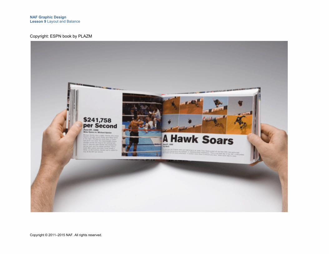
NAF Graphic Design Lesson 9 Layout and Balance
Copyright © 2011–2015 NAF. All rights reserved.
Copyright: ESPN book by PLAZM
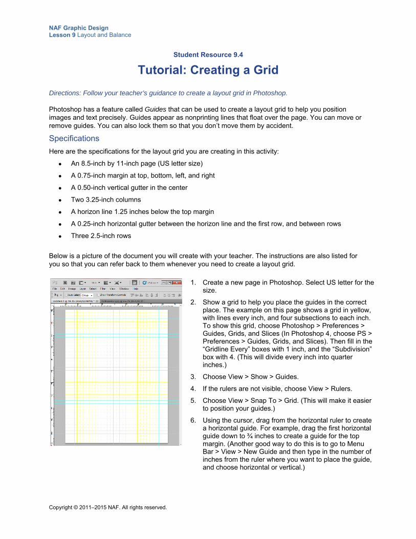
NAF Graphic Design Lesson 9 Layout and Balance
Copyright © 2011–2015 NAF. All rights reserved.
Student Resource 9.4
Tutorial: Creating a Grid
Directions: Follow your teacher’s guidance to create a layout grid in Photoshop.
Photoshop has a feature called Guides that can be used to create a layout grid to help you position images and text precisely. Guides appear as nonprinting lines that float over the page. You can move or remove guides. You can also lock them so that you don’t move them by accident.
Specifications
Here are the specifications for the layout grid you are creating in this activity:
An 8.5-inch by 11-inch page (US letter size)
A 0.75-inch margin at top, bottom, left, and right
A 0.50-inch vertical gutter in the center
Two 3.25-inch columns
A horizon line 1.25 inches below the top margin
A 0.25-inch horizontal gutter between the horizon line and the first row, and between rows
Three 2.5-inch rows
Below is a picture of the document you will create with your teacher. The instructions are also listed for you so that you can refer back to them whenever you need to create a layout grid.
1. Create a new page in Photoshop. Select US letter for the size.
2. Show a grid to help you place the guides in the correct place. The example on this page shows a grid in yellow, with lines every inch, and four subsections to each inch. To show this grid, choose Photoshop > Preferences > Guides, Grids, and Slices (In Photoshop 4, choose PS > Preferences > Guides, Grids, and Slices). Then fill in the “Gridline Every” boxes with 1 inch, and the “Subdivision” box with 4. (This will divide every inch into quarter inches.)
3. Choose View > Show > Guides.
4. If the rulers are not visible, choose View > Rulers.
5. Choose View > Snap To > Grid. (This will make it easier to position your guides.)
6. Using the cursor, drag from the horizontal ruler to create a horizontal guide. For example, drag the first horizontal guide down to ¾ inches to create a guide for the top margin. (Another good way to do this is to go to Menu Bar > View > New Guide and then type in the number of inches from the ruler where you want to place the guide, and choose horizontal or vertical.)
NAF Graphic Design Lesson 9 Layout and Balance
Copyright © 2011–2015 NAF. All rights reserved.
7. Using the cursor, drag from the vertical ruler to create a vertical guide. For example, drag the first horizontal guide over to ¾ inches to create a guide for the left margin.
8. Keep dragging guides from the rulers until you have placed all the guides you need on your page.
Tips:
Use the Move tool to adjust where a guide is sitting after it has been created.
To remove a guide, drag it outside the image window.
To remove all guides, choose View > Clear Guides.
Copyright © 2011–2015 NAF. All rights reserved.
NAF Graphic Design
Lesson 10 Fundamentals of Color
In this lesson, students learn the basics of color theory, and they learn how to use color to communicate meaning in a design. Students begin by learning about the color wheels, and then they look at tints and shades of colors. They get practice using the color features of Photoshop. Next, students examine how colors and meaning are associated. Students also learn about CMYK, RGB, and grayscale color systems. Finally, students put into practice all that they have learned by creating a color palette for a business or an organization of their choice.
Advance Preparation
If student resources are normally printed in black and white, you will need to provide students with color copies of all images in this lesson’s student resources in order for this lesson to be effective. You will also need a color version of Teacher Resource 10.2, Example: Words and Color.
This lesson is expected to take 5 class periods.
Lesson Framework
Learning Objectives Each student will:
Explain the concepts and the major techniques involved in using color to communicate ideas*
Explain the basics of color theory as it relates to graphic design
Compare and contrast grayscale, RGB, and CMYK color systems
Demonstrate the ability to choose colors in Photoshop using the Eyedropper tool and the Color Picker
*This is one of the 16 key learning objectives assessed by the NAFTrack Certification end-of-course exam for this course.
Academic Standards The relevant Common Core State Standards are too extensive to list here but are an important basis for this lesson. For details, please refer to the separate document “Correlations to the Common Core Standards” (available in the Course Planning Tools section of the course materials).
NAF Graphic Design Lesson 10 Fundamentals of Color
Copyright © 2011–2015 NAF. All rights reserved. - 2 -
Analyze how the application of visual arts elements and principles of design communicate and express ideas (Common Career Technical Core 2012, AR-VIS 2)
Demonstrate knowledge of color correction using Photoshop CS6 (Adobe Certified Associate, Objectives for Visual Communication using Photoshop CS6, Identifying Design Elements When Preparing Images 2.4)
Demonstrate an understanding of and select the appropriate features and options required to implement a color management workflow (Adobe Certified Associate, Objectives for Visual Communication using Photoshop CS6, Understanding Adobe Photoshop CS6 3.5)
Adjust or correct the tonal range, color, or distortions of an image (Adobe Certified Associate, Objectives for Visual Communication using Photoshop CS6, Manipulating Images using Adobe Photoshop CS6 4.4)
Identify the purpose, audience, and audience needs for preparing image(s) (Adobe Certified Associate, Objectives for Visual Communication using Photoshop CS6, Setting Project Requirements 1.1)
Apply existing knowledge to generate new ideas, products, or processes (ISTE NETS for Students 2007, 1a)
Assessment
Assessment Product Means of Assessment
A color palette for a business or organization and an accompanying creative brief (Student Resource 10.10, Student Resource 10.11)
Assessment Criteria: Color Palette (Teacher Resource 10.4)
Prerequisites Basic knowledge of image size and resolution
Understanding of graphic design as visual communication
Ability to create accurate selections using all Photoshop selection tools
Ability to edit and manipulate layers in a Photoshop image
Instructional Materials
Teacher Resources Teacher Resource 10.1, Images: ComplementaryColors.psd, Triads.psd,
SplitComplementTriads.psd, AnalogousColors.psd, ColorPalette.jpg (separate ZIP file)
Teacher Resource 10.2, Example: Words and Color
Teacher Resource 10.3, Presentation and Notes: CMYK, RGB, and Grayscale Color Systems (includes separate PowerPoint file)
Teacher Resource 10.4, Assessment Criteria: Color Palette
Teacher Resource 10.5, Key Vocabulary: Fundamentals of Color
Teacher Resource 10.6, Bibliography: Fundamentals of Color
NAF Graphic Design Lesson 10 Fundamentals of Color
Copyright © 2011–2015 NAF. All rights reserved. - 3 -
Student Resources Student Resource 10.1, Analysis: Color Combinations
Student Resource 10.2, Instruction Sheet: Creating a Color Wheel
Student Resource 10.3, Reference Sheet: Color Combinations
Student Resource 10.4, Assignment Sheet: Creating Color Combinations
Student Resource 10.5, Reference Sheet: Shades, Tints, and Monochromatic Color Schemes
Student Resource 10.6, Assignment Sheet: Creating Designs with Tints, Shades, and Monochrome
Student Resource 10.7, Interactive Reading: Communicating Meaning through Color
Student Resource 10.8, K-W-L Chart: Color Systems
Student Resource 10.9, Reading: CMYK, RGB, and Grayscale Color Systems
Student Resource 10.10, Assignment Sheet: Creating a Color Palette
Student Resource 10.11, Creative Brief: Color Palette
Equipment and Supplies Red, blue, and yellow paints and small paint brushes for students to create color wheels, or red,
blue, and yellow Prismacolor pencils (or other pencils that are designed to blend on the paper when you rub with your finger or a napkin), or play dough colored with red, blue, and yellow food coloring (see Step 2 in lesson steps)
Access to Photoshop for all students
LCD projector and computer for PowerPoint presentation
Sticky notes
Blackboard, whiteboard, or flip chart
Lesson Steps
Step Min. Activity
CLASS PERIOD 1
1 10 Observation and Analysis: Which Color Combinations Work Best?
In this activity, students think about why some color combinations work better than others.
NAF Graphic Design Lesson 10 Fundamentals of Color
Copyright © 2011–2015 NAF. All rights reserved. - 4 -
Step Min. Activity
Explain to students that in this lesson, they will be learning about color theory. Point out that having a good grasp of how colors work will make it much easier for them to come up with effective color combinations in their graphic design work. Ask students to work in groups of three, and refer them to Student Resource 10.1, Analysis: Color Combinations. Instruct students to choose the color combination that they think is most effective, and then to make a short list at the bottom of the page pinpointing their reasons why the color combination they chose is more effective than the others.
When students have completed the work, ask groups to share their choices and reasoning with the class. After all groups have had a chance to share, tell them that over the next few class periods, they will be learning how color combinations work, and they can come back later in the lesson and check to see if their intuitive idea about which color combination works best corresponds to the basic principles of color theory.
2 20 Painting: The Color Wheel
In this activity, students create a color wheel to learn how colors are created and how they relate to each other. This activity focuses on the following college and career skills:
Utilizing time efficiently when managing complex tasks
Thinking critically and systemically to solve difficult problems
There are three different options for this activity. Choose the one that is best for you and your classroom setup. The essential outcome is that students experience how colors are created:
Option 1: Set students up at tables with yellow, red, and blue paints and small paint brushes, or with yellow, red, and blue Prismacolor pencils (or other pencils that are designed to blend on the paper when you rub with your finger or a napkin). Refer them to Student Resource 10.2, Instruction Sheet: Creating a Color Wheel. Ask students to follow the instructions to paint the appropriate colors in the primary, secondary, and tertiary color slots. First, students fill in the primary colors. Then they mix primary colors to create secondary colors and fill in the secondary color slots on the wheel. Finally, they mix secondary colors to create tertiary colors, and they fill in the tertiary slots on their wheel.
Option 2: Make yellow, red, and blue play dough ahead of time, and give each student a small lump of each color of play dough. Refer them to Student Resource 10.2. Ask students to follow the instructions on the resource to create a wheel of primary, secondary, and tertiary colors with play dough. First, students place the play dough in the primary slots of the color wheel. Then they mix pieces of their colored play dough to create secondary colors. Finally, they mix pieces of their secondary color play dough to create tertiary colors. They place their final lumps in the correct places on the color wheel page of Student Resource 10.2. If possible, ask them to take a picture of their play dough color wheel for future reference.
Option 3: If the above options are not practicable in your class setting, demonstrate how to combine colors and create a color wheel by using yellow, red, and blue paints on a piece of chart paper while students watch. Ask students to follow along on Student Resource 10.2 as you paint, and make sure they understand the difference between primary, secondary, and tertiary colors.
When students have finished their color wheels, explain that the colors on their wheel are the 12 basic colors, and that with this color wheel they can create combinations of
NAF Graphic Design Lesson 10 Fundamentals of Color
Copyright © 2011–2015 NAF. All rights reserved. - 5 -
Step Min. Activity
color that are pretty much guaranteed to work together.
Refer students to Student Resource 10.3, Reference Sheet: Color Combinations. Go through the four color wheels in the left column as a class, and explain to students what complementary colors, triads, split complement triads, and analogous combinations are using the following notes:
Complementary colors are directly across from each other. Because they are so opposite, they often work best when one is the main color and the other is an accent. There is always one warm color and one cool color.
Triads are a set of three colors equidistant from each other. All triads except the primary triad of red, blue, and yellow have underlying colors connecting them, which makes them harmonize well.
Split complement triads: Choose a color on one side of the wheel and find its complement directly across, but use the colors on each side of the complement rather than the complement itself. This creates a combination with a more sophisticated edge.
Analogous combinations are composed of two or three colors directly next to each other on the wheel. They all share an undertone of the same color, creating a harmonious combination.
In the second column of color wheels, instruct students to follow the instructions to illustrate each type of color combination. When they have finished, have students share their work with a partner to check for accuracy and completeness. Instruct students to put this reference sheet in their notebook. Point out that it helps to keep a standard color wheel diagram on hand when working on color balance, because you can use the color wheel to predict how a change in one color component affects other colors. You may want to encourage students to access Tiger Color (http://www.tigercolor.com/color-lab/color-wheel/color-wheels.htm) for downloadable color wheels.
3
20 Independent Practice: Designing with Color Wheel Combinations
In this activity, students get a chance to experiment with different color combinations.
Explain to students that in this activity, they will get a chance to see what color wheel combinations look like in actual designs. Give students access to the following files included in Teacher Resource 10.1, Images:
ComplementaryColors.psd
Triads.psd
SplitComplementTriads.psd
AnalogousColors.psd
Refer students to Student Resource 10.4, Assignment Sheet: Creating Color Combinations, and instruct them to color the different shapes in the Photoshop files, following the instructions on the assignment sheet. To begin, you may want to demonstrate how to pick up a color from the color wheel layer with the Eyedropper tool and drop the color into one of the shape layers.
After students have finished creating their own color combinations in the designs, ask students to tile all four of their designs in the Photoshop window and share what they have on their screens in groups of three. Ask them to check the use of complementary,

NAF Graphic Design Lesson 10 Fundamentals of Color
Copyright © 2011–2015 NAF. All rights reserved. - 6 -
Step Min. Activity
triad, split complement triad, and analogous colors for accuracy. Ask each group of three to choose one design that they think is effective and print it to post on the wall. Ask students to save their work as PSD files. You may want to gauge student understanding by assessing their designs on a credit/no-credit basis.
To conclude this activity, ask students to contribute their ideas about how the use of different color palettes affects a design. Point out that choosing the best colors for a design is an acquired skill that requires lots of practice.
CLASS PERIOD 2
4
30 Independent Practice: Hues, Tints, Shades, and Monochromatic Schemes
To begin this activity, explain that the colors on the color wheel are pure colors, which are called hues, and that other colors are created by adding black or white to the hues. Adding black to a hue creates shades; adding white to a hue creates tints. The range of lightness or darkness is called the value.
Refer students to Student Resource 10.5, Reference Sheet: Shades, Tints, and Monochromatic Color Schemes. Make sure students understand that the colors on the outer ring of the color wheels are hues, created by combining primary colors, and the colors on the inner rings are shades, created by adding black to the hue, and tints, created by adding white to the hue.
Have students look at the monochromatic color scheme on the reference sheet, and ask them to suggest designs where a monochromatic color scheme might be effective. Point out that monochromatic colors go well together and produce a soothing effect. A monochromatic scheme is easy on the eyes, especially with blue or green hues. You can also use it to establish an overall mood.
Answer any questions students have about hues, shades, tints, values, or monochromatic color schemes, and then refer them to Student Resource 10.6, Assignment Sheet: Creating Designs with Tints, Shades, and Monochrome. Instruct students to follow the instructions on the assignment sheet to create a design in Photoshop. Go over the instructions as a class, and answer any questions before they begin work.
When the students have completed their designs, ask them to share their design with a partner to check for accuracy. Depending on your printing resources, you may want to ask students to print their designs and post them on the walls, or you may want to choose three or four of the best designs and print them. Instruct students to give you access to their files so that you can gauge student understanding by assessing them on a credit/no-credit basis if you wish.
5 15 Pre-Reading: Color Communication
The purpose of this pre-reading activity is to help students understand the importance of color in visual communication.
Point out to students that every color communicates both emotion and physical feeling, and it is essential for graphic designers to understand how color communicates. Tell students that in this activity, they have a chance to experiment with their own reactions
NAF Graphic Design Lesson 10 Fundamentals of Color
Copyright © 2011–2015 NAF. All rights reserved. - 7 -
Step Min. Activity
to color.
Ask students to flood their imagination with metallic bronze. When they’ve had a few seconds to get their imaginations working, ask them the following questions orally and write answers on the board:
How does metallic bronze feel physically? (cold, warm, hot)
What does the color express? (mystery? richness? tradition? achievement?)
What other physical properties does it possess? (dull, bright, hard)
What associations do you have with the color?
Congratulate students on their ability to match meaning to color, and then give them a second color to think about, such as deep purple. Read the questions above orally again, but this time, ask students to work individually and write their answers in their notebook.
Finally, ask students to compare their answers with a partner, and then with the class to see what their answers have in common. Do people from different cultures have different answers? Do boys and girls have different answers? Would deep purple have the same meaning for all target audiences? Conclude this activity with a discussion of why it’s important to get the meaning of color right when using color in graphic design. Tell students that in their reading, they will learn more about the messages different colors communicate.
6 5 Homework Reading: Communicating Ideas Using Color
In this reading, students explore the meanings of different colors and color combinations.
Refer students to Student Resource 10.7, Interactive Reading: Communicating Meaning through Color. Explain that this reading will help them to connect colors with meaning. Ask students to look at the “Your Ideas” questions and prompts that are interspersed throughout the reading, and instruct them to write answers to these questions as they read. Suggest that they also underline colors or color combinations they read about that they would like to try in a design. Assign the reading as homework, and tell students they will have a chance to share what they have learned from the reading at the beginning of the next class period.
CLASS PERIOD 3
7
35 Independent Practice: Associating Color with Meaning
To introduce this activity, ask students to get together with a partner and share something they learned about the meaning of a particular color from the homework reading, and then have pairs share with the class. Answer any questions students have about how various colors communicate meaning. Next, write the following list of words on the board: Dependable
NAF Graphic Design Lesson 10 Fundamentals of Color
Copyright © 2011–2015 NAF. All rights reserved. - 8 -
Step Min. Activity
Depressed
Festive
Sensual
Delicate
Sweet
Dysfunctional
Wholesome
Ask students to select a word from this list and then use Photoshop to select five colors that they think represent the meaning of the word. (Explain that they can use tints and shades of colors as well as hues.) Instruct them to create a page with a square of each of the five colors they chose and then write the word in the different colors, using the same font in each color. Show them the word nocturnal (in Teacher Resource 10.2, Example: Words and Color) as an example of what they should create. When students have completed their design, ask them to display it in full-screen mode on their computer. To conclude this activity, instruct students to view at least four screens and then select one and post a sticky note on it with their answer to the following questions: Of the screens you looked at, which color palette do you think best communicates
the word it is expressing?
What is it about the colors that communicates meaning?
Remind students that whenever they choose a color for a design, they should begin by thinking about what the color is likely to communicate to the target audience.
8
15 Presentation: CMYK, RGB, and Grayscale Color Systems
This activity gives students an in-depth look at what the important differences are between these color systems and when it is appropriate to use each type of color. The activity also develops students’ listening and note-taking skills.
To prepare, make notes to guide class discussion using Teacher Resource 10.3, Presentation Notes: CMYK, RGB, and Grayscale Color Systems. Have Teacher Resource 10.3, Presentation: CMYK, RGB, and Grayscale Color Systems (separate PowerPoint file), ready to show as a full-screen slideshow using an LCD projector.
Point out to students that in addition to selecting colors that communicate a message effectively, they need to make sure they use the appropriate color system to specify the colors. Refer students to Student Resource 10.8, K-W-L Chart: Color Systems. Give students a few minutes to fill in what they already know and what they would like to learn about CMYK, RGB, and grayscale color systems. After they have filled in the first two columns of the chart, ask students to share what they have written with the class. Then instruct them to take notes about each color system in the “What I Learned” column during the presentation.
Present the slideshow. Use the notes you prepared and the questions on the slides to encourage class discussion.
This presentation is duplicated as Student Resource 10.9, Reading: CMYK, RGB, and Grayscale Color Systems. If an LCD projector is unavailable, students can read the
NAF Graphic Design Lesson 10 Fundamentals of Color
Copyright © 2011–2015 NAF. All rights reserved. - 9 -
Step Min. Activity
presentation, answer the discussion questions in their notebook, and discuss their answers as a class. This student resource is also useful for review.
After the presentation, ask students to share their K-W-L chart with a partner. Instruct them to add any important information they learn from their partner. Tell students to put their K-W-L chart in their notebook so that they can use it as a reference when they need to select a color system.
Remind students that selecting the appropriate color system is something that will be expected of them for any graphic design work they do.
CLASS PERIOD 4
9 50 Performance Assessment: Creating a Color Palette
In this activity, students create a color palette for a real or fictional business or organization. This activity focuses on the following college and career skill:
Prioritizing and completing tasks without direct oversight
Explain to students that when working as a graphic designer for a business or organization, one of the important skills is to be able to create a palette of colors that the business or organization will use for all its publicity and communication. Having a set palette of colors increases recognition of a business and gives an image of professionalism. The colors, of course, communicate meaning, so it’s important to choose colors that are appropriate for the business or organization.
Tell students that in this assignment, they will create a color palette either for a fictional business or organization that they would like to work for, or for a real business or organization that they are interested in. Ask students to suggest possible clients to make sure everyone understands the idea of how to choose a client.
Refer students to Student Resource 10.10, Assignment Sheet: Creating a Color Palette. Go over the instructions with them and have them look at the example that is part of the resource. Ask students to read the assessment criteria, and answer any questions they have about how their work will be assessed. Also refer students to Student Resource 10.11, Creative Brief: Color Palette, and explain that this is the creative brief they should fill out as part of Step 1 on the assignment sheet.
Have students begin working on Step 1 of the assignment sheet. Ask them to complete this step, which includes the creative brief, for homework. They should come to the next class period ready to start creating their color palette in Photoshop.
CLASS PERIOD 5
10
30 Performance Assessment: Creating a Color Palette (Continued)
In this activity, students create their color palette in Photoshop.
To begin this activity, ask students to share their creative brief with a partner to check for accuracy and completeness. Answer any questions about creating the color palette.
NAF Graphic Design Lesson 10 Fundamentals of Color
Copyright © 2011–2015 NAF. All rights reserved. - 10 -
Step Min. Activity
Give students access to the file ColorPalette.jpg, which is included in Teacher Resource 10.1, Images. Tell them to follow the instructions on their assignment sheet to fill in the main color, accent color, and tints and shades for their color palette. Remind them to write a sentence below their color palette that explains their rationale for choosing the hues, tints, and shades for their particular business or organization. Also remind students to make sure that their work meets or exceeds the assessment criteria for the assignment.
When students have completed their color palettes, ask them to display their page on their computer screen in preparation for a gallery walk.
11
10 Gallery Walk: Creating a Color Palette
Give students sticky notes and ask them to visit at least 10 computer screens to look at the palettes. Ask them to leave sticky notes commenting on:
Color choices that they think are particularly appropriate
Color choices they think could be improved, giving their reason why another color might be better
Answer any questions students have after the gallery walk. If necessary, tell students that they can make changes to their palette based on feedback from their peers and then submit their work at the beginning of the next class period.
When students have a final version, ask them to print their color palette and submit it for assessment. Assess the color palette using Teacher Resource 10.4, Assessment Criteria: Color Palette.
Encourage students to add this professional piece to their portfolio.
12 10 Think, Pair, Share: Communicating with Color
To conclude this lesson, refer students back to Student Resource 10.1, Analysis: Color Combinations. Ask them to take a new look at the color combination they chose as the most attractive on this page, and to review their reasons for choosing it. Write the following questions on the board and ask students to respond in their notebooks:
After studying color theory, do you still agree with your intuitive idea about what color combination works best?
What additional information do you now have about why one of these color combinations works better than the others?
Ask students to share what they wrote with a partner, and then share as a class. If time permits, use student answers to formulate a list of the most important points to remember when choosing a color for a design.
Point out to students that they will get more practice working with color during the remaining lessons of the course.
NAF Graphic Design Lesson 10 Fundamentals of Color
Copyright © 2011–2015 NAF. All rights reserved. - 11 -
Extensions
Enrichment Ask students to create a “color and culture” chart. In the first column, they list colors (or put
swatches of colors). In columns to the right, they explain what the color communicates in different cultures. For example, for the color white, they might write that in Western culture white denotes purity, whereas in Chinese culture it denotes death.
Give students a simple logo and ask them to make three variations of the logo by using different color combinations. Instruct them to write a paragraph explaining how changing the color affects the look and feel of the logo.
Technology Integration Instruct students to create duotones and quadtones in Photoshop using the following tutorial:
http://www.dpchallenge.com/tutorial.php?TUTORIAL_ID=23. Have students print out their results and share them with the class.
Point students to https://color.adobe.com/create/color-wheel and instruct them to use the real-time color wheel on this site to create a color system. To begin, they should click Create on the home page. They will have to sign up as Adobe ID holders to use the site, but the ID is free. You could also ask them to choose one of the contributed color themes they would like to use for a project.
Cross-Curricular Integration Science: Remind students that when the spectrum of physical light hits an object, the object
absorbs most of the spectrum, and what it doesn’t absorb reflects back to our eyes as color. When astronomers pass the light of a star through a spectrograph, they get a spectrum of the star. The spectrum looks like a regular rainbow of colors because there are different elements, and each element absorbs light of a particular frequency—a particular color. Ask students to use the Stellar Spectra activity on this web page: http://www.learner.org/teacherslab/science/light/color/spectra/index.html. Have them look at the spectrum of the mystery star and determine which elements are present in the star.
Science: Ask students to experiment with refracting light through a prism and to look at the spectrum of color they get. Ask them to compare this spectrum with the colors on the color wheel and share their observations with the class.
Copyright © 2011–2015 NAF. All rights reserved.
NAF Graphic Design
Lesson 10 Fundamentals of Color
Teacher Resources
Resource Description
Teacher Resource 10.1 Images: ComplementaryColors.psd, Triads.psd, SplitComplementTriads.psd, AnalogousColors.psd, ColorPalette.jpg (separate ZIP file)
Teacher Resource 10.2 Example: Words and Color
Teacher Resource 10.3 Presentation and Notes: CMYK, RGB, and Grayscale Color Systems (includes separate PowerPoint file)
Teacher Resource 10.4 Assessment Criteria: Color Palette
Teacher Resource 10.5 Key Vocabulary: Fundamentals of Color
Teacher Resource 10.6 Bibliography: Fundamentals of Color
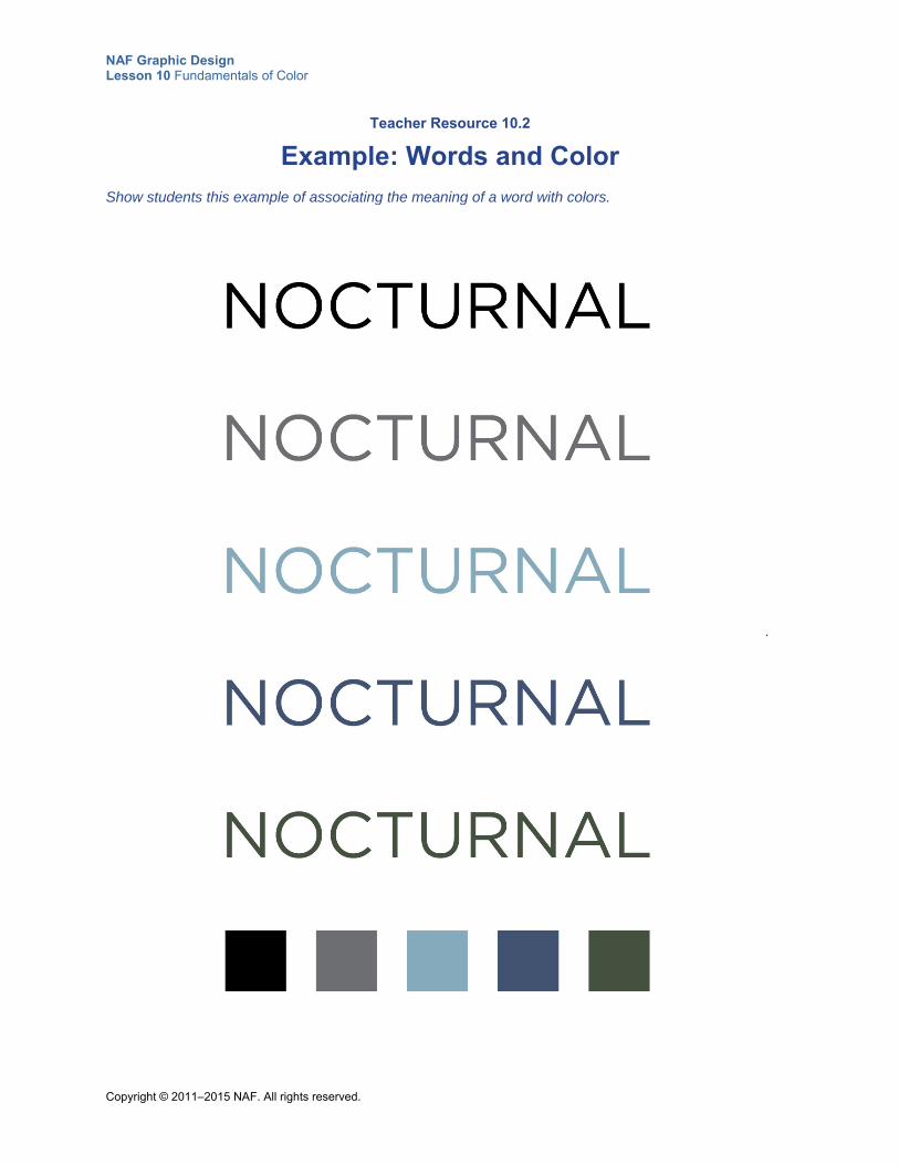
NAF Graphic Design Lesson 10 Fundamentals of Color
Copyright © 2011–2015 NAF. All rights reserved.
Teacher Resource 10.2
Example: Words and Color
Show students this example of associating the meaning of a word with colors.
.
NAF Graphic Design Lesson 10 Fundamentals of Color
Copyright © 2011–2015 NAF. All rights reserved.
Teacher Resource 10.3
Presentation Notes: CMYK, RGB, and Grayscale Color Systems
Before you show this presentation, use the text accompanying each slide to develop presentation notes. Writing the notes yourself enables you to approach the subject matter in a way that is comfortable to you and engaging for your students. Make this presentation as interactive as possible by stopping frequently to ask questions and encourage class discussion.
This presentation explains the important differences between these color systems, and when it is appropriate to use each type of color.
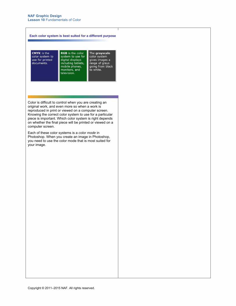
NAF Graphic Design Lesson 10 Fundamentals of Color
Copyright © 2011–2015 NAF. All rights reserved.
Color is difficult to control when you are creating an original work, and even more so when a work is reproduced in print or viewed on a computer screen. Knowing the correct color system to use for a particular piece is important. Which color system is right depends on whether the final piece will be printed or viewed on a computer screen.
Each of these color systems is a color mode in Photoshop. When you create an image in Photoshop, you need to use the color mode that is most suited for your image.
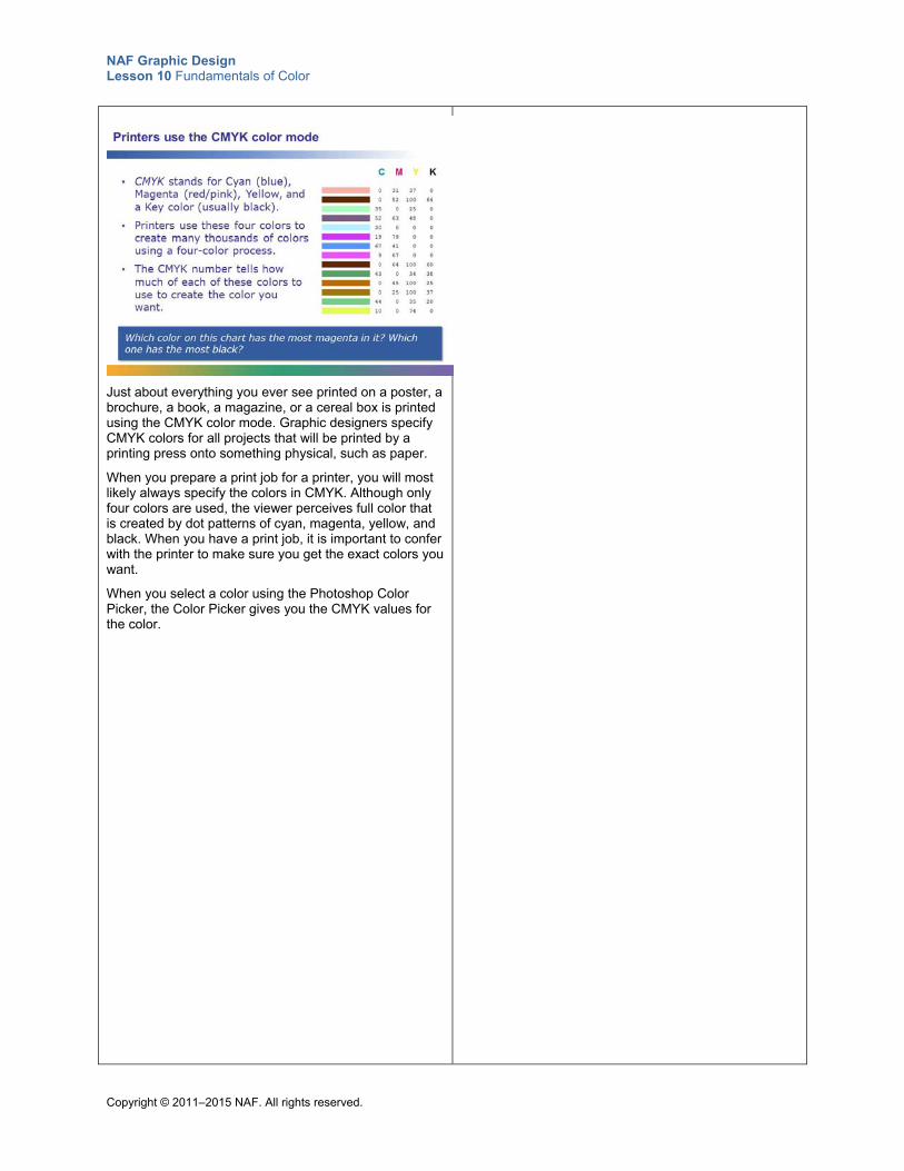
NAF Graphic Design Lesson 10 Fundamentals of Color
Copyright © 2011–2015 NAF. All rights reserved.
Just about everything you ever see printed on a poster, a brochure, a book, a magazine, or a cereal box is printed using the CMYK color mode. Graphic designers specify CMYK colors for all projects that will be printed by a printing press onto something physical, such as paper.
When you prepare a print job for a printer, you will most likely always specify the colors in CMYK. Although only four colors are used, the viewer perceives full color that is created by dot patterns of cyan, magenta, yellow, and black. When you have a print job, it is important to confer with the printer to make sure you get the exact colors you want.
When you select a color using the Photoshop Color Picker, the Color Picker gives you the CMYK values for the color.
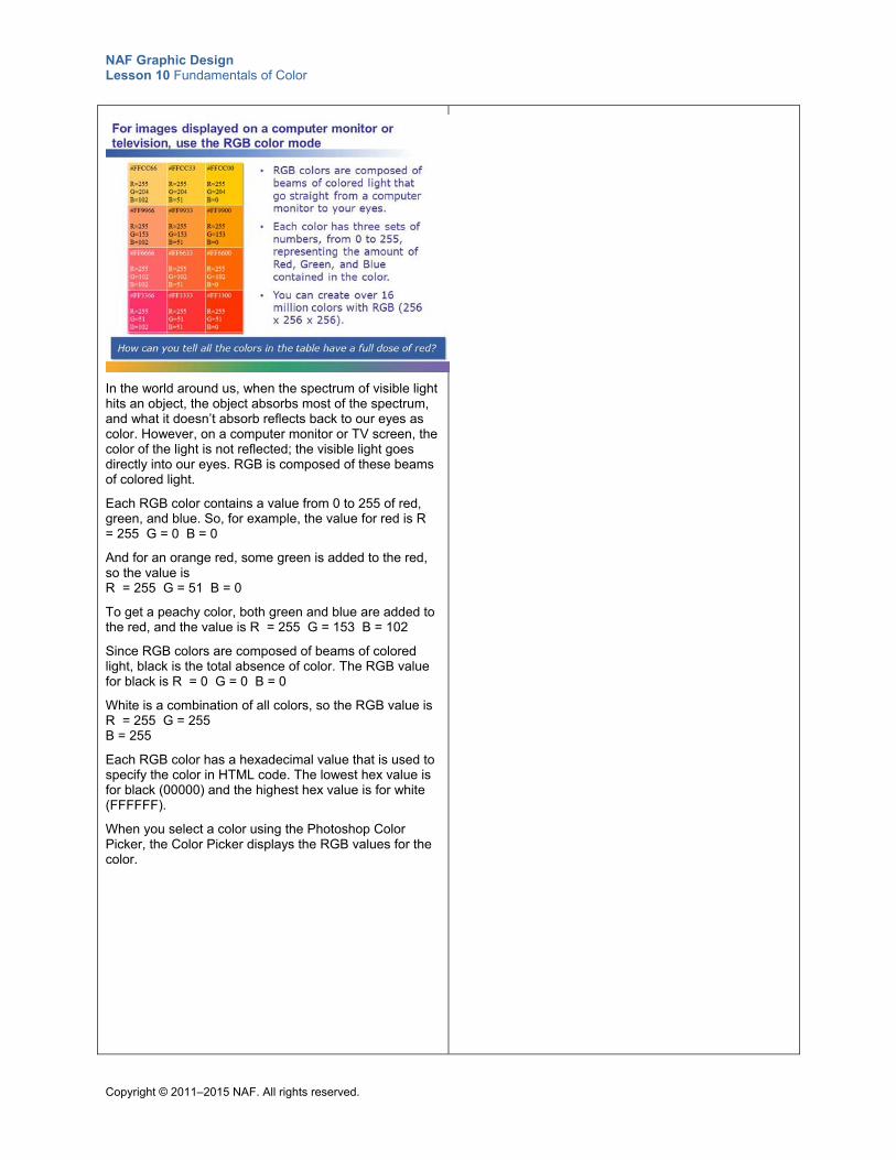
NAF Graphic Design Lesson 10 Fundamentals of Color
Copyright © 2011–2015 NAF. All rights reserved.
In the world around us, when the spectrum of visible light hits an object, the object absorbs most of the spectrum, and what it doesn’t absorb reflects back to our eyes as color. However, on a computer monitor or TV screen, the color of the light is not reflected; the visible light goes directly into our eyes. RGB is composed of these beams of colored light.
Each RGB color contains a value from 0 to 255 of red, green, and blue. So, for example, the value for red is R = 255 G = 0 B = 0
And for an orange red, some green is added to the red, so the value is R = 255 G = 51 B = 0
To get a peachy color, both green and blue are added to the red, and the value is R = 255 G = 153 B = 102
Since RGB colors are composed of beams of colored light, black is the total absence of color. The RGB value for black is R = 0 G = 0 B = 0
White is a combination of all colors, so the RGB value is R = 255 G = 255 B = 255
Each RGB color has a hexadecimal value that is used to specify the color in HTML code. The lowest hex value is for black (00000) and the highest hex value is for white (FFFFFF).
When you select a color using the Photoshop Color Picker, the Color Picker displays the RGB values for the color.
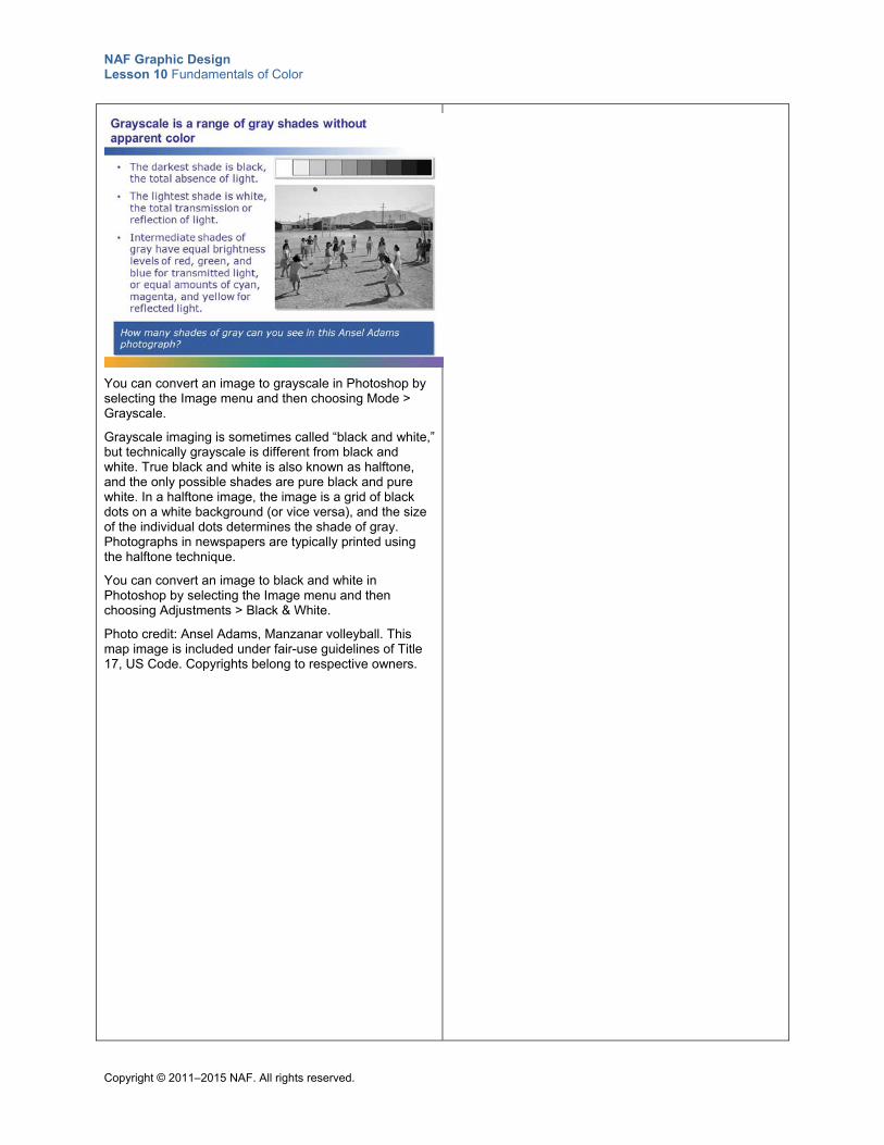
NAF Graphic Design Lesson 10 Fundamentals of Color
Copyright © 2011–2015 NAF. All rights reserved.
You can convert an image to grayscale in Photoshop by selecting the Image menu and then choosing Mode > Grayscale.
Grayscale imaging is sometimes called “black and white,” but technically grayscale is different from black and white. True black and white is also known as halftone, and the only possible shades are pure black and pure white. In a halftone image, the image is a grid of black dots on a white background (or vice versa), and the size of the individual dots determines the shade of gray. Photographs in newspapers are typically printed using the halftone technique.
You can convert an image to black and white in Photoshop by selecting the Image menu and then choosing Adjustments > Black & White.
Photo credit: Ansel Adams, Manzanar volleyball. This map image is included under fair-use guidelines of Title 17, US Code. Copyrights belong to respective owners.
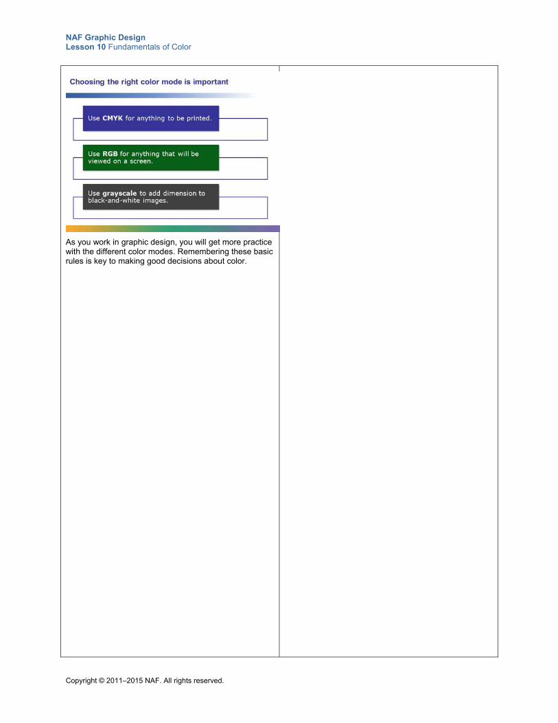
NAF Graphic Design Lesson 10 Fundamentals of Color
Copyright © 2011–2015 NAF. All rights reserved.
As you work in graphic design, you will get more practice with the different color modes. Remembering these basic rules is key to making good decisions about color.
NAF Graphic Design Lesson 10 Fundamentals of Color
Copyright © 2011–2015 NAF. All rights reserved.
Teacher Resource 10.4
Assessment Criteria: Color Palette
Student Name:______________________________________________________________
Date:_______________________________________________________________________
Using the following criteria, assess whether the student met each one.
Met Partially Met
Didn’t Meet
The creative brief shows that skilled and thoughtful planning work was put into the color palette.
□ □ □
The color palette is clearly appropriate for the products or services offered and for the target audience.
□ □ □
The six colors below the main color and the accent color are all tints or shades of the main color or the accent color.
□ □ □
The sentences describing the color choices give a convincing rationale for the choices.
□ □ □
The final product shows careful, accurate work in both text and graphics.
□ □ □
Additional Comments:
_____________________________________________________________________________
_____________________________________________________________________________
_____________________________________________________________________________
_____________________________________________________________________________
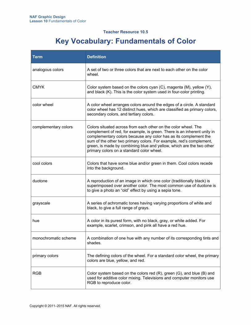
NAF Graphic Design Lesson 10 Fundamentals of Color
Copyright © 2011–2015 NAF. All rights reserved.
Teacher Resource 10.5
Key Vocabulary: Fundamentals of Color
Term Definition
analogous colors A set of two or three colors that are next to each other on the color wheel.
CMYK Color system based on the colors cyan (C), magenta (M), yellow (Y), and black (K). This is the color system used in four-color printing.
color wheel A color wheel arranges colors around the edges of a circle. A standard color wheel has 12 distinct hues, which are classified as primary colors, secondary colors, and tertiary colors.
complementary colors Colors situated across from each other on the color wheel. The complement of red, for example, is green. There is an inherent unity in complementary colors because any color has as its complement the sum of the other two primary colors. For example, red’s complement, green, is made by combining blue and yellow, which are the two other primary colors on a standard color wheel.
cool colors Colors that have some blue and/or green in them. Cool colors recede into the background.
duotone A reproduction of an image in which one color (traditionally black) is superimposed over another color. The most common use of duotone is to give a photo an “old” effect by using a sepia tone.
grayscale A series of achromatic tones having varying proportions of white and black, to give a full range of grays.
hue A color in its purest form, with no black, gray, or white added. For example, scarlet, crimson, and pink all have a red hue.
monochromatic scheme A combination of one hue with any number of its corresponding tints and shades.
primary colors The defining colors of the wheel. For a standard color wheel, the primary colors are blue, yellow, and red.
RGB Color system based on the colors red (R), green (G), and blue (B) and used for additive color mixing. Televisions and computer monitors use RGB to reproduce color.
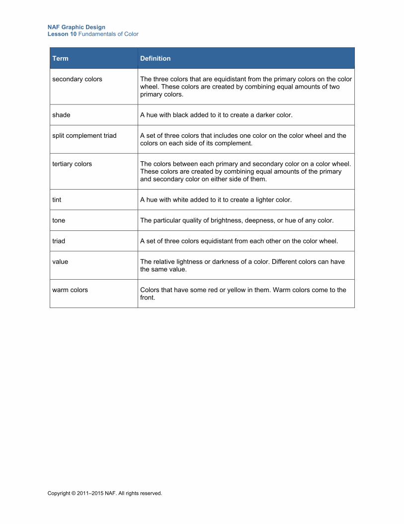
NAF Graphic Design Lesson 10 Fundamentals of Color
Copyright © 2011–2015 NAF. All rights reserved.
Term Definition
secondary colors The three colors that are equidistant from the primary colors on the color wheel. These colors are created by combining equal amounts of two primary colors.
shade A hue with black added to it to create a darker color.
split complement triad A set of three colors that includes one color on the color wheel and the colors on each side of its complement.
tertiary colors The colors between each primary and secondary color on a color wheel. These colors are created by combining equal amounts of the primary and secondary color on either side of them.
tint A hue with white added to it to create a lighter color.
tone The particular quality of brightness, deepness, or hue of any color.
triad A set of three colors equidistant from each other on the color wheel.
value The relative lightness or darkness of a color. Different colors can have the same value.
warm colors Colors that have some red or yellow in them. Warm colors come to the front.
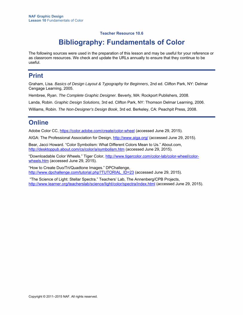
NAF Graphic Design Lesson 10 Fundamentals of Color
Copyright © 2011–2015 NAF. All rights reserved.
Teacher Resource 10.6
Bibliography: Fundamentals of Color
The following sources were used in the preparation of this lesson and may be useful for your reference or as classroom resources. We check and update the URLs annually to ensure that they continue to be useful.
Print Graham, Lisa. Basics of Design Layout & Typography for Beginners, 2nd ed. Clifton Park, NY: Delmar Cengage Learning, 2005.
Hembree, Ryan. The Complete Graphic Designer. Beverly, MA: Rockport Publishers, 2008.
Landa, Robin. Graphic Design Solutions, 3rd ed. Clifton Park, NY: Thomson Delmar Learning, 2006.
Williams, Robin. The Non-Designer’s Design Book, 3rd ed. Berkeley, CA: Peachpit Press, 2008.
Online Adobe Color CC, https://color.adobe.com/create/color-wheel (accessed June 29, 2015).
AIGA: The Professional Association for Design, http://www.aiga.org/ (accessed June 29, 2015).
Bear, Jacci Howard. “Color Symbolism: What Different Colors Mean to Us.” About.com, http://desktoppub.about.com/cs/color/a/symbolism.htm (accessed June 29, 2015).
“Downloadable Color Wheels.” Tiger Color, http://www.tigercolor.com/color-lab/color-wheel/color-wheels.htm (accessed June 29, 2015).
“How to Create Duo/Tri/Quadtone Images.” DPChallenge, http://www.dpchallenge.com/tutorial.php?TUTORIAL_ID=23 (accessed June 29, 2015).
“The Science of Light: Stellar Spectra.” Teachers’ Lab, The Annenberg/CPB Projects, http://www.learner.org/teacherslab/science/light/color/spectra/index.html (accessed June 29, 2015).
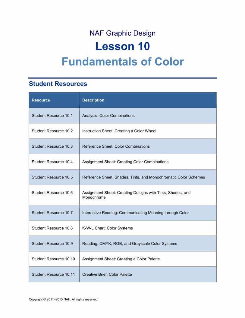
Copyright © 2011–2015 NAF. All rights reserved.
NAF Graphic Design
Lesson 10 Fundamentals of Color
Student Resources
Resource Description
Student Resource 10.1 Analysis: Color Combinations
Student Resource 10.2 Instruction Sheet: Creating a Color Wheel
Student Resource 10.3 Reference Sheet: Color Combinations
Student Resource 10.4 Assignment Sheet: Creating Color Combinations
Student Resource 10.5 Reference Sheet: Shades, Tints, and Monochromatic Color Schemes
Student Resource 10.6 Assignment Sheet: Creating Designs with Tints, Shades, and Monochrome
Student Resource 10.7 Interactive Reading: Communicating Meaning through Color
Student Resource 10.8 K-W-L Chart: Color Systems
Student Resource 10.9 Reading: CMYK, RGB, and Grayscale Color Systems
Student Resource 10.10 Assignment Sheet: Creating a Color Palette
Student Resource 10.11 Creative Brief: Color Palette
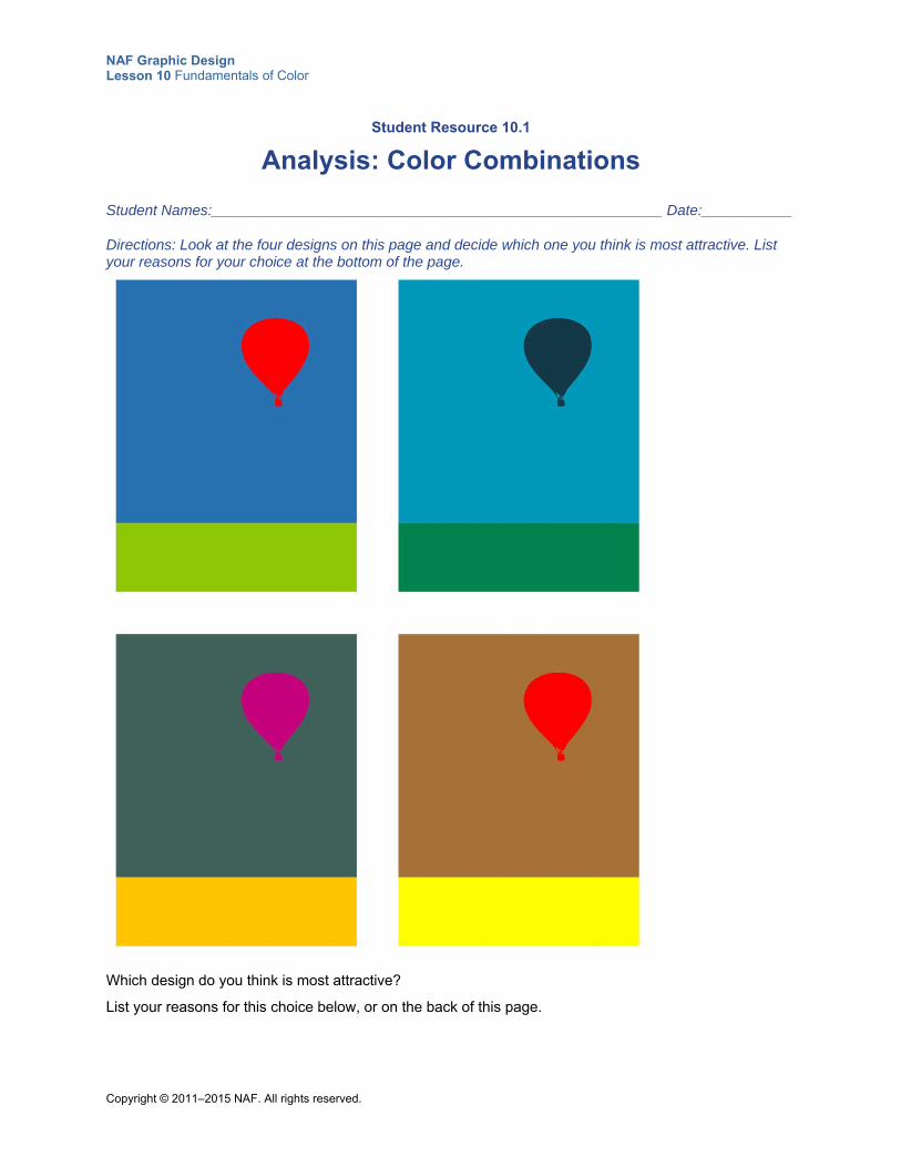
NAF Graphic Design Lesson 10 Fundamentals of Color
Copyright © 2011–2015 NAF. All rights reserved.
Student Resource 10.1
Analysis: Color Combinations
Student Names:_______________________________________________________ Date:___________
Directions: Look at the four designs on this page and decide which one you think is most attractive. List your reasons for your choice at the bottom of the page.
Which design do you think is most attractive?
List your reasons for this choice below, or on the back of this page.
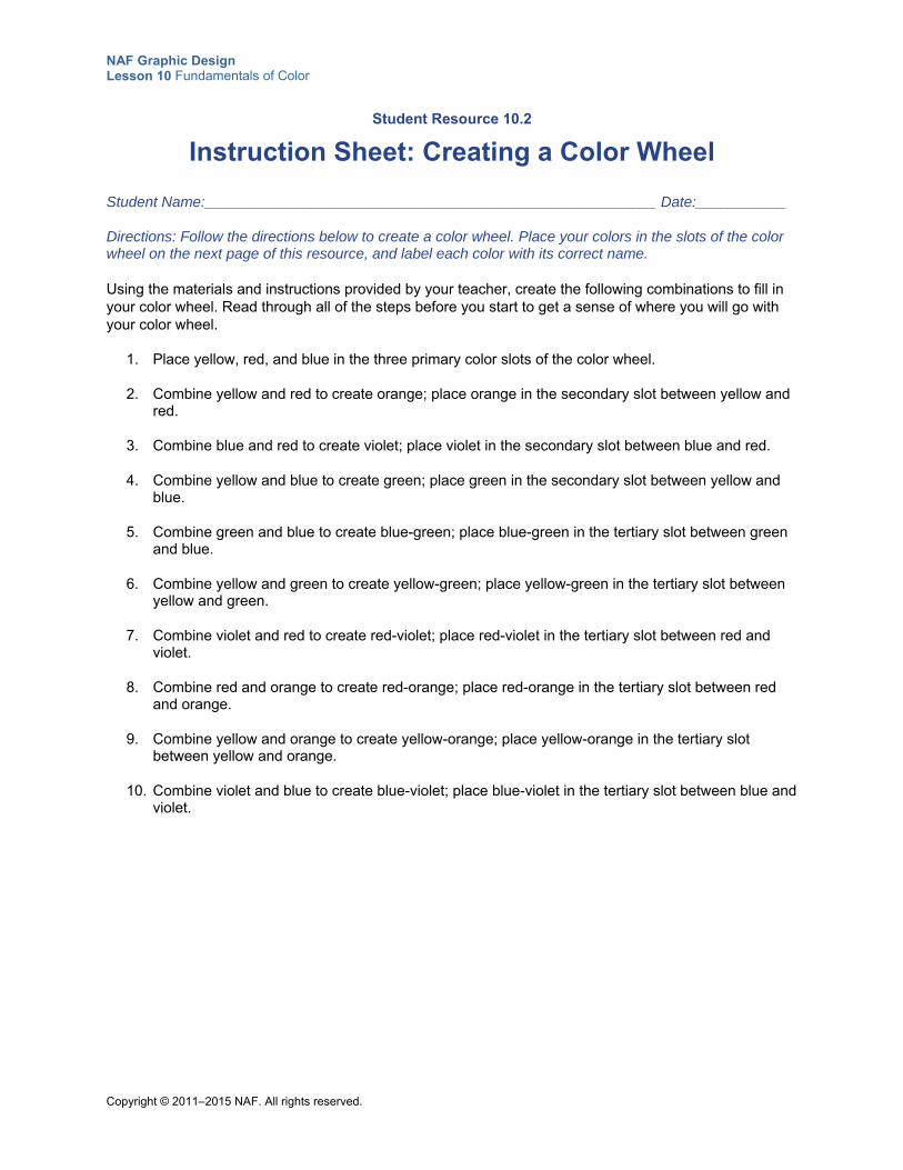
NAF Graphic Design Lesson 10 Fundamentals of Color
Copyright © 2011–2015 NAF. All rights reserved.
Student Resource 10.2
Instruction Sheet: Creating a Color Wheel
Student Name:_______________________________________________________ Date:___________
Directions: Follow the directions below to create a color wheel. Place your colors in the slots of the color wheel on the next page of this resource, and label each color with its correct name.
Using the materials and instructions provided by your teacher, create the following combinations to fill in your color wheel. Read through all of the steps before you start to get a sense of where you will go with your color wheel.
1. Place yellow, red, and blue in the three primary color slots of the color wheel.
2. Combine yellow and red to create orange; place orange in the secondary slot between yellow and red.
3. Combine blue and red to create violet; place violet in the secondary slot between blue and red.
4. Combine yellow and blue to create green; place green in the secondary slot between yellow and blue.
5. Combine green and blue to create blue-green; place blue-green in the tertiary slot between green and blue.
6. Combine yellow and green to create yellow-green; place yellow-green in the tertiary slot between yellow and green.
7. Combine violet and red to create red-violet; place red-violet in the tertiary slot between red and violet.
8. Combine red and orange to create red-orange; place red-orange in the tertiary slot between red and orange.
9. Combine yellow and orange to create yellow-orange; place yellow-orange in the tertiary slot between yellow and orange.
10. Combine violet and blue to create blue-violet; place blue-violet in the tertiary slot between blue and violet.
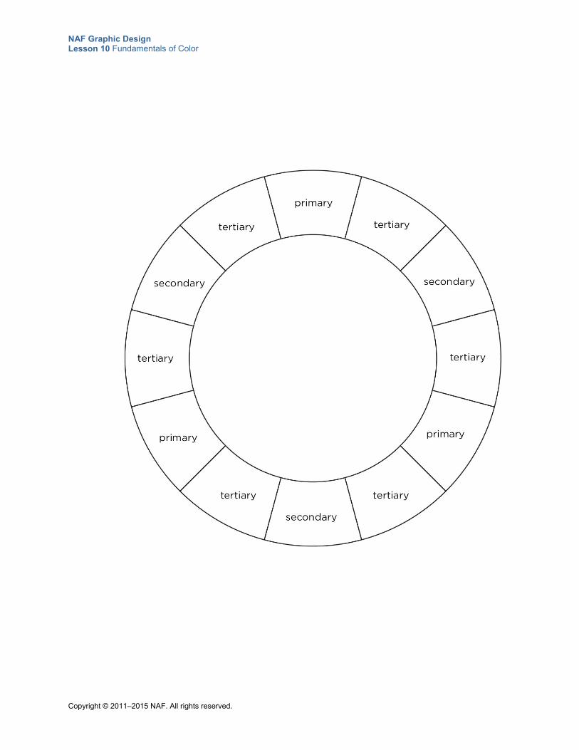
NAF Graphic Design Lesson 10 Fundamentals of Color
Copyright © 2011–2015 NAF. All rights reserved.
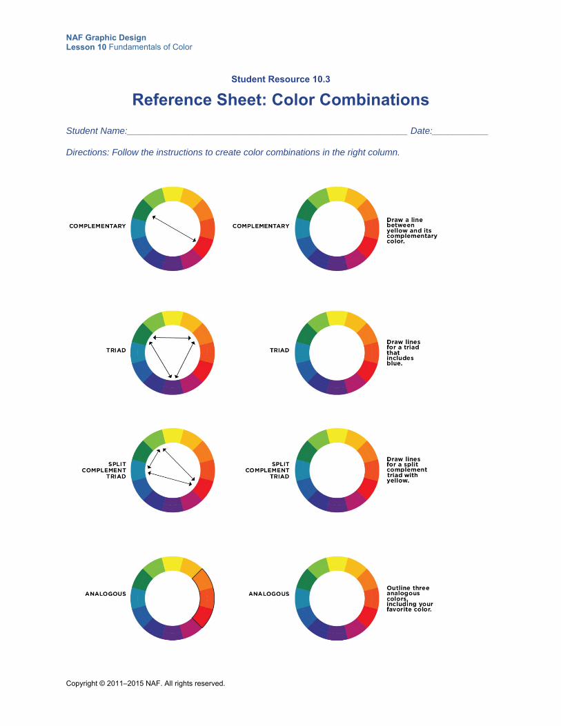
NAF Graphic Design Lesson 10 Fundamentals of Color
Copyright © 2011–2015 NAF. All rights reserved.
Student Resource 10.3
Reference Sheet: Color Combinations
Student Name:_______________________________________________________ Date:___________
Directions: Follow the instructions to create color combinations in the right column.
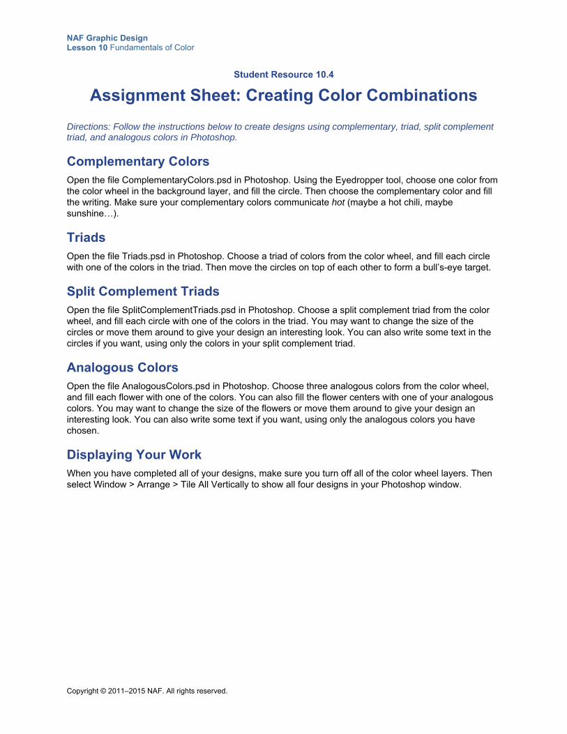
NAF Graphic Design Lesson 10 Fundamentals of Color
Copyright © 2011–2015 NAF. All rights reserved.
Student Resource 10.4
Assignment Sheet: Creating Color Combinations
Directions: Follow the instructions below to create designs using complementary, triad, split complement triad, and analogous colors in Photoshop.
Complementary Colors Open the file ComplementaryColors.psd in Photoshop. Using the Eyedropper tool, choose one color from the color wheel in the background layer, and fill the circle. Then choose the complementary color and fill the writing. Make sure your complementary colors communicate hot (maybe a hot chili, maybe sunshine…).
Triads Open the file Triads.psd in Photoshop. Choose a triad of colors from the color wheel, and fill each circle with one of the colors in the triad. Then move the circles on top of each other to form a bull’s-eye target.
Split Complement Triads Open the file SplitComplementTriads.psd in Photoshop. Choose a split complement triad from the color wheel, and fill each circle with one of the colors in the triad. You may want to change the size of the circles or move them around to give your design an interesting look. You can also write some text in the circles if you want, using only the colors in your split complement triad.
Analogous Colors Open the file AnalogousColors.psd in Photoshop. Choose three analogous colors from the color wheel, and fill each flower with one of the colors. You can also fill the flower centers with one of your analogous colors. You may want to change the size of the flowers or move them around to give your design an interesting look. You can also write some text if you want, using only the analogous colors you have chosen.
Displaying Your Work When you have completed all of your designs, make sure you turn off all of the color wheel layers. Then select Window > Arrange > Tile All Vertically to show all four designs in your Photoshop window.
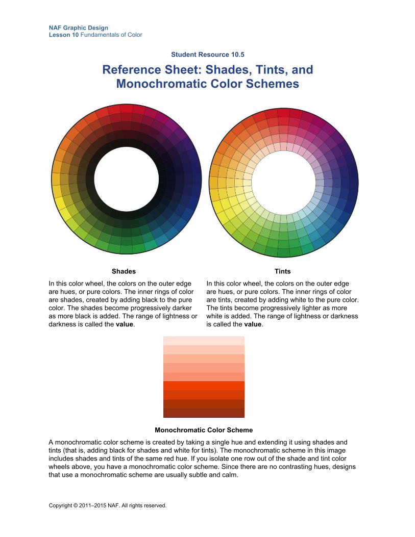
NAF Graphic Design Lesson 10 Fundamentals of Color
Copyright © 2011–2015 NAF. All rights reserved.
Student Resource 10.5
Reference Sheet: Shades, Tints, and Monochromatic Color Schemes
Shades
In this color wheel, the colors on the outer edge are hues, or pure colors. The inner rings of color are shades, created by adding black to the pure color. The shades become progressively darker as more black is added. The range of lightness or darkness is called the value.
Tints
In this color wheel, the colors on the outer edge are hues, or pure colors. The inner rings of color are tints, created by adding white to the pure color. The tints become progressively lighter as more white is added. The range of lightness or darkness is called the value.
Monochromatic Color Scheme
A monochromatic color scheme is created by taking a single hue and extending it using shades and tints (that is, adding black for shades and white for tints). The monochromatic scheme in this image includes shades and tints of the same red hue. If you isolate one row out of the shade and tint color wheels above, you have a monochromatic color scheme. Since there are no contrasting hues, designs that use a monochromatic scheme are usually subtle and calm.
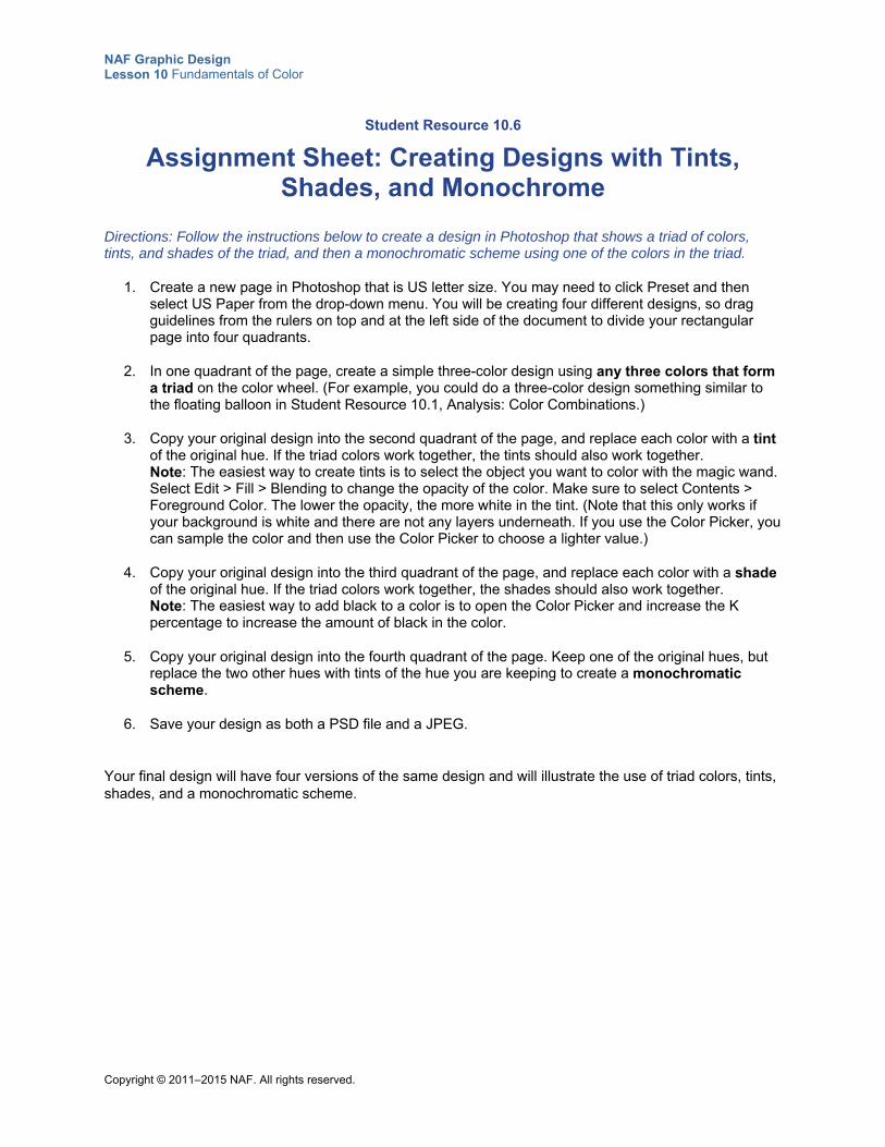
NAF Graphic Design Lesson 10 Fundamentals of Color
Copyright © 2011–2015 NAF. All rights reserved.
Student Resource 10.6
Assignment Sheet: Creating Designs with Tints, Shades, and Monochrome
Directions: Follow the instructions below to create a design in Photoshop that shows a triad of colors, tints, and shades of the triad, and then a monochromatic scheme using one of the colors in the triad.
1. Create a new page in Photoshop that is US letter size. You may need to click Preset and then select US Paper from the drop-down menu. You will be creating four different designs, so drag guidelines from the rulers on top and at the left side of the document to divide your rectangular page into four quadrants.
2. In one quadrant of the page, create a simple three-color design using any three colors that form a triad on the color wheel. (For example, you could do a three-color design something similar to the floating balloon in Student Resource 10.1, Analysis: Color Combinations.)
3. Copy your original design into the second quadrant of the page, and replace each color with a tint of the original hue. If the triad colors work together, the tints should also work together. Note: The easiest way to create tints is to select the object you want to color with the magic wand. Select Edit > Fill > Blending to change the opacity of the color. Make sure to select Contents > Foreground Color. The lower the opacity, the more white in the tint. (Note that this only works if your background is white and there are not any layers underneath. If you use the Color Picker, you can sample the color and then use the Color Picker to choose a lighter value.)
4. Copy your original design into the third quadrant of the page, and replace each color with a shade of the original hue. If the triad colors work together, the shades should also work together. Note: The easiest way to add black to a color is to open the Color Picker and increase the K percentage to increase the amount of black in the color.
5. Copy your original design into the fourth quadrant of the page. Keep one of the original hues, but replace the two other hues with tints of the hue you are keeping to create a monochromatic scheme.
6. Save your design as both a PSD file and a JPEG.
Your final design will have four versions of the same design and will illustrate the use of triad colors, tints, shades, and a monochromatic scheme.
NAF Graphic Design Lesson 10 Fundamentals of Color
Copyright © 2011–2015 NAF. All rights reserved.
Student Resource 10.7
Interactive Reading: Communicating Meaning through Color
Student Name:_______________________________________________________ Date:___________
Directions: Read through this text carefully and underline the different colors or color combinations that you would like to try in a design. As you are reading, respond to the “Your Ideas” questions and prompts interspersed throughout the reading.
Colors are more than a combination of red and blue or yellow and black; they are nonverbal communication. Colors have symbolism and meanings that convey a message or tell a story. As you choose colors for your designs, it’s important to think about how the eye and the mind perceive certain colors. Remember that meaning is associated with the colors in your design.
One of the easiest ways to attract attention to your design is to add color, but you need to make sure that the color you choose communicates the right message. In addition to symbolizing something or carrying a particular meaning, color can evoke moods. Did you know that most theaters have red walls because red tones are known to evoke hunger? Or that some car insurance companies charge more to insure red cars because owners of red cars are statistically more aggressive and take more risks?
Choosing the wrong color can send the wrong message, and this can be disastrous. For example, imagine a moldy-green-colored ad for a cleaning service. Or a gloomy gray ad for a seaside resort in the sunshine.
Cultures and Color What do you think of when you see red and green together? How about black and orange? Or pastel blue and pink? In US culture, those color combinations have specific meanings. You wouldn’t create a red-and-green flyer to publicize a Halloween event!
In Western culture, white symbolizes purity, but in Chinese culture, it symbolizes death. Chinese wedding dresses are traditionally red, to symbolize good luck. In India, red symbolizes purity; in South Africa, mourning; in Western culture, danger and passion.
Your Ideas
In the chart below, write at least one word that each color evokes in your culture of origin.
red
silver
green
black
When creating a design, remember to research color meanings for all ethnic sectors of your target audience. It’s important to make sure you don’t offend any sector of the target audience. When you are designing for your own culture, you are likely to have at least an average understanding of how your audience will interpret the colors.
NAF Graphic Design Lesson 10 Fundamentals of Color
Copyright © 2011–2015 NAF. All rights reserved.
Techniques for Choosing Colors Graphic designers consider all aspects of the effect they want to create with a particular image and then choose colors that will create the desired effect. In addition to evoking specific meanings, colors are considered warm, cool, or neutral. Reds, yellows, and oranges are warm colors. Blues and greens are cool colors. Tans and grays are neutral colors that are influenced by the warm or cool colors in proximity.
Warm Colors Graphic designers use warm colors to attract attention and increase visibility. Red attracts attention, and yellow is highly visible from a distance. Combinations of red, yellow, and orange are used for packaging and for signs that need to be seen from a distance. These warm colors seem to advance toward the viewer.
Your Ideas
In the box below, make a list of popular products that are packaged in warm colors. (Cheerios cereal is a good example.)
Red
Use the color red to grab attention and to get people to take action. Red suggests speed combined with confidence and perhaps even a dash of danger. Red is a good choice when you don’t want to sink into the background. But remember: that little bit of red goes a long way. Small doses can often be more effective than large amounts of this strong color.
Combining red with other colors:
To create a cheerful palette, combine multiple shades of red and even pink or orange.
Use cool blues to provide contrast and to tone down the heat of red.
Light pinks and yellows harmonize with red if they are not too close in value. For example, try a dark red with a pale or golden yellow.
Be careful using purple. It can be an elegant combination, but too much could be overpowering.
Add a dash of red to a soft but sophisticated pink and gray combo.
Red, white, and blue create a patriotic combination in the United States, even if the shades are different from those in the flag.
Yellow
Yellow is a warm color that evokes the idea of sunshine and cheerfulness. It denotes happiness and joy. In the United States, a yellow ribbon symbolizes the hope of military troops coming home. But like red, yellow has conflicting symbolism. Yellow is also the color of cowardice and deceit.
Bright yellow is a perky color you can use to create excitement when red or orange may be too strong or too dark.
Combining yellow with other colors:
Use yellow to perk up more subdued cool blues and grays.
Use lemon yellow with orange to create a healthy or summery citrus palette.
NAF Graphic Design Lesson 10 Fundamentals of Color
Copyright © 2011–2015 NAF. All rights reserved.
Use very pale yellows as neutral colors alongside darker colors.
Use yellow and blue for a high-contrast, eye-popping combination.
Combine yellow with gray and a hint of black for a high-tech look.
Orange
Orange is a vibrant color that denotes energy, warmth, and the sun. Orange is a bit less intense or aggressive than red, because it is calmed by the cheerfulness of yellow. Orange is a warm color that stimulates the emotions and even the appetite.
If you want to get noticed without screaming, try using orange. Softer oranges such as peach are more soothing and friendly, but still energetic.
Combining orange with other colors:
Orange really pops with a medium blue.
Combine bright red, yellow, and orange for a fiery hot combination.
Combine more subdued shades of red, yellow, and orange for a fresh, fruity palette.
Combine orange with green to convey tropical.
Combining orange and pink creates a ’60s psychedelic look that you may want to avoid.
To catch the viewer’s eye, try a hint of orange with deep purple, or a hint of purple and orange with lots of yellow or white.
Your Ideas
In the box below, describe a design you would like to create using warm colors.
Cool Colors Cool colors tend to have a calming effect. They can be cold and impersonal, but they can also be comforting and nurturing. Blue, green, and the neutral colors white, gray, and silver are examples of cool colors. When you think of a lake, a forest, or a snow-capped mountain, you see cool colors. You can combine blues and greens to create natural, watery color palettes. If you have a color palette that you think is too cool, heat it up with a spot of red or orange.
Blue
Blue is a calming color. Almost everyone likes some shade of the color blue. It can be strong and confident or light and friendly. A blue power suit in the corporate world or blue uniforms for police officers convey importance and confidence. In American culture, dark blue has traditionally been considered a corporate color, and it can be associated with intelligence, stability, unity, and conservatism. Because of the blue of the sky, blue is considered a natural color.
Combining blue with other colors:
Combine light and dark blue to convey trust and truthfulness. Banks often use this combination.
Use pastel blues with pinks and pale yellows to suggest springtime.
Use a spot of blue to cool down a hot red or orange palette.
NAF Graphic Design Lesson 10 Fundamentals of Color
Copyright © 2011–2015 NAF. All rights reserved.
Combine blue and yellow to get attention.
Combine navy blue with white for a fresh, crisp, and perhaps nautical look.
For an elegant combination, use dark blue with metallic silver accents.
Green
Green is a restful color with some of the same calming attributes of blue. Because of its abundance in nature, green often symbolizes life, growth, renewal, health, and environment. But in American culture, green also symbolizes envy, jealousy, and inexperience.
Combine several shades of green for a fresh, spring feeling. Olive green can be a summery green, but it also has military overtones.
Combining green with other colors:
Green with blue conveys new beginnings and growth.
Combine green with brown, tan, or beige to communicate organic or recycled.
Use green with yellow and black or white to communicate a sporty, outdoors feeling.
Combine purple with green for a lively contrast.
Lime green with orange and yellow is a fresh and fruity palette.
Silver
Silver, like its non-shiny counterpart gray, is a neutral color. Shiny, metallic silver is on the cool side of neutral, like gray. Silver is of course livelier and more exciting than gray. Silver often symbolizes riches, just as gold does. Silver can also convey glamour. We think of gray-haired men and women as old, but a silver-haired person is said to be distinguished. Silver can be sleek and modern, or it can be ornate.
Because silver is a neutral color, it coordinates easily with other colors. You can use silver with other colors to create a high-tech or industrial look. A touch of silver pops with medium blue.
Your Ideas
In the box below, describe a design you would like to create using cool colors.
Purple Purple is a secondary color made by combining red and blue, so the “temperature” of the purple depends on how much red and how much blue is in it, but it has both warm and cool properties. A mysterious color, purple is associated with royalty, nobility, and spirituality. Purple has a special place in nature; lavender, orchid, lilac, and violet flowers are all very delicate. Deep or bright purples suggest riches, and lighter purples are more romantic and delicate. Be careful using purple. It can be an elegant color but too much can be overpowering.
Combining purple with other colors:
Combine a deep, eggplant purple with tan or beige for a conservative, earthy color combination with a touch of mystery.
Green and purple can be a striking combination. Use deep tones to communicate richness, or lighter shades to convey a cheerful, springlike feeling.
NAF Graphic Design Lesson 10 Fundamentals of Color
Copyright © 2011–2015 NAF. All rights reserved.
Combine pink and purple to create a feminine appeal.
Tips for Using Color Deciding which colors work together is not an easy task. It is not uncommon for graphic designers to try out many color combinations in their design before coming up with the final combination. They might try out several different colors to see what looks right and what makes the message pop.
The colors you choose should contribute to the legibility, organization, feeling, and personality of your page. Here are some tips to help you make sure this happens:
Use color to attract attention to what is important in your design. For example, make the most important information on the page a bright color to draw the viewer’s attention to it.
Pick colors that are appropriate for your design topic and for your audience.
Use color consistently to help organize your design.
Make sure there is sufficient contrast to create a visual impact.
For legibility, make sure there is a lot of contrast between background color and typeface color. Do not use bright color combinations such as red and yellow on pages with lots of small text, because this is hard on the eyes.
Rather than becoming overwhelmed by color choices, try using a maximum of three colors to reinforce your message.
Your Ideas
In the box below, describe a design you would like to create. Explain how one or two of the above tips will help you choose the right colors for your design.
The Colors You Choose Will “Color” Your Message Using color to communicate meaning effectively will add a new dimension to your designs. The more you practice selecting and using colors to communicate, the more likely your designs will click and resonate with your target audience.
NAF Graphic Design Lesson 10 Fundamentals of Color
Copyright © 2011–2015 NAF. All rights reserved.
Student Resource 10.8
K-W-L Chart: Color Systems
Student Name:_______________________________________________________ Date:___________
Directions: For each row in the chart, write down what you already know in the first column, and write down what you would like to learn in the second column. During the presentation, as you learn new information, fill in what you have learned in the third column.
K
What I Know
W
What Else I Want to Know
L
What I Learned
CMYK
RGB
Grayscale
NAF Graphic Design Lesson 10 Fundamentals of Color
Copyright © 2011–2015 NAF. All rights reserved.
Student Resource 10.9
Reading: CMYK, RGB, and Grayscale Color Systems
This presentation explains the important differences between these color systems, and when it is appropriate to use each type of color.
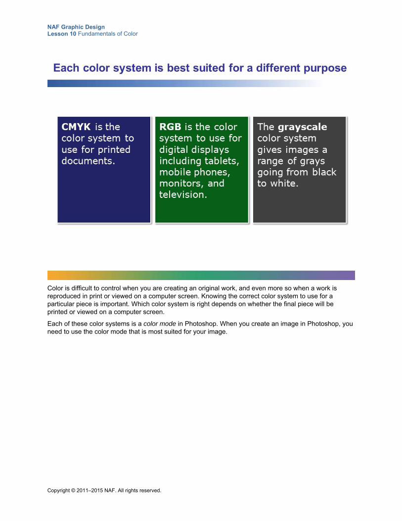
NAF Graphic Design Lesson 10 Fundamentals of Color
Copyright © 2011–2015 NAF. All rights reserved.
Color is difficult to control when you are creating an original work, and even more so when a work is reproduced in print or viewed on a computer screen. Knowing the correct color system to use for a particular piece is important. Which color system is right depends on whether the final piece will be printed or viewed on a computer screen.
Each of these color systems is a color mode in Photoshop. When you create an image in Photoshop, you need to use the color mode that is most suited for your image.
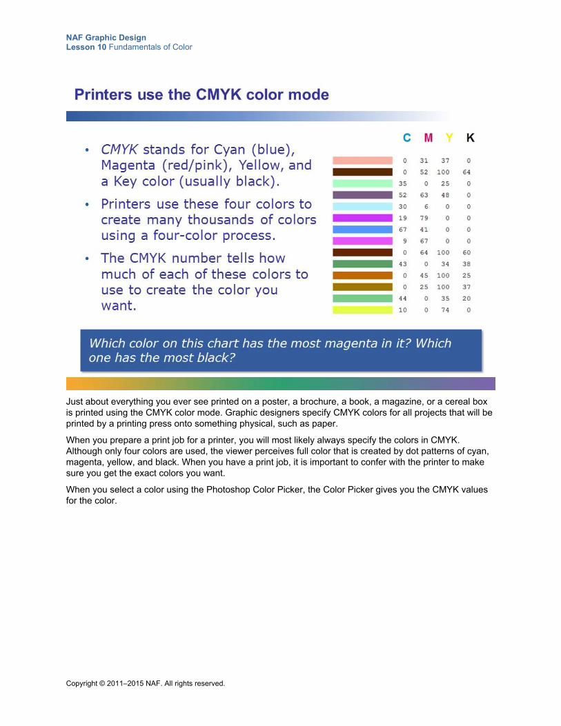
NAF Graphic Design Lesson 10 Fundamentals of Color
Copyright © 2011–2015 NAF. All rights reserved.
Just about everything you ever see printed on a poster, a brochure, a book, a magazine, or a cereal box is printed using the CMYK color mode. Graphic designers specify CMYK colors for all projects that will be printed by a printing press onto something physical, such as paper.
When you prepare a print job for a printer, you will most likely always specify the colors in CMYK. Although only four colors are used, the viewer perceives full color that is created by dot patterns of cyan, magenta, yellow, and black. When you have a print job, it is important to confer with the printer to make sure you get the exact colors you want.
When you select a color using the Photoshop Color Picker, the Color Picker gives you the CMYK values for the color.
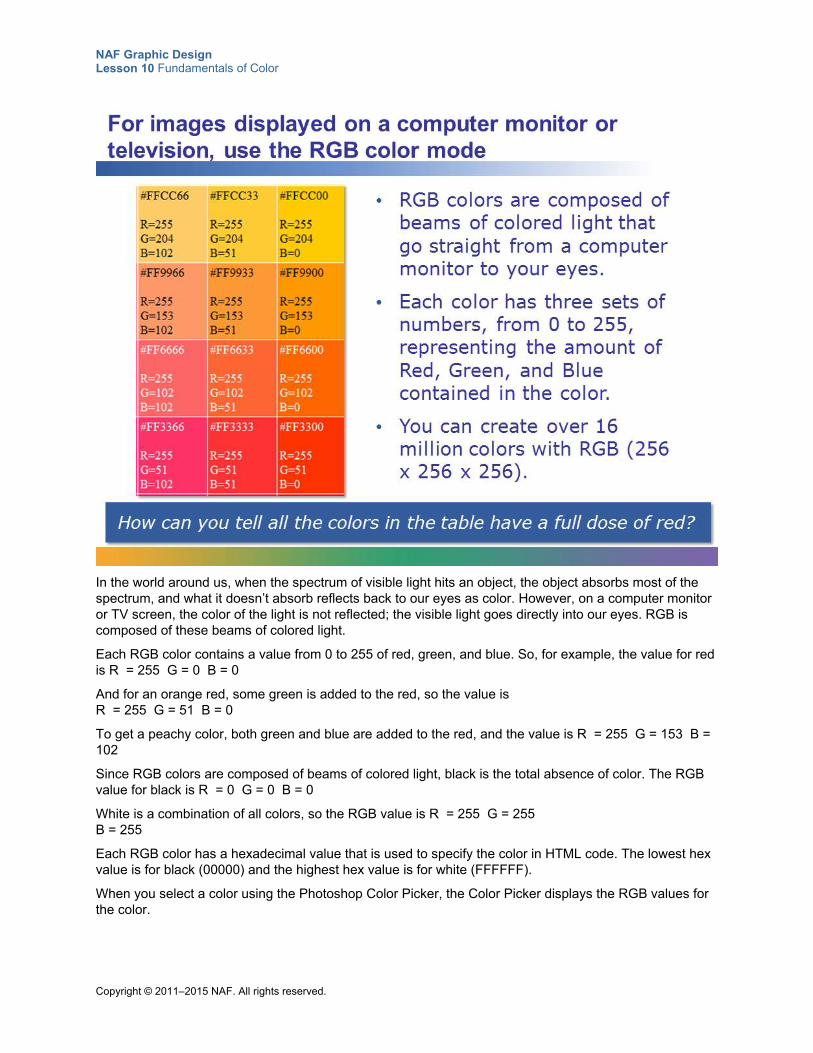
NAF Graphic Design Lesson 10 Fundamentals of Color
Copyright © 2011–2015 NAF. All rights reserved.
In the world around us, when the spectrum of visible light hits an object, the object absorbs most of the spectrum, and what it doesn’t absorb reflects back to our eyes as color. However, on a computer monitor or TV screen, the color of the light is not reflected; the visible light goes directly into our eyes. RGB is composed of these beams of colored light.
Each RGB color contains a value from 0 to 255 of red, green, and blue. So, for example, the value for red is R = 255 G = 0 B = 0
And for an orange red, some green is added to the red, so the value is R = 255 G = 51 B = 0
To get a peachy color, both green and blue are added to the red, and the value is R = 255 G = 153 B = 102
Since RGB colors are composed of beams of colored light, black is the total absence of color. The RGB value for black is R = 0 G = 0 B = 0
White is a combination of all colors, so the RGB value is R = 255 G = 255 B = 255
Each RGB color has a hexadecimal value that is used to specify the color in HTML code. The lowest hex value is for black (00000) and the highest hex value is for white (FFFFFF).
When you select a color using the Photoshop Color Picker, the Color Picker displays the RGB values for the color.
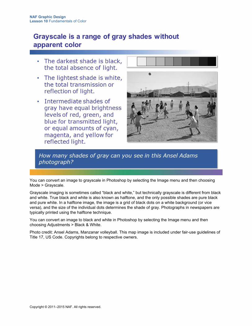
NAF Graphic Design Lesson 10 Fundamentals of Color
Copyright © 2011–2015 NAF. All rights reserved.
You can convert an image to grayscale in Photoshop by selecting the Image menu and then choosing Mode > Grayscale.
Grayscale imaging is sometimes called “black and white,” but technically grayscale is different from black and white. True black and white is also known as halftone, and the only possible shades are pure black and pure white. In a halftone image, the image is a grid of black dots on a white background (or vice versa), and the size of the individual dots determines the shade of gray. Photographs in newspapers are typically printed using the halftone technique.
You can convert an image to black and white in Photoshop by selecting the Image menu and then choosing Adjustments > Black & White.
Photo credit: Ansel Adams, Manzanar volleyball. This map image is included under fair-use guidelines of Title 17, US Code. Copyrights belong to respective owners.
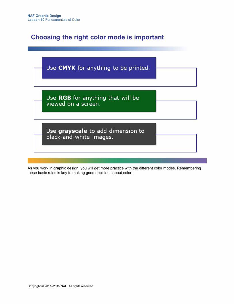
NAF Graphic Design Lesson 10 Fundamentals of Color
Copyright © 2011–2015 NAF. All rights reserved.
As you work in graphic design, you will get more practice with the different color modes. Remembering these basic rules is key to making good decisions about color.
NAF Graphic Design Lesson 10 Fundamentals of Color
Copyright © 2011–2015 NAF. All rights reserved.
Student Resource 10.10
Assignment Sheet: Creating a Color Palette
Directions: Follow the steps below to determine which colors work for your business or organization and create an appropriate color palette. Before you begin work, review the assessment criteria on this assignment sheet and make sure you understand how your work will be assessed. Also, look at the example at the end of this resource to get an idea of what your color palette should look like.
Step 1: Determine What Colors Fit Your Business
1. Decide what business or organization you want to create a color palette for. The business or organization can be real or fictitious, but you need to have enough information about it to create a meaningful color palette.
2. Once you’ve decided on a business or organization, fill out the creative brief in Student Resource 10.11, Creative Brief: Color Palette. The creative brief information will help you determine what you want to communicate through color.
3. Based on your creative brief, choose a main color and an accent color for your color palette. Then decide what shades and tints of those colors would also be useful for your business. You might want to use Student Resource 10.5, Reference Sheet: Shades, Tints, and Monochromatic Color Schemes, to get some ideas of what shades and tints you could use.
Step 2: Create a Color Palette in Photoshop
1. Open the file ColorPalette.jpg in Photoshop.
2. Use the Marquee selection (or Magic Wand) tool to select the top box, and then fill the box with your main color.
3. Select the second box and fill it in with your accent color.
4. Fill in the other boxes with tints and shades of your main and accent colors to create a complete palette of all the colors your business or organization will use. Use the same method to create tints and shades that you used with Student Resource 10.6, Assignment Sheet: Creating Designs with Tints, Shades, and Monochrome.
5. Use one of your colors to write the name of your business or organization at the top of the page.
6. Use one of your colors to write two or three sentences at the bottom of the page describing why you chose the hues, tints, and shades that you chose. Be sure to write with one of the darker colors or shades in your palette.
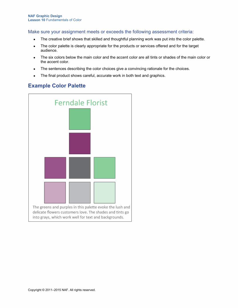
NAF Graphic Design Lesson 10 Fundamentals of Color
Copyright © 2011–2015 NAF. All rights reserved.
Make sure your assignment meets or exceeds the following assessment criteria:
The creative brief shows that skilled and thoughtful planning work was put into the color palette.
The color palette is clearly appropriate for the products or services offered and for the target audience.
The six colors below the main color and the accent color are all tints or shades of the main color or the accent color.
The sentences describing the color choices give a convincing rationale for the choices.
The final product shows careful, accurate work in both text and graphics.
Example Color Palette
NAF Graphic Design Lesson 10 Fundamentals of Color
Copyright © 2011–2015 NAF. All rights reserved.
Student Resource 10.11
Creative Brief: Color Palette
Student Name:_______________________________________________________ Date:___________
Directions: Before you create the color palette for your business or organization, fill out this creative brief to gain a clear understanding of what you should communicate about your business through your color palette. You will submit this creative brief for assessment along with your color palette.
Color Palette—Creative Brief
Name of company or organization:
BACKGROUND
Explain a bit about the history of the company or organization and tell why it could use a color palette.
PRODUCTS AND SERVICES
What products or services does the business or organization offer?
TARGET AUDIENCE Age, income, interests, geographic location, and so on.
COMMUNICATION OBJECTIVES What will you communicate about the business or organization through the use of color?
DELIVERABLES A color palette with a main color, an accent color, and six additional colors that are shades or tints of the main color or the accent color. The color palette will be presented on an 8.5" x 11" page with the name of the business or organization at the top and a sentence explaining why the colors were chosen at the bottom.
Copyright © 2011–2015 NAF. All rights reserved.
NAF Graphic Design
Lesson 11 Typography
In this lesson, students learn how to use typography effectively in design. They learn about the different parts of letters (such as ascenders and descenders) and how text is set on a baseline, and then they learn about line spacing and letter spacing. Students get practice using Photoshop to space letters effectively and to type text along a path. Students also explore the different ways that they can express meaning through the use of typography. Finally, students create a design based on the letters in their name to demonstrate what they have learned about typography and meaning.
Advance Preparation
Verify that students have access to a good variety of typefaces on their computers. If it is necessary to download additional typefaces, make sure you have the necessary administrator rights to download them onto student computers.
This lesson is expected to take 5 class periods.
Lesson Framework
Learning Objectives Each student will:
Describe the proportions of roman letter forms
Explain how to use line spacing and letter spacing effectively*
Demonstrate the ability to use antialiasing, leading, kerning, and tracking to smooth and format text in Photoshop
Demonstrate the ability to use type along paths and shapes in Photoshop
Identify appropriate typefaces to help communicate a visual solution*
Demonstrate the ability to use typography effectively in a design
*This is one of the 16 key learning objectives assessed by the NAFTrack Certification end-of-course exam for this course.
NAF Graphic Design Lesson 11 Typography
Copyright © 2011–2015 NAF. All rights reserved. - 2 -
Academic Standards The relevant Common Core State Standards are too extensive to list here but are an important basis for this lesson. For details, please refer to the separate document “Correlations to the Common Core Standards” (available in the Course Planning Tools section of the course materials).
Demonstrate knowledge of typography (Adobe Certified Associate, Objectives for Visual Communication using Photoshop CS6, Identifying Design Elements When Preparing Images 2.3)
Demonstrate knowledge of type (Adobe Certified Associate, Objectives for Visual Communication using Photoshop CS6, Manipulating Images using Adobe Photoshop CS6 4.7)
Demonstrate knowledge of design principles, elements, and image composition (Adobe Certified Associate, Objectives for Visual Communication using Photoshop CS6, Identifying Design Elements When Preparing Images 2.2)
Create original works as a means of personal or group expression (ISTE NETS for Students 2007, 1b)
Analyze how the application of visual arts elements and principles of design communicate and express ideas (Common Career Technical Core 2012, AR-VIS 2)
Perform common editing and formatting functions (IC3 GS4 2012, Key Applications)
Be able to format text and documents including the ability to use automatic formatting tools (IC3 GS4 2012, Key Applications)
Assessment
Assessment Product Means of Assessment
Typographical design of student’s name that expresses something about who the student is (Student Resource 11.11)
Assessment Criteria: Expressing Meaning through Typography (Teacher Resource 11.6)
Prerequisites Basic knowledge of image size and resolution
Understanding of graphic design as visual communication
Ability to create accurate selections using all Photoshop selection tools
Ability to edit and manipulate layers in a Photoshop image
Understanding of composition balance in an image
A working knowledge of the use of proximity, alignment, repetition, and contrast in graphic design
A working knowledge of how to establish a visual hierarchy
Ability to create emphasis using size, color, position, shape, texture, contrast, density, and movement
Ability to create a grid in Photoshop and use it effectively
Ability to use color to express meaning
Ability to create an effective color palette based on knowledge of color theory
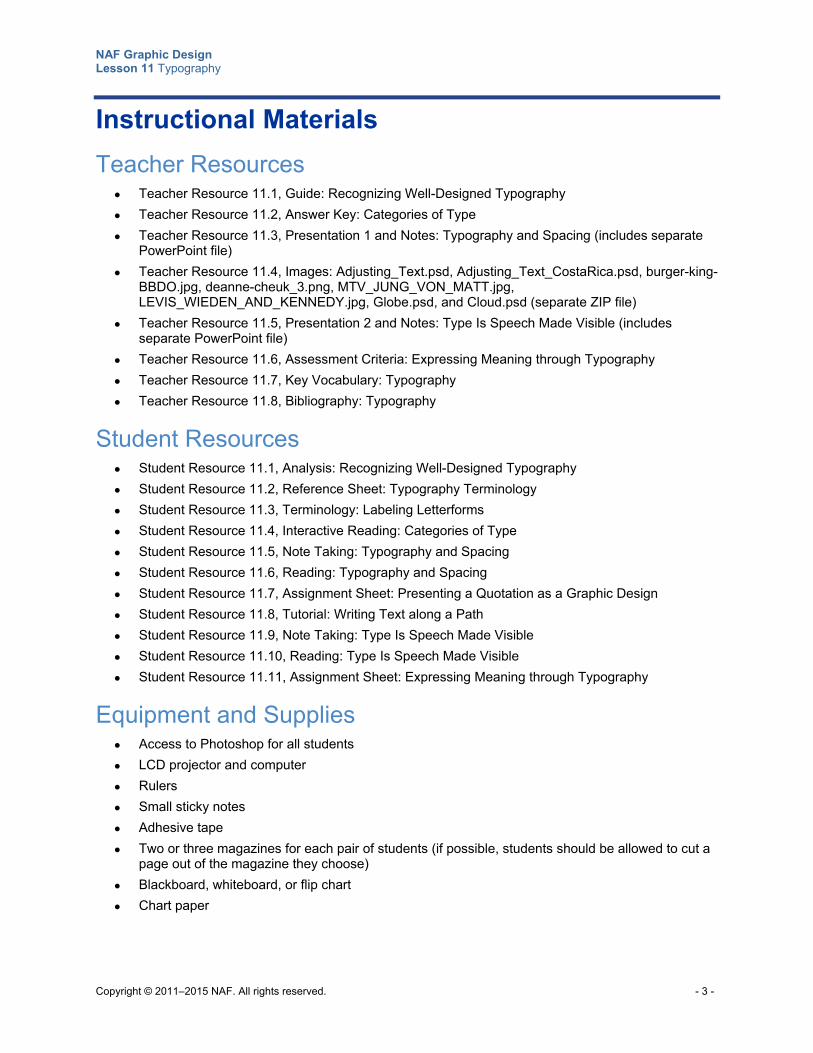
NAF Graphic Design Lesson 11 Typography
Copyright © 2011–2015 NAF. All rights reserved. - 3 -
Instructional Materials
Teacher Resources Teacher Resource 11.1, Guide: Recognizing Well-Designed Typography
Teacher Resource 11.2, Answer Key: Categories of Type
Teacher Resource 11.3, Presentation 1 and Notes: Typography and Spacing (includes separate PowerPoint file)
Teacher Resource 11.4, Images: Adjusting_Text.psd, Adjusting_Text_CostaRica.psd, burger-king-BBDO.jpg, deanne-cheuk_3.png, MTV_JUNG_VON_MATT.jpg, LEVIS_WIEDEN_AND_KENNEDY.jpg, Globe.psd, and Cloud.psd (separate ZIP file)
Teacher Resource 11.5, Presentation 2 and Notes: Type Is Speech Made Visible (includes separate PowerPoint file)
Teacher Resource 11.6, Assessment Criteria: Expressing Meaning through Typography
Teacher Resource 11.7, Key Vocabulary: Typography
Teacher Resource 11.8, Bibliography: Typography
Student Resources Student Resource 11.1, Analysis: Recognizing Well-Designed Typography
Student Resource 11.2, Reference Sheet: Typography Terminology
Student Resource 11.3, Terminology: Labeling Letterforms
Student Resource 11.4, Interactive Reading: Categories of Type
Student Resource 11.5, Note Taking: Typography and Spacing
Student Resource 11.6, Reading: Typography and Spacing
Student Resource 11.7, Assignment Sheet: Presenting a Quotation as a Graphic Design
Student Resource 11.8, Tutorial: Writing Text along a Path
Student Resource 11.9, Note Taking: Type Is Speech Made Visible
Student Resource 11.10, Reading: Type Is Speech Made Visible
Student Resource 11.11, Assignment Sheet: Expressing Meaning through Typography
Equipment and Supplies Access to Photoshop for all students
LCD projector and computer
Rulers
Small sticky notes
Adhesive tape
Two or three magazines for each pair of students (if possible, students should be allowed to cut a page out of the magazine they choose)
Blackboard, whiteboard, or flip chart
Chart paper
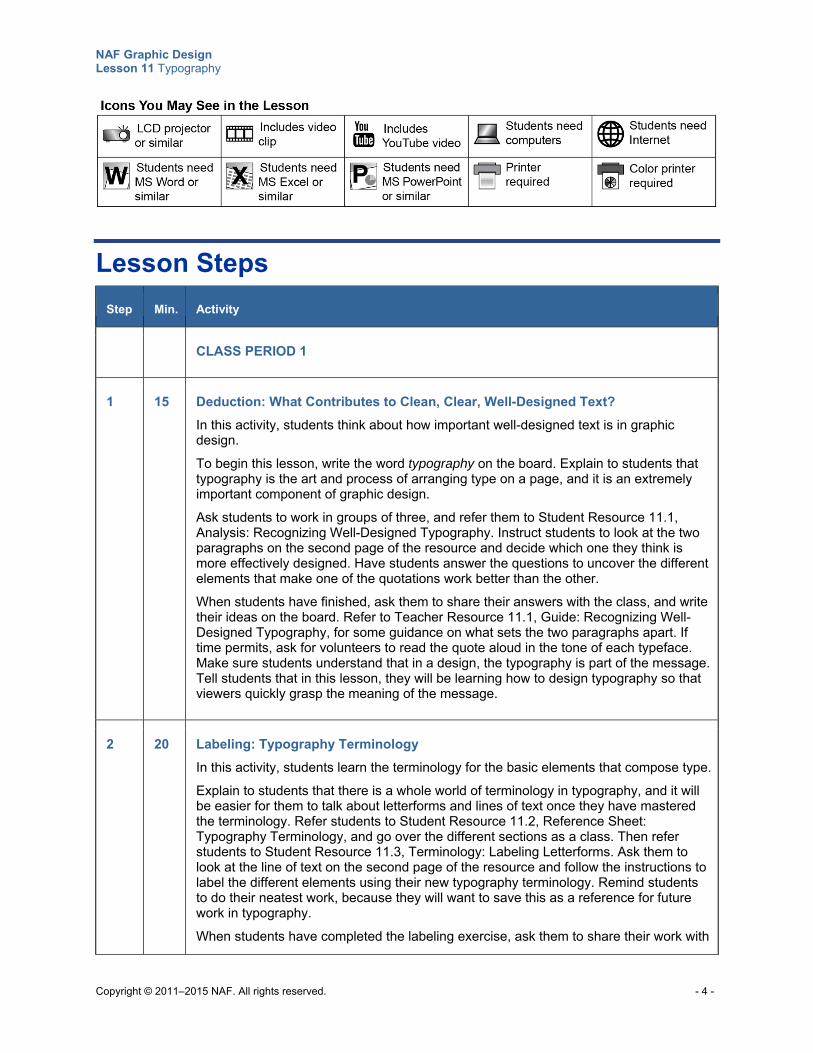
NAF Graphic Design Lesson 11 Typography
Copyright © 2011–2015 NAF. All rights reserved. - 4 -
Lesson Steps
Step Min. Activity
CLASS PERIOD 1
1 15 Deduction: What Contributes to Clean, Clear, Well-Designed Text?
In this activity, students think about how important well-designed text is in graphic design.
To begin this lesson, write the word typography on the board. Explain to students that typography is the art and process of arranging type on a page, and it is an extremely important component of graphic design.
Ask students to work in groups of three, and refer them to Student Resource 11.1, Analysis: Recognizing Well-Designed Typography. Instruct students to look at the two paragraphs on the second page of the resource and decide which one they think is more effectively designed. Have students answer the questions to uncover the different elements that make one of the quotations work better than the other.
When students have finished, ask them to share their answers with the class, and write their ideas on the board. Refer to Teacher Resource 11.1, Guide: Recognizing Well-Designed Typography, for some guidance on what sets the two paragraphs apart. If time permits, ask for volunteers to read the quote aloud in the tone of each typeface. Make sure students understand that in a design, the typography is part of the message. Tell students that in this lesson, they will be learning how to design typography so that viewers quickly grasp the meaning of the message.
2 20 Labeling: Typography Terminology
In this activity, students learn the terminology for the basic elements that compose type.
Explain to students that there is a whole world of terminology in typography, and it will be easier for them to talk about letterforms and lines of text once they have mastered the terminology. Refer students to Student Resource 11.2, Reference Sheet: Typography Terminology, and go over the different sections as a class. Then refer students to Student Resource 11.3, Terminology: Labeling Letterforms. Ask them to look at the line of text on the second page of the resource and follow the instructions to label the different elements using their new typography terminology. Remind students to do their neatest work, because they will want to save this as a reference for future work in typography.
When students have completed the labeling exercise, ask them to share their work with
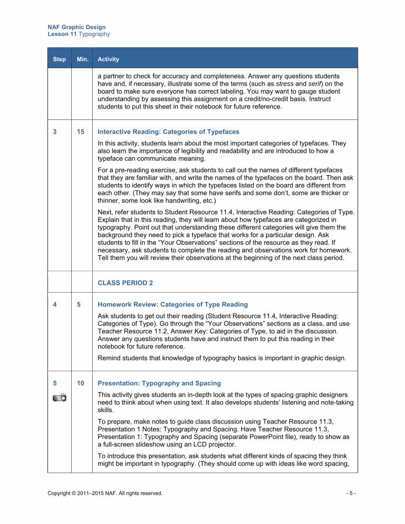
NAF Graphic Design Lesson 11 Typography
Copyright © 2011–2015 NAF. All rights reserved. - 5 -
Step Min. Activity
a partner to check for accuracy and completeness. Answer any questions students have and, if necessary, illustrate some of the terms (such as stress and serif) on the board to make sure everyone has correct labeling. You may want to gauge student understanding by assessing this assignment on a credit/no-credit basis. Instruct students to put this sheet in their notebook for future reference.
3 15 Interactive Reading: Categories of Typefaces
In this activity, students learn about the most important categories of typefaces. They also learn the importance of legibility and readability and are introduced to how a typeface can communicate meaning.
For a pre-reading exercise, ask students to call out the names of different typefaces that they are familiar with, and write the names of the typefaces on the board. Then ask students to identify ways in which the typefaces listed on the board are different from each other. (They may say that some have serifs and some don’t, some are thicker or thinner, some look like handwriting, etc.) Next, refer students to Student Resource 11.4, Interactive Reading: Categories of Type. Explain that in this reading, they will learn about how typefaces are categorized in typography. Point out that understanding these different categories will give them the background they need to pick a typeface that works for a particular design. Ask students to fill in the “Your Observations” sections of the resource as they read. If necessary, ask students to complete the reading and observations work for homework. Tell them you will review their observations at the beginning of the next class period.
CLASS PERIOD 2
4 5 Homework Review: Categories of Type Reading
Ask students to get out their reading (Student Resource 11.4, Interactive Reading: Categories of Type). Go through the “Your Observations” sections as a class, and use Teacher Resource 11.2, Answer Key: Categories of Type, to aid in the discussion. Answer any questions students have and instruct them to put this reading in their notebook for future reference. Remind students that knowledge of typography basics is important in graphic design.
5
10 Presentation: Typography and Spacing
This activity gives students an in-depth look at the types of spacing graphic designers need to think about when using text. It also develops students’ listening and note-taking skills.
To prepare, make notes to guide class discussion using Teacher Resource 11.3, Presentation 1 Notes: Typography and Spacing. Have Teacher Resource 11.3, Presentation 1: Typography and Spacing (separate PowerPoint file), ready to show as a full-screen slideshow using an LCD projector.
To introduce this presentation, ask students what different kinds of spacing they think might be important in typography. (They should come up with ideas like word spacing,
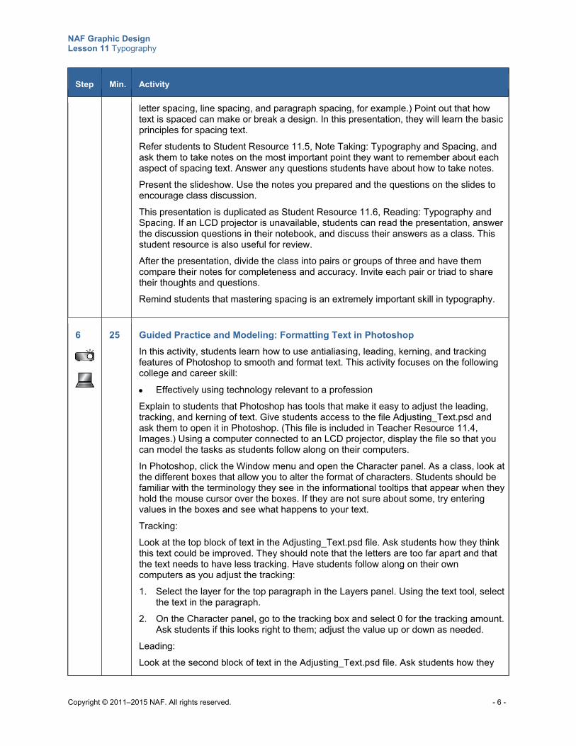
NAF Graphic Design Lesson 11 Typography
Copyright © 2011–2015 NAF. All rights reserved. - 6 -
Step Min. Activity
letter spacing, line spacing, and paragraph spacing, for example.) Point out that how text is spaced can make or break a design. In this presentation, they will learn the basic principles for spacing text. Refer students to Student Resource 11.5, Note Taking: Typography and Spacing, and ask them to take notes on the most important point they want to remember about each aspect of spacing text. Answer any questions students have about how to take notes.
Present the slideshow. Use the notes you prepared and the questions on the slides to encourage class discussion.
This presentation is duplicated as Student Resource 11.6, Reading: Typography and Spacing. If an LCD projector is unavailable, students can read the presentation, answer the discussion questions in their notebook, and discuss their answers as a class. This student resource is also useful for review.
After the presentation, divide the class into pairs or groups of three and have them compare their notes for completeness and accuracy. Invite each pair or triad to share their thoughts and questions.
Remind students that mastering spacing is an extremely important skill in typography.
6
25 Guided Practice and Modeling: Formatting Text in Photoshop
In this activity, students learn how to use antialiasing, leading, kerning, and tracking features of Photoshop to smooth and format text. This activity focuses on the following college and career skill: Effectively using technology relevant to a profession
Explain to students that Photoshop has tools that make it easy to adjust the leading, tracking, and kerning of text. Give students access to the file Adjusting_Text.psd and ask them to open it in Photoshop. (This file is included in Teacher Resource 11.4, Images.) Using a computer connected to an LCD projector, display the file so that you can model the tasks as students follow along on their computers.
In Photoshop, click the Window menu and open the Character panel. As a class, look at the different boxes that allow you to alter the format of characters. Students should be familiar with the terminology they see in the informational tooltips that appear when they hold the mouse cursor over the boxes. If they are not sure about some, try entering values in the boxes and see what happens to your text.
Tracking:
Look at the top block of text in the Adjusting_Text.psd file. Ask students how they think this text could be improved. They should note that the letters are too far apart and that the text needs to have less tracking. Have students follow along on their own computers as you adjust the tracking:
1. Select the layer for the top paragraph in the Layers panel. Using the text tool, select the text in the paragraph.
2. On the Character panel, go to the tracking box and select 0 for the tracking amount. Ask students if this looks right to them; adjust the value up or down as needed.
Leading:
Look at the second block of text in the Adjusting_Text.psd file. Ask students how they
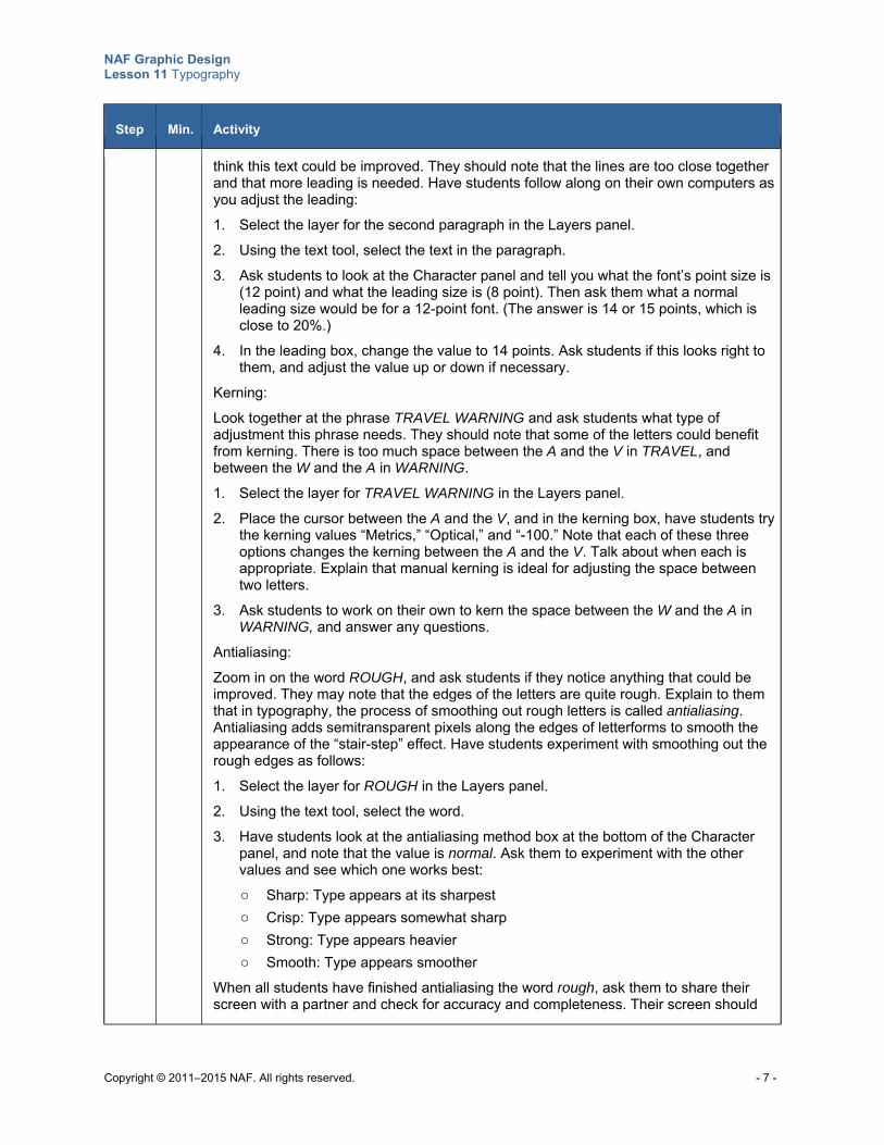
NAF Graphic Design Lesson 11 Typography
Copyright © 2011–2015 NAF. All rights reserved. - 7 -
Step Min. Activity
think this text could be improved. They should note that the lines are too close together and that more leading is needed. Have students follow along on their own computers as you adjust the leading:
1. Select the layer for the second paragraph in the Layers panel.
2. Using the text tool, select the text in the paragraph.
3. Ask students to look at the Character panel and tell you what the font’s point size is (12 point) and what the leading size is (8 point). Then ask them what a normal leading size would be for a 12-point font. (The answer is 14 or 15 points, which is close to 20%.)
4. In the leading box, change the value to 14 points. Ask students if this looks right to them, and adjust the value up or down if necessary.
Kerning:
Look together at the phrase TRAVEL WARNING and ask students what type of adjustment this phrase needs. They should note that some of the letters could benefit from kerning. There is too much space between the A and the V in TRAVEL, and between the W and the A in WARNING.
1. Select the layer for TRAVEL WARNING in the Layers panel.
2. Place the cursor between the A and the V, and in the kerning box, have students try the kerning values “Metrics,” “Optical,” and “-100.” Note that each of these three options changes the kerning between the A and the V. Talk about when each is appropriate. Explain that manual kerning is ideal for adjusting the space between two letters.
3. Ask students to work on their own to kern the space between the W and the A in WARNING, and answer any questions.
Antialiasing:
Zoom in on the word ROUGH, and ask students if they notice anything that could be improved. They may note that the edges of the letters are quite rough. Explain to them that in typography, the process of smoothing out rough letters is called antialiasing. Antialiasing adds semitransparent pixels along the edges of letterforms to smooth the appearance of the “stair-step” effect. Have students experiment with smoothing out the rough edges as follows:
1. Select the layer for ROUGH in the Layers panel.
2. Using the text tool, select the word.
3. Have students look at the antialiasing method box at the bottom of the Character panel, and note that the value is normal. Ask them to experiment with the other values and see which one works best:
o Sharp: Type appears at its sharpest
o Crisp: Type appears somewhat sharp
o Strong: Type appears heavier
o Smooth: Type appears smoother
When all students have finished antialiasing the word rough, ask them to share their screen with a partner and check for accuracy and completeness. Their screen should
NAF Graphic Design Lesson 11 Typography
Copyright © 2011–2015 NAF. All rights reserved. - 8 -
Step Min. Activity
look like your screen. Answer any questions students have about these formatting options, and tell them they will get a chance to use these options to format text on their own in the next activity.
7
10 Independent Practice: Formatting Text in Photoshop
In this activity, students get more practice time to apply antialiasing, leading, kerning, and tracking as needed to smooth and format text.
Give students access to the file Adjusting_Text_CostaRica.psd. (This file is included in Teacher Resource 11.4, Images.) Instruct them to open the file in Photoshop and apply tracking, leading, kerning, and antialiasing where necessary. When students have completed their formatting, ask them to share the page on their computer screen with a partner to check for accuracy and completeness. Answer any questions students have, and discuss as a class what changes are necessary to improve this page. Ask students to save their files and give you access to them. You may want to gauge student understanding by assessing this assignment on a credit/no-credit basis.
Point out to students that these are important tools, and they should get used to using them to improve their designs. Correct, precise spacing will give their work a professional look.
For homework, ask students to think about a short quotation or proverb they would like to use in a design. Examples include “A smooth sea never made a skilled sailor” (English proverb) and “You miss 100% of the shots you don’t take” (Wayne Gretzky quote).
CLASS PERIOD 3
8
25 Independent Practice: Presenting Text Effectively
In this activity, students use everything they’ve learned so far about typography to create an effective text design in Photoshop.
To begin this activity, ask students the following question:
Based on what you’ve learned about typography so far, what are the aspects of typography that you need to think about when using text in graphic design?
(Answers should include the different types of spacing, font choice, type size, style and weight, line length, legibility and readability, etc.)
Tell students that in this activity, they will get a chance to apply all that they have learned by presenting a quotation of their choice in a design. Refer students to Student Resource 11.7, Assignment Sheet: Presenting a Quotation as a Graphic Design. Go over the instructions as a class and answer any questions. Then circulate as students are working and help them as necessary.
You may want to show some examples of how text can become part of the design. Try showing the following designs for student inspiration:
http://media-cache-ec0.pinimg.com/originals/f4/24/49/f42449e690d98723cb5b7fb73bba0b66.jpg
NAF Graphic Design Lesson 11 Typography
Copyright © 2011–2015 NAF. All rights reserved. - 9 -
Step Min. Activity
http://media-cache-ec0.pinimg.com/736x/35/59/d0/3559d0b5ebe28c53ec5e1908d0bf10ec.jpg
http://media-cache-ak0.pinimg.com/736x/a0/9d/b1/a09db165ccef1a8a495c900f07544803.jpg
When students have completed their design, ask them to show it to a partner on their screen. Instruct partners to check each other’s work to make sure all aspects of typography are taken into consideration. Ask students to print the final version of their quotation, and post all of the quotations on the wall so that students can read each other’s quotations.
Ask students to share any difficulties they had achieving effective results for this assignment, and answer any questions students have about the different aspects of typography. Remind students that well-designed text is an important aspect of visual communication.
9
25 Guided and Independent Practice: Typing Text along a Path in Photoshop and Using Warp Text Styles
In this activity, students learn how to use Photoshop to type text along a path and to use different warp text styles.
Point out to students that one way to use text effectively in a design is to make it an integral part of an image or a shape in the design. Show students examples of effective use of text in designs to give them some ideas. For example, using an LCD projector with your computer, show the following image files that are included in Teacher Resource 11.4, Images:
burger-king-BBDO.jpg
deanne-cheuk_3.png
MTV_JUNG_VON_MATT.jpg
LEVIS_WIEDEN_AND_KENNEDY.jpg
Point out to students that if they want to take on a challenge, they could create images similar to these by using patterns and other features of Photoshop. But an easy way to make text an integral part of an image is to draw a path in a design and type text along that path. (This is what is going on in the Levi’s image.)
Give students access to the file Globe.psd (included in Teacher Resource 11.4, Images) and ask them to open the file in Photoshop. Using an LCD projector with your computer, demonstrate how to draw a path around the globe and write text on it, and have students follow along on their own computers:
1. Select the Pen tool from the toolbar and place the pen at the beginning point for the circle.
2. Click and drag in the direction you want the circular path to go. You might suggest students think of it as ice skating; the skater touches down with the skate (clicking) and pushes off in the direction he or she wants to glide (dragging).
3. When the circle is complete, use the Direct Select and Path Select tools from the toolbar to adjust it. The Path Select pointer tool selects the whole object; the Direct Select pointer tool selects anchor points on the path and edits them. Have students click any anchor point and move it. Also have them click the path itself to drag it up
NAF Graphic Design Lesson 11 Typography
Copyright © 2011–2015 NAF. All rights reserved. - 10 -
Step Min. Activity
and down. Have students work with their circle until they are satisfied that they have a nice, smooth circle. Tip: Editable anchors are hollow dots. Selected anchors become solid dots.
4. Now you are ready to enter text along the path. Select the text tool in the toolbar.
5. Before clicking the path, set the text attributes (color, font, size, etc.).
6. Hold the text cursor over the path and ask students about the change they see in the cursor icon. When you hold the text cursor over a path, the baseline becomes an angled shape, indicating that the text tool is in text-on-a-path mode.
7. Once the cursor transforms, click the path. You can now enter your text, “Around the world in eighty days,” or some other appropriate text.
Answer any questions students have about the process. Have students check their images with a partner to make sure their images look like what is on your screen. Help students clear up any discrepancies.
Next, introduce students to the Warp option on the text tool. Let students try the different Warp features on the text in their globe image to get an idea of how the Warp option works. Ask students to suggest types of graphic designs where the Warp option would be especially useful to help communicate meaning.
Finally, give students access to Cloud.psd and instruct them to choose their own text and have it follow along a path, using the same method you used in the guided practice. Refer students to Student Resource 11.8, Tutorial: Writing Text along a Path, for written instructions on how to write text along a path. Circulate while students are working and answer any questions. Ask students to put their tutorial page in their notebook so that they can refer to it when they want to write text along a shape.
When students are finished, ask them to display their cloud with text on their screen. Ask them to look at the screens of two of their peers and use sticky notes to comment on what is particularly effective.
Ask students to save their files so that you can access them. You may want to gauge student understanding by assessing students’ files on a credit/no-credit basis.
CLASS PERIOD 4
10
20 Presentation: Type Is Speech Made Visible
This activity gives students an in-depth look at how to choose typefaces that communicate their message.
To prepare, make notes to guide class discussion using Teacher Resource 11.5, Presentation 2 Notes: Type Is Speech Made Visible. Have Teacher Resource 11.5, Presentation 2: Type Is Speech Made Visible (separate PowerPoint file), ready to show as a full-screen slideshow using an LCD projector.
To introduce this presentation, ask students if they can think of an example of how you communicate the emotion of fear using a typeface. Note their answers on the board, and explain that in this presentation, they will learn about the different aspects of
NAF Graphic Design Lesson 11 Typography
Copyright © 2011–2015 NAF. All rights reserved. - 11 -
Step Min. Activity
transforming type into expressive, spoken words rather than just letters on a page.
Refer students to Student Resource 11.9, Note Taking: Type Is Speech Made Visible, and instruct them to take notes on the most important point they want to remember about each aspect of choosing a typeface. Answer any questions students have about how to take notes.
Present the slideshow. This presentation is also duplicated as Student Resource 11.10, Reading: Type Is Speech Made Visible, to use according to your preferences.
After the presentation, divide the class into pairs or groups of three and have them compare their notes for completeness and accuracy. Invite each pair or triad to share their thoughts and questions.
Tell students that in the remaining activities of this lesson, they will get a chance to put into practice what they have learned about communicating through type.
11 15 Scavenger Hunt: Typography That Speaks
In this activity, students get practice observing how professionals use type to express meaning. This activity focuses on the following college and career skill:
Demonstrating teamwork and collaboration
Ask students to work in pairs, and give each pair a few magazines to look through. (If possible, give them magazines from which they can remove a page for this assignment.)
Instruct students to look through their magazines and find typefaces that express light-heartedness, seriousness, humor, a particular time and place, urgency, or some other quality. Ask them to choose one example where the type design communicates meaning and write down in their notebook:
The primary meaning (what the words say)
The secondary meaning (what the type design communicates)
Ask them to cut the page out of the magazine and tape it to the notebook page where they wrote their primary and secondary meaning.
If time permits, have pairs share their work with each other, and ask for a few volunteers who found a really good example in their magazine to share their work with the class. You may want to gauge student understanding by assessing this assignment on a credit/no-credit basis.
Encourage students to keep their eyes open for observing how type design is used to communicate meaning in the world around them. The more they observe what others are doing, the better they will become at communicating through type design.
12 15 Performance Assessment: Using Typography to Express Meaning
In this activity, students apply what they have learned about using type to express meaning to making their own personal statement using typography.
Ask students to write their first and last names on a page in their notebook, and then to write several words that describe who they are below their name. Have them share what they wrote with a partner, and then explain to students that in this activity, they will
NAF Graphic Design Lesson 11 Typography
Copyright © 2011–2015 NAF. All rights reserved. - 12 -
Step Min. Activity
use the letters in their name to create an interesting composition that shows something about who they are.
Refer students to Student Resource 11.11, Assignment Sheet: Expressing Meaning through Typography. Read through the specifications and procedure with students, and look at the assessment criteria together. Look at the example, and ask students to share what they like about the example and to suggest other ways that this person could have presented her name. Impress upon students that there are any number of ways to create a design that meets the specifications for this assignment. They should aim for a unique and memorable design that is really about who they are. Answer any questions students have before they begin work.
Ask students to complete their thumbnail designs for homework. Tell them they will have a chance at the beginning of the next class period to show their thumbnails to a partner and get some advice on what might be the most effective design.
CLASS PERIOD 5
13
35 Performance Assessment: Using Typography to Express Meaning (Continued)
To begin this activity, ask students to share their thumbnail designs with a partner and to evaluate each other’s designs. Ask them to help their partner choose a design that is unique and memorable and that is representative of the designer. Also ask partners to suggest any improvements to typeface and color choices.
When students have made a final choice of the thumbnail they want to work from, have them get right to work creating their design in Photoshop. Remind them to keep the assessment criteria in mind as they are working. Circulate and give students any assistance they need.
When students are finished, ask them to save their design both as a PSD file and as a PDF file. Instruct them to display the PDF file on their screen.
14
10 Gallery Walk: Using Type to Express Meaning
Ask students to share their work in groups of five. Tell each group to go from screen to screen together, looking at each other’s work. Ask group members to share what they can perceive about the designer in each of the designs. If time permits, ask each group to choose one design to share with the entire class.
Ask students to submit their thumbnails, their PSD file, and their PDF file for assessment. Assess student work using Teacher Resource 11.6, Assessment Criteria: Expressing Meaning through Typography.
You may also want to instruct students to print a copy of their work and save it in their design portfolio. Explain to students that a piece in their portfolio that tells something about who they are could be very effective to share in an interview for a job or an internship.
15 5 Taxonomy: Typography Terms
NAF Graphic Design Lesson 11 Typography
Copyright © 2011–2015 NAF. All rights reserved. - 13 -
Step Min. Activity
To conclude this lesson, create a list titled “Typography Taxonomy” on chart paper. Write the letters of the alphabet down the side of the paper. Ask students to call out all of the terms related to typography that they know, and write them next to the appropriate letter on the chart paper. Challenge them to come up with 35 terms in five minutes. Remind students that words are valuable, and having these new words in their vocabulary is an asset for their future. Instruct students to make their own taxonomy of typography terms in their notebook for homework.
Encourage students to use these terms accurately whenever they are working with typography.
Extensions
Enrichment Show students (or have them watch) the film Helvetica. Then have them write a few paragraphs
explaining how the Helvetica font has influenced the design fonts they use and plan to use in the future.
Ask students to create a poster for their favorite film using only text on the poster. If possible, display the best posters in the school media center or some other prominent place on the school grounds.
Technology Integration Point out to students that although the terms typeface and font are used interchangeably today,
they are in fact two different things. Graphic designers choose typefaces for their projects—typefaces such as Times New Roman or Courier or Arial. To render the typeface, designers use a font of that typeface. (A font in the old days was a set of metal characters; today a font is a set of digital files.) For example, one typeface is News Gothic. Within that typeface you have various fonts available, such as News Gothic Bold and News Gothic Light.
Tell students that there are thousands of fonts that they can download to their computer from the Internet. Some fonts are for sale, and if they become professional designers they will probably need to purchase fonts. Fonts are copyrighted material, and this is why sites charge for downloading them. But many sites also have fonts available for free. Give students the names of the following sites, and instruct them to visit one or more of the sites and download fonts that they like onto their home computers. Tell students that dafont.com has instructions for downloading fonts to different types of computers on the home page of the website.
o www.dafont.com
o www.1001freefonts.com
o www.urbanfonts.com
o www.fontspace.com
o http://www.fontsquirrel.com
Instruct students to write a few lines with the fonts they download and then print their work and share it with the class.
NAF Graphic Design Lesson 11 Typography
Copyright © 2011–2015 NAF. All rights reserved. - 14 -
Ask students to research the different font software formats (such as PostScript, TrueType, and OpenType) and write a report on the usage of these different formats. Also ask students to visit www.fonts.com and report on what’s available. Have students give a copy of their report to their classmates for future reference.
Cross-Curricular Integration History: Ask students to study the history of typefaces from the 15th century to 21st-century
computers (or ask students to concentrate on typefaces in one particular period of history). Have them create a timeline of the most important developments and breakthroughs. Remind them that their timeline should demonstrate effective use of typography. Display the timelines in the classroom.
Foreign Languages: Ask students to create a poster using only text to publicize a film. All text on the poster must be in the language they are studying. Ask students to write their observations about any differences they had to adapt to when working with typography in a foreign language. (This could involve use of accents, longer word length, need for more words to express an idea, different character sets, etc.) Display the posters in the foreign language lab or classroom.
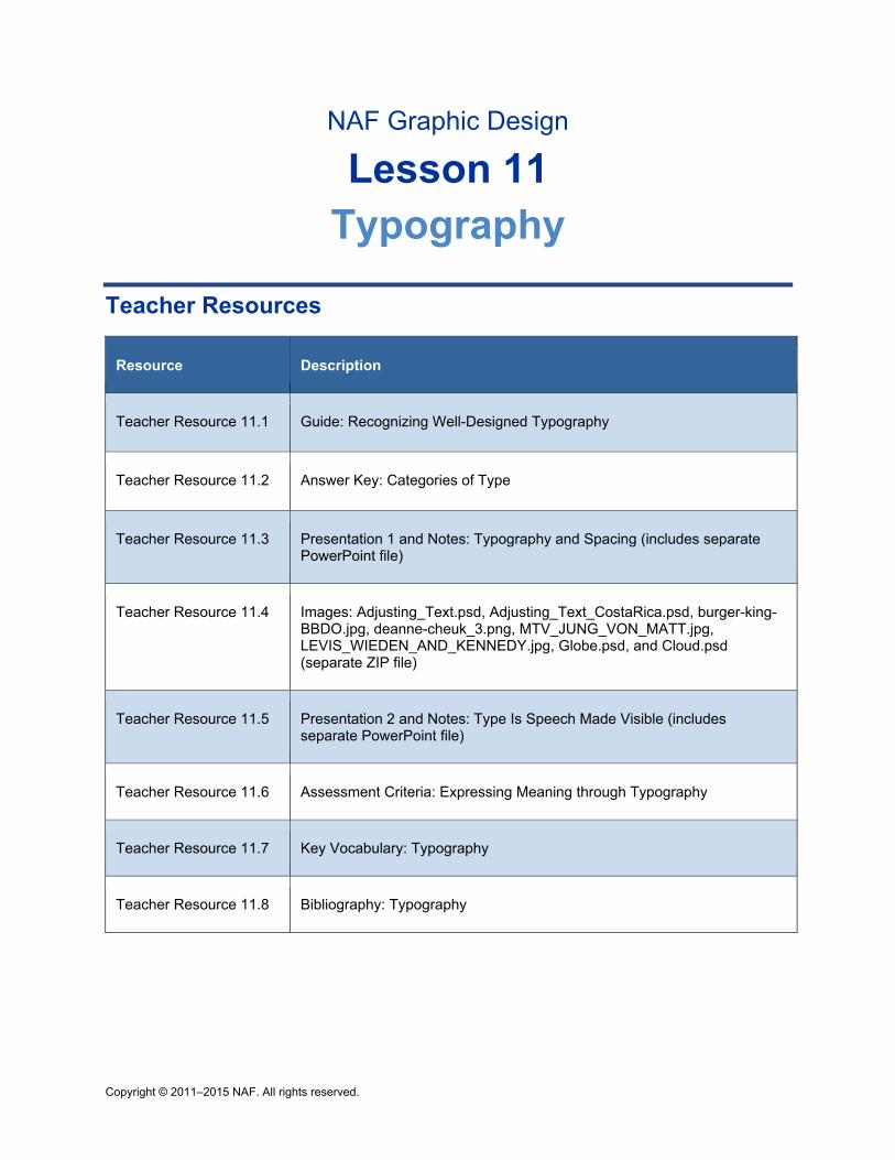
Copyright © 2011–2015 NAF. All rights reserved.
NAF Graphic Design
Lesson 11 Typography
Teacher Resources
Resource Description
Teacher Resource 11.1 Guide: Recognizing Well-Designed Typography
Teacher Resource 11.2 Answer Key: Categories of Type
Teacher Resource 11.3 Presentation 1 and Notes: Typography and Spacing (includes separate PowerPoint file)
Teacher Resource 11.4 Images: Adjusting_Text.psd, Adjusting_Text_CostaRica.psd, burger-king-BBDO.jpg, deanne-cheuk_3.png, MTV_JUNG_VON_MATT.jpg, LEVIS_WIEDEN_AND_KENNEDY.jpg, Globe.psd, and Cloud.psd (separate ZIP file)
Teacher Resource 11.5 Presentation 2 and Notes: Type Is Speech Made Visible (includes separate PowerPoint file)
Teacher Resource 11.6 Assessment Criteria: Expressing Meaning through Typography
Teacher Resource 11.7 Key Vocabulary: Typography
Teacher Resource 11.8 Bibliography: Typography
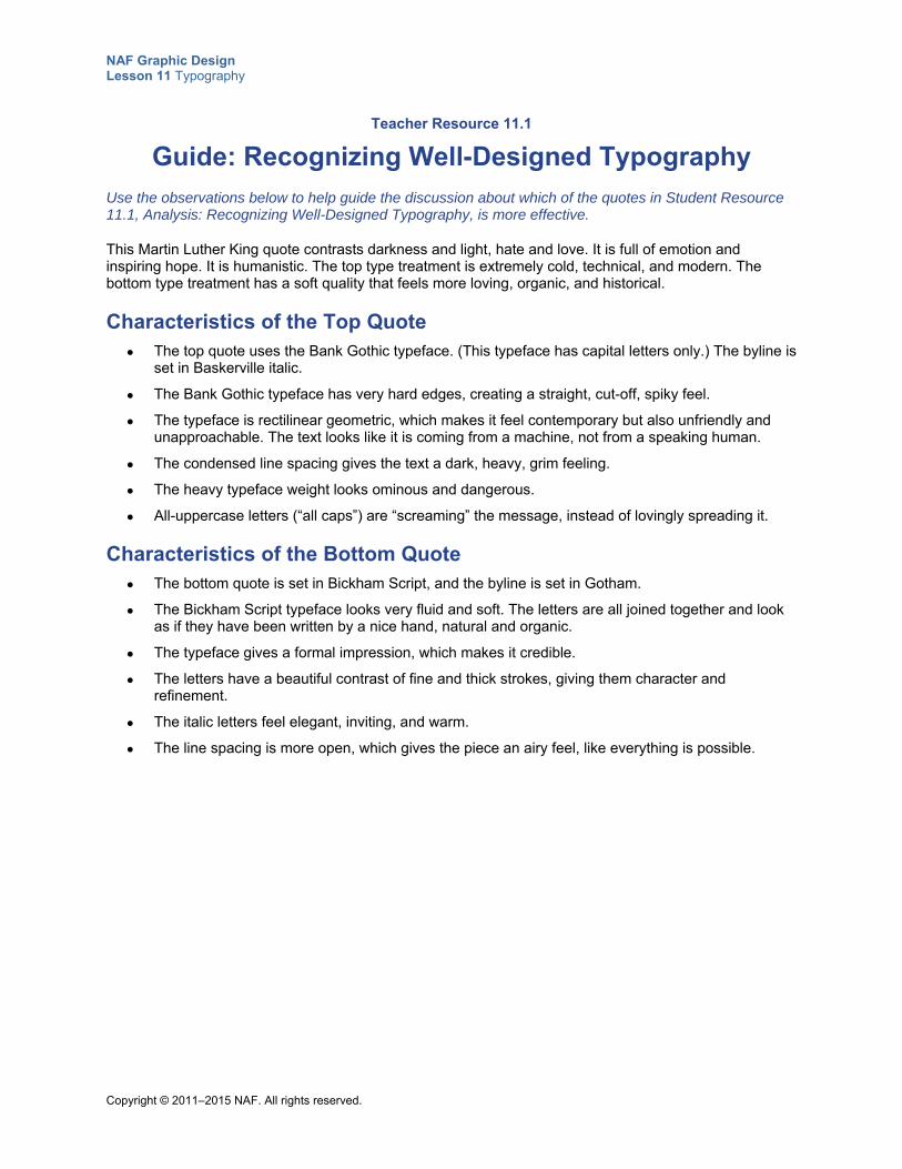
NAF Graphic Design Lesson 11 Typography
Copyright © 2011–2015 NAF. All rights reserved.
Teacher Resource 11.1
Guide: Recognizing Well-Designed Typography
Use the observations below to help guide the discussion about which of the quotes in Student Resource 11.1, Analysis: Recognizing Well-Designed Typography, is more effective.
This Martin Luther King quote contrasts darkness and light, hate and love. It is full of emotion and inspiring hope. It is humanistic. The top type treatment is extremely cold, technical, and modern. The bottom type treatment has a soft quality that feels more loving, organic, and historical.
Characteristics of the Top Quote The top quote uses the Bank Gothic typeface. (This typeface has capital letters only.) The byline is
set in Baskerville italic.
The Bank Gothic typeface has very hard edges, creating a straight, cut-off, spiky feel.
The typeface is rectilinear geometric, which makes it feel contemporary but also unfriendly and unapproachable. The text looks like it is coming from a machine, not from a speaking human.
The condensed line spacing gives the text a dark, heavy, grim feeling.
The heavy typeface weight looks ominous and dangerous.
All-uppercase letters (“all caps”) are “screaming” the message, instead of lovingly spreading it.
Characteristics of the Bottom Quote The bottom quote is set in Bickham Script, and the byline is set in Gotham.
The Bickham Script typeface looks very fluid and soft. The letters are all joined together and look as if they have been written by a nice hand, natural and organic.
The typeface gives a formal impression, which makes it credible.
The letters have a beautiful contrast of fine and thick strokes, giving them character and refinement.
The italic letters feel elegant, inviting, and warm.
The line spacing is more open, which gives the piece an airy feel, like everything is possible.
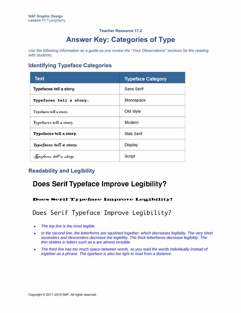
NAF Graphic Design Lesson 11 Typography
Copyright © 2011–2015 NAF. All rights reserved.
Teacher Resource 11.2
Answer Key: Categories of Type
Use the following information as a guide as you review the “Your Observations” sections for the reading with students.
Identifying Typeface Categories
Readability and Legibility
The top line is the most legible.
In the second line, the letterforms are squished together, which decreases legibility. The very short ascenders and descenders decrease the legibility. The thick letterforms decrease legibility. The thin strokes in letters such as e are almost invisible.
The third line has too much space between words, so you read the words individually instead of together as a phrase. The typeface is also too light to read from a distance.
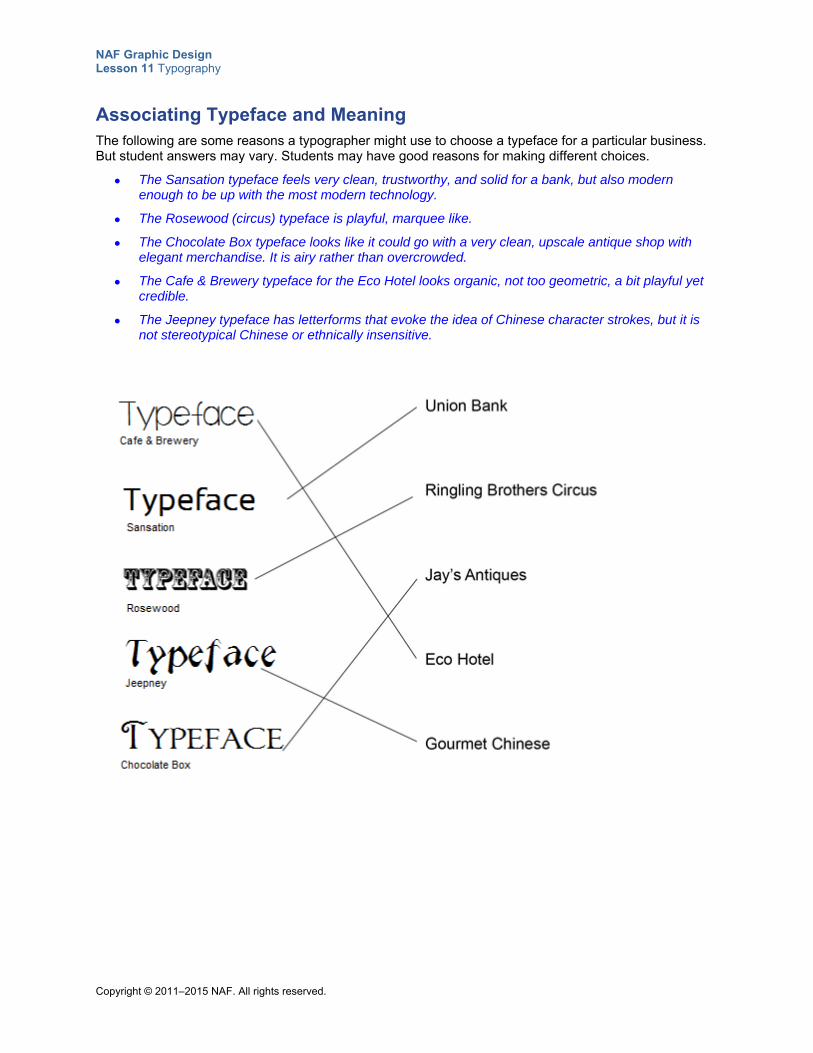
NAF Graphic Design Lesson 11 Typography
Copyright © 2011–2015 NAF. All rights reserved.
Associating Typeface and Meaning The following are some reasons a typographer might use to choose a typeface for a particular business. But student answers may vary. Students may have good reasons for making different choices.
The Sansation typeface feels very clean, trustworthy, and solid for a bank, but also modern enough to be up with the most modern technology.
The Rosewood (circus) typeface is playful, marquee like.
The Chocolate Box typeface looks like it could go with a very clean, upscale antique shop with elegant merchandise. It is airy rather than overcrowded.
The Cafe & Brewery typeface for the Eco Hotel looks organic, not too geometric, a bit playful yet credible.
The Jeepney typeface has letterforms that evoke the idea of Chinese character strokes, but it is not stereotypical Chinese or ethnically insensitive.

NAF Graphic Design Lesson 11 Typography
Copyright © 2011–2015 NAF. All rights reserved.
Teacher Resource 11.3
Presentation 1 Notes: Typography and Spacing
Before you show this presentation, use the text accompanying each slide to develop presentation notes. Writing the notes yourself enables you to approach the subject matter in a way that is comfortable to you and engaging for your students. Make this presentation as interactive as possible by stopping frequently to ask questions and encourage class discussion.
This presentation explains the importance of and uses for leading, letter spacing, kerning, and word spacing.
Presentation notes
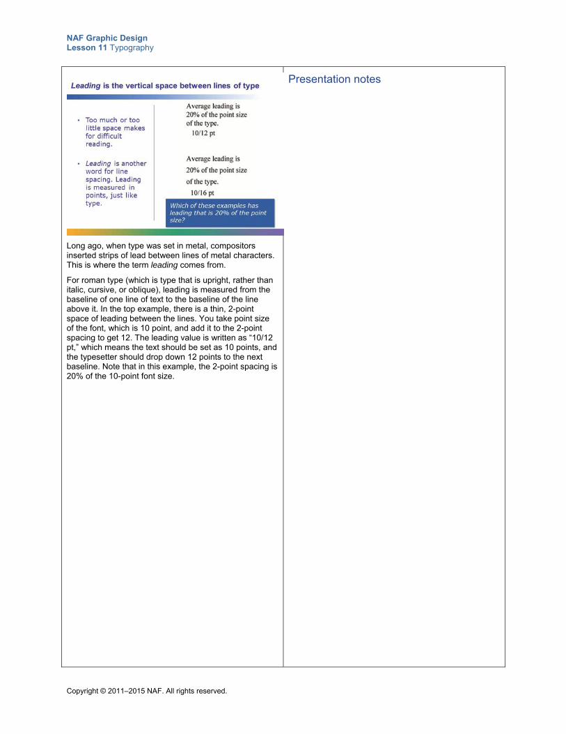
NAF Graphic Design Lesson 11 Typography
Copyright © 2011–2015 NAF. All rights reserved.
Long ago, when type was set in metal, compositors inserted strips of lead between lines of metal characters. This is where the term leading comes from.
For roman type (which is type that is upright, rather than italic, cursive, or oblique), leading is measured from the baseline of one line of text to the baseline of the line above it. In the top example, there is a thin, 2-point space of leading between the lines. You take point size of the font, which is 10 point, and add it to the 2-point spacing to get 12. The leading value is written as “10/12 pt,” which means the text should be set as 10 points, and the typesetter should drop down 12 points to the next baseline. Note that in this example, the 2-point spacing is 20% of the 10-point font size.
Presentation notes
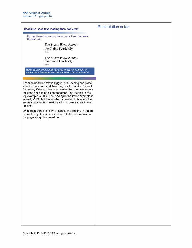
NAF Graphic Design Lesson 11 Typography
Copyright © 2011–2015 NAF. All rights reserved.
Because headline text is bigger, 20% leading can place lines too far apart, and then they don’t look like one unit. Especially if the top line of a heading has no descenders, the lines need to be closer together. The leading in the top example is 20%. The leading in the lower example is actually -10%, but that is what is needed to take out the empty space in this headline with no descenders in the top line.
On a page with lots of white space, the leading in the top example might look better, since all of the elements on the page are quite spread out.
Presentation notes
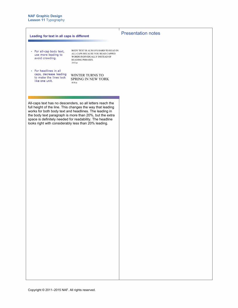
NAF Graphic Design Lesson 11 Typography
Copyright © 2011–2015 NAF. All rights reserved.
All-caps text has no descenders, so all letters reach the full height of the line. This changes the way that leading works for both body text and headlines. The leading in the body text paragraph is more than 20%, but the extra space is definitely needed for readability. The headline looks right with considerably less than 20% leading.
Presentation notes
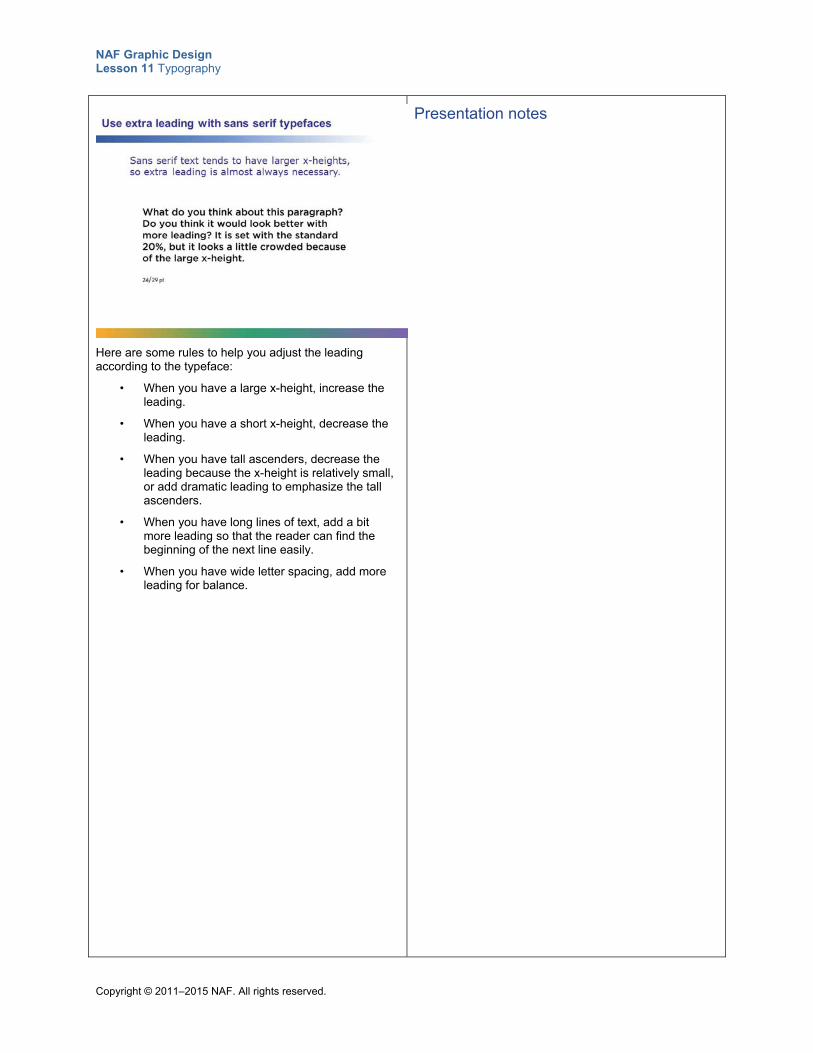
NAF Graphic Design Lesson 11 Typography
Copyright © 2011–2015 NAF. All rights reserved.
Here are some rules to help you adjust the leading according to the typeface:
• When you have a large x-height, increase the leading.
• When you have a short x-height, decrease the leading.
• When you have tall ascenders, decrease the leading because the x-height is relatively small, or add dramatic leading to emphasize the tall ascenders.
• When you have long lines of text, add a bit more leading so that the reader can find the beginning of the next line easily.
• When you have wide letter spacing, add more leading for balance.
Presentation notes
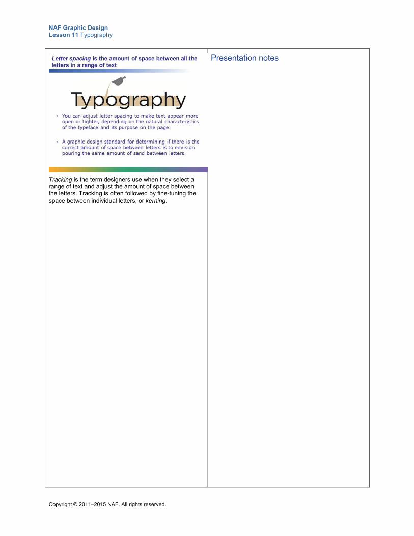
NAF Graphic Design Lesson 11 Typography
Copyright © 2011–2015 NAF. All rights reserved.
Tracking is the term designers use when they select a range of text and adjust the amount of space between the letters. Tracking is often followed by fine-tuning the space between individual letters, or kerning.
Presentation notes
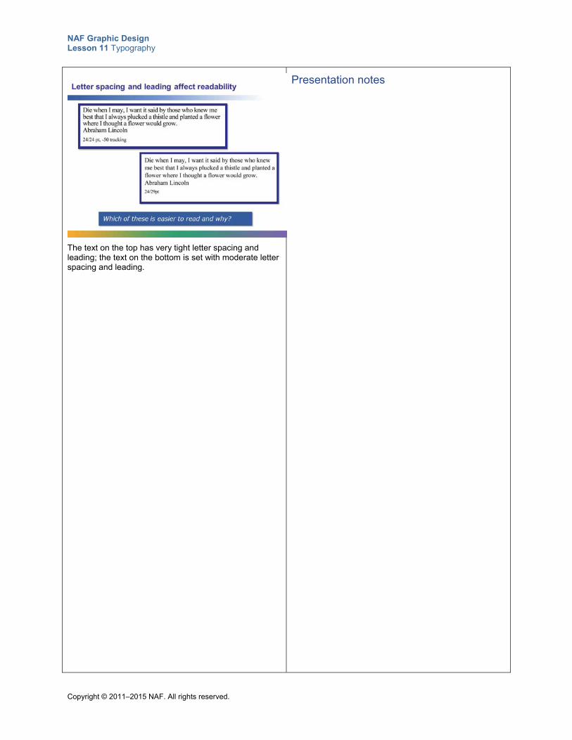
NAF Graphic Design Lesson 11 Typography
Copyright © 2011–2015 NAF. All rights reserved.
The text on the top has very tight letter spacing and leading; the text on the bottom is set with moderate letter spacing and leading.
Presentation notes
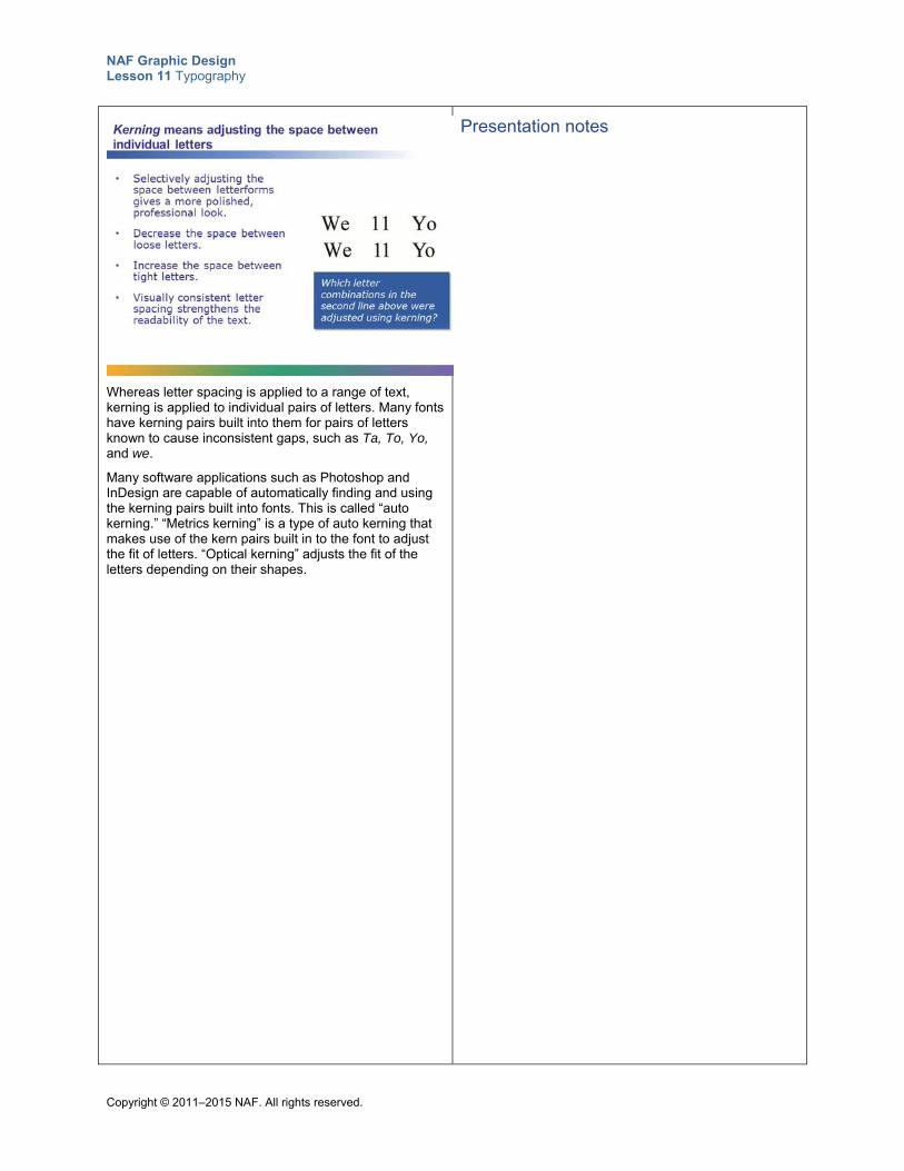
NAF Graphic Design Lesson 11 Typography
Copyright © 2011–2015 NAF. All rights reserved.
Whereas letter spacing is applied to a range of text, kerning is applied to individual pairs of letters. Many fonts have kerning pairs built into them for pairs of letters known to cause inconsistent gaps, such as Ta, To, Yo, and we.
Many software applications such as Photoshop and InDesign are capable of automatically finding and using the kerning pairs built into fonts. This is called “auto kerning.” “Metrics kerning” is a type of auto kerning that makes use of the kern pairs built in to the font to adjust the fit of letters. “Optical kerning” adjusts the fit of the letters depending on their shapes.
Presentation notes
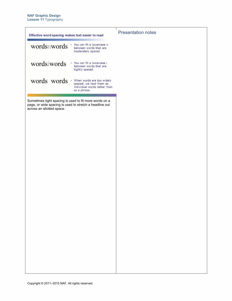
NAF Graphic Design Lesson 11 Typography
Copyright © 2011–2015 NAF. All rights reserved.
Sometimes tight spacing is used to fit more words on a page, or wide spacing is used to stretch a headline out across an allotted space.
Presentation notes
NAF Graphic Design Lesson 11 Typography
Copyright © 2011–2015 NAF. All rights reserved.
When you create a graphic design, be sure to use your knowledge of spacing to improve readability and to give your work a polished look. Although many software programs such as Photoshop do a lot of the work for you, it is your responsibility as a graphic designer to tailor the spacing in your design.
Presentation notes
NAF Graphic Design Lesson 11 Typography
Copyright © 2011–2015 NAF. All rights reserved.
Teacher Resource 11.5
Presentation 2 Notes: Type Is Speech Made Visible
Before you show this presentation, use the text accompanying each slide to develop presentation notes. Writing the notes yourself enables you to approach the subject matter in a way that is comfortable to you and engaging for your students. Make this presentation as interactive as possible by stopping frequently to ask questions and encourage class discussion.
This presentation explains how you can use typography to communicate a message that goes beyond the actual words on the page.
Much of the content in this presentation is adapted from the article “The Voice of Typography” in DT&G Magazine, located at http://www.graphic-design.com/Type/voice/index.html (accessed July 1, 2015).
Presentation notes
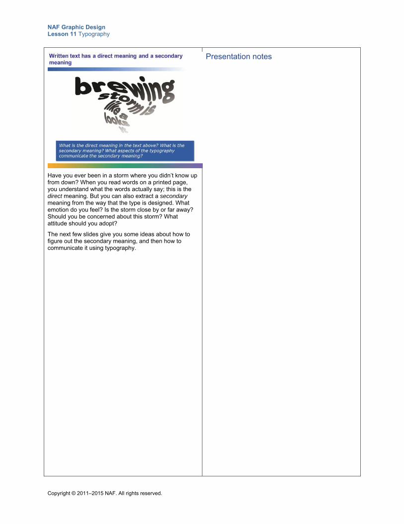
NAF Graphic Design Lesson 11 Typography
Copyright © 2011–2015 NAF. All rights reserved.
Have you ever been in a storm where you didn’t know up from down? When you read words on a printed page, you understand what the words actually say; this is the direct meaning. But you can also extract a secondary meaning from the way that the type is designed. What emotion do you feel? Is the storm close by or far away? Should you be concerned about this storm? What attitude should you adopt?
The next few slides give you some ideas about how to figure out the secondary meaning, and then how to communicate it using typography.
Presentation notes
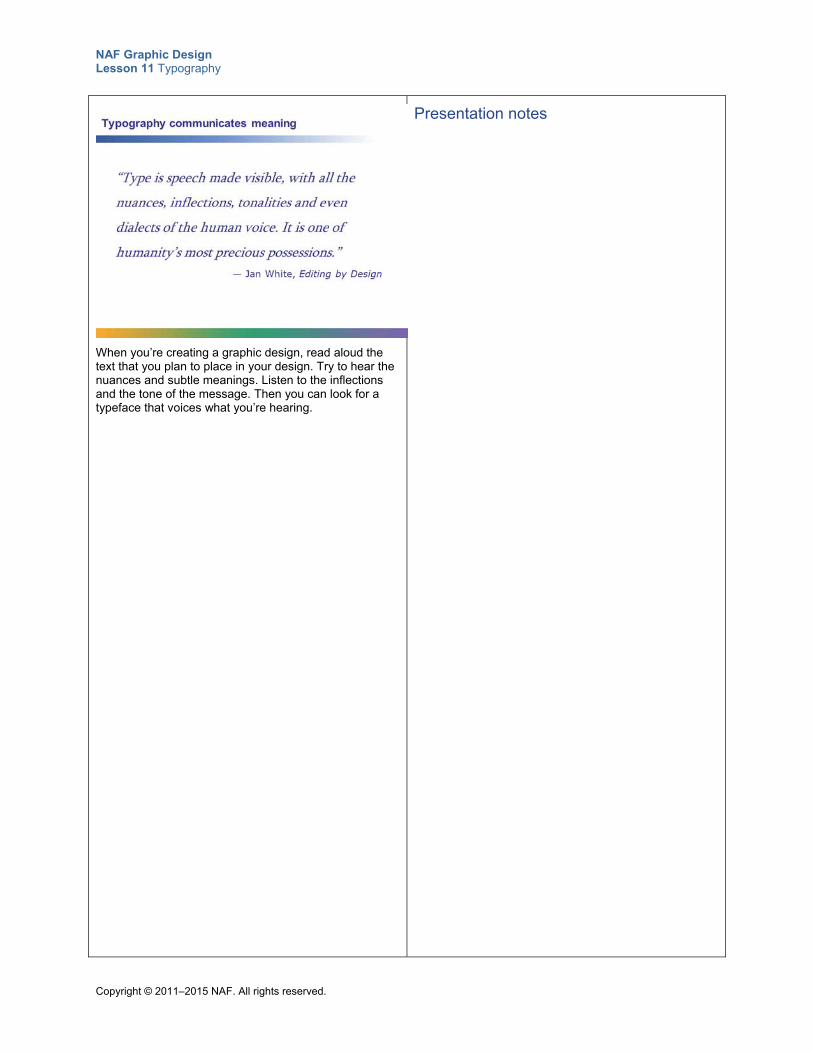
NAF Graphic Design Lesson 11 Typography
Copyright © 2011–2015 NAF. All rights reserved.
When you’re creating a graphic design, read aloud the text that you plan to place in your design. Try to hear the nuances and subtle meanings. Listen to the inflections and the tone of the message. Then you can look for a typeface that voices what you’re hearing.
Presentation notes
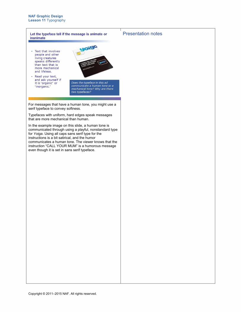
NAF Graphic Design Lesson 11 Typography
Copyright © 2011–2015 NAF. All rights reserved.
For messages that have a human tone, you might use a serif typeface to convey softness.
Typefaces with uniform, hard edges speak messages that are more mechanical than human.
In the example image on this slide, a human tone is communicated through using a playful, nonstandard type for Yoiga. Using all caps sans serif type for the instructions is a bit satirical, and the humor communicates a human tone. The viewer knows that the instruction “CALL YOUR MUM” is a humorous message even though it is set in sans serif typeface.
Presentation notes
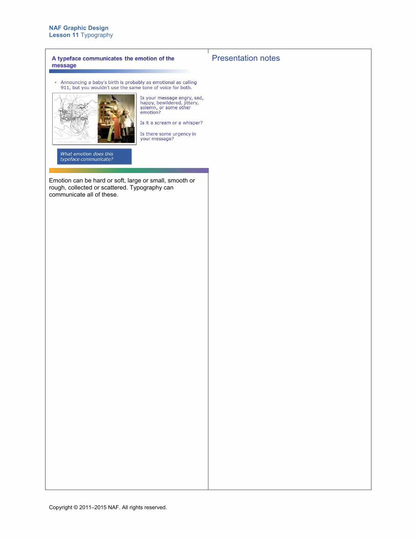
NAF Graphic Design Lesson 11 Typography
Copyright © 2011–2015 NAF. All rights reserved.
Emotion can be hard or soft, large or small, smooth or rough, collected or scattered. Typography can communicate all of these.
Presentation notes
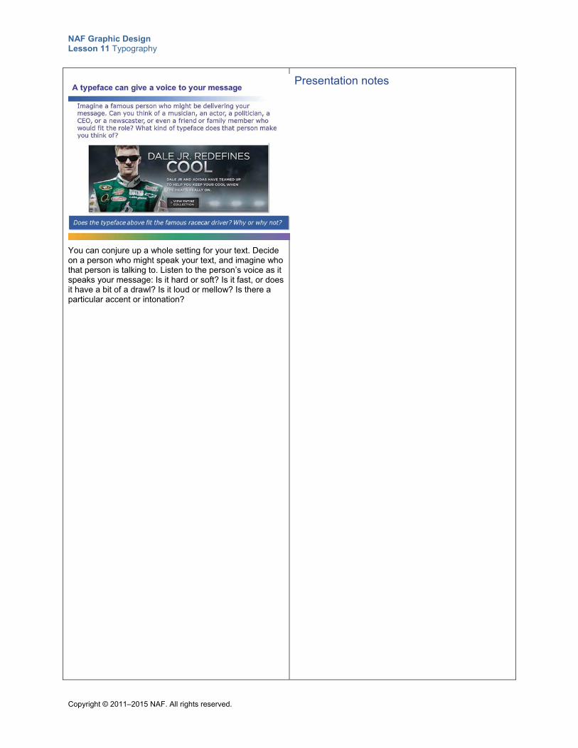
NAF Graphic Design Lesson 11 Typography
Copyright © 2011–2015 NAF. All rights reserved.
You can conjure up a whole setting for your text. Decide on a person who might speak your text, and imagine who that person is talking to. Listen to the person’s voice as it speaks your message: Is it hard or soft? Is it fast, or does it have a bit of a drawl? Is it loud or mellow? Is there a particular accent or intonation?
Presentation notes
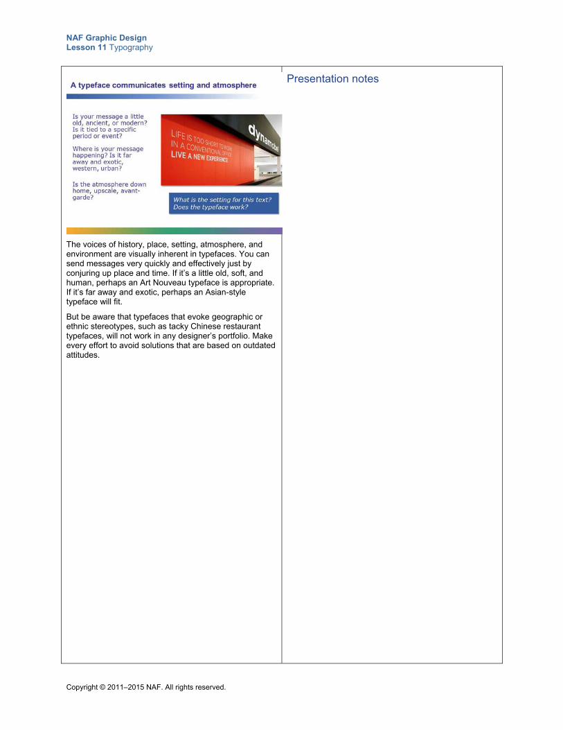
NAF Graphic Design Lesson 11 Typography
Copyright © 2011–2015 NAF. All rights reserved.
The voices of history, place, setting, atmosphere, and environment are visually inherent in typefaces. You can send messages very quickly and effectively just by conjuring up place and time. If it’s a little old, soft, and human, perhaps an Art Nouveau typeface is appropriate. If it’s far away and exotic, perhaps an Asian-style typeface will fit.
But be aware that typefaces that evoke geographic or ethnic stereotypes, such as tacky Chinese restaurant typefaces, will not work in any designer’s portfolio. Make every effort to avoid solutions that are based on outdated attitudes.
Presentation notes
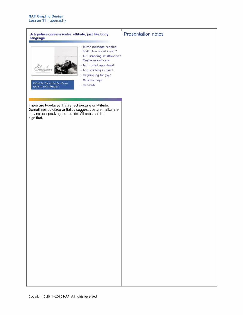
NAF Graphic Design Lesson 11 Typography
Copyright © 2011–2015 NAF. All rights reserved.
There are typefaces that reflect posture or attitude. Sometimes boldface or italics suggest posture; italics are moving, or speaking to the side. All caps can be dignified.
Presentation notes
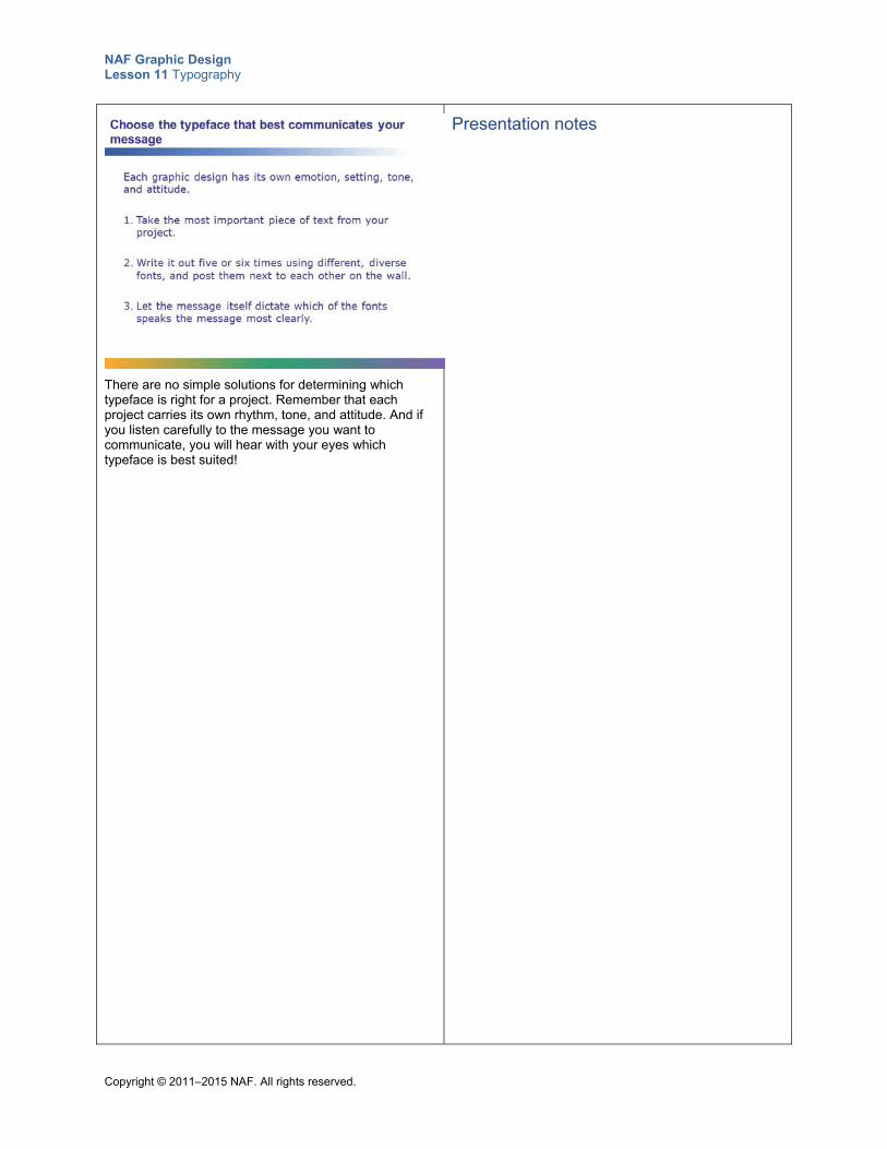
NAF Graphic Design Lesson 11 Typography
Copyright © 2011–2015 NAF. All rights reserved.
There are no simple solutions for determining which typeface is right for a project. Remember that each project carries its own rhythm, tone, and attitude. And if you listen carefully to the message you want to communicate, you will hear with your eyes which typeface is best suited!
Presentation notes
NAF Graphic Design Lesson 11 Typography
Copyright © 2011–2015 NAF. All rights reserved.
Teacher Resource 11.6
Assessment Criteria: Expressing Meaning through Typography
Student Name:______________________________________________________________
Date:_______________________________________________________________________
Using the following criteria, assess whether the student met each one.
Met Partially Met
Didn’t Meet
The thumbnails show that skilled and thoughtful planning work was put into the design.
□ □ □
The typefaces used in the design visually communicate who the designer is.
□ □ □
The arrangement of letters on the page visually communicates who the designer is.
□ □ □
The colors in the design communicate the designer’s identity.
□ □ □
The design demonstrates unity and balance. □ □ □
The design is unique and memorable and an accurate representation of the designer.
□ □ □
Additional Comments:
_____________________________________________________________________________
_____________________________________________________________________________
_____________________________________________________________________________
_____________________________________________________________________________
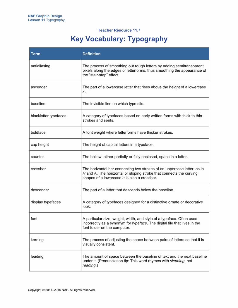
NAF Graphic Design Lesson 11 Typography
Copyright © 2011–2015 NAF. All rights reserved.
Teacher Resource 11.7
Key Vocabulary: Typography
Term Definition
antialiasing The process of smoothing out rough letters by adding semitransparent pixels along the edges of letterforms, thus smoothing the appearance of the “stair-step” effect.
ascender The part of a lowercase letter that rises above the height of a lowercase x.
baseline The invisible line on which type sits.
blackletter typefaces A category of typefaces based on early written forms with thick to thin strokes and serifs.
boldface A font weight where letterforms have thicker strokes.
cap height The height of capital letters in a typeface.
counter The hollow, either partially or fully enclosed, space in a letter.
crossbar The horizontal bar connecting two strokes of an uppercase letter, as in H and A. The horizontal or sloping stroke that connects the curving shapes of a lowercase e is also a crossbar.
descender The part of a letter that descends below the baseline.
display typefaces A category of typefaces designed for a distinctive ornate or decorative look.
font A particular size, weight, width, and style of a typeface. Often used incorrectly as a synonym for typeface. The digital file that lives in the font folder on the computer.
kerning The process of adjusting the space between pairs of letters so that it is visually consistent.
leading The amount of space between the baseline of text and the next baseline under it. (Pronunciation tip: This word rhymes with sledding, not reading.)
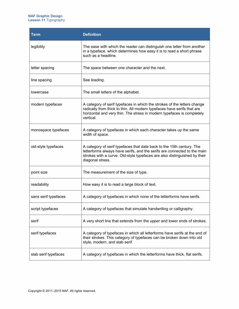
NAF Graphic Design Lesson 11 Typography
Copyright © 2011–2015 NAF. All rights reserved.
Term Definition
legibility The ease with which the reader can distinguish one letter from another in a typeface, which determines how easy it is to read a short phrase such as a headline.
letter spacing The space between one character and the next.
line spacing See leading.
lowercase The small letters of the alphabet.
modern typefaces A category of serif typefaces in which the strokes of the letters change radically from thick to thin. All modern typefaces have serifs that are horizontal and very thin. The stress in modern typefaces is completely vertical.
monospace typefaces A category of typefaces in which each character takes up the same width of space.
old-style typefaces A category of serif typefaces that date back to the 15th century. The letterforms always have serifs, and the serifs are connected to the main strokes with a curve. Old-style typefaces are also distinguished by their diagonal stress.
point size The measurement of the size of type.
readability How easy it is to read a large block of text.
sans serif typefaces A category of typefaces in which none of the letterforms have serifs.
script typefaces A category of typefaces that simulate handwriting or calligraphy.
serif A very short line that extends from the upper and lower ends of strokes.
serif typefaces A category of typefaces in which all letterforms have serifs at the end of their strokes. This category of typefaces can be broken down into old style, modern, and slab serif.
slab serif typefaces A category of typefaces in which the letterforms have thick, flat serifs.
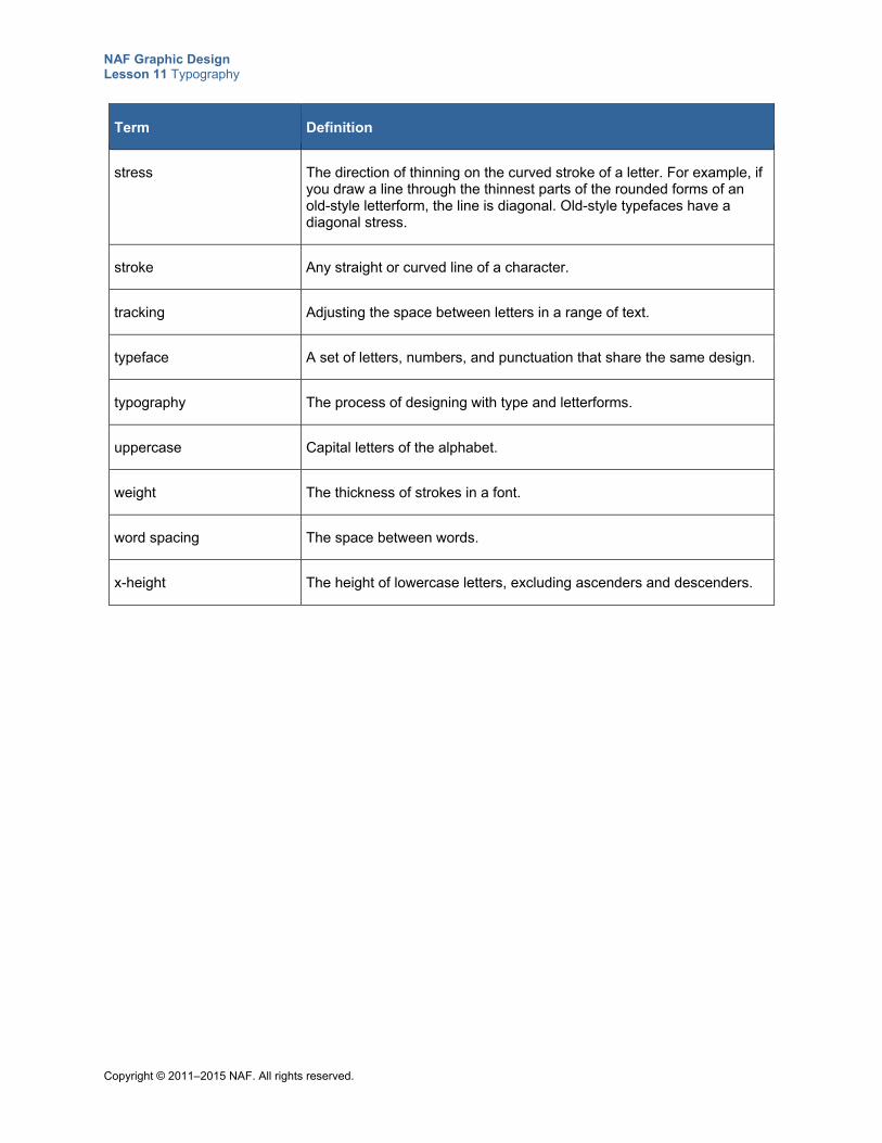
NAF Graphic Design Lesson 11 Typography
Copyright © 2011–2015 NAF. All rights reserved.
Term Definition
stress The direction of thinning on the curved stroke of a letter. For example, if you draw a line through the thinnest parts of the rounded forms of an old-style letterform, the line is diagonal. Old-style typefaces have a diagonal stress.
stroke Any straight or curved line of a character.
tracking Adjusting the space between letters in a range of text.
typeface A set of letters, numbers, and punctuation that share the same design.
typography The process of designing with type and letterforms.
uppercase Capital letters of the alphabet.
weight The thickness of strokes in a font.
word spacing The space between words.
x-height The height of lowercase letters, excluding ascenders and descenders.
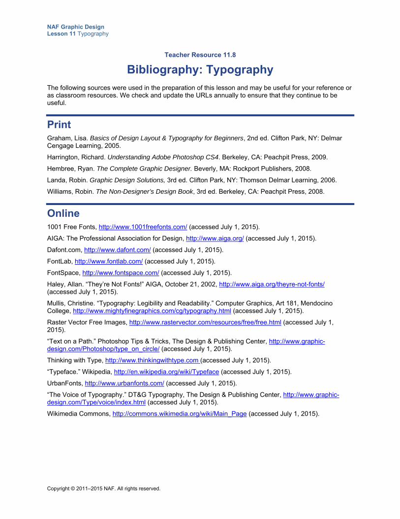
NAF Graphic Design Lesson 11 Typography
Copyright © 2011–2015 NAF. All rights reserved.
Teacher Resource 11.8
Bibliography: Typography
The following sources were used in the preparation of this lesson and may be useful for your reference or as classroom resources. We check and update the URLs annually to ensure that they continue to be useful.
Print Graham, Lisa. Basics of Design Layout & Typography for Beginners, 2nd ed. Clifton Park, NY: Delmar Cengage Learning, 2005.
Harrington, Richard. Understanding Adobe Photoshop CS4. Berkeley, CA: Peachpit Press, 2009.
Hembree, Ryan. The Complete Graphic Designer. Beverly, MA: Rockport Publishers, 2008.
Landa, Robin. Graphic Design Solutions, 3rd ed. Clifton Park, NY: Thomson Delmar Learning, 2006.
Williams, Robin. The Non-Designer’s Design Book, 3rd ed. Berkeley, CA: Peachpit Press, 2008.
Online 1001 Free Fonts, http://www.1001freefonts.com/ (accessed July 1, 2015).
AIGA: The Professional Association for Design, http://www.aiga.org/ (accessed July 1, 2015).
Dafont.com, http://www.dafont.com/ (accessed July 1, 2015).
FontLab, http://www.fontlab.com/ (accessed July 1, 2015).
FontSpace, http://www.fontspace.com/ (accessed July 1, 2015).
Haley, Allan. “They’re Not Fonts!” AIGA, October 21, 2002, http://www.aiga.org/theyre-not-fonts/ (accessed July 1, 2015).
Mullis, Christine. “Typography: Legibility and Readability.” Computer Graphics, Art 181, Mendocino College, http://www.mightyfinegraphics.com/cg/typography.html (accessed July 1, 2015).
Raster Vector Free Images, http://www.rastervector.com/resources/free/free.html (accessed July 1, 2015).
“Text on a Path.” Photoshop Tips & Tricks, The Design & Publishing Center, http://www.graphic-design.com/Photoshop/type_on_circle/ (accessed July 1, 2015).
Thinking with Type, http://www.thinkingwithtype.com (accessed July 1, 2015).
“Typeface.” Wikipedia, http://en.wikipedia.org/wiki/Typeface (accessed July 1, 2015).
UrbanFonts, http://www.urbanfonts.com/ (accessed July 1, 2015).
“The Voice of Typography.” DT&G Typography, The Design & Publishing Center, http://www.graphic-design.com/Type/voice/index.html (accessed July 1, 2015).
Wikimedia Commons, http://commons.wikimedia.org/wiki/Main_Page (accessed July 1, 2015).
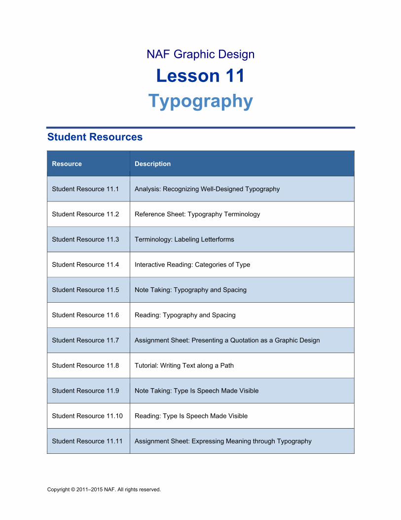
Copyright © 2011–2015 NAF. All rights reserved.
NAF Graphic Design
Lesson 11 Typography
Student Resources
Resource Description
Student Resource 11.1 Analysis: Recognizing Well-Designed Typography
Student Resource 11.2 Reference Sheet: Typography Terminology
Student Resource 11.3 Terminology: Labeling Letterforms
Student Resource 11.4 Interactive Reading: Categories of Type
Student Resource 11.5 Note Taking: Typography and Spacing
Student Resource 11.6 Reading: Typography and Spacing
Student Resource 11.7 Assignment Sheet: Presenting a Quotation as a Graphic Design
Student Resource 11.8 Tutorial: Writing Text along a Path
Student Resource 11.9 Note Taking: Type Is Speech Made Visible
Student Resource 11.10 Reading: Type Is Speech Made Visible
Student Resource 11.11 Assignment Sheet: Expressing Meaning through Typography
NAF Graphic Design Lesson 11 Typography
Copyright © 2011–2015 NAF. All rights reserved.
Student Resource 11.1
Analysis: Recognizing Well-Designed Typography
Student Names:_______________________________________________________ Date:___________
Directions: Look at the two quotations on the following page and think about which typography is more effective and why. Answer the questions below to help uncover the different elements that make one typographical design work better than the other.
1. In just three or four words, what is the main message of the quotation?
2. Which typeface best fits the message being delivered? What is it about the letters that is more fitting?
3. Does the quotation work better with type that is set open, with lots of space, or with one that is more geometrical? Why?
4. What makes one of the quotations look more friendly and approachable than the other?
5. All things considered, which design do you think is more effective?
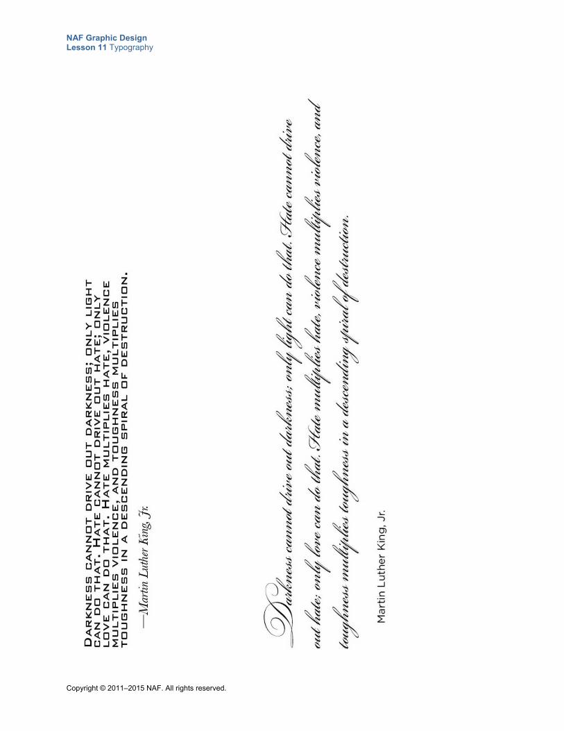
NAF Graphic Design Lesson 11 Typography
Copyright © 2011–2015 NAF. All rights reserved.
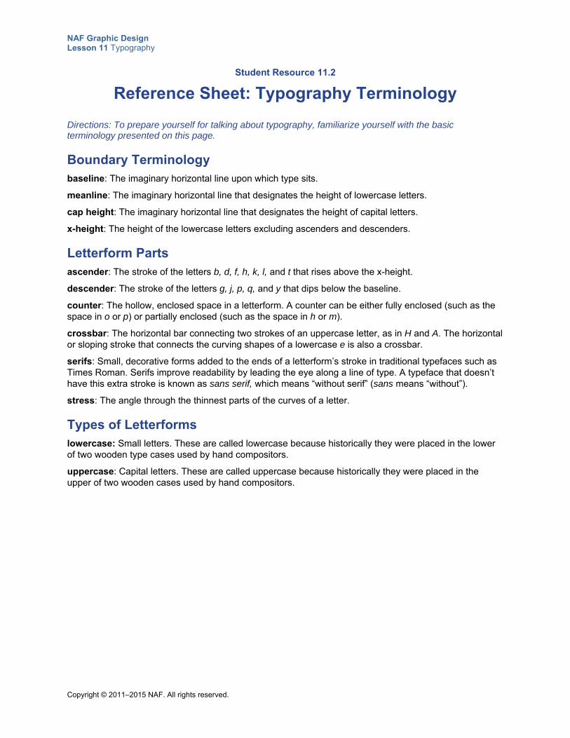
NAF Graphic Design Lesson 11 Typography
Copyright © 2011–2015 NAF. All rights reserved.
Student Resource 11.2
Reference Sheet: Typography Terminology
Directions: To prepare yourself for talking about typography, familiarize yourself with the basic terminology presented on this page.
Boundary Terminology baseline: The imaginary horizontal line upon which type sits.
meanline: The imaginary horizontal line that designates the height of lowercase letters.
cap height: The imaginary horizontal line that designates the height of capital letters.
x-height: The height of the lowercase letters excluding ascenders and descenders.
Letterform Parts ascender: The stroke of the letters b, d, f, h, k, l, and t that rises above the x-height.
descender: The stroke of the letters g, j, p, q, and y that dips below the baseline.
counter: The hollow, enclosed space in a letterform. A counter can be either fully enclosed (such as the space in o or p) or partially enclosed (such as the space in h or m).
crossbar: The horizontal bar connecting two strokes of an uppercase letter, as in H and A. The horizontal or sloping stroke that connects the curving shapes of a lowercase e is also a crossbar.
serifs: Small, decorative forms added to the ends of a letterform’s stroke in traditional typefaces such as Times Roman. Serifs improve readability by leading the eye along a line of type. A typeface that doesn’t have this extra stroke is known as sans serif, which means “without serif” (sans means “without”).
stress: The angle through the thinnest parts of the curves of a letter.
Types of Letterforms lowercase: Small letters. These are called lowercase because historically they were placed in the lower of two wooden type cases used by hand compositors.
uppercase: Capital letters. These are called uppercase because historically they were placed in the upper of two wooden cases used by hand compositors.
NAF Graphic Design Lesson 11 Typography
Copyright © 2011–2015 NAF. All rights reserved.
Student Resource 11.3
Terminology: Labeling Letterforms
Student Name:_______________________________________________________ Date:___________
Directions: Follow the steps below to label the letterforms in the line of type on the next page of this resource with the correct terminology. Use Student Resource 11.2, Reference Sheet: Typography Terminology, as a reference as you work. Be sure your work is extremely neat so that your labeled page can serve as a useful reference for future work.
1. Using a ruler, draw the baseline, the meanline, and the cap height. Label each of the lines.
2. Draw a vertical line identifying the x-height, and label it.
3. Using any letters you choose, label them with the following terms: ascender, descender, crossbar, serifs, and counter.
4. Draw a line showing the stress of a letter. (Your line should go through the thinnest parts of the curves of the letter.)
5. Label a lowercase letter and an uppercase letter.

NAF Graphic Design Lesson 11 Typography
Copyright © 2011–2015 NAF. All rights reserved.
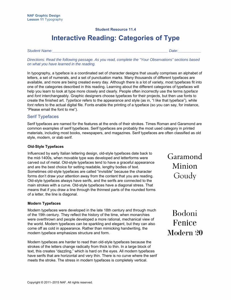
NAF Graphic Design Lesson 11 Typography
Copyright © 2011–2015 NAF. All rights reserved.
Student Resource 11.4
Interactive Reading: Categories of Type
Student Name:_______________________________________________________ Date:___________
Directions: Read the following passage. As you read, complete the “Your Observations” sections based on what you have learned in the reading.
In typography, a typeface is a coordinated set of character designs that usually comprises an alphabet of letters, a set of numerals, and a set of punctuation marks. Many thousands of different typefaces are available, and more are being created every day. Although there is a lot of variety, most typefaces fit into one of the categories described in this reading. Learning about the different categories of typefaces will help you learn to look at type more closely and clearly. People often incorrectly use the terms typeface and font interchangeably. Graphic designers choose typefaces for their projects, but then use fonts to create the finished art. Typeface refers to the appearance and style (as in, “I like that typeface”), while font refers to the actual digital file. Fonts enable the printing of a typeface (so you can say, for instance, “Please email the font to me”).
Serif Typefaces
Serif typefaces are named for the features at the ends of their strokes. Times Roman and Garamond are common examples of serif typefaces. Serif typefaces are probably the most used category in printed materials, including most books, newspapers, and magazines. Serif typefaces are often classified as old style, modern, or slab serif.
Old-Style Typefaces
Influenced by early Italian lettering design, old-style typefaces date back to the mid-1400s, when movable type was developed and letterforms were carved out of metal. Old-style typefaces tend to have a graceful appearance and are the best choice for setting readable, lengthy bodies of text. Sometimes old-style typefaces are called “invisible” because the character forms don’t draw your attention away from the content that you are reading. Old-style typefaces always have serifs, and the serifs are connected to the main strokes with a curve. Old-style typefaces have a diagonal stress. That means that if you draw a line through the thinnest parts of the rounded forms of a letter, the line is diagonal.
Modern Typefaces
Modern typefaces were developed in the late 18th century and through much of the 19th century. They reflect the history of the time, when monarchies were overthrown and people developed a more rational, mechanical view of the world. Modern typefaces can be sparkling and elegant, but they can also come off as cold in appearance. Rather than mimicking handwriting, the modern typeface emphasizes structure and form. Modern typefaces are harder to read than old-style typefaces because the strokes of the letters change radically from thick to thin. In a large block of text, this creates “dazzling,” which is hard on the eyes. All modern typefaces have serifs that are horizontal and very thin. There is no curve where the serif meets the stroke. The stress in modern typefaces is completely vertical.
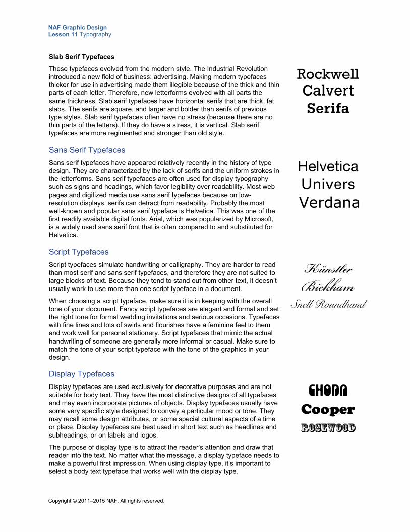
NAF Graphic Design Lesson 11 Typography
Copyright © 2011–2015 NAF. All rights reserved.
Slab Serif Typefaces
These typefaces evolved from the modern style. The Industrial Revolution introduced a new field of business: advertising. Making modern typefaces thicker for use in advertising made them illegible because of the thick and thin parts of each letter. Therefore, new letterforms evolved with all parts the same thickness. Slab serif typefaces have horizontal serifs that are thick, fat slabs. The serifs are square, and larger and bolder than serifs of previous type styles. Slab serif typefaces often have no stress (because there are no thin parts of the letters). If they do have a stress, it is vertical. Slab serif typefaces are more regimented and stronger than old style.
Sans Serif Typefaces
Sans serif typefaces have appeared relatively recently in the history of type design. They are characterized by the lack of serifs and the uniform strokes in the letterforms. Sans serif typefaces are often used for display typography such as signs and headings, which favor legibility over readability. Most web pages and digitized media use sans serif typefaces because on low-resolution displays, serifs can detract from readability. Probably the most well-known and popular sans serif typeface is Helvetica. This was one of the first readily available digital fonts. Arial, which was popularized by Microsoft, is a widely used sans serif font that is often compared to and substituted for Helvetica.
Script Typefaces
Script typefaces simulate handwriting or calligraphy. They are harder to read than most serif and sans serif typefaces, and therefore they are not suited to large blocks of text. Because they tend to stand out from other text, it doesn’t usually work to use more than one script typeface in a document.
When choosing a script typeface, make sure it is in keeping with the overall tone of your document. Fancy script typefaces are elegant and formal and set the right tone for formal wedding invitations and serious occasions. Typefaces with fine lines and lots of swirls and flourishes have a feminine feel to them and work well for personal stationery. Script typefaces that mimic the actual handwriting of someone are generally more informal or casual. Make sure to match the tone of your script typeface with the tone of the graphics in your design.
Display Typefaces
Display typefaces are used exclusively for decorative purposes and are not suitable for body text. They have the most distinctive designs of all typefaces and may even incorporate pictures of objects. Display typefaces usually have some very specific style designed to convey a particular mood or tone. They may recall some design attributes, or some special cultural aspects of a time or place. Display typefaces are best used in short text such as headlines and subheadings, or on labels and logos.
The purpose of display type is to attract the reader’s attention and draw that reader into the text. No matter what the message, a display typeface needs to make a powerful first impression. When using display type, it’s important to select a body text typeface that works well with the display type.
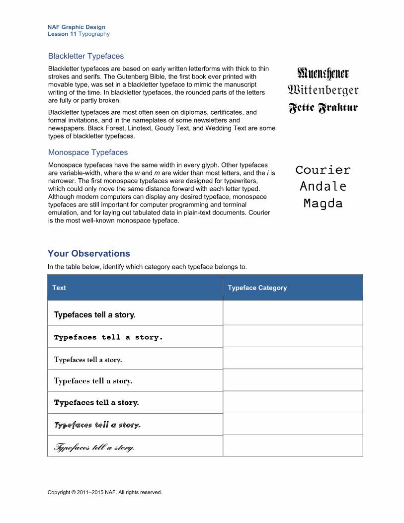
NAF Graphic Design Lesson 11 Typography
Copyright © 2011–2015 NAF. All rights reserved.
Blackletter Typefaces
Blackletter typefaces are based on early written letterforms with thick to thin strokes and serifs. The Gutenberg Bible, the first book ever printed with movable type, was set in a blackletter typeface to mimic the manuscript writing of the time. In blackletter typefaces, the rounded parts of the letters are fully or partly broken.
Blackletter typefaces are most often seen on diplomas, certificates, and formal invitations, and in the nameplates of some newsletters and newspapers. Black Forest, Linotext, Goudy Text, and Wedding Text are some types of blackletter typefaces.
Monospace Typefaces
Monospace typefaces have the same width in every glyph. Other typefaces are variable-width, where the w and m are wider than most letters, and the i is narrower. The first monospace typefaces were designed for typewriters, which could only move the same distance forward with each letter typed. Although modern computers can display any desired typeface, monospace typefaces are still important for computer programming and terminal emulation, and for laying out tabulated data in plain-text documents. Courier is the most well-known monospace typeface.
Your Observations In the table below, identify which category each typeface belongs to.
Text Typeface Category
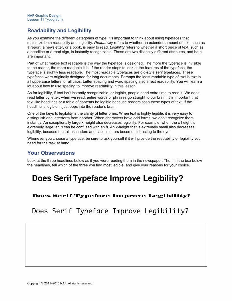
NAF Graphic Design Lesson 11 Typography
Copyright © 2011–2015 NAF. All rights reserved.
Readability and Legibility As you examine the different categories of type, it’s important to think about using typefaces that maximize both readability and legibility. Readability refers to whether an extended amount of text, such as a report, a newsletter, or a book, is easy to read. Legibility refers to whether a short piece of text, such as a headline or a road sign, is instantly recognizable. These are two distinctly different attributes, and both are important.
Part of what makes text readable is the way the typeface is designed. The more the typeface is invisible to the reader, the more readable it is. If the reader stops to look at the features of the typeface, the typeface is slightly less readable. The most readable typefaces are old-style serif typefaces. These typefaces were originally designed for long documents. Perhaps the least readable type of text is text in all uppercase letters, or all caps. Letter spacing and word spacing also affect readability. You will learn a lot about how to use spacing to improve readability in this lesson.
As for legibility, if text isn’t instantly recognizable, or legible, people need extra time to read it. We don’t read letter by letter; when we read, entire words or phrases go straight to our brain. It is important that text like headlines or a table of contents be legible because readers scan these types of text. If the headline is legible, it just pops into the reader’s brain.
One of the keys to legibility is the clarity of letterforms. When text is highly legible, it is very easy to distinguish one letterform from another. When characters have odd forms, we don’t recognize them instantly. An exceptionally large x-height also decreases legibility. For example, when the x-height is extremely large, an n can be confused with an h. An x-height that is extremely small also decreases legibility, because the tall ascenders and capital letters become distracting to the eye.
Whenever you choose a typeface, be sure to ask yourself if it will provide the readability or legibility you need for the task at hand.
Your Observations Look at the three headlines below as if you were reading them in the newspaper. Then, in the box below the headlines, tell which of the three you find most legible, and give your reasons for your choice.
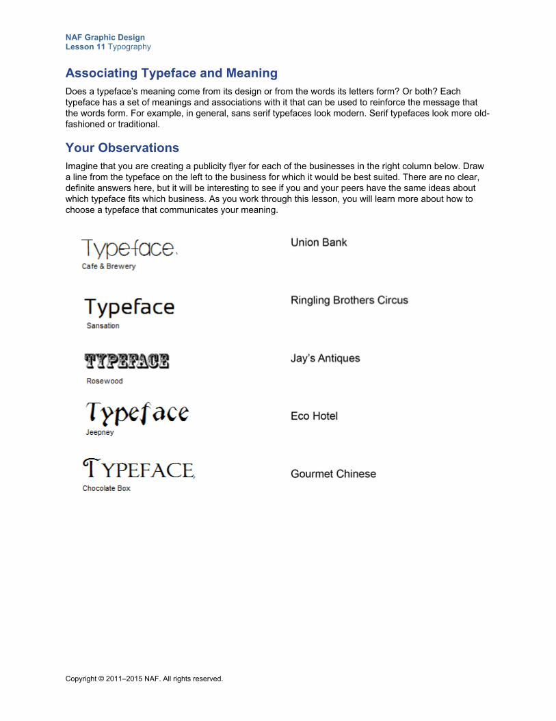
NAF Graphic Design Lesson 11 Typography
Copyright © 2011–2015 NAF. All rights reserved.
Associating Typeface and Meaning Does a typeface’s meaning come from its design or from the words its letters form? Or both? Each typeface has a set of meanings and associations with it that can be used to reinforce the message that the words form. For example, in general, sans serif typefaces look modern. Serif typefaces look more old-fashioned or traditional.
Your Observations Imagine that you are creating a publicity flyer for each of the businesses in the right column below. Draw a line from the typeface on the left to the business for which it would be best suited. There are no clear, definite answers here, but it will be interesting to see if you and your peers have the same ideas about which typeface fits which business. As you work through this lesson, you will learn more about how to choose a typeface that communicates your meaning.
NAF Graphic Design Lesson 11 Typography
Copyright © 2011–2015 NAF. All rights reserved.
Student Resource 11.5
Note Taking: Typography and Spacing
Student Name:_______________________________________________________ Date:___________
Directions: As you watch the presentation on typography and spacing, take notes about the important points you learn under each of the headings below.
Leading What is it?
How is leading expressed in points?
What is the average amount of leading?
What situations call for more or less leading than average?
Letter Spacing What is it?
What is tracking?
Why is it important to have the same amount of space between letters?
Kerning What is it?
What letter combinations typically need kerning?
Word Spacing How can you tell if words are moderately spaced?
NAF Graphic Design Lesson 11 Typography
Copyright © 2011–2015 NAF. All rights reserved.
Student Resource 11.6
Reading: Typography and Spacing
This presentation explains the importance of and uses for leading, letter spacing, kerning, and word spacing.
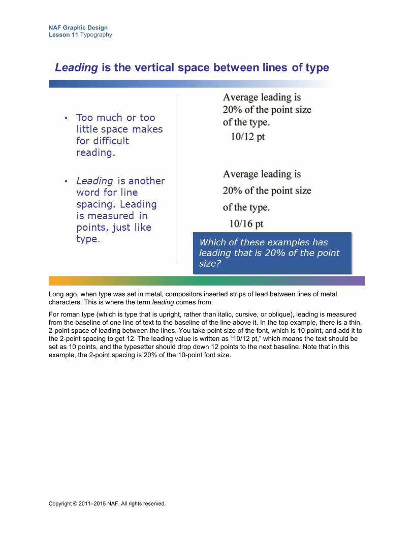
NAF Graphic Design Lesson 11 Typography
Copyright © 2011–2015 NAF. All rights reserved.
Long ago, when type was set in metal, compositors inserted strips of lead between lines of metal characters. This is where the term leading comes from.
For roman type (which is type that is upright, rather than italic, cursive, or oblique), leading is measured from the baseline of one line of text to the baseline of the line above it. In the top example, there is a thin, 2-point space of leading between the lines. You take point size of the font, which is 10 point, and add it to the 2-point spacing to get 12. The leading value is written as “10/12 pt,” which means the text should be set as 10 points, and the typesetter should drop down 12 points to the next baseline. Note that in this example, the 2-point spacing is 20% of the 10-point font size.
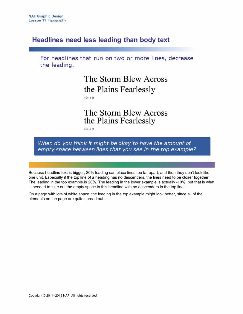
NAF Graphic Design Lesson 11 Typography
Copyright © 2011–2015 NAF. All rights reserved.
Because headline text is bigger, 20% leading can place lines too far apart, and then they don’t look like one unit. Especially if the top line of a heading has no descenders, the lines need to be closer together. The leading in the top example is 20%. The leading in the lower example is actually -10%, but that is what is needed to take out the empty space in this headline with no descenders in the top line.
On a page with lots of white space, the leading in the top example might look better, since all of the elements on the page are quite spread out.
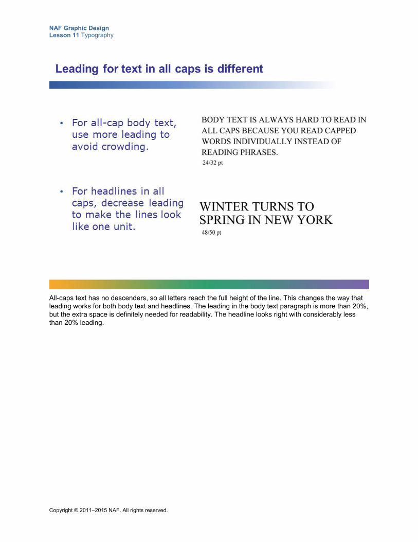
NAF Graphic Design Lesson 11 Typography
Copyright © 2011–2015 NAF. All rights reserved.
All-caps text has no descenders, so all letters reach the full height of the line. This changes the way that leading works for both body text and headlines. The leading in the body text paragraph is more than 20%, but the extra space is definitely needed for readability. The headline looks right with considerably less than 20% leading.
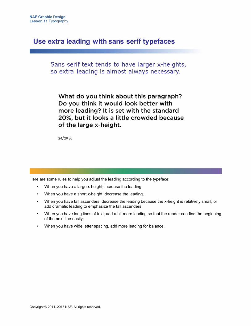
NAF Graphic Design Lesson 11 Typography
Copyright © 2011–2015 NAF. All rights reserved.
Here are some rules to help you adjust the leading according to the typeface:
• When you have a large x-height, increase the leading.
• When you have a short x-height, decrease the leading.
• When you have tall ascenders, decrease the leading because the x-height is relatively small, or add dramatic leading to emphasize the tall ascenders.
• When you have long lines of text, add a bit more leading so that the reader can find the beginning of the next line easily.
• When you have wide letter spacing, add more leading for balance.
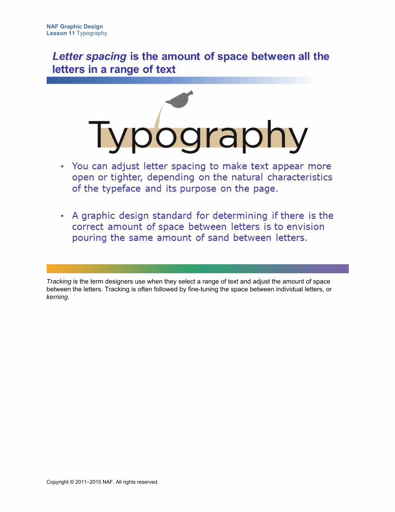
NAF Graphic Design Lesson 11 Typography
Copyright © 2011–2015 NAF. All rights reserved.
Tracking is the term designers use when they select a range of text and adjust the amount of space between the letters. Tracking is often followed by fine-tuning the space between individual letters, or kerning.
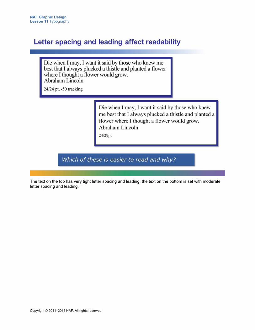
NAF Graphic Design Lesson 11 Typography
Copyright © 2011–2015 NAF. All rights reserved.
The text on the top has very tight letter spacing and leading; the text on the bottom is set with moderate letter spacing and leading.
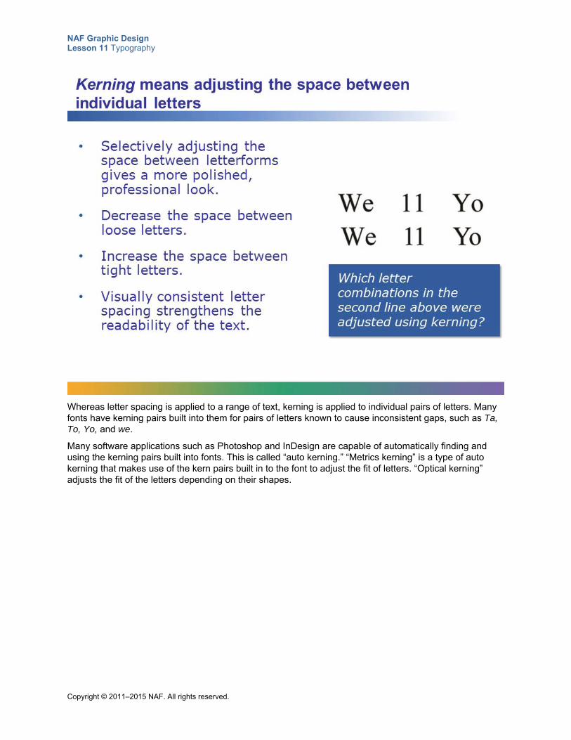
NAF Graphic Design Lesson 11 Typography
Copyright © 2011–2015 NAF. All rights reserved.
Whereas letter spacing is applied to a range of text, kerning is applied to individual pairs of letters. Many fonts have kerning pairs built into them for pairs of letters known to cause inconsistent gaps, such as Ta, To, Yo, and we.
Many software applications such as Photoshop and InDesign are capable of automatically finding and using the kerning pairs built into fonts. This is called “auto kerning.” “Metrics kerning” is a type of auto kerning that makes use of the kern pairs built in to the font to adjust the fit of letters. “Optical kerning” adjusts the fit of the letters depending on their shapes.
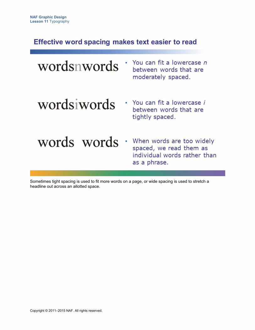
NAF Graphic Design Lesson 11 Typography
Copyright © 2011–2015 NAF. All rights reserved.
Sometimes tight spacing is used to fit more words on a page, or wide spacing is used to stretch a headline out across an allotted space.
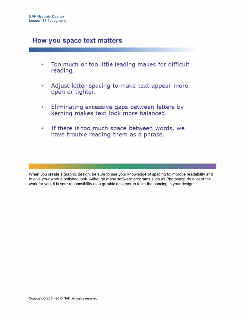
NAF Graphic Design Lesson 11 Typography
Copyright © 2011–2015 NAF. All rights reserved.
When you create a graphic design, be sure to use your knowledge of spacing to improve readability and to give your work a polished look. Although many software programs such as Photoshop do a lot of the work for you, it is your responsibility as a graphic designer to tailor the spacing in your design.
NAF Graphic Design Lesson 11 Typography
Copyright © 2011–2015 NAF. All rights reserved.
Student Resource 11.7
Assignment Sheet: Presenting a Quotation as a Graphic Design
Directions: Choose a quotation that is meaningful to you. Use Photoshop to write your quotation using everything you’ve learned so far about typography, and present your quotation on a US letter page. Make sure you read through all of the instructions before you begin work.
1. Choose a quotation that you would like to display on a US letter-size page using your best typography. Write your quotation here:
2. Create a new US letter-size document in Photoshop. When you create your document, make sure you think about the page orientation you want.
3. Present your quotation on the page. Before you start formatting, be sure there are no spelling or punctuation errors!
4. Think through the meaning of your quotation and then choose a typeface that you think is appropriate. Also, make sure the size, style, and weight of the type work with the meaning you want to communicate.
5. Make any needed adjustments to the spacing:
a. Line spacing
b. Letter spacing
c. Word spacing
d. Line length
e. Alignment
f. Margins
6. Check for legibility and readability, as appropriate, and make any necessary changes.
7. Double-check everything, and then print your final product to see what it looks like on paper. If necessary, make adjustments to improve the look of the printed copy.
NAF Graphic Design Lesson 11 Typography
Copyright © 2011–2015 NAF. All rights reserved.
Student Resource 11.8
Tutorial: Writing Text along a Path
Directions: Follow the instructions below to create a path in Photoshop, and then write text along the path.
1. Open the file Cloud.psd in Photoshop.
2. Select the Pen tool from the toolbar. Place the pen at the beginning place for the path that your line of text will sit on.
3. Click and drag in the direction you want the circular path to go. Think of it as ice skating: you touch down with your skate when you click, and you push off in the direction you want to glide when you drag the cursor.
4. When your path is complete, use the Direct Select and Path Select tools from the toolbar to adjust it. The Path Select pointer tool selects the whole object; the Direct Select pointer tool selects anchor points on the path and edits them. Work with your path until it is the shape that you desire. Tip: Editable anchors are hollow dots. Selected anchors become solid dots.
5. Now you are ready to enter text along the path. Select the text tool in the toolbar.
6. Before clicking the path, set the text attributes (color, typeface, size, etc.).
7. Pause the mouse cursor over the path. When the baseline becomes an angled shape, the text tool is in text-on-a-path mode.
8. Once the cursor transforms, click the path. You can now enter your text. Try “Floating on Cloud Nine” or any other text that communicates your message.
9. If you want, you can also use a Warp option on the text tool for all or part of your text.
NAF Graphic Design Lesson 11 Typography
Copyright © 2011–2015 NAF. All rights reserved.
Student Resource 11.9
Note Taking: Type Is Speech Made Visible
Student Name:_______________________________________________________ Date:___________
Directions: Below is a list of the questions you want to ask yourself when you are deciding on a typeface or a font to use for the text part of a design. During the presentation, write down the points that are important to remember under each question.
Is the subject of the text alive, or is it more hard and mechanical? What is the emotion that is being expressed? What does the voice of the person who might deliver your message sound like?
What is the setting and atmosphere where the message is delivered? What is the attitude of the message?
NAF Graphic Design Lesson 11 Typography
Copyright © 2011–2015 NAF. All rights reserved.
Student Resource 11.10
Reading: Type Is Speech Made Visible
This presentation explains how you can use typography to communicate a message that goes beyond the actual words on the page.
Much of the content in this presentation is adapted from the article “The Voice of Typography” in DT&G Magazine, located at http://www.graphic-design.com/Type/voice/index.html (accessed July 1, 2015).
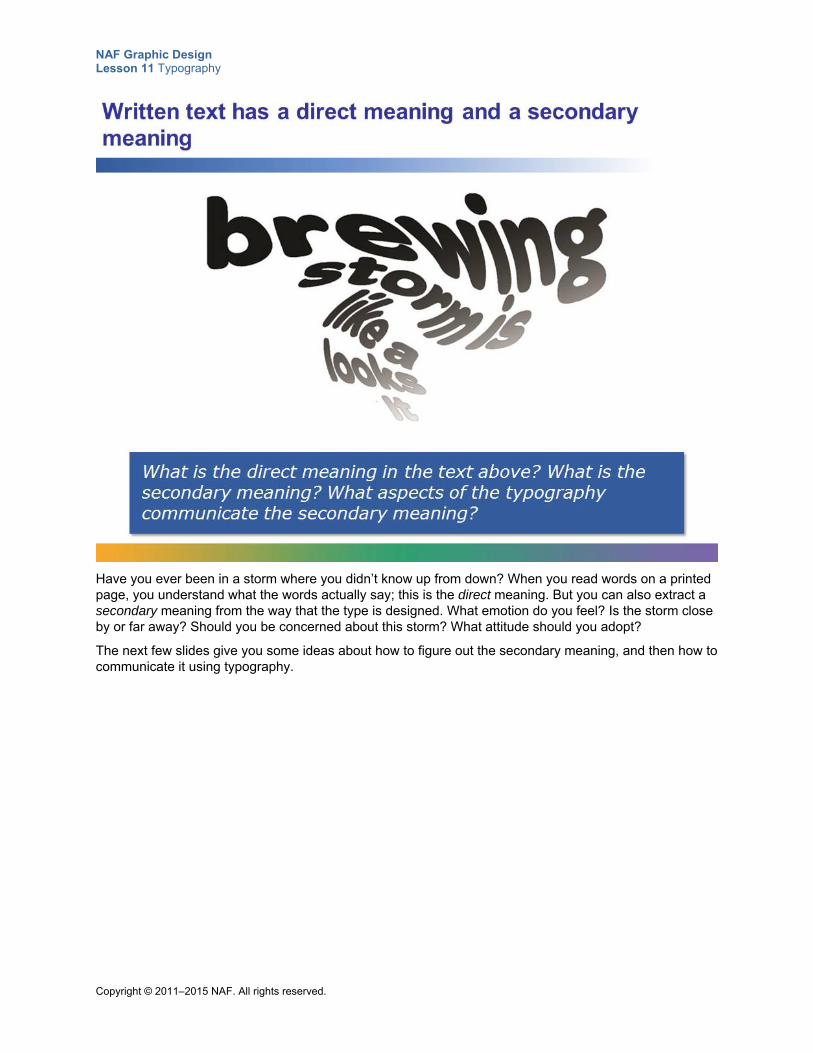
NAF Graphic Design Lesson 11 Typography
Copyright © 2011–2015 NAF. All rights reserved.
Have you ever been in a storm where you didn’t know up from down? When you read words on a printed page, you understand what the words actually say; this is the direct meaning. But you can also extract a secondary meaning from the way that the type is designed. What emotion do you feel? Is the storm close by or far away? Should you be concerned about this storm? What attitude should you adopt?
The next few slides give you some ideas about how to figure out the secondary meaning, and then how to communicate it using typography.
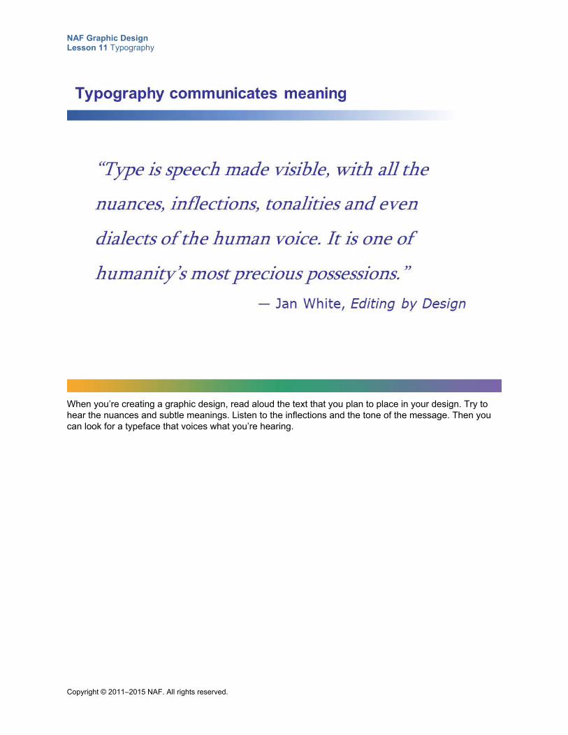
NAF Graphic Design Lesson 11 Typography
Copyright © 2011–2015 NAF. All rights reserved.
When you’re creating a graphic design, read aloud the text that you plan to place in your design. Try to hear the nuances and subtle meanings. Listen to the inflections and the tone of the message. Then you can look for a typeface that voices what you’re hearing.
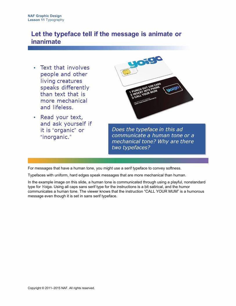
NAF Graphic Design Lesson 11 Typography
Copyright © 2011–2015 NAF. All rights reserved.
For messages that have a human tone, you might use a serif typeface to convey softness.
Typefaces with uniform, hard edges speak messages that are more mechanical than human.
In the example image on this slide, a human tone is communicated through using a playful, nonstandard type for Yoiga. Using all caps sans serif type for the instructions is a bit satirical, and the humor communicates a human tone. The viewer knows that the instruction “CALL YOUR MUM” is a humorous message even though it is set in sans serif typeface.
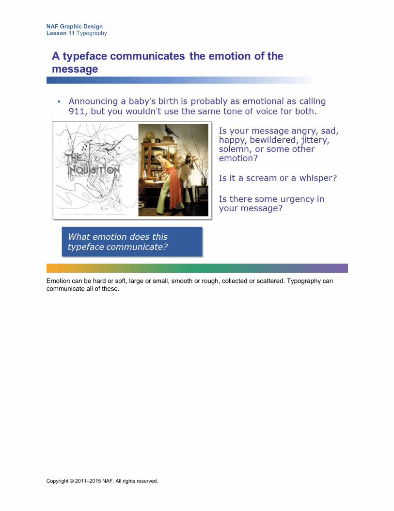
NAF Graphic Design Lesson 11 Typography
Copyright © 2011–2015 NAF. All rights reserved.
Emotion can be hard or soft, large or small, smooth or rough, collected or scattered. Typography can communicate all of these.
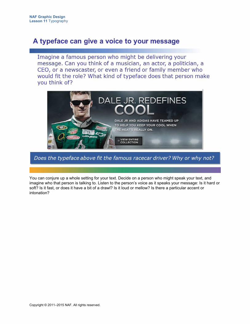
NAF Graphic Design Lesson 11 Typography
Copyright © 2011–2015 NAF. All rights reserved.
You can conjure up a whole setting for your text. Decide on a person who might speak your text, and imagine who that person is talking to. Listen to the person’s voice as it speaks your message: Is it hard or soft? Is it fast, or does it have a bit of a drawl? Is it loud or mellow? Is there a particular accent or intonation?
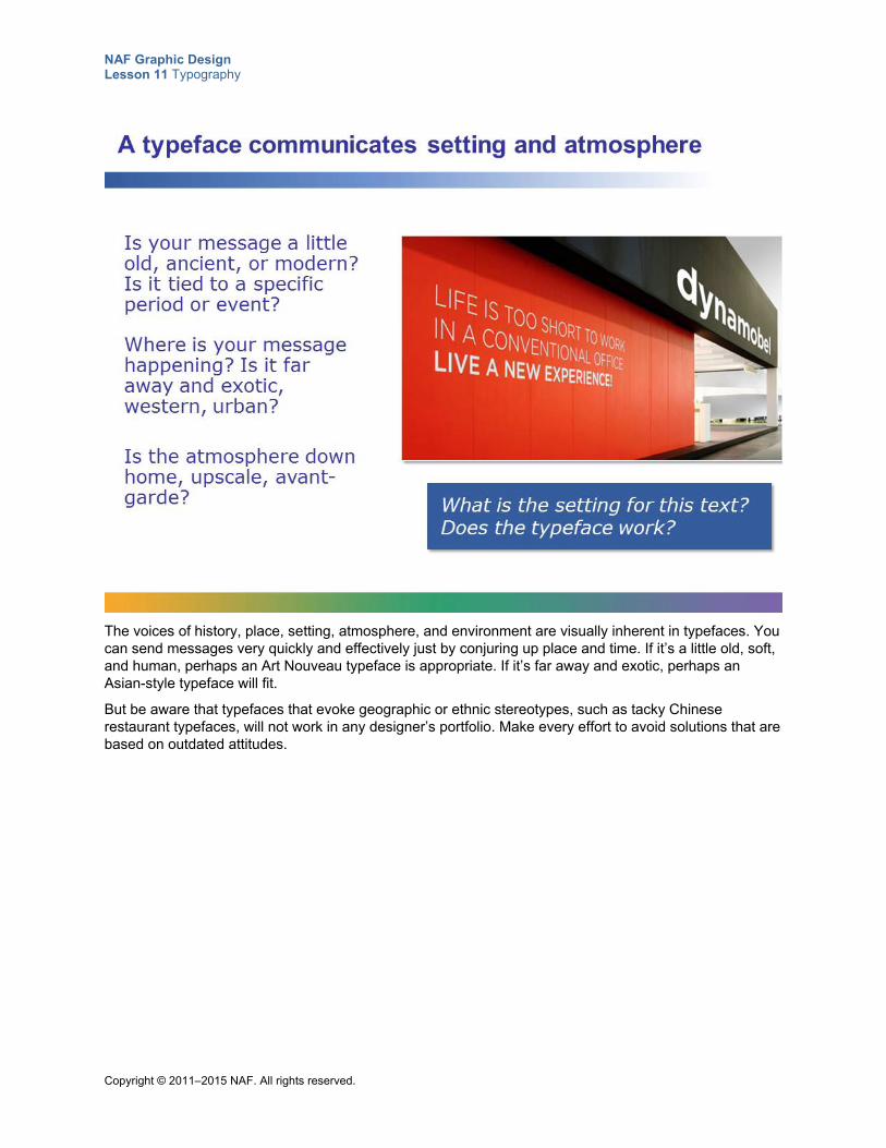
NAF Graphic Design Lesson 11 Typography
Copyright © 2011–2015 NAF. All rights reserved.
The voices of history, place, setting, atmosphere, and environment are visually inherent in typefaces. You can send messages very quickly and effectively just by conjuring up place and time. If it’s a little old, soft, and human, perhaps an Art Nouveau typeface is appropriate. If it’s far away and exotic, perhaps an Asian-style typeface will fit.
But be aware that typefaces that evoke geographic or ethnic stereotypes, such as tacky Chinese restaurant typefaces, will not work in any designer’s portfolio. Make every effort to avoid solutions that are based on outdated attitudes.
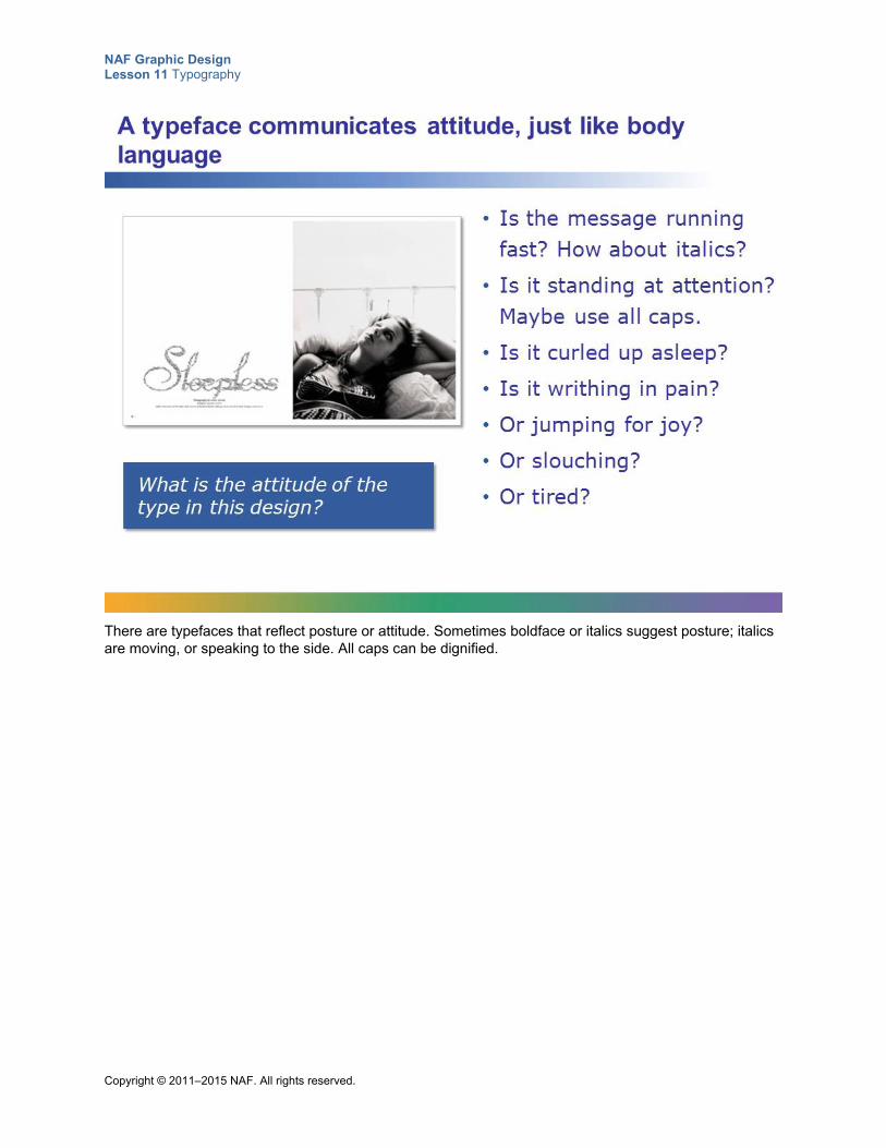
NAF Graphic Design Lesson 11 Typography
Copyright © 2011–2015 NAF. All rights reserved.
There are typefaces that reflect posture or attitude. Sometimes boldface or italics suggest posture; italics are moving, or speaking to the side. All caps can be dignified.
NAF Graphic Design Lesson 11 Typography
Copyright © 2011–2015 NAF. All rights reserved.
There are no simple solutions for determining which typeface is right for a project. Remember that each project carries its own rhythm, tone, and attitude. And if you listen carefully to the message you want to communicate, you will hear with your eyes which typeface is best suited!
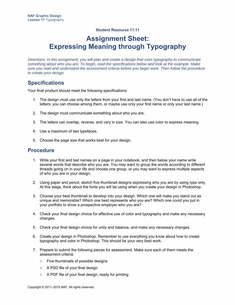
NAF Graphic Design Lesson 11 Typography
Copyright © 2011–2015 NAF. All rights reserved.
Student Resource 11.11
Assignment Sheet: Expressing Meaning through Typography
Directions: In this assignment, you will plan and create a design that uses typography to communicate something about who you are. To begin, read the specifications below and look at the example. Make sure you read and understand the assessment criteria before you begin work. Then follow the procedure to create your design.
Specifications Your final product should meet the following specifications:
1. The design must use only the letters from your first and last name. (You don’t have to use all of the letters; you can choose among them, or maybe use only your first name or only your last name.)
2. The design must communicate something about who you are.
3. The letters can overlap, reverse, and vary in size. You can also use color to express meaning.
4. Use a maximum of two typefaces.
5. Choose the page size that works best for your design.
Procedure
1. Write your first and last names on a page in your notebook, and then below your name write several words that describe who you are. You may want to group the words according to different threads going on in your life and choose one group, or you may want to express multiple aspects of who you are in your design.
2. Using paper and pencil, sketch five thumbnail designs expressing who you are by using type only. At this stage, think about the fonts you will be using when you create your design in Photoshop.
3. Choose your best thumbnail to develop into your design. Which one will make you stand out as unique and memorable? Which one best represents who you are? Which one could you put in your portfolio to show a prospective employer who you are?
4. Check your final design choice for effective use of color and typography and make any necessary changes.
5. Check your final design choice for unity and balance, and make any necessary changes.
6. Create your design in Photoshop. Remember to use everything you know about how to create typography and color in Photoshop. This should be your very best work.
7. Prepare to submit the following pieces for assessment. Make sure each of them meets the assessment criteria:
o Five thumbnails of possible designs
o A PSD file of your final design
o A PDF file of your final design, ready for printing
NAF Graphic Design Lesson 11 Typography
Copyright © 2011–2015 NAF. All rights reserved.
Make sure your work meets or exceeds the following assessment criteria:
The thumbnails show that skilled and thoughtful planning work was put into your design.
The typefaces used in the design visually communicate who you are.
The arrangement of letters on the page visually communicates who you are.
The colors in the design communicate who you are.
The design demonstrates unity and balance.
The design is unique and memorable and an accurate representation of who you are.
Example Deb Gould wrote these four words to describe herself:
playful
joyful
flexible
elegant
In her final design, she used the Gotham typeface and a playful typeface called Curlz.
Copyright © 2011–2015 NAF. All rights reserved.
NAF Graphic Design
Lesson 12 Images
In this lesson, students learn the importance of using images that convey meaning in their designs. They learn both how to find and acquire appropriate images from stock photography sources and how to create their own images in Photoshop using the Brush tools and the Drawing tools. Finally, students put into practice what they have learned about using images that convey a message when they create their own CD cover for a musician of their choice.
Advance Preparation
If resources are normally printed in black and white, you will need to print color copies of Teacher Resource 12.1, Sample Images: Images That Express Meaning (separate PDF file).
This lesson is expected to take 6 class periods.
Lesson Framework
Learning Objectives Each student will:
Identify images appropriate for message and audience
Describe the use of vector graphics and identify software that can produce vector graphics*
Explain how images can be used to attract a person’s attention
Compare and contrast commissioned artwork, stock illustrations, and photography and explain what to look for when selecting an image
Create images in Photoshop using the Pen, Pencil, Paintbrush, and Drawing tools
Explain how to create and modify brushes
Define depth of field and explain how to achieve this in a Photoshop image
Identify proper application of copyright law to graphic design activities
*This is one of the 16 key learning objectives assessed by the NAFTrack Certification end-of-course exam for this course.
NAF Graphic Design Lesson 12 Images
Copyright © 2011–2015 NAF. All rights reserved. - 2 -
Academic Standards The relevant Common Core State Standards are too extensive to list here but are an important basis for this lesson. For details, please refer to the separate document “Correlations to the Common Core Standards” (available in the Course Planning Tools section of the course materials).
Analyze how the application of visual arts elements and principles of design communicate and express ideas (Common Career Technical Core 2012, AR-VIS 2)
Demonstrate knowledge of design principles, elements, and image composition (Adobe Certified Associate, Objectives for Visual Communication using Photoshop CS6, Identifying Design Elements When Preparing Images 2.2)
Demonstrate knowledge of image-generating devices, their resulting image types, and how to access resulting images in Photoshop (Adobe Certified Associate, Objectives for Visual Communication using Photoshop CS6, Identifying Design Elements When Preparing Images 2.5)
Understand key terminology of digital images (Adobe Certified Associate, Objectives for Visual Communication using Photoshop CS6, Identifying Design Elements When Preparing Images 2.6)
Adjust or correct the tonal range, color, or distortions of an image (Adobe Certified Associate, Objectives for Visual Communication using Photoshop CS6, Manipulating Images using Adobe Photoshop CS6 4.4)
Demonstrate knowledge of drawing and painting (Adobe Certified Associate, Objectives for Visual Communication using Photoshop CS6, Manipulating Images using Adobe Photoshop CS6 4.6)
Identify the purpose, audience, and audience needs for preparing image(s) (Adobe Certified Associate, Objectives for Visual Communication using Photoshop CS6, Setting Project Requirements 1.1)
Demonstrate knowledge of standard copyright rules for images and image use (Adobe Certified Associate, Objectives for Visual Communication using Photoshop CS6, Setting Project Requirements 1.2)
Create original works as a means of personal or group expression (ISTE NETS for Students 2007, 1b)
Select and use applications effectively and productively (ISTE NETS for Students 2007, 6b)
Use product or service design processes and guidelines to produce a quality information technology (IT) product or service (Common Career Technical Core 2012, IT 2)
Assessment
Assessment Product Means of Assessment
A CD cover design for a musician or musical group (Student Resource 12.9)
Assessment Criteria: CD Cover (Teacher Resource 12.4)
Prerequisites Basic knowledge of image size and resolution
Understanding of graphic design as visual communication
Ability to create accurate selections using all Photoshop selection tools
Ability to edit and manipulate layers in a Photoshop image
Understanding of composition balance in an image
NAF Graphic Design Lesson 12 Images
Copyright © 2011–2015 NAF. All rights reserved. - 3 -
A working knowledge of the use of proximity, alignment, repetition, and contrast in graphic design
A working knowledge of how to establish a visual hierarchy
Ability to create emphasis using size, color, position, shape, texture, contrast, density, and movement
Ability to create a grid in Photoshop and use it effectively
Ability to use color to express meaning
Ability to create an effective color palette based on knowledge of color theory
Ability to use typography effectively
Instructional Materials
Teacher Resources Teacher Resource 12.1, Sample Images: Images That Express Meaning (separate PDF file)
Teacher Resource 12.2, Presentation and Notes: Raster and Vector Graphics (includes separate PowerPoint file)
Teacher Resource 12.3, Images: Strawberries.jpg, Zebras.jpg (separate ZIP file)
Teacher Resource 12.4, Assessment Criteria: CD Cover
Teacher Resource 12.5, Key Vocabulary: Images
Teacher Resource 12.6, Bibliography: Images
Student Resources Student Resource 12.1, Image Selection: Images That Express Meaning
Student Resource 12.2, K-W-L Chart: Choosing and Acquiring Appropriate Images
Student Resource 12.3, Reading: Choosing and Acquiring Appropriate Images
Student Resource 12.4, Reference Sheet: Stock Photography Sites
Student Resource 12.5, Assignment Sheet: Selecting Stock Photography
Student Resource 12.6, Tutorial: Painting with Brushes
Student Resource 12.7, Reading: Raster and Vector Graphics
Student Resource 12.8, Assignment Sheet: Drawing a Playing Card
Student Resource 12.9, Assignment Sheet: CD Cover
Equipment and Supplies Access to Photoshop for all students
LCD projector and computer for PowerPoint presentation
A deck of classic playing cards
Chart paper
Small sticky notes
Blackboard, whiteboard, or flip chart
NAF Graphic Design Lesson 12 Images
Copyright © 2011–2015 NAF. All rights reserved. - 4 -
Lesson Steps
Step Min. Activity
CLASS PERIOD 1
1 15 Extracting Meaning: Communicating with Images
In this activity, students get practice exploring how images communicate a message.
Before students come to class, print copies of the images in Teacher Resource 12.1, Sample Images: Images That Express Meaning (separate PDF file), and post them on the walls of your classroom. (If at all possible, print the images in color.) Group the football pictures in one section, the ice cream pictures in another section, and the “ads without words” pictures in a third section. If you have a large class, you may want to make two or three copies of each picture so that students can gather around them without crowding.
Point out to students that in the previous lessons, they have studied how to communicate a message using color and typography. In this lesson, they will learn how to communicate using images. Refer students to Student Resource 12.1, Image Selection: Images That Express Meaning. Look at the questions on the resource as a class, and explain that they will be looking at the three different groups of pictures posted on the wall and answering the questions on their worksheet about how images communicate a message.
Instruct students to work in pairs, and to walk around the room and answer the questions on their worksheet about each group of images. (Tell them they don’t have to go through the images in any particular order.)
When students have completed their work, talk about the meaning of the different images as a class. Be sure to cover the following points:
The football image that shows a team and that shows uniforms is the most motivating. The orange color communicates excitement. The photo is a picture of how freshmen players would like to imagine themselves.
The ice cream images all have pros and cons. The two ice cream cones look organic, but the colors could be boring and not particularly inviting. The bright tubs of ice cream look exciting because of the great variety, the bright colors, and the fancy swirls. But the colors could appear artificial to those who prefer organic, and may not be appropriate. The young woman with the ice cream cone is inviting because you can see how happy the ice cream makes her, but the ice cream looks more like a packaged cone than a homemade organic ice cream. Students may want to suggest some combination of the three pictures.
NAF Graphic Design Lesson 12 Images
Copyright © 2011–2015 NAF. All rights reserved. - 5 -
Step Min. Activity
The ads without words are all for very well-known companies. Having an ad that is instantly recognizable without words speaks volumes. Note the use of symbols to represent the meaning of the message. Note the importance of the emotional content in each image, and the use of color to communicate.
To conclude this activity, point out how important it is for each image in a design to be packed with both primary and secondary meaning. Tell students that in this lesson, they will learn how to create designs with images that are just the right choice. They will learn about sources where they can find a huge selection of images, and also how to use Photoshop to create their own simple images.
2 20 Reading: Choosing and Acquiring Appropriate Images
The purpose of this reading is to familiarize students with the different types of sources for acquiring images. It also shows how to evaluate whether an image is suitable for a particular design.
Point out to students that finding just the right image for a design is perhaps not as easy as it sounds. Explain to them that in this reading, they will be learning where to look for photographs and illustrations for their designs. They will also learn how to evaluate whether images work well in the design they are creating. Refer students to Student Resource 12.2, K-W-L Chart: Choosing and Acquiring Appropriate Images, and ask them to fill in the first two columns of the chart. In the first column, they should respond to the questions in each box with what they already know. In the second column, they should write what they want to learn about the topic. After students have filled in the two columns, ask them to share their responses with a partner, and have them add any new questions they are interested in to their “What I Want to Know” column.
Next, refer students to Student Resource 12.3, Reading: Choosing and Acquiring Appropriate Images, and ask them to take notes in the “What I Learned” column of their K-W-L chart as they read.
When students have completed the reading, have them compare their notes with a partner to check for accuracy and completeness. Answer any questions. Tell them that in the next activity, they will get some practice choosing stock photography images.
3
15 Independent Practice: Selecting Stock Photography Images
In this activity, students learn how to search for appropriate images on stock photography sites.
To begin, refer students to Student Resource 12.4, Reference Sheet: Stock Photography Sites. Ask students if they are familiar with any of the sites on the list, and invite them to share their thoughts about any of the sites they have used. Explain that this is a list of the sites that graphic designers use most frequently for stock photography. In the right column of the reference sheet, encourage them to write notes about the sites for their own use. They might, for example, note information about pricing or information about a site’s selection of images for a particular topic. Tell them to put this sheet in their notebook for future reference.
Next, refer students to Student Resource 12.5, Assignment Sheet: Selecting Stock Photography. Explain that in this activity, they will be selecting an image for a skydiving poster, as described in the creative brief that is included as part of the worksheet.
NAF Graphic Design Lesson 12 Images
Copyright © 2011–2015 NAF. All rights reserved. - 6 -
Step Min. Activity
Remind students to read the creative brief carefully, because this is not an ordinary skydiving poster. Ask students to follow the instructions on their assignment sheet to download an appropriate image and to write down the required information about the image. Tell students they should search at least three stock photography sites. (You may want to assign sites to different students to make sure everyone doesn’t just go to the first three sites on the reference list.)
Circulate as students are working and answer any questions. If necessary, have students finish the final question on the worksheet, an analysis of why the image is appropriate for the poster, for homework. Advise students that they will have a chance to share their image and their analysis with their peers at the beginning of the next class period.
CLASS PERIOD 2
4
5 Homework Review: Stock Photography Selection
In this activity, students share their stock photography selection with their peers.
As class begins, ask students to display the stock photography image they have chosen on their computer screen and to place their completed assignment sheet about the photo on their desk. Ask students to work in groups of three and to look at each other’s photo choices, explaining to each other why they chose the photo.
Next, ask groups that have a photo that works exceptionally well to share the photo, along with their analysis of why it is a good choice, with the class. Finally, answer any questions students have about acquiring stock photography. You may want to gauge student understanding by assessing this worksheet on a credit/no-credit basis.
Point out to students that knowing where and how to acquire stock photography is a graphic design skill that they can talk about in an interview for an internship or a job.
5
30 Tutorial: Brush and Pencil Tools
In this activity, students experiment with the various brush and pencil options available in Photoshop and then draw their own beach scene.
Refer students to Student Resource 12.6, Tutorial: Painting with Brushes. Point out to students that they can achieve almost any kind of painting they want in Photoshop; the key is becoming well acquainted with the Brush tool. Instruct students to work through the different sections of the tutorial and to learn as much as they can about how brushes work by experimenting with the different options. Explain that at the end of the tutorial, they will be drawing their own beach scene.
Circulate while students are working and answer any questions. After about 15 minutes, tell the students that they should move on to drawing their beach scene.
When students have finished their beach scenes, ask them to save their page as a PSD file. Have them display their picture on their screen, and if time permits, allow them to look at each other’s pictures.
To conclude the activity, ask students to call out what they think are the most useful brush features, and answer any questions.
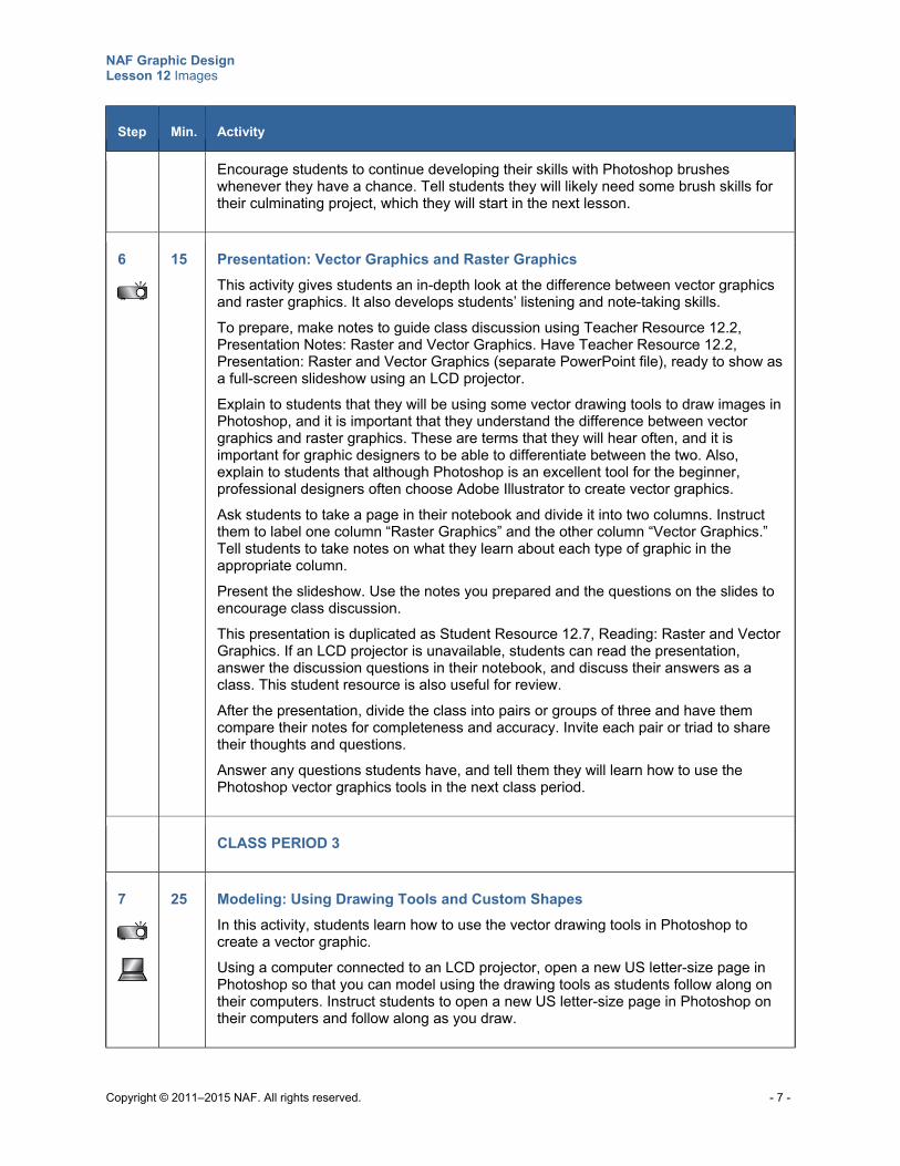
NAF Graphic Design Lesson 12 Images
Copyright © 2011–2015 NAF. All rights reserved. - 7 -
Step Min. Activity
Encourage students to continue developing their skills with Photoshop brushes whenever they have a chance. Tell students they will likely need some brush skills for their culminating project, which they will start in the next lesson.
6
15 Presentation: Vector Graphics and Raster Graphics
This activity gives students an in-depth look at the difference between vector graphics and raster graphics. It also develops students’ listening and note-taking skills.
To prepare, make notes to guide class discussion using Teacher Resource 12.2, Presentation Notes: Raster and Vector Graphics. Have Teacher Resource 12.2, Presentation: Raster and Vector Graphics (separate PowerPoint file), ready to show as a full-screen slideshow using an LCD projector.
Explain to students that they will be using some vector drawing tools to draw images in Photoshop, and it is important that they understand the difference between vector graphics and raster graphics. These are terms that they will hear often, and it is important for graphic designers to be able to differentiate between the two. Also, explain to students that although Photoshop is an excellent tool for the beginner, professional designers often choose Adobe Illustrator to create vector graphics.
Ask students to take a page in their notebook and divide it into two columns. Instruct them to label one column “Raster Graphics” and the other column “Vector Graphics.” Tell students to take notes on what they learn about each type of graphic in the appropriate column.
Present the slideshow. Use the notes you prepared and the questions on the slides to encourage class discussion.
This presentation is duplicated as Student Resource 12.7, Reading: Raster and Vector Graphics. If an LCD projector is unavailable, students can read the presentation, answer the discussion questions in their notebook, and discuss their answers as a class. This student resource is also useful for review.
After the presentation, divide the class into pairs or groups of three and have them compare their notes for completeness and accuracy. Invite each pair or triad to share their thoughts and questions.
Answer any questions students have, and tell them they will learn how to use the Photoshop vector graphics tools in the next class period.
CLASS PERIOD 3
7
25 Modeling: Using Drawing Tools and Custom Shapes
In this activity, students learn how to use the vector drawing tools in Photoshop to create a vector graphic.
Using a computer connected to an LCD projector, open a new US letter-size page in Photoshop so that you can model using the drawing tools as students follow along on their computers. Instruct students to open a new US letter-size page in Photoshop on their computers and follow along as you draw.
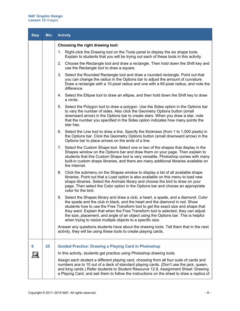
NAF Graphic Design Lesson 12 Images
Copyright © 2011–2015 NAF. All rights reserved. - 8 -
Step Min. Activity
Choosing the right drawing tool:
1. Right-click the Drawing tool on the Tools panel to display the six shape tools. Explain to students that you will be trying out each of these tools in this activity.
2. Choose the Rectangle tool and draw a rectangle. Then hold down the Shift key and use the Rectangle tool to draw a square.
3. Select the Rounded Rectangle tool and draw a rounded rectangle. Point out that you can change the radius in the Options bar to adjust the amount of curvature. Draw a rectangle with a 10-pixel radius and one with a 60-pixel radius, and note the difference.
4. Select the Ellipse tool to draw an ellipse, and then hold down the Shift key to draw a circle.
5. Select the Polygon tool to draw a polygon. Use the Sides option in the Options bar to vary the number of sides. Also click the Geometry Options button (small downward arrow) in the Options bar to create stars. When you draw a star, note that the number you specified in the Sides option indicates how many points the star has.
6. Select the Line tool to draw a line. Specify the thickness (from 1 to 1,000 pixels) in the Options bar. Click the Geometry Options button (small downward arrow) in the Options bar to place arrows on the ends of a line.
7. Select the Custom Shape tool. Select one or two of the shapes that display in the Shapes window on the Options bar and draw them on your page. Then explain to students that this Custom Shape tool is very versatile. Photoshop comes with many built-in custom shape libraries, and there are many additional libraries available on the Internet.
8. Click the submenu on the Shapes window to display a list of all available shape libraries. Point out that a Load option is also available on this menu to load new shape libraries. Select the Animals library and choose the bird to draw on your page. Then select the Color option in the Options bar and choose an appropriate color for the bird.
9. Select the Shapes library and draw a club, a heart, a spade, and a diamond. Color the spade and the club in black, and the heart and the diamond in red. Show students how to use the Free Transform tool to get the exact size and shape that they want. Explain that when the Free Transform tool is selected, they can adjust the size, placement, and angle of an object using the Options bar. This is helpful when trying to resize multiple objects to a specific size.
Answer any questions students have about the drawing tools. Tell them that in the next activity, they will be using these tools to create playing cards.
8
25 Guided Practice: Drawing a Playing Card in Photoshop
In this activity, students get practice using Photoshop drawing tools.
Assign each student a different playing card, choosing from all four suits of cards and numbers ace to 10 out of a deck of standard playing cards. (Don’t use the jack, queen, and king cards.) Refer students to Student Resource 12.8, Assignment Sheet: Drawing a Playing Card, and ask them to follow the instructions on the sheet to draw a replica of
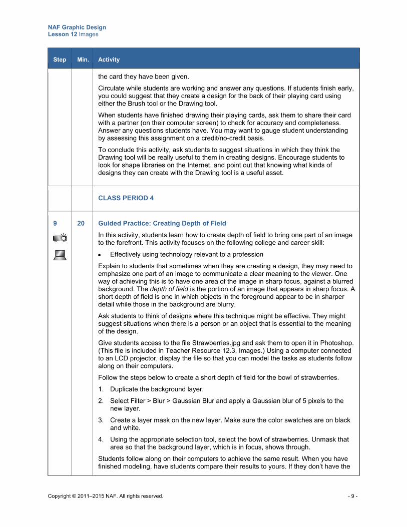
NAF Graphic Design Lesson 12 Images
Copyright © 2011–2015 NAF. All rights reserved. - 9 -
Step Min. Activity
the card they have been given.
Circulate while students are working and answer any questions. If students finish early, you could suggest that they create a design for the back of their playing card using either the Brush tool or the Drawing tool.
When students have finished drawing their playing cards, ask them to share their card with a partner (on their computer screen) to check for accuracy and completeness. Answer any questions students have. You may want to gauge student understanding by assessing this assignment on a credit/no-credit basis.
To conclude this activity, ask students to suggest situations in which they think the Drawing tool will be really useful to them in creating designs. Encourage students to look for shape libraries on the Internet, and point out that knowing what kinds of designs they can create with the Drawing tool is a useful asset.
CLASS PERIOD 4
9
20 Guided Practice: Creating Depth of Field
In this activity, students learn how to create depth of field to bring one part of an image to the forefront. This activity focuses on the following college and career skill:
Effectively using technology relevant to a profession
Explain to students that sometimes when they are creating a design, they may need to emphasize one part of an image to communicate a clear meaning to the viewer. One way of achieving this is to have one area of the image in sharp focus, against a blurred background. The depth of field is the portion of an image that appears in sharp focus. A short depth of field is one in which objects in the foreground appear to be in sharper detail while those in the background are blurry.
Ask students to think of designs where this technique might be effective. They might suggest situations when there is a person or an object that is essential to the meaning of the design.
Give students access to the file Strawberries.jpg and ask them to open it in Photoshop. (This file is included in Teacher Resource 12.3, Images.) Using a computer connected to an LCD projector, display the file so that you can model the tasks as students follow along on their computers.
Follow the steps below to create a short depth of field for the bowl of strawberries.
1. Duplicate the background layer.
2. Select Filter > Blur > Gaussian Blur and apply a Gaussian blur of 5 pixels to the new layer.
3. Create a layer mask on the new layer. Make sure the color swatches are on black and white.
4. Using the appropriate selection tool, select the bowl of strawberries. Unmask that area so that the background layer, which is in focus, shows through.
Students follow along on their computers to achieve the same result. When you have finished modeling, have students compare their results to yours. If they don’t have the
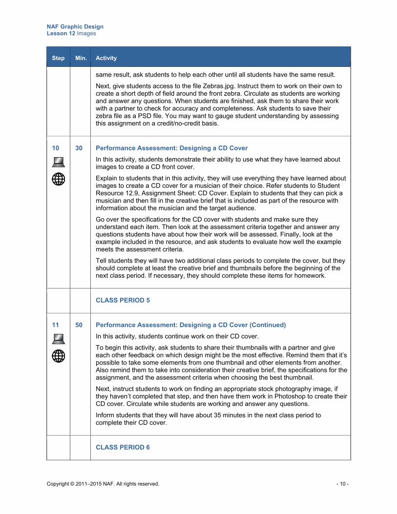
NAF Graphic Design Lesson 12 Images
Copyright © 2011–2015 NAF. All rights reserved. - 10 -
Step Min. Activity
same result, ask students to help each other until all students have the same result.
Next, give students access to the file Zebras.jpg. Instruct them to work on their own to create a short depth of field around the front zebra. Circulate as students are working and answer any questions. When students are finished, ask them to share their work with a partner to check for accuracy and completeness. Ask students to save their zebra file as a PSD file. You may want to gauge student understanding by assessing this assignment on a credit/no-credit basis.
10
30 Performance Assessment: Designing a CD Cover
In this activity, students demonstrate their ability to use what they have learned about images to create a CD front cover.
Explain to students that in this activity, they will use everything they have learned about images to create a CD cover for a musician of their choice. Refer students to Student Resource 12.9, Assignment Sheet: CD Cover. Explain to students that they can pick a musician and then fill in the creative brief that is included as part of the resource with information about the musician and the target audience.
Go over the specifications for the CD cover with students and make sure they understand each item. Then look at the assessment criteria together and answer any questions students have about how their work will be assessed. Finally, look at the example included in the resource, and ask students to evaluate how well the example meets the assessment criteria.
Tell students they will have two additional class periods to complete the cover, but they should complete at least the creative brief and thumbnails before the beginning of the next class period. If necessary, they should complete these items for homework.
CLASS PERIOD 5
11
50 Performance Assessment: Designing a CD Cover (Continued)
In this activity, students continue work on their CD cover.
To begin this activity, ask students to share their thumbnails with a partner and give each other feedback on which design might be the most effective. Remind them that it’s possible to take some elements from one thumbnail and other elements from another. Also remind them to take into consideration their creative brief, the specifications for the assignment, and the assessment criteria when choosing the best thumbnail.
Next, instruct students to work on finding an appropriate stock photography image, if they haven’t completed that step, and then have them work in Photoshop to create their CD cover. Circulate while students are working and answer any questions.
Inform students that they will have about 35 minutes in the next class period to complete their CD cover.
CLASS PERIOD 6
NAF Graphic Design Lesson 12 Images
Copyright © 2011–2015 NAF. All rights reserved. - 11 -
Step Min. Activity
12
35 Performance Assessment: Designing a CD Cover (Continued)
In this activity, students complete their CD cover.
Instruct students to get right to work finishing up their designs in Photoshop. Remind them to follow the procedure on their assignment sheet and to keep the assessment criteria in mind as they work.
Place a white band of chart paper (or butcher paper) around the wall, just a bit wider than the height of a CD cover. When students finish their covers, instruct them to print the cover, cut it to size, and post it on the white band of paper in preparation for a peer review.
13 15 Peer Review: The Client’s Perspective
In this activity, students play the role of the client who wrote the creative brief for the CD cover. This activity focuses on the following college and career skill:
Demonstrating adaptability and flexibility
Explain to students that in this peer review, they will be playing the role of the client and reviewing another student’s work to evaluate whether it solves the problem set out in the creative brief.
Ask students to exchange their creative brief with a partner and to show their partner the CD cover they designed in response to the creative brief. Instruct students to evaluate their partner’s design in terms of how well it aligns with the creative brief, and to place on the design sticky notes pointing out (1) where the design is particularly effective or (2) any changes they would recommend.
If time permits, ask “clients” who are particularly satisfied with the design that they are evaluating to share the design with the class.
Ask students to submit their CD cover files and their creative briefs for assessment. If students need time to implement changes suggested by their peers, tell them they can submit their CD cover at the beginning of the next class period. Assess their work using Teacher Resource 12.4, Assessment Criteria: CD Cover.
To conclude the lesson, ask students to share new design techniques they learned in this lesson that contributed to the success of their CD cover. Point out that the more practice they get with these techniques, the more professional looking their work will become.
Extensions
Enrichment Have students create a deck of cards, front and back, on card stock paper. Instruct them to make
the design for the backs of the cards using the Photoshop Brush tools. They should be able to fit nine cards per page of US letter paper.
NAF Graphic Design Lesson 12 Images
Copyright © 2011–2015 NAF. All rights reserved. - 12 -
Ask students to design a candy wrapper for a candy of their choice using Photoshop Brush and Drawing tools.
If any students have experience drawing in Adobe Illustrator, ask them to create a chart and then compare and contrast the drawing tools in Photoshop and Illustrator. Have students report back to the class with their comparative analysis.
Ask students to research how and why you register a copyright in the United States and to write a report outlining the procedure. This information is available online from the US government. Have students share their report with the class.
Technology Integration Consider showing and discussing the following video during the lesson:
o “Shape Tools,” Adobe Photoshop CC tutorial, 8:47, https://helpx.adobe.com/photoshop/how-to/photoshop-vector-shape-tools.html
Cross-Curricular Integration Geometry: Lead a discussion on vector graphics and how they relate to vectors in mathematics.
Have students draw an abstract shape at two different scales using vectors to show how they look exactly the same.
Science/History: Ask students to create a collection of 10 stock photography photos related to a topic they are studying. For each photo, ask them to describe how the photo communicates meaning about the concept and why it would be useful to have the photo instead of just using text.
Copyright © 2011–2015 NAF. All rights reserved.
NAF Graphic Design
Lesson 12 Images
Teacher Resources
Resource Description
Teacher Resource 12.1 Sample Images: Images That Express Meaning (separate PDF file)
Teacher Resource 12.2 Presentation and Notes: Raster and Vector Graphics (includes separate PowerPoint file)
Teacher Resource 12.3 Images: Strawberries.jpg, Zebras.jpg (separate ZIP file)
Teacher Resource 12.4 Assessment Criteria: CD Cover
Teacher Resource 12.5 Key Vocabulary: Images
Teacher Resource 12.6 Bibliography: Images
NAF Graphic Design Lesson 12 Images
Copyright © 2011–2015 NAF. All rights reserved.
Teacher Resource 12.2
Presentation Notes: Raster and Vector Graphics
Before you show this presentation, use the text accompanying each slide to develop presentation notes. Writing the notes yourself enables you to approach the subject matter in a way that is comfortable to you and engaging for your students. Make this presentation as interactive as possible by stopping frequently to ask questions and encourage class discussion.
This presentation explains the difference between raster and vector graphics and clarifies when each type of graphic is appropriate.
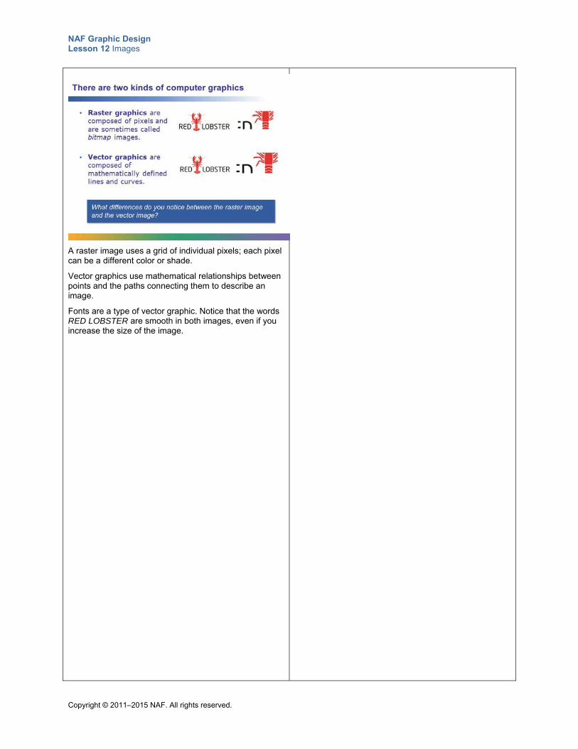
NAF Graphic Design Lesson 12 Images
Copyright © 2011–2015 NAF. All rights reserved.
A raster image uses a grid of individual pixels; each pixel can be a different color or shade.
Vector graphics use mathematical relationships between points and the paths connecting them to describe an image.
Fonts are a type of vector graphic. Notice that the words RED LOBSTER are smooth in both images, even if you increase the size of the image.
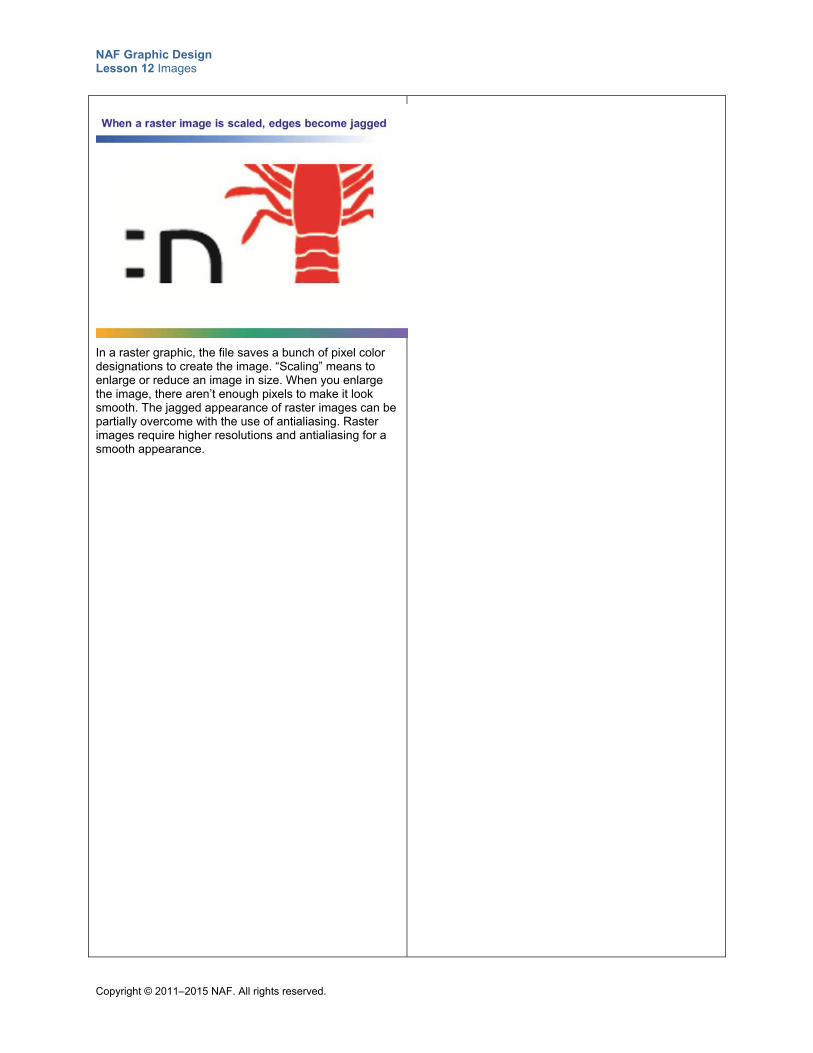
NAF Graphic Design Lesson 12 Images
Copyright © 2011–2015 NAF. All rights reserved.
In a raster graphic, the file saves a bunch of pixel color designations to create the image. “Scaling” means to enlarge or reduce an image in size. When you enlarge the image, there aren’t enough pixels to make it look smooth. The jagged appearance of raster images can be partially overcome with the use of antialiasing. Raster images require higher resolutions and antialiasing for a smooth appearance.
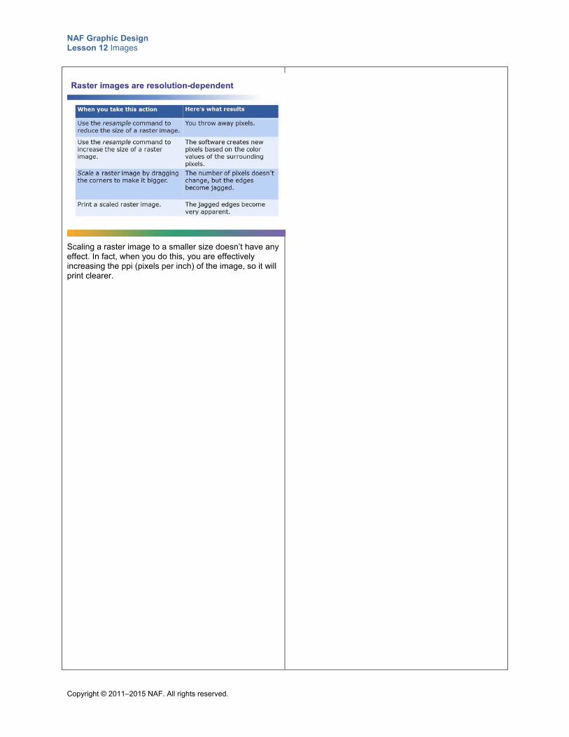
NAF Graphic Design Lesson 12 Images
Copyright © 2011–2015 NAF. All rights reserved.
Scaling a raster image to a smaller size doesn’t have any effect. In fact, when you do this, you are effectively increasing the ppi (pixels per inch) of the image, so it will print clearer.
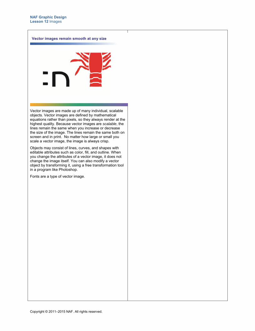
NAF Graphic Design Lesson 12 Images
Copyright © 2011–2015 NAF. All rights reserved.
Vector images are made up of many individual, scalable objects. Vector images are defined by mathematical equations rather than pixels, so they always render at the highest quality. Because vector images are scalable, the lines remain the same when you increase or decrease the size of the image. The lines remain the same both on screen and in print. No matter how large or small you scale a vector image, the image is always crisp.
Objects may consist of lines, curves, and shapes with editable attributes such as color, fill, and outline. When you change the attributes of a vector image, it does not change the image itself. You can also modify a vector object by transforming it, using a free transformation tool in a program like Photoshop.
Fonts are a type of vector image.
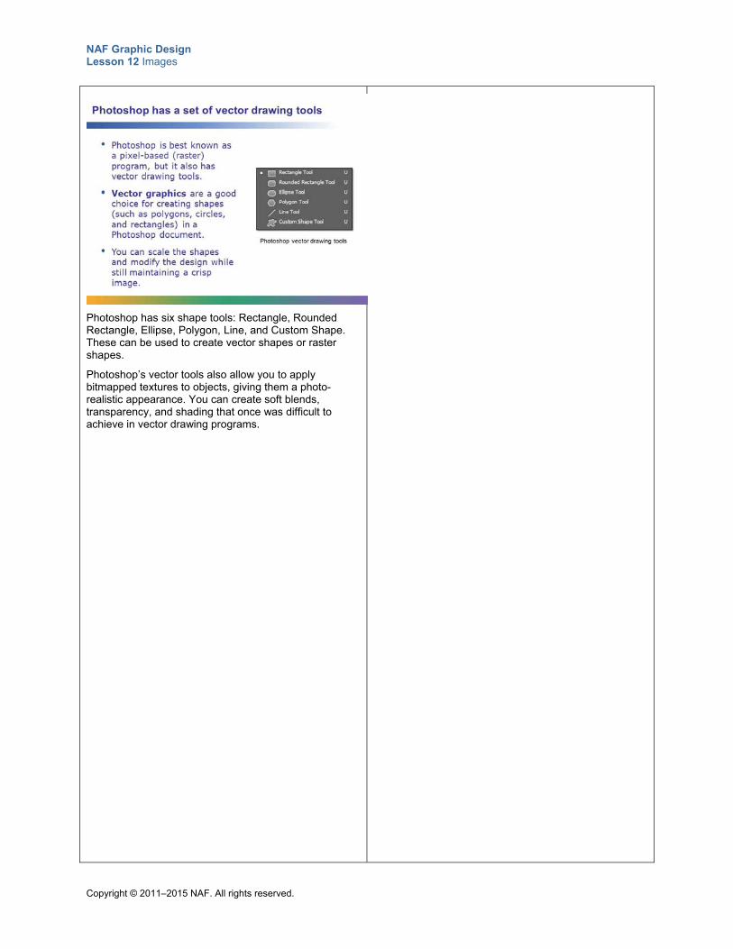
NAF Graphic Design Lesson 12 Images
Copyright © 2011–2015 NAF. All rights reserved.
Photoshop has six shape tools: Rectangle, Rounded Rectangle, Ellipse, Polygon, Line, and Custom Shape. These can be used to create vector shapes or raster shapes.
Photoshop’s vector tools also allow you to apply bitmapped textures to objects, giving them a photo-realistic appearance. You can create soft blends, transparency, and shading that once was difficult to achieve in vector drawing programs.
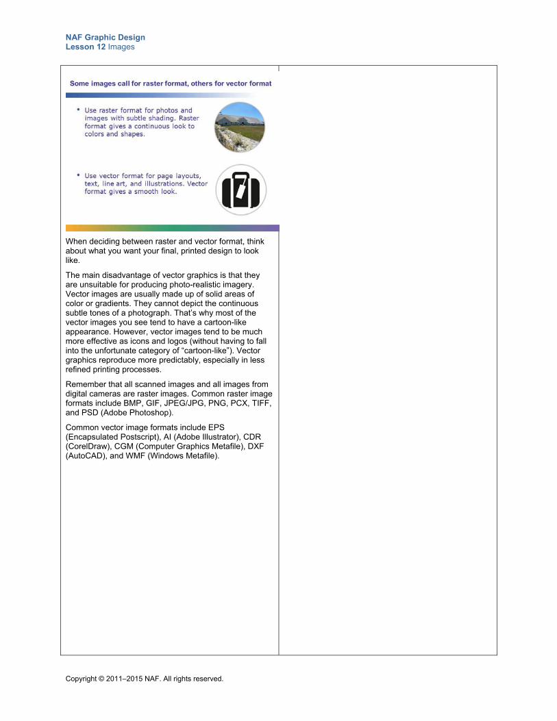
NAF Graphic Design Lesson 12 Images
Copyright © 2011–2015 NAF. All rights reserved.
When deciding between raster and vector format, think about what you want your final, printed design to look like.
The main disadvantage of vector graphics is that they are unsuitable for producing photo-realistic imagery. Vector images are usually made up of solid areas of color or gradients. They cannot depict the continuous subtle tones of a photograph. That’s why most of the vector images you see tend to have a cartoon-like appearance. However, vector images tend to be much more effective as icons and logos (without having to fall into the unfortunate category of “cartoon-like”). Vector graphics reproduce more predictably, especially in less refined printing processes.
Remember that all scanned images and all images from digital cameras are raster images. Common raster image formats include BMP, GIF, JPEG/JPG, PNG, PCX, TIFF, and PSD (Adobe Photoshop).
Common vector image formats include EPS (Encapsulated Postscript), AI (Adobe Illustrator), CDR (CorelDraw), CGM (Computer Graphics Metafile), DXF (AutoCAD), and WMF (Windows Metafile).
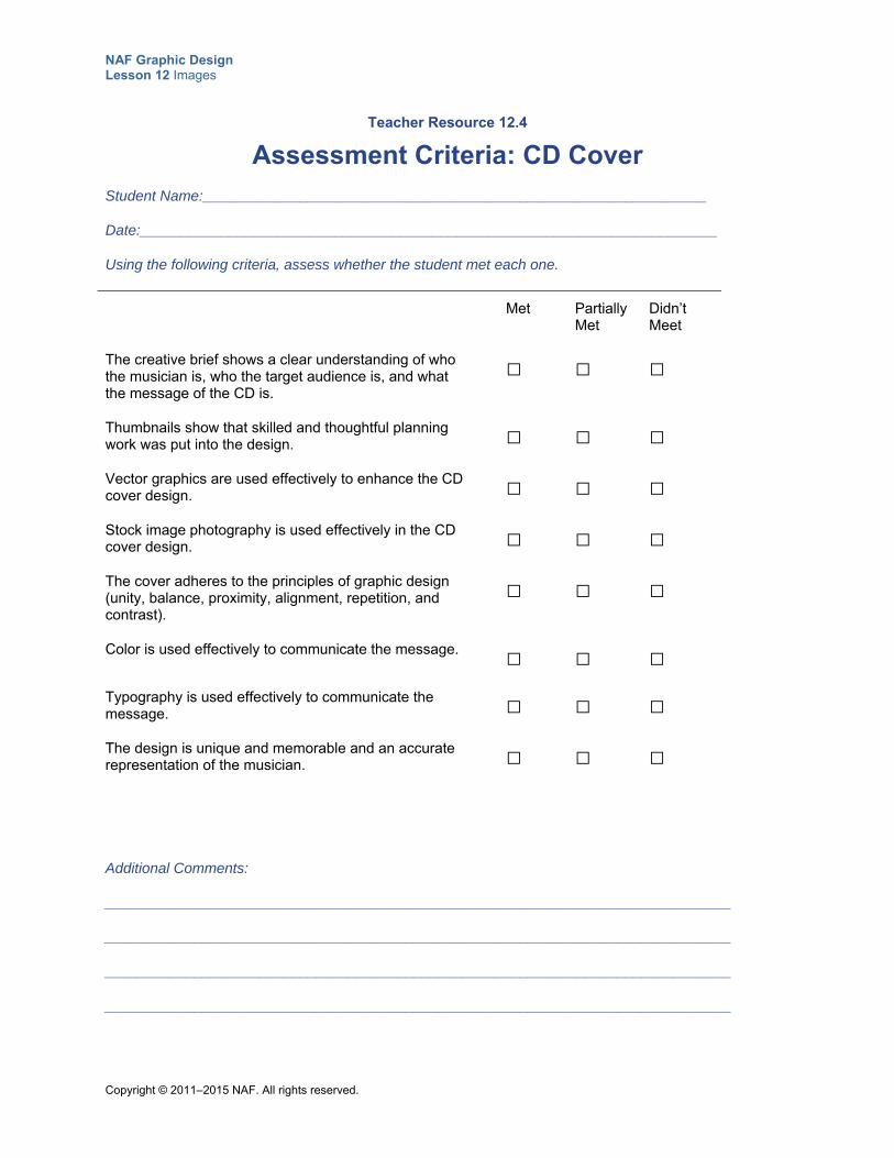
NAF Graphic Design Lesson 12 Images
Copyright © 2011–2015 NAF. All rights reserved.
Teacher Resource 12.4
Assessment Criteria: CD Cover
Student Name:______________________________________________________________
Date:_______________________________________________________________________
Using the following criteria, assess whether the student met each one.
Met Partially Met
Didn’t Meet
The creative brief shows a clear understanding of who the musician is, who the target audience is, and what the message of the CD is.
□ □ □
Thumbnails show that skilled and thoughtful planning work was put into the design.
□ □ □
Vector graphics are used effectively to enhance the CD cover design.
□ □ □
Stock image photography is used effectively in the CD cover design.
□ □ □
The cover adheres to the principles of graphic design (unity, balance, proximity, alignment, repetition, and contrast).
□ □ □
Color is used effectively to communicate the message. □ □ □
Typography is used effectively to communicate the message.
□ □ □
The design is unique and memorable and an accurate representation of the musician.
□ □ □
Additional Comments:
_____________________________________________________________________________
_____________________________________________________________________________
_____________________________________________________________________________
_____________________________________________________________________________
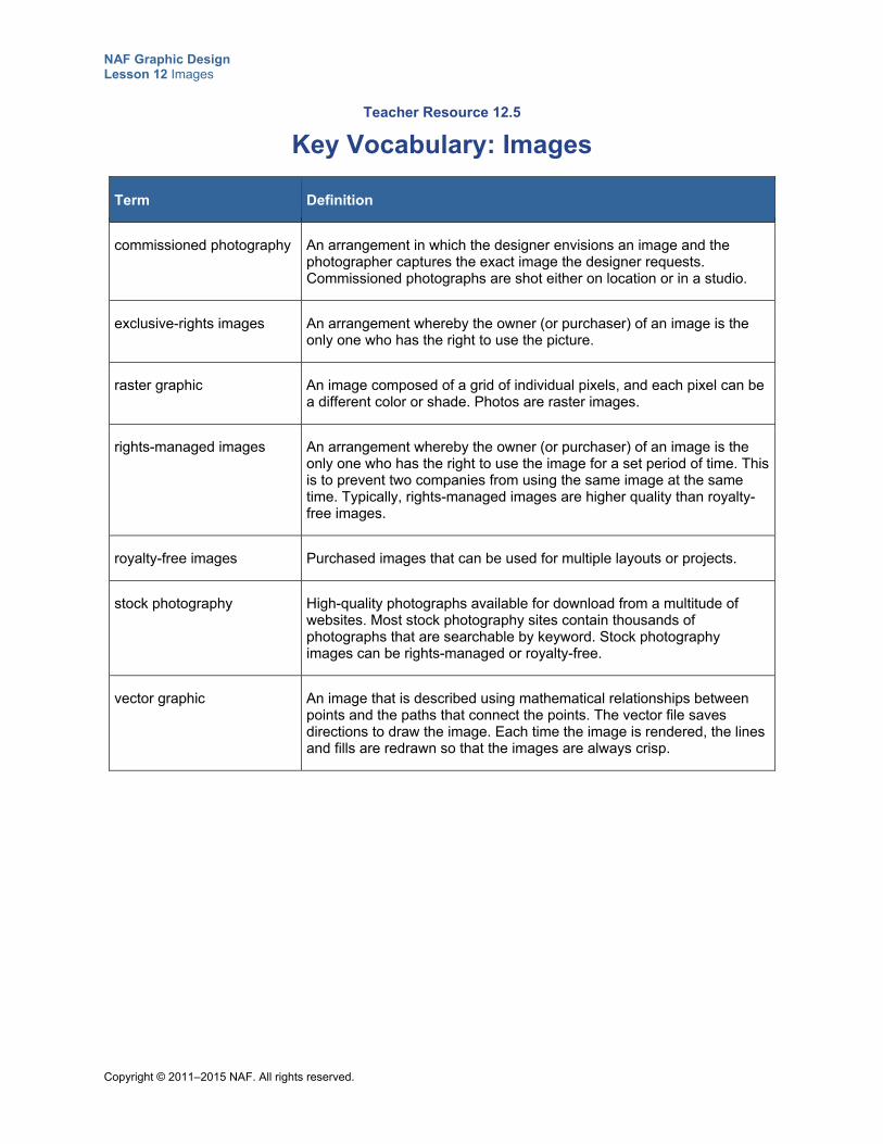
NAF Graphic Design Lesson 12 Images
Copyright © 2011–2015 NAF. All rights reserved.
Teacher Resource 12.5
Key Vocabulary: Images
Term Definition
commissioned photography An arrangement in which the designer envisions an image and the photographer captures the exact image the designer requests. Commissioned photographs are shot either on location or in a studio.
exclusive-rights images An arrangement whereby the owner (or purchaser) of an image is the only one who has the right to use the picture.
raster graphic An image composed of a grid of individual pixels, and each pixel can be a different color or shade. Photos are raster images.
rights-managed images An arrangement whereby the owner (or purchaser) of an image is the only one who has the right to use the image for a set period of time. This is to prevent two companies from using the same image at the same time. Typically, rights-managed images are higher quality than royalty-free images.
royalty-free images Purchased images that can be used for multiple layouts or projects.
stock photography High-quality photographs available for download from a multitude of websites. Most stock photography sites contain thousands of photographs that are searchable by keyword. Stock photography images can be rights-managed or royalty-free.
vector graphic An image that is described using mathematical relationships between points and the paths that connect the points. The vector file saves directions to draw the image. Each time the image is rendered, the lines and fills are redrawn so that the images are always crisp.
NAF Graphic Design Lesson 12 Images
Copyright © 2011–2015 NAF. All rights reserved.
Teacher Resource 12.6
Bibliography: Images
The following sources were used in the preparation of this lesson and may be useful for your reference or as classroom resources. We check and update the URLs annually to ensure that they continue to be useful.
Print Harrington, Richard. Understanding Adobe Photoshop CS4. Berkeley, CA: Peachpit Press, 2009.
Hembree, Ryan. The Complete Graphic Designer. Beverly, MA: Rockport Publishers, 2008.
Landa, Robin. Graphic Design Solutions, 3rd ed. Clifton Park, NY: Thomson Delmar Learning, 2006.
Williams, Robin. The Non-Designer’s Design Book, 3rd ed. Berkeley, CA: Peachpit Press, 2008.
Online AIGA: The Professional Association for Design, http://www.aiga.org/ (accessed July 1, 2015).
Corbis Images, http://www.corbisimages.com/ (accessed July 1, 2015).
Fotosearch, http://www.fotosearch.com/ (accessed July 1, 2015).
Getty Images, http://www.gettyimages.com/ (accessed July 1, 2015).
iStockphoto, http://www.istockphoto.com/ (accessed July 1, 2015).
Masterfile, http://www.masterfile.com/ (accessed July 1, 2015).
Pizzi, Matthew. “Shape Tools.” Adobe Photoshop CC tutorial, 8:47. December 10, 2013. https://helpx.adobe.com/photoshop/how-to/photoshop-vector-shape-tools.html (accessed July 1, 2015).
Raster Vector Free Images, http://www.rastervector.com/resources/free/free.html (accessed July 1, 2015).
Shutterstock Images, http://www.shutterstock.com/ (accessed July 1, 2015).
Veer, http://www.veer.com/ (accessed June 4, 2014).
Wikimedia Commons, http://commons.wikimedia.org/wiki/Main_Page (accessed July 1, 2015).
“Wikipedia: Public domain image resources.” Wikipedia, http://en.wikipedia.org/wiki/Wikipedia:Public_domain_image_resources (accessed July 1, 2015).
Copyright © 2011–2015 NAF. All rights reserved.
NAF Graphic Design
Lesson 12 Images
Student Resources
Resource Description
Student Resource 12.1 Image Selection: Images That Express Meaning
Student Resource 12.2 K-W-L Chart: Choosing and Acquiring Appropriate Images
Student Resource 12.3 Reading: Choosing and Acquiring Appropriate Images
Student Resource 12.4 Reference Sheet: Stock Photography Sites
Student Resource 12.5 Assignment Sheet: Selecting Stock Photography
Student Resource 12.6 Tutorial: Painting with Brushes
Student Resource 12.7 Reading: Raster and Vector Graphics
Student Resource 12.8 Assignment Sheet: Drawing a Playing Card
Student Resource 12.9 Assignment Sheet: CD Cover
NAF Graphic Design Lesson 12 Images
Copyright © 2011–2015 NAF. All rights reserved.
Student Resource 12.1
Image Selection: Images That Express Meaning
Student Names:_______________________________________________________ Date:___________
Directions: Read the description of the target audience and the objective of the flyer, and then study the images your teacher provides for you and choose the image that you think is best suited for each flyer. Give your reasons for each of your choices.
Football Flyer This picture is for a flyer designed to encourage incoming high school freshman to try out for the freshman football team. The target audience is high school freshmen.
Which image is best suited? Give your reasons.
What is the mood or emotion of the image you chose?
Ice Cream Truck This image will go on the side of an ice cream truck that sells homemade, organic ice cream. The truck serves ice cream cones in the neighborhoods of an upscale suburb of Los Angeles. The target audience is adults who prefer organic food, and their children who love ice cream.
Which image is best suited? Give your reasons.
What is the mood or emotion of the image you chose?
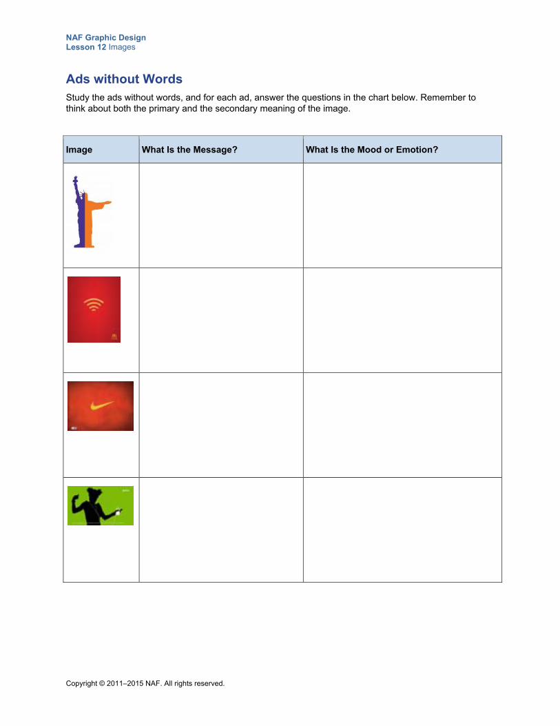
NAF Graphic Design Lesson 12 Images
Copyright © 2011–2015 NAF. All rights reserved.
Ads without Words Study the ads without words, and for each ad, answer the questions in the chart below. Remember to think about both the primary and the secondary meaning of the image.
Image What Is the Message? What Is the Mood or Emotion?
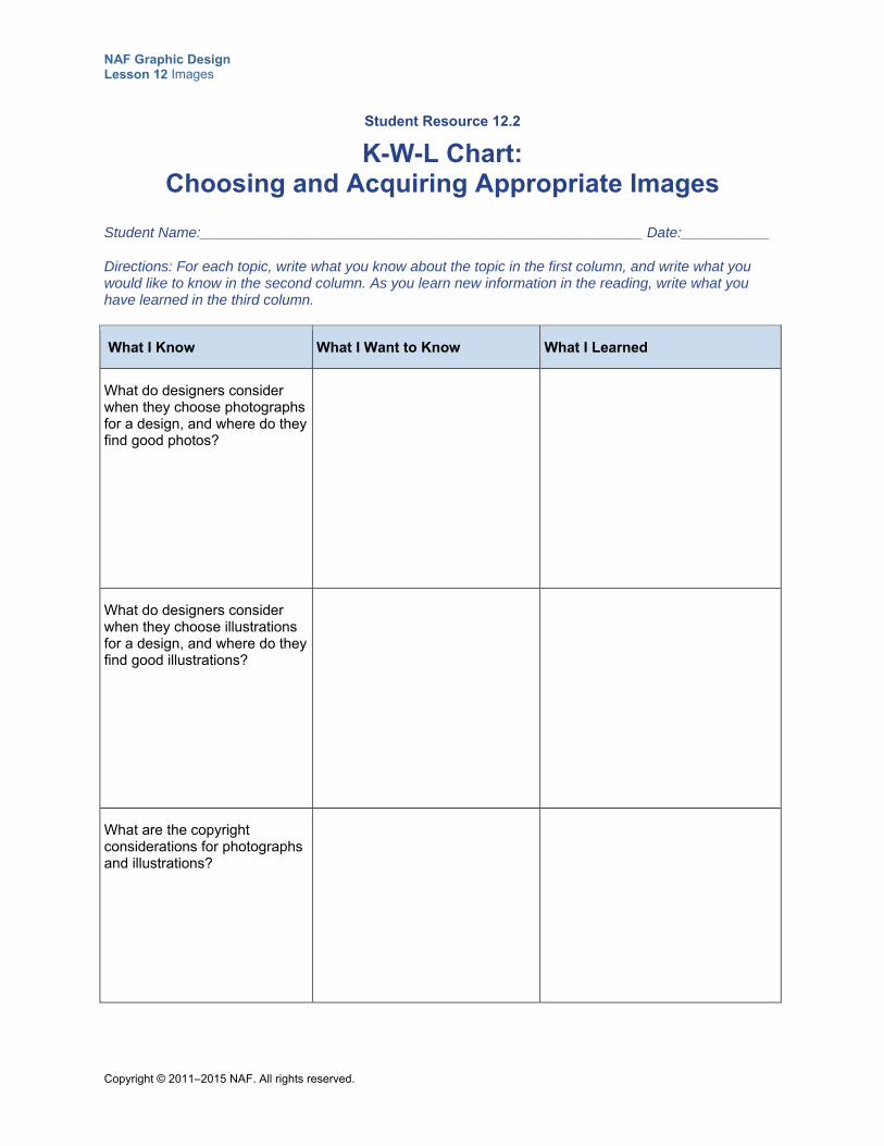
NAF Graphic Design Lesson 12 Images
Copyright © 2011–2015 NAF. All rights reserved.
Student Resource 12.2
K-W-L Chart: Choosing and Acquiring Appropriate Images
Student Name:_______________________________________________________ Date:___________
Directions: For each topic, write what you know about the topic in the first column, and write what you would like to know in the second column. As you learn new information in the reading, write what you have learned in the third column.
What I Know What I Want to Know What I Learned
What do designers consider when they choose photographs for a design, and where do they find good photos?
What do designers consider when they choose illustrations for a design, and where do they find good illustrations?
What are the copyright considerations for photographs and illustrations?
NAF Graphic Design Lesson 12 Images
Copyright © 2011–2015 NAF. All rights reserved.
Student Resource 12.3
Reading: Choosing and Acquiring Appropriate Images
The importance of effective images in graphic design cannot be overstated. Images add impact to a design and make it more visually appealing. They evoke curiosity, create a call to action, or communicate important information. But the images you choose communicate more than information: they also communicate the mood and emotion of your design.
Photography Photography captures the world around us and draws the viewer in to a particular moment in time. Photos can inform, convince, evoke an emotional response, or sell a product. When a photo effectively communicates the message, the viewer quickly grasps the mood of the piece, or comprehends the important information. Because photographs traditionally “do not lie,” photos are often considered to be more credible than illustrations. However, with the advent of tools such as Photoshop that can be used to touch up photos, the credibility of photos can also be called into question.
Photography is often used to gain the viewer’s attention and lead the viewer into the written words. To draw the viewer in, a photo must be unique and visually appealing, with a distinct focal point. Designers use various means to achieve this. Short depth of field, tight cropping, and close-ups of the subject matter are all useful techniques. Remember that you do not need to use a photo in its entirety. Cropping out unnecessary portions of a photo can be very effective, if the cropping doesn’t change the mood or the meaning of the photo.
Commissioned Photography
For commissioned photography, the designer envisions an image, and the photographer captures the exact image the designer requests. Commissioned photographs are shot either on location or in a studio. Different angles and lighting techniques can be used to create the image that is perfect for the project’s concept. Because setting up a staged photo shoot like this can be complex and time consuming, the cost may be prohibitive for many clients. If it requires a special location or hiring models, commissioned photography becomes even more expensive.
Stock Photography
The abundance of high-quality stock photographs available for download from the web is an invaluable resource for designers. Most stock photography sites contain thousands of photographs that are searchable by keyword. It’s possible to find photographs on almost any subject matter.
There are three types of stock photography: royalty-free, rights-managed, and exclusive rights.
When you purchase a royalty-free photograph, you can use it for multiple layouts or projects.
When you purchase a rights-managed photograph, there is usually a set period of time for which you can use it. This is to prevent two companies from using the same image at the same time. Typically, rights-managed images are higher quality and more expensive than royalty-free images.
When you purchase exclusive rights, no one else has the right to use the picture. These images are often the most expensive.
You may find additional restrictions on images—specifically, their use may be limited to print only, or web only, or both. Similar restrictions may apply to fonts.
A drawback of stock photography is that it can have a generic look. You may need to shop around to find images that are unique and that communicate your meaning exactly. An enterprising designer can up the impact of images by using techniques offered in this course like dramatic cropping, tinting, or layering.
NAF Graphic Design Lesson 12 Images
Copyright © 2011–2015 NAF. All rights reserved.
Illustrations Illustrations are also an effective way to draw the viewer in to a printed piece. They can be more effective than photography at communicating an idea or a feeling. Ideally, readers can look at the text on a page, the illustration, or both to get the whole story on the page. Combining visual and verbal elements helps people comprehend a message more quickly than if there is only an illustration or only text. It is important to choose illustrations that complement the text.
Many types of illustrations exist, and choosing the appropriate type of illustration for a particular piece is an important skill. A soft pastel drawing sends a different message than a cartoon or a drawing with hard edges. Illustrations can be humorous, decorative, factual, or serious. When you select an illustration, be sure to consider how it contributes to the overall effectiveness of your page. The tone and feeling it communicates is as important as the image itself. To choose an appropriate illustration, you must fully understand the written content on the page and have the guidelines of the creative brief firmly in mind. If you are choosing an illustration for a page with content written by someone else, make sure you understand the entire concept and focus of the page.
As a graphic designer, it is important to learn how to do simple illustrations yourself. However, for complex illustrations, designers often use either a professional illustrator or stock illustrations. The ability to think visually is more important than the ability to draw.
Rules for Using Images Effectively Leave plenty of space around images so that the eye naturally flows around the page. If images
are jammed together on a page, it stops the viewer’s progression through the page.
Vary the size of images or of the subjects within an image to create variety and add interest to a page. It can be boring when everything is the same size.
Pick images that look like they belong together. If you are selecting images from a variety of sources, this is especially important. Sometimes you can make images look more coordinated by making changes to the size, shape, border, color, or typeface in the image.
Make sure images are appropriate for the content of the page. If the image is off-subject, it will be distracting or confusing to viewers and may cause them to question the validity of the piece.
Copyright Considerations Copyright laws protect original works of art and design, including photographs and illustrations. You must always buy licensing rights for stock photography or illustrations and request permission to use other types of artwork. Using an image without permission is copyright infringement; it is unethical and illegal.
Design students may include copyrighted images and illustrations in their work for educational purposes. The original artist must be credited with the work, and the design cannot be reproduced, distributed, or sold.
Images that are part of the public domain are free for use. The public domain is defined by the US Copyright Office as the works that are not copyrighted. This includes images whose copyright has expired and works that were released into the public domain by the copyright holder. Images from the US federal government, such as pictures from the NASA website, are considered part of the public domain and are therefore free for use. A wealth of public domain images is available from sites such as Raster Vector Free Images (http://www.rastervector.com/resources/free/free.html). Wikimedia Commons (http://commons.wikimedia.org/wiki/Main_Page) also hosts a number of public domain images—but be sure to check each image’s licensing information carefully.

NAF Graphic Design Lesson 12 Images
Copyright © 2011–2015 NAF. All rights reserved.
Make Image Sources Work for You Gaining familiarity with a variety of image sources will enable you to find just what you need for a particular design. As you look for images on different sources, note the quality, the prices, the styles, the variety, and the subject matters of the images they offer. You will certainly find some sources that are your favorites and others that are not your style. Knowing what’s out there is an important first step to choosing and acquiring an appropriate image.
NAF Graphic Design Lesson 12 Images
Copyright © 2011–2015 NAF. All rights reserved.
Student Resource 12.4
Reference Sheet: Stock Photography Sites
Student Names:_______________________________________________________ Date:___________
Directions: Look for stock photography to meet your needs on the sites listed in this table. For each site that you access, write your notes about what you find in the notes column. You won’t need to look through all the sites to find a suitable image, but it’s useful to have this long list of reliable sites as a reference whenever you need to find an image.
Stock Photography Site Your Notes
Getty Images www.gettyimages.com
Corbis Images www.corbisimages.com
Shutterstock Images www.shutterstock.com
Masterfile www.masterfile.com
Veer www.veer.com
iStockphoto www.istockphoto.com
Fotolia http://us.fotolia.com
Dreamstime http://www.dreamstime.com
Fotosearch www.fotosearch.com
NAF Graphic Design Lesson 12 Images
Copyright © 2011–2015 NAF. All rights reserved.
Student Resource 12.5
Assignment Sheet: Selecting Stock Photography
Directions: Follow the steps listed below to find an image that is an appropriate solution for the creative brief on the next page of this resource.
1. Read the creative brief on the next page of this resource and make sure you understand exactly what type of image is required for the poster. Write some notes here about what you are looking for in an image:
2. Search for an appropriate image on one or more of the stock photography sites listed on Student Resource 12.4, Reference Sheet: Stock Photography Sites. As you search different sites, make notes on the reference sheet of anything you want to remember about a particular site.
3. When you find an image that is appropriate in terms of content, target, audience, and tone, download a preview (also known as a “comp”) of the image to your computer. (All of the sites allow you to download a low-resolution comp before you actually purchase the image. Most of the comps have a watermark on them, which indicates that you have not purchased the image.)
4. In the space provided, note the following information about the image you selected:
The name and URL of the stock photography site
The image ID number
Whether the image is royalty-free or rights-managed
What size image you think you would need for the poster (in inches and in MB), and what the price is for that image size If pricing information is not readily available, especially in the case of rights-managed images, indicate here that you must contact the site for pricing information. Be aware that some images on some sites may not be available in sufficiently high resolution to look clean when printed on your poster. Make sure to purchase an image at least as big as the actual size it will be in your design. A small image will have poor image quality when enlarged. Apply what you’ve already learned about image size and resolution for using raster images like photographs.
5. Write a two- or three-sentence analysis of why the image is appropriate for the poster.
NAF Graphic Design Lesson 12 Images
Copyright © 2011–2015 NAF. All rights reserved.
Creative Brief: Skydiving Poster Directions: Before you search for the right image for your skydiving poster, study this creative brief. Then find an image that communicates the client’s message clearly.
Aging but Dangerous Skydiving Event – Creative Brief
BACKGROUND
“Aging but Dangerous” is a nonprofit organization designed to encourage women to challenge themselves and not slow down as they get older. The organization is hosting a skydiving event in Wisconsin for women 50 and older. Getting these women out of their comfort zone helps them build confidence and generates a lot of excitement.
CAMPAIGNOBJECTIVES
Publicize the skydiving event and generate at least 100 registrations.
ASSIGNMENT
Provide a 300 dpi stock photography image for use as the background on a printed 11" by 17" poster. There should be at least 3 inches of background space at the top and bottom of the image to allow room for written information about the event.
DELIVERABLES Preview image downloaded in JPEG format (The preview image will be 72 dpi and will have a
watermark.)
Name of the stock photography site, image ID number, and information about whether the image is royalty-free or rights-managed
Information about the price of the image
A two- or three-sentence analysis of why the image is appropriate for the poster
TARGETPOPULATION
Women, 50 years and older, residing in Wisconsin. The poster will be displayed in many grocery store chains and all public libraries in Wisconsin.
TONE/LOOK&FEEL
The thought of jumping out of a plane at 14,000 feet should make viewers feel invigorated, excited, and challenged. Viewers should think of skydiving as the thrill of a lifetime.
NAF Graphic Design Lesson 12 Images
Copyright © 2011–2015 NAF. All rights reserved.
Student Resource 12.6
Tutorial: Painting with Brushes
Directions: In this tutorial, you will start out with a clean document and try different strokes on it to see what they look like. First, work through all the sections of the tutorial about brush options. When you are satisfied that you know where to find the brushes you need, follow the instructions to create your first painting project, a beach scene.
The brushes in Photoshop are an incredible resource for painting! They offer a surprising number of possibilities: brush presets, tip shapes, tip sizes, degrees of hardness, colors, smoothing, jittering, scattering, and fading, for example—and that’s just some of the options. Rather than letting yourself be overwhelmed by too many choices, the best approach is to get in there and experiment with the many brush possibilities.
1. Create a new US letter-size document in Photoshop.
2. Type D to load the default colors of black and white. Feel free to use the Color Picker to change the brush color whenever you want, but we’ll start out with black and white.
3. Type B to select the standard Brush tool (or you can select the Brush tool on the Tools panel).
4. On the top right of the Photoshop window, make sure you have selected the Painting workspace (or select it from the Window menu: Window > Workspace > Painting). This arranges the Photoshop window so that the most commonly used panels for painting are available.
5. Click the Brush panel icon to display the Brush panel.
(Or on the Window menu, select Brush.) The Brush panel gives you a huge variety of options for your paintbrush. We’ll work through some of the most important options, but to become a pro at painting in Photoshop, you’ll need to spend a lot of time experimenting with the Brush panel.
Brush Presets A preset brush is a saved brush tip with defined characteristics, such as size, tip shape, and hardness. Photoshop comes with lots of brush presets, which you can try out. When you get used to using brushes, you can also create your own presets.
1. On the Brush panel, click Brush Presets at the top. You’ll see a list and thumbnails of several brush styles. The brush stroke preview at the bottom of the panel shows how paint strokes look with the current brush options.
2. Scroll through the list of brush presets and choose a style you like. Draw a stroke on your blank document to see what it looks like. Try several different presets and draw strokes to familiarize yourself with the variety of possibilities. (Remember that you can use the History panel to go back in time if your page gets too full!) Tip: To draw a straight line, click a starting point in the image. Then hold down Shift, and click an ending point.
Brush Tip Shape Click the words Brush Tip Shape in the Brush panel to display the brush tip shape options. You’ll see a box on the right of the panel with tip shapes that you can select, and below the box are options for how you want the particular brush tip to work. The options change a bit depending on the brush tip you select,
NAF Graphic Design Lesson 12 Images
Copyright © 2011–2015 NAF. All rights reserved.
but here are some of the more important options to try out. Draw more lines on your page with various brush tips, and see what these options do to the brush:
Size (or Diameter in earlier versions of Photoshop) controls the size of the brush.
Flip X and Flip Y change the direction of the brush by flipping it on its X axis or its Y axis. (Think of changing the direction of a paint brush you’re holding in your hand.)
Angle specifies the angle at which the brush is held. (If your brush is elliptical rather than round, holding it at an angle will change what the strokes look like.)
Roundness of 100% is a round brush, while 15% is a long, skinny brush.
Hardness of 100% indicates no feathering, which appears like thicker paint. Less hardening creates soft edges and more natural strokes.
Spacing controls the distance between brush marks when you create a stroke.
Other Brush Options Try these additional brush options on brushes of your choice. You can examine the effect in the preview window before you draw your strokes. All of these options are selectable from the left side of the Brush panel:
Scattering adds variation to the placement of strokes, so you can simulate splattering, or wilder strokes.
Texture introduces a pattern into your strokes to make it look like you are painting on textured canvas.
Noise adds additional randomness to individual brush tips. This option is most effective when applied to soft brush tips (brush tips that contain gray values).
Wet edges causes paint to build up along the edges of the brush stroke, creating a watercolor effect.
Airbrush applies gradual tones to an image, simulating traditional airbrush techniques. The Airbrush option in the Brush panel corresponds to the Airbrush option in the Options bar. When using the Brush tool as an airbrush, hold down the mouse button without dragging to build up color.
The Pencil Tool The Pencil tool is similar to the Brush tool. The big difference is that the Pencil tool only draws hard-edge strokes. The Brush tool creates soft strokes of color, and the Pencil tool creates hard-edged lines. To select the Pencil tool, right-click the Brush tool in the Tools panel and select the pencil. Try drawing with the Pencil tool and note how the strokes are different from those of a soft brush.
Using Brush Tools to Create a Beach Scene For this painting project, start with a clean US letter-size page. What your beach looks like is totally up to you.
1. Start by painting the sand. Use the Color Picker to select a sandy color. Choose a brush tip that is appropriate. Try selecting Texture and using lots of jitter to give the canvas a sandy texture. You’ll want a pretty big brush size to fill in the sand on the beach.
2. Add the water. Experiment with different colors, brush tips, and options until you find something that works. You might try adding some waves. Try using strokes that make the sand and the beach come together nicely.

NAF Graphic Design Lesson 12 Images
Copyright © 2011–2015 NAF. All rights reserved.
3. Add some sky. Make it look like a sunny day or a cloudy day—whatever you want!
4. Draw a few starfish in the sand, a sailboat in the water, or whatever you like to make your beach look inviting.
NAF Graphic Design Lesson 12 Images
Copyright © 2011–2015 NAF. All rights reserved.
Student Resource 12.7
Reading: Raster and Vector Graphics
This presentation explains the difference between raster and vector graphics and clarifies when each type of graphic is appropriate.
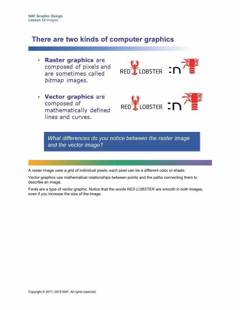
NAF Graphic Design Lesson 12 Images
Copyright © 2011–2015 NAF. All rights reserved.
A raster image uses a grid of individual pixels; each pixel can be a different color or shade.
Vector graphics use mathematical relationships between points and the paths connecting them to describe an image.
Fonts are a type of vector graphic. Notice that the words RED LOBSTER are smooth in both images, even if you increase the size of the image.
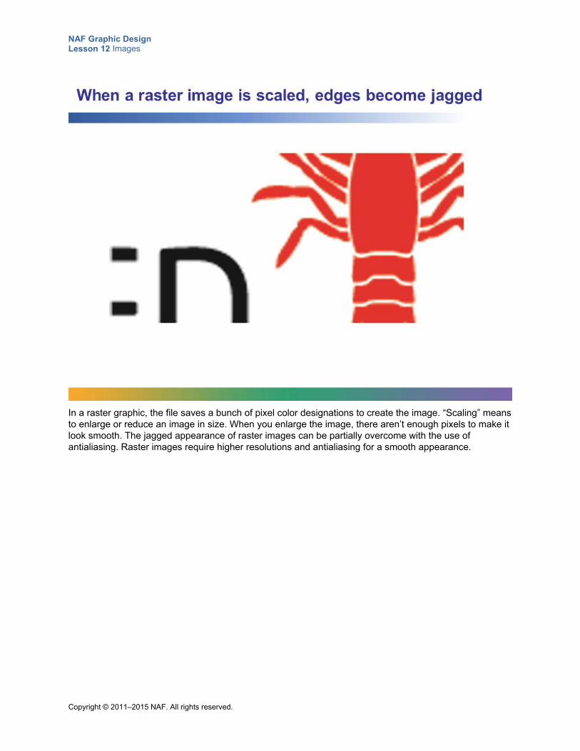
NAF Graphic Design Lesson 12 Images
Copyright © 2011–2015 NAF. All rights reserved.
In a raster graphic, the file saves a bunch of pixel color designations to create the image. “Scaling” means to enlarge or reduce an image in size. When you enlarge the image, there aren’t enough pixels to make it look smooth. The jagged appearance of raster images can be partially overcome with the use of antialiasing. Raster images require higher resolutions and antialiasing for a smooth appearance.
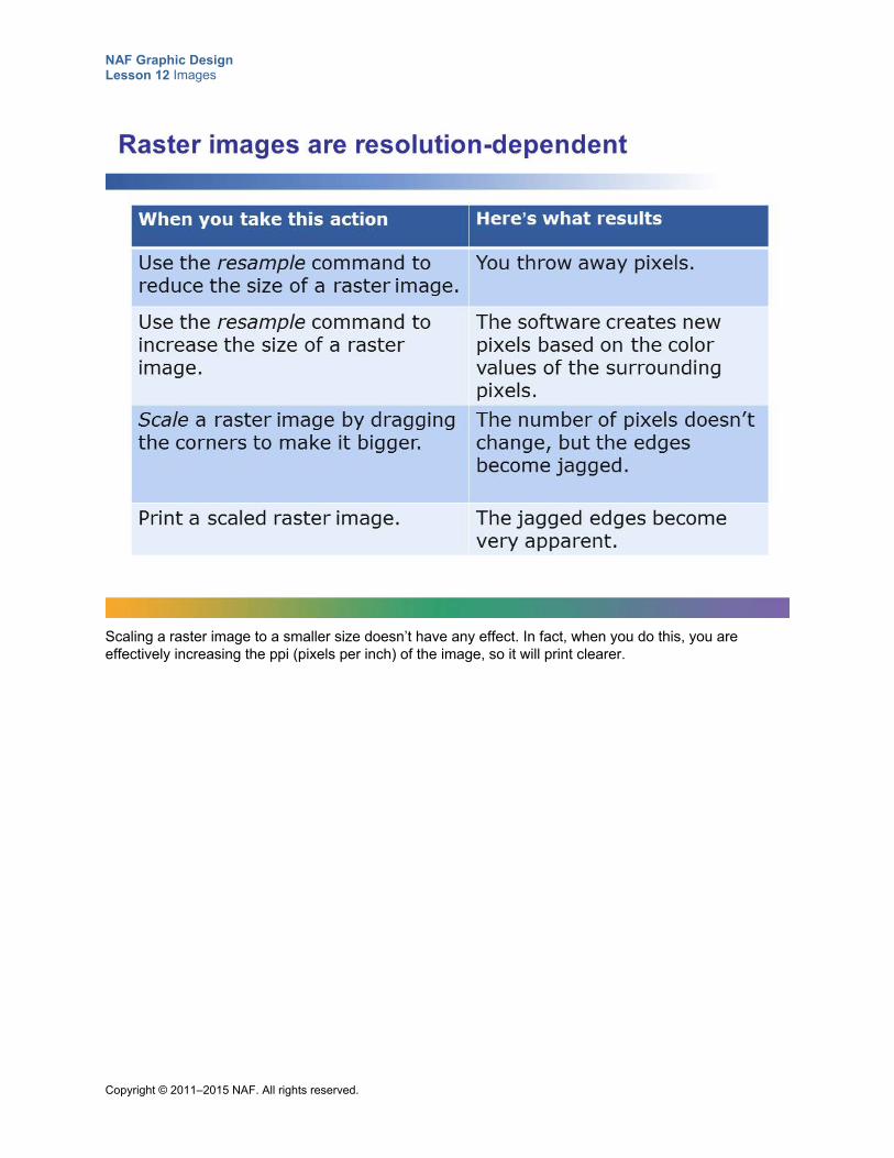
NAF Graphic Design Lesson 12 Images
Copyright © 2011–2015 NAF. All rights reserved.
Scaling a raster image to a smaller size doesn’t have any effect. In fact, when you do this, you are effectively increasing the ppi (pixels per inch) of the image, so it will print clearer.
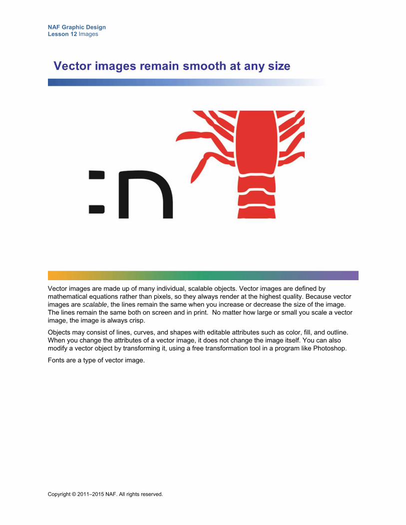
NAF Graphic Design Lesson 12 Images
Copyright © 2011–2015 NAF. All rights reserved.
Vector images are made up of many individual, scalable objects. Vector images are defined by mathematical equations rather than pixels, so they always render at the highest quality. Because vector images are scalable, the lines remain the same when you increase or decrease the size of the image. The lines remain the same both on screen and in print. No matter how large or small you scale a vector image, the image is always crisp.
Objects may consist of lines, curves, and shapes with editable attributes such as color, fill, and outline. When you change the attributes of a vector image, it does not change the image itself. You can also modify a vector object by transforming it, using a free transformation tool in a program like Photoshop.
Fonts are a type of vector image.
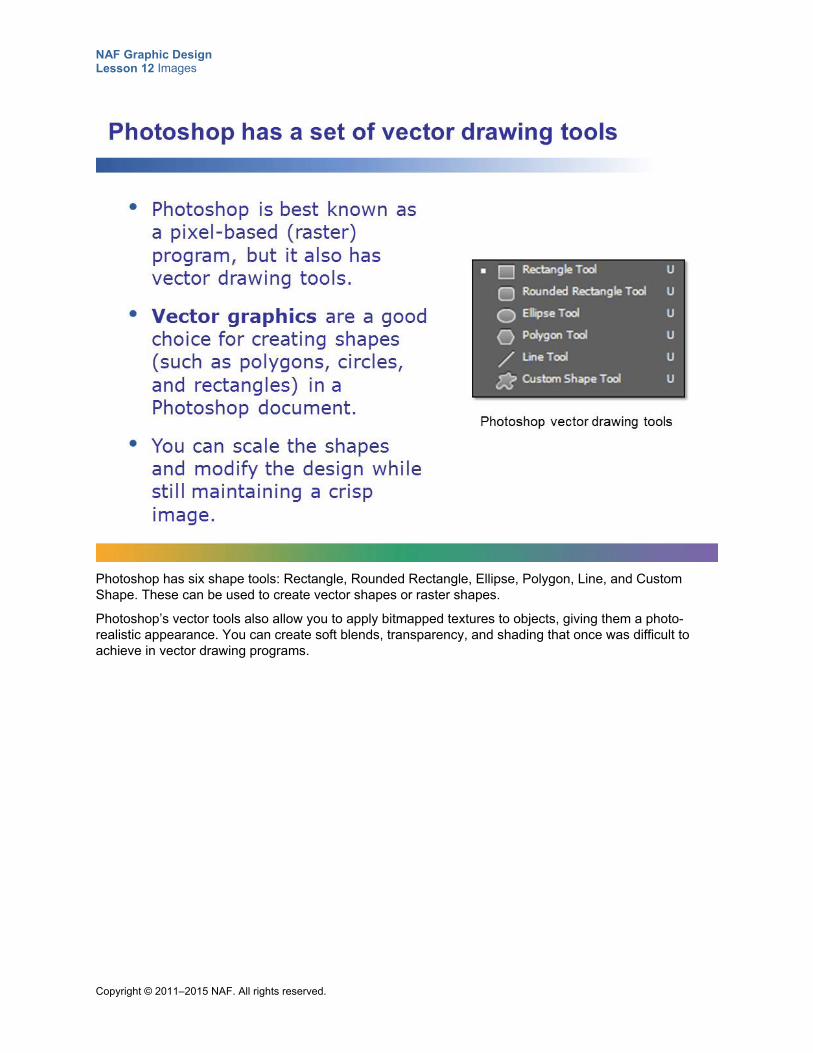
NAF Graphic Design Lesson 12 Images
Copyright © 2011–2015 NAF. All rights reserved.
Photoshop has six shape tools: Rectangle, Rounded Rectangle, Ellipse, Polygon, Line, and Custom Shape. These can be used to create vector shapes or raster shapes.
Photoshop’s vector tools also allow you to apply bitmapped textures to objects, giving them a photo-realistic appearance. You can create soft blends, transparency, and shading that once was difficult to achieve in vector drawing programs.
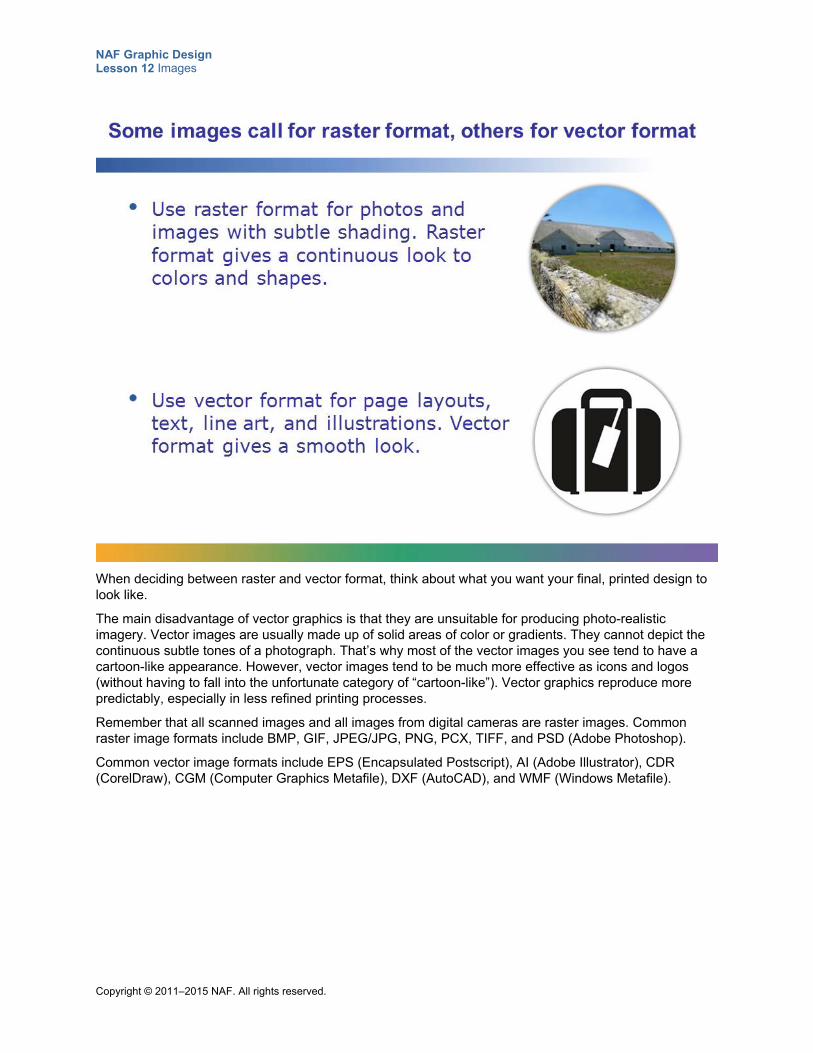
NAF Graphic Design Lesson 12 Images
Copyright © 2011–2015 NAF. All rights reserved.
When deciding between raster and vector format, think about what you want your final, printed design to look like.
The main disadvantage of vector graphics is that they are unsuitable for producing photo-realistic imagery. Vector images are usually made up of solid areas of color or gradients. They cannot depict the continuous subtle tones of a photograph. That’s why most of the vector images you see tend to have a cartoon-like appearance. However, vector images tend to be much more effective as icons and logos (without having to fall into the unfortunate category of “cartoon-like”). Vector graphics reproduce more predictably, especially in less refined printing processes.
Remember that all scanned images and all images from digital cameras are raster images. Common raster image formats include BMP, GIF, JPEG/JPG, PNG, PCX, TIFF, and PSD (Adobe Photoshop).
Common vector image formats include EPS (Encapsulated Postscript), AI (Adobe Illustrator), CDR (CorelDraw), CGM (Computer Graphics Metafile), DXF (AutoCAD), and WMF (Windows Metafile).
NAF Graphic Design Lesson 12 Images
Copyright © 2011–2015 NAF. All rights reserved.
Student Resource 12.8
Assignment Sheet: Drawing a Playing Card
Directions: Follow the instructions below to create a copy of the playing card that has been assigned to you.
1. In Photoshop, create a new document sized to 1,024 x 768 pixels, with RGB color mode and transparent background contents.
2. Select the Rounded Rectangle tool, and in the Options bar set the radius to 10 pixels and the color to white.
3. Draw a rounded rectangle the size of a playing card (3.5" x 2.25").
4. Using the Custom Shape tool, select a heart, a diamond, a club, or a spade from the Shape box on the Options bar, and fill it with red or black as appropriate.
5. Study the playing card assigned to you to see how the shapes and numbers are set out on it. If you have a suit other than diamonds, some of the shapes will be right side up and some will be upside down. Also, the number in the top left will be right side up and the number in the bottom right will be upside down. All of the cards except 7s are symmetrical. The easiest way to proceed is to draw the top part of the card (use the Text tool to draw the number). Then copy the part you have drawn, and use the Free Transform tool to rotate the copied area 180 degrees and place it at the bottom of the card. Depending on which playing card you have, you may then need to draw more of your shapes in the middle of the card to come out with the right design.
6. Check your playing card to make sure everything is correct. Use the alignment tools to center and line up the shapes as needed.
7. Save your final design as a PSD file and as a JPEG file.
NAF Graphic Design Lesson 12 Images
Copyright © 2011–2015 NAF. All rights reserved.
Student Resource 12.9
Assignment Sheet: CD Cover
Directions: In this assignment, you will plan and create a CD cover for a musician or group of your choice. To begin, read the specifications below and look at the example. Then, choose the group you want to create a CD cover for and fill in the creative brief included in this resource. When you have completed your creative brief, follow the procedure outlined below to create your design. Make sure you read and understand the assessment criteria before you begin work.
Specifications Your final product should meet the following specifications:
1. The design must communicate something about who the musician is, what the CD songs are about, and what the spirit of the music is. Remember that the goal of the CD cover is to sell the CD to the target audience.
2. The cover must include some vector graphics (for example, outlines of CDs in the background).
3. The cover must include an appropriate image from stock photography. Consider using depth of field or cropping to make the meaning of the image pop.
4. Include the name of the CD and the name of the artist on the cover. You will have to choose a name for the CD. (Be sure to use all that you know about typography for this!)
5. The cover must be the correct size for a CD.
Procedure
1. Complete the creative brief with a clear description of the musician and the target audience for your CD.
2. Using paper and pencil, draw five thumbnails of possible designs for your CD. Think about what kind of stock photography image you could use, what kind of vector graphics you could use, and what colors and typefaces. Make use of all you have learned so far about graphic design.
3. Look through images on at least two stock photography sites and choose an image that will enhance your CD cover. Write down the following information about the image you choose: the name of the stock photography site, the image ID number, and information about whether the image is royalty-free or rights-managed.
4. If necessary, rework some of your thumbnails in light of the stock photography you have chosen, and then choose your best thumbnail. Which one best represents your musician? Which one will make your musician stand out as unique and memorable? Which one could you put in your portfolio to show a prospective employer? Ask someone else to help you choose which one is best; a second opinion is often helpful.
5. Check your final design choice for effective use of color and typography and make any necessary changes.
6. Create your design in Photoshop. Remember to use everything you know about how to create an effective design in Photoshop. This should be your very best work.
NAF Graphic Design Lesson 12 Images
Copyright © 2011–2015 NAF. All rights reserved.
7. Prepare to submit the following pieces for assessment. Make sure each of them meets the assessment criteria:
o Creative brief
o Five thumbnails
o PSD and PDF files of your final design
Make sure your work meets or exceeds the following assessment criteria:
The creative brief shows a clear understanding of who the musician is, who the target audience is, and what the message of the CD is.
Thumbnails show that skilled and thoughtful planning work was put into your design.
Vector graphics are used effectively to enhance the CD cover design.
Stock image photography is used effectively in the CD cover design.
The cover adheres to the principles of graphic design (unity, balance, proximity, alignment, repetition, and contrast).
Color is used effectively to communicate the message.
Typography is used effectively to communicate the message.
The design is unique and memorable and an accurate representation of the musician.
NAF Graphic Design Lesson 12 Images
Copyright © 2011–2015 NAF. All rights reserved.
Creative Brief
CD Cover – Creative Brief
BACKGROUND
Explain who the musicians are and what kind of work they have done in the past, and write down a few words that describe the spirit of their music.
CAMPAIGNOBJECTIVES
Explain what the musicians aim to accomplish with this particular CD. Why are they producing a new CD?
DELIVERABLES Front cover for a CD in PSD and PDF format
4.724 inches square, CMYK color
Name of the stock photography site, image ID number, and information about whether the image is royalty-free or rights-managed
TARGETPOPULATION
Give a clear idea of who the target audience is for this CD (age, gender, interests, location, style, etc.).
TONE/LOOK&FEEL
What tone and look and feel must the CD communicate to get the attention of the target audience?
MANDATORIES The cover must include some vector graphics.
The cover must include an appropriate image from stock photography.
The name of the CD and the name of the artist must be on the cover.
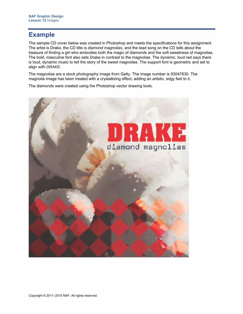
NAF Graphic Design Lesson 12 Images
Copyright © 2011–2015 NAF. All rights reserved.
Example The sample CD cover below was created in Photoshop and meets the specifications for this assignment. The artist is Drake, the CD title is diamond magnolias, and the lead song on the CD tells about the treasure of finding a girl who embodies both the magic of diamonds and the soft sweetness of magnolias. The bold, masculine font also sets Drake in contrast to the magnolias. The dynamic, loud red says there is loud, dynamic music to tell the story of the sweet magnolias. The support font is geometric and set to align with DRAKE.
The magnolias are a stock photography image from Getty. The image number is 93047830. The magnolia image has been treated with a crystallizing effect, adding an artistic, edgy feel to it.
The diamonds were created using the Photoshop vector drawing tools.
Copyright © 2011–2015 NAF. All rights reserved.
NAF Graphic Design
Lesson 13 Identity Design
In this lesson, students learn how to create an identity design that reflects what a client wants to communicate to a target market. This lesson introduces the culminating project, and student groups meet with a real client for whom they will create an identity design. They begin by working with their client on an identity design creative brief, and then they use the information in the creative brief as the basis for determining the colors, typefaces, image style, and other aspects that are most appropriate for their client’s identity design. Finally, they develop three proposals for their client’s identity design and document them in an identity design style guide.
Advance Preparation
Setting up this lesson requires extensive advance preparation:
When the course begins, start lining up clients for whom students will create an identity design, a logo, business cards, letterhead, and one other type of printed collateral. Students will be grouped in teams of three, so you will need one client for every three students. You may want to suggest to students that they try to arrange to work with local neighborhood businesses or organizations (such as cafés and church groups) that are close to their school or home. At least two weeks before beginning this lesson, finalize arrangements with the clients. See Teacher Resource 13.1, Guide: Recruiting Clients for the Culminating Project, for information and suggestions on appropriate clients.
At least a week before starting this lesson, provide clients with specific information about what they can expect from you, and make sure they will be available over the next weeks to provide feedback to students in a timely manner.
Arrange for the client to come to the school for an initial interview during Class Period 5 of this lesson. Although the client meeting is scheduled for only 30 minutes, it is best if the client can plan to spend a full class period with students, possibly over the lunch break.
If possible, arrange for the meeting with the client and the students to be a working luncheon in a location such as the school media center. To mark the importance of the event, try to find donation money to get the luncheon catered. Invite administrators and NAF advisory board members to attend.
You will be assigning students to their culminating project groups (three students per group) in this lesson. You may want to give students a choice of which client they would like to work with. You may also need to put some thought into placing students in the groups where they will be most likely to succeed, making sure each group has a balanced skill set for the different aspects of the project. Students must be placed in project groups by the beginning of Class Period 2 of this lesson.
You will need to work out the course schedule so that you can tell students when each element for the project will be delivered to the client, and when they should expect feedback from the client. Use Teacher Resource 13.2, Timeline: Culminating Project Work, to get a clear idea of what the schedule should look like. You will need to fill in your specific project dates. Students will need to insert the exact dates in the timeline section of the creative brief that they send to the client in Class Period 2 of this lesson. Since the dates when clients will be receiving input and providing feedback are so important, you may want to fill in the dates in the creative brief template before giving students access to it.
This lesson is expected to take 8 class periods.
NAF Graphic Design Lesson 13 Identity Design
Copyright © 2011–2015 NAF. All rights reserved. - 2 -
Lesson Framework
Learning Objectives Each student will:
Explain how graphic elements and color can be used to visually represent core values, philosophy, and principles of a business or organization*
Evaluate designs for audience, meaning, and effectiveness
Identify ways to maintain consistency across a client’s entire identity system
Demonstrate the ability to choose a style for a client’s identity system
Develop an identity design that meets a client’s needs
*This is one of the 16 key learning objectives assessed by the NAFTrack Certification end-of-course exam for this course.
Academic Standards The relevant Common Core State Standards are too extensive to list here but are an important basis for this lesson. For details, please refer to the separate document “Correlations to the Common Core Standards” (available in the Course Planning Tools section of the course materials).
Analyze how the application of visual arts elements and principles of design communicate and express ideas (Common Career Technical Core 2012, AR-VIS 2)
Demonstrate effective professional communication skills and practices that enable positive customer relationships (Common Career Technical Core 2012, IT 1)
Use product or service design processes and guidelines to produce a quality information technology (IT) product or service (Common Career Technical Core 2012, IT 2)
Demonstrate the use of cross-functional teams in achieving IT project goals (Common Career Technical Core 2012, IT 3)
Identify the purpose, audience, and audience needs for preparing image(s) (Adobe Certified Associate, Objectives for Visual Communication using Photoshop CS6, Setting Project Requirements 1.1)
Demonstrate knowledge of project management tasks and responsibilities (Adobe Certified Associate, Objectives for Visual Communication using Photoshop CS6, Setting Project Requirements 1.3)
Communicate with others (such as peers and clients) about design plans (Adobe Certified Associate, Objectives for Visual Communication using Photoshop CS6, Setting Project Requirements 1.4)
NAF Graphic Design Lesson 13 Identity Design
Copyright © 2011–2015 NAF. All rights reserved. - 3 -
Demonstrate knowledge of design principles, elements, and image composition (Adobe Certified Associate, Objectives for Visual Communication using Photoshop CS6, Identifying Design Elements When Preparing Images 2.2)
Create original works as a means of personal or group expression (ISTE NETS for Students 2007, 1b)
Contribute to project teams to produce original works or solve problems (ISTE NETS for Students 2007, 2d)
Assessment
Assessment Product Means of Assessment
Three identity design style guide proposals for the culminating project client
Assessment Criteria: Identity Design Style Guide (Teacher Resource 13.8)
Prerequisites Basic knowledge of image size and resolution
Understanding of graphic design as visual communication
Ability to create accurate selections using all Photoshop selection tools
A working knowledge of the use of proximity, alignment, repetition, and contrast in graphic design
A working knowledge of how to establish a visual hierarchy
A working knowledge of the elements of design: color, typography, and images
Instructional Materials
Teacher Resources Teacher Resource 13.1, Guide: Recruiting Clients for the Culminating Project
Teacher Resource 13.2, Timeline: Culminating Project Work
Teacher Resource 13.3, Examples: Identity Designs (separate PDF file)
Teacher Resource 13.4, Rubric: Identity Design Portfolio
Teacher Resource 13.5, Presentation and Notes: Creating an Identity Design (includes separate PowerPoint file)
Teacher Resource 13.6, Source File: Identity Design Creative Brief (separate Word file)
Teacher Resource 13.7, Example: Culminating Project Identity Design Style Guide (separate PDF file)
Teacher Resource 13.8, Assessment Criteria: Identity Design Style Guide
Teacher Resource 13.9, Prompts: Learning Objective Reflection (separate PowerPoint slide)
Teacher Resource 13.10, Key Vocabulary: Identity Design
Teacher Resource 13.11, Bibliography: Identity Design
NAF Graphic Design Lesson 13 Identity Design
Copyright © 2011–2015 NAF. All rights reserved. - 4 -
Student Resources Student Resource 13.1, Deduction: Identity Design
Student Resource 13.2, Culminating Project Launch: Project Overview
Student Resource 13.3, Analysis: Sample Identity Design Collections
Student Resource 13.4, Note Taking: Creating an Identity Design
Student Resource 13.5, Reading: Creating an Identity Design
Student Resource 13.6, Tips: Communicating with Your Client
Student Resource 13.7, Example Identity Design Statement: Fisher-Price
Student Resource 13.8, Scenarios: Communicating a Style
Student Resource 13.9, Research: Exploring Identity Design Style Guides
Student Resource 13.10, Assignment Sheet: Identity Design Style Guide Proposals
Student Resource 13.11, Tips: Follow-up Email
Equipment and Supplies Access to Photoshop for all students
LCD projector and computer for PowerPoint presentation
Sticky notes
Blackboard, whiteboard, or flip chart
Lesson Steps
Step Min. Activity
CLASS PERIOD 1
1 20 Observation and Analysis: Identity Design
In this activity, students gain understanding of how businesses use an identity design to communicate visually.
Before class begins, print Teacher Resource 13.3, Examples: Identity Designs (separate PDF file). Set up stations around the room, and place the page for one of the identity designs at each station (for example, you will have a station for Harley Davidson, a station for Starbucks, etc.). If you have a large class, print out two copies of the teacher resource and set up 10 stations rather than 5. (A station can be as simple
NAF Graphic Design Lesson 13 Identity Design
Copyright © 2011–2015 NAF. All rights reserved. - 5 -
Step Min. Activity
as posting the page on the wall so that students can gather around and study it.)
Explain to students that they will be looking at printed materials from some well-known businesses and thinking about what makes a company’s identity memorable, unique, and effective. Pair students up and refer them to Student Resource 13.1, Deduction: Identity Design. Ask students to visit all 5 stations with their partner. More than one pair can visit a station at a time, but spread students among the 5 or 10 stations that you have set up.
Instruct students to answer the questions on their worksheet as they visit each station.
When students have visited all of the stations, ask them to share with the class what they deduced about the different businesses, and answer any questions. Then write the term identity design on the board. Tell students that what they have been looking at is the evidence of each company’s identity design. These organizations’ identity design is what makes us able to recognize them in a flash. Ask students to call out elements that contribute to an identity design, and write the elements on the board (for example, using the same colors on all materials, using the same typefaces, a logo, etc.). Finally, ask students to share their ideas about why it is important for a business or organization to have a distinctive identity design. Point out that identity design is an important field in graphic design.
Tell students that during this lesson, they will begin their culminating project, which includes creating an identity design for a real client. They can use what they have observed about identity designs in this activity to help them formulate a unique and memorable identity design for their client.
2 20 Culminating Project Work: Project Launch
This launching session introduces students to the culminating project for the course and provides them with a basic overview of what is to come regarding the project.
Explain to students that for their culminating project in this course, they will be working for a client who has requested an identity design. Project work on this identity design will span from this lesson to the end of the course, and it is extremely important that students get off to a good start during this lesson. In their identity design, they will be applying everything they have learned so far about the principles of graphic design and the elements of design.
Briefly explain to students who the different clients for the project are, and tell enough about what each client is looking for in an identity design to get the students interested.
You may want to let students state their preference for which client they would be interested in working with before forming groups, or you may want to place students in the groups where they will be most likely to succeed. In either case, make sure each group has a balanced skill set for the different aspects of the project. Skills that will be useful for this project include the ability to organize material, the ability to think conceptually, Photoshop skills, graphic design skills, and leadership skills. Students must be placed in their groups before the beginning of the next class period.
Tell students they will be contacting their client by email in the next class period and meeting with the client in Class Period 5 of this lesson, so they need to quickly orient themselves to their group and this new project. To give students a chance to prepare, explain that they should plan to wear business attire for the client interview, and give
NAF Graphic Design Lesson 13 Identity Design
Copyright © 2011–2015 NAF. All rights reserved. - 6 -
Step Min. Activity
them the exact date the interview will take place.
Ask students to read Student Resource 13.2, Culminating Project Launch: Project Overview, in groups of three. If students already know which project group they are in, have them read this with their project group. Ask the students to make a list of any questions they have. Tell them each group should come up with at least two or three questions. When students have completed the reading, have each group ask a question, and keep going from group to group until all questions have been answered. Let other students help answer questions as they can, and make sure all students have a clear understanding of how the project is set up. Next, give students a copy of Teacher Resource 13.4, Rubric: Identity Design Portfolio. Point out to students that each element of the project will be assessed separately using assessment criteria, but there will also be an assessment of the entire project portfolio using this rubric. Ask students to look through the rubric, and answer any questions they have at this point. Tell them to keep the rubric in their notebook so that they can refer to it as they are working on the different parts of their project. Remind students that the culminating project will define the remainder of this course, so time spent now gaining a firm understanding of all that is being asked of them is crucial for their continued success.
3 10 Homework: Sample Identity Design Collections
The purpose of this activity is to expose students to as many samples of identity design as possible. Explain to students that before creating their own identity design, they can learn a lot by evaluating identity designs developed by professional designers. Tell students that for homework, each project group needs to make a collection of printed materials (business cards, letterhead, envelopes, packaging, etc.) that show identity designs from at least six different businesses or organizations. Ask students to bring at least one example from the type of client they’ll be working with (see Teacher Resource 13.1). Refer students to Student Resource 13.3, Analysis: Sample Identity Design Collections. Instruct project groups to use this resource to evaluate each identity design in their collection. Go over with the class the set of information they will be entering for each identity design, and answer any questions. Explain that each group member should collect two identity designs and answer the questions for the identity designs they collect, and then they can compile them into a group collection. Instruct them to collect their identity designs and fill out the analysis before the start of Class Period 4. Remind students that one of the best ways to learn about what makes a good identity design is to evaluate the work of other graphic designers.
CLASS PERIOD 2
4 20 Presentation: Identity Design
This activity gives students an in-depth look at the basics of creating an identity design.
NAF Graphic Design Lesson 13 Identity Design
Copyright © 2011–2015 NAF. All rights reserved. - 7 -
Step Min. Activity
It also develops students’ listening and note-taking skills.
To prepare, make notes to guide class discussion using Teacher Resource 13.5, Presentation Notes: Creating an Identity Design. Have Teacher Resource 13.5, Presentation: Creating an Identity Design (separate PowerPoint file), ready to show as a full-screen slideshow using an LCD projector. Refer students to Student Resource 13.4, Note Taking: Creating an Identity Design, and instruct them to take notes about the presentation by answering the questions on this resource. Have students review the questions before you begin the presentation so that they know what they are looking for. Present the slideshow. Use the notes you prepared and the questions on the slides to encourage class discussion.
This presentation is duplicated as Student Resource 13.5, Reading: Creating an Identity Design. If an LCD projector is unavailable, students can read the presentation, answer the discussion questions in their notebook, and discuss their answers as a class. This student resource is also useful for review.
After the presentation, divide the class into pairs or groups of three and have them compare their notes for completeness and accuracy. Invite each pair or triad to share their thoughts and questions.
Remind students that being able to create an effective identity design for a client is an important skill for a graphic designer.
5
30 Culminating Project Work: Initial Client Contact
In this activity, culminating project groups send an email introducing themselves and explaining what they need from the client in order to create an identity design. They attach a creative brief template to their email to help guide the client. Notes:
Before this activity, you need to work out the dates when students will be delivering items to their client and the dates they are asking the client to provide feedback. Refer to Teacher Resource 13.2, Timeline: Culminating Project Work, for details on how the project work is presented over the next lessons of the course. You will need to give students exact dates for each piece so that they can insert the dates in the timeline section of the creative brief that they send to the client. You may want to create a schedule for your class in the timeline section of the creative brief template and project it during this activity, or you may want to meet with one member of each culminating project group and have them take notes while you discuss the schedule.
If you haven’t already provided students with a contact name and an email address for their client, you need to do so for this activity.
If, for some reason, your students are creating an identity design for a fictitious client or for a client who cannot devote time to interacting with the students, you should play the role of the client and have students interact with you as they would with their client.
Instruct students to get in their culminating project groups. Explain that they will be putting together an email and an identity design creative brief template to send to their client during this activity. Give them access to the Identity Design Creative Brief
NAF Graphic Design Lesson 13 Identity Design
Copyright © 2011–2015 NAF. All rights reserved. - 8 -
Step Min. Activity
template (Teacher Resource 13.6, Source File: Identity Design Creative Brief [separate Word file]). Note: The dates when clients will be receiving input and providing feedback are very important, so you may want to fill in the dates in the creative brief template before giving students access to it. In that case, you could instruct two students in each group to work on the email, instead of distributing the work as suggested here. Explain that there are three parts to this activity: Write an email to your client requesting that the client fill in the creative brief
attached to the email and bring it to the client meeting.
Complete the opening section of the creative brief with your client’s information, and customize the various sections of the document as necessary for your particular client.
Complete the timeline in the creative brief.
Instruct students to have one group member take responsibility for each of these tasks listed on the board, and then to review each other’s work before they send the email to the client. Point out that the email will require the most work, and they may want to have all group members contribute to a well-written email for their client.
Refer students to Student Resource 13.6, Tips: Communicating with Your Client, and tell them to use these tips to complete the three parts of the activity.
You may want to meet separately with all of the students who are responsible for their group’s timeline, to go over the dates when each item will be delivered and when feedback from the client is required.
When students have completed the part of the assignment they are responsible for, ask them to have another group member check their work for accuracy and completeness. Remind students that the email and creative brief they send to their client represents their skills and abilities as graphic designers. They should double-check everything to make sure that it is neat and accurate, that the wording is professional, and that there are no spelling or grammatical errors.
Tell students this email must be sent to their client before the end of business today in order to give the client time to prepare for the meeting in Class Period 5. Instruct students to Cc you on their email correspondence with the client. You may want to gauge student understanding by assessing this assignment on a credit/no-credit basis.
Remind students that developing strong client relationships is a very important skill for graphic designers.
CLASS PERIOD 3
6 20 List, Group: Communicating Values, Philosophy, and Principles of Business Visually
In this activity, students examine the different ways core values, philosophy, business principles, goals, and personality can be communicated visually.
Explain to students that what they have learned about communicating visually with colors, typography, and images provides the foundation for creating an identity design.
NAF Graphic Design Lesson 13 Identity Design
Copyright © 2011–2015 NAF. All rights reserved. - 9 -
Step Min. Activity
To begin, ask students questions such as the following:
What colors might you use to communicate a value such as “customer service,” and why?
What kind of typeface could convey the tenet that “fast is better than slow”?
When creating an identity design for a toy company that “offers products and services consumers can trust to improve their family’s lives,” what kind of images would be appropriate? Photographs? Shapes? Illustrations? Black and white? Complex or simple?
Once students start to get the idea of how to conceptualize information about a business in terms of the elements of design, refer them to Student Resource 13.7, Example Identity Design Statement: Fisher-Price. Ask students to read the section about Fisher-Price and underline words, phrases, and concepts that could be communicated visually in an identity design. Draw three columns on the board and label them:
Colors
Typography
Image style
Ask students to contribute ideas about which colors, typography choices, and image styles could be appropriate for a Fisher-Price identity design, and write their suggestions in the appropriate column on the board. For each suggestion students make, ask them to give at least one word, phrase, or concept in the Fisher-Price text that supports their idea.
When all students have had a chance to contribute, work as a class to try to develop a consensus about what colors, typography style, and image style might be best for a Fisher-Price identity design. Answer any questions students have about how to communicate the essence of a business or organization visually.
To conclude this activity, point out to students that they will need to go through this same procedure when developing an identity design for their culminating project business or organization. One of the first steps will be to gather information, such as core values, business practices, and vision, from their client.
7 20 Scenario Review: Communicating a Style
In this activity, students learn how to communicate a style that will appeal to a target market and connect with that audience’s emotions and expectations.
To begin the activity, read the following example to students:
A client is opening a coffeehouse in a ski resort town. Her target market is both skiers and locals who want something cozy, comfy, and inviting—sort of like being in someone’s living room. She wants to communicate to potential customers that her coffeehouse is an intimate setting with lots of warmth and rich coffee smells—the perfect place to come in from the cold with best friends.
Ask students to share with a partner an idea about how they might communicate this style visually, and then have pairs share their ideas with the class. It could be an image, a word, a typeface, or some combination of these.
NAF Graphic Design Lesson 13 Identity Design
Copyright © 2011–2015 NAF. All rights reserved. - 10 -
Step Min. Activity
Explain to students that by visually communicating a style, they connect with the target customers’ emotions and expectations. A warm, intimate image, such as a fireplace, or even just warm, earthy colors, would be likely to draw target customers to the ambiance of the coffeehouse.
Answer any questions students have about communicating a style visually, and then refer them to Student Resource 13.8, Scenarios: Communicating a Style. Go over the instructions, and then ask students to work through the three scenarios.
When students have completed their work, have them share what they wrote with a partner, and then share as a class.
Remind students that connecting with the emotions and expectations of the target market is an essential goal of an identity design, and they need to keep this in the forefront as they work on their culminating project.
8 10 Culminating Project Work: Researching Your Client’s Style
In this activity, students note ways they can visually communicate the style of their culminating project client.
Ask students to meet in their culminating project groups. Write the following questions on the board, and ask project groups to write answers in their notebooks and be prepared to discuss this information with the client at the client interview:
Based on what you know about your client so far, make a list of words that might communicate the style of his or her business or organization.
How could you communicate this style visually, and emotionally connect with the target market?
Explain that this is just a preliminary exercise, since they will need to discuss the target market with the client to get a clear idea of the style they should communicate.
If time permits, ask groups to share their answers with the class. If necessary, ask students to finish this activity for homework. Tell them they need to have their answers to these questions ready to discuss with the client at the client interview.
Remind project groups that they should have their completed homework assignment from Class Period 1 with them at the beginning of the next class period. (This is a collection of identity designs and Student Resource 13.3, Analysis: Sample Identity Design Collections.)
CLASS PERIOD 4
9 15 Gallery Walk: Identity Design Collections
In this activity, students look at the identity designs their peers have collected and evaluate their effectiveness.
Before class begins, ask culminating project groups to get out the six different identity designs they have collected and display them on a table or desks.
To begin, ask each group to choose the identity design that they like the best and
NAF Graphic Design Lesson 13 Identity Design
Copyright © 2011–2015 NAF. All rights reserved. - 11 -
Step Min. Activity
present it to the class by reading what they wrote about it.
After all groups have presented one of their identity designs, ask students to walk around the room and look at the different identity design collections. Ask students to place a sticky note on the identity design that they think is the most memorable, and to write what makes it memorable on the sticky note.
To conclude this activity, talk about the elements that make some identity designs more memorable than others. Then ask students to write in their notebooks one or two inspirations they would like to apply to their culminating project.
You may want to gauge student understanding by assessing Student Resource 13.3, Analysis: Sample Identity Design Collections, on a credit/no-credit basis.
Remind students that one of the most effective ways to improve their own graphic design work is to study the work of professional designers. Encourage students to take notice of the identity designs they see all around them: on advertisements, billboards, television, packaging, and so on.
10
20 Research: Exploring Identity Design Style Guides
In this activity, students learn about the importance of consistency in an identity design.
Explain to students that in order for an identity design to be effective, the use of colors, typeface, and images must be consistent across all collateral. Companies go to great lengths in their style guides to ensure that everything that represents their company is consistent. This precise, careful work projects a consistent image and results in instant recognition of a company or organization.
Divide students into groups of four, and assign each group a company style guide to explore. You may want to procure copies of style guides for businesses in your area to give students a sense of how local graphic designers work. Or you can assign students style guides accessible on the web, such as these (which are also listed in Student Resource 13.9):
NYU – University Identity http://www.nyu.edu/employees/resources-and-services/media-and-communications/styleguide.html
Google Visual Assets https://www.behance.net/gallery/9028077/google-visual-assets-guidelines-part-1
Swedish Armed Forces http://issuu.com/castemelijn/docs/saf_designmanual
Skype http://issuu.com/bondo/docs/skype_brand_book_-_look
University at Albany Graphic Identity Manual http://www.designerstalk.com/uploads/corpid/Albany_Graphic_Identity_Manual_2.0.pdf
Refer students to Student Resource 13.9, Research: Exploring Identity Design Style Guides. Instruct students to follow the procedure on this research sheet to learn about the different measures that the company or organization assigned to them takes to maintain a consistent identity.
After students have completed their research, ask each group to share their findings
NAF Graphic Design Lesson 13 Identity Design
Copyright © 2011–2015 NAF. All rights reserved. - 12 -
Step Min. Activity
with the class.
Finally, make a list on the board of areas where students think it will be important to maintain consistency in the identity design they create for their client. Ask one group to contribute an item to the list, then go on to the next group, and so on.
Tell students that they will get a chance to apply what they have learned about consistency when they create their own identity design style guide (the culminating project) later in this lesson.
11
15 Culminating Project Work: Preparing for the Client Meeting
In this activity, students prepare to meet with their client to discuss the contents of the creative brief and explain the next steps in the project.
To begin this activity, explain the particulars of how the client meetings will be set up so that students will know what to expect. Make sure they know where their meeting will be held, where their group will be sitting, the names of client representatives who will be attending, the materials they are expected to bring to the meeting, and so on. Explain that in the first part of the meeting, clients will talk about their company and share what they have written on the creative brief. In the second part, students can ask the client questions and make sure they have all the information they need to create an identity design for the client. Remind students that this is the only chance they will have to go over the client brief with the client.
Next, point out to students that this is a professional meeting, and ask students to suggest different ways they can demonstrate professional behavior. Make sure they touch on the following:
Dress in professional attire.
Treat the client with respect.
Come to the meeting prepared.
Listen carefully to the client’s point of view.
Be flexible.
Instruct students to print out a copy for each group member of the identity design creative brief they prepared and sent to their client. Tell students that they should use this form to take notes during their client meeting. Write the following elements of identity that should be clear by the end of the meeting:
What the client wants to communicate about its business, including core values and key business practices
Who the client defines as the target market
The products and services the client offers
The style the client wants to communicate visually
Ask students to work with their project groups to make a list of questions they would like to ask the client. Instruct them to organize themselves as a team to ask the questions and record the answers. You may want to review each group’s questions before the client meetings.
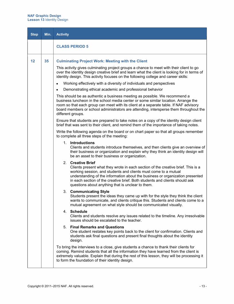
NAF Graphic Design Lesson 13 Identity Design
Copyright © 2011–2015 NAF. All rights reserved. - 13 -
Step Min. Activity
CLASS PERIOD 5
12 35 Culminating Project Work: Meeting with the Client
This activity gives culminating project groups a chance to meet with their client to go over the identity design creative brief and learn what the client is looking for in terms of identity design. This activity focuses on the following college and career skills:
Working effectively with a diversity of individuals and perspectives
Demonstrating ethical academic and professional behavior
This should be as authentic a business meeting as possible. We recommend a business luncheon in the school media center or some similar location. Arrange the room so that each group can meet with its client at a separate table. If NAF advisory board members or school administrators are attending, intersperse them throughout the different groups.
Ensure that students are prepared to take notes on a copy of the identity design client brief that was sent to their client, and remind them of the importance of taking notes.
Write the following agenda on the board or on chart paper so that all groups remember to complete all three steps of the meeting:
1. Introductions Clients and students introduce themselves, and then clients give an overview of their business or organization and explain why they think an identity design will be an asset to their business or organization.
2. Creative Brief Clients present what they wrote in each section of the creative brief. This is a working session, and students and clients must come to a mutual understanding of the information about the business or organization presented in each section of the creative brief. Both students and clients should ask questions about anything that is unclear to them.
3. Communicating Style Students present the ideas they came up with for the style they think the client wants to communicate, and clients critique this. Students and clients come to a mutual agreement on what style should be communicated visually.
4. Schedule Clients and students resolve any issues related to the timeline. Any irresolvable issues should be escalated to the teacher.
5. Final Remarks and Questions One student restates key points back to the client for confirmation. Clients and students ask final questions and present final thoughts about the identity design.
To bring the interviews to a close, give students a chance to thank their clients for coming. Remind students that all the information they have learned from the client is extremely valuable. Explain that during the rest of this lesson, they will be processing it to form the foundation of their identity design.
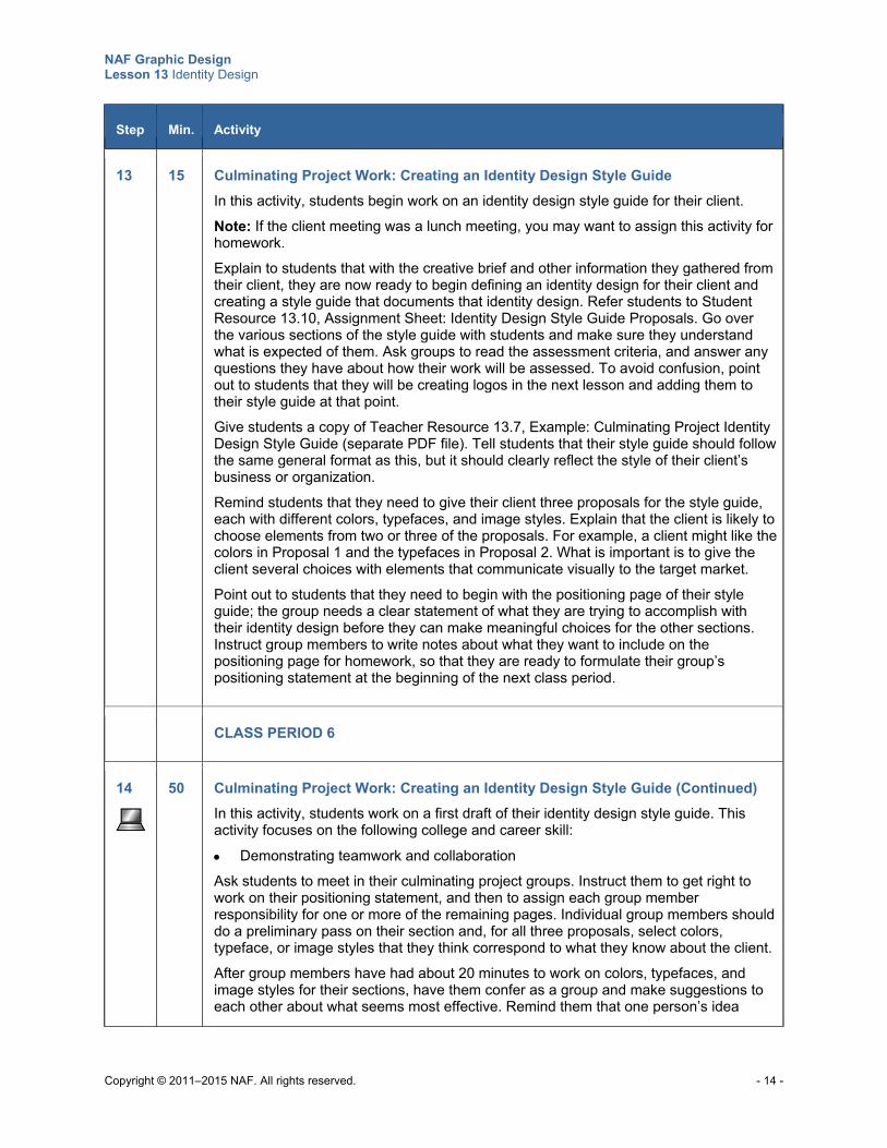
NAF Graphic Design Lesson 13 Identity Design
Copyright © 2011–2015 NAF. All rights reserved. - 14 -
Step Min. Activity
13 15 Culminating Project Work: Creating an Identity Design Style Guide
In this activity, students begin work on an identity design style guide for their client. Note: If the client meeting was a lunch meeting, you may want to assign this activity for homework. Explain to students that with the creative brief and other information they gathered from their client, they are now ready to begin defining an identity design for their client and creating a style guide that documents that identity design. Refer students to Student Resource 13.10, Assignment Sheet: Identity Design Style Guide Proposals. Go over the various sections of the style guide with students and make sure they understand what is expected of them. Ask groups to read the assessment criteria, and answer any questions they have about how their work will be assessed. To avoid confusion, point out to students that they will be creating logos in the next lesson and adding them to their style guide at that point. Give students a copy of Teacher Resource 13.7, Example: Culminating Project Identity Design Style Guide (separate PDF file). Tell students that their style guide should follow the same general format as this, but it should clearly reflect the style of their client’s business or organization. Remind students that they need to give their client three proposals for the style guide, each with different colors, typefaces, and image styles. Explain that the client is likely to choose elements from two or three of the proposals. For example, a client might like the colors in Proposal 1 and the typefaces in Proposal 2. What is important is to give the client several choices with elements that communicate visually to the target market. Point out to students that they need to begin with the positioning page of their style guide; the group needs a clear statement of what they are trying to accomplish with their identity design before they can make meaningful choices for the other sections. Instruct group members to write notes about what they want to include on the positioning page for homework, so that they are ready to formulate their group’s positioning statement at the beginning of the next class period.
CLASS PERIOD 6
14
50 Culminating Project Work: Creating an Identity Design Style Guide (Continued)
In this activity, students work on a first draft of their identity design style guide. This activity focuses on the following college and career skill: Demonstrating teamwork and collaboration
Ask students to meet in their culminating project groups. Instruct them to get right to work on their positioning statement, and then to assign each group member responsibility for one or more of the remaining pages. Individual group members should do a preliminary pass on their section and, for all three proposals, select colors, typeface, or image styles that they think correspond to what they know about the client.
After group members have had about 20 minutes to work on colors, typefaces, and image styles for their sections, have them confer as a group and make suggestions to each other about what seems most effective. Remind them that one person’s idea
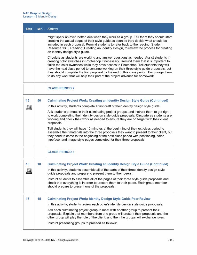
NAF Graphic Design Lesson 13 Identity Design
Copyright © 2011–2015 NAF. All rights reserved. - 15 -
Step Min. Activity
might spark an even better idea when they work as a group. Tell them they should start creating the actual pages of their style guide as soon as they decide what should be included in each proposal. Remind students to refer back to the reading, Student Resource 13.5, Reading: Creating an Identity Design, to review the process for creating an identity design style guide. Circulate as students are working and answer questions as needed. Assist students in creating color swatches in Photoshop if necessary. Remind them that it is important to finish the color swatches while they have access to Photoshop. Tell students they will have the next class period to continue working on their three style guide proposals, but they should complete the first proposal by the end of this class period. Encourage them to do any work that will help their part of the project advance for homework.
CLASS PERIOD 7
15
50 Culminating Project Work: Creating an Identity Design Style Guide (Continued)
In this activity, students complete a first draft of their identity design style guide. Ask students to meet in their culminating project groups, and instruct them to get right to work completing their identity design style guide proposals. Circulate as students are working and check their work as needed to ensure they are on target with their client proposals. Tell students they will have 10 minutes at the beginning of the next class period to assemble their materials into the three proposals they want to present to their client, but they need to come to the beginning of the next class period with positioning, color, typeface, and image style pages completed for their three proposals.
CLASS PERIOD 8
16
10 Culminating Project Work: Creating an Identity Design Style Guide (Continued)
In this activity, students assemble all of the parts of their three identity design style guide proposals and prepare to present them to their peers.
Instruct students to assemble all of the pages of their three style guide proposals and check that everything is in order to present them to their peers. Each group member should prepare to present one of the proposals.
17 15 Culminating Project Work: Identity Design Style Guide Peer Review
In this activity, students review each other’s identity design style guide proposals.
Ask each culminating project group to meet with another group to present their proposals. Explain that members from one group will present their proposals and the other group will play the role of the client, and then the groups will exchange roles.
Instruct presenting groups to proceed as follows:
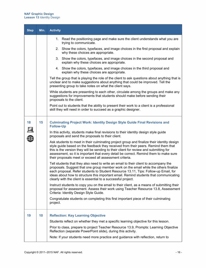
NAF Graphic Design Lesson 13 Identity Design
Copyright © 2011–2015 NAF. All rights reserved. - 16 -
Step Min. Activity
1. Read the positioning page and make sure the client understands what you are trying to communicate.
2. Show the colors, typefaces, and image choices in the first proposal and explain why these choices are appropriate.
3. Show the colors, typefaces, and image choices in the second proposal and explain why these choices are appropriate.
4. Show the colors, typefaces, and image choices in the third proposal and explain why these choices are appropriate.
Tell the group that is playing the role of the client to ask questions about anything that is unclear and to make suggestions about anything that could be improved. Tell the presenting group to take notes on what the client says.
While students are presenting to each other, circulate among the groups and make any suggestions for improvements that students should make before sending their proposals to the client.
Point out to students that the ability to present their work to a client is a professional skill they will need in order to succeed as a graphic designer.
18
15 Culminating Project Work: Identity Design Style Guide Final Revisions and Follow-Up
In this activity, students make final revisions to their identity design style guide proposals and send the proposals to their client.
Ask students to meet in their culminating project group and finalize their identity design style guide based on the feedback they received from their peers. Remind them that this is the version they will be sending to their client for review and submitting for assessment, so it is important that every detail be correct. Remind them to make sure their proposals meet or exceed all assessment criteria.
Tell students that they also need to write an email to their client to accompany the proposals. Suggest that one group member work on the email while the others finalize each proposal. Refer students to Student Resource 13.11, Tips: Follow-up Email, for ideas about how to structure this important email. Remind students that communicating clearly with the client is essential to a successful project.
Instruct students to copy you on the email to their client, as a means of submitting their proposal for assessment. Assess their work using Teacher Resource 13.8, Assessment Criteria: Identity Design Style Guide.
Congratulate students on completing this first important piece of their culminating project.
19 10 Reflection: Key Learning Objective
Students reflect on whether they met a specific learning objective for this lesson.
Prior to class, prepare to project Teacher Resource 13.9, Prompts: Learning Objective Reflection (separate PowerPoint slide), during this activity.
Note: If your students need more practice and guidance with reflection, return to
NAF Graphic Design Lesson 13 Identity Design
Copyright © 2011–2015 NAF. All rights reserved. - 17 -
Step Min. Activity
Teacher Resource 2.8 in Lesson 2.
Write the following learning objective on the board:
Explain how graphic elements and color can be used to visually represent core values, philosophy, and principles of a business or organization
Project Teacher Resource 13.9, Prompts: Learning Objective Reflection. Tell students to choose one of the prompts and think about it in connection with the learning objective on the board. They should then write their reflection in their notebook.
Give students a few minutes to write down their thoughts. Ask for a show of hands to see who chose the first prompt. Place these students in pairs or triads to compare their reflections. Do the same for each of the other prompts. Their task is to choose the reflection that is most complete, on topic, and thoughtful.
Ask a member of each group to share the reflection that the group feels best fits these criteria. Generate a brief class discussion to help students develop their metacognitive skills. Complete this activity by reminding students that this type of practice will help them when they have to complete professional self-evaluations in their internships or jobs. If your students are participating in NAFTrack Certification, it also prepares them for the reflection component of the culminating project.
Extensions
Enrichment When students create their color palette, ask them to label the swatches with Pantone, RGB, and
web labels in addition to CMYK values. These options can be found in Photoshop’s Color Picker.
Study one of the designers who led the way in visual identity: Paul Rand, Lester Beall, Otl Aicher, Vignelli Associates, Chermayeff & Geismar Associates. Write a report detailing why the designer’s contribution to the field was significant.
Write a report about the development of an identity program for CBS Television (first created by William Golden) or Olivetti Corporation (created by Giovanni Pintori).
Technology Integration Consider showing and discussing the following videos during the lesson. For YouTube videos: if
your school does not allow access to YouTube, you may wish to download the video to your computer in advance using KeepVid (see www.keepvid.com) or a similar program.
o “Brand Identity Case Study – Finsense,” YouTube video, 4:58, https://www.youtube.com/watch?v=AACY5LREL4A
Cross-Curricular Integration English Language Arts: Lead a discussion on the ways that businesses express their core values
and business principles in written communication. Ask students to write a vision statement for the business or organization they are working with for their culminating project.
Copyright © 2011–2015 NAF. All rights reserved.
NAF Graphic Design
Lesson 13 Identity Design
Teacher Resources
Resource Description
Teacher Resource 13.1 Guide: Recruiting Clients for the Culminating Project
Teacher Resource 13.2 Timeline: Culminating Project Work
Teacher Resource 13.3 Examples: Identity Designs (separate PDF file)
Teacher Resource 13.4 Rubric: Identity Design Portfolio
Teacher Resource 13.5 Presentation and Notes: Creating an Identity Design (includes separate PowerPoint file)
Teacher Resource 13.6 Source File: Identity Design Creative Brief (separate Word file)
Teacher Resource 13.7 Example: Culminating Project Identity Design Style Guide (separate PDF file)
Teacher Resource 13.8 Assessment Criteria: Identity Design Style Guide
Teacher Resource 13.9 Prompts: Learning Objective Reflection (separate PowerPoint slide)
Teacher Resource 13.10 Key Vocabulary: Identity Design
Teacher Resource 13.11 Bibliography: Identity Design
NAF Graphic Design Lesson 13 Identity Design
Copyright © 2011–2015 NAF. All rights reserved.
Teacher Resource 13.1
Guide: Recruiting Clients for the Culminating Project
Finding the right clients for the culminating project can be challenging. This resource provides some recommendations from an experienced design teacher that might be helpful to you.
Potential Clients You will need to find clients who would like to have a new identity design for their business or organization. It’s okay to enlist clients who already have an identity design with a color palette and logo if they agree to have students start from scratch developing a new identity design for them. The following type of clients would be good choices:
School clubs: For example, a computer club, a foreign language club, a business professionals club, or a forensics team can all use a solid identity to make themselves known around the school.
School or academy business partners: This is a way that students can contribute to existing partnerships.
Small businesses or startups: Try contacting small-business groups in your community. They often have workshops for people interested in starting a small business. People who are just starting to develop a business would be ideal clients. You might also look in the local newspaper classifieds for a listing of businesses that have recently filed a Fictitious Business Name.
Community organizations and service projects: Many community organizations such as senior centers, musical groups, soup kitchens, and tutoring services could benefit from an identity design.
Client Responsibilities When you are recruiting clients, explain to them that they will have the following roles and responsibilities:
The client should have a genuine need for an identity design, a logo, business cards, and other printed materials that represent the business or organization.
The client will be asked to fill out a creative brief explaining the client’s needs and providing information about the business or organization before an initial meeting with students.
The client will need to come to the school to discuss the creative brief with the students and answer questions.
During the four weeks that students are working intensely on their projects (in Lessons 13 and 14), clients will need to review each of the elements of the project and provide feedback in one or two days. Most of the project elements are small, so the review time should be fairly short, but it is extremely important that clients get feedback to students in a timely manner so that students can continue to advance on their project every day.
The client will be asked to sign off on final delivery of the identity design portfolio and attend the student portfolio review event that will take place at the end of the course.
Usage Rights It may be important to agree on usage rights for the final artwork in the initial contact with prospective clients. Who will own the artwork?
NAF Graphic Design Lesson 13 Identity Design
Copyright © 2011–2015 NAF. All rights reserved.
Teacher Resource 13.2
Timeline: Culminating Project Work
Note the key dates when students will be giving the client materials for review and the dates when they need materials back from the client. The table below notes the lesson number and class period where each project piece is completed in the NAF lesson plan. You will of course have to adapt the schedule to your particular situation, depending on how the lesson activities fit into your class periods.
Item Delivery to Client Date Client Return Date
Identity design colors, typography, and image style roughs
Lesson 13: Class Period 8 (This is the last class period in Lesson 13.)
Lesson 14: Class Period 2
Logo roughs Lesson 14: Class Period 3 Lesson 14: Class Period 5
Final logo Lesson 14: Class Period 6 Not applicable
Business card and letterhead roughs
Lesson 14: Class Period 6 Lesson 14: Class Period 8
Final business card and letterhead
Lesson 14: Class Period 9 Not applicable
Additional printed collateral roughs
Lesson 14: Class Period 8 Lesson 14: Class Period 10
First delivery of complete product Lesson 14: Class Period 10 Lesson 15: Class Period 2
Final delivery date and student portfolio review
(date, time, and venue of your student portfolio review)
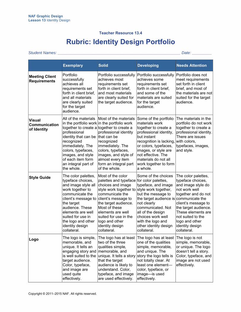
NAF Graphic Design Lesson 13 Identity Design
Copyright © 2011–2015 NAF. All rights reserved.
Teacher Resource 13.4
Rubric: Identity Design Portfolio
Student Names: ________________________________________________________ Date: _________
Exemplary Solid Developing Needs Attention
Meeting Client Requirements
Portfolio successfully achieves all requirements set forth in client brief, and all materials are clearly suited for the target audience.
Portfolio successfully achieves most requirements set forth in client brief, and most materials are clearly suited for the target audience.
Portfolio successfully achieves some requirements set forth in client brief, and some of the materials are suited for the target audience.
Portfolio does not meet requirements set forth in client brief, and most of the materials are not suited for the target audience.
Visual Communication of Identity
All of the materials in the portfolio work together to create a professional identity that can be recognized immediately. The colors, typefaces, images, and style of each item form an integral part of the whole.
Most of the materials in the portfolio work together to create a professional identity that can be recognized immediately. The colors, typefaces, images, and style of almost every item form an integral part of the whole.
Some of the portfolio materials work together to create a professional identity, but instant recognition is lacking, or colors, typefaces, images, or style are not effective. The materials do not all work together to form a whole.
The materials in the portfolio do not work together to create a professional identity. There are issues with colors, typefaces, images, and style.
Style Guide The color palettes, typeface choices, and image style all work together to communicate the client’s message to the target audience. These elements are well suited for use in the logo and other identity design collateral.
Most of the color palettes and typeface choices and image style work together to communicate the client’s message to the target audience. Most of these elements are well suited for use in the logo and other identity design collateral.
Some of the choices for color palettes, typeface, and image style work together, but the message to the target audience is not clearly communicated. Not all of the design choices work well with the logo and other identity design collateral.
The color palettes, typeface choices, and image style do not work well together and do not communicate the client’s message to the target audience. These elements are not suited to the logo and other identity design collateral.
Logo The logo is simple, memorable, and unique. It tells an engaging story and is well suited to the target audience. Color, typeface, and image are used quite effectively.
The logo has at least two of the three qualities simple, memorable, and unique. It tells a story that the target audience is likely to understand. Color, typeface, and image are used effectively.
The logo has at least one of the qualities simple, memorable, and unique. The story the logo tells is not totally clear. At least one element—color, typeface, or image—is used effectively.
The logo is not simple, memorable, or unique. The logo doesn’t tell a story. Color, typeface, and image are not used effectively.

NAF Graphic Design Lesson 13 Identity Design
Copyright © 2011–2015 NAF. All rights reserved.
Exemplary Solid Developing Needs Attention
Business Card
Color and typeface are used effectively and are consistent with the identity design style guide. Basic principles of graphic design are used effectively and visual hierarchy is correct. The card is sized correctly, and all information is complete and accurate.
Color and typeface are used effectively and are consistent with the identity design style guide, with no more than one exception. There is no more than one error in observing the basic principles of graphic design and visual hierarchy. The card is sized correctly, and all information is complete and accurate.
Color and typeface are used effectively and are consistent with the identity design style guide, with no more than two exceptions. No more than two errors exist in observing the basic principles of graphic design and visual hierarchy. There may be one or two errors in how the card is sized and in the accuracy and completeness of information.
Color and typeface are not consistent with the identity design style guide. Basic principles of graphic design and visual hierarchy are not adhered to. The card is not sized correctly, and there are errors in the accuracy and completeness of information.
Letterhead Color and typeface are used effectively and are consistent with the identity design style guide. Basic principles of graphic design are used effectively. The paper is sized correctly, and all information is complete and accurate.
Color and typeface are used effectively and are consistent with the identity design style guide, with no more than one exception. There is no more than one error in observing the basic principles of graphic design. The paper is sized correctly, and all information is complete and accurate.
Color and typeface are used effectively and are consistent with the identity design style guide, with no more than two exceptions. No more than two errors exist in observing the basic principles of graphic design. There may be one or two errors in how the paper is sized and in the accuracy of information.
Color and typeface are not consistent with the identity design style guide. Basic principles of graphic design are not adhered to. The paper is sized incorrectly and there are errors in the accuracy of information.
Additional Design Item
Color, typefaces, and images are used effectively and are consistent with the identity design style guide. Basic principles of graphic design are used effectively. The final product is neat, clear, and precise.
Color, typefaces, and images are used effectively and are consistent with the identity design style guide, with no more than one exception. There is no more than one error in observing the basic principles of graphic design. The final product is neat, clear, and precise.
Color, typefaces, and images are used effectively and are consistent with the identity design style guide, with no more than two exceptions. No more than two errors exist in observing the basic principles of graphic design. Elements of neatness, clarity, and precision are lacking.
Color, typefaces, and images are not consistent with the identity design style guide. Basic principles of graphic design are not adhered to. The final product lacks neatness, clarity, and precision.
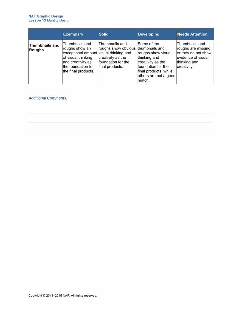
NAF Graphic Design Lesson 13 Identity Design
Copyright © 2011–2015 NAF. All rights reserved.
Exemplary Solid Developing Needs Attention
Thumbnails and Roughs
Thumbnails and roughs show an exceptional amount of visual thinking and creativity as the foundation for the final products.
Thumbnails and roughs show obvious visual thinking and creativity as the foundation for the final products.
Some of the thumbnails and roughs show visual thinking and creativity as the foundation for the final products, while others are not a good match.
Thumbnails and roughs are missing, or they do not show evidence of visual thinking and creativity.
Additional Comments:
____________________________________________________________________________________ ____________________________________________________________________________________ ____________________________________________________________________________________ ____________________________________________________________________________________
NAF Graphic Design Lesson 13 Identity Design
Copyright © 2011–2015 NAF. All rights reserved.
Teacher Resource 13.5
Presentation Notes: Creating an Identity Design
Before you show this presentation, use the text accompanying each slide to develop presentation notes. Writing the notes yourself enables you to approach the subject matter in a way that is comfortable to you and engaging for your students. Make this presentation as interactive as possible by stopping frequently to ask questions and encourage class discussion.
This presentation explains how to create an identity design that visually communicates the essence of a business or organization.
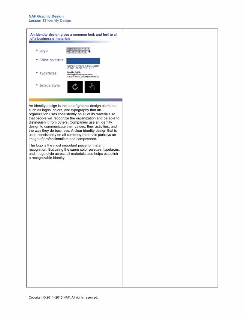
NAF Graphic Design Lesson 13 Identity Design
Copyright © 2011–2015 NAF. All rights reserved.
An identity design is the set of graphic design elements such as logos, colors, and typography that an organization uses consistently on all of its materials so that people will recognize the organization and be able to distinguish it from others. Companies use an identity design to communicate their values, their activities, and the way they do business. A clear identity design that is used consistently on all company materials portrays an image of professionalism and competence.
The logo is the most important piece for instant recognition. But using the same color palettes, typefaces, and image style across all materials also helps establish a recognizable identity.
NAF Graphic Design Lesson 13 Identity Design
Copyright © 2011–2015 NAF. All rights reserved.
A creative brief helps you understand your client’s identity. Include sections in the creative brief that ask clients to tell you what is most important to them. Make sure you understand what a client wants his or her identity to portray.
NAF Graphic Design Lesson 13 Identity Design
Copyright © 2011–2015 NAF. All rights reserved.
Core values are the principles that guide an organization’s internal conduct and its relations with those outside. Many companies have a mission statement that summarizes their core values.
Business practices are the methods, procedures, and rules that an organization follows in order to meet its objectives. Businesses are usually very proud of their core values and their business practices, and they want to communicate them to their target market. An identity design is a means of visually communicating the essence of the business.
NAF Graphic Design Lesson 13 Identity Design
Copyright © 2011–2015 NAF. All rights reserved.
In addition to learning about the age, income, interests, and geographic location of the target market, you need to know what people in the target market are thinking and to define what the client wants them to think. Then figure out how to create an identity design that changes the way the target audience thinks about the business or organization.
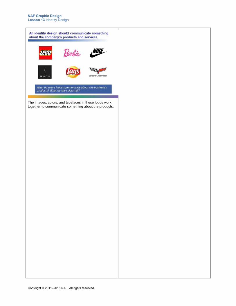
NAF Graphic Design Lesson 13 Identity Design
Copyright © 2011–2015 NAF. All rights reserved.
The images, colors, and typefaces in these logos work together to communicate something about the products.
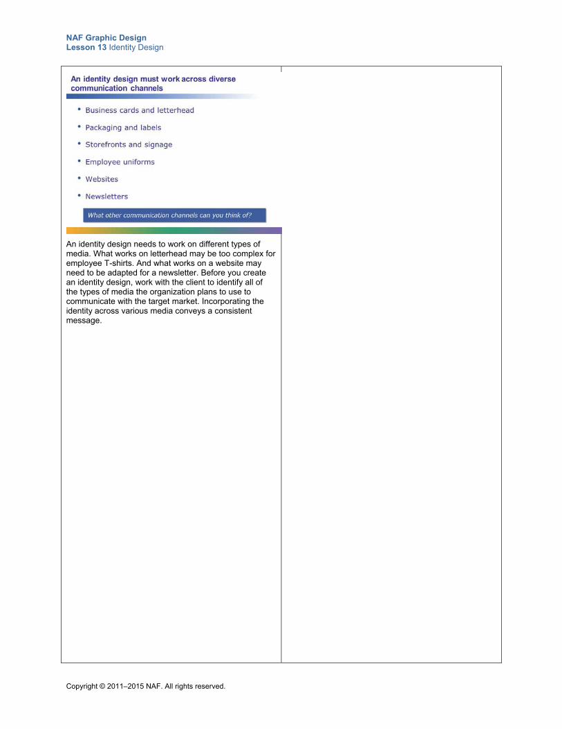
NAF Graphic Design Lesson 13 Identity Design
Copyright © 2011–2015 NAF. All rights reserved.
An identity design needs to work on different types of media. What works on letterhead may be too complex for employee T-shirts. And what works on a website may need to be adapted for a newsletter. Before you create an identity design, work with the client to identify all of the types of media the organization plans to use to communicate with the target market. Incorporating the identity across various media conveys a consistent message.
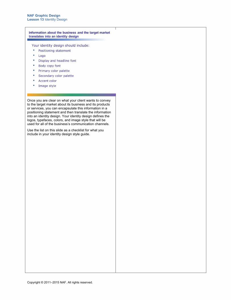
NAF Graphic Design Lesson 13 Identity Design
Copyright © 2011–2015 NAF. All rights reserved.
Once you are clear on what your client wants to convey to the target market about its business and its products or services, you can encapsulate this information in a positioning statement and then translate the information into an identity design. Your identity design defines the logos, typefaces, colors, and image style that will be used for all of the business’s communication channels.
Use the list on this slide as a checklist for what you include in your identity design style guide.
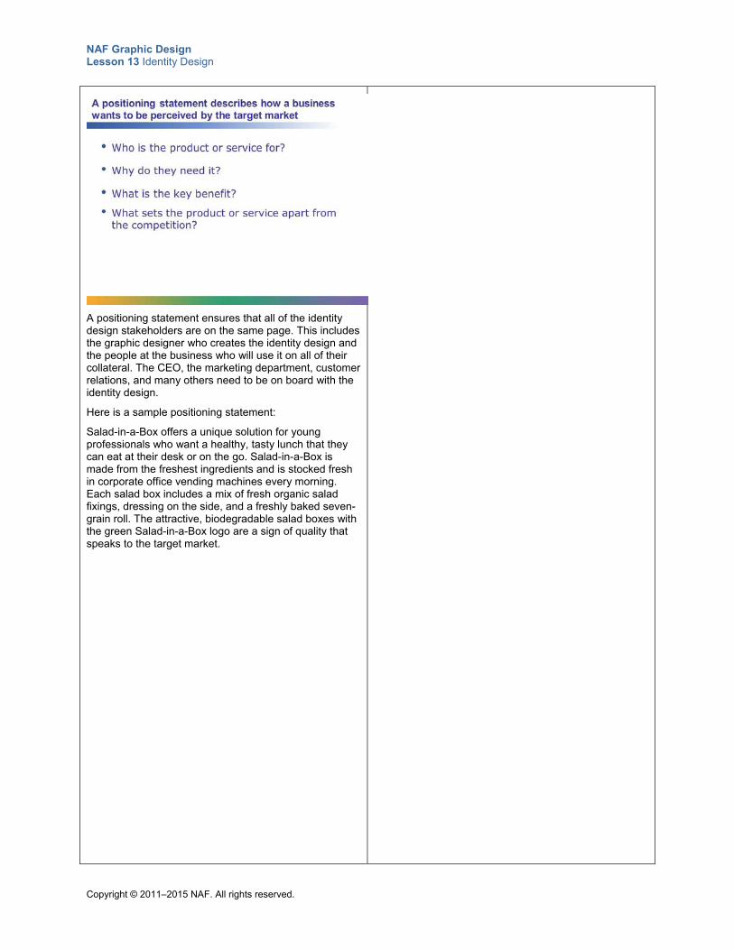
NAF Graphic Design Lesson 13 Identity Design
Copyright © 2011–2015 NAF. All rights reserved.
A positioning statement ensures that all of the identity design stakeholders are on the same page. This includes the graphic designer who creates the identity design and the people at the business who will use it on all of their collateral. The CEO, the marketing department, customer relations, and many others need to be on board with the identity design.
Here is a sample positioning statement:
Salad-in-a-Box offers a unique solution for young professionals who want a healthy, tasty lunch that they can eat at their desk or on the go. Salad-in-a-Box is made from the freshest ingredients and is stocked fresh in corporate office vending machines every morning. Each salad box includes a mix of fresh organic salad fixings, dressing on the side, and a freshly baked seven-grain roll. The attractive, biodegradable salad boxes with the green Salad-in-a-Box logo are a sign of quality that speaks to the target market.
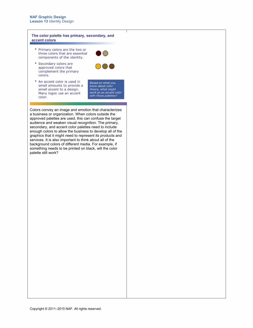
NAF Graphic Design Lesson 13 Identity Design
Copyright © 2011–2015 NAF. All rights reserved.
Colors convey an image and emotion that characterizes a business or organization. When colors outside the approved palettes are used, this can confuse the target audience and weaken visual recognition. The primary, secondary, and accent color palettes need to include enough colors to allow the business to develop all of the graphics that it might need to represent its products and services. It is also important to think about all of the background colors of different media. For example, if something needs to be printed on black, will the color palette still work?
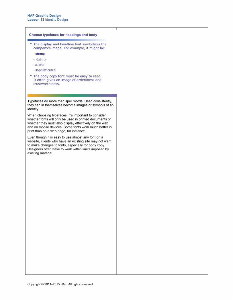
NAF Graphic Design Lesson 13 Identity Design
Copyright © 2011–2015 NAF. All rights reserved.
Typefaces do more than spell words. Used consistently, they can in themselves become images or symbols of an identity.
When choosing typefaces, it’s important to consider whether fonts will only be used in printed documents or whether they must also display effectively on the web and on mobile devices. Some fonts work much better in print than on a web page, for instance.
Even though it is easy to use almost any font on a website, clients who have an existing site may not want to make changes to fonts, especially for body copy. Designers often have to work within limits imposed by existing material.
NAF Graphic Design Lesson 13 Identity Design
Copyright © 2011–2015 NAF. All rights reserved.
How is the visual image of the business best captured? The image style should answer this question. For example, a college campus might define its image style like this:
• Photos in horizontal and vertical formats
• Portray interaction among students and faculty
• Portray diversity (race, gender, age)
• Portray visually pleasing campus settings
• Portray student life
NAF Graphic Design Lesson 13 Identity Design
Copyright © 2011–2015 NAF. All rights reserved.
The identity design you create for your client can be an invaluable tool. An effective identity design is a statement that persuades the target market to stand up and take note. It makes it easy for customers and potential customers to identify and recognize the business. The work you do on your culminating project could very well create a new beginning for your client.
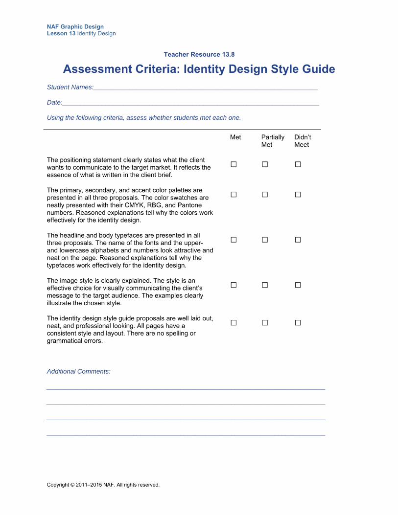
NAF Graphic Design Lesson 13 Identity Design
Copyright © 2011–2015 NAF. All rights reserved.
Teacher Resource 13.8
Assessment Criteria: Identity Design Style Guide
Student Names:______________________________________________________________
Date:_______________________________________________________________________
Using the following criteria, assess whether students met each one.
Met Partially Met
Didn’t Meet
The positioning statement clearly states what the client wants to communicate to the target market. It reflects the essence of what is written in the client brief.
□ □ □
The primary, secondary, and accent color palettes are presented in all three proposals. The color swatches are neatly presented with their CMYK, RBG, and Pantone numbers. Reasoned explanations tell why the colors work effectively for the identity design.
□ □ □
The headline and body typefaces are presented in all three proposals. The name of the fonts and the upper- and lowercase alphabets and numbers look attractive and neat on the page. Reasoned explanations tell why the typefaces work effectively for the identity design.
□ □ □
The image style is clearly explained. The style is an effective choice for visually communicating the client’s message to the target audience. The examples clearly illustrate the chosen style.
□ □ □
The identity design style guide proposals are well laid out, neat, and professional looking. All pages have a consistent style and layout. There are no spelling or grammatical errors.
□ □ □
Additional Comments:
_____________________________________________________________________________
_____________________________________________________________________________
_____________________________________________________________________________
_____________________________________________________________________________
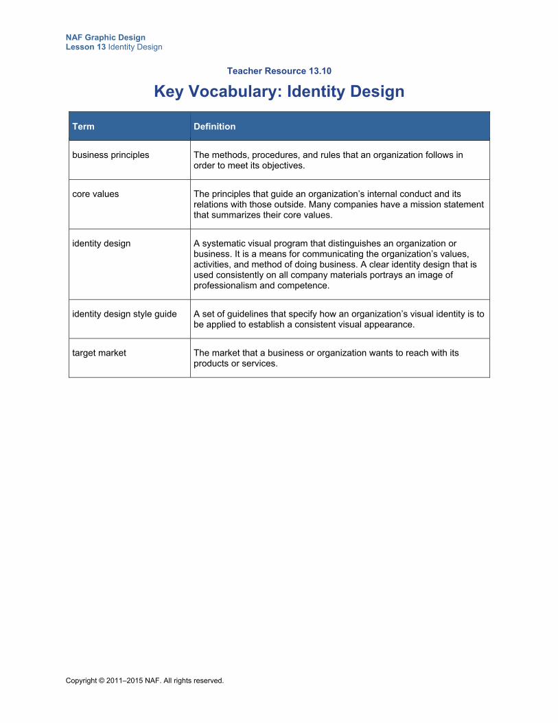
NAF Graphic Design Lesson 13 Identity Design
Copyright © 2011–2015 NAF. All rights reserved.
Teacher Resource 13.10
Key Vocabulary: Identity Design
Term Definition
business principles The methods, procedures, and rules that an organization follows in order to meet its objectives.
core values The principles that guide an organization’s internal conduct and its relations with those outside. Many companies have a mission statement that summarizes their core values.
identity design A systematic visual program that distinguishes an organization or business. It is a means for communicating the organization’s values, activities, and method of doing business. A clear identity design that is used consistently on all company materials portrays an image of professionalism and competence.
identity design style guide A set of guidelines that specify how an organization’s visual identity is to be applied to establish a consistent visual appearance.
target market The market that a business or organization wants to reach with its products or services.
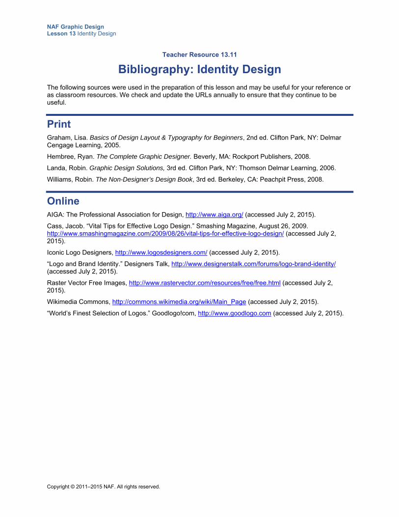
NAF Graphic Design Lesson 13 Identity Design
Copyright © 2011–2015 NAF. All rights reserved.
Teacher Resource 13.11
Bibliography: Identity Design
The following sources were used in the preparation of this lesson and may be useful for your reference or as classroom resources. We check and update the URLs annually to ensure that they continue to be useful.
Print Graham, Lisa. Basics of Design Layout & Typography for Beginners, 2nd ed. Clifton Park, NY: Delmar Cengage Learning, 2005.
Hembree, Ryan. The Complete Graphic Designer. Beverly, MA: Rockport Publishers, 2008.
Landa, Robin. Graphic Design Solutions, 3rd ed. Clifton Park, NY: Thomson Delmar Learning, 2006.
Williams, Robin. The Non-Designer’s Design Book, 3rd ed. Berkeley, CA: Peachpit Press, 2008.
Online AIGA: The Professional Association for Design, http://www.aiga.org/ (accessed July 2, 2015).
Cass, Jacob. “Vital Tips for Effective Logo Design.” Smashing Magazine, August 26, 2009. http://www.smashingmagazine.com/2009/08/26/vital-tips-for-effective-logo-design/ (accessed July 2, 2015).
Iconic Logo Designers, http://www.logosdesigners.com/ (accessed July 2, 2015).
“Logo and Brand Identity.” Designers Talk, http://www.designerstalk.com/forums/logo-brand-identity/ (accessed July 2, 2015).
Raster Vector Free Images, http://www.rastervector.com/resources/free/free.html (accessed July 2, 2015).
Wikimedia Commons, http://commons.wikimedia.org/wiki/Main_Page (accessed July 2, 2015).
“World’s Finest Selection of Logos.” Goodlogo!com, http://www.goodlogo.com (accessed July 2, 2015).
Copyright © 2011–2016 NAF. All rights reserved.
NAF Graphic Design
Lesson 13 Identity Design
Student Resources
Resource Description
Student Resource 13.1 Deduction: Identity Design
Student Resource 13.2 Culminating Project Launch: Project Overview
Student Resource 13.3 Analysis: Sample Identity Design Collections
Student Resource 13.4 Note Taking: Creating an Identity Design
Student Resource 13.5 Reading: Creating an Identity Design
Student Resource 13.6 Tips: Communicating with Your Client
Student Resource 13.7 Example Identity Design Statement: Fisher-Price
Student Resource 13.8 Scenarios: Communicating a Style
Student Resource 13.9 Research: Exploring Identity Design Style Guides
Student Resource 13.10 Assignment Sheet: Identity Design Style Guide Proposals
Student Resource 13.11 Tips: Follow-up Email
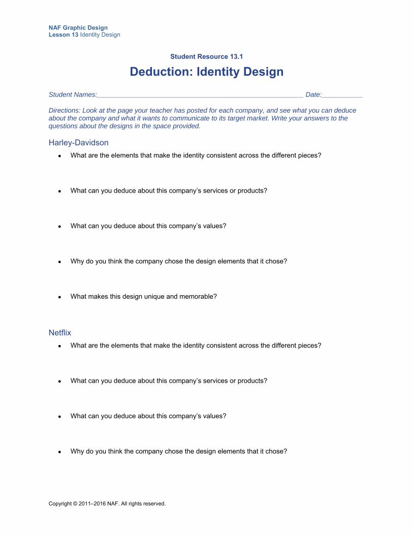
NAF Graphic Design Lesson 13 Identity Design
Copyright © 2011–2016 NAF. All rights reserved.
Student Resource 13.1
Deduction: Identity Design
Student Names:_______________________________________________________ Date:___________
Directions: Look at the page your teacher has posted for each company, and see what you can deduce about the company and what it wants to communicate to its target market. Write your answers to the questions about the designs in the space provided.
Harley-Davidson
What are the elements that make the identity consistent across the different pieces?
What can you deduce about this company’s services or products?
What can you deduce about this company’s values?
Why do you think the company chose the design elements that it chose?
What makes this design unique and memorable?
Netflix
What are the elements that make the identity consistent across the different pieces?
What can you deduce about this company’s services or products?
What can you deduce about this company’s values?
Why do you think the company chose the design elements that it chose?
NAF Graphic Design Lesson 13 Identity Design
Copyright © 2011–2016 NAF. All rights reserved.
What makes this design unique and memorable?
Starbucks
What are the elements that make the identity consistent across the different pieces?
What can you deduce about this company’s services or products?
What can you deduce about this company’s values?
Why do you think the company chose the design elements that it chose?
What makes this design unique and memorable?
Taco Bell
What are the elements that make the identity consistent across the different pieces?
What can you deduce about this company’s services or products?
What can you deduce about this company’s values?
Why do you think the company chose the design elements that it chose?
What makes this design unique and memorable?
NAF Graphic Design Lesson 13 Identity Design
Copyright © 2011–2016 NAF. All rights reserved.
Target
What are the elements that make the identity consistent across the different pieces?
What can you deduce about this company’s services or products?
What can you deduce about this company’s values?
Why do you think the company chose the design elements that it chose?
What makes this design unique and memorable?
NAF Graphic Design Lesson 13 Identity Design
Copyright © 2011–2016 NAF. All rights reserved.
Student Resource 13.2
Culminating Project Launch: Project Overview
As you work on the culminating project for this course, you will take on the role of a graphic designer who designs and creates an identity design to represent the business or organization of your client. The driving question for all of your work on this project is, “How can we create a visual design and collateral materials that capture and communicate the identity of our client?”
You will need to draw on all that you already know about visual communication, target audiences, creative briefs, the principles of graphic design, and the elements of graphic design. First and foremost, keep your client’s needs in mind. Remember that you are providing a valuable service. An identity design that is professional, unique, and memorable could be the catalyst that gives your client the recognition it is seeking in its target market.
As you know, in the working world, whole teams of designers, each with specialized roles and responsibilities, work together to design identities. In this project, you will also work as part of a design team.
The work you do on this project should be something you are proud of. It will help you in your internship, college classes, and beyond. Add this project to your resume and to your design portfolio. Think of it as an important step on the road to career success!
Getting Started To begin, you will ask your client to provide the information you need to formulate a creative brief for your identity design. This creative brief will be a little different from the ones you have written so far, because you will need to capture the essence of who your client is and what it represents in visuals such as a logo. When you meet with your client’s representatives, you will have a chance to discuss what is most important to the client. It will be your job to use the elements of design (color, typography, and images) to visually communicate the essence of who your client is.
Project Deliverables Over the course of this project, your group will work together to produce the following pieces:
A creative brief that clearly sets out all aspects of what the client is requesting
The identity design elements (color palette, typefaces, and image styles that define your client’s identity design)
A logo that your client can use on all printed collateral
Business cards
Letterhead
At least one additional type of printed collateral (such as a T-shirt, a package design, etc.) that adheres to the identity design
Assessment Each individual project piece will be assessed against assessment criteria. Then, when you put all of the pieces together, the entire project portfolio will be assessed using a rubric. Your whole group will receive the same scores on these, so please do your best to be a reliable, effective, and contributing group member!
NAF Graphic Design Lesson 13 Identity Design
Copyright © 2011–2016 NAF. All rights reserved.
Presenting Your Work After all the hard work of creating your client’s identity design portfolio is done, you will be eager to show it off. In addition to presenting your portfolio to your client, you will participate in a student portfolio review, where you will show your project portfolio to an invited audience that includes NAF academy advisory board members and professional graphic designers. This student portfolio review will be similar to student portfolio reviews that AIGA offers to students who want to get feedback on their work. This opportunity to practice presenting your work is invaluable for future portfolio presentations that you will need to do when you apply to schools, submit scholarship applications, or interview for internships and jobs.
NAF Graphic Design Lesson 13 Identity Design
Copyright © 2011–2016 NAF. All rights reserved.
Student Resource 13.3
Analysis: Sample Identity Design Collections
Student Names:_______________________________________________________ Date:___________
Directions: Collect sample printed materials from at least six different organizations or businesses, including materials from at least one organization or business that is the same type as your client. For each organization or business, gather at least three different types of printed collateral. Your samples might include business cards, letterheads, envelopes, packaging, ads, or bills, for example. Then answer the questions below about each company.
Name of business or organization:
1. What does the identity design tell you about the company?
2. What does the identity design tell you about the target audience?
3. How do elements of consistency and repetition create a common thread among all the pieces of printed collateral?
4. Is this identity design unique and memorable? Why or why not?
Name of business or organization:
1. What does the identity design tell you about the company?
2. What does the identity design tell you about the target audience?
NAF Graphic Design Lesson 13 Identity Design
Copyright © 2011–2016 NAF. All rights reserved.
3. How do elements of consistency and repetition create a common thread among all the pieces of printed collateral?
4. Is this identity design unique and memorable? Why or why not?
Name of business or organization:
1. What does the identity design tell you about the company?
2. What does the identity design tell you about the target audience?
3. How do elements of consistency and repetition create a common thread among all the pieces of printed collateral?
4. Is this identity design unique and memorable? Why or why not?
NAF Graphic Design Lesson 13 Identity Design
Copyright © 2011–2016 NAF. All rights reserved.
Student Resource 13.4
Note Taking: Creating an Identity Design
Student Name:_______________________________________________________ Date:___________
Directions: Review the questions below before the presentation. Then use these questions to guide you as you take notes on the presentation.
1. What is identity design?
2. What do you need to know about a business in order to create an effective identity design?
3. What do you need to know about the target market to create an effective identity design?
4. What types of information do you need about a company’s products or services?
5. What are the main elements of an identity design?
6. Why is it important to have well-defined color palettes?
7. What can the typeface communicate?
8. Why is it important to have images of the same style across all of a business’s collateral?
9. What do you think your culminating project client is likely to gain from having an identity design?
NAF Graphic Design Lesson 13 Identity Design
Copyright © 2011–2016 NAF. All rights reserved.
Student Resource 13.5
Reading: Creating an Identity Design
This presentation explains how to create an identity design that visually communicates the essence of a business or organization.
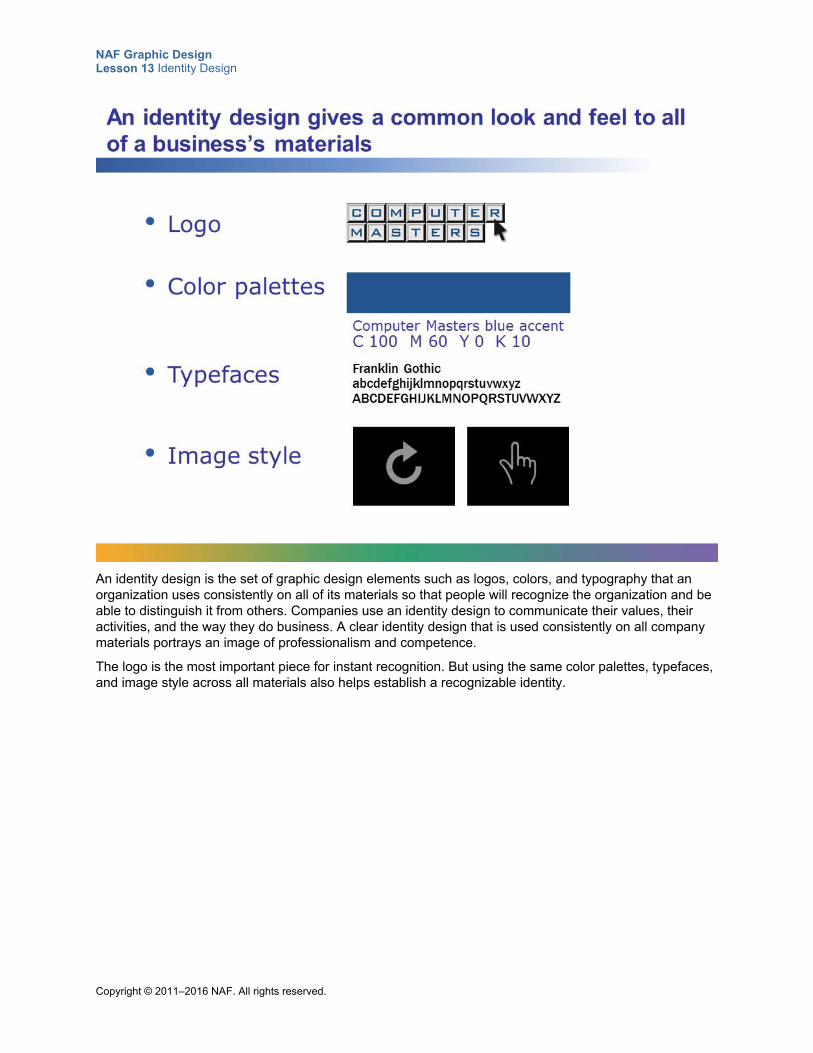
NAF Graphic Design Lesson 13 Identity Design
Copyright © 2011–2016 NAF. All rights reserved.
An identity design is the set of graphic design elements such as logos, colors, and typography that an organization uses consistently on all of its materials so that people will recognize the organization and be able to distinguish it from others. Companies use an identity design to communicate their values, their activities, and the way they do business. A clear identity design that is used consistently on all company materials portrays an image of professionalism and competence.
The logo is the most important piece for instant recognition. But using the same color palettes, typefaces, and image style across all materials also helps establish a recognizable identity.
NAF Graphic Design Lesson 13 Identity Design
Copyright © 2011–2016 NAF. All rights reserved.
A creative brief helps you understand your client’s identity. Include sections in the creative brief that ask clients to tell you what is most important to them. Make sure you understand what a client wants his or her identity to portray.
NAF Graphic Design Lesson 13 Identity Design
Copyright © 2011–2016 NAF. All rights reserved.
Core values are the principles that guide an organization’s internal conduct and its relations with those outside. Many companies have a mission statement that summarizes their core values.
Business practices are the methods, procedures, and rules that an organization follows in order to meet its objectives. Businesses are usually very proud of their core values and their business practices, and they want to communicate them to their target market. An identity design is a means of visually communicating the essence of the business.
NAF Graphic Design Lesson 13 Identity Design
Copyright © 2011–2016 NAF. All rights reserved.
In addition to learning about the age, income, interests, and geographic location of the target market, you need to know what people in the target market are thinking and to define what the client wants them to think. Then figure out how to create an identity design that changes the way the target audience thinks about the business or organization.
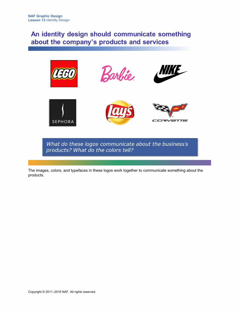
NAF Graphic Design Lesson 13 Identity Design
Copyright © 2011–2016 NAF. All rights reserved.
The images, colors, and typefaces in these logos work together to communicate something about the products.
NAF Graphic Design Lesson 13 Identity Design
Copyright © 2011–2016 NAF. All rights reserved.
An identity design needs to work on different types of media. What works on letterhead may be too complex for employee T-shirts. And what works on a website may need to be adapted for a newsletter. Before you create an identity design, work with the client to identify all of the types of media the organization plans to use to communicate with the target market. Incorporating the identity across various media conveys a consistent message.
NAF Graphic Design Lesson 13 Identity Design
Copyright © 2011–2016 NAF. All rights reserved.
Once you are clear on what your client wants to convey to the target market about its business and its products or services, you can encapsulate this information in a positioning statement and then translate the information into an identity design. Your identity design defines the logos, typefaces, colors, and image style that will be used for all of the business’s communication channels.
Use the list on this slide as a checklist for what you include in your identity design style guide.
NAF Graphic Design Lesson 13 Identity Design
Copyright © 2011–2016 NAF. All rights reserved.
A positioning statement ensures that all of the identity design stakeholders are on the same page. This includes the graphic designer who creates the identity design and the people at the business who will use it on all of their collateral. The CEO, the marketing department, customer relations, and many others need to be on board with the identity design.
Here is a sample positioning statement:
Salad-in-a-Box offers a unique solution for young professionals who want a healthy, tasty lunch that they can eat at their desk or on the go. Salad-in-a-Box is made from the freshest ingredients and is stocked fresh in corporate office vending machines every morning. Each salad box includes a mix of fresh organic salad fixings, dressing on the side, and a freshly baked seven-grain roll. The attractive, biodegradable salad boxes with the green Salad-in-a-Box logo are a sign of quality that speaks to the target market.
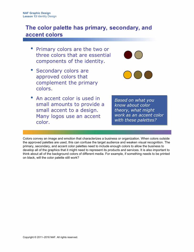
NAF Graphic Design Lesson 13 Identity Design
Copyright © 2011–2016 NAF. All rights reserved.
Colors convey an image and emotion that characterizes a business or organization. When colors outside the approved palettes are used, this can confuse the target audience and weaken visual recognition. The primary, secondary, and accent color palettes need to include enough colors to allow the business to develop all of the graphics that it might need to represent its products and services. It is also important to think about all of the background colors of different media. For example, if something needs to be printed on black, will the color palette still work?
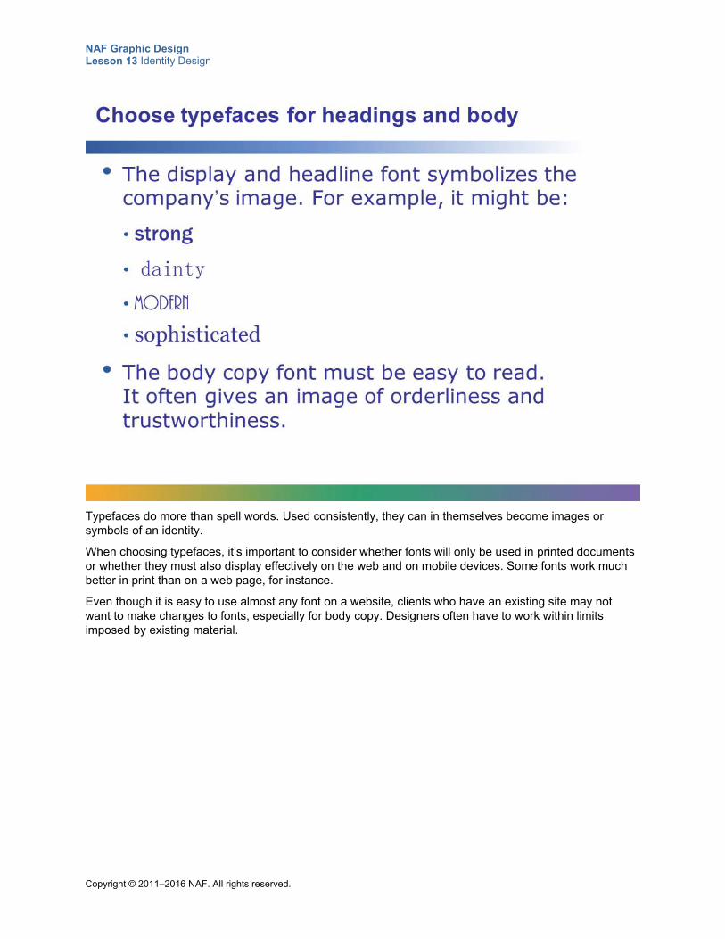
NAF Graphic Design Lesson 13 Identity Design
Copyright © 2011–2016 NAF. All rights reserved.
Typefaces do more than spell words. Used consistently, they can in themselves become images or symbols of an identity.
When choosing typefaces, it’s important to consider whether fonts will only be used in printed documents or whether they must also display effectively on the web and on mobile devices. Some fonts work much better in print than on a web page, for instance.
Even though it is easy to use almost any font on a website, clients who have an existing site may not want to make changes to fonts, especially for body copy. Designers often have to work within limits imposed by existing material.
NAF Graphic Design Lesson 13 Identity Design
Copyright © 2011–2016 NAF. All rights reserved.
How is the visual image of the business best captured? The image style should answer this question. For example, a college campus might define its image style like this:
• Photos in horizontal and vertical formats
• Portray interaction among students and faculty
• Portray diversity (race, gender, age)
• Portray visually pleasing campus settings
• Portray student life
NAF Graphic Design Lesson 13 Identity Design
Copyright © 2011–2016 NAF. All rights reserved.
The identity design you create for your client can be an invaluable tool. An effective identity design is a statement that persuades the target market to stand up and take note. It makes it easy for customers and potential customers to identify and recognize the business. The work you do on your culminating project could very well create a new beginning for your client.
NAF Graphic Design Lesson 13 Identity Design
Copyright © 2011–2016 NAF. All rights reserved.
Student Resource 13.6
Tips: Communicating with Your Client
Directions: Use the tips below to write an email to your client, customize the creative brief template for your client, and create a schedule. Make sure you work as a team and check each other’s work.
Email Tips Make sure to include the following in your email:
Introduce yourself and your team.
Explain that you need information about the business or organization and its target audience in order to create an identity design that will represent the business or organization effectively.
Explain that graphic designers use a form called a creative brief to collect information about the client. It is a sort of agreement with the client about who the client is, who the target market is, what specifically you will provide to the client, and what the schedule is.
Ask the client to complete the creative brief and bring it to the meeting. It will form the basis of your discussion.
Give the client specific information about the time and place of your meeting.
Make sure you attach the creative brief template that has been customized by your teammates before sending your email.
Tips for Customizing the Creative Brief Fill in the name of your high school and the names of your team members at the top of the page.
Fill in the name of your client’s business or organization and the date on the top line of the form.
Insert your client’s name and contact information in the top section. You should have a name, an email address, and a phone number. If you don’t have a phone number, ask the client to provide one during the meeting.
Read through the entire form and customize it for your client where necessary. (For example, where it says “business or organization,” change it to read “business” if your client has a business and “organization” if your client has an organization. In the section that talks about “products or services,” use the appropriate term.) Do everything you can to let clients know that you’ve already done some research on them.
When your teammate has filled out the timeline with all of the appropriate dates, copy it into the creative brief form.
Before saving the document, read through it to make sure there are no mistakes or omissions. Print out a copy for yourself and for each of your teammates. You will need this to take notes on during the client interview.
Timeline Tips Work with your teacher to get the correct dates for each event on the timeline.
After you enter all of the dates, read through the schedule carefully to make sure it makes sense. Ask your teacher about anything that doesn’t seem right.
Ask your teammate to paste the completed schedule into the customized creative brief. Review the completed document for accuracy and completeness.
NAF Graphic Design Lesson 13 Identity Design
Copyright © 2011–2016 NAF. All rights reserved.
Student Resource 13.7
Example Identity Design Statement: Fisher-Price
Directions: The following text is from the Fisher-Price website (http://archive.today/AqMZ1). It tells how the Fisher-Price company defines itself. These paragraphs are the essence of the company’s identity. Creating an identity design means taking information like this and making it visual. Follow your teacher’s instructions to come up with an identity design for Fisher-Price.
Fisher-Price—About Us
Our Work
As the most trusted name in quality toys, Fisher-Price® has been helping to make childhood special for generations of kids. While we’re still loved for our classics, our employees’ talent, energy and ideas have helped us keep pace with the interests and needs of today’s families. Now we add innovative learning toys, toys based on popular preschool characters, award-winning baby gear, and numerous licensed children’s products to the list of Fisher-Price favorites.
Our Philosophy
We believe in the potential of children and in the importance of a supportive environment in which they can grow, learn, and get the best possible start in life. Our company supports today’s families with young children through our breadth of products and services that make early childhood more fun and enriching.
Diversity in Our Workplace
To be recognized as a premier employer of choice…enriched and enlightened by diversity in our workplace and community, seeking out and embracing the uniqueness each individual brings to our workplace. Fisher-Price is committed to attracting, developing and retaining the highest caliber talent and fully utilizing each person’s unique abilities to achieve superior business results.
We will achieve this vision by:
Treating “effective diversity management” as a core leadership competency and business priority.
Creating a workforce, at all levels, that reflects the diversity of our consumers and the population at large.
Assuring equal opportunity and fair employment practices.
Recognizing employees’ needs for work life balance and providing development opportunities that enable all employees to continually improve their capabilities and maximize their contributions.
Our Values
In keeping with our long-standing tradition of innovation, quality, durability, safety and good value, we offer products and services consumers can trust to improve their family’s lives. Through the power of teamwork, we challenge ourselves to strive for excellence and to exceed our consumers’ and partners’ expectations.
NAF Graphic Design Lesson 13 Identity Design
Copyright © 2011–2016 NAF. All rights reserved.
Student Resource 13.8
Scenarios: Communicating a Style
Student Name:_______________________________________________________ Date:___________
Directions: Read each scenario carefully and underline the important things you learn about the style of the target market. Then answer the questions in the space provided.
Gym Scenario This gym is located in an industrial park and is surrounded by all kinds of business offices. The owner wants to attract her target market of young professionals who work out before or after work, or on their lunch break. She wants to communicate a style that is youthful, exhilarating, sleek, and refreshing.
Write down your ideas about how to communicate this style visually and connect emotionally with the target market.
Zoo Scenario A zoo in a densely populated urban area wants to re-create its image to appeal to young families who live nearby. The target market is ethnically diverse working-class families. The zoo wants to communicate an environmentally friendly, exotic, fun, kid-friendly style.
Write down your ideas about how to communicate this style visually and connect emotionally with the target market.
NAF Graphic Design Lesson 13 Identity Design
Copyright © 2011–2016 NAF. All rights reserved.
Jewelry Store Scenario A young woman who makes jewelry that appeals to high school girls has decided to open a store right in the neighborhood of your high school.
Describe the style that she might want to communicate.
Write down your ideas about how to communicate this style visually and connect emotionally with the target market.
NAF Graphic Design Lesson 13 Identity Design
Copyright © 2011–2016 NAF. All rights reserved.
Student Resource 13.9
Research: Exploring Identity Design Style Guides
Student Name:_______________________________________________________ Date:___________
Directions: Access the identity design style guide your teacher assigned to your group. Follow the steps outlined below, and prepare to report back to your class what you find out about consistency in style.
Here is a list of the style guides your teacher may ask you to explore:
NYU – University Identity http://www.nyu.edu/employees/resources-and-services/media-and-communications/styleguide.html
Google Visual Assets https://www.behance.net/gallery/9028077/google-visual-assets-guidelines-part-1
Swedish Armed Forces http://issuu.com/castemelijn/docs/saf_designmanual
Skype http://issuu.com/bondo/docs/skype_brand_book_-_look
University at Albany Graphic Identity Manual http://www.designerstalk.com/uploads/corpid/Albany_Graphic_Identity_Manual_2.0.pdf
1. Scan the style guide, looking only at the headings and the illustrations.
a. Based on the headings, list at least six areas where this company or organization requires consistency in style.
b. What do you learn about consistency in style from the illustrations? Why do you think the illustrations are there?
2. What did you learn from the style guide you are researching that you want to apply to your own culminating project work?
NAF Graphic Design Lesson 13 Identity Design
Copyright © 2011–2016 NAF. All rights reserved.
Student Resource 13.10
Assignment Sheet: Identity Design Style Guide Proposals
Directions: Follow the steps below to create three identity design proposals for your client. You will need to assign different tasks to each team member in your group. For example, you might want to have one person responsible for colors, another for typefaces, and a third for image style. One team member can work on creating color swatches while the others begin creating the other pages of the style guide. Remember to make best use of the skills of each team member. Read the assessment criteria at the end of this assignment sheet before you start work, and ask your teacher for clarification if you have any questions about how your work will be assessed.
Step 1: Write Your Positioning Statement Remember that your positioning statement is a short paragraph geared toward making sure everyone is on the same page in terms of what you want to communicate to the target market. Work with your group to synthesize the information you have in your creative brief into a concise positioning statement. Your positioning statement will be the same in each of your three proposals.
Step 2: Decide on Colors, Typefaces, and Image Styles For each of your three proposals, you need to define:
Primary colors
Secondary colors
Accent color
Headline typeface
Body typeface
Image style
Your color palettes, typefaces, and image styles should visually communicate the message that your client wants the target market to hear.
Step 3: Create Your Color Swatches in Photoshop Follow this procedure to create swatches in Photoshop, and then paste the swatches onto the color palette pages of your identity design style guide proposals.
1. Create a new Photoshop document in CMYK mode, 150 x 150 pixels, which is 1 x 1" at 150 ppi.
2. Using the Color Picker, enter the CMYK value you want for the swatch.
3. Fill the square with that color at 100% opacity.
4. Save each file as a JPEG.
NAF Graphic Design Lesson 13 Identity Design
Copyright © 2011–2016 NAF. All rights reserved.
Step 4: Create Your Identity Design Style Guide Proposals Microsoft Word is likely to be your best tool for creating your style guide (unless you have access to a page-layout program such as InDesign). With a little effort, you can create a professional-looking document in Word. Use a separate page for each item, and make it look as clear and clean as possible. Your identity design proposals should include the following pages:
Cover page: Write the name of the company or organization in the primary colors and headline typeface. Put the name of your team and the date in a color from the color palette and use the body typeface. You may want to include an image that uses your image style.
Positioning: Your positioning page is the same for all three proposals.
Primary colors: Create a separate “Primary Colors” page for each proposal, with swatches of the primary colors. Be sure to note their CMYK values, in addition to their RGB and Pantone values (these options can be found in Photoshop’s Color Picker). Write a sentence at the top of the page explaining why the colors are appropriate.
Secondary colors: Create a separate “Secondary Colors” page for each proposal, with swatches of the secondary colors. Be sure to note their CMYK values, in addition to their RGB and Pantone values (these options can be found in Photoshop’s Color Picker). Write a sentence at the top of the page explaining why the colors are appropriate.
Accent: Create a separate “Accent” page for each proposal, with swatches of the accent color. Be sure to note their CMYK values, in addition to their RGB and Pantone values (these options can be found in Photoshop’s Color Picker). Write a sentence at the top of the page explaining why the color is appropriate.
Headline typeface: Create a separate “Headline Typeface” page for each proposal, with the name of the font, the alphabet in upper- and lowercase, and the numbers 0 to 9. Write a sentence at the top of the page explaining why the typeface is appropriate.
Body typeface: Create a separate “Body Typeface” page for each proposal, with the name of the font, the alphabet in upper- and lowercase, and the numbers 0 to 9. Write a sentence at the top of the page explaining why the typeface is appropriate.
Image style: Write a sentence or two explaining the chosen image style, and then give two or three examples. You can use the same image style for all proposals if only one image style seems appropriate, or you can offer more than one choice.
Note that in the next lesson, you will create a logo and add it to your identity design style guide.
Make sure your proposals meet or exceed the following assessment criteria:
The positioning statement clearly states what the client wants to communicate to the target market. It reflects the essence of what is written in the client brief.
The primary, secondary, and accent color palettes are presented in all three proposals. The color swatches are neatly presented with their CMYK, RGB, and Pantone numbers. Reasoned explanations tell why the colors work effectively for the identity design.
The headline and body typefaces are presented in all three proposals. The name of the fonts and the upper- and lowercase alphabets and numbers look attractive and neat on the page. Reasoned explanations tell why the typefaces work effectively for the identity design.
The image style is clearly explained. The style is an effective choice for visually communicating the message to the target audience. The examples clearly illustrate the chosen style.
The identity design style guide proposals are well laid out, neat, and professional looking. All pages have a consistent style and layout. There are no spelling or grammatical errors.
NAF Graphic Design Lesson 13 Identity Design
Copyright © 2011–2016 NAF. All rights reserved.
Student Resource 13.11
Tips: Follow-up Email
Directions: When you send your client your identity design style guide proposals, remember to include the following in your email.
If you haven’t already done so in writing, thank your client for taking the time to come to the client interview, and express how much you enjoyed meeting with him or her.
Present your identity design style guide to your client in a sentence or two. Highlight why you think it is really good.
Explain that your identity design style guide proposes three different color palettes, three typefaces, and an image style, and the client can choose from those.
Tell the client you need to set up a phone or in-person meeting to discuss his or her choices and clarify all details so that you can move ahead with the final version of the identity design style guide before you go on to develop the logo and other materials that are part of the project. Ask the client to email comments back to you by the date that is specified in the timeline, and suggest possible times for a meeting or phone call.
Remember to Cc your teacher on the email to your client.
Remember to attach your identity design style guide proposals.
Copyright © 2011–2015 NAF. All rights reserved.
NAF Graphic Design
Lesson 14 Creating Logos and Applying Identity to Printed Materials
In this lesson, students put into practice all of the graphic design skills that they have acquired to create logos, business cards, letterhead, and other printed materials requested by their client as part of the culminating project. Students learn the basics of logo design and learn how to create a variety of collateral that adhere to the same identity design, in an effort to gain instant recognition for their client’s business or organization.
Advance Preparation
Students continue to communicate with their clients during this lesson via email and telephone. It is essential that students get responses from clients within 24 hours during this lesson in order to complete all of the identity design products in the prescribed time. You may want to check in with each client to ensure that everything is running smoothly and to head off any potential challenges.
Student Resource 14.6, Interactive Reading: Business Card and Letterhead, is more effective if it is printed in color.
This lesson is expected to take 10 class periods.
NAF Graphic Design Lesson 14 Creating Logos and Applying Identity to Printed Materials
Copyright © 2011–2015 NAF. All rights reserved. - 2 -
Lesson Framework
Learning Objectives Each student will:
Explain what makes a logo simple, unique, and memorable*
Synthesize the elements and principles of graphic design as they apply to logos
Design a logo that tells the story of the client’s history and of the quality and type of products or services offered by the client
Identify different types of printed collateral where identity design can be used effectively
Design a business card and letterhead that gives a business or organization instant recognition
Demonstrate the ability to apply the same graphic elements and color palettes across multiple forms of communication
*This is one of the 16 key learning objectives assessed by the NAFTrack Certification end-of-course exam for this course.
Academic Standards The relevant Common Core State Standards are too extensive to list here but are an important basis for this lesson. For details, please refer to the separate document “Correlations to the Common Core Standards” (available in the Course Planning Tools section of the course materials).
Analyze how the application of visual arts elements and principles of design communicate and express ideas (Common Career Technical Core 2012, AR-VIS 2)
Demonstrate effective professional communication skills and practices that enable positive customer relationships (Common Career Technical Core 2012, IT 1)
Use product or service design processes and guidelines to produce a quality information technology (IT) product or service (Common Career Technical Core 2012, IT 2)
Identify the purpose, audience, and audience needs for preparing image(s) (Adobe Certified Associate, Objectives for Visual Communication using Photoshop CS6, Setting Project Requirements 1.1)
Demonstrate knowledge of design principles, elements, and image composition (Adobe Certified Associate, Objectives for Visual Communication using Photoshop CS6, Identifying Design Elements When Preparing Images 2.2)
Demonstrate knowledge of project management tasks and responsibilities (Adobe Certified Associate, Objectives for Visual Communication using Photoshop CS6, Setting Project Requirements 1.3)
Communicate with others (such as peers and clients) about design plans (Adobe Certified Associate, Objectives for Visual Communication using Photoshop CS6, Setting Project Requirements 1.4)
Apply existing knowledge to generate new ideas, products, or processes (ISTE NETS for Students 2007, 1a)
Create original works as a means of personal or group expression (ISTE NETS for Students 2007, 1b)
Contribute to project teams to produce original works or solve problems (ISTE NETS for Students 2007, 2d)
Select and use applications effectively and productively (ISTE NETS for Students 2007, 6b)
NAF Graphic Design Lesson 14 Creating Logos and Applying Identity to Printed Materials
Copyright © 2011–2015 NAF. All rights reserved. - 3 -
Perform common printing/outputting functions (IC3 GS4 2012, Key Applications)
Assessment
Assessment Product Means of Assessment
A portfolio of all culminating project products, including identity design style guide, logo, business card, letterhead, and additional design item
Rubric: Identity Design Portfolio (Teacher Resource 14.3)
Logo designed for culminating project client (Student Resource 14.5)
Assessment Criteria: Logos (Teacher Resource 14.4)
Business card and letterhead designed for culminating project client (Student Resource 14. 7)
Assessment Criteria: Business Card and Letterhead (Teacher Resource 14.5)
Additional design item created for culminating project client (Student Resource 14.8)
Assessment Criteria: Additional Identity Design Item (Teacher Resource 14.6)
Prerequisites Basic knowledge of image size and resolution
Understanding of graphic design as visual communication
Ability to create accurate selections using all Photoshop selection tools
A working knowledge of the use of proximity, alignment, repetition, and contrast in graphic design
A working knowledge of how to establish a visual hierarchy
A working knowledge of the elements of design: color, typography, and images
A clear understanding of what identity design is and why it is important
Instructional Materials
Teacher Resources Teacher Resource 14.1, Answer Key: Name That Logo
Teacher Resource 14.2, Presentation and Notes: Designing Memorable Logos (includes separate PowerPoint file)
Teacher Resource 14.3, Rubric: Identity Design Portfolio
Teacher Resource 14.4, Assessment Criteria: Logos
Teacher Resource 14.5, Assessment Criteria: Business Card and Letterhead
Teacher Resource 14.6, Assessment Criteria: Additional Identity Design Item
Teacher Resource 14.7, Key Vocabulary: Creating Logos and Applying Identity to Printed Materials
Teacher Resource 14.8, Bibliography: Creating Logos and Applying Identity to Printed Materials
NAF Graphic Design Lesson 14 Creating Logos and Applying Identity to Printed Materials
Copyright © 2011–2015 NAF. All rights reserved. - 4 -
Student Resources Student Resource 14.1, Instant Recognition: Name That Logo
Student Resource 14.2, Note Taking: Designing Memorable Logos
Student Resource 14.3, Reading: Designing Memorable Logos
Student Resource 14.4, Writing Assignment: Narrative and Descriptive Paragraphs
Student Resource 14.5, Assignment Sheet: Logos
Student Resource 14.6, Interactive Reading: Business Card and Letterhead
Student Resource 14.7, Assignment Sheet: Business Card and Letterhead
Student Resource 14.8, Assignment Sheet: Additional Identity Design Item
Equipment and Supplies Access to Photoshop for all students
LCD projector and computer for PowerPoint presentation
Sticky notes
Blackboard, whiteboard, or flip chart
Lesson Steps
Step Min. Activity
CLASS PERIOD 1
1 10 Identity Game: Name That Logo
In this activity, students think about how logos are used to create a strong identity.
Refer students to Student Resource 14.1, Instant Recognition: Name That Logo. Point out that there are logos of several well-known businesses or franchises on the worksheet, but the name of each has been removed. Ask students to examine the logos and then to write the name of the business or franchise that the logo belongs to below each logo. Most of these entities have built such strong identities that students will be able to put a name to the logo.
After students have about five minutes to write their answers, go over the answers as a class. Use Teacher Resource 14.1, Answer Key: Name That Logo, to identify any logos you are unsure of.
Next, ask students to look at the logos on the worksheet and think about what makes
NAF Graphic Design Lesson 14 Creating Logos and Applying Identity to Printed Materials
Copyright © 2011–2015 NAF. All rights reserved. - 5 -
Step Min. Activity
them simple, unique, and memorable. Ask them to share at least two ideas with a partner, and then have pairs share their ideas with the class. Make sure the discussion covers topics such as color combinations, typography, memorable symbols, images, and so on.
Tell students that in the next activity, they will view a presentation that gives some more ideas about how to create logos that communicate.
2
20 Presentation: Creating a Logo
This activity gives students an in-depth look at the special considerations they need to think about when creating a logo. It also develops students’ listening and note-taking skills.
To prepare, make notes to guide class discussion using Teacher Resource 14.2, Presentation Notes: Designing Memorable Logos. Have Teacher Resource 14.2, Presentation: Designing Memorable Logos (separate PowerPoint file), ready to show as a full-screen slideshow using an LCD projector.
To introduce this presentation, ask students for some ideas about why they think creating a logo is different from creating any other type of design. (They will probably point out that a logo encapsulates everything about a company in a design with very few elements.) Remind students that learning about logo design is important preparation for creating a logo for their culminating project later in this lesson. Encourage them to collect ideas that might work for their culminating project logo.
Refer students to Student Resource 14.2, Note Taking: Designing Memorable Logos, and ask them to take notes on the most important points they want to remember about each aspect of logo design. Answer any questions students have about the worksheet.
Present the slideshow. Use the notes you prepared and the questions on the slides to encourage class discussion.
This presentation is duplicated as Student Resource 14.3, Reading: Designing Memorable Logos. If an LCD projector is unavailable, students can read the presentation, answer the discussion questions in their notebook, and discuss their answers as a class. This student resource is also useful for review.
After the presentation, divide the class into pairs or groups of three and have them compare their notes for completeness and accuracy. Invite each pair or triad to share their thoughts and questions.
Remind students that mastering logo design is very important for graphic designers.
3 15 Culminating Project Work: Narrative and Descriptive Writing
Point out to students that before they begin creating their culminating project logos, they need to have a good handle on the “story” of their company, including the history, the products and services, and the quality. The better they can tell the company’s story, the more accurately they can encapsulate that story in their logo.
Ask students to meet in their culminating project groups, and refer them to Student Resource 14.4, Writing Assignment: Narrative and Descriptive Paragraphs. Go over the directions on the assignment sheet as a class, and then ask groups to assign one
NAF Graphic Design Lesson 14 Creating Logos and Applying Identity to Printed Materials
Copyright © 2011–2015 NAF. All rights reserved. - 6 -
Step Min. Activity
paragraph to each group member. Tell them to write their paragraph in their notebook.
Have students take out the creative brief and identity design style guide they have developed for their client. Explain that they can use the information they already have about their client to write these paragraphs, or, if they are missing information about the history, products and services, or quality considerations of their client, they can do further research. Point out that research might involve talking to the client, researching on the Internet, trying out a product or service to gain firsthand experience, and so on.
Answer any questions students have about this writing assignment and let them get started writing. Ask them to finish their paragraph for homework and be ready to present it to their group for review at the beginning of the next class period.
Also remind students that they should be in contact with their client before the beginning of the next class period to finalize the choice of identity design. Before they begin work on their logo in the next class period, they need to be clear on what the client wants each element of the identity design to look like (color, typography, and image style).
4 5 Homework Assignment: Business Card Collection
Explain to students that they will be creating a business card as part of their culminating project in this lesson, and a good way to get ideas for their business card is to look at lots of professional business cards to find ideas that will work well for their client.
Instruct students to make their own personal collection of business cards over the next few days. Advise them that each student must come to Class Period 4 of this lesson with a collection of 10 business cards. Ask students to suggest different ways they might gather business cards. (They might suggest visiting businesses, asking friends and relatives, etc.) Encourage them to find one or two business cards for businesses or organizations similar to the one they are working with.
Answer any questions students have, and if necessary provide extra help to any students who think they will have a hard time collecting business cards.
CLASS PERIOD 2
5 15 Culminating Project Work: Group Review of Narrative and Descriptive Paragraphs
In this activity, students work in their culminating project groups to extract the most important visual information from their paragraphs.
Ask students to meet in their culminating project groups, and tell each student to read the paragraph they wrote about their client to the project group. (See Student Resource 14.4, Writing Assignment: Narrative and Descriptive Paragraphs.)
Write the following instructions on the board, and tell students to go through this sequence as each group member reads:
1. Suggest any important changes: additions, deletions, or corrections.
2. Underline any parts that are particularly well suited for visual communication.
NAF Graphic Design Lesson 14 Creating Logos and Applying Identity to Printed Materials
Copyright © 2011–2015 NAF. All rights reserved. - 7 -
Step Min. Activity
3. Agree on a list of concepts that could be communicated visually in a logo.
When students have reviewed all three paragraphs, instruct them to consolidate their list of concepts that could be communicated visually in a logo. Tell them they should have at least 10 concepts on their list. If they have fewer, instruct them to go through the paragraphs again and look for more concepts.
Explain to students that in the next activity, they will begin creating thumbnails based on the concepts they have listed. Ask students to share some of the concepts that they think are most suited for a logo with the class. Answer any questions students have about their concepts.
You may want to gauge student understanding by assessing students’ paragraphs on a credit/no-credit basis.
6 35 Culminating Project Work: Creating Logo Thumbnails
In this activity, students begin creating their culminating project logo by drawing thumbnails.
Remind students that creating a logo for their client is central to their culminating project, and all group members will need to put their best effort into this work. Refer students to Student Resource 14.5, Assignment Sheet: Logos, and go over the process described on it with them. Also ask students to look at the assessment criteria, and answer any questions students have about how their logos will be assessed. You may also want to refer students to the rubric that will be used to assess their entire project. Ask students to think about how the logo fits into the project as a whole.
Instruct students to spend the rest of this class period creating thumbnail sketches of logos. Each group member must create at least three thumbnails. Encourage students to come up with more if they can. Remind students to refer to their identity design style guide, and encourage them to develop a visual representation of the information in the narrative and descriptive paragraphs they wrote about their business or organization. Write the three keywords for logo design on the board:
Simple
Unique
Memorable
Instruct students to finish their thumbnails for homework if necessary. Remind them that each student must come to the beginning of the next class period with three completed thumbnails.
CLASS PERIOD 3
7
50 Culminating Project Work: Creating Logo Roughs
In this activity, students select the thumbnails that they would like to develop into roughs, create the roughs of their logo, and submit them to their client for review.
Explain to students that they have this class period to create roughs of three logo designs, so they will need to get right to work. Tell them to begin by selecting the three
NAF Graphic Design Lesson 14 Creating Logos and Applying Identity to Printed Materials
Copyright © 2011–2015 NAF. All rights reserved. - 8 -
Step Min. Activity
thumbnails that they want to develop into roughs and making any necessary adjustments to enhance the thumbnails. Remind students that as they make their selection, they should focus on those thumbnails that comply with their identity design style guide and that are appropriate for the target audience.
Next, instruct each group member to create one of the roughs using Photoshop. Remind them to make best use of all of the Photoshop skills they have learned in the course. Also remind them to work as a team and make best use of each team member’s skills. Even though each group member is creating a separate rough, they should be ready to help each other out as necessary so that all three roughs reflect the best work of the entire group.
Circulate as students are working and help them as necessary. When students have completed their three roughs, remind them to save them as PSD and PDF files; they’ll send the PDF files to their client.
Ask students to review their roughs as a group, checking them against their identity design and against the assessment criteria. When they are satisfied with the quality of their work, tell them to send an email to their client and attach all three roughs. Advise them to remind their client that they need a 24-hour turnaround for the client’s choice of logo. Instruct students to Cc you on their email. If necessary, students can complete their email for homework, but it must be sent before the end of the business day to give the client enough time to respond.
CLASS PERIOD 4
8 20 Analysis: Business Cards
In this activity, students think about what makes a business card unique, clear, and memorable.
Instruct students to put their business card collection on their desk. Tell them to put their name on the back of any business cards in their collection that they want back at the end of the activity.
Next, ask students to go from desk to desk and collect three business cards that they think could best serve as inspiration for developing a business card for their client.
After students pick their business cards, ask them to share in their culminating project groups why they chose the ones they did. Then ask each culminating project group to share one or two cards with the class and explain why they think the card is particularly effective.
Conclude the activity with a discussion of what makes a business card unique, clear, and memorable. Tell students to make sure any business cards with names on them get back to their rightful owner.
9 15 Interactive Reading: Effective Business Cards and Letterhead
In this activity, students read about how to create effective business cards and letterhead.
Refer students to Student Resource 14.6, Interactive Reading: Business Card and
NAF Graphic Design Lesson 14 Creating Logos and Applying Identity to Printed Materials
Copyright © 2011–2015 NAF. All rights reserved. - 9 -
Step Min. Activity
Letterhead. Point out to students that this reading should help them zero in on the guidelines that explain why some of the business cards they have been looking at are more effective than others. Instruct students to fill in the “Your Observations” boxes on the student resource as they read.
When students have finished the reading, ask them to share what they wrote with a partner, and then have pairs share their answers with the class. Answer any questions students have about creating business cards and letterhead. Tell them that they will get to put what they have learned into practice in the next activity, when they begin creating a business card as part of their culminating project.
10
10 Culminating Project Work: Creating Business Card and Letterhead Thumbnails
In this activity, students begin designing a business card and letterhead for their culminating project client.
To begin this activity, refer students to Student Resource 14.7, Assignment Sheet: Business Card and Letterhead, and go over the process described on the assignment sheet with them. Also ask students to look at the assessment criteria, and answer any questions about how the work will be assessed. You may also want to refer students to the rubric that will be used to assess their entire project and ask students to think about how the business card and letterhead fit in to the project as a whole.
Instruct students to begin by creating thumbnails of their business cards and letterhead. Remind students to refer to their identity design style guide and to the guidelines in their reading on business cards and letterhead.
If groups have not finalized the choice of logo design with their client yet, tell them to begin with the other aspects of the business card and letterhead design, and then finalize their thumbnails when they hear from the client (which should be before the beginning of the next class period).
Instruct students to finish their thumbnails for homework if necessary. Remind them that each student must come to the beginning of the next class period with three sets of business card and letterhead thumbnails.
11 5 Homework: Finalize Logo Choice with Client
Advise students that they will begin working on the final draft of their logo at the beginning of the next class period. Instruct them to finalize the logo choice with their client by phone or email before the beginning of the next class period. Provide special help to any groups that are having difficulty communicating with their client. Remind students that the client’s input on the logo design is extremely important, and point out that they should treat the client’s wishes with utmost respect.
CLASS PERIOD 5
12 50 Culminating Project Work: Creating a Final Logo and Business Card and Letterhead Roughs
NAF Graphic Design Lesson 14 Creating Logos and Applying Identity to Printed Materials
Copyright © 2011–2015 NAF. All rights reserved. - 10 -
Step Min. Activity
In this activity, culminating project groups work on their final logo and the roughs of their business card and letterhead designs. This activity focuses on the following college and career skills:
Demonstrating teamwork and collaboration
Demonstrating creativity and innovation
Explain to students that in this class period, culminating project groups will need to function as effective teams, making decisions that are in the best interest of their client and assigning different tasks to each group member.
Write the following task list on the board:
1. Meet as a group and discuss which logo the client selected and any changes to the design that the client requested.
2. Meet as a group and decide on which three business card and letterhead designs you want to develop into roughs.
3. Assign one person to develop the final version of the logo, one person to work on the three business card roughs, and one person to work on the three letterhead roughs.
Tell students they will have this class period and the next to complete their final logo and the business card and letterhead roughs. They should aim to have their final logo completed in this class period so that they can resize it as necessary and use it in the business card and letterhead roughs during the next class period.
CLASS PERIOD 6
13
50 Culminating Project Work: Creating a Final Logo and Business Card and Letterhead Roughs (Continued)
In this activity, students complete the roughs of their business card and letterhead and prepare their final logo for assessment. This activity focuses on the following college and career skills:
Demonstrating teamwork and collaboration
Utilizing time efficiently when managing complex tasks
Advise culminating project groups to get right to work on their final logo and on their business card and letterhead roughs. Remind them that at the end of this class period, they will need to send their business card and letterhead roughs to their client, and they will need to submit their final logo for assessment.
Circulate while groups are working and answer any questions.
Write the following list on the board of items that are to be submitted for assessment of the final logo:
Identity design style guide with logo page completed
Logo that has been resized for a business card in JPEG format
Logo that has been resized for letterhead in JPEG format
NAF Graphic Design Lesson 14 Creating Logos and Applying Identity to Printed Materials
Copyright © 2011–2015 NAF. All rights reserved. - 11 -
Step Min. Activity
All thumbnails and roughs of logo design
Use Teacher Resource 14.4, Assessment Criteria: Logos, to assess these materials.
Near the end of the class period, ask students to review their business card and letterhead roughs as a group and to check them against their identity design and the assessment criteria. When students are satisfied with the quality of their work, tell them to send an email to their client and attach all three roughs, along with the final version of their logo. Advise them to remind their client that they need 24-hour turnaround for the client’s choice of business card and letterhead design. Instruct students to Cc you on their email. If necessary, they can complete their email for homework, but they must send it before the end of the business day to give the client enough time to respond.
CLASS PERIOD 7
14
50 Culminating Project Work: Research and Thumbnails for an Additional Identity Design Item
In this activity, culminating project groups begin designing the additional item their client has requested that makes use of the client’s identity design.
To begin this activity, refer students to Student Resource 14.8, Assignment Sheet: Additional Identity Design Item, and go over the process described on the assignment sheet with them. Explain to students that the process may vary slightly depending on what they are creating, but they still need to follow an orderly procedure for creating their design. Ask students to look at the assessment criteria, and answer any questions about how their work will be assessed. You may also want to refer students to the rubric that will be used to assess their entire project and ask students to think about how this additional item fits into the project as a whole.
Next, ask different groups to explain what kind of item they are creating. Take a few minutes to brainstorm as a class on what a good approach for each item might be. Ask students the following questions to begin the discussion:
What do you think are the most important principles of graphic design to observe when creating this type of item?
Where might you find some good examples of this type of item, or how could you find out what the competition is doing?
How would the design change if you were creating something for a website, an app, or an interactive ad?
For example, if one group is creating a gift card or a fidelity card, instant recognition would be important. If another group is creating signage for a storefront, they will need to pay particular attention to legibility. If a group is creating a candy wrapper, they will want it to look appetizing and enticing.
Instruct students to begin by doing a bit of research to answer the questions at the beginning of the assignment sheet. Circulate as students are working and help them find appropriate resources on the Internet to get ideas about their design.
When students have completed their research, instruct them to work on their thumbnails. Remind students to refer to their identity design style guide to make sure that their thumbnails adhere to the style guide and are coherent with the other identity
NAF Graphic Design Lesson 14 Creating Logos and Applying Identity to Printed Materials
Copyright © 2011–2015 NAF. All rights reserved. - 12 -
Step Min. Activity
design products they have developed so far.
Instruct students to finish their thumbnails for homework if necessary. Remind them that each student must come to the beginning of the next class period with at least three thumbnails.
CLASS PERIOD 8
15
50 Culminating Project Work: Creating Roughs of an Additional Identity Design Item
In this activity, students complete the roughs of their additional design item.
Advise culminating project groups to get right to work choosing which thumbnails they will develop into roughs and then to create their roughs. Remind them that at the end of this class period, they will need to send their roughs to their client.
Circulate while groups are working and answer any questions.
Near the end of the class period, ask students to review their roughs as a group, checking them against their identity design and against the assessment criteria. When they are satisfied with the quality of their work, tell them to send an email to their client and attach all three roughs. Advise them to remind their client that they need 24-hour turnaround for the client’s choice of a design for the additional item. Instruct students to Cc you on their email. If necessary, students can complete their email for homework, but they must send it before the end of the business day to give the client enough time to respond.
Remind students that they need to know the client’s choice on letterhead and business card designs before the start of the next class period so that they can work on their final design. If students are having difficulty getting responses from clients, encourage them to be proactive and contact the client as necessary. You may want to have them role-play what a polite, respectful conversation with a client would sound like.
CLASS PERIOD 9
16
10 Culminating Project Work: Organizing Your Portfolio
In this activity, students begin organizing all of their project materials in a portfolio that they will present for assessment.
Point out to students that they are almost to the end of the production phase of their culminating project. In the next class period, they will be submitting their entire project to their client for final review and also submitting it for assessment. It is important that they take some time to gather all of the pieces and make sure the project as a whole measures up to the criteria on the rubric. Explain that in addition to the electronic files, they will need a printed copy of each piece they are submitting for assessment. Write on the board the following list of items that they will need to submit in their portfolio:
Identity design style guide
Logo
NAF Graphic Design Lesson 14 Creating Logos and Applying Identity to Printed Materials
Copyright © 2011–2015 NAF. All rights reserved. - 13 -
Step Min. Activity
Business card (front and back)
Letterhead
Additional identity design item
Remind students that they will be presenting their portfolio to an invited audience in Lesson 16. Tell them that they will have a chance to make improvements before then based on feedback from you and from their client, but the portfolio they submit to you and to their client in the next class period should contain their best possible work.
Instruct students to have one person working on getting as many items as possible together for this portfolio while the other group members are working on the final design of the letterhead and business card.
Tip: If students are assembling their portfolio in a PowerPoint document, advise them that some versions of PowerPoint will not embed CMYK files, so the files may have to be converted to RGB in order to place them on the slides.
17
40 Culminating Project Work: Creating a Final Version of the Business Card and Letterhead
In this activity, students create a final version of their business card and letterhead, based on feedback from their client.
Ask students to begin this activity by discussing their client’s choices for the final version of their business card and letterhead. Have them work as a group to talk through any changes they need to make to their design, and then instruct them to have one or two people work on the business card and one person work on the letterhead. Remind them that whoever has extra time should be working on preparing their portfolio for submission.
Circulate while groups are working and answer any questions.
On the board, write the following list of items that are to be submitted for assessment of the final business card and letterhead:
Business card (front and back) in JPEG and PDF format
Letterhead in PDF format
All thumbnails and roughs of business card and letterhead designs
Near the end of the class period, ask students to submit their final business card and letterhead for assessment, and instruct them to email these items to their client.
Use Teacher Resource 14.5, Assessment Criteria: Business Card and Letterhead, to assess these items.
Also remind students that they need to know the client’s choice on the additional design item before the start of the next class period so that they can work on their final design.
CLASS PERIOD 10
18 30 Culminating Project Work: Creating a Final Version of the Additional Design Item
NAF Graphic Design Lesson 14 Creating Logos and Applying Identity to Printed Materials
Copyright © 2011–2015 NAF. All rights reserved. - 14 -
Step Min. Activity
In this activity, students create a final version of their additional design item, based on feedback from their client.
Ask students to begin this activity by discussing their client’s choices for the final version of their additional design item. Have them work as a group to talk through any changes they need to make to their design, and then instruct them to have two people work on the final design and one person continue work on preparing their portfolio for submission.
Circulate while groups are working and answer any questions.
When students have finished their item, ask them to submit it for assessment and to make a printed copy to include in their portfolio.
Use Teacher Resource 14.6, Assessment Criteria: Additional Identity Design Item, to assess their work.
19 20 Gallery Walk: Design Portfolios
In this activity, students share their culminating project materials with the class.
Instruct culminating project groups to place their project portfolio on a desk or table in the room. Then ask students to go with their culminating project group to view each of the other projects. Give each group some sticky notes, and instruct them to leave notes on what they think is most effective in each portfolio. When groups have completed the gallery walk, ask students to share which items they think really work well in terms of identity design.
Remind students to send an electronic copy of all items in their portfolio to their client for final review. Have students submit their final portfolio to you for assessment. Assess the portfolios using Teacher Resource 14.3, Rubric: Identity Design Portfolio.
To conclude this activity, point out to students that completing this identity design portfolio for their client is a major accomplishment. The skills they have acquired are excellent positioning for an internship or a job. Remind students that they will have a chance to put finishing touches on their identity design portfolios over the next few days in preparation for the student portfolio review, where their work will be evaluated by professional designers.
Extensions
Enrichment Consider showing and discussing the following video during the lesson. If your school does not
allow access to YouTube, you may wish to download the video to your computer in advance using KeepVid (see www.keepvid.com) or a similar program.
o “The Origin of the BMW Logo,” YouTube video, 4:00, http://www.youtube.com/watch?v=znBnNJ1Fv08
Ask students to make a list of the important points they learned from these professionals about logo development, and ask them to share their list with their culminating project group.
NAF Graphic Design Lesson 14 Creating Logos and Applying Identity to Printed Materials
Copyright © 2011–2015 NAF. All rights reserved. - 15 -
Technology Integration Ask students to research popular brand identities on the web. How do companies integrate their
logos and identities with social media outlets like Twitter, Facebook, and interactive ads? If you have the technology to use apps in your classroom, you may want to instruct students to create a presentation showing what they have found using an app like Haiku Deck, Book Creator, or StoryKit.
Cross-Curricular Integration History: Ask students to study the history of logo and business card design. What historical events
created the need for publicity such as business cards and logos? When and where were these forms of graphic design first introduced? Ask students to write a report on what they find and share it with the class.
History: Ask students to imagine that they are a historical figure of their choice, and then to create letterhead that would be appropriate for that particular person. Remind them to choose typefaces and colors for their letterhead that reflect the time and place of their historical figure. After they create the letterhead, have them use it to write a letter to another historical figure of the same era. Ask students to expose an important issue of the time in the letter and to try to persuade their correspondent on what action to take.
Copyright © 2011–2015 NAF. All rights reserved.
NAF Graphic Design
Lesson 14 Creating Logos and Applying Identity to Printed Materials
Teacher Resources
Resource Description
Teacher Resource 14.1 Answer Key: Name That Logo
Teacher Resource 14.2 Presentation and Notes: Designing Memorable Logos (includes separate PowerPoint file)
Teacher Resource 14.3 Rubric: Identity Design Portfolio
Teacher Resource 14.4 Assessment Criteria: Logos
Teacher Resource 14.5 Assessment Criteria: Business Card and Letterhead
Teacher Resource 14.6 Assessment Criteria: Additional Identity Design Item
Teacher Resource 14.7 Key Vocabulary: Creating Logos and Applying Identity to Printed Materials
Teacher Resource 14.8 Bibliography: Creating Logos and Applying Identity to Printed Materials
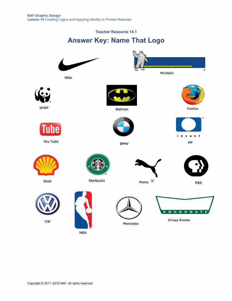
NAF Graphic Design Lesson 14 Creating Logos and Applying Identity to Printed Materials
Copyright © 2011–2015 NAF. All rights reserved.
Teacher Resource 14.1
Answer Key: Name That Logo
NAF Graphic Design Lesson 14 Creating Logos and Applying Identity to Printed Materials
Copyright © 2011–2015 NAF. All rights reserved.
Teacher Resource 14.2
Presentation Notes: Designing Memorable Logos
Before you show this presentation, use the text accompanying each slide to develop presentation notes. Writing the notes yourself enables you to approach the subject matter in a way that is comfortable to you and engaging for your students. Make this presentation as interactive as possible by stopping frequently to ask questions and encourage class discussion.
This presentation introduces the most important elements to consider when designing a logo.
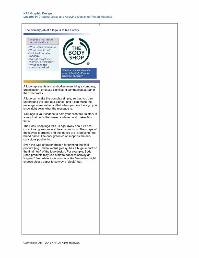
NAF Graphic Design Lesson 14 Creating Logos and Applying Identity to Printed Materials
Copyright © 2011–2015 NAF. All rights reserved.
A logo represents and embodies everything a company, organization, or cause signifies. It communicates rather than decorates.
A logo can make the complex simple, so that you can understand the idea at a glance, and it can make the message memorable, so that when you see the logo you know right away what the message is.
You logo is your chance to help your client tell its story in a way that holds the viewer’s interest and makes him care.
The Body Shop logo tells us right away about its eco-conscious, green, natural beauty products. The shape of the leaves is organic and the leaves are “protecting” the brand name. The dark green color supports the eco-conscious positioning.
Even the type of paper chosen for printing the final product (e.g., matte versus glossy) has a huge impact on the final “feel” of the logo design. For example, Body Shop products may use a matte paper to convey an “organic” feel, while a car company like Mercedes might choose glossy paper to convey a “sleek” feel.
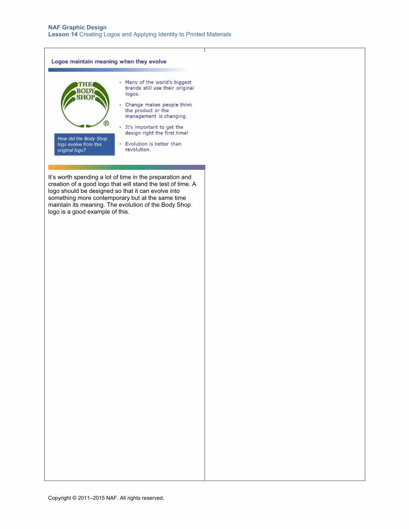
NAF Graphic Design Lesson 14 Creating Logos and Applying Identity to Printed Materials
Copyright © 2011–2015 NAF. All rights reserved.
It’s worth spending a lot of time in the preparation and creation of a good logo that will stand the test of time. A logo should be designed so that it can evolve into something more contemporary but at the same time maintain its meaning. The evolution of the Body Shop logo is a good example of this.
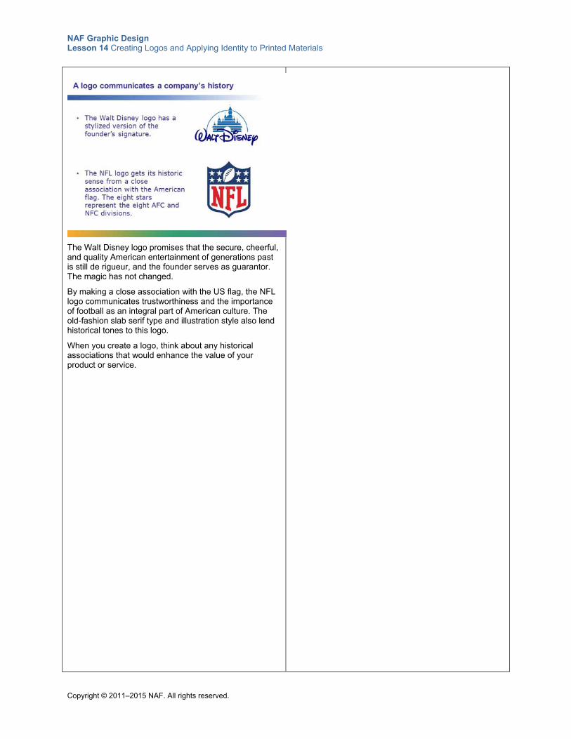
NAF Graphic Design Lesson 14 Creating Logos and Applying Identity to Printed Materials
Copyright © 2011–2015 NAF. All rights reserved.
The Walt Disney logo promises that the secure, cheerful, and quality American entertainment of generations past is still de rigueur, and the founder serves as guarantor. The magic has not changed.
By making a close association with the US flag, the NFL logo communicates trustworthiness and the importance of football as an integral part of American culture. The old-fashion slab serif type and illustration style also lend historical tones to this logo.
When you create a logo, think about any historical associations that would enhance the value of your product or service.
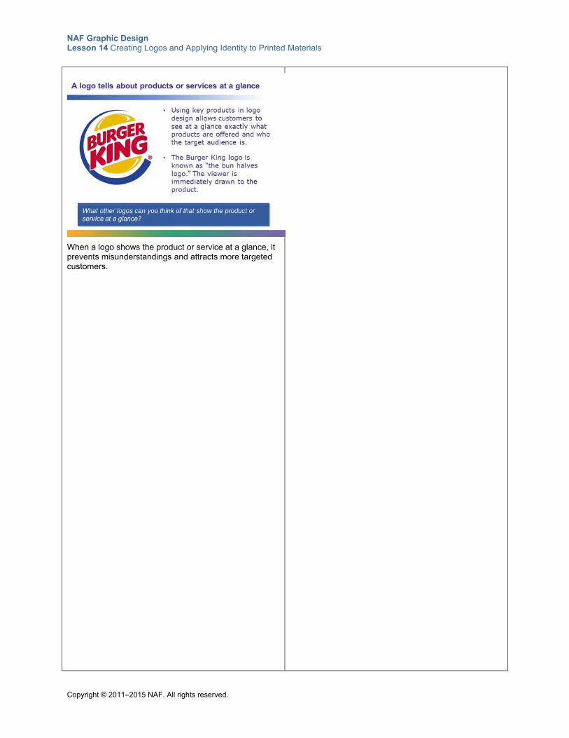
NAF Graphic Design Lesson 14 Creating Logos and Applying Identity to Printed Materials
Copyright © 2011–2015 NAF. All rights reserved.
When a logo shows the product or service at a glance, it prevents misunderstandings and attracts more targeted customers.
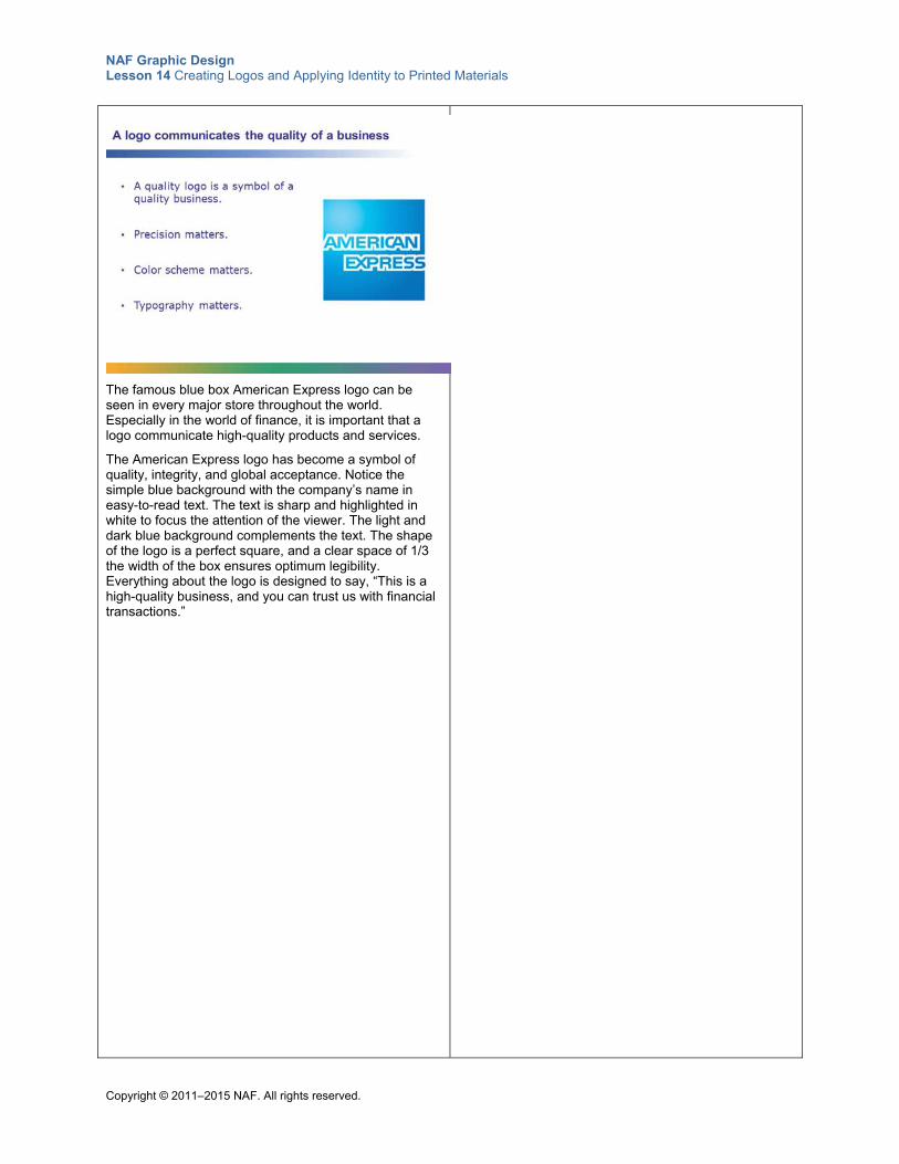
NAF Graphic Design Lesson 14 Creating Logos and Applying Identity to Printed Materials
Copyright © 2011–2015 NAF. All rights reserved.
The famous blue box American Express logo can be seen in every major store throughout the world. Especially in the world of finance, it is important that a logo communicate high-quality products and services.
The American Express logo has become a symbol of quality, integrity, and global acceptance. Notice the simple blue background with the company’s name in easy-to-read text. The text is sharp and highlighted in white to focus the attention of the viewer. The light and dark blue background complements the text. The shape of the logo is a perfect square, and a clear space of 1/3 the width of the box ensures optimum legibility. Everything about the logo is designed to say, “This is a high-quality business, and you can trust us with financial transactions.”
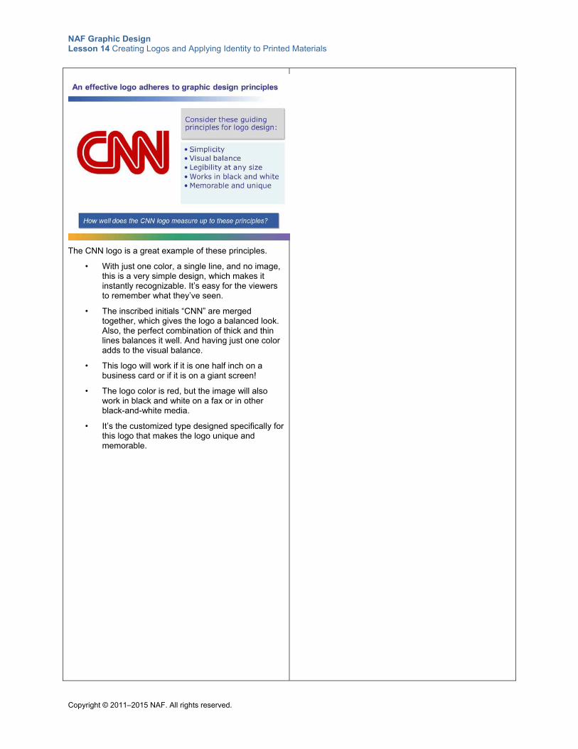
NAF Graphic Design Lesson 14 Creating Logos and Applying Identity to Printed Materials
Copyright © 2011–2015 NAF. All rights reserved.
The CNN logo is a great example of these principles.
• With just one color, a single line, and no image, this is a very simple design, which makes it instantly recognizable. It’s easy for the viewers to remember what they’ve seen.
• The inscribed initials “CNN” are merged together, which gives the logo a balanced look. Also, the perfect combination of thick and thin lines balances it well. And having just one color adds to the visual balance.
• This logo will work if it is one half inch on a business card or if it is on a giant screen!
• The logo color is red, but the image will also work in black and white on a fax or in other black-and-white media.
• It’s the customized type designed specifically for this logo that makes the logo unique and memorable.
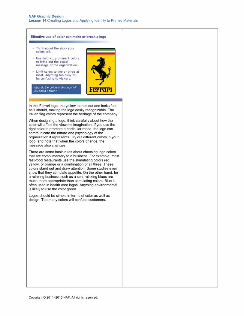
NAF Graphic Design Lesson 14 Creating Logos and Applying Identity to Printed Materials
Copyright © 2011–2015 NAF. All rights reserved.
In this Ferrari logo, the yellow stands out and looks fast, as it should, making the logo easily recognizable. The Italian flag colors represent the heritage of the company.
When designing a logo, think carefully about how the color will affect the viewer’s imagination. If you use the right color to promote a particular mood, the logo can communicate the nature and psychology of the organization it represents. Try out different colors in your logo, and note that when the colors change, the message also changes.
There are some basic rules about choosing logo colors that are complimentary to a business. For example, most fast-food restaurants use the stimulating colors red, yellow, or orange or a combination of all three. These colors stand out and draw attention. Some studies even show that they stimulate appetite. On the other hand, for a relaxing business such as a spa, relaxing blues are much more appropriate than stimulating colors. Blue is often used in health care logos. Anything environmental is likely to use the color green.
Logos should be simple in terms of color as well as design. Too many colors will confuse customers.
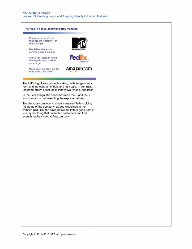
NAF Graphic Design Lesson 14 Creating Logos and Applying Identity to Printed Materials
Copyright © 2011–2015 NAF. All rights reserved.
The MTV logo looks groundbreaking, with the geometric form and the contrast of bold and light type. In contrast, the hand-drawn effect looks innovative, young, and fresh.
In the FedEx logo, the space between the E and the X forms an arrow, representing the express delivery.
The Amazon.com logo is simply sans serif letters giving the name of the company, as you would see in the website URL. But the smile below the letters goes from a to z, symbolizing that contented customers can find everything they want at Amazon.com.
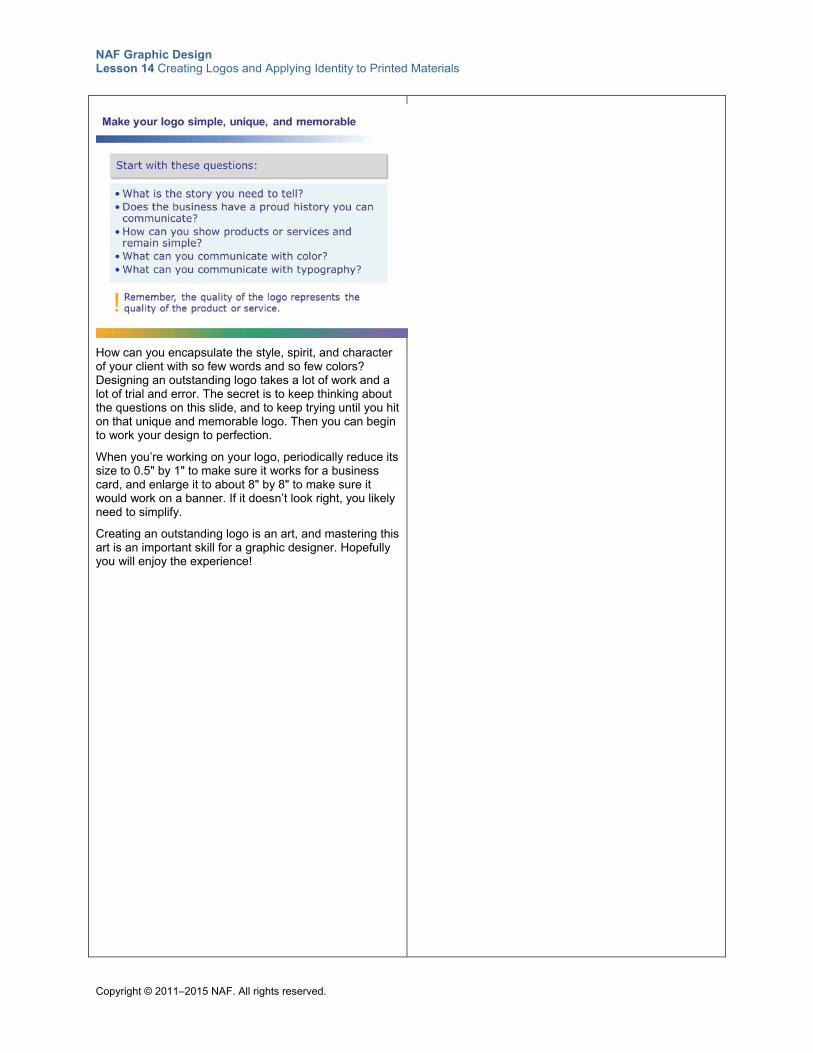
NAF Graphic Design Lesson 14 Creating Logos and Applying Identity to Printed Materials
Copyright © 2011–2015 NAF. All rights reserved.
How can you encapsulate the style, spirit, and character of your client with so few words and so few colors? Designing an outstanding logo takes a lot of work and a lot of trial and error. The secret is to keep thinking about the questions on this slide, and to keep trying until you hit on that unique and memorable logo. Then you can begin to work your design to perfection.
When you’re working on your logo, periodically reduce its size to 0.5" by 1" to make sure it works for a business card, and enlarge it to about 8" by 8" to make sure it would work on a banner. If it doesn’t look right, you likely need to simplify.
Creating an outstanding logo is an art, and mastering this art is an important skill for a graphic designer. Hopefully you will enjoy the experience!
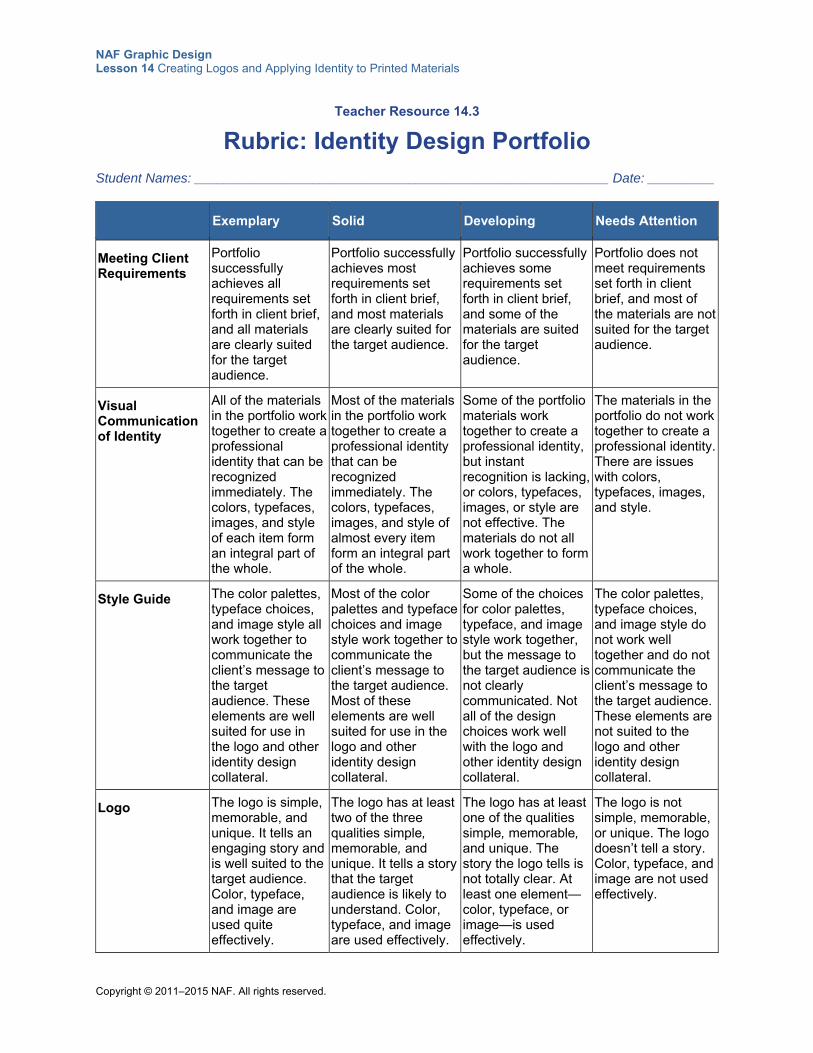
NAF Graphic Design Lesson 14 Creating Logos and Applying Identity to Printed Materials
Copyright © 2011–2015 NAF. All rights reserved.
Teacher Resource 14.3
Rubric: Identity Design Portfolio
Student Names: ________________________________________________________ Date: _________
Exemplary Solid Developing Needs Attention
Meeting Client Requirements
Portfolio successfully achieves all requirements set forth in client brief, and all materials are clearly suited for the target audience.
Portfolio successfully achieves most requirements set forth in client brief, and most materials are clearly suited for the target audience.
Portfolio successfully achieves some requirements set forth in client brief, and some of the materials are suited for the target audience.
Portfolio does not meet requirements set forth in client brief, and most of the materials are not suited for the target audience.
Visual Communication of Identity
All of the materials in the portfolio work together to create a professional identity that can be recognized immediately. The colors, typefaces, images, and style of each item form an integral part of the whole.
Most of the materials in the portfolio work together to create a professional identity that can be recognized immediately. The colors, typefaces, images, and style of almost every item form an integral part of the whole.
Some of the portfolio materials work together to create a professional identity, but instant recognition is lacking, or colors, typefaces, images, or style are not effective. The materials do not all work together to form a whole.
The materials in the portfolio do not work together to create a professional identity. There are issues with colors, typefaces, images, and style.
Style Guide The color palettes, typeface choices, and image style all work together to communicate the client’s message to the target audience. These elements are well suited for use in the logo and other identity design collateral.
Most of the color palettes and typeface choices and image style work together to communicate the client’s message to the target audience. Most of these elements are well suited for use in the logo and other identity design collateral.
Some of the choices for color palettes, typeface, and image style work together, but the message to the target audience is not clearly communicated. Not all of the design choices work well with the logo and other identity design collateral.
The color palettes, typeface choices, and image style do not work well together and do not communicate the client’s message to the target audience. These elements are not suited to the logo and other identity design collateral.
Logo The logo is simple, memorable, and unique. It tells an engaging story and is well suited to the target audience. Color, typeface, and image are used quite effectively.
The logo has at least two of the three qualities simple, memorable, and unique. It tells a story that the target audience is likely to understand. Color, typeface, and image are used effectively.
The logo has at least one of the qualities simple, memorable, and unique. The story the logo tells is not totally clear. At least one element—color, typeface, or image—is used effectively.
The logo is not simple, memorable, or unique. The logo doesn’t tell a story. Color, typeface, and image are not used effectively.
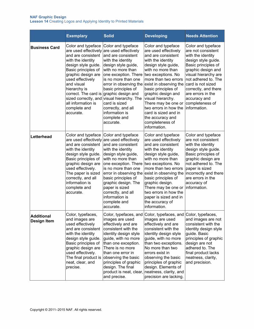
NAF Graphic Design Lesson 14 Creating Logos and Applying Identity to Printed Materials
Copyright © 2011–2015 NAF. All rights reserved.
Exemplary Solid Developing Needs Attention
Business Card
Color and typeface are used effectively and are consistent with the identity design style guide. Basic principles of graphic design are used effectively and visual hierarchy is correct. The card is sized correctly, and all information is complete and accurate.
Color and typeface are used effectively and are consistent with the identity design style guide, with no more than one exception. There is no more than one error in observing the basic principles of graphic design and visual hierarchy. The card is sized correctly, and all information is complete and accurate.
Color and typeface are used effectively and are consistent with the identity design style guide, with no more than two exceptions. No more than two errors exist in observing the basic principles of graphic design and visual hierarchy. There may be one or two errors in how the card is sized and in the accuracy and completeness of information.
Color and typeface are not consistent with the identity design style guide. Basic principles of graphic design and visual hierarchy are not adhered to. The card is not sized correctly, and there are errors in the accuracy and completeness of information.
Letterhead Color and typeface are used effectively and are consistent with the identity design style guide. Basic principles of graphic design are used effectively. The paper is sized correctly, and all information is complete and accurate.
Color and typeface are used effectively and are consistent with the identity design style guide, with no more than one exception. There is no more than one error in observing the basic principles of graphic design. The paper is sized correctly, and all information is complete and accurate.
Color and typeface are used effectively and are consistent with the identity design style guide, with no more than two exceptions. No more than two errors exist in observing the basic principles of graphic design. There may be one or two errors in how the paper is sized and in the accuracy of information.
Color and typeface are not consistent with the identity design style guide. Basic principles of graphic design are not adhered to. The paper is sized incorrectly and there are errors in the accuracy of information.
Additional Design Item
Color, typefaces, and images are used effectively and are consistent with the identity design style guide. Basic principles of graphic design are used effectively. The final product is neat, clear, and precise.
Color, typefaces, and images are used effectively and are consistent with the identity design style guide, with no more than one exception. There is no more than one error in observing the basic principles of graphic design. The final product is neat, clear, and precise.
Color, typefaces, and images are used effectively and are consistent with the identity design style guide, with no more than two exceptions. No more than two errors exist in observing the basic principles of graphic design. Elements of neatness, clarity, and precision are lacking.
Color, typefaces, and images are not consistent with the identity design style guide. Basic principles of graphic design are not adhered to. The final product lacks neatness, clarity, and precision.
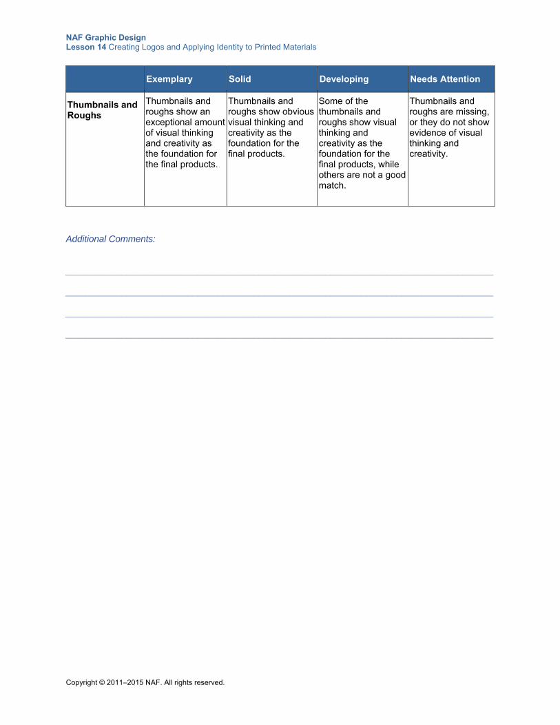
NAF Graphic Design Lesson 14 Creating Logos and Applying Identity to Printed Materials
Copyright © 2011–2015 NAF. All rights reserved.
Exemplary Solid Developing Needs Attention
Thumbnails and Roughs
Thumbnails and roughs show an exceptional amount of visual thinking and creativity as the foundation for the final products.
Thumbnails and roughs show obvious visual thinking and creativity as the foundation for the final products.
Some of the thumbnails and roughs show visual thinking and creativity as the foundation for the final products, while others are not a good match.
Thumbnails and roughs are missing, or they do not show evidence of visual thinking and creativity.
Additional Comments:
____________________________________________________________________________________ ____________________________________________________________________________________ ____________________________________________________________________________________ ____________________________________________________________________________________
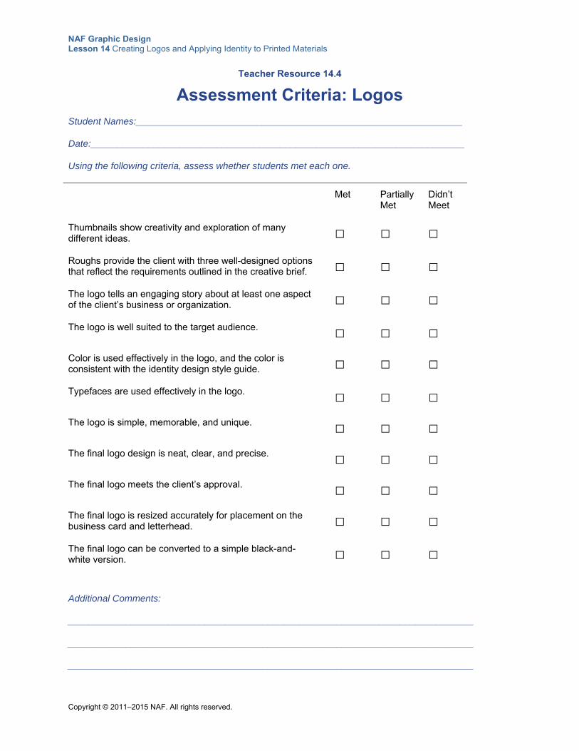
NAF Graphic Design Lesson 14 Creating Logos and Applying Identity to Printed Materials
Copyright © 2011–2015 NAF. All rights reserved.
Teacher Resource 14.4
Assessment Criteria: Logos
Student Names:______________________________________________________________
Date:_______________________________________________________________________
Using the following criteria, assess whether students met each one.
Met Partially Met
Didn’t Meet
Thumbnails show creativity and exploration of many different ideas.
□ □ □
Roughs provide the client with three well-designed options that reflect the requirements outlined in the creative brief.
□ □ □
The logo tells an engaging story about at least one aspect of the client’s business or organization.
□ □ □
The logo is well suited to the target audience. □ □ □
Color is used effectively in the logo, and the color is consistent with the identity design style guide.
□ □ □
Typefaces are used effectively in the logo. □ □ □
The logo is simple, memorable, and unique. □ □ □
The final logo design is neat, clear, and precise. □ □ □
The final logo meets the client’s approval. □ □ □
The final logo is resized accurately for placement on the business card and letterhead.
□ □ □
The final logo can be converted to a simple black-and-white version.
□ □ □
Additional Comments:
_____________________________________________________________________________
_____________________________________________________________________________
_____________________________________________________________________________
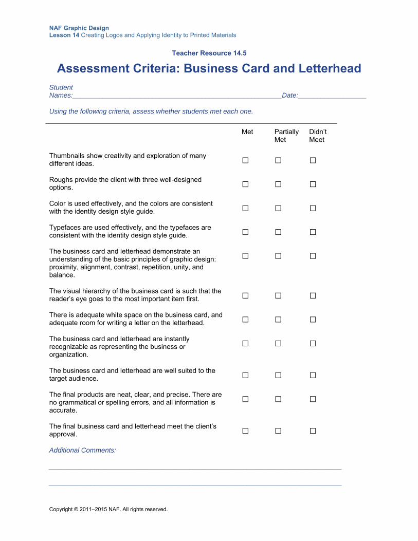
NAF Graphic Design Lesson 14 Creating Logos and Applying Identity to Printed Materials
Copyright © 2011–2015 NAF. All rights reserved.
Teacher Resource 14.5
Assessment Criteria: Business Card and Letterhead
Student Names:_______________________________________________________Date:__________________
Using the following criteria, assess whether students met each one.
Met Partially Met
Didn’t Meet
Thumbnails show creativity and exploration of many different ideas.
□ □ □
Roughs provide the client with three well-designed options.
□ □ □
Color is used effectively, and the colors are consistent with the identity design style guide.
□ □ □
Typefaces are used effectively, and the typefaces are consistent with the identity design style guide.
□ □ □
The business card and letterhead demonstrate an understanding of the basic principles of graphic design: proximity, alignment, contrast, repetition, unity, and balance.
□ □ □
The visual hierarchy of the business card is such that the reader’s eye goes to the most important item first.
□ □ □
There is adequate white space on the business card, and adequate room for writing a letter on the letterhead.
□ □ □
The business card and letterhead are instantly recognizable as representing the business or organization.
□ □ □
The business card and letterhead are well suited to the target audience.
□ □ □
The final products are neat, clear, and precise. There are no grammatical or spelling errors, and all information is accurate.
□ □ □
The final business card and letterhead meet the client’s approval.
□ □ □
Additional Comments:
_____________________________________________________________________________
_____________________________________________________________________________
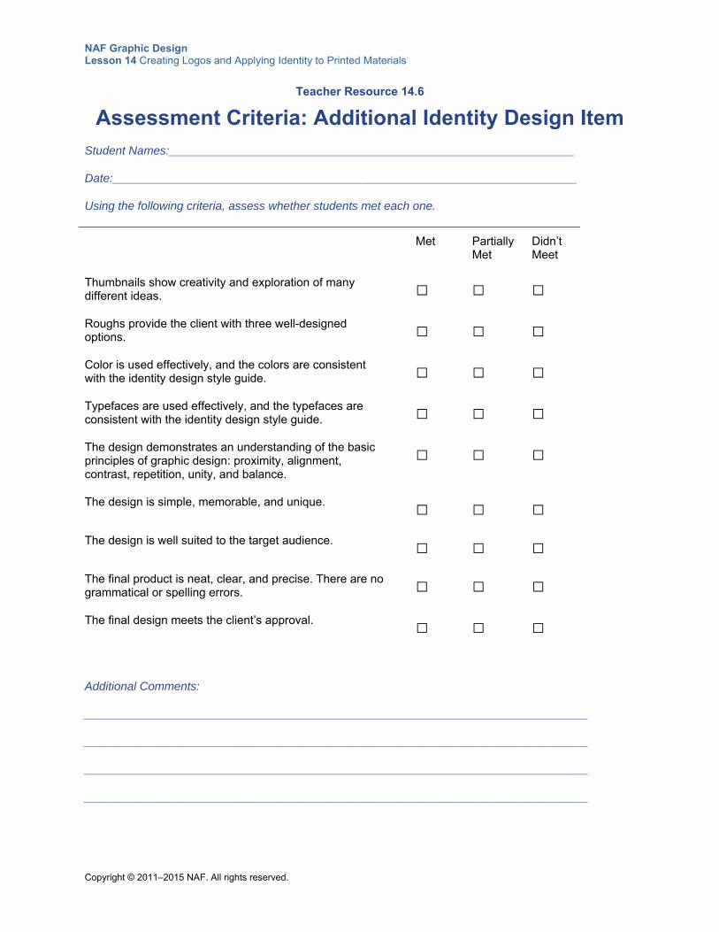
NAF Graphic Design Lesson 14 Creating Logos and Applying Identity to Printed Materials
Copyright © 2011–2015 NAF. All rights reserved.
Teacher Resource 14.6
Assessment Criteria: Additional Identity Design Item
Student Names:______________________________________________________________
Date:_______________________________________________________________________
Using the following criteria, assess whether students met each one.
Met Partially Met
Didn’t Meet
Thumbnails show creativity and exploration of many different ideas.
□ □ □
Roughs provide the client with three well-designed options.
□ □ □
Color is used effectively, and the colors are consistent with the identity design style guide.
□ □ □
Typefaces are used effectively, and the typefaces are consistent with the identity design style guide.
□ □ □
The design demonstrates an understanding of the basic principles of graphic design: proximity, alignment, contrast, repetition, unity, and balance.
□ □ □
The design is simple, memorable, and unique. □ □ □
The design is well suited to the target audience. □ □ □
The final product is neat, clear, and precise. There are no grammatical or spelling errors.
□ □ □
The final design meets the client’s approval. □ □ □
Additional Comments:
_____________________________________________________________________________
_____________________________________________________________________________
_____________________________________________________________________________
_____________________________________________________________________________
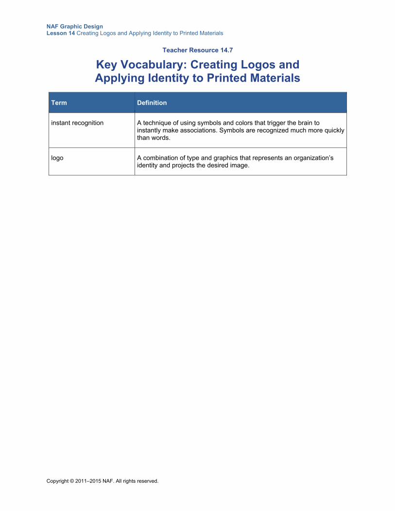
NAF Graphic Design Lesson 14 Creating Logos and Applying Identity to Printed Materials
Copyright © 2011–2015 NAF. All rights reserved.
Teacher Resource 14.7
Key Vocabulary: Creating Logos and Applying Identity to Printed Materials
Term Definition
instant recognition A technique of using symbols and colors that trigger the brain to instantly make associations. Symbols are recognized much more quickly than words.
logo A combination of type and graphics that represents an organization’s identity and projects the desired image.
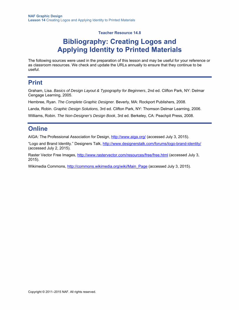
NAF Graphic Design Lesson 14 Creating Logos and Applying Identity to Printed Materials
Copyright © 2011–2015 NAF. All rights reserved.
Teacher Resource 14.8
Bibliography: Creating Logos and Applying Identity to Printed Materials
The following sources were used in the preparation of this lesson and may be useful for your reference or as classroom resources. We check and update the URLs annually to ensure that they continue to be useful.
Print Graham, Lisa. Basics of Design Layout & Typography for Beginners, 2nd ed. Clifton Park, NY: Delmar Cengage Learning, 2005.
Hembree, Ryan. The Complete Graphic Designer. Beverly, MA: Rockport Publishers, 2008.
Landa, Robin. Graphic Design Solutions, 3rd ed. Clifton Park, NY: Thomson Delmar Learning, 2006.
Williams, Robin. The Non-Designer’s Design Book, 3rd ed. Berkeley, CA: Peachpit Press, 2008.
Online AIGA: The Professional Association for Design, http://www.aiga.org/ (accessed July 3, 2015).
“Logo and Brand Identity.” Designers Talk, http://www.designerstalk.com/forums/logo-brand-identity/ (accessed July 2, 2015).
Raster Vector Free Images, http://www.rastervector.com/resources/free/free.html (accessed July 3, 2015).
Wikimedia Commons, http://commons.wikimedia.org/wiki/Main_Page (accessed July 3, 2015).
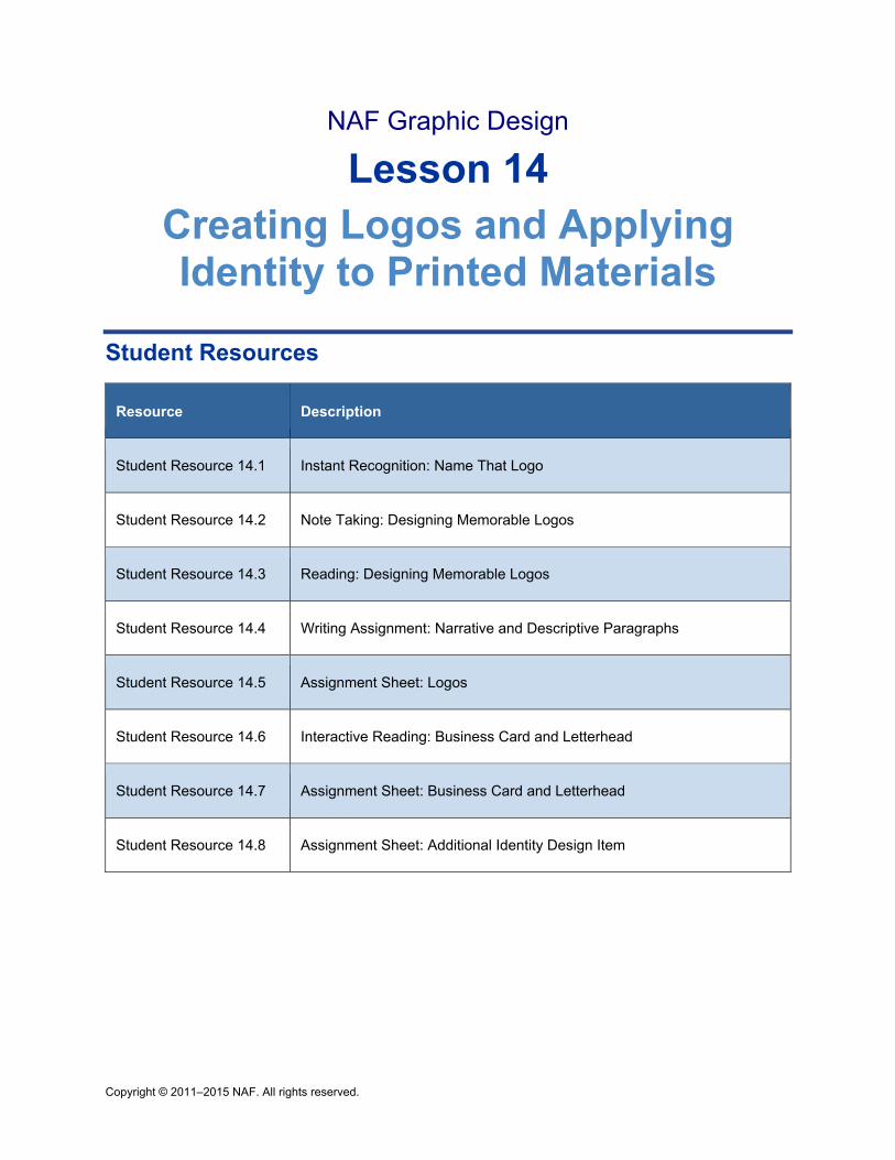
Copyright © 2011–2015 NAF. All rights reserved.
NAF Graphic Design
Lesson 14 Creating Logos and Applying Identity to Printed Materials
Student Resources
Resource Description
Student Resource 14.1 Instant Recognition: Name That Logo
Student Resource 14.2 Note Taking: Designing Memorable Logos
Student Resource 14.3 Reading: Designing Memorable Logos
Student Resource 14.4 Writing Assignment: Narrative and Descriptive Paragraphs
Student Resource 14.5 Assignment Sheet: Logos
Student Resource 14.6 Interactive Reading: Business Card and Letterhead
Student Resource 14.7 Assignment Sheet: Business Card and Letterhead
Student Resource 14.8 Assignment Sheet: Additional Identity Design Item
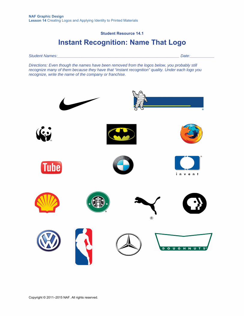
NAF Graphic Design Lesson 14 Creating Logos and Applying Identity to Printed Materials
Copyright © 2011–2015 NAF. All rights reserved.
Student Resource 14.1
Instant Recognition: Name That Logo
Student Names:_______________________________________________________ Date:___________
Directions: Even though the names have been removed from the logos below, you probably still recognize many of them because they have that “instant recognition” quality. Under each logo you recognize, write the name of the company or franchise.
NAF Graphic Design Lesson 14 Creating Logos and Applying Identity to Printed Materials
Copyright © 2011–2015 NAF. All rights reserved.
Student Resource 14.2
Note Taking: Designing Memorable Logos
Student Name:_______________________________________________________ Date:___________
Directions: Review the questions below before the presentation. Then use these questions to guide you as you take notes on the presentation.
1. How do you make a logo tell a story?
2. Explain how a logo can be used to communicate a company’s history. Give examples.
3. Give an example of how a logo can show key products or services at a glance.
4. How can you make sure your logo reflects the high quality of your business or organization?
5. What are the most important graphic design principles for logos?
6. What do you need to remember about color and logos?
7. What do you need to remember about typeface and logos?
8. What are the guidelines that will help you make your logo simple, unique, and memorable?
NAF Graphic Design Lesson 14 Creating Logos and Applying Identity to Printed Materials
Copyright © 2011–2015 NAF. All rights reserved.
Student Resource 14.3
Reading: Designing Memorable Logos
This presentation introduces the most important elements to consider when designing a logo.
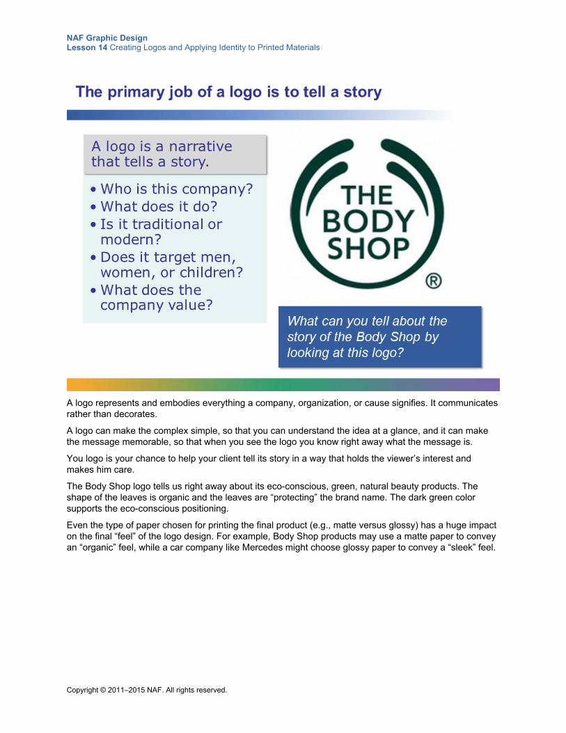
NAF Graphic Design Lesson 14 Creating Logos and Applying Identity to Printed Materials
Copyright © 2011–2015 NAF. All rights reserved.
A logo represents and embodies everything a company, organization, or cause signifies. It communicates rather than decorates.
A logo can make the complex simple, so that you can understand the idea at a glance, and it can make the message memorable, so that when you see the logo you know right away what the message is.
You logo is your chance to help your client tell its story in a way that holds the viewer’s interest and makes him care.
The Body Shop logo tells us right away about its eco-conscious, green, natural beauty products. The shape of the leaves is organic and the leaves are “protecting” the brand name. The dark green color supports the eco-conscious positioning.
Even the type of paper chosen for printing the final product (e.g., matte versus glossy) has a huge impact on the final “feel” of the logo design. For example, Body Shop products may use a matte paper to convey an “organic” feel, while a car company like Mercedes might choose glossy paper to convey a “sleek” feel.
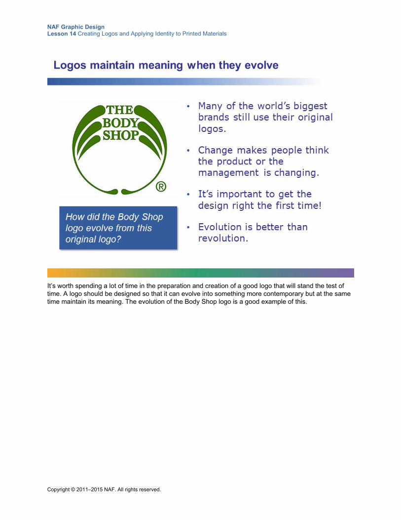
NAF Graphic Design Lesson 14 Creating Logos and Applying Identity to Printed Materials
Copyright © 2011–2015 NAF. All rights reserved.
It’s worth spending a lot of time in the preparation and creation of a good logo that will stand the test of time. A logo should be designed so that it can evolve into something more contemporary but at the same time maintain its meaning. The evolution of the Body Shop logo is a good example of this.
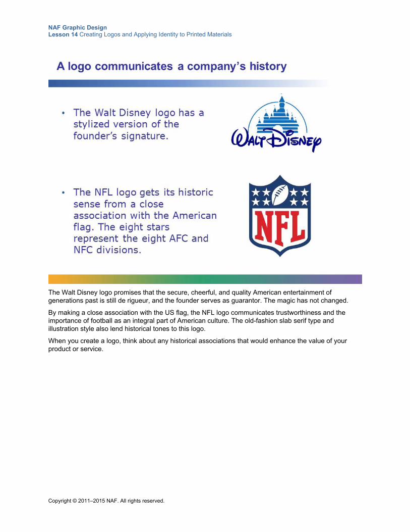
NAF Graphic Design Lesson 14 Creating Logos and Applying Identity to Printed Materials
Copyright © 2011–2015 NAF. All rights reserved.
The Walt Disney logo promises that the secure, cheerful, and quality American entertainment of generations past is still de rigueur, and the founder serves as guarantor. The magic has not changed.
By making a close association with the US flag, the NFL logo communicates trustworthiness and the importance of football as an integral part of American culture. The old-fashion slab serif type and illustration style also lend historical tones to this logo.
When you create a logo, think about any historical associations that would enhance the value of your product or service.
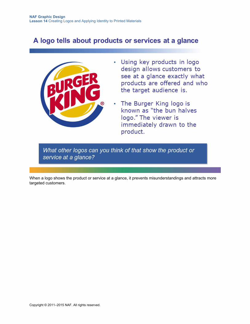
NAF Graphic Design Lesson 14 Creating Logos and Applying Identity to Printed Materials
Copyright © 2011–2015 NAF. All rights reserved.
When a logo shows the product or service at a glance, it prevents misunderstandings and attracts more targeted customers.
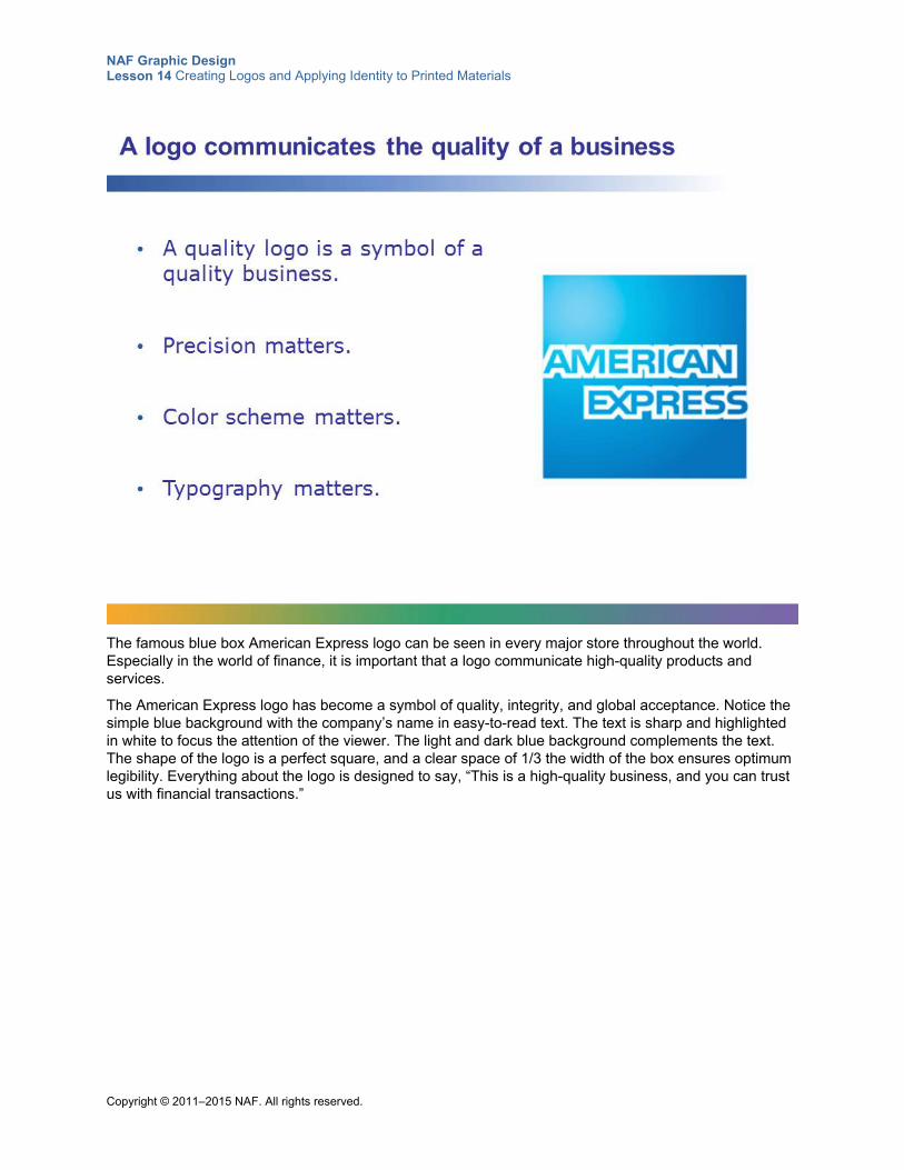
NAF Graphic Design Lesson 14 Creating Logos and Applying Identity to Printed Materials
Copyright © 2011–2015 NAF. All rights reserved.
The famous blue box American Express logo can be seen in every major store throughout the world. Especially in the world of finance, it is important that a logo communicate high-quality products and services.
The American Express logo has become a symbol of quality, integrity, and global acceptance. Notice the simple blue background with the company’s name in easy-to-read text. The text is sharp and highlighted in white to focus the attention of the viewer. The light and dark blue background complements the text. The shape of the logo is a perfect square, and a clear space of 1/3 the width of the box ensures optimum legibility. Everything about the logo is designed to say, “This is a high-quality business, and you can trust us with financial transactions.”
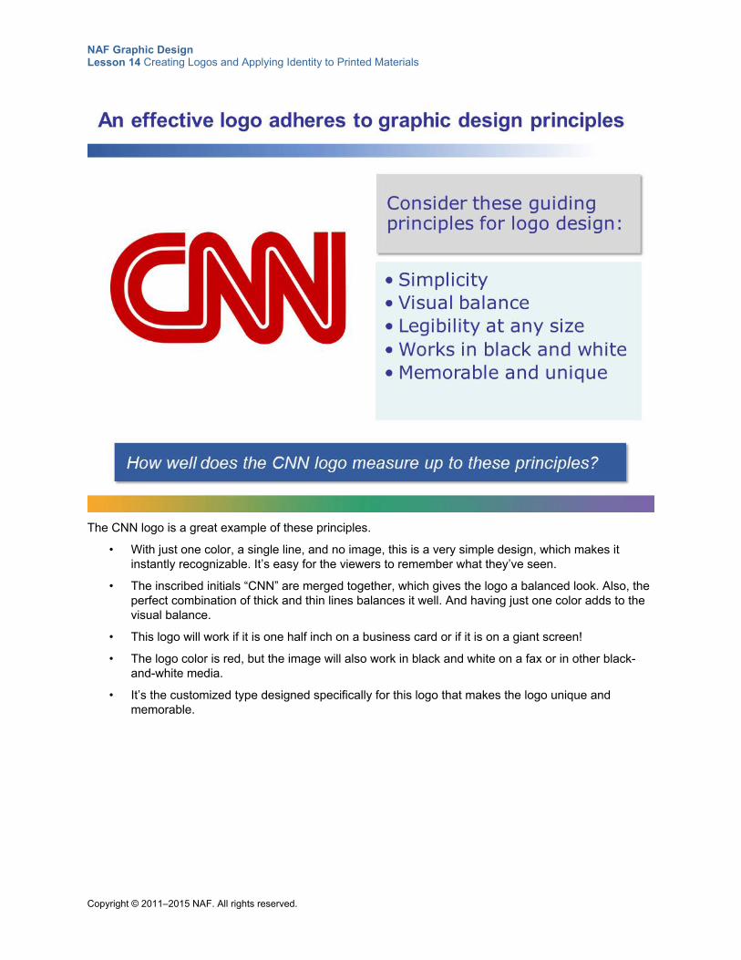
NAF Graphic Design Lesson 14 Creating Logos and Applying Identity to Printed Materials
Copyright © 2011–2015 NAF. All rights reserved.
The CNN logo is a great example of these principles.
• With just one color, a single line, and no image, this is a very simple design, which makes it instantly recognizable. It’s easy for the viewers to remember what they’ve seen.
• The inscribed initials “CNN” are merged together, which gives the logo a balanced look. Also, the perfect combination of thick and thin lines balances it well. And having just one color adds to the visual balance.
• This logo will work if it is one half inch on a business card or if it is on a giant screen!
• The logo color is red, but the image will also work in black and white on a fax or in other black-and-white media.
• It’s the customized type designed specifically for this logo that makes the logo unique and memorable.
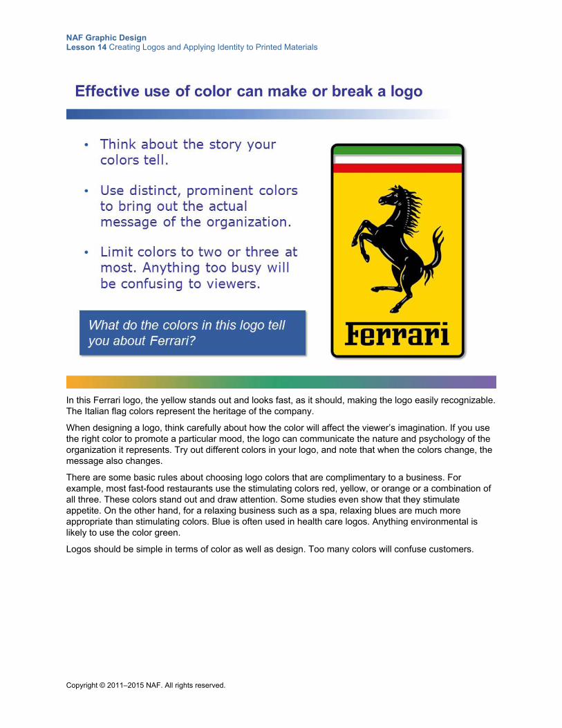
NAF Graphic Design Lesson 14 Creating Logos and Applying Identity to Printed Materials
Copyright © 2011–2015 NAF. All rights reserved.
In this Ferrari logo, the yellow stands out and looks fast, as it should, making the logo easily recognizable. The Italian flag colors represent the heritage of the company.
When designing a logo, think carefully about how the color will affect the viewer’s imagination. If you use the right color to promote a particular mood, the logo can communicate the nature and psychology of the organization it represents. Try out different colors in your logo, and note that when the colors change, the message also changes.
There are some basic rules about choosing logo colors that are complimentary to a business. For example, most fast-food restaurants use the stimulating colors red, yellow, or orange or a combination of all three. These colors stand out and draw attention. Some studies even show that they stimulate appetite. On the other hand, for a relaxing business such as a spa, relaxing blues are much more appropriate than stimulating colors. Blue is often used in health care logos. Anything environmental is likely to use the color green.
Logos should be simple in terms of color as well as design. Too many colors will confuse customers.
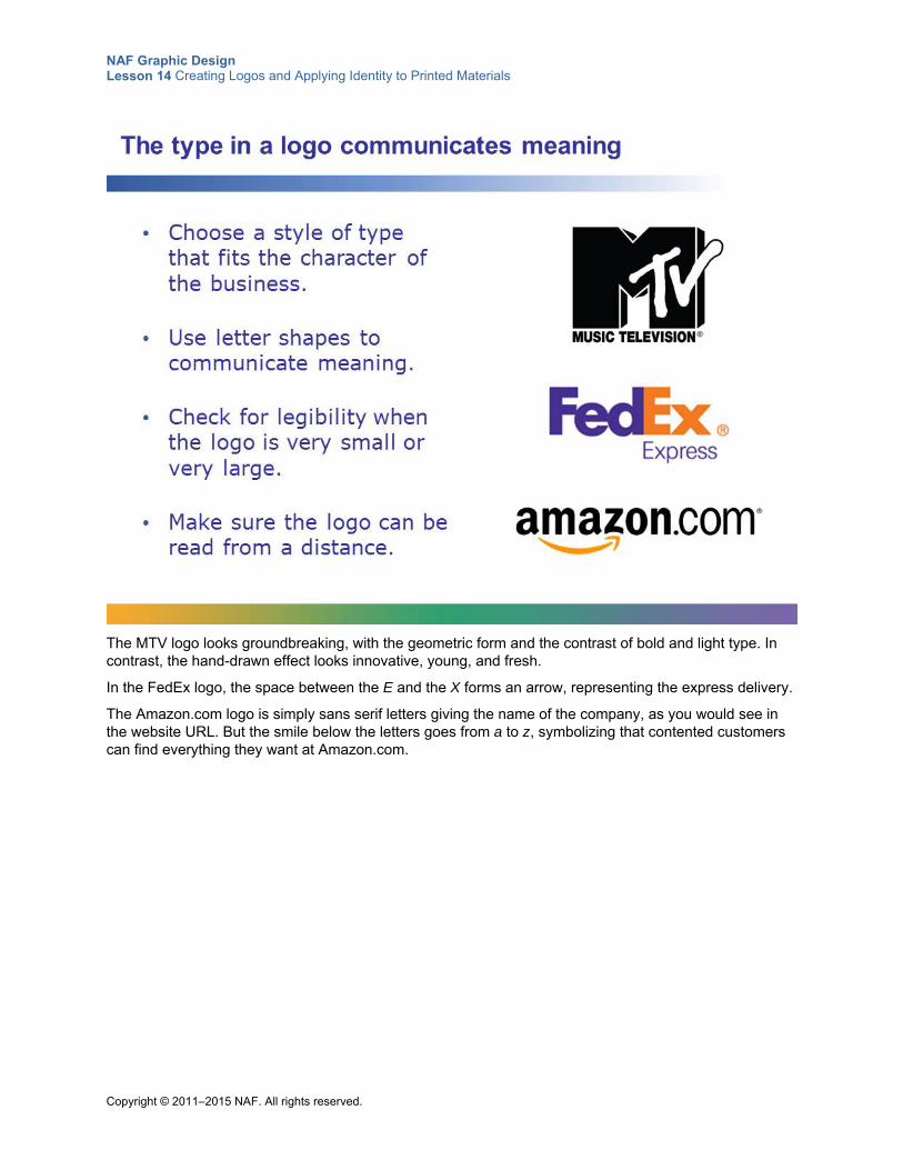
NAF Graphic Design Lesson 14 Creating Logos and Applying Identity to Printed Materials
Copyright © 2011–2015 NAF. All rights reserved.
The MTV logo looks groundbreaking, with the geometric form and the contrast of bold and light type. In contrast, the hand-drawn effect looks innovative, young, and fresh.
In the FedEx logo, the space between the E and the X forms an arrow, representing the express delivery.
The Amazon.com logo is simply sans serif letters giving the name of the company, as you would see in the website URL. But the smile below the letters goes from a to z, symbolizing that contented customers can find everything they want at Amazon.com.
NAF Graphic Design Lesson 14 Creating Logos and Applying Identity to Printed Materials
Copyright © 2011–2015 NAF. All rights reserved.
How can you encapsulate the style, spirit, and character of your client with so few words and so few colors? Designing an outstanding logo takes a lot of work and a lot of trial and error. The secret is to keep thinking about the questions on this slide, and to keep trying until you hit on that unique and memorable logo. Then you can begin to work your design to perfection.
When you’re working on your logo, periodically reduce its size to 0.5" by 1" to make sure it works for a business card, and enlarge it to about 8" by 8" to make sure it would work on a banner. If it doesn’t look right, you likely need to simplify.
Creating an outstanding logo is an art, and mastering this art is an important skill for a graphic designer. Hopefully you will enjoy the experience!
NAF Graphic Design Lesson 14 Creating Logos and Applying Identity to Printed Materials
Copyright © 2011–2015 NAF. All rights reserved.
Student Resource 14.4
Writing Assignment: Narrative and Descriptive Paragraphs
Directions: Working with your culminating project group, write three paragraphs about your client, as described below. Remember that the purpose of these paragraphs is to tell a story about your client’s business or organization. Telling the story in words is excellent preparation for encapsulating the story in a logo.
Narrative of History Write a narrative paragraph that tells the history of your client. Consider:
How was the business or organization formed?
How long has it been in existence?
What important events have marked the history of the business or organization?
What, if anything, about the organization’s history denotes stability and/or excellence?
What is unique or memorable about the history of this business or organization?
Description of Products and Services Write a paragraph that describes the organization’s most important products or services. For example:
Describe in detail exactly what the most important products or services are.
What makes these products or services popular?
What makes the products or services stand out from the competition’s?
What is unique or memorable about the products and services?
Description of Quality Write a descriptive paragraph that describes the quality of the business or organization and the quality of the products or services.
Describe anything you know about the reputation of your client’s business or organization.
Describe any business practices that make your client stand out.
What makes your client’s products or services better than those of the competition?
NAF Graphic Design Lesson 14 Creating Logos and Applying Identity to Printed Materials
Copyright © 2011–2015 NAF. All rights reserved.
Student Resource 14.5
Assignment Sheet: Logos
Student Name:_______________________________________________________ Date:___________
Directions: Using the narrative and descriptive paragraphs you have written, the creative brief from your client, and your identity design style guide as source material, create thumbnail sketches of every idea you can think of that might work for your logo. Remember to think about your target audience as you are working. Next, choose the best of the thumbnails and create three roughs. Finally, take the rough that your client chooses and develop it into your final logo design. Remember that your logo must demonstrate your ability to apply everything you have learned about graphic design so far.
Thumbnail Sketches Create quick thumbnail sketches to explore as many ideas as possible. In a thumbnail, you establish approximate locations for major elements, but you don’t fret over details. Here are some tips for creating thumbnails that will help you find a unique idea quickly:
Draw your thumbnails with a pencil. You want quick, rough designs that approximate layouts and the placement of key elements. If you draw each thumbnail on its own piece of paper, you can shuffle and compare ideas quickly.
Make your thumbnails approximately proportional to the page, but don’t get out a ruler. They should be small: maybe a quarter of a page or smaller. You’re aiming for a general idea of how the logo might look.
Have each member of your team make at least three thumbnails. Creating lots of thumbnails is a quick way to rule out many design ideas without wasting time in Photoshop.
When you have a good stack of thumbnails, go through them as a team. Rule out the ideas that don’t work, and take the best ideas and put them together. You will be creating three roughs, so you still need lots of ideas.
Keep working at thumbnails until you have some ideas that pop. It’s okay to go back to the drawing board if you don’t come up with something you’re excited about the first round. You may find that in combining the ideas of your team, you are able to come up with something better.
When you have some ideas that you like that you think will work for the logo, move on to the roughs. Even though you’ll be creating three roughs, you don’t need three totally separate ideas for the roughs. Your roughs can be variations on one idea that you really like, but they don’t have to be. You may want to present your client with one traditional idea, one modern idea, and one that is somewhere in between. Make sure that you and your team like all of the logos that you decide to develop into roughs, because you never know what your client might decide!
Roughs Work in Photoshop to create three roughs of your logo. These do not need to be the finished product, but they do need to be good enough to inspire the client to get excited about your ideas. If it is easier, some parts (such as a graphic element) can be hand-drawn in the roughs, and others computer generated.
Your roughs should show:
Fonts and font sizes
Exact colors (from your identity design)
Placement of all text
Placement and size of all graphic elements, including geometric shapes and lines
NAF Graphic Design Lesson 14 Creating Logos and Applying Identity to Printed Materials
Copyright © 2011–2015 NAF. All rights reserved.
Final Logo Based on the input you receive from your client, create your final logo in Photoshop. Remember to pay attention to every detail and apply all of the graphic design skills that you have learned. When you have a final version of the logo, submit it to your client for final approval. After you receive client approval, resize the logo for each piece of collateral that you are delivering to your client:
Identity design style guide
Business card
Letterhead
Additional identity design item
Remember to include your logo in the final version of your identity design style guide. You may also want to include information about the size of the logo that is used on business cards and letterhead.
Make sure your logo assignment meets or exceeds the following assessment criteria:
Thumbnails show creativity and exploration of many different ideas.
Roughs provide the client with three well-designed options that reflect the requirements outlined in the creative brief.
The logo tells an engaging story about at least one aspect of your client’s business or organization.
The logo is well suited to the target audience.
Color is used effectively in the logo, and the color is consistent with the identity design style guide.
Typefaces are used effectively in the logo.
The logo is simple, memorable, and unique.
The final logo design is neat, clear, and precise.
The final logo meets the client’s approval.
The final logo is resized accurately for placement on the business card and letterhead.
The final logo can be converted to a simple black-and-white version.
NAF Graphic Design Lesson 14 Creating Logos and Applying Identity to Printed Materials
Copyright © 2011–2015 NAF. All rights reserved.
Student Resource 14.6
Interactive Reading: Business Card and Letterhead
Student Name:_______________________________________________________ Date:___________
Directions: As you read, fill in the “Your Observations” boxes, and think about how you can apply what you learn to the business card and letterhead you will be creating for your culminating project.
Designing business cards, letterhead, and envelopes is sometimes referred to as designing a stationery set. All three items need a consistent design that the viewer can recognize immediately. In an effective stationery design, the same element will be dominant on the business card, the letterhead, and the envelope.
It is good practice to begin by designing the business card. Since this is the smallest piece, it is perhaps the most difficult to design. When you figure out the business card, you can then use the elements you have on your letterhead and envelope.
Business Card Design The challenge of a business card is to pack a lot of information into a small space. In addition to your address and phone, you probably need a cell phone number, fax number, email address, and website URL. Consider the following points about format, typography, and wording when creating your business card. Refer to the identity design style guide as your starting point.
Format
Use standard business card size, which is 3.5" by 2". Your card can have either a horizontal or a vertical layout. Sometimes when you have a lot of short pieces of information, a vertical layout is better. Be sure to try both formats and figure out which one works best for the information on your card.
Everything on your card should be aligned with something else. A strong flush-left or flush-right alignment is usually better than centered. Remember: Not only is it okay to have empty space; it’s important!
If your client has a budget for printing the business card on both sides, create a simple design on the back of the card that enhances instant recognition of the card.
Typography
Look at the business cards you’ve collected and pick out the ones that look the most professional. Chances are the type size is 7, 8, or 9 points. A 12-point type size is too big and looks unsophisticated. Remember that a business card is different from an ad. Creating a sophisticated effect is more important than having a type size that can be read from a distance.
Use a maximum of two fonts. Remember to choose fonts that match your message!
Color
Your business card should use the colors in your logo. If you use a second color in the text, use only a small amount, as an accent.
Wording
The most important consideration when wording your business card is to keep everything clean, crisp, and clear. Here are some tips:
The words email and website are not necessary on a business card. People will know what email addresses and website URLs are.
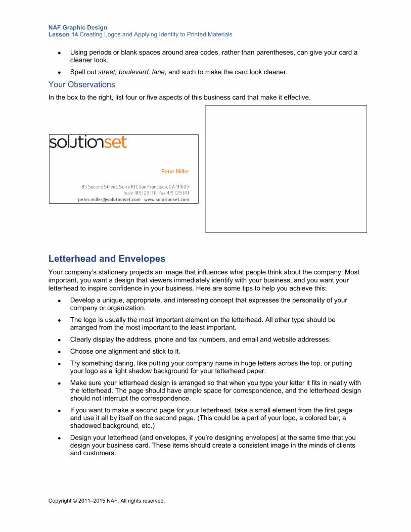
NAF Graphic Design Lesson 14 Creating Logos and Applying Identity to Printed Materials
Copyright © 2011–2015 NAF. All rights reserved.
Using periods or blank spaces around area codes, rather than parentheses, can give your card a cleaner look.
Spell out street, boulevard, lane, and such to make the card look cleaner.
Your Observations
In the box to the right, list four or five aspects of this business card that make it effective.
Letterhead and Envelopes Your company’s stationery projects an image that influences what people think about the company. Most important, you want a design that viewers immediately identify with your business, and you want your letterhead to inspire confidence in your business. Here are some tips to help you achieve this:
Develop a unique, appropriate, and interesting concept that expresses the personality of your company or organization.
The logo is usually the most important element on the letterhead. All other type should be arranged from the most important to the least important.
Clearly display the address, phone and fax numbers, and email and website addresses.
Choose one alignment and stick to it.
Try something daring, like putting your company name in huge letters across the top, or putting your logo as a light shadow background for your letterhead paper.
Make sure your letterhead design is arranged so that when you type your letter it fits in neatly with the letterhead. The page should have ample space for correspondence, and the letterhead design should not interrupt the correspondence.
If you want to make a second page for your letterhead, take a small element from the first page and use it all by itself on the second page. (This could be a part of your logo, a colored bar, a shadowed background, etc.)
Design your letterhead (and envelopes, if you’re designing envelopes) at the same time that you design your business card. These items should create a consistent image in the minds of clients and customers.
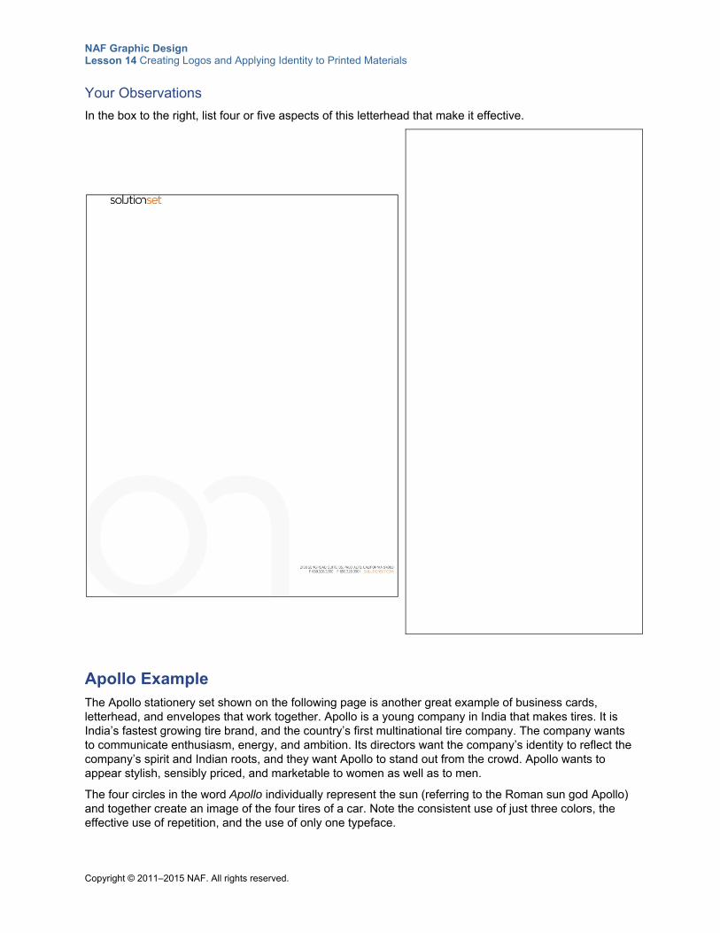
NAF Graphic Design Lesson 14 Creating Logos and Applying Identity to Printed Materials
Copyright © 2011–2015 NAF. All rights reserved.
Your Observations
In the box to the right, list four or five aspects of this letterhead that make it effective.
Apollo Example The Apollo stationery set shown on the following page is another great example of business cards, letterhead, and envelopes that work together. Apollo is a young company in India that makes tires. It is India’s fastest growing tire brand, and the country’s first multinational tire company. The company wants to communicate enthusiasm, energy, and ambition. Its directors want the company’s identity to reflect the company’s spirit and Indian roots, and they want Apollo to stand out from the crowd. Apollo wants to appear stylish, sensibly priced, and marketable to women as well as to men.
The four circles in the word Apollo individually represent the sun (referring to the Roman sun god Apollo) and together create an image of the four tires of a car. Note the consistent use of just three colors, the effective use of repetition, and the use of only one typeface.
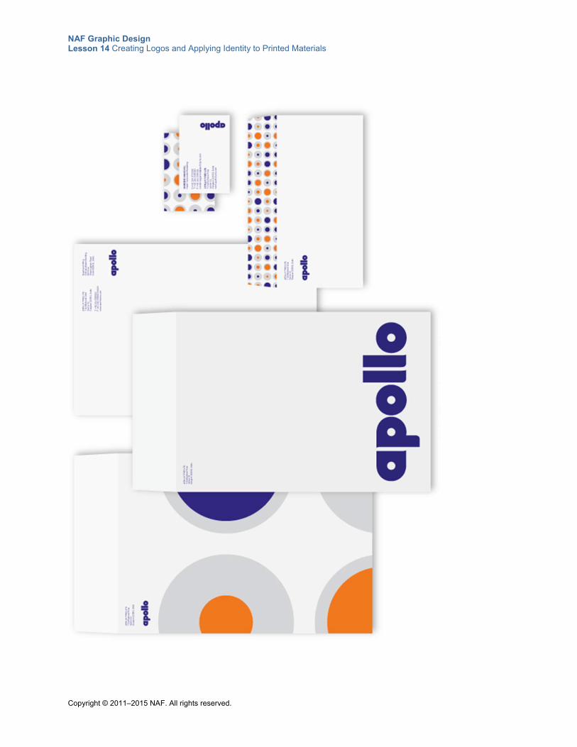
NAF Graphic Design Lesson 14 Creating Logos and Applying Identity to Printed Materials
Copyright © 2011–2015 NAF. All rights reserved.
NAF Graphic Design Lesson 14 Creating Logos and Applying Identity to Printed Materials
Copyright © 2011–2015 NAF. All rights reserved.
Student Resource 14.7
Assignment Sheet: Business Card and Letterhead
Directions: Using your identity design style guide, your logo, and the information in the “Mandatories” section of your creative brief as source material, create thumbnail sketches of every idea you can think of that might work for your business card and letterhead. Remember that your business card and letterhead must look like they belong together, so each time you create a thumbnail for a business card, you need a matching thumbnail for the letterhead. Choose the best of your thumbnails and create three roughs. Finally, take the rough that your client chooses and develop it into your final business card and letterhead design. Remember that your business card and letterhead must demonstrate your ability to apply everything you have learned about graphic design so far. In particular, pay attention to proximity, alignment, contrast, repetition, unity, and balance.
Thumbnail Sketches Create quick thumbnail sketches to explore as many ideas as possible.
Use these tips when creating thumbnails for your business card and letterhead:
Draw your thumbnails with pencil. You want quick, rough designs that approximate layouts and the placement of key elements. If you draw each thumbnail on a separate piece of paper, you can shuffle and compare ideas quickly. Draw a business card and a letterhead on each piece of paper. Be sure to include what the back side of your business card will look like.
Have each member of your team make at least three thumbnails. Creating lots of thumbnails is a quick way to rule out many design ideas without wasting time in Photoshop.
When you have a good stack of thumbnails, go through them as a team. Rule out the ideas that don’t work, and take the best ideas and put them together. As you make your choices, keep in mind that your business card and letterhead should match the style of your logo. For example, if your client chose a very modern style for the logo, your business card and letterhead roughs should also use a modern style.
Keep working at thumbnails until you have some ideas that pop. It’s okay to go back to the drawing board if you don’t come up with something you’re excited about the first round. You may find that in combining the ideas of your team, you are able to come up with something better.
When you have some ideas that you like that you think will work for the business card and letterhead, move on to the roughs. Even though you’ll be creating three roughs, you don’t need three totally separate ideas for the roughs. Your roughs can be variations on one idea that you really like, but they don’t have to be.
Roughs Work in Photoshop to create three roughs of your business card and letterhead. These do not need to be the finished product, but they need to be good enough to inspire the client to get excited about your ideas, and they need to have accurate information for the address, phone number, and so on. (This information should be listed in the “Mandatories” section of your creative brief.)
Your roughs should show:
Business card front and back sized to 3.5" x 2"
Letterhead sized to 8.5" x 11"
Exact fonts and font sizes (from your identity design style guide)
Exact colors (from your identity design style guide)
NAF Graphic Design Lesson 14 Creating Logos and Applying Identity to Printed Materials
Copyright © 2011–2015 NAF. All rights reserved.
Placement of all text
Placement and size of all graphic elements, including geometric shapes and lines
Final Business Card and Letterhead Based on the input you receive from your client, create your final business card and letterhead in Photoshop. Remember to pay attention to every detail. Triple-check all of the written information (address, phone, etc.) for accuracy, and ask your client to recheck it for accuracy. When you have a final version of the business card and letterhead, submit it to your client for final approval.
Make sure your assignment meets or exceeds the following assessment criteria:
Thumbnails show creativity and exploration of many different ideas.
Roughs provide the client with three well-designed options.
Color is used effectively, and the colors are consistent with the identity design style guide.
Typefaces are used effectively, and the typefaces are consistent with the identity design style guide.
The business card and letterhead demonstrate an understanding of the basic principles of graphic design: proximity, alignment, contrast, repetition, unity, and balance.
The visual hierarchy of the business card is such that the reader’s eye goes to the most important item first.
There is adequate white space on the business card, and adequate room for writing a letter on the letterhead.
The business card and letterhead are instantly recognizable as representing the business or organization.
The business card and letterhead are well suited to the target audience.
The final products are neat, clear, and precise. There are no grammatical or spelling errors, and all information is accurate.
The final business card and letterhead meet the client’s approval.
NAF Graphic Design Lesson 14 Creating Logos and Applying Identity to Printed Materials
Copyright © 2011–2015 NAF. All rights reserved.
Student Resource 14.8
Assignment Sheet: Additional Identity Design Item
Directions: Complete each section of this assignment sheet to create your additional identity design item. Be sure to use your identity design style guide, your creative brief, and your logo as source material.
Research Notes What do you learn by looking at similar design items from the competition?
Describe what is likely to make your design item attractive to your target audience.
What other questions do you need to research?
What additional information do you need from your client?
Thumbnail Sketches When you are satisfied that you have thoroughly researched the item you are designing, you are ready to move on to your thumbnails. Create quick thumbnail sketches to explore as many ideas as possible. You now have lots of experience creating thumbnails, so use the strategies that worked best for you and your group in the logo and business card assignments. As with your other design items, have each group member create three thumbnails, and then choose your three best thumbnails to create your roughs.
Roughs Work in Photoshop to create three roughs of your design. These do not need to be the finished product, but they need to be good enough to inspire the client to get excited about your ideas. If it is easier, some parts (such as a graphic element) can be hand-drawn in the roughs, and others computer generated.
NAF Graphic Design Lesson 14 Creating Logos and Applying Identity to Printed Materials
Copyright © 2011–2015 NAF. All rights reserved.
Your roughs should show:
Exact size of the final item
Exact fonts and font sizes (from your identity design style guide)
Exact colors (from your identity design style guide)
Placement of all text
Placement and size of all graphic elements, including geometric shapes and lines
Final Design Based on the input you receive from your client, create your final design in Photoshop. Remember to pay attention to every detail and apply all of the graphic design skills that you have learned. When you have a final version, submit it to your client for final approval.
Make sure your design meets or exceeds the following assessment criteria:
Thumbnails show creativity and exploration of many different ideas.
Roughs provide the client with three well-designed options.
Color is used effectively, and the colors are consistent with the identity design style guide.
Typefaces are used effectively, and the typefaces are consistent with the identity design style guide.
The design demonstrates an understanding of the basic principles of graphic design: proximity, alignment, contrast, repetition, unity, and balance.
The design is simple, memorable, and unique.
The design is well suited to the target audience.
The final product is neat, clear, and precise. There are no grammatical or spelling errors.
The final design meets the client’s approval.
Copyright © 2011–2015 NAF. All rights reserved.
NAF Graphic Design
Lesson 15 Exploring Graphic Design Careers and Learning from
Industry Experts This lesson introduces students to the types of employment available to job seekers looking for a position in the field of graphic design. It also describes the kinds of work that experienced job seekers look for, including working “in house” and working as a freelance designer. In addition, this lesson encourages students to consider their own goals and qualifications in the context of these positions. Students hear from a guest speaker who works in the industry.
This lesson also gives students an opportunity to learn more about putting together a professional portfolio, and they begin to make decisions about the final layout and content of their course portfolio.
Advance Preparation
Line up a guest speaker, or several guest speakers, to talk with your students during Class Period 2. The speakers should be industry professionals who are prepared to discuss their own job histories, the work they do now, and the qualities they look for in someone applying for an entry-level position. Tell the guests that the students will be asking lots of questions and that their visit will be interactive. Request that guest speakers bring a portfolio of their work if at all possible. Explain that this will serve as an example of a professional portfolio for students, who are assembling their own portfolios during this lesson. If possible, arrange to obtain a speaker through the local AIGA chapter, as this will get students interested in the professional organization as well as the career.
For Class Period 2, students need to bring to class all the materials they have collected in their portfolio during this course. You may want to inform them of this at the beginning of the lesson.
This lesson is expected to take 4 class periods.
NAF Graphic Design Lesson 15 Exploring Graphic Design Careers and Learning from Industry Experts
Copyright © 2011–2015 NAF. All rights reserved. - 2 -
Lesson Framework
Learning Objectives Each student will:
List the types of graphic design-related jobs that are available
Describe entry-level graphic design jobs and corresponding qualifications*
Evaluate which graphic design jobs are most suitable for him or her, based on personal interests and skills
Create a professional portfolio to present to a potential employer or to include in a school or scholarship application
*This is one of the 16 key learning objectives assessed by the NAFTrack Certification end-of-course exam for this course.
Academic Standards The relevant Common Core State Standards are too extensive to list here but are an important basis for this lesson. For details, please refer to the separate document “Correlations to the Common Core Standards” (available in the Course Planning Tools section of the course materials).
Use product or service design processes and guidelines to produce a quality information technology (IT) product or service (Common Career Technical Core 2012, IT 2)
Exhibit a positive attitude toward using technology that supports collaboration, learning, and productivity (ISTE NETS for Students 2007, 5b)
Assessment
Assessment Product Means of Assessment
Draft of a professional-style design portfolio (Student Resource 15.4)
Assessment Criteria: Portfolio Draft (Teacher Resource 15.2)
Prerequisites Ability to evaluate whether graphic design work adheres to the principles of design
Ability to evaluate whether graphic design work uses the elements of design (color, typography, images) appropriately
Thorough understanding of the basics of visual communication
Instructional Materials
Teacher Resources Teacher Resource 15.1, Guide: Qualifications and Skills
Teacher Resource 15.2, Assessment Criteria: Portfolio Draft
NAF Graphic Design Lesson 15 Exploring Graphic Design Careers and Learning from Industry Experts
Copyright © 2011–2015 NAF. All rights reserved. - 3 -
Teacher Resource 15.3, Key Vocabulary: Exploring Graphic Design Careers and Learning from Industry Experts
Teacher Resource 15.4, Bibliography: Exploring Graphic Design Careers and Learning from Industry Experts
Student Resources Student Resource 15.1, Reading: Graphic Design Employment Overview
Student Resource 15.2, Chart: Job Wish List
Student Resource 15.3, Planning Sheet: Developing Your Portfolio
Student Resource 15.4, Assignment: A Professional Portfolio
Equipment and Supplies Blackboard, whiteboard, or flip chart
Folders to serve as portfolio covers (black, if possible)
Sticky notes
Lesson Steps
Step Min. Activity
CLASS PERIOD 1
1 10 Think, Pair, Share: Considering Professional Roles
Students prepare to explore specific professional opportunities in the field of graphic design by recalling the skills they have learned throughout the course. They consider these roles in light of their own career ambitions. This activity focuses on the following college and career skill:
Developing awareness of one’s own abilities and performance
Explain to the students that this is the beginning of a new unit and that they will be shifting gears to look at careers. They will consider how to take what they have learned in this course and apply it to a professional role. This unit will also include the final presentation of their project, so remind them that they should be finishing that up outside of class.
Write these questions on the board or on a large sheet of paper on the wall:
What are the different kinds of graphic design projects you have worked on or
NAF Graphic Design Lesson 15 Exploring Graphic Design Careers and Learning from Industry Experts
Copyright © 2011–2015 NAF. All rights reserved. - 4 -
Step Min. Activity
heard about in this course? Do people create those kinds of projects in the work world? What kinds of jobs do they have?
What do you think would be the best part of working in graphic design? What do you think would be the most challenging?
Use Think, Pair, Share to develop students’ thinking on this topic:
1) Think: Have students write brief notes on each question in their notebook. 2) Pair: Ask students to talk about their ideas in pairs. They should compare their notes and identify any professional roles they have thought of. They should also consider their potentially different ideas about the pros and cons of working in the graphic design industry. 3) Share: Invite pairs to share their ideas with the rest of the class. You can do this in round-robin fashion, calling on each pair, or take volunteered answers. When the students have finished sharing, explain that this lesson will be about careers in graphic design, but that the skills they have learned can be applied to many other industries. Note that while students have heard a lot about graphic design, they are now going to learn more about specific careers in this field.
Point out to students that they will also be working on a professional graphic design portfolio during this lesson, as a means of showcasing the best of their work in a professional setting. Instruct students to bring all the materials they have collected in their portfolio during this course to the next class period.
2 30 Reading: Graphic Design Industry Employment Overview
This activity provides students with an overview of the many different graphic design jobs available and helps students to reflect further on jobs that might be right for them. Make sure that students understand that graphic design is essential in every industry, not just in the IT sector.
Review Student Resource 15.2, Chart: Job Wish List, with the students and answer any questions. Then ask them to read Student Resource 15.1, Reading: Graphic Design Employment Overview, and complete the Job Wish List as they read. Explain that this assignment will help them think about specific jobs that might interest them and the qualities they would need to succeed in these jobs. Tell them that they will be using this worksheet to help complete assignments in the next class period and later in this unit.
When the students have finished their reading and worksheet, pair them up and have them share with a partner. Once partners have had a few minutes to share, go around the room and ask each pair to share at least one job that they found appealing and explain why.
3 10 Group Discussion: Preparing to Meet an Industry Expert
This activity prepares students to take an active role during the visit of the industry expert(s).
Present a brief introduction of each visitor, including a description of the person’s role within the organization at which he or she works. Point out to students that this is an excellent opportunity to learn directly from people in the industry what the work is like
NAF Graphic Design Lesson 15 Exploring Graphic Design Careers and Learning from Industry Experts
Copyright © 2011–2015 NAF. All rights reserved. - 5 -
Step Min. Activity
for them, as well as to learn the qualities and experiences that are most important.
1. Ask students to take a moment to think about what they might ask this person, and then have them write down two or three questions in their notebooks.
2. Ask students to team up with a partner and share their questions. They should copy down any questions from their partner that they think are helpful.
3. During the last five minutes of class, go around the room and ask each pair to share one question they thought of. Encourage students to copy any good questions they hear into their notebook. Let the students know that you may call on any of them to ask the expert a question, so this list in their notebook is good preparation.
Make sure students understand that they are expected to take notes during the speaker’s visit. Have them start a new page in their notebook and label it with the guest speaker’s name and the date of the visit. Suggest that they plan to write down each question as it is asked, and then make notes on the important elements of the speaker’s response. Remind them that they should not aim to write down everything that the speaker says, but instead to focus on key points.
CLASS PERIOD 2
4 30 Group Discussion: Asking an Expert
This activity provides students with the opportunity to ask an industry expert questions and also challenges students to work on their public speaking skills.
Note: Depending on your situation, you may want to reserve an entire class period for this meeting with an industry expert.
Begin the class period by introducing the expert(s) you’ve invited. Ask class visitors to briefly describe their:
Position in the industry and responsibilities in this role
Work history and how they settled into their current position
Educational background and how educational experiences prepared them for work
Pathways that they or colleagues took to get into graphic design—what they studied in college, for instance
Soft skills such as work ethic, positive attitude, communication skills, time management, problem solving, and being a team player (which ones matter the most and why do they matter?)
Use these questions together with any additional questions that you think might help set context for your students.
After this introduction, ask the professionals to show their portfolio. Have them explain the pieces they have and why they chose those to be in their portfolio.
Next, invite the students to ask questions. If there are no volunteers, remind students to look at the list of questions they made in their notebook. Then ask for volunteers again. If there are still no volunteers, choose a student. Remind the student that it’s okay to use the questions everyone wrote down in their notebook.
NAF Graphic Design Lesson 15 Exploring Graphic Design Careers and Learning from Industry Experts
Copyright © 2011–2015 NAF. All rights reserved. - 6 -
Step Min. Activity
At the end of the visit, make sure students have time to thank the expert(s).
5 20 Pre-Assessment: Organizing Your Portfolio for Presentation
In this activity, students prepare to compile their course portfolio by learning about industry expectations for portfolios.
Explain to students that in this activity, they will learn how to best organize all of the items they have collected for their portfolio during this course. Later in the lesson, they will create a mock-up of a portfolio they could present at a job interview and submit it for assessment.
Review Student Resource 15.3, Planning Sheet: Developing Your Portfolio, with the class. Explain that this resource will give them information about how to develop their portfolio; it also includes questions for them to think about and answer while they read.
Let students know that they will be starting to compile their portfolios in the next class period. Ask them to begin reading and responding to this worksheet now and to finish it for homework. Remind them to come to the next class period with every graphic design piece they might consider including in their portfolio.
Note: If your students have been assembling an online portfolio during this course, ask them to bring their online portfolio to the next class period. You may have to adapt some of the activities to accommodate online portfolios.
CLASS PERIOD 3
6 20 List, Group, Label: Job Qualifications
This activity uses List, Group, Label to develop students’ ideas about the job qualifications they consider important. (See The NAF Learning Handbook for more information about this strategy.)
Write this prompt on the board:
List the personal and professional qualifications that you think would ensure success in the graphic design industry.
Have students brainstorm anything they can think of that would apply to the prompt and list all the ideas on the board. See Teacher Resource 15.1, Guide: Qualifications and Skills, for a list of qualifications and characteristics the students should identify. If possible, instruct students to refer to the list of graphic design skills they made in Lesson 2 of this course (see Student Resource 2.6, Skills Analysis: Skills of Graphic Designers). How has the list they developed at the beginning of the course evolved?
If students have trouble coming up with ideas, suggest that they think about one of the particular jobs on their Job Wish List (Student Resource 15.2, Chart: Job Wish List). Then ask the whole class to suggest skills or knowledge a person might need to succeed in that job.
Once the class has listed 15 to 30 of these qualifications, guide students to organize the qualifications into the following groups:
NAF Graphic Design Lesson 15 Exploring Graphic Design Careers and Learning from Industry Experts
Copyright © 2011–2015 NAF. All rights reserved. - 7 -
Step Min. Activity
Skills
Knowledge
Personal Characteristics
Experience
Next, put students in small groups. Ask them to look over the groups of qualifications and answer one of the following questions, depending on their experience:
If they have already completed their internship: ask students to identify which qualities were the most helpful during the internship. Which qualities did they develop or improve upon during their internship?
If they have not completed their internship: ask them to identify which qualities they think will be the most useful.
While the students discuss, circulate around the classroom, answering any questions and checking Student Resource 15.2, Chart: Job Wish List, to make sure it is complete.
Point out to students that knowing one’s own strengths, skills, and relevant experiences is a necessary first step before applying for a job.
7 30 Assignment: Organizing Your Portfolio for Presentation
In this activity, students create a mock-up of a design portfolio they could take to an interview. This activity focuses on the following college and career skills:
Utilizing time efficiently when managing complex tasks
Developing awareness of one’s own abilities and performance
Begin by reviewing the homework reading and asking students to think about the following prompts:
One really useful tip from the reading/chart was…
One question I still have about the reading/chart is…
Call on volunteers to share their response to one of the prompts. Take this opportunity to clear up any misunderstandings.
Next, review Student Resource 15.4, Assignment: A Professional Portfolio, with the students. Explain that this assignment sheet walks them through the steps of creating a mock-up of their portfolio. Explain that this is a mock-up rather than a complete portfolio, because they probably have some work they still need to do to revise some of their designs or to create pieces that would show off skills they have learned that aren’t yet represented in their work.
Ask students to read through the assignment sheet, paying special attention to the assessment criteria at the end. Answer any questions students have about what they need to include in their mock-up portfolio or how it will be assessed. Be sure to clarify that students are not required to have a professional cover or professional mountings for the portfolio they submit for assessment, because of the cost involved. Point out that they should think about investing in a professional cover and mountings before they present their portfolio to a potential employer.
Emphasize that students need to get their portfolio mock-up finished in the next class period, so they need to use their time efficiently, and they will need to do some of the
NAF Graphic Design Lesson 15 Exploring Graphic Design Careers and Learning from Industry Experts
Copyright © 2011–2015 NAF. All rights reserved. - 8 -
Step Min. Activity
work for homework. You may want to suggest that students do their written introduction for homework. Circulate around the classroom, answering questions and keeping students on task.
CLASS PERIOD 4
8 35 Assignment: Organizing Your Portfolio for Presentation (Continued)
In this activity, students complete their portfolio mock-up.
Tell students to get right to work on the remaining pieces of their portfolio. Answer any questions students have as they begin working, and make sure everyone is clear on what they need to complete and submit for assessment.
9 15 Peer Review: Student Portfolios
In this activity, students get peer feedback on their in-progress work.
When approximately 15 minutes remain in class, pair students up and ask them to look over their partner’s work. Instruct students to give their partner feedback using the following prompts, which may be posted on the board or a sheet of chart paper:
Two things I like/I think you are doing well are…
Two things I think you need to work on more are…
Encourage students to pay attention to their partner’s feedback. Remind them that being able to learn from feedback or criticism is an important skill that people will look for in a professional designer.
Finish up the class period with a quick vote. Ask students to raise their hand if they feel very confident about their portfolio work. Then ask students to raise their hand if they feel okay about their portfolio but still think it needs some work. Then ask students to raise their hand if they are very worried or think their portfolio needs a lot of work. Make note of students who are very worried and try to meet with them to provide extra guidance.
At the end of the class period, collect the portfolio assignments. If students need more time, tell them they can complete their mock-up portfolio for homework and submit it at the beginning of the next class period. Assess the portfolios using Teacher Resource 15.2, Assessment Criteria: Portfolio Draft.
Extensions
Enrichment As a Work-Based Learning (WBL) activity, practice role-playing a successful internship interview.
Ask students to get into pairs and have them role-play a few questions and answers from a successful internship interview. Have one student in each pair select the mock company and
NAF Graphic Design Lesson 15 Exploring Graphic Design Careers and Learning from Industry Experts
Copyright © 2011–2015 NAF. All rights reserved. - 9 -
position, and explain to the other students that their goal when being interviewed is to put forth key information about themselves that will land them that specific internship.
Before students begin, review the elements of a successful interview, including clear articulation of the interviewee’s skills and compatibility for both the internship position and the work environment. Remind students that they will not be the only qualified candidate for the job. What can they do to make themselves stand out? Some example questions to get student interviews started include:
o What do you know about this organization?
o Why are you interested in this internship?
o Tell me about a class project you worked on, how the project turned out, and what you learned that might be applicable to this internship?
If you’d like to expand on this activity, or for additional interview questions, see the Mock Interview Planning Timeline in the WBL resources of NAF’s Academy Support Hub.
Ask students to read the article “Ten Common Mistakes in Résumés and Cover Letters” (http://www.aiga.org/content.cfm/resume-common-mistakes?searchtext=job%20description), which refers to graphic design jobs, and to apply what they learn to their resume and cover letter.
Have students read the article “A Guide to Internships” (http://www.aiga.org/content.cfm/a-guide-to-internships?searchtext=job%20description) and report back to the class.
Have students read “How to Find Your First Design Job” (http://www.aiga.org/content.cfm/guide-findfirstjob) and report back to the class.
Introduce students to some of the self-evaluation tools designed to help people choose a career, such as those in What Color Is Your Parachute? Select a tool (or tools) appropriate for your students and have the students complete the tool in the classroom. To find further career resources, check with your school’s career or college office, if one exists.
Ask a member of the NAF academy advisory board to visit the class and conduct an interviewing workshop, including holding mock interviews, if possible. These may be videotaped for evaluation.
Select three to four good examples of professional graphic design portfolios for students to view online, and ask students to report back to the class about new ideas they have discovered that they can use for their portfolio. Ideally, it would be good to use portfolios of local designers or AIGA members, particularly ones that may be willing to serve as guest speakers or participate in the course in some way. If that is not feasible, the AIGA member gallery (http://portfolios.aiga.org/?content=users&sort=featured_date&time=all&page=1) is another source for high-quality portfolios.
Technology Integration Have students start their own online portfolio using a free service like Behance:
https://www.behance.net/welcome
Cross-Curricular Integration English Language Arts, Drama: Team up with other teachers to simulate job fairs and interview
situations. The more varied, expert feedback and encouragement the students receive on their “performances,” the more skilled at interviewing they will become. Ideally, videotape students and offer constructive criticism to improve their presentations of themselves to potential employers.
English Language Arts, Social Studies: Have students conduct “interviews” with characters from literature or with historical figures. Let students work in groups to write questions for the interviewee. Then ask them to write out a script between themselves (as interviewer) and the historical or literary figure. These can also be performed in class.

NAF Graphic Design Lesson 15 Exploring Graphic Design Careers and Learning from Industry Experts
Copyright © 2011–2015 NAF. All rights reserved. - 10
-
Mathematics: Demonstrate how salaries compound over time by having students calculate annual raises. For example, ask them to compare starting salaries of $25,000 and of $40,000, assuming 5% increases each year.
Copyright 2011–2015 NAF. All rights reserved.
NAF Graphic Design
Lesson 15 Exploring Graphic Design Careers and Learning from
Industry Experts
Teacher Resources
Resource Description
Teacher Resource 15.1 Guide: Qualifications and Skills
Teacher Resource 15.2 Assessment Criteria: Portfolio Draft
Teacher Resource 15.3 Key Vocabulary: Exploring Graphic Design Careers and Learning from Industry Experts
Teacher Resource 15.4 Bibliography: Exploring Graphic Design Careers and Learning from Industry Experts
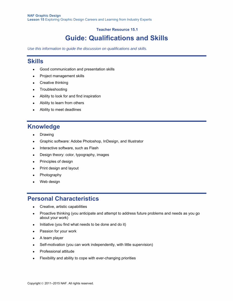
NAF Graphic Design Lesson 15 Exploring Graphic Design Careers and Learning from Industry Experts
Copyright 2011–2015 NAF. All rights reserved.
Teacher Resource 15.1
Guide: Qualifications and Skills
Use this information to guide the discussion on qualifications and skills.
Skills Good communication and presentation skills
Project management skills
Creative thinking
Troubleshooting
Ability to look for and find inspiration
Ability to learn from others
Ability to meet deadlines
Knowledge Drawing
Graphic software: Adobe Photoshop, InDesign, and Illustrator
Interactive software, such as Flash
Design theory: color, typography, images
Principles of design
Print design and layout
Photography
Web design
Personal Characteristics Creative, artistic capabilities
Proactive thinking (you anticipate and attempt to address future problems and needs as you go about your work)
Initiative (you find what needs to be done and do it)
Passion for your work
A team player
Self-motivation (you can work independently, with little supervision)
Professional attitude
Flexibility and ability to cope with ever-changing priorities
NAF Graphic Design Lesson 15 Exploring Graphic Design Careers and Learning from Industry Experts
Copyright 2011–2015 NAF. All rights reserved.
Experience Many companies place great value on hands-on experience—even a summer job or internship.
Your design portfolio demonstrates what you can do.
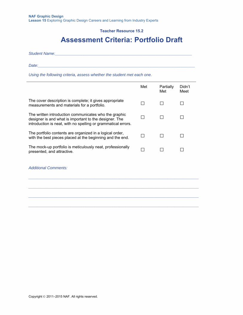
NAF Graphic Design Lesson 15 Exploring Graphic Design Careers and Learning from Industry Experts
Copyright 2011–2015 NAF. All rights reserved.
Teacher Resource 15.2
Assessment Criteria: Portfolio Draft
Student Name:______________________________________________________________
Date:_______________________________________________________________________
Using the following criteria, assess whether the student met each one.
Met Partially Met
Didn’t Meet
The cover description is complete; it gives appropriate measurements and materials for a portfolio.
□ □ □
The written introduction communicates who the graphic designer is and what is important to the designer. The introduction is neat, with no spelling or grammatical errors.
□ □ □
The portfolio contents are organized in a logical order, with the best pieces placed at the beginning and the end.
□ □ □
The mock-up portfolio is meticulously neat, professionally presented, and attractive.
□ □ □
Additional Comments:
_____________________________________________________________________________
_____________________________________________________________________________
_____________________________________________________________________________
_____________________________________________________________________________
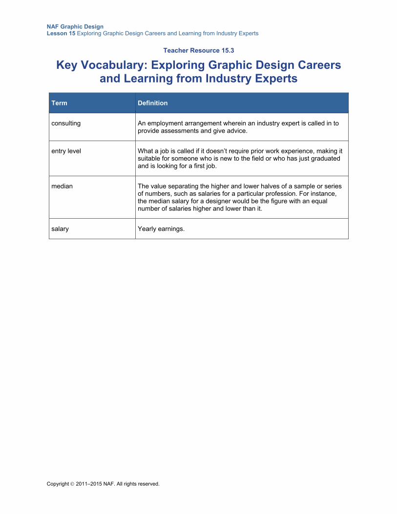
NAF Graphic Design Lesson 15 Exploring Graphic Design Careers and Learning from Industry Experts
Copyright 2011–2015 NAF. All rights reserved.
Teacher Resource 15.3
Key Vocabulary: Exploring Graphic Design Careers and Learning from Industry Experts
Term Definition
consulting An employment arrangement wherein an industry expert is called in to provide assessments and give advice.
entry level What a job is called if it doesn’t require prior work experience, making it suitable for someone who is new to the field or who has just graduated and is looking for a first job.
median The value separating the higher and lower halves of a sample or series of numbers, such as salaries for a particular profession. For instance, the median salary for a designer would be the figure with an equal number of salaries higher and lower than it.
salary Yearly earnings.
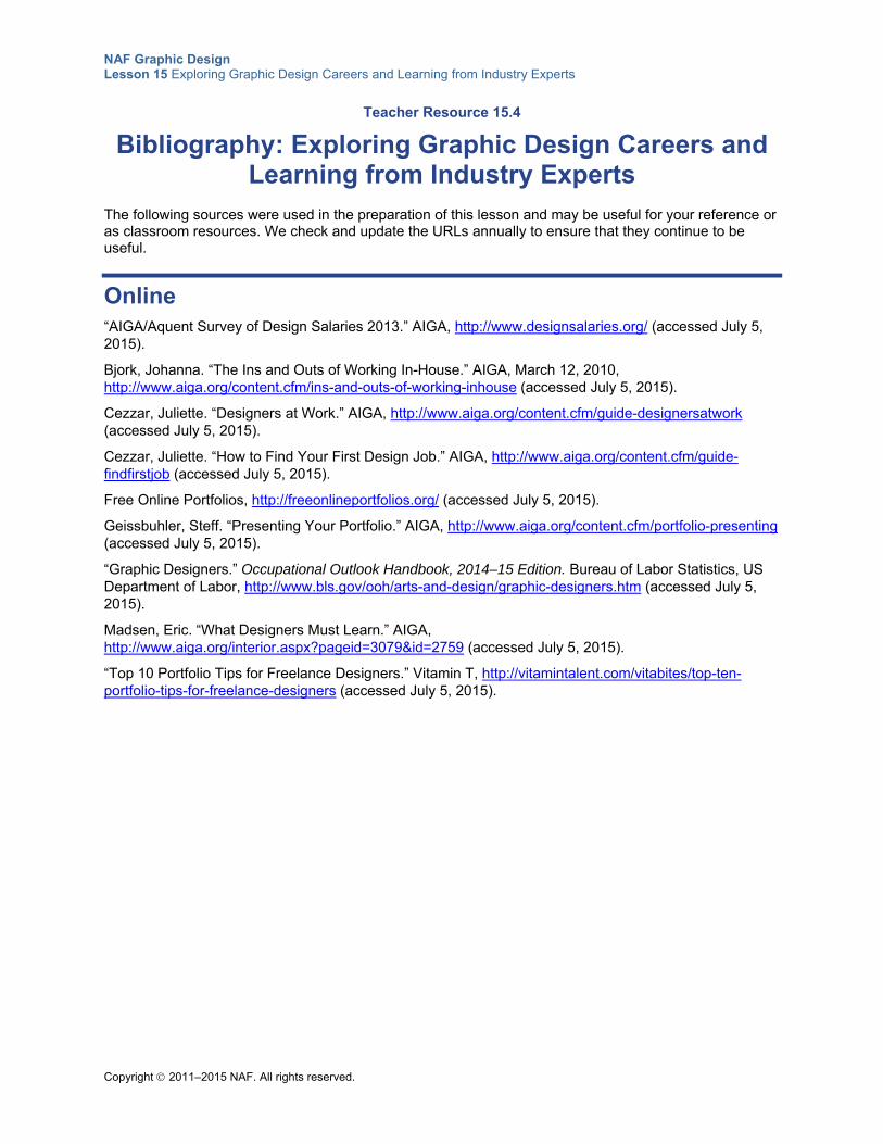
NAF Graphic Design Lesson 15 Exploring Graphic Design Careers and Learning from Industry Experts
Copyright 2011–2015 NAF. All rights reserved.
Teacher Resource 15.4
Bibliography: Exploring Graphic Design Careers and Learning from Industry Experts
The following sources were used in the preparation of this lesson and may be useful for your reference or as classroom resources. We check and update the URLs annually to ensure that they continue to be useful.
Online “AIGA/Aquent Survey of Design Salaries 2013.” AIGA, http://www.designsalaries.org/ (accessed July 5, 2015).
Bjork, Johanna. “The Ins and Outs of Working In-House.” AIGA, March 12, 2010, http://www.aiga.org/content.cfm/ins-and-outs-of-working-inhouse (accessed July 5, 2015).
Cezzar, Juliette. “Designers at Work.” AIGA, http://www.aiga.org/content.cfm/guide-designersatwork (accessed July 5, 2015).
Cezzar, Juliette. “How to Find Your First Design Job.” AIGA, http://www.aiga.org/content.cfm/guide-findfirstjob (accessed July 5, 2015).
Free Online Portfolios, http://freeonlineportfolios.org/ (accessed July 5, 2015).
Geissbuhler, Steff. “Presenting Your Portfolio.” AIGA, http://www.aiga.org/content.cfm/portfolio-presenting (accessed July 5, 2015).
“Graphic Designers.” Occupational Outlook Handbook, 2014–15 Edition. Bureau of Labor Statistics, US Department of Labor, http://www.bls.gov/ooh/arts-and-design/graphic-designers.htm (accessed July 5, 2015).
Madsen, Eric. “What Designers Must Learn.” AIGA, http://www.aiga.org/interior.aspx?pageid=3079&id=2759 (accessed July 5, 2015).
“Top 10 Portfolio Tips for Freelance Designers.” Vitamin T, http://vitamintalent.com/vitabites/top-ten-portfolio-tips-for-freelance-designers (accessed July 5, 2015).
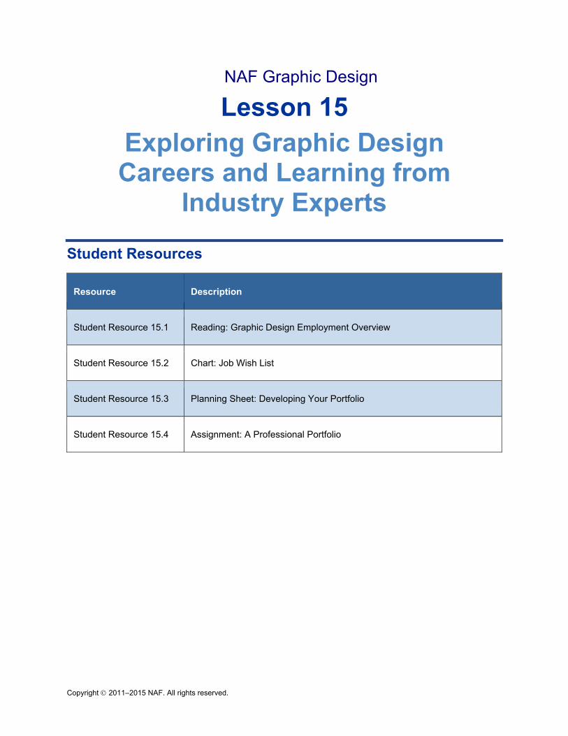
Copyright 2011–2015 NAF. All rights reserved.
NAF Graphic Design
Lesson 15 Exploring Graphic Design Careers and Learning from
Industry Experts
Student Resources
Resource Description
Student Resource 15.1 Reading: Graphic Design Employment Overview
Student Resource 15.2 Chart: Job Wish List
Student Resource 15.3 Planning Sheet: Developing Your Portfolio
Student Resource 15.4 Assignment: A Professional Portfolio
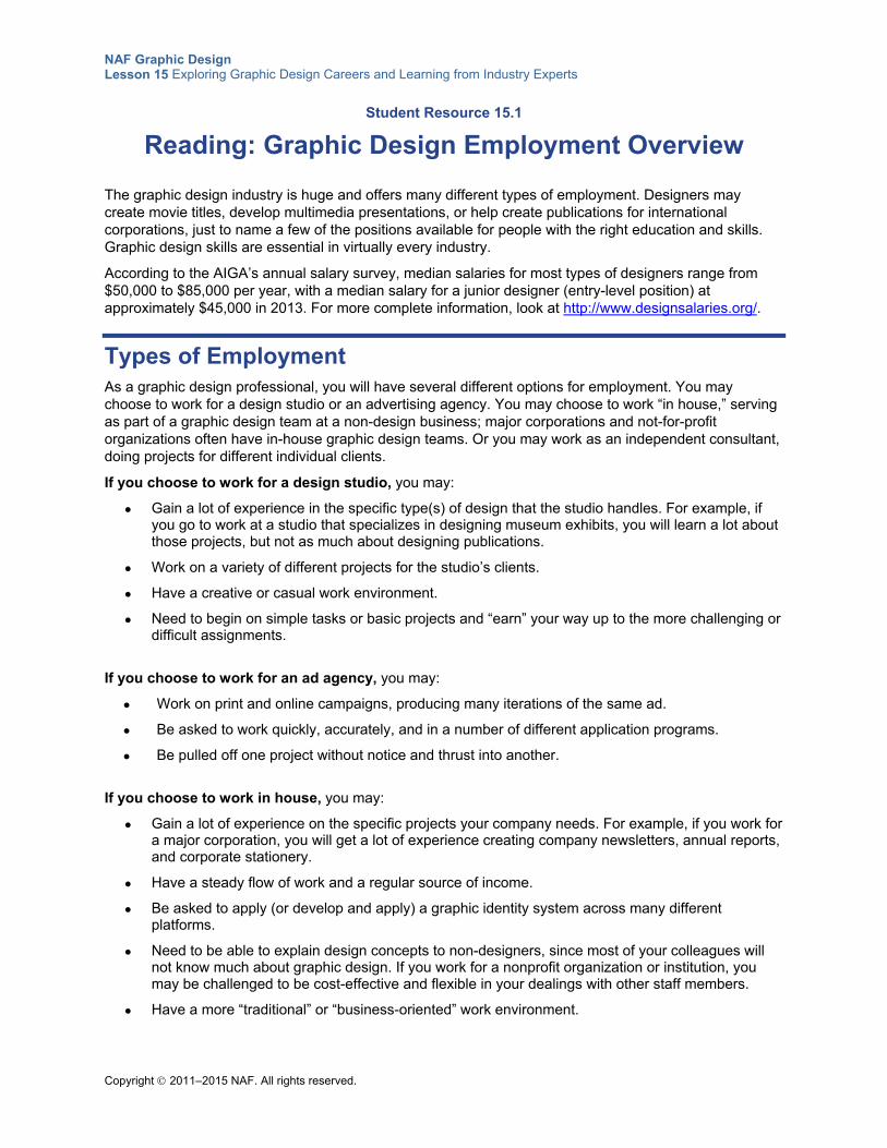
NAF Graphic Design Lesson 15 Exploring Graphic Design Careers and Learning from Industry Experts
Copyright 2011–2015 NAF. All rights reserved.
Student Resource 15.1
Reading: Graphic Design Employment Overview
The graphic design industry is huge and offers many different types of employment. Designers may create movie titles, develop multimedia presentations, or help create publications for international corporations, just to name a few of the positions available for people with the right education and skills. Graphic design skills are essential in virtually every industry.
According to the AIGA’s annual salary survey, median salaries for most types of designers range from $50,000 to $85,000 per year, with a median salary for a junior designer (entry-level position) at approximately $45,000 in 2013. For more complete information, look at http://www.designsalaries.org/.
Types of Employment As a graphic design professional, you will have several different options for employment. You may choose to work for a design studio or an advertising agency. You may choose to work “in house,” serving as part of a graphic design team at a non-design business; major corporations and not-for-profit organizations often have in-house graphic design teams. Or you may work as an independent consultant, doing projects for different individual clients.
If you choose to work for a design studio, you may:
Gain a lot of experience in the specific type(s) of design that the studio handles. For example, if you go to work at a studio that specializes in designing museum exhibits, you will learn a lot about those projects, but not as much about designing publications.
Work on a variety of different projects for the studio’s clients.
Have a creative or casual work environment.
Need to begin on simple tasks or basic projects and “earn” your way up to the more challenging or difficult assignments.
If you choose to work for an ad agency, you may:
Work on print and online campaigns, producing many iterations of the same ad.
Be asked to work quickly, accurately, and in a number of different application programs.
Be pulled off one project without notice and thrust into another.
If you choose to work in house, you may:
Gain a lot of experience on the specific projects your company needs. For example, if you work for a major corporation, you will get a lot of experience creating company newsletters, annual reports, and corporate stationery.
Have a steady flow of work and a regular source of income.
Be asked to apply (or develop and apply) a graphic identity system across many different platforms.
Need to be able to explain design concepts to non-designers, since most of your colleagues will not know much about graphic design. If you work for a nonprofit organization or institution, you may be challenged to be cost-effective and flexible in your dealings with other staff members.
Have a more “traditional” or “business-oriented” work environment.
NAF Graphic Design Lesson 15 Exploring Graphic Design Careers and Learning from Industry Experts
Copyright 2011–2015 NAF. All rights reserved.
If you work as an independent consultant, you may:
Be asked to handle projects and assignments for many different companies in many different industries.
Specialize in one type of work, such as multimedia design.
Be asked to produce work for a variety of different contexts, using a broad range of software.
Work in a “feast or famine” environment, taking work when it’s there, and adjusting to slow periods, as well.
Work on one project for a specific period of time, like six months, and then go on to another project.
Need to be able to find your own clients and promote your own work.
Specializations within Graphic Design Once you have determined which kind of company you’d like to work for, you need to think about what kind of job you’d like to have. There are lots of possibilities out there. Here are some of the most common jobs:
Interactive Designer: Many graphic designers today work on interactive or multimedia projects, designing websites or giving advice on the visual appearance and layout of computer programs. This job requires strong graphic design skills as well as a good understanding of computer technology and the limitations (and opportunities) of designing for the online space.
UX Designer (User Experience Designer):UX designers are concerned with how an online product feels to the user. They are primarily responsible for enabling the user to move smoothly from one step to another within a website, app, or piece of software.
UI Designer (User Interface Designer): Unlike UX designers, who are concerned with the overall feel of an online product, UI designers are responsible for how the product is laid out. For example, a UI designer who is creating a dashboard might decide to put the most important content at the top, or decide which kind of buttons or sliders are best for the user. UI designers are also responsible for maintaining the consistency of visuals and language across the entire product.
Type Designer: Have you ever noticed how many different fonts there are in a program like Microsoft Word? Any time type is used—in a book or magazine, on a website, on a sign—someone needs to choose a font or design a font with a specific look. Type designers specialize in these projects. They need to think about what the design communicates: is it formal or casual, traditional or funky? Type designers need to have a good sense of structure, because all the letters in a typeface need to have a unified look. Type designers also need a lot of patience, because this is very detail-oriented work.
Publication Designer: A lot of graphic designers work on publications. Publication design may involve working on a magazine, developing corporate letters or annual reports for a major business, helping a not-for-profit organization create a fundraising brochure, or developing a new textbook for students to read in school. Many publications need a logical system and a cohesive overall design; for example, a textbook may also have a matching workbook and a teacher’s guide to accompany it, and all three need to work together effectively. Publication designers need a good sense of systems design as well as the ability to blend together text, images, charts, graphs, and other elements creatively.
Identity Designer: Most businesses have a corporate logo, something that represents their business on everything from a matchbook to the sign in front of the building. Identity designers specialize in creating these memorable images. An identity graphic needs to be clear, easy to recognize, flexible enough to be used in many different ways, and, above all, expressive of the business or organization it represents. Identity designers need to be very skilled at manipulating and making subtle changes in typeface and
NAF Graphic Design Lesson 15 Exploring Graphic Design Careers and Learning from Industry Experts
Copyright 2011–2015 NAF. All rights reserved.
visual imagery. They also need to be good communicators, since they will need a lot of input from their clients in order to create an effective identity design.
Advertising Designer: An advertising design job blends psychology, marketing, and creativity. Although many advertising design professionals focus their energy on the creative end of the spectrum, psychology and marketing often spill over into their everyday work. Artistic talent is the most obvious trait that advertising designers should possess. Having a good portfolio that demonstrates your skill and creativity will help you get noticed by prospective employers. Advertising designers also need good communication skills. Knowing your target audience and how to talk to them is a critical piece of advertising design. Your marketing skill and knowledge of customer psychology will play an important role in helping you get a message out to consumers. Aspiring ad designers also need to thrive in a competitive environment. The advertising industry is highly competitive. While the pressure may not be as extreme for designers as it is for people in other ad agency positions, you will most likely be working under deadlines with people who are under pressure.
Production Artist: Often hired by ad agencies, production artists take rough layouts, made by creative directors or designers, and produce final print- or online-ready art using a variety of software applications. Expectations are high, deadlines are tight, and precision is demanded.
Film/Television Designer: When you’re watching a movie or TV show, you probably aren’t paying a lot of attention to the titles and credits that appear on the screen. But designing those titles is an important job. Just imagine what would happen if you started watching a scary movie and the titles were done in bright colors and animated with singing birds and characters that looked like they came out of a children’s movie. It wouldn’t work, would it? Title designers use their graphic design skills to set the mood of the film or TV show from the very beginning. People who design titles and such are likely to use After Effects, Motion, and other animation and motion graphics programs, in addition to Photoshop and possibly Adobe Illustrator. Some designers also work on special effects for movies or TV shows.
Exhibit Designer: Many museums hire designers to help them plan their exhibits. A really effective museum exhibit can make a “boring” topic exciting for the visitor. The designer needs to think about how to organize the exhibit: what items to display where, and how to guide visitors through the exhibit. Sure, the museum could just stick a bunch of historical photographs on a wall. But what if the photos were enlarged to life-size and projected on a screen? And maybe some music could be playing, music from that historical time period? Now the exhibit has really “come to life.” Exhibit designers need to be good listeners, because they need to be able to listen to experts explain the importance of the items in the exhibit. They need to be good at thinking of creative ways to demonstrate information like charts, graphs, and statistics. They have to be able to create a story out of many different details or items, so these designers tend to be comfortable with complexity. Exhibit designers should be knowledgeable about and enjoy working with a variety of physical materials like wood, metal, and glass, as well as comfortable creating in multimedia contexts like audio, video, and interactive learning. Skill with three-dimensional design is an asset in this field. These designers may enjoy modeling, sculpting, or applied art, and they are good at framing and visual composition.
Signage Designer: If you have ever visited a strange city, explored a museum, or tried to find your way through a giant sports arena, you have experienced the work of a signage designer. These people work on ways to guide visitors through large spaces. A signage designer must become very familiar with the location and develop a plan for how to guide people through it. Once the plan is agreed upon, the designer must create signs that are easy to read and have a unified design that is appropriate for the location. Signage designers must be good at designing systems and planning; they also need to be skilled at working with typefaces, colors, and various physical materials, and they may be good at modeling.
Packaging Designer: When someone buys a bag of chips or a new computer, that purchase comes in a package. Designing those packages is the job of a graphic designer. The packaging serves two purposes: it protects the product and it also encourages more people to buy the product. The packaging should be attractive and its design should suit the design of the product. In other words, if the product is designed to be sleek and modern, it should be in a sleek, modern box. Some packaging designers also
NAF Graphic Design Lesson 15 Exploring Graphic Design Careers and Learning from Industry Experts
Copyright 2011–2015 NAF. All rights reserved.
create the in-store displays where items are sold. Packaging designers tend to be good at three-dimensional design as well as designing systems. Packaging designers need to understand complex printing and manufacturing requirements, including some legal mandatories.
Environmental Designer: Environmental designers have some of the same jobs as a signage designer, but their work includes more than just the signs. Environmental designers create a unified sense of place through signs and through two-dimensional and three-dimensional structures. Large events, such as the Olympic Games, need to have a consistent design that makes many different venues feel like part of the same overall event. Environmental designers frequently work on very large projects, so they need to be very organized and able to keep track of many different elements. They are also likely to be good at many different types of design, including typeface, signage, modeling, and identity design.
Strategic Design Planner: Like an environmental designer, a strategic design planner focuses on the big picture. But while an environmental designer might work on a big event, like the Olympics, strategic designers work on large-scale projects that may shape an entire industry; for example, helping to develop a new design for a school, a mall, or a business. They may work with architects and other experts. Their goal is to organize many different types of design into one unified project. Strategic designers need to be very comfortable with complexity, and they need to be extremely organized.
Game Environment Designer (or Level Designer): A level designer is a game designer who creates environments and scenarios for games. This person is called a level designer because he or she uses a level editor. (Level editors are produced by game programmers.) Many level designers have skills as both visual artists and game designers. In addition to making the environments the players inhabit in the game, a level designer may also work on enemy or nonplayer character placement and scripted storyline events. They may also write high-level code, altering game rules or scoring.
Creative Director: A creative director oversees the creative team as it develops creative products for clients. The team includes copywriters and designers. The creative director also works with executives to make sure the client’s needs are being met and the creative goals are on track. Creative directors assign projects to staff and make sure all deadlines are met.
Design Executive: If you have both strong design skills and a good head for business, you may build up a career as a design executive. This could mean running your own design studio, or it could mean serving as the head of graphic design for a major corporation. This is not an entry-level position; it takes years to become a design executive. Design executives are good at balancing the creative needs of a design with the needs of the business as a whole; they are excellent communicators who can work with both creative and noncreative individuals. Executives need a lot of experience in design because they hire or supervise other designers, and they also need some experience in the business world so that they understand the needs of their business colleagues. Becoming a design executive isn’t easy, but it can be very exciting and very financially rewarding.
Getting Started Any career in graphic design requires basic computer skills and competencies, as well as some basic understanding of art concepts. Getting one or more internships can be extremely valuable, because it will expose you to what it’s like to work in a design studio or as an in-house graphic design professional.
You need to focus on developing your portfolio, because when you apply for a job, your portfolio is going to be one of the most important factors in helping you land it. You will need an online portfolio as well as a physical portfolio. Seek out projects you can do to add to your portfolio, and look for opportunities to get your portfolio evaluated by professional graphic designers and graphic design teachers.
Take any art and graphic design classes offered at your school; you may also wish to explore art courses at local community colleges. A bachelor’s degree in graphic design is usually required for entry-level designer jobs; by taking art courses in high school, you will be prepared to study graphic design in college. A bachelor’s degree in graphic design may include courses in principles of design, website

NAF Graphic Design Lesson 15 Exploring Graphic Design Careers and Learning from Industry Experts
Copyright 2011–2015 NAF. All rights reserved.
design, and commercial printing techniques. For assistant designer positions or positions that require technical skills only, you can get an associate’s degree or complete a two- to three-year training program rather than a bachelor’s. However, to reach the top jobs or work on the most significant projects, you will need a bachelor’s degree as well as a strong portfolio and years of experience. Strong grades in high school, not to mention good grades in your NAF academy, will help you get into a good college program, which in turn can help you get the right internship or entry-level job to start you off in the graphic design industry.
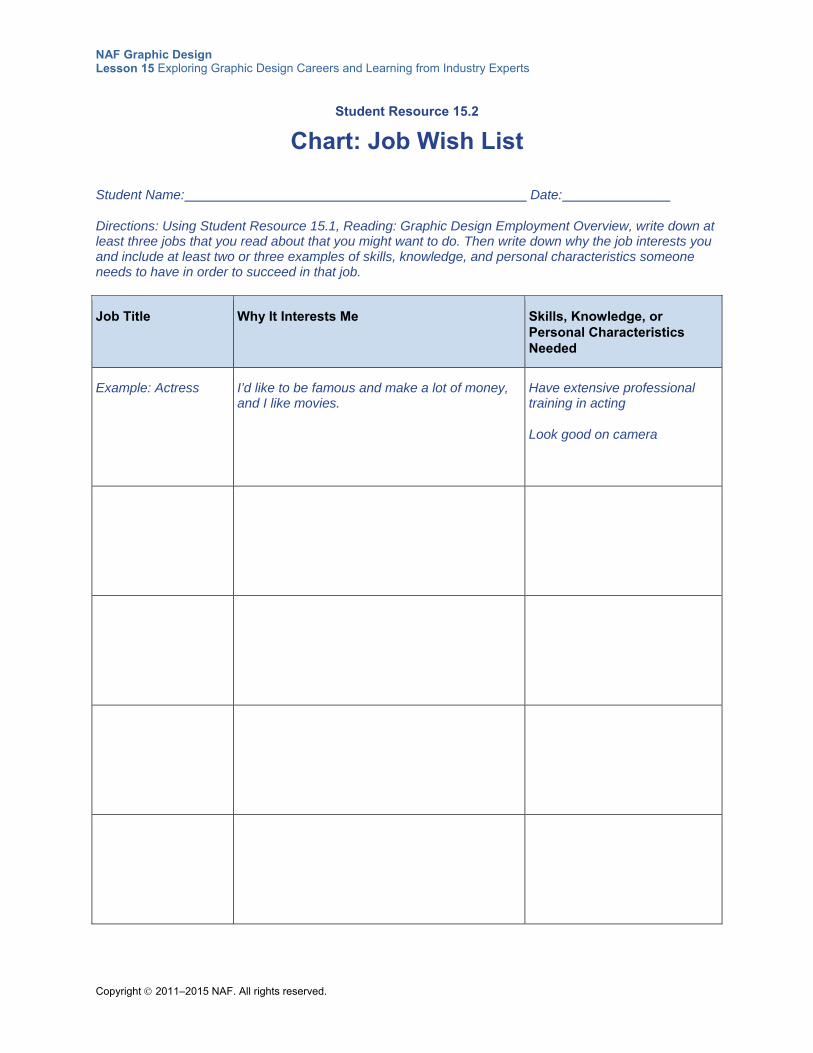
NAF Graphic Design Lesson 15 Exploring Graphic Design Careers and Learning from Industry Experts
Copyright 2011–2015 NAF. All rights reserved.
Student Resource 15.2
Chart: Job Wish List
Student Name: Date:
Directions: Using Student Resource 15.1, Reading: Graphic Design Employment Overview, write down at least three jobs that you read about that you might want to do. Then write down why the job interests you and include at least two or three examples of skills, knowledge, and personal characteristics someone needs to have in order to succeed in that job.
Job Title Why It Interests Me Skills, Knowledge, or Personal Characteristics Needed
Example: Actress
I’d like to be famous and make a lot of money, and I like movies.
Have extensive professional training in acting
Look good on camera
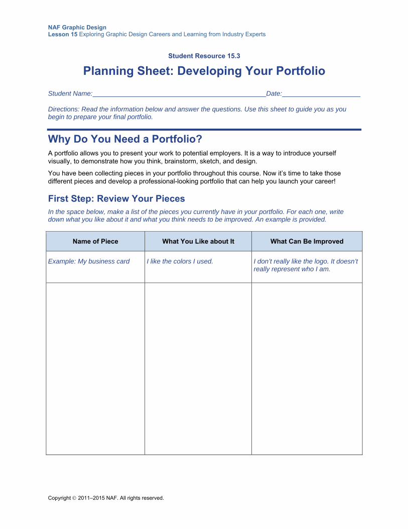
NAF Graphic Design Lesson 15 Exploring Graphic Design Careers and Learning from Industry Experts
Copyright 2011–2015 NAF. All rights reserved.
Student Resource 15.3
Planning Sheet: Developing Your Portfolio
Student Name: Date:
Directions: Read the information below and answer the questions. Use this sheet to guide you as you begin to prepare your final portfolio.
Why Do You Need a Portfolio? A portfolio allows you to present your work to potential employers. It is a way to introduce yourself visually, to demonstrate how you think, brainstorm, sketch, and design.
You have been collecting pieces in your portfolio throughout this course. Now it’s time to take those different pieces and develop a professional-looking portfolio that can help you launch your career!
First Step: Review Your Pieces In the space below, make a list of the pieces you currently have in your portfolio. For each one, write down what you like about it and what you think needs to be improved. An example is provided.
Name of Piece What You Like about It What Can Be Improved
Example: My business card I like the colors I used. I don’t really like the logo. It doesn’t really represent who I am.
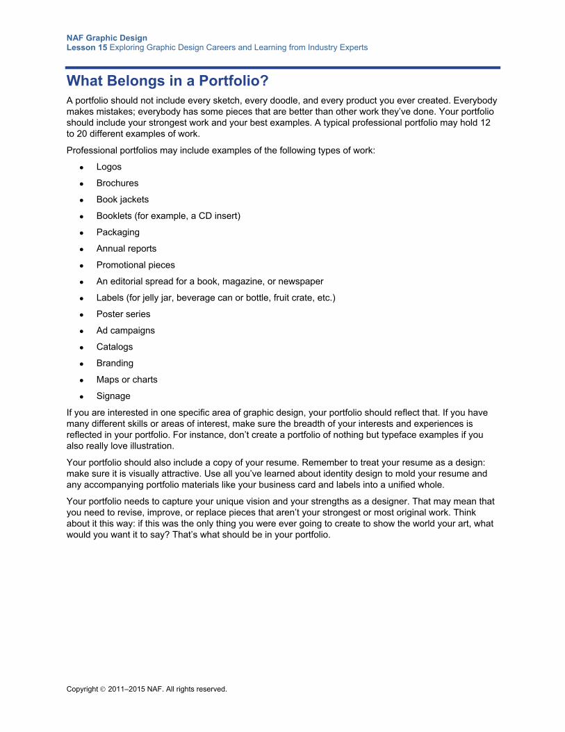
NAF Graphic Design Lesson 15 Exploring Graphic Design Careers and Learning from Industry Experts
Copyright 2011–2015 NAF. All rights reserved.
What Belongs in a Portfolio? A portfolio should not include every sketch, every doodle, and every product you ever created. Everybody makes mistakes; everybody has some pieces that are better than other work they’ve done. Your portfolio should include your strongest work and your best examples. A typical professional portfolio may hold 12 to 20 different examples of work.
Professional portfolios may include examples of the following types of work:
Logos
Brochures
Book jackets
Booklets (for example, a CD insert)
Packaging
Annual reports
Promotional pieces
An editorial spread for a book, magazine, or newspaper
Labels (for jelly jar, beverage can or bottle, fruit crate, etc.)
Poster series
Ad campaigns
Catalogs
Branding
Maps or charts
Signage
If you are interested in one specific area of graphic design, your portfolio should reflect that. If you have many different skills or areas of interest, make sure the breadth of your interests and experiences is reflected in your portfolio. For instance, don’t create a portfolio of nothing but typeface examples if you also really love illustration.
Your portfolio should also include a copy of your resume. Remember to treat your resume as a design: make sure it is visually attractive. Use all you’ve learned about identity design to mold your resume and any accompanying portfolio materials like your business card and labels into a unified whole.
Your portfolio needs to capture your unique vision and your strengths as a designer. That may mean that you need to revise, improve, or replace pieces that aren’t your strongest or most original work. Think about it this way: if this was the only thing you were ever going to create to show the world your art, what would you want it to say? That’s what should be in your portfolio.
NAF Graphic Design Lesson 15 Exploring Graphic Design Careers and Learning from Industry Experts
Copyright 2011–2015 NAF. All rights reserved.
Next Step: Rank Your Work Look at all the pieces currently in your portfolio. In the space below, rank them. List your best work first, then your “okay” work. List your weakest pieces at the bottom.
What Makes a Good Portfolio? A good portfolio:
Is designed well
Is organized well
It also should:
Be labeled clearly
Include sketches
Include an online/digital component
Design You’re looking for a job or an internship as a designer, so your portfolio needs to demonstrate your skill with design. Imagine that your portfolio is telling a story about who you are as a person and a designer. What does the cover say? What does the first piece of work say? The second piece of work? Which pieces of work are displayed by themselves? Which pieces of work are displayed as a group? Which piece of work is last?
Think about some of the jobs you read about earlier in this lesson. Many of those jobs needed someone who could create a unified design—take a bunch of different elements and make them work together. That’s exactly what you are doing with your portfolio. How you lay things out, how you use color—all of those things tell a potential employer something about your taste and skill in design.
NAF Graphic Design Lesson 15 Exploring Graphic Design Careers and Learning from Industry Experts
Copyright 2011–2015 NAF. All rights reserved.
How will you hold all of these pieces together? There are three common methods: a book or binder with plastic covered pages that you can slide your work into, a clamshell-like box, or an attaché-style case. The attaché-style case is a well-constructed, good-quality case with a flap cover and a handle. A clamshell portfolio is a sturdy case that is constructed to open wide and display your pieces. The book or binder approach is probably the most familiar to you, but don’t think of it like a school binder. A binder portfolio is filled with specially designed pages covered in plastic. You will need to research the cost of each solution and choose something that is within your budget. Whichever method you choose, the portfolio case you use to present your work to a potential employer should be attractive and professional-looking and large enough to hold all your different pieces.
You need to think about how you will mount or present your pieces. The mounting or pages of your portfolio need to be just as carefully designed as your pieces. Many professional designers recommend mounting work on black boards because black does not show fingerprints. All of the boards should be the same size. If you are using the binder portfolio, make sure to use good-quality, sealed plastic sheets to hold your work, and make sure the pieces are fixed in place.
Even though you might not have a professional cover or professional mountings right now, keep this information in mind. It’s worth investing in a good cover and mountings for your pieces before you go for a job or internship interview.
As in most IT professions, the trend has moved toward digital and mobile technology. Now most professional print and web designers have online portfolios that prospective employers can easily access. There are several free online portfolio sites that can help you showcase your work. You can also have images in PDF format on a mobile device, like a tablet, to show a client in person, as you can’t always rely on having web access in an interview. PDF files in a design portfolio should be one multipage document under 5MB.
Next Step: Brainstorm a Design In the space below, make some notes about how you might want to design your portfolio. You can always change your mind, so write down or sketch several different design concepts.
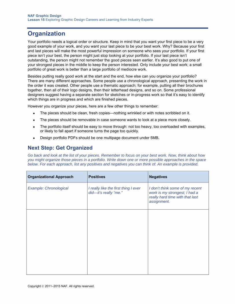
NAF Graphic Design Lesson 15 Exploring Graphic Design Careers and Learning from Industry Experts
Copyright 2011–2015 NAF. All rights reserved.
Organization Your portfolio needs a logical order or structure. Keep in mind that you want your first piece to be a very good example of your work, and you want your last piece to be your best work. Why? Because your first and last pieces will make the most powerful impression on someone who sees your portfolio. If your first piece isn’t your best, the person might just stop looking at your portfolio. If your last piece isn’t outstanding, the person might not remember the good pieces seen earlier. It’s also good to put one of your strongest pieces in the middle to keep the person interested. Only include your best work; a small portfolio of great work is better than a large portfolio of mediocre work.
Besides putting really good work at the start and the end, how else can you organize your portfolio? There are many different approaches. Some people use a chronological approach, presenting the work in the order it was created. Other people use a thematic approach; for example, putting all their brochures together, then all of their logo designs, then their letterhead designs, and so on. Some professional designers suggest having a separate section for sketches or in-progress work so that it’s easy to identify which things are in progress and which are finished pieces.
However you organize your pieces, here are a few other things to remember:
The pieces should be clean, fresh copies—nothing wrinkled or with notes scribbled on it.
The pieces should be removable in case someone wants to look at a piece more closely.
The portfolio itself should be easy to move through: not too heavy, too overloaded with examples, or likely to fall apart if someone turns the page too quickly.
Design portfolio PDFs should be one multipage document under 5MB.
Next Step: Get Organized Go back and look at the list of your pieces. Remember to focus on your best work. Now, think about how you might organize those pieces in a portfolio. Write down one or more possible approaches in the space below. For each approach, list any positives and negatives you can think of. An example is provided.
Organizational Approach Positives Negatives
Example: Chronological I really like the first thing I ever did—it’s really “me.”
I don’t think some of my recent work is my strongest; I had a really hard time with that last assignment.
NAF Graphic Design Lesson 15 Exploring Graphic Design Careers and Learning from Industry Experts
Copyright 2011–2015 NAF. All rights reserved.
Other Elements of the Portfolio: Labels, Sketches, and So Forth Sometimes you may have to drop off your portfolio for someone to look at when you aren’t there. If you have brief, clear labels on your pieces, it makes it easier for someone to just pick up your portfolio and look through it. Remember to keep your labels short, though. The person is interested in your design skills, not in reading an essay about every piece you’ve done!
In the graphic design industry, many people like to see sketches or examples of in-progress work included in a portfolio. After all, if they are going to hire you, they want to know how you work. Seeing how your sketches or work developed over time can be very informative. Also, in today’s environment, where a lot of work is done on the computer, employers like to have a sense of how you draw by hand as well as how you work on the computer. If you do include sketches, make sure to label them clearly so that a prospective employer doesn’t mistake your practice for your final version!
Nowadays, most designers have an online or digital version of their portfolios. If you are applying to a school or trying to win a job on the other side of the country (or the world!), it is much easier to send someone a link to your website than to mail them your entire portfolio. You can take good-quality photographs of your work, which will serve as part of your digital portfolio and will also be a good backup in case something happens to your hard-copy portfolio. You should create a PDF version of your work to email to prospective employers. You can tailor this portfolio to the job you are applying for.
Some designers prefer to have two hard copies so that they can leave one with a potential employer and still have one to keep with them.
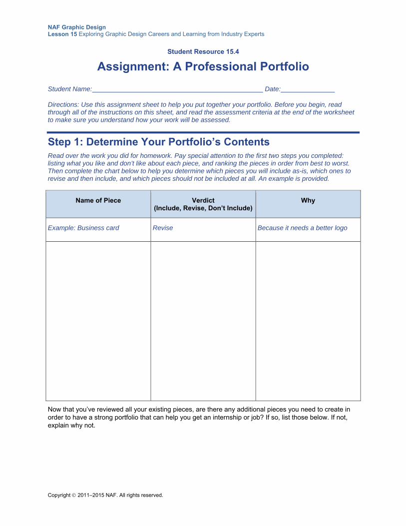
NAF Graphic Design Lesson 15 Exploring Graphic Design Careers and Learning from Industry Experts
Copyright 2011–2015 NAF. All rights reserved.
Student Resource 15.4
Assignment: A Professional Portfolio
Student Name: Date:
Directions: Use this assignment sheet to help you put together your portfolio. Before you begin, read through all of the instructions on this sheet, and read the assessment criteria at the end of the worksheet to make sure you understand how your work will be assessed.
Step 1: Determine Your Portfolio’s Contents Read over the work you did for homework. Pay special attention to the first two steps you completed: listing what you like and don’t like about each piece, and ranking the pieces in order from best to worst. Then complete the chart below to help you determine which pieces you will include as-is, which ones to revise and then include, and which pieces should not be included at all. An example is provided.
Name of Piece Verdict (Include, Revise, Don’t Include)
Why
Example: Business card Revise Because it needs a better logo
Now that you’ve reviewed all your existing pieces, are there any additional pieces you need to create in order to have a strong portfolio that can help you get an internship or job? If so, list those below. If not, explain why not.
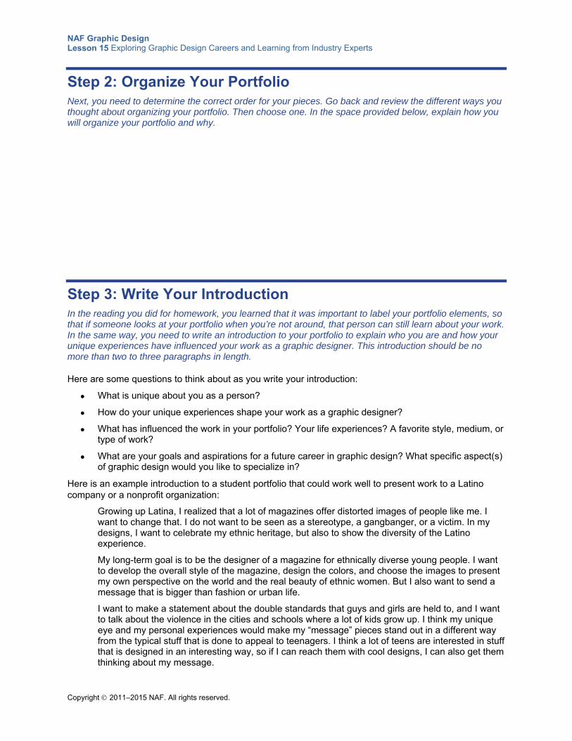
NAF Graphic Design Lesson 15 Exploring Graphic Design Careers and Learning from Industry Experts
Copyright 2011–2015 NAF. All rights reserved.
Step 2: Organize Your Portfolio Next, you need to determine the correct order for your pieces. Go back and review the different ways you thought about organizing your portfolio. Then choose one. In the space provided below, explain how you will organize your portfolio and why.
Step 3: Write Your Introduction In the reading you did for homework, you learned that it was important to label your portfolio elements, so that if someone looks at your portfolio when you’re not around, that person can still learn about your work. In the same way, you need to write an introduction to your portfolio to explain who you are and how your unique experiences have influenced your work as a graphic designer. This introduction should be no more than two to three paragraphs in length.
Here are some questions to think about as you write your introduction:
What is unique about you as a person?
How do your unique experiences shape your work as a graphic designer?
What has influenced the work in your portfolio? Your life experiences? A favorite style, medium, or type of work?
What are your goals and aspirations for a future career in graphic design? What specific aspect(s) of graphic design would you like to specialize in?
Here is an example introduction to a student portfolio that could work well to present work to a Latino company or a nonprofit organization:
Growing up Latina, I realized that a lot of magazines offer distorted images of people like me. I want to change that. I do not want to be seen as a stereotype, a gangbanger, or a victim. In my designs, I want to celebrate my ethnic heritage, but also to show the diversity of the Latino experience.
My long-term goal is to be the designer of a magazine for ethnically diverse young people. I want to develop the overall style of the magazine, design the colors, and choose the images to present my own perspective on the world and the real beauty of ethnic women. But I also want to send a message that is bigger than fashion or urban life.
I want to make a statement about the double standards that guys and girls are held to, and I want to talk about the violence in the cities and schools where a lot of kids grow up. I think my unique eye and my personal experiences would make my “message” pieces stand out in a different way from the typical stuff that is done to appeal to teenagers. I think a lot of teens are interested in stuff that is designed in an interesting way, so if I can reach them with cool designs, I can also get them thinking about my message.
NAF Graphic Design Lesson 15 Exploring Graphic Design Careers and Learning from Industry Experts
Copyright 2011–2015 NAF. All rights reserved.
Write a draft of your introduction on the computer or on a separate sheet of paper. After you finish writing it, compare it to what you’ve already decided about your portfolio. Does your introduction match the contents of your portfolio? For example, if you say in your introduction that you like designing typefaces, do you have examples of your typeface work in your portfolio? Take the time to make changes to your portfolio contents based on this review.
Step 4: Decide on a Presentation Case What kind of case would you like to use to present your portfolio? How big or small will it be? What material will it be made of? What color will it be? Write a brief description of it in the space below.
My portfolio case will be…
Step 5: Assemble a Mock-up of Your Portfolio It’s finally time to put your portfolio together! But this is still a mock-up; it will be your job to finalize your portfolio before going to an interview for an internship or job. Follow these steps before you turn in your mock-up:
On the current folder that contains your portfolio, write down the measurements, material, color, and such of the case you plan to use for a portfolio you will take to a job or internship interview.
Put your introduction at the front.
Place your graphic design pieces in the folder in the order they are listed in your table of contents.
For any pieces that still need revision, add a sticky note that details the revisions you are going to make.
For pieces that still need to be created, insert a page with a thumbnail of what you plan to create.
Make sure your assignment meets or exceeds the following assessment criteria:
The cover description is complete; it gives appropriate measurements and materials for a portfolio.
The written introduction communicates who the graphic designer is and what is important to the designer. The introduction is neat, with no spelling or grammatical errors.
The portfolio contents are organized in a logical order, with the best pieces placed at the beginning and the end.
The mock-up portfolio is meticulously neat, professionally presented, and attractive.
Copyright © 2011–2015 NAF. All rights reserved.
NAF Graphic Design
Lesson 16 Project Presentation and Course
Closure This lesson gives students an opportunity to consider what they’ve learned during the course. Students reflect in small groups about their class experience. They talk about what they’ve learned, what they produced, and how their ideas about graphic design may have changed during the course. The lesson also provides time for students to share their culminating projects.
Advance Preparation
This lesson includes the final student portfolio review. This should be a major event with an invited audience that includes at least one professional graphic designer and a keynote speaker. See Teacher Resource 16.1, Guide: Planning for the Student Portfolio Review, for details of how to prepare for the event. If you have a large class, you will need more than 50 minutes for the review.
This lesson is expected to take 4 class periods. Keep in mind that the number of class periods needed for this lesson will vary depending on whether or not the portfolio review is held outside of class time.
Lesson Framework
Learning Objectives Each student will:
Evaluate personal experience and performance in the course
Summarize key learning across the whole subject of graphic design
Academic Standards The relevant Common Core State Standards are too extensive to list here but are an important basis for this lesson. For details, please refer to the separate document “Correlations to the Common Core Standards” (available in the Course Planning Tools section of the course materials).
Analyze how the application of visual arts elements and principles of design communicate and express ideas (Common Career Technical Core 2012, AR-VIS 2)
NAF Graphic Design Lesson 16 Project Presentation and Course Closure
Copyright © 2011–2015 NAF. All rights reserved. - 2 -
Demonstrate effective professional communication skills and practices that enable positive customer relationships (Common Career Technical Core 2012, IT 1)
Use product or service design processes and guidelines to produce a quality information technology (IT) product or service (Common Career Technical Core 2012, IT 2)
Create original works as a means of personal or group expression (ISTE NETS for Students 2007, 1b)
Interact, collaborate, and publish with peers, experts, or others, employing a variety of digital environments and media (ISTE NETS for Students 2007, 2a)
Communicate information and ideas effectively to multiple audiences using a variety of media and formats (ISTE NETS for Students 2007, 2b)
Assessment
Assessment Product Means of Assessment
Final version of the culminating project identity design portfolio, which includes identity design style guide, logo, business card, letterhead, and additional design item
Rubric: Identity Design Portfolio (Teacher Resource 16.4)
Prerequisites Basic knowledge of image size and resolution
Understanding of graphic design as visual communication
Ability to create accurate selections using all Photoshop selection tools
A working knowledge of the use of proximity, alignment, repetition, and contrast in graphic design
A working knowledge of how to establish a visual hierarchy
A working knowledge of the elements of design: color, typography, and images
A clear understanding of what identity design is and why it is important
Instructional Materials
Teacher Resources Teacher Resource 16.1, Guide: Planning for the Student Portfolio Review
Teacher Resource 16.2, Student Portfolio Review: Questions for Graphic Designers
Teacher Resource 16.3, Student Portfolio Review: Questions for Clients
Teacher Resource 16.4, Rubric: Identity Design Portfolio
Teacher Resource 16.5, Bibliography: Project Presentation and Course Closure
Student Resources Student Resource 16.1, Planning Sheet: Introducing Your Identity Design Portfolio
NAF Graphic Design Lesson 16 Project Presentation and Course Closure
Copyright © 2011–2015 NAF. All rights reserved. - 3 -
Equipment and Supplies Blackboard, whiteboard, or flip chart
Computers with Internet access
Six sheets of chart paper, each labeled with the title of a unit in this course
Pads of sticky notes (one pad for every two students)
Lesson Steps
Step Min. Activity
CLASS PERIOD 1
1 20 Sticky Note Comments: What We Learned
This activity helps students recognize how much they have learned in this course and provides informal feedback to the teacher.
Tell students to get out their notebook, review the table of contents page, and leaf through the pages, reminding themselves of what they did in each unit.
Post sheets of chart paper around the room, each one labeled with the title of a unit and the major topics in that unit (for example, Unit 4: Elements of Graphic Design, included fundamentals of color, typography, and images).
Tip: To get a quick summary of each unit, you might find it helpful to refer to the Scope and Sequence document for the course, which is included in the Course Planning Tools section of the course.
Divide the class into pairs and give each pair a pad of sticky notes. Ask students to go around the room for about 10 minutes, looking at the titles of the different units. For each unit, students should write down one or more of the following on a sticky note:
Something I learned in this unit was…
In this unit, the best activity or assignment was…
I wish we’d had more time to do...in this unit.
I really had a hard time with…in this unit.
When students have finished, ask them to return to their seats. Call on a few students and ask them which topic was their favorite and which one they liked the least. Explain that the chart paper sheets will be used later in this lesson.
NAF Graphic Design Lesson 16 Project Presentation and Course Closure
Copyright © 2011–2015 NAF. All rights reserved. - 4 -
Step Min. Activity
2 30 Culminating Project Work: Preparing for the Graphic Design Student Portfolio Review
In this activity, culminating project groups prepare to present their portfolio at the student portfolio review.
Remind students that the student portfolio review, where they will present their culminating project to an invited audience, is coming up very shortly. Explain that during this class period and the next, they will be preparing to present their identity design portfolio to an invited audience that includes professional graphic designers and clients who will be commenting on their work.
Explain to the students what will take place at the portfolio review:
1. The session will begin with opening remarks from a professional graphic designer. Explain to students that this is typically how student portfolio review sessions open, and they should be prepared to listen for any advice the speaker gives about future studies and careers in graphic design.
2. Culminating project groups will explain the key elements of their creative brief so that the audience understands who the target audience is and what the client desired to achieve with the identity design. Then each group member will explain one highlight about the graphic design of their portfolio. For example, one student might note as a highlight, “We have used white space to develop a really crisp, clean look in all of our materials.”
3. After each group presents, one or more professional graphic designers will evaluate how well the design elements in the portfolio meet the client’s needs as expressed in the creative brief. These guest graphic designers will also suggest improvements that would make the identity design more effective. Explain to students that getting some professional input about what they could improve in their identity design can be extremely helpful. Remind them that figuring out even very small improvements can make a world of difference in an identity design.
4. Students and other guests will have a chance to ask questions of the professional graphic designers about each identity design portfolio. Encourage students to plan to get as much information from the professional designer about their portfolio as they can in the allotted time.
5. The culminating project clients who are present will explain how the identity design portfolio created for them meets their needs. They will also suggest any improvements they think would make it more effective.
6. Any remaining time will be devoted to visiting with the audience and making contacts with NAF advisory board members, graphic designers, members of AIGA, school administrators, and others who might be able to help students continue with their studies or secure internships in graphic design.
Remind students of the importance of dressing professionally and exhibiting professional behavior. Ask students to suggest ways that they can exhibit professional behavior. (Make sure they cover items such as greeting visitors respectfully, looking them in the eye, shaking hands, and presenting their work in a positive light.) Also make sure students are aware of the date, time, and place of the event.
Answer any questions students have about how the student portfolio review will be conducted, and then refer them to Student Resource 16.1, Planning Sheet: Introducing Your Identity Design Portfolio. Explain that the purpose of this resource is to help
NAF Graphic Design Lesson 16 Project Presentation and Course Closure
Copyright © 2011–2015 NAF. All rights reserved. - 5 -
Step Min. Activity
groups prepare their part of the student portfolio review. Instruct students to work through the questions on this planning sheet in their groups, and to prepare what they will say to introduce their identity design portfolio.
Advise students that they will have time in the next class period to practice their presentation, and tell them they need to prepare what they want to say before the beginning of the next class period.
CLASS PERIOD 2
3 30 Culminating Project Work: Final Preparations
Students work on the presentation aspect of their portfolio.
Point out to students that they will begin unveiling their identity design portfolios in the next class period, and this is their final opportunity to polish up their portfolio and make any last-minute changes before the portfolio review. Ask students if there is new information they learned about presenting a portfolio in Lesson 15 that they need to apply to their identity design portfolio. (Responses should include determining what items to include in the portfolio, deciding how to organize the pieces in the portfolio, deciding on a container, etc.) Explain to students that their portfolio must contain all of the pieces they created for their client, but they can decide if they would also like to include some of their thumbnails or roughs to show the process of their work. Remind them that any thumbnails or roughs that are included should represent their best work and be tastefully presented. Also point out to students that they are not expected to have fancy, expensive containers for their work, but they should ensure that everything is extremely neat and clean.
Explain to students how the room will be set up and where they will be placing their portfolio for review to give them a visual idea of what presenting it will be like.
Remind students of Teacher Resource 16.4, Rubric: Identity Design Portfolio, which they were introduced to in Lesson 13. Ask students to look over the rubric once more and make sure they feel confident that their final portfolio meets or exceeds all of the assessment criteria. You may also want to distribute Teacher Resource 16.2, Student Portfolio Review: Questions for Graphic Designers, and Teacher Resource 16.3, Student Portfolio Review: Questions for Clients, to give students an idea of what the graphic design professionals and clients will be looking for.
Circulate as students are organizing the pieces in their portfolio and preparing each piece for presentation, and answer any questions. Remind students that they must come to the student portfolio review with the portfolio ready for presentation. If necessary, they should complete any final preparations for homework.
4 20 Culminating Project Work: Presentation Practice
In this activity, students practice giving their one-minute presentation to their group members, and then to the members of another group.
To begin this activity, write the following question on the board:
What are the most important rules for making an effective presentation?
NAF Graphic Design Lesson 16 Project Presentation and Course Closure
Copyright © 2011–2015 NAF. All rights reserved. - 6 -
Step Min. Activity
Ask students to share answers to this question in their groups and then share as a class. You may want to list their answers on the board. Make sure they note the importance of making eye contact with the audience, standing up straight, smiling, and using notes sparingly.
Next, have students practice the presentation they prepared. Remind them that their presentation is just an introduction to the review of their portfolio, and it should not last longer than two minutes. Give students five minutes to practice in their own group, and then ask them to pair up with another group and present to them. Write the following questions on the board, and instruct students to answer them as they listen to each other:
Did the group stay within the two-minute time limit?
Did the speakers establish eye contact?
Did the speakers use their notes for support only, and look at the audience most of the time?
Did the speakers stand up straight with both feet on the floor?
Encourage students to practice what they will say for homework until they are totally comfortable giving their part of the presentation. Remind students to dress appropriately for the review, and answer any final logistical questions they have.
CLASS PERIOD 3
5 50 Culminating Project Work: Student Portfolio Review
In this activity, students present their identity design portfolios to an invited audience and receive feedback from professional graphic designers and from the client for whom they created their project materials. This activity focuses on the following college and career skills:
Demonstrating adaptability and flexibility
Demonstrating creativity and innovation
Demonstrating the ability to speak effectively
To begin the event, introduce the person delivering the opening remarks and ask that person to speak. This should be an inspirational speech for all aspiring graphic designers.
Next, begin the student portfolio review. Review each portfolio as follows:
1. The culminating project group presents its portfolio.
2. One or more professional graphic designers evaluate the portfolio, using the questions in Teacher Resource 16.2, Student Portfolio Review: Questions for Graphic Designers, as a basis for their review.
3. Invite students and other guests to ask questions of the professional graphic designers about the portfolio.
4. If representatives of the client for the project are present, invite them to explain how the identity design portfolio created for them meets their needs, and to suggest any

NAF Graphic Design Lesson 16 Project Presentation and Course Closure
Copyright © 2011–2015 NAF. All rights reserved. - 7 -
Step Min. Activity
improvements they think would make it more effective. (They can use the questions in Teacher Resource 16.3, Student Portfolio Review: Questions for Clients, as a basis for their comments.)
After all of the portfolios have been reviewed, devote any remaining time to allowing students to visit with the audience. Explain to the audience that students are eager to make contacts with NAF advisory board members, graphic designers, members of AIGA, school administrators, and others who might be able to help them continue with their studies or line up internships in graphic design. Encourage students to collect business cards from any contacts that they think might be able to help them.
Assess the identity design portfolios using Teacher Resource 16.4, Rubric: Identity Design Portfolio.
CLASS PERIOD 4
6 15 Culminating Project Work: Reviewing Feedback
In this activity, students work in their project groups to review and discuss student portfolio review feedback from their client and from professional graphic designers.
Write the following questions on the board:
What were the two most helpful tips from graphic designers or your client that could help you improve your identity design portfolio?
What aspect of your identity design portfolio are you most proud of, and why?
Ask students to move into their project groups one last time, and ask them to discuss these two questions in their group and come to a consensus on the answers. Then ask each group to share its answers with the class. Answer any questions students have about how the professionals reviewed their portfolios, and encourage students to always strive to do their best work in graphic design.
When students have finished their discussion, ask them to return to their seats to take a few minutes to assess their own project and their work in this course.
7 35 Notebook Reflection: At the End of the Course
This activity provides a final opportunity for students to reflect on what they have learned.
Ask students to write a brief response to each of the following prompts:
1. What did you think of your group’s work on the project? What grade would you give your group?
2. What kind of contribution did you make to your group? What grade would you give your part of the project?
3. How has your understanding of graphic design changed during this course?
4. What do you most want to remember about your experience in this course?
5. What is your overall evaluation of this course? Explain.
NAF Graphic Design Lesson 16 Project Presentation and Course Closure
Copyright © 2011–2015 NAF. All rights reserved. - 8 -
Step Min. Activity
Tell students to look at the comments on the chart paper from the beginning of the lesson to help them think about what to say. Take the last 5–10 minutes of class to allow students to share some of their comments. Make any final comments you wish to share with your students.
Extensions
Enrichment Ask students to organize their thoughts about the course once more. This time, however, ask
them to comment specifically on which parts of the course they liked the most, which they thought were most difficult, which they wished they had more time to complete, and so on.
Encourage them to create a list of ideas, recommendations, and improvements they would make if they had to teach the course the following semester, and to organize these suggestions into categories for presentation.
Cross-Curricular Integration All other subjects: Tell students to ask other teachers if an end-of-term summary and evaluation
would be valuable in their courses. Students can write a letter to another teacher that makes the case for such an activity.
Copyright © 2011–2015 NAF. All rights reserved.
NAF Graphic Design
Lesson 16 Project Presentation and Course
Closure
Teacher Resources
Resource Description
Teacher Resource 16.1 Guide: Planning for the Student Portfolio Review
Teacher Resource 16.2 Student Portfolio Review: Questions for Graphic Designers
Teacher Resource 16.3 Student Portfolio Review: Questions for Clients
Teacher Resource 16.4 Rubric: Identity Design Portfolio
Teacher Resource 16.5 Bibliography: Project Presentation and Course Closure
NAF Graphic Design Lesson 16 Project Presentation and Course Closure
Copyright © 2011–2015 NAF. All rights reserved.
Teacher Resource 16.1
Guide: Planning for the Student Portfolio Review
The students’ presentation of their identity design portfolios is the culmination of all the hard work they have put in to this course. Therefore, it is important that this final presentation be staged as a special event, open to parents and invited guests. The event celebrates students’ hard work and also reinforces for them that the work they have done is for a broader audience than just their teacher and classmates.
Step 1: Schedule It Properly Decide whether the portfolio review will be held during school hours or outside of class time. Consider when your students and your invited guests are most likely to be available. You need at least one full class period for the portfolio review. It may be easier to attract parents, NAF academy advisory board members, graphic design or community professionals, and local leaders to an evening event that will not take time out of the workday. If you do decide to hold the event outside of class time, make sure to notify the students as soon as possible so that you have time to handle scheduling conflicts.
Step 2: Plan for Opening Remarks or Short Keynote Address To enhance the authenticity of this occasion, plan to open the portfolio review with a guest speaker who makes opening remarks or delivers a short keynote address. The purpose of this speech is to encourage students to continue in their pursuit of excellence in the field of graphic design. (Given the time constraints, you may want to limit this to 5 or 10 minutes.) If possible, ask a member of AIGA, a local graphic designer, an internship provider, or a member of the NAF academy advisory board to deliver the address. If no one else is available, put on your professional hat and deliver the address yourself.
Step 3: Invite the Right People It is vital that this student portfolio review be shared with a broader audience than just you and the rest of the class. Consider having your students design an invitation or a flyer that can be distributed to interested parties.
Invite as many graphic designers or members of your local AIGA chapter as you can. Think about recruiting graphic designers who design materials for your school district or for community organizations. Also contact large businesses or advertising agencies in your area that may have in-house graphic design teams. Ask these designers to participate in the student portfolio review as professional reviewers. Explain to them that they will be reviewing the portfolios and commenting on the quality of the graphic design. You may want to give them a copy of Teacher Resource 16.2, Student Portfolio Review: Questions for Graphic Designers, ahead of time so that they can prepare for the review.
Also invite all of the clients for whom students created identity design portfolios. Explain to them that they will be asked to comment on the portfolio that was created for them and to highlight the ways that the identity design meets their needs. You may want to give them a copy of Teacher Resource 16.3, Student Portfolio Review: Questions for Clients, ahead of time so that they can prepare for the review.
Other guests to invite include:
Students who may be interested in joining a NAF academy (This could be an excellent recruiting tool.)
Local internship providers
Anyone who has assisted your class in any way (guest speakers, etc.)
NAF academy advisory board members
NAF Graphic Design Lesson 16 Project Presentation and Course Closure
Copyright © 2011–2015 NAF. All rights reserved.
School administrators, guidance counselors, other teachers, and school board members
Local civic leaders
Local middle school guidance counselors (to help recruit future NAF students)
Parents, guardians, friends, and relatives of the students
Emphasize the great help the audience can be to the students by asking questions and providing them with a real-world perspective on their work.
Step 4: Make It Celebratory The students need to get the message that this is an important event.
Make arrangements for refreshments to be available before or after the student portfolio review. Your PTA or parents group may be able to assist with this, or you might discuss other options with your school administration.
Reinforce the significance of the event by emphasizing to the students that they dress nicely, in appropriate business attire.
Step 5: Arrange for Someone to Take Pictures Make arrangements for someone to take pictures during the portfolio review, or to create a video of the review session. This can be a useful tool for the students, marking the unveiling of their first portfolio. It will also be helpful for future Graphic Design students to see what a portfolio review looks like, and it can be a useful recruiting tool.
NAF Graphic Design Lesson 16 Project Presentation and Course Closure
Copyright © 2011–2015 NAF. All rights reserved.
Teacher Resource 16.2
Student Portfolio Review: Questions for Graphic Designers
The student portfolio review is a celebratory event and the culmination of all the hard work that students have put in to their course. Your participation will certainly be an encouragement to the students. At the review, you will have an opportunity to share your comments on the students’ identity design portfolios with the entire class and with an invited audience that includes professionals, school administrators, and students’ family members. You may want to use the questions below as a basis for your review of the projects. Please feel free to choose the questions that you think are most appropriate or most interesting. You may want to go into more depth on some questions and skip others when there is less to say.
Is the identity design memorable and unique? What makes it memorable and unique, or what is missing? Does the design work demonstrate creativity?
Do the pieces demonstrate unity and balance? Explain what creates unity and balance, or what is missing.
Is typography used effectively? What makes the typography effective, or what is missing?
Is color used effectively? What makes the colors effective, or what is missing?
Is the image style effective? What makes it effective, or what is missing?
Are there any issues with the basic principles of design (proximity, alignment, contrast, and repetition)? Or are these adhered to particularly well?
Does the visual hierarchy make sense?
Is the portfolio neat and attractive? Are the pieces professionally presented?
If you were to suggest just one thing the group could do to improve its portfolio, what would it be?
Thanks for agreeing to participate in the NAF Graphic Design student portfolio review. We appreciate your interest in our students.
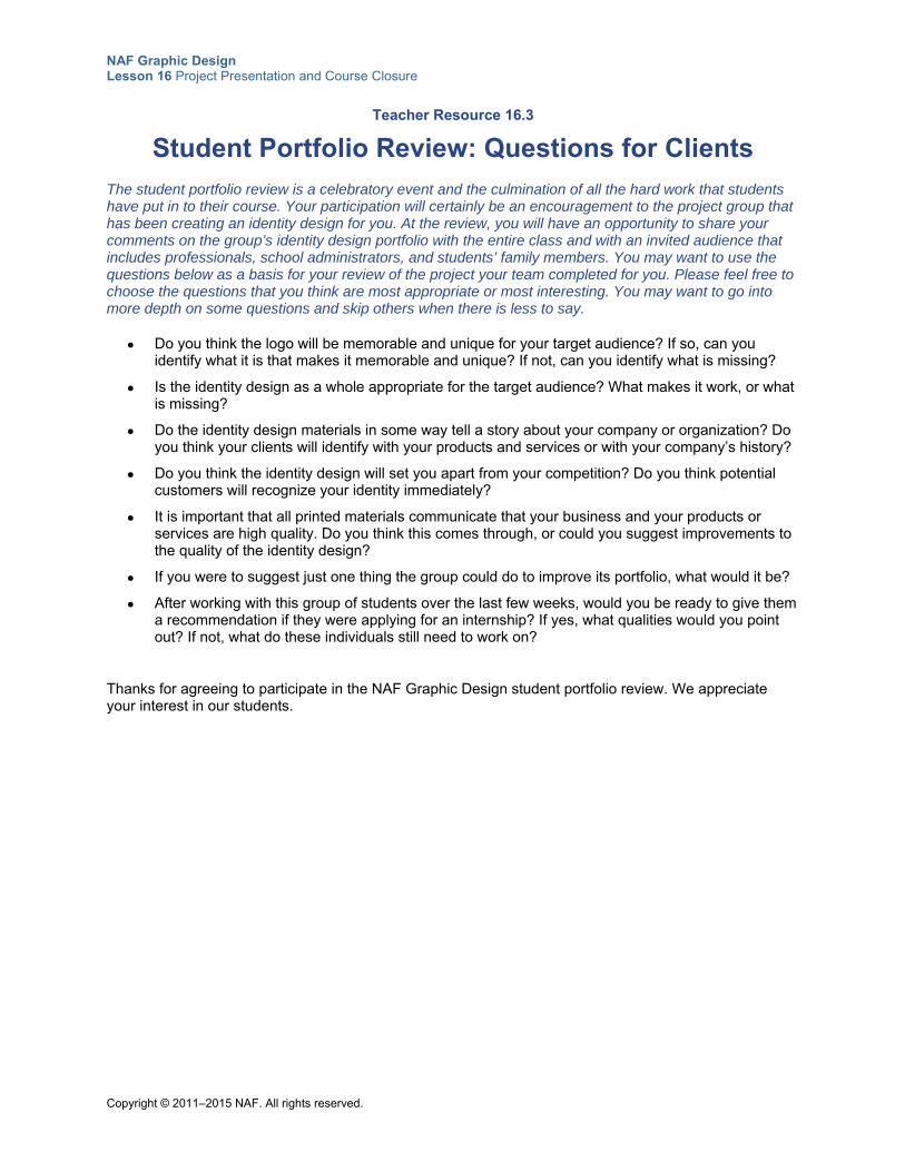
NAF Graphic Design Lesson 16 Project Presentation and Course Closure
Copyright © 2011–2015 NAF. All rights reserved.
Teacher Resource 16.3
Student Portfolio Review: Questions for Clients
The student portfolio review is a celebratory event and the culmination of all the hard work that students have put in to their course. Your participation will certainly be an encouragement to the project group that has been creating an identity design for you. At the review, you will have an opportunity to share your comments on the group’s identity design portfolio with the entire class and with an invited audience that includes professionals, school administrators, and students’ family members. You may want to use the questions below as a basis for your review of the project your team completed for you. Please feel free to choose the questions that you think are most appropriate or most interesting. You may want to go into more depth on some questions and skip others when there is less to say.
Do you think the logo will be memorable and unique for your target audience? If so, can you identify what it is that makes it memorable and unique? If not, can you identify what is missing?
Is the identity design as a whole appropriate for the target audience? What makes it work, or what is missing?
Do the identity design materials in some way tell a story about your company or organization? Do you think your clients will identify with your products and services or with your company’s history?
Do you think the identity design will set you apart from your competition? Do you think potential customers will recognize your identity immediately?
It is important that all printed materials communicate that your business and your products or services are high quality. Do you think this comes through, or could you suggest improvements to the quality of the identity design?
If you were to suggest just one thing the group could do to improve its portfolio, what would it be?
After working with this group of students over the last few weeks, would you be ready to give them a recommendation if they were applying for an internship? If yes, what qualities would you point out? If not, what do these individuals still need to work on?
Thanks for agreeing to participate in the NAF Graphic Design student portfolio review. We appreciate your interest in our students.
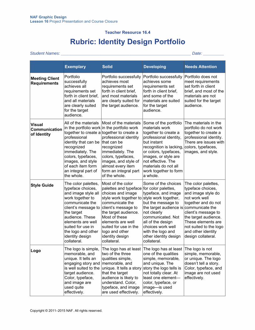
NAF Graphic Design Lesson 16 Project Presentation and Course Closure
Copyright © 2011–2015 NAF. All rights reserved.
Teacher Resource 16.4
Rubric: Identity Design Portfolio
Student Names: ________________________________________________________ Date: _________
Exemplary Solid Developing Needs Attention
Meeting Client Requirements
Portfolio successfully achieves all requirements set forth in client brief, and all materials are clearly suited for the target audience.
Portfolio successfully achieves most requirements set forth in client brief, and most materials are clearly suited for the target audience.
Portfolio successfully achieves some requirements set forth in client brief, and some of the materials are suited for the target audience.
Portfolio does not meet requirements set forth in client brief, and most of the materials are not suited for the target audience.
Visual Communication of Identity
All of the materials in the portfolio work together to create a professional identity that can be recognized immediately. The colors, typefaces, images, and style of each item form an integral part of the whole.
Most of the materials in the portfolio work together to create a professional identity that can be recognized immediately. The colors, typefaces, images, and style of almost every item form an integral part of the whole.
Some of the portfolio materials work together to create a professional identity, but instant recognition is lacking, or colors, typefaces, images, or style are not effective. The materials do not all work together to form a whole.
The materials in the portfolio do not work together to create a professional identity. There are issues with colors, typefaces, images, and style.
Style Guide The color palettes, typeface choices, and image style all work together to communicate the client’s message to the target audience. These elements are well suited for use in the logo and other identity design collateral.
Most of the color palettes and typeface choices and image style work together to communicate the client’s message to the target audience. Most of these elements are well suited for use in the logo and other identity design collateral.
Some of the choices for color palettes, typeface, and image style work together, but the message to the target audience is not clearly communicated. Not all of the design choices work well with the logo and other identity design collateral.
The color palettes, typeface choices, and image style do not work well together and do not communicate the client’s message to the target audience. These elements are not suited to the logo and other identity design collateral.
Logo The logo is simple, memorable, and unique. It tells an engaging story and is well suited to the target audience. Color, typeface, and image are used quite effectively.
The logo has at least two of the three qualities simple, memorable, and unique. It tells a story that the target audience is likely to understand. Color, typeface, and image are used effectively.
The logo has at least one of the qualities simple, memorable, and unique. The story the logo tells is not totally clear. At least one element—color, typeface, or image—is used effectively.
The logo is not simple, memorable, or unique. The logo doesn’t tell a story. Color, typeface, and image are not used effectively.

NAF Graphic Design Lesson 16 Project Presentation and Course Closure
Copyright © 2011–2015 NAF. All rights reserved.
Exemplary Solid Developing Needs Attention
Business Card
Color and typeface are used effectively and are consistent with the identity design style guide. Basic principles of graphic design are used effectively and visual hierarchy is correct. The card is sized correctly, and all information is complete and accurate.
Color and typeface are used effectively and are consistent with the identity design style guide, with no more than one exception. There is no more than one error in observing the basic principles of graphic design and visual hierarchy. The card is sized correctly, and all information is complete and accurate.
Color and typeface are used effectively and are consistent with the identity design style guide, with no more than two exceptions. No more than two errors exist in observing the basic principles of graphic design and visual hierarchy. There may be one or two errors in how the card is sized and in the accuracy and completeness of information.
Color and typeface are not consistent with the identity design style guide. Basic principles of graphic design and visual hierarchy are not adhered to. The card is not sized correctly, and there are errors in the accuracy and completeness of information.
Letterhead Color and typeface are used effectively and are consistent with the identity design style guide. Basic principles of graphic design are used effectively. The paper is sized correctly, and all information is complete and accurate.
Color and typeface are used effectively and are consistent with the identity design style guide, with no more than one exception. There is no more than one error in observing the basic principles of graphic design. The paper is sized correctly, and all information is complete and accurate.
Color and typeface are used effectively and are consistent with the identity design style guide, with no more than two exceptions. No more than two errors exist in observing the basic principles of graphic design. There may be one or two errors in how the paper is sized and in the accuracy of information.
Color and typeface are not consistent with the identity design style guide. Basic principles of graphic design are not adhered to. The paper is sized incorrectly and there are errors in the accuracy of information.
Additional Design Item
Color, typefaces, and images are used effectively and are consistent with the identity design style guide. Basic principles of graphic design are used effectively. The final product is neat, clear, and precise.
Color, typefaces, and images are used effectively and are consistent with the identity design style guide, with no more than one exception. There is no more than one error in observing the basic principles of graphic design. The final product is neat, clear, and precise.
Color, typefaces, and images are used effectively and are consistent with the identity design style guide, with no more than two exceptions. No more than two errors exist in observing the basic principles of graphic design. Elements of neatness, clarity, and precision are lacking.
Color, typefaces, and images are not consistent with the identity design style guide. Basic principles of graphic design are not adhered to. The final product lacks neatness, clarity, and precision.
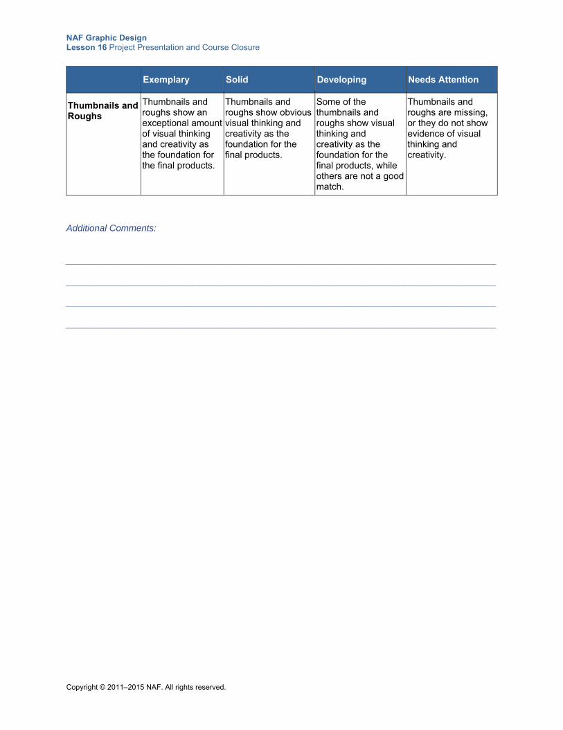
NAF Graphic Design Lesson 16 Project Presentation and Course Closure
Copyright © 2011–2015 NAF. All rights reserved.
Exemplary Solid Developing Needs Attention
Thumbnails and Roughs
Thumbnails and roughs show an exceptional amount of visual thinking and creativity as the foundation for the final products.
Thumbnails and roughs show obvious visual thinking and creativity as the foundation for the final products.
Some of the thumbnails and roughs show visual thinking and creativity as the foundation for the final products, while others are not a good match.
Thumbnails and roughs are missing, or they do not show evidence of visual thinking and creativity.
Additional Comments:
____________________________________________________________________________________ ____________________________________________________________________________________ ____________________________________________________________________________________ ____________________________________________________________________________________
NAF Graphic Design Lesson 16 Project Presentation and Course Closure
Copyright © 2011–2015 NAF. All rights reserved.
Teacher Resource 16.5
Bibliography: Project Presentation and Course Closure
The following sources were used in the preparation of this lesson and may be useful for your reference or as classroom resources. We check and update the URLs annually to ensure that they continue to be useful.
Online AIGA: The Professional Association for Design, http://www.aiga.org/ (accessed July 6, 2015).
AIGA 2013 Student Portfolio Review (Boston), http://boston.aiga.org/event/2013-student-portfolio-review/ (accessed July 6, 2015).
AIGA 2013 Student Portfolio Review (Salt Lake City), http://saltlakecity.aiga.org/event/student-portfolio-review/ (accessed July 6, 2015).
AIGA 2014 Student Portfolio Review (Los Angeles), http://losangeles.aiga.org/aiga-los-angeles-student-portfolio-review-2014/ (accessed July 6, 2015).
Copyright © 2011–2015 NAF. All rights reserved.
NAF Graphic Design
Lesson 16 Project Presentation and Course
Closure
Student Resources
Resource Description
Student Resource 16.1 Planning Sheet: Introducing Your Identity Design Portfolio
NAF Graphic Design Lesson 16 Project Presentation and Course Closure
Copyright © 2011–2015 NAF. All rights reserved.
Student Resource 16.1
Planning Sheet: Introducing Your Identity Design Portfolio
Directions: Answer the questions on this worksheet based on what you have learned about your client and the target audience from your creative brief and other communications with your client. Then use the information in your answers to formulate a one-minute presentation to introduce your portfolio.
1. Give a brief explanation of who your client is and what products or services it offers.
2. Explain who your target audience is.
3. Explain how your design solution establishes a unique position for your client in the competitive marketplace.
4. Make a list of 10 highlights, or strengths, that make your portfolio effective at meeting your client’s needs. Then narrow your list down to the three most important highlights and decide which of these highlights each group member will present.


