Embed Size (px)
Citation preview
© J.F. Campbell UM St. Louis 2015 1
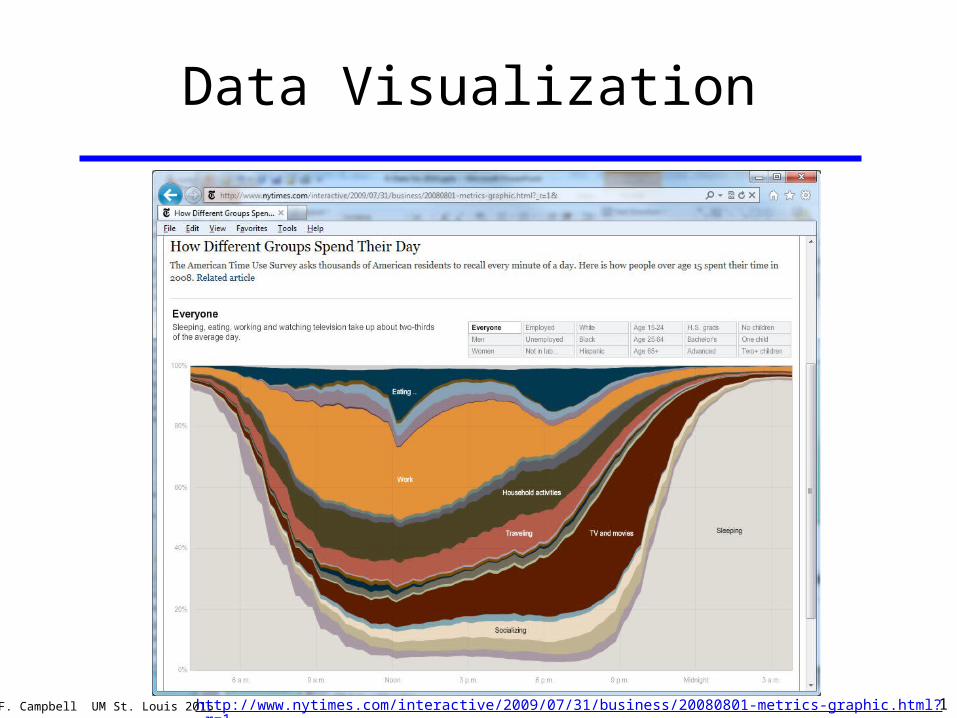
Data Visualization
http://www.nytimes.com/interactive/2009/07/31/business/20080801-metrics-graphic.html?_r=1&
© J.F. Campbell UM St. Louis 2015 2
Overview
1. Why use visualization?
2. Types of visualizations.
3. Design guidelines.
4. Infographics.
5. Tableau example.
Visualize This http://www.youtube.com/watch?v=mkEXx7sDXAI#t=69
Much of this is drawn from materials at the Duke University Library Data Visualization site: http://guides.library.duke.edu/datavis/
© J.F. Campbell UM St. Louis 2015 3
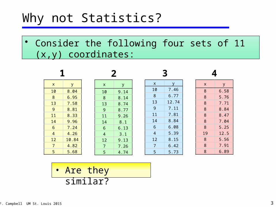
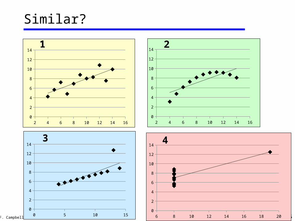
Why not Statistics?
• Consider the following four sets of 11 (x,y) coordinates:
• Are they similar?
x y
10 8.04
8 6.95
13 7.58
9 8.81
11 8.33
14 9.96
6 7.24
4 4.26
12 10.84
7 4.82
5 5.68
x y
10 9.14
8 8.14
13 8.74
9 8.77
11 9.26
14 8.1
6 6.13
4 3.1
12 9.13
7 7.26
5 4.74
x y
10 7.46
8 6.77
13 12.74
9 7.11
11 7.81
14 8.84
6 6.08
4 5.39
12 8.15
7 6.42
5 5.73
x y
8 6.58
8 5.76
8 7.71
8 8.84
8 8.47
8 7.04
8 5.25
19 12.5
8 5.56
8 7.91
8 6.89
1 2 3 4
© J.F. Campbell UM St. Louis 2015 4
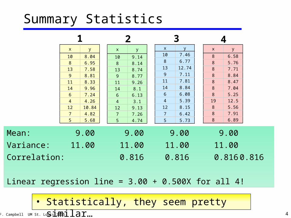
Summary Statistics
• Statistically, they seem pretty similar…
Mean: 9.00 9.00 9.00 9.00
Variance: 11.00 11.00 11.00 11.00
Correlation: 0.816 0.816 0.816 0.816
Linear regression line = 3.00 + 0.500X for all 4!
x y
10 8.04
8 6.95
13 7.58
9 8.81
11 8.33
14 9.96
6 7.24
4 4.26
12 10.84
7 4.82
5 5.68
x y
10 9.14
8 8.14
13 8.74
9 8.77
11 9.26
14 8.1
6 6.13
4 3.1
12 9.13
7 7.26
5 4.74
x y
10 7.46
8 6.77
13 12.74
9 7.11
11 7.81
14 8.84
6 6.08
4 5.39
12 8.15
7 6.42
5 5.73
x y
8 6.58
8 5.76
8 7.71
8 8.84
8 8.47
8 7.04
8 5.25
19 12.5
8 5.56
8 7.91
8 6.89
1 2 3 4
© J.F. Campbell UM St. Louis 2015 56 8 10 12 14 16 18 200
2
4
6
8
10
12
14
0 5 10 150
2
4
6
8
10
12
14
2 4 6 8 10 12 14 160
2
4
6
8
10
12
14
Similar?
x y
10 7.46
8 6.77
13 12.74
9 7.11
11 7.81
14 8.84
6 6.08
4 5.39
12 8.15
7 6.42
5 5.73
x y
8 6.58
8 5.76
8 7.71
8 8.84
8 8.47
8 7.04
8 5.25
19 12.5
8 5.56
8 7.91
8 6.89
1
3 4
2 4 6 8 10 12 14 160
2
4
6
8
10
12
142
© J.F. Campbell UM St. Louis 2015 6
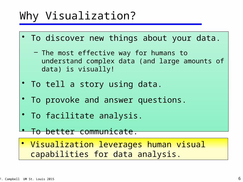
Why Visualization?
• To discover new things about your data.
– The most effective way for humans to understand complex data (and large amounts of data) is visually!
• To tell a story using data.
• To provoke and answer questions.
• To facilitate analysis.
• To better communicate.
• Visualization leverages human visual capabilities for data analysis.
© J.F. Campbell UM St. Louis 2015 7
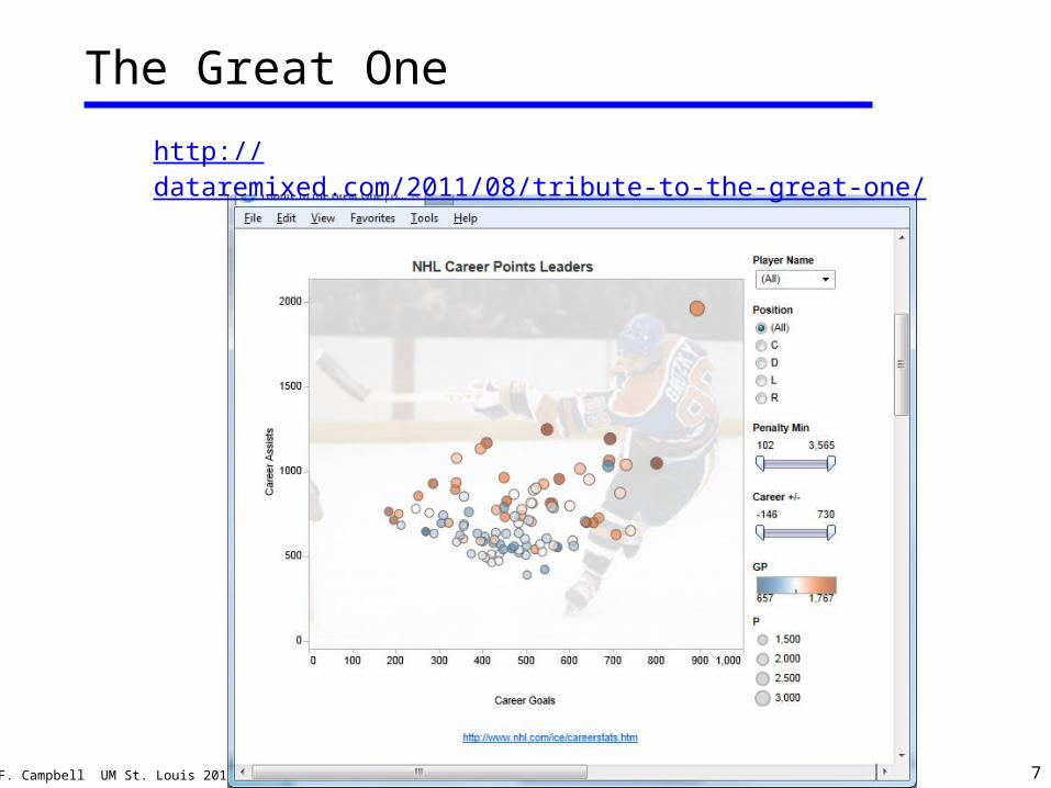
The Great One
http://dataremixed.com/2011/08/tribute-to-the-great-one/
© J.F. Campbell UM St. Louis 2015 8
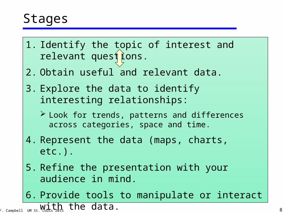
Stages
1. Identify the topic of interest and relevant questions.
2. Obtain useful and relevant data.
3. Explore the data to identify interesting relationships: Look for trends, patterns and differences across
categories, space and time.
4. Represent the data (maps, charts, etc.).
5. Refine the presentation with your audience in mind.
6. Provide tools to manipulate or interact with the data.
© J.F. Campbell UM St. Louis 2015 9
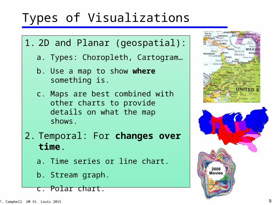
Types of Visualizations
1. 2D and Planar (geospatial):
a. Types: Choropleth, Cartogram…
b. Use a map to show where something is.
c. Maps are best combined with other charts to provide details on what the map shows.
2. Temporal: For changes over time.
a. Time series or line chart.
b. Stream graph.
c. Polar chart.
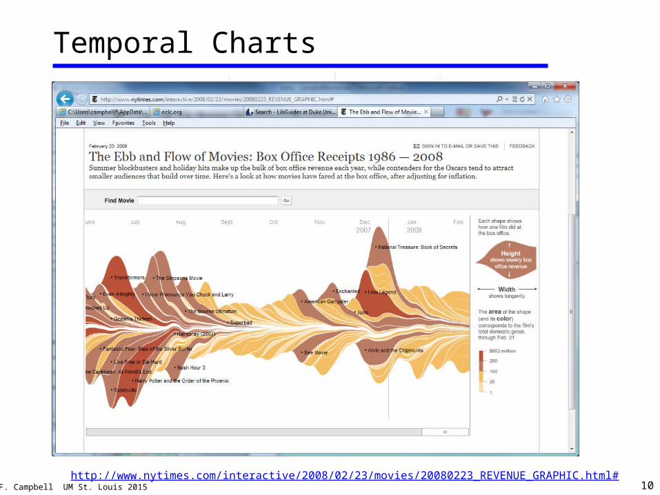
© J.F. Campbell UM St. Louis 2015 10
Temporal Charts
http://www.nytimes.com/interactive/2008/02/23/movies/20080223_REVENUE_GRAPHIC.html#
© J.F. Campbell UM St. Louis 2015 11
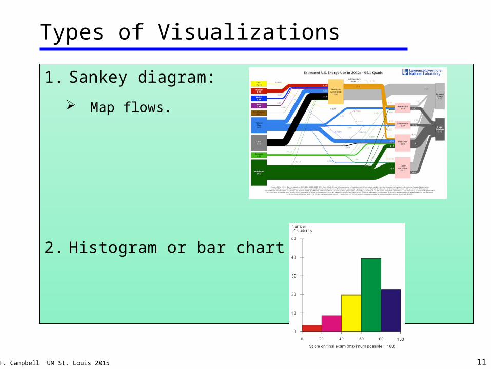
1. Sankey diagram:
Map flows.
2. Histogram or bar chart.
Types of Visualizations
© J.F. Campbell UM St. Louis 2015 12
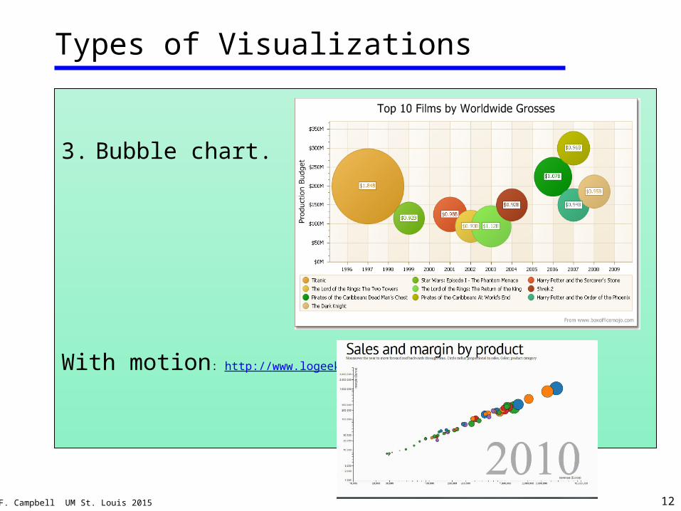
3. Bubble chart.
With motion: http://www.logeeka.com/motion_chart.html
Types of Visualizations
© J.F. Campbell UM St. Louis 2015 13
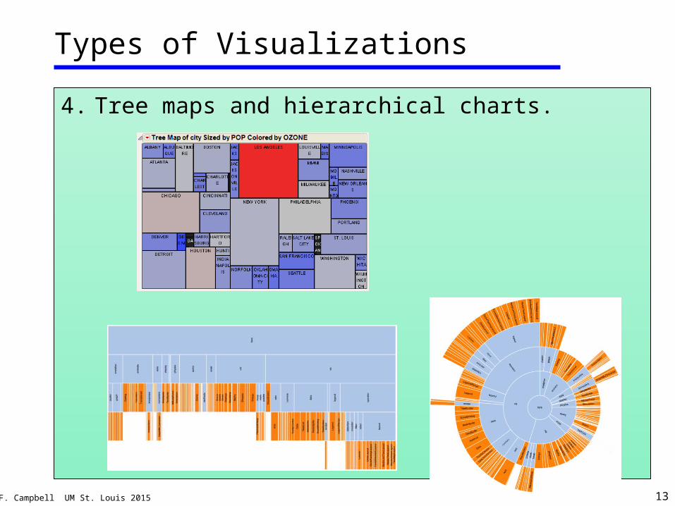
Types of Visualizations
4. Tree maps and hierarchical charts.
© J.F. Campbell UM St. Louis 2015 14
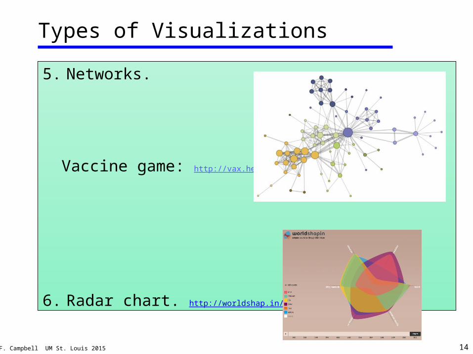
Types of Visualizations
5. Networks.
Vaccine game: http://vax.herokuapp.com/game
6. Radar chart. http://worldshap.in/
© J.F. Campbell UM St. Louis 2015 15
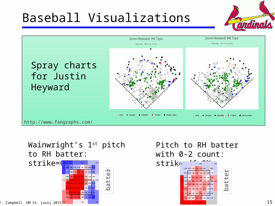
Baseball Visualizations
Spray charts for Justin Heyward
http://www.fangraphs.com/
1.10% 1.40% 2.40% 2.90% 2.90% 2.30% 1.50% 1.30% 1.00% 0.90%
0.20% 0.40% 0.70%
0.30% 0.50% 0.70% 0.70% 1.00% 1.30% 0.70% 0.30%
0.50% 0.90% 1.40% 1.90% 1.80% 1.20% 0.80% 0.60%
0.90% 1.60% 2.50% 2.80% 2.10% 1.20% 1.10% 1.00%
2.00% 2.80% 2.90% 2.90% 2.50% 1.50% 0.90% 0.50%
2.10% 2.50% 3.00% 3.10% 2.10% 0.90% 0.50% 0.40%
1.70% 2.30% 2.50% 2.10% 1.20% 0.60% 0.50% 0.40%
1.60% 1.80% 1.70% 1.80% 1.10%
0.5
0.60% 0.40% 0.20%
1.50% 1.10%
Wainwright’s 1st pitch to RH batter: strike=67.4%
batt
er
3.60% 0.80% 1.20% 1.60% 1.40% 1.50% 1.20% 1.20% 1.40% 1.40%
1.00% 0.80% 0.80%
4.30% 6.10%
1.20% 0.80% 0.80%
1.50% 1.20% 1.20% 1.60% 1.50%
1.50% 1.10% 0.80%
1.30% 1.40% 1.10% 1.20% 1.50%
1.50% 1.40% 0.80%
1.50% 1.30% 1.20% 1.30% 1.30%
1.20% 1.00% 1.40%
1.20% 1.50% 1.50% 1.40% 1.30%
1.20% 0.80% 1.10%
0.80% 1.10% 1.50% 1.50% 1.50%
0.80% 0.80%
0.80% 0.80% 1.20% 1.40% 1.20%
0.80%
0.80% 0.80% 1.20% 1.60% 1.40%
8% 0.80%
Pitch to RH batter with 0-2 count: strike=46.0%
batt
er
© J.F. Campbell UM St. Louis 2015 16
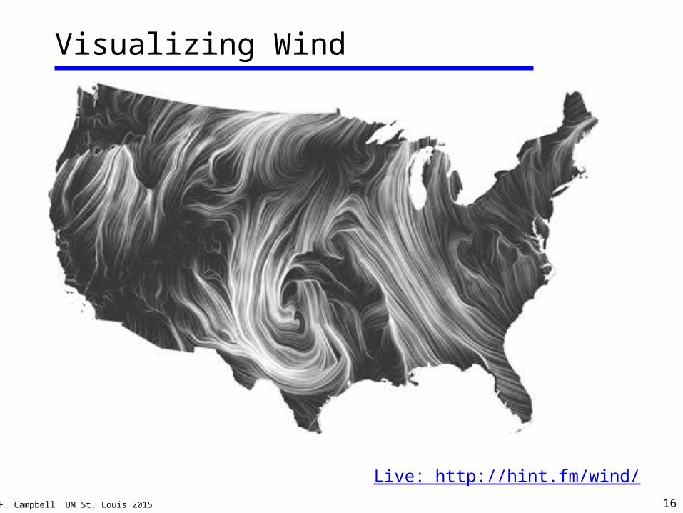
Visualizing Wind
http://www.fangraphs.com/
Live: http://hint.fm/wind/
© J.F. Campbell UM St. Louis 2015 17
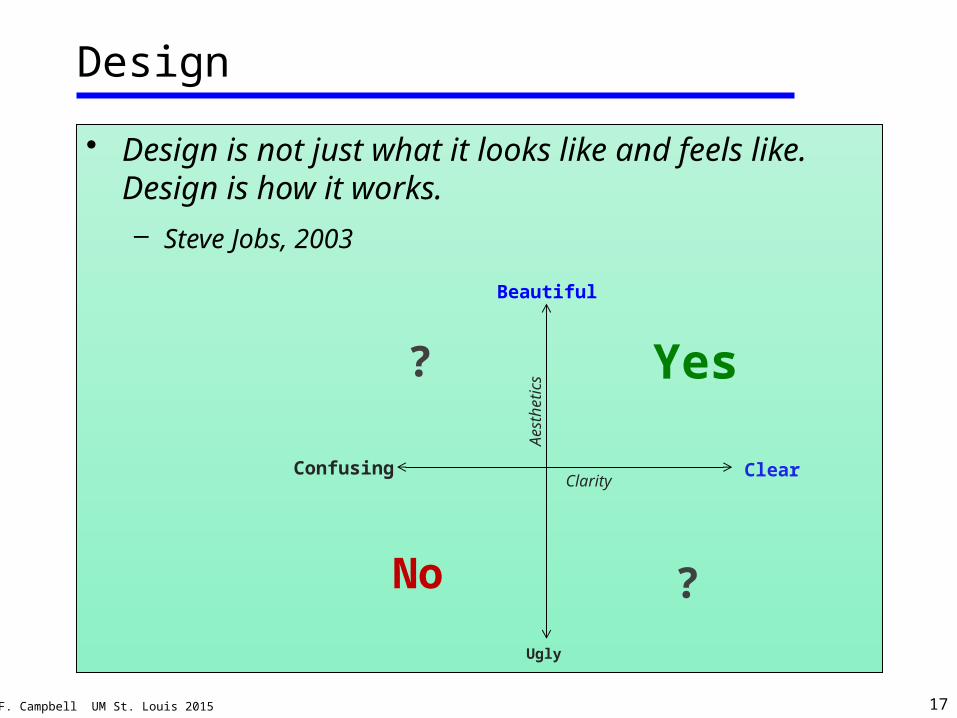
Design
• Design is not just what it looks like and feels like. Design is how it works.– Steve Jobs, 2003
Clarity
Aest
heti
cs
Confusing
Ugly
Beautiful
Clear
Yes
No ?
?
© J.F. Campbell UM St. Louis 2015 19
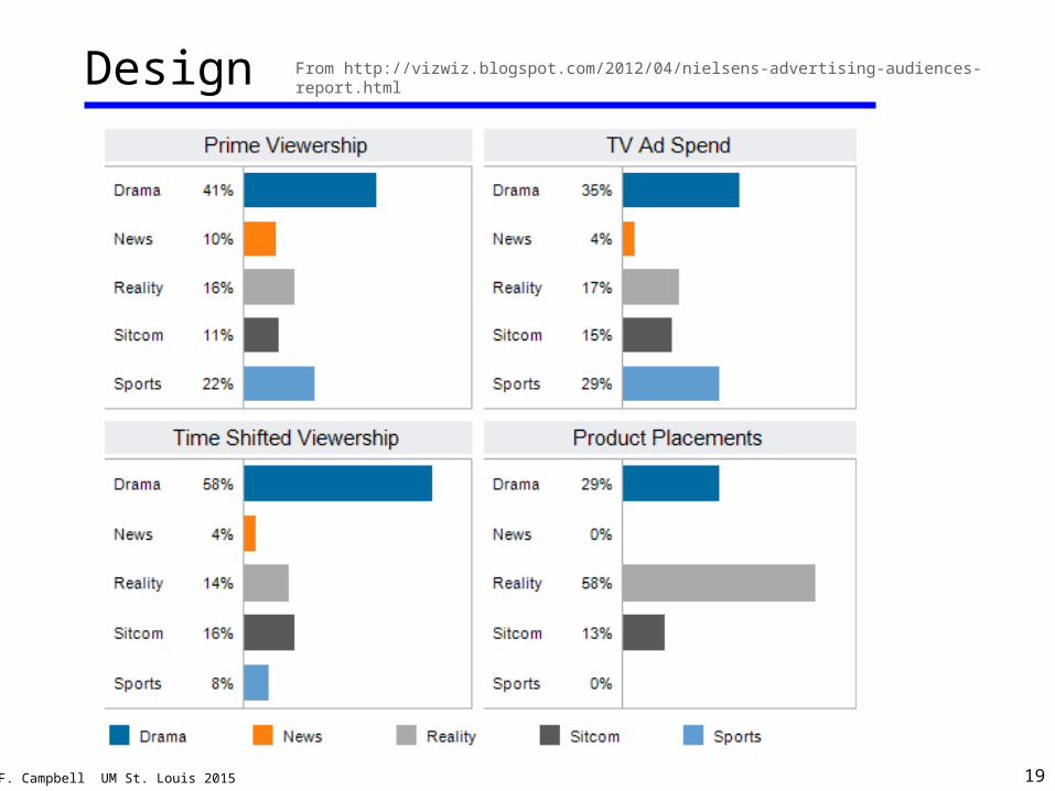
Design From http://vizwiz.blogspot.com/2012/04/nielsens-advertising-audiences-report.html
© J.F. Campbell UM St. Louis 2015 20
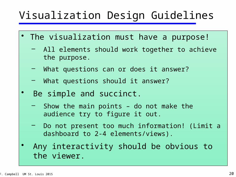
Visualization Design Guidelines
• The visualization must have a purpose!– All elements should work together to achieve the
purpose.
– What questions can or does it answer?
– What questions should it answer?
• Be simple and succinct.– Show the main points – do not make the audience try
to figure it out.
– Do not present too much information! (Limit a dashboard to 2-4 elements/views).
• Any interactivity should be obvious to the viewer.
© J.F. Campbell UM St. Louis 2015 21
Visualization Design Guidelines
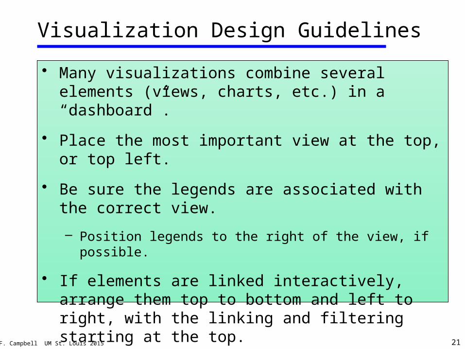
• Many visualizations combine several elements (views, charts, etc.) in a “dashboard”.
• Place the most important view at the top, or top left.
• Be sure the legends are associated with the correct view.
– Position legends to the right of the view, if possible.
• If elements are linked interactively, arrange them top to bottom and left to right, with the linking and filtering starting at the top.
© J.F. Campbell UM St. Louis 2015 22
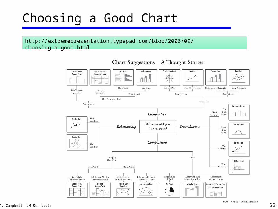
Choosing a Good Chart
http://extremepresentation.typepad.com/blog/2006/09/choosing_a_good.html
© J.F. Campbell UM St. Louis 2015 23
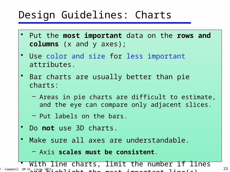
Design Guidelines: Charts
• Put the most important data on the rows and columns (x and y axes);
• Use color and size for less important attributes.
• Bar charts are usually better than pie charts:
– Areas in pie charts are difficult to estimate, and the eye can compare only adjacent slices.
– Put labels on the bars.
• Do not use 3D charts.
• Make sure all axes are understandable.
– Axis scales must be consistent.
• With line charts, limit the number if lines and highlight the most important line(s).
© J.F. Campbell UM St. Louis 2015 24
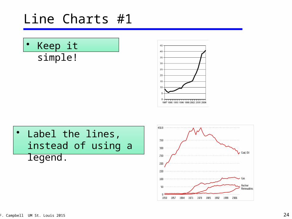
Line Charts #1
• Keep it simple!
• Label the lines, instead of using a legend.
© J.F. Campbell UM St. Louis 2015 25
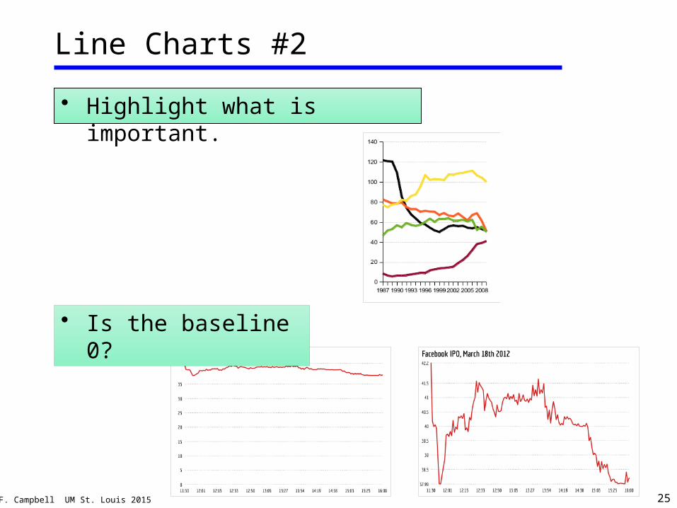
• Highlight what is important.
Line Charts #2
• Is the baseline 0?
© J.F. Campbell UM St. Louis 2015 26
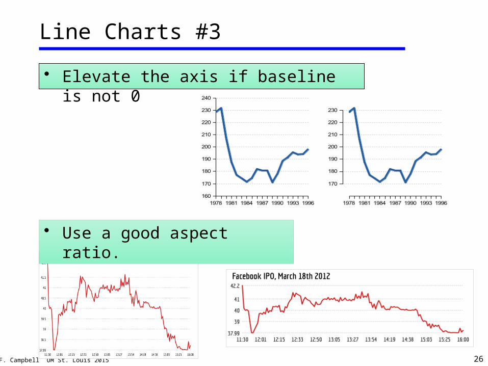
• Elevate the axis if baseline is not 0
Line Charts #3
• Use a good aspect ratio.
© J.F. Campbell UM St. Louis 2015 27
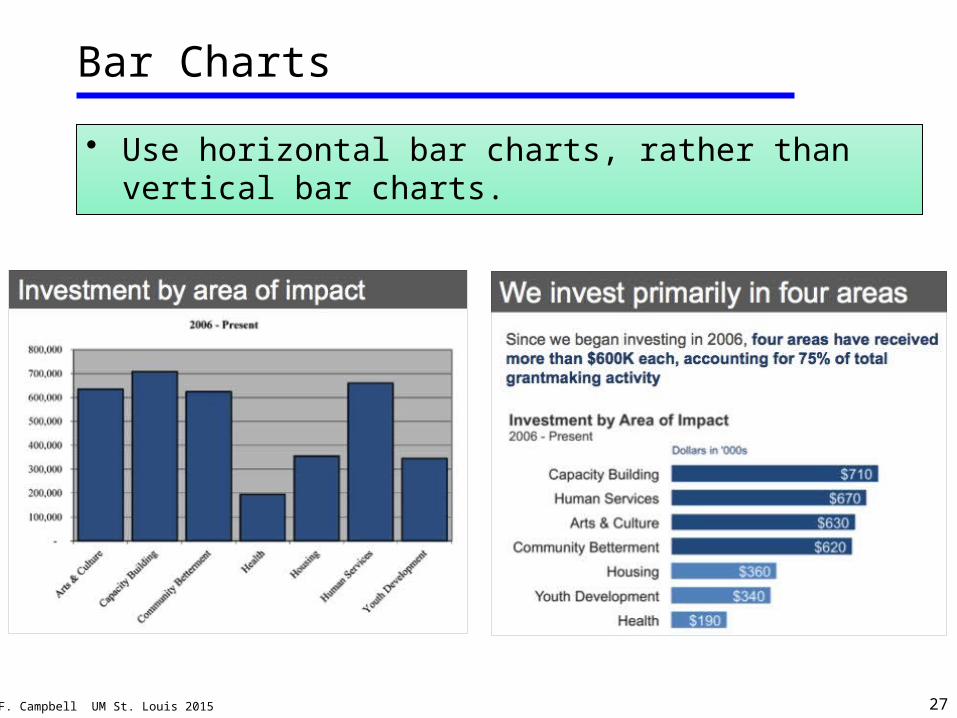
Bar Charts
• Use horizontal bar charts, rather than vertical bar charts.
© J.F. Campbell UM St. Louis 2015 28
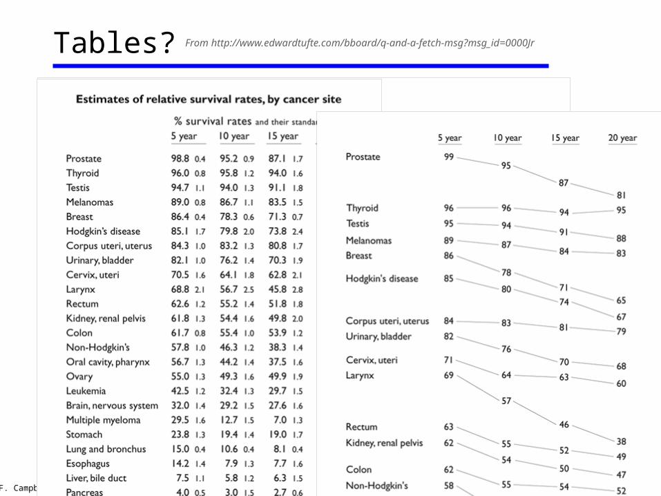
Tables? From http://www.edwardtufte.com/bboard/q-and-a-fetch-msg?msg_id=0000Jr
© J.F. Campbell UM St. Louis 2015 29
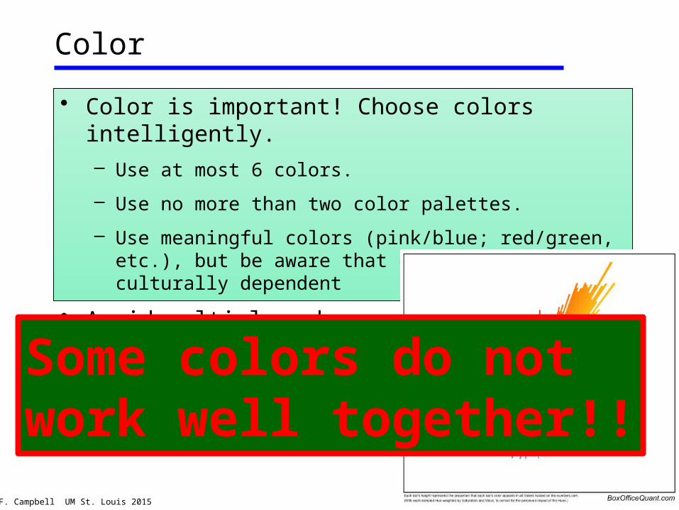
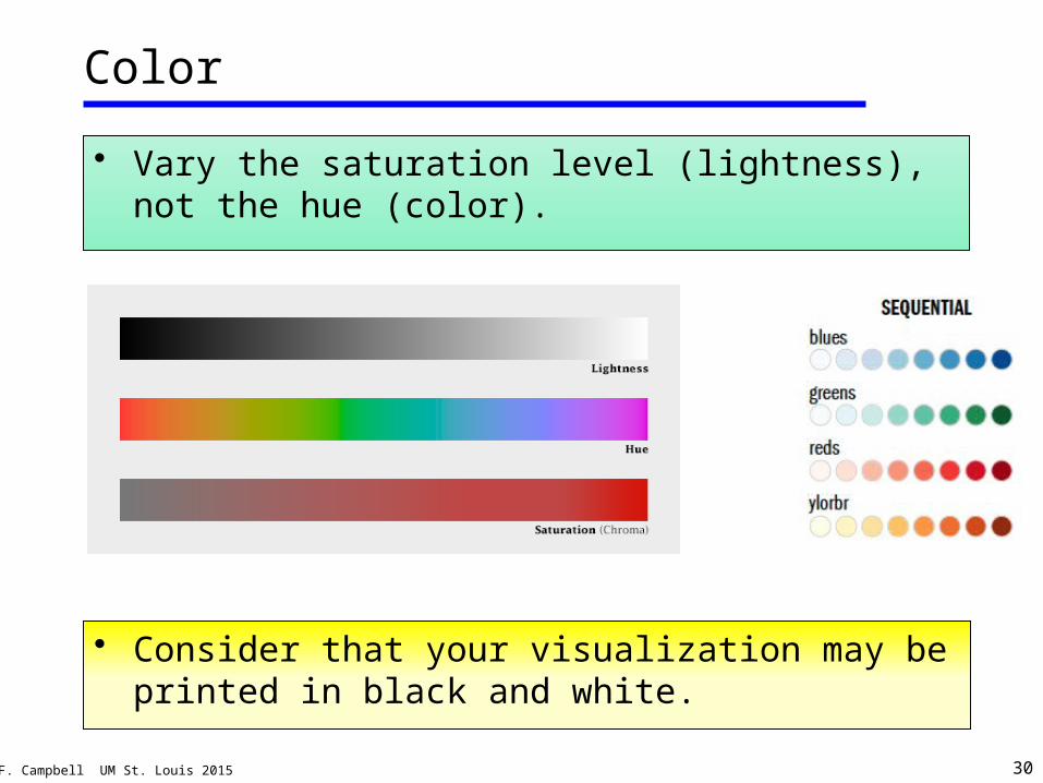
Color
• Color is important! Choose colors intelligently.– Use at most 6 colors.
– Use no more than two color palettes.
– Use meaningful colors (pink/blue; red/green, etc.), but be aware that colors are culturally dependent
• Avoid multiple schemes.
Some colors do not work well together!!
© J.F. Campbell UM St. Louis 2015 30
Color
• Vary the saturation level (lightness), not the hue (color).
• Consider that your visualization may be printed in black and white.
© J.F. Campbell UM St. Louis 2015 31
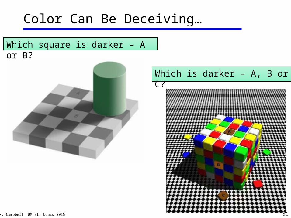
Color Can Be Deceiving…
Which square is darker – A or B?
Which is darker – A, B or C?
© J.F. Campbell UM St. Louis 2015 32
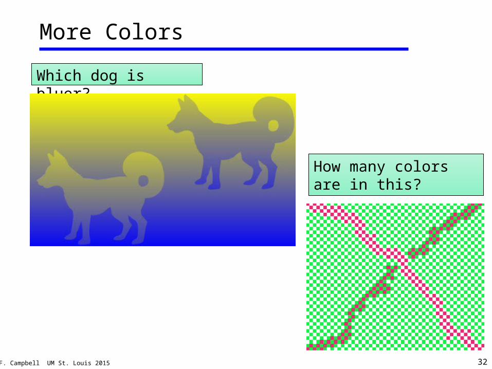
More Colors
Which dog is bluer?
How many colors are in this?
© J.F. Campbell UM St. Louis 2015 33
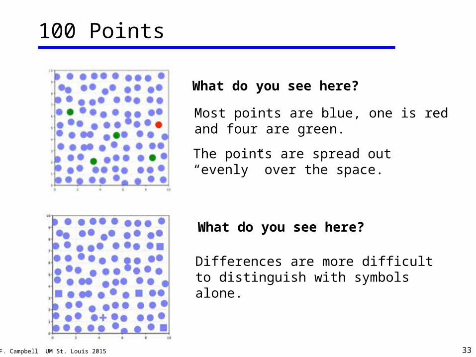
100 Points
What do you see here?
Most points are blue, one is red and four are green.
The points are spread out “evenly” over the space.
What do you see here?
Differences are more difficult to distinguish with symbols alone.
© J.F. Campbell UM St. Louis 2015 34
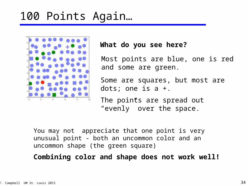
100 Points Again…
You may not appreciate that one point is very unusual point - both an uncommon color and an uncommon shape (the green square)
Combining color and shape does not work well!
What do you see here?
Most points are blue, one is red and some are green.
Some are squares, but most are dots; one is a +.
The points are spread out “evenly” over the space.
© J.F. Campbell UM St. Louis 2015 35
Fonts
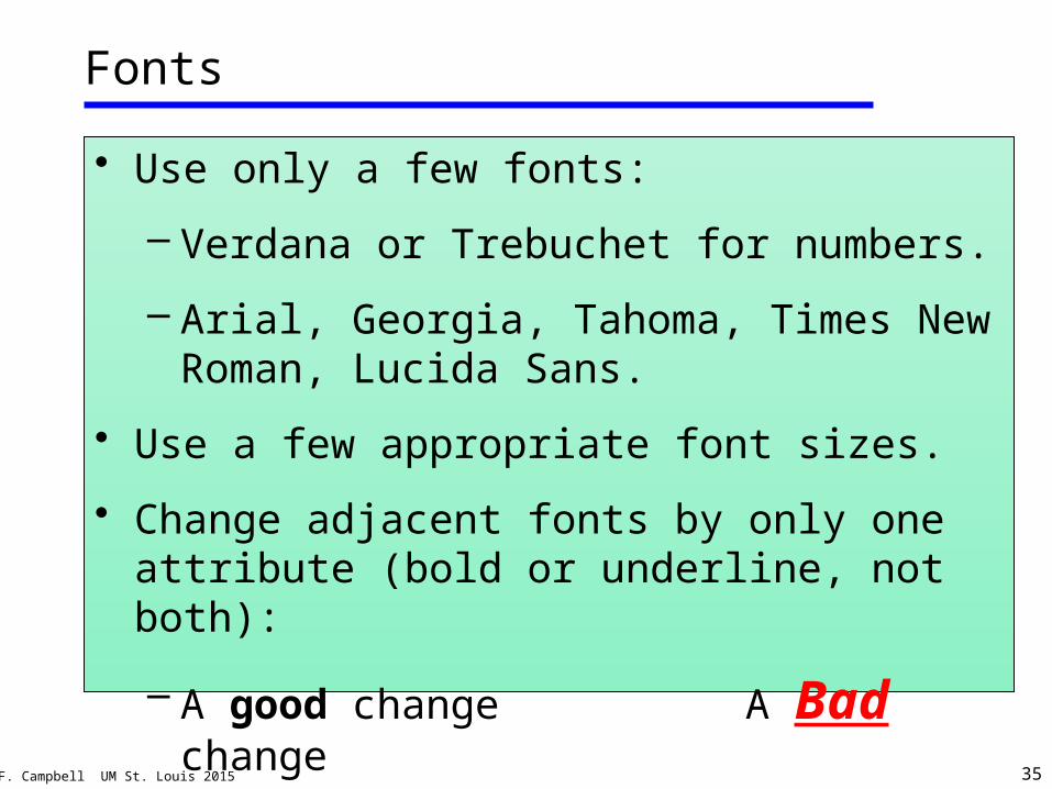
• Use only a few fonts:
– Verdana or Trebuchet for numbers.
– Arial, Georgia, Tahoma, Times New Roman, Lucida Sans.
• Use a few appropriate font sizes.
• Change adjacent fonts by only one attribute (bold or underline, not both):
– A good change A Bad change
© J.F. Campbell UM St. Louis 2015 36
Infographics
• A common type of visualization specific to a particular context.
• Usually created for a single dataset for a particular purpose.
• Not designed for the user to explore the data.
• Most view infographics as a type of visualization; but some see it the opposite way.
© J.F. Campbell UM St. Louis 2015 37
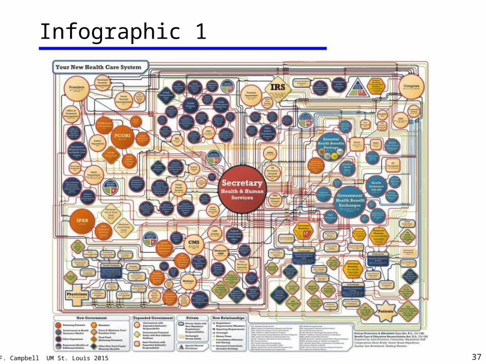
Infographic 1
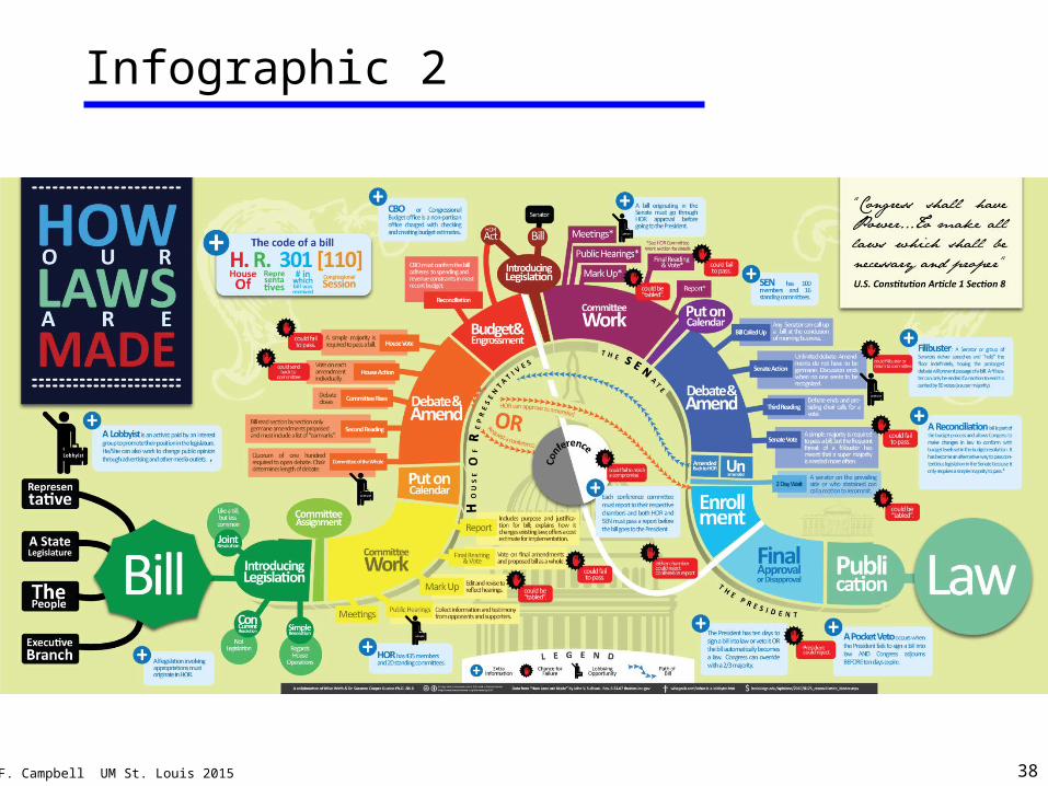
© J.F. Campbell UM St. Louis 2015 38
Infographic 2
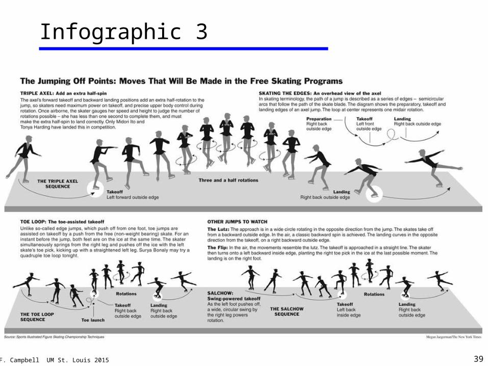
© J.F. Campbell UM St. Louis 2015 39
Infographic 3
© J.F. Campbell UM St. Louis 2015 40
Summary
• Use the real estate wisely.
• Show the main points – do not make the audience try to figure it out.
• Do not present too much information!
• Do the squint test:
– What stands out? What do you see?
• Show it to someone else and ask what they see.
• Include the source of the data.
© J.F. Campbell UM St. Louis 2015 41
• A great site for visualization basics.
• A great site for Tableau information.
• More design guidance…
Basic Information
http://guides.library.duke.edu/tableau
http://www.youtube.com/watch?v=pD_OvRtH0aY
http://guides.library.duke.edu/datavis/
© J.F. Campbell UM St. Louis 2015 42
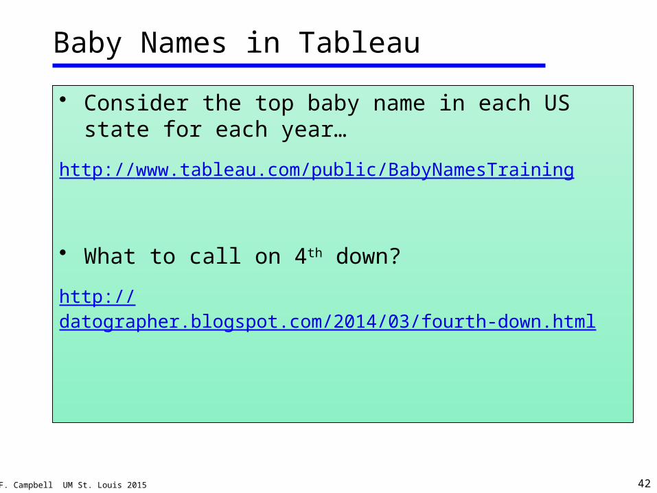
Baby Names in Tableau
• Consider the top baby name in each US state for each year…
http://www.tableau.com/public/BabyNamesTraining
• What to call on 4th down?
http://datographer.blogspot.com/2014/03/fourth-down.html
© J.F. Campbell UM St. Louis 2015 43
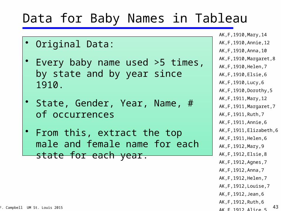
Data for Baby Names in Tableau
• Original Data:
• Every baby name used >5 times, by state and by year since 1910.
• State, Gender, Year, Name, # of occurrences
• From this, extract the top male and female name for each state for each year.
AK,F,1910,Mary,14
AK,F,1910,Annie,12
AK,F,1910,Anna,10
AK,F,1910,Margaret,8
AK,F,1910,Helen,7
AK,F,1910,Elsie,6
AK,F,1910,Lucy,6
AK,F,1910,Dorothy,5
AK,F,1911,Mary,12
AK,F,1911,Margaret,7
AK,F,1911,Ruth,7
AK,F,1911,Annie,6
AK,F,1911,Elizabeth,6
AK,F,1911,Helen,6
AK,F,1912,Mary,9
AK,F,1912,Elsie,8
AK,F,1912,Agnes,7
AK,F,1912,Anna,7
AK,F,1912,Helen,7
AK,F,1912,Louise,7
AK,F,1912,Jean,6
AK,F,1912,Ruth,6
AK,F,1912,Alice,5
AK,F,1912,Esther,5
© J.F. Campbell UM St. Louis 2015 44
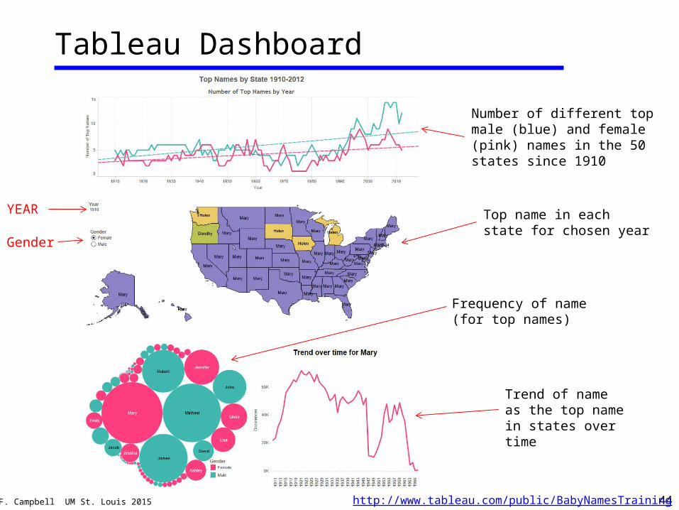
Tableau Dashboard
Number of different top male (blue) and female (pink) names in the 50 states since 1910
Top name in each state for chosen year
Frequency of name (for top names)
Trend of name as the top name in states over time
YEAR
Gender
http://www.tableau.com/public/BabyNamesTraining