Embed Size (px)
Citation preview

Q 7)
I used to many pictures on the front cover of my school magazine which made it look unprofessional and unclear on what the magazine was about, so for my music magazine I only used one image which Is positioned across the page.
When I was producing my music magazine I learned how to get rid of the background of a picture using the magic wand and quick select tool. Getting rid of the background of the photo helped my magazine look more professional and neat. Whereas I was unaware on how to do this when producing my school magazine so the images I used don’t look very professional.
My masthead for my school magazine is a little on the small side and doesn’t really catch people’s attention, whereas for my music magazine I made my masthead large and fit across the entire top of the page which helps make it easy to read and stand out from any other magazine.
The text on my school magazine is also very small and hard to read unlike the text on my music magazine which is very large and easy to read. I also used different colours for the text on my music magazine to make it look more appealing to people whereas I only used black for all the text on my school magazine.
For my music magazine I featured a banner at the bottom with some information written on and I also included a barcode and price on the page unlike in my school magazine where I didn’t include any of that.
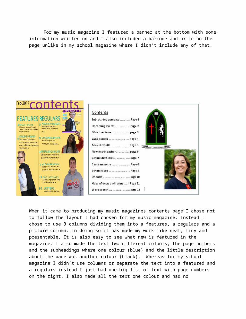
When it came to producing my music magazines contents page I chose not to follow the layout I had chosen for my music magazine. Instead I chose to use 3 columns dividing them into a features, a regulars and a picture column. In doing so it has made my work like neat, tidy and presentable. It is also easy to see what new is featured in the magazine. I also made the text two different colours, the page numbers and the subheadings where one colour (blue) and the little description about the page was another colour (black). Whereas for my school magazine I didn’t use columns or separate the text into a featured and a regulars instead I just had one big list of text with page numbers on the right. I also made all the text one colour and had no subheadings with a small description about that specific topic underneath.
For my music magazine the title is big and bold at fist almost the whole way across the top of the page and has colour which makes it appealing to the eye and stand out, whereas my school magazines title is small in the corner of the page and has no colour at all making it dull boring and unattractive.
For my music magazine I made the page numbers big and bold and had them on the left hand side of the text unlike my school magazine which had them on the left side and in a small font making it unclear what page you are looking for.
I also erased the backgrounds from the pictures I used for my music magazine making them look more neat and presentable and less unprofessional.