Embed Size (px)
Citation preview
PORTFOLIOSIMRAN SETHI
FASHION EDITORIAL& AD
Before conducting any kind of photo shoot for an editorial, there are a couple of things essential for any stylist toknow. Fashion trends, target audience of the magazine as well as its concept and the theme play a vital role todetermine how to make an editorial shoot a success. Thus, in order to plan and execute an editorial shoot for Nylonmagazine based on S/S 2014 trends where I would play a role of a stylist ,photographer and an art director indeciding the layout, I firstly did a brief research on Nylon Magazine in terms of its concept, style and imagery andtarget audience before I could begin to decide the theme and concept of my fashion editorial . Having understood themagazine: its concept and target audience; the next milestone to be crossed was to choose an appropriate theme forthe editorial in addition to finding an apt story for an editorial along with recognizing the major S/S 2014 trends onrunways which I would incorporate in my editorial .
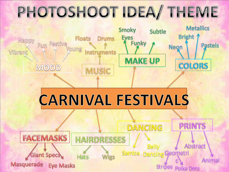
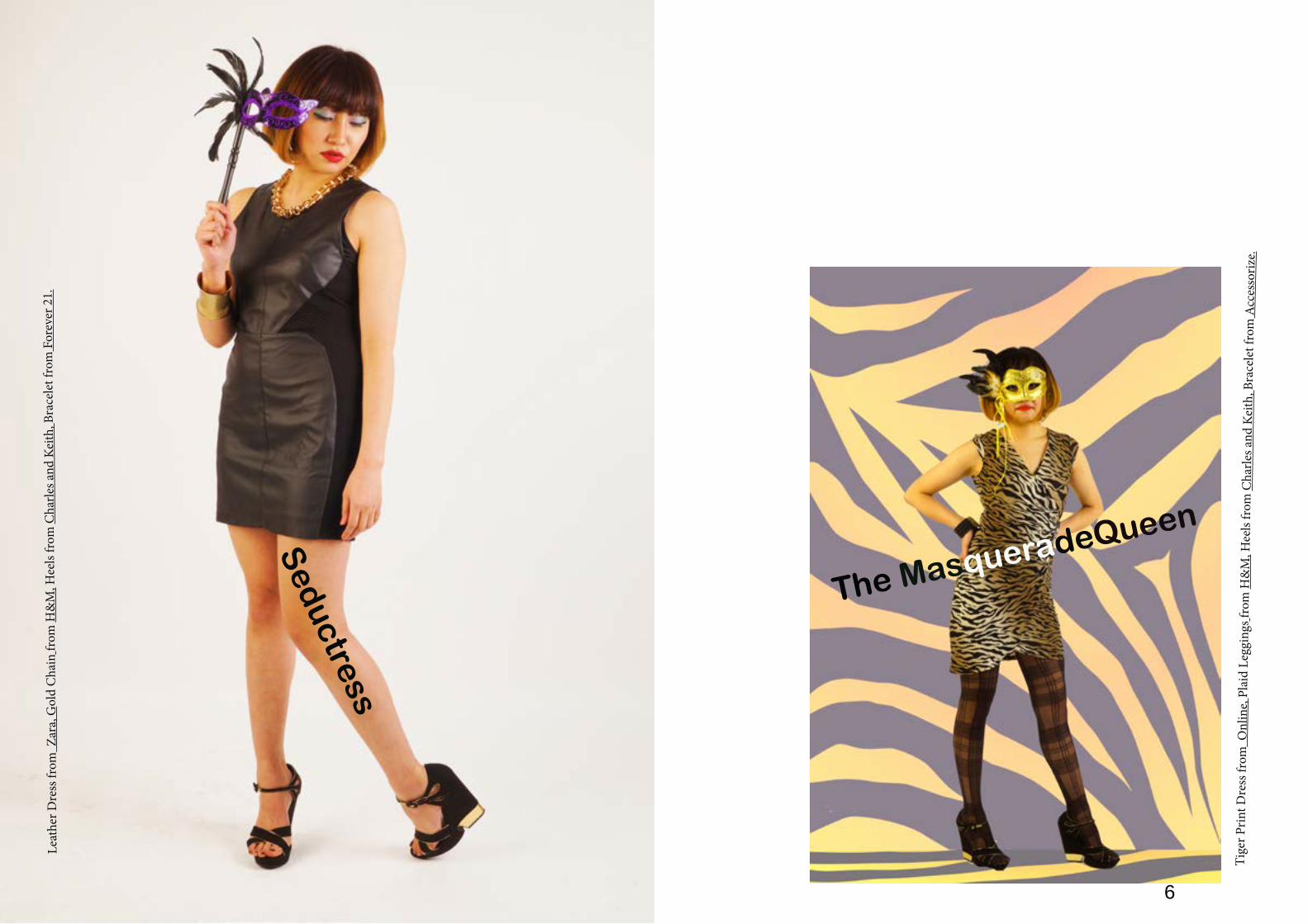
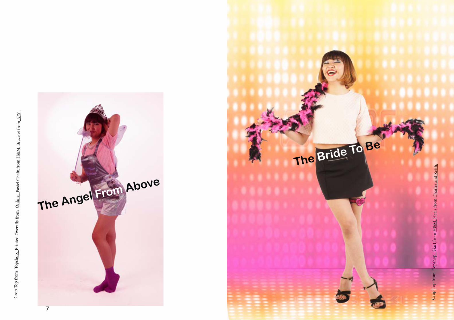
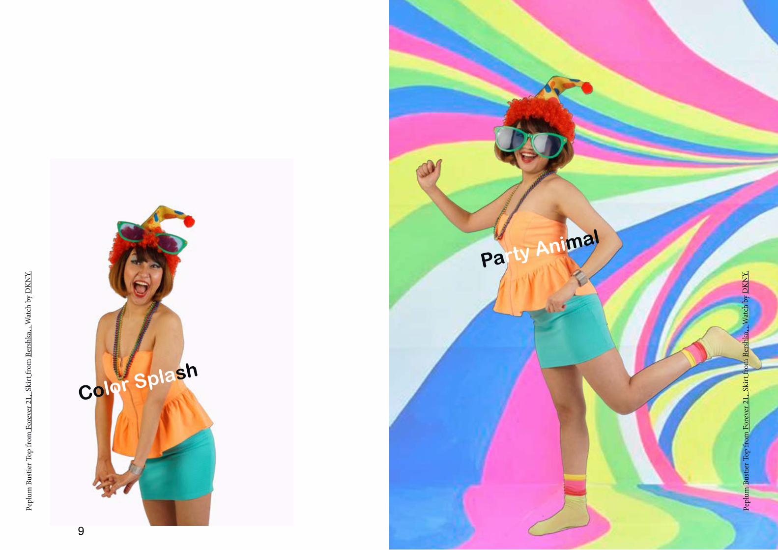
Since the target market for my selected magazine, Nylon is young fashion loving and trendy women; Ichose my editorial theme to be ‘Carnival Festivals’ i.e. festive seasons which typically involves a public celebrationor parade combining some elements of a circus, mask and public street party celebrated at different times of theyear across the globe. My editorial being inspired by the theme ‘Carnival Festivals’ named ‘Carnival Dreams’revolved around a trend conscious young girl who one afternoon while reading a book dozes off on her chair andbegins to dream of herself being dressed in vibrant and fun carnival themed outfits until the last shot where shewakes up on her chair again only to realize it was a dream. The story contained themes of youth, vibrancy and funwith a sense of femininity which was illustrated through the use of a sweet Japanese girl model with a soft, feminineand fun personality dressed in young, fun and vibrant outfits based on the S/S 2014 fashion trends with her hair letdown, smoky eyes and bright lips to add drama to the whole editorial along with using carnival props like funky earcap, angel wings, crown, magic wand, masquerade masks, feather scarf, joker hat and huge specs to name a few. Theeditorial was shot in the studio with soft box lighting set up on either side of the model in order to brighten thebackground as well as the model’s face. The sequence of the images saw the first shot with the girl asleep on herchair followed by her dreaming of leaving home with her luggage for the carnival and a series of events showing herbeing dressed in different attires with the level of excitement increasing with each shot until the last shot where shewakes stretching herself only to realize that it was nothing but a wonderful dream.
The editorial made use of photographic techniques like creative composition, selective focus to capture the model’sfacial expressions in some along with using fast shutter speed to capture the movement of the model’s actions.
After a successful shoot, though my job as a stylist and photographer was over, my task did not end there ashaving completed the shoot in order to shortlist the best shots shortlisted for each look, now as an Art Director Iscanned all the images on the basis of which best describes the theme and look. Having done that I then retouched allthe selected images before going for publication. In order to create drama and brighten the image, I applied severalretouching techniques like brightness/ contrast, color saturation, color balance, black and white, crop tool alongwith changing backgrounds to abstract ones and horizontal flip using Adobe Photoshop to meet the criteria of theeditorial being young, fun and vibrant.Thus, after applying post production to the selected images; in order to proceed to complete the entire editorialprocess and to decide a layout in order to get a rough view of how the images would be laid in the publication, priorto the final commitment using the InDesign Software; I, then created a flat plan i.e. a layout of how the imageswould be placed along with the credits, texts and captions is drawn on paper stating all these details in addition towhether the images would be full bleed or with borders in order to provide a clear picture of the layout to the arteditor and the team; keeping in mind that the real impact of the shoot is not lost.
The initial editorial story prior to the shoot contained 8 looks; but after the shoot looking at theimages to give the whole story a new depth and drama 11 shots were selected for the publication withrepetition of images in 3 outfits, thus, emphasizing their importance in the story. Therefore, the entire editorialwas then decided to contain 11 shots spread over 12 pages with 1 double page spread and the remaining 10 beingsingle page spreads with 8 images being shot full length, 1 being shot 3/4th length and 2 half length. 5 images werewith full bleed whereas the remaining 6 had borders of different lengths creating a rhythm and size contrast in orderto give the entire editorial a dramatic effect.
Lastly, I marked the end of the entire editorial process by creating the editorial on the basis of the decided layoutusing Adobe InDesign; ready to be sent for publication.
Having done this project , I learnt about the minute details essential in planning and executing an editorialphoto shoot along with gaining experience of how exactly a fashion publication functions in order to create theirpublication and also helped me broaden my knowledge about the importance of adhering to deadlines as creatingmagazines is no child’s play instead each team member plays an equally vital role in publication and thus, involvestrue team spirit, hard work and dedication to make each publication a success.
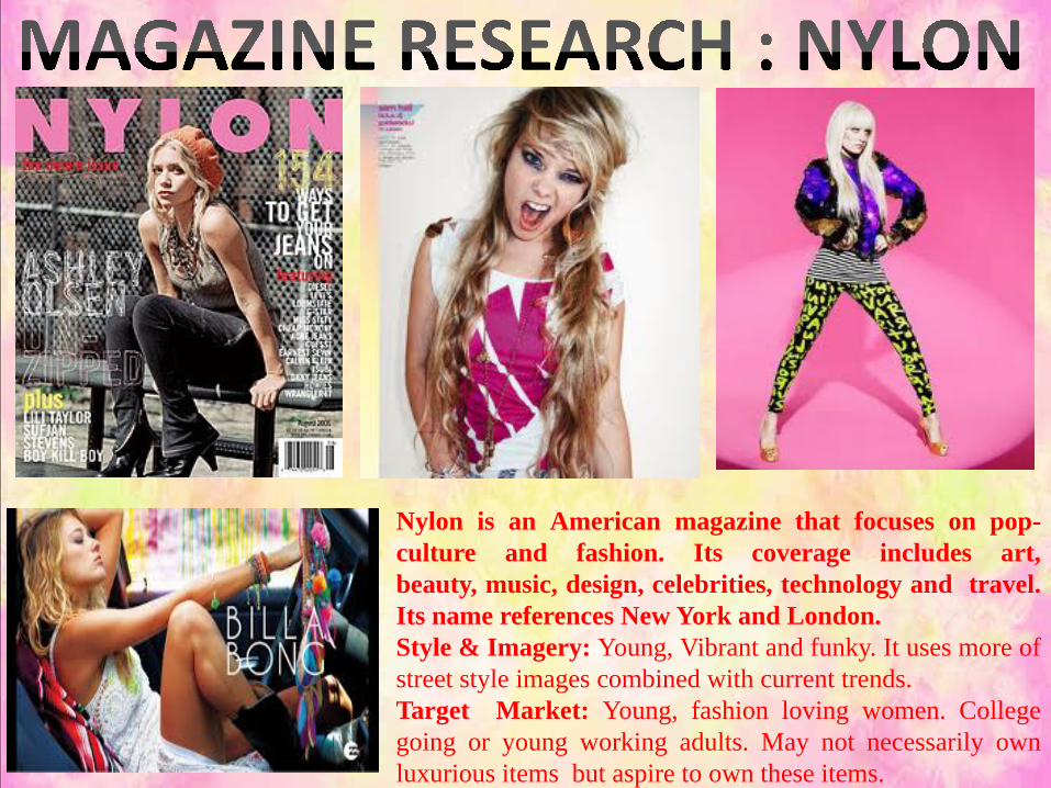
Nylon is an American magazine that focuses on pop-culture and fashion. Its coverage includes art,beauty, music, design, celebrities, technology and travel.Its name references New York and London.Style & Imagery: Young, Vibrant and funky. It uses more ofstreet style images combined with current trends.Target Market: Young, fashion loving women. Collegegoing or young working adults. May not necessarily ownluxurious items but aspire to own these items.
Hats SambaBelly
Dancing Geometric Animal
Abstract
Stripes Polka Dots

Taking inspiration from few of the images of the various carnival festivals across theglobe, I further created a theme board in link with the mood of my editorial being funand festive to create a better view for myself and my team of how my editorial would beinspired by carnival festivals. The purpose of making the theme board is to help myselfrefer to these images put together and visualize how exactly my editorial would look likebased on the theme ‘Carnival Festivals’.

The initial story board contained 8 looks but after the shoot looking at theimages to give the whole story a new depth and drama 11 shots were selectedfor the publication with repetition of dresses in 3 outfits emphasizing on theirimportance in the story.

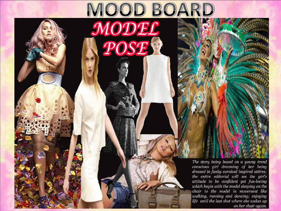
After deciding the theme and story; prior to the shoot, I even researched on the different kinds of accessories, facialexpressions, make up and model poses which I would use in my editorial based on ‘Carnival Festivals’ named“Carnival Dreams”. Thus, for a better understanding of how the editorial would look like with all of the essentialcomponents like accessories, facial expressions, make up and model poses put together; I further created variousmood boards along with one board describing the mood of the editorial to be young, fun, festive and vibrant with abit of drama.


PASTELS
ChanelGiles Antonio Berardi

LEATHER
Antonio Berardi Fashion East Giles Tom Ford
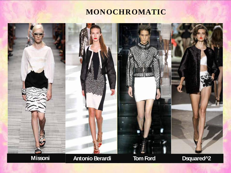
MONOCHROMATIC
Missoni Antonio Berardi Tom Ford Dsquared^2

Acne Studios
Alexander Mc Queen
Christian Dior
Carven
PRINTS
Valentino
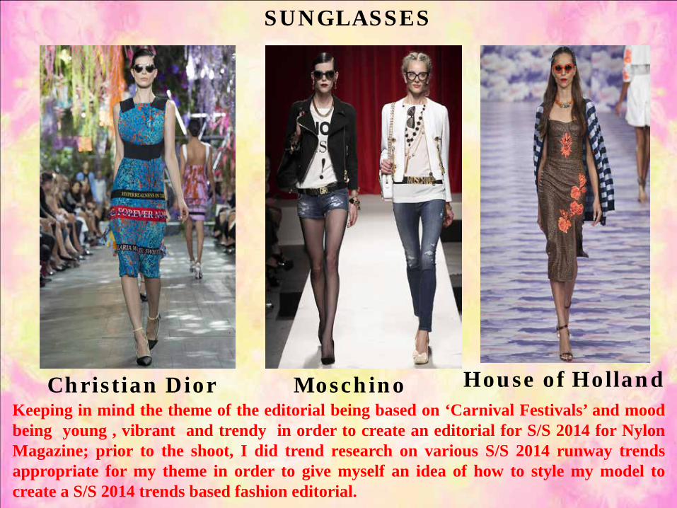
SUNGLASSES
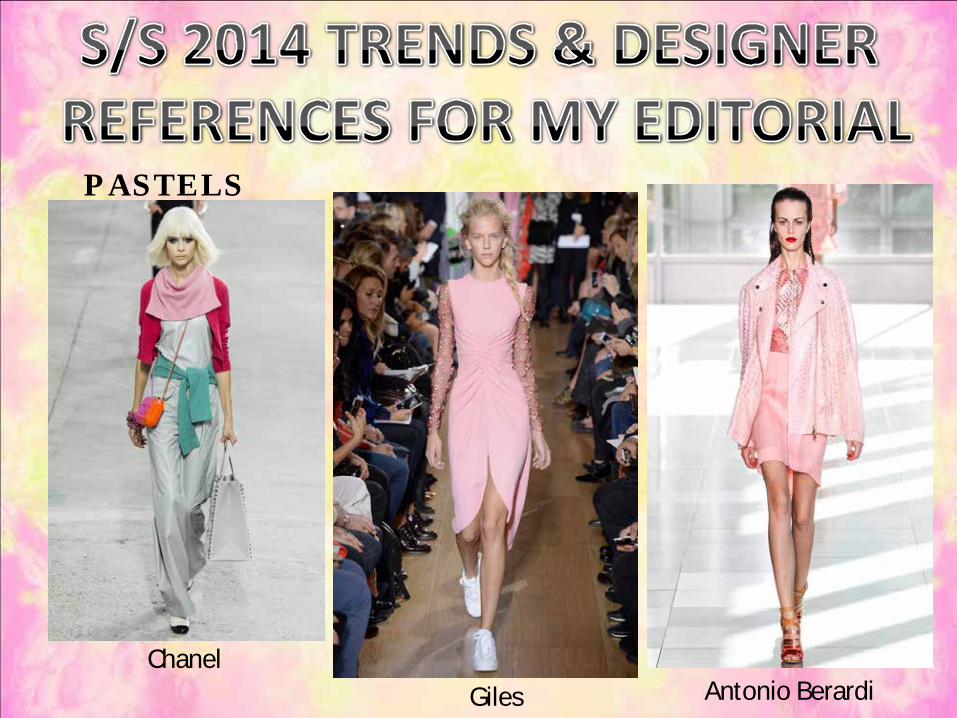
Christian Dior House of HollandMoschinoKeeping in mind the theme of the editorial being based on ‘Carnival Festivals’ and moodbeing young , vibrant and trendy in order to create an editorial for S/S 2014 for NylonMagazine; prior to the shoot, I did trend research on various S/S 2014 runway trendsappropriate for my theme in order to give myself an idea of how to style my model tocreate a S/S 2014 trends based fashion editorial.

List of things I require for the shootüHatsüWigsüRoman Laurel WreathüFeather HeadbandsüMasquerade MasksüEye MasksüGiant SpecsüFeather StreamersüSuitcaseüHeelsüSlippersüColorful Clothing-Pastels-Neon-Bright-Metallic-Stockings/Socks-Printed Outfits: Animal, Geometric, Abstract

STYLING LOOKS
Look 1 Look 2 &3 Look 4 Look 5
Look 6 Look 7 Look 8 &9 Look 10 & 11
Look 1 Look 2 &3

FLAT PLAN
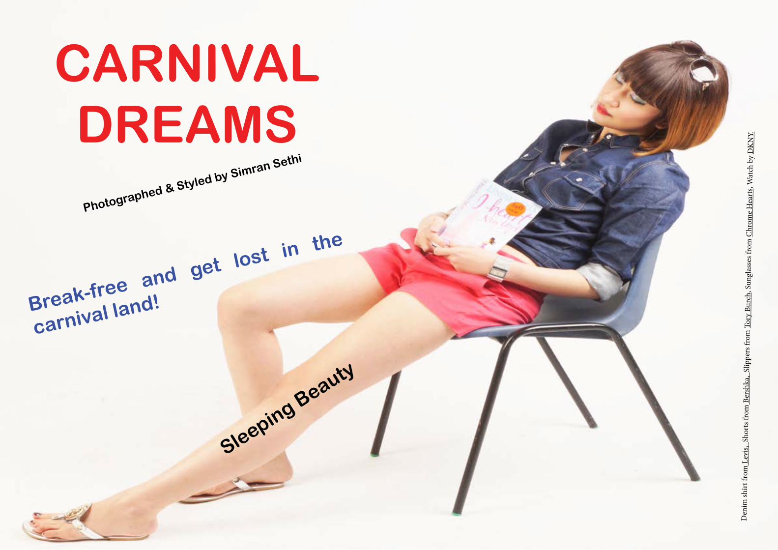
CARNIVAL DREAMS
Photographed & Styled by Simran Sethi
Break-free and get lost in the
carnival land!
Sleeping Beauty
Den
im sh
irt fr
om L
evis,
Sho
rts f
rom
Ber
shka
, Sl
ippe
rs fr
om T
ory
Burc
h, S
ungl
asse
s fro
m C
hrom
e H
eart
s, W
atch
by
DK
NY.

3 4
Monochromatic Zinger
Off to Carnival Land
Strip
e sh
irt fr
om Z
ara
Lea
ther
Pan
t fro
m H
&M
, H
at fr
om H
&M
,, Su
ngla
sses
from
Her
mes
, Wat
ch b
y G
ucci
, Bra
cele
t fro
m F
orev
er 2
1.
Strip
e sh
irt fr
om Z
ara
Lea
ther
Pan
t fro
m H
&M
, H
at fr
om H
&M
,, Su
ngla
sses
from
Her
mes
, Wat
ch b
y G
ucci
i, H
eels
from
Cha
rles a
nd K
eith
, Bra
cele
t fro
m
Fore
ver 2
1.
65
Seductress
The MasqueradeQueen
Leat
her D
ress
from
Zar
a, G
old
Cha
in fr
om H
&M
, Hee
ls fr
om C
harle
s and
Kei
th, B
race
let f
rom
For
ever
21.
Tige
r Prin
t Dre
ss fr
om O
nlin
e, Pl
aid
Legg
ings
from
H&
M, H
eels
from
Cha
rles a
nd K
eith
, Bra
cele
t fro
m A
cces
soriz
e.
7 8
The Angel From Above
The Bride To Be
Cro
p To
p fr
om T
opsh
op,
Prin
ted
Ove
ralls
from
Onl
ine,
Pas
tel C
hain
from
H&
M, B
race
let f
rom
A/X
.
Cro
p To
p fr
om T
opsh
op,
Skirt
from
H&
M, H
eels
from
Cha
rles a
nd K
eith
,
9 10
Color Splash
Party Animal
Pepl
um B
ustie
r Top
from
For
ever
21,
Ski
rt fr
om B
ersh
ka, ,
Wat
ch b
y D
KN
Y.
Pepl
um B
ustie
r Top
from
For
ever
21,
Ski
rt fr
om B
ersh
ka, ,
Wat
ch b
y D
KN
Y.

11 12
Time To Wake Up
Tank
Top
from
For
ever
21,
Bla
zer f
rom
Onl
ine,
Shor
ts fr
om F
orev
er 2
1, W
atch
by
DK
NY,
Slip
pers
from
Tor
y Bu
rch.
Back To Reality
Tank
Top
from
For
ever
21,
Bla
zer f
rom
Onl
ine,
Shor
ts fr
om F
orev
er 2
1, W
atch
by
DK
NY,
Slip
pers
from
Tor
y Bu
rch.
The second part of the fashion editorial project involved me to design a fashion ad for a fashion label as well as decide itsfinal layout for publication with the main aim being to be able to lure its customers to buy the product . Though in the realfashion publication world, fashion publications are paid by clients to print their adverts which have already been shot bythe client’s consent and thus, only the finalised print ads are sent to the particular publication to be printed in theirpublication and thus, form a major part of the publication’s income., here in order to complete the advert right from theadvert shoot to the time of sending the advert for publication, I would play the role of not only the client of the selectedbrand to have a final say in the advert shoot but also be the stylist and photographer at the time of production as well as anart director of the selected publication house where the advert is sent to be printed post production; applying post productionto the images as well as deciding the final layout of the advert to send it for publication .
Keeping in mind that before proceeding to shoot an and for any fashion brand, it is vital for any photographer andstylist to understand the brand ethos, values and concept for which the advert is; since the brand identity is at stake andthus, needs to be shot with great planning in order to make it a success; I selected Estee Lauder as my brand to beadvertised in the same magazine as my fashion editorial i.e. Nylon. Having selected the brand, thus, in order to plan andexecute an advert shoot for nylon magazine based on S/S 2014 trends where I would play a role of a stylist ,photographer andan art director in deciding the layout, I firstly did a brief research on the Estee Lauder in terms of its concept, style andimagery and target audience along with the major trends of S/S 2014 witnessed on the runways before I could begin to decidethe specific product I would advertise for Estee Lauder. Having understood the brand: its concept and target audience, alongwith recognizing the major S/S 2014 trends I would incorporate in my ad keeping in mind the magazine’s concept of beingyoung, vibrant and funky; the next objective was to choose an appropriate concept for the advert which would not tarnishEstee Lauder’s brand image and the specific product I would advertise for the brand.
Since the target market for my selected brand , Estee Lauder is girls in their teens to the women in their 50s whohave elegance and style along with being beauty conscious in addition to keeping in mind that the Nylon magazine caters toyoung fashion loving and trendy women I chose my advert’s concept to be classy and sophisticated with traces of eleganceand maturity with the aim to sell the product Estee Lauder Double Wear Stay Rose Lipstick.
The story contained themes of sensuality, femininity and traces of seduction which was exemplified by using anAsian Indian Model with a strong personality dressed in classic and elegant outfits based on the S/S 2014 fashion trends withher hair let down, basic eyeliner and minor face contouring with blush to give her not only a classic and elegant look but alsoto make her look seductive.
The ad was shot in the bedroom of the model with natural lighting of the sun entering the window along with normalroom lighting and the camera set to a higher ISO value to brighten the model’s face and the set up. The sequence of theimages saw the first shot with a close up of her face where she is seen to be biting the lipstick followed by the other whereshe stands in a seductive pose with strawberry in one of her hands. The advertisement made use of photographic techniquescreative composition, depth of field and selective focus to capture the model’s facial expressions
After a successful shoot, though my job as a stylist and photographer was over, my task did not end there as havingcompleted the shoot in order to shortlist the best shots shortlisted for each look, now as a client as well as an Art Director Iscanned all the images on the basis of which best describes the brand concept as well as the theme of the story. Having donethat I then as an Art Director retouched all the selected images before going for publication. In order to create drama andbrighten the image several techniques like brightness/ contrast, color saturation, color balance and crop tool were appliedto make the ad look appealing using Adobe Photoshop to meet the criteria of the advertisement of relating it to the brandpersona of Estee Lauder which could be described to be elegant, classy with a bit of seduction.Thus, after applying post production to the selected images in order to proceed to complete the entire advert process and todecide a layout in order to get a rough view of how the images would be laid in the publication, prior to the final commitmentusing the InDesign Software, I then created a flat plan i.e. a layout of how the images would be placed along with thecredits, texts and captions is drawn on paper stating all these details in addition to whether the images would be full bleedor with borders in order to provide a clear picture of the layout to the art editor and their team; keeping in mind the brandconcept as well as seeing to it that the real impact of the shoot is not lost.
Thus, the entire ad was then decided to be of 2 pages with both being single page spreads with 1 images being shothalf length and other being quarter length. 1 image would be with full bleed whereas the other would have borders ofconstant size creating a rhythm and size contrast in order to give the ad a dramatic effect.
Lastly, I marked the end of the entire advert process by creating the ad on the basis of the decided layout using AdobeInDesign ; ready to be sent for publication.
Having done this project , I learnt about the minute details essential in planning and executing an advert photo shootalong with gaining experience that in order to be able to sell any product, it is essential to keep in mind the brand ethics andimage, and create an ad appealing to its viewers to attract them to buy the product without tarnishing the image of the brand .I also learnt that though unlike editorials, advertising tends to look cleaner, using simple lighting to really show off theclothing or make up with the motto to be able to sell the key merchandise; it is more tough to design an ad than an editorialas for the ad the brand image is at stake and usually the client has her say in the final end product and hence requires a lot ofcoordination in order to make it a success.

It was founded by Estée Lauder with four products and anunshakeable belief: that every woman can be beautiful. in1946.Today, more than 60 years later, that simple notion hasliterally changed the face of the beauty business. Essenceincludes beautiful beauty products.Brand Persona: Classy, Sophisticated, Elegant, Mature,Beautiful.Style & Imagery: Estee Lauder ads always try to portrayelegance and sophistication. The model is placed either on adark background or rich background to compliment the brandpersona. The ads are subject specific i.e. focus on the productthey are selling than the model.Target Market: No specific target audience; girls in theirteens to the women in their 50s those who portray elegance andstyle ; and are beauty conscious, all use this brand.
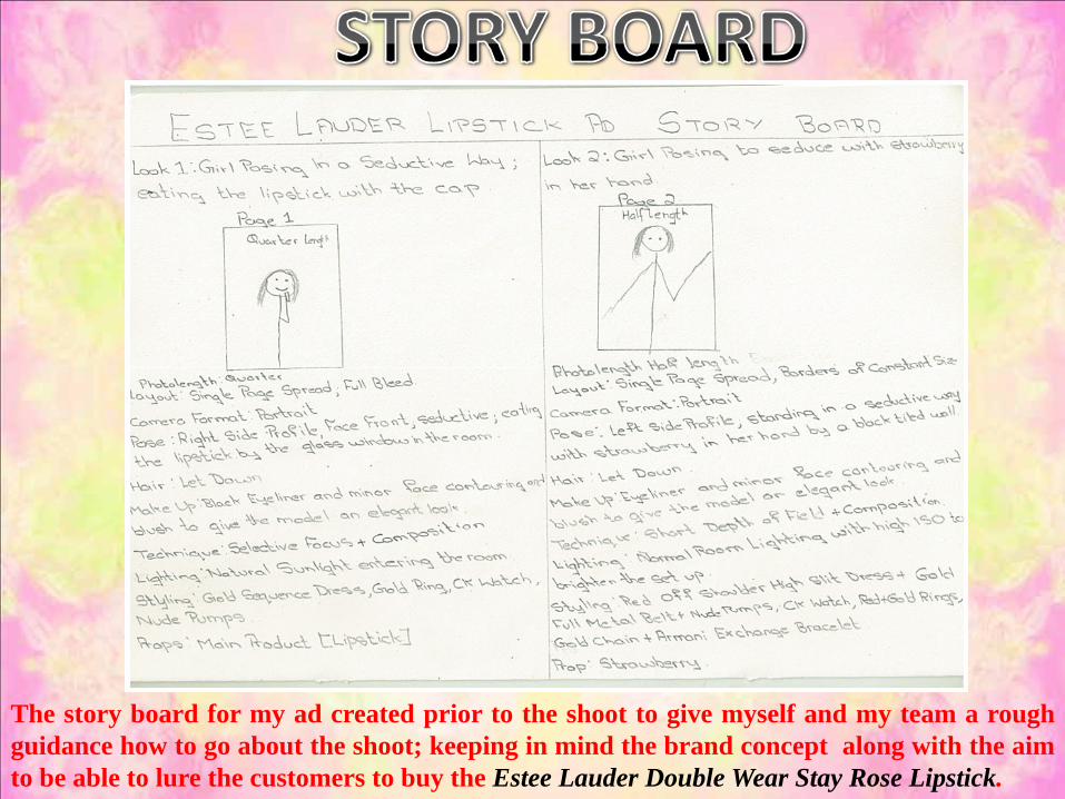
The story board for my ad created prior to the shoot to give myself and my team a roughguidance how to go about the shoot; keeping in mind the brand concept along with the aimto be able to lure the customers to buy the Estee Lauder Double Wear Stay Rose Lipstick.

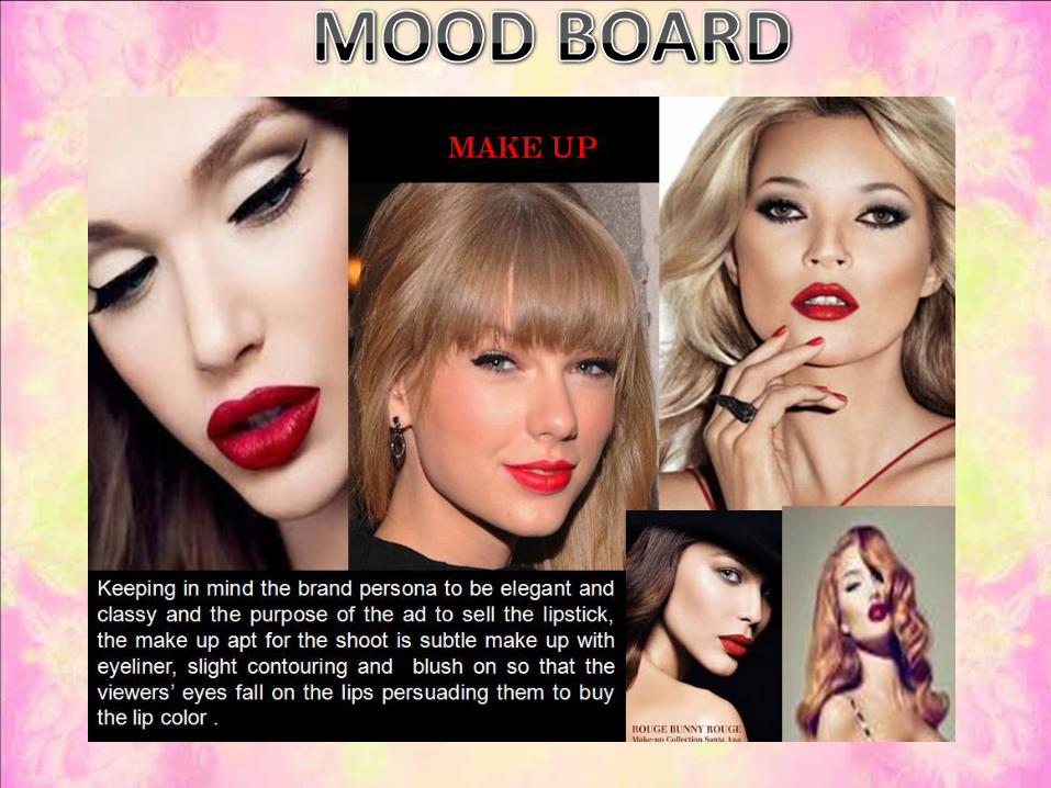
Prior to the shoot I created various mood boards for a better understanding of how the ad wouldlook with all of the essential components like facial expressions, model poses and makeup puttogether in order to explain the model and my team what kind of look I am going for. I also createdone mood board to understand and demonstrate the brand persona of Estee Lauder which can bedescribed as classy, sophisticated, elegant, elite and mature to help me refer back to, at the time of theshoot so that the true meaning of the shoot is not lost .


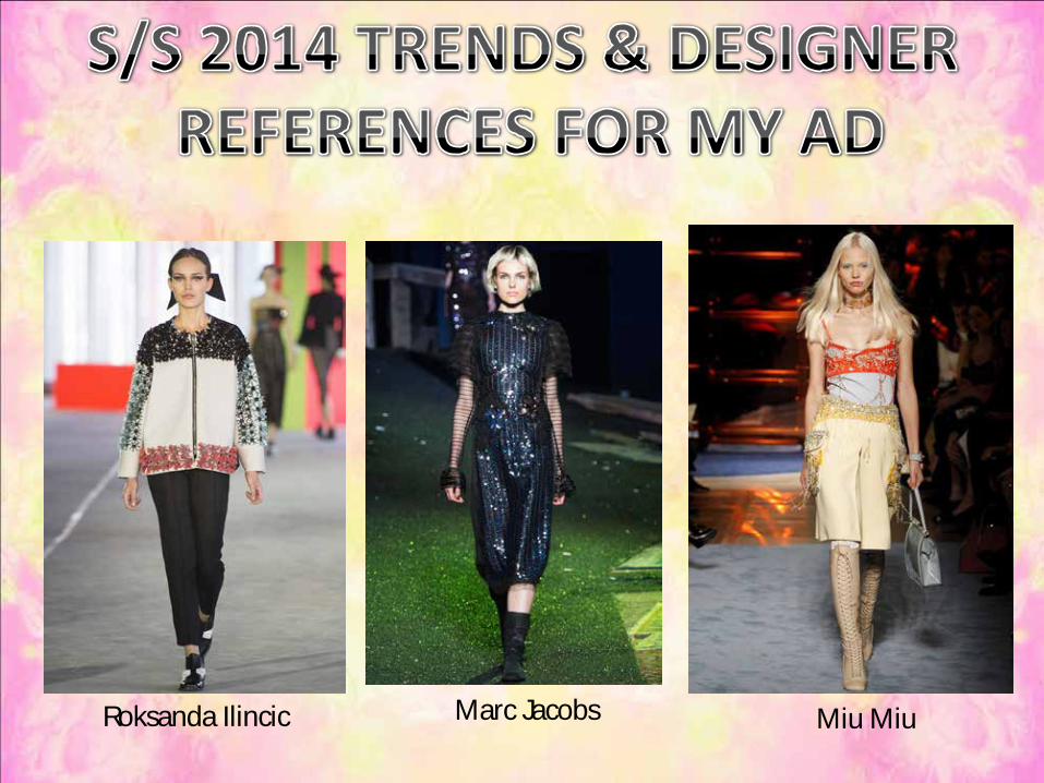
Roksanda Ilincic Marc Jacobs Miu Miu

COLD SHOULDER
Chanel Saint Laurent MulberryKeeping in mind the brand persona of Estee Lauder being sophisticated, elegant and classyalong with the story of the ad containing themes of sensuality, femininity and traces ofseduction; in order to create an advertisement for Estee Lauder Double Wear Lipstick StayRose Lip color based on S/S 2014 trends for Nylon Magazine, prior to the shoot I did trendresearch on various S/S 2014 runway trends appropriate for my ad theme and concept inorder to give myself an idea of how to style my model to create a S/S 2014 trends basedfashion ad for Estee Lauder.

List of things I require for the shoot
üEstee Lauder Stay Rose LipsticküFake NailsüGolden RingüGold ChainüGold Metal BeltüColorful Yet Elegant Clothing-Bright-MetallicüNude PumpsüStrawberry
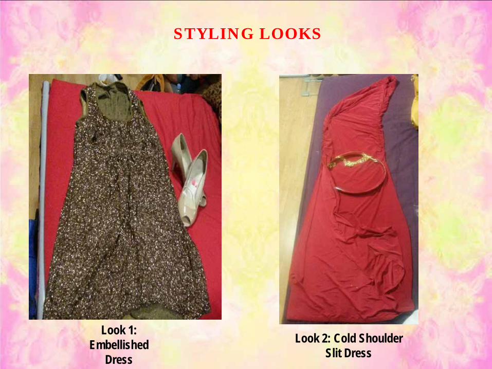
STYLING LOOKS
Look 1: Embellished
DressLook 2: Cold Shoulder
Slit Dress
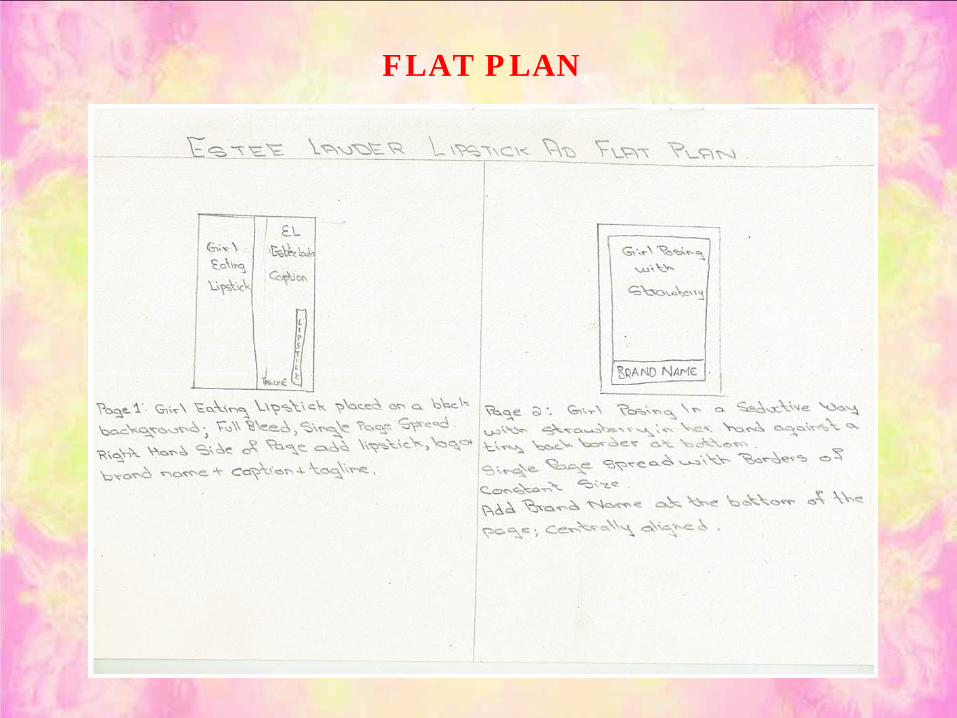
FLAT PLAN