Embed Size (px)
Citation preview

CHAPTER
2
Revit ArchitectureUser Interface
INTRODUCTION
This chapter is designed to acquaint you with the user interface and work environment ofRevit Architecture. The Revit user interface is logically organized and easy to learn. In thischapter, we will explore its major features. Many features of the interface follow standardMicrosoft Windows™ conventions. Some aspects of the user interface are unique to RevitArchitecture. In this overview, our goal is to make you comfortable with all aspects ofinteracting with and receiving feedback from your Revit software. Many of the lessonsthat follow are descriptive in nature and some are tutorial-based. Feel free to followalong in Revit Architecture as you read the descriptions.
OBJECTIVES
To get you quickly acquainted with the Revit user interface, topics we will exploreinclude:
• An overview of the Revit Architecture user interface
• Interface terminology
• Working with the Ribbon, Quick Access Toolbar, and the Options Bar
• Moving around a Revit Architecture model
UNIT CONVENTIONSThroughout this book, Imperial units and files will be listed first, followed by metricin brackets, for example, Imperial [Metric]. See the Preface for complete details onstyle conventions used throughout this book.
Imperial dimensions throughout this text appear in the “Feet and Inch” format forclarity. However, when typing imperial values into Revit, neither the foot symbol ( 0)(when typing whole feet) nor the hyphen separating the feet from inches (when typ-ing both) is required. Therefore, to type values of whole feet, simply type the number.To type values of both feet and inches, type the number of feet with the foot symbol( 0) followed immediately by the number of inches; the inch symbol is not required.
67
© C
enga
ge L
earn
ing.
All
right
s res
erve
d. N
o di
strib
utio
n al
low
ed w
ithou
t exp
ress
aut
horiz
atio
n.

You can also separate feet from inches with a space (press the SPACEBAR) and omitthe unit symbol. When typing only inches, the inch ( 00) symbol is required unlessyou preface the value with a leading 0 0. For example, 4 0-0 00 can be typed in RevitArchitecture as simply: 4 (or 48 00). To input four feet six inches, type: 4.5, 4 06 or54 00. You can also type 4 6 (that is 4 SPACE 6). To type 10 inches, type: 10 00 or0 010 or 0 10 (that is 0 SPACE 10). Hyphens are not required. When separatinginches from fractions, use a SPACE. Consult Table 2.1 for additional examples.
NOTE In all cases, avoid using a dash (or hyphen) to separate values as Revit will try to interpretsuch input as a mathematical expression.
NOTE Typing the foot ( 0) mark is acceptable when typing whole feet as well; however, it isnot required.
NOTE Dimensions throughout this text are given in the “Feet and Inch” format for clarity. How-ever, feel free to enter dimension values in whatever of the above acceptable formats youprefer. Eliminating the inch or foot marks where possible reduces keystrokes and is recom-mended despite their inclusion in this text.
If using metric units, all values in this text are in millimeters and can be typed indirectly with no unit designation required. More information on style conventionsused in this book can be found in the Preface.
UNDERSTANDING THE USER INTERFACERevit Architecture offers a clean and streamlined work environment designed to putthe tools and features that you need to use most often within easy reach. In additionto the many onscreen tools and controls, many of the most common tools also havekeyboard shortcuts. The topic of shortcuts will be explored below. Figure 2.1 showsthe Revit Architecture screen with each of the major interface elements labeled foryour reference.
TABLE 2.1 Acceptable Imperial Unit Input Formats
Value Required Type This:
Four feet 4 or 48 0000
Six inches .5 or 6 0000 or 0 006 or 0 6
Five feet six inches 5 006 or 66 0000 or 5.5 or 5 6
Four feet six and one half inches 4 006 ½ or 54.5 0000 or 4 6.5 or 4 6 1/2
68 S e c t i o n I • I n t r o du c t i o n and Me t h o d o l o g y
© C
enga
ge L
earn
ing.
All
right
s res
erve
d. N
o di
strib
utio
n al
low
ed w
ithou
t exp
ress
aut
horiz
atio
n.

The Revit interface continues to be refined in this release. The most significantchanges are the new modeless Properties palette (docked to the left side above theProject Browser by default) and the fixed location and consistent behavior of theModify and Context ribbon tabs. The ribbon (introduced in the last release) is atabbed panel across the top of the screen that includes all of the software’s buttonsand controls. This interface is consistent with many of Microsoft’s latest offeringsand is becoming widely adopted by other vendors as well. The concept of theribbon-style interface is to make commands and tools more accessible than theywere in pull-down menus, and to present tools to you in context with the task you areperforming.
Above the ribbon, in the top left corner of the Revit screen is where the Applicationmenu (adorned by the large Revit “R” icon) and the Quick Access Toolbar arelocated. At the top right are the standard Windows minimize, maximize, and closeicons, accompanied immediately to the left by the Info center and Help icons. Con-sistent with most Windows applications, a status bar frames the bottom edge of thescreen. On the left side of the screen (usually docked or attached) is the ProjectBrowser and the new Properties palette stacked atop one another. The Properties pal-ette allows immediate and ongoing access to the properties of any view or selectedelement in your Revit environment. The Project Browser can be thought of as the“table of contents” for your Revit project. It reveals all of the various representationsof your project data—referred to in Revit as “Views.” Views in Revit can be graphical
FIGURE 2.1 The Revit Architecture User Interface
Chap t e r 2 • Rev i t A r c h i t e c t u r e U s e r I n t e r f a c e 69
© C
enga
ge L
earn
ing.
All
right
s res
erve
d. N
o di
strib
utio
n al
low
ed w
ithou
t exp
ress
aut
horiz
atio
n.

(drawings, sketches, diagrams) or non-graphical (schedules, legends, takeoffs) andoffer the means to both query your project (output) and to manipulate and edit it(input). The Project Browser also lists the Families, Groups, and linked files thatreside in the project. When you open one or more of these views, they occupy viewwindows that can be tiled, cascaded, or maximized (full screen). Finally, stretchedacross the top of the screen just beneath the ribbon is the Options Bar. Optionsappear in this space as you work depending on the item or tool you have selected.(All of these items are labeled in Figure 2.1). Take some time to acquaint yourselfwith the various user interface elements. You can also right-click many items to seeadditional context-sensitive menus. Do not choose any right-click menu commandsat this time. You can simply click away from the menu to close it or press the ESC key.
Recent FilesWhen you first launch Revit, the “Recent Files” screen will appear (see Figure 2.2).This is like a welcome page that offers you options to open or create Revit files. Twomain areas are included. In the “Projects” area, you can use the Open link to open anexisting Revit project. Use the New link to create a new Revit project. The same twolinks appear for the “Families” area. In addition, there is also a New Conceptual Massitem in Families. Open existing Family files to edit content in your library and createnew ones to add to your library. Families will be discussed in detail in Chapter 10. Upto four of your recently opened files will appear in each area. You can simply click thepreview image to open that file.
FIGURE 2.2 The Recent Files screen greets you when you launch Revit
70 S e c t i o n I • I n t r o du c t i o n and Me t h o d o l o g y
© C
enga
ge L
earn
ing.
All
right
s res
erve
d. N
o di
strib
utio
n al
low
ed w
ithou
t exp
ress
aut
horiz
atio
n.

The third area is Resources. Here you will find links to “What’s New,” the Helpsystem, and some video files showcasing various features of the Revit Architecturesoftware. All of these resources are located on the Autodesk Web site, so Internetaccess is required.
Application MenuFile access and management tools are grouped under the Application menu (adornedby the large Revit “R” icon). Click on the big “R” to open the Application menu. Ifthis is your first time launching Revit, the right side of the Application menu will beempty. But as you open and close files, the list of recent files will begin to populate.Revit remembers the last several files you had opened and shows them here. You caneven click the pushpin icon to permanently “pin” a particular file to the menu, makingit easier to load next time (see the left side of Figure 2.3). Right at the top of theApplication menu are two icons to switch the list from Recent Documents to cur-rently Open Documents. These icons are pointed out in the figure. If you switch toOpen Documents and you have several project files and/or view windows open, youcan use the Application menu to switch between open windows (see the middle ofFigure 2.3).
On the left side of the menu, you will find commands like New, Open, Save, andSave As. Sub-menus on each item list the various file formats that can be opened orcreated. For example, a Revit project file contains all the work you do on your build-ing projects. It is the primary file type in Revit and has an RVT file extension.A Revit Family file has an RFA extension and each Family file contains a singlepiece of Revit content that can be loaded and used in one or more projects. Revitcan also open files with the ADSK and IFC extensions. Search the online help formore information on these file formats. When creating new Revit files, separateoptions are offered for Conceptual Mass, Annotations, and Titleblocks. Whilethese are all Family files and will use the RFA extension, each is typically createdfrom different template files and settings. Having the separate commands on theApplication menu makes it easier to load these templates when creating such files(see the right side of Figure 2.3).
FIGURE 2.3 The Application Menu
Chap t e r 2 • Rev i t A r c h i t e c t u r e U s e r I n t e r f a c e 71
© C
enga
ge L
earn
ing.
All
right
s res
erve
d. N
o di
strib
utio
n al
low
ed w
ithou
t exp
ress
aut
horiz
atio
n.

On the Save As sub-menu, options will be available based on the current file you haveloaded. For example, you cannot save a project file (RVT) as a Family file (RFA).Therefore, the Save As > Family option is grayed out when you are in a project.However, you can save a project as a new project template. Project Templates have aRTE extension and are discussed in detail in the next chapter. In addition to theoptions for saving, Revit files can be exported to a number of industry standardformats, such as DWG (AutoCAD drawing file), DGN (MicroStation drawingfile), and IFC (Industry Foundation Classification).
At the bottom of the Application menu two buttons appear: Options and Exit Revit.Exit Revit is self-explanatory. Revit will prompt you to save your work. Use theOptions button to open the Options dialog. This dialog has many program prefer-ences that you can configure. Most of the out-of-the-box settings are suitable forthe beginner. There may be some items that you or your CAD/BIM Manager willwant to adjust. Refer to the “Settings” topic below and the online help for moreinformation.
Quick Access ToolbarThe Quick Access Toolbar (QAT) as its name implies is a location for commonlyused tools to which you wish to have easy and “quick access.” The default QATincludes many common tools such as: Open, Save, Synchronize with Central,Undo, Redo, Measure, Dimension, Tag, Text, Default 3D view, Section, ThinLines, Close Hidden Windows, and switch windows. You can add buttons to theQAT with the menu on the right end of the QAT itself. For example, the New com-mand is not part of the default QAT. Simply choose it from the pop-up menu toadd it. At the bottom of this menu, you can also choose the Customize Quick AccessToolbar command to open a dialog with more options. In this dialog, you can rear-range tools on the QAT, add separators, and remove commands. For other com-mands not included on the list, locate them on the ribbon (see the next topic),right-click the tool, and choose Add to Quick Access Toolbar (see Figure 2.4).
FIGURE 2.4 The Quick Access Toolbar
72 S e c t i o n I • I n t r o du c t i o n and Me t h o d o l o g y
© C
enga
ge L
earn
ing.
All
right
s res
erve
d. N
o di
strib
utio
n al
low
ed w
ithou
t exp
ress
aut
horiz
atio
n.

RibbonsYou issue commands in Revit by clicking their tools on the ribbon. The ribbonreplaces more traditional pull-down menus in the interface. A series of tabs appearsjust beneath the QAT. Each tab is separated into one or more Panels. Each Panelcontains one or more Tools (see Figure 2.5).
To navigate the ribbon, click a tab, locate the panel and tool you need, and then justclick the tool to execute a command. When tutorial instructions are given in this text,you will be directed first to the tab, then the panel, and finally the tool. For example,instructions to execute the Wall tool might look something like this:
On the Home tab of the ribbon, on the Build panel, click theWall tool.
In the context of the exercise, when it is obvious which tab or panel, the descriptionmight be shortened to something like:
On the Build panel, click theWall tool.
Or just:
Click theWall tool.
Look to the online help for a description of each of the default ribbon tabs.
Contextual Ribbon TabsIn addition to the default ribbon tabs, certain actions you perform in the software willcause other ribbon tabs to appear. These “contextual” ribbon tabs contain tools and com-mands specific to the item you are creating or editing. Contextual tabs will often beattached to the standard Modify tab. For example, if you select a Wall element in themodel, a Modify | Walls contextual ribbon tab will appear. If you execute the Floor tooland begin creating a Floor element, a Modify | Create Floor Boundary tab will appearwith the tools and options required to enable you to build a Floor. In both cases, the stan-dard Modify tab and its tools will remain on the left side of the ribbon (see Figure 2.6).
FIGURE 2.5 A look at the Revit ribbon tabs
Chap t e r 2 • Rev i t A r c h i t e c t u r e U s e r I n t e r f a c e 73
© C
enga
ge L
earn
ing.
All
right
s res
erve
d. N
o di
strib
utio
n al
low
ed w
ithou
t exp
ress
aut
horiz
atio
n.

If you install any third-party add-on applications, you may also get an Add-Ins tab onyour ribbon.
PanelsRibbons are segregated into panels to help further classify and group the various tools.Panels simply group common tools and make locating the tool you need easier toaccomplish. If you use a certain tool frequently, you can right-click on it and add itto the QAT as noted above in the “Quick Access Toolbar” topic. If you use all of thetools on a particular panel frequently, you can “tear off” the entire panel. This makesthe panel into a floating toolbar on your screen. You can drag such a floating panelanywhere you like, even to a secondary monitor if you have one attached to your sys-tem. If you “tear off” any panels, Revit will remember the custom locations of thepanels the next time you launch the application.
MANAGERNOTE
You can reset the QAT and all the custom positions of ribbon panels by deleting theUIState.dat file on your system. You can locate this file in the local profile folders on yoursystem. Search the online help for the exact paths for Windows XP, Vista, and Windows 7.
If you tear off a panel and later wish to restore it, simply move your mouse over thefloating panel. This will make gray bars appear on each side. On the left side, there isa drag bar that you can use to drag the panel around your screen to a new location. Onthe right side, there is a small icon that if clicked will restore the panel to its originalribbon tab and location.
NOTE Feel free to customize your interface by tearing off panels if you wish; however, all instruc-tions in the tutorials that follow assume that panels are in their default locations on the rib-bon tabs and refer to them as such.
You can only tear off panels on the permanent default ribbon tabs. Panels on contex-tual ribbon tabs cannot be torn off and left floating on screen. You can tell if a panelcan be torn off by placing your mouse over the panel’s titlebar. If the titlebar pre-highlights, you can tear it off.
FIGURE 2.6 Tear off ribbon panels and drag them anywhere you like on screen
74 S e c t i o n I • I n t r o du c t i o n and Me t h o d o l o g y
© C
enga
ge L
earn
ing.
All
right
s res
erve
d. N
o di
strib
utio
n al
low
ed w
ithou
t exp
ress
aut
horiz
atio
n.
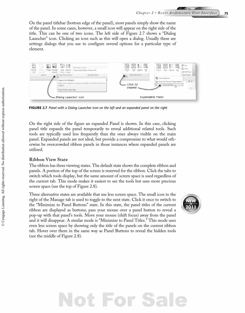
On the panel titlebar (bottom edge of the panel), most panels simply show the nameof the panel. In some cases, however, a small icon will appear on the right side of thetitle. This can be one of two icons. The left side of Figure 2.7 shows a “DialogLauncher” icon. Clicking an icon such as this will open a dialog. Usually these aresettings dialogs that you use to configure several options for a particular type ofelement.
On the right side of the figure an expanded Panel is shown. In this case, clickingpanel title expands the panel temporarily to reveal additional related tools. Suchtools are typically used less frequently than the ones always visible on the mainpanel. Expanded panels are not ideal, but provide a compromise to what would oth-erwise be overcrowded ribbon panels in those instances where expanded panels areutilized.
Ribbon View StateThe ribbon has three viewing states. The default state shows the complete ribbon andpanels. A portion of the top of the screen is reserved for the ribbon. Click the tabs toswitch which tools display, but the same amount of screen space is used regardless ofthe current tab. This mode makes it easiest to see the tools but uses more preciousscreen space (see the top of Figure 2.8).
Three alternative states are available that use less screen space. The small icon to theright of the Manage tab is used to toggle to the next state. Click it once to switch tothe “Minimize to Panel Buttons” state. In this state, the panel titles of the currentribbon are displayed as buttons; pass your mouse over a panel button to reveal apop-up with that panel’s tools. Move your mouse (shift focus) away from the paneland it will disappear. A similar mode is “Minimize to Panel Titles.” This mode useseven less screen space by showing only the title of the panels on the current ribbontab. Hover over them in the same way as Panel Buttons to reveal the hidden tools(see the middle of Figure 2.8).
FIGURE 2.7 Panel with a Dialog Launcher icon on the left and an expanded panel on the right
Chap t e r 2 • Rev i t A r c h i t e c t u r e U s e r I n t e r f a c e 75
© C
enga
ge L
earn
ing.
All
right
s res
erve
d. N
o di
strib
utio
n al
low
ed w
ithou
t exp
ress
aut
horiz
atio
n.

The final display state shows only the ribbon tabs (see the bottom of Figure 2.8).Click on a ribbon tab to make the tab pop up. Like the panel titles state, if you shiftfocus away from a tab, it will disappear. It is easy to experiment with each mode anddiscover the one that you prefer. Simply click the toggle icon once to switch to paneltitles, and click it again to switch to tabs. If you wish to return to the full ribbon, clickit again. Each time you click, it toggles to the next state. You can also use the drop-down on the minimize icon to choose the mode you want directly.
NOTE Instructions throughout this text use the full ribbon display mode. Adjust accordingly if youchoose to use one of the minimized modes.
ToolsRibbon panels contain tools. These tools will appear using one of three types ofbuttons. These are: Buttons, Drop-down buttons, and Split buttons. Examples ofeach type of button can be seen on most ribbon tabs. For example, each can befound on the Home tab. On the Home tab, examples of a button are the Door andWindow tools (see the top-left of Figure 2.9). Clicking a button simply invokes thattool. In the case of either Door or Window, the Modify | Place Door or Modify |Place Window tab will appear on the ribbon and you can configure and place theelement in your model.
On the Model panel, the Model Group tool is an example of a drop-down button.In this case, if you click the tool, a drop-down list will appear showing the variousoptions for the tool. In the case of the Model Group tool, we can choose from thePlace Model Group, Create Group, or Load as Group into Open Projects tools (seethe bottom left of Figure 2.9).
FIGURE 2.8 Cycle through several minimized ribbon options
76 S e c t i o n I • I n t r o du c t i o n and Me t h o d o l o g y
© C
enga
ge L
earn
ing.
All
right
s res
erve
d. N
o di
strib
utio
n al
low
ed w
ithou
t exp
ress
aut
horiz
atio
n.

Split buttons can be either vertical or horizontal. They appear like the other buttonsuntil you pass your mouse over them, at which point it will be clear that that only partof the button highlights under the mouse. The portion of the button with the smallpop-up indicator (small triangle) behaves like a drop-down button. The other sidebehaves like a normal button. On the Home tab, the Wall, Roof, and Floor tools areexamples of split buttons (see the right side of Figure 2.9).
Some tools will appear grayed out if the particular command is not available in thecurrent context. For instance, if you have a sheet view active on screen, most toolssuch as Wall, Door, or Roof on the Home tab will not be available. There are plentyof other examples; Walls cannot be drawn in an elevation view and Levels cannot bedrawn in a plan view. If a tool you want to use is grayed out, try opening a differentview and try again.
User Interface OptionsSeveral aspects of the user interface have customizable options. From the Applicationmenu, click the Options button (shown in Figure 2.3 above) to open the “Options”dialog. Click the User Interface tab. The first item you can change is the theme of theinterface. Revit offers a choice of Dark or Light. You can also use the controls on thistab to decide if the Recent Files screen should appear when Revit launches. If youprefer not to see Recent Files, uncheck this box. In the “Tab Display Behavior” area,you can decide what happens when you clear your selection or exit a tool. Revit willeither stay on the Modify tab, or return to the tab you previously had open. Further-more, you can even prevent Revit from switching to the Modify tab when you selectobjects onscreen. The author recommends that you select “Return to previous tab”and check the “Display the contextual tab on selection” checkbox (see the left side ofFigure 2.10). You can of course choose alternate settings if you prefer.
When you pause your mouse over tools, a tooltip usually appears. Tooltips give youthe name of a tool, its keyboard shortcut (in parenthesis), a short description, a longdescription, and often a descriptive image. Tooltip assistance can be configured todifferent levels of information. You can find settings to control how much tooltip
FIGURE 2.9 Examples of each kind of button on the Home tab
Chap t e r 2 • Rev i t A r c h i t e c t u r e U s e r I n t e r f a c e 77
© C
enga
ge L
earn
ing.
All
right
s res
erve
d. N
o di
strib
utio
n al
low
ed w
ithou
t exp
ress
aut
horiz
atio
n.

assistance you want on the User Interface tab in the Tooltips area. If you chooseNone, no tooltip assistance will appear. Figure 2.10 on the top right shows an exam-ple of the tooltip you will receive with the tooltip assistance set to Minimal. If youchooseHigh, you will get a tip like the one pictured on the bottom right of the figure.The Normal options will display a tip like the one on the top first, and then, after afew moments, the more detailed tip will appear.
As we have seen, all Revit commands and functions are included on the ribbons. Key-board shortcuts provide a way to execute commands without first locating them onthe ribbon. They are simple keystroke combinations that can be typed as an alterna-tive way to issue a command. To use a keyboard shortcut, simply type the two letterson the keyboard in succession. There is no need to press ENTER following the key-strokes. Figure 2.10 shows that the keyboard shortcut for the Wall tool is WA. Thismeans you can invoke the Wall tool by typing WA instead of clicking the tool on theribbon. Tooltip assistance can be a useful way to learn the keyboard shortcuts for yourmost frequently used tools and commands. In general, once you learn the shortcuts,they will usually be the fastest way to issue commands.
New in Revit 2011, you can now easily modify the existing keyboard shortcuts andadd shortcuts to commands that do not already have them. To do this, click the Cus-tomize button on the User Interface tab of the “Options” dialog (you can also find iton the User Interface drop-down button on the View tab or keyboard shortcuts evenhas a shortcut of its own: just type KS). In the “Keyboard Shortcuts” dialog, you canscroll through all of the currently assigned shortcuts. In some cases like the Propertiescommand, there will be more than one shortcut. All work the same, so choose the oneyou prefer. If you wish to add a new shortcut, locate the desired command and selectit in the list. Next, type the desired shortcut in the “Press new keys” field and thenclick the Assign button (see Figure 2.11). If you wish to edit an existing shortcut,first select and then remove it, then assign a new one. Be careful not to assign
FIGURE 2.10 Configure tooltip assistance and other settings for the UI in the Options dialog
78 S e c t i o n I • I n t r o du c t i o n and Me t h o d o l o g y
© C
enga
ge L
earn
ing.
All
right
s res
erve
d. N
o di
strib
utio
n al
low
ed w
ithou
t exp
ress
aut
horiz
atio
n.

a shortcut to a command that is already in use. Revit will use the first instance of ashortcut that it finds ignoring it for other commands.
Another Windows convention supported by Revit is the ability to issue menu com-mands with the keyboard using the ALT key and a key letter combination from thedesired command. To try this, press the ALT key. Doing so will place a small label oneach tool and ribbon tab. Numbers appear on each of the tools on the QAT. Simplypress this number to execute that command. Letters appear on each of the ribbontabs. To invoke a tool on a tab, first press the letter for the tab. This will make anew set of letters appear on all the tools. Next press the key or keys shown on thetool. For example, to access the Align tool via the ALT key, press the ALT key, thenthe letter M, and then the letters AL. If a drop-down button is involved, use the arrowson the keyboard to choose the desired command and then press ENTER to completethe selection.
NOTEPlease note, even if the tab you want is current, when using the ALT key, you must stillpress the keystroke for that tab first.
Project BrowserWhen you open a Revit project file, its contents will be displayed in the ProjectBrowser. Think of the Project Browser as the table of contents for your project. Itis the primary organizational tool for a Revit project. It is typically docked on theleft side of the screen but you can also tear it off and place it anywhere you like(see Figure 2.12).
FIGURE 2.11 Use the “Keyboard Shortcuts” dialog to add and edit shortcuts
Chap t e r 2 • Rev i t A r c h i t e c t u r e U s e r I n t e r f a c e 79
© C
enga
ge L
earn
ing.
All
right
s res
erve
d. N
o di
strib
utio
n al
low
ed w
ithou
t exp
ress
aut
horiz
atio
n.
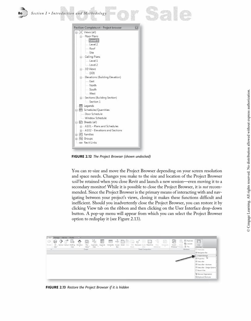
You can re-size and move the Project Browser depending on your screen resolutionand space needs. Changes you make to the size and location of the Project Browserwill be retained when you close Revit and launch a new session—even moving it to asecondary monitor! While it is possible to close the Project Browser, it is not recom-mended. Since the Project Browser is the primary means of interacting with and nav-igating between your project’s views, closing it makes these functions difficult andinefficient. Should you inadvertently close the Project Browser, you can restore it byclicking View tab on the ribbon and then clicking on the User Interface drop-downbutton. A pop-up menu will appear from which you can select the Project Browseroption to redisplay it (see Figure 2.13).
FIGURE 2.12 The Project Browser (shown undocked)
FIGURE 2.13 Restore the Project Browser if it is hidden
80 S e c t i o n I • I n t r o du c t i o n and Me t h o d o l o g y
© C
enga
ge L
earn
ing.
All
right
s res
erve
d. N
o di
strib
utio
n al
low
ed w
ithou
t exp
ress
aut
horiz
atio
n.

Longer view names in the Project Browser can get truncated. It is therefore recom-mended that you widen the Project Browser window by stretching the right edge asmuch as your screen size will permit and to the extent of your own personal prefer-ences. This will make it easier to read the full names of your views. However, if youare not able to widen the Project Browser or you prefer not to, you can simply hoveryour mouse over a view to see a tooltip of its full name (see Figure 2.14).
As already noted, you can also tear the Project Browser away from the side of thescreen, undocking it, and place it anywhere on screen you like. This has the effect ofmaking your drawing window larger while allowing you to make the browser a moreconvenient size as well. The Project Browser enables you to view and work with twodistinct parts of your project: views of your model and elements within your model.Views are listed at the top in the Views, Legends, Schedule/Quantities, and Sheetsbranches. In the previous chapter, we explored this part of the Project Browser andits organization options. Please refer to that discussion for more details. To interactdirectly with elements within your model from the Project Browser, you will workwithin the Families, Groups, and the Revit Links branches of the Project Browsertree. Every Family, Group, and Revit file link in a project is listed among theseitems. From these branches, you can edit existing items, or even create new ones(see Figure 2.15).
FIGURE 2.14 Partially hidden names can be seen with tooltips or you can widen the Browser window
Chap t e r 2 • Rev i t A r c h i t e c t u r e U s e r I n t e r f a c e 81
© C
enga
ge L
earn
ing.
All
right
s res
erve
d. N
o di
strib
utio
n al
low
ed w
ithou
t exp
ress
aut
horiz
atio
n.

Right-click options are sometimes available on each node and sub-branch of theProject Browser. Please take a moment to right-click on each item and study themenus and commands that are available. If you right-click an item like the Familiesbranch, and no menu appears, this simply indicates that there are no commands asso-ciated with that node or branch of the Project Browser. You can learn more aboutGroups and Links in Chapter 6. Families are explored in detail in Chapter 10.
In the previous chapter, we explored the Views branch of the Project Browser withinthe context of a provided dataset. Here we will reiterate certain behaviors that havemore to do with understanding the user interface associated with Project Browser.Beneath the Views branch of the tree, certain categories will appear automatically asvarious views are added to the project. For instance, a Floor Plans branch is automati-cally created to group the various floor plan views of your project. Likewise, “Eleva-tion” and “Section” branches will appear as their respective view types are added. If youdelete all views in a particular category, the category itself will also disappear. Thisbehavior is maintained automatically by the software.
The name of the currently active view will appear bold in the Project Browser. Youcan open any view by simply double-clicking on its name in the Project Browser. Thisis the most common function of the Project Browser. In addition, you can right-clickviews in the Browser to access commands specific to that item (see below for more onright-clicking). It is also important to note that more than one item may be selectedon the Project Browser at the same time. To select multiple views, select the firstview, then hold down the CTRL key and select additional views. You can also usethe SHIFT key to select everything between any two items. Once you have morethan one view selected, you may right-click on any of the highlighted view names toaccess a menu that will apply to the entire selection of views. This might be useful ifyou wish to make a global change such as applying a View Template to several viewsat once (see Figure 2.16).
FIGURE 2.15 Understanding the various branches of the Project Browser
82 S e c t i o n I • I n t r o du c t i o n and Me t h o d o l o g y
© C
enga
ge L
earn
ing.
All
right
s res
erve
d. N
o di
strib
utio
n al
low
ed w
ithou
t exp
ress
aut
horiz
atio
n.

Another important aspect of the Project Browser is its presentation of the project’ssheets. Although sheets are technically classified as views in Revit they have someunique properties not shared by other views. They are also presented in their ownbranch of the Project Browser. Expand the Sheets branch to see the sheet views inyour project. Since sheets can actually have other views placed on them, a plus (þ)will appear next to the sheet name. Expanding this will reveal the names of theviews that have been placed upon the sheet. A sheet appearing in the ProjectBrowser without a plus sign indicates that the sheet does not yet contain refer-ences to any other views. (The dataset from Chapter 1 provides a good exampleof each condition.) Like other views, you can open a sheet view by double-clickingon its name in the Project Browser. In addition, you can open referenced viewsplaced on sheets by double-clicking their names beneath the expanded sheet name(see Figure 2.17).
FIGURE 2.16 Select multiple items in the Project Browser with the CTRL or SHIFT keys
FIGURE 2.17 Understanding the Sheets branch on the Project Browser
Chap t e r 2 • Rev i t A r c h i t e c t u r e U s e r I n t e r f a c e 83
© C
enga
ge L
earn
ing.
All
right
s res
erve
d. N
o di
strib
utio
n al
low
ed w
ithou
t exp
ress
aut
horiz
atio
n.

When using these techniques to navigate your project, recall from the previous chap-ter our discussion of changing the way that the Project Browser is organized. In thatexercise, we noted how we could organize our views by discipline, phase, or even bythose not yet placed on sheets. Look back to Figure 1.9 in Chapter 1 and the accom-panying discussion for more details.
When you choose to organize the Browser using the “Not on Sheets” type, you do notloose anything. You simply change the way things are displayed. If you wish to workon a view that is already on a sheet, you first expand the sheet on which it is placed,and then double-click the view name beneath it. If the view is not yet on a sheet, itwill be listed beneath the Views branch at the top of the Browser instead. Once youadd a view to a sheet, it will disappear from the Views branch and appear insteadbeneath its host sheet. If you wish to experiment with this, try reopening the datasetfrom Chapter 1 and explore further.
PROPERTIES palette and the TYPE SELECTORNew in this release, the Properties dialog is now a modeless palette. “Modeless” is acomputer term that refers to a persistent interface element. In other words, the Prop-erties palette will stay onscreen as you work and no longer must be closed in order tocontinue. You now simply interact with the properties you wish to edit and eitherclick the Apply button or simply shift focus away from the palette to accept thechanges and continue working. This makes work more fluid with fewer disruptionsfrom having to go in and out of modal (non-persistent) dialogs.
You can edit element properties on the palette both when you are creating new ele-ments and when you select existing elements. Like the Project Browser, the Proper-ties palette can be docked or floating. By default, it appears docked on the left sideof the screen above the Project Browser. Every Element in Revit, from Model Ele-ments like Walls and Floors, to Annotation Elements like text, tags, and Levels,and even views themselves can be edited via this palette. Most elements also havetype properties. Editing the Type Properties affects all elements in the model ofthat type. The Properties palette will allow access to instance properties of anyselected element, new elements as they are being created, and the current viewproperties. To switch between the properties of the selected elements on screen(including the view properties), use the drop-down on the Properties palette. Ifyou wish to edit the Type properties of a selected element, click the Edit Type but-ton on the Properties palette (see Figure 2.18).
84 S e c t i o n I • I n t r o du c t i o n and Me t h o d o l o g y
© C
enga
ge L
earn
ing.
All
right
s res
erve
d. N
o di
strib
utio
n al
low
ed w
ithou
t exp
ress
aut
horiz
atio
n.

Also new, the Type Selector has been relocated to the top of the Properties palette.The Type Selector is a drop-down list of Types available in your project for thekind of item you are creating or editing. Families have at least one, but can have sev-eral Types. Think of a Type as a “variation” of a particular Family. For example, adouble flush door might have several standard size configurations. Each such varia-tion would be saved as a separate Type that we could select from the Type Selectorlist. Whenever you create elements, you will choose an appropriate Type fromthis list. You can also use the Type Selector to change the Type of elements alreadyin the model. Simply select an element and then choose a different Type from the list(see Figure 2.19).
FIGURE 2.18 The Properties palette can edit instance properties of elements or views. Click Edit Typeto access Type Properties
FIGURE 2.19 The Type Selector appears at the top of the Properties palette
Chap t e r 2 • Rev i t A r c h i t e c t u r e U s e r I n t e r f a c e 85
© C
enga
ge L
earn
ing.
All
right
s res
erve
d. N
o di
strib
utio
n al
low
ed w
ithou
t exp
ress
aut
horiz
atio
n.

You will interact with both the Type Selector and Properties palette when creating ormodifying elements. When you are creating an element, you first choose the tool forthe item you wish to create on the ribbon. Next choose a Type from the Type Selectorand if necessary edit other properties on the Properties palette. If you are modifyingan existing element, simply select the element (or elements) and then choose thedesired Type from the Type Selector and/or modify the desired parameters on theProperties palette and then click Apply. If you wish to modify all elements of a par-ticular type globally across the entire project, click the Edit Type button.
When you select multiple elements, if they all share the same Type, the Type Selectorwill display the name. If the selection of items is the same kind of element (all Doors,for example) but are not currently the same Type, then the Type Selector will remainactive, but will display a message reading “Multiple Families Selected.” If you selectmultiple elements and the Type Selector reports “Multiple Categories Selected,” thisindicates that you have made a selection of dissimilar elements (like a Wall and aDoor), and you cannot make changes to them using the Type Selector. You may beable to edit Properties, but the options available on the Properties palette will be lim-ited only to those properties that the selection of elements shares (examples of this canbe seen above in Figure 2.13).
Options BarThe Options Bar runs horizontally across the screen and is located directly below theribbon. The Options Bar displays options available for elements you are creating. Onoccasion, some options will also display for existing elements you have selected as well(see Figure 2.20).
You will interact with the Options Bar regularly as you work in Revit. Keep this inmind and always remember to look there for context-specific options relating to thetask at hand. Remember to also look at the contextual ribbon tabs as well. In manycases, you will need to configure options on both the Options Bar and the contextualribbon.
The Canvas (View Window Display Area)The most interactive portion of the interface is the canvas area where you work withthe views of your building model. When you open a view, it appears in a windowin the canvas area. At least one view window must be open to work in a project. You
FIGURE 2.20 Examples of the Options Bar when creating or editing various model elements
86 S e c t i o n I • I n t r o du c t i o n and Me t h o d o l o g y
© C
enga
ge L
earn
ing.
All
right
s res
erve
d. N
o di
strib
utio
n al
low
ed w
ithou
t exp
ress
aut
horiz
atio
n.

can however open several views for a project at one time. If the view windows aremaximized, you can see which are opened on the Application menu (click the OpenDocuments icon shown in Figure 2.3 above) or using the Switch Windows tool on theView tab or on the QAT. You can also tile (type WT) or cascade (type WC) the Win-dows onscreen. These commands are also on the View tab. If you have many viewsopen at once, tiling can make the actual windows very small and hard to work with.To prevent this, you can cascade them or maximize them instead. Be sure to closewindows when you no longer need them. An easy way to do this is to maximize thecurrent view window and then choose Close Hidden tool on the View tab.
Status BarThe Status Bar is the gray bar along the bottom edge of the Revit screen. If youglance down at the Status Bar, you will notice a constant readout of feedbackappears there. In some cases, the information provides prompts and clues as towhat actions are required within a particular command; in other cases, the feedbackmay simply describe an action taking place or describe an element beneath the cur-sor (see Figure 2.21 for examples).
In many cases, the same or similar feedback is available on screen in the form of tooltips. The extent to which tooltips appear is controlled by a setting that you can mod-ify. You can opt for a high level of tooltip prompting, a moderate level, or none at all.To edit the degree of Tooltip Assistance, choose Options from the Applicationmenu and edit the “Tooltip Assistance” item on the User Interface tab. You cannotedit the Status Bar messages in any way.
In addition to the Status messages, two new areas of the Status Bar are the StatusBar – Worksets and the Status Bar – Design Options. These two controls provideshortcuts to these two Revit features. Worksets is the collection of tools that enablemultiple users to access the same Revit model simultaneously. You can learn moreabout them in Appendix B. Design Options provides a mechanism to consideralternative design schemes in the same Revit model. To learn more, please visit theonline help.
FIGURE 2.21 The Status Bar provides ongoing feedback and guidance as you work
Chap t e r 2 • Rev i t A r c h i t e c t u r e U s e r I n t e r f a c e 87
© C
enga
ge L
earn
ing.
All
right
s res
erve
d. N
o di
strib
utio
n al
low
ed w
ithou
t exp
ress
aut
horiz
atio
n.

View Control BarEvery graphical view window has a View Control Bar located at the bottom edge ofthe window.When windows are maximized, this will appear directly above the StatusBar adjacent to the horizontal scroll bar. If the view windows are tiled, it will appear inthe lower left corner of the view window (see Figure 2.22). The View Control barserves two purposes—it displays at a glance the most common view settings of thewindow and provides a simple and convenient way to change them if required.
Like so many other aspects of Revit, the View Control Bar is context sensitive. Noticethe two bottom windows in Figure 2.22 have different View Control Bars than theothers (the lower one says Perspective and does not show scale, the other only has theHide/Isolate settings). The one with only the hide/isolate settings is a sheet view andsheet views do not have as many settings available as other views. Perspective viewsnaturally do not have scale. Click on any of the icons on the View Control Bar toaccess a pop-up menu of available choices. For example, to change the scale of aview, click on the scale item, or pick the Detail Level icon to change the level of detailin which the view is being displayed (see Figure 2.23).
FIGURE 2.22 The View Control Bar maximized (top) and tiled (bottom)
FIGURE 2.23 The View Control Bar provides quick access to the most common view settings
88 S e c t i o n I • I n t r o du c t i o n and Me t h o d o l o g y
© C
enga
ge L
earn
ing.
All
right
s res
erve
d. N
o di
strib
utio
n al
low
ed w
ithou
t exp
ress
aut
horiz
atio
n.

All of the settings, except Hide/Isolate, on the View Control Bar are also accessiblefrom the Properties palette. To access these settings in Properties, choose the nameof the current view from the pop-up on the Properties palette (examples shown inFigure 2.18 above).
The last two icons on the right are used to hide and show elements in your model tomake it easier to see things as you work. There are two ways to hide objects. You canuse the icon on the Temporary Hide/Isolate View Control Bar (looks like sunglasses)to hide elements temporarily. You can also hide elements permanently. To use thetemporary Hide/Isolate tools, select an element or elements in the model and thenclick the Hide/Isolate icon and choose an option. TheHide Element option tempo-rarily makes the selected element(s) invisible. The Isolate Element option leaves theselected elements visible and hides everything else. There are also options to hide orisolate the entire category of objects based upon the category of objects you haveselected. For example, if you select a Door in the model and then chooseHide Cate-gory, all Doors in the view will temporarily hide. When you use the temporary Hide/Isolate command, a cyan border will appear around the current view window until themode is disabled.
The important thing to know about using the Temporary Hide/Isolate function in aview is that the changes it makes to the view window will not be saved outside thecurrent work session. Furthermore, if you were to print or export the current view,Hide/Isolate settings will be ignored. If you want to hide an object permanently onscreen or when printing, use the “Hide in View” command on the right-click menu(or the ribbon) instead. If you wish to make the Hide/Isolate settings permanent,select the Temporary Hide/Isolate icon and choose Apply Hide/Isolate to Viewfrom the pop-up.
To reveal hidden elements, both temporary and permanent, you click the RevealHidden Elements toggle icon (light bulb on the far right). If there are temporarilyhidden elements in the current view, this mode will reveal them in a cyan color. Per-manently hidden elements will be revealed in maroon. A maroon border will appeararound the current view window as long as this mode is active.
Remember also that while the View Control Bar shows the most common ViewProperties, using the Properties palette will give access to the complete list of viewproperties—many more than on the View Control Bar.
RIGHT-CLICKINGLike most Windows software, in Revit, you can right-click on almost anything andreceive a context-sensitive menu. In fact, we have already seen examples of this in theprevious chapters and in this chapter. Let’s take a few minutes here to explore some ofthe more common right-click menus.
Right-click on the Quick Access ToolbarAs mentioned above, you can customize the QAT. To do so, use the small menu iconon the right side of the QAT or simply right-click on any tool (see Figure 2.24).
Chap t e r 2 • Rev i t A r c h i t e c t u r e U s e r I n t e r f a c e 89
© C
enga
ge L
earn
ing.
All
right
s res
erve
d. N
o di
strib
utio
n al
low
ed w
ithou
t exp
ress
aut
horiz
atio
n.

Right-click on a particular button on the QAT if you want to remove it. You canalso add a separator which is a small line between buttons to help visually groupthem. The separator appears after the button you right-click. You can also move theQAT to below the ribbon if you prefer. Do this if you wish to addmany tools to theQATas you will have more space to do so if it is below the ribbon. However, the trade-off isthat it will reduce the drawing area slightly.
Right-click on the Ribbon TabsEarlier in the “Ribbon View State” topic, we discussed ways to change the state ofthe ribbon display on screen. You can use the right-click menu to access theseoptions as well. Right-click on the ribbon tabs or the ribbon itself for these options(see Figure 2.25).
If you right-click on the ribbon tabs, you also get an option to hide ribbon titles. Thiswill reduce the size of the ribbon slightly giving, a little more space to the Canvasbelow.
Right-click on the Options BarOne choice appears when you right-click on the Options Bar. You can have it dockedat either the bottom or the top. The choice on the right-click toggles between the twoas appropriate. This is a personal preference and otherwise makes no change in theOptions Bar behavior or size on screen.
Right-Click Items in Project BrowserItems on Project Browser often have right-click options as well. Context menus arenot available for every branch of the tree. Examples of where you can right-click canbe seen in Figures 2.15 and 2.16 above. You can always right-click directly on a viewname to receive a context menu of options for that view (or views). Several such exam-ples have already been discussed.
Right-Click in the View WindowWhen you right-click directly in the view window, you get a different menu depend-ing on whether there are any objects selected or not. If there are no objects selected,
FIGURE 2.25 Right-click on the Ribbon to change display states
FIGURE 2.24 Right-click on the QAT to customize it
90 S e c t i o n I • I n t r o du c t i o n and Me t h o d o l o g y
© C
enga
ge L
earn
ing.
All
right
s res
erve
d. N
o di
strib
utio
n al
low
ed w
ithou
t exp
ress
aut
horiz
atio
n.

the menu contains basic zooming and scrolling commands, the View Properties com-mand, and the Find Referring Views command. The “Find Referring Views” com-mand is particularly useful. When choosing this command, a dialog will appear likethe one shown in the middle of Figure 2.26.
You can choose any view listed in the dialog and then click the Open View button.The figure illustrates an example of running the command from a plan view. If yourun the command from a section or elevation view, a similar dialog will appear listingdifferent views including plans and reflected ceiling plans.
When you right-click with one or more objects selected on screen, you get a differentmenu than if there is no selection active. However, some commands appear in eithercase. One such command is Properties. This is simply another way to hide or showthe Properties palette. If Properties appears with a checkmark next to it, then the pal-ette is displayed. If it appears with no checkmark, then it is hidden (see Figure 2.27).
FIGURE 2.26 Find Referring Views locates all views that refer to the current view
FIGURE 2.27 Properties is visible if the checkmark appears
Chap t e r 2 • Rev i t A r c h i t e c t u r e U s e r I n t e r f a c e 91
© C
enga
ge L
earn
ing.
All
right
s res
erve
d. N
o di
strib
utio
n al
low
ed w
ithou
t exp
ress
aut
horiz
atio
n.

NAVIGATING IN VIEWSWhen working with models on a computer screen, you need more than the standardWindows scroll bars to navigate your model. You will need to change the magnifica-tion of the model and frequently scroll other parts of the model into view on the lim-ited screen space available. The act of changing the magnification of the screen isreferred to as “zooming,” and moving the image on screen within the borders of theview window to see parts off screen is referred to as “panning.”
Using a Wheel Mouse to NavigateIf you have a mouse with a middle wheel button, Revit provides zooming and scrol-ling using the wheel! If you don’t have a wheel mouse, this might be a good time toget one. This modest investment in hardware will pay for itself in time saved andincreased productivity by the end of the first day of usage. Using the wheel you havethe following benefits:
• To Zoom—Roll the wheel. Roll up to zoom in (closer), roll down to zoom out(farther away). Move the pointer before you roll to control the center of thezooming.
• To Pan—Push and hold the wheel down and then drag the mouse.
• To Dynamic Zoom—Hold down the CTRL key and then drag the wheel (this issimilar to rolling the wheel, except the zoom is centered).
• To Dynamic Orbit—Hold down the SHIFT key and then drag the wheel(3D Views only).
Navigation BarThe Navigation Bar includes a small toolbar with navigation commands and theViewCube. The Navigation Bar and ViewCube were both introduced in the previouschapter. Rather than reiterate their function in detail here, you are directed to the“View Navigation” topic in Chapter 1 for more information. You can also find a use-ful video in the online help that showcases the common functions of the ViewCubeand Navigation Bar.
ZoomIn addition to the wheel mouse, Revit provides a few other zooming methods. Accessthese commands from the right-click menu or from the zoom icon on the NavigationBar (pictured in Figure 1.12 in Chapter 1).
Zoom In Region—This command will enlarge an area of the model that you desig-nate by dragging a box around the area on screen.
Zoom Out (2x)—This is also a zoom (or reduction in magnification) command thatsimply doubles the size of the image on screen.
Zoom To Fit—Most often this is a zoom out (or reduction in magnification) com-mand. The function of this command is to fit the entire extents of model and anyannotation objects into the available view window space on screen. A similar com-mand is available on the Navigation Bar: Zoom All to Fit. This command performsthe “Zoom To Fit” command in all of the open view windows rather than just theactive one.
92 S e c t i o n I • I n t r o du c t i o n and Me t h o d o l o g y
© C
enga
ge L
earn
ing.
All
right
s res
erve
d. N
o di
strib
utio
n al
low
ed w
ithou
t exp
ress
aut
horiz
atio
n.

Previous Pan/Zoom—You can backtrack through your navigation changes onscreen using this command. Each time you choose it, the screen will go back onestep to a previous zoom level or pan location.
Next Pan/Zoom—Works the same as Previous Pan/Zoom except that it will moveforward in the progression of view changes. This command is only available followingthe use of Previous Pan/Zoom.
Previous and Next Pan/Zoom are similar to the Rewind function on the SteeringWheel except that it is not as interactive. The Steering Wheel and Rewind function-ality was discussed in the “View Navigation” topic in Chapter 1. In addition to theright-click menu and Navigation Bar, don’t forget that each zoom command alsohas keyboard shortcuts (as seen in Table 1.4 in Chapter 1).
SELECTION METHODSBefore elements can be modified in Revit, they must be selected. There are variousmethods used to select elements, some of which are similar to other software. Whenmodifying elements in a model, the basic workflow is as follows:
1. Select the Element(s) to be manipulated with the Modify tool (mouse pointer).
2. Issue a command to perform on the selection, usually by clicking a tool on theribbon or typing a Keyboard Shortcut like MV for Move.
3. Indicate on screen where and how to perform the command.
To summarize this workflow, choose (select)what you want to modify and then indi-cate how you want to modify it—“to this selection of elements I wish to perform thisaction.”
Creating a Selection SetA selection set is one or more selected elements. As you move theModify tool arounda view window, you will notice that any elements available for selection will temporar-ily highlight while under the cursor—this is known as “pre-highlighting.” The pur-pose of pre-highlighting is to preview what will be selected if you click the mouse.This is particularly helpful when working in a complex model with many elementsclose together. Use the pre-highlighting (and often the TAB key—see below) as atool to assist you in accurate selection.
The simplest way to select an element is to click on it. When you select an element itwill display in light blue on screen—this indicates that the element(s) is selected.Once selected, an element will remain selected until you deselect it. You can deselectelements in three ways: selecting another element will automatically deselect the cur-rent selection set (unless you hold down the CTRL key) and become the new selectionset. You can deselect all elements without creating a new selection set by clicking on ablank portion of the screen (where there are no elements) or by pressing the ESC key.(You can also right-click and choose Cancel.)
To create a selection set containing more than one element, use the followingtechniques:
• Hold the CTRL key down while clicking on another element. The new elementwill be added to the current selection set (and highlight light blue as well).
Chap t e r 2 • Rev i t A r c h i t e c t u r e U s e r I n t e r f a c e 93
© C
enga
ge L
earn
ing.
All
right
s res
erve
d. N
o di
strib
utio
n al
low
ed w
ithou
t exp
ress
aut
horiz
atio
n.

• Hold the SHIFT key down while clicking on a selected element (highlightedlight blue) to remove the element from the current selection set (it will no lon-ger be highlighted in light blue).
If you accidentally pick an object without holding down the CTRL key (or if you acci-dentally click in the white space), you will lose your selection set (which will bereplaced with only the one element just picked or nothing if you click in whitespace). You can restore your previous selection set by right-clicking in the view win-dow and then choosing Select Previous.
NOTE You can also select previous by holding down the CTRL key and then pressing the LEFTARROW key.
Either action will restore your previous selection without having to start all over again.
Selection BoxesEven with the CTRL and SHIFT keys, making selections of multiple elements canbe time consuming. The easiest way to create a large selection set is by using a selec-tion box. To create a selection box with the Modify tool, click down with the leftmouse button next to an element, hold the button down and drag a rectangular boxaround the elements you wish to select. Elements will pre-highlight as you make theselection box.
The direction in which you drag the selection box determines which specific elementsare selected. If you create your selection box by dragging the Modify tool from left toright on the screen, the edge of the selection box will appear solid as you drag and onlyelements completely within the box will be selected. If you create your selection box bydragging from right to left on the screen, the edges of the selection box will appeardashed and any element completely or partially included in the box will be selected(see Figure 2.28).
FIGURE 2.28 Selection boxes vary with the direction you drag
94 S e c t i o n I • I n t r o du c t i o n and Me t h o d o l o g y
© C
enga
ge L
earn
ing.
All
right
s res
erve
d. N
o di
strib
utio
n al
low
ed w
ithou
t exp
ress
aut
horiz
atio
n.

You can always combine methods—first create a selection box, and then use theCTRL and SHIFT keys to add and remove from the basic selection.
Filter SelectionAnother approach to building a large selection set is to deliberately select too manyelements and then use the Filter tool to remove items of categories that you designatefrom the selection. The Filter selection tool is located on the Status Bar and on theribbon. Remember, when using the Filter selection tool, you always start with a selec-tion that includes more than the items you want, and you then filter out the undesiredelements by category (see Figure 2.29).
Each of the selection methods will require a little practice to become second nature toyou. Take the time to practice each one since selection is such an important and fre-quent part of nearly all tasks in Revit.
THE ALMIGHTY TAB KEYYou will find that the TAB key is probably the most used and most useful of all thekeys on the keyboard when working in Revit. As mentioned in the previous topic,being able to quickly add or remove from a selection set can greatly increase your effi-ciency during a work session. In general, you can think of the TAB key as a “toggleswitch,” allowing you to cycle through potential selections. When you attempt topre-highlight a particular element on screen, sometimes a neighboring element willpre-highlight instead. No matter how subtly you move your mouse in an attempt tocapture the desired element, it often proves difficult or impossible to highlight theright one. The TAB key provides the solution to this situation. Use it to cycle throughadjacent or stacked items to highlight the particular element you desire.
TIP“When in doubt, press TAB.”
While there are dozens of examples of using the TAB key in a Revit Architecture ses-sion, a few examples are presented here that will give you an idea of where using theTAB key proves most handy.
FIGURE 2.29 Use the Filter Selection dialog to remove categories of elements from the selection set
Chap t e r 2 • Rev i t A r c h i t e c t u r e U s e r I n t e r f a c e 95
© C
enga
ge L
earn
ing.
All
right
s res
erve
d. N
o di
strib
utio
n al
low
ed w
ithou
t exp
ress
aut
horiz
atio
n.

Pre-Highlighting Elements for SelectionIf the tool, whether it is the Modify, Dimension, Split, or another tool, is near two ormore Elements in a view window, you can either move your mouse around the view topre-highlight the different objects for selection, or use the TAB key to pre-highlighteach element in succession. Each time you press TAB, a different element will pre-highlight until all items have been cycled through. Once you have tabbed throughall elements, the cycling will repeat (see Figure 2.30).
When the element that you wish to select is pre-highlighted, click the mouse asnormal to select it.
During DimensioningWhen you are using existing geometry for reference points such as when addingdimensions, using the align command or tracing a background, you can use the TABkey to cycle through possible reference points (see Figure 2.31).
FIGURE 2.30 Use the TAB to cycle through and pre-highlight nearby elements
96 S e c t i o n I • I n t r o du c t i o n and Me t h o d o l o g y
© C
enga
ge L
earn
ing.
All
right
s res
erve
d. N
o di
strib
utio
n al
low
ed w
ithou
t exp
ress
aut
horiz
atio
n.

Chain SelectionChain selection is a very powerful feature of Revit. Chain selection works with Wallsor Lines. Like an actual chain, chain selection highlights all of theWalls or Lines thattouch one another end to end. To make a chain selection, you first pre-highlight asingle Wall or Line. Next you press the TAB key and in so doing, any walls or linesthat form a chain (i.e., are located end-to-end) with that wall or line are pre-highlighted together. Finally, you click the mouse to make the selection with a singlemouse-click (see Figure 2.32). Don’t forget to click when the chain pre-highlights. Ifyou don’t click, when you move your mouse away nothing will be selected.
There are dozens of additional ways to use the TAB key in Revit. One of the easiestthings to do is simply try tabbing in various situations while you work in the software.Other examples will be presented throughout this book in the tutorials that follow.For more discussion on the topic, consult the Revit Architecture online help.
SETTINGSWhile not strictly related to interface, this section covers some of the settings you canuse to manipulate your overall Revit preferences. Most of the following settings applyto your Revit Architecture application (global) in general (in other words, you can set
FIGURE 2.31 Use the TAB to cycle through dimension reference points
FIGURE 2.32 Use the TAB key to chain select a collection of Walls
Chap t e r 2 • Rev i t A r c h i t e c t u r e U s e r I n t e r f a c e 97
© C
enga
ge L
earn
ing.
All
right
s res
erve
d. N
o di
strib
utio
n al
low
ed w
ithou
t exp
ress
aut
horiz
atio
n.

it once and then forget about it regardless of the project you open) and in other casesthe setting is saved with the project file and can vary from one project to the next.
Examples of global settings include the User name, the Tooltip Assistance, or thePath settings. Any of these settings applies to your installation of Revit Architecturenot to a particular project file. On the other hand, Units settings apply to only thecurrent project file. So if you change the Project Units from Feet-Inches to Inches,this would apply only to the current project file.
There are many Options and Project Settings available. Here we will only look at afew of the more common ones.
The General TabFrom the Application menu, click the Options button to open the “Options” dialogand view or edit the settings therein. The dialog is divided into several tabs, each con-taining various options (see Figure 2.33).
Save Reminder Interval—The default setting is 30 minutes. This means that every30 minutes during your work session, Revit will prompt you to save your file. You canchange the increment here to suit your preference.
TIP Regardless of your Save Reminder frequency, you should make it a habit to save your workoften.
Synchronize with Central Reminder Interval—The default setting is also 30 min-utes. Central files are used in team environments when multiple users need to work inthe same project model simultaneously. Synchronizing with central frequently is as
FIGURE 2.33 The Options dialog box
98 S e c t i o n I • I n t r o du c t i o n and Me t h o d o l o g y
© C
enga
ge L
earn
ing.
All
right
s res
erve
d. N
o di
strib
utio
n al
low
ed w
ithou
t exp
ress
aut
horiz
atio
n.

important as saving your local file frequently. Refer to Appendix A for more informa-tion on Central files.
You should set both reminders at an amount of time that will be helpful in remindingyou to save, but not so frequent as to become disruptive to your work.
Username—By default, this is set to yourWindows login name. The only time this isimportant is if you are working with Worksharing and Worksets. Worksharing andWorksets enable you to work with teams on the same project. Refer to AppendixA for more information on using Worksharing. The important thing to rememberabout Username is that Revit will only allow you to open and work in a Workset-enabled local file if your username matches the username that was active when thatfile was saved.
Journal File Cleanup—Journal files are created by Revit as a troubleshooting tool.Should you experience problems with your project file, Autodesk tech support mayask you to send them your journal files. A new journal file is created each time youlaunch Revit. The settings in this section control how many previous journal files arekept.
The User Interface tab was discussed earlier in this chapter.
GraphicsIf you have a video card capable of hardware acceleration, you can configure Revit touse hardware acceleration on the Graphics tab. You can also change the colors usedfor selection, pre-highlighting, and alerts. If you are unsure about your computer’shardware specifications, you should consult your IT support person before makingchanges on the Graphics tab.
When you have temporary dimensions appearing on screen, the size of the text isfixed and does not adjust as you zoom in or out. This is unlike the behavior of perma-nent dimensions which have a size and scale set in final plotting units and thereforedo adjust as you zoom in or out. On the Graphics tab, at the bottom, you can changethe overall text size for all temporary dimensions in your project. If you are findingthem difficult to read, increase the value here. You can also make the backgroundopaque if you wish so that the text covers model elements. Leave it transparent ifyou do not wish to have the dimensions obscure the model.
File LocationsThe File Locations tab of the “Options” dialog is where you configure the hard driveand/or network locations of the template and library files used by Revit Architecture.
Default template file—Project Template files are discussed in detail in Chapter 4.Use the setting here to point to your firm’s preferred project template file. This mightbe an out-of-the-box template provided by Autodesk or a custom one developed byyour CAD or BIMManager.
Default path for user files—If you have a specific location on your computer thatyou typically keep your project files, you can browse to that location here. The folderwritten here will be used by Revit when the Open dialog is used. If you are working ina team environment, using the Worksharing functionality, Revit will automaticallysave local files to this location. You can learn more about Worksharing and localfiles in Appendix A.
Chap t e r 2 • Rev i t A r c h i t e c t u r e U s e r I n t e r f a c e 99
© C
enga
ge L
earn
ing.
All
right
s res
erve
d. N
o di
strib
utio
n al
low
ed w
ithou
t exp
ress
aut
horiz
atio
n.

Default path for family template files—Family Template files are discussed indetail in Chapter 10. Use the setting here to point to your firm’s preferred locationfor Family template files.
Places—This is a very handy feature. Click the Places button to see a list of Places.Each entry in this list will show up as an icon on the left side of the Open and Savedialog boxes. In this way, you can jump from one library location to another with asingle click.
TIP Add a Library pointer for the folder in which you installed your dataset files from thestudent companion. In this way, you can navigate to this location quickly at the start ofeach tutorial.
To add a path, click the Places button to open the “Places” dialog. Click the AddValue icon on the left side. In the Library Name field, type a description for theplace such as MRAC 2011. In the Library Path field, use the browse icon to pointto the location where you installed the dataset files from the student companion files(see Figure 2.34).
Click OK twice to close the dialog. To test it out, click the Open tool on the QAT.You should see your new icon on the left side among the other places.
Temporary DimensionsAlthough you can toggle the reference point used by temporary dimensions usingthe TAB key, it is often more efficient to change the default behavior instead. Defaultsfor Temporary Dimensions can be configured for Walls, Doors, and Windows.Depending on your preferences, you can have the Temporary Dimensions default toeither the centers (default) or edges of objects. Click the Manage tab of the ribbon.On the Settings panel, click the Additional Settings tool. From the drop-down menuthat appears, choose Temporary Dimensions (see Figure 2.35).
FIGURE 2.34 Add a path in the “Places” dialog for the Book dataset files
100 S e c t i o n I • I n t r o du c t i o n and Me t h o d o l o g y
© C
enga
ge L
earn
ing.
All
right
s res
erve
d. N
o di
strib
utio
n al
low
ed w
ithou
t exp
ress
aut
horiz
atio
n.

Choose your preference for both the “Walls” and “Doors and Windows” settings.Revit Architecture defaults to centerlines for both. For Walls, you can dimensionfaces, centerlines, and/orWall Cores. For Doors andWindows, choose between cen-terlines and openings. The author recommends Faces for Walls and Openings forDoors and Windows.
SnapsMany project settings are accessible from both the Settings drop-down button anddirectly on the Manage ribbon. Feel free to look at any of the others. We will endour explorations in this chapter with a look at the “Snaps” dialog. The Snaps buttonis on the Settings panel. Revit includes dimension snaps and object snaps. Dimensionsnaps adjust with your zoom level on screen. As you zoom out, the snap incrementbecomes larger. As you zoom in, it becomes smaller. You can customize the incre-ment upon which it adjusts at the top of the dialog for both length and angles. Inthe middle of the dialog, all of the object snap modes are listed. You can turn themon and off to suit your preferences. They are all on by default. You do not need tochange anything in this dialog, but do become familiar with all of the items it con-tains. In particular, make note of the keyboard shortcuts next to each object snap.These are two character codes in parenthesis (see Figure 2.36).
FIGURE 2.35 Configure temporary dimension behavior
Chap t e r 2 • Rev i t A r c h i t e c t u r e U s e r I n t e r f a c e 101
© C
enga
ge L
earn
ing.
All
right
s res
erve
d. N
o di
strib
utio
n al
low
ed w
ithou
t exp
ress
aut
horiz
atio
n.

As you work on your models, you can type these shortcuts as needed to force Revit touse a particular object snap. This amounts to an override that lasts for one click of themouse.
SUMMARYNow that you have completed the Quick Start Tutorial, read the high-level overview ofBuilding Information Modeling in Chapter 1, and have been guided through an over-view of the user interface in this chapter, you are now ready to begin creating yourfirst Revit projects. In the chapters that follow, we will build two projects from scratch:one residential and one commercial. In this chapter, you have learned:
• The User Interface of Revit Architecture uses many common Windows conven-tions and some unique ones as well.
• The ribbon along the top of the screen contains several Tools organized intoTabs.
• Each ribbon tab is divided into panels.
FIGURE 2.36 Study the settings in “Snaps” and make note of the keyboard shortcuts for object snaps
102 S e c t i o n I • I n t r o du c t i o n and Me t h o d o l o g y
© C
enga
ge L
earn
ing.
All
right
s res
erve
d. N
o di
strib
utio
n al
low
ed w
ithou
t exp
ress
aut
horiz
atio
n.

• Tools come in three varieties: buttons, drop-down buttons, and split buttons.
• The Options Bar changes to reflect the current tool or command.
• One or more views of the project can be opened at one time in the Workspacearea.
• The Project Browser, along the left side by default, contains all of the views ofthe project as well as the Families, Groups, and Linked files. (Project Browser islike a “table of contents” for your project).
• The View Control Bar can be used to manipulate the display settings of theactive view.
• The Status Bar along the bottom of the screen shows prompts for the currentcommand.
• Many common commands are available from the context-sensitive right-clickmenus.
• The easiest way to navigate a view is using the wheel of your mouse and theappropriate modifier keys.
• Roll the wheel to zoom, drag the wheel to pan, hold the SHIFT key, and drag toorbit the 3D model.
• Most editing commands first require a selection set.
• Select elements with the modify tool (mouse pointer), use the CTRL key to addto the selection set, and the SHIFT key to remove from the selection set.
• Drag left to right to select all elements within the selection box, right to left toselect all those in contact with the box.
• The TAB key is used to cycle through potential selections when more than one ispossible.
• Use the TAB key to “Chain” select Walls or Lines. (Select Walls or Lines touchingend to end.)
• Configure settings in the “Options” and “Temporary Dimensions” dialogs to suityour personal preferences.
• Settings in “Options” persist from session to session regardless of the open proj-ect; settings in “Temporary Dimensions” apply only to the current project.
Chap t e r 2 • Rev i t A r c h i t e c t u r e U s e r I n t e r f a c e 103
© C
enga
ge L
earn
ing.
All
right
s res
erve
d. N
o di
strib
utio
n al
low
ed w
ithou
t exp
ress
aut
horiz
atio
n.


![[XLS]worknet.wisconsin.govworknet.wisconsin.gov/worknet_info/downloads/OES/all_wi... · Web view29300 12.57 26150 16.45 34230 11.99 24930 12.79 26610 17.05 35460 21.31 44330 550001](https://img.pdfslide.net/doc/110x75/5ac333187f8b9aa0518c0fa0/xls-view29300-1257-26150-1645-34230-1199-24930-1279-26610-1705-35460-2131.jpg)