Embed Size (px)
DESCRIPTION
Corporate Style Guide Manual for 2d3 Sensing.com
Citation preview

STYLE GUIDEThis is a guide to the brand communication style for 2d3 Sensing. It clearly explains what our brand stands for. This guide should be followed to express our Marketing goals in all our communications and to help create a brand image in our customers’ mind. Use this as a starting point for all marketing presen-tations and design compositions. While the logo, font usage, and photography selection rules seem rigid, keep in mind that there is a great deal of flexibility still available. Feel free to use a white background with simple text and the right logo choice. If you need any help in implementing this guide or if you encounter any design or marketing challenges that this guide cannot overcome, be please contact: [email protected]
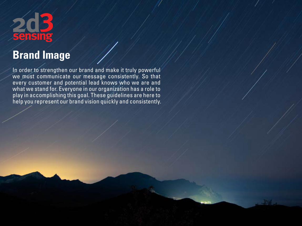
Brand ImageIn order to strengthen our brand and make it truly powerful we must communicate our message consistently. So that every customer and potential lead knows who we are and what we stand for. Everyone in our organization has a role to play in accomplishing this goal. These guidelines are here to help you represent our brand vision quickly and consistently.

CONTENTSOur BrandOur Way to PlayThe Right to WinCreative GuidelinesMaster LogoLogo GuidelinesLogo Best PracticeColor PalettesTypographyPhotographyBrand ArchitectureType & ImageGraphic Resonance
245891013253037535560

Our Way to Play2d3 Sensing develops commercial off the shelf, standards-based motion imagery processing, exploitation and dissemination software.
Our core, interdependent capabilities: Motion Imagery ExpertiseComputer Vision ExpertiseStandards ExpertiseCommercial off the ShelfMulti-NationalAgility
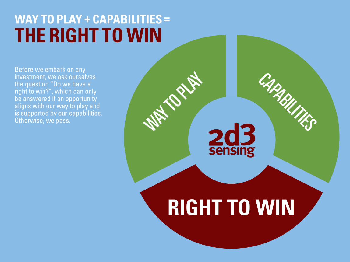
WAY TO PLAY + CAPABILITIES
THE RIGHT TO WIN=
Before we embark on any investment, we ask ourselves the question “Do we have a right to win?”, which can only be answered if an opportunity aligns with our way to play and is supported by our capabilities. Otherwise, we pass.
RIGHT TO WIN
WAY TO PL
AY CAPABILITIES
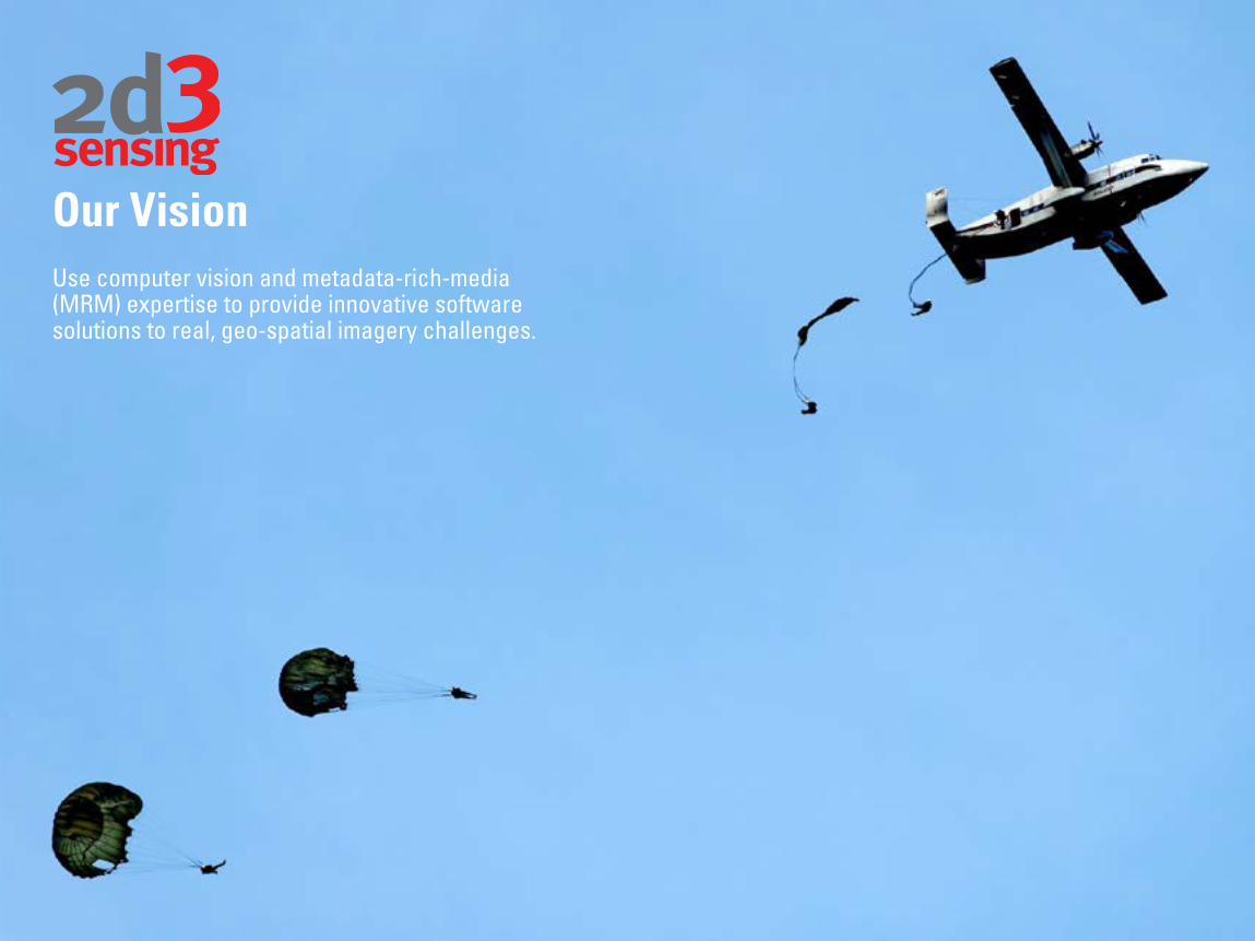
Our VisionUse computer vision and metadata-rich-media (MRM) expertise to provide innovative software solutions to real, geo-spatial imagery challenges.
TYPE & IMAGE
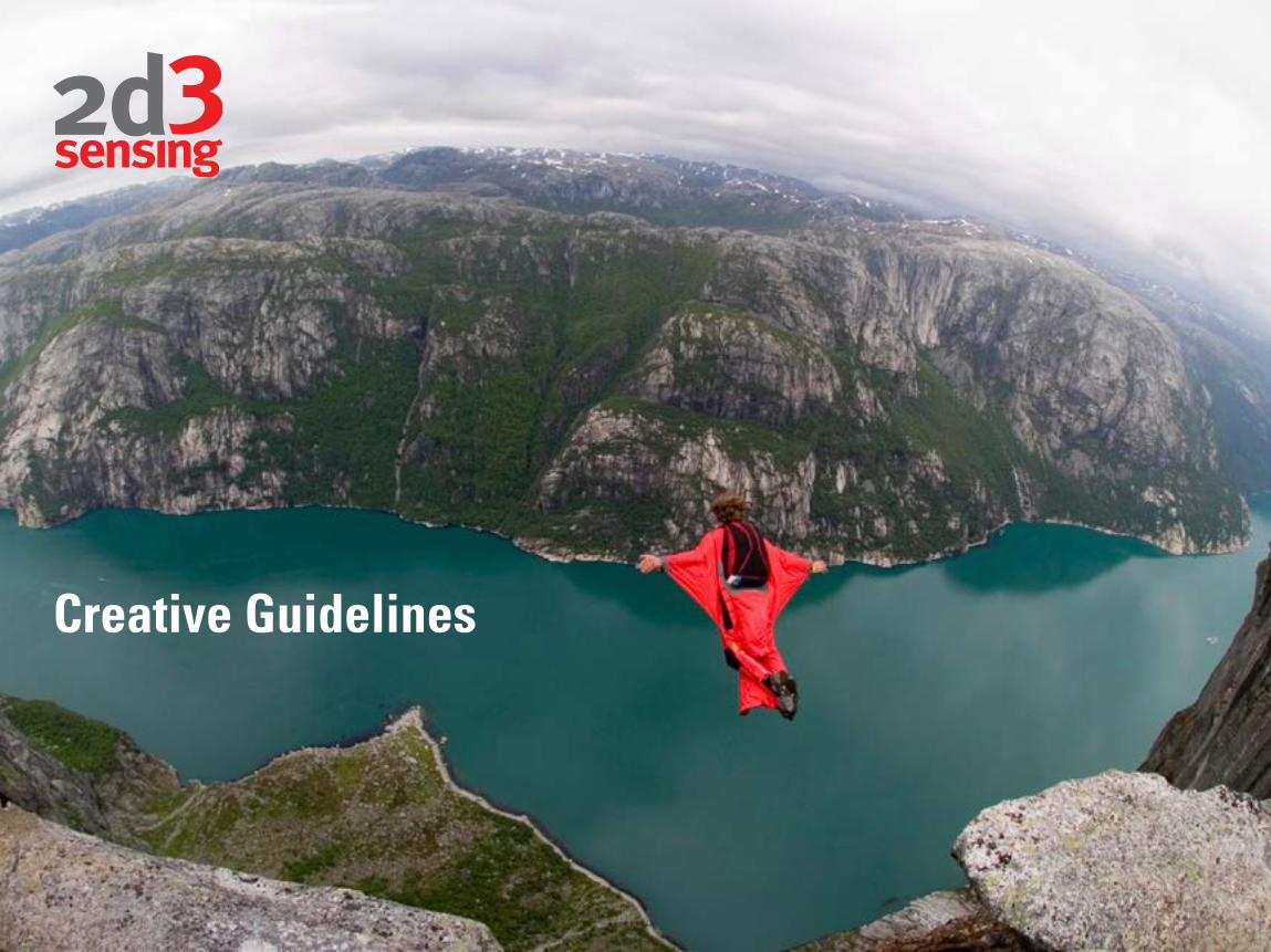
Creative Guidelines
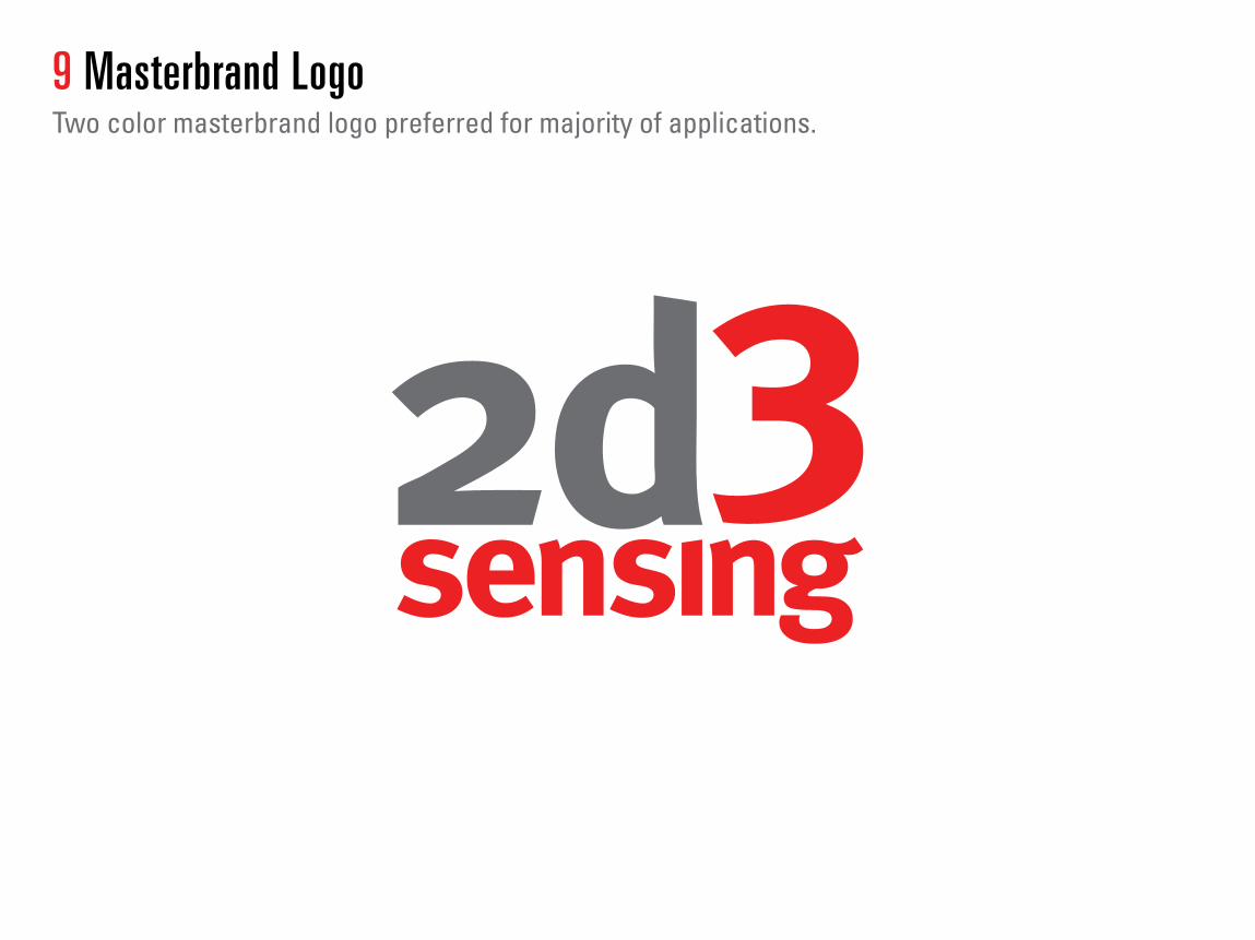
9 Masterbrand Logo Two color masterbrand logo preferred for majority of applications.
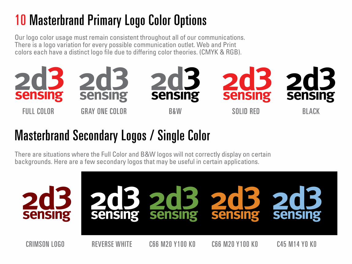
10 Masterbrand Primary Logo Color Options Our logo color usage must remain consistent throughout all of our communications. There is a logo variation for every possible communication outlet. Web and Print colors each have a distinct logo file due to differing color theories. (CMYK & RGB).
Masterbrand Secondary Logos / Single Color There are situations where the Full Color and B&W logos will not correctly display on certain backgrounds. Here are a few secondary logos that may be useful in certain applications.
FULL COLOR GRAY ONE COLOR
CRIMSON LOGO REVERSE WHITE C66 M20 Y100 K0 C66 M20 Y100 K0 C45 M14 Y0 K0
B&W SOLID RED BLACK

11 Masterbrand Logo Minimum Edge Spacing The Master logo should always have breathing room around the edges:To illustrate this point just remember that one proportional width of the ‘2’ character should always be able to fit around the outer most edges, no matter what the logo size is.
X CONTENT TOO CLOSE TO MASTER LOGO
X CONTENT TOO CLOSE TO MASTER LOGO
X CONTENT TOO CLOSE TO MASTER LOGO
✓ OK FOR USE
✓ OK FOR USE ✓ OK FOR USE
✓ ABSOLUTE MINIMUM EDGE MARGIN
www.2d3sensing.com

✓ MINIMUM SIZE
✓ PROPORTIONAL SCALE
X NEVER USE TOO SMALL
X NON PROPORTIONAL SKEW X NON PROPORTIONAL SCALE
X NEVER USE
X NEVER USE
12 Minimum Logo Size Dos & Do NotsDue to the condensed usage of typography, our master logo should never be less than 80px, 25mm, or 1 inch wide. Once a logo has been scaled down, it should never be scaled up again:
Always refer to the correct logo artwork file for your particular needs.

Best Practice
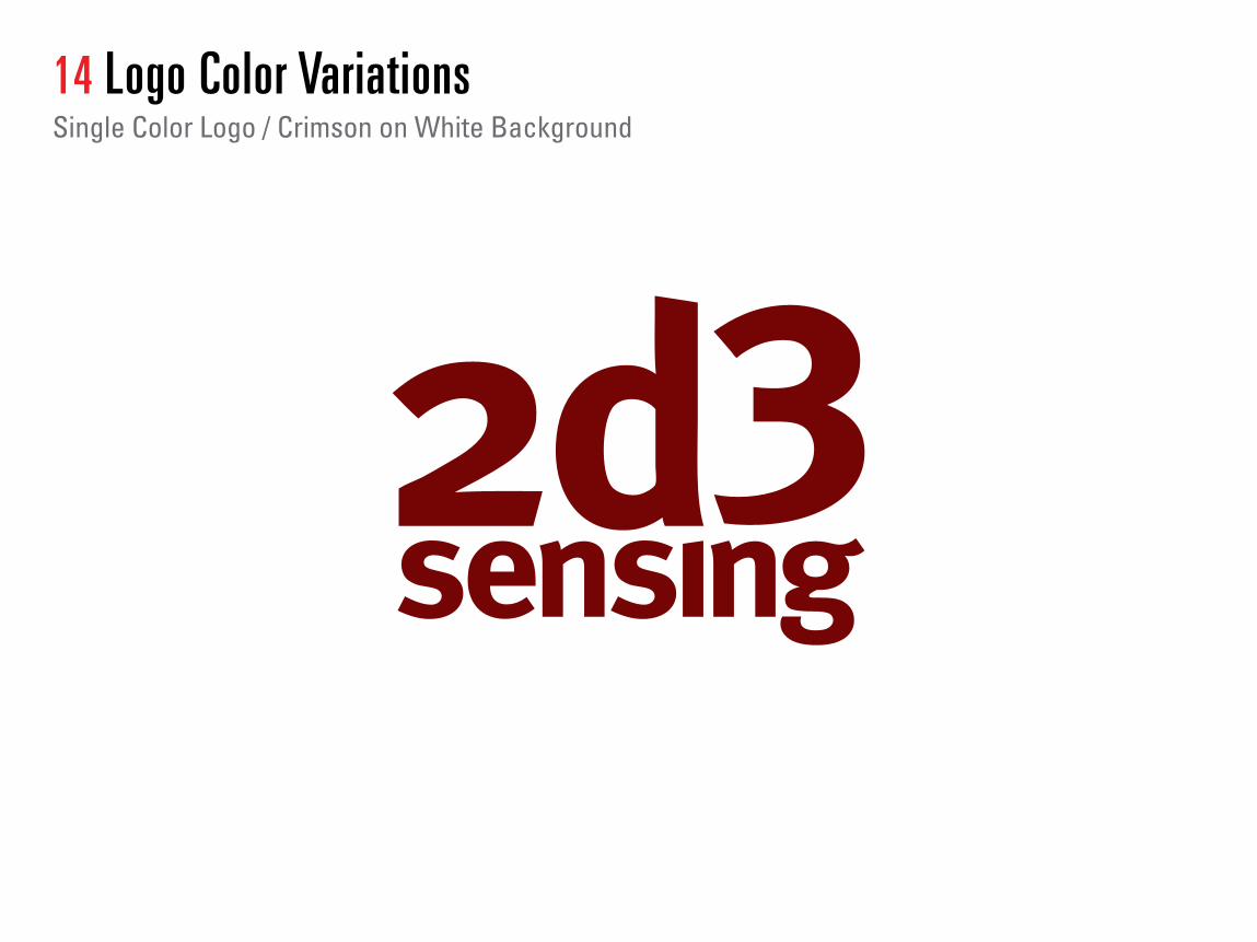
14 Logo Color VariationsSingle Color Logo / Crimson on White Background

Logo Color VariationsReverse White Logo On Light Blue Background
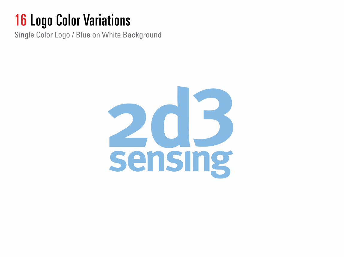
16 Logo Color VariationsSingle Color Logo / Blue on White Background
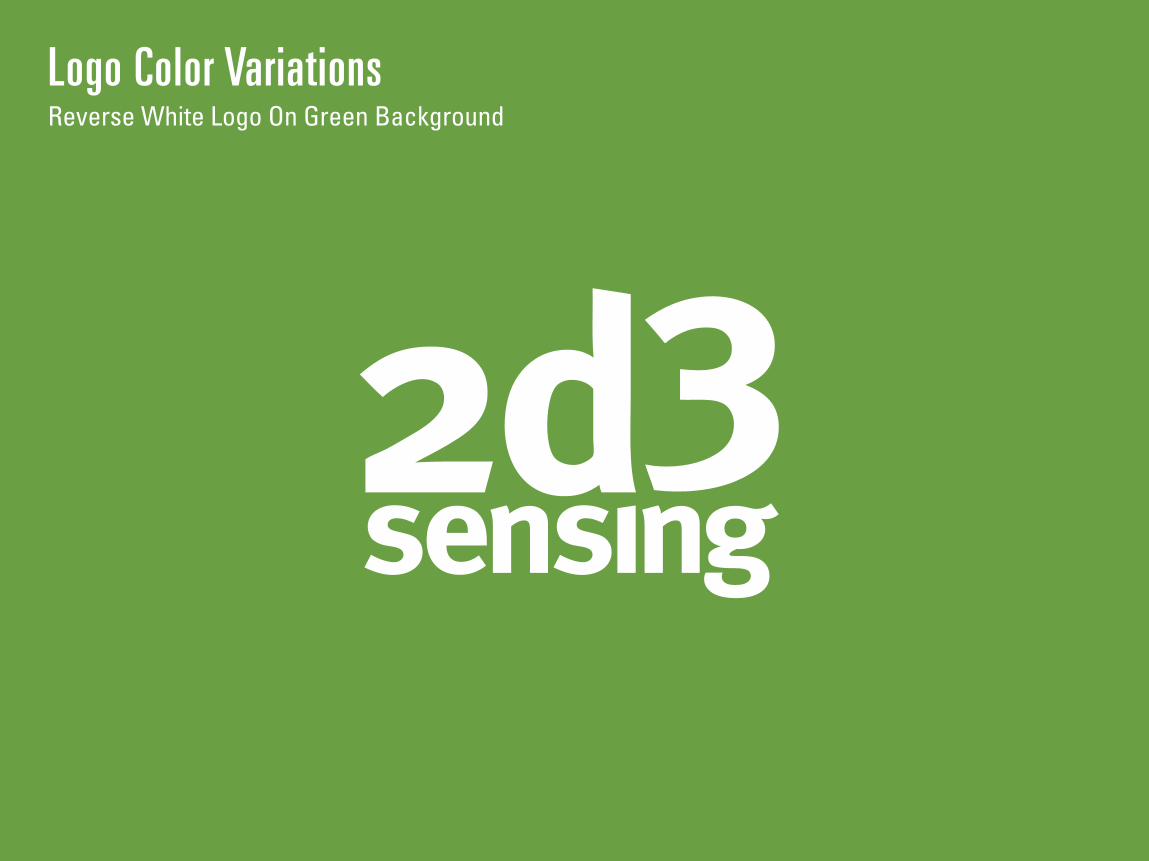
Logo Color VariationsReverse White Logo On Green Background
18 Logo Color VariationsSingle Color Logo / Green on White Background

Logo Color VariationsReverse White Logo On Red Background
20 Logo Color VariationsReverse White Logo On Black Background
Logo Color VariationsTwo Color Logo On Black Background
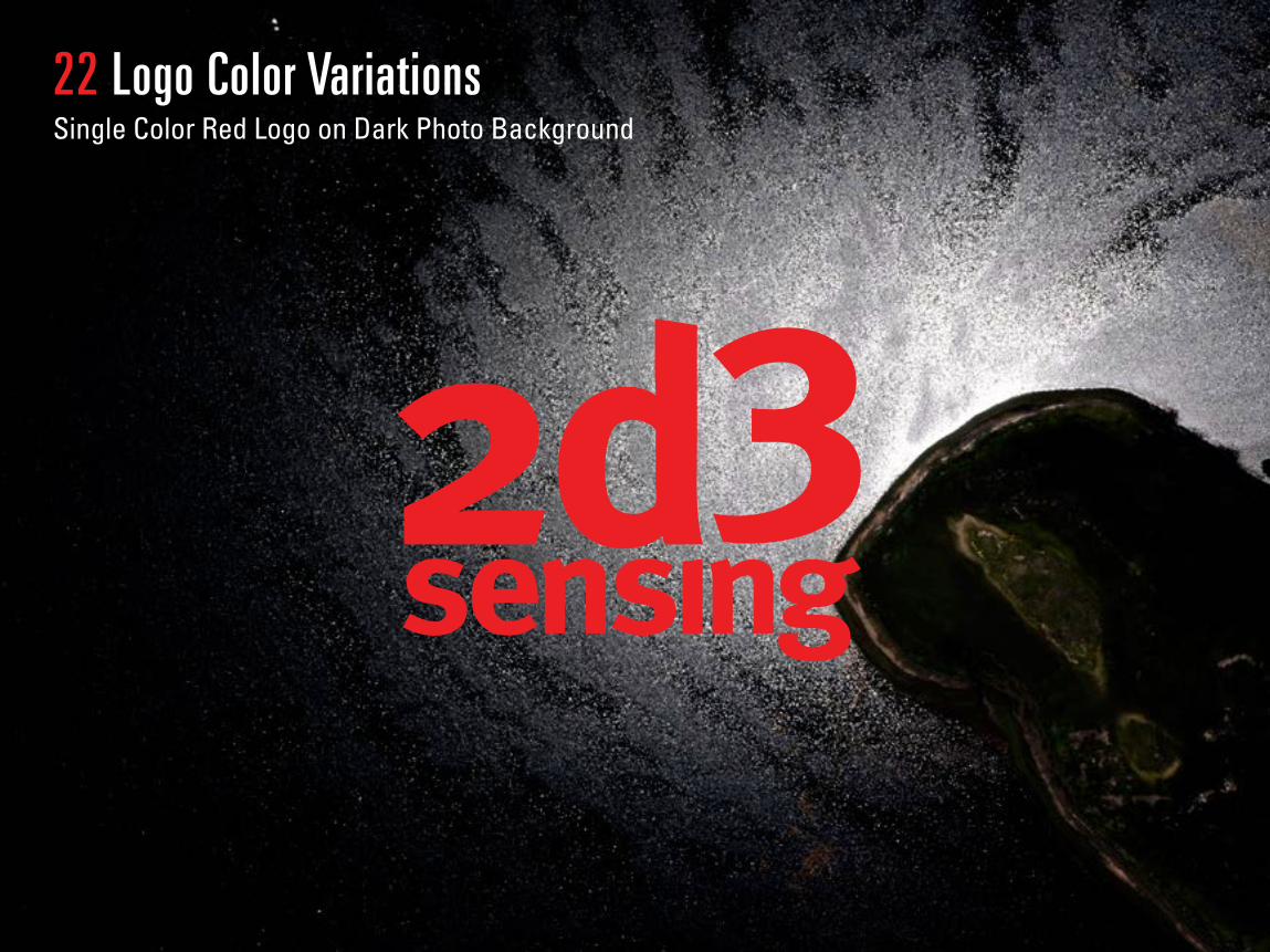
22 Logo Color Variations Single Color Red Logo on Dark Photo Background
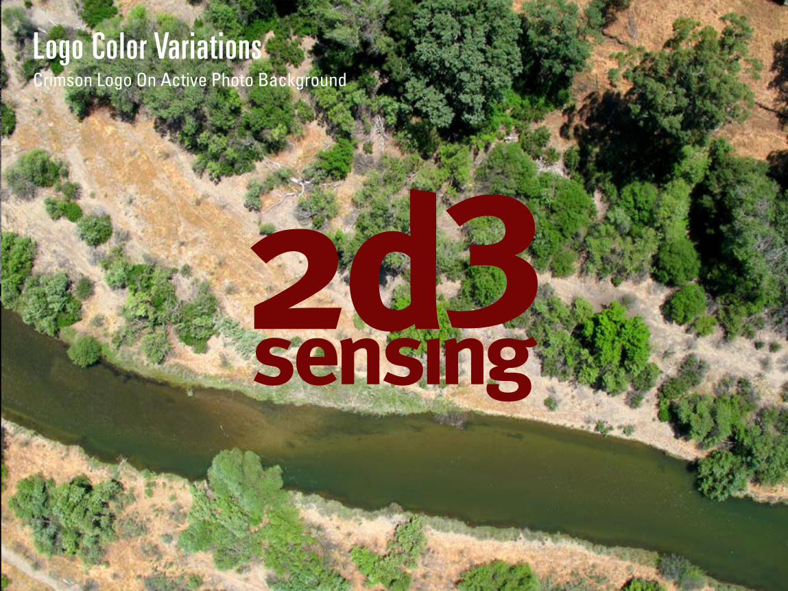
Logo Color Variations Crimson Logo On Active Photo Background
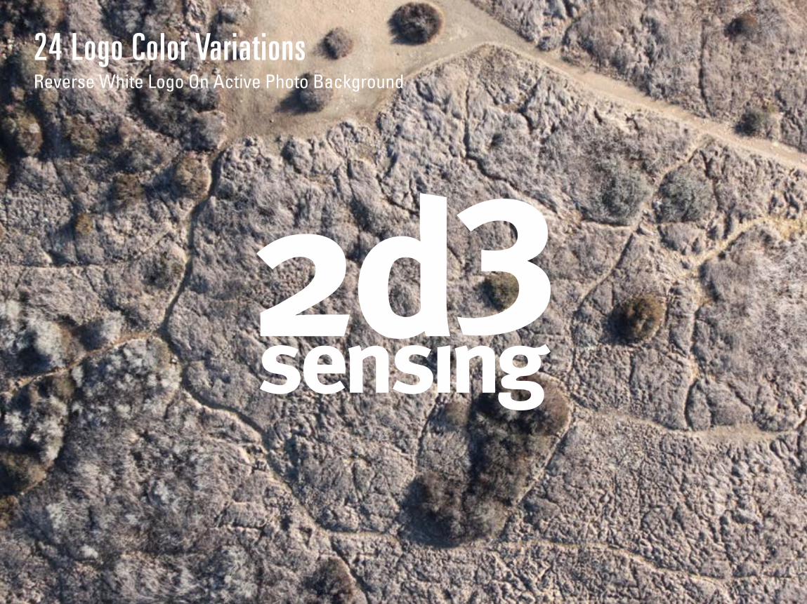
24 Logo Color VariationsReverse White Logo On Active Photo Background
Color Palettes
B L A C K
W H I T E
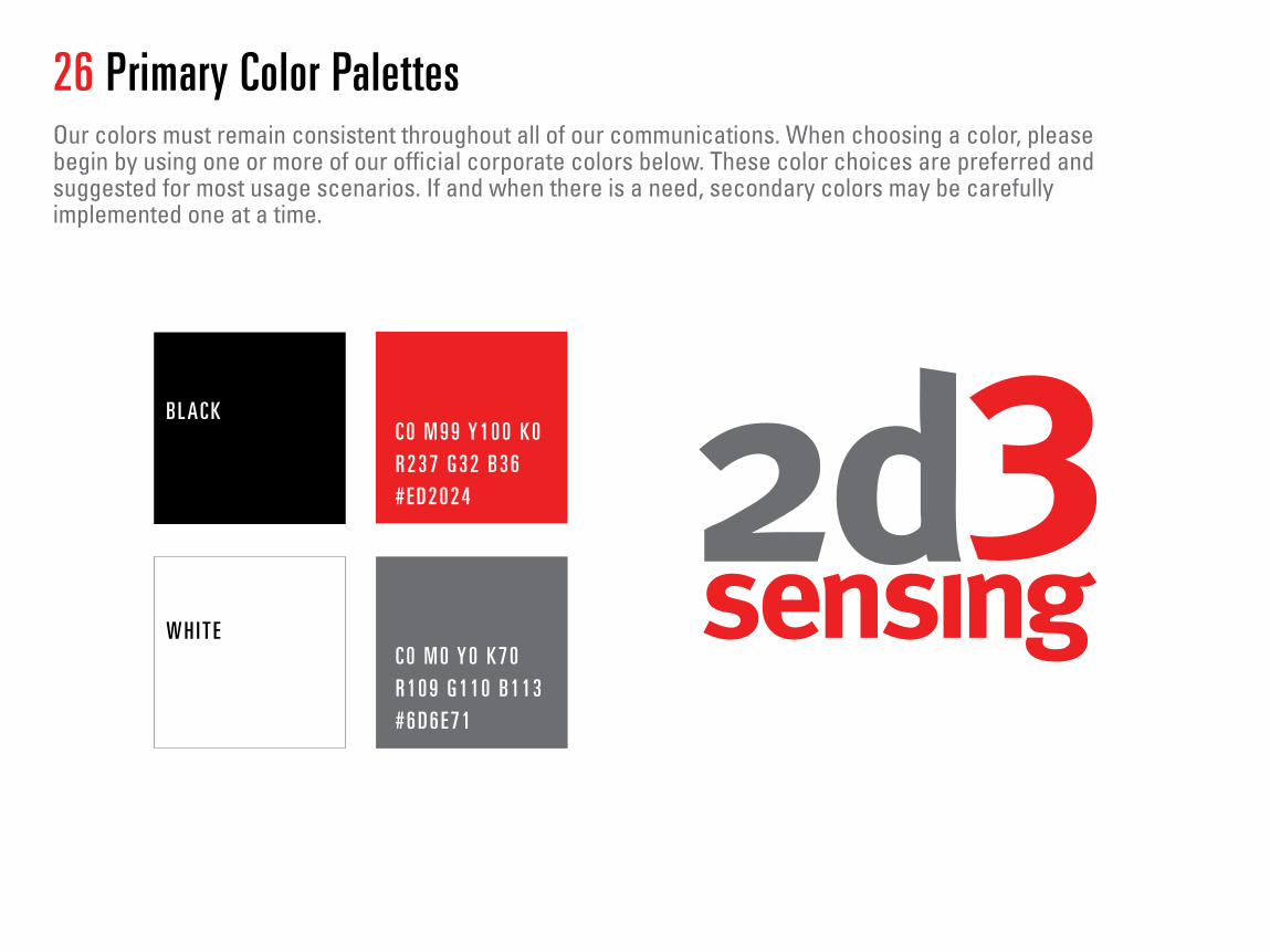
C 0 M 9 9 Y 1 0 0 K 0R 2 3 7 G 3 2 B 3 6# E D 2 0 2 4
C 0 M 0 Y 0 K 7 0R 1 0 9 G 1 1 0 B 1 1 3# 6 D 6 E 7 1
26 Primary Color PalettesOur colors must remain consistent throughout all of our communications. When choosing a color, please begin by using one or more of our official corporate colors below. These color choices are preferred and suggested for most usage scenarios. If and when there is a need, secondary colors may be carefully implemented one at a time.

G O V E R N M E N T A G R I C U LT U R E C O M M E R C I A L ENTERTAINMENT
27 Secondary Color PalettesIf our primary color palette is not adequate to convey our message, please choose one secondary color from the following options. The industry color suggestions are not set in stone and these colors can be used freely for any industry. Please use secondary colors with discretion and remember that less is more.
C 4 4 M 1 4 Y 0 K 0R 1 3 6 G 1 8 8 B 2 3 0# 8 8 B C E 6
C 6 6 M 2 0 Y 1 0 0 K 0R 1 0 6 G 1 6 0 B 6 8# 6 A A 0 4 4
C 4 4 M 1 4 Y 0 K 0R 1 3 6 G 1 8 8 B 2 3 0# 8 8 B C E 6
C 0 M 9 9 Y 1 0 0 K 0R 2 7 G 1 1 7 B 1 8 8# 1 B 7 5 B C
C 0 M 9 9 Y 1 0 0 K 0R 2 7 G 1 1 7 B 1 8 8# 1 B 7 5 B C
C 2 2 M 3 8 Y 8 4 K 0R 2 0 4 G 1 5 8 B 7 4# C C 9 E 4 A
C 8 M 5 7 Y 1 0 0 K 0R 2 2 9 G 1 3 2 B 3 7# E 5 8 4 2 5
C 5 1 M 1 0 0 Y 1 0 0 K 1 9R 1 2 4 G 3 7 B 3 9# 7 C 2 5 2 7
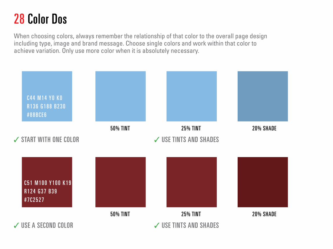
28 Color DosWhen choosing colors, always remember the relationship of that color to the overall page design including type, image and brand message. Choose single colors and work within that color to achieve variation. Only use more color when it is absolutely necessary.
C 4 4 M 1 4 Y 0 K 0R 1 3 6 G 1 8 8 B 2 3 0# 8 8 B C E 6
C 5 1 M 1 0 0 Y 1 0 0 K 1 9R 1 2 4 G 3 7 B 3 9# 7 C 2 5 2 7
50% TINT
50% TINT
25% TINT
25% TINT
20% SHADE
20% SHADE
✓ START WITH ONE COLOR
✓ USE A SECOND COLOR
✓ USE TINTS AND SHADES
✓ USE TINTS AND SHADES
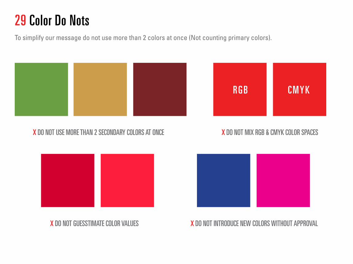
29 Color Do NotsTo simplify our message do not use more than 2 colors at once (Not counting primary colors).
X DO NOT USE MORE THAN 2 SECONDARY COLORS AT ONCE X DO NOT MIX RGB & CMYK COLOR SPACES
X DO NOT INTRODUCE NEW COLORS WITHOUT APPROVAL X DO NOT GUESSTIMATE COLOR VALUES
R G B C M Y K
Typography
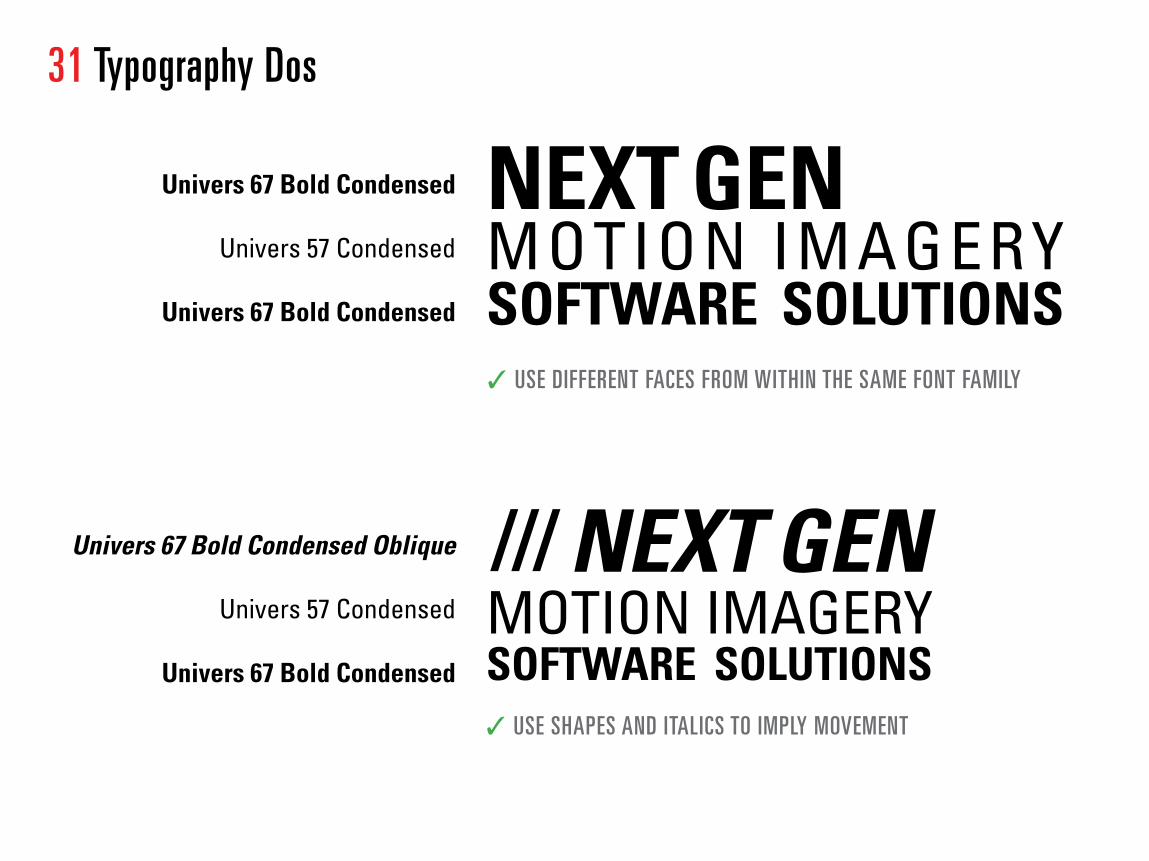
31 Typography Dos
Univers 67 Bold Condensed Oblique
Univers 57 Condensed
Univers 67 Bold Condensed
Univers 67 Bold Condensed
Univers 57 Condensed
Univers 67 Bold Condensed
NEXT GEN MOTION IMAGERYSOFTWARE SOLUTIONS✓ USE DIFFERENT FACES FROM WITHIN THE SAME FONT FAMILY
/// NEXT GEN MOTION IMAGERYSOFTWARE SOLUTIONS✓ USE SHAPES AND ITALICS TO IMPLY MOVEMENT

NEXT GEN MOTION IMAGERYS O F T W A R E S O L U T I O N S
NEXT GEN MOTION IMAGERYSOFTWARE SOLUTIONS
NEXT GEN MOTION IMAGERYSOFTWARE SOLUTIONS
32 Typography Do Nots
X DO NOT STRETCH ANY FONTS TO FIT A CERTAIN SPACE USE AN EXTENDED FONT TO FIT INTO LARGE AREAS
X DO NOT SET TYPE VERTICALLY (SEE PAGE 55 FOR USAGE)
X DO NOT SCALE FONTS TO FIT TIGHT SPACES USE A CONDENSED FONT TO FIT INTO SMALL AREAS
X DO NOT USE DIFFERENT TYPEFACES IN THE SAME COMPOSITION
2d3sensing
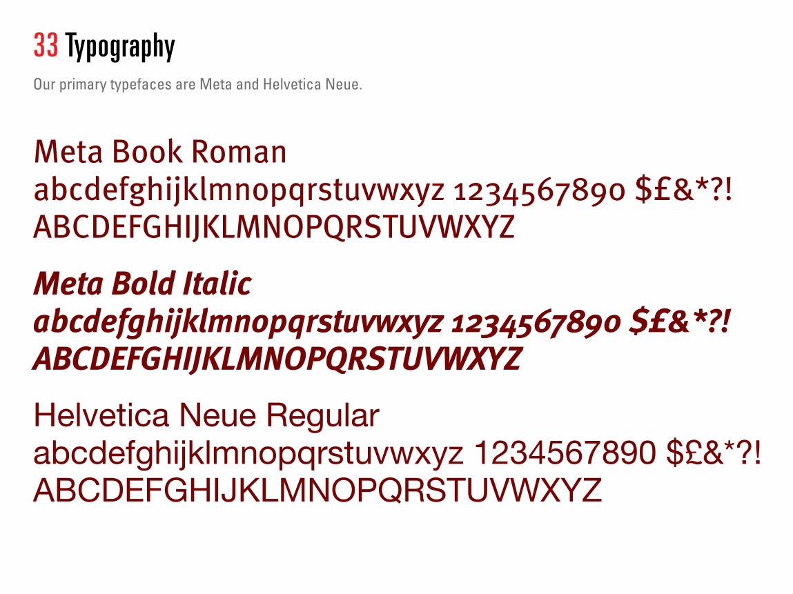
33 TypographyOur primary typefaces are Meta and Helvetica Neue.
Meta Book Roman abcdefghijklmnopqrstuvwxyz 1234567890 $£&*?! ABCDEFGHIJKLMNOPQRSTUVWXYZ
Meta Bold Italic abcdefghijklmnopqrstuvwxyz 1234567890 $£&*?! ABCDEFGHIJKLMNOPQRSTUVWXYZ
Helvetica Neue Regular abcdefghijklmnopqrstuvwxyz 1234567890 $£&*?! ABCDEFGHIJKLMNOPQRSTUVWXYZ
X DO NOT SET TYPE VERTICALLY (SEE PAGE 55 FOR USAGE)

34 TypographySince the Meta font is used for Branding of our logo, and Helvetica use is in over-abundance, there is a third typeface that has been introduced throughout this guide by the name of Univers. The number after the name refers to the line weight or thickness of the letter forms.
Univers 39 Thin Ultra Condensedabcdefghijklmnopqrstuvwxyz 1234567890 $£&*?! ABCDEFGHIJKLMNOPQRSTUVWXYZ
Univers 59 Ultra Condensed abcdefghijklmnopqrstuvwxyz 1234567890 $£&*?! ABCDEFGHIJKLMNOPQRSTUVWXYZ
Univers 67 Bold Condensed Oblique abcdefghijklmnopqrstuvwxyz 1234567890 $£&*?! ABCDEFGHIJKLMNOPQRSTUVWXYZ
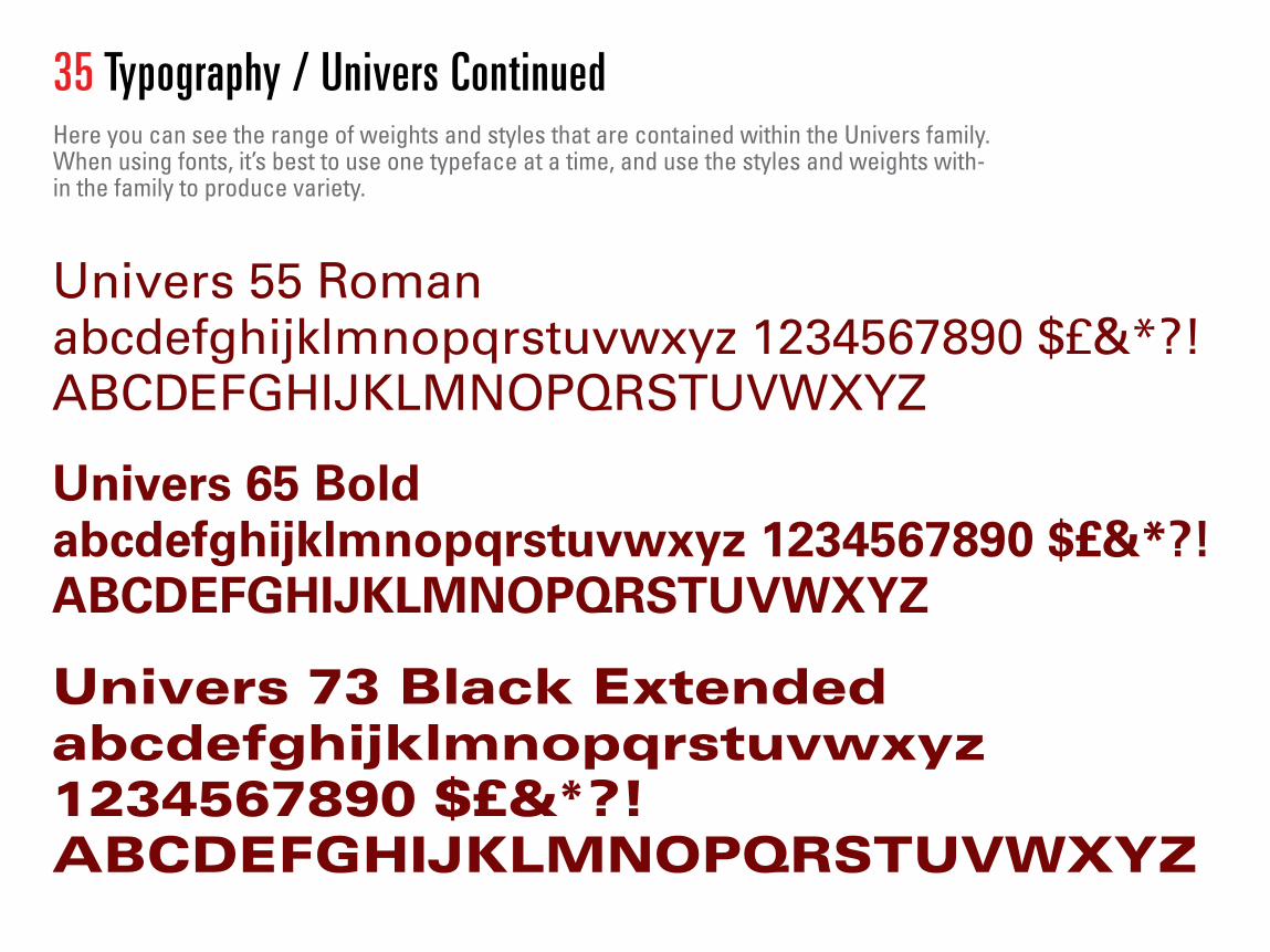
Univers 55 Roman abcdefghijklmnopqrstuvwxyz 1234567890 $£&*?! ABCDEFGHIJKLMNOPQRSTUVWXYZ
Univers 65 Bold abcdefghijklmnopqrstuvwxyz 1234567890 $£&*?! ABCDEFGHIJKLMNOPQRSTUVWXYZ
Univers 73 Black Extended abcdefghijklmnopqrstuvwxyz 1234567890 $£&*?! ABCDEFGHIJKLMNOPQRSTUVWXYZ
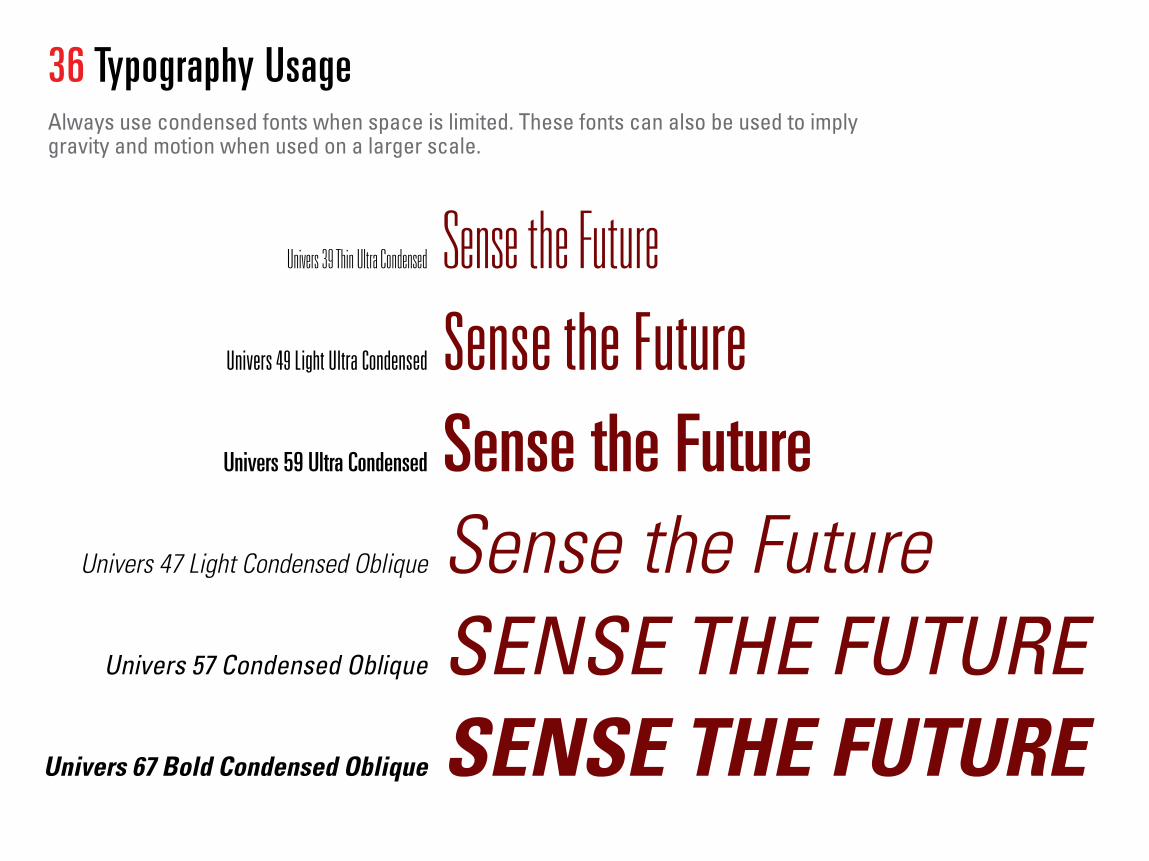
35 Typography / Univers Continued Here you can see the range of weights and styles that are contained within the Univers family. When using fonts, it’s best to use one typeface at a time, and use the styles and weights with-in the family to produce variety.
Sense the Future Sense the FutureSense the FutureSense the FutureSENSE THE FUTURESENSE THE FUTURE
Univers 39 Thin Ultra Condensed
Univers 49 Light Ultra Condensed
Univers 59 Ultra Condensed
Univers 47 Light Condensed Oblique
Univers 57 Condensed Oblique
Univers 67 Bold Condensed Oblique
36 Typography UsageAlways use condensed fonts when space is limited. These fonts can also be used to imply gravity and motion when used on a larger scale.

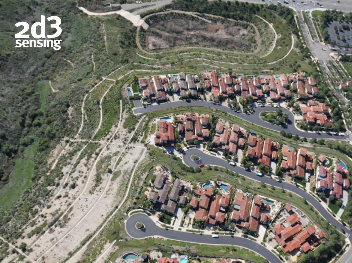
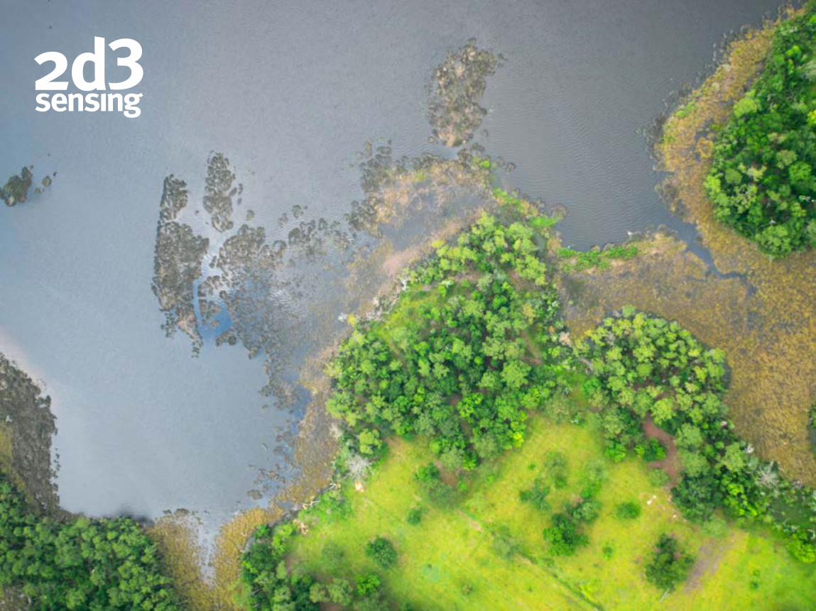
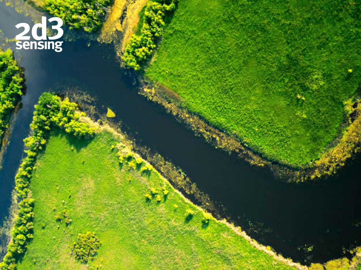
PhotographyAlways use simple but engaging high resolution photography. We have a broad selection of imagery to choose from. High quality aerial photos, life-style shots, or custom photo shoots, we will find the imagery that conveys the right message. Our new library is resides within our Sharepoint located at Companyweb > Shared Documents > Marketing > Stock Photography.
Sense the Future Sense the FutureSense the FutureSense the FutureSENSE THE FUTURESENSE THE FUTURE
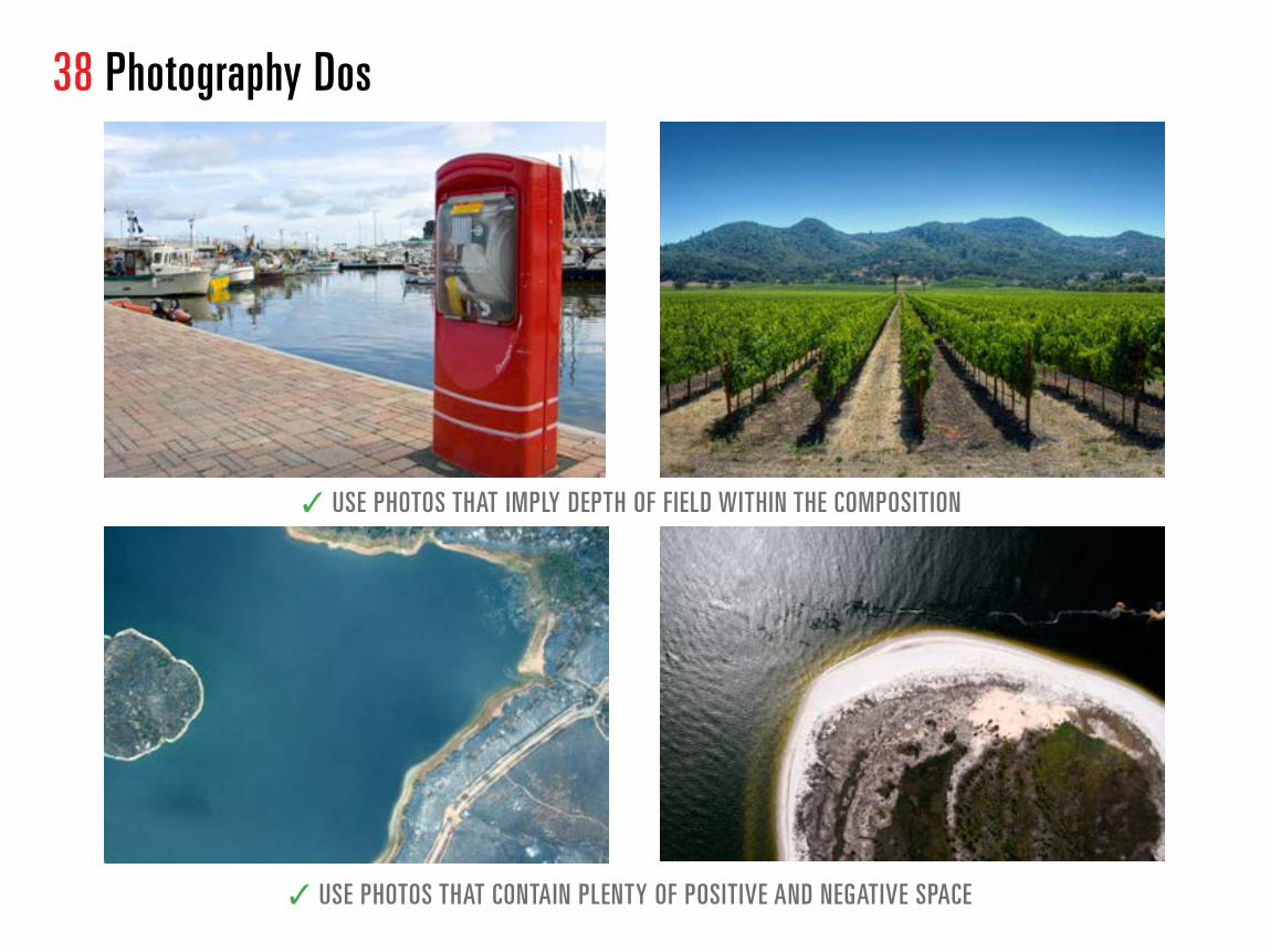
38 Photography Dos
✓ USE PHOTOS THAT IMPLY DEPTH OF FIELD WITHIN THE COMPOSITION
✓ USE PHOTOS THAT CONTAIN PLENTY OF POSITIVE AND NEGATIVE SPACE

39 Photography Do NotsWhen choosing the right photo we are looking for an ownable style that fits into our brand message. Photographs can be used to create visual metaphors and help us tell our story. Look for photos that are warm, inviting, and even sentimental. Here are a few examples of imagery that we do not want to be associated with.
X DO NOT USE POSED MODELS X DO NOT USE CLICHÉD IMAGERY NO COLD POORLY LIT IMAGERY
X DO NOT USE UNINSPIRED IMAGERY USE A LIFESTYLE PHOTO INSTEAD
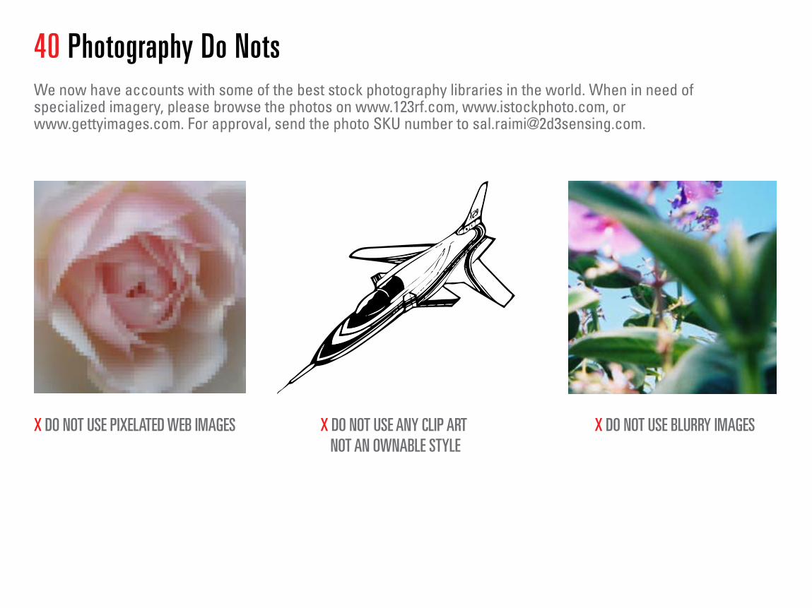
40 Photography Do NotsWe now have accounts with some of the best stock photography libraries in the world. When in need of specialized imagery, please browse the photos on www.123rf.com, www.istockphoto.com, or www.gettyimages.com. For approval, send the photo SKU number to [email protected].
X DO NOT USE PIXELATED WEB IMAGES X DO NOT USE BLURRY IMAGESX DO NOT USE ANY CLIP ART NOT AN OWNABLE STYLE
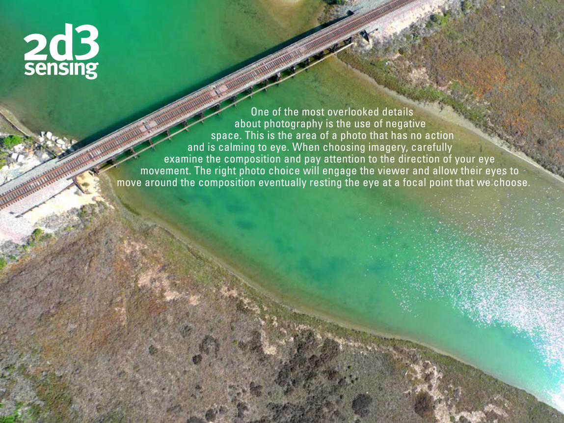
One of the most overlooked details about photography is the use of negative
space. This is the area of a photo that has no action and is calming to eye. When choosing imagery, carefully
examine the composition and pay attention to the direction of your eye movement. The right photo choice will engage the viewer and allow their eyes to
move around the composition eventually resting the eye at a focal point that we choose.
X DO NOT USE BLURRY IMAGES


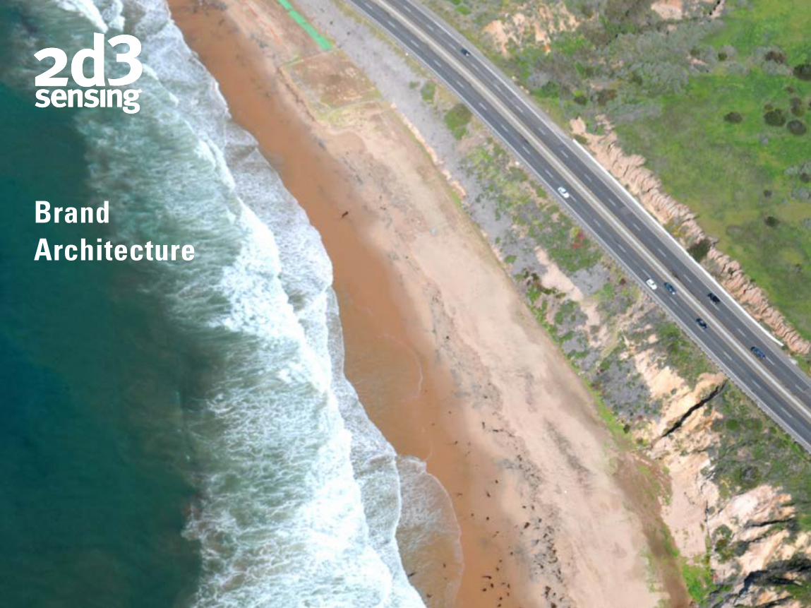
BrandArchitecture
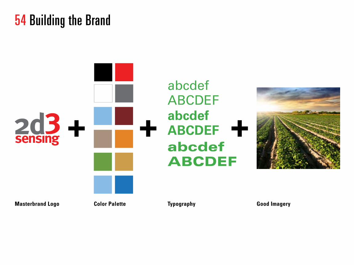
54 Building the Brand
+ + +
abcdefABCDEF abcdefABCDEF abcdef ABCDEF
Masterbrand Logo
Color Palette
Typography Good Imagery
Growth
Gro
wth
Gro
wth
Gro
wth
Gro
wth

abcdefABCDEF abcdefABCDEF abcdef ABCDEF
Growth
Gro
wth
Gro
wth
Gro
wth
Gro
wth
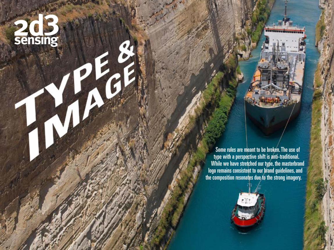
Some rules are meant to be broken. The use of type with a perspective shift is anti-traditional.
While we have stretched our type, the masterbrand logo remains consistent to our brand guidelines, and
the composition resonates due to the strong imagery.
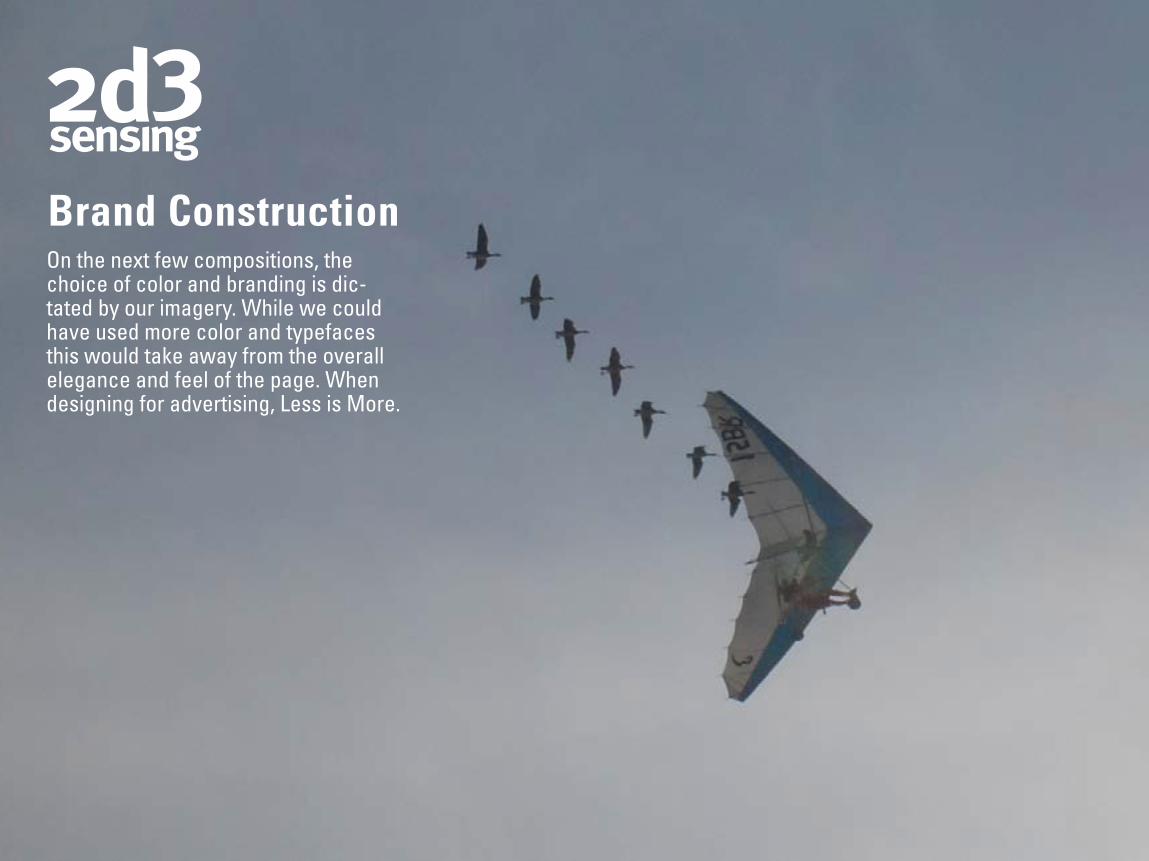
Brand ConstructionOn the next few compositions, the choice of color and branding is dic-tated by our imagery. While we could have used more color and typefaces this would take away from the overall elegance and feel of the page. When designing for advertising, Less is More.
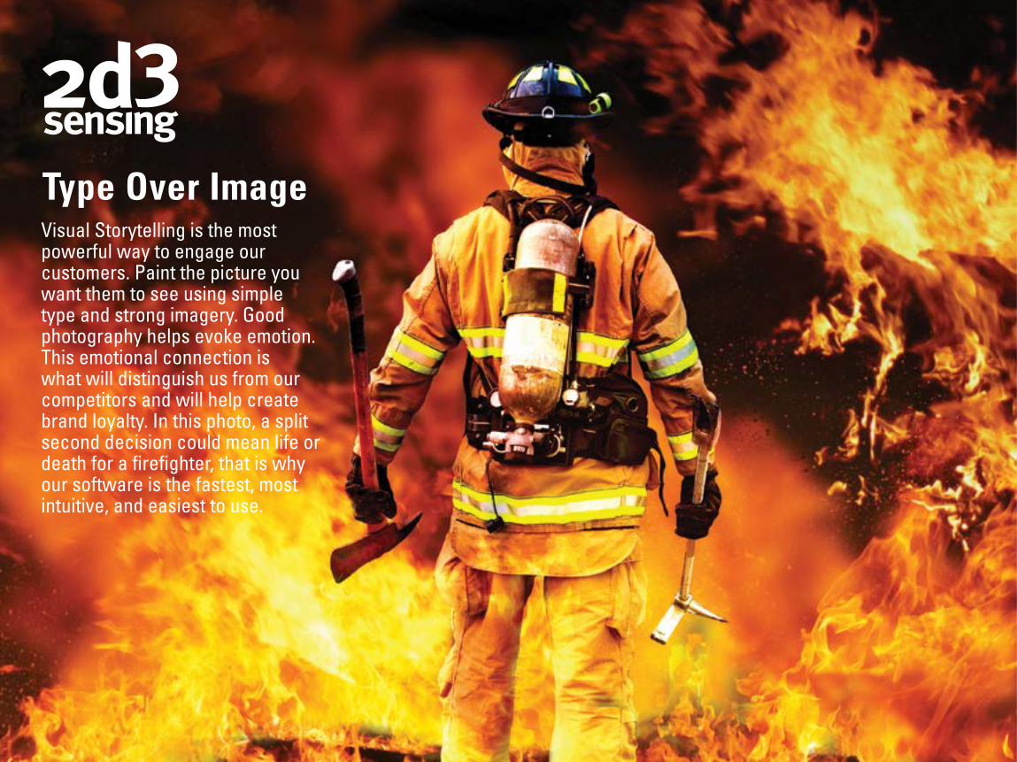
Type Over ImageVisual Storytelling is the most powerful way to engage our customers. Paint the picture you want them to see using simple type and strong imagery. Good photography helps evoke emotion. This emotional connection is what will distinguish us from our competitors and will help create brand loyalty. In this photo, a split second decision could mean life or death for a firefighter, that is why our software is the fastest, most intuitive, and easiest to use.

YOUR DATA.
OUR SOLUTION.
This visual metaphor says many different things. Navigating hazardous terrain with large amounts of data requires a specialized type of expertise. 2d3 Sensing is the leader in comput-er vision and motion imagery. Taking huge amounts of video, imagery, and geodata, making it searchable, and instantly accessible.

GraphicResonanceWhen designing with type and image, the end goal is to achieve some sort of interaction between the different ele-ments on the page to evoke emotion in our viewer. This inter-action is a problem solving exercise, where you should ask yourself what is it that you want the viewer to experience? A successful design can always be seen as having Graphic Resonance. Just as in composing a piece of classical music where the final piece comes together and resonates with the audience, our marketing must resonate each and every time that it is viewed by our customers.
For Creative Direction or Questions Please Contact:[email protected]