Embed Size (px)
Citation preview
September 2004 Visual Sample Plan Version 3.0 4.1
4.0 Assessment of Sampling Plans
VSP provides multiple displays for allowing you to assess the sampling plan that has been designed/ selected. VSP calls the displays Views. You can view a representation of the sampling locations on the map entered into VSP, view a graph of the performance of the design, look at a report that summarizes the key components of the design (such as number of samples, size of sampling area, cost, probabilities associated with the problem, assumptions, and technical justification), or see a listing of the coordinates of each sampling location. This section describes each of these views and discusses how you can use the views to assess the VSP sampling plan.
There are two ways to select/change views:
• Press one of the display buttons in the middle of the tool bar (MAP VIEW, GRAPH VIEW, REPORT VIEW, COORDINATE VIEW)
• From the main menu select View > Map (or Graph, Report, Coordinate)
4.1 Display of Sampling Design on the Map: MAP VIEW button or View > Map
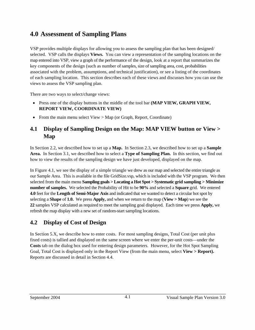
In Section 2.2, we described how to set up a Map. In Section 2.3, we described how to set up a Sample Area. In Section 3.1, we described how to select a Type of Sampling Plan. In this section, we find out how to view the results of the sampling design we have just developed, displayed on the map.
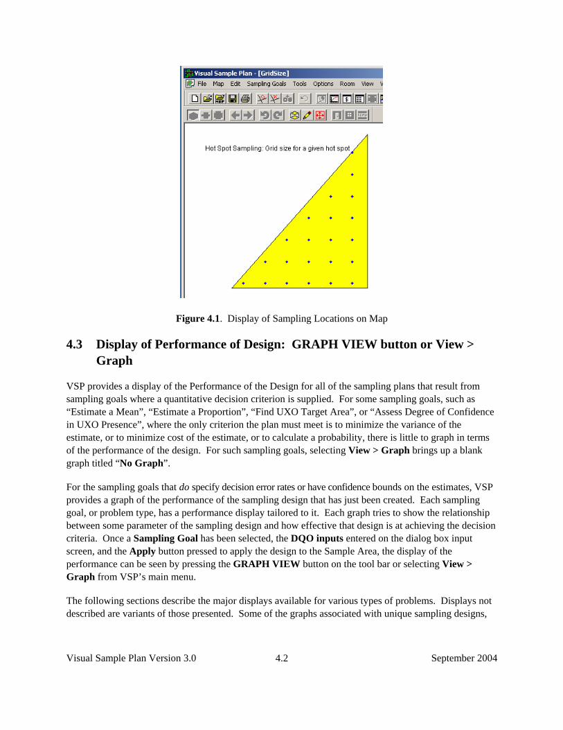
In Figure 4.1, we see the display of a simple triangle we drew as our map and selected the entire triangle as our Sample Area. This is available in the file GridSize.vsp, which is included with the VSP program. We then selected from the main menu Sampling goals > Locating a Hot Spot > Systematic grid sampling > Minimize number of samples. We selected the Probability of Hit to be 90% and selected a Square grid. We entered 4.0 feet for the Length of Semi-Major Axis and indicated that we wanted to detect a circular hot spot by selecting a Shape of 1.0. We press Apply, and when we return to the map (View > Map) we see the 22 samples VSP calculated as required to meet the sampling goal displayed. Each time we press Apply, we refresh the map display with a new set of random-start sampling locations.
4.2 Display of Cost of Design
In Section 5.X, we describe how to enter costs. For most sampling designs, Total Cost (per unit plus fixed costs) is tallied and displayed on the same screen where we enter the per-unit costs—under the Costs tab on the dialog box used for entering design parameters. However, for the Hot Spot Sampling Goal, Total Cost is displayed only in the Report View (from the main menu, select View > Report). Reports are discussed in detail in Section 4.4.
Visual Sample Plan Version 3.0 September 2004 4.2
Figure 4.1. Display of Sampling Locations on Map
4.3 Display of Performance of Design: GRAPH VIEW button or View > Graph
VSP provides a display of the Performance of the Design for all of the sampling plans that result from sampling goals where a quantitative decision criterion is supplied. For some sampling goals, such as “Estimate a Mean”, “Estimate a Proportion”, “Find UXO Target Area”, or “Assess Degree of Confidence in UXO Presence”, where the only criterion the plan must meet is to minimize the variance of the estimate, or to minimize cost of the estimate, or to calculate a probability, there is little to graph in terms of the performance of the design. For such sampling goals, selecting View > Graph brings up a blank graph titled “No Graph”.
For the sampling goals that do specify decision error rates or have confidence bounds on the estimates, VSP provides a graph of the performance of the sampling design that has just been created. Each sampling goal, or problem type, has a performance display tailored to it. Each graph tries to show the relationship between some parameter of the sampling design and how effective that design is at achieving the decision criteria. Once a Sampling Goal has been selected, the DQO inputs entered on the dialog box input screen, and the Apply button pressed to apply the design to the Sample Area, the display of the performance can be seen by pressing the GRAPH VIEW button on the tool bar or selecting View > Graph from VSP’s main menu.
The following sections describe the major displays available for various types of problems. Displays not described are variants of those presented. Some of the graphs associated with unique sampling designs,
September 2004 Visual Sample Plan Version 3.0 4.3
such as Sequential Sampling, have been described in earlier sections, e.g., Graph View of Sequential Sampling (Fig 3.8), found in Section 3.
4.3.1 Performance of Design for Sampling Goal: Compare Average to a Fixed Threshold
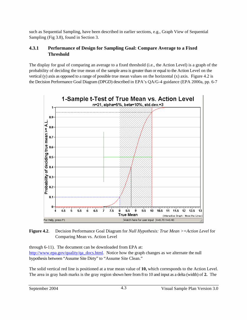
The display for goal of comparing an average to a fixed threshold (i.e., the Action Level) is a graph of the probability of deciding the true mean of the sample area is greater than or equal to the Action Level on the vertical (y) axis as opposed to a range of possible true mean values on the horizontal (x) axis. Figure 4.2 is the Decision Performance Goal Diagram (DPGD) described in EPA’s QA/G-4 guidance (EPA 2000a, pp. 6-7
Figure 4.2. Decision Performance Goal Diagram for Null Hypothesis: True Mean >=Action Level for Comparing Mean vs. Action Level
through 6-11). The document can be downloaded from EPA at: http://www.epa.gov/quality/qa_docs.html. Notice how the graph changes as we alternate the null hypothesis between “Assume Site Dirty” to “Assume Site Clean.”
The solid vertical red line is positioned at a true mean value of 10, which corresponds to the Action Level. The area in gray hash marks is the gray region shown here from 8 to 10 and input as a delta (width) of 2. The
Visual Sample Plan Version 3.0 September 2004 4.4
two dashed blue lines that extend from the y-axis to the x-axis mark the two types of decision error rates, alpha, set here at 5%, and beta, set here at 10%. Recall that Alpha is the probability of rejecting the null hypothesis when it is true (called a false rejection decision error), and beta is the probability of accepting the null hypothesis when it is false (called a false acceptance decision error). The error rates along with the user-supplied standard deviation of 3 and the VSP-calculated sample size n=21 is shown on second row of the title. We also see in the title that we are using the sample size formula for the 1sample t-test.
The green vertical line marks off one standard deviation (3) from the action level. This mark allows the user to visually compare the width of the gray region to how variable, on average, we expect individual observations to be about the mean (definition of standard deviation). The sliding black lines (cross hairs) that move on the graph when the mouse is moved are provided to facilitate reading the x, y values off the graph. This cross-hair feature can be turned off or on by choosing Options > Graph > Cross Hairs.
Most of the parameters displayed on the DPGD can be changed interactively by moving the lines on the graph, rather than having to change the values in the input dialog box. Table 4.1 describes the interactive features.
Table 4.1. Interactive Graph Features
To Change Do the Following Alpha Drag the horizontal blue dashed line up or down Beta Drag the horizontal blue dashed line up or down Delta (and LBGR, or UBGR) Drag the vertical edge of the shaded gray area to the left or rightStandard Deviation Drag the vertical section of the green line left or right Action Level Drag the vertical red line left or right Null Hypothesis Click on the y-axis title
As you change these parameters, you can see the new value of the parameter on the bottom status bar after “watch here for user input.” You will notice that changing these values on the graph also changes their values on the other displays: the sampling design is modified in the report view, new samples are placed on the map view, and updated sample location information is list in the coordinate view.
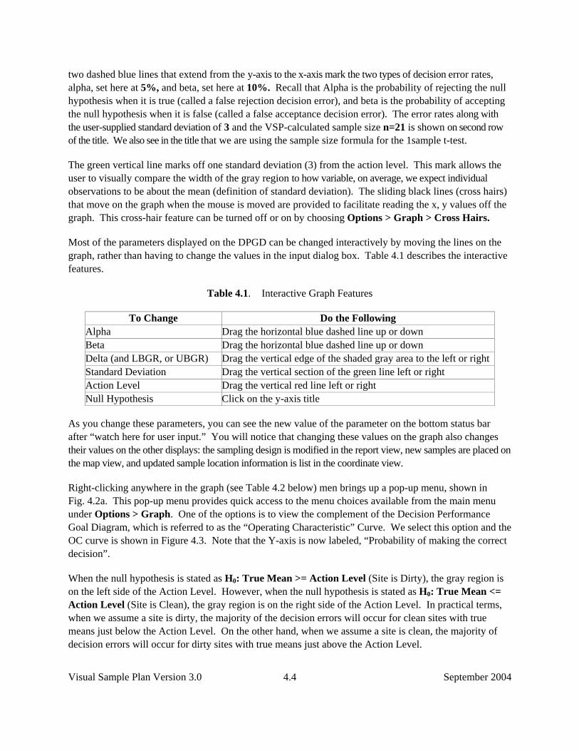
Right-clicking anywhere in the graph (see Table 4.2 below) men brings up a pop-up menu, shown in Fig. 4.2a. This pop-up menu provides quick access to the menu choices available from the main menu under Options > Graph. One of the options is to view the complement of the Decision Performance Goal Diagram, which is referred to as the “Operating Characteristic” Curve. We select this option and the OC curve is shown in Figure 4.3. Note that the Y-axis is now labeled, “Probability of making the correct decision”.
When the null hypothesis is stated as H0: True Mean >= Action Level (Site is Dirty), the gray region is on the left side of the Action Level. However, when the null hypothesis is stated as H0: True Mean <= Action Level (Site is Clean), the gray region is on the right side of the Action Level. In practical terms, when we assume a site is dirty, the majority of the decision errors will occur for clean sites with true means just below the Action Level. On the other hand, when we assume a site is clean, the majority of decision errors will occur for dirty sites with true means just above the Action Level.
September 2004 Visual Sample Plan Version 3.0 4.5
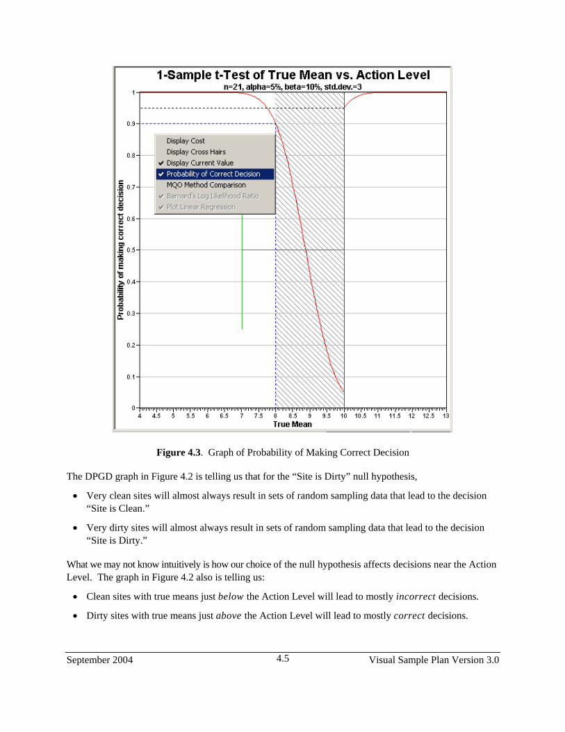
Figure 4.3. Graph of Probability of Making Correct Decision
The DPGD graph in Figure 4.2 is telling us that for the “Site is Dirty” null hypothesis,
• Very clean sites will almost always result in sets of random sampling data that lead to the decision “Site is Clean.”
• Very dirty sites will almost always result in sets of random sampling data that lead to the decision “Site is Dirty.”
What we may not know intuitively is how our choice of the null hypothesis affects decisions near the Action Level. The graph in Figure 4.2 also is telling us:
• Clean sites with true means just below the Action Level will lead to mostly incorrect decisions.
• Dirty sites with true means just above the Action Level will lead to mostly correct decisions.
Visual Sample Plan Version 3.0 September 2004 4.6
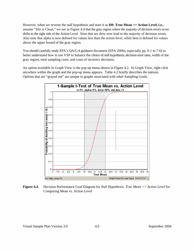
However, when we reverse the null hypothesis and state it as H0: True Mean <= Action Level, i.e., assume “Site is Clean,” we see in Figure 4.4 that the gray region where the majority of decision errors occur shifts to the right side of the Action Level. Sites that are dirty now lead to the majority of decision errors. Also note that alpha is now defined for values less than the action level, while beta is defined for values above the upper bound of the gray region.
You should carefully study EPA’s QA/G-4 guidance document (EPA 2000a, especially pp. 6-1 to 7-6) to better understand how to use VSP to balance the choice of null hypothesis, decision error rates, width of the gray region, total sampling costs, and costs of incorrect decisions.
An option available in Graph View is the pop-up menu shown in Figure 4.2. In Graph View, right click anywhere within the graph and the pop-up menu appears. Table 4.2 briefly describes the options. Options that are “grayed out” are unique to graphs associated with other Sampling Goals.
Figure 4.4. Decision Performance Goal Diagram for Null Hypothesis: True Mean <= Action Level for Comparing Mean vs. Action Level

September 2004 Visual Sample Plan Version 3.0 4.7
Table 4.2. Graph Options Menu Commands
Display Cost Display cost on any graph axis that would otherwise display the number of samples.
Display Cross Hairs Display an interactive cross-hair that allows the user to see the X and Y values for any point on the graph
Display Current Value Displays a cross-hair that corresponds to the current X or Y value produced by the current sampling design.
Probability of Correct Decision Displays the probability of a correct decision in place of a decision performance goal diagram
MQO Method Comparison Displays a bar graph that shows the relative costs of MQO sampling design alternatives.
Barnard’s Log Likelihood Ratio Display’s a plot of Barnard’s Log Likelihood Ratio (which is the test statistic used in Barnard’s sequential t-Test)
Plot Linear Regression Displays the linear regression plot (available for collaborative sampling designs).
4.3.2 Performance of Design for Sampling Goal: Construct Confidence Interval on the Mean
The display for assessing a confidence interval for a mean differs somewhat from that for comparing an average to a threshold because this is an estimation problem, not a testing problem. As such, there is only one type of decision error rate, alpha. Shown in Figure 4.4 is the Performance Design for a problem where the user specified the width of the confidence interval as 1.0, the standard deviation as 3, and a desired 95% one-sided confidence interval on the mean. We are using a one-sided confidence interval (vs. a two-sided) because we are concerned only about values that exceed the upper bound of the confidence interval, not values both above the upper bound and below the lower bound. This is consistent with problems in which the mean to be estimated is average contamination, so we are not concerned about values below the lower bound of the confidence interval.
VSP calculated that a sample size of 26 was required. The performance graph is a plot of possible confidence interval widths vs. number of samples for the problem specified. The dashed blue line terminates at the y-axis at a confidence interval width of 1.0, as specified by the user, and at the x-axis at the recommended minimum sample size of 26.
The solid black line is a locating aid you can slide up and down the graph to easily read the trade-offs between increased width of the confidence interval and increased number of samples. In Figure 4.4, the x-axis value (number of samples) and the y-axis value (width of confidence interval) for the current solid black line can be seen in the status bar as X = 2.72 and Y = 5.96.

Visual Sample Plan Version 3.0 September 2004 4.8
Figure 4.5. Decision Performance Graph for One-Sided 95% Confidence Interval
4.3.3 Performance of Design for Sampling Goal: Comparing a Proportion to a Fixed Threshold
The sampling design assessment display for comparing a proportion to a fixed threshold is a graph of the number of samples vs. the decision error, beta. These parameters were selected for the performance graph because they can be directly calculated and the graph provides a visual display of how increasing the number of samples decreases one of the error rates (beta).
Note: If the appropriate statistical test is used, the test is designed to achieve the level of significance, or alpha. It is beta and the power of the test (1-beta) that are affected by sample size.
For this sampling goal, there is no clear distinction between “Site Dirty” and “Site Clean,” depending on how the null hypothesis is formulated. If the proportion we are talking about is the proportion of 1-acre lots in a building development that have trees, then exceeding a threshold would be a “good thing.” However, if the proportion is the proportion of acres that have contamination greater than 10 pCi, then exceeding the threshold would be a “bad thing.” Alpha and beta are still defined as false acceptance and false rejection rates, but the user must formulate the hypotheses and select limits on the error rates consistent with the goals of the project and which type of error is most important to control.
In the example in Figure 4.5, the null hypothesis was set to True Proportion >= Given Proportion. As such, beta is the probability of deciding the proportion exceeds the threshold when the true proportion is equal to or less than the lower bound of the gray region. For this problem, we set alpha to 1% and beta to

September 2004 Visual Sample Plan Version 3.0 4.9
5%, and the lower bound of the gray region to 0.35 (i.e., width of gray region = 0.15). The proportion we want to test against (Action Level) is 0.5. This Action Level is the default for VSP because it is the most conservative. That is, the most number of samples are needed to differentiate a proportion from 0.5 (vs. differentiate a proportion from any other percentage). VSP calculated a sample size of 169. The dashed blue line terminates on the y-axis at 169 samples and on the x-axis at a beta of 5%. The heading for this graph reminds the user that the one-sample proportion test is the assumed test that will be used for making the decision because the sample size formula in VSP is based on the one-sample proportion test.
Note the solid black line in Figure 4.5 and the values in the status bar. The black line shows that for a beta of 20%, the minimum number of samples is reduced to 109. Moving the black line is a quick way to play “what-if” games regarding sample sizes and beta error rates for a given alpha.
4.3.4 Performance of Design for Sampling Goal: Compare Average to Reference Average
The sampling design performance display for comparing the true means of two populations when the assumption of normality can be made is a graph of the probability of deciding if the difference of true means is greater than or equal to the specified difference (Action Level) vs. various differences of true means. This graph is similar to the Decision Performance Curve discussed in Section 4.3.1, but this time we are dealing with two populations, and the x-axis is a range of possible differences between the two population means.
Figure 4.6. Decision Performance Goal Diagram for Comparing a Proportion to a Fixed Threshold
Visual Sample Plan Version 3.0 September 2004 4.10
Figure 4.7. Decision Performance Goal Diagram for Comparing a Sample Area Mean to a Reference Area Mean
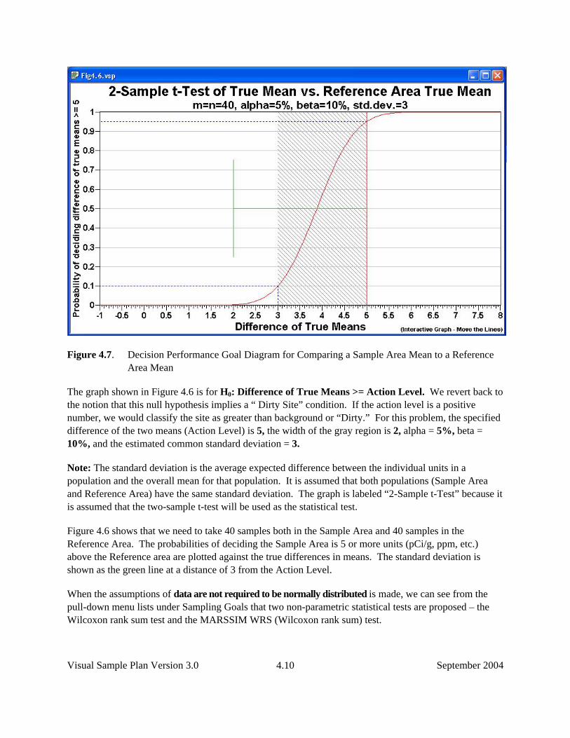
The graph shown in Figure 4.6 is for H0: Difference of True Means >= Action Level. We revert back to the notion that this null hypothesis implies a “ Dirty Site” condition. If the action level is a positive number, we would classify the site as greater than background or “Dirty.” For this problem, the specified difference of the two means (Action Level) is 5, the width of the gray region is 2, alpha = 5%, beta = 10%, and the estimated common standard deviation = 3.
Note: The standard deviation is the average expected difference between the individual units in a population and the overall mean for that population. It is assumed that both populations (Sample Area and Reference Area) have the same standard deviation. The graph is labeled “2-Sample t-Test” because it is assumed that the two-sample t-test will be used as the statistical test.
Figure 4.6 shows that we need to take 40 samples both in the Sample Area and 40 samples in the Reference Area. The probabilities of deciding the Sample Area is 5 or more units (pCi/g, ppm, etc.) above the Reference area are plotted against the true differences in means. The standard deviation is shown as the green line at a distance of 3 from the Action Level.
When the assumptions of data are not required to be normally distributed is made, we can see from the pull-down menu lists under Sampling Goals that two non-parametric statistical tests are proposed – the Wilcoxon rank sum test and the MARSSIM WRS (Wilcoxon rank sum) test.
September 2004 Visual Sample Plan Version 3.0 4.11
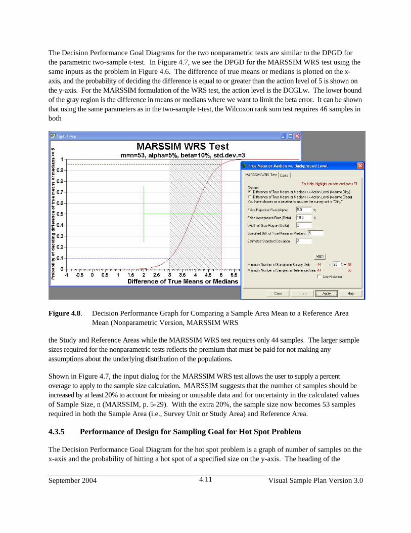
The Decision Performance Goal Diagrams for the two nonparametric tests are similar to the DPGD for the parametric two-sample t-test. In Figure 4.7, we see the DPGD for the MARSSIM WRS test using the same inputs as the problem in Figure 4.6. The difference of true means or medians is plotted on the x-axis, and the probability of deciding the difference is equal to or greater than the action level of 5 is shown on the y-axis. For the MARSSIM formulation of the WRS test, the action level is the DCGLw. The lower bound of the gray region is the difference in means or medians where we want to limit the beta error. It can be shown that using the same parameters as in the two-sample t-test, the Wilcoxon rank sum test requires 46 samples in both
Figure 4.8. Decision Performance Graph for Comparing a Sample Area Mean to a Reference Area Mean (Nonparametric Version, MARSSIM WRS
the Study and Reference Areas while the MARSSIM WRS test requires only 44 samples. The larger sample sizes required for the nonparametric tests reflects the premium that must be paid for not making any assumptions about the underlying distribution of the populations.
Shown in Figure 4.7, the input dialog for the MARSSIM WRS test allows the user to supply a percent overage to apply to the sample size calculation. MARSSIM suggests that the number of samples should be increased by at least 20% to account for missing or unusable data and for uncertainty in the calculated values of Sample Size, n (MARSSIM, p. 5-29). With the extra 20%, the sample size now becomes 53 samples required in both the Sample Area (i.e., Survey Unit or Study Area) and Reference Area.
4.3.5 Performance of Design for Sampling Goal for Hot Spot Problem
The Decision Performance Goal Diagram for the hot spot problem is a graph of number of samples on the x-axis and the probability of hitting a hot spot of a specified size on the y-axis. The heading of the
Visual Sample Plan Version 3.0 September 2004 4.12
performance graph lists the size of the hot spot and the size of the sample area. The trade-off displayed is that by increasing the number of samples (i.e., a tighter grid spacing and hence the higher cost), and/or changing the grid type (say from square to triangular), there is a higher probability of hitting the hot spot with one of the nodes on the grid. This is almost a straight-line relationship until we get into larger sample sizes, and then the efficiency is diminished.
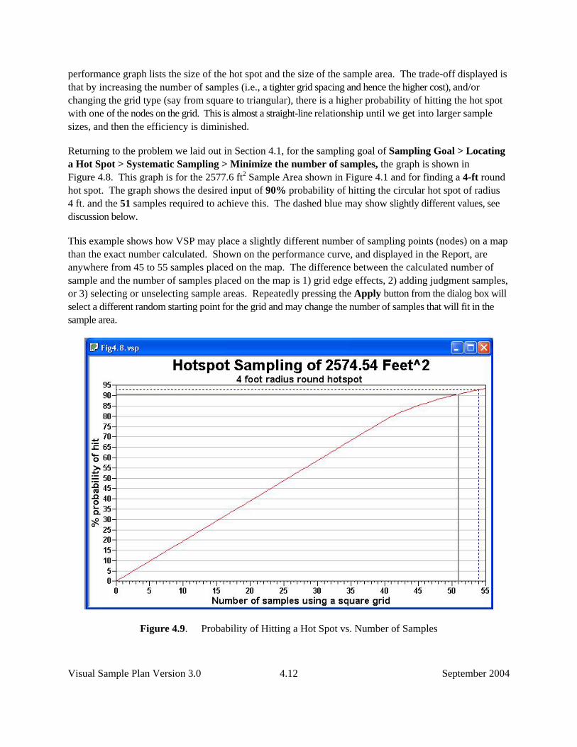
Returning to the problem we laid out in Section 4.1, for the sampling goal of Sampling Goal > Locating a Hot Spot > Systematic Sampling > Minimize the number of samples, the graph is shown in Figure 4.8. This graph is for the 2577.6 ft2 Sample Area shown in Figure 4.1 and for finding a 4-ft round hot spot. The graph shows the desired input of 90% probability of hitting the circular hot spot of radius 4 ft. and the 51 samples required to achieve this. The dashed blue may show slightly different values, see discussion below.
This example shows how VSP may place a slightly different number of sampling points (nodes) on a map than the exact number calculated. Shown on the performance curve, and displayed in the Report, are anywhere from 45 to 55 samples placed on the map. The difference between the calculated number of sample and the number of samples placed on the map is 1) grid edge effects, 2) adding judgment samples, or 3) selecting or unselecting sample areas. Repeatedly pressing the Apply button from the dialog box will select a different random starting point for the grid and may change the number of samples that will fit in the sample area.
Figure 4.9. Probability of Hitting a Hot Spot vs. Number of Samples

September 2004 Visual Sample Plan Version 3.0 4.13
The probability of hit is a geometric relationship between the grid spacing and the hot spot size and shape. The probability of hit is not a function of number of samples. On the graph, however, grid spacing is translated to the number of samples on a theoretical sampling area. The number of theoretical samples is shown on the graph because it is a more meaningful metric for the user than grid spacing. The dashed blue line on the performance curve shows the number of samples that fit on the actual sample area given the starting point. The report also lists the actual number of samples placed on the map.
Important note: Regardless of where the dashed blue line occurs on the graph, the probability of hit for your sampling design is the one you specified and is shown on the sampling goal dialog. This is true because the probability of hit is a geometric relationship between the grid spacing and the hot spot size and shape.
Deselecting the Random Start on the dialog box removes the random assignment of the grid and keeps the grid fixed with each repeated hit of the Apply button, keeping the same sample size.
Note that you can use the mouse to move the solid black line up and down the graph. You can use this solid line to easily read off the probability vs. sample size trade-off options from the horizontal and vertical axes. In Figure 4.8, we have the solid black line positioned at a 60% probability of hitting a hot spot of radius 4 ft when there are only 31 grid samples in an area of 2577.6 ft2.
4.3.6 Performance of Design for Sampling Goal of Compare Proportion to a Reference Proportion
The graph for displaying the performance of the design for comparing a proportion to a reference proportion is similar to the comparison of two population means (see Figure 4.6). As such, the difference between the two true proportions is shown on the x-axis, and the probability of deciding that the difference between the two true proportions is greater than a specified difference (i.e., the Action Level) is shown on the y-axis. The two proportions being compared could be, say, the proportion of children with elevated blood lead in one area compared to the proportion in another area, or it could be the percentage of 1-m squares within an acre that have contamination greater than 1 ppm of dioxin. The comparison might be to compare the amount of contamination (stated as a percentage remaining at a site after it has been remediated) to a background or reference area. Using the naming convention in EPA (2000b, pp. 3-27 – 3-31), the site (also called the survey unit, Sample Area) is Area 1, and the reference or background area is Area 2. The document can be downloaded from the EPA site: http://www.epa.gov/quality.qa_docs.html.
In Figure 4.9, we see the inputs from the dialog box along with the Decision Performance Goal Diagram. The example has as the null hypothesis “no difference between site and background,”or Ho: P1 – P2 <= 0. The two estimated proportions are required to calculate the standard deviation for the pooled proportion used in the sample size formula. With this formulation, the specified difference (Action Level) is 0, and the false acceptance error rate (beta = 5%) is set at the difference of P1 – P2 = 0.10. Thus, 0.10 is the upper bound of the gray region, which VSP requires to be greater than the Action Level. When the null hypothesis is changed to Difference of Proportions >= Specified Difference, the lower bound of the gray region is less than the action level.

Visual Sample Plan Version 3.0 September 2004 4.14
Figure 4.10. Decision Performance Goal Diagram for Comparing a Sample Area Proportion to a Reference Area Proportion. Input dialog box for design shown as insert.
The graph in Figure 4.9, labeled the Two-Sample Proportion Test, lists the inputs of alpha, beta, and the two estimated proportions in the heading line. The S-shaped curve shows that for larger differences in the true proportions, the probability of correctly deciding the difference exceeds the Action Level increases. This is intuitive because the greater the difference between two populations, the easier it is to correctly distinguish that difference from a fixed threshold (Action Level).
4.3.7 Performance of Design for Sampling Goal of Establish Boundary of Contamination
In Figure 3.9a we see the performance of the sampling design defined by the inputs shown in Figure 3.40 applied to the Sample Area of the large “oval” in the Millsite.dxf file (see Map View in Figure 3.42). This problem is for the Enclosed Boundary. In order to have a 95% confidence of finding a hot spot of diameter of 45 ft, we need 12 segments. This dictates we need 60 Primary Sampling Locations (12 x 5 = 60). The relationship between diameter of hot spot and number of primary sampling locations is shown in the dashed blue line positioned on the performance curve shown in Fig. 3.9a. The dashed line shows the current number of Primary Sampling Locations for this design (n = 60), which may differ from the optimum number because of rounding and bump-out effects. We can see from the cross hairs positioned on the performance curve (right-click on graph, and toggle the Display Cross Hairs to “on”), that if we expand our Primary Sampling Locations to 100, we could detect a hotspot of diameter 27 ft. with the sample level of 95% confidence.
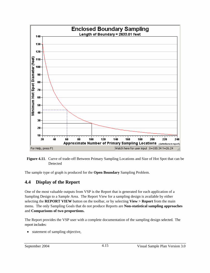
September 2004 Visual Sample Plan Version 3.0 4.15
Figure 4.11. Curve of trade-off Between Primary Sampling Locations and Size of Hot Spot that can be
Detected
The sample type of graph is produced for the Open Boundary Sampling Problem.
4.4 Display of the Report
One of the most valuable outputs from VSP is the Report that is generated for each application of a Sampling Design to a Sample Area. The Report View for a sampling design is available by either selecting the REPORT VIEW button on the toolbar, or by selecting View > Report from the main menu. The only Sampling Goals that do not produce Reports are Non-statistical sampling approaches and Comparisons of two proportions.
The Report provides the VSP user with a complete documentation of the sampling design selected. The report includes:
• statement of sampling objective,

Visual Sample Plan Version 3.0 September 2004 4.16
• the assumptions of the design, • sample size formula, • inputs provided by the user, • summary of VSP outputs including sample size and costs, • list of samples with their coordinates and labels, • map with sample locations identified, • Performance Goal Diagram, • Peer-reviewed technical references for designs and formulas, • technical discussion of the statistical theory supporting the sampling design and sample size formula.
The reports are suitable for incorporation into a quality assurance project plan or a sampling and analysis plan. The report for some of the sampling designs include:
• recommended data analysis activities for how data should be used in the appropriate statistical test to make a decision,
• insight into options presented in the Input Dialog Box,
• sensitivity tables showing how sample number changes as input parameters change, and
• extended statistical discussions and support equations.
Some of the output from VSP, for some designs, is viewable only within the report. VSP users can use the information in the Report as an additional source of Help.
A few selections from the report for the selection Sampling Goal > Compare Average to a fixed threshold > Assume data normally distributed > Simple Random Sampling are shown in Figure 4.10. Each time VSP calculates a new sample size, changes VSP input, or adds points to an existing design, the report is updated automatically. The complete report can be copied to the clipboard for pasting into a word processing application like Microsoft Word selecting Edit > Copy from the main menu when the report view is active. The text and graphics are copied using rich text format (RTF) to preserve formatting. The user opens Microsoft Word, selects Paste, and the entire report is copied into a Word document.
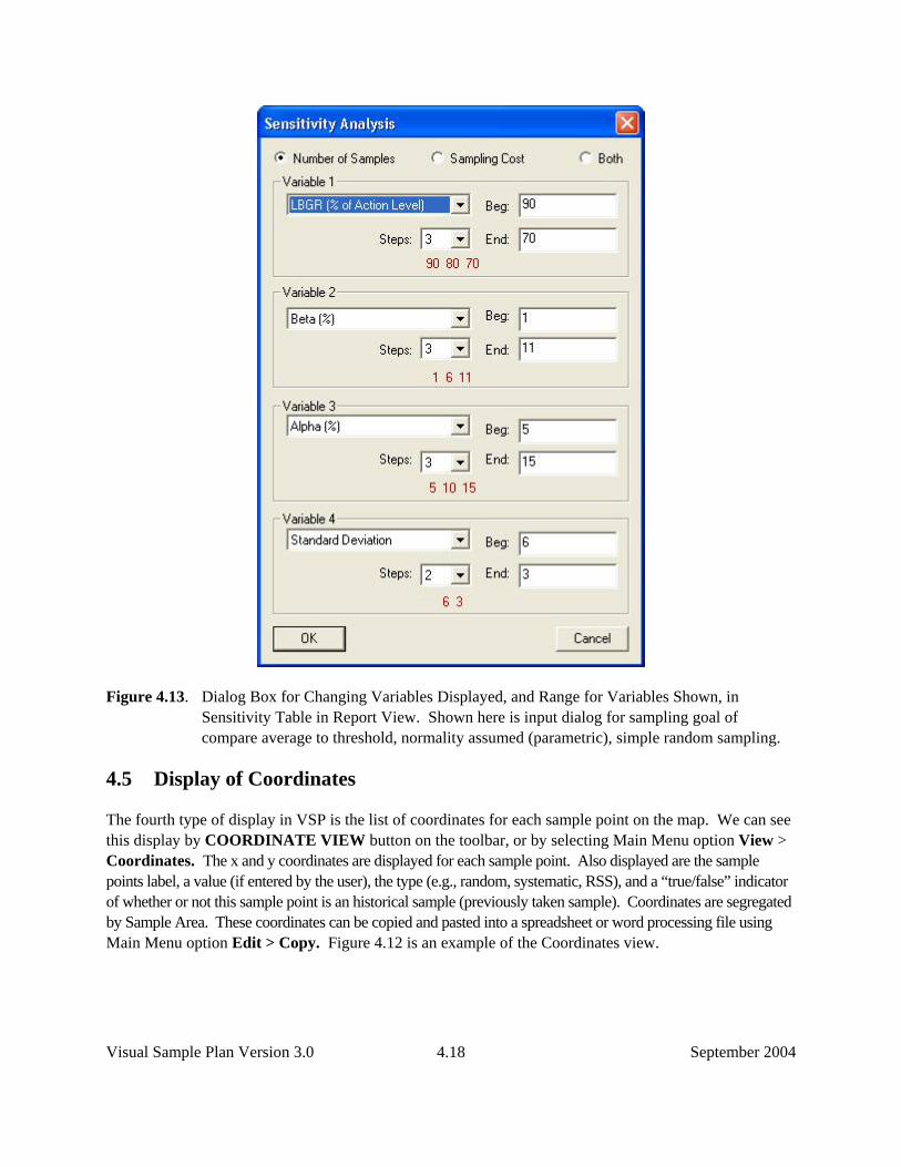
The sensitivity table in the Report View allows the user to do “what-if” scenarios with VSP input and output. For one sampling goal, the sensitivity table shows how sample size changes with changes in the standard deviation and the two decision error rates, alpha and beta. Different sampling goals and sets of assumptions have different variables and parameters in their sensitivity table. The user can change the variables and range of values shown in the sensitivity table by right-clicking anywhere in the report. A dialog box, as shown in Figure 4.11, is displayed to allow the user can choose which of up to four variables that will be displayed, along with each variable’s starting and ending value, and the step-size shown in the sensitivity table. Displayed in the table can be the number or samples, cost, or both. Certain sampling designs have the option to show parameters other than cost.

September 2004 Visual Sample Plan Version 3.0 4.17
Figure 4.12. Report View of the Sampling Goal: Compare Average to a Fixed Threshold, Normality Assumed, Simple Random Sampling
Visual Sample Plan Version 3.0 September 2004 4.18
Figure 4.13. Dialog Box for Changing Variables Displayed, and Range for Variables Shown, in Sensitivity Table in Report View. Shown here is input dialog for sampling goal of compare average to threshold, normality assumed (parametric), simple random sampling.
4.5 Display of Coordinates
The fourth type of display in VSP is the list of coordinates for each sample point on the map. We can see this display by COORDINATE VIEW button on the toolbar, or by selecting Main Menu option View > Coordinates. The x and y coordinates are displayed for each sample point. Also displayed are the sample points label, a value (if entered by the user), the type (e.g., random, systematic, RSS), and a “true/false” indicator of whether or not this sample point is an historical sample (previously taken sample). Coordinates are segregated by Sample Area. These coordinates can be copied and pasted into a spreadsheet or word processing file using Main Menu option Edit > Copy. Figure 4.12 is an example of the Coordinates view.
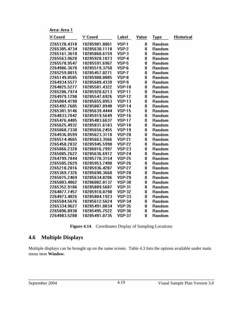
September 2004 Visual Sample Plan Version 3.0 4.19
Figure 4.14. Coordinates Display of Sampling Locations
4.6 Multiple Displays
Multiple displays can be brought up on the same screen. Table 4.3 lists the options available under main menu item Window.

Visual Sample Plan Version 3.0 September 2004 4.20
Table 4.3. Window Menu Commands
New Window Creates a new window that views the same project Cascade Arranges windows in an overlapped fashion Tile Arranges windows in non-overlapped tiles. Arrange Icons Arranges icons of closed windows Double Window Shows map view and graph view Triple Window Shows map, graph, and report views Quad Window Shows map, graph, report, and coordinate views
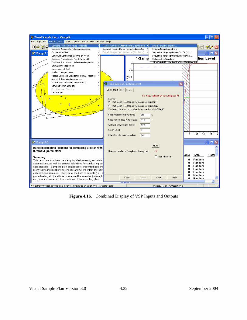
The user can select the QUAD WINDOW button from the toolbar for a quick way to display the Quad Window. Figure 4.13 shows the results of the Quad Window option.
To summarize, in Figure 4.14 we show the selection of a Sampling Goal and sample type (Simple Random Sampling), we have entered the DQO inputs into the dialog box, Applied the design to our Sample Area, and displayed the Map, Graph, Report, and Coordinates simultaneously using the Quad Window from the Windows menu.

September 2004 Visual Sample Plan Version 3.0 4.21
Figure 4.15. Quad Display of Map, Graph, Report, and Coordinates on Same Screen
Visual Sample Plan Version 3.0 September 2004 4.22
Figure 4.16. Combined Display of VSP Inputs and Outputs