Embed Size (px)
Citation preview

A Comparative Study of
Visualization Techniques
for Data Mining
A Thesis Submitted To
The School of Computer Science and Software Engineering
Monash University
By
Robert Redpath
In fulfilment of the requirements
For The Degree of
Master of Computing.
November 2000

Declaration
This thesis contains no material that has been accepted for the award of any other
degree or diploma in any other university. To the best of my knowledge and belief,
the thesis contains no material previously published or written by any other person,
except where due reference is made in the text of the thesis.
____________________
R. C. A. Redpath
School of Computer Science and Software Engineering
Monash University
6th November 2000.

i
Acknowledgements
I would like to thank the following people for their help and guidance in the
preparation of this thesis.
Prof. Bala Srinivasan for his encouragement and willingness to help at all times.
Without his assistance this thesis would not have been completed.
Dr. Geoff Martin for getting me started and guidance prior to his retirement.
Dr. Damminda Alahakoon, Mr. John Carpenter, Mr. Mark Nolan, and Mr. Jason
Ceddia for many discussions on the content herein.
The School of Computer Science and Software Engineering for the use of their
computer facilities and indulgence to complete this thesis.

ii
Abstract The thesis aims to provide an objective evaluation of the available multi-
dimensional visualization tools and their underlying techniques. The role of
visualization tools in knowledge discovery, while acknowledged as an important
step in the process is not clearly defined as to how it influences subsequent steps
or exactly what the visualization reveals about the data before those steps take
place. The research work described, by showing how known structures in test data
sets are displayed in the visualization tools considered, indicates the definite
knowledge, and limitations on that knowledge, that may be gained from those
visualization tools.
The major contributions of the thesis are: to provide an objective assessment of
the effectiveness of some representative information visualization tools under
various conditions; to suggest and implement an approach to developing standard
test data sets on which to base an evaluation; to evaluate the chosen information
visualization tools using the test data sets created; to suggest criteria for making a
comparison of the chosen tools and to carry out that comparison.

iii
Table of Contents
Acknowledgements i
Abstract ii
List of Figures vi
List of Tables x
Chapter 1: Introduction 1
1.1 Knowledge Discovery in Databases . . . . . . . . . . . . . . . . . . . . . . . . . . .1
1.2 Information Visualization . . . . . . . . . . . . . . . . . . . . . . . . . . . . . . . . . . .3
1.3 Aims and Objectives of the Thesis . . . . . . . . . . . . . . . . . . . . . . . . . . . .5
1.4 Criteria for Evaluating the Visualization Techniques . . . . . . . . . . . . . 6
1.5 Research Methodology . . . . . . . . . . . . . . . . . . . . . . . . . . . . . . . . . . . . .7
1.6 Thesis Overview . . . . . . . . . . . . . . . . . . . . . . . . . . . . . . . . . . . . . . . . . .8
Chapter 2: A Survey of Information Visualization for Data Mining 10
2.1 Scatter Plot Matrix Technique . . . . . . . . . . . . . . . . . . . . . . . . . . . . . 12
2.2 Parallel Co-ordinates Technique . . . . . . . . . . . . . . . . . . . . . . . . . . . . . 14
2.3 Pixel-Oriented Techniques . . . . . . . . . . . . . . . . . . . . . . . . . . . . . . . . 16
2.4 Other Techniques . . . . . . . . . . . . . . . . . . . . . . . . . . . . . . . . . . . . . . . . 20
Worlds within Worlds Technique. . . . . . . . . . . . . . . . . . . . . . . . . . . 20
Chernoff Faces. . . . . . . . . . . . . . . . . . . . . . . . . . . . . . . . . . . . . . . . . . 24
Stick Figures. . . . . . . . . . . . . . . . . . . . . . . . . . . . . . . . . . . . . . . . .. . . 29
2.5 Techniques for Dimension Reduction. . . . . . . . . . . . . . . . . . . . . . . . 33
2.6 Incorporating Dynamic Controls . . . . . . . . . . . . . . . . . . . . . . . . . . . . 34
2.7 Summary . . . . . . . . . . . . . . . . . . . . . . . . . . . . . . . . . . . . . . . . . . . . . . .35

iv
Chapter 3: Taxonomy of Patterns in Data Mining 37
3.1 Regression . . . . . . . . . . . . . . . . . . . . . . . . . . . . . . . . . . . . . . . . . . . . . . 41
3.2 Classification. . . . . . . . . . . . . . . . . . . . . . . . . . . . . . . . . . . . . . . . . . . . 42
3.3 Data Clusters. . . . . . . . . . . . . . . . . . . . . . . . . . . . . . . . . . . . . . . . . . . . 44
3.4 Associations. . . . . . . . . . . . . . . . . . . . . . . . . . . . . . . . . . . . . . . . . . . . . 45
3.5 Outliers . . . . . . . . . . . . . . . . . . . . . . . . . . . . . . . . . . . . . . . . . . . . . . . . 45
3.6 Summary . . . . . . . . . . . . . . . . . . . . . . . . . . . . . . . . . . . . . . . . . . . . . . 46
Chapter 4: The Process of Knowledge Discovery in Databases 48
4.1 Suggested Processing Steps. . . . . . . . . . . . . . . . . . . . . . . . . . . . . . . . . 49
4.2 Visualization in the Context of the Processing Steps. . . . . . . . . . . . . .52
4.3 The Influence of Statistics on Visualization Methods. . . . . . . . . . . . . 55
4.4 Evaluation of Visualization Techniques. . . . . . . . . . . . . . . . . . . . . . . 56
Establishing Test Data Sets. . . . . . . . . . . . . . . . . . . . . . . . . . . . . . . . . . 57
Evaluation Tools. . . . . . . . . . . . . . . . . . . . . . . . . . . . . . . . . . . . . . . . . . 57
Comparison Studies. . . . . . . . . . . . . . . . . . . . . . . . . . . . . . . . . . . . . . . . 59
4.5 Summary . . . . . . . . . . . . . . . . . . . . . . . . . . . . . . . . . . . . . . . . . . . . . . 60
Chapter 5: Test Data Generator of Known Characteristics 61
5.1 Generation of Test Data for Evaluating Visualization Tools. . . . . . . 62
5.2 Calculation of Random Deviates Conforming to a Normal
Distribution . . . . . . . 64
5.3 The Test Data Sets Generated for the Comparison of the
Visualization Tools . . . . . . . .65
5.4 Summary . . . . . . . . . . . . . . . . . . . . . . . . . . . . . . . . . . . . . . . . . . . . . . 69

v
Chapter 6: Performance Evaluation of Visualization Tools 70
6.1 DBMiner. . . . . . . . . . . . . . . . . . . . . . . . . . . . . . . . . . . . . . . . . . . . . . . .71
6.1 Spotfire. . . . . . . . . . . . . . . . . . . . . . . . . . . . . . . . . . . . . . . . . . . . . . . . .91
6.2 WinViz. . . . . . . . . . . . . . . . . . . . . . . . . . . . . . . . . . . . . . . . . . . . . . . . 105
Chapter 7: Comparative Evaluation of the Tools 119
7.1 Criteria for Comparison. . . . . . . . . . . . . . . . . . . . . . . . . . . . . . . . . . . . 119
7.2 Comparison of the Visualization Tools. . . . . . . . . . . . . . . . . . . . . . . . 125
7.3 Schema Treatment for Associations. . . . . . . . . . . . . . . . . . . . . . . . . . 133
7.4 Summary . . . . . . . . . . . . . . . . . . . . . . . . . . . . . . . . . . . . . . . . . . . . . . .135
Chapter 8: Conclusion 137
8.1 Summary of Contributions. . . . . . . . . . . . . . . . . . . . . . . . . . . . . . . . . . 137
8.1.1 Integration of Visualization in the Knowledge Discovery
Process . . . . . 138
8.1.2 Strengths and Weaknesses of the Techniques. . . . . . . . . . . . . . . .139
8.1.3 An Approach for Creating Test Data Sets. . . . . . . . . . . . . . . . . . .140
8.1.4 An Evaluation of Three Visualization Tools. . . . . . . . . . . . . . . . .141
8.1.5 Criteria for Comparison of the Tools. . . . . . . . . . . . . . . . . . . . . . 142
8.1.6 Comparative Assessment of the Tools. . . . . . . . . . . . . . . . . . . . . 143
8.2 Future Research. . . . . . . . . . . . . . . . . . . . . . . . . . . . . . . . . . . . . . . . . . 143
References 145

vi
List of Figures
Figure 1.1 Model for experimental evaluation of visualization techniques
Figure 2.1 Layout for a scatter plot matrix of 4 dimensional data
Figure 2.2 Parallel axes for RN. The polygonal line shown represents the point
C= (C1, .... , Ci-1, Ci, Ci+1, ... , Cn)
Figure 2.3 The original chernoff face
Figure 2.4 Davis’ chernoff face
Figure 2.5 A family of stick figures
Figure 2.6 Iconographic display of data taken from the Public Use Microsample
- A(PMUMS-A) of the 1980 United States Census [Grin92 p.641]
Figure 3.1 Years early loan paid off
Figure 3.2 A classification tree example
Figure 4.1 The KDD process (Adriens/Zantinge)
Figure 5.1 The user interface screen for the generation of the test data
Figure 6.1 Test data set 1 with 3 dimensional cluster in DBMiner
Figure 6.2 DBMiner Properties Window
Figure 6.3 Test data set 1with no cluster in the displayed dimensions 4,5 and 6 in
DBMiner
Figure 6.4 Test data set 1 with one cluster dimension in DBMiner
Figure 6.5 Test data set 1 with one cluster dimension rotated by 45 degrees in
DBMiner
Figure 6.6 Test data set 1 with 2 cluster dimensions in DBMiner
Figure 6.7 Test data set 1 with 2 cluster dimensions rotated by 90 degrees in DBMiner

vii
Figure 6.8 Test data set 2 with two 3 dimensional clusters in DBMiner
Figure 6.9 Test data set 2 with two cluster dimensions in DBMiner
Figure 6.10 Test data set 3 containing a 3 dimensional cluster with 50% noise
instances in DBMiner
Figure 6.11 Test data set 4 containing a 3 dimensional cluster with 80% noise
instances in DBMiner
Figure 6.12 Test data set 4 with 2 cluster dimensions only present; 80% noise
instances in DBMiner
Figure 6.13 Test data set 5 with a 3 dimensional cluster(Fields1,2,3) as part of a 6
dimensional cluster in DBMiner
Figure 6.14 Test data set 5 with a 3 dimensional cluster(Fields1,2,4) as part of a 6
dimensional cluster in DBMiner
Figure 6.15 Test data set 5 with a 3 dimensional Cluster(Fields1,2,5) as part of a 6
dimensional cluster in DBMiner
Figure 6.16 Test data set 5 with a 3 dimensional cluster(Fields4,5,6) as part of a 6
dimensional cluster in DBMiner
Figure 6.17 Test data set 6 with 3 dimensional cluster, which is spread out (Variance
= 2) in DBMiner
Figure 6.18 Test data set 1; two cluster dimensions (columns 1,2) as part of a 3
dimensional cluster in Spotfire
Figure 6.19 test data set 1; two cluster dimensions (Columns 2,3) as part of a 3
dimensional cluster in Spotfire
Figure 6.20 test data set 1; zoom in on two cluster dimensions (Columns 2,3) as part
of a 3 dimensional cluster in Spotfire

viii
Figure 6.21 Test data set 1; one cluster dimension (Column 3) as part of a 3
dimensional cluster in Spotfire
Figure 6.22 Test data set 1; choice of dimensions not involved in the cluster (Columns
4,5,6) in Spotfire
Figure 6.23 Test data set 2; two cluster dimensions (Columns 1,2) as part of 3
dimensional cluster in Spotfire
Figure 6.24 Test data set 3; two cluster dimensions as part of a 3 dimensional cluster
with 50% noise instances in Spotfire
Figure 6.25 Test data set 4; two cluster dimensions as part of a 3 dimensional cluster
with 80% noise instances in Spotfire
Figure 6.26 Test data set 5; two cluster dimensions(Columns 1,2) as part of a 6
dimensional cluster in Spotfire
Figure 6.27 Test data set 5; two cluster dimensions(Columns 1,3) as part of a 6
dimensional cluster in Spotfire
Figure 6.28 Test data set 5; two cluster dimensions(Columns 1,4) as part of a 6
dimensional cluster in Spotfire
Figure 6.29 Test data set 6;A 3 dimensional cluster which is spread out (Variance = 2)
in Spotfire
Figure 6.30 Test data set 1; 3 dimensional cluster, no connecting lines in WinViz
Figure 6.31 Test data set 1; 3 dimensional cluster, all connecting line in WinViz
Figure 6.32 Test data set 1; 3 dimensional cluster with connecting lines (no overlap);
in WinViz
Figure 6.33 Test data set 1A with two 1 dimensional clusters in WinViz
Figure 6.34 Test data set 1A with two 1 dimensional clusters with some records
queried only in WinViz

ix
Figure 6.35 Test data set 2 with two 3D clusters without connecting lines in WinViz
Figure 6.36 Test data set 2 with two 3D clusters with connecting lines in WinViz
Figure 6.37 Test data set 2 with two 3D clusters without connecting lines; single line
where overlap in WinViz
Figure 6.38 Test data set 3; 3 dimensional cluster with 50% noise instances;
connecting lines for all instances in WinViz
Figure 6.39 Test data set 3; 3 dimensional cluster; 50% noise instances; connecting
lines for cluster instances only in WinViz
Figure 6.40 Test data set 4; 3 dimensional cluster with 80% noise instances;
connecting lines for all instances in WinViz
Figure 6.41 Test data set 4; 3 dimensional cluster with 50% noise instances;
connecting lines for cluster instances only in WinViz
Figure 6.42 Test data set 5; 6 dimensional cluster in WinViz
Figure 6.43 Test data set 6; A 3 dimensional cluster which is spread out (variance = 2)
in WinViz

x
List of Tables
Table 2.1 Description of facial features and ranges for the chernoff face
Table 3.1 Taxonomy of approaches to data mining
Table 7.1 Summary of the comparison of the visualization techniques

1
Chapter 1
Introduction�
�
1.1 Knowledge Discovery in Databases
The term Knowledge Discovery in Databases (KDD) has been coined for the
processing steps used to extract useful information from large collections of data
[Fraw91 p.3]. Databases are used to store these large collections of data. The
operational database is usually not used for the discovery of knowledge so as not to
degrade the performance and security of the operational systems. Instead a data
warehouse is created which is a consolidation of all an organization's operational
databases. The data warehouse is organized into subject areas which can be used to
support decision making in each subject area. The data warehouse will grow as new
operational data is added but it is nonvolatile in nature. The data warehouse is suitable
for the application of KDD techniques.
The term Data Mining (DM) is used as a synonym for KDD in the commercial sphere
but it is considered distinct from KDD and is defined by various academic researchers
as a lower level term and as one of the steps in the KDD process [Klos1996]. Data
mining is specifically defined as the use of analytical tools to discover knowledge in a
collection of data. The analytical tools are drawn from a number of disciplines, which

2
may include machine learning, pattern recognition, machine discovery, statistics,
artificial intelligence, human-computer interaction and information visualization.
An example of the kind of knowledge sought is relations that exist between data. For
example, a retailer may be interested in discovering that customers who buy lettuce
and tomatoes also buy bacon 80% of the time [Simo96 p.26]. This may have
commercial advantage in that the retailer can place the bacon near the tomatoes in the
retail space, thereby increasing sales of both items. Another example may be in
identifying trends such as sales in a particular region that are decreasing [Simo96
p.26]. Management decisions can be assisted by such information but it is difficult to
extract valuable information from large amounts of stored data.
Because of the difficulty of finding valuable information, data mining techniques have
developed. Visualization of data is one of the techniques that is used in the KDD
process as an approach to explore the data and also to present the results. The
visualization techniques usually consider a single data set drawn from the data
warehouse. The data set is arranged as rows and columns in a large table. Each
column is equivalent to a dimension of the data and the data set is termed multi-
dimensional. The values in each column represent an attribute of the data and each
row of data an instance of related attribute values. The single data set might be made
up of a number of tables in the operational database joined together based on
relationships defined in the schema of the operational database. This is necessary as
the visualization techniques considered do not deal with the complexity of data in
multiple tables.

3
1.2 Information Visualization
Data mining provides many useful results but is difficult to implement. The choice of
data mining technique is not easy and expertise in the domain of interest is required. If
one could travel over the data set of interest, much as a plane flies over a landscape
with the occupants identifying points of interest, the task of data mining would be
much simpler. Just as population centers are noted and isolated communities are
identified in a landscape so clusters of data instances and isolated instances might be
identified in a data set. Identification would be natural and understood by all. At the
moment no such general-purpose visualization techniques exist for multi-dimensional
data. The visualization techniques available are either crude or limited to particular
domains of interest. They are used in an exploratory way and require confirmation by
other more formal data mining techniques to be certain about what is revealed.
Visualization of data to make information more accessible has been used for
centuries. The work of Tufte provides a comprehensive review of some of the better
approaches and examples from the past [Tuft82, 90, 97]. The interactive nature of
computers and the ability of a screen display to change dynamically have led to the
development of new visualization techniques. Researchers in computer graphics are
particularly active in developing new visualizations. These researchers have adopted
the term Visualization to describe representations of various situations in a broad way.
Physical problems such as volume and flow analysis have prompted researchers to
develop a rich set of paradigms for visualization of their application areas [Niel96
p.97]. The term Information Visualization has been adopted as a more specific
description of the visualization of data that are not necessarily representations of

4
physical systems which have their inherent semantics embedded in three dimensional
space [Niel96 p.97].
Consider a multi-dimensional data set of US census data on individuals [Grin92
p.640]. Each individual represents an entity instance and each entity instance has a
number of attributes. In a relational database a row of data in a table would be
equivalent to an entity instance. Each column in that row would contain a value
equivalent to an attribute value of that entity instance. The data set is multi-
dimensional; the number of attributes being equal and equivalent to the number of
dimensions. The attributes in the chosen example are occupation, age, gender, income,
marital status, level of education and birthplace. The data is categorical because the
values of the attributes for each instance may only be chosen from certain categories.
For example gender may only take a value from the categories male or female.
Information Visualization is concerned with multi-dimensional data that may be less
structured than data sets grounded in some physical system. Physical systems have
inherent semantics in a three dimensional space. Multi-dimensional data, in contrast,
may have some dimensions containing values that fall into categories instead of being
continuous over a range. This is the case for the data collected in many fields of study.
In terms of relational databases, a visualization is an attempt to display the data
contained in a single relation (or relational table).

5
1.3 Aims and Objectives of the Thesis
Information Visualization Techniques are available for data mining either as
standalone software tools or integrated with other algorithmic DM techniques in a
complete data mining software package. Little work has been done on formally
measuring the success or failure of these tools. Standard test data sets are not
available. There is no knowledge of how particular patterns, contained in a data set,
will appear when displayed in a particular visualization technique. No comparison
between techniques, based upon their performance against standard test data sets, has
been made.
This thesis addresses the following issues:
• The integration of visualization tools in the knowledge discovery process.
• The strengths and weaknesses of existing visualization techniques.
• An approach for creating standard test data sets and its implementation.
• The creation of a number of test data sets containing known patterns.
• An evaluation of tools, representing the more common information
visualization techniques, using standard test data sets.
• The development of criteria for making a comparison between information
visualization techniques and the comparison of tools representing those
techniques.

6
1.4 Criteria for Evaluating the Visualization Techniques
There are a number of criteria on which the effectiveness of the visualization
techniques can be judged. The criteria fall into two main groups; interface
considerations and characteristics of the data set. Interface considerations include
whether the display is perceptually satisfying, intuitive in its use, has dynamic controls
and its general ease of use. The characteristics of the data set include the size of the
data set, the dimensionality of the data set, any patterns contained therein, the number
of clusters present, the variance of the clusters and the level of background noise
instances present. These criteria are discussed more fully in Chapter 7.
Mention of the criteria is important at this point because the program for generating
the test data has been developed with the criteria relating to characteristics of the data
set in mind. In particular, the factors that allow measurement of the criteria may be
varied in the test data sets, which are generated by the program. The test data program
generator allows the user to choose any dimensionality for the data up to 6
dimensions, generate clusters within the data set with dimensionality from 1 to 6
dimensions, determine the total number of instances within a cluster, determine the
number of clusters (by combining output files), determine the variance of the clusters
and decide upon the number of background noise instances.

7
1.5 Research Methodology
The process model represented in figure 1.1 summarises the methodological approach.
Standard test data sets containing known patterns are created. These standard test data
sets are used as input into three visualization tools. Each of the tools represents a
particular technique. The techniques considered are a 2 dimensional scatter plot
approach, a 3 dimensional scatter plot approach and a parallel co-ordinates approach.
The various test data sets contain clusters of different variances against backgrounds
of different levels of noise. The number of clusters in the data sets is also varied.
For each of the standard test data sets a judgment is made on whether the expected
pattern is revealed or not. Issues of human perception and human factors are not
considered. We make a simple binary judgment on whether a pattern is clearly
revealed or not in the visualization tools considered.
Visualization Technique
Standard Test Data set
Screen Display
Apply Criteria
Pattern Revealed or Not?
Figure 1.1 The model for experimental evaluation of visualization techniques

8
1.6 Thesis Overview
There are many visualization techniques available. Three of the main visualization
techniques are chosen for detailed study. This choice is based on their wide use and
acceptance as demonstrated by the number of commercially available visualization
tools in which they are used. The particular visualization tools, used in the
experiments, are seen as being representative of the more general visualization
techniques. The conclusions, where appropriate, are generalised from the specific tool
to the more general information visualization technique represented by the tool.
In Chapter 2 a review of the major information visualization techniques is made. The
strengths and weaknesses of each of the techniques are highlighted. In Chapter 3 a
taxonomy is given of the patterns that may occur in the data sets considered for DM.
Each of the patterns is defined and explained. An outline of the process of knowledge
discovery in databases, explaining the relationship of information visualization to this
process, is given in Chapter 4.
An approach to producing standard test data sets, which will be used as a benchmark
for evaluating the visualization techniques, is detailed in Chapter 5. Chapter 5 also
contains the details of the particular test data sets that will be used in the evaluation.
In Chapter 6 the three chosen visualization tools are investigated by using them
against the test data sets documented in Chapter 5. For each of the visualization
techniques the appearance of a pattern possessing particular characteristics is
established. In Chapter 7 a number of criteria are defined for judging the success of
the techniques under various conditions. The criteria are applied to the results

9
obtained in Chapter 6 and a comparison is made between the visualization techniques.
Finally in Chapter 8 conclusions are made on the basis of the research and possible
future directions are indicated.
10
Chapter 2
A Survey of Information
Visualization for Data Mining The study of Information Visualization is approached from a number of different
perspectives depending on the underlying research interests of the person involved.
While the primary concern is the ability of the information visualization to reveal
knowledge about the data being visualized the emphasis varies greatly. If graphics
researchers are concerned with multi-dimensional data their activity revolves around
new and novel ways of graphically representing the data and the technical issues of
implementing these approaches. Researchers in the human-computer interaction area
are also concerned with the visualization of multi-dimensional data but in line with
their concerns they may use an existing visualization technique and focus on how a
user may relate to it interactively.
In order to understand the role of information visualization in knowledge discovery
and data mining some of the techniques for representing multidimensional data are
outlined. Visualization techniques may be used to directly represent data or
knowledge without any intervening mathematical or other analysis. When used in this
way the visualization technique may be considered a data mining technique, which
can be used independently of other data mining techniques. There are also

11
visualization techniques for representing knowledge that has been discovered by some
other data mining technique. Formal visual representations exist for the knowledge
revealed by various of the algorithmic data mining techniques. These different uses of
visual representations need to be matched to the process of knowledge discovery.
A simple statement of the knowledge discovery process is that starting with a
selection of data, mathematical or other techniques may be applied to acquire
knowledge from that data. A visual representation of that data could be made as a
starting point for the process. In this case the representation acts as an exploratory
tool. Alternately, or in addition, a visualization technique could be used at the end of
the process to represent the found knowledge. Visualization tools can act in both ways
during the KKD process and at intermediate steps to monitor progress or represent
some chosen subset of the data for instance.
The techniques reviewed in this chapter have been developed with the main intention
of being used as exploratory tools. In section 2.1 the scatter plot technique is
reviewed. It is the most well known and popular of all the techniques used for
commercially implemented exploratory visualization tools. Section 2.2 reviews the
parallel co-ordinates technique, which is also available as a commercially
implemented exploratory visualization tool. In Section 2.3 pixel oriented techniques
are reviewed. They have generated a high level of interest in the academic arena but
there are no commercial implementations of these techniques. Section 2.4 reviews
three other techniques (world within worlds, chernoff faces and stick figures) that are
of interest because of the novelty of the approaches and also the issues they raise
relating to how perception operates. Section 2.5 and 2.6 address issues that impact on

12
all the visualization techniques. These are the employment of techniques to reduce the
number of dimensions thereby making visual representations easier. Also the use of
dynamic controls to permit interaction with the various visualization techniques is
reviewed. Finally section 2.7 provides a summary of the contents of the chapter.
2.1 Scatter Plot Matrix Technique
The originator of scatter plot matrices is unknown. They are reviewed by Chambers
(et al) in 1983 although they have been used for many years prior to this time
[Cham83 p.75]. To construct a simple scatter plot each pair of variables in a
multidimensional database is graphed, in 2 dimensions, against each other as a point.
The scatter plots are arranged in a matrix. Figure 2.1 illustrates a scatter plot matrix of
4 dimensional data with attributes (or variables) a,b,c,d. Rather than a random
arrangement, the arrangement in figure 2.1 is suggested if there are 4 variables a,b,c,d
that are used to define a multidimensional instance.
This arrangement ensures that the scatter plots have shared scales. Along each row or
column of the matrix one variable is kept the same while the other variables are
changed in each successive scatter plot. The user would then look along the row or
column for linking effects in the scatter plot that may reveal patterns in the data set.
Some of the scatter plots are repeated but the arrangement ensures that a vertical scan
allows the user to compare all the scatter plots for a particular variable.

13
a * d b * d c * d unused a * c b * c unused d * c a * b unused c * b d * b unused b * a c * a d * a
Figure 2.1 Layout for a scatter plot matrix of 4 dimensional data
Cleveland writing in 1993 makes the distinction between cognitively looking at
something as opposed to perceptually looking at something [Clev93 p.273].
Cognitively looking at something requires the person involved to use thinking
processes of analysis and comparison that draw on learned knowledge of what
constitutes a feature in the data and what the logic of the visualization technique is.
The process is relatively slow and considered. When a person perceptually looks at
something there is an instant recognition of the important features in what is being
considered. In the case of scatter plot matrices the user must cognitively look at the
visualization of the data. If a visualization technique breaks the multidimensional
space into a number of subspaces of dimension three or less, the user must rely more
on their cognitive abilities than on their perceptual abilities to recognize features that
have a dimensionality greater than that of the subspace visualized. For instance, a four

14
dimensional cluster cannot be directly seen in or recognized in a single, two or three
dimensional, scatter plot.
Problems With the Scatter Plot Approach
Everitt considers that there are two reasons why scatter plots can prove unsatisfactory
[Ever78 p.5]. Firstly if the number of variables exceeds about 10 the number of plots
to be examined is very large and is as likely to lead to confusion as to knowledge of
the structures in the data. Secondly it has been demonstrated that structures existing in
the p-dimensional space are not necessarily reflected in the joint multivariate
distributions of the variables that are represented in the scatter plots. Despite these
potential problems variations on the scatter plot approach are the most commonly
used of all the visualization techniques.
The scatter plot approach in both two and three dimensions are the basis for many of
the commercial dynamic visualization software tools such as DBMiner[DBMi98],
Xgobi [Xgob00] and Spotfire[Spot98].
2.2 Parallel Coordinates
This technique uses the idea of mapping a multi dimensional point on to a number of
axes, all of which are in parallel. Each coordinate is mapped to one of the axes and as
many axes as required can be lined up side to side. A line, forming a single polygonal
line for each instance represented, then connects the individual coordinate mappings.

15
Thus there is no theoretical limit to the number of dimensions that can be represented.
When implemented as software the screen display area imposes a practical limit.
Figure 2.2 shows a generalized example of the plot of a single instance. Many
instances can be mapped onto the same set of axes and it is hoped that the patterns
formed by the polygonal lines will reveal structures in the data.
C2 . . . . . . C1 Cn C3 X1 X2 X3 Xi-1 Xi Xi+1 Xn-2 Xn-1 Xn
Figure 2.2 Parallel axes for RN. The polygonal line shown represents
the point C= (C1, .... , Ci-1, Ci, Ci+1, ... , Cn)
The technique has applications in air traffic control, robotics, computer vision and
computational geometry [Inse90 p.361]. It has also been included as a data mining
technique in the software VisDB developed by Keim and Kriegel [Keim96(1)] and the
software WinViz developed by Lee and Ong [Lee96].

16
The main advantage of the technique is that it can represent an unlimited number of
dimensions. Although it seems likely that when many points are represented using the
parallel coordinate approach, overlap of the polygonal lines will make it difficult to
identify characteristics in the data. Keim and Kriegel confirm this intuition in their
comparison article [Keim96(1) pp.15-16]. Certain characteristics, such as clusters, can
be identified but others are hidden due to the overlap of the lines. Keim and Kriegel
felt that about 1,000 data points is the maximum that could be visualized on the screen
at the same time [Keim96(1) pp.8].
2.3 Pixel Oriented Techniques
The idea of the pixel oriented techniques is to use each individual pixel in the screen
display to represent an attribute value for some instance in a data set. A color is
assigned to the pixel based upon the attribute value. As many attribute values as there
are pixels on the screen can be represented so very large data sets can be represented
in a single display. The techniques described in this section use different methods to
arrange the pixels on the screen and will also break the display into a number of
windows depending on the technique and the dimensionality of the data set
represented.
A Query Independent Pixel Oriented Technique
The broad approach is to use each pixel on a display to represent a data value. The
data can be represented in relation to some query (explained below) or without regard
to any query. If the data is displayed without reference to some query it is termed as a

17
query independent pixel technique and an attempt is made to represent all the data
instances.
The idea of this technique is to take each multidimensional instance and map the data
values of the individual attributes of each instance to a colored pixel. The colored
pixels are then arranged in a window, one window for each attribute. The ordering of
the pixels is the same for each window with one attribute, usually one that has some
inherent ordering such as a time series, being chosen to order all the data values in all
the windows. Depending on the display available and the number of windows
required, up to a million data values can be represented. The pixels can be arranged in
their window with the arrangement depending on the purpose. A spiral (with various
approaches to constructing the spiral) is the most common arrangement. By
comparing the windows, correlations, functional dependencies and other interesting
relationships may be visually observed. Blocks of color occurring in similar regions in
each of the windows, where a window corresponds to each of the attributes, would
identify these features of the data. The equivalent blocks would not necessarily be the
same color as a consequence of what must be, by its nature, an arbitrary mapping of
attribute values to the available colors. If the color of equivalent blocks do not match
it will be difficult for a user to recognize that equivalence exists thus making it
difficult to use the technique. The user must have the capability to designate which
attribute determines the ordering. The colors in this main window need to graduate
from one color to the next as the data values change and a large range of colors need
to be available so that this graduation can be easily observable. This becomes more
important as the number of discrete data values increases. A color may have to be
assigned to a range if there were more discrete data values than the available colors.
18
The developers of the technique, Keim and Kriegel[Keim96(2)p.2], consider that one
major problem is to find meaningful arrangements of the pixels on the screen.
Arrangements are sought which provide nice clustering properties as well as being
semantically meaningful [Keim96(2)p.2]. The recursive pattern technique fulfils this
requirement in the view of the developers of the technique. This is a spiral line that
moves from side to side, according to a fixed arrangement, as it spirals outwards and
this tends to localize instances in a particular region by, in effect, making the spiral
line greater in width.
Query Dependent Pixel Oriented Techniques
If the visualization technique is query dependent, instead of mapping the data attribute
values for a specific instance directly to some color, a semantic distance is calculated
between each of the data query attribute values and the attribute values of each
instance. An overall distance is also calculated between the data values for a specific
instance and the data attribute values used in the predicate of the query. If an attribute
value for a specific instance matches the query it gains a color indicating a match.
Yellow has been used for an exact match in all the examples provided by Keim and
Kriegel [Keim96(1)]. A sequence of colors ending in black is used, where black is
assigned if the attribute values, for a particular instance, do not match the query values
at all [Keim96(1) p.6].
In the query dependent approach the main window is used to show overall distance
with the pixels for each instance sorted on their overall distance figure. The other
windows show (one window for each) the individual attributes, sorted in the same
19
order as the main window. If the query has only one attribute in the query predicate
only a single window is required, as the overall distance will be the same as the
semantic distance for the attribute used in the query predicate. There are various
possibilities for the arrangement of the ordered pixels on the screen. The most natural
arrangement here is to present data items with highest relevance in the centre of the
display. The generalized-spiral and the circle segments techniques do this. The
generalized-spiral makes clusters more apparent by having the pixels representing the
data items zigzag from side to side as they spiral outwards from the centre. This
occurs for each square window, one being allocated for each attribute. The circle-
segments technique allows display of multiple attributes in the one display by having
each attribute allocated a segment of a larger circle like a slice of pie.
Areas of Weakness in the Pixel Oriented Techniques
It is not clear that the Keim and Kriegel query independent approach can demonstrate
useful results. It needs to be proven with some data containing known clusters,
correlations and functional dependencies for example to see what is revealed by the
visualization. Without access to the software and in the absence of other critical
comment it is difficult to assess the usefulness of the technique. For both query-
independent and query-dependent techniques, what the variations of the technique
should show in each situation does not seem inherently obvious. There are no formal
measures given in most articles by Keim and Kriegel and findings are stated in vague
terms like provides good results [Keim96(1) p.16]. Indications of how the expected
displays should appear for correlations or functional dependencies are not discussed.
The query dependent technique may offer more promise and this is reflected in the

20
attention it receives (and the corresponding neglect query independent approaches
receive) from its developers in overview articles they have written, for instance
VisDB: A System for Visualizing Large Databases [Keim95(3)]. The techniques are
implemented in a product named VisDB, which also incorporates the parallel co-
ordinates and stick figures techniques. This allows direct comparison but the product
is not easily portable making it difficult for others to confirm any comparisons made.
The techniques may be useful but further work by others is required to establish this.
2.4 Other Techniques
The techniques that follow have been chosen for the novelty of their approach or
because of the research interest they have generated. None of them have been
implemented as commercial software packages and research implementations only
exist for them. They highlight a number of issues in visualization including pre-
attentive perception (stick figures), perceptive responses to the human face (Chernoff
faces) and a technique for representing an unlimited number of dimensions (worlds
within worlds).
Worlds Within Worlds Technique
This technique developed by Steven Feiner and Clifford Beshers [Fein90(1)] employs
virtual reality devices to represent an n-dimensional virtual world in 3D or 4D-
Hyperworlds. The basic approach to reducing the complexity of a multidimensional
function is to hold one or more of its independent variables constant.

21
This is equivalent to taking an infinitely thin slice of the world perpendicular to the
constant variable’s axis thus reducing the n-dimensional world’s dimension by one.
This can be repeated until there are three dimensions that are plotted as a three
dimensional scatter plot. The resulting slice can be manipulated and displayed with
conventional 3D graphics hardware [Fein90 p.37].
Having reduced the complexity of some higher dimensional space to 3 dimensions the
additional dimensions can be added back but in a controlled way. Choosing a point in
the space and designating the values of the 3 dimensions as fixed and then using that
point as the origin of another 3 dimensional space does this. The second 3
dimensional world (or space) is embedded in the first 3 dimensional world (or space).
This embedding can be repeated until all the higher dimensions are represented.
The method has its limitations. Having chosen a point in the first dimensional space,
this fixes the values of three of the dimensions. Only instances having those three
values will now be considered. There may be few, or no, instances that fulfill this
requirement. If the next three dimensions chosen, holding the first 3 constant, have no
values for that particular slice, a space, which is empty, would be displayed. We may
understand the result intuitively by considering that the multidimensional space is
large and the viewer is taking very small slices of that total space that become smaller
on each recursion into an inner 3D world. This problem could be overcome to a
degree by selecting a displayed point in the outer or first 3D space (or world) as the
origin for the next 3D world; it would be thus ensured that there was at least one point
in the higher dimensional world being viewed. These considerations assume that the
dimensions have continuous values for the instances in the data set. If the values of

22
the dimensions in the first, or outer world are categorical in nature, that is they may
hold only a fixed number of possible values, then the higher dimensional worlds may
be more densely populated. This is because the instances are now shared between
limited numbers of possible values for each of the dimensions in the outer world. In
this case the worlds within worlds technique may be more revealing of the structures
contained within the data set being considered.
Another problem may be that the 3D slices of a higher dimensional world may never
reveal certain structures. This is for the reason already discussed in relation to scatter
plots [Section 2.3.6 Scatter plots] and attributed to Everitt [Ever78 p.5]. Everitt noted
that it has been mathematically demonstrated that structures existing in a p-
dimensional space are not necessarily reflected in joint multi-variate distributions of
the variables that are represented in scatter plots. Intuitively to understand this one
might consider that what appears as a cluster in a 2D representation may describe a
pipe in 3 dimensions. By a pipe it is meant a scattering of occurrences in 3 dimensions
that have the appearance of a rod or pipe when viewed in a 3D representation. While
the pipe is easily identifiable in a three-dimensional display, if an inappropriate cross
section is chosen for the matching two-dimensional display, the pipe will not appear
as an obvious cluster, if it appears as any structure at all. Equivalent structures could
exist in higher dimensions, say, between five and six dimensions; a cluster in 5
dimensions might be a pipe in 6 dimensions. The worlds within worlds approach is a
3D scatter plot and if the 3 dimensions chosen to be represented in the outer world are
less than the total number of dimensions to be represented, then some structures may
not be observed for the same reasons that apply to 2D scatter plots. How these higher
dimensional structures reveal themselves at lower dimensions would depend on the

23
luck and skill of the user in choosing a lower dimensional slice of the higher
dimensional space. It would also depend on the chance alignment of the structures to
the axes. The lower dimensional slice would need to be a good cross section of the
structure that existed in the higher dimensional world or the viewer may have
difficulty or fail to identify that a structure existed.
An improvement to the worlds within worlds approach might be to not just choose a
single point in one 3D world as the origin for the next inner 3D world but rather
define a region in the first 3D world as an approximate origin. Thus we would ensure
that the next chosen 3D world would be more heavily populated with occurrences. If
the region chosen as the origin in the first 3D world covered a clustering of
occurrences the next chosen 3D world would be even more likely to be heavily
populated with occurrences. It is noted that the worlds within worlds technique does
allow the variables in the outer world to be changed while still observing an inner
world. This addresses the improvement suggested to a degree but it places a greater
reliance on the viewer to range over the suitable region in the outer world and to
remember correspondences over time for a region in the inner world. These comments
apply when discrete data occurrences are being represented. If the data were
continuous, for example, say radioactivity levels matched against distance, the
problems would not arise but this is not the case for much of the data analyzed by
knowledge discovery in databases (KDD) techniques where the instances in the data
set are categorical.

24
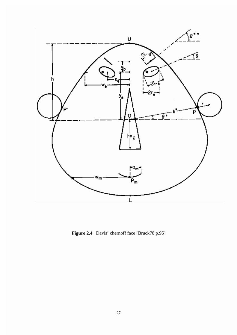
Chernoff Faces
A stylized face is used to represent an instance with the shape and alignment of the
features on the face representing the values of the attributes. A large number of faces
are then used to represent a data set with one face for each instance. The idea of using
faces to represent multidimensional data was introduced by Herman Chernoff
[Bruck78 p.93]. The faces are considered to display data in a convenient form, help
find clusters (a number of instances in the same region), identify outliers (instances
which are distant from other instances in the data set) and to indicate changes over
time, all within certain limitations. Data having a maximum of 18 dimensions may be
visualized and each dimension is represented by one of the 18 facial features. The
original Chernoff face is shown in figure 2.3.
Other researchers have modified this to add ears and increase the nose width so the
method has evolved. The face developed by Herbert T. Davis Jr. is shown in figure
2.4.
The table 2.1 indicates the facial features available for each dimension of an instance
to map onto. The table also indicates the range of values for the parameter controlling
the facial feature that the dimension’s value must map to and the default value the
parameter controlling the facial feature assumes when it is not required to represent a
dimension.
It is considered important that the face looks human and that all features are
observable. The assignment of data dimensions to features can be deliberate or

25
random. The choice depends on the user’s preferences. For example, success or
failure might be represented by mouth curvature and a liberal/labor stance might be
represented by the eyes looking left or right.
Faces were chosen by Chernoff because he felt that humans can easily recognize and
differentiate faces; there is a common language which can be employed to describe
them; the dimensions of certain applications lend themselves to facial analysis such as
happy/sad or honest/dishonest or sly. Limitations of the technique include the
difficulty of actually viewing if the numbers of occurrences are large so this renders
them difficult to employ for many knowledge discovery tasks. If all the 20 dimensions
available are used, the faces can be difficult to view and it is hard to perceive subtle
variations. Fifteen variables are considered a practical maximum [Bruc78 p.107].
Additionally, because of the way the faces are plotted there is a dependence between
some facial features, which can distort the aims of representation. Techniques to limit
dependencies have been developed but they usually reduce the number of dimensions
that can be represented. Within certain limitations and for certain applications
Chernoff faces can be a useful technique but little development has occurred since
1980 in their use and they will not be considered further here.

26
Figure 2.3 The original chernoff face [Bruck78 p.94]
27
Figure 2.4 Davis’ chernoff face [Bruck78 p.95]

28
_____
Variable facial Feature Default Value Range _________________________________________________________________ x1 controls h* face width .60 .20 .70 x2 controls * ear level .50 .35 .65 x3 controls h half-face height .50 .50 1.00 x4 is eccentricity of .50 .50 1.00 upper ellipse of face x5 is eccentricity of 1.00 .50 1.00 lower ellipse of face x6 controls length of nose .25 .15 .40 x7 controls pm position of center of mouth .50 .20 .40 x8 controls curvature of mouth .00 4.00 4.00 x9 controls length of mouth .50 .30 1.00 x10 controls ye height of center of eyes .10 0.00 .30 x11 controls xe separation of eyes .70 .30 .80 x12 controls slant of eyes .50 .20 .60 x13 is eccentricity of eyes .60 .40 .80 x14 controls Le half-length of eye .50 .20 1.00 x15 controls position of pupils .50 .20 .80 x16 controls yb height of eyebrow .80 .60 1.00 x17 controls **- angle of brow .50 .00 1.00 x18 controls length of brow .50 .30 1.00 x19 controls r radius of ear .50 .10 1.00 x20 controls nose width .10 .10 .20
Table 2.1 Description of facial features and ranges for the chernoff face [Bruck78 p.96]

29
Stick Figures
The developers of the stick figure technique intend to make use of the user’s low-level
perceptual processes such as perception of texture, color, motion, and depth [Pick95
p.34]. Presumably a user will automatically try to make physical sense of the pictures
of the data created. When interpreting the various visualization techniques the degree
to which we do this varies. The distinction between cognitively looking at a picture
and perceptually looking at a picture made by Cleveland [Clev93 p.273] and discussed
in section 2.1 is relevant here. Visualization techniques that break the
multidimensional space into a number of subspaces of dimension 3 or less rely more
on the cognitive abilities than the perceptual abilities of the user. Stick figures avoid
breaking a higher dimensional space into a number of subspaces and present all
variables and data points in a single representation. Stick figures by trying to embrace
all the variables in a single representation thus rely more on the perceptual abilities of
the user. Scatter plots, pixel-oriented visualizations and the world within worlds
approach, by breaking the display into a number of subspaces, put more emphasis on
the cognitive abilities of the user.
To create a textured surface under the control of the data a large number of icons are
massed on a surface, each icon representing a data point. The user will then segment
the surface based on texture and this will be the basis for seeing structures in the data.
The icon chosen is a stick figure, which consists of a straight-line body with up to four
straight-line limbs. The values of a data item can be mapped to the straight-line
segments and control four features of the segments - orientation, length, brightness,
and color. Not all features have to be used and most work has employed orientation

30
only as this is considered most potent in conveying texture variation. A family of stick
figures is shown in figure 2.6. A straightforward implementation is to choose one of
the stick figures for display of a particular data set. This would allow up to five
variables to be mapped to the icon in addition to the position of the icon in the 2
dimensional display space.
1 4 7 10 2 5 8 11 3 6 9 12
Figure 2.6 A family of stick figures
Many other approaches have been suggested by the developers, including attaching
color and sound to the icons [Grin92 p.642]. Three-dimensional icons have been
suggested but these approaches have not yet been implemented. The types of
databases that have been displayed using the simpler versions of the stick figure
technique are what are termed as multi-parameter imagery and statistical databases.
Multi-parameter imagery examples include weather satellite images, medical images

31
and semiconductor wafer tests. These types of database all have an inherently
meaningful 2 dimensional space, which is mapped, to the display space. Statistical
databases examples include data on homicides in the USA, census data on engineers
and epidemiological data on AIDS patients. Figure 2.7 is an example based on United
States of America census data. A particular stick figure has been chosen and the only
feature employed is the orientation of the limbs so that 7 variables are represented in
total. The data set contains information on individuals classified as scientists,
engineers, or technicians. Each icon in the picture represents one individual. The icon
is positioned on the screen according to an individuals age and income. Age is
mapped to vertical axis and income is mapped to horizontal axis. The data fields
represented by each icon are sex, occupation, marital status, level of education, and
birthplace [Grin 92 p.640].
Discrete data values are well suited to this approach as they can map to individual
icons that are distinct in appearance. The choice of mapping is considered to be vital
for the effectiveness of the technique. Limitations exist in the number of attributes that
can be represented, seven if the icon represents five variables and the position on the
plot another two dimensions. It is necessary to have two attributes which are quasi
continuous and suitable for the two axes. When these limitations are met it must be
noted that the stick figure approach is still at an early stage of development. No formal
research has been done to establish the effectiveness of the displays or how the
underlying perceptual abilities work in relation to the displays.
Grinstein has suggested combinations of Visual and Auditory Techniques for
Knowledge Discovery in particular for use with the stick figures approach. A number

32
of auditory approaches have been suggested for representing the values of variables.
By mapping variables to the properties of sonic events and possibly combining the
approach with visual techniques the number of dimensions represented in total for
each instance, from the data set, which is being considered, can be extended. Such an
approach may exploit perceptual abilities, which operate pre-attentively.
Figure 2.7. Iconographic display of data taken from the Public Use Microsample
- A (PMUMS-A) of the 1980 United States Census [Grin92 p.641]

33
These perceptual abilities can be both visual and auditory. Grinstein writing in 1992
states that “ Preattentive processing of visual elements is the ability to sense
differences in shapes or patterns without having to focus attention on specific
characteristics that make them different. Work by Beck, Treisman and Gormican, and
Enns [Enns90, Trei88] document the kinds of differences among elements that are
discriminable preattentively. Among these are differences in line orientation and area
color. Similar preattentive mechanisms have been found in the human auditory system
(see, for example [Breg75] and [Warr82] ).” [Grin92 p.638].
The comments quoted by Grinstein have guided approaches to both visual and
auditory techniques and focus attention on the pre-attentive nature of human visual
perception, which is an important aspect of the stick figures approach. As yet the
auditory approaches are at an early stage of development and details of how the
interface can best function, how auditory perceptual abilities map to variables, dealing
with large volumes of data, combining auditory with visual approaches and dealing
with the temporal nature of sound all need to be defined and refined. Auditory
approaches offer much potential for the future but there are no implemented auditory
systems at the moment that are readily used for real applications in knowledge
discovery and they will not be considered further here.
2.5 Techniques for Dimension Reduction
A number of techniques exist for reducing the number of dimensions in a
multidimensional matrix to 2 or 3 dimensions. This allows for the representation by
conventional 2D and 3D approaches. These techniques include principal components

34
analysis and multidimensional scaling. Multidimensional scaling gathers a number of
techniques for the analysis of data under a single term. Shepard states “The unifying
purpose that these techniques share, despite their diversity, is the double one (a) of
somehow getting hold of whatever pattern or structure may otherwise lie hidden in a
matrix of empirical data and (b) of representing that structure in a form that is much
more accessible to the human eye- namely, as a geometrical model or picture.”
[Shep72].
The methods have been developed by mathematical psychologists and have been
employed by researchers in psychology, psychiatry, medicine and the social sciences.
The methods have not been much adopted by researchers in other fields and this
includes Data Mining. There is always some loss of information when dimension
reduction is carried out and it may be that the structures that data mining seeks are not
well revealed by these techniques. Exceptions may well exist and principal component
analysis, for instance, is considered useful in identifying multi-variate outliers [Ever78
p.11].
2.6 Incorporating Dynamic Controls
Techniques have been developed which allow direct interaction with the visualization
for exploration of the data. They are not mutually exclusive of the other techniques
but employ controls that allow the user to interact with the data. The ability to interact
with the visualization is often a feature of software that implements the theoretical
visualization techniques that have been proposed. The implementations having
dynamic controls include Xgobi, Spotfire and DBMiner . They are based on the scatter

35
plot approach but vary greatly from each other. Spotfire and DBMiner are evaluated in
detail in Chapter 6.
Consider Xgobi as a particular example of a visualization software tool incorporating
dynamic controls. Xgobi is a multivariate statistical analysis tool developed at
Bellcore by Buja, Cook and Swayne [Buja96]. It runs under the Unix operating system
and is distributed free. The technique employed in the tool uses a rendering of the
data, which is essentially a scatter plot in one, two or three dimensions. The user
decides how many dimensions are to be represented and then chooses variables from
the data variables available for a particular plot. The user may then interact with the
scatter plot via a number of methods. If a 3D scatter plot is chosen the display can
rotate or tour the 3D space so that scatter plot may be viewed from different positions
thus making it easier to identify structures within the data. The other variables are
ignored while the chosen variables are viewed. This technique may be compared to
the worlds within worlds approach in the way that they each conceptually deal with
the multi-dimensional representation problem. The Xgobi approach simply ignores
other variables when displaying the chosen 3 dimensions rather than holding other
variables at some fixed value.
2.6 Summary
This chapter has provided an overview of the existing techniques for the visualization
of multi-dimensional data sets, the comparison of which is the major purpose of this
thesis. The advantages and limitations of the techniques are highlighted. The use of
dimension reduction techniques has been introduced as a way of visualizing higher

36
dimensional data sets using conventional 2D and 3D approaches. The use of dynamic
controls to allow interaction with the visualization techniques is discussed.
The next chapter discusses the patterns that data mining seeks to find and which the
visualization techniques, already reviewed, are meant to assist in revealing.

37
Chapter 3
Taxonomy of Patterns in
Data Mining
Data mining aims to reveal knowledge about the data under consideration. This
knowledge takes the form of patterns within the data that embody our understanding
of the data. Patterns are also referred to as structures, models and relationships. The
patterns within the data cannot be separated from the approaches that are used to find
those patterns because all patterns are essentially abstractions of the real data. The
approach used is called an abstraction model or technique. The approach chosen is
inherently linked to the pattern revealed. Data mining approaches may be divided into
two main groups. These are verification driven data mining and discovery driven data
mining.
The name of the pattern revealed in the discovery driven group area is often a
variation of the name of the approach. This is due to the difficulty of separating the
pattern from the approach. The terms regression, classification, association analysis
and segmentation are used to name the approach used and the pattern revealed. For
example segmentation reveals segments (also called clusters), classification assigns
data to classes and association analysis reveals associations. An exception to this

38
terminology is the use of the approach called deviation detection to reveal a pattern of
outliers but outliers form a particular kind of segment in any case.
The data will rarely fit an approach exactly and different approaches may be used on
the same data. The data will have an inherent structure but it is not possible to
describe it directly. Rather a pattern is an attempt to describe the inherent structure by
using a particular approach. Patterns are best understood in terms of the approach used
to construct them. For this reason the patterns are often discussed in terms of how they
are arrived at rather than stating the data has a pattern in some absolute sense.
The taxonomy in table 3.1 classifies the approaches to the data mining task and the
patterns revealed. It is not expected that all the approaches will work equally well with
all data sets.
Verification driven Discovery driven
Predictive (Supervised) Informative(Unsupervised) Query and reporting Regression Clusters (Segmentation) Statistical analysis Classification Association
Outliers (Deviation detection)
Table 3.1 Taxonomy of approaches to data mining

39
Visualization of data sets can be combined with or used prior to the other approaches
and assists in selecting an approach and indicates what patterns might be present. It
would be interesting to establish which patterns are better revealed by visualization
techniques.
Verification Driven Data Mining Techniques
Verification data mining techniques require the user to postulate some hypothesis.
Simple query and reporting, or statistical analysis techniques then confirm this
hypothesis. Statistical techniques have been neglected to a degree in data mining in
comparison to less traditional techniques such as neural networks; genetic algorithms
and rules based approaches to classification. The reasons for this are various.
Statistical techniques are most useful for well-structured problems. Many data mining
problems are not well structured and the statistical techniques break down or they
require large amounts of time and effort to be effective.
In addition, statistical models often highlight linear relationships but not complex
non-linear relationships. To avoid exploring exhaustively all possible higher
dimensional relationships, which may take an unacceptably long time, the non-linear
statistical methods require knowledge about the type of non-linearity and the way that
the variables interact. Knowledge about the type of non-linearity and how variables
interact is often not known in complex multi-dimensional data mining problems. This
is the reason why less traditional techniques, such as neural networks, genetic
algorithms and rules based approaches, are often chosen. They are not subject to the

40
same restrictions as the statistical techniques but are, rather, more exploratory in their
nature.
Statistics can be useful for gaining summary information about the data set such as
mean and variance and for distribution analysis. But they are not the main focus of our
interest as the techniques have existed for many decades and many of the data sets
being considered are not amenable to these traditional verification driven techniques
because their dimensionality is large. The current high level of interest in data mining
centres on many of the newer techniques, which may be termed as discovery driven.
Discovery Driven Data Mining Techniques as a Focus for Data
Mining
Discovery driven data mining techniques can be broken down into two broad areas;
those techniques that are considered predictive, sometimes termed supervised
techniques and techniques that are termed informative, sometimes termed
unsupervised techniques. Predictive techniques build patterns by making a prediction
of some unknown attribute given the values of other known attributes. Informative
techniques do not present a solution to a known problem; rather they present
interesting patterns for consideration by some expert in the domain. The patterns may
be termed informative patterns. The main predictive and informative patterns are
described below.

41
3.1 Regression
Regression is a predictive technique to discover patterns where the values are
continuous or real valued. The term regression comes from statistics but is now used
to describe patterns produced by neural network techniques also. Neural network
approaches are preferred because linear regression, as traditionally employed in
statistics, is unsuitable where relationships are not linear as is the case for many of the
multi dimensional situations that are encountered in data mining.
As an example of a regression model consider a mortgage provider concerned with
retaining mortgages once they are taken out. They may be interested in how profit on
individual loans is related to customers paying off their loans at an accelerated rate.
For example, a customer may pay an additional amount each month and thus pay off
their loan in 15 years instead of 25 years. A graph of the relationship between profit
and the elapsed time between when a loan is actually paid off and when it was
originally contracted to be paid off (i.e. the time a loan is paid off early) may appear as
in figure 3.1. A linear regression on the data does not match the real pattern of the
data. The curved line represents what might be produced by a neural network
approach. This curved line fits the data much better. It could be used as the basis on
which to predict profitability. Decisions on exit fees and penalties for certain behavior
may be based on this kind of analysis.

42
Profit
0
0 7 Years
Figure 3.1 Years early loan paid off
3.2 Classification Predictive patterns can be generated by classification techniques. They are similar to
the patterns generated by regression techniques except that the values predicted will
be categorical rather than real-valued. That is the values predicted will belong to a
class. Two techniques for establishing classification patterns, which are often used in
data mining, are decision trees and Bayesian classifications. Neural network
techniques can also be used to predict to which class an instance belongs based on the
past behaviour of other instances recorded in some test data set.
Consider the example of the mortgages used in the previous section on regression.
Instead of predicting profit, the likelihood of a customer defaulting on a loan is
predicted using two predictors, the term of the loan and whether or not redraw was
used while the loan was active. A graph of instances may indicate a classification of
mortgages, which could then be represented as a decision tree (figure 3.2). This would
allow direct interpretations of the situation and the decision tree could be used to
neural
linear

43
predict whether mortgages default or not based on the two attributes shown on the
graph. It may be observed in this example that not all instances match the decision
tree but that it provides a reasonably close match to the data set.
Redraw
No redraw
25 30
Y N
Y N
Y N Y N
Figure 3.2 A classification tree example
No default on Loan
term < 25
redraw redraw
no default
no default term < 30
default no default default
Term of the loan (years)

44
3.3 Clusters
A clustering pattern is a kind of informative pattern, also referred to as a segmentation
pattern. The idea is to divide the data set into groupings of instances, which have
similar attribute values. Statistics on the cluster can then be used to characterize that
cluster. The role of the domain expert is to gain some useful knowledge from the
identified clusters. This may be a difficult task but even if the causes or reasons for the
existence of the cluster are not understood the cluster can be used by organizations to
target particular groups for particular strategies that aim to have that group or cluster
contribute to the organizations objectives. An example might be a credit card
company. The attributes of customers that leave the credit card company may be
identified and a strategy can be developed to encourage customers with those
attributes not to leave the company. This is known as preventing customer attrition. In
addition, if the attributes of customers who are loyal to the company are identified,
customers can be sought who possess those attributes. This is known as target
marketing.
A more formal statement of what a cluster is can be usefully made. A test data set is a
set of unordered n-dimensional data vectors (or data elements) with each data element
viewed as a point in n-dimensional space being defined along dimensions
x1,x2,.......,xn. A cluster may then be considered to be a set of points with some
common characteristics that differ from the remaining points. It is a region in n-
dimensional space, each of the data points within the region having some
characteristics that are clearly distinguishable from the rest of the data set (in this case
it is a connected geometric object). Note that the boundary of the region may have no

45
sharp border. The region may be defined by m dimensions (an m-dimensional cluster)
where 0<= m <= n. Note also that some dimensions may be said to be dense or
continuous such as x and y co-ordinates in image data and the time dimension in time
series.
3.4 Associations
An association rule is an informative pattern. A set of records may contain a collection
of items. An association exists if a record that contains, as example, attribute values A
and B also contains C in a large proportion of cases. The specific percentage of cases
that also contains C is known as the confidence factor. Rules might be expressed as
“72% of all records that contain A and B also contain C”. It is also said that, in terms
of the example above, that “A and B are on the opposite side of the association to C”.
Associations may involve any number of items on either side of the association
[Simo96 p.29]. A common application of association rules is for basket analysis of
consumer purchases. An example would be discovering that when soft drink is
purchased sun screen lotion is also purchased 70% of the time. The explanation of the
behavior is of interest but is not required to take advantage of the knowledge.
Association rules are often searched for in clusters or classifications that have been
already found by clustering techniques.
3.5 Outliers
Techniques exist for identifying instances that are significantly different from other
instances. The particular instances cannot be matched to any class or group of
instances. These techniques are collectively known as deviation detection techniques.

46
Deviation detection often occurs in conjunction with identifying clusters of instances.
The instances identified as being significantly different are often termed as outliers. In
some senses an outlier is no different from a cluster, but it could be considered a
cluster of one. The question might be asked, “what is the difference between two or
three outliers in the same region and a cluster of only two or three instances in that
region?”. To be aware of outliers can constitute useful knowledge. The reasons why
any instance or a small number of instances have different attribute values from most
other instances could be sought. If those reasons are found, by considering the
particular instances, new understanding upon which actions could be based may be
gained. Consider the example of the mortgage provider. Particular instances or
outliers could occur where customers are leaving the financial institution, paying out
their loan many years early in spite of penalty fees. A direct inquiry to the customer
might reveal that they have transferred to another mortgage provider where loans are
offered with additional features, for example redraw, which make the customer
willing to withdraw from their first mortgage and pay the penalty. The action based on
this information could be to offer the additional features with a small fee, which is
less than the cost of establishing a new mortgage. Then there would be no incentive
for a customer to change mortgage provider.
3.6 Summary
This chapter has had the purpose of giving the detail on the patterns that the
visualization techniques will aim to assist in revealing. The aims of this thesis depend
directly on understanding what these patterns are. They have been listed and defined.
These are regression, classification, association and segmentation patterns. Outliers

47
are also defined. The next chapter outlines the knowledge discovery process employed
to find a pattern if one is present in the data set considered. The role of visualization
techniques in that process is defined and explained.

48
Chapter 4
The Process of Knowledge
Discovery in Databases
In chapter 2 visualization techniques for multi-dimensional datasets have been
reviewed and explained. Chapter 3 provided the background on the patterns that data
mining aims to reveal, why they are useful and the algorithmic techniques that are
used to find them.
In order to evaluate the usefulness of the visualization techniques, the ways in which
they assist and complement the data mining process need to be understood. In this
chapter the relationship of visualization techniques to the data mining process will be
explained. The first part of the chapter outlines the main steps in a suggested data
mining process. The next section indicates the ways that visualization techniques can
complement the data mining process and the points in that process where this occurs.
The following section provides a justification in terms of statistical theory for the use
of visualization techniques in an exploratory way in the data mining process. The
chapter concludes by reviewing what evaluation studies have been carried out on
visualization techniques for data mining. The reasons for and approaches to creating
test data sets and evaluation tools are reviewed.

49
There have been a number of methodologies suggested for major steps required in the
knowledge discovery process. Brachman and Anand [Brach96] provide an excellent
description of the process as do Adriens & Zantinge[Adri96 p.38]. The steps in the
process described below are based on Adriens & Zantinge. The process is iterative and
begins with a data mining analyst and an expert in the domain defining a problem or
information requirement, selecting the data for analysis, cleaning the data to remove
inconsistencies, enriching the data with additional information, coding or simplifying
the data to allow the next step of choosing an algorithmic technique for application to
the data, and finally reporting what is found and deciding upon some action.
4.1 Suggested Processing Steps
Figure 4.1 summarizes the suggested steps in the process. The steps described exist in
multiple feedback loops so those steps can be repeated with modification as required
to progress toward the goal of revealing knowledge about the data set.
The functionality of Adriens and Zantinge’s model are:
Data Selection
Data Selection is the separation of that part of operational data that is of interest into a
separate database for the KDD process.

50
Data Cleaning /Enrichment Coding Data mining
selection -domain - clustering consistency - segmentation -de-duplication - prediction Reporting -disambiguation
Information Requirement Action
Feedback Operational data External data
Figure 4.1 The KDD process (Adriens/Zantinge)
Data Cleaning
Cleaning the data involves a number of steps including removing duplicate records,
ensuring data meets domain integrity checks, and highlighting ambiguities for
attention from the user. For instance, names of individuals that differ slightly but have
addresses that are the same could be inspected and changed if thought appropriate.
Enrichment
Enrichment involves finding additional information about a particular record instance
and adding it to the database so the profile of an individual, say, is more complete and
thus the subsequent analysis is more valid, which may reveal more knowledge or
reveal knowledge where it would not have been possible otherwise.
Coding
Coding can involve a number of transformations to the data. One common
transformation is to take addresses and replace them with regional codes; another is to

51
transform birth dates into age ranges. It is often necessary to convert continuous data
into range data for categorization purposes.
Data Mining
The data mining step involves a choice of approach from the full range of techniques
available. These include Visualization, Neural Networks and Statistical Techniques.
Reporting
The results of the data mining step must be reported and this can take many forms.
The presentation visualizations employed here are different to exploratory
visualizations that are the topic of this thesis.
Considering these processing steps it is the case that there are few KDD systems that
implement all the steps or even most of the steps outlined. Typically, all of the steps
are not carried out depending on a particular situation. The processing steps outlined
above attempt to embrace all the alternatives but systems, which may be purchased or
have been developed by researchers, tend to narrow their focus to the area of expertise
or interest of the developer. These areas of interest for researchers include human-
computer interaction, data mining techniques, visualization techniques, data cleaning
and query formulation techniques. The steps in which the researcher is less interested
are usually treated in a minimal fashion. This allows the system to function so that it
may demonstrate the main point of the research with minimum development effort. In
this sense the processing steps are unproven as a whole but they provide a satisfactory
framework to guide existing and new research in the area of Knowledge Discovery in
Databases (KDD). In addition, some or all of the steps will be required when KKD is
carried out on real applications.

52
Some processing steps are ignored in what has been outlined. Lee and Ong writing on
Visualization Support for Data Mining see a need to rank findings, as there is often
more than a single finding or item of knowledge revealed [Lee96 p.74]. Another
possible step suggested by Woodruff and Stonebraker [Wood97 p.1], among others, is
the need for the user to view a visualization of some data set and then establish data
lineage. Data lineage is defined as the processing history of an instance displayed in a
particular visualization. This would allow the user to identify the data instance in the
original data set that the visualization was based on and perhaps detail of how that
particular data instance was collected. It would also allow the required steps to be
established.
The architecture of the Knowledge Discovery System would have to incorporate the
modules to allow data lineage to be established. With regard to some visualization
techniques this would mean linking the point or line in that visualization back to the
multi-dimensional point in the original data set. It seems likely, for instance, that it
would be useful to have a data lineage capability to find which particular
multidimensional point related to some outlier identified by visualization.
4.2 Visualization in the Context of the Processing
Steps
The process described shows visualization tools potentially being used at a number of
steps in the process. But the same tools may not be appropriate at each step and how
they will be used may be different. Grinstein in writing on the role of visualization

53
considers there are three approaches for the integration of data mining and data
visualization [Grin95p.54].
The first approach is to use a visualization technique to present the results of data
mining applied against the raw data. Here the visualization is a presentation tool for
knowledge gained by some other data mining technique. The second approach is to
use the visualization technique as an exploratory tool against the raw data. Once some
sense of the meaning and possible interesting features of the data is gained other data
mining analysis tools can be applied to confirm the existence of identified features. A
third approach is to use visualization techniques to complement the data mining
techniques. Here the user could employ their knowledge of the domain to frame a
query or form a hypothesis. This would lead a choice of an aspect or segment of the
data to be presented by some visualization technique, which could lead to further
queries or hypotheses for confirmation by another data mining analysis tool and so on
in a feedback loop until some knowledge is acquired. Using this approach it is not
important whether a visualization of the data is the first step in the process, or not, as
the feedback loop which moves the process forward may be commenced by either a
visualization or a query. It needs to be noted that some visualizations, such as Keim
and Kriegel’s query dependent pixel techniques require an initial query to generate a
visualization. Keim and Kriegel’s query dependent techniques are an example of a
complimentary approach where the questions generate visualizations, which may
prompt further questions or generate hypotheses.
How useful and important is visualization in the KDD context? It is easy to accept at
an intuitive level that visual perception is more natural and allows for quicker

54
understanding of visual representations than absorbing what is relayed via language or
formal notations. It is harder to justify that visualization techniques will reveal
something that has not been revealed by other data mining techniques. Thus
exploratory visualization in particular, more so than presentation of found knowledge
via some visualization, needs some justification. The strength of exploratory
visualization may lie in assisting with the task of identifying the areas of interest and
the questions that might usefully be asked. Bertin writes that the list of basic questions
that might be asked and what constitutes useful information in the data is purely a
problem of the imagination which no machine can solve [Bert81 p.2]. This then is
where visualization may have a great potential. By having some suitable, relevant or
revealing visualization of either the overall data set or selected parts of the data set the
user’s imagination is prompted to ask questions or suggest hypotheses regarding the
data which can then be confirmed by more rigorous approaches. Some neural network
approaches require initial estimates of the number of clusters present in the data.
Visualization techniques could assist in arriving at more accurate estimates and
perhaps reduce the number of iterations of the neural network calculations.
It also seems likely that if a particular visualization technique can be strongly linked to
structures in the data then the visualization technique could also be the data mining
tool (in the exploratory sense) and the method of presentation as well. In this case the
presentation reveals and displays the knowledge as a single step. It may be helpful to
support the visualization by text or values on the screen at the same time.

55
4.3 The Influence of Statistics on Information
Visualization
The use of visualization as an exploratory tool for information discovery, which also
allows for the suggestion of hypotheses for subsequent validation may be justified by
recent developments in statistics. Classical statistics has a dogma that the data may not
be viewed prior to modeling [Elde95 p.88]. During the 1970’s the term Exploratory
Data Analysis (EDA) was used to express the notion that both the choice of model
and hints as to appropriate approaches could be driven by the data. Elder and Pregiban
describes the dichotomy as follows: “On the one side the argument was that
hypotheses and the like must not be biased by choosing them on the basis of what the
data seemed to be indicating. On the other side was the belief that pictures and
numerical summaries of data are necessary in order to understand how rich a model
the data can support.” [Elde95 p.88]
Elder and Pregiban go on to conclude that it is a very hard problem to include
common sense based on some knowledge of the domain in automated modeling
systems. It is recognized that chance discoveries occur when exploring data that may
not have occurred otherwise and that they can also change the approach to the
subsequent modeling. The problems in the way of entirely automating the process are,
[Elde95 p.92]
1. It is hard to quantify a procedure to capture the unexpected in plots.
2. Even if this could be accomplished one would need to describe how this maps into
the next analysis step in the automated procedure.

56
What is sorely needed in the statistician’s armoury is a way to represent meta-
knowledge about the problem at hand and the procedures commonly used.
It can be inferred from this that a visualization technique combined with an interactive
exploration and a querying system guided by a domain expert, where the domain
expert is one who, by definition, is possessed of meta-knowledge about the problem,
goes beyond current statistical methods. It can be concluded that current thinking on
statistical theory recognizes such an approach as being potentially able to provide a
more effective way of discovering knowledge about the data set than a non-
exploratory approach.
4.4 Evaluation of Visualization Techniques
There has been limited work done to measure the effectiveness of information
visualization techniques either as exploratory tools for revealing structures in data or
for forming hypotheses for confirmation by other techniques. The main parameters to
consider are:
(1) The domain of interest of the data set,
(2) The structures within the data,
(3) The testing procedures employed,
(4) The domain knowledge of the user.
It is unlikely that all techniques will perform equally well in all situations. Some work
on defining a model for test data generation has been carried out. It is reviewed in the
next section.

57
Establishing Test Data Sets
Daniel Keim, Daniel Bergeron and Ronald Pickett propose a model for establishing
test data sets. Their aims are to provide a method for judging the effectiveness of
visualization systems and also to allow comparative studies of visualization
techniques. A taxonomy is suggested for the data structures that visualization systems
might need to address [Keim95(1)].
Data Types are identified using terminology from the statistical domain.
nominal - data whose values have no inherent ordering
ordinal - data whose values are ordered, but for which no meaningful distance
metric exists
metric - data that has a meaningful, distance metric between any two values
The structure of the data, which is a storage issue, is distinguished from structures in
the data, which is where the concerns of the current study lie. Visualization
techniques are being evaluated for their ability to reveal the structures in the data.
Evaluation Tools
Pak Chung Wong and R. Daniel Bergeron have developed an evaluation tool for
visualizations of multidimensional multivariate (mDmV) data [Wong95]. The aim of
the tool is to evaluate human responses to visualizations of scientific data. The tool
developed supports scientific visualization in a number of ways. Test data with
characteristics determined by the researcher can be generated. It has two visualization
displays included. The instances can be displayed as pixels in a two-dimensional field
and color attached to represent a third dimension. The alternative icon is a small
pyramid positioned in a two dimensional field. Each of the four faces of the icon can
58
represent the value of a dimension by a color range attached to it. The tool also keeps
track of test sessions and will produce evaluation reports [Wong95 p.95].
The test data generation component employs a random number generator to provide
background noise in the space to be considered. Over the same space at certain points
of stimulus a gamma distribution of values is imposed. It is a property of the gamma
distribution that it has no negative values. In consequence of this, if it is reflected in
its mean, it has a region on each side where no values occur. The mean of the chosen
gamma distribution is made to correspond to the point of stimulus. This allows points
to be generated, based on this modified gamma distribution, in certain restricted
regions around the point of stimulus.
The visualizations supported by the tool are not an exact match to any of the
techniques already outlined but the developers aim to make the tool capable of using
any user-defined iconographic display. The examples in the paper cited are a simple
pixel display with each variate mapped to a pixel position in a 2D display with a color
assigned to the pixel based on the value of a third dimension (or variable). The
alternative visualization uses pyramid icons which allow up to 6 variables to be
mapped; one for each face of the pyramid and two for its position in the 2D display
space [Wong95 p.105]. Communication with Daniel Bergeron indicates the tool was
never developed beyond the experimental stage so is not available for use by others1.
The technical paper on the tool does provide some guidelines and experience as to
how one might proceed.
1 Private communication with the R.D. Bergeron regarding the mDmV evaluation
tool documented in [Wong95] September 1997.

59
Comparison Studies
The only published study that has attempted to compare a number of visualization
techniques was conducted by Keim & Kriegel [Keim96(1)]. The techniques chosen
for comparison were those included in the visualization software developed by Keim
& Kreigel called VisDB. The aim of the study was to evaluate the expressiveness of
those different techniques. This expressiveness was defined as the perceptibility of the
characteristics of the data. The authors noted that the results must necessarily depend
on the human performing the perceptual task as well as the potential of the
visualization technique. They did not make use of an evaluation tool, such as was
described in the previous section, rather they drew conclusions based upon their own
perception of how the different techniques performed with some different data sets.
The researchers evaluated the performance of the visualization techniques at different
types of tasks. The tasks included identifying functional dependencies, distributions,
clusters and outliers. The visualization techniques were also compared on the basis of
their ability to handle a maximum number of data items, a maximum number of
dimensions, overlapping data instances and finally data items with inherent two or
three dimensional data semantics.
Keim and Kriegel's own visualization tool, the pixel oriented technique, performs the
best on the broad range of tasks. The stick figures approach was considered superior if
the inherent semantics of the data is two or three-dimensional. The conclusion reached
was that the different visualization techniques should be used in parallel. In this way
the strengths of all can be employed and the weaknesses avoided. For instance, the

60
pixel oriented technique could be used to reduce the amount of data and then the stick
figures or parallel co-ordinates approach then used to explore the smaller data set.
The research conducted by Keim and Kriegel provides guidelines as to useful
approaches but has been generally concerned with scientific data. In addition the
conclusions reached are subjective by their nature, and very few techniques have been
compared.
4.5 Summary
In this chapter the use of visualization techniques as an exploratory tool is explained
and justified. Exploratory visualization is useful in identifying groupings of instances
within a large data set that may be studied in greater detail by other algorithmic data
mining techniques. The user may also be prompted by the visualization to suggest
hypotheses or ask questions about the nature of the instances and the patterns that
might exist in the data set.
The chapter concludes by reviewing existing studies of the usefulness of visualization
techniques in the data mining process. Suggested methods for establishing test data
sets and developing evaluation tools are reviewed. The approaches outlined form the
basis for the test data generator developed for this thesis and the subsequent
evaluation study.

61
Chapter 5
Test Data Generator of
Known Characteristics
One of the most important criteria on which visualization tools are compared is their
ability to reveal patterns within the data set being considered. In order to know if a
particular visualization reveals a particular pattern and how that pattern appears in the
visualization it is necessary to have test data that contains patterns of known
characteristics. The visualization tool can then be used to display a particular data set
and an evaluation is made of the appearance of the data set. A conclusion can be
drawn as to whether or not the pattern, known to be therein, is revealed. If the pattern
is revealed it will then be known how a particular pattern appears in a particular
visualization. The established known appearance of particular patterns will provide a
basis for visual assessment and comparison. The visualization tool can then be used
against data sets, of unknown characteristics, to discover the patterns contained within
them.
The patterns discovered by the visualization tool could be used to guide other non-
visual techniques. As an example, if the visualization tool can successfully identify a
number of clusters and indicate the dimensions for which the clusters exist,
algorithmic approaches for classification can be assisted and supported by the
information gained from the visualization. For instance, an unsupervised neural
network approach could be given initial values and use nominated dimensions based
upon information gained from an effective visualization technique.
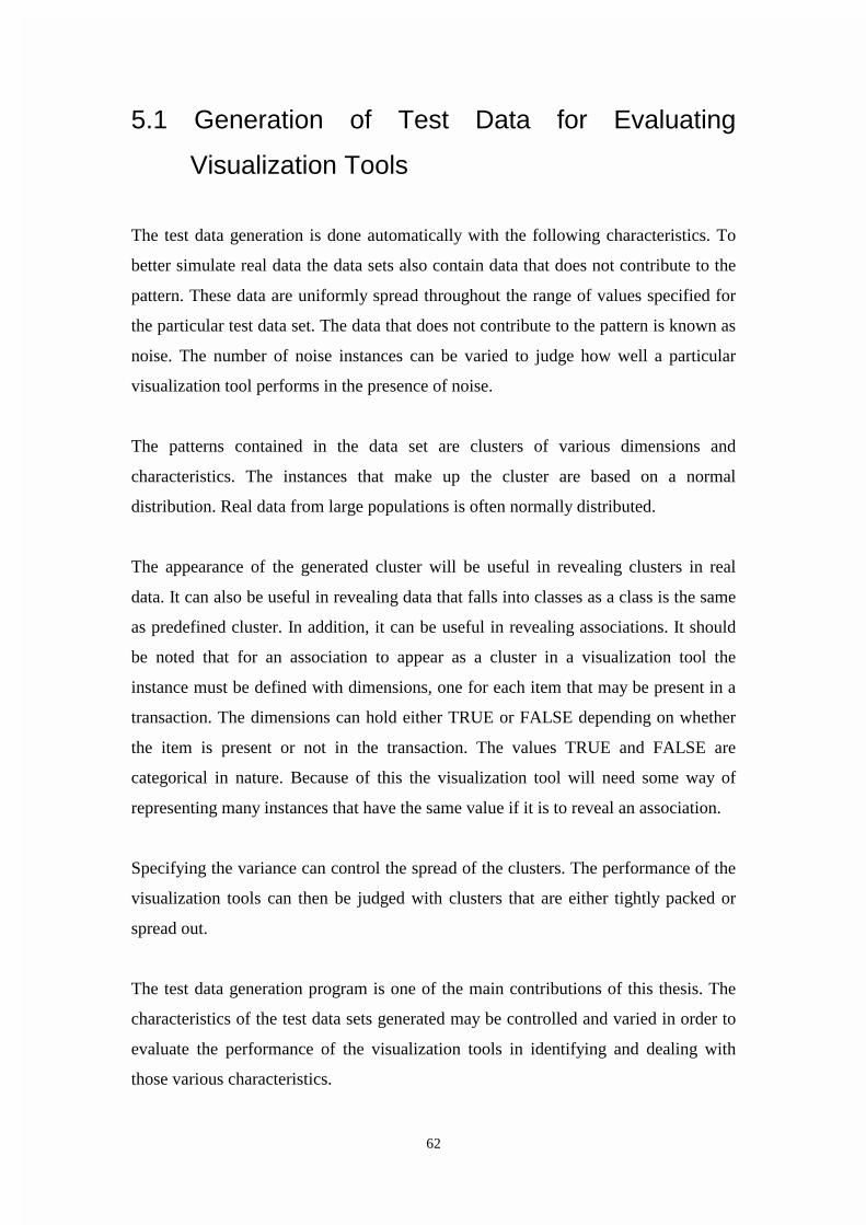
62
5.1 Generation of Test Data for Evaluating
Visualization Tools
The test data generation is done automatically with the following characteristics. To
better simulate real data the data sets also contain data that does not contribute to the
pattern. These data are uniformly spread throughout the range of values specified for
the particular test data set. The data that does not contribute to the pattern is known as
noise. The number of noise instances can be varied to judge how well a particular
visualization tool performs in the presence of noise.
The patterns contained in the data set are clusters of various dimensions and
characteristics. The instances that make up the cluster are based on a normal
distribution. Real data from large populations is often normally distributed.
The appearance of the generated cluster will be useful in revealing clusters in real
data. It can also be useful in revealing data that falls into classes as a class is the same
as predefined cluster. In addition, it can be useful in revealing associations. It should
be noted that for an association to appear as a cluster in a visualization tool the
instance must be defined with dimensions, one for each item that may be present in a
transaction. The dimensions can hold either TRUE or FALSE depending on whether
the item is present or not in the transaction. The values TRUE and FALSE are
categorical in nature. Because of this the visualization tool will need some way of
representing many instances that have the same value if it is to reveal an association.
Specifying the variance can control the spread of the clusters. The performance of the
visualization tools can then be judged with clusters that are either tightly packed or
spread out.
The test data generation program is one of the main contributions of this thesis. The
characteristics of the test data sets generated may be controlled and varied in order to
evaluate the performance of the visualization tools in identifying and dealing with
those various characteristics.

63
The program has the following features:
- the test data is continuous in a range from zero to some specified upper limit;
- the test data may have from one to six dimensions;
- the clusters may be from one to six dimensions while remaining less than or equal
to the dimensionality of the space;
- the number of data instances involved in the cluster is specified;
- the cluster is randomly positioned in the space;
- the instances involved in the cluster are distributed around the random position
according to a normal distribution;
- the random position is the mean of the normal distribution;
- the variance of the normal distribution is specified;
Figure 5.1 The user interface screen for the generation of the test data
- the number of noise data instances is specified;
- the noise data instances are distributed in the space according to a uniform
distribution;
- the name of the test data file is specified.
The user interface for the test data generation program appears in figure 5.1.

64
5.2 Calculation of Random Deviates Conforming to
a Normal Distribution
The method for generating the normal deviates that make up the clusters is based on a
direct method given some uniform random deviate that is detailed below. Visual
Basic provides a function to generate uniform deviates that act as input to the method
which is described below.
The following is a direct method for generating random deviates that conform to a
normal distribution with a mean of 1 and a standard deviation of 1. It is taken from
Abramowitz and Stegun's Handbook of Mathematical Functions [Abra72 p.953]. First
generate a pair of uniform deviates (U1, U2). Then a pair of independent normal
random deviates with mean zero and unit variance, X1 and X2, is given by:
( )22/1
11 2cosln2 UUX e π
−=
( )22/1
12 2sinln2 UUX e π
−=
The random deviates generated by the method above are then shifted to the position of
the cluster that has been randomly determined. The method can be applied as often as
is required to give the required number of cluster instances. Test files can also be
combined manually to give test files with as many clusters within them as is required.
The default range for the test files is 0 to 100. This has been chosen, as it will allow
easy interpretation of the values in terms of the total size of the space. It also means
that the default variance for clusters, of 1, is also 1% of the range specified for the
total data range. The method has been incorporated in the test data generation
program to generate the random deviates that make up the instances in the test data
files. Using the test data generator a number of test data files have been generated
with different characteristics as detailed in section 5.3.

65
5.3 The Test Data Sets Generated for the
Comparison of the Visualization Tools
The data sets following vary in a number of ways; the dimensionality of the clusters
in each data set, the number of clusters present in each data set, the amount of noise
present in each data set and the variance of the clusters in each data set.
Test Data Set 1
A single 3 dimensional cluster in a higher dimensional space with minimal noise.
File Name Brief
description
Number of
instances
in cluster
Variance of
cluster
Number of
instances of
noise
Cluster
position
Big3d6d A cluster of 3
dimensions in
a space of 6
dimensions
1000 1 100 field1: 73.4
field2: 62.1
field3: 92.3

66
Test Data Set 1A
Two 1 dimensional clusters in a higher dimensional space with minimal noise.
File Name Brief
description
Number
of
instances
in each
cluster
Variance
of
cluster
Number
of
instances
of noise
Cluster position
big2of1d6d Two distinct
clusters of 1
dimension in a
space of 6
dimensions
1000 1 200 First Cluster
Position:
field1: 30.4
Second Cluster
Position:
field2: 65.4
Test Data Set 2
Two 3 dimensional clusters in a higher dimensional space with minimal noise.
File Name Brief
description
Number of
instances
in each
cluster
Variance
of cluster
Number
of
instances
of noise
Cluster position
big3d6dv2 Two clusters
of 3
dimensions in
a space of 6
dimensions.
1000 1 200 First Cluster
Position:
field1: 89.4
field2: 24.6
field3: 3.9
Second Cluster
Position:
field1: 73.4
field2: 62.1
field3: 92.3

67
Test Data Set 3
A single 3 dimensional cluster in a higher dimensional space with an increased level
of noise.
File Name Brief
description
Number
of
instances
in cluster
Variance
of cluster
Number
of
instances
of noise
Cluster
position
big3d6dnoise50-
50
A cluster of
3 dimensions
in a space of
6
dimensions.
500 1 500 field1: 88.8
field2: 23.4
field3: 16.9
Test Data Set 4
A single 3 dimensional cluster in a higher dimensional space with a high level of
noise.
File Name Brief
description
Number of
instances
in cluster
Variance
of cluster
Number
of
instances
of noise
Cluster position
big3d6dn80-
20
A cluster of 3
dimensions in
a space of 6
dimensions.
.
200 1 800 field1: 76.6
field2: 31.8
field3: 76.0

68
Test Data Set 5
A six dimensional cluster in a six dimensional space with minimal noise levels.
File Name Brief
description
Number of
instances
in cluster
Variance
of cluster
Number
of
instances
of noise
Cluster position
big6d6d A cluster of 6
dimensions in
a space of 6
dimensions.
.
1000 1 100 field1: 54.4
field2: 73.7
field3: 80.8
field4: 8.2
field5: 49.1
field6: 50.4
Test Data Set 6
A 3 dimensional cluster in a higher dimensional space with minimal noise and a
cluster variance double that of the previous test data sets.
File Name Brief
description
Number of
instances
in cluster
Variance
of cluster
Number
of
instances
of noise
Cluster position
var23d6d A cluster of 3
dimensions in
a space of 6
dimensions.
.
1000 2 100 field1: 65.0
field2: 52.6
field3: 55.9

69
5.4 Summary This chapter provides the specification of the test data generator program developed.
The features of the test data generator allow the user to vary the characteristics of the
test data sets in order that the visualization techniques may be evaluated for their
ability to deal with those characteristics and their ability to reveal clusters known to
exist in a particular test data set. The method used by the test data generator to
produce random deviates that conform to a normal distribution is explained.
The chapter concludes by giving the details of a number of test data sets that differ in
regard to their characteristics. These test data sets are used to evaluate the
visualization tools in the following chapter.

70
Chapter 6
Performance Evaluation of
Visualization Tools In this chapter the use of three well known visualization tools will be explained and
the tools will be compared and evaluated. Each tool combines a particular
visualization technique with dynamic controls. Each tool is a representative of a
technique used for data mining. Hence the evaluation will be related to the inherent
strengths and weaknesses of the technique. It will also consider aspects of the
dynamic controls used by each particular implementation of the visualization tools.
The tools to be considered are DBMiner, Spotfire and WinViz. DBMiner employs a
variation based on a 3 dimensional scatter plot and Spotfire employs a modified 2
dimensional scatter plot with color to represent a third dimension. WinViz employs a
parallel co-ordinates approach with addition of frequency distributions on the axis for
each dimension. The tools are all available commercially. This indicates a degree of
acceptance for the underlying visualization technique and it is also part of the
justification for the choice of tools. Most of the other visualization tools available
commercially employ variations on two and three dimensional scatter plots.
In the following sections the display provided by each visualization tool will be
explained. Each of the visualization tools will then be used against various test data
sets of known characteristics that are generated as per the description of chapter 5. An

71
analysis is made on each of the displays and this will form the basis for the evaluation
and comparison of each of the visualization tools.
6.1 DBMiner
DBMiner Technology Inc., British Columbia, Canada, developed DBMiner. It is
Microsoft windows based and that integrates other data mining tools with the
visualization tool. The visualization of the data known is called a data cube. Once a
data cube has been created the user may choose from a range of data mining functions
for further analysis of the data. These functions include characterization, comparison,
association, classification, prediction and clustering. The visualization is based on a 3
dimensional scatter plot approach as described in chapter 2. It has variations to the
technique, the major of which is to summarize the instances in a region, of the three
dimensional graphical space, to a single icon, being a box the size of which is
proportional to the number of instances in each region.
The entire graphical space is known as a cube and it contains individual smaller
boxes, one in each region of the larger cube (see to figure 6.1). The shading on the
surrounding grid and the range on the axis surrounded by a box highlights the position
of the particular smaller cube that the cursor is currently positioned on. The number of
instances that the particular small box represents is displayed in the top left of the
display window. In the DBMiner each dimension is referred to as a field.
The size of each individual cube is proportional to the number of instances in the
particular region. This prevents the overlap that would occur if each instance were
included as an individual icon. This means the display is capable of, in theory, dealing

72
with data sets of any size and other issues, such as processing power and memory,
would be the limiting factors. The user may employ controls to zoom in on a
particular region or to rotate the cube in the 3 dimensional space and look at the
display from a different perspective.
Figure 6.1 Test data set 1 with 3 dimensional cluster in DBMiner

73
The cube properties window can be accessed from the far left button in the row of
button controls at the top of the display in figure 6.1.The cube properties window
shown in figure 6.2 indicates the properties established for the display in figure 6.1.
Figure 6.2 DBMiner Properties Window
Evaluation of the Usefulness of DBMiner for Data
Mining
Experiment 1:
Test data set 1 contains a single 3 dimensional cluster in a higher dimensional space
with minimal noise. It is fed into DBMiner and the 3 dimensional cluster is shown in
figure 6.1

74
We wish to evaluate the ease of identification of a 3 dimensional cluster. The
presence of a large cube in the middle region of the display in figure 6.1 indicates a 3
dimensional cluster of instances in the test data set 1.
Figure 6.3 shows the same data set but with dimension 4, dimension 5 and dimension
6 attached to each of the three axes. It can be seen from the figure that these
dimensions do not contribute to any cluster. There is a uniform spread of the smaller
cubes in the display indicating that no cluster exists in those dimensions.
Figure 6.3 Test data set 1with no cluster in the displayed dimensions 4,5 and 6 in
DBMiner
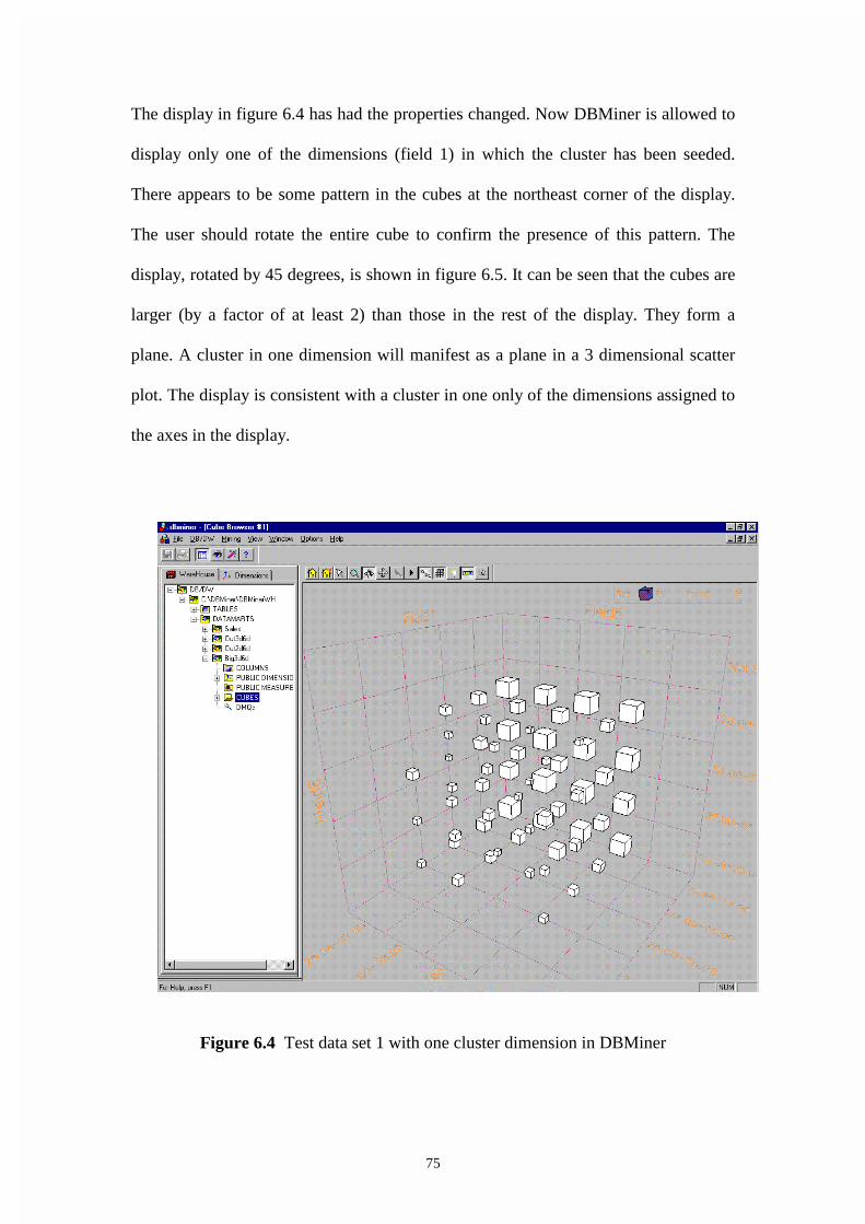
75
The display in figure 6.4 has had the properties changed. Now DBMiner is allowed to
display only one of the dimensions (field 1) in which the cluster has been seeded.
There appears to be some pattern in the cubes at the northeast corner of the display.
The user should rotate the entire cube to confirm the presence of this pattern. The
display, rotated by 45 degrees, is shown in figure 6.5. It can be seen that the cubes are
larger (by a factor of at least 2) than those in the rest of the display. They form a
plane. A cluster in one dimension will manifest as a plane in a 3 dimensional scatter
plot. The display is consistent with a cluster in one only of the dimensions assigned to
the axes in the display.
Figure 6.4 Test data set 1 with one cluster dimension in DBMiner

76
Figure 6.5 Test data set 1 with one cluster dimension rotated by 45 degrees in
DBMiner
The display in figure 6.6 includes only two of the dimensions that contribute to the 3
dimensional cluster seeded in test data set 1. A pattern is apparent in the figure 6.6 as
indicated by the cubes that are larger in size towards the back of the display. The user
could rotate the entire cube to confirm the existence of the pattern and to better
determine its position. The rotated display is shown in figure 6.7. Figure 6.7 clearly
shows a row of larger cubes that may be termed a pipe. The pipe structure is how a
cluster involving two of the dimensions only would manifest in a 3 dimensional
display.
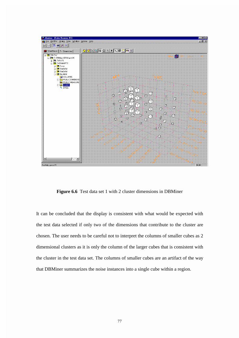
77
Figure 6.6 Test data set 1 with 2 cluster dimensions in DBMiner
It can be concluded that the display is consistent with what would be expected with
the test data selected if only two of the dimensions that contribute to the cluster are
chosen. The user needs to be careful not to interpret the columns of smaller cubes as 2
dimensional clusters as it is only the column of the larger cubes that is consistent with
the cluster in the test data set. The columns of smaller cubes are an artifact of the way
that DBMiner summarizes the noise instances into a single cube within a region.

78
Figure 6.7 Test data set 1 with 2 cluster dimensions rotated by 90 degrees in
DBMiner
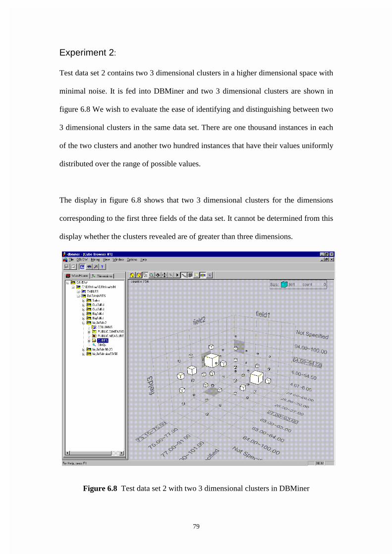
79
Experiment 2:
Test data set 2 contains two 3 dimensional clusters in a higher dimensional space with
minimal noise. It is fed into DBMiner and two 3 dimensional clusters are shown in
figure 6.8 We wish to evaluate the ease of identifying and distinguishing between two
3 dimensional clusters in the same data set. There are one thousand instances in each
of the two clusters and another two hundred instances that have their values uniformly
distributed over the range of possible values.
The display in figure 6.8 shows that two 3 dimensional clusters for the dimensions
corresponding to the first three fields of the data set. It cannot be determined from this
display whether the clusters revealed are of greater than three dimensions.
Figure 6.8 Test data set 2 with two 3 dimensional clusters in DBMiner
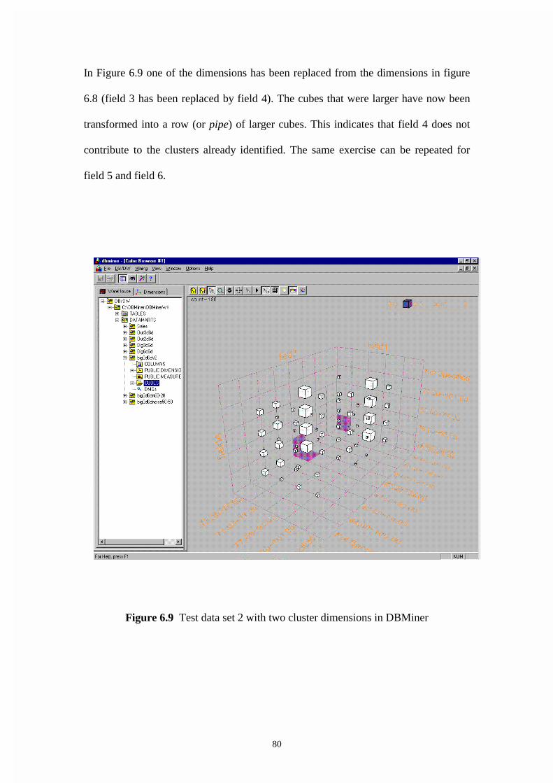
80
In Figure 6.9 one of the dimensions has been replaced from the dimensions in figure
6.8 (field 3 has been replaced by field 4). The cubes that were larger have now been
transformed into a row (or pipe) of larger cubes. This indicates that field 4 does not
contribute to the clusters already identified. The same exercise can be repeated for
field 5 and field 6.
Figure 6.9 Test data set 2 with two cluster dimensions in DBMiner

81
Experiment 3:
Test data set 3 contains a single 3 dimensional cluster in a higher dimensional space
with an increased level of noise. It is fed into DBMiner and the 3 dimensional cluster
is shown in figure 6.10. We wish to evaluate the effect of considerable noise in the
data set. In figure 6.10 the display is shown where 50% of the instances are noise,
meaning they are randomly spread through the space according to a uniform
distribution.
We know that a 3 dimensional cluster exists in the test data. The two large cubes
towards the bottom of the display indicate the expected cluster. The increased level of
noise has caused two cubes that are slightly larger and might be, incorrectly, assumed
to be a clusters. It is known that no second cluster exists and the noise is randomly
generated based on a uniform distribution. This indicates identification of clusters in
DBMiner needs to be approached with caution if the noise levels are fairly high.
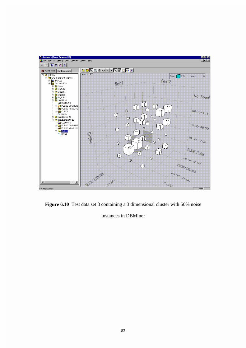
82
Figure 6.10 Test data set 3 containing a 3 dimensional cluster with 50% noise
instances in DBMiner
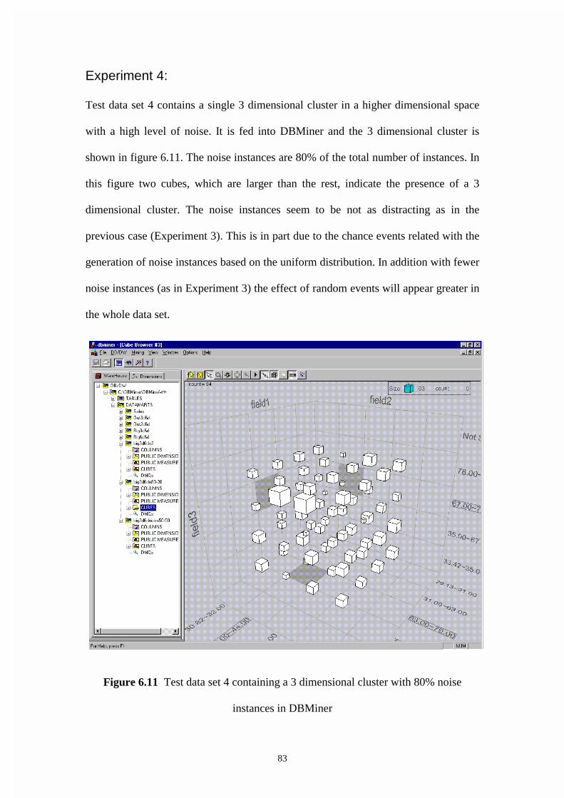
83
Experiment 4:
Test data set 4 contains a single 3 dimensional cluster in a higher dimensional space
with a high level of noise. It is fed into DBMiner and the 3 dimensional cluster is
shown in figure 6.11. The noise instances are 80% of the total number of instances. In
this figure two cubes, which are larger than the rest, indicate the presence of a 3
dimensional cluster. The noise instances seem to be not as distracting as in the
previous case (Experiment 3). This is in part due to the chance events related with the
generation of noise instances based on the uniform distribution. In addition with fewer
noise instances (as in Experiment 3) the effect of random events will appear greater in
the whole data set.
Figure 6.11 Test data set 4 containing a 3 dimensional cluster with 80% noise
instances in DBMiner
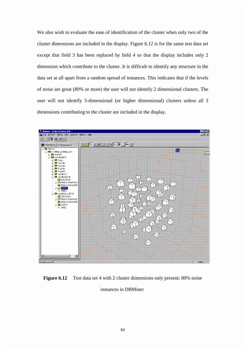
84
We also wish to evaluate the ease of identification of the cluster when only two of the
cluster dimensions are included in the display. Figure 6.12 is for the same test data set
except that field 3 has been replaced by field 4 so that the display includes only 2
dimension which contribute to the cluster. It is difficult to identify any structure in the
data set at all apart from a random spread of instances. This indicates that if the levels
of noise are great (80% or more) the user will not identify 2 dimensional clusters. The
user will not identify 3-dimensional (or higher dimensional) clusters unless all 3
dimensions contributing to the cluster are included in the display.
Figure 6.12 Test data set 4 with 2 cluster dimensions only present; 80% noise
instances in DBMiner
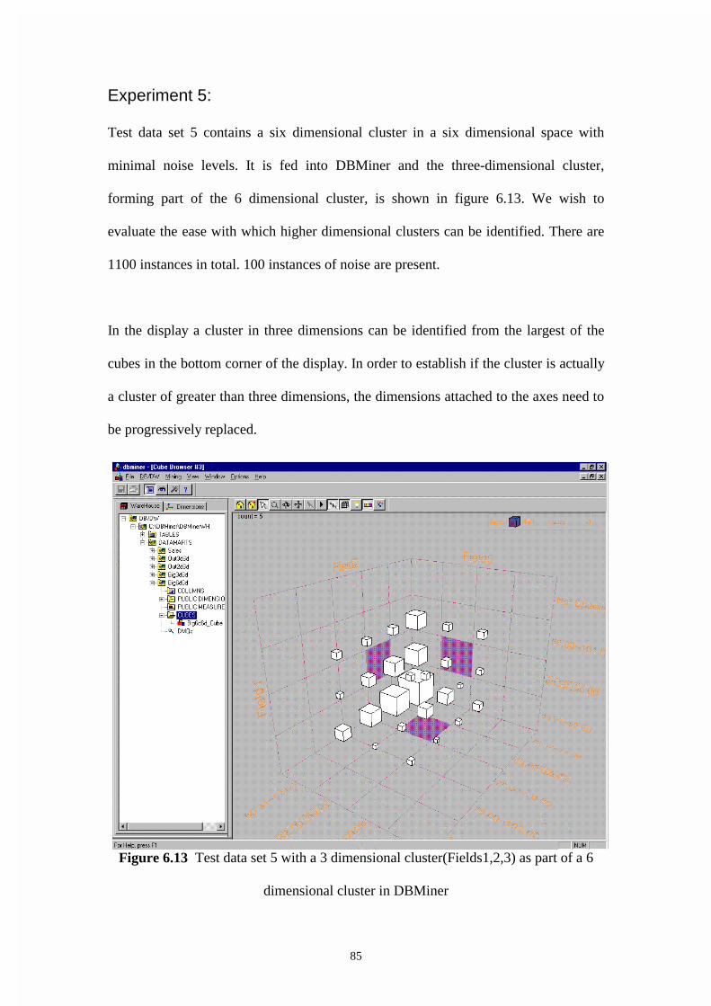
85
Experiment 5:
Test data set 5 contains a six dimensional cluster in a six dimensional space with
minimal noise levels. It is fed into DBMiner and the three-dimensional cluster,
forming part of the 6 dimensional cluster, is shown in figure 6.13. We wish to
evaluate the ease with which higher dimensional clusters can be identified. There are
1100 instances in total. 100 instances of noise are present.
In the display a cluster in three dimensions can be identified from the largest of the
cubes in the bottom corner of the display. In order to establish if the cluster is actually
a cluster of greater than three dimensions, the dimensions attached to the axes need to
be progressively replaced.
Figure 6.13 Test data set 5 with a 3 dimensional cluster(Fields1,2,3) as part of a 6
dimensional cluster in DBMiner

86
In figure 6.14 dimension 3 (field 3) has been replaced with dimension 4 (field 4) in
the display. When viewed, the cluster is in about the same position as in figure 6.13
but the legend has changed for field 4 so that it is between 7.62 and 9. It can be
concluded that dimension 4 also contributes to the cluster.
Figure 6.14 Test data set 5 with a 3 dimensional cluster (Fields 1,2,4) as part of a 6
dimensional cluster in DBMiner

87
Figure 6.15 Test data set 5 with a 3 dimensional cluster (Fields 1,2,5) as part of a 6
dimensional cluster in DBMiner
In figure 6.15 dimension 4 (field 4) has been replaced with dimension 5 (field 5) in
the display. The cluster is in about the same position but the legend now indicates
48.61 to 50 for field 5. It can be concluded that dimension 5 also contributes to the
cluster.
In figure 6.16 dimension 4 (field 4), dimension 5 (field 5) and dimension 6 (field 6)
have been attached to axes in the display. The display is more difficult to interpret and
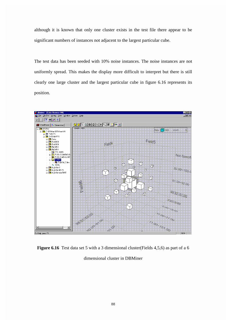
88
although it is known that only one cluster exists in the test file there appear to be
significant numbers of instances not adjacent to the largest particular cube.
The test data has been seeded with 10% noise instances. The noise instances are not
uniformly spread. This makes the display more difficult to interpret but there is still
clearly one large cluster and the largest particular cube in figure 6.16 represents its
position.
Figure 6.16 Test data set 5 with a 3 dimensional cluster(Fields 4,5,6) as part of a 6
dimensional cluster in DBMiner

89
Experiment 6:
Test data set 6 contains a 3 dimensional cluster in a higher dimensional space with
minimal noise and a cluster variance double that of the previous test data sets. It is fed
into DBMiner and the three-dimensional cluster is shown in figure 6.17. We wish to
evaluate the ease with which clusters can be identified with an increased level of
variance for the cluster instances. Test data set 6 contains 1100 instances in total.
1000 instances contribute to a three-dimensional cluster in a 6 dimensional space. The
cluster is located around the mean position given by the co-ordinates field 1= 65.0
field 2= 55.9, field 3=52.6. The variance of the normal distribution, which determines
the values of the instances about the mean, is 2 instead of 1 as in the previous
experiments.
In figure 6.17 it is extremely difficult to identify a three-dimensional cluster. The
cubes are slightly larger at the known cluster position but the small increase in size
could easily be attributed to noise. It can be concluded that if the cluster becomes too
spread out it cannot be identified.
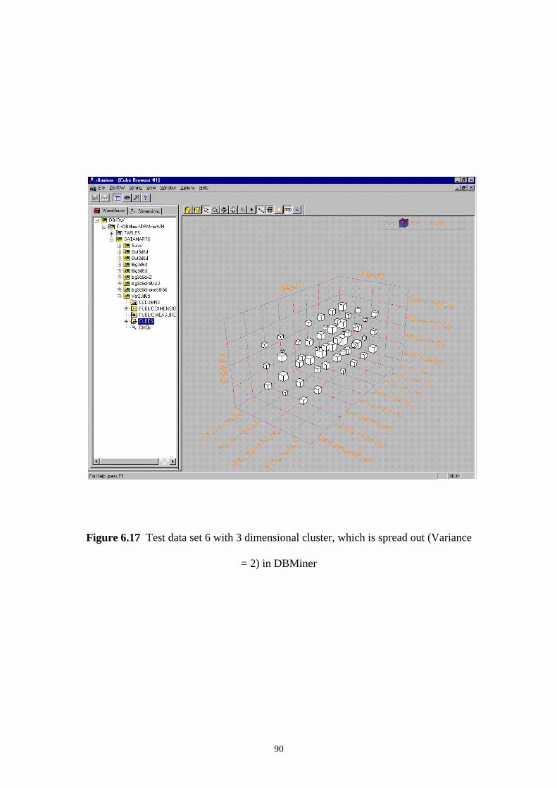
90
Figure 6.17 Test data set 6 with 3 dimensional cluster, which is spread out (Variance
= 2) in DBMiner
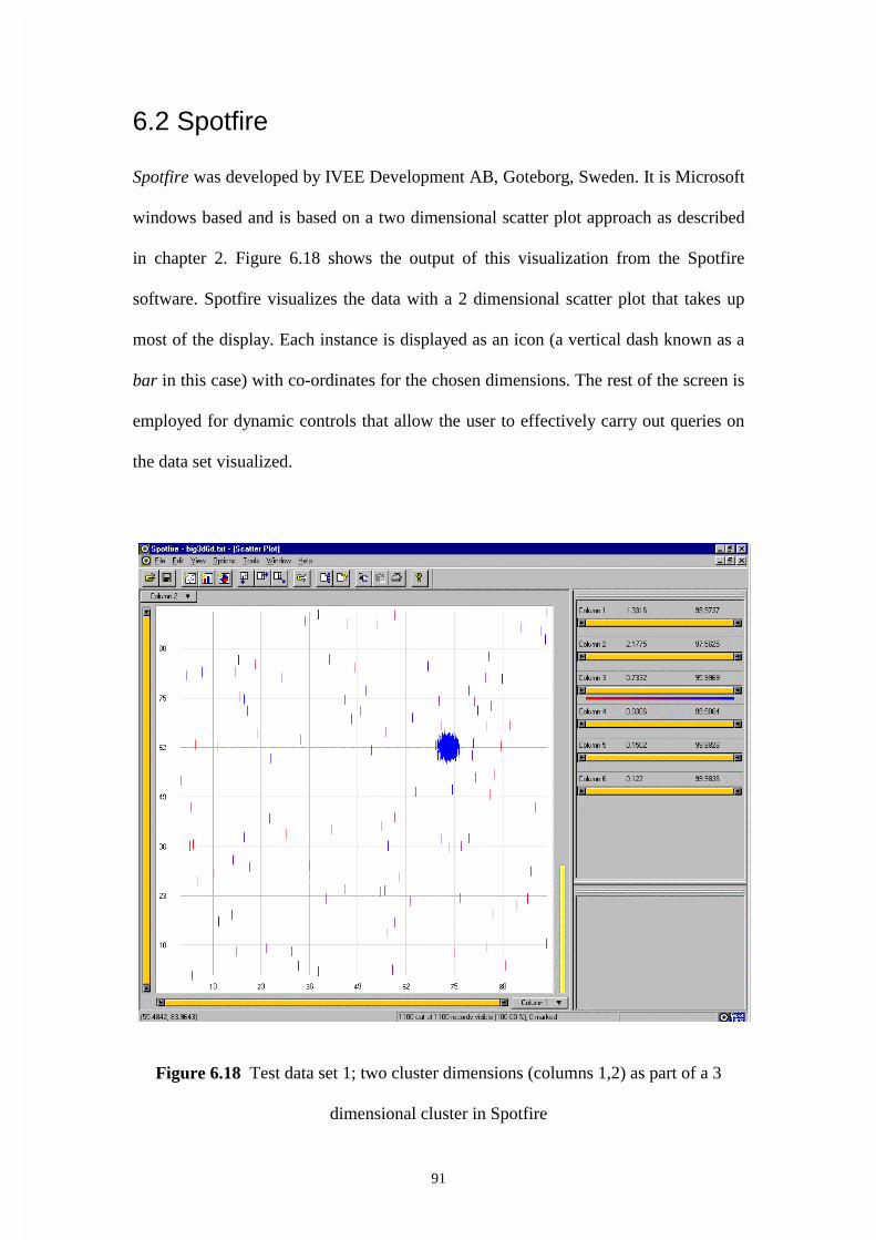
91
6.2 Spotfire
Spotfire was developed by IVEE Development AB, Goteborg, Sweden. It is Microsoft
windows based and is based on a two dimensional scatter plot approach as described
in chapter 2. Figure 6.18 shows the output of this visualization from the Spotfire
software. Spotfire visualizes the data with a 2 dimensional scatter plot that takes up
most of the display. Each instance is displayed as an icon (a vertical dash known as a
bar in this case) with co-ordinates for the chosen dimensions. The rest of the screen is
employed for dynamic controls that allow the user to effectively carry out queries on
the data set visualized.
Figure 6.18 Test data set 1; two cluster dimensions (columns 1,2) as part of a 3
dimensional cluster in Spotfire

92
The default display for a particular icon is a small filled rectangle but it has been
replaced by a vertical line in this case as this creates less overlap and makes the
display clearer when there are many instances displayed. The color of the icon is used
to represent a third dimension with a color range from red to blue (red is shaded
through purple to blue) being matched to the range of values for the third dimension.
The software Spotfire refers to each dimension as a column.
Figure 6.19 test data set 1; two cluster dimensions (Columns 2,3) as part of a 3
dimensional cluster in Spotfire

93
Evaluation of the Usefulness of Spotfire for Data
Mining
Experiment 1:
Test data set 1 contains a single 3 dimensional cluster in a higher dimensional space
with minimal noise. It is fed into Spotfire and the 3 dimensional cluster is shown in
figure 6.18. Visual inspection of the display indicates that a two dimensional cluster
exists for dimensions 1 and 2. The bars in the cluster are all the same color (blue).
This suggests the cluster is 3 dimensional. The use of color by itself is not sufficient
to confirm or deny the involvement of a dimension in a cluster; it provides an
indication only. A change in the dimensions assigned to the axes would confirm this.
This is shown in figure 6.19. The horizontal axis now represents dimension 3 and
color has been assigned to dimension 1. It can be concluded that a cluster exists in 3
dimensions.
Figure 6.20 displays the range of values in the region of the cluster. By reducing the
overlap of the bar icons the density of the instances in the cluster can be gauged. In
this case it is known that there are 1000 instances in the cluster and it can be seen that
overlap still exists in the small range of values displayed. This demonstrates how the
slide control beside each axis can be used to change the range of values displayed.
Note also that the region in the right of the display indicates how each dimension
(termed a column in Spotfire terminology) is treated.
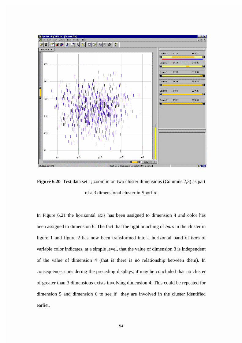
94
Figure 6.20 Test data set 1; zoom in on two cluster dimensions (Columns 2,3) as part
of a 3 dimensional cluster in Spotfire
In Figure 6.21 the horizontal axis has been assigned to dimension 4 and color has
been assigned to dimension 6. The fact that the tight bunching of bars in the cluster in
figure 1 and figure 2 has now been transformed into a horizontal band of bars of
variable color indicates, at a simple level, that the value of dimension 3 is independent
of the value of dimension 4 (that is there is no relationship between them). In
consequence, considering the preceding displays, it may be concluded that no cluster
of greater than 3 dimensions exists involving dimension 4. This could be repeated for
dimension 5 and dimension 6 to see if they are involved in the cluster identified
earlier.

95
Figure 6.21 Test data set 1; one cluster dimension (Column 3) as part of a 3
dimensional cluster in Spotfire

96
Figure 6.22 includes only dimensions 4 (the X axis), dimension 5 (the Y axis) and
dimension 6 (color of the icon). The uniform spread of the bars indicates that no
clusters exist involving those dimensions.
Figure 6.22 Test data set 1; choice of dimensions not involved in the cluster
(Columns 4,5,6) in Spotfire

97
Experiment 2:
Test data set 2 contains two 3 dimensional clusters in a higher dimensional space
with minimal noise. It is fed into Spotfire and two 3 dimensional clusters are shown in
figure 6.24. We wish to evaluate the ease of identifying and distinguishing between
two 3 dimensional clusters in the same data set. There are two thousand instances in
the two clusters and another two hundred instances that have the values uniformly
distributed over the range of possible values. The range of possible values is from
zero to one hundred.
The display in figure 6.23 shows that two definite clusters exist in each of dimension1
and dimension 2 with the uniformity of color (which is used to represent dimension 3)
strongly suggesting that the clusters are 3 dimensional. This could be confirmed by
reassigning the dimensions as discussed for the single cluster case.
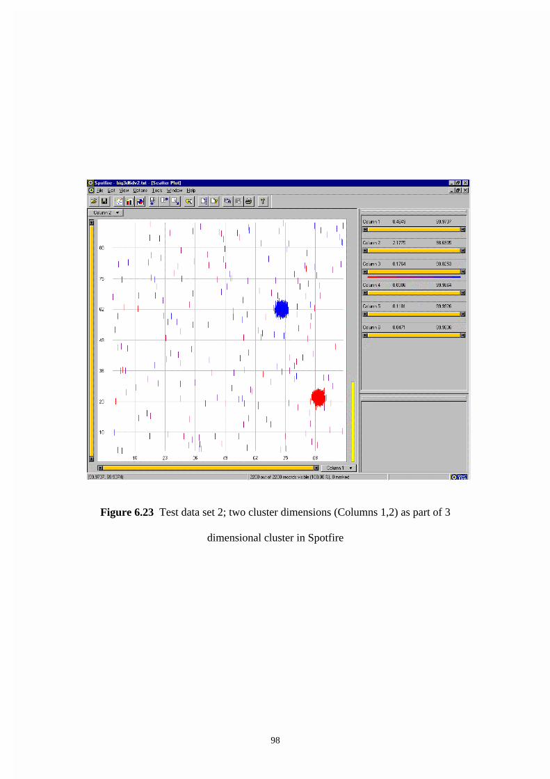
98
Figure 6.23 Test data set 2; two cluster dimensions (Columns 1,2) as part of 3
dimensional cluster in Spotfire

99
Experiment 3:
Test data set 3 contains a single 3 dimensional cluster in a higher dimensional space
with an increased level of noise. It is fed into DBMiner and the 3 dimensional cluster
is shown in figure 6.24. We wish to evaluate the effect of considerable noise in the
data set. There are 1000 instances, 50% of which are noise and 50% of which
contribute to a 3 dimensional cluster.
The cluster is still clearly apparent in figure 6.24 with 50% of the instances not
contributing to the cluster. The visual identification is not affected by increased levels
of noise to 50% of the total number of instances.
Figure 6.24 Test data set 3; two cluster dimensions as part of a 3 dimensional cluster
with 50% noise instances in Spotfire

100
Experiment 4:
Test data set 4 contains a single 3 dimensional cluster in a higher dimensional space
with a high level of noise. It is fed into Spotfire and the 3 dimensional cluster is
shown in figure 6.25. We wish to evaluate the effect of an even greater level of noise
in the test data set. There are 1000 instances, 80% of which are noise and 20% of
which contribute to a 3 dimensional cluster.
The cluster is still clearly apparent in figure 6.25 with 80% of the instances not
contributing to the cluster. The increased levels of noise do not affect the visual
identification.
Figure 6.25 Test data set 4; two cluster dimensions as part of a 3 dimensional cluster
with 80% noise instances in Spotfire
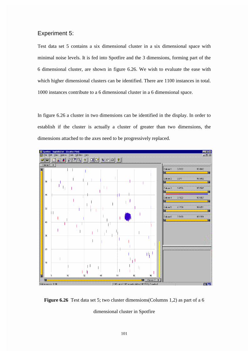
101
Experiment 5:
Test data set 5 contains a six dimensional cluster in a six dimensional space with
minimal noise levels. It is fed into Spotfire and the 3 dimensions, forming part of the
6 dimensional cluster, are shown in figure 6.26. We wish to evaluate the ease with
which higher dimensional clusters can be identified. There are 1100 instances in total.
1000 instances contribute to a 6 dimensional cluster in a 6 dimensional space.
In figure 6.26 a cluster in two dimensions can be identified in the display. In order to
establish if the cluster is actually a cluster of greater than two dimensions, the
dimensions attached to the axes need to be progressively replaced.
Figure 6.26 Test data set 5; two cluster dimensions(Columns 1,2) as part of a 6
dimensional cluster in Spotfire
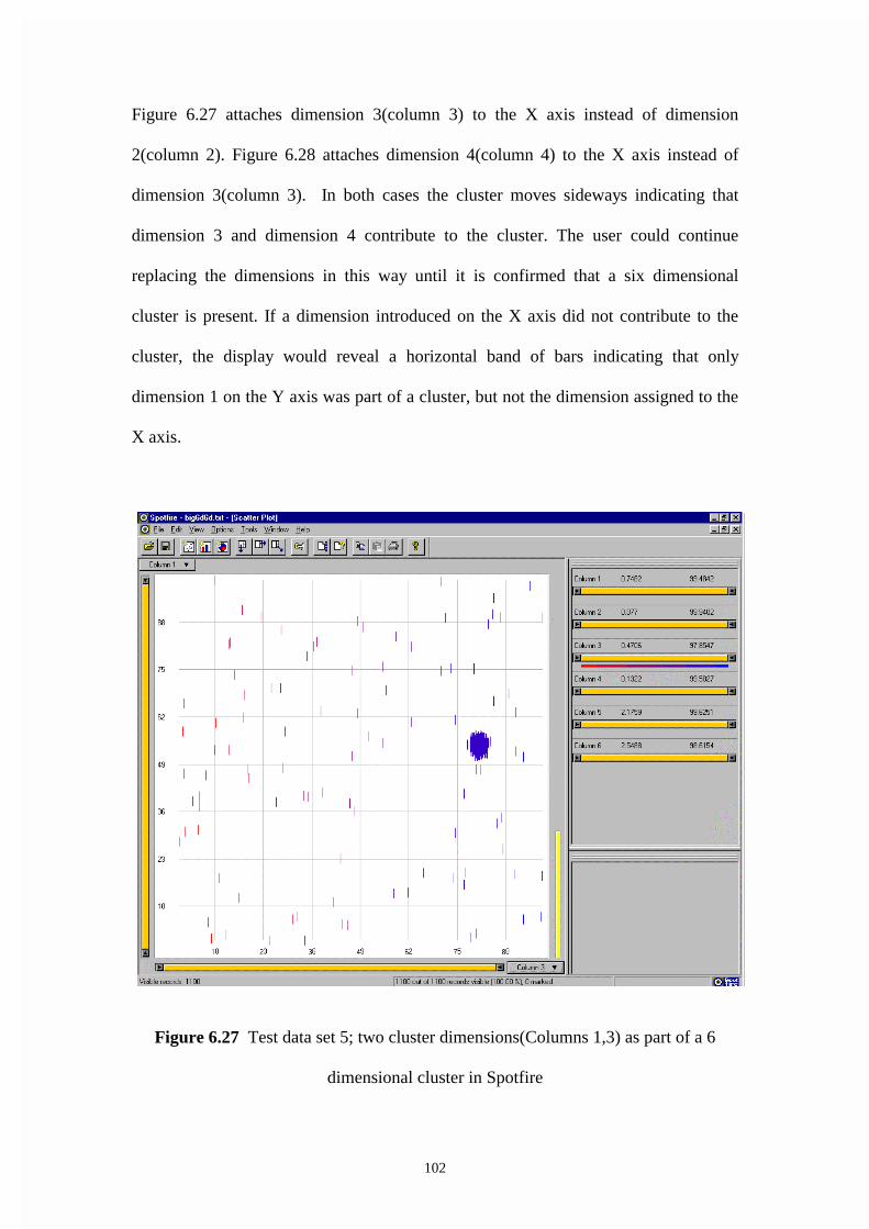
102
Figure 6.27 attaches dimension 3(column 3) to the X axis instead of dimension
2(column 2). Figure 6.28 attaches dimension 4(column 4) to the X axis instead of
dimension 3(column 3). In both cases the cluster moves sideways indicating that
dimension 3 and dimension 4 contribute to the cluster. The user could continue
replacing the dimensions in this way until it is confirmed that a six dimensional
cluster is present. If a dimension introduced on the X axis did not contribute to the
cluster, the display would reveal a horizontal band of bars indicating that only
dimension 1 on the Y axis was part of a cluster, but not the dimension assigned to the
X axis.
Figure 6.27 Test data set 5; two cluster dimensions(Columns 1,3) as part of a 6
dimensional cluster in Spotfire

103
Figure 6.28 Test data set 5; two cluster dimensions(Columns 1,4) as part of a 6
dimensional cluster in Spotfire
Experiment 6:
Test data set 6 contains a 3 dimensional cluster in a higher dimensional space with
minimal noise and a cluster variance double that of the previous test data sets. It is fed
into Spotfire and the 3 dimensional cluster is shown in figure 6.29. We wish to
evaluate the ease with which clusters can be identified with an increased level of
variance for the cluster instances. There are 1100 instances in total. 1000 instances
contribute to a 3 dimensional cluster in a 6 dimensional space. The cluster is located
around the mean position given by the co-ordinates field 1= 65.0, field 2= 55.9, field
3=52.6. The variance of the normal distribution, which determines the values of the
instances about the mean, is 2.

104
In figure 6.29 the cluster can still be easily identified. The increase in variance is
apparent in the increased spread of the icons in the area of the cluster. In spite of this
the cluster can be identified.
Figure 6.29 Test data set 6;A 3 dimensional cluster which is spread out (Variance =
2) in Spotfire

105
6.3 WinViz The text and figures following provide an analysis of a number of test data sets with
the software WinViz.
WinViz was developed by Information Technology Institute, Singapore. It is
Microsoft windows based and is based on a parallel co-ordinates approach as
described in Chapter 2. WinViz has additional dynamic controls and querying
capabilities designed to improve its flexibility for visualizing with both business and
scientific data
Figure 6.30 shows the default display. The workspace region takes up most of the
display and shows a frequency distribution for each of the dimensions. The
dimensions are labeled field 1, field 2, etc. The region on the right of the figure where
statistical information is displayed is known as the status region. What is displayed in
the status region depends on where the cursor is positioned in the workspace region.
In the example each field has a vertical axis going from 0 to 100. Currently the cursor
is positioned over 73 for field 1 so the Bar/Total indicates that the value 73 occurs 396
times. WinViz automatically calculates a range from X - 0.5 to X + 0.5 where X is an
integer and represents all instances in that range as having a value of X.
Evaluation of the Usefulness of WinViz for Data
Mining
Experiment 1:
Test data set 1 contains a single 3 dimensional cluster in a higher dimensional space
with minimal noise. It is fed into WinViz and the 3 dimensional cluster is shown in
figure 6.30. There are 1100 instances in total. 1000 instances contribute to a 3
dimensional cluster in a 6 dimensional space. Visual inspection of the display
indicates that one-dimensional clusters exist for field 1, field 2 and field 3. The
display in figure 6.31 shows the values in each field for a particular instance
connected by a black line.

106
Figure 6.30 Test data set 1; 3 dimensional cluster, no connecting lines in WinViz
Figure 6.31 Test data set 1; 3 dimensional cluster, all connecting line in WinViz

107
This has been done for the 396 instances that have the value of greatest frequency for
field1. The value of 73 for field 1 occurred with the greatest frequency in this case.
The dimensions that have a cluster need to be next to each other for the connecting
lines to be able to establish if the individual cluster are all part of the same higher
dimensional cluster. The software WinViz provides a drag option to allow the user to
place the dimensions in any order from left to right
The display in figure 6.32 is identical to figure 6.31 except that a single line now
represents the many lines that connected the same points. Both figure 6.31 and figure
6.32 visually reveal a 3 dimensional cluster for field 1, field 2 and field 3. The lines
going to the same region on the axes indicate the existence of the cluster. The tight
band of lines connecting field 1, field 2 and field 3 can be contrasted to the spread of
black lines connecting field 4, field 5 and field 6. This indicates that field 4, field 5
and field 6 do not contribute to the cluster.
Experiment 1A:
Test data set 1A contains a two one dimensional clusters in a higher dimensional
space with minimal noise. It is fed into WinViz and two one-dimensional clusters are
shown in figure 6.33
We wish to evaluate how to distinguish between two one-dimensional clusters and a
single 2 dimensional cluster in WinViz. This experiment is carried out for WinViz
only since a separation in space between the clusters will not occur, as it will in a 2 or
3 dimensional scatter plot approach. Test Data Set 1A contains two one-dimensional
clusters in a 6 dimensional space. The two one-dimensional clusters are unrelated.
There are one thousand instances in each of the two clusters and another two hundred
instances that have the values uniformly distributed over the range of possible values.
The range of possible values is from zero to one hundred.
The display in figure 6.33 shows lines fanning out from each of the one-dimensional
clusters but with no links from one cluster to the other. Thus it can be concluded that
it is not one 2 dimensional cluster but, rather, two one-dimensional clusters. Figure
6.34 shows this more clearly by only selecting records in the cluster region of field 1.

108
Figure 6.32 Test data set 1; 3 dimensional cluster with connecting lines (no overlap)
in WinViz
Figure 6.33 Test data set 1A with two 1 dimensional clusters in WinViz

109
Figure 6.34 Test data set 1A with two 1 dimensional clusters with some records
queried only in WinViz
Experiment 2:
Test data set 2 contains two 3 dimensional clusters in a higher dimensional space with
minimal noise. It is fed into WinViz and two 3 dimensional clusters are shown in
figure 6.35. There are two thousand instances in the two clusters and another two
hundred instances that have their values uniformly distributed over the range of
possible values. The range of possible values is from zero to one hundred.
The display shows that two definite clusters exist in each of field 1, another two
clusters exist in field 2 and another two clusters field 3. It cannot be determined from
this display whether the individual clusters are part of the same 3 dimensional cluster
across the three dimensions.
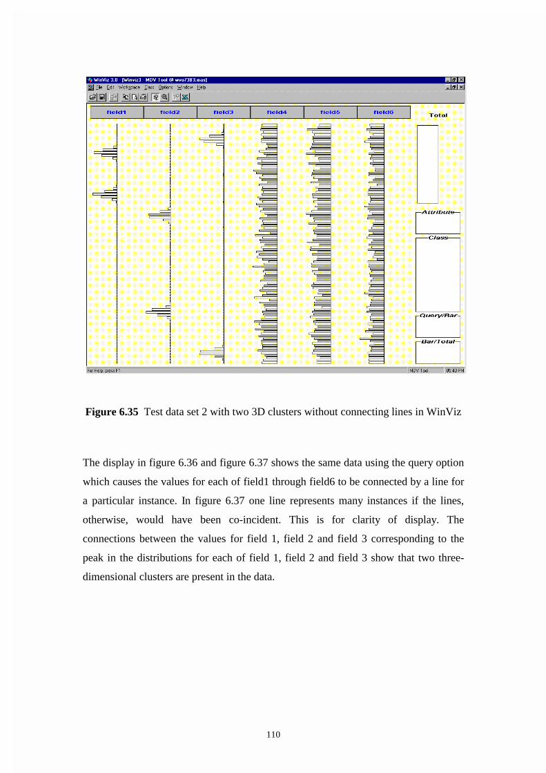
110
Figure 6.35 Test data set 2 with two 3D clusters without connecting lines in WinViz
The display in figure 6.36 and figure 6.37 shows the same data using the query option
which causes the values for each of field1 through field6 to be connected by a line for
a particular instance. In figure 6.37 one line represents many instances if the lines,
otherwise, would have been co-incident. This is for clarity of display. The
connections between the values for field 1, field 2 and field 3 corresponding to the
peak in the distributions for each of field 1, field 2 and field 3 show that two three-
dimensional clusters are present in the data.

111
Figure 6.36 Test data set 2 with two 3D clusters with connecting lines in WinViz

112
Figure 6.37 Test data set 2 with two 3D clusters without connecting lines; single line where overlap in WinViz
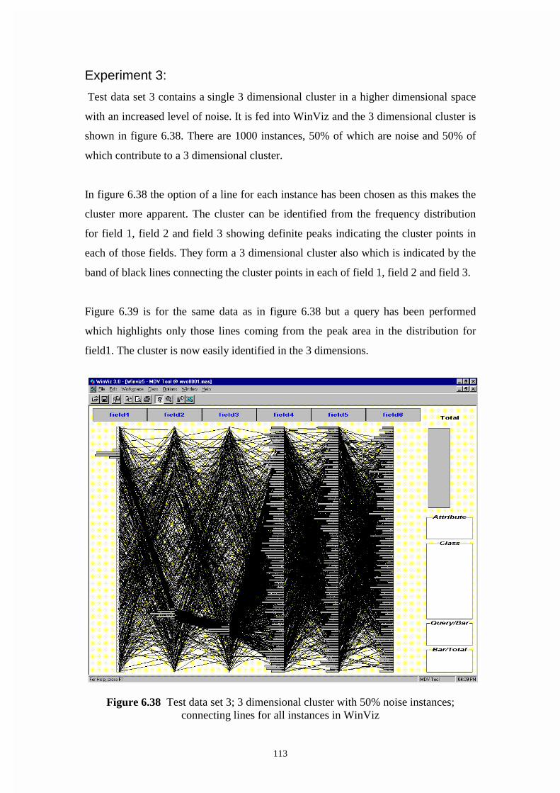
113
Experiment 3:
Test data set 3 contains a single 3 dimensional cluster in a higher dimensional space
with an increased level of noise. It is fed into WinViz and the 3 dimensional cluster is
shown in figure 6.38. There are 1000 instances, 50% of which are noise and 50% of
which contribute to a 3 dimensional cluster.
In figure 6.38 the option of a line for each instance has been chosen as this makes the
cluster more apparent. The cluster can be identified from the frequency distribution
for field 1, field 2 and field 3 showing definite peaks indicating the cluster points in
each of those fields. They form a 3 dimensional cluster also which is indicated by the
band of black lines connecting the cluster points in each of field 1, field 2 and field 3.
Figure 6.39 is for the same data as in figure 6.38 but a query has been performed
which highlights only those lines coming from the peak area in the distribution for
field1. The cluster is now easily identified in the 3 dimensions.
Figure 6.38 Test data set 3; 3 dimensional cluster with 50% noise instances;
connecting lines for all instances in WinViz
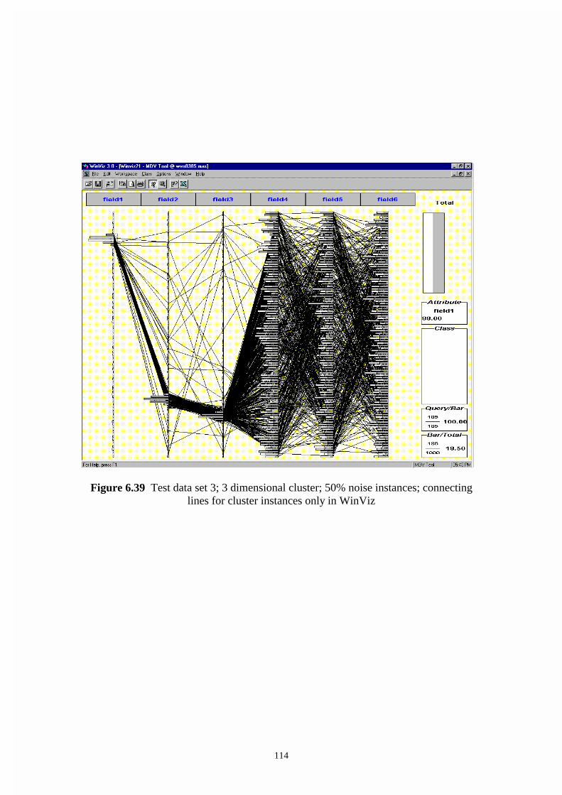
114
Figure 6.39 Test data set 3; 3 dimensional cluster; 50% noise instances; connecting
lines for cluster instances only in WinViz
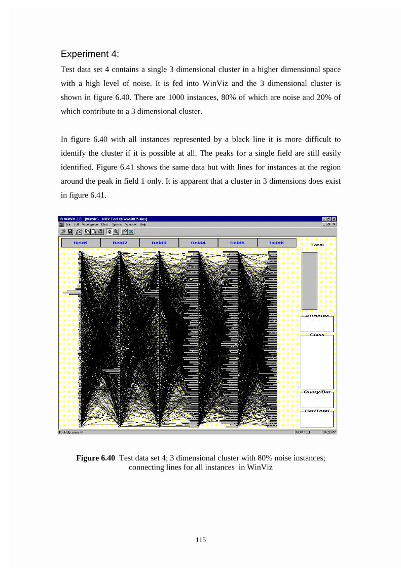
115
Experiment 4:
Test data set 4 contains a single 3 dimensional cluster in a higher dimensional space
with a high level of noise. It is fed into WinViz and the 3 dimensional cluster is
shown in figure 6.40. There are 1000 instances, 80% of which are noise and 20% of
which contribute to a 3 dimensional cluster.
In figure 6.40 with all instances represented by a black line it is more difficult to
identify the cluster if it is possible at all. The peaks for a single field are still easily
identified. Figure 6.41 shows the same data but with lines for instances at the region
around the peak in field 1 only. It is apparent that a cluster in 3 dimensions does exist
in figure 6.41.
Figure 6.40 Test data set 4; 3 dimensional cluster with 80% noise instances; connecting lines for all instances in WinViz

116
Figure 6.41 Test data set 4; 3 dimensional cluster with 50% noise instances;
connecting lines for cluster instances only in WinViz

117
Experiment 5:
Test data set 5 contains a six dimensional cluster in a six dimensional space with
minimal noise levels. It is fed into WinViz and the 3 dimensional cluster, forming part
of the 6 dimensional cluster, is shown in figure 6.42. There are 1100 instances in total.
1000 instances contribute to a 6 dimensional cluster in a 6 dimensional space.
A cluster in six dimensions can immediately be identified in figure 6.42 by the thick
grouping of lines connecting the peaks of the individual probability distributions for
each dimension (or field).
This demonstrates one of the strengths of the technique. Clusters of greater than three
dimensions can be revealed in a single display.
Figure 6.42 Test data set 5; 6 dimensional cluster in WinViz
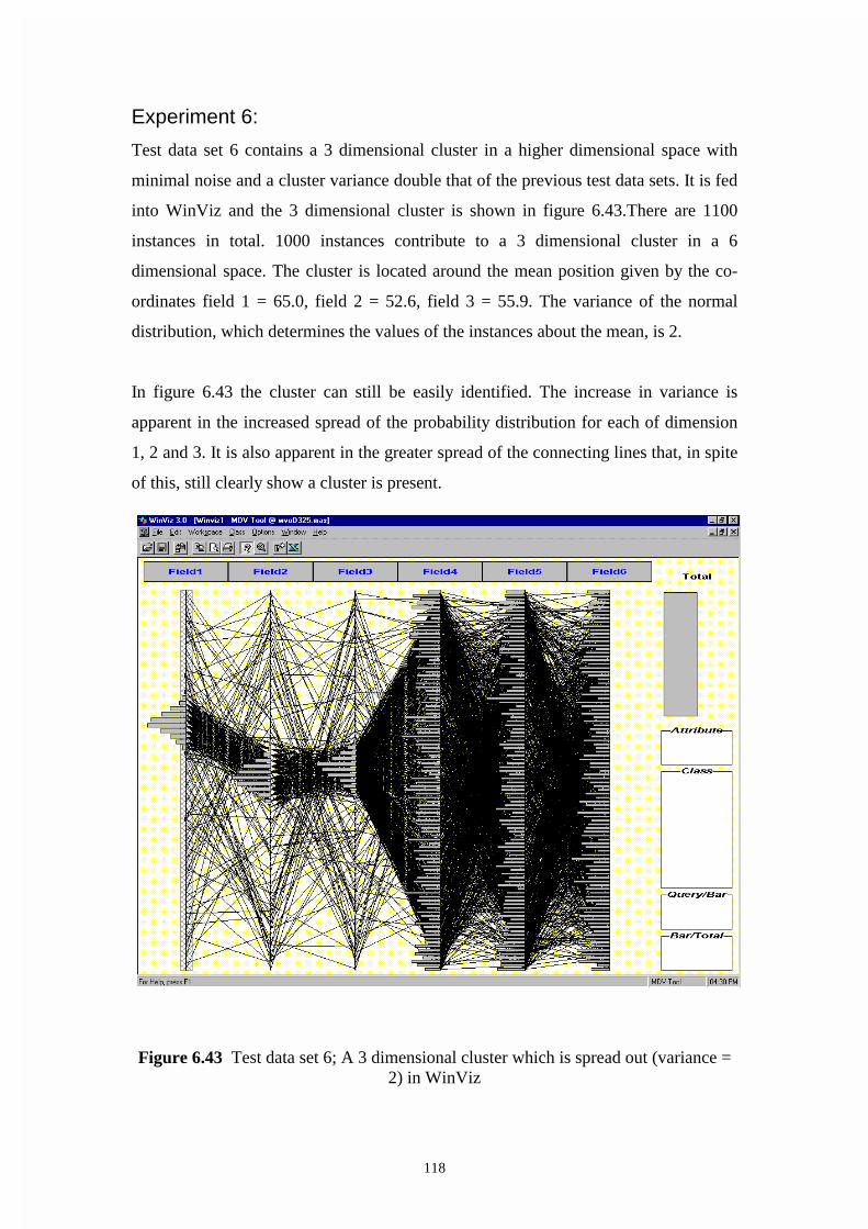
118
Experiment 6:
Test data set 6 contains a 3 dimensional cluster in a higher dimensional space with
minimal noise and a cluster variance double that of the previous test data sets. It is fed
into WinViz and the 3 dimensional cluster is shown in figure 6.43.There are 1100
instances in total. 1000 instances contribute to a 3 dimensional cluster in a 6
dimensional space. The cluster is located around the mean position given by the co-
ordinates field 1 = 65.0, field 2 = 52.6, field 3 = 55.9. The variance of the normal
distribution, which determines the values of the instances about the mean, is 2.
In figure 6.43 the cluster can still be easily identified. The increase in variance is
apparent in the increased spread of the probability distribution for each of dimension
1, 2 and 3. It is also apparent in the greater spread of the connecting lines that, in spite
of this, still clearly show a cluster is present.
Figure 6.43 Test data set 6; A 3 dimensional cluster which is spread out (variance = 2) in WinViz

119
Chapter 7
Comparative Evaluation of
the Tools
In this chapter a number of criteria for judging the effectiveness of visualization
techniques and their related tools will be identified and defined. These criteria will
form the basis for the comparison of the various visualization tools that are evaluated
in Chapter 6 and will also determine the scope of this thesis. The techniques,
corresponding to the tools, will then be discussed and compared based upon their
theoretical capability in terms of the reference material. Finally, a comparative
evaluation of the tools described in Chapter 6 will be attempted.
7.1 Criteria for Comparison
The criteria chosen should reflect the issues affecting the success or failure of various
visualization techniques in revealing patterns and guiding subsequent processing. The
visualization tools considered in Chapter 6 have been experimentally measured
against the criteria. The techniques the tools employ can then be compared based on
the experimental results. The other visualization techniques can only be assessed
against the criteria based on their theoretical capabilities as outlined in the literature
reviewed in Chapter 2. Thus the tools’ performance against them is based on a
consideration of the theoretical issues.

120
The criteria have been divided into two groups; interface issues and characteristics of
the data. When judging the visualization techniques against the criteria, grouped
under the heading interface issues, it is necessary to separate effects that are inherent
in the visualization technique and those which are due to the particularities of the
visualization tool implementing the technique. Where the effects may be due to the
particular implementation this will be noted in the discussion of the criteria.
a) Interface Issues
Perceptually Satisfying Presentation
When considering if a visualization technique is perceptually satisfying we are
making a judgement about how naturally and clearly features of the data set are
revealed. Graphical displays commonly used and learnt early in a person’s education
are easily interpreted. The meaning of what is presented in two-dimensional or three-
dimensional graphical displays can also be understood in terms of the three
dimensional world we inhabit. When the attributes of a dataset are translated into co-
ordinates in a two or three-dimensional space they gain a location which can be
understood in terms of that space. The understanding of such displays is therefore
much more easily achieved and the display is usually more perceptually satisfying.
Intuitiveness of the Technique
The intuitiveness of a technique relates to how easily what is viewed can be
interpreted. If the features of a dataset, such as a cluster or outlier, are easily identified
without an extended familiarity with the technique or recourse to a number of displays

121
requiring a considered comparison, the technique may be said to be intuitive. Even
two and three-dimensional scatter plots require learning to understand how they are
presented and implemented in some particular tools. This need not be a criticism of
the technique if the learning task can be achieved in a reasonably short time or
achieved in progressive stages with greater facility being gained in the use of the tool
at each stage. Thus there is a learning curve associated with each tool and
corresponding technique. If, once learnt, the displays are easily and naturally
interpreted the initial novelty of the technique need not be a disadvantage.
Ability To Manipulate Display Dynamically
When a visualization technique is actually implemented as a visualization tool in
some specific software it is usually accompanied by a number of features for
deliberately controlling the display. Features may exist for querying on particular
records or over particular ranges. It may be possible to zoom in on a particular part of
the display. Controls may also exist for assigning colours to particular dimensions in
the display. There may be features to allow cycling through different dimensions of
the data set in the display. The cycling may be necessary to establish relationships
over those dimensions. For instance when using a two-dimensional scatterplot if a
matrix of scatterplots is not presented the user must cycle through the individual two
dimensional scatterplots to establish a relationship or pattern. The features provided
depend on the particular implementation rather than the visualization technique.

122
Ease of Use
The ease of use of the display or visualization technique relates to a combination of
factors. These factors include the flexibility of data set format that can be imported. It
also relates to how efficiently the data is displayed. If significant delays exist in
changing the display the user will have difficulty using the visualization techniques. If
the design of the controls is awkward, not obvious or fails to follow common
conventions the tool will not be easy to use. These issues relate directly to the
architecture and design of the tool rather than the particular visualization technique
the tool employs. But unless the tool is easy to use the visualization will not be
successful in its goal of revealing patterns in the data.
b) Characteristics of the Data Set
Size Of Data Set
It is important to know whether the visualization techniques deal with data sets of
different sizes. Data sets may range in size from a few hundred instances to many
millions of instances. Not all the techniques will successfully deal with large numbers
of instances. The concern here is not the capacity of the computer hardware used.
Rather the visualization technique may be unable to effectively display and
distinguish large numbers of instances. The capability of the visualization techniques
to deal with large numbers of instances without overlap and the possible loss of
information must therefore be considered.
123
Support For Multi- Dimensional Data
Some of the visualization techniques are able to display many dimensions in a single
display and others have an upper limit of two, three or four dimensions. Simple
scatterplots can display only two or three dimensions. If the point plotted has other
distinguishing features such as color or is an icon, which relates to further dimensions
through some aspect of its shape, a greater number of dimensions can be represented
in a single display. Other techniques use multiple windows to display a large number
of dimensions or a number of straight line axes as in the case of parallel co-ordinates.
Ability to Reveal Patterns in a Data Set
The purpose of the visualization tools is primarily to gain knowledge through the
recognition of patterns in the data. The technique must be able to reveal patterns in the
data set if they are present. If the visualization is unable to do this it has failed in its
basic purpose. It would be desirable to be able to distinguish between different types
of pattern. The criteria following consider more particular aspects of the ability to
reveal patterns in the data set.
Ability To Reveal Clusters Of Two Or Three Dimensions
Clusters indicate the presence of relationships between attributes. They may be
indicative of associations or classes also. For the visualization technique to be useful
it is expected that as a minimum requirement two and three-dimensional clusters
would be revealed.

124
Ability To Reveal Clusters Of Greater Than Two Or Three
Dimensions
We also wish to know if clusters greater than two or three dimensions can be
successfully revealed by the visualization techniques. It needs to be established
whether higher dimensional clusters can be revealed by consideration of a single
display or whether a more laborious cognitive procedure is required such as cycling
through two-dimensional displays.
Number Of Clusters Present
Most patterns manifest as clusters in the visualizations. The visualization techniques
must be able to distinguish between clusters if a number of clusters are present. We
are concerned as to whether the clusters obscure each other or are clearly revealed as
separate clusters.
Amount Of Background Noise
Another important consideration is how the visualization technique performs against a
background of noise instances. Real data will usually have many instances that do not
contribute to any pattern. If presence of background noise, as such instances are
termed, obscures what patterns are present the visualization technique is less useful. It
is necessary to test the visualization techniques against various levels of background
noise to determine the usefulness in the presence of such noise.

125
Variance Of The Clusters
The instances that contribute to a cluster may be tightly packed or spread out in the
region of space where the cluster or pattern appears. Given that there is usually some
background noise clusters that are spread out will be more difficult to detect. It would
be interesting to know if some visualization techniques are better than others at
dealing with clusters that are more spread out.
7.2 Comparison of the Visualization Tools
When comparing different techniques and implementations it is necessary to use
available implemented software of the various visualization techniques. The theories
behind the methods can be compared in some sense; for instance the theoretical ability
to represent higher dimensional data sets, but to compare them in terms of their actual
performance implemented versions of the various techniques must be found.
In table 7.1 the performance of the implemented visualization tools considered in this
thesis is summarised. The plus symbols are in the range of one to three where one
indicates the visualization technique is marginally successful in terms of the criteria
and three indicates a high level of success in terms of the criteria. The table does not
adequately address the complexity of the issues considered and should be seen as a
guide only. The supporting discussion needs to be read. It should be kept in mind that
the ability of the tools to satisfy the individual criteria cannot be always separated and
is interdependent.

126
Key to Table 7.1
+ + + Highly successful at satisfying criteria
+ + Successful at satisfying criteria
+ Marginally successful at satisfying criteria
Visualization Tool
Criteria 3D Scatterplot 2D Scatterplot Parallel Co-ordinates
a) Interface Issues DBMiner Spotfire WinViz
Perceptually Satisfying Presentation + + + + + + + Intuitiveness of the Technique + + + + + + + + Ability To Manipulate Display Dynamically + + + + + + + + Ease of Use + + + + + + + +
b) Characteristics of the Data Set
Size Of Data Set + + + + + + + Support For Multi- Dimensional Data + + + + + + + Ability To Reveal Clusters of 2&3 + + + + + + + Dimensions Ability To Reveal Clusters of Greater + + + + + + + Than 3 Dimensions Many Clusters Present + + + + + + + + Increased Background + + + + + + Noise Increased Variance of The Clusters + + + + + +
Table 7.1 Summary of the comparison of the visualization tools
Underlying Technique

127
a) Interface Issues
Perceptually Satisfying Presentation
DBMiner may be considered perceptually satisfying because it provides an experience
like moving through a real three dimensional space. It is much as if one were flying
through a space containing objects. The relationship to the real world breaks down
because the objects viewed are cubes whose size is proportional to the number of data
instances contained in the region. One must learn to understand the significance of the
size of a cube and also the significance of the size of the cube relative to the other
cubes in the space. Spotfire employs a 2-dimensional graph and because most people
readily interpret this form of presentation it may be considered perceptually satisfying.
Clusters and linear relationships in 2-dimensions, if present, can be easily identified. If
features are present in the dimensions chosen for display they are apparent. In contrast
WinViz cannot be interpreted without some explanation being provided or reading to
clarify what the vertical axes represent and the significance of the connecting lines.
Intuitiveness of the Technique
Once the display provided by DBMiner is understood, it is naturally and easily used
with good support provided by the statistical information at the edge of the display. So
one comes to use the software in an intuitive and natural way with the cluster points
being very clear. Spotfire is easy to use once one becomes familiar with the method of
cycling through the available dimensions to establish if clusters exist and in which
dimensions. WinViz is also easy to use once the method is learnt to choose instances
and move axes next to each other if a cluster is suspected in the dimensions attached

128
to the axes in question. All the tools may be considered intuitive once a user is
familiar with them.
Ability To Manipulate Display Dynamically
All the visualization tools, DBMiner, Spotfire and WinViz allow excellent dynamic
control of the dimensions displayed. Spotfire and WinViz are slightly superior to
DBMiner in allowing the user to avoid going via a properties window by having
controls to make direct changes to many parameters.
Ease of Use
DBMiner is the most complex visualization tool to use, as it requires user to create a
cube based on the dataset being considered. The cube is for nominated attributes in
the dataset. DBMiner has many other components beyond the visualization component
that are advantaged by this approach but it does add complexity for the user. DBMiner
requires the data be in a relational database. This is Microsoft Access in the version
employed here. In contrast Spotfire has the ability to accept data in a number of
formats and the dynamic controls are obvious and simple in their use when changing
attributes or zooming in on a particular area. WinViz is also very easy to use once the
user has understood which menu options to choose to generate the connecting lines. It
is then a simple procedure to drag over the range of values for a dimension the user
wishes to consider and also to drag together the axes for those dimensions the user
suspects may contribute to a cluster.

129
b) Characteristics of the Data Set
Size Of Data Set
DBMiner is designed specifically to handle a large number of data instances. It does
this by not displaying an icon for each individual instance but by using a single cube
as the icon, adjusted for relative size, to represent all the data instances in a region.
This method allows an unlimited number of data instances to be represented. Spotfire
is not able to represent unlimited number of instances. Considerable overlap and loss
of information can occur as the number instances increases. There are some features
of Spotfire that allow the user to deal with overlap. The user can zoom in on a
particular region which has the effect of spreading the icons over a greater area. There
is also a feature called jitter that shifts a proportion of the icons slightly away from
their true position if they are hidden. WinViz is not able to represent an unlimited
number of instances. The polygonal line used to represent each instance can overlap to
such a degree that it is hard to gain any useful information from the display. It does
have some very effective features to overcome this limitation. As well as the
polygonal lines there is a frequency distribution for each dimension that indicates the
proportion of instances having a value in a range. If lines overlap they can be
represented by a single line if the user wishes. This reduces crowding in the display
and allows features to be more easily identified.
Support For Multi- Dimensional Data
DBMiner directly represents three dimensions in a perspective view of a three
dimensional grid. The user can then swap the dimensions shown on the grid and cycle
through and combine dimensions as required. The larger the number of dimensions

130
the more complex becomes the task of recognizing structures within the data. The
dimensions involved in a cluster for instance have to be combined in the same display
and structures involving more than three dimensions will be hard to identify. Spotfire
directly represents two dimensions in a two dimensional graph. Additionally a third
dimension can be represented by the color of the icon used for each point in the two
dimensional graph.
Ability to Reveal Patterns in a Data Set
This section is an overview of the more particular conclusions that follow. In Chapter
3 the following patterns were listed: Regression, Classification, Clusters, Associations
and Outliers. Regression and classification are predictive patterns and cannot be
represented in an exploratory visualization tool by their nature. They require an
algorithmic interpretation to function as predictors. It is expected that the informative
patterns, that is clusters, associations and outliers, would be revealed in an exploratory
visualization tool. Associations are expressed as rules of the form “50% of all records
that contain attribute A also contain attribute B”. An association would appear as a
clustering of instances in the attributes involved if the attributes are defined in the
correct way (refer to 7.3 Schema Treatment for Associations). We are essentially
looking for clustering of instances and those particular instances, which are isolated
from other instances in the n-dimensional space of the data set considered.
DBMiner, Spotfire and WinViz effectively reveal clusters under certain conditions.
DBMiner and Spotfire are effective in identifying outliers. It can be difficult to
identify outliers in WinViz due to the overlap of lines that occurs when there are a

131
large number of instances. The following sections discuss the ability to reveal clusters
in greater detail.
Ability To Reveal Clusters Of Two Or Three Dimensions
Dbminer is well able to reveal clusters in three dimensions. The larger cube in a
region is easily identified. A cluster in two dimensions appears as a pipe which is in
the case of DBMiner a row of cubes about the same size. This can be more difficult to
identify especially if noise instances are present (as they usually are).
Spotfire being a two dimensional graphical technique identifies two-dimensional
clusters particularly well if they are present in the dimensions selected for the axes.
Three-dimensional clusters can be more difficult to identify. Spotfire uses color to
represent a third dimension and a two-dimensional cluster of the same color would
indicate a three dimensional cluster but with greater difficulty as the assigning of color
to one of the dimensions is restricted to the color range available and this may not be a
good match to the range of values the dimension takes. The user could alternatively
cycle thru the dimensions on the axes trying to identify a three-dimensional cluster but
this is again a more difficult task.
WinViz is easily able to identify dimensions in two or three dimensions by dragging
the axes next to each other where one-dimensional clusters are identified. The
technique employed by WinViz does not favour two or three-dimensional displays as
all axes are lined up in parallel.

132
Ability To Reveal Clusters Of Greater Than Two Or Three
Dimensions
DBMiner and Spotfire are able to identify clusters of greater than three dimensions
but only by the laborious technique of cycling through the dimensions progressively in
the display as described in 6.1 Experiment 5 and 6.2 Experiment 5 . It is a cognitive
task requiring the user to understand the tool being used and the method to be
employed. WinViz, in contrast, is able to directly represent a higher dimensional
cluster in a single display up to the limit of the number of axes that can be lined up in
parallel on the screen.
Number Of Clusters Present
DBMiner, Spotfire and WinViz are all able to distinguish more than a single cluster
with ease even if they are in the same dimensions. As DBMiner aggregates instances
in a region into a single cube icon for display it follows that if two clusters had
instances in the same region they would be included in the same cube and information
would be lost. This was not the case in the experiment conducted here.
Amount Of Background Noise
Of the visualization tools considered DBMiner proved to be the most susceptible to
noise levels. While it was still possible to identify cubes of greater size in the region
or regions where the cluster was centered the effect of the aggregation of many
instances into a single cube meant that the noise instances were aggregated into
instances that contributed to the cluster seeded in the test data set. A number of cubes

133
larger than the rest could appear next to each other. As the distribution of noise could,
by virtue of chance, be uneven other slightly larger cubes could appear further
distracting the user. Spotfire clearly identified the clusters in the test data set against
high levels of noise up to 80% of all instances. WinViz clearly identified the cluster
against high levels of noise up to 80% of all instances. It should be noted that at a
level of 80% noise the feature of WinViz that allows the user to display some instances
only was used to ascertain the presence of the cluster positively.
Variance Of The Clusters When the variance of the cluster seeded in the test data set was increased by a factor
of two it became difficult to identify a cluster in DBMiner. There were a number of
slightly larger cubes in the region of the cluster. This was against a background of
noise of only 10% of the number of instances present. Both Spotfire and WinViz
clearly identified the presence of the cluster under the same conditions.
7.3 Schema Treatment for Associations
Schema definition is an important part of the task of a data mining analyst. Consider
the situation for associations within a data set. It demonstrates that schema definition
needs to be chosen as part of the knowledge discovery process if useful information is
to be revealed by a visualization technique.
An association pattern is useful for market basket analysis (such as “which items do
customers often buy together?”). It involves comparing tuples and considering

134
binaries. That is an item is either purchased or not purchased (true or false). If
attributes can be organised in a hierarchy of classes this must be considered. For
example, ask the question, not do they buy light alcohol beer but rather, do they buy
beer. Classifying instances as beer will, potentially, bring many more instances
together.
Whether or not a 3 dimensional or 2 dimensional scatter plot visualization will reveal
an association rule depends on how the schema of the data set is defined. For example
transactions at a shop might be recorded for market basket analysis, which is a
common application of Association rules. The schema of instances in the data set
would be of the form (tran-id,{ product-type, product-id}) where the product-type and
product-id would be repeated as many times as there were products in the transaction.
A visualization of the instances in the data set would not show anything that would
indicate the presence of an association (if it were present) unless it is treated in a
particular way. The instances would need to be stored with a flag to indicate the
presence or not of each product type. The schema definition would need to be of the
form (tran-id, product-type-1, product-type-2, ……, product-type-n) where the values
of true or false would be held for each product type.
Each column will hold true if the product is purchased and false if the product is not
purchased. In a scatter plot each axis would have only two possible values, these being
true and false. By viewing scatter plot visualizations, in two dimensions, of product-
type-A against product-type-B associations of the type when A is purchased B is also
purchased X% of the time will be revealed as a cluster. A scatter plot visualization in
three dimensions, with product-type-A, product-type-B and product-type-C mapped to

135
each of the axes, will reveal associations of the type when A and B are purchased C is
purchased X% of the time. As the data is categorical (that is with values of either
TRUE or FALSE) many points will be co-incident on the graph. The visualization
tool needs to be able to deal with this overlap. For example DBMiner would be useful
in this context as the size of the cube in a region indicates the number of points in a
region.
7.4 Summary
Chapter 7 brings together the main contributions of this thesis by comparing three
representative visualization tools. In order to do this a number of criteria are suggested
for carrying out that comparison. The criteria are divided into two groups. The first
group, called interface issues, includes whether the display is perceptually satisfying,
is intuitive in its use, provides dynamic controls and is easy to use. The second group,
called characteristics of the data set, includes whether the visualization technique can
handle different sizes of the data set, datasets of different dimensionality, and reveal
patterns in the dataset if they exist. When considering the ability of the visualization
technique to reveal patterns, the particular criteria are the ability of the visualization to
reveal clusters of 2 or 3 dimensions, the ability of the visualization to reveal clusters
of greater than 3 dimensions, the ability to reveal more than one cluster if more are
present and the ability of the visualization to reveal clusters of different variance. The
final criterion to be suggested is the ability of the visualizations to deal with data sets
containing varying levels of noise instances.

136
The chapter carried out a comparison of the visualization tools DBMiner, Spotfire
and WinViz. Each of the visualization tools has its particular strengths and
weaknesses. DBMiner is very good at handling very large data sets, is intuitive and
easy in its use. Spotfire is also intuitive and easy in its use. Spotfire was also very
good at dealing with high levels of background noise and still revealing clusters if
they are present. WinViz required some familiarity to understand its use but once that
knowledge was gained it was particularly good at revealing higher dimensional
clusters and clusters of large variance.

137
Chapter 8
Conclusion�
The focus of the thesis has been to provide an objective evaluation of the available
multi-dimensional visualization tools and their underlying techniques. The role of
visualization tools in knowledge discovery, while acknowledged as an important step
in the process is not clearly defined as to how it influences subsequent steps or exactly
what the visualization reveals about the data before those steps take place. The
research work described, by showing how known structures in test data sets are
displayed in the visualization tools considered, indicates the definite knowledge, and
limitations on that knowledge, that may be gained from those visualization tools. This
chapter presents a summary of the findings of this work and suggests some areas and
problems related to the work that are suitable for further research.
8.1 Summary of Contributions
The major contributions of this thesis can be divided into 6 parts.
• Demonstrate how multidimensional visualization tools can be used in an
exploratory way to support the knowledge discovery process;
• Identify the strengths and weaknesses of a number of multi-dimensional
visualization techniques;
138
• Develop an approach for creating standard test data sets and its
implementation;
• Evaluate three visualization tools against test data sets of known characteristics;
• Suggest criteria for a comparison of multi-dimensional visualization
techniques;
• Conduct a comparison of a number of multi-dimensional visualization tools
representing particular techniques.
Contributions in each of these parts are described in detail in the following
subsections.
8.1.1 Integration of Visualization in the Knowledge Discovery
Process
All the visualization techniques have the ability to play a valuable role in exploratory
visualization if they reveal clusters in the data set that is being considered. In an
overall knowledge discovery process the visualization can be integrated with and
support other data mining tools. Visualizations can be effective in supporting neural
network data mining tools. The Growing Self Organising Map (GSOM) developed by
Alahkhoon [Alah99, Alah00(1)] is an approach to use neural networks for
unsupervised learning. It has a presentation graph associated with it known as a
Feature Map that arranges the output nodes of the network according to their distance
from each other and is able to indicate their proximity as well as the topological
relationships. As such the GSOM provides better presentation visualizations
compared to the previous feature maps from a simple Self Organizing Map (SOM).
One of the initial parameters used by a GSOM is the spread factor. A high spread
factor has the effect of allowing the GSOM to zoom in on a particular group of data
instances. A low spread factor permits an overall view of a large data set. The use of a
high spread factor is very processing intensive if all data instances are considered.
Thus an exploratory visualization tool such as those discussed in this thesis would

139
allow selection of a subset of the entire data set for consideration by the GSOM using
a high spread factor. The subset chosen would be those instances in a cluster that was
visually identified. By choosing a subset a high spread factor can be used without
being too processing intensive. In this way what initially may have been thought to be
one large cluster could be revealed as a number of sub clusters by the GSOM.
Therefore an exploratory multi-dimensional visualization tool such as those discussed
in this thesis can be used to further automate the data analysis/mining using a GSOM.
If the visualization tool is integrated with other data mining techniques into the same
software tool this is simplified. Some of the tools such as DBMiner do integrate the
visualization component of the tool with other algorithmic data mining approaches.
8.1.2 Strengths and Weaknesses of the Techniques
The five different visualization techniques that are considered are distinct in some
respect from each other and have also gained research attention in the published
literature. The main advantages and disadvantages of each technique are listed below.
1. Many visualization tools employ a scatter plot matrix in either two or three
dimensions. They are the easiest technique to intuitively grasp and are well
understood by most people but if the number of dimensions is greater than
three they require some method to cycle the dimensions in the dataset. This is
a demanding cognitive task and all features of the data set may not be
discovered in any case. They are flawed for representing higher dimensional
relationships.
2. Parallel co-ordinates can represent any number of dimensions in a single
display so higher dimensional features in the data set can be identified in a
single display. The user must learn to interpret and manipulate the display. If
the number of data instances is large the display can become overcrowded and
features of the data set are obscured. A directed search limits the number of

140
instances considered and makes parallel co-ordinates suitable for supervised
learning tasks.
3. Pixel oriented techniques are able to represent a large number of instances in a
single display by using a single pixel for each data instance. All the variations
of the technique are novel and require the user to learn to interpret the display.
They are difficult to interpret and ambiguous in some cases.
4. The stick figures approach allows the user to make quick recognition of
features by making use of our visual perception. It is limited in the number of
instances it can represent as the icon representing each instance takes up
considerable space on the display. It is limited to representing seven
dimensions.
5. The worlds within worlds technique can represent any number of dimensions
by nesting three dimensional scatter plots after progressively fixing the values
of some dimensions. It requires sophisticated virtual reality hardware and
software to implement. It is possible for the user to lose track of what part of
the n-dimensional space they are in and as a small slice of the n-dimensional
space is seen at any one-time instances may not be seen which are in close
proximity.
8.1.3 An Approach for Creating Test Data Sets
In order to formally evaluate the ability of several of the visualization tools standard
test data sets are required containing known characteristics. An approach to producing
such test data sets was developed and implemented. A number of parameters and
features can be established for each test data set. The number of dimensions can be

141
determined. Clusters of instances can be created based on the normal distribution with
a specified number of instances, variance and dimensionality. The number of noise
instances, based on a uniform distribution, can be specified. A common range for all
dimensions can be determined between 0 and some upper limit.
8.1.4 An Evaluation of Three Visualization Tools
This thesis, by the use of test data sets of known characteristics, has allowed the
following objective evaluations to be made of the DBMiner, Spotfire and WinViz.
DBMiner by creating the cube icons within the display caters well for large datasets.
There is no theoretical limit to the number of instances the display can handle. There
are some drawbacks to the approach. The cubes that are displayed in each region do
not represent the actual data instances. They are an artifact of the number of instances
in the region and as well as providing a visual summary they can also lead to a
distorted impression of what is occurring in some situations. The results of chapter 6
indicate that in the presence of noise instances false clusters may be indicated.
Spotfire employs a scatter plot to display up to 2 dimensions with color for an
additional dimension. The dynamic controls provide excellent functionality and are
easy to use. Two and even 3 dimensional clusters are revealed well under all
conditions except for a very large numbers of instances. WinViz provides a method to
display each instance over as many dimensions as can be lined up in parallel on the
screen. It provides a frequency distribution for each dimension in the same display. It
has effective dynamic features that permit the user to identify higher dimensional
clusters. It has the ability to select instances having values in a range for some chosen

142
dimension. The effect of noise instances is reduced and patterns in the data are more
easily identified. It is easy to use and effective over a range of conditions.
8.1.5 Criteria for Comparison of Tools
In order to carry out a comparison of the tools suitable criteria for comparison need to
be established. The following criteria address the relevant issues in determining the
success or failure of a particular visualization tool. The criteria for comparing the
techniques can be divided into (1) interface considerations and (2) characteristics of
the data set.
There are four criteria under interface considerations. Whether the technique is
1. perceptually satisfying
2. intuitive in its use
3. able to manipulate the display dynamically
4. easy to use.
There are four criteria to consider under the characteristics of the data set.
1. The number of instances in the data set.
2. The number of dimensions in the data set.
3. The patterns contained within the data set. These patterns, if clusters, have
more specific characteristics
a. The dimensionality of the clusters present
b. The number of clusters present.
c. The variance of the clusters present.
4. The number of noise instances present.

143
8.1.6 Comparative Assessment of the Tools
The table in section 7.1 provides an overview of the comparison. Each of the tools has
its strengths and weaknesses. Notably DBMiner is the best for very large data sets and
can theoretically deal with any number of instances. Spotfire is the best at revealing
two dimensional clusters even in the presence of high levels of noise. WinViz allows
many dimensions to be represented in a single display and thus is able to directly
reveal higher dimensional clusters. It is difficult to identify outliers in WinViz if there
are a large number of instances. This is due to the overlap of lines that occurs in the
screen display.
It has been demonstrated that a user would be well served by having a number of
different visualization tools at their disposal each employing a different technique.
This will allow the user to deal with data sets possessing a variety of characteristics.
8.2 Future Research
The evaluation conducted in this thesis used test data sets created over a continuous
numeric range. Much of the data in commercial databases is categorical in nature
(such as gender or state of origin). Further evaluation could be carried out using test
data sets containing categorical data. Issues of how the various visualization
techniques match to the domain of the data set under consideration have not been
explored. An investigation of how the meta-data for the domain of interest should be
treated would be valuable. One example in this thesis was the treatment of the meta-
data for market basket analysis (section 7.3).

144
The assessment of a visualization presented could be automated by using techniques
for feature evaluation already developed for image retrieval systems. The user could
provide relevance feedback on those visualizations considered interesting. Images
chosen from the larger set of all possible images with similar features could be
presented based on an automated procedure. Approaches such as this could be
investigated for their effectiveness.
Finally there is much scope for development of novel alternative techniques for
representing higher dimensional data given that all the existing techniques have a
number of limitations.

145
References
[Abra72] Abramowitz, M. and Stegun, IA. (Ed.); Handbook of Mathematical
Functions, Dover, New York, 1972.
[Alah99] Alahakoon D., Halgamuge S.K. and Srinivasan B.; A Self Generating
Neural Architecture for Data Analysis, Proceedings of the International
Joint Conference on Neural Networks (IJCNN99), Washington D.C.,
USA, July 1999.
[Alah00(1)] Alahakoon D., Halgamuge S.K. and Srinivasan B.; Dynamic Self
Organising Maps with Controlled Growth for Knowledge Discovery,
IEEE Transactions on Neural Networks (Special Issue on Data Mining),
Volume 11, No. 3, May 2000, pp 601-614.
[Alah00(2)] Alahakoon D., Halgamuge S.K. and Srinivasan B.; Mining a Growing
Feature Map by Skeleton Modelling, in Data Mining and Computational
Intelligence, Physica Verlag, (To appear in 2000).
[Beck82] Beck, J.; Textural segmentation, Organization and Representation in
Perception, J. Beck(Ed.), Erlbaum, Hillsdale, NJ, 1982, pp 285-317.

146
[Bert81] Bertin, Jacques (Translated by Berg, W.J.and Scott, P.); Graphics and
Graphic Information-Processing, Walter de Gruyter and Co.
Berlin(Published in French as La Graphique et le Traitement Graphique
de l’Information 1977)1981.
[Brach96] Brachman, R. J. and Anad, T.; The Process of Knowledge Discovery in
Discovery in Databases, Chapter 2 in Advances in Knowledge Discovery
and Data Mining (Ed. Fayyad U. M. et al.) AAAI Press, Menlo Park,
California, 1996, pp 37-57.
[Breg75] Bregman, A. and Rudnicky, A.; Auditory segregation: Stream or
streams?, Journal of Experimental Psychology: Human Perception and
Performance, 1975, pp 263-267.
[Bruck78] Bruckner, Lawrence A.; On Chernoff Faces Graphical Representation of
Multivariate Data(Ed. Wang P. C. C.) Academic Press Inc., 1978, pp 93-
121.
[Buja96] Buja, A. Cook, D. and Swayne, D.; Interactive High-Dimensional Data
Visualization, Journal of Computational and Graphical Statistics, Vol. 5,
No. 1; 1996, pp 78-99.
[Cham83] Chambers, J. M. Cleveland W. S., Kleiner, B. and Tukey, P.A.; Graphical
Methods for Data Analysis; Chapman and Hall, New York, 1983.

147
[Cher73] Chernoff, H.; The Use of Faces to Represent Points in k-Dimensional
Space Graphically; Journal of the American Statistical Association June
1973, Vol. 68, No. 342 1973, pp 361-368.
[Clev93] Cleveland, W. S.; Visualizing Data; AT&T Bell Laboratories, Murray
Hill, New Jersey 1993.
[DBMi98] Software-DBMiner Version 4.0 Beta; DBMiner Technology Inc., British
Columbia, Canada 1998.
[Elde95] Elder, John F. IV; Pregibon, Daryl; A Statistical Perspective on KDD;
Proceedings of the First International Conference on Knowledge Discovery
and Data Mining(Ed. Fayyad, U.M. and Uthurusamy, R.) AAAI Press,
Menlo Park, California 1995, pp 87-93.
[Enns90] Enns, J. T.; Three-dimensional features that pop out in visual search,
Visual Search, D.Brogan (Ed.), Taylor and Francis, London, 1990, pp 37-
45.
[Ever78] Everitt, B. S.; Graphical Techniques for Multivariate Data; Heinemann
Educational Books Ltd. London, 1978.
[Fayy96] Fayyad, U. M. et al. (Editors); Advances in Knowledge Discovery and
Data Mining; AAAI Press, Menlo Park, California, 1996.

148
[Fein90(1)] Feiner, S. and Beshers, C.; Visualizing n-Dimensional Virtual Worlds
with n-Vision; Computer Graphics Vol. 24, No. 2, March 1990, pp 37-38.
[Fein90(2)] Feiner, S. and Beshers, C.; 'Worlds within Worlds: Metaphors for
Exploring n-Dimensional Virtual Worlds; Proc. UIST’90(ACM Symp. on
User Interface Software and Technology), Snowbird, UT, October 3-5,
1990, pp 76-83.
[Fraw91] Frawley, W. J. Piatetsky-Shapiro, G., Matheus, C. J.; Knowledge
Discovery in Databases: An Overview; Knowledge Discovery in
Databases, Ed. Piatetsky-Shapiro G. and Frawley W. J., AAAI Press/ The
MIT Press, Menlo Park, California, 1991, pp 1-30.
[Grin92] Grinstein, G., Sieg, J. C. Jr., Smith, S. and Williams, M. G.; Visualization
for Knowledge Discovery; International Journal of Intelligent Systems,
Vol. 7, 1992, pp 637-648.
[Grin95] Grinstein, G. and Thuraisingham, B.; Data Mining and Data
Visualization: Position Paper for the Second IEEE Workshop on
Database Issues for Data Visualization; Database Issues for Data
Visualization IEEE Visualization ‘95 Workshop Atlanta, Georgia, USA
1995 Proceedings; Springer-Verlag Berlin 1995, pp 54-56.
[Han98] Han, Jiawei; Towards On-Line Analytical Mining in Large Databases;
SIGMOD Record, Vol. 27, No. 1, March 1998, pp 97-107.

149
[Hols94] Holsheimer, M. and Siebes, A. P. J. M.; Data Mining: the search for
knowledge in databases; Centrum voor Wiskunde en Informatica Report
CS-R9406; Amsterdam 1994.
[Hube87] Huber, P. J.; Experiences with Three-Dimensional Scatterplots; Journal
of the American Statistical Association, Vol. 82, No. 398, June 1987, pp
448-453.
[Iizu98] Iizuka, Y. Shiohara, H. Iizuka, T. and Isobe, S.; Automatic Visualization
Method for Visual Data Mining, Pacific Asia Knowledge Discovery in
Database Conference, Melbourne April 1998.
[Insel90] Inselberg, A. and Dimsdale, B.; Parallel Coordinates: A Tool for
Visualizing Multi-Dimensional Geometry; Visualization ‘90, San
Francisco, CA, 1990, pp 361-370.
[Keim94] Keim, D. A. and Kriegel, H.; VisDB: Database Exploration Using
Multidimensional Visualization; IEEE Computer Graphics and
Applications, September 1994, pp 40-49.
[Keim95 (1)] Keim, D. A. Bergeron, R.D. and Pickett R. M.; Test Data Sets for
Evaluating Data Visualization Techniques; Perceptual Issues in
Visualization (Eds. Grinstein G. and Levkowitz H.) ; Springer-Verlag;
Berlin 1995, pp 9-21.

150
[Keim95(2)] Keim, D. A. and Kriegel, H.; Possibilities and Limits in Visualizing
Large Amounts of Multidimensional Data; in Perceptual Issues in
Visualization, G. Grinstein H. Levkowitz (Eds.); Springer 1995, pp 127-
142.
[Keim95(3)] Keim, D. A. and Kriegel, H.; VisDB: A System for Visualizing Large
Databases; Proc. ACM SIGMOD Int. Conf. on Management of Data, San
Jose, CA, 1995, pp 482.
[Keim95(4)] Keim, D. A. Ankerst, M. and Kriegel, H.; Recursive Pattern: A
Technique for Visualizing Very Large Amounts of Data; Proc.
Visualization'95 October 29-November 3, 1995; Atlanta, Georgia; IEEE
Computer Society Press, Los Alamitos, California, 1995.
[Keim96(1)] Keim, D. A. and Kriegel, H.; Visualization Techniques for Mining Large
Databases: A Comparison; IEEE Transactions on Knowledge and Data
Engineering, Special Issue on Data Mining; Vol. 8, No. 6, December 1996,
pp 923-938.
[Keim 96(2)] Keim, D. A.; Pixel-oriented Database Visualizations; ACM Sigmod
Record, Special Issue on Information Visualization, Vol. 25, No. 4
December 1996.

151
[Keim96(3)] Keim, D. A. Lee, J.P. Thuraisingham, B. and Wittenbrink, C.; Supporting
Interactive Database Exploration; Database Issues for Data Visualization,
IEEE Visualization ‘95 Workshop Atlanta, Georgia, USA, 1995;Andreas
Wierse and G. Grinstein (Eds.); Springer 1996, pp 12-25.
[Keim96(4)] Keim, D. A. and Kriegel, H.; Circle Segments: A Technique for Visually
Exploring Large Multidimensional Data Sets; Proc.Visualization’96, Hot
Topic Session, San Francisco, CA, 1996.
[Klos96] Klosgen and Zytkow; Appendix A Knowledge Discovery in Databases
Terminology; in 'Advances in Knowledge Discovery and Data Mining',
Fayyad U. M. et al. (Editors); AAAI Press, Menlo Park, California, 1996,
pp 573-592.
[Kuro96] Kurokawa, K. Isobe, S. and Shiohara, H.; Information Visualization
Environment for Character-based Database Systems; Visual'96 First
International Conference on Visual Information Systems, Melbourne
February 1996.
[Lee96] Lee, Hing-Yan and Ong, Hwee-Leng; Visualization Support for Data
Mining; IEEE Expert, Vol. 11, No. 5, October 1996, pp 69-75.

152
[John97] John, George H.; Enhancements to the Data Mining Process: A
Dissertation Submitted to the Department of Computer Science and the
Committee on Graduate Studies of Stanford University in partial
fulfillment of the degree of Doctor of Philosophy; web address:
http://xenon.stanford.edu/~gjohn ;March 1997.
[Jog95] Jog, N. K. and Shneiderman, B.; Starfield Visualization with Interactive
Smooth Zooming; Visual Database Systems 3: Visual Information
Management, Proceedings of the third IFIP 2.6 working conference on
visual database systems, 1995 Ed. Spaccapietra S. and Ramesh J.;
Chapman and Hall London 1995, pp 3-14.
[Jule83] Jules, B. and Bergen J. R.; Textons the fundamental elements in
preattentive vision and perception of texture; Bell System Technical
Journal, Vol. 62 No. 6, 1983, pp 1619-1645.
[Mann97] Mannila, H.; Methods and problems in data mining; Proc. of
International Conference on Database Theory, Delphi Greece, January
1997 , Springer-Verlag 1997.
[Niel95] Nielson, Gregory M.; Theme Issue Introduction: Challenges in
Visualization Research; IEEE Transactions on Visualization and
Computer Graphics Vol. 2, No. 2; June 1996, pp 97-99.

153
[Pick95] Pickett, R. M., Grinstein, G., Levkowitz H. and Smith S.; Harnessing
Preattentive Perceptual Processes in Visualization; Perceptual Issues in
Visualization (Eds. Grinstein G. and Levkowitz, H.) Springer-Verlag
Berlin 1995, pp 33-46.
[Scott99] Scott, P.D.; Wilkins, E.; Evaluating Data Mining Procedures:
Techniques for Generating Artificial Data Sets; Information and
Software Technology 41 (1999), pp 579-587.
[Shep72] Shepard, R.N.; Kimball, Romney, A.; Nerlove, S. B. (ed.);
Multidimensional Scaling: Theory and Applications in the Behavioral
Sciences; Seminar Press, New York, 1972.
[Simo96] Simoudis, E.; Reality Check for Data Mining, IEEE Expert Vol. 11, No.
5:October 1996, pp 26-33.
[Spot98] Software-Spotfire Pro Version 3.0; IVEE development, Gothenburg,
Sweden 1998.
[Trei86] Treisman, A.; Features and Objects in Visual Processing, Scientific
America, Vol. 255 1986, pp 106-115.
[Trei88] Treisman, A. and Gormican, S.; Feature Analysis in Early Vision:
Evidence from Search Asymmetries, Psychological Review, Vol. 95 1988,
pp 15-48.

154
[Tuft83] Tufte, E. R.; The Visual Display of Quantitative Information; Graphics
Press, Cheshire, Connecticut, 1983.
[Tuft90] Tufte, E. R.; Envisioning Information; Graphics Press, Cheshire,
Connecticut, 1990.
[Warr82] Warren, R. M.; Auditory Perception: A New Synthesis, Pergamon, New
York, 1982.
[WinV97] Software-WinViz for Excel 7.0 Version 3.0; Information Technology
Institute, NCB, Singapore 1997.
[Wong95] Wong, P. and Bergeron, R. D.; A Multidimensional Multivariate Image
Evaluation Tool Perceptual Issues in Visualization (Ed. Grinstein, G. and
Levkowitz, H.) Springer-Verlag Berlin 1995, pp 95-108.
[Wood97] Woodruff, A. and Stonebraker M.; Supporting Fine-Grained Data
Lineage in a Database Visualization Environment; Proceedings of 13th
International Conference on Data Engineering, Birmingham, England
April 1997.
[Xgob00] Software-Xgobi A System for Multivariate Data Visualization; web site:
http://www.research.att.com/area/stat/xgobi/ 2000.


![CrusView: A Java-Based Visualization Platform for Comparative … · CrusView: A Java-Based Visualization Platform for Comparative Genomics Analyses in Brassicaceae Species[OPEN]](https://img.pdfslide.net/doc/110x75/5fe2db489d40b15c7c182911/crusview-a-java-based-visualization-platform-for-comparative-crusview-a-java-based.jpg)