Embed Size (px)
Citation preview
AcroTEX Software Development Team
AcroTEX BundleeForm Support
D. P. Story
c© 1999-2006 Version 1.2 http://www.acrotex.netJune 24, 2006 [email protected]
Table of Contents
1 Introduction 3
2 Package Requirement and Options 32.1 Package Requirements . . . . . . . . . . . . . . . . . . . . . . . . . . . . . . . 32.2 Package Options . . . . . . . . . . . . . . . . . . . . . . . . . . . . . . . . . . 3
3 Form Fields 43.1 Button Fields . . . . . . . . . . . . . . . . . . . . . . . . . . . . . . . . . . . . 4
• Push Buttons . . . . . . . . . . . . . . . . . . . . . . . . . . . . . . . . . . 4• Check Boxes . . . . . . . . . . . . . . . . . . . . . . . . . . . . . . . . . . . 5• Radio Buttons . . . . . . . . . . . . . . . . . . . . . . . . . . . . . . . . . . 6
3.2 Choice Fields . . . . . . . . . . . . . . . . . . . . . . . . . . . . . . . . . . . . 7• List Boxes . . . . . . . . . . . . . . . . . . . . . . . . . . . . . . . . . . . . 7• Combo Boxes . . . . . . . . . . . . . . . . . . . . . . . . . . . . . . . . . . 8
3.3 Text Fields . . . . . . . . . . . . . . . . . . . . . . . . . . . . . . . . . . . . . 9
4 Actions 104.1 Trigger Events . . . . . . . . . . . . . . . . . . . . . . . . . . . . . . . . . . . 104.2 Action Types . . . . . . . . . . . . . . . . . . . . . . . . . . . . . . . . . . . . 12
5 JavaScript 145.1 Support of JavaScript . . . . . . . . . . . . . . . . . . . . . . . . . . . . . . . 14
• The Convenience Command \JS . . . . . . . . . . . . . . . . . . . . . . . . 15• Inserting Simple JavaScript . . . . . . . . . . . . . . . . . . . . . . . . . . . 15• Inserting Complex or Lengthy JavaScript . . . . . . . . . . . . . . . . . . . 16
Appendix 17A The Annotation Flag F . . . . . . . . . . . . . . . . . . . . . . . . . . . . . . 17B Annotation Field flags Ff . . . . . . . . . . . . . . . . . . . . . . . . . . . . . 17C Supported Key Variables . . . . . . . . . . . . . . . . . . . . . . . . . . . . . . 18
References 24
Section 1: Introduction 3
1. Introduction
In this document, we describe the support for form elements in an AcroTEX document. ThePDF Specifications indicate there are four different categories of fields for a total of seventypes of fields.1. Button Fields
(a) Push Button
(b) Check Box
(c) Radio Button
2. Choice Fields
(a) List Box
(b) Combo Box
3. Text Fields
4. Signature Fields
The AcroTEX Bundle does not support signature fields, this leaves six types of fields. Com-mands for creating each of the remaining six types will be discussed.
The hyperref Package (Rahtz, Oberdiek et al) provides support for the same set ofform fields; however, not all features of these fields can be accessed through the hyperrefcommands. I was determined to write my own set of commands which would be sufficientlycomprehensive and extendable to suit all the needs of the AcroTEX Bundle. All the quizenvironments have been modified to use this new set of form commands, in this way, thereis a uniform treatment of all form fields in the AcroTEX Bundle.
� The demo files for eForm support are eqform.tex, for those using the Acrobat Distillerto create a PDF document, and eqform pd.tex, for those who use pdftex or dvipdfm.
2. Package Requirement and Options
Prior to Exerquiz version 5.9, eForms was an integral part of Exerquiz. I’ve now separatedthe two, making eForms into a stand-alone package that is called by Exerquiz.
2.1. Package Requirements
The eForms package requires hyperef (a newer version) and insdljs, a package that is part ofthe AcroTEX Bundle.
2.2. Package Options
The eForms package has the usual driver options: dvipsone, dvips, pdftex and dvipdfm.The only other option is preview, this is useful if you use a dvi previewer to view yourdocument. When preview is taken, a frame box is drawn around any form field created byeForms, making the position of the field visible in the previewer. This makes it easy to makeany additional adjustments for the position of the field.
Section 3: Form Fields 4
3. Form Fields
The eForm support for AcroTEX defines six basic (and internal) commands for creating thesix types of form elements. These six are used as “building blocks” for defining all buttons,check boxes, radio buttons and text fields used in the AcroTEX quizzes; and for definingsix user-commands: \listBox, \comboBox, \pushButton, \checkBox, \radioButton and\textField. These user commands are the topic of the subsequent sections.
Each of the above listed field commands has an optional first parameter that is used tomodify the appearance of the field, and/or to add actions to the field. This is a “local”capability, i.e., a way of modifying an individual field. There is also a “global” mechanism.Each field type has its own \everyFieldTypeName command. For example, all buttonscreated by \pushButton can be modified using the \everyPushButton command. See thesections on Check Boxes and Radio Buttons for examples and additional comments.
� The local modifications—the ones inserted into the field by the first parameter—are readafter the global modifications, in this way, the local modifications overwrites the global ones.
3.1. Button Fields
Buttons are form elements that the user interacts with using only a mouse. There are threetypes of buttons: push buttons, check boxes and radio buttons.
• Push ButtonsThe push button is a button field that has no value, it is neither on or off. Generally, pushbuttons are used to initiate some action, such as JavaScript action.
\pushButton: The command for creating a push button has four arguments
\pushButton[#1]{#2}{#3}{#4}
Parameter Description:
#1 = optional, used to enter any modification of appearance/actions#2 = the title of the button field#3 = the width of the bounding rectangle#4 = the height of the bounding rectangle
Default Appearance: The default appearance of a push button is determined by thefollowing:
\W{1}\S{B}\F{\FPrint}\BC{0 0 0}\H{P}\BG{.7529 .7529 .7529}
Key Variables: The first (optional) parameter can be used to modify the default appear-ance of a button field and to add some actions. Following is a list of the variables usedwithin the brackets of this optional argument for the list box: \Ff, \F, \H, \TU, \W, \S,\R, \BC, \BG, \CA, \RC, \AC, \mkIns, \textFont, \textSize, \textColor, \A, \AA and\rawPDF. See the Support Key Variables table for descriptions and notes on each of thesevariables.
☛ If the width argument (#3) is left empty, the LATEX code attempts to determine the ap-propriate width based on the width of the text given by \CA, \RC and \AC. See Example 2,below.
Section 3: Form Fields 5
Global Modification: \everyPushButton{<key variables>}
Example 1. This example resets all forms in this document:
\pushButton[\CA{Push}\AC{Me}\RC{Reset}\A{/S/ResetForm}]{myButton}{36bp}{12bp}
Example 2. Button with empty width argument:
\pushButton[\CA{Push}\AC{Me}\RC{Reset}\A{/S/ResetForm}]{myButton}{}{12bp}
• Check BoxesA check box is a type of button that has one of two values, “off” or “on”. The value of thefield when the field is “off” is Off; the value of the “on” state can be defined by the user.
\checkBox: The command for creating a check box has five parameters
\checkBox[#1]{#2}{#3}{#4}{#5}
Parameter Description:
#1 = optional, used to enter any modification of appearance/actions#2 = the title of the check box button#3 = the width of the bounding rectangle#4 = the height of the bounding rectangle#5 = the name of the ‘‘on’’ state (the export value)
Default Appearance: The default appearance of a standard check box is determined bythe following:
\W{1}\S{S}\BC{0 0 0}\F{\FPrint}
Key Variables: The first (optional) parameter can be used to modify the default appear-ance of a check box and to add some actions. Following is a list of the variables used withinthe brackets of this optional argument for the list box: \Ff, \F, \TU, \W, \S, \MK, \DA,\AP, \AS, \R, \textFont, \textSize, \textColor, \DV, \V, \A, \AA and \rawPDF. See theSupported Key Variables table for descriptions and notes on each of these variables.
Global Modification: \everyCheckBox{<key variables>}
Example 3. Are you married? Yes:
\checkBox[\symbolchoice{circle}]{myCheck}{10bp}{10bp}{On}
In the example, the appearance of this check box was modified through the global modifi-cation scheme. The following command appears in the preamble of this document:
\everyCheckBox{\BC{.690 .769 .871} % border color\BG{.941 1 .941} % background color\textColor{1 0 0 rg} % text color
}
Section 3: Form Fields 6
• Radio ButtonsA radio button field is similar to a check box, but is meant to be used in unison with oneor more additional radio buttons.
\radioButton: The command for creating a radio button has five parameters
\radioButton[#1]{#2}{#3}{#4}{#5}
Parameter Description:
#1 = optional, used to enter any modification of appearance/actions#2 = the title of the radio button#3 = the width of the bounding rectangle#4 = the height of the bounding rectangle#5 = the name of the ‘‘on’’ state (the export value)
� A collection of radio buttons meant to be used in unison need to all have the same title(parameter #2) but different export values (parameter #5).
Default Appearance: The default appearance of a standard radio button is determinedby the following:
\W{1}\S{S}\BC{0 0 0}\F{\FPrint}
Key Variables: The first (optional) parameter can be used to modify the default appear-ance of a radio button and to add some actions. Following is a list of the variables usedwithin the brackets of this optional argument for the list box: \Ff, \F, \TU, \W, \S, \MK,\DA, \AP, \AS, \R, \textFont, \textSize, \textColor, \DV, \V, \A, \AA and \rawPDF. Seethe Supported Key Variables table for descriptions and notes on each of these variables.
� \Ff Field flags. There are two values which are appropriate to a radio button are\FfNoToggleToOff (if set, one radio button must be set at all times) and \FfRadiosInUnison(if set, radio buttons with the same value will be turned on or off in unison, PDF 1.5).
Global Modification: \everyRadioButton{<key variables>}
Example 4. What is your gender? Male: Female: Neither:
Male: \radioButton{myRadio}{10bp}{10bp}{Male}Female: \radioButton{myRadio}{10bp}{10bp}{Female}Neither: \radioButton[\A{\JS{app.alert("You can’t be ’neither’!
I’m resetting the field, guess again!");\rthis.resetForm(["myRadio"])}}]{myRadio}{10bp}{10bp}{Neither}
In the example, the appearance of these radio button fields was modified through the globalmodification scheme. The following command appears in the preamble of this document:
\everyRadioButton{\BC{.690 .769 .871} % border color\BG{.941 1 .941} % background color\textColor{0 0 1 rg} % text color\symbolchoice{star} % check symbol
}
Section 3: Form Fields 7
3.2. Choice Fields
A choice field is a list of text items, one or more of which can be selected by the user.
• List BoxesA scrollable list box is a type of choice field in which several of the choices are visible in arectangle. A scroll bar becomes available if any of the items in the list are not visible in therectangle provided.
\listBox: The command for creating a list box has five arguments, the first of which isoptional.
\listBox[#1]{#2}{#3}{#4}{#5}
Parameter Description:
#1 = optional, used to enter any modification of appearance/actions#2 = the title of the list box#3 = the width of the bounding rectangle#4 = the height of the bounding rectangle#5 = an array of appearance/values of list.
The fifth parameter needs more explanation. The value of this parameter which defines theitems in the list—their appearance text and their export values—take two forms:1. An array of arrays:
[(v1)(item1)][(v2)(item2)]...[(vn)(itemn)]
The first entry in the two member array is the export value of the item, the second isthe appearance text of that item.
2. An array of strings:(item1)(item2)...(itemn)
In this case, the export value is the same as the appearance text.
Default Appearance: The default appearance of a standard list box is determined by thefollowing:
\W{1}\S{I}\F{\FPrint}\BC{0 0 0}
Key Variables: The first (optional) parameter can be used to modify the default ap-pearance of a list and to add some actions. Following is a list of the variables usedwithin the brackets of this optional argument for the list box: \Ff, \F, \TU, \W, \S, \R,\BC, \BG, \mkIns, \textFont, \textSize, \textColor, \DV, \V, \A and \AA. See theSupported Key Variables table for descriptions and notes on each of these variables.
� \Ff Field flags. Values appropriate to a list box are \FfCommitOnSelChange (commitsimmediately after selection, PDF 1.5); \FfSort (sorts1the items); and \FfMultiSelect(allows more than one value to be selected, PDF 1.4). It is important to note that the flags\FfMultiSelect and \FfCommitOnSelChange cannot both be in effect. See the Appendixfor a complete list of values for the Ff flag.
1This flag really is not useful unless you have the full Acrobat application, the Sort items check box ischecked in the Options tab of the Fields Properties dialog for the field. Initially, the items are listed in thesame order as listed in the #5 argument; the Acrobat application will sort the list if you view the FieldsProperties for the field and click ‘Ok’. Be sure to save the changes.
Section 3: Form Fields 8
Global Modification: \everyListBox{<key variables>}
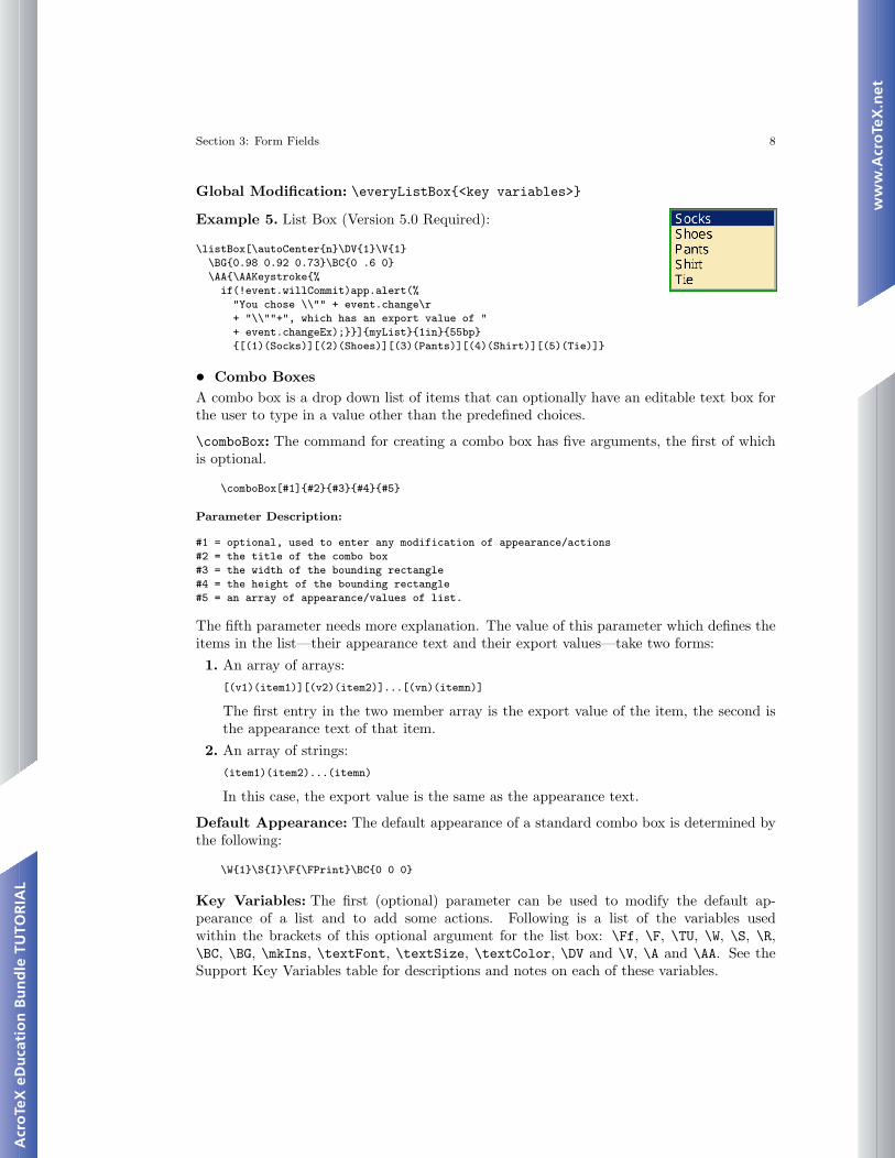
Example 5. List Box (Version 5.0 Required):
\listBox[\autoCenter{n}\DV{1}\V{1}\BG{0.98 0.92 0.73}\BC{0 .6 0}\AA{\AAKeystroke{%
if(!event.willCommit)app.alert(%"You chose \\"" + event.change\r+ "\\""+", which has an export value of "+ event.changeEx);}}]{myList}{1in}{55bp}{[(1)(Socks)][(2)(Shoes)][(3)(Pants)][(4)(Shirt)][(5)(Tie)]}
• Combo BoxesA combo box is a drop down list of items that can optionally have an editable text box forthe user to type in a value other than the predefined choices.
\comboBox: The command for creating a combo box has five arguments, the first of whichis optional.
\comboBox[#1]{#2}{#3}{#4}{#5}
Parameter Description:
#1 = optional, used to enter any modification of appearance/actions#2 = the title of the combo box#3 = the width of the bounding rectangle#4 = the height of the bounding rectangle#5 = an array of appearance/values of list.
The fifth parameter needs more explanation. The value of this parameter which defines theitems in the list—their appearance text and their export values—take two forms:1. An array of arrays:
[(v1)(item1)][(v2)(item2)]...[(vn)(itemn)]
The first entry in the two member array is the export value of the item, the second isthe appearance text of that item.
2. An array of strings:(item1)(item2)...(itemn)
In this case, the export value is the same as the appearance text.
Default Appearance: The default appearance of a standard combo box is determined bythe following:
\W{1}\S{I}\F{\FPrint}\BC{0 0 0}
Key Variables: The first (optional) parameter can be used to modify the default ap-pearance of a list and to add some actions. Following is a list of the variables usedwithin the brackets of this optional argument for the list box: \Ff, \F, \TU, \W, \S, \R,\BC, \BG, \mkIns, \textFont, \textSize, \textColor, \DV and \V, \A and \AA. See theSupport Key Variables table for descriptions and notes on each of these variables.
Section 3: Form Fields 9
� \Ff Field flags. Values appropriate to a combo box are \FfEdit (allows user to typein a choice); \FfDoNotSpellCheck (turn spell check off—applicable only if \FfEdit isset); \FfCommitOnSelChange (commits immediately after selection); and \FfSort (sortsthe items—see footnote 1). See the Appendix for a complete list of values for the Ff flag.
Global Modification: \everyComboBox{<key variables>}
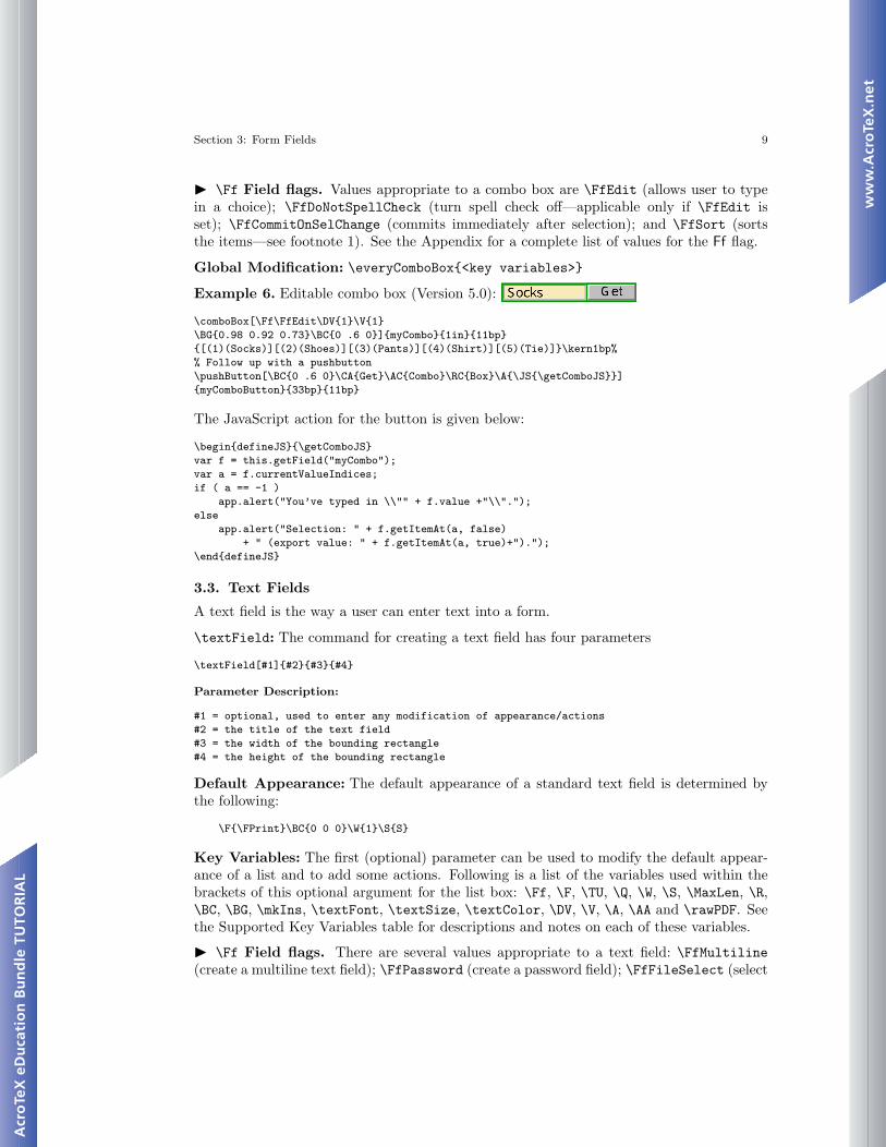
Example 6. Editable combo box (Version 5.0):
\comboBox[\Ff\FfEdit\DV{1}\V{1}\BG{0.98 0.92 0.73}\BC{0 .6 0}]{myCombo}{1in}{11bp}{[(1)(Socks)][(2)(Shoes)][(3)(Pants)][(4)(Shirt)][(5)(Tie)]}\kern1bp%% Follow up with a pushbutton\pushButton[\BC{0 .6 0}\CA{Get}\AC{Combo}\RC{Box}\A{\JS{\getComboJS}}]{myComboButton}{33bp}{11bp}
The JavaScript action for the button is given below:
\begin{defineJS}{\getComboJS}var f = this.getField("myCombo");var a = f.currentValueIndices;if ( a == -1 )
app.alert("You’ve typed in \\"" + f.value +"\\".");else
app.alert("Selection: " + f.getItemAt(a, false)+ " (export value: " + f.getItemAt(a, true)+").");
\end{defineJS}
3.3. Text Fields
A text field is the way a user can enter text into a form.
\textField: The command for creating a text field has four parameters
\textField[#1]{#2}{#3}{#4}
Parameter Description:
#1 = optional, used to enter any modification of appearance/actions#2 = the title of the text field#3 = the width of the bounding rectangle#4 = the height of the bounding rectangle
Default Appearance: The default appearance of a standard text field is determined bythe following:
\F{\FPrint}\BC{0 0 0}\W{1}\S{S}
Key Variables: The first (optional) parameter can be used to modify the default appear-ance of a list and to add some actions. Following is a list of the variables used within thebrackets of this optional argument for the list box: \Ff, \F, \TU, \Q, \W, \S, \MaxLen, \R,\BC, \BG, \mkIns, \textFont, \textSize, \textColor, \DV, \V, \A, \AA and \rawPDF. Seethe Supported Key Variables table for descriptions and notes on each of these variables.
� \Ff Field flags. There are several values appropriate to a text field: \FfMultiline(create a multiline text field); \FfPassword (create a password field); \FfFileSelect (select
Section 4: Actions 10
a file from the local hard drive as the value of the text field, PDF 1.4); \FfDoNotSpellCheck(automatic spell check is not performed, PDF 1.4); \FfDoNotScroll (disable the scrollingof long text, this limits the amount of text that can be entered to the width of the textfield provided, PDF 1.4); \FfComb (if set, the text field becomes a comb field, the numberof combs is determined by the value of \MaxLen, PDF 1.5); \FfRichText (allows rich textto be entered into the text field, PDF 1.5).
Global Modification: \everyTextField{<key variables>}
Example 7. Enter Name:
\textField[\BC{0 0 1}\BG{0.98 0.92 0.73}\textColor{1 0 0 rg}
]{myText}{1.5in}{12bp}
4. Actions
A form field may simply gather data from the user; additionally, it may perform one or moreactions. Actions include execute JavaScript code, going to a particular page in a document,open a file, execute a menu item, reset a form, play media or a sound, and so on. Beginningwith Acrobat 5.0, most actions can be performed using JavaScript methods.
An action is initiated by a trigger, a field may have many actions, each with a separatetrigger. The different triggers are discussed in Trigger Events, and the various types ofactions available are covered in the section Action Types.
4.1. Trigger Events
Event actions are initiated by triggers. For fields, there are ten different triggers.1. Mouse Enter: The event is triggered when mouse enters the region defined by the
bounding rectangle. The \AAMouseEnter key is used within the argument of \AA todefine a mouse enter event:\textField[\AA{\AAMouseEnter{
\JS{app.alert("You’ve entered my text field, get out!")}}}]{myText}{1.5in}{12bp}
2. Mouse Exit: The event is triggered when mouse exits the region defined by the bound-ing rectangle. The \AAMouseExit key is used within the argument \AA to define a mouseexit event:\textField[\AA{\AAMouseExit{
\JS{app.alert("You’ve exited my domain, never return!")}}}]{myText}{1.5in}{12bp}
3. Mouse Down: The event is triggered when the (left) mouse button is push down whilethe mouse is within the bounding rectangle of the field. The \AAMouseDown key is usedwithin the argument of \AA to define a mouse down event:\pushButton[\AA{\AAMouseDown{\JS{app.alert("Mouse Down!")}}}]
{myButton}{30bp}{12bp}
4. Mouse Up: The event is triggered when the (left) mouse button is released while themouse is within the bounding rectangle of the field. The \A key (or \AAMouseUp key isused within the argument of \AA) is used to define a mouse up event:
Section 4: Actions 11
\pushButton[\A{\JS{app.alert("Mouse Up!")}}]{myButton}{30bp}{12bp}
The same code can be performed as follows:\pushButton[\AA{\AAMouseUp{\JS{app.alert("Mouse Up!")}}}]
{myButton}{30bp}{12bp}
When both types of mouse up actions are defined for the same field, the one defined by\A is the one that is executed.
5. On Focus: The event is triggered when the field comes into focus (either by tab-bing from another field, or clicking the mouse within the bounding rectangle. The\AAOnFocus key is used within the argument of \AA to define an ‘on focus’ event:\textField[\AA{\AAOnFocus{\JS{
app.alert("Please enter some data!")}}}]{myText}{1.5in}{12bp}
6. On Blur: The event is triggered when the field loses focus (either by tabbing to anotherfield, by clicking somewhere outside the field, or (in the case of a text field, for example)pressing the Enter button. The \AAOnBlur key is used within the argument of \AA todefine an ‘on blur’ event:\textField[\AA{
\AAOnBlur{\JS{app.alert("Thanks for the data, I think!")}}}]{myText}{1.5in}{12bp}
7. Format: The format event is the event that occurs when text is entered into a text orcombo box; during this event, optionally defined JavaScript code is executed to formatthe appearance of the text within the field. The \AAFormat key is used within theargument of \AA to define a format event:\textField[\AA{
\AAKeystroke{AFNumber_Keystroke(2, 0, 1, 0, "\\u0024", true);}\AAFormat{AFNumber_Format(2, 0, 1, 0, "\\u0024", true);}}]{myText}{1.5in}{12bp}
The above example creates a text field which will accept only a number into it andwhich will format the number into U.S. currency.
8. Keystroke: This keystroke event is the event that occurs when individual keystrokeis entered into a choice field (list or combo) or a text field; during this code, optionallydefined JavaScript can be used to process the keystroke. The \AAKeystroke key is usedwithin the argument of \AA to define a format event; see the format example above.
9. Validate: The validate event is an event for which JavaScript code can be defined tovalidate the data that has been entered (text and combo fields only). The \AAValidatekey is used within the argument of \AA to define a validate event:\textField[\AA{
\AAKeystroke{AFNumber_Keystroke(2, 0, 1, 0, "\\u0024", true);}\AAFormat{AFNumber_Format(2, 0, 1, 0, "\\u0024", true);}\AAValidate{%
if (event.value > 1000 || event.value < -1000) {\r\tapp.alert("Invalid value, rejecting your value!");\r\tevent.rc = false;\r
}}}]{myText}{1.5in}{12bp}
Section 4: Actions 12
10. Calculate: The calculate event is an event for which JavaScript code can be definedto make automatic calculations based on entries of one or more fields (text and combofields only). The \AACalculate key is used within the argument of \AA to define acalculate event:\textField[\AA{
\AAKeystroke{AFNumber_Keystroke(2, 0, 1, 0, "\\u0024", true);}\AAFormat{AFNumber_Format(2, 0, 1, 0, "\\u0024", true);}\AACalculate{AFSimple_Calculate("SUM",new Array("Prices"));}}]{myText}{1.5in}{12bp}
Additional example appear in the file eqforms.tex.
4.2. Action Types
The following is only a partial listing of the action types, as given in Table 8.36 of the PDFReference [5]. The entire list and the details of usage can be obtain from the PDF Reference.
Action Type DescriptionGoTo Go to a destination in the current documentGoToR Go to a destination in another documentLaunch Launch an application, usually to open a fileURI Resolve a uniform resource identifierNamed Execute an action predefined by the viewerSubmitForm Send data to a uniform resource locatorJavaScript Execute a JavaScript script (PDF 1.3)
Examples of each type of action follow.
� GoTo: Go to a (named or explicit) destination within the current document. In thisexample, we ‘go to’ the named destination toc.1, which references the table of contentspages. This button goes to a named destination:
\pushButton[\CA{Go}\AC{Now!}\RC{to TOC}\A{/S/GoTo/D(toc.1)}]{myButton1}{}{10bp}
For a named destination, the value of the /D key is a string, (doc.1) in the above example,that specifies the destination name.
The following is an example of an explicit destination:
\pushButton[\CA{Go}\AC{Now!}\RC{to Page 3}\A{/S/GoTo/D[{Page3}/Fit]}]{myButton1}{}{10bp}
The value of the destination key /D is an array referencing a page number ({Page3}) and aview (/Fit).
For a GoTo action, the first entry in the destination array, {Page3}, is an indirect referenceto a page, the notation {Page3} is understood by the distiller. For dvipdfm, use the @pageprimitive:
\makeatletter\def\Page#1{@page#1}\makeatother\pushButton[\CA{Go}\AC{Now!}\RC{to Page 3}\A{/S/GoTo/D[\Page3/Fit]}]{myButton1}{}{10bp}
Section 4: Actions 13
pdftex has no mechanism for inserting indirect page references.See section 8.5.3, ‘Go-To Actions’, of the PDF Reference [5] for details of the syntax of
GoTo, and section 8.2.1 for documentation on explicit and named destinations.
� GoToR: Go to a (named or explicit) destination in a remote document. In this example,we ‘go to a remote’ destination, a named destination in another document.
\pushButton[\CA{Go}\AC{Now!}\RC{to TOC}\pushButton[\CA{Go}\AC{Now!}\RC{to TOC}\A{/S/GoToR/F(webeqtst.pdf)/D(webtoc)]{myButton2}{}{10bp}
This example illustrates an explicit destination; the following button jumps to page 3 inanother document:
\pushButton[\CA{Go}\AC{Now!}\RC{to Page 3}\A{/S/GoToR/F(webeqtst.pdf)/D[2/Fit]}]{myButton2}{}{10bp}
The value of the destination key /D is an array referencing a page number and a view (/Fit).For an explicit destination, the PDF Reference [5] specifies that the first entry in the
destination array should be a page number (as contrasted with an indirect reference to apage number, for the case of GoTo). The destination, /D[2/Fit] would correctly work fordistiller, dvipdfm and pdftex.
See section 8.5.3, ‘Remote Go-To Actions’, of the PDF Reference [5] for details of thesyntax of GoToR, and section 8.2.1 for documentation on explicit and named destinations.
� Launch: Launch an application (‘Open a file’). In this example, we open a TEX file usingthe application associated with the .tex extension:
\pushButton[\CA{Go}\AC{Now!}\RC{to TOC}\A{/S/Launch/F(webeqtst.tex)}]{myButton3}{}{10bp}
See section 8.5.3, ‘Launch Actions’, of the PDF Reference [5] for details of the syntax.
� URI: Open a web link. In this example, we go to the Adobe web site:
\pushButton[\CA{Go}\AC{Adobe!}\RC{To}\A{/S/URI/URI(http://www.adobe.com/)}]{myButton4}{}{10bp}
See section 8.5.3, ‘URI Actions’, of the PDF Reference [5] for details of the syntax.
� Named: Execute a ‘named’ action (i.e., a menu item). Named actions listed in the PDFReference are NextPage, PrevPage, FirstPage and LastPage. A complete list of namedactions can be obtained by executing the the code app.listMenuItems() in the JavaScriptconsole of Acrobat (Pro).
\pushButton[\CA{Go}\AC{Previous!}\RC{To}\A{/S/Named/N/PrevPage}]{myButton5}{}{10bp}
See section 8.5.3, ‘Named Actions’, of the PDF Reference [5] for details of the syntax.
� SubmitForm: Submit forms Action. In this example, we submit a URL to a CGI, whichthen sends the requested file back to the browser:
Section 5: JavaScript 14
\def\URL{http://www.math.uakron.edu/\noexpand~dpstory}\comboBox[\DV{\URL}\V{\URL}\BG{0.98 0.92 0.73}\BC{0 .6 0}]{dest}{1.75inin}{11bp}{%
[ (\URL)( Homepage of D. P. Story)][ (\URL/acrotex.html)( AcroTeX Homepage)][ (\URL/webeq.html)( AcroTeX Bundle)][ (\URL/acrotex/examples/webeqtst.pdf)( Exerquiz Demo file (PDF))]
}\kern1bp\pushButton[\BC{0 .6 0}\CA{Go!}\A{/S/SubmitForm/F(http://www.math.uakron.edu/cgi-bin/nph-cgiwrap/%dpstory/scripts/nph-redir.cgi)/Fields[(dest)]/Flags 4}]{redirect}{33bp}{11bp}
See section 8.6.4 of the PDF Reference [5] for details of the syntax for ‘Submit Actions’.
� JavaScript: Execute a JavaScript action. This is perhaps the most important typeof action. In this example, the previous example is duplicated using the Doc.getURL()method, we don’t need to submit to a CGI.
\def\URL{http://www.math.uakron.edu/\noexpand~dpstory}\comboBox[\DV{\URL}\V{\URL}\BG{0.98 0.92 0.73}\BC{0 .6 0}]{dest}{1.75inin}{11bp}{%
[ (\URL)( Homepage of D. P. Story)][ (\URL/acrotex.html)( AcroTeX Homepage)][ (\URL/webeq.html)( AcroTeX Bundle)][ (\URL/acrotex/examples/webeqtst.pdf)( Exerquiz Demo file (PDF))]
}\kern1bp\pushButton[\BC{0 .6 0}\CA{Go!}\A{\JS{%
var f = this.getField("dest");\rthis.getURL(f.value,false);
}}]{redirect}{33bp}{11bp}
Note the use of the convenience command \JS, which expands to the correct syntax:/S/JavaScript/JS(#1), where #1 is the argument of \JS.
Most all actions can be performed using JavaScript, the reader is referred to the AcrobatJavaScript Scripting Reference [2].
5. JavaScript
Acrobat JavaScript is the cross-platform scripting language of the Acrobat suite of products.for Acrobat 5.0 or later, Acrobat JavaScript based on JavaScript version 1.5 of ISO-16262(formerly known as ECMAScript), and adds extensions to the core language to manipulateAcrobat forms, pages, documents, and even the viewer application.
Well-known, web-based references to core JavaScript are the Core JavaScript 1.5 Guide [3]and the Core JavaScript 1.5 Reference [4]. For Acrobat JavaScript, we refer you to the Ac-robat JavaScript Scripting Guide [1] and the Acrobat JavaScript Scripting Reference [2].
5.1. Support of JavaScript
The AcroTEX eDucation Bundle has extensive support for JavaScript, not only for JavaScriptexecuted in response to a field trigger, but for document level and open page actions as well.As the topic of this document is eForm support, the reader is referred to the documentationin the insdljs package, which is distributed with the AcroTEX Bundle.
Section 5: JavaScript 15
• The Convenience Command \JS
The syntax for writing JavaScript actions is
\pushButton[\A{/S/JavaScript/JS(<JavaScript Code>)}]{jsEx}{22bp}{11bp}
Notice the code is enclosed in matching parentheses. As noted earlier, AcroTEX defines thecommand \JS as a convenience for this very common actions; the above example becomes:
\pushButton[\A{\JS{<JavaScript Code>}}]{jsEx}{22bp}{11bp}
The code is now enclosed in matching braces.
• Inserting Simple JavaScriptActions are introduced into a field command through its optional first parameter. JavaScriptactions, in particular, can be inserted by a mouse up2 action, for example, using the \A and\JS commands.
The “environment” for entering JavaScript is not a verbatim environment: ‘\’ is theusual TEX escape character and expandable commands are expanded; active characters areexpanded (which is usually not what you want); and primitive commands appear verba-tim (so you can use, for example, ‘{’ and ‘}). Within the optional argument, the macro\makeJSspecials, which can be redefined, is expanded; the macro makes several specialdefinitions: (1) it defines \\ to be ‘\\’; (2) defines \r to be the JavaScript escape sequencefor new line; and (3) defines \t to be the JavaScript escape sequence for tab.
Example 8.The verbatim listing for this button is
\pushButton[\CA{Sum}\A{\JS{%var n = app.response("Enter a positive integer",
"Summing the first \\"n\\" integers");\rif ( n != null ) {\r\t
var sum = 0;\r\tfor ( var i=1; i <= n; i++ ) {\r\t\t
sum += i;\r\t}\r
app.alert("The sum of the first n = " + n+ " integers is " + sum + ".", 3);
}}}]{jsSum}{22bp}{11bp}
Code Comments. Within the JavaScript string, we want literal double quotes ", to avoid" being interpreted as the end of the string (or the beginning of a string) we have to doubleescape the double quotes, as in \\". (This is not necessary when entering code in theJavaScript editor if you have the full Acrobat viewer.) I try to write JavaScript which I amable to read, edit and debug in the JavaScript editor (available in the full Acrobat viewerapplication); for this reason, I’ve added in new lines and tabbing (\r and \t). Many people,however, have only the Adobe Reader and cannot see their code to debug it; in this case,the formatting is really not needed.
Consider the following code2Other types of possible actions are discussed and illustrated in ‘Actions’ on page 10.
Section 5: JavaScript 16
\pushButton[\A{\JS{var x = "~"}}]{jsTilde}{22bp}{11bp}
In LATEX, ‘~’ is an active character. JavaScript above appears within the JavaScript editoras
var x = "protect unhbox voidb@x penalty @M {}"
Not good! Using ‘\~’ or ‘\\~ fair no better.Needless to say, the following sample will not compile because we do not have matching
braces.
\pushButton[\A{\JS{var x = "{"}}]{jsBrace}{22bp}{11bp}
• Inserting Complex or Lengthy JavaScriptFor JavaScript that is more complex or lengthy, the insdljs Package, distributed with theAcroTEX Bundle, has the verbatim defineJS environment. Details and idiosyncracies ofthis environment are documented in the insdljs Package. The example, given in Example 6,will suffice; the verbatim listing is reproduced here for convenience.
� First, we define the JavaScript action and name it \getComboJS for the button (prior todefining the field, possibly in the preamble, or in style files):
\begin{defineJS}{\getComboJS}var f = this.getField("myCombo");var a = f.currentValueIndices;if ( a == -1 )
app.alert("You’ve typed in \\"" + f.value +"\\".");else
app.alert("Selection: " + f.getItemAt(a, false)+ " (export value: " + f.getItemAt(a, true)+").");
\end{defineJS}
There is no need for the \r and \t commands to format the JavaScript; the environmentobeys lines and spaces.
Now we can define our fields, a combo (not shown) and button, in this example. It isthe button that uses the JavaScript defined above.
\pushButton[\BC{0 .6 0}\CA{Get}\AC{Combo}\RC{Box}\A{\JS{\getComboJS}}]{myComboButton}{33bp}{11bp}
Within the argument of \JS we inset the macro command,
\JS{\getComboButton}
for our JavaScript defined earlier in the defineJS environment
� The demo file definejs.pdf (source definejs.tex) has additional examples of this envi-ronment.
Appendix 17
Appendix
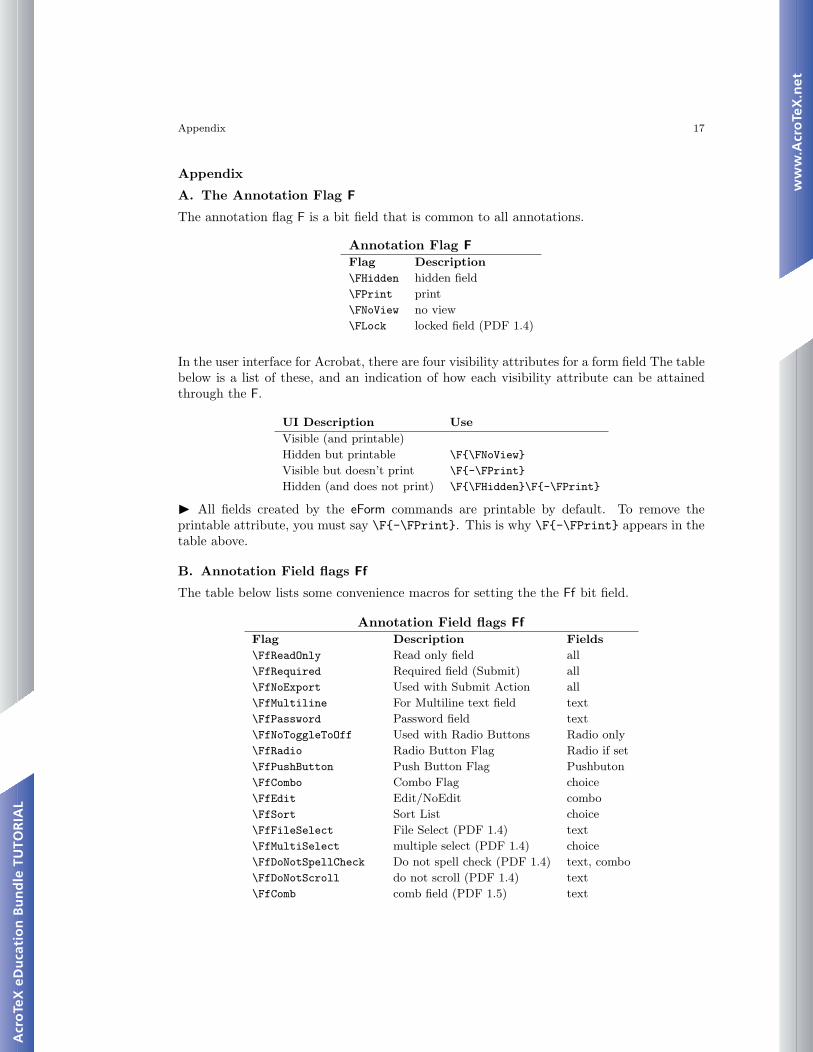
A. The Annotation Flag F
The annotation flag F is a bit field that is common to all annotations.
Annotation Flag FFlag Description\FHidden hidden field\FPrint print\FNoView no view\FLock locked field (PDF 1.4)
In the user interface for Acrobat, there are four visibility attributes for a form field The tablebelow is a list of these, and an indication of how each visibility attribute can be attainedthrough the F.
UI Description UseVisible (and printable)Hidden but printable \F{\FNoView}
Visible but doesn’t print \F{-\FPrint}
Hidden (and does not print) \F{\FHidden}\F{-\FPrint}
� All fields created by the eForm commands are printable by default. To remove theprintable attribute, you must say \F{-\FPrint}. This is why \F{-\FPrint} appears in thetable above.
B. Annotation Field flags Ff
The table below lists some convenience macros for setting the the Ff bit field.
Annotation Field flags FfFlag Description Fields\FfReadOnly Read only field all\FfRequired Required field (Submit) all\FfNoExport Used with Submit Action all\FfMultiline For Multiline text field text\FfPassword Password field text\FfNoToggleToOff Used with Radio Buttons Radio only\FfRadio Radio Button Flag Radio if set\FfPushButton Push Button Flag Pushbuton\FfCombo Combo Flag choice\FfEdit Edit/NoEdit combo\FfSort Sort List choice\FfFileSelect File Select (PDF 1.4) text\FfMultiSelect multiple select (PDF 1.4) choice\FfDoNotSpellCheck Do not spell check (PDF 1.4) text, combo\FfDoNotScroll do not scroll (PDF 1.4) text\FfComb comb field (PDF 1.5) text
Appendix 18
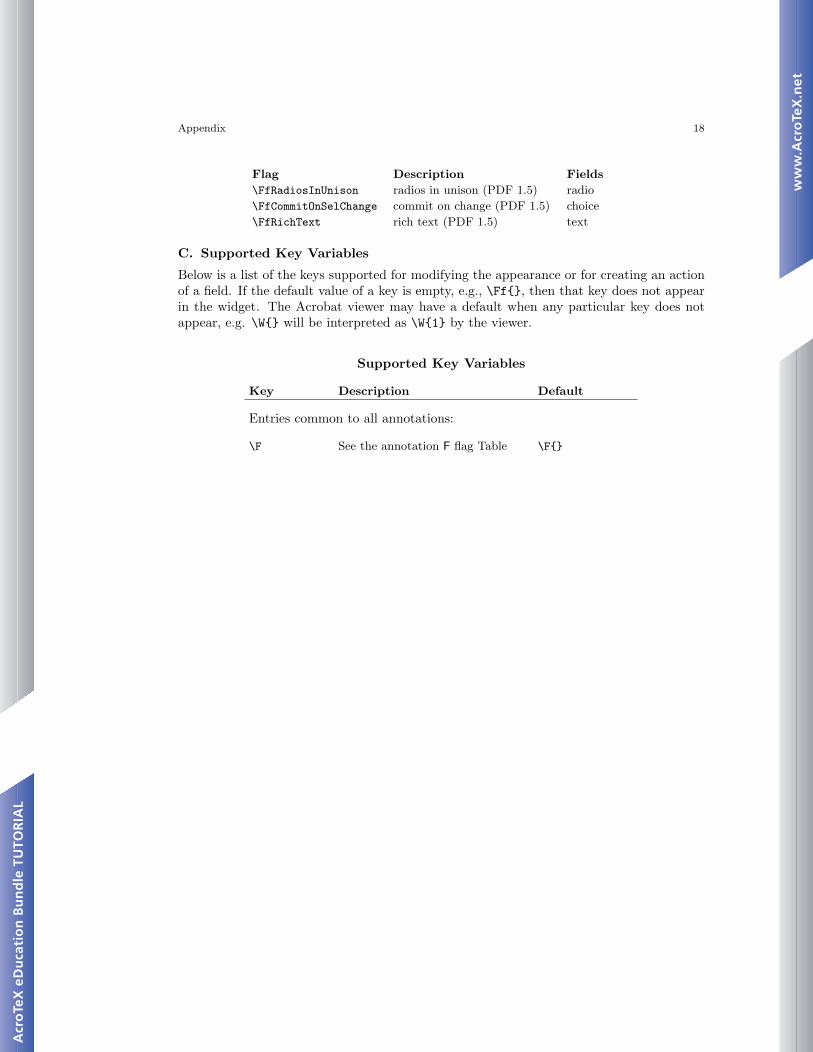
Flag Description Fields\FfRadiosInUnison radios in unison (PDF 1.5) radio\FfCommitOnSelChange commit on change (PDF 1.5) choice\FfRichText rich text (PDF 1.5) text
C. Supported Key Variables
Below is a list of the keys supported for modifying the appearance or for creating an actionof a field. If the default value of a key is empty, e.g., \Ff{}, then that key does not appearin the widget. The Acrobat viewer may have a default when any particular key does notappear, e.g. \W{} will be interpreted as \W{1} by the viewer.
Supported Key Variables
Key Description Default
Entries common to all annotations:
\F See the annotation F flag Table \F{}
Appendix 19
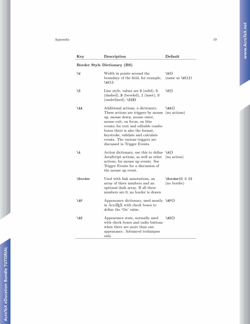
Key Description Default
Border Style Dictionary (BS)
\W Width in points around theboundary of the field, for example,\W{1}.
\W{}(same as \W{1})
\S Line style, values are S (solid), D(dashed), B (beveled), I (inset), U(underlined); \S{B}
\S{}
\AA Additional actions, a dictionary.These actions are triggers by mouseup, mouse down, mouse enter,mouse exit, on focus, on blurevents; for text and editable comboboxes there is also the format,keystroke, validate and calculateevents. The various triggers arediscussed in Trigger Events.
\AA{}(no actions)
\A Action dictionary, use this to defineJavaScript actions, as well as otheractions, for mouse up events. SeeTrigger Events for a discussion ofthe mouse up event.
\A{}(no action)
\Border Used with link annotations, anarray of three numbers and anoptional dash array. If all threenumbers are 0, no border is drawn
\Border{0 0 0}(no border)
\AP Appearance dictionary, used mostlyin AcroTEX with check boxes todefine the ‘On’ value.
\AP{}
\AS Appearance state, normally usedwith check boxes and radio buttonswhen there are more than oneappearance. Advanced techniquesonly.
\AS{}
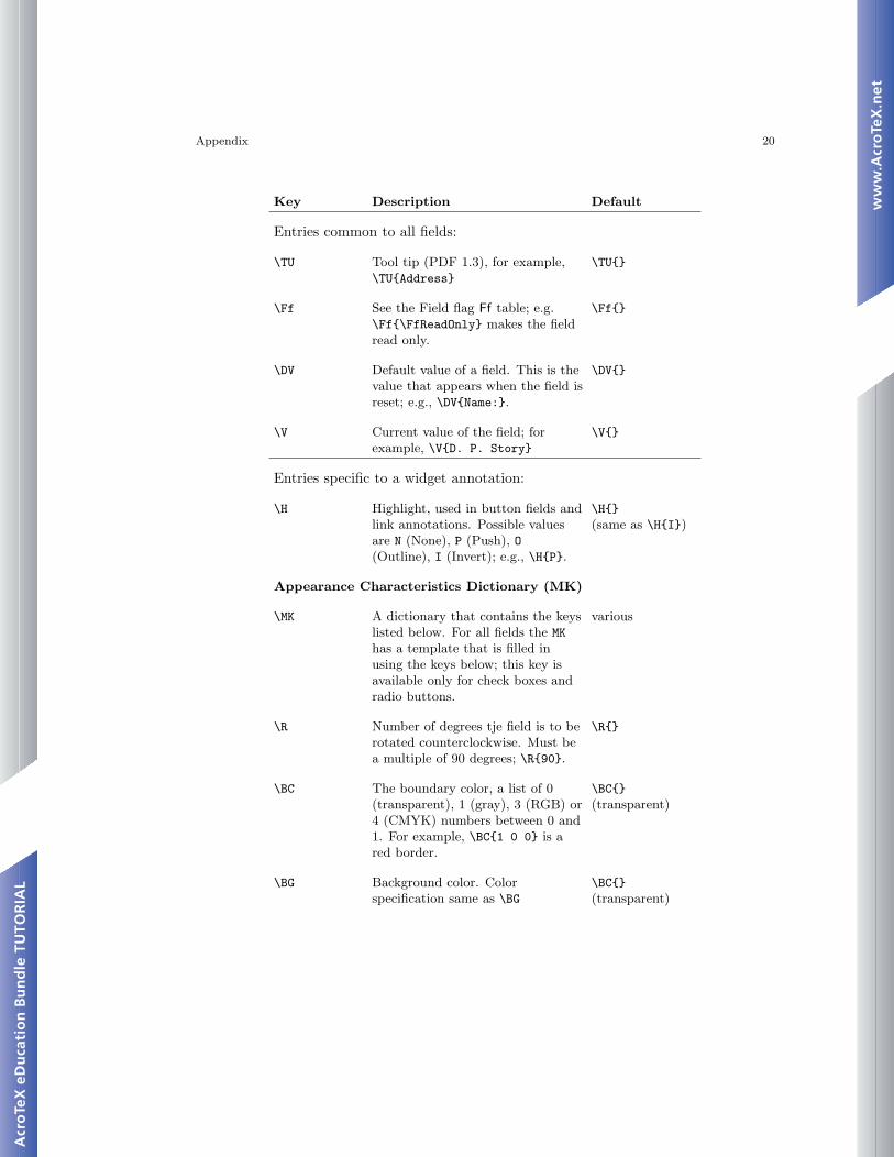
Appendix 20
Key Description Default
Entries common to all fields:
\TU Tool tip (PDF 1.3), for example,\TU{Address}
\TU{}
\Ff See the Field flag Ff table; e.g.\Ff{\FfReadOnly} makes the fieldread only.
\Ff{}
\DV Default value of a field. This is thevalue that appears when the field isreset; e.g., \DV{Name:}.
\DV{}
\V Current value of the field; forexample, \V{D. P. Story}
\V{}
Entries specific to a widget annotation:
\H Highlight, used in button fields andlink annotations. Possible valuesare N (None), P (Push), O(Outline), I (Invert); e.g., \H{P}.
\H{}(same as \H{I})
Appearance Characteristics Dictionary (MK)
\MK A dictionary that contains the keyslisted below. For all fields the MKhas a template that is filled inusing the keys below; this key isavailable only for check boxes andradio buttons.
various
\R Number of degrees tje field is to berotated counterclockwise. Must bea multiple of 90 degrees; \R{90}.
\R{}
\BC The boundary color, a list of 0(transparent), 1 (gray), 3 (RGB) or4 (CMYK) numbers between 0 and1. For example, \BC{1 0 0} is ared border.
\BC{}(transparent)
\BG Background color. Colorspecification same as \BG
\BC{}(transparent)
Appendix 21
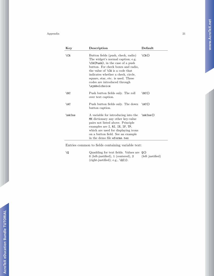
Key Description Default
\CA Button fields (push, check, radio)The widget’s normal caption; e.g.\CA{Push}, in the case of a pushbutton. For check boxes and radio,the value of \CA is a code thatindicates whether a check, circle,square, star, etc. is used. Thesecodes are introduced through\symbolchoice
\CA{}
\RC Push button fields only. The rollover text caption.
\RC{}
\AC Push button fields only. The downbutton caption.
\AC{}
\mkIns A variable for introducing into theMK dictionary any other key-valuepairs not listed above. Principleexamples are I, RI, IX, IF, TP,which are used for displaying iconson a button field. See an examplein the demo file eforms.tex
\mkIns{}
Entries common to fields containing variable text:
\Q Quadding for text fields. Values are0 (left-justified), 1 (centered), 2(right-justified); e.g., \Q{1}.
Q{}(left justified)
Appendix 22
Key Description Default
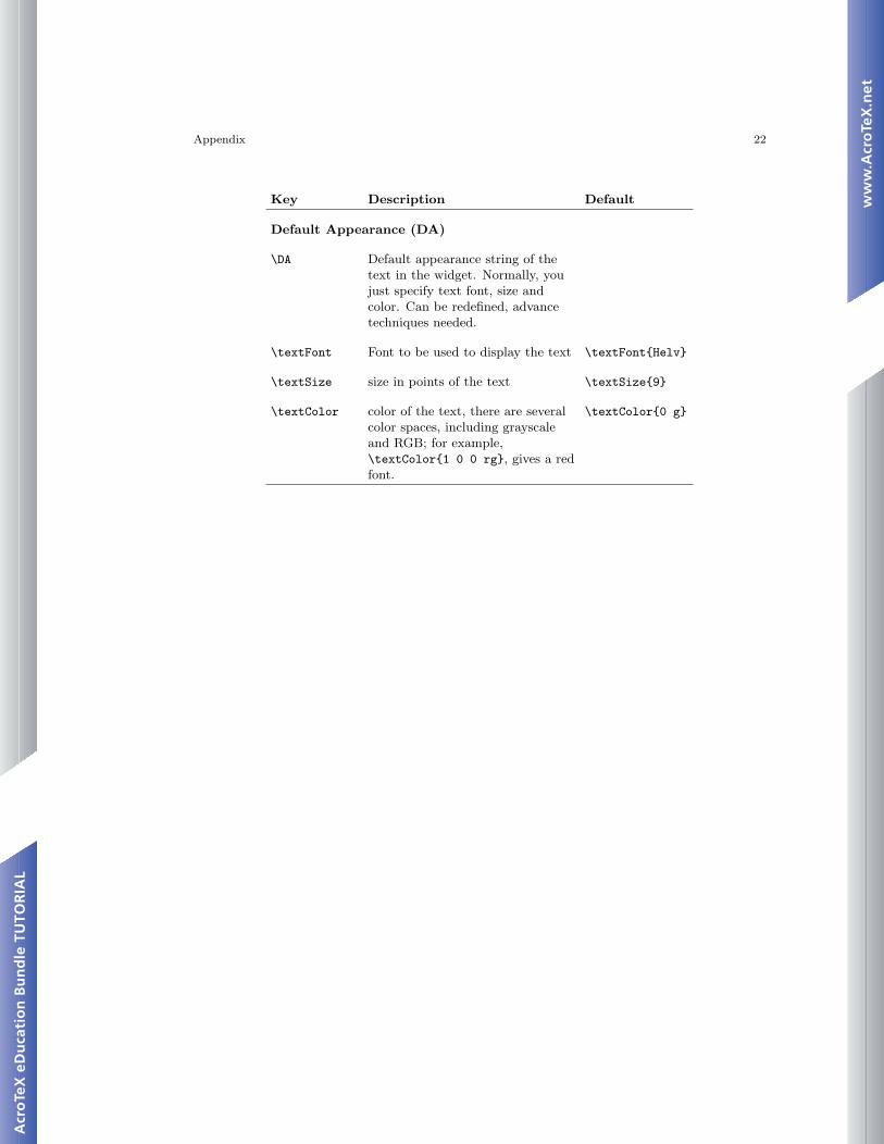
Default Appearance (DA)
\DA Default appearance string of thetext in the widget. Normally, youjust specify text font, size andcolor. Can be redefined, advancetechniques needed.
\textFont Font to be used to display the text \textFont{Helv}
\textSize size in points of the text \textSize{9}
\textColor color of the text, there are severalcolor spaces, including grayscaleand RGB; for example,\textColor{1 0 0 rg}, gives a redfont.
\textColor{0 g}
Appendix 23
Key Description Default
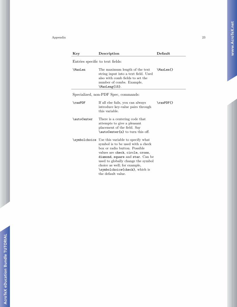
Entries specific to text fields:
\MaxLen The maximum length of the textstring input into a text field. Usedalso with comb fields to set thenumber of combs. Example,\MaxLeng{15}.
\MaxLen{}
Specialized, non-PDF Spec, commands:
\rawPDF If all else fails, you can alwaysintroduce key-value pairs throughthis variable.
\rawPDF{}
\autoCenter There is a centering code thatattempts to give a pleasantplacement of the field. Say\autoCenter{n} to turn this off.
\symbolchoice Use this variable to specify whatsymbol is to be used with a checkbox or radio button. Possiblevalues are check, circle, cross,diamond, square and star. Can beused to globally change the symbolchoice as well; for example,\symbolchoice{check}, which isthe default value.
References 24
References
[1] Acrobat JavaScript Scripting Guide, Version 6.0., Technical Note #5430, Adobe Sys-tems, Inc., 20033 14
[2] Acrobat JavaScript Scripting Reference, Version 6.0., Technical Note #5431, AdobeSystems, Inc., 20034 14
[3] Core JavaScript 1.5 Guide Netscape Communications Corporation, 20015 14
[4] Core JavaScript 1.5 Reference Netscape Communications Corporation, 20016 14
[5] Draft PDF Reference, Version 1.5 Adobe Systems, Inc., 20037 12, 13, 14
3http://partners.adobe.com/asn/acrobat/docs.jsp4http://partners.adobe.com/asn/acrobat/docs.jsp5http://developer.netscape.com/docs/manuals/javascript.html6http://developer.netscape.com/docs/manuals/javascript.html7http://partners.adobe.com/asn/tech/pdf/specifications.jsp