Embed Size (px)
Citation preview
Rochester Institute of Technology Rochester Institute of Technology
RIT Scholar Works RIT Scholar Works
Theses
1-1-1993
An impressionist form of oriental landscape images An impressionist form of oriental landscape images
You-Sook Choi
Follow this and additional works at: https://scholarworks.rit.edu/theses
Recommended Citation Recommended Citation Choi, You-Sook, "An impressionist form of oriental landscape images" (1993). Thesis. Rochester Institute of Technology. Accessed from
This Thesis is brought to you for free and open access by RIT Scholar Works. It has been accepted for inclusion in Theses by an authorized administrator of RIT Scholar Works. For more information, please contact [email protected].
ROCHESTER INSTITUTE OF TECHNOLOGY
A Thesis Submitted to the Faculty of
The College of Fine and Applied Arts
in Candidacy for the Degree of
MASTER OF FINE ARTS
An Impressionist Form of Oriental Landscape Images
By
You - Sook Choi
May 17, 1993
Approvals
Adviser: Donald G. Bujnowski Donald G. Bujnowski Date: ~ I~ /1f3
Associate Adviser: Pamela Blum
Date: §f&~ ~ I I
Pamela P. Blum
Associate Adviser: Laurie Dill-Kocher Laurie Dill-Kocher Date: ~ /7 / {q1? -------
Special Assistant to fue °Z for Graduate Affain!: Phillip Bornarth
Date: .5>h1 'f 3 Philip W. Bornarth
Dean, College of Fine and Applied Arts: Margaret 0 . Lucas
Date: S-zf-1'3 Margaret 0. Lucas I
You-Sook Choi I, , prefer to be contacted each time a request for
production is made. I can be reached at the following address:

Acknowledgements
I would like to express my deepest gratitude to Donald Bujnowski for his
encouragement during the school year.
I would also like to express my appreciation to Pamela Blum and Laurie Dill-
Kocher for their helpful suggestions and ideas during the development ofmy thesis work,
and especially to my parents for their affection and support.
I should like to thankGod for his blessings.
11
Table of Contents
Pages
Acknowledgements 11
List of illustrations iv
Introduction 1
Historical Inquiry
I. Oriental landscape paintings ... . . . Japanese paintings 2
II. Impressionist paintings 5
Thesis Concept 7
Discussion ofThesis Works
. Work I 9
. Work II 15
. Work IB 17
Conclusion 20
Illustrations 22
Bibliography42
m
List of Illustrations
Pages
Figure 1. "Landscape of the FourSeasons"
by Sesshu 22
Figure 2. "Maple Tree andAutumn"
byHasegawa Tohaku 23
Figure 3. "White and Red PlumTrees"
by Ogata Korin 24
Figure 4. "Sails andPines"
byPaulSignac 25
Figure 5-1. Sketch I,Work I 26
Figure 5 -2. Sketch II,Work I 27
Figure 5 -3. Sketchm, Work I 28
Figure 5 -4. Sketch IV, Work I 29
Figure 5 -5. Sketch V(114"
x 72"),Work I 30
Figure 6-1. Batik, experimental work on hempcloth 31
Figure 6-2. Batik, experimental work on silk noil 31
Figure 7-1. Handpainted image before weaving (Work I, 1st panel ) 32
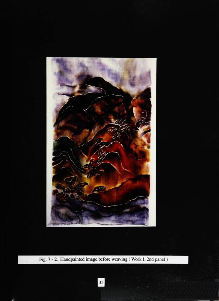
Figure 7-2. Handpainted image before weaving (Work I, 2nd panel ) 33
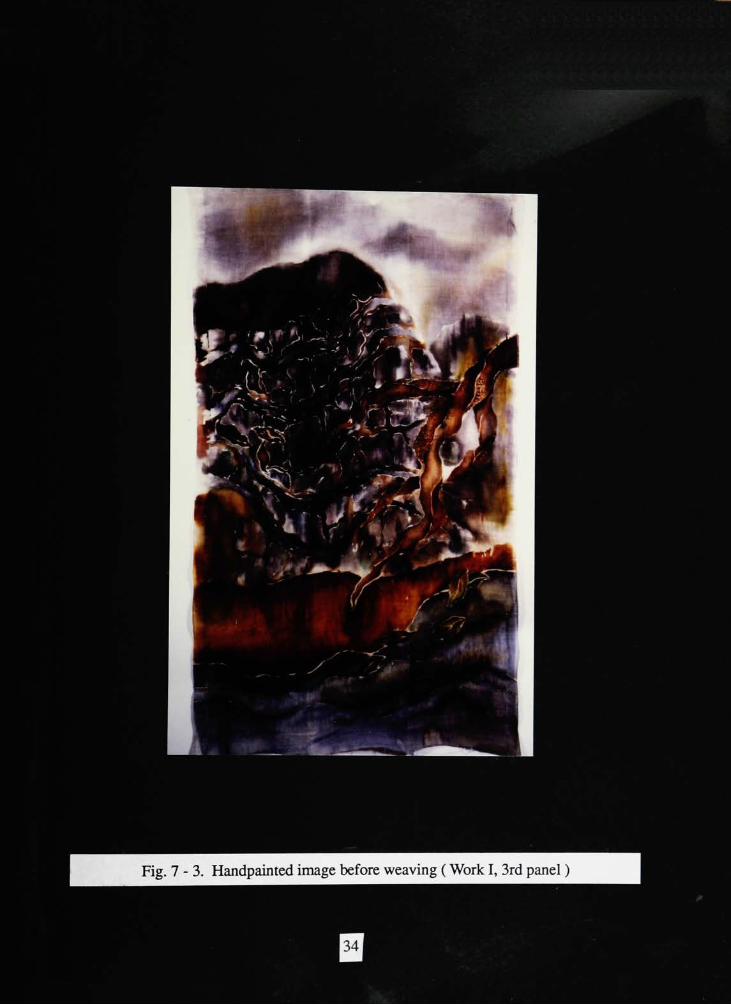
Figure 7-3. Handpainted image before weaving (Work 1, 3rd panel ) 34
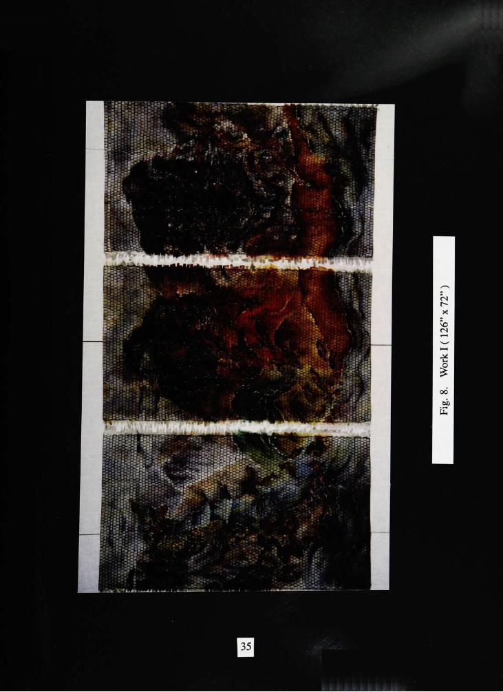
Figure 8. Work I (126"
x72"
) 35
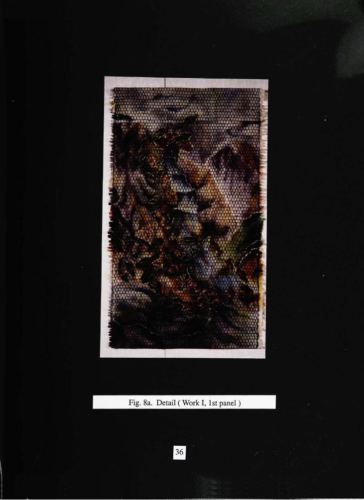
Figure 8a. Detail (Work 1, 1st panel ) 36
Figure 8b. Detail (Work I, 2nd panel ) 37
Figure 8c. Detail (Work I, 3rd panel) 38
Figure 9. Work B (29"
x36"
) 39
Figure 10. Handpainted image before weaving,Work HI 40
Figure 11. Work IB(42"
x75"
) 41
IV
Introduction
Art isman's way of expressing the emotional feeling within himself and the nature
that surrounds him.
Many art forms exist. My form is textile art. My work is influenced by two
different but similar forms of art from separate cultures. I am influenced by the beauty of
Oriental landscape paintings and my love for Western impressionist landscape art and
technique.
Oriental landscape paintings express the essence and the beauty of the different
seasons. The freedom of life and spirit is shown by depicting nature with a vague and
flexibleperspective.1 On the other hand, Impressionist landscape paintings describe the
beauty and the harmony of nature by depicting the natural appearance of objects in a
landscape by simulating the reflectedlight.2
My main focus was to combine the images ofOriental and Impressionist paintings
to form a new image. The theme, composition, and decorative characteristics ofOriental
paintings was a direct influence on the of handpainting of my work. In contrast, the
Impressionist paintings influenced the weaving technique after the completion of the
handpainted surface image. While the handpainted surface emphasized the Oriental
landscape, I fragmented this finished work and rewove the fabric to achieve the effect of
brush work.
This is a new direction in textiles, and this form has a possibility to extend into
various materials with utilitarian as well as artistic value.
1Shio Sakanishi, The Spirit of the Brush. (JohnMurray, 1948), 87.
2Jean Leymarie. Impressionism. (Skira Studio, 1973), 31.
Historical inquiry
I. Oriental landscape paintings Japanese paintings
Japanese paintings have always derived its model and inspiration from nature. The
artist achieves artistic enjoyment, which is found to be an essential part of life, from his
ability to respond to nature's suggestion and inspiration. By assimilating the style and
technique of Chinese painting, the Japanese painters forged a specifically Japanese art,
imbued with lyricism and nativedelicacy.3
One of the characteristics of Japanese painting was their use of the landscape as a
subject. The artists ofChina consider both mountains and water to be essential to landscape
subjects. The Japanese artist has a tendency to simplify add strengthen by emphasizing the
mountains and water. Mountains and water, the most predominate elements of the country,
have long stood as symbols of all the aspects ofnature.4
The artists visually take pleasure
in rivers and in the virtuous mountains. Surely this pair of natural elements,
complimenting each other, represent the basic qualities of oriental mind: Orientals love
movement. A mobile flowing rhythm is one of the chief characteristics of theartists'
brushwork in painting. The atmosphere of stillness, quiet and serenity, must strike the
Western onlooker especially accustomed to scenes of strenuousaction.5
Another feature of Japanese painting is the expression of the change of four
seasons. Although Chinese painting has a somewhat similar feeling for nature and
seasons, there was no expressive theme for the change of seasons. This is a unique
characteristic to Japanese paintings. A clear change of the seasons is a special characteristic
of the climate in the Japanese archipelago. The four seasons form a series susceptible to
3Masaharu Anesaki. Art. Life And Nature In Japan. (Greenwood Press, 1971), 7.
4
Henry P. Bowie, on the laws of Japanese painting. (Paul Elder and Company Publishers, 1911), 51.5
Chiang Yee, The Chinese Eve. (IndianaUniversity Press, 1935), 135.
the most varied and engaging treatment and presentation. The seasons are sometimes
symbolized by mountains, rocks, cliffs, trees, rivers, and even the composition of
landscape. There is a law which determines the general character of a landscape according
to the season, and is thus expressed: mountains in spring should suggest joyousness; in
summer, green andmoisture; in autumn, abundance; in winter,drowsiness.6
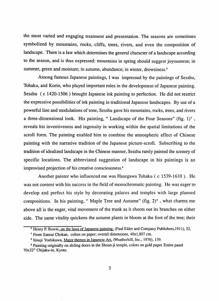
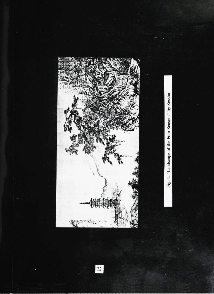
Among famous Japanese paintings, I was impressed by the paintings of Sesshu,
Tohaku, and Korin, who played important roles in the development of Japanese painting.
Sesshu ( c 1420-1506 ) brought Japanese ink painting to perfection. He did not restrict
the expressive possibilities of ink painting in traditional Japanese landscapes. By use of a
powerful line and modulations of tone, Sesshu gave his mountains, rocks, trees, and rivers
a three-dimensional look. His painting,"
Landscape of the FourSeasons"
(fig.I)7
,
reveals his inventiveness and ingenuity in working within the spatial limitations of the
scroll form. The painting enabled him to combine the atmospheric effect of Chinese
painting with the narrative tradition of the Japanese picture-scroll. Subscribing to the
tradition of idealized landscape in the Chinese manner, Sesshu rarely painted the scenery of
specific locations. The abbreviated suggestion of landscape in his paintings is an
improvised projection of his creativeconsciousness.8
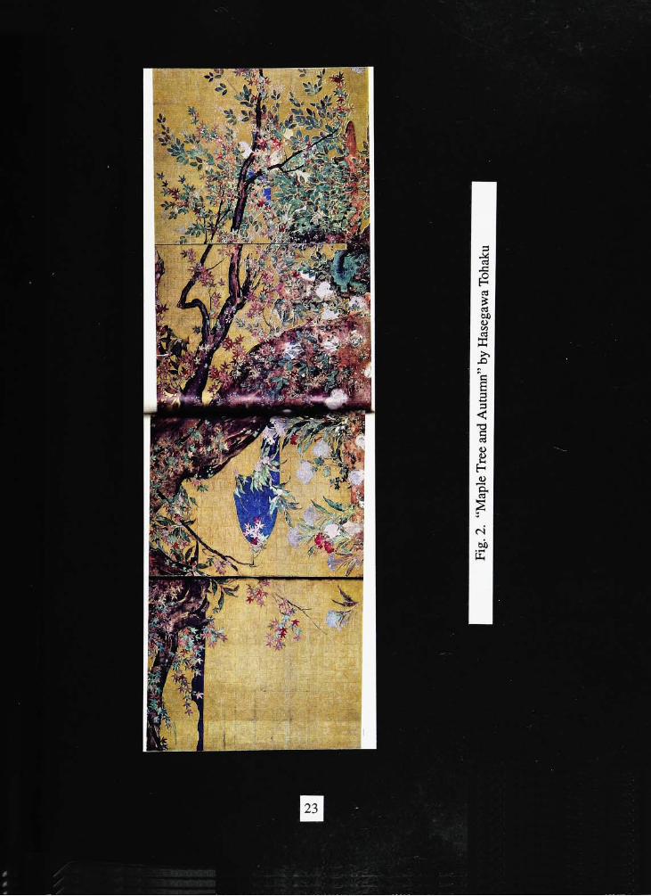
Another painter who influenced me was Hasegawa Tohaku ( c 1539-1610 ). He
was not content with his success in the field ofmonochromatic painting. He was eager to
develop and perfect his style by decorating palaces and temples with large planned
compositions. In his painting,"
Maple Tree andAutumn"
(fig.2)9
, what charms me
above all is the eager, vital movement of the trunk as it shoots out its branches on either
side. The same vitality quickens the autumn plants in bloom at the foot of the tree; their
6
Henry P. Bowie, on the laws of Japanese painting. (Paul Elder and Company Publishers,1911), 52.7From Sansui Chokan, colors on paper; overall dimensions, 40x1,807 cm.
8Itisuji Yoshikawa, Major themes in Japanese Art. (Weatherhill, Inc., 1976), 139.
9
Painting originally on sliding doors in the Shoun-ji temple, colors on gold paper. Entire panel70x22"
Chijaku-in, Kyoto.
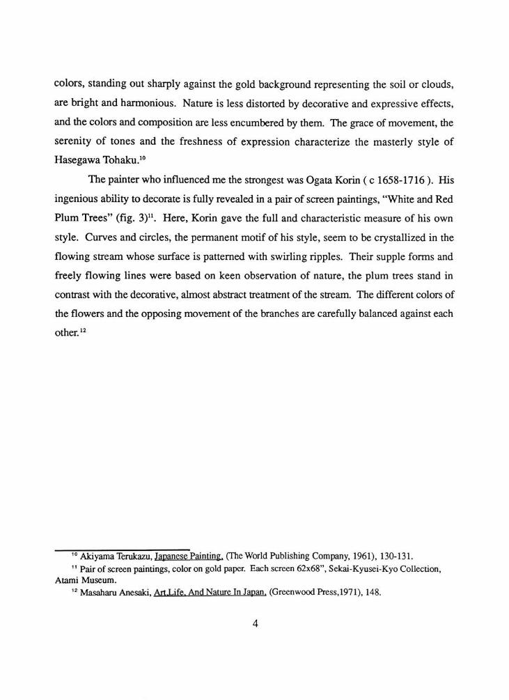
colors, standing out sharply against the gold background representing the soil or clouds,
are bright and harmonious. Nature is less distorted by decorative and expressive effects,
and the colors and composition are less encumbered by them. The grace ofmovement, the
serenity of tones and the freshness of expression characterize the masterly style of
Hasegawa Tohaku.10
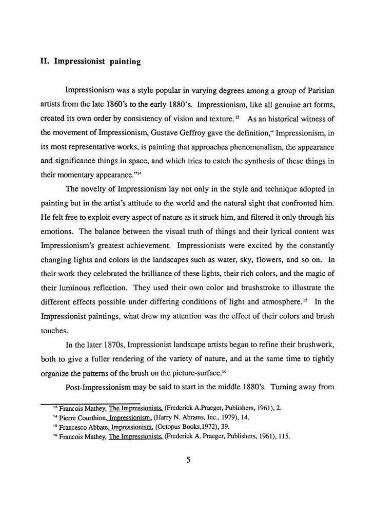
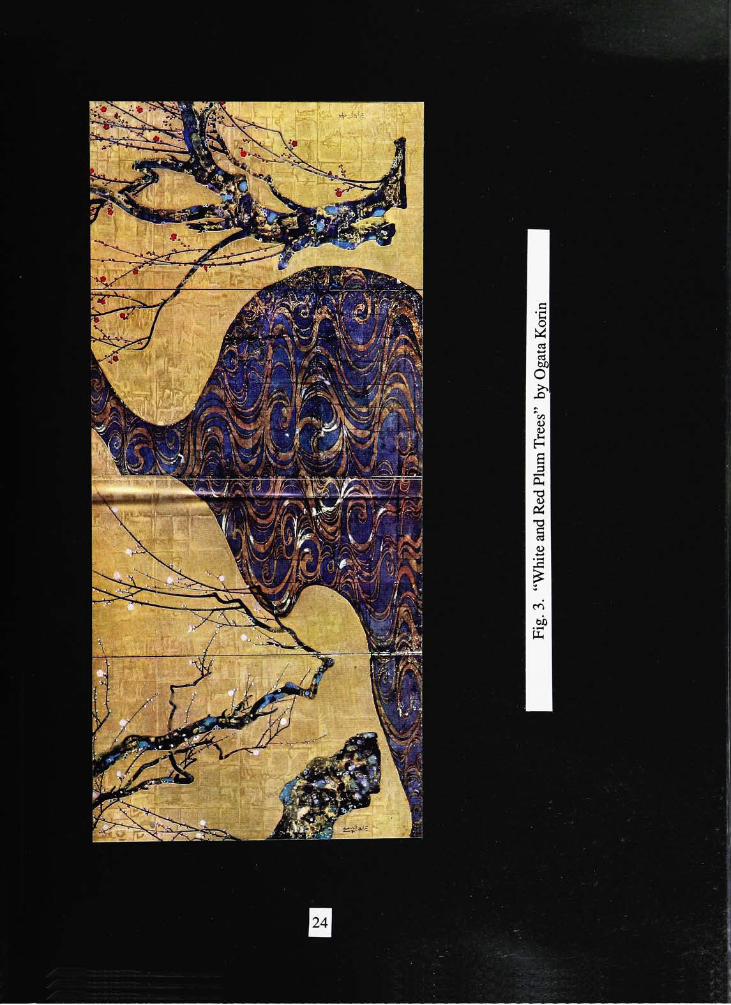
The painterwho influenced me the strongestwas Ogata Korin ( c 1658-1716 ). His
ingenious ability to decorate is fully revealed in a pair of screen paintings, "White and Red
PlumTrees"
(fig. 3)u. Here, Korin gave the full and characteristic measure of his own
style. Curves and circles, the permanent motif of his style, seem to be crystallized in the
flowing stream whose surface is patterned with swirling ripples. Their supple forms and
freely flowing lines were based on keen observation of nature, the plum trees stand in
contrast with the decorative, almost abstract treatment of the stream. The different colors of
the flowers and the opposing movement of the branches are carefully balanced against each
other.12
10Akiyama Terukazu. Japanese Painting. (TheWorld Publishing Company, 1961), 130-131.
11Pair of screen paintings, color on gold paper. Each screen 62x68", Sekai-Kyusei-Kyo Collection,
Atami Museum.
12Masaharu Anesaki, Art-Life. AndNature In Japan. (Greenwood Press,1971), 148.
II. Impressionist painting
Impressionism was a style popular in varying degrees among a group of Parisian
artists from the late 1860's to the early 1880's. Impressionism, like all genuine art forms,
created its own order by consistency of vision and texture.13
As an historical witness of
the movement of Impressionism, Gustave Geffroy gave thedefinition,"
Impressionism, in
its most representative works, is painting that approaches phenomenalism, the appearance
and significance things in space, and which tries to catch the synthesis of these things in
theirmomentaryappearance."14
The novelty of Impressionism lay not only in the style and technique adopted in
painting but in the artist's attitude to the world and the natural sight that confronted him.
He felt free to exploit every aspect of nature as it struck him, and filtered it only through his
emotions. The balance between the visual truth of things and their lyrical content was
Impressionism's greatest achievement. Impressionists were excited by the constantly
changing lights and colors in the landscapes such as water, sky, flowers, and so on. In
their work they celebrated the brilliance of these lights, their rich colors, and the magic of
their luminous reflection. They used their own color and brushstroke to illustrate the
different effects possible under differing conditions of light andatmosphere.15
In the
Impressionist paintings, what drew my attention was the effect of their colors and brush
touches.
In the later 1870s, Impressionist landscape artists began to refine their brushwork,
both to give a fuller rendering of the variety of nature, and at the same time to tightly
organize the patterns of the brush on thepicture-surface.16
Post-Impressionism may be said to start in the middle 1880's. Turning away from
13FrancoisMathey, The Impressionists. (FrederickA.Praeger, Publishers, 1961), 2.
14Pierre Conithion. Impressionism. O^arry N. Abrams, Inc., 1979), 14.
15Francesco Abbate. Impressionism. (Octopus Books.1972), 39.
16FrancoisMathey, The Impressionists. (Frederick A. Praeger, Publishers, 1961), 1 15.
the Impressionist naturalism which emphasized the external effect of light ormovement, the
new concept emphasized on form and controlled space arrangement. Post-Impressionist
movements were known as Divisionism, Chromo-Luminarism and Pointillism. The chief
practitioners included Seurat and Signac.
The Neo-Impressionists also grew out of Impressionism with its awareness of the
complementary relationships of colors and the need for dividing colors into their
components so that the eye would be able, even forced, to bring them together into a more
or less pure light. TheNeo-Impressionists'
rigorous dotted technique was not just a
vehicle for the optical mixture they wished to generate. The small spots of color that have
become the style's most conspicuous feature also permitted great variety and nuances of
chromatic effects. In other words, in Neo-Impressionist pictures, the juxtaposed touches
of varied color were meant to be seen as distinct accents and were used to suggest the
constant variety of natural hues andtextures.17
In the 1890's the impact of Neo-Impressionism lessened. Signac modified the
small points used by Seurat into rectangles. These were often compared to the tesserae that
composed mosaics. He pursued his interest in vibrant color combinations at the expense of
the luminous effects originally sought by the Neo-Impressionists. Concern for capturing
the behaviour of natural light and color was replaced by the search for colder harmonies
and decorative patterns that would satisfy theartists'
individualsensibilities.18
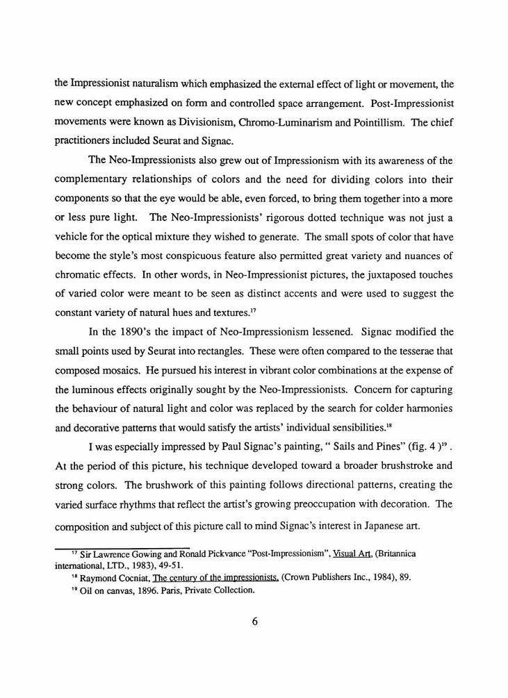
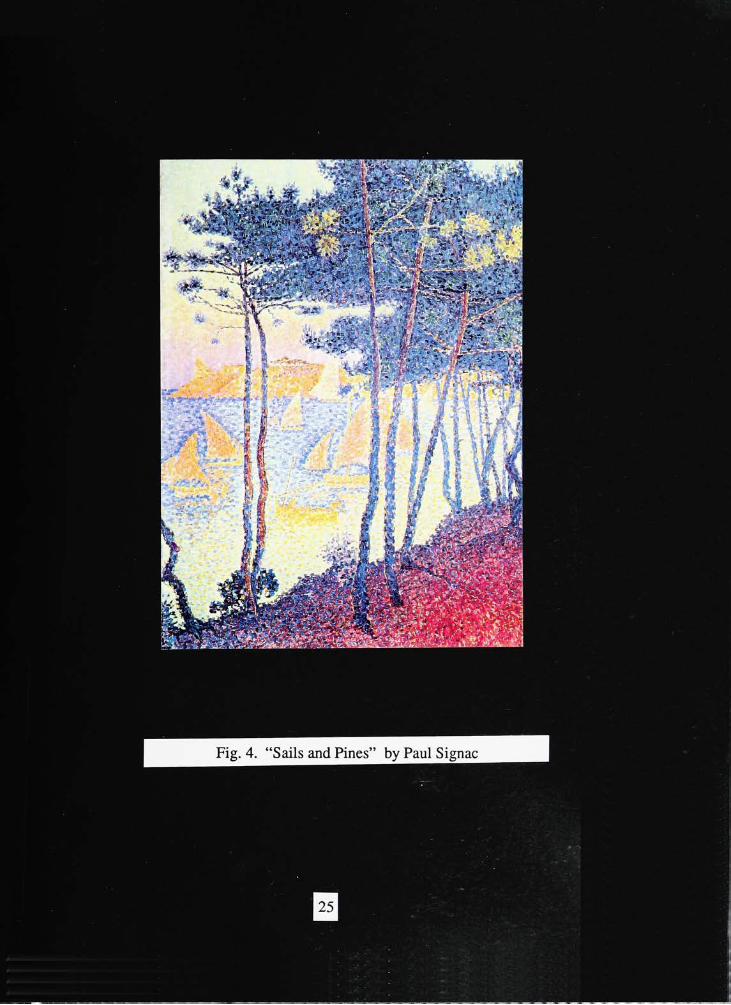
I was especially impressed by Paul Signac's painting,"
Sails andPines"
(fig. 4)19
.
At the period of this picture, his technique developed toward a broader brushstroke and
strong colors. The brushwork of this painting follows directional patterns, creating the
varied surface rhythms that reflect the artist's growing preoccupation with decoration. The
composition and subject of this picture call tomind Signac's interest in Japanese art.
1 7Sir LawrenceGowing and Ronald Pickvance "Post-Impressionism", Visual Art. Q3ritannica
international, LTD., 1983), 49-51.
,8Raymond Cocniat, The century of the impressionists. (Crown Publishers Inc., 1984), 89.
"Oil on canvas, 1896. Paris, Private Collection.
Thesis Concept
Nature has long been one of the noblest sources of inspiration for artists. Because
nature is varied, there are enough rhythms, forms, colors and sizes to please to most
diverse artistic tastes. Artists commune for days and nights with nature in her multiplied
forms and her beautiful developments. Their work is an attempt to preserve nature's
beauty.20
Every particle of nature - even stones, water and air - has in itself a spring of
activity, of spontaneous movement. Nature, a constantly moving pattern of change, as
seen in themovement of clouds, trees, waves and surging water, is an inexhaustible visual
source for my works.
Nature shows many different aspects according to a clear change of seasons. The
seasons have their own essence and feeling. Because of them, each season has its own
beauty. Such an example are mountains. The mountains of spring are tranquil and
captivating as if they smiled; the mountains of summer are fresh and green as if they drip
with dew; the mountains of autumn are clean and neat as if beautifully ornamented and
arrayed; the mountains of winter are melancholy and subdued as if in sleep. In addition,
the atmosphere of the real landscapes are not the same through the four seasons. In spring
the atmosphere is bright and harmonious; in summer, dense and brooding; in autumn, thin
and scattered; in winter, dark andgloomy.21
The seasons have their own scene and feeling. Because of them, each season has
its own beauty. The beauty of seasons are translated throughmy expressive simplication of
color, line, and composition. However, above all, I realized that I can, by no means, get
free from the order of nature. When winter is over, I see a promise of spring and the cycle
of the changing seasons begin once again. The cycle of the changing seasons fulfill the
20MaxineMasterfield, In harmony with Nature. (Watson-Guptill Publications, 1990), 7.
21Kuo Hsi, An Essay on Landscape Painting. (JohnMurray, 1959), 38-39.
aspirations ofman.
Nature's beauty is emphasized by landscapes under sunlight. We recognize the
beauty of nature's color, her texture, and her form by sunlight. Without light, there is no
beauty in this world. The landscape has a soul as well as a body. Its body is our great
rock-ribbed mother-earth with her endless expanse of fields and hills, of rivers and surging
seas. Its soul is the spirit of light - of sunlight, which careens ceaselessly across the face of
thelandscape.22
I became increasingly more attentive to rendering the luminous effects of
sunlight on the scene of the changing seasons. The landscape evokes the different effects
possible under changing conditions of light and atmosphere. Natural illumination is nearly
always charming, even when it falls on common place things. Nature's certain subjects
unbeautiful in themselves become beautiful under the right condition of light and
atmosphere. The forever shifting light gives the landscape movement of life and texture.
My thesis work is a presentation of living nature. It expresses the scene of
shimmering sunlight on the landscape. The beauty associated with the order in nature and
the change of the four seasons symbolizes man's hope for rebirth of life.
GeorgeHoward Opdyke. Art And Nature Appreciation. (TheMacmillan Company,1932), 57.
Discussion of Thesis Work
Work I
My work consists ofwallhangings as a format to convey my concept, employing
handpainting and weaving. I was fascinatedwith the landscape and achieving the interplay
of light, the daily atmospheric changes and the variety of forms and textures that emphasize
the seasons.
The initial step was to decide on the number ofpanels expressing the change of four
seasons. Even though many artists tend to depict each season on a single panel, I decided
to express the four seasons on three panels. My intention was to express the symbolic
meaning of the odd number in Korea tradition and to follow the tradition ofKorean artists
by painting mainly on three panels. The odd number has a symbolic meaning of "Yang",
the positive principle in nature to keep offmisfortune.
The next step was to depict the changing seasons. The main subject matter was
determined to be mountains and water, similar to the main subject matter in Oriental
landscape paintings. The minor subject matter was a tree which is clearly different in
appearance according to the change of seasons. I was influenced by Japanese painter,
Sesshu, in arranging these subjects. I tried to arrange the composition to depict the
atmospheric effect ofChinese painting with the narrative tradition of Japanese painting. In
addition, under the influence of the decorative paintings of Japanese painters, Tohaku and
Korin, I tried to describe the subjectmatter with decorative patterns.
In order to get a pleasing design, I changed the sketches several times. The first
sketch hadmountains arranged from right to left expressing the mountains during the four
seasons in order. The mountains were expressed with different patterns showing typical
scenes of the seasons. The tree with thick, falling leaves and a leafless tree were expressed
according to the change of the seasons. One panel, however, didn't show the process of
changing seasons and broke the connection among the panels. The design needed an
expression of slow seasonal change. A constant flowing waterfall was described in order
to show the movement of living nature. I also applied various curved lines to express
rhythm of the design, but it seemed as if the waterfall seized when the curved lines met the
horizontal lines forming the river, (fig. 5-1)
To make up for the weak points of the previous design, I tried other sketches
consisting of rhythm, balance and compability . Rhythmic connection of thick leaves and
falling leaves were achieved by using many leaves instead of a thick one. Other problems
seemed to appear on the sketch. The waterfall had too much emphasis on constant flow
and rhythm, breaking the balance and the composition of the entire design, (fig. 5-2)
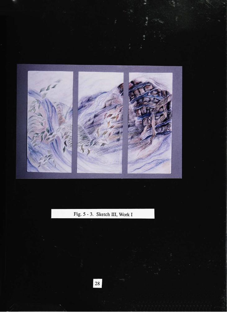
I smoothly rescaled the waterfall and rejoined the river. I also rearranged the leaves
to express rhythm and variety, similar to the painting by Tohaku. I redecorated the patterns
of the mountains for a more stylized pattern to increase unity and variety. Then, the
movement of river was expressed by patterns of curved lines. I was satisfied with the final
design. Next, I colored the line sketch. I changed the main color from light green, to the
light blue and violet , then brown, and then to dark brown and dark blue according to the
mood of seasons. The sky and the river were colored with variously valued blues, which
created a subtle pattern on the surface. More problems occurred after coloring the sketch.
The waterfall image was still too strong for the entire design. Also, the curved line of the
mountain on the third panel and the pattern expressed on the second panel didn't match.
(fig. 5 - 3)
To express a ceaseless flow of mountains on the three panels, I changed them to a
more rhythmical curved line. The image on the third panel was also too strong tomatch the
other panels. In order to show the seasonal color cycle, I coordinated the first and third
panels, along with depicting fewer leaves on the third panel to hint at the image of spring
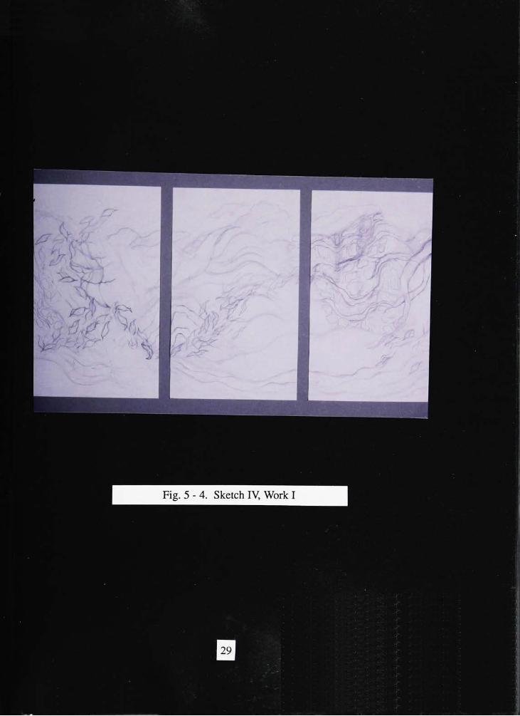
after winter. This trial gave balance, compability and unity to the entire design, (fig.5 - 4)
10
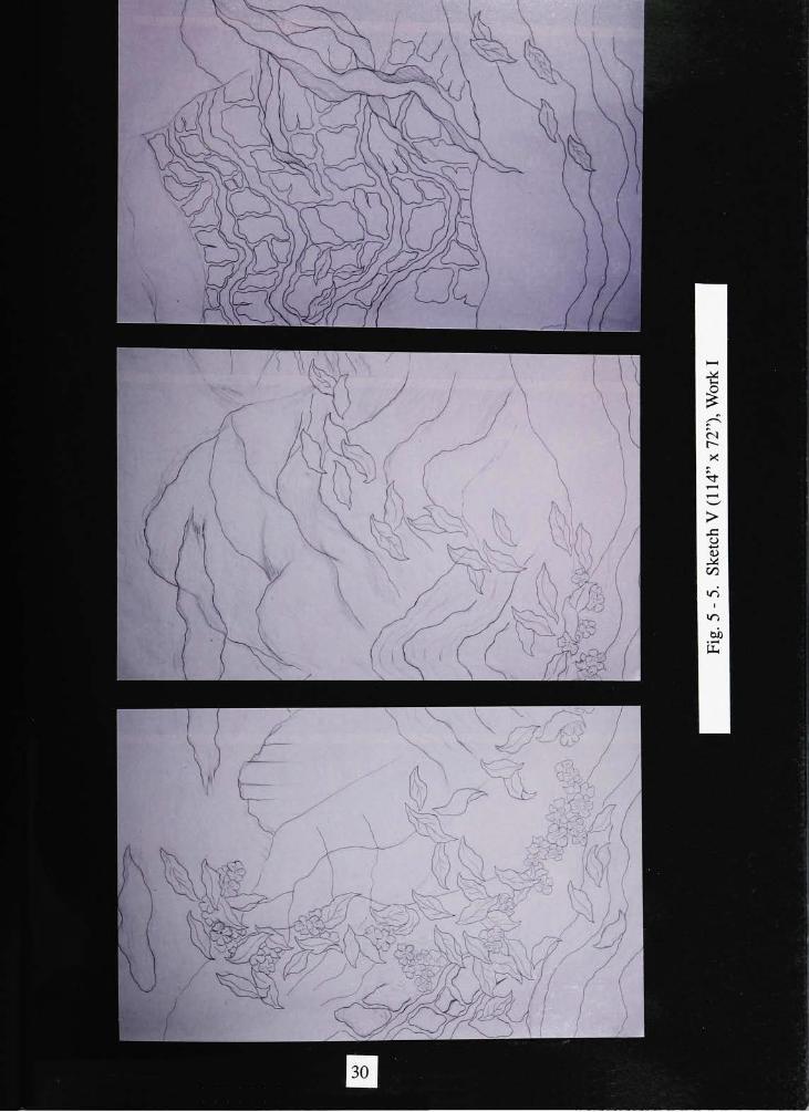
A few changes were made during the process of transferring the sketch into the full
size design. The images of the original sketch and full size design gave a different mood.
In the full size design, the atmosphere of spring, summer, and fall were not expressed
because the image of the leaves on the first and the second panel were very similar and the
entire mood was alike. Therefore, I arranged the flowers to express the feeling of spring
and summer, giving stability of composition and a decorative effect to the entire design.
Finally, I was satisfied by the design, (fig. 5 - 5)
The next step after transferring the design onto the fabric was handpainting. By
using batik I achieved a greater continuity of line and was able to not only resist the
penetration of dye color which is dyed over the previous one but also to appear in closer
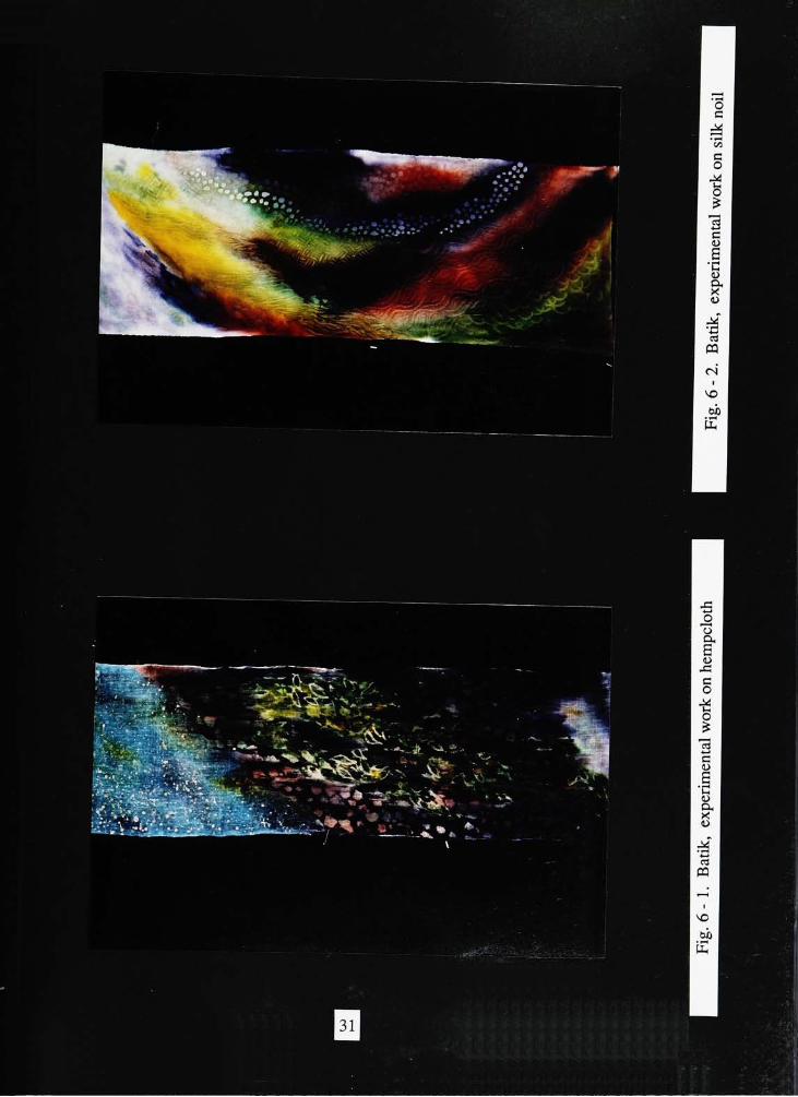
relation. I began by choosing the appropriate fabric for the design and batik technique. I
experimented with the technique using hempcloth and silk noil. (fig. 6-1.2) I chose
the hempcloth for the work, because it showed the mood of an antique style of oriental
landscape painting more than the silk noil. I washed the fabric to thoroughly remove any
undesirable substances, then dried and ironed the fabric to make it ready for the application
of the design.
The first step on application was to place the design under the fabric and hold it
against the light table to trace the design with a washable pencil. Then, the fabrics were
stretched on a frame to allow an easy and uniform penetration of the wax. A six-part
beeswax and a four-part white paraffin wax were combined to produce an excellent result.
After the wax thoroughlymelted in the pot, it was applied to the outline of the design using
a brush.
The next step was preparing for the handpainting. Procion fabric dyes were mixed
together to make the colors as they appeared on the sketch. The colors of dye on the fabric
and colors of colored pencils gave a different sensual expression. The color of the dye on
the fabric was richer and more delicate than that of the sketch. Spontaneous colors were
made possible by the layering of dyes painted on the fabric. Colors were applied on the
11
design according to my feelings about the nature. I started by painting leaves and the tree,
varying colors from green, to light brown, to dark brown, following the seasonal change
from spring to winter. Then, I painted the mountains with matching colors as the
background. I applied wax on some finished areas, then painted with other colors to
express texture and rich colors, depicting mountains blazing with autumnal tints. Next, I
painted the sky, the river and the waterfall. With the main color of blue, light violet and
yellow were used to give variety and accent, to express shimmering sunlight on the river
and the waterfall. The sky was painted with plain colors to show a general calm mood
against the busy landscape. On the other hand, the river was painted along the wax line
with many shades of blue to give a three-dimensional look. That completed the hand
painting on the fabric.
The following step was very exiting. Majority of the wax on the fabric was
removed by ironing. The painted fabric was placed between two layers of newspaper. As
the wax melted under the applied heat, it was absorbed by the newspaper. It took seven
sheets of newspaper to completely remove the wax. Then, in order to fix the painted dye
onto the fabric, I steamed the fabric while wrapped in brown papers to keep the dyed
surfaces from coming in contact with each other. After washing and ironing, the surface
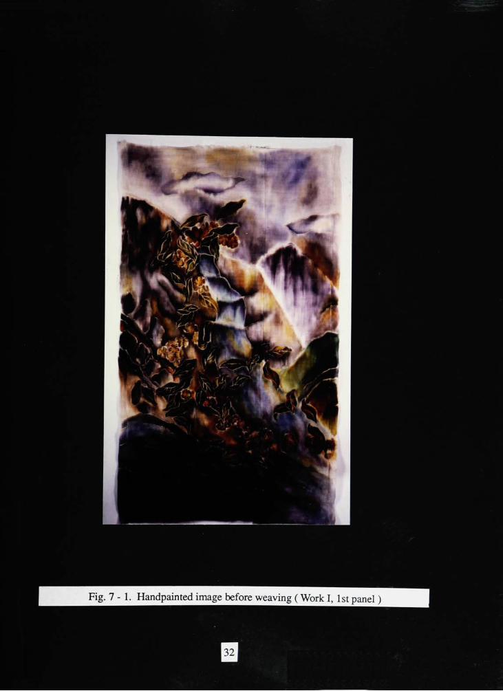
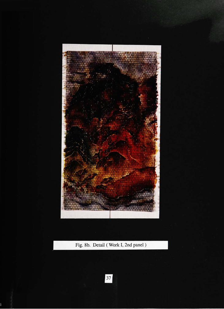
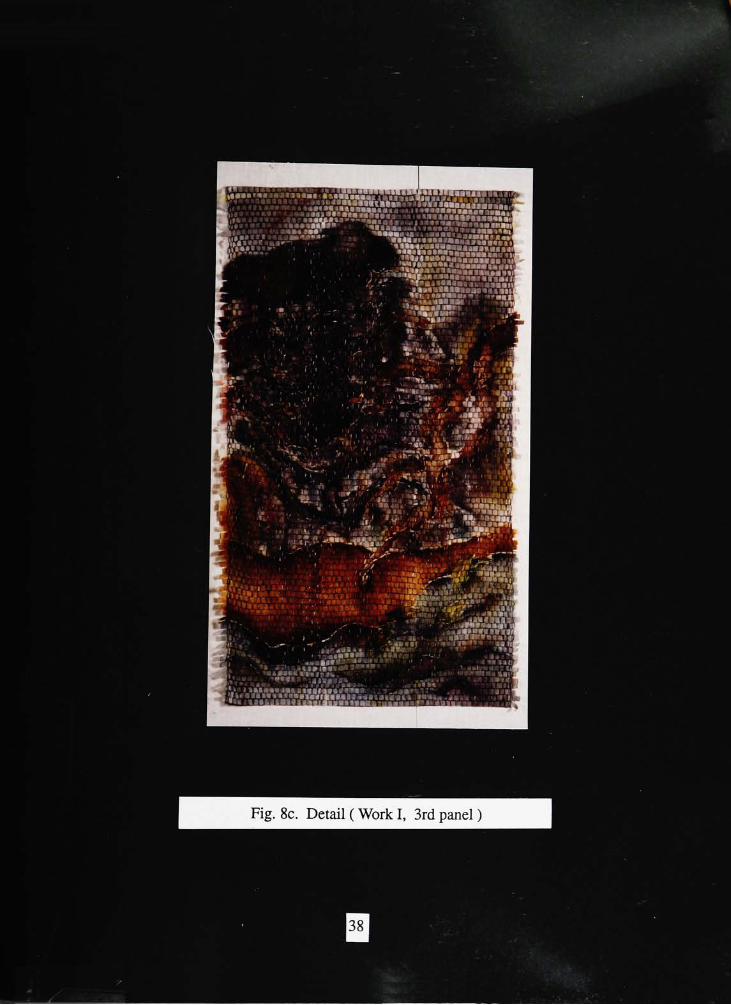
image was finally finished. ( fig. 7 - 1. 2. 3)
Being inspired by Impressionist painting, I wanted to express the effect of the
brushwork on the completed images. Therefore, I planned to rebuild the surface images
through the weaving technique by using the fabrics cut into strips as weft and warp of
dyed yarns.
To dye yarns for the warp, I chose a plied textured yarn to express a great variety of
surface texture. My plan was to randomly dye these yarns with five different colors: blue,
violet, green, brown and dark blue. Those five colors matched the surface image and
expressed the effect of shimmering sunlight. In order to get the random effect, the tie
dyeing technique was achieved with Procion M dyes, which is capable of being dyed in
12
cold water. The method for stopping the absorption of color in selected areas was to tie
nonporous materials such as plastic strips around the section that was not to receive a
particular color. First, I tied the yarn with plastic strips, except for the area to be dyed with
light blue. Then, I tied dyed that area and untied another section for next color. The same
process was repeated until five colors were completely dyed, and then I untied entire the
warp. The color transition went smoothly, since the dyeing consisted of the layering and
permeating from one color to the other. The yarns were colorful and exciting due to
combination of color and plied texture, which satisfied me enough to go to the next step,
weaving.
The preparation to weave the image needed a basic weaving technique. I calculated
the length and width of the warp in the traditional way. The length of the warp was about
96 inches for 72 inches of finished web. The width of the warp was about 46 inches for
38 inches of finished web. However, my special concern was calculating the number of
warp ends. To make the rectangular shape similar to brush strokes, I reduced the number
ofwarp ends. I used a total of 138 threads for a width of 46 inches using a 8 dent reed. I
also threaded 3 threads instead of 8 threads per inch. The weaving structure for the work
was a plain weave. Before weaving, the weft was prepared by cutting the image on the
fabric into strips 0.75 inch wide. I marked sequential numbers on the strips in order to
reweave them in order. After I wove about 10 inches on the fabric, I ran into a problem.
Weaving using only fabric as a weft was too loose to be stable, and didn't show the effect
of fragmentary rectangular shapes. To support the loose weft, I used commercial brown,
green, and blue wool yarns matching the imagery. I wove with the fabric as weft, then
mixed brown and green yarns for one pick, andmixed green and blue yarns for the second.
As a result, the weave became tighter and had more color due to the different colors of
yarns. After completing the first panel, I repeated the process for the second and the third
panel.
The final process was treating the edges. I planned to clean up the rough edges, but
13

the sharp edge would have cut the movement and flow of imagery, so I left it untrimmed.
It achieved amore natural look. (fig. 8)
14
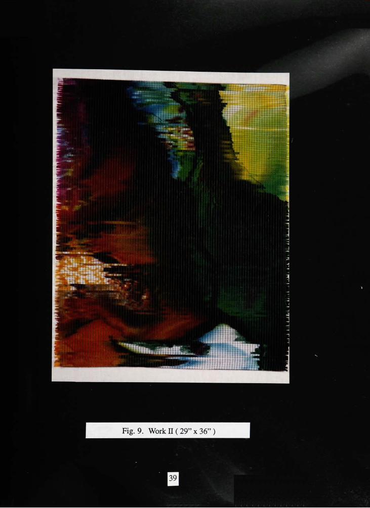
Work II
Inspired by the theme of Japanese painting, which represents the change of
seasons, and the brushwork of Impressionist paintings, this piece expresses different
feelings fromWork I. I used a direct handpainting and weaving technique.
The first step was to paint on the silk. Overdesigning sometimes may kill the spirit
of the piece and also may become a dreary reenactment of an once inspired concept.
Therefore, I decided to paint directly on the silk without a using a design line. Although
drawing objects of the landscape on the silk were not necessary, a good idea of the picture
design was needed for an effective theme expression. I tried to paint with colors that came
naturally to my feelings inspired by the changing seasons. I didn't sketch colors in detail.
Random color schemes heighten the drama, the excitement, and the special effects. I
worked wet-on-wet to softly blend the colors effects. As in Work I, yellow green was
painted for the spring, green for the summer, light brown for the fall and dark brown for
the winter. I added some accent colors to imply the following season at the end of each
season. I also added black curved lines to imply the passage of the time. The black lines
emphasized the color, imagery, and composition. When I was finished painting, I let the
fabric dry and steamed it.
The image seemed to express the changing seasons, without vitality andmovement
of nature. Moreover, the flat surface of silk expressed a surface image lacking variety.
Therefore, I tried to make up for the weak points by rearranging the image and adding
texture, to express the effect of the brushwork. I used the weaving technique to express
them. I cut the image into strips for weft. With the width of each strip being 0.3 inch, it
expressed the delicate texture of a small brush stroke as seen in Impressionist painting. I
used light green yarns as warps with matching interlocking weft. I used the same color
yarn as both warp and weft, to depict unity in variety. I wove in a zig zag fashion, moving
side to side, attempting to express the vitality and movement of nature.
15
I was mostly satisfied with the outcome, except when I took the finished product
off the loom, it was too thin and flexible to hang on the wall. Therefore, I ironed it with
starch in order to give some stiffness. I trimmed only the bottom and the top hem in the
same manner as inWork I. (fig. 9)
16
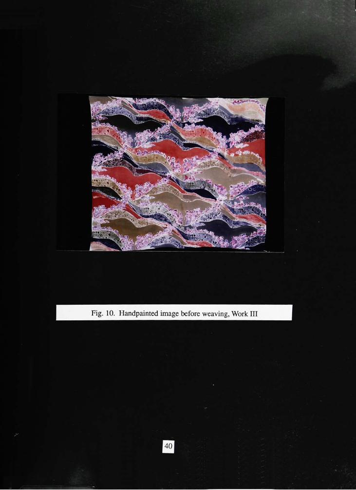
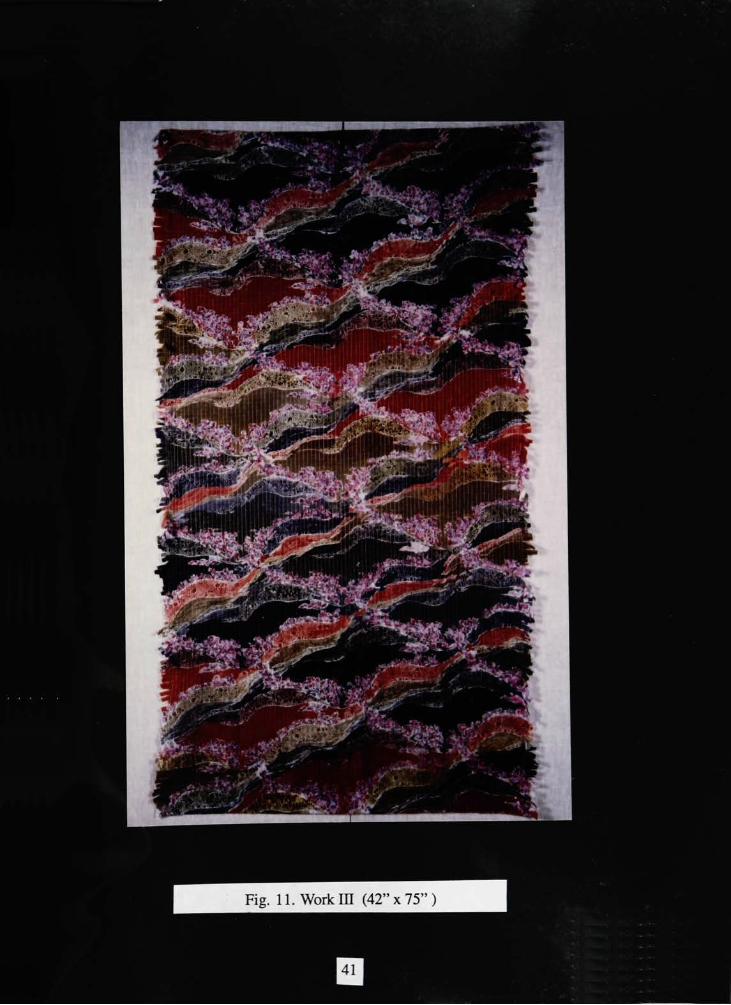
Work III
With the same theme expression as in bothWork I and n, I varied the technique for
use inWork IB. My main idea was to make a dual purpose fabric to be used for utility and
decoration. I applied handprinting, handpainting, and weaving technique in Work BI.
First, I designed the image for handprinting. The design depended on the repetition
of a motif. A motif was expressed by transforming a subject matter of nature into an
organic and a geometric form. I tried to depict the mountains, flowing water, and passing
seasons by dominating curved lines showing rhythm, balance, and unity. The space
formed by the lines were filled with slightly curved lines and tortoise shapes to imply the
presence of water and the rocks. In addition, I arranged flowers to decorate the entire
design. This was a special arrangement of subject matter to similate the influences of
Japanese decorative painting. The reason I chose flowers for the decoration was to express
an organic life form against a geometric design.
In the process of repeating the unit, I used a half drop method to make the
continuous curve line representing the living nature.
To transfer the design onto the fabric, I tried the silk-screen printing technique
which could repeat the design on a large quantity of fabric in a very short time. However,
the silk-screen printing technique has limitations in using various colors and in expressing
detailed designs. Therefore, I decided to only print the outline of the design, and then to
use a hand painting technique which offered spontaneity and great freedom with a wider
variety of colors. I also planned to print the outline of the design with gutta to keep the dye
from flowing and smearing into another area
To prepare for silk-screen printing, I drew the design on a piece of treated acetate
with drawing ink. Then, I stretched a polyester screen fabric tightly over the screen frame.
I wet the fabric before stretching to achieve a tighter surface after drying. I then cleaned the
screen and let it completely dry. Next, I coated the screen with a light-sensitive emulsion in
17
a darkroom, using a squeegee. When it dried, I placed the positive acetate, previously
prepared, over the screen. I then exposed the screen to an arc light for two minutes. The
areas on the screen which were exposed to the light hardened, but those portions which had
been covered by the dark areas of the acetate remained soft. I flooded the screen with
warmwater to remove the soft emulsion.
The next step was printing on the silk. First, I tightly pinned the silk on the
printing table. Then, aftermeasuring the exact distance needed to repeat the design, I was
ready to print. With the screen placed on the fabric, I spread the gutta as smoothly as
possible across the screen using a squeegee. I repeated the process from the top to the
bottom of the fabric.
I chose green, blue, brown, and faded olive green procion dye as main colors
which represented spring, summer, fall and winter. Then, I began painting the design
along the diagonal curved lines. I tried to express the three dimensional effect by changing
the values of the colors. The last part was painting the flowers. I painted them with light
blue, light violet and dark violet which were used inWorks I and B to express objects by
simulating reflected sunlight. Expressing the flowers by painting enabled me to actually
feel the life and energy behind it. (fig. 10)
When the painting was done, I tried to express the effect of the brushwork in
Impressionist painting on the surface image by weaving, using fine silk yarns for the
warp. Then, I cut the image into 0.5 inch wide strips, enough to create surface texture
with some visual distortion created by reweaving. The structure of the weave is the same
as inWork B. I calculated the number of ends under the consideration to create the size of
rectangular shape formed by weaving, then applied 4 threads per inch with a 8 dent reed.
Although the weaving was under loose tension to prevent cuts on weak silk yarns, this
caused a problem. The weft and the warp lacked tension, but it matched the moving surface
image very well. Moreover, the weave needed some stiffness for utility. Therefore, I
sewed a cotton lining to the back instead of ironing it with starch as in Work II. As a
18

result, the work was both stable and draperable. Even though the final image didn't satisfy
the purpose of utility because of its loose structure, this method of sewing the lining
offered a possibility of applying this product into a fabric for utility, (fig. 11)
19
Conclusion
In my thesis work, the art inspired a possibility for an application of new
techniques. In the beginning, I tried to create a new image by combining Oriental
landscape paintings with the brush work of Impressionists. This made me apply a new
technique which combined hand painting and weaving. My work expressed the change of
seasons on the surface image by hand painting and the woven effect of emphatic, separate
brush strokes creating a fragmented paint surface. The new technique created more visual
and textural forms than that of hand painting or weaving.
This new mixed media technique could be applied in different ways. Even though
thesisWorks I, II, and BI have the same theme and their Impressionist form was done with
the same technique, the final image varied according to the different application of the
technique.
In Work I, I was influenced directly by the historical inquiry ofOriental paintings
and Impressionist paintings. The work depicted subject matter in the same manner as a
formal landscape painting. This wall hanging with 3 panels is similar to a folding screen
in the East which is used for both decoration and utility.
Work B expresses the same theme as work I, without depiction of actual subject
matter of nature. The appearance of this work with the combination ofwash painting on
the silk and weaving broke away from a typical image ofOriental paintings.
In the final appearance, I was inspired to expose the possibility of using a fabric as
a form of art. That is, my concern was making a fabric not only art work but also a
material which would make utility goods. Work III, a repetitious unit design, has the
function of a commercial fabric that shows the possibility ofmass production and a wide
range of application. Also, the surface image with the unique texture formed by hand
printing, hand painting, and weaving exists as a visual and a textural art form.
20
To summarize, I created art work with an Impressionist form ofOriental landscape
images, through the historical inquiry of art influences. In developing my thesis work, the
result suggests the possibility of using fabric as an art form.
The possibility suggests the field ofmy future work. Many textile designers had a
tendency to design only a simple, repetitious pattern fabric for a single purpose; practicality.
However, since everyone needs tomake themselves as attractive and appealing to others as
possible, they are usually not satisfied with the common clothing made with the fabric.
They always want new fashion designs to express their character, even with the same
fabric. Because of the limitations in the shape of clothing, a new textile design is necessary
to satisfy their needs.
In order to respond to this demand, I would apply the Impressionism with the
Oriental landscape similar to my thesis work onto fabric for clothing. However, I have to
consider a suitable pattern size for the human body and even fashion design. In addition,
the fabric for clothing has to be durable, so a tight weaving technique can be used to make
a durable fabric.
The fabric combination mentioned above has a value of an art work itself as well as
practicality. Using the fantastic fabric would not only enhance the beauty of the garment
used, it would almost design itself. Also, for the first time, a fashion statement will be
inspired by the Impressionism of the Oriental landscape. I will make the best efforts in
continuous improvement of the artistic quality of fabric to develop clothing into artwear.
21
'MI^W
P'{, 3** / x ri.J
"m'"'* "wr^M
fewft* IS
* j|W '.
3
w
bJ3
c3
1)
"8
IH "T^W7rl %^7-<r7\ I
Fig. 4. "Sails andPines"
by Paul Signac
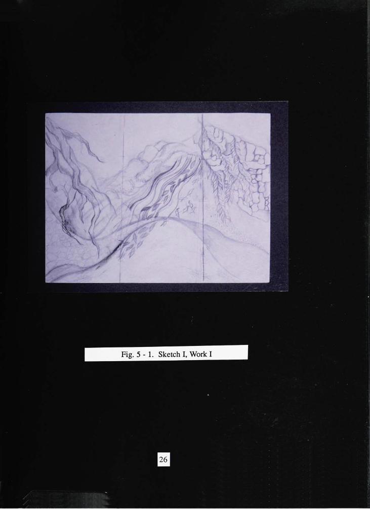
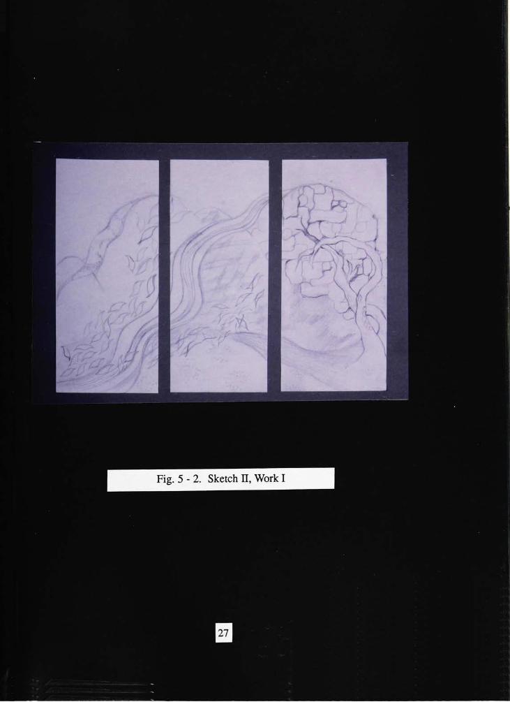
Fig. 5-2. Sketch B, Work I
rA
^^4
Fig. 5 - 3. Sketch BI, Work I
K]
I
--
rV
^B****".!
^^
I/K
Fig. 7-1. Handpainted image before weaving (Work I, 1st panel )
WMI
As -lis tx&m&!8Sfr^W:Z!<
mm
?,., I
Fig. 7-2. Handpainted image before weaving (Work I, 2nd panel )
33
*.
K
wt
,}**
V
'4
_y
^^H
Fig. 7-3. Handpainted image before weaving (Work I, 3rd panel )
^J7M
^"^;<rfMW,3iS.-':,a.
Z-- :!
'
spy -
. v.
/I.**-*'
iri.su, 11
il. 1
-' / MiaiilllMIJIlilll :lf;|
< \ y,.|1JII*I*
~
(!
it.- -IM'lttlUr " 1
4'u'^v;.i-
'iJSngs&TA. .v '.
.n. \*>*??- >&. v.
< rilllJ ''Cl'ljiiVlVlll > a
lift*. ,
f'
> li-iJIHIIII'll 1'iraA-.iM'i.i- 'mi <*..i n
iiiii n. , 'fj ' trrnL- vi tiiiuikiiiiiik
mat ".-. iiiionui- \.Aiaaaaaaaiiaiaa
"tar ** i. i a ; "--!-- .MYiaiaaaayiiij.s
t *ji . iiiiij"f,*.
4..
nai aaaaa.
' I , \: *l
"firm *.:#
fv r MlvtlSMlMiir./,'
iLlHi-'- >
< ;
"
ItinilliliaiKI Ml - Mlllil .(.tlMUWIMli'.Vl
uiiiiii Vn iiiimiiii ,
A""
iiATbu'"!. At- i ruiii.iii'AM*'
'"
> umirllll lit
s AV :,-H'a''
.
-'
'
/WW.if r-i."i. ' HIM
iiiii->ri ill '- , >
. . .?
VI I'.. V r ll'. >>'
\. j>, .". ._. jK?!'
ii- :->k.-Nj-
>ji "i
V i.
iititmi !
'Vijwi
ll '4 F,i" 11^1 '111**
.v.*.
...
lllBt.*aa*'l.c*i-
lit '"AllKC -!/
- V ,
i.UlllHI. L.,
>.,*Triiii . .'. .tiMrii'i'>'L<<ii. .
. nniik.^ t-.iauaa.tPt jjiiY,r i #cn . 1 1 1 <ati
--*>III!
:iulVj
.. ..
'IIIIIL.-Illl*Wlll
<*!
(IIK[.-aiain
rtkiint.ttiii
Fig. 8a. Detail ( Work I, 1st panel )
1it .ta. ru
ll^i'UIUI
araaaaa*,,
- ,
a
-* tu tiaaaair. <aa V''tataaaaicMlf''
; t
II 1
i.'l.
V1
\1
'
,
''
[, : ', ! i i -j^-v.-. ,
i.''
i ' ' ', V
: ,<
'--
i
I
1
**- .ft
.?4tV|
-"I |
'. 5
i^
1'. \ 1 ,\
'. '. .1
s - kj
t . v
'aaiw, 'a*-'-'
'
s-fftV'''1',' -
,
1-
.
Na.-^\----: siV ;<:__. _-
ia. ' naajai
i TJj-i.: '
' mi ! !*** *ai-- . v ( <>.-. .
i
nu, ;.. *i"wri.!*;---.
ai\inuaiii . >
,i<.<ai.
Hju'vua,,., ..Wit*,. -*>.; i a r
aaaiV'"'
'*ViV
T)
Fig. 8b. Detail (Work I, 2nd panel )
>S!^a?.v:^^vs
*aiav
'"''''
Iks;
';
7* a. v%.v-:
. -..'-AVaii... i aa. "aa
i' aft * aa.jaaal
,aa Mat*. <> "Li.-'- ^ r- -
Mf;"
?,ial/ 'I
IFig. 8c. Detail (Work I, 3rd panel )
MM
m
%
I ', l
-
-
JHiljii
fc*
:%.jS:vlB
**^<i.8iiim^
*u
Fig. 9. Work B (29"
x36"
)
imLm
ftiiK
.
***v-
-%.
***:
^s
?m
\&*&T
1W:
JF&&
j*t>.-,
. -vi
*Hri-
fiSW!
Fig. 11. Work IB (42"x75")
Bibliography
Abbate, Francesco. Impressionism New York: Octopus Books LTD., 1972.
Anesaki,Masaharu. Art. Life. And Nature In Japan . Westport, Connecticut: Greenwood
Press, 1971.
Bowie, Henry P. on the laws of Japanese painting. San Francisco: Paul Elder and
Company Publishers, Inc., 1911.
Cachin, Francoise. Paul Signac. Greenwich Connecticut: New York Graphic Society
LTD., 1971.
Cocniat, Raymond. The century of the impressionists. New York: Crown Publishers Inc.,
1984.
Courthion, Pierre. Impressionism. New York: Harry N. Abrams, Inc., 1979.
Gowing, Sir Lawrence and Pickvance, Ronald. Visual Art. London: Britannica
International, LTD., 1983.
Hsi, Kuo. An Essay on Landscape Painting. London: JohnMurray. 1959.
Leymarie, Jean. Impressionism. Paris: Skira Studio, 1973.
Masterfield, Maxine. In harmony with Nature. New York:Watson - Guptill Publications,
1990.
Mathey, Francois. The Impressionists. New York: Frederick A. Praeger, Publishers, 1961.
Opdyke, George Howard. Art and Nature Appreciation. New York: The Macmillan
Company, 1932.
Sakanishi, Shio. The Spirit of the Brush. London: John Murray, 1948.
Terukazu, Akiyama. Japanese Painting. Cleveland, Ohio: The World Publishing Company,
1961.
Yee, Chiang. The Chinese Eve. Bloomington and London: Indiana University Press, 1935.
Yoshikawa, Itsuji. Major themes in Japanese Art. New York: Wheatherhill, Inc., 1976.
42