Embed Size (px)
Citation preview

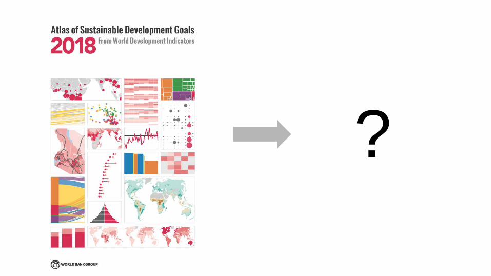
Behind the scenes of the SDG Atlas 2018
Creating a reproducible, data visualization-driven World Bank publication


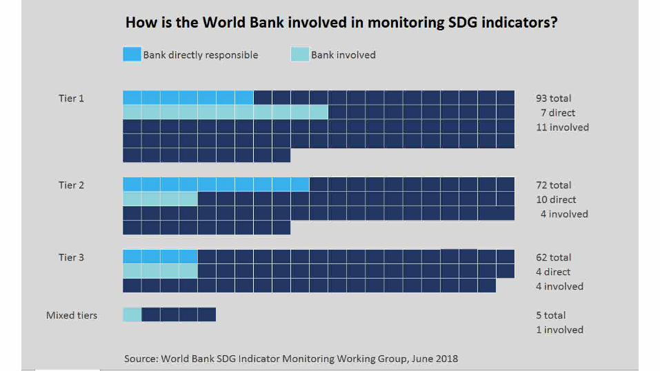
What is the World Bank’s role in SDG monitoring?

How are the SDGs Monitored?
• Inter-agency and Expert Group on SDG Indicators (IEAG-SDGs)
• Develops global indicator framework
• Includes member states; regional and international agencies are observers
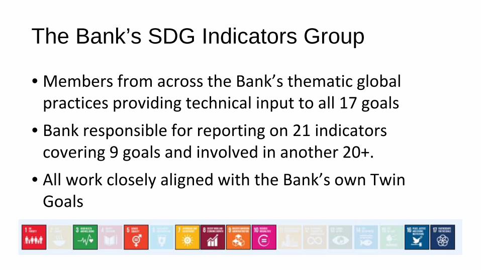
The Bank’s SDG Indicators Group
• Members from across the Bank’s thematic global practices providing technical input to all 17 goals
• Bank responsible for reporting on 21 indicators covering 9 goals and involved in another 20+.
• All work closely aligned with the Bank’s own Twin Goals

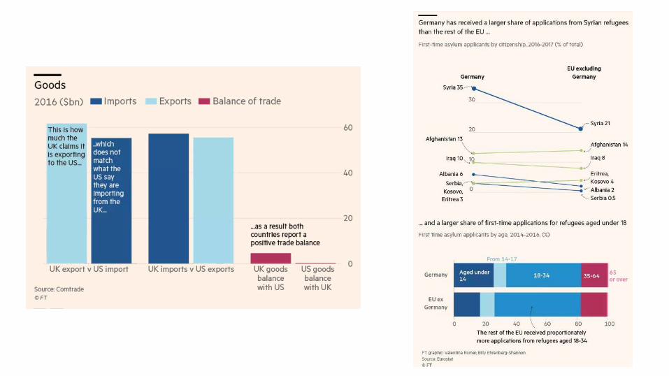
Why an SDG Atlas?


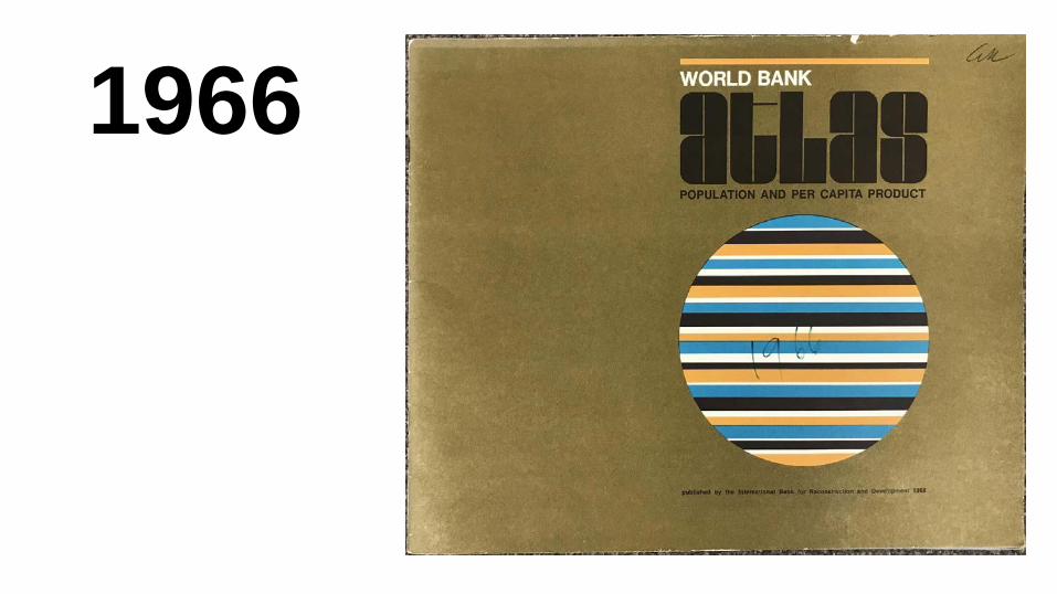
1966


1983


1985


Under new stricter definitions, fewer people have access to water
80% of Pakistanis can “access an improved water source” within a 30-minute round-trip.
In Nigeria, 2/3 of the population have similar access, but new data show that only 10% have access at home.

2017 2018


95% 5%
funkytraditional


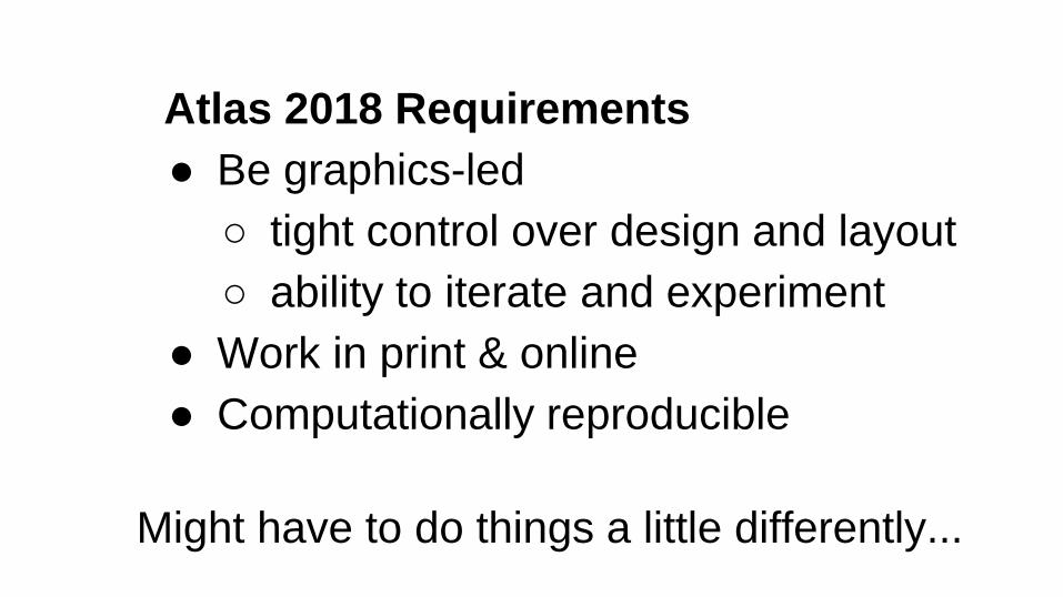
Atlas 2018 Requirements● Be graphics-led
○ tight control over design and layout ○ ability to iterate and experiment
● Work in print & online● Computationally reproducible
Might have to do things a little differently...

2017 2018

years = 1990:2016indicators <- c("SL.AGR.EMPL.ZS","SL.IND.EMPL.ZS","SL.SRV.EMPL.ZS"
)
df <- wbgdata(wbgref$incomes$iso3c,indicators,years = years,indicator.wide = FALSE
)
ggplot(df, aes(date, value,fill = indicatorID
)) +geom_col() +facet_wrap(~iso3c, nrow=1)

years = 1990:2016indicators <- c("SL.AGR.EMPL.ZS","SL.IND.EMPL.ZS","SL.SRV.EMPL.ZS"
)
df <- wbgdata(wbgref$incomes$iso3c,indicators,years = years,indicator.wide = FALSE
)
ggplot(df, aes(date, value,color = indicatorID
)) +geom_line() +facet_wrap(~iso3c, nrow=1)

fig_sdg8_emp_sector_panel <- function(years = 1990:2016) {indicators <- c("SL.AGR.EMPL.ZS", "SL.IND.EMPL.ZS", "SL.SRV.EMPL.ZS")
df <- wbgdata(wbgref$incomes$iso3c,indicators,years = years,indicator.wide = FALSE,# Comment the next two lines to use live API dataoffline = "only",offline.file = "inputs/cached_api_data/fig_sdg8_emp_sector_panel.csv"
)
figure(data = df,plot = function(df, style = style_atlas()) {
df <- df %>% mutate(iso3c = factor(iso3c, rev(wbgref$incomes$iso3c)))iso3c_labeller <- as_labeller(function(l) wbgref$incomes$labels[l])ggplot(df, aes(date, value, group = indicatorID, color = indicatorID)) +
geom_line(size=style$linesize) +scale_y_continuous(expand=c(0,0), limits = c(0, 80)) +scale_x_continuous(expand=c(0,0), limits=c(1990,2020), breaks = c(1990,2016 scale_color_manual(
values = c(SL.AGR.EMPL.ZS = style$colors$spot.secondary,SL.IND.EMPL.ZS = style$colors$spot.secondary.light,SL.SRV.EMPL.ZS = style$colors$spot.primary
),labels = c(
SL.AGR.EMPL.ZS = "Agriculture",SL.IND.EMPL.ZS = "Industry",SL.SRV.EMPL.ZS = "Services"
)) +facet_wrap(~iso3c, nrow=1, labeller = iso3c_labeller) +style$theme() +style$theme_legend("top") +theme(panel.spacing.x = unit(0.03, "npc"))
},aspect_ratio = 1.2,title = "In the early 2000s the service sector overtook agriculture to become th
employer. Globally, services account for 50 percent of employment, agriculture 30 p 20 percent.",
subtitle = paste0("Employment by sector (% of total employment)"),source = paste0("Source: ILO. World Development Indicators (SL.AGR.EMPL.ZS; SL.
SL.SRV.EMPL.ZS)."))
}
?

Source code for publication
Source code for toolsgithub.com/worldbank


Thanks!Tariq Khokhar: [email protected] Emi Suzuki: [email protected]