Embed Size (px)
Citation preview
Best End Brewing Co. Rebrand ProcessMadison Moats | GRDS 408 Portfolio Spring 2021
2Madison Moats | GRDS 408 Portfolio | Best End Rebrand Process
Contents
3
4
7
14
15
20
Purpose
Current Brand
Process
Feedback
Changes based on feedback
Final Brand
3Madison Moats | GRDS 408 Portfolio | Best End Rebrand Process
PurposeBest End Brewing Co. is a brewery in Atlanta, GA that has a line of beers as well as a physical brewery and restaurant space. They are relatively new and still working on establishing their brand and prod-uct line. Because of their size and age, they are also still working on establishing their visual language. Currently, it lacks consistency and refinement. This project set out to establish a more unique, ele-vated visual identity that would be uniform across multiple platforms, especially between their packaging and in-store experience.
4Madison Moats | GRDS 408 Portfolio | Best End Rebrand Process
Current Branding
5Madison Moats | GRDS 408 Portfolio | Best End Rebrand Process
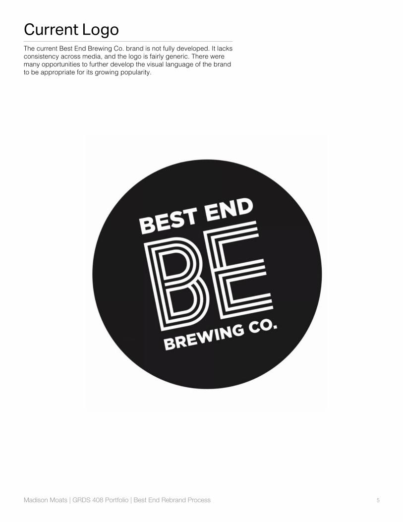
Current LogoThe current Best End Brewing Co. brand is not fully developed. It lacks consistency across media, and the logo is fairly generic. There were many opportunities to further develop the visual language of the brand to be appropriate for its growing popularity.
6Madison Moats | GRDS 408 Portfolio | Best End Rebrand Process
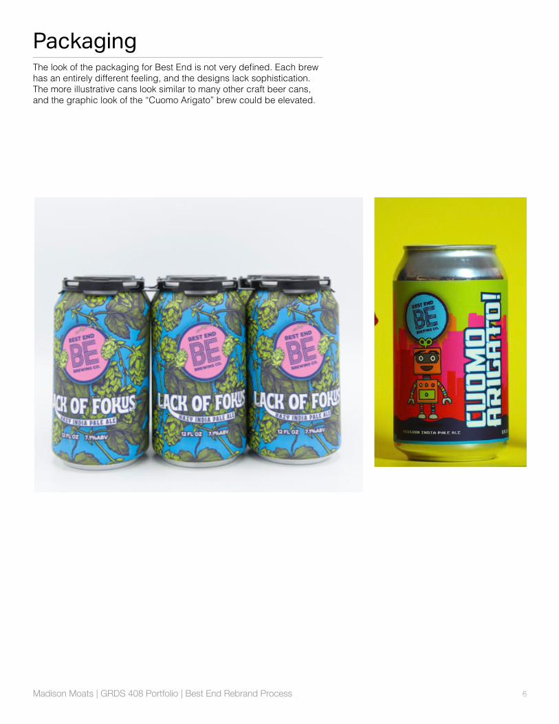
PackagingThe look of the packaging for Best End is not very defined. Each brew has an entirely different feeling, and the designs lack sophistication. The more illustrative cans look similar to many other craft beer cans, and the graphic look of the “Cuomo Arigato” brew could be elevated.
7Madison Moats | GRDS 408 Portfolio | Best End Rebrand Process
Process
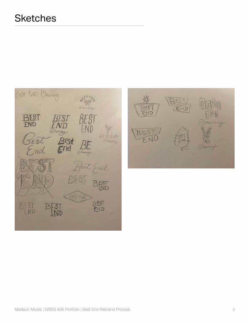
8Madison Moats | GRDS 408 Portfolio | Best End Rebrand Process
Sketches
9Madison Moats | GRDS 408 Portfolio | Best End Rebrand Process
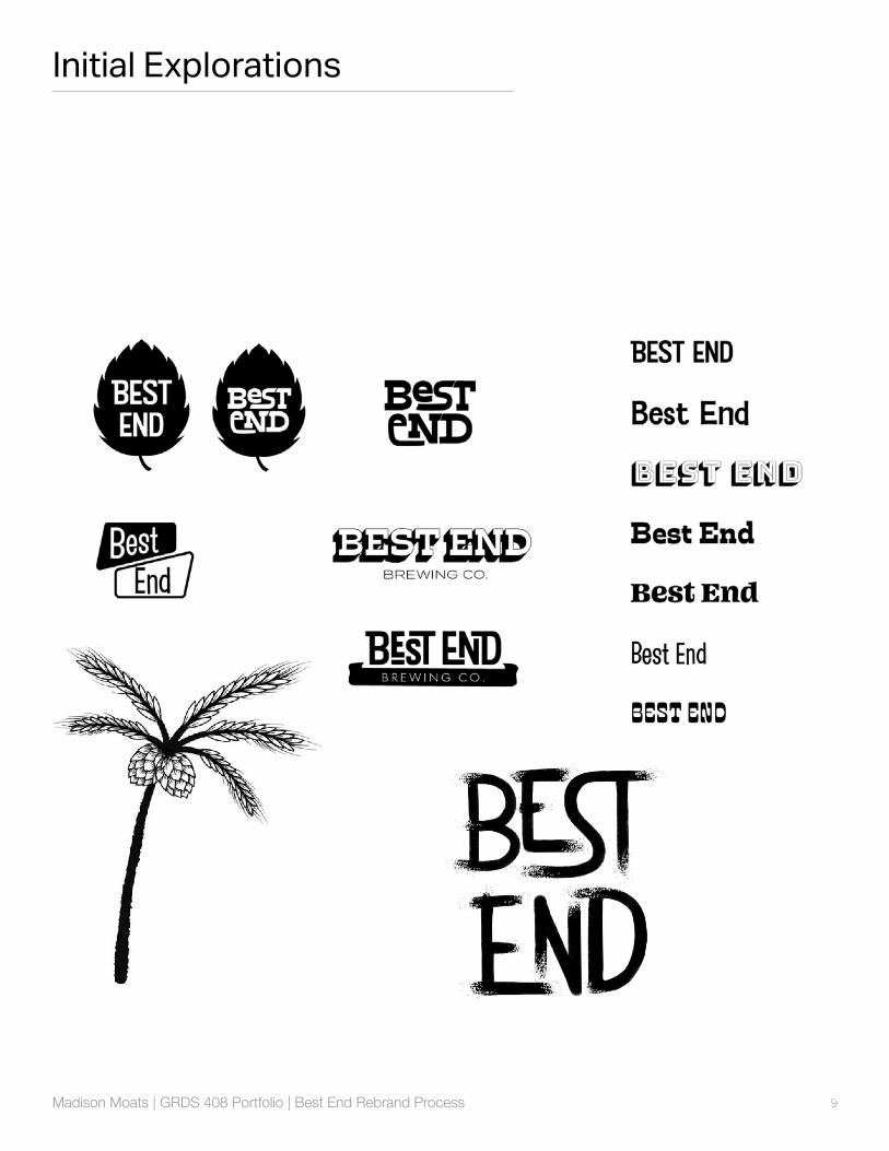
Initial Explorations

10Madison Moats | GRDS 408 Portfolio | Best End Rebrand Process
Initial Explorations
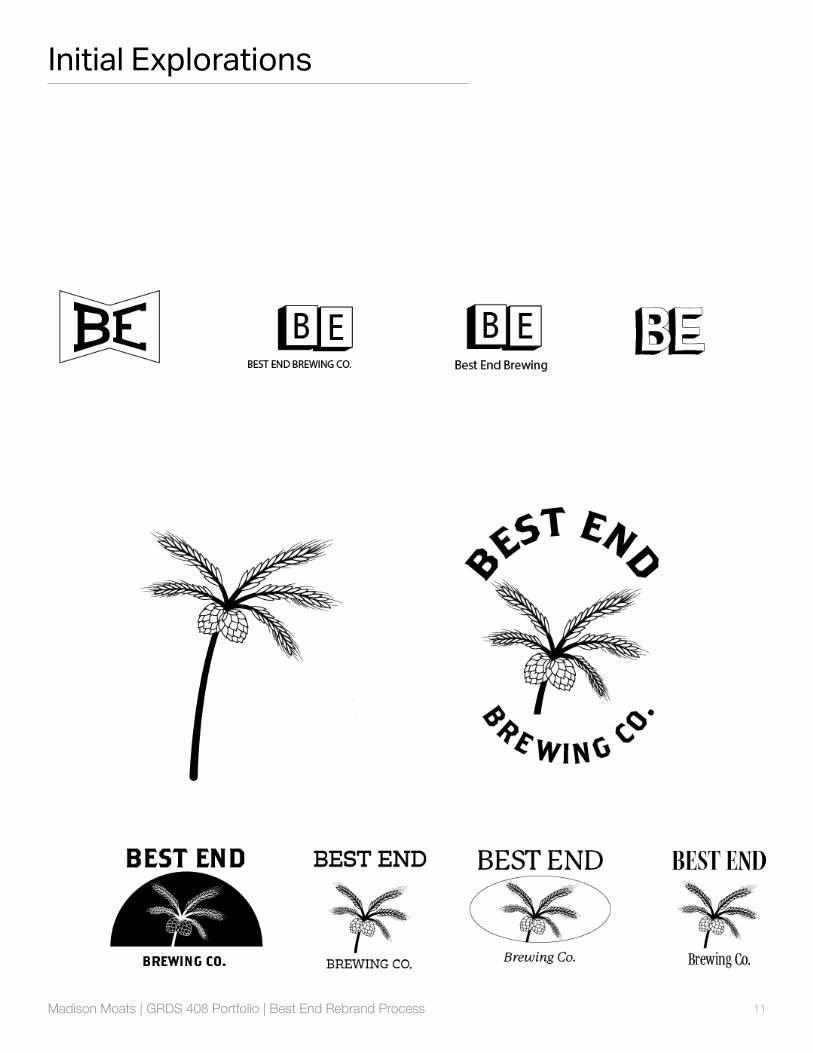
11Madison Moats | GRDS 408 Portfolio | Best End Rebrand Process
Initial Explorations
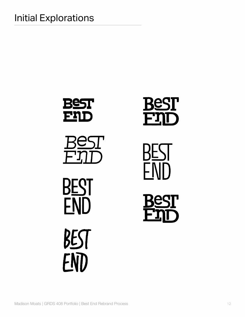
12Madison Moats | GRDS 408 Portfolio | Best End Rebrand Process
Initial Explorations

13Madison Moats | GRDS 408 Portfolio | Best End Rebrand Process
Initial Look
14Madison Moats | GRDS 408 Portfolio | Best End Rebrand Process
Feedback
• Add different roll-outs, like tees and beer glasses.
• Make refinements to the menu and how it is displayed in mockups.
• Normalize colors across brand.
15Madison Moats | GRDS 408 Portfolio | Best End Rebrand Process
Changes based on feedback
16Madison Moats | GRDS 408 Portfolio | Best End Rebrand Process
BEFORE
AFTER
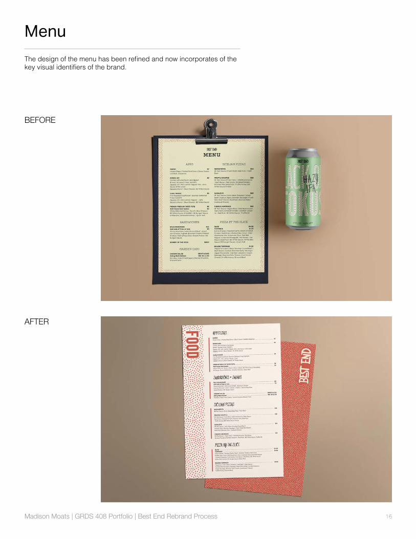
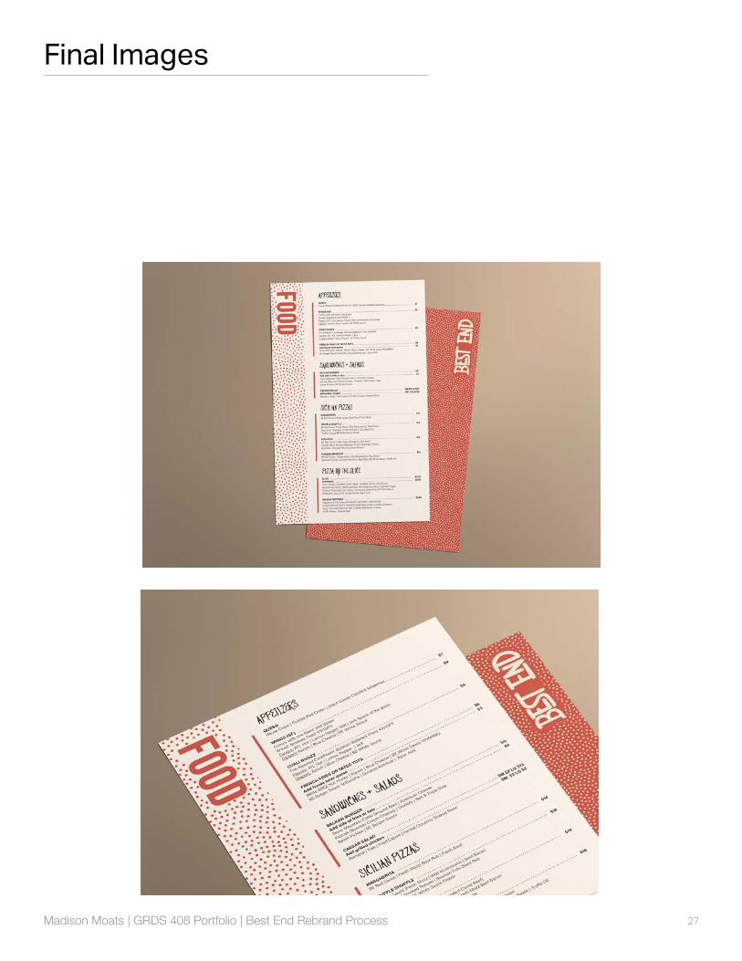
MenuThe design of the menu has been refined and now incorporates of the key visual identifiers of the brand.
17Madison Moats | GRDS 408 Portfolio | Best End Rebrand Process
BEFORE
AFTER
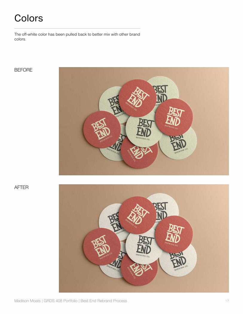
ColorsThe off-white color has been pulled back to better mix with other brand colors.
18Madison Moats | GRDS 408 Portfolio | Best End Rebrand Process
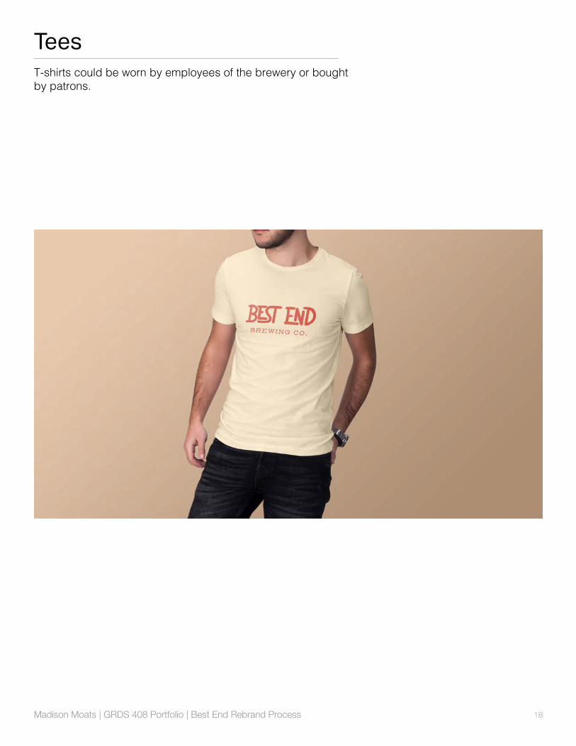
TeesT-shirts could be worn by employees of the brewery or bought by patrons.
19Madison Moats | GRDS 408 Portfolio | Best End Rebrand Process
Beer Glass
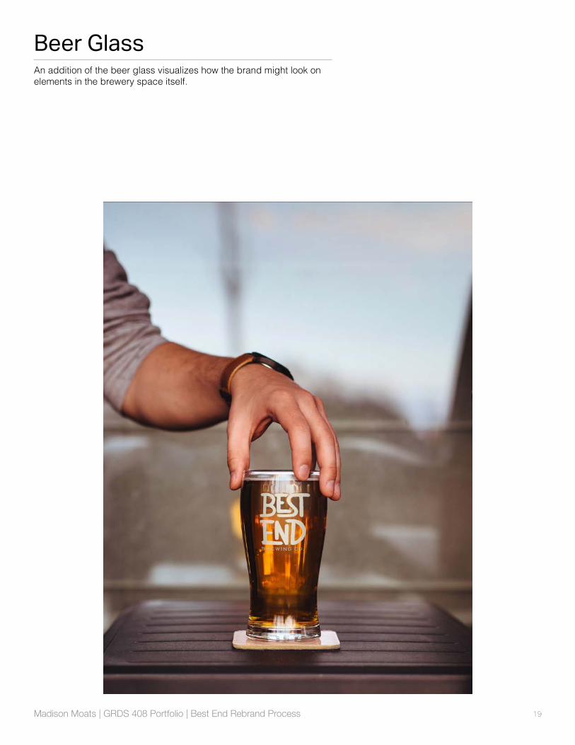
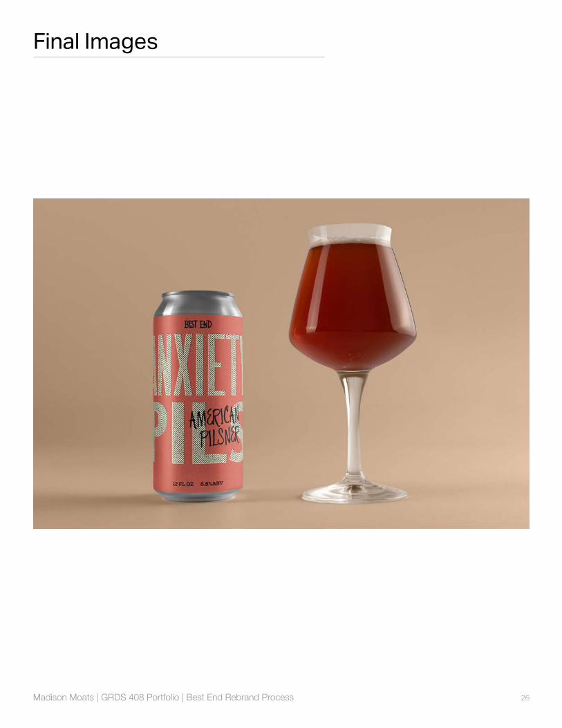
An addition of the beer glass visualizes how the brand might look on elements in the brewery space itself.
20Madison Moats | GRDS 408 Portfolio | Best End Rebrand Process
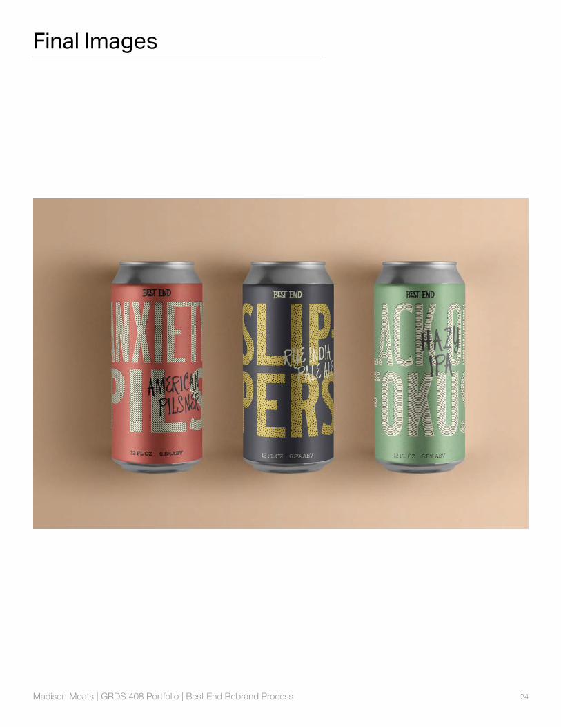
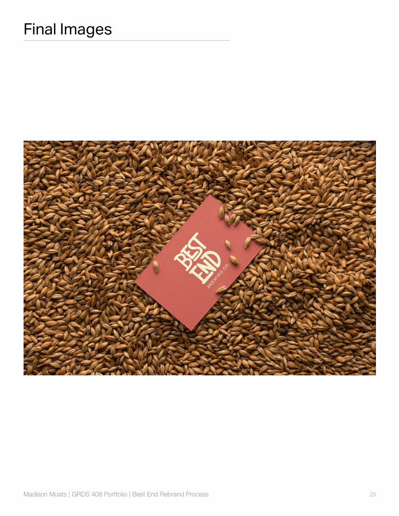
Final ProductThe current visual landscape of craft beer brands sees many illustrative approaches, with complex, detailed artwork and full saturation of colors. While this style is beautiful and for the most part, well-executed, it has caused many beer brands to look the same. Browsing the shelves, it can become difficult to recognize one brand as opposed to another. This new look aims to set Best End apart from the rest, with a more graphic, bold, immediately recognizeable style.
The identity consists of a hand-drawn word mark, a letterpress typeface mixed with handwritten type, printmaking textures, and a small set of strong colors. With these elements, the Best End brand includes distinc-tive packaging and collateral for the brick and mortar brewery space.

21Madison Moats | GRDS 408 Portfolio | Best End Rebrand Process
Word mark
22Madison Moats | GRDS 408 Portfolio | Best End Rebrand Process
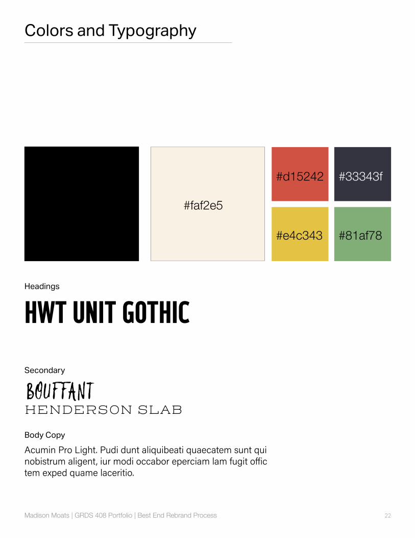
Colors and Typography
HWT UNIT GOTHIC
BOUFFANTHENDERSON SLAB
Acumin Pro Light. Pudi dunt aliquibeati quaecatem sunt qui nobistrum aligent, iur modi occabor eperciam lam fugit offic tem exped quame laceritio.
Headings
Secondary
Body Copy
#d15242
#faf2e5
#33343f
#e4c343 #81af78

23Madison Moats | GRDS 408 Portfolio | Best End Rebrand Process
TexturesThe textures refer back to printing and illustration techniques, using lithographic patterns, stippling, and dry-brush painting.
24Madison Moats | GRDS 408 Portfolio | Best End Rebrand Process
Final Images
25Madison Moats | GRDS 408 Portfolio | Best End Rebrand Process
Final Images
26Madison Moats | GRDS 408 Portfolio | Best End Rebrand Process
Final Images
27Madison Moats | GRDS 408 Portfolio | Best End Rebrand Process
Final Images
28Madison Moats | GRDS 408 Portfolio | Best End Rebrand Process
Final Images
29Madison Moats | GRDS 408 Portfolio | Best End Rebrand Process
Final Images
30Madison Moats | GRDS 408 Portfolio | Best End Rebrand Process
BEFORE
AFTER
Before and After

31Madison Moats | GRDS 408 Portfolio | Best End Rebrand Process
BEFORE
AFTER
Before and After

Madison Moats | GRDS 408 Portfolio | Best End Rebrand Process