Embed Size (px)
Citation preview

BI Query™ Chart EditorUser’s Guide
ii
BI Query Chart Editor User’s Guide5/22/02
Hummingbird Ltd.1 Sparks Avenue, Toronto, Ontario, Canada M2H 2W1Tel: +1-416-496-2200 Toll Free Canada/USA: 1-877-FLY-HUMM (1-877-359-4866)Fax: +1-416-496-2207E-mail: [email protected] or [email protected]: ftp.hummingbird.comFor more information, visit www.hummingbird.com
RESTRICTED RIGHTS LEGEND. Unpublished rights reserved under the copyright laws of the United States. The SOFTWARE is provided with restricted rights. Use, duplications, or disclosure by the U.S. Government is subject to restrictions as set forth in subparagraph (c) (1)(ii) of The Rights in Technical Data and Computer Software clause at DFARS 252.227-7013, subparagraph (c)(1) and (2) (a) (15) of the Commercial Computer Software-Restricted Rights clause at 48 CFR 52.227-19, as applicable, similar clauses in the FAR and NASA FAR Supplement, any successor or similar regulation.
Information in this document is subject to change without notice and does not represent a commitment on the part of Hummingbird Ltd. Not all copyrights pertain to all products.
© 1988–2002 Hummingbird Ltd. All rights reserved.
Genio, Genio Suite, Genio Miner, Genio MetaLink, Genio MetaLink for SAP R/3, Genio MetaLink for ERwin, Genio MetaLink for Power Designer, Genio MetaLink for IDOC, Genio MetaLink for BW, Genio Designer, Genio Scheduler, Genio Administration Manager, Genio Engine, Genio Scheduling Service, Genio Polling Service, Genio BW Service, Genio Met@Data, Hummingbird BI, BI Analyze, BI Cube Creator, BI Server, BI Server Admin, BI Server Repository, BI Query, BI Query Admin, BI Query Reports, BI Query Reports Chart Editor, BI Query Update, BI Query User, BI Web Personal Portfolio, BI Web, Hummingbird Portal, and Hummingbird Web Application Server are trademarks of Hummingbird Ltd. and/or its subsidiaries.
ACKNOWLEDGEMENTS Hummingbird BI makes use of the Blowfish library, an SSL implementation written by Eric Young, © 1995–1997, Eric Young. Photo clipart copyright © 1996 PhotoDisc Inc. All rights reserved.All other copyrights, trademarks, and tradenames are the property of their respective owners.
DISCLAIMER Hummingbird Ltd. software and documentation has been tested and reviewed. Nevertheless, Hummingbird Ltd. makes no warranty or representation, either express or implied, with respect to the software and documentation included. In no event will Hummingbird Ltd. be liable for direct, indirect, special, incidental, or consequential damages resulting from any defect in the software or documentation included with these products. In particular, Hummingbird Ltd. shall have no liability for any programs or data used with these products, including the cost of recovering such programs or data.

Related Documentation and Services
ManualsAll manuals are available in print and online. The online versions require Adobe Acrobat Reader 5.0 and are installed only if you do a Complete installation. Your Hummingbird product comes with the following manuals:
HelpThe online Help is a comprehensive, context-sensitive collection of information regarding your Hummingbird product. It contains conceptual and reference information, and detailed, step-by-step procedures to assist you in completing your tasks.
Release NotesThe release notes for each product contain descriptions of the new features and details on release-time issues. They are available in both print and HTML. The HTML version can be installed when you install the software. Read the release notes before installing your product.
BI Query Installation Guide Determine system requirements and install BI Query and BI Query Reports.
BI Query Queries User’s Guide Query corporate databases and export data to other applications.
BI Query Data Models User’s Guide Create and manage data models and update records in the database.
BI Query Reports User’s Guide Produce reports using BI Query Reports from data obtained using BI Query.
BI Query Chart Editor User’s Guide (PDF Only)
Use advanced features to edit charts created in BI Query Reports.
iii

Professional ServicesHummingbird offers consulting and training services worldwide. Working alongside your technical and non-technical staff, Professional Services can help you identify areas where improved information management can enhance your business performance. As well, we can provide training on how to use your Hummingbird products. If requested, we can design courses that are tailored to meet your organization’s specific needs. These courses can take place at your workplace or at our own training centers. To register, or for more information, pricing, and detailed course outlines, contact Hummingbird Professional Services.
Hummingbird Exposé OnlineHummingbird Exposé Online is an electronic mailing list and online newsletter. It was created to facilitate the delivery
of Hummingbird product-related information. It also provides tips, help, and interaction with Hummingbird users. To subscribe/unsubscribe, browse to the following web address:
http://www.hummingbird.com/expose/about.html
User Groups and Mailing ListsThe user group is an unmoderated, electronic mailing list that facilitates discussion of product-related issues to help users resolve common problems and to provide tips, help, and contact with other users.
To join a user group:
Send an e-mail to [email protected]. Leave the Subject line blank. In the body of the e-mail message, type the following:
subscribe hbi-users Your Name
To unsubscribe:
Send and e-mail to the listserv address. Leave the Subject line blank, and type unsubscribe hbi-users in the body of the e-mail message.
To post messages to the user group:
Send your e-mail to:
To search the mailing list archives:
Go to the following web site:
http://www.hummingbird.com/support/usergroups.html
Telephone +1-613-548-4355 ext. 1700
Fax +1-613-548-7801
Email [email protected]
Website www.hummingbird.com
iv
Contents
About the Chart Editor 3Running the Chart Editor 3
Editing Chart Templates 3
Auto-Redraw 4
Esc to Stop Drawing 4
Display Status 5
Full Screen Chart View 5
Using the Pull-down Menus 5
Pop-up Menus 6
Switching Chart Types 6
Selecting Objects 7
Moving and Resizing Objects 8
Moving 8
Resizing 9
Tools and Palettes 9
Text Toolbar 10
Tool Palette 10
Annotation Palette 11
Color Palette 12
Effects Palette 13
Creating and Saving Chart Templates 17
Opening and Closing Chart Templates 17
Opening an Existing Chart Template 17
Saving a Chart Template 18
Deleting a Chart Template 19
2D Charts 23
Chart Types 27
Bar Charts 27
Line Charts and Area Charts 31
Scatter Charts 33
Radar Charts 34
Polar Charts 35
HiLo Charts 36
Bubble Charts 38
Histograms 38
Spectral Mapped Charts 39
2D Chart Objects 40
Bar, Line and Area Chart Objects 41
Scatter and Bubble Chart Objects 43
Radar and Polar Chart Objects 44
HiLo Chart Objects 45
Histogram Objects 46
Spectral Mapped Chart Objects 47
2D Chart Edits 47
Grid Lines and Tick Marks on Numeric Axes 48
Displaying Grid Lines 48
Grid Lines on Non-numeric Axes 51
Exchanging Rows and Columns 53
Reversing Data Order 54
Zero Lines 56
Riser Base for Negative Data 56
Log and Linear Scales 58
Contents v
Scale Range, Numeric Axes 59
Scale and Header Locations 61
Hiding Scales and Headers 61
Staggered Scale Values and Headers 62
Inverted Scales 63
Curve Fits and Statistical Lines 64
Emphasizing a Bar in a Bar Chart 68
Changing Bars to a Line 69
Changing a Line to Bars 70
Bar Thickness, and Spacing 71
Bar, Marker and Cell Shape 72
Data-point Size 74
Data-point Value and Name Display 75
Title, Subtitle, Footnote 76
Legend 77
Number of Intervals — Histograms 78
Spectrum 79
Display Status 82
Gradients, Colors, Textures, and Patterns 83
3D Charts 87
Why 3D Charts? 89
Correlation in Two Directions 90
Large Amount of Data 91
Impact 91
The Objects of a 3D Chart 93
3D Chart Design 94
Data Correlation 94
Emphasis of Some of the Data 95
Obscured Data-Points 96
3D Chart Types 98
3D Riser Charts 99
3D Floating Charts 100
3D Connect-Series and -Row 101
3D Surface 102
Scatter Charts 106
3D Preset Viewing Angles 107
Standard Angle 108
Tall and Skinny 108
From the Top 108
Distorted 109
Short and Fat 109
Column’s Eye 110
Column Emphasis 110
Few Rows 111
Few Columns 111
Distorted Standard 112
Thick Wall for Columns 112
Shorter and Fatter 113
Thick Wall for Rows 113
Thick Wall Standard 114
California Special 115
Blast-o-Vision 115
3D Chart Edits 116
Custom Viewing Angles 116
vi Contents

The 3D View Tool 116
Positioning the 3D View Tool 117
Controls in the 3D View Tool 118
Adjusting the Viewing Direction — Rotation 119
Stretching and Shrinking the Three Axes — Proportions 120
Thickness of the Walls and Floor — Proportions 121
Perspective Distortion 122
Location along a Screen Axis — Movement 124
Enlarging and Reducing — Zoom 125
Repositioning — Pan 126
Walls and Floor 128
Coloring the Box — Autoshade 128
Edge Decoration 130
Edge Width and Style 130
Removing the Walls and Floor 130
Grid Lines and Scales 131
Grid Lines on Non-numeric Axes 131
Grid Lines on Numeric Axes 132
Numeric Axis Scale Ranges 134
Log and Linear Scales 135
Format of Scale Values 135
Riser Editing 136
Coloring the Risers — Autoshade 136
Grid Lines 139
Riser Dimensions 141
Base of Risers 142
Data-point Names, Scatter Charts 142
Reversing Data Order and Exchanging Axes 143
Scatter Chart Data-points — Visualizing Data-point Location in Space 143
Visual Separation of Data Series 144
Data-point Size and Shape 146
Text Control 147
3D Text 148
Title, Subtitle, Footnote 149
Scatter Chart Legend 150
Display Status 151
Pie Charts 155
The Objects of a Pie Chart 157
Types of Pie Charts 158
Single Pie 158
Multiple Pies 159
Multiple Proportional Pies 160
Pie-Bars 160
Ring Pies 161
Pie Chart Edits 161
Exchanging Pies and Slices 161
Reverse Slice Order and Reverse Pie Order 162
Detaching Slices 163
Deleting Slices 164
Restoring Detached and Deleted Slices 165
Contents vii
3D Effects 165
Ring Pie: Size of the Hole 166
Ring Pie: Pie Total 167
Pie Rotation 167
Slice Labels 168
Pie/Bar — Bar Labels 169
Title, Subtitle, Footnote 172
Legend 173
Colors, Patterns, Gradients and Textures 175
Display Status 175
Line, Area and Text Decorations 179
Solid Colors 180
The Color Palette 180
Applying Colors to Lines and Areas 181
Applying Colors to Text 182
Custom Colors with the RGB Button 183
Transparent “Color” 183
Effects — Gradients, Patterns and Textures 184
The Effects Palette 184
Applying Effects to Areas 189
Editing Pattern Effects 189
Editing Gradient Effects 190
Editing Texture Effects 192
Line Width and Style 194
Formatting Text and Numbers 197
Summary 197
Formatting Numbers 198
Changing Number Formats 199
Changing Punctuation 200
General Number Format 201
Date Formats 201
Fonts, Character Styles and Alignment 202
The Text Toolbar 202
Font Selection 203
Sizing Text 203
Scale Numbers, Legend Text, Category Axis Headers 204
Horizontal Alignment 206
Annotations 209
Creating Annotation Objects 210
Using Annotation Tools 211
The Annotations 211
Rectangles 211
Square 212
Ellipse 212
Circle 212
Arrow 212
Line 213
Horizontal and Vertical Lines 213
Polygon 213
Freehand 214
Text Annotation 214
Creating a Text Annotation 214
viii Contents

Editing a Text Annotation 215
Formatting Annotation Text 215
Editing and Manipulating Annotation Objects 215
Selecting Objects 216
Re-sizing an Object 216
Moving Objects 216
Aligning and Sizing Objects 216
Rearranging Overlapping Objects 224
Deleting Objects 224
Duplicating Objects 224
Object Decoration 225
Accessibility and Technical Support 227
Accessibility 227
Microsoft Accessibility Options 228
Technical Support 228
Index 231
Contents ix


About the Chart Editor
Running the Chart Editor 3
Editing Chart Templates 3
Auto-Redraw 4
Esc to Stop Drawing 4
Display Status 5
Full Screen Chart View 5
Using the Pull-down Menus 5
Pop-up Menus 6
Switching Chart Types 6
Selecting Objects 7
Moving and Resizing Objects 8
Moving 8
Resizing 9
Tools and Palettes 9
Text Toolbar 10
Tool Palette 10
Annotation Palette 11
Color Palette 12
Effects Palette 13


About the Chart EditorThe BI Query Chart Editor is a chart editor supplied with BI Query Reports which provides additional chart formatting capabilities. With the Chart Editor, you can format your charts to present your data with just the look you want. You can draw arrows and shapes, apply different colors, add and customize text elements, and modify three-dimensional chart perspectives for dramatic impact. When you close the Chart Editor, your changes are automatically applied to the chart in BI Query Reports.
Running the Chart EditorWhen you’ve created a chart in BI Query Reports, you can use the Chart Editor to format it. You start the Chart Editor from BI Query Reports — it’s a separate application. Before you start the Chart Editor, select the chart you want to edit.
To run the Chart Editor
1 In BI Query Reports, select the chart you want to edit.
2 Choose Advanced Editor from the Format menu.
3 Edit the chart.
4 To update the chart in BI Query Reports, choose Update from the File menu.
5 To close the Chart Editor, choose Exit from the File menu.
Editing Chart TemplatesSpecific instructions for editing chart templates are given in the following chapters:
Topic Chapter
Bar, line and area charts 2D Charts
Pie charts Pie charts
2D Scatter charts 2D Charts
Histograms 2D Charts
About the Chart Editor 3
4 About the C
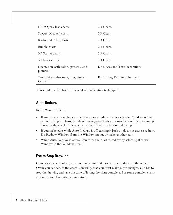
You should be familiar with several general editing techniques:
Auto-Redraw
In the Window menu:
• If Auto Redraw is checked then the chart is redrawn after each edit. On slow systems, or with complex charts, or when making several edits this may be too time consuming. Turn off the check mark so you can make the edits before redrawing.
• If you make edits while Auto Redraw is off, turning it back on does not cause a redraw. Do Redraw Window from the Window menu, or make another edit.
• While Auto Redraw is off you can force the chart to redraw by selecting Redraw Window in the Window menu.
Esc to Stop Drawing
Complex charts on older, slow computers may take some time to draw on the screen. Often you can see, as the chart is drawing, that you must make more changes. Use Esc to stop the drawing and save the time of letting the chart complete. For some complex charts you must hold Esc until drawing stops.
HiLoOpenClose charts 2D Charts
Spectral Mapped charts 2D Charts
Radar and Polar charts 2D Charts
Bubble charts 2D Charts
3D Scatter charts 3D Charts
3D Riser charts 3D Charts
Decoration with colors, patterns, and pictures.
Line, Area and Text Decorations
Text and number style, font, size and format.
Formatting Text and Numbers
hart Editor

Display Status
Many of the chart objects can be turned off, so they don’t show. These are listed in the Chart menu under Display Status. If you can’t find an object, check here to see if it’s turned on.
Full Screen Chart View
A full screen preview of the chart you are working on is often helpful. The larger chart, free of the distractions of other windows and objects on the screen, can give a better feel of how it will look when printed. Sometimes it helps to examine charts with a lot of data in full screen detail before sending them to a higher resolution printer.
To expand the chart in the current window to fill the screen, press F9, or from the Window menu do View Full Screen. Click a mouse button or press most any key to return to normal.
Using the Pull-down MenusChart in the menu bar has selections for editing many of the chart’s objects.
1 Click on Chart in the bar menu.
2 Select the line in the menu you want.
• Some menu lines operate as soon as you select the line and release the mouse button. The text of these menu items has no symbol after it.
• Some menu items bring up a dialog box. The text of these items has three periods after it.
• Some menu lines bring up a sub-menu. Click on the item you want. The text of these items has a right pointing arrow after it.
• Some menu lines display a dialog box for entering additional parameters. Make the appropriate entries and click on the OK button. The Cancel button gets you out with no changes.
About the Chart Editor 5

6 About the C
Pop-up MenusThese augment the standard menu bar at the top of the window. Often a pop-up is the most convenient way to get to a function. They are attached to chart objects, such as an axis or the bar of a bar chart, and have functions related to the object. Most, but not all functions are in the pop-up menus.
To show a pop-up menu, use the Arrow pointer or the Pop-up tool:
To remove a pop-up menu without using it, left-button click anywhere else on the chart. Pop-up menus can’t be activated from the keyboard.
Switching Chart TypesYou can change the type of chart in a chart window — use the Gallery pull-down menu. Most of the design parameters (e.g., axis scale parameters, text fonts, Ö) of one chart are applicable to other charts; to the extent possible these are carried to the new chart. This feature lets you experiment with different chart types without having to “re-design” the colors, type faces, scale ranges, and other parameters after changing chart type.
To change the chart type:
1 Select Gallery from the menu bar.
A sub-menu of major chart type categories drops down.
D bar, line and area, vertical versions2D bar, line and area, horizontal versionsPie chartsVarious 3D chart types, including 3D scatter charts2D Scatter charts
Select the Arrow pointer: Point to the object and click with the right mouse button.
Select the Pop-up tool: Point to the object and click with either mouse button.
hart Editor

Polar chartsRadar chartsBubble chartsHi-Lo-Open-Close chartsSpectral map chartsHistogramsTable Charts
2 Point to one of these categories. A sub-menu of chart types within the category is displayed.
3 Slide into the sub-menu, then slide up and down in the sub-menu. Icons show what the charts look like.
4 Release, or click, on one of the chart types shown. The chart redraws automatically. (If Auto Redraw in the Window menu isn’t checked, select Redraw Window to force a redraw.)
Selecting ObjectsThere are two categories of objects. You can tell which when the object is selected.
You can select single or multiple objects. Select several objects simultaneously, to edit some of their attributes together. Use this as a convenient way, for instance, to make several objects the same color, or to move multiple objects the same amount.
Selected Appearance Properties Examples
Surrounded by handles Can be moved Titles, Annotations
Outlined Cannot be moved Face of a 3D riser
About the Chart Editor 7

8 About the C
Moving and Resizing ObjectsObjects that are outlined when selected can’t be moved or resized. A typical non-movable object is the bar of a bar chart.
When a selected object is identified with handles, it can be moved and resized. A typical movable object is the chart title.
Moving
Select an object and display its handles. To move more than one object together, multiple select them with the Shift key. Then click anywhere inside the handles of one of the objects and drag to the new position. An outline follows the dragging cursor, to help see the new position.
When you multiple select you can include non-movable objects. These retain position when the objects are moved.
Refer to the Annotation chapter for aligning objects.
Single Object Multiple Objects
Select De-select SelectDe-select Single
De-select All
Click inside or on the object.
Its handles or an outline appear.
Several ways:
• Shift-click the object.
• Select an-other object.
• Click the gray area outside the chart.
After selecting the first object, Shift-click additional objects.
Shift-click the selected object.
Two ways:
• Click an-other object.
• Click the gray area outside the chart.
hart Editor
Resizing
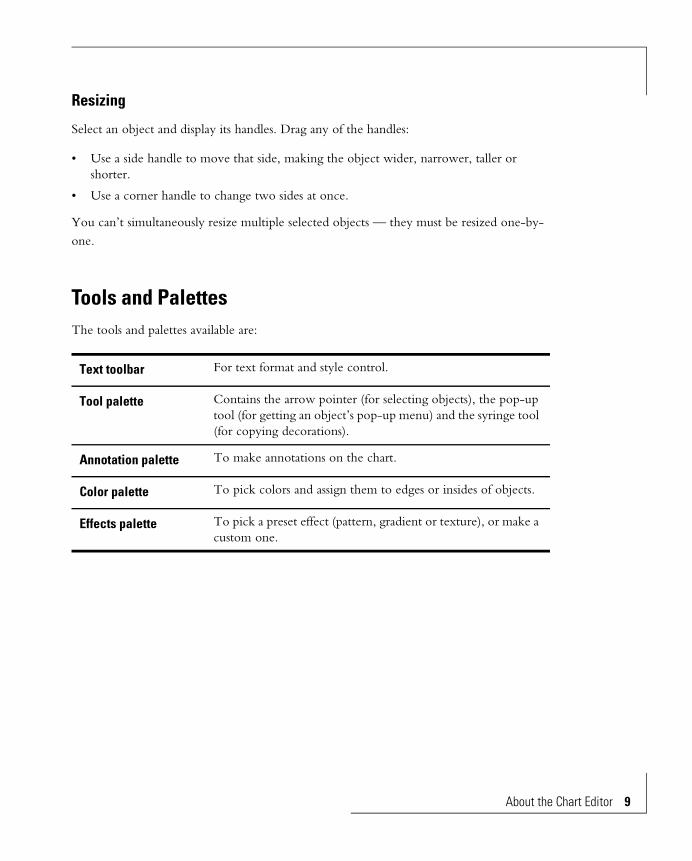
Select an object and display its handles. Drag any of the handles:
• Use a side handle to move that side, making the object wider, narrower, taller or shorter.
• Use a corner handle to change two sides at once.
You can’t simultaneously resize multiple selected objects — they must be resized one-by-one.
Tools and PalettesThe tools and palettes available are:
Text toolbar For text format and style control.
Tool palette Contains the arrow pointer (for selecting objects), the pop-up tool (for getting an object’s pop-up menu) and the syringe tool (for copying decorations).
Annotation palette To make annotations on the chart.
Color palette To pick colors and assign them to edges or insides of objects.
Effects palette To pick a preset effect (pattern, gradient or texture), or make a custom one.
About the Chart Editor 9

10 About the
Text Toolbar
This controls text format. It is similar to controls in many other Windows programs that have text.
To use the tool palette, select the text to be formatted and click on the appropriate tool. This function is described in more detail in the Formatting Text and Numbers chapter.
Tool Palette
Three tools are in the tool palette:
Arrow pointer — for selecting objects:
Pop-up Tool — for showing pop-up menus:
Syringe Tool — for showing pop-up menus:
Use this tool for selecting single and multiple objects. Use it for moving and resizing objects.
Select the tool, point to a chart object, and click either mouse button.
Use this tool to get decoration from an object and inject it into another object.
Font Font Size Bold Italic Underline Autofit
Style
Left Center Right Justify
Alignment
Chart Editor

Annotation Palette
These tools are for annotating a chart. You can draw various geometric shapes and add annotation text.
After you make an annotation, press the spacebar to return to the arrow pointer. This works for all annotations except text, where the spacebar puts a space in the text being entered. You may have to move the cursor to make it change back to the arrow pointer.
Rectangle Click and drag to opposite corner. Hold Ctrl to make square. Hold Shift to make the starting point the center of the rectangle.
Circle/Ellipse Click and drag to opposite corner. Hold Ctrl to make circular. Hold Shift to make the starting point the center of the circle/ellipse
Polygon Click on each corner. Double click the last corner. The polygon automatically closes.
Freehand Drag the cursor to draw a freehand line.
Line Click and drag to the opposite end. Hold Ctrl to make the line vertical or horizontal.
Arrow Click and drag to the opposite end. Hold Ctrl to make the arrow vertical or horizontal.
Text Click, draw out a box to hold the text, and enter the text in the text entry box that appears.
About the Chart Editor 11

12 About the
Color Palette
The color palette is in the top toolbar the window. Click and hold on the Area Box or the Line Box to get it.
Area Box and Line Box
The color will be applied to the inside area or the edge of the selected object.
Transparent Selection Box
The selected object will be made invisible. Be careful with lines - invisible lines will be hard to find if you want to change them back to visible.
RGB Selection Box Brings up the RGB display, for selection of additional colors.
Current Color Box Shows the color and color number of the currently selected object. It stays constant while you select a new color.
Current Selection Box
Shows the color and color number of the current selection — the color under the cursor as you drag the cursor around in the color bands.
Color Bands Select a color. It will show in the current selection box, and will be applied to the selected object inside or edge.
Gray Scale Band Identical to the color selection panel, except it has black, white, and gray levels.
Chart Editor

Effects Palette
To bring up the Effects Palette, select Special Effect Palette from the View menu.
Preview Window Shows the currently selected effect.
Effect Name List box Use the arrow on the right to select a different effect by name.
Apply Effect Button After selecting or making an effect, apply it to the currently selected object with this button.
Edit Effect Button Edit the currently selected effect.
Pattern Select from preset patterns. Use the arrow keys at the bottom or the list box at the top.
Gradient Select from preset gradients. Use the arrow keys at the bottom or the list box at the top.
Texture Select from preset textures. Use the arrow keys at the bottom or the list box at the top.
Effect NameList Box
Patterns
Edit Effect
Gradients
Textures
Preview Window
Apply Effect
Previous PresetContinuous Reverse
Continuous Advance
Next Preset
About the Chart Editor 13

14 About the
>>and<< (Continuous Advance and Reverse)
These take you to the beginning or end of the list of presets.
<and> Previous and Next Preset
These display the previous or next preset.
Chart Editor

Creating and Saving Chart Templates
Opening and Closing Chart Templates 17
Opening an Existing Chart Template 17
Saving a Chart Template 18
Deleting a Chart Template 19


Creating and Saving Chart TemplatesA chart has two independent components:
• The template: The template is the design of the chart and defines how the chart looks, independent of the data. This includes the type of chart (bar, line, area, …), the colors, placement and sizes of its objects, and such details as the lengths of label lines to slices of a pie chart. The Chart Editor edits the template part of charts.
• The data: Data comes from a BI Query results set.
The data, the template and some other information are held together in a chart file with extension .3DF. The Chart Editor does not edit the data part of the chart file. Keep this in mind when using the program and this guide.
The additional information in a chart file is:
• A thumbnail picture to help identification in open dialogs.
• A text description, also to help identification in open dialogs.
• Page setup details — chart size and margins.
Opening and Closing Chart Templates
Opening an Existing Chart Template
1 From the File menu choose Open. A dialog box appears.
Creating and Saving Chart Templates 17

18 Creating a
2 Select the chart to be opened from the Drives, Directories and File Name list boxes. Only .3DF (chart) files are listed.
To help identify the selected file its description and thumbnail are displayed. Use this to confirm it’s the chart you want.
3 Click the OK button.
4 Alternately you can double-click the chart name. This opens the chart immediately, skipping the display of the description and the thumbnail.
The chart is brought into a new window so you can edit its template.
Saving a Chart Template
1 Use File, Save or File, Save As. A dialog box appears.
nd Saving Chart Templates
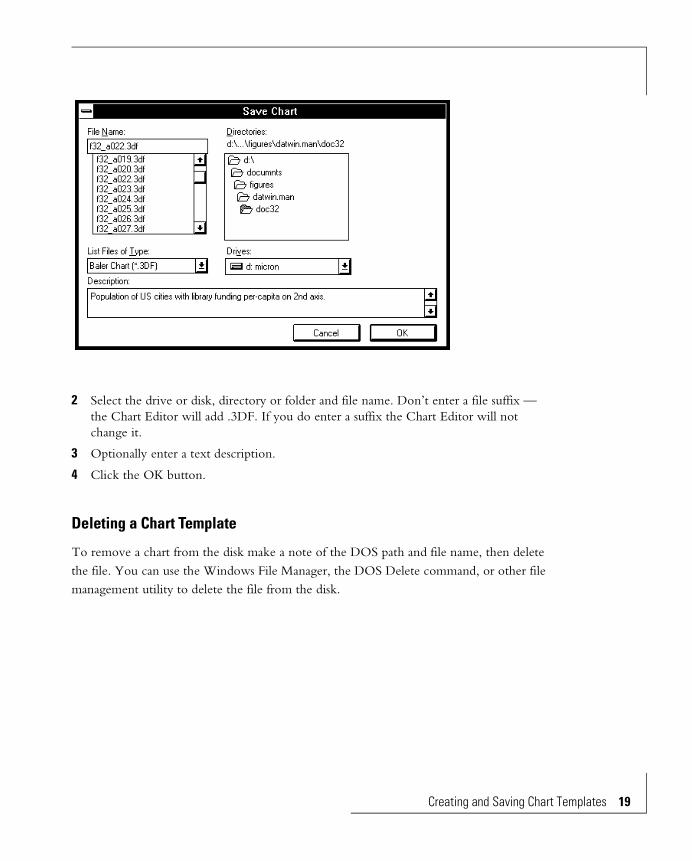
2 Select the drive or disk, directory or folder and file name. Don’t enter a file suffix — the Chart Editor will add .3DF. If you do enter a suffix the Chart Editor will not change it.
3 Optionally enter a text description.
4 Click the OK button.
Deleting a Chart Template
To remove a chart from the disk make a note of the DOS path and file name, then delete the file. You can use the Windows File Manager, the DOS Delete command, or other file management utility to delete the file from the disk.
Creating and Saving Chart Templates 19

2D Charts
Chart Types 27
Bar Charts 27
Bipolar and Dual Axis Bar Charts 29
Line Charts and Area Charts 31
Scatter Charts 33
Radar Charts 34
Polar Charts 35
HiLo Charts 36
Bubble Charts 38
Histograms 38
Spectral Mapped Charts 39
2D Chart Objects 40
Bar, Line and Area Chart Objects 41
Scatter and Bubble Chart Objects 43
Radar and Polar Chart Objects 44
HiLo Chart Objects 45
Histogram Objects 46
Spectral Mapped Chart Objects 47
2D Chart Edits 47
Grid Lines and Tick Marks on Numeric Axes 48
Displaying Grid Lines 48
Number of Divisions 50
Types of Grid Lines, Tick Marks 50
Grid Line Color, Thickness 50
Grid Lines on Dual Axis Charts 51
Grid Lines on Non-numeric Axes 51
Spectral Mapped Chart Grid Lines 52
Exchanging Rows and Columns 53
Reversing Data Order 54
Using Pop-Up Menus: 54
Using Pull-Down Menus: 55
Zero Lines 56
Riser Base for Negative Data 56
Log and Linear Scales 58
Scale Range, Numeric Axes 59
Automatic Scaling 59
Manual Scaling 59
Scale and Header Locations 61
Hiding Scales and Headers 61
Staggered Scale Values and Headers 62
Inverted Scales 63
Curve Fits and Statistical Lines 64
Emphasizing a Bar in a Bar Chart 68
Changing Bars to a Line 69
Changing a Line to Bars 70
Bar Thickness, and Spacing 71
Bar, Marker and Cell Shape 72
Data-point Size 74
Data-point Value and Name Display 75
Turn On Data-point Value, Name Display 76
Turn Off Data-point Value and Name Display 76
Title, Subtitle, Footnote 76
Legend 77
Number of Intervals — Histograms 78
Automatic Interval Selection 79
Manual Interval Selection 79
Spectrum 79
Linear or Log Spectrum Scale 79
Scale Range 80
Display Status 82
Gradients, Colors, Textures, and Patterns 83
2D Charts
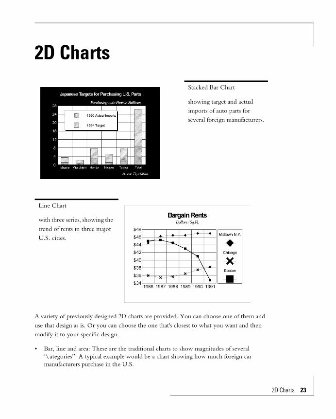
A variety of previously designed 2D charts are provided. You can choose one of them and use that design as is. Or you can choose the one that's closest to what you want and then modify it to your specific design.
• Bar, line and area: These are the traditional charts to show magnitudes of several “categories”. A typical example would be a chart showing how much foreign car manufacturers purchase in the U.S.
Stacked Bar Chart
showing target and actual imports of auto parts for several foreign manufacturers.
Line Chart
with three series, showing the trend of rents in three major U.S. cities.
2D Charts 23
24 2D Charts
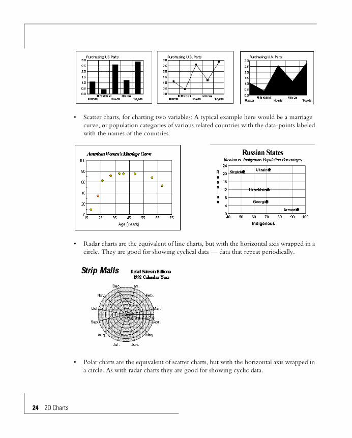
• Scatter charts, for charting two variables: A typical example here would be a marriage curve, or population categories of various related countries with the data-points labeled with the names of the countries.
• Radar charts are the equivalent of line charts, but with the horizontal axis wrapped in a circle. They are good for showing cyclical data — data that repeat periodically.
• Polar charts are the equivalent of scatter charts, but with the horizontal axis wrapped in a circle. As with radar charts they are good for showing cyclic data.
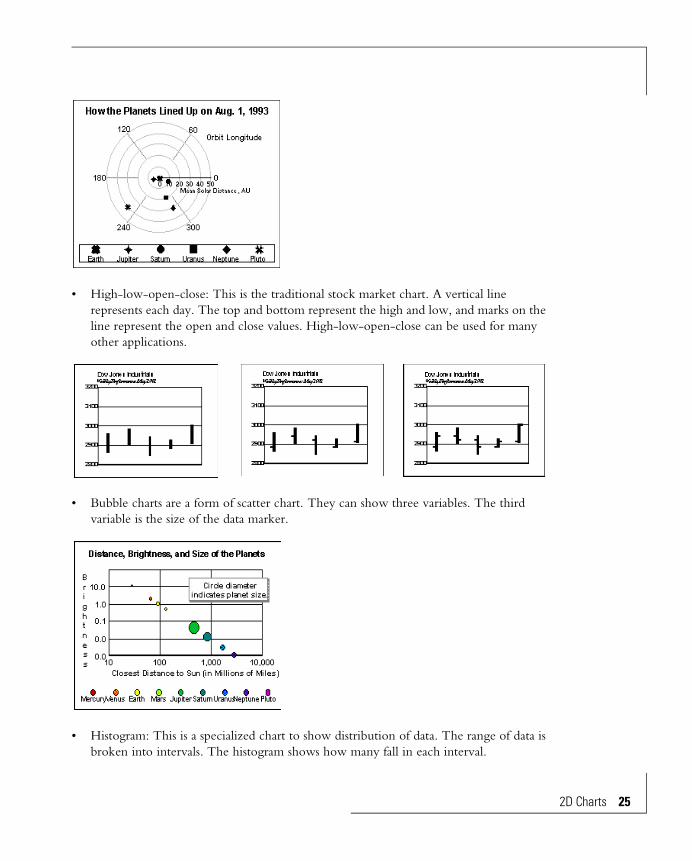
• High-low-open-close: This is the traditional stock market chart. A vertical line represents each day. The top and bottom represent the high and low, and marks on the line represent the open and close values. High-low-open-close can be used for many other applications.
• Bubble charts are a form of scatter chart. They can show three variables. The third variable is the size of the data marker.
• Histogram: This is a specialized chart to show distribution of data. The range of data is broken into intervals. The histogram shows how many fall in each interval.
2D Charts 25
26 2D Charts
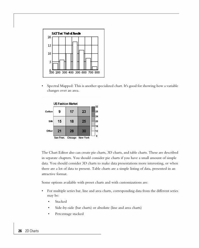
• Spectral Mapped: This is another specialized chart. It's good for showing how a variable changes over an area.
The Chart Editor also can create pie charts, 3D charts, and table charts. These are described in separate chapters. You should consider pie charts if you have a small amount of simple data. You should consider 3D charts to make data presentations more interesting, or when there are a lot of data to present. Table charts are a simple listing of data, presented in an attractive format.
Some options available with preset charts and with customizations are:
• For multiple series bar, line and area charts, corresponding data from the different series may be:
• Stacked
• Side-by-side (bar charts) or absolute (line and area charts)
• Percentage stacked
• Bar, line and area charts, and histograms, can be vertical or horizontal.
• Dual axis charts can chart different data series against opposite axes, using different scales.
• Bipolar charts can chart different data series on either side of a center line through the chart.
• Numeric scales can be linear or logarithmic.
• Numeric scale ranges can be chosen automatically. Or, you can specify the scale range.
• Approximation curves can be drawn.
• Mean and standard deviation lines can be added.
• Numeric axes can have major and minor grid lines and tick marks.
• Data-point values can be put next to the data-points.
• Bars of bar charts can be different shapes, widths and colors.
• The data-points of line, scatter, polar, radar and bubble charts can be different shapes, sizes and colors.
• Bars of bar charts and histograms can be represented as pictographs.
• Bars and areas representing negative numbers can start at the bottom of the chart or from the zero line.
Chart Types
Bar Charts
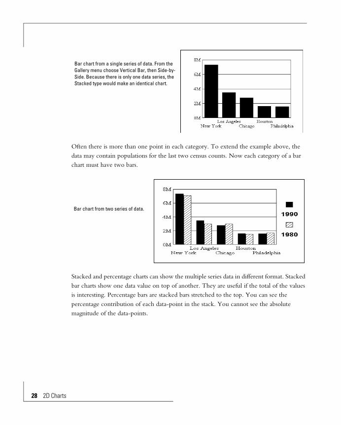
The simplest form of data for charting with a bar chart has one data-point for each “category”. A typical example would be the populations of several cities.
2D Charts 27
28 2D Charts
Often there is more than one point in each category. To extend the example above, the data may contain populations for the last two census counts. Now each category of a bar chart must have two bars.
Stacked and percentage charts can show the multiple series data in different format. Stacked bar charts show one data value on top of another. They are useful if the total of the values is interesting. Percentage bars are stacked bars stretched to the top. You can see the percentage contribution of each data-point in the stack. You cannot see the absolute magnitude of the data-points.
Bar chart from a single series of data. From the Gallery menu choose Vertical Bar, then Side-by-Side. Because there is only one data series, the Stacked type would make an identical chart.
Bar chart from two series of data.
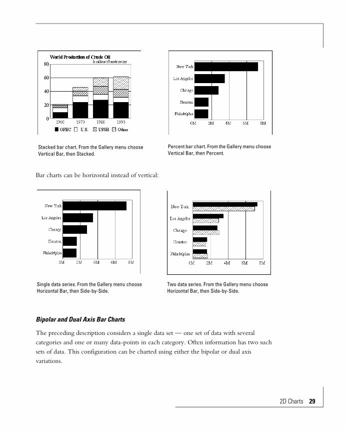
Bar charts can be horizontal instead of vertical:
Bipolar and Dual Axis Bar Charts
The preceding description considers a single data set — one set of data with several categories and one or many data-points in each category. Often information has two such sets of data. This configuration can be charted using either the bipolar or dual axis variations.
Stacked bar chart. From the Gallery menu choose Vertical Bar, then Stacked.
Percent bar chart. From the Gallery menu choose Vertical Bar, then Percent.
Single data series. From the Gallery menu choose Horizontal Bar, then Side-by-Side.
Two data series. From the Gallery menu choose Horizontal Bar, then Side-by-Side.
2D Charts 29
30 2D Charts
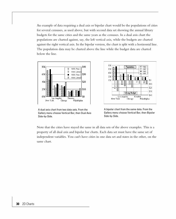
An example of data requiring a dual axis or bipolar chart would be the populations of cities for several censuses, as used above, but with second data set showing the annual library budgets for the same cities and the same years as the censuses. In a dual axis chart the populations are charted against, say, the left vertical axis, while the budgets are charted against the right vertical axis. In the bipolar version, the chart is split with a horizontal line. The population data may be charted above the line while the budget data are charted below the line.
Note that the cities have stayed the same in all data sets of the above examples. This is a property of all dual axis and bipolar bar charts. Each data set must have the same set of independent variables. You can't have cities in one data set and states in the other, on the same chart.
A dual axis chart from two data sets. From the Gallery menu choose Vertical Bar, then Dual Axis Side-by-Side.
A bipolar chart from the same data. From the Gallery menu choose Vertical Bar, then Bipolar Side-by-Side.

As with all bar charts, the direction can be horizontal:
Line Charts and Area Charts
Characteristics of line and area charts are quite similar to bar charts. Some samples are shown below. Like bar charts, new line and area charts are accessed from the File New dialog box while switching to a line or area chart is done with the Gallery menu in the chart window.
The absolute line and area chart types are analogous to side-by-side bar chart types. You must be careful with absolute area charts since large value data can obscure small value data. Absolute area charts should only be used when values are always increasing. Also, area charts must have at least two data points.
Horizontal dual axis and bipolar charts. From the Gallery menu choose Horizontal, then the chart type.
2D Charts 31

32 2D Charts
Absolute line and area charts made from a single column of data.
Absolute line (left) and stacked area (right) charts made from two columns of data.
Dual axis absolute line chart (left) and bipolar stacked area chart (right).

Scatter Charts
2D Scatter charts are used to see the relation between two numeric variables. This differs from bar, line and area charts, where one axis represents non-numeric categories. In a scatter chart the horizontal axis is usually used to represent the “independent” data while the vertical axis represents the data dependent on the horizontal axis data.
The Chart Editor has four 2D scatter chart types:
• XY Scatter (without labels)
• XY Scatter Dual Axis (without labels)
• XY Scatter with Labels
• XY Scatter Dual Axis With Labels
Select the scatter type in the File New dialog box or the Gallery menu in the chart window.
A typical use for an XY Scatter type would be to chart interest rates against loan volume for various time periods. Each time period would be a single point on the chart. Its X-Axis coordinate would be the interest rate and the Y-axis coordinate would be the loan volume.
You can use the XY Scatter Dual Axis and XY Scatter Dual Axis With Labels chart types to chart two dependent variables against the same independent variable. The following charts add an inflation rate axis to the interest rate / loan volume charts.
Scatter chart showing the relation of interest rate and loan volume. The chart type on the left is XY Scatter. It uses two data columns (or rows). The chart on the right is XY Scatter with Labels and uses three data columns (or rows).
2D Charts 33

34 2D Charts
Radar Charts
A radar chart is appropriate when the categories are cyclical. It's the circular equivalent of a 2D line chart. The ends of the cycle are really adjacent — a line chart doesn't show them adjacent but a radar chart, since it wraps around, does. Months in a year and days in a week are good examples.
Scatter charts showing the relation of loan volume and inflation rate to interest rate. The chart type for both is XY Scatter Dual Axis with Labels. In the Display Status dialog box for the chart on the left Labels is unchecked.
Scatter charts showing the relation of loan volume and inflation rate to interest rate. The chart type for both is XY Scatter Dual Axis with Labels. In the Display Status dialog box for the chart on the left Labels is unchecked.

Polar Charts
If a radar chart is the circular analog of a line chart, then a polar chart is the circular analog of a scatter chart. Both axes of a polar chart, the circular and radial, are numeric. As with 2D scatter charts, you can have multiple series of data, the chart can be dual-axis, and you can identify the points with their labels.
The Chart Editor has four polar chart types:
• Polar
• Polar with Labels
• Dual Axis Polar
• Dual Axis Polar with Labels
This chart’s cycle is hours in a day.
2D Charts 35
36 2D Charts
HiLo Charts
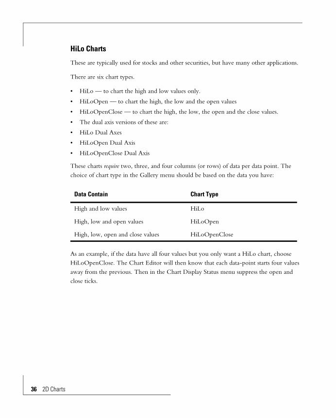
These are typically used for stocks and other securities, but have many other applications.
There are six chart types.
• HiLo — to chart the high and low values only.
• HiLoOpen — to chart the high, the low and the open values
• HiLoOpenClose — to chart the high, the low, the open and the close values.
• The dual axis versions of these are:
• HiLo Dual Axes
• HiLoOpen Dual Axis
• HiLoOpenClose Dual Axis
These charts require two, three, and four columns (or rows) of data per data point. The choice of chart type in the Gallery menu should be based on the data you have:
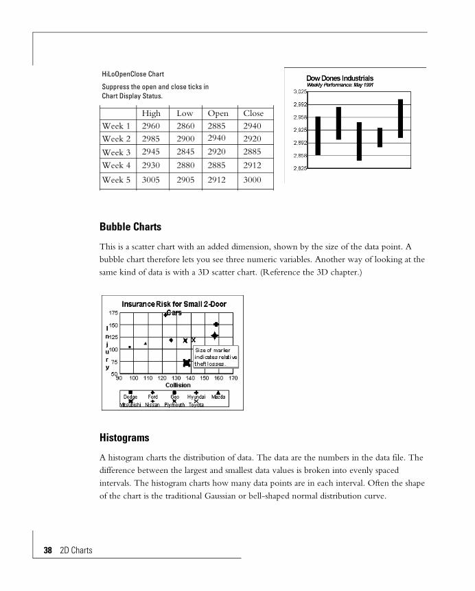
As an example, if the data have all four values but you only want a HiLo chart, choose HiLoOpenClose. The Chart Editor will then know that each data-point starts four values away from the previous. Then in the Chart Display Status menu suppress the open and close ticks.
Data Contain Chart Type
High and low values HiLo
High, low and open values HiLoOpen
High, low, open and close values HiLoOpenClose
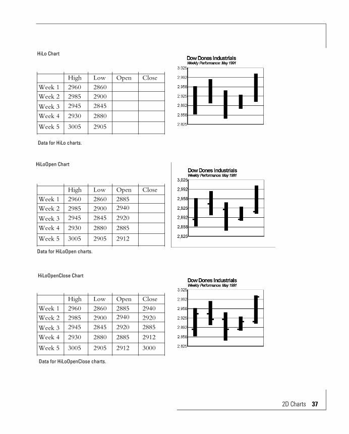
HiLo Chart
Data for HiLo charts.
Week 1Week 2
Week 3Week 4
Week 5
High296029852945
2930
3005
Low Open Close286029002845
2880
2905
HiLoOpen Chart
Data for HiLoOpen charts.
Week 1Week 2
Week 3Week 4
Week 5
High296029852945
2930
3005
Low Open Close2860 2885
294029002845 2920
28852880
2905 2912
HiLoOpenClose Chart
Week 1Week 2
Week 3Week 4
Week 5
High296029852945
2930
3005
Low Open Close2860 2885 2940
2920294029002845 2920 2885
291228852880
2905 2912 3000
Data for HiLoOpenClose charts.
2D Charts 37
38 2D Charts
Bubble Charts
This is a scatter chart with an added dimension, shown by the size of the data point. A bubble chart therefore lets you see three numeric variables. Another way of looking at the same kind of data is with a 3D scatter chart. (Reference the 3D chapter.)
Histograms
A histogram charts the distribution of data. The data are the numbers in the data file. The difference between the largest and smallest data values is broken into evenly spaced intervals. The histogram charts how many data points are in each interval. Often the shape of the chart is the traditional Gaussian or bell-shaped normal distribution curve.
HiLoOpenClose Chart
Suppress the open and close ticks in Chart Display Status.
Week 1Week 2
Week 3Week 4
Week 5
High296029852945
2930
3005
Low Open Close2860 2885 2940
2920294029002845 2920 2885
291228852880
2905 2912 3000
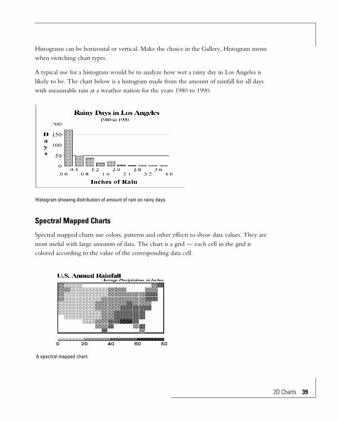
Histograms can be horizontal or vertical. Make the choice in the Gallery, Histogram menu when switching chart types.
A typical use for a histogram would be to analyze how wet a rainy day in Los Angeles is likely to be. The chart below is a histogram made from the amount of rainfall for all days with measurable rain at a weather station for the years 1980 to 1990.
Spectral Mapped Charts
Spectral mapped charts use colors, patterns and other effects to show data values. They are most useful with large amounts of data. The chart is a grid — each cell in the grid is colored according to the value of the corresponding data cell.
Histogram showing distribution of amount of rain on rainy days.
A spectral mapped chart.
2D Charts 39

40 2D Charts
Some interesting applications of spectral mapped charts are:
• Surface elevations, from mountainous terrain to imperfections in a flat surface.
• Real estate values for blocks in a grid laid over an urban area.
• Radiation from a heated surface.
• Quality characteristic of a lens at different focal distances (one axis) and f-stops (the other axis).
The data used for the chart are from the data file. The chart has as many rows and columns as there are in the file.
The magic of a spectral mapped chart is ability to see “hot spots”, and trends. Low and high points on the surface stand out and can be instantly recognized — a nearly impossible task when looking at just the data.
2D Chart ObjectsCharts are made of objects; the figures that follow show them.
Each chart object can be edited independently of the other objects. Or, you can select more than one object to do simultaneous identical editing. The objects can be edited in any order.

Bar, Line and Area Chart Objects
Background The rectangular area that holds all the other chart objects. It forms the background of the chart.
Frame The area bounded by the axes of the chart. The scales, axis titles and headers are outside the frame. The frame is inside the background
Bar, Data-point, or Riser
This represents the data. For line charts straight lines connect the points. Area charts are like line charts except the area between the line and the edge of the frame is filled with color or an effect. Bars of bar charts can have different shapes.
Data Series All points for one series of data are colored or shaded the same in the chart. When charting multiple data series in a bar chart, corresponding data appear side-by-side in groups. In line and area charts they appear behind or on top of each other.
Data Axis(Numeric axis)
The chart border with the numeric scale.
Scale The values next to the numeric axis.
2D Charts 41

42 2D Charts
Non-numeric Axis(Category Axis)
The chart border with the row or column headers.
Row Headers, Column Headers
The identifications for the rows and columns of data being charted. Usually there is a header for each data row and each data column.
Axis Title #1Axis Title #2Axis Title #3
Titles intended to describe the chart's axes. You can put them anywhere on the chart, but they are usually put near the axes. When you switch between horizontal and vertical chart types the data represented by the horizontal and vertical axes also switch. And when you exchange groups and series (Chart, Data Reversal, Swap Groups / Series), the data represented by the axes change.
Legend The section of the chart with the colored or shaded boxes to identify the different bars, lines or areas. If the headers along the non-numeric axis are row headers, then the legend shows the column headers (and vice versa).
Grid Lines The chart can have horizontal and vertical grid lines. For numeric axes major grid lines divide the axis into major grid lines and minor grid lines divide each major division. The non-numeric axis has major grid lines only, between the data points.
Tick Marks Small marks on the numeric axis denote axis divisions. Tick marks are sometimes used instead of grid lines.
Title A description — usually the main chart subject.
Subtitle A second description of the chart, often used to expand on the title.
Footnote A third description of the chart, commonly used to credit the data source.
Data Curve A line that approximates the chart data. It can be simple straight lines drawn from data-point to data-point, a smooth curve drawn through the points, a linear or higher order regression line, or a moving average. Lines at the values of the mean and standard deviations of the data can also be included.
Data-point Values The values of the data-points. This display is optional.

Scatter and Bubble Chart ObjectsMost scatter and bubble chart objects are identical to objects of bar, line and area charts. Objects that are specific to scatter and bubble charts are shown here.
Data Series All data points of one series are shaped and colored the same.
X-Axis The horizontal axis.
Y-Axis The vertical axis.
2nd Y-Axis The vertical axis on the right, for Dual-Y Scatter Charts only.
Data-point Values X and Y values of the data-points. This display is optional.
Data-point Names For scatter charts only. The names of the data-points. This display is optional for scatter charts. Bubble charts cannot show data-point names.
2D Charts 43

44 2D Charts
Radar and Polar Chart ObjectsAll objects in a radar and polar charts are the same as bar, line and area charts except the axes.
Radial Axis The numeric axis. It starts at the center of the circle and ends at the outside.
Circular Axis The category axis for radar charts. Names of the categories are shown outside the circle.
For polar charts this is the other numeric axis.
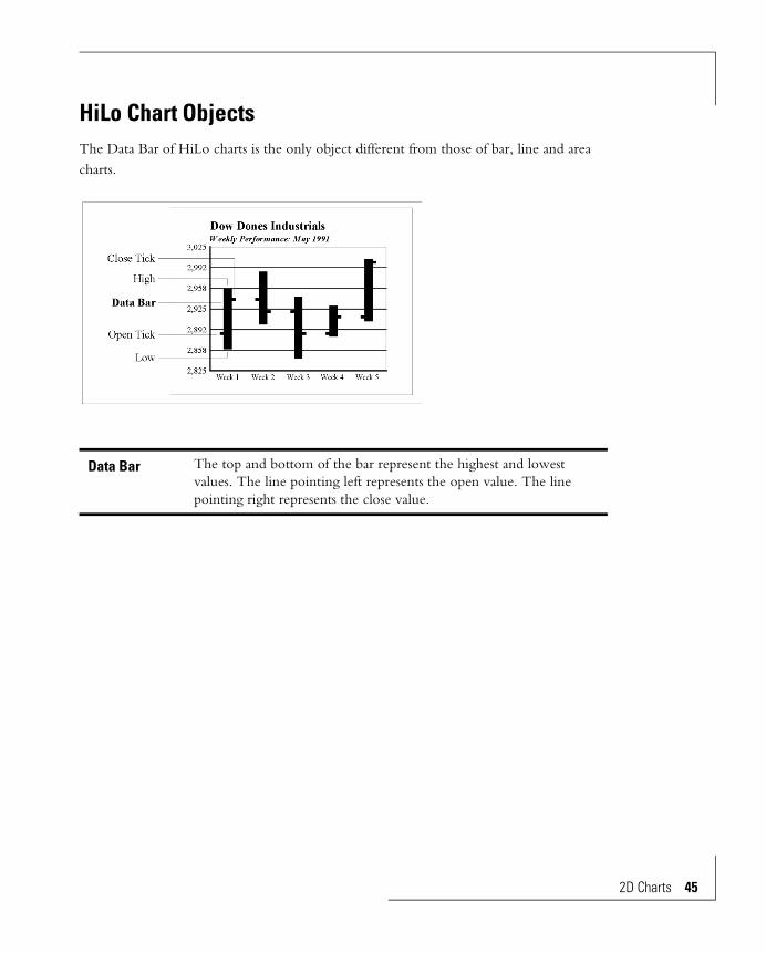
HiLo Chart ObjectsThe Data Bar of HiLo charts is the only object different from those of bar, line and area charts.
Data Bar The top and bottom of the bar represent the highest and lowest values. The line pointing left represents the open value. The line pointing right represents the close value.
2D Charts 45
46 2D Charts
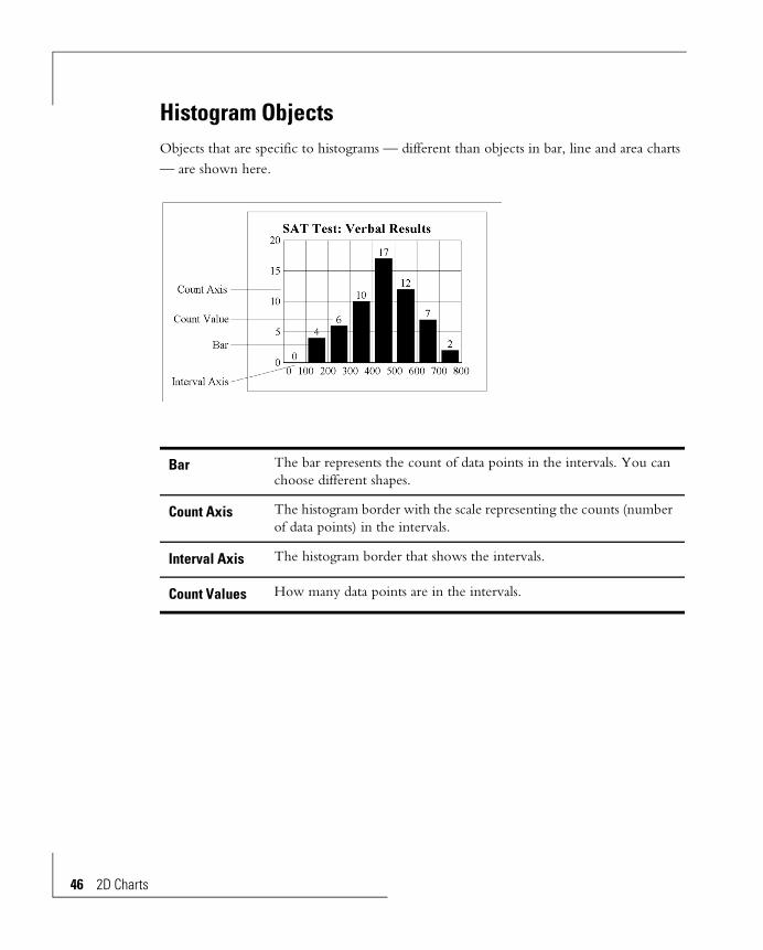
Histogram ObjectsObjects that are specific to histograms — different than objects in bar, line and area charts — are shown here.
Bar The bar represents the count of data points in the intervals. You can choose different shapes.
Count Axis The histogram border with the scale representing the counts (number of data points) in the intervals.
Interval Axis The histogram border that shows the intervals.
Count Values How many data points are in the intervals.

Spectral Mapped Chart ObjectsMost objects in spectral mapped charts are identical to objects of bar, line and area charts. Objects that are specific to spectral mapped charts are shown here.
2D Chart EditsDescribed here are the edits and customizations for 2D charts — bar, line, area, radar, scatter, polar, hi-lo-open-close, bubble, histogram and spectral mapped. Edit instructions for pie charts and 3D charts are in separate chapters.
Editing involves changing colors, text formats, scales, axes, and other properties of objects. The chart objects can be edited singly. Multiple object selection lets you quickly make
Cell The area in the matrix that represents the data point. Each data point charted is represented by one cell. You can choose different shapes for the cells.
Spectrum The strip of colors that correlates individual colors in the chart with a range of values.
Spectrum Boxes The individual cells of the spectrum, each with a different color or effect.
Background The area behind the cells. If the cell shape is rectangular, no background can show in that cell.
2D Charts 47

48 2D Charts
identical edits (such as assigning a color) to more than one object. Objects can be edited in any order.
Data and text for the chart come from the data source and cannot be edited on the chart.
Grid Lines and Tick Marks on Numeric Axes
Numeric axes can have major and minor grid lines and major and minor tick marks. (A non-numeric (category) axis has major grid lines only, to separate the categories.) You can let the Chart Editor choose the number of grid lines, or you can tell it how many. Each major grid line gets a scale value.
Displaying Grid Lines
There are several ways to suppress grid lines. Inspect them all if you can’t get the grids to turn back on.
1 From the Chart menu choose Display Status. Make sure Axis and Scale is checked.
2 From the Chart menu choose Data Axis (orthogonal charts) or Radial Axis (circular charts). One or both of the Display on choices must be checked. Grid lines won't be displayed if the scale is not displayed.
3 Make sure the grid lines are not the same color as the chart frame. The easiest way to check this is to change the color of the frame. Select the frame by clicking on it. Change the color with the left box of the color picker. You can then see the grid lines,
Charts with and without grid lines.

if they are there, and more easily select them to change their color. Use Edit Undo to return to the frame to its original color.
4 In the Grid Lines dialog box (see below) either Show Major Grid Lines or Show Minor Grid Lines must be checked.
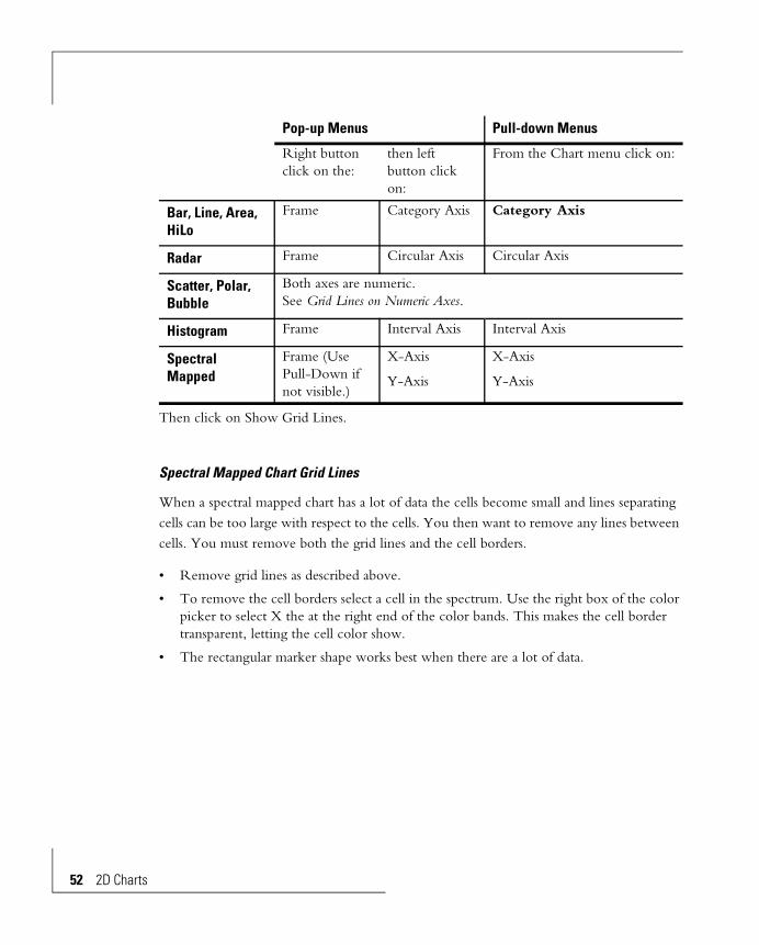
To get the grid line dialog box display the menu (see table) and click on Grid Lines.
If the chart has a 2nd data axis you can also get a grid line dialog box for it. Grid lines of the two data axes are independent of each other.
Pop-up Menus: Pull-down Menus:
Chart Type Right-button click on the: In the Chart menu select:
Bar, Line, Area, Bubble
Data axis Data Axis
Scatter X-axis X-Axis
Y-axis Y-Axis
Radar, Polar Radial Axis Radial Axis
Histogram Count axis Count Axis
HiLo Data axis Data Axis
Grid Line dialog box.
2D Charts 49

50 2D Charts
Number of Divisions
Automatic: Click the Auto button. This tells the Chart Editor to choose the number of divisions based on the scale range. You can see what was chosen when the chart re-draws. If you don't like the choice, use Manual.
Manual: Click Manual. A box appears for entry of the number of divisions. Note that this is the number of divisions, not the number of grid lines. Counting the lines at the extremes of the chart scale there is one more line than the number of divisions.
Types of Grid Lines, Tick Marks
The dialog box lets you choose if you want grid lines and tick marks shown, and the types. Click on Show Major Grid Lines and/or Show Minor Grid Lines — an X in the box means they will be shown. Then select the type of grid line/tick mark from the list underneath.
Click the OK button to redraw to the new specification. The Cancel button returns to the chart with no change.
Grid Line Color, Thickness
Refer to the Line, Area and Text Decorations chapter for instructions to control grid line color and thickness.
This chart has 4 major divisions.

Grid Lines on Dual Axis Charts
Grid lines for the two data axes of a Dual Axis chart can be confused with each other. Several techniques can avoid this:
• Use the same number of grid lines on both axes. Then only one set of grid lines is needed. Suppress the grid lines on the other axis by unchecking Show Major (or Minor) Grid Lines.
• Make the grid lines for both axes different colors.
• Make the grid lines for both axes different thickness.
• Avoid clutter by not using minor grid lines.
Grid Lines on Non-numeric Axes
Grid lines on non-numeric axes are limited to lines between the categories represented on the axis. You can turn them on or off.
Grid lines between categories can be included (left) or omitted (right).
2D Charts 51
52 2D Charts
Then click on Show Grid Lines.
Spectral Mapped Chart Grid Lines
When a spectral mapped chart has a lot of data the cells become small and lines separating cells can be too large with respect to the cells. You then want to remove any lines between cells. You must remove both the grid lines and the cell borders.
• Remove grid lines as described above.
• To remove the cell borders select a cell in the spectrum. Use the right box of the color picker to select X the at the right end of the color bands. This makes the cell border transparent, letting the cell color show.
• The rectangular marker shape works best when there are a lot of data.
Pop-up Menus Pull-down Menus
Right button click on the:
then left button click on:
From the Chart menu click on:
Bar, Line, Area, HiLo
Frame Category Axis Category Axis
Radar Frame Circular Axis Circular Axis
Scatter, Polar, Bubble
Both axes are numeric.See Grid Lines on Numeric Axes.
Histogram Frame Interval Axis Interval Axis
Spectral Mapped
Frame (Use Pull-Down if not visible.)
X-Axis
Y-Axis
X-Axis
Y-Axis

Exchanging Rows and Columns
You can exchange the charted positions of the data rows and columns. These exchanges are specified in the data source.
Chart Type Effect
Bar, Line, Area,
Radar
Categories along the category axis switch positions with categories in the legend box.
Scatter, Bubble The X and Y axes are exchanged.
Polar The circular and radial axes are exchanged.
Histograms Not applicable, since histograms chart a statistic of the data.
Spectral Mapped The X and Y axes are exchanged.
HiLo Categories along the category axis switch positions with categories in the legend box.
Bar chart with row and column data in normal Rows and columns exchanged.
2D Charts 53
54 2D Charts
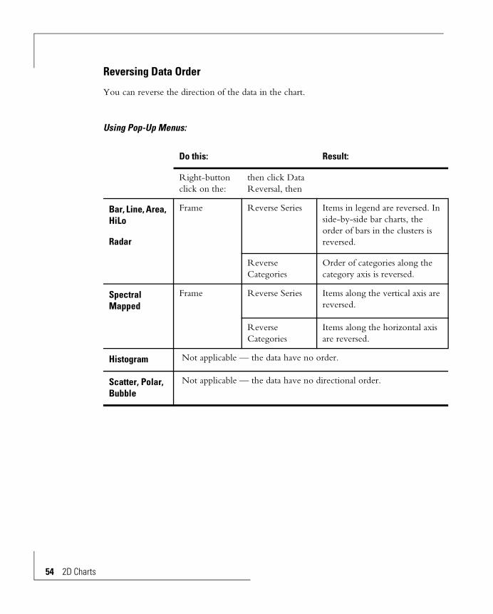
Reversing Data Order
You can reverse the direction of the data in the chart.
Using Pop-Up Menus:
Do this: Result:
Right-button click on the:
then click Data Reversal, then
Bar, Line, Area, HiLo
Radar
Frame Reverse Series Items in legend are reversed. In side-by-side bar charts, the order of bars in the clusters is reversed.
Reverse Categories
Order of categories along the category axis is reversed.
Spectral Mapped
Frame Reverse Series Items along the vertical axis are reversed.
Reverse Categories
Items along the horizontal axis are reversed.
Histogram Not applicable — the data have no order.
Scatter, Polar, Bubble
Not applicable — the data have no directional order.

Using Pull-Down Menus:
Do this: Result:
From the Chart menu choose:
then choose
Bar, Line, Area, HiLo
Radar
Data Reversal Reverse Series
Legend items are reversed. Side-by-side bar charts; bar order in clusters is reversed.
Reverse Categories
Order of categories along the category axis is reversed.
Spectral Mapped
Data Reversal Reverse Series
Items along the vertical axis are reversed.
Reverse Categories
Items along the horizontal axis are reversed.
Histogram Not applicable — the data have no order.
Scatter, Polar, Bubble
Not applicable — the data have no directional order.
2D Charts 55

56 2D Charts
Zero Lines
The line drawn at value zero of a numeric axis is a separate object, not related to grid lines. Editing and displaying zero lines has no effect on grid line edits. If a grid line is at value zero and the zero line is turned on, the zero line will show over the grid line.
Get the Zero Line pop-up menu by clicking on the zero line. Check or uncheck Show Zero Line.
or,
From the Chart menu choose Display Status. In the dialog box that shows click on Zero
Line for the data axis, then click OK.
Riser Base for Negative Data
Bars in bar charts and areas in area charts that represent negative numbers can be drawn from the zero line or from the low end of the chart.
Series reversed. Categories reversed.

In the Chart menu choose Base of Bars (bar charts) or Base of Areas (area charts). Then choose From Zero Line or From Scale Minimum.
Risers are from zero. Risers are from the base.
Risers are from zero.Risers are from the base.
2D Charts 57
58 2D Charts
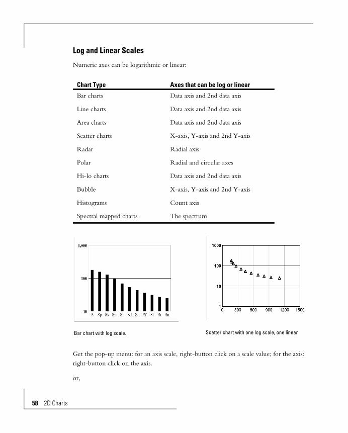
Log and Linear Scales
Numeric axes can be logarithmic or linear:
Get the pop-up menu: for an axis scale, right-button click on a scale value; for the axis: right-button click on the axis.
or,
Chart Type Axes that can be log or linear
Bar charts Data axis and 2nd data axis
Line charts Data axis and 2nd data axis
Area charts Data axis and 2nd data axis
Scatter charts X-axis, Y-axis and 2nd Y-axis
Radar Radial axis
Polar Radial and circular axes
Hi-lo charts Data axis and 2nd data axis
Bubble X-axis, Y-axis and 2nd Y-axis
Histograms Count axis
Spectral mapped charts The spectrum
Bar chart with log scale. Scatter chart with one log scale, one linear
From the Chart menu choose the axis. (For spectral mapped charts, choose Spectrum.) Then click on Linear Axis or Log Axis. A check mark indicates which is in effect.
The chart redraws automatically, or, if Auto Redraw in the Window menu isn't on, select Redraw Window to force a redraw.
An axis can't be logarithmic if any data-point is zero or negative, or if the scale range extends to zero or negative. An information message appears if you try.
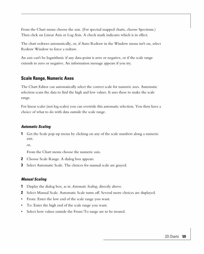
Scale Range, Numeric Axes
The Chart Editor can automatically select the correct scale for numeric axes. Automatic selection scans the data to find the high and low values. It uses these to make the scale range.
For linear scales (not log scales) you can override this automatic selection. You then have a choice of what to do with data outside the scale range.
Automatic Scaling
1 Get the Scale pop-up menu by clicking on any of the scale numbers along a numeric axis.
or,
From the Chart menu choose the numeric axis.
2 Choose Scale Range. A dialog box appears.
3 Select Automatic Scale. The choices for manual scale are grayed.
Manual Scaling
1 Display the dialog box, as in Automatic Scaling, directly above.
2 Select Manual Scale. Automatic Scale turns off. Several more choices are displayed.
• From: Enter the low end of the scale range you want.
• To: Enter the high end of the scale range you want.
• Select how values outside the From/To range are to be treated.
2D Charts 59
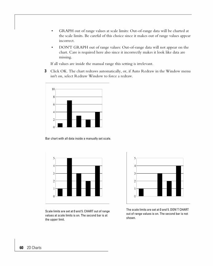
60 2D Charts
• GRAPH out of range values at scale limits: Out-of-range data will be charted at the scale limits. Be careful of this choice since it makes out of range values appear incorrect.
• DON'T GRAPH out of range values: Out-of-range data will not appear on the chart. Care is required here also since it incorrectly makes it look like data are missing.
If all values are inside the manual range this setting is irrelevant.
3 Click OK. The chart redraws automatically, or, if Auto Redraw in the Window menu isn't on, select Redraw Window to force a redraw.
Bar chart with all data inside a manually set scale.
Scale limits are set at 0 and 5. CHART out of range values at scale limits is on. The second bar is at the upper limit.
The scale limits are set at 0 and 5. DON'T CHART out of range values is on. The second bar is not shown.

Scale and Header Locations
Vertical axis scales or headers can be on the left side, the right side, or both sides. If you have a dual axis chart, you should put the data axis scale on the left and the 2nd data axis scale on the right.
Horizontal axis scales or headers can be on the bottom, the top, or both. The scales for radar charts can be on either side or both sides of the radial axis.
1 Get the data axis or category axis pop-up menu by right-button clicking on a scale or header value.
or,
From the Chart menu choose the appropriate axis.
2 Choose Display on Bottom, Top, Left or Right, as appropriate.
The chart redraws automatically, or, if Auto Redraw in the Window menu isn't on, select Redraw Window to force a redraw.
Hiding Scales and Headers
You can suppress display of scales and headers by making them the same color as the field they are on. (If you suppress them by turning them off in the Chart, Display Status dialog box or by unchecking the Display options in the Chart, Axis menu, the grid lines are also turned off.)
Scale and header locations.
2D Charts 61
62 2D Charts
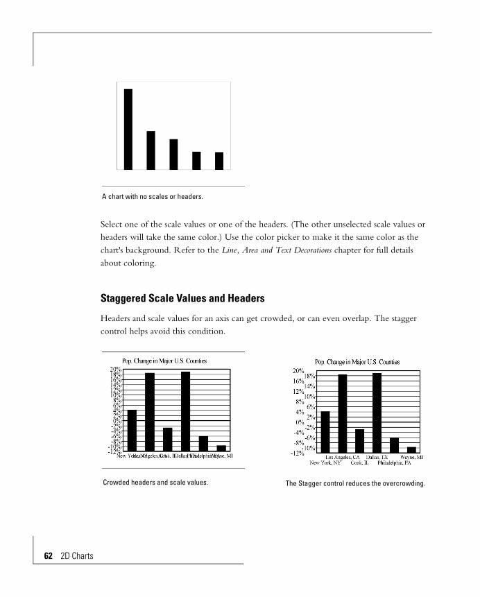
Select one of the scale values or one of the headers. (The other unselected scale values or headers will take the same color.) Use the color picker to make it the same color as the chart's background. Refer to the Line, Area and Text Decorations chapter for full details about coloring.
Staggered Scale Values and Headers
Headers and scale values for an axis can get crowded, or can even overlap. The stagger control helps avoid this condition.
A chart with no scales or headers.
Crowded headers and scale values. The Stagger control reduces the overcrowding.

1 Get the pop-up menu for the scale or headers by clicking on a scale value or header.
or,
From the Chart menu choose Data Axis or Category Axis.
2 Check or uncheck Staggered Scale or Staggered Text.
If Auto Redraw in the Window menu is on the chart will redraw automatically. Or, select Redraw Window, also in the Window menu, to force the chart to redraw.
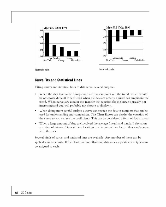
Inverted Scales
Inverting a scale has the effect of inverting the chart. Inverted scales are:
Use one of two methods to invert a scale:
First Method:
1 Get the pop-up menu for the data axis, the data axis scale or the frame.
2 Click Ascending Scale. Absence of a check mark indicates the scale will be inverted.
Second Method:
Do manual scaling (see Manual Scaling in this chapter). Put the high value in the From box and the low value in the To box. The scale is inverted and the chart is drawn reversed.
Vertical numeric axis Low end of the scale is on top.
Horizontal numeric axis Low end of the scale is on the right.
2D Charts 63
64 2D Charts
Curve Fits and Statistical Lines
Fitting curves and statistical lines to data serves several purposes.
• When the data tend to be disorganized a curve can point out the trend, which would be otherwise difficult to see. Even when the data are orderly a curve can emphasize the trend. When curves are used in this manner the equation for the curve is usually not interesting and you will probably not choose to display it.
• When doing more careful analysis a curve can reduce the data to numbers that can be used for understanding and comparison. The Chart Editor can display the equation of the curve so you can see the coefficients. This can be considered a form of data analysis.
• When a large amount of data are involved the average (mean) and standard deviation are often of interest. Lines at these locations can be put on the chart so they can be seen with the data.
Several kinds of curves and statistical lines are available. Any number of them can be applied simultaneously. If the chart has more than one data series separate curve types can be assigned to each.
Normal scale. Inverted scale.
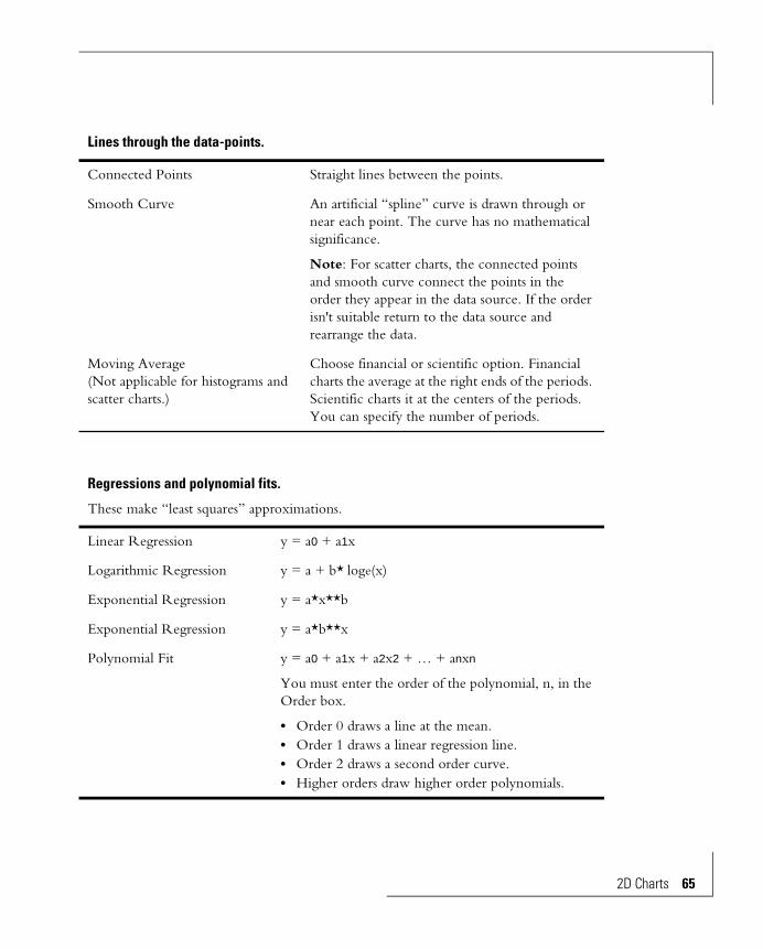
Lines through the data-points.
Connected Points Straight lines between the points.
Smooth Curve An artificial “spline” curve is drawn through or near each point. The curve has no mathematical significance.
Note: For scatter charts, the connected points and smooth curve connect the points in the order they appear in the data source. If the order isn't suitable return to the data source and rearrange the data.
Moving Average(Not applicable for histograms and scatter charts.)
Choose financial or scientific option. Financial charts the average at the right ends of the periods. Scientific charts it at the centers of the periods. You can specify the number of periods.
Regressions and polynomial fits.
These make “least squares” approximations.
Linear Regression y = a0 + a1x
Logarithmic Regression y = a + b* loge(x)
Exponential Regression y = a*x**b
Exponential Regression y = a*b**x
Polynomial Fit y = a0 + a1x + a2x2 + … + anxn
You must enter the order of the polynomial, n, in the Order box.
• Order 0 draws a line at the mean.• Order 1 draws a linear regression line.• Order 2 draws a second order curve.• Higher orders draw higher order polynomials.
2D Charts 65

66 2D Charts
To make a curve:
1 Get the pop-up menu for a data-point by clicking on it.
or,
Select a data-point from a series. To put the same curve on several series multiple select (Shift key) a data-point from each. Then show the Chart menu.
2 From the Chart menu choose Curve Fit and Stat Lines. A dialog box appears.
3 Select the desired curve or select several curves.
• If you select Polynomial enter the order number. Linear Regression is the same as Polynomial with Order set to 1.
• If you select Moving Average enter the number of periods and check Financial or Scientific. Financial charts the average at the right ends of the periods. Scientific charts it at the centers of the periods.
4 Enter a smoothing factor. A higher number looks better but takes more time to draw. Start with 100 and adjust it up or down depending on the appearance and drawing speed. You can use values from 10 to 1000.
Smoothing factor does not apply to connected points, the linear regression line, moving average lines or the mean or standard deviation lines. It has no effect on them, since they are made of straight lines.
Statistical Lines
Mean Line A line is drawn at the mean of the data-points.
Standard Deviation Lines Lines are drawn at each standard deviation distance from the mean line.

5 Check Show Regression Equation and/or Show Correlation Coefficient if you want these to show on the chart.
6 Click the OK button.
The chart redraws automatically, or, if Auto Redraw in the Window menu isn't on, select Redraw Window to force a redraw.
The color of a data curve is the same color as the data points. The width is controlled by Line Width in the Element menu. Refer to the Line, Area and Text Decorations chapter for editing details.
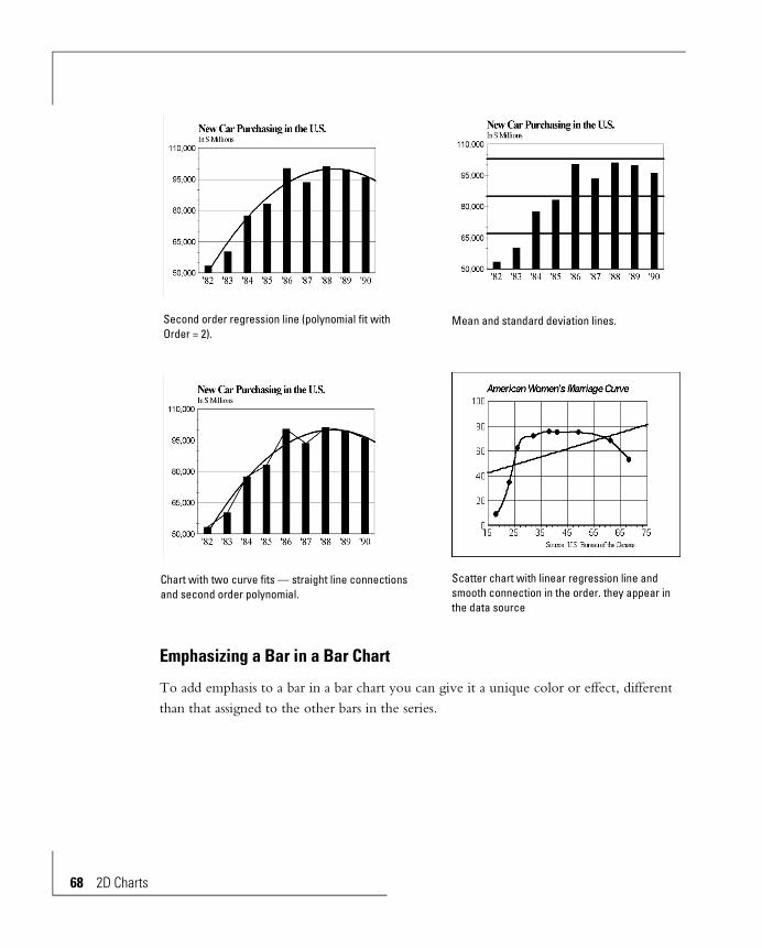
Bar chart with no curve fit. Straight lines drawn between the data-points.
Smooth curve through the data-points. Linear regression line (polynomial fit with Order set to 1).
2D Charts 67
68 2D Charts
Emphasizing a Bar in a Bar Chart
To add emphasis to a bar in a bar chart you can give it a unique color or effect, different than that assigned to the other bars in the series.
Second order regression line (polynomial fit with Order = 2).
Mean and standard deviation lines.
Chart with two curve fits — straight line connections and second order polynomial.
Scatter chart with linear regression line and smooth connection in the order. they appear in the data source
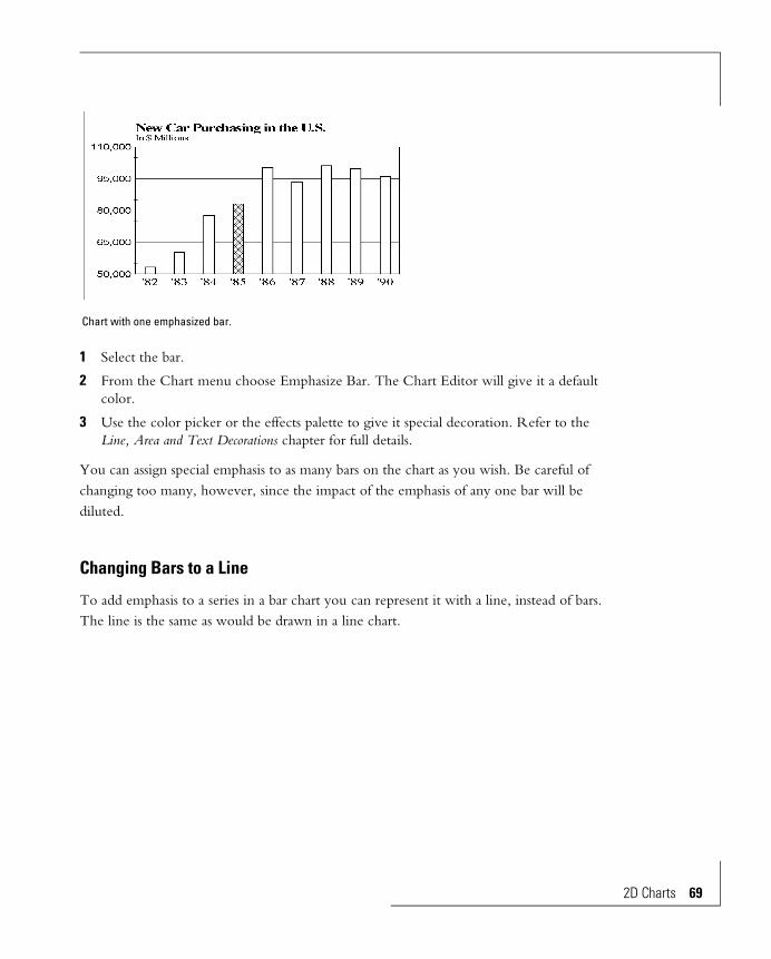
1 Select the bar.
2 From the Chart menu choose Emphasize Bar. The Chart Editor will give it a default color.
3 Use the color picker or the effects palette to give it special decoration. Refer to the Line, Area and Text Decorations chapter for full details.
You can assign special emphasis to as many bars on the chart as you wish. Be careful of changing too many, however, since the impact of the emphasis of any one bar will be diluted.
Changing Bars to a Line
To add emphasis to a series in a bar chart you can represent it with a line, instead of bars. The line is the same as would be drawn in a line chart.
Chart with one emphasized bar.
2D Charts 69

70 2D Charts
Get the pop-up menu for a bar in the series by right-button clicking on it. Then click on Display as Line.
or,
Select a bar. You can multiple select a bar from more than one series to convert the series to lines. Then from the Chart menu choose Display as Line.
If Auto Redraw in the Window menu is checked the chart will redraw automatically, with the series represented by a line instead of bars. Or, select Redraw Window, also in the Window menu, to force the chart to redraw.
Changing a Line to Bars
Just as you can convert a series in a bar chart to a line, you can convert a line in a line chart to bars. The bars are the same as would be drawn in a bar chart.
All data series are represented by bars. One of the series is emphasized by changing its
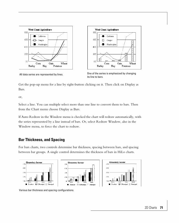
Get the pop-up menu for a line by right-button clicking on it. Then click on Display as Bars.
or,
Select a line. You can multiple select more than one line to convert them to bars. Then from the Chart menu choose Display as Bars.
If Auto Redraw in the Window menu is checked the chart will redraw automatically, with the series represented by a line instead of bars. Or, select Redraw Window, also in the Window menu, to force the chart to redraw.
Bar Thickness, and Spacing
For bars charts, two controls determine bar thickness, spacing between bars, and spacing between bar groups. A single control determines the thickness of bars in HiLo charts.
All data series are represented by lines. One of the series is emphasized by changing its line to bars.
Various bar thickness and spacing configurations.
2D Charts 71

72 2D Charts
To change these:
Pop-up Menu:
1 Right-button click on a bar to get its pop-up menu.
2 Choose Bar Thickness or Bar-Bar Spacing
3 Select from the choices presented.
Pull-Down Menus
1 From the Chart menu choose Bar Thickness or Bar-Bar Spacing
2 Select from the choices presented.
Bar-Bar Spacing is not available for histograms and HiLo charts, since these do not have groups of bars.
Note the following:
• All bars in a chart have the same thickness.
• Changing either bar thickness or bar-bar spacing leaves the other unchanged. The distance between bar groups change. Therefore, to change the distance between groups, change the bar thickness, the bar-bar spacing, or both.
• When the bar thickness is set to Maximum, the Bar-Bar Spacing control will have no effect, since all the space is taken up.
Bar, Marker and Cell Shape
The data-points on charts can be given different shapes:
Bar charts Bars of different series can have different shapes.
Line charts Display of data-points as markers is optional. If displayed, their shapes can be changed.
Different data series can have different shapes.
Scatter, Radar, Polar, Bubble charts
The data-point markers can have various shapes. To differentiate series you can give each a different shape.
Histograms All bars of a histogram must be the same shape.
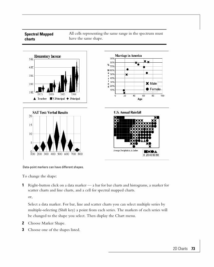
To change the shape:
1 Right-button click on a data marker — a bar for bar charts and histograms, a marker for scatter charts and line charts, and a cell for spectral mapped charts.
or,
Select a data marker. For bar, line and scatter charts you can select multiple series by multiple-selecting (Shift key) a point from each series. The markers of each series will be changed to the shape you select. Then display the Chart menu.
2 Choose Marker Shape.
3 Choose one of the shapes listed.
Spectral Mapped charts
All cells representing the same range in the spectrum must have the same shape.
Data-point markers can have different shapes.
2D Charts 73
74 2D Charts
The chart redraws automatically, or, if Auto Redraw in the Window menu isn’t on, select Redraw Window to force a redraw.
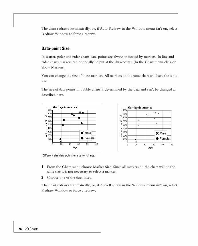
Data-point Size
In scatter, polar and radar charts data-points are always indicated by markers. In line and radar charts markers can optionally be put at the data-points. (In the Chart menu click on Show Markers.)
You can change the size of these markers. All markers on the same chart will have the same size.
The size of data points in bubble charts is determined by the data and can't be changed as described here.
1 From the Chart menu choose Marker Size. Since all markers on the chart will be the same size it is not necessary to select a marker.
2 Choose one of the sizes listed.
The chart redraws automatically, or, if Auto Redraw in the Window menu isn't on, select Redraw Window to force a redraw.
Different size data points on scatter charts.

Data-point Value and Name Display
The values of data-points can be displayed at the data-point positions. Scatter and bubble charts can also show the names of the data-points.
Data values can only be displayed or hidden for all data-points of a chart. You cannot have data values displayed for some points and hidden for others. Similarly, data-point names are either shown or hidden for all points.
Chart with no data values.Chart with data values.
Chart with data values and names.
2D Charts 75
76 2D Charts
Turn On Data-point Value, Name Display
From the Chart menu choose Display Status. In the dialog box click Data Values and Data Names. A check mark indicates they will be shown and turns on two controls:
• Position: Select a position from the list.
• Format: Select a preset number format from the list box. Refer to the Formatting Text and Numbers chapter for an explanation of the options.
When you click OK to close the dialog box the chart redraws automatically, or, if Auto Redraw in the Window menu isn't on, select Redraw Window to force a redraw.
Turn Off Data-point Value and Name Display
Uncheck the Data Values and/or Data Names in the dialog box described above.
Alternately, get the pop-up menu for one of the data values of names and click Hide Values and/or Hide Names.
Title, Subtitle, Footnote
These three objects are used to identify a chart. They can be customized, resized, and positioned anywhere on the chart.
Displaying:
• Choose Display Status from the Chart menu. The Title, Subtitle, or Footnote check box must be selected for the item to be displayed.
• Make sure the text color is not the same color as its background.
Size and Position:
Select the title, subtitle or footnote to display it's handles. Then manipulate it by dragging the handles.

Text Appearance:
Select the characters by dragging over them. Then use the text toolbar to change their attributes. Refer to the Formatting Text and Numbers chapter for a complete description.
Legend
The legend identifies each data series. Each item in the legend is a marker with the same visual design (color, shape etc.) given to the bars, areas, data-points or lines in the series it represents. With each marker is descriptive header text.
• The texts for the legends come from the data source, and must be edited there. It is identified as the Row Headers or the Column Headers.
• Refer to the Formatting Text and Numbers chapter to change the appearance of the text.
• To change size and/or position of the entire legend, select it. This displays the legend's handles. You must click someplace in the blank area between the markers and names so you select the legend, not one of the objects in the legend.
Manipulate the size and position of the legend by dragging the handles.
The legend configuration is controlled in the legend dialog box. From the Chart menu choose Legend. The legend dialog box is also available from several pop-up menus.
2D Charts 77

78 2D Charts
Number of Intervals — Histograms
A histogram assigns each data-point to an interval and charts the number of data-points in each interval.
Display Legend Check to suppress display of the legend.
Autofit Legend Text Check to let the Chart Editor choose a size for text in the legend. If this is not suitable, select a header, then a different size from the font size list box in the text toolbar. Refer to the Formatting Text and Numbers chapter for full details.
Position of text Choose one.
Automatic Legend Orientation
The legend can be vertical or horizontal This option lets the Chart Editor choose which.
Vertical Legend Force the legend to be vertically oriented. When this is chosen an additional control appears that lets you specify the number of markers per column.
Horizontal Legend Force the legend to be horizontally oriented. When this is chosen an additional control appears that lets you specify the number of markers per row.
A histogram charts intervals along the horizontal axis and the number of data-points in each interval on the vertical axis.
You can let the number of intervals be chosen automatically or you can specify the number of intervals.
Automatic Interval Selection
From the Chart menu choose Intervals, then select Automatic Scale. Click OK. The histogram redraws automatically, or, if Auto Redraw in the Window menu isn't on, select Redraw Window to force a redraw.
To see how many intervals were chosen return to the dialog box after redrawing the histogram and click Manual Scale.
Manual Interval Selection
From the Chart menu choose Intervals, then select Manual. Enter the number of intervals and click OK.
The chart redraws automatically, or, if Auto Redraw in the Window menu isn't on, select Redraw Window to force a redraw.
Spectrum
The spectrum of a spectral mapped chart has controls and properties similar to data axes on bar and other more conventional charts. The spectrum can have a linear or logarithmic scale. You can control the number of divisions in the spectrum, and the format of the scale numbers. In addition you can specify its colors and its position and orientation with respect to the chart.
Linear or Log Spectrum Scale
The divisions on the spectrum can be linear or logarithmic. From the Chart menu choose Spectrum, then Linear or Log. Refer also to the Linear and Log Scales section of this chapter.
2D Charts 79
80 2D Charts
Scale Range
The range of the spectrum can be chosen automatically by the Chart Editor, or you can specify a range. Automatic selection scans the data to find the high and low values. It uses these to set the range for the spectrum.
You can override this automatic selection. You then have a choice of what to do with data outside the scale range.
Automatic Scaling
1 From the Chart menu choose Spectrum.
2 Choose Scale Range. A dialog box appears.
3 Select Automatic Scale. The choices for manual scale disappear.
4 Click OK. If Auto Redraw in the Window menu is checked the chart will redraw automatically. Or, select Redraw Window, also in the Window menu, to force the chart to redraw.
Manual Scaling
1 Display the dialog box, as in Automatic Scaling, directly above.
2 Select Manual Scale. Automatic Scale turns off. Several more choices are displayed.
• From: Enter the low end of the scale range you want.
• To: Enter the high end of the scale range you want.
• Select how values outside the From/To range are to be treated.
• GRAPH out of range values at scale limits: Out-of-range data will be shown as the spectrum color at the high end of the spectrum. Be careful of this choice since it makes values appear incorrect.
• DON'T GRAPH out of range values: Out-of-range data will not appear on the chart. These cells will be the color of the background. Care is required here also since it incorrectly makes it look like data are missing.
3 Click OK. The chart redraws automatically, or, if Auto Redraw in the Window menu isn't on, select Redraw Window to force a redraw.
Number of Divisions
1 From the Chart menu choose Spectrum, then Spectrum again.
2 Choose Spectrum. A dialog box appears.

The system defaults to 10 divisions. You can change it to any number between 2 and 32.
3 Click OK. If Auto Redraw in the Window menu is checked the chart will redraw automatically. Or, select Redraw Window, also in the Window menu, to force the chart to redraw.
Spectrum Color Range
You can use any color range for the spectrum. You set the two end colors. The Chart Editor creates a smooth color transition between them and applies it to the spectrum and the appropriate cells.
1 From the Chart menu choose Spectrum, then Spectrum again. A dialog box appears showing the current color range.
2 Click on Start. A color selection dialog box appears. Select or design a color and click OK.
3 Click on End. The same color selection dialog box appears again. Select or design the end color and click OK.
4 Click OK. The chart redraws with the new color range.
Colors, Gradients, Textures and Patterns
Cell decorations can be changed from the default values. As an example, you might change one or a small number of boxes to a contrasting color to make those value ranges stand out in the chart.
Many spectral mapped charts will require only solid colors. However, the ability to use other gradients, patterns and texture effects provides flexibility to put spectral mapped charts to unusual and imaginative purposes. You could, for example, in a chart showing top speed of cars, assign a picture of a turtle to the slowest, a gazelle to the fastest, and other appropriate pictures to those in between.
2D Charts 81

82 2D Charts
You can combine these effects — assign colors to some boxes in the spectrum, textures to others, and gradients or patterns to the rest.
To assign colors you select one of the panels in the spectrum and give it a color from the color picker or an effect from the effects palette. Making these assignments is described in the Line, Area and Text Decorations chapter.
Display Status
You can display or suppress many objects in the chart. On/off controls are in the Display Status dialog box in the Chart menu. These are:
• The chart legend.
• Zero lines for the data axes. When turned on, a zero line overwrites any grid line that is at zero.
• Title, subtitle, and footnote.
• The axis and scale for numeric axes, and the axis and headers for the non-numeric axis.
• The axis titles.
• The data-point values and names.
• For hi-lo-open-close charts, the ticks marking the open and close values.
• For charts with regression curves drawn, the regression equation and correlation coefficient.
Unmodified spectral mapped chart. Patterns applied to the “colors” of the spectrum. Textures, gradients, full colors and special effects can be used in addition to the patterns shown here.
Gradients, Colors, Textures, and Patterns
Objects of a chart can have custom colors, patterns, textures or gradients. These objects include bars, grid lines, data-points, lines between data-points, the text fields associated with the chart, and all other objects. Refer to the Line, Area and Text Decorations chapter.
2D Charts 83


3D Charts
Why 3D Charts? 89
Correlation in Two Directions 90
Large Amount of Data 91
Impact 91
The Objects of a 3D Chart 93
3D Chart Design 94
Data Correlation 94
Emphasis of Some of the Data 95
Obscured Data-Points 96
Viewing Angle 96
Reverse the Data 97
Rearrange the Data 97
Pyramid Charts 98
3D Chart Types 98
3D Riser Charts 99
3D Floating Charts 100
3D Connect-Series and -Row 101
3D Surface 102
3D Math Functions 104
Contoured Surface Maps 105
Wire Frame Surface 105
Scatter Charts 106
3D Preset Viewing Angles 107
Standard Angle 108
Tall and Skinny 108
From the Top 108
Distorted 109
Short and Fat 109
Column’s Eye 110
Column Emphasis 110
Few Rows 111
Few Columns 111
Distorted Standard 112
Thick Wall for Columns 112
Shorter and Fatter 113
Thick Wall for Rows 113
Thick Wall Standard 114
California Special 115
Blast-o-Vision 115
3D Chart Edits 116
Custom Viewing Angles 116
The 3D View Tool 116
Positioning the 3D View Tool 117
Controls in the 3D View Tool 118

Adjusting the Viewing Direction — Rotation 119
Stretching and Shrinking the Three Axes — Proportions 120
Thickness of the Walls and Floor — Proportions 121
Perspective Distortion 122
Location along a Screen Axis — Movement 124
Enlarging and Reducing — Zoom 125
Repositioning — Pan 126
Walls and Floor 128
Coloring the Box — Autoshade 128
Edge Decoration 130
Edge Width and Style 130
Removing the Walls and Floor 130
Grid Lines and Scales 131
Grid Lines on Non-numeric Axes 131
Grid Lines on Numeric Axes 132
Numeric Axis Scale Ranges 134
Automatic Scaling 134
Manual Scaling 134
Log and Linear Scales 135
Format of Scale Values 135
Riser Editing 136
Coloring the Risers — Autoshade 136
Grid Lines 139
Riser Dimensions 141
Base of Risers 142
Data-point Names, Scatter Charts 142
Reversing Data Order and Exchanging Axes 143
Scatter Chart Data-points — Visualizing Data-point Location in Space 143
Visual Separation of Data Series 144
Drop Lines 144
Tie Lines to Neighbor 145
Data-point Colors 146
Data-point Size and Shape 146
To Change the Size 147
To Change the Shape 147
Text Control 147
3D Text 148
Title, Subtitle, Footnote 149
Scatter Chart Legend 150
Display Status 151

3D Charts
Three dimensional charts are a relatively recent addition to the methods available for looking at data. Before computers simplified the mathematics involved 3D charts were a rarity and 2D charts were the standard. With difficulty mainframes produced 3D charts, some of high quality, but their popularity was understandably limited. The recent availability of higher speed personal computers and sufficiently high screen and hard copy
These data are more interesting presented in 3D form than in a standard bar chart.
A surface chart of geographic data. These data cannot be presented in 2D charts.
3D Charts 87

88 3D Charts
output resolution have made 3D charts practical. Their popularity is increasing as they become more familiar.
A 3D chart can be extremely effective for improving data comprehension. By its inherent design, trends based on two variables can be quickly recognized. To do the equivalent a 2D chart must extend to techniques such as multiple bars —sometimes acceptable for small data sets and invariably too complex when larger data sets are involved. For very large data sets the only way to see relations graphically is with a 3D chart. And for presentations the added interest of a 3D chart helps audience attention and retention.
To enhance visual appeal the Chart Editor has gone well beyond the basic 3D geometry. The entire chart may be done with natural-world perspective distortion. This increases the illusion of reality, making the chart appearance less artificial and correspondingly increasing audience receptivity. The Chart Editor also provides almost limitless color and shading enhancement — some users will become artistically creative with the special effects tools provided.
The Chart Editor can produce truly remarkable 3D charts. They are a valuable addition to the 2D chart techniques that have been developed prior to the availability of PCs.
Typical 3D charts.

Why 3D Charts?3D charts are best at showing data trends and relations. If a chart is to be used for picking off intermediate values a 2D version can be more accurate than a 3D type.
Beyond this consideration there are several definite reasons for using a 3D chart in place of the more common 2D flat charts.
Los Angeles area smog alert data in 2D bar charts.
A 3D chart can often show data more effectively than a series of 2D charts.
3D Charts 89

90 3D Charts
Correlation in Two Directions
Consider charting a single data series — either a single row or a single column of data. A simple 2D bar chart is perfectly adequate to show the data.
Now add a second set of data — another row or column. This 2D bar chart must be made of groups, each group having two bars, or it must be a stacked bar. To see the correlation along one of the series you must focus first on the bars of one color/shading and then on the bars of the other color/shading. Or, the equivalent, first concentrate on the left bars of each cluster and then on the right bars.
This is not a daunting task with only two bars per cluster. But as the number of data sets, and therefore the number of bars in each cluster grows, the difficulty of quickly seeing the trends increases until at, say, 5 or 6 bars per cluster the picture becomes so confused that the impact of using a chart to understand the data is lost. It is here that a 3D chart becomes almost essential. Looking along one of the 3D chart’s horizontal directions shows row-wise
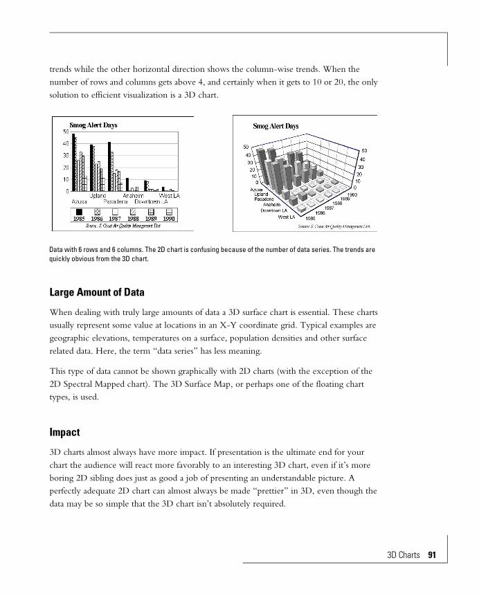
trends while the other horizontal direction shows the column-wise trends. When the number of rows and columns gets above 4, and certainly when it gets to 10 or 20, the only solution to efficient visualization is a 3D chart.
Large Amount of Data
When dealing with truly large amounts of data a 3D surface chart is essential. These charts usually represent some value at locations in an X-Y coordinate grid. Typical examples are geographic elevations, temperatures on a surface, population densities and other surface related data. Here, the term “data series” has less meaning.
This type of data cannot be shown graphically with 2D charts (with the exception of the 2D Spectral Mapped chart). The 3D Surface Map, or perhaps one of the floating chart types, is used.
Impact
3D charts almost always have more impact. If presentation is the ultimate end for your chart the audience will react more favorably to an interesting 3D chart, even if it’s more boring 2D sibling does just as good a job of presenting an understandable picture. A perfectly adequate 2D chart can almost always be made “prettier” in 3D, even though the data may be so simple that the 3D chart isn’t absolutely required.
Data with 6 rows and 6 columns. The 2D chart is confusing because of the number of data series. The trends are quickly obvious from the 3D chart.
3D Charts 91

92 3D Charts
These data can be shown and understood with a 2D chart. But they are more interesting in 3D form.

The Objects of a 3D ChartThe figure shows the objects of a 3D chart. Each object can be edited/customized, independently of the other objects. The editing can be done in any order.
Background The rectangular area that holds all the other chart objects. It forms the background of the chart.
Riser A riser is a bar or other shape representing a data-point and rising from the floor of the chart. Occasionally a representation that does not rise from the floor (e.g., a floating object) is referred to as a riser.
Left Wall One of the two walls of the box holding the chart.
Right Wall One of the two walls of the box holding the chart.
Floor The floor of the box holding the chart.
Title A description of the chart.
Subtitle A second description of the chart.
Footnote A third description of the chart.
Left Scale The numbers along the left wall. They are the same as the right scale.
Right Scale The numbers along the right wall. They are the same as the left scale.
3D Charts 93
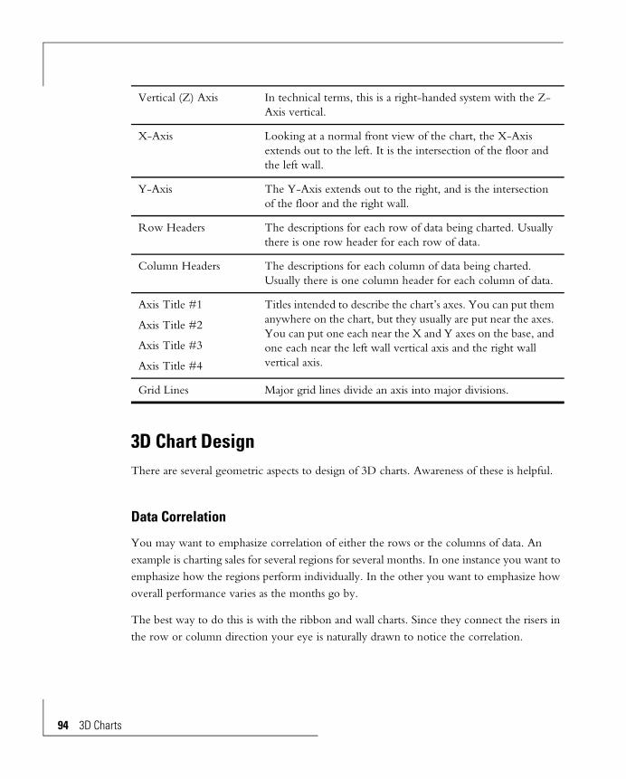
94 3D Charts
3D Chart DesignThere are several geometric aspects to design of 3D charts. Awareness of these is helpful.
Data Correlation
You may want to emphasize correlation of either the rows or the columns of data. An example is charting sales for several regions for several months. In one instance you want to emphasize how the regions perform individually. In the other you want to emphasize how overall performance varies as the months go by.
The best way to do this is with the ribbon and wall charts. Since they connect the risers in the row or column direction your eye is naturally drawn to notice the correlation.
Vertical (Z) Axis In technical terms, this is a right-handed system with the Z-Axis vertical.
X-Axis Looking at a normal front view of the chart, the X-Axis extends out to the left. It is the intersection of the floor and the left wall.
Y-Axis The Y-Axis extends out to the right, and is the intersection of the floor and the right wall.
Row Headers The descriptions for each row of data being charted. Usually there is one row header for each row of data.
Column Headers The descriptions for each column of data being charted. Usually there is one column header for each column of data.
Axis Title #1
Axis Title #2
Axis Title #3
Axis Title #4
Titles intended to describe the chart’s axes. You can put them anywhere on the chart, but they usually are put near the axes. You can put one each near the X and Y axes on the base, and one each near the left wall vertical axis and the right wall vertical axis.
Grid Lines Major grid lines divide an axis into major divisions.
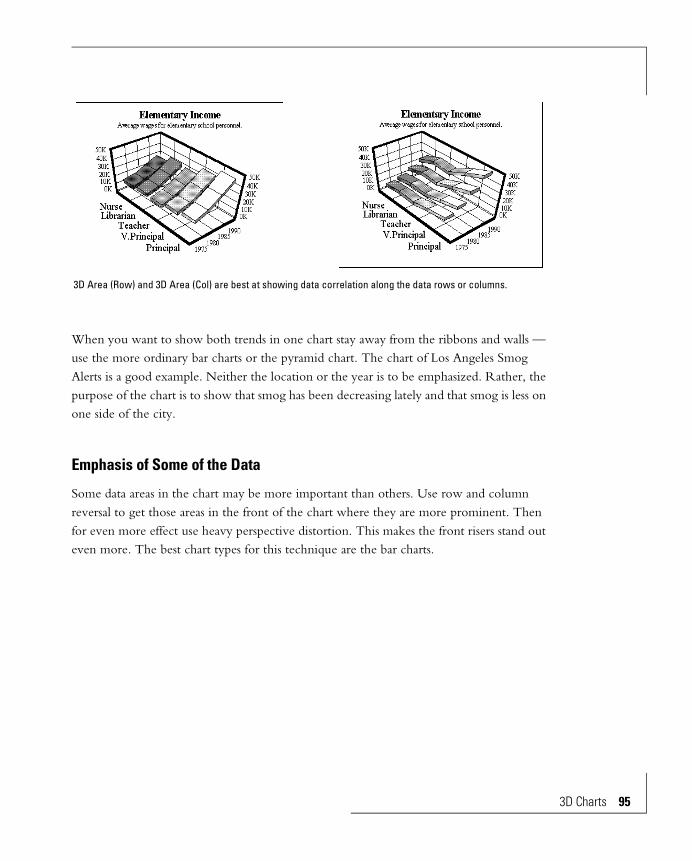
When you want to show both trends in one chart stay away from the ribbons and walls — use the more ordinary bar charts or the pyramid chart. The chart of Los Angeles Smog Alerts is a good example. Neither the location or the year is to be emphasized. Rather, the purpose of the chart is to show that smog has been decreasing lately and that smog is less on one side of the city.
Emphasis of Some of the Data
Some data areas in the chart may be more important than others. Use row and column reversal to get those areas in the front of the chart where they are more prominent. Then for even more effect use heavy perspective distortion. This makes the front risers stand out even more. The best chart types for this technique are the bar charts.
3D Area (Row) and 3D Area (Col) are best at showing data correlation along the data rows or columns.
3D Charts 95
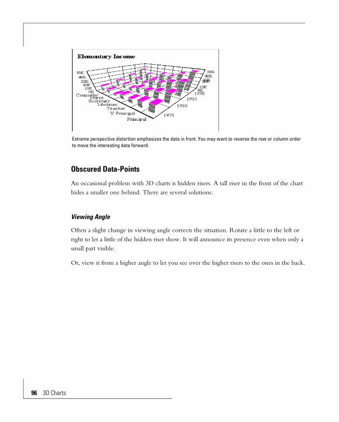
96 3D Charts
Obscured Data-Points
An occasional problem with 3D charts is hidden risers. A tall riser in the front of the chart hides a smaller one behind. There are several solutions:
Viewing Angle
Often a slight change in viewing angle corrects the situation. Rotate a little to the left or right to let a little of the hidden riser show. It will announce its presence even when only a small part visible.
Or, view it from a higher angle to let you see over the higher risers to the ones in the back.
Extreme perspective distortion emphasizes the data in front. You may want to reverse the row or column order to move the interesting data forward.
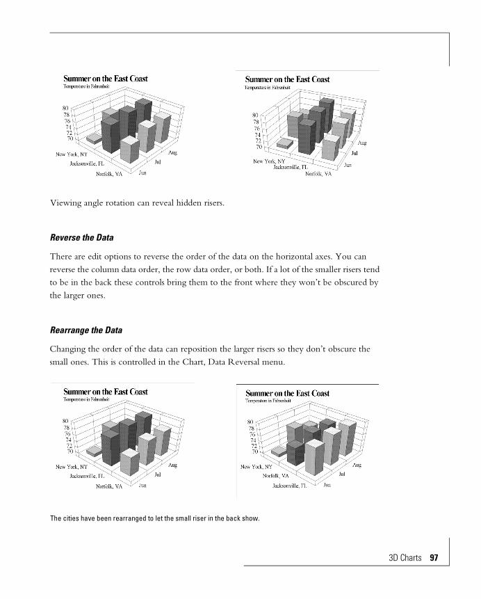
Reverse the Data
There are edit options to reverse the order of the data on the horizontal axes. You can reverse the column data order, the row data order, or both. If a lot of the smaller risers tend to be in the back these controls bring them to the front where they won’t be obscured by the larger ones.
Rearrange the Data
Changing the order of the data can reposition the larger risers so they don’t obscure the small ones. This is controlled in the Chart, Data Reversal menu.
Viewing angle rotation can reveal hidden risers.
The cities have been rearranged to let the small riser in the back show.
3D Charts 97

98 3D Charts
Pyramid Charts
Since pyramid risers taper you can see more of the back of the chart. The pyramid chart has the added advantage of added interest.
3D Chart TypesThe Chart Editor has a variety of preset 3D chart types. These all represent different ways of making 3D charts from the same data. You can use one of these presets as-is or select one that is close to what you want, then modify it.
The various 3D categories in the Gallery menu show the Chart Editor’s presets. Release the mouse button on one of them to draw the data with that chart type. (This procedure is detailed in the Switching Chart Types section of the Overview chapter.) You will find that some chart types work better for some data than others.
You should also consider changing the viewing angle when designing a chart. Viewing angle changes are described later in this chapter.
Following is a summary of the various chart types.
Switching to the Pyramid Chart can sometimes reveal hidden data.

3D Riser Charts
These types use three dimensional bars as the risers. The 3D Bars can be considered a “nominal” chart type, with no special emphasis. Pyramids, Octagons and Corner-Cut Bars are risers with different shapes.
Editing can modify any of these chart types. As an example the bars can be elongated in the column direction if correlation along the data columns instead of rows is the aim.
A somewhat special case of riser charts is pyramid charts. These have two major purposes. First, they are more interesting than many other types. Sometimes they are used for that reason alone.
3D Riser charts: Bar and Pyramid.
3D Riser charts: Octagon and Corner-cut.
3D Charts 99
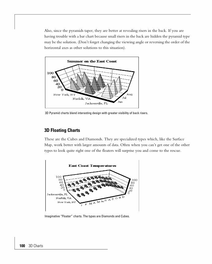
100 3D Chart
Also, since the pyramids taper, they are better at revealing risers in the back. If you are having trouble with a bar chart because small risers in the back are hidden the pyramid type may be the solution. (Don’t forget changing the viewing angle or reversing the order of the horizontal axes as other solutions to this situation).
3D Floating Charts
These are the Cubes and Diamonds. They are specialized types which, like the Surface Map, work better with larger amounts of data. Often when you can’t get one of the other types to look quite right one of the floaters will surprise you and come to the rescue.
3D Pyramid charts blend interesting design with greater visibility of back risers.
Imaginative “Floater” charts. The types are Diamonds and Cubes.
s
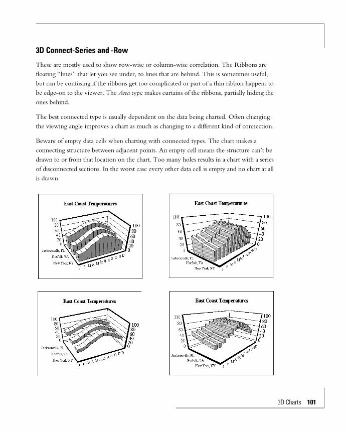
3D Connect-Series and -Row
These are mostly used to show row-wise or column-wise correlation. The Ribbons are floating “lines” that let you see under, to lines that are behind. This is sometimes useful, but can be confusing if the ribbons get too complicated or part of a thin ribbon happens to be edge-on to the viewer. The Area type makes curtains of the ribbons, partially hiding the ones behind.
The best connected type is usually dependent on the data being charted. Often changing the viewing angle improves a chart as much as changing to a different kind of connection.
Beware of empty data cells when charting with connected types. The chart makes a connecting structure between adjacent points. An empty cell means the structure can’t be drawn to or from that location on the chart. Too many holes results in a chart with a series of disconnected sections. In the worst case every other data cell is empty and no chart at all is drawn.
3D Charts 101
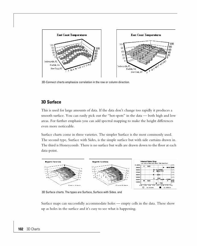
102 3D Chart
3D Surface
This is used for large amounts of data. If the data don’t change too rapidly it produces a smooth surface. You can easily pick out the “hot-spots” in the data — both high and low areas. For further emphasis you can add spectral mapping to make the height differences even more noticeable.
Surface charts come in three varieties. The simpler Surface is the most commonly used. The second type, Surface with Sides, is the simple surface but with side curtains drawn in. The third is Honeycomb. There is no surface but walls are drawn down to the floor at each data-point.
Surface maps can successfully accommodate holes — empty cells in the data. These show up as holes in the surface and it’s easy to see what is happening.
3D-Connect charts emphasize correlation in the row or column direction.
3D Surface charts. The types are Surface, Surface with Sides. and
s

Sometimes you will want to lop off high peaks or low valleys to let the detail of the rest of the data expand to the height of the chart. Use manual scaling to limit the range of the Z axis. You can elect to show out of range data at the scale limits —they will show as flat spots — or not show them at all.
Surface maps can chart incomplete data. The missing data appear as holes in the surface.
3D Charts 103

104 3D Chart
3D Math Functions
An interesting use for surface maps is charting three dimensional mathematical functions. Use a spreadsheet to evaluate the function and assign values to the cells.
Attenuating peaks to expand the remaining data.
Top: Automatic scale range shows all the points. Lower left: The scale range was set to cut off the high points. Out of range data are shown at the scale limits. Lower right: The out of range data are not shown.
Surface Map charts used to show mathematical functions.
s

Contoured Surface Maps
A 3D surface with contour lines can be made by activating grid lines for the riser and making the edges of the riser surface transparent. This leaves only the grid lines visible. They follow the shape of the surface as contour lines.
Wire Frame Surface
You can make a wire-frame surface map by making the colors of the surface transparent.
A 3D contour map. The chart type is 3D Surface with Sides. The “risers” have grid lines and the “edges” of the riser face are transparent.
3D Charts 105
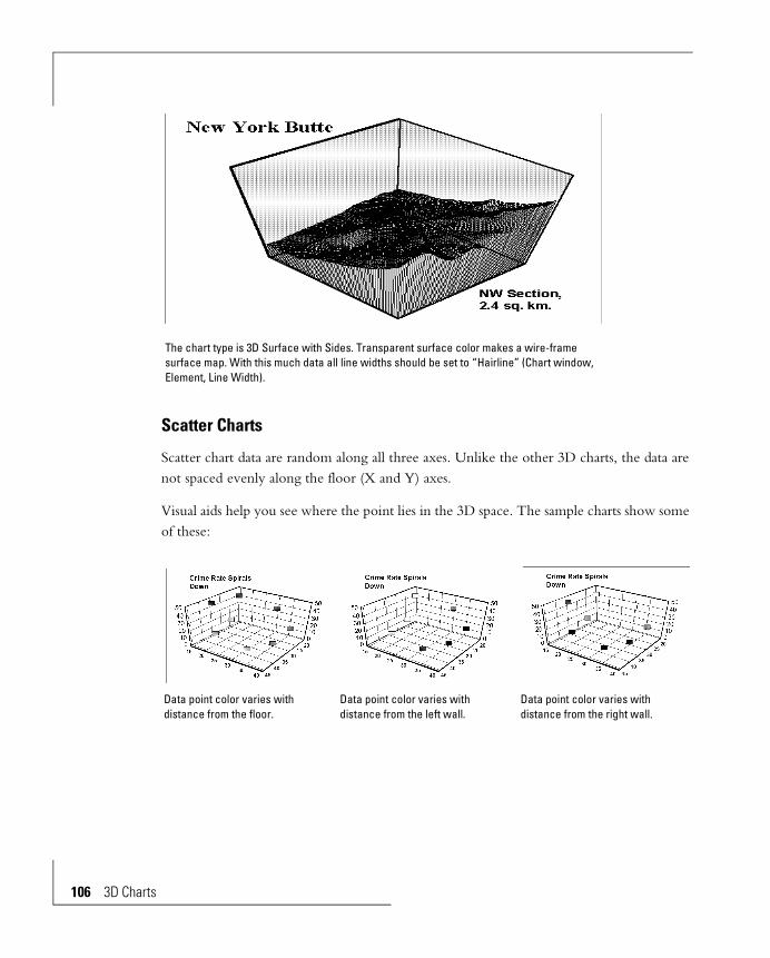
106 3D Chart
Scatter Charts
Scatter chart data are random along all three axes. Unlike the other 3D charts, the data are not spaced evenly along the floor (X and Y) axes.
Visual aids help you see where the point lies in the 3D space. The sample charts show some of these:
The chart type is 3D Surface with Sides. Transparent surface color makes a wire-frame surface map. With this much data all line widths should be set to “Hairline” (Chart window, Element, Line Width).
Data point color varies with distance from the floor.
Data point color varies with distance from the left wall.
Data point color varies with distance from the right wall.
s
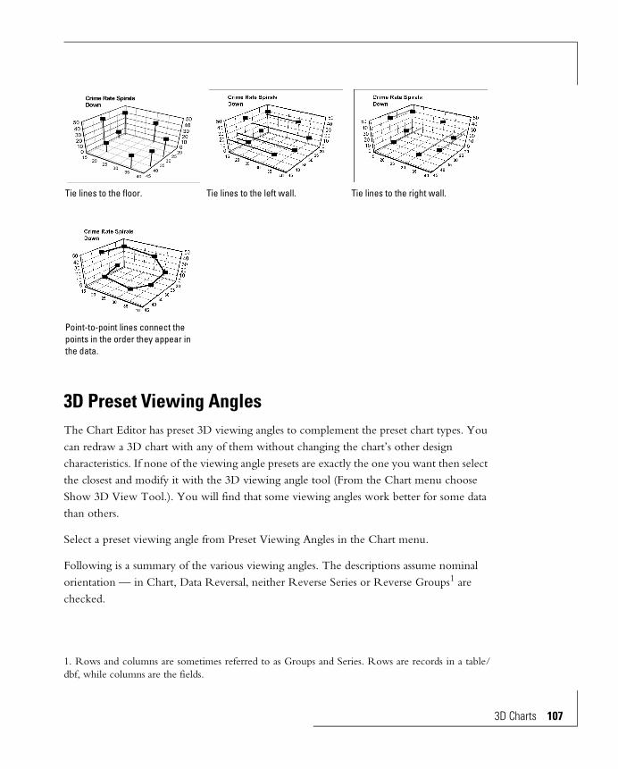
3D Preset Viewing AnglesThe Chart Editor has preset 3D viewing angles to complement the preset chart types. You can redraw a 3D chart with any of them without changing the chart’s other design characteristics. If none of the viewing angle presets are exactly the one you want then select the closest and modify it with the 3D viewing angle tool (From the Chart menu choose Show 3D View Tool.). You will find that some viewing angles work better for some data than others.
Select a preset viewing angle from Preset Viewing Angles in the Chart menu.
Following is a summary of the various viewing angles. The descriptions assume nominal orientation — in Chart, Data Reversal, neither Reverse Series or Reverse Groups1 are checked.
1. Rows and columns are sometimes referred to as Groups and Series. Rows are records in a table/dbf, while columns are the fields.
Tie lines to the floor. Tie lines to the left wall. Tie lines to the right wall.
Point-to-point lines connect the points in the order they appear in the data.
3D Charts 107

108 3D Chart
Standard Angle
This is the “nominal” viewing angle. It has no special emphasis. If you are not sure which angle you want, this is a good starting place — you can sometimes tell from this viewing angle which modifications will work well.
Tall and SkinnyData with a small range—the numbers are all close together—shows well with this viewing angle since the height stretches the differences. It’s also good for emphasizing high numbers.
From the Top
An extreme view that is almost guaranteed to show all the risers — none will be hidden behind others.
s
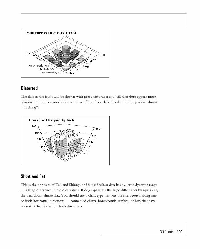
Distorted
The data in the front will be shown with more distortion and will therefore appear more prominent. This is a good angle to show off the front data. It’s also more dynamic, almost “shocking”.
Short and Fat
This is the opposite of Tall and Skinny, and is used when data have a large dynamic range — a large difference in the data values. It de-emphasizes the large differences by squashing the data down almost flat. You should use a chart type that lets the risers touch along one or both horizontal directions — connected charts, honeycomb, surface, or bars that have been stretched in one or both directions.
3D Charts 109
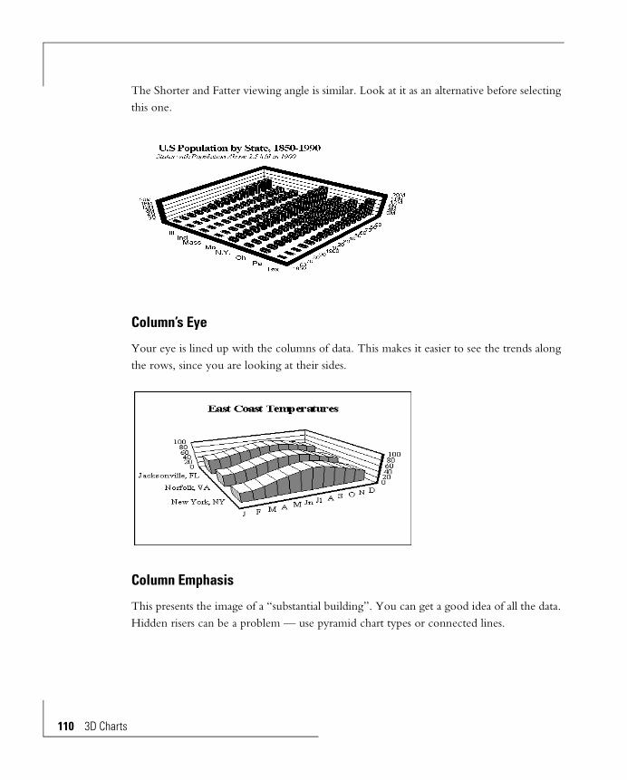
110 3D Chart
The Shorter and Fatter viewing angle is similar. Look at it as an alternative before selecting this one.
Column’s Eye
Your eye is lined up with the columns of data. This makes it easier to see the trends along the rows, since you are looking at their sides.
Column Emphasis
This presents the image of a “substantial building”. You can get a good idea of all the data. Hidden risers can be a problem — use pyramid chart types or connected lines.
s

Few Rows
The opposite of Few Columns.
Useful when you have a lot more data columns than rows. The chart is stretched to accommodate more columns than rows.
Few Columns
The opposite of Few Rows.
Useful when you have a lot more data rows than columns. The chart is stretched to accommodate more rows than columns.
If data are like this use Few Rows.
The chart from the data on the left using the Few
324053
324053
324053
324053
324053
324053
324053
324053
3D Charts 111

112 3D Chart
Distorted Standard
A variation on “Distorted”, but not as tall so the perspective effect is not as extreme. Compared to Distorted this view isn’t as dramatic, and is more considerate of the data in the back.
Thick Wall for Columns
Sighting along the data rows. Like looking edge-on at a long object you can see small changes in data along the row (from column to column).
If data are like this use Few Columns.
The chart from the data on the left using the Few Columns preset.
1884713788 83481057916764156002070825165
2759319944125041542124981232003049636452
3597926090161842008833469310004091648431
s

Shorter and Fatter
This is a variation on Short and Fat and has the same purposes. It’s flatter. The choice between the two is probably just a matter of personal preference.
Thick Wall for Rows
Sighting along the data columns. Like looking edge-on at a long object you can see small changes in data along the column (from row to row).
3D Charts 113

114 3D Chart
Thick Wall Standard
A variation on Standard. As with Standard it has no special characteristics and therefore can work with almost any data — a good alternative to Standard if you are unsure what you want and need a good starting place. The thick walls add interest.
s
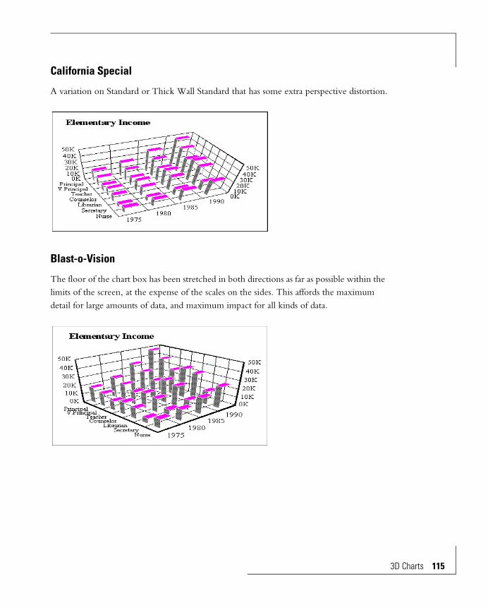
California Special
A variation on Standard or Thick Wall Standard that has some extra perspective distortion.
Blast-o-Vision
The floor of the chart box has been stretched in both directions as far as possible within the limits of the screen, at the expense of the scales on the sides. This affords the maximum detail for large amounts of data, and maximum impact for all kinds of data.
3D Charts 115

116 3D Chart
3D Chart EditsDescribed here are the edits and customizations for 3D charts.
Editing involves changing colors, text formats, scales, axes, and other properties of objects of a chart. The chart objects can be edited singly. Multiple object selection lets you quickly make identical edits to more than one object. Edits can be done in any order.
Data and text for the chart come from the data source and cannot be edited on the chart.
Custom Viewing AnglesThe preset viewing angles can be starting points for customized viewing angles. For any of them you can adjust the following:
• The viewing direction.
• The length of the three axes.
• The thicknesses of the walls and floor of the chart box.
• Perspective distortion.
• Location of the chart and its box along the box axes.
• The chart size.
• The chart position in the window.
The 3D View Tool
The 3D View Tool controls these modifications. You bring it up, expand one of the four adjustment icons along the top, and make changes by clicking on arrows of the expanded icon. The changes are reflected immediately on an outline form of the chart, so you have instant feedback.
s

From the View menu choose 3D View Palette. This superimposes the 3D View Tool on the screen, along with an outline of the 3D box shape. To remove the tool click the small white close box in the upper left corner.
Positioning the 3D View Tool
You can slide the tool around on the screen, in case it is covering a part of the chart you want to see. Click and drag on the dark bar on the top of the panel.
The position can be anywhere on the screen and is not restricted to the chart window or the Chart Editor window. To uncover the chart completely shrink the chart window and slide the tool outside it.
3D Charts 117

118 3D Chart
Controls in the 3D View Tool
Top Row of Icons:
Click on one of these icons to expand it into the central area of the tool, where it can be used. The four icons, from left to right, are:
Movement: Controls location along the screen axes.
Zoom, Pan, Perspective: Controls size, location in the window and perspective distortion.
Proportions: Controls the lengths of the axes and thicknesses of the walls and the floor.
To avoid overlap shrink the chart window and slide the 3D View Tool out of the way.
s

Edit Area:
This is the central area. When you click on an icon at the top its image is expanded into this area as a working tool, so you can use its arrows to make the chart modifications.
Show Chart box:
• Box not checked: The full chart isn’t shown. A box outline shows the starting position. As you make changes the outline moves.
• Box checked: The chart is shown, with the outline over it. As you make changes the outline moves.
Redraw button:
Redraws the chart using the modified configuration. Checks the Show Chart box.
When you are done adjusting the viewing angle you can redraw with Redraw Window in the Window menu or with Redraw in the 3D Viewing Angle Tool. You can leave the 3D Viewing Angle tool on the screen or remove it by clicking the close box in its upper left corner.
Adjusting the Viewing Direction — Rotation
You can look at the chart from anywhere on an imaginary sphere around it. Rotations sometimes help reveal hidden risers, and can be convenient to put important data in prominent positions.
Use the Rotation icon in the viewing panel. Each arrow rotates the outline form of the chart in a different direction.
Rotation: Controls the viewing direction.
3D Charts 119

120 3D Chart
Stretching and Shrinking the Three Axes — Proportions
The three axes can be shrunk to very thin, stretched to very long, or adjusted to any intermediate length. An axis with lots of data sometimes benefits from stretching to make
The 3D View Tool with the Rotation icon expanded. Clicking on the arrows rotates the chart outline.
3D chart rotation.
s

the data fit comfortably. A floor axis with few data-points can be emphasized by making it long.
Use the Proportions icon in the viewing panel, then the arrows on the axis (not the ones on the corners of the walls.) Each arrow changes the length of one of the axes of the outline form of the chart.
Thickness of the Walls and Floor — Proportions
You can adjust the thickness of the walls and the floors of the box surrounding 3D charts.
The Proportions icon of the 3D View Tool.
3D chart axis length adjustment.
3D Charts 121
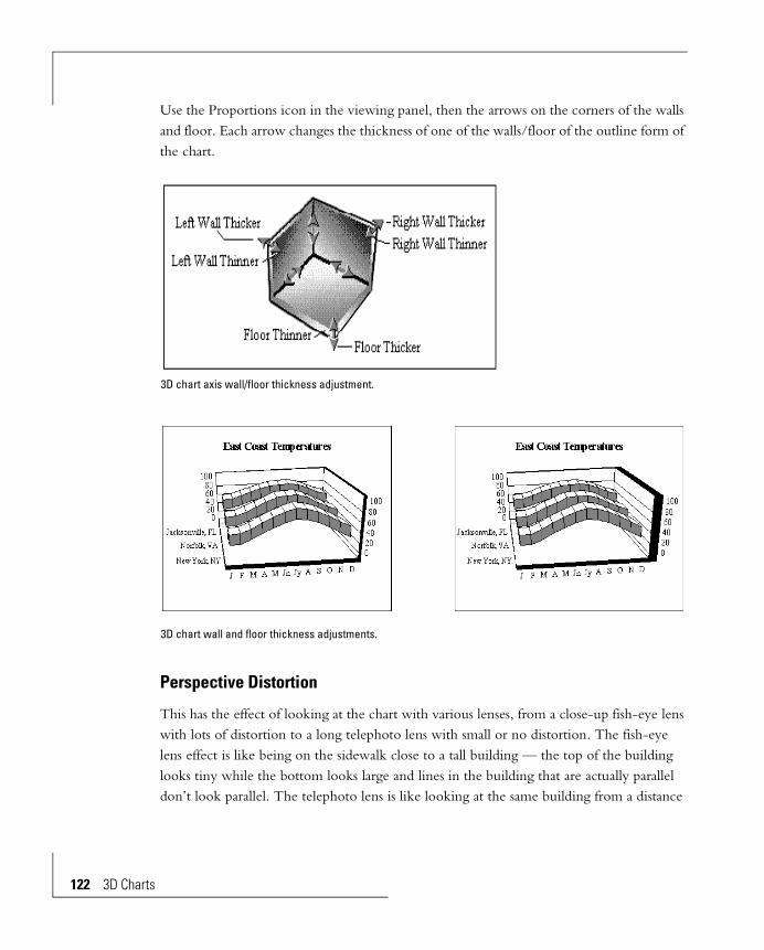
122 3D Chart
Use the Proportions icon in the viewing panel, then the arrows on the corners of the walls and floor. Each arrow changes the thickness of one of the walls/floor of the outline form of the chart.
Perspective Distortion
This has the effect of looking at the chart with various lenses, from a close-up fish-eye lens with lots of distortion to a long telephoto lens with small or no distortion. The fish-eye lens effect is like being on the sidewalk close to a tall building — the top of the building looks tiny while the bottom looks large and lines in the building that are actually parallel don’t look parallel. The telephoto lens is like looking at the same building from a distance
3D chart axis wall/floor thickness adjustment.
3D chart wall and floor thickness adjustments.
s
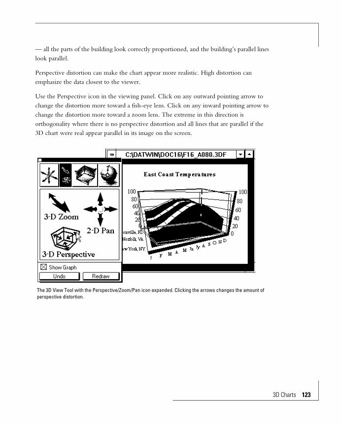
— all the parts of the building look correctly proportioned, and the building’s parallel lines look parallel.
Perspective distortion can make the chart appear more realistic. High distortion can emphasize the data closest to the viewer.
Use the Perspective icon in the viewing panel. Click on any outward pointing arrow to change the distortion more toward a fish-eye lens. Click on any inward pointing arrow to change the distortion more toward a zoom lens. The extreme in this direction is orthogonality where there is no perspective distortion and all lines that are parallel if the 3D chart were real appear parallel in its image on the screen.
The 3D View Tool with the Perspective/Zoom/Pan icon expanded. Clicking the arrows changes the amount of perspective distortion.
3D Charts 123

124 3D Chart
Location along a Screen Axis — Movement
’”Movement” — sliding the chart along one of the screen axes — has an effect similar to watching a box car go by on a railroad track. To do this properly movement changes the viewing direction, the perspective distortion and the viewing distance. Compare this to positioning (Pan), which slides the image on the screen and does not change the shape of the chart. Movement does not change the shape of the chart when there is no perspective distortion — the image is orthogonal. Then the result of movement is similar to panning.
Use the Movement icon in the viewing panel. Click on one of the six arrows to make the adjustment.
3D chart perspective adjustment.
s

Enlarging and Reducing — Zoom
The chart can be expanded to full screen, or even more, or shrunk to a small size, without changing its relative shape.
Use the Perspective/Zoom/Pan icon in the viewing panel. Click on one of the two arrows of the Zoom part of the icon to make the adjustment.
3D chart Movement.
3D Charts 125

126 3D Chart
Repositioning — Pan
You can slide the chart to any place in the window — corners, sides, the center, or anyplace in between.
The 3D View Tool with the Perspective/Zoom/Pan icon expanded. Clicking one of the arrows changes the size of the chart.
3D chart Zoom. Only the chart size changed — the proportions remained constant.
s

Use the Perspective/Zoom/Pan icon in the viewing panel. Click on one of the four arrows of the Pan part of the icon to make the adjustment.
The 3D View Tool with the Perspective/Zoom/Pan icon expanded. Click one of the Pan arrows to reposition the chart.
3D chart Pan. Chart position only is changed — the proportions and size remain constant.
3D Charts 127

128 3D Chart
Walls and FloorThere are two back walls — left and right. You can change their thickness and the decoration of the back wall and floor surfaces and the edges. You can control the grid lines drawn on them. The walls and floor can be removed entirely.
Coloring the Box — Autoshade
You can apply colors, gradients, patterns or textures to the walls and floor of the box. Or you can apply autoshading, which uses different shades of a single solid color to simulate the appearance of a light source illuminating the box from the left. Autoshading quickly gets attractive images.
AutoShade Cube is checked and a color is applied to a side or floor.
AutoShade Cube is not checked. Apply colors separately to the sides and floor.
s
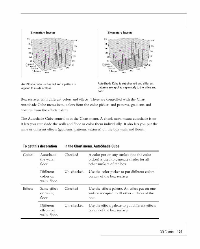
Box surfaces with different colors and effects. These are controlled with the Chart Autoshade Cube menu item, colors from the color picker, and patterns, gradients and textures from the effects palette.
The Autoshade Cube control is in the Chart menu. A check mark means autoshade is on. It lets you autoshade the walls and floor or color them individually. It also lets you put the same or different effects (gradients, patterns, textures) on the box walls and floors.
To get this decoration In the Chart menu, AutoShade Cube
Colors Autoshade the walls, floor.
Checked A color put on any surface (use the color picker) is used to generate shades for all other surfaces of the box.
Different colors on walls, floor.
Un-checked Use the color picker to put different colors on any of the box surfaces.
Effects Same effect on walls, floor.
Checked Use the effects palette. An effect put on one surface is copied to all other surfaces of the box.
Different effects on walls, floor.
Un-checked Use the effects palette to put different effects on any of the box surfaces.
AutoShade Cube is checked and a pattern is applied to a side or floor.
AutoShade Cube is not checked and different patterns are applied separately to the sides and floor.
3D Charts 129
130 3D Chart
To assign a color to a surface, select the surface and select a color from the left box of the color picker. To assign an effect to a surface, select the surface and assign the effect with the effects palette. These procedures are detailed in the Line, Area and Text Decorations chapter.
Edge Decoration
The edges of the 3D box can only be given colors — they cannot have any of the other decorations. Select a surface and use the line box in the color palette. All edges of the box will have the same color. Refer again to the Line, Area and Text Decoration chapter for full details.
Edge Width and Style
You can change the widths and styles of the edges of the box. All edges will have the same width and style.
1 Select any box surface.
2 From the Element menu choose Line Width.
3 Select from the list presented.
4 If the line width is Hairline you can select a line style. From the Element menu choose Line Style, then select from the list presented.
Removing the Walls and Floor
The quickest way to remove a wall or the floor is to get the pop-up menu by clicking on it with the right button. Then choose the top item of the menu — the floor or wall name.
Alternately, use menu items in Display Status of the Chart menu to toggle them on and off. The only way to restore the walls and floor is with Chart Display Status.
s

Grid Lines and ScalesGrid lines can be attached to all three axes, and can be put on the risers.
The vertical axis always represents numeric values. You can:
• Control the number of grid lines.
• Control the scale range.
• Put grid lines on the walls, the wall edges, and the risers.
In all but scatter charts the two axes along the base represent data rows or columns. Grid lines separate the categories, and you can choose to display or not display them.
In scatter charts the two axes along the base represent numbers. As with the vertical axis, you can control the number of grid lines and the scale range.
You can turn off grid lines entirely. Each axis is separately controllable.
Grid Lines on Non-numeric Axes
Non-numeric axes (the X and Y axes along the floor of non-scatter charts) show “categories” — each row and column of data is a category. Grid lines for these axes are limited to lines between the categories.
Wall display is controlled in the Chart menu, Display Status dialog box.
3D Charts 131

132 3D Chart
These grid lines can be turned on and off. From the Chart menu choose 3D Grid Lines and check the appropriate item.
Grid Lines on Numeric Axes
The vertical axis (the Z-Axis) of all 3D charts always represents a numeric quantity. The X and Y axes of scatter charts also represent numeric quantities. These axes can have grid lines to mark the scale divisions. 3D chart numeric axes, unlike 2D charts, do not have minor grid lines and tick marks.
You can let the Chart Editor choose the number of grid lines/divisions on a numeric axis or you can tell it how many to have. Each grid line gets a scale value.
1 Get the pop-up menu for the right or left wall by right-button clicking on it. Choose 3D Grid Lines
or,
From the Chart menu choose 3D Grid Lines.
A dialog box appears.
2 Click the appropriate Show Grid Lines item.
Automatic selection of grid lines and divisions (left) and manual selection (right).
s
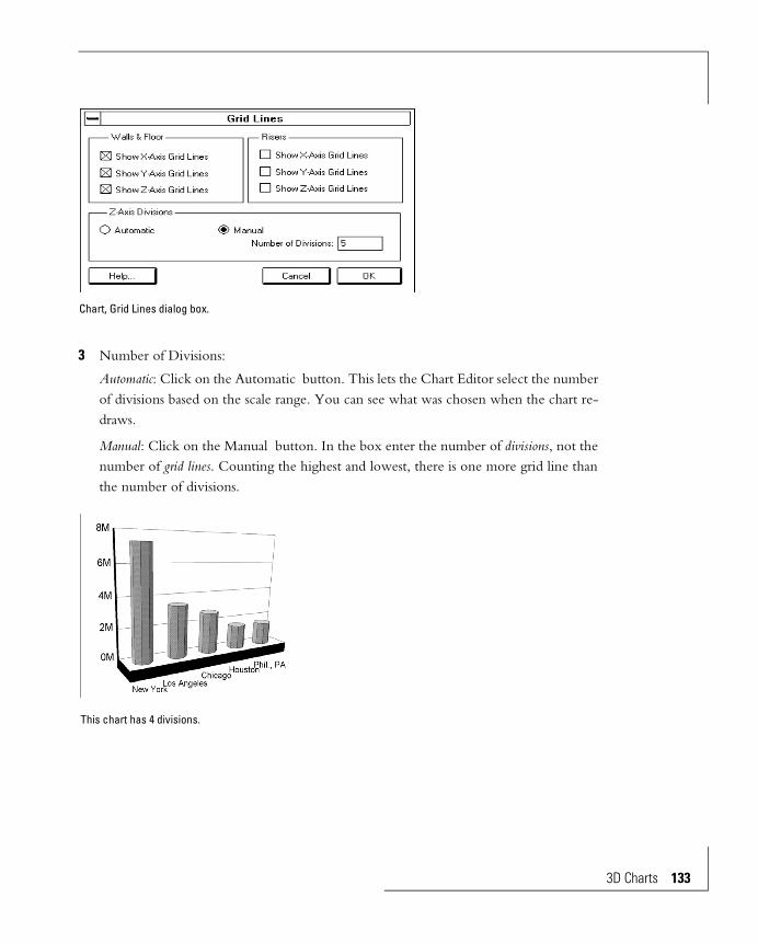
3 Number of Divisions:
Automatic: Click on the Automatic button. This lets the Chart Editor select the number of divisions based on the scale range. You can see what was chosen when the chart re-draws.
Manual: Click on the Manual button. In the box enter the number of divisions, not the number of grid lines. Counting the highest and lowest, there is one more grid line than the number of divisions.
Chart, Grid Lines dialog box.
This chart has 4 divisions.
3D Charts 133

134 3D Chart
Numeric Axis Scale Ranges
For all 3D charts a numeric scale can be on the sides of the left and right walls. These two scales are identical. For scatter charts, numeric scales are on the floor axes also.
The Chart Editor can automatically select the correct scale for numeric axes. Automatic selection scans the data to find the high and low values. It uses these to make the scale range.
You can override this automatic selection. You then have the choice of what to do with data outside the scale range.
Automatic Scaling
1 Get the Scale pop-up menu by right-button clicking on any of the scale numbers along a numeric axis.
or,
From the Chart menu choose a numeric axis.
2 Choose Scale Range. A dialog box appears.
3 Select Automatic Scale. The choices for manual scale disappear.
Manual Scaling
1 Display the dialog box, as in Automatic Scaling, directly above.
2 Select Manual Scale. Several choices are displayed:
• From: Enter the low end of the scale range you want.
s
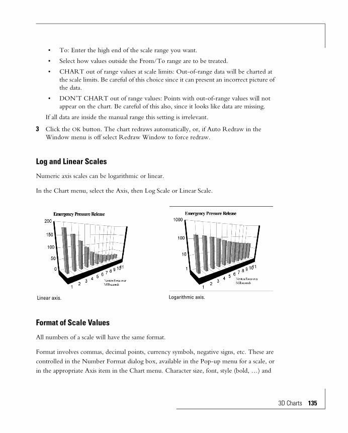
• To: Enter the high end of the scale range you want.
• Select how values outside the From/To range are to be treated.
• CHART out of range values at scale limits: Out-of-range data will be charted at the scale limits. Be careful of this choice since it can present an incorrect picture of the data.
• DON’T CHART out of range values: Points with out-of-range values will not appear on the chart. Be careful of this also, since it looks like data are missing.
If all data are inside the manual range this setting is irrelevant.
3 Click the OK button. The chart redraws automatically, or, if Auto Redraw in the Window menu is off select Redraw Window to force redraw.
Log and Linear Scales
Numeric axis scales can be logarithmic or linear.
In the Chart menu, select the Axis, then Log Scale or Linear Scale.
Format of Scale Values
All numbers of a scale will have the same format.
Format involves commas, decimal points, currency symbols, negative signs, etc. These are controlled in the Number Format dialog box, available in the Pop-up menu for a scale, or in the appropriate Axis item in the Chart menu. Character size, font, style (bold, …) and
Linear axis. Logarithmic axis.
3D Charts 135
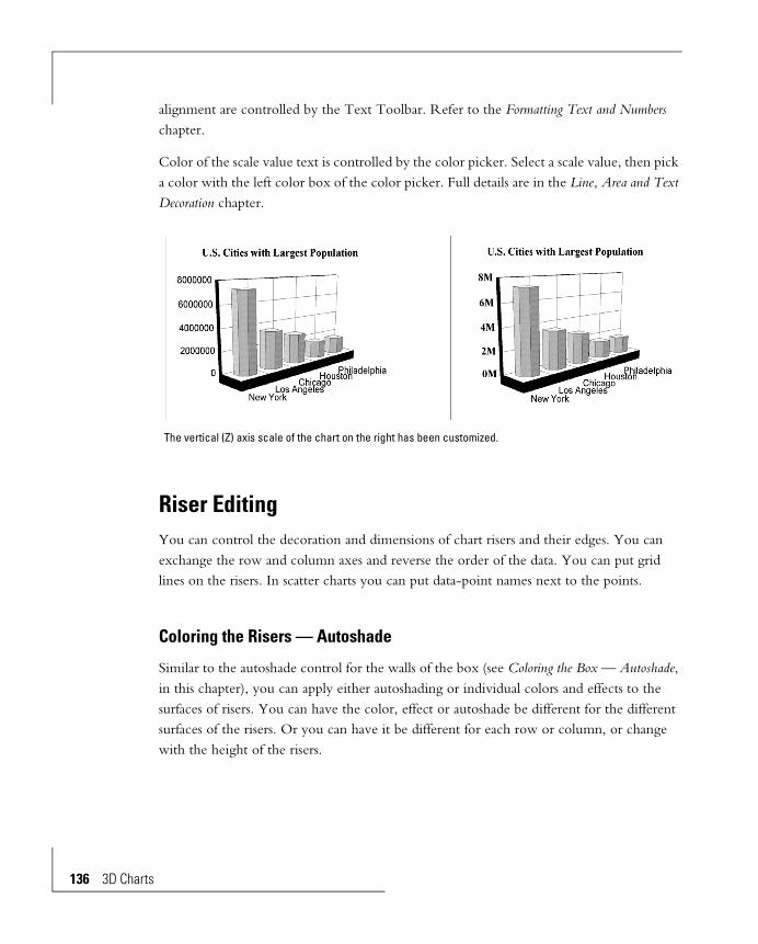
136 3D Chart
alignment are controlled by the Text Toolbar. Refer to the Formatting Text and Numbers chapter.
Color of the scale value text is controlled by the color picker. Select a scale value, then pick a color with the left color box of the color picker. Full details are in the Line, Area and Text Decoration chapter.
Riser EditingYou can control the decoration and dimensions of chart risers and their edges. You can exchange the row and column axes and reverse the order of the data. You can put grid lines on the risers. In scatter charts you can put data-point names next to the points.
Coloring the Risers — Autoshade
Similar to the autoshade control for the walls of the box (see Coloring the Box — Autoshade, in this chapter), you can apply either autoshading or individual colors and effects to the surfaces of risers. You can have the color, effect or autoshade be different for the different surfaces of the risers. Or you can have it be different for each row or column, or change with the height of the risers.
The vertical (Z) axis scale of the chart on the right has been customized.
s
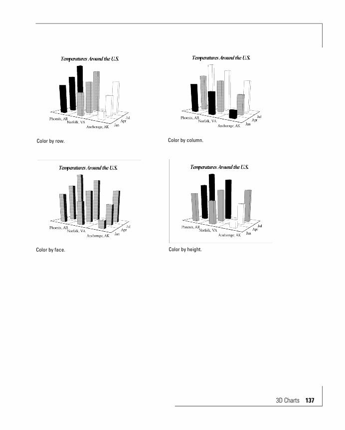
Color by row. Color by column.
Color by face. Color by height.
3D Charts 137

138 3D Chart
When you color by row, by column or by height the Chart Editor assigns colors from a color spectrum. You can control the end colors of the spectrum, and the number of gradations in it. You can, for instance, let the Chart Editor increment the color of each row, from white on the first row to bright red on the last row. This color assignment is “static”. After doing it you can put a contrasting color on one of the rows to make it stand out. Redrawing the chart will keep the contrasting color — the customized row will not revert to the color in the spectrum.
The controls are in the Chart menu. Use them as follows:
Chart Riser Colors menu
Chart Auto-Shade Riser Result
Color by Face Checked All risers get the same autoshade colors or the same gradient, pattern or texture effect.
Unchecked Corresponding surfaces of all risers get the same colors or effects.
Color by Series, Color by Group
Checked All risers of a row (column) get the same autoshade colors or the same effect.
Unchecked All risers of a row (column) get the same solid color or the same effect.
Color by angle.
Risers with different colors and effects. These are controlled by the Autoshade Riser control and Riser Colors selections in the Chart menu, and colors assigned with the color picker.
s
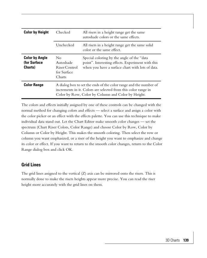
The colors and effects initially assigned by one of these controls can be changed with the normal method for changing colors and effects — select a surface and assign a color with the color picker or an effect with the effects palette. You can use this technique to make individual data stand out. Let the Chart Editor make smooth color changes — set the spectrum (Chart Riser Colors, Color Range) and choose Color by Row, Color by Column or Color by Height. This makes the smooth coloring. Then select the row or column you want emphasized, or a riser of the height you want to emphasize and change its color or effect. If you want to return to the smooth color changes, return to the Color Range dialog box and click OK.
Grid Lines
The grid lines assigned to the vertical (Z) axis can be mirrored onto the risers. This is normally done to make the risers heights appear more precise. You can read the riser height more accurately with the grid lines on them.
Color by Height Checked All risers in a height range get the same autoshade colors or the same effects.
Unchecked All risers in a height range get the same solid color or the same effect.
Color by Angle (for Surface Charts)
No Autoshade Riser Control for Surface Charts
Special coloring by the angle of the “data point”. Interesting effects. Experiment with this when you have a surface chart with lots of data.
Color Range A dialog box to set the ends of the color range and the number of increments in it. Colors are selected from this color range in Color by Row, Color by Column and Color by Height.
3D Charts 139

140 3D Chart
From the Chart menu choose 3D Grid Lines. A dialog box appears. Click the appropriate Show Grid Lines item in the Risers section. The grid line configuration of the corresponding axis is copied to the risers.
Z-axis riser grid lines on surface maps look like contour lines on a 3D representation of the surface. An interesting effect is to make the surfaces and surface edges transparent, leaving only the grid/contour lines.
Grid lines can be put on the risers.
3D Surface with Sides chart with Z- Axis grid lines on the risers and both ends of the color spectrum set to white. The grid lines become contour lines.
s

Riser Dimensions
Most risers have controllable widths and thicknesses. You can make the shape representing the chart skinny, fat, or skinny in one direction or fat in another.
To change the riser dimensions:
1 Get the pop-up menu for a riser by right-button clicking on it. Choose Riser Sizing.
or,
From the Chart menu choose Riser Sizing.
2 Select from one of the choices listed. The first number represents the riser thickness in the X-axis direction. The second represents the riser thickness in the Y axis direction.
Riser dimensions can be controlled.
3D Charts 141

142 3D Chart
Base of Risers
Risers for negative numbers can be drawn from the plane representing zero, or from the box floor.
Use the Base of Bars control in the pop-up menu for a riser or from the Chart menu. Choose either From the Zero Plane or From the Floor.
Data-point Names, Scatter Charts
Points in a scatter chart can have their names next to the points. You must be using the correct Scatter chart type. From the Gallery menu choose 3D Scatter, then XYZ Scatter with Labels. Four data cells are required for each data point.
Negative risers are from zero. Negative risers are from the floor.
Scatter chart with the names of the data-points next to the points.
s

From the Chart menu choose Display Status. Check Data-point Names in the dialog box. You can’t turn on names for some data-points and not for others. You can, however, blank out the names of the ones you don’t want in the data source.
Formatting character size, font, style (underline, …) and alignment of the names is controlled by the Text Toolbar. Full details are in the Formatting Text and Numbers chapter. Color of the names is controlled by the color picker. Select a scale value, then use the left color box of the color picker to pick a color. Full details are in the Line, Area and Text Decoration chapter.
Reversing Data Order and Exchanging Axes
Reversing the order of the data along one or both of the horizontal axes, and exchanging the axes assigned to rows and columns has several purposes:
• It can help show obscured data.
• It can bring more interesting data-points to the more prominent positions in the front.
• Often the floor axis (X or Y) used and the order of the data in rows and columns is not what was planned. And, you may decide the data look better reversed or exchanged even though they were charted in the planned locations. More commonly, there has been no plan, and experimentation with reversing and exchanging is needed to get the best look.
Reverse and exchange are usually done with functions instead of manipulating the data in the data source to get the same effect.
Scatter Chart Data-points — Visualizing Data-point Location in SpacePoints in a 3D scatter chart can be anywhere in the space defined by the walls and floor. This is different than non-scatter charts, where the data-points are in an orderly array formed by the row and column data. The orderliness of non-scatter charts gives a visual reference to let your eye judge where data-points are in space. Scatter charts lack this order. Without a visual reference, it can be difficult to judge where the data-point is.
Several techniques are available to give scatter points a visual spatial reference:
3D Charts 143

144 3D Chart
• You can choose to drop perpendicular lines to any of the three bounding planes — the left wall, the right wall, or the floor. The lines hit the plane at the correct location.
• You can choose to color the points by their distance from one of the walls or the floor.
• You can have a line drawn between data-points.
Data-point order is significant in some data. In these cases, the line helps visualization. Examples are an airplane flight path, or a pressure, temperature, volume relation for a gas. Lines are drawn between points in the order they appear in the data. So for this technique to work, the data must be presented in the correct order.
In other scatter chart data, data-point order is technically meaningless. Drawing a line between points in these cases does no good. An example is gas mileage vs. weight vs. price for automobiles. However, a connecting line in these situations can sometimes be helpful in showing where the data clump together.
Visual Separation of Data Series
3D scatter charts can show multiple series of data. Unlike 3D non-scatter charts, no orderly array exists to separate the series. Other techniques must be used:
• If the data have sequential order (see above), make sure the data are properly ordered in the data source and specify lines between the points. A separate line is drawn for each series. If the lines get confusing, you can give them different thicknesses and colors.
• Don’t color the points by distance from a wall or the floor. Instead use Color by Series in the Chart Data-point Colors menu. You can then color the points according to the series they belong to. This selection also lets you display the legend to identify the series. (Select Display Legend in the Chart Legend dialog box.)
• Use different shapes for the different series.
• Make sure the legend is displayed. Turn it on in the Display Status dialog box, available from the Chart menu. The legend defines the series by the color and shape of the markers.
Drop Lines
These are lines from the scatter chart data-point perpendicular to one of the walls or the floor. You can turn on one, two, or all three sets of drop lines.
s

From the Chart menu choose Tie Lines. Click on the appropriate selection:
• Tie Lines to Floor
• Tie Lines to Lt. Wall
• Tie Lines to Rt. Wall
• Tie Lines to Neighbor
If Auto Redraw in the Window menu is checked the chart will redraw automatically. Or, select Redraw Window, also in the Window menu, to force the chart to redraw.
Tie Lines to Neighbor
Lines connect points that are adjacent in the data source.
Drop lines can be made perpendicular to either of the walls or the floor.
Lines connecting points. The connections are in the order the data appear in the data source.
3D Charts 145

146 3D Chart
Select a point in a series or use Shift to select multiple series. In the Chart menu choose Tie Lines, then Point-to Point Lines.
If Auto Redraw in the Window menu is checked the chart will redraw automatically. Or, select Redraw Window, also in the Window menu, to force the chart to redraw.
Data-point Colors
To color data-points according their distance from one of the walls or the floor select a series (or use Shift to select multiple series). Then from the Chart menu choose Data-point Colors and click on the appropriate selection:
• By Distance from Floor
• By Distance from Lt. Wall
• By Distance from Rt. Wall
If none are selected all points of a data series will have the same color. You can then change the color with the color palette. Refer to the Line, Area and Text Decorations chapter.
Data-point Size and Shape
The data-points of a scatter chart can be given different shapes and sizes.
Data-points in a scatter chart can have different shapes and sizes.
s
To Change the Size
1 Get the pop-up for a marker by right-button clicking on it. Choose Data Point Size.
or,
From the Chart menu choose Data Point Size.
2 Select from the list presented. Different series cannot have different sized data points.
To Change the Shape
1 Get the pop-up for a marker by right-button clicking on it. Choose Data Point Shape.
or,
Select a marker from a series, or multiple select a marker from several series. From the Chart menu choose Data Point Shape.
2 Select from the list presented. Markers of the selected series will have the shape you choose.
Text ControlText used on 3D charts is styled as 3D text or as 2D text. 3D text can vary its size with the perspective of the 3D chart.
2D text is identical to text in 2D charts. Format is described in the Formatting Text and Numbers chapter of this manual. 3D text has some special controls and is described below.
2D Texts Title, Subtitle, Footnote.
Axis Titles #1, #2, #3, #4.
Data-point Names (scatter charts).
Legend Text.
3D Texts Row and Column Headers.
Axis Scales.
3D Charts 147
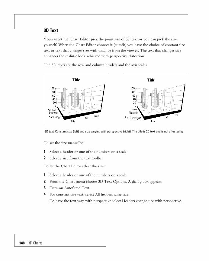
148 3D Chart
3D Text
You can let the Chart Editor pick the point size of 3D text or you can pick the size yourself. When the Chart Editor chooses it (autofit) you have the choice of constant size text or text that changes size with distance from the viewer. The text that changes size enhances the realistic look achieved with perspective distortion.
The 3D texts are the row and column headers and the axis scales.
To set the size manually:
1 Select a header or one of the numbers on a scale.
2 Select a size from the text toolbar
To let the Chart Editor select the size:
1 Select a header or one of the numbers on a scale.
2 From the Chart menu choose 3D Text Options. A dialog box appears:
3 Turn on Autofitted Text.
4 For constant size text, select All headers same size.
To have the text vary with perspective select Headers change size with perspective.
3D text: Constant size (left) and size varying with perspective (right). The title is 2D text and is not affected by
s

Title, Subtitle, Footnote
These three objects are used to identify the chart. They can be customized, re-sized, and positioned anywhere on the chart.
Displaying:
• From the Chart menu choose Display Status. Title, Subtitle or Footnote must be checked to be displayed.
• Make sure the color is not transparent, or the same color as its background.
Editing:
• They must be edited in the data source.
Size and Position:
You can independently change the size of the text and the size of the box around the text.
• Text Size: Select the title, subtitle or footnote, then enter a new text size from the text toolbar.
• Box Size: Select the title, subtitle or footnote to get the object’s handles, then drag the handles.
3D chart with nominal title, subtitle and footnote. 3D chart with customized title, subtitle and footnote.
3D Charts 149
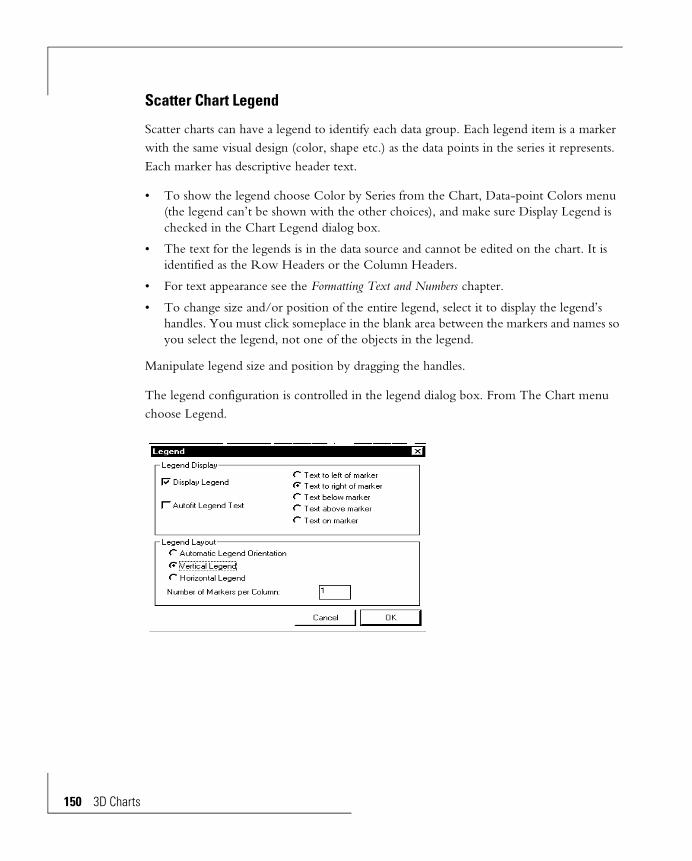
150 3D Chart
Scatter Chart Legend
Scatter charts can have a legend to identify each data group. Each legend item is a marker with the same visual design (color, shape etc.) as the data points in the series it represents. Each marker has descriptive header text.
• To show the legend choose Color by Series from the Chart, Data-point Colors menu (the legend can’t be shown with the other choices), and make sure Display Legend is checked in the Chart Legend dialog box.
• The text for the legends is in the data source and cannot be edited on the chart. It is identified as the Row Headers or the Column Headers.
• For text appearance see the Formatting Text and Numbers chapter.
• To change size and/or position of the entire legend, select it to display the legend’s handles. You must click someplace in the blank area between the markers and names so you select the legend, not one of the objects in the legend.
Manipulate legend size and position by dragging the handles.
The legend configuration is controlled in the legend dialog box. From The Chart menu choose Legend.
s
Display Status
You can display or suppress many objects in the chart. On/off controls are in the Display Status dialog box in the Chart menu. These are:
• Title, subtitle, and footnote.
• Axis titles #1 to #4.
• The headers for the row categories and column categories.
• The left wall, the right wall and the floor.
• The scales on the left and right walls.
• For scatter charts with labels, the data-point names.
• For scatter charts, the X and Y axis scales.
• For scatter charts, the legend.
Display Legend Check to display the legend. This is the same control as Legend in Chart, Display Status.
Autofit Legend Text Check to let the Chart Editor choose a size for text in the legend. If this is not suitable, select a header, then a different size from the font size list box in the text toolbar. Refer to the Formatting Text and Numbers chapter for full details.
Position of text Choose one.
Automatic Legend Orientation
The legend can be vertical or horizontal This option lets the Chart Editor choose which.
Vertical Legend Force the legend to be vertically oriented. When this is chosen an additional control appears that lets you specify the number of columns.
Horizontal Legend Force the legend to be horizontally oriented. When this is chosen and additional control appears that lets you specify the number of rows.
3D Charts 151

152 3D Chart
s
Pie Charts
The Objects of a Pie Chart 157
Types of Pie Charts 158
Single Pie 158
Multiple Pies 159
Multiple Proportional Pies 160
Pie-Bars 160
Ring Pies 161
Pie Chart Edits 161
Exchanging Pies and Slices 161
Single Pie Charts 162
Reverse Slice Order and Reverse Pie Order 162
Detaching Slices 163
Deleting Slices 164
Restoring Detached and Deleted Slices 165
3D Effects 165
Tilt 165
Thickness 166
Ring Pie: Size of the Hole 166
Ring Pie: Pie Total 167
Pie Rotation 167
Slice Labels 168
Numbers or Percent 168
Pie/Bar — Bar Labels 169
Slice Feeler Lines 169
Labels With No Feeler Lines 170
Format of Slice Values 171
Title, Subtitle, Footnote 172
Legend 173
Colors, Patterns, Gradients and Textures 175
Display Status 175


Pie Charts
Pie charts visualize the relative sizes of the data-points compared to the sum of the data-points. The slice sizes show proportions, not the absolute values. Slice labels name the slice and can include the slice’s percentage or its absolute value.
A chart with a single pie represents one row or column of data. Multiple rows and columns are shown as multiple pies on the same chart.
Multiple Pie Chart
displaying slice names but not showing slice values, or the legend.
Single Ring Pie Chart
Pie Charts 155

156 Pie Char
The Chart Editor pie charts can be modified and enhanced with options:
• Depth and tilt can give pies a three dimensional appearance.
• The slice identification labels can include the slice’s numeric value, either in percentage or absolute value.
• The pies can be rotated.
• For multiple-pie charts row and column representation can be reversed. Slices can represent either rows or columns, while the individual pies represent the other.
• Individual slices can be detached from their normal positions or deleted altogether. Often slices are detached to bring attention to them.
• Areas of the chart can be decorated with patterns, colors, gradients, or textures. Text and lines can be decorated with solid colors.
ts
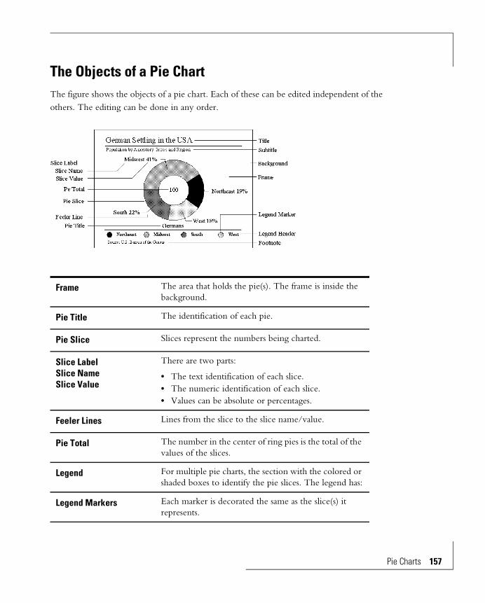
The Objects of a Pie ChartThe figure shows the objects of a pie chart. Each of these can be edited independent of the others. The editing can be done in any order.
Frame The area that holds the pie(s). The frame is inside the background.
Pie Title The identification of each pie.
Pie Slice Slices represent the numbers being charted.
Slice LabelSlice NameSlice Value
There are two parts:
• The text identification of each slice.• The numeric identification of each slice.• Values can be absolute or percentages.
Feeler Lines Lines from the slice to the slice name/value.
Pie Total The number in the center of ring pies is the total of the values of the slices.
Legend For multiple pie charts, the section with the colored or shaded boxes to identify the pie slices. The legend has:
Legend Markers Each marker is decorated the same as the slice(s) it represents.
Pie Charts 157

158 Pie Char
Types of Pie ChartsThe basic idea of a pie chart is to see the data components as percentages of a total. The full pie represents 100%. The slices show the proportion contributed by each component. To supplement the proportions the size of the numbers being charted can be seen in the multiple proportional pie variation, the totals that can be put in the center of ring pies, and from the values that can be attached to each slice.
The Chart Editor has preset pie charts. You can use one of these presets as-is or select the one closest to the design you want and modify it. From the Gallery menu choose Pies to display the list of preset pie charts available. This procedure is described in detail in the Overview chapter.
Pies come in solid or ring versions. The absolute total of all slices can be shown in the holes of ring pies.
Single Pie
This is the most common pie chart. The data represented is a simple list of numbers. The Chart Editor automatically calculates the percentage of each data-point with respect to the total of the data-points and makes the slice sizes proportional to the percentages.
Each slice of a single pie can be labeled with its name and either the percentage of the whole or the absolute value it represents.
Legend Headers Text identification of each marker or slice. These are Row or Column Headers.
Title A description of the chart.
Subtitle A second description of the chart.
Footnote A third description of the chart.
ts
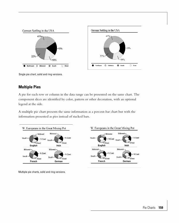
Multiple Pies
A pie for each row or column in the data range can be presented on the same chart. The component slices are identified by color, pattern or other decoration, with an optional legend at the side.
A multiple pie chart presents the same information as a percent-bar chart but with the information presented as pies instead of stacked bars.
Single pie chart, solid and ring versions.
Multiple pie charts, solid and ring versions.
Pie Charts 159

160 Pie Char
Multiple Proportional Pies
This form is similar to multiple pies, but the pie sizes are scaled to reflect the totals of the slices of each pie. With a non-proportional multiple pie you can only compare percentages from one pie to another. With the proportional pie you can see from the pie sizes which have larger or smaller total magnitude. You can see the absolute value of the total magnitude inside the ring of ring pies, but it’s not necessary to read these values to see which is bigger and smaller — the pie size tells you.
Pie-Bars
A pie/bar is a single pie with the components of the detached slice shown in a bar. When more than one slice has components, you can choose the slice to detail in the bar. Pie/bar data have a specific format in the data source — they include the slice values, and the component numbers that sum to the slice values.
Multiple proportional pie charts, solid and ring versions.
ts

Ring Pies
All pies come in two forms; solid and ring.
Ring pies have a hole in the middle. The total value of all the slices can be printed inside the ring. For the non-proportional types this gives you the ability to see the relative sizes of the whole, not just the relative sizes of the components as represented by the slices.
Pie Chart EditsPlease refer to companion chapters for decorations and text annotations:
Exchanging Pies and Slices
Rows or columns in the data source can be the slices or the individual pies.
Edit Chapter
Colors, gradients, textures and patterns applied to areas and lines.
Line, Area and Text Decorations
Text annotations. Annotations
Pie Charts 161

162 Pie Char
Single Pie Charts
When the data range is more than a single row or column, single pies are drawn from the first row or column.
When the data range is a single row or column and you have the control in the Data Orientation dialog box set wrong you will get a one-slice pie. Choose the other data orientation.
Reverse Slice Order and Reverse Pie Order
You can make the slices go around the pie the other way, and you can reverse the order of the pies.
Slices and pies (rows and columns) exchanged.
ts

The control is in the Chart window — nothing changes in the data source. From the Chart menu choose Data Reversal, then Reverse Series to reverse the order of the slices, or Reverse Groups to reverse the order of the pies.
Detaching Slices
It is often useful to emphasize one or more slices by sliding them out from the center. Any number of slices can be detached.
Normal pie chart. Slices reversed.
Pies reversed. Slices and pies reversed.
Pie Charts 163
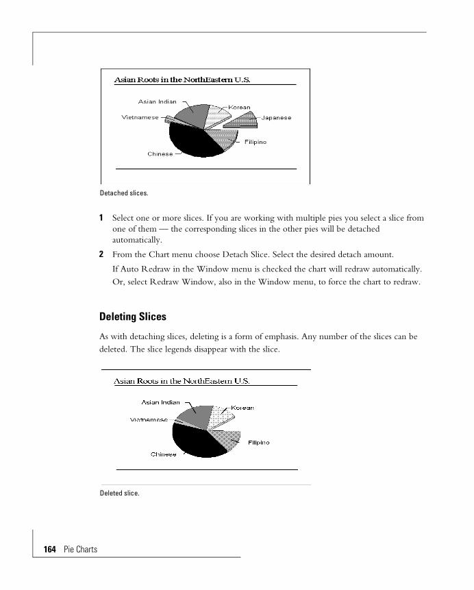
164 Pie Char
1 Select one or more slices. If you are working with multiple pies you select a slice from one of them — the corresponding slices in the other pies will be detached automatically.
2 From the Chart menu choose Detach Slice. Select the desired detach amount.
If Auto Redraw in the Window menu is checked the chart will redraw automatically. Or, select Redraw Window, also in the Window menu, to force the chart to redraw.
Deleting Slices
As with detaching slices, deleting is a form of emphasis. Any number of the slices can be deleted. The slice legends disappear with the slice.
Detached slices.
Deleted slice.
ts

1 Select one or more slices. For multiple pies, select from of one of the pies — the corresponding slices in the other pies will be deleted automatically.
2 From the Chart menu choose Delete Slice.
If Auto Redraw in the Window menu is checked the chart will redraw automatically. Or, select Redraw Window, also in the Window menu, to force the chart to redraw.
Restoring Detached and Deleted Slices
You can get detached slices back to the center and restore all deleted slices. From the Chart menu choose Restore All Slices. If you still want some slices deleted or detached, you must delete/detach them again.
3D Effects
Pies can be tilted and thickened to give them a visually interesting three dimensional effect. You can do this to all types of pies.
Tilt
1 From the Chart menu choose Pie Tilt. A sub-menu appears showing several degrees of tilt.
2 Select the amount of tilt desired.
If Auto Redraw in the Window menu is checked the chart will redraw automatically. Or, select Redraw Window, also in the Window menu, to force the chart to redraw.
3-dimensional effects applied to pies.
Pie Charts 165

166 Pie Char
Thickness
1 From the Chart menu choose Pie Thickness. A sub-menu appears showing several thicknesses.
2 Select the thickness desired.
If Auto Redraw in the Window menu is checked the chart will redraw automatically. Or, select Redraw Window, also in the Window menu, to force the chart to redraw.
Ring Pie: Size of the Hole
To adjust the size of the hole in ring pies:
1 If the pie type in the window isn’t a ring pie choose a ring pie type from the Gallery menu. You can’t put a ring in a solid pie.
2 From the Chart menu choose Hole Size. A sub-menu appears showing various hole sizes.
3 Select the hole size desired.
If Auto Redraw in the Window menu is checked the chart will redraw automatically. Or, select Redraw Window, also in the Window menu, to force the chart to redraw.
Ring pies.
ts

Ring Pie: Pie Total
You can display the absolute total of the slices in the center of ring pies.
1 From the Chart menu choose Display Status.
1 Check Ring Pie Total. (If the pie is not a ring pie this item will not be in the dialog box.)
1 Click OK
You can adjust the number format of the total. From the Chart menu choose Hole Number Format.
Pie Rotation
Pies in pie-bars can’t rotate. All other pies can.
1 From the Chart menu choose Pie Rotation. A sub-menu appears showing various rotations.
2 Select the rotation desired. Rotation is counter-clockwise from the No Rotation position.
If Auto Redraw in the Window menu is checked the chart will redraw automatically. Or, select Redraw Window, also in the Window menu, to force the chart to redraw.
The pie on the right has been rotated.
Pie Charts 167

168 Pie Char
Slice Labels
Labels are one way to identify slices. (The legend is the other way.)
Slice labels have two parts — the slice name and its value. You can choose to show one, both or neither:
1 From the Chart menu choose Display Status. A dialog box appears.
2 Check Slice Names and/or Slice Values. Click OK.
Numbers or Percent
The label values can be either the numbers or the percentages of the pie that the slices represent.
Pie chart with slice names only. Pie chart with slice names and percentage values.
ts
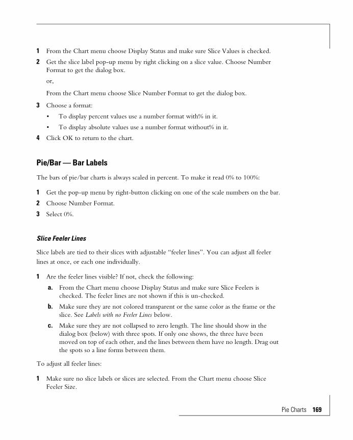
1 From the Chart menu choose Display Status and make sure Slice Values is checked.
2 Get the slice label pop-up menu by right clicking on a slice value. Choose Number Format to get the dialog box.
or,
From the Chart menu choose Slice Number Format to get the dialog box.
3 Choose a format:
• To display percent values use a number format with% in it.
• To display absolute values use a number format without% in it.
4 Click OK to return to the chart.
Pie/Bar — Bar Labels
The bars of pie/bar charts is always scaled in percent. To make it read 0% to 100%:
1 Get the pop-up menu by right-button clicking on one of the scale numbers on the bar.
2 Choose Number Format.
3 Select 0%.
Slice Feeler Lines
Slice labels are tied to their slices with adjustable “feeler lines”. You can adjust all feeler lines at once, or each one individually.
1 Are the feeler lines visible? If not, check the following:
a. From the Chart menu choose Display Status and make sure Slice Feelers is checked. The feeler lines are not shown if this is un-checked.
b. Make sure they are not colored transparent or the same color as the frame or the slice. See Labels with no Feeler Lines below.
c. Make sure they are not collapsed to zero length. The line should show in the dialog box (below) with three spots. If only one shows, the three have been moved on top of each other, and the lines between them have no length. Drag out the spots so a line forms between them.
To adjust all feeler lines:
1 Make sure no slice labels or slices are selected. From the Chart menu choose Slice Feeler Size.
Pie Charts 169
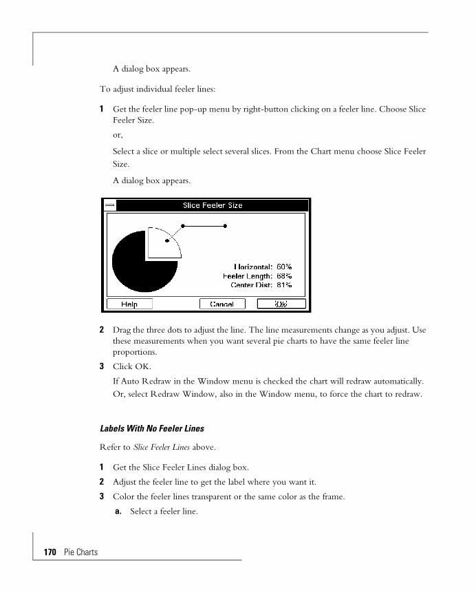
170 Pie Char
A dialog box appears.
To adjust individual feeler lines:
1 Get the feeler line pop-up menu by right-button clicking on a feeler line. Choose Slice Feeler Size.
or,
Select a slice or multiple select several slices. From the Chart menu choose Slice Feeler Size.
A dialog box appears.
2 Drag the three dots to adjust the line. The line measurements change as you adjust. Use these measurements when you want several pie charts to have the same feeler line proportions.
3 Click OK.
If Auto Redraw in the Window menu is checked the chart will redraw automatically. Or, select Redraw Window, also in the Window menu, to force the chart to redraw.
Labels With No Feeler Lines
Refer to Slice Feeler Lines above.
1 Get the Slice Feeler Lines dialog box.
2 Adjust the feeler line to get the label where you want it.
3 Color the feeler lines transparent or the same color as the frame.
a. Select a feeler line.
ts

b. Use the right box of the color picker to select X (transparent). All feeler lines will become transparent.
c. Restoring color. Since the feeler lines are invisible it is difficult to select one so you can get color back. Click around the inside of the label — the side toward the pie. When you hit the invisible line it will highlight. Then color it with the color picker.
Format of Slice Values
The “text format” of slice values involves placement of the percent sign, commas, decimal points, currency symbols, negative signs, etc. The “decorative format” involves character size, font, alignment and styling with underline, bold and italics.
Text format: Use the Number Format dialog box, accessible from the pop-up menus for the slice values or from Slice Number Format in the Chart menu Refer to the Formatting Text and Numbers chapter for an explanation of the options.
Decorative format: Refer to the Line, Area and Text Decorations chapter for an explanation of the options.
Labels with no feeler lines.
Pie Charts 171
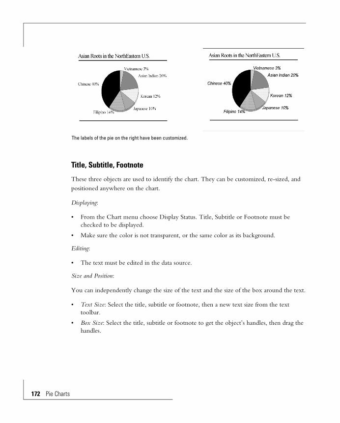
172 Pie Char
Title, Subtitle, Footnote
These three objects are used to identify the chart. They can be customized, re-sized, and positioned anywhere on the chart.
Displaying:
• From the Chart menu choose Display Status. Title, Subtitle or Footnote must be checked to be displayed.
• Make sure the color is not transparent, or the same color as its background.
Editing:
• The text must be edited in the data source.
Size and Position:
You can independently change the size of the text and the size of the box around the text.
• Text Size: Select the title, subtitle or footnote, then a new text size from the text toolbar.
• Box Size: Select the title, subtitle or footnote to get the object’s handles, then drag the handles.
The labels of the pie on the right have been customized.
ts
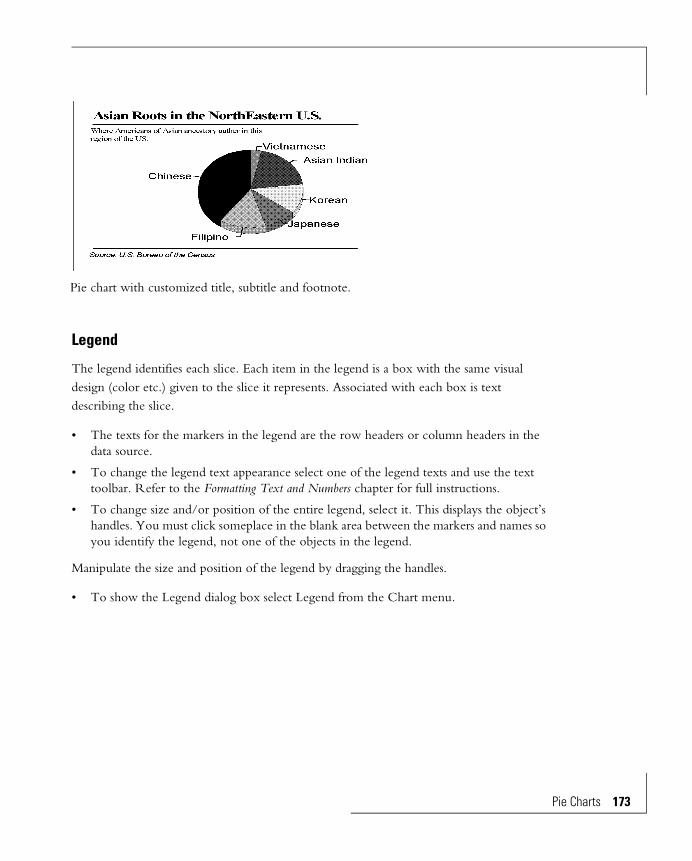
Legend
The legend identifies each slice. Each item in the legend is a box with the same visual design (color etc.) given to the slice it represents. Associated with each box is text describing the slice.
• The texts for the markers in the legend are the row headers or column headers in the data source.
• To change the legend text appearance select one of the legend texts and use the text toolbar. Refer to the Formatting Text and Numbers chapter for full instructions.
• To change size and/or position of the entire legend, select it. This displays the object’s handles. You must click someplace in the blank area between the markers and names so you identify the legend, not one of the objects in the legend.
Manipulate the size and position of the legend by dragging the handles.
• To show the Legend dialog box select Legend from the Chart menu.
Pie chart with customized title, subtitle and footnote.
Pie Charts 173

174 Pie Char
Display Legend: You can choose to not show it.
Autofit Legend Text: The Chart Editor sizes the legend text automatically. Often this is sufficient to make pleasing looking text in the legend box. If you do not autofit the text you must adjust the size “by hand” with the Text Toolbar. Refer to the Formatting Text and Numbers chapter, for details.
Position: The text can be placed in several locations relative to the marker.
Legend Layout: The items in the legend are shown in rows and columns:
Automatic: The Chart Editor chooses the number of rows and columns.
Vertical: Enter the number of columns.
Horizontal: Enter the number of rows.
Horizontal legend. Vertical legend.
ts

Colors, Patterns, Gradients and Textures
Objects of a pie chart can be decorated with custom colors, patterns, textures or gradients. These objects include the slices, slice labels, the chart background, the text fields associated with the chart, and all other objects. Refer to the Line, Area and Text Decorations chapter.
An interesting effect is to apply a circular gradient to pie slices. The Chart Editor puts the center of the gradient at the tip of the pie slice, giving an interesting circular effect.
Display Status
You can display or suppress many objects in a pie chart. On/off controls are in the Display Status dialog box in the Chart menu. These are:
• The chart legend.
• The title, subtitle, and footnote.
• The pie slice values, names, and lines connecting the labels to the slices (feeler lines).
• The slice names and values.
• The ring total, in ring pies.
• The names of the pies.
Pie chart with customized title.
Pie Charts 175


Line, Area and Text Decorations
Solid Colors 180
The Color Palette 180
Applying Colors to Lines and Areas 181
Applying Colors to Text 182
Custom Colors with the RGB Button 183
Transparent “Color” 183
Effects — Gradients, Patterns and Textures184
The Effects Palette 184
Pattern Effects 186
Gradient Effects 187
Texture Effect 188
Applying Effects to Areas 189
Editing Pattern Effects 189
Editing Gradient Effects 190
Editing Texture Effects 192
Line Width and Style 194


Line, Area and Text Decorations Areas in the Chart Editor can be enhanced with solid colors, gradient colors, patterns, bit-mapped textures and vector format textures. The solid colors can also be applied to lines and text. Using these enhancements can make charts more interesting and in many cases, spectacular.
Applying preset effects and colors is as simple as selecting an object and then an effect from the effects palette or a color from the color palette. So you can quickly evaluate the result the chart immediately redraws with the new effect assigned.
Some of the options available are:
• On color systems, select from a number of preset solid colors and gray shades, or design custom colors from any of the ones supported by Windows.
• Apply gradients, either color or gray scale, to areas. A gradient is a smooth transition from one color to another.
• Select from preset patterns for areas.
Typical area objects that can have these decorations are the chart frame and bars of bar charts. Typical lines and text that can be colored are the lines around the area objects, the axes, grid lines and tick marks of data charts, and row and column division lines in table charts. Typical text objects are the chart’s title, subtitle and footnote, axis scales, legend text and annotation text.
Colors, gradients, patterns, and textures for areas are mutually exclusive. Each area can have either a solid color, a gradient, a pattern, or a texture — it cannot simultaneously have more than one of these. Only colors can be applied to text items.
Solid colors are controlled by the color palette.
Patterns, gradients and textures are controlled by the effects palette. These items cannot be applied to text items.
Line, Area and Text Decorations 179
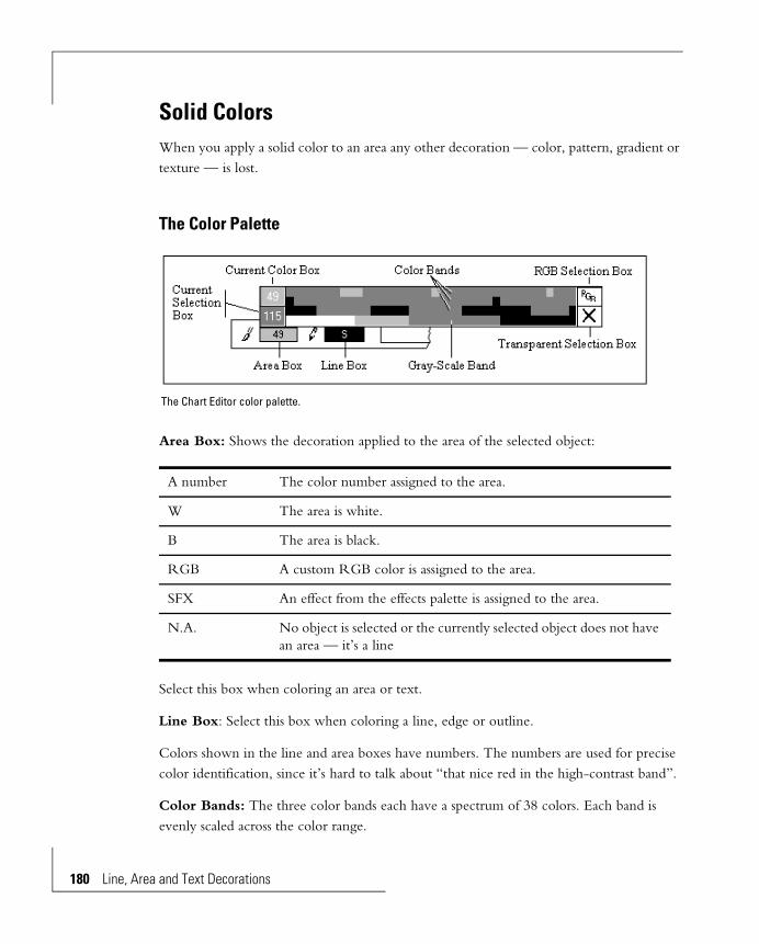
180 Line, Are
Solid ColorsWhen you apply a solid color to an area any other decoration — color, pattern, gradient or texture — is lost.
The Color Palette
Area Box: Shows the decoration applied to the area of the selected object:
Select this box when coloring an area or text.
Line Box: Select this box when coloring a line, edge or outline.
Colors shown in the line and area boxes have numbers. The numbers are used for precise color identification, since it’s hard to talk about “that nice red in the high-contrast band”.
Color Bands: The three color bands each have a spectrum of 38 colors. Each band is evenly scaled across the color range.
A number The color number assigned to the area.
W The area is white.
B The area is black.
RGB A custom RGB color is assigned to the area.
SFX An effect from the effects palette is assigned to the area.
N.A. No object is selected or the currently selected object does not have an area — it’s a line
The Chart Editor color palette.
a and Text Decorations

The bands vary in tone. The top band has the brightest colors. It’s intended for more aggressive charts that should be vivid and lively. The contrast of colors in the bottom color band is subdued and should be used for softer charts. The middle color band is between these two. In general it’s best to select all colors for an image from the same color band.
Gray-Scale Band: The gray-scale band is a spectrum of 29 grays, plus pure black and pure white.
Current Color Box: Shows the color and color number of the currently selected object. It stays constant while you select a new color.
Current Selection Box: Shows the color and color number of the current selection — the color under the cursor as you drag the cursor around in the color bands.
RGB Selection Box: Release the mouse button here to make a custom color with the RGB dialog box. When you return from the box the custom color will be assigned to the selected object.
Transparent Selection Box: Release the mouse button here to make the selected object transparent.
Applying Colors to Lines and Areas
Remember that applying a color replaces any color or effect previously applied to the line or area.
1 Use the Arrow pointer:
2 Select an object from the chart.
• If the object has an area and a border (examples: the chart frame, the bar of a bar chart):
The object’s area and border colors and color numbers are in the area and line boxes of the color palette. If the area has an effect, not a color, then the letters SFX are in the area color box.
• If the object has only a line and no area (example: grid lines):
The line color and color number are in the line box. The word N.A. is in the area box.
Line, Area and Text Decorations 181

182 Line, Are
You can multiple-select (Shift-click) more than one object to give them all the same color. The color and color number in the area and line boxes of the color palette represent the last selected object.
3 Click and hold on the area box (the left one) or the line box (the right one) in the color palette to indicate that you will color the area or the border of the object selected. The color palette pops up. (If you have selected a line, which has no area, the area box is disabled.)
4 Drag the cursor to a color, the RGB box, or the transparent (X) box. As you drag through the colors the color under the cursor, and its number, are shown in the area or line box.
5 Release the mouse button when you have selected what you want.
Applying Colors to Text
1 Use the Arrow pointer:
2 Select the object to be colored:
a. Title, subtitle, footnote, annotation text:
• Select the object. Its handles appear.
• Use the Area box to color the text.
• The line box is unused and has N.A. in it.
• You can’t color individual characters.
b. The axis scale values or headers, text in the chart legend, data-point values and labels:
Select one of the numbers, headers or labels. Only this single item will appear selected, but all the items in the group will be colored.
Color Release on the color.
Custom Color Release on RGB.
Transparent Release on X, the transparent button.
a and Text Decorations

3 Click and hold on the area box in the color palette. Drag the cursor to a color or the RGB box. As you drag through the colors the color number is shown in the Current Selection Box. Release the mouse button when you have selected the color you want.
or,
Release on the RGB button to get the dialog box to make a custom color. When you return the object will have the designed color and the area box will show RGB instead of a color number.
You can’t make text transparent. The transparent box (X) is inoperative.
Custom Colors with the RGB Button
You are not restricted to colors in the color bands of the color palette. The RGB button lets you design others.
1 As described above, select the line, area or text to be colored. Then use the RGB button in the color palette instead of selecting a color from the color bands.
The color design dialog box appears.
2 Adjust the color and click OK to apply the designed color to the selected object.
Transparent “Color”
Lines and areas can be transparent. Whatever is behind shows through. Text will not take “transparent” color.
Line, Area and Text Decorations 183

184 Line, Are
To apply transparency:
1 Select the object with the Arrow pointer. Use Shift-click to make a multiple selection.
2 Click on the area box or line box in the color palette.
3 Drag to the X in the lower right corner of the color palette and release the mouse button.
• 3D chart risers: If Chart, Autoshade Riser is checked, making any riser surface transparent makes all riser surfaces transparent.
If Chart, Autoshade Risers is not checked you can make each riser surface transparent individually.
• 3D chart box: If Chart, Autoshade Cube is checked then making any box surface transparent makes all other box surfaces transparent.
If Chart, Autoshade Cube is not checked you can make each box surface transparent individually.
To restore color to a transparent object, you must select the object. Being invisible, some objects can be difficult to find. You may have to search around in the region where the object is. When you hit it, it will be outlined. Then give it a visible color.
Effects — Gradients, Patterns and TexturesEffects can be applied to areas only, not to text or lines.
The Chart Editor is supplied with a number of preset effects, each identified with a name. You can make new gradient effects or edit existing ones. Bitmap and vector texture effects use external picture files. Patterns are fixed in the Chart Editor, but you can control pattern colors.
The Effects Palette
Effects are controlled by the effects palette — in the View menu check Special Effects Palette. You can also turn it off by clicking the close box in the upper right corner.
a and Text Decorations
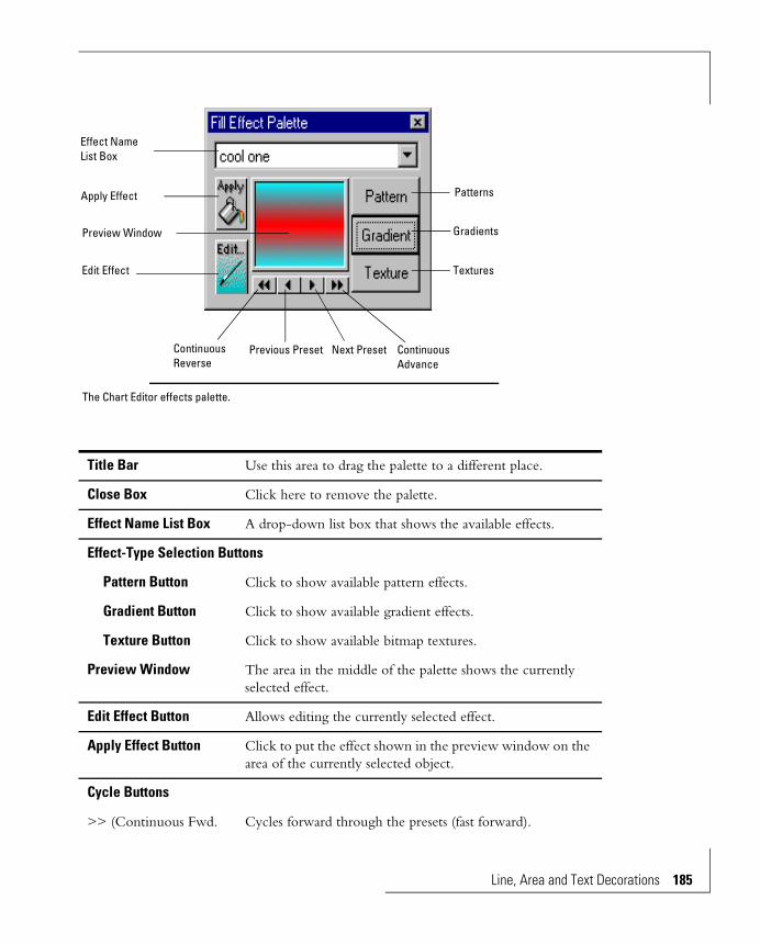
Title Bar Use this area to drag the palette to a different place.
Close Box Click here to remove the palette.
Effect Name List Box A drop-down list box that shows the available effects.
Effect-Type Selection Buttons
Pattern Button Click to show available pattern effects.
Gradient Button Click to show available gradient effects.
Texture Button Click to show available bitmap textures.
Preview Window The area in the middle of the palette shows the currently selected effect.
Edit Effect Button Allows editing the currently selected effect.
Apply Effect Button Click to put the effect shown in the preview window on the area of the currently selected object.
Cycle Buttons
>> (Continuous Fwd. Cycles forward through the presets (fast forward).
Effect NameList Box
Patterns
Edit Effect
Gradients
Textures
Preview Window
Apply Effect
Previous PresetContinuous Reverse
Continuous Advance
Next Preset
The Chart Editor effects palette.
Line, Area and Text Decorations 185

186 Line, Are
Pattern Effects
The Chart Editor comes with preset patterns. Patterns can be put on areas only, not on text or lines. Patterns have two colors — a foreground color that can be edited from the effects palette and a background color that is either white or transparent. The background colors and pattern geometries are contained in the program and can’t be changed.
> (Next Preset) Selects the next higher preset.
< (Previous Preset) Selects the next lower preset.
<< (Continuous Rev. Cycles backward through the presets (rewind).
One way to use the cycle buttons is to click on << or >> to set rewind or fast-forward going. Each effect is shown for a few seconds. When you see the one you want stop there by clicking in the preview window.
The Chart Editor preset patterns.
Pattern Effects
a and Text Decorations
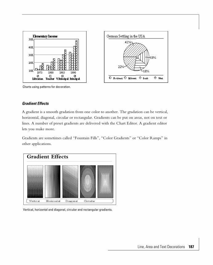
Gradient Effects
A gradient is a smooth gradation from one color to another. The gradation can be vertical, horizontal, diagonal, circular or rectangular. Gradients can be put on areas, not on text or lines. A number of preset gradients are delivered with the Chart Editor. A gradient editor lets you make more.
Gradients are sometimes called “Fountain Fills”, “Color Gradients” or “Color Ramps” in other applications.
Charts using patterns for decoration.
Vertical, horizontal and diagonal, circular and rectangular gradients.
Gradient Effects
Line, Area and Text Decorations 187
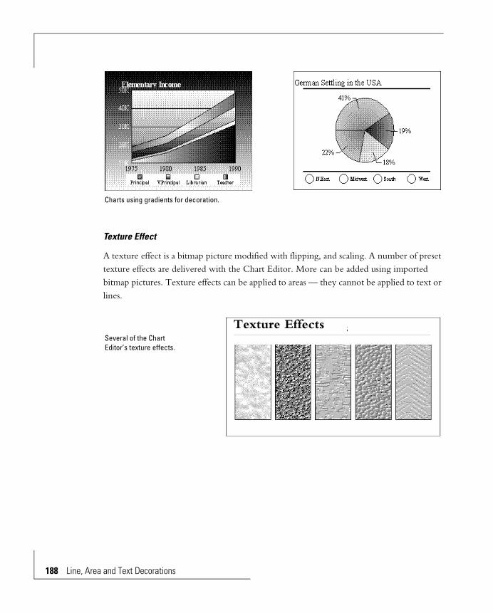
188 Line, Are
Texture Effect
A texture effect is a bitmap picture modified with flipping, and scaling. A number of preset texture effects are delivered with the Chart Editor. More can be added using imported bitmap pictures. Texture effects can be applied to areas — they cannot be applied to text or lines.
Charts using gradients for decoration.
Several of the Chart Editor’s texture effects.
Texture Effects
a and Text Decorations
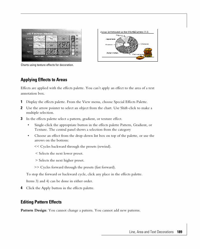
Applying Effects to Areas
Effects are applied with the effects palette. You can’t apply an effect to the area of a text annotation box.
1 Display the effects palette. From the View menu, choose Special Effects Palette.
2 Use the arrow pointer to select an object from the chart. Use Shift-click to make a multiple selection.
3 In the effects palette select a pattern, gradient, or texture effect.
• Single-click the appropriate button in the effects palette Pattern, Gradient, or Texture. The central panel shows a selection from the category
• Choose an effect from the drop-down list box on top of the palette, or use the arrows on the bottom:
<< Cycles backward through the presets (rewind).
< Selects the next lower preset.
> Selects the next higher preset.
>> Cycles forward through the presets (fast forward).
To stop the forward or backward cycle, click any place in the effects palette.
Items 3) and 4) can be done in either order.
4 Click the Apply button in the effects palette.
Editing Pattern Effects
Pattern Design: You cannot change a pattern. You cannot add new patterns.
Charts using texture effects for decoration.
Line, Area and Text Decorations 189
190 Line, Are
Pattern Color: Patterns have two colors. The background color (the fill) is either white or transparent, depending on the pattern. You cannot change it. The foreground color (the color of the pattern) can be changed.
To change the pattern foreground color:
1 Show the pattern: In the effects palette click on Pattern.
2 With the << < > >> buttons select the pattern to be edited.
3 Click Edit in the effects palette. This displays the RGB color design dialog box.
4 Design or choose a new color and click OK.
The pattern in the viewing window is shown with the new foreground color. All patterns take the same foreground color.
Editing Gradient Effects
You can edit any preset gradient effect, or add new ones.
1 In the effects palette click the Gradient button.
2 With the << < > >> buttons select the gradient to be edited. You can also select the gradient in the gradient edit dialog box.
3 In the effects palette click the Edit button. This brings up the gradient edit dialog box.
The gradient selected in the effects palette shows in the Preview panel. You can use the Presets list box to select a different gradient effect to be edited. This list is the same as presented in the effects palette.
4 To preserve the selected gradient and make a derivative of it, click New and enter a new name. Or, you can use Save As after editing.
5 Change the Type, Direction, Start and End colors to modify the gradient effect. The result of the current edits always shows in the Preview panel.
6 The Save, Save As and Delete buttons add and remove edits and gradients on the disk.
7 Click Done when you are done making edits.
a and Text Decorations
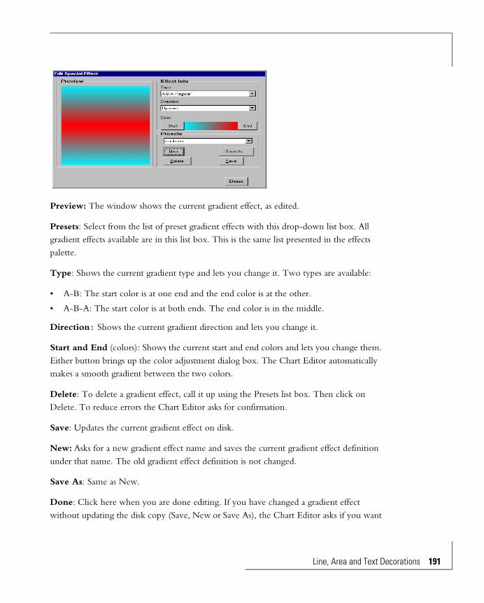
Preview: The window shows the current gradient effect, as edited.
Presets: Select from the list of preset gradient effects with this drop-down list box. All gradient effects available are in this list box. This is the same list presented in the effects palette.
Type: Shows the current gradient type and lets you change it. Two types are available:
• A-B: The start color is at one end and the end color is at the other.
• A-B-A: The start color is at both ends. The end color is in the middle.
Direction: Shows the current gradient direction and lets you change it.
Start and End (colors): Shows the current start and end colors and lets you change them. Either button brings up the color adjustment dialog box. The Chart Editor automatically makes a smooth gradient between the two colors.
Delete: To delete a gradient effect, call it up using the Presets list box. Then click on Delete. To reduce errors the Chart Editor asks for confirmation.
Save: Updates the current gradient effect on disk.
New: Asks for a new gradient effect name and saves the current gradient effect definition under that name. The old gradient effect definition is not changed.
Save As: Same as New.
Done: Click here when you are done editing. If you have changed a gradient effect without updating the disk copy (Save, New or Save As), the Chart Editor asks if you want
Line, Area and Text Decorations 191
192 Line, Are
to save the changes. If you don’t update the disk copy the edits are lost and can’t be applied to the chart.
Editing Texture Effects
You can edit any texture effect, or add new ones.
The definition of a texture effect is:
• The name of the separate bitmap file. This file must be in the directoryHummingbird/BI/Extensions/Pictures1.
• The flipping and scaling manipulations.
These definitions are held in a single file, PICTURES.3FX. Each definition in PICTURES.3FX refers to a separate file containing the bitmap picture. When you edit a texture effect in the Chart Editor you are editing the manipulation instructions, not the bitmap file. You must use another application to edit the bitmap file. Many clipart pictures can be used for texture effects.
1 In the effects palette click the Texture button.
2 With the << < > >> buttons select the texture effect to be edited. You could also select the texture effect in the Edit dialog box.
3 In the effects palette click the Edit button. This brings up the texture effect edit dialog box. The texture effect selected in the effects palette shows in the Preview panel:
• Its name shows in the Presets list box.
• Its file name shows in the Bitmap list box
• Its flipping and scaling choices show in the Flipping and Scaling list boxes.
4 You can use the Presets list box to select a different texture effect to be edited.
5 Change the Flipping and Scaling to modify the texture effect. The result of the current edits always shows in the Preview panel.
6 The New, Save, Save As and Delete buttons add and remove texture effects definitions on the disk.
7 Click Done when you are done making edits.
1. You can change this directory by changing the appropriate line in the BIQCHART.INI file in theHummingbird/BI/Extensions directory.
a and Text Decorations

Presets: Select from the list of texture effects with this drop-down list box. All available picture presets are listed here. When you select a preset its definition is shown in Effect Info.
Bitmap: Shows the name of the picture file used by the current texture effect (preset).
Picture files must be in the directory Hummingbird/BI/Extensions/Pictures1 and be in .BMP format. Use the list box to show all pictures in the directory and select from them.
Flipping: Scaling must be set to Tiled. Shows the flip effect assigned to the current bitmap, and lets you change it.
• Flip horizontal.
• Flip vertical.
• Flip horizontal and vertical.
• No flipping.
Scaling: Shows the scaling effect applied to the current bitmap, and lets you change it.
• No Picture Scaling: The bitmap size is not changed. If the object is larger than the bitmap, the bitmap does not cover the whole object. If the object is smaller than the bitmap the sides of the bitmap are clipped off.
• Scale to Fit Object: Scaling stretches or shrinks the bitmap to the height and width of the object, the chart frame or the chart background.
1. You can change this directory by changing the appropriate line in the BIQCHART.INI file in theHummingbird/BI/Extensions directory.
Line, Area and Text Decorations 193

194 Line, Are
• Tiled: Tiling is intended for small bitmaps. The bitmap is repeated horizontally and vertically until the height and width of the object, frame or background are filled. Tiling does not cause stretching or shrinking.
Delete: To delete a texture effect, call it up using the Presets list box. Then click on Delete. To reduce errors the Chart Editor asks for confirmation.
Save: Updates the current texture effect on disk.
Done: Click here when you are done editing. If you have changed a texture effect without updating the disk copy (Save), the Chart Editor asks if you want to save the changes.
New: Asks for a new texture effect name and saves the current texture effect definition under that name. The old texture effect definition is not changed.
Save As: Same as New.
Line Width and StyleYou can adjust the appearance of the outlines of any of the outlined annotation objects, or any or the non-movable objects of a chart. Line style is inapplicable to the title, subtitle, footnote and annotation texts, since they do not have outlines.
1 Select the object, or multiple select more than one.
2 Line Width: From the Element menu, select Line Width. Choose from the widths in the sub-menu that appears. Hairline and width 1 appear the same on the screen, but print differently.
Line Style: Set the width to Hairline — line styles don’t work on lines of other widths. From the Element menu select Line Style. Choose from the styles in the sub-menu that appears.
You should experiment with width and style to ensure the printed chart is what you want.
a and Text Decorations
Formatting Text and Numbers
Summary 197
Formatting Numbers 198
Changing Number Formats 199
Axis Scales: 199
Data-point Values: 199
Pie Slice Values: 200
Changing Punctuation 200
General Number Format 201
Date Formats 201
Fonts, Character Styles and Alignment 202
The Text Toolbar 202
Font Selection 203
Sizing Text 203
Title, Subtitle and Footnote 204
Scale Numbers, Legend Text, Category Axis Headers 204
Data-point Names and Values, Axis Titles 205
Bold, Italic, Underline 205
Horizontal Alignment 206


Formatting Text and Numbers Appearance of text and numbers can be controlled. Font and style are controlled by the text toolbar. Colors and effects are controlled by the color and effects palettes.
Summary
Which text: Edit what: How to edit:
Chart TitleChart SubtitleChart FootnoteColumn and Row Titles
Font, style and alignment
These are controlled by the text toolbar in the chart window, as described in the Fonts, Character Styles and Alignment section of this chapter.
Column and Row HeadersAxis TitlesData-point NamesLegend TextAnnotation Text
Color Control is in the color palette. Refer to the Line, Area and Text Decoration chapter for full details.
Which text: Edit what: How to edit:
Scales on Chart Axes. Content Not editable. The content is derived by the Chart Editor from the Scale Range and Number Format specifications.
Scale onSpectrum of Spectral Mapped Charts.
Font, style and alignment
These are controlled by the text toolbar in the chart window. All numbers in a scale have the same font, style and alignment format. Refer to the Fonts, Character Styles and Alignment section of this chapter.
Color Control is in the color palette. Refer to the Line, Area and Text Decoration chapter for full details.
Formatting Text and Numbers 197

198 Formatti
Formatting NumbersNumber punctuation controls the decimal point (commonly a period in the US and a comma in European countries), the thousands separator, etc. This punctuation applies to axis scales, pie slice percentages and data-point values displayed next to data-points.
Number Format
Controlled by the Number Format dialog box. These formats are described in the Formatting Numbers section of this chapter.
Which text: Edit what: How to edit:
Data-point Values.Pie Slice Percentages.
Font, style and alignment
These are controlled by the text toolbar in the chart window. Refer to the Fonts, Character Styles and Alignment section of this chapter.
Color Control is in the color palette. Refer to the Line, Area and Text Decoration chapter for full details.
Number Format
Like scales, this is controlled by the Number Format dialog box. Refer to the Formatting Numbers section of this chapter.
Which text: Edit what: How to edit:
ng Text and Numbers
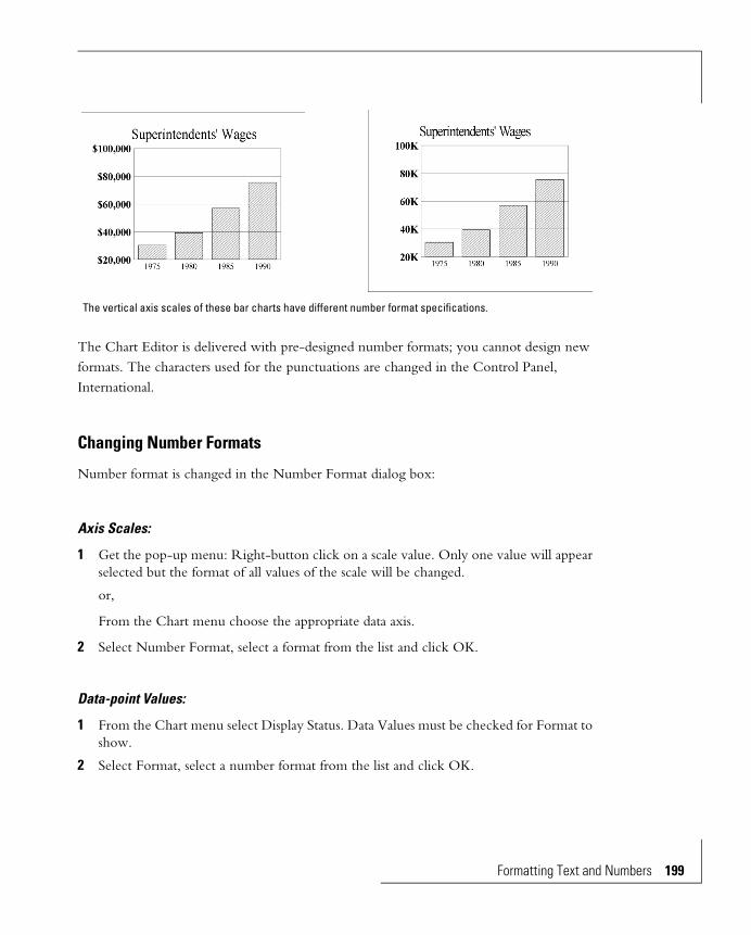
The Chart Editor is delivered with pre-designed number formats; you cannot design new formats. The characters used for the punctuations are changed in the Control Panel, International.
Changing Number Formats
Number format is changed in the Number Format dialog box:
Axis Scales:
1 Get the pop-up menu: Right-button click on a scale value. Only one value will appear selected but the format of all values of the scale will be changed.
or,
From the Chart menu choose the appropriate data axis.
2 Select Number Format, select a format from the list and click OK.
Data-point Values:
1 From the Chart menu select Display Status. Data Values must be checked for Format to show.
2 Select Format, select a number format from the list and click OK.
The vertical axis scales of these bar charts have different number format specifications.
Formatting Text and Numbers 199
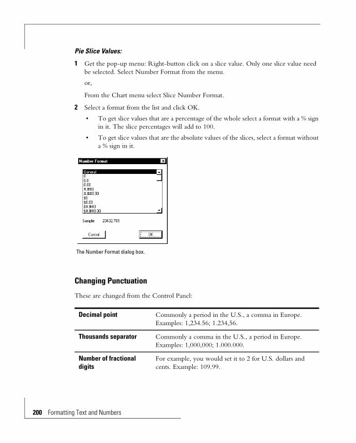
200 Formatti
Pie Slice Values:
1 Get the pop-up menu: Right-button click on a slice value. Only one slice value need be selected. Select Number Format from the menu.
or,
From the Chart menu select Slice Number Format.
2 Select a format from the list and click OK.
• To get slice values that are a percentage of the whole select a format with a % sign in it. The slice percentages will add to 100.
• To get slice values that are the absolute values of the slices, select a format without a % sign in it.
Changing Punctuation
These are changed from the Control Panel:
Decimal point Commonly a period in the U.S., a comma in Europe. Examples: 1,234.56; 1.234,56.
Thousands separator Commonly a comma in the U.S., a period in Europe. Examples: 1,000,000; 1.000.000.
Number of fractional digits
For example, you would set it to 2 for U.S. dollars and cents. Example: 109.99.
The Number Format dialog box.
ng Text and Numbers
To change these, go to the Control Panel. Select International, then use Date Format, Time Format, Currency Format and Number Format. The Windows User’s Guide gives more information.
General Number Format
The first format in the Number Format dialog box is “General”. When you choose General format for a number:
• No more than nine fractional digits are shown in the cell. Additional digits, to the limit of numbers allowed in the Chart Editor, are not discarded and are shown in the edit line when the cell is the currently active cell.
• No thousands separator is shown.
• Numbers smaller than or equal to 10-9 and larger than or equal to 109 are shown in exponential notation.
• Negative numbers have a leading minus sign.
Date Formats
Date format requires that the number be a Julian date. Julian dates count days consecutively from December 31, 1899 (Julian date = 1). The Julian date for January 1, 1995 is 34700.
Leading zero for numbers less than 1
One half can be “.5” or “0.5”.
Currency symbol and position
Examples: $1.23; $ 1.23; 123DM.
Negative indicator Examples: -1.23; (1.23)
Time format Examples: 9:23:47 PM; 21:23:47.
Date format Examples: Wednesday, September 23, 1992; 9/23/92; 92-09-23.
Formatting Text and Numbers 201
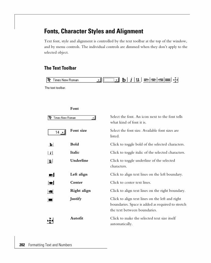
202 Formatti
Fonts, Character Styles and AlignmentText font, style and alignment is controlled by the text toolbar at the top of the window, and by menu controls. The individual controls are dimmed when they don’t apply to the selected object.
The Text Toolbar
Font
Select the font. An icon next to the font tells what kind of font it is.
Font size Select the font size. Available font sizes are listed.
Bold Click to toggle bold of the selected characters.
Italic Click to toggle italic of the selected characters.
Underline Click to toggle underline of the selected characters.
Left align Click to align text lines on the left boundary.
Center Click to center text lines.
Right align Click to align text lines on the right boundary.
Justify Click to align text lines on the left and right boundaries. Space is added as required to stretch the text between boundaries.
Autofit Click to make the selected text size itself automatically.
The text toolbar.
ng Text and Numbers

Font Selection
Title, Subtitle, Footnote, Axis Titles, Annotation Text
All characters in one of these objects will have the same font. You can’t change the font for individual characters.
1 Select the object. Hold down Shift when you click to select multiple objects.
2 Use the font list box in the text toolbar to select a different font typeface.
Headers, Scale Values, Data Names, Data Values, Legend Text
All characters in one of these objects will have the same font. You can’t change the font for individual characters.
1 Select one of the items in the object. Hold down Shift when you click to select multiple objects.
2 Use the font list box in the text toolbar to select a different font typeface. All the items in the objects will have the typeface.
Sizing Text
The quickest and most convenient way to size text is to let the Chart Editor do it with the Autofit control. This reduces your task to selection of the font. Even if Autofit does not do exactly what you might want it usually gets close enough to make the final adjustment easier.
The texts than can be Autofit are:
• Title, subtitle, footnote.
• Data axis scale values
• Category axis headers
• Row headers and column headers.
• Legend text
Font selection section of the Text Toolbar.
Formatting Text and Numbers 203

204 Formatti
• Pie names
• Data-point names in 3D scatter charts
Texts that cannot be autofit are:
• Data-point names
• Data-point values
• Axis titles
There are several controls:
• The Autofit button in the text toolbar:
• Autofit items in the menus and dialog boxes for the various objects: A check mark next to Autofit means automatic size choice is on.
• The Font Size list box in the text toolbar.
Title, Subtitle and Footnote
Adjust by Setting the Character Size
1 Select the object.
2 Select a new font size in the text toolbar.
The text adjusts to fit the box.
Adjust by Dragging Handles
1 Click the Autofit button, to make it dark.
2 Click the object with the text. Its handles appear.
3 Drag the handles. The size of the text adjusts automatically to fit the new size.
Scale Numbers, Legend Text, Category Axis Headers
All characters in an object will be the same size.
ng Text and Numbers
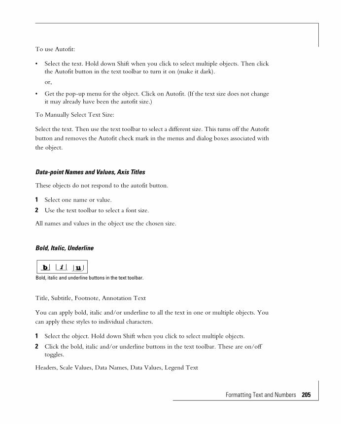
To use Autofit:
• Select the text. Hold down Shift when you click to select multiple objects. Then click the Autofit button in the text toolbar to turn it on (make it dark).
or,
• Get the pop-up menu for the object. Click on Autofit. (If the text size does not change it may already have been the autofit size.)
To Manually Select Text Size:
Select the text. Then use the text toolbar to select a different size. This turns off the Autofit button and removes the Autofit check mark in the menus and dialog boxes associated with the object.
Data-point Names and Values, Axis Titles
These objects do not respond to the autofit button.
1 Select one name or value.
2 Use the text toolbar to select a font size.
All names and values in the object use the chosen size.
Bold, Italic, Underline
Title, Subtitle, Footnote, Annotation Text
You can apply bold, italic and/or underline to all the text in one or multiple objects. You can apply these styles to individual characters.
1 Select the object. Hold down Shift when you click to select multiple objects.
2 Click the bold, italic and/or underline buttons in the text toolbar. These are on/off toggles.
Headers, Scale Values, Data Names, Data Values, Legend Text
Bold, italic and underline buttons in the text toolbar.
Formatting Text and Numbers 205

206 Formatti
1 Select one of the items in the object. Hold down Shift when you click to select multiple objects.
2 Click the bold, italic and/or underline buttons in the text toolbar. All the items in the object will have the attribute.
Axis titles, Row, Column Titles
1 Select the object. Hold down Shift when you click to select multiple objects.
2 Click the bold, italic and/or underline buttons in the text toolbar.
You cannot change the style of individual characters in these objects.
Horizontal Alignment
Text in most text objects can be left or right aligned, centered, or justified (stretched to fill the space).
Title, Subtitle, Footnote, Axis Titles, Row and Column Titles, Annotation Text
1 Select the object. Hold down Shift when you click to select multiple objects.
2 Click on one of the horizontal alignment buttons in the text toolbar.
Headers, Scale Values, Legend Text
1 Select one of the items in the object. Hold down Shift when you click to select multiple objects.
2 Click on one of the horizontal alignment buttons in the text toolbar. All the items in the object will have the alignment.
Data Names, Data Values
Horizontal alignment does not apply to these objects.
Horizontal alignment buttons in the text toolbar.
ng Text and Numbers

Annotations
Creating Annotation Objects 210
Using Annotation Tools 211
The Annotations 211
Rectangles 211
Square 212
Ellipse 212
Circle 212
Arrow 212
Line 213
Horizontal and Vertical Lines 213
Polygon 213
Freehand 214
Text Annotation 214
Creating a Text Annotation 214
Editing a Text Annotation 215
Formatting Annotation Text 215
Editing and Manipulating Annotation Objects215
Selecting Objects 216
Re-sizing an Object 216
Moving Objects 216
Aligning and Sizing Objects 216
Align 217
Center on Page 219
Make Same Size 220
Join 221
Align Inside Edges 222
Rearranging Overlapping Objects 224
Deleting Objects 224
Duplicating Objects 224
Object Decoration 225


AnnotationsAnnotation lets you enhance charts with boxes, arrows and other “objects” that don’t come from the data source. Typical annotations are text to explain the chart, arrows that point to interesting parts, and circles that draw your eye to other significant places. Annotation areas (but not annotation text) can be decorated with colors, patterns, gradients and textures.
Annotations bring attention to important values on the chart.
The vertical dashed lines and the boxes with President’s names add new information to the chart.
Annotations 209
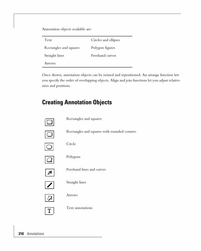
210 Annotati
Annotation objects available are:
Once drawn, annotation objects can be resized and repositioned. An arrange function lets you specify the order of overlapping objects. Align and join functions let you adjust relative sizes and positions.
Creating Annotation Objects
Text Circles and ellipses
Rectangles and squares Polygon figures
Straight lines Freehand curves
Arrows
Rectangles and squares
Rectangles and squares with rounded corners.
Circle
Polygons
Freehand lines and curves
Straight lines
Arrows
Text annotations
ons
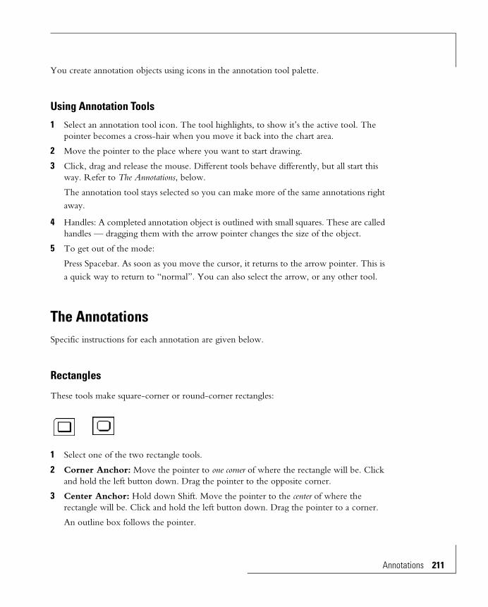
You create annotation objects using icons in the annotation tool palette.
Using Annotation Tools
1 Select an annotation tool icon. The tool highlights, to show it’s the active tool. The pointer becomes a cross-hair when you move it back into the chart area.
2 Move the pointer to the place where you want to start drawing.
3 Click, drag and release the mouse. Different tools behave differently, but all start this way. Refer to The Annotations, below.
The annotation tool stays selected so you can make more of the same annotations right away.
4 Handles: A completed annotation object is outlined with small squares. These are called handles — dragging them with the arrow pointer changes the size of the object.
5 To get out of the mode:
Press Spacebar. As soon as you move the cursor, it returns to the arrow pointer. This is a quick way to return to “normal”. You can also select the arrow, or any other tool.
The AnnotationsSpecific instructions for each annotation are given below.
Rectangles
These tools make square-corner or round-corner rectangles:
1 Select one of the two rectangle tools.
2 Corner Anchor: Move the pointer to one corner of where the rectangle will be. Click and hold the left button down. Drag the pointer to the opposite corner.
3 Center Anchor: Hold down Shift. Move the pointer to the center of where the rectangle will be. Click and hold the left button down. Drag the pointer to a corner.
An outline box follows the pointer.
Annotations 211

212 Annotati
4 Release the mouse button. The rectangle is drawn.
Square
Hold the Ctrl key when dragging out a rectangle. The object will be constrained to be square. Use Ctrl and Shift to center-anchor a square.
Ellipse
Ellipses are circles elongated in the horizontal or vertical direction.
1 Select the ellipse annotation tool.
2 Corner Anchor: Move the pointer to one corner of where the ellipse will be. Click and hold the left button down. Drag the pointer to the opposite corner.
Center Anchor: Hold down Shift. Move the pointer to the center of where the ellipse will be. Click and hold the left button down. Drag the pointer to a corner.
3 An outline box follows the pointer.
4 Release the mouse button. An ellipse is draw.
Circle
Hold the Ctrl key when dragging out an ellipse. The object will be constrained to be circular. Use Ctrl and Shift to center-anchor a circle.
Arrow
Arrows can be any length, pointing any direction. After making an arrow, you can choose a different arrow design from a list of presets.
1 Select the arrow annotation tool:
2 Move the pointer to the location of the end of the arrow that will not have the arrowhead. Click and hold the left button down.
3 Drag the pointer to the location of the arrowhead. A line follows the arrow.
4 Release the mouse button. The arrow is drawn.
To change the design of an arrow:
ons
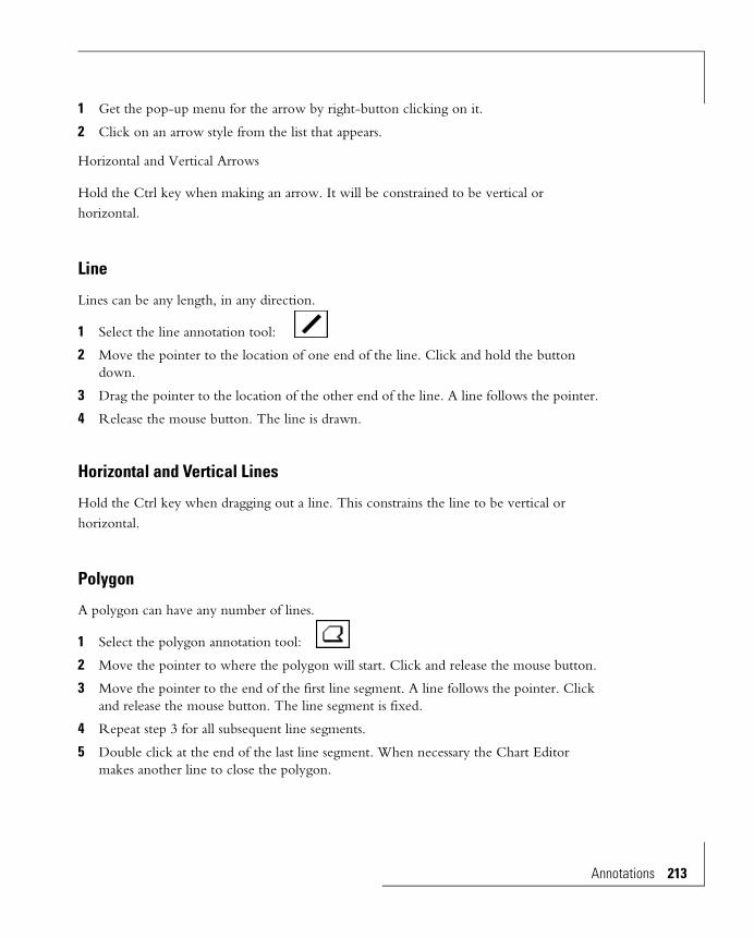
1 Get the pop-up menu for the arrow by right-button clicking on it.
2 Click on an arrow style from the list that appears.
Horizontal and Vertical Arrows
Hold the Ctrl key when making an arrow. It will be constrained to be vertical or horizontal.
Line
Lines can be any length, in any direction.
1 Select the line annotation tool:
2 Move the pointer to the location of one end of the line. Click and hold the button down.
3 Drag the pointer to the location of the other end of the line. A line follows the pointer.
4 Release the mouse button. The line is drawn.
Horizontal and Vertical Lines
Hold the Ctrl key when dragging out a line. This constrains the line to be vertical or horizontal.
Polygon
A polygon can have any number of lines.
1 Select the polygon annotation tool:
2 Move the pointer to where the polygon will start. Click and release the mouse button.
3 Move the pointer to the end of the first line segment. A line follows the pointer. Click and release the mouse button. The line segment is fixed.
4 Repeat step 3 for all subsequent line segments.
5 Double click at the end of the last line segment. When necessary the Chart Editor makes another line to close the polygon.
Annotations 213
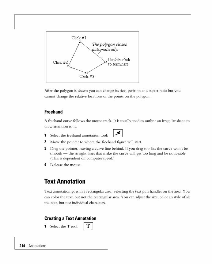
214 Annotati
After the polygon is drawn you can change its size, position and aspect ratio but you cannot change the relative locations of the points on the polygon.
Freehand
A freehand curve follows the mouse track. It is usually used to outline an irregular shape to draw attention to it.
1 Select the freehand annotation tool:
2 Move the pointer to where the freehand figure will start.
3 Drag the pointer, leaving a curve line behind. If you drag too fast the curve won’t be smooth — the straight lines that make the curve will get too long and be noticeable. (This is dependent on computer speed.)
4 Release the mouse.
Text AnnotationText annotation goes in a rectangular area. Selecting the text puts handles on the area. You can color the text, but not the rectangular area. You can adjust the size, color an style of all the text, but not individual characters.
Creating a Text Annotation
1 Select the T tool:
ons
2 Drag out a rectangle (see Rectangle, above).
3 A text entry box appears.
Click in the text entry box to get a blinking vertical bar in the upper left corner, indicating you can start entering text.
4 Type text. You can start a new line by pressing Ctrl-Enter.
5 Terminate by pressing Enter.
Editing a Text Annotation
1 With the Arrow pointer double click the text. The text entry box appears.
2 Use normal text editing techniques:
• Insert and delete text at the I-beam cursor.
• Use Ctrl-Enter for a new line.
• Select text by dragging over it.
• Double click to select a word.
• Edit, Cut, Copy, Paste and Clear are available.
• Use the keyboard equivalents, Ctrl-X, -C, and -V in place of Edit Cut, Copy and Paste.
3 Terminate editing with Enter.
Formatting Annotation Text
Select the text with the Arrow pointer. Then use the text toolbar to select a font, font size, style and alignment.
Editing and Manipulating Annotation ObjectsAnnotation objects can be moved and re-sized. This can be done to individual objects, or to several objects at the same time. The object or objects must be selected to be manipulated.
Annotations 215
216 Annotati
Selecting Objects
Use the arrow pointer to select an object for editing. Handles — small squares at the boundaries — outline selected objects. These are used to change size and to indicate the object is selected.
You can select more than one object at a time so you can edit them simultaneously. Some functions require multiple selection. To do the multiple select hold down Shift when clicking on the object.
Re-sizing an Object
Select the object with the Arrow pointer, then change the size or proportions by dragging its handles (the small squares on the boundary). Hold Ctrl to force rectangles to squares and ellipses to circles.
You can’t resize multiple objects simultaneously.
Moving Objects
Aligning and Sizing Objects
The aligning and sizing controls in the Element menu provide precise object sizing and relative positioning. The objects can be any of the chart objects that have handles when selected, including annotations, the chart title, subtitle and footnote, the legend, axis titles. To do the function you single or multiple select the objects, then choose the appropriate function from the Element menu.
Functions that require multiple object selection use the first selected object as the reference.
Single Object With the pointer inside the object click and drag it to the new position.
Multiple Objects All selected objects move the same amount. With the pointer inside one of the objects, click and drag. An outline around all the objects moves with the pointer.
ons

• All objects except the first selected are adjusted to match the first.
• The first selected need not be a moveable object. It can, for instance, be the riser of a bar chart.
Align
These require multiple selection.
1 Select the objects.
2 From the Element menu choose Align, then one of the choices in the sub-menu that appears.
Align Left
The left edges of the objects align to the left edge of the first object selected.
Align Right
The right edges of the objects align to the right edge of the first object selected.
Annotations 217

218 Annotati
Align Top
The top edges of the objects align to the top edge of the first object selected.
Align Bottom
The bottom edges of the objects align to the bottom edge of the first object selected.
Align Center Horiz.
The objects move horizontally to align their centers on a vertical line through the center of the first object selected.
ons
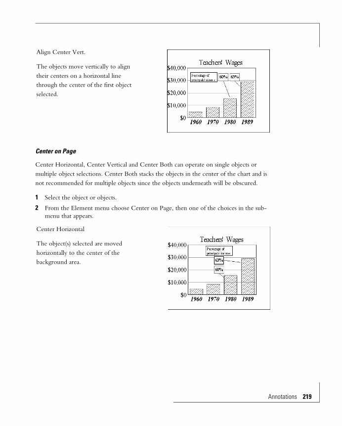
Center on Page
Center Horizontal, Center Vertical and Center Both can operate on single objects or multiple object selections. Center Both stacks the objects in the center of the chart and is not recommended for multiple objects since the objects underneath will be obscured.
1 Select the object or objects.
2 From the Element menu choose Center on Page, then one of the choices in the sub-menu that appears.
Align Center Vert.
The objects move vertically to align their centers on a horizontal line through the center of the first object selected.
Center Horizontal
The object(s) selected are moved horizontally to the center of the background area.
Annotations 219
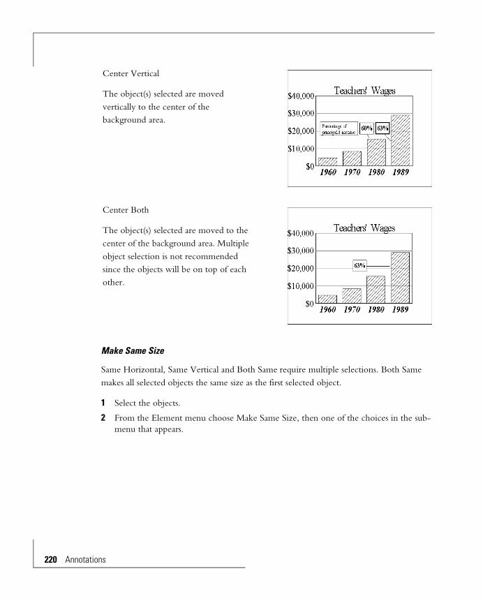
220 Annotati
Make Same Size
Same Horizontal, Same Vertical and Both Same require multiple selections. Both Same makes all selected objects the same size as the first selected object.
1 Select the objects.
2 From the Element menu choose Make Same Size, then one of the choices in the sub-menu that appears.
Center Vertical
The object(s) selected are moved vertically to the center of the background area.
Center Both
The object(s) selected are moved to the center of the background area. Multiple object selection is not recommended since the objects will be on top of each other.
ons

Join
Join Horizontal, Join Vertical and Join Both require multiple selections.
1 Select the objects.
Same Horizontal
The horizontal dimension of all selected objects is made the same as the first object that was selected.
Same Vertical
The vertical dimension of all selected objects is made the same as the first object that was selected.
Both Same
Both the horizontal and vertical dimensions of all selected objects are made the same as the first object that was selected.
Annotations 221

222 Annotati
2 From the Element menu choose Join, then one of the choices in the sub-menu that appears.
Join Both
This is the “intelligent” or “lazy person’s” join. Just get the objects close to where you want them, and you don’t have to decide if the join should be horizontal or vertical. Join Both analyses the object positions and does a horizontal or vertical join to minimize object movement.
Align Inside Edges
The three Align Inside Edges functions, Horizontal, Vertical and Both require multiple selections.
1 Select the objects.
Join Horizontal
The objects are made the same height as the first selected object, and are placed side-by-side.
Join Vertical
The objects are made the same width as the first selected object, and are placed above/below each other.
ons

2 From the Element menu choose Align Inside Edges, then one of the choices in the sub-menu that appears.
Align Horizontal
The first selected object does not move. The other objects move horizontally to put the vertical sides facing each other on the same vertical line.
Align Vertical
The first selected object does not move. The other objects move vertically to put the horizontal sides facing each other on the same horizontal line.
Align Both
This is equivalent to doing a Horizontal and Vertical. It makes the corners of the objects touch.
Annotations 223

224 Annotati
Rearranging Overlapping Objects
Overlapped objects lie on top of one another, making a “stack” of them. When they do overlap, all of the object on top is shown, and parts of lower ones are obscured by higher objects. You can rearrange their vertical stack order.
1 Select one of the overlapping objects. Its handles appear.
2 From the Element menu choose Arrange.
Deleting Objects
1 Select an object or multiple select more than one object.
2 From the Edit menu choose Clear
or,
Press Delete.
The object disappears.
Duplicating Objects
1 Select the object or multiple select more than one object. Its handles appear.
2 From the Edit menu select Duplicate.
Duplicate object(s) appear offset a little from the parent. You can drag to another location.
Bring to Front Puts the object on the top of the stack.
Send to Back Puts the object on the bottom of the stack.
Bring Forward Raises the object one level.
Send Back Lowers the object one level.
ons
Object Decoration
The interiors of solid annotation objects (but not text annotation) can be decorated with colors, patterns, textures, and gradients. Lines, and edges of solid objects can be given different colors.
The general method for applying these colors and effects is to select the object, then apply the decoration with the color palette or the effects palette. Full details are in the Line, Area and Text Decorations chapter.
Annotations 225


Accessibility and Technical Support
AccessibilityHummingbird products are accessible to all users. Wherever possible, we developed our software using Microsoft Windows interface standards. Depending on the product in which you are working, a subset of the following accessibility features is available.
Access Keys
Menus have associated access keys (mnemonics). To open any menu, press Alt and the underlined letter in the menu name as it appears on the interface. For example, to access the File menu, press Alt+F.
Once you have opened a menu, you can access an item on the menu by pressing the underlined letter in the menu item name, or you can use the arrow keys to navigate the menu list.
Keyboard Shortcuts
Some often-used menu options also have shortcut (accelerator) keys. The shortcut key for an item is listed beside it on the menu.
Directional arrows
Use directional arrows on the keyboard to navigate through menu items or to scroll vertically and horizontally. You can also use the directional arrows to navigate through multiple options. For example, if you have a series of radio buttons, you can use the arrow keys to navigate the possible selections.
Tab key sequence
To navigate through a dialog box, press the Tab key. Selected items appear with a dotted border. You can also press Shift+Tab to go back to a previous selection within the dialog box.
Accessibility and Technical Support 227
228 Accessib
Spacebar
Press the Spacebar to toggle check boxes on and off or to select buttons in a dialog box.
Esc
Press the Esc key to close a dialog box without implementing any new settings.
Enter
Press the Enter key to select the highlighted item or to close a dialog box with the new settings. You can also press the Enter key to close all About boxes.
ToolTips
ToolTips appear for functional icons. This feature lets users use screen reviewers to make interface information available through synthesized speech or through a refreshable braille display.
Microsoft Accessibility OptionsMicrosoft Windows environments contain accessibility options that let you change how you interact with the software. This feature can add sound, increase the magnification, and create sticky keys.
To access the Microsoft Windows Accessibility options, open Control Panel and click Accessibility.
If you installed the Microsoft Accessibility components for your Windows system, you can also find other Accessibility tools on the Start menu under Programs/Accessories/Accessibility.
To add the Accessibility components:1 In Control Panel, double-click Add/Remove Programs.
2 On the Setup tab, select the Accessibility Options check box and click Apply.
3 Click OK.
Technical SupportAdministrator’s can contact Hummingbird Technical Support to report problems or suggest enhancements. We require product and company information before we can investigate any problems, so please fill-out the electronic form on the Hummingbird web site or phone in/fax us the corresponding information before contacting Technical Support.
ility and Technical Support
For Technical Support services, please use the contact information for your area.
Using the Trace Utility
Hummingbird provides a trace utility with the software to help troubleshoot problems you are having. The trace utility simplifies problem-solving by monitoring the activity of your products. If you are having problems with the software, Technical Support may ask you to run the trace utility, reproduce the problem, save the trace information, and send us the resulting trace file.
To run the trace utility, double-click trace.exe in the following path:
Program Files\Hummingbird\BI\Utility
For information of configuring the trace utility, see Trace Help.
Hummingbird Ltd.1 Sparks Avenue, North York, Ontario, Canada M2H 2W1
North America Tel: 1 800 486 0095 (8:00 am - 8:00 pm EST)
Fax 1 613 548 7616
Email: [email protected]
Europe (Except UK and Scandanavia)
Tel: +33 1 55 35 96 80 (9:00 am-6:00 pm GMT + 1hr)
Fax: +33 1 42 61 31 87
Email: [email protected]
UK and Scandanavia Tel: +44 (0)118-902-9507 (9:00 am-5:00 pm GMT)
Fax: +44 (0) 118 978 9325
Email: [email protected]
Other Locations +1 613 548 4355 (8:00 am-8:00 pm EST)
+1 613 548 7616
Email: [email protected]
Accessibility and Technical Support 229

230 Accessib
ility and Technical Support
Index 1
Symbols, >> buttons in effects palette 189.3DF files
defined 17.BMP files
using for texture effects 193
Numerics2D charts
barspacing, 71thickness, 71
colors, patterns, textures, gradients, 83curve fit to the data 64data axis scale range 59data-point
name, value location 76shape, size 74value number format 76
dual axis grid line interference 51grid lines
on category (non-numeric) axis 51varieties 50
legend 77objects of 40reverse data order 54scale, header locations 61tick mark varieties 50title, subtitle, footnote 76zero line 56
3D chartsedge width 130editing techniques 116enlarging 125exchanging axes 143Floating Charts 100floor 128footnote 149grid lines 139
non-numeric axes 131numeric axes 132
honeycomb 102linear scale 135log scale 135overview of chart types 98perspective distortion 122preset viewing angles 107pyramid chart used for obscured data-points 98pyramid charts 99reason for using 89reducing size of 125removing back walls, floor 130reposition in the window 126reverse data order 143ribbon types 101riser dimensions 141riser types 99rotation 119scale format 135scale range (automatic or manual) 134scatter chart legend 150scatter charts 143shrinking axes 120stretching axes 120subtitle 149surface 102surface colors, gradients, patterns, textures on the box
128title 149treatment of obscured data-points 96viewing angle
for obscured data-points 96viewing angle presets 107
3D charts,autoshading
boxes, 128risers 136
axis scale range (automatic or manual), 134bar types, 99color by face, row, columns, height, angle, 138colors, gradients, patterns, textures on risers, 136
Index 231

connect series and connect row, 101custom viewing angles, 116data-point name display, 142design discussion, 94edge colors, 130wall/floor thickness, 121walls, 128
3D effects, pie charts 1653D text control 148
Aaccessibility features 227aligning
horizontal (text), 206aligning,
annotation objects, 216Element menu, 217, 222
annotationobjects
aligning, 216clear/delete, 224colors, patterns, gradients, textures, 225duplicate, 224editing, 215moving, 216overlapping, 224re-sizing, 216sizing, 216
text, 214Annotation Palette, 11Annotation tools 211
arrow 212ellipse 212freehand line 214line 213polygon 213rectangle 211
area charts, 31Areas
applying effects 189
coloring 181Arrange overlapping annotation objects 224Arrow annotation tool 212Arrow pointer
(in tool palette) 10Auto Redraw 4Autofit button in text toolbar 204Autofit control in menus 204Automatic data axis scaling
2D charts 593D charts 134histograms 79
Automatic data axis scaling, spectrum of spectral map charts 80
Axis divisions2D charts 503D charts
non-numeric axes 131numeric axes 132
Axis titles#1, #2, #3, #4 (3D) (defined) 94
BB, reported in color palette box 180Background
2D charts (defined) 413D charts (defined) 93
Bar (2D charts)hiding 82
Bar charts2D 27
bar shape 723D 99
Base of risers (negative data)3D riser charts 142
Bitmap effects. See Texture effectsBolded characters 205
232 Index
CCategory (non-numeric) axis (2D charts)
grid lines 51Center on Page (Element menu) 219Changing a chart type 6Character attributes 202Character style selection 202Chart
delete 19save 18
Chart descriptionentering 19
Chart Editor 189Chart menu
3D Text Options 148Autoshade Cube 129
applying transparency 184Autoshade Risers 138Axis
Scale Range 134Bar Thickness 72Bar-Bar Spacing 72Base of Areas 57Base of Bars 57Base of Risers 142Curve Fit & Stat Lines 66Data Reversal
Reverse Categories 55Reverse Series 55
Data-point Colors (3D charts) 146Data-point Lines (3D charts) 146Data-point Shape (3D scatter charts) 147Data-point Size (3D scatter charts) 147Display as Line 70Display on Bottom (Top, Left, Right) 61Display Status 82
Number Format 199Emphasize Bar 69Interval Axis 79Log / Linear Scales
2D charts 59
3D charts 135Marker shape 73Preset Viewing Angles 107Riser Colors 138Scale Range 59Show 3D View Tool 117Slice Number Format 200Spectrum 80Staggered Scale 63Staggered Text 63
Chart menu (pie charts)Delete Slice 165Detach Slice 164Display Status 168, 175Hole Size 166Pie Rotation 167Pie Thickness 166Pie Tilt 165Restore All Slices 165Reverse Groups (order of the pies) 163Reverse Series (order of the slices) 163Slice Feeler Lines 170Slice Number Format 171
Chart type selection 6Circle annotation tool 212Clear annotation objects 224Color boxes in color palette 181Color gradients, 187Color palette 12, 180Color ramps, 187Coloring lines, areas, text 180Colors
3D chart risers 1363D scatter chart, data-points 146annotation objects 225apply to lines and areas 181apply to text 182making custom solid colors with the RGB button 183of spectrum, spectral mapped charts 79on pie chart objects 175
Column headers3D charts (defined) 94
Index 233

Columns of data, defined 107Connected-points curve fit, 2D charts 64Connect-series and connect row charts (3D) 101Contour maps (3D) 105Copy
annotation objects 224Correlation coefficient, show on 2D chart 67Crowded headers, scale values (2D charts) 62Currency symbol 201Curve fit, 2D charts 64
DData-point
2D charts, hiding 82name display,3D charts 142name, value location, 2D charts 76shape, 3D scatter charts 146shape, line, scatter charts 74size, 3D scatter charts 146size, line, scatter charts 74value number format, 2D charts 76value, name display, 2D charts 75values - number format 199
Date format 201Decimal point, changing 200Decorations
annotation objects 225Delete
annotation objects 224chart 19
Depth, pie chart 166De-select
multiple objects 7single objects 7
Display as Line 70Display status
2D charts 823D charts 151
Distortion (perspective) of 3D charts 122Divisions along data axis, 2D charts 50
Drop lines, 3D scatter charts 144Dual axis charts
grid line interference 51Duplicate annotation objects 224
EEdge colors
3D charts 130Edge width
3D charts 130Edit menu
Duplicate 224Editing
footnote 76gradient effects 190patterns (cannot) 189subtitle 76texture effects 192title 76
Editing chart templatesoverview 3
Effectsapply to areas 189gradient 187pattern 186texture 188
Effects palette 13, 184Element menu
Align 217Align Inside Edges 222Arrange 224Center on Page 219Clear 224Join 221Line Style 194
3D charts 130Line Width 194
3D charts 130Make Same Size 220
Ellipse annotation tool 212
234 Index
Emphasize bar, bar charts 69Enlarging 3D charts 125Esc key to stop redrawing 4Exchange pies, slices (rows, columns)
pie charts 161Exchanging data axes
3D charts 143Exchanging rows, columns
2D charts 53Exponential regression, 2D charts 64
FF9 to preview chart full screen 5Feeler line, pie charts 169File menu
Open 17Save 18Save As 18
Financial option for moving average 66Flipping (texture effects) 193Floating Box (Cube) charts (3D) 100Floating Diamond charts (3D) 100Floor, 3D charts
(defined) 93removing it 130
Font selection 203Footnote
2D chartsdefined 76editing 76
3D chartsdefined 149
coloring 182Footnote display/suppress
2D charts 82pie charts 175
Footnote display/suppress, 3D charts 151Formatting numbers 199
data-point values (2D charts) 76scale values (3D charts) 135
slice numbers in pie charts 171Fountain fills, 187Fractional digits displayed 200Freehand drawing annotation tool 214From Axis Line 57From Zero Line 57Full screen view of a chart (F9) 5
GGradient
in effects palette 189Gradient effects 187
annotation objects 225applied to areas 189direction (Gradient edit dialog box) 191editing 190on pie chart objects 175type (gradient edit dialog box) 191
Grid lines2D charts 503D charts 131, 132, 139category (non-numeric) axis (2D charts) 51color, thickness, 2D charts 50interference, dual axis charts 51varieties, 2D charts 50
Group, defined 107
HHandles
for annotation objects 211Headers
3D chart (defined) 94coloring 182locations, 2D charts 61
Hidden data-points in 3D charts - treatment of 96Hidden objects 5Hiding
scales & headers, 2D charts 61
Index 235

HiLo charts, bar shape 72Histograms
bar shape 72interval selection 78
Hole size, ring pie charts 166Honeycomb charts (3D) 102Horizontal alignment of text 206Hummingbird accessibility 227
IImport
for texture effects 192Interval selection, histograms 78Inverted scales, 2D charts 63Italics characters 205
JJoin (Element menu) 221
LLabel lines in pie charts (feelers) 169Labels
pie charts 170pie charts (number or percent) 168
Labels for 3D scatter chart data-points 142Leading zeroes for numbers less than 1 201Left scale - 3D charts (defined) 93Legend
2D charts 77, 823D scatter charts 150coloring legend text 182pie charts 173
Line annotation tool 213Line charts 31
data-point shape, size 74Line display of bars in bar chart 70
Line Width and Style 194Linear regression, 2D charts 64Linear scale
2D charts 583D charts 135Spectral Mapped charts 79
Linesbetween data-points (2D charts) 64coloring 181
Locations of data-point values, names2D charts 76
Log scale2D charts 583D charts 135Spectral Mapped charts 79
Logarithmic regression, 2D charts 64
MMake Same Size (Element menu) 220Manual scaling
2D chart data axis 593D chart data axis 134histogram axis 79spectrum of spectral map charts 80
Math functions - charting in 3D 104Mean line, 2D charts 64Missing line (ribbon), 3D charts 101Move
annotation objects 216object 8
Movement of 3D chart along screen axes 124Moving average line, 2D charts 64Multiple object
de-selection 7selection 7
NN.A., reported in color palette box 180
236 Index
Names of data-points (display or suppress)2D charts 75, 823D charts 1513D scatter charts 142
Names of pie slices (display or suppress) 175Negative indicator 201Negative number representation
3D riser charts 142bar and area charts 57
Numberreported in color palette box 180
Number format 1992D chart data-point value 763D chart scales and data-point values 135axis scales 199data-point values 199pie slice values 200punctuation 198, 200
OObject
move 8resize 9
Objectsof 2D charts 40pie charts 157
Obscured data-points in 3D charts - treatment of 96Order of polynomial curve fit, 2D charts 64Orthogonal 3D charts 123Overlapping annotation objects 224Overlapping headers, scale values (2D charts) 62
PPattern effects 186
applied to areas 189editing 189on 2D charts 83on annotation objects 225
on pie chart objects 175Pattern, in effects palette 189, 190Percent labels for pie slices 168, 200Perspective distortion of 3D charts 122Picture effects. See Texture effectsPicture file name in texture effect 193Pictures
annotation objects 225applied to areas 189importing for texture effects 192on pie chart objects 175
Piename display 175slice value number format 200
Pie charts3D effects 165colors, patterns, gradients, textures 175delete slices 164depth 166detach slices 163display status 175exchange pies, slices (rows, columns) 161footnote 172legend 173number labels 168objects of 157percent labels 168pie is all one slice 162restore detached/deleted slices 165reverse slice order, pie order 162ring — hole size 166rotation 167slice labels 168subtitle 172thickness 166tilt 165title 172
Pie Total 167Polygon annotation tool 213Polynomial curve fit, 2D charts 64Pop-up menus 6Pop-up tool
Index 237

(in tool palette) 10Preview - full screen view of a chart (F9) 5Proportions of 3D charts
axis lengths 120wall and floor thickness 121
Pull-down menususing 5
Punctuation of number format 200Pyramid charts (3D) 99
used for obscured data-points 98
RRadix point, changing 200Rectangle annotation tool 211Reducing size of 3D charts 125Regression equation, show on 2D chart 67Regression lines, 2D charts 64Removing edges, 3D charts 130Reposition 3D charts 126Resize object 9Re-sizing annotation objects 216Restore detached/deleted pie slices 165Reverse slice order, pie order in pie charts 162Reversing data order
2D charts 543D charts 143
Reversing the data order to see obscured data-points in 3D charts 97
RGBbutton in color palette 183colors for text 183reported in color palette box 180, 183selection box in color palette 181
Ribbon charts (3D) 101Right scale - 3D charts (defined) 93Ring (hole) size, pie charts 166Ring pie charts 161Ring total display, pie charts 175Riser
3D charts (defined) 93
color of 3D risers 136dimensions, 3D charts 141editing, 3D charts 136
Riser charts (3D) 99Rotation
3D charts 119pie charts 167
Row headers3D charts (defined) 94
Rows of data, defined 107
SSave a chart template 18Scale
2D chartsinverted 63locations 61log/linear 58on data axis 59
3D charts (defined) 93coloring 182format of numbers (3D charts) 135
Scale range (automatic or manual)2D charts 593D charts 134
Scale to fit (object, frame, background)texture effects 193
Scalesnumber format 199
Scaling (texture effects) 193Scatter charts (2D)
data-point shape, size 74Scatter charts (3D) 106, 143
data-point labels (names) 142data-point shape 146data-point size 146drop lines 144
Scientific option for moving average 66Select
multiple objects 7
238 Index

single object 7Selecting a chart type 6Series, defined 107SFX, reported in color palette box 180Shape of bars
bar charts, histograms, hi-lo charts 72Shape of data-points
3D scatter charts 147line, scatter charts 74
Show Major Grid Lines 50Show Minor Grid Lines 50Shrinking 3D chart axes 120Shrinking 3D charts 125Single object
de-selection 7selection 7
Single slice pie 162Size of data-points
3D scatter charts 147line, scatter charts 74
Size of risers, 3D charts 141Sizing annotation objects 216Sizing text 203Slice labels, pie charts 168Smooth curve, 2D charts 64Smoothing factor (curve fits) 66Solid colors
from color palette 180from RGB button 183
Spacing of bars in 2D charts 71Spectral mapped chart
removing grid lines 52spectrum colors, gradients, textures, patterns 81
Spectrum, spectral mapped chartcolors/effects 79
Spline curve fit, 2D charts 64Square (annotation) 212Staggered headers, scale values, 2D charts 62Standard deviation lines, 2D charts 64Stop drawing (Esc key) 4Straight line fit, 2D charts 64Stretching 3D chart axes 120
Subtitle2D charts
defined 76editing 76
3D charts 149coloring 182
Subtitle display/suppress2D charts 82pie charts 175
Subtitle display/suppress, 3D charts 151Surface charts (3D) 102Surface map - wire frame 105Switching data axes - 3D charts 143Syringe tool
(in tool palette) 10
TTechnical Support 228Template
definition 17save 18
Text annotation 214creating 214editing 215formatting 215
Text annotation tool 214Text size 203Text toolbar 10, 202Text, coloring — titles, legend, scales, headers, annotation
text 182Texture effects 188
applying to areas 189editing 192flipping 193name of picture file 193scale to fit (object, frame, background) 193tiled to fit (object, frame, background) 193
Texture, in effects palette 189Thickness
bars in 2D charts 71
Index 239

grid lines, 2D charts 50pie charts 166walls and floor, 3D charts 121
Thousands separator, changing 200Tick marks
varieties, 2D charts 50Tiled to fit (object, frame, background)
texture effects 193Tilt
pie chart 165Time format 201Title
2D chartsdefined 76editing 76
3D charts 149axis titles (3D) (defined) 94coloring 182
Title display/suppress2D charts 82pie charts 175
Title display/suppress, 3D charts 151Tool Palette 10Tools
annotation 211color palette 180
Transparent objects, how to make 183Transparent selection box in color palette 181Typeface selection 203
UUnderlined characters 205Un-select
object(s) see De-select
VValues of data-points (display or suppress)
2D charts 75, 82
Values of pie slices (display or suppress) 175Vertical Axis
3D charts (defined) 94View full screen 5Viewing angles of 3D charts 116
for obscured data-points 96presets 107
Viewing direction, 3D charts 119
WW, reported in color palette box 180Walls
3D charts (defined) 93Walls, 3D charts
removing them 130Wash effects. See Gradient EffectsWidth of edges, 3D charts 130Width of walls and floor, 3D charts 121Window menu
Auto Redraw 4Redraw Window 4View Full Screen 5
Wire frame surface map 105
XX, in color palette 181X-Axis
3D charts (defined) 94
YY-Axis
3D charts (defined) 94
240 Index

ZZ-Axis
3D charts(defined) 94
Zero line2D charts 56, 82
Index 241

242 Index


![Aquatic Ecosystems s [Read-Only] - Oregon State Universityoregonstate.edu/instruction/fw556/lecture/pdf/aquatic_ecosystems.pdf · Aquatic Ecosystems. Organic Inputs! Allochthonous](https://img.pdfslide.net/doc/110x75/5e522e616d98f111335a4f38/aquatic-ecosystems-s-read-only-oregon-state-u-aquatic-ecosystems-organic-inputs.jpg)