Embed Size (px)
Citation preview
Brand GuidelinesKnewton Visual Communications
K N E W T O N . C O M U P D AT E D 0 7 | 2 0 1 6
2K N E W T O N B R A N D G U I D E L I N E S
03 Introduction
04 Corporate Logo
10 Typography
13 Color
19 Photography
21 Graphics
25 Integrated Examples
T A B L E O F C O N T E N T S
3K N E W T O N B R A N D G U I D E L I N E S
The Knewton Brand
I N T R O D U C T I O N
The Knewton brand is more than a logo. It’s a set of design elements that express the essence of our company. Everything we promise, build, and deliver reflects the Knewton brand.
Knewton is a global company with a presence on every continent except Antarctica. This international reach makes it essential that we communicate in a clear and consistent way across presentations and emails, at conferences and events, and in our products and those of our partners, from London to Tokyo to São Paulo.
Adhering to brand guidelines will teach people to associate Knewton with the values it stands for. Consistency reinforces our mission: to personalize learning for the world.
Please follow these guidelines when making and evaluating creative decisions in product design, marketing, partnerships, and all other external and internal communications.
4K N E W T O N B R A N D G U I D E L I N E S
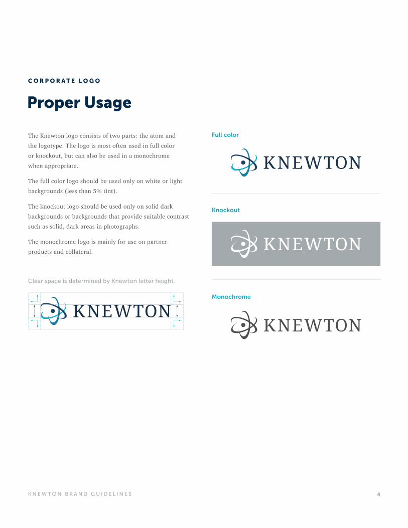
Proper Usage
The Knewton logo consists of two parts: the atom and the logotype. The logo is most often used in full color or knockout, but can also be used in a monochrome when appropriate.
The full color logo should be used only on white or light backgrounds (less than 5% tint).
The knockout logo should be used only on solid dark backgrounds or backgrounds that provide suitable contrast such as solid, dark areas in photographs.
The monochrome logo is mainly for use on partner products and collateral.
Full color
Clear space is determined by Knewton letter height.
Knockout
Monochrome
C O R P O R A T E L O G O
5K N E W T O N B R A N D G U I D E L I N E S
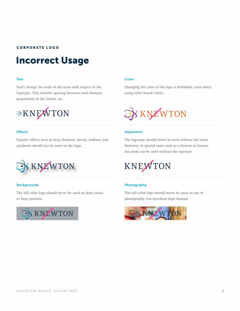
Incorrect Usage
Size
Don’t change the scale of the atom with respect to the logotype. This includes spacing between each element, proportions of the letters, etc.
Color
Changing the color of the logo is forbidden, even when using other brand colors.
Separation
The logotype should never be used without the atom. However, in special cases such as a favicon or button, the atom can be used without the logotype.
Photography
The full color logo should never be used on top of photography. Use knockout logo instead.
Backgrounds
The full color logo should never be used on dark colors or busy patterns.
Effects
Popular effects such as drop shadows, bevels, emboss, and gradients should not be used on the logo.
C O R P O R A T E L O G O
6K N E W T O N B R A N D G U I D E L I N E S
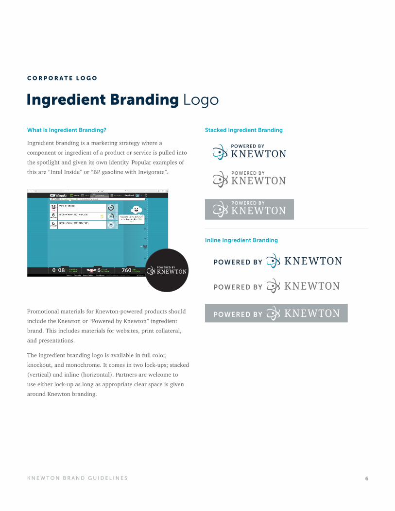
Ingredient Branding Logo
Stacked Ingredient Branding
Inline Ingredient Branding
What Is Ingredient Branding?
Ingredient branding is a marketing strategy where a component or ingredient of a product or service is pulled into the spotlight and given its own identity. Popular examples of this are “Intel Inside” or “BP gasoline with Invigorate”.
Promotional materials for Knewton-powered products should include the Knewton or “Powered by Knewton” ingredient brand. This includes materials for websites, print collateral, and presentations.
The ingredient branding logo is available in full color, knockout, and monochrome. It comes in two lock-ups; stacked (vertical) and inline (horizontal). Partners are welcome to use either lock-up as long as appropriate clear space is given around Knewton branding.
C O R P O R A T E L O G O
7K N E W T O N B R A N D G U I D E L I N E S
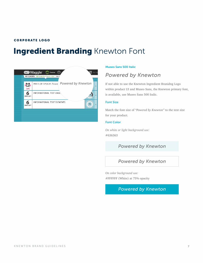
Ingredient Branding Knewton Font
Museo Sans 500 Italic
Font Size
Font Color
Powered by Knewton
Match the font size of “Powered by Knewton” to the text size
for your product.
On white or light background use:
#636363
On color background use:
#FFFFFF (White) at 75% opacity
Powered by Knewton
Powered by Knewton
Powered by Knewton
C O R P O R A T E L O G OC O R P O R A T E L O G O
Powered by Knewton If not able to use the Knewton Ingredient Branidng Logo
within product UI and Museo Sans, the Knewton primary font,
is available, use Museo Sans 500 Italic.
8K N E W T O N B R A N D G U I D E L I N E S
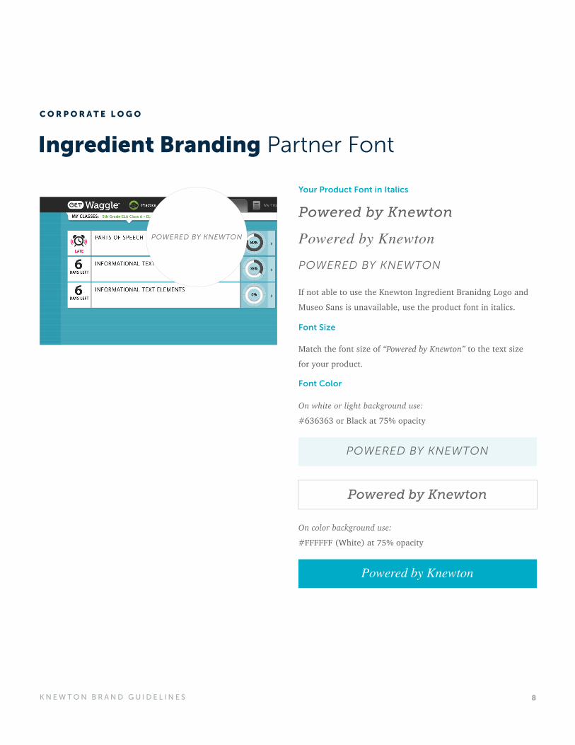
Ingredient Branding Partner Font
Your Product Font in Italics
Powered by Knewton
Powered by Knewton
POWERED BY KNEWTON
Font Size
Font Color
If not able to use the Knewton Ingredient Branidng Logo and
Museo Sans is unavailable, use the product font in italics.
Match the font size of “Powered by Knewton” to the text size
for your product.
On white or light background use:
#636363 or Black at 75% opacity
On color background use:
#FFFFFF (White) at 75% opacity
POWERED BY KNEWTON
Powered by Knewton
Powered by Knewton
C O R P O R A T E L O G O
9K N E W T O N B R A N D G U I D E L I N E S
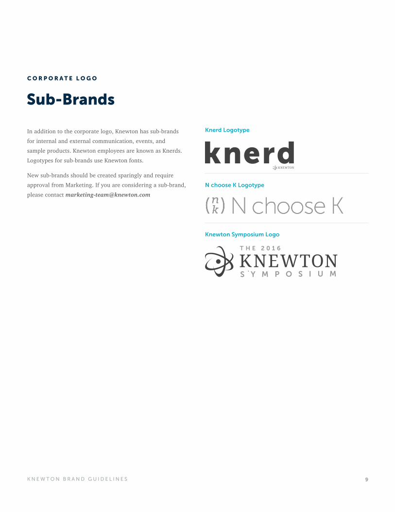
In addition to the corporate logo, Knewton has sub-brands for internal and external communication, events, and sample products. Knewton employees are known as Knerds. Logotypes for sub-brands use Knewton fonts.
New sub-brands should be created sparingly and require approval from Marketing. If you are considering a sub-brand, please contact [email protected]
Sub-Brands
Knerd Logotype
N choose K Logotype
Knewton Symposium Logo
C O R P O R A T E L O G O
10K N E W T O N B R A N D G U I D E L I N E S
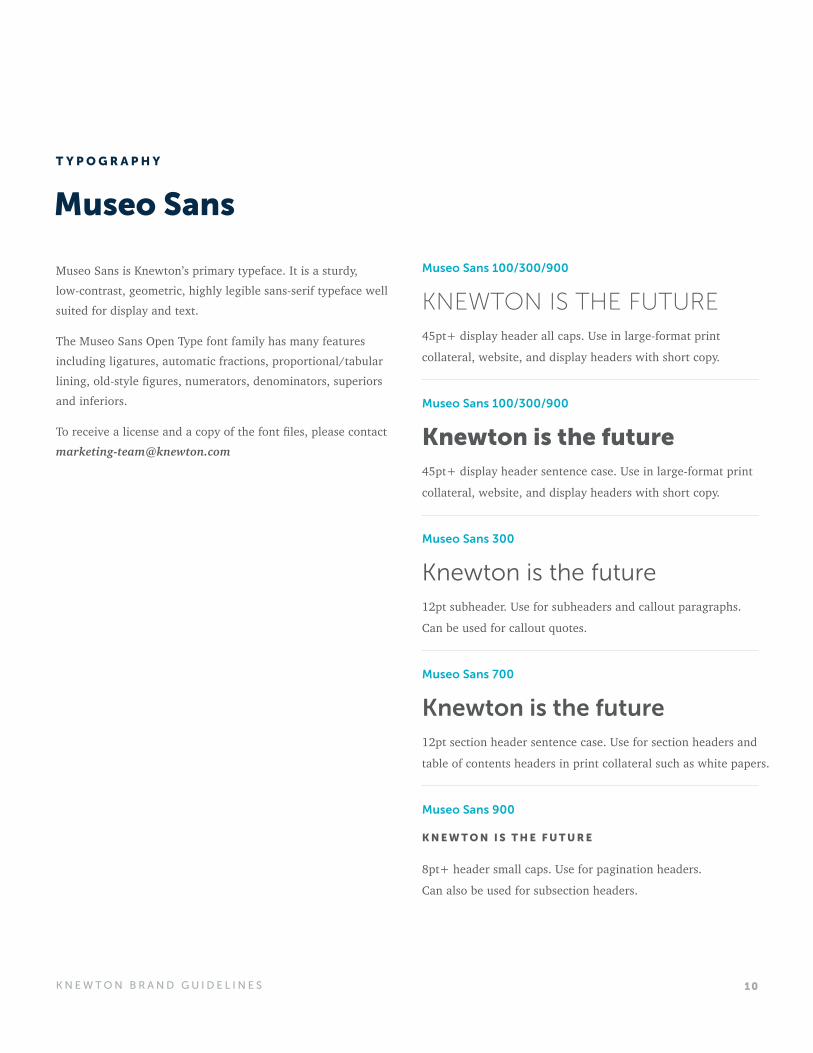
Museo Sans is Knewton’s primary typeface. It is a sturdy, low-contrast, geometric, highly legible sans-serif typeface well suited for display and text.
The Museo Sans Open Type font family has many features including ligatures, automatic fractions, proportional/tabular lining, old-style figures, numerators, denominators, superiors and inferiors.
To receive a license and a copy of the font files, please contact [email protected]
Museo Sans
Museo Sans 100/300/900
Museo Sans 100/300/900
Museo Sans 300
Museo Sans 700
Museo Sans 900
KNEWTON IS THE FUTURE
Knewton is the future
Knewton is the future
Knewton is the future
K N E W T O N I S T H E F U T U R E
45pt+ display header all caps. Use in large-format print
collateral, website, and display headers with short copy.
45pt+ display header sentence case. Use in large-format print
collateral, website, and display headers with short copy.
12pt subheader. Use for subheaders and callout paragraphs.
Can be used for callout quotes.
12pt section header sentence case. Use for section headers and
table of contents headers in print collateral such as white papers.
8pt+ header small caps. Use for pagination headers.
Can also be used for subsection headers.
T Y P O G R A P H Y
11K N E W T O N B R A N D G U I D E L I N E S
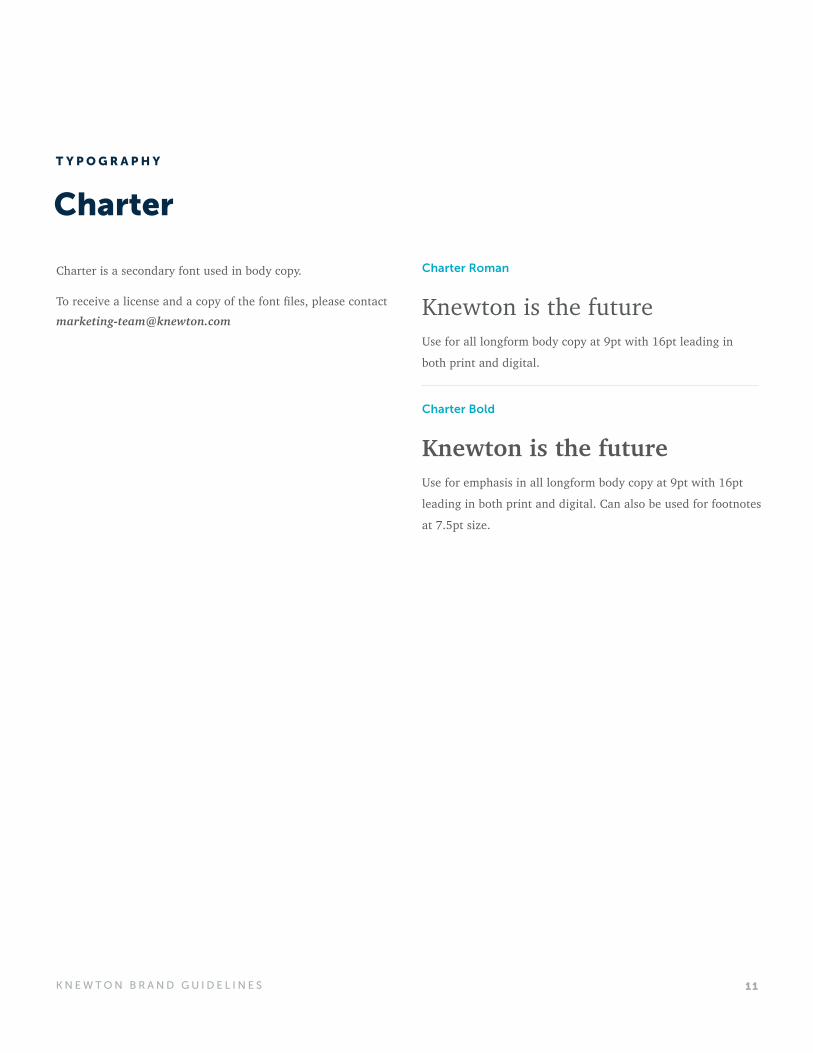
Charter
Charter is a secondary font used in body copy.
To receive a license and a copy of the font files, please contact [email protected]
Charter Roman
Charter Bold
Knewton is the future
Knewton is the future
Use for all longform body copy at 9pt with 16pt leading in
both print and digital.
Use for emphasis in all longform body copy at 9pt with 16pt
leading in both print and digital. Can also be used for footnotes
at 7.5pt size.
T Y P O G R A P H Y
12K N E W T O N B R A N D G U I D E L I N E S
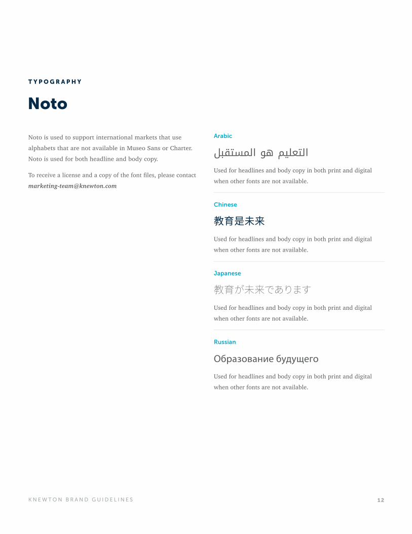
Noto
Arabic
Chinese
Japanese
Russian
التعليم هو المستقبل
教育是未来
教育が未来であります
Образование будущего
Used for headlines and body copy in both print and digital
when other fonts are not available.
Used for headlines and body copy in both print and digital
when other fonts are not available.
Used for headlines and body copy in both print and digital
when other fonts are not available.
Used for headlines and body copy in both print and digital
when other fonts are not available.
T Y P O G R A P H Y
Noto is used to support international markets that use
alphabets that are not available in Museo Sans or Charter.
Noto is used for both headline and body copy.
To receive a license and a copy of the font files, please contact
13K N E W T O N B R A N D G U I D E L I N E S
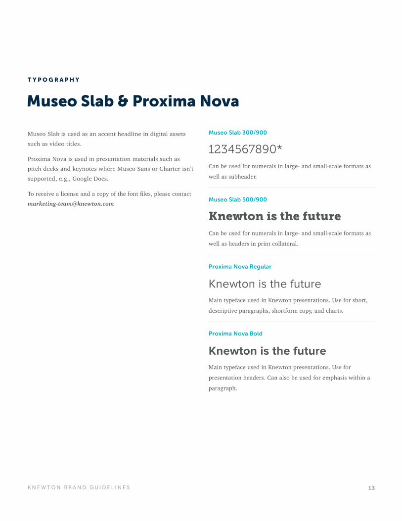
Museo Slab & Proxima Nova
Museo Slab is used as an accent headline in digital assets such as video titles.
Proxima Nova is used in presentation materials such as pitch decks and keynotes where Museo Sans or Charter isn’t supported, e.g., Google Docs.
To receive a license and a copy of the font files, please contact [email protected]
Museo Slab 300/900
Museo Slab 500/900
Proxima Nova Regular
Proxima Nova Bold
1234567890*
Knewton is the future
Knewton is the future
Knewton is the future
Can be used for numerals in large- and small-scale formats as
well as subheader.
Can be used for numerals in large- and small-scale formats as
well as headers in print collateral.
Main typeface used in Knewton presentations. Use for short,
descriptive paragraphs, shortform copy, and charts.
Main typeface used in Knewton presentations. Use for
presentation headers. Can also be used for emphasis within a
paragraph.
T Y P O G R A P H Y
14K N E W T O N B R A N D G U I D E L I N E S
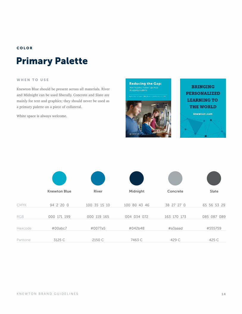
Primary Palette
W H E N T O U S E
Knewton Blue should be present across all materials. River and Midnight can be used liberally. Concrete and Slate are mainly for text and graphics; they should never be used as a primary palette on a piece of collateral.
White space is always welcome.
Knewton Blue
94 2 20 0
000 171 199
#00abc7
3125 C
River
100 35 15 10
000 119 165
#0077a5
2150 C
Midnight
100 80 43 46
004 034 072
#042b48
7463 C
Concrete
38 27 27 0
163 170 173
#a3aaad
429 C
Slate
65 56 53 29
085 087 089
#555759
425 C
CMYK
RGB
Hexcode
Pantone
C O L O R
15K N E W T O N B R A N D G U I D E L I N E S
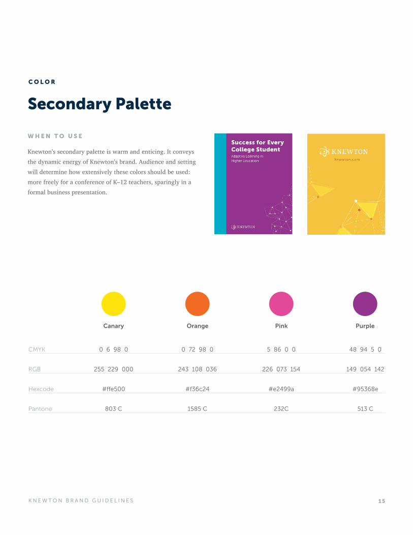
W H E N T O U S E
Knewton’s secondary palette is warm and enticing. It conveys the dynamic energy of Knewton’s brand. Audience and setting will determine how extensively these colors should be used: more freely for a conference of K–12 teachers, sparingly in a formal business presentation.
Secondary Palette
Canary
0 6 98 0
255 229 000
#ffe500
803 C
Orange
0 72 98 0
243 108 036
#f36c24
1585 C
Pink
5 86 0 0
226 073 154
#e2499a
232C
Purple
48 94 5 0
149 054 142
#95368e
513 C
CMYK
RGB
Hexcode
Pantone
C O L O R
16K N E W T O N B R A N D G U I D E L I N E S
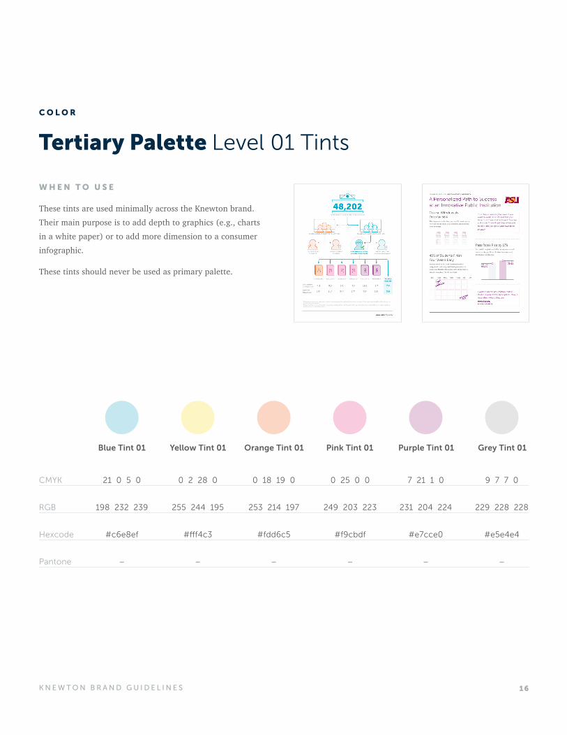
Tertiary Palette Level 01 Tints
W H E N T O U S E
These tints are used minimally across the Knewton brand. Their main purpose is to add depth to graphics (e.g., charts in a white paper) or to add more dimension to a consumer infographic.
These tints should never be used as primary palette.
Blue Tint 01
21 0 5 0
198 232 239
#c6e8ef
–
Yellow Tint 01
0 2 28 0
255 244 195
#fff4c3
–
Orange Tint 01
0 18 19 0
253 214 197
#fdd6c5
–
Pink Tint 01
0 25 0 0
249 203 223
#f9cbdf
–
Purple Tint 01
7 21 1 0
231 204 224
#e7cce0
–
Grey Tint 01
9 7 7 0
229 228 228
#e5e4e4
–
CMYK
RGB
Hexcode
Pantone
C O L O R
17K N E W T O N B R A N D G U I D E L I N E S
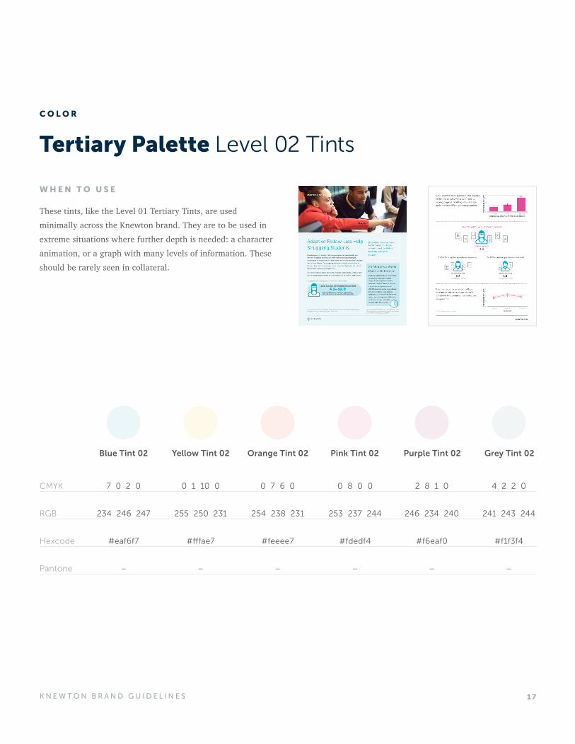
Tertiary Palette Level 02 Tints
W H E N T O U S E
These tints, like the Level 01 Tertiary Tints, are used minimally across the Knewton brand. They are to be used in extreme situations where further depth is needed: a character animation, or a graph with many levels of information. These should be rarely seen in collateral.
Blue Tint 02
7 0 2 0
234 246 247
#eaf6f7
–
Yellow Tint 02
0 1 10 0
255 250 231
#fffae7
–
Orange Tint 02
0 7 6 0
254 238 231
#feeee7
–
Pink Tint 02
0 8 0 0
253 237 244
#fdedf4
–
Purple Tint 02
2 8 1 0
246 234 240
#f6eaf0
–
Grey Tint 02
4 2 2 0
241 243 244
#f1f3f4
–
CMYK
RGB
Hexcode
Pantone
C O L O R
18K N E W T O N B R A N D G U I D E L I N E S
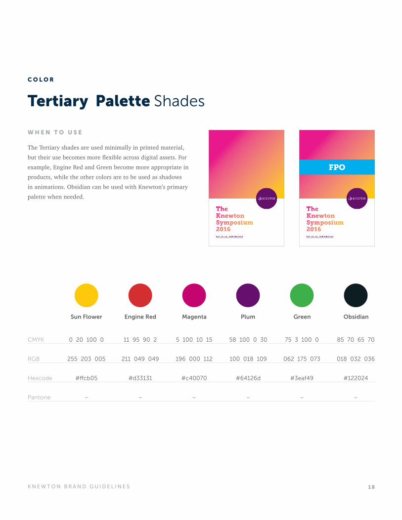
Tertiary Palette Shades
W H E N T O U S E
The Tertiary shades are used minimally in printed material, but their use becomes more flexible across digital assets. For example, Engine Red and Green become more appropriate in products, while the other colors are to be used as shadows in animations. Obsidian can be used with Knewton’s primary palette when needed.
Sun Flower
0 20 100 0
255 203 005
#ffcb05
–
Engine Red
11 95 90 2
211 049 049
#d33131
–
Magenta
5 100 10 15
196 000 112
#c40070
–
Plum
58 100 0 30
100 018 109
#64126d
–
Green
75 3 100 0
062 175 073
#3eaf49
–
Obsidian
85 70 65 70
018 032 036
#122024
–
CMYK
RGB
Hexcode
Pantone
FPO
C O L O R
19K N E W T O N B R A N D G U I D E L I N E S
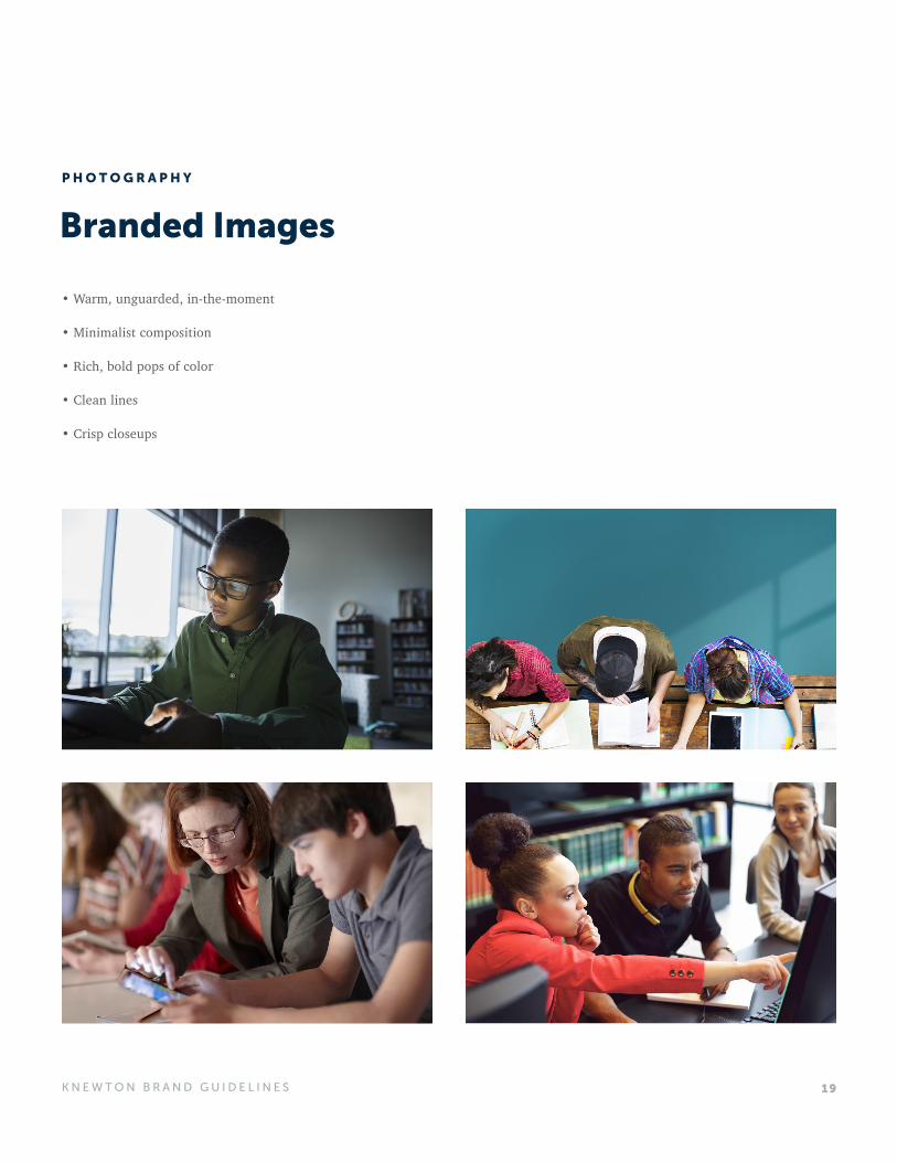
Branded Images
• Warm, unguarded, in-the-moment
• Minimalist composition
• Rich, bold pops of color
• Clean lines
• Crisp closeups
P H O T O G R A P H Y
20K N E W T O N B R A N D G U I D E L I N E S
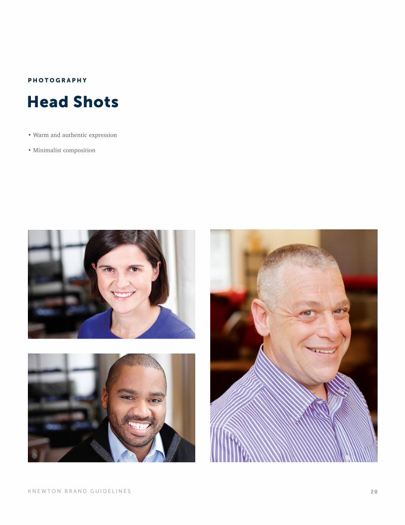
Head Shots
• Warm and authentic expression
• Minimalist composition
P H O T O G R A P H Y
21K N E W T O N B R A N D G U I D E L I N E S
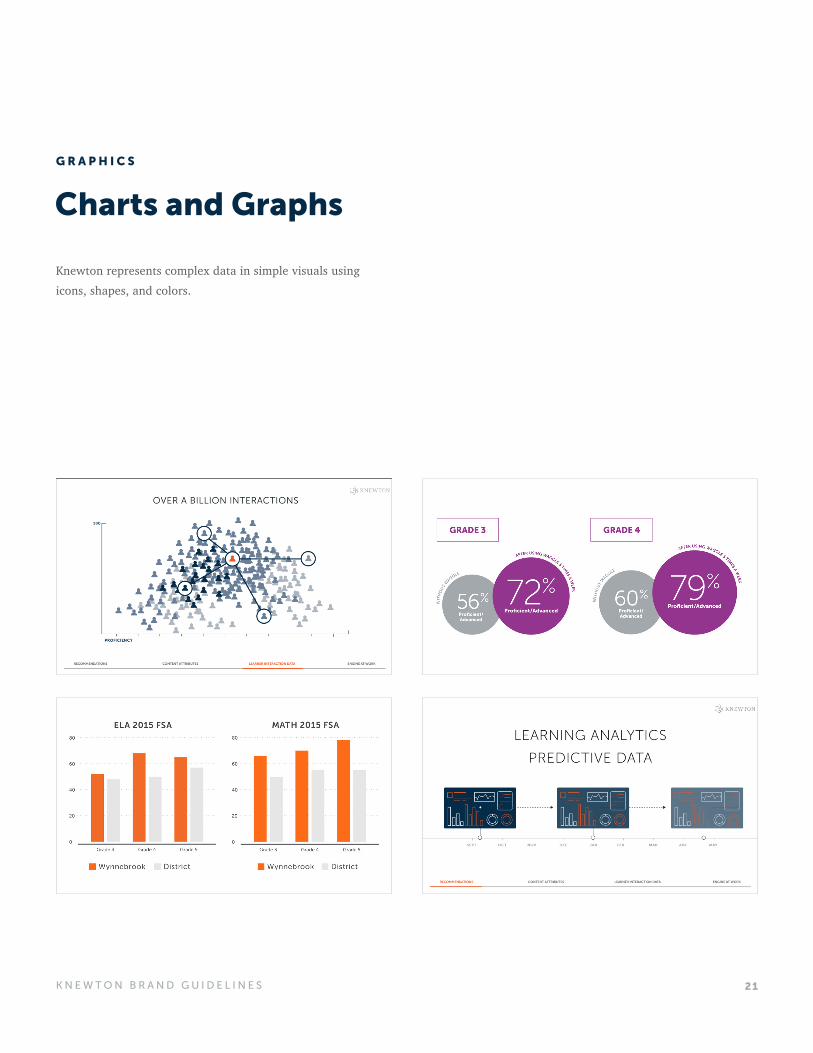
Charts and Graphs
Knewton represents complex data in simple visuals using icons, shapes, and colors.
G R A P H I C S
22K N E W T O N B R A N D G U I D E L I N E S
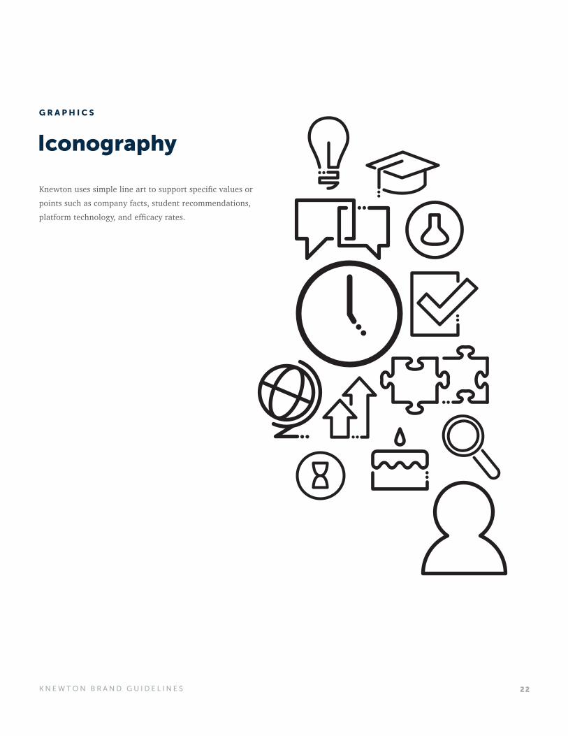
Iconography
Knewton uses simple line art to support specific values or points such as company facts, student recommendations, platform technology, and efficacy rates.
G R A P H I C S
23K N E W T O N B R A N D G U I D E L I N E S
Illustration
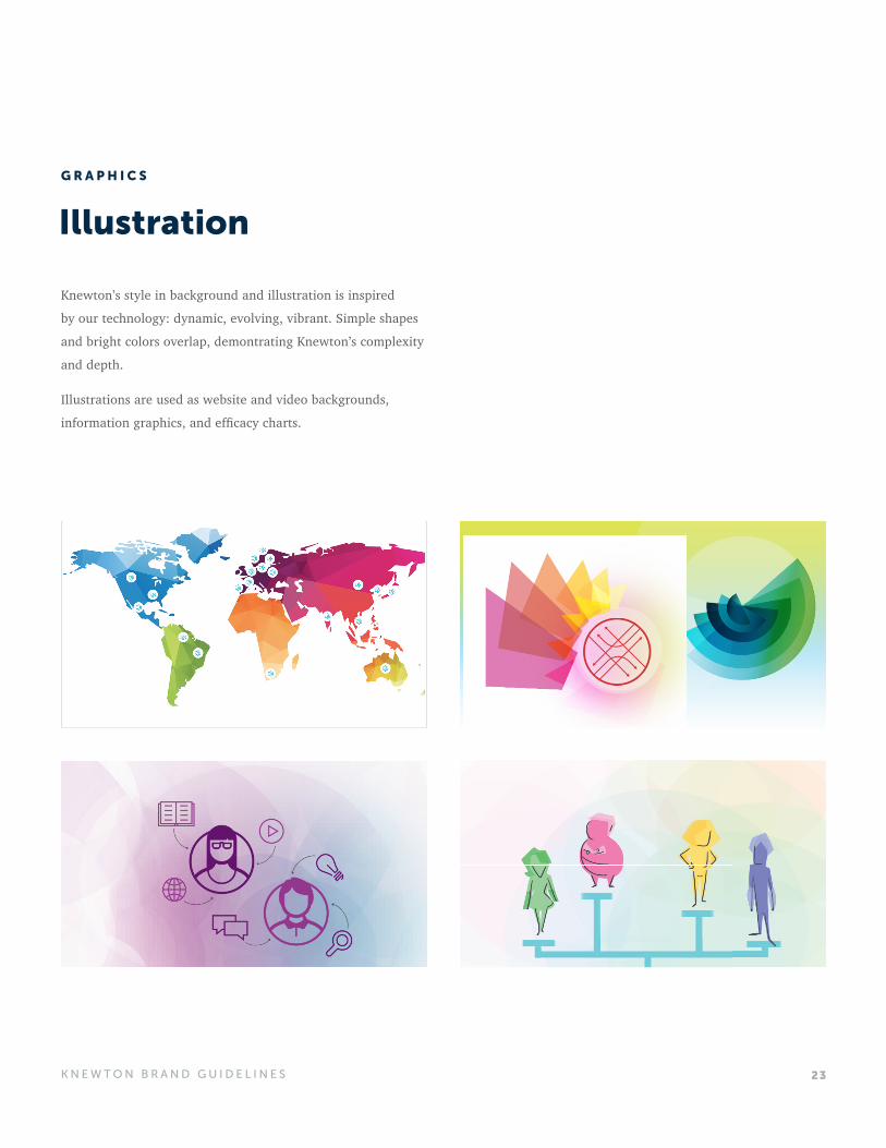
Knewton’s style in background and illustration is inspired
by our technology: dynamic, evolving, vibrant. Simple shapes
and bright colors overlap, demontrating Knewton’s complexity
and depth.
Illustrations are used as website and video backgrounds,
information graphics, and efficacy charts.
G R A P H I C S
24K N E W T O N B R A N D G U I D E L I N E S
Pattern
G R A P H I C S
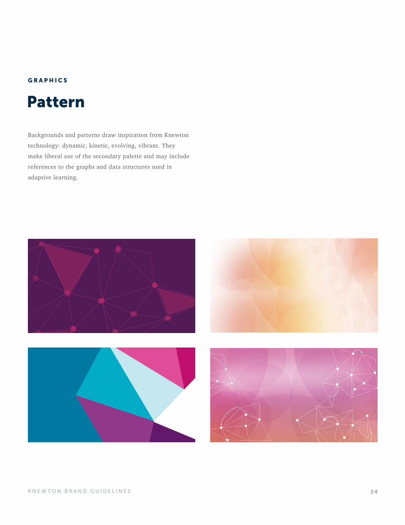
Backgrounds and patterns draw inspiration from Knewton
technology: dynamic, kinetic, evolving, vibrant. They
make liberal use of the secondary palette and may include
references to the graphs and data structures used in
adaptive learning.
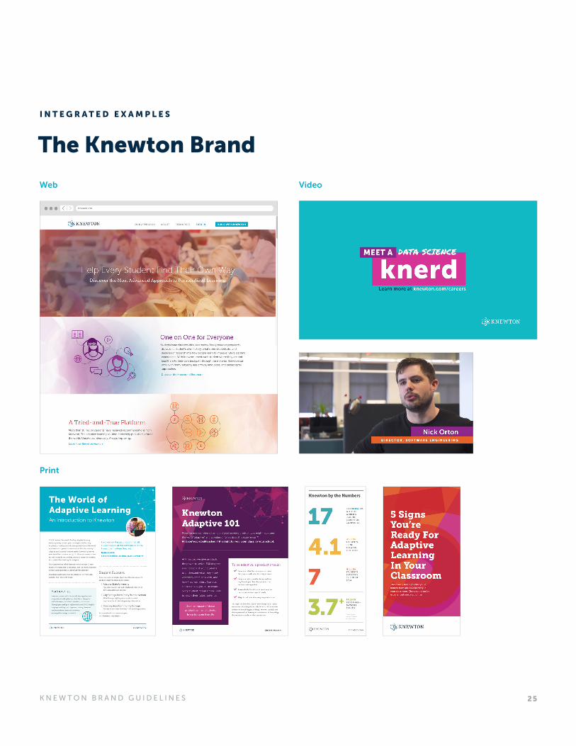
25K N E W T O N B R A N D G U I D E L I N E S
Web
Video
The Knewton Brand
I N T E G R A T E D E X A M P L E S
Address
100 5th Avenue, 8th Floor
New York, NY 10011
United States of America
For questions or to request
assets contact:
C O N T A C T
K N E W T O N . C O M U P D AT E D 0 7 | 2 0 1 6