Embed Size (px)
Citation preview

BRAND GUIDELINES


The Roger Williams University Community Partnerships Center
The Roger Williams University (RWU) Community Partnerships Center (CPC) provides project based assistance to non-profit organizations, government agencies and low- and moderate-income communities in Rhode Island and Southeastern Mas-sachusetts. Our mission is to undertake and complete projects that will benefit the local community while providing RWU students with experience in real-world projects that deepen their academic experiences.
CPC projects draw upon the skills and experience of students and faculty from RWU programs in areas such as:
Community partnerships broaden and deepen the academic experiences of RWU students by allowing them to work on real-world projects, through curriculum-based and service-learning opportunities collaborating with non-profit and commu-nity leaders as they seek to achieve their missions. The services provided by the CPC would normally not be available to these organizations due to their cost and/or diverse needs.
CPC Project Disclaimer: The reader shall understand the following in regards to this project report:1. The Project is being undertaken in the public interest.
2. The deliverables generated hereunder are intended to provide conceptual information only to assist design and planning and such are not intended, nor should they be used, for construction or other project implementation.Furthermore, professional and/or other services may be needed to ultimately implement the desired goals of the public in ownership of the project served.
3. The parties understand, agree and acknowledge that the deliverables being provided hereunder are being performed by students who are not licensed and/or otherwise certified as professionals. Neither RWU nor the CPC makes any warranties or guarantees expressed or implied, regarding the deliverables provided pursuant to this Agreement and the quality thereof, and Sponsor should not rely on the assistance as constituting professional advice. RWU, the CPC, the faculty mentor, and the students involved are not covered by professional liability insurance.
4. Neither RWU, the CPC, the faculty mentor, nor the students involved assume responsibility or liability for the deliverables provided hereunder or for any subsequent use by sponsor or other party and Sponsor agrees to indemnify and hold harmless RWU, the Center, the Faculty Mentor, and the Center’s student against any and all claims arising out of Sponsor’s utilization, sale, or transfer of deliverables provided under this Agreement.
Community Partnerships CenterRoger Williams UniversityOne Old Ferry RoadBristol, RI [email protected]://cpc.rwu.edu
American StudiesArchitecture and Urban Design
BusinessCommunity Development
EducationEngineering and Construction Management
Environmental Science and SustainabilityFinance
Graphic DesignHistoric Preservation
History
Justice StudiesLaw
Marketing and CommunicationsPolitical Science
PsychologyPublic Administration
Public RelationsSustainable Studies
Visual Arts and Digital MediaWriting Studies

LOGOTYPE + SECONDARY LOGTYPE CLEAR SPACE + MINIMUM SIZE COLOR PALETTETYPOGRAPHY INCORRECT USAGE STATIONERY SYSTEM PHOTOGRAPHY APPLCATION
060708091012 14 16
CONTENTS


LOGOTYPES
Literacy Volunteers is an organization centered aroound growth and progression. Though the primary job of this organization is to provide literacy to adults of Washington County, this experience offers more than that.
The mark lends itself to the transformation and the overall purpose of this organization. While the logotype represents the professional and mature brand image.
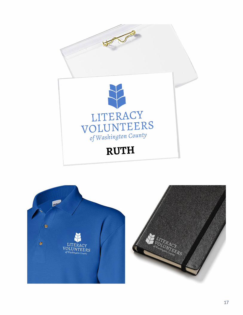
There are several variations of this logo to be utilized throughout the brand. The left-justified logo is to be utilized on letterheads, newsletts, photographs and other promotional material, while the centered logo to be utilized on the website and apparel.
Left-justified logo to be utilized on letterheads, newsletters, photographs and other promotional material.
Centered logo to be utilized on website and apparel.
SECONDARY LOGOTYPE
06

CLEAR SPACE
MINIMUM SIZE
.25
The size of the clear space is equal to the heigh of the “L” in Literacy, around all sides of the logotype. The clear space is relative to the size of the logo. The same guidelines are applied to the secondary logotype.
For printed materials, the minimum size is .25” (1/4”) high. The logo can be scaled up, proportionately, and infinitely.
Clear space is in place to make sure that other graphic material or type does not interfere or detract from the identity. This clear space should also be the minimum when positioning the identity close to the edge of a page or trim area.
The RIJS brand mark should be produced at a reasonable size to maintain legibility.
07

COLOR PALETTE
This color palette is meant to inspire learners, volunteers, and donors. The primary color chosen is a soft blue, which is a peaceful and relaxing color that will help improve the flow of communication. Blue is oftentimes used in collegiate branding and in educational branding, which puts a great emphasis on education and encourages learners to value what they are being taught. The secondary colors are a shade of green that symbolizes growth and a state of balance and a deeper blue which symbolizes structure and commitment.
The combination of these three colors aims to set a high standard of learning the English language as well as learning other necessary skills in which Literacy Volunteers offers assistance with.
PANTONE 285 UC: 80, M: 64, Y: 10, K: 1 R: 74, G: 100, B: 161
PANTONE 281 UC: 95, M: 86, Y: 36, K: 27 R: 38, G: 52, B: 94
PANTONE 375 UC: 54, M: 11, Y: 96, K: 0 R: 133, G: 179, B: 71
PRIMARY SECONDARY
08

TYPOGRAPHY
HEADLINES
SUBHEADLINE
BODY COPYHelvetica BoldA B C D E F G H I J K L M N O P Q R S T U V W X Y Za b c d e f g h i k l m n o p q r s t u v w x y z1 2 3 4 5 6 7 8 9 0
A B C D E F G H I J K L M N O P Q R S T U V W X Y Za b c d e f g h i k l m n o p q r s t u v w x y z1 2 3 4 5 6 7 8 9 0
A B C D E F G H I J K L M N O P Q R S T U V W X Y Za b c d e f g h i k l m n o p q r s t u v w x y z1 2 3 4 5 6 7 8 9 0
Helvetica Regular
Alegreya Regular
A B C D E F G H I J K L M N O P Q R S T U V W X Y Za b c d e f g h i k l m n o p q r s t u v w x y z1 2 3 4 5 6 7 8 9 0
Alegreya Italic
There are two typefaces that should be used in all promotional materials. Headlines and subheads should use Helvetica Bold and Regular and all body text should use Alegreya Regular and Italic. Alegreya is the font used in the logo as well.
Body text should never be smaller than this.
12 point, 0 tracking
Headlines should never be smaller than this.18 point, 0 tracking
TYPE SIZING
Subheadlines should never be smaller than this.16point, 0 tracking
09

INCORRECT USAGE OF LOGO
The consistent and correct application of the Literacy Volunteers logo is essential. Always follow the standards presented in these guidelines. The examples on this page illustrate some of the unacceptable uses of the Literacy Volunteer logo. These guidelines apply to both the primary and secondary variations of the logo.
10

Do not change the orientation of the logo unless the secondary logotype is being used in which then it is acceptable.
Do not stretch or distort the logo. Do not scale the logo in any way that it would distort the typography or mark.
Do not rotate the logo as this decreases the legibility of the design.
Never substitute the typeface and the logo. Alegrya was selected to represent the Literacy Volunteer brand and should remain the only typeface.
11

The organizations regular logo should be used on all stationery items. Each piece of stationery should use the primary blue color for the logo. The business cards should use the deeper blue secondary color as the font color. The stationery package includes a business card, a letterhead, and a standard #10 envelope. The RIJS brand mark has been applied to each example.
STATIONERY
RUTH TURECKOVA Executive Director
93 Tower Street, Units 25 & 26Westerly, RI 02891| 401-596-9411ExeDir@LiteracyWashingtonCounty.orgwww.LiteracyWashingtonCounty.org
Business Cards
12

Commercial Envelope
Letterhead
13

Using photography through branding, allows for a clear message to be shared. This message should reflect the values of the brand, as well as what is being marketed. When selecting photos to use as a part of the brand identity, it is important that the images are high quality, and the appropriate size for it’s application. The photos should be taken with high resolution camera, or through a professional photographer. This will allow for a consistant look for the overall brand.
LITERACY VOLUNTEERSof Washington County
LITERACY VOLUNTEERSof Washington County
White logo over a dark corner Blue logo on white corner
The photos chosen for branding are very important for establishing the overall brand image.
PHOTOGRAPHY
14

LITERACY VOLUNTEERSof Washington County
LITERACY VOLUNTEERSof Washington County
Choosing the right images is important in establishing a pro-fessional image for the Literacy Volunteers brand. The images chosen to use in promotions should be well exposed, and vibrant . The photos should also be of happy people, engaging in what they are doing. Photos without people should reflect a professional quality.
CHOOSING PHOTOS
When applying the logo to photographs, the logo should be placed in a corner of the picture. If the cornor it is placed on is dark, a white logo should be utilized, if the corner that it is chosen to be placed on is white, then a light blue logo should be utilized. If the selected images does not have an appropriate spot for the logo, then a blue horizontal bar should be placed at the bottom with a white logo placed over it in the right corner.
APPLYING THE LOGO
White logo on blue bar Blue logo on dark part image
15

APPLICATION
16
17

HD | OL | RO | JS