Embed Size (px)
Citation preview

I N T E R N A T I O N A L T R I A T H L O N U N I O N BRANDING GUIDELINES | 2011 WORLD CUP

I T U B R A N D I N G G U I D E L I N E S 2 0 11
Contents
INTRODUCTION How to use these guidelines 1.1 Colours 1.2 Minimum logo size 1.3 Typefaces 1.4
LOGOS Primary (Corporate) logo 2.1 Primary logo formats 2.2 Primary logo clear space 2.3 Primary logo violations 2.4 Secondary logo 2.5 Secondary logo formats 2.6 Secondary logo clear space 2.7 Secondary logo violations 2.8
WORLD CUP BRANDING Event Titles: Portrait 3.1 Event Titles: Portrait Guides 3.2 Event Titles: Landscape 3.3 Event Titles: Landscape Guides 3.4 Event Titles: Colour Formats 3.5 LOC Event Logo Requirements 3.6 World Cup Finishing Tape 3.7 World Cup Gantry 3.8 World Cup Podium Backdrop 3.9 World Cup Media Backdrop 3.10 World Cup Accreditation 3.11 World Cup Directional Signage 3.12 World Cup Swim Start 3.13 World Cup Finish chute/Transition area 3.14
GENERAL BRANDING Scrim 4.1 Official ITU Flag 4.2 Vertical Banner 4.3 Athlete Kit 4.5 Bike rack labels 4.6

ITU Branding Guidelines 2011
This guide establishes the standards for the consistent, accurate application of the ITU logo,
its brand and its supporting elements in all media, including online, broadcast, interactive
and print.
The logos and their elements must be reproduced only in the formats displayed in these
standards. Under no circumstances may the logos be modified in anyway.
Please observe the principles established in these standards. This will ensure all material
remains true to the spirit of the ITU design and brand identity.
Please use the attached colour swatches as a guide and ensure that final product matches
the colour swatch.
For questions or concerns about the usage of the elements in these standards, approval
of artwork or additional branded items not included in this guide, please contact:
I T U B R A N D I N G G U I D E L I N E S 2 0 11
INTR
OD
UC
TIO
N
1.1 How to use these guidelines

If possible always reproduce the logo using the
Pantone colour-matching system. For information, visit
www.pantone.com.
When reproducing the ITU logos, only the approved
colours may be used. Please choose the appropriate
colour based on where the logo will be used. When print-
ing, the type of paper may affect the colour outcome of
the logo. Communication with suppliers is important to
ensure that the colour information for the ITU logo is
accurate.
The following standards are for illustrative purposes only
and the printed colour samples should not be used for
colour matching. Please use the perforated swatch sheet,
which is attached at the end of the document, to ensure
correct colour matching.
Where possible all branded material should be printed
on environmentally accredited paper stock. This can vary
from stock from a sustainable forest to stock with a level
of recyclable content that qualifies for an environmental
accreditation.
I T U B R A N D I N G G U I D E L I N E S 2 0 11
INTR
OD
UC
TIO
N
1.2 Colours
MAIN COLOUR
Pantone 2955C
ITU Blue
(Coated papers)
CMYK conversion
(four-colour process)
C: 100%
M: 45%
Y: 0%
K: 37%
RGB conversion
R: 17%
G: 46%
B: 104%
Websafe conversion
#003366
Pantone 144C
ITU Orange
(Coated papers)
CMYK conversion
(four-colour process)
C: 0%
M: 49%
Y: 100%
K: 0%
RGB conversion
R: 255%
G: 102%
B: 0%
Websafe conversion
#FF6600
When printing on coated paper, use the
Pantone coated version of the logo.
When printing the logo in four colour
process publications, use the CMYK
specified colour.
The RGB specified colours should be
usef for broadcast, interactive and
online media.
The Websafe conversion should only be
used for online and web media.
HIGHLIGHT COLOUR

The logos need to be of a sufficient size to reproduce ac-
curately. The minimum size for all print applications is
18.5 mm wide for all variations of the ITU corporate logo.
For the primary logo, the minimum size is 68 mm wide (as
opposed to ITU corporate logo).
If the logo appears too small, it will lose its overall
identity.
I T U B R A N D I N G G U I D E L I N E S 2 0 11
INTR
OD
UC
TIO
N
1.3 Minimum logo sizes
18.5 mm
68 mm

The ITU corporate typeface is Myriad (also found as
Myriad Pro). It should be used in a consistent manner to
maintain the ITU identity.
The ITU corporate typeface adds a stronger identity to
the brand when used to complement the logo in other
printed pieces, such as brochures and posters.
I T U B R A N D I N G G U I D E L I N E S 2 0 11
INTR
OD
UC
TIO
N
1.4 Typefaces
Myriad Pro, 9pt.
Regular: abcdefghijklmnopqrstuvwxyzABCDEFGHIJKLMNOPQRSTUVWXYZ1234567890
Regular Italic: abcdefghijklmnopqrstuvwxyzABCDEFGHIJKLMNOPQRSTUVWXYZ1234567890
Semibold Regular; 9pt: abcdefghijklmnopqrstuvwxyzABCDEFGHIJKLMNOPQRSTUVWXYZ1234567890
Semibold Italic; 9pt: abcdefghijklmnopqrstuvwxyzABCDEFGHIJKLMNOPQRSTUVWXYZ1234567890

I N T E R N A T I O N A L T R I A T H L O N U N I O N LOGOS

The primary, or corporate, format is used in all formal
representation of the ITU identity. When possible, ITU’s
blue must be used as the primary colour of the image
or document that the ITU logo sits on. Hence the blue
background.
If you are unclear about when to use the corporate logo,
please contact ITU.
Refer to page 1.2 for colours.
I T U B R A N D I N G G U I D E L I N E S 2 0 11
LOG
OS
2.1 Primary (Corporate) Logo
ITU_logo_onBlue.eps
The background colour should be a full flood of colour and should
never act as a container for the logo.
The logo should never sit on a page in the blue box. This version is only to be used if the page background colour is blue.

Depending on the medium used, choose the right logo
colour breakdown. This will keep the colours consistent
for all media types.
Refer to page 1.2 for colours.
When colour reproduction is not possible, the black-and
white version must be used.
The background should always be a full flood of colour
and should never act as a container for the logo.
If there is an instance where it is felt to be more appro-
priate to use a supporting colour as a background colour,
this should be by approval from ITU. See page 1.1.
I T U B R A N D I N G G U I D E L I N E S 2 0 11
LOG
OS
2.2 Primary logo formats
ITU_3CircleLOGO_onBlue.eps ITU_3CircleLOGO_onOrng.eps
ITU_3CircleLOGO_onBlk.eps ITU_3CircleLOGO_onWht.eps
ITU_3CircleLOGO_mono.eps
Blue background Orange background
Black background White background
Mono

The simple and consistent application of the ITU primary
logo is of the utmost importance.
There must be an area left around the ITU primary logo so
that it remains clear of any graphic, pictorial or illustrative
elements. The clear space around the logo is equal to the
height of the ‘ITU’ type in the logo.
I T U B R A N D I N G G U I D E L I N E S 2 0 11
LOG
OS
2.3 Primary logo clear space
The height of the ‘ITU’ type

Do not alter the ITU primary logo in any way, as this will
detract from the brand identity.
Application of the ITU 3-circle graphic must adhere to
the same format and standards as for the use of the ITU
primary logo.
If you are unclear about how to use the ITU 3-circle
graphic, please contact ITU.
I T U B R A N D I N G G U I D E L I N E S 2 0 11
LOG
OS
2.4 Primary logo violations
Do not alter the colour
or tint of the logo.
Do not substitute or replace
the wordmark with other fonts.
Use the correct colours when the
logo appears on background.
Never alter the configurations of
the logo or the circle element.
Never alter the configurations of
the logo or the circle elements.
Never remove an ele-
ment from the logo.
Never rotate the 3-circle
graphic element.
Do not add elements to the logo,
this will change the logo.
Do not change the proportions of
the logo by stretching or squishing.

The ITU secondary logo comprises:
• The ‘triathlon’ wordmark
• The ITU 3-circle graphic
• The ITU background
The ITU secondary logo was developed for use in brand-
ing situations such as on-site branding, event titles and
promotional materials. The font used in this logo has
been altered from its original format for the specific use
of ITU. The standard Arial font in combination with the
triathlon rings can never be used as a substitute for the
ITU primary logo.
Triathlon with an upper-case ‘T’ should be used when
written as text, for example on top of a gantry; triathlon
with a lower-case ’t’ should be used in all other circum-
stances. See page 3.3 for an example of Triathlon with an
upper-case ‘T’.
I T U B R A N D I N G G U I D E L I N E S 2 0 11
LOG
OS
2.5 Secondary logo
The primary version of the logo should be used for branding
purposes. Refer to page 1.2 for colours.
The blue background should be a full flood of colour and
should never act as a container for the logo.

Depending on the layout used, choose the correct logo
colour breakdown. This will keep the colours consistent
for all media types.
The background should always be a full flood of colour
and should never act as a container for the logo.
If there is an instance where it is felt to be more appropri-
ate to use a supporting colour as a background, this must
be approved by ITU. See page 1.1.
Refer to page 1.2 for colours.
I T U B R A N D I N G G U I D E L I N E S 2 0 11
LOG
OS
2.6 Secondary logo formats
Blue background
Triathlon_logo_onBlue.eps Triathlon_logo_onOrng.eps
Orange background
White backgroundBlack background
Triathlon_logo_onBlk.eps
Triathlon_logo_mono.eps
Triathlon_logo_onWht.eps
Mono

As with the ITU primary logo, the simple and consistent
application of the ITU secondary logo is important to the
integrity of the brand.
There must be an area left around the secondary logo so
that it remains clear of any graphic, pictorial or illustrative
elements. The clear space around the logo is equal to half
the size the smallest of the ITU rings.
I T U B R A N D I N G G U I D E L I N E S 2 0 11
LOG
OS
2.7 Secondary logo clear space
Size of smallest ITU ring Scaled by 50%

Do not alter the ITU secondary logo in any way, as this will
detract from the brand identity.
I T U B R A N D I N G G U I D E L I N E S 2 0 11
LOG
OS
2.8 Secondary logo violations
Do not alter the colour or tint of the logo.
Do not add elements to the logo. Never alter the spacing between the logo elements.
Do not replace elements of the logo with text, regardless of perceived similarity or aesthetic appeal.
Do not remove any elements from the logo.
Never rotate the ITU brand separately.
Do not squish or stretch the logo. If scaling the logo, ensure the proportions always remain the same as the original.

I N T E R N A T I O N A L T R I A T H L O N U N I O N WORLD CUP BRANDING

These samples are to help suppliers build accurate titles
for event signage.
If the event has a title sponsor, please see examples of
possible ways to incorporate their logo.
All title sponsor integration is subject to approval from
ITU.
When modifying these logos for your respective event,
the only element that will need to be changed is the
venue name.
I T U B R A N D I N G G U I D E L I N E S 2 0 11
WO
RLD
CU
P - E
VEN
T TI
TLES
3.1 World Cup - Event Titles: Portrait
Portrait versions on white background.
Portrait versions on blue background.
ITU Presenting Sponsor, Portrait version, on white background.
Examples of Title Sponsor integration:

City Names (or title sponsor) in the Portrait version of
Event Title graphics are restricted by one of two factors:
height OR length.
Whichever restriction is reached first, height or length,
determines the size of the text for the City Name.
The height restriction is equal to the size of the smaller
ITU ring.
The length restriction extends from the end of the “t” in
triathlon to the end of the “l”.
I T U B R A N D I N G G U I D E L I N E S 2 0 11
3.2 World Cup - Event Titles: Portrait: Guides
WO
RLD
CU
P - E
VEN
T TI
TLES
Height Restriction Example: “Ishigaki” text is scaled until it reaches the first restriction, in this case, height. The length restriction is then ignored.
Length Restriction Example: “Tiszaujvaros” reaches the length restriction first, so the height restriction is ignored.
There must be an area left around the event title logo so that it remains clear of any graphic, pictorial or illustrative elements. This clear space around the logo is equal to the size of the larger ITU circle.
The text “ITU World Cup” should always align with the “t” in triathlon to the left, and extend until the beginning of the “n” to the right.
length restriction
length restriction
height restrictionheight restriction
length restriction

These samples are to help suppliers build accurate titles
for event signage.
If the event has a title sponsor, please see the example.
When modifying these logos for your respective event,
the only element that will need to be changed is the
venue name.
“ITU” and “Triathlon” always remain together.
I T U B R A N D I N G G U I D E L I N E S 2 0 11
3.3 World Cup - Event Titles: Landscape
WO
RLD
CU
P - E
VEN
T TI
TLES
Landscape version on blue background.
Landscape version on white background.
Title sponsor, Landscape version, on white background example:

Spacing Guide text should right-align here
The only element within the Landscape versions of Event
Titles that needs modifying is the City Name.
The City Name text should right-align with the pro-
vided guide to ensure that the correct spacing remains
unchanged
There must be an area left around the event title logo so
that it remains clear of any graphic, pictorial or illustrative
elements. This clear space around the logo is equal to the
size of the smaller ITU circle.
I T U B R A N D I N G G U I D E L I N E S 2 0 11
3.4 World Cup - Event Titles: Landscape: Guides
WO
RLD
CU
P - E
VEN
T TI
TLES

Depending on the medium used, choose the right logo
colour breakdown. This will keep the colours consistent
for all media types.
Refer to page 1.2 for colours.
When colour reproduction is not possible, the black-and
white version must be used.
The background should always be a full flood of colour
and should never act as a container for the logo.
If there is an instance where it is felt to be more appro-
priate to use a supporting colour as a background colour,
this should be by approval from ITU. See page 1.1.
I T U B R A N D I N G G U I D E L I N E S 2 0 11
3.5 World Cup - Event Titles: Colour Formats
WO
RLD
CU
P - E
VEN
T TI
TLES
Mooloolaba_Land_onBlk.eps
Mooloolaba_P_onBlue.eps Mooloolaba_P_onWht.eps
White background
Mooloolaba_Land_onOrng.eps
Mooloolaba_Land_Mono.eps
Orange background
Black background
Blue background
Mono

All LOC event logos must incorporate the secondary
logo.
All proposed LOC event logos must be sent through to
ITU (see page 1.1) for approval before they are applied to
any branding situation.
I T U B R A N D I N G G U I D E L I N E S 2 0 11
3.6 World Cup - LOC Event Logo Requirements
WO
RLD
CU
P - E
VEN
T TI
TLES
LOC event logo
Example 1:
‘Edmonton Triathlon Festival 2007’
Secondary ITU logo

World Cup Finishing Tape must always be ITU orange (see
section 1.2 for colours).
Finishing Tape has been sectioned off with exact areas.
With the exception of the ITU space, in order to preserve
the appearance and readability of the Finishing Tape,
these areas must stay as assigned.
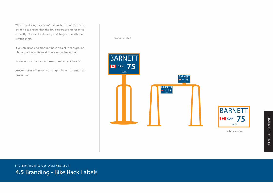
When producing any ‘look’ materials, a spot test must
be done to ensure that the ITU colours are represented
correctly. This can be done by matching to the attached
swatch sheet.
Production of this item is the responsibility of the ITU.
All incorporated LOC logos must be sent to ITU 30 days
before the competition.
I T U B R A N D I N G G U I D E L I N E S 2 0 11
WO
RLD
CU
P BR
AN
DIN
G
3.7 World Cup Finishing Tape
5 metres
0.3 metres LOC LOC LOC LOCTITLE
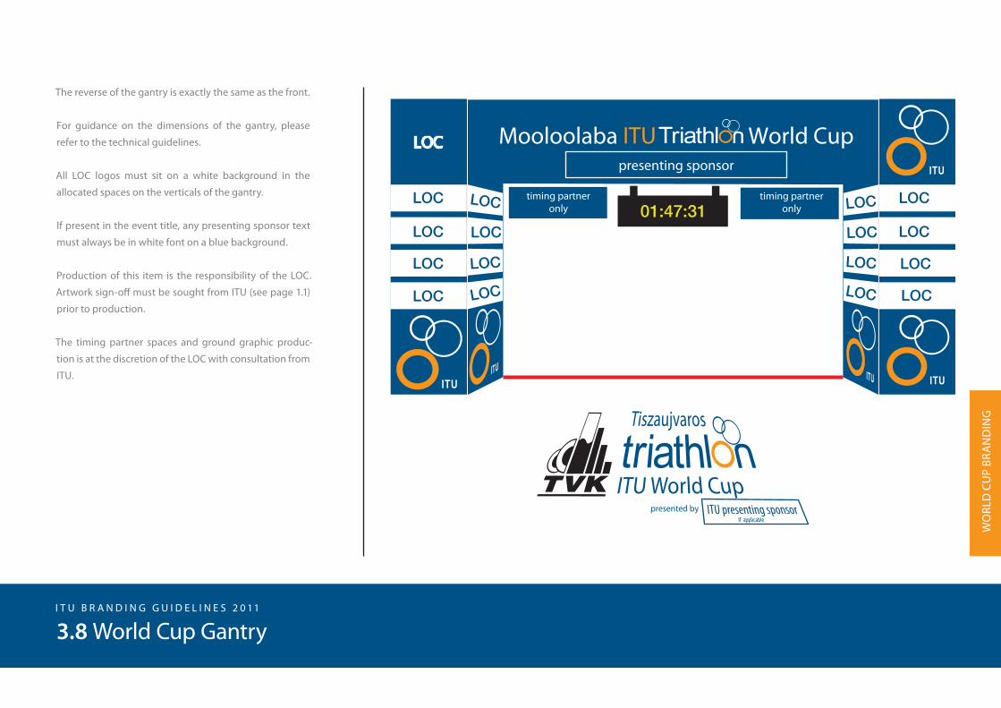
The reverse of the gantry is exactly the same as the front.
For guidance on the dimensions of the gantry, please
refer to the technical guidelines.
All LOC logos must sit on a white background in the
allocated spaces on the verticals of the gantry.
If present in the event title, any presenting sponsor text
must always be in white font on a blue background.
Production of this item is the responsibility of the LOC.
Artwork sign-off must be sought from ITU (see page 1.1)
prior to production.
The timing partner spaces and ground graphic produc-
tion is at the discretion of the LOC with consultation from
ITU.
I T U B R A N D I N G G U I D E L I N E S 2 0 11
3.8 World Cup Gantry
WO
RLD
CU
P BR
AN
DIN
G

It is important to ensure that the podium backdrop is
large enough to cover the entire width of the podium
plus one metre on either side. The podium backdrop
must always incorporate 20 squares.
When producing any ‘look’ materials, a spot test must
be done to ensure that the ITU colours are represented
correctly. This can be done by matching to the attached
swatch sheet.
All logos are to appear on a white background.
The podium backdrop must always sit on a blue
background.
Production of this item is the responsibility of the LOC.
Artwork sign-off must be sought from ITU prior to
production.
I T U B R A N D I N G G U I D E L I N E S 2 0 11
3.9 World Cup Podium Backdrop
WO
RLD
CU
P BR
AN
DIN
G
5 metres
3.5
met
res
LOC
LOC
LOC
LOC LOC
LOC
LOC
LOC
LOC
LOC
LOC
LOC
LOC
LOC
LOC
LOC

It is important to ensure that the media backdrop is made
to the specified size requirements, 5m x 2m to ensure
it covers a possible head table during a press confer-
ence and that it appears properly when videotaped or
photographed.
According to the ITU contract with World Cup LOC’s, the
division of logos must sit at 80%-20%, with 80% percent
of available logo space going to LOC’s and 20% to ITU.
When producing any ‘look’ materials, a spot test must
be done to ensure that the ITU colours are represented
correctly. This can be done by matching to the attached
swatch sheet.
The media backdrop must always sit on a blue
background.
Production of this item is the responsibility of the LOC.
Artwork sign-off must be sought from ITU prior to
production.
I T U B R A N D I N G G U I D E L I N E S 2 0 11
3.10 World Cup Media (press conference) Backdrop
WO
RLD
CU
P BR
AN
DIN
G
LOC LOC LOC
LOCLOCLOCLOC
LOC LOC LOC LOC LOC LOC
LOCLOCLOCLOCLOCLOC
5 metres
2 metres

The ITU accreditation system is to be incorporated into all
ITU events. Accreditation guidelines are available in the
Event Organiser’s Manual.
When producing any ‘look’ materials, a spot test must
be done to ensure that the ITU colours are represented
correctly. This can be done by matching to the attached
swatch sheet.
Production of this item is the responsibility of the LOC.
Artwork sign-off must be sought from ITU prior to
production.
I T U B R A N D I N G G U I D E L I N E S 2 0 11
3.11 World Cup Accreditation
WO
RLD
CU
P BR
AN
DIN
G
Front - Operations Areas
Front - Sport and Public Areas
Back2010
LOREEN BARNETTITU SECRETARY GENERAL
2010
LOREEN BARNETTITU SECRETARY GENERAL
LOC
Coaches’ Area
Atletes’ Preparation Area
Photographers
Press Area
VIP Area
Medical Area
Field of Play
Broadcasters’ Area

When producing any ‘look’ materials, a spot test must
be done to ensure that the ITU colours are represented
correctly. This can be done by matching to the attached
swatch sheet.
If you are unable to produce these on a blue background,
please use white backgrounds as a secondary option.
I T U B R A N D I N G G U I D E L I N E S 2 0 11
3.12 World Cup Directional Signage
WO
RLD
CU
P BR
AN
DIN
G
TitleHere
LOC
420 mm minimum
MIXEDZONE
LOC TIMING& RESULTS
LOC
VIPAREA
LOC ITUOFFICE
LOC

I T U B R A N D I N G G U I D E L I N E S 2 0 11
3.13 World Cup Swim Start
WO
RLD
CU
P BR
AN
DIN
G
Swim start
approx 60 meter
LOC12,5%
LOC12,5%
LOC12,5%
LOC12,5%LOC Partner 25%
ITU ITU ITU ITU ITU ITU ITU ITU ITU ITU ITU ITU ITU ITU ITU ITU ITU ITU ITU ITU ITU ITU ITU ITU ITU ITU ITU ITU ITU ITU ITU ITU ITU ITU ITU ITU ITU ITU ITU ITU
ITU Presenting Sponsor 25%
ITU 3 LOC 3 LOC2 ITU ITU
Flags
ITU

I T U B R A N D I N G G U I D E L I N E S 2 0 11
3.14 World Cup Finish chute/Transition area
WO
RLD
CU
P BR
AN
DIN
G
Host City
Host City
ITU
ITU
ITU
ITU
approx 100 meter
LOC Partner25 %
LOC Partner25 %
LOC12,5 %
LOC15 %
LOC15 %
LOC15 %
LOC15 %
LOC12,5 %
LOC12,5 %
LOC12,5 %
ITU Presenting sponsor20 %
LOC Partner25 %
LOC12,5 %
LOC15 %
LOC15 %
LOC12,5 %
ITU Presenting sponsor20 %
ITU Presenting sponsor20 %
LOC Partner25 %
LOC15 %
LOC15 %
LOC12,5 %
LOC12,5 %
ITU Presenting sponsor20 %
ITU Presenting Sponsor
LOC Partner
approx 100 meter
approx 100 meter
15 meter
Finish chute/Transition area
Finish chute
3 LOC 2 ITU 2 ITU 3 LOC
Flags
Transition area

I N T E R N A T I O N A L T R I A T H L O N U N I O N B R A N D I N G I T E M S

The ITU fence scrim will be used at the race site and on
the course in various strategic positions
When producing any ‘look’ materials, a spot test must
be done to ensure that the ITU colours are represented
correctly. This can be done by matching to the attached
swatch sheet.
Production of this item is the responsibility of the ITU.
I T U B R A N D I N G G U I D E L I N E S 2 0 11
GEN
ERIC
BRA
ND
ING
4.1 Branding - Scrim
FENCE SCRIM
PONTOON SCRIM
The above scrim comes in 6-metre, 12-metre and 24-metre lengths.
triathlon.orgtriathlon.org
6 metres
12 metres0.
8 m
etre
s
0.3 metres

When producing any ’look’ materials, a spot test must
be done to ensure that the ITU colours are represented
correctly. This can be done by matching to the attached
swatch sheet.
Production of this item is the responsibility of the ITU.
I T U B R A N D I N G G U I D E L I N E S 2 0 11
4.2 Branding - Official ITU Flag
GEN
ERIC
BRA
ND
ING

It is important to note that the banner must be supported
horizontally and vertically to ensure maximum visibility.
The supporting flagpole must be 4m high with 0,75m ex-
tension on the top.
The LOC is responsible for providing flagpoles as per
these specifications.
If the flagpole is made of PVC please use the following
instructions:
• 2,5 meter length of 1 inch PVC pipe
• 1,5 meter length of 1 inch PVC pipe
• Coupling (to connect the two parts above)
• 0,75 meter lengths of “ inch PVC pipe
• 1 inch in and “ inch out elbow
For easy storage, you do not need to glue the elbow and
couplings.
The poles can be assembled on site and secured to fenc-
ing by quick ties.
ITU will confirm the quantities of flags present at each
event..
I T U B R A N D I N G G U I D E L I N E S 2 0 11
4.3 Branding - Vertical Banner
GEN
ERIC
BRA
ND
ING
2 metres
0.75 metres
2 metres

When producing any ’look’ materials, a spot test must
be done to ensure that the ITU colours are represented
correctly. This can be done by matching to the attached
swatch sheet.
Production of those items is the responsibility of the
ITU.
I T U B R A N D I N G G U I D E L I N E S 2 0 11
4.4 Branding - Athlete Kit
GEN
ERIC
BRA
ND
ING
Swim caps Medal ribbons
Bike label
Helmet label
75
75 7575
61
61
13.2 cm
2 cm
2 cm
2.6 cm
ITURESERVED
ITU
ITU
75
When producing any ’look’ materials, a spot test must
be done to ensure that the ITU colours are represented
correctly. This can be done by matching to the attached
swatch sheet.
If you are unable to produce these on a blue background,
please use the white version as a secondary option.
Production of this Item Is the responsibility of the LOC.
Artwork sign-off must be sought from ITU prior to
production.
I T U B R A N D I N G G U I D E L I N E S 2 0 11
4.5 Branding - Bike Rack Labels
GEN
ERIC
BRA
ND
ING
Bike rack label
White version
CAN 75BARNETT
CAN 75BARNETT
CAN 75BARNETT
CAN 75BARNETT