Embed Size (px)
Citation preview
communications.tufts.edu
branding guidelinesreference
communications.tufts.edu
contents
1.0 Overview
1.1 From the President 1.2 Tufts Brand Strategy 1.3 Branding Guidelines
2.0 Logo
2.1 University Logo 2.2 Logo Versions 2.3 Incorrect Uses of Logo 2.4 University Seal 2.5 Branding Guidelines Hierarchy 2.6 Schools 2.7 Schools: Treatments 2.8 Administration and Divisions 2.9 Centers
3.0 Cobranding
3.1 University and Center 3.3 School and Center 3.6 Center: Part of School 3.9 Multiple Entities 3.15 External Entities
4.0 Color
4.1 Core Colors 4.2 Extended Palette 4.3 Color Chart
5.0 Type
5.1 Official Typefaces5.2 Characteristics and Styles
6.0 Stationery
6.1 Letterhead 6.2 Letterhead Use 6.3 Envelope 6.4 Business Cards: School 6.5 Business Cards: Department of School 6.6 Business Cards: Department of Division
7.0 Signage
7.1 Exterior Signage 7.2 Interior Signage
8.0 Resources

communications.tufts.educommunications.tufts.edu 1.0
overview
communications.tufts.edu
We can all be proud of Tufts’ accomplishments and confident in the university’s future: we are positioned to find creative and innovative ways of addressing some of the great challenges facing our world. Our common purpose is to ensure that Tufts remains an exceptional place to learn, teach, work, pursue research, and engage widely as active citizens.
The university’s Branding Guidelines help us to develop communications that speak to Tufts’ unique mission, characteristics, and spirit. They also serve to heighten public awareness of the university as a distinguished institution of teaching and research.
This manual provides clear guidelines so that we can communicate the Tufts brand consistently. Ensuring that we adopt these standards across our communications will make a significant contribution to enhancing Tufts’ reputation.
The work of weaving the university’s communications together is ongoing. We can all play a role of thoughtful stewardship when working to communicate Tufts’ values and strengths.
Anthony P. MonacoPresident
1.1
from the president
communications.tufts.edu
Tufts University comprises a unique constellation of schools across four campuses and each of these schools has an excellent reputation in its own right.
However, the Tufts brand as a whole is greater than the sum of its parts. Tufts’ strong, recognized brand adds value to the individual schools under the Tufts umbrella—a rising tide lifts all boats.
In turn, the reputation of the schools helps support and validates the equity of the central Tufts brand.
It’s important to strengthen and reinforce the central brand of Tufts, and by association that will strengthen and reinforce the reputation of the schools. This is why, in all our communications, we aim to project a strong, unifying singular voice and appearance.
While it may be tempting for schools, departments, and centers at Tufts to create their own brand/logo, this would only dilute awareness of the Tufts name and create internal competition or, at worst, confusion among our core audiences.
Maintaining and strengthening our competitive position requires that all components of the Tufts brand appear consistently across all university communications.
No matter which communications channels are used, we all contribute to a unified and professional Tufts brand by following the logo, color, and typeface standards in this guide. The new standards were informed by expertise in web, social, print, photography, video, usability, and accessibility for people with visual impairments.
The Branding Guidelines are flexible so that each school or unit can communicate its own unique characteristics. Anchored by the Tufts logo, you may choose from the official colors and typefaces to define a visual presence that is distinct yet clearly associated with Tufts University as the central primary brand. You may also communicate a distinct brand by using photography, graphic elements, and other visual assets.
The Tufts brand is much more than its seal and wordmark; the brand is reflected in the university’s mission, core values, and strategic themes as communicated through all our messaging and interactions with constituents.
1.2
tufts brand strategy
communications.tufts.edu
a a a a
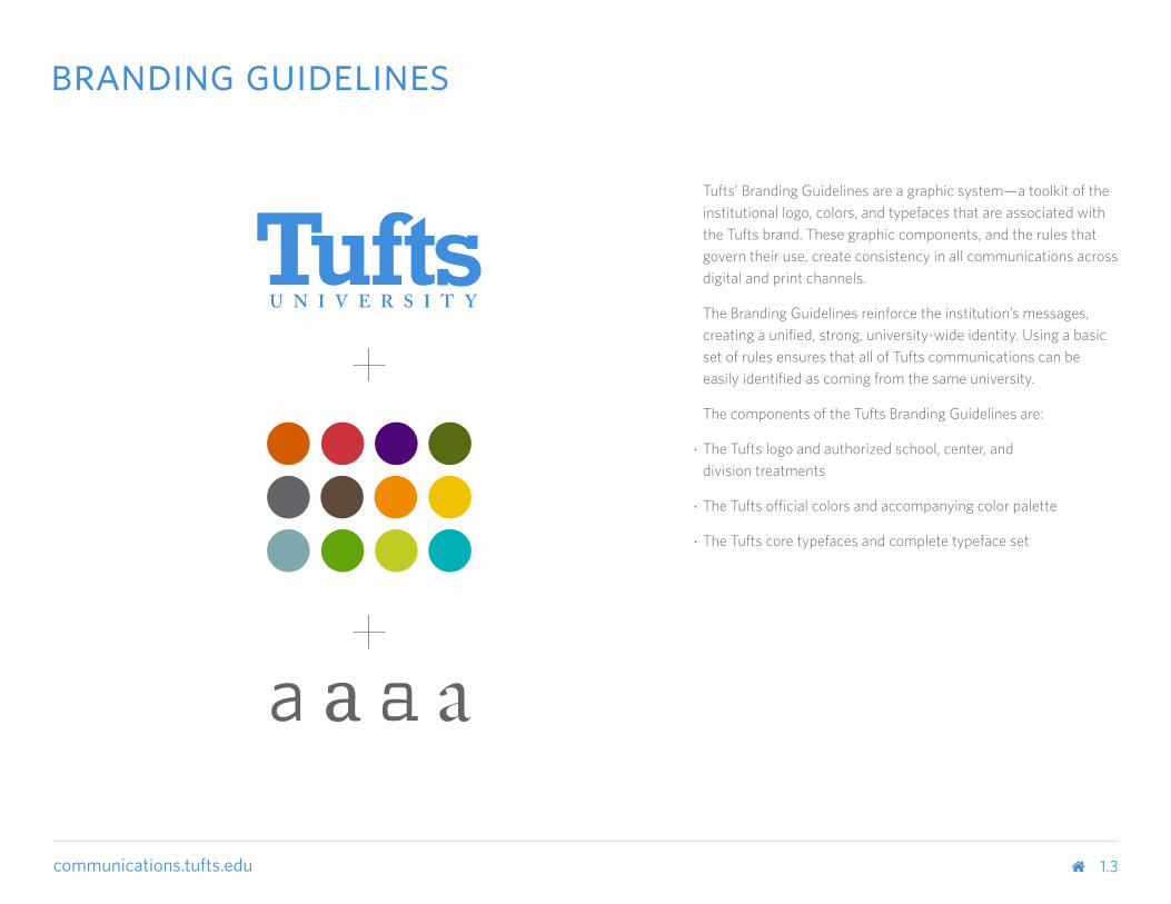
Tufts’ Branding Guidelines are a graphic system—a toolkit of the institutional logo, colors, and typefaces that are associated with the Tufts brand. These graphic components, and the rules that govern their use, create consistency in all communications across digital and print channels.
The Branding Guidelines reinforce the institution’s messages, creating a unified, strong, university-wide identity. Using a basic set of rules ensures that all of Tufts communications can be easily identified as coming from the same university.
The components of the Tufts Branding Guidelines are:
• The Tufts logo and authorized school, center, and division treatments
• The Tufts official colors and accompanying color palette
• The Tufts core typefaces and complete typeface set
1.3
branding guidelines

communications.tufts.edu 2.0
logo
communications.tufts.edu
communications.tufts.edu
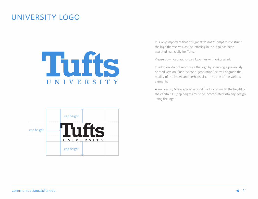
It is very important that designers do not attempt to construct the logo themselves, as the lettering in the logo has been sculpted especially for Tufts.
Please download authorized logo files with original art.
In addition, do not reproduce the logo by scanning a previously printed version. Such “second-generation” art will degrade the quality of the image and perhaps alter the scale of the various elements.
A mandatory “clear space” around the logo equal to the height of the capital “T” (cap height) must be incorporated into any design using the logo.
cap height
cap height
cap height
2.1
university logo
communications.tufts.edu
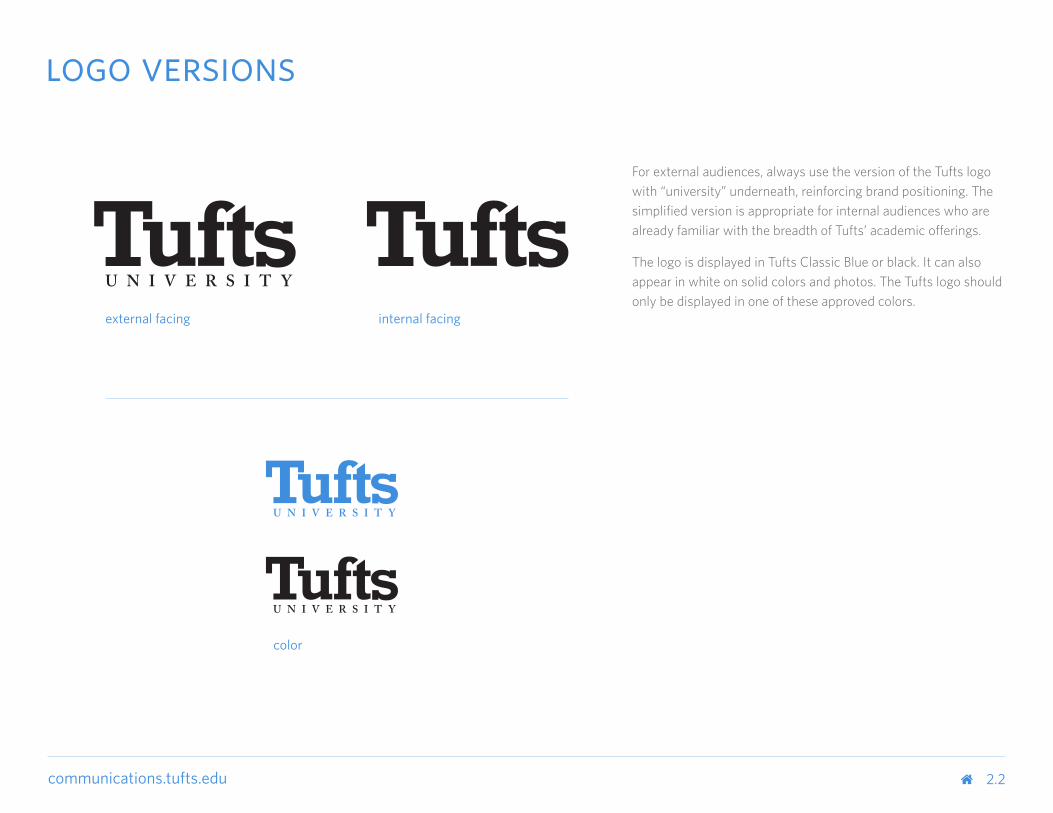
For external audiences, always use the version of the Tufts logo with “university” underneath, reinforcing brand positioning. The simplified version is appropriate for internal audiences who are already familiar with the breadth of Tufts’ academic offerings.
The logo is displayed in Tufts Classic Blue or black. It can also appear in white on solid colors and photos. The Tufts logo should only be displayed in one of these approved colors.
external facing
2.2
internal facing
logo versions
color
communications.tufts.edu
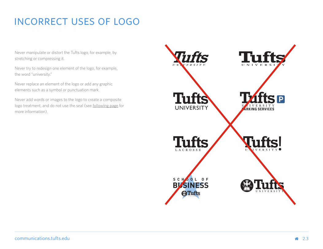
Never manipulate or distort the Tufts logo, for example, by stretching or compressing it.
Never try to redesign one element of the logo, for example, the word “university.”
Never replace an element of the logo or add any graphic elements such as a symbol or punctuation mark.
Never add words or images to the logo to create a composite logo treatment, and do not use the seal (see following page for more information).
2.3
incorrect uses of logo
communications.tufts.edu
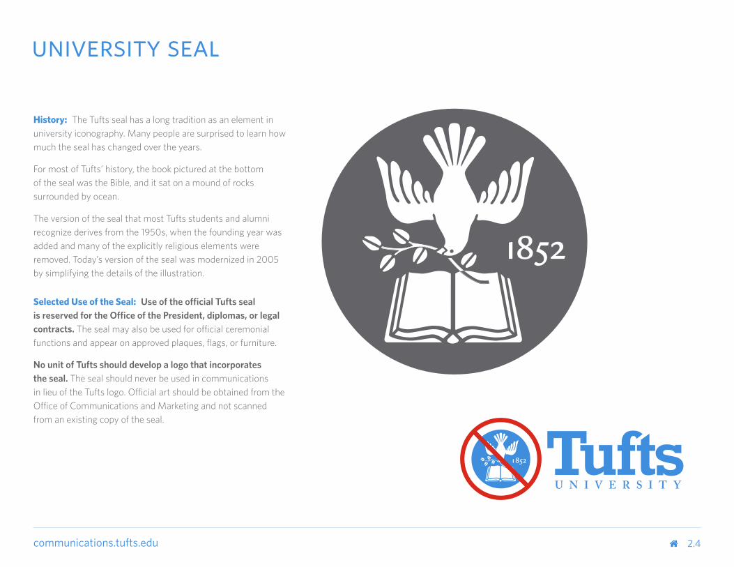
History: The Tufts seal has a long tradition as an element in university iconography. Many people are surprised to learn how much the seal has changed over the years.
For most of Tufts’ history, the book pictured at the bottom of the seal was the Bible, and it sat on a mound of rocks surrounded by ocean.
The version of the seal that most Tufts students and alumni recognize derives from the 1950s, when the founding year was added and many of the explicitly religious elements were removed. Today’s version of the seal was modernized in 2005 by simplifying the details of the illustration.
Selected Use of the Seal: Use of the official Tufts seal is reserved for the Office of the President, diplomas, or legal contracts. The seal may also be used for official ceremonial functions and appear on approved plaques, flags, or furniture.
No unit of Tufts should develop a logo that incorporates the seal. The seal should never be used in communications in lieu of the Tufts logo. Official art should be obtained from the Office of Communications and Marketing and not scanned from an existing copy of the seal.
2.4
university seal
communications.tufts.edu 2.5
branding guidelines hierarchy
Schools
Department / Program Department / Service
Center / Institute
Program
Administration / Division
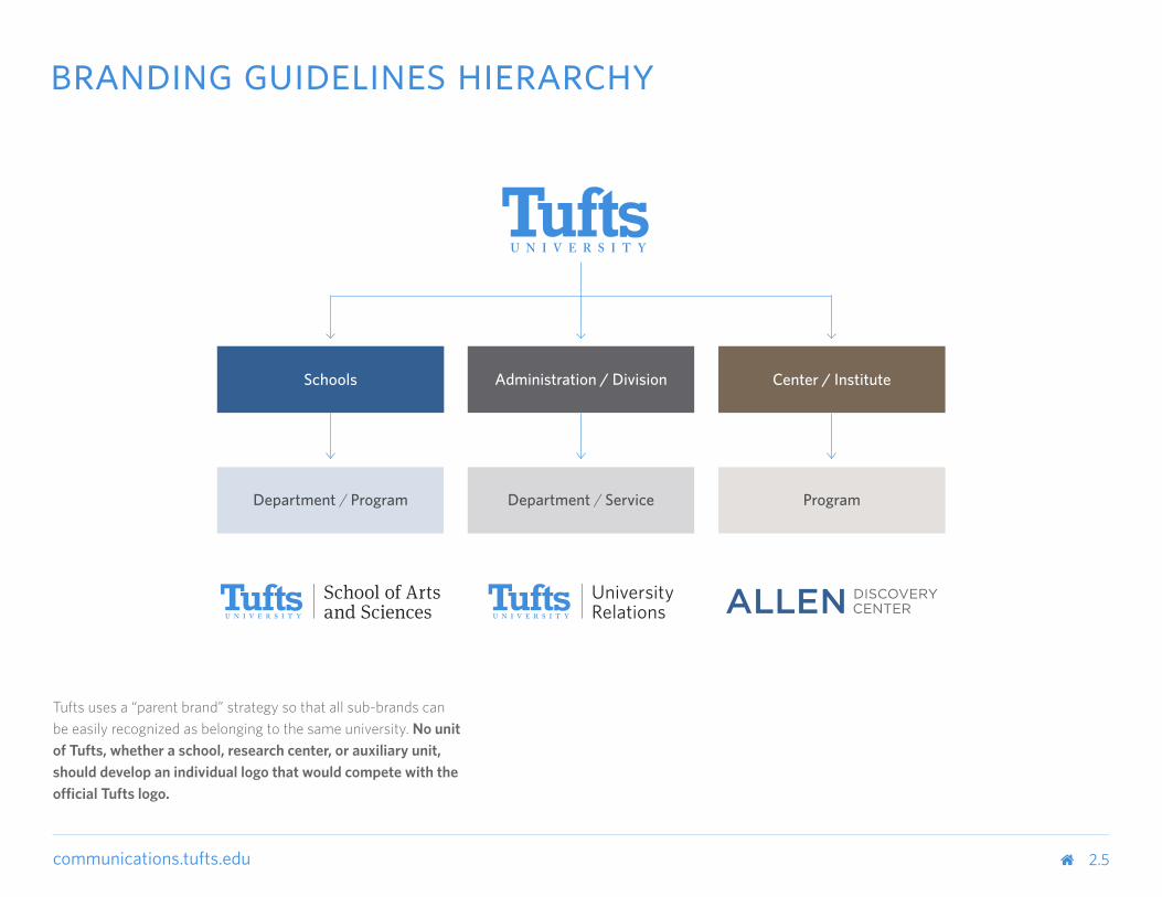
Tufts uses a “parent brand” strategy so that all sub-brands can be easily recognized as belonging to the same university. No unit of Tufts, whether a school, research center, or auxiliary unit, should develop an individual logo that would compete with the official Tufts logo.
communications.tufts.edu
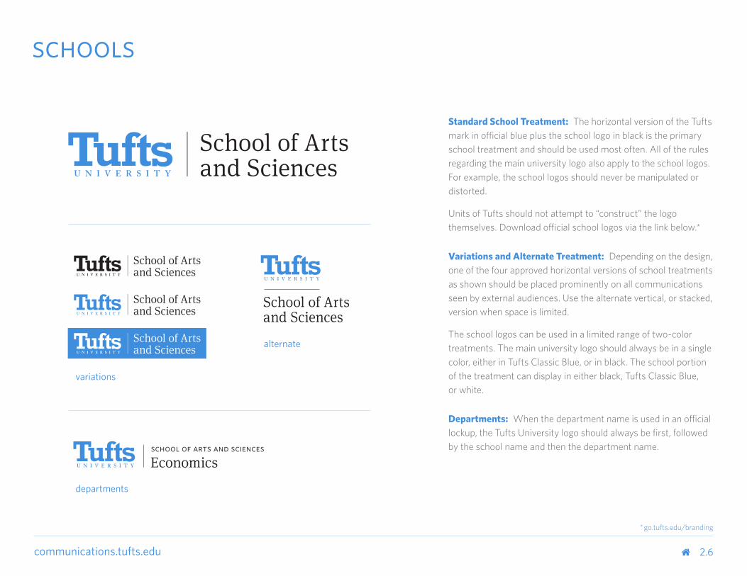
Standard School Treatment: The horizontal version of the Tufts mark in official blue plus the school logo in black is the primary school treatment and should be used most often. All of the rules regarding the main university logo also apply to the school logos. For example, the school logos should never be manipulated or distorted.
Units of Tufts should not attempt to “construct” the logo themselves. Download official school logos via the link below.*
Variations and Alternate Treatment: Depending on the design, one of the four approved horizontal versions of school treatments as shown should be placed prominently on all communications seen by external audiences. Use the alternate vertical, or stacked, version when space is limited.
The school logos can be used in a limited range of two-color treatments. The main university logo should always be in a single color, either in Tufts Classic Blue, or in black. The school portion of the treatment can display in either black, Tufts Classic Blue, or white.
Departments: When the department name is used in an official lockup, the Tufts University logo should always be first, followed by the school name and then the department name.
2.6
schools
variations
alternate
departments
* go.tufts.edu/branding
communications.tufts.edu
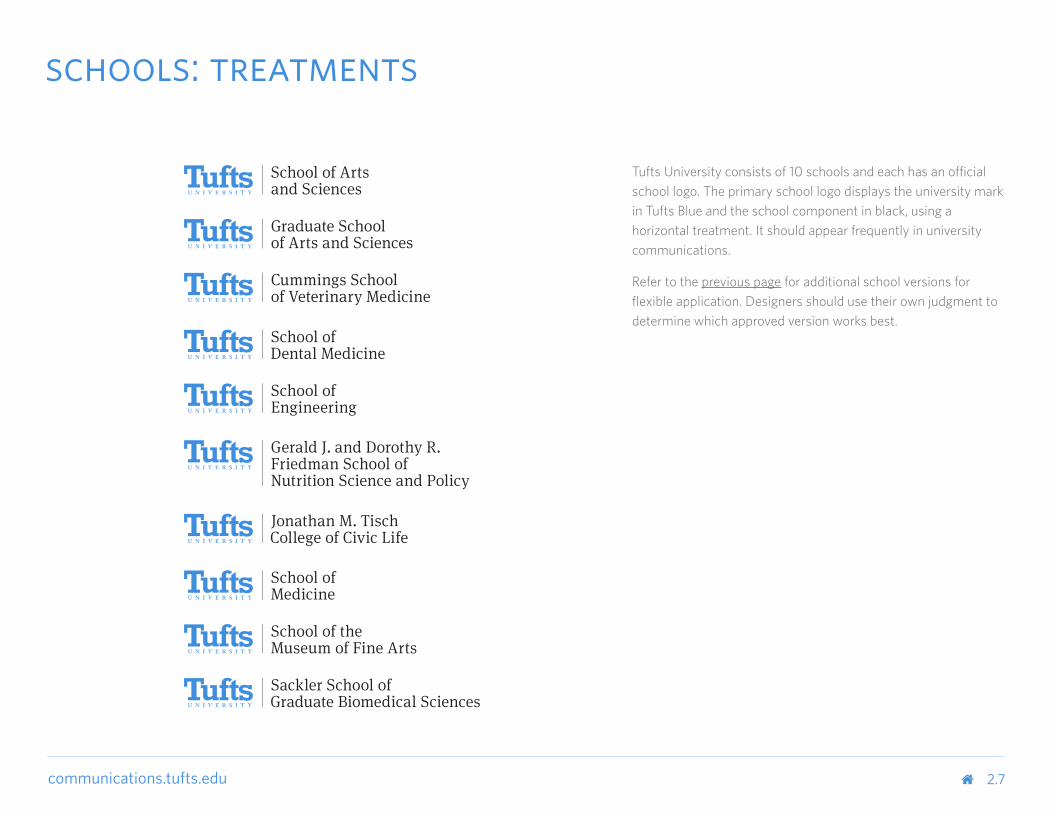
Tufts University consists of 10 schools and each has an official school logo. The primary school logo displays the university mark in Tufts Blue and the school component in black, using a horizontal treatment. It should appear frequently in university communications.
Refer to the previous page for additional school versions for flexible application. Designers should use their own judgment to determine which approved version works best.
2.7
schools: treatments
communications.tufts.edu
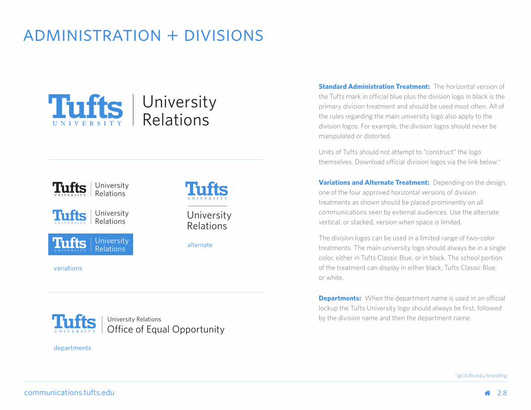
Standard Administration Treatment: The horizontal version of the Tufts mark in official blue plus the division logo in black is the primary division treatment and should be used most often. All of the rules regarding the main university logo also apply to the division logos. For example, the division logos should never be manipulated or distorted.
Units of Tufts should not attempt to “construct” the logo themselves. Download official division logos via the link below.*
Variations and Alternate Treatment: Depending on the design, one of the four approved horizontal versions of division treatments as shown should be placed prominently on all communications seen by external audiences. Use the alternate vertical, or stacked, version when space is limited.
The division logos can be used in a limited range of two-color treatments. The main university logo should always be in a single color, either in Tufts Classic Blue, or in black. The school portion of the treatment can display in either black, Tufts Classic Blue, or white.
Departments: When the department name is used in an official lockup the Tufts University logo should always be first, followed by the division name and then the department name.
administration + divisions
2.8
variations
departments
alternate
* go.tufts.edu/branding
communications.tufts.edu
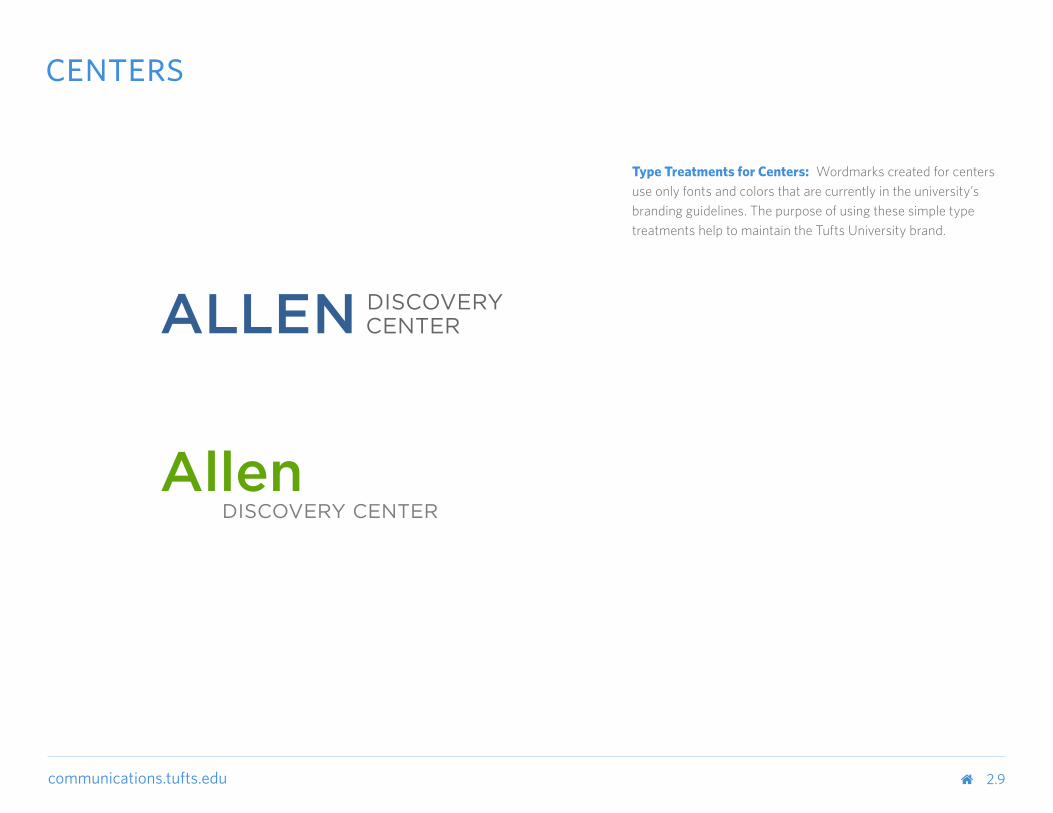
Type Treatments for Centers: Wordmarks created for centers use only fonts and colors that are currently in the university’s branding guidelines. The purpose of using these simple type treatments help to maintain the Tufts University brand.
centers
2.9

communications.tufts.edu 3.0
cobranding
communications.tufts.edu
communications.tufts.edu 3.1
university + center
cap height
100% of cap height
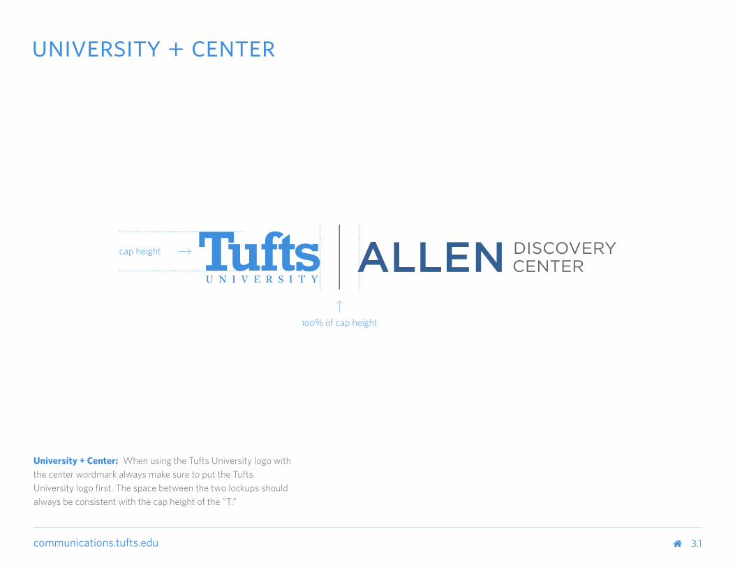
University + Center: When using the Tufts University logo with the center wordmark always make sure to put the Tufts University logo first. The space between the two lockups should always be consistent with the cap height of the “T.”
3.2
communications.tufts.edu 3.3
school + center
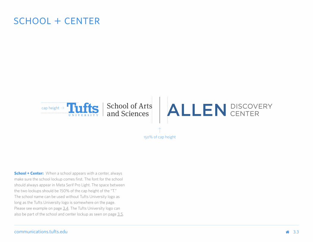
School + Center: When a school appears with a center, always make sure the school lockup comes first. The font for the school should always appear in Meta Serif Pro Light. The space between the two lockups should be 150% of the cap height of the “T.” The school name can be used without Tufts University logo as long as the Tufts University logo is somewhere on the page. Please see example on page 3.4. The Tufts University logo can also be part of the school and center lockup as seen on page 3.5.
cap height
150% of cap height
3.4

3.5

communications.tufts.edu 3.6
center: part of school
Center as Part of School: When the center is part of the school, always make sure to use the following heirarchy: Tufts University wordmark should come first, followed by the name of the school and then the center name. The school name can be used without Tufts University in the wordmark as long as the Tufts University wordmark is somewhere on the page. The font for the school should always appear in Meta Serif Pro Light. The font for the center should always appear in Whitney Semibold Small Caps. For an example of this treatment please refer to page 3.8.
3.7

3.8
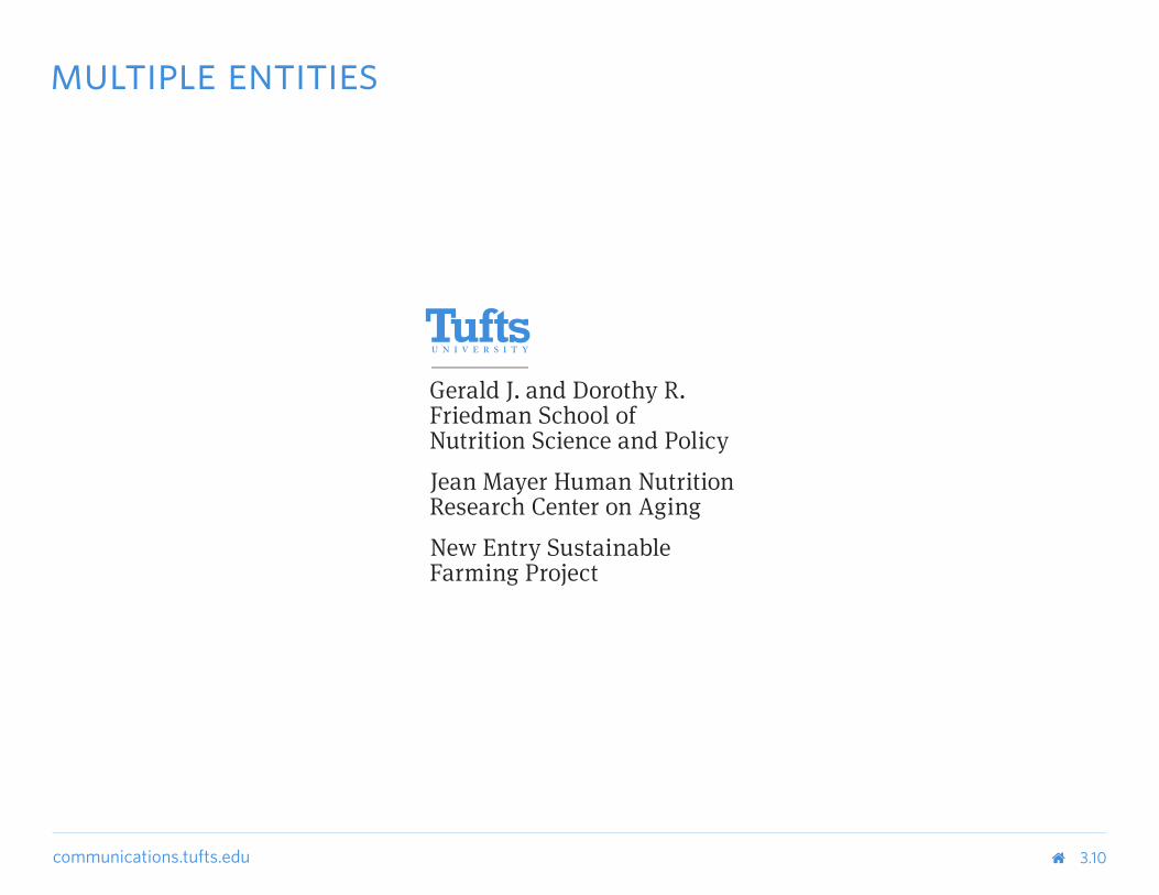
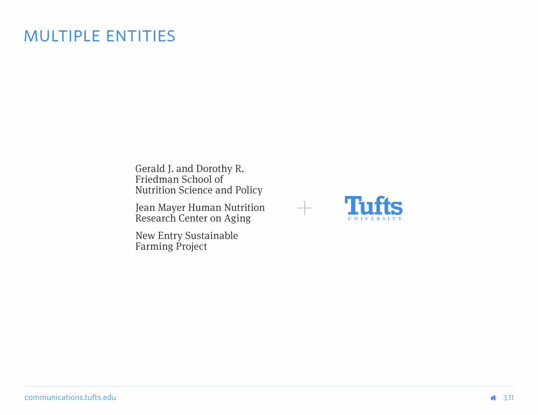
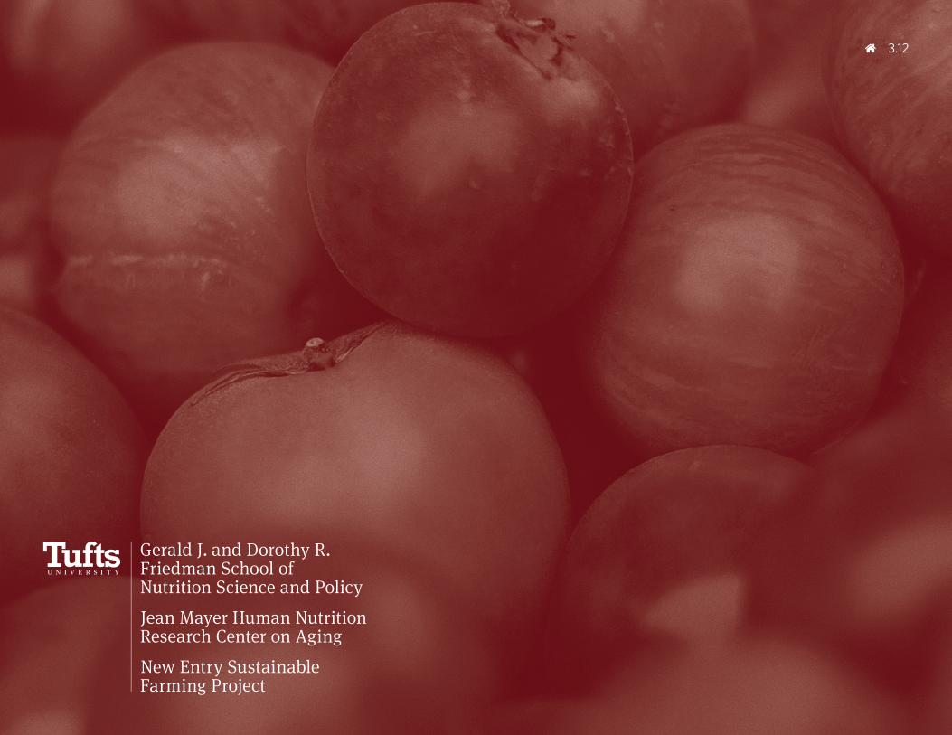
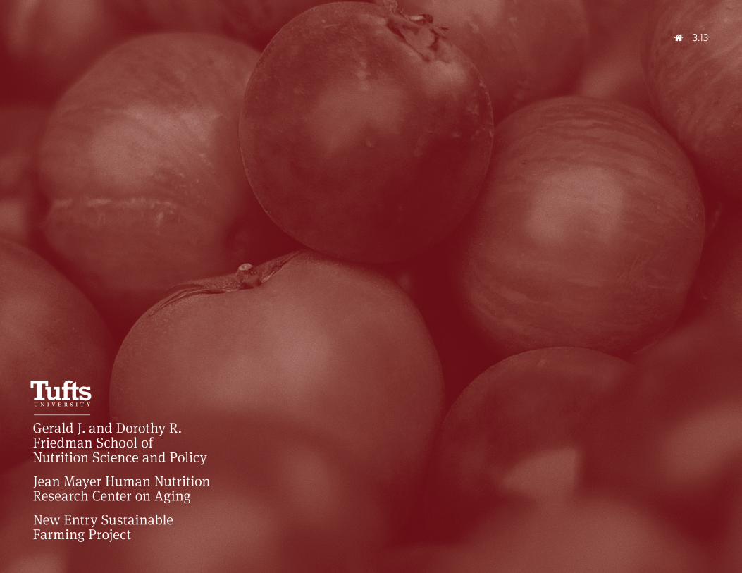
communications.tufts.edu 3.9
multiple entities
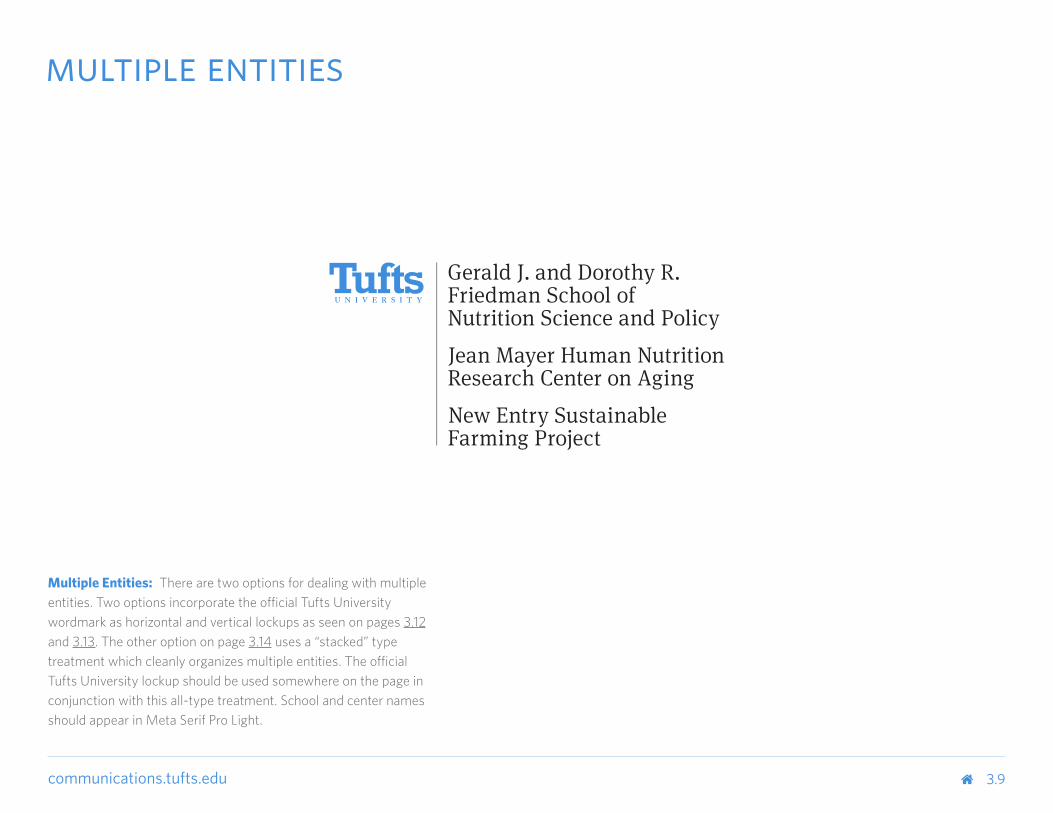
Multiple Entities: There are two options for dealing with multiple entities. Two options incorporate the official Tufts University wordmark as horizontal and vertical lockups as seen on pages 3.12 and 3.13. The other option on page 3.14 uses a “stacked” type treatment which cleanly organizes multiple entities. The official Tufts University lockup should be used somewhere on the page in conjunction with this all-type treatment. School and center names should appear in Meta Serif Pro Light.
communications.tufts.edu 3.10
multiple entities
communications.tufts.edu 3.11
multiple entities
3.12
communications.tufts.edu
3.13
3.14
communications.tufts.edu 3.15
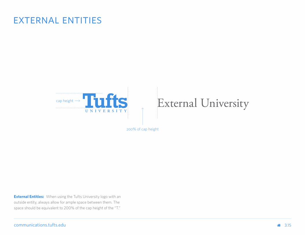
external entities
External Entities: When using the Tufts University logo with an outside entity, always allow for ample space between them. The space should be equivalent to 200% of the cap height of the “T.”
cap height
200% of cap height
3.16
communications.tufts.edu 4.0
color
communications.tufts.edu
communications.tufts.edu
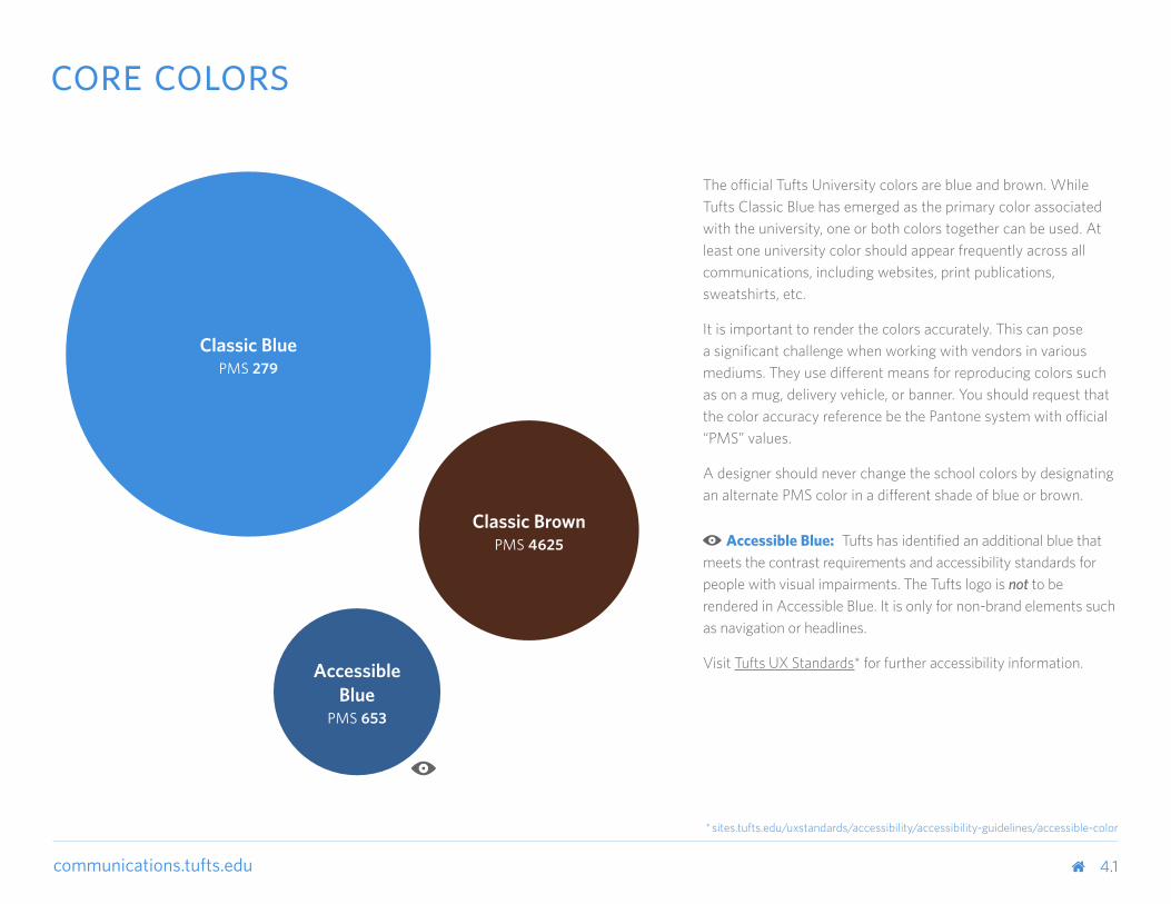
The official Tufts University colors are blue and brown. While Tufts Classic Blue has emerged as the primary color associated with the university, one or both colors together can be used. At least one university color should appear frequently across all communications, including websites, print publications, sweatshirts, etc.
It is important to render the colors accurately. This can pose a significant challenge when working with vendors in various mediums. They use different means for reproducing colors such as on a mug, delivery vehicle, or banner. You should request that the color accuracy reference be the Pantone system with official “PMS” values.
A designer should never change the school colors by designating an alternate PMS color in a different shade of blue or brown.
Accessible Blue: Tufts has identified an additional blue that meets the contrast requirements and accessibility standards for people with visual impairments. The Tufts logo is not to be rendered in Accessible Blue. It is only for non-brand elements such as navigation or headlines.
Visit Tufts UX Standards* for further accessibility information.
Classic BluePMS 279
Classic BrownPMS 4625
AccessibleBlue
PMS 653
* sites.tufts.edu/uxstandards/accessibility/accessibility-guidelines/accessible-color
4.1
core colors
communications.tufts.edu
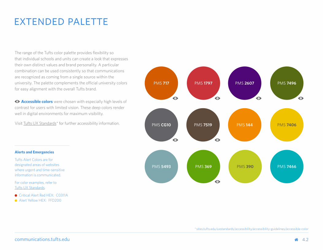
The range of the Tufts color palette provides flexibility so that individual schools and units can create a look that expresses their own distinct values and brand personality. A particular combination can be used consistently so that communications are recognized as coming from a single source within the university. The palette complements the official university colors for easy alignment with the overall Tufts brand.
Accessible colors were chosen with especially high levels of contrast for users with limited vision. These deep colors render well in digital environments for maximum visibility.
Visit Tufts UX Standards* for further accessibility information.
4.2
* sites.tufts.edu/uxstandards/accessibility/accessibility-guidelines/accessible-color
Alerts and Emergencies
Tufts Alert Colors are for designated areas of websites where urgent and time-sensitive information is communicated.
For color examples, refer to Tufts UX Standards.
Critical Alert Red HEX: C0311A Alert Yellow HEX: FFD200
extended palette
PMS 717 PMS 1797 PMS 7496PMS 2607
PMS CG10
PMS 5493
PMS 7406PMS 144
PMS 369 PMS 390 PMS 7466
PMS 7519
communications.tufts.edu
PMS 279 PMS 7519
PMS 4625 PMS 144
PMS 653 PMS 7406
PMS 717 PMS 5493
PMS 1797 PMS 369
PMS 2607 PMS 390
PMS 7496 PMS 7466
PMS CG10
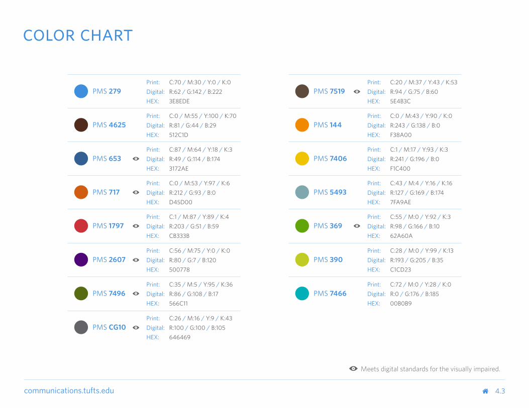
Meets digital standards for the visually impaired.
Print: C:70 / M:30 / Y:0 / K:0Digital: R:62 / G:142 / B:222HEX: 3E8EDE
Print: C:20 / M:37 / Y:43 / K:53Digital: R:94 / G:75 / B:60HEX: 5E4B3C
Print: C:0 / M:55 / Y:100 / K:70Digital: R:81 / G:44 / B:29HEX: 512C1D
Print: C:0 / M:43 / Y:90 / K:0Digital: R:243 / G:138 / B:0HEX: F38A00
Print: C:87 / M:64 / Y:18 / K:3Digital: R:49 / G:114 / B:174HEX: 3172AE
Print: C:1 / M:17 / Y:93 / K:3Digital: R:241 / G:196 / B:0HEX: F1C400
Print: C:0 / M:53 / Y:97 / K:6Digital: R:212 / G:93 / B:0HEX: D45D00
Print: C:43 / M:4 / Y:16 / K:16Digital: R:127 / G:169 / B:174HEX: 7FA9AE
Print: C:1 / M:87 / Y:89 / K:4Digital: R:203 / G:51 / B:59HEX: CB333B
Print: C:55 / M:0 / Y:92 / K:3Digital: R:98 / G:166 / B:10HEX: 62A60A
Print: C:56 / M:75 / Y:0 / K:0Digital: R:80 / G:7 / B:120HEX: 500778
Print: C:28 / M:0 / Y:99 / K:13Digital: R:193 / G:205 / B:35HEX: C1CD23
Print: C:35 / M:5 / Y:95 / K:36Digital: R:86 / G:108 / B:17HEX: 566C11
Print: C:72 / M:0 / Y:28 / K:0Digital: R:0 / G:176 / B:185HEX: 00B0B9
Print: C:26 / M:16 / Y:9 / K:43Digital: R:100 / G:100 / B:105HEX: 646469
4.3
color chart
communications.tufts.edu 5.0
type
communications.tufts.edu
communications.tufts.edu
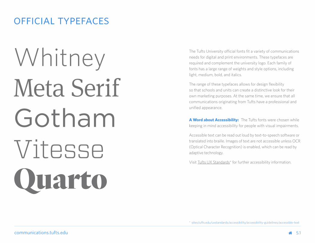
The Tufts University official fonts fit a variety of communications needs for digital and print environments. These typefaces are required and complement the university logo. Each family of fonts has a large range of weights and style options, including light, medium, bold, and italics.
The range of these typefaces allows for design flexibility so that schools and units can create a distinctive look for their own marketing purposes. At the same time, we ensure that all communications originating from Tufts have a professional and unified appearance.
A Word about Accessibility: The Tufts fonts were chosen while keeping in mind accessibility for people with visual impairments.
Accessible text can be read out loud by text-to-speech software or translated into braille. Images of text are not accessible unless OCR (Optical Character Recognition) is enabled, which can be read by adaptive technology.
Visit Tufts UX Standards* for further accessibility information.
5.1
* sites.tufts.edu/uxstandards/accessibility/accessibility-guidelines/accessible-text
official typefaces
WhitneyMeta SerifGothamVitesseQuarto
communications.tufts.edu
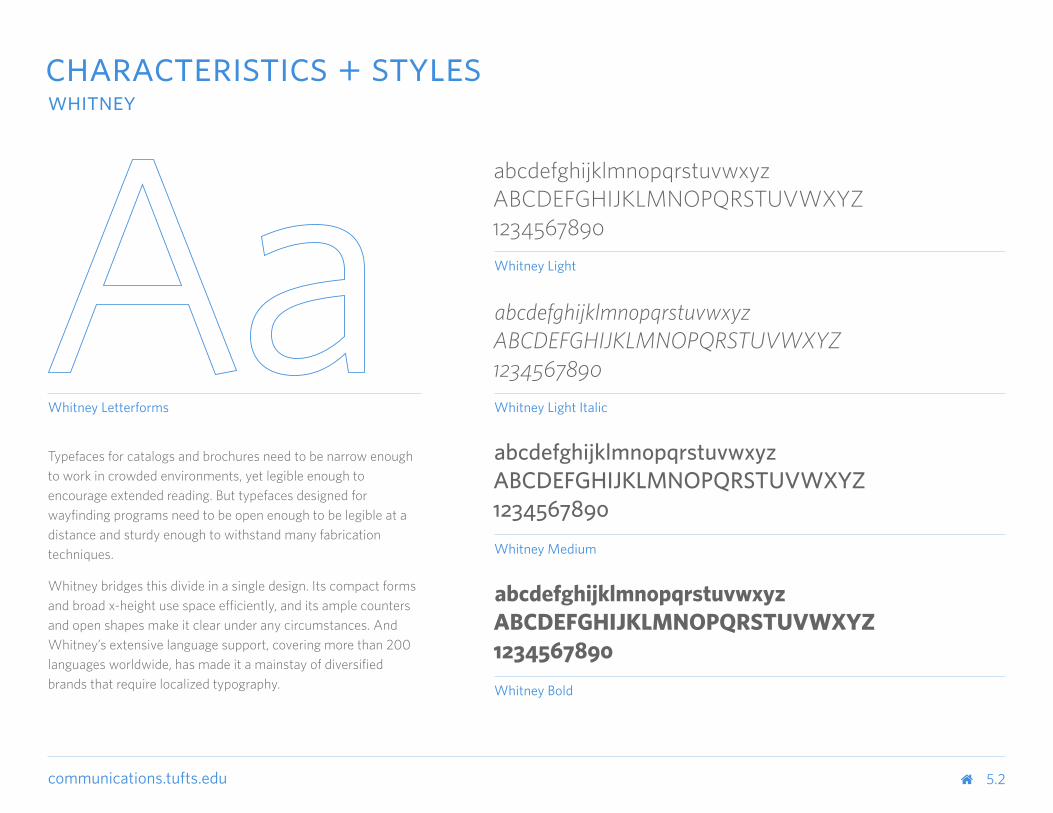
Whitney Letterforms
Typefaces for catalogs and brochures need to be narrow enough to work in crowded environments, yet legible enough to encourage extended reading. But typefaces designed for wayfinding programs need to be open enough to be legible at a distance and sturdy enough to withstand many fabrication techniques.
Whitney bridges this divide in a single design. Its compact forms and broad x-height use space efficiently, and its ample counters and open shapes make it clear under any circumstances. And Whitney’s extensive language support, covering more than 200 languages worldwide, has made it a mainstay of diversified brands that require localized typography.
5.2
abcdefghijklmnopqrstuvwxyzABCDEFGHIJKLMNOPQRSTUVWXYZ1234567890
abcdefghijklmnopqrstuvwxyzABCDEFGHIJKLMNOPQRSTUVWXYZ1234567890
abcdefghijklmnopqrstuvwxyzABCDEFGHIJKLMNOPQRSTUVWXYZ1234567890
abcdefghijklmnopqrstuvwxyzABCDEFGHIJKLMNOPQRSTUVWXYZ1234567890
Whitney Light
Whitney Light Italic
Whitney Medium
Whitney Bold
characteristics + styleswhitney
communications.tufts.edu
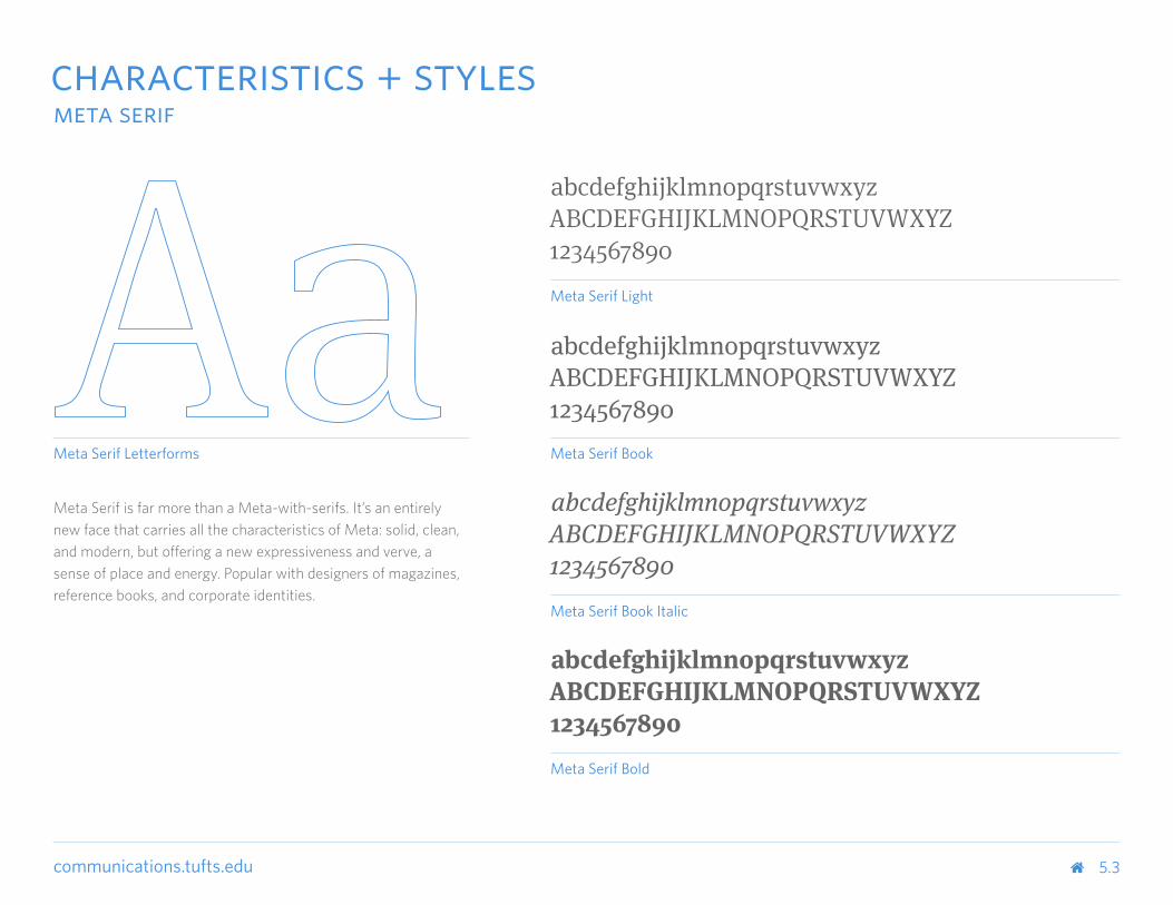
Meta Serif Letterforms
Meta Serif is far more than a Meta-with-serifs. It’s an entirely new face that carries all the characteristics of Meta: solid, clean, and modern, but offering a new expressiveness and verve, a sense of place and energy. Popular with designers of magazines, reference books, and corporate identities.
5.3
abcdefghijklmnopqrstuvwxyzABCDEFGHIJKLMNOPQRSTUVWXYZ1234567890
abcdefghijklmnopqrstuvwxyzABCDEFGHIJKLMNOPQRSTUVWXYZ1234567890
abcdefghijklmnopqrstuvwxyzABCDEFGHIJKLMNOPQRSTUVWXYZ1234567890
Meta Serif Light
Meta Serif Book
Meta Serif Book Italic
Meta Serif Bold
abcdefghijklmnopqrstuvwxyzABCDEFGHIJKLMNOPQRSTUVWXYZ1234567890
characteristics + stylesmeta serif
communications.tufts.edu
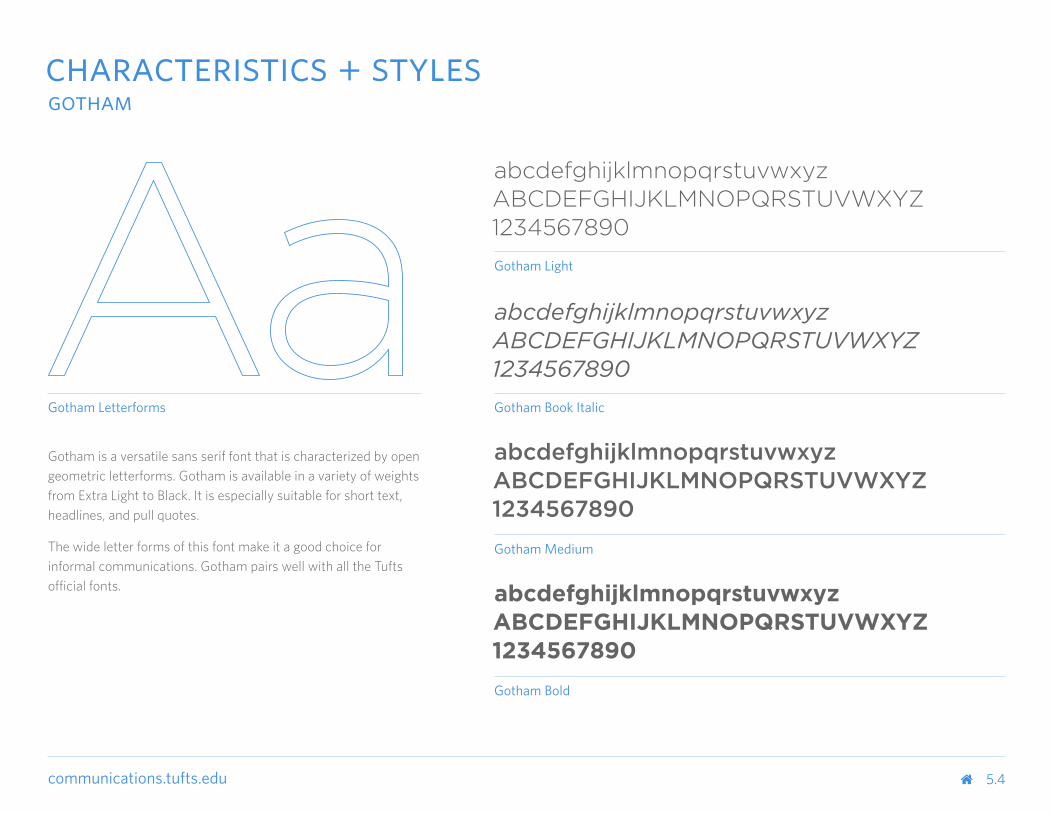
Gotham Letterforms
5.4
abcdefghijklmnopqrstuvwxyzABCDEFGHIJKLMNOPQRSTUVWXYZ1234567890
abcdefghijklmnopqrstuvwxyzABCDEFGHIJKLMNOPQRSTUVWXYZ1234567890
abcdefghijklmnopqrstuvwxyzABCDEFGHIJKLMNOPQRSTUVWXYZ1234567890
abcdefghijklmnopqrstuvwxyzABCDEFGHIJKLMNOPQRSTUVWXYZ1234567890
Gotham Light
Gotham Book Italic
Gotham Medium
Gotham Bold
Gotham is a versatile sans serif font that is characterized by open geometric letterforms. Gotham is available in a variety of weights from Extra Light to Black. It is especially suitable for short text, headlines, and pull quotes.
The wide letter forms of this font make it a good choice for informal communications. Gotham pairs well with all the Tufts official fonts.
characteristics + stylesgotham
communications.tufts.edu
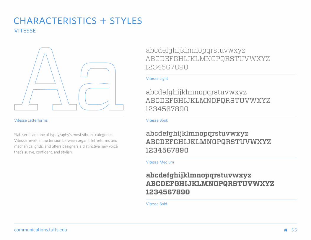
Vitesse Letterforms
5.5
abcdefghijklmnopqrstuvwxyzABCDEFGHIJKLMNOPQRSTUVWXYZ1234567890
abcdefghijklmnopqrstuvwxyzABCDEFGHIJKLMNOPQRSTUVWXYZ1234567890
abcdefghijklmnopqrstuvwxyzABCDEFGHIJKLMNOPQRSTUVWXYZ1234567890
abcdefghijklmnopqrstuvwxyzABCDEFGHIJKLMNOPQRSTUVWXYZ1234567890
Vitesse Light
Vitesse Book
Vitesse Medium
Vitesse Bold
Slab serifs are one of typography’s most vibrant categories. Vitesse revels in the tension between organic letterforms and mechanical grids, and offers designers a distinctive new voice that’s suave, confident, and stylish.
characteristics + stylesvitesse
communications.tufts.edu
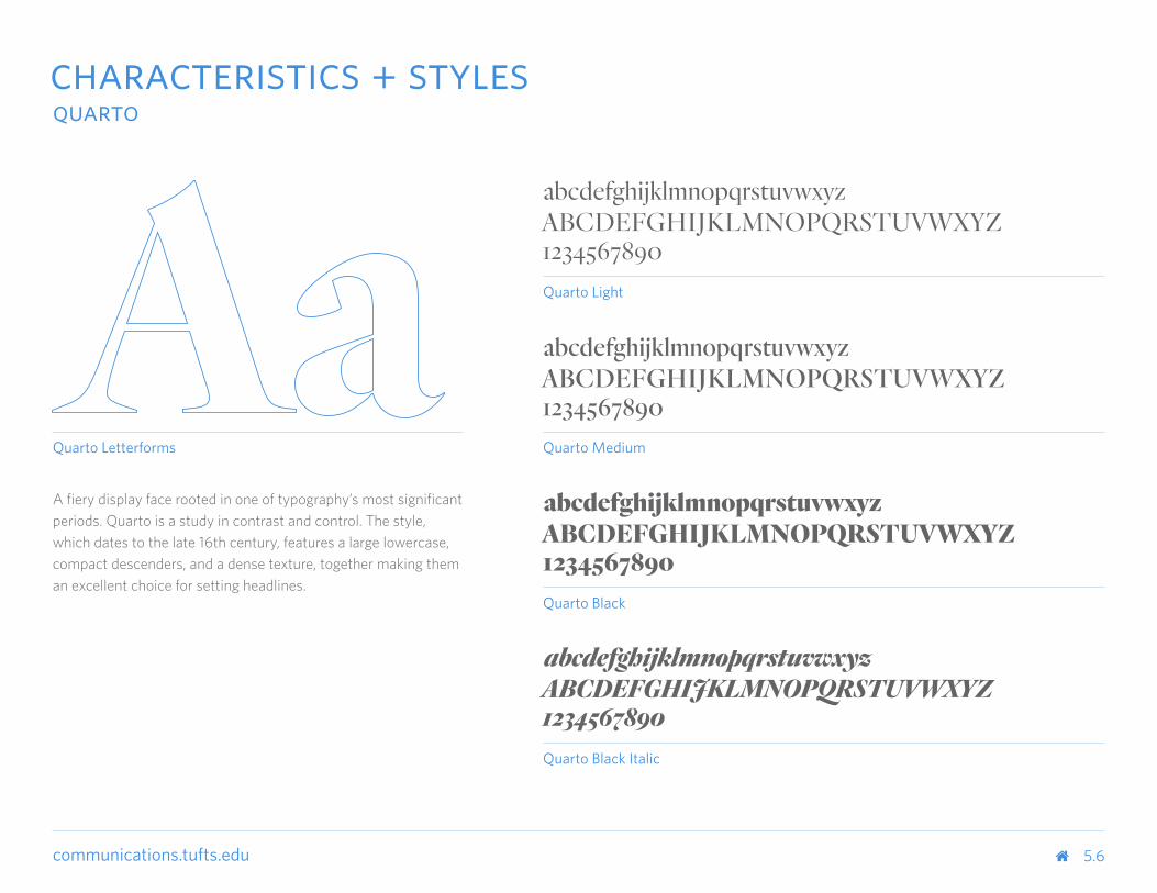
A fiery display face rooted in one of typography’s most significant periods. Quarto is a study in contrast and control. The style, which dates to the late 16th century, features a large lowercase, compact descenders, and a dense texture, together making them an excellent choice for setting headlines.
Quarto Letterforms
5.6
abcdefghijklmnopqrstuvwxyzABCDEFGHIJKLMNOPQRSTUVWXYZ1234567890
abcdefghijklmnopqrstuvwxyzABCDEFGHIJKLMNOPQRSTUVWXYZ1234567890
abcdefghijklmnopqrstuvwxyzABCDEFGHIJKLMNOPQRSTUVWXYZ1234567890
abcdefghijklmnopqrstuvwxyzABCDEFGHIJKLMNOPQRSTUVWXYZ1234567890
Quarto Light
Quarto Medium
Quarto Black
Quarto Black Italic
characteristics + stylesquarto

communications.tufts.edu 6.0
stationery
communications.tufts.edu
communications.tufts.edu
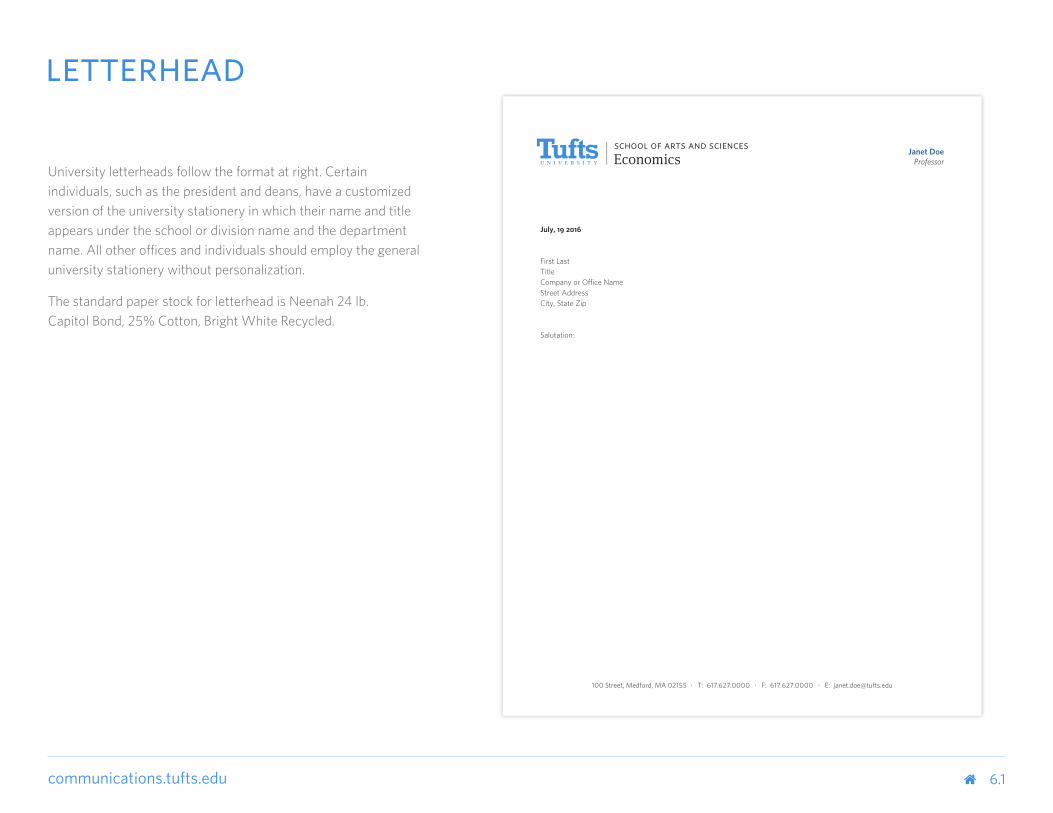
Janet DoeProfessor
July, 19 2016
First LastTitleCompany or Office NameStreet AddressCity, State Zip
Salutation:
100 Street, Medford, MA 02155 • T: 617.627.0000 • F: 617.627.0000 • E: [email protected]
University letterheads follow the format at right. Certain individuals, such as the president and deans, have a customized version of the university stationery in which their name and title appears under the school or division name and the department name. All other offices and individuals should employ the general university stationery without personalization.
The standard paper stock for letterhead is Neenah 24 lb. Capitol Bond, 25% Cotton, Bright White Recycled.
6.1
letterhead
communications.tufts.edu
Janet DoeProfessor
July, 19 2016
First LastTitleCompany or Office NameStreet AddressCity, State Zip
Salutation:
100 Street, Medford, MA 02155 • T: 617.627.0000 • F: 617.627.0000 • E: [email protected]
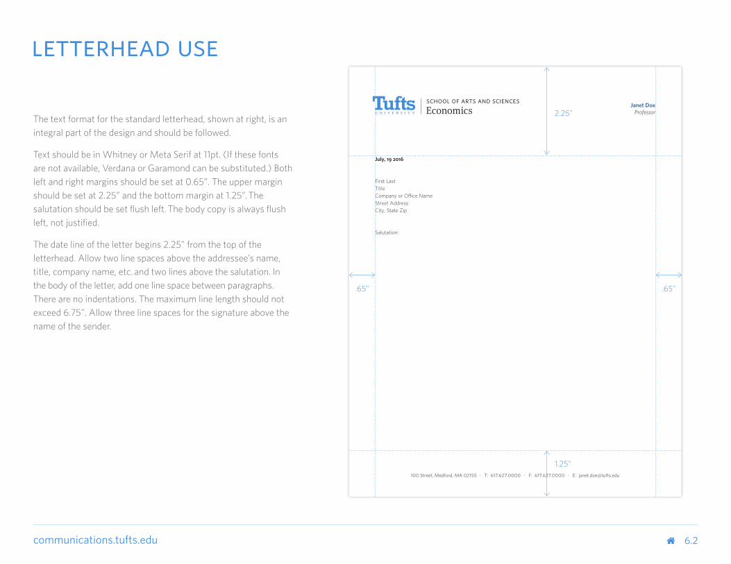
The text format for the standard letterhead, shown at right, is an integral part of the design and should be followed.
Text should be in Whitney or Meta Serif at 11pt. (If these fonts are not available, Verdana or Garamond can be substituted.) Both left and right margins should be set at 0.65”. The upper margin should be set at 2.25” and the bottom margin at 1.25”. The salutation should be set flush left. The body copy is always flush left, not justified.
The date line of the letter begins 2.25" from the top of the letterhead. Allow two line spaces above the addressee’s name, title, company name, etc. and two lines above the salutation. In the body of the letter, add one line space between paragraphs. There are no indentations. The maximum line length should not exceed 6.75". Allow three line spaces for the signature above the name of the sender.
2.25"
1.25"
.65" .65"
6.2
letterhead use
communications.tufts.edu
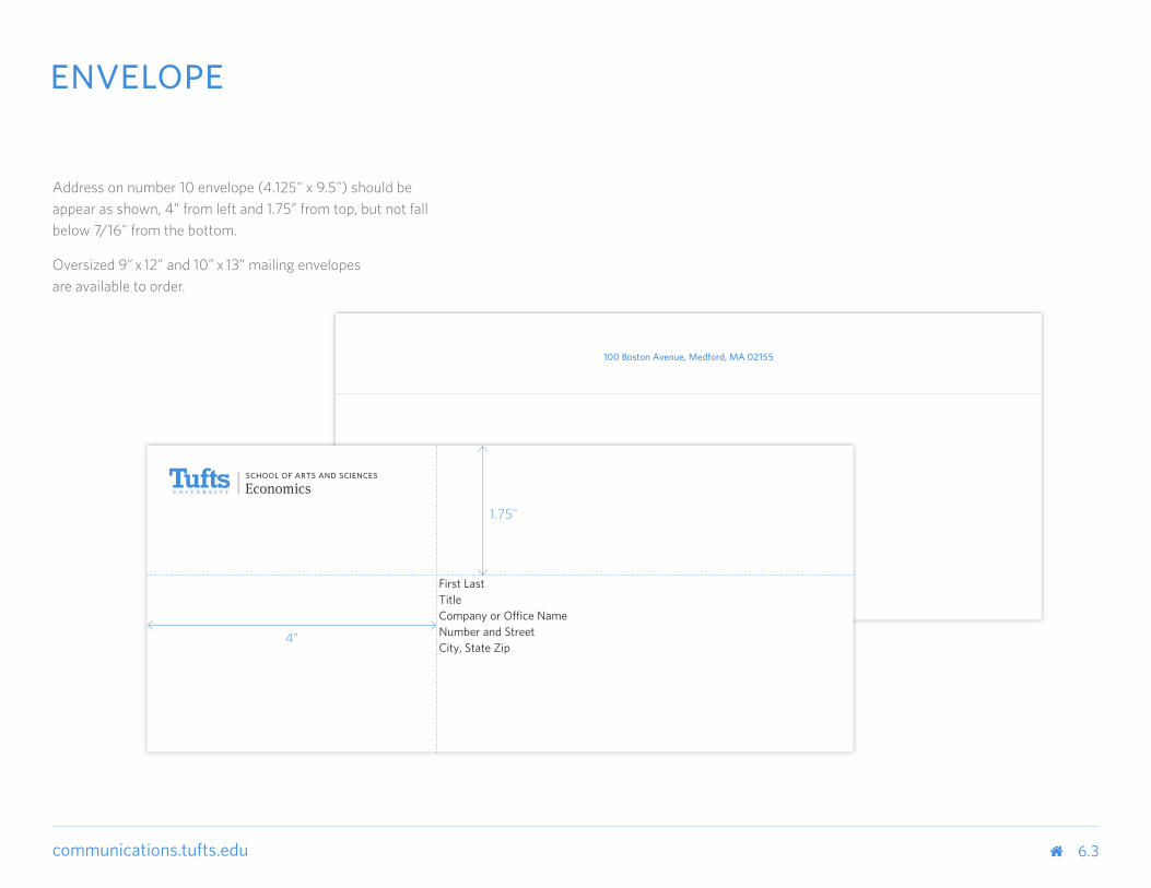
Address on number 10 envelope (4.125" x 9.5") should be appear as shown, 4” from left and 1.75” from top, but not fall below 7/16" from the bottom.
Oversized 9” x 12” and 10” x 13” mailing envelopes are available to order.
100 Boston Avenue, Medford, MA 02155
First LastTitleCompany or Office NameNumber and StreetCity, State Zip
4"
1.75"
6.3
envelope

communications.tufts.edu
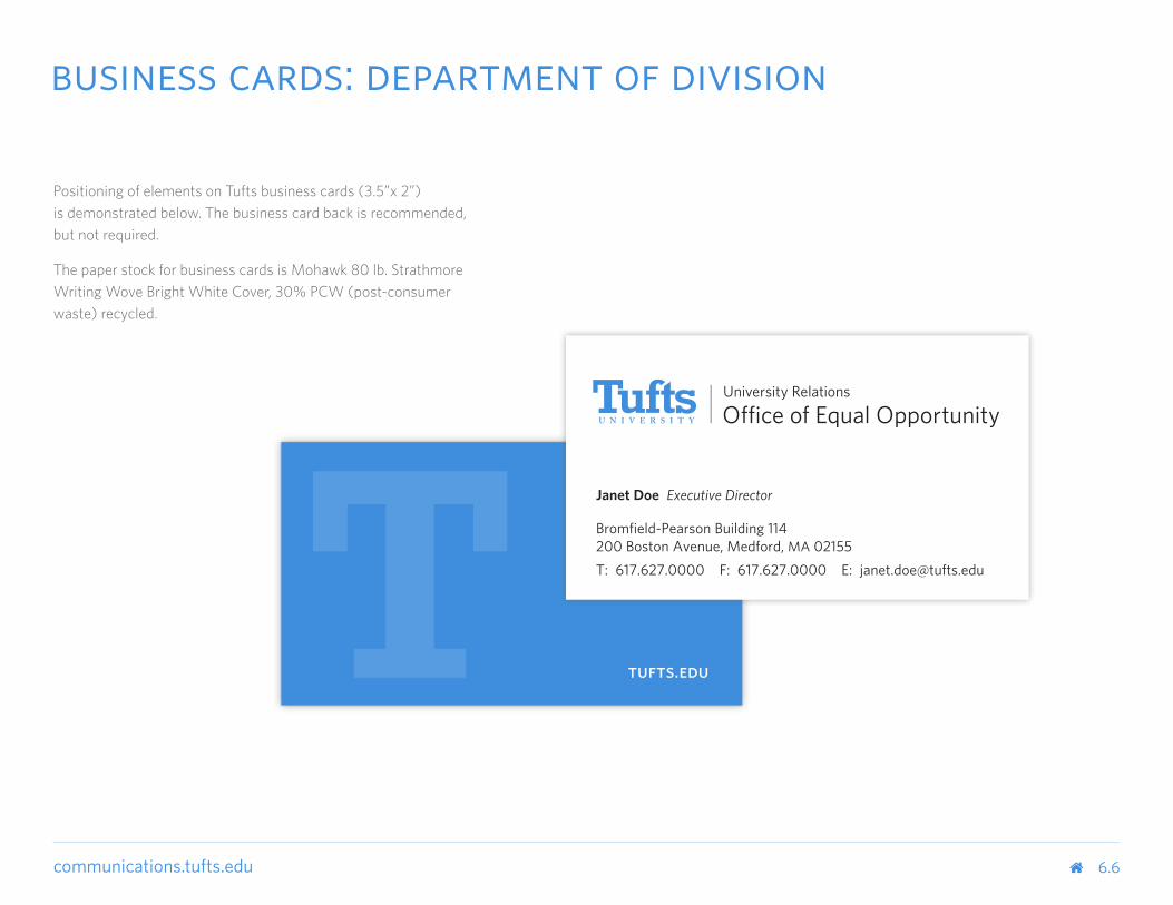
Positioning of elements on Tufts business cards (3.5”x 2”) is demonstrated below. The business card back is recommended, but not required.
The paper stock for business cards is Mohawk 80 lb. Strathmore Writing Wove Bright White Cover, 30% PCW (post-consumer waste) recycled.
6.4
business cards: school
tufts.edu
Janet Doe ProfessorEconomics
Bromfield-Pearson Building 114200 Boston Avenue, Medford, MA 02155T: 617.627.0000 F: 617.627.0000 E: [email protected]

communications.tufts.edu
Positioning of elements on Tufts business cards (3.5”x 2”) is demonstrated below. The business card back is recommended, but not required.
The paper stock for business cards is Mohawk 80 lb. Strathmore Writing Wove Bright White Cover, 30% PCW (post-consumer waste) recycled.
6.5
business cards: department of school
tufts.edu
Janet Doe Professor
Bromfield-Pearson Building 114200 Boston Avenue, Medford, MA 02155T: 617.627.0000 F: 617.627.0000 E: [email protected]
communications.tufts.edu
Positioning of elements on Tufts business cards (3.5”x 2”) is demonstrated below. The business card back is recommended, but not required.
The paper stock for business cards is Mohawk 80 lb. Strathmore Writing Wove Bright White Cover, 30% PCW (post-consumer waste) recycled.
6.6
business cards: department of division
tufts.edu
Janet Doe Executive Director
Bromfield-Pearson Building 114200 Boston Avenue, Medford, MA 02155T: 617.627.0000 F: 617.627.0000 E: [email protected]

communications.tufts.edu
signage
communications.tufts.edu 7.0
communications.tufts.edu 7.1
exterior signage
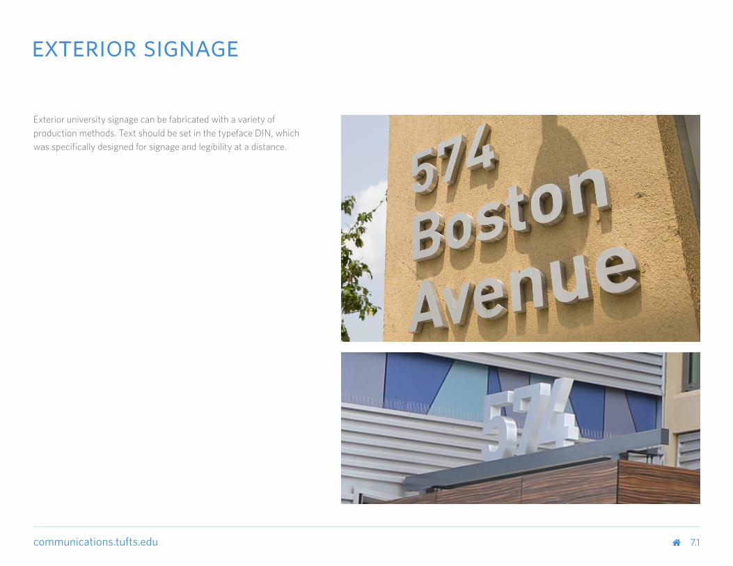
Exterior university signage can be fabricated with a variety of production methods. Text should be set in the typeface DIN, which was specifically designed for signage and legibility at a distance.
communications.tufts.edu
TUFTS UNIVERSITY SEC I ENVIRONMENTAL GRAPHICS I OMLOOP 08 DECEMBER 2015Schematic Design PAGE 11
LEVEL 1 LOBBY EXPERIENCE
School of Engineering
ANDERSON HALL L1
1Elevation: Anderson Entry Level 1
Scale: 1/4”=1’0” Type DI
1ANDERSON HALL
SCHOOL OF ENGINEERING
School of EngineeringDeans’ Offices
Nelson Auditorium
Burden Lounge
Civil & EnvironmentalEngineering
1 ANDERSON HALL
Science andEngineeringComplex
1Elevation: Anderson Entry Level 1
Scale: 1/4”=1’0” Type DI
1ANDERSON HALL
SCHOOL OF ENGINEERING
School of EngineeringDeans’ Offices
Nelson Auditorium
Burden Lounge
Civil & EnvironmentalEngineering
1 ANDERSON HALL
Science andEngineeringComplex
1Elevation: Anderson Entry Level 1
Scale: 1/4”=1’0” Type DI
1ANDERSON HALL
SCHOOL OF ENGINEERING
School of EngineeringDeans’ Offices
Nelson Auditorium
Burden Lounge
Civil & EnvironmentalEngineering
1 ANDERSON HALL
Science andEngineeringComplex
A N D E R S O NR O B I N S O N
E A S TW E S T
1,2,3 CollegeAvenueEntry
7.2
interior signage
TUFTS UNIVERSITY SEC I ENVIRONMENTAL GRAPHICS I OMLOOP 08 DECEMBER 2015Schematic Design PAGE 11
LEVEL 1 LOBBY EXPERIENCE
School of Engineering
ANDERSON HALL L1
1Elevation: Anderson Entry Level 1
Scale: 1/4”=1’0” Type DI
1ANDERSON HALL
SCHOOL OF ENGINEERING
School of EngineeringDeans’ Offices
Nelson Auditorium
Burden Lounge
Civil & EnvironmentalEngineering
1 ANDERSON HALL
Science andEngineeringComplex
1Elevation: Anderson Entry Level 1
Scale: 1/4”=1’0” Type DI
1ANDERSON HALL
SCHOOL OF ENGINEERING
School of EngineeringDeans’ Offices
Nelson Auditorium
Burden Lounge
Civil & EnvironmentalEngineering
1 ANDERSON HALL
Science andEngineeringComplex
1Elevation: Anderson Entry Level 1
Scale: 1/4”=1’0” Type DI
1ANDERSON HALL
SCHOOL OF ENGINEERING
School of EngineeringDeans’ Offices
Nelson Auditorium
Burden Lounge
Civil & EnvironmentalEngineering
1 ANDERSON HALL
Science andEngineeringComplex
A N D E R S O NR O B I N S O N
E A S TW E S T
1,2,3 CollegeAvenueEntry
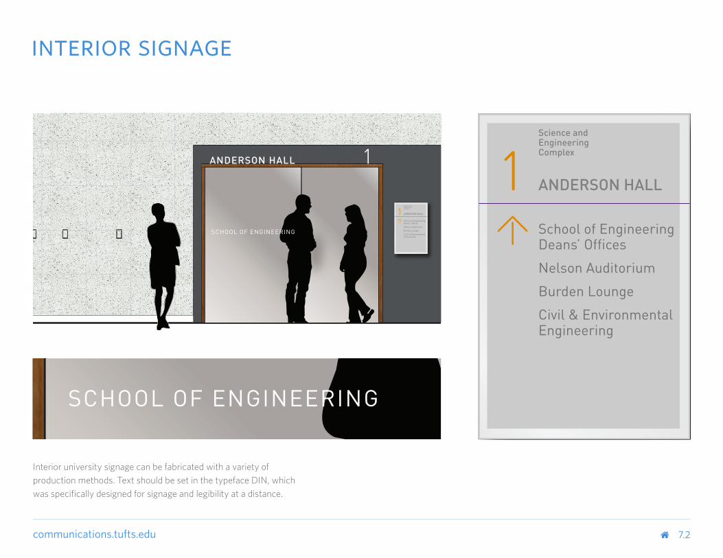
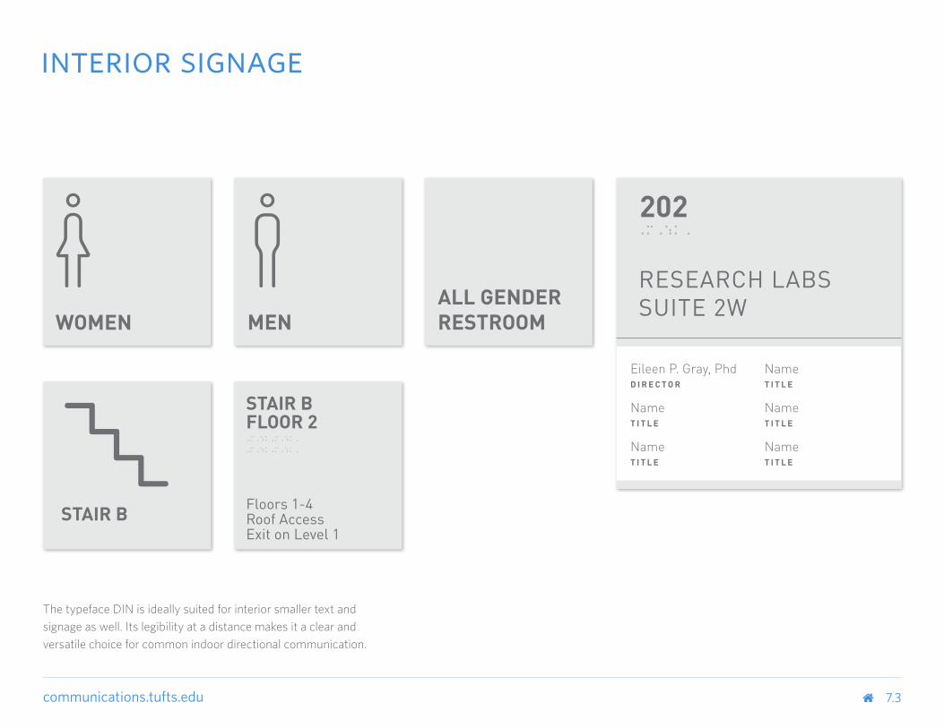
Interior university signage can be fabricated with a variety of production methods. Text should be set in the typeface DIN, which was specifically designed for signage and legibility at a distance.
communications.tufts.edu 7.3
interior signage
The typeface DIN is ideally suited for interior smaller text and signage as well. Its legibility at a distance makes it a clear and versatile choice for common indoor directional communication.
communications.tufts.edu
Download Logoscommunications.tufts.edu/marketing-and-branding/brand-guides-and-logos/download-logos
Social Media Policycommunications.tufts.edu/policies-guidelines/tuftssocialmediapolicy
Tufts’ Missiontufts.edu/about/mission-vision
Tufts Photographytuftsphoto.photoshelter.com
Usability (UX) and Accessibility Standardssites.tufts.edu/uxstandards
8.0
resources
communications.tufts.edu
communications.tufts.edu
©2016 Tufts University Marketing Communications
Tufts University Communications and Marketing / September 2016 Clapp Design, Boston, MA
communications.tufts.edu


![Branding guidelines [spanish]](https://img.pdfslide.net/doc/110x75/568bdefb1a28ab2034bb72a2/branding-guidelines-spanish.jpg)