Embed Size (px)
Citation preview

Brand and Identity GuidelinesFoundational Branding Guidelines 1.01
Foundational branding guidelines
The elements of the National Geographic branding guidelines give the new sub-brand a distinctive and memorable look and feel, which capitalizes on National Geographic’s high-profile and globally recognized brand and logo, and also ensures consistency in the application of the Cengage Learning identity to our communications.
Read these guidelines carefully to understand how the National Geographic Learning logo, color palette, and typography work together with Cengage Learning’s brand identity to express our position as the “center of engagement” and keep our branding clear and consistent across the organization and to our customers worldwide.
NEW! Cengage Learning recently registered the Cengage Learning brand with the U.S. Patent and Trademark Office. This change carries many benefits for the business, but also means that our logos, which previously had a ™ (TM) mark applied, will now carry the standard ® (R) symbol. Please be advised that a new set of logos has been posted to the Resource Center under “Logo Files.”
Good to knowYou can find answers to
your branding questions
about other Cengage
Learning sub-brands at
the National Geographic
Learning Resource Center,
which can be accessed at:
http://inside/sites/corp/
comm/branding/NGL
Foundational branding guidelines 1.01
Corporate logo 1.02
Logo color variations 1.03
Incorrect usage examples 1.04
Transition • From Heinle ELT to National
Geographic Learning 1.05
Sub-brand logo color variations 1.06
Sub-brand logos 1.07
Size and clear space 1.08
Corporate color palette 1.09
Typography 1.10
Branding band usage • No band 1.11
• Band options 1.12
Co-branding • With or without band 1.13
Permitted use of NationalGeographic Housemark 1.14
Permitted use of NationalGeographic Housemark • Examples 1.15
Language standards • National Geographic Learning 1.16
• National Geographic Learning 1.17
• Sub-brands 1.18
• Sub-brands 1.19
Brand and Identity GuidelinesFoundational Branding Guidelines 1.02
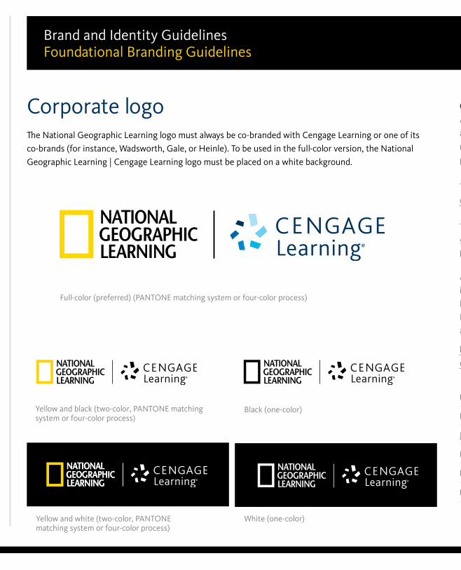
Corporate logoThe National Geographic Learning logo must always be co-branded with Cengage Learning or one of its
co-brands (for instance, Wadsworth, Gale, or Heinle). To be used in the full-color version, the National
Geographic Learning | Cengage Learning logo must be placed on a white background.
Good to knowAlways use approved electronic
artwork. Don’t recreate or
redraw the logo, or change any
part of the logo.
There are only five approved
color variations of our logos.
The minimum size that the logo
should be used at is based on the
height of the star symbol.
Yellow and white (two-color, PANTONE matching system or four-color process)
Black (one-color)
Full-color (preferred) (PANTONE matching system or four-color process)
Yellow and black (two-color, PANTONE matching system or four-color process)
White (one-color)
Approved logo artwork
is available online at the
National Geographic Learning
Resource Center, which can be
accessed at:
http://inside/sites/corp/
comm/branding/NGL
File formats
PNG for Microsoft® Office
JPG for Microsoft® Office
EPS for foil stamping
RGB EPS for web developers
PSD for Adobe® Photoshop
Foundational branding guidelines 1.01
Corporate logo 1.02
Logo color variations 1.03
Incorrect usage examples 1.04
Transition • From Heinle ELT to National
Geographic Learning 1.05
Sub-brand logo color variations 1.06
Sub-brand logos 1.07
Size and clear space 1.08
Corporate color palette 1.09
Typography 1.10
Branding band usage • No band 1.11
• Band options 1.12
Co-branding • With or without band 1.13
Permitted use of NationalGeographic Housemark 1.14
Permitted use of NationalGeographic Housemark • Examples 1.15
Language standards • National Geographic Learning 1.16
• National Geographic Learning 1.17
• Sub-brands 1.18
• Sub-brands 1.19
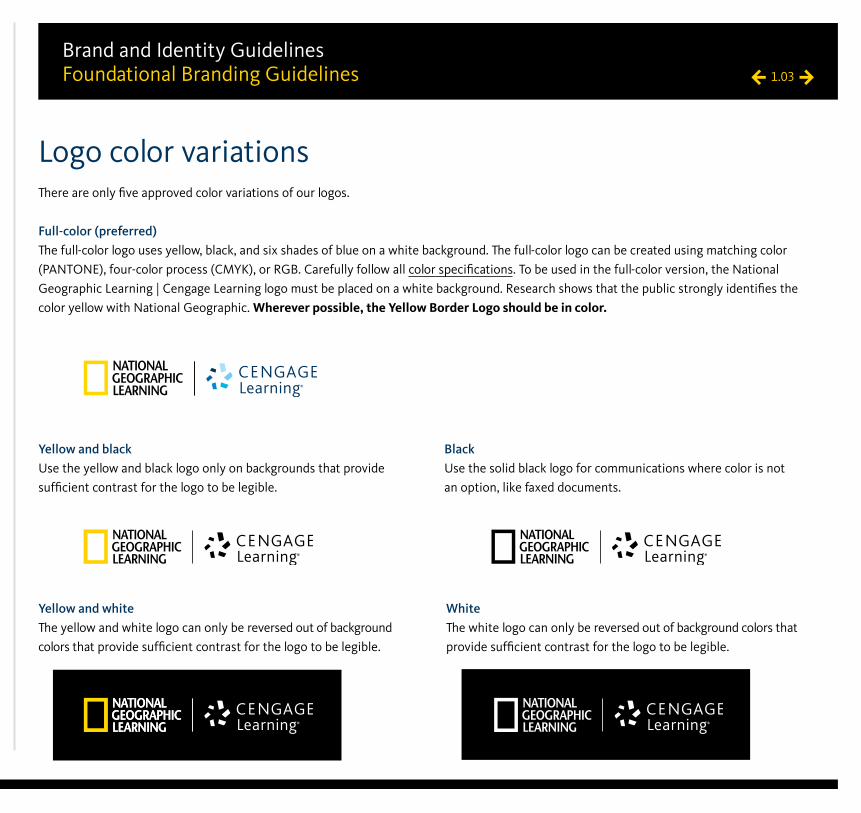
Brand and Identity GuidelinesFoundational Branding Guidelines 1.03
Logo color variationsThere are only five approved color variations of our logos.
Full-color (preferred)The full-color logo uses yellow, black, and six shades of blue on a white background. The full-color logo can be created using matching color
(PANTONE), four-color process (CMYK), or RGB. Carefully follow all color specifications. To be used in the full-color version, the National
Geographic Learning | Cengage Learning logo must be placed on a white background. Research shows that the public strongly identifies the
color yellow with National Geographic. Wherever possible, the Yellow Border Logo should be in color.
Yellow and black Use the yellow and black logo only on backgrounds that provide
sufficient contrast for the logo to be legible.
BlackUse the solid black logo for communications where color is not
an option, like faxed documents.
Yellow and white The yellow and white logo can only be reversed out of background
colors that provide sufficient contrast for the logo to be legible.
WhiteThe white logo can only be reversed out of background colors that
provide sufficient contrast for the logo to be legible.
Foundational branding guidelines 1.01
Corporate logo 1.02
Logo color variations 1.03
Incorrect usage examples 1.04
Transition • From Heinle ELT to National
Geographic Learning 1.05
Sub-brand logo color variations 1.06
Sub-brand logos 1.07
Size and clear space 1.08
Corporate color palette 1.09
Typography 1.10
Branding band usage • No band 1.11
• Band options 1.12
Co-branding • With or without band 1.13
Permitted use of NationalGeographic Housemark 1.14
Permitted use of NationalGeographic Housemark • Examples 1.15
Language standards • National Geographic Learning 1.16
• National Geographic Learning 1.17
• Sub-brands 1.18
• Sub-brands 1.19
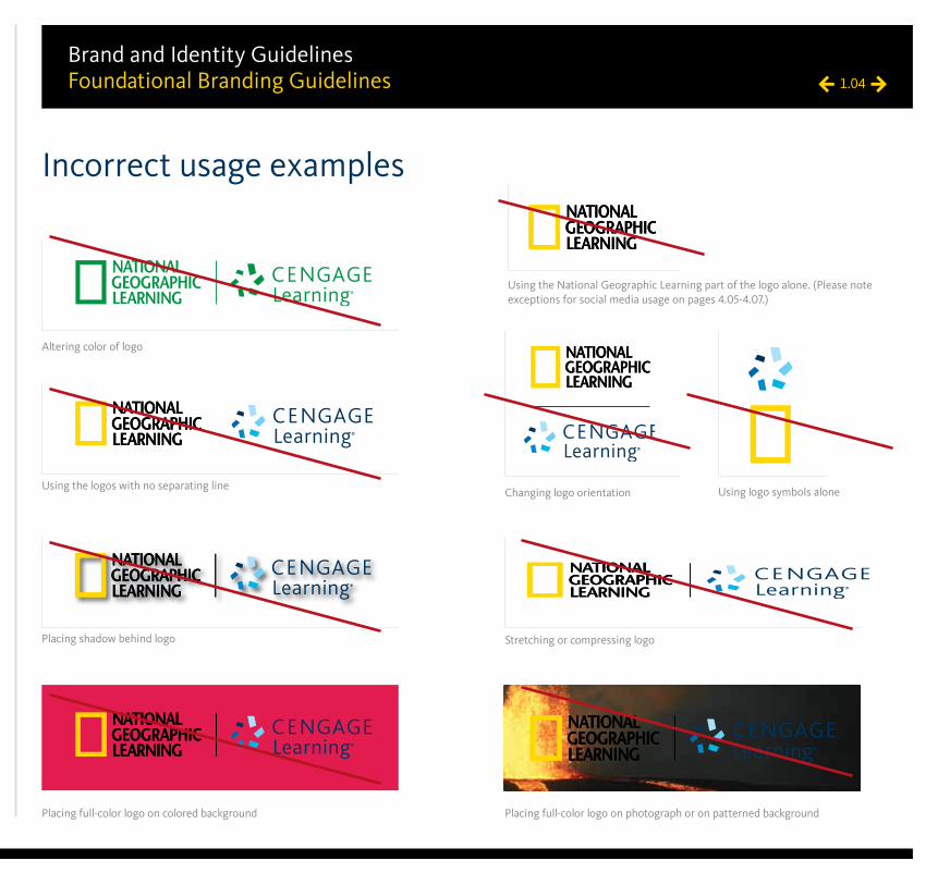
Brand and Identity GuidelinesFoundational Branding Guidelines 1.04
Incorrect usage examples
Altering color of logo
Using logo symbols alone
Placing full-color logo on colored background Placing full-color logo on photograph or on patterned background
Placing shadow behind logo Stretching or compressing logo
Changing logo orientationUsing the logos with no separating line
Using the National Geographic Learning part of the logo alone. (Please note exceptions for social media usage on pages 4.05-4.07.)
Foundational branding guidelines 1.01
Corporate logo 1.02
Logo color variations 1.03
Incorrect usage examples 1.04
Transition • From Heinle ELT to National
Geographic Learning 1.05
Sub-brand logo color variations 1.06
Sub-brand logos 1.07
Size and clear space 1.08
Corporate color palette 1.09
Typography 1.10
Branding band usage • No band 1.11
• Band options 1.12
Co-branding • With or without band 1.13
Permitted use of NationalGeographic Housemark 1.14
Permitted use of NationalGeographic Housemark • Examples 1.15
Language standards • National Geographic Learning 1.16
• National Geographic Learning 1.17
• Sub-brands 1.18
• Sub-brands 1.19
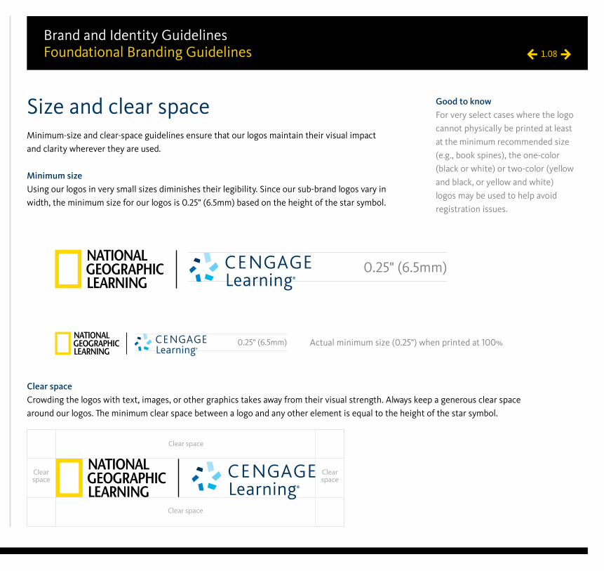
Brand and Identity GuidelinesFoundational Branding Guidelines 1.08
Size and clear spaceMinimum-size and clear-space guidelines ensure that our logos maintain their visual impact
and clarity wherever they are used.
Minimum sizeUsing our logos in very small sizes diminishes their legibility. Since our sub-brand logos vary in
width, the minimum size for our logos is 0.25" (6.5mm) based on the height of the star symbol.
Good to knowFor very select cases where the logo
cannot physically be printed at least
at the minimum recommended size
(e.g., book spines), the one-color
(black or white) or two-color (yellow
and black, or yellow and white)
logos may be used to help avoid
registration issues.
Clear space
Clear space
Clear space
Clear space
0.25" (6.5mm)
Clear spaceCrowding the logos with text, images, or other graphics takes away from their visual strength. Always keep a generous clear space
around our logos. The minimum clear space between a logo and any other element is equal to the height of the star symbol.
Actual minimum size (0.25") when printed at 100%0.25" (6.5mm)
Foundational branding guidelines 1.01
Corporate logo 1.02
Logo color variations 1.03
Incorrect usage examples 1.04
Transition • From Heinle ELT to National
Geographic Learning 1.05
Sub-brand logo color variations 1.06
Sub-brand logos 1.07
Size and clear space 1.08
Corporate color palette 1.09
Typography 1.10
Branding band usage • No band 1.11
• Band options 1.12
Co-branding • With or without band 1.13
Permitted use of NationalGeographic Housemark 1.14
Permitted use of NationalGeographic Housemark • Examples 1.15
Language standards • National Geographic Learning 1.16
• National Geographic Learning 1.17
• Sub-brands 1.18
• Sub-brands 1.19
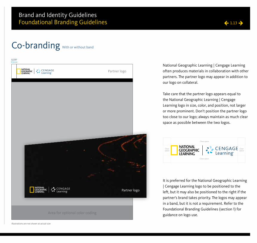
Brand and Identity GuidelinesFoundational Branding Guidelines 1.13
Co-branding With or without band
Illustrations are not shown at actual size
0.375"9.5mm
Area for optional color coding
Clear space
Clear space
Clear space
Clear space
Partner logo
Partner logo
National Geographic Learning | Cengage Learning
often produces materials in collaboration with other
partners. The partner logo may appear in addition to
our logo on collateral.
Take care that the partner logo appears equal to
the National Geographic Learning | Cengage
Learning logo in size, color, and position, not larger
or more prominent. Don’t position the partner logo
too close to our logo; always maintain as much clear
space as possible between the two logos.
It is preferred for the National Geographic Learning
| Cengage Learning logo to be positioned to the
left, but it may also be positioned to the right if the
partner's brand takes priority. The logos may appear
in a band, but it is not a requirement. Refer to the
Foundational Branding Guidelines (section 1) for
guidance on logo use.
Foundational branding guidelines 1.01
Corporate logo 1.02
Logo color variations 1.03
Incorrect usage examples 1.04
Transition • From Heinle ELT to National
Geographic Learning 1.05
Sub-brand logo color variations 1.06
Sub-brand logos 1.07
Size and clear space 1.08
Corporate color palette 1.09
Typography 1.10
Branding band usage • No band 1.11
• Band options 1.12
Co-branding • With or without band 1.13
Permitted use of NationalGeographic Housemark 1.14
Permitted use of NationalGeographic Housemark • Examples 1.15
Language standards • National Geographic Learning 1.16
• National Geographic Learning 1.17
• Sub-brands 1.18
• Sub-brands 1.19