Embed Size (px)
DESCRIPTION
Detailed research #1
Citation preview
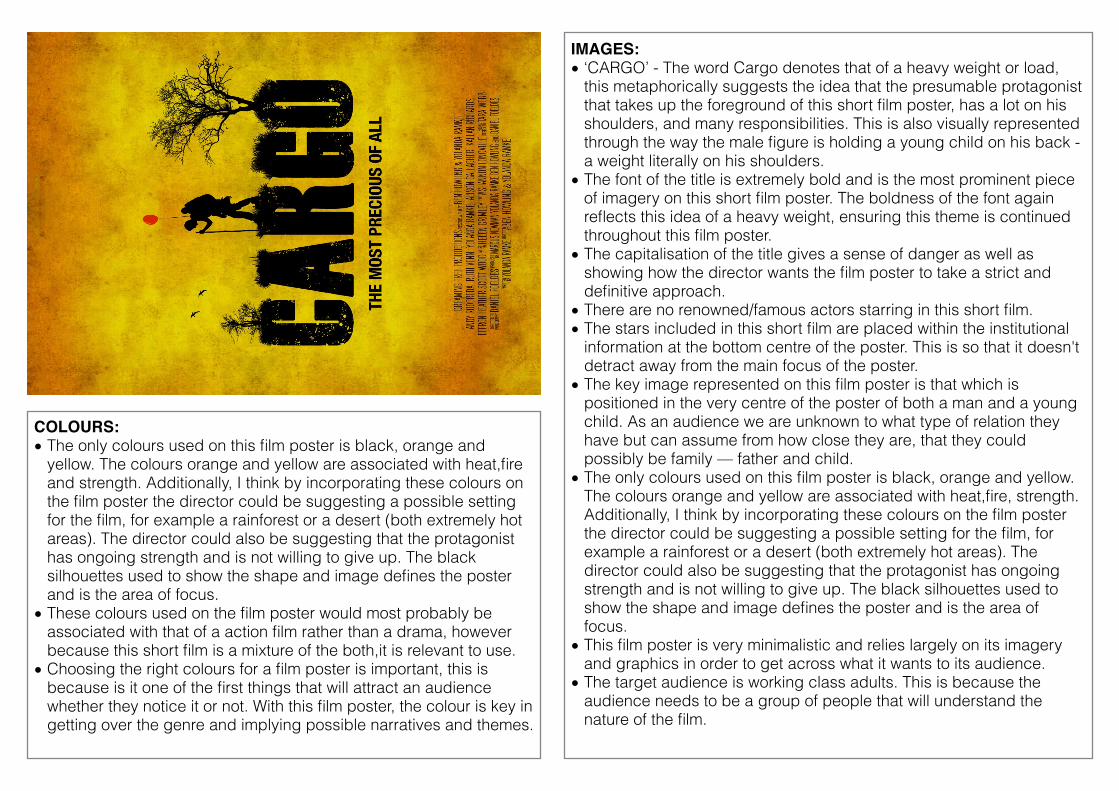
IMAGES:• ‘CARGO’ - The word Cargo denotes that of a heavy weight or load,
this metaphorically suggests the idea that the presumable protagonist that takes up the foreground of this short film poster, has a lot on his shoulders, and many responsibilities. This is also visually represented through the way the male figure is holding a young child on his back - a weight literally on his shoulders.
• The font of the title is extremely bold and is the most prominent piece of imagery on this short film poster. The boldness of the font again reflects this idea of a heavy weight, ensuring this theme is continued throughout this film poster.
• The capitalisation of the title gives a sense of danger as well as showing how the director wants the film poster to take a strict and definitive approach.
• There are no renowned/famous actors starring in this short film. • The stars included in this short film are placed within the institutional
information at the bottom centre of the poster. This is so that it doesn't detract away from the main focus of the poster.
• The key image represented on this film poster is that which is positioned in the very centre of the poster of both a man and a young child. As an audience we are unknown to what type of relation they have but can assume from how close they are, that they could possibly be family — father and child.
• The only colours used on this film poster is black, orange and yellow. The colours orange and yellow are associated with heat,fire, strength. Additionally, I think by incorporating these colours on the film poster the director could be suggesting a possible setting for the film, for example a rainforest or a desert (both extremely hot areas). The director could also be suggesting that the protagonist has ongoing strength and is not willing to give up. The black silhouettes used to show the shape and image defines the poster and is the area of focus.
• This film poster is very minimalistic and relies largely on its imagery and graphics in order to get across what it wants to its audience.
• The target audience is working class adults. This is because the audience needs to be a group of people that will understand the nature of the film.
COLOURS: • The only colours used on this film poster is black, orange and
yellow. The colours orange and yellow are associated with heat,fire and strength. Additionally, I think by incorporating these colours on the film poster the director could be suggesting a possible setting for the film, for example a rainforest or a desert (both extremely hot areas). The director could also be suggesting that the protagonist has ongoing strength and is not willing to give up. The black silhouettes used to show the shape and image defines the poster and is the area of focus.
• These colours used on the film poster would most probably be associated with that of a action film rather than a drama, however because this short film is a mixture of the both,it is relevant to use.
• Choosing the right colours for a film poster is important, this is because is it one of the first things that will attract an audience whether they notice it or not. With this film poster, the colour is key in getting over the genre and implying possible narratives and themes.
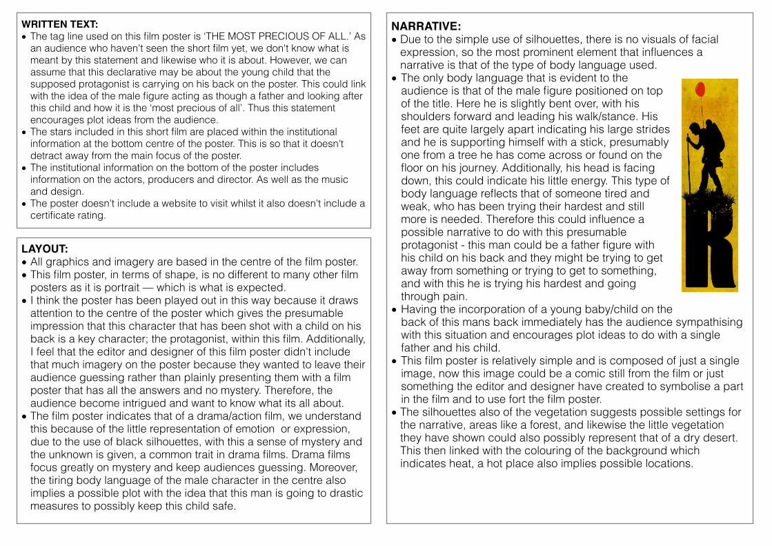
NARRATIVE:• Due to the simple use of silhouettes, there is no visuals of facial
expression, so the most prominent element that influences a narrative is that of the type of body language used.
• The only body language that is evident to the audience is that of the male figure positioned on top of the title. Here he is slightly bent over, with his shoulders forward and leading his walk/stance. His feet are quite largely apart indicating his large strides and he is supporting himself with a stick, presumably one from a tree he has come across or found on the floor on his journey. Additionally, his head is facing down, this could indicate his little energy. This type of body language reflects that of someone tired and weak, who has been trying their hardest and still more is needed. Therefore this could influence a possible narrative to do with this presumable protagonist - this man could be a father figure with his child on his back and they might be trying to get away from something or trying to get to something, and with this he is trying his hardest and going through pain.
• Having the incorporation of a young baby/child on the back of this mans back immediately has the audience sympathising with this situation and encourages plot ideas to do with a single father and his child.
• This film poster is relatively simple and is composed of just a single image, now this image could be a comic still from the film or just something the editor and designer have created to symbolise a part in the film and to use fort the film poster.
• The silhouettes also of the vegetation suggests possible settings for the narrative, areas like a forest, and likewise the little vegetation they have shown could also possibly represent that of a dry desert. This then linked with the colouring of the background which indicates heat, a hot place also implies possible locations.
LAYOUT:• All graphics and imagery are based in the centre of the film poster. • This film poster, in terms of shape, is no different to many other film
posters as it is portrait — which is what is expected. • I think the poster has been played out in this way because it draws
attention to the centre of the poster which gives the presumable impression that this character that has been shot with a child on his back is a key character; the protagonist, within this film. Additionally, I feel that the editor and designer of this film poster didn't include that much imagery on the poster because they wanted to leave their audience guessing rather than plainly presenting them with a film poster that has all the answers and no mystery. Therefore, the audience become intrigued and want to know what its all about.
• The film poster indicates that of a drama/action film, we understand this because of the little representation of emotion or expression, due to the use of black silhouettes, with this a sense of mystery and the unknown is given, a common trait in drama films. Drama films focus greatly on mystery and keep audiences guessing. Moreover, the tiring body language of the male character in the centre also implies a possible plot with the idea that this man is going to drastic measures to possibly keep this child safe.
WRITTEN TEXT:• The tag line used on this film poster is ‘THE MOST PRECIOUS OF ALL.’ As
an audience who haven't seen the short film yet, we don't know what is meant by this statement and likewise who it is about. However, we can assume that this declarative may be about the young child that the supposed protagonist is carrying on his back on the poster. This could link with the idea of the male figure acting as though a father and looking after this child and how it is the ‘most precious of all’. Thus this statement encourages plot ideas from the audience.
• The stars included in this short film are placed within the institutional information at the bottom centre of the poster. This is so that it doesn't detract away from the main focus of the poster.
• The institutional information on the bottom of the poster includes information on the actors, producers and director. As well as the music and design.
• The poster doesn't include a website to visit whilst it also doesn't include a certificate rating.


![Detailed study of Seismic Waves [Research]](https://img.pdfslide.net/doc/110x75/55a6af6b1a28ab6b5c8b45e9/detailed-study-of-seismic-waves-research.jpg)