Embed Size (px)
Citation preview

; / \
CASE STUDY APPLICATIONS OF STATISTICS IN INSTITUTIONAL RESEARCH
/--
\
By MARY ANN COUGHLIN and MARIAN PAGAN(
Case Study Applications of
Statistics in Institutional Research
by Mary Ann Coughlin
and Marian Pagano
Number Ten Resources in Institutional Research
A JOINT PUBLICATION OF THE ASSOCIATION FOR IN STITUTIONAL
RESEARCH AND
THE NORTHEAST ASSOCIATION FOR
INSTITUTIONAL REASEARCH
© 1997 Association for Institutional Research
1 14 Stone Building
Florida State University
Tallahassee, Florida 32306-3038
All Rights Reserved
No portion of this book may be reproduced by any
process, stored in a retrieval
system, or transmitted in any form, or by any means, without the express written permission of the publisher.
Printed in the United States
To order additional copies, contact:
AIR 114 Stone Building
Florida State University
Tallahassee FL 32306-3038 Tel: 904/644-4470Fax: 904/644-8824E-Mail: [email protected]
Home Page: www.fsu.edul-airlhome.htm
ISBN 1-882393-06-6
Table of Contents Acknowledgments • • • • • • • • • • • • • • • • • . • • • • • • • • • . . . . . • • • • • • • • • • • • • • • • . • • .
Introduction . • • • • • • • • • • • . . • . • • • • • . . . • • • • • • • . . . . . • • • • . • • • . . . • • • • • • • • • 1
Chapter 1: Basic Concepts . . • • • • • • • . . . • • • • • • . . . • • • • • • • • . . • • • • • • . . . . . . . 3 Characteristics of Variables and Levels of Measurement . . . . . . . . . . . . . . . . . . . 3 Descriptive Statistics . . . . . . . . . . . . . . . . . . . . . . . . . . . . . . . . . . . . . . . . . . . . . . . 8 Probability, Sampling Theory and the Normal Distribution . . . . . . . . . . . . . . . . 16
Chapter 2: Comparing Group Means: Are There Real Differences Between Average Faculty Salaries Across Departments? • . . . • • • • • • • • . • • . • • • • • • 20
Description of Case Study . . . . . . . . . . . . . . . . . . . . . . . . . . . . . . . . . . . . . . . . . . 20 Research Designs . . . . . . . . . . . . . . . . . . . . . . . . . . . . . . . . . . . . . . . . . . . . . . . . . 2 1 Statistical Procedures : T-test . . . . . . . . . . . . . . . . . . . . . . . . . . . . . . . . . . . . . . . . . . . . . . . . . . . . . . . . . . . 23 One-Way ANOVA . . . . . . . . . . . . . . . . . . . . . . . . . . . . . . . . . . . . . . . . . . . . . . . . 26 Factorial ANOVA . . . . . . . . . . . . . . . . . . . . . . . . . . . . . . . . . . . . . . . . . . . . . . . . . 32 Analysis of Covariance (ANCOVA) . . . . . . . . . . . . . . . . . . . . . . . . . . . . . . . . . . 33 Multivariate ANOVA (MANOVA) . . . . . . . . . . . . . . . . . . . . . . . . . . . . . . . . . . . . 34 Nonparametric Tests of Mean Differences . . . . . . . . . . . . . . . . . . . . . . . . . . . . . . 34
Chapter 3: Correlation: Measuring the Relationship Between SAT and First-Year GPA . • • • • • • • • • • • • • • . • . . • • • • • • • • • • • • • • . • • • • . • • • • • • • • . • • • • • • 36
Description of Case Study . . . . . . . . . . . . . . . . . . . . . . . . . . . . . . . . . . . . . . . . . . 36
.Some Background About Correlation . . . . . . . . . . . . . . . . . . . . . . . . . . . . . . . . . 36 Statistical Procedures : Pearson Correlation Coefficient . . . . . . . . . . . . . . . . . . . . . . . . . . . . . . . . . . . . . . 37 Nonparametric Correlations . . . . . . . . . . . . . . . . . . . . . . . . . . . . . . . . . . . . . . . . . 42 Regression Analysis . . . . . . . . . . . . . . . . . . . . . . . . . . . . . . . . . . . . . . . . . . . . . . . 44
Chapter 4: Chi-Square: Differences in the Frequency of Enrolling and Non-Enrolling Students by the Quantity of Aid Offered • • • • • . • • • • • • • • • • • • • 48
Description of Case Study . . . . . . . . . . . . . . . . . . . . . . . . . . . . . . . . . . . . . . . . . . 48 Some Background About Chi-Square . . . . . . . . . . . . . . . . . . . . . . . . . . . . . . . . . 49 Statistical Procedures : Two-Way Chi-Square . . . . . . . . . . . . . . . . . . . . . . . . . . . . . . . . . . . . . . . . . . . . . . 49 One-Way Chi-Square . . . . . . . . . . . . . . . . . . . . . . . . . . . . . . . . . . . . . . . . . . . . . . 55 Chi-Square Automatic Interaction Detection (CHAID) . . . . . . . . . . . . . . . . . . . 56
Chapter 5: Selecting the Appropriate Statistic • . • • • • • • • • • • • • • • • • • • • • • • . . 58 Using the Design Tree . . . . . . . . . . . . . . . . . . . . . . . . . . . . . . . . . . . . . . . . . . . . . 58 Examples of Using the Design Tree . . . . . . . . . . . . . . . . . . . . . . . . . . . . . . . . . . . 60
Appendix A: SPSS Commands for Statistical Procedures . . . . . • • • • • • . . . • • • 62
References • • • • • . • • • • • • • • . . . . • • • • • • • • • • • . . • • • • • • • • • • • • • • • • • • • • • • . • • • 64
Index • • • . • • . • • • • • • • • . • • . . • . • • • • • . . . • • • • • • • • • • • • . • • • • . . • • • • • • • • • • . . 65

Acknowledgments
We would like to thank the Northeast Association for Institutional Research and the Association for Institutional Research for their support and patience during the preparation of this document. We would like to thank Blake Whitten for
his copy editing and indexing assistance. Also, we would like to thank the teachers, students and colleagues who have taught us how to make material that is feared by
many more accessible and understandable . Marian Pagano would like to especially
thank Dr. David Drews of Juniata College, Huntingdon, PA, for his excellent and
inspirational teaching. Two of the graphics in Chapter One of this monograph come
from class notes taken in Dr. Drews' Introduction to Statistics course . Mary Ann Coughlin would like to thank Dr. Barbara Jensen who has long served as her mentor,
friend, and editor of this text .

Case Study Applications of
Statistics in Institutional Research
Introduction
Statistics has been defined as "a collection of methods for planning experiments, obtaining data, and then organizing, summarizing, presenting, analyzing, interpreting and drawing conclusions based on the data" (Triola, 1995, p. 4). Does this sound like an abbreviated charge for the Office of Institutional Research at your institution? Saupe (1990) discussed several of the above-mentioned activities as functions of Institutional Research. He encapsulated this view by defining Institutional Research as "research conducted within an institution of higher education to provide information which supports
institutional planning, policy formation and decision making" (p. 1). While statisticians are more likely to disagree than agree on a variety of issues,
general agreement exists that the field consists of two subdivisions: descriptive and
inferential statistics. Descriptive statistics consists of a set of techniques for the important task of describing characteristics of data sets and for summarizing large amounts of data
in an abbreviated fashion. Inferential statistics goes beyond mere description to draw conclusions and make inferences about a population based on sample data. While most Institutional Researchers are quite knowledgeable in the area of descriptive statistics,
many are less comfortable with inferential techniques. The use of inferential techniques can bring critical enlightenment to policy and planning decisions.
Thus, this monograph focuses on the application of statistical techniques to Institutional Research; theory, application, and interpretation are the main tenets. The ultimate goal of the authors is to enhance the researchers' knowledge and interpretation of their data through statistical analyses. The text begins with a general background
discussion of the nature and purpose of both descriptive and inferential statistics and their
applications within Institutional Research. Each additional chapter follows a case study format and outlines a practical research question in Institutional Research, illustrates the application of one or more statistical procedures, analyzes data representing a hypothetical institution, and incorporates the output from these analyses into information that can be used in support of policy- and decision-making.
This document is designed to give the reader a broad overview of or refresher in descriptive and inferential statistics as they are applied to case studies in Institutional Research. In this format, this is quite a challenge as a wide range of statistical concepts and procedures is covered in relatively few pages. No intent is made to document the numerical calculation of statistics or to prove statistical formulas. For further information in any of these areas, please consult the list of references.
Statistical software packages are standard equipment in most Institutional Research offices as they handle complex analyses and large data files relatively effortlessly. While it is important that an Institutional Researcher be able to use statistical packages, this monograph is not designed to teach you how to do so. Rather, the emphasis of this monograph will be on the theory, application, and interpretation of statistical analyses. Many statistical packages are available on a wide range of computer platforms that can be utilized to perform these analyses. The Statistical Package for the Social

Sciences (SPSS) is the choice of the authors for statistical software and SPSS for
Windows was used to analyze the data from each case study, yet any standard statistical software can perform these analyses. For your convenience, the statistical commands that perform the analyses discussed in this text using SPSS for Windows are included in
Appendix A. These commands can be readily translated into any standard statistical software.
Before proceeding to the main text, some practicalelirnitations of this monograph should be declared. The first and most important of these points is that the best statistics cannot save an inferior research design. Statistical procedures are no substitute for forethought. Although several robust research designs are illustrated throughout this text, the primary emphasis of the monograph is not dedicated to design concepts. Suffice it to say that the research design is the foundation of a good study. If the design is weak, the
analysis will crumble. Remember, the statistician's favorite colloquial expression: "Garbage in, Garbage out." Secondly, the topics and techniques covered in this text are
for the most part standard and accepted practices. However, as in most fields, few
absolutes exist with many differing opinions. Please feel free to review the references for other suggested practices and approaches to the tasks presented here.
Finally, the case studies and example data utilized in this text are fabricated studies representing fictitious institutions, but are designed to represent real research questions facing Institutional Researchers. In no way should the case studies or data be associated with the authors or the institution of the authors. In the real world, the
questions facing individual Institutional Researchers are as varied as the researchers themselves and their respective institutions. Yet the case studies have been carefully
developed to represent the diversity in our profession and to present a variety of statistical
procedures with universal application.
2
Chapter One: Basic Concepts
This chapter is designed to give a brief overview of some basic statistical
concepts and terms that will be used throughout this text and is divided into the following
four sections: Characteristics of Variables and Levels of Measurement; Descriptive Statistics; Probability, Sampling Theory and the Normal Distribution; and Inferential Statistics. While the titles of these sections imply that this chapter will cover all the material taught in an Introductory Statistics text, please be advised that the text flows briskly through each of the topics and is meant to serve only as a refresher. For more detailed information, please refer to Sprinthall (1987), Levin and Fox (1994), Triola (1995) or any basic statistical textbook.
Characteristics of Variables & Levels of Measurement
A variable is an indicator or measure of the construct of interest. A variable can
be anything that has more than one value (e.g., sex, age, SAT scores). Variables should
have operational definitions clearly stated. An operational definition of a variable defines
specifically the variable measured and, unless it is a universally accepted definition, should be clearly published with any data and analyses. For example, when using SAT
scores from an inquiry survey, SAT score could be operationally defined as "the self
reported scores on both the math and verbal sections of the SAT examination." This
alerts the reader that the results from this analysis might vary from results reported from the Educational Testing Service. For other examples, refer to Example Box 1.
Example Box 1
Variable Operational Definition
FIE - Faculty Total number of full time faculty plus \part-time faculty headcount
Student Anyone enrolled during a semester for at least 1 credit hour
Compensation Salary plus fringe benefits
While this operational definition is quite straightforward, some operational definitions get sticky and lead to the issue of construct validity. Many constructs or concepts in educational research are wide-open to interpretation. Institutional Researchers are usually quite familiar with the nuances of construct validity as we deal with the definition of FTE, full-time faculty, and other seemingly simple variables whose definitions are often capricious. The important point is to clearly communicate how you have measured the constructs (Le. , the underlying variables) in your design.
The values contained within a variable are often determined by the researcher. This is a critical decision in the research design phase, and influences the possibilities for statistical analysis as these values define the level of measurement for that variable. A variable can have continuous or discrete values. Variables are discrete when they have a finite or countable number of possible values. For example, gender, ethnic background, and student status (i.e. , full-time / part-time) are discrete. Continuous variables have infinite range and can be measured to varying degrees of precision. Common examples of
3
continuous data are dollars, square footage, height, weight, and age. A continuous variable
may be measured as if it were discrete; however, the reverse is not true. For example, salary data can be broken down into discrete categories (Example Box 2). In some
instances, dividing a discrete variable by a discrete variable creates a continuous scale; for example, admissions yield ratios (number enrolled divided by number applied).
Example Box 2
Salary as a Discrete Variable Salary as a Continuous Variable
$1 - $25,000 Actual Salary in dollars $25,001 - $50,000 $42,0 1 4
Over $50,00
Levels of measurement can be further broken down into a hierarchy with four categories: nominal, ordinal, interval, and ratio. Variables which are Nominal level of measurement consist of names, labels and categories; this is the lowest level of the hierarchy. In classifying data, subjects or observations are identified according to a common characteristic. When dealing with a nominal variable, every case or subject must
be placed into one and only one category. This requirement indicates that the categories
must be non-overlapping or mutually exclusive. Thus, any respondent labeled as male
cannot also be labeled as female. Also, this requirement indicates that categories must be exhaustive; that is, a place must exist for every case that arises. Nominal data are not
graded, ranked or scaled in any manner. Clearly then, a nominal measure of gender does not signify whether males are superior or inferior to females. Numerical codes are often assigned to the values of nominal variables, adding to the confusion. For example, even
though the value 1 is assigned for female and 2 for male, these are simply labels and no
quantity or quality can be implied. No mathematical calculations can be applied to numbers that only serve as labels. Thus, limits are placed on what can and cannot be done statistically with these data. The most appropriate statistical measures for nominal data include: frequencies, proportions, probabilities and odds.
When the researcher goes beyond mere classification and seeks to assign order to cases in terms of the degree to which the subject has any given characteristic, he or she
has assigned an ordinal level of measurement. With an ordinal scale, imagine a single continuum along which individuals may be ordered. However, the distances between values on the continuum may not always be meaningful or even known. Rather, the ordinal level of measurement yields information about the ordering of categories, but does not indicate the magnitude of differences between the numbers. An ordinal level of measurement supplies more information than is obtained using a nominal scale, since subjects are able to be grouped into separate categories, which can then be ordered. The order of the categories can be described by adjectives like more and less, bigger and smaller, stronger and weaker, etc . A familiar example of ordinal level of measurement is the classification of faculty as assistant, associate or full professors . Although we know a full professor is a higher status than an associate or assistant, it cannot be said that two associates equal one full professor.
Additionally, most Likert scales are considered to be ordinal level of measurement. On student surveys, Likert scales are often used to measure satisfaction with services or the extent of agreement with various statements. For example, students
4
may be asked to respond to the question, "Overall, how satisfied are you with the social
life on campus?" on a 5-point scale where 1 equals 'very dissatisfied' and 5 equals 'very satisfied.' Clearly, if respondent A marks a 5 and respondent B marks a 4, then respondent
A is more satisfied than respondent B. However, the magnitude of the difference in their levels of satisfaction is not directly distinguishable.
By contrast, interval level of measurement not only classifies according to the ordering of categories, but also indicates the exact distance between levels. The interval
scale requires the establishment of some common standard unit of measurement that is accepted and replicable. Common examples of interval level of measurement are SAT scores and temperature in Fahrenheit or Celsius. Given a standard unit of measurement, it
is possible to state that the difference between two subjects is a particular number of units. However with interval data, it is not possible to make direct ratio comparisons between levels of the data. With interval data such comparisons are not possible because there is no
meaningful zero point (Le., zero does not imply the absence of the quantity being measured). For example, 0 Celsius does not imply no temperature; rather the value
represents the freezing point of water. Also, SAT scores are normally considered interval because the base is not equal to zero or "no ability." Thus, a score of 600 is not twice as
high as a score of 300.
If it is possible to locate an absolute and non-arbitrary zero point on the scale, then the data are ratio, the highest level of the measurement hierarchy. In this case, scores
can be compared by using ratios. For example, if the endowment of school A is $10
million and the endowment of school B is $25 million, then school B's endowment can be said to be 2 \times that of school A. After all it is possible to have a $0 endowment. While many researchers make the distinction between interval and ratio level of measurement, some do not. Although the distinction between the two is subtle, it is important to recognize the limitation on the types of comparisons of scores one can make between the two levels. On the other hand, fewer statistical techniques require a ratio scale; making the
distinction between the interval and ratio levels of measurement somewhat irrelevant.
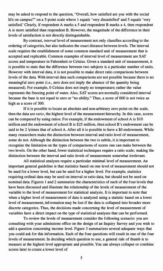
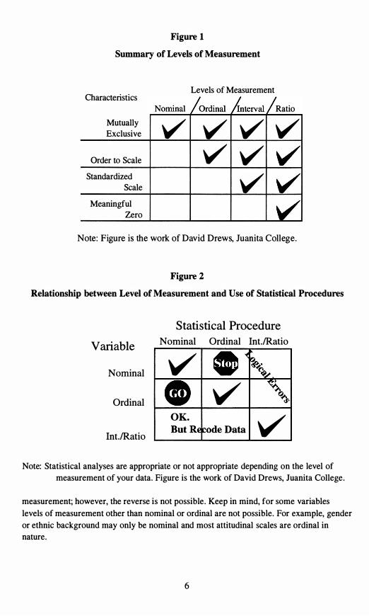
All statistical analyses require a particular minimal level of measurement. An important general guideline is that statistics based on one level of measurement should not
be used for a lower level, but can be used for a higher level. For example, statistics requiring ordinal data may be used on interval or ratio data, but should not be used on nominal data. Figures I and 2 summarize the characteristics of each of the four levels that have been discussed and illustrate the relationship of the levels of measurement of the variable to the level of measurement for statistical analysis . It is important to note that when a higher level of measurement of data is analyzed using a statistic based on a lower level of measurement, information may be lost if the data is collapsed into broader more discrete categories. Thus, the decisions made concerning the level of measurement of variables have a direct impact on the type of statistical analyses that can be performed.
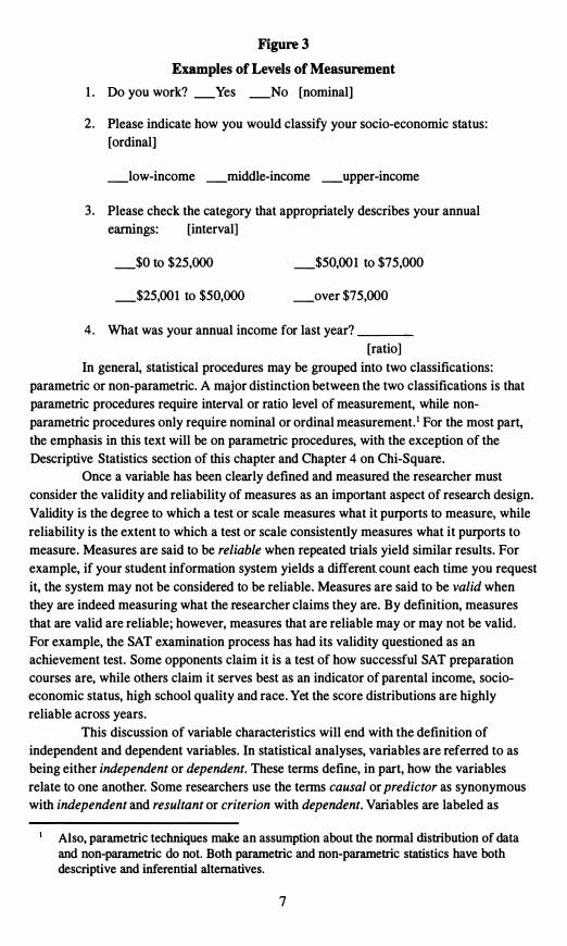
To review the levels of measurement consider the following scenario: you are consulting with your admissions office on the design of an Inquiry Survey and you wish to add a question concerning income level. Figure 3 summarizes several adequate ways that
you could ask for this information. Each of the four questions will result in one of the four levels of measurement. In deciding which question to use, a general rule of thumb is to measure at the highest level appropriate and possible. You can always collapse or combine scores later to create a lower level of
5
Nominal /Ordinal AntervaI /
V V V
.� �. � .....
CO ��
ButRE �ode
Figure 1
Summary of Levels of Measurement
Levels of Measurement CharactenstIcs
Ratio
Mutually Exclusive V V V V
Order to Scale V V Standardized
Scale V Meaningful
Zero
Note: Figure is the work of David Drews, Juanita College .
Figure 2
Relationship between Level of Measurement and Use of Statistical Procedures
Statistical Procedure Variable
Nominal
Ordinal
Int.IRatio
Nominal Ordinal Int.IRatio
v V Q�
OK. VData
Note: Statistical analyses are appropriate or not appropriate depending on the level of measurement of your data. Figure is the work of David Drews, Juanita College.
measurement; however, the reverse is not possible. Keep in mind, for some variables
levels of measurement other than nominal or ordinal are not possible. For example, gender or ethnic background may only be nominal and most attitudinal scales are ordinal in nature.
6
___ _
Figure 3 Examples of Levels of Measurement
1. Do you work? _Yes _No [nominal]
2. Please indicate how you would classify your socio-economic status:
[ordinal]
_low-income _middle-income _upper-income
3 . Please check the category that appropriately describes your annual
earnings: [interval]
_$0 to $25,000 _$50,001 to $75,000
_$25,001 to $50,000 _over $75,000
4. What was your annual income for last year?
[ratio]
In general, statistical procedures may be grouped into two classifications:
parametric or non-parametric. A major distinction between the two classifications is that
parametric procedures require interval or ratio level of measurement, while non
parametric procedures only require nominal or ordinal measurement.· For the most part,
the emphasis in this text will be on parametric procedures, with the exception of the
Descriptive Statistics section of this chapter and Chapter 4 on Chi-Square.
Once a variable has been clearly defined and measured the researcher must
consider the validity and reliability of measures as an important aspect of research design.
Validity is the degree to which a test or scale measures what it purports to measure, while
reliability is the extent to which a test or scale consistently measures what it purports to
measure. Measures are said to be reliable when repeated trials yield similar results. For
example, if your student information system yields a different count each time you request
it, the system may not be considered to be reliable. Measures are said to be valid when
they are indeed measuring what the researcher claims they are. By definition, measures
that are valid are reliable; however, measures that are reliable may or may not be valid.
For example, the SAT examination process has had its validity questioned as an
achievement test. Some opponents claim it is a test of how successful SAT preparation
courses are, while others claim it serves best as an indicator of parental income, socio
economic status, high school quality and race. Yet the score distributions are highly
reliable across years.
This discussion of variable characteristics will end with the definition of
independent and dependent variables. In statistical analyses, variables are referred to as
being either independent or dependent. These terms define, in part, how the variables
relate to one another. Some researchers use the terms causal or predictor as synonymous
with independent and resultant or criterion with dependent. Variables are labeled as
Also, parametric techniques make an assumption about the normal distribution of data and non-parametric do not. Both parametric and non-parametric statistics have both descriptive and inferential alternatives.
7

Tendency.
independent when we want to examine their influences on other variables. Variables are
labeled as dependent when their values are used to measure the effects of the independent
variable(s). In statistical models, the value of the dependent variable depends, in part, on the value of the independent variable(s). In some instances, variables can be used as either independent or dependent in any given analysis. For example, one researcher could examine the influences of gender on SAT performance. In this analysis, gender would be
the independent variable and SAT the dependent. However, in another analysis, the
influences of SAT and gender on college choice could be explored. In this analysis, both gender and SAT are independent variables and college choice would be the dependent measure. With this background, let us now tum our attention to the basic principles of descriptive statistics.
Descriptive Statistics
Descriptive statistics is familiar to most Institutional Researchers and is used primarily to describe important characteristics of data. Three common types of descriptive
statistics are central scores or measures of central tendency, variation within the scores or
measures of dispersion, and the nature or shape of the distribution. Measures of Central When summarizing data one of the first measures
most individuals seek is a 'central' or 'average' score. An important and basic point to
remember is that there are several different ways to compute an average. The mean is the arithmetic average of all scores and is the most overused and abused workhorse of all the measures of central tendency. When given a list of scores and asked to produce an average, most people will obligingly proceed first to total all the scores and then to divide that total by the number of scores. However the mean should only be applied when the
data consist of an interval or ratio level of measurement and thus produce a parametric
statistic, although it is common practice to use the mean as measure of central tendency
with ordinal scales as well. For example, meaningful interpretation exists for the mean of a Likert scale (e.g. the mean of a rating of overall satisfaction of the college experience).
On the other hand, it is totally inappropriate to report the mean of categorical data. One would not report the average gender as 1.67, although this could be interpreted as implying that the distribution was mostly female (if male was coded 1 and female coded 2). If more than two categories existed, then all potentially decipherable meaning would be lost. In general, reporting the mean of a nominal scale is considered a statistical taboo.
The median is the middle value when the scores are arranged in order of increasing magnitude. A median can be used to describe ordinal, interval and ratio levels of data and is synonymous with the 50th percentile. The score representing the median is located at the point where 50 percent of the cases fall above and 50 percent fall below. As the definition states, the median may be found by arranging all responses in numerical order and locating the middle score. If the number of scores is an odd number, the median is the number that is exactly in the middle of the list, while if the number of scores is even, the median is found by computing the mean of the two middle values. For example, if you have 13 scores the median is the value of the 7th score, while if you have 14 scores the median is the mean of the 7th and 8th scores (Example Box 3) .
8
Dispersion.
Example Box 3
1,2,2,3,4,5,6,7,7,8,9, 10, 12 1,2,2,3,4,5,��7,8,9, 10, 12, 19
Median = 7th score Median is between the 7th & 8th scores
Median = 6 Median = 6.5
The mode of a set of scores is obtained by selecting the score that occurs most frequently. In instances where no score is repeated, no mode exists. In those cases when two scores both have the greatest frequency, the distribution is bi-modal and both values
are listed as the mode. Also, if more than two scores occur with the same greatest
frequency, the distribution is said to be multi-modal and each is listed as a mode. The mode is appropriately calculated with all levels of data, but is the only measure of central of tendency applicable for nominal level data. For interval and ratio scales the mode
provides little information in comparison to the mean and median, although the mode can easily be calculated.
Technically either the mean, median or mode can be reported as a central tendency or "average score"; however, the freedom to select a particular statistic (i .e. ,
mean, median, or mode) can slant the description of data. Consider an SAT distribution with a mean of 647, median of 660 and mode of 690. Reporting the mean presents a lower average SAT; the mode a higher average. So how does one decide which statistic to report? The level of measurement, distribution of data, and characteristic of the statistic
must be taken into account. The mean is most affected by extreme scores. One extremely
high or extremely low score can drastically alter the mean, while the median is a measure of position and is not affected by extreme scores. In contrast, the mode does not take all scores into consideration - only those occurring with the greatest frequency. In general, if data are of a ratio level of measurement and are not suspect to extreme scores, the mean
would be the most appropriate statistic. Under those circumstances where extreme scores are plausible, the median should then be reported. When in doubt, report both. Finally, if data are nominal, the mode should be reported.
Measures of It is quite possible for two different sets of scores to have the same mean, median, and mode (Table 1). Yet a simple perusal of the data values
would lead one to state that the data sets are not at all similar. So, what distinguishes these
two distributions from one another? The manner in which the scores are distributed about their central scores is the distinguishing factor. Several statistical techniques describe the variability of scores (i.e., measures of dispersion). The range is the simplest of these
measures and is the difference between the highest and lowest score. For example, if the lowest institutional grant given to a member of the incoming class is $500 and the highest award is $15,000, then the range of grant awards is $14,500.
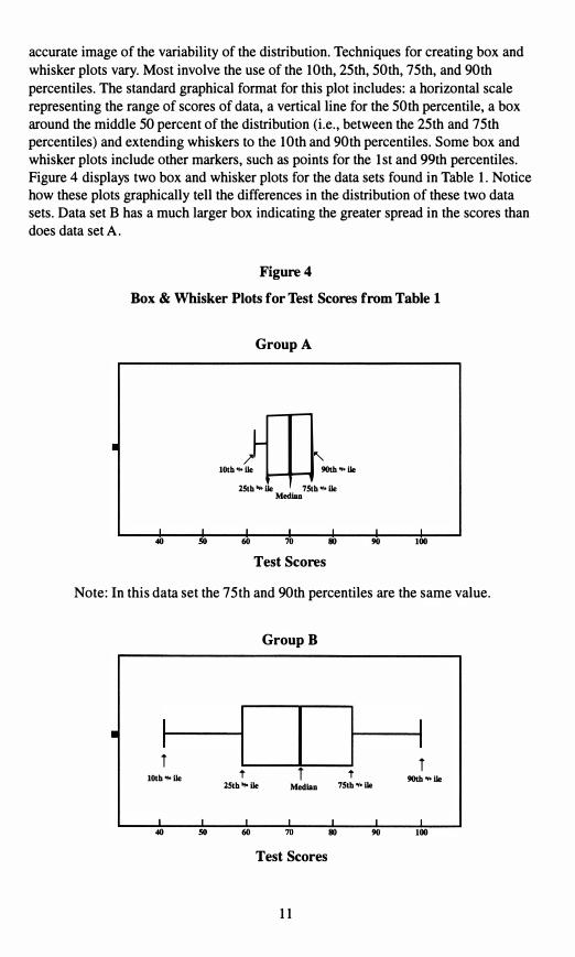
Percentiles may also be used to tell where a score lies in relation to the rest of the distribution. Percentiles report the proportion of scores that fall below a given score . For example, if a student scored in the 88th percentile on the MCAT exams then she earned a higher score than 88 percent of students who took that exam. The most often used percentile is the 50th percentile (Le. , the median); yet, reviewing the median for the two data sets in Table 1 we find the same value. However, a set of percentiles may be used in a box and whisker format to provide a quick and
9
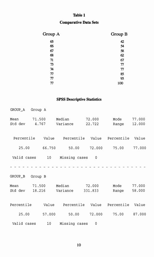
74
Table 1
Comparative Data Sets
Group A GroupB
65 42 (fi 54 61 58 68 62 71 67 73 77
77 77 85 77 93 77 100
SPSS Descriptive Statistics
GROUP_A Group A
Mean 71. 500 Median 72.000 Mode 77.000
S t d dey 4.767 Variance 22.722 Range 12.000
Perc entil e Value Perc entile Value Percent ile Value
25.00 66.750 50.00 72.000 75.00 77.000
valid c a s e s 10 Mis sing c a s e s o
GROUP_B Group B
Mean 71. 500 Median 72.000 Mode 77.000
Std dey 18.216 Varianc e 331. 833 Range 58.000
Percent i l e Value Perc entil e Va lue P e r c entile Va l u e
25.00 57.000 50.00 72.000 75.00 87.000
valid c a s e s 10 Mis sing c a s e s o
10
•
so
I I I SO 70
?�"'
accurate image of the variability of the distribution. Techniques for creating box and
whisker plots vary. Most involve the use of the 10th, 25th, 50th, 75th, and 90th
percentiles. The standard graphical format for this plot includes: a horizontal scale
representing the range of scores of data, a vertical line for the 50th percentile, a box
around the middle 50 percent of the distribution (i.e., between the 25th and 75th
percentiles) and extending whiskers to the 10th and 90th percentiles. Some box and
whisker plots include other markers, such as points for the 1st and 99th percentiles.
Figure 4 displays two box and whisker plots for the data sets found in Table 1. Notice
how these plots graphically tell the differences in the distribution of these two data
sets. Data set B has a much larger box indicating the greater spread in the scores than
does data set A.
Figure 4
Box & Whisker Plots for Test Scores from Table 1
Group A
40 60 70 80 90 100
10th', lie 9O\b"'1Ie
lSth"lIe 7Sth"lIeMedlan
Test Scores
Note: In this data set the 75th and 90th percentiles are the same value.
Group B
T T 10th "'lie t T t 9O\b"'1IelSth"lIe Median 751h"1Ie
40 60 80 90 100
Test Scores
1 1
73
Standard deviation and variance are two statistics that quantify the variability of
scores about the mean of a distribution. Like the mean, these measures of variability should only be computed when data are interval or ratio level of measurement and thus are considered to be parametric statistics. First, one should clearly understand that standard deviation and variance measure the characteristics of dispersion or variation among the scores. Thus, scores grouped closer about their mean will yield a smaller standard
deviation or variance. Notice in Table 1 that data set A has a smaller standard deviation and variance than set B . Conversely, as the data spread farther away from the mean the corresponding values of standard deviation and variance increase.
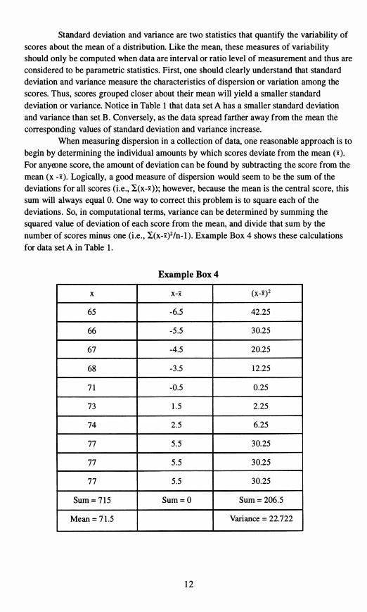
When measuring dispersion in a collection of data, one reasonable approach is to
begin by determining the individual amounts by which scores deviate from the mean (x).
For anyeone score, the amount of deviation can be found by subtracting the score from the
mean (x -x). Logically, a good measure of dispersion would seem to be the sum of the deviations for all scores (i.e., I(x-x»; however, because the mean is the central score, this sum will always equal O. One way to correct this problem is to square each of the deviations. So, in computational terms, variance can be determined by summing the squared value of deviation of each score from the mean, and divide that sum by the
number of scores minus one (Le. , I(x-X)2/n-l). Example Box 4 shows these calculations
for data set A in Table 1 .
Example Box 4
x x-x (X-x)2
65 -6.5 42.25
66 -5.5 30.25
67 -4.5 20.25
68 -3.5 12.25
7 1 -0.5 0.25
1 .5 2.25
74 2.5 6.25
77 5.5 30.25
77 5.5 30.25
77 5.5 30.25
Sum = 715 Sum=O Sum = 206.5
Mean=7 1 .5 Variance = 22.722
12
Shape.
Standard deviation is a simple algebraic manipulation of variance. To obtain
standard deviation from variance, take the square root; vice versa, to obtain variance from
standard deviation, square the value. The computational formula discussed above is
theoretical in nature and is designed to illustrate the principles of standard deviation and
variance; in practice, one would not use this formula to derive standard deviation or variance. Shorter computational formulas are available; better yet, use a statistical package.
Distribution When analyzing data one of the first steps that Institutional
Researchers perform is to create frequency distributions . This first step allows one to get a first look at the data and provides a feel for the data to serve as a guide for future
analyses. A frequency distribution is aptly named as it lists all the categories of scores in
either ascending or descending order, along with their corresponding frequency. In most
statistical packages, along with the frequency for each category, the percentage, valid percentage and cumulative percentage are presented. The percentage represents the percent of the total sample size that corresponded with that response. The valid percentage excludes respondents missing a value for that particular variable and cumulative percent summarizes the percentage included in the current and preceding responses. Cumulative percentages may be used to determine any percentile including the median. To determine
the median from a frequency distribution, look down the cumulative percentage column
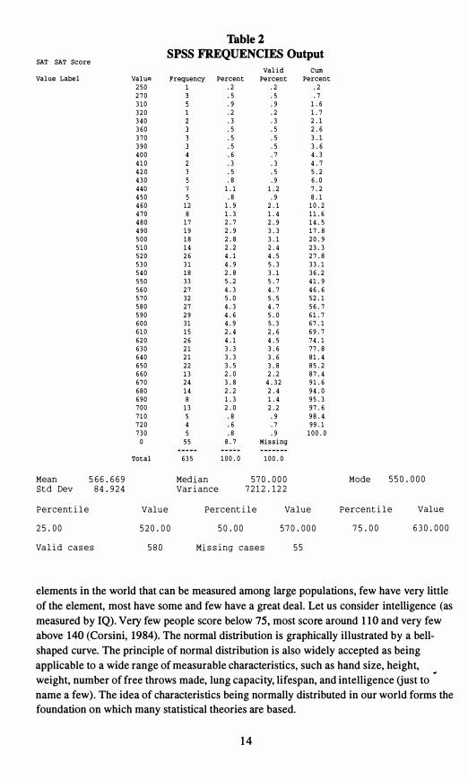
for the first category that contains 50.0% or greater; the corresponding value for that category is the median. Table 2 presents a frequency distribution of SAT scores produced using SPSS.
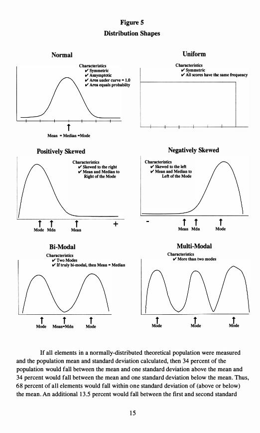
While a frequency distribution presents a table that summarizes the shape of the distribution, graphics are frequently used to provide a visual image of the distribution
shape. The distribution of data is an extremely important characteristic that affects the methods of analysis for and conclusion drawn from data. Statisticians have identified some common distribution shapes: uniform, bi-modal, multi-modal, positively-skewed, negatively-skewed, and normal. Figure 5 presents a graphic display of each of these distribution shapes. A distribution that is evenly spread over the range of possibilities is called uniform. In bi-modal and multi-modal distributions, clusters or grouping of scores
occur about each mode. In a negatively-skewed distribution, the majority of respondents
scored on the high end of the scale, while a few outliers pulled the tail of the distribution
to the negative end. The term "skew" refers to the tail, so when you think of a negativelyskewed distribution remember the tail goes to the low end of the scale. Conversely, in a positively-skewed distribution, the majority of the scores fall on the low end of the scale and a few outlying high scores pull the tail to the positive end of the scale.
The normal distribution is an important concept in understanding statistics. The normal distribution is a theoretical construct based on an infinite number of cases. The area under the curve includes all elements or cases and the curve is symmetric about the center point. Therefore, the right side of the distribution represents half of the cases and
the left side the other half. The area under the curve between any two points on the horizontal axis represents the percentages of cases that fall within that range. The
principles of the normal distribution are directly applicable to the distribution of val 'les
and are an integral part of sampling theory. The world as we know it is normally distributed. This implies that for most of the
13
.3 .3
.7 4.7 .3
.5 .9
1.9
19
33 5.7 4.3 4.7
4.3 4.7
5.3
.9
8.7
55
Table 2
SPSS FREQUENCIES Output SAT SAT Score
valid Cum Value Label Valup. Frequency Percent Percent Percent
250 1 .2 .2 .2 270 .5 .5 .7 310 .9 .9 1.6 320 .2 .2 1.7 340 360 .5 .5
2.1 2.6
370 .5 .5 3.1 390 .5 .5 3.6
.3 400 .6 4.3
5.2 410
.8 420 430
.5
1.2 6.0 7.2440 1.1
450 .8 .9 8.1 460 12 470 8 1.3
2.1 10.2 1.4 11. 6
480 17 2.7 2.9 14.5 490 500 18 510 14
2.9 3.3 17.8 2.8 3.1 20.9 2.2 2.4 23.3
520 26 4.1 4.5 27.8 530 31 4.9 5.3 33.1 540 18 2.8 3.1 36.2
27 550 560
5.2 41. 9
5.0 5.5 46.6 52.1570 32
4.6 5.0 580 27 590 29
56.7 61. 7
600 31 610 15
4.9 2,44.1
67.1 69.7
620 26 2,64.5 74.1
630 21 3.3 3.6 77 .8 640 21 3.3 3.6 81. 4 650 22 3.5 3.8 85.2 660 13 2.0 2.2 87.4 670 24 3.8 4.32 91. 6 680 14 2.2 2.4 94.0 690 8 1.3 1.4 95.3 700 13 2.0 2.2 97.6 710 5 .8 720 4 .6 .7
98.4 99.1
730 5 .8 .9 100.0 a 55 Missing
Total 635 100. a 100. a
Mean 5 6 6 . 6 6 9 Med i an 570 . 000 Mode 550 . 000 S t d Dev 84.9 2 4 Var i ance 7 2 1 2 . 1 2 2
Percent i l e Value Percent i l e Va l ue Percent i l e Value
2 5 . 00 520 . 00 50 . 00 570 . 000 7 5 . 00 6 30 . 000
Va l i d c a s e s 580 Mi s s i ng c a s e s
elements in the world that can be measured among large populations, few have very little of the element, most have some and few have a great deal. Let us consider intelligence (as measured by IQ). Very few people score below 75, most score around 110 and very few above 140 (Corsini, 1984). The normal distribution is graphically illustrated by a bellshaped curve. The principle of normal distribution is also widely accepted as being applicable to a wide range of measurable characteristics, such as hand size, height, weight, number of free throws made, lung capacity, lifespan, and intelligence (just to name a few). The idea of characteristics being normally distributed in our world forms the foundation on which many statistical theories are based.
14
tl'TwoModes
Figure 5 Distribution Shapes
Normal Uniform
CharacteristicsCharacteristics tl'Symmetric tI' Asaymptotic tI' Area under curve -tI' Area equals probabilty
1
1.0
tl'Symmetric tI' All scores have the same frequency
Mean -Median -Mode
Positively Skewed Negatively Skewed
Characteristics Characteristics tI' Skewed to the right tI' Skewed to the left tI'Mean and Median to tI'Mean and Median to
Right of the Mode Left of the Mode
+ 1 1 1 Mean Mdn Mode
Multi-Modal Characteristics
tI'More than two modes
tI' If truly bi-modal, then Mean - Median
1 1 1 1 1 Mode ModeMode Mean-Mdn Mode
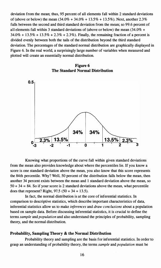
If all elements in a normally-distributed theoretical population were measured and the population mean and standard deviation calculated, then 34 percent of the population would fall between the mean and one standard deviation above the mean and 34 percent would fall between the mean and one standard deviation below the mean. Thus, 68 percent of all elements would fall within one standard deviation of (above or below) the mean. An additional 13 .5 percent would fall between the first and second standard
1 1 1 Mode Mdn Mean
Bi-Modal Characteristics
1 Mode
15
% 3
deviation from the mean; thus, 95 percent of all elements fall within 2 standard deviations
of (above or below) the mean (34.0% + 34.0% + 13.5% + 13.5%). Next, another 2.3%
falls between the second and third standard deviation from the mean; so 99.6 percent of all elements fall within 3 standard deviations of (above or below) the mean (34.0% + 34.0% + 13.5% + 13 .5% + 2.3% + 2.3%). Finally, the remaining fraction of a percent is divided evenly between both the tails of the distribution beyond the third standard
deviation. The percentages of the standard normal distribution are graphically displayed in Figure 6. In the real world, a surprisingly large number of variables when measured and plotted will create an essentially normal distribution.
Figure 6 The Standard Normal Distribution
0.5
34% 34%
o
Knowing what proportions of the curve fall within given standard deviations from the mean also provides knowledge about where the percentiles lie. If you know a
score is one standard deviation above the mean, you also know that this score represents the 84th percentile. Why? Well, 50 percent of the distribution falls below the mean, then another 34 percent exists between the mean and 1 standard deviation above the mean, so 50 + 34 = 84. So if your score is 2 standard deviations above the mean, what percentile does that represent? Right, 97.5 (50 + 34 + 13.5).
In fact, the normal distribution is at the core of inferential statistics. In comparison to descriptive statistics, which describe important characteristics of data,
inferential statistics allow us to make inferences and draw conclusions about a population based on sample data. Before discussing inferential statistics, it is crucial to define the terms sample and population and also understand the principles of probability, sampling theory, and the normal distribution.
Probability, Sampling Theory & the Normal Distribution
Probability theory and sampling are the basis for inferential statistics. In order to grasp an understanding of probability theory, the terms sample and population must be
16
Sampling Sample
defined. A population consists of all elements or subjects to which your conclusions are
intended to apply. A sample is a subset of the population that is actually measured and used as a matter of convenience. In probability we deal with a known population and
make conclusions about a sample based on the knowledge of the population. For example,
if the pool of applicants to an institution consists of 700 males and 800 females and we
were to randomly select one applicant to receive an expense-paid visit to our institution, the chances of selecting a female are .53 or 800/1 ,500. Conversely in statistics, our
population characteristics are unknown. First, make a random sample; next determine the sample statistic and then use the sample to make a conclusion about the population.
Thus, the sample is at the crux of inferential statistics. A sample is said to be random when every element has an equal and known chance of being included in the sample. No systematic or known bias can exist in a random sample. When surveying a
sample of students on Campus Life issues, most Institutional Researchers draw a random
sample of currently enrolled students, distribute the survey, collect responses and then
assume that they have a true random sample. However, just because you have randomly selected subjects does not insure that you have a random sample of responses. In fact,
rarely is a true random sample obtained in Institutional Research. For example, a 25 percent sample (2000 students) is randomly selected from the 8000 students enrolled at
your university. A total of 1200 surveys are returned for a response rate of 60 percent. But, how can we know that no response bias is present in those who chose to complete and return the survey? Did only those students who were highly affiliated and satisfied with the institution respond, or is the opposite true? Did the respondent group exclude any portion of the population? For example, were off-campus students less likely to return the survey because it was delivered via campus mailboxes and they rarely check their boxes?
While most Institutional Researchers will verify the demographics of the non
respondent pool, the question still remains: Is the sample representative of the population? Well, the answer is not known, unless the entire population is measured. But sampling theory, properly applied, makes it highly likely that the sample is representative. A sample
is drawn, because it is usually unreasonable to measure each member of the population (try to tell this to the Census Bureau). Remember, the intent is to measure a known portion
of the population and to use that sample data to make inferences about the population. So if the sample is skewed does the model fall apart? NO! Although the representativeness of the sample may never be known, a degree of confidence regarding the extent to which a
sample is representative of the population can be calculated. The sampling distribution of sample means allows us to determine this confidence interval. Now, let us explore this important principle with a theoretical example.
Distribution of Means. This example is much more enjoyable if you have a box of M & M candies to follow along with us. The possibility of including a box with the text presented insurmountable logistical challenges. Now we know how M & M's are distributed. The Mars company in Hackettstown, New Jersey provided the distribution for plain M & M's reported in Figure 7. For your information, there are 519 plain candies per pound and 183 peanut candies.
17
0
Figure 7 Distribution of Plain M & M's
Brown 30 Percent
0 Yellow 20 Percent
0 Red 20 Percent
0 Green 1 0 Percent
Blue 1 0 Percent
0 Orange 1 0 Percent
So if we took repeated samples of 50 plain M & M's, the average number of red
candies should approach 1 0 candies (20%). How many red candies in your sample (don' t
eat the data yet !) What is the mean number of red candies among all of the samples
drawn? The range? Any outliers? We won't always find 10 in every sample; often we will
find slightly more or slightly less, but rarely many more or many less. Sampling theory
tells us that we can be confident our sample lies within a certain margin of error (Le. , a
confidence interval). This theorem states that 95 percent of samples we would take will be
within two standard deviations of the true value.2 Therefore, when you survey students
and 73 percent of them state that they are satisfied with their overall academic experience,
you can infer that this is representative of the population. You know that this value is
within 2 standard deviations of the true population proportion. There is still a 5 percent
chance that your sample is not within two standard deviations of the true value. Just as if
you ended up with a sample of only 2 red M & M's, you would have had bad luck in
drawing a sample that is not representative of the population. Now, if you haven't
already had the urge, start munching on your M & M's.
For all statistical techniques, basic assumptions drive the statistical formulas and
provide the guidelines for their application. Recall how it is nonsensical to calculate a
mean for nominal level data. The assumptions for inferential statistics, though less
obvious, are equally critical to the appropriate use of the statistical technique. Many
researchers, naively or conveniently, forget to check the limitations of data. Also, it is
It is important to recognize that different samples produce different confidence intervals and in the long run 95 percent of those intervals contain the actual population parameter. It is incorrect to say that the population parameter has a 95 percent chance of falling within the limits of any confidence interval, but it is correct to state, in the long run, 95 percent of all samples collected will contain the population parameters within its limits.
18

tempting to use some of the more powerful statistical techniques when they are not
appropriate. While you may be able to pass your results off on a less educated audience,
predictions or decisions made from these analyses will be less forgiving. In the chapters that follow, various inferential techniques will be discussed. Each
chapter we will use a case study approach to describe an Institutional Research scenario, discuss the background and assumptions for the statistical procedure, suggest ways for
reporting statistical findings and discuss implications for decision-making.
19
Chapter Two
Comparing Group Means: Are T here Real
Differences Between Average Faculty Salaries Across Departments?
Case Study:
Faculty salaries vary by many factors, some of which are logical, such as length
of service, age, rank, and demands of the market. Others are less logical, and may be attributable to unfair covert mechanisms in an institution's salary system, such as paying
lower salaries to women or members of less lucrative departments. In any situation involving differences in means, some of the difference is attributable to randomlyoccurring factors. For example, if you were to attend a meeting of the AAUP and asked a
group of 1000 professors to randomly split into two groups and then you calculated the average salary for each of the two groups, you would not find that the two means are identical. In fact you could repeat this exercise 100 times and you would continue to find differences of varying sizes. Assuming that the two groups are created randomly, these differences are attributable to randomly occurring factors. The statistical procedures ttest, one-way Analysis ofeYariance (ANOYA) and Factorial ANOVA can be used to
explore differences in means across groups. These tests help us decide whether a sample difference is real or the result of randomly-occurring factors. The procedures evaluate the
magnitude of sample differences to determine whether the difference is merely the result of randomly-occurring factors, or if it is attributable to some other forces in the data (i.e. , the independent variable(s)).
The case at hand involves the average faculty salaries at a small university. The
chair of the Humanities division has learned that the average salary for assistant professors in her department is much lower than the average salary for assistant professors in the Business School. The Humanities chair fears that this may be reflective of a shift in the priorities of the university. Perhaps the university is de-emphasizing its traditional commitment to the liberal arts and is moving toward a pre-professional orientation. The
chair wants to know if the magnitude of the difference between the average salaries of Humanities and Business assistant professors is large enough to attribute it to more than common or randomly occurring differences between the two groups. In the course of investigating the situation, the Humanities chair learns that the average salary for assistant professors in the Natural Sciences is also higher than for the Humanities. At first glance, this seems to further confirm her notion that the university is moving towards a preprofessional orientation. She now wants to know whether the Natural Science salaries differ significantly from those in the Humanities.
After a meeting of the Humanities faculty, a female assistant professor asks the chair to explain the large disparity between her salary two years into her job and the salary
of her male colleague who teaches in the Natural Sciences with the same length of service. She wants to know if the university is perpetuating the national trend of paying women less than men for the same job. Many comparisons are possible and many questions may be answered that have legal, morale, and budgetary consequences for this university. The Institutional Research office is asked to investigate the disparities between
20
the salaries of assistant professors in the Humanities, Natural Sciences, and School of
Business. This case study will be used to illustrate the application of the t-test and one
way ANOV A. The determination of which statistical procedure is most appropriate is
dependent on the research design. Before proceeding with a brief discussion of research
designs, some descriptive statistics for this case study are presented in Table 3 .
Research Designs:
ANalysis Of VAriance (ANOVA) is a name for a collection of statistical models
and methods that deal with whether or not the variable means differ significantly across
observation groups. In general terms, ANOVA is a statistical method that permits one to
make an interpretive statement about overall differences among the means for the groups
of observations. ANOVA designs vary based on two elements. First, is the independent
variable an independent groups or a repeated measures factor? Do not get the terms
independent variable and independent groups confused. Remember in Chapter 1 we
defined the term independent variable as the variable whose effects on the dependent
variable we are attempting to measure. In an independent groups design, subjects are
categorized into one and only one level of the independent variables. Probably, the most
common example of an independent groups variable is gender. In a repeated measures
design, all subjects are tested on all levels of the independent variable. In Institutional
Research, tracking students over their years at our institution would be an example of a
repeated measures variable (year in school). In basic terms, independent groups refers to
measuring different groups of people usually at the same time and repeated measures, the same people measured at different times. The simpler of the two forms from a
calculation or interpretive viewpoint is the independent groups design. In contrast to the
independent groups design, the repeated measures design has greater face validity in
that the subjects are being compared to themselves.
The second element in determining design is only relevant to ANOVA. This
element is the number of independent variables. By contrast, a t-test may only have one
independent variable, which has only two levels. A t-test is nothing more than a special
case of ANOVA in which the one independent variable has only two levels. A one-way
ANOVA may only have one independent variable, but this variable has three or more
levels. Comparing the GPAs of males to females would be an example of an independent
groups t-test. Tracking the GPAs of students across their four years at our institution
would be a one-way repeated measures ANOVA.
A Factorial ANOVA is an ANOVA that has any number of factors (Le. ,
independent variables) each with any number of levels (Le., two or more). In each of
these designs, the independent variable(s) may be either independent groups or repeated measures factors, leaving an inordinate amount of possible designs. For example, one
might have a 2 X 4 ANOVA, the first factor being an independent groups factor with two
levels representing the gender of a subject and the second variable being a repeated measures factor representing the GPA of a graduating senior at the end of each of his or
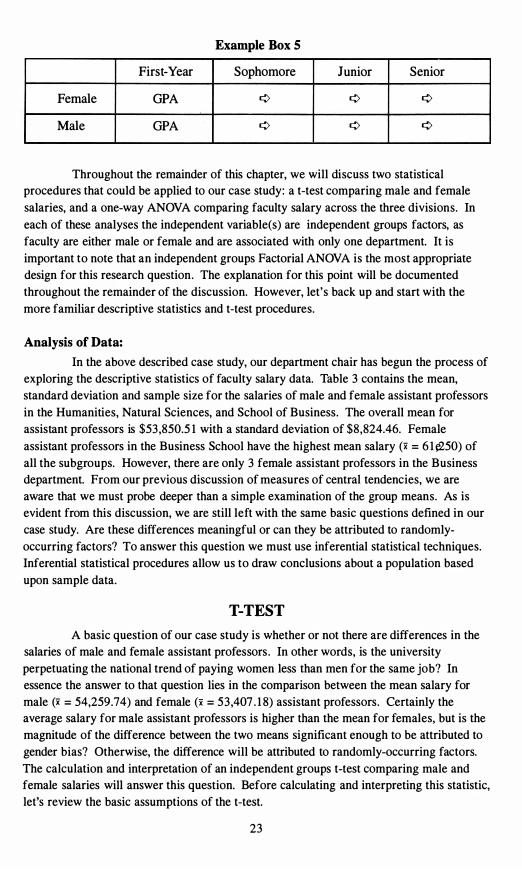
her four years. This design is graphically illustrated in Example Box 5 and would be
referred to as a mixed Factorial ANOVA.
2 1
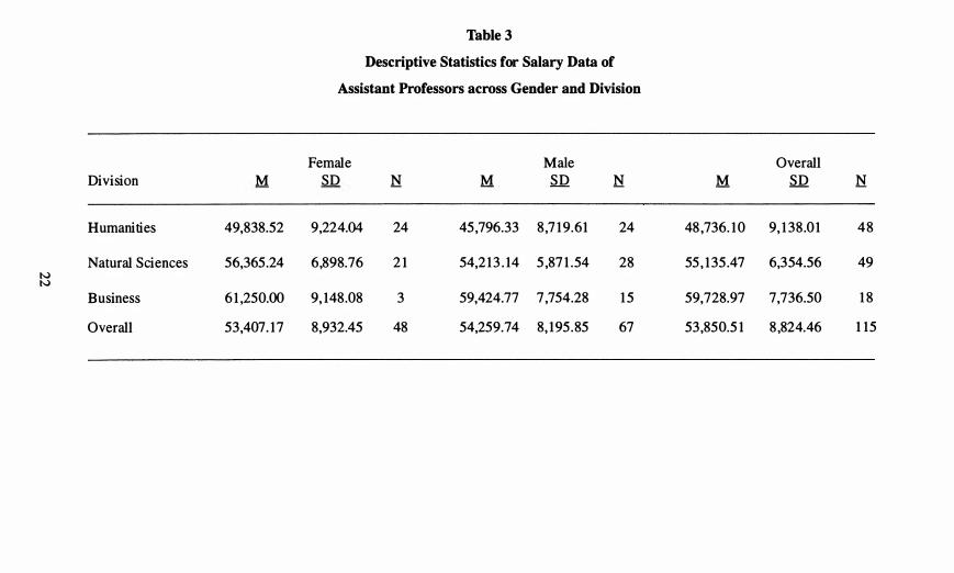
49
Table 3
Descriptive Statistics for Salary Data of
Assistant Professors across Gender and Division
Female Male Overall
Division M SD N M S D N M SD N
Humanities 49,838.52 9,224.04 24 45,796.33 8,7 19 .61 24 48,736. 10 9, 138.0 1 4 8
Natural Sciences 56,365.24 6,89 8.76 2 1 54,2 13 . 14 5,87 1.54 28 55, 135 .47 6,354.56 IV IV
Business 6 1,250.00 9, 148.08 3 59,424.77 7,754.28 15 59,728.97 7,736.50 1 8
Overall 53,407. 17 8,932.45 48 54,259 .74 8, 195 . 85 67 53,850.5 1 8,824.46 1 15
Example Box 5
First-Year Sophomore Junior Senior
Female GPA ¢ ¢ ¢
Male GPA ¢ ¢ ¢
Throughout the remainder of this chapter, we will discuss two statistical
procedures that could be applied to our case study: a t-test comparing male and female
salaries, and a one-way ANOYA comparing faculty salary across the three divisions. In
each of these analyses the independent variable(s) are independent groups factors, as
faculty are either male or female and are associated with only one department. It is
important to note that an independent groups Factorial ANOYA is the most appropriate
design for this research question. The explanation for this point will be documented
throughout the remainder of the discussion. However, let's back up and start with the
more familiar descriptive statistics and t-test procedures.
Analysis of Data:
In the above described case study, our department chair has begun the process of
exploring the descriptive statistics of faculty salary data. Table 3 contains the mean,
standard deviation and sample size for the salaries of male and female assistant professors
in the Humanities, Natural Sciences, and School of Business. The overall mean for
assistant professors is $53 ,850.5 1 with a standard deviation of $8,824.46. Female
assistant professors in the Business School have the highest mean salary (x = 6 1 e,250) of
all the subgroups. However, there are only 3 female assistant professors in the Business
department. From our previous discussion of measures of central tendencies, we are
aware that we must probe deeper than a simple examination of the group means. As is
evident from this discussion, we are still left with the same basic questions defined in our
case study. Are these differences meaningful or can they be attributed to randomly
occurring factors? To answer this question we must use inferential statistical techniques.
Inferential statistical procedures allow us to draw conclusions about a population based
upon sample data.
T-T EST
A basic question of our case study is whether or not there are differences in the
salaries of male and female assistant professors . In other words, is the university
perpetuating the national trend of paying women less than men for the same job? In
essence the answer to that question lies in the comparison between the mean salary for
male (x = 54,259.74) and female (x = 53,407 . 1 8) assistant professors. Certainly the
average salary for male assistant professors is higher than the mean for females, but is the
magnitude of the difference between the two means significant enough to be attributed to
gender bias? Otherwise, the difference will be attributed to randomly-occurring factors.
The calculation and interpretation of an independent groups t-test comparing male and
female salaries will answer this question. Before calculating and interpreting this statistic,
let's review the basic assumptions of the t-test.
23
Background & Basic Assumptions
Aet-test detennines whether the difference between two group means is likely to
have occurred by chance or whether the difference is attributable to the levels (or groups)
of the independent variable. In order to calculate a t-test, the research design must contain
only one dependent variable (in this case, salary) measured on an interval or ratio scale
and one independent variable which has only two levels (in this case, gender). The
independent variable may either be an independent groups or repeated measures factor (in
this case, independent groups). Thus there are two versions of the t-test: independent !groups and repeated measures.e
Another assumption of the independent groups t-test is that the scores within
each level of the independent variable are independent of one another. In our analysis and
most applications, independent observations are assumed when each subject supplies only
one score. However, when an independent groups design is used, the population
characteristics of the two distributions may be quite different. The t-test uses the
assumption of homogeneity of variance which states that the variances of the two levels of
the independent variable must be equal. Remember in Chapter I , an illustration was
provided where the measures of central tendency for two samples were the same, yet the
dispersion of the scores was quite different. In this case if we were comparing the means
of these two groups we might have violated this assumption. Numerous tests are available
for evaluating this assumption. SPSS calculates the Levene test of homogeneity of
variance. Norusis ( 1 993) described this procedure as "less dependent on the assumption
of normality than most tests" (p. 1 87). The null hypothesis for this test is that the groups
(i .e. , levels of the independent variablee) come from populations with equal variances .
The Levene statistic is an F ratio and interpretation of the significance of the F value will
determine whether you have met or violated the assumption.2 In lieu of this or other
tests, Grimm ( 1 993) suggested the following rule of thumb to evaluate this assumption:
"Examine the sample variances: if one of them is four times larger than the other, you
will probably violate the assumption" (p. 1 82).
Overall, the t-test is a robust test. This implies that the test is not always
adversely affected when one of the assumptions has been violated, particularly if the two
sample sizes (i .e. , the levels of the independent variable) are equivalent (n! = ne) and the 2e
overall sample size is large (N > 30) (Grimm, 1993; Triola, 1 992). Yet these assumptions
should not be ignored. In fact the discovery that the variances between the two groups are
significantly different from one another can be an interesting finding, even if the means of
the two groups are not significantly different. If the assumption of homogeneity of
Some texts and software packages refer to independe,,' �roups as independent samples and repeated measures as dependent samples, paired es, or correlated samples.
Thus, non significance equates to meeting the assumption of homogeneity of variance and significance indicates a violation of the assumption.
24
variance has been violated, there is a statistical adjustment to the t-test formula, which is
reported by most statistical software packages, including SPSS. In SPSS, the equal
variances t-test is used with homogenous variances, and the unequal variances t-test for
heterogeneous variances. Finally, if the group sample sizes are not equivalent, the overall
sample size is small, or one or more of the assumptions has been violated, a test of
significance that does not make assumptions about the population distributions should be
used. These tests are referred to as non-parametric tests. A discussion of equivalent non
parametric statistics appears at the conclusion of this chapter.
T-Test Analysis:
In this analysis, the dollar amount of the annual salary of assistant professors
will be used as the dependent variable. The independent variable gender is an
independent groups factor with two levels: male and female. An independent groups t-test
was calculated comparing the mean salary for male and female assistant professors. The
T-TEST procedure from SPSS (Norusis, 1993) was used to calculate this statistic. The
output from this t-test procedure may be found in Table 4.
In reviewing the output in Table 4, Levene's test of equality of the variances
indicates that the assumption of homogeneity of variance has been met, since the 12 > .05 .
Therefore, the t-test formula that should be interpreted is labeled for equal variances. The
t- test (-.50) is calculated by dividing the mean difference3 (-852.5654) by the standard
error of the difference ( 1 7 12.777) labeled SE of DIFF on the printout. The significance of
the t-test was reported as .620. Since this value is clearly greater than the normal alpha
level of .05 , we must conclude that no significant difference exists between the means of
the male and female assistant professors. Although a difference exists between the mean
sample salaries of male (x = 54,259.74) and female (x = 53,407 . 1 8) assistant professors,
this difference is not large enough to be attributed to anything more than random
occurrences.
In the calculation of the t-test, SPSS always subtracts the mean of the group coded 2 from the mean of the group coded 1 . The negative mean difference was created because females were coded as 1 and have a lower mean than the males who were coded 2. Thus, a negative mean difference indicates that the second group has a higher mean than the group coded 1 .
25
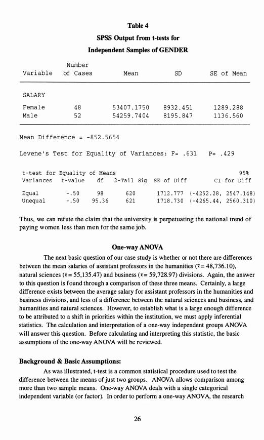
Table 4
SPSS Output from t-tests for
Independent Samples of GENDER
Number
Variable of C a s e s Mean SD S E o f Mean
SALARY
F emale 48 53407 . 1750 8 9 32 . 451 1289 . 288
Male 52 54259 . 7404 8195 . 847 1 13 6 . 560
Mean Dif f erenc e = -852 . 5 654
Levene ' s T e s t f o r Equality of Varianc e s : F = . 631 p= . 42 9
t - t e s t Var iances
for Equa l i ty of Means t -va lue d f 2 -Ta i l Sig SE of Di f f C I
9 5 % for Di f f
Equal Unequal
- . 5 0 - . 5 0
9 8 9 5 . 3 6
6 2 0 6 2 1
1 7 l 2 . 7 7 7 1 7 l 8 . 7 3 0
( - 4 2 5 2 . 2 8 , 2 5 4 7 . 1 4 8 ) ( - 4 2 6 5 . 4 4 , 2 5 6 0 . 3 1 0 )
Thus, we can refute the claim that the university is perpetuating the national trend of paying women less than men for the same job.
One-way ANOVA
The next basic question of our case study is whether or not there are differences
between the mean salaries of assistant professors in the humanities (x = 48,736. 1 0),
natural sciences (x = 55, 1 35 .47) and business (x = 59,728.97) divisions. Again, the answer
to this question is found through a comparison of these three means. Certainly, a large
difference exists between the average salary for assistant professors in the humanities and
business divisions, and less of a difference between the natural sciences and business, and
humanities and natural sciences. However, to establish what is a large enough difference
to be attributed to a shift in priorities within the institution, we must apply inferential
statistics . The calculation and interpretation of a one-way independent groups ANOVA
will answer this question. Before calculating and interpreting this statistic, the basic
assumptions of the one-way ANOVA will be reviewed.
Background & Basic Assumptions:
As was illustrated, t-test is a common statistical procedure used to test the
difference between the means of just two groups. ANOVA allows comparison among
more than two sample means. One-way ANOVA deals with a single categorical
independent variable (or factor). In order to perform a one-way ANOVA, the research
26
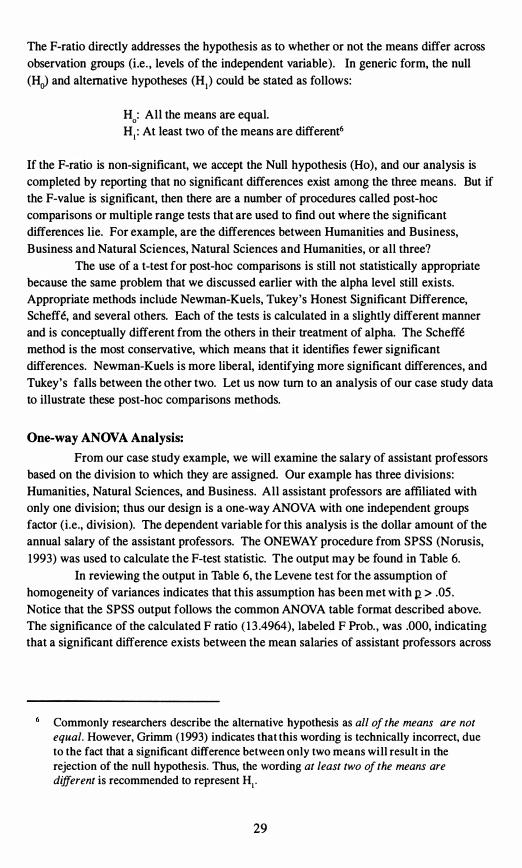
design must contain only one dependent variable measured on an interval or ratio scale.
The independent variable is used to classify subjects or observations into separate categories or groups. The research design for the one-way ANOYA must contain only one
independent variable and that variable should have three or more levels.4
Often individuals ask if they can perform multiple t-tests to make the paired comparisons between the levels of the independent variable instead of a one-way
ANOYA.5 Given that a t-test is a special case of ANOYA in which the independent
variable has only two levels and that the squared t-value (t2) is equivalent to the F-ratio for determining statistical significance between two groups using ANOYA, there would seem to be logical basis for such a procedure. However, this procedure is not statistically appropriate. The use of multiple t-tests leads to a loss of any interpretable level of significance (Le., alpha (27) level). In ANOYA, the alpha level is used to make decisions
regarding statistical significance of the differences between the group means. Thus, when the alpha level is set at .05 and a t-test is conducted, there is a probability of making an error by stating that differences existed between the group means, when in reality they did
not differ. The probability of this type of error for that one test is 5 percent. When a series of t-tests is run, the probability of mistakenly stating that differences existed is
inflated. In fact, Grimm ( 1993) stated that if three t-tests are performed, as in our case study, a .05 alpha level would be inflated to . 14 and if 10 tests were performed the same
alpha (.05) would be inflated to .40. Thus, you would have a 40 percent chance of finding differences that look real, but in fact are due to random occurrences.
From a statistical viewpoint, the same three assumptions that were appropriate for the independent groups t-test are appropriate for the one-way independent groups ANOYA. First, the dependent variable must come from an essentially normallydistributed population. Second, the scores within each level of the independent variable are assumed to be independent of one another. This assumption of independent observations is only appropriate for an independent groups analysis and is assumed
through the research design. Finally, the variance of the dependent measure should be essentially constant for all categories or groups of the independent variables . A term for this second assumption, if met, is homogeneity of variance. Again, SPSS calculates the
Levene test of equality of variances to check this assumption. Unlike the t-test, if this assumption is violated, no statistical adjustment can be made. Therefore the researcher
would determine which variances are distinctly different, report the violation, and proceed with the ANOYA procedure assuming that the test was robust.
If there are only two levels to the independent variable then a t-test would be run. Also, if there is more than one independent variable then a factorial ANOVA would be more appropriate.
In our example this would be equivalent to running three t-tests; comparing: Humanities versus Business, Humanities versus Natural Sciences, and Natural Sciences versus Business.
27

The calculation of the ANOVA centers around the calculation of the F-ratio. In basic
terms, the F-ratio is computed as follows:
variance between groups F =
variance within groups
This computation requires the calculation of three sources of variance (sum of squares,
[SS)): between groups, within groups, and total. These three sources can best be seen
graphically in Figure 8. Each of these sources of variance has degrees of freedom
associated with it. Degrees of freedom are adjustments that are made to sources of
variation based on either sample size or the number of levels in the independent variable
or both. The mean square (MS) of the variance between and within samples is equivalent
to the sum of squares (SS) between and within groups divided by its associated degrees of
freedom. The calculations of the one-way ANOVA can best be summarized in the
common table format displayed in Table 5 .
Figure 8
ANOVA Sources of Variation
Total
Table 5 Summary Table for ONE-WAY ANOVA
SOURCE SS df MS F p
B etween Groups k - l
Within Groups N-k
Total N - l
Note: K represents the number o f levels o f the independent variable and N , the total
sample size.
2 8
The F-ratio directly addresses the hypothesis as to whether or not the means differ across
observation groups (Le. , levels of the independent variable). In generic form, the null
(He) and alternative hypotheses (HI) could be stated as follows:
H : All the means are equal.o HI : At least two of the means are different6
If the F-ratio is non-significant, we accept the Null hypothesis (Ho), and our analysis is
completed by reporting that no significant differences exist among the three means. But if
the F-value is significant, then there are a number of procedures called post-hoc
comparisons or multiple range tests that are used to find out where the significant
differences lie. For example, are the differences between Humanities and Business,
Business and Natural Sciences, Natural Sciences and Humanities, or all three?
The use of a t-test for post-hoc comparisons is still not statistically appropriate
because the same problem that we discussed earlier with the alpha level still exists.
Appropriate methods include Newman-Kuels, Thkey's Honest Significant Difference,
Scheffe, and several others. Each of the tests is calculated in a slightly different manner
and is conceptually different from the others in their treatment of alpha. The Scheffe
method is the most conservative, which means that it identifies fewer significant
differences. Newman-Kuels is more liberal, identifying more significant differences, and
Tukey's falls between the other two. Let us now tum to an analysis of our case study data
to illustrate these post-hoc comparisons methods.
One-way ANOVA Analysis:
From our case study example, we will examine the salary of assistant professors
based on the division to which they are assigned. Our example has three divisions:
Humanities, Natural Sciences, and Business. All assistant professors are affiliated with
only one division; thus our design is a one-way ANOYA with one independent groups
factor (i.e., division). The dependent variable for this analysis is the dollar amount of the
annual salary of the assistant professors. The ONEWAY procedure from SPSS (Norusis,
1993) was used to calculate the F-test statistic. The output may be found in Table 6.
In reviewing the output in Table 6, the Levene test for the assumption of
homogeneity of variances indicates that this assumption has been met with 11 > .05 .
Notice that the SPSS output follows the common ANOYA table format described above.
The significance of the calculated F ratio ( 1 3 .4964), labeled F Prob. , was .000, indicating
that a significant difference exists between the mean salaries of assistant professors across
Commonly researchers describe the alternative hypothesis as all of the means are not equal. However, Grimm (1993) indicates that this wording is technically incorrect, due to the fact that a significant difference between only two means will result in the rejection of the null hypothesis. Thus, the wording at least two of the means are different is recommended to represent HI .
29
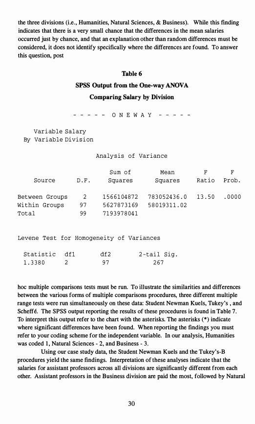
the three divisions (Le. , Humanities, Natural Sciences, & Business). While this fmding
indicates that there is a very small chance that the differences in the mean salaries
occurred just by chance, and that an explanation other than random differences must be
considered, it does not identify specifically where the differences are found. To answer
this question, post
Table 6
SPSS Output from the One-way ANOVA
Comparing Salary by Division
O N E W A Y
Var i ab l e S a l ary
By Var i ab l e Divi s i on
Ana ly s i s o f Var i ance
Sum o f Mean F F
Source D.F. Squares S quare s Rat i o Prob.
Between Group s 2 1566104872 783052436.0 13 . 50 .0000
Wi thin Group s 9 7 5627873169 58019 311.02
Tot a l 9 9 719 3 978041
Levene Te s t for Homogene i ty o f Var i anc e s
S t a t i s t i c d f l df2 2 - t a i l S i g.
1. 3380 2 9 7 267
hoc multiple comparisons tests must be run. To illustrate the similarities and differences
between the various forms of multiple comparisons procedures, three different multiple
range tests were run simultaneously on these data: Student Newman Kuels, Tukey's , and
Scheffe. The SPSS output reporting the results of these procedures is found in Table 7.
To interpret this output refer to the chart with the asterisks. The asterisks (* ) indicate
where significant differences have been found. When reporting the findings you must
refer to your coding scheme for the independent variable. In our analysis, Humanities
was coded 1, Natural Sciences - 2, and Business - 3 .
Using our case study data, the Student Newman Kuels and the Tukey's-B
procedures yield the same findings. Interpretation of these analyses indicate that the
salaries for assistant professors across all divisions are significantly different from each
other. Assistant professors in the Business division are paid the most, followed by Natural
30
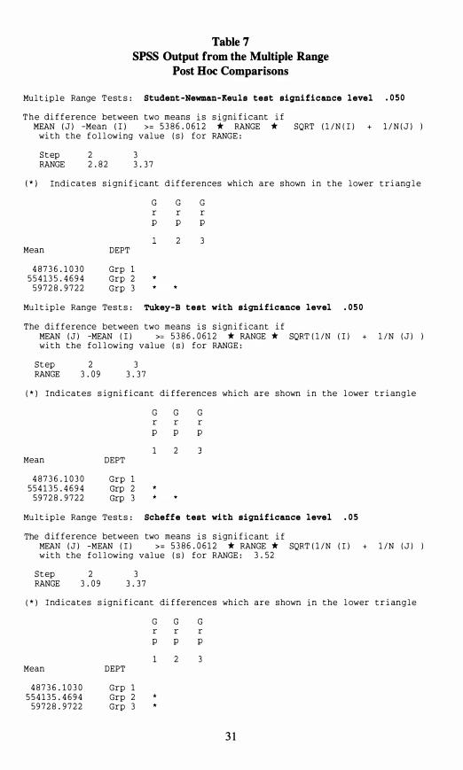
Table 7 SPSS Output from the Multiple Range
Post Hoc Comparisons
Mu l t ip l e Range T e s t s : Student -Newman-Keuls test signi ficance l evel . 0 5 0
T h e di f f e rence between two means i s s i gni f i c ant i f MEAN ( J ) -Mean ( I ) >= 5 386 . 06 1 2 * RANGE * SQRT ( l / N ( I ) + l / N ( J )
wi th the f o l l owing value ( s ) f o r RANGE :
S t ep 2 3 RANGE 2 . 82 3 . 3 7
( * ) Indi c a t e s s i gn i f i cant d i f ferences wh i c h are s hown in the l ower t r i ang l e
G G G r r r p p p
2 3 Mean DEPT
487 3 6 . 1 0 3 0 Grp 1 5 5 4 1 3 5 . 4 6 9 4 Grp 2
5 9 7 2 8 . 9 7 2 2 Grp 3
Mu l t i p l e Range Te s t s : Tukey-B test with signi ficance level . 0 5 0
The di f f e rence between two means i s s i gn i f i cant i f MEAN ( J ) -MEAN ( I ) >= 5 386 . 06 1 2 * RANGE * SQRT ( l / N ( I ) + l / N ( J ) ) wi t h the f o l l owi ng value ( s ) for RANGE :
S t ep 2 3 RANGE 3 . 09 3 . 3 7
( * ) Ind i c a t e s s igni f i cant di f fe renc e s wh i c h are shown i n the l owe r t r i angle
G G G r r r p p p
1 2 Mean DEPT
487 3 6 . 10 3 0 Grp 1 5 5 4 1 3 5 . 4 6 9 4 Grp 2
5 9 7 28 . 9 7 2 2 Grp 3
Mu l t i p l e Range Te s t s : Scheffe test wi th signi f icance level . 0 5
The d i f f e rence between two means i s s i gn i f i c ant i f MEAN ( J ) -MEAN ( I ) > = 5 386 . 06 1 2 * RANGE * SQRT ( 1 / N ( I ) + l / N ( J ) )w i t h the f o l l owing value ( s ) f o r RANGE : 3 . 5 2
S t ep 2 3 RANGE 3 . 09 3 . 3 7
( * ) I nd i c a t e s s igni f i cant di f fe renc e s wh i c h are s hown i n the l ower t r i angle
G G G r r r p p p
1 2 3 Mean DEPT
487 3 6 . 10 3 0 Grp 1 5 5 4 1 3 5 . 4 6 9 4 Grp 2 *
5 9 7 28 . 9 7 2 2 Grp 3
3 1
Sciences, and then Humanities. However, when interpreting output from the more
conservative procedure, Scheffe, the mean salary for assistant professors in the
Humanities division was found to be significantly lower than either the Business or
Natural Sciences divisions, but no significant difference was found between the Business
and Natural Sciences divisions. Given the discrepancy between these procedures the
researcher has a dilemma: which findings should be reported? Even though both the
liberal (Student Newman Kuels) and moderate (Tukey's B) procedures replicate each
other's findings, in this instance erring on the side of conservatism might be wise, given
the sensitive nature of the topic. Thus, the results of the Scheffe procedure are probably
more appropriate to report. No matter what analysis is reported, this is disturbing news
for the institution. Certainly one possible interpretation of these findings is the claim of
the chair of the Humanities division that the institution is de-emphasizing its traditional
commitment to the liberal arts and is moving toward a pre-professional orientation. Since
faculty salaries may vary based on many factors, the researcher should be more complete
and thorough in exploring all possible interpretations. A model with only one
explanatory (i .e . , independent) variable is certainly not comprehensive, and further
analysis and investigation is definitely warranted. Some other factors to consider in salary
equity studies are length of service, years since Ph.D. , Ph.D. origin, and number of
publications .
Other Statistical Procedures for Comparing Group Means
To this point in our analysis of the case study data, we have found no differences
in the salary of assistant professors based on gender and found significant differences
between salaries across the three divisions. Yet several questions remain unanswered.
Do gender and division interact with each other with regard to salary? Are there other
independent variables, such as length of service, which should be included when
examining differences in faculty salaries? For our purposes, in reviewing basic statistical
procedures we have proceeded as far as the limits of this text will allow. However, basic
descriptions of other statistical procedures that may be used to compare group means are
presented to acquaint you with some of the more advanced designs.
Factorial ANOVA:
As was illustrated, the t-test allows comparison between two group means, while
the one-way ANOVA has an advantage over a t-test: being able to make comparisons
among more than two sample means from one independent variable. A factorial ANOVA
is used when the research design includes more than one independent variable, each with
any number of levels (i .e. , two or more). Thus, factorial ANOVAs have an inordinate
number of possible designs. Further, all factorial ANOVA models are labeled by the
number of levels in each of the independent variables . A logical progression from our
case study would be to extend the previous one-way ANOVA and add an additional
independent variable that represents the gender of the professor. This particular factorial
ANOVA is labeled as a 2 X 3 with two independent groups factors (i .e . , gender - 2 levels
and division - 3 levels). In our case study, this analysis may have been the most logical
and appropriate statistical technique to calculate with the exception of one limitation, the
32
sample sizes. If you refer back to Table 3 , you will be reminded of the fact that the
sample sizes between the genders in each division was quite discrepant. For example, the
number of female Business faculty was 3, while the number of female Natural Science
faculty was 2 1 . This small 'cell size' is problematic to the calculation of this ANOVA. As
a result, collapsing to a 2 X 2 ANOVA by dropping the Business department would be
recommended. A factorial ANOVA allows the researcher to test the impact of two
different portions of the design, the main effects and the interaction. The main effects in a factorial design are similar to the univariate tests we just calculated. For our case
study, the main effects would compare the impact of gender and division on the salary of
assistant professors. The interaction or differential effect tests to determine if a different
outcome is present across one or more levels of the two independent variables. Hence, the
name interaction; do the two independent variables interact? For example, do female
Business professors make more than male Humanities professors? Often, this question is
the more interesting and most relevant to our research. In our case study, the analysis of
the interaction would examine whether or not significant salary differences exist between
male and female faculty members in each of the three divisions. In other words, does a
differential effect exist between gender and division with regard to salary?
Analysis of Covariance (ANCOVA) :
Analysis of Covariance is really an advanced form of ANOVA. An attempt will
be made to describe a rather complex statistical procedure in rather basic terms. ANOVA
procedures are grounded in linear regression. However, the procedure does not attempt to
measure the fit between variables; rather, it seeks to determine the probability that a
predictor variable could yield results different from simple random selection (Iverson & Norpoth, 1 976). ANCOVA is an extension of the linear model for ANOVA. The most
common application of ANCOVA is to examine the relationship between a continuous
dependent variable and a categorical independent variable while controlling for the effects
of a second continuous variable (Le., nuisance variable) . In essence, ANCOVA examines
differences in the dependent variable among categories of the independent variable
controlling for differences in the nuisance variable (covariate). For example, in
institutional research it may be interesting to see differences in SAT scores between the
genders after controlling for the level of IQ of the student. In our case study, we could
control for the number of years of teaching. Years of experience is a variable that should
be partialled out of salary in order to more effectively compare mean salaries.
While ANCOVA is generally highly regarded as a means of improving research
design, one must be careful to ensure that ANCOVA is best suited to your study. When
deciding whether or not to include a covariate, two questions must be considered. First,
does a strong relationship exist between the covariate and the dependent measure (r =.40
or greater)? Second, is there little to no relationship between the covariate and the
independent variable? In order for this analysis to be appropriate the answer to both of
these questions must be yes. In order to warrant the partialing out of the impact of this
nuisance variable (covariate), a strong relationship must exist between the covariate and
the dependent variable. However, if a relationship exists between the covariate and the
independent variable, then it becomes impossible to remove the effects of the covariate
33
from the analysis. Another word of caution: using a covariate is not necessarily the best
method for dealing with differences in a known group. From a research design
standpoint, it is far better to randomly assign subjects, if possible. Remember, Garbage
in, Garbage out; no statistical procedure can save an inferior research design.
Multivariate ANalysis Of VAriance (MANOVA) :
ANOVA is used to allow comparisons of a single dependent measure among two
or more levels of an independent variable or variables. MANOVA is used when there is
more than one dependent variable, and it is inappropriate to do a series of univariate tests.
Again, please be reminded that the MANOVA procedure is an advanced and complex
statistical procedure. Only a brief description of the purpose of this statistical procedure
will be explored.
Two major reasons exist for performing a MANOVA as opposed to several
univariate ANOVAs for each dependent variable. First, we often have several tests that are
designed to measure various aspects of one overlying factor. For example, math and
verbal SAT scores are both measures of a high school student's academic achievement. In
other words, math and verbal SAT scores are often highly correlated; hence, if you find a
significant difference between groups on math SAT you would most likely find one for
verbal SAT. Testing both separately with univariate statistics is not the best approach
because the two analyses are not independent. Secondly, the MANOVA procedure
provides the researcher with the ability to study the interaction among the dependent
variables. Just as the interaction among independent variables in a factorial ANOVA
provides new information, which could not be uncovered by calculating separate tests,
looking at two or more dependent variables simultaneously in a MANOVA provides more
information than doing a series of univariate analyses .
Non-parametric Tests of Mean Differences:
When a researcher has violated the assumptions of parametric statistics, several
non-parametric equivalent tests exist for comparing group means. Within the context of
this text no attempt will be made to review all of these non-parametric procedures; rather
a brief description of these procedures will be provided with sources of reference for
further information. Within the context of Institutional Research, non-parametric statistics
are often warranted because of the use of ordinal Likert scales on many of our survey
instruments .
The non-parametric equivalent of the independent groups t-test is the Mann
Whitney U test. The Wilcoxon Signed Rank test is the equivalent non-parametric measure
for the repeated measures or paired t-test. Instead of the one-way independent groups
ANOVA, a researcher should utilize the Kruskal Wallis test under non-parametric
conditions. Finally, the non-parametric equivalent for the one-way ANOVA with repeated
or dependent samples is the Friedman's ANOVA by Ranks procedure. No equivalent non
parametric procedures exist for Factorial ANOVA, ANCOVA, or MANOVA. Most basic
statistical texts (e.g . , Grimm, 1993; Triola, 1994) provide documentation on these basic
34

non-parametric statistics. For a more complete reference for non-parametric statistics,
refer to Conover ( 1980), Mostella and Rourke ( 1973) or Siegal ( 1956).
35
Chapter Three
Correlation: Measuring the Relationship Between SAT and First-Year GPA
Case Study:
Each year admissions officers struggle to recruit qualified students for
enrollment to institutions of higher education. At the same time, faculty may be
questioning the quality of entering first-year students. Often admissions personnel are at a
loss to determine those qualities that are most indicative of success at their institution.
Historically, SAT scores have not shown strong predictive validity for first-year grade
point average at many institutions. High school grade point average and admissions
ratings have shown stronger associations with academic performance. Yet many
institutions have found the need to rely more heavily on qualitative data, such as
recommendations, essays, and interviews. Of course, the analysis of qualitative data is
much more subjective, time consuming and costly than quantitative data.
The case at hand involves a private college with a variety of undergraduate
programs centered around a basic liberal arts orientation. Recently, the faculty have
raised questions about admissions standards and the quality of entering students . Faculty
concerns are centered on decreasing academic performance. Many faculty fear the time
has come to adjust the curriculum or a higher percentage of students will be receiving
lower grades. The Director of Admissions has asked for your assistance in determining
what are the best quantitative measures available to admissions officers for assessing the
potential for academic success within the current curriculum.
The focus of this case study is to examine the 635 students who recently
completed their first year at this institution and determine those variables in the
admissions file that are most strongly related to academic success. From the student
academic data base academic success is defined as the life-to-date grade point average
(LTDGPA) of these students who recently c<?mpleted their first year. From the admissions
file, quantitative measures for these students are extracted and matched to their LTDGPA.
These quantitative measures include: high school grade point average, verbal SAT, and
math SAT. This case study will be used to illustrate the application of correlational
analyses to measure the relationships among these variables.
Background:
A correlation coefficient measures the strength and direction of the linear
relationship between two variables. Correlational procedures measure how one variable
changes in relation to another. Examples in Institutional Research might include
measuring the relationship between the size of the endowment of a college and the
number of alumni, or the amount of money a college spends on recruiting and the number
of applicants .
Before proceeding to the calculation of the correlation coefficient and our case
study, it is important to describe some important aspects of this procedure. First, the
correlation coefficient only measures a linear relationship. Any relationship that may be
36
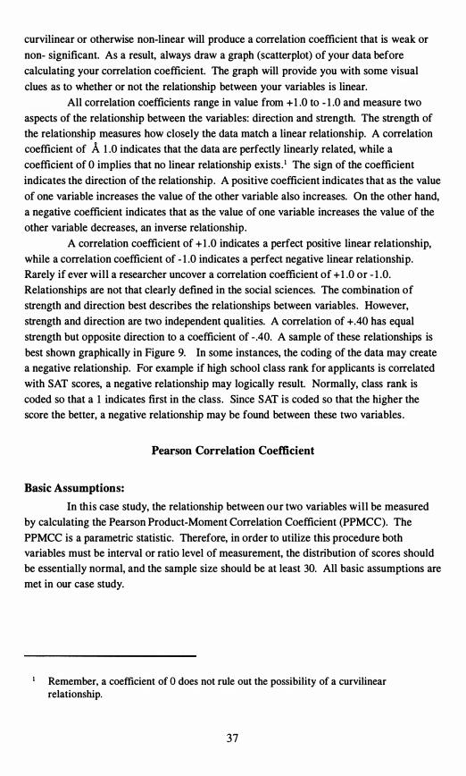
curvilinear or otherwise non-linear will produce a correlation coefficient that is weak or
non- significant. As a result, always draw a graph (scatterplot) of your data before
calculating your correlation coefficient. The graph will provide you with some visual
clues as to whether or not the relationship between your variables is linear.
All correlation coefficients range in value from + 1 .0 to - 1 .0 and measure two
aspects of the relationship between the variables: direction and strength. The strength of
the relationship measures how closely the data match a linear relationship. A correlation
coefficient of A 1 .0 indicates that the data are perfectly linearly related, while a
coefficient of 0 implies that no linear relationship exists . · The sign of the coefficient
indicates the direction of the relationship. A positive coefficient indicates that as the value
of one variable increases the value of the other variable also increases. On the other hand,
a negative coefficient indicates that as the value of one variable increases the value of the
other variable decreases, an inverse relationship.
A correlation coefficient of + 1 .0 indicates a perfect positive linear relationship,
while a correlation coefficient of - 1 .0 indicates a perfect negative linear relationship.
Rarely if ever will a researcher uncover a correlation coefficient of + 1 .0 or - 1 .0.
Relationships are not that clearly defined in the social sciences. The combination of
strength and direction best describes the relationships between variables. However,
strength and direction are two independent qualities. A correlation of +.40 has equal
strength but opposite direction to a coefficient of - .40. A sample of these relationships is
best shown graphically in Figure 9. In some instances, the coding of the data may create
a negative relationship. For example if high school class rank for applicants is correlated
with SAT scores, a negative relationship may logically result. Normally, class rank is
coded so that a 1 indicates first in the class. Since SAT is coded so that the higher the
score the better, a negative relationship may be found between these two variables .
Pearson Correlation Coefficient
Basic Assumptions:
In this case study, the relationship between our two variables will be measured
by calculating the Pearson Product-Moment Correlation Coefficient (PPMCC). The
PPMCC is a parametric statistic. Therefore, in order to utilize this procedure both
variables must be interval or ratio level of measurement, the distribution of scores should
be essentially normal, and the sample size should be at least 30. All basic assumptions are
met in our case study.
Remember, a coefficient of 0 does not rule out the possibility of a curvilinear relationship.
37
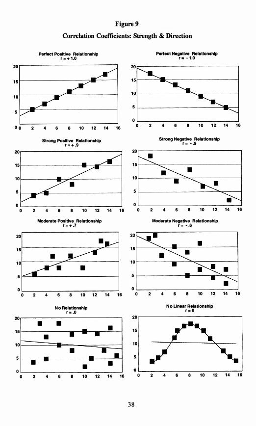
--
• -
-- •
• --
20 r-----------------------------,
O L-________________________ �
Figure 9
Correlation Coefficients: Strength & Direction
Perfect Positive Ralatlonshlp Perfect Negative Relationship r .. + 1 .0 r .. - 1 .0
5
0 0 2 4 6 8 1 0 1 2
Strong Positive Relationship r .. + .9
20
1 5
1 0
5
0 0 2 4 6 8 1 0 1 2
Moderate Positive Relationship r = + .7
0 2 4
• 1 5
• 1 0
• 5
• • o o 2 4 6 8 1 0 1 2
1 4 1 6
20
1 5
1 0
5
0
20
6 8 1 0 1 2 1 4 1 6
N o Relationship r .. . 0
•
0 2 4 6 8 1 0 1 21 4 1 6
Strong Negative Relationship r = - .9
20
1 5
1 0
5
0
5
0 1 4 1 6
0 2 4 6 8 1 0 1 2
Moderate Negative Relationship r = - .6
1 5
1 0
5
0
•
• 0 2 4 6 8 1 0 1 2
N o Linear Relationship r = O
•
• •
o 2 41 4 1 6
1 4 1 6
1 4 1 6
1 5
1 0
5
6 8 1 0 1 2 1 4 1 6
3 8
R = r===============� J
Analysis of Data:
In this analysis, the two variables are high school grade point average (HSGPA)2
and first-year GPA (LTDGPA). Again, the PPMCC was calculated to measure the
strength and direction of the relationship between these two variables. The
CORRELATIONS procedure from SPSS (Norusis, 1993) was used to calculate this
statistic. For your reference, the formula for the PPMCC is listed below in Table 8 with
the output from the SPSS procedure.
Table 8
Formula for
Pearson Product Moment Correlation Coefficient (pPMCC)
-NIXY - (IX) (IY)
[NIX2 (IX)2] [NIy2 -(IY) 2] SPSS Output from
Correlations Procedura (pPMCC)
- - Corre l a t i on Coe f f i c i ents - -
LTDGPA HSGPA VEFB_SAT MATH_SAT
LTDGPA 1 . 0000 . 2 3 4 2 . 1 65 6 . 1 3 55 strength & direction
( 6 3 5 ) ( 6 2 1 ) ( 6 1 5 ) ( 6 1 5 ) It of subj ects
p = p = . 000 p = . 000 p = . 001 signi ficance
HSGPA . 2 3 4 2 1 . 0000 . 1003 - . 09 9 3
( 6 2 1 ) ( 6 2 1 ) ( 5 6 6 ) ( 5 6 6 )
p = . 000 p = p = . 895 p = . 018
. 1 3 55 . 100 3 1 . 0000 . 2 54 9
( 6 1 5 ) ( 56 6 ) ( 6 1 5 ) ( 6 1 5 )
p = . 000 p = . 895 p = p = . 000
. 1 3 55 - . 0 9 9 3 . 2 5 4 9 1 . 0000
( 6 1 5 ) ( 5 6 6 ) ( 6 1 5 ) ( 6 1 5 )
p = . 00 1 p = . 018 p = . 000 p =
( C oe f f i c i ent / ( Ca s e s ) / S i gn i f i canc e )
• i s pr inted i f a c oe f f i c i ent c annot be c ompu t ed
Reviewing the SPSS output provides a correlation matrix. The correlation
coefficient between LTDGPA and high school grade point average (HSGPA) is the
strongest reported (r = .234). While total unanimity does not exist with regard to
Depending on the variety of backgrounds of the entering first-year students, you may wish to convert raw high school grade point averages to standardized scores by calculating Z scores.
39
interpreting correlation coefficients, some authors of basic statistics texts describe
correlations of 0 to .29 as weak, .30 to .59 as moderate, and above .60 as strong (Levin & Fox, 1994). Thus, our correlation is weak. Also, the relationships between LTDGPA and
SAT scores are weak (verbal, r = . 1 656; math, r = . 1 355). However, the question still
remains, does a significant association exist between either high school grade point
average or SAT scores and LTDGPA? In order to generalize about this relationship, a test
of significance should be performed. The SPSS printout reports a significant positive
linear relationship between all of these variables. This test of significance determines if
the relationship is significantly different from o. As a result, many moderate to weak
correlations with a decent sample size (n > 100) will be statistically significant.3
In assessing the true strength of the relationship between the two variables, many
researchers will calculate R2, which is determined by squaring the correlation coefficient.
R-squared is associated with regression analysis and determines the proportion of the total
variation in the LTDGPA scores that can be explained by either high school grade point
average or SAT scores. Also, 1 - R2 represents the proportion of this variance that is left
unexplained or is due to other factors. In this analysis, 5 .48% ( .234 * .234) of the
variability in the LTDGPA scores can be explained by the high school grade point average
of first-year students. Therefore, while a significant relationship (r = .234, II = .00) does
exist between the two variables, a large amount of the variance (94.5%) in LTDGPA
remains unexplained or is due to other factors. As a result, the researcher should
definitely proceed with caution in describing this relationship . SAT scores were not
stronger predictors of first-year grade point average. The R2 for verbal SAT is .027(2.7%
explained) and for math .018 0 .8% explained).
Limitations to Correlational Analyses:
When interpreting correlation coefficients, several limitations should be
considered, of which we have so far discussed two. First, the PPMCC only measures
linear relationships; secondly, the test of significance for the correlation coefficient only
determines whether or not the correlation coefficient is significantly different from O. Beyond these two limitations, the researcher needs to be sure that he or she does not imply
any cause and effect relationship between the two variables when discussing correlational
findings. Remember, correlation measures the strength and direction of the relationship
found between two variables. The researcher makes no attempt to manipulate or control
these variables in any manner. Thus, no cause and effect conclusions may be drawn. Too
many other unexplained or uncontrolled factors may be influencing this relationship, and
you did not measure or control for these factors. Limit the wording of your interpretation
to terms such as association, relationship, or link and avoid terms such as cause, effect, or
difference. For example in this case study, an appropriate conclusion statement might
For example, a correlation coefficient of greater than or equal to A . 196 with a sample size of 100 will be significant. In Institutional Research, larger sample sizes often exist, which does in some cases assist with statistical power.
40
45 .-----------------------.
30 �------------------� 1 - -
1--------15 ��.=-.���------------ 1
0 '------------------------------'
-
--;--
• • •
• •
• • • �
read: a minimal positive association was found between high school GPA and first-year
GPA.
Another factor that may hinder in the interpretation of correlation coefficients is
the presence of an outlying score. An outlier is a score that falls outside of what would be
considered the normal range of data values.4 The presence of the outlying score may
serve to positively or negatively inflate the value of the correlation coefficient. Often, this
outlying score gives the relationship an added anchor point to assist in the fit to a linear
relationship. A picture is worth a thousand words, so refer to Figure 10. In the first graph
the value of the correlation coefficient is .608, and is found to be significant (12 = .01) .
Yet, when the outlier is removed, the value of the coefficient is - . 196 and is non
significant (12 = .47). Remember, always graph your data; without the graph the outlier
may go unnoticed.
Figure 10
Interpreting Correlation Coefficients: The Problem with Outliers
Relationship with Outlier Relationship without Outlier
r = .6077 r = -. 196 20
• • 15
•
10
•• 5 •
• .. • 0
o 5 10 15 20 25 30 35 0 2 4
Similarly, having two groups that are known to be different on one or both of the
variables can inflate the value of the correlation coefficient. Again, Figure 1 1 graphically
displays this concept. The relationship between job-related stress and salary for
Institutional Researchers is plotted. Notice the two distinct groupings of data points
found on this graph. The group in the upper right hand corner are all males and in the
lower left hand corner all females. The overall correlation is strong (r = . 9 13) and
6 8 10 12 14 16
Many researchers define an outlier as any score that falls above or below 2 standard deviations from the mean.
4 1
80.-----------------------------------------�
6O r-----------------------------------�-,�
40 r-------------------���----�--------�+
20 h.P1F-���--------------------------------�
�
certainly the relationship is significant (12 = .00). However, the linear relationship is being
enhanced by the presence of the difference in means found between these two groups. In
fact, when the correlation coefficients are calculated separately for males and females they
drop drastically and are both non-significant (males, r = . 179, 12 = .49; females r = .033 , 12 = .90). Again, remember always to graph your data and be alert for this type of problem.
If you suspect the presence of divergent groups on any one of your variables, do a test of
mean difference prior to running your correlational analysis. When significant differences
are found, calculate and report separate correlation coefficients for each group.
Figure 11
Interpreting Correlation Coefficients: The Problem with Divergent Groups
Salary in Thousands of Dollars
$ +
o o 10 20 30 40 50 60 70
Amount of Stress
Females Males • <>
Other Statistical Procedures for Measuring Relationships
Non-parametric Correlations: As mentioned previously, the PPMCC calculated in this case study is a
parametric statistic. When the assumptions of a parametric statistic have been violated,
several non-parametric correlational procedures exist. Within the bounds of this text, no
attempt has been made to review all of these procedures; rather a brief example of one
will be included. The nice aspect of all correlational procedures is that they generate a
correlation coefficient, and the same universal characteristics of strength and direction
apply to all coefficients.
Within the context of Institutional Research, the use of non-parametric
procedures is often warranted because of the use of ordinal Likert scales. For example, a
researcher may wish to know if a relationship exists between satisfaction with academic
programs and the SAT scores of applicants. Due to the fact that satisfaction with the
42
academic program is rated on a 5-point Likert scale, the use of the PPMCC is not
statistically appropriate; rather the Spearman Rank-Order Rho Correlation Coefficient
would be an appropriate non-parametric equivalent. As the name implies, the Spearman
Formula generates a separate ranking for each subject on both variables . The relationship
between the order of the rankings for both variables is what is used to calculate the
coefficient. The CORRELATIONS procedure from SPSS can also be used to calculate the
Spearman Rank Order Rho correlation coefficient (SRORCC). For your reference, the
formula for the SRORCC and the SPSS output for this procedure may be found in Table 9.
Table 9
Formula for
Spearman Rank Order Rho Correlation Coefficient (SRORCC)
R= 1 -
SPSS Output from
Correlations Procedure (SRORCC)
S P E A R M A N C O R R E L A T I O N C 0 E F F I C I E N T S
. 3 8 7 1
N ( 6 1 5 )
S i g . 0 0 0
ACADPROG . 3 4 4 1 . 4 4 3 3
N ( 6 1 0 ) N ( 6 1 0 )
S i g . 0 0 0 S i g . 0 0 0
( COEFF I C I ENT / ( CASES ) 2 - TAILED S IGNI F ICANCE )
• I S PRINTED I F A COEFF I C I ENT CANNOT BE COMPUTED
In reviewing the SPSS output, the SRORCC between verbal SAT and rating of
academic program was found to be .334 and between math SAT and rating .443 . Given
the moderate strength of this coefficient and the fact that the correlation was statistically
significant, the researcher would conclude that a significant positive linear relationship
does exist between the ranking of satisfaction with academic program and SAT scores. In
43
simpler terms, as the applicant's ranking of his or her academic program increases, so
does his or her SAT score. Overall good news for your institution.s
The Spearman correlation coefficient is a common non-parametric choice for
evaluating relationships between ordinal variables or for any combination of ordinal with
interval or ratio data. Other non-parametric choices include Goodman's or Kruskal's
Gamma for ordinal data. The Phi coefficient measures the relationship between two
nominal variables each with only two categories from a crosstabulation table (2 X 2) . In
addition, a Contingency Coefficient is used to measure the relationship between other
larger crosstabulation tables.6 The output of the SPSS procedure CROSSTABS will report
the value of these coefficients.
Regression Analysis:
Correlation measures the linear relationship that exists between two variables.
Once a correlation has been found between two variables the next logical question to ask
is whether or not that relationship can be used to predict or explain one variable from the
other. In correlation we have no true independent or dependent variable, because we are
simply trying to measure the relationship between the two variables. However, in bi
variate regression one variable is defined as the dependent or criterion variable and the
other variable is the independent or predictor variable. In this analysis, the knowledge of
the independent variable (Le. , high school GPA) is used to predict or explain the
dependent or criterion variable (Le. , first-year GPA). Besides being a logical progression
from correlation, regression has a great deal of practical application for practitioners. In
Institutional Research, regression analysis is most commonly applied to predict first-year
GPA, from some combination of independent variables (e.g. , SAT, HSGPA, admissions
rating). After all, what better tool for admissions than to be able to accurately predict how
a student will achieve academically?
As a brief example of regression, high school grade point average will be used to
predict first-year GPA. In this model, first-year GPA is the criterion or dependent
variable, and high school GPA is the predictor or independent variable. The
Remember, it is important not to imply any causal relationship between rating of program and SAT score. We did not manipulate either variable and thus have no knowledge of what other factors may be influencing or overlapping.
Often beginning researchers believe that they want to measure the relationship between a nominal variable (e.g . , gender) and some other dependent variable which is ordinal, interval, or ratio (e .g. , LTDGPA, or SAT). However, this research design is not correlational, rather it is quasi-experimental. The researcher really wants to know if a difference exists between males and females with regard to the dependent variable. For more information on tests of differences refer to Chapter 3.
44
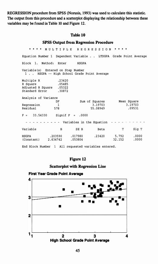
4�-----------------------------------'
2 r---------------------------------�
REGRESSION procedure from SPSS (Norusis, 1993) was used to calculate this statistic.
The output from this procedure and a scatterplot displaying the relationship between these
variables may be found in Table 10 and Figure 12.
Table 10
SPSS Output from Regression Procedure
* * * * M U L T I P L E R E G R E S S I O N * * * *
Equat i on Number 1 Dependent Var i ab l e LTDGPA Grade Point Average
B l o c k 1 . Method : Enter HSGPA
Var i abl e ( s ) Entered on S t ep Number 1 . . HSGPA H i gh School Grade Point Average
Mul t ip l e R . 2 3 4 2 0 R Square . 0 5 4 8 5 Adj u s t ed R Square . 0 5 3 2 2 S t andard Error . 3 0 8 7 2
Analys i s o f Var i ance DF Sum o f Squares Mean Square
Regr e s s ion 1 3 . 1 9 7 0 3 3 . 1 9 7 0 3 Res i dual 5 7 8 55 . 0 8 9 4 9 . 0 9 5 3 1
F = 3 3 . 54 3 3 0 S i gn i f F = . 0 0 0 0
- Var i ables in the Equat ion
Var i ab l e B S E B Beta T S i g T
HSGPA . 2 0 3 5 9 0 . 0 1 7 9 8 0 . 2 3 4 2 0 5 . 7 9 2 . 0 0 0 0 ( Cons t ant ) 2 . 6 3 4 7 4 2 . 0 5 3 8 0 4 3 2 . 1 5 2 . 0 0 0 0
End Block Number 1 Al l requested var iables entered .
Figure 12
Scatterplot with Regression Line
First Year Grade Point Average
• •
•
4 High School Grade Point Average
2 3
45
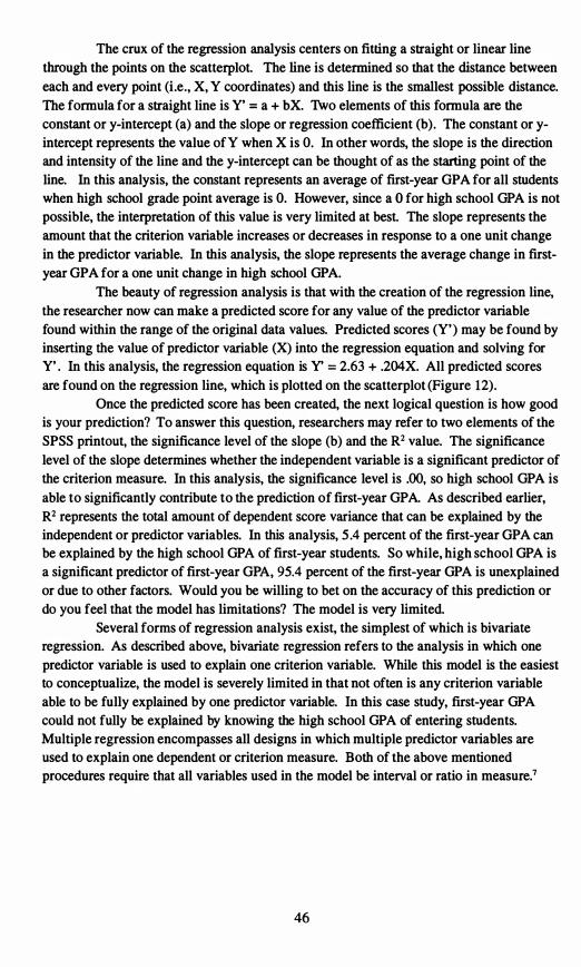
The crux of the regression analysis centers on fitting a straight or linear line
through the points on the scatterplot. The line is determined so that the distance between
each and every point (Le., X, Y coordinates) and this line is the smallest possible distance.
The formula for a straight line is Y' = a + bX. Two elements of this formula are the
constant or y-intercept (a) and the slope or regression coefficient (b). The constant or y
intercept represents the value ofY when X is O. In other words, the slope is the direction
and intensity of the line and the y-intercept can be thought of as the starting point of the
line. In this analysis, the constant represents an average of first-year GPA for all students
when high school grade point average is O. However, since a 0 for high school GPA is not
possible, the interpretation of this value is very limited at best. The slope represents the
amount that the criterion variable increases or decreases in response to a one unit change
in the predictor variable. In this analysis, the slope represents the average change in first
year GPA for a one unit change in high school GPA.
The beauty of regression analysis is that with the creation of the regression line,
the researcher now can make a predicted score for any value of the predictor variable
found within the range of the original data values. Predicted scores (Y') may be found by
inserting the value of predictor variable (X) into the regression equation and solving for
Y' . In this analysis, the regression equation is Y' = 2.63 + .204X. All predicted scores
are found on the regression line, which is plotted on the scatterplot (Figure 12).
Once the predicted score has been created, the next logical question is how good
is your prediction? To answer this question, researchers may refer to two elements of the
SPSS printout, the significance level of the slope (b) and the R2 value. The significance
level of the slope determines whether the independent variable is a significant predictor of
the criterion measure. In this analysis, the significance level is .00, so high school GPA is
able to significantly contribute to the prediction of first-year GPA. As described earlier,
R2 represents the total amount of dependent score variance that can be explained by the
independent or predictor variables. In this analysis, 5 .4 percent of the first-year GPA can
be explained by the high school GPA of first-year students. So while, high school GPA is
a significant predictor of first-year GPA, 95.4 percent of the first-year GPA is unexplained
or due to other factors. Would you be willing to bet on the accuracy of this prediction or
do you feel that the model has limitations? The model is very limited.
Several forms of regression analysis exist, the simplest of which is bivariate
regression. As described above, bivariate regression refers to the analysis in which one
predictor variable is used to explain one criterion variable. While this model is the easiest
to conceptualize, the model is severely limited in that not often is any criterion variable
able to be fully explained by one predictor variable. In this case study, first-year GPA
could not fully be explained by knowing the high school GPA of entering students.
Multiple regression encompasses all designs in which multiple predictor variables are
used to explain one dependent or criterion measure. Both of the above mentioned
procedures require that all variables used in the model be interval or ratio in measure.7
46
Logistic regression is another form of regression for designs in which a nominal
dependent variable is predicted from some combination of ordinal, interval, or ratio
independent variables. In Institutional Research, Logistic Regression has been commonly
used to predict enrollment status (enrolled vs. non-enrolled) from some combination of
predictor variables taken from an applicant data base (e.g., SAT, HSGPA, and ratings of
various aspects of your institution).
However, some coding procedures do exist for using nominal variables in regression analysis. The most common of these is dummy coding for a nominal variable with two levels or categories. While further discussion of these procedures is beyond the scope of this text, refer to Pedhauzer & Schmelkin ( 199 1 ) for elaboration of these procedures.
47
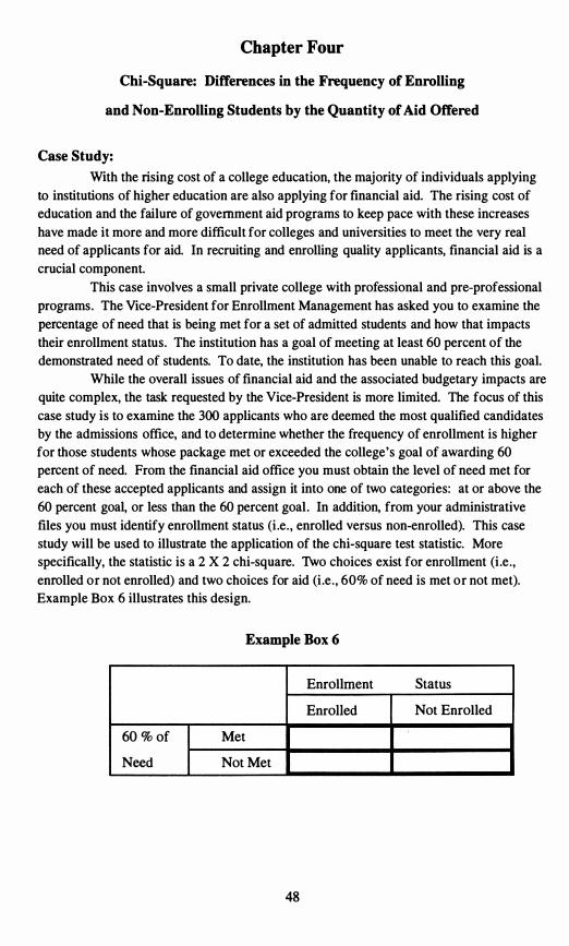
Chapter Four
Chi-Square: Differences in the Frequency of Enrolling
and Non-Enrolling Students by the Quantity of Aid Offered
Case Study:
With the rising cost of a college education, the majority of individuals applying
to institutions of higher education are also applying for financial aid. The rising cost of
education and the failure of government aid programs to keep pace with these increases
have made it more and more difficult for colleges and universities to meet the very real
need of applicants for aid. In recruiting and enrolling quality applicants, financial aid is a
crucial component.
This case involves a small private college with professional and pre-professional
programs. The Vice-President for Enrollment Management has asked you to examine the
percentage of need that is being met for a set of admitted students and how that impacts
their enrollment status. The institution has a goal of meeting at least 60 percent of the
demonstrated need of students. To date, the institution has been unable to reach this goal.
While the overall issues of financial aid and the associated budgetary impacts are
quite complex, the task requested by the Vice-President is more limited. The focus of this
case study is to examine the 300 applicants who are deemed the most qualified candidates
by the admissions office, and to determine whether the frequency of enrollment is higher
for those students whose package met or exceeded the college's goal of awarding 60
percent of need. From the financial aid office you must obtain the level of need met for
each of these accepted applicants and assign it into one of two categories: at or above the
60 percent goal, or less than the 60 percent goal. In addition, from your administrative
files you must identify enrollment status (Le. , enrolled versus non-enrolled). This case
study will be used to illustrate the application of the chi-square test statistic. More
specifically, the statistic is a 2 X 2 chi-square. Two choices exist for enrollment (Le. ,
enrolled or not enrolled) and two choices for aid (Le. , 60% of need is met or not met).
Example Box 6 illustrates this design.
Example Box 6
Enrollment Status
Enrolled Not Enrolled
60 % of Met
Need Not Met
48
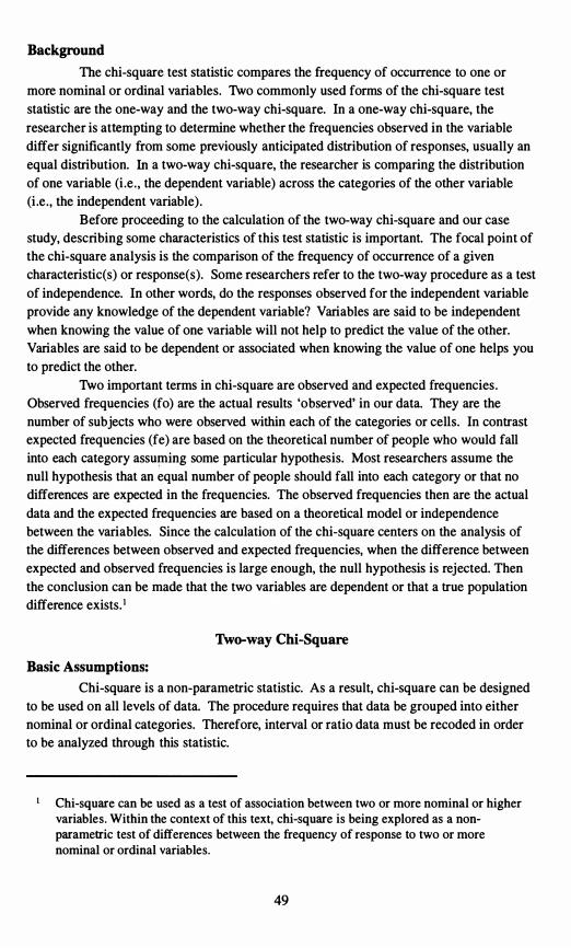
Background
The chi-square test statistic compares the frequency of occurrence to one or
more nominal or ordinal variables. Two commonly used forms of the chi-square test
statistic are the one-way and the two-way chi-square. In a one-way chi-square, the
researcher is attempting to determine whether the frequencies observed in the variable
differ significantly from some previously anticipated distribution of responses, usually an
equal distribution. In a two-way chi-square, the researcher is comparing the distribution
of one variable (Le. , the dependent variable) across the categories of the other variable
(Le. , the independent variable).
Before proceeding to the calculation of the two-way chi-square and our case
study, describing some characteristics of this test statistic is important. The focal point of
the chi-square analysis is the comparison of the frequency of occurrence of a given
characteristic(s) or response(s). Some researchers refer to the two-way procedure as a test
of independence. In other words, do the responses observed for the independent variable
provide any knowledge of the dependent variable? Variables are said to be independent
when knowing the value of one variable will not help to predict the value of the other.
Variables are said to be dependent or associated when knowing the value of one helps you
to predict the other.
Two important terms in chi-square are observed and expected frequencies.
Observed frequencies (fo) are the actual results 'observed' in our data. They are the
number of subjects who were observed within each of the categories or cells. In contrast
expected frequencies (fe) are based on the theoretical number of people who would fall
into each category assuming some particular hypothesis. Most researchers assume the
null hypothesis that an equal number of people should fall into each category or that no
differences are expected in the frequencies. The observed frequencies then are the actual
data and the expected frequencies are based on a theoretical model or independence
between the variables. Since the calculation of the chi-square centers on the analysis of
the differences between observed and expected frequencies, when the difference between
expected and observed frequencies is large enough, the null hypothesis is rejected. Then
the conclusion can be made that the two variables are dependent or that a true population
difference exists. l
Two-way Chi-Square
Basic Assumptions:
Chi-square is a non-parametric statistic. As a result, chi-square can be designed
to be used on all levels of data. The procedure requires that data be grouped into either
nominal or ordinal categories. Therefore, interval or ratio data must be recoded in order
to be analyzed through this statistic.
Chi-square can be used as a test of association between two or more nominal or higher variables. Within the context of this text, chi-square is being explored as a nonparametric test of differences between the frequency of response to two or more nominal or ordinal variables.
49
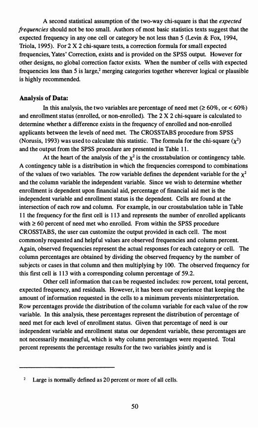
A second statistical assumption of the two-way chi-square is that the expected frequencies should not be too small. Authors of most basic statistics texts suggest that the
expected frequency in any one cell or category be not less than 5 (Levin & Fox, 1 994,
Triola, 1 995). For 2 X 2 chi-square tests, a correction formula for small expected
frequencies, Yates' Correction, exists and is provided on the SPSS output. However for
other designs, no global correction factor exists. When the number of cells with expected
frequencies less than 5 is large,2 merging categories together wherever logical or plausible
is highly recommended.
Analysis of Data:
In this analysis, the two variables are percentage of need met (� 60%, or < 60%)
and enrollment status (enrolled, or non-enrolled). The 2 X 2 chi-square is calculated to
determine whether a difference exists in the frequency of enrolled and non-enrolled
applicants between the levels of need met. The CROSSTABS procedure from SPSS
(Norusis, 1993) was used to calculate this statistic. The formula for the chi-square (X2)
and the output from the SPSS procedure are presented in Table 1 1 .
At the heart of the analysis of the X2 is the crosstabulation or contingency table.
A contingency table is a distribution in which the frequencies correspond to combinations
of the values of two variables. The row variable defines the dependent variable for the X2
and the column variable the independent variable. Since we wish to determine whether
enrollment is dependent upon financial aid, percentage of financial aid met is the
independent variable and enrollment status is the dependent. Cells are found at the
intersection of each row and column. For example, in our crosstabulation table in Table
1 1 the frequency for the first cell is 1 1 3 and represents the number of enrolled applicants
with � 60 percent of need met who enrolled. From within the SPSS procedure
CROSSTABS, the user can customize the output provided in each cell. The most
commonly requested and helpful values are observed frequencies and column percent.
Again, observed frequencies represent the actual responses for each category or cell. The
column percentages are obtained by dividing the observed frequency by the number of
subjects or cases in that column and then multiplying by 100. The observed frequency for
this first cell is 1 1 3 with a corresponding column percentage of 59.2.
Other cell information that can be requested includes: row percent, total percent,
expected frequency, and residuals. However, it has been our experience that keeping the
amount of information requested in the cells to a minimum prevents misinterpretation.
Row percentages provide the distribution of the column variable for each value of the row
variable. In this analysis, these percentages represent the distribution of percentage of
need met for each level of enrollment status. Given that percentage of need is our
independent variable and enrollment status our dependent variable, these percentages are
not necessarily meaningful, which is why column percentages were requested. Total
percent represents the percentage results for the two variables jointly and is
Large is normally defined as 20 percent or more of all cells.
50
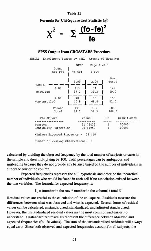
(fo -fe)2 Table 11
Formula for Chi-Square Test Statistic <xl)
=
fe SPSS Output from CROSSTABS Procedure
ENROLL Enro l lment S t at u s by NEED Amount of Need Met
NEED Page 1 of 1
Count I C o l P c t = > 6 0 % < 6 0 %
I Row
Tot a l _ _ _ 1 -2 � .J _
2�0_ENROLL 1
1 . 0 0 I 1 1 3 I 3 4 I 1 4 7
enro l l ed 5 9 . 2 3 1 . 2 4 9 . 0 I I I 2 . 0 0 1 5 3r �B- T -� 1
Non - enro l l ed 5 1 . 0L �.� ..L �B� -.l C o l umn 1 9 1 1 0 9 3 0 0
To t a l 6 3 . 7 3 6 . 3 1 0 0 . 0
Chi - Square Va l u e D F S i gn i f i cant
Pearson 2 1 . 7 2 4 3 2 1 . 0 0 0 0 0
Cont i nu i ty Forrec t i on 2 0 . 6 1 9 5 0 1 . 0 0 0 0 1
Minimum Expected F requency - 5 3 . 4 1 0
Number o f M i s s ing Observat ions : 0
calculated by dividing the observed frequency by the total number of subjects or cases in
the sample and then multiplying by 100. Total percentages can be ambiguous and
misleading because they do not provide any balance based on the number of individuals in
either the row or the column.
Expected frequencies represent the null hypothesis and describe the theoretical
number of individuals who would be found in each cell if no association existed between
the two variables. The formula for expected frequency is:
f e = (number in the row * number in the column) / total N
Residual values are crucial to the calculation of the chi-square. Residuals measure the
differences between what was observed and what is expected. Several forms of residual
values can be calculated: unstandardized, standardized, and adjusted standardized.
However, the unstandardized residual values are the most common and easiest to
understand. Unstandardized residuals represent the difference between observed and
expected frequencies (fo - fe values). The sum of the unstandardized residuals will always
equal zero. Since both observed and expected frequencies account for all subjects, the
5 1
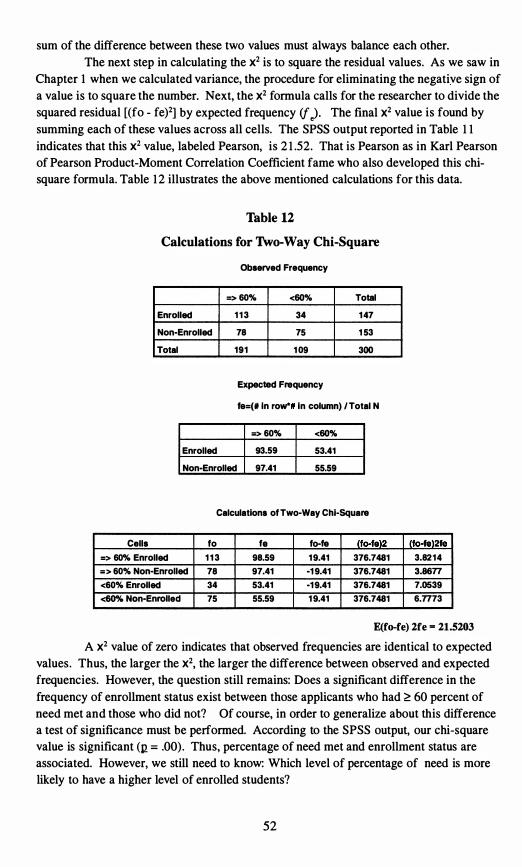
(to-te)2 (fo-fe)2fe
34
sum of the difference between these two values must always balance each other.
The next step in calculating the X2 is to square the residual values. As we saw in
Chapter 1 when we calculated variance, the procedure for eliminating the negative sign of
a value is to square the number. Next, the X2 formula calls for the researcher to divide the
squared residual [(fo - fe)2] by expected frequency if J. The final X2 value is found by
summing each of these values across all cells. The SPSS output reported in Table 1 1
indicates that this X2 value, labeled Pearson, is 2 1 .52. That is Pearson as in Karl Pearson
of Pearson Product-Moment Correlation Coefficient fame who also developed this chi
square formula. Table 1 2 illustrates the above mentioned calculations for this data.
Table 12
Calculations for Two-Way Chi-Square
Observed Frequency
=> 60% <60% Total
Enrolled 1 1 3 34 1 47
Non-Enrolled 78 75 1 53
Total 191 1 09 300
Expected Frequency
18=(. In roW" In column) I Total N
=> 60% <60%
Enrolled 93.59 53.41
Non-Enrolled 97.41 55.59
Calculations ot Two-Way Chi-Square
Cells
=> 60% Enrolled
= > 60% Non-Enrolled
to
1 1 3
78
18
98.59
97.41
to-fe
1 9.41
-1 9.41
376.7481
376.7481
3.82 1 4
3.86n <60% Enrolled 53.41 -1 9.41 376.7481 7.0539
<60% Non-Enrolled 75 55.59 1 9.41 376.7481 6.7773
E(fo-fe) 2fe - 21.5203 A X2 value of zero indicates that observed frequencies are identical to expected
values. Thus, the larger the X2, the larger the difference between observed and expected
frequencies. However, the question still remains: Does a significant difference in the
frequency of enrollment status exist between those applicants who had � 60 percent of
need met and those who did not? Of course, in order to generalize about this difference
a test of significance must be performed. According to the SPSS output, our chi-square
value is significant (12 ;;; .00). Thus, percentage of need met and enrollment status are
associated. However, we still need to know: Which level of percentage of need is more
likely to have a higher level of enrolled students?
52
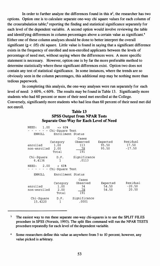
In order to further analyze the differences found in this X2, the researcher has two options. Option one is to calculate separate one-way chi square values for each column of
the cross tabulation table;3 reporting the finding and statistical significance separately for each level of the dependent variable. A second option would involve reviewing the table
and identifying differences in column percentages above a certain value as significant.4
Either one of these column analyses should be done to better interpret the overall
significant (12 < .05) chi square. Little value is found in saying that a significant difference exists in the frequency of enrolled and non-enrolled applicants between the levels of percentage of need met, without saying where the differences were. A more specific statement is necessary. However, option one is by far the more preferable method to determine statistically where these significant differences exist. Option two does not contain any test of statistical significance. In some instances, where the trends are so
obviously seen in the column percentages, this additional step may be nothing more than tedious paperwork.
In completing this analysis, the one-way analyses were run separately for each
level of need: ;;:: 60%, < 60%. The results may be found in Table 1 3 . Significantly more students who had 60 percent or more of their need met enrolled at the College.
Conversely, significantly more students who had less than 60 percent of their need met did not enroll.
Table 13 SPSS Output from NPAR Tests
Separate One-Way for Each Level of Need
NEED : 1 . 0 0 = > 6 0 % Ch i - Square
ENROLL Enrol lmeTe
nt s t S t at u s
Cat egory enro l l ed 1 . 0 0 non - enro l l ed 2 . 0 0
To t a l
C a s e s Obse rved
1 1 3
-----2.6. 1 9 1
Expec ted 9 5 . 5 0 9 5 . 5 0
Res i dua l 1 7 . 5 0
- 1 7 . 5 0
Ch i - Square 6 . 4 1 3 6
D . F . 1
S i gn i f i cance . 0 1 1 3
NEED : - - - -
2 . 0 0 < 6 0 % - - Ch i - Square Te s t
ENROLL Enro l l ment S t a t u s
enro l l ed non- enro l l ed
C a t egory 1 . 0 0 2 . 0 0
To t a l
C a s e s Obs e rved
3 4
-.l.B. 1 9 1
Expec t ed 5 4 . 5 0 5 4 . 5 0
Res idua l - 2 0 . 5 0
2 0 . 5 0
Ch i - Square 1 5 . 4 2 2 0
D . F . 1
S i gn i f i cance . 0 0 0 1
The easiest way to run these separate one-way chi-squares is to use the SPLIT FILES procedure in SPSS (Norusis, 1993). The split files command will run the NPAR TESTS procedure repeatedly for each level of the dependent variable.
Some researchers define this value as anywhere from 5 to 10 percent; however, any value picked is arbitrary.
53
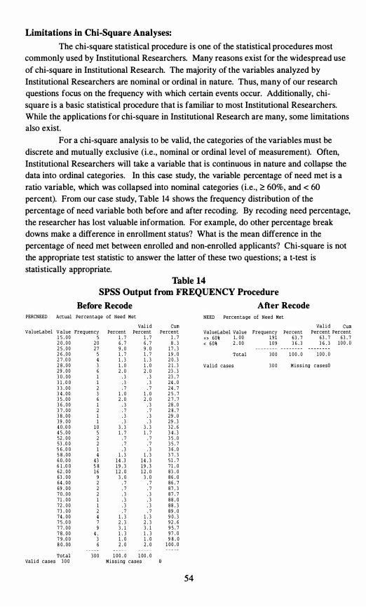
63 . 7 63 . 7 6 . 7
. 3
. 3
. 7 . 7
. 3 . 3
3 5 . 7 . 7 . 7 . 3 . 3
. 7 . 7 . 3 . 3
. 3 . 3 . 3 . 3 . 7
Limitations in Chi-Square Analyses:
The chi-square statistical procedure is one of the statistical procedures most commonly used by Institutional Researchers. Many reasons exist for the widespread use
of chi-square in Institutional Research. The majority of the variables analyzed by Institutional Researchers are nominal or ordinal in nature. Thus, many of our research questions focus on the frequency with which certain events occur. Additionally, chisquare is a basic statistical procedure that is familiar to most Institutional Researchers. While the applications for chi-square in Institutional Research are many, some limitations also exist.
For a chi-square analysis to be valid, the categories of the variables must be discrete and mutually exclusive (i.e., nominal or ordinal level of measurement). Often, Institutional Researchers will take a variable that is continuous in nature and collapse the data into ordinal categories. In this case study, the variable percentage of need met is a ratio variable, which was collapsed into nominal categories (i.e., � 60%, and < 60
percent). From our case study, Table 14 shows the frequency distribution of the percentage of need variable both before and after recoding. By recoding need percentage, the researcher has lost valuable information. For example, do other percentage break downs make a difference in enrollment status? What is the mean difference in the
percentage of need met between enrolled and non-enrolled applicants? Chi-square is not the appropriate test statistic to answer the latter of these two questions; a t-test is statistically appropriate.
Table 14 SPSS Output from FREQUENCY Procedure
Before Recode After Recode PERCNEED Actual percentage of Need Met NEED percentage of Need Met
Val i d Cum val i d Cum ValueLabel V a l ue Frequency Percent Percent Percent
1 . 7 Percent Percent
3 6 . 3 1 0 0 . 0 valueLabel value Frequency Percent
1 9 11 . 71 5 . 0 0 1 . 75 1 . 0 0 63 . 7 = > 60% 9 . 0
2 0 . 0 0 2 0 2 5 . 0 0 2 7
6 . 7 8 . 3 < 6 0 % 2 . 0 0 1 0 9 3 6 . 3 9 . 0 1 7 . 3
2 6 . 0 0 5 1 . 7 1 . 7 1 9 . 0 Total 3 0 0 1 0 0 . 0 1 0 0 . 0 2 7 . 0 0 4 1 . 3 1 . 3 2 0 . 3 2 8 . 0 0 3 1 . 0 1 . 0 2 1 . 3 Valid cases 3 0 0 M i s s i ng casesO
2 . 02 9 . 0 0 6 2 . 0 2 3 . 3 3 0 . 0 0 1 . 3 2 3 . 7
. 7 3 1 . 0 0 1 3 3 . 0 0 2
24 . 0 . 3 2 4 . 7 . 7
3 4 . 0 0 3 1 . 0 1 . 0 2 5 . 7 3 5 . 0 0 2 7 . 76 2 . 0
. 3 2 . 0
3 6 . 0 0 2 8 . 0 2 8 . 7 2 9 . 0
1 . 3
. 3 3 7 . 0 0 2
. 3 3 8 . 0 0 1
3 . 3 3 9 . 0 0 1 4 0 . 0 0 1 0
2 9 . 3 3 2 . 6 3 . 3
4 5 . 0 0 1 . 7. 7
3 4 . 3 3 5 . 0
3 6 . 0
5 1 . 7 52 . 0 0 2 53 . 0 0 2
. 7
1 . 3 1 . 3 5 6 . 0 0 1 5 8 . 0 0 6 0 . 0 0 6 1 . 0 0
4 34
5 8
3 7 . 3 51 . 7 1 4 . 3 1 4 . 3 7 1 . 0 1 9 . 3 1 9 . 3
62 . 0 0 1 6 1 2 . 0 1 2 . 0 83 . 0 63 . 0 0 8 6 . 0
8 6 . 7 8 7 . 3
9 3 . 0. 7
3 . 0
. 7 6 4 . 0 0 2 69 . 0 0 2 7 0 . 0 0 2 8 7 . 7 7 1 . 0 0 1 8 8 . 0
. 7 72 . 0 0 1 8 8 . 3
89 . 0 1 . 3
7 3 . 0 0 2 7 4 . 0 0 4 1 . 3 9 0 . 3 7 5 . 0 0 7 2 . 3 2 . 3 9 2 . 6 7 7 . 0 0 7 8 . 0 0 7 9 . 0 0
4 .9
3
3 . 1 3 . 1 9 5 . 7 1 . 3 1 . 3 9 7 . 0 1 . 0 1 . 0 9 8 . 0
8 0 . 00 6 2 . 0 2 . 0 1 0 0 . 0
Total 3 0 0 1 0 0 . 0 1 00 . 0 Val i d cases 3 0 0 M i s s i ng cases
54

55
As mentioned earlier, a basic assumption of the chi-square test statistic is that the
minimum expected frequency for anyeone cell should not be less than 5. Often when
many cells with low expected frequencies are present, the researcher will merge or
combine similar categories to create cells with larger expected frequencies. For example,
when analyzing differences in levels of satisfaction between males and females from a Likert scale, the researcher may combine the categories of 'very dissatisfied' with 'somewhat dissatisfied' and 'very satisfied' with ' somewhat satisfied' to meet this basic assumption of the chi-square. Again, the major problem with this solution is the loss of information; the differences in the extremes are no longer distinguishable. Often the researcher is better off performing a non-parametric test for differences between groups, such as the Mann Whitney U test, to analyze the differences in Likert scale responses.
Other Statistical Procedures
One-way Chi-square:
Often Institutional Researchers look at a frequency distribution and wonder if a
pattern exists in the responses to the item or question. The one-way chi-square is a test
statistic that allows the researcher to determine whether the frequencies observed in the variable differ significantly from an anticipated distribution of responses. In this case
study, the Institutional Researcher may wish to explore further the amount of need that is being met for all applicants to attempt to determine where the College stands in regards to the goal of meeting at least 60 percent of documented need.
To further explore this topic, the researcher goes back to the financial aid file and retrieves percent of documented need met for all 460 applicants. To facilitate the process the researcher recodes the actual percentage of need into five categories: 0 to 19%, 20 to 39%, 40 to 59%, 60 to 79% and 80 to 100% . After recoding the data, the FREQUENCY Procedure from SPSS (Norusis, 1993) is run to create a frequency distribution, followed by the NPAR TESTS procedure to calculate the one-way chi-square test statistic. The output from these two procedures may be found in Table 15 .
From the SPSS procedure NPAR TESTS , notice that the calculation of the one-way chi-square follows the same procedures and formulas as presented for the two-way chi-square . The procedures are simplified by the fact that the expected
frequencies represent an equal distribution of respondents in each of the categories.
For our analysis, the expected frequency for each category is 92 (i .e. , 460 divided by 5) , the calculated chi-square value is 5 .57, and the corresponding significance of the chi-square value is .23 . Thus, no significant difference exists in the frequency of applicants receiving the various levels of percentage of documented need. Unfortunately for the institution, the data do not support the claim that the College is making progress toward meeting a minimum of 60 percent of the documented need of the applicant. In fact, students were j ust as likely to get less than 60 percent of need met as they were to get 60 percent or more. In order to support this claim, a significant difference would exist with significantly more students falling in the higher categories of percentage of need.
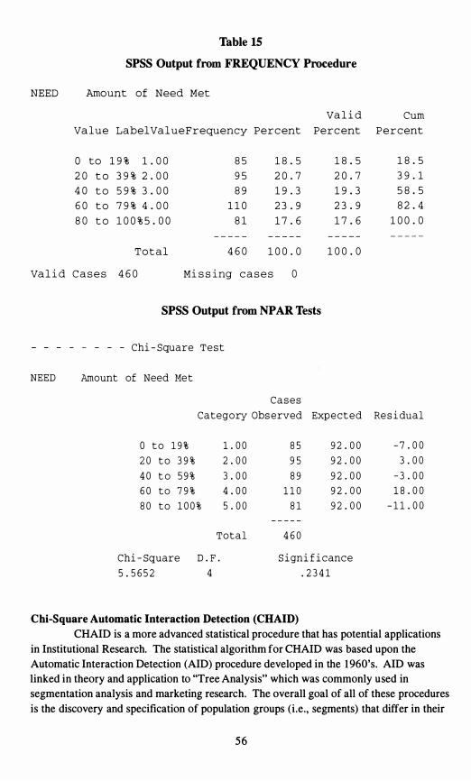
9 5
Table 15
SPSS Output from FREQUENCY Procedure
NEED Amount of Need Met
Va l u e LabelVa l u e F requency Perc ent Va l i d
Perc ent Cum
P e r c ent
o to 1 9 % 1 . 0 0 2 0 t o 3 9 % 2 . 0 0 4 0 t o 5 9 % 3 . 0 0 6 0 t o 7 9 % 4 . 0 0 8 0 t o 1 0 0 % 5 . 0 0
8 5 9 5 8 9
1 1 0 8 1
1 8 . 5 2 0 . 7 1 9 . 3 2 3 . 9 1 7 . 6
1 8 . 5 2 0 . 7 1 9 . 3 2 3 . 9 1 7 . 6
1 8 . 5 3 9 . 1 5 8 . 5 8 2 . 4
1 0 0 . 0
T o t a l 4 6 0 1 0 0 . 0 1 0 0 . 0
Va l i d C a s e s 4 6 0 Mi s s i ng c a s e s 0
SPSS Output from NPAR Tests
- - - - - Chi - Square T e s t
NEED Amount of Need Me t
C a s e s
Category Obs erved Exp e c t e d Re s i dual
o t o 1 9 % 1 . 0 0 8 5 9 2 . 0 0 - 7 . 0 0 2 0 t o 3 9 % 2 . 0 0 9 2 . 0 0 3 . 0 0 4 0 t o 5 9 % 3 . 0 0 8 9 9 2 . 0 0 - 3 . 0 0 6 0 t o 7 9 % 4 . 0 0 1 1 0 9 2 . 0 0 1 8 . 0 0 8 0 t o 1 0 0 % 5 . 0 0 8 1 9 2 . 0 0 - 1 1 . 0 0
T o t a l 4 6 0
Chi - Square D . F . S i gn i f i c anc e
5 . 5 6 5 2 4 . 2 3 4 1
Chi-Square Automatic Interaction Detection (CHAID)
CHAID is a more advanced statistical procedure that has potential applications in Institutional Research. The statistical algorithm for CHAID was based upon the Automatic Interaction Detection (AID) procedure developed in the 1 960's. AID was linked in theory and application to ''Tree Analysis" which was commonly used in segmentation analysis and marketing research. The overall goal of all of these procedures is the discovery and specification of population groups (i.e., segments) that differ in their
56
probability of a given event (Le., the dependent variable). For example, in Institutional
Research we are very interested in discovering whether certain segments or subgroups of our applicant pool have a higher probability of enrolling at our institution or whether any
segments or subgroups of our student population are at a greater risk of withdrawing.
Thus, the overall goal of CHAID and other segmentation modeling procedures is to divide the population into mutually exclusive and exhaustive subgroups (Le. , the segments)
which differ with respect to the dependent variable (e.g., enrolling or not enrolling), and to identify those segments that are "best" from a marketing perspective, so that they can be targeted.
At fIrst glance, CHAID appears to be most commonly related to the chi-square test statistic; however, CHAID procedures are squarely grounded in regression theory. CHAID begins by identifying the "best predictor" of the dependent variable (e.g. ,
enrolling or withdrawing) and splits the population into distinct groups based upon the categories of the "best predictor." Once a variable has been defIned as the "best predictor" variable, CHAID will create a two-way crosstabulation of this variable with the dependent variable. At this point, CHAID will attempt to create optimally merged categories of this
predictor variable using a form of chi-square analysis. CHAID then performs these operations in an iterative process until all subgroups have been analyzed or contain too few observations.
Please be reminded that the CHAID procedure is an advanced and complex statistical procedure with a variety of different options. A complete explanation of this procedure would be beyond the scope of this text. For a more complete description of the CHAID procedures, refer to Madgison ( 1992).
57
Chapter Five
Selecting the Appropriate Statistic
One of the most puzzling dilemmas for novice statisticians is the decision concerning which statistical procedure is appropriate for the data at hand. It has been our experience that many people are quickly able to carry out a procedure to which they have been specifically directed. Thus, identifying the appropriate procedure is much more difficult than actually carrying out the analysis. In order to accelerate the learning curve, several variations of a statistical decision tree have been developed (Emory & Cooper,
199 1 ; Kervin, 1992; Zikmund, 1992). Each model has its own strengths and weaknesses.
The statistical decision tree described in this chapter was initially developed by Dr. Robert Lussier of Springfield College and was later revised in conjunction with Mary Ann Coughlin. A copy of the tree is found in Figure 1 3 . The following text describes the nomenclature used in the tree and walks the reader through the decision tree using the case studies that were cited in the previous chapters.
The design tree shown in Figure 1 3 is meant to be a tool to help you answer the difficult question: What statistical procedure is appropriate for this design? Computer software, such as SPSS (Norusis, 1993), has made performing complex statistical
procedures as easy as pointing and clicking. However, using these tools is the easy part; understanding and appropriately interpreting the analysis is harder. No tool should replace a solid understanding of the statistical procedure you are about to use. A very real danger exists in blindly performing advanced statistical procedures without an understanding of the underpinnings of these procedures. Several good references exist for advanced statistical procedures (Norman & Streiner, 1 986; Norusis, 1 993; Pedhauzer & Schmelkin, 1991) . However, the tree presents a solid outline for identifying the
appropriate statistical procedure for your analysis.
Using the Design Tree
The design tree was developed following the model of a flow chart. The user starts on the far lefthand side of the first page and answers a series of questions found in the columns of the chart. The answers to each of the questions lead the user to the last column which lists the correct statistical procedure based on the design. The questions are designed to determine key pieces of information about the research design that will determine which statistical procedure is appropriate.
Before proceeding to describe the questions, learning some key abbreviations is important. First as you would expect, DV or yl is synonymous with the dependent variable, and IV or X with the independent variable. However, the fact that k stands for 3 or more is
For your convenience, throughout the remainder of the chapter terms and values are bolded when they appear on the design tree.
5 8
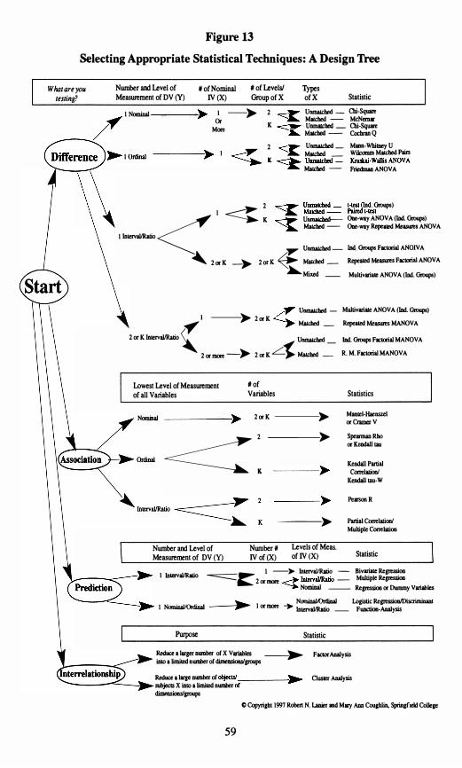
� ___ � � � �
-.... /'..,. �
� <:.� Difti -- �,--, """- l �""" � erence � �� r ---. K � UIIIIIIId>ed _ Krusbi-Wallis ANOVA
�
� � � � - � .... � "'1110..
/� <-----�
_____ -,�
---.�
---�
__ Prediction ----. ET- .---. lnlm'alIRatio
-----.c � ..
objecuI.,.-____ � -----.-<'----.:� of
� 2 0r K _� 2 0r K � MaId>ed _
Figure 13
Selecting Appropriate Statistical Techniques: A Design Tree
What are youtesting?
Number and Level of Measurement of DV (y)
N of Nominal N of Levels! Types
IV (X) Group of X ofX Statistic
1 NomiDal 1 --� 2 UIIIIIIId>ed - Cbi-SquareOr MIfCbod - McNenur
MIfCbod - CochnD QUDIIIIICbed _ Cbi-Sq ....
2 UIIIIIIId>ed MIDIl-WhiIDO)' U
1 MIfCbod _ Wilcomm MIfCbod Pain
MaIcbed - Friedman ANOVA
1 � 2 Groups)
1 Inlm'alIRatio <: � K UIIIIlIIdIed-- ODe-way ANOVA (lDd. Groups)
MaIcbed - ODe-way Rqle..... _ ANOVA
'Y UIIIIIIId>ed -RqleIIOd Meuurea FIdOrial ANOVA
�Mixed _
UIIIIIIId>ed _ Multlvorille ANOVA (Ind. Groups)� l ---� 2 0r K MaId>ed _ RqleIIOd Measures MANOVA
2 or K lntervallRatio � UIIIIIIId>ed _ IDd. Groups Facuxial MANOV A
2 or more -� 2 or K L'" MaIcbed _ R. M. FICIOrial MANOVA
lowest Level ofMeasurement
of all Variables
N of Variables
Nominal 2 0r K ----�
---� � : Number and Level of Measurement of DV (y)
---�
Number N Levels of Meas.
IV of (X) of IV (X)
Statistics
M_l-llaeosul or Cramer V
SpelOllWl Rho or KendalI lIU
Ktodall PartiII ContIaIiooI
KeodalI IaU-W
Pe ..... R
Partial CcrreIaIioaI Multiple Ccrrelatioo
Statistic
I In aIIRaIi � I --� Inlm'aIIRJIio - Bivuille ReJl'SSioo
NomiDaI -- ReJl'SSioo or Dummy Voriables 1m' 0 -=::::::::::::- 2 or ..... - Multiple ReJl'SSioo
NomiDa1Qrdinal Loiistic Regressioo/Discri I NcxniDaIJOrdiDa I or more ... Inlm'allRalio _ FUDCtioa-Analysis
Purpose Statistic
Reduce a larger DWDber of X V_ __� FIICIorAnalysisiDlo a limiled Dumber of dimeDsioasIpIlUpS
Reduce a 11IlI' DWDber of ChISler AoaIysissubjects X into a limiled Dumber dimmsioosIpIlUpS
C Copyright t997 Raben N. Laoier ODd Mil)' ADo a..,hIiD. Spriqfleld CoIIeae
59
KMen
_
IDd Groups FICIOrial ANOIV A
MultivWlf ANOVA (1Dd. Groups)
less obvious. So that "independent groups" does not get confused with "independent
variable," the term unmatched is a synonym for independent groups, while matched is synonymous with repeated measures. For a review of some of these basic terms, refer to Chapter 1 for a discussion of independent and dependent variables, and Chapter 2 for independent groups and repeated measures.
The first question asks "What are you testing?" and has four possible response options: difference, association, prediction, and interrelationship. A test of differences
is designed to examine whether differences of a significant magnitude exist between the levels of one or more independent variables with regard to some dependent measure(s) .
Within the scope of this text, tests of differences were discussed in Chapter 2 and Chapter
4. In Chapter 2, differences in faculty salaries between the genders and divisional status were explored. In Chapter 4, differences in frequencies were explored between enrolling and non-enrolling students across the levels of financial aid received. Tests of association
measure the strength and direction of relationships between two or more variables. Tests of association were discussed in Chapter 3, when the relationship between high school grade point average and first-year grade point average was explored. Tests of prediction
are used to assess the accuracy of predictions about the dependent variable based upon the knowledge of the independent variable. A brief introduction to tests of prediction was
provided in Chapter 3, when the ability of high school grade point average to predict firstyear grade point average was explored with regression analysis. Finally, tests of interrelationships are used to reduce or group a large number of associated variables,
subjects, or objects into smaller groupings. The two statistical procedures described in this section of the design tree are factor analysis and cluster analysis. These procedures are included in the design tree to make the tree as complete as possible, but are beyond the
scope of this introductory text. The remaining questions on the design tree all have to do with important issues
regarding the assumptions of the statistical procedures and how these assumptions relate to your research design. The questions vary slightly with the purpose of your research
(i.e., what you are testing: difference, association, prediction or interrelationship).
Most of the questions center around the number and level of measurement of your
independent and dependent variables, as well as the type of independent variable. For a review of the levels of measurement variables refer to Chapter 1 ; for a discussion of the type of independent variable (independent groups, repeated measures,2 or mixed) refer to Chapter 2 .
Examples of the Design Tree:
To provide some brief examples of the design tree, each case study will be reexamined. The first case study, provided in Chapter I , sought to determine whether
differences existed between the salary of male and female assistant professors. Given that our purpose is to determine whether differences exist, the answer to the first question on
Remember, unmatched is synonymous with independent groups and matched is synonymous with repeated measures.
60
the design tree - what are you testing - is difference. So from the Start circle, follow the
arrow up to difference. The next column asks the question, what is the number and level
of measurement of the dependent variable? The dependent variable in this case study is
salary, so one dependent variable exists and is measured at the ratio level. Follow the
arrow down to 1 Interval/Ratio. The next column asks how many independent variables are in this design. The answer is 1 (gender), so follow the arrow straight across to 1. The
next column asks how many levels or groups exist within the independent variable? Since gender has two levels or groups (Le., male and female), follow the arrow straight across to 2. The final question asks what type of independent variable is gender. Since gender is an independent groups variable (Le. , individuals are either male or female), follow the arrow straight across to unmatched.2 In the last column across from unmatched, the appropriate statistical procedure is listed, independent groups t-test.
Our second case study in Chapter 3 explored the relationship between high school grade point average and first-year grade point average. Given that our purpose is to measure relationships, the answer to the first question on the design tree, what are you
testing, is association. So from the Start circle, follow the arrow down to the second page to association. The next column asks what is the lowest level of measurement of all
of the variables. Since high school grade point average and first-year grade point average are both interval level of measurement, follow the arrow down to IntervalJRatio. The
next question asks how many variables are being analyzed. In this design, the relationship is between two variables, high school grade point average and first-year grade point average, so follow the arrow straight across to 2. The last column across from 2 lists the appropriate statistical procedure, Pearson correlation coefficient (R).
In Chapter 4, the case study attempted to determine whether significant differences existed between the enrollment pattern of applicants who were awarded grants
that matched or exceeded 60 percent of their documented need and those whose award did not meet 60 percent of their need. Given that our purpose is to determine if differences exist, the answer to the first question on the design tree, what are you testing, is
difference. So from the Start circle, follow the arrow up to difference. The next column
asks what the number and level of measurement of the dependent variable is . The
dependent variable in this case study is enrollment status, so one dependent variable exists and is at the nominal level of measurement. Follow the arrow up to 1 nominal. The next
column asks how many independent variables are in this design. The answer is 1 (amount of need met), so follow the arrow straight across to 1 or more. The next column asks how many levels or groups exist within the independent variable. Since amount of need met has two levels or groups (i.e., ;;:: 60% and < 60%), follow the arrow straight across to 2. The final question asks what type of independent variable is amount of need met. Since amount of need is an independent groups variable, follow the arrow straight across to unmatched.2 In the last column across from unmatched, the appropriate statistical procedure is listed, chi-square.
6 1
Appendix A
SPSS Commands
The following is a list of SPSS menu selections that were run to perform the analyses discussed throughout this text. To replicate any of the output, follow the basic set of
menu selections.
For FREQUENCIES:
S t at i s t i c s
S ummar i z e
Fr equenc i e s
E n t e r a l l o f your var i ab l e s
S t at i s t i c s
Qu art i l e s
Mean
Medi an
Mode
S um
S t andard Devi at i on M i n imum S kewn e s s
Var i an c e Max imum Kur t o s i s
Cont i nu e
O K
For Independent Groups t-test:
S t a t i s t i c s
Compare Mean s
I ndependent S amp l e s t T e s t
Te s t Var i abl e = Dependent var i abl e
Group ing Var i ab l e = i ndep endent var i ab l e
De f i ne Group s
Group 1 1
Group 2 2 C on t i nu e
O K
62
For One-way ANOVA:
S t a t i s t i c s
Comp a r e Mean s
One - Way ANOVA
Te s t S c o r e -> Dependent Var i ab l e Box
I nd . Var . -> Fac t o r Box
De f i n e Range
M i n imum l owe s t
Max imum h i ghe s t
Cont i nu e
Po s t H o c
x L ea s t S i gn i f i cant D i f f e renc e
x S t udent Newman - Keu l s
x Tukey H S D
x S che f f e
Con t i nu e
Op t i o n s
x De s c r ip t ive s
x Homogene i ty o f Var iance
Cont i nu e
OK
For Correlation (Either Pearson or Spearman) :
S t a t i s t i c s
C o r r e l a t e
B ivar i a t e
Move TWO VAR IABL E S i n t o t h e Var i ab l e Box
Check e i ther P e a r s on or Spearman and l e ave other two checked : x Pear s o n or x Spearman
x two - t a i l e d
x d i sp l ay a c t u a l s i gni f i c an c e l eve l
OK
For two-way Chi-Square:
S t a t i s t i c s
Summar i z e
C ro s s t abs
Move I ndependent Va r i ab l e to COLUMN ( X ) Move Dependent Var i ab l e t o ROW ( Y )
S t at i s t i c s C e l l s
x c h i s quare x c o l umn
Cont i nu e
OK
63
nonparametric
appraisal intelligence.
applications
Elementary
guide.
Sturdy statistics. nonparametrics
PDO
System guide:
guide.
Measurement. design. analysis : integrated approach.
Nonparametric
analysis .
Elementary
References Blalock, H. M . ( 1972). Social Statistics. New York: McGraw-Hill.
Conover, W. ( 1980). Practical statistics. New York: Wiley.
Corsini, R. ( 1984) . Wechsler 's measurement and of adult New York, Oxford University Press.
Grimm, L. G. ( 1993) . Statistical for the behavioral sciences. New York: John Wiley & Sons.
Levin, J. , & Fox, J. A. ( 1 994). statistic s in social research. New York:
HarperCollins.
Madgison, J. ( 1992). CHAm user 's Chicago, IL: SPSS.
Mosteller, F., & Rourke, R. ( 1973). statistics. Reading, MA: Addison-Wesley.
and order
Norman, G. R. , & Streiner. ( 1986). Statistics. Toronto : B.C. Decker.
Norusis, M . J. ( 1993a). SPSS for Windows Base user 's Release 6.0.
Chicago, IL: SPSS.
Norusis, M . J. ( 1993b). SPSS advanced statistics user 's Chicago, IL: SPSS.
Pedhauzer, E. J . , & Schmelkin, L. P. ( 1991) . and An Hillsdale, NJ: Lawrence Erlbaum.
Saupe, J. ( 1990). The functions of institutional research. Tallahassee, FL: Association
for Institutional Research.
Siegal, S. ( 1956). stati stics for the behavioral Sciences. New York: McGraw-Hill.
Sprinthall, R. C . ( 1987). Basic statistical Englewood Cliffs, NJ: Prentic-Hall.
Triola , M. F. ( 1995). statistics . Reading, MA: Addison-Wesley.
64

Index Alpha Level in Hypothesis Testing . . . . . . . . . . . . . . . . . . . . . . . . . . . . . . . . . . 25 , 27 Analysis of Covariance (ANCOVA) . . . . . . . . . . . . . . . . . . . . . . . . . . . . . . . . . 33-34 Analysis of Variance (ANOVA) . . . . . . . . . . . . . . . . . . . . . . . . . . . . . . . 20-23, 26-33
Factorial . . . . . . . . . . . . . . . . . . . . . . . . . . . . . . . . . . . . . . . . . . . . . . . . . 2 1 , 32-33 Independent Groups Design . . . . . . . . . . . . . . . . . . . . . . . . . . . . . . . . . . . . . . . . 2 1 Interaction Effects . . . . . . . . . . . . . . . . . . . . . . . . . . . . . . . . . . . . . . . . . . . . . . . 33 Main Effects . . . . . . . . . . . . . . . . . . . . . . . . . . . . . . . . . . . . . . . . . . . . . . . . . . . . 33 Multivariate (MAN OVA) . . . . . . . . . . . . . . . . . . . . . . . . . . . . . . . . . . . . . . . . . . 34 One-Way . . . . . . . . . . . . . . . . . . . . . . . . . . . . . . . . . . . . . . . . . . . . . . . . . . . . 26-32 Repeated Measures Design . . . . . . . . . . . . . . . . . . . . . . . . . . . . . . . . . . . . . . . . 2 1 Use of F-ratio in Testing . . . . . . . . . . . . . . . . . . . . . . . . . . . . . . . . . . . . . . . 26-29
Association for Institutional Research . . . . . . . . . . . . . . . . . . . . . . . . . . . . . . . . . . . . i
Box and Whisker Plots . . . . . . . . . . . . . . . . . . . . . . . . . . . . . . . . . . . . . . . . . . . . . . . 1 1
Chi-Square Procedure . . . . . . . . . . . . . . . . . . . . . . . . . . . . . . . . . . . . . . . . . . . . . . . 49 Automatic Interaction Detection (CHAID) . . . . . . . . . . . . . . . . . . . . . . . . . 56-57 One-Way . . . . . . . . . . . . . . . . . . . . . . . . . . . . . . . . . . . . . . . . . . . . . . . . . . . . 55-56 Two-Way . . . . . . . . . . . . . . . . . . . . . . . . . . . . . . . . . . . . . . . . . . . . . . . . . . . 49-55
Comparison of Means . . . . . . . . . . . . . . . . . . . . . . . . . . . . . . . . . . . . . . . . . . . . . . . 29 Confidence Intervals . . . . . . . . . . . . . . . . . . . . . . . . . . . . . . . . . . . . . . . . . . . . . . . . 18 Correlation . . . . . . . . . . . . . . . . . . . . . . . . . . . . . . . . . . . . . . . . . . . . . . . . . . . . . 36-37 Correlation Coefficients
Goodman 's . . . . . . . . . . . . . . . . . . . . . . . . . . . . . . . . . . . . . . . . . . . . . . . . . . . . . 44 Kruskal 's Gamma . . . . . . . . . . . . . . . . . . . . . . . . . . . . . . . . . . . . . . . . . . . . . . . . 44 Pearson . . . . . . . . . . . . . . . . . . . . . . . . . . . . . . . . . . . . . . . . . . . . . . . . . . . . . 37-42 Spearman . . . . . . . . . . . . . . . . . . . . . . . . . . . . . . . . . . . . . . . . . . . . . . . . . . . 43-44
Decision Tree . . . . . . . . . . . . . . . . . . . . . . . . . . . . . . . . . . . . . . . . . . . . . . . . . . . 58-60 Distribution
Bi-modal . . . . . . . . . . . . . . . . . . . . . . . . . . . . . . . . . . . . . . . . . . . . . . . . . . . . 13 , 15 Multi-modal . . . . . . . . . . . . . . . . . . . . . . . . . . . . . . . . . . . . . . . . . . . . . . . . . 13 , 15 Negatively -skewed . . . . . . . . . . . . . . . . . . . . . . . . . . . . . . . . . . . . . . . . . . . . 13, 15 Normal . . . . . . . . . . . . . . . . . . . . . . . . . . . . . . . . . . . . . . . . . . . . . . . . . . . . . 13- 16 Positively -skewed . . . . . . . . . . . . . . . . . . . . . . . . . . . . . . . . . . . . . . . . . . . . . 13 , 15 Shape of . . . . . . . . . . . . . . . . . . . . . . . . . . . . . . . . . . . . . . . . . . . . . . . . . . . . . . . 13 Standard Normal . . . . . . . . . . . . . . . . . . . . . . . . . . . . . . . . . . . . . . . . . . . . . . . . 16 Uniform . . . . . . . . . . . . . . . . . . . . . . . . . . . . . . . . . . . . . . . . . . . . . . . . . . . . . . . 13
Frequency Distribution . . . . . . . . . . . . . . . . . . . . . . . . . . . . . . . . . . . . . . . . . . . . . . . 13
Hypothesis Alternative . . . . . . . . . . . . . . . . . . . . . . . . . . . . . . . . . . . . . . . . . . . . . . . . . . . . . 29 Null . . . . . . . . . . . . . . . . . . . . . . . . . ' " . . . . . . . . . . . . . . . . . . . . . . . . . . . . . . . 29
Level of Measurement Interval . . . . . . . . . . . . . . . . . . . . . . . . . . . . . . . . . . . . . . . . . . . . . . . . . . . . . . . 4-7 Nominal . . . . . . . . . . . . . . . . . . . . . . . . . . . . . . . . . . . . . . . . . . . . . . . . . . . . . . 4-7 Ordinal . . . . . . . . . . . . . . . . . . . . . . . . . . . . . . . . . . . . . . . . . . . . . . . . . . . . . . . 4-7 Ratio . . . . . . . . . . . . . . . . . . . . . . . . ' " . . . . . . . . . . . . . . . . . . . . . . . . . . . . . . 4-7
Levene Test of Homogeneity of Variances . . . . . . . . . . . . . . . . . . . . . . . . . . . . . . . 24 Likert Scale . . . . . . . . . . . . . . . . . . . . . . . . . . . . . . . . . . . . . . . . . . . . . . . . . . . . . 4, 42
65
Linear Relationship . . . . . . . . . . . . . . . . . . . . . . . . . . . . . . . . . . . . . . . . . . . . . . . . . 36
Measurement Reliability . . . . . . . . . . . . . . . . . . . . . . . . . . . . . . . . . . . . . . . . . . . . . . . . . . . . . . . 7 Validity . . . . . . . . . . . . . . . . . . . . . . . . . . . . . . . . . . . . . . . . . . . . . . . . . . . . . . . 3,7
Measures of Central Tendency Mean . . . . . . . . . . . . . . . . . . . . . . . . . . . . . . . . . . . . . . . . . . . . . . . . . . . . . . . . 8 , 10 Median . . . . . . . . . . . . . . . . . . . . . . . . . . . . . . . . . . . . . . . . . . . . . . . . . . . . . . 8, 10 Mode . . . . . . . . . . . . . . . . . . . . . . . . . . . . . . . . . . . . . . . . . . . . . . . . . . . . . . . 9- 10
Measures of Dispersion Percentiles . . . . . . . . . . . . . . . . . . . . . . . . . . . . . . . . . . . . . . . . . . . . . . . . . . . 9-12 Range . . . . . . . . . . . . . . . . . . . . . . . . . . . . . . . . . . . . . . . . . . . . . . . . . . . . . . . 9-12 Standard Deviation . . . . . . . . . . . . . . . . . . . . . . . . . . . . . . . . . . . . . . . . . . . . . . . 12 Variance . . . . . . . . . . . . . . . . . . . . . . . . . . . . . . . . . . . . . . . . . . . . . . . . . . . . . . . 12
Nonparametric Statistics Friedman 's Procedure . . . . . . . . . . . . . . . . . . . . . . . . . . . . . . . . . . . . . . . . . . . . 34 Kruskal-Wallis . . . . . . . . . . . . . . . . . . . . . . . . . . . . . . . . . . . . . . . . . . . . . . . . . . 34 Mann-Whitney U Test . . . . . . . . . . . . . . . . . . . . . . . . . . . . . . . . . . . . . . . . . . . . 34 Wilcoxin Signed Rank . . . . . . . . . . . . . . . . . . . . . . . . . . . . . . . . . . . . . . . . . . . . 34
Outliers . . . . . . . . . . . . . . . . . . . . . . . . . . . . . . . . . . . . . . . . . . . . . . . . . . . . . . . . 18, 4 1
Population . . . . . . . . . . . . . . . . . . . . . . . . . . . . . . . . . . . . . . . . . . . . . . . . . . . . . . . . . 16
Regression Analysis . . . . . . . . . . . . . . . . . . . . . . . . . . . . . . . . . . . . . . . . . . . . . . 44-47 Logistic . . . . . . . . . . . . . . . . . . . . . . . . . . . . . . . . . . . . . . . . . . . . . . . . . . . . . . . . 47 Multiple . . . . . . . . . . . . . . . . . . . . . . . . . . . . . . . . . . . . . . . . . . . . . . . . . . . . . . . 46
Robustness of Statistical Procedures . . . . . . . . . . . . . . . . . . . . . . . . . . . . . . . . . . . . 27 R-Squared (Coefficient of Determination) . . . . . . . . . . . . . . . . . . . . . . . . . . . . . . . 46
Sample . . . . . . . . . . . . . . . . . . . . . . . . . . . . . . . . . . . . . . . . . . . . . . . . . . . . . . . . . . . 17 Scatterplot . . . . . . . . . . . . . . . . . . . . . . . . . . . . . . . . . . . . . . . . . . . . . . . . . . . . . . . . . 45 SPSS . . . . . . . . . . . . . . . . . . . . . . . . . . . . . . . . . . . . . . . . . . . . . . . . . . . . . . . . 2, 62-63 SPSS Procedures
CORRELAT IONS . . . . . . . . . . . . . . . . . . . . . . . . . . . . . . . . . . . . . . . . . . . . 39, 43 CROSSTABS . . . . . . . . . . . . . . . . . . . . . . . . . . . . . . . . . . . . . . . . . . . . . 44, 50-5 1 FREQUENCY . . . . . . . . . . . . . . . . . . . . . . . . . . . . . . . . . . . . . . . . . . . . . . . 54-56 NPAR T ESTS . . . . . . . . . . . . . . . . . . . . . . . . . . . . . . . . . . . . . . . . . . . . . 53, 55-56 REGRESSION . . . . . . . . . . . . . . . . . . . . . . . . . . . . . . . . . . . . . . . . . . . . . . . 44-45 T-T EST . . . . . . . . . . . . . . . . . . . . . . . . . . . . . . . . . . . . . . . . . . . . . . . . . . . . . 25-26
Statistics Descriptive . . . . . . . . . . . . . . . . . . . . . . . . . . . . . . . . . . . . . . . . . . . . . . . . . . . . . . 8 Inferential . . . . . . . . . . . . . . . . . . . . . . . . . . . . . . . . . . . . . . . . . . . . . . . . . . . . . . 17
Test of Significance . . . . . . . . . . . . . . . . . . . . . . . . . . . . . . . . . . . . . . . . . . . . . . . . . 25 T-Test . . . . . . . . . . . . . . . . . . . . . . . . . . . . . . . . . . . . . . . . . . . . . . . . . . . . . . . . . 23-26
Variable Continuous . . . . . . . . . . . . . . . . . . . . . . . . . . . . . . . . . . . . . . . . . . . . . . . . . . . . 3-4 Discrete . . . . . . . . . . . . . . . . . . . . . . . . . . . . . . . . . . . . . . . . . . . . . . . . . . . . . . . 3-4 Dependent . . . . . . . . . . . . . . . . . . . . . . . . . . . . . . . . . . . . . . . . . . . . . . . . . . . . . 7-8 Independent . . . . . . . . . . . . . . . . . . . . . . . . . . . . . . . . . . . . . . . . . . . . . . . . . . . 7-8
66

About the Authors
Mary Ann Coughlin has conducted numerous workshops on statistics and data
analysis for i nstitutional researchers and academicians around the United States.
She frequently serves as a statistical consl.lltant for i nstitutions of higher
education as wel l as the publ ic and privat� sectors, and has served as
Statistician/ Programmer, Research Analyst, and Professor. She holds a
doctorate in Physical Education from Spri ngfield College and is cu rrently an
Assistant Professor of Research and Statistics in the School of G raduate Studies
at Springfield College.
Marian Pagano is the Associate Provost for Planning and Institutional Research
at Columbia U niversity. Prior to her 1 992 appointment at Columbia she worked in
the institutional research office at Tufts University. She is a past president of the
North East Association for Institutional Research and has taught numerous
statistical workshops and institutes for AIR and N EAl A.
A JOINT PUBLICATION OF
TH E ASSOCIATION FOR INSTITUTIONAL RESEARCH
AND
THE NORTH EAST ASSOCIATION FOR INSTITUTIONAL RESEARCH
Association for Institutional Research
Resources for Institutional Research, N umber Ten
ISBN 1 -882393-06-6