Embed Size (px)
DESCRIPTION
Magazine Created for a Computer Graphics course
Citation preview

Pages 30-35: Random Photographs
2

Contents:Pages 4-13: Black and White
Pages 15-21: Obligatory Cup Drawings
Pages 22-29: Flame Keepers
Pages 30-35: Random Photographs
Pages 36-41: Experiments With An Otter

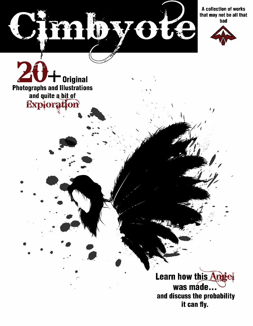
A NEW Revolutionary
This piece was made in Adobe Illustra-tor using the pencil tool, and the shape creation tool. The source image was a picture I took downtown of the General Logan statue in Grant Park. The two people in the picture were just a random father with his daughter playing on the statue steps on one of the first mild days in mid-February. Admittedly I felt a bit creepy taking pictures of them, but the overall com-position was just too good to pass up. I chose to use primarily black for the whole image be-cause the source image was taken in such a way that there was almost no color in the picture. I chose to add red for the little girls hat and the statue to draw a connection to the two, and to keep the eye bouncing from one to the other.
... thought it was a Revolutionary War statue... resemble an epic shot
of a battlefield
John A. Logan was a civil war general who led the army of the Union in several important battles, and after the war served in the House of Representatives. He is actually responsible for the creation of Memorial Day. While General Logan was not a revolutionary, I always get a rebellious vibe off of the statue. It has a feel of triumph over adversity, and this is how I chose to interpret the statue. I had originally thought it was a Revolutionary War statue, because it was a man holding a flag on a horse on top of a hill, which always seemed to resemble an epic shot of a battlefield, like in the movie the Patriot.
4


W I N G S
6
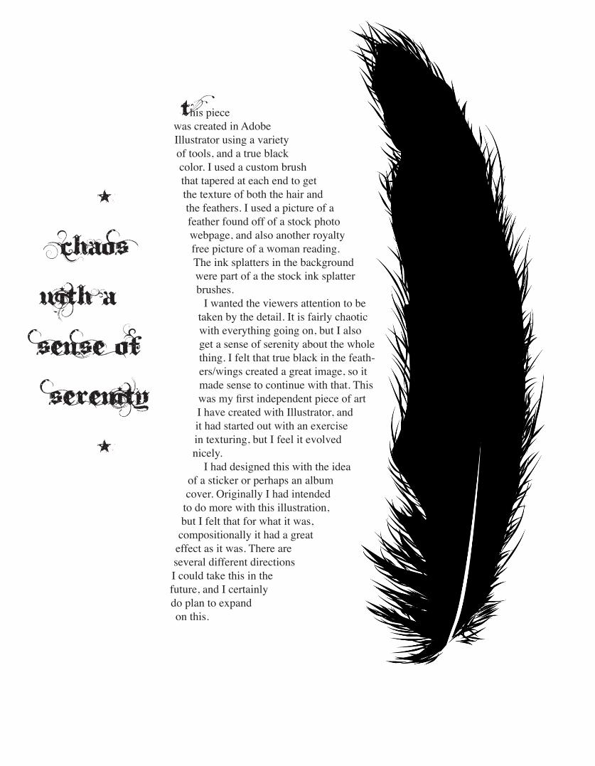
This piece was created in Adobe Illustrator using a variety of tools, and a true black color. I used a custom brush that tapered at each end to get the texture of both the hair and the feathers. I used a picture of a feather found off of a stock photo webpage, and also another royalty free picture of a woman reading. The ink splatters in the background were part of a the stock ink splatter brushes. I wanted the viewers attention to be taken by the detail. It is fairly chaotic with everything going on, but I also get a sense of serenity about the whole thing. I felt that true black in the feath-ers/wings created a great image, so it made sense to continue with that. This was my first independent piece of art I have created with Illustrator, and it had started out with an exercise in texturing, but I feel it evolved nicely. I had designed this with the idea of a sticker or perhaps an album cover. Originally I had intended to do more with this illustration, but I felt that for what it was, compositionally it had a great effect as it was. There are several different directions I could take this in the future, and I certainly do plan to expand on this.
* Chaos
with a sense of serenity
*

This is a picture of my niece, who was waiting expectantly for the bride to arrive. Amber, then 4 years old, was picked to be her cousins flower girl. This was Amber’s first time in a formal dress and was excited because, in her mind, she was going to be the center of attention. She knew that the bride and groom were important, but this was Amber’s chance to shine. She was bouncing around,
looking for the bride, waiting for everything to start. She was so focused on finding the bride so the wedding could start, that she
completely missed when she came in through the back door.
This picture was originally in color, but the composition, with the variations in the lights and darks seemed to work best in Black and White.
The dress and the light from the windows have so many different shades of light grey versus the darkness of the surrounding. They compliment each
other nicely. I also noticed that the picture looked like one that would be used as stock pictures found in picture frames, which was something I
was actually proud and excited about. This was taken before I had really considered photography as art I could
partake in, so to have a picture that I took be on a quality around
that of professionals was a source of great pride. It
is still something I am proud of.
A Bride in WaitingShe was waiting
excitedly to see the beauty that was the
bride to be...
8


Track Master
10

This is an older picture I took for my digital photography class while bored and waiting for a class to start. At the time I had so much music on their it filled the hard drive, and I would have to continue to carry it around even after getting an iPhone. Music has always been a guiding force for me, with my tastes ranging the gambit from classical to thrash-core. This particular photograph was taken as an experiment with the black-and-white feature on my camera, and its attention to detail. I intentionally left dust on the iPod to keep the perception of frequent use. This is one of my favorite pictures I have ever taken.
a guiding force
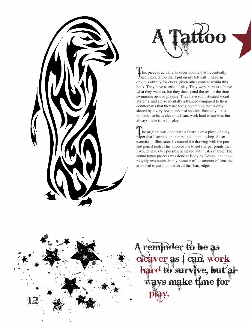
This piece is actually an older doodle that I eventually turned into a tattoo that I put on my left calf. I have an obvious affinity for otters, given other content within this book. They have a sense of play. They work hard to achieve what they want to, but they then spend the rest of the time swimming around playing. They have sophisticated social systems, and are so mentally advanced compared to their counterparts that they use tools, something that is only shared by a very few number of species. Basically it is a reminder to be as clever as I can, work hard to survive, but always make time for play.
The original was done with a Sharpie on a piece of copy paper that I scanned in then refined in photoshop. As an exercise in Illustrator, I vectored the drawing with the pen and pencil tools. This allowed me to get sharper points then I would have ever possible achieved with just a sharpie. The actual tattoo process was done at Body by Design, and took roughly two hours simply because of the amount of time the artist had to put into it with all the sharp edges.
A Tattoo
A reminder to be as cleaver as I can, work hard to survive, but al-ways make time for play.12

This piece was created by experimenting with custom brushes for Adobe Illustrator. I grouped these two illustrations together because of their similar natures. I had been toying with creating a Day of the Dead sugar skull, and through experi-mentation I ended up creating a blueprint, or a pre-liminary sketch for something I plan on sculpting. I wanted to keep it simple at this point, with only a few details. Sugar Skulls tend to be very busy with a lot of detail on them, far beyond anything I would ever want to do.
& A Doodle
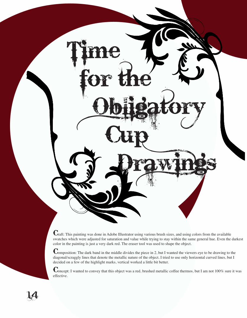
Time for the ObligatoryCup Drawings
Craft: This painting was done in Adobe Illustrator using various brush sizes, and using colors from the available swatches which were adjusted for saturation and value while trying to stay within the same general hue. Even the darkest color in the painting is just a very dark red. The eraser tool was used to shape the object.
Composition: The dark band in the middle divides the piece in 2, but I wanted the viewers eye to be drawing to the diagonal/scraggly lines that denote the metallic nature of the object. I tried to use only horizontal curved lines, but I decided on a few of the highlight marks, vertical worked a little bit better.
Concept: I wanted to convey that this object was a red, brushed metallic coffee thermos, but I am not 100% sure it was effective.
14

Time for the ObligatoryCup Drawings

Craft: This painting was done in Adobe Illustrator using various brush sizes, and using colors from the available swatches which but adjusted saturation, value and hue while trying to stay within the realm of green. The brush stroke sizes are much more varied in this piece then it most others. There is more color variation in the color as the object itself had many different shades of green. This object started out with a large brush which painted horizon-tally to create the general shape, then the aspects of it were further defined with different values and brush sizes.
Composition: I wanted to show the difference between the top and the base of this particular bottle. I found the base to be different than the rest of the bottle because it was shinier and had a lot less color variation. The light source made the bottom a very dark green, almost black, but I wanted it to be seen easier. I at-tempted to give the bottle depth by layering brushstrokes to show that you could in fact see through this bottle.
Concept: ... it’s a green glass bottle.
... it’s a green glass bottle...
16

Craft: This painting was done in Adobe Illustrator using various brush sizes, and using colors from the avail-able swatches which were adjusted for saturation and value while trying to stay within the same general hue. Horizontal lines were used for the exterior and vertical lines were used for the interior.
Composition: The difference in line direction was an intentional at-tempt to differentiate the interior and exterior of this object. I wanted to get a very mess and sporadic look to the strokes on the interior to differentiate the interior from exterior, and to pull the viewers eye downward. I pur-posely decided to not give the object too much detail, as I felt it would become too chaotic.
Concept: The object is a shiny metal bottom half of a martini shaker.

This drawing was created using a base layer of the darkest possible gray using only horizontal curved lines. A bigger brush was used in some parts to fill in better because of how I wanted the bowl to appear. I then added in middle tones and a few highlights. Middle tones were used to give the bowl a definite shape. The subject was a black, shiny plastic square bowl, and I wanted to highlight each of these characteristics. I went for a completely solid dark background to give the impression of how dark the subject was without using black. It was shiny, and all of the middle tones were used to identify the edges as they ap-peared with the dim light to the side. I wanted to pull the viewers eye into the inside of the bowl at the curve, so I positioned the light to reflect in there. I avoided using white to retain the how dark the subject was.
The variations were done by changing colors and brush stoke, as well as size.
18

THATS A LOT
OF CUPS

20

Craft: This painting was done in
Adobe Illustrator using various brush sizes, and using colors from the available
swatches which were adjusted for saturation and value while trying to stay within the same general hue. Layers were added on top of each other with decreasing brush size for the
background. The colors were chosen based on complimentary colors. Each stroke used was the number 8, and the values of the purples and
yellows were chosen systematically as being 10% darker then the previous value.
Composition: I want the viewers attention to go to the darker areas so I had them dominate the space. The number 8 is a curved number, and I chose to
reflect this and retain this quality in the overall painting. The curved eights come together to create a solid object, and retain a bit of a messy style. Overall I think
that all sense of depth was lost, but as an experiment it was interesting.
Concept: This is a painting of a pint glass that has a slight curve towards the top.
All sense of depth was
lost, but{[...] it was interesting.
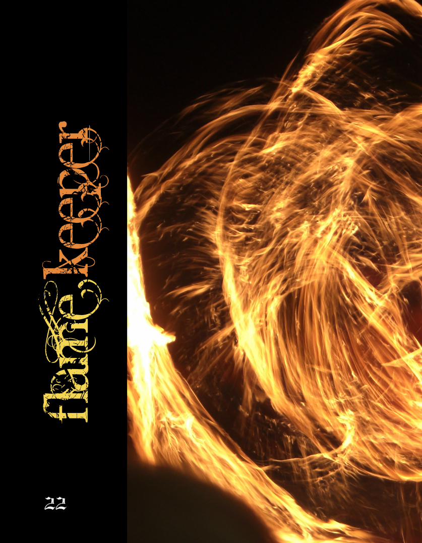
Flam
e Kee
per
22


I have always been a bit of a pyro24

These pictures were taken on a trip to Mexico with my girlfriend. We were watching a fire dance, which basically involved 3 men and 2 women playing with fire and a group of people playing bongos in the background, which is certainty something I could get behind. In the
picture to the left, you can actually see some of the performers. I have always been a bit of a pyro, spending a fair bit of my time playing
with fire, constructing fire-eating torches and juggling fireballs. When taking pictures of fire, it captures a moment of time in which flames are dancing, and it is captured with levels of light that the human eye could not hope to organize in the short amount of time the patterns are present. I wish more than anything about this pictures that I was closer. There were people in front of me at the show, so I could not help but capture them in the pictures. I also wish I had a tripod. As it was, with the very dark lighting conditions, any movement at all
would create blur.
These particular pictures involved a man holding two wheels with torches at various points around the diameter, and doing a dance,
spinning them and creating amazing patters. It created a giant fireball the surrounded the man, and the patterns and the lighting conditions created a very peculiar effect in which the man actually disappeared
in the photographs. Also, despite everything else in the pictures being blurred because I did not have a tripod. The flames remain very clear.

The fire creates a pattern
26

Pull Quote
everything else is a blur

PULL QUOTe
Taken at a bonfire, this picture is of a patio fireplace at my hotel in Mexico. It kept throwing out sparks because the wood that was used was still a little moist. There was a high wind that kept causing the sparks to shoot everywhere, and made the flames flare regularly. I had originally tried to take the picture to capture the movement of the flames, but after the first picture, I noticed how the slower shutter speed captured the path of the sparks like lines erupting
from the flame. In order to make the picture pop more, I did some editing in Photoshop with levels and color balance.
28


Trees...This panoramic was taken in a local forest preserve for a digital photography class during mid-fall. This is pieced together for 5 different pictures taken with a tripod, and then complied by Photoshop. A filter was added to pull the yellows out past the browns. The composition was set up to help hide the lines
created by the panoramic process. I wanted the forest itself to be the subject, but I felt that would lose the eye of the viewer, so I made sure to include a tree in the foreground to give it a subject.
30

I wanted the forest itself to be the subject
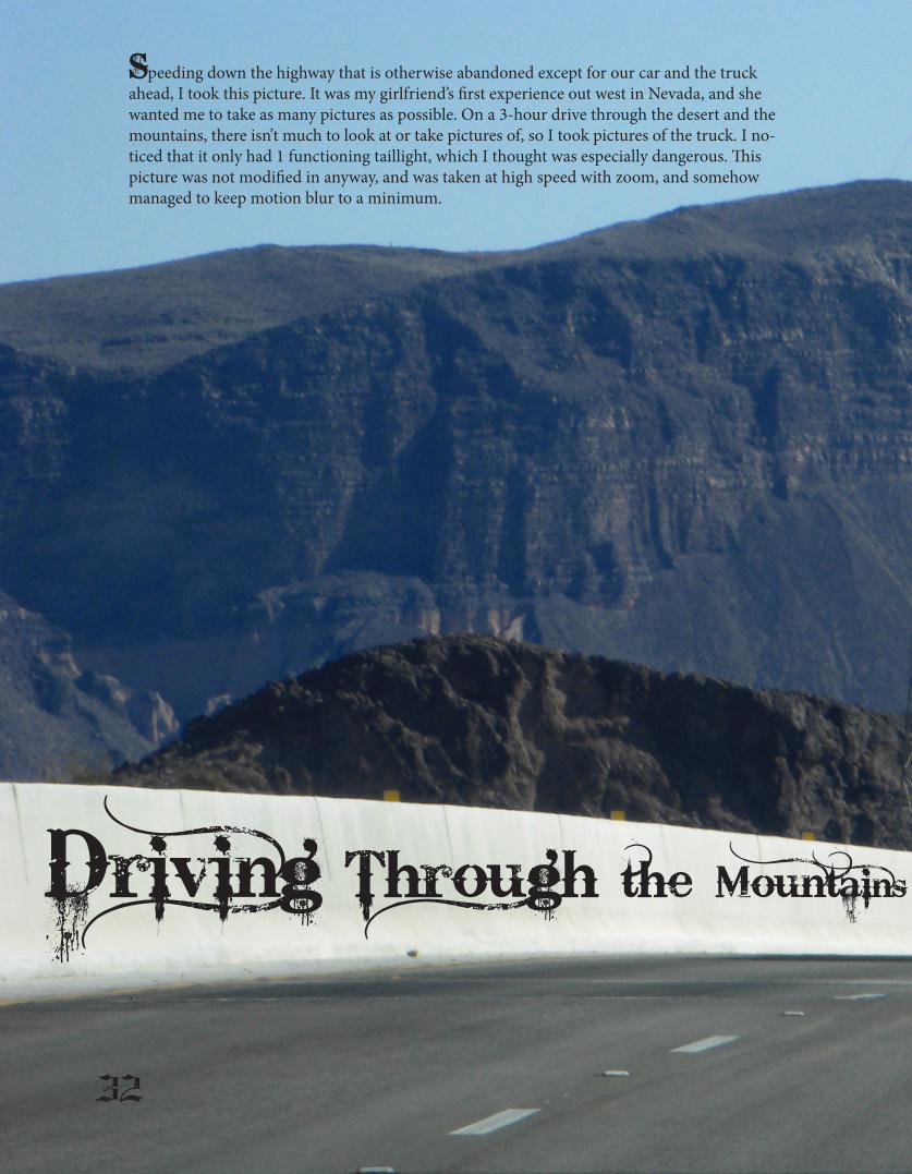
Speeding down the highway that is otherwise abandoned except for our car and the truck ahead, I took this picture. It was my girlfriend’s first experience out west in Nevada, and she wanted me to take as many pictures as possible. On a 3-hour drive through the desert and the mountains, there isn’t much to look at or take pictures of, so I took pictures of the truck. I no-ticed that it only had 1 functioning taillight, which I thought was especially dangerous. This picture was not modified in anyway, and was taken at high speed with zoom, and somehow managed to keep motion blur to a minimum.
Driving Through the Mountains
32

One Brake Light Out

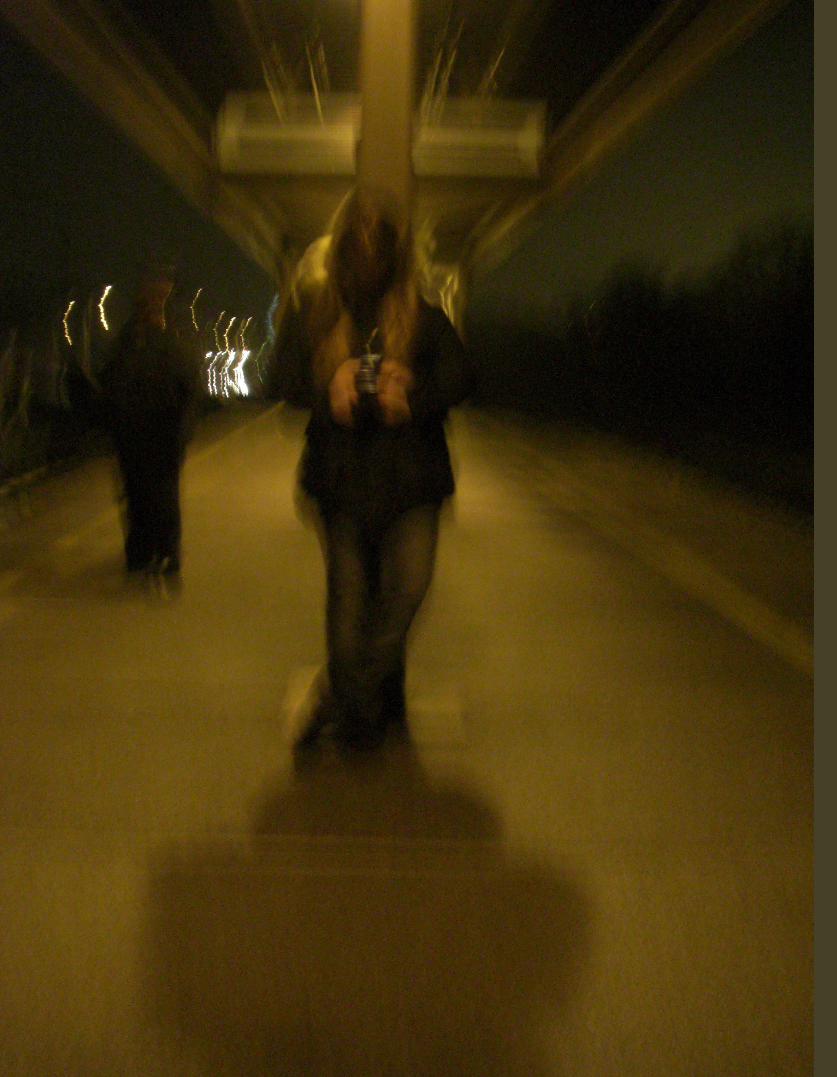
Waiting...I took the opportunity to take some pictures of the individual, but the shaking of the platform ruined it.
This picture was taken on a train platform. The source of the shaking was actually in incoming train, and the person in the back-
ground was actually following my girlfriend and I for a while. I took the opportunity to take some pictures of the individual, but the
shaking of the platform ruined it. This is what resulted.
34

a
aa
OTTER IN PROGRESS36

aaa
aa
Craft:This piece was made in Adobe illustrator. The reference photo was taken from Google, and is included below. Using the pen tool, I started to create layers that were apparent in the source photograph, initially starting out with body shape and adding layers to show the variation in color. Overall shape was then edited to create the impression of fur. The background was created by laying out 4 different shapes with the pen tool and colored to resemble the background of the source image, and then a Gaussian Blur effect was used. The fence was created by tracing out the shape of one of the wholes and cutting this shape out from a grey layer in an at-tempt to get some consistency in shape. The fence layer was laid on top of the body of the otter, but a layer for the paws was laid on top of that to create the illusion of depth.
Composition:The pose was obviously defined by the source photo. Layers were used in such a way to try and create the idea of depth, and that the otter is behind a fence. I wanted to create a “South Park” paper cut-out vibe, so I kept the shapes simple. This style helped to accom-modate a limited time frame that I was able to work on this piece. I wanted the viewers eye to look at the otters eye first, so I made the eye have the only true white in the piece, and then created a fur layer that was very light and large to help draw the eye towards here.
Concept:Otters are generally very active and playful animals, so I found an image where one looked almost sad to be fairly moving. I wanted to communicate the despair or anger that the source image seemed to have. The otter’s face, which I anthropomorphized as having a human facial expression of sadness or defiance communicated to me, along with the fence that the otter was unhappy. I tried to com-municate this as best as I could with the limitation of using only the pen tool. I spent a lot of time on the eye, to create that sense of sadness, or the “inside looking out” kind of sensation. Perhaps this was lost to an extent in the mouth area, but the eye communicates this.
I wanted to create a“
South Park vibe
OTTER IN PROGRESS

Craft:This piece was created in Adobe Illustrator. I used the previ-ous version as a model, and painted over it with a brush that I created to simulate hair. The otter’s hair is short and wet, so the strokes were intended to convey small clumps.The fence was created with the pen tool, forming one square of chain link, then repeating it throughout. Colors were not used from a pattern. I chose random colors within the brown family to again avoid any obvious pattern. The background was made using a spatter brush then a blur was added.A slight blur was added to the whiskers and the parts of the body furthest from the viewer. More blur was initially added, but it created issues with the file size and load times, so it was toned down.
Composition:The wires of the fence were bent randomly to avoid any sense of pat-tern. The paws and the whiskers that are towards the audience were created and layered on top of the fence to create the illusion of depth. Blur was used to convey a sense of depth. The background was left in-tentionally abstract, as the source image had the background extreme-ly out of focus. Attempts to create this did not work. A green was used only in one place to continually draw the eye towards the otter’s eye. I then wanted the attention to flow down the face following the flow of hair. But i wanted attention to keep being drawn to the top of the head by the eye. That bit of color draws it there.
Concept:I tried to convey the character on the inside looking out, as if there was something it wanted outside the fence. Either it was looking at food, or looking at the outside world, wanting to escape. A whole, yearning of freedom, pseudo-concentration camp painting. This was largely an experiment of not using solid blocks as shadow, and actually using color with extreme detail. Im generally very erratic with stoke lines, and here this
38

I tried to convey the character on the inside looking out, as if ... it wanted outside the
fence.
It got so detailed, it kept slowing down the computer.

Left: this modification was created from my initial attempt at the drawing while messing with the color pallet. I chose this color scheme on a whim, and felt it worked nicely.
Near Right: Using the same color pallet as the one above, I chose to eliminate the background. This is based off of the final detailed version of the otter, and largely left it up to the computer to place colors at random. I did tweak a few things in order to prevent the eye from being lost.
Far Right: For this version, I kept the colors the same, but altered the brush size and stroke shape to a grittier brush. I tweaked a few things here as well to prevent the eye being lost.
40


42

Note from the Editor/Artist: I suppose I may as well include a little note about this particular magazine. I created it with a variety of pieces I have created over my last few years of school. I chose to include mostly pieces that were created as experiments. I am not a hor-ribly prolific artist, and I tend to jump from one thing to another. As such I tend to experiment quite a bit. I have fun experimenting and playing with these styles and different mediums. I am not used to creating finished pieces or using an entirely digital medium, as are included in this magazine. A note on the title: I named this magazine Cimbyote (phonetic for symbiote) which is a tag that I have used for the last 7 or so years. It’s what I generally name the characters of the videogames I play. As far as I know, I am the only Cimbyote in the world, having done research to try and create a unique name for myself.

44