Embed Size (px)
Citation preview

5/13/2018 color-composition-1222610522808715-8 - slidepdf.com
http://slidepdf.com/reader/full/color-composition-1222610522808715-8 1/20
Drawing & Painting withStyle and Confidence
Presented by
Anne Kullaf
Anne Kullaf © 2008
Color &
Composition

5/13/2018 color-composition-1222610522808715-8 - slidepdf.com
http://slidepdf.com/reader/full/color-composition-1222610522808715-8 2/20
Anne Kullaf © 2008 Color & Composition
Course premise«
Color and composition are key elements in
any successful piece of art. Regardless of
medium chosen, layout and use of color are essential in keeping the viewer
engaged with the work.

5/13/2018 color-composition-1222610522808715-8 - slidepdf.com
http://slidepdf.com/reader/full/color-composition-1222610522808715-8 3/20
Anne Kullaf © 2008 Color & Composition
Course Overview«
During the weeks that this course runs we will explorecolor and composition through a series of weeklychallenges that address the following:
± Color: Color Harmony & the Limited Palette
Working with White
Working with Values and Temperature to Create Mood & Atmosphere
± Composition: Elements of design
Principles of organization
Compositional Techniques

5/13/2018 color-composition-1222610522808715-8 - slidepdf.com
http://slidepdf.com/reader/full/color-composition-1222610522808715-8 4/20
Anne Kullaf © 2008 Color & Composition
Color

5/13/2018 color-composition-1222610522808715-8 - slidepdf.com
http://slidepdf.com/reader/full/color-composition-1222610522808715-8 5/20
Anne Kullaf © 2008 Color & Composition
Color Basics Colors that complement
one another should beused to create shadowsand darks, in other words,colors that appear opposite
one another on the color wheel
Example: if you need toshow a shaded area on alemon (yellow, primary
color) use violet (secondarycolor)
Mix your secondary colorswhenever possible insteadof using them directly fromthe tube

5/13/2018 color-composition-1222610522808715-8 - slidepdf.com
http://slidepdf.com/reader/full/color-composition-1222610522808715-8 6/20
Anne Kullaf © 2008 Color & Composition
The Limited Palette
Try working with a limited palette of 3 primaries, onedark neutral and one white. One of my favorites is:
± Cobalt blue - Burnt umber
± Alizarin crimson - Titanium white
± Yellow ochre You may experiment with other colors you like, just
remember to keep it to 3 primaries and one dark neutralplus white.
If necessary, you can always add in a brighter primary
for the areas in highlight²for example, I often will use acadmium yellow in addition to the colors above whenworking on sunlit landscapes just to get that extra ³glow´in my greens.

5/13/2018 color-composition-1222610522808715-8 - slidepdf.com
http://slidepdf.com/reader/full/color-composition-1222610522808715-8 7/20
Anne Kullaf © 2008 Color & Composition
The Limited Palette
2 Paintings,
1 Palette: Cobalt Blue
AlizarinCrimson
YellowOchre
CadmiumYellow
Burnt Umber
TitaniumWhite
Notice the difference in mood of the 2 paintings
above.
Both were painted using the colors listed at left,
this illustrates the wide range of effects capable
with a limited palette.

5/13/2018 color-composition-1222610522808715-8 - slidepdf.com
http://slidepdf.com/reader/full/color-composition-1222610522808715-8 8/20
Anne Kullaf © 2008 Color & Composition
Working with White
White reflects color from
objects that surround
When painting white
objects, pay attention to
the temperature of the
object itself, as well as to
the temperature of the
colors it is reflecting
especially in the shadows
Although the painting above is of a pile of allwhite laundry, a variety of colors was used to
paint it: yellow ochre, cobalt blue, dioxazineviolet, burnt umber and titanuium white.Notice the warm and cool highlights on the silkyfabrics, they are more of an off white asopposed to the cool whites of the cottons. Thecolor variation provides interest as well asdefines the textures of the different fabrics.

5/13/2018 color-composition-1222610522808715-8 - slidepdf.com
http://slidepdf.com/reader/full/color-composition-1222610522808715-8 9/20
Anne Kullaf © 2008 Color & Composition
Working with Values &Temperature
to Create Mood & Atmosphere
Vary the mood and
atmosphere of your
paintings through your color
choices: ± Dark colors can be used to
create a dramatic lighting
effect as in the painting top
right ± Bright colors can create a
lighter, more festive feeling

5/13/2018 color-composition-1222610522808715-8 - slidepdf.com
http://slidepdf.com/reader/full/color-composition-1222610522808715-8 10/20
Anne Kullaf © 2008 Color & Composition
Composition

5/13/2018 color-composition-1222610522808715-8 - slidepdf.com
http://slidepdf.com/reader/full/color-composition-1222610522808715-8 11/20
Anne Kullaf © 2008 Color & Composition
Elements of Design
Line - the visual path that enables the eye to move within the piece
Shape - areas defined by edges within the piece, whether geometric
or organic
Color - hues with their various values and intensities
Texture - surface qualities which translate into tactile illusions Direction - visual routes which take vertical, horizontal or diagonal
paths
Size - the relative dimensions and proportions of images or shapes
to one another
Perspective - expression of depth: foreground, middle ground,background
Space - the space taken up by (positive) or in between (negative)
objects
Source: C ompositi on, (Visual Arts), Wiki pedi a

5/13/2018 color-composition-1222610522808715-8 - slidepdf.com
http://slidepdf.com/reader/full/color-composition-1222610522808715-8 12/20
Anne Kullaf © 2008 Color & Composition
Principles of Organization Shape and proportion Balance among the elements
Harmony, or consistency among the elements
The orientation of elements
The area within the field of view used for the picture (cropping)
The path or direction followed by the viewer's eye when theyobserve the image.
Negative space
Color
Contrast: the value, or degree of lightness and darkness, usedwithin the picture.
Rhythm Illumination or lighting
Repetition (Sometimes building into pattern; rhythm also comes intoplay, as does geometry)
Perspective
Source: C ompositi on, (Visual Arts), Wiki pedi a

5/13/2018 color-composition-1222610522808715-8 - slidepdf.com
http://slidepdf.com/reader/full/color-composition-1222610522808715-8 13/20
Anne Kullaf © 2008 Color & Composition
Compositional Techniques
Rule of thirds ± The rule of thirds is a guideline commonly followed by visual
artists. The objective is to stop the subject(s) and areas of
interest (such as the horizon) from bisecting the image, by
placing them near one of the lines that would divide the image
into three equal columns and rows, ideally near the intersectionof those lines.
Source: C ompositi on, (Visual Arts), Wiki pedi a
The painting on theleft follows the ruleof thirds, notice the
placement of theobjects of interest
close to the orangelines. The paintingon the right doesnot follow the ruleof thirds, but it stillis successfulcompositionally,why?

5/13/2018 color-composition-1222610522808715-8 - slidepdf.com
http://slidepdf.com/reader/full/color-composition-1222610522808715-8 14/20
Anne Kullaf © 2008 Color & Composition
Compositional Techniques
Rule of odds ± The rule of odds states that by displaying an odd number of
objects, there is always one in the middle that is "framed" by the
surrounding objects.
Source: C ompositi on (Visual Arts), Wiki pedi a
The painting on the left, a diptych, breaks the rule of odds by having 4 objects (the mason jars)
instead of 3, yet it is a successful composition. What other compositional techniques are used to
make it work? What other rules are broken? Describe the compositional strategies of the painting
on the right.

5/13/2018 color-composition-1222610522808715-8 - slidepdf.com
http://slidepdf.com/reader/full/color-composition-1222610522808715-8 15/20
Anne Kullaf © 2008 Color & Composition
Compositional Techniques
Rule of space ± The applies to artwork (photography, advertising, illustration)
picturing object(s): - to which the artist wants to apply the illusion
of movement
± This can be achieved by leaving white space in the direction the
eyes of a portrayed person are looking at. Another examplewould be when picturing a runner, adding white space behind
him rather than in front of him to indicate movement.
Source: C ompositi on (Visual Arts) Wiki pedi a
The painting on the left showsfigures moving in opposite
directions, there is space impliedby the shadows behind the figureswalking into the painting and thosewalking toward the viewer. Theheadlights on the cars in thepainting at right are aimed into theempty road, further implyingspace.

5/13/2018 color-composition-1222610522808715-8 - slidepdf.com
http://slidepdf.com/reader/full/color-composition-1222610522808715-8 16/20
Anne Kullaf © 2008 Color & Composition
Compositional Techniques
Simplification ± Images with clutter can distract
from the main elements withinthe picture and make it difficult toidentify the subject. By
decreasing the extraneouscontent, the viewer is more likelyto focus on the primary objects.Clutter can also be reducedthrough the use of lighting, asthe brighter areas of the imagetend to draw the eye, as do lines,
squares and color. In painting,the artist may use less detailedand defined brushwork towardsthe edges of the picture.
Source: C ompositi on (Visual Arts) Wiki pedi a
In this painting, the surrounding buildings andtraffic are depicted with looser brushwork thanthat of the main building and figures. Thetriangle created by the elements in this imagefurther solidifies the composition.

5/13/2018 color-composition-1222610522808715-8 - slidepdf.com
http://slidepdf.com/reader/full/color-composition-1222610522808715-8 17/20
Anne Kullaf © 2008 Color & Composition
Compositional Techniques
Limiting focus ± When used properly in the right setting, this technique can place
everything that is not the subject of the painting out of focus.
Geometry and symmetry
± The "rule of odds" suggests that an odd number of subjects in an
image is more interesting than an even number. Thus if youhave more than one subject in your picture, the suggestion is tochoose an arrangement with at least three subjects. An evennumber of subjects produces symmetries in the image, whichcan appear less natural for a naturalistic, informal composition.
± Related to the rule of odds is the observation that triangles arean aesthetically pleasing implied shape within an image. In aattractive face, the mouth and eyes fall within the corners of thearea of an equilateral triangle.
Source: C ompositi on: Visual Arts, Wiki pedi a

5/13/2018 color-composition-1222610522808715-8 - slidepdf.com
http://slidepdf.com/reader/full/color-composition-1222610522808715-8 18/20
Anne Kullaf © 2008 Color & Composition
Other Compositional Techniques(just remember it¶s ok to challenge the rules!)
There should be a center of interest or focus in the work, to prevent itbecoming a pattern in itself;
The direction followed by the viewer's eye should lead the viewer's gazearound all elements in the work before leading out of the picture;
The subject should not be facing out of the image;
A moving subject should have space in front;
Exact bisections of the picture space should be avoided;
Small, high contrast, elements have as much impact as larger, duller elements;
The prominent subject should be off-centre, unless a symmetrical or formalcomposition is desired, and can be balanced by smaller satellite elements
the horizon line should not divide the art work in two equal parts but be
positioned to emphasize either the sky or ground; showing more sky if painting is of clouds, sun rise/set, and more ground if a landscape
Source: C ompositi on (Visual Arts) Wiki pedi a

5/13/2018 color-composition-1222610522808715-8 - slidepdf.com
http://slidepdf.com/reader/full/color-composition-1222610522808715-8 19/20
Anne Kullaf © 2008 Color & Composition
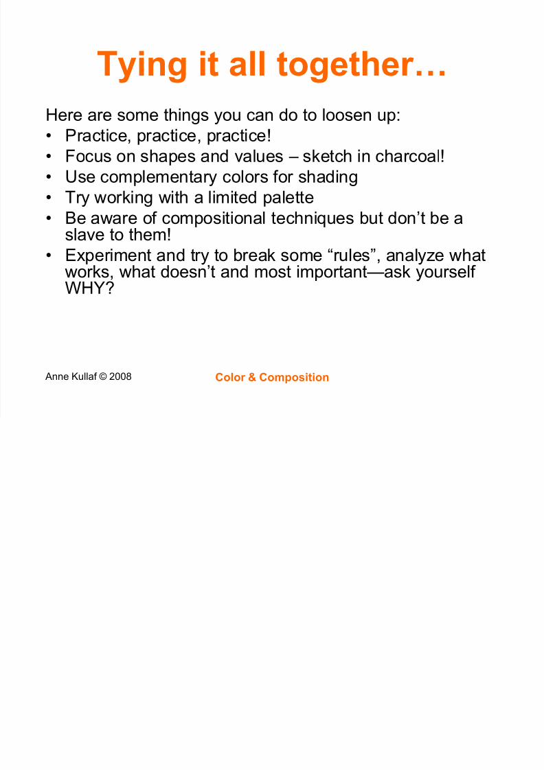
Tying it all together«
5/13/2018 color-composition-1222610522808715-8 - slidepdf.com
http://slidepdf.com/reader/full/color-composition-1222610522808715-8 20/20
Anne Kullaf © 2008 Color & Composition
Tying it all together«
Here are some things you can do to loosen up:
Practice, practice, practice!
Focus on shapes and values ± sketch in charcoal!
Use complementary colors for shading
Try working with a limited palette Be aware of compositional techniques but don¶t be a
slave to them!
Experiment and try to break some ³rules´, analyze whatworks, what doesn¶t and most important²ask yourself
WHY?