Embed Size (px)
Citation preview
1/23/2014
1
Comp/Phys/Apsc 715
Lecture 5: Trichromacy, Color Spaces,
Properties of Color
1/23/2014 Color 1Comp/Phys/Apsc 715 Taylor
Example Videos
• Segmentation and visualization of neurons
• Astro Visualization (the Millennium Run)
• Dragonfly Flight Analysis
1/23/2014 Color Comp/Phys/Apsc 715 Taylor 2
Administrative
Homework to post by next Thursday
� At least a week ahead of when it is due
1/23/2014 Color Comp/Phys/Apsc 715 Taylor 3
1/23/2014
2
How Important is Color (Hue)?
• Color is Irrelevant
• Color is Critical
1/23/2014 Color 4Comp/Phys/Apsc 715 Taylor
Color is Irrelevant…
• To determine object shapes
• To determine layout of objects in space
• To determine how objects are moving
• Therefore, to much of modern life
– Laboratory assistant went 21 years without
realizing he was color-blind
1/23/2014 Color 5Comp/Phys/Apsc 715 Taylor
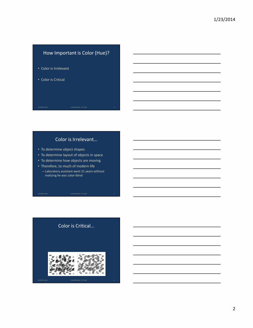
Color is Critical…
1/23/2014 Color 6Comp/Phys/Apsc 715 Taylor
1/23/2014
3
Color is Critical…
• To help us break camouflage
• To judge the condition of objects (food)– Ripe or rotten?
– Poisonous?
• To determine material types
1/23/2014 Color 7Comp/Phys/Apsc 715 Taylor
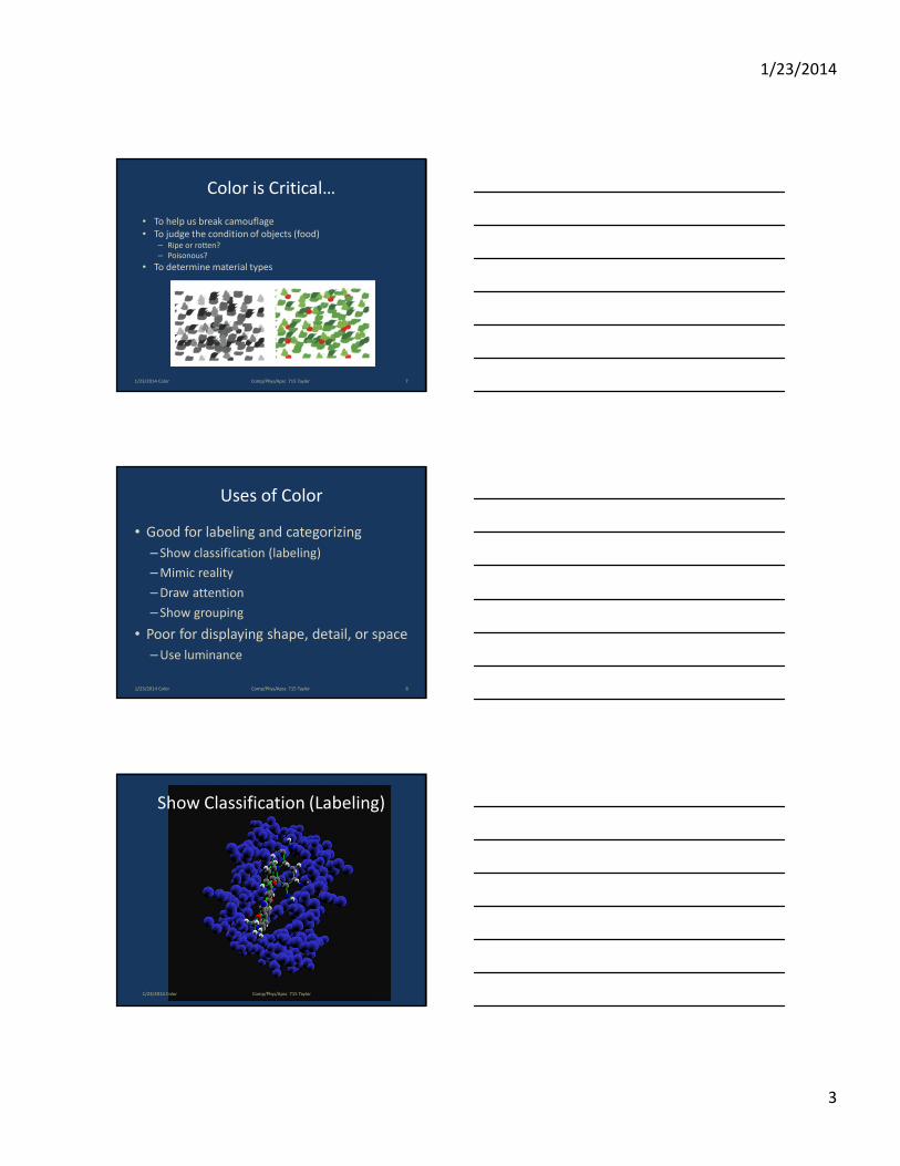
• Good for labeling and categorizing
– Show classification (labeling)
– Mimic reality
– Draw attention
– Show grouping
• Poor for displaying shape, detail, or space
– Use luminance
Uses of Color
1/23/2014 Color 8Comp/Phys/Apsc 715 Taylor
Show Classification (Labeling)
1/23/2014 Color Comp/Phys/Apsc 715 Taylor
1/23/2014
4
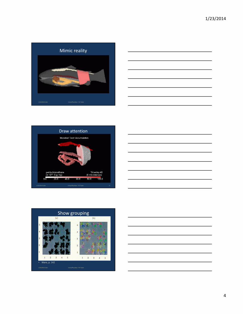
Mimic reality
1/23/2014 Color Comp/Phys/Apsc 715 Taylor
Draw attention
1/23/2014 Color 11Comp/Phys/Apsc 715 Taylor
Show grouping
• Ware, p. 142
1/23/2014 Color Comp/Phys/Apsc 715 Taylor
1/23/2014
5
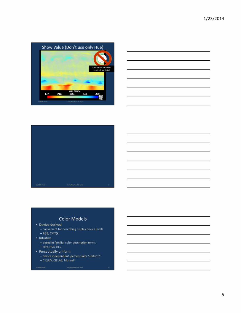
Show Value (Don’t use only Hue)
Luminance variation
required for detail
1/23/2014 Color Comp/Phys/Apsc 715 Taylor
1/23/2014 Color 14Comp/Phys/Apsc 715 Taylor
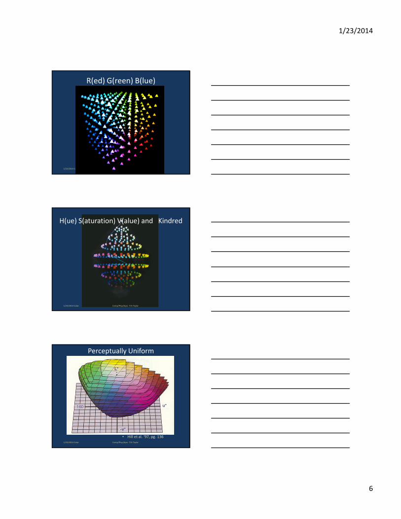
Color Models• Device-derived
– convenient for describing display device levels
– RGB, CMY(K)
• Intuitive
– based in familiar color description terms
– HSV, HSB, HLS
• Perceptually uniform
– device independent, perceptually “uniform”
– CIELUV, CIELAB, Munsell
1/23/2014 Color 15Comp/Phys/Apsc 715 Taylor
1/23/2014
6
R(ed) G(reen) B(lue)
1/23/2014 Color Comp/Phys/Apsc 715 Taylor
H(ue) S(aturation) V(alue) and Kindred
1/23/2014 Color Comp/Phys/Apsc 715 Taylor
• Hill et al. ‘97, pg. 136
Perceptually Uniform
1/23/2014 Color Comp/Phys/Apsc 715 Taylor
1/23/2014
7
1/23/2014 Color Comp/Phys/Apsc 715 Taylor
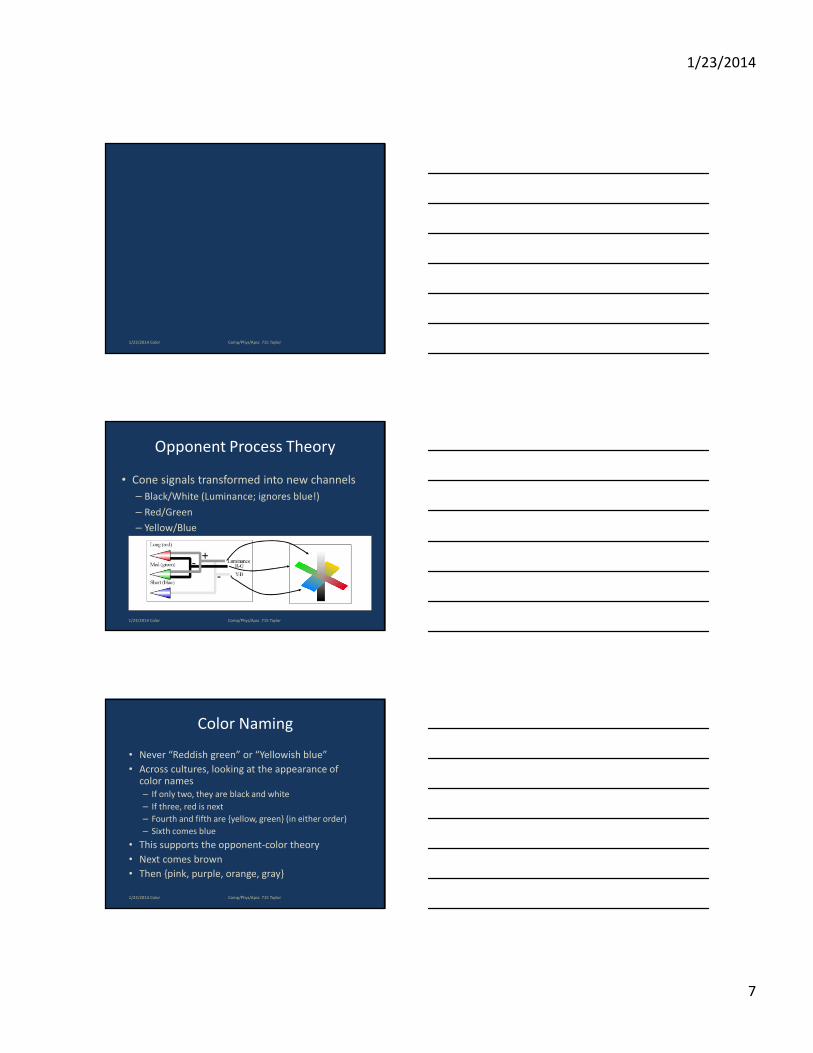
Opponent Process Theory
• Cone signals transformed into new channels
– Black/White (Luminance; ignores blue!)
– Red/Green
– Yellow/Blue
1/23/2014 Color Comp/Phys/Apsc 715 Taylor
Color Naming
• Never “Reddish green” or “Yellowish blue”
• Across cultures, looking at the appearance of color names
– If only two, they are black and white
– If three, red is next
– Fourth and fifth are {yellow, green} (in either order)
– Sixth comes blue
• This supports the opponent-color theory
• Next comes brown
• Then {pink, purple, orange, gray}
1/23/2014 Color Comp/Phys/Apsc 715 Taylor
1/23/2014
8
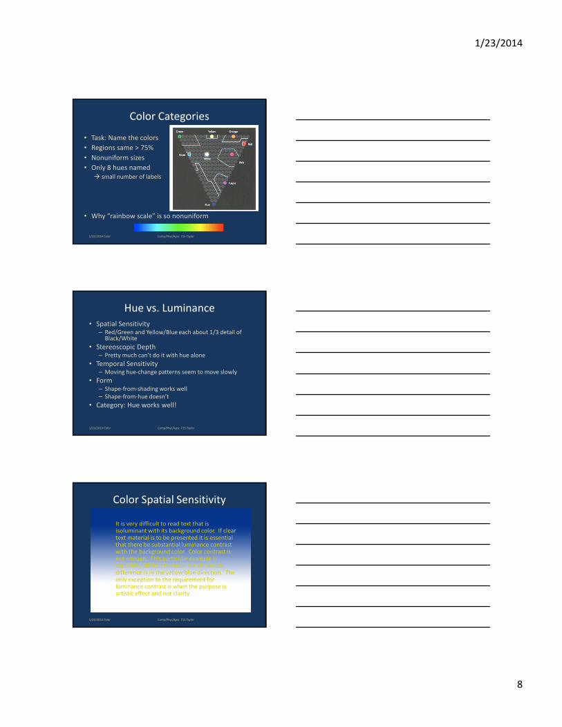
Color Categories
• Task: Name the colors
• Regions same > 75%
• Nonuniform sizes
• Only 8 hues named
� small number of labels
• Why “rainbow scale” is so nonuniform
1/23/2014 Color Comp/Phys/Apsc 715 Taylor
Hue vs. Luminance
• Spatial Sensitivity– Red/Green and Yellow/Blue each about 1/3 detail of
Black/White
• Stereoscopic Depth– Pretty much can’t do it with hue alone
• Temporal Sensitivity– Moving hue-change patterns seem to move slowly
• Form– Shape-from-shading works well
– Shape-from-hue doesn’t
• Category: Hue works well!
1/23/2014 Color Comp/Phys/Apsc 715 Taylor
Color Spatial Sensitivity
It is very difficult to read text that is isoluminant with its background color. If clear text material is to be presented it is essential that there be substantial luminance contrast with the background color. Color contrast is not enough. This particular example is especially difficult because the chromatic difference is in the yellow blue direction. The only exception to the requirement for luminance contrast is when the purpose is artistic effect and not clarity
1/23/2014 Color Comp/Phys/Apsc 715 Taylor
1/23/2014
9
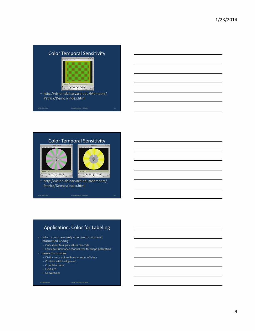
Color Temporal Sensitivity
• http://visionlab.harvard.edu/Members/
Patrick/Demos/index.html
1/23/2014 Color 25Comp/Phys/Apsc 715 Taylor
Color Temporal Sensitivity
• http://visionlab.harvard.edu/Members/
Patrick/Demos/index.html
1/23/2014 Color 26Comp/Phys/Apsc 715 Taylor
Application: Color for Labeling
• Color is comparatively effective for Nominal Information Coding
– Only about four gray values can code
– Can leave luminance channel free for shape perception
• Issues to consider
– Distinctness, unique hues, number of labels
– Contrast with background
– Color blindness
– Field size
– Conventions
1/23/2014 Color Comp/Phys/Apsc 715 Taylor
1/23/2014
10
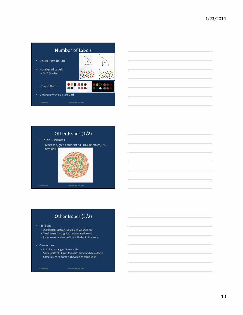
Number of Labels
• Distinctness (Rapid)
• Number of Labels
– 5-10 (Healey)
• Unique Hues
• Contrast with Background
1/23/2014 Color Comp/Phys/Apsc 715 Taylor
Other Issues (1/2)
• Color Blindness
– Most red/green color blind (10% of males, 1%
females)
1/23/2014 Color Comp/Phys/Apsc 715 Taylor
Other Issues (2/2)
• Field Size
– Avoid small spots, especially in yellow/blue
– Small areas: strong, highly-saturated colors
– Large areas: low saturation with slight differences
• Conventions
– U.S.: Red = danger, Green = life
– Some parts of China: Red = life, Green/white = death
– Some scientific domains have color conventions
1/23/2014 Color Comp/Phys/Apsc 715 Taylor
1/23/2014
11
1/23/2014 Color Comp/Phys/Apsc 715 Taylor
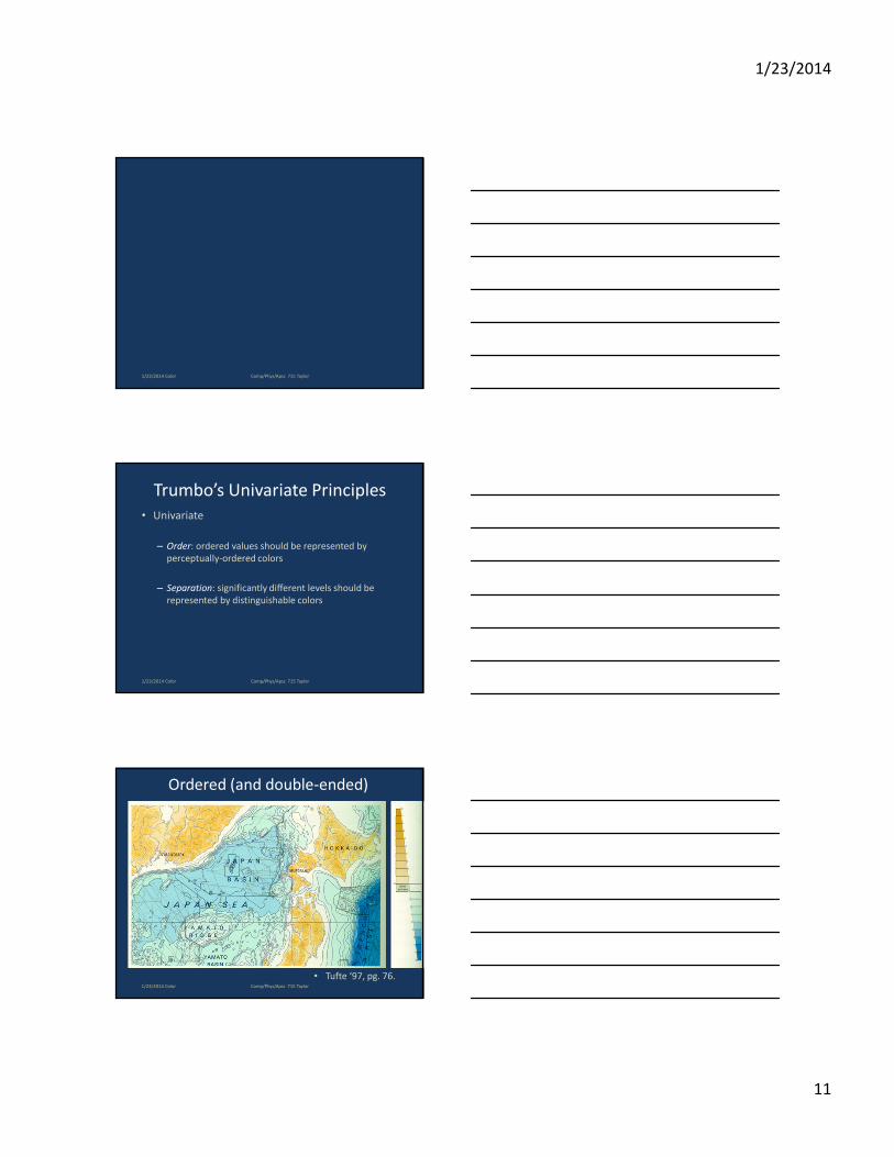
Trumbo’s Univariate Principles
• Univariate
– Order: ordered values should be represented by
perceptually-ordered colors
– Separation: significantly different levels should be
represented by distinguishable colors
1/23/2014 Color Comp/Phys/Apsc 715 Taylor
Ordered (and double-ended)
• Tufte ‘97, pg. 76.1/23/2014 Color Comp/Phys/Apsc 715 Taylor
1/23/2014
12
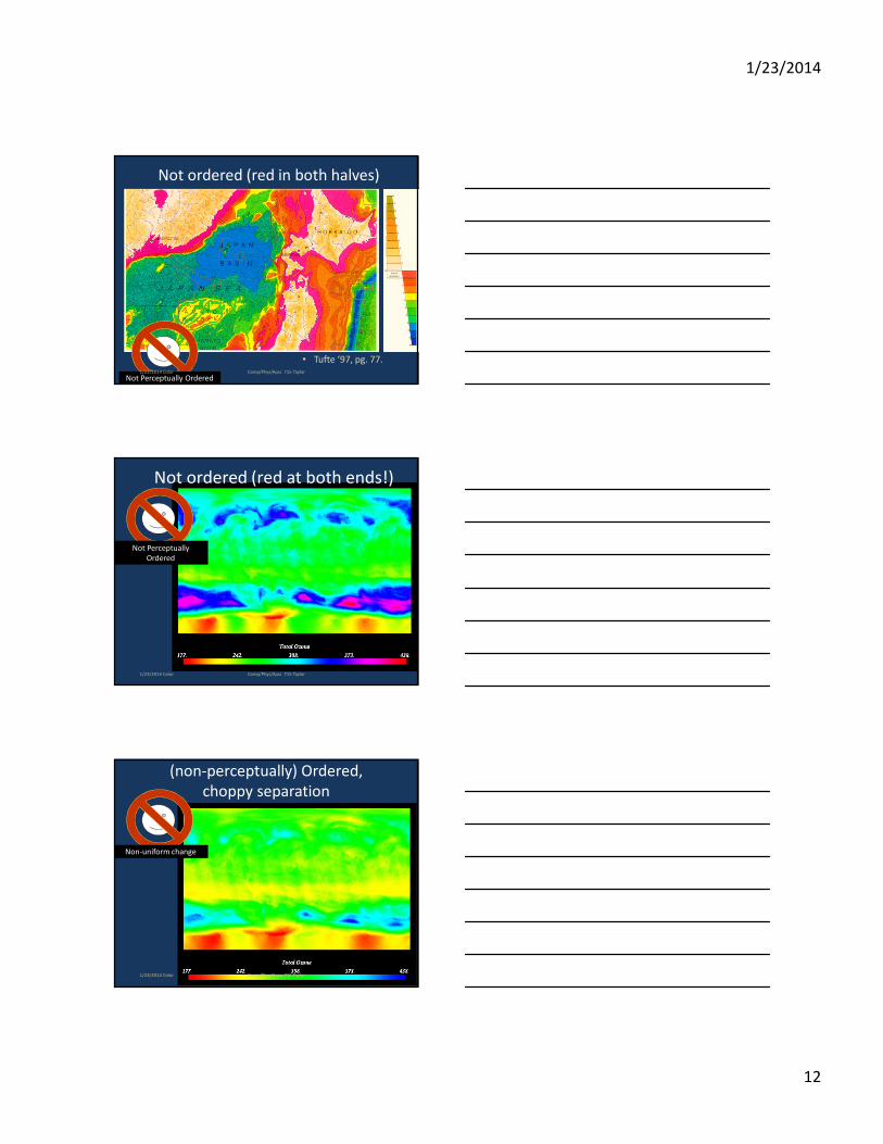
Not ordered (red in both halves)
• Tufte ‘97, pg. 77.
Not Perceptually Ordered1/23/2014 Color Comp/Phys/Apsc 715 Taylor
Not ordered (red at both ends!)
Not Perceptually
Ordered
1/23/2014 Color Comp/Phys/Apsc 715 Taylor
(non-perceptually) Ordered,
choppy separation
Non-uniform change
1/23/2014 Color Comp/Phys/Apsc 715 Taylor
1/23/2014
13
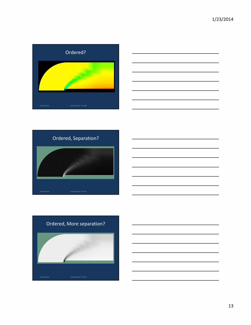
Ordered?
1/23/2014 Color Comp/Phys/Apsc 715 Taylor
Ordered, Separation?
1/23/2014 Color Comp/Phys/Apsc 715 Taylor
Ordered, More separation?
1/23/2014 Color Comp/Phys/Apsc 715 Taylor
1/23/2014
14
Trumbo’s Bivariate Principles
• Bivariate
– Rows and columns: to preserve univariate information,
display parameters should not obscure one another
– Diagonal: to show positive association, displayed
colors should group into three perceptual classes:
diagonal, above, below
1/23/2014 Color Comp/Phys/Apsc 715 Taylor
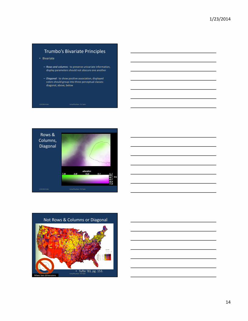
Rows &
Columns,
Diagonal
1/23/2014 Color Comp/Phys/Apsc 715 Taylor
Not Rows & Columns or Diagonal
• Tufte ‘83, pg. 153.
Mixes two dimensions1/23/2014 Color Comp/Phys/Apsc 715 Taylor
1/23/2014
15
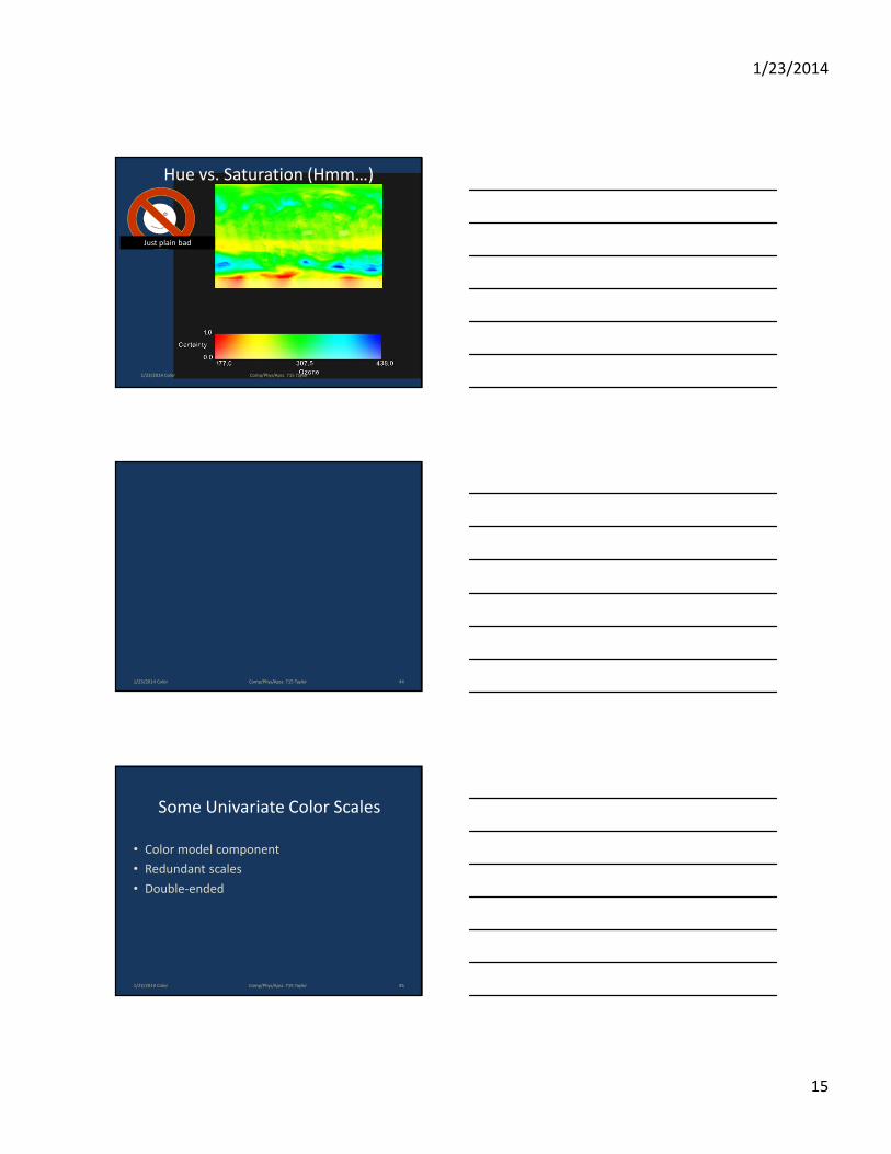
Hue vs. Saturation (Hmm…)
Just plain bad
1/23/2014 Color Comp/Phys/Apsc 715 Taylor
1/23/2014 Color 44Comp/Phys/Apsc 715 Taylor
Some Univariate Color Scales
• Color model component
• Redundant scales
• Double-ended
1/23/2014 Color 45Comp/Phys/Apsc 715 Taylor
1/23/2014
16
Color Model Component Scales
• Change a single color model component with
other components held constant
• Examples
– Grey scale
– Saturation scale
– Spectrum (hue, rainbow)
scale (BOO, HISS!)
1/23/2014 Color 46Comp/Phys/Apsc 715 Taylor
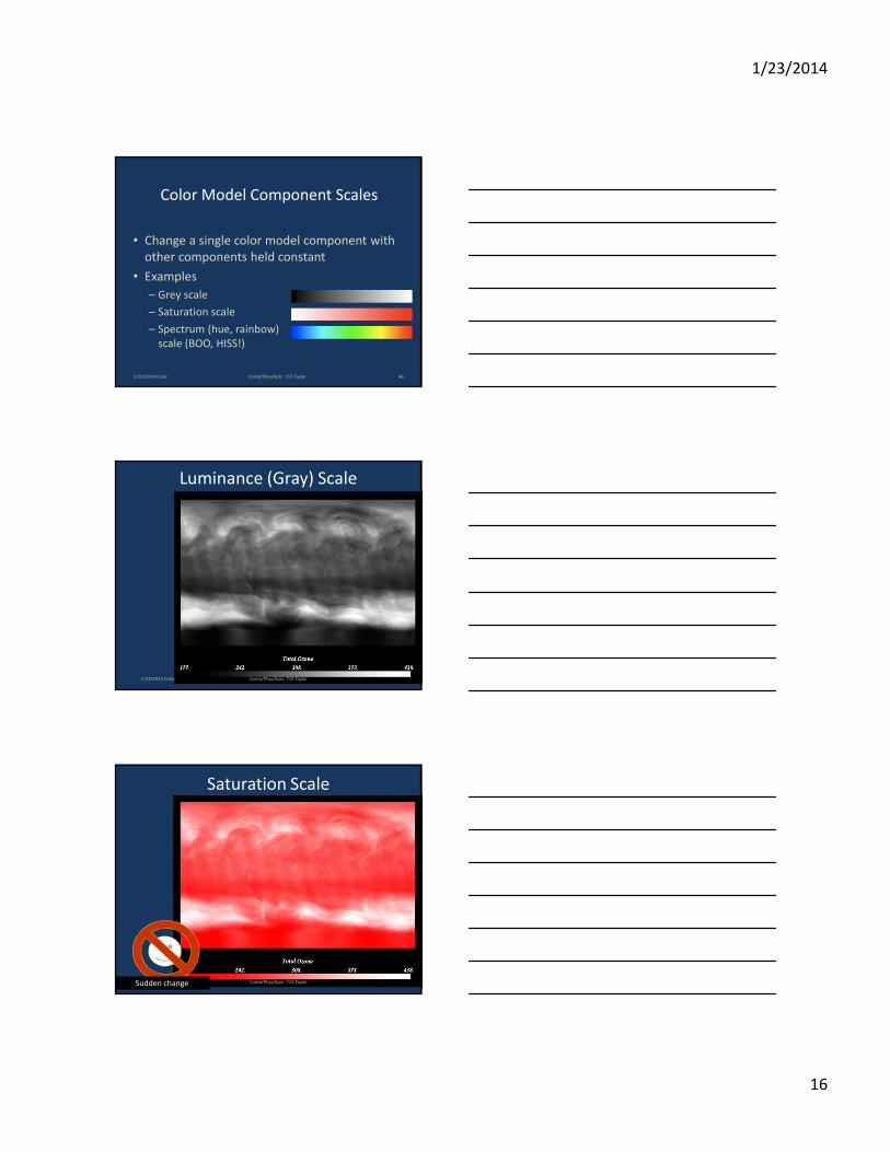
Luminance (Gray) Scale
1/23/2014 Color Comp/Phys/Apsc 715 Taylor
1/23/2014 Color
Saturation Scale
Sudden change Comp/Phys/Apsc 715 Taylor
1/23/2014
17
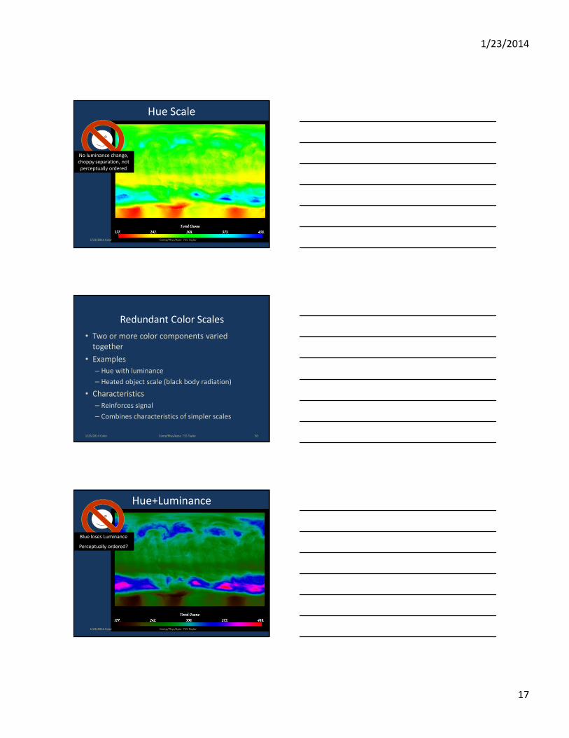
Hue Scale
No luminance change,
choppy separation, not
perceptually ordered
1/23/2014 Color Comp/Phys/Apsc 715 Taylor
Redundant Color Scales
• Two or more color components varied
together
• Examples
– Hue with luminance
– Heated object scale (black body radiation)
• Characteristics
– Reinforces signal
– Combines characteristics of simpler scales
1/23/2014 Color 50Comp/Phys/Apsc 715 Taylor
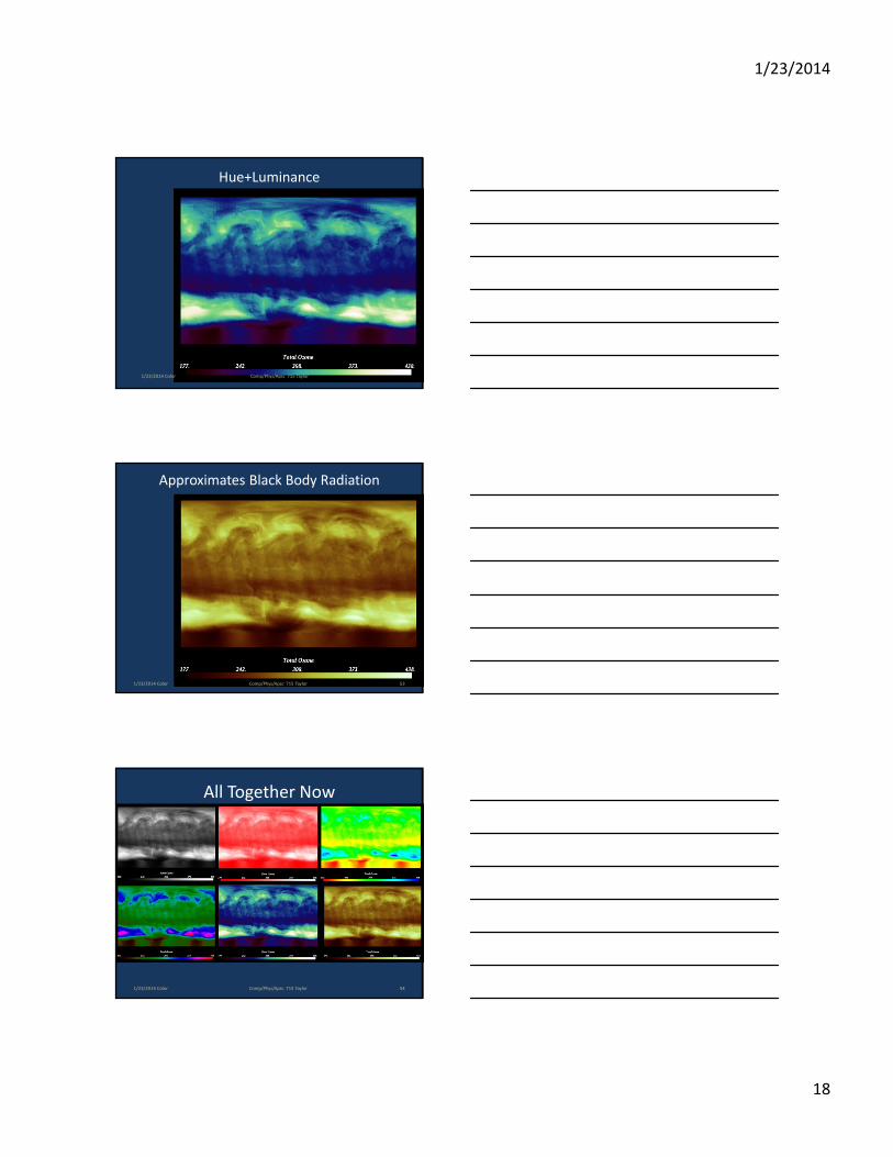
Hue+Luminance
Blue loses Luminance
Perceptually ordered?
1/23/2014 Color Comp/Phys/Apsc 715 Taylor
1/23/2014
18
Hue+Luminance
1/23/2014 Color Comp/Phys/Apsc 715 Taylor
Approximates Black Body Radiation
1/23/2014 Color 53Comp/Phys/Apsc 715 Taylor
All Together Now
1/23/2014 Color 54Comp/Phys/Apsc 715 Taylor
1/23/2014
19
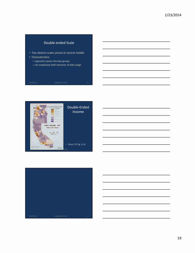
Double-ended Scale
• Two distinct scales joined at neutral middle
• Characteristics
– segments values into two groups
– can emphasize both extremes of data range
1/23/2014 Color 55Comp/Phys/Apsc 715 Taylor
Double-Ended
Income
• Olson ‘97, fig. 11-8.
1/23/2014 Color Comp/Phys/Apsc 715 Taylor
1/23/2014 Color 57Comp/Phys/Apsc 715 Taylor
1/23/2014
20
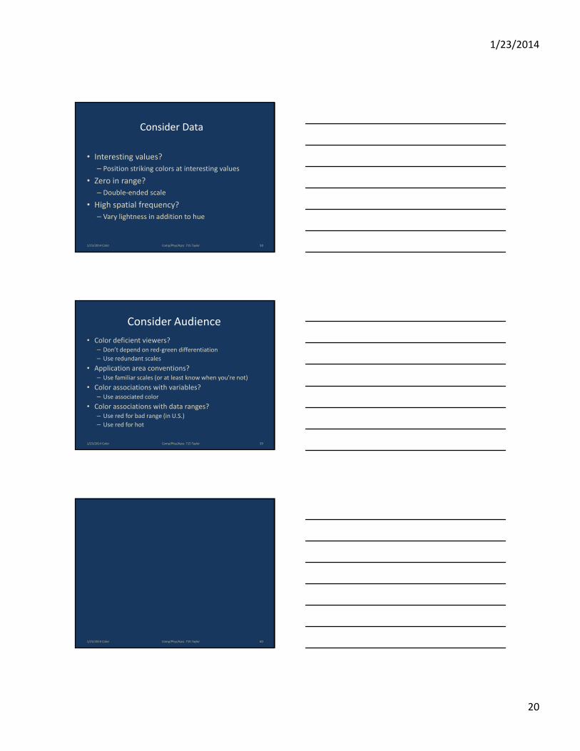
Consider Data
• Interesting values?
– Position striking colors at interesting values
• Zero in range?
– Double-ended scale
• High spatial frequency?
– Vary lightness in addition to hue
1/23/2014 Color 58Comp/Phys/Apsc 715 Taylor
Consider Audience
• Color deficient viewers?
– Don’t depend on red-green differentiation
– Use redundant scales
• Application area conventions?
– Use familiar scales (or at least know when you’re not)
• Color associations with variables?
– Use associated color
• Color associations with data ranges?
– Use red for bad range (in U.S.)
– Use red for hot
1/23/2014 Color 59Comp/Phys/Apsc 715 Taylor
1/23/2014 Color 60Comp/Phys/Apsc 715 Taylor
1/23/2014
21
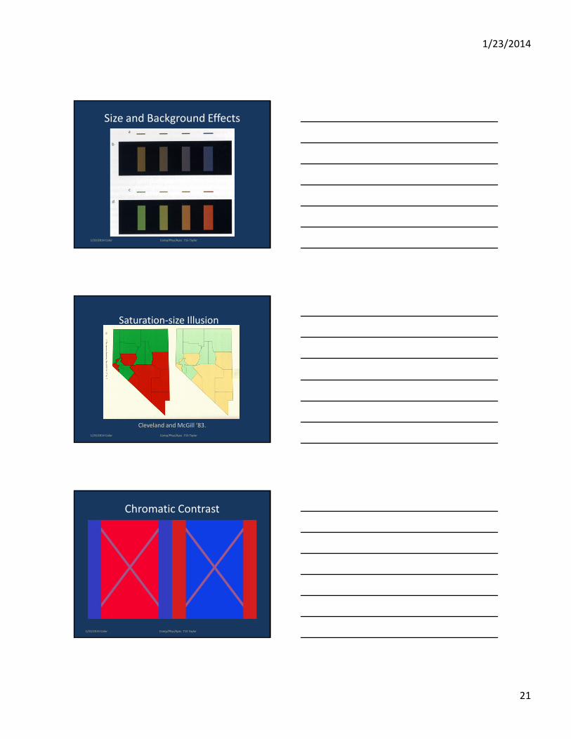
Size and Background Effects
1/23/2014 Color Comp/Phys/Apsc 715 Taylor
Saturation-size Illusion
Cleveland and McGill ‘83.
1/23/2014 Color Comp/Phys/Apsc 715 Taylor
Chromatic Contrast
1/23/2014 Color Comp/Phys/Apsc 715 Taylor
1/23/2014
22
Brown…
• Brown is dark yellow…
– But not when it is alone in a dark room
• Must be surrounded by brighter patches
– Otherwise some shade of yellow
• Be aware that it may not be seen as belonging to the family of
yellows.
"I cannot pretend to feel impartial about colours. I rejoice with
the brilliant ones and am genuinely sorry for the poor
browns." - Sir Winston Churchill
1/23/2014 Color Comp/Phys/Apsc 715 Taylor
Web Pointers
• Color Brewer
– Colorbrewer2.org
• Color FAQ
– http://www.poynton.com/ColorFAQ.html
• Penny Rheingans’ Color Perception and Apps
– http://www.cs.umbc.edu/~rheingan/SIGGRAPH/color.i
ntro.pdf
1/23/2014 Color Comp/Phys/Apsc 715 Taylor
1/23/2014 Color Comp/Phys/Apsc 715 Taylor
1/23/2014
23
References:
• Uses of Color and the four examples, Color Models and the three examples, Univariate, Color Model component (and examples), Redundant (and examples), Color-size illusion, Double-ended (and examples), Multivariate scales (and examples), Evaluating color scales (and examples), Consider Data, Consider Audience: Penny Rheingans
• The remainder are from Colin Ware’s book “Information Visualization.”
1/23/2014 Color 67Comp/Phys/Apsc 715 Taylor