Embed Size (px)
Citation preview
C E N T E R F O R S T A T E A N D L O C A L L E A D E R S H I PA T T H E M A N H A T T A N I N S T I T U T E
C S L
Civ
iC R
epo
RtN
o. 8
8 Ju
ne 2
014
Publ
ishe
d by
Man
hatt
an In
stitu
te
Poverty and Progress in new york i:
Conditions in new york City’s Poorest neighborhoods
L
stephen eideSenior Fellow, Manhattan Institute

Poverty and Progress in New York I
exeCutive SummaRy
New York’s City’s resurgence over the past three decades has been characterized by greater fiscal stability, less crime,
less dependence on cash welfare, and sustained economic growth. Although income has increased broadly, the gains
have been proportionately greater for the most affluent households. This rise of income inequality has prompted newly
elected mayor Bill de Blasio to characterize New York as a “tale of two cities”—and to pledge to improve incomes
and quality of life for the least well-off.
This study establishes a baseline against which future progress may be measured. It presents a quantitative profile, at
the neighborhood level, of the low-income New York that Mayor de Blasio inherited. It inaugurates a new Manhattan
Institute series that will chart the progress of poor New York neighborhoods over the coming years. How have the
poorest neighborhoods in the five boroughs fared over recent decades? Have conditions improved, declined, or
remained the same?
The neighborhoods examined in this report are: Mott Haven and Hunts Point in the South Bronx (Bronx Community
Districts 1 and 2); Brownsville, Coney Island, and East New York in Brooklyn (Brooklyn Community Districts 16, 13, and
5); East Harlem and Central Harlem in Manhattan (Manhattan Community Districts 11 and 10); Elmhurst and Jackson
Heights in Queens (Queens Community Districts 4 and 3); and Stapleton on Staten Island (Staten Island Community
District 1). These are the poorest neighborhoods in their respective boroughs, in terms of median household income.
Conditions in these neighborhoods will be measured using several metrics: “against themselves,” to chart their progress
over recent decades; and against wealthy neighborhoods, as well as the city as a whole.
key findings:
• Population trends are healthy in New York’s poorest neighborhoods. After catastrophic losses during the 1970s,
several neighborhoods have seen double-digit population increases during recent decades, often outpacing the
growth rate for the city as a whole.
• Themostunequivocal improvement inconditions inNewYork’spoorestneighborhoodshasbeen thecrime decline. In seven of ten neighborhoods surveyed, serious crimes declined by at least 70 percent between 1990
and 2013, with murders down by the same margin in nine.
• Citywide, thepoverty rate has not changed significantly since 1980 (21.2 percent now versus 20 percent
then). Among the poorest neighborhoods in the five boroughs, some have registered a drop in their poverty
rate since 1980 (East New York and Central Harlem are down by more than 10 percentage points). Others from
the same cohort have seen their poverty rate climb (Jackson Heights and Elmhurst in Queens, both up by over
8 percentage points).
• Therecordissimilarlymixedforneighborhood-levelchangesinrealmedian household income. Some poor
neighborhoods have seen strong gains, and a few have experienced decline. It has been gentrifying neighborhoods,
in Brooklyn and lower Manhattan, which have experienced the highest growth rate in median household income
since 1980.
Civ
ic R
epor
t 88
June 2014
• Innineofthetenpoorestneighborhoodsinthefiveboroughs,median gross rent has outpaced median household
income since 1980.
• Poorneighborhoodscontinuetoshowhighratesofwelfare dependence, although the kind of dependence
has changed. A smaller share of the population now receives cash assistance than in 1980, but in nine of the ten
neighborhoods, at least 40 percent of residents are on Medicaid—and in seven, at least a third of the population
receive food stamps.
• Family structure has been unstable in New York City’s poorest neighborhoods for decades. The same six
community districts (Mott Haven and Hunts Point in the Bronx; East Harlem and Central Harlem in Manhattan;
Brownsville and East New York in Brooklyn) that had 50 percent, or more, of families headed by a single mother
in 1980 continued to do so in 2012.
• SomeofNewYork’spoorestneighborhoodshavemadesubstantialprogressinratesofeducational attainment. Whereas seven had single-digit rates of adults with a college degree in 1980, only the South Bronx still has not
yet reached 10 percent.
Poverty and Progress in New York I
introduction
Population
income and Poverty
“inequality in new york City”, by scott winship*
Housing Costs
Crime
welfare dependence
Family structure and educational attainment
Conclusion
endnotes
CONTENTS1
2
2
4
7
7
8
11
11
12
*Walter B. Wriston Fellow, Manhattan Institute Cover image: New York City Subway Map ©Metropolitan Transportation Authority. Used with permission.
Civ
ic R
epor
t 88
June 2014
about the authoR
stephen d. eide is a senior fellow at the Manhattan Institute’s Center for State and Local Leadership. He edits
PublicSectorInc.org (@PubSectorInc), a project of the Manhattan Institute, and is also a contributor to the site. His work
focuses on public administration, public finance, political theory, and urban policy. His writings have been published
in the Worcester Telegram and Gazette, Orange County Register, the New York Post, Interpretation: A Journal of
Political Philosophy, and City Journal.
He was previously a senior research associate at the Worcester Regional Research Bureau, and holds a bachelor’s degree
from St. John’s College in Santa Fe, N.M., and a Ph.D. in political philosophy from Boston College.
Poverty and Progress in New York I
1
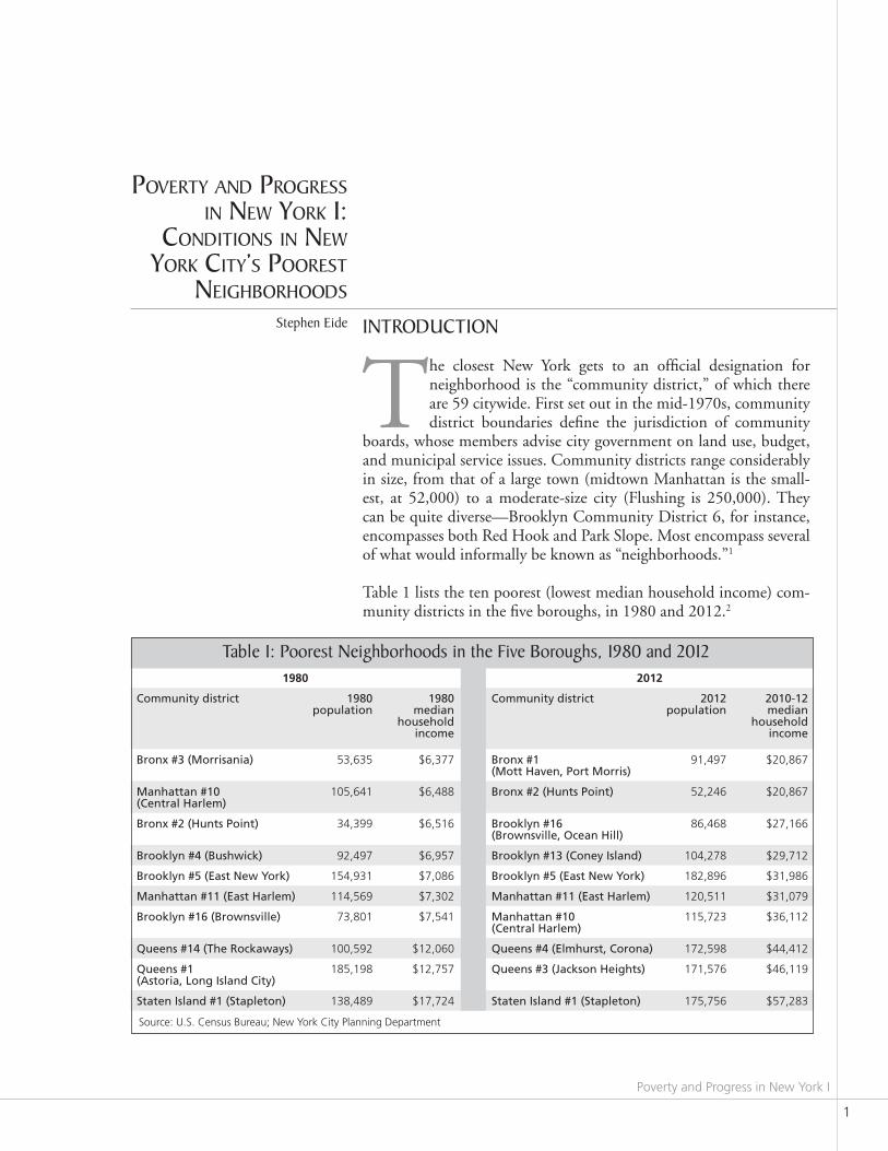
INTrOduCTION
The closest New York gets to an official designation for neighborhood is the “community district,” of which there are 59 citywide. First set out in the mid-1970s, community district boundaries define the jurisdiction of community
boards, whose members advise city government on land use, budget, and municipal service issues. Community districts range considerably in size, from that of a large town (midtown Manhattan is the small-est, at 52,000) to a moderate-size city (Flushing is 250,000). They can be quite diverse—Brooklyn Community District 6, for instance, encompasses both Red Hook and Park Slope. Most encompass several of what would informally be known as “neighborhoods.”1 Table 1 lists the ten poorest (lowest median household income) com-munity districts in the five boroughs, in 1980 and 2012.2
Stephen Eide
poveRty and pRogReSS in new yoRk i:
ConditionS in new yoRk City’S pooReSt
neighboRhoodS
1980 2012
Community district 1980 population
1980 median
household income
Community district 2012 population
2010-12 median
household income
Bronx #3 (Morrisania) 53,635 $6,377 Bronx #1 (Mott Haven, Port Morris)
91,497 $20,867
Manhattan #10 (Central Harlem)
105,641 $6,488 Bronx #2 (Hunts Point) 52,246 $20,867
Bronx #2 (Hunts Point) 34,399 $6,516 Brooklyn #16 (Brownsville, ocean Hill)
86,468 $27,166
Brooklyn #4 (Bushwick) 92,497 $6,957 Brooklyn #13 (Coney island) 104,278 $29,712
Brooklyn #5 (east new york) 154,931 $7,086 Brooklyn #5 (east new york) 182,896 $31,986
Manhattan #11 (east Harlem) 114,569 $7,302 Manhattan #11 (east Harlem) 120,511 $31,079
Brooklyn #16 (Brownsville) 73,801 $7,541 Manhattan #10 (Central Harlem)
115,723 $36,112
Queens #14 (the rockaways) 100,592 $12,060 Queens #4 (elmhurst, Corona) 172,598 $44,412
Queens #1 (astoria, Long island City)
185,198 $12,757 Queens #3 (Jackson Heights) 171,576 $46,119
staten island #1 (stapleton) 138,489 $17,724 staten island #1 (stapleton) 175,756 $57,283
Table 1: Poorest Neighborhoods in the Five Boroughs, 1980 and 2012
Source: U.S. Census Bureau; New York City Planning Department
Civ
ic R
epor
t 88
June 2014
2
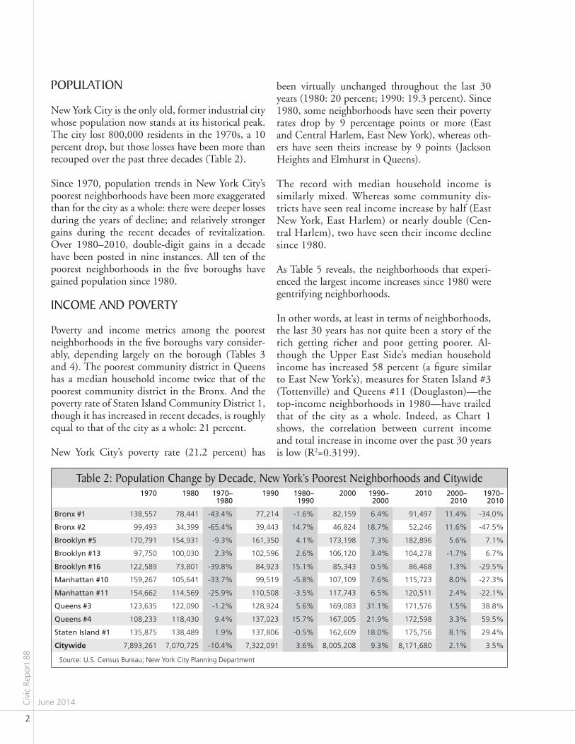
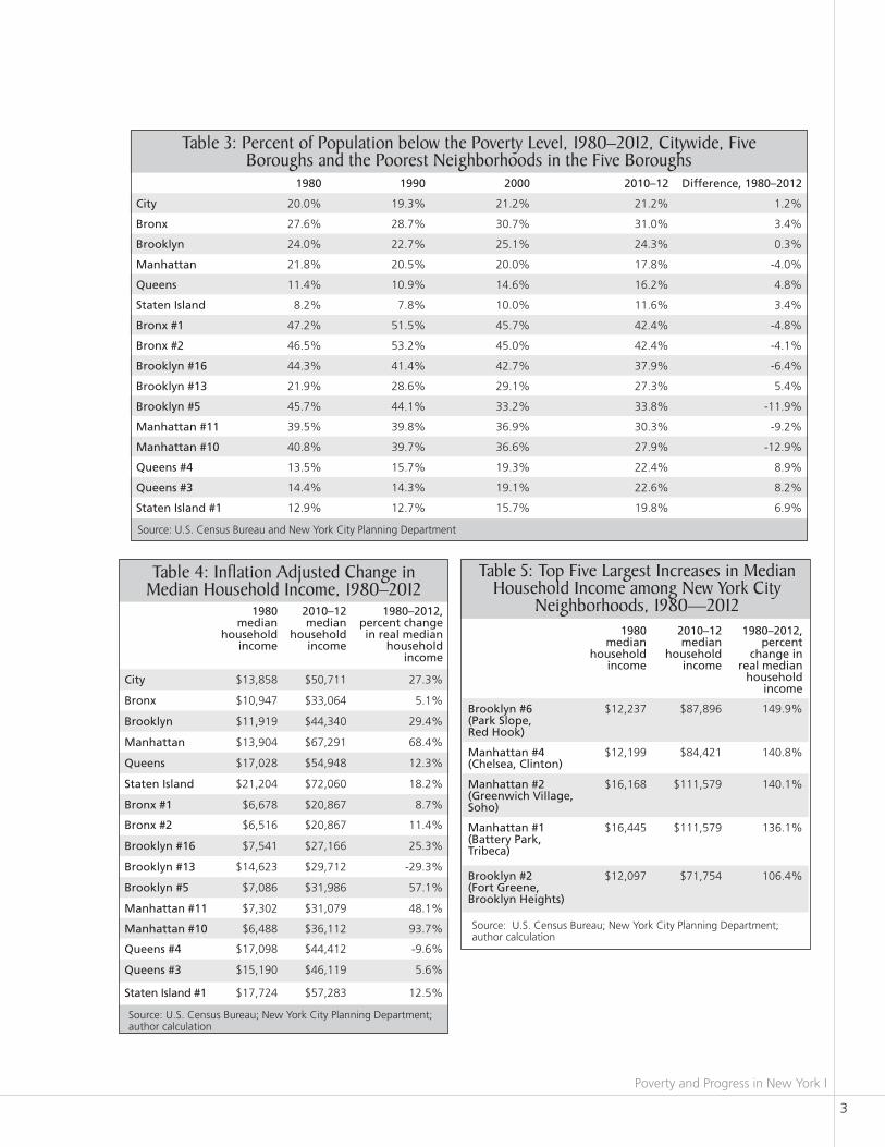
been virtually unchanged throughout the last 30 years (1980: 20 percent; 1990: 19.3 percent). Since 1980, some neighborhoods have seen their poverty rates drop by 9 percentage points or more (East and Central Harlem, East New York), whereas oth-ers have seen theirs increase by 9 points (Jackson Heights and Elmhurst in Queens). The record with median household income is similarly mixed. Whereas some community dis-tricts have seen real income increase by half (East New York, East Harlem) or nearly double (Cen-tral Harlem), two have seen their income decline since 1980. As Table 5 reveals, the neighborhoods that experi-enced the largest income increases since 1980 were gentrifying neighborhoods.
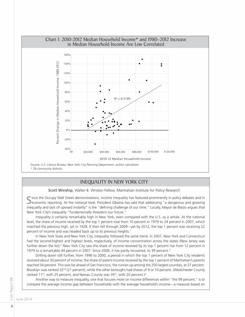
In other words, at least in terms of neighborhoods, the last 30 years has not quite been a story of the rich getting richer and poor getting poorer. Al-though the Upper East Side’s median household income has increased 58 percent (a figure similar to East New York’s), measures for Staten Island #3 (Tottenville) and Queens #11 (Douglaston)—the top-income neighborhoods in 1980—have trailed that of the city as a whole. Indeed, as Chart 1 shows, the correlation between current income and total increase in income over the past 30 years is low (R2=0.3199).
POPulaTION
New York City is the only old, former industrial city whose population now stands at its historical peak. The city lost 800,000 residents in the 1970s, a 10 percent drop, but those losses have been more than recouped over the past three decades (Table 2).
Since 1970, population trends in New York City’s poorest neighborhoods have been more exaggerated than for the city as a whole: there were deeper losses during the years of decline; and relatively stronger gains during the recent decades of revitalization. Over 1980–2010, double-digit gains in a decade have been posted in nine instances. All ten of the poorest neighborhoods in the five boroughs have gained population since 1980.
INCOmE aNd POvErTy
Poverty and income metrics among the poorest neighborhoods in the five boroughs vary consider-ably, depending largely on the borough (Tables 3 and 4). The poorest community district in Queens has a median household income twice that of the poorest community district in the Bronx. And the poverty rate of Staten Island Community District 1, though it has increased in recent decades, is roughly equal to that of the city as a whole: 21 percent.
New York City’s poverty rate (21.2 percent) has
1970 1980 1970– 1980
1990 1980–1990
2000 1990–2000
2010 2000–2010
1970–2010
Bronx #1 138,557 78,441 -43.4% 77,214 -1.6% 82,159 6.4% 91,497 11.4% -34.0%
Bronx #2 99,493 34,399 -65.4% 39,443 14.7% 46,824 18.7% 52,246 11.6% -47.5%
Brooklyn #5 170,791 154,931 -9.3% 161,350 4.1% 173,198 7.3% 182,896 5.6% 7.1%
Brooklyn #13 97,750 100,030 2.3% 102,596 2.6% 106,120 3.4% 104,278 -1.7% 6.7%
Brooklyn #16 122,589 73,801 -39.8% 84,923 15.1% 85,343 0.5% 86,468 1.3% -29.5%
Manhattan #10 159,267 105,641 -33.7% 99,519 -5.8% 107,109 7.6% 115,723 8.0% -27.3%
Manhattan #11 154,662 114,569 -25.9% 110,508 -3.5% 117,743 6.5% 120,511 2.4% -22.1%
Queens #3 123,635 122,090 -1.2% 128,924 5.6% 169,083 31.1% 171,576 1.5% 38.8%
Queens #4 108,233 118,430 9.4% 137,023 15.7% 167,005 21.9% 172,598 3.3% 59.5%
staten island #1 135,875 138,489 1.9% 137,806 -0.5% 162,609 18.0% 175,756 8.1% 29.4%
Citywide 7,893,261 7,070,725 -10.4% 7,322,091 3.6% 8,005,208 9.3% 8,171,680 2.1% 3.5%
Table 2: Population Change by decade, New york’s Poorest Neighborhoods and Citywide
Source: U.S. Census Bureau; New York City Planning Department
Poverty and Progress in New York I
3
1980 1990 2000 2010–12 difference, 1980–2012
City 20.0% 19.3% 21.2% 21.2% 1.2%
Bronx 27.6% 28.7% 30.7% 31.0% 3.4%
Brooklyn 24.0% 22.7% 25.1% 24.3% 0.3%
Manhattan 21.8% 20.5% 20.0% 17.8% -4.0%
Queens 11.4% 10.9% 14.6% 16.2% 4.8%
staten island 8.2% 7.8% 10.0% 11.6% 3.4%
Bronx #1 47.2% 51.5% 45.7% 42.4% -4.8%
Bronx #2 46.5% 53.2% 45.0% 42.4% -4.1%
Brooklyn #16 44.3% 41.4% 42.7% 37.9% -6.4%
Brooklyn #13 21.9% 28.6% 29.1% 27.3% 5.4%
Brooklyn #5 45.7% 44.1% 33.2% 33.8% -11.9%
Manhattan #11 39.5% 39.8% 36.9% 30.3% -9.2%
Manhattan #10 40.8% 39.7% 36.6% 27.9% -12.9%
Queens #4 13.5% 15.7% 19.3% 22.4% 8.9%
Queens #3 14.4% 14.3% 19.1% 22.6% 8.2%
staten island #1 12.9% 12.7% 15.7% 19.8% 6.9%
Table 3: Percent of Population below the Poverty level, 1980–2012, Citywide, Five Boroughs and the Poorest Neighborhoods in the Five Boroughs
Source: U.S. Census Bureau and New York City Planning Department
Table 4: Inflation adjusted Change in median Household Income, 1980–2012
Source: U.S. Census Bureau; New York City Planning Department; author calculation
Table 5: Top Five largest Increases in median Household Income among New york City
Neighborhoods, 1980—2012
Source: U.S. Census Bureau; New York City Planning Department; author calculation
1980 median
household income
2010–12 median
household income
1980–2012, percent change in real median
household income
City $13,858 $50,711 27.3%
Bronx $10,947 $33,064 5.1%
Brooklyn $11,919 $44,340 29.4%
Manhattan $13,904 $67,291 68.4%
Queens $17,028 $54,948 12.3%
staten island $21,204 $72,060 18.2%
Bronx #1 $6,678 $20,867 8.7%
Bronx #2 $6,516 $20,867 11.4%
Brooklyn #16 $7,541 $27,166 25.3%
Brooklyn #13 $14,623 $29,712 -29.3%
Brooklyn #5 $7,086 $31,986 57.1%
Manhattan #11 $7,302 $31,079 48.1%
Manhattan #10 $6,488 $36,112 93.7%
Queens #4 $17,098 $44,412 -9.6%
Queens #3 $15,190 $46,119 5.6%
staten island #1 $17,724 $57,283 12.5%
1980 median
household income
2010–12 median
household income
1980–2012, percent
change in real median
household income
Brooklyn #6 (Park slope, red Hook)
$12,237 $87,896 149.9%
Manhattan #4 (Chelsea, Clinton)
$12,199 $84,421 140.8%
Manhattan #2 (greenwich village, soho)
$16,168 $111,579 140.1%
Manhattan #1 (Battery Park, tribeca)
$16,445 $111,579 136.1%
Brooklyn #2 (Fort greene, Brooklyn Heights)
$12,097 $71,754 106.4%
Civ
ic R
epor
t 88
June 2014
4
INEqualITy IN NEw yOrk CITy
Chart 1: 2010-2012 median Household Income* and 1980–2012 Increase in median Household Income are low Correlated
since the Occupy Wall Street demonstrations, income inequality has featured prominently in policy debates and in economic reporting. At the national level, President Obama has said that addressing “a dangerous and growing
inequality and lack of upward mobility” is the “defining challenge of our time.” Locally, Mayor de Blasio argues that New York City’s inequality “fundamentally threatens our future.”
Inequality is certainly remarkably high in New York, even compared with the U.S. as a whole. At the national level, the share of income received by the top 1 percent rose from 10 percent in 1979 to 24 percent in 2007, which matched the previous high, set in 1928. It then fell through 2009—yet by 2012, the top 1 percent was receiving 22 percent of income and was headed back up to its previous heights.1
In New York State and New York City, inequality followed the same trend. In 2007, New York and Connecticut had the second-highest and highest levels, respectively, of income concentration across the states (New Jersey was further down the list).2 New York City saw the share of income received by its top 1 percent rise from 12 percent in 1979 to a remarkable 44 percent in 2007. Since 2009, it has partly recovered, to 39 percent.3
Drilling down still further, from 1996 to 2000, a period in which the top 1 percent of New York City residents received about 30 percent of income, the share of parent income received by the top 1 percent of Manhattan’s parents reached 54 percent. This was far ahead of San Francisco, the runner-up among the 250 largest counties, at 37 percent. Brooklyn was ranked 32nd (21 percent), while the other boroughs had shares of 9 or 10 percent. (Westchester County ranked 11th, with 25 percent, and Nassau County was 35th, with 20 percent.)4
Another way to measure inequality, one that focuses more on income differences within “the 99 percent,” is to compare the average income gap between households with the average household’s income—a measure based on
scott winship, Walter B. Wriston Fellow, Manhattan Institute for Policy Research
R² = 0.3199
-40%
-20%
0%
20%
40%
60%
80%
100%
120%
140%
160%
$0 $20,000 $40,000 $60,000 $80,000 $100,000 $120,000
Perc
ent
Ch
ang
e in
Med
ian
Ho
use
ho
ld In
com
e, 1
980-
2012
2010-12 Median Household Income
Source: U.S. Census Bureau; New York City Planning Department; author calculation* 59 community districts

Poverty and Progress in New York I
5
10
24
18
22
35
26
30
12
44
35
39
0
5
10
15
20
25
30
35
40
45
50
1980 1985 1990 1995 2000 2005 2010
New York City
New York State
United States
Source: For the United States, data extracted from Thomas Piketty and Emmanuel Saez (2007). “Income and Wage Inequality in the United States, 1913-2002.” In A.B. Atkinson and Thomas Piketty, eds., Top Incomes Over the Twentieth Century: A Contrast Between European and English-Speaking Countries (Oxford: Oxford University Press). Updated figures at http://elsa.berkeley.edu/~saez/TabFig2012prel.xls. I use the series including capital gains (Table A3). For New York State and New York City, data extracted from: Fiscal Policy Institute (2014). “New York State Economic and Fiscal Outlook 2014-2015.” (New York: Fiscal Policy Institute): 77. http://fiscalpolicy.org/wp-content/uploads/2014/02/FPI-Budget-Briefing-Book-2014-2015.pdf.
Share of Income received by the Top One Percent, 1979–2012
0 10 20 30 40 50 60
United States, 1998
New York State
New York City
NY Commuting Zone, 1996–2000
Manhattan
Brooklyn
Queens
Staten Island
Bronx
Westchester Cty
Nassau Cty
Suffolk Cty
Putnam Cty
Percent
Source: For the United States, New York State, and New York City, data extracted from same sources cited in first graph, above. For the NYC commuting zone and borough/county, data extracted from Raj Chetty, Nathaniel Hendren, Patrick Kline, and Emmanuel Saez (2014). “Where is the Land of Opportunity? The Geography of Intergenerational Mobility in the United States.” Working Paper. Online Data Table 3. http://obs.rc.fas.harvard.edu/chetty/website/v2.1/online_data_tables.xls.
Share of Income received by the Top One Percent, late 1990s
Civ
ic R
epor
t 88
June 2014
6
the “Gini coefficient.” In 2012, the average gap in New York City was slightly larger than average household income (108 percent). That was high enough to place it 19th among U.S. cities and seventh among the nation’s 100 largest cities.5 Manhattan and Brooklyn, considered “counties” by the Census Bureau, rank first and third among sizable counties in the U.S.6
Despite such high levels of inequality in New York, it is far from obvious that the poor and middle class have been hurt. Income growth, after all, is not a zero-sum game, particularly at the local level. Indeed, if the city’s financial sector were ever to relocate to Connecticut, this would hardly benefit “the 99 percent.”
For context, New York City ranks ahead of all but 27 American cities in the largest 100, in terms of median income. Meanwhile, its poverty rate (20 percent) puts it squarely in the middle of the pack (ranked 56th).7 As inequality rose, median income in New York City increased by at least one-third between 1979 and 2007, while poverty fell.8 In fact, the income concentration figures cited above are overstated, for a variety of technical reasons, with the median income and poverty estimates understated.9 Finally, new data show that four of the five boroughs (all but Staten Island) rank in the top 40 among the 250 biggest American counties, in terms of intergenerational mobility.10 In the New York labor market, moreover, mobility was no lower among children born in 1993 than among children born in 1980.11
It is not clear that the de Blasio administration can do anything to reduce inequality, given the national and global forces driving income concentration—to say nothing of the growing importance of Wall Street in the American economy. But even if it could, it is, likewise, far from clear that this would be desirable.
1 See the spreadsheet at http://elsa.berkeley.edu/~saez/TabFig2012prel.xls, table A3. These are updated figures from Thomas Piketty
and Emmanuel Saez (2003), “Income Inequality in the United States, 1913–1998,” Quarterly Journal of Economics 118(1): 1–39.2 Estelle Sommeiller and Mark Price (2014), “The Increasingly Unequal States of America: Income Inequality by State, 1917 to 2011”
(Washington, DC: Economic Analysis and Research Network), table 2, http://s2.epi.org/files/2014/Income-Inequality-by-State-Final.pdf. 3 Fiscal Policy Institute (2014), “New York State Economic and Fiscal Outlook 2014–2015,”
http://fiscalpolicy.org/wp-content/uploads/2014/02/FPI-Budget-Briefing-Book-2014-2015.pdf. 4 Raj Chetty, Nathaniel Hendren, Patrick Kline, and Emmanuel Saez (2014), “Where Is the Land of Opportunity? The Geography of
Intergenerational Mobility in the United States,” working paper, online data table 3, http://obs.rc.fas.harvard.edu/chetty/website/
v2.1/online_data_tables.xls. The counties are ranked by size on the basis of the number of children in their sample.5 American Community Survey. See http://factfinder2.census.gov/faces/nav/jsf/pages/index.xhtml. Multiplying the Gini coefficient by
two yields the figures cited in the text.6 Adam Bee (2012), “Household Income Inequality Within U.S. Counties: 2006–2010” (Washington, DC: U.S. Census Bureau),
http://www.census.gov/prod/2012pubs/acsbr10-18.pdf, table 4.7 American Community Survey. See http://factfinder2.census.gov/faces/nav/jsf/pages/index.xhtml. These are five-year estimates,
covering 2008–12. Cities are actually “places,” including, e.g., unincorporated counties. They are ranked by size on the basis of
number of households.8 2007 estimates are from the American Community Survey. For 1979 estimates, see U.S. Census Bureau, “Money Income of
Households in the United States: 1979” (Washington, DC: U.S. Census Bureau), http://www2.census.gov/prod2/popscan/p60-126.
pdf, table 11; and U.S. Census Bureau, “Characteristics of the Population Below the Poverty Level: 1979” (Washington, DC: U.S.
Census Bureau), http://www2.census.gov/prod2/popscan/p60-130.pdf, table 10.9 Scott Winship (2013), “Has Income Inequality Really Risen?” economics21,
http://www.economics21.org/research/has-income-inequality-really-risen-0; idem (2014) “Choosing Our Battles: Why We Should
Wage a War on Immobility Instead of Inequality,” testimony before the Joint Economic Committee of the U.S. Congress,
http://www.economics21.org/research/inequality-testimony-joint-economic-committee; and idem (2014), testimony before the
Committee on the Budget, U.S. House of Representatives,
http://budget.house.gov/uploadedfiles/winship_testimony_before_the_committee_on_the_budget.pdf. 10 Chetty et al. (2014, online data table 3).11 Raj Chetty, Nathaniel Hendren, Patrick Kline, Emmanuel Saez, and Nicholas Turner (2014), “Is the United States Still a Land of
Opportunity? Recent Trends in Intergenerational Mobility,” working paper, online data table 1,
http://obs.rc.fas.harvard.edu/chetty/website/v2.1/onlinedata1_trends.xls. The New York “labor market,” or “commuting zone,”
includes the five boroughs plus Westchester, Nassau, Suffolk, and Putnam Counties. The mobility measure used is the “rank-rank
slope,” which indicates the increase in child-income percentile, per one-percentile increase in parental income.
Poverty and Progress in New York I
7
HOuSINg COSTS
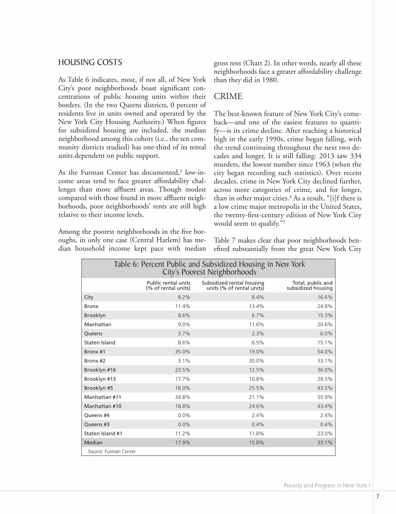
As Table 6 indicates, most, if not all, of New York City’s poor neighborhoods boast significant con-centrations of public housing units within their borders. (In the two Queens districts, 0 percent of residents live in units owned and operated by the New York City Housing Authority.) When figures for subsidized housing are included, the median neighborhood among this cohort (i.e., the ten com-munity districts studied) has one-third of its rental units dependent on public support. As the Furman Center has documented,3 low-in-come areas tend to face greater affordability chal-lenges than more affluent areas. Though modest compared with those found in more affluent neigh-borhoods, poor neighborhoods’ rents are still high relative to their income levels.
Among the poorest neighborhoods in the five bor-oughs, in only one case (Central Harlem) has me-dian household income kept pace with median
gross rent (Chart 2). In other words, nearly all these neighborhoods face a greater affordability challenge than they did in 1980. CRIME
The best-known feature of New York City’s come-back—and one of the easiest features to quanti-fy—is its crime decline. After reaching a historical high in the early 1990s, crime began falling, with the trend continuing throughout the next two de-cades and longer. It is still falling: 2013 saw 334 murders, the lowest number since 1963 (when the city began recording such statistics). Over recent decades, crime in New York City declined further, across more categories of crime, and for longer, than in other major cities.4 As a result, “[i]f there is a low crime major metropolis in the United States, the twenty-first-century edition of New York City would seem to qualify.”5
Table 7 makes clear that poor neighborhoods ben-efited substantially from the great New York City
Public rental units (% of rental units)
subsidized rental housing units (% of rental units)
total, public and subsidized housing
City 8.2% 8.4% 16.6%
Bronx 11.4% 13.4% 24.8%
Brooklyn 8.6% 6.7% 15.3%
Manhattan 9.0% 11.6% 20.6%
Queens 3.7% 2.3% 6.0%
staten island 8.6% 6.5% 15.1%
Bronx #1 35.0% 19.0% 54.0%
Bronx #2 3.1% 30.0% 33.1%
Brooklyn #16 23.5% 12.5% 36.0%
Brooklyn #13 17.7% 10.8% 28.5%
Brooklyn #5 18.0% 25.5% 43.5%
Manhattan #11 34.8% 21.1% 55.9%
Manhattan #10 18.8% 24.6% 43.4%
Queens #4 0.0% 2.4% 2.4%
Queens #3 0.0% 0.4% 0.4%
staten island #1 11.2% 11.8% 23.0%
Median 17.9% 15.8% 33.1%
Table 6: Percent Public and Subsidized Housing in New york City’s Poorest Neighborhoods
Source: Furman Center
Civ
ic R
epor
t 88
June 2014
8
crime decline.6 In five cases, murders dropped by over 88 percent. wElFarE dEPENdENCE
Welfare reform was, after the crime decline, argu-ably the second-most striking feature of New York City’s comeback.7 Having peaked at almost 1.2 mil-lion in 1995, the number of individuals receiving cash assistance from the city’s Human Resources Administration has since declined, to slightly more
than 340,000 by the end of 2013, a 71 percent drop.8 Due in part to the new flexibility accorded by the federal Personal Responsibility and Work Opportunity Reconciliation Act, Mayors Giuliani and Bloomberg adopted a “work first” approach to welfare administration. Time limits were imposed on aid, and seeking work was made a rigorously-enforced condition of receiving assistance. Welfare reform did not reduce spending, nor did it lead to a reduction in overall dependence, in that enrollment in other social assistance programs has increased.
Chart 2: Change in median gross rent and median Household Income in the Ten Poorest Neighborhoods in the Five Boroughs, 1980–2012
Percent Change in Median Gross Rent, 1980–2012 (nominal)
Percent Change in Median Household Income, 1980–2012 (nominal)
0%
100%
200%
300%
400%
500%
Source: U.S. Census Bureau
Community district
Precinct(s) 1990 murders
1990 index
crimes
2001 murders
2001 index
crimes
Percent change in murders,
1990–2001
Percent change
in index crimes, 1990–2001
2013 murders
2013 index
crimes
Percent change in murders,
2001–2013
Percent change
in index crimes, 2001–2013
Percent change
in murders,
1990–2013
Percent change
in index crimes, 1990–2013
Bronx #1 40 72 7,232 27 2,120 -62.5% -70.7% 8 1,902 -70.4% -10.3% -88.9% -73.7%
Bronx #2 41 44 3,943 12 1,397 -72.7% -64.6% 2 1,760 -83.3% 26.0% -95.5% -55.4%
Brooklyn #16 73 60 8,243 26 2,597 -56.7% -68.5% 15 2,094 -42.3% -19.4% -75.0% -74.6%
Brooklyn #13 60 21 6,146 20 4,729 -4.8% -23.1% 8 1,421 -60.0% -70.0% -61.9% -76.9%
Brooklyn #5 75 109 12,273 35 4,473 -67.9% -63.6% 18 3,902 -48.6% -12.8% -83.5% -68.2%
Manhattan #11 25 and 23 66 6,978 16 2,373 -75.8% -66.0% 7 2,173 -56.3% -8.4% -89.4% -68.9%
Manhattan #10 28 and 32 107 8,131 29 2,524 -72.9% -69.0% 9 1,920 -69.0% -23.9% -91.6% -76.4%
Queens #4 110 36 8,820 9 2,565 -75.0% -94.4% 6 1,747 -33.3% 254.4% -83.3% -80.2%
Queens #3 115 28 9,466 5 2,759 -82.1% -93.6% 3 1,760 -40.0% -79.4% -89.3% -98.7%
staten island #1 120 16 6,727 7 2,085 -56.3% -69.0% 4 1,335 -42.9% -36.0% -75.0% -80.2%
Source: New York Police Department; “Index Crimes” include murder, rape, robbery, felony assault, burglary, grand larceny, and grand larceny auto
Table 7: murders and Index Crimes in New york City’s Poorest Neighborhoods, 1980–2013
Poverty and Progress in New York I
9
Table 9: Percent of Population on medicaid, 1982–2010
Table 8: Percent of Population on Cash assistance, 1982–2010
1982 1990 1997 2010 difference, 1982–2010
City 11.5% 10.9% 12.1% 4.0% -7.5%
Bronx 19.2% 19.9% 21.7% 9.0% -10.2%
Brooklyn 14.8% 12.7% 14.2% 5.0% -9.8%
Manhattan 10.2% 10.9% 10.6% 3.0% -7.2%
Queens 5.1% 4.6% 6.5% 2.0% -3.1%
staten island 3.6% 3.8% 5.0% 3.0% -0.6%
Bronx #1 34.1% 37.4% 36.5% 13.0% -21.1%
Bronx #2 31.6% 38.0% 33.6% 13.0% -18.6%
Brooklyn #16 34.8% 28.7% 30.7% 14.0% -20.8%
Brooklyn #13 10.0% 12.8% 15.1% 4.0% -6.0%
Brooklyn #5 36.8% 30.3% 23.7% 9.0% -27.8%
Manhattan #11 26.1% 26.0% 24.2% 8.0% -18.1%
Manhattan #10 21.6% 26.8% 25.5% 8.0% -13.6%
Queens #4 5.6% 4.8% 7.1% 2.0% -3.6%
Queens #3 7.5% 6.7% 7.8% 2.0% -5.5%
staten island #1 7.3% 7.7% 9.6% 6.0% -1.3%
Source: New York City Human Resources Administration
1982 1990 1997 2010 difference, 1982-2010
City 16.9% 17.7% 22.1% 36.0% 19.1%
Bronx 25.9% 28.4% 33.4% 47.0% 21.1%
Brooklyn 20.9% 20.3% 26.3% 41.0% 20.1%
Manhattan 16.5% 18.6% 20.3% 25.0% 8.5%
Queens 8.9% 9.4% 14.3% 34.0% 25.1%
staten island 6.6% 7.4% 10.1% 22.0% 15.4%
Bronx #1 44.4% 50.2% 53.5% 61.0% 16.6%
Bronx #2 41.0% 49.7% 49.7% 57.0% 16.0%
Brooklyn #16 42.9% 38.6% 44.2% 53.0% 10.1%
Brooklyn #13 18.3% 23.3% 33.5% 48.0% 29.7%
Brooklyn #5 45.6% 41.7% 36.6% 49.0% 3.4%
Manhattan #11 38.0% 38.0% 41.4% 47.0% 9.0%
Manhattan #10 32.8% 38.4% 40.6% 41.0% 8.2%
Queens #4 10.1% 10.3% 17.2% 48.0% 37.9%
Queens #3 11.9% 12.4% 17.0% 45.0% 33.1%
staten island #1 11.1% 12.8% 17.2% 31.0% 19.9%
Source: New York City Human Resources Administration
Civ
ic R
epor
t 88
June 2014
10
Table 10: Percent of Population on Food Stamps, 1982–2010
1982 1990 1997 2010 difference, 1982–2010
City 16.6% 12.9% 16.2% 22.0% 5.4%
Bronx 25.1% 25.1% 25.5% 36.0% 10.9%
Brooklyn 21.4% 15.8% 20.2% 27.0% 5.6%
Manhattan 15.5% 12.6% 13.9% 19.0% 3.5%
Queens 8.7% 5.7% 9.7% 13.0% 4.3%
staten island 5.5% 4.5% 6.7% 15.0% 9.5%
Bronx #1 43.7% 41.4% 42.8% 52.0% 8.3%
Bronx #2 40.1% 42.3% 39.2% 46.0% 5.9%
Brooklyn #16 43.3% 32.5% 36.2% 46.0% 2.7%
Brooklyn #13 17.1% 17.6% 25.8% 33.0% 15.9%
Brooklyn #5 46.4% 34.0% 29.0% 40.0% -6.4%
Manhattan #11 35.8% 29.8% 31.1% 42.0% 6.2%
Manhattan #10 31.9% 30.9% 30.9% 37.0% 5.1%
Queens #4 10.1% 6.1% 10.0% 15.0% 4.9%
Queens #3 12.0% 8.2% 12.6% 16.0% 4.0%
staten island #1 10.3% 9.0% 11.9% 25.0% 14.7%
Source: New York City Human Resources Administration
1980 1990 2000 2012 difference, 1980–2012
City 17.3% 23.0% 27.4% 34.7% 17.4%
Bronx 9.1% 12.2% 14.6% 18.2% 9.1%
Brooklyn 11.6% 16.6% 21.8% 31.3% 19.7%
Manhattan 33.2% 42.2% 49.4% 59.0% 25.8%
Queens 15.5% 20.6% 24.3% 29.8% 14.3%
staten island 14.8% 20.7% 23.2% 29.5% 14.7%
Bronx #1 2.4% 3.4% 5.3% 8.2% 5.8%
Bronx #2 2.4% 3.4% 5.7% 8.2% 5.8%
Brooklyn #16 3.5% 5.6% 7.4% 10.4% 6.9%
Brooklyn #13 9.9% 13.2% 23.2% 31.3% 21.4%
Brooklyn #5 4.9% 6.2% 6.9% 12.3% 7.4%
Manhattan #11 7.5% 11.5% 14.4% 28.5% 21.0%
Manhattan #10 5.2% 10.4% 14.5% 32.8% 27.6%
Queens #4 15.8% 17.7% 19.2% 19.6% 3.8%
Queens #3 14.1% 18.9% 18.3% 20.0% 5.9%
staten island #1 14.5% 21.0% 22.8% 26.1% 11.6%
Table 11: Educational attainment (Percent of Persons 25 years of age, College graduate), 1980–2012
Source: U.S. Census Bureau; New York City Planning Department
Poverty and Progress in New York I
11
The city’s Human Resources Administration viewed food stamps, Medicaid, and other forms of noncash assistance as “work supports,”9 crucial tools in the effort to get more poor New Yorkers back into the workforce. This is abundantly reflected in the data. All ten neighborhoods’ populations are less dependent on cash assistance now than they were in 1980 (Table 8). At the same time, rates of reliance on Medicaid and food stamps are up in nearly every case (Tables 9 and 10).
FamIly STruCTurE aNd EduCaTIONal aTTaINmENT
New York City’s poorest neighborhoods continue to struggle on educational attainment (Table 11) and, especially, family structure (Table 12). Though most
lag behind the city in the share of population with a bachelor’s degree, all have seen those rates steadily increase over recent decades. The rate of single-mother families, by contrast, has barely budged at all—either for the city as a whole or in the poorest neighborhoods.
CONCluSION
The greatest legacy of the Bloomberg and Giuliani administrations may have been to demonstrate that New York City is governable and that public policies matter. Mayor de Blasio, has, if anything, a more optimistic belief in what government can ac-complish than his predecessors did—which he plans to bring to bear on a different set of policy chal-lenges. The most critical measure of success, based on de Blasio’s own reasoning, will be how much he improves conditions in the poorest neighborhoods.
1980 1990 2000 2012 difference, 1980–2012
City 33.7% 35.8% 36.3% 33.2% -0.5%
Bronx 44.8% 50.1% 51.2% 52.1% 7.3%
Brooklyn 36.9% 38.6% 38.5% 32.2% -4.7%
Manhattan 40.1% 41.0% 39.7% 32.3% -7.8%
Queens 21.5% 22.5% 24.6% 23.5% 2.0%
staten island 14.8% 16.7% 20.3% 22.7% 8.0%
Bronx #1 65.6% 67.5% 63.2% 66.0% 0.4%
Bronx #2 54.4% 66.1% 56.9% 66.0% 11.6%
Brooklyn #16 71.9% 83.5% 67.3% 64.9% -6.9%
Brooklyn #13 32.9% 46.8% 38.7% 25.4% -7.5%
Brooklyn #5 60.8% 63.0% 53.6% 56.8% -4.0%
Manhattan #11 56.7% 64.5% 61.5% 59.2% 2.4%
Manhattan #10 62.1% 68.0% 65.8% 53.8% -8.3%
Queens #4 21.3% 21.0% 23.0% 25.7% 4.4%
Queens #3 25.6% 24.5% 25.5% 25.8% 0.1%
staten idland #1 24.4% 27.3% 33.3% 32.6% 8.3%
Table 12: Family Structure (Percent of Families, with related Children under 18 years, Headed by Single Female Householders), 1980–2012
Source: U.S. Census Bureau; New York City Planning Department
Civ
ic R
epor
t 88
June 2014
12
endnoteS
1 A nonexclusive list of neighborhoods included in the community districts (CDs) covered in this report include: Mott Haven, Port Morris, and part of Melrose (Bronx #1); Hunts Point and Longwood (Bronx #2); Brownsville, Ocean Hill, and part of Broadway Junction (Brooklyn #16); Brighton Beach, Coney Island, Sea Gate, West Brighton, and part of Gravesend and Homecrest (Brooklyn #13); Cypress Hills, East New York, Highland Park, New Lots, Spring Creek, Starrett City, and part of Broadway Junction (Brooklyn #5); East Harlem, Randalls Island, and Wards Island (Manhattan #11); Central Harlem (Manhattan #10); Corona, Corona Heights, Elmhurst, Lefrak City, and South Corona (Queens #4); East Elmhurst, Jackson Heights, and North Corona (Queens #3); Mariner’s Harbor, Stapleton, and St. George (Staten Island #1).
2 In some of the tables that follow, data for Bronx CDs #1 and #2 are not strictly comparable with past decades since, for some of the 2012 data, the New York City Planning Department has grouped the two community districts together into one statistical unit.
3 Vicki Been et al., “State of New York City’s Housing and Neighborhoods: 2012,” Furman Center for Real Estate and Urban Policy, July 2013,
http://furmancenter.org/thestoop/entry/furman-center-releases-state-of-new-york-citys-housing-and-neighborhoods-20.4 Franklin Zimring, The City That Became Safe (Oxford: Oxford University Press, 2012).5 Ibid., p. 40.6 Community district and police precinct boundaries often coincide, but not always. All ten CDs listed in Table 7 fit neatly
within the precincts indicated, with the exception of Staten Island #1, which also includes a portion of Precinct #121.7 Kay S. Hymowitz, “How Welfare Reform Worked,” City Journal (Spring 2006).8 Source: New York City Human Resources Administration. 9 Robert Doar, “10 Welfare Reform Lessons,” National Review (April 21, 2014).

The Manhattan Institute’s Center for state and Local Leadership (CsLL) promotes
promising new approaches to reform of state and local government. CSLL works on a broad
range of issues, including public sector reform (specifically of pensions and health benefits),
education reform, prisoner reentry, policing, public housing, infrastructure, immigration, and
public service delivery. By spotlighting new ideas, and providing the research and proposals
to inform creative new policies, the CSLL hopes to lay the groundwork for an environment
in which commerce, employment, and a rich civic life can flourish.
The CSLL operates across the country, working in states such as California, Illinois, and
Rhode Island, and cities such as Newark, New Jersey and Detroit, Michigan. The CSLL’s
tools include regular writing and research reports by affiliated Manhattan Institute scholars
and senior fellows, along with public events and media appearances. The CSLL operates
www.PublicSectorInc.org, a website devoted to analysis of the implications—financial
and political—of the power wielded by public sector unions and allied elected officials.
The CSLL also annually selects and showcases the Manhattan Institute’s Urban Innovator
Award, which recognizes a state or local leader whose combination of policy creativity and
skill at implementation has led to groundbreaking improvements in public service, and the
Manhattan Institute’s Social Entrepreneurship Awards, which recognize those who identify
social needs and take it upon themselves to address them privately.
www.manhattan-institute.org/csll
The Manhattan Institute is a 501(C)(3) nonprofit organization. Contributions are tax-
deductible to the fullest extent of the law. EIN #13-2912529
CenteR foR State and LoCaL LeadeRShip
Michael AllegrettiDirector
feLLowS
Rick Baker
Daniel DiSalvo
Richard C. Dreyfuss
Stephen D. Eide
Edward Glaeser
Nicole Gelinas
Steven Malanga
Edmund J. McMahon
Fred Siegel
Jacob Vigdor
Marcus A. Winters