Embed Size (px)
Citation preview
113
3 Controls
HAPTER 2 DESCRIBED how an application is built, the main UIcomponents, application services, and options for hosting the appli-
cation. Although the UI of an application is built from windows, user con-trols, and pages, the top-level parts of the UI are built out of smallercomponents, controls.
For as long as there have been UI toolkits, there have been controls.Whether they were called widgets, gadgets, VBXs, OCXs, components,CWnds, elements, or another name, there has always been some notion of acomponent that encapsulates a particular behavior, object model, and dis-play. Windows Presentation Foundation is no exception.
In this chapter we can begin to dig into controls, which are the real meatof WPF. To start, we will walk through the key new concepts for controlsin WPF: content model and templates. These two concepts are the core ofthe entire control model and, once understood, provide a context forunderstanding the WPF control library. In addition, we explore a few ofthe deeper building-block controls that we can use to create new controlsof our own.
Control PrinciplesThe team assembled to begin working on the control library for WPF hadworked on many frameworks before. We had a list of mistakes and limita-tions that we had encountered in the past and did not want to repeat.
C
Anderson_ch03-113-172.fm Page 113 Wednesday, March 14, 2007 5:12 PM
Chapter 3: Controls114
In addition, we knew that WPF needed to provide an integrated platformfor UI, documents, and media.
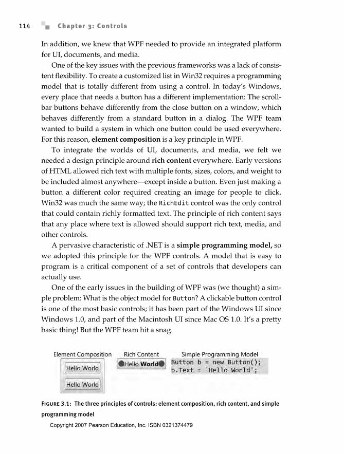
One of the key issues with the previous frameworks was a lack of consis-tent flexibility. To create a customized list in Win32 requires a programmingmodel that is totally different from using a control. In today’s Windows,every place that needs a button has a different implementation: The scroll-bar buttons behave differently from the close button on a window, whichbehaves differently from a standard button in a dialog. The WPF teamwanted to build a system in which one button could be used everywhere.For this reason, element composition is a key principle in WPF.
To integrate the worlds of UI, documents, and media, we felt weneeded a design principle around rich content everywhere. Early versionsof HTML allowed rich text with multiple fonts, sizes, colors, and weight tobe included almost anywhere—except inside a button. Even just making abutton a different color required creating an image for people to click.Win32 was much the same way; the RichEdit control was the only controlthat could contain richly formatted text. The principle of rich content saysthat any place where text is allowed should support rich text, media, andother controls.
A pervasive characteristic of .NET is a simple programming model, sowe adopted this principle for the WPF controls. A model that is easy toprogram is a critical component of a set of controls that developers canactually use.
One of the early issues in the building of WPF was (we thought) a sim-ple problem: What is the object model for Button? A clickable button controlis one of the most basic controls; it has been part of the Windows UI sinceWindows 1.0, and part of the Macintosh UI since Mac OS 1.0. It’s a prettybasic thing! But the WPF team hit a snag.
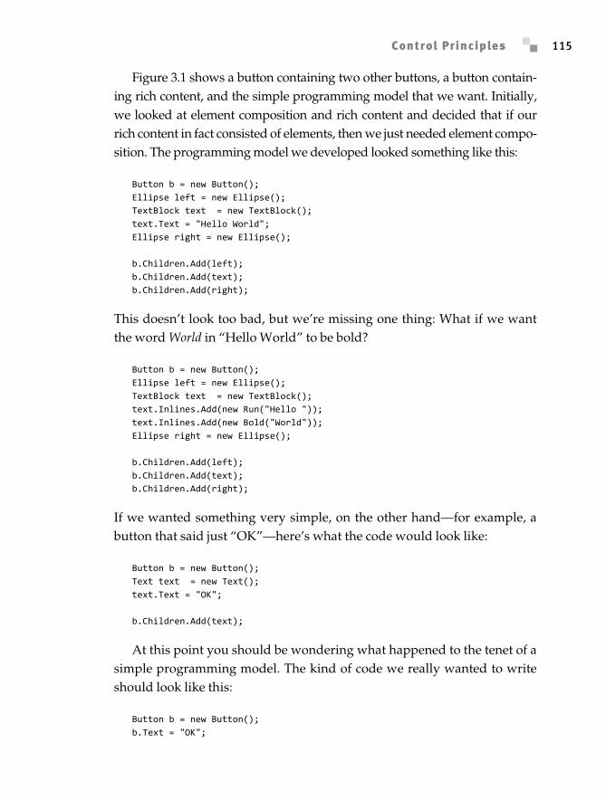
Figure 3.1: The three principles of controls: element composition, rich content, and simple
programming model
Anderson_ch03-113-172.fm Page 114 Wednesday, March 14, 2007 5:12 PM
Copyright 2007 Pearson Education, Inc. ISBN 0321374479
Control Principles 115
Figure 3.1 shows a button containing two other buttons, a button contain-ing rich content, and the simple programming model that we want. Initially,we looked at element composition and rich content and decided that if ourrich content in fact consisted of elements, then we just needed element compo-sition. The programming model we developed looked something like this:
Button b = new Button();Ellipse left = new Ellipse();TextBlock text = new TextBlock();text.Text = "Hello World";Ellipse right = new Ellipse();
b.Children.Add(left);b.Children.Add(text);b.Children.Add(right);
This doesn’t look too bad, but we’re missing one thing: What if we wantthe word World in “Hello World” to be bold?
Button b = new Button();Ellipse left = new Ellipse();TextBlock text = new TextBlock();text.Inlines.Add(new Run("Hello "));text.Inlines.Add(new Bold("World"));Ellipse right = new Ellipse();
b.Children.Add(left);b.Children.Add(text);b.Children.Add(right);
If we wanted something very simple, on the other hand—for example, abutton that said just “OK”—here’s what the code would look like:
Button b = new Button();Text text = new Text();text.Text = "OK";
b.Children.Add(text);
At this point you should be wondering what happened to the tenet of asimple programming model. The kind of code we really wanted to writeshould look like this:
Button b = new Button();b.Text = "OK";
Anderson_ch03-113-172.fm Page 115 Wednesday, March 14, 2007 5:12 PM
Chapter 3: Controls116
Here we’re adding content to the button using a single property, but thecontent can be only a string. Instead, we wanted all the richness to supportthe more complex content in a button.
Enter the content model.
Content ModelIn Win32 programming, controls (e.g., ListBox, Button, and Label) tradi-tionally defined their data model as a simple string. The WPF design teamwanted to allow for both rich content everywhere and the separation ofdata from visualization. Many systems incorporate complex ways of sepa-rating models, views, and controllers, requiring developers to understanda data model for each control. WPF instead uses a model already familiarto many developers: the CLR type system.
Let’s start by setting the content of a button:
Button b = new Button();b.Content = "Hello World";
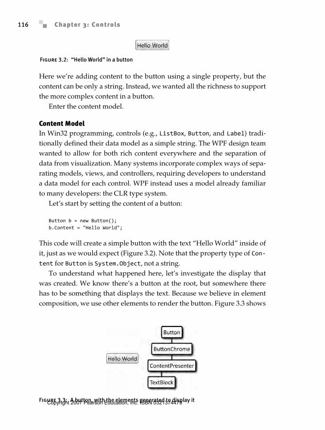
This code will create a simple button with the text “Hello World” inside ofit, just as we would expect (Figure 3.2). Note that the property type of Con-tent for Button is System.Object, not a string.
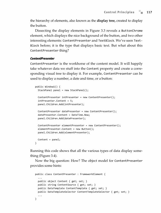
To understand what happened here, let’s investigate the display thatwas created. We know there’s a button at the root, but somewhere therehas to be something that displays the text. Because we believe in elementcomposition, we use other elements to render the button. Figure 3.3 shows
Figure 3.2: “Hello World” in a button
Figure 3.3: A button, with the elements generated to display it
Anderson_ch03-113-172.fm Page 116 Wednesday, March 14, 2007 5:12 PM
Copyright 2007 Pearson Education, Inc. ISBN 0321374479
Control Principles 117
the hierarchy of elements, also known as the display tree, created to displaythe button.
Dissecting the display elements in Figure 3.3 reveals a ButtonChromeelement, which displays the nice background of the button, and two otherinteresting elements: ContentPresenter and TextBlock. We’ve seen Text-Block before; it is the type that displays basic text. But what about thisContentPresenter thing?
ContentPresenter
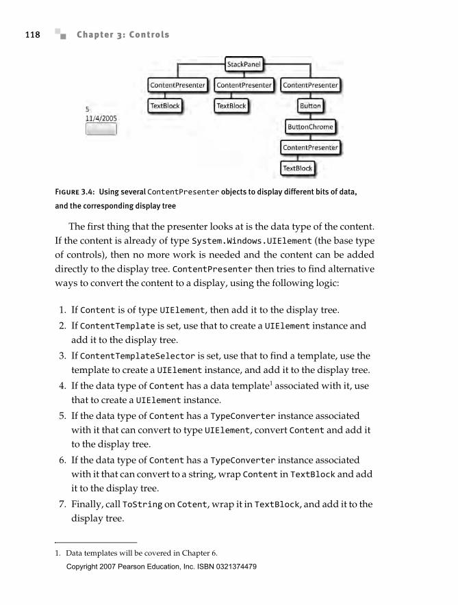
ContentPresenter is the workhorse of the content model. It will happilytake whatever data we stuff into the Content property and create a corre-sponding visual tree to display it. For example, ContentPresenter can beused to display a number, a date and time, or a button:
public Window1() { StackPanel panel = new StackPanel();
ContentPresenter intPresenter = new ContentPresenter(); intPresenter.Content = 5; panel.Children.Add(intPresenter);
ContentPresenter datePresenter = new ContentPresenter(); datePresenter.Content = DateTime.Now; panel.Children.Add(datePresenter);
ContentPresenter elementPresenter = new ContentPresenter(); elementPresenter.Content = new Button(); panel.Children.Add(elementPresenter);
Content = panel;}
Running this code shows that all the various types of data display some-thing (Figure 3.4).
Now the big question: How? The object model for ContentPresenterprovides some hints:
public class ContentPresenter : FrameworkElement { ... public object Content { get; set; } public string ContentSource { get; set; } public DataTemplate ContentTemplate { get; set; } public DataTemplateSelector ContentTemplateSelector { get; set; } ...}
Anderson_ch03-113-172.fm Page 117 Wednesday, March 14, 2007 5:12 PM
Chapter 3: Controls118
The first thing that the presenter looks at is the data type of the content.If the content is already of type System.Windows.UIElement (the base typeof controls), then no more work is needed and the content can be addeddirectly to the display tree. ContentPresenter then tries to find alternativeways to convert the content to a display, using the following logic:
1. If Content is of type UIElement, then add it to the display tree.
2. If ContentTemplate is set, use that to create a UIElement instance and add it to the display tree.
3. If ContentTemplateSelector is set, use that to find a template, use the template to create a UIElement instance, and add it to the display tree.
4. If the data type of Content has a data template1 associated with it, use that to create a UIElement instance.
5. If the data type of Content has a TypeConverter instance associated with it that can convert to type UIElement, convert Content and add it to the display tree.
6. If the data type of Content has a TypeConverter instance associated with it that can convert to a string, wrap Content in TextBlock and add it to the display tree.
7. Finally, call ToString on Cotent, wrap it in TextBlock, and add it to the display tree.
Figure 3.4: Using several ContentPresenter objects to display different bits of data,
and the corresponding display tree
1. Data templates will be covered in Chapter 6.
Anderson_ch03-113-172.fm Page 118 Wednesday, March 14, 2007 5:12 PM
Copyright 2007 Pearson Education, Inc. ISBN 0321374479
Control Principles 119
Obviously the presenter tries very hard to create something that can bedisplayed. The only value that is guaranteed not to display is null; every-thing else will, at worst, display the value returned by the content’sToString method. By encapsulating the logic for presenting content into asimple, composable element, we established a high degree of reusability.
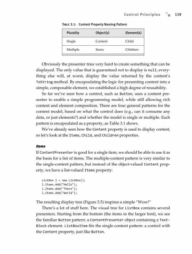
So far we’ve seen how a control, such as Button, uses a content pre-senter to enable a simple programming model, while still allowing richcontent and element composition. There are four general patterns for thecontent model, based on what the control does (e.g., can it consume anydata, or just elements?) and whether the model is single or multiple. Eachpattern is encapsulated as a property, as Table 3.1 shows.
We’ve already seen how the Content property is used to display content,so let’s look at the Items, Child, and Children properties.
Items
If ContentPresenter is good for a single item, we should be able to use it asthe basis for a list of items. The multiple-content pattern is very similar tothe single-content pattern, but instead of the object-valued Content prop-erty, we have a list-valued Items property:
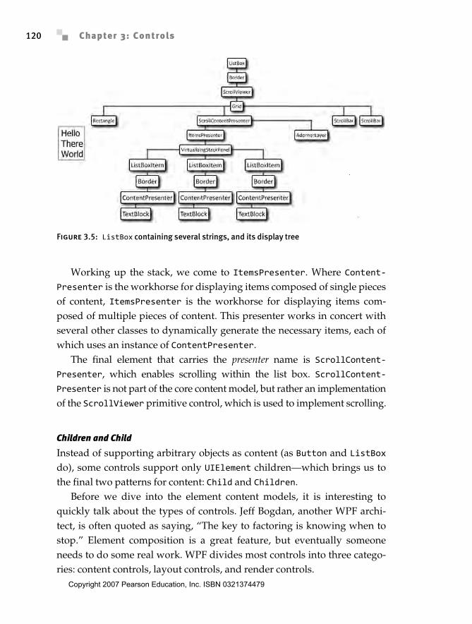
ListBox l = new ListBox();l.Items.Add("Hello");l.Items.Add("There");l.Items.Add("World");
The resulting display tree (Figure 3.5) inspires a simple “Wow!”There’s a lot of stuff here. The visual tree for ListBox contains several
presenters. Starting from the bottom (the items in the larger font), we seethe familiar Button pattern: a ContentPresenter object containing a Text-Block element. ListBoxItem fits the single-content pattern: a control withthe Content property, just like Button.
TABLE 3.1: Content Property Naming Pattern
Plurality Object(s) Element(s)
Single Content Child
Multiple Items Children
Anderson_ch03-113-172.fm Page 119 Wednesday, March 14, 2007 5:12 PM
Chapter 3: Controls120
Working up the stack, we come to ItemsPresenter. Where Content-Presenter is the workhorse for displaying items composed of single piecesof content, ItemsPresenter is the workhorse for displaying items com-posed of multiple pieces of content. This presenter works in concert withseveral other classes to dynamically generate the necessary items, each ofwhich uses an instance of ContentPresenter.
The final element that carries the presenter name is ScrollContent-Presenter, which enables scrolling within the list box. ScrollContent-Presenter is not part of the core content model, but rather an implementationof the ScrollViewer primitive control, which is used to implement scrolling.
Children and Child
Instead of supporting arbitrary objects as content (as Button and ListBoxdo), some controls support only UIElement children—which brings us tothe final two patterns for content: Child and Children.
Before we dive into the element content models, it is interesting toquickly talk about the types of controls. Jeff Bogdan, another WPF archi-tect, is often quoted as saying, “The key to factoring is knowing when tostop.” Element composition is a great feature, but eventually someoneneeds to do some real work. WPF divides most controls into three catego-ries: content controls, layout controls, and render controls.
Figure 3.5: ListBox containing several strings, and its display tree
Anderson_ch03-113-172.fm Page 120 Wednesday, March 14, 2007 5:12 PM
Copyright 2007 Pearson Education, Inc. ISBN 0321374479
Control Principles 121
Content controls like ListBox and Button don’t do much work; theyare composed of other elements that do work. For example, the displaytree for Button (see Figure 3.3) shows that ButtonChrome and Content-Presenter do most of the work for Button.
On the other hand, layout controls are responsible for positioning othercontrols; StackPanel is the primary example that we’ve seen so far in thisbook. Generally, layout controls aren’t visible themselves; rather we seetheir effects on other controls. Layout controls comprise the majority of thecontrols that support the multiple-element content pattern. All of the layoutpanels other than FlowDocumentViewer2 implement the multiple-elementcontent model by deriving from Panel:
public class Panel : FrameworkElement { public UIElementCollection Children { get; }}
Render controls are the controls that actually put pixels on the screen.Rectangle and Ellipse are examples of render controls. Some render con-trols also support containing a control; probably the best example is theBorder class. This type takes a single element and adds a border around it:
public class Border : Decorator { public UIElement Child { get; set; }}
The content model helps solve the problem of rich content for controlswith a simple programming model. Another big problem for writing con-trols is figuring out how to render everything that’s not content: How didthat ButtonChrome appear inside of the button?
TemplatesCustomizing the appearance of controls can be fairly problematic. WithWindows Forms or User32 today, changing the look of a button requiresoverriding OnPaint or handling WM_PAINT and writing code to draw somepixels. Using HTML requires either creating a control using several imagesto look like a button, or writing customized HTML. A problem with all of
2. It seems there’s always an exception.
Anderson_ch03-113-172.fm Page 121 Wednesday, March 14, 2007 5:12 PM
Chapter 3: Controls122
these models is that their programming model for creating and modifyingthe look of a control is substantially different from the programmingmodel for using a control.
Instead of requiring a new display to be written, another commonsolution is to enable customization of the display using properties. InHTML, Cascading Style Sheets (CSS) can be used to adjust the look of anelement in HTML. A problem with this model is that it requires the authorof the control to expose every possible customization point of the displayas a property that CSS can style. Today’s CSS provides a rich library ofproperties for adjusting the borders, fill, and text formatting of compo-nents, but it doesn’t allow the person customizing the display to injectarbitrary content.
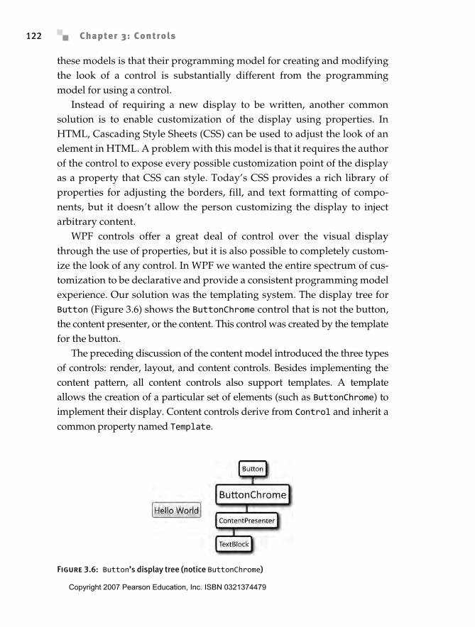
WPF controls offer a great deal of control over the visual displaythrough the use of properties, but it is also possible to completely custom-ize the look of any control. In WPF we wanted the entire spectrum of cus-tomization to be declarative and provide a consistent programming modelexperience. Our solution was the templating system. The display tree forButton (Figure 3.6) shows the ButtonChrome control that is not the button,the content presenter, or the content. This control was created by the templatefor the button.
The preceding discussion of the content model introduced the three typesof controls: render, layout, and content controls. Besides implementing thecontent pattern, all content controls also support templates. A templateallows the creation of a particular set of elements (such as ButtonChrome) toimplement their display. Content controls derive from Control and inherit acommon property named Template.
Figure 3.6: Button’s display tree (notice ButtonChrome)
Anderson_ch03-113-172.fm Page 122 Wednesday, March 14, 2007 5:12 PM
Copyright 2007 Pearson Education, Inc. ISBN 0321374479
Control Principles 123
To start, we can look at the code for a simple button, which will displaythe same button that we’ve already seen several times:
<Button> My Button</Button>
If we wanted to change the look of the button without affecting the con-tent, we could define a new template. Templates are a factory for creating anew display tree. Templates come in two varieties: ControlTemplate(which creates a display tree for a control) and DataTemplate (which cre-ates a display tree for a piece of data, as will be described in Chapter 6).
To define a new control template, we must provide a target type and adisplay tree. We must also always set the target type for the template,which provides the template with information about the type to which itwill be applied:
<Button> <Button.Template> <ControlTemplate TargetType='{x:Type Button}'> <Rectangle Fill='Red' Width='75' Height='23' /> </ControlTemplate> </Button.Template> My Button</Button>
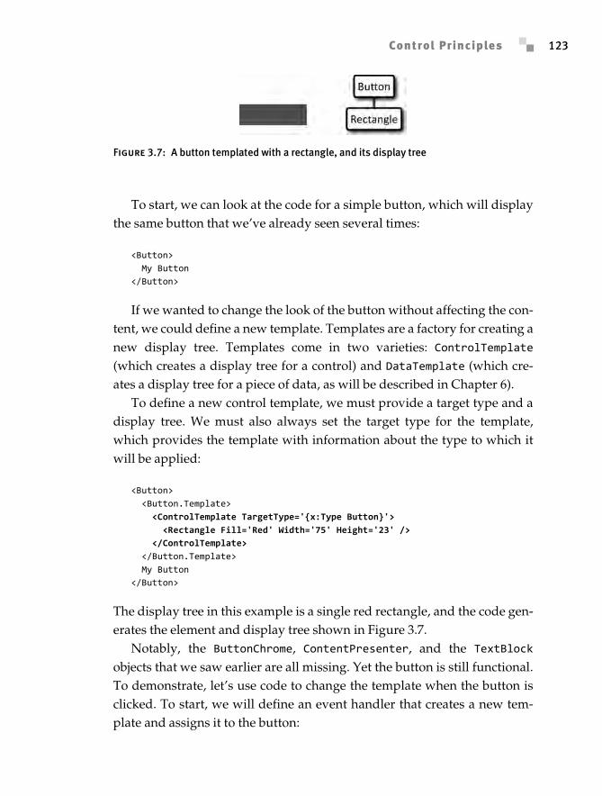
The display tree in this example is a single red rectangle, and the code gen-erates the element and display tree shown in Figure 3.7.
Notably, the ButtonChrome, ContentPresenter, and the TextBlockobjects that we saw earlier are all missing. Yet the button is still functional.To demonstrate, let’s use code to change the template when the button isclicked. To start, we will define an event handler that creates a new tem-plate and assigns it to the button:
Figure 3.7: A button templated with a rectangle, and its display tree
Anderson_ch03-113-172.fm Page 123 Wednesday, March 14, 2007 5:12 PM
Chapter 3: Controls124
void ChangeIt(object sender, RoutedEventArgs e) { ControlTemplate template = new ControlTemplate(typeof(Button)); // The "do nothing" template ((Button)sender).Template = template;}
Now that we have our template, we need to fill in the display tree. TheVisualTree property on ControlTemplate defines the display tree, butnotice that the type of the property is FrameworkElementFactory. Templatescan be applied to more than one control, but controls can appear in thedisplay tree only once. To address this problem, FrameworkElementFactoryconstructs a new instance of the display tree for every control that uses thetemplate. Here we will set the button to be displayed as an ellipse:
void ChangeIt(object sender, RoutedEventArgs e) { ControlTemplate template = new ControlTemplate(typeof(Button)); // The "create an invisible ellipse" template template.VisualTree = new FrameworkElementFactory(typeof(Ellipse)); ((Button)sender).Template = template;}
Next we want to set some of the ellipse’s properties. We must use theSetValue syntax for setting properties because we are effectively creating alist of properties to set when the ellipse is created:
void ChangeIt(object sender, RoutedEventArgs e) { ControlTemplate template = new ControlTemplate(typeof(Button)); // The "create a blue ellipse" template template.VisualTree = new FrameworkElementFactory(typeof(Ellipse)); template.VisualTree.SetValue(Ellipse.FillProperty, Brushes.Blue); template.VisualTree.SetValue(Ellipse.WidthProperty, 75); template.VisualTree.SetValue(Ellipse.HeightProperty, 23); ((Button)sender).Template = template;}
At this point you may notice that, by not tying markup to the object model,we are going against one of the tenets of the XAML language design. In thiscase the code equivalent of defining a template is very different from themarkup. We decided here to go against the tenet of making the markup moreusable. We effectively rerun the markup every time the template is used.
The final step in our example is to wire the event handler to the button:
<Button ... Click='ChangeIt'> ...</Button>
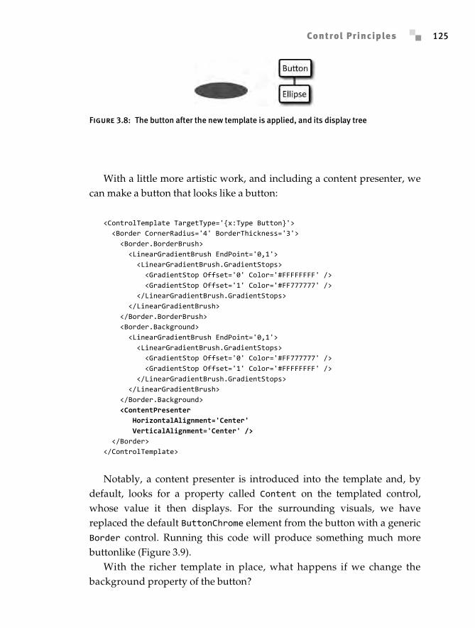
The result after the click is shown in Figure 3.8.
Anderson_ch03-113-172.fm Page 124 Wednesday, March 14, 2007 5:12 PM
Copyright 2007 Pearson Education, Inc. ISBN 0321374479
Control Principles 125
With a little more artistic work, and including a content presenter, wecan make a button that looks like a button:
<ControlTemplate TargetType='{x:Type Button}'> <Border CornerRadius='4' BorderThickness='3'> <Border.BorderBrush> <LinearGradientBrush EndPoint='0,1'> <LinearGradientBrush.GradientStops> <GradientStop Offset='0' Color='#FFFFFFFF' /> <GradientStop Offset='1' Color='#FF777777' /> </LinearGradientBrush.GradientStops> </LinearGradientBrush> </Border.BorderBrush> <Border.Background> <LinearGradientBrush EndPoint='0,1'> <LinearGradientBrush.GradientStops> <GradientStop Offset='0' Color='#FF777777' /> <GradientStop Offset='1' Color='#FFFFFFFF' /> </LinearGradientBrush.GradientStops> </LinearGradientBrush> </Border.Background> <ContentPresenter HorizontalAlignment='Center' VerticalAlignment='Center' /> </Border></ControlTemplate>
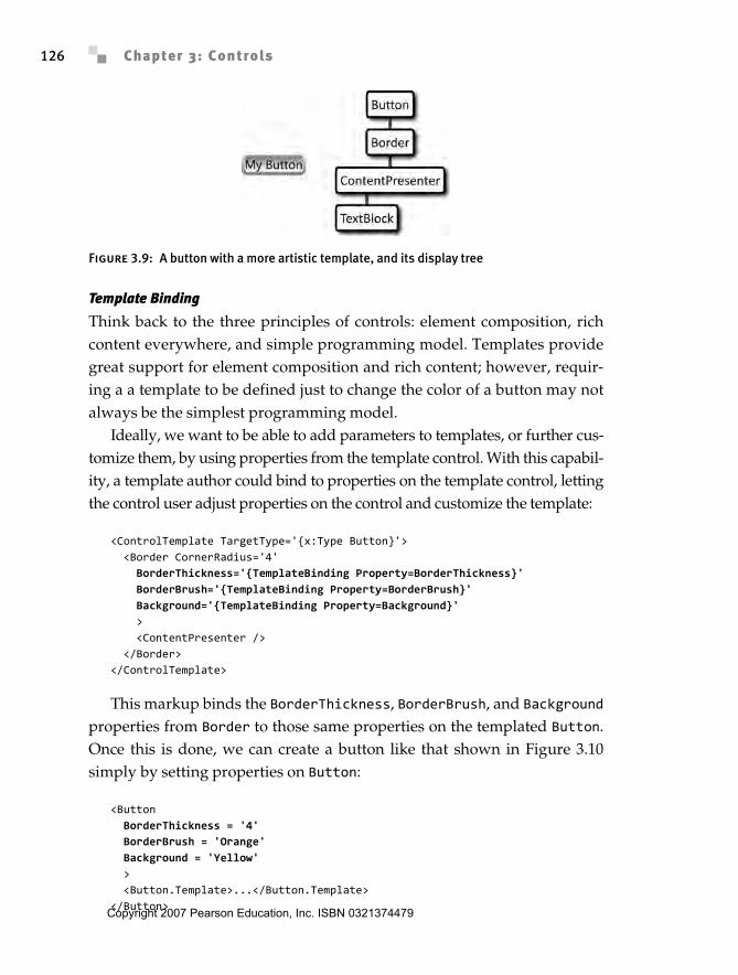
Notably, a content presenter is introduced into the template and, bydefault, looks for a property called Content on the templated control,whose value it then displays. For the surrounding visuals, we havereplaced the default ButtonChrome element from the button with a genericBorder control. Running this code will produce something much morebuttonlike (Figure 3.9).
With the richer template in place, what happens if we change thebackground property of the button?
Figure 3.8: The button after the new template is applied, and its display tree
Anderson_ch03-113-172.fm Page 125 Wednesday, March 14, 2007 5:12 PM
Chapter 3: Controls126
Template Binding
Think back to the three principles of controls: element composition, richcontent everywhere, and simple programming model. Templates providegreat support for element composition and rich content; however, requir-ing a a template to be defined just to change the color of a button may notalways be the simplest programming model.
Ideally, we want to be able to add parameters to templates, or further cus-tomize them, by using properties from the template control. With this capabil-ity, a template author could bind to properties on the template control, lettingthe control user adjust properties on the control and customize the template:
<ControlTemplate TargetType='{x:Type Button}'> <Border CornerRadius='4' BorderThickness='{TemplateBinding Property=BorderThickness}' BorderBrush='{TemplateBinding Property=BorderBrush}' Background='{TemplateBinding Property=Background}' > <ContentPresenter /> </Border></ControlTemplate>
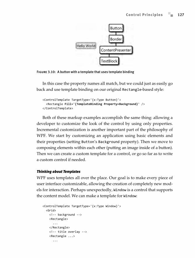
This markup binds the BorderThickness, BorderBrush, and Backgroundproperties from Border to those same properties on the templated Button.Once this is done, we can create a button like that shown in Figure 3.10simply by setting properties on Button:
<Button BorderThickness = '4' BorderBrush = 'Orange' Background = 'Yellow' > <Button.Template>...</Button.Template></Button>
Figure 3.9: A button with a more artistic template, and its display tree
Anderson_ch03-113-172.fm Page 126 Wednesday, March 14, 2007 5:12 PM
Copyright 2007 Pearson Education, Inc. ISBN 0321374479
Control Principles 127
In this case the property names all match, but we could just as easily goback and use template binding on our original Rectangle-based style:
<ControlTemplate TargetType='{x:Type Button}'> <Rectangle Fill='{TemplateBinding Property=Background}' /></ControlTemplate>
Both of these markup examples accomplish the same thing: allowing adeveloper to customize the look of the control by using only properties.Incremental customization is another important part of the philosophy ofWPF. We start by customizing an application using basic elements andtheir properties (setting Button’s Background property). Then we move tocomposing elements within each other (putting an image inside of a button).Then we can create a custom template for a control, or go so far as to writea custom control if needed.
Thinking about Templates
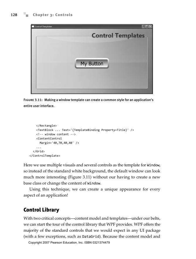
WPF uses templates all over the place. Our goal is to make every piece ofuser interface customizable, allowing the creation of completely new mod-els for interaction. Perhaps unexpectedly, Window is a control that supportsthe content model. We can make a template for Window:
<ControlTemplate TargetType='{x:Type Window}'> <Grid> <!-- background --> <Rectangle> ... </Rectangle> <!-- title overlay --> <Rectangle ...> ...
Figure 3.10: A button with a template that uses template binding
Anderson_ch03-113-172.fm Page 127 Wednesday, March 14, 2007 5:12 PM
Chapter 3: Controls128
</Rectangle> <TextBlock ... Text='{TemplateBinding Property=Title}' /> <!-- window content --> <ContentControl Margin='40,70,40,40' /> ... </Grid></ControlTemplate>
Here we use multiple visuals and several controls as the template for Window,so instead of the standard white background, the default window can lookmuch more interesting (Figure 3.11) without our having to create a newbase class or change the content of Window.
Using this technique, we can create a unique appearance for everyaspect of an application!
Control LibraryWith two critical concepts—content model and templates—under our belts,we can start the tour of the control library that WPF provides. WPF offers themajority of the standard controls that we would expect in any UI package(with a few exceptions, such as DataGrid). Because the content model and
Figure 3.11: Making a window template can create a common style for an application’s
entire user interface.
Anderson_ch03-113-172.fm Page 128 Wednesday, March 14, 2007 5:12 PM
Copyright 2007 Pearson Education, Inc. ISBN 0321374479
Control Library 129
templates make visualization so customizable, the important description ofa control is the data model and interaction model that it offers.
ButtonsFor our tour of controls, it seems appropriate to start with Button. Funda-mentally, buttons are “clickable” things.3 Beyond the Click event fromButtonBase, Button doesn’t add anything significant except the defaultlook and feel of a standard button.
CheckBox and RadioButton both represent toggle buttons that supportIsChecked (data model) and IsThreeState (interaction model) properties.IsThreeState is interesting, in that it controls only the user interactionmodel. When IsThreeState is True, the user can click the check box to togglefrom Checked to Unchecked to Indeterminate. When IsThreeState is False,no matter what the user does the Indeterminate state will not appear; how-ever, the state can be programmatically set to be indeterminate.
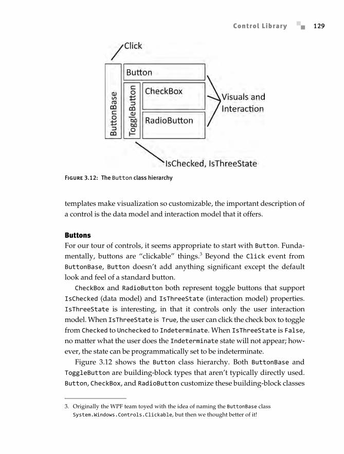
Figure 3.12 shows the Button class hierarchy. Both ButtonBase andToggleButton are building-block types that aren’t typically directly used.Button, CheckBox, and RadioButton customize these building-block classes
Figure 3.12: The Button class hierarchy
3. Originally the WPF team toyed with the idea of naming the ButtonBase class System.Windows.Controls.Clickable, but then we thought better of it!
Anderson_ch03-113-172.fm Page 129 Wednesday, March 14, 2007 5:12 PM
Chapter 3: Controls130
by providing user interaction policy (like RadioButton enforcing a modelthat only one button is checked) and visuals (making radio buttons looklike radio buttons).
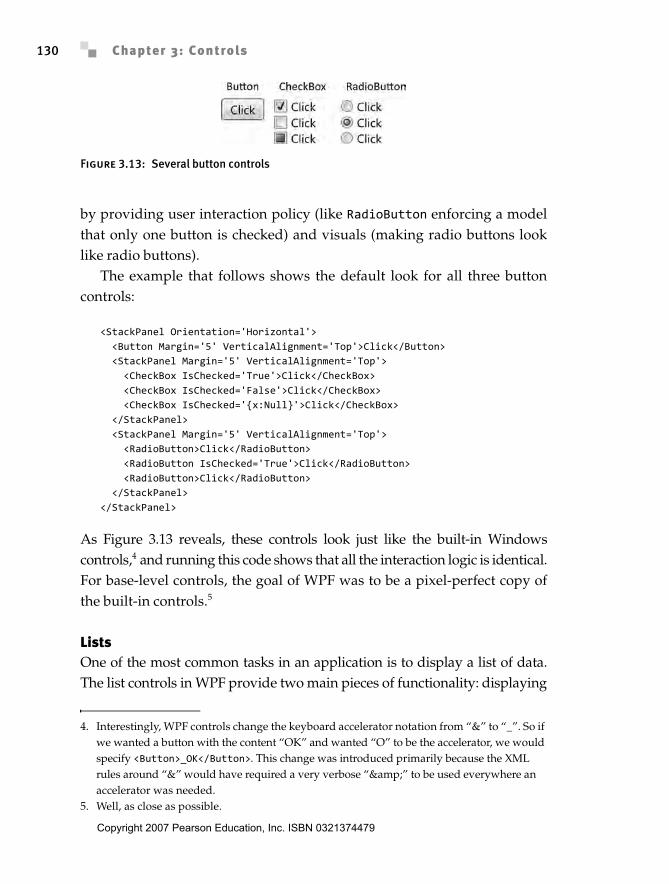
The example that follows shows the default look for all three buttoncontrols:
<StackPanel Orientation='Horizontal'> <Button Margin='5' VerticalAlignment='Top'>Click</Button> <StackPanel Margin='5' VerticalAlignment='Top'> <CheckBox IsChecked='True'>Click</CheckBox> <CheckBox IsChecked='False'>Click</CheckBox> <CheckBox IsChecked='{x:Null}'>Click</CheckBox> </StackPanel> <StackPanel Margin='5' VerticalAlignment='Top'> <RadioButton>Click</RadioButton> <RadioButton IsChecked='True'>Click</RadioButton> <RadioButton>Click</RadioButton> </StackPanel></StackPanel>
As Figure 3.13 reveals, these controls look just like the built-in Windowscontrols,4 and running this code shows that all the interaction logic is identical.For base-level controls, the goal of WPF was to be a pixel-perfect copy ofthe built-in controls.5
ListsOne of the most common tasks in an application is to display a list of data.The list controls in WPF provide two main pieces of functionality: displaying
Figure 3.13: Several button controls
4. Interestingly, WPF controls change the keyboard accelerator notation from “&” to “_”. So if we wanted a button with the content “OK” and wanted “O” to be the accelerator, we would specify <Button>_OK</Button>. This change was introduced primarily because the XML rules around “&” would have required a very verbose “&” to be used everywhere an accelerator was needed.
5. Well, as close as possible.
Anderson_ch03-113-172.fm Page 130 Wednesday, March 14, 2007 5:12 PM
Copyright 2007 Pearson Education, Inc. ISBN 0321374479
Control Library 131
lists of data, and allowing the selection of one or more list items. During thedevelopment of WPF, the number of list controls to ship was a question ofconsiderable debate. Because of WPF’s rich template support, ListBox,ComboBox, DomainUpDown, and even something like a radio button list aredifferentiated only by different templates on top of a base control. In theend, the WPF team decided to ship with the expected controls but generallyfavor templates instead of new controls (this is why the RadioButtonListcontrol that was in the initial beta release was cut). WPF has four standardlist controls: ListBox, ComboBox, ListView, and TreeView.
All list controls can be filled with items from one of two sources: theItemsSource property or the Items property. The Items property addsdata to the list’s internal list of data items:
ListBox list = new ListBox();list.Items.Add("a");list.Items.Add("b");
The ItemsSource property provides the list control with a collection ofdata items, which the list displays:
string[] items = new string[] { "a", "b" };
ListBox list = new ListBox();list.ItemsSource = items;
The difference between the two is subtle but important: using Items-Source lets us maintain the data external to the list control.
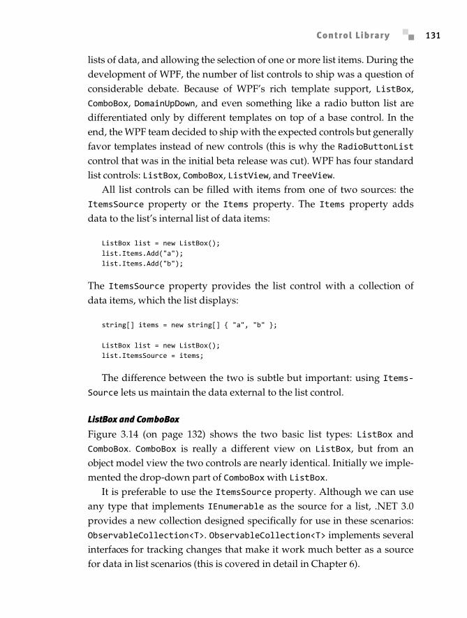
ListBox and ComboBox
Figure 3.14 (on page 132) shows the two basic list types: ListBox andComboBox. ComboBox is really a different view on ListBox, but from anobject model view the two controls are nearly identical. Initially we imple-mented the drop-down part of ComboBox with ListBox.
It is preferable to use the ItemsSource property. Although we can useany type that implements IEnumerable as the source for a list, .NET 3.0provides a new collection designed specifically for use in these scenarios:ObservableCollection<T>. ObservableCollection<T> implements severalinterfaces for tracking changes that make it work much better as a sourcefor data in list scenarios (this is covered in detail in Chapter 6).
Anderson_ch03-113-172.fm Page 131 Wednesday, March 14, 2007 5:12 PM
Chapter 3: Controls132
As you might have guessed from looking back at the two core controlconcepts—content model and templates—we can put any type of data intothe list controls and change the entire look of the control using a template.In addition, ListBox and ComboBox offer a set of properties to adjust thelook of the control without having to write an entirely new template.
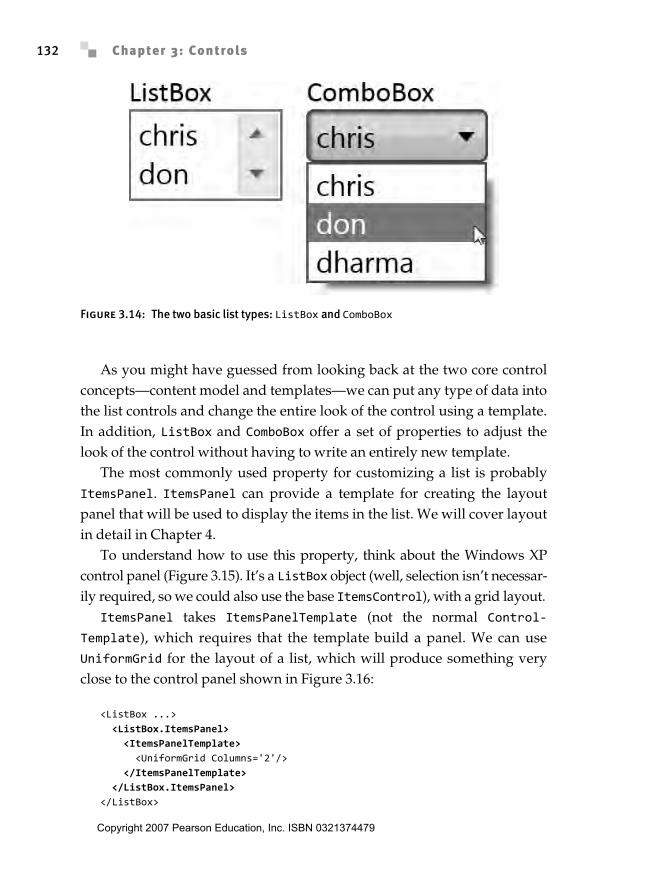
The most commonly used property for customizing a list is probablyItemsPanel. ItemsPanel can provide a template for creating the layoutpanel that will be used to display the items in the list. We will cover layoutin detail in Chapter 4.
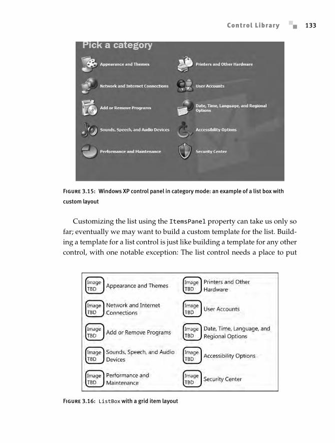
To understand how to use this property, think about the Windows XPcontrol panel (Figure 3.15). It’s a ListBox object (well, selection isn’t necessar-ily required, so we could also use the base ItemsControl), with a grid layout.
ItemsPanel takes ItemsPanelTemplate (not the normal Control-Template), which requires that the template build a panel. We can useUniformGrid for the layout of a list, which will produce something veryclose to the control panel shown in Figure 3.16:
<ListBox ...> <ListBox.ItemsPanel> <ItemsPanelTemplate> <UniformGrid Columns='2'/> </ItemsPanelTemplate> </ListBox.ItemsPanel></ListBox>
Figure 3.14: The two basic list types: ListBox and ComboBox
Anderson_ch03-113-172.fm Page 132 Wednesday, March 14, 2007 5:12 PM
Copyright 2007 Pearson Education, Inc. ISBN 0321374479
Control Library 133
Customizing the list using the ItemsPanel property can take us only sofar; eventually we may want to build a custom template for the list. Build-ing a template for a list control is just like building a template for any othercontrol, with one notable exception: The list control needs a place to put
Figure 3.15: Windows XP control panel in category mode: an example of a list box with
custom layout
Figure 3.16: ListBox with a grid item layout
Anderson_ch03-113-172.fm Page 133 Wednesday, March 14, 2007 5:12 PM
Chapter 3: Controls134
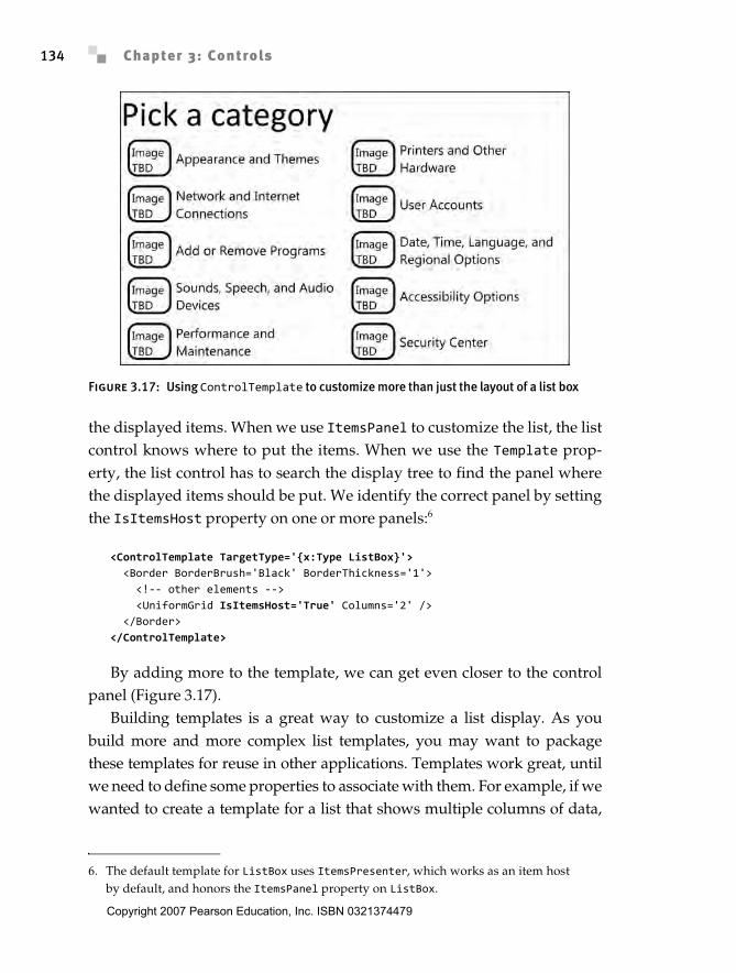
the displayed items. When we use ItemsPanel to customize the list, the listcontrol knows where to put the items. When we use the Template prop-erty, the list control has to search the display tree to find the panel wherethe displayed items should be put. We identify the correct panel by settingthe IsItemsHost property on one or more panels:6
<ControlTemplate TargetType='{x:Type ListBox}'> <Border BorderBrush='Black' BorderThickness='1'> <!-- other elements --> <UniformGrid IsItemsHost='True' Columns='2' /> </Border></ControlTemplate>
By adding more to the template, we can get even closer to the controlpanel (Figure 3.17).
Building templates is a great way to customize a list display. As youbuild more and more complex list templates, you may want to packagethese templates for reuse in other applications. Templates work great, untilwe need to define some properties to associate with them. For example, if wewanted to create a template for a list that shows multiple columns of data,
Figure 3.17: Using ControlTemplate to customize more than just the layout of a list box
6. The default template for ListBox uses ItemsPresenter, which works as an item host by default, and honors the ItemsPanel property on ListBox.
Anderson_ch03-113-172.fm Page 134 Wednesday, March 14, 2007 5:12 PM
Copyright 2007 Pearson Education, Inc. ISBN 0321374479
Control Library 135
we would need somewhere to store the column information. We can easilydefine a new control that derives from ListBox and adds the additional data.
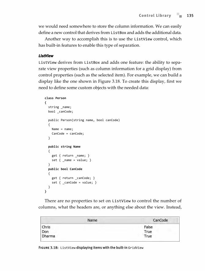
Another way to accomplish this is to use the ListView control, whichhas built-in features to enable this type of separation.
ListView
ListView derives from ListBox and adds one feature: the ability to sepa-rate view properties (such as column information for a grid display) fromcontrol properties (such as the selected item). For example, we can build adisplay like the one shown in Figure 3.18. To create this display, first weneed to define some custom objects with the needed data:
class Person{ string _name; bool _canCode;
public Person(string name, bool canCode) { Name = name; CanCode = canCode; }
public string Name { get { return _name; } set { _name = value; } } public bool CanCode { get { return _canCode; } set { _canCode = value; } }}
There are no properties to set on ListView to control the number ofcolumns, what the headers are, or anything else about the view. Instead,
Figure 3.18: ListView displaying items with the built-in GridView
Anderson_ch03-113-172.fm Page 135 Wednesday, March 14, 2007 5:12 PM
Chapter 3: Controls136
we must set the ListView.View property to GridView, and set propertieson that object. GridView requires the use of binding (which will be coveredin more detail in Chapter 6) to get data from the items in the list:
<ListView> <ListView.View> <GridView> <GridView.Columns> <GridViewColumn Width='300' Header='Name' DisplayMemberBinding='{Binding Path=Name}' /> <GridViewColumn Width='100' Header='CanCode' DisplayMemberBinding='{Binding Path=CanCode}' /> </GridView.Columns> </GridView> </ListView.View></ListView>
This separation between control properties and display properties makesListView probably the most powerful list control.
Creating a new view for the ListView control (something to replaceGridView), involves deriving from the deceptively simple ViewBase type.The essence of a custom view is actually simple: We override PrepareItemand adjust any properties needed:
public class MyView : ViewBase { private double angle;
public double Angle { get { return angle; } set { angle = value; } }
protected override void PrepareItem(ListViewItem item) { item.LayoutTransform = new RotateTransform(angle); base.PrepareItem(item); }}
This is just the beginning, though. The real power of building a customview comes from coupling it with the styling system. Overriding theItemContainerDefaultStyleKey property allows a custom view to defineall aspects of the resulting display, as GridView indicates.
Anderson_ch03-113-172.fm Page 136 Wednesday, March 14, 2007 5:12 PM
Copyright 2007 Pearson Education, Inc. ISBN 0321374479
Control Library 137
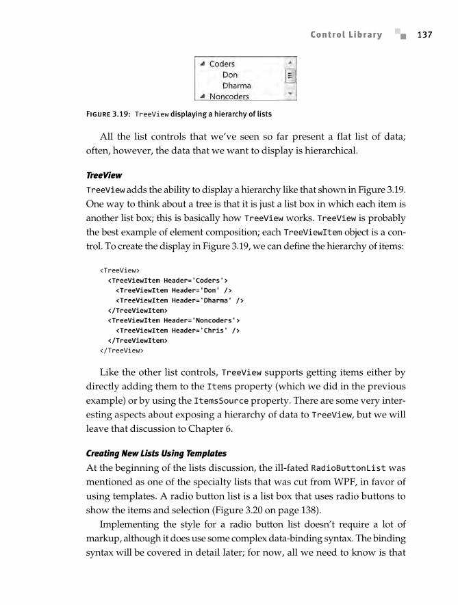
All the list controls that we’ve seen so far present a flat list of data;often, however, the data that we want to display is hierarchical.
TreeView
TreeView adds the ability to display a hierarchy like that shown in Figure 3.19.One way to think about a tree is that it is just a list box in which each item isanother list box; this is basically how TreeView works. TreeView is probablythe best example of element composition; each TreeViewItem object is a con-trol. To create the display in Figure 3.19, we can define the hierarchy of items:
<TreeView> <TreeViewItem Header='Coders'> <TreeViewItem Header='Don' /> <TreeViewItem Header='Dharma' /> </TreeViewItem> <TreeViewItem Header='Noncoders'> <TreeViewItem Header='Chris' /> </TreeViewItem></TreeView>
Like the other list controls, TreeView supports getting items either bydirectly adding them to the Items property (which we did in the previousexample) or by using the ItemsSource property. There are some very inter-esting aspects about exposing a hierarchy of data to TreeView, but we willleave that discussion to Chapter 6.
Creating New Lists Using Templates
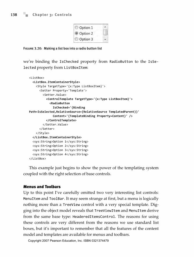
At the beginning of the lists discussion, the ill-fated RadioButtonList wasmentioned as one of the specialty lists that was cut from WPF, in favor ofusing templates. A radio button list is a list box that uses radio buttons toshow the items and selection (Figure 3.20 on page 138).
Implementing the style for a radio button list doesn’t require a lot ofmarkup, although it does use some complex data-binding syntax. The bindingsyntax will be covered in detail later; for now, all we need to know is that
Figure 3.19: TreeView displaying a hierarchy of lists
Anderson_ch03-113-172.fm Page 137 Wednesday, March 14, 2007 5:12 PM
Chapter 3: Controls138
we’re binding the IsChecked property from RadioButton to the IsSe-lected property from ListBoxItem:
<ListBox> <ListBox.ItemContainerStyle> <Style TargetType='{x:Type ListBoxItem}'> <Setter Property='Template'> <Setter.Value> <ControlTemplate TargetType='{x:Type ListBoxItem}'> <RadioButton IsChecked='{Binding Path=IsSelected,RelativeSource={RelativeSource TemplatedParent}}' Content='{TemplateBinding Property=Content}' /> </ControlTemplate> </Setter.Value> </Setter> </Style> </ListBox.ItemContainerStyle> <sys:String>Option 1</sys:String> <sys:String>Option 2</sys:String> <sys:String>Option 3</sys:String> <sys:String>Option 4</sys:String></ListBox>
This example just begins to show the power of the templating systemcoupled with the right selection of base controls.
Menus and ToolbarsUp to this point I’ve carefully omitted two very interesting list controls:MenuItem and ToolBar. It may seem strange at first, but a menu is logicallynothing more than a TreeView control with a very special template. Dig-ging into the object model reveals that TreeViewItem and MenuItem derivefrom the same base type: HeaderedItemsControl. The reasons for usingthese controls are very different from the reasons we use standard listboxes, but it’s important to remember that all the features of the contentmodel and templates are available for menus and toolbars.
Figure 3.20: Making a list box into a radio button list
Anderson_ch03-113-172.fm Page 138 Wednesday, March 14, 2007 5:12 PM
Copyright 2007 Pearson Education, Inc. ISBN 0321374479
Control Library 139
Menus and toolbars go hand in hand. Both provide effectively the samefunctionality: the ability to execute one or more commands. The primarydifferences between the two are visual space and interaction model. Tool-bars consume a lot more visual space to represent the same commands, butthey allow easy user access. Generally, toolbars are shortcuts to commandsalready present in the menu structure. Menus provide a rich hierarchy andoccupy minimal screen real estate, but users have more difficulty findingcommands within them. Menus and toolbars are typically paired withcommands, which we will discuss in Chapter 7.
Menus
Menus consist of a series of MenuItem controls hosted within either Menu orContextMenu. Menus are always displayed and, in any Windows applica-tion, are typically located at the top of the window. Context menus are dis-played only when the user requests them, typically by right-clicking,pressing Shift+F10, or, on newer keyboards, pressing the context menu key.
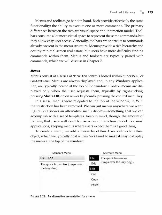
In User32, menus were relegated to the top of the window; in WPFthat restriction has been removed. We can put menus anywhere we want.Figure 3.21 shows an alternative menu display—something that we canaccomplish with a set of templates. Keep in mind, though, the amount oftraining that users will need to use a new interaction model. For mostapplications, keeping menus where users expect them is a good thing.
To create a menu, we add a hierarchy of MenuItem controls to a Menuobject, which we typically host within DockPanel to make it easy to displaythe menu at the top of the window:
Figure 3.21: An alternative presentation for a menu
Anderson_ch03-113-172.fm Page 139 Wednesday, March 14, 2007 5:12 PM
Chapter 3: Controls140
<Window x:Class='EssentialWPF.MenusAndToolbars' xmlns='http://schemas.microsoft.com/winfx/2006/xaml/presentation' xmlns:x='http://schemas.microsoft.com/winfx/2006/xaml' Title='Menus and Toolbars' > <DockPanel LastChildFill='False'> <Menu DockPanel.Dock='Top'> <MenuItem Header='_File'> <MenuItem Header='E_xit' Click='ExitClicked' /> </MenuItem> <MenuItem Header='_Edit'> <MenuItem Header='_Cut' /> <MenuItem Header='C_opy' /> <MenuItem Header='_Paste' /> </MenuItem> </Menu> </DockPanel></Window>
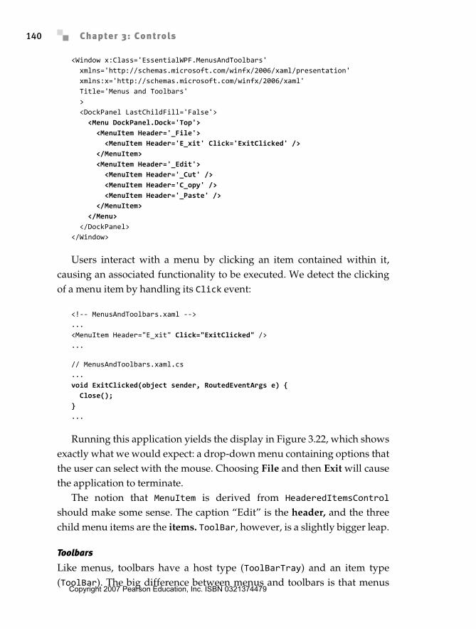
Users interact with a menu by clicking an item contained within it,causing an associated functionality to be executed. We detect the clickingof a menu item by handling its Click event:
<!-- MenusAndToolbars.xaml -->...<MenuItem Header="E_xit" Click="ExitClicked" />...
// MenusAndToolbars.xaml.cs...void ExitClicked(object sender, RoutedEventArgs e) { Close();}...
Running this application yields the display in Figure 3.22, which showsexactly what we would expect: a drop-down menu containing options thatthe user can select with the mouse. Choosing File and then Exit will causethe application to terminate.
The notion that MenuItem is derived from HeaderedItemsControlshould make some sense. The caption “Edit” is the header, and the threechild menu items are the items. ToolBar, however, is a slightly bigger leap.
Toolbars
Like menus, toolbars have a host type (ToolBarTray) and an item type(ToolBar). The big difference between menus and toolbars is that menus
Anderson_ch03-113-172.fm Page 140 Wednesday, March 14, 2007 5:12 PM
Copyright 2007 Pearson Education, Inc. ISBN 0321374479
Control Library 141
support arbitrary hierarchies (through submenus), while toolbars provideonly one level of nesting.
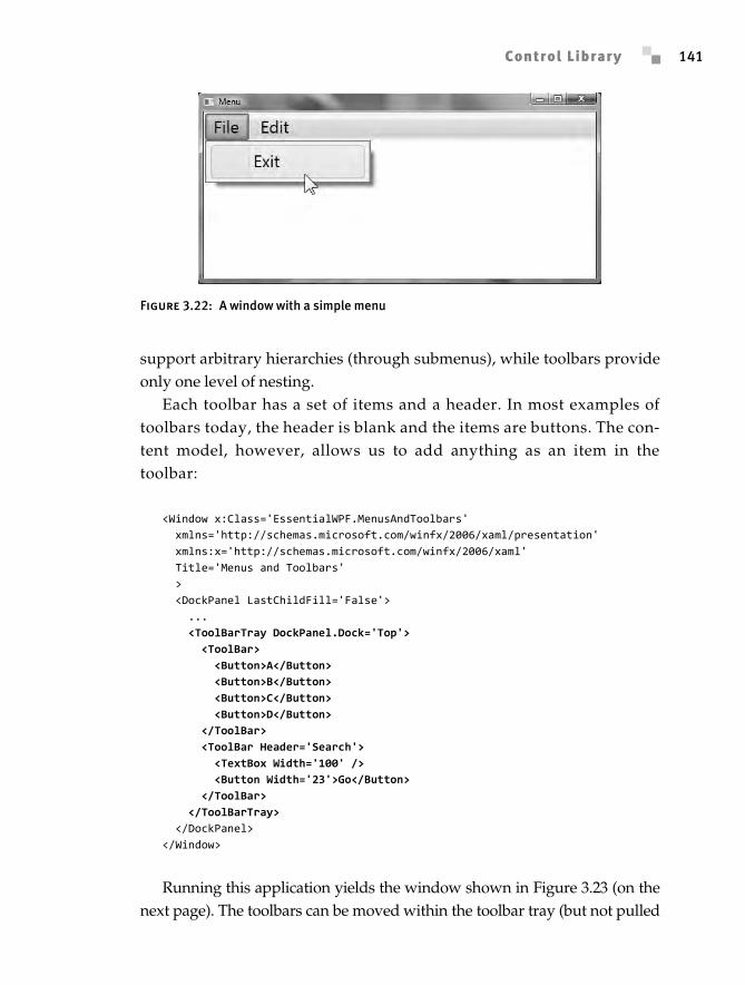
Each toolbar has a set of items and a header. In most examples oftoolbars today, the header is blank and the items are buttons. The con-tent model, however, allows us to add anything as an item in thetoolbar:
<Window x:Class='EssentialWPF.MenusAndToolbars' xmlns='http://schemas.microsoft.com/winfx/2006/xaml/presentation' xmlns:x='http://schemas.microsoft.com/winfx/2006/xaml' Title='Menus and Toolbars' > <DockPanel LastChildFill='False'> ... <ToolBarTray DockPanel.Dock='Top'> <ToolBar> <Button>A</Button> <Button>B</Button> <Button>C</Button> <Button>D</Button> </ToolBar> <ToolBar Header='Search'> <TextBox Width='100' /> <Button Width='23'>Go</Button> </ToolBar> </ToolBarTray> </DockPanel></Window>
Running this application yields the window shown in Figure 3.23 (on thenext page). The toolbars can be moved within the toolbar tray (but not pulled
Figure 3.22: A window with a simple menu
Anderson_ch03-113-172.fm Page 141 Wednesday, March 14, 2007 5:12 PM
Chapter 3: Controls142
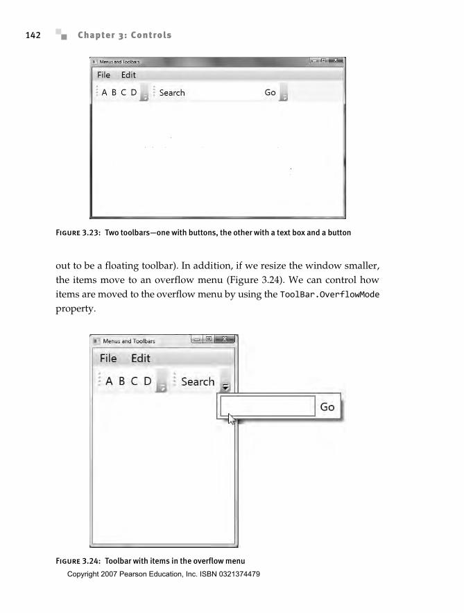
out to be a floating toolbar). In addition, if we resize the window smaller,the items move to an overflow menu (Figure 3.24). We can control howitems are moved to the overflow menu by using the ToolBar.OverflowModeproperty.
Figure 3.23: Two toolbars—one with buttons, the other with a text box and a button
Figure 3.24: Toolbar with items in the overflow menu
Anderson_ch03-113-172.fm Page 142 Wednesday, March 14, 2007 5:12 PM
Copyright 2007 Pearson Education, Inc. ISBN 0321374479
Control Library 143
Toolbars are frequently used as general control containers—for exam-ple, text boxes (such as a search box) or combo boxes (such as the addressbar in most Web browsers). WPF has a number of general-purpose controlcontainers as well.
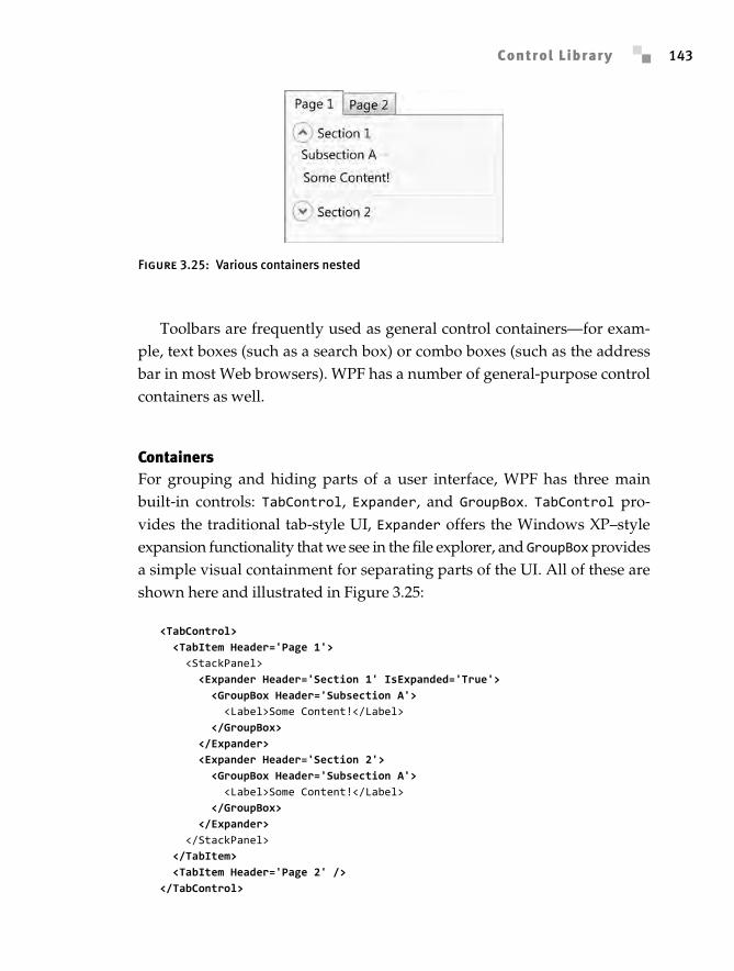
ContainersFor grouping and hiding parts of a user interface, WPF has three mainbuilt-in controls: TabControl, Expander, and GroupBox. TabControl pro-vides the traditional tab-style UI, Expander offers the Windows XP–styleexpansion functionality that we see in the file explorer, and GroupBox providesa simple visual containment for separating parts of the UI. All of these areshown here and illustrated in Figure 3.25:
<TabControl> <TabItem Header='Page 1'> <StackPanel> <Expander Header='Section 1' IsExpanded='True'> <GroupBox Header='Subsection A'> <Label>Some Content!</Label> </GroupBox> </Expander> <Expander Header='Section 2'> <GroupBox Header='Subsection A'> <Label>Some Content!</Label> </GroupBox> </Expander> </StackPanel> </TabItem> <TabItem Header='Page 2' /></TabControl>
Figure 3.25: Various containers nested
Anderson_ch03-113-172.fm Page 143 Wednesday, March 14, 2007 5:12 PM
Chapter 3: Controls144
There are some interesting things to note about the derivation hierarchyof these controls. First, TabItem, Expander, and GroupBox all derive fromHeaderedContentControl. Effectively, HeaderedContentControl is a genericbase type for any control that has a data model with a single header andsingle content model. At first this might seem wrong, since Expander,TabItem, and GroupBox most often contain multiple items. These controlsare able to hold multiple items because a single layout container, likeStackPanel or Grid, can be the root of that content.
The second interesting observation about the derivation hierarchy isthat TabControl derives from Selector (and therefore ItemsControl). Thismeans that TabControl is really a type of list. All the data model, templat-ing, and selection events associated with lists are available to TabControl.
The last group of container controls consists of the layout controls, suchas WrapPanel. These will be covered in detail in Chapter 4.
RangesRange controls allow the selection of a value between upper and lowerbounds (a valid range of values, which is where the name comes from).WPF provides three range controls: Slider, ScrollBar, and ProgressBar.ScrollBar is considered a building-block control because using a scroll-bar for anything other than scrolling is generally thought to be bad UIdesign.
All the range controls work in the same way: We specify a range byassigning minimum and maximum values using the Minimum and Maximumproperties, and we specify or determine the current value within therange through the Value property. Or we can specify SmallChange andLargeChange to control how quickly the value changes when the userclicks on different parts of the control.
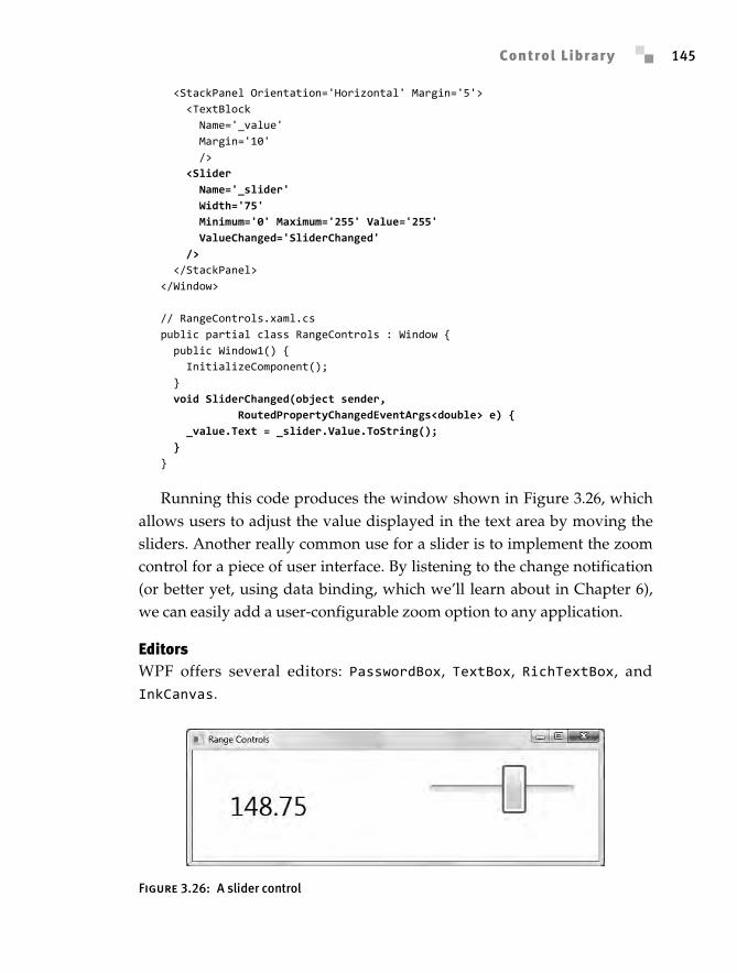
To see how a slider works, we can handle the ValueChanged event onthe slider and update the text of a text block:
<!-- RangeControls.xaml --><Window x:Class='EssentialWPF.RangeControls' xmlns='http://schemas.microsoft.com/winfx/2006/xaml/presentation' xmlns:x='http://schemas.microsoft.com/winfx/2006/xaml' Title='Range Controls' SizeToContent='WidthAndHeight' >
Anderson_ch03-113-172.fm Page 144 Wednesday, March 14, 2007 5:12 PM
Copyright 2007 Pearson Education, Inc. ISBN 0321374479
Control Library 145
<StackPanel Orientation='Horizontal' Margin='5'> <TextBlock Name='_value' Margin='10' /> <Slider Name='_slider' Width='75' Minimum='0' Maximum='255' Value='255' ValueChanged='SliderChanged' /> </StackPanel></Window>
// RangeControls.xaml.cspublic partial class RangeControls : Window { public Window1() { InitializeComponent(); } void SliderChanged(object sender, RoutedPropertyChangedEventArgs<double> e) { _value.Text = _slider.Value.ToString(); }}
Running this code produces the window shown in Figure 3.26, whichallows users to adjust the value displayed in the text area by moving thesliders. Another really common use for a slider is to implement the zoomcontrol for a piece of user interface. By listening to the change notification(or better yet, using data binding, which we’ll learn about in Chapter 6),we can easily add a user-configurable zoom option to any application.
EditorsWPF offers several editors: PasswordBox, TextBox, RichTextBox, andInkCanvas.
Figure 3.26: A slider control
Anderson_ch03-113-172.fm Page 145 Wednesday, March 14, 2007 5:12 PM
Chapter 3: Controls146
PasswordBox is the outlier here, so let’s talk about it first. PasswordBoxprovides the all-too-familiar function of a text box, except that it replaceswhat the user types with a series of dots or asterisks. The implementationof this control is interesting, in that it doesn’t actually support the textobject model. PasswordBox provides an island of functionality, with thepassword stored opaquely inside of it. Security is improved because walk-ing the text tree will not accidentally disclose the password.
TextBox and RichTextBox are very similar to each other, except thatTextBox turns off the ability to host rich text and offers many “simple”text-editing services (maximum length, character casing, etc.). BecauseTextBox supports only plain text, the API is much simpler, so we don’tneed to understand the text object model for simple scenarios. The global-ization, text editing, IME (input method editor) support, spell checking(yes, built-in spell checking for all text editors!), and other features of theplatform are otherwise identical between the two controls.
RichTextBox is the granddaddy text editor. Out of the box, it supportsabout 84 commands that are accessible via keyboard shortcut keys (didyou know that Ctrl+[ and Ctrl+] modify the font size of a selection?), anddozens more are available programmatically. RichTextBox is really aFlowDocument editor, which we will talk about in Chapter 5.
InkCanvas is to ink what RichTextBox is to text. The default behavior willsupport writing, erasing ink, selecting ink, and gestures7 with no additionalcode.
Both ink editing and text editing have a corresponding object model forinspecting and modifying the native data types.
Text Data
There are two ways to deal with text data in WPF: streaming and collec-tions. For most scenarios of building text dynamically and inspecting text,the collection model is simpler. Dealing with rich text editing (and selection)requires understanding some of the core parts of the streaming text model.
7. Gestures are a Tablet PC concept that converts a pen “gesture” (like making a check mark, or drawing a circle) into a programmatic command (like “check” or “circle”). Gesture rec-ognition is a type of handwriting recognition.
Anderson_ch03-113-172.fm Page 146 Wednesday, March 14, 2007 5:12 PM
Copyright 2007 Pearson Education, Inc. ISBN 0321374479
Control Library 147
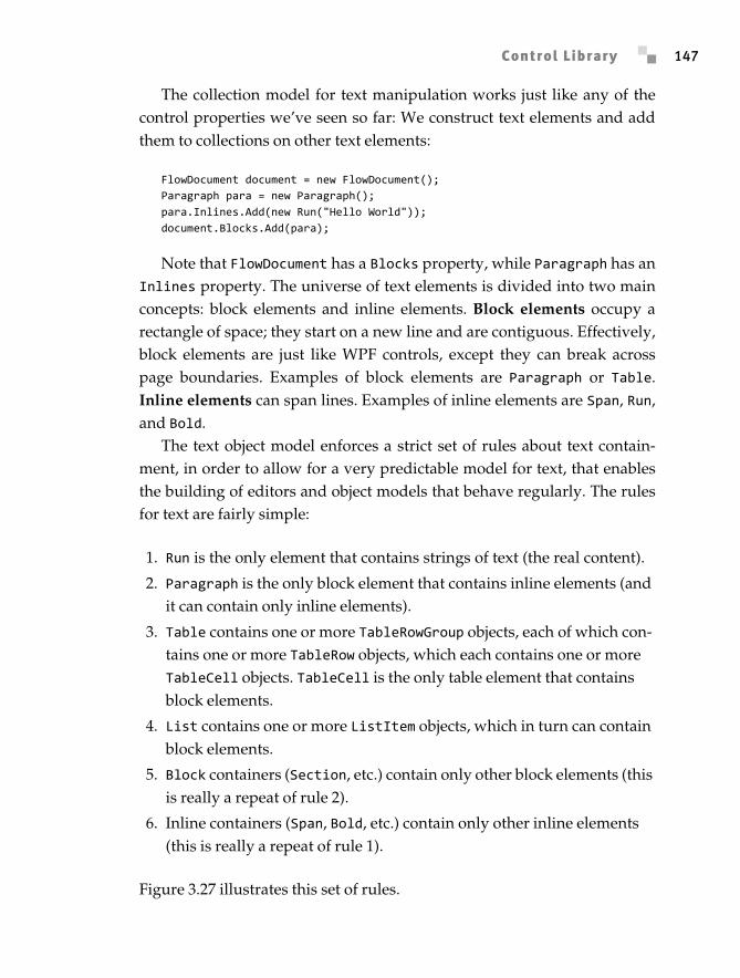
The collection model for text manipulation works just like any of thecontrol properties we’ve seen so far: We construct text elements and addthem to collections on other text elements:
FlowDocument document = new FlowDocument();Paragraph para = new Paragraph();para.Inlines.Add(new Run("Hello World"));document.Blocks.Add(para);
Note that FlowDocument has a Blocks property, while Paragraph has anInlines property. The universe of text elements is divided into two mainconcepts: block elements and inline elements. Block elements occupy arectangle of space; they start on a new line and are contiguous. Effectively,block elements are just like WPF controls, except they can break acrosspage boundaries. Examples of block elements are Paragraph or Table.Inline elements can span lines. Examples of inline elements are Span, Run,and Bold.
The text object model enforces a strict set of rules about text contain-ment, in order to allow for a very predictable model for text, that enablesthe building of editors and object models that behave regularly. The rulesfor text are fairly simple:
1. Run is the only element that contains strings of text (the real content).
2. Paragraph is the only block element that contains inline elements (and it can contain only inline elements).
3. Table contains one or more TableRowGroup objects, each of which con-tains one or more TableRow objects, which each contains one or more TableCell objects. TableCell is the only table element that contains block elements.
4. List contains one or more ListItem objects, which in turn can contain block elements.
5. Block containers (Section, etc.) contain only other block elements (this is really a repeat of rule 2).
6. Inline containers (Span, Bold, etc.) contain only other inline elements (this is really a repeat of rule 1).
Figure 3.27 illustrates this set of rules.
Anderson_ch03-113-172.fm Page 147 Wednesday, March 14, 2007 5:12 PM
Chapter 3: Controls148
The collection-based text object model directly reflects these rules.Some objects have helper methods (e.g., a Paragraph object of type stringhas a Text property) that create the appropriate elements under the covers.
The final two interesting text elements are BlockUIContainer andInlineUIContainer. These two types take an arbitrary UIElement-derivedtype and host it in the text flow in much the same way that TextFlow andRichTextBox host text flow content in the UIElement tree.
In Chapter 5 we will dive into the details of what all these text elements do.So far we have looked at the collection-based text object model. The
streaming model is used for manipulating text as a stream of elements. It isimportant to understand that text is sequential. That may sound obvious,but in the design of WPF it was a pretty difficult issue. Typically, UI libraries(User32, Windows Forms, Abstract Window Toolkit [AWT], Swing, etc.)represent their objects as a tree of elements. Each element has a parent andsome children. It’s a pretty simple model to grasp.
Typical text or document libraries (Internet Explorer, for example) repre-sent their objects as a stream of text. Because the building block of the libraryis a stream of characters, everything can be equated back to that stream of text.
Figure 3.27: An abstract text model
Table
Table Row Group
Table Row List
Table Cell List Item Section, etc.
Paragraph
Block Elements Inline Elements
Inline Container(Span, Bold, etc.)
Run
String of text
Document
Block Containers
Anderson_ch03-113-172.fm Page 148 Wednesday, March 14, 2007 5:12 PM
Copyright 2007 Pearson Education, Inc. ISBN 0321374479
Control Library 149
For a moment, consider the object model required to represent the followingcompletely valid HTML: <b>hello <i>there</b> reader</i>.
The WPF development team was faced with the dilemma of how to rep-resent objects. We knew that rich typography and documents were a corepart of the platform, but dealing with everything as a stream of text meanssome cost in performance and complexity. In addition, the platform wasintended to have a rich control framework, but concepts like partial selec-tion cannot be easily represented in a simple tree model. Our solution wasto do both. When rich text is added into the tree, a streaming model is used(hence the text object model), and a simple hierarchy is used for controls(which we’ve already seen).
TextPointer objects are the main building blocks in the streaming textobject model. A text pointer can be thought of as a finger pointing rightbetween two characters. A text pointer can represent the caret position, orthe start and end of a selection, or the beginning of a word.
TextRange is used to represent the entire selection (or any range of text);it consists of simply two text pointers.8 Formatting and visual effects can beapplied to arbitrary ranges. This is a critical point, so let me repeat it: for-matting can be applied to arbitrary ranges. We can re-create that nasty over-lapping bold and italic HTML example by using ranges. However, if weattempt to save the generated markup, we’ll find that the overlapping tagshave been removed and something more reasonable has been created:
<Bold>hello </Bold><InlineFontWeight='Bold'FontStyle='Italic'> there</Inline><Italic>reader</Italic>.
The Xml property on TextRange returns a very verbose XAML string.The Xml property captures all information (including defaults) about thetext range, and it is therefore useful for Clipboard operations or other casesof extracting part of a document.
8. TextRange can also be used to save and load sections of rich formatting. Using TextRange.Save, we can write out all or part of a document as RTF or XAML. Using TextRange.Load, we can read all or part of a document as RTF or XAML.
Anderson_ch03-113-172.fm Page 149 Wednesday, March 14, 2007 5:12 PM
Chapter 3: Controls150
Using RichTextBox
To use RichTextBox, we must start with the Document property. Rich-TextBox allows the editing of a single FlowDocument object. Using the textobject model, we can initialize the document for RichTextBox with someformatted text:
<Window ... Title='RichTextBox'> <RichTextBox Name='_rtb'> <FlowDocument FontSize='24'> <Paragraph>Hello</Paragraph> </FlowDocument> </RichTextBox></Window>
At runtime the editor is fully functional (Figure 3.28) and supports all thecommon editing commands.
The next big concepts to understand for RichTextBox are the notions ofa caret and selection. The caret is the blinking line that represents the
Figure 3.28: RichTextBox with some text selected
Figure 3.29: TextOffset example, showing how the start and end tokens of an element
occupy space in the text object model
Anderson_ch03-113-172.fm Page 150 Wednesday, March 14, 2007 5:12 PM
Copyright 2007 Pearson Education, Inc. ISBN 0321374479
Control Library 151
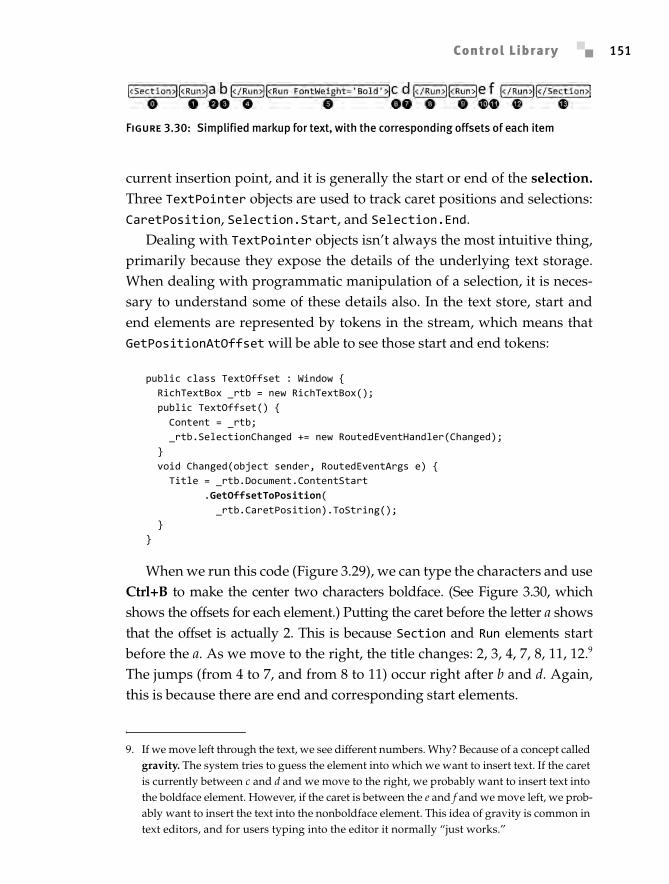
current insertion point, and it is generally the start or end of the selection.Three TextPointer objects are used to track caret positions and selections:CaretPosition, Selection.Start, and Selection.End.
Dealing with TextPointer objects isn’t always the most intuitive thing,primarily because they expose the details of the underlying text storage.When dealing with programmatic manipulation of a selection, it is neces-sary to understand some of these details also. In the text store, start andend elements are represented by tokens in the stream, which means thatGetPositionAtOffset will be able to see those start and end tokens:
public class TextOffset : Window { RichTextBox _rtb = new RichTextBox(); public TextOffset() { Content = _rtb; _rtb.SelectionChanged += new RoutedEventHandler(Changed); } void Changed(object sender, RoutedEventArgs e) { Title = _rtb.Document.ContentStart .GetOffsetToPosition( _rtb.CaretPosition).ToString(); }}
When we run this code (Figure 3.29), we can type the characters and useCtrl+B to make the center two characters boldface. (See Figure 3.30, whichshows the offsets for each element.) Putting the caret before the letter a showsthat the offset is actually 2. This is because Section and Run elements startbefore the a. As we move to the right, the title changes: 2, 3, 4, 7, 8, 11, 12.9
The jumps (from 4 to 7, and from 8 to 11) occur right after b and d. Again,this is because there are end and corresponding start elements.
Figure 3.30: Simplified markup for text, with the corresponding offsets of each item
9. If we move left through the text, we see different numbers. Why? Because of a concept called gravity. The system tries to guess the element into which we want to insert text. If the caret is currently between c and d and we move to the right, we probably want to insert text into the boldface element. However, if the caret is between the e and f and we move left, we prob-ably want to insert the text into the nonboldface element. This idea of gravity is common in text editors, and for users typing into the editor it normally “just works.”
Anderson_ch03-113-172.fm Page 151 Wednesday, March 14, 2007 5:12 PM
Chapter 3: Controls152
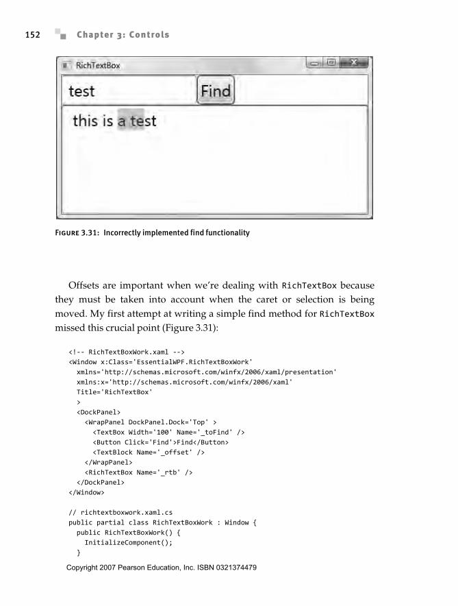
Offsets are important when we’re dealing with RichTextBox becausethey must be taken into account when the caret or selection is beingmoved. My first attempt at writing a simple find method for RichTextBoxmissed this crucial point (Figure 3.31):
<!-- RichTextBoxWork.xaml --><Window x:Class='EssentialWPF.RichTextBoxWork' xmlns='http://schemas.microsoft.com/winfx/2006/xaml/presentation' xmlns:x='http://schemas.microsoft.com/winfx/2006/xaml' Title='RichTextBox' > <DockPanel> <WrapPanel DockPanel.Dock='Top' > <TextBox Width='100' Name='_toFind' /> <Button Click='Find'>Find</Button> <TextBlock Name='_offset' /> </WrapPanel> <RichTextBox Name='_rtb' /> </DockPanel></Window>
// richtextboxwork.xaml.cspublic partial class RichTextBoxWork : Window { public RichTextBoxWork() { InitializeComponent(); }
Figure 3.31: Incorrectly implemented find functionality
Anderson_ch03-113-172.fm Page 152 Wednesday, March 14, 2007 5:12 PM
Copyright 2007 Pearson Education, Inc. ISBN 0321374479
Control Library 153
// This doesn't work correctly! // void Find(object sender, RoutedEventArgs e) { FlowDocument doc = _rtb.Document; string text = new TextRange(doc.ContentStart, doc.ContentEnd).Text; int index = text.IndexOf(_toFind.Text); TextPointer start = doc.ContentStart.GetPositionAtOffset(index); TextPointer end = start.GetPositionAtOffset(_toFind.Text.Length); _rtb.Selection.Select(start, end); }}
In this example the selection will always be off because of the start ele-ment tokens for Section and Run. The fix is to move a text pointer throughthe document searching for the match:
void Find(object sender, RoutedEventArgs e) { FlowDocument doc = _rtb.Document; TextPointer cur = doc.ContentStart; while (cur != null) { TextPointer end = cur.GetPositionAtOffset(_toFind.Text.Length); if (end != null) { TextRange test = new TextRange(cur, end); if (test.Text == _toFind.Text) { _rtb.Selection.Select(test.Start, test.End); break; } } cur = cur.GetNextInsertionPosition(LogicalDirection.Forward); }}
The final big concept with RichTextBox is undo. All operations per-formed on RichTextBox can be undone (and redone) on command. Undounits are hierarchical also, which means that we can create groups of opera-tions that will be treated as a single change. We can use either BeginChange/EndChange or DeclareChangeBlock; however, using DeclareChangeBlock isgenerally preferred because it returns an IDisposable object that can beused in a using statement.
Consider the code to add two paragraphs to a rich text box. If we runthis code, the user will have to run undo twice to remove both paragraphs:
_rtb.Document.Blocks.Add(new Paragraph(new Run("One")));_rtb.Document.Blocks.Add(new Paragraph(new Run("Two")));
Anderson_ch03-113-172.fm Page 153 Wednesday, March 14, 2007 5:12 PM
Chapter 3: Controls154
Instead, we can surround the programmatic changes to the documentwith a change block, making them both into a single undo unit:
using (_rtb.DeclareChangeBlock("add two")) { _rtb.Document.Blocks.Add(new Paragraph(new Run("One"))); _rtb.Document.Blocks.Add(new Paragraph(new Run("Two")));}
When making programmatic changes to the content of RichTextBox,we are expected to wrap them in a call to DeclareChangeBlock so that theend user can easily undo all the operations.
Using TextBox
TextBox is a simplification of most of the features of RichTextBox. BecauseTextBox supports only a single format, it is easy to expose selection as twointegers that represent the offset into the text (no need to deal with thestart/end token issues), and text is exposed as a simple string value. Ontop of this simplification, TextBox offers some additional functionality,such as the ability to easily limit the length of text or modify the casing ofthe text.
Ink Data
The base data type of ink is Stroke, defined in the System.Windows.Inknamespace. In some ways ink data is much simpler than rich text; it iseffectively a series of packets received from the digitizer.
Ink was introduced in the Tablet PC version of Windows XP (if youignore the fabled Pen Windows releases), with a binary persistence format(called ink serialized format, or ISF), COM programming model, and .NETprogramming model. The WPF development team wanted to have inkcompletely integrated into the platform. The binary format of ink is largelyunchanged, but the programming model has undergone some changes tointegrate it with the rest of the platform.
We can safely ignore the binary format, other than to know that the Strokeobject model is implemented on top of this very efficient binary stream.This detail explains some of the oddity in the object model that Strokeexposes. In most cases we can get all needed data using the simpleStylusPoint API, but when we really need access to all the data we candive down into the StylusPointDescription API to gain access to
Anderson_ch03-113-172.fm Page 154 Wednesday, March 14, 2007 5:12 PM
Copyright 2007 Pearson Education, Inc. ISBN 0321374479
Control Library 155
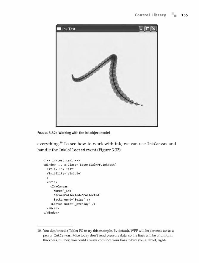
everything.10 To see how to work with ink, we can use InkCanvas andhandle the InkCollected event (Figure 3.32):
<!-- inktest.xaml --><Window ... x:Class='EssentialWPF.InkTest' Title='Ink Test' Visibility='Visible' > <Grid> <InkCanvas Name='_ink' StrokeCollected='Collected' Background='Beige' /> <Canvas Name='_overlay' /> </Grid></Window>
Figure 3.32: Working with the ink object model
10. You don’t need a Tablet PC to try this example. By default, WPF will let a mouse act as a pen on InkCanvas. Mice today don’t send pressure data, so the lines will be of uniform thickness, but hey, you could always convince your boss to buy you a Tablet, right?
Anderson_ch03-113-172.fm Page 155 Wednesday, March 14, 2007 5:12 PM
Chapter 3: Controls156
// inktest.xaml.csvoid Collected(object sender, InkCanvasStrokeCollectedEventArgs e) { _overlay.Children.Clear(); Brush fill = new SolidColorBrush(Color.FromArgb(120, 255, 0, 0)); foreach (StylusPoint pt in e.Stroke.StylusPoints) { double markerSize = pt.PressureFactor * 35.0; Ellipse marker = new Ellipse(); Canvas.SetLeft(marker, pt.X - markerSize / 2); Canvas.SetTop(marker, pt.Y - markerSize / 2); marker.Width = marker.Height = markerSize; marker.Fill = fill; _overlay.Children.Add(marker); }}
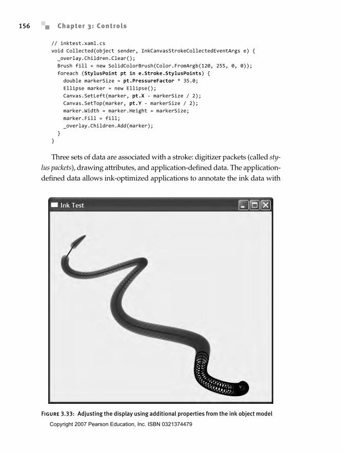
Three sets of data are associated with a stroke: digitizer packets (called sty-lus packets), drawing attributes, and application-defined data. The application-defined data allows ink-optimized applications to annotate the ink data with
Figure 3.33: Adjusting the display using additional properties from the ink object model
Anderson_ch03-113-172.fm Page 156 Wednesday, March 14, 2007 5:12 PM
Copyright 2007 Pearson Education, Inc. ISBN 0321374479
Control Library 157
special information. Drawing attributes control how the ink will be rendered.We can control drawing attributes on each stroke using the Drawing-Attributes property, or on InkCanvas with the DefaultDrawingAttributesproperty.
As we have started to see, stylus packets are somewhat complexbeasts. A key reason for this complexity is that the ink stream can beextended by hardware manufacturers. Multiple buttons are very commonextensions that digitizer manufacturers use. Other examples include pentilt data, or even the rotation of the pen. The long-term goal of ink is to beable to capture all the information about someone’s writing or drawingsin order to accurately create a digital experience that matches or exceedspen on paper.
To query this additional data, we need to tell the ink object modelwhich data we want transferred from the packets into the object model. Wecan request the data either globally (by specifying the DefaultStylus-PointDescription value on InkCanvas) or per stroke (by using the Reformatmethod on StylusPointCollection).
Many newer tablets support XTilt and YTilt, which open up possibili-ties for very interesting visualizations. For this example, however, I’ll stickwith BarrelButton, which most tablets have. X, Y, and NormalPressuremust be the first three properties in the query. When the barrel button ispressed, we will display an alternate circle (Figure 3.33):
public InkTest() { InitializeComponent(); _ink.DefaultStylusPointDescription = new StylusPointDescription( new StylusPointPropertyInfo[] { new StylusPointPropertyInfo(StylusPointProperties.X), new StylusPointPropertyInfo(StylusPointProperties.Y), new StylusPointPropertyInfo(StylusPointProperties.NormalPressure), new StylusPointPropertyInfo(StylusPointProperties.BarrelButton), });}
void Collected(object sender, InkCanvasStrokeCollectedEventArgs e) { _overlay.Children.Clear(); Brush fill = new SolidColorBrush(Color.FromArgb(120, 255, 0, 0)); Brush altFill = new SolidColorBrush(Color.FromArgb(120, 0, 255, 0)); foreach (StylusPoint pt in e.Stroke.StylusPoints) { double markerSize = pt.PressureFactor * 35.0;
Anderson_ch03-113-172.fm Page 157 Wednesday, March 14, 2007 5:12 PM
Chapter 3: Controls158
Ellipse marker = new Ellipse(); Canvas.SetLeft(marker, pt.X - markerSize / 2); Canvas.SetTop(marker, pt.Y - markerSize / 2); marker.Width = marker.Height = markerSize; marker.Fill = fill; if (pt.GetPropertyValue(StylusPointProperties.BarrelButton) != 0) { marker.Fill = null; marker.Stroke = Brushes.Black; marker.StrokeThickness = 2.0; } _overlay.Children.Add(marker); }}
Using InkCanvas
We’ve already seen the basics of using the InkCanvas control, but there is alot more there. With RichTextBox we have all the functionality needed toimplement the WordPad application included in Windows; with InkCanvaswe can implement Journal. All the basics are there: ink selection, erasing,highlighting, tip specification, and so on. Probably the most interestingfeature is the new gesture support.
The gesture recognizer analyzes the ink data and determines whether theuser tried to input one of 41 gestures (everything from Check to Double-Curlicue is included). Enabling gestures requires two critical steps: First,we must set EditingMode on InkCanvas to InkAndGesture. Second, wemust call SetEnabledGestures on InkCanvas to tell the recognizer whichgestures to look for:
<!-- InkCanvasTest.xaml --><Window ... x:Class='EssentialWPF.InkCanvasTest' Title='EssentialWPF' > <StackPanel> <InkCanvas Height='200' Name='_ink' Gesture='InkGesture' EditingMode='InkAndGesture' /> <ListBox Name='_seen' /> </StackPanel></Window>
// InkCanvasTest.xaml.cspublic partial class InkCanvasTest : Window { public InkCanvasTest() {
Anderson_ch03-113-172.fm Page 158 Wednesday, March 14, 2007 5:12 PM
Copyright 2007 Pearson Education, Inc. ISBN 0321374479
Control Library 159
InitializeComponent(); _ink.SetEnabledGestures(new ApplicationGesture[] { ApplicationGesture.AllGestures, }); }
void InkGesture(object sender, InkCanvasGestureEventArgs e) { _seen.Items.Add( e.GetGestureRecognitionResults()[0].ApplicationGesture); }}
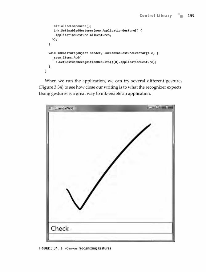
When we run the application, we can try several different gestures(Figure 3.34) to see how close our writing is to what the recognizer expects.Using gestures is a great way to ink-enable an application.
Figure 3.34: InkCanvas recognizing gestures
Anderson_ch03-113-172.fm Page 159 Wednesday, March 14, 2007 5:12 PM
Chapter 3: Controls160
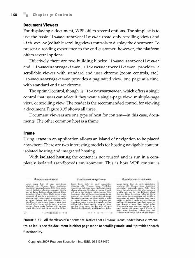
Document ViewersFor displaying a document, WPF offers several options. The simplest is touse the basic FlowDocumentScrollViewer (read-only scrolling view) andRichTextBox (editable scrolling view) controls to display the document. Topresent a reading experience to the end customer, however, the platformoffers several options.
Effectively there are two building blocks: FlowDocumentScrollViewerand FlowDocumentPageViewer. FlowDocumentScrollViewer provides ascrollable viewer with standard end user chrome (zoom controls, etc.).FlowDocumentPageViewer provides a paginated view, one page at a time,with standard end user chrome.
The optimal control, though, is FlowDocumentReader, which offers a singlecontrol that users can select if they want a single-page view, multiple-pageview, or scrolling view. The reader is the recommended control for viewinga document. Figure 3.35 shows all three.
Document viewers are one type of host for content—in this case, docu-ments. The other common host is a frame.
FrameUsing Frame in an application allows an island of navigation to be placedanywhere. There are two interesting models for hosting navigable content:isolated hosting and integrated hosting.
With isolated hosting the content is not trusted and is run in a com-pletely isolated (sandboxed) environment. This is how WPF content is
Figure 3.35: All the views of a document. Notice that FlowDocumentReader has a view con-
trol to let us see the document in either page mode or scrolling mode, and it provides search
functionality.
Anderson_ch03-113-172.fm Page 160 Wednesday, March 14, 2007 5:12 PM
Copyright 2007 Pearson Education, Inc. ISBN 0321374479
Building Blocks 161
hosted when running in the system Web browser as a XAML BrowserApplication. For navigation to another application or HTML content, thisisolated hosting model is supported with a Frame object.
Integrated hosting, in which we want the content to behave as part ofour application, is not supported at all in the system. When Frame navi-gates to content within the application, we get an odd hybrid of isolatedand integrated behavior. Frame isolates its content from its style (and itsparent’s style), but not from the application’s style. Events don’t bubblefrom the content in Frame; however, the objects are accessible from theContent property (meaning that they aren’t isolated in a security sense).
For all these reasons, Frame is most useful when we’re working withexternal content, but it can be carefully used for application content.
Building BlocksWPF’s control model is built around the idea of element composition. Webuild up larger controls (such as ListBox) by using smaller controls(StackPanel, ScrollViewer, etc.). Although in most scenarios we don’tneed to dig into these building-block controls, it’s good to know what ser-vices can be leveraged to build custom controls. The System.Windows.Con-trols.Primitives namespace contains many of the smaller componentsfrom which larger controls are built.
ToolTipGenerally we access tool tip functionality using the ToolTip property onelements:
<Button ToolTip='Click this button to do cool things!'> OK</Button>
There are two common ways to adjust the behavior of tool tips. First,we can use ToolTipService to adjust more tool tip properties. An advan-tage of using the service is that only a single ToolTip control is created (thisis useful when we have lots of tips on lots of controls). For more advancedscenarios we can create an instance of ToolTip directly on a control:
Anderson_ch03-113-172.fm Page 161 Wednesday, March 14, 2007 5:12 PM
Chapter 3: Controls162
<!-- ToolTipTest.xaml --><Window ... x:Class='EssentialWPF.ToolTipTest' Title='Tool Tips' ToolTipService.InitialShowDelay='0' ToolTipService.ShowDuration='500000' > <Window.ToolTip> <ToolTip x:Name='_theTip' Placement='RelativePoint' VerticalOffset='10' /> </Window.ToolTip> <UniformGrid Rows='3' Columns='3'> <Button Margin='5'>1</Button> <Button Margin='5'>2</Button> <Button Margin='5'>3</Button> <Button Margin='5'>4</Button> <Button Margin='5'>5</Button> <Button Margin='5'>6</Button> <Button Margin='5'>7</Button> <Button Margin='5'>8</Button> <Button Margin='5'>9</Button> </UniformGrid></Window>
// ToolTipTest.xaml.cspublic partial class ToolTipTest : Window { public ToolTipTest() { InitializeComponent(); this.MouseMove += ToolTipTest_MouseMove; } void ToolTipTest_MouseMove(object sender, MouseEventArgs e) {
// Hit test to find the element that is directly // under the mouse. // PointHitTestResult hit = VisualTreeHelper.HitTest( this, e.GetPosition(this)) as PointHitTestResult;
if (hit != null && hit.VisualHit != null) { _theTip.Content = hit.VisualHit.ToString(); _theTip.PlacementRectangle = new Rect(e.GetPosition(this), new Size(0, 0)); } }}
If we run this example (Figure 3.36), we never see a window appear asone of the visuals to mouse over. Because the default template for Window
Anderson_ch03-113-172.fm Page 162 Wednesday, March 14, 2007 5:12 PM
Copyright 2007 Pearson Education, Inc. ISBN 0321374479
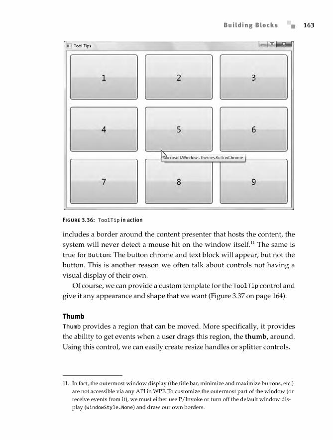
Building Blocks 163
includes a border around the content presenter that hosts the content, thesystem will never detect a mouse hit on the window itself.11 The same istrue for Button: The button chrome and text block will appear, but not thebutton. This is another reason we often talk about controls not having avisual display of their own.
Of course, we can provide a custom template for the ToolTip control andgive it any appearance and shape that we want (Figure 3.37 on page 164).
ThumbThumb provides a region that can be moved. More specifically, it providesthe ability to get events when a user drags this region, the thumb, around.Using this control, we can easily create resize handles or splitter controls.
Figure 3.36: ToolTip in action
11. In fact, the outermost window display (the title bar, minimize and maximize buttons, etc.) are not accessible via any API in WPF. To customize the outermost part of the window (or receive events from it), we must either use P/Invoke or turn off the default window dis-play (WindowStyle.None) and draw our own borders.
Anderson_ch03-113-172.fm Page 163 Wednesday, March 14, 2007 5:12 PM
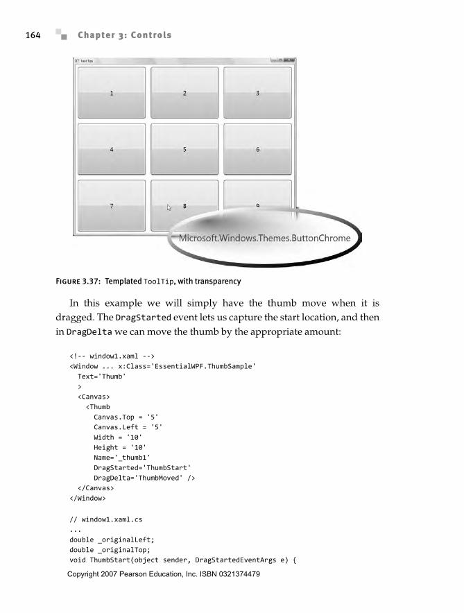
Chapter 3: Controls164
In this example we will simply have the thumb move when it isdragged. The DragStarted event lets us capture the start location, and thenin DragDelta we can move the thumb by the appropriate amount:
<!-- window1.xaml --><Window ... x:Class='EssentialWPF.ThumbSample' Text='Thumb' > <Canvas> <Thumb Canvas.Top = '5' Canvas.Left = '5' Width = '10' Height = '10' Name='_thumb1' DragStarted='ThumbStart' DragDelta='ThumbMoved' /> </Canvas></Window>
// window1.xaml.cs...double _originalLeft;double _originalTop;void ThumbStart(object sender, DragStartedEventArgs e) {
Figure 3.37: Templated ToolTip, with transparency
Anderson_ch03-113-172.fm Page 164 Wednesday, March 14, 2007 5:12 PM
Copyright 2007 Pearson Education, Inc. ISBN 0321374479
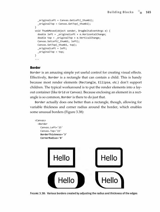
Building Blocks 165
_originalLeft = Canvas.GetLeft(_thumb1); _originalTop = Canvas.GetTop(_thumb1);}void ThumbMoved(object sender, DragDeltaEventArgs e) { double left = _originalLeft + e.HorizontalChange; double top = _originalTop + e.VerticalChange; Canvas.SetLeft(_thumb1, left); Canvas.SetTop(_thumb1, top); _originalLeft = left; _originalTop = top;}...
BorderBorder is an amazing simple yet useful control for creating visual effects.Effectively, Border is a rectangle that can contain a child. This is handybecause most render elements (Rectangle, Ellipse, etc.) don’t supportchildren. The typical workaround is to put the render elements into a lay-out container (like Grid or Canvas). Because enclosing an element in a rect-angle is so common, Border is there to do just that.
Border actually does one better than a rectangle, though, allowing forvariable thickness and corner radius around the border, which enablessome unusual borders (Figure 3.38):
<Canvas> <Border Canvas.Left='15' Canvas.Top='15' BorderThickness='3' CornerRadius='0'
Figure 3.38: Various borders created by adjusting the radius and thickness of the edges
Anderson_ch03-113-172.fm Page 165 Wednesday, March 14, 2007 5:12 PM
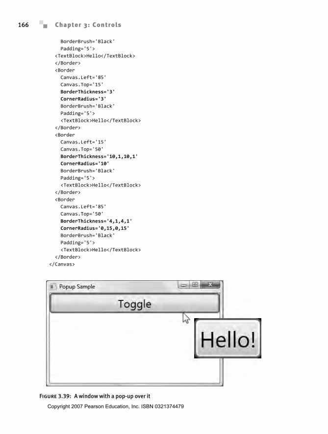
Chapter 3: Controls166
BorderBrush='Black' Padding='5'> <TextBlock>Hello</TextBlock> </Border> <Border Canvas.Left='85' Canvas.Top='15' BorderThickness='3' CornerRadius='3' BorderBrush='Black' Padding='5'> <TextBlock>Hello</TextBlock> </Border> <Border Canvas.Left='15' Canvas.Top='50' BorderThickness='10,1,10,1' CornerRadius='10' BorderBrush='Black' Padding='5'> <TextBlock>Hello</TextBlock> </Border> <Border Canvas.Left='85' Canvas.Top='50' BorderThickness='4,1,4,1' CornerRadius='0,15,0,15' BorderBrush='Black' Padding='5'> <TextBlock>Hello</TextBlock> </Border></Canvas>
Figure 3.39: A window with a pop-up over it
Anderson_ch03-113-172.fm Page 166 Wednesday, March 14, 2007 5:12 PM
Copyright 2007 Pearson Education, Inc. ISBN 0321374479
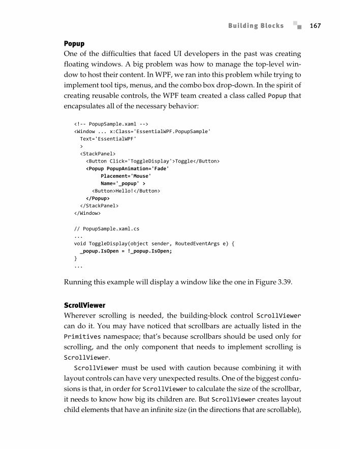
Building Blocks 167
PopupOne of the difficulties that faced UI developers in the past was creatingfloating windows. A big problem was how to manage the top-level win-dow to host their content. In WPF, we ran into this problem while trying toimplement tool tips, menus, and the combo box drop-down. In the spirit ofcreating reusable controls, the WPF team created a class called Popup thatencapsulates all of the necessary behavior:
<!-- PopupSample.xaml --><Window ... x:Class='EssentialWPF.PopupSample' Text='EssentialWPF' > <StackPanel> <Button Click='ToggleDisplay'>Toggle</Button> <Popup PopupAnimation='Fade' Placement='Mouse' Name='_popup' > <Button>Hello!</Button> </Popup> </StackPanel></Window>
// PopupSample.xaml.cs...void ToggleDisplay(object sender, RoutedEventArgs e) { _popup.IsOpen = !_popup.IsOpen;}...
Running this example will display a window like the one in Figure 3.39.
ScrollViewerWherever scrolling is needed, the building-block control ScrollViewercan do it. You may have noticed that scrollbars are actually listed in thePrimitives namespace; that’s because scrollbars should be used only forscrolling, and the only component that needs to implement scrolling isScrollViewer.
ScrollViewer must be used with caution because combining it withlayout controls can have very unexpected results. One of the biggest confu-sions is that, in order for ScrollViewer to calculate the size of the scrollbar,it needs to know how big its children are. But ScrollViewer creates layoutchild elements that have an infinite size (in the directions that are scrollable),
Anderson_ch03-113-172.fm Page 167 Wednesday, March 14, 2007 5:12 PM
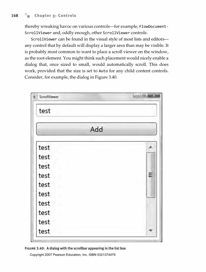
Chapter 3: Controls168
thereby wreaking havoc on various controls—for example, FlowDocument-ScrollViewer and, oddly enough, other ScrollViewer controls.
ScrollViewer can be found in the visual style of most lists and editors—any control that by default will display a larger area than may be visible. Itis probably most common to want to place a scroll viewer on the window,as the root element. You might think such placement would nicely enable adialog that, once sized to small, would automatically scroll. This doeswork, provided that the size is set to Auto for any child content controls.Consider, for example, the dialog in Figure 3.40.
Figure 3.40: A dialog with the scrollbar appearing in the list box
Anderson_ch03-113-172.fm Page 168 Wednesday, March 14, 2007 5:12 PM
Copyright 2007 Pearson Education, Inc. ISBN 0321374479
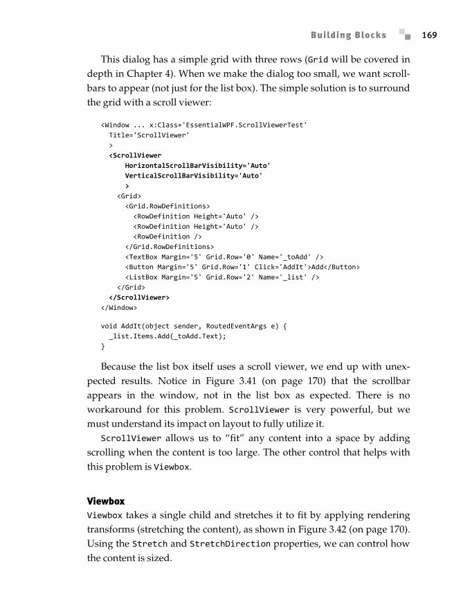
Building Blocks 169
This dialog has a simple grid with three rows (Grid will be covered indepth in Chapter 4). When we make the dialog too small, we want scroll-bars to appear (not just for the list box). The simple solution is to surroundthe grid with a scroll viewer:
<Window ... x:Class='EssentialWPF.ScrollViewerTest' Title='ScrollViewer' > <ScrollViewer HorizontalScrollBarVisibility='Auto' VerticalScrollBarVisibility='Auto' > <Grid> <Grid.RowDefinitions> <RowDefinition Height='Auto' /> <RowDefinition Height='Auto' /> <RowDefinition /> </Grid.RowDefinitions> <TextBox Margin='5' Grid.Row='0' Name='_toAdd' /> <Button Margin='5' Grid.Row='1' Click='AddIt'>Add</Button> <ListBox Margin='5' Grid.Row='2' Name='_list' /> </Grid> </ScrollViewer></Window>
void AddIt(object sender, RoutedEventArgs e) { _list.Items.Add(_toAdd.Text);}
Because the list box itself uses a scroll viewer, we end up with unex-pected results. Notice in Figure 3.41 (on page 170) that the scrollbarappears in the window, not in the list box as expected. There is noworkaround for this problem. ScrollViewer is very powerful, but wemust understand its impact on layout to fully utilize it.
ScrollViewer allows us to “fit” any content into a space by addingscrolling when the content is too large. The other control that helps withthis problem is Viewbox.
ViewboxViewbox takes a single child and stretches it to fit by applying renderingtransforms (stretching the content), as shown in Figure 3.42 (on page 170).Using the Stretch and StretchDirection properties, we can control howthe content is sized.
Anderson_ch03-113-172.fm Page 169 Wednesday, March 14, 2007 5:12 PM
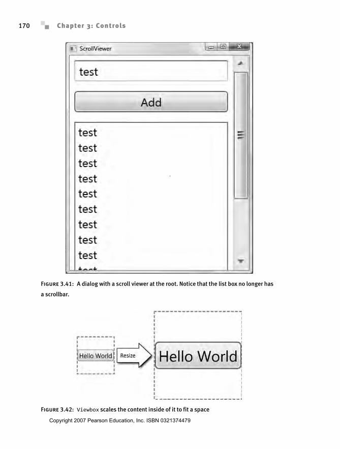
Chapter 3: Controls170
Figure 3.41: A dialog with a scroll viewer at the root. Notice that the list box no longer has
a scrollbar.
Figure 3.42: Viewbox scales the content inside of it to fit a space
Anderson_ch03-113-172.fm Page 170 Wednesday, March 14, 2007 5:12 PM
Copyright 2007 Pearson Education, Inc. ISBN 0321374479
Building Blocks 171
WHERE ARE WE?
Three main principles underlie all the controls of WPF: element composi-tion, rich content everywhere, and a simple programming model. Thischapter has delved into the core concepts of WPF’s controls that enablethese three principles: the content model and templates. With these twoconcepts in mind, we have walked through a brief overview of the controlsthat ship with WPF.
Anderson_ch03-113-172.fm Page 171 Wednesday, March 14, 2007 5:12 PM

Anderson_ch03-113-172.fm Page 172 Wednesday, March 14, 2007 5:12 PM
Copyright 2007 Pearson Education, Inc. ISBN 0321374479